Category: Demographics

  • Empire State Building Toward Wins for Trump, Hillary

    New Yorkers like to think of themselves as ahead of the curve but, this year, they seem to be embracing the most regressive politics. The overwhelming favorite in Tuesday’s primary among Republican candidates – with more than 50 percent support, according to RealClearPolitics – is Donald Trump, the brash New Yorker whose campaign vows to “make America great again.” On the Democratic side, New Yorkers appear to prefer Hillary Clinton, their former U.S. senator and quintessential avatar of the gentry liberals, rather than feeling “the Bern.”

    Some of this stems from political causes – for example, Clinton’s close ties with progressives around Mayor Bill De Blasio – or the fact that the New York primary electorate is 30 percent nonwhite compared with 17 percent in Wisconsin. For Republicans, the overall weakness of the state party, a paucity of evangelicals and Ted Cruz’s poorly chosen attack on “New York values” all favor Trump.

    But the real driver of Trump’s success lies in the changing social, economic and demographic forces reshaping the Empire State. The city has enjoyed a considerable surge in employment, much of it – roughly one-third – in low-wage jobs. But the real “losers,” to use one of Trump’s favorite terms, has been the middle class, which is disappearing even faster in New York than in the rest of the country.

    This distress can be seen in migration numbers. While states like Texas and Florida are gaining hundreds of thousands of new residents, the New York metropolitan area has lost 701,000 net domestic migrants the past five years, after losing more than 1.9 million in the first decade of the new millennium. Greater New York loses net migrants to virtually every big U.S. urban region, even Los Angeles, Philadelphia, Washington, D.C., and Boston, as well as to Atlanta, Dallas-Fort Worth and Houston.

    Read the entire piece at The Orange County Register.

    Joel Kotkin is executive editor of NewGeography.com. He is the Roger Hobbs Distinguished Fellow in Urban Studies at Chapman University and executive director of the Houston-based Center for Opportunity Urbanism. His newest book, The Human City: Urbanism for the rest of us, will be published in April by Agate. He is also author of The New Class ConflictThe City: A Global History, and The Next Hundred Million: America in 2050. He lives in Orange County, CA.

    Photo by Gage Skidmore [CC BY-SA 3.0], via Wikimedia Commons

  • Largest Cities in the World: 2016

    Tokyo-Yokohama continues to be the largest city in the world, with nearly 38 million residents, according to the just released Demographia World Urban Areas (12th Annual Edition). Demographia World Urban Areas (Built-Up Urban Areas or Urban Agglomerations) provides annual estimates of the population, urban land area and urban population density of all identified built-up urban areas in the world. This year’s edition includes 1,022 large urban areas (with 500,000 or more residents), with a total population of 2.12 billion, representing 53 percent of the world urban population.

    Demographia World Urban Areas uses base population figures, derived from official census and estimates data, to develop basic year population estimates within the confines of built-up urban areas. These figures are then adjusted to account for population change forecasts, principally from the United Nations or national statistics bureaus for a 2016 estimate.

    Built-up urban areas are continuously built-up development that excludes rural lands. Built-Up urban areas are the city in its physical form, as opposed to metropolitan areas, which are the city in its economic or functional form. Metropolitan areas include rural areas and secondary built-up urban areas that are outside the primary built-up urban area. These concepts are illustrated in Figure 1, which uses the Paris built-up urban area (unité urbaine) and metropolitan area ("aire urbaine") as an example.

    The Largest Cities

    The world’s eight largest cities are located in Asia. Tokyo-Yokohama became the largest urban area, according to the United Nations, in 1955, more than 60 years ago. However, Japan’s capital may not old onto the top position for long. With Japan now losing population, it seems likely that Tokyo-Yokohama — which has been about the only place in Japan gaining population — will begin shrinking in the next decade, while facing a strong challenge from Jakarta.

    Jakarta has closed the gap to about 6.4 million. This may seem like a lot, but this is the closest a number two urban area has been since 1965, when New York trailed Tokyo-Yokohama by 5.1 million. The gap between number one and number two New York amounted to 16.5 million in 1995.

    Jakarta has grown very quickly, and now stands at a population of 31.3 million. Between 2000 and 2010, Jakarta added more than 7,000,000 residents, one of the largest population gains of any city in history. Should this growth continue, and the population of Tokyo-Yokohama begin to decline, the largest city in the world could be Jakarta by 2030. Jakarta is also the largest city in size in the southern hemisphere, stretching beyond its city limits, into the regencies of Tangerang, Bogor, Bekasi and Karawang to  the large independent cities of Tangerang, South Tangerang, Depok, Bekasi and Bogor.

    Delhi, India’s capital, is not only the third largest city in the world, but is also the largest in India (25.7 million). That may be surprising, since Mumbai (Bombay) was the largest in India for decades and had been widely touted to become the world’s largest city. Delhi spreads from the National Capital Territory of Delhi into the states of Haryana and Uttar Pradesh. These areas include the modern edge city technology hubs of Gargaon and Noida (Figure 2).

    Seoul-Incheon is the fourth largest city in the world, with 23.6 million residents, Seoul-Incheon spreads from the core municipality of Seoul into suburban Gyeonggi and the independent municipality of Incheon. The core city of Seoul has stopped growing, and approximately 60 percent of the population is in the suburbs.

    Manila is the fifth largest city, with 22.9 million residents. Manila slipped from the fourth position according to recently obtained Philippine national statistics authority population projections. However, Manila continues to be one of the world’s fastest growing megacities and can be expected to pass Seoul-Incheon in the next few years. Manila spreads from the National Capital Territory into the adjoining provinces of Cavite, Laguna, Rizal and Bulacan.

    Sixth ranked Mumbai is a new entry to the top 10, with 22.9 million residents. The Mumbai urban area has been redefined to incorporate adjacent urban areas, which explains its larger population relative to last year. Mumbai extends from the municipality of Mumbai into the districts of Thane and Raighar.

    The sixth largest city is Karachi in Pakistan’s with 22.8 million residents. This population estimate is the least reliable among the largest cities. Pakistan’s last population census was nearly 20 years ago, and had been scheduled for March 2016. As of publication, the census has been postponed and no new date set.

    Shanghai dropped to the number eight position from sixth place last year. Shanghai’s population is estimated at 22.7 million residents. Like many cities across China, population growth has dropped substantially during this decade. Recently, the Shanghai city government announced that the population had fallen slightly over the last year, ending three decades of dramatic population growth in the last three decades. The Shanghai urban area is almost completely confined to the municipality of Shanghai, but has minor extensions into the provinces of Jiangsu and Zhenjiang.

    New York is the ninth largest city, with a population of 20.7 million. New York is the largest built-up urban area outside Asia and covers the largest land area of any urban area. New York extends into Long Island and the Hudson Valley in the state of New York, Connecticut and New Jersey. New York had been the world’s largest city before Tokyo, a distinction that it had held since 1925, when it surpassed London (now 33rd largest).

    The 10th largest city of Sao Paulo, with a population of 20.6 million. Sao Paulo is a new addition to the top 10, Latin America’s largest city and the core municipality. Sao Paulo stretches from its large core city in all directions, with approximately half of the population in the suburbs.

    Two cities fell out of the top 10, Beijing and Guangzhou-Foshan. Like Shanghai and some other cities of China, newer population estimates indicated a substantial decline in growth rates. Beijing is now the 11th largest city in the world, while Guangzhou-Foshan is 13th largest.

    Mexico City is ranked 12th largest in the world. Mexico’s capital has experienced a roller coaster ride in urban area rankings since the middle of the last century. In 1950, Mexico City ranked 17th in the world, according to United Nations estimates. By 2000, Mexico City was second in the world to only Tokyo Yokohama. During the period of its greatest growth, in the late 20th century, it was common to hear that Mexico City would eventually be the largest in the world (as was the case with Mumbai, above) but its once frenetic growth has cooled considerably.

    Los Angeles has also had its ups and downs. It is substantial growth in the first half of the 20th century brought Los Angeles from virtually nowhere to 12th largest in the world by 1950. As in Mumbai and Mexico City, there were those who expected Los Angeles to become the largest city in the world. By 1965, Los Angeles was the sixth largest city, trailing only Tokyo Yokohama, New York, Paris, London and Osaka Kobe Kyoto. Now, Los Angeles has fallen to 19th position and not only is unlikely to ever be the largest city in the world or even in the United States.` The 5 million population gap compared to New York in 2016 is little different from 1990.

    Distribution of Population

    Much has been made of the fact that the world now has more than one half of its population living in urban areas. More than one analyst has misunderstood this as meaning that the norm for world residents looks like Fifth Avenue in New York, central London or Paris or the huge shantytowns of Mumbai or Dhaka. In fact, however, most urban residents live in nothing like such environments (See: What is a Half Urban World?).

    Only 8.2 percent of the world population lives in megacities (built-up urban areas with more than 10 million population. In contrast nearly a quarter lives in cities of more than 1 million population, including the megacities. A larger 30 percent of the world population lives in urban areas under 1 million population, which includes the smallest towns. Rural areas still have nearly 46 percent of the world population (Figure 3).

    Most of the large built-up urban area population lives at densities between 4,000 and 10,000 per square kilometer, or approximately 10,000 to 25,000 per square mile. These population densities are typical in parts of Asia, Africa and South America. Another one quarter of the population lives at densities of below 4,000 per square kilometer or approximately 10,000 per square mile. These densities are principally found in Europe, North America and Oceania (principally Australia and New Zealand). Slightly less than one quarter of the population lives at higher densities, above 10,000 per square kilometer or 25,000 per square mile. These densities are largely limited to certain Asian and African nations, such as Bangladesh, the Democratic Republic of the Congo and Pakistan (Figure 4).

    The Future

    As has been noted before, much of the population growth in the world will be in Africa over the next century. However, in the next few decades the greatest urban population growth seems likely to be in Asia, where 57 percent of the large urban area population lives. Even with declining growth rates, such as in China, many millions more  rural residents are expected to continue moving into China’s  cities .

    Note on Availability

    The full Demographia World Urban Areas and its components can be downloaded as follows:

    Full Report:

    Demographia World Urban Areas

    By Component:

    Demographia World Urban Areas- Index

    Photograph: Cover of Demographia World Urban Areas: 12th Annual Edition

    Wendell Cox is principal of Demographia, an international pubilc policy and demographics firm. He is a Senior Fellow of the Center for Opportunity Urbanism (US), Senior Fellow for Housing Affordability and Municipal Policy for the Frontier Centre for Public Policy (Canada), and a member of the Board of Advisors of the Center for Demographics and Policy at Chapman University (California). He is co-author of the “Demographia International Housing Affordability Survey” and author of “Demographia World Urban Areas” and “War on the Dream: How Anti-Sprawl Policy Threatens the Quality of Life.” He was appointed to three terms on the Los Angeles County Transportation Commission, where he served with the leading city and county leadership as the only non-elected member. He served as a visiting professor at the Conservatoire National des Arts et Metiers, a national university in Paris.

  • Moving to the Middle: Domestic Migration by Metropolitan Area Size

    Americans are moving to middle-sized metropolitan areas, according to the latest Census Bureau population estimates. Between 2010 and 2015, all of the domestic migration gain was in a broadly defined middle of metropolitan areas between 250,000 and 5,000,000. Both above and below that range there were huge domestic migration losses.

    Middle Sized Metropolitan Areas (250,000 to 5,000,000 Population)

    Between 2010 and 2015, more than 1.4 million people moved to the metropolitan areas that had between 250,000 and 5,000,000 population in 2010. These movers came from larger metropolitan areas, as well as smaller metropolitan areas, micropolitan areas and areas that are not within these core-based statistical areas (Note). The larger metropolitan areas lost nearly 800,000 domestic migrants, while the smaller areas lost more than 600,000.

    Moreover, the trend is getting stronger. In each year since 2010, the middle sized metropolitan areas have increased their net domestic migration. In 2011, the middle sized metropolitan areas gained 184,000 net domestic migrants. This has gradually moved up to the 2015 figure of 341,000 net domestic migrants (Figure 1). In percentage terms, the middle sized metropolitan areas strongly increased their net domestic migration growth as a percentage of their population, from 0.12 percent to 0.21 percent (Figure 2).

    Larger Metropolitan Areas (5,000,000 Population and Over)

    At the same time, the nine larger metropolitan areas with over 5,000,000 residents and more have lost net domestic migrants in every year. In 2011, the loss was 80,000. It has increased every year since, to 228,000 in 2015. The percentage losses have grown dramatically. In 2011, the larger metropolitan areas lost 0.10 percent of their population to net domestic migration. By 2015, this had nearly tripled, to a loss of 0.28 percent.

    Over time, the position of our largest metropolitan regions has deteriorated, even in comparison with smaller areas. In 2011, the largest metropolitan areas, though losing, did better than the smaller areas (those with under 250,000 residents). The smaller areas lost 105,000 net domestic migrants in 2011, compared to the smaller loss of 80,000 net domestic migrants in the larger metropolitan areas.

    The largest metropolitan areas continued to do better than the smaller areas in 2012, as the gap was about the same. All of that changed in 2013, as the larger metropolitan areas began to sustain larger domestic migration losses than the smaller areas. By 2014, the losses in the smaller areas were less than one-half that of the metropolitan areas with more than 5 million residents. The smaller areas, including those outside the metropolitan areas, lost 113,000 net domestic migrants in 2015, while the larger metropolitan areas lost 228,000.

    These losses are all the more remarkable given that some large metros, notably   Houston and Dallas-Fort Worth have been gaining net migrants, up 255,000 and 241,000 respectively. Two other metropolitan areas in the above 5,000,000 category also gained. Atlanta added 116,000 domestic migrants, albeit at a much slower rate than during the 2000s. Miami also gained, but only modestly (3,000).

    The shift away from the largest metropolitan area group was driven by huge losses in the largest of the metropolitan areas in that category.  New York  lost 701,000 domestic migrants during the decade. Chicago lost 319,000 and Los Angeles was close behind at 280,000. Philadelphia lost 100,000, while Washington lost 13,000.

    Smaller Areas (Under 250,000 Population)

    Among the smaller areas, the peak loss was reached in 2012, at 136,000 net domestic migrants. Since that time, the smaller areas have improved on their net domestic migration losses modestly each year, dropping to the 113,000 in 2015. The annual domestic migration rates have been more constant in the smaller areas, starting at a loss of 0.14 percent in 2011 and fluctuating up and down to a maximum of 0.18 percent and a minimum of 0.15 percent in 2015.

    More Detailed Analysis

    Figures 3 and 4 show the domestic migration trends in more detailed population categories. By far the largest losses have been sustained by the megacities, New York and Los Angeles, with more than 10,000,000 residents. The metropolitan areas with between 5,000,000 and 10,000,000 population had done relatively well in the early part of the decade, but have dropped substantially. If the same trend continues to next year, net domestic migration losses would occur across this category.

    By far the strongest gains were in the 1,000,000 to 2,500,000 category, where net domestic migration more than doubled from 2011 to 2015. There was also strong growth in the 500,000 to 1,000,000 category and in the 250,000 to 500,000 category. There was a more mixed record among the metropolitan areas with between 2,500,000 and 5,000,000 population, with a rise to 2014, but a reduction in 2015.

    The smallest categories, from 50,000 to 250,000 population and under 50,000 population lost in each year, though there were not large fluctuations.

    A Trend?

    The trend that favors the migration from the largest and smallest areas to the broad middle of metropolitan areas may be an aberration. But we may see an even larger share of future domestic migration to middle-sized metropolitan areas, together with two or three larger areas (Houston, Dallas-Fort Worth and maybe Atlanta).

    Note: Core based statistical area is a term that includes metropolitan areas and micropolitan areas, which are larger and smaller labor market areas, with slightly different definitions. Additional information can be obtained from the Office of Management and Budget.

    Wendell Cox is principal of Demographia, an international pubilc policy and demographics firm. He is a Senior Fellow of the Center for Opportunity Urbanism (US), Senior Fellow for Housing Affordability and Municipal Policy for the Frontier Centre for Public Policy (Canada), and a member of the Board of Advisors of the Center for Demographics and Policy at Chapman University (California). He is co-author of the "Demographia International Housing Affordability Survey" and author of "Demographia World Urban Areas" and "War on the Dream: How Anti-Sprawl Policy Threatens the Quality of Life." He was appointed to three terms on the Los Angeles County Transportation Commission, where he served with the leading city and county leadership as the only non-elected member. He served as a visiting professor at the Conservatoire National des Arts et Metiers, a national university in Paris.

  • Aristocracy of Talent: Social Mobility Is the Silver Lining to America’s Inequality Crisis

    Yes, wealth concentration is insane. But the ways in which wealth is shifting are surprising—and give reason for a little optimism.

    In an age of oligarchy, one should try to know one’s overlords—how they made their money, and where they want to take the country. By looking at the progress of the super-rich — in contrast with most of us — one can see the emerging and changing dynamics of American wealth.

    To get a sense of these trends, researcher Alicia Kurimska and I  tapped varying analyses from the Forbes 400 list of richest Americans. No list, of course, captures all the relevant data, but the Forbes list (I am a regular contributor to that magazine’s website) allows us to look not only at who has money now, but how the dynamics of wealth have changed over the past decade or more.

    The bad news here is that our oligarchs are getting richer, and, unlike in the decades following World War II, they are primarily not taking us on the ride. Indeed at a time when middle-class earnings have stagnated for at least a decade and a half,   the oligarch class is making out like bandits. This, of course, extends to much of the infamous “top 1 percent.” The share of income of the top 1 percent of households in the US increased from 10 percent in 1979 to upwards of 20 percent in 2010, as famously found by economist Thomas Piketty and Emmanuel Saez. 

    But if the highly affluent are thriving, the super-rich are enjoying one of the brightest epochs since the days of the robber barons. These people , according toa study by economists Steven N. Kaplan and Joshua D. Rauh, the top 0.0001 percent of 311.5 million US individuals. In constant 2011 dollars, their wealth has grown seven-fold since 1992 — from $214 billion in 1982 to $1.525 trillion in 2011. This at a time when most Americans have endured little or no real income growth.

     What we are talking about is a concentration of wealth and power unprecedented since the turn of the last century. According to an analysis by the left-leaning Institute for Policy studies, America’s 20 wealthiest people own more wealth than the entire bottom half of the population—152 million people in 57 million households. The top 100 own as much wealth as the entire 44.5 million-strong African-American population  (there are only two African Americans on the list), and the top 200 have more than the entire 55 million-strong Latino population (there are 15 Latinos on the list). To make an international comparison, the 400 have more wealth than the GDP of India, arguably the most up and coming big economy on the planet. 

    The Rise of the self-made

    Not all the news is bad, however. The proportion of the 400 who inherited their money has been steadily decreasing. There are more self-made billionaires than existed in the 1980s. Kaplan and Rauh report that since the 1980s the share who grew up wealthy fell from 60 percent to 32 percent. 

    This does not mean so much the return of Horatio Alger — the share who grew up poor remained constant at 20 percent — but that most super-wealthy came from affluent but not rich families, which gave them some head start, notably in education.They did not hand the keys to the kingdom to their offspring. Rather than country clubbers clipping coupons, the rich since the 1980s have become largely, if not entirely, self-made.  

    But origins are not the only thing that has changed in this era of oligarchy. So too have the industries that create the wealth — largely represented by the shift toward technology and finance — and, not surprisingly, where that wealth tends to concentrate. These shifts are already changing not only our economy, but also the outlines of political power, as industries friendlier to Democrats, notably tech and finance, supplant those, notably energy, that have long been associated, particulary in the last decade,  with the Republicans.

    The shift in the fortunes of the super-rich reflect changes in our industrial structure over the past third of a century. The big winners have been in scalable businesses  where capital is king and rapid accumulation possible. Rauh and Kaplan, for example, report that the big winners have emerged  not only in tech, but also include owners of retail and restaurant chains, tech firms and private finance, including hedge funds  Over the period between 1982 and 2012, finance’s share grew the most, followed by technology and mass-retailing.

    Who’s losing ground? The big losers are a bit counter-intuitive. Despite all the attacks on “big oil,” energy has actually suffered the biggest decline in terms of presence on the Forbes list. Energy, for example, used to account for about 21 percent of the 400,  but that has shrunk to about 11 percent. Equally puzzling, amidst a high-end building boom (not so much for the hoi polloi), real estate’s share has dropped about as much. Perhaps less surprising are the losses among non-tech based consumer industrial companies. 

    Since 2012, the year the Rauh study was completed, the tech billionaires have, if anything, expanded their presence, while it’s likely that, with the drop in energy prices, the oil barons will slip even further. On the 2014 list, for example, in terms of dollar gains, five of the top six were from the tech sector, led by Mark Zuckerberg, whose fortunes increased by a remarkable $15 billion (Warren Buffett was the lone exception). Mark Zuckerberg’s gains were larger than the $12 billion increase between Charles and David Koch, even at the peak of the energy boom.

    Fully half of the top 10 on the list came from the tech community, with the balance made up of Wall Street/finance people (Buffett and Michael Bloomberg) along with the Kochs and David Walton, the youngest son of Wal-Mart founder Sam Walton.

    The New Geography of Wealth

    Perhaps more surprising has been the shift in the location of the rich. Despite the rise of the tech oligarchs, the biggest gainers over the past decade have not occurred in California but in New York, Florida and Texas. This reflects not only the power of Wall Street and the investment class (some of whom have decamped to Florida), but the growing diversification of the Texas economy. 

    Oil, of course, still plays a critical role among the Texas rich, but it’s much more than that now. The richest people in the Lone Star Stateinclude Alice Walton, the Ft. Worth-based heir to the retail fortune, but also Austin tech mogul Michael Dell, Dallas financier Andy Beal, and San Antonio supermarket mogul Charles Butt. The first energy billionaire, pipeline entrepreneur Richard Kinder, clocks in as fifth richest Texan. Even if energy remains weak for the next decade, Texas seems likely to keep producing gushers of billionaires.

    If we break the rich list by region, it’s no surprise that New York, long the nation’s premier financial center, would rank first, with 82 billionaires. In second place is the San Francisco area, with 54 billionaires, most of them tied to technology. The Bay Area, with about one-third of the population, surpasses third-place Los Angeles, with 34. Miami ranks fourth with 27, Dallas fifth with 19; each is ahead of the traditional second business capital, Chicago, which ranks sixth with 15, just a few paces ahead of  Houston with 12.

    The Future of Oligarchy  

    What is the future trajectory of wealth in America? One thing seems certain: the twin tech capitals of Bay Area and Seattle, now home to nine of the 400, are likely to expand their reach. One clear piece of evidence is age; people generally do not get richer when they retire. In contrast, virtually all self-made billionaires under 40 are techies

    Of course, the biggest growth can be expected in the Bay Area, particularly as tech people think of new ways to “disrupt” our lives – for our own good, of course. Whole industries such as music, movies, taxis, real estate are increasingly controlled from the Valley; as these companies wax, many of the old fortunes made in these fields will begin to wane. This is also true across the board in retail, where Seattle’s Jeff Bezos now looms as a colossus greater than any individual chain of traditional stores.

    Ultimately what will make “the sovereigns of cyberspace,” to quote author Rebecca MacKinnon, so dominant is precisely what made John D. Rockefeller so rich: control of markets. Google, for example, accounts for over 60 per cent of Internet searches. It and Apple control almost 90 percent of the operating systems for smartphones. Similarly, over half of American and Canadian computer users use Facebook, making it easily the world’s dominant social-media site. 

    And soon, they, like the old Wall Street elites or the energy barons, may be able to regard the government as yet another subsidiary. They will benefit greatly from the likely electoral victory of the Democrats, who are increasingly dependent on tech contributions, while the old economy oligarchs already in retreat, in energy, manufacturing and real estate, fade before them. 

    The prognosis for the future of American wealth, then, is for an ever-expanding role for both tech and private investors, and a gradual shift away from basic industries that are geared to our diminishing middle class. This may not be good for America but will be wondrous indeed for the ever more powerful, and outrageously wealthy, new ruling class.

    This piece originally appeared at The Daily Beast.

    Joel Kotkin is executive editor of NewGeography.com. He is the Roger Hobbs Distinguished Fellow in Urban Studies at Chapman University and executive director of the Houston-based Center for Opportunity Urbanism. His newest book, The Human City: Urbanism for the rest of us, will be published in April by Agate. He is also author of The New Class ConflictThe City: A Global History, and The Next Hundred Million: America in 2050. He lives in Orange County, CA.

  • Population Growth in the Largest Counties: Texas, Florida and the South

    As last week’s US Census Bureau population estimates indicated, the story of population growth between 2014 and 2015 was largely about Texas, as it has been for the decade starting 2010 (See: “Texas Keeps Getting Bigger” The New Metropolitan Area Estimates).  The same is largely true with respect to population trends in the nation’s largest counties, with The Lone Star state dominating both in the population growth and domestic migration among 135 counties with more than 500,000 population. Florida also did very well, especially in view of the population and migration reversals that occurred around the Great Recession. Strong showings in other Southern states ensured that 80 percent of the fastest-growing large counties and those with the fastest domestic migration rates were in the South. The few remaining positions were taken up by metropolitan areas in the West (Table).

    Large County Growth in Texas

    Houston, which is the fastest growing major metropolitan area (over 1 million population) in the nation includes the two fastest growing large counties. Fort Bend County added 4.29 percent to its population between 2014 and 2015 and now has 716,000 residents. Montgomery County grew 3.57 percent to 538,000. In addition to these two suburban Houston counties, Harris County, the core County ranked 16th in growth, adding 2.03 percent to its population and exceeding 4.5 million population.

    Dallas-Fort Worth, the second fastest-growing major metropolitan area has two counties among the top 20. The third fastest-growing county is Denton (located north of Dallas-Fort Worth International Airport), which added 3.42 percent to its population over the past year and now has 781,000 residents. Collin County, to the north of Dallas County, grew 3.17 percent and now stands at 914,000 residents. Its current growth rate would put Collin County over 1 million population by the 2020 census.

    Travis County, with its county seat of Austin, grew 2.22 percent to 1,177,000 and ranked 12th. Bexar County, centered on San Antonio grew 2.01 percent and ranks 17th.

    The I-4 & Middle Florida Corridor

    But there is another impressive growth story in the "I-4 & Middle Florida" corridor (the term “Central Florida“ is not used, because that usually just denotes the Orlando area).  This includes counties along the Interstate 4 corridor, which runs from Tampa-St. Petersburg through Orlando to Daytona Beach as well as one county along Interstate 95 just south of Daytona Beach and adjacent to the Orlando metropolitan area.

    Five of the fastest growing 20 counties with more than 500,000 population are located in this corridor. Orange County, the core of highly suburban Orlando grew at a rate of 2.49 percent between 2014 and 2015 and ranked seventh. Polk County (Lakeland metropolitan area), located midway between Orlando and Tampa-St. Petersburg grew 2.33 percent and ranked 10th. The south western terminus of Interstate 4 in   Hillsborough County, which includes Tampa, Hillsborough County, grew 2.33 percent, though slightly slower than adjacent Polk County and ranked 11th. The other, north eastern terminus of Interstate 4 is located in Daytona Beach, in Volusia County. Volusia County grew at a rate of 2.00 percent and ranks 19th in population growth. Just to the south of is Brevard County, straddling Interstate 95. Brevard County (Palm Bay-Melbourne metropolitan area) grew 2.01 percent and ranked 18th in growth.

    But Florida’s fastest-growing large county was Lee, centered on Cape Coral and Fort Myers. Lee County added 3.35 percent to its population and now has 702,000 residents.

    Other Fast Growing Counties

    Denver County continued its strong growth (2.80 percent) and ranked sixth. Wake County, core of the Raleigh metropolitan area, grew at 2.49 percent and ranked eighth. Utah County, in the Provo metropolitan area grew 2.43 percent and ranked ninth.

    Other counties in the top 20 included Clark (Las Vegas) in Nevada, Mecklenburg (Charlotte) in North Carolina, Gwinnett, a suburban county of Atlanta and Washington, a suburban county of Portland.

    Overall, sixteen of the 20 fastest growing large counties were in the South and four in the West (Figure 1).

    Largest Domestic Migration

    As with population growth, the top 20 in domestic migration was dominated by the South with 16 entries. Four of the migration magnets were located in  metropolitan areas from the West (Figure 2).

    Not surprisingly, the counties with the largest net domestic migration were often near the top of the list in population growth. Lee County, Florida (Cape Coral and Fort Myers) had the greatest net domestic migration between 2014 and 2015, at 3.10 percent. This is a particularly important reversal for Lee County, which experienced some of the most catastrophic house price declines during the housing bust.

    Houston’s Fort Bend and Montgomery counties (Texas), the fastest growing large counties had the second and third largest domestic migration respectively. Denton County and Collin County, in the Dallas-Fort Worth metropolitan area ranked 5th and 7th respectively. Bexar County (San Antonio) ranked 18th, while Travis County (Austin) ranked 20th.

    The I-4 & Middle Florida corridor also did well. Volusia County (Daytona Beach) ranked 4th in domestic migration, followed by its neighbor to the south, Brevard County. Polk County (Lakeland) ranked 9th, Hillsborough County (Tampa) ranked 13th and Orange County (Orlando) ranked 16th. In addition, Pinellas County (St. Petersburg), just across the bridge from Tampa ranked 12th. Palm Beach County, which is outside the I-4 & Middle Florida corridor ranked 14th.

    Denver County, at 8th, was the highest ranking in domestic migration outside Texas and Florida. Other high ranking counties included #10 Wake County (Raleigh), #11 Clark County (Las Vegas), #15 Maricopa County (Phoenix), Mecklenburg County (Charlotte) and #19 Washington County (suburban Portland).

    Slowest Growing Counties

    Seventeen of the 135 largest counties lost population. The 20 large counties with the least percentage population growth (or loss) were fairly evenly distributed outside the West. Eight were in the Northeast, seven in the Midwest and five in the South (Figure 3). The largest losses occurred in the counties containing core cities with some of the largest population losses in the last seven decades. These include Wayne County (Detroit), Cuyahoga County (Cleveland) Baltimore city, Cook County (Chicago) and Allegheny County (Pittsburgh), Hartford County, Monroe County (Rochester) and Erie County (Buffalo). The bottom 10 also included New Haven County, Connecticut and Summit County, Ohio (Akron).

    Largest Domestic Migration Losses: A New York Story

    Among the 20 largest domestic migration losses, 10 were in the Northeast, four in the Midwest, and six in the South (Figure 4)

    The largest domestic migration losses are taking place  in the New York metropolitan area, which accounted for eight of the 13 largest counties in terms of domestic migration losses. This includes Hudson County New Jersey, which had the largest loss. It also included Kings County (Brooklyn), which had the fourth largest domestic migration loss. Bronx County had the seventh largest loss, Queens County the eighth largest loss and Manhattan County the 11th largest loss. In addition, other New Jersey suburban counties had substantial domestic migration losses, including Passaic County, Middlesex County and Essex County (Newark).

    The South rated best in population growth and net domestic migration, but some large southern counties had among the largest domestic migration losses. These include Fairfax County (Washington suburb), El Paso County in Texas, Miami-Dade County in Florida and Baltimore city. Cook County (Chicago) was also among the top 10 domestic migration losers.

    Moreover, the 13 large counties with the greatest losses excluded   Wayne County, with its core city (Detroit) that has lost more of its population (percentagewise) than any other large municipality in the world. Yet, all of the counties listed above, including the eight in the New York metropolitan area lost a greater share of their population by domestic migrants than Wayne County.

    Dominance by the South and the West

    Overall, the largest counties added approximately 1.53 million residents over the past year. More than one half of that net domestic migration was in 19 counties of the South, 11 in the West, none in the Midwest and none in the Northeast. Three quarters of the net domestic migration was in just 52 of the 135 counties, with the South accounting for 30 counties. There were also 20 counties in the West, two in the Midwest and none in the Northeast. The two Midwestern counties were Franklin, Ohio (Columbus) and Dane, Wisconsin (Madison).

    US Counties Over 500,000 Population: Ranked By Population Growth 2014-2015 %
    2014-2015 & 2010-2015
    Population Change Dom. Migra.
    Rank County, State 4/2010 7/2014 7/2015 Fr2010 Fr2014 Fr2010 Fr2014 Fr2010 Fr2014
    1 Fort Bend, Texas      585        687        716      131        29 22.4% 4.29% 13.1% 2.69%
    2 Montgomery, Texas      456        519        538        82        19 17.9% 3.57% 11.8% 2.48%
    3 Denton, Texas      663        755        781      118        26 17.8% 3.42% 10.4% 2.14%
    4 Lee, Florida      619        679        702        83        23 13.5% 3.35% 10.8% 3.10%
    5 Collin, Texas      782        886        914      132        28 16.8% 3.17% 9.3% 1.86%
    6 Denver, Colorado      600        664        683        83        19 13.8% 2.80% 7.2% 1.59%
    7 Orange, Florida   1,146     1,256     1,288      142        32 12.4% 2.52% 3.6% 0.84%
    8 Wake, North Carolina      901        999     1,024      123        25 13.7% 2.49% 6.6% 1.22%
    9 Utah, Utah      517        562        575        59        14 11.3% 2.43% 0.3% 0.45%
    10 Polk, Florida      602        635        650        48        15 8.0% 2.33% 4.2% 1.53%
    11 Hillsborough, Florida   1,229     1,318     1,349      120        31 9.7% 2.33% 3.4% 1.11%
    12 Travis, Texas   1,024     1,151     1,177      152        26 14.9% 2.22% 6.5% 0.77%
    13 Clark, Nevada   1,951     2,069     2,115      164        46 8.4% 2.21% 3.1% 1.20%
    14 Mecklenburg, North Carolina      920     1,012     1,034      114        22 12.4% 2.19% 4.9% 0.84%
    15 Gwinnett, Georgia      805        878        896        90        18 11.2% 2.06% 3.6% 0.69%
    16 Harris, Texas   4,093     4,448     4,538      445        90 10.9% 2.03% 2.0% 0.38%
    17 Bexar, Texas   1,715     1,860     1,898      183        37 10.7% 2.01% 4.4% 0.82%
    18 Brevard, Florida      543        557        568        25        11 4.5% 2.01% 4.5% 1.97%
    19 Volusia, Florida      495        508        518        23        10 4.7% 2.00% 5.3% 2.14%
    20 Washington, Oregon      530        563        574        44        11 8.4% 1.96% 2.3% 0.80%
    21 Maricopa, Arizona   3,817     4,090     4,168      351        78 9.2% 1.91% 3.9% 0.92%
    22 Washington, District of Columbia      602        660        672        70        12 11.7% 1.88% 4.3% 0.57%
    23 Tarrant, Texas   1,810     1,946     1,982      173        36 9.6% 1.86% 3.0% 0.61%
    24 Arapahoe, Colorado      572        620        631        59        11 10.3% 1.85% 4.0% 0.72%
    25 El Paso, Colorado      622        663        674        52        12 8.4% 1.75% 2.2% 0.55%
    26 Palm Beach, Florida   1,320     1,399     1,423      103        24 7.8% 1.74% 4.2% 1.00%
    27 Snohomish, Washington      713        759        773        59        13 8.3% 1.72% 3.0% 0.67%
    28 King, Washington   1,931     2,082     2,117      186        35 9.6% 1.67% 2.4% 0.29%
    29 Multnomah, Oregon      735        778        790        55        12 7.5% 1.60% 2.8% 0.68%
    30 Alameda, California   1,510     1,613     1,638      128        25 8.5% 1.57% 1.2% 0.22%
    31 Pierce, Washington      795        831        844        49        13 6.1% 1.54% 1.1% 0.58%
    32 San Joaquin, California      685        715        726        41        11 6.0% 1.54% 0.6% 0.52%
    33 Duval, Florida      864        899        913        49        14 5.6% 1.52% 0.5% 0.47%
    34 DeKalb, Georgia      692        724        735        43        11 6.2% 1.47% -2.5% -0.10%
    35 Davidson, Tennessee      627        669        679        52        10 8.3% 1.46% 2.0% 0.30%
    36 San Francisco, California      805        853        865        60        12 7.4% 1.44% 0.6% 0.20%
    37 Broward, Florida   1,748     1,870     1,896      148        27 8.5% 1.43% 1.7% 0.11%
    38 Franklin, Ohio   1,164     1,234     1,252        88        18 7.6% 1.43% 1.0% 0.17%
    39 Fulton, Georgia      921        996     1,011        90        14 9.8% 1.41% 3.4% 0.28%
    40 Cobb, Georgia      688        731        741        53        10 7.7% 1.41% 1.4% 0.24%
    41 Riverside, California   2,190     2,328     2,361      171        33 7.8% 1.40% 3.0% 0.51%
    42 Tulsa, Oklahoma      603        630        639        36          9 5.9% 1.40% 1.5% 0.53%
    43 Contra Costa, California   1,049     1,112     1,127        78        15 7.4% 1.35% 2.8% 0.49%
    44 Sacramento, California   1,419     1,481     1,501        83        20 5.8% 1.34% 0.4% 0.28%
    45 Dallas, Texas   2,368     2,520     2,553      186        34 7.8% 1.34% 0.0% -0.10%
    46 Salt Lake, Utah   1,030     1,093     1,107        78        14 7.5% 1.32% -0.1% -0.09%
    47 Oklahoma, Oklahoma      719        767        777        58        10 8.1% 1.31% 2.5% 0.23%
    48 Dane, Wisconsin      488        517        524        36          7 7.3% 1.30% 1.9% 0.25%
    49 Hidalgo, Texas      775        832        842        68        11 8.7% 1.29% -1.1% -0.52%
    50 Pinellas, Florida      917        938        950        33        12 3.6% 1.25% 3.7% 1.18%
    51 Stanislaus, California      514        532        538        24          6 4.7% 1.21% -0.7% 0.12%
    52 Santa Clara, California   1,782     1,896     1,918      136        22 7.7% 1.16% -1.5% -0.53%
    53 Jefferson, Colorado      535        559        566        31          6 5.8% 1.16% 3.4% 0.69%
    54 Douglas, Nebraska      517        544        550        33          6 6.4% 1.12% 0.2% -0.07%
    55 Suffolk, Massachusetts      722        770        778        56          8 7.8% 1.08% -2.1% -0.75%
    56 Johnson, Kansas      544        574        580        36          6 6.6% 1.08% 1.6% 0.12%
    57 San Diego, California   3,095     3,266     3,300      204        34 6.6% 1.04% -0.2% -0.29%
    58 Fresno, California      930        965        975        44        10 4.8% 1.02% -1.7% -0.21%
    59 Kent, Michigan      603        630        636        34          6 5.6% 0.97% 0.6% 0.02%
    60 Bronx, New York   1,385     1,442     1,455        70        14 5.1% 0.95% -6.0% -1.10%
    61 Montgomery, Maryland      972     1,030     1,040        68        10 7.0% 0.94% -2.2% -0.80%
    62 Kern, California      840        874        882        43          8 5.1% 0.91% -1.5% -0.31%
    63 Hennepin, Minnesota   1,152     1,212     1,223        71        11 6.1% 0.91% -0.1% -0.29%
    64 Miami-Dade, Florida   2,498     2,669     2,693      195        24 7.8% 0.91% -3.3% -1.23%
    65 Guilford, North Carolina      488        513        518        29          5 6.0% 0.90% 1.9% 0.15%
    66 San Mateo, California      718        758        765        47          7 6.5% 0.90% 0.2% -0.21%
    67 Ramsey, Minnesota      509        534        538        29          4 5.8% 0.84% -1.5% -0.60%
    68 San Bernardino, California   2,035     2,110     2,128        93        18 4.6% 0.84% -1.1% -0.23%
    69 Middlesex, Massachusetts   1,503     1,573     1,585        82        13 5.5% 0.80% -0.8% -0.42%
    70 Hudson, New Jersey      634        670        675        41          5 6.4% 0.80% -6.6% -1.65%
    71 Orange, California   3,010     3,145     3,170      160        25 5.3% 0.79% -0.4% -0.32%
    72 Essex, Massachusetts      743        770        776        33          6 4.4% 0.72% 0.1% -0.18%
    73 Queens, New York   2,231     2,322     2,339      109        17 4.9% 0.72% -5.1% -1.09%
    74 Anne Arundel, Maryland      538        560        564        27          4 4.9% 0.70% 1.0% -0.04%
    75 Prince George’s, Maryland      864        903        910        46          6 5.3% 0.68% -2.4% -0.72%
    76 Honolulu, Hawaii      953        992        999        46          7 4.8% 0.67% -2.4% -0.75%
    77 Plymouth, Massachusetts      495        507        510        15          3 3.1% 0.66% 0.7% 0.14%
    78 Kane, Illinois      515        528        531        16          3 3.0% 0.63% -1.8% -0.23%
    79 New Castle, Delaware      538        553        557        18          3 3.4% 0.62% -0.6% -0.18%
    80 Kings, New York   2,505     2,621     2,637      132        16 5.3% 0.61% -5.0% -1.25%
    81 Bergen, New Jersey      905        933        939        33          6 3.7% 0.61% -0.8% -0.28%
    82 Los Angeles, California   9,819   10,109   10,170      352        61 3.6% 0.60% -2.7% -0.60%
    83 Jackson, Missouri      674        684        688        13          4 2.0% 0.58% -1.4% -0.06%
    84 Pima, Arizona      980     1,004     1,010        30          6 3.0% 0.58% 0.1% 0.02%
    85 Lancaster, Pennsylvania      519        534        537        17          3 3.3% 0.56% -0.6% -0.28%
    86 Ventura, California      823        846        851        27          4 3.3% 0.52% -1.3% -0.34%
    87 Chester, Pennsylvania      499        513        516        17          3 3.4% 0.52% 0.1% -0.16%
    88 Union, New Jersey      536        553        556        19          3 3.6% 0.49% -3.0% -0.70%
    89 Worcester, Massachusetts      799        815        819        20          4 2.6% 0.49% -1.1% -0.27%
    90 Norfolk, Massachusetts      671        693        696        25          3 3.8% 0.48% 0.0% -0.29%
    91 Marion, Indiana      903        935        939        36          4 3.9% 0.48% -1.6% -0.55%
    92 Ocean, New Jersey      577        586        589        12          3 2.1% 0.48% 0.6% 0.07%
    93 New York, New York   1,586     1,637     1,645        59          8 3.7% 0.46% -4.4% -0.99%
    94 Sedgwick, Kansas      498        509        512        13          2 2.7% 0.45% -2.3% -0.48%
    95 Middlesex, New Jersey      810        837        841        31          4 3.8% 0.43% -3.8% -1.02%
    96 Baltimore, Maryland      805        828        831        26          3 3.3% 0.40% -0.4% -0.31%
    97 Westchester, New York      949        973        976        27          4 2.9% 0.40% -1.9% -0.46%
    98 Jefferson, Kentucky      741        761        764        23          3 3.0% 0.39% -0.3% -0.27%
    99 Bristol, Massachusetts      548        555        557          8          2 1.5% 0.39% 0.0% 0.04%
    100 Philadelphia, Pennsylvania   1,526     1,562     1,567        41          6 2.7% 0.38% -3.1% -0.68%
    101 Macomb, Michigan      841        862        865        24          3 2.8% 0.37% 0.6% -0.12%
    102 Montgomery, Pennsylvania      800        817        819        19          3 2.4% 0.33% -0.2% -0.24%
    103 Essex, New Jersey      784        795        797        13          2 1.7% 0.31% -4.9% -0.89%
    104 Fairfax, Virginia   1,082     1,139     1,142        61          3 5.6% 0.28% -4.3% -1.47%
    105 Will, Illinois      678        686        687        10          2 1.4% 0.24% -2.4% -0.47%
    106 Fairfield, Connecticut      917        946        948        31          2 3.4% 0.24% -1.9% -0.74%
    107 Providence, Rhode Island      627        632        633          7          1 1.1% 0.23% -3.4% -0.67%
    108 Nassau, New York   1,340     1,359     1,361        22          3 1.6% 0.20% -1.2% -0.33%
    109 Passaic, New Jersey      502        510        511          9          1 1.9% 0.20% -5.6% -1.20%
    110 Oakland, Michigan   1,202     1,240     1,242        40          2 3.3% 0.19% -0.3% -0.53%
    111 Delaware, Pennsylvania      559        563        564          5          1 0.9% 0.17% -1.8% -0.43%
    112 Hamilton, Ohio      802        806        808          5          1 0.7% 0.16% -2.4% -0.40%
    113 Bernalillo, New Mexico      663        676        677        14          1 2.1% 0.15% -1.2% -0.47%
    114 Bucks, Pennsylvania      625        627        627          2          1 0.3% 0.12% -0.8% -0.14%
    115 St. Louis, Missouri      999     1,002     1,003          4          1 0.4% 0.12% -1.8% -0.35%
    116 El Paso, Texas      801        836        836        35          0 4.4% 0.01% -3.3% -1.44%
    117 Jefferson, Alabama      658        660        660          2        (0) 0.3% 0.00% -1.6% -0.33%
    118 DuPage, Illinois      917        934        934        17        (0) 1.8% 0.00% -2.5% -0.80%
    119 Camden, New Jersey      514        511        511        (3)        (0) -0.5% -0.01% -4.0% -0.68%
    120 Milwaukee, Wisconsin      948        958        958        10        (0) 1.1% -0.02% -3.4% -0.86%
    121 Lake, Illinois      703        704        704          1        (0) 0.1% -0.03% -4.1% -0.80%
    122 Shelby, Tennessee      928        938        938        10        (0) 1.1% -0.04% -3.2% -0.83%
    123 Monmouth, New Jersey      630        629        629        (2)        (0) -0.3% -0.05% -2.0% -0.37%
    124 Montgomery, Ohio      535        533        532        (3)        (0) -0.5% -0.05% -2.4% -0.45%
    125 Suffolk, New York   1,493     1,502     1,502          8        (1) 0.6% -0.05% -2.5% -0.63%
    126 Erie, New York      919        923        923          4        (1) 0.4% -0.07% -1.4% -0.47%
    127 Monroe, New York      744        750        750          5        (1) 0.7% -0.10% -2.6% -0.80%
    128 Hartford, Connecticut      894        897        896          2        (1) 0.2% -0.11% -3.4% -0.81%
    129 Summit, Ohio      542        543        542          0        (1) 0.0% -0.12% -1.4% -0.41%
    130 Allegheny, Pennsylvania   1,223     1,233     1,230          7        (2) 0.6% -0.20% -0.4% -0.46%
    131 Cook, Illinois   5,195     5,249     5,238        43      (10) 0.8% -0.20% -4.0% -1.06%
    132 New Haven, Connecticut      862        861        859        (3)        (2) -0.3% -0.21% -3.4% -0.84%
    133 Baltimore city, Maryland      621        624        622          1        (2) 0.1% -0.30% -3.8% -0.92%
    134 Cuyahoga, Ohio   1,280     1,261     1,256      (24)        (5) -1.9% -0.37% -3.7% -0.76%
    135 Wayne, Michigan   1,821     1,766     1,759      (61)        (7) -3.4% -0.38% -6.2% -0.87%
    In 000s
    Data from Census Bureau


    Wendell Cox is principal of Demographia, an international pubilc policy and demographics firm. He is a Senior Fellow of the Center for Opportunity Urbanism (US), Senior Fellow for Housing Affordability and Municipal Policy for the Frontier Centre for Public Policy (Canada), and a member of the Board of Advisors of the Center for Demographics and Policy at Chapman University (California). He is co-author of the “Demographia International Housing Affordability Survey” and author of “Demographia World Urban Areas” and “War on the Dream: How Anti-Sprawl Policy Threatens the Quality of Life.” He was appointed to three terms on the Los Angeles County Transportation Commission, where he served with the leading city and county leadership as the only non-elected member. He served as a visiting professor at the Conservatoire National des Arts et Metiers, a national university in Paris.

    Photograph: Lee County, Florida (Cape Coral-Fort Myers), Top domestic migration gainer (by author)

  • The Sun Belt Is Rising Again, New Census Numbers Show

    From 2009-11, Americans seemed to be clustering again in dense cities, to the great excitement urban boosters. The recently released 2015 Census population estimates confirm that was an anomaly. Americans have strongly returned to their decades long pattern of greater suburbanization and migration to lower-density, lower-cost metropolitan areas, largely in the South, Intermountain West and, most of all, in Texas.

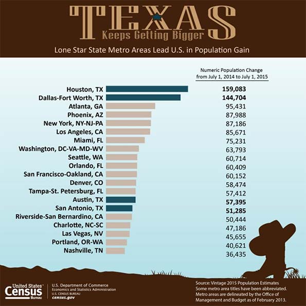
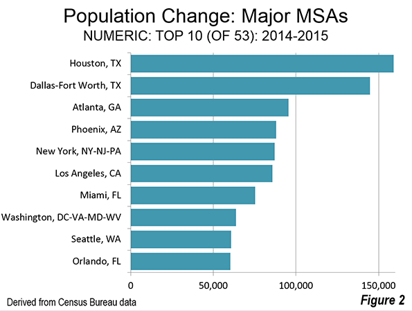
    Among the nation’s 53 largest metropolitan statistical areas, the two biggest population gainers between July 1, 2014, and July 1, 2015, were Houston and Dallas-Ft. Worth, together adding roughly 300,000 people. Their growth, in absolute terms, was larger than that of both Los Angeles and New York, which, respectively, are nearly two and three times as populous, notes demographer Wendell Cox. Two other Sun Belt metropolitan areas, Atlanta and Phoenix, also added more people over the year to July 2015 than L.A. and New York.

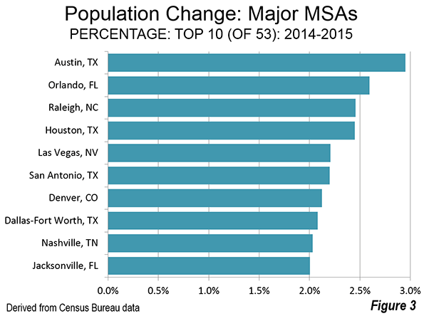
    The divergence in growth is even greater when expressed in percentage terms. Of the 10 fastest-growing metro areas in the country, all but two were located in the old Confederacy. Austin ranks first, with 3.0%  growth, followed by Orlando, Fla. (2.6%), and Raleigh (2.5%). Other fast-growing southern metro areas included San Antonio, Texas (2.2%); Nashville, Tenn.; and Jacksonville, Fla. (both 2.0%). The fastest growers outside the South are Denver (2.1%) and Las Vegas (2.2%), the latter of which is now clearly back from the dead.

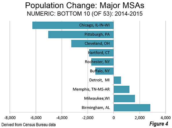
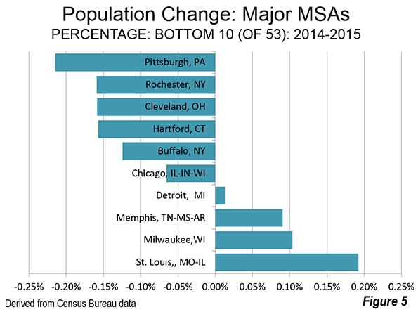
    The old big cities aren’t all losing people. New York and Los Angeles’ populations grew as well, 0.43%  and 0.65%, respectively, but that’s well below the overall U.S. population growth rate of 0.79% over the same span. Some metro areas, notably Chicago, Pittsburgh, Rochester, Hartford, Cleveland and Buffalo suffered slight losses, while many others, such as St. Louis, Memphis, Milwaukee and Detroit remained essentially stagnant.

    Critically, the most recent patterns confirm longer-term trends. Most of the cities at the top of the list are also the ones that have been growing fastest since 2000, led by Raleigh, Austin, and Las Vegas. Also in the top 10 since 2000 are the other three big Texas cities, Phoenix, Charlotte, Orlando and one California metro, largely exurban San Bernardino-Riverside. The slowest growth also follow a similar pattern, with Chicago, several Rust Belt cities, as well as Los Angeles and New York, all in the bottom quintile in percentage terms.

    Where Americans Are Moving

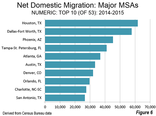
    To look ahead to where America will be growing in the future, perhaps the best indicator is net domestic migration. This measures where people are moving, essentially taking their skills, purchasing power and capital with them. Houston and Dallas-Fort Worth enjoyed the largest net gains from domestic migration, roughly 60,000 each, from July 1, 2014, to July 1, 2015, followed by Phoenix, Tampa-St. Petersburg, Atlanta and Austin. The Sun Belt, once written off as doomed by the urbanist punditry, is clearly back.

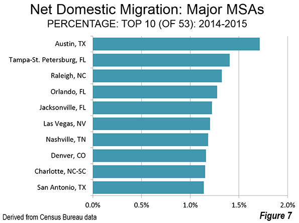
    In percentage terms, Austin led the nation, with a population expansion of 1.7% from net domestic migration. The top 10 cities in percentage terms are all in the Sun Belt (Tampa-St. Petersburg ranked second, followed by Raleigh, Orlando and Jacksonville) or the Intermountain West (Denver and Las Vegas).

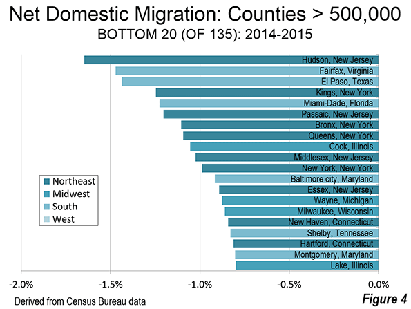
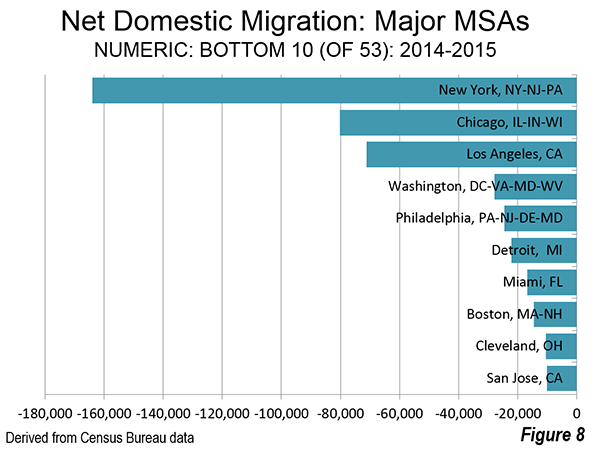
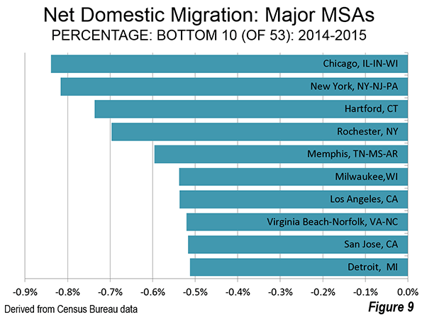
    The biggest losers in overall domestic migration are New York (-164,000), Chicago (-80,000) and Los Angeles (-71,000). In percentage terms, Chicago suffered the biggest losses, followed by New York, Hartford, Memphis and Milwaukee. Despite the explosive growth in Silicon Valley,   San Jose ranked 9th in percentage loss, just behind 10th place Detroit.

    In looking at these trends, the Atlantic’s Derek Thompson, one of the more savvy Census watchers, recently suggested that “it’s 2006 again” as people head out to the Sun Belt metros. When international migration is added to the mix along with the domestic migration numbers, the top five gainers remain in the Sun Belt, led by Houston and Dallas-Fort Worth, which are also becoming meccas for immigrants.

    These trends predate the recession. Since 2000, the biggest migration winners in percentage terms are Raleigh, Austin, Las Vegas, Charlotte, Phoenix, and Orlando. In total numbers since 2000 it’s also a familiar list, led by places like Phoenix (net gain: 705,000), Dallas-Ft. Worth (569,000), Atlanta (547,000), Riverside-San Bernardino (513,000) and Houston (496,000).

    The biggest losers are also familiar, led by the New York metropolitan area, which has lost 2.65 million net migrants since 2000, followed by Los Angeles (negative 1.65 million) and Chicago (down 880,000). Remarkably the two metro areas that have benefited the most from the digitization of the economy are in the loser’s column; between them San Jose and San Francisco lost over 550,000 domestic migrants since 2000.

    The Suburban Revival Continues

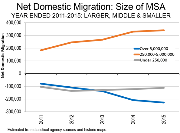
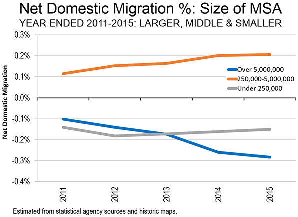
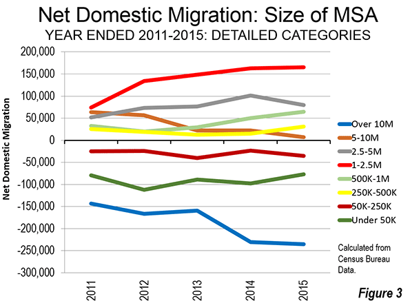
    The other big finding from the new estimates: suburbs are back. In the wake of the housing bust it was widely predicted that the ‘burbs were doomed by high gas prices, millennial preferences and a profound shift of employment to the core cities. The New York Times NYT -0.08% evenpublished fantasies on how the suburban carcass could be carved up, envisioning suburban three-car garages “subdivided into rental units with street front cafés, shops and other local businesses” while abandoned pools would become skateboard parks.

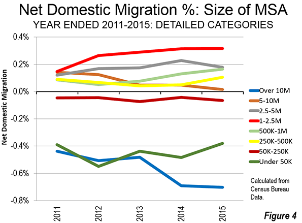
    As  economist Jed Kolko has noted, the much celebrated era when core cities grew faster than suburbs — the immediate 2009-2011 aftermath of the recession — turned out to be remarkably short-lived. From July 2014-July 2015, only seven out of 53 core cities added more domestic migrants than their suburbs. Of these, the District of Columbia (Washington) could be considered high density urban; the other five core counties are functionally more suburban than urban (Phoenix, Raleigh, Richmond, Sacramento and San Antonio).

    Overall domestic migration continues from the core cities to the suburbs. Over the last year core counties lost a net 185,000 domestic migrants, while the suburban counties gained 187,000.

    Looking Ahead

    These trends are likely to continue as long as the economy achieves even modest growth.  One big factor will be the migration of millennials, now headed increasingly to Sun Belt cities and suburbs. Since 2010,  among educated millennials, the fastest growth in migration has been to such lower-cost regions as Atlanta, Orlando, New Orleans, Houston, Dallas-Fort Worth, Pittsburgh, Columbus, and even Cleveland.

    This is largely a product of high housing prices. According to Zillow, rents claim upward of 45% of income in Los Angeles, San Francisco, New York, and Miami compared to less than 30% of income in places like Dallas-Fort Worth and Houston.  The costs of purchasing a house are even more lopsided: in Los Angeles and the Bay Area, a monthly mortgage takes, on average, close to 40% of income, compared to 15% nationally.

    Millennials are also headed increasingly to the suburbs. According to the National Association of Realtors, 80% of the homes purchased by millennials between 2013 and 2014 were detached houses, and 8% had chosen attached housing. This trend will accelerate in the next few years, suggests Kolko, as the peak of the millennial wave turns 30.

    Similarly immigrants — the other big driver shaping our future geography — are also moving increasingly to Sun Belt cities such as Houston, Dallas-Ft, Worth and Atlanta, as newcomers seek out both economic opportunities and lower housing prices. New York remains the immigrant leader, with the foreign-born population increasing by 600,000 since 2000, but second place Houston, a relatively newcomer magnet for immigrants, gained 400,000, more than Chicago and the Bay Area combined. The regions experiencing the highest growth in newcomers in percentage terms were Charlotte and Nashville, which each have seen their foreign-born populations double.

    In the coming decade, immigrants and millennials will produce the vast majority of the country’s children — and they increasingly sending them to school in the suburbs of Sun Belt cities. Central (urban core) areas lost substantial numbers of schoolchildren between 2000 and 2010, while school populations rose in newer suburbs and exurbs. Overall the child populations in cities such as Austin, Houston, San Antonio, Raleigh, Orlando and Nashville are on the rise while dropping in places like Los Angeles and Chicago, as well as some Rust Belt cities.

    America’s geography will be increasingly dominated by Sun Belt cities as well as suburbs. This challenges the preferred narrative among most planners and the mainstream media, as well as some developers who  believe more Americans desire to live in high cost, high density locales. Some day perhaps the facts — as seen both in this year’s numbers and longer term trends — will intrude on the narrative. Dispersion is back, and getting stronger. It’s time that developers, planners and the media adjust to the facts, rather than just reflect their prejudices.

    Population Change in the Nation’s Largest Metropolitan Areas, 2014-2015
    Change Rank Region 2014 Population 2015 Population 14-15 Change % Change
    1 Houston-The Woodlands-Sugar Land, TX  6,497,864 6,656,947 159,083 2.4
    2 Dallas-Fort Worth-Arlington, TX  6,958,092 7,102,796 144,704 2.1
    3 Atlanta-Sandy Springs-Roswell, GA 5,615,364 5,710,795 95,431 1.7
    4 Phoenix-Mesa-Scottsdale, AZ  4,486,543 4,574,531 87,988 2
    5 New York-Newark-Jersey City, NY-NJ-PA  20,095,119 20,182,305 87,186 0.4
    6 Los Angeles-Long Beach-Anaheim, CA  13,254,397 13,340,068 85,671 0.6
    7 Miami-Fort Lauderdale-West Palm Beach, FL  5,937,100 6,012,331 75,231 1.3
    8 Washington-Arlington-Alexandria, DC-VA-MD-WV  6,033,891 6,097,684 63,793 1.1
    9 Seattle-Tacoma-Bellevue, WA  3,672,866 3,733,580 60,714 1.7
    10 Orlando-Kissimmee-Sanford, FL  2,326,729 2,387,138 60,409 2.6
    11 San Francisco-Oakland-Hayward, CA  4,595,980 4,656,132 60,152 1.3
    12 Denver-Aurora-Lakewood, CO  2,755,856 2,814,330 58,474 2.1
    13 Tampa-St. Petersburg-Clearwater, FL  2,917,813 2,975,225 57,412 2
    14 Austin-Round Rock, TX  1,943,465 2,000,860 57,395 3
    15 San Antonio-New Braunfels, TX  2,332,790 2,384,075 51,285 2.2
    16 Riverside-San Bernardino-Ontario, CA  4,438,715 4,489,159 50,444 1.1
    17 Charlotte-Concord-Gastonia, NC-SC  2,379,177 2,426,363 47,186 2
    18 Las Vegas-Henderson-Paradise, NV  2,069,146 2,114,801 45,655 2.2
    19 Portland-Vancouver-Hillsboro, OR-WA  2,348,607 2,389,228 40,621 1.7
    20 Nashville-Davidson–Murfreesboro–Franklin, TN  1,793,910 1,830,345 36,435 2
    21 Boston-Cambridge-Newton, MA-NH  4,739,385 4,774,321 34,936 0.7
    22 San Diego-Carlsbad, CA  3,265,700 3,299,521 33,821 1
    23 Raleigh, NC  1,243,035 1,273,568 30,533 2.5
    24 Sacramento–Roseville–Arden-Arcade, CA  2,244,879 2,274,194 29,315 1.3
    25 Minneapolis-St. Paul-Bloomington, MN-WI  3,495,656 3,524,583 28,927 0.8
    26 Jacksonville, FL  1,421,004 1,449,481 28,477 2
    27 Columbus, OH  1,997,308 2,021,632 24,324 1.2
    28 San Jose-Sunnyvale-Santa Clara, CA  1,954,348 1,976,836 22,488 1.2
    29 Oklahoma City, OK  1,337,619 1,358,452 20,833 1.6
    30 Indianapolis-Carmel-Anderson, IN  1,971,861 1,988,817 16,956 0.9
    31 Kansas City, MO-KS  2,071,283 2,087,471 16,188 0.8
    32 Philadelphia-Camden-Wilmington, PA-NJ-DE-MD  6,053,720 6,069,875 16,155 0.3
    33 Salt Lake City, UT  1,154,513 1,170,266 15,753 1.4
    34 Richmond, VA  1,259,685 1,271,334 11,649 0.9
    35 New Orleans-Metairie, LA  1,251,962 1,262,888 10,926 0.9
    36 Baltimore-Columbia-Towson, MD  2,786,853 2,797,407 10,554 0.4
    37 Grand Rapids-Wyoming, MI  1,028,962 1,038,583 9,621 0.9
    38 Cincinnati, OH-KY-IN  2,148,450 2,157,719 9,269 0.4
    39 Louisville/Jefferson County, KY-IN  1,271,172 1,278,413 7,241 0.6
    40 Virginia Beach-Norfolk-Newport News, VA-NC  1,717,853 1,724,876 7,023 0.4
    41 Tucson, AZ  1,004,244 1,010,025 5,781 0.6
    42 St. Louis, MO-IL  2,806,191 2,811,588 5,397 0.2
    43 Providence-Warwick, RI-MA  1,609,533 1,613,070 3,537 0.2
    44 Birmingham-Hoover, AL  1,142,823 1,145,647 2,824 0.2
    45 Milwaukee-Waukesha-West Allis, WI  1,574,115 1,575,747 1,632 0.1
    46 Memphis, TN-MS-AR  1,342,914 1,344,127 1,213 0.1
    47 Detroit-Warren-Dearborn, MI  4,301,480 4,302,043 563 0
    48 Buffalo-Cheektowaga-Niagara Falls, NY  1,136,642 1,135,230 -1,412 -0.1
    49 Rochester, NY  1,083,678 1,081,954 -1,724 -0.2
    50 Hartford-West Hartford-East Hartford, CT  1,213,225 1,211,324 -1,901 -0.2
    51 Cleveland-Elyria, OH  2,064,079 2,060,810 -3,269 -0.2
    52 Pittsburgh, PA  2,358,096 2,353,045 -5,051 -0.2
    53 Chicago-Naperville-Elgin, IL-IN-WI  9,557,294 9,551,031 -6,263 -0.1

    This piece originally appeared in Forbes.

    Joel Kotkin is executive editor of NewGeography.com. He is the Roger Hobbs Distinguished Fellow in Urban Studies at Chapman University and executive director of the Houston-based Center for Opportunity Urbanism. His newest book, The Human City: Urbanism for the rest of us, will be published in April by Agate. He is also author of The New Class ConflictThe City: A Global History, and The Next Hundred Million: America in 2050. He lives in Orange County, CA.

    Photo by telwink.

  • The Relationship Between Fertility and National Income

    We all heard that “demography is destiny”. But how many of us truly believe it? If demography was destiny, the world would look very different today. The two demographic giants China and India would be uncontested economic and military powers. The United States would be a regional power struggling to keep up. Larger European nations such as Britain, France and Germany would barely register on the economic map, while smaller ones such as Switzerland and Finland would be invisible. Nigeria and DR Congo would be African powerhouses. Brazil, Indonesia and the Philippines would be the shining stars of their continents.

    None of this is true because demography is not destiny. Population size alone does not set a country on a predictable course. Still, demography is, among other factors, an important determinant of destiny. While the rate of demographic growth (or decline) is important, what is more important is the age distribution of the population. Too many old people means an elevated dependency ratio and less income available for spending and investing. Too many young people means an overburdened education system and high unemployment.

    The chart below shows for each country the percentage of the population that is aged 0-29 vs. per capita GDP based on purchasing power parity (PPP). The correlation is undeniable.

    Screen Shot 2016-02-02 at 4.56.14 PM

    Countries with a smaller percentage of young people have higher GDP per capita. Many of these countries and regions, including the United States, Europe and China, have benefited from a demographic dividend while their birth rates declined in recent decades.

    Conversely, countries with more young people have lower GDP per capita. Most of them are in Asia and Africa.

    We can argue about causality. Are countries poorer because they have more children? Or do they have more children because they are poorer? Or are they both poorer and have more children because of a third factor?

    Nothing is simple and all three are true. Countries are poorer because they have too many children, mothers have no time to educate themselves, and there is little or no disposable income to save or invest. But countries also have more children in part because they are poorer, have inadequate health services and suffer from high child mortality. And many countries are poorer and more fertile because female literacy is low and gender inequality is high.

    What is known is that countries that experience a decline in their birth rate sometimes realize a demographic dividend, an economic boost that can last years or even decades. Improving health care and boosting literacy have been shown to break the cycle of extreme poverty and extreme fertility.

    Meanwhile, this is the world that we face in the next few decades: rich countries that are getting older and poor countries that are very young. Working-age populations are shrinking in the rich countries while in poor countries, they are booming beyond those countries’ abilities to educate them, shelter them and employ them.

    The chart above shows that there are many outliers, countries that are either poor despite being relatively older, or richer despite being relatively younger. When we looked to see if the outliers have anything in common, it turned out that they do.

    The first group (old and poor) are shown in red and are the countries that are former or current communist states. The second group (rich and young) are shown in black and are the leading oil and gas-producing nations. The yellow data points are the nations that are (or were) both communist and wealthy from energy resources.

    Communism may be considered an “unusual” way of managing an economy since it conflicts with strong human instincts for creativity and innovation. Likewise, the huge accidental wealth that comes from finding oneself living on top of vast underground resources may also be deemed “unusual” (or certainly lucky) since it is probably rare, or perhaps even unprecedented, in several millennia of human experience.

    If we remove the outlying red and black data points, we end up with the chart below with a much better regression and trend line and an r-squared of 0.78, a large improvement from 0.37 when all the data is included. The trend line is curved because the y-axis is on a log scale.

    This reinforces the idea that in a large majority of countries, young populations tend to be far poorer. At first, this statement may ring intuitively true and uncontroversial, because young people have had less time to accumulate wealth, until one examines the magnitude of the wealth gap. The GDP per capita of the very youngest nations is less than 5% that of the oldest. The Central African Republic’s is 1% of Switzerland’s.

    Screen Shot 2016-02-02 at 5.02.29 PM

    This is a constantly changing dynamic. And it remains to be seen whether the rich countries of the West can weather the aging of their populations and maintain their GDP per capita at current levels.

    They may struggle to do so and we may find that over the long term, demography reasserts itself every so often, even if temporarily, as the leading driver of our destiny.

    Sami Karam is the founder and editor of populyst.net and the creator of the populyst index™. populyst is about innovation, demography and society. Before populyst, he was the founder and manager of the Seven Global funds and a fund manager at leading asset managers in Boston and New York. In addition to a finance MBA from the Wharton School, he holds a Master’s in Civil Engineering from Cornell and a Bachelor of Architecture from UT Austin.

    Baby photo by Bigstock.

  • “Texas Keeps Getting Bigger” The New Metropolitan Area Estimates

    The United States Census Bureau has just released its 2015 population estimates for metropolitan areas and counties. Again, the story is Texas, with the Bureau’s news release headline reading: Four Texas Metro Areas Collectively Add More Than 400,000 People in the Last Year. The Census Bureau heralded the accomplishment with a ”Texas Keeps Getting Bigger” poster, which is shown below. The detailed data is in the table at the bottom of the article.

    Fastest Growing

    Texas has four of the nation’s major metropolitan areas (over 1,000,000 population), and all of them ranked in the top 20 (out of 53) in population gain between 2014 and 2015. Houston again was number one, with a gain of 159,000, Dallas-Fort Worth followed in second place, gaining 145,000. The gap between Dallas-Fort Worth and Houston was small, only 10 percent. However, the gap between the third largest city (Atlanta) and Dallas-Fort Worth was more than 50 percent

    Austin and San Antonio were also in the top 20. Austin gained 57,000 residents, and again was the fastest growing major metropolitan area in the nation (3.0 percent). San Antonio added 51,000.

    This represents something of a return to pre-Great Recession normalcy, with Atlanta adding the third most population (95,000) and Phoenix adding 88,000. These two metropolitan areas were hard hit in the housing bust, but are seeing a return of substantial growth. New York, which is far larger than any of the top four, took fifth place, adding 87,000 (Figure 2).

    On a percentage gain basis, all four Texas metropolitan areas were in the top 10. Austin was again the fastest growing. Houston was 4th, San Antonio 6th and Dallas-Fort Worth 8th. Two other of the national best performers in percentage population growth were also high on the list, including #3 Raleigh and #5 Las Vegas. Las Vegas was the fastest growing major metropolitan area through most of the 2000s. When Las Vegas stumbled late in the 2000s, Raleigh assumed the top position. Denver ranked 7th, the only non-southern metropolitan area in the top 10 (Figure 3).

    Slowest Growing (or Losing)

    The Chicago metropolitan area had the largest population loss, at 6,000. This was the second straight year of losses for Chicago, though last year’s was much smaller. Chicago, at 9.55 million residents will need to reverse this performance if it is ever to add the 450,000 people necessary to make it a megacity of over 10 million. Chicago’s weather is not the most inviting and the state of Illinois’ dismal fiscal position (rated by one source as the second worst run in the nation) is not likely to attract the job creating investment necessary to population growth.

    Five other metropolitan areas experienced losses, including Pittsburgh, Cleveland, Hartford, Rochester and Buffalo. Not all of the South is growing either with both Memphis and Birmingham residing in the bottom 10 (Figure 4).

    Pittsburgh lost the largest percentage of its population, followed by Rochester, Cleveland, Hartford, Buffalo and Chicago (Figure 5).

    Domestic Migration: Top 10

    The four Texas cities all showed up on the top 10 in numeric net domestic migration gain as well. Houston added 62,000 net domestic migrants, followed by Dallas-Fort Worth and 58,000. Phoenix ranked third, Tampa St. Petersburg ranked fourth and Atlanta ranked fifth. Austin was sixth in net domestic migration and the other Texas City, San Antonio, ranked 10th (Figure 6).

    Austin led the nation in the percentage of population growth from net domestic migration, at approximately 1.7 percent. Tampa St. Petersburg ranked second, followed by Raleigh, Orlando and Jacksonville (Figure 7).

    Domestic Migration: Bottom 10

    By far the largest net domestic migration loser was New York, which lost 164,000. Chicago lost 80,000, and Los Angeles lost 71,000. It was a substantial drop to the fourth largest loser, Washington at 28,000,   closely followed by Philadelphia at 24,000 and Detroit at 22,000 (Figure 8).

    Chicago had the largest percentage loss of any major metropolitan area from net domestic migration, at 0.83 percent, slightly more than New York’s 0.82 percent. Hartford, Rochester and Memphis ranks from 3rd to 5th, all losing 0.6 percent from net domestic migration or more. Milwaukee, Los Angeles, Virginia Beach, San Jose, Detroit and Cleveland all lost between 0.5 percent and 0.6 percent to net domestic migration (Figure 9).

    Ranking Changes

    There were a few changes in the rankings this year. Washington passed Philadelphia to assume the sixth largest position. Philadelphia, which was the fourth largest metropolitan area in the nation in the early 2000’s has fallen to seventh, having also been passed by both Dallas-Fort Worth and Houston. Denver overtook St. Louis, to assume the 19th position. Orlando passed both San Antonio and Pittsburgh to become the 24th largest metropolitan area. Even while falling behind Orlando, San Antonio past Pittsburgh. Las Vegas overtook Kansas City and became the 29th largest metropolitan area. Austin passed both Indianapolis and San Jose.

    Milestones were also set by Miami, which rose to above 6 million population, while Columbus and Austin grew to more than 2 million. Perhaps the bigger surprise was a milestone not reached. Had recent trends continued, Honolulu would have become the 54th metropolitan area to reach 1 million population. However, Honolulu fell short by 1300 residents.

    Return to the City: The Elusive Illusion

    Despite the popular lore one hears at a Starbucks in Manhattan or reads in some ever-hopeful core city-centric news outlets, people are still moving to the suburbs. There is no doubt that urban cores, especially close to downtown areas (central business districts) are doing better than before, in no small measure because crime rates have fallen so much (Thank you, Rudi Giuliani).

    In all, 22 core counties out of 53 added net domestic migrants. But only y seven added more domestic migrants than the corresponding suburbs. Of these, only one is dominated by high density urbanization, the District of Columbia (Washington). Another, New Orleans, continues its recovery from the huge hurricane population losses. The other five core counties are functionally more suburban than urban (Phoenix, Raleigh, Richmond, Sacramento and San Antonio).

    But, overall, domestic migration continues from the core cities to the suburbs. That has been the case even in the worst year for suburban growth (2010-2011) and continued in 2014-2015. Core counties last year lost a net 185,000 domestic migrants, while the suburban counties gained 187,000.

    Conclusion

    With the release of 2015 population estimate data, halfway between the 2010 and 2010 census, the nation is settling back into a pattern of suburban southern and western growth.

    Major Metropolitan Area Population Estimates: 2015
    Population 2014-2015
    Rank Metropolitan Area 2010 2014 2015 % Change 2014-2015 Net Domestic Migration Rank: Domestic Migration
    1 New York, NY-NJ-PA     19,601     20,095     20,182 0.43% -0.82%           52
    2 Los Angeles, CA     12,844     13,254     13,340 0.65% -0.54%           47
    3 Chicago, IL-IN-WI       9,471       9,557       9,551 -0.07% -0.84%           53
    4 Dallas-Fort Worth, TX       6,453       6,958       7,103 2.08% 0.83%           14
    5 Houston, TX       5,948       6,498       6,657 2.45% 0.95%           12
    6 Washington, DC-VA-MD-WV       5,667       6,034       6,098 1.06% -0.46%           42
    7 Philadelphia, PA-NJ-DE-MD       5,971       6,054       6,070 0.27% -0.40%           40
    8 Miami, FL       5,586       5,937       6,012 1.27% -0.28%           36
    9 Atlanta, GA       5,304       5,615       5,711 1.70% 0.66%           16
    10 Boston, MA-NH       4,565       4,739       4,774 0.74% -0.31%           38
    11 San Francisco-Oakland, CA       4,345       4,596       4,656 1.31% 0.19%           22
    12 Phoenix, AZ       4,205       4,487       4,575 1.96% 1.01%           11
    13 Riverside-San Bernardino, CA       4,244       4,439       4,489 1.14% 0.16%           23
    14 Detroit,  MI       4,291       4,301       4,302 0.01% -0.51%           44
    15 Seattle, WA       3,449       3,673       3,734 1.65% 0.43%           17
    16 Minneapolis-St. Paul, MN-WI       3,356       3,496       3,525 0.83% -0.23%           32
    17 San Diego, CA       3,104       3,266       3,300 1.04% -0.29%           37
    18 Tampa-St. Petersburg, FL       2,789       2,918       2,975 1.97% 1.41%             2
    19 Denver, CO       2,554       2,756       2,814 2.12% 1.16%             8
    20 St. Louis,, MO-IL       2,790       2,806       2,812 0.19% -0.27%           33
    21 Baltimore, MD       2,716       2,787       2,797 0.38% -0.31%           39
    22 Charlotte, NC-SC       2,224       2,379       2,426 1.98% 1.15%             9
    23 Portland, OR-WA       2,232       2,349       2,389 1.73% 0.91%           13
    24 Orlando, FL       2,140       2,327       2,387 2.60% 1.28%             4
    25 San Antonio, TX       2,153       2,333       2,384 2.20% 1.14%           10
    26 Pittsburgh, PA       2,357       2,358       2,353 -0.21% -0.28%           35
    27 Sacramento, CA       2,155       2,245       2,274 1.31% 0.41%           18
    28 Cincinnati, OH-KY-IN       2,118       2,148       2,158 0.43% -0.12%           31
    29 Las Vegas, NV       1,953       2,069       2,115 2.21% 1.20%             6
    30 Kansas City, MO-KS       2,014       2,071       2,087 0.78% 0.04%           26
    31 Cleveland, OH       2,076       2,064       2,061 -0.16% -0.51%           43
    32 Columbus, OH       1,906       1,997       2,022 1.22% 0.26%           19
    33 Austin, TX       1,728       1,943       2,001 2.95% 1.71%             1
    34 Indianapolis. IN       1,893       1,972       1,989 0.86% 0.05%           25
    35 San Jose, CA       1,842       1,954       1,977 1.15% -0.52%           45
    36 Nashville, TN       1,676       1,794       1,830 2.03% 1.18%             7
    37 Virginia Beach-Norfolk, VA-NC       1,680       1,718       1,725 0.41% -0.52%           46
    38 Providence, RI-MA       1,602       1,610       1,613 0.22% -0.28%           34
    39 Milwaukee,WI       1,557       1,574       1,576 0.10% -0.54%           48
    40 Jacksonville, FL       1,349       1,421       1,449 2.00% 1.22%             5
    41 Oklahoma City, OK       1,258       1,338       1,358 1.56% 0.66%           15
    42 Memphis, TN-MS-AR       1,326       1,343       1,344 0.09% -0.60%           49
    43 Louisville, KY-IN       1,238       1,271       1,278 0.57% 0.02%           28
    44 Raleigh, NC       1,137       1,243       1,274 2.46% 1.32%             3
    45 Richmond, VA       1,210       1,260       1,271 0.92% 0.19%           21
    46 New Orleans. LA       1,196       1,252       1,263 0.87% 0.19%           20
    47 Hartford, CT       1,214       1,213       1,211 -0.16% -0.74%           51
    48 Salt Lake City, UT       1,092       1,155       1,170 1.36% -0.04%           29
    49 Birmingham, AL       1,129       1,143       1,146 0.25% -0.09%           30
    50 Buffalo, NY       1,136       1,137       1,135 -0.12% -0.46%           41
    51 Rochester, NY       1,080       1,084       1,082 -0.16% -0.70%           50
    52 Grand Rapids, MI          990       1,029       1,039 0.94% 0.09%           24
    53 Tucson, AZ          982       1,004       1,010 0.58% 0.02%           27
    Total   170,895   178,063   179,875 1.02% -0.52%
    In 000s
    Data from Census Bureau


    Wendell Cox is principal of Demographia, an international pubilc policy and demographics firm. He is a Senior Fellow of the Center for Opportunity Urbanism (US), Senior Fellow for Housing Affordability and Municipal Policy for the Frontier Centre for Public Policy (Canada), and a member of the Board of Advisors of the Center for Demographics and Policy at Chapman University (California). He is co-author of the "Demographia International Housing Affordability Survey" and author of "Demographia World Urban Areas" and "War on the Dream: How Anti-Sprawl Policy Threatens the Quality of Life." He was appointed to three terms on the Los Angeles County Transportation Commission, where he served with the leading city and county leadership as the only non-elected member. He served as a visiting professor at the Conservatoire National des Arts et Metiers, a national university in Paris.

    Cover picture: Census Bureau ”Texas Keeps Getting Bigger” poster (poster is used at the top and also as the first figure)

  • Farewell, Grand Old Party

    The increased likelihood of Donald Trump as the GOP presidential nominee, as evidenced by his win in Florida and other states last week, spells the end of the Republican Party as we have known it. Successful political parties unite interests under a broadly shared policy agenda. The Clinton Democrats may seem ethically challenged, condescending and bordering on dictatorial, but they share basic positions on many core issues and a unifying belief in federal power as the favored instrument for change.

    In contrast, the Republican Party consists of interest groups that so broadly dislike each other that they share little common ground.

    GOP libertarians want more social freedoms; social conservatives want less. Neocons hunger for war, while most other Republicans, both libertarian and constitutionalist conservatives, reject Bushian interventionism. The rising populist wave now inundating the party and driving the Trump juggernaut both detests, and is detested by, the party’s media, corporate and intellectual establishment.

    Some “movement” conservatives are returning the favor, essentially blaming the white working class for their own failures. Among some on the right, it appears, capitalism and the law of the jungle are always noble, and those who fail to make the grade clearly are not. No surprise, then, that the new generation of voters seems more ready for socialism than for laissez faire.

    Against weak and squabbling opposition, Trump has employed his crude persona, and equally crude politics, to dominate the primaries to date. But in the process he has broken not only the party structure, but also its spirit. Indeed, some of the party’s most promising emerging leaders, such as Nebraska U.S. Sen. Ben Sasse, have made it clear they cannot support a candidate who seems to have little respect for the Constitution, or any other cherished principle.

    Read the entire piece at The Orange County Register.

    Joel Kotkin is executive editor of NewGeography.com. He is the Roger Hobbs Distinguished Fellow in Urban Studies at Chapman University and executive director of the Houston-based Center for Opportunity Urbanism. His newest book, The Human City: Urbanism for the rest of us, will be published in April by Agate. He is also author of The New Class ConflictThe City: A 

    Photo by Gage Skidmore [CC BY-SA 3.0], via Wikimedia Commons

  • Japan Census 2015: Decline Less than Projected

    Headlines were recently made recently as Japan finally experienced a long predicted official decline in population. This is widely expected to be the beginning of a long decline in population, which the National Institute of Population and Social Security Research has projected will drop Japan’s population from its present 127 million to 43 million by 2100 (Chart). This loss equals or exceeds the population of all but 15 of the world’s nearly 200 nations, including Germany, the United Kingdom and France.

    Population projections are, of course, not an exact science. They can be accurate, or they can “miss by a mile.” The preliminary 2015 census figures indicate that the population loss since 2010 has been considerably less than predicted. Japan lost 950,000 residents since between 2010 and 2015,The previous 5-year census period had shown a gain of 280,000. Losing nearly a million population is a big deal. But losing 1.5 million would have been an even bigger deal, as had been projected by Japan’s National Institute of Population and Social Security Research. Over the past five years, Japan’s population loss was more than one-third less than expected (35 percent).

    The big question is “why?” The most obvious answer is a combination of factors, such as   more births than projected or a falling death rate. The Japanese enjoy long lives. In 2013, there were more people aged 100 or above than in the United States, despite, Japan’s 60 percent lower population. More than one in eight of the world’s centenarians live in Japan, while only one in sixty of the world’s people is Japanese.

    No analysis has been identified, nor is the detailed age data for such an analysis readily available. This is to be expected this soon after publication of the first census results. However, recent media reports indicate a continuing annual decline in births. The difference could also be the result of problems in the projection methodology.

    Actual and Projected Population by Area

    As had been the case in the last census period (2005-2010) Tokyo was the big winner. Tokyo prefecture (note), which contains the 23 ku (cities) that constituted the city of Tokyo until its mid-1940s dissolution as well as suburbs, was expected to gain 190,000 residents, but added 355,000. Overall, the four-prefecture area of Tokyo-Yokohama, which includes Tokyo, Kanagawa, Saitama and Chiba prefectures added more than 500,000 residents, compared to the expected 275,000. The gain in Tokyo-Yokohama was 1.4 percent, nearly double the 0.8 percent expected.

    The other two megacities (over 10 million population) did not do so well. Osaka-Kobe-Kyoto (Osaka, Hyogo, Kyoto and Nara prefectures), which is larger than the Los Angeles-Riverside combined statistical area, lost 140,000 residents, nearly as many as the 164,000 projected. Osaka-Kobe-Kyoto was expected to lose 0.9 percent of its population, and nearly equaled that, at minus 0.8 percent.

    Nagoya, including the prefectures of Aichi, Mie and Gifu, lost 13,000 residents, two-thirds the 19,000 projected. Nagoya lost 0.1 percent of its population, slightly better than the minus 0.2 percent projected.

    The middle-sized metropolitan areas did better. The prefecture of Fukuoka, which includes the nation’s fourth largest metropolitan area, Fukuoka-Kitakyushu was expected to lose 0.5 percent of its population, Instead it managed a 0.5 percent gain. Hiroshima was expected to lose 1.2 percent of its population and lost only one-half that much (minus 0.6 percent).

    The city of Sapporo, in Hokkaido prefecture, was a big winner more than doubling its projected 1.0 percent increase (Note 2). Sapporo had a population gain of 2.1 percent. Most of the Sapporo metropolitan area is in the city of Sapporo, and unlike many core municipalities, there is still room for greenfield development.

    Sendai, in Miyagi prefecture was particularly hard hit by the great earthquake and tsunami of 2011. That makes Sendai’s population performance all the more impressive. Sendai was projected to suffer a population loss of 1.8 percent. Yet, its population loss was two thirds less, at 0.6 percent.

    The balance of the nation even did better than expected. Outside the metropolitan areas listed above (and the city of Sapporo), Japan was expected to lose 2.7 percent of its population. The loss was somewhat more modest, at 2.4 percent.

    Government Concern

    Despite the better news out of the census, the government is taking the longer term population loss very seriously. Its Committee for the Future indicates that the prospect could be: “…impose a great burden on people that offsets economic growth, threatening to decrease the actual per-capita consumption level, or the metric for the actual quality and level of people’s lives.”

    Even Tokyo, which has escaped the effects of population decline will be at risk, according to the Committee: The Tokyo Metropolitan area, while unable to avoid the effects of hyper-aging, will lose the vitality of a global city…”

    The changing demographics are already evident in a near majority single person household population in the core Tokyo prefecture. In 2010, 46 percent of Tokyo prefecture households are single person, compared to just 32 percent at the national level, and 36 percent in Osaka prefecture, which has the second highest percentage, according to National Institute of Population and Social Security Research data. Moreover, Tokyo prefecture’s average household size, at 2.03 in 2010, was the lowest, by far in the nation, and well below the national average of 2.42. Like many core areas in the largest metropolitan areas around the world, Tokyo prefecture, less than the normal proportion of children is to be found.

    The government has established a goal of increasing the fertility rate from the present 1.4 (children per woman of child-bearing age) to 1.80 by 2030 and 2.07 by 2040. This would mean a population of 102 million in 2060, compared to the 87 million that current trends suggest. This would also eventually stabilize at around 90 million, more than double the presently projected figure of 43 million.

    Proposed government strategies have involved an array from expanding the use of paternity leave, making it easier for women to retain their jobs after childbirth, supporting better job security for younger people and extending to “support for matchmaking efforts by municipalities and local chambers of commerce.”

    More recently, the government has even hinted at encouraging immigration, which is a radical proposal for a nation that has generally not been welcoming of a large influx of foreigners: “In February 2014, the Cabinet Office revealed that Japan will likely only be able to maintain a population of more than 100 million if it accepts 200,000 immigrants annually from 2015 and the total fertility rate recovers to 2.07 by 2030.”

    There is much riding on Japan’s effort to halt or at least slow the decline of its  population. Other  nations, especially across East Asia and Europe, face similar difficulties, so Japan’s success or failure (and the latter seems more likely) could materially impact policies elsewhere in the decades to come.

    Note 1: Tokyo prefecture is officially called the Tokyo metropolis, which has led many, including some researchers to imagine it to be the metropolitan area. It is simply a jurisdiction within a metropolitan area more than three times as large.

    Note 2: The city of Sapporo is used, because Hokkaido prefecture is far too large to be a metropolitan area (labor market).

    Wendell Cox is principal of Demographia, an international pubilc policy and demographics firm. He is a Senior Fellow of the Center for Opportunity Urbanism (US), Senior Fellow for Housing Affordability and Municipal Policy for the Frontier Centre for Public Policy (Canada), and a member of the Board of Advisors of the Center for Demographics and Policy at Chapman University (California). He is co-author of the “Demographia International Housing Affordability Survey” and author of “Demographia World Urban Areas” and “War on the Dream: How Anti-Sprawl Policy Threatens the Quality of Life.” He was appointed to three terms on the Los Angeles County Transportation Commission, where he served with the leading city and county leadership as the only non-elected member. He served as a visiting professor at the Conservatoire National des Arts et Metiers, a national university in Paris.

    Photo: Sapporo (by author)