Category: Demographics

  • Migration is Back

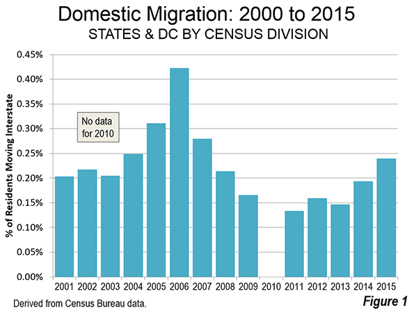
    The 2015 state population estimates, recently released by the Census Bureau, indicate that interstate annual migration has begun to surge again. Between July 1, 2014 to June 30, 2015, up to 0.24% of US residents have migrated, returning to levels not experienced since the early 2000s. Interstate migration was just below the 2004 level of 0.25%, but trailed the much higher 2005 and 2006 levels (0.31% and 0.42%). By 2011, after the devastation of the housing bust and the Great Financial Crisis, interstate migration fell to 0.13% (Figure 1). In 2015, 763,000 US residents made interstate moves, the fifth highest figure since 2000. This was well below the peak of 1,251,000 in 2007 and well above the trough of 412,000 in 2011.

    Regional and Divisional Trends

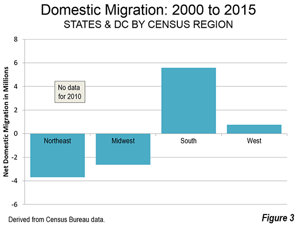
    As opposed to those who claimed the Recession changed migration patterns, it turns out that domestic migrants are moving to just about the same places they did before. They continue to move principally to the South and, to a secondary degree, to the West (2000-2009 and 2010-2015, no data for 2010). The South has gained 5.6 million domestic migrants, followed by 0.8 million in the West. The Northeast has lost 3.7 million domestic migrants, while the Midwest has lost 2.7 million (Figures 2 & 3).

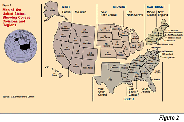
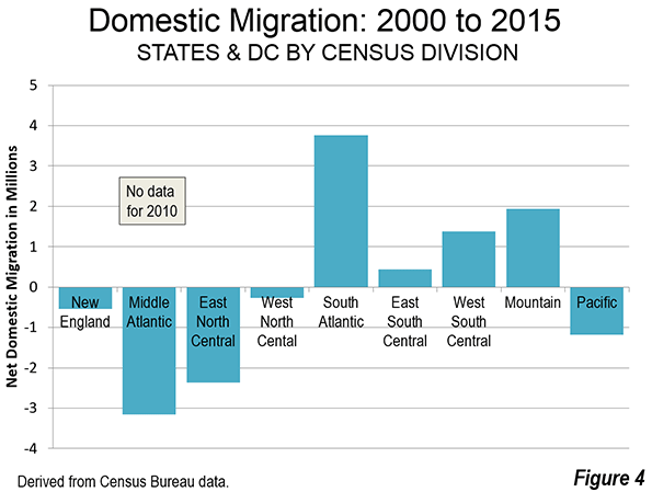
    However, these regional trends mask important differences that have occurred at the division level within the regions (Figure 4). By far the most net domestic migration has been to the South Atlantic division, which stretches along the Atlantic coast from Delaware to Florida and includes West Virginia (Figure 4). The South Atlantic has added 3.8 million net domestic migrants since 2000. This is approximately double the 1.9 million gain of the Mountain division, which includes Western states that do not have a Pacific coast. The West South Central division, which includes Texas, added 1.4 million net domestic migrants, while the East South Central division, stretching from Alabama and Mississippi to Kentucky added 400,000 net domestic migrants. There were net domestic migration losses in the other divisions, including the Middle-Atlantic (New York, Pennsylvania and New Jersey), the East North Central (Ohio to Wisconsin), the Pacific (including California) and the West North Central (the Great Plains).

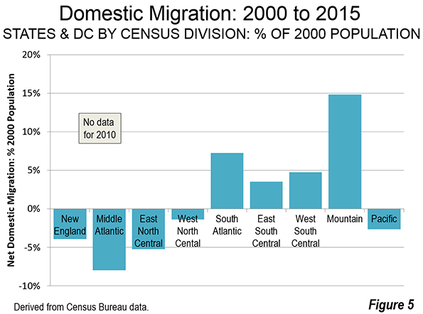
    With its smaller population, the largest percentage gain in population from net domestic migration occurred in the Mountain division at nearly 15%. There were lesser gains in the three divisions of the South. The largest net domestic migration percentage losses were in the Middle-Atlantic, New England and East North Central divisions. The net domestic migration percentage losses were less in the Pacific division and least in the West North Central division (Figure 5).

    In 2014, Northeast and the Midwest had only one state that added domestic migrants: North Dakota. Of course, with the present difficulties in the oil industry, it would not be surprising for North Dakota to fall back into its more familiar pattern of domestic migration decline in 2016. In every year since 2000, the East and Midwest have lost net domestic migrants in the aggregate. The South has gained in every year and the West in all years but one.

    Out of the four divisions in the North East and Midwest, only the West North Central division has had a (single) positive year in net domestic migration in the 2000s. Similarly, the Pacific division has had only one positive net domestic migration year in the 2000s. The situation is virtually the opposite in the remaining divisions. The South Atlantic division and the Mountain division have both added net domestic migrants every year since 2000. The Texas anchored West South Central division and the East South Central division have both added net domestic migrants in 12 of the 14 years.

    Early and Later Millennium

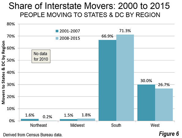
    Breaking the period in two, the inflation, of the Housing Bubble (2000-2007) and the aftermath (2008-2015, except for 2010), the movement to the South recently has become somewhat stronger, while the movement to the West a bit weaker (Figure 6). The two regions captured 97 percent of net interstate migrants from 2008 to 2015. The Midwest appears to have done better in the later period, with 1.8 percent of the interstate migrants, up from 0.2 percent between 2000 and 2007. However, North Dakota alone accounts for two-thirds of the net interstate migration to the Midwest. Without North Dakota, interstate migration to the Midwest would have made up only 0.6 percent of the total.

    State Highlights: 2014

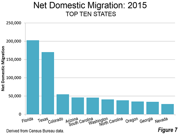
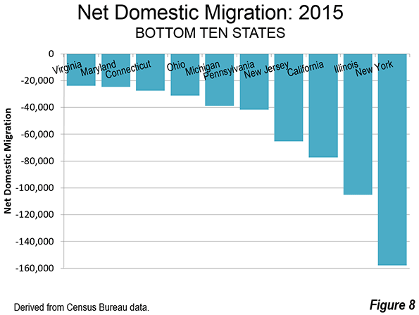
    The bulk of the 763,000 net interstate migrants — 91 percent (694,000) — moved to the top ten states. Florida regained its lead for the first time since 2005, followed by Texas. All of the other top ten states attracted less than one-third the net domestic migrants that arrived in either Florida or Texas (Figure 7). A large majority of 763,000 net interstate migrants left the bottom ten states — 78 percent (594,000). New York, Illinois, New Jersey and Illinois lost the most domestic migrants. Each of these states has routinely appeared at or near the bottom during since the beginning of the millennium (Figure 8).

    Longer Term State Trends

    Overall, eight states gained net domestic migrants in all 14 of the years since 2000 (Table). Of these, Arizona had the largest percentage gain, at 16.5%. However the greatest percentage gain was in Nevada, at 21.5%. However, Nevada had net domestic migration gains only in 12 years, having experienced declines in the years immediately following the housing bust.  

    Florida had the largest net domestic migration numeric gain at 1,793,000, but like Nevada suffered two years of net domestic migration losses following the housing bust. Overall, 20 states have experienced net domestic migration gains over the period since 2000.

    Two states, Minnesota and Massachusetts, have had 13 years of net domestic migration losses out of the last 14 years. Another nine states have had 14 years of net domestic migration losses out of 14. New York has suffered the largest loss, at 2,278,000 and the largest loss in percentage terms, 12.0%. California, also losing each of 14 years lost 1,739,000 net domestic migrants while Illinois lost 1,027,000 net domestic migrants in 14 years of losses. Others among the largest Northeastern states and Midwestern had 14 years of losses, including Ohio, Michigan and New Jersey. The exception was Pennsylvania, which had four years of net domestic migration gains.

    NET DOMESTIC MIGRATION: 2000-2015
    State/District Years with Net Domestic Migration Gains: (Out of 14) Rank Net Domestic Migration: % of 2000 Population Rank Net Domestic Migration: Number Rank
    Arizona 14 1 16.5% 2       853,000 3
    South Carolina 14 1 11.5% 3       461,000 6
    North Carolina 14 1 10.4% 5       837,000 4
    Delaware 14 1 8.0% 8         63,000 19
    Oregon 14 1 7.8% 9       269,000 11
    Texas 14 1 7.4% 11    1,545,000 2
    Tennessee 14 1 6.3% 13       361,000 9
    Washington 14 1 6.1% 14       360,000 10
    Idaho 13 9 10.0% 6       130,000 13
    Georgia 13 9 7.6% 10       629,000 5
    Montana 13 9 6.9% 12         62,000 20
    Nevada 12 12 21.5% 1       433,000 7
    Florida 12 12 11.2% 4    1,793,000 1
    Colorado 12 12 9.0% 7       388,000 8
    South Dakota 11 15 2.2% 21         17,000 25
    Virginia 11 15 2.0% 23       142,000 12
    Wyoming 10 17 5.3% 16         26,000 23
    Oklahoma 10 17 2.4% 19         84,000 15
    Alabama 10 17 2.0% 24         89,000 14
    West Virginia 10 17 0.5% 26           8,000 26
    Arkansas 9 21 2.7% 18         72,000 16
    Maine 9 21 2.1% 22         26,000 23
    Kentucky 9 21 1.6% 25         65,000 18
    New Mexico 8 24 -1.0% 28        (19,000) 30
    North Dakota 7 25 5.3% 15         34,000 21
    Utah 7 25 3.0% 17         67,000 17
    New Hampshire 7 25 2.3% 20         28,000 22
    Missouri 7 25 -0.2% 27        (10,000) 28
    District of Columbia 6 29 -2.7% 36        (16,000) 29
    Wisconsin 4 30 -1.1% 30        (60,000) 35
    Vermont 4 30 -1.3% 31          (8,000) 27
    Pennsylvania 4 30 -1.3% 32      (164,000) 42
    Iowa 4 30 -1.9% 34        (57,000) 34
    Maryland 4 30 -2.9% 38      (153,000) 41
    Alaska 4 30 -4.9% 42        (31,000) 31
    Louisiana 4 30 -7.3% 48      (326,000) 45
    Indiana 3 37 -1.1% 29        (66,000) 36
    Mississippi 3 37 -2.6% 35        (74,000) 38
    Rhode Island 3 37 -6.6% 46        (70,000) 37
    Hawaii 2 40 -3.9% 39        (47,000) 32
    Minnesota 1 41 -1.6% 33        (79,000) 39
    Massachusetts 1 41 -5.1% 43      (325,000) 44
    Nebraska 0 43 -2.8% 37        (47,000) 32
    Ohio 0 43 -4.5% 40      (507,000) 46
    Kansas 0 43 -4.5% 41      (121,000) 40
    California 0 43 -5.1% 44   (1,739,000) 50
    Connecticut 0 43 -5.8% 45      (199,000) 43
    Michigan 0 43 -7.1% 47      (711,000) 47
    Illinois 0 43 -8.3% 49   (1,027,000) 49
    New Jersey 0 43 -8.4% 50      (712,000) 48
    New York 0 43 -12.0% 51   (2,278,000) 51
    Derived from annual Census Bureau population estimates (No data for 2010)


    Restoration and then Some

    Clearly the migration trends predominant in the years prior to the housing bubble and bust have reasserted themselves. It took more than a decade, and a World War to drag the United States out of the Great Depression and eventually to far greater prosperity. It has taken almost that long to accomplish the same thing following the Great Recession, though thankfully without a world war.  If a mild recovery has sparked a reversion to the historic norm, it would be fascinating to see what would happen under boom conditions.

    Wendell Cox is Chair, Housing Affordability and Municipal Policy for the Frontier Centre for Public Policy (Canada), is a Senior Fellow of the Center for Opportunity Urbanism (US), a member of the Board of Advisors of the Center for Demographics and Policy at Chapman University (California) and principal of Demographia, an international public policy and demographics firm. He is co-author of the “Demographia International Housing Affordability Survey” and author of “Demographia World Urban Areas” and “War on the Dream: How Anti-Sprawl Policy Threatens the Quality of Life.” He was appointed to three terms on the Los Angeles County Transportation Commission, where he served with the leading city and county leadership as the only non-elected member. He served as a visiting professor at the Conservatoire National des Arts et Metiers, a national university in Paris.

    Photo: Florida Oranges by University of Florida IFAS

  • What’s the Best Way Up for Minorities?

    In presidential election years, it is natural to see our political leaders also as the brokers of our economic salvation. Some, such as columnist Harold Meyerson, long have embraced politics as a primary lever of upward mobility for minorities. He has positively contrasted the rise of Latino politicians in California, and particularly Los Angeles, with the relative dearth of top Latino office-holders in heavily Hispanic Texas. In Los Angeles, he notes, political activism represents the “biggest game in town” while, in Houston, he laments, politics takes second place to business interests and economic growth.

    In examining the economic and social mobility of ethnic groups across the country, however, the politics-first strategy has shown limited effectiveness. Latinos, for example, have dramatically increased their elected representatives nationally since the 1990s, particularly in California. But both Latinos and African Americans continue to move to, and appear to do better in, the more free-market, politically conservative states, largely in the South.

    Two Paths to Success

    Throughout American history, immigrants and minorities have had two primary pathways to success. One, by using the political system, seeks to redirect resources to a particular group and also to protect it from majoritarian discrimination, something particularly necessary in the case of the formerly enslaved African Americans.

    The other approach, generally less well-covered, has defined social uplift through such things as education, hard work and familial values. This path was embraced by early African American leaders such as Booker T. Washington and Marcus Garvey. Today, the most successful ethnic groups – Koreans, Middle Easterners, Jews, Greeks and Russians – demonstrate the validity of this method through high levels of both entrepreneurial and educational achievement.

    Read the entire piece at The Orange County Register.

    Joel Kotkin is executive editor of NewGeography.com and Roger Hobbs Distinguished Fellow in Urban Studies at Chapman University, and a member of the editorial board of the Orange County Register. He is also executive director of the Houston-based Center for Opportunity Urbanism. His newest book, The New Class Conflict is now available at Amazon and Telos Press. He is also author of The City: A Global History and The Next Hundred Million: America in 2050. He lives in Orange County, CA.

    Photo “asian american” by flicker user centinel.

  • Where American Families Are Moving

    Much is made, and rightfully so, about the future trends of America’s demographics, notably the rise of racial minorities and singles as a growing part of our population. Yet far less attention is paid to a factor that will also shape future decades: where families are most likely to settle.

    However hip and cool San Francisco, Manhattan, Boston or coastal California may seem, they are not where families are moving.

    In a new study by the Chapman Center for Demographics and Policy, we found that the best cities for middle-class families tend to be located outside the largest metropolitan areas. This was based on such factors as housing affordability, migration, income growth, commute times, and middle-income jobs. Many of our best-rated cities tend to mid-sized. The three most highly rated were Des Moines, Iowa, Madison, Wis., and Albany, N.Y., all with populations of less than 1 million. Among our top 10 metropolitan areas for families, five are larger than this, but only two—the Washington, D.C. area and Minneapolis-St. Paul—are among the nation’s 20 largest metropolitan areas.

    Download the full report (pdf) here.

    Our bottom 10 includes the media’s favorite two cities, New York and Los Angeles, also the largest metropolitan areas in the nation. Three other large metropolitan areas rank in the bottom 10: Miami, Riverside-San Bernardino, Calif., and Las Vegas. The hipster cities, in other words, are not so amenable to the new generation of young families.   

    Why Families Head to the Suburbs

    In the 1960s, renowned urbanist Jane Jacobs asserted that “suburbs must be a difficult place to raise children.” But they remain popular nonetheless. According to U.S. Census Bureau statistics, in 2011, children between ages 5 and 14 constituted about 7 percent in urban core Central Business Districts (CBDs) across the country, less than half the level in newer suburbs and exurbs. In Manhattan, singles comprise half of all households, based on the American Community Survey. The highest percentage of women over 40 without children, notes geographer Ali Modarres, can be found in expensive and dense Washington, D.C.

    One clear example of the new child-free city is San Francisco, which is now home to 80,000 more dogs than children. In 1970, children made up 22 percent of the population of San Francisco. Four decades later, they comprised just 13.4 percent of the town’s 800,000 residents. Nearly half of parents of young children there, according to 2011 survey conducted by the city, planned to leave in the next three years, largely due to high housing costs. This pattern is accelerating: Since 2011, less-dense ZIP codes have been growing far faster than the more dense ones.

    The desire for affordable, single-family homes is driving this trend. Over 80 percent of married couples live in such housing, compared to barely 50 percent of households of unrelated individuals and single. The choice to move to the suburbs also reflects the preference for a safer setting. FBI crime statistics show the violent crime rate in the core cities of major metropolitan areas is nearly 3½ times higher than in the suburbs. Given the murder rate in many major cities, this gap can be expected to grow.

    Another key motivation in choosing the suburbs, especially for families with children, is frustration with the quality of urban public education. Suburban schools still consistently out-perform those of inner cities in terms of achievement, graduation and college admission.

    In the coming years the progressive penchant for enforced densification—contrary to the preferences of most Americans—could cause some serious intra-party rifts, even in areas that today are reliably Democratic “blue.” The biggest opposition to building more single family housing has often been in liberal bastions such as Marin County, Calif., Boulder, Colo., and Westchester County, N.Y., the official residence of Hillary and Bill Clinton after they left the White House. As one Bay Area blogger observed, “suburb-hating is anti-child”—because it seeks to undermine neighborhoods with children.

    Exclusionary and Opportunity Regions

    America has always had its fancy neighborhoods, often associated also with racial or ethnic exclusion. But increasingly large parts of the country, and this is true in certain cities and suburbs, are evolving into what Dartmouth College’s William Fischel has called “exclusionary regions”—too expensive for middle-class families to access.

    Fischel traces much of this development to regulatory policies that restrict housing supply. In 1970, for example, housing affordability in coastal California metropolitan areas was similar to the rest of the country, as measured by the median multiple (the median house price divided by the median household income). Today, due in part to a generation of strict growth controls, home prices in places like San Francisco and Los Angeles are now three or more times higher than in some other metropolitan areas.

    The impact is being felt disproportionately by younger adults, who, unlike earlier generations, do not benefit from housing inflation, and who face other barriers to home-buying ranging from student debt to weak income growth. Coupled with an overall weak economy, the net worth of people under age 35 has plummeted almost 70 percent from 2004 levels, making affordable housing an even more pressing issue.

    This cash-short generation is moving to more affordable places. Since 2010, the fastest growth in the ranks of college-educated millennials has been to lower-cost regions such as the four large Texas cities (Dallas-Fort Worth, Houston, San Antonio and Austin), Nashville, Tenn., and Orlando, Fla., as well as such Rust Belt cities as Pittsburgh and Cleveland. These cities offer what the “exclusionary” regions once did: an affordable inner-city option for the young and childless as well as suburbs they can move to as they start families. Other families are settling in small, relatively inexpensive metropolitan areas: Fayetteville, Ark., Cape Coral and Melbourne, Fla., Columbia, S.C., Colorado Springs, Colo., and Boise, Idaho.

    High rents, which now constitute the largest share of income in modern U.S. history, could be determining these change in youthful migration. Since 1990, renters’ income has been stagnant, but inflation-adjusted rents have soared 14.7 percent. Housing, long the largest expenditure item, now takes an even larger share of family costs, while expenditures on food, apparel and transportation have dropped or stayed about the same. In 2015, increases in housing costs essentially swallowed gains made elsewhere, notably savings on the cost of energy.

    This situation is most severe in the highest-priced markets. In New York, Los Angeles, Miami and San Francisco, for example, renters spend 40 percent of their income on rent, well above the national average of under 30 percent. In each of these markets there have been strong increases (income adjusted) relative to historic averages. In New York, rents increased between 2010 and 2015 by 50 percent, while incomes for renters between ages 25 and 44 grew by just 8 percent.

    Where the Future Is Being Built

    This wide disparity between “opportunity” and “exclusionary” areas is being locked in place by the persistent lack of new housing in most high-priced regions. Since 2010, among the 10 areas that experienced the biggest increases in housing supply, only one was in a deep-blue urban area: Seattle. The cities producing the most new units—Austin, Raleigh, N.C., Houston, Dallas-Fort Worth, Nashville, Charlotte, N.C., Orlando, Oklahoma City, and Jacksonville, Fla.—have managed to keep their housing costs, and rents, to levels acceptable to middle- and working-class families.

    In contrast New York, San Francisco, Los Angeles and Boston are authorizing far fewer new units per capita than these rising cities. Houston and Dallas-Ft. Worth, with a population roughly one-third of Los Angeles-Orange Country, have produced close to two times as many new units. Overall, California’s rate of new housing permits is one-third that of the Lone Star State.

    This divide will become more pronounced as progressives work to undermine lower-density lifestyles, often in the name of combatting climate change. In California, new single-family homes are gradually being made the exclusive province of the super-affluent, while multi-family units often face opposition from neighbors and even environmentalists. Older residents, with lower property taxes and ideal weather, may stick around, but young people likely will be forced to migrate, particularly as they enter their 30s or get tired of living in their parents’ spare rooms.

    No surprise, then, that expensive and highly regulated markets have seen declines in their numbers of children since 2000. In contrast, affordable cities continue to gain families with children in the 5 to 14 age range. Dallas-Ft. Worth, for example, gained 230,000 youngsters between 2000-2013. In Houston, the number was 190,000 and in Atlanta it was more 167,000 over that span. During the same period, Los Angeles’ child population dropped by 303,000, or 15 percent. In New York it fell by 238,000 kids.

    Increasingly, employers are factoring affordable local housing stock as an equation into their decisions about where they locate—or relocate. A recent SMU study found that high housing prices to be the biggest reason why Toyota left Los Angeles for the Dallas-Fort Worth area.

    The Emerging Family/Childless Divide 

    Although American localities are being pitted against one another not just by politics but by their ability to attract young families, the emerging map of where families live is not necessarily custom-made for conservatives.

    Key Democratic groups, including African-Americans, are also moving to the suburbs, particularly in less expensive cities, largely in the southeast and Texas. The suburbs are also increasingly the chosen destination of immigrants and their offspring, another blue-leaning cohort. Roughly 60 percent of Hispanics and Asians already live in suburbs. Between 2000 and 2012, the Asian population in suburban areas of the nation’s 52 biggest metro areas grew 66.2 percent, while in the core cities it expanded by 34.9 percent. Of the top 20 cities with an Asian population of more than 50,000, all but two are suburbs.

    Republicans also will be challenged to appeal to the rising number of suburban millennials, who also lean Democratic. But there’s some good news for Republicans in that the political future is not going to be shaped primarily in the Obama hotbeds along the coasts, but places, such as the South and the suburbs, where conservatives at are more competitive.

    To compete for diversifying suburban, Sunbelt and smaller city electorates, conservatives need to better show why families of all ethnicities should support them. They must make the case that Republican policies are better for voters economically and can provide the most efficient and effective services, particularly for their children.

    As for Democratic Party leaders, they would do well to push back the narrative of their urban core elites, who tend to characterize suburbs and Sunbelt cities as soulless enemies of culture and killers of the planet. It is time to recognize that most American families, whatever their ethnicity, desire a decent home in a nice neighborhood, whether in a suburb or a city, where children can be raised. In addition, and this is of increasing importance, they want a place where seniors can grow old amid familiar places and faces. These homeowners will likely yield disproportionate influence over elections since they are more likely to vote — and be active in local affairs — than the general population.

    Ultimately, these families will determine the political future of the country. After all, there is no “replacement” generation for singles and childless couples. In the long run, wooing families will determine who wins the political wars not only this year but in the decades ahead.

    Download the full report (pdf) here.

    Joel Kotkin is executive editor of NewGeography.com and Roger Hobbs Distinguished Fellow in Urban Studies at Chapman University, and a member of the editorial board of the Orange County Register. He is also executive director of the Houston-based Center for Opportunity Urbanism. His newest book, The New Class Conflict is now available at Amazon and Telos Press. He is also author of The City: A Global History and The Next Hundred Million: America in 2050. He lives in Orange County, CA.

  • New Report: Building Cities for People

    This is the introduction to a new report: “Building Cities for People” published by the Center for Demographics and Policy. The report was authored by Joel Kotkin with help from Wendell Cox, Mark Schill, and Ali Modarres. Download the full report (pdf) here.

    Cities succeed by making life better for the vast majority of their citizens. This requires less of a focus on grand theories, architecture or being fashionable, and more on what occurs on the ground level. “Everyday life,” observed the French historian Fernand Braudel, “consists of the little things one hardly notices in time and space.” Braudel’s work focused on people who lived normal lives; they worried about feeding and housing their families, keeping warm, and making a livelihood.

    Adapting Braudel’s approach to the modern day, we concentrate on how families make the pragmatic decisions that determine where they choose to locate. To construct this new, family- centric model, we have employed various tools: historical reasoning, Census Bureau data, market data and economic statistics, as well as surveys of potential and actual home-buyers.

    This approach does not underestimate the critical role that the dense, traditional city plays in intellectual, cultural and economic life. Traditional cities will continue to attract many of our brightest and most capable citizens, particularly among the young and childless. But our evidence indicates strongly that, for the most part, families today are heading away from the most elite, more congested cities, and towards less expensive cities and the suburban periphery. (See report appendix “Best Cities for Families”)

    New York, San Francisco, and Los Angeles long have been among the cities that defined the American urban experience. But today, families with children seem to be settling instead in small, relatively inexpensive metropolitan areas, such as Fayetteville in Arkansas and Missouri; Cape Coral and Melbourne in Florida; Columbia, South Carolina; Colorado Springs; and Boise. They are also moving to less celebrated middle-sized metropolitan areas, such as Austin, Raleigh, San Antonio and Atlanta.

    Traditional cities will continue to attract many of our brightest and most capable citizens, particularly among the young and childless. But our evidence indicates strongly that, for the most part, families today are heading away from the most elite, celebrated cities, and towards less expensive cities and the suburban periphery.

    Download the full report (pdf).

  • In One Chart: Achieving the Demographic Dividend

    The experience of China provides a useful policy template for countries with booming populations in south and southeast Asia and in sub-Saharan Africa. The Chinese boom showed that a growing working-age population combined with a declining fertility ratio can result in a large demographic dividend if certain conditions are met. As noted in this recent post, two important drivers of lower fertility are an increase in female literacy and a decline in child mortality.

    At the same time, better governance, lower corruption, an improvement in business conditions and increased investments in infrastructure and education would lead to higher foreign and domestic investments and greater job creation. Greater urbanization and an expansion of foreign trade can also be byproducts or causes or effects of the demographic dividend.

    Screen Shot 2015-12-01 at 1.19.23 PM

    After the demographic dividend, a country can remain on a growth path through additional political and regulatory reforms that encourage innovation and strengthen institutions.

    Sami Karam is the founder and editor of populyst.net and the creator of the populyst index™. populyst is about innovation, demography and society. Before populyst, he was the founder and manager of the Seven Global funds and a fund manager at leading asset managers in Boston and New York. In addition to a finance MBA from the Wharton School, he holds a Master’s in Civil Engineering from Cornell and a Bachelor of Architecture from UT Austin.

  • Declining Population Growth in China’s Largest Municipalities: 2010-2014

    After three decades of breakneck urban growth, there are indications of a significant slowdown in the largest cities of China. This is indicated by a review of 2014 population estimates in the annual statistical reports filed individually by municipalities with the National Bureau of Statistics.

    For context, municipalities in China, which are also translated as “cities” in English are nothing like cities as is commonly understood in English. In China, municipalities are large geographic areas that have their own governments, but also control rural lands often far beyond the urban area. Indeed, in China, counties are subdivisions of cities, while in Anglo heritage nations, cities are within counties, with the notable exception of the city of New York or in a few, like San Francisco, are identical with counties. Some cities, like Kansas City and Atlanta stretch into adjacent counties, though occupy only part of their main county.

    This article examines municipality population growth trends, from 2010 to 2014 and comparing to the 2000 to 2010 period. The analysis focuses on 21 municipalities, which include 20 of the 25 largest built-up urban areas in the nation areas of continuous development. The 21st municipality is Foshan, which shares its built-up urban area with Guangzhou. The statistical reports the other five municipalities did not provide sufficient data to be included in this analysis (Table).

    Back in 1980, as Deng Xiaoping’s reforms were beginning to take effect, China was approximately 20 percent urban. By 2010, 55 percent of Chinese citizens lived in urban areas, a near tripling of the urban share. A large share of this growth was the so-called “floating population,” which was made up largely of rural residents who moved to the urban areas to take jobs in the export oriented factories and the massive building and infrastructure construction sites.

    The Roaring 2000s

    In the 2000s, the largest Chinese municipalities experienced some of the most rapid growth in world history. Shanghai and Beijing added between 6 and 7 million residents. Both had annual growth rates of between 3% and 4%. During the same period, the U.S. annual growth rate was about 1.0 percent.

    But even these growth rates were not the highest in the country. Xiamen, in Fujian grow at an annual rate of 5.6%, while Suzhou (in Jiangsu, adjacent to Shanghai on the west) and Shenzhen (in Guangdong, just north of Hong Kong) expanded their population at rates between 4% and 5%.

    The Slowing 2010s

    The last four years have been very different. Overall, these 21 municipalities added population at a rate of 2.2% annually between 2000 and 2010. Between 2010 and 2014, the annual growth has been reduced by nearly half, to 1.2%. This is a far greater rate than that of the national population increase, which is gradually moving from modest growth to eventual decline. The 2010 to 2014 annual national population growth rate was 0.50 percent, a 12 percent reduction from the 0.57 percent 2000 to 2010 annual rate, according to the National Bureau of Statistics. The cause of the larger decline in these municipalities thus seems likely to be the result of reduced domestic migration from more rural areas.

    Nearly all — 19 of the 21 municipalities — are experiencing slower growth in this decade than in the last. Only one, Tianjin, is experiencing the growth similar to the fast-growing municipalities of the last decade. Between 2010 and 2014, Tianjin grew 4.1%, annually, a considerable increase over its 2.8% rate from between 2000 and 2010. During this decade, Tianjin added approximately 560,000 residents annually, the largest increase among the 21 municipalities. This fits well with national priorities, since the high densities of Beijing and related consequences have led to a plan to decentralize the population of nearby Beijing (100 miles or 160 kilometers away), encouraging the movement of residents, businesses and government agencies to Tianjin as well as to the municipalities of Tangshan (location of the great 1976 earthquake), and Langfang (midway between Beijing and Tianjin) and Baoding in the province of Hubei. The newly integrated area would be called Jin-Jing-Ji.

    Chongqing has begun to grow, after having lost 1.7 million residents in the last decade. . But Chongqing itself is uncharacteristic and the most “uncitied” of Chinese municipalities. Chongqing is a largely rural province, governed directly from Beijing (like Beijing, Shanghai and Tianjin). The principal built-up urban area, Chongqing, has a population of less than 7.5 million, or one-quarter of the municipality population. Chongqing has grown 0.9 percent annually since 2010 and is adding 267,000 residents per year. The population losses of the last decade occurred principally in the rural areas, as the Chongqing metropolitan area added more than three million residents, according to United Nations data.

    Strong growth continues in Beijing, but at a much reduced rate. The annual population growth rate in Beijing has dropped 38%, to 2.3% annually. Beijing is adding 475,000 residents annually, second only to nearby Tianjin.

    Shanghai’s growth has fallen even further, to 60% below the 2000 (1.3%). Shanghai is adding 310,000 residents annually. Other municipalities in the Yangtze Delta region are not doing as well. Suzhou’s annual growth has dropped more than 90% to 0.3%. Hangzhou and Nanjing have seen their growth drop more than 70 percent, with Hangzhou growing 0.5 percent annually and Nanjing 0.7 percent.

    The Pearl River Delta, in Guangdong, was at the heart of China’s three decade economic miracle, with its export driven growth. All four of the Pearl River Delta’s largest municipalities have seen their population growth rates dropped by 70% or more. Shenzhen grew 4.0% in the 2000’s and grows barely 1.0% today. Guangzhou has fallen from 2.5% in the 2000 to 0.7%. Foshan, which grew 3.0% in the 2000’s, now grows only 0.5%. Dongguan has fallen from a growth rate of 2.5% in the 2002 0.4% over the past four years, the slowest among the Pearl River Delta giants.

    Some other municipalities have grown nearly as quickly as before. Zhengzhou, the capital of Henan, grew rapidly during the 2000’s, at 2.6%, and has maintained a growth rate of 2.1%. With the third fastest growth rate, after Tianjin and Beijing, Zhengzhou is adding 186,000 residents annually, Quanzhou (Fujian), one of the best world examples of “in situ” urbanization is growing at 85% of its previous rate, though only 0.9% annually. Wuhan (Hubei), a long-time central China manufacturing center has been similarly successful in retaining its growth, and now has an annual growth rate of 1.4%.

    Without complete information on all of China’s largest municipalities, it is difficult to assess the extent to which (if any) urban growth has slowed. Certainly, the national government remains committed to strong urban growth. On the other hand, with China’s slowing economic growth rates, there may be less reason to leave the countryside for the city.

    2014 Population & Comparison of 2000-10 and 2010-4 Growth Rates
    Municipalities of China Corresponding to Largest Built-Up Urban Areas
    Annual Population Growth % Annual Population Growth
    Municipality Population: 2014 2000-2010 2010-2014 2000-2010 2010-2014
    Beijing            21,516,000 3.8% 2.3%      604,300      476,000
    Chengdu            14,428,000 2.4% 0.7%      293,900        95,000
    Chongqing            29,914,000 -0.6% 0.9%     (166,700)      267,000
    Dongguan              8,343,000 2.5% 0.4%      177,400        30,750
    Foshan              7,351,000 3.0% 0.5%      185,600        39,250
    Guangzhou            13,081,000 2.5% 0.7%      275,900        95,000
    Hangzhou              8,892,000 2.4% 0.5%      182,100        48,000
    Jinan              7,067,000 1.4% 0.9%        89,200        63,250
    Nanjing              8,216,000 2.7% 0.7%      187,900        52,750
    Qingdao              9,046,000 1.5% 0.9%      122,100        82,750
    Quanzhou              8,440,000 1.1% 0.9%        84,600        77,750
    Shanghai            24,257,000 3.4% 1.3%      661,100      309,500
    Shenyang              8,287,000 1.2% 0.6%        90,200        45,250
    Shenzhen            10,790,000 4.0% 1.0%      334,900      108,000
    Suzhou            10,604,000 4.4% 0.3%      366,800        36,000
    Taiyuan              4,299,000 2.3% 0.6%        85,800        24,250
    Tianjin            15,168,000 2.8% 4.1%      308,900      557,500
    Wuhan            10,338,000 1.6% 1.4%      147,200      138,250
    Xiamen              3,810,000 5.6% 1.9%      147,800        69,750
    Xi’an              8,628,000 1.5% 0.5%      119,300        40,000
    Zhenghou              9,371,000 2.6% 2.1%      197,000      186,000
    Total          241,846,000 2.2% 1.2%   4,495,300   2,842,000
    Calculated from annual municipality reports to the National Bureau of Statistics and NBS data
    Comparable data not available for 5 municipalities corresponding to the 25 largest built-up urban areas
    Built-up urban areas from Demographia World Urban Areas


    Photograph: Still fast growing Zhengzhou (by author)

    Wendell Cox is Chair, Housing Affordability and Municipal Policy for the Frontier Centre for Public Policy (Canada), is a Senior Fellow of the Center for Opportunity Urbanism (US), a member of the Board of Advisors of the Center for Demographics and Policy at Chapman University (California) and principal of Demographia, an international public policy and demographics firm. He is co-author of the "Demographia International Housing Affordability Survey" and author of "Demographia World Urban Areas" and "War on the Dream: How Anti-Sprawl Policy Threatens the Quality of Life." He was appointed to three terms on the Los Angeles County Transportation Commission, where he served with the leading city and county leadership as the only non-elected member. He served as a visiting professor at the Conservatoire National des Arts et Metiers, a national university in Paris.

  • San Francisco With 200,000 More People — Would we be Better Off?

    You want something truly scary? Take a look at these mockups of what San Francisco might look like if we build all the housing that the developers say we need.

    According to writer Greg Ferenstein,

    The city probably needs somewhere north of 150,000 more units: most high-rises would be concentrated in the Eastern, Downtown, and mid-market areas, while every block in the entire city would need at least one 7-story building. Essentially, San Francisco would be Manhattan downtown and Paris everywhere else.

    Set aside that I never want to live in Manhattan (at any price), and that the infrastructure to handle 200,000 more people would be horrendously expensive (and developers are already refusing to pay their fair share for far lower levels of need).

    It’s not just “how to we build that much housing.” It’s how do we build maybe $20 billion or more worth of transportation capacity to handle that density. Manhattan has a citywide underground transit system with high capacity and no surface traffic issues. SF doesn’t, and won’t, as long as we can’t raise property taxes and refuse to charge developers for the cost of that new system.

    Never mind, let’s take Ferenstein’s idea and play it out. Suppose we decided as a city that we are willing to accept a lot more density in exchange for affordability. (This is something the mayor is promoting). Let’s say that the city really needs to build highrises all over the eastern side of town (why only the east?) and put mid-rise buildings everywhere.

    Let’s say we decide that 47.5 square miles of space are enough for1 million people, and that we are willing to give up everything about San Francisco that we would lose in the process.

    Remember, the streets in the highrise districts in Manhattan are much broader than the streets in SF, able to handle more traffic, with big sidewalks that can handle more pedestrians – and still it’s often overwhelming.

    Right now in SF, for example, I am able to walk down the streets at 5pm without being jammed in a pack of stressed-out pushing people, which is life in parts of NYC. It’s possible to able to take your young kids and your dog for a walk in a place where there’s actually room to walk.

    Imagine Mission and Valencia, being packed with thousands more pedestrians. Don’t even think about the traffic.

    In fact, unless we took entire streets and banned cars, forget about the bicycle lanes – they are narrow and limited and can’t easily handle say 200 percent more traffic.

    But again, whatever. Let’s say that it’s elitist to try to keep the charm of a human-scale city in a world-class city like SF, which Ferenstein calls “quaint.” Let’s say that our only hope of avoiding being a city of just the rich is to build all the apartments and condos anyone could every want to build.

    Let’s say we have that debate and decide that the need for affordable housing trumps all, and we will just have to live with the implications.

    So what happens if we let the developers build 200,000 new units – and prices don’t come down?

    That’s actually a pretty likely scenario. It’s happened in other places (NYC, for example, where lots of new housing is being built and prices are not in any way coming down.)

    It’s happened in SF so far, where we have built more market-rate housing in the past four years than at any point since the 1960s, and prices continue to soar.

    Ferenstein talked to an econometrics expert at a credit agency. Okay. No idea if this person has ever studied housing or housing price trends in San Francisco, but he has a model. It assumes that we have to build housing faster than the population grows. Nice.

    Except that market-rate housing causes population growth as fast as it solves it – that is, if your model is the traditional capital-market model, you can’t keep up with population growth by building. You might as well try to decrease traffic by building freeways; never works, never has – not in San Francisco.

    And how come we never talk about why the population is growing so fast, and why so much of that growth comes from one industrial sector that hires one type of workers?

    I emailed Ferenstein with my questions, and here’s what he said:

    Well, prices don’t fall here because we don’t build enough. It’s been an issue for decades. And, if you build enough units, prices will fall. You just have to build more supply than people. The question is whether it is possible to do so. But, I’m actually not advocating for that. I’m advocating for *some* solution. If the city decides it doesn’t want to grow, then it should be responsible for finding some solution where people can live and work in the same city–somewhere. Maybe it’s San Francisco. Maybe it’s Oakland. Maybe it’s a new city. But there has to be a giant metropolis somewhere. And, San Franciscans must realize, if jobs relocate elsewhere, they will suffer massive inequality and terrible commutes.

    Interesting argument. Of course, we are not talking about a city where people live and work; San Francisco’s housing crisis in large part the result of people living here and commuting to Silicon Valley, on private buses. The Valley cities build no housing at all, and expect us to solve the problem.

    And I would argue that if some tech jobs went elsewhere, we would have less inequality and less terrible commutes – it’s the displacement from too many people moving here for jobs when housing doesn’t exist that has created the problem. Most of San Francisco does better when there is slower growth in bubbly tech industries.

    There’s a much more interesting question that we might want to address: Suppose we built may 20,000 new units, or 30,000, or 50,000, spread all over the city – and every one of them was social housing, that is, housing that was never in the private sector? Would that bring down prices? Would that provide the same level of affordability, or maybe much more, than the Manhattan West model?

    Would that be a better deal?

    At the very least, we would know that the new housing would be affordable, instead of taking a huge gamble that the (failed) free market, and the (failed) econometric projections of the past, would save us.

    Oh, and what if we said that SF no longer wants to be the bedroom community for Silicon Valley, and will stop entitling things like private buses that make that trend possible?

    That’s a bit of a different picture.

    This piece originally appeared at 48hills.org.

    Photo: A mockup by Alfred Two for a Medium story on what an “affordable” SF might look like

  • 2010-2012: More Modest Dispersion Within Metropolitan Areas

    American cities seemed to be re-centralizing in the years immediately following the Great Recession, but new American Community Survey data indicates that, contrary to conventional wisdom, Americans continue to disperse though at a much reduced rate. The Census Bureau has just released the five year American Community Survey (2010-2014) small area data used by the City Sector Model to report on population trends within functional sectors of metropolitan areas. The City Sector Model classifies small areas as the urban core, suburban or ex-urban without reference to the more traditional analysis method that relied on core cities and suburbs (Note 1). The principal purpose is to compare finer-grained data and trends in parts of the metropolitan area that are more reflective of pre-World War II urban forms and lifestyles (the Urban Core: CBD and the Urban Core Ring) and the balance of the metropolitan area, which is automobile oriented (the Earlier Suburbs, Later Suburbs and Exurbs).

    These data were collected over a five year period, with the middle year being 2012. General trends can be examined in comparison to the 2008-2012 American Community Survey, with a middle year of 2010. At the same time, caution is warranted since the American Community Survey is not a count, such as is collected in the decennial censuses. For simplicity, this article refers to the 2010 to 2014 data as 2012 and the 2008 to 2012 data as 2010.

    More Modest Dispersion

    The continuing dispersion was most evident in the rising 0.4 percentage point share (from 26.9% to 27.3%) in the Later Suburbs – with mid-point construction dates of 1980 or later. Two of the other four functional city sectors experienced declines in their shares, with the higher density, transit-, walking- and cycling-oriented Urban Core Ring dropping from 13.5% to 13.4% and the Earlier Suburbs dropping from 41.9% to 41.6% of the major metropolitan population. The earlier suburbs are automobile oriented and have houses with median construction dates of 1946 through 1979. The Urban Core CBD sector and the exurbs have retained their previous share of the population since 2010 (Figure: Growth Share by City Sector: 2010-2012 and Population Share by City Sector).

    Overall the Urban Core, which consists of the CBD and Ring dropped from 14.8% of the population to 14.7%. If this rate were to continue through the 2020 census, the Urban Core share of the major metropolitan area population would drop by 0.5 percentage points, considerably less than the 1.7 percentage point loss between 2000 and 2010. Nonetheless, the suburbs and exurbs accounted for nearly 90% of the growth between 2010 and 2012 (Figure: Population by City Sector). Suburbia, even exurbia, is where the growth is

    The new data also suggests that much of that growth was in the suburban areas of the historical core municipalities (newer and automobile oriented). For example, large areas of core cities are functionally suburban, such as in Phoenix, Dallas, Los Angeles, Portland, Atlanta, Charlotte, and elsewhere.

    The bottom line , as we have indicated in previous articles, is this: the data shows virtually no “return to the city.” Between 2010 and 2012 the suburbs and exurbs gained 3.5 million residents, while the Urban Cores gained 400,000. The Exurbs alone gained more population than the Urban Core (CBD and Ring combined). This has also been evident in each year of this decade by the continuing domestic migration to suburban and exurban counties, which has exceeded that of counties that contain the urban cores.

    New York, Other Legacy Cities and the Balance

    There is considerable variation in the size and growth of Urban Cores among the major metropolitan areas. The Urban Cores in the “legacy cities” are far larger and are capturing a far higher share of their metropolitan area growth. The legacy cities are the six metropolitan areas that have downtowns (central business districts or CBD’s) with more than 200,000 jobs (New York, Chicago, Philadelphia, San Francisco, Boston and Washington), These are generally older cities and the strength of their Urban Cores is illustrated by the fact that, combined, the core cities of these metropolitan areas account for 55% of the destinations of transit committing trips in the nation.

    Even among the legacy cities, strong distinctions exist. New York, with central business district employment of nearly 2 million, has nearly 4 times the jobs that of its Chicago counterpart. Indeed, New York’s central business district employment exceeds that of the combined employment in the downtowns other five legacy cities. Thus, as in other indicators of intense urbanism (such as transit ridership and the share of the national transit ridership increase), New York is in a “league” of its own.

    As of 2012, New York’s Urban Core included approximately 53% of the metropolitan area population. This is more than double the 26% share of the metropolitan population in the urban cores of Chicago, Philadelphia, San Francisco, Boston and Washington (Figure Legacy Cities and Others: Population).

    The difference between the legacy cities and the other 46 metropolitan areas is even more stark. On average, other metropolitan areas have on average only approximately seven percent of their populations in their urban cores, compared to 53 percent in New York and 26 percent in the other five.

    There are even greater disparities in population growth. Between 2010 and 2012, 73% of the population growth in the New York metropolitan area was in the Urban Core. This is 2.7 times the average 27% of metropolitan growth in the urban cores of the other five legacy cities. Thus, by two measures, population concentration and population growth in the urban cores, Chicago, Boston and the other legacy cities cannot even present themselves as “little New York’s”.

    Most other cities are not even in the same league as Chicago or Boston. None achieved a 20 percent Urban Core growth percentage, though St. Louis was close (19.8 percent), and Seattle was next (15.0 percent). The urban core growth in the other 46 cities was less than 6% (Figure Legacy Cities and Others: Growth). Even in Portland, with its strong densification policies biased toward urban core development and discouraging towards suburban development, no more than average 10% of its growth took place in its Urban Core. Nearly 90 percent of Portland’s growth was in the suburbs and exurbs.

    Back to Normalcy?

    The 2010-2012 data does not indicate a return to the near monopoly on growth enjoyed by the suburbs and exurbs in the 1990s and 2000s. But more recent data suggests stronger suburban performance, as chronicled by William Frey at the Brookings Institution and Jed Kolko at Trulia. At the same time, it is good to see the upward trends in the in the urban cores, which as metropolitan areas as diverse as St. Louis and Seattle show, do not depend on suburban misfortune to prosper. The cores are an important part of a healthy metropolitan system, although in most places they are far smaller in population, and growth, than the suburban rings.

    Note: The “City Sector Model” provides data for areas (Zip Code Analysis Zones) within metropolitan areas, as opposed to data based on jurisdictional boundaries, such as city limits. The data is based on small areas, Zip Code Tabulation Areas (ZCTA’s). The criteria for classification is indicated in the Figure: City Sector Model Criteria.

    Wendell Cox is Chair, Housing Affordability and Municipal Policy for the Frontier Centre for Public Policy (Canada), is a Senior Fellow of the Center for Opportunity Urbanism (US), a member of the Board of Advisors of the Center for Demographics and Policy at Chapman University (California) and principal of Demographia, an international public policy and demographics firm.He is co-author of the "Demographia International Housing Affordability Survey" and author of "Demographia World Urban Areas" and "War on the Dream: How Anti-Sprawl Policy Threatens the Quality of Life." He was appointed to three terms on the Los Angeles County Transportation Commission, where he served with the leading city and county leadership as the only non-elected member. He served as a visiting professor at the Conservatoire National des Arts et Metiers, a national university in Paris.

    Photo: New York’s Growing Skyline by Citizen59 (Own work) [CC BY 3.0], via Wikimedia Commons

  • Los Angeles: City Of Losers?

    When I arrived in Los Angeles four decades ago, it was clearly a city on the rise, practicing its lines on the way to becoming the dominant metropolis in North America. Today, the City of Angels and much of Southern California lag behind not only a resurgent New York City, but also L.A.’s longtime regional rival, San Francisco, both demographically and economically.

    Forty years ago, San Francisco was a quirky, backward-looking town, a haven for the gilded rich and hippies, a quaint but increasingly insignificant town. The Dodgers and the Lakers ruled the California sporting world.

    Today things couldn’t be more different. San Francisco and its much bigger southerly neighbor, Silicon Valley, have morphed into the global epicenter of the technology industry, with 25 tech companies on the Fortune 500. In contrast, Los Angeles County, which has almost twice as many people, is home to only 15 Fortune 500 firms total.

    Meanwhile, the Giants and the Golden State Warriors have become consistent winners while the Dodgers, Angels and Clippers disappoint and the Lakers are painfully unwatchable.

    Although there is a desire to repeat L.A.’s success with the 1984 Olympics and bring football back to town, that would only put a happy veneer over the city’s core problem: the long-term decline of its business sector. In 1984, the city had a strong and highly motivated business elite highlighted by 12 Fortune 500 companies, who could help sponsor the games and provide management expertise. Now there are only three within city limits, with the departure of major corporations such as Lockheed, Northrop Grumman, Occidental Petroleum and Toyota, and the loss of hundreds of thousands of manufacturing jobs.

    In contrast, the Bay Area is full of thriving companies and successful entrepreneurs, many of them astoundingly young. Of the 30 richest people in the country, five live in the Bay Area; Southern California has only one, the Irvine Company visionary Chairman Donald Bren, and he’s in his eighties. The Bay Area accounts for the vast majority of American billionaires under 40; if not for Snapchat’s founders, Evan Spiegel and Bobby Murphy, as well Elon Musk, who lives in L.A. but spends much of his time working in Northern California, where Tesla and Solar City are located, L.A. would be off the list.

    This unfavorable contrast with the Bay Area, sadly, is not just a recent development. Since 1990 Los Angeles County has added a paltry 34,000 jobs while its population has grown 1.2 million. In contrast, the Bay Area, which added roughly the same number of people during the same time, gained a net 500,000 jobs, mostly in the suburbs. In 1990 Los Angeles had around the same number of private-sector jobs per person as the Bay Area, roughly 410 per 1,000; today Los Angeles’ private-sector jobs to population ratio has dropped to 364 per 1,000 while the Bay Area’s has grown to 415. Worse yet, while the Bay Area has increased its share of high-wage jobs to 33 percent since 1990, Los Angeles percentage fell to 27.7 percent.

    How L.A. Blew It In Technology

    As recently as the 1970s, as UCLA’s Michael Storper has pointed out, L.A. stood on the cutting edge not only in hardware, but also software. Computer Sciences Corp. was the first software company to be listed on a national stock exchange. In 1969, UCLA’s Leonard Kleinrock invented the digital packet switch, one of the keys to the Internet.

    In 1970, IT’s share of the economy in greater Los Angeles and in the Bay Area was about the same (in absolute terms it was bigger in L.A.). By 2010, IT’s share was four times bigger in the north than in the south.

    Storper links the decline in large part to the strategies of the biggest high-tech companies in the L.A. area: Lockheed Martin, Rockwell and TRW focused on defense and space, essentially becoming dependent on government spending. In contrast, the Bay Area technology community, although also initially tied to Washington, began to move into more commercial applications. In the process they also developed a huge network of venture capitalists who would continue to help found and finance fledgling firms.

    Today the San Jose area enjoys the highest percentage of workers in STEM (science technology engineering and mathematics-related jobs) in the country, over three times the national average. San Francisco and its immediate environs, largely as a result of the social media boom, now has a location quotient for STEM jobs of 1.75, meaning it has 75% more tech jobs per capita than the national average. In contrast, the Los Angeles area barely makes it to the national average.

    Southern California remains an attractive to place to live, but it’s hard to imagine it as the next Silicon Valley. L.A. had its chance, and, sadly, it blew it.

    The Growing Demographic Crisis

    Storper and other critics suggest that Los Angeles failed in part because it tried to maintain high-wage blue collar industries while the Bay Area focused on information and biotechnology. The problem now, however, are the factors in L.A. that drive industry away, such as ultra-high electricity prices and a high level of regulation. Even amidst the recent industrial boom in many other parts of the country, Los Angeles has continued to lose manufacturing jobs; Los Angeles’ industrial job count stands at 363,900, still the largest number in the nation, but down sharply from 900,000 just a decade ago.

    This decline places L.A in a demographic dilemma. Like the Midwestern states that lured African-American to fill industrial jobs during the Great Migration, L.A. attracted a large number of largely poorly educated immigrants, mostly from Mexico and Central America. These people came for jobs in factories, logistics and home-building, but now find themselves stranded in an economy with little place for them outside low-end services.

    Although inequality and racial disparities also exist in the Bay Area, the issue is far more relevant in Southern California. The Bay Area’s population is increasingly dominated by well-educated Anglos and Asians. San Francisco’s population is 22 percent black or Hispanic; in Los Angeles, this percentage approaches 60 percent.

    Poverty and lack of upward mobility are the biggest threats to the region. In Los Angeles, a recent United Way study found 35 percent of households were “struggling,” essentially living check to check, compared to 24 percent for the Bay Area.

    recent study by the Public Policy Institute of California and the Stanford Center on Poverty and Inequality found that, once adjusted for cost of living, Los Angeles has the highest level of poverty in the state, 26.1 percent. Rents are out of control for many people who are struggling in an increasingly low-wage dominated economy. In fact, Los Angeles now is the least affordable city for renters, based on income, according to a recent UCLA paper.

    Is There A Way Out?

    Despite these myriad challenges, Los Angeles, and indeed all of Southern California, is far from a hopeless case. It is unlikely to become the next Detroit and is better positioned by natural and human resources than it’s similarly troubled big city competitor Chicago. It still enjoys arguably the best climate of any major city in the world, remains the home of Hollywood, the nation’s dominant ports and a still impressive array of hospitals and universities.

    At least some of the city’s leadership has begun to recognize the challenges facing the region. “The city where the future once came to happen,” a devastating blue ribbon report recently intoned, “is living the past and leaving tomorrow to sort itself out.”

    This recognition might be the first step toward a turnaround, but the area really has increasingly little control over its own fate. Today San Francisco and its immediate environs, despite its much smaller population, is home to virtually every powerful politician in the state: both its U.S. Senators, the Governor, the Lieutenant Governor and the Attorney General. Not surprisingly, state policies on everything from greenhouse gases, urban density and transit to social issues follows lines that originate in, and largely benefit, San Francisco.

    Most troubling of all, the local leadership seems clueless about how to resuscitate the economy, or even how this vast region actually operates. Neither another Olympics nor getting a football team or two will make a difference. Even worse is the effort by Mayor Eric Garcetti to densify the city to resemble a sun-baked version of New York.

    This has been part of the agenda for developers, greens and most local academics for the better part of 30 years. But the problem remains: Los Angeles, and even more so its surrounding region, is notNew York, nor can it ever be. It is, and will remain, a car-dominated, multi-polar city for the foreseeable future. After all the vast majority of Southern California’s population growth — roughly 75 percent — came after the Second World War and the demise of the Red Cars, L.A.’s  much lamented pre-war transit system.

    Some outside observers such as progressive blogger Matt Yglesias now envision L.A. as “the next great transit city.” Yet in reality, despite spending $10 billion on new transit projects, the share of transit commuters has actually dropped since 1990; today nearly 31 percent of New York area commuters take public transportation, while 6.9 percent do so in Los Angeles-Orange County.

    People take cars because, for most, it’s the quickest way to work. Few transit trips take less time, door to door than traveling by car, not to mention the convenience of working at home. The average transit rider in Los Angeles spends 48 minutes getting to work, compared to people driving alone, at 27 minutes.

    This reflects L.A.’s great dispersion of employment, which is not compatible with a transit-driven culture. In greater New York, 20 percent of the workforce labors in the central core; in San Francisco, the percentage is roughly 10 percent. But barely 2 percent do so in Los Angeles. The current, much ballyhooed revival of downtown Los Angeles then is less a reflection of economic forces, than the preferences of a relatively small portion of population for a more urban lifestyle and as market for Asian flight capital. Its population of 50,000 is about the same as Sherman Oaks or the recently minted city of Eastvale in the Inland Empire.

    Rather than seek to become someplace else, Los Angeles has to confront its key problems, like its woeful infrastructure, particularly roads, among the worst in the country, and a miserable education system. These are among the likely reasons why people with children are leaving Los Angeles faster than any major region of the country.

    Yet Los Angeles is not without allure. Overall Los Angeles-Orange has grown its ranks of new educated workers between 25 and 34 since 2011 as much as New York and San Francisco and much more than Portland.

    Perhaps most promising is the region’s status as the number one producer of engineers in the country, almost 3,000 annually. This raw material is now being somewhat wasted, with as many as 70 percent leaving town to find work.

    What Los Angeles needs to do is to provide the entrepreneurial opportunities to keep its young at home, particularly the tech oriented. As the Bay Area has shown, it is possible to reshape an economy based on pre-existing strength. For L.A. the best regional strategy would be based on a remarkably diverse economy dominated by smaller firms, a population that, for the most part, seeks out quiet residential neighborhoods and often prefers working closer to home than battling their way to what remains a still unexceptional downtown.

    One place where Los Angeles could shine is in melding the arts and technology. Unlike New York, which has relatively few engineers, Los Angeles still has the largest supply in the country. The Bay Area may be more appealing to nerddom, but is unexceptional in the arts. This revival will not come from the remaining suits in L.A.; roughly half of workers in the arts are self-employed, according to the economic forecasting firm EMSI.

    This entrepreneurial trend will continue since, with the studio system clearly in decline, as large productions go elsewhere, digital players such as Netflix, Amazon, Apple as well as Los Angeles based Hulu have become more important. Los Angeles could expand its arts-related niche by supplying the content that these expanding digital pipelines require.

    Given the corporate exodus, and the difficult California business climate, overall L.A.’s recovery must come from the bottom up, and be dispersed throughout the region. According to Kauffman Foundation research, the L.A. area already has the second highest number of entrepreneurs per 100 people in the country, just slightly behind the Bay Area.

    The next L.A. can succeed, but not by trying to duplicate New York or San Francisco. Instead there’s a need for greater appreciation why so many millions migrated here in the first place: great weather, beaches, suburban-like living and entrepreneurial opportunities. Only when the local leadership rediscovers the uniqueness of L.A.’s DNA can the region undergo the renaissance of this most naturally blessed of places.

    This article first appeared at Forbes.

    Joel Kotkin is executive editor of NewGeography.com and Roger Hobbs Distinguished Fellow in Urban Studies at Chapman University, and a member of the editorial board of the Orange County Register. He is also executive director of the Houston-based Center for Opportunity Urbanism. His newest book, The New Class Conflict is now available at Amazon and Telos Press. He is also author of The City: A Global History and The Next Hundred Million: America in 2050. He lives in Orange County, CA.

    Photo: Downtown Los Angeles toward the Hollywood Hills and the San Fernando Valley (by Wendell Cox)

  • How Many People Will Live in Africa in 2050 and 2100?

    Large declines in fertility will depend on raising female literacy above 80%.

    Every few years, the United Nations Population Division releases demographic projections for the entire world and for every country, region and continent. Although the UN’s database is the most used source on demographics, the data is not equally reliable for all countries.

    Countries in the developed world conduct regular censuses and produce detailed numbers that are considered reliable. Less developed countries conduct censuses on an irregular basis or are completely unable to conduct them and have instead to rely on demographic sampling. In the poorest countries of the world, most of which are in sub-Saharan Africa, censuses are infrequent or nonexistent and even sampling can be irregular and unreliable.

    This poses a problem today because the biggest population growth by far is expected to take place in these same poor countries. In order to get a fair picture of the world population in the 21st century, we need to get reliable data from the fastest growing region.

    François Pelletier who heads the UN’s Population Estimates and Projections Section told populyst that he considers the data for the next 35 years, that is the projections for the years 2015-2050, to be fairly reliable, with greater confidence in the near years than in the later years. The further the horizon of the projections, the greater the uncertainty. In this regard, Pelletier suggested that the projections beyond 2075, especially those focusing on the median trajectory at the country level, be treated with some degree of caution.

    This makes perfect sense because a small change in the assumptions for child mortality and total fertility ratios (TFR = average children per woman) will have a relatively small impact in the near years and a cumulatively larger impact in the later years.

    For example, if we assume for sub-Saharan Africa a low variant fertility ratio of 4.02 children per woman in 2020-2025 instead of a medium variant closer to 4.42, the cumulative impact of this change adds up to a difference in population size of ‘only’ 80 million people after ten years, a 5% deviation, but of as many as 600 million after fifty years, a 20% deviation.

    Another source of demographic projections is the Vienna-based Wittgenstein Centre and it has cast doubt on the UN’s projections for world and Africa populations. In a note written by Samir KC, the Centre argues that the UN’s projections are too high because the fertility ratio in Africa is likely to fall faster than the UN predicts.

    The Centre’s rationale is reached through analogy with the Asian fertility decline between 1970 and 1990 which was steeper than is predicted by the UN for Africa. Samir KC writes (our emphasis):

    Once countries urbanize and citizens become wealthier, fertility declines everywhere.

    The most important factor is women’s education. Already today, an Ethiopian woman with secondary education has on average only 1.6 children, compared to a woman with no education who has 6 children.

    This relationship is true across Africa (see figure).

    Fertility-rate

    We know that access to education is expanding across Africa. There is even talk of an education dividend.

    Once all girls go to school and stay there longer, they will have fewer children, especially as they will also be exposed to a more modern lifestyle, be it through TV, the cell phone and the fact that Africa is urbanizing rapidly.

    This has also been the experience in Asia. It took about 20 years in Asia for its fertility to decline from more than 5 children per woman during early 1970s to less than 3 children per woman in early 1990s.

    Similarly, India took about 20 years for its fertility to decline from 4.7 children per woman in early 1980s to 3.1 by early 2000s.

    With new development and the plans for the better future in the making, it won’t be a surprise if the average African family would have only three children as soon as 2035.

    If that assumption bears out, then Africa cannot reach 4 billion — and the world would peak this century at below 10 billion.

    So who is right, the UN or the Wittgenstein Centre?

    First, let us look at what each party is projecting. Second, let us examine in greater depth the correlation between fertility ratios and female literacy. Finally, let us see if the Wittgenstein Centre’s use of the Asian precedent makes sense for Africa.

    Running the Numbers

    Screen Shot 2015-11-17 at 8.16.19 PM

    The adjoining tables (click to enlarge) show the UN’s projections for its low and medium variants. We ignore the high variant and other variants for now because our main purpose is to discuss whether the medium variant is too high, as alleged by the Wittgenstein Centre.

    If we look at the two variants for the year 2050 in the table below, we can see that the difference in population size in sub-Saharan Africa is about 200 million or approximately 10% of the total, a non negligible deviation but one that does not fundamentally alter one’s view of the future. Looking further out to 2100, the difference is much more significant at nearly 1.2 billion or about 30% of the total.

    Going through the same comparison for the whole world, the difference is 1 billion in 2050 and a big 4 billion in 2100, respectively 10% and 50% of the total. Also highlighted are figures for India, another high growth country.

    Screen Shot 2015-11-17 at 8.15.20 PM

    The Wittgenstein forecast is a bit lower than the UN’s low variant and assumes a sub-Saharan fertility ratio of 3.0 instead of 3.25 for the UN. Its population estimates for Africa in 2100 is 2.6 billion people, marginally lower than the UN’s low variant which is at 3 billion. We say “marginally” only in the sense that this difference looks large but it results from a small change in assumptions starting now 85 years earlier.

    Female literacy and Fertility Ratios

    Looking at women’s education, it is clear that female literacy, the cornerstone of Wittgenstein projections, is further behind in sub-Saharan Africa than in any other region of the world. The Indian subcontinent and the Middle East/North Africa also lag the rest of the world. Table 1 below shows that the lag in female literacy has been most pronounced in Southern Asia, Africa and the Middle East (Western Asia). Encouragingly, table 2 shows that the lag is significantly narrower among younger people.

    Screen Shot 2015-11-21 at 6.29.19 AM

    Screen Shot 2015-11-21 at 6.29.11 AM

    It is clear that literacy is improving in Africa. The Oxford economist Max Roser compiled this map from UNESCO data and published it on his site Our World in Data. Click on the map to use the interactive feature.

    Screen Shot 2015-11-20 at 12.10.37 PM (2)

    The data shows solid progress in the literacy rate for youth aged 15-24, compared to older groups. For example, 66% of Nigeria’s youth (15-24) are literate, compared to 51% for the overall adult population (defined as 15+ here) and only 22% for the elderly population (65+). Other sub-Saharan countries show a similar progression.

    The countries with the highest literacy rate among the youth group are also the ones with the lowest fertility ratios. Botswana and South Africa have youth literacy rates of 95% and 99% and TFRs of 2.9 and 2.4, respectively.

    One surprising data point is Kenya with a literacy rate of 82% and a TFR of 4.4. Though lower than the 5.1 sub-Saharan average, Kenya’s TFR is still quite high, suggesting that the biggest decline in fertility may occur at a literacy rate that is higher than 80% or 85%. It may be that the TFR falls slowly as literacy rises from 50% to 85% and falls rapidly as it rises from 85% to 100%.

    In order to examine this hypothesis, we compiled the following tables and charts.

    The table shows rates of female literacy for all sub-Saharan countries (except Congo, Somalia and South Sudan). Many of these figures may not be reliable but the trend is clear that female literacy is improving all over the African subcontinent.

    Screen Shot 2015-11-23 at 11.25.32 AM (2)

    Plotting these figures, we reach the most important conclusion which is that the biggest decline in total fertility takes place after female literacy rises over 80%. Under 80%, the fall in TFRs and correlation with literacy is very weak. Excluding all countries with female adult literacy over 80%, the regression has an r-squared of only 0.29 (0.21 if the outlier Niger is also removed). Data from Burundi, Equatorial Guinea and Uganda look somewhat suspect with literacy over 80% and TFRs at 6.5, 4.97 and 6.1.

    Screen Shot 2015-11-23 at 11.19.09 AMVersion 2


    There may be cultural factors that may slow down this dynamic. In order to get a fuller picture, we looked for data on gender inequality. The United Nations Development Programme ranks countries by gender inequality. As shown in the table below, sub-Saharan African countries dominate the bottom of the ranking. It is not surprising that countries ranked lowest on the Gender Inequality Index also have the lowest female literacy and highest fertility ratios. Niger, Mali, Chad, DR Congo, Mozambique, Liberia, CAR all still have youth female literacy well below or barely above 50%. Niger looks especially challenging with a TFR of 7.7 and very low female literacy.

    Screen Shot 2015-11-19 at 2.03.39 PM (2)


    Non-African countries among the bottom 30 include lowest-ranked Yemen (152nd), Afghanistan (149th), Papua New Guinea (135th), Haiti (132nd), Egypt (130th), Pakistan (127th), India (127th) and Syria (125th). Nigeria and a number of others were not ranked in the latest data.

    Analogy with Asia 1970-1990

    Finally, does the Wittgenstein’s use of the precedent of Asia in 1970-1990 make sense for Africa now? We can see in the tables above that the fertility ratio in Asia fell from 5 in 1970 to 3 in 1990.

    We can also see that China played a big role in this decline with its own TFR falling from 5 to 2. The one-child policy contributed to this accelerated decline but a big leap in literacy from about 50% to well over 90% was also a big contributor. Our hypothesis that fertility falls modestly under 80% female literacy, and collapses precipitously above 80% is supported by the Chinese experience. Literacy rose in the 1950s and 1960s but the TFR was still at 6.3 children per woman in 1965-70, very close to the 1950-55 TFR of 6.11. But twenty years later in 1985-90, female youth literacy exceeded 90% and the TFR fell to 2.75.

    India is following a similar path with its female youth literacy ratio rising from 67.7 in 2001 to 87.2 in 2015 and its TFR falling from 3.3 in 2001 to 2.48 now. In the case of India however, the decline appears more gradual and is not obviously faster above the 80% literacy threshold. The table and graph below show that in the case of India the correlation holds well for literacy rates that are well below 80%.

    Screen Shot 2015-11-23 at 4.11.32 PM (2)Screen Shot 2015-11-23 at 4.11.55 PM (1)


    Other considerations

    Another way to gauge the validity of the Asia analogy is to see whether Asia was more or less developed in 1970 than sub-Saharan Africa is today. If Asia was more developed, then the analogy may not be valid and the decline in African TFR will likely be slower. In order to answer this question, we look at electricity consumption per capita as a proxy for development.

    According to the World Bank, electricity consumption per capita in 1970 was 150 kilowatt hour (kWh) in China and 95 kWh in India. Below are the figures for the most populous countries in sub-Saharan Africa.

    Screen Shot 2015-11-19 at 1.20.03 PM (2)


    Per capita electricity consumption in Kenya and Nigeria in 2012 (most recent World Bank data) looked roughly in line with China in 1970, while DR Congo and Tanzania in 2012 looked closer to India’s consumption in 1970. In the absence of a more robust method, we could say that the TFR in Kenya and Nigeria could decline like China’s in 1970-90, while the TFR in DR Congo and Tanzania could decline like India’s, and the TFR in Ethiopia and Uganda could decline even more slowly.

    Under this scenario, the TFR for Kenya and Nigeria would fall to 2 by 2035, while in DR Congo and Tanzania, it would fall to only around 4, and in Ethiopia and Uganda to a still higher level.

    In a similar vein, we could look at urbanization since people living in urban areas tend to have fewer children. With the exception of Uganda, all the countries in the table appear more urbanized than China was in 1970. The percentages shown for DR Congo (42%) and Nigeria (46.9%) look suspect because they are not far below China’s current percentage of urbanization 54.4%. It looks like definitions of urbanization differ across countries and we may fall back on electricity consumption as a more reliable indicator.

    Version 2


    Conclusion

    All in, the answer to how fast African TFRs will decline remains elusive. We can however draw the following conclusions:

    • Demographics are not on automatic pilot. Proactive intervention to raise female literacy, to invest in infrastructure and to improve governance will all have a significant impact on future fertility rates. Absent these measures, it should not be assumed that TFRs will decline in Africa as fast as they did in Asia. They may remain high or they may decline for other reasons such as food or water scarcity.
    • The correlation between female literacy and fertility ratios is neither linear nor gradual. In the case of sub-Saharan Africa, TFRs seem to decline rapidly above 80% female literacy. Below 80%, the correlation is negligible or nonexistent.
    • The recent history of Asian fertility may or may not be a reliable precedent for Africa. China’s evolution in particular was greatly impacted by government policy, including the one-child policy, the literacy campaigns and the expansion of global trade.
    • Data from Africa and other less developed countries is generally unreliable. For example, it is possible that literacy rates and/or fertility rates for some African countries are inflated. It is also possible as a consequence that the relationship between literacy and fertility is in fact quite linear, as seen in the case of India.

    Sami Karam is the founder and editor of populyst.net and the creator of the populyst index™. populyst is about innovation, demography and society. Before populyst, he was the founder and manager of the Seven Global funds and a fund manager at leading asset managers in Boston and New York. In addition to a finance MBA from the Wharton School, he holds a Master’s in Civil Engineering from Cornell and a Bachelor of Architecture from UT Austin.

    Some sources used in this article:

    UNESCO Institute for Statistics: ADULT AND YOUTH LITERACY: National, regional and global trends, 1985-2015

    UNESCO Institute for Statistics: ADULT AND YOUTH LITERACY: Global Trends in Gender Parity

    Population Institute: How Female Literacy Affects Fertility: The Case of India

    Sreemarti Chakrabarti: Women and Adult Literacy in China

    World image by BigStockPhoto.com.