Category: Demographics

  • Deindustrialization, Depopulation, and the Refugee Crisis

    The refugee crisis facing Western nations has begun to peak both demographically and politically.  The United Nations has reported that more than 6.5 million Syrians have fled to neighboring countries and Europe, and even nations that until recently welcomed refugees are frantically trying to change immigration policy or protect borders. In contrast, as migration has swelled the population in some places, in others, like the Rust Belt of the United States, depopulation undermines future economic development.  Some have begun to ask whether population trends can or should determine policy. The answer is yes.

    To understand the significance of depopulation in the Rust Belt, imagine that a plague hit the Midwest and four million people had vanished. What would be the economic consequences for the region, its institutions and for individuals?  Deindustrialization has operated much like a plague, and just as with a plague, the long term social and economic costs are substantial. The region can’t “just get over it.”  Deindustrialization, and the depopulation associated with it, continues to be a drag on the region both economically and socially.

    For example, in Youngstown, Ohio, steel mills began closing almost 40 years ago.  The city’s population is now around 62,000, a decline of more than 50 percent since the 1970s.  A community once known at the “City of Homes” now has more than 4000 vacant properties. Youngstown’s economic redevelopment program has largely failed. Attempts at economic redevelopment around prisons, fracking, 3-D printing and casinos have had only limited success, at best. They seem more like examples of the economics of desperation than serious efforts to revitalize the local economy. Appeals by business and government leaders to redefine this as a  “shrinking city” and exhortations for the community to exhibit “adaptive resilience” have proven shallow.  With little economic growth, such approaches feel too much like cruel optimism.

    Youngstown mayor John McNally has said that his most important task is to stop the depopulation.  A city like Youngstown needs to stop the hemorrhaging and get an infusion of energy.  Would the city gain by encouraging refugees to move to Youngstown? Other communities have tried this approach, encouraging immigrants to move to depopulated areas and gaining new economic activity in the process. Weather-challenged Winnipeg, the capital of Manitoba, has taken advantage of the Manitoba Provincial Nominee Program, which “selects applicants who demonstrate they have the potential and the desire to immigrate and settle themselves and their families in the Canadian province of Manitoba.” Immigrants may apply through different categories such as General, Family Support, International Student, Employer, Strategic Initiative, or Business Immigration. An Economic Development study reports that Winnipeg’s metropolitan population has grown to 780,000, 100,000 higher than earlier projections. The population increase includes about 85,000 immigrants. Between 2009-2014, the local economy stabilized with unemployment below the national average and higher labor force participation and wage growth. In 2014, the city was touted by KPMG as the No. 1 low cost manufacturing location in aerospace, chemical, electronics assembly, pharmaceuticals and telecommunications equipment in North America.

    On a smaller scale, some locations have also stemmed depopulation through the employment of existing ethnic enclaves as portal communities. Even in places like deindustrialized metro Detroit, depopulation was offset by an influx of Mexican and Middle Eastern immigrants into existing enclaves, transforming areas that were thought of as ghost towns. While traditional immigrant/refugee communities, like those in the Detroit Metro region were quite large, much of the new resettlement has been more geographically diverse and dispersed than it once was. For example, over 70,000 Bosnian refugees have resettled in St. Louis within the region over the last 20 years.

    The New York Times reported in 2014 that new immigrants are more often to be found in midsize cities, like Dayton, Ohio than in New York, Chicago, and other large cities.   Like Youngstown, Dayton had lost over 40% of its population.  But city officials embraced immigration by establishing a “Welcoming Dayton” plan in 2011. The plan encouraged new immigrants and refugees to relocate in this Southwestern Ohio community and developed support groups to help newcomers adjust to their new community.  Most of the new growth in Dayton has been the result of the relocations and the city is in the process of accelerating the plan.

    Another example is Utica, New York. In 2002, this deindustrialized city established the Mohawk Valley Resource Center for Refugees (MVRCR). Over 10,000 immigrants, largely from Bosnia and Vietnam, relocated to the Utica Area.  The 2012 U.S. census reports that 17.6 percent of Utica’s population was foreign born and 26.6 could speak a language other than English. NPR reported that the resettlement succeeded in part because Utica had low housing costs and many low-skilled jobs that were unfilled as result of depopulation. Refugees found jobs as meat cutters, greenhouse workers, and nursing home attendants. Some saved enough money to go into business themselves. They bought low-priced homes and rehabbed them, began to pay taxes, and purchased goods and services. No doubt, the refugees initially generated costs to taxpayers in terms of housing subsidies, Medicaid, Welfare, and education, but over time, repopulation stemmed depopulation and provided a glimmer of hope for economic revitalization.

    Winnipeg, Dayton, and Utica are examples of small-scale attempts at repopulation using relatively small-scale government initiatives and ethnic portal communities. But the scale of today’s refugee crisis suggests the need for larger scale efforts, including, perhaps, a national program.  For example, the German government has developed an administrative formula that distributes refugees and asylum seekers among the 16 German states.  According to Thomas Greven, a political scientist at the Free University of Berlin, the distribution plan is based primarily on population and economic data, with the most refugees assigned to the depopulated parts of East Germany. The hope is that these new arrivals will develop their own micro-economies that will contribute to the revitalization of the region.

    No doubt, the surge in refugees in Germany has caused resentment toward the policy and government in the short term.  Yet the German government has announced its willingness to accept 800,000 new refugees largely from the Syrian war, promised greater economic aid to state and local communities, and enlisted German companies to cope with the influx of refugees. While the German efforts reflect ethical and moral commitment, there is more to the story. The German population has been dropping for some time. Its population has become older and new birth rates are among the lowest in the world.  The German government and business leaders understand that “demographics are destiny,” and if it is to be a leader in economic growth it needs not only more people but also younger people – like the refugees.

    Will any large immigration/refugee repopulation policy be considered in the US? It does not appear so given some recent attempts – by localities, states, and even the U.S. Congress — to discourage immigration and refugees. But the Federal government has final authority over immigration policy matters. If the US were to follow Germany’s approach and offer relocation incentives, Rust Belt communities have the infrastructure and housing to accommodate many refugees. In turn, the new immigrants could establish microeconomic communities, compliment established markets, invest earnings and consume in the local economy and become a source for new tax revenue.

    No doubt, this will be a political challenge given the current zeitgeist. But such a policy would be moral and ethical and in the best traditions of America. It could also help boost the economies of cities that are still struggling to recover from deindustrialization.  One thing that is for certain, if St. Louis can resettle 70,000 Bosnians in a15 year period, the US can certainly accommodate more than the 10,000 Syrian refugees currently slated for resettlement, especially in the deindustrialized and depopulated in the Rust Belt.

    John Russo is a visiting fellow at Kalmanovitz Initiative for Labor and Working Poor at Georgetown University and at the Metropolitan Institute at Virginia Tech. He is the co-author with Sherry Linkon of Steeltown U.S.A.: Work and Memory in Youngstown (8th printing).
  • 2014 Journey to Work Data: More of the Same

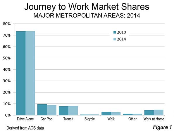
    The major metropolitan area journey to work data is out, reported in the American Community Survey ‘s 2014 one year edition. The news is that there is not much news. Little has changed since 2010 despite all the talk about “peak car” and a supposed massive shift towards transit. Single occupant driving remains by far the largest mode of transport to work in the 53 major metropolitan areas (with over 1,000,000 population), having moved from 73.5 percent of commutes to 73.6 percent. Little upward change in single occupant commuting can be expected, since it is probably already a virtual saturation rate.

    The only significant change is the most important trend that is occurred for decades in US commuting: the reduction in carpooling. Between 2010 and 2014, carpooling dropped from 9.8 percent to 8.8 percent in the major metropolitan areas.

    Transit continued to hold on to third place, with an increase from 7.9 percent to 8.1 percent in the major metropolitan areas. Working at home, including telecommuting, continued its more dramatic rise, from 4.4 percent in 2010 to 4.7 percent in 2014. Walking remained constant at 2.8 percent, while cycling continued its increase but from a small 0.5 percent to 0.7 percent. Other modes of transport, such as taxis and motorcycles remained constant at 1.2 percent (Figure 1).

    In the major metropolitan areas, transit continued to lead over working at home (8.1 percent compared to 4.7 percent), though at the national level the margin was much smaller (5.2 percent compared to 4.5 percent). Transit strength was far more concentrated principally in a few metropolitan areas with “legacy” cities and, as a result, working at home exceeded transit’s market share in 39 of the 53 markets.

    Should carpooling continue its downward trend, it would fall below transit before the end of the decade among the major metropolitan areas (now at 8.8 percent compared to transit 8.1 percent), though the carpooling lead is sufficient to retain second-place far longer at the national level (9.2 percent compared to 5.2 percent). As in working at home, however, transit’s strength is highly concentrated relative to carpooling. Transit leads carpooling only in the six metropolitan areas with transit legacy cities (New York, Chicago, Philadelphia, San Francisco, Boston, and Washington), while carpooling leads in 47 metropolitan areas.

    Commuting market share data for the major metropolitan areas is shown in Tables 1 and 2.

    Transit Gains and Losses

    With by far the most attractive urban environment for transit use in the United States and far and away the largest system, New York dominated the transit share of the  journey to work data, adding 240,000 daily transit commuters between 2010 and 2014 (out of a national total of 576,000). Six other metropolitan areas with the strongest transit gains were San Francisco at 66,000, Chicago with 41,000, Boston with 38,000, Seattle with 34,000 and Washington with 32,000. All of these were above the next highest, Philadelphia, with 16,000. Each of these metropolitan areas, with the exception of Seattle, has a transit legacy city at its core. Overall the other 45 metropolitan areas, with nearly 70 percent of the population, accounted for less than 20 percent of the transit increase.

    Los Angeles, which has been hailed as the becoming "next transit city," seems long on intentions and construction, but wanting in results.  The laggard transit performance of Los Angeles, despite one of the world’s most aggressive rail construction programs has been described in a recent Orange County Register commentary. In 2014-2015, ridership on the legacy MTA (former SCRTD) bus and rail system was almost 10 percent below the bus only system of 1985, despite an increase in the Los Angeles County population of approximately one-quarter (see: Los Angeles; Rail for Others).

    Thirteen metropolitan areas experienced modest transit commuting losses (less than 3,000). In addition to Los Angeles, these included rail metropolitan areas Virginia Beach-Norfolk, San Diego, Buffalo, Cleveland, and Pittsburgh.

    Working at Home Gains and Losses

    The largest working at home gain was also in New York, at 40,000 (out of 499,000 in the major metropolitan areas). The second largest gain was in Los Angeles at 32,000. San Diego added 27,000 people accessing work from home. Four metropolitan areas lost commuters who work at home, though the losses were modest (less than 1,000) in all but Virginia Beach-Norfolk, where the decline was more than 11,000.

    Driving Alone Gains, No Losses

    New York also led in the number of additional commuters driving alone to work, adding more than 420,000. The other largest gainers were in Los Angeles at 325,000 and Houston at 309,000. All of the 53 major metropolitan areas added single occupant commuters and in each single occupant commuting added more than any other mode, including transit. Rochester had the smallest increase, at 7,000.

    Carpool Gains and Losses

    Despite its continuing overall losses, carpooling made gains in some metropolitan areas. Detroit led with nearly 14,000 new carpoolers, followed closely by Orlando, Portland, and Dallas-Fort Worth both added more than 10,000 new carpoolers, adding more commuters than their rail oriented transit systems.

    However, the car pool losses were generally more severe. Chicago lost nearly 36,000 carpooling commuters. Los Angeles lost 30,000, New York lost 29,000 and Tampa-St. Petersburg lost 19,000. Losses of more than 10,000 were also sustained in Washington, St. Louis, San Diego, Pittsburgh, Phoenix, Memphis, Baltimore, and Boston.

    Cycling Gains and Losses

    New York also gained the most cycling commuters, at nearly 14,000, followed by San Francisco at 13,000, Los Angeles at 10,000. Eight metropolitan areas lost cycling commuters, but only two exceeded 250, Grand Rapids (800 loss) and Riverside-San Bernardino (700 loss).

    More of the Same

    U.S. commuters continue to travel to work using the modes that have dominated for decades, with the exceptions of substantial increases in working at home and big losses in car pooling. Though even in these modes, the changes are slight in view of the dominance of single-occupant commuting, as Figure 1 indicates. This is not surprising, commuters who drive alone reach virtually anywhere in the metropolitan area and nearly always at a faster speed than any other method of commuting, save working at home.

    Table 1
    Transit Work Trip Market Share: 2014
    Major Metropolitan Areas (53 over 1,000,000 Population)
    MARKET SHARE              
    MSA Drive Alone Car Pool Transit Bicycle Walk Other Work at Home
    Atlanta, GA 77.6% 10.3% 3.1% 0.2% 1.4% 1.4% 6.2%
    Austin, TX 76.6% 10.1% 2.5% 0.7% 1.7% 1.5% 6.9%
    Baltimore, MD 77.2% 8.2% 6.6% 0.3% 2.6% 1.1% 4.0%
    Birmingham, AL 85.2% 9.1% 0.5% 0.2% 1.1% 1.1% 2.9%
    Boston, MA-NH 67.6% 6.8% 12.9% 1.0% 5.3% 1.2% 5.1%
    Buffalo, NY 82.3% 7.7% 3.0% 0.4% 2.9% 0.9% 2.9%
    Charlotte, NC-SC 81.0% 9.4% 1.9% 0.2% 1.4% 1.1% 5.1%
    Chicago, IL-IN-WI 70.9% 7.7% 11.9% 0.7% 3.2% 1.2% 4.5%
    Cincinnati, OH-KY-IN 82.8% 7.9% 2.1% 0.3% 2.0% 0.8% 4.1%
    Cleveland, OH 82.3% 6.8% 3.2% 0.3% 2.6% 0.9% 3.9%
    Columbus, OH 83.0% 7.7% 1.8% 0.5% 2.1% 0.7% 4.4%
    Dallas-Fort Worth, TX 80.8% 9.9% 1.6% 0.2% 1.2% 1.7% 4.6%
    Denver, CO 76.3% 8.8% 4.5% 0.9% 2.0% 0.8% 6.6%
    Detroit,  MI 84.0% 9.0% 1.6% 0.3% 1.3% 0.8% 3.1%
    Grand Rapids, MI 81.6% 8.9% 1.7% 0.3% 2.2% 1.4% 4.0%
    Hartford, CT 81.4% 7.8% 2.7% 0.2% 2.6% 1.1% 4.2%
    Houston, TX 80.3% 10.7% 2.4% 0.3% 1.3% 1.6% 3.4%
    Indianapolis. IN 84.2% 8.5% 1.2% 0.3% 1.3% 0.7% 3.8%
    Jacksonville, FL 80.4% 9.7% 1.2% 0.6% 1.2% 1.7% 5.2%
    Kansas City, MO-KS 83.4% 8.5% 1.0% 0.2% 1.2% 1.0% 4.7%
    Las Vegas, NV 77.6% 10.2% 4.8% 0.5% 1.6% 2.3% 3.1%
    Los Angeles, CA 74.6% 9.7% 5.8% 1.0% 2.5% 1.3% 5.1%
    Louisville, KY-IN 81.8% 9.5% 2.0% 0.3% 1.7% 1.0% 3.7%
    Memphis, TN-MS-AR 84.9% 8.6% 1.0% 0.1% 1.1% 1.7% 2.6%
    Miami, FL 78.7% 8.9% 3.7% 0.6% 1.7% 1.4% 5.0%
    Milwaukee,WI 80.6% 8.4% 3.5% 0.5% 2.6% 0.8% 3.6%
    Minneapolis-St. Paul, MN-WI 77.3% 8.6% 4.8% 1.0% 2.4% 0.9% 4.9%
    Nashville, TN 81.7% 9.8% 1.3% 0.2% 1.6% 0.8% 4.6%
    New Orleans. LA 79.2% 9.7% 3.1% 1.3% 2.3% 1.5% 2.9%
    New York, NY-NJ-PA 50.2% 6.4% 31.1% 0.6% 6.0% 1.5% 4.2%
    Oklahoma City, OK 82.8% 10.1% 0.4% 0.4% 1.5% 1.1% 3.7%
    Orlando, FL 79.8% 9.9% 2.0% 0.6% 0.9% 1.2% 5.6%
    Philadelphia, PA-NJ-DE-MD 73.0% 7.8% 9.7% 0.6% 3.7% 0.8% 4.3%
    Phoenix, AZ 77.0% 10.5% 2.1% 0.9% 1.5% 1.9% 6.1%
    Pittsburgh, PA 77.5% 8.1% 5.6% 0.4% 3.4% 0.8% 4.1%
    Portland, OR-WA 70.0% 10.2% 6.5% 2.6% 3.3% 1.0% 6.4%
    Providence, RI-MA 81.1% 7.9% 2.8% 0.5% 3.4% 0.9% 3.5%
    Raleigh, NC 80.0% 9.0% 1.0% 0.2% 1.3% 1.1% 7.3%
    Richmond, VA 81.8% 9.1% 1.7% 0.4% 1.6% 1.2% 4.2%
    Riverside-San Bernardino, CA 77.4% 13.3% 1.6% 0.3% 1.7% 1.0% 4.7%
    Rochester, NY 82.5% 6.9% 2.5% 0.7% 3.1% 0.7% 3.7%
    Sacramento, CA 76.4% 10.2% 2.7% 1.8% 2.0% 1.3% 5.5%
    Salt Lake City, UT 74.9% 12.2% 3.8% 0.8% 2.1% 0.8% 5.3%
    San Antonio, TX 80.0% 10.8% 2.1% 0.2% 1.7% 0.9% 4.3%
    San Diego, CA 76.0% 8.6% 2.7% 0.8% 2.9% 1.4% 7.5%
    San Francisco-Oakland, CA 59.2% 9.4% 16.7% 2.2% 4.7% 1.6% 6.2%
    San Jose, CA 76.2% 10.4% 4.0% 1.6% 1.7% 1.2% 4.8%
    Seattle, WA 69.0% 9.8% 9.6% 1.2% 3.6% 1.1% 5.7%
    St. Louis,, MO-IL 82.7% 7.3% 2.9% 0.3% 1.8% 0.8% 4.1%
    Tampa-St. Petersburg, FL 81.1% 7.4% 1.5% 0.9% 1.5% 1.7% 5.9%
    Virginia Beach-Norfolk, VA-NC 82.4% 8.2% 1.6% 0.5% 3.0% 1.2% 3.1%
    Tucson, AZ 77.0% 9.1% 2.9% 2.1% 2.5% 2.0% 4.5%
    Washington, DC-VA-MD-WV 66.1% 9.7% 14.3% 0.8% 3.1% 1.0% 5.1%
    Major Metropolitan Areas 73.6% 8.8% 8.1% 0.7% 2.8% 1.2% 4.7%
    Outside Major Metropolitan Areas 80.4% 9.8% 1.2% 0.5% 2.7% 1.2% 4.1%
    United States 76.5% 9.2% 5.2% 0.6% 2.7% 1.2% 4.5%
    From American Community Survey: 2014 (1 Year)


    Table 2
    Transit Work Trip Market Share: 2010 (2008-2012 ACS)
    Major Metropolitan Areas (53 over 1,000,000 Population)
    MARKET SHARE              
    MSA Drive Alone Car Pool Transit Bicycle Walk Other Work at Home
    Atlanta, GA 77.6% 10.7% 3.2% 0.2% 1.3% 1.4% 5.6%
    Austin, TX 75.0% 11.3% 2.6% 0.8% 1.8% 1.9% 6.6%
    Baltimore, MD 76.3% 9.7% 6.3% 0.3% 2.7% 0.9% 3.9%
    Birmingham, AL 84.0% 10.6% 0.7% 0.1% 1.1% 0.6% 3.0%
    Boston, MA-NH 68.8% 7.9% 11.9% 0.9% 5.3% 0.9% 4.4%
    Buffalo, NY 81.8% 8.1% 3.5% 0.4% 3.0% 0.9% 2.4%
    Charlotte, NC-SC 80.5% 10.4% 1.8% 0.1% 1.4% 0.9% 4.9%
    Chicago, IL-IN-WI 70.9% 8.8% 11.3% 0.6% 3.1% 1.1% 4.2%
    Cincinnati, OH-KY-IN 82.6% 8.7% 2.2% 0.2% 2.1% 0.7% 3.6%
    Cleveland, OH 82.1% 7.8% 3.5% 0.3% 2.1% 0.8% 3.4%
    Columbus, OH 82.6% 8.2% 1.6% 0.4% 2.1% 0.8% 4.2%
    Dallas-Fort Worth, TX 80.9% 10.5% 1.5% 0.2% 1.2% 1.3% 4.5%
    Denver, CO 75.7% 9.5% 4.5% 0.9% 2.1% 1.2% 6.0%
    Detroit,  MI 84.2% 8.7% 1.6% 0.2% 1.4% 0.8% 3.1%
    Grand Rapids, MI 82.8% 8.9% 1.2% 0.5% 1.9% 0.7% 3.9%
    Hartford, CT 81.0% 8.2% 3.1% 0.2% 2.7% 1.0% 3.8%
    Houston, TX 79.2% 11.7% 2.4% 0.3% 1.4% 1.6% 3.4%
    Indianapolis. IN 83.6% 9.0% 1.1% 0.3% 1.7% 0.8% 3.6%
    Jacksonville, FL 81.1% 9.9% 1.3% 0.6% 1.4% 1.3% 4.4%
    Kansas City, MO-KS 82.9% 9.2% 1.2% 0.2% 1.3% 1.0% 4.1%
    Las Vegas, NV 78.5% 11.1% 3.7% 0.4% 1.8% 1.5% 3.0%
    Los Angeles, CA 73.6% 10.8% 6.1% 0.9% 2.7% 1.2% 4.9%
    Louisville, KY-IN 82.9% 9.3% 2.1% 0.3% 1.7% 0.8% 2.9%
    Memphis, TN-MS-AR 82.8% 10.7% 1.3% 0.1% 1.3% 1.0% 2.8%
    Miami, FL 78.2% 9.8% 3.7% 0.6% 1.8% 1.4% 4.5%
    Milwaukee,WI 79.9% 9.2% 3.6% 0.5% 2.8% 0.7% 3.2%
    Minneapolis-St. Paul, MN-WI 78.1% 8.6% 4.6% 0.9% 2.3% 0.8% 4.7%
    Nashville, TN 81.5% 10.4% 1.1% 0.2% 1.2% 0.9% 4.6%
    New Orleans. LA 79.0% 10.9% 2.6% 0.8% 2.4% 1.6% 2.6%
    New York, NY-NJ-PA 51.0% 7.1% 29.9% 0.5% 6.1% 1.6% 3.9%
    Oklahoma City, OK 82.9% 10.4% 0.5% 0.3% 1.6% 1.1% 3.3%
    Orlando, FL 81.1% 9.3% 1.9% 0.5% 1.1% 1.7% 4.5%
    Philadelphia, PA-NJ-DE-MD 73.4% 8.2% 9.4% 0.6% 3.7% 0.8% 3.8%
    Phoenix, AZ 76.4% 11.9% 2.1% 0.8% 1.6% 1.6% 5.6%
    Pittsburgh, PA 76.9% 9.3% 5.7% 0.2% 3.6% 0.9% 3.5%
    Portland, OR-WA 71.2% 9.7% 6.1% 2.2% 3.5% 1.0% 6.3%
    Providence, RI-MA 80.8% 8.8% 2.7% 0.3% 3.2% 0.9% 3.3%
    Raleigh, NC 80.6% 9.6% 1.0% 0.3% 1.4% 1.2% 5.9%
    Richmond, VA 81.3% 9.6% 2.0% 0.4% 1.4% 0.8% 4.5%
    Riverside-San Bernardino, CA 76.2% 14.4% 1.6% 0.4% 1.8% 1.1% 4.4%
    Rochester, NY 81.4% 8.4% 1.9% 0.5% 3.6% 0.7% 3.5%
    Sacramento, CA 75.1% 11.6% 2.7% 1.8% 2.0% 1.2% 5.6%
    Salt Lake City, UT 75.9% 12.0% 3.5% 0.8% 2.3% 1.2% 4.3%
    San Antonio, TX 79.1% 11.5% 2.2% 0.1% 1.9% 1.2% 3.9%
    San Diego, CA 75.9% 10.2% 3.1% 0.7% 2.7% 1.1% 6.3%
    San Francisco-Oakland, CA 61.5% 10.3% 14.7% 1.7% 4.3% 1.4% 6.0%
    San Jose, CA 76.5% 10.4% 3.2% 1.7% 2.1% 1.4% 4.7%
    Seattle, WA 69.7% 11.0% 8.3% 1.0% 3.6% 1.1% 5.3%
    St. Louis,, MO-IL 82.6% 8.4% 2.5% 0.3% 1.7% 0.8% 3.7%
    Tampa-St. Petersburg, FL 80.3% 9.5% 1.4% 0.7% 1.6% 1.4% 5.2%
    Virginia Beach-Norfolk, VA-NC 80.6% 9.0% 1.8% 0.4% 2.6% 1.1% 4.4%
    Tucson, AZ 76.5% 10.3% 2.4% 1.5% 2.5% 2.0% 4.8%
    Washington, DC-VA-MD-WV 66.0% 10.6% 14.0% 0.6% 3.2% 0.9% 4.7%
    Major Metropolitan Areas 73.5% 9.6% 7.9% 0.6% 2.8% 1.2% 4.4%
    Outside Major Metropolitan Areas 80.8% 9.8% 0.9% 0.5% 2.7% 1.2% 4.2%
    United States 76.6% 9.7% 4.9% 0.5% 2.8% 1.2% 4.3%
    From American Community Survey:2008-2012


    Wendell Cox is Chair, Housing Affordability and Municipal Policy for the Frontier Centre for Public Policy (Canada), is a Senior Fellow of the Center for Opportunity Urbanism (US), a member of the Board of Advisors of the Center for Demographics and Policy at Chapman University (California) and principal of Demographia, an international public policy and demographics firm.He is co-author of the “Demographia International Housing Affordability Survey” and author of “Demographia World Urban Areas” and “War on the Dream: How Anti-Sprawl Policy Threatens the Quality of Life.” He was appointed to three terms on the Los Angeles County Transportation Commission, where he served with the leading city and county leadership as the only non-elected member. He served as a visiting professor at the Conservatoire National des Arts et Metiers, a national university in Paris.

    Photo: Harbor Freeway (I-110), Los Angeles (by author)

  • The Cities Where Your Salary Will Stretch The Furthest 2015

    Average pay varies widely among U.S. cities, but those chasing work opportunities would do well to keep an eye on costs as well. Salaries may be higher on the East and West coasts, but for the most part, equally high prices there mean that the fatter paychecks aren’t necessarily getting the locals ahead.

    To determine which cities actually offer the highest real incomes, Mark Schill, research director at Praxis Strategy Group, conducted an analysis for Forbes of the 53 largest metropolitan statistical areas, adjusting annual earnings by a cost factor that combines median home values from the U.S. Census (20%) with a measure of regional price differences from the U.S. Bureau of Economic Analysis (80%).

    The takeaway: When cost of living is factored in, most of the metro areas that offer the highest effective pay turn out to be in the less glitzy middle part of the country. 

    Ranking first is the Houston-the Woodlands-Sugar Land metro area, followed by one high-cost outlier: San Jose-Sunnyvale-Santa Clara, Calif., aka Silicon Valley. Although average wages in the San Jose area are $38,000 higher than Houston’s $60,096, the much lower cost of living in Houston means residents there are effectively slightly better off. Adjusted for costs, Houston’s average real income is $62,136. A big contributing factor is Houston’s low home prices: the ratio of the median home price there ($215,000 in the third quarter) to median annual household income is 3.1, compared to 7.5 in the San Jose area (median 3Q home price: $795,000).

    San Jose’s high ranking is somewhat of an anomaly: the very high salaries paid by the tech industry in a metro area made up of largely affluent suburban communities go a long way to make up for the high prices. San Jose’s prices were the third highest among major U.S. metro areas in 2013, the most recent year for which the BEA has data — 21.3% above the national average — while the average annual wage of $98,247 as of this year ranks first.

    Another example of a higher-cost success story is the Hartford, Conn., metro area, which ranks fourth on our list with adjusted annual real earnings of $54,590. One of the lowest-density regions in the country, it boasts many small, prosperous communities with high housing prices surrounding a largely impoverished but small core city (population: 125,000 ). In 2011, the Harford metro area was ranked by Brookings as the most productive metropolitan region in the world.

    But for the most part, it’s the low-cost heartland that dominates the top 15 of our ranking of Cities Where Your Salary Stretches The Furthest. Manufacturing powerhouse Detroit-Warren-Dearborn ranks third with cost-adjusted annual earnings of $55,950. The metro area is comfortably affordable, including an average home price value of $136,400, but also boasts strong wages given the area’s high concentration of factory and engineering jobs, which tend to pay better than other industries, particularly for blue-collar workers.

    Low costs are an advantage that unites a number of the top-ranked heartland metro areas, including Cleveland-Elyria (seventh), where prices of goods and services are 10.5% below the national average, and Cincinnati (ninth), where prices are 9.5% below the national average. In all these areas, the cost of a house is about 20% of what passes for normal in Silicon Valley.

    Hip, But Increasingly Not Worth It

    Perhaps the biggest surprise in our survey is the low rankings of the “cool” cities that are widely discussed as the places that offer the best economic opportunities.

    Take for instance San Francisco, a city that has become the epicenter of “disruptive” tech companies Uber, Lyft, Airbnb, Salesforce.com that are changing our service economy, as well as Twitter. With an average annual salary of $74,794, you would think people would be fat and happy in Baghdad by the Bay. But soaring home prices — median value, $657,300 — have raised costs so high that the area ranks a poor 41st on our list.

    The tech boom has also raised prices in Austin, which ranked fifth when we last did this ranking in 2012, but falls to 19th this year. Over the past year, the average home value in the Texas capital has risen by $24,000, twice the increase experienced in the rest of the country. Median prices now average $217,9000, well above the national median of $188,000 for all large metropolitan regions. This is still not ridiculous, but costs do seems to be eroding some of Austin’s still powerful advantage.

    Similarly, greater New York City also fared poorly, ranking 33rd, in large part due to high housing prices and the overall cost of living: prices there are 22.3% above the national average, according to BEA data, making it the second-costliest metro area in the nation.

    Some of the biggest gaps between cost of living and salary are in Southern California, which has experienced significant house price gains without the income growth that makes San Jose more competitive. Already high, prices in San Diego-Carlsbad (51st), Los Angeles-Long Beach-Anaheim (52nd) and Riverside-San Bernardino (last among the 53 largest metro areas) have all risen considerably above the national average.

    Long-Term Implications

    Our paycheck analysis does not impact everyone equally. Given the central role of housing, for example, long-term residents who bought their homes before prices began to rise dramatically can keep a bigger portion of their take-home pay, and if they decide to sell, they’ll benefit greatly from inflated values. More directly impacted may be young adults and immigrants, most of whom do not own their own homes, and often lack the resources to buy in the more expensive markets.

    Over time this could influence where young families and singles chose to migrate. Since 2010, according to an upcoming study by Cleveland State’s Center for Population Dynamics, there has been a marked shift of college educated workers aged 25 to 34. While between 2008 and 2010, metro areas like San Francisco, New York, Los Angeles, San Jose and Chicago enjoyed the biggest upticks in this coveted population, over the most recently studied period, 2010-13, the leaders were generally less expensive places like Nashville, Pittsburgh, Orlando, Cleveland, San Antonio, Houston and Dallas-Ft. Worth.

    This suggests that areas that have both high-wage jobs and low costs are likely to gain momentum in coming years, particularly if the economy expands. This is not to say that people do not like the excitement and culture associated with San Francisco, Los Angeles or New York, but many may be finding that the price of admission to these fabled places may be too high.

    This could be a great opportunity for less-heralded communities, from Arizona and Texas to Ohio, to gain more educated workers and the companies that require them.

    Metropolitan Average Annual Earnings Adjusted for Cost of Living and Home Values
    Rank MSA Name Adjusted Ave Annual Earnings
    1 Houston-The Woodlands-Sugar Land, TX $62,136
    2 San Jose-Sunnyvale-Santa Clara, CA $56,147
    3 Detroit-Warren-Dearborn, MI $55,950
    4 Hartford-West Hartford-East Hartford, CT $54,590
    5 Dallas-Fort Worth-Arlington, TX $54,497
    6 Atlanta-Sandy Springs-Roswell, GA $53,922
    7 Cleveland-Elyria, OH $53,841
    8 Pittsburgh, PA $53,726
    9 Cincinnati, OH-KY-IN $53,405
    10 St. Louis, MO-IL $53,115
    11 Charlotte-Concord-Gastonia, NC-SC $52,508
    12 Birmingham-Hoover, AL $51,710
    13 Kansas City, MO-KS $51,460
    14 Memphis, TN-MS-AR $51,339
    15 Boston-Cambridge-Newton, MA-NH $50,373
    16 Columbus, OH $50,369
    17 Chicago-Naperville-Elgin, IL-IN-WI $50,351
    18 Nashville-Davidson–Murfreesboro–Franklin, TN $50,168
    19 Austin-Round Rock, TX $50,154
    20 Minneapolis-St. Paul-Bloomington, MN-WI $50,117
    21 Indianapolis-Carmel-Anderson, IN $49,790
    22 Oklahoma City, OK $49,771
    23 Seattle-Tacoma-Bellevue, WA $49,514
    24 Philadelphia-Camden-Wilmington, PA-NJ-DE-MD $48,976
    25 Louisville/Jefferson County, KY-IN $48,807
    26 Milwaukee-Waukesha-West Allis, WI $48,341
    27 Denver-Aurora-Lakewood, CO $48,287
    28 Washington-Arlington-Alexandria, DC-VA-MD-WV $48,102
    29 Buffalo-Cheektowaga-Niagara Falls, NY $48,071
    30 New Orleans-Metairie, LA $47,956
    31 San Antonio-New Braunfels, TX $47,837
    32 Rochester, NY $47,660
    33 New York-Newark-Jersey City, NY-NJ-PA $47,649
    34 Jacksonville, FL $47,230
    35 Raleigh, NC $47,164
    36 Richmond, VA $47,002
    37 Grand Rapids-Wyoming, MI $46,480
    38 Phoenix-Mesa-Scottsdale, AZ $46,281
    39 Tampa-St. Petersburg-Clearwater, FL $45,826
    40 Baltimore-Columbia-Towson, MD $45,184
    41 San Francisco-Oakland-Hayward, CA $45,082
    42 Portland-Vancouver-Hillsboro, OR-WA $44,451
    43 Salt Lake City, UT $43,857
    44 Sacramento–Roseville–Arden-Arcade, CA $43,254
    45 Miami-Fort Lauderdale-West Palm Beach, FL $42,976
    46 Las Vegas-Henderson-Paradise, NV $42,960
    47 Providence-Warwick, RI-MA $42,827
    48 Orlando-Kissimmee-Sanford, FL $42,463
    49 Tucson, AZ $42,264
    50 Virginia Beach-Norfolk-Newport News, VA-NC $42,226
    51 San Diego-Carlsbad, CA $37,395
    52 Los Angeles-Long Beach-Anaheim, CA $35,691
    53 Riverside-San Bernardino-Ontario, CA $34,040
    Figure is the average annual wages, salaries and proprietor earnings adjusted for cost of living usine BEA Regional Price Parities (80%) and variation in Census median home value among the 53 regions (20%). Data Sources: EMSI 2015.2 Employment Data, U.S. Bureau of Economic Analysis Regional Price Parities, U.S. Census American Community Survey
    Analysis by Mark Schill, mark@praxissg.com


    This piece first appeared at Forbes.com.

    Joel Kotkin is executive editor of NewGeography.com and Roger Hobbs Distinguished Fellow in Urban Studies at Chapman University, and a member of the editorial board of the Orange County Register. He is also executive director of the Houston-based Center for Opportunity Urbanism. His newest book, The New Class Conflict is now available at Amazon and Telos Press. He is also author of The City: A Global History and The Next Hundred Million: America in 2050. He lives in Orange County, CA.

    Photo by w:Flickr user Bill Jacobus [CC-BY-2.0], via Wikimedia Commons

  • When Detroit Stood Tall and Shaped the World

    My recent post about how urban planning decisions helped lead to the Motown sound in Detroit was inspired by David Maraniss’ new book Once in a Great City: A Detroit Story.

    The book takes a deep dive into Detroit 1963, a city that was, although in some ways already in decline, in others near its zenith.

    It’s a great read, in particularly for the depth of characterization. Too often Detroit writing is a story of heroes, villains, and victims. Maraniss rejects that approach and provides mostly nuanced portrayals of Detroiters that allows them to be the actual real, red-blooded human beings that they are.

    I just posted a review of the book over at City Journal.  Here’s an excerpt:

    In his new book, Once in a Great City: A Detroit Story, Pulitzer Prize winner David Maraniss takes a fascinating and engrossing look at the Motor City during this fateful year. Under Henry Ford II (“the Deuce”) and hard-charging salesman Lee Iacocca, the Ford Motor Company was set to unveil its revolutionary Mustang. The civil rights struggle was creating tensions in Detroit and elsewhere, but Mayor Jerome Cavanagh was committed to addressing discrimination and reforming the police. Detroit was about to transform the American musical landscape with Motown Records, whose roster of superstar artists included Smokey Robinson, Diana Ross and the Supremes, Stevie Wonder, and Marvin Gaye. The United States Olympic Committee even nominated Detroit as the American representative to host the 1968 summer Olympics, though it lost out to Mexico City. On the more dubious side, the mafia had a powerful presence in the Motor City, where colorful mob boss Tony Jack Giacalone rode around town in his garish “Party Bus” painted blue and silver, the colors of the NFL’s Detroit Lions.

    Click through to read the whole review or buy the book.

    Aaron M. Renn is a senior fellow at the Manhattan Institute and a Contributing Editor at City Journal. He writes at The Urbanophile, where this piece originally appeared.

  • China’s Demographics at a Turning Point

    For decades, the decline in China’s birth rate was a big boost for the economy. What now?

    This week, schadenfreude could have been a word invented for China experts if you judge by some of the commentary surrounding the country’s lifting of its one-child policy. Most got it right that the legacy of the one-child policy is now a problem for the Chinese economy because of a rapidly rising old-age dependency ratio (green line in the first chart below). This was tacitly acknowledged by the lifting of the policy.

    But many got it wrong that the one-child policy has always been a problem for the Chinese economy since its inception. The cause of their error is the inclination in some quarters to merge a political and moral issue with an economic one, as if to press the point that unfree and coercive decisions are not only bad eventually for the economy, but bad always and from day one. Unfortunately, economic accountability does not come instantaneously after coercive policies are implemented. Politicians are lucky in that the ultimate consequences of their decisions can take years or even decades to finally be seen in full relief.

    Before this occurs, the more immediate and proximate result of a bad policy may in fact be hugely positive for a long time. The reason is that a bad policy can borrow prosperity from the future, or in other words, front-load prosperity to the detriment of future generations. By enacting a policy that pulls prosperity forward, the present can look like a boom but the future then has to contend with the reversing undertow of that same policy.

    At any rate, it is right that a free society focuses on the one-child policy’s encroachment on personal freedom and on the unintended consequence of a lopsided male-female ratio. But ignoring these very important issues for a moment, it must also be said that the one-child policy was in fact a significant contributor, arguably even a critical enabler, of the Chinese boom of the past few decades.

    (The chart shows China’s dependency ratios: Total DR in blue; Child DR in red; Old-age DR in green. Source: UN Population Division. See definitions in footnotes.)

    DR China

    There is no mystery here because the chain reaction is well understood by demographers and economists, albeit perhaps forgotten or ignored by some this week. As the Chinese fertility ratio declined, so did the total and child dependency ratios (blue and red lines in the chart), opening a window of opportunity for a demographic dividend.

    China’s policymakers managed to seize on this window to accelerate the economy. Here business dynamism, economic policy and the large expansion of trade with the US, Europe, Japan and other economies made a big difference and allowed the country to capitalize on the opportunity and to reap a large demographic dividend.

    But there is no free lunch in economics or indeed in demographics. The long-term effect of the one-child policy was to pull prosperity forward by crashing the dependency ratio faster and generating a demographic dividend that was far larger than would have been if households had had more children.

    Without the one-child policy, China’s dependency ratio would have fallen more slowly between 1980 and 2010 and may have looked more like India’s (chart below). The decline would have been less pronounced in 1980-2010 and therefore the demographic dividend less great, but the climb would be less steep now and therefore the future less challenging. See Demography Charts – 1 for dependency ratios of other countries.

    BRIC Countries Total Dependency Ratios

    BRIC Countries Total Dependency Ratios

    With only one child to support aging parents, the dependency ratio has started a climb that will continue for several decades. Should the removal of the one-child policy result in more children, this would in the near term push the dependency ratio to rise even faster. As sure as demography was a tailwind in the years 1990-2010, it will be a headwind for decades to come.

    This does not mean that the Chinese economy will be weak for decades. Demographics is only one component among many and economies can adapt to changing conditions. Should there be a surge in Chinese innovation and/or new reforms to raise productivity, China could very well skirt or mitigate the coming demographic challenge.

    China’s target for annual real GDP growth is now 6.5%, compared to nearly 10% on average since 1980.  These figures must be seen against the backdrop of a working-age population that rose steadily from 500 million in 1975 to a billion in 2015, and that is expected to level off and contract to 920 million by 2035. See also Working Age Population Around the World 1960-2050.

    Version 2

    Here are a few notable recent articles on the one-child policy:

    • Harvard Professor Amartya Sen writes in the New York Times that the empowerment of women had more to do with China’s declining fertility ratio than did the one-child policy. This is credible on the one hand because the fertility ratio had already declined significantly by the time the policy was enacted. But it is not wholly credible on the other hand because it does not square with the issue of selective abortions. It seems odd that empowered women would have a bias for male children. Perhaps the chronology of events must be examined more closely in order to validate Professor Sen’s thesis.
    • Several commentators are quoted in this other New York Times article and most get it right. Many agree with Harvard Professor David Bloom’s statement that “the economically active share of the population will fall, reversing the demographic dividend that has figured so prominently in China’s rapid economic growth over the past few decades”. Fred Hu, founder of Chinese investment firm Primavera Capital Group, argues that “what drives China’s future in the next two or three decades is not the population. It is whether future leaders can continue to push ahead political and economic reforms.”
    • In this Wall Street Journal piece, economist Nicholas Eberstadt seems to ignore the demographic dividend when he writes that “the one-child mandate is the single greatest social-policy error in human history.” As argued above, this is true from the point of view of individual freedom, and maybe true for the Chinese economy going forward, but certainly not true for that economy from 1980 to today.

    Definitions:

    The total dependency ratio is the ratio of the population aged 0-14 and 65+ to the population aged 15-64. They are presented as number of dependents per 100 persons of working age (15-64).

    The child dependency ratio is the ratio of the population aged 0-14 to the population aged 15-64. They are presented as number of dependents per 100 persons of working age (15-64).

    The old-age dependency ratio is the ratio of the population aged 65 years or over to the population aged 15-64. They are presented as number of dependents per 100 persons of working age (15-64).

    Sami Karam is the founder and editor of populyst.net and the creator of the populyst index™. populyst is about innovation, demography and society. Before populyst, he was the founder and manager of the Seven Global funds and a fund manager at leading asset managers in Boston and New York. In addition to a finance MBA from the Wharton School, he holds a Master’s in Civil Engineering from Cornell and a Bachelor of Architecture from UT Austin.

    Top photo by Rex Pe from Savannah, Georgia, USA (student teacherUploaded by Adrignola) [CC BY 2.0], via Wikimedia Commons

  • Too Many Places Will Have too Few People

    The adage “demographics are destiny” is increasingly being replaced by a notion that population trends should actually shape policy. As the power of projection grows, governments around the world find themselves looking to find ways to counteract elaborate and potentially threatening population models before they become reality.

    Nowhere is this clearer than in China’s recent announcement that it was suspending its “one child” policy. The country’s leaders are clearly concerned about what demographer Nicholas Eberstadt has labeled “this coming tsunami of senior citizens” with a smaller workforce, greater pension obligations and generally slower economic growth.

    A second example is Europe’s open migration policy. Despite widespread opposition by its own citizens, and cost estimates that run to a trillion euros over 30 years, Europe’s political and business leaders regard migration as critical to address the Continent’s aging demographics. Germany knows it may not be able to keep its economic engine running without a huge influx of workers.

    In defense of the migration policy, European Union economists project that refugees from the Middle East, Africa and Central Asia could boost Europe’s GDP by 0.2 percent to 0.3 percent by 2020.

    This all speaks to a kind of demographic arbitrage between countries with aging demographics and those with youth to spare. Half the world’s population already lives in countries with fertility rates below replacement level (2.1 per woman).

    Read the entire piece at The Orange County Register.

    Joel Kotkin is executive editor of NewGeography.com and Roger Hobbs Distinguished Fellow in Urban Studies at Chapman University, and a member of the editorial board of the Orange County Register. He is also executive director of the Houston-based Center for Opportunity Urbanism. His newest book, The New Class Conflict is now available at Amazon and Telos Press. He is also author of The City: A Global History and The Next Hundred Million: America in 2050. He lives in Orange County, CA.

    Photo “Nursery Cart” by flickr user Pieterjan Vandaele

  • The Sociology of Fear

    As part of its annual Survey on American Fears, Chapman University has tried to identify what Americans fear the most. A team of professors and students teamed up to retool last year’s survey tool and dig up American’s deepest horrors. In total, a random sample of 1,500 adults across the country were  asked about 88 different individual fears, in which they were to rank questions accordingly. Last year Americans were worried about walking alone at night and identity theft. But with the presidential elections just around the corner, it wasn’t surprising to see that corruption of our own government officials topped this year’s results.

    Sociology of Fear
    Nobody has ever cracked the code of human emotions. Our feelings are rooted within the depths of our physiology, but our cheers and screams are also products of our environment. Put in sociological terms, “fearfulness in varying degrees is part of the very fabric of everyday social relations”. This is bad news for those who thought the pursuit of happiness would be all fun and games.

    Director of the Fear Survey Chris Bader recruited a group of interdisciplinary students to join the semester long course to help retool last year’s survey and to provide fresh perspective on what American’s Fear. But when the student researchers involved in the project (including me) arrived at the first class of Sociology of Fear, we weren’t completely aware of what would be a grueling month of debate, passion, and even tears.

    Our class conducted multiple rounds of survey testing with friends, family and strangers to get feedback on additions made to last year’s survey tool. The most common fear amongst us twenty something college students facing the brink of graduation was “not living up to our potential”, and we considered this when evaluating the current state of American fears.

    Rapid communication and transfer of information creates the perception that our peers are having more fun and being more productive than us, and FOMO (Fear of Missing Out) was brought up numerous times during discussion. But our personal explorations did not interfere with the macro-level research conducted for the project, and in the end, the fears that rose to the top of the list were cross-generational.  After all, the survey was on American fears, not millennial anxieties.

    The course was a growing experience, but it was the work of the research faculty and project leaders that transformed this experience into excellent insights on the current American situation.

    Biggest Fears Today
    The survey explored four categories of fear: personal fears, natural disasters, paranormal fears, and drivers of fear behavior. The top American domains of fear averaged to be man-made disasters, technology, and government. Given the political transformations and technological developments taking place today, the results seem spot on.

    In order of most feared to least, the environment, personal future, natural disasters, crime, personal anxieties, daily life, and judgment of others came in next on the list. Makes sense – I’m sure most of us have some concern about how we’re perceived by others, but this sentiment doesn’t quite stack up to a 8.0 earthquake or creepy government spying.

    As for the top individual fears, 58% of respondents were afraid or very afraid of corruption of government officials. Perhaps Americans are on to some of the fishy things going on in Washington at the moment, or are simply sucked into the negative rhetoric commonplace in some opinion outlets.  Meanwhile, only 30% of Americans are afraid or very afraid of global warming impacting their lives.

    Following behind fear of government officials, 44.8% of Americans are afraid or very afraid of cyber terrorism. 44.6% are afraid or very afraid of corporate tracking of personal info, and 44.4% of terrorist attacks. 41.4% where afraid or very afraid of government tracking of personal info, and 40.9% of bio-warfare. The remaining top fears surrounded financial and personal issues, with identity theft coming in at 39.6%, economic collapse at 39.2%, running out of money in future at 37.4%, and credit card fraud at 36.9%.

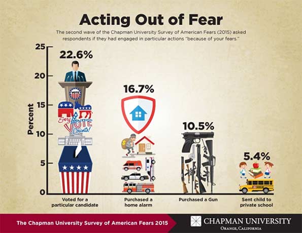
    The survey also found that these fears are actually driving our actions. Fear has the strongest impact on our voting patterns. About one third who have an above average fear of government reported having voted for a particular candidate due to their fears. Even more alarming is the fact that “of those respondents who have an above average fear of the government, over 15% have purchased a gun due to fear.” Eight percent of people with an above average fear of the government send their children to private school out of fear.

    As if gun control and education reform weren’t complicated enough, we can say that emotions will play some role in how policy is shaped in the coming years.

    A society of hope or fear?
    That fact that Americans fear government and technology is not surprising, given the individualist basis on which our nation was founded and the exponential technological growth we’re experiencing today. The Internet is forcing institutions and businesses to be increasingly transparent in everything from product sourcing to internal communications, and the watchdog power that citizens now have is both empowering, and frightening.

    It’s easy to be blinded by fear, as our emotions are the most mysterious, yet powerful forces behind our decisions. But for every 58% who are afraid of government corruption, there is 42% who isn’t. For every 44.4 percent who are afraid of terrorism, there is 55.6% with no worries. Surely, there are preventative benefits that come with healthy skepticism and insecurity, but too much diminishes any hope for societal progress. Can we keep this in mind as we go about our business, citizenship, and personal lives?

    The things that make us afraid can be dealt with. Some of them are opportunities, others are threats, and a good deal of them are complex issues and events that require brave souls to challenge them head on. This being said, we can all use a little inspiration to give us light in the face of darkness.

    Nelson Mandela told us quite simply, “May your choices reflect your hopes, not your fears.” Emerson’s advice was a bit more menacing, perhaps more appropriate given the nature of this survey. “Always do what you are afraid to do.”

    Charlie Stephens is a researcher at the Chapman University Center for Demographics and Policy, and an MBA candidate at the Argyros School of Business and Economics at Chapman University.He is also a regular contributor to the creative business site PSFK.com and the founder of substrand.com, a social awareness site that helps people, businesses, and communities understand their cultural environments and connect in new grounds.

    Photo: “Actress-fear-and-panic” by MyName (Bantosh) – self-made, taken in course of professional work. Licensed under Wikimedia Commons.

  • A Question of Values: Middle-Income Housing Affordability

    This is the Executive Summary from a new report “A Question of Values: Middle-Income Housing Affordability and Urban Containment Policy" authored by Wendell Cox and published by the Frontier Centre for Public Policy. Ailin He, a PhD doctoral candidate in economics at McGill University served as research assistant.

    The "report is a public policy narrative on the relationships between urban containment policy, housing affordability and national economies. It is a synthesis of economic and urban planning analysis that is offered as a policy evaluation of urban containment. The analysis is presented in the context of higher-order objectives of domestic policy: improving the standard of living and eradicating poverty" (Page 9). The research focuses on the international experience, especially in Canada, Australia, New Zealand, the United Kingdom and the United States. Download the full report (pdf) here.

    Middle-income housing affordability is important to people and the economy: Canada’s house prices have risen more than house prices in most other high-income nations. This is of concern, because higher house prices reduce discretionary incomes, which defines the standard of living and poverty. If discretionary incomes are reduced, households will have less to spend on other goods and services, which can retard job creation and economic growth. Improving the standard of living and eradicating poverty are among the highest-order domestic priorities.

    Urban containment policy can lead to higher house prices: Urban land-use regulation has become stronger in many metropolitan areas and often includes urban containment policy. Urban containment severely restricts or bans development in urban fringe areas. Consistent with basic economics, this increases land values and house prices (all else equal). The planning intention and expectation is that higher housing densities will offset the land-price increases and that housing affordability will be maintained.

    Severe losses in housing affordability have been experienced in urban containment markets: Top housing and economic experts attribute much of the loss in housing affordability to stronger land-use policy.

    Housing affordability losses have been sustained in the five nations this report focuses upon: Across the United Kingdom, Australia, New Zealand and some markets in Canada and the United States, house prices have nearly doubled or tripled compared with household incomes as measured by price to income ratios. Much of this has been associated with urban containment policy.

    Demand and supply: Some research suggests that the huge house-price increases have occurred due to higher demand and the greater attractiveness of metropolitan areas that have urban containment policy. However, the interaction of supply and demand sets house prices. Claims that metropolitan areas with urban containment policy are more attractive are countered by their net internal out-migration and diminished amenities for some households.

    An intrinsic urban containment amenity seems doubtful: Some urban containment advocates claim that urban containment policy intrinsically improves amenities (such as a dense urban lifestyle). However, whether a feature is an amenity depends on individual preferences. Moreover, the strong net internal migration away from many metropolitan areas with urban containment policy is an indication that there is no urban containment amenity for most households.

    Higher densities have not prevented huge losses in housing affordability: In contrast with planning expectations, the land-value increases expected from urban containment have not been nullified by higher densities within urban containment boundaries.

    Intervening urban containment boundaries are more influential than topographic barriers: It has been suggested that topographic barriers such as mountains and the ocean cause higher house prices. However, in urban containment metropolitan areas, urban containment boundaries are usually placed between the built-up urban areas and the topographic barriers. As a result, house-price increase associated with the land shortage will be principally associated with the urban containment boundary, not the topographic barrier.

    A competitive land supply is required for housing affordability: A risk with urban containment policy is that by limiting the land for sale, large landholders will seek to buy up virtually all of the land for future gain. Without urban containment, there will not be a land shortage, and there will not be an incentive to monopolize the land supply. A sufficient land supply can be judged to exist only if prices relative to incomes are not higher than before the urban containment policy came into effect.

    Urban containment policy has been associated with reduced economic growth: Evidence suggests that urban containment policy reduces job creation and economic growth. The increased inequality noted by French economist Thomas Piketty is largely attributed to the housing sector and is likely related to strong regulation. Other research estimated a US$2-trillion loss to the U.S. economy, much of it related to strong land-use regulation, and called this “a large negative externality.”

    Urban containment policy has important social consequences: There are also important social consequences such as wealth transfers from younger to older generations and from the less-affluent to the more-affluent households.

    Urban containment policy has failed to preserve housing affordability: Some have expressed concern that urban containment policy might not have been implemented if there had been the expectation of losses in housing affordability. In fact, the administration of urban containment policy has been deficient, with corrective actions largely not taken despite the considerable evidence of losses in housing affordability. In urban containment markets, programs should be undertaken to stop the further loss of housing affordability and transition toward restoring housing affordability. Further, urban containment should not be implemented where it has not already been adopted.

    Canada could be at risk: Canada could be at greater risk in the future. Already, huge losses in housing affordability have been sustained in Vancouver and Toronto. Other metropolitan areas are strengthening land-use regulations. This could lead to severe consequences such as lowering middle-income standards of living and greater poverty with less job creation and less economic growth.

    The urban containment debate is fundamentally a question of values: Ultimately, the choice is between the planning values of urban design or urban form and the domestic policy values of improving the standard of living and reducing poverty. Urban containment policy appears to be irreconcilable with housing affordability. Proper prioritization requires that the higher-order values of a better standard of living and less poverty take precedence.

    Download the full report (pdf) here.

    Wendell Cox is Chair, Housing Affordability and Municipal Policy for the Frontier Centre for Public Policy (Canada), is a Senior Fellow of the Center for Opportunity Urbanism (US), a member of the Board of Advisors of the Center for Demographics and Policy at Chapman University (California) and principal of Demographia, an international public policy and demographics firm.He is co-author of the “Demographia International Housing Affordability Survey” and author of “Demographia World Urban Areas” and “War on the Dream: How Anti-Sprawl Policy Threatens the Quality of Life.” He was appointed to three terms on the Los Angeles County Transportation Commission, where he served with the leading city and county leadership as the only non-elected member. He served as a visiting professor at the Conservatoire National des Arts et Metiers, a national university in Paris.

  • Report: Africa’s Demographic Transition, Dividend or Disaster?

    A recent report published jointly by the World Bank and by Agence Française de Développement highlights the challenge of realizing Africa’s promised demographic dividend. The title Africa’s Demographic Transition: Dividend or Disaster? (see footnote 1) sums up the authors’ thesis that the dividend is not an automatic result of falling fertility ratios (TFR).

    Instead, falling TFRs open a window of opportunity which can lead to a demographic dividend when governments and the public sector implement the requisite steps to capitalize on this opportunity. Lower child mortality usually leads to falling fertility ratios and improvements in women’s health. But most important among concurrent or subsequent initiatives are investments in education, and the provision of sufficient jobs to a booming working-age population.

    From the report [our emphasis]:

    Declines in child mortality, followed by declines in fertility, produce a “bulge” generation and a period when a country has a large number of working-age people and a smaller number of dependents. Having a large number of workers per capita gives a boost to the economy provided there are labor opportunities for the workers.

    And elsewhere:

    The first and perhaps most challenging step is to speed up the fertility decline in countries where it is currently slow or stalled. Reducing fertility leads to immediate gains in income per capita as youth dependency rates fall. However, achieving the full potential of the demographic dividend requires economic policies that take advantage of the opportunity. Formulating and implementing policies that strengthen financial institutions and encourage saving will channel rising incomes into domestic savings and investments that further fuel growth and development.

    Empirical evidence points to three highly interactive accelerators [of fertility decline]:

    • Health, especially child health. Child health is a critical input into fertility declines. As children’s health and survival rates improve, family demand for more children declines as confidence in child survival increases. Smaller family sizes improve maternal health, which further improves child health, completing a virtuous cycle.
    • Education, especially education for girls. Female education is a critical driver of lower desired fertility and the transition from high to low fertility. Fertility decline, in turn, has a strong effect on education by allowing for fewer, healthier, better nourished, and better educated children.
    • Women’s empowerment, which is clearly related to the first two. Better educated and healthier women with more market, social, and decision-making power in the family—are likely to have fewer children (World Bank 2011). And women who have fewer children—as a result of delayed age of marriage, delayed first sexual contact, or more space between births—are much more likely to enter the paid labor market, to have higher earnings, and to be more empowered.

    Further, the report provides a road map of the policies that are necessary to convert fertility decline into a first demographic dividend and a second demographic dividend. These policies are shown in Table 0.3 (all charts below are from the report).

    Screen Shot 2015-10-29 at 10.04.26 AM


    Table 0.1 shows a correlation between each country’s total fertility ratio (TFR) and its GDP per capita. Countries with high TFRs have lower GDP per capita. Some of the most populous countries, Kenya, Ethiopia and Tanzania are in the middle ranges, while others like DR Congo are near the GDP bottom (and TFR top). Nigeria is an outlier with better than average GDP per capita but a higher than average TFR. Botswana and South Africa have higher GDP per capita and lower TFRs.

    Screen Shot 2015-10-28 at 1.49.21 PM


    Table 0.2 shows the relation of child mortality and TFRs. Low mortality coincides with a low TFR. Nigeria and DR Congo are problematic with high mortality and high TFRs, whereas Tanzania still maintains a higher than average TFR despite relatively low child mortality.

    Screen Shot 2015-10-28 at 1.50.27 PM


    Figure 0.5 shows the evolution of TFRs for several countries since 1960. Niger’s remained high while South Africa’s declined. Nearly all country TFRs are falling, albeit at a slower rate than previously expected in some cases.

    Screen Shot 2015-10-28 at 1.49.50 PM

    Figure 0.6 shows the clear divide in TFRs between rural and urban areas of Ethiopia, Ghana and Kenya. An increase in agricultural productivity and the creation of urban jobs will contribute to further declines in TFRs.

    Screen Shot 2015-10-28 at 1.50.06 PM


    Download the full report here.

    Sami Karam is the founder and editor of populyst.net and the creator of the populyst index™. populyst is about innovation, demography and society. Before populyst, he was the founder and manager of the Seven Global funds and a fund manager at leading asset managers in Boston and New York. In addition to a finance MBA from the Wharton School, he holds a Master’s in Civil Engineering from Cornell and a Bachelor of Architecture from UT Austin.

    1. Canning, David, Sangeeta Raja, and Abdo S. Yazbeck, eds. 2015. Africa’s Demographic Transition: Dividend or Disaster? Africa Development Forum series. Washington, DC: World Bank. doi:10.1596/978-1-4648-0489-2. License: Creative Commons Attribution CC BY 3.0 IGO
  • So Much For The Death Of Sprawl: America’s Exurbs Are Booming

    It’s time to put an end to the urban legend of the impending death of America’s suburbs. With the aging of the millennial generation, and growing interest from minorities and immigrants, these communities are getting a fresh infusion of residents looking for child-friendly, affordable, lower-density living.

    We first noticed a takeoff in suburban growth in 2013, following a stall-out in the Great Recession. This year research from Brookings confirms that peripheral communities — the newly minted suburbs of the 1990s and early 2000s — are growing more rapidly than denser, inner ring areas.

    Peripheral, recent suburbs accounted for roughly 43% of all U.S. residences in 2010. Between July 2013 and July 2014, core urban communities lost a net 363,000 people overall, Brookings demographer Bill Frey reports, as migration increased to suburban and exurban counties. The biggest growth was in exurban areas, or the “suburbiest” places on the periphery.

    How could this be? If you read most major newspapers, or listened to NPR or PBS, you would think that the bulk of American job and housing growth was occurring closer to the inner core. Yet more than 80% of employment growth from 2007 to 2013 was in the newer suburbs and exurbs. Between 2012 and 2015, as the economy improved, occupied suburban office space rose from 75% of the market to 76.7%, according to the real estate consultancy Costar.

    These same trends can be seen in older cities as well as the Sun Belt. Cities such as Indianapolis and Kansas City have seen stronger growth in the suburbs than in the core.

    This pattern can even be seen in California, where suburban growth is discouraged by state planning policy but seems to be proceeding nevertheless. After getting shellacked in the recession, since 2012 the Inland Empire — long described as a basket case by urbanist pundits — has logged more rapid population growth  than either Los Angeles and even generally healthy Orange County. Last year the metro area ranked third in California for job growth, behind suburban Silicon Valley and San Francisco.

    To those who have been confidently promoting a massive “return to the city,” the resurgence of outer suburbs must be a bitter pill. In 2011, new urbanist pundit Chris Leinberger suggested outer ring suburbs were destined to become “wastelands” or, as another cheerily described them, “slumburbs” inhabited by the poor and struggling minorities chased out of the gentrifying city.

    In this worldview, “peak oil” was among the things destined to drive people out of the exurbs . So convinced of the exurbs decline that some new urbanists were already fantasizing that suburban three-car garages would be “subdivided into rental units with street front cafés, shops, and other local businesses,” while abandoned pools would become skateboard parks.

    This perspective naturally appeals to people who write most of our urban coverage from such high-density hot spots as Brooklyn, Manhattan, Washington, D.C., or San Francisco. And to be sure, all these places continue to attract bright people and money from around the world. Yet for the vast majority, particularly families, such places are too expensive, congested and often lack decent public schools. For those who can’t afford super-expensive houses and the cost of private education, the suburbs, particularly the exurbs, remain a better alternative.

    Even as Houston, like other Sun Belt cities, has enjoyed something of a renaissance in its inner core, nearly 80% of the metro area’s new homebuyers last year purchased residences outside Beltway 8, which is far to west of the core city.

    If you want to know why people move to such places, you can always ask them. On reporting trips to places like Irvine, California, Valencia, north of Los Angeles, or Katy, out on the flat Texas prairie 31 miles west of Houston, you get familiar answers: low crime, good schools and excellent access to jobs. Take Katy’s Cinco Ranch. Since 1990, the planned community has grown to 18,000 residents amid a fourfold expansion in the population of the Katy area to 305,000.

    To some, places like Cinco Ranch represents everything that is bad about suburban sprawl, with leapfrogging development that swallows rural lands and leaves inner city communities behind. Yet to many residents, these exurban communities represent something else: an opportunity to enjoy the American dream, with good schools, nice parks and a thriving town center.

    Nor is this a story of white flight. Roughly 40% of the area’s residents are non-Hispanic white; one in five is foreign born, well above the Texas average. Barely half of the students at the local high school are Caucasian and Asian students have been the fastest-growing group in recent years, with their parents attracted to the high-performing schools.

    “We have lived in other places since we came to America 10 years ago,” says Pria Kothari, who moved to Cinco with her husband and two children in 2013. “We lived in apartments elsewhere in big cities, but here we found a place where we could put our roots down. It has a community feel. You walk around and see all the families. There’s room for bikes –that’s great for the kids.”

    Here Come The Millennials

    Potentially, the greatest source of exurban and peripheral revival lies with the maturation of the millennial generation. Millennials — born between 1982 and 2002 — are widely portrayed as dedicated city dwellers. That a cohort of young educated, affluent people should gravitate to urban living is nothing new. The roughly 20% who, according to an analysis by demographer Wendell Cox, live in urban cores may be brighter, and certainly more loquacious, than their smaller town counterparts, dominating media coverage of millennials. But the vast majority of millennials live elsewhere — and roughly 90% of communities’ population growth that can be attributed to millennials since 2000 has taken place outside of the urban core.

    To be sure, millennials are moving to the suburbs from the city at a lower rate than past generations , but this is more a reflection of slower maturation and wealth accumulation.

    According to U.S. Census Bureau data released last month, 529,000 Americans ages 25 to 29 moved from cities out to the suburbs in 2014 while 426,000 moved in the other direction. Among younger millennials, those in their early 20s, the trend was even starker: 721,000 moved out of the city, compared with 554,000 who moved in.

    This may well reflect rising cost pressures, as well as lower priced housing many millennials can afford. Three-quarters, according to one recent survey, want a single-family house, which is affordable most often in the further out periphery.

    Future trends are likely to be shaped by an overlooked fact: as people age, they change their priorities. As the economist Jed Kolko has pointed out, the proclivity for urban living peaks in the mid to late 20s and drops notably later. Over 25% of people in their mid-20s, he found, live in urban neighborhoods; but by the time they move into their mid-30s, it drops to 18% or lower. In 2018, according to Census estimates, the number of millennials entering their 30s will be larger than those in their 20s, and the trend will only get stronger as the generation ages.

    Some might argue that millennials will be attracted to more urban suburbs, places like Bethesda, Md.; Montclair, N.J.; or the West University or Bellaire areas of Houston, all of them located near major employment centers with many amenities. These suburban areas are also among the most expensive areas in the country, with home prices often in the millions. And a number of older inner ring suburbs, as we saw in the case of Ferguson, are troubled and have lost population — even as the number of residents in downtown areas have grown.

    So when millennials move they seem likely to not move to the nice old suburbs, or the deteriorating one, but those more far-flung suburban communities that offer larger and more affordable housing, good schools, parks and lower crime rates.

    Among the research that confirms this is a study released this year by the Urban Land Institute, historically hostile to suburbs, which found that some 80% of current millennial homeowners live in single-family houses and 70% of the entire generation expects to be living in one by 2020.

    The Future Of Exurbia

    Far from being doomed, exurbia is turning into something very different from the homogeneous and boring places portrayed in media accounts. For one thing exurbs are becoming increasingly ethnically diverse. In the decade that ended in 2010 the percentage of suburbanites living in “traditional” largely white suburbs fell from 51% to 39%.  According to a 2014 University of Minnesota report, in the 50 largest U.S. metropolitan areas, 44% of residents live in racially and ethnically diverse suburbs, defined as between 20% and 60% non-white.

    And how about the seniors, a group that pundits consistently claim to be heading back to the city? In reality, according to an analysis of Census data, as seniors age they’re increasingly unlikely to move, but if they do, they tend to move out of urban cores as they reach their 60s, and to less congested, often more affordable areas out in the periphery. Seniors are seven times more likely to buy a suburban house than move to a more urban location. A National Association of Realtors survey found that the vast majority of buyers over 65 looked in suburban areas, followed by rural locales.

    Trends among millennials, seniors and minorities suggest that demographics are in the exurbs’ favor. The movement to these areas might be accelerated by their growing sophistication, as they build amenities long associated with older cities, such as town centers, good ethnic restaurants and shops, diverse religious institutions and cultural centers. At the same time, the growth of home-based business — already larger than transit ridership in two-thirds of American metropolitan areas and growing much faster — increases the need for larger homes of the sort found most often in the outer rings.

    Rather than regard these communities as outrages to the urban form, planners and developers need to appreciate that peripheral developments remain a necessary part of our evolving metropolitan areas. With a new generation looking for affordable homes, good schools and low crime, it seems logical that many will eventually leave core cities that offer none of the above. The future of exurbia is far from dead; it’s barely begun.

    This piece first appeared at Forbes.

    Joel Kotkin is executive editor of NewGeography.com and Roger Hobbs Distinguished Fellow in Urban Studies at Chapman University, and a member of the editorial board of the Orange County Register. He is also executive director of the Houston-based Center for Opportunity Urbanism. His newest book, The New Class Conflict is now available at Amazon and Telos Press. He is also author of The City: A Global History and The Next Hundred Million: America in 2050. He lives in Orange County, CA.