Category: Demographics

  • The Cities Americans Are Thronging To And Fleeing

    Cities get ranked in numerous ways — by income, hipness, tech-savviness and livability — but there may be nothing more revealing about the shifting fortunes of our largest metropolitan areas than patterns of domestic migration.

    Bright lights and culture may attract some, but people generally move to places with greater economic opportunity and a reasonable cost of living, particularly affordable housing.

    So who moves? Census data suggests that it is primarily the young — those aged 25 to 34 — followed by people approaching retirement. Family and friends are a big motivating factor in both age groups. According to the moving company Mayflower,   one in four millennials aged 18 and 34 moved back to their hometowns over the past five years. At the same time seniors also express a strong desire to live close to their children and grandchildren; most elderly who do not make such moves age in place.

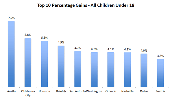
    Forbes took a close look at the most recent data on domestic migration — that is movement within the U.S. between metro areas — between 2010 and 2014. We ranked the nation’s 53 largest metropolitan areas based on their annualized rates of population change attributable to migration. What we found is that to a remarkable extent, Americans still seem to be whistling Dixie. Eight of the 10 fastest gainers were in the former Confederacy, led by Austin, Texas, which gained 126,296 more migrants over that time span from other parts of the country than it lost in outmigration, accounting for an annual increase in its population of 1.69%. No other metro area in the country enjoyed anything like this rate of in-migration.

    Austin’s high job creation rate — over 3% growth annually since 2010 — has a great deal to do with its ability to lure new residents not only from other Texas cities, but from the coasts as well.

    The other Southern standouts are from the northern and western edges of the region. They include several Texas cities — No. 3 San Antonio (1.02% annual increase in population from migration) and No. 8 Houston — which have logged strong job growth and offer housing prices, adjusted for incomes, that are less than half those in coastal California, New York and parts of New England.

    The oil bust could slow down the allure of some of these cities, notably Houston as well as No. 9 Oklahoma City. But lower petroleum prices could prove a boon to nearly universally suburbanized cities such as No. 2 Raleigh, N.C. (1.14% annual growth in population from migration), and No. 5 Nashville, Tenn.,  both of which have economies built around technology, manufacturing and business services. Raleigh is growing so strongly that local officials expect the population of the metro area will double over the next 20 years.

    It’s a continuation of a longstanding shift to the South, a trend that some pundits were quick to declare was over after the Great Recession amid a perceived rise in interest in urban living. There have certainly been some Southern metro areas that seem to have lost appeal since 2010, notably Atlanta, Tampa-St. Petersburg and Jacksonville, all of whose rates of in-migration have slowed, although they’re still comfortably among the 20 top destinations.

    The Rockies And The Pacific Northwest

    In this century, the other great migration draw has been two parts of the West: the Mountain States and the Pacific Northwest. This vast region extending from Colorado to Oregon has enjoyed generally strong economic growth and reasonable housing costs, particularly in comparison with coastal California. The big winner here has been No. 4 Denver, which gained a net 103,785 domestic migrants from 2010 to 2014.

    The other strong performers in the region include No. 11 Phoenix, which gained 119,000 net migrants since 2010. But this is a slowdown from its previous pace; between 2000 and 2009 (the Census Bureau did not produce migration figures for 2009-2010), Phoenix ranked fifth in the nation. But an even bigger decline has occurred in Las Vegas, the boomtown of the last decade, which has fallen from the No. 2 in the first decade of the new millennium to 16th place in 2010-14. On an annual basis, Las Vegas is now attracting about 9,000 net migrants a year compared to 35,000 in the 2000s.

    The Pacific Northwest continues to attract more migrants than it loses, many from California. The big winner here has been No. 15 Seattle, which has gained 60,000 net migrants since 2010; in the last decade, the Emerald City barely managed 40,000 net migrants from 2000 to 2009. Portland has added about 49,000 net migrants, though its annual inflow has dropped somewhat.

    Winners And Losers

    It is frequently claimed by fiscal conservatives that politics and regulation drive these patterns. Generally speaking, there tends to be more growth in lower-tax states than in higher-taxed ones, but this analysis only goes so far. Blue metro areas like Seattle, Portland and Denver are luring new residents despite somewhat higher costs and stringent regulation. It seems likely that their success is that they are not California, a regulatory state on steroids.

    Indeed economic booms can make up for a lot of sins. No. 20 San Francisco may not be drawing newcomers like an Austin or a Nashville, but super-high costs have not been enough to overcome the lure of riches from the current tech boom. Since 2010, the area, which includes suburban San Mateo County, Marin County and the East Bay, has attracted a net 49,000 new migrants, a big turnaround compared to the massive outflow of 347,000 suffered in the first decade of this millennium.

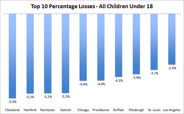
    But other expensive and expansive metropolitan areas are not doing as well in the population sweepstakes. The nation’s three largest metropolitan areas fall to the bottom of our list: Los Angeles (46th), Chicago (52nd) and, in last place New York. Since 2010, the New York metro area has lost a net 529,000 domestic migrants, adding to the 1.9 million who departed from 2000 to 2009.

    Yet these great metropolitan areas are not shrinking, due to a steady flow of new residents from overseas and a surplus of births over deaths. In this sense, they are less vulnerable to migration losses than cities such as Cleveland, Pittsburgh and Detroit, where the rate of domestic outmigration is lower, but the number of new foreign immigrants is relatively low.

    Clearly America’s migration trends are always changing, but for the most part the basics remain the same. Places that are more affordable, and also have thriving economies, tend to attract new residents while those with relatively tepid economies and high costs fare, all things being equal,  far worse.

    The Winners: No. 1: Austin, Texas

    Metro Area Population, 2014: 1.94 million

    Net Domestic Migration Gain, 2010-14: 126,296

    Annual Rate Of Pop. Increase Since 2010 From Migration: 1.69%

    No. 2: Raleigh, NC

    Metro Area Population, 2014: 1.24 million

    Net Domestic Migration Gain, 2010-14: 55,920

    Annual Rate Of Pop. Increase Since 2010 From Migration: 1.14%

    No. 3: San Antonio, TX

    Metro Area Population, 2014: 2.33 million

    Net Domestic Migration Gain, 2010-14: 94,159

    Annual Rate Of Pop. Increase Since 2010 From Migration: 1.02%

    No. 4: Denver, CO

    Metro Area Population, 2014: 2.75 million

    Net Domestic Migration Gain, 2010-14: 103,785

    Annual Rate Of Pop. Increase Since 2010 From Migration: 0.95%

    No. 5: Nashville, TN

    Metro Area Population, 2014: 1.79 million

    Net Domestic Migration Gain, 2010-14: 63,477

    Annual Rate Of Pop. Increase Since 2010 From Migration: 0.88%

    No. 6: Charlotte, NC-SC

    Metro Area Population, 2014: 2.38 million

    Net Domestic Migration Gain, 2010-14: 83,305

    Annual Rate Of Pop. Increase Since 2010 From Migration: 0.87%

    No. 7: Orlando, FLA

    Metro Area Population, 2014: 2.32 million

    Net Domestic Migration Gain, 2010-14: 72,735

    Annual Rate Of Pop. Increase Since 2010 From Migration: 0.79%

    No. 8: Houston, TX

    Metro Area Population, 2014: 6.49 million

    Net Domestic Migration Gain, 2010-14: 191,796

    Annual Rate Of Pop. Increase Since 2010 From Migration: 0.75%

    No. 9: Oklahoma City, OK

    Metro Area Population, 2014: 1.34 million

    Net Domestic Migration Gain, 2010-14: 37,528

    Annual Rate Of Pop. Increase Since 2010 From Migration: 0.70%

    No. 10: Dallas-Fort Worth, TX

    Metro Area Population, 2014: 6.95 million

    Net Domestic Migration Gain, 2010-14: 184,021

    Annual Rate Of Pop. Increase Since 2010 From Migration: 0.67%

    The Losers: No. 10: Milwaukee, WI

    Metro Area Population, 2014: 1.57 million

    Net Domestic Migration Loss, 2010-14: 22,597

    Annual Rate Of Pop. Decrease Since 2010 From Migration: -.34%

    o. 9: Virginia Beach-Norfolk, VA-NC

    Metro Area Population, 2014: 1.72 million

    Net Domestic Migration Loss, 2010-14: 24,374

    Annual Rate Of Pop. Decrease Since 2010 From Migration: -.34%

    No. 8: Los Angeles, CA

    Metro Area Population, 2014: 13.26 million

    Net Domestic Migration Loss, 2010-14: 208,635

    Annual Rate Of Pop. Decrease Since 2010 From Migration: -.39%

    No. 7: Rochester, NY

    Metro Area Population, 2014: 1.08 million

    Net Domestic Migration Loss, 2010-14: 17,665

    Annual Rate Of Pop. Decrease Since 2010 From Migration: -.39%

    No. 6: Memphis, TN-MS-AR

    Metro Area Population, 2014: 1.34 million

    Net Domestic Migration Loss, 2010-14: 21,999

    Annual Rate Of Pop. Decrease Since 2010 From Migration: -.39%

    No. 5: Cleveland, OH

    Metro Area Population, 2014: 2.06 million

    Net Domestic Migration Loss, 2010-14: 38,424 

    Annual Rate Of Pop. Decrease Since 2010 From Migration: -.44%

    No. 4: Detroit, MI

    Metro Area Population, 2014: 4.30 million

    Net Domestic Migration Loss, 2010-14: 89,649

    Annual Rate Of Pop. Decrease Since 2010 From Migration: -.50%

    No. 3: Hartford, CT

    Metro Area Population, 2014: 1.21 million

    Net Domestic Migration Loss, 2010-14: 27,425

    Annual Rate Of Pop. Decrease Since 2010 From Migration: -.54%

    No. 2: Chicago, IL-IN-WI

    Metro Area Population, 2014: 9.55 million

    Net Domestic Migration Loss, 2010-14: 237,666

    Annual Rate Of Pop. Decrease Since 2010 From Migration: -.60%

    No. 1: New York, NY-NJ-PA

    Metro Area Population, 2014: 20.09 million

    Net Domestic Migration Loss, 2010-14: 528,742

    Annual Rate Of Pop. Decrease Since 2010 From Migration: -.64%

    This piece first appeared at Forbes.

    Joel Kotkin is executive editor of NewGeography.com and Roger Hobbs Distinguished Fellow in Urban Studies at Chapman University, and a member of the editorial board of the Orange County Register. He is also executive director of the Houston-based Center for Opportunity Urbanism. His newest book, The New Class Conflict is now available at Amazon and Telos Press. He is also author of The City: A Global History and The Next Hundred Million: America in 2050. He lives in Orange County, CA.

    Wendell Cox is Chair, Housing Affordability and Municipal Policy for the Frontier Centre for Public Policy (Canada), is a Senior Fellow of the Center for Opportunity Urbanism (US), a member of the Board of Advisors of the Center for Demographics and Policy at Chapman University (California) and principal of Demographia, an international public policy and demographics firm.He is co-author of the “Demographia International Housing Affordability Survey” and author of “Demographia World Urban Areas” and “War on the Dream: How Anti-Sprawl Policy Threatens the Quality of Life.” He was appointed to three terms on the Los Angeles County Transportation Commission, where he served with the leading city and county leadership as the only non-elected member. He served as a visiting professor at the Conservatoire National des Arts et Metiers, a national university in Paris.

  • Providing Electricity to Africa by 2050

    How many Africans will have access to electricity by 2050?

    According to the World Bank’s latest figures, 64.6% of the population of sub-Saharan Africa lacked access to electricity in 2012, or a total of 572 million people. Across the world, 1.09 billion have no access to electricity. So, sub-Saharan Africa accounts for more than half the total.

    Given the expected boom in the African population and the likely increase in access, the demand for electricity infrastructure is going to explode between now and 2050. On UN estimates (medium variant), the sub-Saharan population will jump from 886 million in 2012 to 2.1 billion in 2050. Assuming that each country’s current access rate remains the same, 381 million additional people will have access to electricity and 855 million additional people will not.

    Screen Shot 2015-09-15 at 4.33.48 PM (2)

    In order to maintain its current low rate of access, sub-Saharan Africa would have to increase its power generation by at least 100%, and more likely by 200% or more if one accounts for the frequent power outages across the continent.

    In order for the subcontinent to raise to 50% the percentage of people who have electricity on a reliable basis, it would need to increase its electricity generation by a factor of 3 to 5.

    Power Africa

    Then there is President Obama’s Power Africa initiative launched in 2013 which seeks to “double access to power in sub-Saharan Africa”. At first, Power Africa focused on six countries – Ethiopia, Ghana, Kenya, Liberia, Tanzania and Nigeria – and its goal was to add 10,000 megawatts of electricity generation and 20 million new connections.  But during the US-Africa Leaders Summit of 2014, the program was expanded to other countries and its scope was tripled to 30,000 megawatts and 60 million new connections. (Note: this assumes 2,000 connections per megawatt. In developed countries, the ratio is often closer to 1,000 connections per megawatt).

    July 2015 fact sheet from the White House states that Power Africa has helped bring on line 4,100 megawatts to 4 million connections. But critics claim that these projects were already in progress before the program was introduced and that new projects have been slow to get off the ground. As reported in this New York Times article, Sam Amadi, chairman of the Nigerian Electricity Regulatory Commission, the country’s electric power regulator, recently said that he was “not aware of any concrete plans for power plants that have emerged as a result of Power Africa.”

    In the long term, if ‘double access’ means doubling the number of people who have access to electricity without necessarily increasing individual consumption, that would translate into access for an additional 314 million people, roughly equivalent to the current size of the US population.

    But if ‘double access’ means doubling the percentage of people who have access to electricity, that would mean enough new electricity to reach an additional 1.19 billion people on the continent in 2050. This number exceeds the 2015 combined populations of the USA and Europe.

    If Africa reaches 100% access in 2050, it will have built enough infrastructure to reach 1.8 billion additional people, a near six-fold increase from the number that have access today.

    Other populous nations of the world already enjoy higher access rates. But here also, there is likely to be significant new demand from rising population numbers. Assuming the same access rates in 2050 as in 2012, there would need to be new infrastructure to reach an additional 708 million people living in Mexico, Brazil and several Asian countries.

    Per Capita Consumption

    At the same time, ‘access’ can mean different things to different people. In the United States, per capita consumption of electricity stands at nearly 13,000 kWh. In China, it is 3,475 kWh. In India, 744 kWh and in much of sub-Saharan Africa, it is less than 500 kWh. Below are per capita consumption numbers for Africa.

    Screen Shot 2015-09-23 at 2.25.54 PM (2)<

    And here are per capita consumption numbers for other emerging nations:

    Screen Shot 2015-09-23 at 2.26.12 PM (2)

    As usual, financing and execution will be the main hurdles but it is clear that the demand for new electricity infrastructure is going to be very very high in Africa and in Asia.

    Sami Karam is the founder and editor of populyst.net and the creator of the populyst index™. populyst is about innovation, demography and society. Before populyst, he was the founder and manager of the Seven Global funds and a fund manager at leading asset managers in Boston and New York. In addition to a finance MBA from the Wharton School, he holds a Master’s in Civil Engineering from Cornell and a Bachelor of Architecture from UT Austin.

    Photo by DIVatUSAID via Flickr

  • New Report: Putting People First

    This is the abstract from a new report “Putting People First: An Alternative Perspective with an Evaluation of the NCE Cities ‘Trillion Dollar’ Report,” authored by Wendell Cox and published by the Center for Opportunity Urbanism. Download the full report (pdf) here.

    A fundamental function of domestic policy is to facilitate better standards of living and minimize poverty. Yet favored urban planning policies, called "urban containment" or "smart growth," have been shown to drive the price of housing up, significantly reducing discretionary incomes, which necessarily reduces the standard of living and increases poverty.

    This makes the alleviation of poverty, the opportunity for better living standards and aspirations for upward mobility secondary to contemporary urban planning prescriptions. Despite this, calls to intensify land use regulations are becoming stronger and more insistent.

    A New Climate Economy report (NCE Cities report), by Todd Litman, "Analysis of Public Policies that Unintentionally Encourage and Subsidize Urban Sprawl," contends that the failure to implement urban containment policy (smart growth) costs more than $1.1 trillion annually in the United States. The urban containment policies favored by the NCE Cities report seek substantially increase urban population densities and transfer urban travel from cars to transit, walking and cycling.

    There are serious consequences to such policies, which lead to lower standards of living and greater poverty. This report evaluates the NCE Cities report which places urban containment policy as its most important priority. This Evaluation report offers an alternate vision, focused on improving living standards for all, while seeking to eradicate poverty.

    The NCE Cities report relies heavily on social costing and externality analysis of lower density development. While these are useful tools, they are ultimately subjective and should be used with great caution.

    This Evaluation identifies a number of issues with respect to the NCE Cities report cost analysis.

    1. Nearly 90% of the cost is attributable to personal vehicle use, and is based on a fixed cost per mile differential between the Most Compact (densest) quintile of US urban areas and the four quintiles that are less dense. This Evaluation finds a range of differences in per capita mileage among the quintiles that is far smaller than the NCE Cities report estimates. Adjustment for this and other issues would reduce the NCE Cities report cost estimate by nearly 85 percent, to a maximum that is under $200 billion. Other, unquantified issues are identified that could reduce the reduced estimate even further.

    2. The NCE Cities report largely dismisses the housing affordability consequences of urban containment policy. By rationing land, urban containment policy drives up the price of housing and has been associated with an unprecedented loss of housing affordability in a number of metropolitan areas in the United States and elsewhere. Urban containment policy has also been associated with greater housing market volatility. This is a particular concern given the role of the 2000s US housing bubble and bust in precipitating the Great Financial Crisis that resulted in a reduction of international economic output.

    3. Urban containment policy has significant negative externalities. A recent economic analysis associates an annual loss of nearly $2 trillion in gross domestic product in the United States with more stringent housing regulation. This estimate would nullify the NCE Cities report cost of dispersion estimate by more than 1.5 times. More significantly, it would dwarf the NCES Report cost estimate as adjusted in this Evaluation.

    The purpose of public policy in cities is not to focus a particular urban form, planning philosophy, type of housing, population density, or mode of transport. The purpose is rather to seek better lives for people. The most appropriate form of urban planning policy is that which facilitates better living standards and less poverty. There is increasing evidence that urban containment policy is not only irreconcilable with housing affordability and price stability but also with better standards of living and reduced poverty.

    Download the full report (pdf) here.

    Wendell Cox is Chair, Housing Affordability and Municipal Policy for the Frontier Centre for Public Policy (Canada), is a Senior Fellow of the Center for Opportunity Urbanism (US), a member of the Board of Advisors of the Center for Demographics and Policy at Chapman University (California) and principal of Demographia, an international public policy and demographics firm.He is co-author of the "Demographia International Housing Affordability Survey" and author of "Demographia World Urban Areas" and "War on the Dream: How Anti-Sprawl Policy Threatens the Quality of Life." He was appointed to three terms on the Los Angeles County Transportation Commission, where he served with the leading city and county leadership as the only non-elected member. He served as a visiting professor at the Conservatoire National des Arts et Metiers, a national university in Paris.

  • Recent Growth and Decline of Children in Major Metropolitan Areas

    That America has an aging population is well known. Estimates data released this summer by the Census Bureau illustrate this transition in progress – and paint a picture of an actual shrinking number of children in many major American metro areas.

    From 2010 to 2014, the percentage of the population of residents under the age of 18 shrank in every single metro area with more than a million people. This reflects the aging of the population in progress.  But it’s not just that there are more older people. In about half of these major American metros, the actual number of children declined

    These results roughly fall alone lines that would be expected, with regions that are rapidly growing their total population, like Austin, also strongly growing in children. In fact, Austin was the top gainer with a 7.9% increase in children. Houston (+5.5%), Washington, DC (+4.2%) and Denver (+3.1%) were also among those posting strong gains.

    The loss department is dominated by usual post-industrial suspects, with Cleveland being the “biggest loser” at -5.5%. Detroit (-5.2%), Chicago (-4.4%), and Philadelphia (-2.7%) were also among the losers.  But you don’t have to have crummy weather to lose kids. Notable among those losing children is Los Angeles, whose child population dropped by 3.3% or over 100,000 people. This loss is not being made up, as in the past, by the Inland Empire, with Riverside-San Bernardino also seeing its child population shrink, by 2.1% or over 25,000 people. This is a remarkable reversal for Los Angeles, once one of America’s great growth stories.

    This loss of children augurs poorly for reversing population loss or stagnation in many of these regions. With the next generation of women of childbearing age smaller than the one before it, this suggests even further declines are possible.

    In sum, while very few regions are losing population on a total basis, many more   are failing at creating the next generation of residents. Of course it  is possible to make up for natural increase in population by attracting newcomers, but consider that these statistics include the children of those recent arrivals as well.

    Looking at younger, pre-school age children under the age of five, even more – 34 out of 54 – large metro areas showed a decline. This includes surprising small losses even in rapidly growing, traditional family magnets like Atlanta, Charlotte, Nashville and Kansas City. This reflects how pervasive low birthrates have become.

    Conversely, again some traditionally slower growth cities and some conventionally viewed as not child friendly– San Francisco, Seattle, and Boston  are seeing slight  gains in their population of young children even though their percentages drop. Keep in mind these are metropolitan area numbers, not central city ones, as most children, particularly those older than five, end up in suburbs. But even so, the performance of these regions is remarkable compared to declines in celebrated urban areas like Chicago and Los Angeles.

    The Pacific Northwest cities of Portland and Seattle also make for an interesting contrast. Both have experienced similar, and healthy, overall population growth since 2010, with Portland growing slightly faster.  But the Seattle area was a much stronger performer when looking at children. In fact, Seattle ranked #10 (out of 53) large metros in the country with 3.3% growth.  Portland, however, eked out only 0.4% growth.  Looking at children under age five, Seattle actually ranked third in growth at 4.2% while Portland shrank by 2.6%.

    And New York City is a particularly interesting case. Its total child population declined by over 47,000 people, or 1.1%.  But its under five population grew by over 33,000, or 2.8%, and it was one of only two large metros, along with Buffalo, that actually increased it share of the population in that age group.  Brooklyn and Manhattan led the way, each posting double digit percentage growth, though from a low base in Manhattan’s case. Queens did nearly as well.  Staten Island, traditionally the most family centered area, was the only borough to lose young children.  Long Island, Westchester, and Dutchess County lost them as well. 

    The real question is whether places like Manhattan will be able to retain these families as the kids reach school age. Its population of those 5-17 has continued to decline. Given its high costs, it’s not realistic to expect Manhattan to ever be a premier family magnet. But there are surely some city-dwellers with children who might want to stay if life with children could be incrementally better supported in the city with things, such as low crime, clean parks and good schools, that tend to matter to families. This challenge will be felt by all cities as their youth populations begin to enter their prime childbearing years.

    Aaron M. Renn is a senior fellow at the Manhattan Institute and a Contributing Editor at City Journal. He writes at The Urbanophile.

    Baby photo by Bigstock.

  • Race, Ancestry, and Genetic Composition of the U.S.

    Race and ancestry, or countries/peoples of origin, are popular topics, with large amounts of data attempting to help us understand the ethnic nature of the country. In this paper I attempt a summary description of the intersections of race, ancestry, and genome, at the state level, but I hasten to emphasize that the “findings” are tentative, highly uncertain, and based on astoundingly unreliable data. I hope some readers may point the way to better data or safer interpretations.

    Table 1 presents a summary of numbers of people by ”race” by broad ancestral/ethnic or countries of origin together with the main Y-DNA (male) genetic haplogroups associated with the racial and ancestral groups. The haplogroups are male individuals who share a particular mutation or common male ancestor up to 50,000 years ago. All this is uncertain and speculative, for these reasons. The race and ancestral identifications are self-reported, and subject to lying as well as ignorance. But we still can make beautiful detailed maps, down to the county level! The numbers of persons with good DNA analyses are too few to permit highly confident estimates at useful levels of geography. But let’s see what we have.

    Table 1 Race, Ancestry, Haplogroups
    Group Number (millions) Ancestry group Number (millions) Haplogroups
    White
    215
    White,nonihisp
    192
    Eng,Scot,Ire
    87
    R1b
    I
    Germany-Scaand
    50
    R1b
    I
     SCAndin
    10
    I
    R1b
    France Belg
    12
    R1b
    Italy
    16
    R1b
    J
    E Europe
    16
    R1a
    I,J,N
    Balkans,Near east
    2
    J, G
    WhiteHispan
    23
    Mexico
    16
    R1b
    CentAmer,Carib
    7
    R1b
    African
    40
    E
    Asian
    14
    Mod white admix
    O
    NatAmerican
    34
    US, AK
    5
    Q
    R1b
    LatAmericca
    29
    Pacific Islan
    0.4
    Hi white admix
    up to 50%
    Mixed compl
    9
    M


    Race

    Well, some 215 million people are probably mainly white (69%), of which 192 million (61%) are self-identified non-Hispanic white. The difference of 23 million are people who identify as white and Hispanic. About 40 million identify as Black or African-American, although there is probably an admixture of 20 percent or more of “whiteness”.  Up to 14 million identify as of Asian origin, but as many as 1 million may be white in genetics and appearance, e.g. people from Afghanistan, NW India or West Pakistan.  Finally less than 1 million identify as Pacific Islanders.

    This leaves a large number of 34 million who identify as all or partly Native American, including about 5 million Alaskan or US Native American, about half of whom are clearly Native American, but about half of whom appear to be and are probably genetically mostly white. Then 29 million are “Mexican” or Caribbean, etc., not a race, but a perceived or actual combination of Spanish (some Portuguese) and Native Americans, from the US southwest, central America, the Caribbean, and South America. Even though these people legitimately identify as a mix of Native and Spanish, most are genetically “white” (see below).

    Ancestry, country of origin, or ethnicity are even harder categories. The complexity is incredible. Not only have the “countries” changed again and again over the last few centuries, but persons’ stated identities,  which can be multiple, are often bewildering, because of centuries of mixing, often with people who may not know their heritage. For example, some 20 million identify as “American” which is perfectly reasonable, if they are descended from early immigrants (1620 to 1820). People also do reasonably identify with more than one county/people, but these combinations are not tabulated, and it is difficult to claim accuracy from the data on ancestry. Finally, most of our ancestries are European countries, but we know from both history and genetic analysis that people have mingled and moved within “Europe” for thousands of years.

    Given these warnings, what do we almost know? The largest groupings of non-Hispanic whites first the English-Scottish-Irish at some 87 million, 28% of the population, followed by Germans (including Dutch, Austrian, Swiss) at about 50 million, and Scandinavians at 10 million. Others from Western Europe include 16 million from Italy and probably 12 million from France. Eastern Europe is the origin of about 16 million, including 9 million from Poland, 3.5 million from Russia, and 1.5 million from both Hungary and Czechoslovakia, and over 1 million from Greece. About 2 million are from the eastern Balkans and the Middle East.

    As discussed above, self-identified Hispanic whites number some 23 million, people with an African origin perhaps 40 million, of an Asian origin, 13 million, then up to 34 million as from Native American or Native-American-Spanish admixture.

    Genetic composition

    Much has been learned about the genetic evolution of humans and of their complex migration out of Africa, then across the globe. Since the majority of Americans are of European ancestry, the genome story of Europe translates to the genetic structure of the United States.  Table 2 summarizes the numbers of persons by haplogroup estimated for the US population. In Table 1 I added an estimate of the haplogroups associated with the racial-ancestral combinations. These are tentative and will be worked on further.  

    Table 2 Major haplogroups
    Group Population % of population Areas
    R1b
    156
    50
    W Europe
    E
    43
    14
    Africa
    I
    44
    13
    Mid Europe
    R1a
    16
    6
    E Europe
    J
    14
    5
    SE Europe, Near East
    G
    12
    4
    SW Asia
    O
    10
    3
    Asia
    Q
    9
    3
    NatAmerican
    N
    2
    0.7
    Baltic, Siberia
    M
    0.5
    0.2
    Pacific Island


    The relevant haplogroups are:

    • E, over 50,000 years old, still dominant in Africa, and the many descendant groups of equally old
    • F, which developed in south Asia (India-Pakistan), from the earliest migration out of Africa (Europe was still ice-bound). All F subgroups seem to have differentiated in the same hearth area (India to the Caucasus), gradually moving northwest.
    • G occurs in modest numbers in Italy, Turkey and the Balkans,
    • N in the Baltic countries and Siberia,
    • I divided into I1, still strongly Scandinavian and I2 in south Italy and the west Balkans
    • J in Greece and the Middle East (includes most Jews).
    • R1b swept into Europe, dominant from Italy through France, Spain, Portugal, Belgium on through England and Ireland (plus North Africa).
    • R1a is strongest in Eastern Europe (Poland, Czechoslovakia, and Russia)
    • O, Asian
    • Q, Native American

    Evidently groups G, I and J were in Europe by 25,000 years ago, N 20,000 years ago, but the now dominant groups R (R1a, R1b) not until 15 to 20,000 years ago. 

    Sequencing of haplogroups
    Yrs BP
    50-52,000
    E F
    45,000
    G HIJK
    40,000
    IJ K
    30,000
    I J K2
    25,000
    E G I1,I2 J NO K2
    20,000
    N O P
    17,000
    E G I1,I2 j N O Q R
    R1a,R1b


    In the tables and maps I distinguish between the R1B peoples dominantly English, German or French-Italian, and an R1bh population, which is the self-reported American Hispanic population, but which is not genetically different, from the male Y-dana point of view.

    How does this translate to US states (besides with difficulty)? The estimates are based on the self-reported ancestry of people by states and related to the haplogroups of those ancestries. Please see Table 3 and three maps of states the classification is based on the top 2 or 3 relevant haplogroups. HI is unique as the only state with a dominant O, Asian, group, and the District of Columbia as the only area dominated by E (African origin).

    Four states, KS, ME, NH, and WV are most strongly just R1b (West European – English, German and Italian-French). The largest number of states, 12, the historic south, plus MO, are primarily R1b and secondarily E. Six states are also strong in R1b and E, but also in R1a, eastern Europe, IN, MD,MI, OH, NY (also has Hispanic and Jewish), and PA. Somewhat similar are IL and NJ (notice that many of these are contiguous), with R1b, E, and R1bh.

    Estimated Haplogroups for US states
    State Dominant group Share 2nd (share) 3rd (share) 4th (share) Rb1Eng Rb1erm Rb1FRIT
    AL R1b 50 E 25 38 8 4
    AK R1b 56 Q 13 I 7 R1a 6 28 21 7
    AZ R1b 53 R1bh 25 E 7 R1a 6 28 17 8
    AR R1b 70 E 13 38 28 4
    CA R1b 37 R1bh 30 O 14 E 7 R1a5 19 11 7
    CO R1b 68 R1bh 16 R1a 6 I 6 33 25 10
    CT R1b 76 R1a 15 34 13 29
    DE R1b 69 E 14 38 18 13
    DC E 43 R1b 31 17 8 6
    FL R1b 52 R1bh 20 E 15 R1a8 J 5 30 12 10
    GA R1b 50 E 30 37 9 4
    HI O 40 R1b  22 M 16 13 1 8
    ID R1b 70 I 8   41 22 7
    IL R1b 56 E 15 R1bh 12 R1a 6 27 22 9
    IN R1b 69 E 7 R1a 6 37 27 5
    IA R1b 81 I>10 33 43 5
    KS R1b 70 35 32 3
    KY R1b 71 E 7 50 17 4
    LA R1b 55 E 25 24 9 22
    ME R1b 97 56 10 31
    MD R1b 53 E 24 R1a 8 29 16 8
    MA R1b 80 R1a 8 42 8 30
    MI R1b 69 E 14 R1a 11 J 5 30 27 12
    MN R1b 68 I 16 + R1a 8 23 38 7
    MS R1b 44 E 28 32 7 5
    MO R1b 74 E 12 38 29 7
    MT R1b 78 I 11 Q 7 40 30 8
    NE R1b 79 R1a 11 I 9 32 41 6
    NV R1b 51 R1bh 20 27 14 10
    NH R1b 96 50 10 37
    NJ R1b 58 E 17 R1bh 13 R1a >12 J 8 26 13 19
    NM R1b 55 R1bh 35 Q >10 33 17 5
    NY R1b 56 E 15 R1a 10 R1bh 9 J 7 26 13 17
    NC R1b 55 E 20 36 12 7
    ND R1b 72 I>10 R1a 9 19 46 7
    OH R1b 66 E 12 R1a >10 28 29 9
    OK R1b 55 Q 10 E 7 34 17 4
    OR R1b 67 I 9 36 23 8
    PA R1b 77 R1a 11 E 10 34 29 14
    RI R1b 89 R1a 7 38 6 45
    SC R1b 53 E 28 37 11 5
    SD R1b 70 I 20? Q 9 R1a6 25 40 5
    TN R1b 59 E 17 43 12 4
    TX R1b 49 R1bh 30 E 13 22 12 15
    UT R1b 65 I 13 R1bh 12 44 15 6
    VT R1b 93 R1a 5 50 12 31
    VA R1b 56 E 20 37 13 6
    WA R1b 63 I >10 O 7 R1bh 6 33 22 8
    WV R1b 73 45 21 7
    WV R1b 77 I >10 R1a >10 24 45 8
    WY R1b 80 Q 5 I >5 43 29 8

    The second map includes a set with the R1b and I1 combination (high in Scandinavian also), ID, IA, and OR, a related pair with a significant R1bh presence, UT and WA, which also has a sizeable O population.  Also related are MT and SD, with R1b, I but also Q (Native American). States with R1b, I and also R1a (Eastern Europe) include MN, NE, ND and WI. Three states have R1b, then Q or Q and I:  OK<WY and AK (the highest Q share at 13%).  

    The third map shows first four states with R1b and R1a, all in New England: CT, MA, RI and VT. CO and NV have the combination of R1b and R1bh. CA is quite complex, with only a modest R1b share, a very large r1bh share, and also a sizeable O and then E share. AZ and NM also have R1b, R1bh, but also Q (Native American).  FL is also complex, with R1b, R1bh, but also E, R1a and J.

    Ancestry

    I also present a few maps of ancestry combinations (most published maps show the single strongest). The shares of English (plus Scot and Irish), German (plus Austria, Netherlands and Switzerland) and French-Italian (plus Belgium) – all part of the R1b group, are also shown in Table 3.

    English and German (19 states) and German and English (7) are the most common ancestries of Americans (Map 4). English and German by themselves dominate most in KS and WV. Scandinavian is added to English-German for ID, OR and WA (which also adds Asian), and to German-English, for IA, MN, ND, SD, then together with East European for NE and WI. These 11 states are the most “northern European”. Native Americans are added most for MT, OK, WY and especially AK (now 15 states) and then a Hispanic component to CO and UT.

    The English-German and German-English sets include 8 more states with a sizeable Black population, AR, DE, IL, IN, KY, MI and MO, and OH, then PA with a sizeable French-Italian and East European population as well. The full set is also a contiguous bloc across much of the north, and crossing into the south central.

    Not surprising (Map 5) is the English Hispanic (AZ, NV) and Hispanic-English, (NM, plus CA and TX, with additional Asian and German, and Black and French-Italian, respectively), covering the southwest, plus FL, adding a Black population). An English-Black combination coves the rest of the southern portion of the country – LA (Black English, French), then AL. GA, MS, NC, SC, TN and even MD.

    This leaves, (Map 6) besides HI and DC, a northeastern set of 8 states with a distinctive combination of English and French-Italian, CT, ME, NH, RI, VT, plus MA, adding E European) and complex NY, adding Black and East European. The entire mosaic reveals the fascinating stories of immigration and subsequent migration, still ongoing and becoming ever more complex.

    Richard Morrill is Professor Emeritus of Geography and Environmental Studies, University of Washington. His research interests include: political geography (voting behavior, redistricting, local governance), population/demography/settlement/migration, urban geography and planning, urban transportation (i.e., old fashioned generalist).

  • Wave of Migrants Will Give Europe an Extreme Makeover

    The massive, ongoing surge of migrants and refugees into Europe has brought up horrendous scenes of deprivation, along with heartwarming instances of generosity. It has also engendered cruel remembrances of the continent’s darkest hours. But viewed over the long term, this crisis may well be the prelude to changes that could dissipate, and even overturn, some of the world’s most-storied and productive cultures.

    Some may prefer to ignore the long-term impacts of huge migration from the often-chaotic developing world – where 99 percent of the world’s population growth will be taking place – to the more orderly, prosperous and low-fertility richer countries. Separated from the daily drama, the human movement from Syria, the rest of the Middle East and Africa can be seen as potentially changing European society forever by breaking its already-weak Christian foundations and threatening the future of Europe’s elaborate welfare states. In many ways this invokes the vision laid out in the 1973 French novel “Le Camp des Saints,” which envisioned a Europe overwhelmed by a tide of poor refugees.

    These concerns, of course, are not simply European. The flow of generally lower-income people from Central and South America has emerged – largely courtesy of the demagogic Donald Trump – as a key political issue in the Republican presidential race. Claims, based on federal employment data, that immigrants have gained far more jobs in the recovery is the kind of thinking that keeps Trump in business. Concerns about other transfers from the Third World to the First World have also surfaced in a host of other countries, including Canada, Australia and even orderly Singapore.

    Read the entire piece at The Orange County Register.

    Joel Kotkin is executive editor of NewGeography.com and Roger Hobbs Distinguished Fellow in Urban Studies at Chapman University, and a member of the editorial board of the Orange County Register. He is also executive director of the Houston-based Center for Opportunity Urbanism. His newest book, The New Class Conflict is now available at Amazon and Telos Press. He is also author of The City: A Global History and The Next Hundred Million: America in 2050. He lives in Orange County, CA.

  • Peak People in Japan

    Japan reached "peak people" in 2011, when its population reached 127.4 million residents. From that point, all trends point to significant population losses. But, there is by no means unanimity on the extent of those population losses. Population projection is anything but an exact science, and Japan provides perhaps the ultimate example.

    Dueling National Population Projections

    Japan’s agency responsible for projecting population, the National Institute of Population and Social Security Research forecasts a stunning reduction of population to only 42.9 million residents in 2110. For every three Japanese residents today, there will be one in 2110 according to the National Institute of Population. If this projection is realized, Japan’s population would drop to a level not seen since the middle 1890s.

    The National Institute of Population projects a population loss to 97.0 million residents by 2050, for an annual population loss rate of 0.7 percent from 2015. By 2100, the population would fall to 49.6 million, for an annual loss rate of 1.3 percent. Over the 95 years from 2015, the annual population loss rate would accelerate from 0.4 percent annually to nearly 1.5 percent.

    The United Nations is considerably more optimistic about Japan’s future population than the National Institute of Population. The UN forecasts a population of 108.3 million residents by 2050, or 11 million more residents than expected by the National Institute of Population. The annual loss rate is 0.4 percent, one half the rate projected by the National Institute of Population. By 2100, the last year of the UN series, the population would be 84.5 million, 35 million more than the National Institute of Population figure. The UN’s annual population loss rate would be 0.8 percent (Figure 1).

    Major Metropolitan Areas

    Much of Japan’s urban population is in the dense corridor from Tokyo-Yokohama to Osaka-Kobe-Kyoto, a distance of approximately 300 miles (500 kilometers). The four metropolitan areas of this corridor (Tokyo-Yokohama, Shizuoka-Hamamatsu, Nagoya, and Osaka-Kobe-Kyoto) contain approximately 75 million residents. By comparison, the US Northeast Corridor is about 1.5 times as long and has under 50 million residents.

    According to National Institute of Population data, each of the 10 largest metropolitan has reached its population peak. The most populous, Tokyo-Yokohama is the only major metropolitan area to have gained population between 2010 and 2015. Each of the others had already reached their population peaks, according to the forecasts that end in 2040 (Figure 2).

    Tokyo-Yokohama:Tokyo-Yokohama is the world’s largest metropolitan area (labor market area). Much of it is located on the Kanto plain that stretches in three directions from Tokyo Bay. Between 2010 and 2015, Tokyo-Yokohama grew from a population of 42.6 million to 42.8 million. However a strong turnaround is anticipated. By 2020, the population is expected to fall to 42.4 million. Tokyo-Yokohama is expected to decline to 38.0 million residents in 2040, a reduction approximately equal to the population of metropolitan areas such as Phoenix, Montréal, and Melbourne. The 2040 population would represent a loss of approximately 11 percent from 2015.

    Osaka-Kobe-Kyoto: Osaka-Kobe-Kyoto has been Japan’s second largest metropolitan area for decades. Osaka-Kobe-Kyoto is a true conurbation, with three separate core cities and their suburbs that have grown together to form a single urban area, which now also encompasses smaller Nara, the country’s ancient capital. Some of Japan’s most important historical sites are in Kyoto and Nara. Despite having less than one half the population of Tokyo-Yokohama, Osaka-Kobe-Kyoto has been one of the world’s largest metropolitan areas for at least the last half of the century. Osaka-Kobe-Kyoto’s population fell from 20.9 million in 2010 to 20.7 million in 2015. By 2040, this large urban agglomeration is forecast to have a population of 17.5 million, down 16 percent from its 2015 level.

    Nagoya: Nagoya is Japan’s third largest metropolitan area and is located about two thirds of the way between Tokyo-Yokohama and Osaka-Kobe-Kyoto. Nagoya is renowned as the headquarters of Toyota. Nagoya is expected to fall from its 11.3 million residents in 2015 to 11.2 million in 2020 and 10.0 million in 2040. This population loss rate would be similar to that of Tokyo-Yokohama, at approximately 11 percent.

    Fukuoka-Kitakyushu: The Fukuoka-Kitakyushu metropolitan area is comprised of two large and separate urban areas. It is the only metropolitan area of the largest five that is not in the Tokyo to Osaka corridor. Further, Fukuoka-Kitakyushu is on the island of Kyushu, to the south of the main island of   Honshu. Fukuoka-Kitakyushu had a population of 5.0 million in 2015 and is expected to fall to 4.4 million in 2040. This is an approximately 12 percent population loss rate, somewhat worse than Tokyo-Yokohama and Nagoya.

    Shizuoka-Hamamatsu:The Shizuoka-Hamamatsu metropolitan area is located between the Tokyo-Yokohama and Nagoya metropolitan areas. In 2015, the population was 3.7 million, which is expected to drop to 3.0 million in 2040. This area, long a critical part of Japan’s industrial complex, would suffer the largest loss among the five largest metropolitan areas, at 18 percent.

    The Rest of Japan: The balance of Japan would experience an even greater loss, dropping from 43 million in 2015 to 34 million in 2040. This would represent a decline of 20 percent.

    Japan: Leading the Way?

    Japan is just the first of a wave of nations that are expected to experience population declines. The challenges are likely to be great as the nation is forced to downsize its considerable infrastructure to accommodate a smaller population. With a growing imbalance of senior citizens relative to working age adults, there are likely to be significant difficulties in financing social services. Japan’s strategies and successes or failures will be watched closely by national leaders from Berlin to Beijing and Brasilia whose nations  are likely to experience reductions in population and demographic imbalances starting mid-century or sooner.

    Wendell Cox is Chair, Housing Affordability and Municipal Policy for the Frontier Centre for Public Policy (Canada), is a Senior Fellow of the Center for Opportunity Urbanism (US), a member of the Board of Advisors of the Center for Demographics and Policy at Chapman University (California) and principal of Demographia, an international public policy and demographics firm.
    He is co-author of the "Demographia International Housing Affordability Survey" and author of "Demographia World Urban Areas" and "War on the Dream: How Anti-Sprawl Policy Threatens the Quality of Life." He was appointed to three terms on the Los Angeles County Transportation Commission, where he served with the leading city and county leadership as the only non-elected member. He served as a visiting professor at the Conservatoire National des Arts et Metiers, a national university in Paris.

    Photo: Fukuoka (by author)

  • The Comeback Of The Great Lakes States

    For generations the broad swath of America along the Great Lakes has been regarded as something of a backwater. Educated workers and sophisticated industries have tended to gather in the Northeast and on the West Coast, bringing with them strong economic growth.

    Yet increasingly these perceptions are outdated. The energy hotbeds of Texas, Oklahoma and North Dakota may have posted the strongest employment growth since 2007, and were among the first states to gain back all the jobs lost in the recession. But a group of less heralded places from Minnesota to western Pennsylvania have also enjoyed a considerable revival, as energy, manufacturing, logistics and other basic industries have rebounded.

    Every Great Lakes state except for Illinois now has an unemployment rate below the national average, a stunning reversal from previous decades.

    Ironically the state most popularly associated with long-term economic decline, Michigan, has been lauded in a Pew study as perhaps the ”biggest success story.” From the state’s nadir of household employment in November 2009 through this July, the Wolverine State has added 302,543 jobs, a 7.2% increase.

    An Industrial Comeback

    One clear key to improving conditions in Michigan and elsewhere is the revival of America’s industrial economy. Following a generation of falling employment, the sector has been on something of a rebound since 2010, adding some 855,000 jobs. Although many of these new jobs are in the Southeast and Texas, Great Lakes states have been at the center of the turnaround. The fastest growth in industrial employment over the past five years has been in three Michiganmetro areas — Detroit, Warren and Grand Rapids – and Toledo, Ohio.

    Structural and political factors are behind the Midwestern recovery. Rising wages in China and the North American energy boom have helped make U.S. companies more cost competitive. German electricity prices, for example, are almost three times the average for the United States. Energy production has been a major driver in large swaths of the heartland, notably Pennsylvania, Ohio, and Oklahoma, where fracking has sparked new development.

    This growing competitiveness can be seen in a surge of capital investment. Four of the top 10 statesfor new plant and equipment investment in 2014 are in the Great Lakes region, according to Site Selection Magazine: Ohio, Illinois, Michigan, and Pennsylvania.

    Changing Geography Of Human Capital

    For generations the Great Lakes has been hemorrhaging people to the rest of the country, mainly the South and West. But that outflow has recently slowed, and in some cases reversed. According to demographer Wendell Cox, the rate of outmigration from Cleveland and Detroit has been cut by half or more while some metro areas, including Indianapolis and Columbus, Ohio, are firmly in positive territory. In contrast, Los Angeles, New York and even the Silicon Valley hub of San Jose continue to lose people to other regions.

    More surprising is the movement of younger college-educated people. American Community Survey numbers show some of the fastest growth in the population of educated workers between 2005 and 2013 occurred in places such as Pittsburgh, Columbus, Indianapolis and, yes, Cleveland, which, according to Cleveland State’s Richey Piiparinen, are attractive due to lower costs and a more family-friendly environment.

    Another analysis of the changes in the population of educated workers since 2005, by Mark Schill at the Praxis Strategy Group, reflects this shift. The rate of increase in the population of people 25 to 35 with graduate degrees was slightly higher in Pittsburgh than in San Francisco. Grand Rapids, Buffalo, Indianapolis, Columbus and Louisville did even better (albeit off low bases). These citiesare even considered something of new “hipster havens,” as young people look to these old industrial cities as better bargains for life and work.

    This brain gain parallels another important shift — the growing relevance of the Great Lakes workforce to companies here and around the world. The region already possesses the nation’s largest store of engineers in the country. STEM employment in a host of fields from manufacturing and medicine to business services is surging fast in many of these areas. Between 2004 and 2014, according to an analysis by Schill, several Midwestern states — Iowa, Michigan, Oklahoma, the Dakotas — added STEM jobs at double digit rates, equaling the percentage increases enjoyed by California and easily outpacing New York.

    It turns out that much STEM growth takes place out of the high-profile world of search engines, social media and “disruptive” business service firms. In many cases technical innovations, in the words of the French sociologist Marcel Mauss, constitute “a traditional action made effective,” often in manufacturing, medicine and other fields not always associated with “tech.” The social media and search explosion, so prominent in the Bay Area, home to a remarkable 40% of such jobs, often obscures the serious innovation taking place in the Midwest. For example, much of the earliest advances in self-driving vehicles came not from Google but tractor maker John Deere.

    As it looks to develop auto software for cars, Google looks to, in the words of the autonomous car project’s director, “a lot of amazing companies in the Detroit area and international than know how to make cars.”

    The Great Lakes position as an innovation center is based on a unique combination of engineeringschools and a high concentration of engineers. Dayton and Detroit rank among the top 12 metro areas in the country in terms of engineers per capita, with a higher concentration than Boston, San Francisco, New York, Los Angeles and Chicago.

    One particular hot spot is the area around Warren and Troy, Mich., sometimes referred to “automation alley.” This is where software meets heavy metal, with a plethora of companies focusing on factory software and new computer-controlled systems for automobiles. It is home to engineering software firms like Altair, which has been expanding rapidly, and also where General Motors recently announced plans for a $1 billion tech center, employing 2,600 salaried workers.

    Other tech development has been tied to the health care industry, including such regional standouts as the Cleveland Clinic and Mayo Clinic. Madison, Wisc., has a strong government and education employment base but also is home to growing number of technology firms, with information employment since 2009 up an impressive 36.1%. But much of the growth is related to health care, with the leading local company being medical software maker Epic, which employs 6,800 at its sprawling campus in nearby Verona.

    Qmed ranks California as the best state for medical device makers, but also ranking highly are Minnesota, Indiana, Pennsylvania and Wisconsin.

    In the coming years, more talent should be heading to these area. Housing prices in the San Francisco Bay Area, Los Angeles and New York are at least two to three times higher than most Great Lake metro areas. This is a boon to those who bought far in the past, but a barrier to entry to young aspirational families. To live in San Francisco, particularly for those who hope to raise a family, is increasingly impossible.

    It has also led some companies to locate elsewhere, particularly to the Pacific Northwest. In 2011, 1 in 7 people in the Bay Area searched Redfin.com for homes outside of the Bay Area. Now it’s 1 in 4. Adam Wiener, Redfin’s chief growth officer, announced to other executives last month: “The dam has broken.”

    Potential Threats

    Ultimately the durability of the Great Lakes recovery depends on building off its natural strengths in engineering, its central location along water routes, ample natural resources and low living costs. Pro-business policies have enhanced these advantages and made several Midwestern governors intoserious national political figures, namely Snyder in Michigan, Walker in Wisconsin, and Ohio’s Kasich.

    Yet there are serious clouds on the horizon, perhaps the biggest of which is looming EPA greenhouse gas regulations, which could shut down many coal-fired power plants in the region and raise electric rates. 

    International forces – notably the devaluation of the Chinese yuan – threaten the industrialresurgence. A strong dollar tends to make exports pricier and imports more competitive. Such changes may not matter too much on the coasts, but Midwestern states are far more dependent on manufacturing. According to the U.S. Bureau of Economic Analysis, many of the states with the highest percentage of their GDP tied to manufacturing are in the region, led by Indiana, where 25%of GDP is tied to industry, followed closely by Iowa, Ohio, Wisconsin, and Michigan.

    Ultimately the Great Lakes cannot recover fully unless it continues the revival of its core industries, while expanding in other fields based on the movement of skilled labor coming to the region. If the region can continue its progress, it will be a major boon not only to the people who live there, but to the country that needs an infusion of economic sanity, and down to earth production, to complement the growth of finance, media and communications that dominate so many business headlines.

    This piece first appeared in Forbes.

    Joel Kotkin is executive editor of NewGeography.com and Roger Hobbs Distinguished Fellow in Urban Studies at Chapman University, and a member of the editorial board of the Orange County Register. He is also executive director of the Houston-based Center for Opportunity Urbanism. His newest book, The New Class Conflict is now available at Amazon and Telos Press. He is also author of The City: A Global History and The Next Hundred Million: America in 2050. He lives in Orange County, CA.

    Photo courtesy of BigStockPhoto.com.

  • As Rivals Stumble, America Steps Up

    As its former rivals in Asia and Europe slip into torpor and even decline, America, almost despite itself, is recovering its perch as the world’s bastion and predominant power. This is all the more remarkable given that our government is headed by someone who largely rejects traditional ideas about American exceptionalism, preferring to “lead from behind.”

    Just a quick look around the world makes clear that the United States has emerged as a relative hot spot in a chilly global economy. China is devaluating its currency and ratcheting down its growth expectations. Japan and Europe continue to lag, as they have for the past decade or two. Indeed, with the possible exception of India, no major country appears on the rise, and several once-ballyhooed rising stars – Russia, Brazil, South Africa – now seem headed for prolonged economic eclipse.

    Time for new thinking

    America’s mainstream media and intellectual classes now face a quandary. Generally attracted over the past century to economic models other than our own, they have shifted their admiration from Mussolini’s Italy and Stalin’s Soviet Union in the 1930s and, in the 1960s and beyond, Japan, Germany and, most recently, China.

    Now all those fashionable role models are clearly unravelling. Instead of seeking to imitate other countries, perhaps it’s time to find ways to bolster our own capabilities. President Obama may prefer to lead from behind, but that has not turned America into the world’s caboose. The country, in its fundamentals, is potentially far stronger and resilient than many believe.

    This is not to say that we cannot learn from abroad. There are specific things we should try to emulate, like the Chinese commitment to infrastructure building, northern Europe’s craft training, Japanese industrial precision, Korean technological development and water management strategies from Israel. Even Stalinism produced a terrific subway system in Moscow that still puts ours to shame.

    Read the entire piece at The Orange County Register.

    Joel Kotkin is executive editor of NewGeography.com and Roger Hobbs Distinguished Fellow in Urban Studies at Chapman University, and a member of the editorial board of the Orange County Register. He is also executive director of the Houston-based Center for Opportunity Urbanism. His newest book, The New Class Conflict is now available at Amazon and Telos Press. He is also author of The City: A Global History and The Next Hundred Million: America in 2050. He lives in Orange County, CA.

    Baby photo by Bigstock.

  • America’s Shrinking Cities Are Gaining Brains

    If there’s one thing that’s a nearly universal anxiety among cities, it’s brain drain, or the loss of educated residents to other places. I’ve written about this many times over the years, critiquing the way it is normally conceived.

    Since brain drain seems to be a major concern in shrinking cities, I decided to take a look at the facts around brains in those places. Looking at the 28 metro areas among the 100 largest that had objective measures of shrinkage – in population and/or jobs – between 2000 and 2013, I looked what what happened to their educational attainment levels.

    My results were published in my Manhattan Institute study “Brain Gain in America’s Shrinking Cities.” As the title implies, my key findings were:

    • Every major metro area in the country that has been losing population and/or jobs is actually gaining people with college degrees at double digit rates.
    • As a whole the shrinking city group is holding its own with the country in terms of educational attainment rates, and in many cases outperforming it.
    • Even among younger adults, most shrinking cities are adding more of them with degrees, increasing their educated population share, and even catching up with the rest of the country in their college degree attainment levels.

    The following chart of metro area population change vs. degree change for select cities should drive the point home.

    Click through to read the whole thing.

    In short, for most places, it looks like the battle against brain drain has actually been won. As people there can attest, thanks to many improvements public and private over the years, they are now viable places to live for higher end talent in a way they weren’t say 20 years ago. This means the attention and resources that have been devoted to this issue can now be put to more present day tasks such as repairing civic finances, rebuilding core public services, and creating more economic opportunity for those without degrees.

    More commentary later perhaps, but for now please check out the report and share widely.

    Aaron M. Renn is a senior fellow at the Manhattan Institute and a Contributing Editor at City Journal. He writes at The Urbanophile.