Category: Demographics

  • Economic Progress is More Effective Than Protests

    The election of Barack Obama promised to inaugurate the dawn of a post-racial America. Instead we seem to be stepping ever deeper into a racial quagmire. The past two month saw the violent commemoration of the Ferguson protests, “the celebration” of the 50th anniversary of the Watts riots, new police shootings in places as distant as Cincinnati and Fort Worth, and renewed disorder, tied to a police-related shooting, in St. Louis last week.

    When President Obama was elected, two-thirds of Americans thought race relations were good. Now six in 10 think they are bad, according to a New York Times poll, including some 68 percent of African Americans.

    This extreme alienation creates a rich soil for resurgence of a cramped form of black nationalism, as revealed in such widely read books as Ta-Nehisi Coates’s Between the World and Me. Coates, like the black nationalists of the ’60s, is fawned over by today’s progressive gentryNew York Times film critic A.O. Scott gushed that Coates’s writing is “essential, like water or air.” Yet the new nationalists do not, like many previous iterations, look to Africa for salvation, and as a potential place of re-settlement. Instead they may look to Africa for inspiration, but seem content to stew in the American racial cauldron, always apart but also here.

    Yet to this reader, it’s hard to regard Coates’s book as anything more than a narrow selfie that holds little hope for any future racial progress. To Coates, America itself seems irredeemable, its very essence tied to racial oppression and brutality. America is not about ideals not yet fulfilled, but a legacy of “pillaging,” the “destruction of families,” “the rape of mothers,” and countless other outrages. Today’s abusive police—and clearly some can be so described—are not outliers who should be punished but “are merely men enforcing the whims of our country, correctly interpreting its heritage and legacy.” His alienation from America is so great that he admits to little sympathy for the victims of 9/11.

    He has particular contempt for those blacks who seek to succeed within the American system, although Coates, a talented rhetorician, has clearly done well for himself. To him, they are deluded into believing they can make their way by “acting white, of talking white, of being white.” African-American families that have broken away from the inner city or the poor small town and found a home in the suburbs, he suggests, “would rather live white than live free.” In language no doubt reassuring to New York urbanistas, he even accuses these blacks of participating in a grand global destruction merely because they drive cars and live in suburbs.

    Coates’s book also reinforces other nationalist voices such as can be found in certain vocal corners of the “Black Lives Matter” movement, which seems to have little room for the inclusive humanism that characterized the early ’60s civil rights campaigners. They shout down genuine progressives like Bernie Sanders and poseurs like Martin O’Malley for insisting that “all lives matter.” In this world-view all police are tarred similarly; in this construct, clear abuses, such as the Eric Garner case, are no different than that of Michael Brown in Ferguson, which even the Obama Justice Department found unworthy of federal prosecution.

    The current radicalization of some prominent black thinkers poses some challenges to Democrats in particular, reflecting their increased dependence on lopsided support from African Americans. Republicans may be doomed to become “the white man’s party,” as my old friend Harold Meyerson suggests, but who thinks the GOP’s insularity deserves emulating? Do the new black nationalists think they have anything to sell outside the confines of liberal bastions or inner-city African-American communities?

    Ultimately this program represents a dead end, both for the country and its increasingly diverse population. Ta-Nehisi Coates can’t expect to castigate whites as brutes who need to oppress blacks for both self-esteem and economic survival and then expect these same brutes to get on board with concessions, subsidies, and even reparations. Many academics and mainstream journalists may go along with such a program, but this is not a reasonable strategy for the rest of the country.

    ***

    When desegregation began in earnest in the ’60s, the hope was that we would see the emergence of greater equality between minorities and whites. And to be sure, there was reduction in black poverty in the booming ’60s, and then again during the Reagan and Clinton expansions. Yet in ensuing years, and especially with the onset of the Great Recession, this progress reversed, in large part because black and Latino families bore the brunt of the foreclosure crisis. African Americans saw their household wealth plunge 31 percent during the recession, including a steep 35 percent decline in their retirement assets, according to the Urban Institute. By comparison, the wealth of white families fell a relatively mild 11 percent from 2007 to 2010.

    This growing disparity has prompted demands for expanded racially-derived benefits that, according to advocates like former Attorney General Eric Holder, should be a permanent part of national policy. “The question,” says Holder, “is not when does it end, but when does it begin … When do people of color truly get the benefits to which they are entitled?”

    This idea has been further expanded by the Obama administration’s commitment to correcting what it calls “disparate impact,” which would force communities—presumably middle-class suburbs—to accommodate poor and minority residents at taxpayer expense, if the federal Housing and Urban Development or the courts deem it appropriate.

    Such an approach negates the aspirations of middle-class families, including many African Americans who have headed to the suburbs for a better life.Upwardly mobile African Americans have been deserting core cities for years: Today, only 16 percent of the Detroit area’s African Americans live within the city limits.

    The big problem here is the emphasis on legal remedies and identity politics, rather than focusing on economic empowerment for Americans of all ethnicities. Perhaps as much as any senior government official, Holder argued in support of a quota regime, which at its logical extreme guarantees that even the children of black billionaires get preferences easier than a white kid brought up in an Appalachian hovel.

    Yet this is the same official who gently treated Wall Street malefactors—the very people in large part responsible for millions of foreclosures, including those that affected many blacks—to an extent that even the usually pro-Obama Rolling Stone openly wondered if he was a “Wall Street double agent.”

    The Obama years—following the previous disasters left over from the Bush regime—have been largely an economic disaster for black America. Child poverty is at the highest level in 20 years, and among African Americans it stands at a disastrous 38 percent, rising even during the recovery. After decades of gradual decline, concentrated urban poverty has grown rapidly over the past decade.

    Nor have African Americans benefited much from the recovery. White American unemployment is either about the same or below what it was before the recession levels, while the gap with African Americans has grown, in some states two and a half times that of the majority population. In Washington, D.C., the fundamental center of blue-state America, it’s five times as high.

    Far more helpful than expanding racial quotas would have been steps to put African Americans to work, particularly teenagers, who suffer nearly 30 percent unemployment rate, twice the national average. Many African Americans, for example, could have benefited more from a revival of the old Works Progress Administration, which would have put unemployed and underemployed people to work, than from any extension of affirmative action in universities. It’s hard to see how doling out “green” subsidies and breaks to Silicon Valley and Wall Street crony capitalists has been much of a benefit to African-American communities, or other underserved minorities.

    Nor is the overall Obama environmental program—particularly on energy—helpful to African-Americans who need jobs in basic industries and in some places, such as California, are stuck with high electricity bills. Harry Alford, head of the U.S. Black Chamber of Commerce, accuses the EPA of “apparent indifference to the plight of low-income and minority households,” which he calls “inexcusable.”

    For Coates’s part, he claims several times in his book that America depends on the oppression of blacks—who, he claims, represent “the essential below,” an oppressed class of workers whose sweat and blood propel America’s economy. This may well have been true in the times when cotton was king and the South produced most of our exports. But for many states in 2015, the fact is that the low-wage labor force is now made up of workers largely from Latin America or Asia, who do the grueling work that blacks too often performed in the past.

    In a multi-racial society—where African Americans are in many places the second- or third-largest minority—black communities must focus on developing a competitive economic advantage. There are traditions here to draw on, from such disparate figures as Booker T. Washington and Marcus Garvey, who emphasized the need to be competitive with other peoples. The role models are not posturing Black Panthers but those who built institutions like Tuskegee Institute or even Howard University, Coates’s “Mecca.” Instead, Coates seems to prefer the theatrical racialism of the Panthers, whose legacy of violence left little in terms of tangible accomplishments, but who, like him, can count on the continued fawning approval of white intellectuals.

    Revolutionary posturing and racial redress may appeal to New York publishers, but economic success requires more than identity politics. Community members must loan to each other, start banks and nonprofits, and seek to dominate specific niches. In contrast, how much independent wealth or how many jobs have been created by the likes of Al Sharpton, whose career is largely one of extracting money from frightened corporate donors seeking anti-racist absolution?

    Ultimately the fate of black America is no different from the fate of the country as a whole: Both depend on economic progress more than political agitation. In a recent study I conducted with colleagues at the Center for Opportunity Urbanism, we found that the cities where African Americans and other minorities did best—measured by employment, income, homeownership—were those that created the most jobs, particularly for mid-skilled workers, and kept costs, particularly for housing, low.

    These included primarily regions in the least “progressive” parts of the country, such as the Southeast. Since 2000, when the census registered the first increase in the region’s black population in more than a century, the “Great Migration” to the North has now reversed and is heading back South. In our survey, the South accounted for a remarkable 13 of the top 15 metro areas for African Americans. Blacks in Texas, for example, suffer an unemployment rate 50 percent lower than blacks in California. School segregation, notes the University of California’s Civil Rights Project, is greatest in the Northeast and urban areas and least pronounced in the Southeast and the suburbs. 

    ***

    Despite all the negative aspects of America’s tortured racial history, comparing today’s situation to that of the early 20th or even 19th centuries—most particularly in the South—is misleading and hyperbolic. America is no longer a black-white country and many newcomers, such as Asians, also suffered severe discrimination but have made enormous progress. Yet today Asians enjoy higher incomes and levels of education than whites. Increasingly they are no longer the subjects of affirmative action, but among its primary victims.

    Perhaps even more revealing has been the progress of African immigrants, who represent one of the fastest-growing parts of our newcomer population. Between 2000 and 2010, their numbers grew from 800,000 to more than 1.6 million, and since 2010 grew by another 100,000, expanding faster as an immigrant group than those from any part of the world. Like African Americans, they are moving increasingly to Southern states, notably Texas and Virginia. As a group, they have done well in terms of income, education, and entrepreneurship.

    To be sure, most Africans in America, like Latinos and Asians, do not carry with them the burdens of slavery, or as consistent a long history of legal discrimination. They came here by choice and this no doubt influenced their behavior. Yet the success of other minorities does suggest that lingering racism, so deeply entwined in the analysis of Coates and other neo-black nationalists, does not present an insurmountable barrier.

    Of course, there is no clear pattern of such discrimination by police against Asians, and no way to distinguish the experiences of African immigrants from other blacks in terms of crime. Yet each group each is physically distinct, and they have not allowed this fact to prevent their ascendency in American society. This is not to say that serious changes in policing are not necessary—there certainly are—but that the focus of ethnic uplift needs to be focused not on what “they” do to you, but what you can manage to accomplish yourself despite their depredations.

    America’s racial divide cannot be bridged anymore by demonizing the country than by ignoring the issue. America is not, and won’t be, entirely “color blind” any time soon. But that is somewhat beside the point—the key to economic success lies not in celebrating or exploiting victimhood but in people moving forward both as individuals and groups.

    Simply put, to suggest that America is as racist today as in 1865 or 1965 is absurd, given the reality of the Obama presidency or, more specifically, given the demonstrable change in national attitudes. In 1958, a mere 4 percent of the population endorsed racial intermarriage, while today that percentage has risen to 87 percent. These views are particularly deeply felt among millennials, who are themselves the most diverse generation in American history.

    In the long run, demanding an economy with sufficient opportunities represents the best way to address racial disparities. The new black nationalists may be feted by the intellectually chic, but in the end their strategies can only leave their people in a cul-de-sac of disappointment, anger, rage, and, ultimately, impotence.

    This piece first appeared in The Daily Beast.

    Joel Kotkin is executive editor of NewGeography.com and Roger Hobbs Distinguished Fellow in Urban Studies at Chapman University, and a member of the editorial board of the Orange County Register. He is also executive director of the Houston-based Center for Opportunity Urbanism. His newest book, The New Class Conflict is now available at Amazon and Telos Press. He is also author of The City: A Global History and The Next Hundred Million: America in 2050. He lives in Orange County, CA.

    Photo by flickr user amir aziz

  • An Improbable And Fragile Comeback: New Orleans 10 Years After Katrina

    In the fall of 2005, many saw in postdiluvial New Orleans another example of failed urbanization, a formerly great city that was broken beyond repair.Yet 10 years after a catastrophe that drove hundreds of thousands of its citizens away, the metro area has made an impressive comeback.

    New Orleans’ resurgence since Katrina has come courtesy of $71 billion in federal funds and the determination and verve of New Orleanians themselves, as documented by Tulane geographer Rich Campanella, who provided research and direction for this article. It also benefited from the generosity of thevolunteers who worked in the recovery efforts as well as that of neighboring cities, notably Houston, which housed thousands of evacuees. Many have now returned, joined by newcomers from around the country, determined to turn around the city. “A city,” notes urban historian Kevin Lynch, “is hard to kill,” and New Orleans is proving that assertion.

    New Orleans’ comeback reflects not only improved levees and disaster management planning but a break from the region’s famously corrupt politics. Author Joel Garreau once described the city as a “marvelous collection of sleaziness and peeling paint.”  Today the metro area, and Louisiana, is earning higher marks for efficiency and business friendliness.  In Forbes’ annual ranking of the Best States For Business, Louisiana has risen from dead last in 2006 to 29th place in 2014, while Chief Executive Magazine ranks the state as having the ninth best business climate in the country, up from 45th in 2008.

    Perhaps most compelling has been the improvement in the public schools, which were  once among the worst in the country. After the storm, most of the campuses were converted to charter schools, which now educate over 80% of the parish’s schoolchildren. New Orleans now outperforms not only the rest of the state but the nation in terms of high school graduation rates, which have risen to 73% in 2014 from 54% in 2004, and the percentage of students on grade level in grades 3-11 is at 68%, up from 25% in 2000.  As Allison Plyer, executive director of the Greater New Orleans Community Data Center, put it in 2013, “Greater New Orleans is in some ways rebuilding better than before.”

    Growth, But Also A Rebound In Poverty

    The improvements in governmental institutions have, along with federal aid, sparked something of a jobs boom in New Orleans. The metro area recovered all the jobs lost in the recession by 2012 while the nation remained 3% below its pre-recession level.  The economy has expanded into some new sectors, such as digital media, while there has been a strong recovery in longtime core sectors liketourism and shipping, with an expansion of the port. After lagging the country for a generation, post-Katrina New Orleans surprised everyone by outperforming it.

    But there are signs that New Orleans’ rate of growth is leveling out, as might be expected with the tailing off of federal recovery spending. In our annual ranking of the cities creating the most jobs, themetro area has dropped from 26th place in 2013 to 43rd. This slowdown could worsen the biggest challenge facing New Orleans: its historic legacy of poverty.

    Greater New Orleans and the central city in particular have among the nation’s highest poverty rates and inequality. Even before Katrina, the city had over 26,000 blighted properties, a number that doubled after the storm.

    As more evacuees have returned, poverty rates in the city and the metro area have resurged. Between 2007 and 2013 Orleans Parrish’s poverty rate rose from 21% to 27%, just about where it was in 1999. At the same time, the gap between white and African-American incomes and poverty rates remain well above the national averages.  Incarceration rates in Orleans parish are almost four times as high as the national average, and  the rest of the metro area also has incarceration rates considerably above the national average.  New Orleans’ murder rate fell to the lowest level last year since 1971, but it was still the ninth highest among major U.S. cities.

    A Demographic Resurgence

    Yet some new demographic trends offer hope.Critically, the region finally has begun to reverse a demographic decline spanning more than a generation in which the urban core steadily lost young, educated people and families to the suburban periphery and beyond.  

     The immediate aftermath of Katrina saw an influx of “YURPS,” or Young Urban Rebuilding Professionals — urbanists, environmentalists and social workers who headed South to work in the recovery efforts, in nonprofits and government programs, seeking to be part of something important.After that came a wave of well-educated professionals, who saw personal opportunity in the region’s rebounding economy. Campanella estimate this latter group at around 15,000 to 20,000strong.   Along with them, says Campanella, have come a fair number of artists, musicians, and creative types seeking to join in what they perceived to be an undiscovered bohemia in the lower faubourgs of New Orleans.

    The New Orleans metro area’s population of college graduates increased by roughly 44,000 from 2007 to 2012, a 25% increase, double the national average of 12.2% over that span.

    These educated newcomers are widely credited not only with helping rebuild New Orleans, but also sparking an increase in start-up companies well above the national pace and boosting the city’s economic diversification. Employment in the New Orleans area’s information sector — high-paying jobs in entertainment, games, software — grew 21.2% between 2007 and 2012, more than twice the national average, according to Praxis Strategy Group.

    Is Gentrification A Threat?

    This promising development, however, brings with it a set of problems, among them concern, particularly among African-Americans, about gentrification of inner-city neighborhoods. Many African-Americans, notes city employee Lydia Cutrer, have “trust issues after many broken promises, and feel like outsiders are taking over.” Or, as former New Orleanian Sherby Guillory, a health care worker and now a Houston resident put it acidly, “They want to build a shining city on a hill, but without the people.”

    A map of the city by Campanella (below) shows where this turnover in population is the most advanced. He observes that the newcomers are attracted to a particular type of neighborhood – places with distinctive, historic housing stock, and close to areas that have already gentrified, or that never economically declined, like the Garden District. The arc of gentrification spreads through uptown New Orleans, around Audubon Park and Tulane and Loyola universities, with a curving spout along the St. Charles Avenue/Magazine Street corridor through the French Quarter and into the Faubourg Marigny and Bywater. These areas have in many cases been incubators of New Orleans’heavily African-American music and food culture, and now are losing some of those old connections.

    Courtesy of Richard Campanella

    Courtesy of Richard Campanella

    As elsewhere gentrification is widely welcomed in the real estate and business communities, but also poses dilemmas, even for newcomers. Indeed gentrification threatens to undermine one of the very reasons young people are so attracted to New Orleans — its unique local culture. Boilerplate yuppie restaurants selling beet-filled ravioli is no substitute for fried okra and other traditional specialties.

     The Physical Challenge Of Rebuilding

    As Katrina demonstrated all too well, poverty in New Orleans is deeply intertwined with  the geographic challenges of the region. Most predominately African-American neighborhoods were located in the low-lying areas of the city, easily susceptible to flooding, while more affluent, usually white neighborhoods were on higher ground.  

    Some have suggested moving the region’s entire population to higher ground, but political and fiscal realities, plus social resistance to closing down heavily damaged, far-flung neighborhoods, paved the way for resettlement patterns that have not reduced human exposure to the hazard of surge flooding.

    But there’s no question that $14.5 billion in taxpayer dollars have gone to good use in keeping thosehazard at bay — at least for the next few decades. The Army Corps of Engineers’ new Hurricane Storm Surge Risk Reduction System — composed of heightened levees, floodwalls, surge barriers, gates, and pumps — now  protects the metropolis from storms that have a 1% change of occurring in any given year. That’s much less than the city needs, but it’s a lot more than it had before Katrina, and the Risk Reduction System (note that it’s no longer called a “flood protection system”) worked well during Hurricane Isaac in 2012.

    That’s the good news. The bad news, Campanella observes, is that the coastal wetlands beyond the system, starved of sediment and freshwater, continue to subside and erode at rapid paces in the face of rising sea levels and intruding sea water.

     A Difficult Road Ahead 

    Solving New Orleans’ geophysical problems is critical for long-term growth.  “We have to approach this as a win-win proposition,” says the Nature Conservancy’s Seth Blitch. “Everyone knows if we do nothing, it’s a lose-lose for everyone.”

     In the near term obstacles include the growing disparities of race and class, the fall in oil prices, and the strengthening dollar,which could slow the recent surge in capital investment into Louisiana’s industrial economy that has come on the heels of the surge in natural gas production.  

    While challenges abound, progress over the past 10 years is undeniable, and few  would have predicted the city would have come this far so soon in addressing its long-term challenges. “None of this would have happened without Katrina,” says Loyola theologian and philosopher Michael Cowan. “It changed forever what had been an inertial environment. After Katrina, it was like operating in zero gravity. Katrina broke the pattern.”  

    This piece first appeared at Forbes.com.

    Joel Kotkin is executive editor of NewGeography.com and Roger Hobbs Distinguished Fellow in Urban Studies at Chapman University, and a member of the editorial board of the Orange County Register. He is also executive director of the Houston-based Center for Opportunity Urbanism. His newest book, The New Class Conflict is now available at Amazon and Telos Press. He is also author of The City: A Global History and The Next Hundred Million: America in 2050. He lives in Orange County, CA.
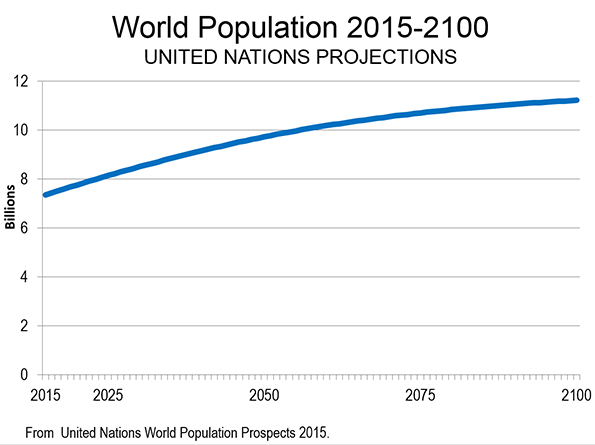
    Photo montage by Richard Campanella.

  • Poorer Nations Set for 99% of Population Growth

    According to the new United Nations World Population Prospects: The 2015 Revision, the population of the world is projected to rise from 7.3 billion in 2015 to 11.2 billion in 2100. This represents a 53 percent increase. However, over the period, population growth will moderate substantially. This is indicated by the annual growth rate the first year (2015 to 2016), at 1.1 percent, compared to the last year (2099 to 2100) at 0.1 percent. Annual population growth is projected to decline 90 percent from the beginning of the period to the end (Figure 1).

    Growth by Continent

    The distribution of growth among the continents will be anything but even. Approximately 83 percent of the growth is projected to be in Africa, which is to grow approximately 270 percent. Asia is expected to account for 13 percent of the world’s growth and add 11 percent to its population. Northern America (Note), while growing 40 percent is expected to account for four percent of the world’s population growth. Latin America and the Caribbean are expected to account for 2.2 percent of the world’s growth, and add 14 percent to their population. Europe (including all of Russia) is expected to decline in population by 13 percent (Figure 2).

    Population Growth by Income Status

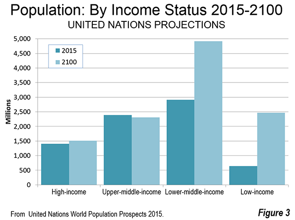
    World population growth is expected to vary widely by current income status (Figure 3). Income status is indicated on page 137 of this United Nations publication.

    The world’s high income nations are expected to add only eight percent (111 million) to their population and will represent only three percent of the population growth. These nations are principally in North America and Europe, but also include Japan, South Korea, Saudi Arabia and others.

    The world’s upper middle income nations are expected to experience a population decline of three percent, which amounts to a loss of 82 million residents. China, Russia, Mexico, South Africa, Iran and Brazil are examples of upper-middle income nations. When combined with the high income gain noted above the more affluent half of the world’s nations would add 29 million residents, or just 0.7 percent of the world’s growth. This is fewer people than live in the Tokyo metropolitan area.

    This means that more than 99 percent of world growth from 2015 to 2100 is expected to be among the lower income nations. The lower middle income nations would gain 2 billion people, representing 52 percent of the population growth.  The lower-middle income nations include India, Indonesia, Nigeria, the Philippines, Vietnam, Guatemala and others.

    The lower income nations would gain 1.8 billion people, capturing 47 percent of the world’s growth. The lower income nations include Bangladesh, Tanzania, Myanmar, the Democratic Republic of the Congo and others.

    In the high income and upper middle income regions, population growth will be also anything but consistent. Nations such as the United States, the United Kingdom, France, Canada and Australia are expected to grow far faster. The United States is expected to add 40 percent to its population and more than four times the population growth of all of the upper half of nations. Canada (up 39 percent) and Australia (up 77 percent), combined, are expected to add more population than the total upper income half of nations.  These gains will be largely offset by losses in Japan, Germany, South Korea, Italy and others.

    Largest Population by Nation

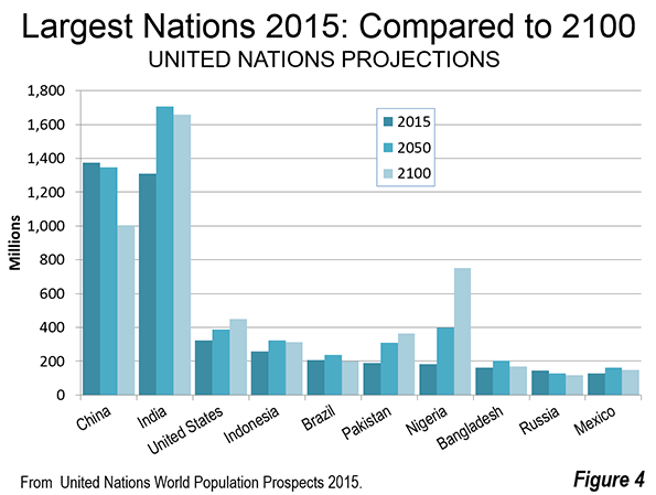
    China, with the largest population in 2015, is expected to fall behind India in 2050 and remain in second place by 2100. India is expected to be the largest nation in both 2050 and 2100. However, India’s population will be less in 2100 than it was in 2050.

    Eight of the 10 most populated nations, including India and China are expected to have a lower population in 2100 than in 2050 (Figure 4). Pakistan is expected to reach its population peak in 2095 and start declining in 2096. This leaves only the United States among today’s today’s 10 largest nations that is expected to be adding population in 2100. The growth rate between 2099 and 2100 (0.2 percent) is expected to be considerably below the growth rate at the beginning of the period (2015-2016), which was 0.7 percent.

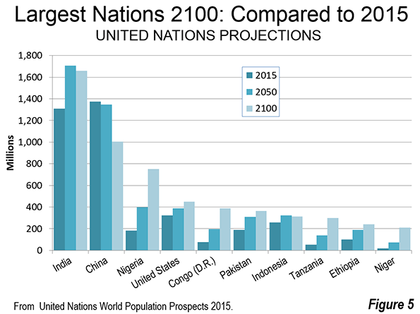
    By 2100, there are expected to be substantial changes to the top 10 nations in population. Five of the 10 largest nations in the world are expected to be in Africa. This is an increase from one in 2015 (Figure 5). Nigeria will have replaced the United States as the third largest nation, with approximately 750 million people, having more than quadrupled in size. The Democratic Republic of the Congo (Congo – Kinshasa) would rank fifth, and is expected to reach 390 million people, quintupling in size. Tanzania would rank eighth, reaching 300 million residents, nearly 6 times its 2015 population. Ethiopia would have more than 240 million residents, 2.5 times its current population and would rank ninth. The 10th largest nation would be Niger, with 210 million residents, a figure 10 times its 2015 level. Among the African nations in the top 10, only Ethiopia would be declining by 2100, having reached its population peak in 2097.

    Pakistan would retain its current sixth position, while Indonesia would fall from 4th to 7th. As noted above, India would be the largest nation in China would be second largest in 2100. By that date India would have an overall gain of approximately 350 million people from 2015, while China would lose 370 million people. The United States would add more than 125 million people. Brazil, which is currently ranked 5th, would lose approximately 10 million people and fall to 13th position. Eighth ranked Bangladesh, which was long among the fastest growing nations in the world, would gain only 10 million people and fall to 14th position. Russia, ranked 9th, would fall to 23rd, losing 25 million residents. Mexico, ranked 10th, would gain 20 million residents, and would be ranked 18th in 2100.

    The Uncertainty of Projections

    Of course projections of any kind are subject to wide error ranges. Economic growth, the extent of poverty, wars, social trends, medical advances and other factors can interfere. The simple fact is that none of us and no organization knows the future for sure. One study of UN population trends in six Southeast Asian nations found that 1980 projections from 1950 were 13.9 percent off by nation, with a range from minus 20 percent to plus 27 percent. There had been some improvement in comparing 1975 projections to 2000 actual populations, with an average error of 8.2 percent. The range was little improved, from minus 23 percent to plus 25 percent. Obviously projections are likely to be much more accurate in early years and the chances for greater accuracy are improved in larger nations or regions.

    A World of Challenges

    Regardless of the extent of accuracy, which cannot be known at this point, the projections indicate a continuation of trends that cause concern. A world that is experiencing virtually 100 percent of its growth in its poorest areas cannot help but face a tougher future. This makes it clear that the principal priority of governments around the world should be to improve affluence and reduce poverty. The challenges are gargantuan, but focusing on these issues is likely to result in a better, though less than ideal, world.

    Note:  Northern America includes Canada, the United States, Greenland, Bermuda and the French territory of Saint Pierre and Miquelon.

    Photograph: Western Railway Headquarters (Churchgate), Mumbai, India (by author)

    Wendell Cox is Chair, Housing Affordability and Municipal Policy for the Frontier Centre for Public Policy (Canada), is a Senior Fellow of the Center for Opportunity Urbanism (US), a member of the Board of Advisors of the Center for Demographics and Policy at Chapman University (California) and principal of Demographia, an international public policy and demographics firm.

    He is co-author of the "Demographia International Housing Affordability Survey" and author of "Demographia World Urban Areas" and "War on the Dream: How Anti-Sprawl Policy Threatens the Quality of Life." He was appointed to three terms on the Los Angeles County Transportation Commission, where he served with the leading city and county leadership as the only non-elected member. He served as a visiting professor at the Conservatoire National des Arts et Metiers, a national university in Paris.

  • California: “Land of Poverty”

    For decades, California’s housing costs have been racing ahead of incomes, as counties and local governments have imposed restrictive land-use regulations that drove up the price of land and dwellings. This has been documented by both Dartmouth economist William A Fischel and the state Legislative Analyst’s Office.

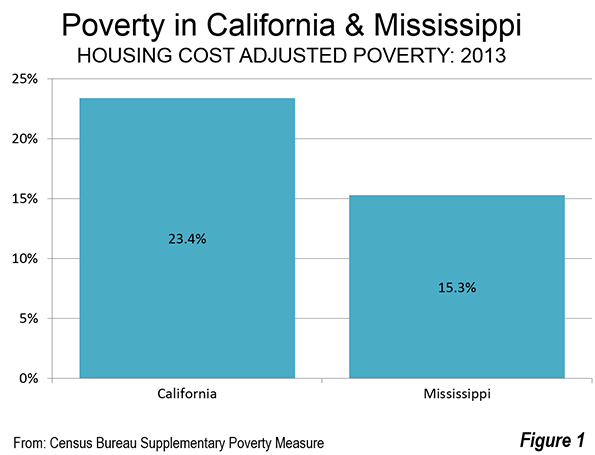
    Middle income households have been forced to accept lower standards of living while less fortunate have been driven into poverty by the high cost of housing.Housing costs have risen in some markets compared to others that the federal government now publishes alternative poverty estimates (the Supplemental Poverty Measure), because the official poverty measure used for decades does not capture the resulting differentials. The latest figures, for 2013, show California’s housing cost adjusted poverty rate to be 23.4 percent, nearly half again as high as the national average of 15.9 percent.

    Back in the years when the nation had a "California Dream," it would have been inconceivable for things to have gotten so bad — particularly amidst what is widely hailed as a spectacular recovery. The 2013 data shows California to have the worst housing cost adjusted poverty rate among the 50 states and the District of Columbia. But it gets worse. California’s poverty rate is now more than 50 percent higher than Mississippi, which long has set the standard for extreme poverty in the United States (Figure 1).

    The size of the geographic samples used to estimate the housing adjusted poverty rates are not sufficient for the Supplemental Poverty Measure to produce local, county level or metropolitan area estimates. However, a new similar measure makes that possible.

    The California Poverty Measure                           

    The Public Policy Institute of California and the Stanford Center on Poverty and Inequality have collaborated to establish the "California Poverty Measure," which is similar to the Supplemental Poverty Measure adjusted for housing costs.

    The press release announcing release of the first edition (for 2011) said that: "California, often thought of as the land of plenty" in the words Center on Poverty and Inequality director Professor David Grusky, is "in fact the land of poverty."

    The latest California Poverty Measure estimate, for 2012, shows a statewide poverty rate of 21.8 percent, somewhat below the Supplemental Poverty Measure and well above the Official Poverty Measure that does not adjust for housing costs (16.5 percent).

    The California Poverty Measure also provides data for most of California’s 58 counties, with some smaller counties combined due to statistical limitations. This makes it possible to estimate the California Poverty Measure for metropolitan areas, using American Community Survey data.

    Metropolitan Area Estimates

    By far the worst metropolitan area poverty rate was in Los Angeles, at 25.3 percent. The Los Angeles County poverty rate was the highest in the state at 26.1 percent, well above that of Orange County (22.4 percent), which constitutes the balance of the Los Angeles metropolitan area. However, the Orange County rate was higher than that of any other metropolitan area or region in the state (Figure 2). San Diego’s poverty rate was 21.7 percent. Perhaps surprisingly, Riverside-San Bernardino (the Inland Empire), which is generally perceived to have greater poverty, but with lower housing costs, had a rate of 20.9 percent. The two counties, Riverside and San Bernardino had lower poverty rates than all Southern California counties except for Ventura (Oxnard) and Imperial.

    The San Francisco metropolitan area had a poverty rate of 19.4 percent, more than one-fifth below that of Los Angeles. San Jose has a somewhat lower poverty rated 18.3 percent (Note 1). The metropolitan areas making constituting the exurbs of the San Francisco Bay Area had a poverty rate of 18.7 percent. This includes Santa Cruz, Santa Rosa, Stockton and Vallejo. Sacramento had the lowest poverty rate of any major metropolitan area, at 18.2 percent.

    The San Joaquin Valley, stretching from Bakersfield through Fresno to Modesto (Stockton is excluded because it is now a San Francisco Bay Area exurb) had a poverty rate of 21.3 percent, slightly below the state wide average of 21.8 percent. The balance of the state, not included in the metropolitan areas and regions described above had a poverty rate of 21.2 percent.

    County Poverty Rates

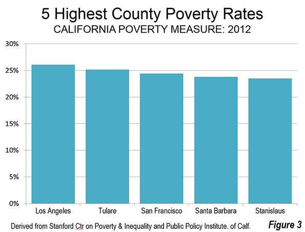
    As was noted above, Los Angeles County had the highest 2012 poverty rate in the state (Note 2), according to the California Poverty Measure (26.1 percent). Tulare County, in the San Joaquin Valley had the second-highest rate at 25.2 percent. Somewhat surprisingly, San Francisco County with its reputation for high income had the third worst poverty rate in the state at 23.4 percent. This is driven, at least in part, by San Francisco’s extraordinarily high median house price to household income ratio (median multiple). In this grisly statistic, it trails only Hong Kong, Vancouver and Sydney in the latest Demographia International Housing Affordability Survey. Wealthy Santa Barbara County has the fourth worst poverty rate in the state, at 23.8 percent. The fifth highest poverty rate is in Stanislaus County, in the San Joaquin Valley (county seat Modesto), which is already receiving housing refugees from the San Francisco Bay Area, unable to pay the high prices (Figure 3).

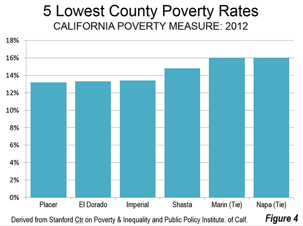
    The two lowest poverty rates were in suburban Sacramento counties (Note 2). Placer County’s rate was 13.2 percent and El Dorado County’s rate was 13.3 percent. Another surprise is Imperial County, which borders Mexico and has generally lower income. Nonetheless, Imperial County has the third lowest poverty rate at 13.4 percent. Shasta County (county seat Redding), located at the north end of the Sacramento Valley is ranked fourth at 14.8 percent. Two counties are tied for the fifth lowest poverty rate (16.0 percent), Marin County in suburban San Francisco and Napa County, in the exurban San Francisco Bay Area (Figure 4).

    Weak Labor Market and Notoriously Expensive Housing

    The original Stanford Center on Poverty and Inequality press release cited California’s dismal poverty rate as resulting from "a weak labor market and California’s notoriously expensive housing." These are problems that can be moderated starting at the top, with the Governor and legislature. The notoriously expensive housing could be addressed by loosening regulations that allow more supply to be built at lower cost. True, the new supply would not be built in Santa Monica or Palo Alto. But additional, lower cost housing on the periphery, whether in Riverside County, the High Desert exurbs of Los Angeles and San Bernardino Counties, the San Francisco Bay Area exurbs or the San Joaquin Valley could begin to remedy the situation.

    The improvement in housing affordability could help to strengthen the weak job market, by attracting both new business investment and households moving from other states.

    Regrettably, Sacramento does not seem to be paying attention. Liberalizing land use regulations is not only absent from the public agenda, but restrictions are being strengthened (especially under the requirements of Senate Bill 375). In this environment, metropolitan areas like Los Angeles, San Francisco, San Jose and San Diego could become even more grotesquely unaffordable, and the already high price to income ratios in the Inland Empire and San Joaquin Valley could worsen. All of this could lead to slower economic growth and to even greater poverty, as more lower-middle-income households fall into poverty.

    Note 1: San Benito County is excluded from the San Jose metropolitan area data. The California Poverty Measure does not report a separate poverty rate for San Benito County.

    Note 2: Among the counties for which specific poverty rates are provided.

    Wendell Cox is Chair, Housing Affordability and Municipal Policy for the Frontier Centre for Public Policy (Canada), is a Senior Fellow of the Center for Opportunity Urbanism (US), a member of the Board of Advisors of the Center for Demographics and Policy at Chapman University (California) and principal of Demographia, an international public policy and demographics firm.

    He is co-author of the "Demographia International Housing Affordability Survey" and author of "Demographia World Urban Areas" and "War on the Dream: How Anti-Sprawl Policy Threatens the Quality of Life." He was appointed to three terms on the Los Angeles County Transportation Commission, where he served with the leading city and county leadership as the only non-elected member. He served as a visiting professor at the Conservatoire National des Arts et Metiers, a national university in Paris.

    Photograph: Great Seal of the State of California by Zscout370 at en.wikipedia [CC BY-SA 3.0], from Wikimedia Commons

  • Goodbye, Single Family Home? But wait…..

    New urbanist utopians love to decry Americans’ love of the single family home, and to extol the virtues of a higher-rising denser city as more efficient and environmentally responsible. Without expounding on the immensely destructiveness of such a utopian viewpoint to physical and psychological well-being of a large majority of people, nor of the scientific absurdity of the claim of efficiency and  environmental goodness, I will for now present only some maps and data of what the real world is like.

    People vary in needs and preferences over the life course. It is indeed the case that young adults, usually unmarried (and yes increasingly for a longer time), and perhaps a fair share of elderly widows or widower, or even empty-nesters, together as many as one-third of persons, may prefer and enjoy an urban lifestyle, and apartment living. These are the people, for example that are flocking into a growing Seattle, bidding up the price of housing, to take up jobs at Amazon and similar businesses, and even supporting planning calls for replacing a sizeable share of single family homes, with higher density housing.

    But this phenomenon ignores the further housing reality that the other two-thirds of people are in families, with children or other relatives, or even unrelated people who rent rooms, who much prefer homes on lots, with some private space. Even those young singles jumping into downtown Seattle may marry, have children, and as they have done generation after generation, and look, yes, for homes with yards and space for a car, so they can go and explore the environs beyond the city.

    What’s out there?

    Table 1 summarizes the national data on population living in different kinds of housing. For whatever reasons you will not find this information in any census publication or city or state reports! They are quite difficult to find and require gleaning from PUMS (Public Use Micro Sample) data.

    Table 1 Shares of population by Type of Housing, 2010
    Type # Units % of Units  Population % of population     Ave HH Size
    Single family 76.5 67.4 216.6 72.2 2.83
    Small apartments 15 13.3 37.7 12.6 2.51
    Large apartments 15.9 14 28.3 9.4 1.78
    Mobile Homes 7.4 6.5 17.2 5.7 2.2
    ALL  114 100 299.5 100 2.6
    Units and population in millions


    The key information is that single family homes. Including duplexes for which each unit a separate address account for 67.4 % of occupied housing units in 2010 (61.6 % in totally separate structures), and housed a convincing 217 million, 72.2 % of the population (not including those in group quarters), at an average household size of 2.83. Note well: that’s almost 3 out of 4!

    Mobile homes are mostly banned from big cities, but in the real world of providing shelter for the less affluent in many areas, they are 6.5% of units, housing over 17 million, another 5.7% of the population, at an average household size of 2.2.

    About 31% of units, 13.3% in structures with 2 to 9 units, and 14% in structures with 10 or more units, are in apartments, and house 22% of the population (12.6 in the smaller structures, 9.4 in the larger) at an average household size of 2.5 and 1.8 respectively, or 2.2 for all apartments. 

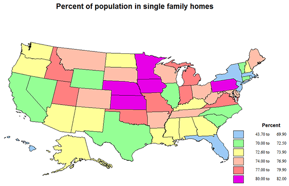
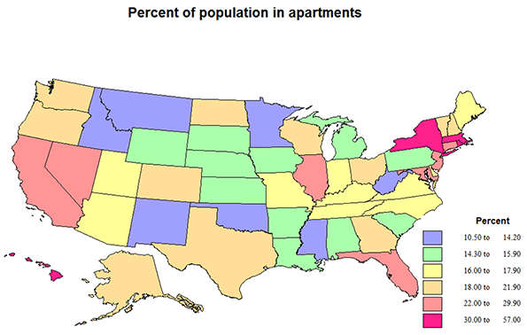
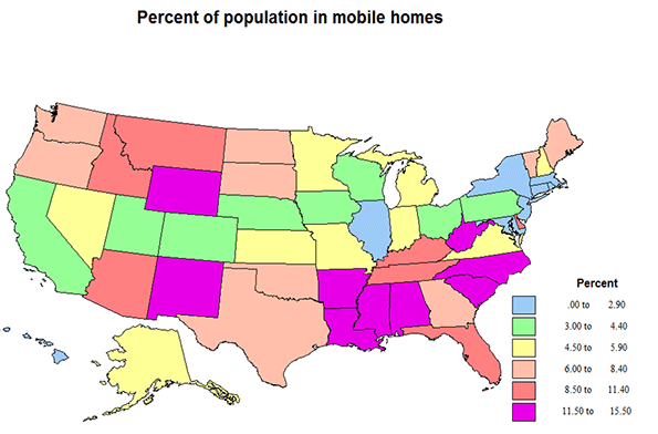
    The relative importance of single family homes and of apartments varies significantly across states (and cities or counties if we had the data), but this is best seen with the help of the included maps.

    It is interesting to start with mobile homes, to find out where they are most common. In 11 states over 10% of people live in mobile homes. The highest is 15.5% in SC, followed by NM at 13.9, WY, 13.2, WV, 12.9, MS, 12.6, then AL and NC, 12.1, states with high shares of less affluent people.  Most higher shares are across the warmer south, but are also high in the northern Rockies. Indeed the lowest shares are across the middle of the country from CA to New England. The lowest share is DC at 0.0, then HI, .2, but are also quite low in MA, .7, CT, .9, RI, and NJ at 1.0, mostly small and very metropolitan states. Typical states close to the average of 5.7% are AK and NH at 5.7, MO, 5.5., and NV, 5.2.    

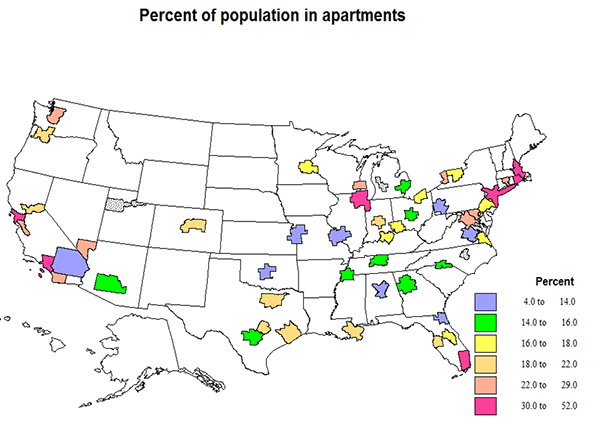
    Apartment living is quite a bit higher in selected states. The District of Columbia is by far the highest at 56%, as it is the central city of a giant metropolitan region. Next highest is New York at 46%, actually a consequence of New York City. These are followed by MA, 35, RI, 34, HI, 34 and NJ, 30.  HI may be expected to have higher apartment shares, due to the high value of desirable land, MA, RI and NJ, because of very high metropolitan shares, including New York City suburbs. Moderate apartment shares occur in CA, 24, IL, 27, FL, 24, and NV, 25.  Average shares of 22% occur in TX, VT, NH, and MD. At the other extreme, apartment living is amazingly low (under 14%) in WV, 10.5, ID 11.9, NM, 12.9, MT, 13.5, OK, 13.8, and MN, 14—mostly less metropolitan.

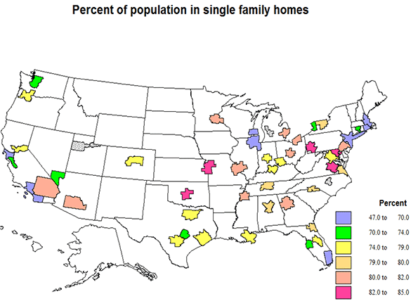
    Single family homes dominate most of the country. The highest shares, over 80, are for IA, KS, MN and NE, a contiguous sub region of the north central US, and somewhat surprising, PA. Actually not surprising: PA, 18, MD, 21, DE, 15, and VA, 10, have unusually high shares of “attached” 1 unit row houses with separate numbers and yards – not the image of single family home in most of the country. Shares are almost 80 in Mormon UT and ID, and in MI. In general, with the exceptions of NY and most of New England, shares are higher across the northern and central US than across the south, perhaps because of the greater shares of mobile homes to the south. The lowest shares are in the states with the highest shares of apartments, DC, NY, but still 52%, MA, 64, RI, 65, HI, 66, and  FL, 67, but already over 2/3! Right at the US average of 72% are AK, AZ, CA, NC, NH, TX and WY, a not geographically obvious or coherent set!

    The story for metropolitan areas

    Data are available for large “millionaire” metropolitan areas. These offer few surprises, reinforcing the story from the data for states. Table 2 distinguishes the information for 52 large metro areas, and the rest of the US. The large metro areas contain a little over half of the US population (51%).

    Table 2 Population by housing types, large metropolitan areas and the rest of the US
          Metro Rest of US
    Type      Units Population  % of Pop Ave HH Size Units Population % of Pop Ave HH Size
    Sing Family          40.2 112 73 2.78 36.3 104 71 2.89
    Apartments 17.7 37 24 2.1 11.8 29 20 2.4
    Mobile 1.7 4 2.6 2.2 5.8 13 9 2.2
    All  59.6 153 100 2.57 53.9 146 100 2.71

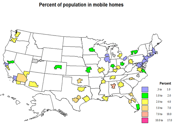
    The share of population in single family homes differs only slightly between the large metro areas and the rest of the country, but the share of people in apartments is much higher in  the big metro areas (24 to 20), while the share of people in mobile homes  is much higher outside of the large metro areas (9 versus 2.6). The slightly higher single family share for the metro areas is a little misleading, however, because the metro set has a much higher share of an intermediate category of housing, “1 unit attached”, meaning row houses, separate addresses and yards, but of higher density than the detached single family home.

    Mobile home shares are especially lower in the biggest metro areas, most notably megalopolis, as Boston, .2 and Washington DC, .3. The highest metro share are in the south, e.g., Birmingham, 8, Tampa, 7, Riverside, 6, Jacksonville, and San Antonio, 6.

    The share of the population in single family homes  is not surprising for the most part, that is, lowest (under 70%) in most of the older and largest metro areas, NY, Boston, Chicago, San Francisco, Los Angeles, and Miami, and highest in intermediate sized across most of the country. The highest shares ae for Kansas City, 84, Pittsburgh, Oklahoma City and Richmond, 83, and Atlanta, Columbus, Detroit and St. Louis, 82. The cases of Philadelphia, Baltimore, Washington, and Richmond are special, as the high single family shares are actually a result of high shares of row housing, e.g., 32% in Philadelphia, 24 in Baltimore, 20 in Washington, 10 in Richmond.

    The population shares in apartments also reflect the size and importance of the metro area, with the addition of Miami, highest in New York Metropolitan Area, 41, (52% in the NYC part), San Francisco-Oakland, 33, Chicago, 32, Providence,33, Boston, 41, LA-Anaheim, 31.5 (33 in the LA part), and Miami, 30. The lowest shares tend to be in the interior eastern US, plus Richmond in the east and Riverside in the west: Birmingham and Oklahoma City, 12, Riverside and Pittsburgh, 13, and Jacksonville, Kansas City, Richmond and St. Louis, 14. Metro areas in a middle range (23 to 25%) include Seattle, Hartford, New Orleans, Baltimore, Buffalo, Las Vegas, and San Jose, middle sized and scattered across the country.

    Average household size

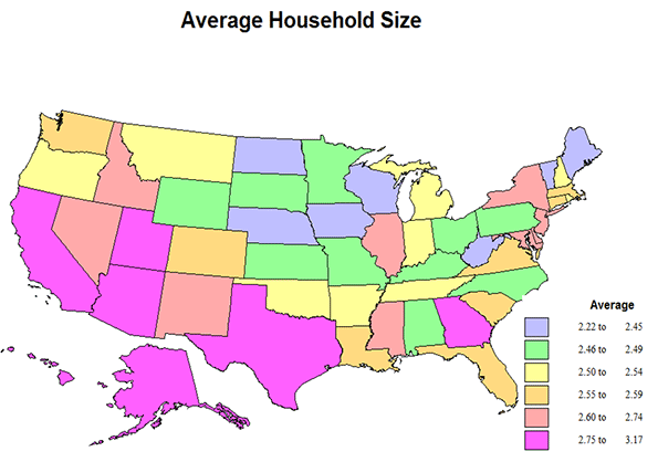
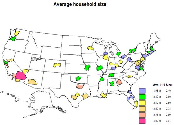
    Average household size in part reflects the kind of housing, but equally the age and ethnic composition of the population, not part of this data set. The average US number is 2.63, but 2.57 in the metro areas, and 2.71 for the rest of the US. It is highest for single family homes, 2.83 for the US, 2.78 in the metro set, 2.89 for the rest of the country, 2.2 for apartment dwellers and 2.2 for mobile home folks. As expected average values for smaller apartment structures (2 to 9) is higher in the smaller buildings than in larger ones, 2.5 compared to 1.8.

    Average values for states vary from 2.22 in ND (due to a combination of an influx of energy workers, high share of college students, and remaining seniors), 2.26 in the District of Columbia (large share of single persons), 2.35 in ME, 2.36 in IA, and 2.237 in WV (older populations) to the very highest in UT (well..) at 3.17, then CA at 2.95, AK 2.86, AZ and TX, 2.84, reflecting ethnic composition. Right in the middle are NY and DE, 2.63. Metro area average household size varies from a high of 3.1 for Riverside, then 3 for Anaheim, 2.91 for San Jose, 2.83 for Los Angeles and Dallas, all with high Hispanic populations  and levels of young immigrants.  At the low size end are NY at 1.98, the only area under 2, reflecting the high share of apartments and of singles, particularly in New York City, then Jacksonville, 2.23, Tampa, 2.28, Richmond, 2.35, and Orlando, 2.36, — in Florida a result of in-migration of older households without children.   The middle areas at 2.57 are Las Vegas, Miami, and Minneapolis.

    Conclusion

    There is no likelihood of the demise of the single family home, or even of significant attrition, simply because the large majority of people demand them. But there will be some reduction in a few areas where demand for housing is high but the land supply constrained, geographically or by growth management, as in Seattle, coastal California, New York, and Boston, with high shares of non-families. On the other hand, continuing concentration of population in giant metropolitan areas is not inevitable, as a costs drive people elsewhere. In the end, barring a national clampdown on suburbs, the balance of housing types may not change greatly.  

    Richard Morrill is Professor Emeritus of Geography and Environmental Studies, University of Washington. His research interests include: political geography (voting behavior, redistricting, local governance), population/demography/settlement/migration, urban geography and planning, urban transportation (i.e., old fashioned generalist).

  • Moving to the London Exurbs and Beyond

    A review of the most recent internal migration (domestic migration) in England and Wales reveals some surprises. The latest data covers the one year ended June 30, 2014. It was published by the Office of National Statistics (ONS) and provides estimates at least down to the local authority area (municipality). In this regard, is positioned along with a number of European nations and the Australian Bureau of statistics well ahead of the US Census Bureau, which provides estimates only to the county level.

    The Regions

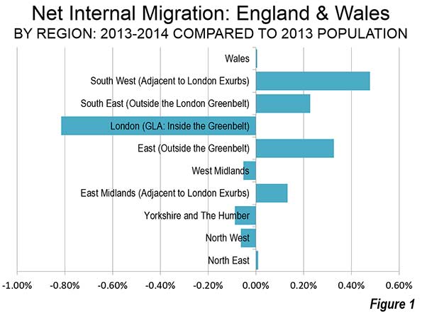
    On a regional level, there was little movement outside the southern half of England. England is divided into nine regions. Three of the northern and middle regions lost modest numbers of internal migrants, ranging from a minus 0.05% (minus 3,000 people) in the West Midlands, which contains England’s second largest city, Birmingham. There was loss of 0.06% (minus 7,100 people) in the North West, where Manchester and Liverpool are located. There was a 0.09% loss (minus 4,700 people) in Yorkshire and the Humber, where Leeds and Sheffield are located (Figure 1).

    The North East, which contains the city of Newcastle, has long been an area of economic hardship and is of danger of becoming "Britains Detroit" according to  The Guardian. Yet the North East experienced a small gain of 0.01% in internal migrants (500 people). The largest gain outside southern England was in the East Midlands, which includes Leicester and Nottingham, attracted a net 0.13 percent in new migrants (6,200 people). Wales (largest city Cardiff) also had a 0.1% gain in internal migrants (200 peopled).

    London (the Greater London Authority) lost by far the largest percentage of its population to internal migration, at minus 0.82 percent, or 68,600 people. This may be particularly surprising because London has recently reached its all-time population peak, having exceeded its pre-World War II 1939 estimated level. Yet virtually all of London’s huge population gain has been from natural growth (births minus deaths) and international migration. In recent years, this growth stems from strong gains in migration from a European Union countries, between which there is virtually unrestricted immigration.

    But Londoners, whether born in Great Britain or those who arrived before 2013, have been moving in large numbers to the exurbs beyond the greenbelt for some time and even farther away. The two large exurban regions have attracted many migrants. The East, which includes such well-known localities as Cambridge, Luton, Milton Keynes and St. Albans added the 0.33 percent to its population through internal migration. The South East, which includes localities like Oxford, Windsor, Dover and the entrance to the Euro tunnel to France added a somewhat smaller 0.23 percent.

    But some Londoners appear to be moving even farther away. The largest growth was in the South West region, which lies at least 70 miles (125 kilometers) from Trafalgar Square in London. The South West is home to such places as Bristol, Bath, Salisbury and Cornwall. The South West added 0.48 percent to its population through.

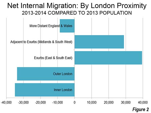
    London and Environs

    During 2013-2014, the dominant trend was movement away from London to the exurbs and regions just beyond the exurbs, with a less dominant trend away from the balance of England and Wales. Virtually all the internal migration growth was in the London Exurbs (East and South East) and the adjacent areas, the South West, East Midlands and West Midlands (Figure 2). Nearly all the loss was in London. Inner London, suffered the largest domestic migration loss, at 1.05 percent of its population (minus 35,000). Inner London, at 3.3 million remains well below its population peak of 4.5 million, reached nearly 115 years ago (1901). Outer London, consisting of the large tracts of semidetached and detached housing built in the inter-war years lost a smaller 0.66 percent of its population to internal migration (minus 33,700). Outer London now has a population of approximately 5.1 million, one-half larger than Inner London.

    The Office for National Statistics (ONS) explains that London attracts internal migrants up to age 29. But, the internal outmigration of people 30 and above more than cancels this out. ONS explains:

    "A key factor for people in their 30s and 40s who move out of London could be the cost of housing. Young couples wishing to buy their first house, or a larger one for a growing family, may find prices in London prohibitively expensive and therefore choose to live outside of London."

    ONS adds:

    "Another important reason may be that people with children are more likely to move out of London because of environmental or social factors. For example, they may be seeking somewhere greener and quieter, and may also perceive that a less urban neighbourhood offers a better social and educational environment for children. Moves of adults with children also explains why there is a net outflow of children from London."

    ONS further indicates that there is net migration from London of older citizens, including those over 90 (the highest age category reported upon). These are trends similar to those we have identified in the United States some of which were opposite the conventional wisdom (See: Driving Farther to Qualify in Portland, Urban Core Millennials? A Matter of Perspective, Exodus of the School Children, and Seniors Dispersing Away from the Urban Cores)

    Greatest Gains and Losses

    Even so, London had one local authority area with the greatest internal migration gain: the historic City of London. However, this area, which is the core of the central business district, has few residents. Even after the internal migration gain (1.80 percent), the city still has fewer than 8,000 residents. The other largest gainers in numbers were found in the London exurbs or the South West, with the exception of Fylde, which is located in Lancashire (the North West), adjacent to the resort of Blackpool.

    London had nine of the 10 local authority areas with the greatest internal migration losses (out of 348). The largest loss was in the inner London borough of Newham (minus 2.68%). The one non-London local authority area in the bottom 10 was Pendle, in Lancashire (the North West).

    Metropolitan Areas

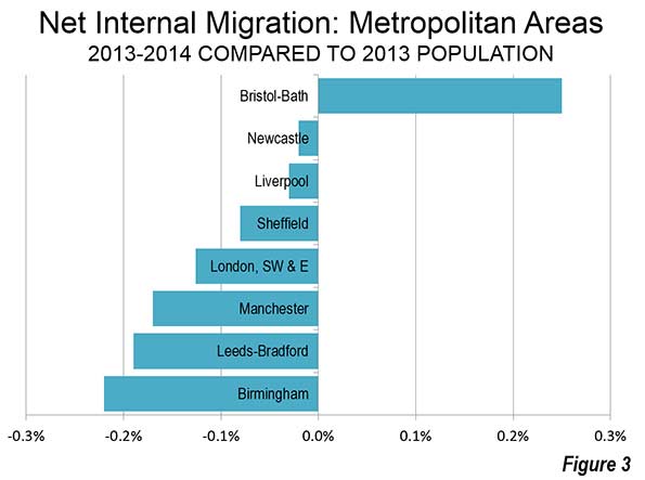
    Only one of the larger metropolitan areas experienced a net internal migration gain. The Bristol – Bath area (ceremonial Avon County), located in the South West gained 0.25 percent (Figure 3).

    Two metropolitan areas that have long experienced serious economic declines suffered only modest losses. Newcastle (Tyne and Wear Metropolitan County) lost only 0.2 percent of its population to internal migration. Liverpool, with a central municipality that dropped from a population of 856,000 in 1931 to 439,000 in 2001 (after which modest growth returned), had an internal migration loss of 0.03 percent. Sheffield (South Yorkshire Metropolitan County) lost 0.08% of its population to net internal migration.

    In view of the relative fortunes of London and Liverpool over the last century, it is especially surprising that the London region, including the exurbs, lost internal migration at a rate four times that of Liverpool (0.13%).

    Manchester (Greater Manchester Metropolitan County) experienced a net internal migration loss of 0.17 percent, and Leeds-Bradford (West Yorkshire Metropolitan County). Birmingham (West Midlands Metropolitan County) have the greatest loss at -0.22 percent.

    More Dispersion

    By far the largest net internal migration numbers are in the south of England, reflecting strong trends of decentralization away from London, to the East and the South East. But, by far the largest recipient of internal migration is the South West, beyond even the exurbs. This is another confirmation of the dispersing pattern of development, as has been observed in virtually all of the world’s megacities.

    ————–

    Note: The United Kingdom does not formally designate metropolitan areas. This article uses metropolitan and former (ceremonial) counties to approximate metropolitan areas.

    Photograph: Local authority of Milton Keynes, Buckinghamshire (South East of England), by author

    Wendell Cox is Chair, Housing Affordability and Municipal Policy for the Frontier Centre for Public Policy (Canada), is a Senior Fellow of the Center for Opportunity Urbanism (US), a member of the Board of Advisors of the Center for Demographics and Policy at Chapman University (California) and principal of Demographia, an international public policy and demographics firm.

    He is co-author of the "Demographia International Housing Affordability Survey" and author of "Demographia World Urban Areas" and "War on the Dream: How Anti-Sprawl Policy Threatens the Quality of Life." He was appointed to three terms on the Los Angeles County Transportation Commission, where he served with the leading city and county leadership as the only non-elected member. He served as a visiting professor at the Conservatoire National des Arts et Metiers, a national university in Paris. 

  • The Changing Patterns Of U.S. Immigration: What The Presidential Field Should Know, And You

    Public concern about illegal immigration, particularly among older native-born Americans, as well as the the rising voting power of Latinos, all but guarantees that immigration is an issue that will remain at the forefront in the run-up to the 2016 elections. Nor is this merely a right-wing issue, as evidenced in the controversy over “sanctuary cities”; even the progressive Bernie Sanders has expressed concern that massive uncontrolled immigration could “make everybody in America poorer.”

    Yet despite the political heat, there is precious little dispassionate examination of exactly where immigrants are coming from, and where in the U.S. they are headed. To answer these questions, we turned to demographer Wendell Cox, who analyzed the immigration data between 2010 and 2013 for the 52 metropolitan statistical areas with populations over a million.

    One would think listening to the likes of Donald Trump that the country is awash with hordes of unwanted newcomers from Mexico and Central America. But sorry, Donald, the numbers show a changing picture in terms of who is coming, as well as the places that they choose to settle.

    Perhaps due to Mexico’s stronger economy and lower birthrates, Mexicans are no longer as dominant in the ranks of new immigrants as in the last decade. Mexico is still the single largest place of origin of new immigrants, but from 2010 through 2013, Mexican migration to the U.S. dropped 17.7% to an average of 140,266 a year, according to data from the U.S. Department of Homeland Security. Meanwhile the inflow from Asia has increased: immigration from China is up 25.8% to 74,458 a year, and 10.7% from India to 65,336 a year. Asia now equals the Americas as a source of new immigrants, with each accounting for 40% of the annual total.

    European immigration, once the mainstay of growth for the U.S., fell 32% from 2010 to 2013 to an average of 91,000 a year, surpassed by the number of African immigrants, which has soared 29.6% to 98,000 annually.

    America’s new African population tends to be well-educated — considerably more than the national average: they are more than 60% more likely to have a graduate degree than other Americans. The vast majority are fluent in English and fully one-third hold management or professional level jobs. Not surprisingly, they are generally doing well in their new country. The places where they settle — notably New York, greater Washington, Houston and Dallas-Fort Worth — will likely benefit from their presence in coming years.

    Just as Mexican and Asian immigration changed the ethnic geography of America, boosting economies and changing local culture, one can expect the Africans to do much the same in the coming years.

    The Largest And Fastest-Growing Immigrant Hubs

    The largest foreign-born communities in America reflect both size and longstanding immigrant populations. The leader remains the New York metropolitan statistical area, which was home in 2013 to 5.69 million people born elsewhere, following by Los Angeles with 4.3 million, Miami with 2.2 million, Chicago with 1.69 million and Houston with 1.39 million.

    But a look at the metro areas with the fastest-growing foreign-born communities tells a different story, one of growing migration into the more interior and central parts of the country. In many ways, this reflects the attraction of areas with relatively low housing prices and buoyant local economies. In contrast, the economies of many traditional immigrant hubs like Los Angeles and Chicago have not done so well, while places in coastal California and near New York suffer from high housing prices.

    Pittsburgh ranks first for recent pace of growth, with a 17.4% jump in its foreign-born population to 89,000 from 2010 through 2013, almost four times the 4.3% national rate over the same span. The western Pennsylvania city has built a robust economy based on energy, medical services and technology. Its housing prices are low — roughly a third those of the Bay Area based on median income — and the city is situated in an attractive setting with rolling hills. Pittsburgh is attracting both less educated immigrants from more expensive places, and also educated newcomers, notes demographer Jim Russell, some due to the strong universities in the area.

    Other surprising heartland destinations for immigrants include Indianapolis, whose foreign-born population expanded 14.3% in 2010-13 to 127,767, the second fastest rate of growth among the largest metro areas; Oklahoma City (third fastest, up 12.9% to 110,269); and Columbus, Ohio (up 9.8% to 139,562). Generally, these cities, like Pittsburgh, have strong economies, low housing prices and favorable state regulatory climates.

    The Move South Continues

    Until the 1970s, the South was an also-ran in immigration, with the exception of Florida. But today many of the fastest-growing foreign-born communities are in the South. These include still-recovering New Orleans, whose numbers of foreign born surged 12.4% in 2010-13 to 91,412, as well as Charlotte (up 11.2% to 225,673) and Austin (up 10.7% to 279,923).

    This  movement to the South in recent decades has changed the geography of the most immigrant rich parts of the country. Three of the 10 metro areas with the largest number of foreign born residents are in the south. Miami has some 2.26 million immigrant residents make  up with 38.8% of its population, the highest proportion of any large metro area in the country. The Houston metro area has the fifth biggest foreign-born population, Dallas-Ft. Worth, the eighth.

    The Texas metro areas, and their emerging southern counterparts, offer much of what the prospering Rust Belt cities also provide — strong broad-based economies and an affordable cost of living, particularly housing. Immigrants tend to prioritize home ownership and often work in thriving blue-collar fields such as manufacturing , logistics and construction.

    Coastal Growth Follows The Economy

    The Atlantic and Pacific coasts have long dominated immigration, but there appears to be some subtle changes in this picture. Most big coastal metro areas have logged steady but below average growth of their foreign-born populations, including New York, with a 3.67% increase. (Note that even with relatively slow growth in percentage terms, New York added a net 208,800 immigrants, more than the total foreign-born populations of any of the four fastest growers.) Some blue areas are doing much better in terms of growth rate, including Seattle (9th), Boston (11th) and San Jose (15th). All tend to be expensive, but have done very well in the recovery, largely due to technology-related growth.

    In contrast, some traditional immigrant hubs with weaker economies have lagged behind. Chicago’s foreign-born population increased 1.71%, less than half the national average. Los Angeles’ foreign born population ticked down 0.1% amid economic stagnation and rising housing prices. When it comes to immigration, it is the geography of opportunity that still prevails.

    U.S. Metropolitan Areas with the Highest Share of Immigrants

    No. 1: Miami, Fla.

    Number of Foreign-Born: 2.26 million

    Percentage of Population, 2013: 38.8%

    No. 2: San Jose, Calif.

    Number of Foreign-Born: 719,460

    Percentage of Population, 2013: 37.5%

    No. 3: Los Angeles, Calif.

    Number of Foreign-Born: 4.39 million

    Percentage of Population, 2013: 33.2%

    No. 4: San Francisco, Calif.

    Number of Foreign-Born: 1.34 million

    Percentage of Population, 2013: 29.7%

    No. 5: New York, NY-NJ-PA

    Number of Foreign-Born: 5.69 million

    Percentage of Population, 2013: 28.5%

    No. 6: San Diego, Calif.

    Number of Foreign-Born: 761,580

    Percentage of Population, 2013: 23.7%

    No. 7: Houston, Tex.

    Number of Foreign-Born: 1.42 million

    Percentage of Population, 2013: 22.6%

    No. 8: Washington, D.C.

    Number of Foreign-Born: 1.31 million

    Percentage of Population, 2013: 22.0%

    No. 9: Las Vegas, Nev.

    Number of Foreign-Born: 440,866

    Percentage of Population, 2013: 21.7%

    No. 10: Riverside-San Bernardino, Calif.

    Number of Foreign-Born: 932,747

    Percentage of Population, 2013: 21.3%


    This piece first appeared in Forbes.

    Joel Kotkin is executive editor of NewGeography.com and Roger Hobbs Distinguished Fellow in Urban Studies at Chapman University, and a member of the editorial board of the Orange County Register. He is also executive director of the Houston-based Center for Opportunity Urbanism. His newest book, The New Class Conflict is now available at Amazon and Telos Press. He is also author of The City: A Global History and The Next Hundred Million: America in 2050. He lives in Orange County, CA.
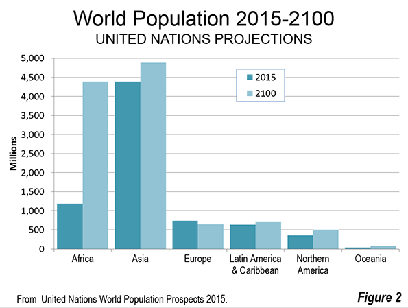
    Photo by telwink

  • Special Report: Maximizing Opportunity Urbanism with Robin Hood Planning

    This is the first section of a new report authored by Tory Gattis for the Center for Opportunity Urbanism titled Maximizing Opportunity Urbanism with Robin Hood Planning. Download the full report (pdf) here.

    Across America and the developed world, we face a well-reported crisis of income stagnation, rising inequality, a declining middle class, and a general lack of broad prosperity. Yet contemporary urban planning seems disconnected from this crisis, focusing instead on pedestrian aesthetics, environmentalism, and appealing to the supposed preferences of the wealthy and the “creative class.” This approach increasingly dominates urban thinking, expressed often as New Urbanism or Smart Growth. In this perspective, dense and usually older cities like New York, Portland, and San Francisco have been held up as models. For the most part, planners see their world through the perspective of an architect – an architect of the physical form of cities. But what if they tried the perspective of an economist – an architect of opportunities for people to have a better life?

    Cities matter far more than they used to as engines of opportunity and upward social mobility – the very essence of the American Dream. As the basis of the economy has shifted from industry to services, proximity to others now matters more than ever before. A factory can be anywhere and ship its products anywhere, but, generally speaking, most services need to be in-person. This is pushing more and more of the population to agglomerate around not so much cities, as defined by their political boundaries, but major metros, including numerous suburban rings, where the vast majority of the population resides. In many metros, limited housing supply has driven up home prices and rents to levels where much of the middle and working classes are either unable to buy or must pay a heavy portion of their incomes in mortgages or rents.

    This is occurring as economic and technological factors have directed ever more wealth to a relatively small population of elites, whose demand for specialized services – whether personal spending or that of the corporations they control – has become a major part of the economy. Economic opportunity is driven not just by proximity to others in general, but by proximity to the very small but critically influential super-affluent class – what Citigroup research calls the “Plutonomy”. iv In some markets, such as Miami, New York and San Francisco, the locational preferences of this class – who often have several residences and many are foreign buyers – has been yet another driver of major metro agglomeration and higher housing prices, particularly where there are strong land use regulations.

    Family sizes have shrunk and reduced fertility rates are leading towards destabilizing demographic implosions in Europe, Japan, and China – and the U.S. trend is moving in the same direction.vi As nations seek to improve fertility rates, one of the greatest challenges is a shortage of family-friendly housing with sufficient space. If that space is not affordable, then people do the next best alternative: shrink their family size. Whereas families used to be comfortable with multiple children per bedroom, the modern standard is one bedroom for every child – not to mention the “home office” for virtual work by the dual-income parents. With the large suburban house both regulatory out-of-favor and unaffordable in some metropolitan areas, families are forced to shrink to live in expensive density, or pay very high prices and rents for what used to be considered standard middle class homes.

    The planning community generally has few answers to these dilemmas, but in practice the steps they often advocate may actually be making it worse. A dominant tenet of Smart Growth actually seeks to restrict suburban development and encourage density to contain urban expansion. Draconian regulations – and ever higher costs – are piled on any new developments. On the other side, pressure from NIMBY homeowners often limits development of any kind – including high-density. In some areas, exclusionary zoning – such as tight restrictions on multi-family housing – is used to prevent minority, disadvantaged, or lower-income populations from moving in nearby.

    All in all, the net effect is a suffocating restriction on new housing supply even as demand increases, leading to skyrocketing home prices. This has the effect of making affluent NIMBY homeowners, who are disproportionately white and older, quite happy since their homes prices, sans new competition, are almost certain to increase. But the system works like a “Robin Hood in reverse” for younger, middle and working class families that lose out. This is a major driver of inequality – in fact, recent analysis indicates that homeownership completely accounts for the rise in inequality in recent decades. xii Planners have to take a hard look in the mirror and face an uncomfortable truth: whether they have been conscious of it or not, they have been direct accomplices in the rise of inequality and the decline of the middle and working class.

    Download the full report (pdf) from the Center for Opportunity Urbanism.

    Tory Gattis is a Founding Senior Fellow with the Center for Opportunity Urbanism, and co-authored the original Opportunity Urbanism studies. Tory writes the popular Houston Strategies blog and its twin blog at the Houston Chronicle, Opportunity Urbanist, where he discusses strategies for making Houston a better city. He is the founder of Coached Schooling, a startup to create a high-tech network of affordable private schools ($10/day) combining the best elements of eLearning, home and traditional schooling to reinvent the one-room schoolhouse for the 21st century. Tory is a McKinsey consulting alum, TEDx speaker, and holds both an MBA and BSEE from Rice University.

  • The Evolving Urban Form: Jing-Jin-Ji (Dispersing Beijing)

    China’s cities continue to add population at a rapid rate, despite a significant slowdown in population growth. Although overall population is expected to peak around 2030, the urban population will continue growing until after 2050. China’s cities will be adding more than 250 million new residents in the next quarter century, according to United Nations projections. China’s cities will add nearly as many people as live in Indonesia, the world’s fourth largest country, more than live in Brazil and 10 times as many as live in Australia.

    Two of China’s six megacities (urban areas with more than 10 million population) are nearly adjacent, within 90 miles (150 kilometers) of one another. The urban areas of Beijing and Tianjin have a combined population of 35 million and are among the fastest growing in the world. This is an increase of nearly 60% from the 2000 population of 21 million.

    The Jing-Jin-Ji Megalopolis

    The faster growing of the two, Beijing, is the national capital. Beijing is encircled by five freeway standard ring roads or beltways. These are numbered 2 through 6, with the first ring road being surrounding the Forbidden City. Its population is served by a number of additional expressways and the world’s longest subway. For some time there has been discussion of integrating the metropolitan areas of a much larger region. A principal purpose is dispersion — to redistribute activities, such as government administration and manufacturing away from Beijing’s congested core to peripheral locations.

    Over the past year, there have been various announcements describing the process. The  megalopolis would be called Jing-Jin-Ji, and would be composed of Beijing, Tianjin and Hebei province. An alternative name would be the "Capital Economic Circle." The name, Jing-Jin-Ji is constructed of the last syllables of "Beijing" and "Tianjin," along with "ji," which is the pronunciation of the one character Mandarin abbreviation for Hebei.

    The Need for Dispersal

    Beijing has just become too dense and too crowded. Traffic congestion already is among the worst in the world. According to The Sydney Morning Herald, the situation has become so bad that officials intended to limit the population of the Beijing municipality (province) to 23 million, only slightly above the population that is nearing 22 million. They also intend to reduce the population of central districts by 15%.

    Important steps are already being taken. Construction has begun on a new facility to house Beijing municipality functions in the suburban district ("qu") of Tongzhou. This subsidiary center is a 40 minute drive from the city center. Tongzhou borders the municipality of Tianjin and, according to the Beijing Municipality government is itself growing about one-quarter faster than the Beijing municipality itself.

    There are also plans to move many of the manufacturing facilities that have located in Beijing to the other jurisdictions. The extent of the manufacturing dominance of Beijing is illustrated by the much larger "floating population," of Beijing, which consists of migrants from other parts of the country who lack local residence permission (hukou). According to data in the China Yearbook 2014, Beijing has more than double the ratio to its population of migrant workers as Tianjin and nearly 10 times the ratio of Hebei, which has more than two-thirds of the megalopolis population.

    One large automobile manufacturer has already completed moving out of Beijing to Huanghua, a county level city in the Hebei municipality of Cangzhou, which borders Tianjin to the south.

    Geography of Jing-Jin-Ji

    The jurisdictions comprising Jing-Jin-Ji have approximately 110 million residents. The gross land area is approximately 216,000 square kilometers (83,000 square miles), approximately the land area of Romania or the US state of Idaho. No one, however, should imagine a Phoenix or Portland type sprawl of such a magnitude. As is indicated the Table, the overall population density of Jing-Jin-Ji is only 500 residents per square kilometer (1,300 per square mile).  The largest urban areas comprise only 3.5% of the land area, yet contain approximately 40% of the population. Despite the massive urbanization of Beijing and Tianjin, and the other large urban areas, Jing-Jin-Ji has a population that is 40% rural.

    Components of Jing-Jin-Ji
    Jurisdiction Total Population (2013) Density (per KM2) Principal Urban Area Population (2015) Urban Density (per KM2)
    Beijing 21.2      1,300 20.2      5,100
    Tianjin 14.7      1,200 10.9      5,400
    Jing-Jin-Ji Core 35.9      1,300 31.1      5,200
    Baoding 10.2         500 1.3      5,900
    Langfang 4.4         700 0.5      3,800
    Canzhou 7.2         500 0.5      3,800
    Tangshan 7.5         600 2.4      8,700
    Zhangzhiakow 4.6         100 1.2      9,200
    Qinhuangdao 2.9         400 1.0      6,500
    Chengde 3.7         100 0.1      4,300
    Inner Jing-Jin-Ji 40.5         300 7.0      6,600
    Shijiazhuang 10.4         700 3.4    17,000
    Handan 9.2         800 2.0    11,900
    Xingtai 7.1         600 0.7      6,000
    Henshui 4.3         500 0.4    11,800
    Outer Jing-Jin-Ji 31.0         600 6.5    12,500
    Jng-Jin-Ji 109.2         500 44.6      5,900
    Population in millions.
    Jurisdition population from government sources
    Urban area population from Demographia World Urban Areas


    The Nearby Urban Areas

    In addition to Tianjin, other urban areas are expected to gain functions, jobs and residents from Beijing. Baoding, an urban area to the southwest of Beijing is expected to gain hospitals, educational institutions and government offices. Baoding has a population of 1.3 million and is a former capital Hebei, but was displaced by Shijiazhuang in 1967. Shijiazhuang, with a population of 3,4 million, is located  in the outer ring of Jing-Jin-Ji.

    Langfang is unusual in being a discontinuous municipality, part of which is an enclave surrounded by Beijing and Tianjin (as is Hebei province), and the other part located to the south of both jurisdictions. Langfang is in the path of growth of both Beijing and Tianjin. The urban area of Langfang is still relatively small, with 500,000 residents. The urbanization along the Jingtang Expressway through Langfang nearly reaches the development of Beijing to the northwest and Tianjin to the southeast.

    Tangshan is directly north of Tianjin and east of Beijing. Tangshan seems likely to benefit from the dispersion of functions, jobs and residences by virtue of its proximity to both of the megacities. A new high speed rail line has just been announced that would connect Tangshan with Beijing in 30 minutes. Tangshan gained international notoriety in 1976 when it was struck by a devastating earthquake (photo here) that virtually flattened the city and killed at least 240,000 people (estimates of the earthquake death toll reach 800,000). Tangshan has been completely rebuilt, with impressive modern architecture (photograph above, taken from an earthquake memorial), but not appreciated by all. One architectural critic has insensitively bloviated that the new architecture "has been more destructive to Tangshan’s urban history than the great earthquake." Today, Tangshan is an urban area of 2.4 million.

    Qinhuangdao, an urban area of 1 million, lies just beyond (northeast of) Tangshan on the way to Shenyang and China’s Dongbei (Manchuria). Qinhuangdao could profit from its well placed seaport.

    Transportation Improvements

    Important transportation improvements have been announced. There are plans to expand Beijing’s subway, which already has the highest ridership in the world and is second longest (after Shanghai). New suburban train lines will be built and new high speed rail lines will connect the cities within Jing-Jin-Ji that are farther apart. There will be considerable expansion of the already comprehensive expressway system, including Beijing’s seventh ring road, which is to be fully completed by 2017. Already, approximately 400 kilometers have been completed, much of it through the mountains to the west of Beijing.

    Decentralizing Beijing

    Jing-Jin-Ji would be China’s third megalopolis, joining with the Yangtze Delta (centered on Shanghai) and Pearl River Delta (centered on an axis from Guangzhou to Shenzhen). But Jing-Jin-Ji is substantially different and not so obvious a candidate for integration. Jing-jin-ji’s urban areas are located farther apart than in the Pearl or the Yangtze. Yet its concentration of development is greater, especially in the Beijing core, which provides much of the justification for decentralization.

    Wendell Cox is Chair, Housing Affordability and Municipal Policy for the Frontier Centre for Public Policy (Canada), is a Senior Fellow of the Center for Opportunity Urbanism (US), a member of the Board of Advisors of the Center for Demographics and Policy at Chapman University (California) and principal of Demographia, an international public policy and demographics firm.

    He is co-author of the "Demographia International Housing Affordability Survey" and author of "Demographia World Urban Areas" and "War on the Dream: How Anti-Sprawl Policy Threatens the Quality of Life." He was appointed to three terms on the Los Angeles County Transportation Commission, where he served with the leading city and county leadership as the only non-elected member. He served as a visiting professor at the Conservatoire National des Arts et Metiers, a national university in Paris. 

    Photograph: Tangshan’s modern architecture, from an earthquake memorial (by author)

  • In Comparing Metro Areas, the Devil is in the Details

    Frequently I see examples of metro areas comparing themselves to other, more successful metro areas.  Metro area movers and shakers take a deep dive into the intricacies of what makes a “good” place tick, and try to implement the takeaways in their metro.  This is a reasonable action, but I believe it misses the point.  There is more to examine by taking a deep dive within your own metro than looking at another.

    Surely there are physical scale, density and economic differences between metro areas that are worth exploring.  But those differences can be overstated.  Milwaukee, for example, will never be the Silicon Valley, for a host of reasons. Just as importantly, the reverse is true. 

    When I see that, say, Kansas City wants to do what Portland’s doing, or Grand Rapids wants to do what Nashville’s doing (totally fabricated examples, I might add), I cringe for three reasons — 1) distinctiveness, not homogeneity, should be the hallmark of cities and metro areas; 2) metro areas are already far more alike than different, in terms of their built environment and even their economies; and 3) there is more inequality that is evident within metro areas than between them.

    Why is it that, when looking at the marketplace of metros, they try to emulate successes rather than striking out for distinctiveness?  This generally stands in opposition to what happens in business, where firms seek to deliver a product that is of better quality, or less expensive, or offers more options, in order to stand out in the marketplace. 

    Unfortunately we end up having metro areas chasing advantages they will never be able to attain.  The Bay Area’s combination of entrepreneurship and top-tier education, leading to the R&D work that supports Silicon Valley, is only tangentially replicable in a handful of metros nationwide.  The low-tax, low-cost advantage that many interior metro areas enjoy over their coastal brethren is not something that can be done in the high-tax, high-cost coastal metros.

    Addressing the third point will lead to greater city and metro growth than trying to replicate what any other metro area purports to be doing at a metro scale.

    Let me offer one example.  Below you’ll see a table that shows the top 25 metro areas from 2010, organized by median household income.  The data is from the Census Bureau’s American Community Survey in 2011 (although there is more recent data available, the reason for using this dataset will become clearer below):

    Median household income for the top 25 metro areas falls within a fairly narrow range.  Together, the metros have a median of medians, if you will, of $57,783, with a standard deviation of about $7,300.  The Tampa/St. Petersburg metro area comes in at the lowest ($46,890), while San Francisco/Oakland comes in as the highest ($76,911). 

    At the metro level, there are easy answers to explain why some metro areas are where they are — the supercharged, tech-driven or eds-and-meds economies lift San Francisco and Boston, while the presence of larger numbers of retirees in some Sun Belt metros, and deindustrialization that saw jobs move away, depresses incomes in Tampa, Miami, Pittsburgh or Detroit. 

    It’s data like this that reinforces the simple tropes that drive our understanding of metro areas.

    But what if we look within a metro area?

    I have a dataset that has 2011 American Community Survey data for 283 municipalities within the Chicago metro area, as well as the 55 zip codes that comprise the city of Chicago.  This data covers about 8.5 million of the 9.5 million within the broader metro area, excluding a handful of outlying exurban counties in Illinois as well as a few counties in Indiana and Wisconsin.  By looking at finer grained data that examines municipalities, and breaks down the behemoth that is the region’s core city of Chicago, we can see how there are greater differences within the a metro area than between them.

    Median household income falls within a far broader range within the Chicago area than in the top 25 MSA dataset.  In 2011, the median of median household incomes for the 338 places identified was $68,325, which is completely understandable when one considers higher income suburban municipalities being over-represented in the dataset.  The range, however, is what stands out — the highest median household income was in North Shore Kenilworth ($242,188) while the lowest was in Chicago’s 60621 zip code, which corresponds with the city’s Englewood neighborhood ($19,692).  What’s crazy, though, is that the standard deviation for median household income in the Chicago area in 2011 ($32,700) is nearly double the actual number for the 60621 zip code. 

    There were 68 municipalities and city zip codes that had median incomes below $50,000 in 2011; there were 54 municipalities and city zip codes above $100,000.  One group presently drives metro area economic policymaking, while another remains largely ignored.

    There is greater variation within metros than there is between them.  This idea should inform our urban policymaking.  (Note: I use Chicago only because I have the data for it.  I imagine other metros, particularly large ones, will have similarly large ranges; the range likely decreases as metros get smaller, but remains to some extent.)

    For decades economic developers have relied on two economic strategies to improve conditions that influence data points like median household income — 1) attract more skilled businesses and workers, and 2) work like hell to retain skilled businesses and workers. The first strategy works in metros that have relied on migration for growth; the second works almost nowhere.

    As I see it, there is an opportunity for dramatic metro area improvement by those that focus on talent development, rather than talent attraction or retention.  When metro areas focus on the successes of our nation’s metro area “winners”, and try to implement a talent attraction/retention strategy, they relegate themselves to the whims of a select group who, for a variety of reasons, can choose to be anywhere.  Developing talent — investing in early, secondary and higher education, forging strong links between higher education and the business community, supporting entrepreneurship and investment — can pay dividends.  At some point, metros that become proficient at talent development will find that that activity evolves into talent attraction, creating the vibrant economic environment that all metros desire.

    Pete Saunders is a Detroit native who has worked as a public and private sector urban planner in the Chicago area for more than twenty years.  He is also the author of “The Corner Side Yard,” an urban planning blog that focuses on the redevelopment and revitalization of Rust Belt cities.

    Lead photo: View of the Life Sciences Complex, UB School of Medicine at the University at Buffalo, with downtown Buffalo, NY in the background.  Panoramas such as this can make any place look fantastic, but the devil is in the details.  Source: medicine.buffalo.edu.