Category: Demographics

  • Presidential Candidate Jim Webb is an Old-time Democrat

    Will Rogers famously stated, “I am not a member of any organized political party. I am a Democrat.” And he was not so far from the truth. The old Democratic Party was a motley collection of selected plutocrats, labor bosses, Southern segregationists, smaller farmers, urban liberals and, as early as the 1930s, racial minorities. It was no doubt a clunky coalition but delivered big time: winning World War II, pushing back the Soviet Union and making it to the moon while aiding tens of millions of Americans to ascend into the middle class.

    Only one Democratic candidate in the 2016 presidential race, James Webb, represents this old coalition. A decorated combat veteran, onetime Reagan Navy secretary and former U.S. senator from Virginia, Webb, 69, combines patriotism with a call for expansive economic policies to help the middle class. He speaks most directly to white working-class voters, particularly in places like Appalachia, the South and in rural hamlets and exurbs across the country, precisely where Democrats are now regularly thrashed in elections.

    Webb, notes the National Journal, combines “Elizabeth Warren’s passion for economic justice with Rand Paul’s itch to reinvent foreign policy.” After all, the former soldier was one of the harshest critics of George W. Bush’s disastrous Iraq invasion.

    Yet, so far, his candidacy is attracting little to no mention in the media. Part of the problem may lie with the fact that he most identifies with an America – white, rural or suburban – disdained or ignored by the official press. Many current Democrats not only dislike these constituencies, but don’t even want to deal with them, counting, instead, on their coalition of the affluent, minorities and millennials to carry the day.

    Read the entire piece at The Orange County Register.

    Joel Kotkin is executive editor of NewGeography.com and Roger Hobbs Distinguished Fellow in Urban Studies at Chapman University, and a member of the editorial board of the Orange County Register. He is also executive director of the Houston-based Center for Opportunity Urbanism. His newest book, The New Class Conflict is now available at Amazon and Telos Press. He is also author of The City: A Global History and The Next Hundred Million: America in 2050. He lives in Orange County, CA.

    Jim Webb photo by flickr user kalexnova.

  • The Evolving Urban Form: Sprawling Boston

    Few terms are more misunderstood than "urban sprawl." Generally, it refers to the spatial expansion (dispersion) of cities and has been use to describe urbanization from the most dense (least sprawling) in the world (Dhaka, Bangladesh), the most dense in the United States (Los Angeles) and also the least dense in the world (such as Atlanta and Charlotte, low density world champions in their population categories).

    The discussion of density and dispersion is often confused, a prisoner of pre-conceived notions about various urban areas.  Boston is in a class by itself in this regard. Boston certainly deserves its reputation for a high density urban core and a strong CBD. Yet, Boston itself represents only a small part of the urbanization in its commute shed, which is a combined statistical area (CSA) or stand-alone metropolitan area (Note 2). The CSA is the largest labor market definition and combines adjacent metropolitan areas with strong commuting ties. The city of Boston had only 8% of the Boston-Worcester-Providence CSA population in 2010.

    Much of the Boston CSA is made up of extensive, low density suburbanization more akin to Atlanta or Charlotte than to Los Angeles, which has the densest suburbs.

    The Boston Combined Statistical Area

    In contrast to its reputation for compactness, the Boston CSA is massive in its geography, covering more than 9,700 square miles (25,000 square kilometers). It is larger than Slovenia or Israel. The CSA stretches across parts of four states, including the eastern half of Massachusetts, all of Rhode Island, a large southeastern corner of New Hampshire and the northeastern corner of Connecticut. It includes the Boston, Providence, Worcester, Manchester and Barnstable Town metropolitan areas and the Concord (NH) and Laconia (NH) micropolitan areas.

    Boston is the only CSA in the nation that includes three state capitals, Boston (Massachusetts), Providence (Rhode Island) and Concord (New Hampshire). It is the only CSA in the nation that contains the largest municipalities in three states, Boston, Providence and Manchester (New Hampshire).

    The Boston CSA also includes multiple CBDs, from the fifth largest in the nation, Boston, to much smaller, but historically significant Providence, Worcester, and Manchester.

    Consider this: The Boston CSA is more than 200 miles (320 kilometers) from the southernmost point, Westerly, Rhode Island to the northernmost point, on the shores of Lake Winnipesaukee, north of Laconia, New Hampshire and more than a third the way to Montréal. Westerly itself is less than 50 miles (80 kilometers) from the New York combined statistical area, which begins at Madison, Connecticut across the New Haven County line. From Boston’s easternmost point near Provincetown, at the end of Cape Cod, it is more than 225 miles (360 kilometers) to Lake Winnipesaukee. From Provincetown to Athol, Massachusetts, to the west is more than 180 miles (290 kilometers).

    Urbanization in the Boston CSA

    But perhaps the most remarkable feature of this "Greater Greater Boston" is the extent of its urbanization (Note 3). The urban areas within the Boston CSA cover 3,640 square miles (9,400 square kilometers). This includes the dominant urban area of Boston (4.2 million), Providence (1.1 million), Worcester (0.5 million), which have largely grown together and a number of other urban areas. The urbanization is illustrated in the photograph above, which superimposes a Census Bureau maps of Boston’s urbanization and the Boston CSA, both on a Google Earth image. The CSA is a "reddish" color, while the urban areas are more "pinkish," and completely enclosed in the CSA.

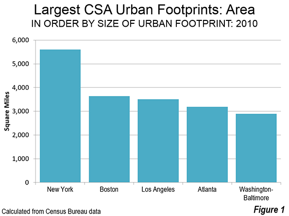
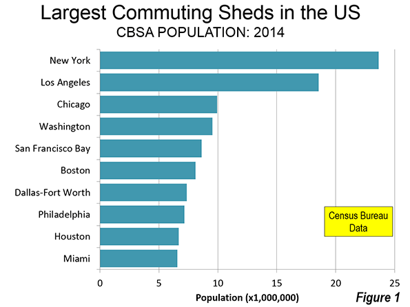
    If all of Boston’s urbanization were a single urban area, it would be the third most expansive in the world (Figure 1), following the combined urban area of New York-Bridgeport-New Haven (4,500 square miles or 11,600 square kilometers) and Tokyo-Yokohama (3,300 square miles or 8,500 square kilometers).

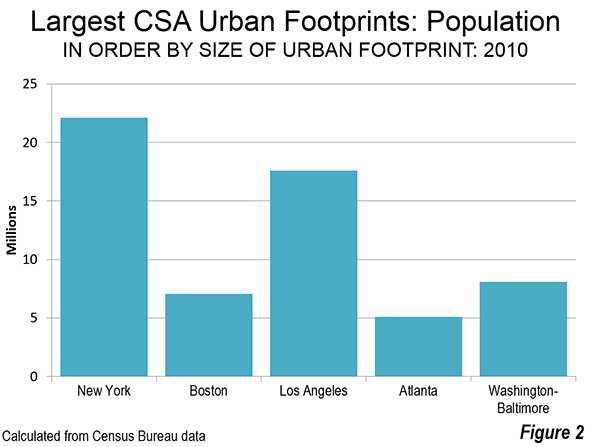
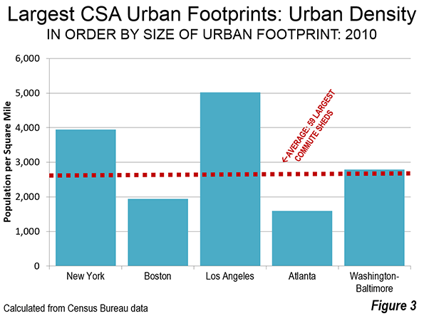
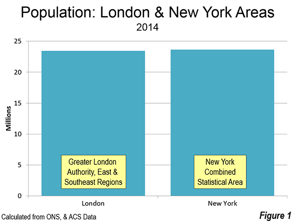
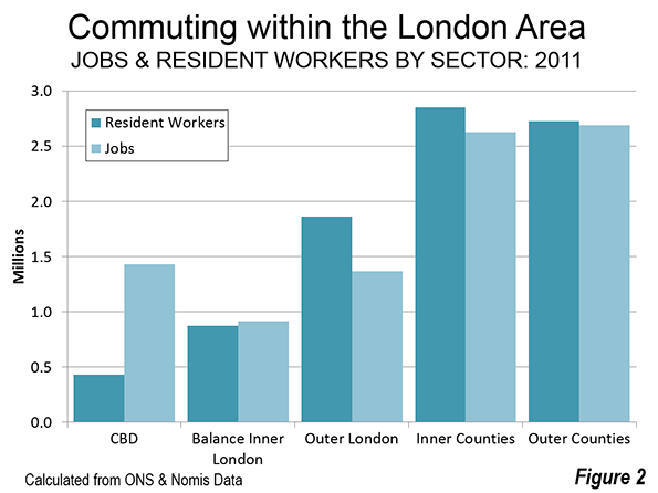
    There is a big difference, however, in the intensity of development between the urbanization in these labor markets. The urban population of the Boston CSA is 7.1 million (Figure 2). The urbanization of the New York CSA has more than three times as many people (23 million), but covers only about 1.5 times the land area. Tokyo, with a tenth less land area, has more than five times the population (38 million). With a density of 1,941 per square mile (750 per square kilometer), the urbanization of Boston is 60% less dense (Figure 3) than the urbanization of the Los Angeles CSA (5,020 per square mile or 1,940 per square kilometer), which includes the Inland Empire urban area of Riverside-San Bernardino.

    Pre-World War II Boston is largely confined within the Route 128 semi-circumferential highway (most of it now called Interstate 95), had a 2010 population of approximately 1.9 million, with a population density of 6,300 per square mile (2,400 per square kilometer). The core city of Boston is among the most dense in the United States, with a 2014 density of 13,300 per square mile (5,200 per square kilometer). It is also very successful, having experienced a strong population turnaround, after falling from 801,000 residents in 1950 to 562,000 in 1980 (a 30% loss). By 2014, the city had recovered nearly 40% of its former population, rising to 656,000.

    Suburban Densities

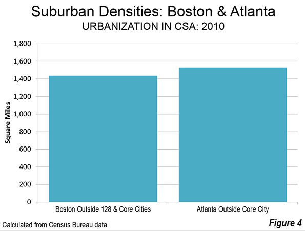
    But once you get outside of 128, Boston’s urban population density fall steeply. If the denser urbanization inside Route 128 and the historic, dense municipalities of Providence, Worcester and Manchester are excluded, the remainder of Boston’s urbanization has a population density of 1,435 per square mile (550 per square kilometer). This is less dense than Atlanta’s urbanization outside the city of Atlanta. Overall, the Atlanta urban area is the least dense in the world with more than 2.5 million population. Approximately two-thirds of the Boston CSA urban population lives in these sparsely settled suburbs (Figure 4).

    If the Boston CSA were as dense as  the Los Angeles urban form, the population would be 18.3 million, not 7.1 million, more than 2.5 times as -people as now reside there. 

    In many ways, Boston is the epitome of the dispersed urban development that followed World War II. Once one of the nation’s densest urban areas, it has evolved into one of the least. What distinguishes Boston from other low density urban areas, like Atlanta, Charlotte or Birmingham (Alabama) is that is core well reflects the urban form built for the pre-automobile age.

    Employment Dispersion

    As would be expected, Boston’s highly dispersed urbanization has been accompanied by highly dispersed employment. Despite having the fifth largest CBD in the nation, Boston’s "hub" accounts for only 6% of the CSA employment. In the 1950s and 1960s, Route 128 became the nation’s first high-tech corridor and has been referred to as the birthplace of the modern industrial park. But most people work outside 128.

    Despite Boston’s huge urban expanse the average trip travel time is only 29 minutes. This is slightly above the US average of 26 minutes and 18 minutes shorter than Hong Kong, the high-income world’s densest urban area. Hong Kong’s urban density is more than 30 times that of Boston’s urbanization.

    One of the World’s Most Prosperous Metropolitan Areas

    Highly dispersed Boston has emerged as one of the world’s most affluent areas. According to the Brookings Global Metro Monitor, the Boston metropolitan area has the fourth largest GDP per capita, purchasing power parity, in the world. Boston trailed only Macau, nearby Hartford and San Jose, the world’s leading technology hub. Two other Boston CSA metropolitan areas were successful enough to be included in the top 100 in the Brookings data. The Providence and Worcester metropolitan areas ranked in the top 100 (like 65 other US metropolitan areas), at about the same level as Vienna, while leading Brussels and Tokyo. Overall, Boston has to rank as one of the country’s – and the world’s most successful labor markets. It has done so while not being denser but while combining the virtues of both a successful core city and a large, expansive periphery.

    Note 1: Cites have two generic forms, physical and economic (or functional). The physical form is the continuously built-up area, called the urban area or the urban agglomerations. This is the area that would be outlined by the lights of the city from a high flying airplane at night. The economic form is the labor market (metropolitan area or combined statistical area), which includes the urban area but stretches to include rural areas and other areas from which commuters are drawn. There is considerable confusion about urban terms, especially when applied to municipalities when called "cities," Municipalities are not themselves generic cities, but are usually parts of generic cities. Some municipalities may be larger than their corresponding generic cities (principally in China).

    Note 2: "Commute sheds" encompass core based statistical areas, as defined by the Office of Management and Budget. including combined statistical areas, as well as metropolitan and micropolitan areas that are not a part of combined statistical areas), Combined statistical areas themselves are formed by strong commuting patterns between adjacent metropolitan and micropolitan areas. A table of all 569 commuter sheds is posted to demographia.com.

    Note 3: Combined statistical areas (and metropolitan areas) often have more than one urban area. This article combines all of the urban areas in the Boston CSA, rather than focusing only on the principal urban area, Boston. Comparisons are made to the total urbanization (not the principal urban areas) of other CSAs in the United States.

    Wendell Cox is Chair, Housing Affordability and Municipal Policy for the Frontier Centre for Public Policy (Canada), is a Senior Fellow of the Center for Opportunity Urbanism (US), a member of the Board of Advisors of the Center for Demographics and Policy at Chapman University (California) and principal of Demographia, an international public policy and demographics firm.

    He is co-author of the "Demographia International Housing Affordability Survey" and author of "Demographia World Urban Areas" and "War on the Dream: How Anti-Sprawl Policy Threatens the Quality of Life." He was appointed to three terms on the Los Angeles County Transportation Commission, where he served with the leading city and county leadership as the only non-elected member. He served as a visiting professor at theConservatoire National des Arts et Metiers,a national university in Paris. 

    Photo:  Second largest geographical expanse of labor market urbanization in the world (Boston). US Census Bureau maps superimposed on Google Earth.

  • Institution of Family Being Eroded

    Recent setbacks for social conservative ideals – most particularly on same-sex marriage – have led some to suggest that traditional values are passé. Indeed, some conservatives, in Pat Buchanan’s phrase, are in “a long retreat,” deserted by mainstream corporate America sporting rainbow logos. Some social conservatives are so despondent that they speak about retreating from the public space and into their homes and churches, rediscovering “the monastic temperament” prevalent during the Dark Ages.

    This response would be a tragedy for society. For all its limitations, the fundamental values cherished by the religious – notably, family – have never been more important, and more in need of moral assistance. The current progressive cultural wave may itself begin to “overreach” as it moves from the certainty of liberal sentiment to ever more repressive attempts to limit alternative views of the world, including those of the religious.

    In the next few years, social conservatives need to engage, but in ways that transcend doctrinal concerns about homosexuality, or even abortion. It has to be made clear that, on its current pace, Western civilization and, increasingly, much of East Asia are headed toward a demographic meltdown as people eschew family formation for the pleasures of singleness or childlessness.

    Read the entire piece at The Orange County Register.

    Joel Kotkin is executive editor of NewGeography.com and Roger Hobbs Distinguished Fellow in Urban Studies at Chapman University, and a member of the editorial board of the Orange County Register. He is also executive director of the Houston-based Center for Opportunity Urbanism. His newest book, The New Class Conflict is now available at Amazon and Telos Press. He is also author of The City: A Global History and The Next Hundred Million: America in 2050. He lives in Orange County, CA.

    Baby photo by Bigstock.

  • Comparisons: Commuting in London and New York

    The world’s two leading Global Cities, London and New York are, according to most indicators, remarkably similar in their patterns of regional commuting. This is the conclusion from our recent review of commuting in London and commuting in New York. This analysis contrasts the results between the London Area (Greater London Authority, East and Southeast regions) and the New York combined statistical area, which stretches from New York state, to New Jersey, Connecticut and Pennsylvania. (A unique animated graphic illustrates the London commuting pattern, at "undertheraeder.com." The map is here and illustrates the size of the greenbelt in the London area).

    Population and Area

    The London and New York areas had almost identical populations in 2014. New York had 23.663 million residents and London had 23.431 million residents, just one percent less. London, however, is growing more rapidly, adding 1.1 percent per year since the 2011 census, while New York’s increase has been 0.8 percent annually since the 2010 census (Figure 1).

    The land areas are also similar (Figure 2). The London commute shed covers 15,400 square miles (39,800 square kilometers). The New York area is about 10 percent smaller, covering 13,900 square miles (36,000 square kilometers).

    Broadly, the two cities can be divided into similar sectors. Both have among the largest central business districts (downtowns or CBDs) in the world. The two central municipalities, the Greater London Authority and the city of New York both have somewhat over 8 million population. There is a first ring of counties located outside the Greater London Authority and the city of New York. Finally there are outer counties in both areas. The geographic areas are described in the "Geographical Note" below.

    Distribution of Employment

    In the distribution of employment between the two cities is remarkably similar (Figure 3). In each case, the suburban counties account for 60% of employment. In both London and New York, the outer counties have slightly more employment than the inner counties, though in both cases the inner counties and outer counties have approximately 30% of employment.

    This leaves approximately 40% of the employment for the central cities. In New York, 22% of the employment is in Manhattan, which contains the central business district. In London, a somewhat smaller 16% of the employment is in the five local authority areas that include the central business district (Camden, Lambeth, city of London, Southwark and the city of Westminster). The balance of the city of New York — the outer boroughs of the Bronx, Brooklyn, Queens and Staten Island, has just 18% of the area’s employment, while the balance of the Greater London Authority — outer London and the balance of inner London — has 25% of the area’s employment.

    Where People Live and Work

    The distribution of the jobs are relative to resident workers is also similar between London and New York. In both cities, the inner counties and the outer counties have nearly the same number of jobs as resident workers. In the case of London, there are 99 jobs per 100 resident workers in the inner counties and a somewhat smaller 92 in the outer counties. In New York, there are 97 jobs per resident worker in the inner counties and 87 in the outer counties. The largest imbalances in both areas occur in the core municipalities. There are approximately 330 jobs per 100 resident workers in the local authority areas containing London’s central business district. Manhattan, with New York’s central business district has a somewhat smaller 280 jobs per 100 resident workers. Indicating the draw of the central business district for workers living in the balance of both core municipalities, there are only 83 jobs for each 100 workers in the balance of the Greater London Authority and 68 in the balance of the city of New York (Figure 4).

    In the two cities, most resident workers are employed in their home sector, 68% in New York and 67% in London. This is also the case in each of the sectors of the two cities. In New York, the largest percentage of resident workers (85%) is employed in Manhattan, with the central business district. The number is considerably smaller (64%) in the jurisdictions containing London’s central business district. In London, the largest share of resident workers employed in their own sector is 88% in the outer counties. In both cities, the inner counties also have a relatively strong balance of local residents, with 71% working in their home sector in New York and 75% in London. In both cities, the smallest number of resident workers employed in their home sectors are in the balance of the core municipality, 62% in London and 55% in New York (Figure 5).

    Commuting to the Central Business Districts

    The data indicates a surprisingly limited draw for the two central business districts. Often media articles and even academics presume that cities are monocentric — that most employees work in the central business district. This isn’t even close to being the case. In fact, the analysis of commuting in the New York and London areas shows that only in the sectors containing the central business districts does the central business district attract most of the resident workers. Even in the relatively jobs-poor balance of the two core municipalities, only 36% in New York and 30% in London work in the jurisdictions containing the CBDs. In the inner counties, the numbers are much smaller. Only 14% of New York inner county resident workers have employment in Manhattan, with an even smaller number, 8% of London’s inner county resident workers commuting to CBD jurisdictions. The numbers are even smaller in the outer counties, where only 4.6% of New Yorkers commute to Manhattan and 2.4% of Londoners commute to the CBD jurisdictions (Figure 6). 

    In both cases, approximately 75% of CBD employees are drawn from the core municipality. In New York, approximately 30% of the central business district employees are from Manhattan, while 43% are from the outer boroughs. In London, 19% of the central business district employees are from the five CBD jurisdictions and 57% are from the balance of the Greater London Authority.

    Manhattan is a somewhat stronger draw to the suburban counties, with 18% of employees from the inner counties and 8% from the outer counties. The London CBD draws 17% of its workers from the inner counties and 5% from the outer counties. Despite the comprehensive suburban rail system in New York and both suburban and national rail system in London, comparatively few workers commute from beyond the outer counties — 2.6% in London in 1.5% and New York (Figure 7).

    How Commuters Travel

    There are also similarities between the commuting methods in the London and New York areas. In both cases, cars, vans and other light vehicles carry the majority of commuters, 53% in London and 62% in New York (Figure 8). Mass transit carries virtually the same share of commuters in both cities, at 26%. Many more Londoners walk to work the New Yorkers, at 10%, compared to less than 6%. Approximately 5.8% of London workers report working at home, somewhat more than New York’s 4.1% (Since the two nations use different census survey instruments, the data may not be completely comparable).

    Widely Dispersed Global Cities

    Ultimately the key finding is that the world’s two greatest Global Cities are widely dispersed. Despite the strength of their cores, the overwhelming majority of employment is in the suburbs. Only a small percentage of resident employees in the suburban areas work in the central business districts. A majority of resident workers is attracted to the CBDs only from the jurisdictions containing the CBDs themselves.

    —–

    Geographical Note: The geographical sectors are as follows:

    London (Greater London Authority, Southeast England and East England): The central business district is situated in a wide corridor on both sides of the Thames River. It is contained in local authority areas, including the city of London, the city of Westminster and the boroughs of Camden, Southwark and Lambeth. The inner counties border on the metropolitan greenbelt, which surrounds the Greater London Authority. They are Berkshire Buckinghamshire, Essex, Hertfordshire, Kent and Surrey. The outer counties are Cambridgeshire, East Sussex, Hampshire, Isle of Wight, Norfolk, Oxfordshire, Suffolk and West Sussex.

    New York (New York Combined Statistical Area): The area includes 35 counties, in eight metropolitan areas, including New York (NY-NJ-PA), Allentown-Bethlehem (PA-NJ),  Bridgeport-Stamford (CT), East Stroudsburg (PA), Kingston (NY), New Haven (CT), Torrington (CT) and Trenton (NJ). 

    —–

    Wendell Cox is Chair, Housing Affordability and Municipal Policy for the Frontier Centre for Public Policy (Canada), is a Senior Fellow of the Center for Opportunity Urbanism (US), a member of the Board of Advisors of the Center for Demographics and Policy at Chapman University (California) and principal of Demographia, an international public policy and demographics firm.

    He is co-author of the “Demographia International Housing Affordability Survey” and author of “Demographia World Urban Areas” and “War on the Dream: How Anti-Sprawl Policy Threatens the Quality of Life.” He was appointed to three terms on the Los Angeles County Transportation Commission, where he served with the leading city and county leadership as the only non-elected member. He served as a visiting professor at theConservatoire National des Arts et Metiers,a national university in Paris. 

    Photograph: Traffic in Bergen County, New Jersey (a  New York inner suburban county), by author.

  • Who Should Immigration be Helping?

    Recent revelations about the firing of American tech workers and their replacement by temporary visa holders reveal, in the starkest way, why many Americans are wary of the impact of untrammeled immigration. Workers in American companies have been removed from their jobs not because they could not perform them, but because their replacements, largely from India, are simply cheaper and, likely, more malleable.

    The H-1B temporary visa program was purportedly designed to help tech firms hire specialized talent to fill needs not adequately addressed by the U.S. labor market. But what it has really become is a way to lay off workers for cheaper ones.

    Silicon Valley’s Phony War

    A looming shortage of domestic tech talent has long been a siren song played in Silicon Valley by grandees such as Facebook’s Mark Zuckerberg. It is common to hear them claim the visa program must be expanded for them to compete.

    Immigrant entrepreneurs and technical staff are hugely important, but the notion about “shortages” of IT workers is dicey at best. A 2013 report from the labor-aligned Economic Policy Institute found that the country is producing 50 percent more IT professionals each year than are being employed. EPI estimates “guest workers” now account for one-third to one-half of all new IT job holders, much of them through contracts with Infosys and Tata Consultancy Services, both based in India. These two firms, according to EPI, have cost over 12,000 U.S. workers their jobs this year alone.

    Read the entire piece at The Orange County Register.

    Joel Kotkin is executive editor of NewGeography.com and Roger Hobbs Distinguished Fellow in Urban Studies at Chapman University, and a member of the editorial board of the Orange County Register. He is also executive director of the Houston-based Center for Opportunity Urbanism. His newest book, The New Class Conflict is now available at Amazon and Telos Press. He is also author of The City: A Global History and The Next Hundred Million: America in 2050. He lives in Orange County, CA.

    Photo by telwink

  • Commuting in London

    According to the 2011 census, the London commuter shed — defined here as the of London (the Greater London Authority, or GLA) and the East and Southeast regions of England — had a 2013 population of 23.2 million, spread over an area of 15,400 square miles (39,800 square kilometers).

    For this analysis, the area is divided into five parts, including the central business district (CBD), the balance of Inner London, Outer London, the inner counties, which are largely adjacent to London and the outer counties. Counties are largely only ceremonial at this point and used for geographical convenience. In many counties, unitary local authorities have been established that replace part or all of the previous county geographic authority.

    The central business district is situated in a wide corridor on both sides of the Thames River. It is contained in five local authority areas, including the city of London, the city of Westminster and the boroughs of Camden, Southwark and Lambeth. All of central London’s eight largest rail stations are in these five areas, and central business district commuters rely to a substantial degree on its suburban rail system.

    Inner London roughly corresponds to the London County Council area as it existed before creation of the Greater London Council (GLC) in 1965. Outer London includes the boroughs that were added in the establishment of the GLC which was abolished in 1986. A new, London authority (the GLC) was created  in 2000, with a considerably scaled back portfolio of responsibilities, principally transport, police, fire, emergency services and planning. GLA has 33 local authorities, 32 of which are popularly referred to as boroughs, plus the City of London (the one square mile historic core). The local authorities which are responsible for a many local public services, and constituted London’s only local government between 1986 and 2000.

    The inner counties border on the metropolitan greenbelt, which surrounds London (Note). They are Berkshire Buckinghamshire, Essex, Hertfordshire, Kent and Surrey. The outer counties are Cambridgeshire, East Sussex, Hampshire, Isle of Wight, Norfolk, Oxfordshire, Suffolk and West Sussex.

    Distribution of Employment

    As of the 2011 census, the local authority areas containing the central business district had approximately 1.4 million jobs, or approximately 15 percent of the jobs in the London area. The rest of GLA, including the balance of inner London and Outer London has 25 percent of the employment. The outer counties have the largest number of jobs, at 2.7 million, comprising 30 percent of London area employment. The inner counties have nearly as many jobs, at 2.6 million, or 29 percent of employment. Thus, the suburban areas outside the Greenbelt have nearly 60 percent of the London area employment (Figure 1).

    Where People Live and Work

    The local authority areas containing the CBD have the greatest imbalance between resident workers and jobs. There are 3.35 jobs for each resident worker in these areas. The ratio of jobs to resident workers is much closer in the balance of Inner London, with a ratio of 1.04 jobs per employee. The least balanced is Outer London, with only 0.73 jobs per employee. The inner counties have the second highest ratio, at 0.93 jobs per employee. Surprisingly, the outer counties have the ratio closest to 1.00, at 0.99 jobs per employee (Figure 2). This parallels our findings of America’s only city with anything like London’s pedigree, New York.

    Most employees work in the sector of their residence. About 65 percent of CBD local authority area residents work in the CBD area (Figure 3). Outside-the-greenbelt commuters work in their own sector to a greater degree. In the outer counties 88 percent work in their home sectors, while 75 percent of inner counties commuters work in their own sectors. The balance of Inner London has the lowest percentage of employees working in their own sectors (41 percent), while Outer London is somewhat higher, at 50 percent.

    Commuting to Central London

    Despite its strong CBD, the London area is anything but monocentric. Approximately 85 percent of London area jobs are outside the central business district. Yet London comparative data from nearly two decades ago placed London’s CBD at fourth largest in the world, trailing Tokyo, New York and slightly behind Osaka. With London’s strong economic growth since that time, London has probably passed Osaka, which has faced more difficult economic times.

    The overwhelming majority of jobs in the London CBD are filled by GLA residents, with more than 75 percent of commuters living in the balance of Inner London or Outer London (Figure 4). This leaves only a quarter living in the exurban areas beyond the greenbelt. Approximately 17 percent of CBD commuters travel from the inner counties, adjacent to the Greenbelt. Only 5 percent travel from the outer counties. Less than three percent of CBD commuters travel from beyond the London area, which may be surprising given the plentiful higher speed (as opposed to genuine high speed) rail services.

    How Commuters Travel

    More than half of Londoners commute to work by car or other light vehicles (including car pools). Transit accounts for about a quarter of commuting, while about 10 percent of commuters walk to work. Approximately six percent usually labor mainly at or from home (Figure 5).

    Among mass transit commuters, suburban rail systems account for the largest share, at 37 percent, underground (metro) and light rail 33 percent and buses 30 percent. Over the past three decades there has been a substantial increase in bus ridership, principally from expanded services financed with savings from competitive tendering (also called competitive contracting) and additional services added later in conjunction with London’s inner congestion pricing zone. Competitive contracting involves use of competitively selected private companies to operate services. London’s "red bus" system — which is fully integrated in its fare, route structure and vehicle livery with its many double deck buses is virtually all operated by the private sector through competitive tendering.

    Minicentric London?

    In some ways, London is one of the world’s most dispersed cities, largely due to the discontinuous development encouraged by the greenbelt. The greenbelt imposes a substantial distance penalty for commuters from the inner and outer counties to the CBD, whether by car or train. This is in considerable contrast to Western Europe’s other megacity, Paris, which is far more compact in its metropolitan development, despite having a considerably weaker CBD. London also demonstrates that the age of the monocentric metropolitan area is largely a thing of the past in high income world cities. With less than one-sixth of metropolitan employment in the CBD, "minicentric" might be a more accurate characterization.

    Note: Housing development is prohibited on the metropolitan greenbelt, which surrounds London (GLA). The metropolitan greenbelt covers three times the land area of the GLA. Virtually all population growth over the past 85 years in the London area has occurred outside the greenbelt. The inner and outer counties have added more than 7 million residents over the since the 1931 census, while London itself has added approximately 500,000 residents.

    The metropolitan is a cornerstone of London’s urban containment policy, which also applies throughout the United Kingdom. Housing development is banned on the greenbelt and the U.K.’s urban containment policy has been associated with a substantial rise in house prices relative to incomes (see: The Barker Review of Housing Supply, the Barker Review of Land Use Planning and The Costs of Smart Growth: A 40 Year Perspective).

    Wendell Cox is Chair, Housing Affordability and Municipal Policy for the Frontier Centre for Public Policy (Canada), is a Senior Fellow of the Center for Opportunity Urbanism (US), a member of the Board of Advisors of the Center for Demographics and Policy at Chapman University (California) and principal of Demographia, an international public policy and demographics firm.

    He is co-author of the "Demographia International Housing Affordability Survey" and author of "Demographia World Urban Areas" and "War on the Dream: How Anti-Sprawl Policy Threatens the Quality of Life." He was appointed to three terms on the Los Angeles County Transportation Commission, where he served with the leading city and county leadership as the only non-elected member. He served as a visiting professor at the Conservatoire National des Arts et Metiers, a national university in Paris. 

    Photo: Traffic in London (by author)

  • Australia’s Recipe for Urban Decay

    Across federal, state, and local levels, Australian urban planning authorities have emphasized the need for policies that seek to limit urban fringe development and create densely-populated urban centers. This process is called ‘urban consolidation’ and has been a goal of Australian authorities for more than three decades. More specifically, urban consolidation is defined by efforts to concentrate housing, jobs, and amenities around “activity centers” such as a traditional downtown, satellite urban centers, and elongated strategic corridors. These high-density areas are to be separated by green belts of undeveloped land and connected by public transport links such as trains and light rail systems.

    Australian planners’ efforts to establish a high-density urban form have been effective, at least from their point of view. From 1981 to 2011, housing stock in Sydney, Melbourne, and Brisbane saw a large shift towards high-density units. A net total of 640,000 new multi-unit dwellings were built during this time, representing an increase of over 115%. This surge forced the proportion of multi-unit housing to increase to nearly one-third of the total housing supply in cities that have historically been dominated by single-family dwellings.1

    As Australia moves toward higher-density cities, what will be the result? Urban planners assert that their policy decisions are thoroughly researched and provide the “best” outcomes, but evidence from Australia’s largest cities tends to refute that claim. Among the numerous issues that arise due to consolidation ideology, perhaps the most disturbing are the severe impacts on housing affordability, poverty, and housing quality.

    Urban consolidation policies, by definition, are aimed at choking the supply of new single-family detached housing by limiting urban fringe growth as a means of minimizing the urban footprint. This is intended to drive more and more of the urban population into compact living situations. Thus, by limiting the supply of single-family detached housing and pushing more households into the market for multi-family housing, urban consolidation causes home prices to rise in both markets. As Figures 1 through 5 show, this is exactly what has happened in cities that adopt consolidation ideology. The Australian Bureau of Statistics reports that “the price of established houses in the capital cities rose by almost half (46%) between 2002-03 and 2008-09, with prices increasing at an average of 6.5% per year.”2 From 2001 to 2011, the number of dwellings in Sydney costing less than AUD $275 in rent per week decreased by 52% while the number of dwellings costing more than $275 in weekly rent surged by 269%; in Melbourne, the number of dwellings that cost at least $650 per week in rent more than tripled. Homeowners in Sydney and Melbourne have also seen tremendous increases in mortgage payments. In the same ten-year period, there was a seven-fold increase in the number of households in Sydney and Melbourne paying more than $4,000 per month in mortgage payments, while the number of households paying less than $1,000 per month was cut in half.3  At a time when wages and income have been stagnant, this means a severe decrease in housing affordability, meaning fewer Australians are able to afford the highly sought-after stability of homeownership.

    Given the profile of buyers and sellers, the market for dense multi-family housing is predominantly driven by investors, landlords, and institutional property owners.4 Thus the large majority of occupants are renters, not owner-occupiers, and there is no reason to infer that this ownership pattern will change.  As Australian cities continue to densify, ownership demand – that is, the market for the purchase and sale of housing units – will be driven less by owner-occupiers and more by investors and landlords, who have historically been the dominant players in multi-unit dwelling markets. This latter group of owners responds to market conditions in a different way than the owner-occupier group, and the shift is likely to have a profound impact on economic and socio-political outcomes in the long-term.

    In housing markets, there are two groups of consumers: investors, who intend to lease the units after buying, and owner-occupiers, who intend to live in the residences themselves. Owner-occupiers purchase homes for personal consumption; their decision about which home to buy is driven by the quality of the housing, access to transportation and employment, amenities in the surrounding area, and the sense of financial stability provided by owning one’s own home. Investors, on the other hand, are quite different. By definition, investors are driven by profit. They are seeking rental income from tenants as well as appreciation in the value of both the property and the underlying land. They evaluate properties based on the potential cash flows from renting and the price they can receive when they sell the property sometime in the future.

    But investors’ motives may become distorted in Australia due to a policy known as ‘negative gearing.’ Negative gearing, in terms of real estate investment, allows any negative cash flow from a single property to be deducted from the investor’s total taxable income.5 This gives investors   an incentive to purchase properties where the mortgage payments exceed rental income, especially if value of the property is appreciating. This pushes up the after-tax returns to investors which inflates housing prices even further. It also provides investors with greater incentive to make speculative purchases, which increases home price volatility and instability.

    What happens when you throw urban consolidation policies into the mix? As urban planners continue to choke the supply of new land, the price of existing land continues to accelerate upward. When investor profits are increasingly driven by speculating on the land value rather than income from the tenants, investors are more inclined to purchase lower-value properties which require less maintenance and fewer capital expenditures yet enjoy the same increases in underlying land value. By this logic, we could expect that low-income housing would increase in value at a faster pace than higher-quality housing as investors bid up the prices, which is exactly what happened in Sydney’s last real estate boom.6 Low-value properties are also more likely to provide investors with the support of negative gearing since they typically provide the lowest rental revenues. But investors, looking primarily at tax advantages, are less likely to improve the properties or even maintain existing structures. Thus, we can see how more and more investors not only have the incentive to compete for low-value housing units, where there is already insufficient supply, but also neglect those units in the long-term. Such market pressures are already noticeable in Sydney and Melbourne, where urban consolidation has been occurring for a longer time, and will certainly arise in Brisbane, in the state of Queensland, as planners establish growth boundaries for its booming population.7

    But it doesn’t stop there. This problem is exacerbated by the nature of Strata title plans, which have come to dominate the market for higher density housing in Australia. Essentially, strata titling comes from legislation passed in the 1960s whereby each apartment unit or flat on a parcel of land can be owned individually, and thus a mortgage could be taken out in order to purchase individual high-density housing units. This is similar to a condominium ownership structure in the United States, but with a few key shortcomings. Although strata titling allows a few individuals living in high-density areas to enjoy homeownership, it primarily benefits investors who now only have to purchase single units instead of entire multi-family buildings. Even worse, strata titling’s lack of consideration for common areas poses a serious issue in the long run for the maintenance of high-rise buildings and their surrounding neighborhoods, especially in areas of lower income. According to Bill Randolph, Director of the City Futures Research Center at the University of New South Wales, “the strata system may come badly unstuck in lower value areas where investor landlords have little incentive to reinvest in their property and home owners do not have the wherewithal to afford major repair costs.”8

    Putting it all together, what can we expect to be the future for Australia? Urban consolidation policies continue to push more Australians out of suburban homes and into cramped apartments, where housing markets are dominated by investor-landlords instead of owner-occupiers. The consolidation policies will squeeze the supply of land and force dwelling prices to rise regardless of rental revenue, promoting speculative behavior among investors. Negative gearing and strata titling programs incentivize these investors to neglect their properties, causing high-density areas (especially low-income neighborhoods) to deteriorate. The end result is slum-like conditions, social tension, and perpetual poverty for the neighborhood’s inhabitants. Even in higher-value neighborhoods, a lack of necessary upkeep will erode housing quality, even as prices continue to inflate. This is the reality of urban consolidation; it takes ownership out of the hands of Australians and puts it in the hands of speculative and neglectful investor-landlords. It is nothing short of a recipe for urban decay.

    Clinton Stiles-Schmidt graduated magna cum laude from Chapman University where he earned a Bachelor of Science in Business Administration (emphasis in Real Estate and Finance) and a Bachelor of Arts in Economics. His experience includes several internships in real estate investment and development as well as studying abroad in both Spain and Australia. Clinton recently joined Cushman & Wakefield as an Analyst in their Corporate Finance & Investment Banking Group.


    Figure 1: Ratio of Housing Debt to Disposable Income in Australia9

    Figure 2: Weekly Rent Payments in Sydney10

    Figure 3: Monthly Mortgage Payments in Sydney11

    Figure 4: Weekly Rent Payments in Melbourne12

    Figure 5: Monthly Mortgage Payments in Melbourne13


    1 "Community Profiles." ABS Census 1986-2011. Australian Bureau of Statistics, 1 Oct. 2014. http://www.abs.gov.au/websitedbs/censushome.nsf/home/communityprofiles.

    2 "Measures of Australia’s Progress, 2010." Australian Bureau of Statistics, 15 Sept. 2010. http://www.abs.gov.au/ausstats/abs@.nsf/Lookup/by%20Subject/1370.0~2010~Chapter~House%20prices%20(5.4.4.1)

    3 "Community Profiles." ABS Census 1986-2011. Australian Bureau of Statistics, 1 Oct. 2014. http://www.abs.gov.au/websitedbs/censushome.nsf/home/communityprofiles.

    4 Randolph, Bill. "Delivering the Compact City in Australia: Current Trends and Future Implications." City Future Research Centre, University of New South Wales, 1 June 2006.

    5 Koulizos, Peter. "How Negative Gearing Works." The Realestate.com.au Blog. Realestate.com.au, 21 Oct. 2013. http://www.realestate.com.au/blog/how-negative-gearing-works/.; "Real Estate." Australian Tax Office. Australian Government, 22 Jan. 2013. https://www.ato.gov.au/General/Capital-gains-tax/In-detail/Real-estate/

    6 Hill, Robert J., Daniel Melser, and Iqbal Syed. "Measuring a Boom and Bust: The Sydney Housing Market 2001–2006." Journal of Housing Economics 18.3 (2009): 193-205. ScienceDirect. Web. http://www.sciencedirect.com/science/article/pii/S1051137709000321

    7 Yu, Xiaojiang. "‘The Great Australian Dream’ Busted on a Brick Wall: Housing Issues in Sydney." Cities 22.6 (2005): 436-45. ScienceDirect. Web. http://www.sciencedirect.com/science/article/pii/S0264275105000879 ; Stimson, Robert J., and Shane P. Taylor. "City Profile: Brisbane." Cities 16.4 (1999): 285-95.ScienceDirect. Web. http://www.sciencedirect.com/science/article/pii/S0264275199000104

    8 Randolph, Bill. "Delivering the Compact City in Australia: Current Trends and Future Implications." Urban Policy and Research 24.4 (2006): 473-90. City Futures, June 2006. Web. https://www.be.unsw.edu.au/sites/default/files/upload/researchpaper6.pdf

    9 "RBA: Statistical Tables." Reserve Bank of Australia, 26 Sept. 2014. http://www.rba.gov.au/statistics/tables/.

    10 "Community Profiles." ABS Census 1986-2011. Australian Bureau of Statistics, 1 Oct. 2014. http://www.abs.gov.au/websitedbs/censushome.nsf/home/communityprofiles.

    11 Ibid.

    12 Ibid.

    13 Ibid.

    Sydney suburb photo by BigStockPhoto.com.

  • Commuting in New York

    The New York commuter shed (combined statistical area) is the largest in the United States, with 23.6 million residents spread across 13,900 square miles in New York, New Jersey, Connecticut and Pennsylvania. It includes 35 counties, in eight metropolitan areas, including New York (NY-NJ-PA), Allentown-Bethlehem (PA-NJ), Bridgeport-Stamford (CT), East Stroudsburg (PA), Kingston (NY), New Haven (CT), Torrington (CT) and Trenton (NJ). The criteria for designation of combined statistical areas is here and Figure 1 is a map of the New York CSA.

    This article examines employment and commuting in the New York area by broad geographic sector. The core sector, of course, is Manhattan (New York County). The second sector is the balance of the city of New York, the outer boroughs of the Bronx, Brooklyn, Queens and Staten Island. The inner counties are Westchester and Nassau in New York as well as Bergen, Essex, Hudson, Middlesex, Passaic and Union in New Jersey. The balance of the CSA is in the outer counties.

    Distribution of Employment

    The New York CSA is home to the world’s second largest central business district (CBD). Only Tokyo’s Yamanote Loop has more employment. Overall, Manhattan (New York County) has 2.4 million jobs, with approximately 2.0 million jobs in the CBD, which covers virtually all of the area to the south of 59th Street. Yet, despite this impressive statistic, unmatched anywhere in the country, Manhattan contains only 22 percent of the employment in the New York area. The largest portion of employment is in the outer counties, with 32 percent (Figure 2). Combined, the inner and outer county suburbs represent 60 percent of the jobs in the New York commuting shed.

    Where People Live and Work

    The distribution of employee residences contrasts sharply with that of employment. Manhattan displays the most extreme imbalance between jobs and where people live. (Figure 3). There are nearly three times as many jobs as resident employees in Manhattan (2.8 jobs per resident employee). The most evenly balanced sector is the outer counties, which are at near parity, with 0.97 jobs for every resident employee. The outer counties are relatively balanced, with 0.87 jobs per resident employee. The balance of New York City has 2.7 million resident workers and only 1.9 million jobs. There are only 0.68 jobs per resident employee. When the entire city is considered, including Manhattan, there is a much closer balance, with 1.16 jobs per resident worker.

    Most employees work in their sector of residence. About 85 percent of Manhattan residents work in Manhattan. Nearly 79 percent of outer county residents work in the outer counties, while 71 percent of inner county residents work in the inner counties. Perhaps surprisingly, nearly two-thirds as many inner county residents work in the outer counties as work in Manhattan. Only 55 percent of resident workers in the four outer boroughs of New York City work in the outer boroughs (Figure 4)

    Commuting to Manhattan

    One of the most enduring urban myths is built around the idea of the monocentric city. This is the conception that most people work downtown (the CBD). This has been an inaccurate characterization for decades, even in New York. In New York, as noted above, the CBD accounts for little more than 20 percent of employment. By comparison, however, this is a substantial number compared to other large North American commuter sheds. The Chicago CSA, for example (the Loop) has about 11 percent of its employment downtown (the Loop), Toronto has less than 15 percent and Los Angeles is under two percent.

    The overwhelming majority of jobs in Manhattan are filled by local residents or nearby commuters. According to American Community Survey "flow" data for 2006-2010, 73 percent of Manhattan commuters live in Manhattan or in the balance of New York City. Another 18 percent of commuters travel from the inner counties. This leaves less than eight percent of commuters traveling from the outer counties. Less than two percent of commuters travel to Manhattan from outside the CSA (Figure 5).

    How Commuters Travel

    New York relies on transit far more than any other US commuter shed. Overall approximately 27 percent of work trip travel is on transit. However, the extent of transit use varies widely by sector. Transit accounts for 75 percent of work trip travel to Manhattan employment. Transit also has a significant market share to jobs in the outer boroughs (38 percent). Jobs in the city of New York account for 88 percent of the transit commuting in the CSA. Outside the city, transit carries a much smaller share. In the inner counties, transit captures nine percent of commuters, while accounting for a much smaller 2.6 percent in the outer counties. In the outer counties, transit’s market share is slightly more than one-half the national average (Table).

    Cars have the largest work trip market share in every commuter shed in the nation, including the New York area, where they provide 61 percent of trips. Again, however, there is a very wide variation between the sectors. Cars provide less than 15 percent of commute trips to jobs in Manhattan. They provide a larger 44 percent share in the outer boroughs. In the inner counties and outer counties, cars are strongly dominant, providing for 80 percent and 88 percent of the commutes respectively.

    The walking commuter share is lower than might be expected in famously pedestrian oriented Manhattan. Manhattan has by far the densest urbanization in the United States. With more than 70,000 residents per square mile (28,000 per square kilometer), Manhattan is nearly four times as dense as San Francisco, which has the highest density of any large municipality in the US outside New York. With such a high density, and a job density of more than 100,000 per square mile (nearly 40,000 per square kilometer), it may be surprising that workers in the outer boroughs rely on walking to work to a greater extent. Walking has a 7.4 percent commuting share in Manhattan, and a 9.6 percent share in the outer boroughs, despite their much lower population and employment densities.

    Table
    New York CSA Means of Transportation: Work Location: 2013
    Area Drive Alone Car Pool Transit Bicycle Walk Other Work at Home
    Manhattan 10.0% 2.7% 74.7% 1.0% 7.4% 1.8% 2.4%
    Balance: NYC 37.0% 7.3% 38.7% 1.1% 9.6% 1.4% 4.8%
    Inner Counties 71.6% 8.6% 9.4% 0.3% 4.2% 1.7% 4.2%
    Outer Counties 79.6% 8.6% 2.6% 0.3% 2.8% 1.1% 5.0%
    New York CSA 54.3% 7.1% 26.9% 0.6% 5.4% 1.5% 4.2%
    Exhibit: United States 76.4% 9.4% 5.2% 0.6% 2.8% 1.3% 4.4%
    Calculated from American Community Survey


    The faster work commute trips of cars is illustrated in the sectoral analysis. Automobile commuting is most dominant in the outer county suburbs, which have the largest number of resident workers and jobs. The average one-way work trip travel time is 24.7 minutes in the outer counties, little more than one half the 49.7 minute one way trip to jobs in Manhattan. The inner counties have the second shortest travel time, at 28.5 minutes. Jobs in the outer boroughs of New York City have an average work trip travel time of 36.4 minutes (Figure 7).

    A Dispersed Commuter Shed

    Despite its reputation for monocentricity, and its primacy in terms of the sheer numbers of core area employees, the New York combined statistical area remains surprisingly dispersed when it comes to jobs, contrary to popular accounts, although less so than others.

    —–

    Wendell Cox is Chair, Housing Affordability and Municipal Policy for the Frontier Centre for Public Policy (Canada), is a Senior Fellow of the Center for Opportunity Urbanism (US), a member of the Board of Advisors of the Center for Demographics and Policy at Chapman University (California) and principal of Demographia, an international public policy and demographics firm.
    He is co-author of the "Demographia International Housing Affordability Survey" and author of "Demographia World Urban Areas" and "War on the Dream: How Anti-Sprawl Policy Threatens the Quality of Life." He was appointed to three terms on the Los Angeles County Transportation Commission, where he served with the leading city and county leadership as the only non-elected member. He served as a visiting professor at the Conservatoire National des Arts et Metiers, a national university in Paris. 

    Photograph: Inner County New York CSA: City of Elizabeth, seat of Union County, New Jersey (by author)

  • America’s Largest Commuter Sheds (CBSAs)

    Core Based Statistical Area (CBSA) is the Office of Management and Budget’s (OMB) way of defining metropolitan regions.  The OMB (not the Census Bureau) defines criteria for delineating its three metropolitan concepts, combined statistical areas, metropolitan statistical areas, and micropolitan statistical areas. The CBSA has obtained little use since this adoption for the 2000 census. According to OMB:

    "A CBSA is a geographic entity associated with at least one core of 10,000 or more population, plus adjacent territory that has a high degree of social and economic integration with the core as measured by commuting ties."

    In this context, core means urban area. If an urban area has 50,000 or more population, OMB defines a metropolitan area around it. If an urban area has 10,000 or more population but fewer than 50,000 residents, OMB defines a micropolitan area around it.

    It is also important to understand that CBSAs, whether CSAs, metropolitan areas, or micropolitan areas are not urban areas. In fact, 94% of the area in CBSAs is rural — only 6% is urban (built-up urban cores and suburbs).

    Combined statistical areas (CSAs) are made up of adjacent CBSAs that have a significant amount of commuting between them, but less than required for a metropolitan area or a micropolitan area. In some cases the CSAs seem so obvious as to make the smaller metropolitan area definitions seem ludicrous. One keen observer, Michael Barone of the Washington Examiner, put San Francisco and San Jose, as well as Los Angeles and Riverside-San Bernardino together in his recent analysis of population growth, because, as he rightly pointed out, they seem to "flow together."

    Some CSAs are very large. For example the New York CSA is composed of 8 metropolitan areas (New York (NY-NJ-PA), Bridgeport (CT), New Haven (CT), Trenton (NJ), Allentown (PA-NJ), Kingston (NY). Torrington (CT) and East Stroudsburg (PA). On the other hand, many major metropolitan areas are not a part of a CSA, such as Phoenix and San Diego.

    Since the term CBSA seems unlikely to achieve popular usage, this article uses the term "commuter shed" to denote the highest local level of metropolitan definition.  The highest level for the largest regions are is the combined statistical area (CSA). In others they are defined as a metropolitan area or micropolitan area. The result is a consistent standard of economic geography defined by commuting. Yet such lists are rare or non-existent. A table of all 569 commuter sheds (over 1,000,000 population) is posted to demographia.com.

    10 Largest Commuter Sheds

    As a 2014, there were 60 commuter sheds in the United States with more than 1 million population (Table).

    Not surprisingly, the nation’s largest commuter shed is New York. New York stretches from New Haven and Bridgeport, and Connecticut which are separate metropolitan areas out to Allentown which is principally in Pennsylvania and Trenton in New Jersey. The New York commuter shed has a population of 23.6 million. In fact, given the extensive suburban rail transit service between Southwestern Connecticut and New York City, it may be surprising that New Haven and Bridgeport are separate metropolitan areas, both with nearly 1,000,000 population. Moreover, there is virtually no break in the continuously built-up area between New York and southwestern Connecticut (Fairfield and New Haven counties) — they "flow together" to use Barone’s term. Since 2010, the Allentown metropolitan area, with nearly 1,000,000 population, was added to the New York CSA.

    The second largest commuter shed is Los Angeles-Inland Empire, with 18.6 million residents. This includes the Los Angeles metropolitan area (Los Angeles and Orange Counties, Ventura County and the Riverside San Bernardino metropolitan area (Inland Empire, including Riverside and San Bernardino County), which is one of the largest in the nation, with more than 4 million population. Here, as in New York, there is virtually no break in the built-up urbanization between the two urban areas, Los Angeles and Riverside-San Bernardino.

    Chicago is the third largest commuter shed, though its adjacent metropolitan areas are far smaller than in New York and Los Angeles. Chicago is also growing very slowly, with its population increase over the last year so small that it will take nearly to 2020 to reach 10 million, even though it only has 72,000 to go.

    Just below Chicago, Washington and Baltimore combine to form nation’s fourth largest commuter shed. Already with more than 9.5 million residents and strong growth this decade, Washington-Baltimore could pass 10 million population and Chicago by 2020. Washington-Baltimore is unique in combining two of the nation’s historically largest and most intensely developed core municipalities along with the much more extensive suburbs (which contain 85% of the population). Washington-Baltimore now extends to Franklin County, Pennsylvania.

    The fifth largest metropolitan complex is the San Francisco Bay Area with a population of 8.6 million. This includes the San Francisco, San Jose, Vallejo, Santa Rosa, Santa Cruz metropolitan areas and the recently added Stockton metropolitan area.. There is no break in the urbanization between San Francisco and San Jose.  

    The Boston CBSA was enlarged during the last decade to include Providence, a major metropolitan area in its own right. Boston also includes the Worcester metropolitan area, which is nearing 1,000,000 population. Boston-Providence has a population of 8.1 million.

    The top 10 is rounded out by Dallas-Fort Worth (7.4 million), Philadelphia (7.2 million), Houston (6.7 million), and Miami (6.6 million).

    The largest metropolitan complex in the nation that is not a part of a CSA is Phoenix, which is ranked 14th. Only one other commuter sheds in the top 20 is not a CSA (San Diego) and only six of the 60 commuter sheds with more than 1,000,000 population is not a CSA.

    Fastest Growing Commuter Sheds

    The fastest commuter shed growth rates are in the South, which accounts for eight of the ten fastest growing commuter shed’s. Austin ranks number one in annual percentage growth between 2010 and 2014, a position it also holds among major metropolitan areas. Cape Coral (Florida) ranks second. Cape Coral also ranks as the fastest growing among the midsized metropolitan areas (from 500,000 to 1,000,000 population). Houston ranks third in growth rate. Houston and Dallas-Fort Worth are the only commuter sheds with more than 5 million population that are among the top 10 in growth. The two non-Southern top 10 entries are from the West: Denver and Phoenix (Figure 2).

    Slowest Growing Commuter Sheds

    All of the 10 slowest growing major commuter sheds are in the old industrial heartland of the Northeast and Midwest. Cleveland-Akron is the slowest growing, having lost approximately 0.1 percent of its population annually. Pittsburgh, Dayton, Buffalo and Detroit have also lost population.

    Continuing Dispersion

    The dispersion of US metropolitan areas continues, with perhaps the ultimate example of Portland (Oregon), which was recently combined with four other metropolitan areas (see: Driving Farther to Quality in Portland). The "flowing together" suggest that the combined statistical area may be an increasingly important in assessing regional trends.

    Core Based Statistical Areas (Commuter Sheds): United States
    Over 1,000,000 Population in 2014
    2014 Population Rank Metropolitan Area 2010 2014 Annual % Change: 2010-2014 Growth Rank
    1 New York-New Haven, NY-NJ-CT-PA CSA 23.077 23.633 0.56% 41
    2 Los Angeles-Inland Empire, CA CSA 17.877 18.550 0.87% 30
    3 Chicago, IL-IN-WI CSA 9.841 9.928 0.21% 50
    4 Washington-Baltimore, DC-MD-VA-WV-PA CSA 9.052 9.547 1.26% 18
    5 San Fransicsco-San Jose, CA CSA 8.154 8.607 1.28% 17
    6 Boston-Providence, MA-RI-NH-CT CSA 7.894 8.100 0.61% 38
    7 Dallas-Fort Worth, TX-OK CSA 6.818 7.353 1.79% 8
    8 Philadelphia, PA-NJ-DE-MD CSA 7.068 7.165 0.32% 47
    9 Houston, TX CSA 6.115 6.686 2.13% 3
    10 Miami-West Palm Beach, FL CSA 6.168 6.558 1.46% 14
    11 Atlanta, GA CSA 5.910 6.259 1.36% 16
    12 Detroit, MI CSA 5.319 5.315 -0.02% 56
    13 Seattle, WA CSA 4.275 4.527 1.36% 15
    14 Phoenix, AZ MSA 4.193 4.489 1.62% 9
    15 Minneapolis-St. Paul, MN-WI CSA 3.685 3.835 0.94% 26
    16 Cleveland-Akron, OH CSA 3.516 3.498 -0.12% 60
    17 Denver, CO CSA 3.091 3.345 1.88% 6
    18 San Diego, CA MSA 3.095 3.263 1.25% 20
    19 Portland-Salem, OR-WA CSA 2.921 3.060 1.10% 23
    20 Orlando-Daytona Beach, FL CSA 2.818 3.046 1.84% 7
    21 Tampa-St. Petersburg, FL MSA 2.784 2.916 1.10% 22
    22 St. Louis, MO-IL CSA 2.893 2.911 0.15% 52
    23 Pittsburgh, PA-OH-WV CSA 2.661 2.654 -0.06% 59
    24 Charlotte, NC-SC CSA 2.376 2.538 1.57% 11
    25 Sacramento, CA CSA 2.415 2.513 0.94% 27
    26 Salt Lake City-Ogden, UT CSA 2.272 2.424 1.54% 12
    27 Kansas City, MO-KS CSA 2.343 2.412 0.68% 36
    28 Columbus, OH CSA 2.309 2.398 0.90% 28
    29 Indianapolis, IN CSA 2.267 2.354 0.89% 29
    30 San Antonio, TX MSA 2.143 2.329 1.98% 4
    31 Las Vegas, NV-AZ CSA 2.195 2.315 1.26% 19
    32 Cincinnati, OH-KY-IN CSA 2.174 2.208 0.37% 46
    33 Raleigh-Durham, NC CSA 1.913 2.075 1.94% 5
    34 Milwaukee, WI CSA 2.026 2.044 0.21% 51
    35 Austin, TX MSA 1.716 1.943 2.97% 1
    36 Nashville, TN CSA 1.788 1.913 1.59% 10
    37 Norfolk-Virginia Beach, VA-NC CSA 1.779 1.819 0.53% 43
    38 Greensboro-Winston-Salem, NC CSA 1.589 1.630 0.60% 39
    39 Jacksonville, FL-GA CSA 1.470 1.543 1.14% 21
    40 Louisville, KY-IN CSA 1.460 1.499 0.62% 37
    41 Hartford, CT CSA 1.486 1.488 0.02% 55
    42 New Orleans, LA-MS CSA 1.414 1.480 1.09% 24
    43 Grand Rapids, MI CSA 1.379 1.421 0.71% 34
    44 Greenville, SC CSA 1.362 1.410 0.81% 33
    45 Oklahoma City, OK CSA 1.322 1.409 1.50% 13
    46 Memphis, TN-MS-AR CSA 1.353 1.370 0.29% 48
    47 Birmingham, AL CSA 1.303 1.317 0.27% 49
    48 Richmond, VA MSA 1.208 1.260 1.00% 25
    49 Harrisburg, PA CSA 1.219 1.240 0.39% 45
    50 Buffalo, NY CSA 1.216 1.215 -0.02% 57
    51 Rochester, NY CSA 1.175 1.177 0.05% 54
    52 Albany, NY CSA 1.169 1.174 0.10% 53
    53 Albuquerque, NM CSA 1.146 1.166 0.40% 44
    54 Tulsa, OK CSA 1.106 1.139 0.69% 35
    55 Fresno, CA CSA 1.081 1.121 0.84% 32
    56 Knoxville, TN CSA 1.077 1.104 0.58% 40
    57 Dayton, OH CSA 1.080 1.078 -0.05% 58
    58 Tucson, AZ CSA 1.028 1.051 0.53% 42
    59 El Paso, TX-NM CSA 1.013 1.050 0.85% 31
    60 Cape Coral, FL CSA 0.940 1.028 2.13% 2
    In millions
    Data from US Census Bureau
    Metropolitan Statistical Areas shown only if not in a Combined Statistical Area.


    Wendell Cox is Chair, Housing Affordability and Municipal Policy for the Frontier Centre for Public Policy (Canada), is a Senior Fellow of the Center for Opportunity Urbanism (US), a member of the Board of Advisors of the Center for Demographics and Policy at Chapman University (California) and principal of Demographia, an international public policy and demographics firm.

    He is co-author of the "Demographia International Housing Affordability Survey" and author of "Demographia World Urban Areas" and "War on the Dream: How Anti-Sprawl Policy Threatens the Quality of Life." He was appointed to three terms on the Los Angeles County Transportation Commission, where he served with the leading city and county leadership as the only non-elected member. He served as a visiting professor at the Conservatoire National des Arts et Metiers, a national university in Paris. 

    Photo: Albany (NY) City Hall (by author)

  • Why We Should Nourish Strong Families

    Every social, economic, and public policy issue can be seen, at its base, as a family issue. The data and evidence are overwhelming, and have been for decades: family structure is the principal variable in the entire list of economic and social indicators. Voluminous academic research confirms that strong family environments correlate highly with positive educational, economic and social outcomes, and inversely with negative outcomes: incidence of crime and imprisonment; inability to obtain and retain employment; the incidence and persistence of poverty; out-of-wedlock births; entitlement dependence; substance abuse and dependence; domestic violence; and others. Even income and wealth inequality — inequality of life’s outcomes — correlates closely with family structure.

    Strong family structure is the single most powerful explanatory correlate in social science; stronger, even, than race. Two-parent black American families, for example, outscore single-parent white families by all measures of well-being. That’s why it is distressing that less than half of US kids live in a traditional family.

    Where does inequality start? – Much has been made of income inequality in the US; it might even be one of the biggest issues in next year’s presidential election. But the biggest reason for income inequality is single parenthood. Research by Harvard economist Raj Chetty and his colleagues concludes that the single strongest correlate of upward economic mobility across geographic regions of America is the fraction of children that do not live in single-parent families.

    Earlier this year, Our Kids: The American Dream in Crisis by Robert Putnam, attracted much attention. Putnam argues that access to the core institutions that foster the development of children – strong families, strong schools, strong communities – is increasingly separate and unequal. How did this happen? Putnam points to the usual suspects (the first being loss of manufacturing jobs), but his descriptions of life paths actually tell the American story of the past 50 years: great rewards go to those with human capital (skills, education, and determination), but not to those without. As it happens, those traits correlate closely with strong family structure. Hence, as family cohesion deteriorates, outcomes diminish for kids in those households.

    When looking at social, cultural, and economic phenomena it is difficult to separate cause from effect. The retreat from marriage and the decline in men’s labor force participation rates have occurred simultaneously. But numerous studies have found that employment and participation rates have remained consistently higher for married fathers than for married men with no children and unmarried men with no children. Sadly, these effects persist across generations.

    Family Fragmentation – Family fragmentation is the biggest domestic problem facing this country. So writes Mitch Pearlstein, head of the Center of the American Experiment and author of Broken Bonds: What Family Fragmentation Means for America’s Future.

    According to Pearlstein, about 40 percent of babies born in America these days are born outside of marriage. That’s true of about 30 percent of non-Hispanic whites, more than 50 percent of Hispanics, and more than 70 percent of blacks. Why does it matter? Because data show that children raised by their two biological (or adoptive) parents do substantially better in every respect in life than those who are not. They do better in school and in higher education; they do better at jobs and economically; and they develop more stable and lasting relationships personally. In other words, they are more likely to earn success, personal satisfaction and happiness.

    According to Brookings Institution scholar Isabel Sawhill, family fragmentation is propelling a bifurcated society. Among the wealthiest 20 percent of whites, divorce rates and single parenthood have declined to 1950s levels. But among the poorest 30 percent of whites – and among much larger percentages of Hispanics and blacks – divorce and single parenthood have become a way of life.

    What to do? – Strong, healthy families are conducive to a rich, safe, healthy, productive society, one with wide opportunities, social and geographic mobility, and cultural, moral and civic strength. Families lead to and are supported by an independent, self-reliant population. Do we not all agree these are worthwhile goals? And does that not suggest we should be promoting strong, healthy families?

    The promotion of family is a cultural cause. What can we do? For one, those of us who see empirical evidence of the importance of family can disseminate the facts. For another, those of us who, through personal experience, are aware of the social and economic benefits of strong families, could preach what we practice, as suggested by Charles Murray in his book, Coming Apart.

    Does this view devalue or stigmatize non-traditional families — single, same-sex, unrelated households, for example? No, the modern conception of family now includes those formations. And to those who say “check your privilege,” I say, share and spread the privilege.

    Dr. Roger Selbert is a trend analyst, researcher, writer and speaker. Growth Strategies is his newsletter on economic, social and demographic trends. Roger is economic analyst, North American representative and Principal for the US Consumer Demand Index, a monthly survey of American households’ buying intentions.

    Flickr photo by Sarah R: Moroccan-inspired vegetable soup