Category: Demographics

  • Are Suburbs Causing Crime?

    Reihan Salam, often an insightful critic, argues in Salon that poverty has come to the suburbs at a higher rate than it has grown in big cities because poorer service workers have followed the service jobs required in the suburbs. This has caused problems. Salam sees more civil strife in suburbs like Ferguson, Missouri today partly because the different kinds of family structures that have become so predominant, particularly those exhibited by the poor, cannot be accommodated in single-family, detached housing.

    There’s clearly some truth here but overall the policies he suggests do not hold water. Households led by singles are up to over 20 percent of all households in the most highly populated metropolitan areas, two-parent families with the manpower to take care of suburban homes and lawns has fallen, and single parent households have grown. His solution:  to build smaller, high-density attached housing units, not so much because they are more affordable for the poor; many of the suburban poor already live in rental housing units, and overall high density is generally more expensive than lower density. Salam sees density and its concomitant higher property assessments as  generating more  tax revenue, thus reducing local government aggressiveness in  levying traffic and loitering fines (administered mostly through an often distrusted police force), which have grown to become an enormous burden for the poor in the suburbs.  

    But Salam doesn’t seem to appreciate that much of the desperation for local tax dollars is driven by increases in the number of residents — all kinds of residents but including the poor — and especially the young and poor, who generate the demand for  expensive services like schools, special education, and law enforcement.  Salam is under the impression that higher density buildings produce more property tax revenue, but he doesn’t acknowledge that if these buildings are filled with more people per acre than a single family home, they will also require more services, and generate the need for more taxes.   One of the enduring political features of high-density urban areas is the lack of a tax base (or political willingness) to adequately fund big city school systems. By court order, New York State had to revamp its school aid formula in the early 2000s to channel billions in more funds to the New York City public school system, which State Supreme Court Justice Leland DeGrasse  ruled had for years neglected its constitutional obligation to ensure "the availability of a sound basic education to all children of the state."

    In fairness, one of the most perplexing issues in urban planning over the decades has been whether or not certain types of housing pay more or less in property taxes than their inhabitants require in government services. This question has not been answered to anyone’s satisfaction.

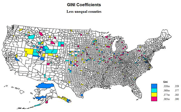
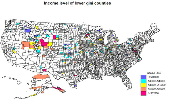
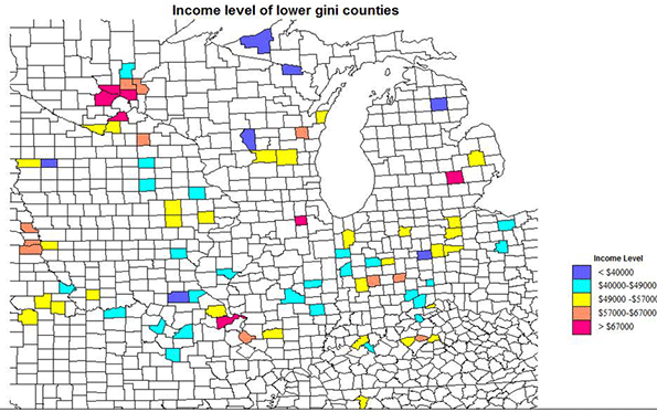
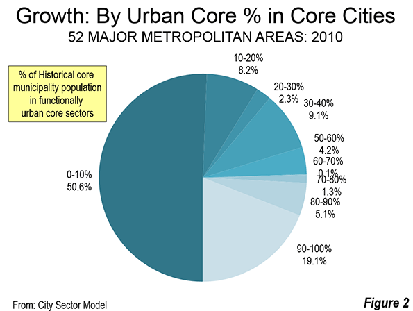
    There are broader questions raised by this article. If the poor (the majority of whom are single mothers) are poor at least in some respect to there being only one or no working adults in a household, wouldn’t a poor, single mother of three still be poor living in an attached apartment (as opposed to a basement of a single-family home)? If at least one social objective to alleviate poverty is to create two-income households, it is not clear how building smaller housing units would encourage this. As the University of Washington’s Richard Morrill  and others have repeatedly shown, our most densely populated areas (i.e. those with smaller housing units) exhibit the most severe forms of economic stratification.

    Nor is it clear how Salam’s recommendation would address the aspirations of the poor, most of whom still seek one day to acquire a piece of property and a single-family home. A recent Redfin study found that 92 percent of “Millenials” (those born during the early 1980s and now in their late 20s and 30s) who don’t own a home want to buy one in the future. And according to figures from the 2008 Current Population Survey, as reported by Thomas Tseng in Newgeography.com, 44 percent of Millenials belong to some racial or ethnic category other than "non-Hispanic white." It’s an unfortunate reality of American life that even into the second decade of the 21st century a disproportionate number of the poor are racial minorities. One must assume that a goodly portion of these young aspirants to homeownership must be poor racial minorities.

    How would forcibly filling the landscape with apartment buildings and crowding out single-family, detached homes (making them, therefore, more expensive) help the poor achieve that dream?

    Salam’s remedy of building smaller living units might even exacerbate another problem that some suburbs (and the nation as a whole) face: the “birth dearth”, or the decline, especially in older suburbs, of family formation and birth rates. As opposed to the “nursery” for America’s next generation that many of America’s sprawl suburbs still remain, urban centers today are among the most “child free” ‑ whether in Manhattan, San Francisco, Chicago, or Boston. But even in the old-line suburbs, since the 2008 recession, the number of new children has plummeted. The largest declines in the 5 to 14 cohort since 2000 have almost all occurred in the large coastal metropolitan regions, including their suburbs, led by Los Angeles where the child population has dropped by 303,000, or 15.3%, since 2000. In the New York metro area, the number of 5- to 14-year-olds has fallen by 238,000. This includes the Nassau-Suffolk region, America’s “oldest suburb,” which has experienced a decline of 71,834 residents in the 0-14 population group between 2000 and 2013.

    Today the number of households with children is 38 million, about the same as a decade ago, even as the total number of households has shot up by nearly 10 million. There are now more houses with dogs than houses with children.

    The decline in the numbers of potential young suburban residents suggests not some great urban revival, but a drain in the population of future taxpayers and workers. As demographer Wendell Cox and others have shown, localities with higher densities have considerably lower birth rates than areas with lower densities. With the push for higher density, are the suburbs slated next to become “child free zones”?

    Few would dispute that many suburban areas across the country lack sufficient housing options. But the seemingly ubiquitous assumption that high density housing will eradicate problems such as high taxes, increasing inequality, civil unrest, and lower birth rates may be invested with an unjustified sense of certainty.   

    Seth Forman, Ph.D, AICP, is author of American Obsession: Race and Conflict in the Age of Obama and Blacks in the Jewish Mind: A Crisis of Liberalism, among other books. His work has appeared in publications that include National Review, Frontpagemag.com, The Weekly Standard, and The American. He is currently Research Associate Professor at Stony Brook University, and the Chief Planner for the Long Island Regional Planning Council. His opinions are not associated with any of these institutions. He blogs at www.mrformansplanet.com.

  • Not so Unequal America?

    The extreme and rising inequality of income and wealth in the United States has been exhaustively reported and analyzed, including by me. Incomes are strikingly unequal just about everywhere, but not to the same degree. To discover a more egalitarian America, I used US Census American Community Survey data (2007-2011) estimates of the Gini coefficients of all US counties and equivalents. The Gini coefficient is a measure of the percent departure of a line of accumulated population versus accumulated income, from the lowest to the highest and the straight line if everyone had the same equal income. 

    The index would be 0 if all were equal, 1.0 if only 1 person had all the income. The median US counties, dozens of them, have a Gini of .43, which is in fact pretty extreme, far higher than in 1974, when it was .37. But the overall US figure is .47 (.41 in 1975), because larger counties tend to be more unequal than smaller, skewing the average. Examples of a median .43 county are Winnebago, WI (Oshkosh!), Klamath, OR, and Arlington, VA, and a good example of the average US county is Jackson, MO (Kansas City!). The lowest Gini for the US is .33 (Yakutat, AK and Power, ID) and the highest is no surprise at .59, New York county (Manhattan). It is revealing and horrific that our lowest value of .33 is that of Sweden (and most of Scandinavia), Germany is only .35 and the lowest in the world is evidently Switzerland, despite those rich bankers, at .31.  

    Is this a Great Country or What?

    I mapped only the 208 counties with the lowest Gini indices, those under .39, in two ways, first by the Gini values and then by groups of these counties sorted by median incomes.  Only 10 have values below .35. In 1975, 11 counties had Ginis bellow .27.  States with the highest number or share of less unequal counties include Alaska, 10, Idaho, 11, Indiana, 15, Iowa, 10, Kansas, 18, Minnesota, 11, Nebraska, 17, Utah, 7, Virginia, 13 and Wyoming, 8. Except for Alaska, there is an evident north central bias: band of less unequal counties from Virginia to Idaho-Nevada, with epicenter at the junctions of Utah, Idaho and Wyoming. 

    States without any qualifying as less unequal counties (with Ginis under .39)  are Alabama, Connecticut, Delaware, Hawaii, Louisiana, Maine, Massachusetts, New Hampshire, New Jersey, Rhode Island  and South Carolina. Large California has only one, as does New York, and large Texas only 7.    

    Size of Counties

    A problem with the data is that small population size of many of the counties render the ACS estimates somewhat uncertain.  Thirteen have fewer than 500 households, 25 have fewer than 1000. It is reasonable that smaller rural counties, e.g., in the Plains states, might have less inequality because of the homestead settlement history and the absence of slavery, but there is still uncertainty due to small sample size. Of the counties with under 1000 households, 8 are in NE, 5 in AK, 3 in KS, 2 in CO, MT and TX, and 1 in ID, N and WA.  

    At the other end, 28 counties have more than 25,000 households, and 5 have over 100,000. The largest are an interesting set. All are suburban, or even exurban, and most are fairly high income, essentially homogeneously middle class. The six largest are Williamson, TX, King William, VA, St. Charles, MO, Anoka, MN, Loudoun, VA and Davis, UT. These are also among the richest counties on the list. 

    It might be meaningful that some of these counties, as around Washington, DC, Baltimore and Austin, TX, have high levels of government employees, while their minority levels are quite low.

    Lower inequality, but High in Minorities

    This unlikely combination does occur, although only 7 of the 208 counties have minority shares (percentages) above .5: TX, 3, Kenedy, Moore and Reagan;  KS, 2, Ford and Seward; AZ 1, Greenlee, and AK, Aleutians 1. The TX, KS and AZ counties are all Hispanic, and high in energy development for TX and KS.  The AK county is Asian. No county has a black population majority. Surry county, VA, at 47% black, is highest share of black population, located and exurban between Richmond and Norfolk.  

    The Lowest Ginis, Under .36

    Thirty-one counties have Gini levels under .36 (Still high of course!) Only 10 are under .35. These vary in size from tiny Kenedy, TX (147 households) to Loudon, VA  with 105,000. The distribution by state is
    VA 7:  King William, Prince George, Surry, Craig, Greene, Loudon, King and Queen
    KS 4:   Meade, Wabaunsee, Wichita, Kearny
    AK 3:  Yakutat, Bristol Bay, North Slope
    UT 3: Morgan, Emery, Juab
    NE 3:   Blaine, Stanton, Grant
    TX 2: Kenedy and Carson.
    Several states with one county: CA, Mono,  GA, Chattahoochee,  ID, Power,  IL, Kendall,  IN, Jasper,  IA,  Cedar, KY, Spencer, OH, Putnam, and WY, Lincoln.

    These are distributed in a similar way to the 208 lower Gini counties, with the exception of the much larger number in VA, and not just in the WDC area!  UT and AK stand out, as do neighbor states of KS and NE.  The AK set is high in minorities (Native Americans, Asians), as is Kenedy, TX (Hispanic).  The VA set includes suburban Richmond and Washington DC counties, exurban to rural Chesapeake Bay counties, a tiny Allegheny mountain county and suburban Charlottesville. ID, UT, KY, KS, IL, IN and GA have suburban counties, KS and TX energy growth counties, and NE, WY, UT and CA fairly remote rural counties, the latter three recreational.

    Less unequal counties by income level

    Lower income counties: 27 counties have median household incomes below $40,000. By state these are
    NE 5: Garfield, Hooker, Blaine, Grant. Hayes
    ID 5: Idaho, Lewis, Power, Benewah, Clark
    KS 4: Cloud, Norton, Trego, Rush
    MI 2: Oscoda, Ontonagon        
    WV 2: Grant, Monroe
    WI 2: Adams, Florence
    Several states with one county, including PA, Forest: TX, Kenedy: MT, Golden Valley:  IN, Jay;
    IA, Osceola,;  ND, Griggs; and MO, Monroe,

    The dominance of neighboring KS and NE is noteworthy, as is the large number and share in Idaho. Eight of the counties are small, with under 1000 households, and only 4 have over 40,000. Thus most of the counties are rural and small town, resource oriented, and often with small manufactures. The counties in upper Michigan and Wisconsin are similar in character.

    Higher income counties at the other end comprise 28, with median household incomes above $67,000. By state these are:
    VA 7: Loudoun, Stafford, Prince William, Spotsylvania, Manassas Park, New Kent, King George
    AK 4: Juneau, Denali, Skagway, North Slope
    MN 4: Scott, Sherburne, Anoka, Wright
    MD 3: Calvert, Charles, Carroll 
    WY 3; Campbell, Sublette, Sweetwater
    TX 2; Rockwall,  Williamson
    Several with one county: NM, Los Alamos: UT, Morgan; MO, St Charles; MI, Livingston; IL, Kendall

    The 9 richest counties include 6 suburban or exurban around Washington DC and Baltimore, suggesting the importance of federal employment, and federal oriented Los Alamos, NM, Rockwall is suburban Dallas, Scott suburban Minneapolis.   Other suburban and exurban counties are in UT, MO, and MN (3 more!), VA (4 more), MI, IL, and TX. Higher income rural small town areas are in AK (4) and WY (3).

    Middle Income Less Unequal Counties

    The middle group of 52 counties with median household incomes between $49,000 and $57,000 are more varied and complex.  By state
    IN 6: Jasper, Ohio, Putnam, Spencer, Tipton and Whitley
    IA 5: Iowa, Lyon, Cedar, Mills, Benton                    
    KS 3: Jackson, Wabaunsee, Jefferson
    UT 3: Juab, Duchesne, Box Elder    
    OH 4: Mercer, Henry, Auglaize, Putnam
    WI 2: Kewaunee, Dodge, Columbia     
    MN 2: Le Sueur, Nicollet
    ID 2: Jefferson, Teton
    MO, 2, Clinton, Lincoln
    WY 2: Weston, Carbon,
    KY, 2, Anderson, Bullitt
    TX,  Reagan
    GA 2: Pike, Effingham
    VA 2: Surry, Greene  
    NE 2: Hamilton, Kearny
    AK, Aleutians, AR, Saline, CA, Mono, IL, Washington, MI, Lapeer
    MT Lewis and Clark. OR, Hood River, PA, Perry, TN, Cheatham, NC Currituck
    None have under 1000 households, and 21 have 10,000 or more. The largest, Saline, AR, has 41,000 (suburban Little Rock).

    These tend to prevail across the north central states from OH west to UT, and include many small town and small city regional centers. Several are free-standing small town counties, a few are suburban to larger cities, such as Nashville and Little Rock, but the most are far suburban or exurban to smaller metro areas. 

    The small map inset centered on Indiana illustrates these patterns.

    Conclusions                 

    The geography of these less unequal counties is unusual. Not one is a metropolitan core county, large or small. Not one is a majority black county. While there are many suburban counties, almost all are in a few clusters, VA-MD, ID-UT, or in the upper Midwest, especially MN. A large number are exurban, just beyond the official metro areas, mostly across the north, but with a few in the  south. And, most old-fashioned and reassuring, quite a number are freestanding small city and small town, micropolitan or smaller counties, most notably in the Northern Plains and Rocky Mountain states, and apparently doing well with a resource and small industrial economy.   

    Contrasting the  Most Unequal Counties

    OK, how different is the geography of the most unequal counties?  The US has 30 counties with Gini indices over .53, culminating in New York (Manhattan) at almost .6. These are indeed quite different, as race plays a dominant role, but not a universal one.

    23 of the 30 are in the south, and 17 of these have high black population shares, including core metropolitan counties, the District of Columbia, Fulton (Atlanta). Orleans (New Orleans), and Richmond, VA. Outside the south, 6 of the 8 counties also have a high minority share, New York (Manhattan), Westchester, Essex, NJ (Newark), Sioux, SD (reservation), and Harding, NM (Latino), leaving only tiny Mineral CO (recreation), and  Fairfield CT (super rich suburban-exurban NY).

    Six counties in the south do not have high minority shares,  Decatur, TN (west central on the Tennessee river), Baylor, TX , exurban Wichita Falls, Llano, TX , exurban Austin and tiny Borden, TX, Galax city, VA, far southwest, and Watauga, NC, home of Appalachian State University.

    Race clearly is the most common basis for extreme inequality, but exurban counties close to rich metropolitan centers may also have high class differentials, as do some recreation dependent areas.    

    Richard Morrill is Professor Emeritus of Geography and Environmental Studies, University of Washington. His research interests include: political geography (voting behavior, redistricting, local governance), population/demography/settlement/migration, urban geography and planning, urban transportation (i.e., old fashioned generalist).

  • Growth Concentrated in Most Suburbanized Core Cities

    An analysis of the just-released municipal population trends shows that core city growth is centered in the municipalities that have the largest percentage of their population living in suburban (or exurban) neighborhoods.

    Improved Urban Core Analysis

    There is considerable interest in urban core population trends, both because of recent increases in the interest of urban planning orthodoxy to restore living patterns more akin to the pre-World War II era. At that time, urban areas were considerably more densely populated, commuting travel was much more focused on downtowns (central business districts or CBDs) and automobile use accounted for far less of urban travel than today.

    Most previous analysis has equated historical core municipality (core city) data with the urban core. The core cities are generally the original settlements, as they have evolved by expanding their city limits. Around these core cities, suburbs and exurbs have developed, which combined with the core cities make up the metropolitan area. Metropolitan areas are the "economic" dimension of contemporary cities.

    However, even the most cursory analysis demonstrates that equating core cities with the urban core is far from ideal. Historical core municipalities vary greatly in their percent of their population living in traditional high density neighborhoods. For example, in core cities like New York, Boston and San Francisco, nearly all people live in neighborhoods that can be classified as urban core. In others of the largest core cities, virtually all of the population lives in neighborhoods that are suburban or exurban, in view of their low densities and overwhelming automobile orientation. These include examples like San Antonio, Phoenix and San Jose. Even core cities perceived to have a strong urban core, such as Portland and Miami, have considerably less than 50% of their population in urban core neighborhoods.

    Overall, historical core municipalities have little more than 40% of their population living in urban core neighborhoods. When non-core principal cities or primary cities are equated with core cities, there is even less association with the urban core. Overall, non-core principal cities have less than 10% of their population living in urban core neighborhoods.

    This has changed in recent years, with the introduction of the annual American Community Survey and its small area data, such as for ZIP Code analysis zones (ZCTAs). Even so, the comprehensive publication of small area data tends to lag approximately three years behind population estimates. Thus, the small area data that would make it possible to compare population trends to 2014 by functional urban sector within core cities will not be released until 2017.

    This article classifies 2010 to 2014 core city population growth by the percentage of urban core population according to the 2010 census. The classification was developed using my City Sector Model, which classifies every zip code in metropolitan areas as pre-War urban core (CBD and inner ring) or post-War suburban or exurban (Figure 1). Simplified, the City Sector Model classifies as urban core any small area with an employment density of 20,000 per square mile or more or a population density of 7,500 per square mile or more, with a transit, cycling and walking work trip market share of 20% or more (Note).

    Growth by Extent of Urban Core Population

    More than 50% of the growth between 2010 and 2014 has been in core municipalities that are more than 90% post World War II suburban or exurban (0 to 10% urban core). This growth share is nearly one-half higher than their population share of 35%.

    These findings are based on the City Sector Model (Figure 1 and Note), which classifies small areas (zip code tabulation areas) principally using population density and commuting market share data that attempts to replicate urban areas as they functioned before World War II.

    These most suburban of core cities grew the fastest, up 6.8% from 2010 to 2014. These municipalities had less than 10% of their population in urban core neighborhods, and include core cities that annexed substantial suburban or rural territory, such as Phoenix, San Jose, Charlotte, Tampa, Orlando and San Antonio. Those that were most heavily urban core in form grew 4,0 percent, which was slightly behind the national average of 4.7 percent. The core cities had less than 10% of their population living in urban core neighborhoods, and include New York, Buffalo, Providence, San Francisco and Boston (Figure 2)  

    The functionally suburban and exurban areas accounted for approximately 58% of the population in the core cities. This leaves approximately 42% of the population living in areas that are similar to the urban areas as they functioned in 1940.

    Approximately 70% of the growth was in the 33 historical core municipalities that are more than 60% suburban or exurban.

    At the same time, the five core cities with the largest urban core percentages accounted for nearly 20% of the growth, compared to their 22 percent of the population. Approximately 80% of this growth was in New York, which is estimated to have added the largest population (316,000) among the core cities.

    Ten Fastest Growing Core Municipalities

    Six of the ten fastest growing core cities had urban core shares of less than 10%, including Austin, Orlando, Charlotte, Raleigh, Atlanta and San Antonio. A seventh, Denver was less than 15% urban by function. Two more had more than 50% in urban core population, Washington and Seattle (Table). Eight of the 10 fastest growing core cities were in the South, including Washington.

    Table
    Population Growth: 2010-2014
    Core Municipalities in Major Metropolitan Areas
    Population Population in Pre-War Functional Urban Core
    Rank Historical Core Municipality Metropolitan Area 2010 2014 % Change Historical Core Municipality Metropolitan Area
    1 Austin Austin, TX     790,637      912,791 15.5% 4.8% 2.2%
    2 New Orleans New Orleans. LA     343,829      384,320 11.8% 37.9% 10.9%
    3 Denver Denver, CO     600,024      663,862 10.6% 13.1% 3.1%
    4 Orlando Orlando, FL     238,304      262,372 10.1% 0.0% 0.0%
    5 Charlotte Charlotte, NC-SC     735,780      809,958 10.1% 0.0% 0.0%
    6 Seattle Seattle, WA     608,660      668,342 9.8% 52.6% 10.5%
    7 Washington Washington, DC-VA-MD-WV     601,723      658,893 9.5% 83.7% 16.5%
    8 Raleigh Raleigh, NC     403,947      439,896 8.9% 0.0% 0.0%
    9 Atlanta Atlanta, GA     420,279      456,002 8.5% 9.2% 0.7%
    10 San Antonio San Antonio, TX  1,327,605   1,436,697 8.2% 0.1% 0.1%
    11 Miami Miami, FL     399,508      430,332 7.7% 23.0% 3.0%
    12 Oklahoma City Oklahoma City, OK     580,003      620,602 7.0% 6.1% 2.8%
    13 Dallas Dallas-Fort Worth, TX  1,197,833   1,281,047 6.9% 1.1% 0.5%
    14 Tampa Tampa-St. Petersburg, FL     335,709      358,699 6.8% 0.0% 0.0%
    15 Houston Houston, TX  2,097,217   2,239,558 6.8% 1.4% 0.5%
    16 Nashville Nashville, TN     603,527      644,014 6.7% 0.7% 0.2%
    17 Richmond Richmond, VA     204,237      217,853 6.7% 26.0% 4.5%
    18 San Jose San Jose, CA     952,562   1,015,785 6.6% 0.1% 0.2%
    19 Minneapolis Minneapolis-St. Paul, MN-WI     382,578      407,207 6.4% 86.0% 0.0%
    20 Boston Boston, MA-NH     617,594      655,884 6.2% 90.4% 35.5%
    21 Phoenix Phoenix, AZ  1,447,552   1,537,058 6.2% 0.0% 0.0%
    22 San Diego San Diego, CA  1,301,621   1,381,069 6.1% 2.8% 1.2%
    23 Portland Portland, OR-WA     583,778      619,360 6.1% 37.9% 10.0%
    24 Columbus Columbus, OH     788,577      835,957 6.0% 12.0% 5.0%
    25 Oakland San Francisco-Oakland, CA     390,719      413,775 5.9% 54.7% 0.0%
    26 San Francisco San Francisco-Oakland, CA     805,235      852,469 5.9% 94.4% 0.0%
    27 Las Vegas Las Vegas, NV     583,787      613,599 5.1% 7.8% 2.8%
    28 Stl Paul Minneapolis-St. Paul, MN-WI     285,068      297,640 4.4% 38.7% 0.0%
    29 Sacramento Sacramento, CA     466,488      485,199 4.0% 7.6% 1.6%
    30 New York New York, NY-NJ-PA  8,175,136   8,491,079 3.9% 97.3% 52.8%
    31 Jacksonville Jacksonville, FL     821,784      853,382 3.8% 0.0% 0.0%
    32 Los Angeles Los Angeles, CA  3,792,627   3,928,864 3.6% 30.1% 10.6%
    33 Indianapolis Indianapolis. IN     820,442      848,788 3.5% 11.0% 4.8%
    34 Grand Rapids Grand Rapids, MI     188,040      193,792 3.1% 19.1% 3.8%
    35 Louisville Louisville, KY-IN     597,336      612,780 2.6% 17.8% 8.7%
    36 San Bernardino Riverside-San Bernardino, CA     209,952      215,213 2.5% 0.0% 0.0%
    37 Kansas City Kansas City, MO-KS     459,787      470,800 2.4% 19.8% 5.4%
    38 Salt Lake City Salt Lake City, UT     186,443      190,884 2.4% 21.4% 3.7%
    39 Philadelphia Philadelphia, PA-NJ-DE-MD  1,526,006   1,560,297 2.2% 86.1% 25.8%
    40 Memphis Memphis, TN-MS-AR     646,889      656,861 1.5% 3.7% 1.8%
    41 Norfolk Virginia Beach-Norfolk, VA-NC     242,803      245,428 1.1% 2.8% 0.4%
    42 Chicago Chicago, IL-IN-WI  2,695,598   2,722,389 1.0% 76.6% 25.8%
    43 Milwaukee Milwaukee,WI     594,740      599,642 0.8% 55.4% 23.6%
    44 Providence Providence, RI-MA     178,036      179,154 0.6% 92.6% 26.2%
    45 Cincinnati Cincinnati, OH-KY-IN     296,950      298,165 0.4% 54.2% 10.1%
    46 Baltimore Baltimore, MD     620,961      622,793 0.3% 67.7% 16.2%
    47 Birmingham Birmingham, AL     212,288      212,247 0.0% 0.0% 0.0%
    48 Hartford Hartford, CT     124,775      124,705 -0.1% 88.5% 11.3%
    49 Pittsburgh Pittsburgh, PA     305,702      305,412 -0.1% 78.0% 15.9%
    50 Rochester Rochester, NY     210,512      209,983 -0.3% 51.7% 11.4%
    51 St. Louis St. Louis,, MO-IL     319,294      317,419 -0.6% 84.1% 11.7%
    52 Buffalo Buffalo, NY     261,310      258,703 -1.0% 96.0% 29.2%
    53 Cleveland Cleveland, OH     396,814      389,521 -1.8% 80.1% 22.2%
    54 Detroit Detroit,  MI     713,777      680,250 -4.7% 32.1% 6.5%
    Data from:
    US Census Bureau
    City Sector Model (2015)


    Austin has been the fastest growing historical core municipality over the four years. In 2010, Austin had 790,000 residents, and has increased 15.5% to 913,000.

    New Orleans was the second fastest growing, adding 11.8%, continuing its recovery from the huge population loss after Hurricanes Katrina and the related flood control failures, which the Independent Levee Investigation Team concluded was the "single most costly catastrophic failure of an engineered system in history." New Orleans has now recovered more than 70% of its population loss between 2005 and 2006. In 2005, the population was 455,000, which fell to 209,000 in 2006, before recovering to the 2014 figure of 384,000.

    The balance of the top five, Denver, Orlando and Charlotte also grew more than 10% between 2010 and 2014. The second five in population growth were Seattle, Washington (DC), Raleigh, Atlanta and San Antonio.

    Slowest Growing Core Municipalities

    Eight of the 10 slowest growing municipalities were in the Northeast and Midwest, including Detroit, Cleveland, Buffalo, St. Louis, Rochester, Pittsburgh, Hartford and Cincinnati. Two were in the South, Birmingham and Baltimore.

    Eight core municipalities lost population. The largest loss was in Detroit, which fell 4.7% to 680,000. This is a continuation of the catastrophic losses from 1950, when Detroit had 1,850,000 residents. It may be surprising, however, that Detroit has become the core municipality with the greatest loss only this year. Until 2013, St. Louis had lost the largest share of its population from 1950 (when its population was 857,000). By 2014, Detroit had lost 63.2% of its 1950 population, compared to the 63.0% loss in St. Louis). St. Louis also continued its losses, dropping 0.6% between 2010 and 2014.

    Cleveland and Buffalo had greater losses than St. Louis. Cleveland slipped 1.8% to 390,000, while Buffalo dropped 1.0% to 259,000. Losses of less than 0.5% were posted in Pittsburgh, Hartford and Birmingham.

    More-than-a-Million Municipalities

    The United States added its 10th municipality with more than 1,000,000 in the 2014 estimates. San Jose joins Los Angeles and San Diego as California’s third more-than-a-million city. As a result, California now equals Texas, which had led the nation, with three cities with more than 1,000,000 residents in previous years (Houston, San Antonio and Dallas).

    Texas, however, should soon reclaim the exclusive title. The city of Austin forecasts that its population will reach 1,000,000 population early in the 2020s, which would give Texas four more-than-a-million municipalities. This forecast, however, could be too conservative. If the Texas city continues to grow at its current rate, a population of more than 1,000,000 could be reached before the 2020 census.

    Yet, the core municipalities with more than 1,000,000 – particularly the new entrants – are not particularly dense, but are virtually suburban in form, that is, auto-oriented and generally low density.  Three have less than one percent of their population in urban core neighborhoods, including Phoenix, San Antonio and San Jose, Dallas and Houston have less than two percent of their population in urban core neighborhoods, while San Diego has less than three percent. Even in Los Angeles only 30% of residents live in urban core neighborhoods. Only three of the largest municipalities have most of their population in urban core neighborhoods, New York, (97%), Philadelphia (86%) and Chicago (77%).  

    Lower Density Growth Could be Dominant in Core Cities

    The new population estimates provide little indication how much core city growth since 2010 is urban intensification versus low density suburban development. However, the concentration of growth where urban cores are smaller implies that growth has been stronger at lower in the suburban portions of core municipalities. To know for sure will require waiting for later small area data.

    Related article: U.S. Population Estimate Accuracy: 2010

    Note: The analysis is based on the City Sector Model (Figure 1), which classifies small areas (ZIP codes, more formally, ZIP Code Tabulation Areas, or ZCTAs) in major metropolitan areas based upon their behavioral functions as urban cores, suburbs or exurbs. The criteria used are generally employment and population densities and modes of work trip travel. The purpose of the urban core sectors is to replicate, to the best extent possible, the urban form as it existed before World War II, when urban densities were much higher and when a far larger percentage of urban travel was on transit or by walking. The suburban and exurban sectors replicate automobile oriented suburbanization that began in the 1920s and escalated strongly following World War II.

    Wendell Cox is principal of Demographia, an international public policy and demographics firm. He is co-author of the "Demographia International Housing Affordability Survey" and author of "Demographia World Urban Areas" and "War on the Dream: How Anti-Sprawl Policy Threatens the Quality of Life." He was appointed to three terms on the Los Angeles County Transportation Commission, where he served with the leading city and county leadership as the only non-elected member. He served as a visiting professor at the Conservatoire National des Arts et Metiers, a national university in Paris. Wendell Cox is Chair, Housing Affordability and Municipal Policy for the Frontier Centre for Public Policy (Canada), is a Senior Fellow of the Center for Opportunity Urbanism and is a member of the Board of Advisors of the Center for Demographics and Policy at Chapman University.

    Photo: Newest more-than-a-million US core city, virtually all-suburban San Jose by Robert Campbell [GFDL or CC BY-SA 3.0], via Wikimedia Commons

  • Malls Washed Up? Not Quite Yet

    Maybe it’s that reporters don’t like malls. After all they tend to be young, highly urban, single, and highly educated, not the key demographic at your local Macy’s, much less H&M.

    But for years now, the conventional wisdom in the media is that the mall—particularly in the suburbs—is doomed. Here a typical sample from The Guardian: “Once-proud visions of suburban utopia are left to rot as online shopping and the resurgence of city centers make malls increasingly irrelevant to young people.”

    To be sure, there are hundreds of outmoded malls, long-in-the-tooth complexes most commonly found in working-class suburbs and inner-ring city neighborhoods. Some will never come back. By some estimates, something close to 10 to 15 percent of the country’s estimated 1,000 malls will go out of business over the next decade; many of them are located in areas where budgets have been very tight, with locals tending to shop at “power centers” built around low-end discounters such as Target or Walmart.

    But the notion that Americans don’t like malls anymore is misleading. The roughly 400 malls that service more-affluent communities—like those typically anchored by a Bloomingdale’s or Nordstrom—recovered most quickly from the recession, and now appear to be doing quite well.

    To suggest malls are dead based on failure in failed places would be like suggesting that the manifest shortcomings of Baltimore or Buffalo means urban centers are not doing well. Like cities, not all malls are alike.

    Looking across the entire landscape, it’s clear the mall is transforming itself to meet the needs of a changing society but is hardly in its death throes. Last year, vacancy rates in malls flattened for the first time since the recession. The gains from e-commerce—6.5 percent of sales last year, up from 3.5 percent in 2010—has had an effect, but bricks and mortar still constitutes upwards of 90 percent of sales. There’s still little new construction, roughly one-seventh what it was in 2006, but that’s roughly twice that in 2010.

    Shopping in stores, according to a recent study from A.T. Kearney, is preferred over online-only by every age group, including, most surprisingly, millennials, although many of them research on the web, then visit the store, and sometimes then order on line. The malls that are flourishing tend to be newer or retrofitted and are pitched at expanding demographic markets. These “cathedrals of commerce” in the past tended to reflect the mass sameness of mid-century America; those in the future focus on distinct niches—ethnic, income, even geographical—that are not only viable but highly profitable.

    This leaves us with a tale of two kinds of malls. One clear dividing line is customer base. In the ’80s and before, malls succeeded fairly universally, notes Houston investor Blake Tartt. But now it’s a matter of being in the right place. “Everything has changed and you have to be with the right demographics,” he suggests. “It’s not so much about the mall but the location that matters.”

    Old malls in declining areas, notes a recent analysis by the consultancy Costar, do truly face a “bleak future” and should look to be converted into apartments, houses, corporate headquarters, or churches.

    In contrast, affluent urban areas are becoming an unexpected hotspot for malls—even outlet malls are opening open in the urban core. You now see gigantic malls in places like Manhattan: the Shops on Columbus mall in Manhattan, the world’s fifth-most profitable mall, looks inside like it was teleported from Orange County, California, or, god forbid, Long Island.

    This is not unusual across the world. Malls are on the march in many of the world’s biggest cities, including Istanbul, Mumbai, Singapore, and Dubai. Today Asia is the site of seven of the world’s 10 largest malls, in places like Beijing, Dubai, and Kuala Lumpur.

    In the developing world, malls grow as local shopping streets either gentrify or decay. This is particularly true in fast-growing developing countries where malls are often seen as an escape from hot, humid, dirty and even dangerous urban environments. Indian novelist and Mumbai blogger Amit Varma suggests that these folks like malls “because they are relatively clean and sanitized” as opposed to the city’s pollution-choked, beggar-ridden and often foul-smelling streets.

    Ethnic Malls

    Within the U.S., demographic change is creating opportunities for a new breed of mall-maker. Across the country, savvy investors and developers have been buying older malls, which tended to serve either Anglo or African-American customers, and shifting them instead to focus on fast-growing ethnic markets. Such malls can now be found in traditional Latino areas such as Southern California and Texas, but they also exist in Atlanta, Las Vegas, Oklahoma City, and Charlotte, places that have recently become major hubs for immigrants.

    “We had a terrific recession,” notes Los Angeles-based mall maven Jose Legaspi, who has developed 12 such malls around the country. “You do well if you target specific niches that are growing. You can’t make it with a plain vanilla mall. We are creating in these places a Hispanic downtown.”

    Fort Worth’s 1.2 million-square-foot La Gran Plaza, which Legaspi manages, epitomizes the advantages of such marketing. When investor Andrew Segal bought the mall in 2005, it was a failing facility that primarily serviced a working-class Anglo population. Barely 15 percent of the mall’s tenants were both open and paying rent.

    Segal quickly recognized that the area around the mall—like much of urban Texas—was becoming more diverse, in this case largely Latino.

    Segal and Legaspi redid the once prototypical plain vanilla mall to look more like a Northern Mexican town plaza, a design pattern developed by Los Angeles architect David Hidalgo. Latino customers are drawn to amenities like large and comfortable family bathrooms, an anchor supermarket, mariachi music shows, and even Catholic masses. There is also a “swap meet” that accommodates small vendors, something that Legaspi sees as essential to creating “a carnival of retail experiences.” By 2008, when the face-lift was complete, the mall achieved 90 percent occupancy. Today La Gran Plaza is effectively “full,” says Segal, who is considering a further expansion of the mall.

    The viability of ethnic malls in hard times demonstrated their viability in better ones. When Dr. Alethea Hsu opened her Diamond Jamboree Center in Irvine, California, the state was reeling from the recession. Yet from the time she opened in 2008, her mall, which focuses on Orange County’s large and expanding Asian population, has been fully occupied. It includes various realty offices, hair salons, medical offices, a Korean supermarket, and a small Japanese department store, all primarily aimed at a diverse set of Asian customers. The biggest problem—for those interested in choosing among various kinds of Chinese, Vietnamese, Korean, or Japanese cuisine—is not that it’s deserted but that it’s often difficult to get a parking space.

    Be sure of this: The ethnic mall is no flash in the pan, at least as long as immigrants pour into this country. By 2000, one in five American children already were the progeny of immigrants, mostly Asian or Latino; today they make up as much as one-third of American kids. These kids, and their own offspring, not to mention Anglo or African-American friends, have been brought up with food and fashion tastes that often originate in Mexico, Taiwan, Japan, Korea, or China. When I was a kid growing up in New York, you went to Chinatown or Little Italy for an ethnic infusion. Now you get in your car, park, and get options not so dissimilar than what you would find—usually in a mall—in Mexico City, Mumbai, or Singapore.

    The World According to Rick

    For most of America, says Los Angeles developer Rick Caruso, the future lies in replicating the function that Main Street once served. Rather than simply a center for instant consumption and transactions, the mall is a social meeting point, says Caruso, who has 10 developments under his belt. To make it all work means adding often unconventional amenities such as live entertainment or the lighting of Christmas trees and the Chanukah menorah.

    This is part of a broader mall trend in which developers see their properities as community and entertainment centers, an approach adopted now by mainstream mall developers such as Westfield, whose projects are increasingly open-air and built around amenities such as health clubs and trendy restaurants and cafes.

    The ultimate example may be the Caruso-owned Grove, a giant open-air mall that lies next to the Farmers’ Market, one of the oldest and beloved shopping areas in Los Angeles. The world’s eighth-most profitable mall, the Grove is laid out like a Disneyesque Main Street and is particularly appealing to families and tourists. Overall, the Grove now ranks among L.A.’s leading tourist attractions. This reflects both the development’s pleasant, pedestrian-oriented design as well as proximity to the Farmer’s Market, which remains, as has been traditional, largely a collection of small, idiosyncratic stalls.

    A sense of place is what makes the Grove—and, to a lesser extent, Caruso’s other developments—work. Located in the Miracle Mile district of L.A., it attracts a huge urban population that includes old Jewish shoppers from the immediate area as well as the growing ranks of hipsters, tourists, and the rest of the vast diversity that is Los Angeles. Caruso’s other centers, like the Commons in suburban Calabasas and The Promenade in Westlake, may lack global appeal but they succeed as anchors of their communities. Without developed, large historic downtowns, these communities still need a central place, and for them, the malls, however imperfectly, come closest to delivering it.

    In today’s environment, Caruso suggests, a mall has to offer something that online retailers, power centers, or catalogs cannot provide: a social experience. “You have to differentiate yours, offer a place for people to gather for holidays. People are yearning for a place to connect with each other. We are not building just town centers, but the centers of towns.”

    Ironically these malls are fulfilling a role that some urbanists have denounced the suburbs for lacking. “What do most urbanists want?,” asks David Levinson, director of the Networks, Economics, and Urban Systems Research Group. “A lively, pedestrian realm, clean, free of automobiles, with a variety of activities, the ability to interact with others and randomly encounter friends and acquaintances. This is what the shopping mall gives.”

    The New Town Center: With Suburban Revival, New Hope for Malls

    The notion of dead malls has been connected to a similar idea about the inevitable demise of the suburbs, which appeared possible at the height of the recession, but has since been shown to be largely false. Suburbs may not be booming as in the ’90s, but they are now growing as fast as core cities, and constitute more than 70 percent of all new population and 80 percent of new job growth since 2010.

    Surprisingly, the most recent numbers suggest that the outer suburbs and exurbs, once consigned to Hades by the new urbanist crowd, have begun to roar back. Millennials, as they get older, notes Jed Kolko, now seem to be moving to what he calls “the suburbiest” areas farther out on the periphery. 

    It is in these areas that malls may have their greatest future. In communities like Irvine, where the Spectrum development has become the de facto downtown, or Sugar Land, a highly diverse outer suburb of Houston, the “town center” is essentially a mall in brick, made to look like an old Main Street but filled with chain stores and specialty restaurants. Many residents of fast-growing communities like Sugar Land, which has 83,000 residents, are relative newcomers, and for them such town centers are the focus of their communities.

    It is time to dispense with the twin memes of mall- and suburb-bashing, and begin appreciating and improving how most Americans live and shop. The malls of the future indeed may be very different in many ways—more segmented by income and ethnicity, more entertainment- and experience-oriented. But they will continue to serve an important focus for most American communities. And at a time when many of our most celebrated cities have themselves become giant malls (is there any place on Earth more boring than the area around Times Square?), the future of malls may prove brighter, and even more transformative, than commonly imagined.

    This piece first appeared at The Daily Beast.

    Joel Kotkin is executive editor of NewGeography.com and Roger Hobbs Distinguished Fellow in Urban Studies at Chapman University, and a member of the editorial board of the Orange County Register. He is also executive director of the Houston-based Center for Opportunity Urbanism. His newest book, The New Class Conflict is now available at Amazon and Telos Press. He is also author of The City: A Global History and The Next Hundred Million: America in 2050.  He lives in Los Angeles, CA.

    Photo: “Thegrove“. Licensed under CC BY-SA 3.0 via Wikipedia.

  • US Population Estimate Accuracy: 2010

    Intercensal population estimates, while generally reliable, are prone to substantial variation in some cases. This is especially so with municipal population estimates.

    Between 2000 and 2010, the average discrepancy between the US Census Bureau 2010 estimates and the 2010 census counts at the county level was 3.1% (absolute value). By comparison, among the 50 largest municipalities and census designated places, the average discrepancy was more than one-half higher, at 4.7 using the 2000 to 2009 estimates (there were no 2010 sub-county population estimates). The variations, however, can be substantial in sub-county population estimates. Between 2000 and 2010, the Census Bureau estimated that New York had added more than 410,000 residents. However, the 2010 census count showed a much smaller gain, at approximately 165,000 (2010 estimates are available for New York because it is composed of whole counties).

    There were even more substantial variations. The 2009 population estimates for Atlanta and Detroit were more than 25% higher than the 2010 census count. In the case of Atlanta, the 2000 to 2009 population growth estimate was more than 120,000, more than 100 times the actual increase of approximately 1,000. The discrepancies in Atlanta and Detroit were greater than in all but a three of the nation’s more than 3,000 counties and each of the counties with larger discrepancies had populations of less than 1,000 in 2010.

  • Working at Home: In Most Places, the Big Alternative to Cars

    Working at home, much of it telecommuting, has replaced transit as the principal commuting alternative to the automobile in the United States outside New York. In the balance of the nation, there are more than 1.25 commuters who work at home for each commuter using transit to travel to work, according to data in the American Community Survey for 2013 (one year). When the other six largest transit metropolitan areas are included (Los Angeles, Chicago, Philadelphia, Washington, Boston and San Francisco), twice as many people commute by working at home than by transit.

    Overall, working at home leads transit in 37 of the 52 major metropolitan areas (over 1 million population in 2013).

    The Top Ten

    Not surprisingly, most of the strongest work at home markets are technology hubs. However, the strength of working at home, and particularly its growth in these metropolitan areas may seem at odds with the huge expenditures on urban rail. Nine of the top 10 working at home metropolitan areas have built or expanded rail systems, yet working at home has grown far faster than transit. The exception is Seattle, where transit has grown faster, but nearly all the increase has been on buses and ferries. Only two of the top ten metropolitan areas have larger transit shares than work at home shares.

    Here are the top 10 working at home major metropolitan areas (Figure). Market shares are shown to the second digit to eliminate ties.

    • Denver has the highest working at home commute share, at 7.14%. Like nine of the other top 10 major metropolitan areas, Denver has an urban rail system. Even so, Denver’s transit work trip market share is a full third lower, at 4.41%. In 2000, working at home had only a lead over transit (4.58% v. 4.45%).
    • Technology hub Austin places a close second, at 6.87%. Austin’s working at home commute share is nearly 3 times its 2.37% transit share. Working at home increased from 3.60% in 2000, while transit dropped from 2.51%, despite the addition of a rail line.
    • Portland, also a technology hub, and a decorated model among urban planners, ranks third in working at home commute share, at 6.40%. Transit share slightly smaller, at 6.37%. In 1980, however, transit’s market share was nearly a third again its present level (8.4%), before the first of its six rail lines opened. In contrast, working at home has nearly tripled its share from 2.2% in 1980. In 2000, working at home attracted 4.60% of commuters in Portland, well below the 6.27% transit share.
    • San Diego ranks fourth in working at home, with a 6.38% market share. The California city built the first of the modern light rail lines in the early 1980s. San Diego’s transit market share is approximately one half its working at home share (3.17 percent). In 2000, working at home had a commute share of 4.40%, while transit’s share was 3.31%.
    • Raleigh, another technology hub, ranks fifth in working at home with a 6.16% market share. Raleigh is the only metropolitan area among the top 10 that does not have an urban rail system. Raleigh’s transit work trip market share is 1.03%. In 2000, working at home had a commute share of 3.46%, while transit’s share was 0.86%, modestly below the 2013 figure.
    • Atlanta ranks sixth in working at home, with a 5.96% market share. Atlanta has built more miles of high quality Metro (grade separated subway and elevated rail) than anywhere outside Washington and San Francisco in the last half century. Even so, Atlanta has experienced a more than 50% decline in its transit market share and now that share is barely half that of working alone (3.08%). In 2000, working at home had a commute share of 3.47%, while transit’s share was 3.46%.
    • San Francisco, another technology hub, ranks seventh in working at home, with a 5.94% market share. San Francisco is unique in having a substantially higher transit than work at home market share (16.13%). San Francisco is the second strongest transit market in the United States, trailing only New York (30.86%). In 2000, working at home had a commute share of 4.27%, while transit’s share was 13.77%.
    • Phoenix nearly equals San Francisco, with a 5.85% working at home market share. This is more than double the 2.61% transit market share. In 2000, working at home had a commute share of 3.66%, while transit’s share was 1.93%.
    • Sacramento ranks 9th in working at home market share, at 5.56%, more than double its 2.65% transit work trip share. In 2000, working at home had a commute share of 4.03%, while transit’s share was 2.67%.
    • Seattle, also a technology hub, has a working at home market share of 5.38%, for a ranking of 10th. Like San Francisco has a higher transit work trip market share (9.31%). In 2000, working at home had a commute share of 4.17%, while transit’s share was 6.97%.

    The work at home and transit market shares are indicted for each major metropolitan area in the table.

    Where Working at Home is the Weakest

    In most of the strongest transit metropolitan areas, as opposed to cities that have systems that simply are not so widely used, working at home doesn’t usually achieve second place to cars.  As noted above, San Francisco has a considerably stronger transit share than virtually any major metropolitan area outside New York.

    New York, by far the largest transit market in the United States, is also the largest work at home market in raw numbers (386,000). Yet, New York’s transit market share (30.86%) is seven times its work at home share (4.17%).

    Chicago, Washington and Boston have transit market shares approximately three times that of working at home, while Philadelphia’s transit share is 2.5 times as high.

    This is not to say that working at home is in decline. Strong working at home gains — nearly 50% to over 100% from 2000 to 2013 — were made in each of these six metropolitan areas. Yet, with its smaller base, working at home is not likely to exceed transit in the near future.

    Los Angeles is a possible exception. Since 2013, working at home has closed approximately 60% of the gap with transit. Continuation of present trends would have working at home becoming the most popular alternative to cars in Los Angeles before 2020.

    The Future?

    Working at home has grown despite having received little attention in urban planning, compared to that of expensive rail projects. Its success has eliminated millions of daily work trips, reduced greenhouse gases and responded to the desire for better lifestyles by many. With continuing improvements in technology, and higher acceptance among companies and government agencies, working at home seems likely to continue its growth in the coming decades.

    Work at Home to Transit Commuting Ratio
    Major Metropolitan Areas: 2013
    Metropolitan Area Work at Home Work Trip Share Transit Work Trip Share Work at Home Commuters per Transit Commuter
    Atlanta, GA 5.96% 3.08% 1.93
    Austin, TX 6.87% 2.37% 2.89
    Baltimore, MD 4.10% 6.79% 0.60
    Birmingham, AL 2.79% 0.78% 3.57
    Boston, MA-NH 4.46% 12.76% 0.35
    Buffalo, NY 2.62% 2.92% 0.90
    Charlotte, NC-SC 5.19% 1.74% 2.98
    Chicago, IL-IN-WI 4.32% 11.75% 0.37
    Cincinnati, OH-KY-IN 3.85% 2.17% 1.78
    Cleveland, OH 3.80% 3.25% 1.17
    Columbus, OH 4.14% 1.69% 2.44
    Dallas-Fort Worth, TX 4.98% 1.39% 3.58
    Denver, CO 7.14% 4.41% 1.62
    Detroit,  MI 3.52% 1.68% 2.09
    Grand Rapids, MI 4.22% 1.62% 2.61
    Hartford, CT 3.50% 3.07% 1.14
    Houston, TX 3.69% 2.37% 1.56
    Indianapolis. IN 3.93% 1.12% 3.51
    Jacksonville, FL 4.99% 1.07% 4.66
    Kansas City, MO-KS 4.08% 1.22% 3.35
    Las Vegas, NV 3.18% 3.47% 0.92
    Los Angeles, CA 5.13% 5.84% 0.88
    Louisville, KY-IN 2.77% 1.71% 1.63
    Memphis, TN-MS-AR 2.37% 1.15% 2.07
    Miami, FL 4.76% 4.07% 1.17
    Milwaukee,WI 3.52% 3.65% 0.96
    Minneapolis-St. Paul, MN-WI 4.88% 4.64% 1.05
    Nashville, TN 4.50% 1.02% 4.43
    New Orleans. LA 2.67% 2.70% 0.99
    New York, NY-NJ-PA 4.17% 30.86% 0.13
    Oklahoma City, OK 3.07% 0.54% 5.74
    Orlando, FL 5.05% 1.73% 2.92
    Philadelphia, PA-NJ-DE-MD 3.99% 10.00% 0.40
    Phoenix, AZ 5.85% 2.61% 2.25
    Pittsburgh, PA 3.71% 4.89% 0.76
    Portland, OR-WA 6.40% 6.37% 1.01
    Providence, RI-MA 3.23% 2.68% 1.21
    Raleigh, NC 6.16% 1.03% 5.96
    Richmond, VA 4.25% 1.34% 3.18
    Riverside-San Bernardino, CA 5.00% 1.46% 3.42
    Rochester, NY 3.39% 2.53% 1.34
    Sacramento, CA 5.56% 2.65% 2.10
    Salt Lake City, UT 5.13% 3.25% 1.58
    San Antonio, TX 4.33% 2.51% 1.72
    San Diego, CA 6.38% 3.17% 2.01
    San Francisco-Oakland, CA 5.94% 16.13% 0.37
    San Jose, CA 4.05% 4.24% 0.96
    Seattle, WA 5.38% 9.31% 0.58
    St. Louis,, MO-IL 4.09% 2.91% 1.40
    Tampa-St. Petersburg, FL 5.11% 1.38% 3.70
    Virginia Beach-Norfolk, VA-NC 3.38% 1.71% 1.98
    Washington, DC-VA-MD-WV 5.02% 14.16% 0.35
    From: American Community Survey, 2013 (One Year)


    Wendell Cox is principal of Demographia, an international public policy and demographics firm. He is co-author of the "Demographia International Housing Affordability Survey" and author of "Demographia World Urban Areas" and "War on the Dream: How Anti-Sprawl Policy Threatens the Quality of Life." He was appointed to three terms on the Los Angeles County Transportation Commission, where he served with the leading city and county leadership as the only non-elected member. He served as a visiting professor at the Conservatoire National des Arts et Metiers, a national university in Paris. Wendell Cox is Chair, Housing Affordability and Municipal Policy for the Frontier Centre for Public Policy (Canada), is a Senior Fellow of the Center for Opportunity Urbanism and is a member of the Board of Advisors of the Center for Demographics and Policy at Chapman University.

    Photo by By Rae Allen, “My portable home office on the back deck”

  • The Changing Geography of Racial Opportunity

    In the aftermath of the Baltimore riots, there is increased concern with issues of race and opportunity. Yet most of the discussion focuses on such things as police brutality, perceptions of racism and other issues that are dear to the hearts of today’s progressive chattering classes. Together they are creating what talk show host Tavis Smiley, writing in Time, has labeled “an American catastrophe.”

    Yet what has not been looked at nearly as much are the underlying conditions that either restrict or enhance upward mobility among racial minorities, including African-Americans, Latinos and Asians. In order to determine this, my colleague at Houston-based Center for Opportunity Urbanism Wendell Cox and I developed a ranking system that included four critical factors: migration patterns, home ownership, self-employment and income.

    We found, for all three major minority groups,   that the best places were neither the most liberal in their attitudes nor had the most generous welfare programs. Instead they were located primarily in regions that have experienced broad-based economic growth, have low housing costs, and limited regulation. In other words, no matter how much people like Bill de Blasio talk about the commitment to racial and class justice, the realities on the ground turn out to be quite different than he might imagine.

    Southern Comfort

    Perhaps the greatest irony in our findings is the location of many of the best cities for minorities: the South. This is particularly true for African-Americans who once flocked to the North for both legal rights and opportunity. Today almost all the best cities for blacks are in the South, a region that has enjoyed steady growth and enjoys generally low costs. Indeed, of the top 15 cities for African-Americans, 13 are in the old Confederacy starting with top-ranked Atlanta, No. 2 Raleigh, No. 4 Charlotte, No. 6 Virginia Beach-Norfolk, No. 7 Orlando, No. 8 Richmond (a distinction it shares with Miami and San Antonio), as well as   four of Texas’ large metro areas: No. 12 Houston, No. 13 Dallas-Ft. Worth and No. 8 San Antonio. The only two other metros are “inside the Beltway”: the metropolitan expanses of Washington and, surprisingly, Baltimore.

    What accounts for this? Well, in Washington and Baltimore, the obvious answer is the federal government.  Roughly one in five black adults works for the government, and are far more likely to have a public sector job than non-Hispanic whites, and twice as likely as Hispanics. These are not the people who rioted in the inner city; most of them live in prosperous suburbs surrounding these cities. But outside the Beltway region, the explanations tend towards more basic economics, like job creation, low housing prices and better opportunities for starting businesses.

    Ironically, blacks – 6 million of whom moved to the North during the great migration — are once again voting with their feet, but back to the same region in which, for so long, they were so harshly oppressed.   Between 2000 and 2013, the African-American population of Atlanta, Charlotte, Orlando, Houston, Dallas-Fort Worth, Raleigh, Tampa-St. Petersburg and San Antonio all experienced growth of close to 40 percent or higher, well above the average of 27 percent for the nation’s 52 metropolitan areas with more than 1 million residents.  

    In contrast, the African-American population actually dropped in five critically important large metros that once were beacons for black progress: San Francisco-Oakland, San Jose, Los Angeles, Chicago and Detroit.  In many cases, most notably in San Francisco, blacks have become the unintended victims of soaring housing prices and rampant gentrification, with little option to move to the also high-priced suburbs.   Today, suggests economist Thomas Sowell, the black population of the city itself is half that of 1970; the situation has changed so much that former Mayor Gavin Newsom even initiated a task force to address black out-migration.

    Yet if many African-Americans can be seen “going home” to their native region, the South is also doing well among ethnic groups that have historically had little attachment to Dixie. For Latinos, now the nation’s largest ethnic minority, seven of the top 13 places are held by cities wholly or partially in the old Confederacy, led by No. 1 Jacksonville, Fla., as well as No. 4 Houston, No. 6 Virginia Beach, No. 7 Dallas-Ft. Worth, No. 9 Austin, No. 12 Tampa and #13 Orlando.The majority of newcomers to the South, notes a recent Pew study, are classic first-wave immigrants: young, 57 percent foreign-born and not well educated — but they see the South as their land of opportunity.

    In Florida, no stranger to Latino populations, Tampa-St. Petersburg, Orlando and Jacksonville all experienced Hispanic growth rates since 2000 between 100 and 150 percent, well above the average of 96 percent among the 52 metropolitan regions.  Lower housing costs and better prospects for advancement drive this change.  Despite their historically large populations in Texas, Latino populations still grew at a rapid rate in Houston, at 68 percent, Dallas-Ft. Worth at 70 percent and Austin, 83 percent.  “You go where the opportunities are,” explains Mark Hugo Lopez, associate director of the Pew Hispanic Center in Washington, D.C.

    Asian-Americans, although their economic and educational performance tends to be better than other minorities, follow a surprisingly similar pattern. Seven of the top 10 regions for them also were in the South, as well as two others, Washington and Baltimore, that abut the old Confederacy. Most of the best metros for Asians were in the Sunbelt, starting with No.1 Riverside-San Bernardino, Calif., No. 2 Richmond, No. 4 Raleigh, No. 5 Houston,   No. 7 Dallas-Ft. Worth, No. 8 Austin, No. 9 Las Vegas, No. 12 Phoenix, No. 13 Atlanta and No. 15 Jacksonville.

    Like African-Americans and Latinos, Asians are voting for these places with their feet. Although Asian migration still is largely to California, that’s not where Asians are increasingly moving. Since 2000, Asian population growth in their traditional hubs like Los Angeles, San Francisco and San Jose was roughly one-third what was seen in the top Asian cities.

    The New Geography of Racial Opportunity

    Perhaps the biggest determinant of immigrant and minority opportunity has to do with home ownership. In the aftermath of the housing crash, minorities, notably blacks and Hispanics, suffered tremendous losses. This exacerbated the largest cause of the wealth gap  between minorities and whites: the extent of homeownership, which represents the key asset class for most Americans.

    Whereas older whites may have been able to benefit from wildly inflated home values, the results for minorities, who are generally younger and newer to the market, are less satisfactory. One useful comparison can be drawn between two adjacent metropolitan regions, Los Angeles and Riverside-San Bernardino. House prices in Los Angeles are roughly twice as high, based on income; not surprisingly, minority home ownership is much lower there. Black homeownership in Riverside-San Bernardino (an area known as the Inland Empire) is over 40 percent, 10 points higher than in L.A.; for Asians it is 14 percent higher, and for Latinos the percentage difference with L.A.  is more than 20 points.

    Some of the worst results — in terms not only homeownership but income — are ironically in those part of the country that purport to be most sympathetic to minority interests. In New York, Los Angeles and San Francisco, between 25 and 30 percent of African-Americans own their own home. In Atlanta it’s nearly 50 percent and well over 40 percent in most of the other Dixie metro areas.  

    This is not likely to change soon. Black incomes in these Southern cities, where there is a much lower cost of living, are roughly the same as they are in super-blue New York, Los Angeles, Boston or San Francisco.  Much the same pattern can be seen for both Latinos and Asians, with the exception of San Jose, where Silicon Valley employment keeps their household income well north of $100,000 annually.

    Policy Implications

    What this study shows us is, if nothing else, the relative worthlessness of good intentions. As we have seen over the past 50 years, the expansion of transfer payments, while critical to alleviating the worst impacts of poverty, have not generally been best at promoting upward mobility for African-Americans and, increasingly, Latinos. If higher welfare costs and political pronunciamentos were currency, New York, Los Angeles, Boston and San Francisco would not be, for the most part, stuck in the second half of our rankings.

    Ultimately what really matters are the economics of opportunity. Many of the cities that scored best for all three groups — the Washington, D.C. area, Houston, Dallas-Fort Worth, San Antonio and Austin — have enjoyed stronger than normal economic growth over the past decade.  In the areas around the nation’s capital, government employment has been a critical factor; in the other areas more generalized business growth has taken the lead.  In contrast, notes University of Washington demographer Richard Morrill , many regions that have seen rapid de-industrialization and slow housing growth have developed “barbell” economies based on a combination of ultra-high-wage industries, like technology and finance, and low-end service jobs.  

    There are other policy implications. Blue state progressives are often the most vocal about expanding opportunities for minority homeownership but generally support land use and regulatory policies, notably in California, that tend to raise prices far above the ability of newcomers — immigrants, minorities, young people — to pay. Similarly blue state support for such things as strict climate change regulation tends to discourage the growth of industries such as manufacturing, logistics and home construction that have long been gateways for minority success.

    Given the persistence of racial tensions, this data begins to give us a clearer understanding of what actually works for America’s emerging non-white majority. Denunciations of racism, police brutality and xenophobia may be all well and good for one’s sense of justice. But  if you want actually to improve the lives of minorities, we might consider focusing instead on policies that promote economic opportunity, keep living costs down, and allow for all Americans to enjoy fully the bounty of this country.

    This piece first appeared at Real Clear Politics.

    Joel Kotkin is executive editor of NewGeography.com and Roger Hobbs Distinguished Fellow in Urban Studies at Chapman University, and a member of the editorial board of the Orange County Register. He is also executive director of the Houston-based Center for Opportunity Urbanism. His newest book, The New Class Conflict is now available at Amazon and Telos Press. He is also author of The City: A Global History and The Next Hundred Million: America in 2050.  He lives in Los Angeles, CA.

    Photo “asian american” by flicker user centinel.

  • Best Cities for Minorities: Gauging the Economics of Opportunity

    This is the overview from a new report, Best Cities for Minorities: Gauging the Economics of Opportunity by Joel Kotkin and Wendell Cox for the Center for Opportunity Urbanism. Read the full report here (pdf viewer).

    This study provides an initial analysis of African-American, Latino and Asian economic and social conditions in 52 metropolitan regions currently and over the period that extends from 2000  to 2013. Our analysis includes housing affordability, median household incomes, self-employment rates, and population growth. Overall, the analysis shows that ethnic minorities in metropolitan regions with significant economic growth and affordable housing tend to do better than in other locations irrespective of the dominant political culture.

    Understanding the dynamics of minority economic mobility is critical to the future of all Americans. If ethnic minorities may once have been viewed as a cultural afterthought in a primarily anglo society, they are now unquestionably America’s future. According to the U.S. Census Bureau, minority children will outnumber white children by as early as 2020, and by 2050, non-white ethnic groups will equal the total number of White-non Hispanics in the population. These estimates likely understate the rate of ethnic transformation in the U.S. because of the country’s growing number of mixed race households.

    For years America has been an anglo-dominated nation and ethnic groups largely peripheral societies all too frequently marginalized by discrimination, segregation and racial strife. If W.E.B. Dubois famously noted that “the problem of the twentieth century is the problem of the color line” at the beginning of the 20th century,” the great historian John Hope Franklin asserted that racial issues will continue to shape our society in the 21st.

    Demographic trends suggest this is inevitable. Today, America’s ethnic population has surged to an unprecedented extent Latinos, together with African Americans and Asians, now constitute 43 percent of the population in the country’s 52 largest metropolitan areas with a population of at least one million residents, which also comprise 55 percent of the total U.S. population. This is up from 35 percent in 2000.

    African Americans, including new immigrants from the Caribbean and Africa, constitute 15 percent of the population, Hispanics are now 21 percent and Asians 7 percent. These areas. Today Latinos are the nation’s largest ethnic minority and Asians the fastest growing in percentage terms.

    Despite the massive new and growing influence of ethnic minorities, there are surprisingly few studies comparing the economic performance of American’s burgeoning communities in different metropolitan areas. Fewer still have attempted to identify specific factors that correlate with the most and least favorable results in different regions. As the ethnic composition of America decisively shifts, it is vitally important to understand what regional factors work best to create and sustain economic and social opportunities for the nation’s emerging majority groups.

    Overall we found that metropolitan areas with less burdensome regulations, especially those affecting land use and housing costs, tended to do better, in the survey, but not in every instance. Some areas with more restrictive regulations were also highly ranked if other factors, such as a proximity to a relatively robust government employment base (Washington D.C. and Baltimore regions), or rapid private sector growth (Asians in the San Jose area) were sufficiently strong to overcome adverse regulatory and tax burdens.

    The data also show a strong contrast between America’s luxury cities, such as New York, San Francisco or Boston, where high costs have significantly reduced opportunities for middle and working class households, and “opportunity cities,” often located in less costly portions of the country like Texas or the South but that have also sustained more rapid and broadly based economic growth.

    Although most, if not all, luxury cities sustain strongly progressive politics African-Americans, Asians and Latino households have done relatively worse in these locations; cities in the states with the more generous welfare provisions aimed to help the minority poor – notably California, New York and Illinois –  tended to perform worse than those that were less forthcoming, notably in the sunbelt. Ironically, in many of these places, such as metropolitan New York, Chicago, San Francisco and Los Angeles, the media and public officials may be the most adamant in attacking racial and class inequality, but their outcomes have been generally less than optimal.

    Instead, America’s ethnic population growth, has shifted away from these slower growth, higher cost regions, irrespective of the level of public assistance or political ideology, towards opportunity cities where economic, housing and other policies provide greater chances of social advancement for middle and working class Americans of all races.

    The implication of these findings is that America’s emerging majorities, like the Anglo communities before them, primarily desire and will populate regions where they can afford decent homes, earn higher incomes relative to the cost of living, and have greater independence and opportunity, as reflected in self-employment rates. These broad strategies do much more to enhance the lives of African-Americans, Asians and Latino households than the redistributive war on poverty-era programs employed in regions with high housing and living costs. These programs are usually not sufficient to improve the prospects of minorities if the business environment is burdened by high costs and regulatory burdens.

    Minorities Head to Opportunity Cities

    The data overwhelmingly show that minority populations are growing much faster in opportunity cities than in the more expensive, highly regulated luxury cities in the Northeastern corridor or on the west coast.iv In some cases, this has to do with the changing post-industrial nature of these economies. The increasing dependence on industries, such as software and social media, that employ few Latinos or African Americans. In Silicon Valley, African Americans and Hispanics make up roughly one-third of the valley population but barely five percent of employees in the top Silicon Valley firms.

    Over the past forty years States such as Texas, Arizona, the Carolinas and Florida have seen their employment base grow far more rapidly and broadly in terms of manufacturing and other blue collar sectors than either California or the Northeast corridor.vi Generally, the leading metropolitan areas in the sunbelt also have overall enjoyed higher growth in population, income and self- employment and considerably higher rates for minority homeownership. “Luxury cities” such as described by former New York Mayor Michael Bloomberg are generally not so good for minorities.

    Read the full report (pdf viewer).

    Joel Kotkin is executive editor of NewGeography.com and Roger Hobbs Distinguished Fellow in Urban Studies at Chapman University, and a member of the editorial board of the Orange County Register. He is also executive director of the Houston-based Center for Opportunity Urbanism. His newest book, The New Class Conflict is now available at Amazon and Telos Press. He is also author of The City: A Global History and The Next Hundred Million: America in 2050.  He lives in Los Angeles, CA.

    Wendell Cox is principal of Demographia, an international public policy and demographics firm. He is co-author of the “Demographia International Housing Affordability Survey” and author of “Demographia World Urban Areas” and “War on the Dream: How Anti-Sprawl Policy Threatens the Quality of Life.” He was appointed to three terms on the Los Angeles County Transportation Commission, where he served with the leading city and county leadership as the only non-elected member. He was appointed to the Amtrak Reform Council to fill the unexpired term of Governor Christine Todd Whitman and has served as a visiting professor at the Conservatoire National des Arts et Metiers, a national university in Paris.

  • California in 2060?

    The California Department of Finance (DOF) has issued population projections for the state’s counties to 2060.  Forecasts are provided for every decade, from a 2010 base. The DOF projects that the the state will grow from 37.3 million residents in 2010 to 51.7 million in 2060. This is a 0.7 percent annual growth rate over the next 50 years. By contrast, California’s growth rate was 1.7 percent annually over the last 50 years (1960-2010), and a much higher 3.0 percent in the growth heyday of 1940 to 1990. However, even with this slower rate, California is expected to grow slightly more quickly than the nation (0.6 percent annually).

    The current projections are considerably more conservative than those made by DOF less than a decade ago. In 2007, DOF forecast that California would have 60 million residents in 2050. The current population project for 2050 is substantially smaller, at 49.8 million.

    Metropolitan Complexes

    To understand where this growth is projected to take place — and not — we look at CSA’s (consolidated statistical areas).  CSA’s are economically connected, adjacent metropolitan areas. CSA’s require a 15 percent employment interchange between the metropolitan areas. Metropolitan areas themselves are defined by a 25 percent commuting interchange between outlying counties and central counties, each of which must have at least one-half of its population in the core urban area.

    As Michael Barone pointed out in his analysis of the 2014 population estimates, sometimes it is not obvious when one metropolitan area changes into another, as in the cases of San Francisco/San Jose and Los Angeles/Riverside-San Bernardino, which are CSA’s. Another example is New York and the southwestern Connecticut suburbs in Fairfield and New Haven counties. This is because there is no break in the continuous urbanization.

    Metropolitan Complexes in 2060

    If the DOF has it right, in a half century, California will be home to eight major metropolitan complexes. which I am defining as combined statistical areas (CSA’s) or  "stand alone" metropolitan areas with more than 1,000,000 population (Figure 1).

    The Los Angeles metropolitan complex (Los Angeles-Riverside, including Los Angeles, Orange, Riverside, San Bernardino and Ventura counties) would remain by far the largest, growing from 17.9 million to 22.8 million. One-third of the growth would be in Los Angeles County, and two-thirds outside. Riverside and San Bernardino counties would receive most of the growth (53 percent). Riverside County would grow the fastest, adding 68 percent to its population (Figure 2). Overall, the Los Angeles metropolitan complex would grow 27.3 percent, well below the projected state rate of 38.4 percent. This is quite a turnaround for a metropolitan complex that was once among the fastest growing in human history.

    The San Francisco Bay metropolitan complex, including the San Francisco, San Jose, Santa Cruz, Vallejo, Santa Rosa and Stockton metropolitan areas would grow a much faster 45.6 percent, from 8.1 million in 2010 to 11.9 million in 2060. The core city of San Francisco would add nearly 300,000, growing 36.3 percent to 1.1 million, (nearly the state rate). However, only 8 percent of the Bay Area growth would be in San Francisco, and 92 percent outside (Figure 3).  Four counties would add more than 500,000 residents, including Santa Clara (800,000), Alameda (680,000), Contra Costa (519,000), and newly added San Joaquin county, which is defined as the Stockton metropolitan area (620,000). San Joaquin County would also grow the fastest, at 90 percent, reaching 1.3 million. This growth is to be expected, since San Joaquin is one of the more peripheral counties, and where the metropolitan fringe (which includes the commuting shed) has been expanding the most.

    The San Diego metropolitan complex, a "stand alone" metropolitan area, would grow nearly as slowly as Los Angeles. San Diego’s population of 3.1 million in 2010 would rise to 4.1 million in 2060, an increase of 30.8 percent.

    Sacramento’s metropolitan complex includes the Sacramento, Truckee-Grass Valley and Yuba City metropolitan areas. Sacramento is projected to grow 52.8 percent, from 2.4 million in 2010 to 3.7 million in 2060.

    Four additional metropolitan complexes with more than 1 million population are projected, all in the San Joaquin Valley.

    Fresno, which includes Fresno County and Madera County, would grow from 1.1 million to 1.9 million, for a nearly 75 percent growth rate.

    Bakersfield (Kern County) would be the fastest growing among major metropolitan complexes. Bakersfield would grow from 840,000 in 2010 to 1.8 million in 2060, for a growth rate of 111 percent.

    Modesto (Stanislaus and Merced counties) would be the seventh largest metropolitan complex. From a 2010 population of 770,000, Modesto would grow 74 percent to 1,340,000. However, it is possible that by 2060 the commuting shed will reach the San Francisco Bay metropolitan complex, causing it to consume Modesto, as it already has Stockton.

    In 2060, California would get its eighth major metropolitan area, with Visalia-Hanford reaching 1,040,000, up 74 percent from 2010 (Tulare and Kings Counties).

    Outside of these areas, the largest metropolitan complex would be Salinas, which is projected to have 530,000 residents by 2060. However, Salinas is close enough to the San Francisco Bay Area that it could be added to that area’s commuting shed by 2040. The next largest metropolitan area would be El Centro (Imperial County), with a population projected to reach 340,000 by 2060. El Centro, however, could be included in the San Diego commuter shed by that time, making it a part of the San Diego metropolitan complex. The next largest metropolitan complexes would be in the northern Sacramento Valley, Redding and Chico, both approximately 300,000.

    Only 2.4 million Californians lived outside the 8 major metropolitan complexes, or 7 percent of the population. Growth in these areas is expected to be slow, with only a 27 percent increase to 2060.

    The Difficulty of Projections

    Of course, it is virtually impossible to accurately predict demographic trends 50 years into the future. California’s slower than expected growth in recent decades reflected general economic weakness since 1990, and the impact of ultra-high housing prices, particularly on the coast. However, the 2060 California projections provide an interesting view of the future from today’s perspective.

    Photo: Bakersfield: Fastest Growth Projected 2010 to 2060. “Bakersfield CA – sign” by nickchapman – originally posted to Flickr as P1000493. Licensed under CC BY 2.0 via Wikimedia Commons.

    Wendell Cox is principal of Demographia, an international public policy and demographics firm. He is co-author of the "Demographia International Housing Affordability Survey" and author of "Demographia World Urban Areas" and "War on the Dream: How Anti-Sprawl Policy Threatens the Quality of Life." He was appointed to three terms on the Los Angeles County Transportation Commission, where he served with the leading city and county leadership as the only non-elected member. He served as a visiting professor at the Conservatoire National des Arts et Metiers, a national university in Paris. Wendell Cox is Chair, Housing Affordability and Municipal Policy for the Frontier Centre for Public Policy (Canada), is a Senior Fellow of the Center for Opportunity Urbanism and is a member of the Board of Advisors of the Center for Demographics and Policy at Chapman University.

  • Suburban Migration In Baltimore

    One unique aspect of Baltimore is that it is a so-called “independent city” that is not part of any county. Because of this, migration data from the IRS allows us to look specifically at the city of Baltimore. So I wanted to take a quick look at migration between Baltimore and its suburbs.

    As you might expect, there’s been a net outflow of people from the city for quite some time. From 1990 to 2011 (the most recent year the IRS has released), Baltimore lost almost 151,000 people on a net basis to its suburbs. Here’s the chart:


    You see here that Baltimore had an accelerating net loss of people, but then showed a steep drop in net loss through the 2000s. This is consistent with county level migration I’ve seen in other regions.

    When people leave, they take their money with them. Baltimore’s cumulative net loss of annual income to its own suburbs from departing residents is about $2.75 billion from 1992 to 2011. (Income data isn’t available for 90-91 and 91-92 movers). That’s annual income, so this loss in effect recurs every single year. That’s a lot of money. Here’s the chart on adjusted gross income loss (in thousands of dollars):


    What was a small post-recession bump in the people numbers is a more sizable one in the money figures.

    Since we can, let’s also look at the individual flows of people leaving and people coming in. Here are people moving from Baltimore to the suburbs:


    And here are people moving from the suburbs to the city of Balitmore – and yes, lots of people do that:


    Here we see that the decline in Baltimore’s net loss was driven both by a decline in the number of people leaving and by an increase in the number of people coming in. This is similar to what I’ve seen in other similar places. The uptick in the recession is due to a drop off in the number of in movers.

    There are some pretty dramatic movements in the early 90s, which were an interesting time in urban America to put it mildly. I’m not familiar with the specifics of Baltimore in that era. Some other regions I looked at – including St. Louis, which is also an independent city – show higher early 90’s migration, but nothing like the swing in Baltimore.

    We will have to see what happens in post-2011 years. The IRS is delayed in issuing data, and has been trying to kill off this data program entirely, so who knows when more data will be available. 2012 data should in theory be out right about now, but we are some years away at best from finding out what impact this year’s riots might have had.

    I should caveat this data by noting that it is based on tax returns that can be matched from year to year, so there are some movers who aren’t captured. As you can see, this is a pretty large data set, however.

    Aaron M. Renn is a senior fellow at the Manhattan Institute and a Contributing Editor at City Journal. He writes at The Urbanophile, where this piece first appeared.