Category: Demographics

  • Driving Farther to Qualify in Portland

    Portland has been among the world leaders in urban containment policy. And, as would be predicted by basic economics, Portland has also suffered from serious housing cost escalation, as its median multiple (median house price divided by median household income) has risen from a normal 3.0 in 1995 to 4.8 in 2014.

    One of the all too predictable effects of urban containment policy is at least some households will drive even farther to "qualify" for mortgages than before. Single-family detached houses have been the national preference in housing in the United States (and a number of other nations) for decades. Significant "leakage" can occur as people skip over the urban growth boundaries, inside of which housing has become unaffordable. For example, after the 2010 census, San Joaquin County, with its seat of Stockton, was added to the San Francisco Bay combined statistical area (CSA). Combined statistical areas are combinations of metropolitan areas have a somewhat weaker economic connection, as defined by commuting patterns than within metropolitan areas (Note 1).

    As in the San Francisco Bay Area, more Portlanders are now commuting from outside the metropolitan area in large enough numbers that four additional, metropolitan areas are now included in the Portland CSA.

    Driving to Qualify from Corvallis and Albany

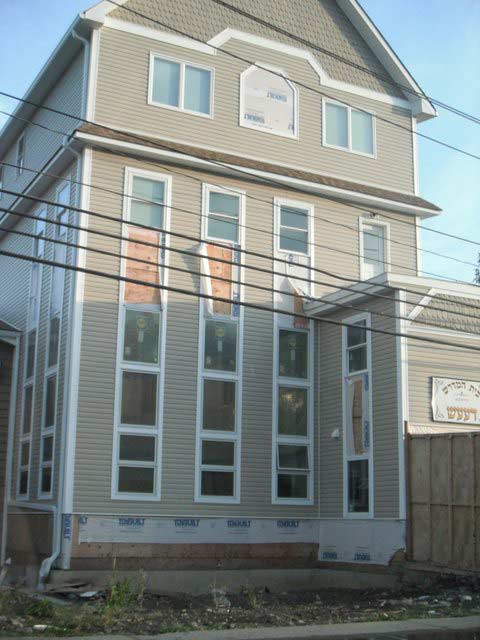
    Perhaps most notable addition is Corvallis, seat of Benton County and home of Oregon State University. Corvallis is rather exurban to Portland, even though it is now officially in Portland’s commuting belt. At least 15 percent of resident workers in Benton County travel to one of the central counties of the Portland metropolitan area (Clackamas, Multnomah and Washington in Oregon and Clark in Washington) or vice versa. This is no 30 minute commute. Corvallis is 85 miles from downtown Portland. It is 65 miles from the nearest potential Portland MSA employment in southern Clackamas County. Further, the Corvallis metropolitan area is not adjacent to the Portland metropolitan area. To get to the Portland metropolitan area by the most direct route, a Benton County commuter passes through two other metropolitan areas Albany and Salem.

    This would be a very long commute, even by comparison to the nation’s largest metropolitan regions. Take New York, for example. The New York CSA extends from outside of New Haven, Connecticut, to beyond Allentown, Pennsylvania, to beyond Toms River, New Jersey and includes all of Long Island. Yet some of the farthest reaches of New York are no closer to Manhattan than Corvallis to Portland. These include Bethlehem, Pennsylvania, New Haven, Connecticut, and Port Jervis, New York. Philadelphia, beyond the New York CSA, is only slightly farther away (90 miles).

    Or, consider Los Angeles, which its undeserved reputation for sprawl. The Los Angeles CSA is the second largest in the nation. Yet, Banning, which sits on the mountain pass leading to Palm Springs is 85 miles from Los Angeles. San Clemente, the southernmost point in the CSA is only 60 miles from downtown. The expansive Portland commuter shed suggests that, in some ways, Portland, already far less dense, is also more sprawling.

    Expansions for Linn, Marion, Polk and Cowlitz Counties

    The Portland CSA added two more metropolitan areas in the Willamette Valley. Albany (Linn County), only about 15 miles closer than Corvallis is one. Salem, the state capital, was also added. Salem includes Marion and Polk counties and is 45 miles from Portland. To the north, Longview, Washington (Cowlitz County) was also added. By comparison with Corvallis, Longview seems close, at less than 50 miles from Portland.

    The Portland CSA now stretches 175 miles from the southern Linn County border to the northern Cowlitz County border. There it has collided with the southerly expanding Seattle CSA, which now includes Lewis County (Centralia-Chehalis), 85 miles from downtown Seattle.

    However, this does not imply 175 miles of continuous urbanization. Like all metropolitan areas, combined statistical areas, including Portland, have far more rural land than urban land.

    Dispersing in the Metropolitan Area

    Perhaps the greatest irony is that an “urban containment” policy designed to prevent sprawl could well be accelerating it. Higher prices, in part due to this policy, have forced more people to look ever further for housing that is affordable.

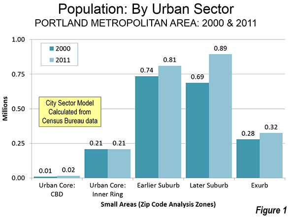
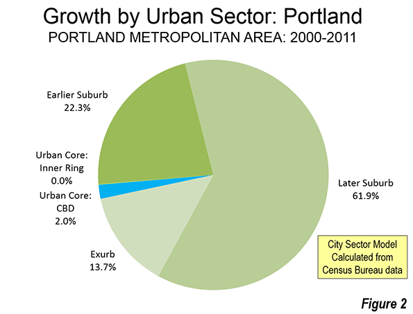
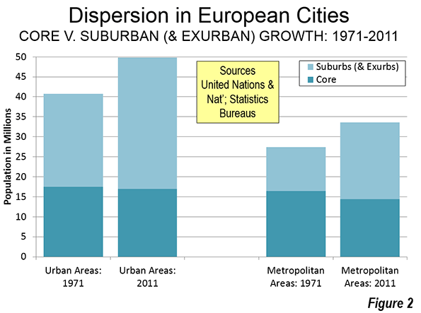
    Approximately 98 percent of Portland’s population growth between 2000 and 2011 occurred in the suburbs (Note). There was a small, but significant percentage growth around the central business district, but its addition of fewer than 7,000 residents paled by comparison to the more than 325,000 added to the suburbs and exurbs. The balance of the urban core, (the inner ring) grew by little more than 100, which is glacial for an urban sector with more than 200,000 residents (less than 0.1 percent).

    None of this should be surprising. The attractive inner city developments, especially the Pearl District, do not provide for the economic needs or wants of most people, as the population trend data indicates. Few households are drawn to buy less than one-half the space they want at nearly three times the price per square foot they would pay in outer suburbs like Forest Grove, Wilsonville or Hazel Dell.

    Job Dispersion

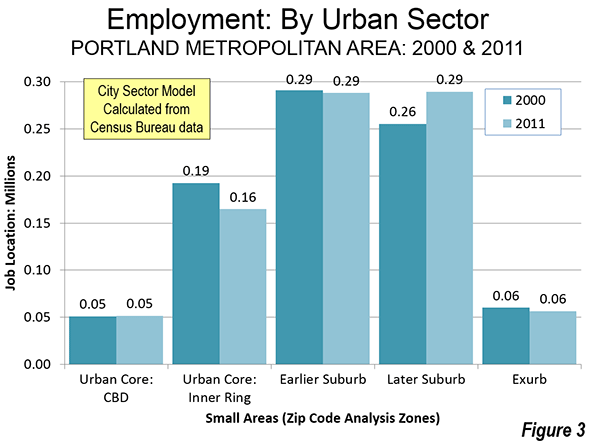
    Fortunately for both the suburbanites and an exurbanites, Portland’s job market also dispersed between 2000 and 2011, meaning that a smaller percentage of commuting was to downtown or the balance of the urban core (Figure 3). That makes it easier to drive to qualify. It turns out that while planners plan, people usually make choices that suit their basic needs rather than those of a particular urban ideology.

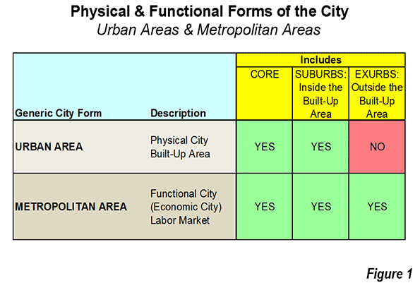
    Note 1: Metropolitan areas are defined by commuting patterns. Oversimplifying, metropolitan areas are organized around central counties that contain all or part of large urban areas ("built-up" urban areas). All such counties are included in the metropolitan area as well as any counties that have a strong commuting interchange with the central counties. For example, in the case of Portland, the central counties are Multnomah, Washington and Clackamas in Oregon and Clark in Washington. Columbia and Yamhill in Oregon are outlying counties as well as Skamania in Washington. Combined statistical areas are created from combinations of metropolitan areas that meet a weaker commuting interchange threshold. A complete description of the commuting thresholds that apply to metropolitan areas and combined statistical areas is found here.

    Note 2: Based on the City Sector Model (Figure 4), which classifies small areas (ZIP codes, more formally, ZIP Code Tabulation Areas, or ZCTAs) in metropolitan area in the nation based upon their behavioral functions as urban cores, suburbs or exurbs. The criteria used are generally employment and population densities and the extent of transit, versus car use. The purpose of the urban core sectors is to replicate, to the best extent possible, the urban form as it existed before World War II, when urban densities were much higher and when a far larger percentage of urban travel was on transit. The suburban and exurban sectors replicate automobile oriented suburbanization that began in the 1920s and escalated strongly following World War II. The data from 2000 is from the 2000 census. The 2011 data is from the 2009-2013 American Community Survey (mid-year 2011).

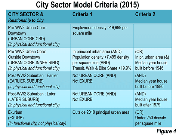
    Photo: Benton County Courthouse, Corvallis (in the Portland commuter shed) by Gregkeene (Own work) [CC BY 3.0 us or CC BY-SA 3.0], via Wikimedia Commons

    Wendell Cox is principal of Demographia, an international public policy and demographics firm. He is co-author of the "Demographia International Housing Affordability Survey" and author of "Demographia World Urban Areas" and "War on the Dream: How Anti-Sprawl Policy Threatens the Quality of Life." He was appointed to three terms on the Los Angeles County Transportation Commission, where he served with the leading city and county leadership as the only non-elected member. He served as a visiting professor at the Conservatoire National des Arts et Metiers, a national university in Paris. Wendell Cox is Chair, Housing Affordability and Municipal Policy for the Frontier Centre for Public Policy (Canada), is a Senior Fellow of the Center for Opportunity Urbanism and is a member of the Board of Advisors of the Center for Demographics and Policy at Chapman University.

  • America’s Cities Mirror Baltimore’s Woes

    The rioting that swept Baltimore the past few days, sadly, was no exception, but part of a bigger trend in some of our core cities towards social and economic collapse. Rather than enjoying the much ballyhooed urban “renaissance,” many of these cities are actually in terrible shape, with miserable schools, struggling economies and a large segmented of alienated, mostly minority youths.

    We are witnessing an unwelcome reprise of the bad old days of the late ’60s, when much of American core cities went up in smoke. Already this year there have been serious disturbances in St. Louis as well as neighboring Ferguson. There’s also been a cascading of urban violence in cities such as Chicago, where the murder rate in 2013 exceeded that of the Capone era. Overall, the geography of fear remains very much what it was a half century ago. The most dangerous places in in the U.S. in terms of violent crime tend to be heavily black cities, led by Detroit, Oakland, Memphis, St. Louis, and Cleveland. Baltimore ranks sixth.

    Of course not everything is as it was. Some cities, notably New York and Los Angeles, are much safer today, and there remains a strong pull for younger people, particularly the well-educated, to move to core cities, at least in their 20s. Black urban professionals enjoy opportunities that were rare a generation ago to reach the highest levels in our most elite cities.

    But, as Baltimore makes clear, we are still very far from what Aaron Ehrenhalt has labeled the “great inversion,” in which our cities change into affluent redoubts while the suburbs devolve into future slums. In reality, this is very far from the truth: cities are, if anything, becoming more bifurcated than ever, with a large, and seemingly unmovable, population that has benefited little from the gentrification of some urban neighborhoods, including some in Baltimore itself.

    The Persistence of Concentrated Poverty

    Perhaps the biggest sign of how limited the urban renaissance has been is to look at the growth of precisely the kind of highly concentrated poor areas like those that blew up in Baltimore. Yet although the suburbs’ share of poverty may have increased, the average poverty rate in the historical core municipalities in the 52 largest U.S. metro areas remains at 24.1 percent, more than double the 11.7 percent rate in suburban areas—despite a considerable urban turnaround in this period.

    BALTIMORE, MD - AUGUST 20: Vacant houses on August 20, 2010 in Baltimore, Maryland . There are an estimated 30,000 vacant homes in Baltimore. More than one third of these buildings are now owned by the city.  (Photo by David S. Holloway/Getty Images)David S. Holloway/Getty

    In fact, neighborhoods suffering entrenched urban poverty (PDF) actually grew in the first decade of the new millennium, increasing in numbers from 1,100 to 3,100 and in population from two to four million. In other words, poverty spread but also became far more intense in cities. “This growing concentration of poverty,” note urban researchers Joe Cortright and Dillon Mahmoudi, “is the biggest problem confronting American cities.”

    Certainly Sandtown-Winchester—where Freddie Gray, whose death sparked the riots, grew up—fits this mode. As the liberal Think Progress website explains, more than half of that neighborhood’s people between the ages of 16 and 64 are out of work and the unemployment rate is double that for the rest of the city. Median income is below the poverty line for a family of four, and nearly a third of families live in poverty. About a quarter to a third of the buildings are vacant, compared to 5 percent in the city as a whole.

    Yet the people in these neighborhoods do not represent the majority of black America. Besides the gap between blacks and whites, there is also a growing one among African-Americans themselves. This is painfully obvious in the Baltimore region which, extending to the Washington, D.C., suburbs, has some of the highest black wages and homeownership rates of any of the county, and ranks among the best places for African-Americans in a new study I co-authored for the Center for Opportunity Urbanism.

    In fact, five of the ten wealthiest black communities in America are in Maryland. Needless to say, residents in those towns are not rioting. There is an increasingly enormous gap between entrenched poor communities, such as those in Baltimore, and a rapidly expanding black suburban population. Barely half of the 775,000 African-Americans in the Baltimore metropolitan region live in the city, and those outside do far better than inside the city limits. In the last decade, suburban Baltimore County added160,000 blacks, far more than moved into the city (PDF). The black suburbanites not only make more money than their urban counterparts but their life expectancy (PDF) is at least eight years longer.

    These trends can be seen nationwide. In the last two decades of the 20th century, more blacks moved into the suburbs than in the previous 70 years, a trend that continues unabated. The 2010 Census indicated that 56 percent of African Americans in major metropolitan areas live in the suburbs. This movement was particularly marked among families with children; the number of black children living in cities like New York, Oakland, Atlanta, Los Angeles all dropped precipitously, as families sought out safer streets, better schools, and more affordable space.

    The Changing Nature of Urban Economies

    African-Americans came to Baltimore and other northern cities in large part to work in the steel, port, and other blue collar, industrial businesses that flourished in mid-century America. Yet most of those jobs are now gone, leaving behind those who must scramble to find work in the growth industries of today—education, technology, medical services. This is the case in almost all heavily black cities, not only in the Northeast, but the Midwest and even parts of coastal California. But today’s star urban industries, notably technology and high-end business services, employ few working class blacks. African-Americans, for example, occupy only the tiniest sliver of jobs—roughly 2 percent—in Silicon Valley. Nor have African Americans done well in the tech boom, driven by software-related firms more likely to staff themselves with Indian technocoolies than boys up from the ’hood. Between 2009 and 2011, earnings dropped 18 percent for blacks and 5 percent for Latinos, according to a 2013 Joint Venture Silicon Valley report.

    Overall the places where these industries have grown often produce not more opportunities for poor people or minorities but rather a subtle form of “ethnic cleansing.” A recent report from the Urban League, for example, pointed out that the very cities most praised as exemplars of urban revival—San Francisco, Chicago and Minneapolis—also suffer the largest gaps between black and white incomes. Notwithstanding the rhetoric, much of the “hip cool” world increasingly consists of monotonic “white cities” with relatively low, and falling, minority populations, such as San FranciscoPortland, and Seattle. These places are achingly political correct in theory, but are actually becoming whiter and less ethnically diverse as the rest of the country diversifies. The situation has changed so much that former MayorGavin Newsom even initiated a task force to address black out-migration.

    Inverting the Inversion

    Baltimore proves that the “great inversion,” insofar as it exists at all, positively affects a relatively small part of the urban population, particularly in historically black cities. Cities may well have become a popular abode for the young, well-educated, and the rich (usually white), but they also contain another, usually much larger population of those, mostly minorities, who have been left behind in the urban evolution. Midwestern urban analyst Pete Saunders describes Chicago in this manner: “one third San Francisco, two thirds Detroit.”

    This is precisely what we see in Baltimore and many traditionally black cities. Everything that does not work in cities today—education, for example, and sometimes law enforcement—most directly affects minorities and the poor. Crime may be down overall in many cities, but not necessarily in predominately minority neighborhoods. As blogger Daniel Hertz has demonstrated, violent crime has actually increased since the early ’90s in several large, predominately African-American Chicago neighborhoods.

    Clearly what we are seeing then is not an urban kumbaya you see in TV ads for fast food and web services, but a hardening of class and racial divisions. Suburban poverty and crime may have increased in recent years, but they are not nearly as entrenched on the periphery as they are in the city. Places like inner Baltimore function essentially as a kind of dead-end, a cul-de-sac for dreams of a better future.

    The Changing Geography of African-American Opportunity

    We are witnessing a very unwelcome resurgence of racial tensions over the past six years, with concern about racism at the highest level since the Rodney King riots in 1992. Today, particularly in the divisive aftermath of Ferguson and other police-related controversies, two in five Americans feel race relations have gotten worse since President Obama took office, while only 15 percent thought they had gotten better.

    How do we reverse this ugly trend? Sadly it takes more than good intentions and handouts. To be sure, the initial Great Society programs helped reduce chronic black poverty. But the poverty rate was already dropping: in the prosperous early ’60s, black poverty plummeted from 56 percent to 34 percent; in contrast, in the years after President Lyndon Johnson launched the war on poverty, it dropped only slightly, to 32 percent. But by the ’70s this progress—despite the implementation of such programs as affirmative action—slowed to a crawl, in large part due to cascading social problems, particularly in industrial cities like Baltimore.

    Many progressives have blamed conservatives starting with President Reagan for the conditions that still prevail for many African Americans. Yet it turns out that expansive era was pretty good for blacks, if not for their leaders. Even as poverty spending growth slowed, the poverty rate dropped in the Reagan years to around 30 percent for African-Americans. Similarly the economic boom of the Clinton era saw even greater progress, with poverty dropping to 25 percent. It began to rise again, albeit slowly, during the tepid recovery of the Bush era, but then began to rise more steeply during the Great Recession, and through the slow, and also tepid, recovery of the Obama years.

    Clearly an improved economy is more important than ramping up social spending. Indeed, according to USC’s Luke Phillips, states. like New York, Massachusetts , California and Illinois spend almost twice as much on welfare payments than do states like North Carolina, Texas, or Florida, both in terms of GDP and state spending. Yet the best results for African Americans in our Center for Opportunity Urbanism study were found overwhelmingly in the former Confederacy, states generally not well known for their generosity to the poor or interest in racial redress.

    This is leading to a stunning reversal in black migration patterns. Between 1910 and 1970 six million African Americans migrated from the South to the North in what became known as the Great Migration. But since World War II the migration has changed course: ambitious blacks now head toward the suburbs, or the South. Between 2000 and 2013, the African American populations of Atlanta, Charlotte, Orlando, Houston, Dallas-Fort Worth, Raleigh, Tampa-St. Petersburg, and San Antonio all experienced growth of close to 40 percent or higher, well above the average of 27 percent for the 52 metropolitan areas.

    “Blacks who have relocated tend to be either retirees or well-educated, well-off middle-agers with children,” John Giggie, associate professor of history and director of graduate studies at the University of Alabama in Tuscaloosa, toldBET.com. They move to the South not because they like the politics (most probably don’t) but because they seek economic progress. Part of the reason may be that sunbelt cities have more broad based opportunites for middle and working class residents than have the increasingly post-industrial economies of California and the Northeast corridor.

    Our leadership class, black and white, misses all this. Sending Al Sharpton, President Obama’s highly publicized advisor, to Baltimore hardly bodes well for improving things on the ground. A little bit of catharsis, perhaps, but at some point you need to deal with reality.

    It would be far better if some CEOs or investors—American, Asian, or European—came to the old Chesapeake city bearing plans for expanding jobs and opportunities. That, at least, would begin to address the economic and social isolation that, inevitably, finds its expression in fires on the street. Good jobs and the prospect of a better future—not good intentions—is what ultimately matters.

    This piece first appeared at The Daily Beast.

    Joel Kotkin is executive editor of NewGeography.com and Roger Hobbs Distinguished Fellow in Urban Studies at Chapman University, and a member of the editorial board of the Orange County Register. He is also executive director of the Houston-based Center for Opportunity Urbanism. His newest book, The New Class Conflict is now available at Amazon and Telos Press. He is also author of The City: A Global History and The Next Hundred Million: America in 2050.  He lives in Los Angeles, CA.

    Photo by Voice of America, Victoria Macchi

  • America’s Mid-Sized Metropolitan Areas

    The United States has 53 mid-sized metropolitan areas, with populations from 500,000 to 1 million. These metropolitan areas together had a population of nearly 38 million in 2014, according to the most recent Census Bureau population estimates (Table). In number, they match the 53 major metropolitan areas (over 1 million population), though they have only one fifth of the population (178 million). The mid-sized metropolitan areas are growing somewhat slower than the major metropolitan areas, at an annual rate of 0.81% between 2010 and 2014, compared to 1.00% in the major metropolitan areas. Combined, the major metropolitan areas and the mid-sized metropolitan areas have two-thirds of the US population.

    Largest Mid-Sized Metropolitan Areas

    Honolulu is the largest, with a population of 991,000. Honolulu seems destined to graduate into the major metropolitan category, though its growth rate over the last year could indicate this will occur in 2016 or later, rather than 2015 which appeared to be likely from earlier data. Tulsa, Oklahoma’s second largest metropolitan area, is growing somewhat more slowly, but seems likely to pass the million mark by the 2020 census. Third-ranked Fresno is growing somewhat faster and should also reach 1 million population by 2020. Bridgeport, which is a part of the New York Combined Statistical Area (Note) has grown almost as fast as the other three since 2010, though like Honolulu, its growth rate in the past year has been halved. Bridgeport has an outside chance of reaching 1 million by the 2020 census.

    The next three fastest-growing metropolitan areas, (Worcester, Albuquerque, and Omaha) all have populations exceeding 900,000. Worcester is experiencing the slow growth that would be expected for the Northeastern metropolitan area and is unlikely to reach 1 million this decade. Surprisingly, Albuquerque is growing almost as slowly and its 2014 growth was well below its previous three-year rate. Albuquerque has typically been a fast-growing metropolitan area. Omaha, which ranks seventh is the fastest growing of this group, sustaining a growth rate of about 1.0%, which is above the national average. Omaha should reach 1 million before 2030.

    The ninth and 10th largest mid-sized metropolitan areas are growing more strongly than average. This includes Bakersfield and Greenville (SC), both of which should reach 1 million before 2030 (Figure 1). Greenville is the only other metropolitan area in the top 10 growing at a rate above 1.0 percent (1.08 percent). By contrast five of the top 10 major metropolitan areas are growing at above 1.0 percent (Dallas-Fort Worth, Houston, Washington, Miami, and Atlanta).

    Among the top 10, all but Albany, Albuquerque and Omaha are single county metropolitan areas. Metropolitan areas are made up of complete counties, only three are single counties (San Diego, Las Vegas, and Tucson). Among the mid-sized metropolitan areas, their smaller size means that many more are composed of single counties.

    Smallest Mid-Sized Metropolitan Areas

    There were two new entries to the list of mid-sized metropolitan areas in 2014. One was Fayetteville (AR-MO), home of both the Wal-Mart world headquarters (Bentonville, AR) and the University of Arkansas. Santa Rosa, which is an exurban metropolitan area in the San Francisco Combined Statistical Area was also added.

    Fastest Growing Mid-Sized Metropolitan Areas

    The 10 fastest growing mid-sized metropolitan areas are from every major region of the country except for the Northeast. Cape Coral, FL was the fastest growing between 2010 and 2014. Its growth rate picked up substantially in 2013 to 2014. Cape Coral (formerly called Fort Myers) was hit particularly hard by the real estate bust of the late 2000s. The core municipality itself has not only the usual street system, but an extensive canal system (photo above). It is hard to imagine a metropolitan area that feels less urban.

    Charleston, SC was second ranked, nearly equaling the growth rate of Cape Coral. Four other Southern metropolitan areas were among the fastest growing, including Fayetteville, AR-MO (4th), academic and research center Durham, NC (6th), which is a part of the Raleigh Combined Statistical Area. The other Southern entries were Rio Grande Valley and border metropolitan area McAllen, TX and Sarasota (North Port), FL. Current growth rates indicate that Charleston and McAllen should exceed 1,000,000 by 2030, while chances for Sarasota and Cape Coral are somewhat less (Figure 2).

    Three of the fastest growing mid-sized metropolitan areas were in the West, including Provo, UT, Boise, ID and Colorado Springs. Des Moines, was the only Midwestern metropolitan area among the fastest growing.

    Slowest Growing Mid-Sized Metropolitan Areas

    Virtually all of the slowest growing mid-sized metropolitan areas are former industrial behemoths that lost out in the competition for survival in the Northeast and Midwest. A visit to any of these cities will reveal either a relatively strong pre-World War II central business district or the remains of one. Each of these has a built form that looks more like Louisville or Cincinnati than the dominant pattern for new metropolitan areas that developed with a far more modest density gradient and with much weaker cores.

    Five of the slowest growing are actually losing population. Since 2010, Youngstown has lost an average of 0.5% of its population annually. Scranton (Wilkes-Barre), PA continues its eight decade decline. The list also includes Toledo; Syracuse; Akron; Dayton; and Springfield, MA; which once had been strong manufacturing centers. The list also includes New Haven, which also lost population despite being home to Yale University. Allentown is also an old manufacturing center, but has recently been added to the New York Combined Statistical Area, indicating the expansion of the nation’s largest labor market. Perhaps the most unusual of the bottom 10 in growth is Albany, NY, which is one of the largest state government centers in the United States. Certainly, the Albany area has lost much of its industrial base, but a large government presence often can compensate for such losses.

    Prospects

    The list of mid-sized metropolitan areas is fluid. As noted above, a number of mid-sized metropolitan areas could move into the major metropolitan category before 2020 or 2030. On the other hand, there will be new mid-sized metropolitan areas. Three seem likely to be added by the 2020 census (Lexington, KY, Lafayette, LA and Pensacola, FL). There should be a rush of new mid-sized metropolitan areas between 2020 and 2030, at current growth rates. This could include Visalia, CA; Springfield, MO; Corpus Christi, TX; Port St. Lucci, FL; Reno, NV; Asheville, NC; Huntsville, AL; Santa Barbara, CA; and Myrtle Beach, SC.

    Note: Combined Statistical Areas are larger labor markets that are combinations of metropolitan areas. The commuting exchange between these metropolitan areas is less than that required to be included in a metropolitan area. Perhaps the most notable examples of combined statistical areas are New York, Los Angeles and San Francisco. The New York CSA which extends from the metropolitan area to include New Haven and Bridgeport in Connecticut and Allentown in Pennsylvania and New Jersey. The Los Angeles CSA includes the Riverside-San Bernardino and Oxnard metropolitan areas. The San Francisco CSA includes the San Francisco metropolitan area, the San Jose metropolitan area and the smaller metropolitan areas of Santa Rosa, Santa Cruz, Vallejo and Stockton (added since 2010).

    Mid-Sized Metropolitan Areas (US)
    Population: 500,000 to 1,000,000: 2010-2014
    Population 2013-2014
    Rank Metropolitan Area 2010 2013 2014 Annual % Change: 2010-2014 Rank % Change: 2010-2014
    1 Honolulu, HI 953 987 992 0.94%        21 0.48%
    2 Tulsa, OK 937 962 969 0.79%        25 0.71%
    3 Fresno, CA 930 956 966 0.89%        22 1.03%
    4 Bridgeport, CT 917 942 945 0.73%        29 0.35%
    5 Worcester, MA-CT 917 928 930 0.34%        43 0.26%
    6 Albuquerque, NM 887 903 905 0.46%        39 0.14%
    7 Omaha, NE-IA 865 896 904 1.04%        15 0.99%
    8 Albany, NY 871 878 880 0.25%        45 0.19%
    9 Bakersfield, CA 840 866 875 0.96%        19 1.00%
    10 Greenville, SC 824 850 862 1.08%        14 1.42%
    11 New Haven, CT 862 863 861 -0.03%        49 -0.20%
    12 Knoxville, TN 838 852 858 0.56%        36 0.66%
    13 Oxnard, CA 823 841 846 0.65%        32 0.62%
    14 El Paso, TX 804 835 837 0.94%        20 0.25%
    15 McAllen, TX 775 819 831 1.66%          8 1.48%
    16 Allentown, PA-NJ 821 827 830 0.25%        46 0.34%
    17 Baton Rouge, LA 802 820 825 0.67%        31 0.62%
    18 Dayton, OH 799 802 801 0.05%        47 -0.10%
    19 Columbia, SC 768 792 800 0.99%        17 1.02%
    20 Sarasota (North Port), FL 702 733 749 1.52%          9 2.19%
    21 Greensboro, NC 724 741 747 0.73%        28 0.71%
    22 Little Rock, AR 700 724 729 0.97%        18 0.66%
    23 Charleston, SC 665 712 728 2.16%          2 2.19%
    24 Stockton, CA 685 705 716 1.02%        16 1.50%
    25 Akron, OH 703 703 704 0.02%        48 0.09%
    26 Colorado Springs, CO 646 679 687 1.47%        10 1.21%
    27 Cape Coral, FL 619 661 680 2.23%          1 2.75%
    28 Boise, ID 617 650 664 1.77%          5 2.15%
    29 Syracuse, NY 663 663 661 -0.04%        50 -0.21%
    30 Winston-Salem, NC 641 652 655 0.53%        37 0.54%
    31 Wichita, KS 631 638 641 0.38%        42 0.44%
    32 Lakeland, FL 602 623 635 1.25%        12 1.84%
    33 Madison, WI 605 627 634 1.08%        13 1.01%
    34 Ogden, UT 597 622 632 1.35%        11 1.62%
    35 Springfield, MA 622 628 629 0.28%        44 0.11%
    36 Des Moines, IA 570 600 612 1.68%          7 1.91%
    37 Daytona Beach (Deltona), FL 590 601 610 0.77%        26 1.46%
    38 Toledo, OH 610 608 607 -0.10%        51 -0.16%
    39 Augusta, GA-SC 565 580 584 0.77%        27 0.59%
    40 Jackson, MS 567 577 578 0.43%        40 0.06%
    41 Provo, UT 527 562 571 1.93%          3 1.64%
    42 Harrisburg, PA 549 558 561 0.48%        38 0.53%
    43 Scranton, PA 564 562 560 -0.17%        52 -0.38%
    44 Melbourne (Palm Bay), FL 543 551 557 0.58%        35 0.99%
    45 Youngstown, OH-PA 566 556 553 -0.52%        53 -0.52%
    46 Chattanooga, TN-GA 528 542 545 0.72%        30 0.44%
    47 Durham, NC 504 534 543 1.74%          6 1.70%
    48 Spokane, WA 528 536 541 0.58%        34 0.98%
    49 Lancaster, PA 519 530 533 0.62%        33 0.60%
    50 Modesto, CA 514 526 532 0.79%        23 1.09%
    51 Portland, ME 514 520 524 0.43%        41 0.61%
    52 Fayetteville, AR-MO 463 492 502 1.89%          4 1.88%
    53 Santa Rosa, CA 484 495 500 0.79%        24 0.98%
    Total   36,361     37,316     37,620 0.81%
    In 000s
    Data from Census Bureau
    More familiar names substituted in some cases (Census names in parentheses)


    Photo: Cape Coral, Florida (fastest growing mid-sized metropolitan area)

    Wendell Cox is principal of Demographia, an international public policy and demographics firm. He is co-author of the "Demographia International Housing Affordability Survey" and author of "Demographia World Urban Areas" and "War on the Dream: How Anti-Sprawl Policy Threatens the Quality of Life." He was appointed to three terms on the Los Angeles County Transportation Commission, where he served with the leading city and county leadership as the only non-elected member. He served as a visiting professor at the Conservatoire National des Arts et Metiers, a national university in Paris. He is a Senior Fellow at the Center for Opportunity Urbanism and a member of the Board of Advisors at the Center for Demographics and Policy at Chapman University.

  • China’s Shifting Population Growth Patterns

    As demographers have projected for some time, China’s population growth is slowing. The nation gained population at a rate of 0.49% between 2010 and 2013, according to data from the National Bureau of Statistics. This is a reduction from the rate of 0.57% between 2000 and 2010. Further growth rate declines are expected until the 2030s when the total population, according to United Nations projections, will actually begin to decline.

    Right now the biggest slowdown is taking place in regions with the greatest and densest urbanization such as in the province of Guangdong, home of the Pearl River Delta and the Yangtze Delta, anchored by Shanghai. At the same time, the northern plains economic region of Beijing-Tianjin continues its growth, but following a more decentralized pattern that sees more growth away from Beijing.

    Guangdong and the Pearl River Delta

    Guangdong is unique in being home to two of the world’s megacities (urban areas over 10 million population), Guangzhou-Foshan and Shenzhen. No other sub-national jurisdiction (province or state) in the world has more than one. The province, anchored along the Pearl River Delta, has been the heart of China’s three decade long economic advance. Between Guangzhou-Foshan and Shenzhen, the Dongguan urban area has 8 million residents. Across the Pearl River, Jiangmen, Zhongshan and Zhuhai all have more than one million residents. If the China’s adjacent special economic regions of Hong Kong and Macau are included, the area’s population reaches 55 million, nearly one-half more than Tokyo, with nearly the same land area. However, with little day-to-day work trip commuting between, they do not, at least as of yet, represent a single labor market (metropolitan area).

    This slowdown comes after years of spectacular growth. Between 1990 and 2000, the province added more than 40 million new residents, more people than live in California. On average, the the population rose 2.1 million every year, an annual rate of 2.6 percent. Just between 2009 and 2010 the increase was 3.1 million. However, over the three years between 2010 and 2013 Guangdong added only 700,000 each year, for an annual growth rate of 0.66 percent., 

    Shanghai and the Yangtze Delta

    Shanghai, a city province that contains nearly all of the Shanghai mega-city, also experienced a huge drop in its population growth rate (Parts of Shanghai’s continuously built-up area are now stretching into neighboring Jiangsu and Zhejiang provinces). Between 2000 and 2010, Shanghai grew at an annual rate of 3.65% and added nearly 7 million new residents. Over the last three years, the annual rate of population growth has dropped by more than half, to 1.67% as only 1.1 million new residents have been added. Shanghai was estimated to have a population of 24,150,000 at the end of 2013.

    Shanghai is at the core of the larger Yangtze River Delta, home to nearly 160 million residents crowded into an area the size of Oregon. The Yangtze Delta includes the provinces of Zhejiang, Shanghai and Jiangsu and stretches from Ningbo, through Hangzhou, Shanghai, Suzhou, Changzhou, and Zhenjiang to Nanjing. Like Guangdong, the Yangtze Delta experienced a substantial drop in its rate of population growth. Between 2000 and 2010, the Yangtze Delta added approximately 20 million new residents, or 1.4 percent annually. This dropped to only 2 million between 2010 and 2013, dropping the annual growth rate  to 0.5%.

    Beijing, Tianjin and the Northern China Plain

    All the population of the Beijing mega-city is contained within the municipal province of Beijing. With its adjacent megacity of Tianjin (also a municipal province) the two provinces combined have a population of 35 million. When combined with the surrounding province of Hebei (capital Shijiazhuang), the population of this Northern China Plain megalopolis is nearing 110 million. Unlike China’s other two major economic regions, the North China Plain is sustaining its population growth. Between 2000 and 2010, the annual population growth rate was 1.47 percent. Over the past three years, it was 1.46 percent.

    Beijing was estimated to have a population of 21,150,000 at the end of 2013.Yet, there has been a substantial slowdown in growth but not as marked as that of Shanghai. Between 2000 and 2010, Beijing added more than 6 million residents, growing at an annual rate of 3.70 percent. Another 1.5 million residents were added between 2010 and 2013, but the growth rate dropped to 2.67 percent.

    The trajectory of growth has now shifted to Tianjin. Tianjin is by far the fastest growing provincial level jurisdiction in China. Between 2010 and 2013, Tianjin grew at an annual rate of 4.49 percent, and added 1.7 million new residents. This is more in total numbers than either Beijing or Shanghai, which are both larger. Among the provincial level jurisdictions, only Guangdong, seven times as large, added more residents. Tianjin is estimated to have a population of 14,720,000.

    Tianjin appears to be an opportunity corridor for growth. Tianjin is located approximately 90 miles (145 kilometers) from Beijing and is the principal seaport in the area. High speed trains between Tianjin and Beijing operate about 100 times each way daily, completing the trip in 35 minutes. Tianjin is a natural safety valve for the continuing growth of the North China Plain megalopolis.

    Hebei continued its stronger than national growth. In the 2000s, Hebei added 5.2 million residents, and added another 1.4 million over the past three years.

    This shift of growth from Beijing to surrounding areas could indicate some success in the policy initiatives of the national and Beijing governments to control Beijing’s rapid population growth and shift it to more peripheral areas. More decentralization initiatives are due, such as the planned seventh ring road, which will traverse most of its distance in surrounding Tianjin and Hebei.

    The Dongbei Rust Belt

    Population growth continues to elude China’s historic Rust Belt, the Dongbei ("East North," also called Manchuria). This area, consisting of Lioaning, Jilin and Heliongjiang provinces, with major cities Shenyang, Harbin and Dalian grew by only 200,000 residents, an annual rate of 0.06 percent. This is down from 0.26 percent in the 2000s, which was less than one-half the national growth rate. The Dongbei has nearly 110 million residents.

    Other Areas

    At the same time, population in the interior province of Hubei (capital Wuhan) has been propelled from 0.14 percent annually between 2000 and 2010 to a near national rate of 0.41 percent since 2010. Adjacent interior province Hunan (capital Changsha) recovered from a 0.01 percent annual growth rate in the 2000s to 0.62 in the last three years. Next to Hunan, city province Chongqing recovered from a lethargic 0.12 percent growth rate between 2000 and 2010, to an impressive 0.99 percent over the last three years. These cases may also be another indication of the success of government policies to encourage growth away from the East Coast.

    Outside of Tianjin, only four regions of China are growing at a greater than one percent annual rate. Three are to the west, including Tibet (1.31 percent), Xinjiang (1.21 percent) and Ningxia (1.12 percent). All are experiencing slower growth than before. To the south, Hainan, the island province, is also growing at just above one percent), about the same rate as in the 2000s.

    Floating Population: Slower Growth

    China’s large floating population, — internal migrants who have moved to the cities to provide the work force for much of the manufacturing and construction boom — continued to grow, but at a somewhat slower rate. The floating population grew 8 million annually between 2010 and 2013, down from 15 million annually between 2005 and 2010. Of course, that is still a big number. With reform of the internal passport system ("hukou" system) promised, there may be an important incentive for many to remain in the cities, where economic aspirations may be more likely to be met.

    China’s Changing Growth Patterns

    China is going through an important transition from nearly speed-of-light economic expansion to much slower growth that is, nonetheless the envy of just about every other major economy. Nonetheless, these changes are already bringing spatial changes.

    Photo: Dalian (Liaoning), in the Dongbei (by author)

    Wendell Cox is principal of Demographia, an international public policy and demographics firm. He is co-author of the "Demographia International Housing Affordability Survey" and author of "Demographia World Urban Areas" and "War on the Dream: How Anti-Sprawl Policy Threatens the Quality of Life." He was appointed to three terms on the Los Angeles County Transportation Commission, where he served with the leading city and county leadership as the only non-elected member. He served as a visiting professor at the Conservatoire National des Arts etMetiers, a national university in Paris and is a Senior Fellow at the Center for Opportunity Urbanism.

  • Dispersion in Europe’s Cities

    For any who had been following demographic trends closely in Western Europe, it is long been obvious that suburbanization was following generally the same track as in Canada (more than 75 percent suburban), Australia and the United States (85 percent suburban). Nearly all growth in the major cities has been in the suburbs for the last four decades.

    The massive postwar automobile oriented suburbanization of Europe started a bit later than in the Western offshoots of the British Empire as the fabled economic historian Angus Maddison called them. It took a while for Western Europe to recover from World War II, but by 1970 much had been restored.

    This article reviews citywide population trends, divided into their core and suburban (or exurban) components from 1971 to 2011. This is a far more complicated exercise than reviewing the urban trends of Canada, Australia, and the United States. Ten years ago I published an examination of European trends relying principally on using data from the Ranally Metropolitan Areas, which had been established by my friend Richard Forstall, then at Rand McNally. Metropolitan areas are particularly difficult to compare across international lines because the few nations that designate them use different criteria and most nations do not designate them at all.

    Regretfully, the internet and perhaps other commercial considerations made the Ranally Metropolitan Areas a thing of the past.

    Data Difficulty in Western Europe

    The only source that approaches consistency is the United Nations Urban Agglomerations (urban areas) list. In its latest iteration the list includes data from 1950 through projections to 2030 in five year increments for approximately 1700 cities around the world. But, the United Nations must rely on member states to provide the information, which is often not urban agglomeration data at all.

    Some nations report urban area data. Others report metropolitan area data. Urban areas and metropolitan areas are not the same thing. Urban areas are built up areas defined by the extent of the urban form, rather than by jurisdictional boundaries (see Demographia World Urban Areas). Metropolitan areas encompass both the urban area and the economically connected areas to the outside (exurbs). The difference is that urban areas do not include exurbs and metropolitan areas do (Figure 1).

    Some nations report only core municipality data, which is incomplete. Characterizing cities as only the core is rather like declaring a leg or a lung to be the same thing as a human body. These nations include Germany and Austria. Data for Valencia, Spain is also for the core municipality only.

    Perhaps the best source for citywide trends over the last 40 years in Western Europe is the United Nations data. The results are reported for urban areas and metropolitan areas, ignoring the irrelevant reported core data. Cities are included that had a population of 750,000 or more in any year from 1970 to 2010 on the UN World Agglomerations list. As of 2011, there are 24 urban areas and 16 metropolitan areas with comparable United Nations data (Table).

    How the Cities have Dispersed

    Among the urban areas, the suburbs monopolized population growth over the period (1971 to 2011). Overall, the 24 urban areas increased their population by 9.1 million residents. This was the combination of a 9.7 million increase in the suburbs and a 600,000 loss in the cores. With the core losses, the suburbs accounted for 107% of the urban area growth.

    The monopolization of suburban and exurban growth was even greater in the 16 metropolitan areas. The overall citywide population increase was 6.2 million. This included 8.2 million in the suburbs and exurbs and the loss of 2.1 million in the cores.

    Combining these two different urban conceptions for statistical purposes shows how dominant suburban and exurban growth has been. In 1971, the cores and suburbs had about the same population. By 2011, the suburbs had grown to have 60% more residents than the cores (Figure 2).

    Some of the disparities were large. In Madrid, the suburbs grew 450 percent between 1971 and 2011, compared to only 5 percent in the core. In Toulouse, the suburbs grew 327 percent, while the core edged up only 20 percent, while in Zurich, the suburbs grew 186 percent compared to the core decline of 12 percent.

    Overall, core population performance exceeded that of the suburbs in only three of the 40 cases. The most significant is slow-growing Birmingham, which is closing in on its 1951 peak. Then there is Liverpool, which is managed to drop from the population peak of more than 850,000 in 1931 to under 475,000 in 2011. Liverpool’s loss over the 40 years was even less percentage wise than that of the suburbs. The core of Southampton also grew faster than the suburbs.

    Core Resurgence

    At the same time, it notable cores have reversed their previous loss patterns in recent years. Some resurgent cores remain well below their much earlier peaks. The ville de Paris has regained little more than 100,000 of its 800,000 loss since 1921. Inner London (Note) has regained much more (800,000), but still needs another 1.3 million to restore its 1901 peak (Outer London is so suburban that it provided much of the ammunition for the British anti-suburban movement). Others cores, like Stockholm and Madrid have risen above previous peaks.

    As in the United States, this urban resurgence should not lead to a perception that suburbanites are "flocking" to the urban cores. Domestic migration data continues to show net population movements from the cores to the suburbs and exurbs. Much of the resurgence has been propelled by international migration since enlargement of the European Union (such as from the growing London core), which has virtually eliminated westward barriers to immigration from the less affluent former Soviet satellites. Even the core of Stockholm, now at its population peak, has lost domestic migration to the suburbs in Stockholm County in each of the last five years according to Statistics Sweden data.

    Earlier Core Troughs

    The forty-year perspective masks some huge core population losses that occurred earlier. Perhaps the most spectacular is Copenhagen, which dropped from 768,000 in 1950 to 464,000 in 1992, for a percentage loss near that of Detroit from 1950 to 1990. Copenhagen’s population loss was 40 percent, compared to Detroit’s 44 percent (See: Shrinking Cities, Chapter 2). Since 1992, the core of Copenhagen has made up only a quarter of its loss since 1950.

    The core of Glasgow also suffered earlier losses. In 1931, the core municipality had a population nearing 1.1 million. By 1971, Glasgow became the first core municipality in the world to fall below 1,000,000 population after having achieved that status. Glasgow has since been followed by Naples, Turin and Detroit. Glasgow increased its population modestly after 2001, to just under 600,000.

    The Missing Cities

    What can be said about Germany and Austria, which do not provide data for either urban areas or metropolitan areas? If such data were available, it would likely show the same general trends. By the early 2000s, cores such as Berlin, Dresden, Frankfurt, Hamburg, Leipzig, Munich and Stuttgart had lost population from their peaks. Between 1987 and 2001, all growth in the Rhine-Ruhr, Western Europe’s third largest city, was in the suburbs and exurbs. This area, which defines the very term conurbation, may have been the first truly polycentric metropolitan area in the world, with its historic municipalities like Essen, Dusseldorf, Bochum, Gelsenkirchen, Oberhausen, Dortmund, Duisburg, Dusseldorf and Wuppertal.  Vienna reached its population peak in 1910,when  capital of the Austro-Hungarian under Emperor Franz Josef.

    Better Data Ahead

    Meanwhile, the state of urban statistics is improving significantly in Europe. It is to be expected that historical data would be non-comparable and cumbersome with Europe’s multiple nations. However, Eurostat now publishes its own, consistent metropolitan area data. Generally data is available back to the early or mid 2000s, which will make the lives of interested statisticians better in the future.

    The suburbanization of Europe may be surprising to New World tourists, who rarely venture beyond the historical cores. I called this the Louvre Syndrome, which describes New World tourists who jealousy wonder why their cites cannot look like attractive European cores, but never experience, predictably,  their extensive and   less historically appealing  suburbs. And why should they? Americans and Canadians go to Europe to see what’s different, not what’s similar.

    What is similar is that the cities of Europe, like those in Japan and the New World have dispersed as they have become more affluent, a dynamic pointed out by Robert Bruegmann in Sprawl: A Short History. There is also considerable dispersion going on in developing world cities. There is also an imperative to disperse the inhuman densities and living conditions in many parts of African, Asia and South America. These include shantytowns like Dharavi in Mumbai, Kibera in Nairobi, Rio’s notorious favelas and in Manila, with its all too frequent fires that destroy thousands of homes at once.

    Core & Suburban Growth in Cities
    Western Europe: 1971-2011
    Urban Areas (Urban Agglomerations) and Metropolitan Areas
    Population in 000s 1971 Population 2011 Population
      UA/MA Core Suburbs UA/MA Core Suburbs
    URBAN AREAS (URBAN AGGLOMERATIONS)      
    Amsterdam 938 820 118 1,064 780 284
    Athens 2,535 862 1,673 3,089 664 2,425
    Birmingham 2,369 1,013 1,356 2,446 1,086 1,360
    Bordeaux 590 254 336 853 239 614
    Dublin 783 569 214 1,114 528 586
    Glasgow 1,732 897 835 1,210 593 617
    Helsinki 522 529 -7 1,134 588 546
    Lille 912 233 679 1,020 228 792
    Liverpool 1,253 607 646 865 466 399
    London 7,787 2,959 4,828 10,297 3,232 7,065
    Lyon 1,128 507 621 1,563 491 1,072
    Manchester 2,391 542 1,849 2,559 503 2,056
    Marseille 1,197 894 303 1,569 851 718
    Newcastle 876 222 654 776 149 627
    Nice 649 328 321 947 344 603
    Oslo 643 488 155 916 599 317
    Paris 8,278 2,504 5,774 10,537 2,250 8,287
    Rotterdam 959 687 272 995 606 389
    Stockholm 1,031 747 284 1,385 847 538
    Southampton 740 213 527 857 254 603
    Thessaloniki 557 340 217 754 325 429
    Toulouse 476 372 104 891 447 444
    West Yorkshire 1,705 506 1,199 1,787 475 1,312
    Zurich 711 423 288 1,198 373 825
    Urban Areas 40,763 17,516 23,247 49,824 16,918 32,906
    METROPOLITAN AREAS (LABOR MARKETS)      
    Antwerp 858 227 631 976 185 791
    Barcelona 3,521 1,828 1,693 4,999 1,621 3,378
    Bergamo 561 126 435 799 115 684
    Bologna 746 488 258 766 371 395
    Brussels 1,576 143 1,433 1,975 170 1,805
    Copenhagen 1,338 626 712 1,207 540 667
    Florence 725 460 265 694 358 336
    Genoa 918 832 86 701 586 115
    Lisbon 1,874 782 1,092 2,826 553 2,273
    Madrid 3,595 3,121 474 5,870 3,265 2,605
    Milan 3,040 1,732 1,308 3,065 1,242 1,823
    Naples 2,019 1,267 752 2,213 962 1,251
    Palermo 757 653 104 855 658 197
    Porto 941 326 615 1,288 238 1,050
    Rome 3,168 2,656 512 3,617 2,617 1,000
    Turin 1,775 1,142 633 1,742 872 870
    Metropolitan Areas 27,413 16,409 11,004 33,594 14,353 19,241
    All 68,177 33,925 34,252 83,418 31,271 52,148
    Populaton Change 1971 Population 2011 Population
      UA/MA Core Suburbs UA/MA Core Suburbs
    URBAN AREAS (URBAN AGGLOMERATIONS)      
    Amsterdam 126 -40 166 13% -5% 141%
    Athens 553 -198 751 22% -23% 45%
    Birmingham 77 73 4 3% 7% 0%
    Bordeaux 263 -15 278 45% -6% 83%
    Dublin 331 -41 372 42% -7% 173%
    Glasgow -522 -304 -218 -30% -34% -26%
    Helsinki 611 59 552 117% 11%
    Lille 108 -5 113 12% -2% 17%
    Liverpool -389 -141 -248 -31% -23% -38%
    London 2,510 273 2,237 32% 9% 46%
    Lyon 435 -16 450 39% -3% 72%
    Manchester 169 -39 208 7% -7% 11%
    Marseille 372 -43 415 31% -5% 137%
    Newcastle -101 -73 -28 -11% -33% -4%
    Nice 298 16 282 46% 5% 88%
    Oslo 272 111 161 42% 23% 104%
    Paris 2,259 -254 2,513 27% -10% 44%
    Rotterdam 36 -81 117 4% -12% 43%
    Stockholm 354 100 254 34% 13% 90%
    Southampton 118 41 77 16% 19% 15%
    Thessaloniki 197 -15 212 35% -4% 97%
    Toulouse 415 75 340 87% 20% 327%
    West Yorkshire 82 -31 113 5% -6% 9%
    Zurich 487 -50 537 69% -12% 186%
    Urban Areas 9,061 -598 9,659 22% -3% 42%
    METROPOLITAN AREAS (LABOR MARKETS)      
    Antwerp 118 -42 160 14% -19% 25%
    Barcelona 1,477 -207 1,684 42% -11% 99%
    Bergamo 238 -11 249 43% -9% 57%
    Bologna 21 -117 138 3% -24% 54%
    Brussels 399 27 372 25% 19% 26%
    Copenhagen -131 -86 -45 -10% -14% -6%
    Florence -31 -102 71 -4% -22% 27%
    Genoa -217 -246 29 -24% -30% 34%
    Lisbon 952 -229 1,181 51% -29% 108%
    Madrid 2,275 144 2,131 63% 5% 450%
    Milan 24 -490 514 1% -28% 39%
    Naples 194 -305 499 10% -24% 66%
    Palermo 97 5 92 13% 1% 88%
    Porto 347 -88 435 37% -27% 71%
    Rome 449 -39 488 14% -1% 95%
    Turin -33 -270 237 -2% -24% 37%
    Metropolitan Areas 6,181 -2,056 8,237 23% -13% 75%
    All 15,242 -2,654 17,896 22% -8% 52%
    Population in 000s
    Sources:
       Urban Area/Metropolitan Area data estimated from UN
       Core data from national statistics bureaus
    Core: Core municipality or previous core municipality where data available
    Urban Areas/Metropolitan Areas over 750,000 in 1971 or 2001
    No data for Germany, Austria or Valencia (Spain)
       Do not report data in urban area or metropolitan area format
    Some cores may have added land area during the period


    Wendell Cox is principal of Demographia, an international public policy and demographics firm. He is co-author of the "Demographia International Housing Affordability Survey" and author of "Demographia World Urban Areas" and "War on the Dream: How Anti-Sprawl Policy Threatens the Quality of Life." He was appointed to three terms on the Los Angeles County Transportation Commission, where he served with the leading city and county leadership as the only non-elected member. He served as a visiting professor at the Conservatoire National des Arts et Metiers, a national university in Paris and is a Senior Fellow at the Center for Opportunity Urbanism.

    Photograph: Paris: Eifel Tower & La Defense from Tour Montparnasse (by author)

  • Shades of Red and Blue Across Counties Show Surprising Balance

    We cannot escape the reality of a polarized America, given the current level of rhetorical and real political gridlock. And maps are frequently invoked to illustrate that this polarization is also geographic, with clear-cut Red and Blue territories.

    Clearly there are large areas of extreme polarization, and we will show them. But there are also more balanced kinds of counties which vote not consistently with one side. These contested areas are more extensive than people likely believe or the media proclaim. This is healthy for the nation.

    I employed a cluster analysis of US counties with selected variables that do best at distinguish voting Democratic or Republican.  This produced a useful 10 cluster solution, based most critically on voting Red or Blue, but also taking into account kinds of settlement, i.e metropolitan, small city, and rural, and a cultural gradation from traditional religious conservative to socially progressive. The historic scale on economic distinctions between Democrat and Republican is virtually extinct.    

    Five clusters exhibit extreme spatial polarization—three highly Republican, two strongly Democratic. Two are solid Republican but not extreme. Three are balanced, so much so that counties in each voted Republican and Democratic, so we divided each of these into Democratic and Republican sub-groups.

    Category Republican Democrat
    True Believers R1, R2, R3 D1, D2
    Moderate Republican R4, R5
    Balanced RD, DRD D3, D3R, D4, RD4

    We locate these groups on four maps, one for True Believer counties of extreme polarization, two not extreme  but Republican leaning counties, two (with 4 sub-groups) that are majority Democratic, and one (with two subgroups) that is majority Republican. 

    Population, votes for Obama and Romney, and values for political character are summarized in Table 1.  The table numbers should surprise many readers. True believer America is hugely important to the parties, especially the Democrats, (and symbolically for Republicans?), but contain just 103 million people and 41 million voters, about one-third of the total.

    Clusters of US Counties on Presidential Politics, 2008-2012
    Group # of Counties % Obama 2012 Settlement Pattern Culture Race Obama vote Romney D Margin Population (Thousands)
    D1 104 72 Lg met Prog + 47           19,600           7,077          12,523                68,307
    D2 112 70 non-met moderate 56                 820               353                467                   2,776
    D extreme 216 70 mixed high min           20,420           7,430          12,990                71,083
    R3 506 32 rural Cons+ 13             1,342           2,791          (1,449)                10,034
    R2 454 25 non-met Cons  21             1,737           5,297          (3,560)                17,920
    R1 340 18 rural Cons + 25                 323           1,587          (1,264)                   4,164
    R extreme 1300 26 rural, non-met Cons  low             3,402           9,675          (6,273)                32,118
    All True Bel 1516 58 all           23,827         17,105            6,722              103,201
    R5 528 40 Non-met moderate 19             3,944           5,777          (1,833)                23,231
    R4 278 36 Larg met moderate 21             6,774         11,581          (4,867)                44,727
    R not extreme 806 37 mix moderate 20           10,718         17,358          (6,640)                67,958
    D3 194 56.5 non-metro mod to pro 21             2,227           1,727                500                   8,723
    RD3 38 49 non-metro mod to pro 28                 415               435                (20)                   2,033
    D3 total 232 55 non-metro 22             2,642           2,162                480                10,756
    D4 194 56 large  met Prog+ 30           22,573         17,792            4,780                95,835
    RD4 68 47.3 Prog+ 24             4,677           5,358             (681)                24,865
    RD total 262 54 Prog+ 29           27,250         23,150            4,100              120,700
    R>D 244 45.2 rural Mod to cons 19                 946           1,486             (540)                   4,574
    DR>D 92 53.6 rural Mod to cons 21                 454               396                  58                   1,814
    R>D total 344 rural Mod to cons 19             1,400           1,882             (482)                   6,388
    All balanced 830 54           31,262         26,194            5,068              137,844
    All D 62.5 metro dominated           45,674         27,335          18,379              177,455
    All R 37 nonmet dominated           20,155         34,312       (14,157)              131,548
    All groups 51.6           65,832         61,647            4,185              309,003


    Another 68 million people and 28 million voters are in strong Republican areas, which, together with the true believer Republican areas, give the GOP dominance in counties with 100 million people and 41 million voters—about one-third of the total. This is higher than the strongly Democratic core areas with 71 million people and 28 million voters.

    But the really interesting story is about the remainder of the country, which we argue is somewhat balanced, with 137 million people (44%) and 57 million voters (45%). These are significant and meaningful battleground territories, and a warning to both parties to be more careful in proclaiming long term dominance. But it is true that the total population in Democratic majority groups totals 177 million, compared to 132 million for the Republican clusters, and thus the basis for a Democratic net margin in 2012.   

    We will discuss the variable settlement and cultural characteristics of the clusters through an analysis of the four maps.

    True Believers

    OK here is the quintessential polarization! Between areas of concentrated blue. Group D1 is mainly in large metropolitan cores, especially on the two coasts – the northeastern Megalopolis, and Los Angeles, San Francisco, Portland and Seattle, but also Chicago, Detroit, Minneapolis, plus a few ethnic minority areas, as along the border with Mexico, and noted in the table as metropolitan, high in minorities, and culturally progressive. Cluster D2 is smaller, non-metropolitan, majority minority, culturally moderate, and primarily with black, Hispanic or Native American settlement, but with a different sub-set of counties in Vermont, upstate New York, and in environmental recreation areas in the west. These tilt more progressive.

    The contrast with the true believer Republican clusters is profound. R1 and R2 are the most conservative, mainly rural and non-metropolitan respectively, and tend to occupy the same areas, dominating huge portions of two realms: the western high plains from Texas to North Dakota, and the extended Mormon region, centered on Utah but stretching to neighboring states. In addition, there are  some added counties in Appalachia and into the south.  R3 counties are as conservative and also rural, and are found mainly in Appalachia, Missouri (Ozarks) and in a far north belt from the Dakotas to eastern Washington. These true believer red counties constitute over half of US counties, and almost half the territory, but have only 11 percent of the population.

    The strongly Republican , yet less extreme counties have a very different geography. They do tend to occur together, embracing many smaller metropolitan areas, together with adjoining non-metro counties. They tend to be culturally moderate, and much more populous than the extreme R1 to R3 groups, with 68 million people, and as important to Republican margins. They are most prevalent across the west and “the north of Appalachian north —  OH, IL, MI, IN, WI, MO, and MN — than in metropolitan and suburban areas in the south, notably FL, NC, SC, LA, and TX, and then in the less or smaller metropolitan west.

    The more balanced counties have 138 million people, and provided a small but critical margin for Obama in 2012, with 106 million in the D majority groups, and 32 million in the R majority groups.

    The Republican majority balance group RD is rural and moderately conservative. They are most prevalent across the northern edge of the country from Maine to MI, WI, MN, and IA  to the Dakotas, a historically moderate area, with scattered exurban and rural areas in the west (mainly R carried) and scattered across the south from LA to VA (also mainly R carried)

    The Democratic majority balanced groups D4 and D3 are quite varied, almost a prototype of the US average! The D3 counties are mainly non-metropolitan, and moderate to progressive. The D and R carried counties tend to be intermingled. These counties are most prevalent in the “old” north from MN and IA to northern New England, but also fairly common in the Rockies and along the Pacific coast. Many of these counties were and even still are resource-oriented, and many have become exurban professional and/or environmental amenity dependent (CO, CA, WA, ID, NM, ME, NH).  

    The D4 group is larger and less dominantly Democrat carried. It is mainly larger metropolitan and culturally progressive, but not as strongly Democratic as the D1 counties. The difference is that many are smaller, often “satellite” metropolitan areas, or suburban-exurban counties, as along the Pacific coast, in Florida and Megalapolis. Many were counties that were historically Republican but have become increasingly socially liberal,   experiencing declines in the Republican margins. Notable are big areas like San Diego, Riverside-San Bernardino, Phoenix, Dallas, Houston, suburban Denver, and suburban-exurban NJ, NY, and CT.

    The balanced counties would seem difficult for a very conservative “Tea party” candidate, and good for Hilary Clinton, but could possibly revert to Republican with a more mainstream candidate. Thus it is premature to write off the long term Republican prospects. Both parties have a long history of decline and resurgence.  If mainstream Republican leaders can restrain the extreme conservatives, then there is at least some prospect of a serious realignment, with perhaps four parties for a transition period, the Tea Party, a Business party, a Green party (progressive environmentalists), historically liberal Republican, and dare I hope, a (social) Democratic party? Bring back economics and this could happen.

    Richard Morrill is Professor Emeritus of Geography and Environmental Studies, University of Washington. His research interests include: political geography (voting behavior, redistricting, local governance), population/demography/settlement/migration, urban geography and planning, urban transportation (i.e., old fashioned generalist).

  • Asian Augmentation

    California, our beautiful, resource-rich state, has managed to miss both the recent energy boom and the renaissance of American manufacturing. Hollywood is gradually surrendering its dominion in a war of a thousand cuts and subsidies. California’s poverty rate – adjusted for housing costs – is the nation’s worst, and much of the working class and lower middle class is being forced to the exits. Our recent spate of high-tech growth has created individual fortunes, but few jobs, outside the Bay Area. The agricultural heartland is suffering not only from drought, but from green policies that allow a torrent of unused water to flow into the Sacramento Delta and San Francisco Bay while huge parts of the Central Valley go fallow.

    But California retains one powerful trump card that our leaders in Sacramento have not yet found a way to squander: Its link to Asia. True, the state’s growth-restrained ports are increasingly tied up, and, over time, much of our trade with China and other Asian countries might pass, instead, through the Panama Canal en route to Houston and other ports. But geography, culture and family ties have a way of overcoming even the most deluded policy environments.

    In the 19th century, many in California railed against the “Asian invasion,” and led the drive to restrict Asian immigration to America. As early as 1850, Asians accounted for one-tenth of the state’s non-native American population. Early on, Chinese, Indian and Japanese immigrants showed remarkable ingenuity, largely as farmers and merchants, which only made whites more antagonistic. “Indispensable as the Chinese are,” one grower report admitted, “they must go, as gradually as possible.”

    Read the entire piece at the Orange County Register.

    Joel Kotkin is executive editor of NewGeography.com and Roger Hobbs Distinguished Fellow in Urban Studies at Chapman University, and a member of the editorial board of the Orange County Register. He is also executive director of the Houston-based Center for Opportunity Urbanism. His newest book, The New Class Conflict is now available at Amazon and Telos Press. He is also author of The City: A Global History and The Next Hundred Million: America in 2050.  He lives in Los Angeles, CA.

    Wendell Cox is principal of Demographia, an international public policy and demographics firm. He is co-author of the “Demographia International Housing Affordability Survey” and author of “Demographia World Urban Areas” and “War on the Dream: How Anti-Sprawl Policy Threatens the Quality of Life.” He was appointed to three terms on the Los Angeles County Transportation Commission, where he served with the leading city and county leadership as the only non-elected member. He was appointed to the Amtrak Reform Council to fill the unexpired term of Governor Christine Todd Whitman and has served as a visiting professor at the Conservatoire National des Arts et Metiers, a national university in Paris.

    Map courtesy of U.S. Census.

  • California Dreamin’ or California Nightmare?

    Our recent report on “California Social Priorities” — released by Chapman University’s Center for Demographics and Policy and the topic of the first meeting of the Houston based Center for Opportunity Urbanism — stirred up some controversy. A largely negative response came from Josh Stephens from the California Planning and Development Report.

    As a lifelong Democrat, granddaughter/daughter/sister/aunt of union members working in the steel and construction trades, major contributor and multi-decade Board member of several California environmental advocacy organizations, top-ranked California environmental and land use lawyer and recipient of the California Lawyer of the Year award for environment and land use work, and Latina asthma-sufferer who grew up in Pittsburg, California amidst factories that belched pollution into our air and waters, I need to first take exception to the author’s apparent assumption that anyone publishing a thoughtful report with accurate data about California’s acute social needs (income inequality, middle-class job loss, educational non-attainment) is a “conservative” with a “hate on CEQA in much more vague ways.” (Indeed, none of the individuals cited by the author fit the derisive (in much of California) “conservative” label: Both David Friedman and Joel Kotkin worked at the Progressive Policy Institute, the think tank for the Democratic Leadership Council when Bill Clinton was at the helm.) Dismissing uncomfortable demographic facts with politicized name-calling seems more about deflecting, rather than engaging, in what I believe is an entirely appropriate – and necessary – debate about how to address California’s social equity challenges in tandem with California’s environmental policies.

    I do agree with the author’s characterization that I am “an astute observer of, and enthusiastic participant in, the evolution of CEQA caselaw.” Defending CEQA litigation abuse, on behalf of our public and private sector clients, has been and continues to allow me – and a legion of other lawyers and consultants – to earn a generous income.

    I am also delighted that the California Planning & Development Report reported on our demographic analysis at all, because I believe those of us dealing with land use planning uses are long past due for a frank conversation about how the web we have created – the “we” being pro-environment, pro-labor Democrats of a certain age – has without question improved air and water quality, and protected California’s most valuable natural areas, but has also without question managed to dramatically and adversely affect the upward mobility and economic health of many millions of Californians. I believe we are still young enough, still energetic enough, and still creative enough, to work together to improve social equity and economic opportunity – without sacrificing our hard-won environmental improvements.

    I believe that part of the necessary solution, as acknowledged by scores of commenters and impartial observers including last week’s report from the Legislative Analyst’s Office explaining why California housing costs are so high, is modernizing CEQA. I have written extensively about CEQA. In an analysis of 15 years of reported appellate court EIR cases, for example, we learned that the vast majority of CEQA lawsuits challenged non-industrial “infill” projects, renewable energy projects, and transit projects – precisely the types of projects that improve public health and environmental quality, and combat climate change.  This and related work – including widespread media reports of CEQA litigation abuse – calls into question whether CEQA is advancing, or obstructing, progress on today’s environmental challenges. I have too much personal experience as a lawyer with 30 years of experience with CEQA, and now as a researcher and CEQA reform advocate, to pretend that CEQA – and specifically CEQA’s litigation abuse – isn’t a major hurdle we need to discuss, and modernize.

    The author also criticizes this demographic report as failing to recommend specific CEQA reforms, but neither CEQA generally nor CEQA reforms specifically were the primary subjects of this Report. As many of CPDR’s readers well know, I have and continue to advocate for sensible and moderate CEQA reforms, like better integrating this 1970 statute into California’s panoply of modern environmental, public health and planning laws, prohibiting secrecy in CEQA lawsuits that try to conceal abuse of this great statute for non-environmental purposes, and extending to all projects – not just politically favored, donor-rich Sacramento basketball arenas – the right to cure minor errors in CEQA studies with a corrected study (and where appropriate more mitigation) rather than derailing a project approval entirely because a judge decided to grade an EIR addressing more than 100 mandatory study topics with an “A-“ rather than an “A+”.

    One final note: I am not an expert on Prop 13, nor do I understand why curtailing then-skyrocketing property taxes on the elderly and poor – those losing their homes when Prop 13 was enacted – contributes to today’s income inequality or middle-class job loss challenges. CEQA litigation abuse for non-environmental purposes, in contrast, has earned widespread recognition – by the Governor, by Bill Fulton’s (CPDR’s publisher) CPDR blog, and by every editorial page of every major newspaper in California, to name just a few – as a problem. Notwithstanding Mr. Fulton’s pessimistic assessment that special interests are too wedded to CEQA abuse to ever permit Legislative reform, I believe land planners and environmental advocates have a moral obligation to improve what we know (including CEQA) to address the terrible social inequality that has grown so pervasive in California.

  • Still Moving to Texas: The 2014 Metropolitan Population Estimates

    Texas continues to dominate major metropolitan area growth. Among the 53 major metropolitan areas (with more than 1 million population), Texas cities occupied three of five top positions in population growth, and four of the top 10 (Figure 1).

    Other parts of the nation are adding population in large numbers as well. The six top 10 cities not in Texas were split evenly between the South and the Mountain West. In the South, Raleigh ranked third, Orlando ranked fourth and Nashville was eighth. Out West, sixth-ranked Denver is maintaining its quick  growth rate as the middle of the decade approaches. Two cities that were especially hard hit by the housing bust now seem to be making progress. Las Vegas, has recovered to become the seventh fastest growing city, largely on the strength of substantially improved domestic migration numbers. In 2013-2014, the rate of net domestic migration quadrupled in Las Vegas. Phoenix (9th) is also recovering, and is now established as the nation’s 12th largest metropolitan area, having passed Riverside-San Bernardino.

    Texas

    But the biggest gains were in Texas.

    Houston gained the most population between 2013 and 2014, adding 166,000 new residents. This is nearly as much as the gain in the entire Midwest states (177,000) which is home to 10 times as many people. Since 2000, Houston has risen from the nation’s eighth largest metropolitan area to its fifth, passing Washington, Miami, and earlier in this decade, Philadelphia.

    For the first time in US history, two of the five largest cities in the nation are in Texas. Just ahead of Houston is fourth-ranked Dallas-Fort Worth, which had the second largest population gain at 127,000. This is a larger increase than occurred in the Northeast, which stretches from Pennsylvania, New Jersey, and New York through New England and has more than eight times as many people as Dallas-Fort Worth. While Dallas-Fort Worth’s population increase has been slower than Houston’s in recent years (10th in 2013-2014), it has risen from a position of ninth in 1992 fourth today (present metropolitan boundaries).

    Other Texas cities are also performing well. Austin, as has often been the case since the moderation of growth in Las Vegas during the last decade, has by far the largest population growth rate, at 3.0%, compared to the Houston’s 2.5%.

    San Antonio, so often overlooked in a state with Houston, Dallas-Fort Worth, and Austin ranked fifth in population growth rate between 2013 and 2014.

    Net Domestic Migration

    The top cities in net domestic migration almost duplicate the top 10 in population growth. Charlotte and Tampa-St. Petersburg replace Phoenix and Dallas-Fort Worth among the top 10 in net domestic migration (Figure 2).

    A number of cities suffered substantial net domestic migration losses (Figure 3). The largest loss was in New York, which lost nearly one percent of its residents to other parts of the country. New York’s net domestic migration loss increased more than a third from that of 2011 through 2013, rising to 163,000 in 2014. Almost a net 100,000 left New York City, up from 69,000 in 2012-2013. The suburbs experienced a smaller loss, 64,000, up from 44,000.

    The other two largest cities, Los Angeles and Chicago also had larger domestic migration losses (61,000 66,000 respectively) than the other cities.  Washington had by far the largest reversal, experiencing a domestic migration loss of 25,000, down from a plus 43,000 between 2012 and 2013.

    Additional Developments

    There’s also a new member of the million person metropolitan club, Tucson, the 53rd major metropolitan area.

    Chicago’s growth has virtually stalled. Over the last year, the metropolitan area added only 0.1% to its population. This is less than one quarter the longer-term rate that had previously been projected. At that rate, Chicago would have reached 10 million residents within a decade. At the most recent growth rate, it would take nearly a half century. In light of the expected slower growth rates in the future, Chicago may never reach megacity status, unless its commuting shed expands enough to add new counties along its metropolitan fringe.

    However, even without Chicago, the United States could add two new megacities within the next two decades. Both Houston and Dallas-Fort Worth would exceed 10 million by 2040 population if their current growth rates were to be maintained.

    Despite being passed by Houston and Dallas-Fort Worth in the last two decades, Washington appears sure to emerge larger than Philadelphia by next year’s population estimates. This year, Washington exceeded 6 million population for the first time.

    Domestic Migration: Core and Suburban Counties

    This is indicated by domestic migration trends, which are reported by the Census Bureau only at the county level. Suburban counties continue to increase their net domestic migration and over the last year attracted nearly 420,000 more new residents from other parts of the nation than the core counties. The suburban counties gained 230,000 net domestic migrants, while the core counties lost 190,000. The low point of suburban net domestic migration occurred in 2012 when the gap relative to core counties was approximately 155,000. In each of the years of this decade, core counties have lost domestic migration, while suburban counties have gained more new residents from elsewhere (Figure 4).

    As the nation continues its tepid recovery from the Great Recession, the largest number of people are moving to the suburbs and away from the core counties. This suggests that, normalcy may be gradually returning, with strong growth both in the suburbs and throughout the Sunbelt.

    Major Metropolitan Area Population Estimates
    Population 2013-2014
    Rank Metropolitan Area 2010 2013 2014 % Change Net Domestic Migration Rank: Domestic Migration
    1 New York, NY-NJ-PA  19,567  20,002  20,093 0.45% -0.81%          53
    2 Los Angeles, CA  12,829  13,176  13,262 0.66% -0.47%          47
    3 Chicago, IL-IN-WI    9,461    9,545    9,555 0.10% -0.69%          51
    4 Dallas-Fort Worth, TX    6,426    6,823    6,954 1.92% 0.72%          13
    5 Houston, TX    5,920    6,334    6,490 2.47% 1.04%            6
    6 Philadelphia, PA-NJ-DE-MD    5,965    6,036    6,051 0.25% -0.34%          42
    7 Washington, DC-VA-MD-WV    5,636    5,967    6,034 1.12% -0.41%          45
    8 Miami, FL    5,565    5,863    5,930 1.13% -0.21%          35
    9 Atlanta, GA    5,287    5,525    5,614 1.61% 0.58%          15
    10 Boston, MA-NH    4,552    4,698    4,732 0.73% -0.22%          37
    11 San Francisco-Oakland, CA    4,335    4,530    4,594 1.42% 0.32%          21
    12 Phoenix, AZ    4,193    4,404    4,489 1.93% 0.93%          11
    13 Riverside-San Bernardino, CA    4,225    4,390    4,442 1.18% 0.24%          23
    14 Detroit,  MI    4,296    4,295    4,297 0.03% -0.47%          48
    15 Seattle, WA    3,440    3,614    3,671 1.60% 0.48%          16
    16 Minneapolis-St. Paul, MN-WI    3,349    3,461    3,495 0.97% -0.02%          31
    17 San Diego, CA    3,095    3,223    3,263 1.27% 0.08%          28
    18 Tampa-St. Petersburg, FL    2,783    2,874    2,916 1.44% 0.99%          10
    19 St. Louis,, MO-IL    2,788    2,802    2,806 0.16% -0.28%          39
    20 Baltimore, MD    2,710    2,774    2,786 0.43% -0.23%          38
    21 Denver, CO    2,543    2,700    2,754 2.02% 1.09%            4
    22 Charlotte, NC-SC    2,217    2,337    2,380 1.84% 1.03%            7
    23 Pittsburgh, PA    2,356    2,361    2,356 -0.19% -0.12%          33
    24 Portland, OR-WA    2,226    2,315    2,348 1.45% 0.71%          14
    25 San Antonio, TX    2,143    2,282    2,329 2.04% 1.09%            5
    26 Orlando, FL    2,134    2,271    2,321 2.22% 1.01%            8
    27 Sacramento, CA    2,149    2,218    2,244 1.21% 0.37%          19
    28 Cincinnati, OH-KY-IN    2,115    2,139    2,149 0.51% -0.04%          32
    29 Kansas City, MO-KS    2,009    2,055    2,071 0.77% 0.05%          29
    30 Las Vegas, NV    1,951    2,029    2,070 1.99% 1.00%            9
    31 Cleveland, OH    2,077    2,065    2,064 -0.08% -0.38%          44
    32 Columbus, OH    1,902    1,969    1,995 1.30% 0.44%          17
    33 Indianapolis. IN    1,888    1,953    1,971 0.93% 0.11%          26
    34 San Jose, CA    1,837    1,929    1,953 1.25% -0.37%          43
    35 Austin, TX    1,716    1,886    1,943 3.05% 1.75%            1
    36 Nashville, TN    1,671    1,759    1,793 1.94% 1.13%            3
    37 Virginia Beach-Norfolk, VA-NC    1,677    1,707    1,717 0.54% -0.30%          40
    38 Providence, RI-MA    1,601    1,606    1,609 0.24% -0.16%          34
    39 Milwaukee,WI    1,556    1,570    1,572 0.13% -0.45%          46
    40 Jacksonville, FL    1,346    1,396    1,419 1.65% 0.92%          12
    41 Memphis, TN-MS-AR    1,325    1,342    1,343 0.11% -0.55%          50
    42 Oklahoma City, OK    1,253    1,321    1,337 1.23% 0.43%          18
    43 Louisville, KY-IN    1,236    1,262    1,270 0.59% 0.12%          25
    44 Richmond, VA    1,208    1,247    1,260 1.06% 0.36%          20
    45 New Orleans. LA    1,190    1,242    1,252 0.80% 0.16%          24
    46 Raleigh, NC    1,130    1,215    1,243 2.28% 1.18%            2
    47 Hartford, CT    1,212    1,216    1,214 -0.14% -0.71%          52
    48 Salt Lake City, UT    1,088    1,142    1,153 1.03% -0.32%          41
    49 Birmingham, AL    1,128    1,140    1,144 0.37% 0.02%          30
    50 Buffalo, NY    1,136    1,136    1,136 0.02% -0.22%          36
    51 Rochester, NY    1,080    1,084    1,083 -0.06% -0.52%          49
    52 Grand Rapids, MI       989    1,017    1,028 1.03% 0.25%          22
    53 Tucson, AZ       980       998    1,005 0.65% 0.09%          27
    In 000s
    Data from Census Bureau


    ——–

    Note: Core counties are the counties with the largest historical core municipalities as well as the five counties that make up the core city of New York.

    Photograph: Houston Suburbs by author


    Wendell Cox is principal of Demographia, an international public policy firm located in the St. Louis metropolitan area. He has served as a visiting professor at the Conservatoire National des Arts et Metiers in Paris since 2002. His principal interests are economics, poverty alleviation, demographics, urban policy and transport. He is co-author of the annual Demographia International Housing Affordability Survey and Demographia World Urban Areas.

  • Demography & Destiny: America’s Youngest Community

    The village of Kiryas Joel is a perfect illustration of how demographic differences can play out spatially. An enclave of ultra-orthodox Satmar Hasidic Jews tucked in the woods of Orange County, about 60 miles north of New York City, Kiryas Joel is an uncharacteristically high-density settlement filled with individuals whose high birth rate and dependence on federal aid often incurs the anger of the upper-middle class suburbs that surround it.

    Between a few hills in a picturesque but otherwise none-too-remarkable part of a mostly automobile-oriented suburban county of New York City, the settlement of Kiryas Joel has the distinction of being one of the fastest-growing communities in the entire country. In 1980, the Census recorded its population at around 2,080 people; by 2010, it had over 20,000. While such rates might not cause public officials in Nevada, Arizona or Idaho to bat an eyelash, in a slow-growth state like New York, this is unusual—all the more so because, prior to 1975, Kiryas Joel didn’t exist.

    The original founders were a group of Jews belonging to the Satmar Hasidic dynasty. Most lived in Brooklyn, and, like so many who fled to the suburbs at that time, the first arrivals in “KJ” were escaping what they perceived as the ills and crowds of the big city.

    The community has an Orthodox and Haredi population that surpasses virtually everywhere in the world outside of Israel. Its ethos is distinctive for its vocal opposition to Zionism: no Satmar Hasidim would ever culturally identify with Israel; the Hebrew lettering in its signs use Yiddish orthography. While the population in Williamsburg burgeoned, it was only a matter of time before the surrounding, secular neighborhoods of Brooklyn encroached on the enclave. After scouting several sites in New Jersey and Staten Island (rejected fiercely by locals), they discovered an area 60 miles north of their prior home, which at the time was still lightly populated, dirt-cheap and primarily exurban in character.

    Kiryas Joel grows largely through natural increase. It has among the highest birth rates of any municipality not just in the US, but in the developed world. In 2010, an astonishing 730 of 1000 women between ages 20 and 34 gave birth, a high figure even for many developing countries. Hasidic women marry young, usually shortly after completing the equivalent of high school. They do not practice birth control, so they then almost immediately begin to have children every year or two, resulting in a community with the nation’s lowest median age: thirteen years. It’s an extreme outlier, since no other place in the country has a median age under 20.

    The community can claim a number of distinctions, but among those for which it is the most notorious is that it is the poorest municipality with a population of over 10,000 in the entire country, with many estimates placing approximately 70 percent of the population at incomes that would qualify them as below the federal poverty line. About half of the residents receive food stamps, while one-third receive Medicaid benefits. This poverty correlates directly to the fact that virtually none of the women work full-time jobs, and a significant number of the men devote most of their lives to studying the Torah and Talmud; not even 40 percent of them have the equivalent of a high school degree, and the low levels of English proficiency make them further unemployable.

    Visually, its most prominent feature is its housing. It may not be architecturally distinctive, but the density is atypical for outer suburbs, even considering that these are outer suburbs to the nation’s largest and most densely populated city. Since the median household size is nearly six people, homes are both thickly clustered together and crowded within.


    And they’re expanding, often using construction standards that appear dubious.


    Virtually none of the housing is single-family. Approximately 95 percent is attached, a higher rate than much of New York City, meaning yards are virtually unheard of, which explains why the streets become a play area so much of the time. And more multifamily goliaths are popping up along the forested fringe.

    In its earliest years, Kiryas Joel was almost exclusively residential. Those (mostly male) KJ residents who worked would often take buses for the lengthy trip back to the City. A Park-and-Ride service is still available on the village’s outskirts. But in more recent years, the community has become increasingly self-contained, with retail tucked in the street level of these large residential complexes, as well as basic services to meet other needs.

    With more than one synagogue, multiple commercial buildings, emergency response, and dedicated recreational space, it broadly occupies the goods-and-services domain one might expect of a smaller city of 20,000 inhabitants.

    Bearing in mind that Kiryas Joel is surrounded on all sides by mid-century homes on large, wooded lots, accessed only by undulating rural collector roads, it is really the most urban community around. It’s safe to say that KJ comprises the highest concentration of pedestrian activity in the entire area, at least on the Sabbath day, when its residents do not ride, and probably every other day of the week as well.

    The community bears more than a passing resemblance to other religiously inspired outliers in the United States, also characterized by fundamentalist interpretations of their sacred texts, atypically high birth rates, and an overt repudiation of certain contemporary mores. Certain Anabaptists (particularly the Amish) and the Fundamentalist Church of Jesus Christ of Latter-Day Saints come to mind. Perhaps the principles that shape the way of life of Satmar Hasidim are not as distinct as they may initially seem. Kiryas Joel isn’t the only exurban settlement of Hasidic or Haredi Jewry in metro New York. While Kiryas Joel is the largest, most of the others share its growth rate and are likely only to escalate in public visibility in the years ahead.

    Kiryas Joel embodies a collision of values written many times over. Apparently, the surrounding population in the Town of Monroe has vigorously protested its further growth because it represents suburban sprawl. The irony of such an accusation is obvious. Not only was the development pattern of the 1960s and 1970s a glorification of a decentralized, anti-urban ethos that many deride as sprawl, most recent development in Orange County comes far closer to the “sprawling” densities of Monroe than does Kiryas Joel.

    Even if Kiryas Joel is not unique, it’s still such an anomaly that it is impossible to ignore. It’s a greenfield development more tightly packed than the densest neighborhoods in many American cities. It required no market analyses to determine if a sufficient demand existed to support such high density; the demand was obvious to the rabbinical leadership. The Town of Monroe did not overtly incentivize the development of this concentrated settlement through density bonuses in order to bolster its tax base (quite the opposite). While KJ looks nothing like the Traditional Neighborhood Development (TND) planned communities that have popped up across exurbs throughout the country, it shares at least a few of their objectives: mixed uses and high densities promote the sort of walkability that an increasing number of suburbanites find appealing. And for the Satmar Hasidim, walkability is essential.

    The community remains antithetical to what most of its neighbors would define as the “American Dream” as it applies to housing—a catchphrase that by now is hackneyed, not just from overuse, but from the narrow cultural implications it evokes. Yet Kiryas Joel continues to boom in population The American Dream is diversifying exponentially, fueled by disparate, self-actualizing initiatives, and manifesting in ways that depend largely upon their location. Kiryas Joel is just one example of many that are only “bad” or “good” when compared to their counterparts, whose own goodness or badness depends just as much on subjective judgment. The escalating elasticity of the American Dream must therefore concede to another catchphrase: live and let live.

    Eric McAfee is an itinerant urban planner/emergency manager who fuses his cross county (and trans-national) travels and love of contemporary landscapes into his blog, American Dirt (http://dirtamericana.com/). A longer and slightly different version of this post originally appeared in American Dirt: Part I and Part II.

    Photos by the author.