Category: Demographics

  • World Megacities: Densities Fall as they Become Larger

    There is an impression, both in the press and among some urban analysts that as cities become larger they become more densely populated. In fact, the opposite is overwhelmingly true, as Professor Shlomo Angel has shown in his groundbreaking work, A Planet of Cities. This conclusion arises from the fact that, virtually everywhere, cities grow organically so that they add nearly all of their population on the urban fringe, which has considerably less expensive land. As their physical form of cities (the urban area) expands, the residents per unit of developed area generally falls.

    Previous Analysis

    Two years ago, we analyzed growth patterns among the 23 world megacities that had been described in the Evolving Urban Form series. Megacities are urban areas with more than 10 million residents. This article extends the analysis to the other 11 megacities that will be included in the soon to be published 11th edition of Demographia World Urban Areas.

    Sadly, historical data is simply not available for the most urban areas. Urban areas are designated in some countries, such as the United States, Canada, the United Kingdom, France, India, and the Scandinavian countries. The census authorities in only a few countries, such as the United States and France have produced reliable information over a number of decades.

    Perhaps the most notable historical international effort was that of Kenworthy and Laube, whose global project produced estimates from 1960 through 1990 for a number of urban areas. In some cases, academic efforts have produced consistent urban land area and urban population data for specific cities, such as Lahore, one of the new megacities described below.

    Estimating the Density Dynamics of Cities

    Where historic urban area data is not available, an effective alternative is to compare core area population growth to areas outside the core in the corresponding metropolitan areas. Areas outside the core typically have lower population densities and the addition of more people outside the cores will normally indicate that the urban density is falling. In some cases, this can be indicated by huge core area losses, such as has occurred for decades in London and Paris, as well as Osaka and Mexico City, described in the previous article (see Table).

    Table
    SUMMARY OF MEGACITY URBAN POPULATION TRENDS
    MEGACITY General Growth Pattern
    Bangkok 10 Years: 55% of growth outside core municipality
    Beijing 10 Years: 99% of growth outside core districts
    Buenos Aires 60 Years: 100%+ of growth outside core municipality
    Cairo 16 Years: 2/3 of growth outside core governate
    Chengdu 10 Years: 55% of growth outside core districts
    Delhi 10 Years: 90% of growth outside core districts
    Dhaka 10 Years: 50% of growth outside core municipalities
    Guangzhou-Foshan 10 Years: 75%+ of growth outside core districts
    Istanbul 25 Years: 100%+ growth outside core districts
    Jakarta 20 Years: 85% of growth outside core jurisdiction
    Karachi 20 Years: Estimated density decline 15%
    Kinshasa 20 Years 65% of growth outside core districts
    Kolkata 20 Years: 95% of growth outside core municipality
    Lagos 15 Years: 90% of growth outside core districts
    Lahore 40 Years: 70% urban density decline
    Lima 15 Years: 100%+ of growth outside core districts
    London 110 Years: core districts decline 30% (Inner London)
    Los Angeles 60 Years: 95% growth outside core municipality
    Manila 60 Years: 95% growth outside core districts
    Mexico City 60 Years: 100%+ of growth outside core districts
    Moscow 8 Years: 95% of growth outside core districts
    Mumbai 50 Years: 98% of growth outside core districts
    Nagoya 40 Years 90% of growth outside core municipality
    New York 56 Years: 45% urban area density decline
    Osaka-Kobe-Kyoto 50 Years: 95% of growth outside core municipalities
    Paris 50 Years: 25% urban area density decline
    Rio de Janeiro 10 Years: 95% of growth outside core districts
    Sao Paulo 20 Years: 2/3 of growth outside core municipality
    Seoul 20 Years: 115%+ of growth outside core municipality
    Shanghai 10 Years: 99% of growth outside core districts
    Shenzhen 10 Years: 70%+ of growth outside core districts
    Tehran 15 Years >95% of growth outside core districts
    Tianjin 10 Years: 85%+ of growth outside core districts
    Tokyo 50 Years: 95% of growth outside core municipalities


    Many core municipalities have been expanded to include areas that are functionally suburban, rather than the intense urbanization that was more usual in pre-automobile sectors of the city. This is not just an American phenomenon. In Canada, there are large areas of functional suburbanization (lower residential densities and majority automobile use for motorized transport) in core municipalities, such as Toronto, Ottawa, and Calgary. There are other examples elsewhere in the world, such as Auckland, London, and Rome.

    As a result, functional urban core and suburban characteristics are poorly defined by analyses using municipal jurisdiction boundaries (such as core municipalities versus suburban municipalities).
    Urban core populations and densities are best analyzed using functional urban core and suburban characteristics, such as higher residential densities and unusually high reliance on transit, walking and cycling, as opposed to automobiles.

    The use of census tracts for this finer grained analysis has been undertaken for the metropolitan areas of Canada by Gordon and Janzen. Following their general model, I have applied functional urban core and suburban characteristics at the Zip Code Tabulation Area (ZCTA) level in the United States, see From Jurisdictional to Functional Analysis of Urban Cores & Suburbs). A number of issues have been covered in articles (City Sector Model index). One article shows that, among the core municipalities of the major metropolitan areas, those with more than 1,000,000 population, only 42 percent of residents live in functionally urban core districts. Virtually the entire core municipality is functionally urban core in New York, Buffalo, and San Francisco. A number of core municipalities simply have no functional urban core (such as Phoenix and San Jose).

    Megacity Density Trends

    The previous article indicated that population densities were falling in each of the 23 megacities analyzed. A similar conclusion applies to the 11 additional megacities analyzed in this article. All of these trends are indicated in the table.

    Paris: It may come as a surprise that the ville de Paris (the core municipality) accounts for little more than one-fifth of the urban area population and less than 1/20th of the continuously built up land area. Further, the ville de Paris has experienced a population decline as significant as many American core municipalities, dropping from over 2.9 million in 1921 to 2.3 million today. The population density of the Paris urban has dropped by more than one-half since 1954 and by nearly 85 percent since 1900. The inner four districts (arrondissements) have lost nearly three-quarters of their population since 1861. The losses may have started earlier, but comparable earlier data is not available.

    London: The London urban area has just achieved megacity status. London forced much of its post-World War II population growth outside its newly created greenbelt following World War II. Between World War II and the 1990s, the London urban area lost population. Most, but not all of the London urban area is composed by the Greater London Authority (GLA), over which Ken Livingstone and Boris Johnson have famously presided.

    However there has been a significant population increase since the 1990s. The Greater London Authority recently celebrated a "peak population" day to note having exceeded its 1939 population peak.  Virtually all of London’s metropolitan area (Note 1) growth has occurred outside the greenbelt, in the exurban areas. Approximately 3.3 million residents have been added to the first ring counties abutting the greenbelt between 1951 and 2011. Inner London, which roughly corresponds to the pre-1964 London County Council area, lost more than 450,000 residents in the same period, while Outer London (also in the GLA and inside the green belt) gained more than 400,000.

    However, even with the greenbelt, today’s London urban area covers more land area. At the 2011 census, the London urban area had fallen to nearly 15 percent below the Kenworthy and Laube estimate for 1961. Since 1900, London’s density is estimated to have dropped by two-thirds. Inner London, which roughly corresponds to the pre-1964 London County Council area, remains approximately one-quarter below its 1901 population, even with recent growth. All of the GLA growth has been in outer London.

    Other Megacities: Pakistan’s two largest urban areas, Karachi and Lahore are growing at among the fastest rates in the world, averaging approximately three percent annually. Interpolation of data from academic papers indicates declining population densities in both cities.

    Lagos continues to grow rapidly. More than 90 percent of its recent growth has been in suburban districts, with their lower, but still high, densities. Kinshasa, one of the new megacities, has the fastest growth rate according to United Nations data. Kinshasa is growing over four percent per year, with nearly two-thirds of its recently reported growth outside the densest areas in the core districts.

    Tehran’s core districts are now experiencing only modestly increasing population. Nearly all growth (98 percent) has been outside the core districts.

    China has recently added two cities to the megacity list, Tianjin and Chengdu. Approximately 85 percent of Tianjin’s recent growth has been outside the core districts. In Chengdu, the areas outside the core districts have captured 55 percent of the growth.

    Over the past 40 years, 90 percent of Nagoya’s growth has been outside the core municipality.

    Lima is another new megacity. In Lima, core district population is declining and all growth has occurred in suburban districts over the latest 15 years for which there is data.

    The Limits to Urban Density Declines

    There are limits to urban density declines. As people become more affluent and car use increases, city densities decline toward those of automobile orientation. Once that has occurred, there may be modest density increases, but not sufficient to restore the much higher urban area densities from the past and now found only in pre-automobile urban cores.

    However, as lower and middle income cities, from Lagos to Sao Paulo grow and achieve greater affluence, urban growth is likely to continue to be on the lower density periphery.

    Note: The metropolitan area is the economic form of the city. The metropolitan area includes rural and urban territory from which commuters are drawn to employment in the principal urban area.

    Wendell Cox is principal of Demographia, an international public policy and demographics firm. He is co-author of the "Demographia International Housing Affordability Survey" and author of "Demographia World Urban Areas" and "War on the Dream: How Anti-Sprawl Policy Threatens the Quality of Life." He was appointed to three terms on the Los Angeles County Transportation Commission, where he served with the leading city and county leadership as the only non-elected member. He was appointed to the Amtrak Reform Council to fill the unexpired term of Governor Christine Todd Whitman and has served as a visiting professor at the Conservatoire National des Arts et Metiers, a national university in Paris.

    Photo: Depiction of Lagos built-up urban area
  • Dr. Strangelove: Or How I Learned To Stop Worrying and Love Sprawl (Sort of)

    I’m a longtime advocate of walkable, mixed-use, mixed-income, transit-served neighborhoods. But lately I’ve been having impure thoughts about suburbia. Let me explain.


     Screen Shot 2015-01-06 at 8.45.12 PM Screen Shot 2015-01-06 at 8.43.39 PM

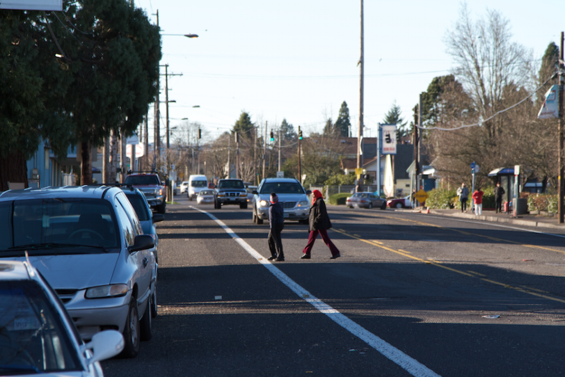
    What often passes for a neighborhood in America is a low grade assemblage of chain convenience stores, big box outlets, franchise muffler shops, multi-lane highways, and isolated cul-de-sacs. Even when it’s physically possible to walk or bike from Point A to Point B it’s not pleasant, safe, or convenient. I bet there are big parts of the town you live in that look like this.

    Screen Shot 2015-01-06 at 8.46.09 PM Screen Shot 2015-01-06 at 8.46.24 PM Screen Shot 2015-01-06 at 8.54.45 PM

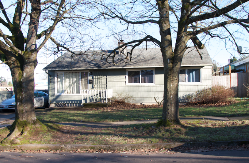
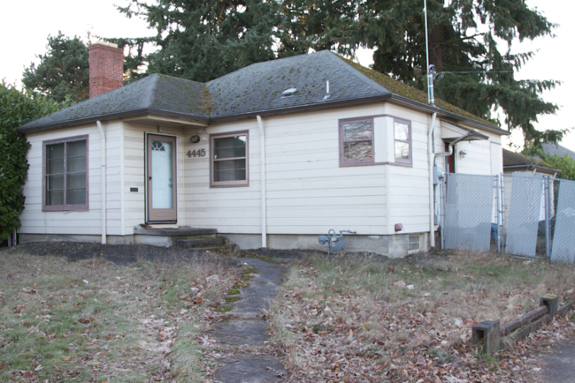
    Here’s what’s happened to the housing stock in previously desirable post war suburbs. They’ve aged and were passed over in favor of new development farther out on the edge of town. The homes are out of fashion. They’re too small. They don’t have the right modern features. There are questions about the quality of the local schools. And there’s a general perception that the kinds of people who remain may not make good neighbors. These properties sell at significantly lower prices relative to the larger region. It’s often assumed that they’re unlikely to appreciate in value so they’re considered a poor investment.

    Screen Shot 2015-01-06 at 8.42.30 PM Screen Shot 2015-01-06 at 8.47.44 PM Screen Shot 2015-01-06 at 9.15.26 PM Screen Shot 2015-01-06 at 8.43.09 PM Screen Shot 2015-01-07 at 1.35.38 AM

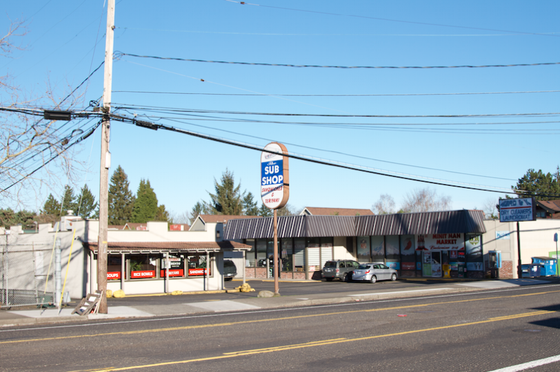
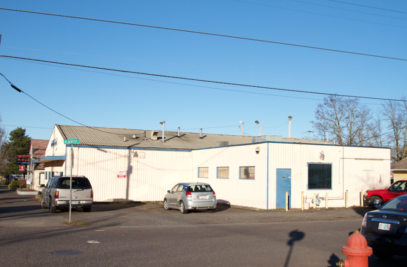
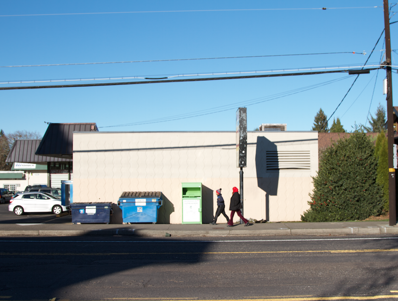
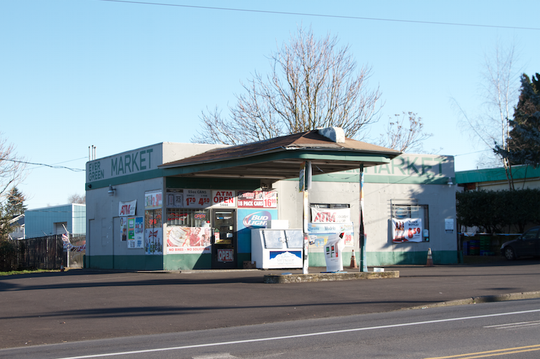
    This is what the commercial building stock is like. Cheap disposable plywood and cinder block boxes and industrial sheds set behind a patch of asphalt parking lot. These photos happen to be of Portland, Oregon, but they could be from a thousand other places. They’re all the same. This actually looks a lot like where I grew up in New Jersey.

    Sure, the sleek new Pearl District and Historic Pioneer Square are fashionable and urbane. But the vast majority of people will never live there. Most of Portland, like most of America, is sprawl. Forget what you’ve heard about urban growth boundaries, streetcars, and jack booted liberal thugs who make you live in a shoebox apartment and take away your car. The reality on the ground is that most of Portland is indistinguishable from everyplace else.

    Screen Shot 2015-01-07 at 1.34.34 AM Screen Shot 2015-01-07 at 1.44.53 AM

    But here’s the fascinating thing to me – and the source of my recent epiphany about aging sprawl. I always assumed that these neighborhoods would all devolve into the new slums – and many certainly are doing that. Ferguson, Missouri anyone? But it doesn’t have to go that way. These forgotten suburban neighborhoods can just as easily be the new sweet spots for small enterprise and a renewed middle class.

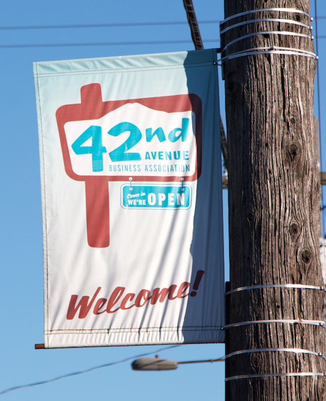
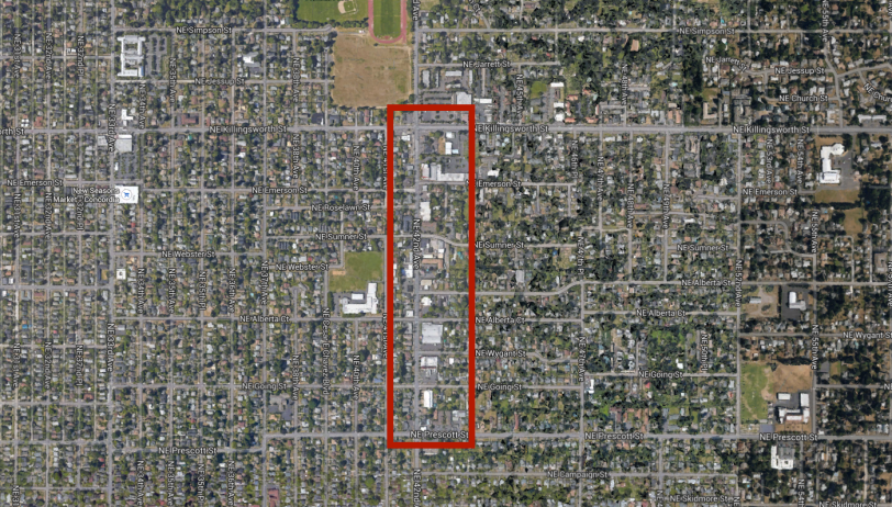
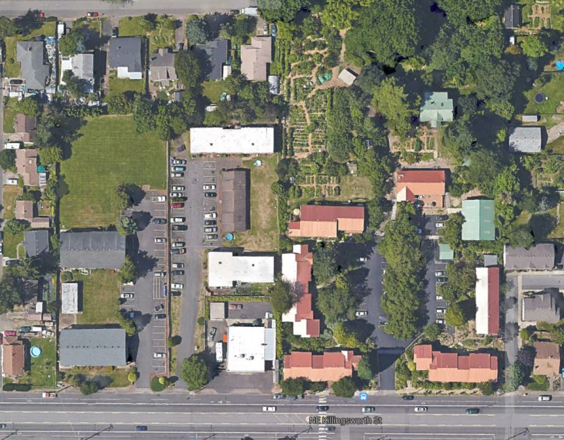
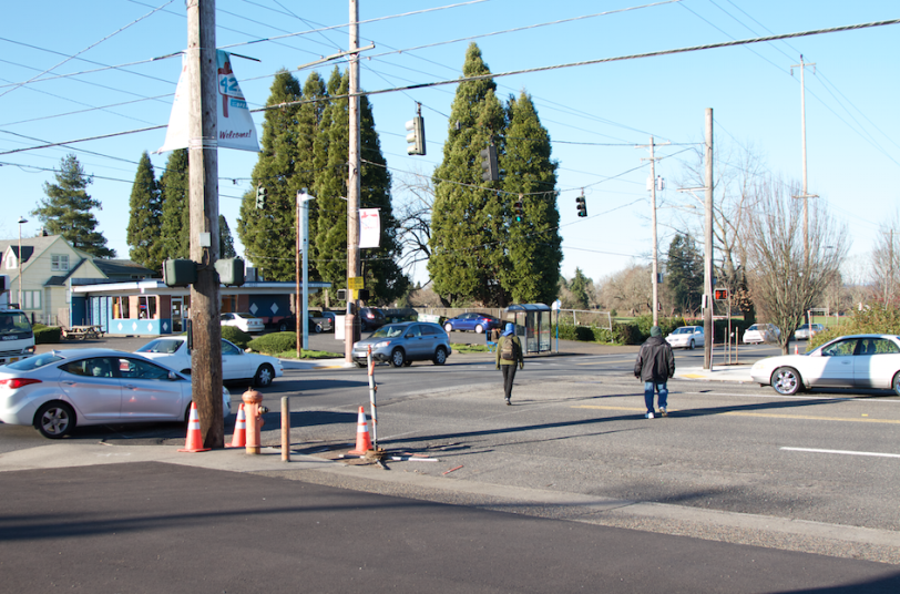
    I stumbled on the intersection of 42nd Avenue and Killingsworth (see all photos above) and thought, “What a crap hole.” But then I started to poke around for a couple of weeks. There’s more going on than immediately meets the eye.

    Here’s the deal. In the 1970’s and 80’s the cheapest real estate was in America’s abandoned downtowns and industrial zones. They were colonized by people looking for freedom – economic freedom from high rents and mortgages, as well as regulatory freedom to do as they wished without the Upright Citizen’s Brigade shutting them down. Now those places have all been picked over by high end developers and transformed into luxury “lifestyle” centers. The same is true of many close-in historic streetcar suburbs like Portland’s Alberta Arts District here. So if you either can’t afford, or simply don’t want, the premium city condo or the deluxe outer suburb McMansion… where do you go to do your own thing on a tight budget?

    IMG_3094 (800x533) IMG_3115 (800x533)   IMG_3122 (800x533) IMG_3126 (800x533) IMG_3109 (800x533)

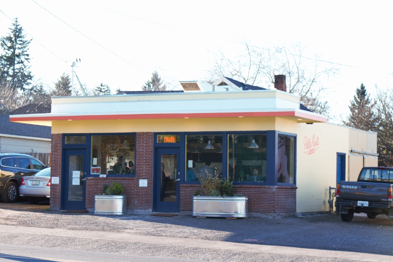
    This is Pollo Norte here on a miserable intersection where two busy roads collide. A friend brought me here for take away dinner one night and the food was simple, but spectacularly good and it was served by charming people. We arrived at 6:30 on a Tuesday and the place was packed. We were lucky to get the last whole chicken and some side dishes just as they sold out. The place is open until ten but they were overwhelmed by many more customers than they expected. This was their first month in business and they couldn’t keep up with demand. Aside from the great food, the customers all seemed to know each other and were in good spirits even though there wasn’t enough food to go around. They were celebrating the success of a great new local spot. Good beer and companionship were their consolation prizes. Now the owners need to ramp up production and work with their local suppliers to obtain more of the organic free range ingredients in keeping with their mission statement about quality and regional sustainability. This is a good problem for a new business to have.

    Screen Shot 2015-01-07 at 1.01.19 AM Google

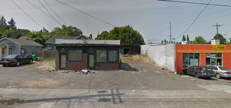
    By the way, I pulled this image off Google Street View. This is what the building looked like before the Pollo Norte folks scrubbed it clean, gave it some paint, and infused it with new life. It’s still a piece of crap concrete block bunker, but these buildings can be reinvented to good purpose with the right attitude and community support.

    unnamed-9 unnamed-10 unnamed-11 unnamed-12 unnamed-13
     unnamed-14

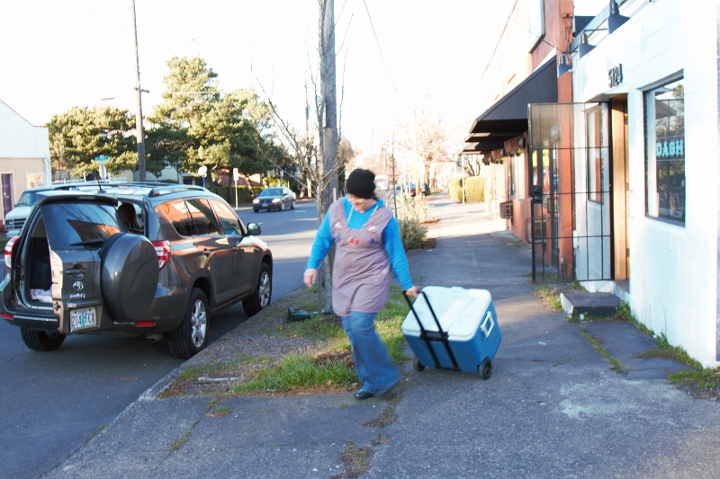
    Here’s another tiny concrete bunker a few blocks down the road. It’s owned by a woman who runs a 550 square foot commercial kitchen called Dash here. She rents out space to a variety of small scale producers who need an inspected facility in order to comply with health codes. When I dropped in I was able to speak with Nikki Guerrero as she was readying her Hot Mamma Salsa for market in local shops. here. Nikki started out selling small batches of salsa at farmers markets and now has expanded to several local grocers. She’s successful enough to support herself with the salsa. I don’t think Dash was intentionally organized as an incubator per se, but it serves as the next step up after people are ready to graduate from home cooking (Oregon has a cottage food law here) and street vending. This is not only profitable for the woman who owns the building and cost-effective for people who rent space, but it also cultivates community among various small business people as they share the space. The beauty of this business model is that any cheap ugly building in any uninspiring location can work so long as zoning and NIMBYs don’t get in the way. When your neighbors are industrial sheds and no name convenience stores you don’t get any push back.

    unnamed unnamed-1 unnamed-3 unnamed-4 unnamed-2
    unnamed-5

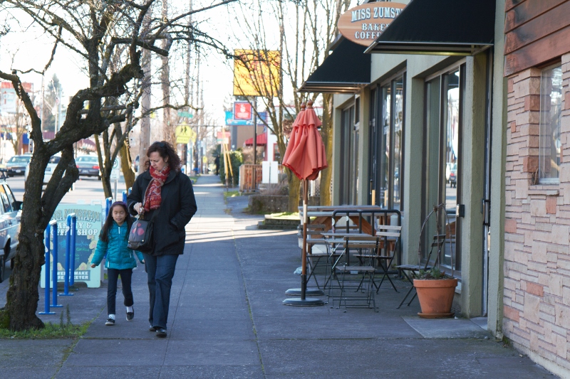
    Miss Zumstein’s Bakery across the street here is owned by Anja, a native Portlander who finds it difficult to afford property in the trendy parts of town now that the city has become much more expensive than in her girlhood. She recently opened her bakery/cafe on 42nd Ave. because so many of her friends have recently colonized the neighborhood. Price has pushed people into places to live that they wouldn’t necessarily have chosen otherwise. Now the big task at hand is how to make the ugly traffic corridor a proper walkable Main Street on a tight budget. She said the new Pollo Norte is a great indication of the kinds of small independent businesses she’s working with to carve out a new business zone in an otherwise not-so-great location. Anja was very supportive of the people at Dash (Hot Mama Salsa et al) and was thrilled that a new bicycle shop opened up nearby. Cheap ugly space and lots of enthusiastic like-minded people are their primary resources. 

    unnamed-16  unnamed-18 unnamed-20 unnamed-19 unnamed-21

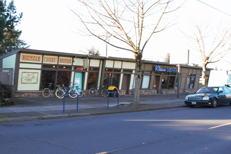
    This is Cat Six Bikes here. Two bike guys just opened up shop seven months ago. They were working for someone else in a more established neighborhood and finally decided to do their own thing. There are so many cyclists in Portland that if there’s a three mile stretch without a bike shop it’s actually a problem for a lot of people who need parts and service. They identified this location, realized it was more affordable than other more fashionable parts of town, and decided to fill the need.

    They almost rented the building that the Pollo Norte people are in now, but the current location was ultimately a better deal. The dentist who owns the building and runs his practice next door provided a deep discount on the rent because he lives in the immediate neighborhood and wanted to help establish more independent businesses in the area. The alternative probably would have been a check cashing place or a cell phone outlet. The guys were able to pull together their business and populate their initial stock and equipment for $10,000 which they had in savings. There was no need for a loan. They’re both handy and were able to do the carpentry and interior work for the shop themselves.

    Screen Shot 2015-01-07 at 1.54.40 AM GoogleScreen Shot 2015-01-07 at 1.57.11 AM GoogleScreen Shot 2015-01-07 at 1.52.51 AM 
    GoogleScreen Shot 2015-01-07 at 1.55.31 AM GoogleScreen Shot 2015-01-07 at 1.50.09 AM GoogleScreen Shot 2015-01-07 at 1.56.17 AM GoogleScreen Shot 2015-01-07 at 1.51.55 AM Google

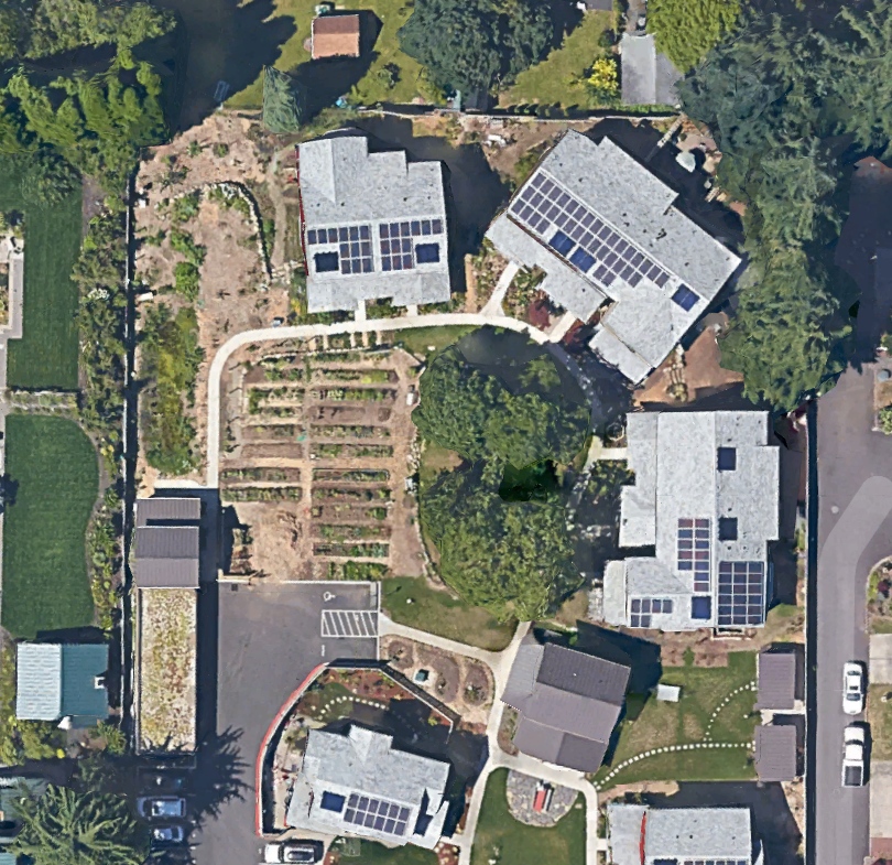
    But here’s the other thing they mentioned that got me exploring the rest of the neighborhood. The guys share a house – one lives with his girlfriend upstairs and the other lives downstairs. The house is nearby in the Cully neighborhood where little post war homes often have pretty large lots. Many neighbors do varying degrees of urban agriculture – some for a livelihood. This is absolutely not an option in the city center.

    Of course they ride their bikes to work since things are relatively close compared to the far more disbursed newer suburbs far from the downtown core. They were confident that over time they would be able to convince the city to implement road diets that would calm car traffic and make it safer and more pleasant to walk and ride bikes in the area. The primary factor in their favor is that highway expansion and car-oriented improvements are fantastically expensive, while bike infrastructure is ridiculously cheap. They also decided that what the neighborhood lacks in big city urban amenities it makes up for in gardening and door-to-door domestic community as well as significantly lower cost. Many of their friends had already moved to the area so they weren’t alone.

    IMG_2632 (800x533) IMG_2635 (800x533) Screen Shot 2015-01-08 at 9.42.51 PMIMG_3561 (800x533)IMG_3566 (533x800)

    And what about all those tragic little post war ranch homes? Well, it turns out that they’re radically less expensive than either a condo downtown or a McMansion in the newer suburbs. With a little love they can be transformed into something to be proud of. They’re bigger than an apartment, they have a garden, and they’re a whole lot closer to the city center. They’re also a short walk or bike ride to the emerging 42nd Ave, business cluster.

    I’m not saying that all, or even most, aging suburbs will blossom. But it’s at least a possibility. The real question to me is… what pushes a neighborhood down vs. what lifts it up? So far what I’m seeing is that a dead downtown contributes to even deader close in neighborhoods. A thriving downtown attracts more people to the city and creates an economic incentive for people to get creative with the reinvention of not-so-fabulous nearby areas. So if you want your struggling suburb to succeed, support your downtown.

    John Sanphillippo lives in San Francisco and blogs about urbanism, adaptation, and resilience at granolashotgun.com. He’s a member of the Congress for New Urbanism, films videos for faircompanies.com, and is a regular contributor to Strongtowns.org. He earns his living by buying, renovating, and renting undervalued properties in places that have good long term prospects. He is a graduate of Rutgers University.

  • The Cities Where African-Americans Are Doing The Best Economically

    The U.S. may have its first black president, but these have not been the best of times for African-Americans. Recent shootings of unarmed black teenagers and the murder of two New York City police officers have inflamed racial tensions. A Bloomberg poll in December found that 53% of respondents believed that race relations have declined since Obama was elected in 2008.

    Even if the results were not skewed by the immediate, impassioned responses to the recent tragedies, the persistent economic gap between whites and blacks is a more serious and deep-rooted problem. The unemployment rate for African-Americans stood at 10.4% in December, more than twice that of whites, as it has been formost of the past 40 years.

    Blacks’ real median household income ticked up to $34,598 in 2013, roughly 59% that of whites’, a ratio that has also not varied much since the Census Bureau began tracking this data in 1967.

    Where African-Americans took a significant step back in recent years was in household wealth, which plunged 31% during the recession, including a steep 35% decline in their retirement assets, which the Urban Institute suggests was partially due to the unemployed drawing down savings to cover living expenses. The wealth of white families fell a comparatively mild 11% from 2007-10.

    Yet economic conditions for African-Americans vary widely throughout the country. We decided to look into which of America’s 52 largest metropolitan areas present African-Americans with the best opportunities. We weighed these metropolitan statistical areas by three critical factors — homeownership, entrepreneurship, as measured by the self-employment rate, and median household income  — that we believe are indicators of  middle-class success. Data for those is from 2013. In addition, we added a fourth category, demographic trends, measuring the change in the African-American population from 2000 to 2013 in these metro areas, to judge how the community is “voting with its feet.” Each factor was given equal weight.

    Southern Exposure

    In the first half of the 20th century, African-Americans fled the former Confederate state for economic opportunity, to escape from institutional racism and, sometimes, for their lives. This pattern,notes demographer Bill Frey, began to reverse itself in the 1970s, with Southern states becoming destinations for black migrants. Since 2000, when the Census registered the first increase in the region’s black population in more than a century, this trend has accelerated, with African-Americans leaving not just the Northeast or Midwest, but the West Coast as well.

    Today, Dixie has emerged, in many ways, as the new promised land for African-Americans. In our survey the South accounts for a remarkable 13 of the top 15 metro areas.

    At the top of our list is Atlanta, long hailed as the unofficial capital of black America. The city, which in the 1960s advertised itself as “the city too busy to hate,” has long lured ambitious African-Americans. With its well-established religious and educational institutions, notably Spellman and Morehouse, which are ranked first and third, respectively, by US News among the nation’s historically black colleges, the area has arguably the strongest infrastructure for African-American advancement in the country. The region’s strong music and art scene has also made it an “epicenter for black glitterati” and culture.

    The superlatives extend well beyond glamour to the basics of everyday life. Some 46.9% the metro area’s black population owned their own homes as of 2013, well above the 38% major metro average for African-Americans. Atlanta’s African-Americans have a median household income of $41,800, also considerably above the major metro average, while their rate of self-employment, 17.1%, is second only to New Orleans.

    Clear evidence of the Atlanta area’s appeal can be seen in the growth of the black population, up 50% from 2000 through 2013. This is also well above the of 28% average growth in the African-American population in the nation’s 52 biggest metro areas during the same time.

    This shift of African-Americans to Southern metro areas is widespread. Population growth since 2000 above 40% was posted by No. 2 metro area Raleigh, N.C.; Charlotte, N.C. (sixth); Orlando (seventh) as well as the three cities that tie for eighth place: Miami; Richmond, Va.; and San Antonio. The same can be said of Texas’ other big cities: Austin (11th), Houston (12th) and Dallas-Fort Worth (13th).

    If there’s a challenger to Atlanta and the renewed Southern ascendency for African-Americans, it’s the greater Washington, D.C., area which ranks third. The median black household income in the metro area is $64,896, more than $20,000  above that of Atlanta and other top-ranked southern cities. Home ownership rates, at 49.2%, are also the highest in the nation.

    As in Atlanta, Washington’s black community has strong institutions of culture and higher education. The District is home to Howard University, the nation’s second-ranked historically black university. Washington’s urban core may be becoming less black — down from 60% in 2000 to under 50% in 2013– but this has been more than made up for by the burgeoning population of surrounding suburban areas such as Prince George’s County, which is majority black and relatively prosperous, with poverty rates well below those of the city. The key plus here appears to be the the federal government, which employs many people at high wages in the area.

    Incomes also have been boosted by the government in No. 4 Baltimore, which enjoys the third highest black median income and the third highest self-employment rate after Atlanta and New Orleans. As in Washington, much of this prosperity is not in the hardscrabble city core, but in surrounding suburban areas such as Baltimore County, where the black population grew from 20% of the total in 2000 to over 26% in 2010.

    Where African-Americans Are Struggling

    Many of the metro areas at the bottom of our list are the once mighty manufacturing hubs where Southern blacks flocked in the Great Migration: last place Milwaukee, followed by Grand Rapids, Mich.; Cincinnati (50th); Pittsburgh (tied for 48th) Cleveland (47th) and Buffalo (46th). African-Americans in these old industrial towns earn on average $10,000 to $15,000 less than their counterparts in Atlanta. Self-employment rates are half as high as those in our top 10 cities.

    Of course, none of this is too surprising, given the long-term economic malaise in the Rust Belt. But some of our most prosperous metro areas are also not working out well for blacks. These include San Francisco-Oakland, which tied with Pittsburgh for 48th, Los Angeles (40th) and Seattle (36th). In these cities, homeownership rates for African-Americans tend to be 10 to 15 percentage points lower, and self-employment close to half of what we see in greater Washington, Atlanta, Raleigh, Charlotte and the four big Texas cities.

    Blacks populations have declined in some of these metro areas, including San Francisco, which has seen a 9.1% drop since 2000, and Los Angeles, where the African-American population has fallen 8%. Chicago (31st), long a major center of black America, has seen a 4% drop since 2000, while the black population of the New York metro area (24th) has grown just 2.4%.

    Ironically, many of the metro areas at the top of our list tend to vote Republican. But many local Democratic politicians in the South support generally pro-business economic agendas. African-Americans, who tend to have fewer economic assets than whites, need growth to expand their opportunities; that’s one reason they do so well, relatively, in the South.

    But it’s not just growth. Places like Los Angeles and the Bay Area are losing black population because of their high housing prices. Hollywood stars and tech titans may not mind, but it’s tough for most everyone else to buy a house in the big California cities and New York. Housing prices in Atlanta and Houston, relative to incomes, are about half or more less than those in the Bay Area.

    Best Cities for African Americans
    Metropolitan Area Rank Score Home Ownrshp Rate Median Hshld Income Share of Self Emplymt Change in Population: 2000-2013
    Atlanta, GA 1      87.0 46.9% $41,803 17.1% 49.9%
    Raleigh, NC 2      84.6 46.7% $42,285 12.8% 55.9%
    Washington, DC-VA-MD-WV 3      83.2 49.2% $64,896 15.1% 19.7%
    Baltimore, MD 4      74.5 46.2% $47,898 15.0% 15.6%
    Charlotte, NC-SC 4      74.5 43.9% $36,522 13.6% 47.8%
    Virginia Beach-Norfolk, VA-NC 6      72.6 43.8% $40,677 13.2% 34.6%
    Orlando, FL 7      71.6 44.7% $33,982 11.0% 58.9%
    Miami, FL 8      68.3 44.9% $36,749 11.2% 32.4%
    Richmond, VA 8      68.3 47.7% $38,899 12.7% 17.9%
    San Antonio, TX 8      68.3 40.8% $41,681 9.3% 43.3%
    Austin, TX 11      67.8 43.6% $42,514 9.0% 39.2%
    Houston, TX 12      66.3 41.6% $40,572 9.9% 37.5%
    Dallas-Fort Worth, TX 13      64.4 38.7% $40,239 9.5% 45.2%
    Nashville, TN 13      64.4 41.8% $37,716 10.9% 31.9%
    Birmingham, AL 15      63.0 50.0% $33,092 15.0% 12.0%
    Memphis, TN-MS-AR 16      61.1 47.2% $31,981 13.5% 18.5%
    Jacksonville, FL 17      58.7 46.3% $32,469 10.8% 24.2%
    Boston, MA-NH 18      58.2 31.7% $46,556 9.1% 38.9%
    Riverside-San Bernardino, CA 18      58.2 40.9% $42,673 7.6% 32.6%
    Philadelphia, PA-NJ-DE-MD 20      57.2 47.3% $36,595 9.1% 13.3%
    Tampa-St. Petersburg, FL 21      52.9 36.6% $31,665 10.8% 40.9%
    Columbus, OH 22      51.4 35.9% $33,451 9.3% 40.0%
    Hartford, CT 22      51.4 33.3% $46,097 8.3% 24.4%
    New York, NY-NJ-PA 24      49.5 32.0% $43,381 10.9% 2.4%
    New Orleans. LA 25      46.6 45.5% $27,812 17.4% -13.4%
    Denver, CO 26      46.2 38.9% $41,215 6.3% 29.6%
    Las Vegas, NV 26      46.2 29.0% $34,281 8.3% 77.7%
    Phoenix, AZ 28      45.7 31.5% $36,779 6.8% 93.4%
    Portland, OR-WA 29      44.2 39.7% $33,699 5.8% 42.5%
    Kansas City, MO-KS 30      43.8 39.4% $35,277 8.3% 15.8%
    Chicago, IL-IN-WI 31      42.3 39.4% $34,287 9.4% -4.3%
    Oklahoma City, OK 32      41.8 39.2% $34,745 7.8% 18.4%
    San Jose, CA 33      40.9 32.9% $53,645 7.2% 11.4%
    Detroit,  MI 34      39.9 43.8% $30,162 9.5% -4.9%
    St. Louis,, MO-IL 35      39.4 42.4% $31,215 9.1% 6.9%
    Seattle, WA 36      37.5 28.3% $41,081 6.7% 36.4%
    Providence, RI-MA 37      36.5 29.3% $32,907 7.3% 52.5%
    Indianapolis. IN 38      35.6 35.4% $31,452 7.8% 29.1%
    San Diego, CA 39      33.7 30.1% $46,650 7.1% 2.6%
    Los Angeles, CA 40      32.2 32.9% $40,980 7.7% -8.0%
    Rochester, NY 41      31.7 34.2% $28,104 8.9% 16.2%
    Sacramento, CA 41      31.7 31.6% $33,530 7.2% 26.4%
    Salt Lake City, UT 41      31.7 18.7% $32,102 5.5% 94.2%
    Louisville, KY-IN 44      30.8 35.7% $28,826 7.4% 21.0%
    Minneapolis-St. Paul, MN-WI 44      30.8 26.3% $31,564 6.4% 69.2%
    Buffalo, NY 46      26.9 33.7% $26,210 9.4% 1.6%
    Cleveland, OH 47      26.0 37.8% $26,646 8.8% 0.0%
    Pittsburgh, PA 48      25.5 37.3% $28,088 8.0% 2.5%
    San Francisco-Oakland, CA 48      25.5 30.8% $40,152 7.3% -9.1%
    Cincinnati, OH-KY-IN 50      23.6 31.4% $28,684 8.7% 10.7%
    Grand Rapids, MI 51      21.6 29.9% $25,495 8.0% 19.3%
    Milwaukee,WI 52      14.4 29.9% $27,438 7.2% 10.8%
    Calculated from 2013 American Community Survey & EMSI data
    Analysis by Wendell Cox

    This piece first appeared at Forbes.

    Joel Kotkin is executive editor of NewGeography.com and Roger Hobbs Distinguished Fellow in Urban Studies at Chapman University, and a member of the editorial board of the Orange County Register. His newest book, The New Class Conflict is now available at Amazon and Telos Press. He is author of The City: A Global History and The Next Hundred Million: America in 2050. His most recent study, The Rise of Postfamilialism, has been widely discussed and distributed internationally. He lives in Los Angeles, CA.

  • Asians: America’s Fastest Growing Minority

    Asians have emerged as the fastest growing of the three major ethnic and minority populations in the United States. According to Census Bureau data, the number of US native and foreign-born Asian residents rose 56 percent from the 2000 Census to the 2013 American Community Survey (one year release). This is calculated by comparing estimates based on interviews with residents who have classified themselves as a single race and Asian. In the last two censuses, respondents have been asked to designate their race, with the option of selecting more than one ("combinations"). For simplicity, this analysis uses "one race" rather than "combination" data for Asians and African-Americans as well as all data for Hispanics or Latinos. In 2010, 4.8 percent of the nation’s population was "Asian alone" (not in combination with another race or ethnicity).

    Overall Population Growth Rates: 2000 to 2013

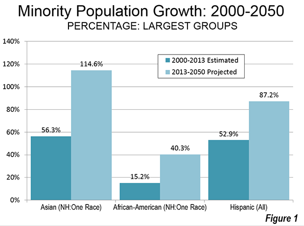
    The 56 percent growth in the Asian population was slightly higher than the 53 percent growth among Hispanics between 2000 and 2013. Asian population growth was also more than three times that of African-Americans, at 15 percent.

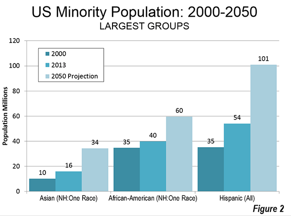
    Due largely to the greater size of  population of Hispanics and African Americans, the larger Asian percentage increase represented the second smallest numeric increase among the three groups over the past decade. The growth in Hispanics was 19 million, from a 2000 population of 35 million to 2013 population of 54 million. The Asian population grew 5.8 million, from a 2000 population of 10.2 million to a 2013 population of 16.0 million. The African-American population increased somewhat less slowly, at 5.3 million, despite a 2000 population that was nearly 3.5 times the Asian population.

    The Census Bureau projects a continuation of similar trends. Between 2013 and 2050, the Asian population (one-race) is expected to increase 115 percent to 34.3 million. This is more than four times the projected national growth rate over the period. The Hispanic population is projected to grow at a slightly lower rate, at 88 percent with a 2050 population of 101 million. The African-American population would continue with the slowest growth of ethnic minorities, adding 40 percent and reaching 16 million by 2050 (Figures 1 and 2), although they will grow faster than the Non-Hispanic White population, which is expected to decline by five percent.


    Census Bureau Definition of Asian

    Asia is by far the largest continent both in the land area and population. It includes three of the four most populous nations in the world, China, India, and Indonesia (the United States is the third most populous). The Census Bureau classifies people within South Asia (the Indian subcontinent), Southeast Asia and East Asia as Asian, based on their responses to surveys.

    As a result, the census definition covers a broad area from the western border of Pakistan, through India, and Bangladesh along with Southeast Asia, China, the Philippines, Japan and Korea.

    Distribution of Asian Origins

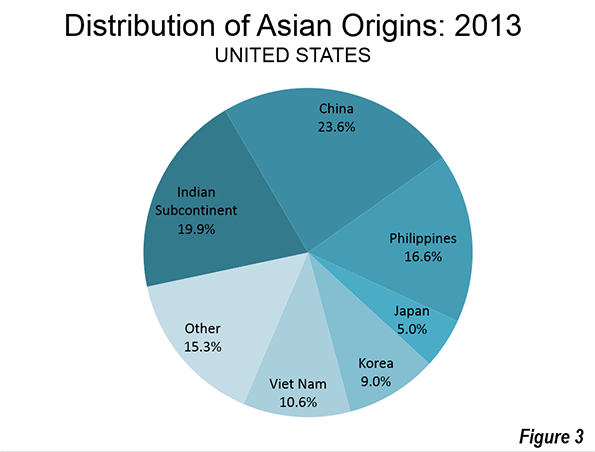
    China, According to the American community survey for 2013, was the origin to the highest number of Asians in the United States, at approximately 24 percent. The Indian subcontinent has the second largest number at approximately 20 percent (including India, Pakistan, Bangladesh and Sri Lanka). The Philippines represents approximately 17 percent of the Asian population, while Vietnam has approximately 11 percent, Korea nine percent, and Japan five percent. Another 15 percent are classified as "other Asian," indicating origins in one of the other areas of Asia, such as Indonesia or Thailand (Figure 3). Some of these might also be Chinese by ethnicity.

    Between 2000 and 2013, the largest numeric growth was among Indian subcontinent and "other Asian" origins, both at 90 percent. Chinese origins increased 56 percent, while the Japanese population fell slightly (minus 0.3 percent).

    Population Concentrations

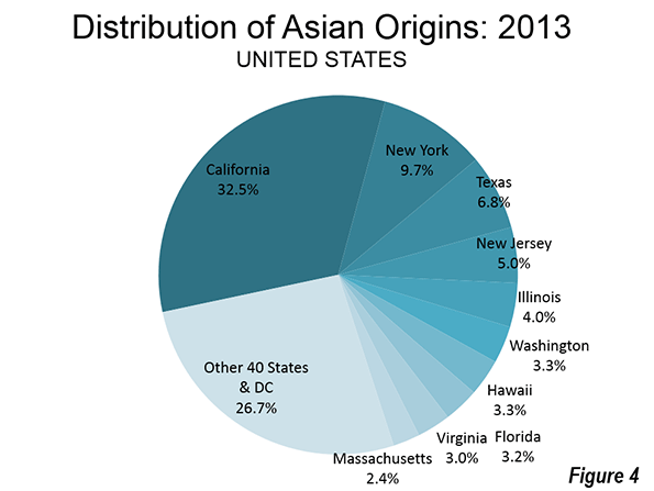
    The Asian population is unusually concentrated. The 10 states with the largest Asian population account for nearly three-quarters of the total (Figure 4). California had the largest Asian population, with approximately one-third of the Asian population in the United States. Approximately 5.2 million Asians lived in California. This is more than three times the Asian population living in second-ranked New York, with 1.6 million. Texas ranks third in Asian population, with 1.1 million. Five other states have more than one half million Asians, including New Jersey, Illinois, Washington, Hawaii, and Florida.

    Who Lives Where?

    California’s concentration of Asian population extends to all seven census categories. California has more Indian subcontinent, Chinese, Filipino, Japanese, Korean, Vietnamese, and other Asian residents than any other state. New York follows California in the number of Asians with origins in China, the Korea and "other Asian" areas. Hawaii has the second most people with Japanese and Philippine origins. Texas is second in Vietnamese origins and New Jersey ranks second in Indian subcontinental origins. In each of the 10 most Asian states, the group trails Hispanics

    Comparisons

    In some states, Asians are already the second largest racial minority, behind Latinos. Perhaps most significantly, California’s 5.2 million Asians constitute more than double the 2.3 million African-American citizens. In three nearby states, Asians are approximately double or more the African-American population, including Washington, Oregon, Utah, Idaho, and Montana.

    In one state, Hawaii, Asians represent the largest minority. Hawaii has 530,000 Asian residents, which is nearly 4 times the Hispanic population and more than 17 times the African-American population. Asians represent the second largest minority in 10 states.

    Wendell Cox is principal of Demographia, an international public policy and demographics firm. He is co-author of the “Demographia International Housing Affordability Survey” and author of “Demographia World Urban Areas” and “War on the Dream: How Anti-Sprawl Policy Threatens the Quality of Life.” He was appointed to three terms on the Los Angeles County Transportation Commission, where he served with the leading city and county leadership as the only non-elected member. He was appointed to the Amtrak Reform Council to fill the unexpired term of Governor Christine Todd Whitman and has served as a visiting professor at the Conservatoire National des Arts et Metiers, a national university in Paris.

    Photo: Hsi Lai Temple (Buddhist), Los Angeles By Aaron Logan [CC BY 1.0], via Wikimedia Commons.

  • The Geography of Lower, Middle and Higher Income Households in the United States

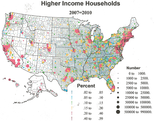
    Data on incomes of households for US counties allow us to see the geographic patterns of poorer, average and richer households. Covering the numbers of households and shares of households that are relatively poor to rich, we get a fascinating picture of American economic diversity. 

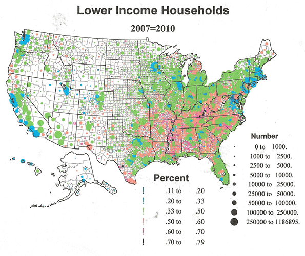
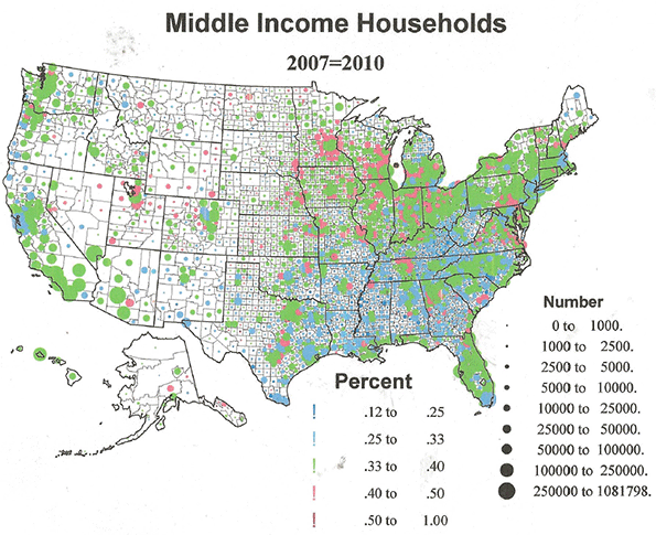
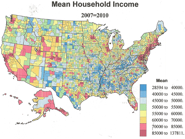
    Four maps are used, one each for numbers and shares of lower income: under $40,000, middle income: $40,000 to $100,000, and higher income: over $100,000. These three are the main focus, but I also show a map of mean incomes (aggregate income of the county divided by the number of households), instead of the familiar map of median or typical income, which provides us with some interesting insight into the impact of ultra-affluent households.

    In addition, I present a few tables listing the more “extreme” counties: those highest and lowest in mean income, those with the highest share of rich, middle class and poorer households, and counties with the greatest inequality. These numbers, it should be add, do not factor in the cost of living, nor distinguish between families and non-families, which might produce very different results.

    Lower income households

    Areas with highest shares of lower income households (< $40,000), shown in orange, red and almost black, are quite distinct. Poorest America is concentrated within a massive contiguous zone, punctuated by less poor urban islands, spreading over much of the South and border states, and also encompassing Appalachia and Ozarkia. The northern portion, MO, northern AR, KY, TN, WV, into OH, and western VA and NC, are mainly white and  rural, small town. And there are some mainly white rural low income counties in TX, LA, MS, AL, GA, SC, and NC. But lower income black households dominate in AR, MS, AL, GA, SC, NC into VA, and some American Indian areas in OK.

    Outside the southern core region, there are several  distinct areas of poorer households, (1), core metropolitan counties in Megalopolis (Baltimore, Philadelphia, NJ-NY), (2), heavily Hispanic areas in Texas, along the border with Mexico, (3), Indian reservation areas across the West, (4) and most interesting, several clusters of declining resource dependent counties in ME, northern MI, and a relatively unknown stretch of resource dependent communities in the Pacific Northwest and CA. . 

    In contrast areas with the lowest shares of low income households include suburban Megalopolis, Minneapolis and Chicago, and the Pacific coastal metropolitan areas in general.

    Table 1 lists the very highest share of poorer households for the lower income, < $40,000. The map shows the 30 counties from Table 1 with a higher than 70% share of lower income. These include 11 from Appalachia. Even more counties, 19, are minority dominated. Two are Hispanic and one American Indian. Of the 44 counties with highest share of the poorest category, < $25,000, 14 are in Appalachia, 8 are Hispanic, mostly in TX, 19 are black majority counties in the south,  1 is Indian and 2 are characterized by many poor whites as well as blacks.

    Table 1: Highest shares of low income households
    Counties Poor % Mean Income
    Owsley County, Kentucky 64.4%  $         30,654
    Brooks County, Texas 58.0%  $         38,721
    Allendale County, South Carolina 57.5%  $         37,662
    Breathitt County, Kentucky 57.0%  $         36,737
    Holmes County, Mississippi 57.0%  $         31,294
    Zavala County, Texas 56.7%  $         30,994
    Hancock County, Georgia 56.2%  $         30,209
    Wolfe County, Kentucky 56.2%  $         28,594
    Clay County, Kentucky 55.7%  $         33,904
    Chicot County, Arkansas 55.5%  $         37,631
    McDowell County, West Virginia 55.1%  $         31,002
    McCreary County, Kentucky 55.1%  $         31,517
    Knox County, Kentucky 54.6%  $         35,052
    Leflore County, Mississippi 54.6%  $         35,095
    Noxubee County, Mississippi 54.5%  $         34,046
    Wilcox County, Alabama 54.4%  $         34,585
    Issaquena County, Mississippi 54.3%  $         33,698
    Willacy County, Texas 53.6%  $         36,137
    Magoffin County, Kentucky 53.3%  $         36,653
    Clinton County, Kentucky 53.0%  $         33,799
    Jackson County, Kentucky 53.0%  $         32,884
    Greene County, Alabama 52.7%  $         36,678
    Lee County, South Carolina 52.6%  $         36,284
    Hancock County, Tennessee 52.6%  $         31,170
    Taliaferro County, Georgia 52.4%  $         35,122
    Galax city, Virginia 52.2%  $         39,006
    East Carroll Parish, Louisiana 51.9%  $         51,241
    Quitman County, Mississippi 51.7%  $         33,462
    Hudspeth County, Texas 51.5%  $         34,453
    Telfair County, Georgia 51.4%  $         34,131
    Shannon County, South Dakota 51.3%  $         31,875
    Kinney County, Texas 51.0%  $         36,953
    Claiborne County, Mississippi 51.0%  $         33,386
    Elliott County, Kentucky 51.0%  $         34,786
    Zapata County, Texas 51.0%  $         42,526
    Williamsburg County, South Carolina 51.0%  $         36,065
    Jefferson County, Mississippi 50.9%  $         33,777
    Starr County, Texas 50.9%  $         39,871
    Costilla County, Colorado 50.8%  $         38,967
    Tallahatchie County, Mississippi 50.8%  $         34,418
    Lake County, Tennessee 50.7%  $         37,016
    Coahoma County, Mississippi 50.6%  $         42,045
    Bell County, Kentucky 50.4%  $         36,482
    Sunflower County, Mississippi 50.0%  $         37,361

    It is fascinating that while the poor black, Hispanic and Indian poorer areas tend to vote Democratic, the northern poor white areas, especially in Appalachia, now generally support Republicans.

    Middle income households:  $40,000-$100,000

    While it could be argued that my $40 to $100k range is too narrow for middle classes, I don’t think so, at least for most areas, and I feel that the data reveal the income polarization of American society, with middle classes getting squeezed by the rising shares of the poorer and richer.

    From the map the most telling feature is how sparse are counties with the highest shares of middle incomes. There is a polarization, reflecting a processes of deindustrialization, and the increasing income disparities between professional and the new service workers.  Shares over 40% are predominantly suburban and exurban in the eastern half of the country. They are well represented across the South, most prominently in TX, OK, TN, and VA, but far more pervasive in the Midwest, most notably in MN (greater Minneapolis), WI, IA, MO, IL, IN, and to some degree around cities that still have an industrial base and/or a productive hinterland. A secondary set of counties with high middle income shares are spread across the Mountain West, but different in character, often rural to small city, and notably in UT, CO, and WY. Note their total absence in mighty CA, where the middle class, as we define it, is clearly shrinking.

    In table 2 I list the 45 counties with 46 to 64% middle income shares. Many are quite small and none is very populous. The state with the most such counties is UT, then MN, CO, VA, NE, and IA. It may be significant that Utah has by far the highest share of these high middle income counties. Generally counties with high shares of middle class households have the lowest income inequality.

    Table 2: Highest shares of middle income households
    Counties Mid-Income Households Low Income % Mid-Income % High Income %
    Skagway Municipality, Alaska              206 16.8% 53.4% 27.2%
    Craig County, Virginia           1,045 32.9% 52.5% 10.0%
    McPherson County, Nebraska              104 27.5% 51.0% 5.9%
    Reagan County, Texas              581 27.7% 50.9% 14.2%
    Bath County, Virginia           1,029 36.6% 50.8% 5.6%
    Rich County, Utah              386 24.7% 50.7% 12.1%
    Tooele County, Utah           8,937 27.5% 50.4% 18.0%
    Storey County, Nevada              912 28.4% 49.9% 18.0%
    Moody County, South Dakota           1,281 33.5% 49.4% 9.6%
    Manassas Park city, Virginia           2,071 17.9% 49.2% 28.5%
    Iowa County, Iowa           3,230 35.0% 48.5% 12.9%
    Grundy County, Iowa           2,442 32.9% 48.4% 13.5%
    Lyon County, Iowa           2,095 38.4% 48.0% 8.4%
    Grand County, Colorado           2,557 28.8% 48.0% 18.9%
    Chisago County, Minnesota           9,267 26.6% 47.9% 20.8%
    Lincoln County, Wyoming           3,094 32.5% 47.8% 15.7%
    Greenlee County, Arizona           1,586 38.5% 47.7% 6.3%
    Box Elder County, Utah           7,436 32.8% 47.6% 13.9%
    King William County, Virginia           2,814 26.7% 47.6% 20.7%
    Lincoln County, South Dakota           7,494 25.2% 47.5% 23.4%
    Teton County, Idaho           1,791 32.8% 47.3% 14.1%
    Routt County, Colorado           4,766 22.6% 47.0% 21.9%
    Paulding County, Georgia        21,807 28.7% 47.0% 18.9%
    Sherburne County, Minnesota        13,684 22.2% 46.8% 26.7%
    Juab County, Utah           1,422 34.8% 46.7% 13.8%
    Calumet County, Wisconsin           8,505 27.7% 46.6% 20.6%
    Wayne County, Utah              418 37.5% 46.5% 13.3%
    Dodge County, Minnesota           3,392 27.3% 46.5% 21.7%
    Sioux County, Iowa           5,351 37.3% 46.4% 10.0%
    Stanton County, Kansas              339 34.6% 46.4% 8.9%
    Iowa County, Wisconsin           4,498 35.3% 46.3% 14.1%
    Cameron Parish, Louisiana           1,233 35.1% 46.3% 16.4%
    Nicollet County, Minnesota           5,624 31.7% 46.3% 16.1%
    Wabaunsee County, Kansas           1,272 39.3% 46.3% 11.1%
    Wasatch County, Utah           3,308 24.5% 46.2% 23.9%
    Pershing County, Nevada              914 37.6% 46.2% 11.2%
    Ouray County, Colorado              783 30.0% 46.0% 19.0%
    Morgan County, Utah           1,247 21.0% 45.9% 27.0%
    Park County, Colorado           3,248 24.1% 45.9% 24.0%
    Logan County, Nebraska              147 42.8% 45.9% 4.4%
    Carson County, Texas           1,109 34.9% 45.9% 16.1%
    Emery County, Utah           1,735 38.4% 45.9% 9.6%
    Cass County, Nebraska           4,408 27.5% 45.9% 21.2%
    Jasper County, Indiana           5,602 33.7% 45.8% 15.0%
    Polk County, Nebraska           1,019 40.1% 45.7% 8.6%


    High Income counties

    The geography of higher income counties is again completely different – and rather amazing. Higher shares of richer households are located overwhelmingly in large metropolitan areas in all regions of the country, predictably but most dominant around greater New York City. The few rural small town counties are generally the resort playgrounds of the rich, as found in CO. 

    Table 3A lists the counties with the highest shares of higher incomes (>$100,000). Of the 32 higher income counties, 23 are in Megalopolis, including the 3 richest areas, from 53% to 59% high income. Of the 32 richest counties, 11.1% to 19% of the households are above $200,000, again 22 counties are in Megalopolis, then 4 in CA (Bay Area). 

    Table 3A: Highest share of rich households
    Counties Rich % $100-200,000 Rich % Above $200,000 Mean Income
    Falls Church city, Virginia 35.4% 19.6%  $  134,264
    Hunterdon County, New Jersey 33.0% 17.5%  $  130,723
    Fairfax County, Virginia 35.8% 17.4%  $  132,662
    Loudoun County, Virginia 41.7% 17.4%  $  134,098
    Marin County, California 28.2% 16.8%  $  128,544
    Somerset County, New Jersey 32.6% 16.0%  $  129,222
    Fairfield County, Connecticut 25.0% 16.0%  $  130,074
    Westchester County, New York 24.7% 15.8%  $  128,127
    New York County, New York 19.5% 15.8%  $  122,620
    Morris County, New Jersey 32.7% 15.6%  $  128,371
    Howard County, Maryland 36.3% 15.4%  $  123,234
    Montgomery County, Maryland 31.6% 15.3%  $  125,557
    Pitkin County, Colorado 20.0% 15.1%  $  134,267
    Arlington County, Virginia 32.4% 15.1%  $  121,315
    Nantucket County, Massachusetts 26.3% 14.4%  $  137,811
    Nassau County, New York 33.0% 13.9%  $  121,567
    San Mateo County, California 29.1% 13.8%  $  118,774
    Santa Clara County, California 30.3% 13.5%  $  113,161
    Skagway Municipality, Alaska 14.2% 13.0%  $    93,822
    Fairfax city, Virginia 35.4% 12.6%  $  114,007
    Goochland County, Virginia 27.9% 12.5%  $  118,743
    Los Alamos County, New Mexico 40.3% 12.3%  $  117,400
    Williamson County, Tennessee 31.1% 12.3%  $  114,801
    Bergen County, New Jersey 28.4% 12.1%  $  111,219
    Borden County, Texas 16.4% 11.9%  $    93,417
    Chester County, Pennsylvania 29.6% 11.8%  $  110,798
    San Francisco County, California 24.9% 11.7%  $  102,267
    Monmouth County, New Jersey 29.3% 11.7%  $  109,042
    Alexandria city, Virginia 28.4% 11.2%  $  110,671
    Norfolk County, Massachusetts 28.7% 11.2%  $  108,887
    Douglas County, Colorado 38.4% 11.1%  $  117,692
    Rockland County, New York 30.1% 11.1%  $  105,450

    Table 3B which lists the 37 counties with the highest MEAN incomes, including 9 around Washington DC, 8 around New York, and 3 around San Francisco, reinforcing the fact of the concentration of wealth.   

    Table 3B: Mean Income (highest)
    County Rich % $100-200,000 Rich % Above $200,000 Mean Income
    Nantucket County, Massachusetts 26.3% 14.4%  $  137,811
    Pitkin County, Colorado 20.0% 15.1%  $  134,267
    Falls Church city, Virginia 35.4% 19.6%  $  134,264
    Loudoun County, Virginia 41.7% 17.4%  $  134,098
    Fairfax County, Virginia 35.8% 17.4%  $  132,662
    Hunterdon County, New Jersey 33.0% 17.5%  $  130,723
    Fairfield County, Connecticut 25.0% 16.0%  $  130,074
    Somerset County, New Jersey 32.6% 16.0%  $  129,222
    Marin County, California 28.2% 16.8%  $  128,544
    Morris County, New Jersey 32.7% 15.6%  $  128,371
    Westchester County, New York 24.7% 15.8%  $  128,127
    Montgomery County, Maryland 31.6% 15.3%  $  125,557
    Howard County, Maryland 36.3% 15.4%  $  123,234
    New York County, New York 19.5% 15.8%  $  122,620
    Nassau County, New York 33.0% 13.9%  $  121,567
    Arlington County, Virginia 32.4% 15.1%  $  121,315
    San Mateo County, California 29.1% 13.8%  $  118,774
    Goochland County, Virginia 27.9% 12.5%  $  118,743
    Douglas County, Colorado 38.4% 11.1%  $  117,692
    Los Alamos County, New Mexico 40.3% 12.3%  $  117,400
    Williamson County, Tennessee 31.1% 12.3%  $  114,801
    Fairfax city, Virginia 35.4% 12.6%  $  114,007
    Santa Clara County, California 30.3% 13.5%  $  113,161
    Bergen County, New Jersey 28.4% 12.1%  $  111,219
    Delaware County, Ohio 32.3% 10.6%  $  110,917
    Chester County, Pennsylvania 29.6% 11.8%  $  110,798
    Alexandria city, Virginia 28.4% 11.2%  $  110,671


    Table 3C lists the counties with the most extreme income inequality, characterized by high shares of the poorer and the richer, with lower shares of the middle classes. The list includes both inequality based on high shares of lower income (<$4,000) and higher income (>$100,000), and as estimated from highest shares of the poorest (<$25,000) and richest (>$200,000) households. Many counties are on both lists. New York (Manhattan) and San Francisco top both lists. Other counties prominent on both include Fairfield, CT; Westchester, NY; Norfolk, MA; Monmouth, NY; Contra Costa, CA; Rockland NY; and Goochland, VA – all suburban or exurban. Summit, UT and Pitkin, CO are rural resort areas in the west.  Many of the core counties on the lists are high in minority populations, e.g., New York; Fulton, GA; Washington, DC; and Alameda, Contra Costa, Orange, and Ventura, CA.

    Table 3C: Most Unequal Counties
    Counties <$40k $40-$100k >$100k
    New York County, New York 35.0% 26.5% 35.2%
    San Francisco County, California 30.9% 28.8% 36.5%
    Pitkin County, Colorado 30.0% 29.8% 35.1%
    Fulton County, Georgia 36.7% 29.9% 28.7%
    Westchester County, New York 25.7% 30.1% 40.6%
    District of Columbia, District of Columbia 35.8% 30.1% 29.6%
    Fairfield County, Connecticut 25.1% 30.5% 41.0%
    Rappahannock County, Virginia 35.3% 30.5% 31.3%
    Goochland County, Virginia 25.2% 30.8% 40.4%
    Rockland County, New York 24.6% 31.2% 41.2%
    Monmouth County, New Jersey 24.2% 31.4% 41.0%
    Kendall County, Texas 31.4% 32.0% 33.2%
    Boulder County, Colorado 32.4% 32.1% 31.3%
    Alameda County, California 29.6% 32.5% 34.1%
    Norfolk County, Massachusetts 24.1% 32.6% 39.9%
    Mercer County, New Jersey 28.7% 32.9% 35.0%
    Middlesex County, Massachusetts 25.6% 33.0% 37.7%
    Contra Costa County, California 24.9% 33.0% 38.4%
    Essex County, Massachusetts 32.6% 33.1% 30.6%
    Summit County, Utah 23.5% 33.5% 38.9%
    Union County, New Jersey 30.2% 33.7% 32.0%
    Bristol County, Rhode Island 30.7% 33.9% 31.6%
    Santa Cruz County, California 31.2% 33.9% 30.8%
    Napa County, California 29.4% 33.9% 32.4%
    Richmond County, New York 29.1% 34.2% 33.0%
    Ventura County, California 25.1% 34.6% 36.1%
    Orange County, California 25.3% 34.6% 36.0%
    St. Johns County, Florida 30.8% 34.9% 29.0%
    Montgomery County, Pennsylvania 24.5% 35.2% 36.3%
    Oakland County, Michigan 29.9% 35.2% 30.8%
    Newport County, Rhode Island 29.4% 35.5% 30.3%
    King County, Washington 28.4% 35.6% 31.8%
    Placer County, California 25.6% 35.6% 34.6%
    San Diego County, California 31.4% 35.6% 28.5%
    Counties <$25k >$200k
    New York County, New York 24.5% 15.8%
    San Francisco County, California 20.9% 11.7%
    Borden County, Texas 18.9% 11.9%
    Fairfield County, Connecticut 15.3% 16.0%
    Westchester County, New York 15.2% 15.8%
    Norfolk County, Massachusetts 15.0% 11.2%
    Pitkin County, Colorado 14.6% 15.1%
    Monmouth County, New Jersey 14.4% 11.7%
    Contra Costa County, California 14.3% 10.7%
    Rockland County, New York 14.2% 11.1%
    Bergen County, New Jersey 13.9% 12.1%
    Santa Clara County, California 13.5% 13.5%
    Nantucket County, Massachusetts 13.5% 14.4%
    Goochland County, Virginia 13.3% 12.5%
    Summit County, Utah 13.2% 10.8%
    Marin County, California 13.1% 16.8%
    Lake County, Illinois 12.6% 10.9%
    Chester County, Pennsylvania 12.0% 11.8%
    Alexandria city, Virginia 11.6% 11.2%
    San Mateo County, California 11.6% 13.8%
    Nassau County, New York 11.4% 13.9%
    Williamson County, Tennessee 10.8% 12.3%
    Delaware County, Ohio 10.7% 10.6%
    Fauquier County, Virginia 10.5% 10.1%
    Arlington County, Virginia 10.3% 15.1%
    Putnam County, New York 10.0% 10.4%

    It doesn’t take much of a cynic to conclude that the way to get rich is to be around Wall Street (the pinnacle of capital) or around the U.S. Congress, the pinnacle of government largess (including lobbyists for Wall Street). Do you doubt? Please see the final map of mean income. Yes, Seattle, Denver, Chicago, Minneapolis, and Atlanta are represented at the table, as is the San Diego to San Francisco corridor, but Megalopolis dwarfs them all.

    As if this were not scary enough, consider the relation between these income figures and how Americans voted in for president in 2012. Without showing a map, I can simply state that the areas that provided the extra millions of votes for Obama are precisely the giant metropolitan areas, suburbs and exurbs as well as core counties, with the highest mean income and shares of the rich. While it is also true that Obama carried poorer minority areas, rural as well as metropolitan, he LOST most areas of poor to middle income whites, urban and rural. Weirdly, both the rich (professionals) and the poor (minorities) in the most unequal counties are cores of Democratic strength. The traditional economic basis for Democrat versus Republican partisan difference has essentially disappeared, replaced by distinctions of culture and race, leading to the current screwed up state of not only our political party system, but of governance more widely, and yes, of society itself.

    Richard Morrill is Professor Emeritus of Geography and Environmental Studies, University of Washington. His research interests include: political geography (voting behavior, redistricting, local governance), population/demography/settlement/migration, urban geography and planning, urban transportation (i.e., old fashioned generalist).

  • Divergent Demographic and Economic Trends in Chicago

    The fortunes of the city of Chicago have become clouded in recent years as concerns over its weakening finances and heavy debt obligations have grown. The tally for the unfunded public employee debt obligations of Chicago’s overlapping units of local governments (including those for public schools, parks, and county services) is now approaching $30 billion. Moreover, the city government has been criticized for its practices of funding current public services with proceeds from the issuance of long-term debt and the long-term leases of public assets (such as its parking meter system). However, faith in Chicago’s ability to address its debts has not fallen so far as that in Detroit’s, chiefly because the Windy City’s economic trends display more vibrancy.

    Population change is a prominent indicator of the health of an urban economy because it reflects a city’s ability to hold on to its residents (as opposed to losing them to the suburbs or other locales). Over the past few decades, similar to other central cities, Chicago has experienced an erosion in its population share of the broader metropolitan statistical area (MSA);[1] in contrast, the surrounding suburbs have seen their share climb. According to the U.S. Census, Chicago held 38% of the MSA’s population in 1980, with this share falling to 35% by 1990; in the subsequent 20 years, Chicago’s population share of the MSA decreased another 3 percentage points per decade, reaching 29% by 2010 (see table below). During the 1980–2010 period, Chicago lost a total of over 300,000 residents. At the same time, suburban Chicago gained close to 2 million in population. Since 2010, the city of Chicago’s population and population share of the MSA have strengthened somewhat, though the (off-Census year) estimates are probably not as reliable.

    While population trends can be telling for a city’s prospects, they can also belie changes in its residents’ wealth and income. Despite the city of Chicago’s population loss over the past few decades, its economic trends have been generally more encouraging.[2] Household income is an important indicator of Chicago’s fortunes relative to those of its suburbs. In 1990, median household income in the city was just 67% of the median household income in suburban Chicago. By 2010, this income ratio had climbed to 73% (see table below). Decomposing household income statistics by (self-reported) racial/ethnic group reveals that this trend was pervasive for the three largest groups: non-Hispanic white, black, and Hispanic. The ratio of city median income to suburban median income among white households experienced the greatest change; it rose from 77% in 1990 to 98% (near parity) in 2010.

    These robust trends are echoed by Chicago’s rising share of adults aged 25 and older who have attained at least a bachelor’s degree. In 1990, among adults aged 25 and older, 19% of those residing in the city had attained a four-year college degree versus 28% of those residing in the suburbs (see table below). By 2010, Chicagoans in this age demographic had almost reached the same share in this regard as their suburban counterparts (33% for city residents versus 35% for suburban residents). The non-Hispanic whites again experienced the greatest change among the three largest racial/ethnic groups. In 1990, 29% of the white city population aged 25 and older had a four-year college degree—the same percentage as the white suburban population in this age demographic; however, by 2010, 55% of such white city dwellers had a bachelor’s degree, while 39% of their white suburbanite counterparts did. Between 1990 and 2010, the city’s black population also made substantial gains in education, as evidenced by the share of black adults aged 25 and older with a bachelor’s degree having risen from 11% to 17%.

    By “drilling down” through the data to examine specific neighborhoods, we can see how geographically concentrated the city’s gains in college-educated adults aged 25 and older have been. These gains have been highly concentrated in Chicago’s central business district (“the Loop”) and the surrounding areas, as well as the neighborhoods west of Chicago’s northern lakeshore. As shown in the table below, dramatic gains in the college-educated population were seen in the Loop and the neighborhoods just south, west, and north of it. For example, the Near South Side saw an increase in the share of adults with a four-year college degree climb from 9% in 1980 to 68% in 2010. No less dramatic were such gains in Chicago’s neighborhoods west of its northern lakeshore: The shares of the college-educated population there typically doubled or tripled between 1980 and 2010 (in the case of the North Center neighborhood, this share increased sixfold—from 11% in 1980 to 66% in 2010).

    As one might expect, many college-educated Chicago residents work in proximity to their residence. Of those living in the Central Area and Mid-North Lakefront, an estimated 57% work in the Central Area of Chicago and 79% work somewhere in the city.[3] Of those who do work in the Central Area, an estimated 19% travel to work by driving alone (as opposed to walking, public transit, bike, and carpooling); this percentage is much smaller than the nearly 70% of metropolitan Chicago workers who travel to work by driving alone.[4] The trends highlighted thus far point to the fact that the city of Chicago draws and retains many jobs. By one count, the city of Chicago’s Central Area is the domicile of over half a million jobs. As seen below, job counts in the Central Area have remained fairly constant over the past 13 years, even while job levels in the remainder of the city and in the remainder of Cook County have been falling.

    Meanwhile, compensation levels per job have continued to climb in Chicago’s Central Area, reflecting a work force with greater skills and education. Annual compensation per worker on the payroll in Chicago’s Central Area exceeds that of the overall MSA by 50%.

    Many of the trends shown here bode well for the city of Chicago, despite the fiscal challenges it currently faces. To be sure, many large central cities in the Midwest, including Detroit, are experiencing strong growth of both jobs and households centered around their central areas and downtowns. In this, the central Chicago area enjoys a strong start.

    William Sander (Ph.D., Cornell University) is professor of economics at DePaul University in Chicago.  He has also taught at the University of Illinois at Urbana-Champaign and the University of the Philippines.

    William A. Testa (Ph.D., Ohio State University) is Vice President and Director of Regional Programs, Federal Reserve Bank of Chicago.  He has also taught at Tulane University.

    Flickr photo by Chris Smith: Pritzker Pavilion, Millennium Park

    ________________________________________

    [1] Current and historical delineations of MSAs are available atwww.census.gov/population/metro/(Return to text)

    [2] This is not to say that all parts of the city have been on the economic upswing. Several Chicago neighborhoods have seen severe deterioration in wealth and income, as well as in living conditions, as evidenced by increasing incidences of homelessness and crime in certain areas in the past few decades; see, e.g., http://danielkayhertz.com/2013/08/05/weve-talked-about-homicide-in-chicago-at-least-one-million-times-but-i-dont-think-this-has-come-up/(Return to text)

    [3] This statement covers 113,000 workers living in these areas as of the year 2000. Estimates were pulled from www.rtams.org and are based on the Census Transportation Planning Package (CTPP), “which is a special tabulation of the decennial U.S. Census for transportation planners” and “contains detailed tabulations on the characteristics of workers at their place of residence (‘part 1’), at their place of work (‘part 2’), and on work trip flows between home and work (‘part 3’)” (see www.rtams.org/rtams/ctppHome.jsp). Workers who work at home are excluded. See also http://definingdowntown.org/wp-content/uploads/docs/Defining_DowntownReport.pdf; this report ranks Chicago second among major U.S. cities in terms of the percentage of residents living within one mile of downtown who work downtown (figure 3 in the report), and ranks Chicago first in terms of population growth in the downtown area over the period 2000–10 (figure 4 in the report).(Return to text)

    [4] Estimates are from www.rtams.org and are based on the Census Transportation Planning Package (CTPP). (Return to text)

    This post originally appeared in Chicago Fed Midwest Economy on December 3, 2014.

  • Don’t Boost Cities by Bashing the ‘Burbs

    There is nothing like a trip to Washington, D.C., to show how out of touch America’s ruling classes have become. I was in the nation’s capital to appear on a panel for a Politico event that – well after I agreed to come – was titled “Booming Cities, Busting Suburbs.”

    The notion of cities rising from the rotting carcass of suburbia is widely accepted today by much of our corporate, academic and media leadership. This notion has been repeatedly embraced as well by the Obama administration, whose own former secretary of Housing and Urban Development declared several years back that the suburbs were dying, and people were “moving back to the central cities.”

    Some on Wall Street also embrace this notion. Having played a pivotal role, along with regulators, in the housing crash of the late 2000s, some financiers have been buying up foreclosed homes for rental income and also back many high-density projects, which are built to house, in large part, those who cannot buy a home, particularly the younger generation.

    As the Economistrecently pointed out, the suburban house, or a house in less-crowded parts of cities, is an aspiration of upwardly mobile people in the United States and around the world. Surveys, including those conducted by Smart Growth America, demonstrate that the vast majority of Americans prefer single-family houses; most millennials seem to feel that way, too, according to both a Frank Magid Associates survey and a more recent one from Nielsen. As the economy improves, and the people in the millennial generation enter their thirties, it is likely that they – as did other generations – will start buying houses as they start families.

    At the very least, suburbia clearly predominates among Americans. Roughly 85 percent of people in our major metropolitan areas, notes demographer Wendell Cox, inhabit suburban neighborhoods, dominated by cars and single-family houses, even though they live within the boundaries of the largest cities. They are definitively not moving en masse into the urban core. In the most recent census, from 2010, the urban core, defined as territory within two miles of city hall, grew by 206,000 people. In contrast, areas 10 or more miles away from an urban center grew by some 15 million people.

    Nor has this appreciably changed over time. Since the housing bust, the growth rates of core cities and suburbs are now basically even, but the preponderance of suburban population means that the periphery is adding many more people. From 2010-13, the suburbs added 5.4 million people, while the core cities have added 1.5 million, accounting for less than 30 percent of all major metropolitan population growth.

    Other recent analyses, such as from the real estate website Trulia, confirm that this pattern continues. Meanwhile, demand for suburban office space, often seen as dying by urban boosters, now is recovering faster than that of the central core, according to the consultancy CoStar.

    The boom in U.S. energy production, and the resulting drop in energy prices, could accelerate the suburban recovery. For years, smart-growth advocates counted on pricey “peak oil” to turn suburbs into “remote slums.” Brookings has estimated that every 10 percent rise in oil prices lowers suburban housing prices by several thousand dollars while raising prices closer in. Not surprisingly, cheaper energy does not sit well with the progressive clerisy, as epitomized by a recent New Yorker article, which likens it to “an industrial form of crack.”

    No one buys the mindless embrace of higher housing density and expanding rail transit more than urban mayors. At the Politico event in Washington, Salt Lake City Mayor Ralph Becker insisted gamely that transit is “less expensive” than building and maintaining roads, which is not even remotely the case. Transit’s fully loaded capital and operating expenditures per passenger mile are more than four times that of the automobile and road system. Nor is the Salt Lake City area about to become a region of strap hangers: 3.2 percent of workers in the Salt Lake City region commute by transit, down slightly since 2000.

    The real Salt Lake City, Becker’s perception notwithstanding, is very much a sprawled one. The downtown may have been spiffed up a bit, largely due to a massive investment by the Mormon church, but, since 2010, the periphery has grown by 48,000 people, compared with 5,000 in the city. In 1950, Salt Lake City accounted for 66 percent of the region’s population; today that is a mere 17 percent.

    Another of my fellow panelists, Atlanta Mayor Kasim Reed, is fantastical in his embrace of transit and the future of metropolitan geography. Reed counts on millennials transforming his city, but, overall, the millennial population share in urban cores has dropped since 2010, with strong percentage declines registered in such varied core counties in New York, San Francisco, St. Louis and Washington, D.C., as well as Atlanta.

    Reed, something of a darling of the Davos crowd, presides over something around 8 percent of the Atlanta metro area’s population, down from half in 1950. The most recent estimates from the Census Bureau, suggest that Atlanta may have gained 28,000 people since 2010, compared with 209,000 gained in the suburbs. But even this must be taken with a grain of salt; in the most recent census, it turned out that estimates in many cities, including New York, Chicago and St. Louis, were greatly inflated – in metro Atlanta’s case, by over 100,000.

    Although poverty has seeped out of central Atlanta and into the periphery, in part due to the relatively small size of its urban core, the poverty rate in the city is close to twice that of the suburbs, which mirrors the national trend. Its crime rate ranks among the nation’s worst, up there with Detroit, Oakland and St. Louis. An Atlanta resident is roughly more than three times more likely than an average Georgian to become the victim of a violent crime. Although worse than most, Atlanta’s metropolitan core is not unusual; overall, the rate of violent crime in urban cores, although down from 2001, is almost four times higher than that of suburbs, where the rate has also declined.

    Nor is Atlanta about to turn into a Southern version of successful transit “legacy” cities like New York or even Washington. Despite a massive investment in rail transit, the regional share of transit commuting today, according to Census Bureau estimates, is a mere 3.1 percent, compared with 3.4 percent in 2000. In reality, transit ridership has risen mostly in a handful of “legacy” cities, notably New York, while overall the share of transit commuters nationally is almost a whole percentage point lower than in 1980. In most U.S. metropolitan areas, including Atlanta, more people telecommute than take transit.

    To be sure, Atlanta is, in certain spots, looking better. Upscale districts, like Midtown and Buckhead, have rebounded smartly from the real estate crash, but downtown Atlanta has among the highest vacancy rates in the country. The once-ballyhooed Underground Atlanta downtown shopping and entertainment district is widely seen as something of a disaster. Progressive rhetoric aside, Atlanta, according to the liberal Brookings Institution, has the greatest income inequality of any large city in America, even worse than luxury cities like San Francisco, New York or Boston.

    To be sure, one can still make a sounder case for Atlanta’s evolution. There is a sizeable youth demographic, particularly students and childless households, who are attracted to such places, and some companies find the central location better than that of the suburban periphery. It is still a liveable city with many nice, relatively low-density neighborhoods that could accommodate middle-class families. It possesses a canopy of trees – leading some to call it “a city in a forest.”

    Cities like Atlanta are important, and it’s great that they are doing better than they were three decades ago. But the urban turnaround, more tentative in places like Atlanta than in Manhattan, does not have to be predicated, as the Politico event seemed to suggest, on the projected ruin of suburban aspirations. Despite the hopes nurtured in places like Washington, D.C., and among parts of financial oligarchy, suburb-dwelling Americans are likely to dominate our housing market, economy and demography for generations to come.

    Rather than target suburbia for extinction, cities should focus on the hard work ahead of them. Even as pundits worry about the loss of artists in high-cost cities, the urban future really depends on holding onto middle-class families and millennials as they age. To keep them, mayors need to focus not just on the densest sections of the urban core and rail transit, but on improving the roads, reducing crime, improving both neighborhoods and the broad-based economy. And they must radically reform the schools, critical to luring middle-class families with children. Rather than celebrating the supposed demise of suburbia, city leaders like Mayor Reed should take heed of the biblical injunction: “Physician, heal thyself.”

    This piece first appeared at the Orange County Register.

    Joel Kotkin is executive editor of NewGeography.com and Roger Hobbs Distinguished Fellow in Urban Studies at Chapman University, and a member of the editorial board of the Orange County Register. His newest book, The New Class Conflict is now available at Amazon and Telos Press. He is author of The City: A Global History and The Next Hundred Million: America in 2050. His most recent study, The Rise of Postfamilialism, has been widely discussed and distributed internationally. He lives in Los Angeles, CA.

  • 2014 State Population: Rise of South and West Continues

    The new Census Bureau state and District of Columbia population estimates indicate that North Dakota grew at the fastest rate from the 2010 census, displacing the District of Columbia, which had grown the fastest from 2010 to 2013. Seven of the 10 fastest growing areas were in the South and West between 2010 and 2014. Only one state, West Virginia, suffered a population loss between 2010 and 2014 (-0.1 percent).

    Over the year ended July 1, 2014, North Dakota, Nevada, Texas, Colorado, and the District of Columbia had the fastest growth rates (Figure 2), with eight of the fastest growing areas in the South and West (Figure 2). Five states lost population between 2013 and 2014, with the greatest loss in West Virginia (-0.2 percent). Illinois, Alaska, Connecticut and New Mexico also had losses (Table).

    Overall, the US population reached 318.9 million in 2014, an increase of 10.1 million since the 2010 census. The annual growth rate in this decade of 0.81 percent is below the 0.90 percent rate from between 2000 and 2010.

    State & DC Population:2010, 2013 & 2014
      2010 Census 2013: July 1 2014: July 1 % 2000-14 Change
    Alabama 4,779,736 4,833,996 4,849,377 1.5% 69,641
    Alaska 710,231 737,259 736,732 3.7% 26,501
    Arizona 6,392,017 6,634,997 6,731,484 5.3% 339,467
    Arkansas 2,915,918 2,958,765 2,966,369 1.7% 50,451
    California 37,253,956 38,431,393 38,802,500 4.2% 1,548,544
    Colorado 5,029,196 5,272,086 5,355,866 6.5% 326,670
    Connecticut 3,574,097 3,599,341 3,596,677 0.6% 22,580
    Delaware 897,934 925,240 935,614 4.2% 37,680
    District of Columbia 601,723 649,111 658,893 9.5% 57,170
    Florida 18,801,310 19,600,311 19,893,297 5.8% 1,091,987
    Georgia 9,687,653 9,994,759 10,097,343 4.2% 409,690
    Hawaii 1,360,301 1,408,987 1,419,561 4.4% 59,260
    Idaho 1,567,582 1,612,843 1,634,464 4.3% 66,882
    Illinois 12,830,632 12,890,552 12,880,580 0.4% 49,948
    Indiana 6,483,802 6,570,713 6,596,855 1.7% 113,053
    Iowa 3,046,355 3,092,341 3,107,126 2.0% 60,771
    Kansas 2,853,118 2,895,801 2,904,021 1.8% 50,903
    Kentucky 4,339,367 4,399,583 4,413,457 1.7% 74,090
    Louisiana 4,533,372 4,629,284 4,649,676 2.6% 116,304
    Maine 1,328,361 1,328,702 1,330,089 0.1% 1,728
    Maryland 5,773,552 5,938,737 5,976,407 3.5% 202,855
    Massachusetts 6,547,629 6,708,874 6,745,408 3.0% 197,779
    Michigan 9,883,640 9,898,193 9,909,877 0.3% 26,237
    Minnesota 5,303,925 5,422,060 5,457,173 2.9% 153,248
    Mississippi 2,967,297 2,992,206 2,994,079 0.9% 26,782
    Missouri 5,988,927 6,044,917 6,063,589 1.2% 74,662
    Montana 989,415 1,014,864 1,023,579 3.5% 34,164
    Nebraska 1,826,341 1,868,969 1,881,503 3.0% 55,162
    Nevada 2,700,551 2,791,494 2,839,099 5.1% 138,548
    New Hampshire 1,316,470 1,322,616 1,326,813 0.8% 10,343
    New Jersey 8,791,894 8,911,502 8,938,175 1.7% 146,281
    New Mexico 2,059,179 2,086,895 2,085,572 1.3% 26,393
    New York 19,378,102 19,695,680 19,746,227 1.9% 368,125
    North Carolina 9,535,483 9,848,917 9,943,964 4.3% 408,481
    North Dakota 672,591 723,857 739,482 9.9% 66,891
    Ohio 11,536,504 11,572,005 11,594,163 0.5% 57,659
    Oklahoma 3,751,351 3,853,118 3,878,051 3.4% 126,700
    Oregon 3,831,074 3,928,068 3,970,239 3.6% 139,165
    Pennsylvania 12,702,379 12,781,296 12,787,209 0.7% 84,830
    Rhode Island 1,052,567 1,053,354 1,055,173 0.2% 2,606
    South Carolina 4,625,364 4,771,929 4,832,482 4.5% 207,118
    South Dakota 814,180 845,510 853,175 4.8% 38,995
    Tennessee 6,346,105 6,497,269 6,549,352 3.2% 203,247
    Texas 25,145,561 26,505,637 26,956,958 7.2% 1,811,397
    Utah 2,763,885 2,902,787 2,942,902 6.5% 179,017
    Vermont 625,741 626,855 626,562 0.1% 821
    Virginia 8,001,024 8,270,345 8,326,289 4.1% 325,265
    Washington 6,724,540 6,973,742 7,061,530 5.0% 336,990
    West Virginia 1,852,994 1,853,595 1,850,326 -0.1% -2,668
    Wisconsin 5,686,986 5,742,953 5,757,564 1.2% 70,578
    Wyoming 563,626 583,223 584,153 3.6% 20,527
    United States  308,745,538  316,497,531  318,857,056 3.3% 10,111,518
       
    Data from Census Bureau


    Domestic Migration by State

    Texas and Florida dominated net domestic migration between 2010 and 2014. Texas added a net 563,000 interstate migrants and Florida added 450,000. Third place North Carolina (143,000) attracted less than one-third of Florida’s total. Colorado added 140,000 interstate migrants and Arizona 116,000. One other state added more than 100,000 interstate migrants, South Carolina, at 112,000 (Figure 3). All of the top 10 interstate migration states were either in the South (six) and the West (four).

    The largest interstate migration losses were in New York (-487,000), Illinois (-319,000), New Jersey (-204,000), California (-189,000) and Michigan (-153,000). The balance of the bottom ten included Ohio, Pennsylvania, Connecticut, Missouri, and Kansas (Figure 4). All of the largest interstate migration losers were in the East (four) or Midwest (five), except for California (which trailed only New York in this category between 2000 and 2010).

    Migration by Region

    Much of the net domestic migration was to the South, with a net gain of more than 1.4 million from 2010 to 2014. There was a gain of more than 200,000 domestic migrants in the West. All of these domestic migrants were taken from the East and the Midwest, which loss more than 900,000 and 700,000 respectively.

    Perhaps more surprising, the largest international migration gains were also in the South, which gained nearly 1,500,000. More than 54 percent of these gains occurred in Florida or Texas. International migration to the East was nearly 1,100,000 and to the West nearly 1,000,000. The lowest international migration was to the Midwest, at over 500,000 (Figure 5). The largest international migration gains were in California, New York, Florida and Texas, all with gains over 300,000.

    North Dakota’s Fast Growth

    Fastest growing North Dakota added 9.9 percent to its population between 2010 and 2014. North Dakota also grew the fastest between 2013 and 2014, with an increase of 2.2 percent. This rate of increase, however, may be challenging to sustain because of North Dakota’s reliance on the oil industry for its strong job creation. Sustained low oil prices could reduce growth in the years to come.

    Slower Growth in the District of Columbia

    The District of Columbia (the city of Washington), which had the fastest growth rate compared to any state between 2010 and 2013, fell to an annual growth rate of 1.5 percent, dropping to 5th position in growth over the last year. Even with the strong population increases early in this decade, Washington remains 240,000 below its population peak (estimated at 900,000 in the middle 1940s by the Census Bureau).

    Elsewhere, the early part of the decade has seen important changes in state rankings and population growth rates.

    Recovery in Nevada

    Nevada regained its position as one of the nation’s fastest growing states. Between 1950 and 2010, Nevada experienced by far greatest growth, expanding its population by nearly 16 times. No other state grew remotely as quickly as Nevada. Arizona, which was second fastest growing, had a rate less than half that of Nevada. In 1950, Nevada had only 160,000 residents, fewer people than live in smaller metropolitan areas such as Joplin, Missouri; El Centro, California; and Warner Robbins, Georgia. By 2014, Nevada had grown to 2,839,000 residents.

    Nevada also had the fastest growth between 2000 and 2010. However, its growth slowed substantially from the effects of the housing bust induced Great Recession. By the end of the decade was at a near standstill. Between 2009 and 2011, Nevada’s growth fell to a ranking of 32nd.

    Over the past year, despite claims that the sunbelt boom was over, Nevada has regained its strong growth track, ranking second in growth North Dakota, at 1.7 percent (in a near tie with third ranked Texas). Nevada could recover its leadership in the years to come.

    The past year also witnessed an increase in Arizona’s population growth, perhaps indicating the end of more restrained growth that resulted from the Great Recession.

    Florida Passes New York

    Florida passed New York to become the nation’s third largest state in 2014 on July 1. Florida added 293,000 residents in 2014, compared to New York’s 51,000.

    Florida reflects the massive population shifts that have occurred in the United States since World War II. Since that time, the South and West have grown far faster than the East and East, which had dominated population statistics. In more recent decades, the South has grown considerably faster that the West, as California’s breakneck growth has slowed considerably.

    In the first post-war census, 1950, Florida had a population of 2.8 million. The nation’s largest state at that time was New York, with a population of 14.8 million, more than five times that of Florida. In 1950, Florida had a population only 33,000 more than Brooklyn, the largest of the New York City boroughs. Since that time Florida has added a population more than double that of New York City. While Florida was increasing its population by more than six times, New York’s population increase in the last 64 years was less than one-third of the national rate (Figure 6).

    New York assumed the top population position in the 1810 census and had maintained its preeminence for more than 150 years. In 1962, New York lost the top position to California in 1963, when both states had approximately 17.5 million residents. New York retained second position for another three decades, until 1994, when Texas assumed the second position; both states had approximately 18.5 million residents. New York’s next drop in rank happened two decades later. There seems to be little prospect of New York dropping another notch in near future. A theoretical exercise applying the 2010-2014 annual growth rates to the future indicates that New York would still hold a 7 million advantage over the next largest state in 2050 (North Carolina). Pennsylvania, Illinois, and Ohio, currently the closest in population to New York, have grown even more slowly than the Empire state since 2010.

    Former Megastate Michigan Tumbles

    Michigan, the only state to reach 10 million residents and then fall back below (2002 through 2007) managed to grow 0.3 percent since 2010. This was insufficient to restore its 10 million status (with megacities defined as 10 million or more population, it seems reasonable to suggest a megastate requires the same population). In 2010, Michigan was the 8th largest state. Georgia passed Michigan in 2012. North Carolina jumped ahead of Michigan in 2012. The growth differences are not as great as in the New York and Florida comparisons. However, Michigan had a much larger 1950 population (6.4 million) in 1950 than North Carolina (4.1 million) and Georgia (3.9 million).

    Southern and Western Rise Continues

    The first four years of the decade show the partial restoration of patterns of growth similar to the 2000s. In both periods, the South has captured 52 percent of national growth and the West, 32 percent. Some states hard hit by the Great Recession seem to be reasserting their growth (Nevada and Arizona), while Southern states are slowly but surely displacing the states in the East and Midwest that formerly dominated the top 10 population rankings.

    Wendell Cox is principal of Demographia, an international public policy and demographics firm. He is co-author of the "Demographia International Housing Affordability Survey" and author of "Demographia World Urban Areas" and "War on the Dream: How Anti-Sprawl Policy Threatens the Quality of Life." He was appointed to three terms on the Los Angeles County Transportation Commission, where he served with the leading city and county leadership as the only non-elected member. He was appointed to the Amtrak Reform Council to fill the unexpired term of Governor Christine Todd Whitman and has served as a visiting professor at the Conservatoire National des Arts et Metiers, a national university in Paris.

    Photo: Florida state capital buildings (Tallahasse) by Jenn Greiving

  • 2014’s Top Stories at New Geography

    We’ve come to the end of another year at New Geography. Here’s a look back at the most popular pieces from 2013. Happy New Year, and thanks for reading.

    12. The Rust Belt Roars Back from the Dead In December, Joel and Richey Piiparinen laid out the case for the rustbelt resurgence based on human capital and a new maker economy. This piece also appeared at The Daily Beast.

    11. Best Cities Rankings Our annual Best Cities for Jobs rankings crunched by Michael Shires are based on an index of short-, medium-, and long-range job growth.

    10. How Segregated is New York City? Daniel Hertz uses a series of maps to show that New York City is more segregated than many people realize. Be sure to check out Daniel’s blog: City Notes.

    9. Affordable Cities are the New Sweet Spots Photographer and keen city observer Johnny Sanphillippo uses a Cincinnati neighborhood to point out that older, affordable urban neighborhoods are great places to be. He concludes that “It’s like moving to the suburbs except you get to live in a great vibrant city instead of a crappy tract house on a cul-de-sac an hour from civilization.” Read more from Johnny at GranolaShotgun.com.

    8. Composite Traffic Congestion Index Shows Richmond Best In June, Wendell Cox combined the results of the three major American traffic congestion indexes to show the best and worst metropolitan areas for traffic.

    7. Special Report: 2013 Metropolitan Area Population Estimates In April Wendell summarized the results of the latest Metropolitan Area population estimates.

    6. Our Father, Who Art in the Apple Store In this Forbes column, Joel ponders the implications of our increasingly techno-centric culture.

    5. The U.S. Middle Class is Turning Proletarian Joel argues that the biggest issue facing American society is the gradual decent of the middle class to proletarian status. What to do about it? Encourage growth of blue-collar industries over those profiting from asset inflation, address the costs of education, promote skills training, and work to ensure the benefits of capitalism inure to all. This piece also appeared in Forbes.

    4. The Metro Areas with the Most Economic Momentum Going into 2014 One year ago, Joel and I created this economic performance index of the nation’s 52 largest metropolitan areas using 8 short-term indicators, covering jobs, unemployment, income growth, migration, birth rates, and education. This piece was also published by Forbes.

    3. America’s Smartest Cities This piece covers our human talent index of all the nation’s metropolitan areas. Places ranking at the top increased their share of residents with a bachelor’s degree the fastest, added the most educated residents, and have the highest current educational attainment rates.

    2. The Demographics that Sank the Democrats in the Midterm Elections Joel’s post-mortem from November’s mid-term elections was this year’s second most read piece on the site. It also appeared at Forbes.

    1. Largest World Cities: 2014 This year’s most read article is Wendell’s intro to his annual World Urban Areas publication, a comprehensive report listing population, land area, and density data for the world’s urban areas. The report is the only annually published inventory of these data for the world’s urban areas of more than 500,000 population.

  • Measuring Economic Growth, by Degrees

    In this information age, brains are supposed to be the most valued economic currency. For California, where the regulatory environment is more difficult for companies and people who make things, this is even more the case. Generally speaking, those areas that have the heaviest concentration of educated people generally do better than those who don’t.

    Nothing more illustrates this trend than the supremacy of the Bay Area over Southern California in the past five years. Since the 2007-09 recession, the Bay Area has recovered all of its jobs, as has San Diego, but Los Angeles-Orange and the Inland Empire, although improving, lag behind.

    Overall, the San Jose and San Francisco areas boast shares of college graduates at around 45 percent, compared with a 34 percent average for the 52 largest U.S. metropolitan areas. The San Diego area clocks in at 34.6. In comparison, the Los Angeles-Orange County area has roughly 31 percent college graduates while the San Bernardino-Riverside area has the lowest share of four-year degrees – 20 percent – of any large region in the country – this is worse even than backwaters like Memphis, Tenn., and Birmingham, Ala.
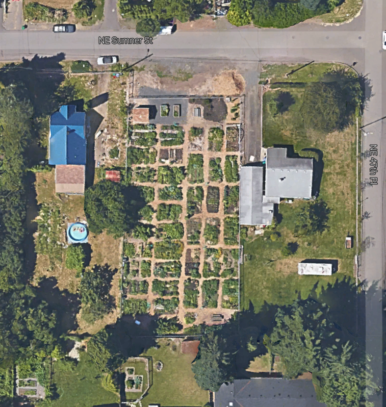
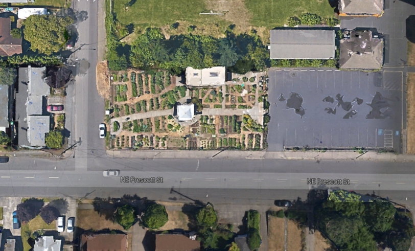
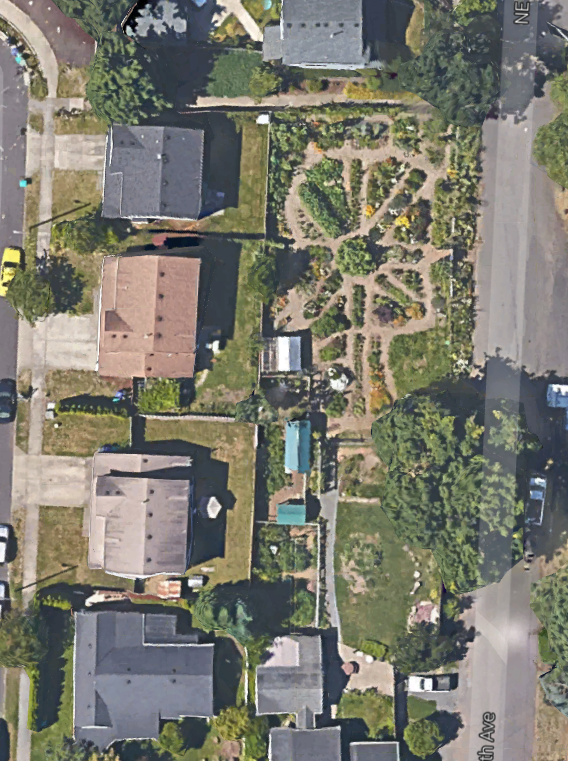
    Dividing this region by counties shows Orange County well in the lead, with 37.6 percent college-educated, well above Los Angeles County’s 30 percent.

    Recent Trends

    To see where these metrics are headed, Mark Schill, an analyst with the Praxis Strategy Group (www.praxissg.com), was asked to identify the share growth of bachelor’s degrees in the country’s largest metropolitan areas during 2000-13. The share of the adult population with college educations rose by 6.8 percent in San Jose and 6.4 points in the San Francisco-Oakland region. Some regions did better, including Boston, Pittsburgh, Grand Rapids, Mich., Baltimore, New York and St. Louis. All these were considerably above the national average increase of 5.2 percent.

    In contrast, most areas of Southern California have shown more meager growth in their educated workforces. Los Angeles, overall, enjoyed a very average increase of 5.2 percent. San Diego, despite its high-tech reputation, notched a 5 point jump while the Inland Empire increased by 3.8 points, one of the lowest performances in the country. The biggest gainer in the Southland was Orange County, where the share of educated workers grew by a healthy 6.3 percent.
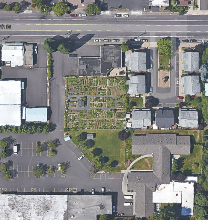
    Whither young, educated workers?

    The picture, particularly for the Inland Empire, is not totally bleak. In a recent survey conducted by Cleveland State University, there have been some promising developments in the growth of younger educated workers. This key cohort, notes researcher Richey Piiparinen, appears to follow a very different path than do older educated workers, with many seeking out careers in less-expensive locales.

    Indeed, looking at educated growth among 25-34-year-olds from 2010-13 finds that the most rapid expansion is taking place in unlikely places, such as the areas around Nashville, Tenn., Orlando, Fla., and Cleveland, all which experienced increases of roughly 20 percent or more. This is better than twice the growth rate in such noted “brain centers” as San Jose and San Francisco, which were around 10 percent, and New York at 9 percent. The Los Angeles-Orange County area saw a similar increase.

    The reasons for these surprising, and somewhat encouraging results, particularly for the Inland Empire, may vary. One thing, of course, is the low base from which the area starts. After all, until the past decade, the employment profile of the Inland Empire favored manufacturing, logistics and construction, all fields not dependent on large contingents of highly educated workers.

    Another critical factor may well be price, as we saw in our surprising findings on millennials. Simply put, many of the areas attractive in the past to educated workers have become extraordinarily expensive – as demonstrated by San Francisco-based writer Johnny Sanphillippo – while some more affordable locales have become “sweet spots” for younger educated people, particularly as millennials enter their family formation years.

    County, city breakdowns

    The Southland, of course, is a vast region, and even every county contains hosts of cities that are very different from each other. In terms of counties, the biggest gains – albeit from a smaller base – took place in the Inland Empire, notably Riverside, which saw a 93 percent jump in its educated population since 2000. Orange County saw a 37.6 percent gain, ahead of Los Angeles’ roughly 36 percent gain.

    More intriguing, and revealing, is the distribution of college degrees by city areas. Here, the supremacy of a few areas is very clear. In three Southland communities, more than 60 percent of the adult populations have college degrees: Santa Monica, Newport Beach and Irvine. Yorba Linda, Pasadena and Redondo Beach all boast rates close to, or above, 50 percent.

    Obviously, these towns are something of outliers in the region. Los Angeles, by far the region’s largest city, has roughly 31 percent of its adults with college degrees. Many communities do far worse, most of all, Compton, where less than 6 percent have four-year degrees. Hesperia, Southgate, Lynwood and Victorville have educated percentages under 10 percent.

    Adjacent communities sometimes have radically different rates of education. Santa Ana, for example, abuts Irvine, but has an educated population of barely 12 percent. And while some areas have shown meager growth in their share of educated residents, several areas have seen double-digit percentage increases, including Burbank, Yorba Linda, Rancho Cucamonga and Santa Monica.

    Implications

    As the Southland economy evolves, it makes sense to look at those areas most likely to have more of the educated workers that high-end industries need. These increasingly are clustered in a few places, such as Irvine, Newport Beach, Rancho Cucamonga and Costa Mesa, that are both suburban in form but tend to have better schools than much of the region. These areas also tend to have lower-than-average unemployment rates. Educated people tend to migrate, for the most part, to areas where others of their ilk are concentrated, and often where their children have the best chance at a decent education.

    These statistics and trends suggest that our leaders, in education and politics, need to focus on reality. It is dubious that many communities throughout the Southland will develop large shares of educated people in the immediate future. Indeed, given the quality of public education throughout most of the region, it seems almost inevitable that much of the region will lag in terms of skills well into the next decade.

    This means that local leaders cannot expect to duplicate in the near future the success of places like Boston, the Bay Area, or even Pittsburgh. Instead, there needs to be a two-pronged attempt to address this issue. One is to boost preparatory and higher education throughout the region, which will allow for Southern California to better compete at the highest-end of employment.

    But the other strategy, not to be discounted, is a full-scale commitment to skills training for those unlikely to earn bachelor’s degrees. This also means taking measures allowing the industries that would employ such workers – largely manufacturing, logistics, medical and business services – to flourish, so this training will have rewards. The Southland’s already large educated population is one key to its future, but finding a decent work environment for those without a four-year degree merits equal, if not greater, emphasis.

    This piece first appeared at the Orange County Register.

    Joel Kotkin is executive editor of NewGeography.com and Roger Hobbs Distinguished Fellow in Urban Studies at Chapman University, and a member of the editorial board of the Orange County Register. His newest book, The New Class Conflict is now available at Amazon and Telos Press. He is author of The City: A Global History and The Next Hundred Million: America in 2050. His most recent study, The Rise of Postfamilialism, has been widely discussed and distributed internationally. He lives in Los Angeles, CA.

    Graduation image by BigStockPhoto.com.