Category: Demographics

  • The Curious Comeback Of U.S. Downtowns

    Perhaps nothing better illustrates the notion of urban revival in America than the comeback of many downtown districts. Yet if these areas have recovered some of their vigor, they are doing so in a manner that hardly suggests a return to their glory days in the first half of the 20th Century.

    Instead what’s emerging is a very different conceptualization of downtown, as a residential alternative that appeals to the young and childless couples, and that is not so much a dominant economic hub, but one of numerous poles in the metropolitan archipelago, usually with an outsized presence of financial institutions, government offices and business service firms.

    The good news: after an era of population declines, these areas are growing again: From 2000 to 2010, the downtown cores of the nation’s 51 metropolitan areas with populations over a milliongained slightly over 200,000 residents, or 1.3% of all the growth in the nation’s major metropolitan areas. However, 80% of that growth took place in just six cities — New York, Chicago, Philadelphia, Washington, D.C., Boston and San Francisco. In 18 of the 51 downtowns populations declined. Meanwhile, the population in the outer fringe of the 51 metro areas, 10 miles beyond downtown, grew by some 15 million.

    These trends appear to have continued into the initial stages of the current economy recovery. In a survey of 2011-2012 patterns, Trulia found a similar pattern of higher growth near the center, but even stronger growth rates on the fringes. As we have noted since 2000, the slowest growth took place in the close-in neighborhoods adjacent to the urban core.

    The better numbers reflect then not a mass “back to the city” movement but an uptick in the market appeal of city centers. And it’s unlikely that the old urban cores will ever come close to recovering the economic preeminence they once enjoyed. In American Community Survey data from 2006-08, the central business district of the New York metro area was the only one across the country that accounted for over 20% of regional employment; downtown’s share topped 10% in just six other metro areas: Chicago, Boston, Washington D.C., Richmond, Chicago and Hartford. This contrasts with the kind of employment dominance seen in the 1950s when Manhattan’s commercial core accounted for more than 35% of employment in the New York area. Of course, the decline is a natural outgrowth of the massive physical expansion of the New York area during the past half century, a pattern seen in other major regions.

    From 2000 to 2010, the share of jobs dropped somewhat in the nation’s biggest urban cores, but employment declined far more in the inner ring suburbs, according to an analysis by demographerWendell Cox. In contrast the fastest job growth was in suburban and exurban areas, paralleling their gains in population. This has become clearer since the recession ended; the consultancy Costar notesbetween 2012 and 2013 office absorption grew quicker in the suburbs than the core, accounting for 87% of new office demand. Overall suburbs account for nearly 75% of all office space in our metropolitan areas.

    We can see this pattern even in two of the hottest office markets, San Francisco and Houston. Overall, despite all the blather about tech moving into the core, San Jose, Calif., has almost 50% more new office space under construction than San Francisco. San Jose, it should be remembered, is essentially a giant suburb, with a very small downtown, and very low levels of transit ridership. It may be next to San Francisco but in urban form, it represents its direct opposite.

    In Houston, easily the nation’s leader in new office construction, downtown has fared well in the boom but the vast majority of new growth is located in the ‘burbs, including the largest project — the new ExxonMobil campus, with 20 buildings that will host 10,000 employees. In both places population growth in the suburbs has been approximately four times that of the core cities between 2010 and 2013.

    These patterns can be seen even in areas where there have been strong improvements in residential growth. In 2010, Chicago’sDowntown Loop Alliance reported that private sector employment in the Loop fell 20% during the last decade. Perhaps more telling, the number of jobs and resident workers (the “jobs-housing” balance) in the city of Chicago are converging toward equality. According to American Community Survey data, there are 1.1 jobs in the city of Chicago for each working resident. In contrast, two of the three large suburban corridors have higher ratios of jobs to workers than the city of Chicago. The Interstate 88 corridor has 1.3 jobs per worker, while the North Shore has approximately 1.5 jobs per worker. The Interstate 90 corridor has slightly more jobs than workers.

    How could this be given the much hyped migration of companies such as Boeing to the Windy City? One explanation lies with the rise of what urban analyst Aaron Renn has described as the “executive headquarters.” These relocations, he notes, tend to follow CEO preferences but cover only a small number of employees. Cost pressures, particularly from Wall Street, make securing space in central cities prohibitive if it involves large numbers of employees. A small, swanky office is one thing but putting 10,000 workers in expensive towers seems less common.

    The recent move of Archer Daniels Midland’s headquarters, he notes, brought roughly 100 jobs while that of Boeing, at a cost of $63 million in incentives, was a net gain of 500. In both cases, far more employees, spanning research, development and marketing remained in the original locations. Boeing, for example, retains over 80,000 employees in its original home around Seattle.

    What seems clear from these trends is this: downtowns are back, but not as dominant business hubs. Instead we continue to see not massive construction of new offices but the continued conversion of offices to residential buildings. This is particularly true in Chicago, where developers are adapting older office towersmalls, as well as hotels for apartments. In most cases, these are rental properties designed to serve a generally younger, and childless market.

    In Manhattan, the rate of office construction is running at a multi-decade high, but some insiders worry that demand may not be there in the next four years to fill the 14 million square feet of spaceprojected to be built by 2019. The shift of jobs, particularly in financial services, to cheaper locales could have a negative effect, as does the trend of employers cramming workers into smaller spaces.

    What about the wannabes like downtown Dallas, Atlanta and Los Angeles? These central cores have failed to recover their economic base, with vacancy rates approaching 20% despite a dearth of new construction. Nor has mass transit — often sold as the “magic bullet” to turn these central cores into thriving urban hubs — succeeded in reestablishing their economic centrality. In all three metro areas, despite multibillion-dollar expenditures on new rail lines, transit ridership remains at or even slightly below the levels of a decade ago.

    None of this suggests that these cores are not important to their regions, and particularly to their often vulnerable self-esteem. The downtowns of Atlanta and Dallashave gained some residents, and there is more pedestrian traffic at night. Similarly Los Angeles, whose downtown attracted nearly half of all L.A. residents daily in the 1920s, according to Robert Fogelson, continues to fade in economic importance. Today it represents about 2% of the vastly expanded metro area’s jobs. At least four other regional job centers are as larger or larger ).

    Yet despite this, it’s legitimate to see some revival of the area, largely due to a rash of residential conversions and some new apartment building. This has brought some new life, as well as some restaurants and some shops, as the population within two miles of City rose by an impressive 23,000 since 2006. But this hardly represents a full-scale return to the center city as the population of the surrounding areas — two to five miles from City Hall — has dropped by a similar number. Almost all the new construction in downtown is either for residents or hotels; very little new office space is being produced.

    Los Angeles’ downtown recovery, notes real estate analyst David Shulman, is “more about sports and entertainment venues, restaurants and bars, loft conversions, and hotels than it is about companies that need a lot of floors in tall buildings. Nightlife and streetscapes trump florescent light and cubicles.”

    This resurgence in L.A., and elsewhere, is no mean accomplishment, but it also does not constitute sea-change in fundamental economic geography. Downtowns are back, but more as a lifestyle option than as a dominant feature of the metropolitan landscape.

    This piece originally appeared in Forbes.

    Joel Kotkin is executive editor of NewGeography.com and Distinguished Presidential Fellow in Urban Futures at Chapman University, and a member of the editorial board of the Orange County Register. His newest book, The New Class Conflict is now available at Amazon and Telos Press. He is author of The City: A Global History and The Next Hundred Million: America in 2050. His most recent study, The Rise of Postfamilialism, has been widely discussed and distributed internationally. He lives in Los Angeles, CA.

    Lead photo of 432 Park Avenue in New York by Louis B (Own work) [CC-BY-3.0 or CC-BY-4.0], via Wikimedia Commons

  • The Three Generations of Black Mayors in America

    A select group of cities elected black mayors during the brief and tumultuous Black Power Era, seeking to implement an activist social justice platform.  These cities – notably Cleveland, Gary, Newark and Detroit among large cities — became stigmatized in a way that few have been able to recover from.   A negative narrative was developed about most of them that stuck, despite considerable efforts to dispel them.  Cities that elected “first black mayors” after the Black Power Era, during a period of relative calm, were able to adapt as the political skill set grew in the African-American community.  However, the Black Power Era’s near-toxic combination of heightened white racism, black disenfranchisement and disillusionment – and ill-prepared black political leadership – accelerated the downfall of these select cities.

    If the cities that elected black mayors during this tumultuous period are ever to move forward, to achieve their potential, they must be released from the purgatory they inhabit.

    Just as many people have well-developed thoughts and opinions on the American Civil War but little understanding of the turbulent Reconstruction Era that followed, many are familiar with the 20th Century Civil Rights Movement, yet are far less knowledgeable about the local social and political events that followed it.  The Black Power Movement supplanted much of the Civil Rights Movement after the assassination of Dr. Martin Luther King, with an emphasis on turning social activism into political empowerment.  Several cities elected their first black mayors during that period.  Cleveland was the first with the selection of Carl Stokes as mayor in 1967.  Gary, Indiana followed suit the same year with the election of Richard Hatcher, and the federal government appointed Walter Washington to become Washington, DC’s first black mayor as well.  Later, Newark (Kenneth Gibson), Dayton (James McGee) and Cincinnati (Ted Berry) followed suit by 1972, and culminated with the elections of Tom Bradley (Los Angeles), Maynard Jackson (Atlanta) and Coleman Young (Detroit) in 1973.  A new era of African-American political empowerment had begun.

    Taking a long historical view, it’s clear that the people who became first African-American mayors beginning in the late ‘60s and continuing through today held different views, developed different paths to victory and methods of governance, and had differing perceptions of their skills among their constituents.  Mayors elected through about 1975 were often activists straight from the Civil Rights Movement, and were looking for ways to turn the movement into actual political power.  The group of black mayors that followed them, from about 1975 to 1990 or so, had more distance between them and the Civil Rights Movement and were less concerned about implementing movement politics; they were more concerned about developing the kind of coalition that could get them elected and help them win legislative victories once in office.  The third group of “first black mayors”, coming after about 1990 and continuing through today generally came to terms with a different demographic landscape in most major American cities.  Whereas first black mayors elected twenty years prior could dependably rely on a supermajority of black votes in their favor – and an equally large supermajority of white votes against them – the most recent group works in a more nuanced and less racially charged environment.  Younger white residents without the racial grievances of their parents or grandparents were returning to cities, and Hispanics were rapidly increasing in numbers.  Anyone who would attempt to become a “first black mayor” in that environment would have to develop an appeal that goes beyond racial boundaries.

    And yes, the decade that followed Dr. Martin Luther King’s assassination was as tumultuous as they come for America’s largest cities.  That period, well remembered by those who lived it as a time of particularly strong urban and social tensions, coincided with the downward slide in momentum of the Civil Rights Movement and the subsequent rise of the Black Power Movement.  Older adults likely remember the period well: urban riots, fights over school busing, Affirmative Action battles, efforts to eliminate long-entrenched policies like blockbusting and redlining.  Skyrocketing crime, heated debates on the inequity of public services, and the development of a new, rapidly expanding land called “suburbia” that was looking very appealing to a growing number of city residents.  Nearly all large cities developed scars during that period.  The question is whether they healed, and healed well.

    “It’s Our Time”


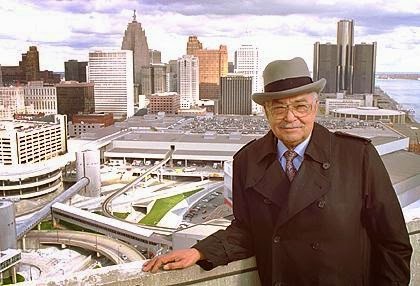
    Detroit Mayor Coleman Young.  Source: Detroit News

    Coleman Young, elected as Detroit’s first black mayor in 1973, in many ways epitomizes the first group of black political leadership that emerged following the Civil Rights Movement.  One might call them the Black Power set.  Born in 1918, Young was part of a generation of African-Americans who stood tantalizingly closer to economic prosperity and social equality than any previous generation, yet were reminded that they could never achieve it.  After serving as a bombardier and navigator for the U.S. Army Air Forces during World War II, Young returned from his service disillusioned by the segregation he and his fellow troops suffered.  He went on to become a labor leader with the UAW and later built a political base as a state representative and state senator in the Michigan Legislature, representing Detroit’s East Side.

    Young became a vocal critic of local leadership after the 1967 riots, and targeted the heavy-handed efforts of Detroit police to reduce crime.  Young announced he was running for mayor in 1973 in large part to work to disband the Detroit Police Department’s STRESS (Stop the Robberies, Enjoy Safe Streets) unit.  The unit was often mentioned as the initiator of police brutality complaints, and was allegedly responsible for as many as 22 deaths of black residents over a 2 ½ year period.  Young ran against John Nichols, the city’s police commissioner and staunch supporter of the troubled unit.

    Young won a narrow victory over Nichols in 1973 in a race that was almost entirely split along racial lines in the nearly 50/50 city.  In his inaugural address, Young famously told “all those pushers, (to) all rip-off artists, (to) all muggers: It’s time to leave Detroit; hit Eight Mile Road! And I don’t give a damn if they are black or white, or if they wear Superfly suits or blue uniforms with silver badges. Hit the road.”  Young maintained that his message was that criminals were not welcome in Detroit; the quote has often been interpreted by white former Detroit residents as a throwing down of the gauntlet, urging whites to leave the city for the suburbs.  Young went on to win four more terms in office.  He balanced budgets yet struggled to maintain services in a city with a rapidly declining tax base.  He remains one of the most controversial leaders in Detroit history.

    Conversely, Cleveland’s Carl Stokes and Newark’s Kenneth Gibson may not have provoked similar passions in their respective cities, but they did not fare much better.  Stokes obtained his law degree in 1956, served three terms in the Ohio Legislature and narrowly lost a bid for mayor in 1965.  His eventual win in 1967 garnered him plenty of national attention as he became the first African-American mayor of one of the nation’s ten largest cities.  He was successful enough to pursue and win a second two-year term in 1969, but his tenure in office was characterized by constant feuds with the Cleveland City Council and the Police Department.  Stokes left office at the end of his second term.  After studying civil engineering in college, Gibson worked for nearly two decades as a structural engineer with the New Jersey Highway Department, the Newark Housing Authority and the City of Newark.  He pursued the mayor’s office as a reformer wishing to restore honor to the office following the corruption scandals of incumbent Hugh Addonizio.  Gibson won in 1970 but perhaps his attachment to people like Newark poet and playwright Amiri Baraka, who challenged Gibson to push the city’s corporate interests to take a more active and responsible role in the community, served as a lightning rod to the city’s remaining middle class element.  Gibson was elected to four terms, but Newark’s slide continued unabated.

    Black National Political Convention

    It’s probably fair to say that the political pinnacle of the Black Power era took place between the elections of Gibson and Young, with the advent of the Black National Political Convention in 1972.  Held in Gary, Indiana and hosted by Mayor Richard Hatcher, delegates from the entire spectrum of black leadership convened to establish a black political agenda for urban America.  More than 8,000 people attended the three-day convention, with 3,000 selected to be voting delegates.  Newly elected black officials attended, along with celebrated black nationalists and revolutionaries.  Delegates with more moderate position also attended.  However, whites were not invited.  No white speakers whose views were sympathetic to the movement; not even white reporters.  This exclusion caused groups like the NAACP and the Urban League to skip the event and be critical of the gathering.

    Renee Ferguson, a former Chicago local news television reporter and currently the press secretary for U.S. Rep. Bobby Rush (D-IL), attended the convention as a 22-year-old reporter for the Indianapolis News.  In an interview with Chicago public radio station WBEZ remarking on the 40th anniversary of the convention in 2012, she spoke about the frenzied nature of the event.  “When I got there it was very disorganized, much bigger than anybody had planned for and impossible actually for anybody to see what was happening. The speeches were long and there were a lot of egos and there weren’t many women.”

    Ferguson said that the agenda of the convention was framed by a basic question, and was the source of great tension.

    “Are black people going to work on the inside with the system, or are they going to have their own and work on the outside? And that was the big argument no matter what else they talked about,” Ferguson said. “That was the underlying intrigue and the most interesting thing for me to document as a young reporter.”

    In the end, black nationalists won the day.  The prevailing theme of the convention was that African-Americans would seek to create change outside of the system.  The agenda included platforms that had support from other liberal factions (elimination of capital punishment, national health insurance), but also included platforms that sought to consolidate political control with the growing number of leaders (community control of schools, busing for school integration).  Perhaps the biggest message of the convention, however, was that “White politics had failed Black people”.  And a new group of leaders set out to implement that vision.

    Coalition Builders


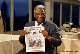
    Chicago Mayor Harold Washington, the day after winning the election in 1983.  Source: Illinois Historic Preservation Agency.

    Almost immediately after the convening of the convention, a group of rising black political figures who rejected the premise of the Black Power era leaders sought to ascend through coalition building.  Rather than work exclusively outside of the system, and alienating those who disagreed with them, this group stressed their ability to work within the existing power and political framework.

    As a state representative at the time representing Illinois’ 26th legislative district, Harold Washington would’ve been eligible to serve as a delegate to the Black National Political Convention.  Whether he attended is uncertain.  But it is clear that he adopted a coalition-building style that served him well as he ascended to the office of Mayor in Chicago.

    Born in 1922 and just four years younger than Detroit’s Coleman Young, Harold Washington nevertheless followed a different path to mayor of Chicago.  Washington also served in the Army during World War II, building runways for long-range bombers in the North Pacific.  Upon his return from service he graduated from Roosevelt College in Chicago in 1949, and from Northwestern University Law School in 1952.  Washington immediately became immersed in local Chicago politics after law school, working for 3rd Ward Alderman and former Olympic athlete Ralph Metcalfe.  While working with Metcalfe Washington became intimately familiar with Chicago’s brand of Machine politics – a spoils system, patronage, and a personal approach to bringing out the vote on Election Day.

    Contrary to Young’s experience in Detroit, African-Americans in Chicago experienced a fair amount of political enfranchisement.  In many respects, African-Americans were just one part of the ethnic milieu that made up Chicago’s political landscape, like the Germans, Poles, Italians and Irish.  The foundation of Chicago’s political machine was its ability to meet the specific needs of those who could be convinced to depend on them, and convincing as many people to depend on them as they could.  The Machine’s success meant that it could not ignore or exclude potential votes, wherever they came from, and that included the African-American community.  The Machine’s strength was derived from its network of precinct captains, committeemen and elected officials that would convene regularly to discuss its political platform, slate of candidates vote targets and distribution of benefits.    Washington received a sound political education in coalition building through his work in Chicago’s Machine.

    Washington was elected into the Illinois House of Representatives in 1965 and to the U.S. Congress in 1980.  Over the years, he developed a reputation of independence from the Chicago Democratic Party leadership, often becoming an unreliable member of the Machine’s state legislative contingent.  As a State Senator Washington was one of a group of independent black Democrats who partnered with white liberal Democrats and moderate Republicans to push forward the Illinois Human Rights Act of 1980.  His ascension to Congress later that year, defeating Machine loyalist Bennett Stewart, further alienated him from the Machine.

    This effort afforded Washington a unique political perspective.  He enjoyed strong independent support from his African-American base, largely developed apart from the Machine.  He had strong connections with members of Chicago’s “lakefront progressive” community, which had a fairly large contingent in the city’s Hyde Park community, where Washington also lived.  It was likely evident to Washington and others that this pairing provided him a wider base than other black elected officials who rose through the ranks and focused solely on serving the needs of their African-American constituents.  Furthermore, Washington likely realized that the Hyde Park progressive community’s networks with other progressives, particularly on the North Side, opened up opportunities for offices beyond Congress.

    Washington rode the wave of his unique coalition into mayoral politics in 1983.  Bolstered by support from his African-American base and reform-minded white progressives, Washington won against Republican Bernard Epton that November.  Once elected, however, he was confronted with a solid bloc of 29 aldermen (out of 50) firmly wedded to the “Democratic Organization” structure that had survived for so long in Chicago.  The bloc led a four-year period of legislative gridlock in Chicago known as Council Wars – the bloc assumed control of all Council committees, allowing it to set the legislative agenda; the bloc voted down virtually all of the mayor’s appointments; the bloc fought bitterly with Washington’s supporters on budget and appropriations.

    Despite the challenges, however, Washington’s coalition held firm.  Federal lawsuits led by Washington allies challenged Chicago’s ward redistricting following the 1980 Census.  At the time, Chicago’s population included approximately 40 percent white and black residents, and 15 percent with an Hispanic background.  However, Washington supporters argued that wards were gerrymandered to maximize the number of white aldermen in the racially polarized city – at the time of Washington’s election as mayor there were 33 white, 16 black and one Hispanic aldermen.  Federal courts ruled in favor of Washington’s supporters in 1986, causing a redrawing of seven wards and special elections.  Washington supporters won four elections, creating a 25-25 split in the City Council and effectively giving the mayor control of the Council through his ability to cast a deciding vote.  Unfortunately, Washington’s control was short-lived.  He died of a massive heart attack on November 25, 1987, just months after his defeat of the obstructionist bloc.

    Whereas Harold Washington’s political acumen made him a coalition builder, Baltimore mayor Kurt Schmoke’s stellar athletic and academic pedigree, wonky sensibility and personable nature drew coalitions toward him.

    Schmoke attended the prestigious Baltimore City College for high school, where he excelled in football and lacrosse.  He entered Yale University in 1967, where he played quarterback for the freshman team and developed into an undergraduate student leader.  After graduating from Yale with a degree in history in 1971, Schmoke studied as a Rhodes Scholar at Oxford University and graduated from Harvard Law School in 1976.

    Schmoke’s first electoral victory was as Baltimore State’s Attorney in 1982.  He defeated William Swisher in a surprise landslide, running a race-neutral campaign against the law-and-order, and (according to some) racially insensitive incumbent.  Schmoke was technically not Baltimore’s first black mayor; that title goes to Clarence “Du” Burns, who was elevated to mayor after the election of the previous mayor, William Donald Schaefer, as Maryland’s governor.  But Schmoke inherited much of Schaefer’s progressive and business establishment, as they saw him as the one who could articulate their agenda in a largely black city.  Schmoke challenged Burns in 1987 and won narrowly.  Recalling Schmoke’s victory for an article in Baltimore’s City Paper, City Council member Bill Cunningham said it was a “new-day-is-dawning thing.”  In the same article, the Rev. Arnold Howard of Enon Baptist Church said, “We were looking for someone to encompass our hopes for the future, someone who would validate our own journey.  He went into office with all that on him. He was the new savior. He was the one who would fulfill our dreams.”

    In the end, however, despite being twice re-elected, Schmoke’s analytical approach to leadership alienated coalitions who thought they were getting something else.  He developed a reputation for establishing bold policy goals that were difficult to build consensus around – improving adult literacy, drug decriminalization – and put in place department heads who brought the same policy wonk approach to their work that he did.  The business establishment and African-American community alike thought they were electing a dynamic “mover and shaker” who could energize them as they pushed toward new heights.  But Schmoke was perhaps more manager and caretaker than mover.  As a result he left office in 1999, deciding not to seek a fourth term, with a frayed coalition: a business community slightly betrayed, and an African-American community slightly disillusioned.

    Trans-Racial Appealists

    With the start of the 1990’s a new type of black political figure began to emerge.  Gains made through increased access to education and job opportunities were putting more African-Americans in previously unattainable positions, and allowing them to pursue previously unattainable avenues.  Wellington Webb, the first black mayor of Denver, fits this bill.

    Webb was born in 1941 in Chicago and arrived in the Mile High City at age 11.  In his autobiography, he chronicles a difficult childhood; his mother had a drinking problem and he ended up being raised by his grandmother, and he had academic difficulties at Denver’s Manual High School.  But Webb fought through his family problems and personal demons.  He attended and graduated from Northeastern Junior College in Colorado in 1960, and obtained his bachelor’s degree from Colorado State College in 1964.  He was introduced to politics by his grandmother, who was a Democratic Party district committeewoman in Denver.  Webb wanted to become a teacher, but found it difficult to obtain a position in Denver’s public schools, and thought local political involvement in some of the federal “War on Poverty” programs of the late 1960’s might help.  He transitioned from working in a potato chip factory to working in city government, and later obtained a master’s degree from the University of Northern Colorado in 1971.

    Webb developed a reputation as a numbers-cruncher and policy wonk in city government, and was pulled into politics rather than pushed into it by any sense of bitterness.  He was elected to the Colorado House of Representatives in 1972 and represented the Northeast Denver neighborhood he grew up in.  In 1977 he was appointed by President Jimmy Carter to serve as regional director of the U.S. Department of Health, Education and Welfare, and in 1981 he was appointed by Colorado Governor Richard Lamm to be executive director of the state Department of Regulatory Agencies.  Webb held that position until 1987, when he ran and won in the election to become Denver’s city auditor.

    Webb’s political ascendance through the ‘70s and ‘80s certainly put him on a path to consider pursuing citywide and even statewide positions, but it was unclear whether an African-American in a city with a small minority population, in a state with a small minority population, could be competitive.  He did not start with a built-in large political base like Young or Washington; nor did he have to ability to strengthen a base through coalition building the way Washington did.  His only strategy, should he pursue another office, was to make a trans-racial appeal that would highlight his experience, skills and vision.

    Webb entered the campaign in late 1990.  Three leading candidates emerged: Webb, Denver District Attorney Norm Early (also African-American), and Republican lawyer Don Bain.  Webb carried out his “Sneaker Campaign”, going door-to-door in virtually all of Denver’s neighborhoods while preaching a message of competency.  He surprised everyone by forcing a runoff with Early in the May 1991 primary, finishing with 30 percent of all votes to Early’s 40 percent.  Webb was able to consolidate the support from other candidates with a law-and-order platform prior to the general election against Early in June 1991.  Webb won with 57 percent of the vote.


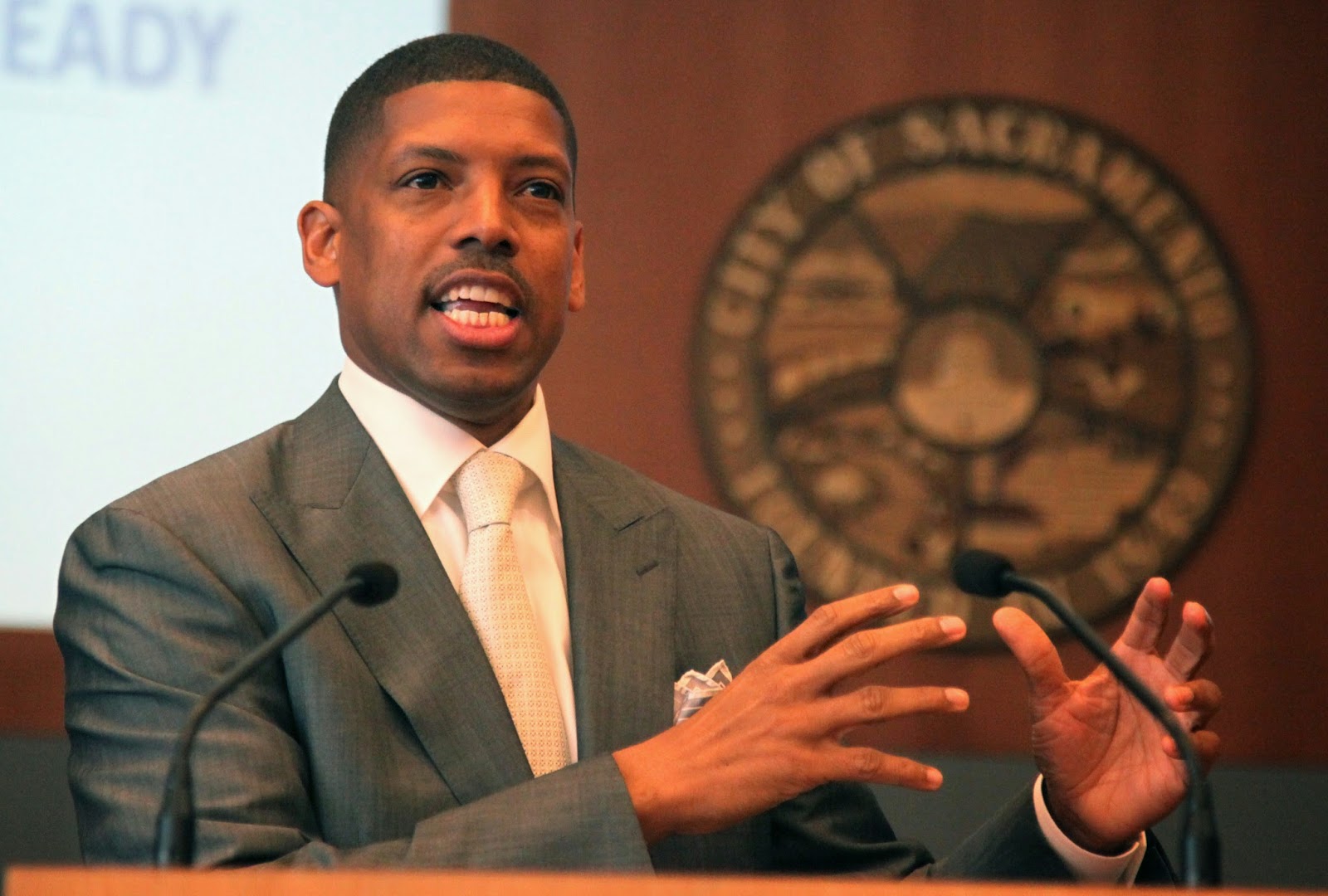
    Sacramento Mayor Kevin Johnson.  Source: gbmnews.com

    Perhaps a better version of a first black mayor who won with a broad trans-racial appeal would be Kevin Johnson of Sacramento.  Johnson was born in Sacramento, where he was a standout student and athlete.  He excelled in basketball and baseball, and accepted a scholarship to play basketball at the University of California, Berkeley.  From there he went on to a storied college basketball career and a long professional career with the NBA’s Cleveland Cavaliers and Phoenix Suns.

    Even during his playing days Johnson maintained strong roots with his native Sacramento.  He established the Kevin Johnson Corporation, which focused on real estate development and business acquisitions, and the St. HOPE nonprofit organization as an after-school program in the Oak Park neighborhood he grew up in.  After his retirement from basketball in 2000, he broadened St. HOPE to include charter schools and nonprofit development in Sacramento.  Today, St. HOPE is a network of four charter schools in Sacramento, and a development company with more than a dozen new construction and renovation projects in Sacramento.

    Johnson had intimated his political ambitions for years, but finally announced his run for mayor in 2008.  Race was hardly a factor in the race; indeed, Johnson was viewed as a decorated favorite son of California’s capital city.  Johnson received numerous endorsements from Sacramento’s business and political establishment, and was the highest vote getter in the nonpartisan election that June.  He forced a runoff against two-time incumbent mayor Heather Fargo, and soundly defeated her in November.

    Johnson has parlayed his athletic, corporate and nonprofit success well in the government sector.  He has been a staunch supporter of charter schools, along with his wife Michelle Rhee, the former chancellor of the Washington, DC Public Schools.  He was actively involved in keeping the NBA’s Sacramento Kings basketball team from fleeing the city, orchestrating the team’s sale to a group of local investors.  He easily won reelection in 2012, and in April 2014 was elected as president of the U.S. Conference of Mayors.

    There are other black mayors who fit the trans-racial appeal profile, but are not the first black mayors of their respective cities.  Kasim Reed of Atlanta, Michael Nutter of Philadelphia, and Cory Booker of Newark each brought impressive academic credentials, strong corporate backgrounds and youthful passion to their positions as mayor, distinguishing them from their predecessors.    Reed interned for U.S. Rep. Joseph Kennedy II before earning his juris doctorate from Howard University, and became a partner at a law firm prior to entering politics.  Nutter earned a business degree from the Wharton School at the University of Pennsylvania.  Booker earned his bachelor’s and masters degrees from Stanford, earned a Rhodes Scholarship to attend the University of Oxford, and earned his juris doctorate from Yale.

    Because of their academic and corporate credentials, Reed, Nutter and Booker are as comfortable in corporate boardrooms as they are in churches or community centers.  Each has forged partnerships with political opponents, and adopted a pragmatic bipartisan approach to governing cities.  Each has focused on effective service delivery rather than empowerment or redistributive policies.  Booker’s success as mayor of New Jersey’s largest city propelled him to his current position as New Jersey’s junior U.S. Senator through special election in 2013.

    The Power of Perception

    Detroit, Cleveland, Newark, Chicago, Denver, Baltimore and Sacramento occupy different positions on the success spectrum of American cities.  Of these five Chicago would certainly occupy the highest perch.  Chicago clearly is a global city – a world financial center, the home of a dozen Fortune 500 companies and the critical link in the nation’s rail and air transportation network.  The Windy City has extensive economic connections throughout the world.  Indeed, world-class architecture firms based in Chicago are designing the gleaming skyscrapers sprouting everywhere in China’s large cities.  Denver would rest in a position not far behind Chicago.  Denver has become the capital of the Great Plains and Mountain West, a mid-continent transportation hub that built its wealth on its access to mineral resources in the Rocky Mountains.  Sacramento would likely occupy a position behind Denver.  Sacramento’s growth has been more recent than the others, and it still sits in the shadows of much larger California metropolises.  But as the capital of our nation’s largest and most influential state, it has heft.

    Baltimore, Cleveland and Newark would occupy another place on the spectrum.  All are well known for enduring the storm of industrial decline, and in Cleveland’s case, fiscal insolvency.  They’re slowly recovering from a nadir reached perhaps a decade or two ago and have made small steps toward improvement.  They’ve worked hard to revitalize their cores – Newark has leaned on its financial services sector to turn the tide, while Baltimore and Cleveland have relied on their assets in education, health care services, and biomedical and biotech research.  However, all are far from being complete success stories.

    Then there is Detroit.

    Each city has had African-Americans serve in the city’s highest office.  Chicago’s Harold Washington endured tough times as mayor of Chicago, but he built a lasting coalition that allowed him to prevail.  Denver’s Wellington Webb learned to adapt in a pluralistic environment and raised the profile of a Western city.  Cleveland, Newark and Detroit each elected first black mayors during the turbulent post-Civil Rights era and paid a steep social price for doing so.  Cleveland and Newark began their turnaround some years ago; perhaps Detroit’s, with its recent bankruptcy filing, has just begun.

    If anyone doubts the impact of electing an African-American mayor during the racially tumultuous late ‘60s-early ‘70s era, examine the general perceptions that formed of the cities during that period and have endured ever since.  Newark and Detroit, already tainted by the aftermath of urban riots, were effectively shunned by white residents after the elections of their first black mayors.  Cleveland may have been headed down the same path after the election of Carl Stokes in 1967.  But Stokes chose not to run for a third two-year term as mayor, leaving a wide open field.  Stokes was followed by three consecutive white mayors — Ralph J. Perk, Dennis Kucinich and George Voinovich – before the election of the city’s second black mayor, Michael White, in 1990.  Atlanta touted itself as the “City too busy to hate” in the ‘70s, but Maynard Jackson’s 1973 election coincided with rapid white flight out of the city, at the same time that Sun Belt migration from the north was strengthening the suburban base.  In Washington, DC, black political empowerment there was often wrapped up in the controversy of federal political representation for the District.  Mayors in the District were federally appointed until Walter Washington was elected mayor in 1975.

    Perhaps the best way to view perceptions of cities that elected “first black mayors” during the Black Power Era is to examine the fortunes of Detroit and Philadelphia during and after this period.  Entering the 1970’s the Motor City and the City of Brotherly Love had similar populations (about 1.5 million people in Detroit, 1.9 million in Philadelphia), with a similar geography (about 140 square miles) and similar demographics (approximately a 60/40 split between whites and blacks).  As noted, Coleman Young was elected mayor of Detroit in 1973, narrowly winning against Police Commissioner John Nichols.  It was clear that Nichols’ candidacy was an effort by his constituency to restore order to a city during a difficult time.  Meanwhile, another police commissioner, Frank Rizzo, assumed power as mayor of Philadelphia in 1971.  As mayor Rizzo was regarded as having a strained relationship with the city’s African-American community.  Rizzo’s “law-and-order” tactics were viewed positively by his white ethnic base and have been credited by some for keeping Philadelphia from suffering the same fate as other cities.  Could the Nichols campaign have been modeled after the successful Rizzo election two years earlier?

    Possibly.  Yet it is instructive to view the difference in perceptions of both cities since that time.  Philadelphia was certainly hit hard by the decline of the nation’s manufacturing sector.  Philly had substantial losses in the shipbuilding, oil refining and food processing industries over the decades, losing thousands of jobs as a result.  Yet did Philly endure what was in effect a boycott of the city by white residents?  Troubled North and West Philadelphia are well known, but did their troubles define the entire city?  I think many people could imagine a real-life “Rocky Balboa” coming from Philadelphia in the ‘70s and ‘80s, but far fewer could imagine a similar character coming from Detroit.

    Philadelphia’s national perception took a tumble over the last 40 years, but the city has fought back hard to rebuild itself as a premier city with a strong economic foundation in education, health care and financial services.  Detroit, however, continued on a descent no other city endured.  High crime rates, racial tensions, dilapidated abandoned buildings in a desolate post-industrial landscape  — all defined Detroit then and continue to define it today.

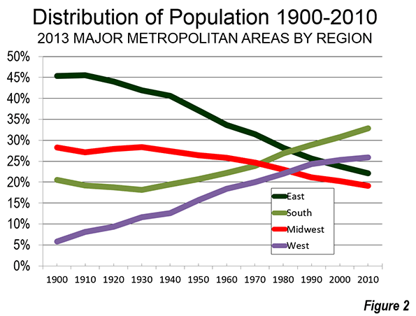
    Between 1970 and 2010, Philadelphia’s population dropped by 22 percent, from 1.9 million to 1.5 million.  The decline was largely driven by a substantial loss of its non-Hispanic white population over the period, which declined by 56 percent.  Over the same period, Detroit’s population dropped by 53 percent, from 1.5 million to just over 700,000.  Its decline too was largely driven by a loss of its non-Hispanic white population, which dropped by 93 percent. Ninety-three percent.

    Something happened that kept a base or core of white residents in Philadelphia.  Something happened in Detroit that led to their virtual disappearance.

    Cities that elected their first black mayors during the Black Power Era deeply suffered in national perception because of the gamut of social challenges they had at the time, and found it difficult to stabilize poor economies or for revitalization to gain traction.  But they suffered far worse than other cities because they were in effect shunned.  They suffered from the greatest increases in crime.  They experienced the largest declines in school quality and performance.  They witnessed the steepest drops in property values.  They had the widest divides between police and community.  They had the highest numbers of white middle-class residents departing for the suburbs.  Newark was shunned.  Gary was shunned.  Detroit was shunned.  Maybe Cleveland, Los Angeles, or Cincinnati, or Dayton did not suffer the same fate because African-American populations there did not approach parity with whites, who were eventually able to “reclaim” the city’s highest office.  In the end, however, select cities paid a price for the election of black mayors during this time, a price not paid by cities that elected black mayors after them, or not at all.

    Another Transition


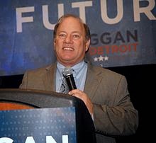
    Detroit Mayor Mike Duggan on election night in 2013.  Source: wikipedia.org

    On January 1, Michael Duggan assumed the difficult and unenviable responsibility of becoming the 75th mayor of Detroit, Michigan.  Given the most recent difficult period that Detroit has endured, and the continued difficult times ahead, Mayor Duggan’s inauguration was a subdued affair.  There was no inaugural ball or celebration.  The new mayor was simply sworn in with a short ceremony in his new 11th floor office in the Coleman A. Young Municipal Center.

    The new mayor said he would focus on operations – removing blight, snowplowing streets, repairing lights, making sure buses run safely and on time.  The mayor suggested he would move into Manoogian Mansion, the palatial mayoral residence on the Detroit River that was deeded to the city in the 1960’s.  As far as the focus on operations goes, he really has little choice in the matter.  The State of Michigan-appointed emergency manager Kevyn Orr, brought in with exceptionally broad powers to resolve the city’s financial mess and currently leading the Motor City’s largest-ever municipal bankruptcy, has a lock on policy decisions right now.  Mayor Duggan says his focus is to “return the city to elected leadership on October 1,” the day that Orr’s 18-month appointment from the state ends.

    And with that, Mike Duggan became the first white mayor of Detroit since 1973, mayor of a city with a population that is 83% African-American.  This most recent election, most observers believe, is a venture into the unknown, and is as much an experiment as Detroit’s bankruptcy itself.  An era of African-American political leadership has ended in Detroit, but no one is certain of what the next era might be.

    Perhaps the bankruptcy, the election of a white mayor and the growing urban pioneer spirit that is visible in parts of the city means that the shunning of Detroit has ended.

    This post originally appeared on August 10th, 2014 in Corner Side Yard.

    Pete Saunders is a Detroit native who has worked as a public and private sector urban planner in the Chicago area for more than twenty years.  He is also the author of “The Corner Side Yard,” an urban planning blog that focuses on the redevelopment and revitalization of Rust Belt cities.

    Top photo: The Monument to Joe Louis, commonly known as “The Fist”, in downtown Detroit. For more than thirty years, the sculpture has been a controversial symbol of black power in Detroit.  Source: Pete Saunders

  • Urbanists Need to Face the Full Implications of Peak Car

    As traffic levels decline nationally in defiance of the usual state DOT forecasts projecting major increases, a number of commentators have claimed that we’ve reached “peak car” – the point at which the seemingly inexorable rise in vehicle miles traveled in America finally comes to an end.   But while this has been celebrated, with some justification in the urbanist world as vitiating plans for more roads, the implications for public policy haven’t been fully faced up to.

    Indeed, the “peak car” is antithetical to the reigning urbanist paradigm of highways known as “induced demand.”  Induced demand is Say’s Law for roads: supply of lanes creates its own demand by drivers to fill them. Hence building more roads to reduce congestion is pointless. But if we’ve really reached peak car, maybe we really can build our way out of congestion after all.

    Traffic levels have stabilized or even fallen in recent years. According to analysis by economist Doug Short featured in Streetsblog, aggregate auto travel peaked on a per capita basis in 2005 and has fallen since. Per capita traffic levels are now back to 1994 levels, a two decade rollback in traffic increases.


    Population adjusted traffic growth. Image via Doug Short
    Even looking at total, not per capita travel shows a marked reversal.  The State Smart Transportation Initiative, a pro-environmental research center, put together a graph showing how high the US DOT’s traffic projections have turned out to be:

    VMT forecasts vs. actual. Source: SSTI

    This data is complemented by a slew of recent stories about the poor financial performance of toll roads, resulting in part from traffic falling far below projections.  For example, the concessionaire operating the Indiana Toll Road recently went bankrupt. Streetsblog reported that while projections forecasted traffic level increase of 22% in the first seven years, traffic actually fell 11% in the first eight.

    Recent traffic declines are a reversal of a long running trend of Vehicle Miles Traveled (VMT) increases at above growth in population. Some of this is no doubt due to the poor macro-economy. But there are reasons to believe we may be in a new era of traffic growth or lack thereof.  Many of the trends that drove high growth have largely been played out: household size declines, suburbanization, the entry of women into the workforce, one car per driver, etc. That’s not to say these will necessarily reverse. But we’ve reached the point of diminishing returns in terms of how many more women, for example, will join the labor force given that there’s already 57% female participation and their labor force participation rate is projected to decline in the future.

    This is potentially very good fiscal news, especially given tight budgets. Clearly many of the freeway expansion projects on the books that have been driven by speculative demand should be revisited.  For example, the state of Wisconsin has massive investments planned in Milwaukee area freeway system even though the metro area is very slow growth in population.  Are these really necessary?  Projects in more rapidly growing boomtown regions in places like Dallas, Houston or Charlotte may well continue to make sense. From top to bottom, engineers need to recalibrate their forecasting models to better correspond to reality. And to revisit highway plans accordingly.

    So the idea that we need to build fewer roads than we thought is sound. But less attention has been paid to the flip side implications of this.  To repeat, the induced demand theory says that there is a more or less infinite supply of traffic, thus any new roadway capacity will be used up shortly, leaving congestion as bad as the status quo ante.  Despite peak car, articles touting induced demand as a reason not to build roads continue unabated, including recent ones in Wired (“What’s Up With That: Building Bigger Roads Actually Makes Traffic Worse”) and Vox (“The ‘fundamental rule’ of traffic: building new roads just makes people drive more”).  In a world of peak car, where traffic levels are flat to declining on a per capita basis, induced demand no longer holds court, certainly not to the level claimed by those who believe it’s pointless to build roads.

    In fact, what peak car means is that while speculative projects may be dubious, there many be good reasons now to build projects designed to alleviate already exiting congestion.  Places like Los Angeles remain chronically congested, which has great economic and social consequences, not the least of which is the value of untold hours lost sitting in traffic.  While individual projects there might indeed be boondoggles, maybe it’s worth building some of the planned freeway expansions there in light of peak car. In short, in some cases peak car strengthens the argument for building or expanding roads.

    On the other hands, many of the regional development plans designed to promote compact central city development and transit may be predicated on an analysis that assumes large future traffic increases in a “business as usual” scenario.  Not just highways but all aspects of regional planning are dependent on traffic forecasts.  That’s not to say that such plans are necessarily wrong, but clearly revised traffic reality needs to be reflected in all plans, not just highway building ones.

    It’s not clear how this will all play out, but urbanists and policy makers of all stripes need to think about the full implications of peak car. At a minimum, the traditional “you can’t build your way out of congestion” rhetoric should be  supplanted, at least in most areas, by a more nuanced approach that neither overestimates demand, nor ignores the problems caused by rapid growth in some regions and pockets of congestion in others.

    Aaron M. Renn is an independent writer on urban affairs and the founder of Telestrian, a data analysis and mapping tool. He writes at The Urbanophile.

  • Legal but Still Poor: The Economic Consequences of Amnesty

    With his questionably Constitutional move to protect America’s vast undocumented population, President Obama has provided at least five million immigrants, and likely many more, with new hope for the future. But at the same time, his economic policies, and those of the progressive wing of the Democratic Party, may guarantee that many of these newly legalized Americans will face huge obstacles trying to move up in a society creating too few opportunities already for its own citizens, much less millions of the largely ill-educated and unskilled newcomers.

    Democratic Party operatives, and their media allies, no doubt see in the legalization move a step not only to address legitimate human needs, but their own political future. With the bulk of the country’s white population migrating rapidly to the GOP, arguably the best insurance for the Democrats is to accelerate the racial polarization of the electorate. It might be good politics but we need to ask: what is the fate awaiting these new, and prospective, Americans?

    In previous waves of immigration, particularly during the early 20th Century, there were clear benefits for both newcomers and the economy. A nation rapidly industrializing needed labor, including the relatively unskilled, and, with the help of the New Deal and the growth of unions, many of these newcomers (including my own maternal grandparents) achieved a standard of living, which, if hardly affluent, was at least comfortable and moderately secure.

    Demand for labor remained strong during the big immigrant wave of the 1980s until the Great Recession. The country was building houses at a rapid clip, which required a large amount of immigrant labor. Service industries, particularly before the onset of digital systems, such as ipads for ordering, that replace human staff in fast-food restaurants, tend to hotels and provide personal services, although often at low wages.

    More recently, this wave of undocumented migration has diminished, as economic prospects, particularly for the low-skilled, have weakened. Yet the undocumented population remains upwards eleven million. Largely unskilled and undereducated, roughly half of adults 25 to 64 in this population have less than a high-school education compared to only 8 percent of the native born. Barely ten percent have any college, one third the national rate.

    This workforce is being legalized at a time of unusual economic distress for the working class. Well into the post-2008 recovery, the country suffers from rates of labor participation at a 36 year low. Many jobs that were once full-time are, in part due to the Affordable Care Act, now part-time, and thus unable to support families. Finally there are increasingly few well-paying positions—including in industry—that don’t require some sort of post-college accreditation.

    Sadly, the legalization of millions of new immigrants could make all these problems worse, particularly for Latinos already here and millions of African-Americans.

    African-American unemployment is now twice that of whites. The black middle class, understandably proud of Obama’s elevation, has been losing the economic gains made over the past thirty years.

    Latino-Americans have made huge strides in previous decades, but now are also falling behind, with a gradual loss of income relative to whites. Poverty among Latino children in America has risen from 27.5 percent in 2007 to 33.7 percent in 2012, an increase of 1.7 million minors.

    Logically, many Latinos and African-Americans might suspect that amnesty won’t be a great deal for them. There are occasional signs of disquiet. A recent Pew survey found that not only half of all whites, but nearly two-fifths of African Americans and roughly even a third of Hispanics approved of increased deportations of the undocumented. A Wall Street Journal-NBC poll found that well less than half of Latinos supported the President’s action.

    This ambivalence may reflect the reality that legalization of the undocumented may be felt hardest in those places, such as California, that have attracted the most newcomers, and also have highly developed welfare states. Today public agencies in Los Angeles, with an estimated one million undocumented immigrants, are bracing from large increases in the demand for state provided services.

    One LA Supervisor estimates the County, facing “an already impossible fiscal dilemma,” will need to spend an additional $190 million, without hope of federal compensation, on the newly legalized population. Ultimately, the newest migrants will be competing with existing residents—particularly poorer ones—not only for jobs but also social services.

    The President’s action on immigration requires a profound shift in economic policy, particularly in the large urban centers where most undocumented are clustered, to avoid creating a squeeze on scarce jobs and services. But Obama’s other big agenda—addressing climate change—has slowed the expansion of fossil fuel development. Meanwhile, it’s the energy sector that creates precisely the kinds of high-paying blue collar jobs, averaging upwards of $100,000 annually, that immigrants might be eager to fill and could give low unskilled workers a foothold into the middle class.

    Similarly, efforts by Obama’s allies at Federal agencies like HUD to encourage dense housing and discourage suburban growth means far less construction employment, one of the largest generators of good blue collar jobs and opportunities.

    Ironically, the places where the cry for amnesty has been the loudest—New York, San Francisco, Los Angeles, and Chicago—also tend to be those places that have created the least opportunity for the urban poor. This is in part due to the fact that these areas have tended to de-industrialize the most rapidly, discourage fledgling grassroots businesses through high taxes, environmental and housing, regulations.

    Whatever their noble intentions, these cities generally suffer the largest degree of income inequality, notes a recent Brookings study. In fact, according to an analysis by Mark Schill at the Praxis Strategy Group, African-American incomes in New York are barely half those of whites and, in San Francisco somewhat below half. In contrast, cities with broader economies like Dallas and Houston, have black populations earning sixty five percent of white incomes. Similarly, Latinos in Boston, New York, Philadelphia and San Francisco do far worse, relative to incomes, than their Sunbelt counterparts, compared to whites.

    These trends could worsen in precisely those areas with the biggest concentrations of undocumented immigrants covered by Obama’s executive order.

    Take, for example, the borough of the Bronx in New York City. The most Latino of all New York’s counties, in the Bronx, roughly one in three households live in poverty, the highest rate of any large urban county.

    In the country. It’s doubtful that legalization absent job growth will improve conditions , as it adds more potential claimants for local benefits without creating new income sources.

    For reasons that can’t be purely economic, most Latino political leaders, and much of the group’s electorate, are in favor of policies that, over time, could doom prospects for Those who receive amnesty. Of course, there are other factors that play into support for these policies, like the emotional pull to reunite families, but whatever their appeal such measures could leave the very people they are meant to help as legal paupers.

    My adopted home region of Southern California has seen an almost 14% drop in high-wage blue-collar jobs since 2007. Deindustrialization has continued, and construction employment lagged, even while the country as a whole, sparked by more secure and now cheaper energy supplies, has seen industrial production improve since 2010.

    Herein lies the great dilemma then for the advocates of amnesty. In much of the country, and particularly the blue regions, they will find very few decent jobs but often a host of programs designed to ease their poverty. The temptation to increase the rolls of the dependent—and perhaps boost Democratic turnouts—may prove irresistible for the local political class.

    So what should we do under these circumstances? Constitutional arguments aside, there do seem to be some better ways to create conditions for upward mobility among newcomers.

    Higher minimum wages may help some of the legal residents, but arguably at the cost of new jobs for others including the newly amnestied. However popular with most voters, such redistributive measures will not address the fundamental economic challenge posed by amnesty.

    Perhaps a sounder strategy would be to adopt policies that encourage broad-based economic growth, including energy, manufacturing, logistics and home construction. This would, of course, require some moderation of regulatory standards, particularly in reference to climate change.

    The President’s recent deal with China, which essentially allows the Chinese to keep boosting emissions until 2030 while we reduce ours steeply, could make things worse. In some states like California, where the global warming consensus is beheld with theological rigidity, “green,” anti-suburban policies largely guarantee that most of the urban poor will never enter the middle class. In San Francisco, Boston and New York, the percentage of Latino and black homeowners is roughly one-third to one-half that seen in redder regions like Houston, Dallas, Phoenix and Atlanta.

    In essence, the deepest blue states have created the worst of all conditions for the urban poor, and will be particularly tough on undocumented residents granted amnesty.

    All this suggests that, if we are to make new Americans economically successful, we need to concentrate not on racial redress but find ways to spark broad based economic growth. Increasing use of inexpensive natural gas, for example, would not only help continue to reduce emissions but would spark an industrial expansion that would create more blue collar jobs. Similarly, policies that allowed for affordable, energy efficient new homes could create not only more blue collar employment possibilities, but a brighter future for young families, many of whom are themselves immigrants or their children.

    The current amnesty could benefit both the country overall as well as recent immigrants if it is tacked to a broad based economic growth strategy. But that doesn’t seem to be in the cards. Instead, continuing policies that inhibit broad-based economic growth are increasing the numbers of Americans who must depend on government, not the economy, to take care of themselves and their families.

    This piece originally appeared at The Daily Beast.

    Joel Kotkin is executive editor of NewGeography.com and Distinguished Presidential Fellow in Urban Futures at Chapman University, and a member of the editorial board of the Orange County Register. His newest book, The New Class Conflict is now available at Amazon and Telos Press. He is author of The City: A Global History and The Next Hundred Million: America in 2050. His most recent study, The Rise of Postfamilialism, has been widely discussed and distributed internationally. He lives in Los Angeles, CA.

    Photo by telwink

  • The Evolving Urban Form: Tianjin

    Tianjin is located on Bohai Gulf, approximately 75 miles (120 kilometers) from Beijing. It was the imperial port of China, by virtue of that proximity. Tianjin also served as one of the most important "treaty ports" occupied and/or controlled by western nations and Japan for various years before 1950.

    Tianjin is pivotally located along the East coast corridor between "Dongbei" – the northeast (the provinces of Heilongjiang, Jilin and Liaoning, which are also referred to as Manchuria) and Jinan, Nanjing, Shanghai and points south. Both the most direct expressway route (interstate standard) and high speed rail line from Shanghai to Dongbei cross through Tianjin rather than larger Beijing.

    Tianjin is one of four centrally administered provincial level municipalities, along with Shanghai, Beijing, and Chongqing. While Tianjin has grown strongly in recent years, it has been one of China’s largest cities for decades. According to the United Nations, the 1950 Tianjin urban area was the second largest in China, with 2.5 million residents, trailing only Shanghai which had 4.3 million. Beijing trailed Tianjin by a third, at 1.7 million.

    Population and Growth

    Since 1982, the total population of Tianjin has expanded by nearly 90 percent, from 7.9 million to 14.7 million in 2013 (Exhibit 1).  Population growth has accelerated over that time. Between 2000 and 2010, the population rose 2.7 percent annually, more than double 1.2 percent rate of the 1990s. The rate of increase was even higher between 2010 and 2013, at 4.5 percent.

    Between the 2000 and 2010 censuses, the inner core district (Heping qu), experienced a population loss of 12 percent. But the rest of the municipality increased, accounting for 101 percent of the growth. The balance of the core captured 18 percent of the growth, while the suburban ring attracted 27 percent. By far the greatest growth was in the outer districts, which accounted for a solid majority of the growth (Exhibit 2). This peripheral domination of growth mirrors the experience of other large Chinese cities, such as Shanghai, Beijing, and Chongqing, which have seen their core areas decline in population, with most growth occurring in the outer sectors.

    A New Megacity

    Tianjin is one of the world’s newest megacities (urban area over 10 million population). This has occurred because of the strong post-2010 population growth. In the next Demographia World Urban Areas (early 2015), Tianjin will have an estimated built up urban area population of 10.9 million. With an urban expanse covering 775 square miles (2,007 square kilometers), Tianjin has an urban population density of 14,100 per square mile (5,400 per square kilometer).

    With the urban area expanding geographically, Tianjin fits the international trend of cities, in growing strongly, yet experiencing declining overall urban densities. Chinese urban planners have told me that it has been an intended objective of policy to reduce population densities, to give people more living space. This is despite the preachments of US and European urban planners for whom higher densities often are embraced as an "Article of Faith."

    Tianjin’s Urban Form

    Despite their comparatively high density, Chinese cities are anything but compact. Most are polycentric in urban form, with central districts have widely spaced commercial buildings (the most notable exceptions may be Shanghai, Chongqing, and Dalian, but even these are somewhat polycentric). Tianjin, along with "in situ" urbanization Quanzhou, may be the least compact of the major cities.

    Tianjin has a broad central business district (CBD), populated with tall, commercial buildings and residential structures (Exhibits 3 & 4). As is the case in many Asian cities (such as Bangkok, Guanzhou-Foshan, Xi’an and Beijing, the tall commercial buildings tend to be highly dispersed, rather than close together as is the custom in Canadian and American cities. In between the dispersed tall buildings are lower rise buildings, both commercial and residential.

    Currently the tallest building in the CBD is the Tianjin World Financial Center (Exhibit 5), at 76 stories (1,105 feet or 337 meters). This is somewhat taller than New York’s Chrysler Building, which was the second tallest in Gotham for years. However, another taller building is near completion, the Tianjin R&F Guangdong Tower (Exhibit 6), which is well on the way to its 91 floors (1,535 feet or 468 meters). However,even this building is not as tall as three others under construction in other Tianjin centers.

    A second central business district is developing in the Binhai new area, near the port and 30 miles (50 kilometers) south of the Tianjin CBD. The Rose Rock International Financial Center will reach 100 floors (1,929 feet or 538 meters). This, however, is only the second tallest under construction. The CTF Tower is also under construction and will reach 96 floors (1,740 feet or 530 meters), nearly as tall as the new World Trade Center in New York (1,776 feet or 541 meters).

    Finally, the tallest building in Tianjin, Goldin Finance 117 is under construction approximately 9 miles (15 kilometers) west of the Tianjin CBD in a virtually new business center. This building will exceed the heights of all but three of the completed skyscrapers in the world (Lead Photo).

    Altogether, Tianjin will soon have five buildings of more than 90 floors, a record few if any cities will soon equal.

    Architecture

    Tianjin has more than its share of modern Chinese high rise commercial structures and residential buildings. But, perhaps to a greater extent than any other Chinese city, Tianjin exhibits the architecture of the foreign powers to a greater degree than some other treaty ports (such as Fuzhou, Dalian, and Wuhan). The city of Tianjin has meticulously preserved many of these structures, not only commercial and residential buildings, but also churches.

    The Tianjin CBD has a number of low rise streets with European architecture. Some of the most impressive are across the Hai River from the Tianjin Railway Station. There is also a long pedestrian street beyond with considerable western architecture. Virtually throughout the urban core there are examples of classic western architecture, some as ornate as in central Buenos Aires (Exhibit 7).

    Perhaps the most unique feature is a large area of western residences just to the south of the Tianjin CBD (Exhibits 8 & 9).

    In the Beijing Orbit: An Advantage

    Tianjin is clearly in the orbit of larger Beijing, which has recently announced plans for a 7th ring road and other infrastructure to tie not only the city but adjacent provincial level jurisdictions together (Tianjin and Hebei). With a strong policy interest in limiting Beijing’s population growth, and with plenty of rural land available, Tianjin could receive a substantial share of growth that otherwise would go to Beijing.

    Top photo: Goldin 117 Financial Building under construction at November 6, 2014 (by author).

    Wendell Cox is principal of Demographia, an international public policy and demographics firm. He is co-author of the "Demographia International Housing Affordability Survey" and author of "Demographia World Urban Areas" and "War on the Dream: How Anti-Sprawl Policy Threatens the Quality of Life." He was appointed to three terms on the Los Angeles County Transportation Commission, where he served with the leading city and county leadership as the only non-elected member. He was appointed to the Amtrak Reform Council to fill the unexpired term of Governor Christine Todd Whitman and has served as a visiting professor at the Conservatoire National des Arts et Metiers, a national university in Paris.

  • America’s Smartest Cities

    In this difficult recovery, many of the strongest local economies have been those with a high share of educated people in their workforce, particularly areas where technology companies and other knowledge-based industries are growing most rapidly.

    To determine the metro areas that are gaining brainpower in the 21stCentury, we scored the nation’s 380 metropolitan statistical areas based on three criteria. We started with the growth rate in the number of residents with at least a bachelor’s degree from 2000 through 2013 (25% weighting in final score). But since the places that post the highest growth rates tend to be those starting with low levels of educational attainment, we gave greater weight to the percentage point increase in the share of the population that is college-educated over that span (50%), and we factored in the share of educated people in the population in 2013 (25%). We also separated out results for the 51 MSAs with over a million residents.

    For the most part, the top 10 on our list of the 51 largest metro areas is dominated by places with large concentrations of colleges, and those that long ago made the transition from industrial to information-based economies.

    In the Boston-Cambridge-Newton metro area, 44.8% of the population has bachelor’s degrees or above, the fourth-highest concentration of brainpower in the nation, up 7.8 percentage points since 2000 on the strength of a 32.2% jump in its college-educated population. That places Boston No. 1 on our large cities list.

    It’s followed in second place by Pittsburgh, which logged the largest percentage point increase since 2000 in the proportion of its population that is college-educated, 8.8 points, to 32.2%, on the strength of 37.3% growth in raw numbers.

    Perhaps the biggest driver in increasing the concentration of educated people in a population lies in the composition of local industry. Silicon Valley has done very well, making heavy additions to an already high concentration of educated residents. The San Jose-Sunnyvale-Santa Clara metro area places third on our list with a population in which 46.7% hold a bachelor’s degree or above, the second highest share in the nation, a 6.8 percentage point jump over 2000. Its urban annex, San Francisco-Oakland-Hayward, places eighth, with a population that is 45.2% college-educated, an increase of 6.4 percentage points. To some extent, this reflects the area’s deindustrialization and high price structure; you do not want to come to the Bay Area today without a high-paying job requiring a good college degree if you expect to live a middle-class lifestyle.

    Another big employer of educated people is government, and with Washington in expansion mode over the past decade, it’s no surprise that our nation’s capital features in the top 10 — twice. The proportion of the population of Washington-Alexandria-Arlington that is college-educated has risen 6.2 points to 48.7%, the highest concentration in the nation, on the back of a 45% increase in the raw numbers. It ranks fifth on our list, followed in sixth place by neighboring Baltimore-Columbia-Towson, Md.

    The Small Smart Set

    Looking at the full set of the nation’s 380 metropolitan areas, the 51 biggest added far more people to their college-educated populations than the other 329 — a net 12 million since 2000, compared to 4.8 million for the smaller metro areas. But the growth rates were actually fairly similar, 43% vs. 41%, which highlights that the largest cities are no longer the only places attracting educated workers.

    Some of the most dramatic growth is taking place in two kinds of small-scale geographies: college towns and what might be best described as amenity regions. At the turn of the millennium, college towns already had a decent base of educated people; now they seem able to attract and nurture tech companies as well. This is the case for the second-ranked metro area on our overall list of all 380: Bloomington, Indiana. Home to Indiana University, the metro area has logged a dramatic 11.7 percentage point increase in the proportion of its population that is college educated since 2000. The share of its population with BAs is now 40.6%, putting it in range of places like Boston and the Bay Area.

    Much the same pattern can be seen in several college towns, including No. 4 Auburn-Opelika, Ala.; Hattiesburg, Miss. (sixth); Lawrence, Kan. (seventh), and Burlington, Vt. (10th). The other big growth areas are attractive small towns that have lured many down-shifting, but often well educated, boomers. Placing first on our overall list is St. George, Utah — its college-educated population increased by 167% from 2000 through 2013, making for a hefty 11.1 percentage point jump in the proportion of its population that’s college educated to 32.0%. Other areas with similar patterns of growth include Ocean City, N.J. (third), Wilmington, N.C. (fifth), Asheville, N.C. (eighth), and Redmond-Bend, Ore. (ninth).

    Looking Forward

    The rapid growth in the concentration of residents with bachelor’s degrees in these smaller cities suggests that the geography of brainpower is likely to change in the years ahead. For decades the Southeast and Midwest have lagged behind the Northeast and the West Coast in education, but this gap is closing somewhat, at least in the smaller cities. Save Burlington, Vt., not one small metro area in the Northeast or California ranked within the top 65 of our overall list.

    A plethora of places in the Southeast dot the top part of our overall list: in addition to the previously mentioned Wilmington and Asheville, Durham-Chapel Hill (15th); Charleston-North Charleston, S.C. (17th); and Savannah, Ga. (20th). The Intermountain West is well represented as well in addition to St. George, with Boulder, Colo., in 13th place, and Provo-Orem, Utah, in 22nd. These areas are all likely to emerge as top tech and professional centers as their ranks of educated workers swell.

    An equally compelling view of the future would be to concentrate on the locations of relatively recent college graduates. A recent study by Richey Piiparinen and Jim Russell for Cleveland State University looked at college-educated people between the ages of 25 and 34 in 2011-13. It found that many of the metro areas with the most rapid growth of this population were in the South, led by Nashville, Tenn., Orlando-Kissimmee-Sanford, Fla.; and Austin, Texas, all of which experienced growth in this cohort of between 15% and 25%.

    More surprising, however, was the strong growth in some Rust Belt cities, including Cleveland-Elyria (+20%), and Pittsburgh (12%). Piiparinen and Russell suggest this is, in part, due to the lower costs in these regions, which allow young people to live far better than they would in a pricier city on either coast. Clearly high costs could shift the nature of future educated migration. It already has caused millennial populations to stagnate in some traditional magnet cities for the educated, such as New York and San Francisco, and actually drop in the core areas of Chicago and Portland. Another factor could be the availability of high-paying jobs; Portland, for example, has an inordinate proportion of college-educated young residents working at lower wages than the national average. In contrast Houston, where high-paying jobs are being created at a healthy clip, the young educated cohort grew five times as fast.

    Of course many factors could shift this geography of education in the years ahead. An extended slide in oil prices, for example, could slow growth in places like Houston and Dallas, while a shift in the terrain of social media could have a devastating effect on the Bay Area. Yet looking ahead, it’s clear that the map of America’s brainpower is likely to continue changing. The leaders, particularly talent-producers such as Boston, should remain at the top for years to come, but other regions — notably the South, the Intermountain West and perhaps also the Rust Belt — could be making bigger gains in the years ahead.

    Educated Metropolitan Area Rankings
    Rank Rank in Size Group Region (MSA) Size Score 2013 share 2000-2013 Growth 2000-2013 point change
    1 1 St. George, UT S 72.0 32.0% 167.3% 11.1%
    2 2 Bloomington, IN S 69.7 40.6% 27.6% 11.7%
    3 3 Ocean City, NJ S 67.6 33.7% 48.7% 11.7%
    4 4 Auburn-Opelika, AL S 65.6 37.9% 90.0% 10.0%
    5 1 Wilmington, NC M 62.5 34.6% 37.6% 10.4%
    6 5 Hattiesburg, MS S 62.1 32.6% 77.7% 10.0%
    7 6 Lawrence, KS S 60.6 50.4% 50.4% 7.7%
    8 2 Asheville, NC M 60.2 32.7% 71.8% 9.6%
    9 7 Bend-Redmond, OR S 60.1 33.8% 104.6% 8.9%
    10 8 Burlington-South Burlington, VT S 59.2 43.3% 39.8% 8.4%
    11 9 Bloomington, IL S 58.1 41.8% 48.0% 8.2%
    12 1 Boston-Cambridge-Newton, MA-NH L 57.1 44.8% 32.2% 7.8%
    13 3 Boulder, CO M 56.8 58.5% 20.1% 6.1%
    14 10 Iowa City, IA S 55.2 48.6% 45.2% 6.6%
    15 4 Durham-Chapel Hill, NC M 54.7 45.5% 53.1% 6.8%
    16 2 Pittsburgh, PA L 54.7 32.2% 37.3% 8.8%
    17 5 Charleston-North Charleston, SC M 54.7 33.0% 81.5% 8.0%
    18 3 San Jose-Sunnyvale-Santa Clara, CA L 54.2 46.7% 32.9% 6.8%
    19 4 Grand Rapids-Wyoming, MI L 54.0 30.6% 92.7% 7.9%
    20 6 Savannah, GA M 53.9 31.3% 73.2% 8.1%
    21 5 Washington-Arlington-Alexandria, DC-VA-MD-WV L 53.3 48.7% 44.9% 6.2%
    22 7 Provo-Orem, UT M 52.9 37.7% 94.5% 6.7%
    23 11 Hilton Head Island-Bluffton-Beaufort, SC S 52.6 36.7% 83.4% 6.9%
    24 6 Baltimore-Columbia-Towson, MD L 52.6 36.8% 40.8% 7.6%
    25 7 Raleigh, NC L 52.6 43.7% 78.7% 6.1%
    26 12 Missoula, MT S 52.5 39.8% 48.8% 7.0%
    27 8 Des Moines-West Des Moines, IA M 52.4 35.4% 59.8% 7.4%
    28 9 Ann Arbor, MI M 51.4 53.5% 23.7% 5.4%
    29 8 San Francisco-Oakland-Hayward, CA L 51.3 45.2% 30.8% 6.4%
    30 9 Seattle-Tacoma-Bellevue, WA L 50.9 39.4% 47.9% 6.7%
    31 10 New York-Newark-Jersey City, NY-NJ-PA L 50.9 37.4% 37.9% 7.1%
    32 11 St. Louis, MO-IL L 50.8 32.5% 41.9% 7.7%
    33 13 Sioux Falls, SD S 50.6 32.3% 73.0% 7.2%
    34 10 Fayetteville-Springdale-Rogers, AR-MO M 50.4 28.2% 92.3% 7.4%
    35 14 Manhattan, KS S 50.3 37.8% 13.0% 7.4%
    36 15 Great Falls, MT S 50.2 29.4% 45.5% 7.9%
    37 12 Denver-Aurora-Lakewood, CO L 49.4 40.3% 52.2% 6.1%
    38 11 Trenton, NJ M 49.0 40.4% 27.7% 6.4%
    39 16 Logan, UT-ID S 48.8 35.9% 66.6% 6.3%
    40 17 Corvallis, OR S 48.7 52.2% 26.1% 4.8%
    41 18 Hinesville, GA S 48.4 20.9% 101.1% 7.7%
    42 13 Nashville-Davidson–Murfreesboro–Franklin, TN L 48.4 32.3% 71.9% 6.6%
    43 14 Philadelphia-Camden-Wilmington, PA-NJ-DE-MD L 48.2 34.6% 36.3% 6.9%
    44 19 California-Lexington Park, MD S 48.1 29.5% 69.3% 7.0%
    45 15 Minneapolis-St. Paul-Bloomington, MN-WI L 48.1 39.3% 43.7% 6.1%
    46 12 Bridgeport-Stamford-Norwalk, CT M 48.0 45.5% 21.5% 5.6%
    47 13 Portland-South Portland, ME M 47.9 35.8% 37.2% 6.6%
    48 20 Columbia, MO S 47.7 45.3% 35.0% 5.3%
    49 14 Madison, WI M 47.6 42.4% 48.5% 5.5%
    50 16 Portland-Vancouver-Hillsboro, OR-WA L 47.4 35.1% 53.9% 6.3%
    51 15 Salisbury, MD-DE M 46.9 22.5% 344.7% 3.0%
    52 21 Morgantown, WV S 46.7 32.5% 55.5% 6.4%
    53 17 Austin-Round Rock, TX L 46.3 41.5% 79.8% 4.8%
    54 16 Omaha-Council Bluffs, NE-IA M 46.3 33.4% 48.0% 6.4%
    55 22 Fargo, ND-MN S 46.3 35.3% 56.7% 5.9%
    56 23 Sumter, SC S 46.2 23.3% 58.9% 7.5%
    57 24 State College, PA S 46.1 41.7% 36.0% 5.4%
    58 25 Elizabethtown-Fort Knox, KY S 46.1 21.6% 113.7% 6.8%
    59 17 Green Bay, WI M 45.9 27.0% 54.7% 7.0%
    60 18 Lexington-Fayette, KY M 45.6 35.7% 45.7% 5.9%
    61 19 Huntsville, AL M 45.6 36.5% 54.5% 5.6%
    62 18 Buffalo-Cheektowaga-Niagara Falls, NY L 45.4 30.1% 29.4% 6.9%
    63 19 Chicago-Naperville-Elgin, IL-IN-WI L 45.4 35.1% 32.5% 6.2%
    64 20 Hartford-West Hartford-East Hartford, CT L 45.2 36.5% 28.5% 6.0%
    65 20 Worcester, MA-CT M 44.9 32.9% 55.0% 6.0%
    66 21 Milwaukee-Waukesha-West Allis, WI L 44.8 33.2% 33.4% 6.3%
    67 21 Clarksville, TN-KY M 44.8 23.2% 70.1% 7.0%
    68 26 Pittsfield, MA S 44.5 32.4% 24.4% 6.4%
    69 22 Cincinnati, OH-KY-IN L 44.4 31.2% 37.7% 6.4%
    70 27 Gettysburg, PA S 44.3 23.6% 63.8% 6.9%
    71 22 Greeley, CO M 44.3 27.4% 101.2% 5.8%
    72 23 Peoria, IL M 44.0 27.4% 41.3% 6.7%
    73 28 Daphne-Fairhope-Foley, AL S 44.0 29.0% 76.5% 5.9%
    74 24 North Port-Sarasota-Bradenton, FL M 43.9 30.6% 53.3% 6.0%
    75 29 Springfield, IL S 43.9 34.0% 30.0% 6.0%
    76 30 Santa Fe, NM S 43.7 41.7% 37.1% 4.8%
    77 25 New Haven-Milford, CT M 43.4 33.5% 30.1% 5.9%
    78 26 Davenport-Moline-Rock Island, IA-IL M 43.3 26.5% 41.2% 6.6%
    79 27 Evansville, IN-KY M 43.3 24.5% 32.3% 7.0%
    80 31 Napa, CA S 43.1 32.2% 39.8% 5.8%
    81 32 Fairbanks, AK S 43.1 32.6% 52.5% 5.6%
    82 23 Kansas City, MO-KS L 43.1 33.7% 37.7% 5.7%
    83 28 Hagerstown-Martinsburg, MD-WV M 43.0 21.3% 71.5% 6.7%
    84 24 Columbus, OH L 42.7 33.7% 50.0% 5.4%
    85 33 Champaign-Urbana, IL S 42.4 39.4% 30.3% 4.9%
    86 29 Urban Honolulu, HI M 42.2 33.4% 37.5% 5.5%
    87 30 Norwich-New London, CT M 42.2 32.0% 32.7% 5.8%
    88 34 Ithaca, NY S 42.2 50.9% 21.3% 3.4%
    89 35 Johnson City, TN S 42.0 24.8% 50.2% 6.4%
    90 25 Tampa-St. Petersburg-Clearwater, FL L 42.0 27.6% 53.1% 5.9%
    91 31 Boise City, ID M 41.9 30.7% 74.5% 5.2%
    92 26 Jacksonville, FL L 41.9 28.3% 62.5% 5.7%
    93 36 Ames, IA S 41.8 48.2% 22.0% 3.7%
    94 27 Virginia Beach-Norfolk-Newport News, VA-NC L 41.8 29.6% 41.2% 5.8%
    95 28 Providence-Warwick, RI-MA L 41.7 29.6% 30.9% 6.0%
    96 37 Rochester, MN S 41.7 35.3% 56.9% 4.8%
    97 38 Grand Junction, CO S 41.6 27.6% 63.7% 5.7%
    98 32 Bremerton-Silverdale, WA M 41.6 30.9% 42.2% 5.6%
    99 33 Roanoke, VA M 41.6 27.1% 40.7% 6.1%
    100 29 Birmingham-Hoover, AL L 41.5 28.6% 39.9% 5.9%
    101 39 Charlottesville, VA S 41.4 42.2% 48.2% 3.9%
    102 34 Allentown-Bethlehem-Easton, PA-NJ M 41.4 27.6% 44.3% 5.9%
    103 40 Las Cruces, NM S 41.3 27.9% 59.3% 5.6%
    104 30 Los Angeles-Long Beach-Anaheim, CA L 41.3 31.7% 36.6% 5.5%
    105 41 Winchester, VA-WV S 41.2 24.2% 71.3% 5.9%
    106 31 San Diego-Carlsbad, CA L 41.2 34.6% 39.9% 5.0%
    107 35 Fort Collins, CO M 41.2 43.3% 43.6% 3.8%
    108 32 Cleveland-Elyria, OH L 41.0 29.8% 23.8% 5.9%
    109 36 Albany-Schenectady-Troy, NY M 40.8 34.3% 28.0% 5.2%
    110 37 Santa Cruz-Watsonville, CA M 40.6 38.9% 18.6% 4.7%
    111 42 Bellingham, WA S 40.4 32.2% 51.9% 5.0%
    112 33 Louisville/Jefferson County, KY-IN L 40.4 27.0% 42.5% 5.8%
    113 43 Bismarck, ND S 40.3 30.5% 65.3% 4.9%
    114 34 Detroit-Warren-Dearborn, MI L 40.0 29.0% 24.6% 5.7%
    115 38 Lynchburg, VA M 39.8 24.6% 46.9% 5.9%
    116 35 Miami-Fort Lauderdale-West Palm Beach, FL L 39.8 29.3% 45.2% 5.3%
    117 39 Cape Coral-Fort Myers, FL M 39.7 26.2% 84.1% 5.1%
    118 44 Appleton, WI S 39.7 27.6% 48.8% 5.4%
    119 36 Charlotte-Concord-Gastonia, NC-SC L 39.7 32.0% 102.3% 4.0%
    120 40 Lancaster, PA M 39.6 26.1% 47.7% 5.6%
    121 41 Akron, OH M 39.4 29.7% 27.7% 5.4%
    122 42 Lincoln, NE M 39.4 36.3% 37.0% 4.4%
    123 43 Scranton–Wilkes-Barre–Hazleton, PA M 39.3 23.6% 35.7% 6.1%
    124 45 Jonesboro, AR S 39.2 23.1% 58.5% 5.8%
    125 37 Richmond, VA L 39.2 32.5% 37.0% 4.9%
    126 44 Erie, PA M 39.2 26.6% 32.9% 5.7%
    127 46 Sierra Vista-Douglas, AZ S 39.1 24.5% 52.4% 5.7%
    128 38 Orlando-Kissimmee-Sanford, FL L 39.0 29.5% 66.5% 4.7%
    129 47 Dover, DE S 39.0 23.9% 79.0% 5.3%
    130 45 Myrtle Beach-Conway-North Myrtle Beach, SC-NC M 39.0 22.7% 163.1% 4.0%
    131 46 Naples-Immokalee-Marco Island, FL M 39.0 32.4% 58.2% 4.5%
    132 39 Rochester, NY L 38.8 32.6% 27.6% 4.9%
    133 40 Houston-The Woodlands-Sugar Land, TX L 38.7 30.9% 61.7% 4.5%
    134 48 Kahului-Wailuku-Lahaina, HI S 38.7 27.4% 60.0% 5.0%
    135 49 Walla Walla, WA S 38.5 28.1% 37.8% 5.2%
    136 50 Flagstaff, AZ S 38.4 34.3% 40.1% 4.4%
    137 47 Ogden-Clearfield, UT M 38.4 29.0% 79.0% 4.4%
    138 48 San Luis Obispo-Paso Robles-Arroyo Grande, CA M 38.3 31.5% 35.4% 4.8%
    139 51 Bloomsburg-Berwick, PA S 38.2 23.0% 40.8% 5.8%
    140 52 Fond du Lac, WI S 38.2 22.6% 48.7% 5.7%
    141 49 Harrisburg-Carlisle, PA M 38.2 29.4% 34.8% 5.0%
    142 53 Dubuque, IA S 38.0 26.6% 38.2% 5.3%
    143 54 Homosassa Springs, FL S 38.0 18.9% 70.8% 5.8%
    144 50 Manchester-Nashua, NH M 37.9 34.5% 27.0% 4.4%
    145 51 Reno, NV M 37.8 28.4% 58.5% 4.7%
    146 55 La Crosse-Onalaska, WI-MN S 37.5 29.5% 34.1% 4.9%
    147 41 Dallas-Fort Worth-Arlington, TX L 37.4 32.6% 54.6% 4.1%
    148 42 San Antonio-New Braunfels, TX L 37.4 26.7% 66.2% 4.7%
    149 56 Cheyenne, WY S 37.2 28.2% 45.2% 4.8%
    150 43 Atlanta-Sandy Springs-Roswell, GA L 37.1 35.2% 47.7% 3.8%
    151 52 Wichita, KS M 37.0 29.0% 36.9% 4.8%
    152 57 Kingston, NY S 37.0 29.8% 25.9% 4.8%
    153 53 Ocala, FL M 36.9 19.0% 84.4% 5.3%
    154 44 Las Vegas-Henderson-Paradise, NV L 36.9 22.1% 91.4% 4.7%
    155 45 Indianapolis-Carmel-Anderson, IN L 36.8 30.8% 51.4% 4.3%
    156 54 Shreveport-Bossier City, LA M 36.8 24.2% 56.8% 5.0%
    157 58 Columbus, IN S 36.6 27.0% 36.8% 4.9%
    158 46 Sacramento–Roseville–Arden-Arcade, CA L 36.6 30.8% 48.4% 4.2%
    159 59 Altoona, PA S 36.5 19.7% 41.8% 5.8%
    160 47 Phoenix-Mesa-Scottsdale, AZ L 36.4 29.2% 62.5% 4.2%
    161 55 Syracuse, NY M 36.4 29.9% 25.6% 4.7%
    162 56 Oxnard-Thousand Oaks-Ventura, CA M 36.1 31.2% 34.8% 4.3%
    163 60 Niles-Benton Harbor, MI S 36.1 24.9% 26.5% 5.3%
    164 61 Elmira, NY S 36.1 23.9% 29.0% 5.3%
    165 57 Colorado Springs, CO M 36.0 35.3% 43.7% 3.6%
    166 62 Chico, CA S 35.9 26.6% 36.7% 4.8%
    167 58 Columbia, SC M 35.9 30.7% 44.3% 4.1%
    168 59 Baton Rouge, LA M 35.8 27.3% 46.7% 4.5%
    169 63 Cape Girardeau, MO-IL S 35.3 24.9% 31.3% 5.0%
    170 60 Springfield, MO M 35.2 25.8% 51.2% 4.5%
    171 64 Greenville, NC S 35.1 28.4% 33.3% 4.4%
    172 61 Lansing-East Lansing, MI M 34.9 32.4% 23.8% 4.0%
    173 65 Staunton-Waynesboro, VA S 34.9 22.4% 41.7% 5.0%
    174 66 Pocatello, ID S 34.9 28.4% 28.0% 4.5%
    175 48 New Orleans-Metairie, LA L 34.9 27.4% 21.8% 4.7%
    176 62 Greenville-Anderson-Mauldin, SC M 34.8 26.8% 81.5% 3.8%
    177 67 Midland, MI S 34.7 33.2% 21.8% 3.9%
    178 63 Kalamazoo-Portage, MI M 34.6 31.0% 25.3% 4.1%
    179 68 Barnstable Town, MA S 34.5 37.1% 10.2% 3.5%
    180 64 Atlantic City-Hammonton, NJ M 34.5 23.5% 40.0% 4.8%
    181 65 Duluth, MN-WI M 34.3 25.2% 28.9% 4.7%
    182 69 Wheeling, WV-OH S 34.3 20.0% 34.1% 5.3%
    183 49 Memphis, TN-MS-AR L 34.1 26.4% 38.1% 4.4%
    184 70 Glens Falls, NY S 34.1 23.6% 37.2% 4.7%
    185 50 Salt Lake City, UT L 34.1 31.2% 43.8% 3.6%
    186 71 Monroe, MI S 34.0 19.4% 47.7% 5.1%
    187 72 Harrisonburg, VA S 33.7 25.6% 47.1% 4.2%
    188 73 Albany, OR S 33.7 18.3% 62.1% 4.9%
    189 66 Spartanburg, SC M 33.6 22.6% 56.1% 4.4%
    190 67 Greensboro-High Point, NC M 33.5 27.5% 36.6% 4.1%
    191 74 Binghamton, NY S 33.1 26.4% 19.9% 4.4%
    192 75 Lafayette-West Lafayette, IN S 32.9 32.5% 32.6% 3.3%
    193 76 Lebanon, PA S 32.9 20.1% 47.8% 4.7%
    194 77 Bay City, MI S 32.8 19.2% 35.4% 5.0%
    195 68 Eugene, OR M 32.6 29.2% 30.9% 3.7%
    196 78 Coeur d’Alene, ID S 32.6 23.0% 68.6% 3.9%
    197 79 Blacksburg-Christiansburg-Radford, VA S 32.6 29.3% 38.0% 3.6%
    198 80 Battle Creek, MI S 32.6 20.8% 31.1% 4.8%
    199 51 Oklahoma City, OK L 32.5 27.9% 41.8% 3.7%
    200 69 Chattanooga, TN-GA M 32.4 23.7% 42.1% 4.2%
    201 81 College Station-Bryan, TX S 32.3 34.2% 49.9% 2.7%
    202 70 Augusta-Richmond County, GA-SC M 32.2 24.5% 45.2% 4.0%
    203 71 Springfield, MA M 32.2 29.2% 7.8% 4.0%
    204 82 Carbondale-Marion, IL S 32.0 27.5% 27.3% 3.9%
    205 83 Johnstown, PA S 32.0 18.7% 28.4% 5.0%
    206 84 Saginaw, MI S 31.9 20.7% 26.3% 4.8%
    207 72 El Paso, TX M 31.8 20.8% 57.7% 4.2%
    208 73 Tucson, AZ M 31.8 30.1% 35.0% 3.3%
    209 74 Pensacola-Ferry Pass-Brent, FL M 31.7 25.4% 37.7% 3.9%
    210 85 Bowling Green, KY S 31.5 25.3% 86.0% 3.1%
    211 86 Charleston, WV S 31.5 22.8% -4.8% 4.9%
    212 87 Medford, OR S 31.4 26.0% 40.9% 3.7%
    213 75 Santa Rosa, CA M 31.4 31.7% 25.4% 3.2%
    214 88 Chambersburg-Waynesboro, PA S 31.3 19.1% 54.2% 4.3%
    215 76 Tallahassee, FL M 31.2 36.6% 26.8% 2.5%
    216 89 Jackson, TN S 31.2 23.8% 50.4% 3.8%
    217 90 Brunswick, GA S 31.0 23.4% 50.2% 3.8%
    218 77 Fayetteville, NC M 31.0 22.3% 43.0% 4.0%
    219 52 Riverside-San Bernardino-Ontario, CA L 31.0 20.1% 73.9% 3.8%
    220 78 Anchorage, AK M 30.9 30.0% 41.4% 3.0%
    221 91 Oshkosh-Neenah, WI S 30.8 26.4% 30.1% 3.6%
    222 79 Dayton, OH M 30.7 26.6% 14.1% 3.9%
    223 92 Decatur, IL S 30.5 21.3% 24.9% 4.3%
    224 80 Deltona-Daytona Beach-Ormond Beach, FL M 30.5 21.3% 66.9% 3.6%
    225 81 Killeen-Temple, TX M 30.5 21.6% 61.5% 3.7%
    226 82 Tulsa, OK M 30.5 26.0% 33.0% 3.6%
    227 83 Reading, PA M 30.4 22.5% 35.3% 4.0%
    228 84 Jackson, MS M 30.4 29.3% 35.6% 3.1%
    229 85 Little Rock-North Little Rock-Conway, AR M 30.3 27.4% 37.6% 3.3%
    230 86 Huntington-Ashland, WV-KY-OH M 30.1 18.8% 63.5% 3.9%
    231 93 Wausau, WI S 30.0 22.2% 37.5% 3.9%
    232 87 Port St. Lucie, FL M 30.0 23.1% 60.6% 3.4%
    233 94 Grants Pass, OR S 30.0 18.3% 48.6% 4.2%
    234 88 Utica-Rome, NY M 30.0 21.9% 24.6% 4.1%
    235 95 Casper, WY S 29.9 23.5% 47.8% 3.5%
    236 89 Canton-Massillon, OH M 29.7 21.4% 26.3% 4.1%
    237 90 Albuquerque, NM M 29.6 30.7% 40.7% 2.6%
    238 96 Sebastian-Vero Beach, FL S 29.4 26.2% 42.3% 3.1%
    239 91 Santa Maria-Santa Barbara, CA M 29.4 32.2% 18.4% 2.7%
    240 97 Prescott, AZ S 29.3 24.3% 55.2% 3.2%
    241 98 Muncie, IN S 29.0 24.1% 16.1% 3.7%
    242 99 Lake Charles, LA S 28.9 20.3% 35.5% 3.9%
    243 92 Lubbock, TX M 28.9 26.9% 37.6% 3.0%
    244 93 York-Hanover, PA M 28.6 21.9% 39.1% 3.5%
    245 94 Mobile, AL M 28.5 22.3% 30.4% 3.6%
    246 100 Grand Forks, ND-MN S 28.5 27.4% 17.3% 3.2%
    247 95 Brownsville-Harlingen, TX M 28.4 17.1% 63.6% 3.7%
    248 101 Yuba City, CA S 28.4 17.0% 61.7% 3.8%
    249 96 Olympia-Tumwater, WA M 28.4 32.0% 41.8% 2.1%
    250 97 Youngstown-Warren-Boardman, OH-PA M 28.4 20.3% 19.3% 4.0%
    251 102 Lewiston, ID-WA S 28.3 22.1% 32.5% 3.5%
    252 98 Palm Bay-Melbourne-Titusville, FL M 28.2 26.5% 33.4% 2.9%
    253 99 Toledo, OH M 28.2 24.8% 10.5% 3.5%
    254 100 Knoxville, TN M 28.1 27.1% 55.2% 2.5%
    255 101 Lakeland-Winter Haven, FL M 28.0 18.4% 60.9% 3.5%
    256 103 Lewiston-Auburn, ME S 28.0 18.3% 35.8% 3.9%
    257 104 Bangor, ME S 27.9 23.6% 30.0% 3.3%
    258 105 Midland, TX S 27.9 27.3% 49.9% 2.5%
    259 102 Vallejo-Fairfield, CA M 27.9 24.5% 31.8% 3.1%
    260 106 Florence, SC S 27.9 20.5% 33.9% 3.6%
    261 107 Springfield, OH S 27.8 18.9% 23.5% 4.0%
    262 103 Hickory-Lenoir-Morganton, NC M 27.8 17.5% 40.5% 3.9%
    263 108 Punta Gorda, FL S 27.8 21.0% 40.3% 3.4%
    264 104 McAllen-Edinburg-Mission, TX M 27.8 16.2% 84.9% 3.3%
    265 109 Gainesville, GA S 27.7 21.7% 59.6% 3.0%
    266 110 Joplin, MO S 27.6 19.9% 38.3% 3.6%
    267 111 St. Cloud, MN S 27.6 24.0% 37.9% 3.0%
    268 112 Williamsport, PA S 27.6 19.0% 26.1% 3.9%
    269 105 Cedar Rapids, IA M 27.5 27.6% 26.3% 2.7%
    270 113 Tuscaloosa, AL S 27.4 24.7% 37.1% 2.9%
    271 114 Eau Claire, WI S 27.3 25.0% 31.8% 2.9%
    272 115 Mount Vernon-Anacortes, WA S 27.1 23.7% 39.5% 2.9%
    273 116 Tyler, TX S 27.1 25.3% 40.7% 2.7%
    274 106 Fort Wayne, IN M 27.0 24.3% 27.2% 3.0%
    275 117 Racine, WI S 26.9 23.4% 25.4% 3.2%
    276 118 Beckley, WV S 26.9 15.9% 33.9% 4.0%
    277 119 Hammond, LA S 26.4 19.3% 58.0% 3.0%
    278 107 Salem, OR M 26.3 23.6% 34.3% 2.8%
    279 120 Topeka, KS S 26.2 26.3% 18.4% 2.7%
    280 121 Hot Springs, AR S 26.1 21.1% 31.4% 3.1%
    281 122 Pueblo, CO S 26.0 21.3% 37.2% 3.0%
    282 123 Lima, OH S 25.8 17.1% 27.2% 3.7%
    283 124 Sheboygan, WI S 25.8 21.1% 26.0% 3.2%
    284 125 Jefferson City, MO S 25.7 24.0% 23.0% 2.8%
    285 126 Burlington, NC S 25.6 22.0% 36.8% 2.8%
    286 127 Waterloo-Cedar Falls, IA S 25.5 25.0% 18.1% 2.7%
    287 128 Michigan City-La Porte, IN S 25.3 17.4% 31.5% 3.4%
    288 108 Laredo, TX M 25.3 16.8% 70.4% 2.9%
    289 129 Jacksonville, NC S 25.3 17.8% 56.3% 3.0%
    290 130 Muskegon, MI S 25.3 17.3% 31.5% 3.4%
    291 109 South Bend-Mishawaka, IN-MI M 25.3 24.4% 17.3% 2.7%
    292 110 Fort Smith, AR-OK M 25.2 16.7% 33.0% 3.5%
    293 111 Gainesville, FL M 25.0 37.5% 24.2% 0.8%
    294 112 Winston-Salem, NC M 25.0 25.7% 66.2% 1.7%
    295 113 Amarillo, TX M 24.9 23.4% 31.9% 2.5%
    296 114 Columbus, GA-AL M 24.9 21.1% 32.3% 2.8%
    297 131 San Angelo, TX S 24.9 22.2% 30.8% 2.7%
    298 132 Decatur, AL S 24.8 18.9% 30.2% 3.1%
    299 133 Cleveland, TN S 24.8 17.6% 44.1% 3.1%
    300 134 Janesville-Beloit, WI S 24.8 19.7% 29.8% 3.0%
    301 135 Weirton-Steubenville, WV-OH S 24.3 15.7% 20.6% 3.6%
    302 115 Kingsport-Bristol-Bristol, TN-VA M 24.1 18.6% 26.2% 3.1%
    303 136 Valdosta, GA S 24.0 20.1% 35.4% 2.7%
    304 116 Flint, MI M 23.9 19.3% 18.8% 3.0%
    305 117 Stockton-Lodi, CA M 23.5 17.2% 53.0% 2.6%
    306 118 Crestview-Fort Walton Beach-Destin, FL M 23.4 25.6% 63.8% 1.3%
    307 137 Jackson, MI S 23.4 19.1% 22.4% 2.9%
    308 138 Abilene, TX S 23.4 22.1% 21.1% 2.5%
    309 139 Watertown-Fort Drum, NY S 23.4 18.9% 26.2% 2.8%
    310 119 Kennewick-Richland, WA M 23.1 24.8% 54.4% 1.5%
    311 140 East Stroudsburg, PA S 23.1 22.6% 36.9% 2.1%
    312 141 Cumberland, MD-WV S 23.0 16.5% 24.2% 3.1%
    313 142 Sioux City, IA-NE-SD S 22.9 20.8% 34.5% 2.3%
    314 120 Fresno, CA M 22.6 19.8% 41.1% 2.3%
    315 121 Beaumont-Port Arthur, TX M 22.4 17.4% 28.9% 2.7%
    316 122 Rockford, IL M 22.1 21.0% 23.0% 2.3%
    317 143 Mankato-North Mankato, MN S 22.0 28.8% 27.1% 1.2%
    318 123 Montgomery, AL M 21.9 25.9% 19.1% 1.7%
    319 144 Dothan, AL S 21.8 18.3% 33.2% 2.4%
    320 145 Gadsden, AL S 21.7 16.2% 24.2% 2.8%
    321 124 Gulfport-Biloxi-Pascagoula, MS M 21.2 19.3% 73.8% 1.4%
    322 125 Merced, CA M 21.2 13.5% 59.1% 2.4%
    323 146 Rome, GA S 20.9 18.2% 22.4% 2.4%
    324 147 Elkhart-Goshen, IN S 20.9 17.8% 29.2% 2.3%
    325 148 Goldsboro, NC S 20.8 17.4% 28.4% 2.4%
    326 149 Rapid City, SD S 20.8 24.5% 42.0% 1.2%
    327 150 Mansfield, OH S 20.7 15.3% 19.3% 2.7%
    328 151 Rocky Mount, NC S 20.5 16.3% 28.6% 2.4%
    329 152 Hanford-Corcoran, CA S 20.5 12.9% 48.8% 2.5%
    330 153 Grand Island, NE S 20.5 18.2% 25.6% 2.2%
    331 154 Longview, WA S 20.1 15.6% 36.7% 2.3%
    332 126 Spokane-Spokane Valley, WA M 20.1 25.9% 39.5% 0.9%
    333 155 El Centro, CA S 20.1 12.7% 55.8% 2.3%
    334 156 Kokomo, IN S 20.1 19.5% -2.9% 2.4%
    335 157 Terre Haute, IN S 19.8 19.4% 14.6% 2.1%
    336 158 Alexandria, LA S 19.6 17.7% 25.6% 2.0%
    337 127 Modesto, CA M 19.5 16.0% 40.5% 2.0%
    338 159 Yuma, AZ S 19.3 13.9% 48.8% 2.1%
    339 160 Billings, MT S 19.2 26.8% 28.2% 0.7%
    340 161 St. Joseph, MO-KS S 19.0 18.3% 21.9% 1.9%
    341 162 Macon, GA S 19.0 20.4% 15.9% 1.7%
    342 163 Lawton, OK S 18.8 20.5% 28.1% 1.4%
    343 164 Texarkana, TX-AR S 18.6 16.8% 33.8% 1.8%
    344 165 Owensboro, KY S 18.3 17.4% 23.0% 1.8%
    345 166 Panama City, FL S 17.8 18.8% 43.4% 1.1%
    346 167 Morristown, TN S 17.7 14.4% 13.3% 2.2%
    347 128 Visalia-Porterville, CA M 17.7 13.3% 47.1% 1.8%
    348 168 Odessa, TX S 17.7 13.8% 42.1% 1.8%
    349 169 Idaho Falls, ID S 17.4 24.5% 41.4% 0.3%
    350 170 Sherman-Denison, TX S 17.3 18.6% 23.3% 1.4%
    351 171 Vineland-Bridgeton, NJ S 17.3 13.7% 27.0% 2.0%
    352 172 Warner Robins, GA S 17.2 20.1% 74.6% 0.3%
    353 129 Lafayette, LA M 17.1 21.6% 107.4% -0.5%
    354 173 Wichita Falls, TX S 17.0 20.5% 10.5% 1.3%
    355 174 Kankakee, IL S 17.0 16.6% 23.1% 1.6%
    356 175 New Bern, NC S 16.6 18.9% 23.6% 1.2%
    357 176 Sebring, FL S 15.9 15.1% 23.8% 1.5%
    358 177 Parkersburg-Vienna, WV S 15.6 16.9% -33.6% 2.1%
    359 178 Lake Havasu City-Kingman, AZ S 15.5 11.3% 56.0% 1.4%
    360 130 Waco, TX M 15.3 19.7% 27.9% 0.6%
    361 179 Athens-Clarke County, GA S 15.2 31.6% 20.3% -0.8%
    362 180 Monroe, LA S 15.1 21.7% 13.8% 0.6%
    363 181 Danville, IL S 14.3 13.9% 8.7% 1.5%
    364 131 Bakersfield, CA M 14.2 14.4% 41.6% 0.9%
    365 182 Redding, CA S 13.9 17.3% 20.3% 0.7%
    366 183 Madera, CA S 13.6 13.0% 36.4% 1.0%
    367 184 Dalton, GA S 13.4 12.2% 30.4% 1.1%
    368 185 Wenatchee, WA S 13.0 20.2% 21.0% 0.1%
    369 186 Houma-Thibodaux, LA S 12.6 13.2% 23.6% 0.9%
    370 187 Carson City, NV S 12.5 18.8% 8.5% 0.4%
    371 188 Albany, GA S 12.4 16.4% 7.9% 0.7%
    372 132 Salinas, CA M 11.6 22.2% 8.6% -0.3%
    373 189 Florence-Muscle Shoals, AL S 10.9 17.0% 5.9% 0.3%
    374 190 Yakima, WA S 10.6 15.5% 14.9% 0.2%
    375 191 Victoria, TX S 10.1 15.7% -6.8% 0.5%
    376 133 Corpus Christi, TX M 10.0 17.5% 14.5% -0.2%
    377 192 Longview, TX S 9.3 16.1% 12.3% -0.1%
    378 193 Anniston-Oxford-Jacksonville, AL S 8.0 15.0% 4.6% -0.2%
    379 194 Pine Bluff, AR S 6.0 13.8% -6.3% -0.3%
    380 195 Farmington, NM S 5.8 12.9% 15.7% -0.6%


    Analysis by Mark Schill, mark@praxissg.com. Measures are normalized and weighted 50% to point change in educational attainment rate, 25% growth in educated population, and 25% in 2013 educational attainment rate. Point change is the difference between the 2000 and the 2013 educational attainment rate. The Villages, FL, an extreme outlier, was excluded from the analysis. Data source: U.S. Census and American Community Survey.

    This piece originally appeared at Forbes..

    Joel Kotkin is executive editor of NewGeography.com and Distinguished Presidential Fellow in Urban Futures at Chapman University, and a member of the editorial board of the Orange County Register. His newest book, The New Class Conflict is now available at Amazon and Telos Press. He is author of The City: A Global History and The Next Hundred Million: America in 2050. His most recent study, The Rise of Postfamilialism, has been widely discussed and distributed internationally. He lives in Los Angeles, CA.

    Mark Schill is a community process consultant, economic strategist, and public policy researcher with Praxis Strategy Group.

    Boston photo by 2nified (Own work) [CC-BY-SA-3.0], via Wikimedia Commons

  • Measuring Current Metropolitan Area Growth from 1900

    Growth in the current land areas of the 52 major metropolitan areas (over 1 million) provides an effective overview of changes in how the population has been redistributed United States since 1900. These metropolitan areas are composed of nearly 440 counties, as defined by the Office of Management and Budget for 2013. There have been such substantial changes in metropolitan area concepts and definitions that reliable comparisons extending beyond a decade from Census Bureau are impossible. (See Caution: Note 1).

    In 1900, the land areas which hold today’s major metropolitan areas had a population of 27.6 million. This was only 36 percent of the national population, which stood at 76.2 million. By 2010, these 52 areas had reached 169.5 million population, approximately 55 percent of the nation’s 308.7 million population (Figure 1). Over the period of 1900 to 2010, the 52 areas captured 61 percent of the nation’s growth, while the balance of the nation accounted for the other 39 percent.

    From 1900

    The growth was anything but equal among the nation’s four Census Bureau regions (metropolitan areas were allocated using the Census Bureau region of the historical core municipality). In 1900, the East was dominant, with 45 percent of the population of the 52 areas. The Midwest was a strong second with 28 percent, while the South had 21 percent of the population. The West accounted for only six percent of the population of the 52 areas.

    By comparison, growth since 1900 has been in the parts of the country least populated in 1900. The South alone obtained 35 percent of the population increase, followed by the West with 30 percent of the increase. The East gained only 18 percent of the increase, while the Midwest gained only 17 percent.

    From 1950

    Things had already begun to change significantly by 1950, when the East’s share had fallen to 37 percent. The Midwest experienced a slight and dropped to 26 percent, while the South remained at 21 percent. The biggest change was in the West, which nearly tripled its percentage of the population, to 16 percent.

    The changes were much more significant to 2010. The formerly dominant East has now been displaced by the South, with 33 percent of the population. The West also passed the East, with 26 percent of the population. The East’s share had fallen to 22 percent, while the Midwest had fallen substantially, to 19 percent (Figure 2).

    Between 1950 and 1970 the highest growth was in the South, which added 11 million residents and the lowest growth was in the East, which added 7 million residents. However, after 1970 there was a sea– change in regional population growth. Since that time, the East and Midwest have fallen strongly behind. From 1970 to 2010, the East added only 3.2 million residents, less than one half the 7.3 million residents added between 1950 and 1970. The Midwest did modestly better, adding 5.6 million residents between 1970 and 2010, but well below the 7.7 million residents added between 1950 and 1970.

    The big gains were made in the South and West. Between 1950 and 1970, the West added nearly as many new residents (10.4 million) as the South (11.0 million), despite starting from a smaller base. However, since 1970, the momentum has shifted to the South which added nearly 30 million new residents from 1970 to 2010. The West also grew strongly, but fell behind the South in growth, with an increase of 22 million. The South accounted for 49 percent of the growth over the period. The substantial deceleration of population growth in California’s coastal metropolitan areas (Los Angeles, San Francisco, San Diego and San Jose) was a major factor in slowing the West’s growth rate (Figure 3).

    Metropolitan Highlights

    A review of the individual metropolitan areas indicates the pervasiveness of growth in the South and West and the more lackluster growth of the East and Midwest. The five fastest growing current metropolitan areas from 1900, 1950, and 1980 to 2010 were all in the South and West. The five slowest growing were all in the East and Midwest (Table).

    2010 Metropolitan Area Population Compared to 1900
    2013 Geographical Definitions
    TOP 10    
    FROM 1900 TO 2010 Times 1900
    1 Miami 1113
    2 Phoenix 150
    3 Orlando 97
    4 Riverside-San Bernardino 92
    5 San Diego 88
    FROM 1950 TO 2010 Times 1950
    1 Las Vegas 40.7
    2 Orlando 11.2
    3 Phoenix 11.2
    4 Riverside-San Bernardino 9.4
    5 Miami 8.0
    FROM 1980 TO 2010 Times 1980
    1 Las Vegas 4.21
    2 Austin 2.93
    3 Raleigh 2.81
    4 Riverside-San Bernardino 2.71
    5 Orlando 2.71
    TOP 10    
    FROM 1900 TO 2010 Times 1900
    1 Pittsburgh 1
    2 Buffalo 1
    3 Providence 1
    4 Boston 1
    5 Rochester 1
    FROM 1950 TO 2010 Times 1950
    1 Pittsburgh 0.91
    2 Buffalo 1.04
    3 Cleveland 1.24
    4 Detroit 1.36
    5 Providence 1.36
    FROM 1980 TO 2010 Times 1980
    1 Pittsburgh 0.89
    2 New Orleans 0.91
    3 Buffalo 0.91
    4 Cleveland 0.96
    5 Detroit 0.99


    No city can compare to the growth registered by Miami since 1900. At that time, the three counties of the 2013 metropolitan area had only 5,000 residents. By 2010, Miami had reached 5.6 million and was more than 1,100 times its size in 1900. Next was fast growing Phoenix, which at 150 times its 1900 size (28,000), grew at only a fraction of Miami’s growth. Orlando is 97 times its 1900 size, Riverside-San Bernardino is 92 times, and San Diego is 88 times its 1900 population.

    The slowest growing were all in the East, although each grew over the past century. Pittsburgh grew the slowest and was 1.81 times its 1900 size in 2010. Buffalo, Providence, Boston and Rochester rounded out the slowest growing five from 1900.

    From 1950, Las Vegas was the fastest growing, with a 2010 population 40.7 times that of 60 years before (complete data is not available for Las Vegas in 1900). Orlando, Phoenix, Riverside-San Bernardino, and Miami were also in the top five.

    The bottom five from 1950 was led by Pittsburgh, which lost population to 2010. The other four, Buffalo, Cleveland, Detroit, and Providence all gained, but only modestly.

    Las Vegas was also the fastest growing since 1980, with a 2010 population was 4.21 times its 1980 level. The other top five cities were Austin, Raleigh, Riverside-San Bernardino, and Orlando.

    The bottom five between 1980 and 2010 followed the pattern since 1950, with the exception of New Orleans, which ranked second slowest growing. This reflects largely the impact of Hurricane Katrina. Other than New Orleans, the four slowest growing were Pittsburgh, Buffalo, Cleveland, and Detroit. All five of these cities lost population from 1980.

    The data for all 52 metropolitan areas for each census year (and 2013) is on this webpage.

    The United States: Moving South and Increasingly

    The population shifts in the United States have been substantial over the past 110 years. In 1900, nearly three quarters of the population of these cities was located in the East and Midwest. By 2010, the balance had shifted substantially, with 59 percent of the population in the major metropolitan areas of the South and West. However, in the West, coastal California growth rates are beginning to look more like those of the East and Midwest. Current projections suggest that this shift will continue, though nothing about the future is a certainty.

    Wendell Cox is principal of Demographia, an international public policy and demographics firm. He is co-author of the "Demographia International Housing Affordability Survey" and author of "Demographia World Urban Areas" and "War on the Dream: How Anti-Sprawl Policy Threatens the Quality of Life." He was appointed to three terms on the Los Angeles County Transportation Commission, where he served with the leading city and county leadership as the only non-elected member. He was appointed to the Amtrak Reform Council to fill the unexpired term of Governor Christine Todd Whitman and has served as a visiting professor at the Conservatoire National des Arts et Metiers, a national university in Paris.

    —-

    Note 1: Caution: This article compares 2013 geographical boundaries of metropolitan areas to census years between 1900 and 2010. In years before 2010, metropolitan area geographical definitions were different from 2010 and before 2000 metropolitan area conceptual definitions were different. As a result, this article does not compare 2013 metropolitan areas with metropolitan areas as defined in any year before 2013.

    Note 2: The population data referred to is for the current county composition of metropolitan areas. These data are not adjusted for county boundary changes that may have occurred. For example, no data is available for Las Vegas in 1900, because its one metropolitan county, Clark, did not exist until the 1910 census.

    Top photo: Miami’s Elser’s Pier in the 1920s.

  • City and Suburb 2010-2013

    Three years is a short time, but perhaps enough to give a sense of what is happening to US metropolitan areas. For both reasons of less uncertainty (and less work for me), I look at just the 107 US metro areas with 500,000 or more people in 2013. These regions house 213 million, two-thirds of the population. I look at the populations of core cities and their suburbs, comparing amounts and rates of change, with further comparison by population size and by region. One definitional problem is what I mean by “core” central city: not the multi-names given by OMB, but rather the historic cities by which we know the places. These can sometimes be a pair, for example, Minneapolis-St. Paul, Dallas-Ft. Worth, San Francisco-Oakland and San Bernardino-Riverside. Another problem I do not try to deal with is whether there were annexations to the core cities in these 3 years.

    City and Suburb: the Nation

    The 107 core cities grew to almost 60 million, but still only 28 percent of the metropolitan population, the suburbs to 153 million. The central cities grew by almost 2 million, a 3.4% gain, while suburbs added 4.4 million, for a slower rate of 3.0%, giving value to the claim of urban revitalization in recent years. We can first deconstruct this change by size of metro areas, large (those over 2.25 million), medium (those from 1 to 2.5 million), and “small” (those under 1 million).

    The interesting story here is that is that the smaller metros, often thought of as the faster growing, e.g., in the 1990s, were the slowest for 2010-2013 at only 2.5%, for both cities and suburbs. Next were the giant metropolises over 2.5 million, growing at an intermediate rate of 3.2%, again with no difference between cities and suburbs. So the particular successful cities now are the medium-sized metros, here from 1 to 2.5 million, whose cities grew by an impressive 4.3% in 3 years, but with a lower 2.3% growth in their suburbs. These intermediate metro areas also had a much smaller suburban share overall of 58% compared to 74% for the largest areas and 69% for the smaller.

    Differences Across Broad Regions, the North, the South and the West

    Confirming expectations, and continuing trends of several decades, the North’s metro areas had the highest total population, but the smallest change for both cities and suburbs, but the region also shows the biggest gap between very low suburban (1.3 %) and a not quite so low city rate of 1.8%. The south, continuing a pattern of larger absolute and relative growth, with city growth moderately faster (5.3%) than in their suburbs (4.6%).  In the west, too, cities grew just slightly more than the suburbs.

    City and Suburb: Population Change 2010-2013 (Thousands)
    Size Large Metros (>2.5 mil) Medium Metros (1-2.5 Mil) Small Metros (Under 1 Mil) Total
    City 2010             31,004                15,557              11,143               57,704
    City 2013             32,016                16,261              11,426               59,703
    Suburb 2010             87,958                34,959              25,738             148,655
    Suburb2013             90,753                35,907              26,368             153,028
    % in suburb 74 69 70 72
    Large Metros (>2.5 mil) Medium Metros (1-2.5 Mil) Small Metros (Under 1 Mil) Total
    Total Change % change Total Change % change Total Change % change Total Change % change
    Metro Change            3,807.0 3.2                 1,624 2.7 914 2.5                 6,345 3.1
    City Change            1,008.0 3.2                    675 4.3 283 2.5                 1,966 3.4
    Suburb Change            2,799.0 3.2                    949 2.3 631 2.5                 4,379 3
    % change in suburbs 74 58 69 69
    Region North South West Total
    City 2010             23,448                17,882              16,358               57,688
    City 2013             23,920                18,866              16,958               59,744
    Suburb 2010             62,910                48,179              37,565             148,654
    Suburb2013             63,732                50,380              38,921             153,033
    % in suburb 73 73 70
    North  South West Total
    Total Change % change Total Change % change Total Change % change Total Change
    Metro Change                1,241 1.4                 3,144 4.7                  1,956 3.6                 6,341
    City Change                   422 1.8                    944 5.3                     600 3.7                 1,966
    Suburb Change                   892 1.3                 2,201 4.6                  1,356 3.6                 4,449
    % change in suburbs 72 70 69


    Example City and Suburb Change

    Here we examine the full list of places, to find which contribute to the growth of cities and of suburbs. I will note metro areas where the highest absolute and relative growth was in cities (1), or in suburbs (2), and those metro areas, where both city and suburban growth were high. But I will also note metro areas with very low growth and then those which are right in the middle, the average place!  Please see the following table.  The reader can also see the geographic patterns of these differences in absolute and relative growth via two maps, the first showing city growth and the second on suburban growth.

    Fast, Slow, and Medium Growth of Cities and Suburbs
    Fast City Growth Fast Suburb Growth Fast City and Suburb Growth
    Rate Rate City Rate Suburb Rate
    Washington 7.4 Houston 7.8 Dallas 6 6
    Atlanta 6.6 Boise 6.1 San Antonio 6.2 6.5
    Seattle 7.2 Des Moines 7.1 Austin 12 7.7
    Charlotte 8.4 Provo 7.1 Orlando 7.2 6.1
    New Orleans 13 Raleigh 6.9 7.7
    Omaha 6.2 Charleston 6.7 7.3
    Durham 7.6 Ft Myers-CapeCoral 7.5 6.6
    Denver 8.2
    Medium City Growth Medium Suburbs
    All 3.3 to 3.5% All 2.8 to 3.2
    Riverside-SanBernardino Minneapolis
    Las Vegas Tampa-St Petersburg
    Provo Baltimore
    Chattanooga Sacramento
    Honolulu Richmond
    Columbia SC Tucson
    Tulsa
    Fresno
    BatonRouge
    Stockton
    Madison
    Slow Growth City Slow Growth Suburb Slow Growth City & Suburb
    Rate Rate City Rate Suburb Rate
    Cincinnati 0.2 Albany 0.7 Chicago 0.9 0.8
    Baltimore 0.2 Dayton 0.2 Detroit -3.5 0.7
    Milwaukee 0.7 Wichita 0.9 St Louis -0.3 0.6
    Birmingham -0.1 New Orleans 0.8 Pittsburgh -0.1 0.2
    Worcester 0.8 Cleveland -1.7 -0.3
    Baton Rouge 0 Providence -0.1 0.2
    Youngstown -1.4 Hartford 0.2 0.2
    Lancaster -1.5 Buffalo -1 0.1
    Portland, ME 0.8 Rochester -0.1 0.4
    New Haven 0.7 -0.1
    Allentown 0.5 0.8
    Akron -0.5 0.7
    Syracuse -0.3 0
    Toledo -1.7 0.9
    Harrisburg -1.4 1.8
    Largest Absolute Growth
    Cities Rate  Absolute Growth Suburbs Rate  Absolute Growth
    New York 2.8                        231,000 New York 13                     153,000
    Dallas 6                        116,000 Los Angeles 2.3                     211,000
    LosAngeles 2.4                          92,000 Dallas 6                     208,000
    Houston 4.1                          95,000 Houston 7.8                     257,000
    San Antonio 6.2                          82,000 Washington 5.3                     266,000
    Austin 12                          95,000 Miami 4.5                     238,000
    Raleigh 6.9                          84,000 Atlanta 4.3                     205,000
    Boston 2.1                     104,000
    SanFrancisco 4                     133,000
    Phoenix 5                     138,000
    Riverside 3.7                     138,000
    Seatttle 4.8                     127,000
    Denver 5.9                     105,000
    Orlando 6.1                     116,000


    City Growth

    Although New York and Los Angeles had high absolute growth, the rates of growth were modest. In contrast, several southern and western cities showed both high numbers and rates of change—notably Austin, Dallas, San Antonio, three just in Texas, and Raleigh, NC. And there were high rates in more southern and western metro areas: Washington, Atlanta, Charlotte, Durham, but especially New Orleans (recovery), and Seattle and Denver, and the northern outlier, Omaha.

    Most slow-growing or losing cities are in the north – 21 cities – with only Birmingham and Baton Rouge in the south, pretty much a continuation of historic deindustrialization trends. Fourteen have slow growing suburbs as well.

    Suburb Growth

    Suburban growth is absolutely much larger than city growth, so is more prominent on the map.  Fourteen suburban areas added at least 100,000 in three years, led by Washington (266,000), Houston (257,000), and Miami (238,000). But the highest rates of change were for Houston, Des Moines, Boise and Provo, metros where suburban growth was rather faster than central city. Other growing regions include Dallas, San Antonio, Austin, Orlando, Charleston, Raleigh and Ft. Myers-Cape Coral – note all are in the south – for which both city and suburban rates of growth were high.

    Slow growing suburbs but not the core cities characterized Atlanta, Dayton, Wichita, and New Orleans, but in 15 other metro areas, all in the north, both suburban and core city growth was slow. Moderately fast (5 to 6%) city growth occurred for San Jose, Nashville, Oklahoma City, McAllen, TX, and El Paso. Moderately fast growing suburban regions include Miami, Phoenix, Denver, Nashville, Jacksonville, Oklahoma City, Salt Lake, and McAllen.     

    City and Suburb: Richer and Poorer

    The economic context for cities and suburbs has changed. In the 1970s and 1980s core cities suffered as suburban employment expanded mightily, spurred by the new interstate highways, and also fueled by social change, especially school desegregation, leading to massive white flight. Thus cities became poorer as the more affluent joined the suburban lifestyle. Some cities partly recovered by the late 1980s into the 1990s due to growth of the finance sectors, but suburbanization was still dominant even from 2000 to 2010. But around 1990 some cities – mostly high level regional capitals – began to gentrify, as younger, more affluent, professional and educated, and often unmarried singles or partners, reclaimed desirable older city housing. Some are even reverse commuting to suburban jobs, such as to Microsoft from Seattle.

    Such gentrification led to substantial displacement of the poor and of especially of minorities from the cities to adjacent suburbs, again typified by Seattle experience. The process has gone so far that some central cities are no higher in income and lower in poverty than their suburbs, as in Seattle, San Francisco, and Portland. The most gentrified cities, as measured by the share of neighborhoods upgraded, are Boston, Seattle, New York, San Francisco, Atlanta, Chicago, Portland, Tampa, Los Angeles and Denver—many of the biggest metro areas, and also cities with substantial growth 2010-2013.

    The relative vibrancy and high income of these cities is obviously related as well to the growing inequality of income and wealth of the last 20 years. This has particularly hurt the middle classes, but enabled the educated and professional non-family population to reinvigorate the core cities, even if they have to endure very high housing costs. If the economy improves in terms of jobs and middle class income, I would predict more successful growth in the suburbs than the media and even real estate market folks think, as people find more and more affordable housing available.

    Conclusion

    The period of review is short, but does show continuing growth of both core cities and their suburbs, but with the growth edge going to cities, unlike the dominant pattern of earlier decade. The “new urbanist” interpretation might be that people have come to support denser urban living, but an equally plausible interpretation is that the recession is not yet over, and that the market and financing for suburban single family home living is still suppressed. And a further realistic view is that the huge increase in inequality, reducing the number and buying power of the middle classes, is the more likely explanation of the relative success of cities, as adult children return to family homes, elderly move in with children, or people just double up in homes or are forced to accept living in apartments, even if they might prefer homes.

    Richard Morrill is Professor Emeritus of Geography and Environmental Studies, University of Washington. His research interests include: political geography (voting behavior, redistricting, local governance), population/demography/settlement/migration, urban geography and planning, urban transportation (i.e., old fashioned generalist).

  • The Demographics That Sank The Democrats In The Midterm Elections

    Over the past five years, the Democratic Party has tried to add class warfare to its pre-existing focus on racial and gender grievances, and environmental angst. Shortly after his re-election in 2012, President Obama claimed to have “one mandate . . . to help middle-class families and families that are working hard to try to get into the middle class.”

    Yet despite the economic recovery, it is precisely these voters, particularly the white middle and working classes, who, for now, have deserted the Democrats for the GOP, the assumed party of plutocracy. The key in the 2014 mid-term elections was concern about the economy; early exit polls Tuesday night showed that seven in 10 voters viewed the economy negatively, and this did not help the Democratic cause.

    “The Democrats have committed political malpractice,” says Morley Winograd, a longtime party activist and a former top aide to Vice President Al Gore during the Clinton years. “They have not discussed the economy and have no real program. They are offering the middle class nothing.”

    Winograd believes that the depth of white middle- and working-class angst threatens the bold predictions in recent years about an “emerging Democratic majority” based on women, millennials, minorities and professionals. Non-college educated voters broke heavily for the GOP, according to the exit polling, including some 62% of white non-college voters. This reflects a growing trend: 20 years ago districts with white, working-class majorities tilted slightly Democratic; before the election they favored the GOP by a 5 to 1 margin, and several of the last white, Democratic congressional holdovers from the South, notably West Virginia’s Nick Rahall and Georgia’s John Barrow, went down to defeat Tuesday night.

    Perhaps the biggest attrition for the Democrats has been among middle-class voters employed in the private sector, particularly small property and business owners. In the 1980s and 1990s, middle- and working-class people benefited from economic expansions, garnering about half the gains; in the current recovery almost all benefits have gone to the top one percent, particularly the wealthiest sliver of that rarified group.

    Rather than the promise of “hope and change,” according to exit polls, 50% of voters said they lack confidence that their children will do better than they have, 10 points higher than in 2010. This is not surprisingly given that nearly 80% state that the recession has not ended, at least for them.

    The effectiveness of the Democrats’ class warfare message has been further undermined by the nature of the recovery; while failing most Americans, the Obama era has been very kind to plutocrats of all kinds. Low interest rates have hurt middle-income retirees while helping to send the stock market soaring. Quantitative easing has helped boost the price of assets like high-end real estate; in contrast middle and working class people, as well as small businesses, find access to capital or mortgages still very difficult.

    The Republicans made gains in states in New England and the upper Midwest where the vast majority of the population, including the working class, remains far whiter than the national norm of 64% Anglo, such as Massachusetts, where a Republican was elected governor, Michigan, Arkansas and Ohio. Anglos constitute 89% of the population in Iowa and 93% in the former working-class Democratic bastion of West Virginia, two states where the Republicans picked up Senate seats. In Colorado, another big Senate pickup for the GOP, some 80% of the electorate is white. In Kentucky, where Senator Mitch McConnell won a surprisingly easy re-election, only 11% of voters were non-white, down 4% from 2008.

    A more intriguing danger sign for Democrats has been the surprisingly strong GOP performance among the educated professionals that embraced Obama early on. This can be seen in gubernatorial victories in deep blue Massachusetts and Maryland,  and a close race in Connecticut; in all three states concerns over taxes have shifted some voters to the GOP. Voters making over $100,000 annually broke 56 to 43 for the GOP, according to NBC’s exit polls. College graduates leaned slightly toward the Republicans, but among white college graduates the GOP led by a decisive 55 to 43 margin.

    In Colorado, Senator-elect Cory Gardner, like many successful GOP candidates, also did well with middle-income voters (annual salaries between $50,000 and $100,000), who basically accounted for his margin of victory. These are voters that some Republicans are targeting to instigate a new “tax revolt,” like the one that helped catapult Ronald Reagan into the presidency. The potential may be there if the Republicans can wake up from their blind instinct to protect large corporations and big investors. Certainly Obama’s call for higher income taxes on the wealthy has alienated small business owners and professionals, though barely impacting tech oligarchs, whose wealth is taxed at far lower capital gains rates.

    It can be argued that changing demographics will make this year’s blowout a temporary setback. Among Latinos, a key constituency for the Democrats’ future, economic hardships and disappointment at the Democrats’ failure to achieve immigration reform have blunted but hardly reversed voting trends. This year, according to exit polls, Latinos remained strongly Democratic, but down from the nearly three-quarters who supported President Obama in 2012 to something slightly less than two-thirds.

    One encouraging sign for Republicans: Texas Governor-elect Abbott won 44% of the Hispanic vote.

    Perhaps the more serious may be shifts among millennials, a generation that, for the most part, stands most in danger of proleterianization. Once solidly pro-Democratic, this generation has become increasingly alienated as the economy has failed to produce notable gains. In states across the country, the Republican share of millennial votes grew considerably. According to exit polls, their deficit with voters under 30 has shrunk to 13%. The Republicans actually won among white voters under 30, 53% to 44%, even as they lost 30- to 44-year-olds, 58 to 40. If these trends hold, the generation gap that many Democrats saw as their long-term political meal ticket may prove somewhat less compelling.

    If they are losing the middle and working classes, and even some millennials, what are the Democrats left with? They did best in states like California and New York, where there is a high concentration of progressive post-graduates and non-whites, and where many of the sectors benefiting most from the recovery have thrived, notably tech, financial services, and high-end real estate.

    Yet these areas of strength could also prove a problem for the Democrats. A party increasingly dominated by progressives in New York, Los Angeles, the Bay Area and Seattle may embrace the liberal social and environmental agenda that captivates party’s loyalists but is less appealing to the middle class. Unless the Democrats develop a compelling economic policy that promises better things for the majority, they may find their core constituencies too narrow to prevent the Republicans from enjoying an unexpected, albeit largely undeserved, resurgence.

    This piece originally appeared at Forbes.

    Joel Kotkin is executive editor of NewGeography.com and Roger Hobbs Distinguished Fellow in Urban Studies at Chapman University, and a member of the editorial board of the Orange County Register. His newest book, The New Class Conflict is now available at Amazon and Telos Press. He is author of The City: A Global History and The Next Hundred Million: America in 2050. His most recent study, The Rise of Postfamilialism, has been widely discussed and distributed internationally. He lives in Los Angeles, CA.

    Illustration by Flickr user DonkeyHotey.

  • Aging America: The U.S. Cities Going Gray The Fastest

    For years we have been warned about the looming, profound impacts that the aging of the U.S. population will have on the country. Well, the gray wave has arrived. Since 2000, the senior population has increased 29% compared to overall population growth of 12%. The percentage of Americans in the senior set has risen from 12.4% to 14.1%, and their share of the population is projected to climb to 19.3% by 2030. There are two principal causes for this: the baby boom generation is reaching 65 years old, while the U.S. fertility rate has fallen markedly in recent decades, despite immigration, and now hovers around the replacement rate.

    To find the cities that are going gray the fastest, we looked at the change from 2000 through 2013 in the share of seniors in the populations of the nation’s largest metropolitan areas, the 52 metropolitan statistical areas that have more than a million residents. Some 13.2% of the residents of these 52 MSAs are seniors, a lower proportion than nationwide.

    Before we look at where the biggest changes have occurred, let’s take a look at where the highest overall concentrations of seniors are: no big surprise, in Florida, and in the slow-growing Northeast and Midwest. Among the 52 biggest metropolitan areas, Tampa-St. Petersburg has the highest share of seniors in its population at 18.2%. The retirement mecca of Miami, where 16.7% of its population is over 65, ranks third in the nation, and Jacksonville is 18th, at 13.7%.

    Outside of Florida almost all the retirement capitals are in the Northeast and Midwest. The second most senior region, for example, is Pittsburgh, where 18.0% of the population is over 65. The old Steel City is followed by a host of Rust Belt metro areas: Cleveland, Rochester, Providence, Hartford, St. Louis and Detroit, all of which have a senior set that makes up 14% or more of the overall population.

    Austin, Texas, has the smallest proportion of seniors, at 9.2%, but its senior share is rising — more on Austin later on. Salt Lake City, Houston and Dallas-Fort Worth are also below 10%, while Raleigh has the fifth-lowest proportion of seniors, at 10.2%. Not surprisingly, all of these relatively young cities are experiencing strong domestic in-migration.

    Cities That Are Aging The Most

    The metropolitan areas that have seen the biggest jumps in the senior proportion of their populations, have, for the most part, been the same ones that have drawn strong net domestic in-migration of millennials, families and working adults. The rise in the share of seniors in these cities isn’t because seniors are moving to them in overwhelming numbers — Census data shows they make major moves less than all other age groups. (In 2011-12, seniors moved to another state five times less frequently than those between the ages of 25-34, according to Current Population Survey figures.) Rather, many of those who have reached 65 since 2000 in the cities that top our list moved to them when they were younger, generally in search of economic opportunities or better lives, and have aged there.

    However, when seniors do decide to move, they can have a disproportionate impact on metropolitan economies because of their relative affluence. Over-65 households have a net worth 2.5 times the national average, according to Census Bureau data. Seniors (over 62) were far less damaged in the housing bust than younger households, and their incomes increased more with the tepid economic recovery, according to St. Louis Federal Reserve studies.

    In first place on our list is Atlanta, where the share of seniors in the population rose from 7.7% in 2000 to 10.4% in 2013, the biggest increase in the nation. In raw numbers, the over-65 population of the metro area rose to 572,534, an increase of  73.5% since 2000.

    The percentage of the population in fast-growing Raleigh, N.C., that is over 65 grew from 8.0% to 10.2% in 2013, putting it in second place.

    Austin may have a reputation as a youthful place, but it’s also getting older rapidly. The senior population has surged 91.7% since 2000 to 172,476, amid a general population boom – the share of seniors in the metro area has expanded from 7.2% to 9.2%, placing it third on our list. The metro area may be unprepared for a mounting “silver tsunami” of impoverished elderly, according to the Austin American-Statesman.

    Two of the cities that posted the biggest increases in the share of seniors in their populations also were among the largest overall domestic migration losers, San Jose, Calif., and Los Angeles. Since 2000, 1.7 million more U.S. residents moved away from the two metro areas than to them. Only Hurricane Katrina-ravaged New Orleans lost a larger share of its total population to domestic out-migration than San Jose, which ranks 4th in the increase of its senior population, going from 9.4% to 11.9%. Los Angeles, which trailed only New Orleans, San Jose and New York in the percentage of its population that it lost to domestic migration, went from 9.8% over-65 to 12.1%, the ninth biggest increase among the 52 largest metro areas. The combination of older households moving less and younger households leaving to take advantage of better job opportunities elsewhere may explain this.

    The balance of the top 10 all experienced net domestic migration gains since 2000.

    Meanwhile, the Rust Belt and Florida cities that already were among the oldest didn’t get much older. Tampa-St. Petersburg actually got younger, at least in part due to strong overall in-migration by younger people.

    Are Seniors Headed To Big Cities?

    One favorite meme of urban boosters is the assertion that seniors are heading to the inner city. The preponderance of evidence shows the opposite. Within the 52 largest metropolitan areas, the urban cores, measured at the small area level (zip codes) have lost seniors to the periphery. Between 2000 and 2010, the urban core senior population declined by  1.5 million, dropping from nearly 15% of the total population to 13%.The losses were pervasive, extending to all the 52 biggest MSAs except for San Diego (and there the urban core gain was miniscule, with 97% of the senior growth occurring in the suburbs and exurbs).

    In contrast, suburbs and exurbs together gained over 2.82 million seniors. But the largest increases were farthest from core, in the newer, outer suburbs and exurbs. Together these areas gained 2.4 million seniors. Rather than headed into the core, the prevailing trend has been quite the opposite.

    A similar pattern has been identified in Canada. A recent study of that country’s six largest cities found similar patterns, with older Canadians, if they move, tending to end up the suburban rings.

    Just The Beginning

    Over the next 15 years, cities are likely to age even faster. Those cities that attract the most among relatively few senior domestic migrants and which have seen their over-50 cohorts swelled by previous domestic migration should see the largest increases. At the same time, other cities with modest senior population gains could also age more quickly if more of the rest of the population moves away.

    Seniors in America’s Largest Metropolitan Areas, 2000-2013
    Ranked by change in share of seniors, 2000-2013
    Rank MMSA Seniors Share 2000 Seniors Share 2013 Seniors Share Change 2000-13% Number of Seniors 2013 Change in Total Seniors 2000-13%
    1 Atlanta, GA 7.7% 10.4% 34.0% 572,534 73.5%
    2 Raleigh, NC 8.0% 10.2% 28.6% 124,285 96.0%
    3 Austin, TX 7.2% 9.2% 27.2% 172,476 91.7%
    4 San Jose, CA 9.4% 11.9% 26.7% 229,062 40.1%
    5 Denver, CO 9.0% 11.3% 25.7% 304,698 57.1%
    6 Dallas-Fort Worth, TX 7.9% 9.9% 25.6% 676,537 64.4%
    7 Jacksonville, FL 11.0% 13.7% 24.2% 191,000 54.2%
    8 Houston, TX 7.7% 9.5% 24.0% 601,800 66.9%
    9 Los Angeles, CA 9.8% 12.1% 23.7% 1,584,236 31.4%
    10 Portland, OR-WA 10.4% 12.8% 23.5% 296,365 48.3%
    11 Minneapolis-St. Paul, MN-WI 9.7% 11.9% 23.1% 412,713 40.4%
    12 Washington, DC-VA-MD-WV 9.0% 11.0% 23.0% 656,678 51.3%
    13 Virginia Beach-Norfolk, VA-NC 10.3% 12.7% 22.7% 215,992 32.6%
    14 Grand Rapids, MI 10.5% 12.7% 20.5% 128,805 31.6%
    15 Las Vegas, NV 10.7% 12.8% 20.4% 260,156 77.5%
    16 Rochester, NY 12.9% 15.5% 20.0% 167,497 22.3%
    17 Detroit, MI 12.0% 14.3% 19.7% 616,033 15.5%
    18 Sacramento, CA 11.3% 13.5% 19.1% 298,327 46.8%
    19 Seattle, WA 10.1% 11.9% 17.9% 431,378 39.8%
    20 Richmond, VA 11.4% 13.3% 17.1% 166,173 38.2%
    21 San Francisco-Oakland, CA 11.7% 13.7% 16.8% 617,996 27.9%
    22 New Orleans. LA 11.4% 13.2% 16.4% 164,372 8.0%
    23 Memphis, TN-MS-AR 10.0% 11.7% 16.3% 156,792 28.7%
    24 Salt Lake City, UT 8.0% 9.3% 15.6% 105,993 40.3%
    25 Columbus, OH 10.1% 11.7% 15.5% 230,044 35.6%
    26 Charlotte, NC-SC 10.5% 12.0% 15.2% 281,202 56.7%
    27 Phoenix, AZ 11.9% 13.7% 15.1% 604,442 55.8%
    28 Nashville, TN 10.3% 11.8% 14.9% 208,133 46.3%
    29 Chicago, IL-IN-WI 10.9% 12.4% 14.3% 1,184,871 19.8%
    30 Baltimore, MD 12.0% 13.7% 14.1% 379,722 23.8%
    31 Cincinnati, OH-KY-IN 11.7% 13.3% 13.4% 283,518 21.5%
    32 Kansas City, MO-KS 11.5% 13.0% 12.8% 266,749 27.9%
    33 Louisville, KY-IN 12.4% 14.0% 12.4% 176,229 26.6%
    34 Cleveland, OH 14.5% 16.2% 11.8% 335,054 7.5%
    35 Boston, MA-NH 12.6% 14.1% 11.6% 658,710 19.0%
    36 St. Louis,, MO-IL 13.0% 14.4% 11.1% 404,297 16.3%
    37 San Diego, CA 11.1% 12.3% 10.8% 396,543 26.4%
    38 Hartford, CT 13.9% 15.4% 10.5% 187,183 16.9%
    39 New York, NY-NJ-PA 12.6% 13.9% 10.4% 2,768,694 16.3%
    40 Birmingham, AL 12.8% 14.1% 10.1% 160,686 19.3%
    41 San Antonio, TX 10.8% 11.9% 10.1% 270,480 46.5%
    42 Riverside-San Bernardino, CA 10.5% 11.5% 9.8% 502,846 47.8%
    43 Oklahoma City, OK 11.4% 12.5% 9.7% 164,481 32.2%
    44 Indianapolis. IN 11.0% 12.0% 9.5% 234,973 29.0%
    45 Orlando, FL 12.4% 13.4% 8.5% 304,660 49.7%
    46 Milwaukee,WI 12.6% 13.5% 7.4% 211,527 12.3%
    47 Providence, RI-MA 14.4% 15.4% 7.0% 247,689 8.4%
    48 Philadelphia, PA-NJ-DE-MD 13.4% 14.2% 6.5% 858,313 13.0%
    49 Buffalo, NY 15.9% 16.5% 3.7% 186,693 0.5%
    50 Miami, FL 16.4% 16.7% 1.8% 975,529 18.5%
    51 Pittsburgh, PA 17.7% 18.0% 1.6% 425,102 -1.3%
    52 Tampa-St. Petersburg, FL 19.2% 18.4% -4.3% 527,861 14.6%
    52 Major Metropolitan Areas 11.4% 12.9% 13.2% 22,588,129 29.2%
    Outside MMSAs 13.6% 15.7% 14.8% 22,115,945 26.4%
    United States 12.4% 14.1% 13.8% 44,704,074 27.8%

    This piece first appeared at the Orange County Register.

    Joel Kotkin is executive editor of NewGeography.com and Roger Hobbs Distinguished Fellow in Urban Studies at Chapman University, and a member of the editorial board of the Orange County Register. His newest book, The New Class Conflict is now available at Amazon and Telos Press. He is author of The City: A Global History and The Next Hundred Million: America in 2050. His most recent study, The Rise of Postfamilialism, has been widely discussed and distributed internationally. He lives in Los Angeles, CA.

    Wendell Cox is principal of Demographia, an international public policy and demographics firm. He is co-author of the “Demographia International Housing Affordability Survey” and author of “Demographia World Urban Areas” and “War on the Dream: How Anti-Sprawl Policy Threatens the Quality of Life.” He was appointed to three terms on the Los Angeles County Transportation Commission, where he served with the leading city and county leadership as the only non-elected member. He was appointed to the Amtrak Reform Council to fill the unexpired term of Governor Christine Todd Whitman and has served as a visiting professor at the Conservatoire National des Arts et Metiers, a national university in Paris.

    “Senior Citizens Crossing” photo by Flickr user auntjojo.