Category: Demographics

  • Should Middle Class Abandon the American Dream?

    Over the past few years, particularly since the bursting of the housing bubble, there have been increasing calls for middle-class Americans to “scale down” from their beloved private homes and seek a more constrained existence. Among these voices recently was Michael Milken, for whom I have worked and have enormous respect. He suggested Americans would be better off not buying homes and living smaller, for the sake of their own economic situations, families and the environment.

    To some extent, the Great Recession has done much to make downsizing a reality, just as Milken and others propose. Homeownership in America, which peaked in 2002 at nearly 70 percent, dropped, according to the U.S. Census Bureau, to 65 percent in 2013, the lowest level in 15 years. Some of this may be seen as correcting the excesses of the housing bubble, but the trajectory suggests – and many analysts agree – that ownership may continue to fall in years ahead.

    The question now is, do we want Americans to abandon homeownership, leave the less-crowded periphery for congested areas, adopting the chock-a-block lifestyle much as many of their grandparents did? This poses an easier proposition for the ultrarich, who already live far larger than the average American and whose biggest real estate worry more likely involves which pied a terre or country house they want to purchase next.

    This is very different than the reality of the average middle-class family, whose concerns are more prosaic, such as finding room for home offices, deciding how few bathrooms a family can accommodate without armed conflict and if it is even feasible to afford the close-in communities their betters want them to inhabit.

    Unable to play the stock game on the scale of gain like those who invest in private equity, hedge funds or venture capital, for the middle classes the home remains the one place where they can gain equity and, perhaps more importantly, some sense of autonomy. For many, it is the only large investment they can afford, since at least it provides a place to live and offsets the rent that they would have to pay otherwise.

    The recovery has been sweet for the rich, in large part because they have the extra money to invest in stocks. They have 24 percent of their wealth in homes, compared with 40 percent for middle-income families.

    And, since the rich can afford to send their kids to elite schools, where degrees increasingly are the last ones to produce much value at the high end of the job market, to such people, the investment in education urged by Milken may seem like a good bet. Investing more in conventional education, however, is no panacea for many middle-class and working-class families, whose kids are often saddled with debt and attend the second-tier schools whose returns on income are far less attractive, say, than those who can send their kids to Harvard.

    This is not to say that many larger homes seem foolhardy investments. But there are many legitimate reasons why people may need larger spaces. Among the most prominent is the growing tendency for people to work at home – most metro areas have far more telecommuters than transit commuters – as well as the increasing numbers of multigenerational households, which, after falling for decades, have risen from 12 percent of total households to 16 percent since 1980.

    The phenomena of some among the rich calling for the middle class to scale back represents one of the least-attractive aspects of the current gentry liberal ascendency. In one remarkable piece, Dave Zahniser, writing for the LA Weekly, went to the homes of L.A.’s “smart growth” advocates, most of whom want ever more density and multifamily apartments as opposed to houses. And where did they live? Almost all in large houses, often in gated communities, far from any bus line. Zahnhiser’s headline captured the hypocrisy: “Do what we say, not what we do.”

    Cloaked in sensible rhetoric, the current drive to discourage middle-class homeownership really represents a kind of class warfare, albeit unacknowledged, waged by wealthy people upon the middle class, who, the wealthy suggest, should live smaller even as they indulge ever-expanding luxury. Talk about adding insult to injury: Middle-income groups have fared far worse during the recovery than the rich or, in relative terms, the poor.

    Some advocacy for middle-class downsizing is brazenly self-interested. The Wall Streetadvocates of a “rentership” society see a great opportunity for profit as Americans are deprived of their aspirations by the weak economy. As the dream of some autonomy fades, more families are forced to become renters in apartments or houses that such hedge funds as Blackstone have collected from distressed former owners.

    In the process, a huge portion of the population is being transformed from property owners to renting serfs; money that might have gone to building a family nest egg ends up paying the mortgages for the investor class. In this neofeudalist landscape, landlords replace owner-occupants, perhaps for as long as the next generation.

    “There is the possibility that Wall Street and the banks and the affluent 1 percent stand to gain the most from this,” said Jack McCabe, a real estate consultant based in Deerfield Beach, Fla. “Meanwhile, lower-income Americans will lose their opportunity for the American Dream of building wealth through owning a home.”

    Other wealthy folks – notably some in Hollywood and Silicon Valley – also support a California planning regime that makes difficult the purchasing and construction of family-size homes, largely as a means to reducing the dreaded human “carbon footprint.” Yet they, too, are often unconsciously hypocritical, as many of them live in palatial houses, and often fly on private jets, one of the quickest ways to boost one’s carbon emissions. Google’s top executives, among the most reliable allies of the middle-class-destroying green and urban-planner lobby, famously have a fleet of planes based at San Jose Airport.

    Others, like the environment magazine Grist, embrace a more idealistic vision of a new generation that rarely owns and doesn’t embrace conventional ambitions. They see the current millennial generation, facing limited economic prospects and high housing prices, as “a hero generation,” rejecting the material trap of suburban living and work that engulfed their parents.

    This story originally appeared at The Orange County Register.

    Joel Kotkin is executive editor of NewGeography.com and Distinguished Presidential Fellow in Urban Futures at Chapman University, and a member of the editorial board of the Orange County Register. He is author of The City: A Global History and The Next Hundred Million: America in 2050. His most recent study, The Rise of Postfamilialism, has been widely discussed and distributed internationally. He lives in Los Angeles, CA.

  • Time Magazine Gets it Wrong on the Suburbs

    Time Magazine’s Sam Frizell imagines that the American Dream has changed, in an article entitled "The New American Dream is Living in a City, Not Owning a House in the Suburbs." Frizell further imagines that "Americans are abandoning their white-picket fences, two-car garages, and neighborhood cookouts in favor of a penthouse view downtown and shorter walk to work." The available population data shows no such trend.

    Frizell’s evidence is the weak showing in single family house building permits last month and a stronger showing in multi-family construction.

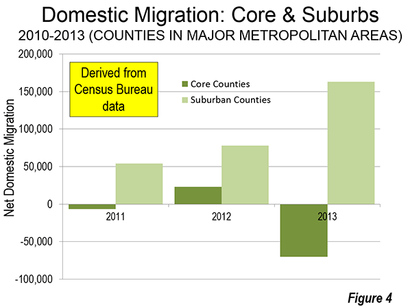
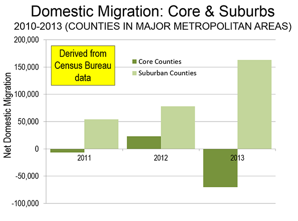
    This is just the latest in the "flocking to the city" mantra that is routinely mouthed without any actual evidence (see: Flocking Elsewhere: The Downtown Growth Story). The latest Census Bureau estimates show that net domestic migration continues to be negative in the core counties (which include the core cities) of the major metropolitan areas (those with more than 1,000,000 residents). The county level is the lowest geographical level for which data is available.

    At the same time, there is net domestic inward migration to the suburban counties. Moreover, much of the net domestic migration to metropolitan areas has been to the South and Mountain West, where core cities typically include considerable development that is suburban in nature (such as in Austin, Houston and Phoenix). As the tepid "recovery" has proceeded, net domestic migration to suburban counties has been strengthened (see: Special Report: 2013 Metropolitan Area Population Estimates), as is indicated in the Figure.

    There is no question but that core cities are doing better than before. It helps that core city crime is down and that the South Bronx doesn’t look like Berlin in 1945 anymore. For decades, many inclined toward a more urban core lifestyle were deterred by environments that were unsafe, to say the least. A principal driving force of this has been millennials in urban core areas. Yet, even this phenomenon is subject to over-hype. Two-thirds of people between the ages of 20 and 30 live in the suburbs, not the core cities, according to American Community Survey data.

    To his credit, Frizell notes that the spurt in multi-family construction is "not aspirational," citing the role of the Great Recession in making it more difficult for people to buy houses. As I pointed out in No Fundamental Shift to Transit: Not Even a Shift, 2013 is the sixth year in a row that total employment, as reported by the Bureau of Labor Statistics was below the peak year of 2007. This is an ignominious development seen only once before in the last 100 years (during the Great Depression).

    In short, urban cores are in recovery. But that does not mean (or require) that suburbs are in decline.

  • Largest World Cities: 2014

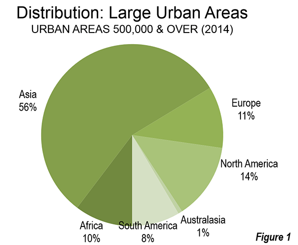
    The recently released 10th edition of Demographia World Urban Areas provides estimated population, land area and population density for the 922 identified urban areas with more than 500,000 population. With a total population of 1.92 billion residents, these cities comprise approximately 51 percent of the world urban population. The world’s largest cities are increasingly concentrated in Asia, where 56 percent are located. North America ranks second to Asia, with only 14 percent of the largest cities (Figure 1). Only three high income world cities are ranked in the top ten (Tokyo, Seoul and New York) and with present growth rates, Tokyo will be the lone high-income representative by the middle 2020s.

    Demographia World Urban Areas is the only regularly published compendium of urban population, land area and density data for cities of more than 500,000 population. Moreover, the populations are matched to the urban land areas where sufficient data is available from national census authorities.

    The City

    The term "city" has two principal meanings. One is the "built-up urban area," which is the city in its physical form, encompassing virtually all of the land area encircled by rural land or bodies of water. Demographia World Urban Areas reports on cities as built-up urban areas, using the following definition (Note 1).

    An urban area is a continuously built up land mass of urban development that is within a labor market (metropolitan area or metropolitan region). As a part of a labor market, an urban area cannot cross customs controlled boundaries unless the virtually free movement of labor is permitted. An urban area contains no rural land (all land in the world is either urban or rural).

    The other principal definition is the labor market, or metropolitan area, which is the city as the functional (economic) entity. The metropolitan area includes economically connected rural land to the outside of the built-up up urban area (and may include smaller urban areas). The third use, to denote a municipal corporation (such as the city of New York or the city of Toronto) does not correspond to the city as a built-up urban area or metropolitan area. This can – all too often does –   cause confusion among analysts and reporters who sometimes compare municipalities to metropolitan areas or to built-up urban areas.

    A Not Particularly Dense Urban World

    Much has been made of the fact that more than one-half of humanity lives in urban areas, for the first time in history. Yet much of that urbanization is not of the high densities associated with cities like Dhaka, New York, or even Atlanta.

    The half of the world’s urban population not included in Demographia World Areas lives in cities ranging in population from the hundreds to the hundreds of thousands (see: What is a Half-Urban World). In the high income world, residents of large urban areas principally live at relatively low densities, with automobile oriented suburbanization accounting for much of the urbanization in Western Europe, North America, Japan and Australasia. This point was well illustrated in research by David L. A. Gordon et al at Queen’s University (Kingston, Ontario), released last year which concluded that the metropolitan areas of Canada are approximately 80 percent suburban.

    Population

    There are now 29 megacities, with the addition in the last year of London. London might be thought of as having been a megacity for decades, however the imposition of its greenbelt forced virtually all growth since 1939 to exurban areas that are not a part of the urban area, keeping its population below the 10 million threshold until this year (Demographia World Urban Areas Table 1).

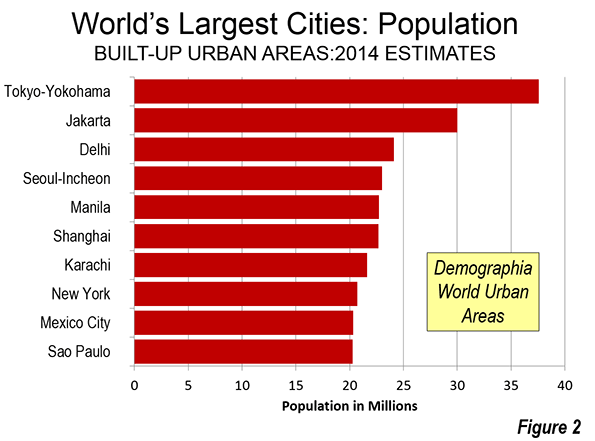
    The largest 10 contain the same cities as last year, though there have been ranking changes. Tokyo, with 37.6 million residents, continues its half century domination, though its margin over growing developing world cities is narrowing, especially Jakarta. Manila became the fifth largest urban area in the world, displacing Shanghai, while Mexico City moved up to 9th, displacing Sao Paulo (Figure 2).

    Land Area

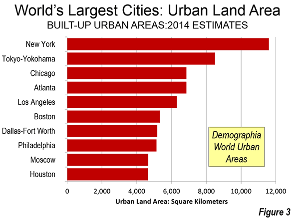
    Often seen as the epitome of urban density, the urban area of New York continues to cover, by far, the most land area of any city in the world. Its land area of nearly 4,500 square miles (11,600 square kilometers) is one-third higher than Tokyo’s 3,300 (8,500 square kilometers). Los Angeles, which is often thought of as defining low-density territorial expansion ranks only fifth, following Chicago and Atlanta, with their substantially smaller populations (Figure 3). Perhaps more surprisingly is the fact that Boston has the sixth largest land area of any city in the world. Boston’s strong downtown (central business district) and relatively dense core can result in a misleading perception of high urban density. In fact, Boston’s post-World War II suburbanization is at urban densities little different than that of Atlanta, which is the world’s least dense built-up urban area with more than 3 million population. Now, 29 cities cover land areas of more than 1,000 square miles or 2,500 square kilometers (Demographia World Urban Areas Table 3).

    Urban Density

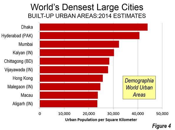
    All but two of the 10 densest cities are on the Indian subcontinent. Dhaka continues to lead in density, with 114,000 residents per square mile (44,000 per square kilometer).  Hyderabad (Pakistan, not India) ranks a close second. Mumbai and nearby Kalyan (Maharashtra) are the third and fourth densest cities. Hong Kong and Macau are the only cities ranking in the densest ten outside the subcontinent (Figure 4). Despite its reputation for high urban densities, the highest ranking city in China (Henyang, Hunan) is only 39th (Demographia World Urban Areas Table 4).

    Smaller Urban Areas

    Demographia World Urban Areas Table 2 includes more than 700 additional cities with fewer than 500,000 residents, mainly in the high income world. Unlike the main listing of urban areas over 500,000 population, the smaller cities do not represent a representative sample, and are shown only for information.

    Density by Geography

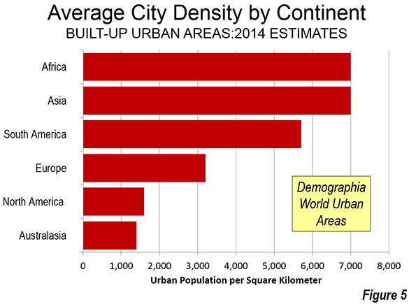
    Demographia World Urban Areas also provides an average built-up urban area density for a number of the geographical areas. Africa and Asia had the highest average city densities, at 18,000 per square mile (7,000 per square kilometer), followed by South America. Europe was in the middle, while North America and Oceania have the lowest average city densities (Figure 5).

    Some geographies, however, had much higher average urban densities. Bangladesh was highest, at 86,800 per square mile (33,000 per square kilometer), nearly five times the Asian average. Other geographies above 30,000 per square mile (11,500 per square kilometer) included Pakistan, the Democratic Republic of the Congo, the Philippines, India and Colombia, the only representative from the Western Hemisphere (Demographia World Urban Areas Table 5).

    Wendell Cox is principal of Demographia, an international public policy and demographics firm. He is co-author of the "Demographia International Housing Affordability Survey" and author of "Demographia World Urban Areas" and "War on the Dream: How Anti-Sprawl Policy Threatens the Quality of Life." He was appointed to three terms on the Los Angeles County Transportation Commission, where he served with the leading city and county leadership as the only non-elected member. He was appointed to the Amtrak Reform Council to fill the unexpired term of Governor Christine Todd Whitman and has served as a visiting professor at the Conservatoire National des Arts et Metiers, a national university in Paris.

    ———————-

    Note 1: Urban areas are called also called "population centres" (Canada), "built-up urban areas" (United Kingdom, "urbanized areas’ (United States), "unités urbaines" (France)  and "urban centres" (Australia). The "urban areas" of New Zealand include rural areas, as do many of the areas designated "urban" in the People’s Republic of China, and, as a result, do not meet the definition of urban areas above.

    Note 2: Demographia World Urban Areas is a continuing project. Revisions are made as more accurate satellite photographs and population estimates become available. As a result, the data in Demographia World Urban Areas is not intended for comparison to prior years, but is intended to be the latest data based upon the best data sources available at publication.

    Photograph: Slum, Valenzuela City, Manila (by Author)

  • Turn Of The Screwed: Does The GOP Have A Shot At Wooing Disgruntled Millennials?

    Over the past five years, the millennial generation (born after 1983) has been exercising greater influence over the economy, society and politics of the country, a trend that will only grow in the coming years. So far, they’ve leaned Democratic in the voting booth, but could the lousy economic fate of what I’ve dubbed “the screwed generation” lead to a change?

    Just look at these numbers. Since 2008, the percentage of the workforce under 25 has dropped by 13.2%, according to the Bureau of Labor Statistics, while that of people over 55 has risen by 7.6%. Among high school graduates who left school in 2009-11, only 16% had full-time work in 2012, and 22% worked part time although most sought a full-time job.

    These trends are likely to continue and could worsen, according to the U.S. Department of Labor, particularly for workers between 20 and 24. Today even a college degree guarantees increasingly little in terms of social uplift. Tuition debt is nearing $1 trillion; the percentage of 25-year-olds with school debt has risen from 25% in 2004 to close 40% in 2012. Average indebtedness amongst borrowers has grown 70% from $15,000 to nearly $25,000.

    A record one in 10 recent college borrowers has defaulted on their debt, the highest level in a decade. With wages for college graduates on a downward slope, one has to wonder how many more will join them.

    Over 43% of recent graduates who are employed are working at jobs that don’t require a college education, according to a recent report by the Heldrich Center for Workforce Development. Some 16% of bartenders and almost the same percentage of parking attendants had a bachelor’s degree or higher, notes Ohio State economics professor Richard Vedder.

    Besides a tepid economy, the millennials confront paying off huge public debts, much of it due to the generous pensions of boomer public employees. This constitutes what economist Robert Samuelson has labeled “a generational war” in which the young are destined to be losers in the “withering of the affluent society.” As he puts it: “For millions of younger Americans—say, those 40 and under—living better than their parents is a pipe dream. They won’t.”

    Not surprisingly, the young, who are traditionally optimists, are becoming far less so. According to a Rutgers study, 56% of recent high school graduates feel they would not be financially more successful than their parents; only 14% thought they’d do better. College education doesn’t seem to make a difference: 58% of recent graduates feel they won’t do as well as the previous generation. Only 16% thought they’d do better.

    According to Pew Research, up to half of millennials lean Democratic, compared to barely a third who favor the Republicans. The actue generational chronciclers Morley Winograd and Mike Hais suggest that this will continue and that hard times may even strengthen millennial support for what they describe as “economically activist government.” They cite a 2011 Pew poll that found millennials preferred a larger government that provided more services over a smaller one by a 54% to 35% margin. By contrast, 54% of boomers (born 1946-1964) and 59% of the silent generation (born 1925-1945) favored a smaller government.

    Critically, they maintain, these political views are likely to remain in place throughout their lifespans. The “Greatest Generation,” those born before 1925 who grew up during the Depression, never lost their enthusiasm for government.

    But it may be premature for Democrats to presume they have a lock on millennials’ loyalty.

    In 2008, twice as many millennials identified as Democrats or leaned Democratic (58%) as identified with the GOP or leaned Republican (29%), according to Pew. Cut to 2014, and the Democrats’ advantage among millennials has narrowed to 16 percentage points (50% to 34%).

    Although barely a a quarter of those under 35 said they had positive feelings toward the Republican Party in the last Wall Street Journal/NBC News poll, in a poll earlier this year, support for the Democrats has also dropped from roughly half to barely a third. Last year, a majority of 18- to 29-year-olds polled in a Harvard study no longer approved of the president’s performance.

    This suggest that like boomers under Jimmy Carter, who then shifted to Reagan, the millennials are not to be taken for granted. To attract them, though, Republicans will need to change many of their positions.

    Millennials, for example, are far more heavily minority, and descended from recent immigrants; they are likely to be far more permissive on immigration reform than earlier generation. At the same time, they embrace significantly more liberal views on issues like gay marriage and legalization of marijuana than older generations. Republicans right now are not competitive on these issues.

    Some conservatives rest their hopes not on attracting millennial voters but on the possibility that they’ll stay home during the mid-term elections. In 2010, 18- to 24-year-olds turned out at half the rate of the rest of electorate. But this can’t go on forever; the millennial share of the vote, even with poor turnouts, will continue to go up and will eventually overwhelm a party that depends on older voters to prop them up. In 2012 millennials accounted for roughly a quarter of the electorate; by 2020 they will be about 36%.

    Simply put, Republicans have no choice but to engage this population. To do so, they must focus primarily on economic growth, where the Democrats don’t have much to recommend themselves. Issues where the GOP could make up ground include reform for boomer pensions, as well as policies to spark job and income growth.

    To win over a significant share of millennials, Republicans don’t so much need a new Reagan as a program that inspires more confidence in the economic future.

    Although I am not fond of either party, a more competitive political environment among millennials would be useful, not only for conservatives also for the generation itself. As African Americans should have learned by now, being taken for granted does not guarantee better service from the political class. Under the country’s first black president, conditions for African Americans have declined rapidly.

    The evolution of the boomer generation suggests that such a change of fortune could happen. Between 1990 and today, the percentage of boomers identifying with the Democratic Party has dropped from 31% in 1990 to 25%. Much of this stemmed from reaction to the failures of the Carter presidency.

    This suggests that, although the formative years are critical, people do change their views as they age, experience life as adults and, most importantly, become parents. Many may not become Republicans, but could easily shift towards independent status. It may not happen this year, but perhaps later in the decade.

    Over time, even the self-absorbed boomers will have to give way to the needs of the new generation. The challenge for both parties is to develop policies that will allow the millennials to rise as have previous American generations. Whether these ideas come from the right or left seems less important than that the debate be engaged, open and focused more on the future than the past.

    This piece originally appeared in Forbes.

    Joel Kotkin is executive editor of NewGeography.com and Distinguished Presidential Fellow in Urban Futures at Chapman University, and a member of the editorial board of the Orange County Register. He is author of The City: A Global History and The Next Hundred Million: America in 2050. His most recent study, The Rise of Postfamilia

    Unemployed photo by BigStockPhoto.com.

  • No Joke: It Couldn’t Get Much Better In Fargo

    This week the coastal crowd will get another opportunity to laugh at the zany practices of those living in the frozen reaches of the Great Plains. The new television series “Fargo,” based on the 1996 Coen brothers movie, will no doubt be filled with fearsome violence mixed with the proper amount of Scandinavian reserve and wry humor — the very formula that made the original such a hit.

    Yet how much will “Fargo” the series resemble the real places? Probably not much. For one thing the series only uses Fargo as a kind of marker; the action actually takes place in Bemidji, Minn., a small town of 12,000 over two hours away. I know distances are seen differently in the northern Plains, but the whole idea seems a bit of a stretch. Located in forest and lake country, many locals would not even consider the Minnesota town part of the Plains.

    Less known to the sophistos who will watch the show is that Fargo, a metro area with over 200,000 people, and the state of North Dakota have been enjoying a sustained boom for a decade. This resurgence — in demographics, economics and real estate — follows decades of relative decline and an almost sullen sense of isolation that drove many people out of the state.

    In a state where the unofficial motto seems to be “it could be worse” — not a bad notion given the often miserable weather — things couldn’t be much better. North Dakota leads the nation in virtually every indicator of prosperity: the lowest unemployment rate, and the highest rates of net in-migration, income growth and job creation. Last year North Dakota wages rose a remarkable 8.9%, twice as much as Utah and Texas, which shared honors for second place, and many times the 1% rise experienced nationwide.

    The once dreary predictions of demographic decline — epitomized by the proposal two New Jersey academics to turn the area into a “Buffalo Commons” — have been reversed. North Dakota now lures many college graduates from out of state and keeps more of its own as well. Today more than half of North Dakotans aged 25-44 have post-secondary degrees, among the highest percentages in the nation, and well above the roughly 40% number for the rest of the country.

    Many will ascribe the state’s rise primarily to the energy boom. To be sure the fastest growth in North Dakota and other Plains states has been in the areas closest to the oil and gas finds. But over the past decade, the population of the Plains has expanded by 14%, well above the national average and far faster than the Midwest, the Northeast or California.

    This Plains resurgence is taking place even in areas far from energy development. Fargo, for example, is six hours hard driving from Williston, the center of the Bakken range. Yet despite this the area’s population has been growing, up 20% in the last decade, twice the national average. Since 2010, over 8,000 more people have come to the Fargo metro area, which extends to the Minnesota city of Moorhead, than have left. In fact, the small cities of the Dakotas have been growing faster than the nation for well more than a decade, before the recent energy boom took off.

    The growth in Fargo has come not so much from energy, but an expanding industrial and technology sector. STEM employment is up nearly 40% since 2001, compared to 3% nationally. It also leads all other U.S. metro areas in the growth in the number of mid-skilled jobs, providing good wages to people with two-year or certificate degrees. Between 2009 and 2011, mid-skilled employment grew 5%, roughly 10 times the national average. No surprise then that the population with BAs in Fargo has grown 50% in the last decade, well above the 40% rate for the rest of the country.

    Yet perhaps nothing illustrates the dramatic changes in Fargo better than its downtown area. Twenty years ago, when I first visited the city, downtown was torpid on a good day. Storefronts were old, funky and often empty. The local hotels ranged between acceptable to sorry.

    But in the past decade downtown Fargo has seen a crush of new investment; property values have more than doubled since 2000. Mid-range apartment complexes are sprouting up, all pitching themselves to millennial professionals who value a more pedestrian-oriented environment. The founder of Great Plains Software, now Microsoft Business Systems, Doug Burgum, has proposed to build a 23-story office tower downtown. Not surprisingly, it would be the tallest building in the state.

    Some are rightfully skeptical about some of these ambitious plans given the low cost of development on the periphery and the region’s basically non-urban mindset. But the feel has certainly changed, with several high-end restaurants, huge numbers of bars (befitting the German and Scandinavian roots of the area’s population), offering a rising number of local brews. There’s even a boutique hotel, the Donaldson, founded by Burgum’s ex-wife Karen, decorated with Plains art, and run by a friendly, highly professional staff.

    The people even look different than a decade or two ago. The bars and restaurants now host a more attractive group of young professionals and meandering divorcees. The change is so striking that I have been pitching friends in L.A. to produce a North Dakota version of the “Real Housewives” reality series.

    None of this is likely to be revealed in the new “Fargo” TV show. After all, the place has one of the lowest crime rates in the country, a full third below the national average; with only 11 murders since 2000, it’s hardly the Baltimore of the “Wire” or “Treme.” But murder sells better than contentment, or at least makes for more riveting entertainment about the place, unless I can find buyers for my “Housewives” idea. But unlike in the past, Fargo residents don’t have to cringe about this latest Hollywood assault and its impact on their image. Things are good enough that they can afford to laugh; it certainly could be a lot worse.

    This piece originally appeared in Forbes.

    Joel Kotkin is executive editor of NewGeography.com and Distinguished Presidential Fellow in Urban Futures at Chapman University, and a member of the editorial board of the Orange County Register. He is author of The City: A Global History and The Next Hundred Million: America in 2050. His most recent study, The Rise of Postfamilialism, has been widely discussed and distributed internationally. He lives in Los Angeles, CA.

    Hotel Donaldson photo By jeffreykreger

  • Focusing on People, Not Sprawl

    For seven decades urban planners have been seeking to force higher urban population densities through urban containment policies. The object is to combat "urban sprawl," which is the theological (or ideological) term applied to the organic phenomenon of urban expansion. This has come at considerable cost, as house prices have materially increased relative to incomes, which is to be expected from urban containment strategies that ration land (and thus raise its price, all things being equal).

    Smart Growth America is out with its second report that rates urban sprawl, with the highest scores indicating the least sprawl and the lowest scores indicating the most (Measuring Sprawl 2014).

    Metropolitan Areas and Metropolitan Divisions

    For the second time in a decade Smart Growth America has assigned a "sprawl" rating to what it calls metropolitan areas. I say "what it calls," because, as a decade ago, the new report classifies "metropolitan divisions" as metropolitan areas (Note 1). Metropolitan divisions are parts of metropolitan areas. This is not to suggest that a metropolitan division cannot have a sprawl index, but metropolitan divisions have no place in a ranking of metropolitan areas. Worse, metropolitan areas with metropolitan divisions were not rated (New York, Los Angeles, Chicago, Dallas-Fort Worth, Philadelphia, Washington, Miami, San Francisco, Detroit, and Seattle).

    This year’s highest rating among 50 major metropolitan areas (over 1,000,000 population) goes to part of the New York metropolitan area (the New York-White Plains-Wayne metropolitan division) at 203.36. The lowest rating (most sprawling) is in Atlanta, at 40.99. This contrasts with 2000, when the highest rating was in part of the New York metropolitan area (the New York PMSA), at 177.8, compared to the lowest, in the Riverside-San Bernardino PMSA portion of the since redefined Los Angeles metropolitan area, at 14.2. Boston is excluded due to insufficient data (Note 2)

    Rating Sprawl

    The sprawl ratings are interesting, though obviously I would have done them differently.

    Overall urban population density would seem to be a more reliable indicator (called urbanized areas in the United States, built-up urban areas in the United Kingdom, population centres in Canada, and urban areas just about everywhere else). For example, the Los Angeles metropolitan area (combining its two component metropolitan divisions), has an index indicating greater sprawl than Springfield, Illinois. Yet, the Los Angeles urban area population density is about four times that of Springfield (6,999 residents per square mile, compared to 1747 per square mile, approximately the same as bottom ranking Atlanta). The implication is that if Los Angeles were to replicate the individual ratings that make up its index, and covered (sprawled) over four times as much territory, it would be less sprawling than today.

    This case simply illustrates the fact that sprawl has never been well defined. Indeed, the world’s most dense major urban area, Dhaka (Bangladesh), with more than 15 times the urban density of Los Angeles and 65 times the urban density of Springfield, has been referred to in the planning literature as sprawling.

    Housing Affordability

    The principal problem with the report lies with its assertions regarding housing affordability. Measuring Sprawl 2014 notes that less sprawling areas have higher housing costs than more sprawling areas (Note 3). However, it concludes that the lower costs of transportation offset much more all of the difference. This conclusion arises from reliance the US Department of Housing and Urban Development (HUD) and US Department of Transportation (DOT) Location Affordability Index, which bases housing affordability for home owners on median current expenditures, not the current cost of buying the median priced home. Nearly two thirds of the nation’s households are home owners, and most aspire to be.

    HUD-DOT describes its purpose as follows:

    "The goal of the Location Affordability Portal is to provide the public with reliable, user-friendly data and resources on combined housing and transportation costs to help consumers, policymakers, and developers make more informed decisions about where to live, work, and invest." 

    Yet, a consumer relying on the Location Affordability Index could be seriously misled. The HUD-DOT index (Note 4) does not begin to tell the story to people seeking to purchase homes. The costs are simply out of pocket housing costs, regardless of whether the mortgage has been paid off and regardless of when the house was bought (urban containment markets have seen especially strong house price increases).An index including people who have no mortgage and people who have lower mortgage payments as a result of having purchased years ago cannot give reliable information to consumers in the market today.

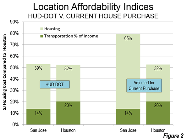
    A household relying on this source of information would be greatly misled. For example, comparing Houston with San Jose, according to HUD-DOT, owned housing and transportation consume virtually the same share of the median household income in each of the two metropolitan areas. In Houston, 52.5 percent of income is required for housing and transportation, while the number is marginally higher than San Jose (52.9 percent).

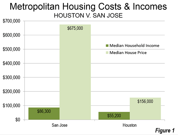
    But the HUD-DOT numbers reflect nothing like the actual costs of housing in San Jose relative to Houston. The median price house in Houston was approximately $155,000, 2.8 times the median household income of $55,200 (this measure is called the median multiple) during the 2006-10 period used in calculating the HUD-DOT index. In San Jose, the median house price was approximately $675,000, 7.8 times the median household income of $86,300 (Figure 1).
    If the Location Affordability Index reflected the real cost for a prospective home owner (HUD-DOT costs including a market rate mortgage for the house), a considerable difference would emerge between San Jose and Houston. The combined San Jose Location Affordability Index for home owners would rise to 85 percent of median household income, a full 60 percent above the Houston figure, rather than the minimal difference of less than one percent indicated by HUD-DOE (Figure 2).
    Under-Estimating the Cost of Urban Containment

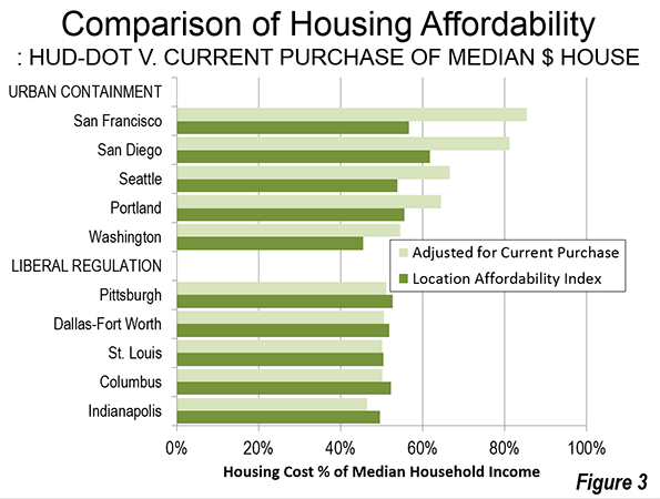
    There is a substantial difference between the HUD–DOT housing and transportation cost and the actual that would be paid by prospective buyers. Five selected urban containment markets indicate a substantially higher actual housing cost than reflected in the HUD–DOT figures. On the other hand, in the selected liberally regulated markets (or traditionally regulated markets), the HUD–DOE figure is much closer to the current cost of home ownership (Figure 3). This is a reflection of the greater stability (less volatility) of house prices in liberally regulated markets. Overall, based on data in the 50 major metropolitan areas, owned housing costs relative to incomes rise approximately 6 percent for each 10 percent increase in the sprawl index – that is, less sprawl is associated with higher house prices relative to incomes (Note 6).
    The increasing impacts of urban containment’s housing cost increases have been limited principally to households who have made recent purchases. The effect will become even more substantial in the years to come as the turnover of the more expensive housing stock continues.

    Granted, the 2006 to 2010 housing data includes part of the housing bubble and its higher house prices. However, house prices relative to incomes have returned to levels at or above that recorded during the period covered by Measuring Sprawl 2014 in "urban containment" markets, such as San Francisco, San Jose, Los Angeles, San Diego, Seattle, Portland, and Washington.

    Economic Mobility and Human Behavior

    Another assertion requires attention: economic mobility is greater in less sprawling metropolitan areas. The basis is research by Raj Chetty and Nathaniel Hendren of Harvard University and Patrick Kline and Emmanuel Saez of the University of California, Berkeley. However, the realities of domestic migration suggest caution with respect to the upward mobility conclusions, as is indicated in Distortions and Reality About Income Mobilityand in commentary by Columbia University urban planner David King.

    Virtually all urban history shows city growth to have occurred as people have moved to areas offering greater opportunity. Jobs, not fountains, theatres and art districts, drive nearly all the growth of cities. This means that there should be a strong relationship between the cities net domestic migration and the economic mobility conclusions of the research. The strongest examples show the opposite relationship.

    Domestic migration is strongly away from some metropolitan areas identified in the research as having the greatest upward income mobility also had substantial net domestic migration losses. For example, despite claims of high economic mobility New York, Los Angeles and the San Francisco Bay area, each lost approximately 10 percent of their population to net domestic migration in the 2000s. On the other hand, some metropolitan areas scoring the lowest in upward economic mobility drew substantial net domestic migration gains. For example, low economic mobility Charlotte and Atlanta gained 17 percent and 10 percent due to net domestic migration in the 2000s. Thus, the results of the economic research appear to be inconsistent with expected human behavior (Note 7).

    Sprawl: An Inappropriate Priority

    The new sprawl report is just another indication that urban planning policy has been elevated to a more prominent place than appropriate among domestic policy priorities. The usual justification for urban containment is a claimed sustainability imperative for its densification and anti-mobility policies. Yet, these policies are hugely expensive and thus ineffective at reducing greenhouse gas emissions, and thus have the potential to unduly retard economic growth (read "the standard of living and job creation"). Far more cost-effective alternatives are available, which principally rely on technology.

    There is a need to reverse this distortion of priorities. Little, if anything is more fundamental than improving the standard of living and reducing poverty (see Toward More Prosperous Cities). Housing is the largest element of household budgets and policies of that raise its relative costs necessarily reduce discretionary incomes (income left over after paying taxes and paying for basic necessities). There is no legitimate place in the public policy panoply for strategies that reduce discretionary incomes.

    London School of Economics Professor Paul Cheshire may have said it best, when he noted that urban containment policy is irreconcilable with housing affordability.

    ———

    Note 1: The previous Smart Growth America report used primarily metropolitan statistical areas (PMSAs), which have been replaced by metropolitan divisions. The primary metropolitan statistical areas were also subsets of metropolitan areas (labor market areas). This is problem is best illustrated by the fact that the Jersey City PMSA, composed only of Hudson County, NJ, is approximately one mile across the Hudson River from Manhattan in New York. Manhattan is the world’s second largest central business district and frequent transit service connects the two. Obviously, Jersey City is a part of the New York metropolitan area (labor market area), not a separate labor market.

    Note 2: Because of incomplete data, Boston is not given a sprawl rating in Measuring Sprawl 2014. A different rating system in the previous edition resulted in a Boston rating among the least sprawling. Yet, the Boston metropolitan area is characterized by low density development. Outside a 10 mile radius from downtown, the population density within the urban area is slightly lower than that of Atlanta (same square miles of land area used).

    Note 3: Higher house prices relative to household incomes are more associated with policies to control urban sprawl (such as urban growth boundaries and other land rationing devices), than with the extent of sprawl. More compact (less sprawling) urban areas do not necessarily have materially higher house prices. For example, in 1970, the Los Angeles urban area was one of the most dense in the United States, yet it was within the historical affordability range (a median multiple of less than 3.0). The emergence of Los Angeles as the nation’s most dense urban area in the succeeding decades (and 30 percent increase in density) is largely the result of a change in urban area criteria. Through 1990, the building blocks of urban areas were municipalities, which meant that many square miles of San Gabriel Mountains wilderness were included, because it was in the city of Los Angeles. Starting in 2000, the building blocks or urban areas became census blocks, which are far smaller and thus exclude the large swaths of rural territory that were included before in some urban areas.

    Note 4: The transport costs from the Location Affordability Index are accepted for the purposes of this article.

    Note 5: The current purchase housing cost is based on the average price to income multiple over the period of 2006 to 2010, relative to the median household income (calculated from quarterly data from the Joint Center for Housing Studies of Harvard University, State of the Nation’s Housing 2011). It is assumed that the buyer would finance 90 percent of the house cost at the average 30 year fixed mortgage rate with points over the period. The 10 percent down payment is allocated annually in equal amounts over the 360 months (30 years). The final annual cost estimate is calculated by adding the monthly mortgage payment and down payment allocation to the median monthly housing cost in each metropolitan area for households without a mortgage.

    HUD-DOT uses the "selected monthly owner cost" from the American Community Survey (ACS) for its cost of home ownership. According to ACS, “Selected monthly owner costs are calculated from the sum of payment for mortgages, real estate taxes, various insurances, utilities, fuels, mobile home costs, and condominium fees."

    Note 6: This is based on a two-variable regression estimation (log-log) with the sprawl index as the independent variable and the substituted housing share of income as the dependent variable for the 50 largest metropolitan areas (excluding Boston), It is posited that most of the variation in housing costs is accounted for by variation in land costs. Other significant factors, such as construction costs and financing costs in this sample vary considerably less. A sprawl index for each metropolitan areas represented by metropolitan divisions (not provided in the sprawl report) is estimated by population weighting.

    Note 7: Another difficulty with that research is that it measured geographic economic mobility at age 30, well before people reach their peak earning level. This is likely to produce less than reliable results, since those who achieve the highest incomes as well as the most educated such as medical doctors and people with advanced degrees) are likely to have larger income increases after age 30 than other workers.

    Wendell Cox is principal of Demographia, an international public policy and demographics firm. He is co-author of the “Demographia International Housing Affordability Survey” and author of “Demographia World Urban Areas” and “War on the Dream: How Anti-Sprawl Policy Threatens the Quality of Life.” He was appointed to three terms on the Los Angeles County Transportation Commission, where he served with the leading city and county leadership as the only non-elected member. He was appointed to the Amtrak Reform Council to fill the unexpired term of Governor Christine Todd Whitman and has served as a visiting professor at the Conservatoire National des Arts et Metiers, a national university in Paris.

    Suburban neighborhood photo by Bigstock.
  • Watch Chicago’s Middle Class Vanish Before Your Very Eyes

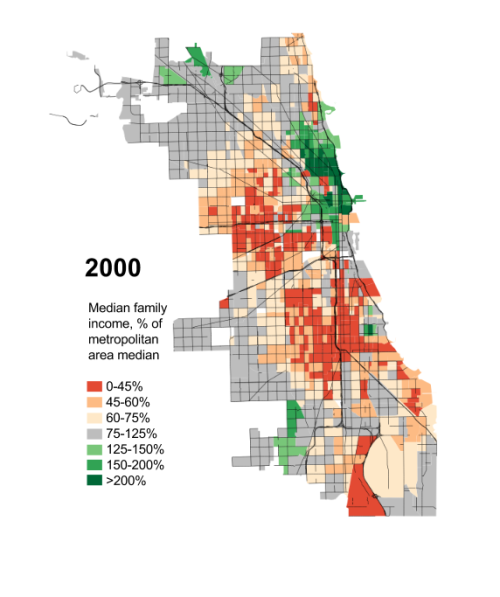
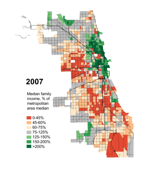
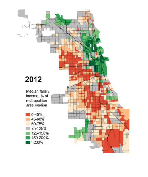
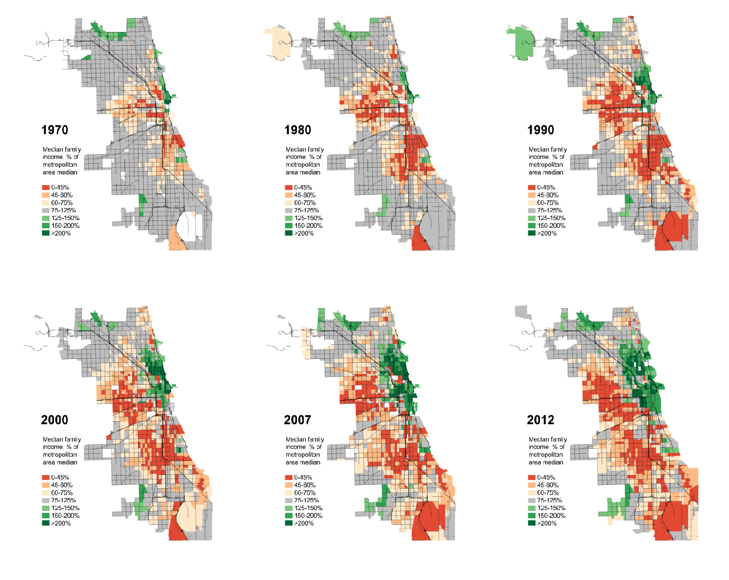
    Note: I owe both the concept for this measurement of income segregation and much of the actual data – all of it, except for 2012 – to Sean Reardon andKendra Bischoff, who wrote a series of wonderful papers on the subject and then were kind enough to send me a spreadsheet of their data from Chicago a while ago. The maps, however, are mine, as is all the data from 2012, and any mistakes in them or in the interpretation of the data is entirely my responsibility.

    I think one reason I’ve felt less than compelled by Chicagoland, CNN’s reasonably well-made documentary series, is that its tale-of-two-cities narrative is so worn, so often repeated, that it’s become a little dull. Not the actual fact of inequality – which only seems to cut deeper over time – but its retelling.

    In fact, I think the point has long passed at which simply repeating the story of Chicago’s stratification is equivalent to fighting it. For a lot of people, in my experience, it’s the opposite: an opportunity for distancing, for washing of hands. It’s a ritual in which we tell each other that this is the way it’s always been – The Gold Coast and the Slum was written about already well-entrenched institutions, after all, over three-quarters of a century ago – that these facts somehow seep out of the ground here, as much a part of the city as the lake, and that as a result there’s really nothing we can do about it.

    But this obscures much more than it clarifies. Inequality has always been a part of Chicago – as it has always been a part of the United States, and a part of humanity – but the forms it has taken, and the severity of those many forms, have changed in truly dramatic ways. Take, for example, today’s monolithic segregation of African Americans: at the turn of the last century, black Chicagoans were less segregated than Italians, and not because Italians were then hyper-segregated.

    Moreover, decisions made by people in the city have played, and continue to play, a huge role in determining what those changes look like. Had Elizabeth Wood received any serious support from white residents or their elected representatives – instead of meeting Klan-like violent resistance – the history of racial integration, economic integration, and public housing in this city would be very, very different. This isn’t to say that national and global factors aren’t important, since they obviously are. But neither do we lack responsibility.

    Anyway, this is all by way of introducing the following maps: their goal is not merely to depress you (you’re welcome!), but to suggest just how dramatically the reality of Chicago’s “two cities” has changed over the last few generations, how non-eternal its present state is, and that a happier alternate reality isn’t just possible, but actually existed relatively recently.

    I feel relatively comfortable telling the story of how Chicago came to be so segregated by race; I’m much humbler about my ability to explain this, except inasmuch as the ever-widening ghetto of the affluent could not exist without, yes, radically exclusionary housing laws, and I will take that up separately in another post. In the meanwhile, I’ll take a page from Ta-Nehisi Coates and ask you all, if you have some background in this, to talk to me like I’m stupid: what does the literature say about growing economic segregation? Who and what should I be reading?

    One last piece: the obvious and immediate reaction to these maps is to see them as a direct consequence of rising income inequality. There is some truth to that, but the researchers from which much of this data came have already discovered that income segregation has actually risen faster than inequality. So that’s not the end of the story.

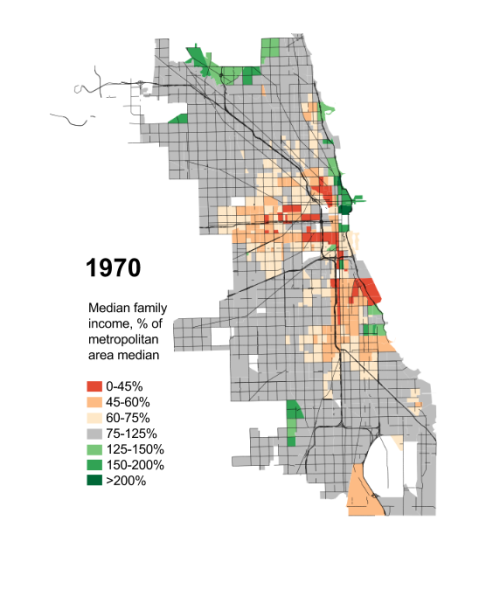
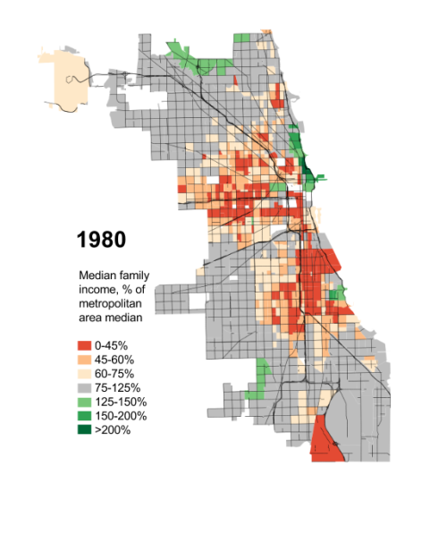
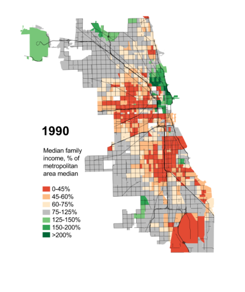
    Anyway, here you go: the disappearance of Chicago’s middle-class and mixed-income neighborhoods since 1970, measured by each Census tract’s median family income as a percentage of the median family income for the Chicago metropolitan region as a whole.

    Seg70aSeg80a


    Seg90aSeg00aSeg07aSeg12a


    IncSegGIF


    This piece first appeared at Daniel’s blog City Notes.

  • America’s New Brainpower Cities

    Brainpower rankings usually identify the usual suspects: college towns like Boston, Washington, D.C.,  and the San Francisco Bay area. And to be sure, these places generally have the highest per capita education levels. However, it’s worthwhile to look at the metro areas that are gaining college graduates most rapidly; this is an indicator of momentum that is likely to carry over into the future.

    To determine where college graduates are settling, demographer Wendell Cox analyzed the change in the number of holders of bachelor’s degrees and above between 2007 and 2012 in the 51 metropolitan statistical areas with over a million people (all saw gains). For the most part, the fastest-growing brain hubs are in the South and Intermountain West (which excludes the states on the Pacific Coast). Some of these places are usually not associated with the highest levels of academic achievement, and for the most, they still lag the national average in college graduation rates.

    But times are changing, and educated people are increasingly heading to these metro areas, notably in the South, were job growth has been robust and the cost of living is far lower than in the San Francisco Bay Area, New York or Los Angeles. This includes New Orleans, which ties for first place on our list with San Antonio. The New Orleans metro area’s population of college graduates grew by 44,000 from 2007 to 2012, a 20.3% increase, nearly double the national average of 10.9%. (The percentage of college grads in the U.S. stood at 19.4% in 2012, up from 18% in 2007.)

    New Orleans’ story, of course, is unique; the jump certainly is partly due to the return of evacuees to the city after Katrina, and some scoff that the region is destined to return to its historical pattern of exporting its educated young. But right now the American Community Survey data seems to indicate otherwise, as does the decision in recent years by numerous technology, videogame and media businesses to establish operations in the metro area, including General Electric, Paris-based Gameloft and the satellite communications company Globalstar, which in 2010 moved its headquarters from Silicon Valley to Covington, a prosperous suburb of the Crescent City.

    What is happening in New Orleans, where I have worked as a consultant, is unique, but it also follows a broader pattern that we see in other areas. Unable to afford to settle long-term in traditional “brain centers,” educated people are increasingly looking for places that have strong economies but also many of the cultural and natural amenities associated with the traditional meccas for the educated. With housing prices that are half to a third of Silicon Valley or San Francisco, New Orleans offered educated workers, particularly younger ones, many of the things they look for, but at an affordable cost.

    “For $65,000 a year in San Francisco you get a shared apartment and no car,” says long-time New Orleans tech entrepreneur Chris Reed. ”Here, you get great restaurants and clubs, and you get to have a car and your own nice apartment. It’s a no-brainer.”

    Other cities with some of the same characteristics are also winning in the race to bring in more educated workers. Nowhere is this more true than in Texas, which is home to four of the top 12 metro areas on our list. Tops is co-first place San Antonio, which had a net gain of 76,000 college-educated people since 2007, or 20.3%.

    Like New Orleans, the San Antonio area has traditionally lagged behind in attracting educated people; nearly one resident in six does not have a high school diploma. But the old Texas town also has many amenities that appeal to educated workers, notably great food and a good nightlife scene. In addition, it boasts one of the fastest-growing regional economies in the country, with expanding tech and energy businesses, something that may have a particular appeal in this still weak recovery.

    “When the buzz starts … and hipsters start to get wise to the neighborhood assets that are here, once the hipsters get wind of it – you’ll have to beat them away with a stick,” says economic geographer Jim Russell.

    Austin places third, which should come as no surprise — the area is home to the main campus of the University of Texas, boasts a thriving music scene and a strong technology infrastructure. Nor should the rapid growth of educated residents in sixth-ranked Houston, up 16% since 2007, which also enjoys low costs, an increasingly attractive cultural scene and one of the fastest growing hubs of dense urban living in the country. Dallas, also a fast-growing area, lands in 12th place on our list, boosting its college graduate population by 13%, or 175,000.

    One of the more surprising metro areas in our top 10 is fifth place Louisville, Ky.-Ind. The home of Humana, it has a thriving health care sector, and also is strong in the food industry and logistics. It has seen a 16.2% increase in the number of educated residents.

    Strong growth has also occurred in the Intermountain West, led by Denver (seventh) and Salt Lake City (eighth). Both areas have been beneficiaries of the migration of people and companies from California. This may also explain the growth of 11th place Phoenix, an area that has made remarkable strides since the disastrous days of the housing bust and is once again attracting migrants in larger numbers than any large metro area outside Texas.

    So if these areas are leading the race to capture “talent,” who is lagging behind? Not surprising at the bottom of the list are a series of Rust Belt cities with relatively weak economies, led by last place Detroit, where the number of college-educated residents rose 4.1%. Its followed by Providence,  Cleveland and Cincinnati.

    Boston, long styled as the “Athens” of America, ranks 47th on our list. Over the past five years Boston has gained some 98,000 college educated people, an increase of 7.2%, well below the national average. Beantown, of course, can always claim it has the highest “quality” brains but even in terms of percentage gains of people with graduate degrees it ranks only 41st .

    The data show the universe of educated people is not becoming more “spiky” as some suggest, but is spreading out. This is true not only in terms of percentage growth, but in absolute numbers. Since 2007, for example, the Houston and Dallas metro areas have added more BAs than San Francisco-Oakland, and nearly twice as many as Boston. As a result, these and other such cities are gaining a critical mass in brainpower not widely recognized in the Eastern-dominated media.

    At very least, we can say that the conventional wisdom favoring the traditional “brain” cities seems flawed. There will always be areas with more educated people per capita than others, if for no other reason than historical inertia and lack of migration, particularly among the less educated. But the clear pattern now is for brainpower, like population and jobs, to continue dispersing, largely to the South, the Southeast and the Intermountain West, with ramifications that will be felt in the economy in the decades ahead.

    Educational Attainment: BAs & Higher
    Corrected (2015-05-07)
    Major Metropolitan Area 2007 2012 Change Change % Rank
    Atlanta, GA    1,151,723     1,243,122       91,399 7.9% 45
    Austin, TX       382,119        477,058       94,939 24.8% 3
    Baltimore, MD       589,874        677,837       87,963 14.9% 14
    Birmingham, AL       187,094        214,201       27,107 14.5% 17
    Boston, MA-NH    1,271,193     1,369,597       98,404 7.7% 47
    Buffalo, NY       207,907        231,718       23,811 11.5% 34
    Charlotte, NC-SC       348,923        401,116       52,193 15.0% 13
    Chicago, IL-IN-WI    1,984,496     2,190,424     205,928 10.4% 40
    Cincinnati, OH-KY-IN       393,076        419,714       26,638 6.8% 48
    Cleveland, OH       380,479        405,731       25,252 6.6% 49
    Columbus, OH       367,811        419,136       51,325 14.0% 20
    Dallas-Fort Worth, TX    1,155,069     1,330,312     175,243 15.2% 12
    Denver, CO       595,437        708,325     112,888 19.0% 6
    Detroit,  MI       786,153        819,347       33,194 4.2% 51
    Hartford, CT       276,002        305,100       29,098 10.5% 39
    Houston, TX       972,615     1,157,627     185,012 19.0% 6
    Indianapolis. IN       333,079        377,189       44,110 13.2% 24
    Jacksonville, FL       221,907        258,893       36,986 16.7% 9
    Kansas City, MO-KS       410,109        460,391       50,282 12.3% 32
    Las Vegas, NV       257,886        293,001       35,115 13.6% 23
    Los Angeles, CA    2,458,215     2,720,654     262,439 10.7% 36
    Louisville, KY-IN       195,760        233,566       37,806 19.3% 5
    Memphis, TN-MS-AR       197,292        222,813       25,521 12.9% 26
    Miami, FL    1,058,815     1,186,398     127,583 12.0% 33
    Milwaukee,WI       308,214        337,253       29,039 9.4% 42
    Minneapolis-St. Paul, MN-WI       774,669        881,581     106,912 13.8% 21
    Nashville, TN       287,154        355,630       68,476 23.8% 4
    New Orleans. LA       172,965        216,970       44,005 25.4% 1
    New York, NY-NJ-PA    4,433,180     4,836,321     403,141 9.1% 43
    Oklahoma City, OK       210,720        237,329       26,609 12.6% 28
    Orlando, FL       379,636        409,263       29,627 7.8% 46
    Philadelphia, PA-NJ-DE-MD    1,204,380     1,377,684     173,304 14.4% 18
    Phoenix, AZ       709,284        818,434     109,150 15.4% 11
    Pittsburgh, PA       456,717        513,838       57,121 12.5% 30
    Portland, OR-WA       479,207        549,825       70,618 14.7% 16
    Providence, RI-MA       301,591        320,262       18,671 6.2% 50
    Raleigh, NC       278,754        324,318       45,564 16.3% 10
    Richmond, VA       244,277        280,650       36,373 14.9% 14
    Riverside-San Bernardino, CA       469,381        519,680       50,299 10.7% 36
    Rochester, NY       205,014        226,912       21,898 10.7% 36
    Sacramento, CA       403,140        435,485       32,345 8.0% 44
    Salt Lake City, UT       193,167        229,140       35,973 18.6% 8
    San Antonio, TX       300,114        376,445       76,331 25.4% 1
    San Diego, CA       631,996        722,819       90,823 14.4% 18
    San Francisco-Oakland, CA    1,251,139     1,414,393     163,254 13.0% 25
    San Jose, CA       527,167        592,703       65,536 12.4% 31
    Seattle, WA       814,902        918,119     103,217 12.7% 27
    St. Louis,, MO-IL       521,047        586,547       65,500 12.6% 28
    Tampa-St. Petersburg, FL       496,826        544,121       47,295 9.5% 41
    Virginia Beach-Norfolk, VA-NC       284,924        317,741       32,817 11.5% 34
    Washington, DC-VA-MD-WV    1,658,902     1,885,862     226,960 13.7% 22
    Total  34,181,501   38,352,595  4,171,094 12.2%
    Outside MMSAs  20,152,010   22,389,927  2,237,917 11.1%
    United States  54,333,511   60,742,522  6,409,011 11.8%


    Joel Kotkin is executive editor of NewGeography.com and Distinguished Presidential Fellow in Urban Futures at Chapman University, and a member of the editorial board of the Orange County Register. He is author of The City: A Global History and The Next Hundred Million: America in 2050. His most recent study, The Rise of Postfamilialism, has been widely discussed and distributed internationally. He lives in Los Angeles, CA.

    Graduation image by BigStockPhoto.com.

  • Special Report: 2013 Metropolitan Area Population Estimates

    The 2013 annual metropolitan area population estimates by the US Census Bureau indicate a continuing and persistent dominance of population growth and domestic migration by the South. Between 2010 and 2013, 51 percent of the population increase in the 52 major metropolitan areas (over 1 million population) was in the South. The West accounted for 30 percent of the increase, followed by the Northeast at 11 percent and eight percent in the North Central (Midwest).

    Components of Population Change: Major Metropolitan Areas

    The dominance of the South was even greater when we turn to net domestic migration between Census Bureau regions. Nearly 785,000 more people moved to the major metropolitan areas of the South from other parts of the country than left. A much smaller 170,000 net domestic migrants moved to major metropolitan areas in the West. At the same time the Northeast lost 485,000 net domestic migrants and the Midwest lost 280,000.

    Perhaps even more remarkable, the South, long a laggard as an immigrant destination, even led in net international migration (666,000 for a 1.2 percent over three years), though the Northeast added 546,000, for a 1.0 percent rate). Net international migration to the West was about the same, some 454,000 for a 1.0 percent rate. The Midwest had the lowest net international migration in the country and well below any other region (280,000, for a 0.6 percent rate), as is indicated in Table 1.

    There was a substantial gap in the natural increase (births minus deaths) between the regions as well. The West (2.1 percent relative to the 2010 population over the three years) lead the South (2.0 percent) slightly in rate. Both were well ahead of the Midwest at 1.5 percent and especially the Northeast, at 1.2 percent (Table 1).

    Table 1
    Components of Population Change by Region
    Major Metropolitan Areas
      Total Natural Growth (Births Minus Deaths) Net Domestic Migration Net International Migration
    Northeast              546,742              434,872             (434,029)              545,899
    South           2,555,304           1,105,631              783,438              666,235
    North Central              398,536              472,017             (280,022)              206,541
    West           1,543,319              917,852              171,444              454,023
    Change Compared to 2010 Population
    Northeast 1.5% 1.2% -1.2% 1.5%
    South 4.6% 2.0% 1.4% 1.2%
    North Central 1.2% 1.5% -0.9% 0.6%
    West 3.5% 2.1% 0.4% 1.0%
    From Census Bureau Data


    Population Growth

    The New York metropolitan area continues to hold the top position, having added nearly 400,000 residents since 2010 to rise to a population of 19,950,000 residents. At its current rate of growth, New York will exceed a population of 20 million in 2014. There was a time that many expected second-place Los Angeles to overtake New York. However, since 1990 the New York population advantage over Los Angeles has expanded from 6.1 million to 6.8 million, including a further 80,000 advantage built up since 2010 (present geographical definitions). Part of this because much of the growth has been pushed to the more distant Riverside-San Bernardino area.

    Los Angeles and Chicago continued to retain the second and third positions, which they seem likely to maintain for decades. Population projections by the National Conference of Mayors indicates strong growth in Dallas-Fort Worth and Houston over the next three decades could have them by pass Chicago by 2050. The challenge could be even more immediate, since Chicago’s growth rate over the first three years of the decade is approximately one half the annual rate projected by the US Conference of Mayors between 2012 and 2042.

    Late in the last decade, Dallas-Fort Worth passed Philadelphia to become the fourth largest metropolitan area. Then, Philadelphia was passed by Houston in 2011. The result is that, for the first time since the nation’s founding, two of the five largest cities (which are functionally defined as metropolitan areas) are in a single state (Texas).

    Philadelphia seems likely to fall further. The strong growth rate of seventh ranked Washington suggests that this nearby rival may also pass Philadelphia as early as 2015. Eighth ranked Miami is growing fast enough that it also could drop Philadelphia a position, to 8th place the 2020 census.

    But Philadelphia is not the only metropolitan area in relative decline. Detroit started the decade as the nation’s 12th largest metropolitan area, but has since fallen to 14th. Detroit has been passed by both Riverside-San Bernardino and Phoenix. Phoenix rose 14th to 12th, passing Riverside-San Bernardino (which remained in 13th position) in the process.

    Among the 52 major metropolitan areas, Austin has grown at the greatest percentage rate since 2010 with Raleigh was the second fastest growing. Houston was the third fastest growing major metropolitan area over the three year period. Orlando ranked 4th in growth from 2010, while San Antonio was the fifth. The top ten was rounded out by Denver, Washington, Dallas-Fort Worth, Charlotte and Oklahoma City. Thus, among the 10 fastest-growing major metropolitan areas, nine were in the South and one (Denver) was in the West (Table 2).

    Table 2
    Major Metropolitan Area Population: 2010, 2012 & 2013
    Metropolitan Areas 2010 2012 2013 2010-13 2012-13
    Atlanta, GA       5,304,197       5,454,429       5,522,942 4.12% 1.26%
    Austin, TX       1,727,784       1,835,110       1,883,051 8.99% 2.61%
    Baltimore, MD       2,715,312       2,753,922       2,770,738 2.04% 0.61%
    Birmingham, AL       1,129,096       1,134,915       1,140,300 0.99% 0.47%
    Boston, MA-NH       4,564,054       4,642,095       4,684,299 2.63% 0.91%
    Buffalo, NY       1,135,314       1,133,767       1,134,115 -0.11% 0.03%
    Charlotte, NC-SC       2,223,635       2,294,990       2,335,358 5.02% 1.76%
    Chicago, IL-IN-WI       9,470,335       9,514,059       9,537,289 0.71% 0.24%
    Cincinnati, OH-KY-IN       2,117,344       2,129,309       2,137,406 0.95% 0.38%
    Cleveland, OH       2,075,690       2,064,739       2,064,725 -0.53% 0.00%
    Columbus, OH       1,906,243       1,944,937       1,967,066 3.19% 1.14%
    Dallas-Fort Worth, TX       6,452,758       6,702,801       6,810,913 5.55% 1.61%
    Denver, CO       2,553,829       2,646,694       2,697,476 5.62% 1.92%
    Detroit,  MI       4,291,400       4,292,832       4,294,983 0.08% 0.05%
    Grand Rapids, MI          989,196       1,005,493       1,016,603 2.77% 1.10%
    Hartford, CT       1,214,014       1,214,503       1,215,211 0.10% 0.06%
    Houston, TX       5,948,689       6,175,466       6,313,158 6.13% 2.23%
    Indianapolis. IN       1,892,323       1,929,207       1,953,961 3.26% 1.28%
    Jacksonville, FL       1,349,095       1,378,040       1,394,624 3.37% 1.20%
    Kansas City, MO-KS       2,013,691       2,038,690       2,054,473 2.03% 0.77%
    Las Vegas, NV       1,953,106       1,997,659       2,027,868 3.83% 1.51%
    Los Angeles, CA     12,844,070     13,037,045     13,131,431 2.24% 0.72%
    Louisville, KY-IN       1,237,851       1,251,538       1,262,261 1.97% 0.86%
    Memphis, TN-MS-AR       1,326,595       1,340,739       1,341,746 1.14% 0.08%
    Miami, FL       5,581,524       5,763,282       5,828,191 4.42% 1.13%
    Milwaukee,WI       1,556,549       1,566,182       1,569,659 0.84% 0.22%
    Minneapolis-St. Paul, MN-WI       3,355,167       3,422,417       3,459,146 3.10% 1.07%
    Nashville, TN       1,675,945       1,726,759       1,757,912 4.89% 1.80%
    New Orleans. LA       1,195,757       1,227,656       1,240,977 3.78% 1.09%
    New York, NY-NJ-PA     19,596,183     19,837,753     19,949,502 1.80% 0.56%
    Oklahoma City, OK       1,257,883       1,297,397       1,319,677 4.91% 1.72%
    Orlando, FL       2,139,372       2,223,456       2,267,846 6.01% 2.00%
    Philadelphia, PA-NJ-DE-MD       5,971,397       6,019,533       6,034,678 1.06% 0.25%
    Phoenix, AZ       4,208,770       4,327,632       4,398,762 4.51% 1.64%
    Pittsburgh, PA       2,356,658       2,360,989       2,360,867 0.18% -0.01%
    Portland, OR-WA       2,232,177       2,289,038       2,314,554 3.69% 1.11%
    Providence, RI-MA       1,601,798       1,601,160       1,604,291 0.16% 0.20%
    Raleigh, NC       1,137,351       1,188,504       1,214,516 6.78% 2.19%
    Richmond, VA       1,210,015       1,232,954       1,245,764 2.95% 1.04%
    Riverside-San Bernardino, CA       4,244,089       4,342,332       4,380,878 3.22% 0.89%
    Rochester, NY       1,080,081       1,082,375       1,083,278 0.30% 0.08%
    Sacramento, CA       2,154,417       2,193,927       2,215,770 2.85% 1.00%
    St. Louis,, MO-IL       2,789,893       2,796,506       2,801,056 0.40% 0.16%
    Salt Lake City, UT       1,091,452       1,123,943       1,140,483 4.49% 1.47%
    San Antonio, TX       2,153,288       2,234,494       2,277,550 5.77% 1.93%
    San Diego, CA       3,104,182       3,176,138       3,211,252 3.45% 1.11%
    San Francisco-Oakland, CA       4,344,584       4,454,159       4,516,276 3.95% 1.39%
    San Jose, CA       1,842,076       1,892,894       1,919,641 4.21% 1.41%
    Seattle, WA       3,448,425       3,552,591       3,610,105 4.69% 1.62%
    Tampa-St. Petersburg, FL       2,788,961       2,845,178       2,870,569 2.93% 0.89%
    Virginia Beach-Norfolk, VA-NC       1,680,120       1,698,410       1,707,369 1.62% 0.53%
    Washington, DC-VA-MD-WV       5,664,789       5,862,594       5,949,859 5.03% 1.49%
    Major Metropolitan Areas   169,898,524   173,253,232   174,942,425 2.97% 0.97%
    From Census Bureau Data


    Domestic Migration

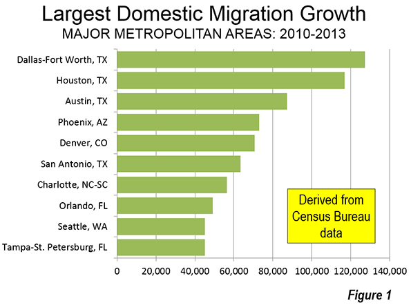
    Net domestic migration is, not surprisingly, dominated by the major metropolitan areas of the South, especially Texas and Florida. Dallas-Fort Worth and Houston led the nation with more than 100,000 net domestic migrants (Figure $$$). Austin placed third in San Antonio was sixth. Charlotte ranked seventh, while the Florida entries Orlando stood at eighth and Tampa-St. Petersburg at 10th. The West had three big domestic migration lures, Phoenix (4th), Denver (5th), and Seattle (9th).

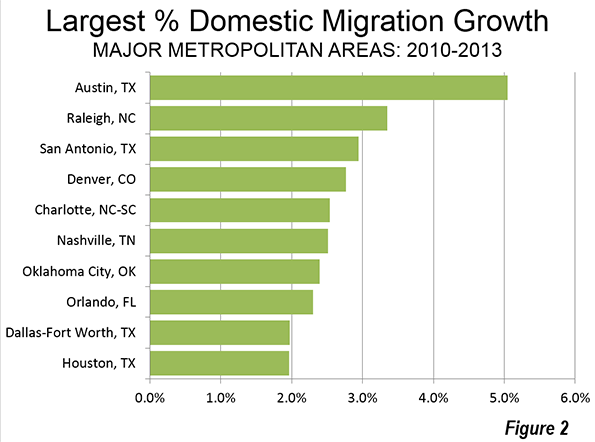
    Austin also led in the percentage of net domestic migration gain relative to its 2010 population. Again, nine of the top gainers were in the South, with one entry from the West, Denver (Figure 2).

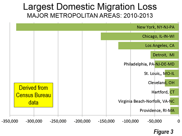
    The largest net domestic migration losses were more dispersed across the country, with metropolitan areas from every region represented. New York lost the most net domestic migrants (more than 300,000) and was joined by Philadelphia, Hartford, and Providence from the East. Chicago lost the second most domestic migrants (more than 150,000) and was joined by Detroit, St. Louis and Cleveland from the Midwest. Los Angeles ranked third in the bottom 10, losing more than 100,000 net domestic migrants, the only western metropolitan area to suffer a significant migration loss. The South’s only representative in the bottom 10 was Virginia Beach-Norfolk (Figure 3).

    Table 3
    Major Metropolitan Area Net Migration: 2010 to 2013
    Metropolitan Areas Net Domestic Migration Change Relative to 2010 Population Net International Migration Change Relative to 2010 Population
    Atlanta, GA      44,433 0.84%         49,375 0.93%
    Austin, TX      87,189 5.05%         15,685 0.91%
    Baltimore, MD          (121) 0.00%         24,366 0.90%
    Birmingham, AL       (2,918) -0.26%           3,585 0.32%
    Boston, MA-NH           101 0.00%         70,356 1.54%
    Buffalo, NY       (7,774) -0.68%           7,341 0.65%
    Charlotte, NC-SC      56,478 2.54%         14,590 0.66%
    Chicago, IL-IN-WI   (161,558) -1.71%         69,041 0.73%
    Cincinnati, OH-KY-IN     (16,893) -0.80%           9,703 0.46%
    Cleveland, OH     (28,780) -1.39%         10,837 0.52%
    Columbus, OH      11,425 0.60%         13,752 0.72%
    Dallas-Fort Worth, TX    127,315 1.97%         57,403 0.89%
    Denver, CO      70,668 2.77%         14,160 0.55%
    Detroit,  MI     (58,343) -1.36%         30,281 0.71%
    Grand Rapids, MI        4,594 0.46%           3,290 0.33%
    Hartford, CT     (18,979) -1.56%         15,206 1.25%
    Houston, TX    116,956 1.97%         74,817 1.26%
    Indianapolis. IN      13,698 0.72%         12,031 0.64%
    Jacksonville, FL      16,932 1.26%           9,760 0.72%
    Kansas City, MO-KS       (3,738) -0.19%           9,162 0.45%
    Las Vegas, NV      17,419 0.89%         19,041 0.97%
    Los Angeles, CA   (125,037) -0.97%       145,101 1.13%
    Louisville, KY-IN        4,874 0.39%           6,530 0.53%
    Memphis, TN-MS-AR     (13,723) -1.03%           4,868 0.37%
    Miami, FL      31,750 0.57%       152,998 2.74%
    Milwaukee,WI     (14,282) -0.92%           6,547 0.42%
    Minneapolis-St. Paul, MN-WI        2,664 0.08%         30,341 0.90%
    Nashville, TN      42,090 2.51%         10,201 0.61%
    New Orleans. LA      20,721 1.73%           8,727 0.73%
    New York, NY-NJ-PA   (336,566) -1.72%       372,651 1.90%
    Oklahoma City, OK      30,086 2.39%           6,759 0.54%
    Orlando, FL      49,244 2.30%         43,230 2.02%
    Philadelphia, PA-NJ-DE-MD     (49,564) -0.83%         51,244 0.86%
    Phoenix, AZ      72,985 1.73%         24,885 0.59%
    Pittsburgh, PA        7,564 0.32%           8,129 0.34%
    Portland, OR-WA      30,244 1.35%         15,350 0.69%
    Providence, RI-MA     (17,253) -1.08%         13,365 0.83%
    Raleigh, NC      38,088 3.35%         10,875 0.96%
    Richmond, VA      10,777 0.89%           9,542 0.79%
    Riverside-San Bernardino, CA      18,321 0.43%         14,997 0.35%
    Rochester, NY     (11,558) -1.07%           7,607 0.70%
    Sacramento, CA        6,922 0.32%         17,662 0.82%
    St. Louis,, MO-IL     (28,809) -1.03%         11,556 0.41%
    Salt Lake City, UT        3,367 0.31%           7,560 0.69%
    San Antonio, TX      63,391 2.94%         10,778 0.50%
    San Diego, CA           455 0.01%         35,199 1.13%
    San Francisco-Oakland, CA      37,157 0.86%         68,510 1.58%
    San Jose, CA       (6,245) -0.34%         41,207 2.24%
    Seattle, WA      45,188 1.31%         50,351 1.46%
    Tampa-St. Petersburg, FL      45,071 1.62%         28,621 1.03%
    Virginia Beach-Norfolk, VA-NC     (17,944) -1.07%         15,650 0.93%
    Washington, DC-VA-MD-WV      32,749 0.58%       107,875 1.90%
    Total    240,831 0.14%    1,872,698 1.10%
    From Census Bureau Data


    Migration Gains in the Suburbs, Losses in the Core

    This year was notable for the virtual absence of the customary "return to the city" stories. In recent years, historical core municipalities have done better in population growth than in the past. In previous decades, some lost large amounts of their population. However, an improving urban environment, not least because of better crime control, has led to something of a residential resurgence, especially in the immediate area of downtowns, though inner core populations (within five miles of City Hall) have continue to decline (see Flocking Elsewhere: The Downtown Growth Story).

    Specious claims of a net suburban movement to the cores have been refuted by the domestic migration data. Net domestic migration is reported by the Census Bureau only at the county level. Thus, any analysis of domestic migration between the cores and the suburbs must be county-based. During the Great Recession, domestic migration declined substantially, as is to be expected when the economy is depressed.

    Yet, in each of the three years of this decade, suburban counties have experienced net domestic migration gains and in each year have substantially led the core counties. In only one year, 2012, was there a net domestic migration gain in the core counties. The most recent 2013 data shows that core counties experienced a 70,000 net domestic migration loss, while the suburban counties gained 163,000 net domestic migrants. This difference of 233,000 was approximately four times the demographic gains made by the suburbs in both of the previous years Figure 4).

    Returning to Normalcy?

    With the economy still depressed, it would be premature to declare that the more typical results of the last year presage a return to normalcy. Any such reliable judgment must await restoration of broad-based, job and salary driven – as opposed to asset-based – economic growth. However, the trends of the last year indicate more than anything that the basic patterns of at least the past quarter century – with higher suburban growth and a shift towards the South – to be reasserting themelves.

    Wendell Cox is principal of Demographia, an international public policy and demographics firm. He is co-author of the "Demographia International Housing Affordability Survey" and author of "Demographia World Urban Areas" and "War on the Dream: How Anti-Sprawl Policy Threatens the Quality of Life." He was appointed to three terms on the Los Angeles County Transportation Commission, where he served with the leading city and county leadership as the only non-elected member. He was appointed to the Amtrak Reform Council to fill the unexpired term of Governor Christine Todd Whitman and has served as a visiting professor at the Conservatoire National des Arts et Metiers, a national university in Paris.

    Photo: Downtown Houston (by author)

  • Good Jobs Often Not Matter of Degrees

    If there’s anything both political parties agree upon, it’s that our education system is a mess. It is particularly poor at serving the vast majority of young people who are unlikely either to go to an elite school or get an advanced degree in some promising field, particularly in the sciences and engineering.

    Historically, education has been a key driver of upward mobility and progress in our society. But, increasingly, its impact on boosting incomes has slowed, or even reversed, and, for many, the attempt to get a four-year degree ends in debt and widespread unemployment or underemployment. Worse still, many don’t make it. Indeed, according to a 2010 report by the Public Policy Institute of California, young adults in California are less likely to graduate from college than were their parents.

    These failures make things even worse for workers with only a high school education, as they must compete for even low-wage jobs with people who either have been in college or have graduated. So, we now see college graduates working in jobs as humdrum as barista or even janitor. This has even led to some pretty dubious lawsuits against schools by disgruntled graduates who feel they were misled by post-graduate employment claims.

    The worst performance is at the grade-school and high school levels, particularly in California. Blame funding, teachers unions or demographics, but our state’s basic education system has been deteriorating for decades. California was ranked 48th in 2009 for high school attainment. In 2000, it ranked 40th. In 1990, it was tied with Illinois for 36th place.

    Clearly, if we are to advance as a state, and a country, we need to develop a new perspective on education. It’s not just a matter of money, as progressive journalists,teachers unions, education lobbyists and advocates for various ethnic and political causes all insist. Money should be spent but more emphasis needs to be placed on how it is spent. After all, America boosted per-pupil spending on public elementary and secondary education by 327 percent from 1970-2010 (adjusted for inflation) with no rise in student test scores.

    As for the effectiveness of college, a recent Rutgers University report found that barely half of college graduates since 2006 had full-time jobs. And it’s not getting better: Those graduating since 2009 are three times more likely to not have found a full-time job than those from the classes of 2006-08. Since 1967, notes one 2010 study, the percentage of underemployed college graduates has soared from roughly 10 percent to more than 35 percent.

    What we need to do is rethink the notion, supported by President Obama and others, that the solution to our education woes primarily is “more.” More what? What are the job prospects for the new crop of ethnic-studies majors, post-modern English graduates and art historians, for example, particularly those from second-tier institutions? These kind of liberal-arts degrees are, as the New York Times recently reported, that tend to earn graduates the least, while those degrees that pay the most are largely offered by schools aimed at technology, mining and other “hard skills.”

    First, we need to understand that educational differences and capabilities exist and cannot be easily adjusted simply by forever lowering standards. Our most competitive institutions need to make sure that people leave with the highest degree of critical skills. Grade inflation at Harvard may not produce unemployables, but it does weaken the value of the degree and, even worse, suggests that one can not expect too much knowledge, or reasoning capacity, from graduates. Indeed, many employers complain about the lack of “soft skills,” such as communication and critical thinking, as much as they do about applicants’ lack of harder skills such as math and science.

    This suggests that even those of us who teach at more selective universities cannot just rest on laurels. Schools have to focus more on developing actual skills – notably in presentation and research – even among the brightest students. Instead, all too often, as the Manhattan Institute’s Heather McDonald has pointed out, political education – usually, but not always, tending toward the progressive left – actually predominates over learning how to think critically and express ideas coherently.

    More important is the need to put greater effort in lifting students who may not be ideal for a classical liberal four-year education. This may include a greater emphasis on skills with practical applications, such as nursing, rehabilitation, technical and scientific areas of specialization. It also includes expanding innovative programs, such as at LaGuardia College in New York, that helps high school dropouts to get their diplomas.

    Although some of these students will still seek four-year degrees, for many, the best opportunities for employment do not require more than a two-year degree, or simply a certificate. This may be particularly critical for the roughly 40 percent of students who attend college but don’t finish.

    These include many fields where employment has been growing, notably, in energy, manufacturing and – with the resurgence of the housing market – construction. But the biggest shift may be as a result of the current energy revolution, which, notes the president of the engineering and electronics conglomerate Siemens, Joe Kaeser, “is a once-in-a-lifetime moment.” Cheap and abundant natural gas, in particular, is luring investment from European and Asian manufacturers and sparking demand not only for geologists and engineers but also machinists, rig operators and truck drivers.

    The workforce in many of these fields is rapidly aging, and the demand for new, updated skills, particularly involving computers, has soared, leaving manufacturers desperate for necessary workers.

    There is already, notes a recent Boston Consulting Group study, a shortfall of some 100,000 skilled manufacturing positions. In this respect, millennials – which I have called “the screwed generation” – may have finally caught a break. By 2020, according to the consultancy BCG and the Bureau of Labor Statistics, the nation could face a shortfall of about 875,000 machinists, welders, industrial-machinery operators and other highly skilled manufacturing professionals.

    This already is the case in parts of the country now enjoying the energy and manufacturing renaissance. In training facilities in the New Orleans area, where some of the new trade school students have migrated after receiving four-year degrees, and near Columbus, Ohio, you can see many young people preparing for positions not only in medical fields, but as technicians, machinists, plumbers and electricians.

    Businesspeople almost everywhere decry such labor shortages, but rarely lament a lack of English post-modernist scholars. As I saw on a recent trip to Houston – in many ways the country’s most economically dynamic city – developers enjoy high demand by are stymied by a lack of skilled labor. In some cases, companies are beginning to invest not only in community colleges but also looking to recruit high school students into these professions.

    This practical approach may offend people to whom it seems reminiscent of the infamous “tracking” system, which was used to steer even the most academically gifted minority students into manual professions. Still, stuffing more students into a system that, in the end, fails to prepare young people for the future, and lands them in debt, makes little sense. Today a record 1-in-10 recent college borrowers has defaulted on student debt, the highest level in a decade. And, with wages for college graduates on a downward slope, one has to wonder how many more will join them.

    Some “progressives” believe the solution lies in subsidizing even more the current system. In reality, such an approach will only continue the current failures, with fewer students graduating with needed skills and more years of wasted effort. Shifting the financial burdens from parents and students and onto business and the taxpayer does not seem the best way to boost public support for education.

    Instead of bailing out the current system, we need to find ways to change our educational focus from the elite level to the certificate program, in ways that serve the needs of both the economy and the next generation. For the talented students I so often encounter at Chapman, this means greater rigor, more serious reading and opening themselves to conflicting ideas. But, for many others, the focus should be on practical skills that can lead to middle-class jobs. We have to learn to appreciate that there’s nothing wrong with a son or daughter, rather than aspiring to become a doctor or lawyer, instead, earning a good living as a plumber.

    This story originally appeared at The Orange County Register.

    Joel Kotkin is executive editor of NewGeography.com and Distinguished Presidential Fellow in Urban Futures at Chapman University, and a member of the editorial board of the Orange County Register. He is author of The City: A Global History and The Next Hundred Million: America in 2050. His most recent study, The Rise of Postfamilialism, has been widely discussed and distributed internationally. He lives in Los Angeles, CA.

    Graduation photo by Bigstock.