Category: Demographics

  • New Central Business District Employment and Transit Commuting Data

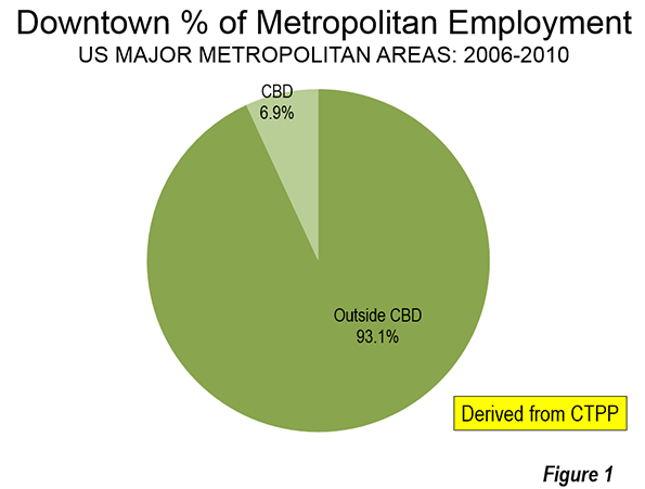
    Photographs of downtown skylines are often the "signature" of major metropolitan areas, as my former Amtrak Reform Council colleague and then Mayor of Milwaukee (later President and CEO of the Congress of New Urbanism) John Norquist has rightly said. The cluster of high rise office towers in the central business district (CBD) is often so spectacular – certainly compared with an edge city development or suburban strip center – as to give the impression of virtual dominance. I have often asked audiences to guess how much of a metropolitan area’s employment is in the CBD. Answers of 50 percent to 80 percent are not unusual. In fact, the average is 7 percent in the major metropolitan areas (over 1,000,000) and reaches its peak at only 22 percent in New York (Figure 1), which sports the second largest business district in the world (after Tokyo).

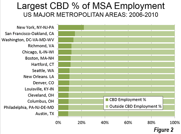
    Only seven of the 52 major metropolitan areas have CBDs with 10 percent or more of employment. Some are much lower. For example, Los Angeles and Dallas have had some of the nation’s tallest skyscrapers outside New York or Chicago for decades, yet these downtowns have only 2.4 percent and 2.3 percent of their metropolitan area employment respectively (Figure 2).

    This and similar information has been summarized in the third edition of Demographia Central Business Districts, which is based on the 2006-2010 Census Transportation Planning Package, a joint venture of the Census Bureau and the American Association of State Highway and Transportation Officials (AASHTO). The two previous editions of the report summarized data from the 1990 and 2000 censuses.

    The Declining Role of Downtown

    Downtowns have become far less important than before World War II, when a large share of American households did not have access to automobiles and when employment was far more concentrated than today. Indeed, the highly concentrated American downtown area is "unique," as Robert Fogelson indicates in Downtown: Its Rise and Fall: 1880-1950, and could be easily located as the destination of the "street railways." Downtown was a product of transit and remains transit’s principal destination today. The concentrated US style CBD form is really quite rare outside other new world nations, such as Canada, Australia, South Africa and New Zealand. Some, but only a few Asian cities have also followed the example, most notably Shanghai, Hong Kong, Nanjing, Chongqing, Singapore, and Seoul.

    The US, however, for all its role as originator of the downtown paradigm has also led the world in employment dispersion. This reflects the dominance in the US of automobiles. Dispersion is more amenable to mobility by the car, which dominates motorized mobility in virtually all major metropolitan areas of North America and Western Europe. This has led in the US to generally shorter work trip travel times and less traffic congestion, according to Tom Tom and Inrix. The continuing expansion of working at home could improve the situation even more.

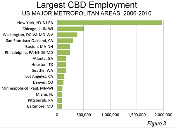
    New York has the largest CBD in the nation by far, with nearly 2,000,000 jobs. Chicago’s CBD (the Loop and North Michigan Avenue) has about one-quarter as many jobs (500,000) and Washington approximately 375,000. San Francisco, Boston and Philadelphia, also ranked among the nation’s transit "legacy cities," have between 200,000 and 300,000 jobs. Automobile oriented Houston and Atlanta are the largest otherwise, with Houston’s downtown being much more compact than Atlanta’s. Atlanta’s downtown has expanded strongly (and less densely) to the north and includes "Midtown" (Figure 3)

    Transit is About Downtown

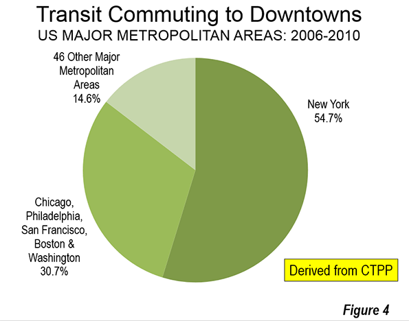
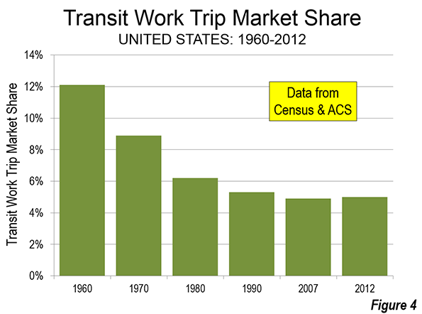
    Transit is about downtown. Approximately 55 percent of transit commuting in the United States is to jobs in just six municipalities (not to be confused with metropolitan areas), which I have called transit’s "legacy cities." Most of that commuting is to the six downtown areas. Of course, the city of New York is dominant, which alone accounts for 55 percent of the country’s CBD transit commuting (Figure 4), with much of the balance in the other five legacy cities (Figure 4). Only 14 percent of the CBD commuting is to the other 46 smaller downtowns.

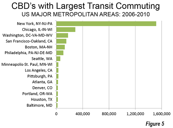
    More than 1.5 million transit commuters converge on jobs in Manhattan every day. In the other five legacy cities, the figure ranges from 100,000 to 300,000 daily. All of the other central business districts draw fewer than 100,000 daily commuters. Seattle ranks 7th, at 60,000, and has double or more the CBD transit commuters of any of the other 44 CBDs (Figure 5). 

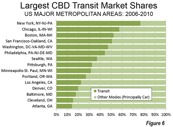
    New York has by far the highest transit commuting share of any downtown in the nation. Approximately 77 percent of people who work in the New York central business district commute by transit. The other legacy cities post impressive market shares as well, though well below those of New York. The CBDs in Chicago, Boston, and San Francisco draw between 50 percent and 60 percent of their commuters by transit. Downtown Philadelphia and Washington attract more than 40 percent of their commuters by transit (Figure 6).

    Transit is About Downtown II

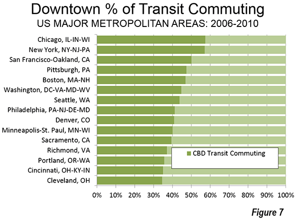
    The importance of downtown to transit is also indicated by its predominance in transit commuting destinations. In the New York metropolitan area, with a transit market share of approximately 30 percent, 57 percent of all transit commuting is to downtown jobs. Chicago’s transit commuting is concentrated in downtown to a slightly greater degree than in New York. One half of all the transit commuting in the San Francisco metropolitan area is to downtown. The CBDs of Boston, Philadelphia, and Washington account for between 40 percent and 50 percent of all transit commuting in their downtown areas. Seattle and Pittsburgh also are in this range (Figure 7). Seven of the eight metropolitan areas with the largest transit market shares have a CBD commuting dominance of 40 percent or more (Pittsburgh is the exception).

    The 52 major metropolitan area CBDs combined have less than five percent of the nation’s jobs. Elsewhere, downtowns and otherwise, the other 95 percent of American commuters use transit at only a three percent rate.

    Other Employment Centers

    In a new feature, Demographia Central Business Districts also provides data for selected employment centers other than the principal central business districts. These also include some surprises. For example, downtown Brooklyn, long since engulfed by the expansion of New York, has the second highest transit market share of any employment center identified other than New York, at 60 percent. Across the river, the Jersey City Waterfront area achieves a transit market share of more than 50 percent, greater than the downtowns of legacy cities Philadelphia and Washington.

    Data on supplemental employment center and corridor data is selected and therefore not representative. It is notable that some employment corridors and centers have employment totals that dwarf those of the principal downtown areas in their respective metropolitan areas, such as Los Angeles, Portland, Dallas, and Kansas City.

    With a few exceptions, the transit commuting shares for most of these selected centers and corridors is modest. Many are served by new rail systems, which are simply not up to the task of providing mobility to these dispersed centers. Nor can they provide the radial, high quality service that makes transit such a success in the six legacy city downtowns. For example, the Dallas light rail system provides service along virtually the entire US-75 corridor from north of downtown to Plano. Transit’s share of commutes in this corridor is only 2 percent, far below the downtown Dallas share of 14 percent and the legacy city downtown average of 65 percent.

    Wendell Cox is principal of Demographia, an international public policy and demographics firm. He is co-author of the "Demographia International Housing Affordability Survey" and author of "Demographia World Urban Areas" and "War on the Dream: How Anti-Sprawl Policy Threatens the Quality of Life." He was appointed to three terms on the Los Angeles County Transportation Commission, where he served with the leading city and county leadership as the only non-elected member. He was appointed to the Amtrak Reform Council to fill the unexpired term of Governor Christine Todd Whitman and has served as a visiting professor at the Conservatoire National des Arts et Metiers, a national university in Paris.

  • Freedom and its Fruits: Fertility Over Time in Estonia

    Estonians and Latvians are the only independent nations in Europe with fewer people now than at the beginning of the 20th century. It is written in The White Book, 2004, about losses inflicted on the Estonian nation by occupation regimes. During the whole period (1940-1991) nearly 90,000 citizens of the Republic of Estonia perished, and about the same number of people left their homeland forever. It happened in a nation with a population number of about one million. Another nation, through centuries, gradually perished and disappeared from this territory: the Livonians. Their leader, Caupo, in 1203 was received with honor by Roman Pope Innocent III. Interestingly, at least three regions in America are named after Livonians. They are Livonia in New York State, Livonia in Pennsylvania, and Livonia in the Michigan. Do the inhabitants of these Livonias have any connection to the Livonians at the Baltic Sea?!

    The growth of the number of Estonians in 45 postwar years till 1990 was about 100 thousand. This was caused by natural increase, decrease of mortality, return of ethnic Estonians from Russia. The fertility rate of Estonians was below the replacement level for 40 years, but from 1970 to 1990 was at or above the replacement level. At the same time, the foreign-born population experienced a rate of fertility beneath the replacement level: 1.64 – 1.72.

    The time between 1983 and 1988 was a positive period, with a crude birth rate (the number of births per 1000 people per year) of about 16.0. It is interesting that this situation arose during the so-called “stagnation era”. The stagnation period – life without radical changes – was probably fruitful for fertility growth. The same trend was noted for Russia. Perhaps this increase was caused by the decision of the Soviet government in 1981 to increase the birth rate “About Measures of Public Support to Families Having Children”. In 1989, the peak of fertility was over.

    The French demographer Adolphe Landry (1874-1956) defined genuine demographic revolution as the situation in which use of contraceptives and abortions by women becomes universal. This revolution detaches fertility from social control and transfers it to the interests of individuals. For Estonia, this period arrived at the beginning of nineties, when plenty of contraceptives became available, in addition to abortions continuing to be permitted.

    In 1991, the crude birth rate fell to 12.4, and the total fertility rate (number of children per woman during her lifetime, which characterize the necessary replacement level of 2.1) to 1.80. The year of 1991 was the first year of two decades of continuing decrease. Remarkably, fall of the birth rate at the beginning of nineties was much worse than it was during WW II. The population of about one million had 19.5 and 19.2 thousand births respectively in 1941 and 1942 during the war, but in 1993, when conditions were clearly better, only 15.3 thousand children were born to a population of one and a half million. The genuine demographic revolution had truly arrived!

    The reasons, in addition to the availability of contraceptives and abortions, were the decline of religion, economic uncertainty regarding the future, the opening of the world with a variety of lifestyle choices and career paths. Almost thirty decrees regarding the family benefits of the Soviet period that had been made by that government were cancelled in 1992. In the liberal market economy of the nineties, population policy was left largely to chance. Public attention to the issue was narrowly limited to family benefits and integration programs.

    The Parental Benefit Act passed in 2003 tried to attain the birth rate. According to the Act, persons have the right to receive parental benefits for 435 days from the day following the final day of maternity leave. The amount of the parental benefit received is calculated on the basis of the Social Tax paid during the previous year. If the parent didn’t work, the parental benefit is paid at the designated benefit base rate, which is 290 euros in 2013. The upper limit of the amount of the parental benefit is three times the average salary earned during the year before last, which – in 2013 – is 2,234 euros.

    If we take the birth rate of the years 2002 and 2003 – 13,000 births – as the plateau (base rate) and eliminate all other factors pertaining to reproductive behavior, then natality during the 2004-2012 period resulted in about 18 thousand additional births. This speaks to the effectiveness of the parental benefit. However, even this was insufficient for attaining positive natural increase. The total maximum fertility rate obtained was 1.65, but later, in 2011, it decreased to 1.52. In 28 countries of European Union the mean value of the total fertility rate was 1.58 in 2012, for euro area it was 1.56. However in France, which has perhaps the oldest experience in field of demography and demographic research, this indicator was 2.01. In contrast, Singapore’s total fertility rate steadily dropped from 1.6 in 2000 to a record low of 1.16 in 2010. It bounced back to 1.2 in 2011, and further to 1.29 in 2012, but last year slipped again to 1.19. 

    The government aims, by 2015, to achieve a birth rate that is higher than the death rate, meaning an increase of the total birth rate to 1.70. (Action Program of the Government of the Republic 2011-2015). This seems unattainable. Poverty and migration worsen the situation. The at-risk-of-poverty rate in Estonia in 2011 was 17.6% on the average. The parent benefit and family benefits together constituted 1,7% of GDP in 2011 ( the same figure in Sweden and Finland was 3%).  

    One key cause, ironically, is freedom to move that came with the fall of the Soviet Union. Handling the population decrease we described first of all the birth rate, but last years has been intensified external migration. Migration that took place in 2011 decreased the population of Estonia in 2012 by 6,600 inhabitants. The trend continued. In external migration, there was an increase in both immigration and emigration in 2012. Over 4,000 persons immigrated to and almost 11,000 persons emigrated from Estonia. The main destination countries for emigrants are Finland and the United Kingdom. Most of the immigrants are in fact returnees, mostly from Finland. The second place is held by Russia, but the immigrants from Russia are mainly new immigrants.

    Despite numerous attempts to boost birth rate, the years from 1991 to 2013 are characterized by a birth rate under the replacement level. The lowest point arrived in 1998, with a total fertility rate of 1.28. After that it began to rise, reaching 1.65 in the year of 2008, only to decrease again later. At the same time, the population figure decreased by 14%. Problems caused by decreasing population entail a threat to the survival of the Estonian national culture, issues with sustainable economic development and difficulties with the sustainability of the social infrastructure. 

    How to avoid the fate of Livonians? Is there a force majeure against the small nation? Or it is a problem of insufficient national steering without any specialized institution responsible on population?

    Jaak Uibu, a Phd. in human micro ecology, was former Deputy Minister of Health of Estonia and advisor to Minister of Population. 

    Oleviste photo by E. Kanash.

  • Era of the Migrant Moguls

    Southern California, once the center of one of the world’s most vibrant business communities, has seen its economic leadership become largely rudderless. Business interests have been losing power for decades, as organized labor, ethnic politicians, green activists, intrusive planners, crony developers and local NIMBYs have slowly supplanted the leaders of major corporations and industries, whose postures have become, at best, defensive.

    Increasingly, a search for inspiration about the region’s future must focus, first and foremost, on immigrants. As major companies disappear, merge or shift more of their operations elsewhere, the foreign-born represent a significant asset for our grass-roots economy. With many of the region’s legacy industries – from oil and gas to aerospace and entertainment – stagnating or declining, the area desperately needs new blood to avoid ending up like the older cities of the slow-growth Northeast or Midwest, albeit with much better weather.

    Amid a graying and, increasingly, marginal generation of regional business leaders, there have emerged new foreign-born dynamic figures. Some great examples: South African native and Tesla founder Elon Musk, who lives in Los Angeles and runs SpaceX, headquartered in Hawthorne and with more than 2,000 employees, and John Tu and David Sun, owners of Fountain Valley’s Kingston Technology, a leading independent memory-chip manufacturer founded in 1987 and now employing 4,000 people worldwide.

    Our new moguls increasingly are minted abroad. Pharmaceutical entrepreneur Patrick Soon-Shiong, the son of Chinese immigrants from South Africa, is now widely considered the richest man in Los Angeles, according to the Los Angeles Business Journal. But he’s not alone; five of the 13 richest people in the City of Angels are immigrants; in 1997 there was one, Australia’s Rupert Murdoch.

    Why are these immigrants so bright when much of our business leadership is dark grey? Part of it has to do with the nature of people who risk everything to migrate to another country. Overall they account for one out of every five U.S. business owners. They are three times as likely to start a new business than non-immigrants; in 2010 they accounted for almost one-in-three new firms, twice their share in 1995. Roughly 40 percent of the engineering-based firms started in Silicon Valley, notes the Kauffman Foundation, had at least one immigrant founder.

    Whether in high-tech, pharmaceuticals or running the local coffee shop, immigrants tend both to innovate and take risks. That’s because, as Kingston’s John Tu explained to me, they don’t have a choice. “The key thing about being an immigrant makes you flexible,” he said. “IBM, Apple and Compaq were inflexible. They told the memory customers to take it or leave it. We thought about the customer and the relationship with the employees. I guess we didn’t know any better.”

    Rise of the ethnoburb

    Most of the growth being generated by Southern California’s immigrants is taking place in suburban communities – what geographer Wei Li describes as ethnoburbs. Despite the hopes that more Southlanders can be lured into high-density, high-rise rental housing, immigrants, particularly Asians, here and elsewhere, continue to move further from the city core to areas where they can live with a degree of privacy and quiet virtually impossible in their homelands.

    This can be seen in the migration numbers. As foreign-born numbers have dropped in expensive and crowded Los Angeles and Orange County, the big growth has taken place in other areas, notably in fast-growing Texas cities such as Dallas and Houston, as well as numerous low-cost, pro-business states in the Southeast. The one Southland area that has continued to see a boom in foreign-born residents – the Inland Empire – has the lowest population density and house prices in the region.

    According to demographer Wendell Cox, the Inland Empire’s immigrant population has swelled by more than 50 percent, or more than 300,000 people, since 2000, roughly three times the increase in actual numbers seen in Los Angeles and Orange counties. Much of this growth is taking place not in the older cities such as Riverside and San Bernardino, as might be expected, but in generally more affluent, newer suburbs such as Rancho Cucamonga, whose foreign-born population soared a remarkable 61.6 percent over the past decade. Even Moreno Valley, on the edge of the urbanization, has more foreign-born residents than does San Bernardino.

    Even within the coastal counties, much of the growth in the Asian population, now the largest source of immigrants to the U.S., has been outside the densest, more-urbanized parts of the region. As the immigrant share of the population has declined in traditional immigrant strongholds such as the city of Los Angeles (down 5 percent) and Santa Ana (more than 11 percent), Cox notes, the immigrant population is shifting to more upscale suburbs. In Glendale, a major destination for both Armenian and Asian immigrants, more than 56 percent of the population is foreign-born, up 4 percent since 2000.

    Other popular immigrant destinations include once-heavily white suburban communities, such as Irvine, which is now more than 38 percent foreign-born, up almost 19 percent since 2000. Fullerton, like Irvine, favored largely by Asian migrants, saw its foreign-born population increase by 21 percent since 2000, now accounting for more than one-third of the city’s total.

    Other places that seem to be attracting immigrants include Santa Clarita, Palmdale and Lancaster, all communities further out on the periphery of the region.

    Harnessing entrepreneurial energy

    If Southern California’s future lies largely in the hands of newcomers and their offspring, how can we best respond to their needs? One way is by maintaining a large supply of single-family houses or townhomes. Today’s immigrants, particularly Asians, favor settling in ethnoburbs more than the dense Chinatowns, Little Indias and barrios that may strike many other Americans as somehow more colorful. Now, the best place to encounter immigrant food and culture is frequently at the strip malls of Monterey Park, the Hispanicized shopping complexes like Plaza Mexico, Irvine’s Diamond Jamboree Center or the amazing 626 Night Market at Santa Anita Park in Arcadia.

    Of course, immigrants are less interested in providing neighbohoods with local color than in moving to places with good schools, safe streets and parks – as most middle-class families prefer. This preference runs afoul of the kind of extreme land-use regimen being imposed on the region, including the Inland Empire, planning that seeks to promote the construction of high-density housing that, to be honest, many immigrants, particularly Asians, could enjoy at home, with far more amenities.

    Planners and some developers seem keen on this shift, thinking it will appeal to young childless couples and empty-nesters. What they ignore is that, without plentiful, and at least somewhat affordable, single-family houses, immigrants will continue to shift to other parts of the country, notably, the Southeast and Texas, where they can afford them.

    Perhaps even more important may be the economy. Immigrants are the ultimate canaries in the coalmine – they tend to gravitate toward opportunity. When Southern California’s economy was burgeoning in the 1970s and 1980s, immigrants also flocked here, buying homes and starting businesses. Few immigrant entrepreneurs reached the level of a John Tu or an Elon Musk, but many have launched small manufacturing firms that supported larger firms, engaged in international trade and started small service businesses.

    Unfortunately, the business climate in Southern California increasingly makes such enterprise ever more difficult, and may lead these entrepreneurs to relocate or expand where their efforts may be more appreciated. Not helping these businesses is an L.A. political climate dominated by a crony capitalist regime – not at all friendly to plucky startups of any kind – or by a Republican Party that still seems unable to make peace with the demographic realities of our region.

    The good news is, however, that these immigrants, and their kids, are still here. They have many reasons to stay, including the presence of ethnic media, churches, schools and shops not likely to be remotely as well-developed in places like Las Vegas, Phoenix, Atlanta or Nashville. But this does not mean they can be taken for granted. We need to recognize that they are our greatest asset, and, if we can appeal to their aspirations, they could help fashion a resurgence in this region.

    This story originally appeared at The Orange County Register.

    Joel Kotkin is executive editor of NewGeography.com and Distinguished Presidential Fellow in Urban Futures at Chapman University, and a member of the editorial board of the Orange County Register. He is author of The City: A Global History and The Next Hundred Million: America in 2050. His most recent study, The Rise of Postfamilialism, has been widely discussed and distributed internationally. He lives in Los Angeles, CA.

    Photo by LHOON

  • Where Inequality Is Worst In The United States

    Perhaps no issue looms over American politics more than worsening  inequality and the stunting of the road to upward mobility. However, inequality varies widely across America.

    Scholars of the geography of American inequality have different theses but on certain issues there seems to be broad agreement. An extensive examination by University of Washington geographer Richard Morrill found that the worst economic inequality is largely in the country’s biggest cities, as well as in isolated rural stretches in places like Appalachia, the Rio Grande Valley and parts of the desert Southwest.

    Morrill’s findings puncture the mythology espoused by some urban boosters that packing people together makes for a more productive and “creative” economy, as well as a better environment for upward mobility. A much-discussed report on social mobility in 2013 by Harvard researchers was cited by the New York Times, among others, as evidence of the superiority of the densest metropolitan areas, but it actually found the highest rates of upward mobility in more sprawling, transit-oriented metropolitan areas like Salt Lake City, small cities of the Great Plains such as Bismarck, N.D.; Yankton, S.D.; Pecos, Texas; and even Bakersfield, Calif., a place Columbia University urban planning professor David King  wryly labeled “a poster child for sprawl.”

    Demographer Wendell Cox pointed out that the Harvard research found that commuting zones (similar to metropolitan areas) with less than 100,000 population average have the highest average upward income mobility.

    The Luxury City

    Most studies agree that large urban centers, which were once meccas of upward mobility, consistently have the highest level of inequality. The modern “back to the city” movement is increasingly less about creating opportunity rather than what former New York Mayor Michael Bloomberg called “a luxury product” focused on tapping the trickle down from the very wealthy. Increasingly our most “successful cities” have become as journalist Simon Kuper puts it, “the vast gated communities where the one percent reproduces itself.”

    The most profound level of inequality and bifurcated class structure can be found in the densest and most influential urban environment in North America — Manhattan. In 1980 Manhattan ranked 17th among the nation’s counties in income inequality; it now ranks the worst among the country’s largest counties, something that some urbanists such as Ed Glaeser suggests Gothamites should actually celebrate.

    Maybe not. The most commonly used measure of inequality is the Gini index, which ranges between 0, which would be complete equality (everyone in a community has the same income), and 1, which is complete inequality (one person has all the income, all others none).  Manhattan’s Gini index stood at 0.596 in 2012, higher than that of South Africa before the Apartheid-ending 1994 election. (The U.S. average is 0.471.) If Manhattan were a country, it would rank sixth highest in income inequality in the world out of more than 130 for which the World Bank reports data. In 2009 New York’s wealthiest one percent earned a third of the entire municipality’s personal income — almost twice the proportion for the rest of the country.

    The same patterns can be seen, albeit to a lesser extent, in other major cities. A 2006 analysis by the Brookings Institution showed the percentage of middle income families declined precipitously in the 100 largest metro areas from 1970 to 2000.

    The role of costs is critical here. A 2014 Brookings study showed that the big cities with the most pronounced levels of inequality also have the highest costs: San Francisco, Miami, Boston, Washington, D.C., New York, Oakland, Chicago and Los Angeles. The one notable exception to this correlation is Atlanta. The lowest degree of inequality was found generally in smaller, less expensive cities like Ft. Worth, Texas; Oklahoma City; Raleigh, N.C.; and Mesa, Ariz. Income inequality has risen most rapidly in the bastion of luxury progressivism, San Francisco, where the wages of the 20th percentile of all households declined by $4,300 a year to $21,300 from 2007-12. Indeed when average urban incomes are adjusted for the higher rent and costs, the middle classes in metropolitan areas such as New York, Los Angeles, Portland, Miami and San Francisco have among the lowest real earnings of any metropolitan area.

    Rural Poverty

    But cities are not the only places suffering extreme inequality. Some of the nation’s worst poverty and inequality, notes Morrill, exist in rural areas. This is particularly true in places like Texas’ Rio Grande Valley, Appalachia and large parts of the Southwest.

    Perhaps no place is inequality more evident than in the rural reaches of California, the nation’s richest agricultural state. The Golden State is now home to 111 billionaires, by far the most of any state; California billionaires personally hold assets worth $485 billion, more than the entire GDP of all but 24 countries in the world. Yet the state also suffers the highest poverty rate in the country (adjusted for housing costs), above 23%, and a leviathan welfare state. As of 2012, with roughly 12% of the population, California accounted for roughly one-third of the nation’s welfare recipients.

    With the farm economy increasingly mechanized and industrial growth stifled largely by regulation, many rural Californians particularly Latinos, are downwardly mobile, and doing worse than their parents; native-born Latinos actually have shorter lifespans than their parents, according to a2011 report. Although unemployment remains high in many of the state’s largest urban counties, the highest unemployment is concentrated in the rural counties of the interior. Fresno was found in one study to have the least well-off Congressional district.

    The vast expanse of economic decline in the midst of unprecedented, but very narrow urban luxury has been characterized as “liberal apartheid. ” The well-heeled, largely white and Asian coastal denizens live in an economically inaccessible bubble insulated from the largely poor, working-class, heavily Latino communities in the eastern interior of the state.

    Another example of this dichotomy — perhaps best described as the dilemma of being a “red state” economy in a blue state — can be seen in upstate New York, where by virtually all the measurements of upward mobility — job growth, median income, income growth — the region ranked below long-impoverished southern Appalachia as of the mid-2000s. The prospect of developing the area’s considerable natural gas resources was welcomed by many impoverished small landowners, but it has been stymied by a coalition of environmentalists in local university towns and plutocrats and celebrities who have retired to the area or have second homes there, including many New York City-based “progressives.”

    Where Inequality Is Least Pronounced

    According to the progressive urbanist gospel, suburbs are doomed to be populated by poor families crowding into dilapidated, bargain-priced former McMansions in the new “suburban wastelands.” Suburbs, not inner cities, suggests such urban boosters as Brookings Chris Leinberger, will be the new epicenter of inequality, even though the percentage of poor people, as shown above, remained far higher in the urban core.

    Yet , according to geographer Morrill, in comparison with urban cores, suburban areas remain heavily middle class, with a high proportion of homeowners, something rare inside the ranks of core cities.The average poverty rate in the historical core municipalities in the 52 largest U.S. metro areas was 24.1% in 2012, more than double the 11.7% rate in suburban areas. Between 2000 and 2010, more than 80% of the new population.

    in America’s urban core communities lived below the poverty line compared with a third of the new population in suburban areas, although the majority of poor people lived there, in large part because they are also the home to the vast majority of metropolitan area residents.

    An analysis by demographer Wendell Cox of American Community Survey Data for 2012 indicates that suburban areas suffer considerably less household income inequality than the core cities. Among the 51 metropolitan areas with populations over 1 million, suburban areas were less unequal (measured by the Gini coefficient) than the core cities in 46 cases.

    The Racial Dynamic

    There is also a very clear correlation between high numbers of certain groups — notably African Americans but also Hispanics — and extreme inequality. Morrill’s analysis shows a huge confluence between states with the largest income gaps, largely in the South and Southwest, with the highest concentrations of these historically disadvantaged ethnic groups.

    In contrast, Morrill suggests, areas that are heavily homogeneous, notably the “Nordic belt” that cuts across the northern Great Lakes all the way to the Seattle area, have the least degree of poverty and inequality. Morrill suggests that those areas dominated by certain ethnic backgrounds — German, Scandinavian, Asian — may enjoy far more upward mobility and less poverty than others.

    Some, such as UC Davis’ Gregory Clark even suggest that parentage determines success more than anyone suspects — what the Economist has labeled “genetic determinism.” None of this is particularly pleasant but we need to understand the geography of inequality if we want to understand the root causes of why so many Americans remain stuck at the lower ends of the economic order.

    This story originally appeared at Forbes.com.

    Joel Kotkin is executive editor of NewGeography.com and Distinguished Presidential Fellow in Urban Futures at Chapman University, and a member of the editorial board of the Orange County Register. He is author of The City: A Global History and The Next Hundred Million: America in 2050. His most recent study, The Rise of Postfamilialism, has been widely discussed and distributed internationally. He lives in Los Angeles, CA.

  • The Great Skills Gap Myth

    One of the great memes out there in trying to diagnose persistently high unemployment and anemic job growth during what is still, I argue, the Great Recession is the so-called “skills gap”. The idea here is that the fact that there are millions of unfilled job openings at the same time millions of people can’t find work can be chalked up to a lack of a skills match between unemployed workers an open positions. To pick one random example out of many, here’s the way US News and World Report put it last year:

    Some 82 percent of manufacturers say they can’t find workers with the right skills. Even with so many people looking for jobs, we’re struggling to attract the next generation of workers. The message about the opportunities in manufacturing doesn’t seem to be reaching parents and counselors who help guide young people’s career ambitions.

    We face two major problems – a skills gap and a perception gap. Today’s modern, technology-driven manufacturing is not your grandparents’ manufacturing, yet for many, talk of the sector evokes images from the Industrial Revolution.

    What’s interesting about this is that the “skills gap” continues to have tremendous resonance in public policy discussions I come across although it’s very easy to find many mainstream press articles that challenge it. So I want to take my shot at the problem.

    Is there a skill gap? In select cases I’m sure there’s a mismatch in skill, but for the most part I don’t think so. I believe the purported inability of firms to find qualified workers is due largely to three factors: employer behaviors, limited geographic scope, and unemployability.

    Employer Behaviors

    Let’s be honest, it’s in the best interest of employers to claim there’s a skills gap. The existence of such a gap can be used as leverage to obtain public policy considerations or subsidies. So there’s a self-serving element.

    But beyond that, several behaviors of present day employers contribute to their inability to hire.

    1. Insufficient pay. If you can’t find qualified workers, that’s a powerful market signal that your salary on offer is too low. Higher wages will not only find you workers, they also send a signal that attracts newcomers into the industry. Richard Longworth covered this in 2012. He explains that companies have refused to adjust their wages due to competitive pressures:

    In other words, Davidson said, employers want high-tech skills but are only willing to pay low-tech wages. No wonder no one wants to work for them….So why doesn’t GenMet pay more? In other words, why doesn’t it respond to the law of supply and demand by offering starting wages above the burger-flipping level? Because GenMet is competing in the global economy. It can pay more than Chinese-level wages, but not that much more.

    In other words, this company in question doesn’t have a skill gap problem, they have a business model problem. They aren’t profitable if they have to pay market prices for their production inputs (in this case labor). It’s no surprise firms in this position would be seeking help with their “skill gap” problem – it’s a backdoor bailout request.

    2. Extremely picky hiring practices enforced by computer screening. If you’ve looked at any job postings lately, you’ll note the laundry list of skills and experience required. The New York Times summed it up as “With Positions to Fill, Employers Wait for Perfection.” Also, companies have chopped HR to the bone in many cases, and heavily rely on computer screening of applicants or offshore resume review. The result of this automated process combined with excessive requirements is that many candidates who actually could do that job can’t even get an interview. What’s more, in some cases the entire idea is not to find a qualified worker to help legally justify bringing in someone from offshore who can be paid less.

    3. Unwillingess to invest in training. In line with the above, companies no loner want to spend time and money training people like they used to. I strongly suspect most of those over 50 machinists and such we keep hearing about learned on the job. Why can’t companies simply train people in the skills they need? When I started work at Andersen Consulting in 1992, we weren’t expected to have any specific skill. Instead, they were looking for general aptitude and spent big to train us in what we needed to know. In a sense, outside of some professional services fields, today’s companies, despite their endless talk about talent, don’t actually recruit talent at all. They are recruiting people with specific skills and experience. That’s a very different mindset.

    4. Aesthetic hiring. This one I think is specific to select industries, but in some fields if you don’t have the right “look”, you’re going to find it difficult. For example, the NYT Magazine just today has a major piece called “Silicon Valley’s Youth Problem” talking about this very issue. Hip, cool startups see their working environment and culture as critical to success. And that’s true, but those cultures aren’t very inclusive, which is why many Silicon Valley firms are continuously under fire for various forms of discrimination. When they’re trying to be the hot new thing, the last thing an app startup wants is some 55 year old dude with a pocket protector cramping their style, no matter how much of a tech guru he might be.

    Limited Geographic Scope

    You frequently see the skills gap phrased in terms of specific geographies. For example, a state. Rhode Island has X number of unemployed people and Y number of unfilled jobs. So what do we do to match them up?

    This type of thinking is too limited. I attended an hour brainstorming session on the Rhode Island skills gap a while back and not once did anyone suggest anything that crossed the state boundary. One person mentioned these technical high schools in Boston that produce grads with exactly the skills the market is needing. His idea was that Rhode Island needed to create these types of institutions. Not a bad idea, but I was struck that nobody thought about sending these Rhode Island employers who can’t find workers on the one hour drive to Boston to go hire some of those grads directly out of Boston’s high schools. Problem solved. And maybe while bringing some young, fresh blood into the state to boot.

    Similarly, no one ever suggested that an unemployed person in Rhode Island might seek work out of state. Realistically, America has often solved unemployment problems through migration. People need to be willing to move to where the job opportunities are. In fact, if you look at the highly educated people who might say telling people to move in order to find work is evil awful, they are actually the most mobile people there are. Clearly the highly skilled see the value in pursuing opportunity through migration. We need to extend the same opportunity to those who are currently stuck in place.

    Unemployability

    A third problem is that a significant number of adults in this country are simply unemployable. If you’re a high school dropout, a drug user, etc. you are going to find it tough slogging to find work anywhere, regardless of skills required.

    Watching the Chicagoland documentary and seeing what kids in these inner city neighborhoods face, a lack of machine tool or coding skills is far from the problem. Similar problems are now hitting rural and working class white communities where the economic tide has receded. Heroin, meth, etc. were things that just didn’t exist in my rural hometown growing up – but they sure do now.

    These aren’t skill problems, they are human problems. And the answer isn’t simply job training. These problems are much, most more complex and they are incredibly difficult to solve. They need to be tackled by very different means than a job skills problem.

    If you want more info that documents that there is no skills gap, google around and find plenty of economists crunching the numbers to show that’s the case. But I hope this gives you a sense of some of the trends that explain why there can be persistent unemployment with many job openings without recourse to a skills gap to explain it.

    Aaron M. Renn is an independent writer on urban affairs and the founder of Telestrian, a data analysis and mapping tool. He writes at The Urbanophile, where this piece originally appeared.

    Auto manufacturing photo by BigStockPhoto.com.

  • No Fundamental Shift to Transit: Not Even a Shift

    The American Public Transportation Association (APTA) is out with news of higher transit ridership. APTA President and CEO Michael Melaniphy characterizes the new figures as indicating "a fundamental shift going on in the way we move about our communities.” Others even characterized the results as indicating "shifting consumer preferences." The data shows either view to be an exaggeration.

    1935 and 2013

    This is hardly a reliable time for making judgments about fundamental shifts or shifts in consumer preferences. Economic performance has been more abysmally abnormal only once in the last century –during the Great Depression – than at present.

    The last year, 2013, is the sixth year in a row that total employment, as reported by the Bureau of Labor Statistics was below the peak year of 2007 (Figure 1). This run of dismal job creation was exceeded only between the Great Depression years of 1929 and 1936 in the last 100 years (Note 1). From World War II until the Great Recession, the maximum number of years that employment fell below a previous peak was two, following the 9/11 terrorist attacks (2001 to 2003). The Great Recession may have ended, according to the National Bureau of Economic Research, but the Great Malaise continues as the economy is performing well below historic levels. Judgments about fundamental shifts and consumer choice today are not more reliable than they would have been in the Great Depression year of 1935.

    Transit’s Market Share: Stuck in Neutral

    But more importantly, there is no shift to transit.  APTA is right to point out that transit ridership has grown faster than vehicle travel in the United States since 1995. Nonetheless, transit’s share of urban travel has barely budged, because its 1995 share of travel was so small. This is indicated by Figure 2, which compares the overall market share of transit to that of cars and light trucks from 1995 to 2013. Indeed, the top of Figure 2 (the 100 percent line) is virtually indistinguishable from the personal vehicle share over the entire period. The bottom of the chart (the zero percent line) is virtually indistinguishable from the transit share. This is not the stuff of fundamental shift.

    Commuting: The Story is Not Transit

    A similar pattern of little or no change is indicated by the commuting (work access) data from the Census Bureau’s American Community Survey.

    Over the past five years, as with virtually all the years since such data has been collected, the overwhelming majority of new commuters have driven alone (Figure 3). Indeed, transit has not taken a single net automobile off the road since 1960, and not in the last five years. Between 2007 and 2012, 93 percent of the additional commuters drove alone (Note 2). The drive alone market, which might have been thought to be saturated, actually rose from 76.1 percent to a 76.3 percent market between 2007 and 2012.

    The biggest change has been the continuing loss in carpool use, which dropped from 10.4 percent to 9.7 percent from 2007 to 2012. It is estimated that nearly 450,000 passengers left carpools (excluding drivers), approximately 1.8 passengers for each additional commuter using transit (250,000).

    The largest gain from 2007 to 2012 was in working at home, including telecommuting. Working at home increased from 4.1 percent to 4.4 percent. In actual numbers, working at home added 1.9 times the increase in transit commuting. Its change in market share was greater than that of transit in 42 of the 52 major metropolitan areas. Surprisingly, this includes New York, with its incomparable transit system (by US standards).

    Transit’s share of commuting inched up only 0.1 percentage points between 2007 and 2012. This is so small that if this rate of annual increase were sustained for 50 years, transit’s commute market share would  edge up to only 6 percent (Figure 4), approximately transit’s 1980 market share (doubling to 10 percent would require 130 years). The latest data indicates both gains and losses for transit, with market shares up in 28 major metropolitan areas and down in 24.

    Transit Losses

    In Atlanta, with the nation’s second largest Metro (subway) system built since 1975, a declining overall employment base was accompanied by a loss of 13,000 transit commuters, at the same time that there was an increase in working at home of 19,000.

    In Portland, considered by many around the world to be an urban planning Utopia, the data is hardly favorable. Since 1980, the last year with data before the first of five light rail lines and one commuter rail line opened, transit’s market share has dropped from 8.4 percent to 6.0 percent. While spending billions of dollars on rail, working at home – which involves little or no public expenditure – increased by triple the number of people drawn to transit. And things have not changed materially, even during the claimed "fundamental shift." In the last five years, the working at home increase is more than double that of transit.

    In Los Angeles, ridership at the largest transit agency continues to languish below its 1985 peak, despite having opened 9 light rail, Metro, and rapid busway lines and adding more than 1.5 million residents. Even this decline may be under-stated because of how transit counts passengers. Each time someone steps on a transit vehicle, they are counted (as a boarding). A person who transfers between two or three buses to make a trip counts as two or three boardings, which is what the APTA data reports.

    When rail is added to a transit system, bus services are reconfigured to serve the rail system. This can mean many more boardings from transfers without more passenger trips. This potential inflation of ridership is likely to have occurred not only in Los Angeles, but in all metropolitan areas that added rail systems.

    Transit Gains

    At the same time, gains are being made in some metropolitan areas. Ridership has risen more strongly in transit’s six "legacy cities," the municipalities (not metropolitan areas) of New York, Chicago, Philadelphia, San Francisco, Boston, and Washington. Between 2007 and 2012, 68 percent of the additional transit commuting occurred to employment locations in these six municipalities. This is higher than the 55 percent of national transit commuting that these areas represented in 2012. The much larger share being attracted by these areas in the last 5 years is an indication that transit ridership, already highly concentrated in just a few places, is becoming even more concentrated.  Further, 50 percent to 75 percent of commuters to the corresponding six downtowns reach work by transit.

    Rational Consumer Behavior

    Even when the nation finally emerges from the Great Malaise, only vain hope will be able to conceive of a large scale consumer preference driven shift toward transit. The rational consumer will not choose transit that is slower or less convenient than the car. Where transit access is impractical or impossible, people will use cars. This is the case for most trips in all US metropolitan area, as the Brookings Institution research cited below indicates

    The Brookings Institution research indicated that the average employee in the nation’s major metropolitan areas are able to access fewer than 10 percent of jobs in 45 minutes. This is not only a small number of jobs, but it is a travel time that is approximately twice that of the average employee in the United States (most of whom travel by car).

    More funding for transit cannot solve this problem. The kind of automobile competitive transit system needed to provide rational consumer choice between cars and transit would require annual expenditures rivaling the total personal income in the metropolitan area, as Jean-Claude Ziv and I showed in our 2007 11th World Conference on Transport Research paper (2007). It is no wonder that not a single comprehensive automobile competitive transit system exists or has been seriously proposed in any major US or Western European metropolitan area (Note 3).  Transit is about the largest downtowns and the largest urban cores.

    Unbalanced Coverage

    All of this appears to have escaped many media outlets, which largely parroted the APTA press release. For example, The New York Times, CBS News, the Washington Post, and the Chicago Tribune were as parish newsletters commenting on a homily by the priest, for their failure to report both sides. A notable exception was USA Today, whose reporter consulted outsider Alan Pisarski (who has written for newgeography.com). Pisarski placed the APTA figures in historical context and expressed reservations about restoration of the transit commuting share numbers of 1980 or before. 

    Wendell Cox is principal of Demographia, an international public policy and demographics firm. He is co-author of the "Demographia International Housing Affordability Survey" and author of "Demographia World Urban Areas" and "War on the Dream: How Anti-Sprawl Policy Threatens the Quality of Life." He was appointed to three terms on the Los Angeles County Transportation Commission, where he served with the leading city and county leadership as the only non-elected member. He was appointed to the Amtrak Reform Council to fill the unexpired term of Governor Christine Todd Whitman and has served as a visiting professor at the Conservatoire National des Arts et Metiers, a national university in Paris.

    Photograph: DART light rail train in downtown Dallas (by author)

    ———————

    Note 1: Current Employment Statistics Survey data, 1939 to 2013. 1913 to 1938 estimated from data in Historical Statistics of the United States: Bicentennial Edition.

    Note 2: The source for the commuting data is the American Community Survey of the Census Bureau, which indicates an employment level in 2012 that is higher than in 2007. The Current Employment Statistics Survey of the Bureau of Labor Statistics indicates a decline.

    Note 3: I would be pleased to be corrected on this. In 2004, we issued a challenge on this subject, and while there were some responses, none met the required criteria (see http://demographia.com/db-challenge-choice.htm). The criteria are repeated below:

    To identify an actual system or propose a system that provides the following in an urban area of more than 1,000,000 population:

    · Transit choice (automobile competitive public transport service) for at least 90 percent of trips and passenger kilometers in the particular urban area.

    · Automobile competitiveness is defined as door to door trip times no more than 1.5 times automobile travel time.

    The description of any system not already in operation should also include an estimate of its cost, capital and annual operating.

  • East of Egan: Success in California is Not Evenly Distributed

    The New York Times ran a Timothy Egan editorial on California on March 6.  The essay entitled Jerry Brown’s Revenge was reverential towards our venerable Governor.  It did, however, fall short of declaring Brown a miracle worker, as the Rolling Stone did last August.  These and other articles are part of an adoring press’s celebratory spasm occasioned by the facts that California has a budget surplus and has had a run of strong job growth.

    Egan at least pauses in his panegyrical prose to mention that all is not perfect in California:

    Without doubt, California has serious structural problems, well beyond the byzantine hydraulic system that allows the state to flourish. For all the job growth, the unemployment rate is one of the highest in the nation. It has unsustainable pension obligations, a bloated public-employee sector led by the prison guard union. And it is so expensive to live here that clashes over the class divide are threatening to get nasty.

    That’s not the worst of it.  Before going there, though, let’s consider Brown’s most celebrated achievement, a budget surplus. 

    California has a budget surplus because of a temporary income tax on its highest earning citizens and because of large capital gains reaped during an amazing year for stocks.  The S&P 500 was up almost 30 percent last year, an event unlikely to be repeated.  California’s tax revenues are excessively dependent on a relatively few wealthy tax payers.  This makes revenues extremely volatile.  When these tax payers do well, Sacramento is flush with cash.  When the high end tax payers don’t do well, Sacramento has very serious problems.

    By increasing California’s reliance on a few wealthy tax payers, Brown’s tax increase made California’s revenues more volatile.  The ongoing bull stock market would have generated higher tax revenues for California without the tax increase.  It generated even more with the tax increase.  When a bear market comes, the state will again face deficits.  This is one reason that Standard and Poors ranks California’s credit as second worst in the country, only above Illinois.

    So far, to his credit and in stark contrast to what we saw in the dot-com boom under Gray Davis, Jerry Brown has, with the exception of his pet project, the high-speed train, effectively resisted the legislature’s knee-jerk impulse to increase long-term spending commitments.  What he has not done is perhaps more important: addressing California’s other financial issues, the ones that are contributing to California’s dismal credit rating.

    California has had several quarters of stronger-than-the-nation job growth, but is still 113,500 jobs below the level in 2007; in contrast Texas is 844,300 jobs above that number.  

    Nor can it be sure that growth will continue. Unfortunately, the day after Egan’s celebratory essay, California’s Economic Development Department announced that the state had lost 31,600 jobs in January.  That’s an initial estimate, and it will be changed, but it’s hard to tell which direction.  The data released with that estimate appear to be a bit of a mess and are internally inconsistent.  We’ve asked for some clarification.

    Regardless of the most recent data point, California’s job performance has been better than expected, and we should all be thankful for that.  However, comparison with the United States average is not the only metric.  Comparison with California’s potential is the correct metric, and there California is underperforming in a big way.  Given all of its advantages, California should be leading the nation in job creation and opportunity.

    California has been averaging about 27,000 new jobs a month over the most recent 12 months for which we have data.  It should be averaging at least 40,000.  This would be slightly more than Texas’ average of 33,900,.  But, it still represents only 3.2 percent job growth, well below Texas’ 3.7 percent job growth rate.

    The state is sitting over estimated oil reserves that are about four times as large as the Bakken Shield, a major contributor to North Dakota’s boom.  Any serious effort to tap that resource would generate huge numbers of jobs.  Many of those jobs would be high wage positions for less educated workers who were hurt the most by the recession.

    California has many advantages over North Dakota, or Texas for that matter, besides oil.  These are well known and include location between Pacific Rim producers and the world’s largest consumer market, ports, workforce, and climate.  Even without oil, we should be doing better.  Policy though, particularly environmental policy, is restraining the state’s job creation.

    Egan makes a big deal of migration.  Here is his first paragraph (emphasis is his):

    Let’s review. Just a few years ago California was a punching bag for conservative scolds — a failed state, profligate with its spending and promiscuous with its ambition. Ungovernable. And everybody’s leaving.

    Later, he returned to the topic:

    Third, the great exodus never happened. Since the dawn of the recession, the state has added about 1.5 million people — almost three Wyomings. And yes, 67,702 people moved from California to Texas in 2012. But 43,005 people moved from Texas to California. (Population growth is not necessarily a good thing, especially in this overstuffed state, but that’s another topic).

    This is really curious.  A whopping 57 percent more people moved from California to Texas than moved from Texas to California, which was the case for decades.  This is an argument that people aren’t leaving California?  California’s population is up 1.5 million?  California’s population growth is mostly a result of California’s fertile young people.  Census data show that California’s domestic migration has been negative for over 20 consecutive years.   It may not be The Great Exodus, but it’s a reversal of about a 150 year of migratory trend.

    Then there is poverty and unemployment.  Poverty, unemployment and lack of opportunity are why California’s domestic migration data is negative.  Lack of opportunity may be hard to measure, but we have lots of data on unemployment and poverty.   Some examples:

    • San Bernardino has the second highest poverty rate of any major U.S. metropolitan areas.  Only Detroit is worse.
    • California, with about 12 percent of the U.S. population, has 34 percent of U.S. welfare recipients.
    • Two California counties, the geographically separated Colusa and Imperial, have unemployment rates over 20 percent.
    • Thirty-one of California’s 58 counties have unemployment rates in double digits.

    The geographic distribution of California’s poverty is one reason many people fail to understand California.  Most of California’s poverty is concentrated in regions where the political class —or wayfaring editorialists — seldom venture.  It’s mostly inland, not where most of California’s elite live or travel.  If you stay on the 101 corridor, or hug scenic Route 1, it’s easy to avoid.  You can find it, but you have to have eyes that are open to it, and it helps if you get off the beaten path. 

    Egan wrote his piece in Santa Barbara, where life can be as good as it gets, particularly for the affluent and boomers who bought their homes decades ago.  But, the city of Guadalupe in Santa Barbara County could give him a taste of how the other half lives. Just take a look sometime: it’s about as hardscrabble a town as the Texas town in the movie “The Last Picture Show”.

    California’s poverty is harder to ignore along the 99, but is even more evident in roads like 33 which winds along the eastern side of the coastal range.  Go there, and you will find it hard to believe that you are still in the United States, much less California.  There you will find grinding, hopeless poverty more reminiscent of the Third World than the center of the economic jobs.

    A high speed train won’t help these people.  Neither will Silicon Valley tech jobs, even if they don’t shrink in the inevitable social media shakeout.  Neither will Sacramento, apparently.  Until we start doing something for the state’s huge and struggling working and middle class, and that means creating opportunity for them, we should refrain from congratulating ourselves and each other for our good work.

    Bill Watkins is a professor at California Lutheran University and runs the Center for Economic Research and Forecasting, which can be found at clucerf.org. A slightly different version of this story appeared in CLU Center for Economic Research and Forecasting’s September, 2013 California Economic Forecast.

  • Work Access in the Non-centered San Francisco Bay Area

    The San Francisco Bay Area (San Jose-San Francisco combined statistical area or CSA) has a superior access to work systems, including its important work at home element. The freeway system provides primary access between all points, importantly supplemented by arterial streets, and accounts for nearly 70 percent of all work trips. There are more types of transit than in other metropolitan regions (metro, street car, commuter rail, light rail, ferry, and cable car) and generally with a higher level of service. The Silicon Valley virtually defines information technology and is behind the huge increase in working at home, much of it telecommuting.

    The recently released American Community Survey five-year file provides the opportunity to examine state of employment access in all Bay Area municipalities

    Employment Access by Car

    Like every major metropolitan area in the United States, more people use cars or light trucks (for simplicity called "cars" in this article) to get to work than any other mode of transport. In the Bay Area, 68 percent of commuting is by car. Cars provide the overwhelming majority of work access to jobs in 11 of the Bay Area’s 12 counties. This ranges from 80 percent in Alameda County (secondary core municipality Oakland is the county seat) to 91 percent in San Joaquin County, which was recently added to the San Jose-San Francisco CSA (Figure 1). In the 12th county, San Francisco, cars provide work access for nearly equal to that of transit, walking and cycling combined (both approximately 46 percent).

    Employment Access from Home

    Working at home continues to grow and, to an even greater extent than car travel, is relatively evenly distributed throughout the 12 Bay Area counties. The highest percentage is in Marin County, at 9.6 percent. The combination of a technology friendly regional environment and horrific traffic on the primary commuting routes to most of the Bay Area (US-101 and the Golden Gate Bridge) probably drive this figure higher. Contra Costa County and Santa Cruz County also have a high work at home shares, at 7.3 percent and 7.1 percent respectively. This is than 50 percent above the national rate.

    Most surprisingly, however, the lowest work at home share in the Bay Area is in Santa Clara County, the very heart of Silicon Valley. This is slightly less than the national average. Another surprise is counties on the periphery of the Bay Area also have small work at home shares. Sonoma, Napa and San Joaquin counties have work at home shares of under 5.0 percent.

    Outside the core cities of San Francisco and Oakland, more than 1.5 times as many employees work at home (including telecommuting) than access work by transit (Figure 2).

    Employment Access by Transit

    The Bay Area remains monocentric only in aerial photographs and transit market share. San Francisco is served by one of the nation’s busiest metro (subway or underground) systems in the nation, Bay Area Rapid Transit (BART), which carries over 400,000 one-way rides daily. BART was the first of the major post-World War II rapid transit systems in the United States and was followed by other fully grade separated Metro systems in Washington and Atlanta and individual lines in Los Angeles.

    As we indicated in Transit Legacy Cities, most of the transit commuting (55 percent) in the United States is to just six core municipalities, New York, Chicago, Philadelphia, Boston, Washington, and San Francisco. Approximately 60 percent of commuting to those cities is to the downtown areas, which are also the largest in the United States. Yet these legacy cities, with a majority of the nation’s transit commuting, account for only six percent of the nation’s employment.

    Nearly two-thirds of Bay Area transit commuters work in the city of San Francisco and that figure rises to more than 70 percent, including the city of Oakland, with its strong downtown. Yet, these two core cities have only 21 percent of employment in the Bay Area. The downtowns of both core cities are well served by transit, including BART and radial surface transit systems. Buses serve downtown Oakland, while buses, trolley buses (electric buses), street cars and cable cars are focused on downtown San Francisco.

    The Non-Centered Metropolis

    Even with a regional Metro system, the Bay Area has developed in a strongly dispersed and polycentric form. Polycentricity is represented by edge cities (suburban office centers) such as Walnut Creek (with a BART station), the San Francisco Airport office area (not generally walkable from any rapid transit) and in the Silicon Valley (San Mateo and Santa Clara counties). Even more, however, employment is dispersed well beyond even these nodes.  Authors Robert Lang and Jennifer LeFurg have called this phenomenon "edgeless cities," though their other term, the "non-centered metropolis," says it better.

    Outside the San Francisco-Oakland core, the commuting pattern in the Bay Area is little different than in the rest of the nation (as is also the case in New York, outside the urban core). Nearly 80 percent of the Bay Area’s jobs are outside the cities of San Francisco and Oakland, however only 4.0 percent of commuters use transit to jobs located outside these cores. Among municipalities other than San Francisco and Oakland with BART stations, work access by transit is 5.1 percent, only slightly higher than the national average (which includes all urban and rural areas). Commuting by transit is even lower (3.0 percent) to jobs in outside municipalities with BART stations (Figure 3).

    Among the municipalities with BART stations and favorable "jobs-housing balances," only San Francisco, Oakland and Berkeley (home of the University of California) attract more transit commuters than the national average. Walnut Creek illustrates the problem of regional transit commuting to suburban locations. Walnut Creek has a strong suburban office center and a stronger jobs-housing balance than all BART municipalities but much smaller Colma. Yet, only 3.5 percent of commuters who work in Walnut Creek used transit to get to work (Figure 4).

    Overall, outside the core cities of San Francisco and Oakland, approximately 20 times as many people commute to jobs by car as by transit.

    The Illusion of Monocentricity

    With transit’s failure to carry large numbers of workers to jobs throughout the Bay Area (not just to the two older core municipalities), planners have switched strategies. Now the focus is on urban villages (transit oriented development), by which people and jobs will be located close together, reducing the need for long automobile commutes. The adopted regional plan, "Plan Bay Area" imagines people living in transit oriented developments and walking, cycling or using transit to get to employment. However, former principal planner of the World Bank Alain Bertaud says that this "urban village model exists only in the mind of urban planners" and worse, that "it contradicts the economic justification of large cities:  the efficiency of large labor markets." (see: Urban Planning 101) That means a lower standard of living and more poverty.

    The reality for the Bay Area and for metropolitan areas around the world is that transit is structurally incapable of replacing the automobile for the bulk of the workforce. The fundamental problem is that no transit system can attract drivers to jobs by offering travel times competitive with the automobile (Note). Transit can compete to some downtowns, but downtowns have only a small minority of employment. Outside of those, trip patterns are simply too dispersed for transit to serve as well as cars. Monocentric cities, to duplicate Bertaud’s logic, exist "only in the mind of urban planners."

    Wendell Cox is principal of Demographia, an international public policy and demographics firm. He is co-author of the "Demographia International Housing Affordability Survey" and author of "Demographia World Urban Areas" and "War on the Dream: How Anti-Sprawl Policy Threatens the Quality of Life." He was appointed to three terms on the Los Angeles County Transportation Commission, where he served with the leading city and county leadership as the only non-elected member. He was appointed to the Amtrak Reform Council to fill the unexpired term of Governor Christine Todd Whitman and has served as a visiting professor at the Conservatoire National des Arts et Metiers, a national university in Paris.

    ————–

    Note: In 2003, I issued a challenge to identify an existing or proposed transit system design that would achieve automobile competitiveness throughout a metropolitan area of more than 1,000,000 in Western Europe or the United States (see: Smart Growth Challenge: Transportation Choice for All, Not Just a Few [Automobile Competitiveness]). No complete responses were received. This is not surprising. In 2007, Professor Jean-Claude Ziv and I authored a paper for the 11th World Conference on Transport Research (2007 WCTRS) that estimated such a system could cost as much as the total gross domestic product of any such metropolitan area each year).

    Photo: Bart A car Oakland Coliseum Station

  • The U.S. Cities Profiting The Most In The Stock Market And Housing Boom

    If anything positive can be said for the current tepid economic recovery, it has been very good to those who invest in the stock market or own real estate.

    Property owners have been able to reap higher rents and sale prices, and the stock market has soared while the overall economy has registered only modest gains. However, only a precious few have benefited from the bull market on Wall Street. According to Pew Research, only 47% of American households own some stock, down from nearly two-thirds in 2007.

    And of those who do own equities, the upper crust control the lion’s share. As of 2010, the wealthiest 20% of U.S. households held 91.7% of all U.S. stock; the top 5%, a shade over two-thirds; and the top 1% controlled 35%.

    While incomes for the middle and working class have stagnated in the recovery, the booming stock market helped swell the income of the top 1% by 31.4% through 2012. Overall, the rich now account for 50% of the country’s wealth, more than at any time since 1917, when the income tax was introduced, and well above the level in 1928, at the end of the Roaring Twenties stock boom.

    Just as the current asset-driven recovery has had disparate impacts depending on social class, it has affected different regions in divergent ways. To gauge which areas have benefited the most from asset inflation, Mark Schill, head of research at Praxis Strategy Group, looked at the percentage of income derived from rents, dividends and interest in the nation’s 52 largest metropolitan areas and 100 most populous counties.

    The Codger Economy

    The top of our list is dominated by areas where retirees and aging boomers, particularly the more affluent, are concentrated. Some 57% of Americans aged 50 to 64 own stock, according to Pew, twice as high a percentage as those under 30. People over 55 control well over half the nation’s wealth.

    Also as they reach retirement, seniors are less likely to be earning income from wage and salary work, further driving up the share of income from rents, interest and dividends in retirement hot spots. The most well-to-do retirees are the most likely to become migratory snow birds, clustering in the nation’s warmest climes.

    This includes the top five metro areas on our list, led by the Miami-Fort Lauderdale-West Palm Beach Metropolitan Statistical Area, where roughly 26.5% percent of income was earned this way in 2012, compared to a national average of 18.2%.

    It’s followed by Tampa-St. Petersburg-Clearwater, Fla., and San Diego-Carlsbad, Calif.

    These trends are even more evident when we look at the nation’s 100 largest counties. The top of the list is dominated by wealthy retirement counties, led by Palm Beach, Fla., where a remarkable 39.8% of income comes from stocks, rents and interest payments. It’s followed by two other affluent Florida counties: Lee (39.6%), whose largest city is Cape Coral, and Pinellas (29.1%), which is the home county for both St. Petersburg and Clearwater. Other retirement counties at the top of the list include No. 7 Broward (Ft. Lauderdale) and Pima, Ariz., which contains the city of Tucson.

    Superstar Cities

    The surge of profits for investors also boosts incomes in some of the metro areas whose economies have done the best overall in the asset-driven recovery. This is most marked in the San Francisco Bay area, which added more billionaires  last year than anyplace else in the country.

    San Francisco-Oakland-Hayward ranks sixth on our metro area list, with 20.7% of residents’ income coming from rents, dividends and interest, and San Jose-Sunnyvale-Santa Clara comes in seventh (19.3%). This places them well ahead of traditional centers for plutocrats, such as Boston-Cambridge-Newton (16th) and, remarkably, the home of Wall Street, the primary beneficiary of asset inflation, New York-Newark-Jersey City (23rd).

    Our counties list offers a more precise map of where asset-driven wealth is, showing that much of it is concentrated in the suburban reaches. Although much of the hype about new billionaires revolves around San Francisco, the real star in the Bay Area is somewhat more prosaic San Mateo County (fifth on our county list), home to tech giants such as Genentech and Oracle , and seven of the 10 largest venture capital firms in the Bay Area. In contrast, San Francisco County ranks 36th.

    This diversion in the patterns of where investors and rentiers congregate can also be seen in the sprawling metropolitan area that contains the nation’s financial capital, the 19 million-person New York region. Greater Gotham is home to a remarkable four of the top 15 counties on our list, starting with No. 4 Fairfield County, Conn., a major center for the hedge fund and private equity industries, followed by two affluent suburban counties, Westchester (ninth) and Nassau (13th).

    Among the five boroughs only one, No. 14 Manhattan (New York County) ranks in the upper echelon, while three outer boroughs — Queens, Brooklyn (Kings County) and the Bronx — are in the bottom 15 of the 100 largest counties. The heavily minority and poor Bronx ranks last.

    Strongest Economies At The Bottom

    Not surprisingly, many of the metropolitan areas at the bottom of our ranking are older Rust Belt towns, such as Cleveland-Elyria (44th) and Detroit (46th). These are places where poverty is more concentrated and much of the money has moved away, often to Sun Belt locales such as Florida.

    However, the bottom of our list also features many of the nation’s most dynamic economies, including Raleigh, N.C. (43rd); Dallas-Ft. Worth-Arlington, (45th); Charlotte-Concord-Gastonia, N.C. (47th); Columbus, Ohio, (49th); and third to last and second to last among the 52 biggest metro areas, Houston-The Woodlands-Sugar Land, Texas, and Nashville-Davidson–Murfreesboro-Franklin, Tenn.

    This appears to be largely a function of age. All these fast-growing areas are also thosemost attractive to young families  with children. These people are drawn primarily by the good prospects for wage employment — needed to support their families and buy houses — and are less likely to depend on rentier profits. Clipping bond coupons may play a big role in some economies, largely on the East and West Coasts, and notably Florida, but far less in those areas that are growing the old-fashioned way, by working for a paycheck.

    Income from Interest, Dividends, and Rent
    52 Largest U.S. Metropolitan Areas
    Rank Area Population 2012 Share of Income from interest, dividends, & rent
    United States (Metropolitan Portion) 267,664,440 18.2%
    1 Miami-Fort Lauderdale-West Palm Beach, FL 5,762,717 26.5%
    2 Tampa-St. Petersburg-Clearwater, FL 2,842,878 24.6%
    3 San Diego-Carlsbad, CA 3,177,063 21.9%
    4 Jacksonville, FL 1,377,850 21.5%
    5 Virginia Beach-Norfolk-Newport News, VA-NC 1,699,925 21.3%
    6 San Francisco-Oakland-Hayward, CA 4,455,560 20.7%
    7 San Jose-Sunnyvale-Santa Clara, CA 1,894,388 19.3%
    8 Richmond, VA 1,231,980 19.2%
    9 San Antonio-New Braunfels, TX 2,234,003 19.0%
    10 Las Vegas-Henderson-Paradise, NV 2,000,759 19.0%
    11 Los Angeles-Long Beach-Anaheim, CA 13,052,921 18.8%
    12 St. Louis, MO-IL 2,795,794 18.6%
    13 Sacramento–Roseville–Arden-Arcade, CA 2,196,482 18.6%
    14 Washington-Arlington-Alexandria, DC-VA-MD-WV 5,860,342 18.5%
    15 Orlando-Kissimmee-Sanford, FL 2,223,674 18.5%
    16 Boston-Cambridge-Newton, MA-NH 4,640,802 18.5%
    17 Hartford-West Hartford-East Hartford, CT 1,214,400 18.4%
    18 Austin-Round Rock, TX 1,834,303 18.4%
    19 Seattle-Tacoma-Bellevue, WA 3,552,157 18.2%
    20 Rochester, NY 1,082,284 18.1%
    21 Denver-Aurora-Lakewood, CO 2,645,209 18.1%
    22 Portland-Vancouver-Hillsboro, OR-WA 2,289,800 18.1%
    23 New York-Newark-Jersey City, NY-NJ-PA 19,831,858 17.9%
    24 Baltimore-Columbia-Towson, MD 2,753,149 17.9%
    25 Chicago-Naperville-Elgin, IL-IN-WI 9,522,434 17.4%
    26 New Orleans-Metairie, LA 1,227,096 17.4%
    27 Milwaukee-Waukesha-West Allis, WI 1,566,981 17.3%
    28 Salt Lake City, UT 1,123,712 17.1%
    29 Buffalo-Cheektowaga-Niagara Falls, NY 1,134,210 17.0%
    30 Minneapolis-St. Paul-Bloomington, MN-WI 3,422,264 16.7%
    31 Providence-Warwick, RI-MA 1,601,374 16.7%
    32 Oklahoma City, OK 1,296,565 16.6%
    33 Kansas City, MO-KS 2,038,724 16.6%
    34 Phoenix-Mesa-Scottsdale, AZ 4,329,534 16.4%
    35 Philadelphia-Camden-Wilmington, PA-NJ-DE-MD 6,018,800 16.2%
    36 Riverside-San Bernardino-Ontario, CA 4,350,096 16.2%
    37 Atlanta-Sandy Springs-Roswell, GA 5,457,831 16.2%
    38 Birmingham-Hoover, AL 1,136,650 16.2%
    39 Grand Rapids-Wyoming, MI 1,005,648 16.0%
    40 Cincinnati, OH-KY-IN 2,128,603 15.9%
    41 Pittsburgh, PA 2,360,733 15.8%
    42 Louisville/Jefferson County, KY-IN 1,251,351 15.7%
    43 Raleigh, NC 1,188,564 15.7%
    44 Cleveland-Elyria, OH 2,063,535 15.4%
    45 Dallas-Fort Worth-Arlington, TX 6,700,991 15.2%
    46 Detroit-Warren-Dearborn, MI 4,292,060 14.8%
    47 Charlotte-Concord-Gastonia, NC-SC 2,296,569 14.4%
    48 Indianapolis-Carmel-Anderson, IN 1,928,982 14.3%
    49 Columbus, OH 1,944,002 13.3%
    50 Houston-The Woodlands-Sugar Land, TX 6,177,035 13.3%
    51 Nashville-Davidson–Murfreesboro–Franklin, TN 1,726,693 12.8%
    52 Memphis, TN-MS-AR 1,341,690 12.7%
    Source: Bureau of Economic Analysis
    Analysis by Mark Schill, Praxis Strategy Group
    Income from Interest, Dividends, and Rent
    Top & Bottom 25 Among the 100 Largest U.S. Counties
    Rank County Population 2012 Share of Income from interest, dividends, & rent
    1 Palm Beach, FL 1,356,545 39.8%
    2 Lee, FL 645,293 39.6%
    3 Pinellas, FL 921,319 29.1%
    4 Fairfield, CT 933,835 25.4%
    5 San Mateo, CA 739,311 24.4%
    6 Lake, IL 702,120 23.8%
    7 Broward, FL 1,815,137 23.0%
    8 St. Louis, MO 1,000,438 22.8%
    9 Westchester, NY 961,670 22.5%
    10 Pima, AZ 992,394 22.0%
    11 Hillsborough, FL 1,277,746 21.9%
    12 San Diego, CA 3,177,063 21.9%
    13 Nassau, NY 1,349,233 21.7%
    14 New York, NY 1,619,090 21.7%
    15 Honolulu, HI 976,372 21.4%
    16 El Paso, CO 644,964 21.3%
    17 Montgomery, MD 1,004,709 20.9%
    18 Norfolk, MA 681,845 20.5%
    19 Ventura, CA 835,981 20.3%
    20 Travis, TX 1,095,584 20.2%
    21 Bergen, NJ 918,888 20.2%
    22 Middlesex, MA 1,537,215 20.1%
    23 Fairfax, Fairfax City + Falls Church, VA 1,155,292 20.0%
    24 Orange, CA 3,090,132 19.7%
    25 Baltimore, MD 817,455 19.7%
    76 Snohomish, WA 733,036 14.8%
    77 Mecklenburg, NC 969,031 14.8%
    78 Worcester, MA 806,163 14.7%
    79 Suffolk, MA 744,426 14.6%
    80 Collin, TX 834,642 14.5%
    81 San Bernardino, CA 2,081,313 14.5%
    82 Gwinnett, GA 842,046 14.4%
    83 Marion, IN 918,977 14.2%
    84 Jackson, MO 677,377 14.2%
    85 Kern, CA 856,158 14.1%
    86 Queens, NY 2,272,771 14.0%
    87 Tarrant, TX 1,880,153 14.0%
    88 Franklin, OH 1,195,537 13.9%
    89 Wayne, MI 1,792,365 13.8%
    90 Macomb, MI 847,383 13.7%
    91 Shelby, TN 940,764 13.6%
    92 Harris, TX 4,253,700 13.2%
    93 Denton, TX 707,304 13.2%
    94 Davidson, TN 648,295 12.8%
    95 Kings, NY 2,565,635 12.8%
    96 Will, IL 682,518 12.8%
    97 Hudson, NJ 652,302 12.7%
    98 Philadelphia, PA 1,547,607 12.5%
    99 Hidalgo, TX 806,552 11.1%
    100 Bronx, NY 1,408,473 11.1%
    Source: Bureau of Economic Analysis
    Analysis by Mark Schill, Praxis Strategy Group


    This story originally appeared at Forbes.com.

    Joel Kotkin is executive editor of NewGeography.com and Distinguished Presidential Fellow in Urban Futures at Chapman University, and a member of the editorial board of the Orange County Register. He is author of The City: A Global History and The Next Hundred Million: America in 2050. His most recent study, The Rise of Postfamilialism, has been widely discussed and distributed internationally. He lives in Los Angeles, CA.

    Miami photo by Wiki Commons user Comayagua.

  • The Evolution of Red and Blue America 1988-2012

    David Jarman of Daily Kos Elections provides an excellent analysis of the absolute change in the Democratic and Republican vote for president from the 1988 through the 2012 elections, together with valuable tables and maps. The maps, tables, and narrative clearly demonstrate that, while the map looks mostly red as if Republicans were the big winners, the reality is that the Democrats were the beneficiaries of vastly more added votes, because of Democrats’ stupendous domination of the denser, bigger, metropolitan territory. For example, Los Angeles County by itself provided a Democratic gain of 1.2 MILLION, while the largest Republican gain was Utah county, Utah (Provo) with a paltry 90,000 gain. Republicans dominate the vast non-metropolitan expanses, Democrats the urban cores.

    But the title of the piece, “Democrats are from cities, Republicans from exurbs”, is not quite right. Density is only one factor in elections; Democrats did quite well in much of exurbia as well as much of suburbia, relegating Republicans to rural, small city, non-metropolitan America. But the story is as much one of social change as of city versus country. Not only the big central cities, but their suburbs and even exurbs have evolved to house the more socially liberal population, with issues of race, women’s rights, and sexuality converting many middle and upper class to the Democratic side, even while rural small town America and much of the South remain socially conservative and supportive of Republicans.

    This analysis extends Jarman’s findings by disaggregating the net change in the D and R vote by first looking at the degree of change in the Democratic share of the presidential vote from 1988 to 2012 and second by classifying by the change by such categories as:

    • increased R vote shares, 1,
    • declining R votes, 2,
    • shift to Democratic to Republican,3,
    • increased D vote shares, 4,
    • decreased D vote shares, 5,  and
    • 6, a shift from Republican to a Democratic majority

    This permits a more subtle geographic evaluation of the evolution of Red and Blue America. I want to thank the Daily Kos Elections which generously provided the necessary data files. This analysis considers only the vote for president, as the story of votes for congress is complicated by gerrymandering and other issues.

    Change in the Democratic vote by type of change (see Table 1)

    Table 1: Net Change by Type of Change
    Number of Counties 2012 %D 1988 %D Change in D% 88-12 net change County Type (Code)
    1411 30.8 39.8 -9 -4,605,125 1 Total
    448 40.3 55.1 -14.5 -1,517,300 3 Total
    108 55.8 57.2 -1.4 -62,214 5 Total
    -6,184,639 R gain
    274 71.1 58 12.8 8,835,866 4 Total
    313 59.7 42.9 16.4 8,917,699 6 Total
    572 42.4 35.3 7.1 463,743 2 Total
    18,217,308 D gain
    12,032,669 Net D Gain

    Almost half of all counties, 1411, experienced Democratic declines and net Republican gains, totaling  a  net change of 4,605,000, with the Democratic share dropping nine points from 39.8% to 30.8%.  Next in importance for Republicans was the gain of 1,517,000 votes in 448 counties taken from the Democratic column in 1988, with a decline in the Democratic share from 55.1% to 40.3%, a big drop of 14.8 points.  Finally a smaller number of counties, 108, remained Democratic but with a declining share (type 5), giving Republicans a small net gain of 62,000. These Republican gains totaled 6,184,000 and look impressive on a US map.

    But what the Democrats lose in vast America, they make up in the crowded parts. Although their increased shares took place in only 274 counties, the gains were populous enough to provide the Democrats with a massive gain of 8,836,000 total votes. The D share rose an impressive 12.5 points from 58.8% to 71.1%. (This exceeds even the R share in the R gaining counties). But even this big number was exceeded by the gain of 8,918,000 in the again fairly small number of counties which switched from Republican to Democratic, with a change in share up 16.4 points from 46.1% D to 59.3%. Finally the Democrats gained a net 464,000 votes in 572 counties carried by Republicans but by a lesser margin than in 1988, with the D share rising from 35.3% to 42.4%.  Overall the net Republican gains of 6,184,000 were surpassed by Democratic gains of 18,717,000 for a net D growth of 12,032,000, a rise in the D share of 5.9 points from 46.1% in 1988 to 52.6% in 2012.

    Change By State

    A short look at the state level is interesting (Table 2).  Sixteen states became even more Republican, with a net gain of 2,681,000.  Most important in total numbers is the southwestern set of  TX, OK, LA, and AR (1,143,000), then the northern mountain states of UT,ID, WY, and MT (477,000), followed by the Great Plains states of ND,SD, NE, KS, and MO (376,000), and the Appalachian set of TN  and KY (488,000). To the latter should be added West Virginia, 210,000, the only state which switched from Democratic to Republican and an apt example of the non-big-metropolitan and ideological shift in the US electorate.  Only one state, Iowa, experienced a small Democratic decline.

    Nine states became even more Democratic, but sixteen switched from Republican to Democratic, and thus spurring the major numeric and geographic manifestation of the 1988-2012 realignment, a total of 15,342,000.  Combining the Democratic states into subregions reveals the overwhelming importance of greater northeastern Megalopolis, yielding a net vote gain of 5,660,000 and of the “Left Coast” with 4,115,000, both dwarfing the total Republican gains. And the gains in the Great Lakes of 2,740,000, northern New England of 443,000, and the southern Mountain states of 431,000 were significant. Finally the major change in the South Atlantic region is notable, with a gain of 1,383,000 in SC, NC, GA, and FL, even though all but Florida remained Republican. At the individual state level California is dominant, 3,367,000, followed by NY-NJ. For Republicans Texas dominated with 578,000 followed by much smaller Utah with 268,000.

    County level

    The first two maps are the traditional red and blue (sort  of) choropleth maps, showing in Map 1 change in the share voting Democratic and in Map 2, the type of change. Map 3 depicts via graduated circles the absolute net change by counties, like the similar map in the Jarman article.

    Percent change in the Democratic and Republican shares, 1988-2012, Map 1

    Somewhat over half the territory of the US experienced Republican gains, in red shadings, but on average, the populations of the counties are smaller than for the Democratic counties in the blue shades. The dominant swath of red in the center third of the country from TX and LA north through the Dakotas and MN is impressive, but also prominent is the extension across the border south from MO and southern IL to KY, WV and into western PA, and then the northwestern extension to the mountain west, as far as the Cascade range. The most extreme Republican gains were in the two cores of southern Appalachia and eastern TX and OK into LA, plus UT. Most are non-metropolitan. A few most extreme R gains were in Knott, KY, 50%, Cameron, LA, 45, Mingo and Logan, WV, 44 and 43, and Kent, TX, 43%.

    Democratic gains were far more concentrated: in the northeast, in the urban Great Lakes, in much of FL, in the Black Belt of the south, in the metropolitan Left Coast, and in the southern mountain states. The highest gains were in central and suburban-exurban counties in the northeast, the west coast, and Great Lakes, and also in non-metropolitan northern New England. Lower Democratic gains were common beyond the big metropolitan cores or on the edges of the Black Belt in the south.  A few of the more extreme Democratic increases were in Clayton, GA, 51%, Rockdale, GA, 33, both suburban Atlanta, Osceola, FL, 31, Prince George, MD, 30, and Hinds, MS (Jackson), 28%. 

    Kind of change, 1988-2012, Map 2

    The 1411 counties becoming even more Republican (type 1) certainly dominate the interior Plains from Canada to the Gulf and the interior, mainly non-metropolitan far northwest. There are a few counties (typically university counties) in this heartland with counties still red, but less so in 2012. The dominant areas for Republican decline (type 2) are found in the Great Lakes states, in the non-metropolitan, often exurban edges of Megalopolis (NY, PA, NJ, MD, VA). Other areas of Republican decline include rural areas in the interior west, especially areas with environmental attractions and/or increasing Latino populations, and even in parts of the traditional south, such as MS, FL, SC,NC, and VA.

    Most notable are such long term Republican strongholds as Orange, CA, Duval (Jacksonville), FL, and Maricopa, (Phoenix).  Counties which switched from Democratic to Republican (type 3) are first and most impressively in Appalachia from western PA, then including most of WV, and into western VA, central TN into northern AL, second in the TX-OK-AR-LA zone, almost totally non-metropolitan.

    Areas of Democratic gains, type 4, darkest blue, require a close look at the map, as they are mainly the metropolitan cores, most notably Los Angeles, Cook, King (Seattle), much of the New York SMSA, San Francisco-Oakland, Detroit, and Philadelphia. However there are also many majority-minority counties: in the Black Belt across the south, in a few Hispanic areas along the Rio Grande, and Native American areas across the west. Highest Democratic share gains were in metropolitan CA,  FL, in exurban New York, Philadelphia, Washington, DC, and Chicago, northern New England and select amenity areas, popular with metropolitan migrants, even in WY and ID!

    Democratic voter share declined (type 5) in  some urban cores, like Allegheny (Pittsburgh), but the most prominent areas are in farming and forestry  areas in the upper Midwest (IA, WI, MN, often adjacent to counties which switched from D to R), and traditionally D forest industry counties in OR and WA. Especially interesting are the counties switching from Republican to Democratic, type 6, most critical to understanding the connection to social liberalism. The most prominent area is northern New England and NY, and extending through Megalopolis snatching a large number of very populous suburban and EXURBAN counties (MA, CT, NY, NJ, MD, VA, PA).

    A second large swath in territory and population is in CA, switching major metropolitan-suburban counties, and also increasingly Hispanic counties to the D column. This switching of suburban and exurban counties was also prevalent in CO, OR, WA, IL, and MI, as well as in parts of the south, e.g., FL and NC. Less visible is the shift of many university counties in most parts of the country. Last and increasingly important is the shift of rural environmentally attractive areas, mostly across the west, but also in the south Atlantic, upper New England and the upper Great Lakes, in part due to retirement of urban professionals. Some of the most important switches were Riverside, San Bernardino, San Diego, Sacramento in CA; Miami and Orlando, FL; Oakland, MI; Suffolk, Bergen and Westchester (all exurban New York); Mecklenburg (Charlotte); and Marion, IN (Indianapolis).

    Absolute change in the D and R vote, 1988-2012, Map 3

    Map 3 plots the absolute size variation in the Democratic versus Republican change, via a simple blue versus red, to assist the reader in properly interpreting Maps 1 and 2. The map highlights the tremendous concentration of Democratic gains in the northeastern Megalopolis, metropolitan California, the big cities of the Great Lakes, and Florida, versus the much more widespread pattern  of Republican gains, extensive in area but small in voter magnitude across the Plains, Mountain states, and most notably, Appalachia .

    Overall, what emerges is a picture far more subtle than simply cities versus exurbs. The bad news for Republicans is that most of their gains occur in rural areas with little population while the Democrats have consolidated their increases in more populous urban, suburban, and in some places exurban areas. Whether these trends spell the death knell for the GOP in the post-Obama period may turn on how they learn to appeal to the next generation of suburban and exurban voters – many of them Hispanic or Asian – as they enter their 30s, buy houses and start businesses. Economic issues could help here, but an emphasis on social issues, or simple anti-tax dogmatism could spell the GOP’s descent into permanent minority status.

    Table 2: Greatest Changes by State
    State 2012% 1988% % Change Code Net change (000)
    TX 42 43.7 -1.7 1 -578
    UT 25.4 32.6 -7.2 1 -268
    KY 36 44.7 -8.7 1 -254
    OK 33.3 41.6 -8.3 1 -253
    TN 39.5 41.8 -2.3 1 -234
    WV 36.3 52.4 -16.1 3 -210
    WY 28.6 39.5 -10.9 1 -62
    DE 59.6 43.5 16.1 4 114
    VT 68.2 48.3 19.9 6 115
    NV 53.3 39.2 14.1 6 141
    NH 52.9 37.7 15.2 6 157
    ME 57.8 44.3 13.5 6 171
    WA 58.2 50.8 7.4 4 435
    MA 61.7 54 7.7 4 516
    VA 51.9 39.7 12.2 6 598
    OH 51.5 43.9 7.6 6 643
    MI 54.8 46 8.8 6 739
    MD 62.6 48.5 14.1 6 756
    IL 58.6 49 9.6 6 979
    FL 50.4 38.8 11.6 6 1,036
    NJ 59 43.1 15.9 6 1,068
    NY 66.2 52.1 14.1 4 1,720
    CA 61.9 45.2 16.7 4 3,367

    Richard Morrill is Professor Emeritus of Geography and Environmental Studies, University of Washington. His research interests include: political geography (voting behavior, redistricting, local governance), population/demography/settlement/migration, urban geography and planning, urban transportation (i.e., old fashioned generalist).