Category: Demographics

  • The Evolving Urban Form: Charlotte

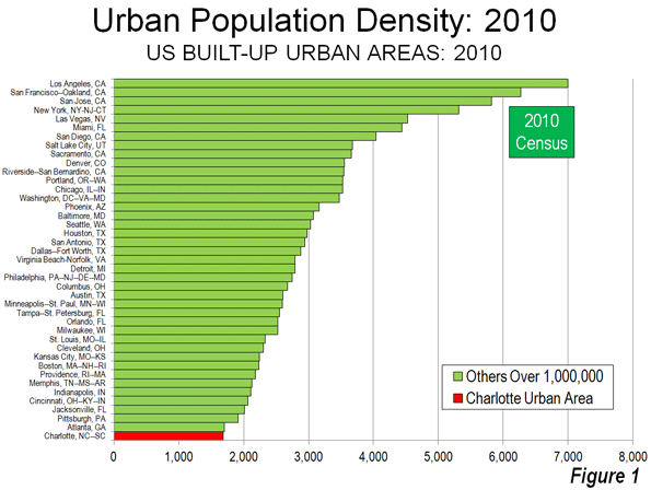
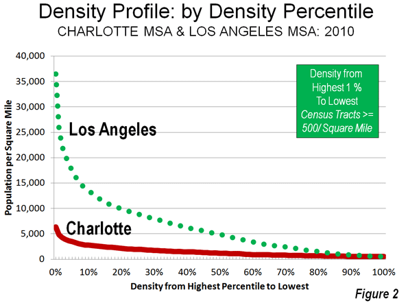
    There may be no better example of the post World War II urban form than Charlotte, North Carolina (a metropolitan area and urban area that stretches into South Carolina). Indeed, among the approximately 470 urban areas with more than 1 million population, Charlotte ranks last in urban population density in the United States (Figure 1) and last in the world. According to the United States Census Bureau, Charlotte’s built-up urban area population density was 1685 per square mile (650 per square kilometer) in 2010. Charlotte is not only less dense than Atlanta, the world’s least dense urban area with more than 4,000,000 residents, but it is only one-quarter the density of the supposed  “sprawl capital” of Los Angeles (Figure 2).

    Over the last seven decades, Charlotte also has been among the fastest growing metropolitan areas in the United States. Charlotte is the county seat of Mecklenburg County, and as recently 1940 as was home to 101,000 residents while with its suburbs in Mecklenburgh County was barely 150,000.

    Declining Densities in the Core City

    Charlotte is also in example of the difficulty of using the core municipality data for comparisons to the suburban balance of metropolitan areas. With North Carolina’s liberal annexation laws, Charlotte has pursued a program of nearly continuous annexation such that in every 10 years since 1940, the city has added substantial new territory.

    In 1940, the city of Charlotte covered a land area of 19 square miles (50 square kilometers) and had a population density of 5200 per square mile (2,000 per square kilometer). For a prewar core municipality, this was not at all dense. For example, Evansville Indiana, which had approximately the same population at the time, had a population density nearly twice that of Charlotte. Other larger core municipalities approached triple or more Charlotte’s population density, such as Trenton, Buffalo, Providence, and Milwaukee.

    Over the last seven decades, the city’s population has risen by 6.2 times, while its land area has increased by 14.4 times (Table $$$). The result is a 53% decline in the city of Charlotte’s population density, to 2456 per square mile (948 per square kilometer). This is only slightly above average density of the US built-up urban area – which includes the smallest towns and suburbs of every size – of 2,343 per square mile (1,455 per square kilometer). Indeed, the average far flung suburbs (30 miles distant) of Los Angeles, such as Pomona and Tustin, are more than 2.5 times as dense.

    City of Charlotte (Municipality)
    Population & Land Area: 1940-2010
    Census Population Area: Square Miles Area: Square KM Density (Sq. Mile) Density (KM)
    1940           100,899 19.3 50.0          5,228          2,019
    1950           134,042 40.0 103.6          3,351          1,294
    1960           201,564 64.8 167.8          3,111          1,201
    1970           241,178 76.0 196.8          3,173          1,225
    1980           314,447 139.7 361.8          2,251             869
    1990           395,934 174.3 451.4          2,272             877
    2000           567,943 242.3 627.6          2,344             905
    2010           731,424 297.8 771.3          2,456             948
    Change 625% 1443% 1443% -53.0% -53.0%


    Growth by Geography

    The core city of Charlotte’s ever-fluctuating boundaries make it necessary to use smaller area measures to estimate the distribution of population growth. This can be accomplished using zip code data from the 2000 and 2010 censuses.

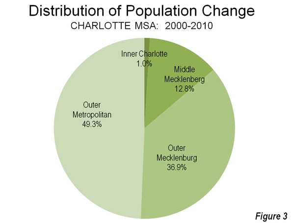
    Inner Charlotte, for the purposes of this analysis (zip codes 28202 through 28208) covers approximately 28 square miles (73 square kilometers) and had a population of approximately 92,000 in 2010 . This is a larger area than the city of Charlotte in 1940, which covered only two thirds as much land area and had more people. Between 2000 and 2010, this inner area population rose by 6,200 residents. All the gain was in the central zip code that comprises the downtown area (central business district), which in Charlotte is called "Uptown." Outside this small 1.8 square mile area (4.7 square kilometers), the inner area actually lost 1,400 residents.

    Overall, the inner area of Charlotte – which has somewhat an obsessive hold on many city leaders – accounted for 1.0% of the metropolitan area growth from 2000 to 2010. This is not unlike other major metropolitan areas, which have experienced slow growth, particularly in areas adjacent to the downtown cores. Among the 51 US metropolitan areas with more than 1,000,000 population in 2010, net gain occurred within two miles of city hall, while this gain was erased by a loss of 272,000 between two and five miles of city hall.

    Another 13% (64,000) of the 2000-2010 growth occurred in the middle Mecklenburg County zip codes (28209 to 28217), virtually all of which is in the city of Charlotte. This 185 square mile area, combined with the inner area, exceeds the land area of the city in 1990.

    Mecklenburg County’s outer zip codes, many of which are in the city, captured 37% of the metropolitan area’s growth (184,000). The remaining 49% (247,000) of growth in the Charlotte metropolitan area was outside Mecklenburg County (Figure 3).

    From 1990 to 2010, Charlotte was the seventh fastest growing metropolitan area out of the 51 with a population exceeding 1 million. Early data for the present decade shows Charlotte to have slipped to ninth fastest growing; however during this period, Charlotte has displaced Portland, Oregon as the nation’s 23rd largest metropolitan area. Between 1990 and 2012, Charlotte added nearly 1,000,000 residents and now has 2.4 million residents.

    Uptown: The Commercial Story

    Unlike other post-World War II metropolitan areas (such as Phoenix, San Jose, and Riverside-San Bernardino), Charlotte has developed a concentrated, high rise downtown area." Part of this is due to the city’s strong financial sector. Charlotte is the home to Bank of America, the nation’s second largest bank and the successor to the San Francisco-based California bank of the same name that was the largest bank in the world for decades. Nation’s Bank, the predecessor to Bank of America, erected a 60 story tower in 1992 that was among the tallest in the United States.

    Charlotte was also home to Wachovia Bank, which built its 42 floor headquarters before, and nearby the Bank of America Tower. Wachovia had intended to move to a larger, 50 story building. However, the time it was completed, Wachovia had been sold to Wells Fargo Bank, a casualty of the US financial crisis. The new building was renamed the Duke Energy Center.

    Thus, Charlotte consumed one San Francisco bank, and lost another to San Francisco. Now Uptown Charlotte has six buildings more than 500 feet in height (152 meters). With six buildings of this height,  Charlotte has developed by far the concentrated central business district among the newer metropolitan areas.

    However, the high employment density has not converted into a transit oriented business district, as some might have predicted. American Community Survey (CTPP) data indicates that approximately 87% of uptown employees use cars to get to work. Further, more than 90% of the jobs in the metropolitan area are outside Uptown.

    Uptown: The High Rise Condominium Story

    Uptown’s commercial progress has not been replicated in the residential market, as overzealous high rise condominium developers apparently may have confused Charlotte for Manhattan or Hong Kong. One of the more recent 500 foot plus towers was The Vue, a 50 story condominium tower. Too few condominiums were sold, and a foreclosure auction followed. The new owner has converted the condominiums to rental units. A 40 story condominium project ("One Charlotte") was to feature units priced from $1.5 million to $10 million, but was cancelled. Another condominium building, the 32 story 300 South Tryon was also cancelled. A tower base was prepared for a 50 plus story condominium monolith, but this was never built, while depositors were claiming they could not find the developer to get their deposits back. It was also reported that legendary developer Donald Trump had plans for the tallest building in town, a 72 story condominium tower, which would have been joined by another tower. These have also been cancelled (for artists renderings, click here).

    Charlotte’s Continuing Dispersion

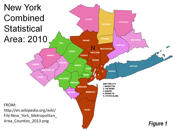
    While Uptown condominium developers were unable to sell many units, Charlotte’s labor market dispersed so much between 2000 and 2010 that the Office of Management and Budget expanded the metropolitan area by four counties. The net addition to the population of this revision was approximately 460,000.  This is by far the largest percentage increase to a metropolitan area over the period, though much larger New York added counties with 660,000 residents.

    Charlotte seems to say it all with respect to the ill-named "back to the city movement" (ill named, because most suburbanites did not come from the city to begin with). Yes, there is growth downtown and yes, it is important and yes, it is healthy. But, in the overall scheme of things, it is small, and relative to the rest of the thriving region, likely to remain less important in the years ahead.

    Wendell Cox is a Visiting Professor, Conservatoire National des Arts et Metiers, Paris and the author of “War on the Dream: How Anti-Sprawl Policy Threatens the Quality of Life.

    Photo: Uptown Charlotte courtesy of Wiki Commons user Bz3rk

  • The Geography of Cultural Attitudes

    The cultural and political division of America, the gap between “red” and ”blue” with respect to economic and social liberalism or conservatism is a constant and dominant theme in American discourse. Here’s some narrowly specific measures of social liberalism based on actual votes by citizens or legislatures, not polls or broader indices available.   

    We would have liked to use more measures, but data problems restricted us to only 8 measures: women’s suffrage and state votes on the ERA (Equal Rights Amendment), the right to die, the legalization of marijuana, gay sex (sodomy laws), same sex marriage, racial intermarriage, contraception, and abortion (current state).  Data for religion-state separation were inadequate, although we include some extra data on religiosity.

    For women’s suffrage our index notes when suffrage was granted (states which did not until after the 19th Amendment get the lowest score).  Similarly for the ERA, we give high scores to states which early granted rights to women, with low scores for states which did not pass the ERA, or rescinded an earlier yes vote. For racial intermarriage, scores were based on when intermarriage became legal, with the lowest scores for those states where it was still illegal before the 1967 Supreme Court decision. Gay sex similarly gives lowest scores with anti-sodomy laws still in force at the time of the Lawrence vs Texas case in 2003. The same sex marriage measure gives high scores to states which now accept same sex marriage. The contraception measure is based on current restrictions on emergency contraception, as data on earlier history were poor. The “right to die” or “death with dignity” cause is more recent. The abortion measure is based on a state by state analysis of when and if it was accepted by states before Roe, and the degree of current constraints. Finally the marijuana measure considers the vote in CO and WA, and also states with medical marijuana provisions. 

    These nine values are summed to give a score to the states (listed in table 1 below). The table is arranged in order from the lowest total (most conservative) to the highest (most liberal).

    This scaling is compared to the right in the table with a measure of religiosity, two indices of social liberalism from the web (also published) and the Gallup poll. Since the data on the 9 measures and for the other indices were in varying units, I converted all to a simple scale from 1 (extremely conservative) to 10 (extremely liberal).  The Gallup poll was for 2010-2012 surveys, the “religiosity” ranking on a separate Gallup poll on the “importance of religion,” the “Free state liberal” index is from the Free State Project Forum, State Policy Liberalism Rankings,  by Jason Sorens , the social science model rankings from Andrew Gelman , Statistical modeling, causal inference and social science statistics, and based on the 2000 Annenberg Survey.

    Since our analysis was based on varying measures, some quite recent and others quite old, our numbers are rather different from most of the other comparison indices. These are broadly similar to contemporary rankings of conservatism or liberalism, with some intriguing differences, which reflect our choice of measures.

    Consider our low ranking of Virginia and Florida, which actually voted for Obama in 2008 and 2012! The reason is not that there is a dearth of liberals, but that they have not been very effective.  If the state legislatures and courts don’t pass “liberal” measures because they are consistently controlled by conservative tradition and majorities, then many liberal voters are ineffective and irrelevant, except for statewide votes for senate or governor or president. The same principle applies to a lesser extent to Pennsylvania, Ohio, Michigan, and perhaps even Wisconsin. At the opposite end, there are many conservative voters in states like Washington, Oregon, Maine, California, New York and Vermont, but their effectiveness is low, since the governor and legislatures are often controlled by more liberal majorities. Washington may be the extreme in this respect, where the voters themselves, not the legislatures, twice affirmed  abortion rights, then the right to same sex marriage, death with dignity (right to die), and the legalization of marijuana.  Maine and Minnesota affirmed same sex marriage, and Oregon the right to die.    

    The relatively low ranking for the District of Columbia, often the most liberal in other surveys, probably reflects the fact that it was part of the South culturally and perhaps more importantly subject to congressional oversight.

    The story is different for the states which are widely proclaimed to be conservative, but are in the lower “liberal” part of my table.  Most noteworthy is Montana, but also Arkansas, Iowa, New Mexico, and Wyoming, noted among the most conservative in polls and other rankings. The reason again is my particular choice of measures.  Western conservative states tend to embrace a libertarian point of view which can translate into social liberalism despite economic conservatism. Wyoming and then Montana were the first to give women the right to vote, and supported the ERA early on. Montana was the 3rd state to recognize a right to die; it also tried to defy the Supreme Court with respect to corporate political contributions (Citizens United).

    The other main reason for difference is that my ranking is based solely on social issues, while the other ranking all have some degree of economic liberalism affecting their results. This is why many Northeastern states are lower in my more strictly social liberalism ranking. The data show that some states have become more liberal over time while some states in the wide open west have become more conservative (WY, NV, ID AZ).

    The social geography of American states is a fascinating story of tradition and consistency, selective change.  The deeper South (not DE and MD) remains astoundingly monolithic. It is hard to escape the conclusion that to many the Civil War is not over, that race still rules, but also that for less obvious reasons, more fundamentalist religious denominations dominate, while in much of the country, religious adherence has diminished.

    At the other extreme, the “Left coast” and the Megalopolitan Northeast, (except for Pennsylvania!) exhibit a remarkable social liberalism. While the root may lie in a New England moralist or ethical tradition of tolerance, associated with the Congregational and Episcopal churches, this somehow became amplified in the 1960s and since through rising levels of education, professional occupations, and societal experimentation.  To some degree this relatively liberal ideology moved westward across the “northern tier” to the rise of a “progressive” movement in the Great Lakes states, and on to Iowa and Minnesota, (still  apparent!) and even on to Washington and Oregon.

    The Mountain states, including probably Alaska, are more complex, with increasing conservatism, especially in the “Mormon realm” – Utah, Idaho, Arizona, and Wyoming, while New Mexico and Colorado have even become more liberal. Education?  I’ll leave the explanation to the readers!

    This leaves the great Midwestern heartland – the Great Lakes, the northern Plains, and Appalachia. Appalachia was Democratic, a legacy of mining and unions, but social change seemed to pass the region by, as historic forces of fundamentalist religion and traditional values and small-townness, resisted the social change associated with the large metropolis.

    The Great Lakes states (MI, OH, IN, WI, IL) are remarkably alike in the middle ground between liberal and conservative on the social dimension, and seem to defy any simple understanding. They are metropolitan, and historically industrially vibrant, but also retain extensive small-town and farming areas, with a stronger religious tradition than the Left Coast or the megalopolitan realm. Thus they are resistant to the more ‘radical’ social changes, like same sex marriage. And Illinois just changed on same sex marriage! Other states may soon follow.

    The northern Plains, the region from MO and KS to the Dakotas and Minnesota, is more socially diverse, with Minnesota and Iowa far more socially liberal than the other states, especially the less metropolitan western area from Kansas through the Dakotas.

    I would conclude with a warning that this ranking is social, and ignores economic values and votes. Thus while WA maybe the most socially liberal, it is much lower on economic measures. While WA does have the highest minimum wage, it is 50th, yes last, in its regressive tax structure.

    Table 1: Index of Social Liberalism by State
    State Women Vote Equal Rights Act Racial Intermarry Gay Sex Same Sex Marriage Contraception Right to Die Abortion Marijuana Total Score
    AL 1 1 1 1 1 1 1 1 1 9
    VA 1 1 1 1 1 1 1 1 1 9
    MS 3 1 1 1 2 1 1 1 1 12
    FL 2 4 1 1 1 1 1 1 1 13
    GA 2 1 1 3 1 1 1 3 1 14
    LA 3 4 1 1 1 1 1 1 1 14
    NC 1 4 1 1 1 1 1 4 1 15
    SC 1 4 1 1 1 8 1 1 1 19
    OK 9 4 1 1 1 1 1 1 1 20
    AR 5 1 1 3 1 7 1 1 1 21
    KY 6 4 1 5 1 1 1 1 1 21
    ID 9 4 4 1 1 1 1 1 1 23
    TN 5 4 1 5 2 1 1 3 1 23
    MO 6 9 1 2 2 1 1 1 1 24
    NE 5 4 4 8 1 1 1 1 1 26
    UT 9 1 4 1 1 8 1 1 1 27
    TX 5 9 1 1 1 7 1 1 1 27
    AZ 9 1 4 3 2 1 1 3 5 29
    SD 9 4 4 8 1 1 1 1 1 30
    KS 9 9 7 1 1 1 1 1 1 31
    ND 5 9 4 8 1 1 1 1 1 31
    WV 1 9 1 8 4 1 1 7 1 33
    IN 6 9 4 8 3 1 1 1 1 34
    MI 9 9 7 1 1 1 1 1 5 35
    PA 1 9 7 6 3 7 1 1 1 36
    OH 4 9 7 8 1 7 1 1 1 39
    WY 10 9 4 8 3 1 1 4 1 41
    DC 5 9 4 6 9 7 1 1 1 43
    DE 3 9 1 8 9 1 1 6 5 43
    MD 1 9 4 4 10 1 1 9 4 43
    NV 9 4 4 5 5 1 1 9 5 43
    RI 6 9 7 5 9 1 1 4 5 47
    WI 6 10 9 6 3 8 1 4 1 48
    IA 6 9 7 8 9 1 1 6 1 48
    MT 10 9 4 4 2 1 8 9 5 52
    IL 5 4 7 10 9 8 1 7 1 52
    MA 3 9 7 7 9 9 1 7 1 53
    NH 3 9 9 8 9 9 1 7 1 56
    MN 6 9 9 3 9 8 1 6 5 56
    NM 3 9 7 8 7 9 1 9 5 58
    AK 9 9 9 6 2 9 1 9 5 59
    NJ 3 9 9 8 7 8 1 9 5 59
    CO 9 9 4 8 5 7 1 6 10 59
    CT 3 9 9 8 9 8 1 8 5 60
    HI 5 9 9 8 5 9 1 10 5 61
    NY 9 9 9 6 9 8 1 9 1 61
    CA 9 9 4 8 9 9 1 9 5 63
    ME 6 9 7 8 10 9 1 9 5 64
    OR 9 9 4 8 5 8 10 9 5 67
    VT 3 9 9 8 9 9 9 9 5 70
    WA 9 9 7 8 10 9 9 10 10 81


    Table 2: Comparison to Other Indexes
    State Religious Separation Freestate Liberal Socsci model rank Gallup My Ranking
    AL 1 1 3 1 1
    VA 3 3 5 5 1
    MS 1 1 1 1 2
    FL 4 6 4 5 2
    GA 2 2 3 3 2
    LA 1 3 2 2 2
    NC 2 4 4 4 2
    SC 1 2 3 3 2
    OK 1 1 2 2 3
    AR 1 1 1 2 2
    KY 2 2 1 4 3
    ID 8 2 2 2 3
    TN 2 1 2 3 3
    MO 3 2 3 4 4
    NE 4 3 3 2 4
    UT 3 2 3 1 4
    TX 2 1 3 4 4
    AZ 7 4 4 4 4
    SD 3 2 2 4 5
    KS 3 2 4 4 5
    ND 3 1 3 1 5
    WV 3 4 1 3 5
    IN 3 2 3 3 5
    MI 5 6 5 7 5
    PA 4 5 5 6.7 5
    OH 4 7 4 5 5
    WY 7 1 3 1 6
    DC 6 5 9 10 6
    DE 6 7 7 9 6
    MD 4 9 7 6 6
    NV 9 5 4 7 6
    RI 9 8 10 9 7
    WI 3 5 5 4 7
    IA 5 4 5 4 7
    MT 6 5 3 3 8
    IL 6 7 6 6 8
    MA 9 10 10 9 8
    NH 10 6 7 7.8 8
    MN 5 6 6 6 8
    NM 4 4 4 7 8
    AK 9 5 6 1 8
    NJ 7 10 8 6 8
    CO 7 6 5 7 8
    CT 9 8 9 9 9
    HI 8 8 7 8 9
    NY 8 10 9 8 9
    CA 8 9 7 6 9
    ME 10 7 6 7.5 9
    OR 9 7 7 9 9
    VT 10 7 10 9 9
    WA 9 7 6 5 10
    Correlation with My Ranking 0.83 0.74 0.68 0.66

    Richard Morrill is Professor Emeritus of Geography and Environmental Studies, University of Washington. His research interests include: political geography (voting behavior, redistricting, local governance), population/demography/settlement/migration, urban geography and planning, urban transportation (i.e., old fashioned generalist).

  • NewGeography’s Top Stories of 2013

    A new year is upon us, here’s a look back at a handful of the most popular pieces on NewGeography from 2013. Thanks for reading, and happy New Year.

    12. Gentrification as an End Game, and the Rise of “Sub-Urbanity” In January Richey Piiparinen points out that gentrification driven by affluent young people moving back to the city might be creating “a ‘sub-urbanity’ that is emerging when the generalization of gentrification meets the gentrification of the mind.”

    11. The Cities Winning the Battle for the Biggest Growth Sector in the U.S. Joel and I put this index together to measure growth and concentration of the professional, technical, and scientific services sector among the nation’s largest metropolitan areas. As high-end services become easier to export, this sector is becoming a critical region-sustaining sector in many parts of the country. This piece also ran at Forbes.com.

    10. A Map of America’s Future: Where Growth will be Over the Next Decade Working with Forbes Magazine in September, Joel and I laid out seven regions and three city-states across the nation. Regional economic diversity is one of America’s most critical attributes.

    9.  The Dutch Rethink the Welfare State Nima Sanandaji outlines the trajectory of the social services culture in the Netherlands.

    8.  Suburb Hating is Anti-Child In this provocative, widely-discussed piece, Mike Lanza takes it to politicians and commentators who advocate against suburbs, pointing out that “we need to fix suburbs and the way families utilize them,” but “what we shouldn’t do is try to force families to live in dense city centers.”

    7.  Fixing California: The Green Gentry’s Class Warfare Joel Kotkin points out that many green policies are pro-gentry and anti-middle class, particularly in California. This piece originally appeared at U-T San Diego.

    6.  How Can We Be So Dense? Anti-Sprawl Policies Threaten America’s Future In this piece from Forbes, Joel Kotkin argues that high-density housing advocates should be open to a broader range of housing options because policies pushing high density often favor real estate investors over the middle class and the concept of upward mobility.

    5.  Class Warfare for Republicans Joel takes the Republican Party to task for ignoring the issue of class and small business growth in favor of rhetoric about social conservatism, gun control, and free market idealism. This piece originally ran in the Orange County Register.

    4.  Houston Rising: Why the Next Great American Cities Aren’t What you Think In this piece from The Daily Beast, Joel argues that a city’s most important quality is its ability to foster upward mobility and to sustain a middle class, not its urban form.

    3.  The New Power Class Who Will Profit from Obama’s Second Term Who stands to benefit most from the second Obama administration? Joel argues that it’s the plutocrats of Silicon Valley and new media industries and the clerisy of academia. This piece originally appeared at Forbes.com.

    2.  Why are there so Many Murders in Chicago? Aaron Renn lays out seven possible reasons contributing to violent crime in Chicago and calls for an adjustment in strategy to fight it.

    1.  Gentrification and its Discontents: Notes from New Orleans The most read piece of the year is this excellent expose of gentrification and its impact on the culture and age demographics of New Orleans by local geographer Richard Campanella.

    Mark Schill is a community strategist and analyst with Praxis Strategy Group and New Geography’s Managing Editor.

  • North Dakota Leads Population Growth Again

    New US Census Bureau state level estimates have just been released. Repeating the pattern similar to that developing since 2010, North Dakota, the District of Columbia, Texas, Utah and Colorado have posted the strongest percentage gains.  North Dakota added 3.1 percent to its population between 2012 and 2013 and 7.6 percent since the 2010 Census. Close behind was the District of Columbia, which added 7.4 percent since 2010, though its growth over the past year has been at a lower 2.1 percent rate.

    Texas added the most residents of any other state over the last three years (1.3 million), a fifth more than 22nd ranked California, which is nearly 50 percent larger. Texas has added 5.2 percent to its population since 2010, while California has added 2.9 percent.

    Utah grew 5.0 percent, followed closely by Colorado, at 4.8 percent.

    Former perennial growth leader Florida continues to recover, placing 6th, with a three year growth rate of 4.0 percent. At its present growth rate, Florida should pass New York by 2014, to become the fourth largest state. South Dakota, Washington, Arizona and Alaska rounded out the top ten.

    The slowest growing states were Rhode Island (the only state to lose population since 2010), Maine, West Virginia, Michigan and Vermont. A table is attached with the data.

    States Ranked by 2010-2013 Population Change
    Rank   2010 Census 2012 2013 Pop. Change 2010-2013 % Change 2012-2013 % Change 2010-2013
    1  North Dakota           672,591        701,345        723,393         50,802 3.1% 7.6%
    2  District of Columbia           601,723        633,427        646,449         44,726 2.1% 7.4%
    3  Texas      25,145,561   26,060,796   26,448,193    1,302,632 1.5% 5.2%
    4  Utah        2,763,885     2,854,871     2,900,872       136,987 1.6% 5.0%
    5  Colorado        5,029,196     5,189,458     5,268,367       239,171 1.5% 4.8%
    6  Florida      18,801,310   19,320,749   19,552,860       751,550 1.2% 4.0%
    7  South Dakota           814,180        834,047        844,877         30,697 1.3% 3.8%
    8  Washington        6,724,540     6,895,318     6,971,406       246,866 1.1% 3.7%
    9  Arizona        6,392,017     6,551,149     6,626,624       234,607 1.2% 3.7%
    10  Alaska           710,231        730,307        735,132         24,901 0.7% 3.5%
    11  Wyoming           563,626        576,626        582,658         19,032 1.0% 3.4%
    12  Nevada        2,700,551     2,754,354     2,790,136         89,585 1.3% 3.3%
    13  North Carolina        9,535,483     9,748,364     9,848,060       312,577 1.0% 3.3%
    14  Virginia        8,001,024     8,186,628     8,260,405       259,381 0.9% 3.2%
    15  South Carolina        4,625,364     4,723,417     4,774,839       149,475 1.1% 3.2%
    16  Hawaii        1,360,301     1,390,090     1,404,054         43,753 1.0% 3.2%
    17  Georgia        9,687,653     9,915,646     9,992,167       304,514 0.8% 3.1%
    18  Delaware           897,934        917,053        925,749         27,815 0.9% 3.1%
    19  California      37,253,956   37,999,878   38,332,521    1,078,565 0.9% 2.9%
    20  Idaho        1,567,582     1,595,590     1,612,136         44,554 1.0% 2.8%
    21  Maryland        5,773,552     5,884,868     5,928,814       155,262 0.7% 2.7%
    22  Oklahoma        3,751,351     3,815,780     3,850,568         99,217 0.9% 2.6%
    23  Montana           989,415     1,005,494     1,015,165         25,750 1.0% 2.6%
    24  Oregon        3,831,074     3,899,801     3,930,065         98,991 0.8% 2.6%
    25  Tennessee        6,346,105     6,454,914     6,495,978       149,873 0.6% 2.4%
    26  Nebraska        1,826,341     1,855,350     1,868,516         42,175 0.7% 2.3%
    27  Massachusetts        6,547,629     6,645,303     6,692,824       145,195 0.7% 2.2%
    28  Minnesota        5,303,925     5,379,646     5,420,380       116,455 0.8% 2.2%
    29  Louisiana        4,533,372     4,602,134     4,625,470         92,098 0.5% 2.0%
    30  Arkansas        2,915,918     2,949,828     2,959,373         43,455 0.3% 1.5%
    31  Iowa        3,046,355     3,075,039     3,090,416         44,061 0.5% 1.4%
    32  Kansas        2,853,118     2,885,398     2,893,957         40,839 0.3% 1.4%
    33  New York      19,378,102   19,576,125   19,651,127       273,025 0.4% 1.4%
    34  Indiana        6,483,802     6,537,782     6,570,902         87,100 0.5% 1.3%
    35  Kentucky        4,339,367     4,379,730     4,395,295         55,928 0.4% 1.3%
    36  New Mexico        2,059,179     2,083,540     2,085,287         26,108 0.1% 1.3%
    37  New Jersey        8,791,894     8,867,749     8,899,339       107,445 0.4% 1.2%
    38  Alabama        4,779,736     4,817,528     4,833,722         53,986 0.3% 1.1%
    39  Wisconsin        5,686,986     5,724,554     5,742,713         55,727 0.3% 1.0%
    40  Missouri        5,988,927     6,024,522     6,044,171         55,244 0.3% 0.9%
    41  Mississippi        2,967,297     2,986,450     2,991,207         23,910 0.2% 0.8%
    42  Connecticut        3,574,097     3,591,765     3,596,080         21,983 0.1% 0.6%
    43  Pennsylvania      12,702,379   12,764,475   12,773,801         71,422 0.1% 0.6%
    44  New Hampshire        1,316,470     1,321,617     1,323,459           6,989 0.1% 0.5%
    45  Illinois      12,830,632   12,868,192   12,882,135         51,503 0.1% 0.4%
    46  Ohio      11,536,504   11,553,031   11,570,808         34,304 0.2% 0.3%
    47  Vermont           625,741        625,953        626,630              889 0.1% 0.1%
    48  Michigan        9,883,640     9,882,519     9,895,622         11,982 0.1% 0.1%
    49  West Virginia        1,852,994     1,856,680     1,854,304           1,310 -0.1% 0.1%
    50  Maine        1,328,361     1,328,501     1,328,302              (59) 0.0% 0.0%
    51  Rhode Island        1,052,567     1,050,304     1,051,511         (1,056) 0.1% -0.1%
     United States  308,745,538 313,873,685 316,128,839    7,383,301 0.7% 2.4%


  • The Metro Areas With The Most Economic Momentum Going Into 2014

    America’s economy may be picking up steam, but it remains a story of parts, with the various regions of the country performing in often radically divergent ways.

    To identify the regions with the most momentum coming out of the recession, we turned to Mark Schill, research director for the Praxis Strategy Group, who crunched a range of indicative data from 2007 to today for the nation’s 52 largest metropolitan statistical areas. To gauge economic vitality, we used four metrics: GDP growth, job growth, real median household income growth and current unemployment. To measure demographic strength we looked at population growth, birth rate, domestic migration and the change in educational attainment. All factors were weighted equally.

    Our assumption is that strong local economies attract the most people and create the best conditions for family formation, which in turn generates new demand. Strong productive industries drive demand for such things as heath care, business services and retail, as well as single-family houses, a critical component of local growth and still the aspirational goal of the vast majority of Americans. This, of course, depends on economic factors, which drive perceptions of better times and provide the income necessary to qualify for a mortgage.

    Our results are based on metrics often overlooked in assessments that are focused primarily on either asset inflation — stocks or out-of-control housing prices — or are built around anecdotal, cherry-picked data from, for example, just one part of a metropolitan region. Despite all the attention lavished on places like Manhattan or Chicago’s central core, virtually all the fastest-emerging economies coming out of the recession are either in the Southeast, Texas, the Great Plains or the Intermountain West. Of our top 10 metro areas, only one is on the east or west coast: 10th-ranked San Jose/Silicon Valley.

    Most of the strongest local economies combine the positive characteristics associated with blue states — educated people, tech-oriented industries, racial diversity — with largely red, pro-business administrations. This is epitomized by our top-ranked metro area, Austin, Texas, which has enjoyed double-digit growth in GDP, jobs, population and birthrate since 2007. The Texas capital has a very strong hipster reputation, attracting many of the same people who might otherwise end up in Silicon Valley or San Francisco, but it also boasts the low taxes, light regulation and reasonable housing prices that keep migrants there well past their 30s.

    As has been the case for most of the past five years, Texas cities are clearly the place to be in terms of job creation, wealth formation and overall growth. All the other major Lone Star cities place highly on our list, including second-place San Antonio and Houston (fourth). Clearly many parts of the Sun Belt have not died off, as many Eastern pundits gleefully predicted during the recession. The migration of Americans southward, thought by the Eastern press to have petered out, has resumed, particularly to Texas and Sun Belt cities with strong economies.

    One critical factor propelling growth has been the energy revolution, which is rapidly transforming big swathes of middle America into a production hub for fossil fuels and the best place to secure cheap electric power. Besides the Texas cities, other energy capitals doing well including Salt Lake City (No. 3) and Denver (No. 7) — both of which also boast burgeoning tech sectors — as well as Oklahoma City (No. 8).

    One canary in the coalmine suggesting future dynamism is a rising share of highly educated people in the population. Places like Nashville, Denver and Salt Lake are all getting smarter faster, increasing their numbers of educated people faster than “brain” regions such as Seattle (14th), San Francisco (22nd), Boston (26th), New York (31st), Chicago (40th) and Los Angeles (44th). Another survey looking at areas that have gained the most young college graduates since 2006 found similar trends, with Nashville, New Orleans, Dallas, Austin, San Antonio and Houston among the leaders. More important still, in these high- growth cities, educated labor is not tethered to the current social media bubble, but to more diverse industries such as medical services, energy, manufacturing and business services.

    Other evidence of these areas’ dynamism includes high rates of birth and family formation. After several years of declines, the nation’s fertility rate now appears to be rebounding somewhat, with some demographers predicting we may on the cusp of a “birth bounce,” in part as millennials start entering their 30s. Certainly this welcome trend will accelerate if the economy continues to gain strength.

    So where will these new families likely settle? With the exception of  Washington D.C. (12th), virtually all the areas with the fastest projected rates of household formation are in the Sun Belt, led by Houston, which is expected to add 140,000 new households by 2017, the largest increase in the nation, nearly twice as many as much larger New York. Indeed despite some of the most active homebuilding in the nation, the energy capital clearly needs more homes; sales have been so strong that it has now reached the lowest inventory in recent history.

    Critically, most of these cities embrace growth, whether in their urban cores or suburban peripheries. In contrast, some strong economies, such as San Jose and San Francisco, are also among the most restrictive in terms of new construction, leading to ever escalating prices that tends to force 30-somethings and families out of the region. High housing costs also play a depressing role in always hyped New York, as well as Los Angeles and Chicago; all suffer high rates of domestic out-migration and depressed household formation. Chicago is now projected to have virtually no job growth next year, not a good sign in an economy that remains well below its 2007 employment level.

    What other regions are likely to lag, even amid a strengthening recovery? The list includes Sun Belt metro areas where the housing bubble hit hardest and job growth has not revived, such as Las Vegas (51st) and Riverside-San Bernardino, Calif. (49th). In these cities real per capita household income remains almost 20% below 2007 levels. With fewer people able to afford new homes, these areas have roughly 8% fewer jobs than five years ago.

    Other bottom-dwellers include several industrial cities where even a resurgence in manufacturing has failed to erase the catastrophic losses suffered in the recession. Detroit ranks dead last at 52nd; Providence, R.I., 50th; and Cleveland 48th. All three have fewer people than in 2007 and at least 5% fewer jobs than.

    These differentials between regions could widen further in the future, as the impact of the energy revolution deepens and the current social media craze begins to die down. This happened after the first dot-com bust at the beginning of the last decade, sending roughly half of California’s tech workers out of the industry or out of the state.

    Sky-high housing costs, coupled with stricter mortgage restrictions, could accelerate the development of new, less pricey tech centers, including Seattle, New Orleans (16th) and Pittsburgh (19th). Once the venture capital punch bowl is removed, it is likely the surviving social media firms will need to find more affordable places to locate, if not their leading researchers, at least much of their marketing and administration.

    Looking across the board, it seems likely that the best places to look for work, or invest, will be those that have diversified their economies, kept costs down and attracted a broad cross-section of migrants from other parts of the country. These may not all be the favored cities of the media, or the pundit class, but they are the places offering a variety of positives to residents at every stage of life. These balanced regions are the places employers and families are most likely to flock to. Such places have not only transcended the worst effects of the recession, but seem primed to take advantage of a nascent expansion that could redraw the map of the country.

    2014 Regions to Watch Index
    Rank Region (MSA) Score GDP Growth, 2007-2012 Job Growth, Aug-Oct 07-13 Population Change, 07-12 Unemplymt Rate 2013 Median Real Hshld Inc Growth, 07-12 Dommestic Mig Rate 10-12 Birth rate, 10-12 Pt Change in Educ. Attain Rate, 07-12
    1 Austin 82.8 21.7% 11.8% 16.3% 5.4% -5.4% 17.0 14.2 2.2%
    2 San Antonio 69.7 11.2% 6.2% 11.1% 6.2% 0.4% 9.2 14.2 2.2%
    3 Salt Lake City 69.4 10.7% 3.7% 8.3% 4.4% -5.3% 0.8 17.0 3.0%
    4 Houston 67.7 12.3% 9.2% 11.5% 6.3% -4.7% 5.2 15.3 1.9%
    5 Nashville 64.4 11.5% 6.5% 8.4% 6.7% -8.4% 7.0 13.3 4.0%
    6 Dallas 62.9 9.3% 6.4% 10.2% 6.2% -6.0% 6.9 14.7 1.7%
    7 Denver 62.1 6.6% 3.4% 9.4% 6.6% -5.7% 8.2 13.4 3.4%
    8 Oklahoma City 61.4 9.2% 5.3% 8.1% 5.1% -3.1% 7.1 14.3 0.7%
    9 Raleigh 58.8 8.9% 2.9% 14.9% 6.8% -6.3% 10.9 13.2 0.6%
    10 San Jose 58.2 15.3% 2.6% 7.3% 6.7% -2.2% -1.3 13.4 2.7%
    11 Portland 55.9 23.6% -0.7% 7.1% 7.1% -7.1% 4.8 12.2 2.5%
    12 Washington 55.3 8.0% 2.9% 9.1% 5.6% -4.2% 2.3 13.8 0.9%
    13 Minneapolis 54.0 6.1% 1.2% 4.7% 4.7% -6.3% 0.0 13.0 2.6%
    14 Seattle 52.3 9.0% 0.8% 7.5% 5.8% -7.2% 3.9 12.6 1.6%
    15 Columbus 49.6 2.2% 2.5% 5.6% 6.2% -6.2% 1.4 13.5 1.7%
    16 New Orleans 49.2 8.6% 3.7% 11.9% 7.1% -16.7% 6.1 13.2 1.1%
    17 Baltimore 49.2 8.2% 1.9% 3.2% 7.2% -5.1% 0.1 12.2 3.0%
    18 Louisville 48.4 5.6% 0.7% 4.0% 7.9% -3.4% 0.2 12.7 2.9%
    19 Pittsburgh 46.7 4.6% 2.6% 0.1% 6.7% -0.1% 1.4 10.0 2.9%
    20 Richmond 46.7 4.8% -0.2% 4.9% 6.0% -9.7% 2.4 12.0 2.4%
    21 San Francisco 46.3 3.7% -1.0% 6.5% 6.4% -8.1% 2.3 11.9 2.2%
    22 Indianapolis 45.9 3.3% 1.5% 5.6% 7.1% -11.9% 1.1 14.2 1.9%
    23 Charlotte 45.6 4.5% 1.9% 10.1% 8.5% -11.0% 7.8 13.0 0.9%
    24 Grand Rapids 45.0 -2.4% 3.6% 2.4% 6.6% -6.7% 0.9 13.3 1.9%
    25 Kansas City 44.9 3.9% -1.1% 4.3% 6.5% -8.0% -1.1 13.6 1.9%
    26 Boston 44.9 7.6% 3.0% 4.3% 6.4% -4.9% -0.1 11.2 1.1%
    27 Virginia Beach 42.0 2.2% -1.5% 2.2% 6.0% -7.8% -3.4 13.4 1.8%
    28 Phoenix 41.7 -4.8% -6.3% 7.8% 7.0% -14.5% 4.8 13.7 2.6%
    29 Birmingham 41.4 0.7% -6.5% 2.7% 5.8% -10.5% -1.7 13.7 2.6%
    30 Buffalo 41.4 2.0% 1.0% -0.3% 7.3% 1.2% -2.5 10.5 2.5%
    31 San Diego 40.6 -1.0% -1.9% 6.8% 7.3% -11.8% 0.2 14.3 1.3%
    32 Philadelphia 39.1 1.9% -1.9% 2.3% 8.1% -6.9% -2.4 12.3 2.8%
    33 Atlanta 38.9 -0.5% -1.5% 7.7% 8.1% -13.7% 3.2 13.6 1.2%
    34 New York 38.9 1.9% 1.6% 3.1% 7.9% -6.1% -5.8 12.7 1.9%
    35 Milwaukee 37.6 0.3% -3.8% 2.4% 7.1% -8.6% -2.9 13.1 2.0%
    36 Jacksonville 37.6 -5.4% -3.3% 5.4% 6.6% -16.2% 3.5 12.8 2.1%
    37 St. Louis 35.8 0.2% -3.6% 1.5% 7.2% -10.1% -3.7 12.3 2.6%
    38 Cincinnati 35.6 1.3% -3.4% 2.1% 7.0% -9.0% -3.0 12.9 1.4%
    39 Tampa 33.5 -3.4% -2.4% 4.3% 6.9% -14.0% 5.9 10.9 1.0%
    40 Chicago 33.0 0.2% -2.5% 2.0% 9.1% -9.7% -5.9 13.2 2.5%
    41 Orlando 32.9 -5.7% -2.0% 8.1% 6.6% -18.3% 7.4 12.0 -0.2%
    42 Rochester 32.8 -2.2% 0.2% 1.0% 6.9% -9.3% -3.2 11.0 1.6%
    43 Miami 32.3 -4.3% -3.9% 6.3% 7.4% -14.4% 3.8 11.6 0.9%
    44 Memphis 31.2 -4.0% -5.8% 3.0% 9.6% -9.8% -1.7 14.5 1.7%
    45 Los Angeles 31.1 -2.5% -4.6% 3.3% 8.9% -10.9% -3.2 13.5 1.8%
    46 Hartford 29.1 -6.9% -1.0% 1.3% 8.0% -6.4% -5.0 10.0 2.2%
    47 Sacramento 26.4 -6.0% -7.9% 5.5% 8.3% -14.1% 0.8 12.9 0.5%
    48 Cleveland 25.1 -1.9% -5.5% -1.3% 7.0% -12.1% -5.8 11.0 1.7%
    49 Riverside 23.6 -9.0% -8.1% 7.0% 10.1% -18.5% 2.3 14.9 0.4%
    50 Providence 23.4 -0.4% -4.2% -0.1% 9.1% -9.4% -4.3 10.5 1.4%
    51 Las Vegas 21.6 -10.4% -8.6% 7.1% 9.6% -20.1% 1.5 13.8 0.7%
    52 Detroit 18.3 -6.0% -5.6% -1.9% 9.7% -13.5% -4.7 11.5 1.8%

    Analysis by Mark Schill, Praxis Strategy Group, mark@praxissg.com
    Data Sources: Bureau of Economic Analysis, Bureau of Labor Statistics, U.S. Census Population Estimates Program, U.S. Census American Community Survey

    This story originally appeared at Forbes.

    Joel Kotkin is executive editor of NewGeography.com and Distinguished Presidential Fellow in Urban Futures at Chapman University, and a member of the editorial board of the Orange County Register. He is author of The City: A Global History and The Next Hundred Million: America in 2050. His most recent study, The Rise of Postfamilialism, has been widely discussed and distributed internationally. He lives in Los Angeles, CA.

  • The Law’s No Ass: Rejecting Hollywood Densification

    The city of Los Angeles received a stunning rebuke, when California Superior Court Judge Alan J. Goodman invalidated the Hollywood Community Plan. The Hollywood district, well known for its entertainment focus, contains approximately 5% of the city of Los Angeles’ population. The Hollywood Plan was the basis of the city’s vision for a far more dense Hollywood, with substantial high rise development in "transit oriented developments" adjacent to transit rail stations (Note 1).

    The Hollywood Plan had been challenged by three community groups (Savehollywood.org, La Mirada Avenue Neighborhood Association of Hollywood, and Fix the City), which argued that the approval process had violated provisions of California law, and most particularly had relied on population projections that were both obsolete and inaccurate.

    Judge Goodman called the Hollywood Plan "fatally flawed," and noted that it relied on errors of both "fact and law." He ordered the City to:

    (1) Rescind, set aside and vacate all actions approving the Hollywood Plan and prepare a replacement that is lawful and consistent with the City’s general plan.

    (2) Grant no permits or entitlements from the Hollywood Plan until it has been replaced with a lawful substitute.

    An "Entirely Discredited" Population Baseline

    The principal issue in the case revolved around out-of-date and erroneous population estimates (Note 2). The city based its densification plan on an assumption that the population of Hollywood would rise from 200,000 in 2000 to 224,000 in
    2005. This estimate was produced by the Southern California Association of Governments (SCAG), which is the metropolitan planning organization for all of Southern California outside San Diego County. SCAG had further projected that Hollywood’s population would rise to 250,000 by 2030.

    To house these additional residents, the city reasoned that higher density development was necessary. In a related matter, the Los Angeles City Council approved Millennium Hollywood, a pair of 35 and 39 story mixed use towers. This was in spite of warnings from the State Geologist that the property was bisected by a dangerous earthquake "rupture" fault (Note 3). Litigation is pending.

    But there’s a fly in this planning ointment, rather than gaining population, Hollywood is losing people.   Before the Hollywood Plan was finally approved, 2010 United States Census data was released that indicated the population had dropped to 198,000. This revealed both the SCAG estimate of the actual population and its 2030 projection to be highly inaccurate. Judge Goodman referred to the SCAG 2005 estimate as "entirely discredited."

    Elementary Questions Raised

    Nonetheless, the city proceeded based upon the incorrect population data. This led the Judge to raise elementary questions about the process (paraphrased below).

    (1) Why was the SCAG population estimate used as a baseline by the city of Los Angeles if the US Census count, readily available before the environmental process was completed, had shown a significantly smaller population?

    (2) Why was the 2030 projection (from SCAG) not adjusted in the Plan based on the new, lower 2010 US Census population count?

    The City defended using the stale and erroneous population data. Judge Goodman commented: "That clearly is a post-hoc rationalization of City’s failure to recognize that the HCPU (Hollywood Plan) was unsupported by anything other than wishful thinking" (parentheses and emphasis by author). The Judge continued that this resulted in a "manifest failure to comply with statutory requirements."

    The Judge set out the burden faced by the City to achieve a legal (and rational outcome):

    …if the population estimate for 2030 were to be adjusted based on what the 2010 Census data had shown, then all of the several  analyses which are based on population would need to be adjusted, such as housing, commercial building, traffic, water demand, waste produced -as well as all other factors analyzed in these key planning documents.

    To its discredit, the city incredibly argued that "it was entitled by law to rely on the SCAG 2005 population estimate." The Judge disagreed. Any other conclusion would have proven "the law to be an ass" (Note 4).

    Abuse of Discretion

    The La Mirada Avenue Neighborhood Association argued that the city of Los Angeles had failed to exercise "good faith effort at full disclosure," contrary to the requirements of California environmental law. Judge Goodman appeared to agree, finding that the city of Los Angeles had abused its discretion, noting "A prejudicial abuse of discretion occurs if the failure to include relevant information precludes informed decision-making and informed public participation, thereby thwarting the goals of" the environmental process.

    Inaccurate Population Estimates and Projections

    This is not the first time that Southern California population projections have been so wrong. With more than a century of explosive population growth, more recent trends may have eluded some of the planning agencies. In 1993, SCAG projected that the city of Los Angeles would reach a population of 4.3 million by 2010. SCAG’s predicted increase of more than 800,000 materialized into little more than 300,000. This is not to suggest that projecting population is an exact science, nor that SCAG has been alone in its inaccuracy.

    In 2007, the state’s official population projection agency, the Department of Finance projected that Los Angeles County would reach 10.5 million residents in just three years. But the 2010 US Census counted only 9.8 million residents (See 60 Million Californians? Don’t Bet on It). In contrast with the previously accustomed growth from other parts of the country, Los Angeles County lost a net 1.2 million residents to other parts of the nation while the rate of immigration fell.  

    Not a Unique Problem

    This instance of overinflated and inaccurate projections is not unique to Los Angeles. The use of out-of-date or erroneous information is increasingly being used in regional planning. Recently, the Association of Bay Area Governments and the Metropolitan Transportation Commission approved the San Francisco Plan Area Plan, which used population projections substantially higher even than those of the Department of Finance (despite that agency’s previous over-optimism).

    As in Los Angeles, Plan Bay Area also used outdated data for automobile greenhouse gas emission factors that have long since been rendered obsolete by technological advancements. Other planning agencies around the nation have engaged in similar practices.

    Planners in the Bay Area, SCAG and elsewhere in California are using similarly flawed projections that presume a substantial change in housing preferences toward multifamily and smaller lots. Yet, years later, the projected trends have not emerged in any significant way (See: A Housing Preference Sea-Change: Not in California).

    Wishful Thinking: No Basis for Action

    Judge Goodman’s decision could have relevance well beyond Los Angeles and the state of California. Regional plans must be based upon current and reliable data, no matter how late received.  To proceed based on faulty data is no different than not changing course when an iceberg appears in the navigation path. Wishful thinking has no place in rational planning.

    ——–

    Note 1: The Hollywood rail stations are on the Red Line subway, which was projected to carry 300,000 daily riders by 2000. The Red Line is carrying approximately 170,000 daily riders and would need three-quarters more to reach the projection for more than a decade ago (see: Report on Funding Levels and Allocations of Funds, Urban Mass Transportation Administration, 1991, page B-49)

    Note 2: The plaintiffs also argued that the Hollywood Plan’s densification would result in additional traffic congestion. This is a serious concern, given Hollywood’s central location in the second most congested metropolitan area in North America (following Vancouver, which recently ended the decades long reign of Los Angeles). Greater traffic congestion is associated with higher population densities.

    Note 3: LA Weekly said that the fault might be capable "of opening the Earth, splitting buildings in half" (See: How the Hollywood Fault Made Millennium’s Future Uncertain, and L.A. a Laughingstock).

    Note 4:  "The law is an ass" (as in a donkey) refers to cases in which the law is at odds with common sense. This phrase was used by Charles Dickens, but appears to have first been used in a play as early as 1620.

    Wendell Cox is a Visiting Professor, Conservatoire National des Arts et Metiers, Paris and the author of “War on the Dream: How Anti-Sprawl Policy Threatens the Quality of Life.

    Photograph: Los Angeles City Hall (by author)

  • The Blue-Collar Heroes of the Inland Empire

    The late comedian Rodney Dangerfield (nee Jacob Cohen), whose signature complaint was that he “can’t get no respect,” would have fit right in, in the Inland Empire. The vast expanse east of greater Los Angeles has long been castigated as a sprawling, environmental trash heap by planners and pundits, and its largely blue-collar denizens denigrated by some coast-dwellers, including in Orange County, who fret about “909s” – a reference to the IE’s area code – crowding their beaches.

    The Urban Dictionary typically defines the region as “a great place to live between Los Angeles and Las Vegas if you don’t mind the meth labs, cows and dirt people.” Or, as another entry put it, a collection of “worthless idiots, pure and simple.” Nice.

    In reality, the people who live along the coast should appreciate the “909ers” since they constitute the future – if there is much of one – for Southern California’s middle class. The region has suffered considerably since the Great Recession, in part because of a high concentration of subprime loans taken out on new houses. Yet, for all its problems, the Inland Empire has remained the one place in Southern California where working-class and middle-class people can afford to own a home. With a median multiple (median house price divided by household income) of roughly 3.7, the area is at least 40 percent less expensive than Los Angeles and Orange County, making it the region’s last redoubt for the American dream.

    Without the 909ers, Southern California would be demographically stagnant. From 2000-10, according to the census, San Bernardino and Riverside counties added more than 1 million people, compared with barely 200,000 combined for Los Angeles and Orange counties. And, despite the downturn that impacted the Inland Empire severely and slowed its growth, the area since 2010 has continued to grow more quickly, according to census estimates, than the coastal counties.

    Families & foreign-born

    Perhaps nothing illustrates the appeal of the region better than the influx of the foreign-born. In the past decade, Riverside and San Bernardino counties grew their foreign-born population by more than 300,000. In contrast, Los Angeles and Orange added barely one third as many. The rate of foreign-born growth in the Inland Empire, notes demographer Wendell Cox, was roughly 50 percent, while Los Angeles and Orange counties managed 2.6 percent growth. The region, once largely white, now has a population that’s 40 percent Latino, the single largest ethnic group.

    And then there’s families. As demographer Ali Modarres has pointed out, the populations of Los Angeles, as well as Orange County, are aging rapidly while the numbers of children have dropped. In contrast, families continue to move into the Inland Empire, one reason for its relatively vibrant demography. Over the past decade, while Orange County and Los Angeles experienced a combined loss of 215,000 people under age 14 – among the highest rates in the U.S. of a shrinking population of children – the Inland Empire gained more than 20,000 under-14s.

    For these basic demographic reasons, the Inland Empire remains critical to Southern California’s success. And there are some signs of progress. Unemployment has plummeted from more than 13 percent to 9.6 percent, higher than in Orange County but considerably better than Los Angeles’ 10.2 percent. There are also some signs of growth, as signaled by some new residential development, and interest in the area from overseas investors.

    Coastals call shots

    The long-term outlook, however, remains clouded, in large part, because of state and regional economic policies that undermine the very nature of the predominately blue-collar 909 economy. This reflects in part the domination of the state by the coastal political class, concentrated in the Bay Area but with strong support in many Southern California coastal communities. The Inland Empire, where almost half the population has earned a high school degree or less, compared with a third of residents in Orange County, is particularly dependent on the blue-collar employment undermined by the gentry-oriented direction of state regulatory policy.

    Losses of jobs in these blue-collar fields, notes economist John Husing, have helped swell the ranks of poor people in the area, from roughly 12 percent of the population to 18 percent over the past 20 years. Part of the problem lies in a determination by the state to discourage precisely the kind of single-family-oriented suburban development that has attracted so many to the region. The decline of construction jobs – some 54,000 during the recession – hit the region hard, particularly its heavily immigrant, blue-collar workforce. This sector has made only a slight recovery in recent months. Ironically, the nascent housing recovery could short-circuit further gains by boosting housing prices and squashing any potential longer-term recovery.

    Other state policies – such as cascading electricity prices – also hit the Inland Empire’s once-promising industrial economy. With California electricity prices as much as two times higher than those in rival states, energy-consuming industries are looking further east, beyond state lines.

    Indeed, according to recent economic trends, job growth is now occurring fastest in places like Arizona, Texas, even Nevada, all of which compete directly with the Inland Empire. As the nation has gained a half-million manufacturing jobs since 2010, such jobs have continued to leave the region. Had the regulatory environment been more favorable, notes economist John Husing, the Inland Empire, with industrial space half as expensive that in Los Angeles and Orange, would have been a major beneficiary.

    Finally, there is a major threat to the logistics industry, which has grown rapidly over 20 years, adding 71,900 jobs from 1990-2012, a yearly average of 3,268. The potential threat is posed by the expansion of the Panama Canal, and the resulting expansion of Gulf Coast ports, all of which could reduce these positions dramatically in coming decades. Husing suggests that attempts by the regional Air Quality Management District to slow this industry’s expansion is a “a fundamental attack on the area’s economic health.”

    Keys to rebound

    Can the Inland Empire still make another turnaround, as it did after the previous deep regional recession 20 years ago? Some, such as the Los Angeles Times, see the key to a rebound in boosting transit, something that, despite huge investment, accounts for barely 1.5 percent of the IE’s work trips, even less than the 7 percent in Los Angeles or 3 percent in Orange County.

    This “smart growth” solution remains oddly detached from economic or geographic reality; more transit usage may be preferable in some ways but can only constitute a marginal factor in the near or midterm future. What the Inland Empire needs, more than anything, is an economic environment that spurs middle-class jobs, notably in logistics, manufacturing and construction.

    Equally important, the area needs to focus more on quality-of-life issues that may attract younger, educated workers, increasingly priced out of the coastal areas. This means a commitment to better parks and schools, attractive particularly to families. This approach has helped a few communities, such as Eastvale, near Ontario, become new bastions of the middle class.

    Without a resurgence in the Inland Empire, all of Southern California can expect, at best, to see the area age and lose its last claim to vitality. This should matter to everyone in Southern California whether they live there or not. Without the 909ers, we are not only without the butt of jokes from self-styled sophisticates, we will have lost touch with the very aspirational dynamic that has forged this region throughout its history. It’s time maybe to give them some respect.

    This story originally appeared at The Orange County Register.

    Joel Kotkin is executive editor of NewGeography.com and Distinguished Presidential Fellow in Urban Futures at Chapman University, and a member of the editorial board of the Orange County Register. He is author of The City: A Global History and The Next Hundred Million: America in 2050. His most recent study, The Rise of Postfamilialism, has been widely discussed and distributed internationally. He lives in Los Angeles, CA.

  • What is a City For?

    The attached report is derived from a speech given last spring in Singapore at the Singapore University of Technology and Design. The notion here is to lay out a new, more humanistic urban future, not one shaped primarily by large developers, speculators and transient global workers. Singapore was a particularly difficult case to look at since it has no room to spread out, something we still have in much of the rest of the world. Yet the city has been very innovative in the development of open space, and its public housing agency, the Housing Development Board, has worked hard to accommodate the needs of families. I have been struck by how people in different countries want the same things: safety, space, privacy, convenience, and affordable housing. The speech is a call to reconsider our urban priorities and make the city responsive to its denizens.

    Download the full .pdf document.

    Introduction

    What is a city for? In this urban age, it’s a question of crucial importance but one not often asked. Long ago, Aristotle reminded us that the city was a place where people came to live, and they remained there in order to live better, “a city comes into being for the sake of life, but exists for the sake of living well” (Mawr, 2013).

    However, what does “living well” mean? Is it about working 24/7? Is it about consuming amenities and collecting the most unique experiences? Is the city a way to reduce the impact of human beings on the environment? Is it to position the polis — the city — as an engine in the world economy, even if at the expense of the quality of life, most particularly for families?

    I start at a different place. I view “living well” as addressing the needs of future generations, as sustainability advocates rightfully state. This starts with focusing on those areas where new generations are likely to be raised rather than the current almost exclusive fixation on the individual. We must not forget that without families, children, and the neighbourhoods that sustain them, it would be impossible to imagine how we, as a society, would “live well.” This is the essence of what my colleague, Ali Modarres and I call the ‘Human City’.

    Living well should not be about where one lives, but how one lives, and for whom. Families can thrive in many places, but these bearers of the next generation are not the primary focus of much of the urbanist community. I am referring here to urban neighbourhoods like in Singapore or in the great American cities, as well as the country’s vast suburbs. These are not necessarily the abodes of the glittering rich, or the transitory urban nomadic class, who dominate our urban dialogue, but a vast swath of aspiring middle- and working- class people. They are not necessarily the places that hipsters gravitate to, or lure people thinking of a second or third house.

    Download the full .pdf document.

    Published by the Lee Kuan Yew Centre For Innovative Cities

    Joel Kotkin is executive editor of NewGeography.com and Distinguished Presidential Fellow in Urban Futures at Chapman University, and a member of the editorial board of the Orange County Register. He is author of The City: A Global History and The Next Hundred Million: America in 2050. His most recent study, The Rise of Postfamilialism, has been widely discussed and distributed internationally. He lives in Los Angeles, CA.

  • Where Working-Age Americans Are Moving

    Barrels of ink and money have been devoted to predictions of where Americans will migrate, particularly younger ones. If you listen to big developer front groups such as the Urban Land Institute or pundits like Richard Florida, you would believe that smart companies that want to improve their chances of cadging skilled workers should head to such places as downtown Chicago, Manhattan and San Francisco, leaving their suburban office parks deserted like relics of a bygone era.

    A close look at recent migration data shows that a significant number of younger people do indeed prefer urban life and can endure, temporarily at least, the high housing costs that go with it. However, the data also show that as they age, Americans continue, in general, to shift to suburbs, and later smaller communities, looking to buy homes and start families. Last week we explored an expert analysis of these trends by demographer Wendell Cox that showed distinctly different migration patterns from 2007 to 2012 among different age groups. (See: “The Geography Of Aging: Why Millennials Are Headed To The Suburbs“) In this article we will look at the metro areas that they went to.

    Our analysis is based on 15-year age cohorts of the working-age population: people who in 2007 were 15-29, 30-44 and 45-59. We looked at the changes in the population numbers of these cohorts five years later in 2012 in the 51 U.S. metropolitan statistical areas with a population over 1 million.

    Youth Magnet Cities

    Most attention tends to go to the youngest of these cohorts, which aged from 15-29 in 2007 to 20-34 in 2012. It includes students, the unmarried and childless — people in the earliest stages of their careers. This is historically the age group most likely to move from one region to another. Although the vast majority of this cohort live in suburbs or smaller towns, our research does show sizable increases in their numbers in many of the larger, expensive cities, particularly those with strong economies.

    From 2007 to 2012, tech-heavy cities generally saw the biggest growth in numbers in this age group. The San Francisco metro area placed first among the largest U.S. metro areas with a 20.7% increase in its population in this age group. Young people, it should be expected, tend to be less sensitive to ultra-high rents (particularly if they work for a successful company or their parents subsidize them). It was followed by Seattle (20.3% growth), Washington, D.C. (18.1%), and Austin, Texas (18.1%).

    But tech centers were not the only gainers. Some up-and-coming metro areas, notably Orlando, Las Vegas and New Orleans, also registered high levels of youth migration.

    In contrast many of the country’s large “hip and cool” cities did not fare nearly as well. Despite its endless self-promotion as a youth magnet, New York placed 19th (8.6% growth, though in absolute numbers in gained the most in this demographic, 323,000), while Los Angeles was 31st and Boston 22nd. Chicago, the much hyped (and hoped for) magnet for the young promoted by the Urban Land Institute in a recent Wall Street Journal article, places 41st – its population in this demographic actually dropped 0.6%. The lowest rungs are dominated by the traditional Rust Belt hard-luck cases: Cleveland (47th), Buffalo (48th), Rochester (49th), Detroit (50th) and last-place Riverside-San Bernardino, which lost 9.4% of its population in this age cohort from 2007 to 2012.

    View Full List Gallery at Forbes: The Cities Where Working-Age Americans Are Moving

    But Where Do They Go After 35?

    As we explained in the last article, perhaps the most important group to watch is the one that aged from 30-44 in 2007 to 35-49 in 2012. This is the group just ahead of the millennials, and the one most likely to provide hints of where the millennials will move as 20 million enter their 30s over the next decade: the dreaded (at least for some) age of marriage, settling down and, in most cases, starting families. This group has shown remarkably different proclivities than the younger cohort. For one thing, they are not going to San Francisco, which drops to 30th place in this cohort – the city lost a net 0.7% of the age group from 2007 to 2012. Other high-cost urban areas also did very poorly with this demographic, including Boston (40th, -2.3%), New York (45th, losing a net 3.9%, or 161,000 people), San Jose (46th), Los Angeles (47th) and Chicago (49th, -5.2%).

    Who wins this group may be critical, since these are people entering their prime who earn more than younger cohorts, particularly in this economy. Census Bureau data indicates that average household incomes are 28% higher where heads of households are 35-45 years old than those in the 25-34 cohort. The gap grows to 34% against householders who are 45 to 54. This group seems very sensitive to both job markets and housing prices. With the exception of the Washington, D.C., area (No. 6), whose government-driven economy continues to flourish, virtually all the top 10 cities enjoy strengthening private-sector economies and relatively low housing prices. At the top of the list is the New Orleans area, whose population in this age group rose 19.3% from 2007 to 2012. The Big Easy’s gains are related, at least in part, to the return of people who fled after Katrina, but it also reflects a newfound demographic vitality backed by substantial economic improvements. It is followed by Miami, San Antonio and Raleigh. Houston and Oklahoma City also did well.

    These are the cities that will appeal most to aging millennials, suggests generational chronicler Morley Winograd. Older millennials, he notes, tend to be very interested in home ownership, family and being good parents. The tough economic times they face, plus often crushing college debt, will force many of them to move not to “luxury cities” where they could never afford a home suitable for child-raising, but to places that are, as he puts it, “less expensive and certainly downscale from the places where they grew up.”

    Mature Adult Markets

    The migration patterns are similar, although not uniformly so, in the next cohort, aged between 50 and 64 in 2012. Mostly still working, and earning close to peak wages, this generation tended to move to less expensive cities as well. New Orleans also ranks first, with a 7.9% gain in this cohort from 2007 to 2012. Low housing costs are another factor in New Orleans’ rebound. You can say much the same for other Sun Belt metro areas, such as San Antonio (third in this demographic with a 7.3% gain), No. 4 Tampa-St. Petersburg (5.0%), No. 5 Austin and No. 7 Oklahoma City.

    Interestingly, the California rankings in this cohort are almost the mirror image of the youth brigade. Riverside-San Bernardino, last in the youth list, for example, ranked second, while Sacramento, 43rd on the youth list, seems to get more appealing as people age. In the 30something group, the area rises to 32nd, and boasts a strong ninth place ranking in growth in the 50-64 cohort (+2.0%).

    Editorialists at local papers, such as the Sacramento Bee, are obsessed with increasing density and luring hipsters. Yet the California capital region, while not drawing many younger people, does very well in luring adult migrants from the far more expensive, and denser, Bay Area and Los Angeles-Orange County. In contrast, in this cohort, San Francisco ranks 40th with a 4.4% decline in population, Los Angeles-Orange County 44th (-5.6%), and San Jose 49th (-7.3%).

    The Upshot For Investors And Companies

    A look at these three working-age cohorts suggests a far more complex, and possibly perplexing, challenge to both companies and regions. our demographic analysis suggests the movement of the youngest workers to “hip, cool”cities that is so celebrated by ULI and other professional urban boosters faces some serious time constraints, particularly as workers age.

    High-profile companies such as Google (itself located in very suburban Mountain View) seek outposts in places like downtown Chicago or New York, where youthful labor, often less expensive, is readily available. But most companies in technology — particularly those with an engineering focus as opposed to social media — depend heavily on older, skilled workers, most of whom live in suburbs. Much the same can be said of professional services, and finance and industrial companies.

    This may explain in part why, despite the claims made by urban boosters, office space construction and absorption is currently considerably stronger in suburbs than in the core cities. A recent Costar report says suburban San Jose, Sacramento, San Jose, Austin, Kansas City and Charlotte are enjoying particularly strong net office absorption. This trend, largely ignored in the media, may accelerate in the future.

    The key again is millennials as they enter their 30s. Like previous generations, many will end up either living in suburbs, or moving to less expensive cities as they get ready to buy homes and start families. The notion that “everyone” wants to move, and more importantly stay, in expensive core cities no doubt appeals to journalists based in places like Washington, D.C., San Francisco or Manhattan. But the actual reality is far more complex and more favorable to the continued dispersion of the workforce. Banking on the shifting tastes of 20somethings only works for so long; in the end, only a minority of workers remain Peter Pans, living their youthful urban dreams well into their 40s and 50s.

    View Full List Gallery at Forbes: The Cities Where Working-Age Americans Are Moving

    This story originally appeared at Forbes.

    Joel Kotkin is executive editor of NewGeography.com and Distinguished Presidential Fellow in Urban Futures at Chapman University, and a member of the editorial board of the Orange County Register. He is author of The City: A Global History and The Next Hundred Million: America in 2050. His most recent study, The Rise of Postfamilialism, has been widely discussed and distributed internationally. He lives in Los Angeles, CA.

    Unemployed woman photo by BigStockPhoto.com.

  • The Evolving Urban Form: Greater New York Expands

    The term “Greater New York” was applied, unofficially, to the 1898 consolidation that produced the present city of New York, which brought together the present five boroughs (counties). The term “Greater” did not stick, at least for the city. When consolidated, much of the city of New York was agricultural. As time went on, the term "Greater" came to apply to virtually any large city and its environs, not just New York and implied a metropolitan area or an urban area extending beyond city limits. By 2010, Greater New York had expanded to somewhere between 19 million and 23 million residents, depending on the definition.

    Greater New York’s population growth has been impressive. Just after consolidation, in 1900, the city and its environs had 4.2 million residents, according to Census historian Tertius Chandler. Well before all of the city’s farmland had been developed, New York, including its environs, had become the world’s largest urban area by the 1920s, displacing London from its 100 year predominance. Yet, even when Tokyo displaced New York in the early 1960s, there was still farmland on Staten Island. 

    New York became even larger in two dimensions, as a result of geographic redefinitions arising from the 2010 census.

    The Expanding New York Metropolitan Area

    The New York metropolitan area grew by enough land area to add more than 700,000 residents between 2000 and 2010, even after the decentralization reported upon in the metropolitan area as defined in 2000. The expansion of the metropolitan area occurred because the employment interchange between the central counties and counties outside the metropolitan area in 2000 became sufficient to expand the boundaries by more than 1,000 square miles (2,500 square kilometers).

    Summarized, metropolitan areas are developed by identifying the largest urban area (area of continuous urban development with 50,000 or more population) and then designating the counties that contain this urban area as “central counties.” Additional (“outlying”) counties are included in a metropolitan area if 25 percent or more of their resident workers have jobs in the central counties, or if 25 percent or more of the employees in the outlying county live in the central counties (There are additional criteria, which can be reviewed at 2010 Office of Management and Budget metropolitan area standards). In addition, adjacent metropolitan areas can be merged into a combined statistical area at a lower level of employment interchange (see below).

    For example, one of the counties added to the New York metropolitan area in the 2010 redefinition was Dutchess (home of the Franklin Delano Roosevelt Presidential Library). A resident of Dutchess County who works across the county line in Putnam County (a central county) would count toward the 25 percent employment interchange with the central counties of the New York metropolitan area. Contrary to some perceptions, metropolitan areas do not denote an employment interchange between suburban areas and a central city, even as major an employment destination as the city of New York.

    The OMB concept of “central” counties is in contrast to the more popular view that would consider the central counties to be Manhattan (New York County) or the five boroughs of New York City. In fact, out of the New York metropolitan area’s 25 counties, all but three (Dutchess and Orange in New York and Pike in Pennsylvania) are central counties. Sufficient parts of the urban area are in the other 22 counties, which makes them central.

    The Expanding New York Combined Statistical Area

    OMB has a larger metropolitan concept called the "combined statistical area." The combined statistical area is composed of metropolitan and micropolitan areas that have a high degree of economic integration with the larger metropolitan area. Essentially, adjacent areas are merged into a combined statistical area if there is an employment interchange of 15 percent. This occurs where the sum of the following two factors is 15 percent or more: (1) The percentage of resident workers in the smaller area employed in the larger area (not just central counties) and (2) The percentage of workers employed in the smaller area who reside in the larger area.

    On this measure, New York became greater by more 1 million residents as a result of the changes in commuting patterns. The addition of Allentown (Pennsylvania – New Jersey) and the East Stroudsburg, Pennsylvania metropolitan areas expanded the New York combined statistical area by another 2,700 square miles (7,000 square miles), bringing the population to 23.1 million. Altogether, the metropolitan area and combined area land area increases added up to 3,700 square miles (9,700 square kilometers). The 35 county New York combined statistical area is illustrated in the map (Figure 1).

    Organized Around the World’s Largest Urban Area (in Land Area)

    The New York combined statistical area is very large. It covers approximately 14,500 square miles (37,600 square kilometers). From north to south, it measures 235 miles (375 kilometers) from the Massachusetts border of Litchfield County, Connecticut to Beach Haven, in Ocean County, New Jersey. It is an even further east to west, at more than 250 miles (400 kilometers) from Montauk State Park in Suffolk County, New York to the western border of Carbon County in Pennsylvania (Note 2). Despite containing the largest urban area  in the world, at 4,500 square miles (11,600 square kilometers), more than 60 percent of the combined statistical area is rural (see Rural Character in America’s Metropolitan Areas).

    Dispersion of Jobs and Residences

    The dispersion characteristic of modern metropolitan regions is illustrated by the extent to which jobs have followed the population in the New York combined statistical area. In all “rings” outside the city of New York, there is near parity between resident workers and jobs. The greatest employment to worker parity (0.97) is in the metropolitan and micropolitan areas outside the New York metropolitan area (Allentown, PA-NY; Bridgeport, CT; East Stroudsburg, PA; New Haven, CT; Torrington, CT; and Trenton, NJ). There is 0.94 parity in the inner ring suburban counties, which include Nassau and Westchester in New York as well as Bergen, Essex, Hudson, Middlesex, Passaic and Union in New Jersey. The outer balance of the New York metropolitan area has slightly lower employment to worker parity, at 0.87 (Figure 2).

    The lowest employment to worker parity in the New York combined statistical area is in the four boroughs of New York City outside Manhattan, at 0.70. The greatest disparity is in Manhattan, where there are 2.80 jobs for every resident worker. Combining all of New York’s five boroughs yields a much more balanced 1.17 jobs per resident worker.

    Example: Commuting from Hunterdon County

    Hunterdon County, New Jersey provides an example of the dispersion of employment in the New York area. Hunterdon County is located at the edge of the New York metropolitan area. It is well served by the commuter rail services of New Jersey Transit. With a line that reaches Penn Station in New York City, approximately 55 miles (35 kilometers) away. Yet, the world’s second largest employment center (after Tokyo’s Yamanote Loop), Manhattan south of 59th Street, draws relatively few from Hunterdon County to fill its jobs.

    Among resident workers, 45 percent have jobs in Hunterdon County. Another 36 percent work in other outer counties of the combined statistical area. This leaves only 19 percent of workers who commute to the rest of the combined statistical area. The New Jersey inner suburban counties attract 16 percent of Hunterdon’s commuters and Manhattan employs just three percent of Hunterdon’s resident workers (Figure 3). Fewer than 0.5 percent of Hunterdon’s commuters work in the balance of the CSA, including the outer boroughs of New York, the other New York counties and Connecticut). The detailed area definitions are included in the Table.

    DISTRIBUTION OF COMMUTING FROM HUNTERDON COUNTY, NEW JERSEY
    To Locations in the New York Combined Statistical Area (2006-2010)
    NY CSA Sector Commuting from Hunterdon County Areas Included
    Hunterdon County 45.0% Hunterdon County, NJ
    Outer Combined Statistical Area 35.6% Monmouth County, NJ
    Morris County, NJ
    Ocean County, NJ
    Pike County, PA
    Somerset County, NJ
    Sussex County, NJ
    Allentown metropolitan area, PA-NJ
    East Stroundsburg metropolitan area, PA
    Trenton metropolitan area, NJ
    Inner Ring (New Jersey only) 16.1% Bergen County, NJ
    Essex County, NJ
    Hudson County, NJ
    Middlesex County, NJ
    Passaic County, NJ
    Union County, NJ
    Manhattan 2.8% New York County, NY
    Elsewhere 0.4% Bronx
    Brooklyn
    Queens
    Staten Island
    Dutchess County, NY
    Nassua County, NY
    Orange County, NY
    Putnam County, NY
    Rockland County, NY
    Suffolk County, NY
    Westchester County, NY
    Bridgeport metropolitan area, CT
    Kingston metropolitan area, NY
    New Haven metropolitan area, CT
    Torrington metropolitan area, CT


    From Commuter Belts and Concentricity to Dispersion

    Metropolitan areas are labor markets, as OMB reminds in its 2010 metropolitan standards, which refer to metropolitan areas, micropolitan areas, and combined statistical areas as geographic entities associated with at least one core plus “adjacent territory that has a high degree of social and economic integration with the core as measured by commuting ties. ”

    Yet metropolitan areas have changed a great deal. Through the middle of the last century, metropolitan areas were perceived as monocentric with core cities and a surrounding “commuter belt” from which the city drew workers to fill its jobs. However, metropolitan areas have become more polycentric, as Joel Garreau showed in his book Edge City: Life on the New Frontier. In more recent years, metropolitan areas have become even more dispersed, with most employment located in areas that are hardly centers at all. Of course, some people still commute to downtown and edge cities. Others work even further away, but most find their employment much closer to home. That is the story of New York and, which has just become greater, and other metropolitan areas as well.

    ——

    Note 1: OMB revised its metropolitan terms in 2000. The term “core based statistical area” (CBSA) is used to denote metropolitan areas (organized about urban areas of 50,000 population or more) and micropolitan areas (organized around urban areas of 10,000 to 50,000 population). The former “consolidated metropolitan statistical area,” was replaced by the combined statistical area, which is a combination of core based statistical areas. OMB also notes that the term “urban area” includes “urbanized areas” (50,000 population or more) and “urban clusters (10,000 to 50,000 population).

    Note 2: Part of the reason for this large geographic expanse is the use of counties as building blocks of core based statistical areas. If the smaller geographic units were used (such as census blocks, as in the delineation of urban areas), the geographies would be smaller, though populations would be similar.

    ——-

    Wendell Cox is a Visiting Professor, Conservatoire National des Arts et Metiers, Paris and the author of “War on the Dream: How Anti-Sprawl Policy Threatens the Quality of Life.

    Photograph: 59th Street, Manhattan (by author).