Category: Demographics

  • On the Outside, Looking In

    The urban political base that was the foundation of African-American politics since the Civil Rights Movement is slowly eroding. Because of large-scale demographic trends at work in our metro areas, black political influence is in decline. Unless blacks become more inclusive (or intersectional) in our political approach, or better at building coalitions, we risk having our political concerns relegated to the margins, by virtue of where we live.

    I said as much nearly three years ago (“How ‘Black = Urban’ Ends”) and in subsequent posts I wrote nearly two years ago about urban and suburban demographic trends and how that’s reflected in our metro areas. I haven’t updated the data, but think the trends are more evident now than ever.

    How can I make this claim? One measure is the number of elected African-American mayors in our nation’s largest cities.

    Let’s look at how thing have changed over the last 25 years. In 1992 four of the ten largest cities in the nation were led by black mayors (New York, Los Angeles, Philadelphia and Detroit). Some cities, like Chicago and Cleveland, had already elected black mayors but no longer had them; others, like Seattle, Denver, Kansas City, Memphis, Minneapolis and San Francisco, would elect their first black mayors before the end of the decade. In all, by 2000, 13 of the 25 largest U.S. cities at the time, and 19 of the 50 largest, either had or would have a black mayor in office.

    But the election of black mayors in large cities would slow greatly after 2000. Today, only six of the 50 largest cities (Houston, Denver, Washington, DC, Baltimore, Kansas City and Atlanta) currently have black mayors. Five more cities in the top 50 — San Antonio, Jacksonville, Columbus, Sacramento and Wichita — had black mayors whose terms started in 2000 or later, but have since been replaced (most recently former San Antonio Mayor Ivy Taylor, just last month).

    Let’s be clear about a couple things, however. While the numbers of black mayors of large cities has declined over the last 25 years, the leadership of our cities is far more diverse — and representative — than it was then. There are more Latino, Asian and women mayors leading our large cities than ever before, and that’s a positive. But that doesn’t change the fact that there are fewer blacks in those positions.

    And while the election of big city mayors is relatively easy to track, identifying trends among other local officials is far more difficult. My guess is that city councils, county boards, special service districts and the like are also more diverse and representative, and may even have more African-Americans in those positions — even as the number of black mayors has declined. That also can be viewed as a positive.

    The Explanation

    How can this be explained? Two years ago I pulled some Census Bureau ACS data for the twenty largest U.S. urbanized areas (the contiguous portions of metro areas with more than 1,000 people per square mile) that offered some interesting findings:

    • Nationally, principal cities and their suburbs both grew at 4.4% between 2010 and 2014.

    • Metro area population growth is driven by strong growth among Hispanics, Asians and other groups.

    • Within urbanized areas, however, whites and blacks are growing at much slower rates – blacks at 4.0%, whites at just 0.3% nationwide.

    • Within the twenty largest urbanized areas, the number of white residents is growing in principal cities and decreasing in suburbs.

    • Similarly, the number of black residents in growing in suburbs, and essentially flat in principal cities.

    • At the metro level, 12 of the top 20 metro areas have principal cities where the white population is increasing while the black population is decreasing, or where the growth rate of whites exceeds that of blacks.

    • Similarly, 19 of the top 20 metro areas have suburbs where the black population is increasing while the white population is decreasing, or where the growth rate of whites exceeds that of whites.

    • Here’s how that information looks graphically. First, for whites, blacks, Hispanics, Asians and others, at the national level by city and suburban geography:

    And then, a focus in on whites and blacks nationally, by city and suburban geography:

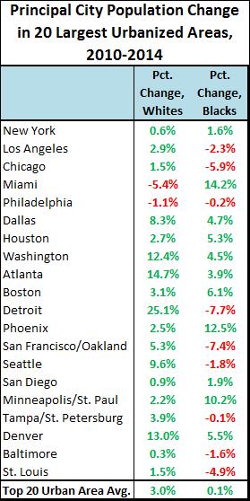
    Now, let’s look at percentage changes of whites and blacks within the principal cities of the twenty largest urbanized areas:


    And lastly, at percentage changes of whites and blacks in suburban areas of the top 20:


    This data is in need of updating, and there is the question of whether trends evident within the top 20 urban areas are applicable to smaller ones. I’ll try to answer both when I can. In the meantime, simply put, Latino and Asian populations are growing in the largest cities and suburbs. Whites are growing more numerous in cities while declining in suburbs, while blacks are declining in cities and growing in suburbs.

    This is the first part of understanding the change in African-American political influence.

    Much of this seems to slip under the radar of urbanists, because of the second part of trying to understand this — your level of analysis impacts your ability to perceive, and evaluate, the trend. At the metro level, we see that suburbs are becoming more diverse as they add more people of color and cities see a return of white residents to core cities. After generations of practices put in place to exclude people of color from suburbs, this is applauded. But at the neighborhood level, it could be viewed quite differently — an influx of minorities where none previously existed in the suburbs, or an influx of whites in minority-dominated neighborhoods. Only one of these trends at the neighborhood level has truly been considered by most urbanists.

    Speaking of which — I want to dispel any notion that displacement related to gentrification plays a dominant role in this. That’s the narrative that’s fueled gentrification debates for years. But rarely does this narrative consider the aspirational appeal of moving to the suburbs that still resonates with many people of color, just as it did with earlier generations of whites in the 20th century. Lance Freeman, a professor of urban planning at Columbia University, has conducted considerable research that counters this assumption:

    “What distinguishes gentrification is not who moves out; it’s who moves in. In a gentrifying neighborhood, new residents are more likely to be well-off . As a result, the neighborhood’s poverty makeup can shift, even if no one leaves. In 2004, I found that a neighborhood’s poverty rate could drop from 30 percent to 12 percent in a decade with minimal displacement. That’s because gentrification often leads to new construction or to investment in once-vacant properties.”

    Thinking that gentrifiers are forcing this dynamic magnifies their importance, and diminishes the decision-making process of people of color.

    The Impact

    Back to politics. What will this mean going forward, given what we know about how cities are changing the political landscape? We know that cities are pushing forward to develop an urban political agenda; in the aftermath of the election of Donald Trump to the presidency, a key recommendation of Richard Florida’s book The New Urban Crisis was that cities should become more autonomous so they can more effectively address the challenges that impact them. But with increasing numbers of minorities in suburbia, and a growing number of urbanists who have “been there, done that” when it comes to the suburbs, does autonomy come at a price?

    Here’s how I see things playing out over the next decade or two. People of color will continue to move to suburbia in increasing numbers. They will do so for the same reasons people before them did — affordability, good schools, lower crime. They are doing so in part because suburbia is something that eluded them for so long, and is now within their grasp. As they move in, they will begin to wield more influence on suburban politics — suburban mayors, County Board representatives, more representation in state legislatures. We will see more minority representation in the suburbs — just as suburban political influence wanes.

    Why? Because cities are ascendant. It’s not just people flowing back into cities. It’s jobs, and it’s money. More and more people in residential and commercial real estate are finding out that the real money to be made is now in cities. Banks will change lending patterns to favor cities, and not suburbs. The case will be made — and rightly so — that urban density is the right response to lowering carbon emissions in a climate change world, and those who choose density will be rewarded. At the same time, those who choose sprawl will be punished. Banks won’t finance new development or renovations. Property values will decline. Tax dollars for infrastructure improvements will be harder to come by.

    I hardly see this happening to all suburban areas across the country. There are suburbs in some metro areas that are closely aligned with the core city (either by adjacency or transit) and will adapt accordingly. There are pockets of affluence in many suburbs that will not change, no matter what broader trends portend. There are other metro areas whose entire makeup is largely suburban in orientation, and any change they have will more likely be region-wide. As for metro areas with a bigger city-suburban divide, over time I see wealth being pulled from suburbia and back into cities in quite the same way it happened in the middle of the 20th century, in reverse. Minority political representation will continue to decline in cities and increase in suburbs — and they’ll find they own a landscape few people want.

    In other words, even as people of color are making decisions that work in their interests now, we may need to get accustomed to a future of being on the outside, looking in.

    This piece originally appeared on The Corner Side Yard.

    Pete Saunders is a Detroit native who has worked as a public and private sector urban planner in the Chicago area for more than twenty years.  He is also the author of “The Corner Side Yard,” an urban planning blog that focuses on the redevelopment and revitalization of Rust Belt cities.

    Photo: huffingtonpost.com

  • Still Set to Depopulate, Japan Raises Long Term Population Projection

    Japan is well known for its huge expected population loss, likely to be the greatest in the world for a major nation by the end of the century. However, things do not look as bleak as they did just five years ago. The National Institute of Population and Social Security Research (Japan) just released its 100 year population national projections based upon the results of the 2015 census, which is an update of the 2012 projections based on the 2010 census. The projections are virtually identical until 2040, when Japan’s population is expected to be approximately 107 million, down from the 2015 level of 127 million. After that time, however, the population loss is expected to moderate. By 2110, the population under the medium fertility/medium mortality scenario is projected to be 53.4 million, down more than 70 million from the 2010 peak of 128 million (Figure 1). This is more than 10 million higher than projections released in 2012, which anticipated 42.9 million residents in 2110, approximately equal to the population of the Nagoya metropolitan area (prefecture based).

    The Largest Cities

    Projections are not available beyond 2040 below the national level. However, the latest 2040 prefectural population projections, based on the 2010 census, give an idea of how the loss is likely to be distributed in the early years.

    Japan has four cities (metropolitan areas) with more than 5 million residents that can be roughly delineated by prefectural boundaries, Tokyo – Yokohama, Osaka – Kobe – Kyoto, Nagoya and Fukuoka –Kitakyushu. These areas are expected to do much better in future population trends than the rest of the nation.

    Figure 2 provides a comparison of the actual populations from 1980 to 2010 for these cities, along with projections to 2040. Tokyo – Yokohama retains the largest share of its population, falling 11.0 percent from its peak. This includes the prefectures of Tokyo, Kanagawa, Saitama, Chiba, Ibaraki, Toshigi, Gunma and Yamanishi. In 1980, Tokyo – Yokohama had a population of 36.7 million, which rose to 43.5 million in 2010 and is expected to fall to 38.7 million by 2040.

    With strong growth continuing in places like Jakarta, Delhi and Manila, it seems unlikely that Tokyo – Yokohama will retain its “largest city in the world” status. Guanghou – Foshan – Shenzhen – Dongguan and the rest of the Pearl River Delta may also emerge as a larger metropolitan area should high levels of commuting develop (metropolitan areas are normally delineated by commuting patterns).

    The second largest city, Osaka – Kobe – Kyoto is expected to do more poorly, with the loss of 16.5 percent. Osaka – Kobe – Kyoto includes the prefectures of Osaka, Hyogo, Kyoto and Nara. In 1980, Osaka – Kobe – Kyoto had a population of 17.4 million, which rose to 18.5 million in 2010 and is expected to fall to 15.4 million by 2040.

    Nagoya, the third largest city, does nearly as well as Tokyo – Yokohama, losing 11.7 percent of its population. This includes the prefectures of Aichi, Gifu and Mie. In 1980, Nagoya had a population of 9.8 million, which rose to 11.3 million in 2010 and is expected to fall to 10.0 million by 2040.

    Fukuoka – Kitakyushu (Fukuoka prefecture) is expected to lose 13.7 percent of its population between 2010 and 2040. In 1980, Fukuoka – Kitakyushu had a population of 4.6 million, which rose to 5.1 million in 2010 and is expected to fall to 4.4 million by 2040.

    The population losses in the rest of the nation are expected to be more severe, at 21.2 percent. Outside the four largest cities, there was a 1980 population of 54.1 million, which rose to 54.8 million in 2010 and is expected to fall to 43.1 million by 2040.

    2040 Prefecture Projections

    Among the country’s 47 prefectures, only two are outside the four largest cities. Okinawa would lose the least population, 2.9 percent (Table). Shiga, which is sandwiched between Osaka – Kobe – Kyoto and Nagoya would have the second lowest population loss at 7.8 percent, just above that of Tokyo Prefecture, which is at the core of Tokyo-Yokohama. Fourth ranked Aichi is the core prefecture of Nagoya. Kanagawa and Saitama are in Tokyo – Yokohama, and Fukuoka includes Fukuoka – Kitakyushu. Chiba is in Tokyo – Yokohama, ninth-ranked Myagi includes the large city of Sendai, with 10th-ranked Kyoto being a part of the Osaka – Kobe – Kyoto metropolitan area. Osaka, the core prefecture of Osaka – Kobe – Kyoto ranks 12th. Generally, the core areas are expected to retain their population better than the more outlying areas.

    The prefectures with the largest losses tend to be more rural. The greatest losses are projected to be in on the northern part of Honshu (the main island), in Akita (31.6 percent), Amore (28.6 percent) and Iwate (25.9 percent). Kochi, on the island of Shikoku would have the third greatest loss, at 26.5 percent (See Japan Prefecture map – Figure 3).

    Conjectural Projections

    A “what if” analysis was performed to conjecture about what Japan might look like below the national level by 2110, when its 53 million population is projected to be nearly 60 percent below the 2010 peak. A population change factor was computed averaging the share of population losses for each prefecture from 2020 to 2040 and the overall share of the population expected to be in each prefecture in 2040.

    The “what if” scenario suggests that population losses in each of the largest cities will be more than 50 percent from 2010, the population losses in Tokyo-Yokohama and Nagoya would be just under 50 percent. Fukuoka – Kitakyushu would lose 54 percent, while Osaka – Kobe – Kyoto would drop nearly 60 percent (Figure 4). Each of these, however, would be far better than the rest of the nation, with a decline of nearly 70 percent.

    However, at the prefectural level, prefectures without larger cities would drop even more (Table). Only Okinawa, Shiga, Tokyo, Aichi and Kanagawa would lose less than half their population. At the other end of the scale, Akita, Amore, Kochi and Iwate would lose 80 to 90 percent of their population.

    However, the population loss is distributed. The Japan of 2110 is likely to be radically different than today. At the same time, population projections are no more than projections and no one can know the future for sure. But Japan seems likely to face serious challenges from population losses in the decades to come, perhaps a harbinger of what can happen in an increasingly post-familial world.

    By Tokyoship (Own work) [Public domain], via Wikimedia Commons

    Japan: Population by Prefecture 2010 to 2040 Projection and 2110
    Rank Prefecture 2010 Census 2040 Projection Change from 2010 2110 Comectural Change from 2010
    1 Okinawa 1.393 1.369 -2.9% 0.950 -31.8%
    2 Shiga 1.411 1.309 -7.8% 0.813 -42.4%
    3 Tokyo 13.159 12.308 -7.8% 7.606 -42.2%
    4 Aichi 7.411 6.856 -8.2% 4.199 -43.3%
    5 Kanagawa 9.048 8.343 -8.8% 5.004 -44.7%
    6 Saitama 7.195 6.305 -12.5% 3.397 -52.8%
    7 Fukuoka 5.072 4.379 -13.2% 2.339 -53.9%
    8 Chiba 6.216 5.358 -13.5% 2.790 -55.1%
    9 Miyagi 2.348 1.973 -14.4% 1.003 -57.3%
    10 Kyoto 2.636 2.224 -15.0% 1.116 -57.7%
    11 Hiroshima 2.861 2.391 -15.4% 1.191 -58.4%
    12 Osaka 8.865 7.454 -15.4% 3.670 -58.6%
    13 Ishikawa 1.170 0.974 -15.5% 0.484 -58.6%
    14 Hyogo 5.588 4.674 -15.5% 2.303 -58.8%
    15 Okayama 1.945 1.611 -15.8% 0.796 -59.1%
    16 Tochigi 2.008 1.643 -16.7% 0.778 -61.2%
    17 Ibaraki 2.970 2.423 -17.1% 1.127 -62.1%
    18 Mie 1.855 1.508 -17.2% 0.704 -62.0%
    19 Gunma 2.008 1.630 -17.3% 0.756 -62.4%
    20 Kumamoto 1.817 1.467 -17.4% 0.687 -62.2%
    21 Saga 0.850 0.680 -17.8% 0.313 -63.1%
    22 Shizuoka 3.765 3.035 -17.9% 1.368 -63.7%
    23 Oita 1.197 0.955 -18.3% 0.429 -64.1%
    24 Gifu 2.081 1.660 -18.5% 0.733 -64.8%
    25 Miyazaki 1.135 0.901 -18.7% 0.398 -64.9%
    26 Fukui 0.806 0.633 -19.3% 0.272 -66.3%
    27 Nara 1.401 1.096 -20.0% 0.447 -68.1%
    28 Nagano 2.152 1.668 -20.2% 0.689 -68.0%
    29 Kagawa 0.996 0.773 -20.2% 0.317 -68.2%
    30 Kagoshima 1.706 1.314 -20.3% 0.546 -68.0%
    31 Yamanashi 0.863 0.666 -20.5% 0.271 -68.6%
    32 Toyama 1.093 0.841 -20.9% 0.331 -69.7%
    33 Hokkaido 5.506 4.190 -21.8% 1.558 -71.7%
    34 Niigata 2.374 1.791 -22.0% 0.671 -71.7%
    35 Tottori 0.589 0.441 -22.2% 0.165 -72.0%
    36 Ehime 1.431 1.075 -22.3% 0.397 -72.3%
    37 Fukushima 2.029 1.485 -22.3% 0.491 -75.8%
    38 Nagasaki 1.427 1.049 -23.5% 0.363 -74.6%
    39 Yamaguchi 1.451 1.070 -23.5% 0.369 -74.6%
    40 Shimane 0.717 0.521 -24.2% 0.174 -75.7%
    41 Tokushima 0.785 0.571 -24.4% 0.185 -76.4%
    42 Yamagata 1.169 0.836 -25.1% 0.263 -77.5%
    43 Wakayama 1.002 0.719 -25.2% 0.222 -77.8%
    44 Iwate 1.330 0.938 -25.9% 0.273 -79.5%
    45 Kochi 0.764 0.537 -26.5% 0.151 -80.3%
    46 Aomori 1.373 0.932 -28.6% 0.211 -84.6%
    47 Akita 1.086 0.700 -31.6% 0.109 -90.0%
    2010 and 2040 data from the National Institute for Population & Social Security Research
    2110 dsta from Demographia. See text.

    Wendell Cox is principal of Demographia, an international public policy and demographics firm. He is a Senior Fellow of the Center for Opportunity Urbanism (US), Senior Fellow for Housing Affordability and Municipal Policy for the Frontier Centre for Public Policy (Canada), and a member of the Board of Advisors of the Center for Demographics and Policy at Chapman University (California). He is co-author of the “Demographia International Housing Affordability Survey” and author of “Demographia World Urban Areas” and “War on the Dream: How Anti-Sprawl Policy Threatens the Quality of Life.” He was appointed to three terms on the Los Angeles County Transportation Commission, where he served with the leading city and county leadership as the only non-elected member. He served as a visiting professor at the Conservatoire National des Arts et Metiers, a national university in Paris.

    Photo: Fukuoka (by author)

  • Deep Ellum

    I recently wrote about the need to embrace reality when it comes to land use regulation, culture, politics, and economics. My interpretation can seem a bit… dark. It’s not my intention to discourage people looking to make a positive difference in their communities. I’ve just seen how things tend to play out and the process doesn’t exactly favor mom and pop operations that are juggling day jobs, raising kids, and working on limited budgets. Telling motivated individuals to go out into the world and build great new small scale walkable mixed use urbanism of the kind once found on every Main Street in North America is disingenuous. Yes, it’s “possible.” But it’s also incredibly unlikely in most places. Building from scratch or even modifying existing properties isn’t the answer for these folks. We need to be honest about that.

    I’ll use the Deep Ellum neighborhood in Dallas as an example. A few years ago I was in Dallas to attend a series of overlapping city planning conferences. Deep Ellum was a recurring theme and a number of events were held there as demonstration projects. Back in 1973 city officials bulldozed most of the neighborhood to make way for a massive elevated highway. Urban removal killed two birds with one stone. State and federal money provided commuter infrastructure that supported the ever growing new middle class suburbs on the edge of town while simultaneously wiping away blight near downtown. What’s not to love? (Anyone want to guess who lived in Deep Ellum before it was razed?)

    Dallas locals like Jason Roberts of Build a Better Block as well as fellow participants from out of state like Street Plans Collaborative advocate fast, cheap, temporary, and iterative programming for neglected neighborhoods. Potted plants, inexpensive outdoor furniture, food trucks, street vendors, bicycle accommodations, string lights, outdoor movie nights, and live music can reactivate otherwise dead streets, vacant lots, and disused storefronts. If done sensitively with the active participation of the people who already live in the neighborhood these techniques can be transformative. The goal is to discover what works and build upon those successes incrementally over time. It’s bootstrap urban revival on a shoestring budget.

    These days market demand for urban living is strong and there’s money to be made in redeveloping what’s left of these old neighborhoods. They have “authenticity” and “texture” that can’t be duplicated in new construction. Deep Ellum is well located within walking and biking distance of the central business district as well as Baylor University Medical Center. There’s a spread between what these buildings are now and what they could be with new investment and institutional support.

    While I was in town conference hopping I attended a side presentation organized by a group of prominent business leaders who advocate pulling down the highway that cuts through Deep Ellum. This meeting was held at the behest of the American Conservative and D Magazine populated by a lot of old white guys in suits, not crunchy hippie treehuggers.

    The business argument is simple. The aging highway is at the end of its design life and neither the city of Dallas nor the Texas Department of Transportation has the money to rebuild it since both are functionally insolvent. Dismantling the highway would liberate a huge amount of downtown land that could be redeveloped by the private sector. Construction jobs would be created up front, market demand for urban living would be satisfied, and substantial tax revenue would be generated for the city for many decades into the future. In other words, a cost center would become a profit center.

    And let’s not forget there’s a tremendous amount of money to be made for well placed developers with deep pockets. Hence all the wine and cheese gatherings and thought leaders with their PowerPoints. I hasten to add this isn’t corruption per se. The cost in time, money, and political wrangling is enormous. Only exceptionally well funded organizations can work their way through these endless processes and achieve any kind of worthwhile goal. Why would anyone bother if there wasn’t an equally massive payoff at the end?

    The reality of how land is redeveloped in this context is simple. The cost of buying distressed property, site remediation, upgrading the infrastructure, accommodating all the requirements of multiple bureaucracies from the fire marshal to institutional investors – all while still creating a product the market wants and can actually afford to pay for… leads to this. It’s referred to as the Texas Doughnut. It’s an entire city block of multi-storied parking garages wrapped in a skin of apartments. Sometimes they’re rentals, sometimes they’re condos for sale. If your goal is to recreate the fine grained individually owned mom and pop buildings of a previous century that’s just not going to happen. Again, it’s not impossible. It’s just highly unlikely to pan out for a dozen reasons having to do with the fact that the society that build Main Street no longer exists.

    So let’s go back to the smaller older existing buildings in Deep Ellum. These are at a scale an average family can wrap its mind around. Lots of people dream of owning an independent business and living upstairs. It’s a great arrangement that’s been used successfully for eons all around the world. But there are complications here. The most pragmatic way to purchase and renovate buildings like these is with cash. Some people have it. Most don’t. Private equity (A.K.A. asking your father-in-law or a collection of dentists and chiropractors from the country club for money) works if you have that kind of personal situation and charisma…

    Don’t expect to go to just any random bank and get a thirty year mortgage for one of these places. Almost all banks see such properties as “non-conforming.” They’re used to writing loans for four bedroom two bath homes on cul-de-sacs and then bundling them off at the end of the month to pension funds that require consistency in the product profile. If these were ten thousand square foot strip malls with fifty seven parking spaces on a road with forty thousand cars driving by each weekday there’d be an institutional bundle for that. Same with a two hundred unit garden apartment complex. But a fifteen hundred square foot bakery or barber shop with an apartment upstairs? What kind of freaky platypus is that?

    Some people will sit you down and calmly explain that the guidelines for plain vanilla federally insured mortgages technically include buildings with up to four units and up to 25% commercial space in an otherwise residential building. On paper it’s no different than a single family home. That’s absolutely true. But many older buildings are closer to fifty/fifty residential/commercial. Even if you find a building that does conform you still need to find a banker who will grant that loan in this neighborhood. Again, it’s absolutely possible. But it’s not easy. And if a building is too cheap – generally under $50,000 – no bank will write a mortgage either.

    A commercial loan with a short term – typically eight years – and a significantly higher interest rate might be offered instead of a standard thirty year mortgage. Maybe. As part of the due diligence process the right bank will make you prove that the building is structurally sound, conforms to modern codes, and has a pro forma that can cash flow properly. And then there’s the cost of renovations, complying with the Americans With Disabilities Act, the fire code, and existing zoning regulations… It can be done. But something as basic as installing fire sprinklers or an elevator can easily kill a proposed project. It’s just too expensive in a building with too little value. Sorting out all this stuff takes real skill and experience. I know several seasoned mid-size property developers who lost everything to bankruptcy because their high quality projects came on line just in time for a big market correction and they couldn’t service their debts. And these folks were light years ahead of an ordinary person looking to invest in a modest property.

    The scenario I see all over the country is formulaic. Older buildings in formerly derelict neighborhoods are bought and renovated by well funded and skilled firms who specialize in this kind of development. Shops and apartments are then rented to individuals. These legacy districts become amenity centers that add value to new large scale infill development of the Texas Doughnut variety. There are exceptions, but that’s mostly what I see. It’s neither good nor bad. People sometimes complain about gentrification, but the alternative is for these neighborhoods to continue to decline until they can’t be saved at all. It might be nice if every aspect of society changed to allow other options, but I’m not holding my breath. At the end of the day we live in the world we live in. We have the rules and procedures we have. Shrug. Mom and Pop need to find a new gig.

    This piece first appeared on Granola Shotgun.

    John Sanphillippo lives in San Francisco and blogs about urbanism, adaptation, and resilience at granolashotgun.com. He’s a member of the Congress for New Urbanism, films videos for faircompanies.com, and is a regular contributor to Strongtowns.org. He earns his living by buying, renovating, and renting undervalued properties in places that have good long term prospects. He is a graduate of Rutgers University.

  • The ‘Not Good’, Bad & Ugly of Mapping

    Today, useful demographic, real estate, and economic information is instantly accessed from your bedroom laptop. A few decades ago you would have to make a trip to city hall and wait for someone to go through hundreds of files.

    Information (data) is only as good as the source, hand entered from someone – subject to human error. Yet in reality, after 3 decades of use, mapping software — used by virtually every city and county agency — is actually getting worse not better.

    What is occurring

    To understand the decline of mapping data, let’s go back in time – three decades ago when GIS was first introduced. There were many players competing to be the leader in the industry, however, the graphic capability and speed of computers was pitiful back then. Yet even today, with much faster computers and infinitely more storage, the quality of mapping programs has declined.

    Today’s GIS industry leader, ESRI, a company from Redlands, California, overcame speed limitations by defining parcel of land into a single ‘polyline’ which is a series of straight lines along a boundary bypassing the need to draw curves. They coined these parcels (or lots): ‘shapes’, thus a GIS ‘shape map’ is essentially the parcel information of a city.

    How can a curve be represented by straight lines? By having a series of itsy-bitsy lines drawn along an arc so that it appears as a curve, requiring a massive number of additional points to be generated.

    The problem is that in the typical city with many curved streets, a shape map would add hundreds of thousands (likely millions) of inaccurate traced points.

    Take for example this small area in Pontiac, Michigan which took over 160,000 lines to define – none of which are precise:

    Today, ESRI pretty much controls the multi-billion dollar GIS industry. There’s no intent in this article to say ESRI provides bad or good software, but to hopefully reverse a very disturbing trend in the data in which maps are based upon and why it’s counter-productive to sustainable growth.

    Ask yourself:

    • With multiple billions of dollars invested in GIS technology and mapping – most by you – the tax payer, why is the very fabric of today’s growth worse, than that of the 1960’s – before any digital technology existed?

    • Why is it that at every city council and planning commission meeting are presentations and submittals materially no different today than in the past 6 decades?

    • Why is it that the regulatory system continues to produce (actually promote) the cookie-cutter mundaneness that plagues every city?

    Why we need to go back to surveying

    At this point to understand the problem in GIS mapping, you need a short lesson on land surveying. The person in blue jeans standing on the roadside looking into the scope of the transit is a land surveyor.

    Land surveying is more art than science. A proper boundary survey requires those in the field to find the corners along the streets and nearby. The land surveyor looks for differences between adjacent site dimensions of what is recorded, if any. Using judgments based upon extensive knowledge, the land surveyor can adjust the inconsistencies and set new corners.

    Why Accuracy is Critical

    Once the actual corners of a boundary are known, the land surveyor collects all man-made improvements (stuff) on the site to determine if fences overlaps onto the neighbor’s property, or their shed encroaches within the parcels boundary. Is the home set the required minimum 10’ from the side yard or is it less? This would be a violation. This is stuff lawsuits are made of.

    How can bad data be fixed?

    Those purchasing the GIS are told that they could quickly put a map in and then later on collect accurate control points which cold be ‘rubber sheeted’ (stretched). In other words, an inaccurate map that was traced decades ago, then rubber sheeted 10 or 20 feet (or more) to be made ‘accurate’, produces results in 4 good points and hundreds of thousand bad ones. Those GIS purchasers with no knowledge of surveying somehow saw logic in this false premise.

    Are there any accurate base maps?

    Yes! For example, decades ago, Gary Stevenson the County Surveyor in Dakota County, Minnesota decided to hand key in the plat dimensions of deeds and recorded plats (site plans of developments) into a coordinated geometry system upon which land surveying and civil engineering is based upon.

    The Dakota County Surveyors office created a map, complete with parcels of land and subdivision plats that conflict with each other showing overlaps and void areas. This precision map using recorded information adjusts each parcel and plat to a common angle basis (rotation). This way a land surveyor can use the information to determine problems in the adjoining property and can make an attempt to adjust conflicts and solve them ultimately fixing the map and creating a geometrically perfect city.

    Technology that changed land surveying

    Today’s Global Positioning Systems (GPS) has a much higher degree of accuracy for land surveying applications and has made exact measurements of control points along great distances without error possible. However, with all the technology, the skill and knowledge of the land surveyor is required to work the puzzle pieces of creating an accurate base map, as well as correctly defining any property – even yours!

    Can an inaccurate map be fixed over time?

    Absolutely, but only if a city or county wanted to pay far more to fix a bad map than starting over with a good map from scratch. Today, there are far better software technologies, based upon the future of mapping without data structures designed in the past when speed was the ball and chain.

    The ‘not good’, bad & ugly of today’s mapping

    The software our firm develops is designed the same way as we did nearly four decades ago – extremely efficient with data to let the lightning fast processor work, needing very little disk space for storage and access.

    The problem in particular with the leading CAD and GIS software developers is that they have access to a massive amount of memory and disk space. This allows programmers to work with less effort.

    Throwing excessive amount of information to the disk is a quick way to write software code – why not? – you got the space.

    Efficient coding is painfully long and expensive.

    The problem with monopoly

    Today’s mapping systems have essentially the same data structure as four decades ago because they have almost no competition that forces change. This is an increasingly common problem in a tech world increasingly dominated by an ever smaller group of increasingly giant companies.

    One thing about inefficiency: For those with overwhelming market share, it’s also potentially very profitable, as Microsoft, Google, Apple and Facebook can tell us.

    Back to Basics

    It was just few decades ago that contours showing the varied organic shape of the land surface was somewhat efficient and accurate.

    With just a few hundred points collected on the ground by a land surveyor an accurate representation of the ground surface could quickly be computed and drawn by software. You could clearly see where the elevation of the ground changed direction and where walls, curb lines, or drainage ditches were.

    In other words, in general, from a physical data structure perspective, there was little to be concerned with working with contours of the land. Below is an example from decades ago of an on the ground survey with all the boundary and improvements, created from a total 640 field collected points:


    The depiction above is the exact land surface essential for reconstruction and earthwork calculations. Note the contours along the street which show the fine detail of the center of the street along with contour lines that adjust at the street curb line. Because of the digital terrain model is created with only 640 total data points, all calculations such as earthwork and street redesign will be instant.

    Modern laser-based remote sensing technology allows the creation of complete topographic maps without requiring any manual labor to create as was the case in the past, or at least in theory – but not in the real world use for using the data for design and 3D application.

    Essentially the industry was really efficient until modern computers effectively threw topographic efficiency into the garbage, and producing what can be best described as ‘spastic’ jiggly contour lines as shown on this typical LiDAR map:

    The Mayors and Administrators in charge of tax payer funded contracts approving contours such as the above are not aware that this information is pure garbage, because they, nor did their staff (who should have known better) did not have this knowledge.

    With all the information and technological abilities we have today, why are these contours so awful? Because software cannot think – it can only use math. When the land is relatively flat, as most land, streets, and parking areas are, to draw a contour line when points exist within a few feet of each other, it will need to create a short line a particular direction, a few feet in length. Then it needs to determine a direction for the next short line, and ignores a trend or path and simply goes ‘to and fro’ not ‘knowing’ where to go. This of course, is because software cannot ‘know’ anything – only a person can make such judgments.

    You take the person out of the equation, and bad things like this happen.

    Can this excess data be filtered?

    Why has nobody brought this up as a key issue?

    Well, the consultants serving cities – why should they give up all that continual updating of a map to reinvent their services offering accurate consulting requiring the services of a Professional Land Surveyor instead of CAD and GIS technicians? Virtually every convention, periodical, and blog that serves government agencies depend heavily of the advertising dollars of the current GIS and CAD leaders – they would never print a series like this which could damage their relationships with the enormous companies and cut their income stream.

    We can reverse the damage, but it will take key decision makers in government to stop writing tax payer funded checks for substandard, wasteful, and just plain bad – mapping data.

    Rick Harrison is President of Rick Harrison Site Design Studio and Neighborhood Innovations, LLC. He is author of Prefurbia: Reinventing The Suburbs From Disdainable To Sustainable and creator of LandMentor. His websites are rhsdplanning.com and LandMentor.com

    By Karen Capria (esri.com) [Public domain], via Wikimedia Commons

  • Diners and the Decline of Shared Social Institutions

    Grub Street posted another installment in the decline of the New York diner genre.

    I’ve made the point before that many of these old line institutions are going out of business because their product simply isn’t very good. I’m a fan of diner food, but I’ve never had a good meal in a Manhattan diner.

    But there are many other forces at work, including changes in the structure of our society. One thing the disappearance of diners illustrates is the loss of shared social infrastructure spanning across social classes.

    Something I’ve always liked about diners is that they are the kinds of places that you could find people from all walk of life. There were cops and blue collar workers, college students, professionals grabbing breakfast, etc. It was the kind of institution that was broadly patronized across social groups.

    These kinds of institutions are in decline. There has a been fragmentation of the shared American common culture that existed as recently as 1990 into a multiplicity of niche markets.

    There’s also been a gulf that has opened between the consumption and cultural practices of the upper middle class (the top 20% by education and income) and everyone else. They shop in different stores, eat in different restaurants, drink different beers, etc.

    There are fewer of the spaces were classes intersect as they did in diner. There are still NYC restaurants where multi-class patronage does occur – pizza by the slice places and delis come to mind. Those are both great. But in my experience, in diners it’s more likely that people will actually strike up a conversation with others, and thus have real cross-class conversation, even if just idle banter.

    So the decline of the diner is not just about the loss of a restaurant format – those come and go – but also the decline of shared social space and the increasing alienation between social classes and groups.

    You might also like: The fact that you get to interact in a positive way with people of so many different backgrounds is why I love jury duty.

    This piece originally appeared on Urbanophile.

    Aaron M. Renn is a senior fellow at the Manhattan Institute, a contributing editor of City Journal, and an economic development columnist for Governing magazine. He focuses on ways to help America’s cities thrive in an ever more complex, competitive, globalized, and diverse twenty-first century. During Renn’s 15-year career in management and technology consulting, he was a partner at Accenture and held several technology strategy roles and directed multimillion-dollar global technology implementations. He has contributed to The Guardian, Forbes.com, and numerous other publications. Renn holds a B.S. from Indiana University, where he coauthored an early social-networking platform in 1991.

    Photo Credit: Coyote-mania, CC BY-SA 3.0

  • High-Flying California Charts Its Own Path — Is A Cliff Ahead?

    As its economy bounced back from the Great Recession, California emerged as a progressive role model, with New York Times columnist Paul Krugman arguing that the state’s “success” was proof of the superiority of a high tax, high regulation economy. Some have even embraced the notion that California should secede to form its own more perfect union.

    Pumped up by all the love, California’s leaders have taken it upon themselves to act essentially as if they were running their own nation. In reaction to President Trump’s abandonment of the Paris accords, Gov. Jerry Brown trekked to Beijing to show climate solidarity with President Xi, whose country is by far the world’s largest greenhouse gas emitter and still burns coal at record rates, but mouths all the right climate rhetoric.

    At the same time California’s Attorney General is spending millions to protect undocumented workers and there’s legislation being proposed to transform the entire place into a “sanctuary state.” Sacramento also recently banned travel by government workers to Texas and seven other states that fail to follow the California line on gay and transgender rights.

    Past performance and future trajectory

    When progressive journalists, including those in Texas, speak about the California model, they usually refer to the state’s economic performance since 2010, which has been well above the national average. Yet this may have been only an aberrant phenomenon. Since 2010, Texas’ job count has grown by 20.6 percent compared to 18.6 percent for California. If you pull the curtain even further, to 2000, however, the gap is even bigger, with employment growing 32.7 percent in Texas compared to 18 percent in California.

    The main problem is that California’s once remarkably varied and vital economy has become dangerously dependent on the Bay Area tech boom. Since 2010, the Silicon Valley-San Jose economy and San Francisco have been on a tear, growing their employment base by 25 percent. Job growth in the rest of the state has been a more modest 15 percent. “It’s not a California miracle, but really should be called a Silicon Valley miracle,” notes Chapman University forecaster Jim Doti. “The rest of the state really isn’t doing well.”

    Tech starts to slow

    Such dependency poses dangers. The tech economy is very volatile, and now seems overdue for a major correction. People tend to forget the depth of the tech bust at the turn of the century. If you go back to 2000, San Jose’s job growth rate is among the lowest in the state, less than half the state average.

    Now tech is clearly slowing – job growth in the information sector has slowed over the past year from almost 10 percent to under 2 percent. Particularly hard-hit is high-tech startup formation, down almost half in the first quarter from two years ago; the National Venture Capital Association reported that the number of deals in the quarter was the lowest since the third quarter of 2010.

    The growing hegemony of a few very large firms – chiefly Apple, Google and Facebook — has created a very difficult environment for upstarts. As one recent paper demonstrates, these “super platforms” depress competition, squeeze suppliers and reduce opportunities for potential rivals, much as the monopolists of the late 19th century did.

    And as we found in our recent survey of the hot spots for high wage professional business services jobs, last year’s growth rates for this critical middle class sector in Silicon Valley and San Francisco lagged considerably behind those of boomtowns such as Nashville, Dallas, Austin, Orlando, San Antonio, Salt Lake City and Charlotte. Most other California metro areas, including Los Angeles, have languished in the bottom half of the rankings. These trends suggest that the state’s job performance will at least drop to the national average over the next two years and perhaps below, says California Lutheran University forecaster Matthew Fienup.

    Rising inequality

    California is home to a large chunk of the world’s richest people and particularly dominates the list of billionaires under 40. Yet, by one new measure introduced by the Census Bureau last year, the state also suffers the nation’s highest poverty rate; while a 2015 United Way study found that close to one in three Californians were barely able to pay their bills. No surprise then that as of 2015, the state was the most unequal in the nation, according to the Social Science Research Council.

    As of 2011, nearly half of the 16 counties with the highest percentages of people earning over $190,000 annually were located in California but denizens of the state’s interior have done far worse. A 2015 report found California was home to a remarkable 77 of the country’s 297 most “economically challenged,” cities based on levels of poverty and employment. Altogether these cities had a population of more than 12 million in 2010, roughly one third of the state at the time. Six of the ten metropolitan areas in the country with the highest percentage of jobless are located in the central and eastern parts of the state.

    What is disappearing faster than any state, according to a survey last year, is California’s middle class, a pattern also seen in a recent Pew study. One clear sign of middle class decline: California’s homeownership rates now rank among the lowest in the nation and Los Angeles-Orange County, the state’s largest metropolitan area, suffers the lowest level of homeownership of any major region.

    Jerry’s Jihad and its consequences

    State policies tied to Jerry Brown’s climate jihad have widened these divides. Inland Empire economist John Husing asserts that Brown has placed California “at war“ with blue-collar industries like home building, energy, agriculture and manufacturing. These jobs are critical for regions where almost half the workforce has a high school education or less.

    Richard Chapman, President and CEO of the economic development arm of Kern County, an area dependent on these industries, complains that most polices promulgated in Sacramento — from water and energy regulations to the embrace of sanctuary status and a $15 an hour minimum wage — give little consideration given to the needs of the interior. “We don’t have seats at the table,” he laments. “We are a flyover state within a state.”

    The recent legislation to raise the minimum wage to $15 an hour will have more severe ramifications for less affluent areas than San Francisco. As for climate policies, the state no longer even assesses the economic implications. Yet the state’s costly renewable energy mandates make a lot of difference in the less temperate interior when energy prices are 50 percent rise above neighboring states. A recent study found that the average summer electric bill in rich, liberal and temperate Marin County was $250 a month, while in the impoverished, hotter Central Valley communities, where air conditioners are a necessity, the average bill was twice as high. Some one million Californians, many in the state’s hotter interior, were driven into “energy poverty,” a 2012 Manhattan Institute study stated.

    Housing has arguably emerged as the biggest force accentuating inequality. Environmental restrictions that have cramped home production of all kinds, particularly the building of affordable single-family homes on the periphery. The ever increasing restrictions have made the state among the most unaffordable in the nation, driving homeownership rates to the lowest levels since the 1940s. New “zero emissions” housing policies alone are likely to boost the already bloated cost of new construction by tens of thousands of dollars per home.

    Demographic crisis looms

    In much of California, particularly along the south coast, the number of children has dropped sharply. Since 2000, there has been a precipitous 13.6 percent drop in the number of residents under 17 in Los Angeles, while that number has remained flat in the Bay Area. In contrast, there has been 20 percent growth or better in the under 17 population in more affordable metropolitan areas such as Dallas-Fort Worth, Atlanta, Charlotte, Raleigh, Phoenix and San Antonio.

    Housing prices, in part driven by state and regional regulation, are gradually sending the seed corn — younger workers — to more affordable places. Despite claims that people leaving California are old and poor, the two most recent year’s data from the IRS shows larger net losses of people in the 35 to 54 age group. Losses were particularly marked among those making between $100,000 and $200,000 annually.

    Young people particularly are on the way out. California boomers, as we discussed in a recent Chapman University report, have a homeownership rate around the national average but the state has the third lowest home ownership rate in the nation for people 25 to 34, behind just New York and Washington. The drop among this demographic in San Jose and the Los Angeles areas since 1990 are roughly twice the national average and a recent San Jose Mercury News poll found nearly half of all Bay Area millennials planning to move, mostly motivated by housing and costs. The one population on the upswing in the state are seniors, particularly in the coastal countries, who bought their homes when they were much less expensive.

    As long as home prices stay high, and opportunities for high-wage employment highly limited, the state will continue to suffer net domestic migration outflows, as it has for the last 22 of the past 25 years. Given that the state’s birthrate is also at a historic low and immigration from abroad has slowed, there’s a looming shortage of new workers. Between 2013 and 2025 the number of California high school graduates is expected to drop by 5 percent compared to a 19 percent increase in Texas, 10 percent growth in Florida and a 9 percent increase in North Carolina.

    And for what?

    Of course, many environmental activists generally prefer smaller families to cut greenhouse gas emissions; smaller families also serve the needs of developers of high-density housing, who might prefer that younger people remain long-term adolescents.

    Sadly, many of these climate policies, which cause so much damage, won’t have much of an impact on the actual climate unless the rest of the country adopts similar measures. This stems from the state’s already low carbon footprint and the impact of people as well as firms moving elsewhere, where they usually expand their carbon footprint. Nor does densification make sense as a climate antidote, given the rising temperatures associated with “urban heat islands.”

    The tech boom has been used to justify Sacramento’s crushing regulatory and tax regime. It has also made it possible for apologists to ignore some 10,000 businesses that have left or expanded outside the state, many of them employing middle and working class people.

    Ultimately California’s growing class bifurcation will demand solutions. Hedge fund billionaire-turned green patriarch Tom Steyer now insists that, to reverse our worsening inequality, we should double down on environmental and land use regulation but make up for it by boosting subsidies for the struggling poor and middle class. Certainly the welfare state in California — home to over 30 percent of United States’ on public assistance as of 2012 — will have to expand if the state stays on its present course.

    In the coming years the state’s business leaders fear an ever more leftist, and fiscally damaging, regime after the departure of the somewhat frugal Brown. There are increased calls in Sacramento for new subsidized housing, a single payer healthcare system as well as a big boost to the minimum wage already enacted.

    Ultimately California will pay — demographically, economically and socially — from its current surfeit of good intentions. Those who already own houses will not suffer immediately, but the new generation, immigrants and minorities will face an increasingly impossible burden. With its unparalleled natural assets, and economic legacy, California may be able to survive this toxic policy mix better than most places, but even in the Golden State reality has a way of showing its ugly face.

    This piece originally appeared on Forbes.

    Joel Kotkin is executive editor of NewGeography.com. He is the Roger Hobbs Distinguished Fellow in Urban Studies at Chapman University and executive director of the Houston-based Center for Opportunity Urbanism. His newest book is The Human City: Urbanism for the rest of us. He is also author of The New Class ConflictThe City: A Global History, and The Next Hundred Million: America in 2050. He lives in Orange County, CA.

    Photo by Neon Tommy, via Flickr, using CC License.

  • Moving Away from Toronto and Montréal

    The latest Statistics Canada data indicates that people are leaving Toronto and Montréal in large numbers since the 2011 census. Even so, both metropolitan areas continued to grow through the 2016 census as a result of net international migration and the natural increase of births over deaths (Figure 1). It turns out that Canada’s urban pattern is much more like that of the US, as well as other high-income countries, than many may suppose.

    Toronto

    Toronto lost 128,000 net domestic migrants, while Montréal lost 89,000 representing 2.3 percent of its total 2011 population.

    At the same time, the migration has been regional rather than national. In the case of Toronto, more than 90 percent of the net migration loss was to other areas of Ontario (118,000), as opposed to other provinces (10,000). The metropolitan area losses were concentrated in the city of Toronto, which lost a net 119,000 domestic migrants, while the suburbs lost 9,000. The city’s loss of 4.5 percent was nearly double that of the metropolitan area and 15 times that of the suburbs.

    Despite the late 1990s municipal amalgamation that increased the population of the city by three times, Toronto has become a majority suburban metropolitan area. The city of Toronto now has fallen to 46 percent of the population from 53 percent in 2001.

    Part of the metropolitan area loss is likely the result of Toronto’s higher house prices and shortage of single family homes that people prefer (see: Ryerson University Research Cites Urban Containment Policy as Major Factor in Toronto House Price Escalation), with nearby metropolitan areas experiencing strong net domestic migration gains. Up to one-half of Toronto’s loss may have been picked up by Oshawa (16,000), Hamilton (12,000), St. Catharine’s-Niagara (8,000), Barrie (7,000), Guelph (4,000), Brantford (4,000) Kitchener-Cambridge-Waterloo (1,000) and Peterborough (1,000), which are served by the commuter rail or bus services of Go Transit (Metrolinx).

    Moreover, with its highly dispersed employment patterns, commuters from exurban metropolitan areas can find employment much closer to home than downtown Toronto, with its less than 15 percent of metropolitan employment. A few years ago, it was reported that the largest employment center in Canada was the sprawling area around Pearson International Airport (Toronto-Missassauga-Brampton), rather than downtown Toronto. Meanwhile, the Kitchener-Cambridge-Waterloo area has emerged as Canada’s answer to Silicon Valley.

    Montréal

    Things were similar in Montréal, which lost 89,000 net domestic migrants, also representing 2.3 percent of its 2011 population. Unlike Toronto, Montréal’s loss was evenly split, with 45,000 moving out of Quebec and 44,000 moving to other parts of Québec.

    The concentration of net domestic migration losses were even more concentrated in the core than in Toronto. The ville de Montréal lost 117,000 net domestic migrants, while the suburbs gained 28,000. The ville’s loss of 7.0 percent was three times the rate of the total metropolitan area.

    Vancouver

    Vancouver, the third largest metropolitan area, also lost domestic migrants (12,000) at a rate of 0.5 percent relative to its 2011 population. Vancouver gained 10,000 net domestic migrants from other provinces, while losing 22,000 to other parts of British Columbia. Kelowna and Victoria appear to have prospered at Vancouver’s expense, both adding a 7,000 net intraprovincial migrants.

    Alberta: Calgary and Edmonton

    As has been the case for years, Alberta’s two largest metropolitan areas have led the national statistics. Calgary, the fourth largest metropolitan area added 55,000 net domestic migrants between 2011 and 2016. Much of this 4.6 percent gain was from other provinces (41,000). With the recent oil bust, which has hit Alberta hard, net interprovincial migration dropped from 7,000 in 2014-2015 to minus 1,000 in 2015-2016.

    Edmonton, Alberta’s second largest metropolitan area and Canada’s sixth largest, added even more net domestic migrants (72,000), for the strongest performance in the country. This 6.2 percent gain was also concentrated in people from outside the province (48,000). As in Calgary, net interprovincial migration fell strongly from 2014-2015 to 2015-2016, from 10,000 to 2,000.

    It remains to be seen how the recovering energy industry will impact the economy and migration trends in Alberta.

    Ottawa-Gatineau

    Ottawa-Gatineau (Ontario- Québec) has Canada’s capital and is the only major metropolitan area that spans two provinces. Ottawa-Gatineau is Canada’s fifth largest metropolitan area although likely to be overtaken almost at any time by faster growing Edmonton. Ottawa-Gatineau gained 14,000 net domestic migrants between 2011 and 2016 (1.1 percent). Most of the net domestic migration was from other parts of Ontario or Québec (10,000).

    Smaller Census Metropolitan Areas

    Among the other 27 census metropolitan areas that had been designated by the 2011 census, the largest percentage gain was in Kelowna, BC, at 8.4 percent. Saint John, New Brunswick had the largest net domestic migration loss at minus 3.5 percent.

    Overall Results

    Approximately two thirds of Canada’s population resides in the census metropolitan areas. Between 2011 and 2016, there was a net domestic migration of only 17,000 from outside the metropolitan areas (Table). Among the six major metropolitan areas, there was a net domestic migration loss of 89,000, probably driven in large measure by the “severely” or “seriously” unaffordability of housing virtually everywhere but Ottawa-Gatineau. While new metropolitan areas are likely to be designated (like Lethbridge, Alberta since 2011), it may be that there will be little additional net domestic migration to the largest metropolitan areas, and what will occur is largely in the suburbs.

    Net Domestic Migration: Canada Metropoltian Areas: 2011-2016
    Census Metropolitan Area 2016 Census Population Net Domestic Migration % of 2011 Population
    Toronto, Ontario      5,928,040         (128,432) -2.3%
    Montréal, Quebec      4,098,927           (88,913) -2.3%
    Vancouver, British Columbia      2,463,431           (11,928) -0.5%
    Calgary, Alberta      1,392,609             55,415 4.6%
    Ottawa-Gatineau, Ontario/Quebec      1,323,783             14,119 1.1%
    Edmonton, Alberta      1,321,426             71,620 6.2%
    Québec, Quebec         800,296               2,683 0.3%
    Winnipeg, Manitoba         778,489           (17,812) -2.4%
    Hamilton, Ontario         747,545             12,208 1.7%
    Kitchener-Cambridge-Waterloo, Ontario         523,894               1,390 0.3%
    London, Ontario         494,069               4,534 1.0%
    St. Catharines-Niagara, Ontario         406,074               8,030 2.0%
    Halifax, Nova Scotia         403,390               2,926 0.7%
    Oshawa, Ontario         379,848             16,028 4.5%
    Victoria, British Columbia         367,770             17,647 5.1%
    Windsor, Ontario         329,144                  (48) 0.0%
    Saskatoon, Saskatchewan         295,095               8,672 3.3%
    Regina, Saskatchewan         236,481               2,004 0.9%
    Sherbrooke, Quebec         212,105               1,792 0.9%
    St. John’s, Newfoundland and Labrador         205,955               7,949 4.0%
    Barrie, Ontario         197,059               6,943 3.7%
    Kelowna, British Columbia         194,882             15,171 8.4%
    Abbotsford-Mission, British Columbia         180,518               2,952 1.7%
    Greater Sudbury, Ontario         164,689             (1,285) -0.8%
    Kingston, Ontario         161,175               5,572 3.5%
    Saguenay, Quebec         160,980                (782) -0.5%
    Trois-Rivières, Quebec         156,042               2,721 1.8%
    Guelph, Ontario         151,984               3,384 2.4%
    Moncton, New Brunswick         144,810               2,425 1.7%
    Brantford, Ontario         134,203               3,603 2.7%
    Saint John, New Brunswick         126,202             (4,512) -3.5%
    Peterborough, Ontario         121,721               1,394 1.2%
    Thunder Bay, Ontario         121,621                (330) -0.3%
    Total    24,724,257             17,140 0.1%
    Derived from Statistics Canada data


    Wendell Cox is principal of Demographia, an international public policy and demographics firm. He is a Senior Fellow of the Center for Opportunity Urbanism (US), Senior Fellow for Housing Affordability and Municipal Policy for the Frontier Centre for Public Policy (Canada), and a member of the Board of Advisors of the Center for Demographics and Policy at Chapman University (California). He is co-author of the “Demographia International Housing Affordability Survey” and author of “Demographia World Urban Areas” and “War on the Dream: How Anti-Sprawl Policy Threatens the Quality of Life.” He was appointed to three terms on the Los Angeles County Transportation Commission, where he served with the leading city and county leadership as the only non-elected member. He served as a visiting professor at the Conservatoire National des Arts et Metiers, a national university in Paris.

    Photo: Photo: Old City Hall, Toronto (by author)

  • Is California Anti-Family?

    In its race against rapidly aging Europe and East Asia, America’s relatively vibrant nurseries have provided some welcome demographic dynamism. Yet, in recent years, notably since the Great Recession and the weak recovery that followed, America’s birthrate has continued to drop, and is now at a record low.

    Nowhere is this decline more marked than here in California. Once a state known for rapid population growth, and above-average fecundity, the state’s birthrate is also at a historic low. The results are particularly dismal in coastal Southern California. Los Angeles’ population of people under 17 already has dropped a precipitous 13.6 percent, with drops even among Latinos and Asians, while Orange County has fallen by 6 percent since 2000. The national growth, in contrast, was up 2.2 percent. Despite claims that people leaving California are old and poor, the two most recent years of data from the IRS show larger net losses from people in the 35 to 54 age group. Net out-migration is also larger among those making between $100,000 and $200,000 annually. This is your basic child-bearing middle class.

    Why are we eating our seed corn?

    Why is this shift to an increasingly child-free population occurring more in Southern California than elsewhere? One logical source may be housing prices, particularly near the coast, which present a particular problem for middle-class, middle-aged families. In contrast, the growth in the number of children under 17 is much higher in more affordable metropolitan areas such as Dallas-Fort Worth, Atlanta, Phoenix, San Antonio, and Charlotte and Raleigh in North Carolina.

    Housing affordability certainly drives migration. Major metropolitan areas where the cost of housing is at least four times that of annual incomes have seen a net out-migration of 900,000 since 2010. This compares to a net gain of 1.1 million in the more affordable areas.

    Hardest hit of all are the groups who will dominate our future — young people, minorities and immigrants. California boomers, as we discussed in a recent Chapman University report, have a homeownership rate around the national average, but for people aged 25 to 34 the rate is the third-lowest in the nation, behind just New York and Washington, D.C. The drops among this demographic in the San Jose and Los Angeles areas since 1990 are roughly twice the national average.

    It is no surprise, then, that places like Southern California have also seen a decline in the next demographic group: people between 35 and 49, who are generally the age of parents, and also tend to be at their peak earning years. The one population group on the upswing is seniors, particularly in Orange County, who bought their homes when they were much less expensive.

    Read the entire piece at The Orange County Register.

    Joel Kotkin is executive editor of NewGeography.com. He is the Roger Hobbs Distinguished Fellow in Urban Studies at Chapman University and executive director of the Houston-based Center for Opportunity Urbanism. His newest book is The Human City: Urbanism for the rest of us. He is also author of The New Class ConflictThe City: A Global History, and The Next Hundred Million: America in 2050. He lives in Orange County, CA.

    Photo by Kat Grigg, via Flickr, using CC License.

  • Shrinking America

    The Census Bureau released its 2016 county level population estimates earlier this year. This gave us a window into the places that are gaining or losing total population.

    Here’s a map of all the counties that have lost population since 2010.

    The numbers in the legend are the percentage change in population (multiply by 100).

    But just last week the Census Bureau released the population estimates by age, sex, and race. I popped the age estimates into my database and mapped the counties whose child population (those under 18) is in decline. This is the demographic future of these communities apart from migration. Here’s that map:

    Yikes!

    I also rolled this up to to the metro area level – and there are even a number of major metropolitan areas in the US – 25 out of 53 – with a declining population under the age of 18.

    This is a very quick preliminary view for the blog. I’d definitely go dig into these numbers yourself before taking them to the bank. But this doesn’t look good for much of the country.

    This piece originally appeared on Urbanophile.

    Aaron M. Renn is a senior fellow at the Manhattan Institute, a contributing editor of City Journal, and an economic development columnist for Governing magazine. He focuses on ways to help America’s cities thrive in an ever more complex, competitive, globalized, and diverse twenty-first century. During Renn’s 15-year career in management and technology consulting, he was a partner at Accenture and held several technology strategy roles and directed multimillion-dollar global technology implementations. He has contributed to The Guardian, Forbes.com, and numerous other publications. Renn holds a B.S. from Indiana University, where he coauthored an early social-networking platform in 1991.

    Photo by Abe Kleinfeld, via Flickr, using CC License.

  • Inequality and the 2016 Election Outcome: A Dirty Secret and a Dilemma

    The presidential election of 2016 occurred at the crest of a national debate over economic inequality,  deeply researched by economists and sociologists since the 1990s, widely perceived to have risen sharply since the 1970s, and a focus of the first serious left-wing insurgency the Democratic Party in four decades, that of Bernie Sanders. Can class and inequality help explain the election result?  The answer appears to be that they can, quite strongly, but in ways that may seem surprising.

    After Donald Trump’s unexpected victory, Hillary Clinton notably blamed Vladimir Putin, Julian Assange and James Comey.  Clinton-friendly commentators fumed against sexism, racism and the other prejudices of the white working class. A book entitled “Shattered” by two journalists put the onus on the data-driven ineptitude of Clinton’s campaign team.  The legal analyst Jeffrey Toobin called attention to vote suppression (through voter ID laws and by other means) especially in Wisconsin and Michigan, and an analysis of turnout by race, conducted by three political science professors and an analyst at Demos, confirmed that had the 2012 black turnout prevailed in 2016, Clinton rather than Trump would have been elected.

    The election was so close that any of these arguments might be considered valid, up to a point. Even so, simple calculations can put some of them into perspective.  For instance, a study showed that about nine percent of Obama’s 2012 voters went over to Trump. If that is correct, then considerably less than five percent of all voters moved from Obama to Trump, when one considers new voters and those who were no longer voting in 2016, while   about half that proportion went from Romney to Clinton.  Another study of voter attitudes in 2016 found no reason even to measure the effect of late-breaking news on vote-switching from Obama to Trump, as opposed to the economy, immigration, “Muslims,” misogyny or perhaps simple dislike of Hillary Clinton. 

    Still, such a verdict begs two important questions:  Why was the election so close in the first place?  And, did economic inequality have anything to do with the outcome?

    To address these issues, two facts need to be borne in mind.  First, rising economic inequality is   subject to common forces across the entire land-mass and population of the country.  It’s a national phenomenon, as most people perceive and measure it.   But American presidential elections are resolved through winner-take-all in the Electoral College, a constitutional confection of the states. So what happens at the national level in the economy is expressed – if at all – in politics at the level of the state.  So to find meaning in this relationship, we need to find a connection between levels or movement of inequalities and the election outcome at the level of the individual states.

    Coefficients of economic inequality across households within states have been available from the Bureau of Economic Analysis on an annual basis only since 2000.  Before that, sample sizes in the Current Population Survey made measuring inequality in small states problematic, since a state with population of (say) half a million might have as few as one hundred households represented in a national sample survey of 60,000 families.  So data at the required level of detail were available only from the decennial census.  This raised an issue of comparative measurement through time, especially since election years coincide with census years only once every two decades.

    To deal with this issue, Travis Hale and I used the detailed annual measures of the Employment and Earnings database of the Bureau of Labor Statistics to construct annual measures of pay inequality that could be calibrated to the Census measures of income inequality, and we showed that these measures generate reliable annual estimates of state-level income inequality back to 1969.  In recent weeks Jaehee Choi has extended Hale’s measures by a decade to 2014, giving us an uninterrupted panel matrix of 2295 inequality measures for 51 states (including DC) over 45 years.

    There are two ways to look at this data.  One is to compare election outcomes to the current level of inequality in each state, and to ask: did the more egalitarian states have a tendency to choose one candidate over the other? The other approach, accessible only through a data set of the type just described, is to look at changes in inequality over time, and to ask, did states where inequality grew more have a tendency to choose one candidate over the other?  Economists are especially drawn to the second approach, because it washes out (“controls for”) differences in the level of inequality across states that may be due to some timeless historical factors. For instance, a state with large cities and wealthy industries (such as international banking) is likely to have a baseline of inequality quite different from a wheat- or corn-growing state on the Great Plains.

    In this case, both approaches generate a similar, striking result. A simple correlation between the level of inequality in each state and the vote share of one candidate in that state is 0.60.  And the correlation between inequality changes and vote share is even higher:  about 0.69 for the case of the changes from 1990 to 2014; depending on base year chosen the correlation fluctuates up to a maximum of about 0.71.  This means that a large share of the election outcome across the states can be explained solely by the relative degree of rising inequality within each state over a quarter-century, give or take.

    A somewhat surprising result

    Using our measure of pay inequality, which avoids any distortion associated with making a conversion to income inequality measures, the fourteen states with the largest increases in inequality after 1990 without exception voted for Hillary Clinton.1 These fourteen included almost all of the large states that Clinton carried, including California, New York, New Jersey, Massachusetts, Virginia and Illinois. The largest Clinton state below the top fourteen is Washington, and after that, Minnesota (which she carried by whisker); the others include Vermont and Delaware, small states embedded in regions (New England, the Mid-Atlantic) where the increase of inequality was much larger than it was in the states themselves. Vermont is not immune from economic change in New York or Massachusetts, nor is Delaware unaffected by events in New Jersey or Maryland.

    Conversely, the seven states with the smallest increase in inequality, and ten of the lowest twelve, all voted for Donald Trump.  These included Wyoming, West Virginia, Oklahoma, Utah, North Dakota, Montana, Alaska, Indiana, Nebraska and Kentucky, as well as the critical Obama-to-Trump states of Ohio and Michigan. In the middle range, we find a series of states that were (or, in the case of Georgia, might have been) competitive including Wisconsin and Pennsylvania, Florida, and North Carolina.

    The correspondence of inequality-change to the election outcome is almost uncanny.

    A plausible explanation emerges with a moment’s thought.  Clinton-majority states are characterized by high-income enclaves of finance, technology, insurance and government contracts, which often exist alongside large low-income minority and immigrant communities, sufficiently separated by geography and political boundary lines to be almost autonomous from each other. Both of these communities vote Democratic, yet out of highly differing political and social interests; the former perhaps most of all for reasons of social liberalism and environmentalism; the latter out of economic interest and historical alliances on civil rights and immigration.  Where they together predominate, Democrats prevail.

    Trump-majority states are largely middle class, and in the swing states they have industrial communities that once employed unionized black workers but have been for decades in decline    increasing the relative weight of the rural, conservative and white.  Where (as in the South, but also Wisconsin, Michigan and Ohio) these states are racially polarized, election manipulation and vote suppression may have accelerated the political and demographic trend. The shift to Trump, in this analysis, occurred in those states left behind by the takeover of the commanding heights of the national economy by finance and technology, and the shift away from manufacturing.  

    Meanwhile, across the South, a parallel shift is underway in the opposite direction – in Georgia, Arizona, North Carolina, and Texas. This shift is incomplete, and it is not yet very far advanced.  But it leans toward a new coalition of pro-trade business elites, an increasing socially-liberal professional class, and an expanding minority vote, strongly buttressed by the immigrant Hispanic community. While attention in the 2016 election focused on the states that defected to Trump, three of these states moved noticeably in Clinton’s direction, relative to where they had been in 2012. 

    To the extent that this analysis can help foretell the future, the fate of the Democratic Party hangs on a strategic choice. Democrats can seek to recapture the decayed industrial states they lost last year, but might regain with a more populist program. That will be the Sanders strategy in 2020, and it will surely be the strategy of any populist competitor. If Trump falls flat and his working class supporters are disaffected in four years, this may be the quick road back to the White House.  But it may fall short, because the Democratic base in those states is eroding, and the challenge of mobilizing sufficient voters to overcome a growing demographic disadvantage will deepen as the years pass. 

    The other choice, is for the Democrats to ride the demographic drift in the South and Southwest, where inequality is likely to rise as the post-industrial economy shifts there. In that case, they can hope to make up for mid-western losses without dramatic change in the political orientation inherited from the Clintons. The party would then eventually return to electoral predominance on an arc of states running south from Virginia and east from southern California. 

    The problem with this strategy is that it will not work in the near term, because it will require a shift in the linchpin state of Texas, which gave Clinton just 43.2 percent of her vote.  This was a distinct improvement over 2012, and came with a Democratic sweep in Harris County, the nation’s third largest. But it’s too early to say it foretells a statewide tipping point in 2020, and perhaps not even in 2024.  And the dilemma is that the alternative, a move to full-throated populism– perhaps the only reasonable strategy for 2020 – could poison the well in the South and Southwest for later years.

    There are, of course, many reasons to be cautious about placing too much weight on any single variable; the political science literature has seen a fair number of forecasting models come and go. Still, the relationship of inequality change to election outcomes seems strong, and rooted in a certain amount of political common sense.  And it has the appeal of paradox:  as each party achieves its stated agenda, the political fortunes of the other party improve.

    Of course, we have already seen that Republicans have no real interest in delivering their promised manufacturing revival.  Sadly, a similar logic holds on the Democratic side.  Given even a slight hope that Hillary Clinton’s political strategy was not wrong but premature, there is little doubt that the powerful forces behind the Democrats will opt for a perpetual coalition based on grotesque inequalities, and on the fostering of false hopes among the brown and the black.

    Figure:  Changing Inequality 1990-2014 and the Clinton vote share, 2016, by state
    Each state is weighted by its electoral votes.  Calculations by Jaehee Choi and James Galbraith.

    Change in Inequality 1990-2014 and the Election Outcome, 2016, by State.
    State Change in Pay Inequality 1990 to 2014 (Theil measure), Index Number, 1990 =100 Trump / Clinton Clinton Percentage
    Connecticut 186.4 C 54.6%
    New York 179.6 C 59.0%
    New Jersey 176.7 C 55.5%
    California 172.7 C 61.7%
    Rhode Island 169.4 C 54.4%
    Maryland 168.8 C 60.3%
    Nevada 167.6 C 47.9%
    Hawaii 161.3 C 62.2%
    Massachusetts 160.7 C 60.0%
    District of Columbia 159.4 C 90.9%
    Illinois 149.8 C 55.8%
    Virginia 149.1 C 49.8%
    Oregon 148.1 C 50.1%
    New Hampshire 147.5 C 46.8%
    Georgia 146.7 T 45.9%
    Mississippi 146.7 T 40.1%
    North Carolina 144.2 T 46.2%
    Florida 141.4 T 47.8%
    Washington 139.3 C 51.8%
    Pennsylvania 138.8 T 47.9%
    Louisiana 138.7 T 38.4%
    Wisconsin 138.5 T 46.5%
    Kansas 138.3 T 36.1%
    Alabama 137.4 T 34.4%
    South Carolina 137.3 T 40.7%
    Tennessee 136.2 T 34.7%
    Texas 135.1 T 43.2%
    South Dakota 134.7 T 31.7%
    Maine 132.2 C 47.8%
    Missouri 131.9 T 38.1%
    Colorado 131.8 C 48.2%
    Arizona 131.4 T 45.1%
    Idaho 129.6 T 27.5%
    Delaware 128.8 C 53.4%
    Arkansas 127.3 T 33.7%
    Minnesota 126.4 C 46.4%
    Ohio 126.1 T 43.6%
    Michigan 126.0 T 47.3%
    Kentucky 125.3 T 32.7%
    Nebraska 124.4 T 33.7%
    Vermont 124.3 C 56.7%
    Indiana 123.3 T 37.8%
    Alaska 123.0 T 36.6%
    New Mexico 122.1 C 48.3%
    Montana 121.5 T 35.7%
    North Dakota 120.3 T 27.2%
    Iowa 118.9 T 41.7%
    Utah 117.8 T 27.5%
    Oklahoma 116.2 T 28.9%
    West Virginia 116.0 T 26.5%
    Wyoming 114.5 T 21.9%
    Correlation: 0.687

    James Galbraith is an economist, who teaches at the LBJ School of Public Affairs, The University of Texas at Austin, and directs the University of Texas Inequality Project, at http://utip.lbj.utexas.edu.  His most recent book is Inequality: What Everyone Needs to Know (Oxford, 2016).

    Top image by DonkeyHotey (Hillary Clinton vs. Donald Trump – Caricatures) [CC BY-SA 2.0], via Wikimedia Commons

         Using the measure of income inequality gives a slightly different result:  the top eleven states are all Clinton states.