Category: Demographics

  • The Unrise of the Creative Working Class

    Scarcity leads to creativity out of necessity. That’s the pop culture meme at least. Think “starving artist,” or the survivors in Survivor. The thinking has penetrated the business culture as well. For example, in the shadow of the 2008 recession, Google founder Sergey Brin, in a letter to his shareholders, writes: “I am optimistic about the future, because I believe scarcity breeds clarity: it focuses minds, forcing people to think creatively and rise to the challenge.”

    But a recent book, Scarcity: Why Having Too Little Means So Much, by Ivy League psychologists Sendhil Mullainathan and Eldar Shafir, states otherwise. Through years of investigative research, the authors found that people operating from a bandwidth of scarcity don’t have the luxury of preemptive thought. Rather, being in survivor mode saps a person’s cognitive reserve.

    “Think about being hungry,” says Shafir in a piece in Pacific Standard. “If you’re hungry, that’s what you think about. You don’t have to strain for years—the minute you’re hungry, that’s where your mind goes.” The mental preoccupation extends to unpaid utility bills, debt, or, more generally, anything that’s life-pressing, he adds. The effect drains resources from a person’s “proactive memory”.

    Think of the absence of scarcity, then, as the freedom to think, visualize, and create. The results of Mullainathan and Shafir’s findings have implications for cities. Specifically, it’s widely theorized that cities must innovate to survive, and it is a city’s creative reservoir—which is dependent on the size of its educated workforce—that will nurture innovation. This is how  a city of soot can evolve into a city of software, not unlike what has occurred in Pittsburgh.

    But what about  Rust Belt cities struggling with high rates of poverty? Over 36 percent of Detroit’s 700,000 plus are below the poverty line. In Cleveland, the poverty rate is 33 percent of nearly 400,000. The national poverty rate is 14 percent.  This is a ridiculous amount of brain capacity consumed by unforgiving reality.  No wonder Detroit inches to get a leg up. The feral dogs, abandoned houses, and creditors looking for money have eaten up the capability to envision. Hence, the collective exasperation, and the bankruptcy death spiral.

    What will save the Clevelands and Detroits? The most prescribed cure is to find a way to attract more educated people. This has led cities across the country to compete for the vaunted “creative class” professional demographic. To urban theorist Richard Florida, to get creative types a city must have “[an] indigenous street-level culture – a teeming blend of cafes, sidewalk musicians, and small galleries and bistros, where it is hard to draw the line between participant and observer or between creativity and its creators.”

    According to Florida, a city needs to know it is on stage,and compete for the attention of a select demographic. In theatre parlance, this is called “capturing the audience experience.”  In urban place-making parlance it is called  “principles of persuasion” that emphasize novelty, contrast, surprise, color, etc.

    Robin_Williams_779552

    In other words, cities must become the collective embodiment of Robin Williams.

    Then, once you get your audience, you just watch them go,  says Florida, as creativity is “a social process.”  Creativity is bred by “the presence of other creative people.”  The scarcity of creativity in a poor city hypothetically gets filled up by the big-bang spontaneity of two creative types talking, neurologically egged on, no doubt, by a festival performer on stilts in a clown suit sauntering before them.

    If this strategy sounds like an overly simplified way to change what ails Detroit and Cleveland, it’s because it is. In fact Florida himself acknowledged this, stating in Atlantic Cities that, “On close inspection, talent clustering provides little in the way of trickle-down benefits [to the poor].”  In fact, because housing costs rise, it  makes the lives of lower- and middle-income people worse.

    But cities keep revitalizing this way because it is a feel-good prescription that is politically palatable. Who hates art, carnivals, drinking, and eating?  Displays of abundance provide the incentive to look the other way. Writes Thomas Sewell, “The first lesson of economics is scarcity: There is never enough of anything to satisfy all those who want it. The first lesson of politics is to disregard the first lesson of economics”.

    Where does that leave the millions operating on the wrong side of scarcity? Florida’s answer is for cities to somehow convince corporate America to pay their service workers more. While admirable, I doubt Daniel Schwartz, CEO of Burger King, is listening.

    Another option would be refocusing the lens through which modern urban revitalization is viewed. The default setting is to compete for scarcity of the educated elite. Instead, we should alleviate the scarcity from the struggling.  But flipping this script requires cities to give up on the idea that there is some audience that will save them. It is a city’s people who ultimately ruin or save themselves.

    In the meantime, the urban play continues. Cleveland is directing $4 million dollars of its casino windfall profits into the creation of an outdoor chandelier  that will hang at an intersection outside of Playhouse Square, the city’s theater district. The design, evoked by chandeliers inside the Playhouse itself, is intended to blur the line between drama and reality, and will “add glittery outdoor glamour to a district that tends at times to look gray and lifeless,”  according to architecture critic Steven Litt–all the while making the intersection “feel like a giant theater lobby”.

    But the script on Cleveland’s streets is one of hardship, not glittery glamour. Here’s hoping the outdoor chandelier illuminates that scarcity to those walking beneath it.

    This piece was originally published in Belt Magazine.

    Richey Piiparinen is a writer and policy researcher based in Cleveland. He is co-editor of Rust Belt Chic: The Cleveland Anthology. Read more from him at his blog and at Rust Belt Chic.

    Lead photo by David Shvartsman.

  • The Growing Public Safety Inequality Gap in Chicago

    Take a look at the two maps below. Like the captions say, the one on the left shows homicide rates in Chicago by police district in the early 90s, when crime was at its peak, and the one on the right shows the same thing, but about two decades later.* The areas in dark green are the safest; the ones in dark pink are the most dangerous. The colors are calibrated so that green areas are safer than average for the early 90s, and pink ones are more dangerous than average for the early 90s. The 2008-2011 map keeps the same calibration: green is safe compared to the early 90s, so that you can see change in the levels of violence over time.

    And, indeed, the first thing that jumps out from these maps is that there’s way more green nowadays, and it tends to be darker. The city is way safer! Some areas we might consider a bit dicey today – like, say, the Lawndale/Little Village area – actually register as light green, meaning that by early 90s standards, they would be considered relatively safe.

    HOMICIDE RATE BY POLICE DISTRICT

    Hom90 hom20

    1990-1993 2008-2011

    [For those of you craving numbers, the murder rate averaged 30 per 100k during the first period, and 17 per 100k during the second, a decline of nearly 50%.]

    Of course, the other thing we notice is that there are some very distinct patterns to safety. These maps are breaking exactly no news by indicating that the more dangerous parts of the city are on the West and South Sides, but it is striking, I think, to see that nowadays, basically the entire North Side is the darkest green, which translates to a homicide rate of less than 6 per 100k. In fact, the dark-green part of the city has a murder rate of 3.3 per 100k.

    Three point three. In New York City, which is constantly (and mostly correctly) being held up as proof that urban safety miracles can happen in America, it’s 6.3. Toronto, which as far as North American big cities go occupies a fairy tale land where no one hurts anybody, had a homicide rate of 3.3 per 100k as recently as 2007. The North Side is unbelievably safe, at least as far as murder goes.

    But there are none of the darkest green on the West or South Sides. There’s actually a fair amount of pink, meaning places that are relatively dangerous even by the terrifying standards of the early 90s.

    This raises a question: Has the great Crime Decline benefited the whole city equally? Are the South and West Sides still relatively dangerous because they started from such a bad place, or because they haven’t seen nearly as much of a decline as the North Side has?

    Here is the answer in another map:

    CHANGE IN HOMICIDE RATE, EARLY 90s – LATE 2000s

    Murderchange

    The areas in darkest green saw the greatest decline; red means the murder rate actually increased.

    So: Yes, the great Crime Decline is a fickle thing. The North Side saw huge decreases (in Rogers Park, it was over 80%) pretty much everywhere; the few areas that are lighter green were the safest in the city to begin with. The parts of the South and West Sides closest to downtown – Bronzeville, the West Loop, Pilsen, etc. – got a lot safer. But most of the rest actually got worse, including some neighborhoods that were already among the most dangerous in the city, like Englewood and Garfield Park.

    This is a complicated state of affairs, and probably goes at least part of the way to explaining why, in the face of a 50% decrease in homicides citywide over the last two decades, many people persist in believing that the opposite is true: because in their neighborhoods, it is. It’s a dynamic that defies an easy narrative, and makes me slightly less angry (though only slightly) at all those journalists who have written in the last year or two about murder in Chicago without mentioning that the city is, in fact, safer on the whole than it has been in fifty years.

    Here is one final pair of maps:

    RATIO OF POLICE DISTRICT HOMICIDE RATE TO CITY AVERAGE

    Homicideratios90s homicideratio2

    1990-1993 2008-2011

    This is slightly less intuitive. These maps show the how the homicide rate in any given police district compares to the citywide average, using ratios; for example, if the homicide rate in West Town is 10 per 100k, and citywide it’s 5 per 100k, West Town’s ratio is 2 to 1. If West Town were 2.5 per 100k, its ratio would be 0.5 to 1. (Obviously the numbers in these examples are made up.) Blue areas have ratios below 1, and so are relatively safe; red ones above 1, and are relatively dangerous.

    With the help of these maps, I’m going to ignore what I said about all this defying an easy narrative, and try to supply one: Over the last twenty years, at the same time as overall crime has declined, the inequality of violence in Chicago has skyrocketed. The pattern of what’s blue and what’s red in each map is mostly the same; I count only three out of twenty-five districts that switched from one color to another. But the colors are much darker in the 2000s than they were in the 1990s. There have always been safer and more dangerous areas here, as there are everywhere; but the gap between them is way, way bigger now than it used to be.

    Numbers will help this case. Imagine that for each of these two time periods, we cut the city into equal thirds: one contains the most dangerous neighborhoods; another, the safest; and the last, everything else. In the early 90s, the most dangerous third of the city had about six times as many murders as the safest third. By the late 2000s, the most dangerous part of the city had nearly fifteen times more homicides than the safest third.

    In addition, here are two charts (click to enlarge):

    HomRatio90

    Homratio20

    The divergence is self-evident. The early 90s look very roughly like a normal curve: most neighborhoods are in the middle, and there’s a clear, if slightly bumpy, slope down towards the extremes.

    Today, any semblance of a normal curve has been annihilated. Or, actually, that’s not quite right. Now it looks like there might be two completely separate normal curves, one with a peak at 0.2-0.4, and the other peaking at 3.1-4. Plus a few guys who got lost in the middle.

    I suppose there are many, many things that one might say about what this means, but here’s the bottom line: The disadvantages and tragedies that people in “dangerous” neighborhoods experience are both absolute and relative. The death of an innocent person** is an indescribable loss no matter what. And, on that count, things are somewhat better for Chicago’s most violent areas: the homicide rate for the most dangerous third of the city declined from 51 to 39 per 100k in the time period we’ve looked at here. That is a real accomplishment, and hundreds, if not thousands, of people are still with their families and friends because of it.

    But in other ways, it does matter if other parts of the city are getting safer much, much faster. When people weigh safety in their decisions about where to live, they do so by comparing: How much safety am I gaining by living in one neighborhood versus another? The same is true of entrepreneurs considering where to open their next business. The same is true of tourists looking to explore the city. The same is true of locals looking to travel to another neighborhood to eat out or go shopping.

    On every one of those counts, the disadvantages that are accruing to already-disadvantaged neighborhoods in terms of lost population, investment, and connections to the rest of the city are now much more severe. The hurdles are that much higher.

    That’s bad for those physical neighborhoods. It’s also terrible for the people who have good reasons to live there, like social networks, nearby family, or the affordability of real estate.

    Because I don’t have the data in front of me, but who would doubt that over these same twenty years, there has also been a growing gap between how much it costs to live on the safe North Side compared to the more dangerous parts of the South and West Sides? Who would doubt that, as the North Side reaches Toronto-level peacefulness, the cost of rent has greatly diminished the number of apartments there affordable to the poor and working class?

    In other words, just as the stakes have been tripled as to whether you live in Relatively Safe Chicago or Relatively Dangerous Chicago, it has become much, much harder to establish yourself on the winning side.

    So: Next time you hear someone talking about “record violence” in the city, tell them that actually, murders are down almost 50% from twenty years ago. And then tell them that what’sreally alarming is murder inequality.

    * Why does this data end in 2011? Because I made these maps using data from the Chicago Police Department annual reports, which are available online, and which only broke down crimes by police district in the 1990s. In 2012, the police district boundaries changed, making it not quite an apples-to-apples comparison to prior years. Maybe somewhere data exists by Community Area for the early 90s, and then I could redo all of this.

    ** And I think reporting like that done by This American Life at Harper High in Englewood ought to challenge conventional middle-class ideas about “innocence” in the ghetto. It is very easy for those who don’t live in the neighborhood to talk about “thugs” and “gangsters” getting what they deserve. It is also very cruel, and very naive about what exactly “gangs” are, and what kind of people join one, and how, and why.

    This post originally appeared in City Notes on August 5, 2013. Daniel Hertz is a masters student at the Harris School of Public Policy at the University of Chicago.

    Chicago photo by Bigstock.

  • Canada: Suburban, Automobile Oriented Nation

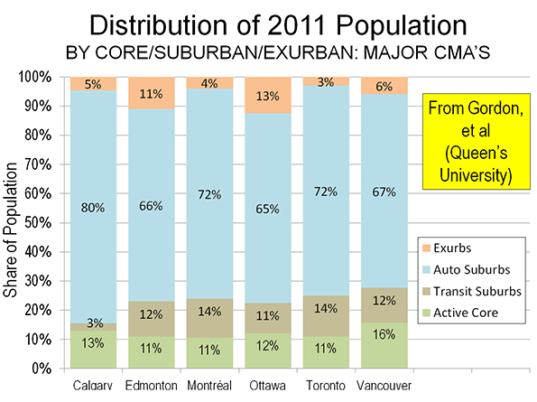
    Canada is even more a suburban nation than generally thought, according to new research that digs deeper than the usual core city versus suburbs distinctions. Researchers at Queen’s University in Kingston, Ontario have announced groundbreaking research that disaggregates 33 census metropolitan areas into four classifications: (1) urban core, (2) transit oriented suburban, (3) automobile oriented suburban and (4) exurban lifestyles, which are also automobile oriented. The findings were made available to canada.com and will be published during the autumn in an academic journal.

    Suburbs and Urban Cores: The Complexities

    Professor David Gordon, director of the School of Urban and Regional Planning at Queen’s University summarized the research as indicating that “Canada is a suburban nation.” This may be surprising, the core cities of Canada represent a larger share of their metropolitan area population than is common in the United States. However, the core city versus suburban (outside the core city) classification substantially understates the suburban and automobile oriented nature of Canada’s metropolitan areas. This definition has long since become obsolete with the substantial annexations of suburban areas by Calgary and Edmonton and the forced consolidations of Toronto, Montréal (parts of which were reversed) and Ottawa.

    Even the core city of Vancouver, which has had essentially the same boundaries for at least 60 years, contains considerable expanses of suburbanization beyond its urban core. The core city of Toronto contains large areas of suburban development, such as in Scarborough, North York and Etobikote. The same is true of the core cities of Calgary, Edmonton and Ottawa and the ville de Montréal.

    To get around this difficulty, we used federal electoral district data to do an early analysis of urban core versus suburban growth when the 2011 census data was released. Our findings were that the greatest share of growth had been in suburban areas (See: Special Report: Census 2011: Urban Dispersion in Canada). The Queens University researchers went considerably deeper, and showed that 95 percent of metropolitan area growth had been in suburban areas between 2006 and 2011, a somewhat higher figure than the 93 percent suburban growth derived from the federal electoral district data (federal electoral districts are smaller than the large core cities).

    The Queen’s University Approach

    Gordon and the research team divided metropolitan areas into the four classifications at the census tract level. The census tract level is ideal for this type of analysis, because it is the closest approximation to the neighborhood. The Gordon et al analysis is thus finely grained, and may be virtually unprecedented in the world.

    The research uses criteria developed from journey to work mode data (such as transit, walking, cycling and automobile) and residential densities. Gordon et al called their urban core classification "active core," to note the greater dependence of residents on walking and cycling for commuting to work. They divided suburban areas into transit and auto suburban areas, and designated the rural areas of metropolitan areas as exurban (Note).

    The findings may be surprising to those retro-urbanists who hold Canada up as a planning model. When urbanization is examined at the neighborhood level, little of the metropolitan population actually follows    the urban core model. Overall, the average urban core constitutes approximately 12% of the metropolitan area. This varies little by population category.

    In describing the results, Gordon noted that there is a tendency to “overestimate the importance of the highly visible downtown cores and underestimate the vast growth happening in the suburban edges.” This is especially evident in the largest metropolitan areas.

    Major Metropolitan Areas

    Among the six major metropolitan areas (those with more than 1 million population), the urban cores also average 12 percent of the population (Figure).


    In relative terms, Vancouver has the largest urban core, at 16% of its population, followed by Calgary with 13% of its population. Toronto, Montréal and Edmonton all have urban cores with approximately 11% of their population, while Ottawa, which is both in Ontario and Quebec, stands at 12%. This means that the major metropolitan areas are, on average, 88% suburban or exurban.

    There is also relative consistency with respect to the populations of the transit oriented suburban areas. The largest are in Toronto and Montréal, at 14%. Vancouver and Edmonton have 12% of their populations in transit oriented suburban areas and Ottawa 11%. However, transit’s reach is much less in Calgary, where the transit suburbs have only 3% of the population.

    Calgary was the most automobile oriented of the major metropolitan areas, with 85 percent of residents living in automobile suburbs and exurbs. But other major metropolitan areas were not far behind, ranging from 73 percent in Vancouver to 78 percent in Ottawa, with Toronto Montréal and Edmonton in between.

    Smaller Metropolitan Areas

    Generally, the level of suburbanization was similar even in the smaller metropolitan areas. Interestingly, Gordon’s method did not require an urban core. This is illustrated by the Abbotsford (BC), where there no urban core is reported. Abbotsford is located in the Fraser River Valley, east of the Vancouver metropolitan area. Abbotsford developed in recent decades and, as a result, is so automobile oriented that the Queen’s University researchers do not even find a transit oriented suburb.

    Further, there were two instances of transit suburban areas being oriented toward urban cores outside their own metropolitan areas. In Oshawa, to the east of Toronto, a transit suburban area is west of Oshawa’s core, along the GO Transit commuter rail line to Toronto’s Union Station. Similarly, in Hamilton, a transit suburban area is located east of Hamilton’s core, on the GO Transit commuter rail line to Toronto.

    Maps

    The media site canada.com has also published A Country of Suburbs  with detailed census tract level maps for each of the metropolitan areas. There are also articles on each of the major metropolitan areas.

    Professor Gordon and his associates have pioneered a new, far more detailed method of analyzing the lifestyle components of the modern metropolitan area. They deserve credit for their objectiveness and attention to detail. Similar analysis is needed in other high income world nations.

    ——

    Note: Metropolitan areas always include rural areas – areas that are not urban. This is because metropolitan areas are employment market areas and people invariably commute from outside the population center (formerly called the urban area by Statistics Canada). The rural areas of metropolitan areas are far larger in geography than population centers or urban areas.

    Photograph: Centre Block, Parliament Hill: Ottawa (by author)

    This has been adapted from an article published at Frontier Centre for Public Policy Notes.

  • Democratic “Upstairs-Downstairs” Coalition at Risk

    Michael Bloomberg’s passing from New York City Hall, and his likely replacement as mayor by a fire-breathing populist Democrat, Bill de Blasio, marks a historic shift, not just in urban politics but, potentially, also national politics. For 20 years, under first Rudy Giuliani and then Bloomberg, New Yorkers accepted a form of “trickle down economics” where Wall Street riches flowed into city coffers and kept Gotham, at least on the surface, humming and solvent.

    That period ended with Tuesday’s election, and with it, the unraveling of one of the great contradictions in modern American politics: the melding of liberalism with a plutocratic elite. Bloomberg epitomized this synthesis, and with his departure, the formula of blending social and “luxury city” liberalism now appears to have run its course. Bloomberg himself appears to have realized the jig could be up, last weekend accusing de Blasio of running a racist campaign based on “class warfare.”

    But for the American Left, now emerging from its Obamian slumbers, de Blasio’s focus on class has also turned him into a national hero. The Nation hails de Blasio as the harbinger of “the rebirth of economic liberalism.” He has won the backing of the magazine’s influential publisher, Katrina van den Heuvel, as well maverick plutocrat-progressive George Soros and former Vermont Gov. Howard Dean.

    To be sure, class warfare has made de Blasio. His plans to raise more taxes from the rich appeals both to the middle class and, more importantly, to the poor and near poor. Those last two groups account for nearly half the “luxury city’s” population. The same middle class New Yorkers who may have voted for a hard-edged Republican, like Giuliani, or a pragmatic billionaire, like Bloomberg, when they feared for their lives and simply wanted the city cleaned up. They now are more concerned with economic issues. De Blasio was the one New York politician to understand the sea change.

    “This election is not going to be about crime, as some previous elections were,” de Blasio told National Journal last month. “It used to be, in New York you worried about getting mugged. But today’s mugging is economic. Can you afford your rent?”

    His argument is sticking, in large part, because perhaps nowhere are the limitations of gentry urbanism so obvious as in New York. The wealth of Wall Street, protected by the tax code and bathed in Bernanke bucks, has expanded inequality. As Wall Streeters have partied, most New Yorkers have not done well. Indeed, according to a recent study by University of Washington demographer Richard Morrill, the once-proudly egalitarian city has become the most unequal big city in the country, worse even than the most racially divided, historically underdeveloped Southeast.

    Here are the facts. In New York, the top 1 percent earns roughly twice as much of the local GDP than is earned in the rest of country. Yet, controlling for costs, the average paycheck is among the lowest in the nation’s 51 largest metro areas, behind not only San Jose, but Houston, Raleigh, N.C., and a host of less-celebrated burgs. There’s only so much middle-class families can do when the cost of living in Manhattan is twice the national average, and the median Manhattan apartment price about $4,000 a month. These economic facts, not crime or mayhem in the streets, explains why, since 2000, the region has lost the most net domestic migrants – some 1.9 million – in the country, sending along $50 billion elsewhere, almost $15 billion in household income just to Florida, the most common destination.

    National leftward shift

    The de Blasio triumph is not solely a New York story. Nationally, this opens a new chapter in the evolution of the American Left. If de Blasio continues his surge and becomes the first openly leftist New York mayor in a generation, the pressure to shift Democratic Party politics to the left could become as inexorable as the Tea Party’s shove to the right has been for the Republicans.

    Like the Republican schism, about which much has been written, the reason for the Democratic lurch to the left is grounded in class realities. In the GOP case, the Tea Party derives support from largely unconnected middle- and working-class Republicans, as opposed to country club or corporate types. For its part, the modern Democratic Party fuses two dissimilar groups: the “upstairs” well-educated gentry, with their urbanist and green politics, and the broader, but less-influential “downstairs” working-class element, concerned about jobs, making more money and likely aspiring to own a home in the suburbs.

    Now that they don’t have to toe the line for another Obama presidential run, leftist Democrats, including what’s left of the labor movement, are less compelled to defend his economic record. Under the current administration, already-troublesome income inequality in the country has been accelerating, to the benefit primarily of the vilified 1 percent. Race, which has served as a rallying cry for both white liberal and minority Democratic voters, likely will lose some of its appeal now that the first African-American president will not appear on the ballot.

    Conflicts loom

    This conflict between populist and gentry factions figures to arise over a host of issues in months to come. One looming issue may be the Keystone XL pipeline, favored by most private-sector unions, but vehemently opposed by greens and their gentry allies. President Obama may find that parts of his party, particularly in the inland West, the Great Plains, Louisiana and Appalachia, care more about jobs than environmental purity.

    Another flash point may emerge over who Obama will choose as head of the Federal Reserve. Wall Street favors Larry Summers, a convenient ally to Obama, whose relations with high finance are complicated by his occasional flights of populist fancy. But, big-business ties and Summers’ role in deregulation during the Clinton era arouse suspicion among more hard-left Congress members; already three left-leaning Democratic senators – Jeff Merkley of Oregon, Sherrod Brown of Ohio and Elizabeth Warren of Massachusetts – appear to oppose a Summers nomination.

    Expect more of this in the future. Some labor unions, including the powerful Teamsters and UNITE, now fear their health care coverage could be sacrificed under Obamacare. The most powerful force in urban Democratic politics, public employees, fear they may be caught between efforts, most notably in Detroit and, possibly, the president’s adopted hometown, Chicago, to revive cities by ransacking their pensions. This may occur even as powerful real estate and corporate interests – primary funders of gentry urbanism – win subsidies from taxpayers for their ambitious plans.

    These contradictions within the Democrats’ unwieldy “upstairs-downstairs” coalition have been papered over for years by focusing on social and racial issues. They were often aided by Republicans, seemingly always looking for ways to alienate persuadable voters. Democrats, like de Blasio, may find that waging class warfare returns more than running on troublesome issues like climate change, guns, hygienic fascism (a Bloomberg specialty) or abortion; in some surveys, a majority of Americans favor some form of redistribution of wealth.

    Unless there is a change in the country’s economic direction, growing inequality could undermine the unnatural marriage of the gentry and the Left. In retrospect, the real political genius of Barack Obama has been to keep this contradictory coalition intact through his image, mastery of media and rhetoric. But, as the post-Bloomberg reality in New York suggests, at some point even the most agile politician can not keep fundamental social conflict swept under the rug forever.

    Joel Kotkin is executive editor of NewGeography.com and Distinguished Presidential Fellow in Urban Futures at Chapman University, and a member of the editorial board of the Orange County Register. He is author of The City: A Global History and The Next Hundred Million: America in 2050. His most recent study, The Rise of Postfamilialism, has been widely discussed and distributed internationally. He lives in Los Angeles, CA.

    This piece originally appeared at The Orange County Register.

    Photo courtesy of Bill de Blasio.

  • The Promise and the Peril of Rust Belt Chic

    What do you do when you’re a post-industrial city fallen on hard times? There’s a sort of default answer in the marketplace that I’ll call for want of a better term the “Standard Model.” The Standard Model more or less tells cities to try to be more like Portland. That is, focus on things like local food, bicycles, public transit, the arts, New Urbanist type real estate development, upscale shopping, microbreweries, coffee shops, etc., etc. The idea seems to be that the Rust Belt city model is a failure and should be chucked in favor of something better. In this model the publicly subsidized real estate project is the preferred economic development strategy. We’ve seen city after city work to create downtown and near-downtown “Green Zones” resembling miniature Chicagos. While these have generated excitement and even attracted some residents (upwards of 4,000 in Cleveland and 3,000 in St. Louis, though these are the high end), they have not fundamentally changed the civic trajectory other than in the largest Tier One type cities. And they likely never will. People who want Standard Model urbanism can find superior versions in many cities that generally boast more robust economies to boot.

    Enter Rust Belt Chic. This approach in theory solves two of the issues plaguing Standard Model urbanism, authenticity and uniqueness. I haven’t seen a crisp definition of what Rust Belt Chic actually is according to its boosters, but Pete Saunders summed up some of the salient points. The three key elements I see, which build upon each other:

    1. Do the Fail. Giving up on the idea of the factories coming back or large scale re-population.

    2. Reject Growth as a Success Marker. This actually aligns it somewhat with the standard model. Traditional signs of civic success such as population and job growth are rejected in favor of items like per capita income, brain gain, etc.

    3. Brashly Embrace the “Rust” in Rust Belt. This extends Do the Fail to actually embrace the civic characteristics failure produced, as well as various quirky legacies of the industrial past such as Pittsburgh potties.

    The best part of Rust Belt Chic is that it understands that you have to be who you are, not who you aren’t. Someone once described a brand as “a promise delivered.” When cities decide that what they are is of no worth or that it can’t succeed in the marketplace, the temptation can then be to try to pretend like they are Portland or some such. Almost invariably in such cases cities end up building towards a false promise they can never deliver. That’s not to say any of the elements of Standard Model urbanism are bad in an of themselves. The problem is that they are basically “best practices” types of things. Just as no company can succeed as nothing but an agglomeration of best practices, no city can either.

    The tendency in Rust Belt cities has been to try to downplay their authentic characteristics in order to try to portray themselves as hip and with it. As I’ve noted before, the one thing most clearly associated with Indianapolis is the Indianapolis 500, yet auto racing plays a fairly small role in how the city tries to sell itself these days.

    Rust Belt Chic is a first attempt at a region deciding no longer to be a passive importer of ideas about what cities should be, but instead trying to chart a path that is rooted in a unique, local history, culture, geography, etc. To the extent that it steers cities away from a purely “me too” strategy towards creating something that has a unique market positioning that’s real to the place and has at least some competitive advantage in the marketplace, Rust Belt Chic is a big win.

    However, as currently constituted, Rust Belt Chic would appear to be limited. In effect, it is really a marketing and to some extent a talent attraction program. Looking at the ironically appropriated trappings of the working man that characterize so much of hipsterdom, Rust Belt Chic says “Hey, we’ve got the real thing.” So rather than drinking PBR ironically, you drink I.C. Light with a more subtle degree of irony (i.e., by pretending that you’re actually drinking it authentically). The term “chic” itself is suggestive of fashion, and thus of artifice.

    What Rust Belt Chic does not do is address any of the core problems of the cities in question, ranging from fiscal crises to corruption to poor business climates to segregation, to say nothing of safe streets, better schools, etc. Maybe that isn’t its aim. But if not, then it would appear to be only one small component of an overall civic strategy, and not an alternative to the Standard Model in its own right. The theory of change it embodies would appear to be that authenticity of place and culture will attract people looking for the real, thus restarting the demographic engine through more population dynamism and ultimately that will percolate into the economy. That’s fine as far as it goes, but it’s insufficient.

    The elevation of authenticity also poses the danger of imprisoning the community in a straitjacket from the past. With “do the fail” and the embrace of decline as part of the culture, Rust Belt Chic deftly side steps some of the worst dangers of the corrosive force of nostalgia. However, the problem with authenticity is that is has to be, well, authentic. And the way that’s normally accomplished is by encasing something in amber, stunting its evolution.

    What Rust Belt Chic needs to be able to do is inform real, substantive change, and to not only unearth the authentic civic character, but updates it for 21st century realities.

    A city I think has done this quite well is Nashville. It would have been tempting for them to see their country music legacy as déclassé, and try to basically pitch themselves as the Portland of the South or some such. Instead, while they have embraced a number of Standard Model approaches – as I said, there’s nothing per se wrong with them – they kept country music as core to their identity. But it isn’t yesterday’s country music or culture. People in Nashville today aren’t sitting around watching Hee Haw reruns. Country music today is as much Hollywood as Hank Williams.

    That’s not to say Nashville disparages its past. Far from it. The old classic country performers are still honored, and their music still respected and listened to. And they see today’s country as linked across time to that of previous generations. So there’s evolution, but with continuity. They very much value their traditions. But they haven’t become imprisoned by them. Also, Nashville happens to have a stellar business climate, far less corruption than your average Rust Belt city, an openness to outsiders, an increasingly diverse population base, and an aggressiveness towards growth missing in most of the Rust Belt. That’s not to say Nashville’s perfect, but they’ve done a pretty good job of updating their authentic culture while backing it up with an actual product that’s functional demographically and economically.

    If Rust Belt Chic wants to reach its potential, it has to be able to do more than unearth and embrace the authentic culture of a place – though that’s important – it needs to be able to inform cultural evolution and also the very real changes in the product (such as Atlanta’s striving to shuck itself of the stigma of racism in the South by becoming the “city too busy to hate” and in the process becoming America’s premier city for blacks) needed to make these cities competitive again.

    Aaron M. Renn is an independent writer on urban affairs and the founder of Telestrian, a data analysis and mapping tool. He writes at The Urbanophile, where this piece originally appeared.

  • America’s Fastest-Growing Counties: The ‘Burbs Are Back

    For nearly a half century, the death of suburbs and exurbs has been prophesied by pundits, urban real-estate interests and their media allies, and they ratcheted up the volume after the housing crash of 2007. The urban periphery was destined to become “the next slums,” Christopher Leinberger wrote in The Atlantic in 2008, while a recent book by Fortune’s Leigh Gallagher, The End of Suburbsclaimed that suburbs and exurbs were on the verge of extinction as people flocked back to dense cities such as New York.

    This has become a matter of faith even among many supposed development professionals. “ There’s a pall being cast on the outer edges,” John McIlwain, a fellow at the Urban Land Institute, told USA Today. “The foreclosures, the vacancies, the uncompleted roads. It’s uncomfortable out there. The glitz is off.”

    Yet an analysis by demographer Wendell Cox of the counties with populations over 100,000 that have gained the most new residents since 2010 tells us something very different: Suburbs and exurbs are making a comeback, something that even the density-obsessed New York Times has been forced to admit. Of the 10 fastest-growing large counties all but two — Orleans Parish, home to the recovering city of New Orleans, and the Texas oil town of Midland— are located in the suburban or exurban fringe of major metropolitan areas.

    Fastest Growiing US Counties: 2010-2012
    Counties over 100,000 Population
    Rank County Equivalent Jurisdiction Growth
    1 Williamson, TX 7.94%
    2 Loudoun, VA 7.87%
    3 Hays, TX 7.56%
    4 Orleans, LA 7.39%
    5 Fort Bend, TX 7.16%
    6 Midland, TX 7.14%
    7 Forsyth, GA 7.07%
    8 Montgomery, TN 7.04%
    9 Prince William, VA 7.04%
    10 Osceola, FL 6.97%


    Not surprisingly several of these fast-growth areas are in burgeoning Texas metro areas. The population of Williamson County, on the outskirts of Austin, has expanded 7.94% since 2010, the strongest growth in the nation over that period. Far from turning into a slum, over the past 25 years the county’s residents have enjoyed the Lone Star state’s fastest rate of income growth and the sixth-highest in the nation. With a strong tech scene – Dell is headquartered in the Williamson town of Round Rock — the county has increased employment by 73% since 2000, the third highest rate in the country.

    Another Austin outer suburb, Hays County, ranks third on our list, with population growth of 7.6% since 2010 and 67% since 2000. Also impressive has been the growth of another Texas exurb, Fort Bend County, to the west of Houston.

    Since 2010 the county’s population has grown 7.2%, and since 2000 employment has increased 78%, in part due to the expansion of energy companies outside Houston. Fort Bend County is now home to 625,000 people, considerably more than the total population of most major core cities, including Atlanta, Cleveland, Baltimore and Portland. Like many of the boom counties, Fort Bend is alsoincreasingly diverse, with a rapidly growing Asian population that is approaching 20% of the total. It is now the unlikely home to one of the nation’s largest Hindu temples.

    In second place is Loudoun County, 25 miles from Washington, D.C., where the population has expanded 7.87% since 2010 and the number of jobs has grown 83% over the past decade. Much of this has come from tech and telecommunications companies, as well as growing numbers of jobs tied to Dulles Airport as well as the nation’s capital.

    They are not on the road to “next slum” status: Loudoun is one of the nation’s wealthiest counties. Another D.C. exurb on our list in ninth place, Prince William County, Va., ranks among America’s 10 wealthiest counties in terms of per capita income.Most of the other fastest-growing counties have a similar profile, attracting large numbers well-educated residents to the fringe of urban regions.

    What these findings demonstrate is that more people aren’t moving “back to the city” but further out. In the last decade in the 51 largest U.S. metropolitan areas, inner cores, within two miles of downtown, gained some 206,000 people,  while locations 20 miles out gained over 8.5 million. Although the recession slowed exurban growth, since 2011, notes Jed Kolko at Trulia, suburbs have continued to grow far faster than inner ring areas as well as downtown. Americans, he concludes, “still love their suburbs.”

    Rather than an inevitable long-range shift, the post-crash slowdown of suburban growth seems to have been largely a response to economic factors. The retro-urbanist dream of eliminating, or at least undermining, suburban alternatives depends very much on maintaining recessionary conditions that discourage relocation, depress housing starts, as well as lowering marriage and birthrates.

    Where incomes are growing along with rapid job growth , suburban and exurban growth tends to be strong.  The metro regions that contain our fastest-growing counties — Austin, Houston, Nashville and Northern Virginia — all epitomize this phenomenon. For example, nearly 80% of all housing growth in greater Houston takes place in the areas west of Beltway 8 (the outer beltway). A similar pattern can be seen in the D.C. area, where the number of units permitted in Loudoun has more than doubled since 2007. In 2012 permit issuances were the highest since 2005, and the vast majority were for either detached or attached single-family houses.

    This doesn’t mean the central areas of  thriving Washington or Houston are in decline; both core areas    enjoy modest population growth not seen in many more hard-pressed cities. But this highly visible and relentlessly promoted growth has not altered the fundamental pattern of faster development on the fringes.  As the economy strengthens, these trends will become evident in other areas.

    It now seems clear that the preference for single-family houses did not change in the recession, but was just stunted by it. With construction starts up again— more than two-thirds single family — this trend is beginning to re-assert itself. Mortgage lending is now at the highest level in five years.

    Indeed suburbia — or sprawl to use the perjorative term — is back even in the anti-suburban stretches of the San Francisco area, where suburban and exurban developers are once again pushing plans to develop new housing for the area’s expanding workforce. In long-suffering areas such as the Inland Empire, east of Los Angeles, there has been a steady housing recovery, leading to talk of new development.

    Other signs suggest that the widely predicted dense city nirvana may need to be put on hold. For example, car sales  — automobiles dominate transportation in most suburbs and exurbs — have been on the upswing, hitting a record in August. And despite predictions that the size of new homes would shrink, the median home size in the country has continued to rise, reaching a record high in 2012.Even shopping malls, long seen as doomed, are experiencing something of a resurgence.

    Demographic forces should accelerate suburban and exurban growth. As the economy has improved, we are starting to see an uptick in the birthrate, and household formation.

    Given the tendency of families to move to suburbs, this should spark further growth there in the future. High-density neighborhoods and the densest U.S. cities may be good for many things, and certain individuals, but not so much for families. During the last decade, suburbs and exurbs accounted for four-fifths of all household growth, a pattern that does not seem likely to change.

    Indeed, what we are seeing now is not the “end of suburbs” but the end of a brief period in which peripheral development was quashed by the severity of the Great Recession. With the return of even modest economic growth, we can expect that most demographic growth will continue to favor suburbs and exurbs, as has been the case for the better part of the last half century.

    This story originally appeared at Forbes.

    Joel Kotkin is executive editor of NewGeography.com and Distinguished Presidential Fellow in Urban Futures at Chapman University, and a member of the editorial board of the Orange County Register. He is author of The City: A Global History and The Next Hundred Million: America in 2050. His most recent study, The Rise of Postfamilialism, has been widely discussed and distributed internationally. He lives in Los Angeles, CA.

    Georgetown, Texas Town Square photo by Jeffrey W. Spencer.

  • The Next Urban Crisis, And How We Might Be Able To Avoid It

    Urban boosters are rightly proud of the progress American cities have made since their nadir in the 1970s; Harvard economist Ed Glaeser has gone so far as to proclaim “the triumph of the city.” Yet recent events — notably Detroit’s bankruptcy and the victory of left-wing populist Bill de Blasio in the Democratic primary of the New York mayoral election — suggest that the urban future may prove far more problematic than commonly acknowledged.

    Detroit’s bankruptcy revealed the unsustainable fiscal problems facing most major urban centers, including, most importantly, President Obama’s political base of Chicago. This summer, Moody’s downgraded the Windy City’s credit rating three notches, noting the unsustainable nature of its pension obligations. Some 37 cities have filed for bankruptcy since 2010, most of them small, and as many as 20 others may be on the verge, including larger places like the California cities of Oakland and Fresno, and Providence, R.I.

    My hometown of Los Angeles may not be far behind. Perhaps the most union-dominated big city in America, the City of Angels’ pension obligations have gone from 3% of the city budget a decade ago to 18% last year. They are rising at a phenomenal 25% annual rate, according to a recent report by an independent watchdog, California Common Sense.

    Given this background, the political tides in New York suggest a worsening of the crisis. Thanks to the Bernanke-inspired Wall Street boom, the New York economy has not suffered the extreme fiscal distress of other big cities. But its fiscal condition is far worse than Mayor Michael Bloomberg and his well-oiled media machine might suggest. Under Bloomberg city spending grew 55% while pension costs have grown 300%.

    With de Blasio likely to be the next mayor, we can expect the bleeding to get worse. Many business people rightly fear a de Blasio’s administration will raise taxes in order to meet public employee demands. Faced with financial shortfalls, de Blasio’s response, notes historian Fred Siegel, is likely to be similar to that of his hero, former Mayor David Dinkins, who consistently gave in to public unions and raises taxes.

    But it’s not enough to dismiss de Blasio as a throwback. His victory reveals the depth of a profound social crisis beneath the glitz and glitter of Bloomberg’s luxury city. Similar class and geographic divisions can be seen throughout the country but inequality seems most egregious in New York. A recent analysis of inequality by University of Washington demographer Richard Morrill found New York to be the least egalitarian big metro area in America.

    This is borne out by other research: the New York City comptroller’s office found that the top 1% account for roughly a third of Gotham’s income, twice as high a share as in the rest of the country. Incomes have surged on Wall Street but most New Yorkers — two-thirds of whom are racial minorities — have struggled to keep pace. Controlling for cost, in fact, the New Yorker’s average paycheck is among the lowest among the nation’s 51 largest metro areas. Nearly half the city’s residents, notes theNation, are either below the poverty line or just above it.

    Bloomberg’s policy focus on ultra-dense development geared to Wall Street, the global rich, and the needs of the all-powerful, largely Manhattan real estate community has done very little for the vast majority of New Yorkers. This reality has lent credibility to de Blasio’s “tale of two cities ” stump speech and the growing rejection of Bloomberg’s legacy.

    Not that all of this can be laid at Bloomberg’s feet. New York’s economy has been changing for decades. New York of the 1950s was a manufacturing, trade and fashion superpower, employing hundreds of thousands of middle- and working-class residents. Large corporations employed large numbers of white- and pink-collar workers. This made New York, although always with its extremes, still a very middle- and working-class city.

    New York’s blue-collar economy has withered to a degree unmatched in most other U.S. cities. The port, the city’s original raison d’etre , lost its primacy to Los Angeles-Long Beach by 1980 and now ranks third in cargo value behind Houston-Galveston as well. The manufacturing sector, which employed a million in 1950, has shriveled to 73,000 jobs today (note that a small part of the decline is due to the BLS’ reclassification of some jobs to other sectors, and other statistical changes). Manufacturing employment in NYC has shrunk 39% since 2004, the worst performance of any major metropolitan area.

    A similar, albeit less dramatic decline has occurred in white-collar employment, in part due to the movement of large companies out of the city. In 1960 New York City boasted one out of every four Fortune 500 firms; today there are 46. And even among those keeping their headquarters in Gotham, many have shipped most of their back office operations elsewhere. Employment has even dropped in the “booming” financial sector, down 7.4% since 2007. The big employment gains have been almost entirely concentrated in the low-wage hospitality and retail sectors.

    If inequality is now greater in New York, the overall economic situation in other cities is, if anything, worse. New York at least has Wall Street, media and a constant infusion of wealth from the rest of world to keep its economy going and stave off the bond-holders. Yet even New York’s economy is underperforming its periphery. The city’s unemployment rate is 8.7% while the surrounding suburbs stand at 7.5%. This gap exists in almost all major metropolitan areas ; among the 51 largest metros the core unemployment rate is 8.8 percent compared to 7.1% in the suburbs.

    The gap is wider in other major cities. In the Chicago area, unemployment in the city is 2 percentage points higher than in the suburbs; in Los Angeles, the city unemployment rate is near 12%, three points higher than in suburbs. This, of course, all pales to Detroit where the city jobless rate stands at over 18% compared to 10% in the suburbs.

    Rather than “cure poverty” or export it to the suburbs, as is regularly claimed, cities retain a poverty rate twice as high as in the suburbs. And although hipsters and the global rich dominate media coverage, the vast majority of the population growth in urban cores over the past decade — upward of 80% — has come not from hipsters but the poor.

    These woes have been largely ignored by the press, but, as de Blasio’s primary victory shows, cannot be hidden forever. True, big investments aimed at attracting the “hip and cool” urban element have helped real estate speculators in selected districts, but has precious little positive impact on the neighborhoods where most urbanities reside.

    Unless addressed, the inequality in core cities suggests a similar lurch to the left could be seen in other cities. What is needed now is a new strategy that promotes the kind of broad-based economic growth that would make the urban “triumph” more than an empty one.

    This story originally appeared at Forbes.

    Joel Kotkin is executive editor of NewGeography.com and Distinguished Presidential Fellow in Urban Futures at Chapman University, and a member of the editorial board of the Orange County Register. He is author of The City: A Global History and The Next Hundred Million: America in 2050. His most recent study, The Rise of Postfamilialism, has been widely discussed and distributed internationally. He lives in Los Angeles, CA.

    Photo courtesy of Bill de Blasio.

  • City Leaders Are in Love With Density but Most City Dwellers Disagree

    People care deeply about where they live. If you ever doubt that, remember this: they staged massive protests over a park in Istanbul. Gezi Park near Taksim Square is one of that ancient city’s most beloved spots. So in June, when Prime Minister Recep Tayyip Erdogan threatened to demolish the park to make room for his grandiose vision of the city as “the financial center of the world,” the park’s neighbors and supporters took to the streets. The protests were directed against what has been described as “authoritarian building”—the demolition of older, more-human-scaled neighborhoods in favor of denser high-rise construction, massive malls, and other iconic projects.

    Other protests, usually more peaceful, but sparked by a similar revulsion against gigantism, have erupted in cities as various as Sao Paolo, Singapore, and Los Angeles. But what is most striking are the eerily similar reactions of mayors, city planners, architects, and developers, all of whom seem remarkably tone deaf to the wishes of their constituents.

    New York’s Mayor Michael Bloomberg, for example, is a tireless advocate for more density in the Big Apple. Along with many of the world’s leading academic, media, and real estate leaders, Bloomberg dreams of a future where urban dwellers live cheek by jowl in ever-closer proximity. Bloomberg’s notions are supported not only by developers but also a large cadre of academics, such as Columbia University’s Kenneth Jackson, who considers dissent from the mayor’s plans an affront to “Gotham’s towering ambitions” by reactionary “opponents of change.”

    There’s just one problem with this brave new condensed world: most urban residents aren’t crazy about it. In the United States and elsewhere, people, when asked, generally say they prefer less dense, less congested places to live. The grandiose vision of high-rise, high-density cities manifestly does not respond to the actual needs and desires of most people, who continue to migrate to the usually less congested, and often less expensive, periphery. And as the people’s desires continue to run counter to what those in power dictate, the urban future is likely to become increasingly contentious.

    Protests over urban development priorities similar to Istanbul’s occurred earlier this year in São Paulo, where the government is accused of putting mega-projects ahead of basic services such as public transport, education, and health care, particularly in the run-up to the 2014 World Cup and the 2016 Olympics.

    Singapore, often held up as a role model for densification, has seen growing concern about the destruction of historic structures, ever-more crowded subways, escalating house prices, and lack of open space. Similarly in Los Angeles, neighborhood councils have rallied against attempts to build denser buildings, which generate more congestion and erode local character. In London, too, attempts to build what the Independent describes as “the tall, the ostentatious, the showy and ‘iconic’” have been widely criticized for undermining the human-scaled nature ofLondon. Densification may be revealed religion to British planners, but this faith is not well accepted by citizens who live nearby. Novelist Will Self noted the “Wizard of Oz–hollowness” of these structures that seek to inspire but also “belittle us” with the mass, scale, and stand against this great city’s historic grain.

    Even in Manhattan, the red-hot center of American ultra-density, eight of the island’s 10 community boards oppose Mayor Bloomberg’s attempts to densify midtown. The midtown project has prompted Yale architect Robert Stern, a devoted urbanist and no opponent of density, to warn that too much high-rise development creates a dehumanized aesthetic that chases away creative businesses and tourists, while preserving older districts attracts them.

    Voting With Their Feet

    The growing disconnect between people and planners is illustrated by the oft-ignored fact that around the world the great majority of growth continues to occur on the suburban and exurban frontier, including the fringes of 23 out of 28 of the world’s megacities. This, notes NYU professor Shlomo Angel in his landmark book A Planet of Cities, is true both in developing and developed countries.

    In Europe, immigration has slightly boosted populations in urban cores, but the flow of domestic migration still heads towards the periphery. The evidence is even more telling in the U.S. In the last decade, nearly 90 percent of all metropolitan growth in this country took place in suburban locations, up from the previous decade. At the same time, a net 3.5 million people left our largest metropolitan areas—those over 10 million—while the majority of growth took place in cities under 2.5 million. Between 2000 and 2010, a net 1.9 million left New York, 1.3 million left Los Angeles, 340,000 left San Francisco, and 230,000 left both San Jose and Boston.       

    This is not what you read regularly in the New York Times or the Wall Street Journal. Young reporters, virtually all of whom live in dense, expensive places like New York or Washington, believe the world is the one they know first-hand, the one in which they and their friends reside. Yet most Americans are not young, highly educated Manhattan residents. Many downtown areas may have experienced a substantial boost in numbers over the last decade, but this accounted for less than 1 percent of the 27 million in population growth experienced by the nation between 2000 and 2010. The total population increase in counties with under 500 people per square mile was more than 30 times that of the increase in counties with densities of 10,000 and greater.

    All of this flies in the face of the argument, made by a well-funded density-boosting industry, that people want more density, not less. Lobbies to force people back into cities enjoy generous funding provided by urban land interests and powerfulmultinationals that build subways and other city infrastructure to bolster the cause of ever greater density.

    These interests speak about cities as if they were giant Lego constructions to be toyed with at the whim of planners or developers. But they neglect the things that matter to people in their daily lives: privacy, room to raise children, the desire for a backyard, decent schools, and safe streets. Roughly four in five home buyers, according to a 2011 study conducted by the National Association of Realtors and Smart Growth America, for example, prefer a single-family home, something that is anathema to the densifiers.

    The Political Economy of Density

    In the Obama era, the cause of densification has gained strong support at HUD, EPA, and other agencies. Yet this is hardly an issue any sane politician—outside New York anyway—wants to run with. People pretty much everywhere naturally resist increasing densification and gigantism—and favor what the Taksim Squareprotesters call a drive for “healthy urbanization and livable city.” 

    Densifiers also claim their work makes cities richer, yet the nation’s greatest wealth-creator—Silicon Valley—is essentially suburban, and the world’s wealthiest metropolitan area—greater Hartford, Connecticut—is largely a collection of bucolic towns and suburbs with a density nearly as low as Atlanta’s. In addition, nearly all urban cores, including New York and Chicago, have considerably higher unemployment rates than their much-dissed suburban rivals. Overall, notes demographer Wendell Cox, 80 percent of the last decade’s urban population growthcame from people below the poverty line, compared with one third in suburbs.

    The new urban densification also shifts the role of the city from an aspirational model to what might be called the geography of inequality. Economists such as Ed Glaeser speak about density as an unalloyed factor in wealth creation, but they rarely factor in such things as cost of living, or in how such factors affect the middle and working classes.  

    Glaeser’s favorite city, New York, is also America’s most unequal metropolis, where the 1 percent earn roughly twice as much of the local GDP than is earned in the rest of country, and where the average paycheck, when controlled for costs, is among the lowest among the nation’s 51 largest metro areas, behind not only San Jose, but Houston, Raleigh, and a host of less celebrated burgs. These inequalities are precisely what opened the door for the previously obscure leftist Bill de Blasio to make his impressive mayoral run. And Gotham’s great rival, London, according to one recent study, now may be the most unequal major city in the Western world.

    Yet rather than re-think density, planners and powerful urban land interests continue to force ever higher-density development down the throats of urban dwellers. In the already pricey San Francisco Bay Area, for example, municipal planners have embraced what is known as a “pack and stack” strategy that will essentially prohibit construction of all but the most expensive single-family homes, prompting one Bay Area blogger to charge that “suburb hating is anti-child,” because it seeks to undermine single-family neighborhoods.

    Unsustainable Post-Familial Cities of Asia

    Perhaps the key measurement of social sustainability is the willingness of people to have children. Historically we fear overpopulation, but increasingly, at least in high-income countries, the real challenges may be over rapid aging and a diminished workforce. There is a countries, the real issue is now below replacement birthrates and rapid aging. High-density environments such as Manhattan, San Francisco, Seattle, Washington, D.C., or Boston invariably have the lowest percentages of children in the country, with Japan-like fertility rates (by 2050 there may well be more Japanese over 80 than under 15).

    The negative impacts of densification are even more evident in the fast-rising cities of the developing world, where most of new high-rise office and residential towers are being erected. In 1980 the world’s 10 tallest buildings were found in New York, Chicago, Houston, and Toronto. Today, only one building in North America—the Sears Tower in Chicago, built in 1973—ranks among the world’s tallest. The rest are located in Dubai, Mecca, Kuala Lumpur, Shenzen, Nanjing, Taipei, Hong Kong, and Shanghai, where the world’s second-tallest building is nearing completion.

    These towers symbolize Asia’s economic ascendency, but they also seem to diminish grassroots economies and discourage family formation. The ultradense cities of East Asia—Hong Kong, Singapore, and Seoul—have among the lowest fertility rates on the planet. Tokyo and Seoul now have fertility rates around one child per family while Shanghai’s has fallen to 0.7, among the lowest ever reported, well below the “one child” mandate and barely one-third the number required simply to replace the current population. Due largely to crowding and high housing prices, 45 percent of couples in Hong Kong say they have given up having children.

    Some Asian urban residents, if they can, now seek to leave these cities—among the most widely praised by urbanists—for more affordable and lower density locales. This is evident in rising emigration from China’s citiesHong Kong, and Singapore, where roughly one in 10 citizens now chooses to settle abroad, mostly in lower density countries like Australia, Canada and the United States.

    To some, this boils down to an issue of health. Dense urbanization, notes a recent Chinese study, engenders more obesity, particularly among the young, who get less exercise, and spend more time desk-bound. Stroke and heart disease have become leading causes of death. These concerns have led, even in authoritarian China, to growing grassroots protests, many of them targeted at new industrial plants located near cities, including Shanghai.

    Perhaps no developing city better reflects the brutalism of Asia’s emerging urban paradigm than Seoul, the densest of the high-income world’s urban areas over 10 million (megacities). The Korean capital is more than 2.5 times as crowded as Tokyo, twice as dense as London and five times as crowded as New York. No surprise then that urban pundits love the place, as epitomized by a glowing report in Smithsonianon Seoul as “the city of the future.” Architects, naturally, join the chorus. In 2010, the International Council of Societies of Industrial Design named the Seoul the “world design capital.”

    Rarely considered, however, is whether this form of urbanization creates a good place for people, particularly families. Korea is already among the unhappiest places on earth, according to a recent  study by the Organization for Economic Cooperation and Development (OECD) and, not surprisingly, suffers a birthrate even lower than Singapore’s.   

    Seoul is, as its boosters claim, fully modern but also both highly congested and aesthetically barren. The result, notes one recent Korean newspaper article is one of the most dehumanized and aesthetically unappealing cities on the planet. MIT architecture professor Lee Kwanghyun charges that over the past decade, development has effectively replaced Seoul’s once unique neighborhoods with seemingly endless blocks of 200-foot high white concrete boxes.     

    Public opposition to this approach has been mounting, and Seoul’s city government recently suspended a “new towns” proposal that sought to knock down the city’s last remaining low-density areas. Not surprisingly, Koreans have been rejecting the hyper-dense core of Seoul, which has lost nearly 1 million residents (10 percent) in 20 years, with residents and migrants from elsewhere in the country heading for the relatively less dense suburbs.

    The City of Disappointment

    The damage done to people by megacity urbanism is most pronounced in poorer countries. My colleague Ali Modarres calls places like Tehran “cities of disappointment.” There, he notes, high housing prices and lack of space have already reduced the birthrate to well below the replacement level, a phenomena he also sees in such unlikely places as urban Tunis, Istanbul, and many otherdeveloping cities in the Islamic world. As in Asia, Modarres says, marriage rates are dropping and increasingly many women are choosing to remain single—heretofore something rare in these countries.

    In cities like Tehran, Modarres says, housing has become equated with living in a small apartment/condominium in a residential building. Rarely does the younger population think about housing in terms of a detached single-story building. And the exorbitant cost of housing in such a high-density city in turn creates constant worries about money and housing—having even one child is prohibitively expensive.

    Gigantism’s effects in the developing world—where much of the most rapid urban growth is now taking place—is even more profound. In Mumbai, home to 20 million people, life expectancy for city residents is at least 10 years below the life expectancy of their country cousins, even though urban residents have much better access to health care. And nearly four of five urban households complain about contaminated water. In 1971, slum dwellers accounted for one in six Mumbai residents. Today, they constitute an absolute majority.

    Indeed, much of the population of most developing country cities—such as Mexico City, Cairo, Jakarta, Manila, Lagos, Mumbai, and Kolkata, megacities all—continue to live in “informal” housing that is often unhygienic, dangerous, and subject to all kinds of disasters, natural or man-made. Moreover, many of these unmanageable megacities—most notably Karachi—offer ideal conditions for gang-led rule and unceasing ethnic conflict.

    Remarkably, many Western pundits find much to celebrate in megacities mushrooming in low-income countries. To them, the growth of megacities is justified because it offers something more than unremitting rural poverty. But surely there’s a better alternative than celebrating slums, as one prominent author did recently inForeign Policy.

    In the mainstream press, there’s even a tendency to engage in what one critic has labeled “slumdog tourism.” A recent National Geographic article, for example, celebrated the entrepreneurial spirit of Kinshasa’s slum dwellers, which is understandable, but underplayed the miserable conditions in which the majority of Kinshasa’s eight million residents are forced to live. That city, which Belgian researchers described as an example of “aborted urban development,” suffers from high crime, poor drinking water, and pervasive informal housing. Similar conditions exist in virtually all of Africa’s largest cities, which are growing as fast as any in the world.

    Toward a Human City

    Rather than concocting sophisticated odes to misery, perhaps we might consider a different approach to urban growth. Perhaps we factor in what exactly we are inflicting on people with “pack and stack” strategies. Planners often link density with community, notes British social critic James Heartfield, but maintaining that “physical proximity that is essential to community is to confuse animal warmth with civilization.” When University of California at Irvine’s Jan Brueckner and Ann Largey conducted 15,000 interviews across the country, they found that for every 10 percent drop in population density, the likelihood of people talking to their neighbors once a week goes up 10 percent, regardless of race, income, education, marital status, or age.  In 2009, Pew recently issued a report that found suburbanites to be the group far more engaged with their communities than those living in core cities.

    A market—or simply human—approach would permit a natural  shift towards smaller, less dense cities and, yes, the suburbs, where more people end up wanting to live. Those who prefer high-density living would still have their opportunity if they so desire. In the developing world, we might to find ways of making villages and smaller cities more attractive, perhaps through the development of local industries, farm-to-market agriculture, and even high-tech development. “We are copying the Western experience in our own stupid and silly way,” says Ashok R. Datar, chairman of the Mumbai Environmental Social Network. “For every tech geek, we have two to three servants. The villages pour out and the city gets more crowded.”

    The primary goal of a city should not be to make wealthy landlords and construction companies ever richer, or politicians more powerful. Instead, we should look for alternatives that conform to human needs and desires, particularly those of families. Urbanism should not be defined by the egos of planners, architects, politicians, or the über-rich, who can cherry-pick the best locales in gigantic cities. Urbanism should be driven above all by what works best for the most people.

    This story originally appeared at The Daily Beast.

    Joel Kotkin is executive editor of NewGeography.com and Distinguished Presidential Fellow in Urban Futures at Chapman University, and a member of the editorial board of the Orange County Register. He is author of The City: A Global History and The Next Hundred Million: America in 2050. His most recent study, The Rise of Postfamilialism, has been widely discussed and distributed internationally. He lives in Los Angeles, CA.

    Skyline photo by Bigstock.

  • Is Portugal Facing a “Shortage Of Japanese”?

    So, about the slow growth/debt connection: I’ve done a quick and dirty mini-RR for the period 1950-2007 ……focusing only on the G7……and if you look at it, you see that most of the apparent relationship is coming from Italy and Japan……And it’s quite clear from the history that both Italy and (especially) Japan ran up high debts as a consequence of their growth slowdowns, not the other way around.” – Paul Krugman, Reinhart-Rogoff, Continued

    Despite so much intense debate about the ailment from which Portugal suffers, and the mountain of sacrifices currently being borne by the Portuguese people one fact has gone virtually unnoticed in amongst all the noise – for the first time, at least in the modern era, Portugal’s working age population has started to shrink. Demography and its possible impact on economic growth is a topic which has been largely ignored by practitioners of economic science in recent decades as population growth has by-and-large been on an upward trend. However, as we enter a new period in human history, one in which the upward trend has shifted towards stagnation or even in some cases towards long run decline, the economic and financial implications of this transformation can no longer be ignored. As Nobel economist Paul Krugman indicates in the above quote, some countries have large debt simply because they have low growth.

    So what is the common thread that runs through these low-growth high-debt countries? Could it be decelerating labour force growth and eventual labour force contraction? The cases of Italy and Japan are well known. In the case of Portugal, it will be argued here, demographic trends can not only explain a significant part of the slow economic growth the country experienced during the first decade of this century, they can also help us understand the depth of the current recession. More important still, we need to think about the consequences of this continuing lose-lose dynamic for the country’s future in both the short and much longer term.

    Economists didn’t always take the view that population dynamics were irrelevant to economic performance. The 1930s gave birth to a serious debate about the possible problem that would arise if many decades of strong population growth were followed by population stagnation and then decline, a debate which was provoked by the fact that birthrates in a number of countries fell below replacement level for the first time in human history during the economic depression. And among the names of those economists who took the problem seriously enough to think and write about it was none other than John Maynard Keynes.

    There are, indeed, several important social consequences already predictable as a result of a rise in population being changed into a decline. But my object this evening is to deal, in particular, with one outstanding economic consequence of this impending change; if, that is to say, I can, for a moment, persuade you sufficiently to depart from the established conventions of your mind as to accept the idea that the future will differ from the past.” J.M. Keynes, Eugen Rev. 1937 April; 29(1): 13–17.

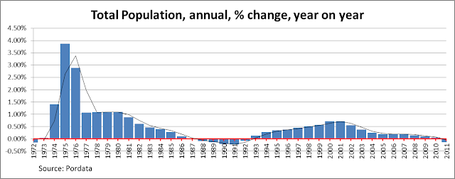
    While the phenomenon has arrived largely unnoticed Portugal’s total population has long been near to stationary.

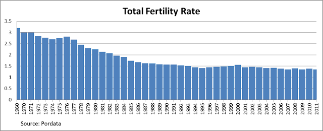
    As can be seen in the above chart, Portugal’s population has been struggling to find growth momentum since the mid 1980’s (the first time numbers actually dipped downwards) but the years 2010/2011 seem to mark a more fundamental turning point, since it was in that time interval that Portugal’s population started on a long, and possibly irreversible, path of decline. Having long had a total fertility rate of below 1.5 this was a more than predictable outcome, and one that should have been expected ever since the total fertility rate fell (and stayed) below the 2.1 replacement level in 1982.

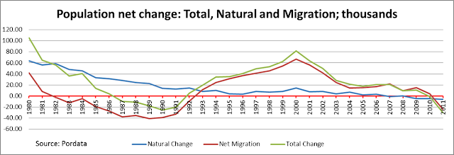
    As is well known, population change is comprised of two major components: natural growth and net migration. Natural growth, births minus deaths, became negative in 2007 and thereafter population growth has become exclusively dependent on having sufficient positive net migration. Up to 2010 this condition was satisfied given the continuing influx of immigrants into the country as can be seen in the chart below.


    However, since the onset of the 2008 recession, not only have the immigration flows reversed completely, but emigration has started to increase again, thus reanimating a trend that has been constantly present in Portuguese history over decades, even centuries. This is perhaps the most critical factor driving the recent population decline. In fact the decline would have occurred much earlier had it not been for the return of thousands of refugees from the Portuguese colonies in the 1974-1981 period.


    According to the European Commission’s 2012 Ageing Report, projections for the Portuguese population during the period 2010 – 2060 anticipated that population would peak in 2034, but as we have seen, the latest data show the population unexpectedly reached its peak in 2010 (total population, previous chart), the year in which the population began to decrease (a similar phenomenon seems to have occurred in Spain in 2012, with again a reversal in migrant flows in an otherwise stagnant population being the trigger). This fact that this turnaround comes as a surprise is clearly the result over optimistic assumptions on the net migration front since the numbers for natural growth are well known and change little (although birth numbers are now dropping in many EU countries under the impact of the long recession). Clearly the unexpected factor here is the severity of the recession from which the country is suffering and the size of the exodus of young people who are leaving.

    Just to highlight even more the speed with which all this is happening, in Japan, the interval between the beginning of the decline of the working age population and the beginning of total population decline was a full decade. In Portugal this interval was only two years.

    Even more relevant than the decline in total population for the purpose of the present discussion is the decline in the working-age population. While the former gives us a good proxy for domestic consumption, it is the later which is important in terms of potential national output. All other things being equal a reduction in the working-age population means a reduction in output. Therefore, the most important detail to catch from the chart above is that the working-age population, defined as the population with ages ranging from 15-64, declined for the first time in Portugal between 2008 and 2009. As highlighted by both Daniel Gros and Paul Krugman if you want to compare economic growth performance as between countries with growing populations and those with declining ones the best indicator to use is undoubtedly GDP per Working Age Person (GDP/WAP).

    In the Portuguese case if we take this ratio and compare it with both Real GDP growth and Working Age Population change (my calculations VM), we can get an impression of how variations in the Working Age Population affect the economic growth of a country. Surprisingly or otherwise, the data for Portugal viewed graphically not only confirms the existence of the “workforce effect” – the relationship seen between Real GDP and GDP/WAP – but also suggests that Portugal has already passed the point where this effect is beginning to have a negative impact on GDP growth.


    As can be seen in the above chart, until 2008 the growth rate of Real GDP was always higher than the rate for GDP/WAP offering a strong suggestion that labour force growth was having a positive impact on GDP growth. It is noteworthy, however, that both in the period 1986 – 1991 and in the period 2003 – 2008, the growth rates of Real GDP and GDP/WAP almost overlapped. This phenomenon coincided with very low or zero rates of working age population growth and as such the “workforce effect” was mostly neutral. The first of these periods, 1986 – 1991, the stagnation in the workforce was the direct result of the increase in emigration that followed the entry of Portugal in the European Union. The second one coincides with the arrival of the turning point in long term WAP growth, as the size of the working age population irrevocably turns negative.

    Indeed, during this early period of emigration towards the EU Portugal’s total population decreased, as shown in the chart Population by age group (above, blue line), but at the time, since the population in general was much younger, and many more new labour force entrants were arriving at working age, the growth rate of the workforce remained slightly positive. In other words, there were still enough Portuguese entering the labour market to replace those who were leaving it (either to retire or to seek a future abroad). In the second period, 2003 – 2008, the large exit of Portuguese nationals, about 700,000 between 1998 and 2008 according to research by the now Economy and Employment Minister Álvaro Santos Pereira, was to some extent offset by an inflow of immigrants, but these were only sufficient in number to maintain the workforce at a stationary level.

    All this calm and stability disappeared, however, after 2008 when the growth rate of Working Age Population turned negative, i.e. the labour force began to decline (see graph below). Where the growth rates of Real GDP and GDP/WAP overlap we can surmise that working age population change is having no effect on real GDP growth. Subsequently, however, the growth rate of GDP/WAP becomes higher than the growth rate of Real GDP and thus the “workforce effect” starts to act as a drag on the economy steadily bringing the potential overall growth rate down. In other words, Portugal is now suffering from a “Shortage of Japanese” as Edward Hugh has called the phenomenon, after Paul Krugman originally coined the term to describe the underlying problem which has been afflicting the Japanese economy since the mid-1990s.

    The fact that the three lines in the above chart happen to intersect at zero is perhaps just an unfortunate coincidence but is consequences are disastrous, since the downward trend that was already evident accelerated greatly after the onset of the recession. The resulting rise in unemployment not only caused a collapse in the immigration flow, it also led to a sharp increase in emigration. As a result workforce shrinkage intensified even further, as can be seen in the above chart by looking at the growing distance between the Real GDP and the GDP/WAP lines. That is, if the workforce had remained stationary the economy would be growing at similar rates to the GDP/WAP, i.e. above the current level as indeed happened in the period 2003 – 2008.

    Naturally, the argument can be advanced here that the recession is a cyclical phenomenon, and this is surely true, there is an ongoing cycle, but the argument being used refers to long term trends – a reversal in direction (or change of sign) for inputs from the labour force component brings down the overall trend growth rate making booms weaker and recessions deeper, all other things being equal. This would seem to be a simple conclusion which stems from elementary growth accounting theory. Naturally, there are other factors which contribute to growth, like multi factor productivity, but again other things being equal you would need more of this to achieve the same growth rate as before under conditions of weakening in the labour force growth component.

    Thus the argument is not that economic growth becomes impossible with a stagnant or slowly declining workforce, but simply that it becomes harder to achieve because it relies more on other factors, such as productivity and raising participation rates, but these change slowly over time, and more so in already developed countries. As such trend growth will surely steadily fall. This can be clearly seen in the following chart: while workforce growth was an important source of growth when Portugal was a developing country, its importance fell back as the workforce started to stagnate even as Portugal was approaching converge with other developed countries in terms of productivity. Other factors took over and increased their importance steadily as the economy started to converge with more advanced ones. Now that this catch up process seems to have come to a standstill as well the economy simply can’t growth, at least at rates considered normal. With a stagnant workforce, low growth or no growth is the new normal.


    Following standard growth accounting procedures, during the 1970s workforce growth accounted for more than half of Portuguese economic growth (see chart above, my calculations VM), and this contribution had fallen to only 16% in the first decade of this century. However, since 2008 not only has this contribution reversed sign but also the magnitude of the negative effect has begun to increase rapidly. Such that, by 2011 the “workforce effect” could be considered to explain more than 29% of the GDP decline. This “negative drag” will continue, and the effect possibly become greater, as the working age population shrinks further. Had the workforce remained stationary we could surmise the 2010 recovery would have been more pronounced and the 2011 recession wouldn’t have been so deep. This is the principal reason why official growth forecasts have been being constantly revised to the downside, and this will continue to happen until the models the forecasters use adequately incorporate the effects of population decline on economic growth. Adding insult to injury, ignorance of the existence of such effects recently led Portugal’s Prime Minister Pedro Passos Coelho to suggested young unemployed Portuguese resort to emigration as an escape route from the crisis, advice thousands have now followed thus making a bad situation even worse.

    Economic growth in Portugal appears to be on a long downward trend, a trend which will only be made worse by the onset of the decline in its working age population. Economic output is now at 2001 levels and thus we can now conclude that the last decade has been completely lost. More worryingly though, is that after such a bad start to this decade, it might not be unreasonable to conclude that this one is also in the process of being lost too.

    At best the economy will stagnate in the years to come but the possibility is there that it will continue to regress – especially if nothing is done to stem the outflow of young educated people – and by 2019 it might even be back somewhere in the 1990’s. This is scenario simply cannot be excluded since, in addition to all the other problems the country faces, a situation that would be in any circumstance challenging is now being aggravated by one more variable whose contribution cannot be easily reversed in the short term – the decrease in the working age population. More than the fact in itself, it is the speed at which this is happening which is alarming, and the fact that policymakers appear unaware of the problem. In analyzing the low Portuguese economic growth issue the decrease in the country’s working age population can no longer be ignored! Or at least it is hoped that this will be one of the outcomes of this short report.

    To return to where we started, Keynes concluded in his pioneering presentation that a stationary or slowly declining population could increase its standard of life while preserving the institutions society values most if, and only if, the process was managed with the necessary strength and wisdom. On the contrary, he argued, a rapid decline in population, of the kind that we are seeing in Portugal today, would almost inevitably result in a serious decline in living standards and a breakdown in highly valued social security mechanisms. The distinction Keynes drew some 80 years ago between rapid and managed rates of decline seems plausible, reasonable and highly relevant today. What we now need to see are urgent measures taken – initiated by the EU and the IMF – to counter the exodus which lies behind this dramatic decline which is occurring before our eyes, measures which at least try to decrease its speed, because once a process like this gains full velocity it will be very difficult to stop, and we have already seen it gather considerable traction. Ireland is a pointer and a great example to learn from, since it took that country more than a century to recover the population decline precipitated by the Great Famine which hit the country in the middle of the nineteenth century.

    Valter Martins is a self-taught economist and his research interests include demographics and its impact on economic growth. He holds a degree in International Business from University of Minho, Portugal and a Professional Diploma in Financial Advice (QFA) from Ireland.

  • America’s True Power In The NAFTA Century

    OK, I get it. Between George W. Bush and Barack Obama we have made complete fools of ourselves on the international stage, outmaneuvered by petty lunatics and crafty kleptocrats like Russia’sVladimir Putin. Some even claim we are witnessing “an erosion of world influence” equal to such failed states as the Soviet Union and the French Third Republic. “Has anyone noticed how diminished, how very Lilliputian, America has become?” my friend Tunku Varadajaran recently asked.

    In reality, it’s our politicians who have gotten small, not America. In our embarrassment, we tend not to notice that our rivals are also shrinking. Take the Middle East — please. Increasingly, we don’t need it because of North America’s unparalleled resources and economic vitality.

    Welcome then to the NAFTA century, in which our power is fundamentally based on developing a common economic region with our two large neighbors. Since its origins in 1994, NAFTA has emerged as the world’s largest trading bloc, linking 450 million people that produce $17 trillion in output. Foreign policy elites in both parties may focus on Europe, Asia and the Middle East, but our long-term fate lies more with Canada, Mexico and the rest of the Americas.

    Nowhere is this shift in power more obvious than in the critical energy arena, the wellspring of our deep involvement in the lunatic Middle East. Massive finds have given us a new energy lifeline in places like the Gulf coast, the Alberta tar sands, the Great Plains, the Inland West, Ohio, Pennsylvania and potentially California.

    And if Mexico successfully reforms its state-owned energy monopoly, PEMEX, the world energy — and economic — balance of power will likely shift more decisively to North America. Mexican President Pena Nieto’s plan, which would allow increased foreign investment in the energy sector, is projected by at least one analyst to boost Mexico’s oil output by 20% to 50% in the coming decades.

    Taken together, the NAFTA countries now boast larger reserves of oil, gas (and if we want it, coal) than any other part of the world. More important, given our concerns with greenhouse gases, NAFTA countries now possess, by some estimates, more clean-burning natural gas than Russia, Iran and Qatar put together. All this at a time when U.S. energy use is declining, further eroding the leverage of these troublesome countries.

    This particularly undermines the position of Putin, who has had his way with Obama but faces long-term political decline. Russia, which relies on hydrocarbons for two-thirds of its export revenues and half its budget, is being forced to cut gas prices in Europe due to a forthcoming gusher of LNG exports from the U.S. and other countries. In the end, Russia is an economic one-horse show with declining demography and a discredited political system.

    In terms of the Middle East, the NAFTA century means we can disengage, when it threatens our actual strategic interests. Afraid of a shut off of oil from the Persian Gulf? Our response should be: Make my day. Energy prices will rise, but this will hurt Europe and China more than us, and also will stimulate more jobs and economic growth in much of the country, particularly the energy belts of the Gulf Coast and the Great Plains.

    China and India have boosted energy imports as we decrease ours; China is expected to surpass the United States as the world’s largest oil importer this year. At the same time, in the EU, bans on fracking and over-reliance on unreliable, expensive “green” energy has driven up prices for both gas  and electricity.

    These high prices have not only eroded depleted consumer spending but is leading some manufacturers, including in Germany, to look at relocating production , notably to energy-rich regions of the United States. This shift in industrial production is still nascent, but is evidenced by growing U.S. manufacturing at a time when Europe and Asia, particularly China, are facing stagnation or even declines. Europe’s industry minister recently warned of “anindustrial massacre” brought on in large part by unsustainably high energy prices.

    The key beneficiaries of NAFTA’s energy surge will be energy-intensive industries such as petrochemicals — major new investments are being made in this sector along the Gulf Coast by both foreign and domestic companies. But it also can be seen in the resurgence in North American manufacturing in automobiles, steel and other key sectors. Particularly critical is Mexico’s recharged industrial boom. In 2011 roughly half of the nearly $20 billion invested in the country was for manufacturing. Increasingly companies from around the world see our southern neighbor as an ideal locale for new manufacturing plants; General Motors GM -0.96%Audi , Honda, Perelli, Alcoa and the Swedish appliance giant Electrolux have all announced major investments.

    Critically this is not so much Ross Perot’s old “sucking sound” of American jobs draining away, but about the shift in the economic balance of power away from China and East Asia. Rather than rivals, the U.S., Mexican and Canadian economies are becoming increasingly integrated, with raw materials, manufacturing goods and services traded across the borders. This integration has proceeded rapidly since NAFTA, with U.S. merchandise exports to Mexico growing from $41.6 billion in 1993 to $216.3 billion in 2012, an increase of 420%,while service exports doubled. MeanwhileU.S. imports from Mexico increased from $39.9 billion in 1993 to $277.7 billion in 2012, an increase of 596%.

    At the same time, U.S. exports to Canada increased from $100.2 billion in 1993 to $291.8 billion in 2012.

    Investment flows mirror this integration. As of 2011, the United States accounted for 44% of all foreign investment in Mexico, more than twice that of second-place Spain; Canada, ranking fourth, accounts for another 10%. Canada, which, according to a recent AT Kearney report, now ranks as the No. 4 destination for foreign direct investment, with the U.S. accounting for more than half the total in the country. Over 70% of Canada’s outbound investment goes to the U.S.

    Our human ties to these neighbors may be even more important. (Disclaimer: my wife is a native of Quebec). Mexico, for example, accounts for nearly 30% of our foreign-born population, by far the largest group. Canada, surprisingly, is the largest source of foreign-born Americans of any country outside Asia or Latin America.

    We also visit each other on a regular basis, with Canada by far the biggest sender of tourists to the U.S., more than the next nine countries combined; Mexico ranks second. The U.S., for its part, accounts for two-thirds of all visitors to Canada and the U.S. remains by far largest source of travelers to Mexico.

    These interactions reflect an intimacy Americans simply do not share with such places as the Middle East (outside Israel), Russia, and China. There’s the little matter of democracy, as well as a common sharing of a continent, with rivers, lakes and mountain ranges that often don’t respect national borders. Policy-maker may prefer to look further afield but North America is our home, Mexico and Canada our natural allies for the future. Adios, Middle East and Europe; bonjour, North America.

    This story originally appeared at Forbes.

    Joel Kotkin is executive editor of NewGeography.com and Distinguished Presidential Fellow in Urban Futures at Chapman University, and a member of the editorial board of the Orange County Register. He is author of The City: A Global History and The Next Hundred Million: America in 2050. His most recent study, The Rise of Postfamilialism, has been widely discussed and distributed internationally. He lives in Los Angeles, CA.

    NAFTA logo by AlexCovarrubias.