Category: Demographics

  • Detroit, Why Hast Thou Forsaken Me?

    Thou wouldst fain destroy the temple! If thou be Jesus, Son of the Father, now from the Cross descend thou, that we behold it and believe on thee when we behold it. If thou art King over Israel, save thyself then!

    God, My Father, why has thou forsaken me? All those who were my friends, all have now forsaken me. And he that hate me do now prevail against me, and he whom I cherished, he hath betrayed me.

    Lyric excerpts from the Fifth and Fourth and Words, respectively, of the Seven Last Words of Christ orchestral work by Joseph Haydn.

    I’m pissed.

    Ever since the announcement late Thursday that the City of Detroit was indeed going to file for Chapter 9 municipal bankruptcy protection, the Internet has been overflowing with commentary on the matter. The commentary has come from all places and taken on by all comers – from the political left and right; from hard news and general interest sources. And all usually with the same scripted and lazy tripe about how Detroit reached its nadir:

    • Single-minded dependence on a collapsing auto industry doomed Detroit.
    • An inability to diversify economically doomed Detroit.
    • Public mismanagement and political corruption doomed Detroit.
    • An inability to effectively deal with its racial matters doomed Detroit.
    • The dramatic and total loss of its tax base doomed Detroit.

    That’s it, people, they seem to reason. The Motor City’s fall from grace is as simple as that. You do the things Detroit did, and you get what Detroit got. You defer decisions just as Detroit did, and you too will suffer the consequences. The speed with which the various articles on Detroit came out proved to me that many writers anticipated the announcement with at least a twinge of glee.

    As I’ve written before, Detroit’s narrative serves everyone else as the nation’s whipping boy, and that came through in the last couple of days:

    You can find Detroit in Cleveland, St. Louis, Buffalo, Milwaukee, Baltimore and Philadelphia. You can find it in Indianapolis, Minneapolis, Cincinnati, Columbus and Louisville. You can find it in Atlanta, Miami, Houston, Dallas and Phoenix. You can even find it in Las Vegas, Seattle, San Francisco and Portland. And yes, you can definitely find it in New York, Chicago, Los Angeles and Washington, DC. You can find elements of the Detroit Dystopia Meme™ in every major city in the country. Yet Detroit is the only one that owns it and shoulders the burden for all of them.

    But let’s leave that aside. I’m pissed because no one seems to acknowledge the central reason Detroit is filing for bankruptcy now. It has endured abandonment – white flight abandonment – on an absolutely epic scale. Before there was auto industry collapse, before there was a lack of economic diversity, before there was mismanagement and corruption, there was abandonment. People skirt and dance around the issue when they talk about the loss of Detroit’s tax base. What Detroit lost was its white people. The chart above illustrates how Detroit’s unique experience when compared to similar cities.

    Detroit is what happens when the city is abandoned. And frankly, there is a part of me that views those that abandoned Detroit with the same anger reserved for hit-and-run drivers – they were the cause of the accident, they left the scene of the crime, and they left behind others to clean up the mess and deal with the pain. What’s worse, so many observers seem to want to implicate those left behind – in Detroit’s case a large African-American majority community – for not cleaning up the mess or easing the pain. Their inflicted pain which they’ve made ours.

    White abandonment of Detroit did not start with the 1973 election of Coleman Young as mayor, or even the 1967 riots, yet those two events accelerated the process. And indeed, Detroit had a very unique set of circumstances that caused it to veer down a troubled path. The very first piece featured in my blog was about the land use and governing decisions that were made more than one hundred years ago in Detroit that literally set the city’s decline in stone. I identified eight key factors:

    • Poor neighborhood identification, or more broadly a poorly developed civic consciousness.
    • A housing stock of poor quality, cheap and disposable, particularly outside of the city’s traditional core.
    • A poorly developed and maintained public realm.
    • A downtown that was allowed to become weak.
    • Freeway expansion.
    • Lack of or loss of a viable transit network.
    • A local government organization type that lacked accountability at the resident/customer level.
    • An industrial landscape that was allowed to constrain the city’s core.

    Conor Friedersdorf of the Atlantic wrote perhaps one of the best recent articles I saw on Detroit when he acknowledged that even a half-century ago, journalists were predicting a dire future for the D. Take this quote Conor found from The Reporter, published October 31, 1957:

    The auto industry created modern Detroit simply as its dormitory and workshop, attracted polyglot millions to it, used it, and now threatens to abandon it. Civic consciousness played little part in the lives of the masses of Irish, German, Poles and Italians who flocked to Detroit in search of a Ford or Dodge or Packard pay check, and who settled there in islands of their own – any more than it played a part in the managements of Ford or Dodge or Packard themselves, or in the crowd of Negroes who also descended upon the city during the boom years of the Second World War… Indeed, it is remarkable that any sense of civic responsibility at all should have been generated in so rootless and transient a community.

    What can a city do when it finds its patron industry and its middle class moving out, leaving it a relic of extremes?… But urban deterioration offers at least one advantage. Once a city core has become as run-down as Detroit’s you can start to rebuild fairly cheaply.

    Yes, that is from 1957.

    The chart at the top of this article was done for an article I did more than a year ago, looking at U.S. Census data for several peer cities over the last seven decennial censuses. In it, I concluded that Detroit’s experience of abandonment was entirely unique:

    Between 1950 and 1970, the decline in Detroit’s white population was on the low end of the spectrum of cities on this list, but it was in the ballpark. Prior to 1970, Detroit and St. Louis were the white flight laggards. After 1970, the bottom fell out and Detroit stood alone. While there certainly are economic reasons white residents may have had for moving, this graph may lend credence to the twin theories of Motor City white flight – the 1967 riots and the 1973 election of Mayor Coleman Young.

    I’m not trying to persuade anyone of the invalidity of their decision to move from Detroit. There were good reasons and not so good reasons. I’m only trying to describe its impact relative to other cities. And where exactly are those white residents who left over the last 60 years? Certainly many have passed on. Some are currently in the Detroit suburbs or elsewhere in Michigan. Some are part of that great Detroit Diaspora that took them to New York, Washington, Charlotte, Atlanta, Houston, Phoenix, Los Angeles, Seattle and Portland. There are clearly at least 1.5 million reasons why white residents left Detroit.

    But the fact is, had Detroit experienced white flight at the same combined rate as the other cities on this list, and not experienced any other changes, there would be nearly 350,000 more white residents today. Maybe 140,000 more households. Maybe more stable neighborhoods.

    Can you imagine that? An additional 350,000 residents means Detroit would still be a city with more than one million people. It would likely be viewed in the same way that a Philadelphia or Baltimore is now – challenged but recovering – instead of the urban dystopia it’s widely seen as today. What impact would that have had on the city’s economy? On the metro area’s economy? On the state’s economy? Or simply the city’s national perception?

    I’ve mentioned here on several occasions that the reason I chose the planning profession is because I grew up in Detroit during the 1970s. I looked around and saw a city with an inferiority complex and saw people leaving in droves. My naïve and childish thinking was, “instead of leaving the city, why don’t people stay and work to make it better?”

    Silly of me. Abandonment is the American way.

    Nonetheless, I view Detroit’s bankruptcy announcement positively. It acknowledges that its troubles are far deeper than most realize. It can be the springboard for fiscal recovery, a re-imagining of the city and an actual and complete revitalization. Detroit indeed is in uncharted waters, and its abandonment means that in many respects it could be viewed as a frontier city once again. I would not be surprised if, after restructuring and reorganization, after recapturing its innovative spirit, the city could see growth almost like it did at the beginning of the twentieth century, mimicking what, say, Las Vegas has done for the last 40 years. Even at this dark moment, Detroit has assets that are the envy of other cities.

    But let no one forget that it is abandonment that brought Detroit to this point.

    This piece originally appeared at The Corner Side Yard.

    Pete Saunders is a Detroit native who has worked as a public and private sector urban planner in the Chicago area for more than twenty years.  He is also the author of "The Corner Side Yard," an urban planning blog that focuses on the redevelopment and revitalization of Rust Belt cities.
  • Singapore Needs A New Sling

    Over the past half century, the tiny city-state of Singapore has developed arguably the most successful formula for growth and social uplift on the planet. Like the famous Singapore sling — a tropical cocktail blending gin, grenadine, sweet and sour mix, cherry brandy and club soda — the city’s mandarins created the perfect recipe for rapid economic growth by combining its strategic location and hard-driving, largely Chinese population, with first-class infrastructure, a relentlessly improved local workforce and an opportunistic immigration policy designed to fill gaps in the labor pool.

    These policies turned what could have become just another steamy, racially divided, corrupt and crime-ridden Third World metropolis into a modern-day Venice with a stunning skyline, a per capita GDP higher than the U.S. and EU, and one of the world’s best-educated and disciplined workforces. It is a burgeoning financial center that in a recent survey, ranked fourth on the planet ahead of such self-important  places as Tokyo, Chicago and Toronto. It stands fifth in the amount of assets managed by institutional investors, ahead of much larger countriessuch as Japan, Great Britain and Brazil.

    Yet as Singapore approaches its 50th year of independence in 2015, the strategy that worked so well, so long, may have reached its expiration date. In the place of a once swaggering self-assurance, many Singaporeans have turned decidedly negative. In a 2011 Gallup survey, the percentage of city residents who things would be worse in five years was among the highest in the world, along with such more understandable countries as Greece, Italy, Syria and Spain.

    Some ascribe these attitudes to traditional Chinese fatalism — particularly among those living in the diaspora — but China itself was not high on the pessimist list, and, for the most part, as Pew suggests, Asian immigrants to the United States, an increasingly Chinese-dominated group, are actually more optimistic about the future than most Americans.

    Economics may be part of the explanation behind this growing negativity. GDP growth continues to chug along at 5% per annum — something the U.S. and the EU would die for — but real wages for ordinary Singaporeans have stagnated.  From 1998 to 2008, the income of the bottom 20% of households dropped an average of 2.7% while the salaries of the richest 20% rose by more than half. Real median income for the middle class rose 11% from 2001 to 2010.

    By contrast, between the 1970s and 2000, incomes doubled or better every decade.

    The growing income equality is particularly troubling  in a country that under the brilliant leadership of legendary Prime Minister Lee Kuan Yew and his People’s Action Party, combined a meritocratic mentality with a powerful commitment to social democracy.

    To be sure, Singaporean living standards remain very high by Asian standards, even for those toward the bottom of the social order. Largely through the efforts of the state-owned Housing Development Board the vast majority of Singaporeans live in clean apartments, spacious by Asian urban standards, which they also own.

    Yet structural changes in the economy, notably the growth of financial services, could accelerate the growth of inequality. Financial centers tend to have vast disparities in wealth (see New York and London). This gap may be furthered by the rising importance of tourism, where the city ranks fifth in the world behind New York, London, Paris and Bangkok. Add to this gaming — the city is about to pass Las Vegas — and you see a rise of both high-rollers and lower paid hospitality jobs.

    Then there’s city-state’s paramount problem: its plunging fertility. Three decades ago Lee and his PAP were rightly concerned about the city’s overpopulation. Now the big problem is a rock-bottom low birthrate — with a fertility rate under 1.2 – barely  half that necessary to replace the current population, which threatens to turn this ultra-dynamic city state into a giant old-age home.

    The reasons for this plunge, according to demographer Gavin Jones at the National University of Singapore, lie largely in such things as long working hours and ever-rising housing costs, something that has been boosted by foreign purchases of private residences. With large apartments increasingly expensive, Singaporeans, particularly those with children, often think of emigrating to less expensive or at least roomier places such as the United States, Australia and New Zealand. One recent survey estimated that over half of Singaporeans want to migrate; the World Bank estimates upward of 300,000 Singaporeans have moved abroad, accounting for almost one in 10 citizens.

    This emigration is taking place just as Singapore has turned increasingly to foreign workers to keep the economy humming, ranging from the relatively unskilled from neighboring countries and South Asia to some of the world’s most talented academic, technical and financial experts. Since 1970 the percentage of Singaporean citizens among the residential population has dropped from 90% to barely 63% today.

    The growing immigrant presence has sparked some unease among Singaporeans. Some fear their city is evolving into what is sometimes called a “Hotel Singapore,” dominated by globalized culture, with its predictable glitzy panoply of shops, iconic structures and global restaurant brands. This reflects pressure in cities to conform to what the Dutch architect Rem Koolhass calls “a larger and seemingly universal style” whose impact on local culture he compares to “the disappearance of a spoken language.”

    Fears of untrammeled globalization have been stoked by a recent government report, “A Sustainable Population for a Dynamic Singapore,” that suggested, in the name of global competiveness, that Singapore’s population expand to 7 million from its current five by 2030. Many natives saw this proposal, which relies heavily on immigrants, as a direct threat to their quality of life and job prospects . With 5.3 million people crammed onto an island of only 714.3 square kilometers, occasional  flooding and train breakdowns, it is unsurprising that many feel the city-state is already crowded enough.

    These factors are sparking, for the first time in decades, something approaching political conflict. In 2011, the opposition won six seats in Parliament, the most since independence in 1965. The ruling party’s share of the vote dropped from 75% in 2001 to barely 60%.

    Most Singaporeans admire the accomplishments of the PAP, and the generally successful outcomes of its policies , but clearly there is a desire for a change of direction. How Singapore addresses these problems is important not just for the city-state, or even Asia, but the entire world. The Singaporean model remains an inspiration to city-builders , and how it meets its contemporary challenges could prove critical in an age where the majority of people live in urban areas.

    The first step for Singapore’s reinvention lies with recognizing the seriousness of its challenges. The policies of the past may have worked impressively, but may not be as appropriate in the future. As my old Japanese sensei Jiro Tokuyama once noted: the hardest thing to do is how to unlearn the secrets of your past success. The ingredients in the cocktail that is Singapore need to be tweaked for a new era.

    Fortunately, Singapore enjoys the social cohesion, the human capital, and capable leadership to make the necessary changes. One key element relates to focusing on how to nurture families once again, and to recapture that sense of Singaporean-ness that makes the place so special. It is not so much a matter of financial incentives — these have not worked — as in controlling housing costs, expanding space for families,  and most importantly, finding better ways to balance life and work.

    Already some initial steps to humanize the metropolis are taking place. These include a remarkable expansion and improvement of green space, and attempts to decentralize work around the newer state housing estates and commercial developments. Steps to increase the size of apartments, repurpose aging shopping and office structure for housing as well as encouraging more home-based work could also prove helpful. These changes will be critical if the world’s most successful city wants to remain so in the decades ahead.

    Joel Kotkin is executive editor of NewGeography.com and Distinguished Presidential Fellow in Urban Futures at Chapman University, and a member of the editorial board of the Orange County Register. He is author of The City: A Global History and The Next Hundred Million: America in 2050. His most recent study, The Rise of Postfamilialism, has been widely discussed and distributed internationally. He lives in Los Angeles, CA.

    This piece originally appeared at Forbes.

    Singapore skyline photo by Bigstockphoto.com.

  • Moving from Travis County (Austin) to Williamson County

    In an article entitled, “The People Moving to Austin and ‘Ruining It’ are from Texas,” the Austinist notes that more people are moving to Austin from neighboring Williamson County than from Los Angeles County.

    The article has the potential to mislead in two ways.

    The lesser of the problems is that it confuses Austin with Travis County. The cited data is for Travis County, not the city of Austin. The source of the data, the American Community Survey does not report on municipal migration. (Austin is most of Travis County’s population, but itself has sections in Williamson and Hayes counties).

    The bigger problem is that the article tells only half the story. Yes, 10,500 people moved from Williamson to Travis over the 2006-2010 period, but 14,200 moved from Travis to Williamson. Thus, there was a net outflow of 3,700 people from Travis to Williamson. Meanwhile, there was a net gain of residents in Travis County from Los Angeles County of approximately 800.

    Thus, while there is net migration from Los Angeles County to Travis County, the net migration from Travis County to Williamson County is 4.5 times as large.

  • Metropolitan Dispersion: 1950-2012

    America has become much more metropolitan since 1950, when the Office of Management and Budget released the first modern criteria for determining the boundaries of metropolitan areas. Metropolitan areas are the economic or functional definition of the "city." They are otherwise known as labor markets and include the physical "urban area" (the area of continuous development) as well as economically connected rural territory from which people commute into the urban area. A previous article examined the development of the “physical” form of the city (urban areas) in the United States, from 1920 to 2010 (See Observations on Urbanization: 1920-2010).

    Major Metropolitan Areas in 1950

    In 1950, there were 14 major metropolitan areas in the United States (over 1,000,000 population). Their combined population was 44.5 million. By 2010, there were 52 major metropolitan areas, with a total population of 169.5 million. This increase, 124 million, is approximately equal to the population of France and the United Kingdom combined. While major metropolitan areas were increasing their population by 281 percent, the rest of the nation grew only 106 percent (Note 1).

    Dispersion to Smaller Metropolitan Areas

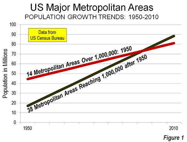
    As the nation was moving to major metropolitan areas, much of the growth was in the 38 smaller metropolitan areas that passed the 1,000,000 mark after 1950. These areas had 17.7 million residents in 1950. By 2010 they had added more than 70 million new residents, for a total population of 88.5 million. In contrast, the 14 metropolitan areas that had more than 1,000,000 population in 1950 grew only 36.5 million, to 81.1 million (Figure 1).

    Among the metropolitan areas that had reached 1,000,000 population by 2010, the fastest growing were all in the Sun Belt. Las Vegas, which was too small to be a metropolitan area in 1950, grew 39 times (3,941 percent) compared to the 1950 population for the area constituting the 2010 metropolitan definition (Clark County). Orlando grew 17.6 times (1,757 percent), while Riverside-San Bernardino grew 14 times (1,400 percent). Three other metropolitan areas grew 10 times or more, including Phoenix at 11.6 times (1,164 percent), Charlotte at 10.3 times (1,025 percent) and Miami at 10.2 times (1,017 percent).

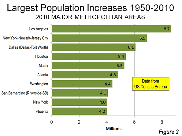
    Los Angeles added the most to its population, at 8.7 million residents from 1950 to 2010. Perhaps surprisingly, however, New York also grew strongly, adding 6.9 million residents. Los Angeles, which grew quickly until recently, managed to reduce New York’s 8.5 million 1950 lead by only one-fifth by 2010. Dallas-Fort Worth added the third greatest number of new residents (6.1 million), partially by absorbing the former (and smaller) Fort Worth metropolitan area during the period. Houston added 5.4 million residents. Miami added 5.4 million residents, also incorporating smaller metropolitan areas, Fort Lauderdale and West Palm Beach. Chicago ranked surprisingly high, adding 4.0 million residents, the result of comparatively strong growth in the early decades (Figure 2). The strong population growth evident in New York and Chicago is largely attributable to much faster growth rates between 1950 and 1970 period.

    The ascendancy of Texas is illustrated by the fact that its two largest metropolitan areas, Dallas-Fort Worth and Houston added more residents (Note 2) than the two largest metropolitan areas in California, Los Angeles, and San Francisco (11.5 million compared to 10.9 million). However, stronger long term California growth was indicated by the 4.1 million addition to the Riverside-San Bernardino metropolitan area (the “Inland Empire”), which is adjacent to the Los Angeles metropolitan area and has emerged as the dominant growth center of the state in recent decades.

    Similar Regions, Big Differences

    There were substantial contrasts in growth between similarly sized metropolitan areas in 1950 over the period.

    Atlanta and nearby Birmingham were similar in population in 1950. Atlanta had a population of 672,000 (ranked 23) and Birmingham had 559,000 (ranked 27). By 2010, Atlanta had risen to a population of 5.3 million and a rank of 9th, compared to Birmingham’s 1.1 million and a rank of 49th.

    A somewhat smaller, but significant difference is evident between Seattle and nearby Portland, which were nearly the same size in 1950 (733,000 and 705,000 respectively) ranking 20th and 21st respectively. Over the next 60 years, Seattle grew 2.8 million (some of it from absorbing the former Tacoma metropolitan area). By 2010, Seattle was the 15th largest metropolitan area in the nation, while Portland had fallen to 23rd, adding a smaller 1.5 million residents. Portland and San Francisco were the only major metropolitan areas in the West to fall in the national rankings between 1950 and 2010.

    Slower Growth Major Metropolitan Areas

    The slowest growing major metropolitan areas were Buffalo (4 percent), Pittsburgh (6 percent), Cleveland (41.7 percent), Detroit 42.4 percent and New York (52 percent (Table 1).

    Table 1
    Major Metropolitan Areas: 2010, Change from 1950
    Population Rank
    Metropolitan Area 1950 2010 Change 2012 1950 2010
    Atlanta, GA         671,797     5,286,732 687%     5,457,831 23 9
    Austin, TX         160,980     1,716,286 966%     1,834,303 107 35
    Baltimore, MD     1,337,373     2,710,489 103%     2,753,149 12 20
    Birmingham, AL         558,928     1,128,050 102%     1,136,650 27 49
    Boston, MA-NH     2,389,986     4,552,402 90%     4,640,802 6 10
    Buffalo, NY     1,089,230     1,135,511 4%     1,134,210 14 47
    Charlotte, NC-SC         197,052     2,217,035 1025%     2,296,569 91 24
    Chicago, IL-IN-WI     5,495,364     9,461,105 72%     9,522,434 2 3
    Cincinnati, OH-KY-IN         904,402     2,114,580 134%     2,128,603 15 28
    Cleveland, OH     1,465,511     2,077,240 42%     2,063,535 10 29
    Columbus, OH         503,410     1,901,965 278%     1,944,002 32 32
    Dallas-Fort Worth, TX         614,799     6,426,210 945%     6,700,991 24 4
    Denver, CO         563,832     2,543,478 351%     2,645,209 26 21
    Detroit,  MI     3,016,197     4,296,247 42%     4,292,060 5 12
    Grand Rapids, MI         288,292         988,938 243%     1,005,648 60 52
    Hartford, CT         358,081     1,212,384 239%     1,214,400 47 44
    Houston, TX         806,701     5,920,456 634%     6,177,035 18 6
    Indianapolis. IN         551,777     1,887,877 242%     1,928,982 29 33
    Jacksonville, FL         304,029     1,345,596 343%     1,377,850 56 40
    Kansas City, MO-KS         814,357     2,009,338 147%     2,038,724 17 30
    Las Vegas, NV           48,289     1,951,269 3941%     2,000,759 NA 31
    Los Angeles, CA     4,367,911   12,828,842 194%   13,052,921 3 2
    Louisville, KY-IN         576,900     1,235,708 114%     1,251,351 25 43
    Memphis, TN-MS-AR         482,393     1,324,829 175%     1,341,690 36 41
    Miami, FL         498,084     5,564,657 1017%     5,762,717 34 8
    Milwaukee,WI         871,047     1,555,908 79%     1,566,981 16 39
    Minneapolis-St. Paul, MN-WI     1,116,509     3,348,859 200%     3,422,264 13 16
    Nashville, TN         321,758     1,670,890 419%     1,726,693 55 37
    New Orleans. LA         685,405     1,189,863 74%     1,227,096 22 46
    New York, NY-NJ-PA   12,911,944   19,567,407 52%   19,831,858 1 1
    Oklahoma City, OK         325,352     1,252,992 285%     1,296,565 53 42
    Orlando, FL         114,950     2,134,411 1757%     2,223,674 138 27
    Philadelphia, PA-NJ-DE-MD     3,671,048     5,965,341 62%     6,018,800 4 5
    Phoenix, AZ         331,770     4,192,887 1164%     4,329,534 51 14
    Pittsburgh, PA     2,213,236     2,356,285 6%     2,360,733 8 22
    Portland, OR-WA         704,829     2,226,009 216%     2,289,800 21 23
    Providence, RI-MA         737,203     1,600,852 117%     1,601,374 19 38
    Raleigh, NC         136,450     1,130,490 729%     1,188,564 125 48
    Richmond, VA         328,050     1,208,101 268%     1,231,980 52 45
    Riverside-San Bernardino, CA         281,642     4,224,851 1400%     4,350,096 63 13
    Rochester, NY         487,632     1,079,671 121%     1,082,284 35 51
    Sacramento, CA         277,140     2,149,127 675%     2,196,482 64 25
    Salt Lake City, UT         274,895     1,087,873 296%     1,123,712 68 50
    San Antonio, TX         500,450     2,142,508 328%     2,234,003 33 26
    San Diego, CA         556,808     3,095,308 456%     3,177,063 28 17
    San Francisco-Oakland, CA     2,240,767     4,335,391 93%     4,455,560 7 11
    San Jose, CA         290,457     1,836,911 532%     1,894,388 59 34
    Seattle, WA         732,992     3,439,809 369%     3,552,157 20 15
    St. Louis,, MO-IL     1,681,281     2,787,695 66%     2,795,794 9 18
    Tampa-St. Petersburg, FL         409,143     2,783,243 580%     2,842,878 41 19
    Virginia Beach-Norfolk, VA-NC         446,200     1,676,820 276%     1,699,925 38 36
    Washington, DC-VA-MD-WV     1,464,089     5,636,232 285%     5,860,342 11 7
    Notes on changes from 1950
    All first named municipalities were the central cites per OMB in 1950 except:
    Norfolk was the central city of Virginia Beach
    San Bernardino was the central city of Riverside-San Bernardino
    Jersey City and Newark were also central cities of New York
    Las Vegas 1950 is for Clark County (was not a metropolitan area)


    Meanwhile, 11 metropolitan areas fell from the top 50 in 1950. All were in the Northeast or Midwest, except for Knoxville, TN. Youngstown has been beset by economic difficulties throughout most of the period. In 1950, Youngstown was the nation’s 30th largest metropolitan area, larger than Atlanta, Phoenix and Las Vegas. However, Youngstown added only seven percent to its population over the 60 years, and fell to 93rd place. Wheeling-Steubenville (WV-OH) is one of the nation’s few genuine “shrinking cities,” that is a metropolitan area or an urban area that is losing population. Wheeling-Steubenville was ranked 48th in 1950. Since that time, the economic influence of Wheeling has deteriorated so much that OMB has split the metropolitan area into two parts, removing Weirton, WV (which includes Steubenville, OH). The Wheeling metropolitan area is approximately 60 percent smaller than in 1950 (Table 2).

    Table 2
    Metropolitan Areas No Longer in Top 50
    Population Rank
      1950 2010 Change 1950 2010
    Youngstown, OH-PA   528,498   565,773 7% 30 93
    Albany, NY   514,490   870,718 69% 31 60
    Dayton, OH   457,333   799,232 75% 37 70
    Allentown, PA   437,824   821,173 88% 39 67
    Akron, OH   410,022   703,205 72% 40 74
    Springfield, MA   407,255   621,570 53% 42 83
    Toledo, OH   395,551   610,001 54% 43 86
    Wilkes-Barre, PA   392,241   563,630 44% 44 95
    Omaha, NE-IA   368,395   868,116 136% 45 61
    Wheeling, WV-OH   354,092   147,950 -58% 48 273
    Syracuse, NY   341,719   662,578 94% 49 79
    Knoxville, TN   337,105   837,571 148% 50 64


    Cities: From Monocentric to Polycentric to Edgeless

    The changes that occurred in cities of the United States and elsewhere around the world have extended well beyond the population increases. The former monocentric model of the city, organized around a dense core has been recent placed by the polycentric city (with the new suburban employment centers documented by Joel Garreau as “edge cities”). In its revisions of the metropolitan area criteria for the 2000 census (Note 2), the Office of Management and Budget began defining core (as used in the encompassing metropolitan area term “Core Based Statistical Area”) as the urban area (urbanized area), rather than the former “central cities.” OMB has designated many suburban employment centers as "principal cities," and in consequence no longer has any suburban designation.

    Robert Lang of the University of Nevada Las Vegas has shown that the evolution of metropolitan areas has been extending beyond the “edge cities” and has heralded the “edgeless city.” The dispersion continues.

    Wendell Cox is a Visiting Professor, Conservatoire National des Arts et Metiers, Paris and the author of “War on the Dream: How Anti-Sprawl Policy Threatens the Quality of Life.

    —————-

    Note 1: Some of the metropolitan growth occurred as residents in counties that were not metropolitan in 1950 were added to metropolitan areas as their borders were defined outward. The current boundaries of the major metropolitan areas would have increased their 1950 population by 17 percent.

    Note 2: The OMB final notice for 2010 defines “core” as “A densely settled concentration of population, comprising either an urbanized area (of 50,000 or more population) or an urban cluster (of 10,000 to 49,999 population) delineated by the Census Bureau, around which a Core Based Statistical Area is delineated. According to the OMB definition, the core is now an entire urban area, not a central city. The “building blocks” of urban areas are census blocks (smaller than census tracts), rather than municipalities, as had been the case before 2000.

    Photo: Crystal City Employment Center: Virginia suburbs of Washington (by author)

  • Will Europe Hit a Demographic Tipping Point?

    The best hope for the youth of France, according to a recent New York Times op-ed, is, well, to get out of France.  Youth unemployment in France is running at 26%.  No wonder some might believe their best opportunity lies elsewhere, including their old colony of New France (Quebec). 

    But this punishing level of unemployment is only slightly worse than the EU-wide rate of 23%. Countries like Spain and Greece have astonishing youth unemployment rates of nearly 60%. What does the future of these countries’ youth look like? Or their adults for that matter? Maybe it’s a future on another continent, including former colonies.

    Young people in France are starting to test the economic waters in Quebec. Fairly recently Spain became a place immigrants came to for opportunity, becoming one of the primary draws for immigrants for both Africa and Latin America. But now Spain is again seeing people leave for greener pastures in Latin America. It’s a similar case in Portugal, where tens of thousands of Portuguese natives have moved to their former colony of Angola in recent years.  

    In 1968 Paul Ehrlich’s doomsday tome The Population Bomb predicted mass starvation and civilizational collapse in much of the world due to overpopulation. But the more serious problem – particularly in traditionally higher-income countries – today is actually too few, not too many new people. The pivot to seeing this as the problem has come through something very basic: pension math. Across the developed world, public pension systems built on the assumption of continued population growth are now facing an actuarial day of reckoning as the bills come due while birth rates have plummeted.

    A society needs a total fertility rate – that is, the average number of children born to each woman – of 2.1 just to maintain its population without immigration. Some European countries like France (2.03) and the UK (1.98) are in reasonably good shape, but they are the exception. The total fertility rate in Greece is 1.43, in Germany 1.36, in Spain 1.36, in Portugal 1.30, and in Poland 1.30.  Much of southern and central Europe hovers near the so-called “lowest-low” rate of 1.3 in which the population is naturally being cut in half every 45 years.

    Simple birth rates alone have caused some to posit a societal going out of business sale in Europe. However, just as extrapolation of high population growth rates in the past led to wildly alarmist claims that proved false, so today we must be careful about not proclaiming Europe is doomed. But with the population on tap to be halved every generation, the runway to turn things around is difficult to conjure. And while we’ve seen many countries make the shift from high to low birth rates, there isn’t a huge track record of success in the other direction.

    It’s against this backdrop that Europe’s youth unemployment crisis must be seen.  Not only are Europe’s young facing short term pain from economic crisis, they also face the long term prospect of being a small population cohort that has to spend their entire working lives (when they eventually find jobs) paying for previous generations’ lavish retirement benefits never properly funded. Along with this, they are the ones who will likely bear the brunt of reduced pension payouts for themselves while the current and nearly retired are fully protected from cuts. This is on top of the massive official public sector debts that have been accrued, along with many years of pain from IMF and EU mandated austerity in a number of countries. Contracting demographics is like a “force multiplier” for unfunded liabilities, and this generation may never achieve the affluence – and buying power – of their parents.

    Immigration has been heralded as a solution to demographic issues, but this seems unlikely to bail Europe out. Unlike the US or Canada, European nation-states are built primarily on ethnic identities that make integration difficult no matter how progressive the policies.  Sclerotic economies and regulations that reward incumbents and large “national champion” firms while punishing entrepreneurs – immigrants are disproportionately entrepreneurial – don’t help.  With Europe having a large percentage of unassimilated and unemployed immigrants along with high native born unemployment rates, there has been social unrest all around. Immigrants have rioted, even in unlikely locales like Stockholm, while there has been an alarming rise in far right extremist groups among the native born.  Unlike immigrant-friendly North America, immigration has been as much problem as solution in Europe.

    So what exactly is in it for a young person in Greece, Italy, Spain, or apparently even France to stay home? Increasingly not a lot other than avoiding the difficulty involved in moving to another country far from home where the culture, language, etc. are different. That’s a daunting challenge to be sure, especially in a continent where people are very rooted, not just in their country, but often their town, though this can be reduced if they move to a former colony. But it appears we are seeing early signs of migration out of some European countries.

    It’s way too early to say what this will turn into, but if an exodus of the youth does take hold, it isn’t hard to imagine how this could hit a catastrophic tipping point in some countries. Facing unemployment, unfunded pensions, massive debts, austerity, and social unrest – as well as the prospect of getting stuck as the bag holder for all this – it isn’t hard to imagine a flight for the exits among the young. This would be like a demographic Lehman Brothers. Once confidence is lost, there’s a run on the bank, or in this case, a run for the exit.

    This is far from assured, of course. But it’s not an inconceivable outcome if things stay on the present course. Solving the nexus of issues around growth-euro-debt is critical for Europe, as is cracking the code on immigration. It seems unlikely birth rates will improve until these items are solved first. In the meantime, the US and Canada should be revisiting their own immigration laws to make sure they are poised to respond to – and benefit from – another wave of European economic refugees heads their direction.

    Aaron M. Renn is an independent writer on urban affairs and the founder of Telestrian, a data analysis and mapping tool. He writes at The Urbanophile.

    Photo by funtik.cat (Dasha Bondareva).

  • New Data on Commuting in Canada

    New data from the National Household Survey indicates that driving to work continues to surge in Canada. In addition to providing work access market shares, the National Household Survey provides one-way work trip travel time estimates for all metropolitan areas.

    The National Data

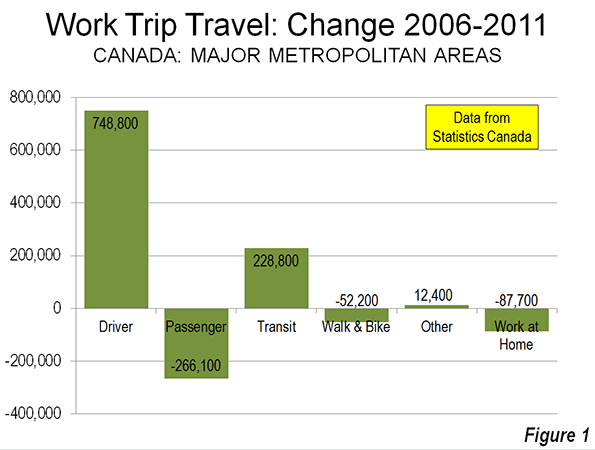
    Between the 2006 census and the 2011 National Household Survey indicates an increase of nearly 750,000 additional work-bound cars on the road. The increase in driving exceeded the overall increase of 585,000 in employment (Figure 1). Transit also experienced a strong increase, adding nearly 230,000 one-way work trip riders. At the same time, there were declines in car pool passengers (266,100), walking and cycling (52,200), and working at home (87,700).

    Driving (whether alone or in a car pool) reached a share of 68.9%, up 2.1 percentage points over the 66.8% registered in the 2006 census. Transit also increased, with its share rising from 10.2% in 2006 to 11.2% in 2011. The big loss was in carpool passengers which dropped from 7.1% to 5.9%. This declining carpool share mirrors the experience in the United States. There were also losses in the combined walking and cycling share, from 7.1% to 6.5% and in the work at home share from 7.7% to 6.9%.

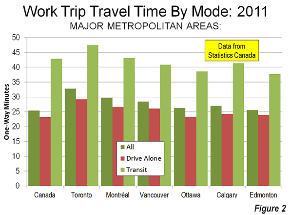
    Overall, the average one-way work trip travel time was 25.4 minutes, not much different than the US average of 25.5 minutes. However, among the major metropolitan areas, travel times generally exceeded those of similarly sized US metropolitan areas (below).

    Major Metropolitan Areas

    The story was similar among the major metropolitan areas (over 1,000,000 population).

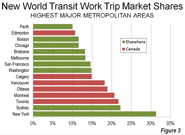
    Toronto: In Toronto, now Canada’s dominant metropolitan area, driving (alone or in car pools) increased from 59.4% to 60.2% between 2006 and 2011. Transit also experienced a full one percentage point increase to 21.7%. This transit work trip market share is higher than any other metropolitan area in Canada or the United States, with the exception of New York, at 31.1%). Toronto’s transit market share trails that of Sydney slightly (22.2%), though is much higher than that in Melbourne. Driving and transit took virtually all of their increase from a 1.9 percentage point loss in carpool passengers.

    Toronto’s one way work trip travel time was 32.8 minutes, which is longer than all other major metropolitan areas and exceeded in the New World only by Melbourne (36 minutes), New York (34.9 minutes), Washington (34.5 minutes), and Sydney (34 minutes). Toronto’s work trip travel time is longer than that of larger Los Angeles (28.6 minutes), as well as similarly-sized Dallas-Fort Worth (26.6 minutes) and Houston (27.7 minutes).

    Montréal: Montréal, the nation’s second-largest metropolitan area experienced a 1.2 percentage point increase in driving, while transit rose 0.7 percentage points. Montréal had the largest decline in carpool passengers among major metropolitan areas, falling from 4.7% in 2006 to 3.2% in 2011.

    Montréal’s average one-way work trip travel time was 29.7 minutes, also longer than the Los Angeles metropolitan area, which has more than three times as many residents. Among the 12 US metropolitan areas between 2,500,000 and 5,000,000 population, only Baltimore (30.3) and Riverside-San Bernardino (31.0) have longer work trip travel times than Montréal.

    Vancouver:Vancouver was the only major metropolitan area with the decline in driving, from 61.7% to 60.9%. Vancouver also had the highest transit market share increase, from 15.1% to 18.2%. Vancouver experienced a huge (1.9 percentage point) loss in carpool passengers and a strong loss in working at home (0.8 percentage points).

    The average work trip travel time in Vancouver was 28.4 minutes. This is nearly equal to that of Los Angeles (28.6 minutes), despite the fact that Los Angeles is nearly five times as large. Vancouver, with a population of 2.3 million has a longer work trip travel time than any US major metropolitan area under 2,500,000 population.

    Ottawa:Ottawa, which includes suburbs in Quebec (across the Ottawa River), experienced the 1.4 percentage point increase in driving and a 0.7% increase in transit use. Ottawa’s transit market share ranks third in the nation. The driving and transit gains were also largely at the expense of carpool passenger and working at home losses. The one-way work trip travel time was 26.3 minutes.

    Calgary:Among the major metropolitan areas, Calgary experienced the largest increase in driving, a 2.7 percentage point increase, from 64.2% to 66.9%. This is the second largest driver market share among the major metropolitan areas. Transit was up a modest 0.4 percentage points, while the share of carpool passengers dropped 1.9 percentage points. Working at home declined by 0.9 percentage points. The one-way work trip travel time was 27.0 minutes, longer than any US metropolitan area in the 1,000,000 to 2,500,000 population category.

    Edmonton:Driving increased 2.1 percentage points from 2006 to 2011 in Edmonton, from 70.5% to 72.6%. Edmonton had the highest driver market share in the nation. Transit was up 1.6 percentage points. Car pool passengers declined 2.2 percentage points and working at home declined 0.7 percentage points. Edmonton’s one-way work trip travel time was 25.6 minutes, the shortest among the major metropolitan areas. Work trip travel in Edmonton takes somewhat longer than the average of 24.5 minutes for US metropolitan areas with from 1,000,000 to 2,500,000 million residents

    Medium Sized Metropolitan Areas

    Five of Canada’s metropolitan areas have between 400,000 and 1,000,000 residents (Quebec, Winnipeg, Hamilton, Kitchener and London). Overall, these areas experienced a 1.9 percentage point increase in driver market share, to 72.4%. Transit was up 0.6%age points to 9.3%. Driving and transit experienced market share gains in each of the five metropolitan areas. As among the major metropolitan areas, the driver and transit gains were principally from losses in car pool passengers. Work trip travel times were below the national average in all but Hamilton.

    Travel Time by Mode

    At the national level, automobile drivers had an average work trip of 23.2 minutes, while transit commuters spent nearly 20 minutes more (42.2 minutes). Transit’s relative travel times were better in the major metropolitan areas, all of which have rapid transit or light rail lines to downtown (25.6 minutes for solo drivers and 41.6 minutes for transit). Even so, the average transit commuter spends nearly two-thirds more time on the way to work than solo automobile commuters (Figure 2)

    Transit’s Market Share

    Among the six major metropolitan areas, five (Toronto, Montréal, Vancouver, Ottawa, and Calgary) have transit market shares greater than all other New World (Australia, Canada, New Zealand, and the United States) major metropolitan areas with the exception of New York and Sydney (Figure 3).

    Policy Implications

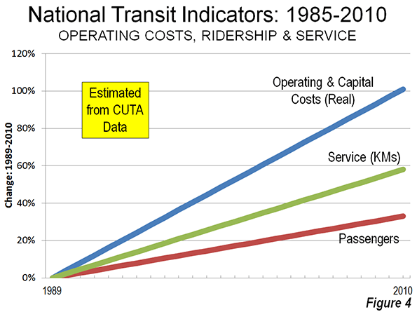
    Major metropolitan areas in Canada have made substantial transit investments (see: Improving the Competitiveness of Metropolitan Areas) in recent years and have seen a strong escalation of operating subsidies (Figure 4). These expenditures did not prevent the substantial increase in driving. Transit’s increase was less than the decrease in car pool passengers. It is possible that many car pool passengers switched to transit, however any such diversion would not have had any impact on the number of cars on the road, but would have only reduced the number of passengers. Driving was up in all the major metropolitan areas, even Vancouver. This seems likely to have increased traffic congestion, which is already substantially worse in Canada than in the United States, though better than in Australia and New Zealand (Note).

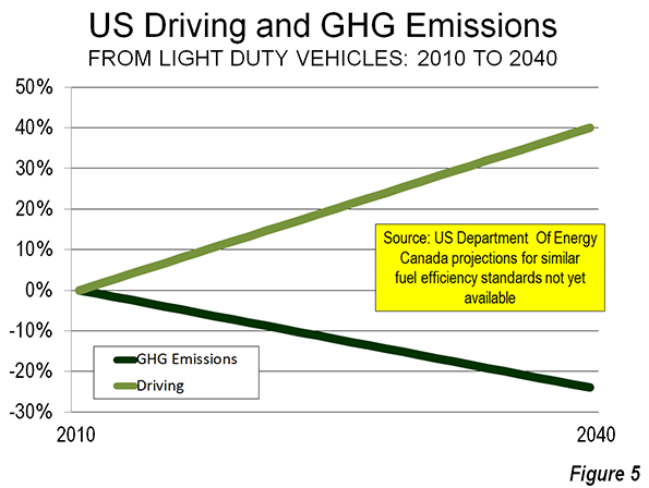
    A principal reason for the increased transit investment has been to reduce greenhouse gas emissions (GHG emissions). However, that impetus is weakening. Canada is adopting strong vehicle emissions standards, virtually identical to the US regulations projected to lead to a huge GHG emissions reduction, even as driving volumes continue to increase (Figure 5). Similar progress seems likely in Canada (projections for Canada are not yet available).

    Table
    Canada: Commuting Market Share: 2006-2011
    2011: National Household Survey Driver Car Pool Passenger Transit Bike Or Walk Other Work at Home
    Major Metropolitan Areas
    Toronto, ON 60.2% 5.1% 21.7% 5.3% 1.0% 6.7%
    Montréal, QC 62.5% 3.2% 20.9% 6.7% 0.8% 6.0%
    Vancouver, BC 60.9% 4.6% 18.2% 7.5% 1.3% 7.6%
    Ottawa, ON-QC 60.0% 6.3% 18.9% 8.0% 0.9% 5.8%
    Calgary, AB 66.9% 5.1% 14.9% 5.7% 1.3% 6.2%
    Edmonton, AB 72.6% 5.2% 10.7% 4.9% 1.3% 5.3%
    Metropolitan Areas: 400,000-1M
    Quebec, QC 72.7% 3.9% 10.8% 7.1% 0.7% 4.8%
    Winnipeg, MB 67.9% 6.9% 12.8% 6.8% 1.3% 4.3%
    Hamilton, ON  73.0% 6.2% 8.7% 5.0% 0.9% 6.2%
    Kitchener, ON 77.0% 6.4% 5.1% 5.2% 0.9% 5.5%
    London, ON 73.4% 6.3% 6.4% 6.4% 0.8% 6.6%
    Major Metropolitan Areas 62.5% 4.6% 19.3% 6.2% 1.0% 6.4%
    Metropolitan Areas: 400,000-1M 72.4% 5.8% 9.3% 6.2% 0.9% 5.3%
    Balance of Canada 75.3% 5.8% 2.8% 7.0% 1.4% 7.8%
    National Total 68.9% 5.2% 11.2% 6.5% 1.2% 6.9%
    2006: Census Driver Car Pool Passenger Transit Bike Or Walk Other Work at Home
    Major Metropolitan Areas
    Toronto, ON 59.2% 7.0% 20.7% 5.4% 0.9% 6.9%
    Montréal, QC 61.3% 4.7% 20.1% 6.9% 0.8% 6.2%
    Vancouver, BC 61.7% 6.5% 15.1% 7.3% 1.1% 8.4%
    Ottawa, ON-QC 58.6% 7.5% 18.2% 8.3% 0.8% 6.6%
    Calgary, AB 64.2% 7.0% 14.5% 6.2% 1.0% 7.1%
    Edmonton, AB 70.5% 7.4% 9.1% 5.9% 1.1% 6.0%
    Metropolitan Areas: 400,000-1M
    Quebec, QC 70.7% 5.1% 9.7% 8.2% 0.7% 5.5%
    Winnipeg, MB 66.2% 8.4% 12.3% 7.1% 0.8% 5.1%
    Hamilton, ON  71.4% 8.0% 8.2% 5.5% 0.8% 6.2%
    Kitchener, ON 73.9% 8.9% 4.5% 6.3% 0.7% 5.7%
    London, ON 70.7% 8.5% 6.3% 7.2% 0.9% 6.4%
    Major Metropolitan Areas 61.4% 6.4% 18.1% 6.4% 0.9% 6.8%
    Metropolitan Areas: 400,000-1M 70.3% 7.6% 8.7% 6.9% 0.8% 5.7%
    Balance of Canada 71.6% 7.7% 2.3% 7.9% 1.4% 9.1%
    National Total 66.8% 7.1% 10.2% 7.1% 1.1% 7.7%
    From Statistics Canada data


    Wendell Cox is a Visiting Professor, Conservatoire National des Arts et Metiers, Paris and the author of “War on the Dream: How Anti-Sprawl Policy Threatens the Quality of Life.

    ——————–
    Note: The INRIX Traffic Scorecard indicates that the average time lost in Canada’s traffic congestion was more than double the US rate (average delay of 15.6%, compared to 6.6% in the United States) in 2012. New data from Tom Tom indicates that traffic congestion is worse in Australia and New Zealand than in Canada.

    Photo: Montreal Centre-Ville (downtown)

  • The Persistence of Failed History: “White Infill” as the New “White Flight”?

    “There is a secret at the core of our nation. And those who dare expose it must be condemned, must be shamed, must be driven from polite society. But the truth stalks us like bad credit.” – Writer Ta-Nehisi Coates

    ***

    With the recent Supreme Courts strike down of the 1965 Voting Rights Act, which was created to protect minority representation, the headline in the Huffington Post read “Back to 1964?” While some contend the title hyperbolic, the HuffPost lead, if not the strike down itself, reflects the reality of a country still tethered to its discriminatory past.

    This reality is reflected in all facets of American society, including urbanism. Specifically, is the “back-to-the-city” movement destined to become 1968 inverted; that is, instead of “white flight” there’s “white infill”? If so, the so-called “game-changing” societal movement will be a process of switching out the window dressing, with the style du jour less lace curtains, more exposed brick.

    While debatable, there appears to be a back-to-the-city trend, particularly the inner-core areas of America’s largest and most powerful cities. For instance, according to a recent report by the Census Bureau, Chicago’s core exhibited a 36% boom in its population from 2000 to 2010—a gain of nearly 50,000. Rounding out the top five core-growth gainers were the cities New York, Philadelphia, San Francisco, and Washington D.C. The report finds that, on average, “[T]he largest metro areas—those with 5.0 million or more population—experienced double-digit percentage growth within 2 miles of their largest city’s city hall…”

    Who is moving into these “spiky” urban cores?

    Whites largely. For example, much of Chicago’s core gains comes from the downtown zip code 60654, in which 11,499 (77%) of the area’s 14,868 incoming residents were white, and where the median family income is $151,000. Other zip codes in Chicago’s core share similar proportions of growth, such as 60605, with 70% of its 12,423 new residents being white. Contrast this with a 5% growth rate for blacks.

    As well, according to research by the Thomas B. Fordham Institute examining the zip codes with the largest growth in the share of white population from 2000 to 2010, 15 of the top 50 were located in Philadelphia, New York, and Washington D.C. Philadelphia’s downtown zip code 19123 grew its population by nearly 40%, and its proportion of whites increased from 25% to almost 50%.  In D.C., the growing core zip code of 20001 increased its white share from 6% to 33% in a mere 10 years. While in Brooklyn, the zip codes 11205 and 11206 showed similar growth dynamics, with overall gains of 15% and 18% respectively, and corresponding increases in the white share of approximately 30%. Also on the Institute’s list are zip codes in not-quite-global cities such as Chattanooga, Austin, Atlanta, St. Paul, Indianapolis, Tampa, and Portland, with the vast majority of the “whitening” areas located in, or besides, the downtown core.

    Now, why does it matter if whites are leading the charge into those cores frequently championed as evidence of a new social order? After all, it is a step forward, right? Or, as urbanist Kaid Benfield recently wrote:

    Inner cities are growing again.  People of means, especially young people, want to be in cities today.  While that carries its own set of challenges, I would submit that addressing the challenges of gentrification is a far better problem to have than coping with massive abandonment and rampant crime.

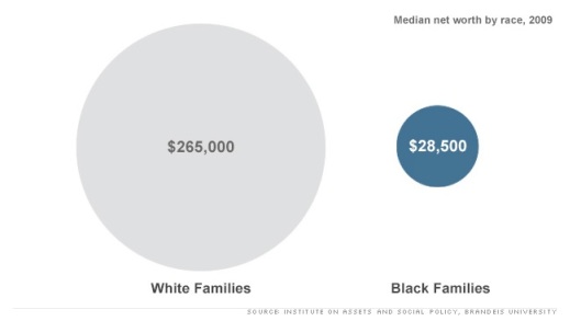
    While that line of argument has merit, what’s missing is a deeper examination about those “people of means”. Specifically, a recent study out of Brandeis University showed the wealth gap between blacks and whites has nearly tripled over the past 25 years. That said, the people of means wanting to be in cities is largely the same people who always had means, and they are simply taking their means from one geography to the next; that is, from the suburban development to the urban enclave.

    Gap


    Of course many argue that infusing affluence into an area will create broad spillover effects. Tweeted urban planner Jeff Speck:

    “A beautiful and vibrant downtown can be the rising tide that lifts all ships. #walkablecity”.

    Yet there is little evidence of a “trickle down” effect within “rejuvenated” space. For instance, in his piece examining the aforementioned D.C. zip code of 20001, Dax-Devlon Ross writes:

    In 2011 alone, condos accounted for 57 percent of total home sales (276), most at triple the 2000 median price. The zip code now boasts an Ann Taylor, a Brooks Brothers, an Urban Outfitters, enough bars to serve several university populations at once and a mind-boggling 10 Starbucks…

    …What’s telling about the zip code’s “new build” makeover is that it did not move the poverty needle. The zip code’s poverty rate is exactly what it was in 1980, 1990 and 2000 — 28 percent — and the child poverty rate is nearly twice what it was in 1990 (45 percent).

    In other words, such developmental strategy is a game of whack-a-mole in which the raison d’être for the mole won’t stop until real economic restructuring happens, or until equity truly starts entering into the lexicon of our shared language. Instead, we get the apologia of the status quo that is shifting the same affluence to the same pockets, switch out the spatial aesthetics of the parking lot for the parklet.


    Trump Towers Chicago. Courtesy of Northwestern Univ.

    That said, there is real doubt the country has the stomach for such discourse, let alone for policy that can affect the prioritization of human and community capital. From the article “Separate, Unequal, and Ignored”, the author suggests that “[r]acial segregation remains Chicago’s most fundamental problem”, and he questions why the issue remained muted during the recent mayor’s race. Answered Princeton sociologist Douglas Massey:

    “[Segregation] is a very difficult and intractable problem. Politicians don’t like to face up to difficult and intractable problems, whatever their nature”.

    Unfortunately for city proponents, this same inability to face the issue by leading urban thinkers is making the “new urbanism” movement look really old. Asked about the risk of racial and economic homogeneity at the hands of the “back-to-the-city” movement, Alan Ehrenhalt, author of “The Great Inversion and the Future of the American City”, answered this way:

    I think you’re going to have class segregation no matter what you do. It would be nice to have people of all classes living right next to each other in gentrified downtowns. That’s probably not going to happen. It is true that a gentrified area tends to become less diverse. Cities can’t solve all problems.

    No, cities can’t solve all problems. But neither should cities be used to make existing problems worse. Re-urbanism, or specifically the opportunities it creates for equitable reinvestment, should be respected for what it is: a chance to move forward from a divided, destructive past.

    Yet such will take collective will and reflective honesty. Or the ability to look deep in the mirror at the American face and know that behind us is a persistence of failed history.

    Richey Piiparinen is a writer and policy researcher based in Cleveland. He is co-editor of Rust Belt Chic: The Cleveland Anthology. Read more from him at his blog and at Rust Belt Chic.

    Lead photo courtesy of Columbus Underground.

  • A Million New Housing Units: The Limits of Good Intentions

    In May 2013, the district of Husby in suburban Stockholm, Sweden was shaken by “angry young men” engaging in destructive behavior for about 72 hours,1 including the burning of automobiles and other properties and attacks on police officers (over 30 officers were injured). The violence spread to the nearby districts of Rinkeby and Tensta as well as to other parts of Sweden.

    Husby, Rinkeby, and Tensta are located within the corporate limits of Sweden’s capital city,2 but a considerable distance from the waterfront and medieval beauty of downtown Stockholm frequented by visitors and tourists. All three communities were planned in the 1960s and completed in the mid-1970s as part of the Swedish Million Programme.  According to official Stockholm municipal statistics, resident populations in 2012 were 12,203, 15,968, and 18,494 respectively.3

    This ambitious program was approved by Sweden’s Parliament in 1965 to remedy what was then considered an acute shortage of housing. Its goal was to rapidly produce a large number of affordable housing units for the Swedish middle class while preserving nearby open space, improving traffic safety and encouraging residents to walk, ride bicycles and use transit. Planners and architects felt that in order to achieve the desired suburban “new town” environment, development and densities were to be as concentrated as possible, and all units were to be within 500 meters of the transit station.4

    The first new homes in Tensta were delivered to their initial residents in 1967, only two years after the program was approved, but the subway line, so important to the design and development of these communities, was not to be opened to traffic until 1975.

    By the 1970s, the Swedish economy had slowed considerably from its 1960s boom, and as the economy cooled, some areas outside of Stockholm where new Million Programme communities had been built suddenly had a surplus of housing. In Stockholm, production of the Million Programme units continued well into the 1970s until all planned units were completed, even though the population of Stockholm was to decline from 787,182 in 1965 to a modern low of 647,115 in 1981.

    Yet in the end, most of the residents who ended up in these units were neither middle class or of Swedish descent. In part because the Million Programme had eliminated Sweden’s shortage of housing and many of its communities were considered unsightly and undesirable by Swedes, the newly constructed units became places where waves of new immigrants to the country found a place to live. Over time these communities have become suburban ghettos for newly-arrived families and individuals, with persons of an “immigrant background” (either immigrants or the child of immigrants making up between 85% and 90% of resident population in these districts according to official statistics for 2012).  

    These areas soon became isolated from the mainstream of Swedish society. The new communities were designed to make open space accessible to their residents (ordinarily a desirable goal), but this by design disconnected from nearby older (and lower-density) subdivisions. Planners and architects for the Million Programme apparently never anticipated that their creations would become segregated to such an extent that a member of Parliament and government minister would call for some of them to be razed. Sweden’s Minister of Integration, Nyamko Sabuni, did just that in a 2009 op-ed column, when she charged that they led to “exclusion” of their residents and since many of them are badly in need of thorough renovation, some should be torn down instead.5 Indeed some Million Programme complexes outside of Stockholm have met their demise with the use of a wrecking ball.6

    Swedish planners and elected officials did learn from these mistakes. The new high-tech employment center of Kista, located adjacent to Husby, has a base of employment that never developed in the Million Programme districts, and a significantly lower percentage of immigrants (though still higher than 50%). 

    Planners and elected officials in other nations (including North America) should take notice of the Million Programme – and more-recent Smart Growth proposals – as an example of what can go badly wrong.

    The aftermath of Million Programme demonstrates the inability of elected officials and the planners and architects on their staffs to anticipate the future needs and even the demographic makeup of their constituent populations, even in a democratic nation such as Sweden. Though it was approved with wide agreement by the Parliament in 1965, it is unlikely that members of that body anticipated that Swedish middle-class families would reject the densely-developed large-scale apartment developments that the effort produced, nor that much of the wave of immigration that was to arrive on Swedish shores starting in the late 1960s and continuing for many years would end up seemingly confined and segregated in the newly-constructed communities. The problems resulting from the cheap construction methods used and a resulting need for extensive and expensive renovations in order to bring the units up to contemporary standards will require large amounts of money. The source of that funding to make those repairs has not been identified.

    Finally, the role of rail transit in these projects deserves a mention. The construction of the Stockholm subway’s Blue Line (a radial line linking all three communities with downtown Stockholm) was significantly delayed, and did not open for traffic until 1975, well after most of the new homes were occupied, even though a transit station was always intended as an integral part of each of them (prior to 1975, residents had to take buses to get downtown, or get themselves to regional rail stations some distance away).  While the subway system in general (and the Blue Line in particular) are rightly called the “world’s longest art exhibit” because of the extraordinary and diverse beauty of its underground stations, it has not prevented the isolation and economic disadvantage that the minorities living along the line have always experienced. 

    C. P. Zilliacus is a transportation engineer residing in the eastern United States.

    Translations from Swedish by the author.

    Tensta housing photo by Wikimedia Commons user Holger.Ellgaard.

    ——————–

    1           Dagens Nyheter, 2013-05-22, ”Det har blivit värre I Husby de senaste åren” (translates to “It Has Gotten Worse in Husby in Recent Years”)  http://www.dn.se/sthlm/det-har-blivit-varre-i-husby-de-senaste-aren/
    Dagens Nyheter (“The Daily News”) is the largest daily newspaper in Sweden.

    2           Like some U.S. cities, including Houston and Los Angeles, Stockholm annexed significant areas of mostly vacant land during the 20th Century that are now generally considered suburban due to distance from downtown and land use characteristics. 

    3           Municipal statistics for Stockholm obtained online from http://www.statistikomstockholm.se.

    4           A Swedish-language overview of the Million Programme was written by Michael Lindqvist, 2000-05-15 “Miljonprogrammet – planeringen och uppförandet” (“Million Programme – Planning and Construction”), available online http://www.micral.se/miljonprogrammet/Miljonprogrammet.pdf

    5           Dagens Nyheter, 2009-03-20, "Riv i miljonprogrammen för integrationens skull" (translates to "Tear Down the Million Programme Units for the Sake of Integration") http://www.dn.se/debatt/riv-i-miljonprogrammen-for-integrationens-skull/

    6           For an example, see Jan Jörnmark’s photo essay of abandoned Million Programme apartment buildings in the municipality of Laxå, located about 240 kilometers (150 miles) by highway west of Husby: http://www.jornmark.se/places_photo.aspx?placeid=29&Photonumber=001&lang=

  • Crime Down in Urban Cores and Suburbs

    The latest data (2011) from the Federal Bureau of Investigation (FBI) Uniform Crime Reports (UCR) indicates that violent crime continued to decline in both the suburbs and historical cores of major metropolitan areas (over 1,000,000 residents). Since 2001, the rates of decline have been similar, but contrary to media reports, the decline has been slightly greater in the suburbs than in the historical cores. Moreover, despite the preliminary report of a slight increase in the violent crime rate at the national level in 2012, substantial progress has been made in making the nation safer over the past 20 years.

    Major Metropolitan Area Trends

    The FBI website includes complete data on 48 of the 51 major metropolitan areas for 2011 (2012 data are not yet available for metropolitan areas). The FBI notes that the data collection methodology for the city of Chicago and the suburbs of Minneapolis-St. Paul is inconsistent with UCR guidelines and as a result, the FBI does not include information for these jurisdictions. No data is reported for Providence.

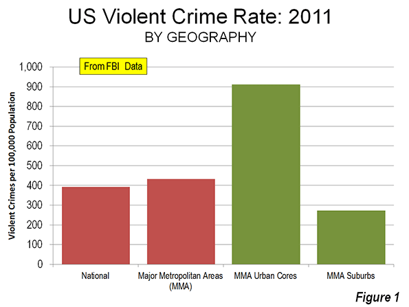
    Among these 48 major metropolitan areas, the violent crime rate was 433 (offenses per 100,000 population known to the police), approximately 10% above the national rate of 392 in 2011. The violent crime rate in the historical core municipalities, or urban core (See Suburbanized Core Cities) was 911 offenses per 100,000 population. In the suburbs, which consist of all municipalities not comprising the historical cores, the violent rate was 272 offenses per 100,000 population. Thus, the urban core violent crime rate was 3.3 times the suburban violent crime rate (Figure 1).

    A comparison of the urban core and suburban crime rates by historical core municipality classification further illustrates the lower crime rates generally associated with more suburban areas. The violent crime rates in the more suburban urban cores are generally lower (Table 1). 

    • Among metropolitan areas with “Post-War & Suburban Core Cities,” the urban core violent crime rate in 2011 was 2.2 times that of the suburbs. This would include core cities such as Phoenix, San Jose, Austin and others that became large metropolitan areas only after World War II and the broad expansion of automobile ownership and detached, low density housing.
    • In the metropolitan areas with “Pre-War & Suburban Core Cities,” the urban core violent crime rate was 3.1 times that of the suburbs. These would include core cities such as Los Angeles, Seattle, and Milwaukee, which combine a denser pre-war inner city with large swaths of post-World War II suburban development within their borders.
    • The greatest difference was in the metropolitan areas with “Pre-War & Non Suburban Core Cities,” where the urban core violent crime rate was 4.4 times that of the suburbs. These would include such core cities as New York, Philadelphia, Boston and others, which had large areas of high density and significant central business districts before World War II, and which, even today, have little post-World War II suburban development within their borders.
    Table
    VIOLENT CRIME RATES: HISTORICAL CORE MUNICIPALITIES AND SUBURBS: 2011
    Violent Crimes Reported per 100,000 Population In Major Metropolitan Areas
    Historcial Core Municipality Classification Metropolitan Area Urban Core Suburbs Urban Core Times Suburbs Crime Rate
    Pre-War Core & Non-Suburban 436 1,181 273 4.3
    Pre-War Core & Suburban 443 821 265 3.1
    Post War Suburban Core 398 642 294 2.2
    48 Major Metropolitan Areas 433 911 272 3.3
    No data for Chicago, Minneapolis-St. Paul and Providence


    Suburban and Urban Core Trends: 10 Years

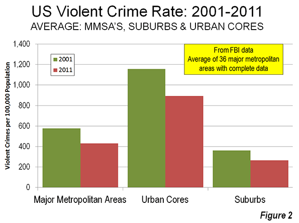
    Over the past decade, violent crime fell both in the suburbs and the urban cores. Among the 36 major metropolitan areas for which complete and comparable data is provided on the FBI website, the violent crime rate fell an average of 25.8 percent between 2001 and 2011. Urban core violent crime rates were down 22.7 percent, while suburb violent crime rates were down a slightly less 26.7 percent (Figure 2).

    Reconciling Differences with Other Analyses

    Other analyses have noted that urban core crime rates are declining faster than in the suburbs. The differences between this and other analyses are due to the use of different time periods, different metropolitan area sets, and most importantly, profoundly more limited definitions of the suburbs.

    An article in The Wall Street Journal raising concerns about suburban crime rates was based on an FBI analysis of all metropolitan areas, not just major metropolitan areas and covered 2001 to 2010. Crucially, the FBI classifies much of suburbia as not being suburbs. The FBI defines suburbs generally as any municipality in a metropolitan area with fewer than 50,000 residents as well as areas patrolled by county law enforcements agencies. Non-core municipalities with their own law enforcement that have 50,000 or more residents are not considered suburbs, regardless of their location in the metropolitan area. This would mean, for example, that Pomona would not be considered a suburb, despite its location 30 miles from Los Angeles City Hall, on the very edge of the metropolitan area, simply because it has more than 50,000 residents. As a result, the crime rates in “cities” versus suburbs cannot be determined by simply comparing FBI geographical classifications.

    A Brookings Institution report reported suburban violent crime rates to be dropping more slowly than in “primary cities,” which are a subset of the “principal cities” defined by the Office of Management and Budget (OMB). Many of these primary cities are virtually all post-World War II suburban in form. These include, for example, Mesa, Arizona, Arlington, Texas and Aurora, Colorado, each of which had fewer than 10,000 residents in 1950 and are virtually exclusively the low-density, automobile oriented suburban development forms that would be found in nearby Tempe, Grand Prairie, and Centennial, which are defined as “suburban” in the Brookings classification. The Brookings report looked at major metropolitan areas as well as smaller metropolitan areas and covered a longer period (1990 to 2008).

    OMB, which defines metropolitan areas, does not designate any geography as suburban. OMB specifically excluded “suburban” terminology from its 2000 metropolitan area criteria. Instead, in recognition of the increasing polycentricity of metropolitan areas, OMB began designating “principal cities.” Except for the largest city in a metropolitan area, principal cities are defined by the strength of their employment markets, and are generally suburban employment centers, not urban cores. In defining its metropolitan area criteria for the 2000 census, OMB recognized  that the monocentric city (metropolitan area) had given way to an urban form with multiple employment centers, located throughout the metropolitan area.

    OMB’s principal cities may be located anywhere in the area, without any relationship to the urban core. Rather than a single core city in a metropolitan area, OMB has designated up to 25 principal cities in a single metropolitan area.

    The National Trend

    The metropolitan area crime reductions are consistent with a now two-decade trend of substantially improving crime rates. This is despite preliminary data recently released by the FBI in June indicating a reversal of the trend for 2012. The FBI reported violent that violent crime increased 1.2 percent. With a 0.7 population increase from 2011 to 2012, the US violent crime rate would increase to 394 per 100,000 residents, from 392 in 2011. Metropolitan area data for 2012 is not yet available.

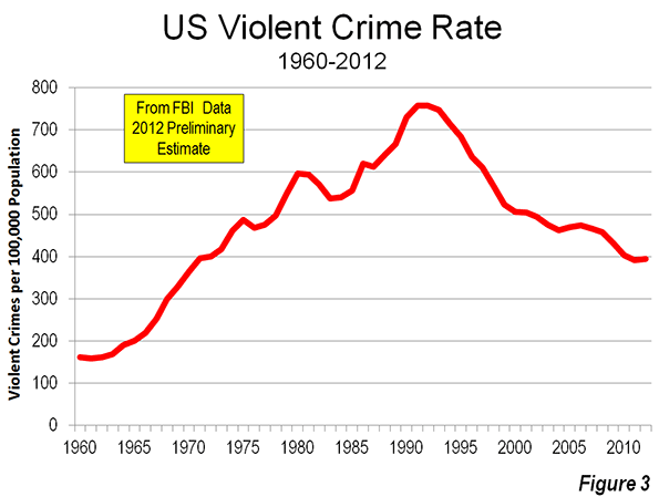
    This increase in crime rates should be a matter of concern. The 2012 violent crime rate increase is, hopefully, only a blip in a decline that will soon resume. The violent crime rate has declined eighteen of the last 21 years. Since 1991, the violent crime rate has dropped by nearly half (48.3%).

    This is in stark contrast with the previous 30 years, during which the violent crime rate increased in all but five years. By 1991, the violent crime rate had increased 3.7 times from 1961. By 2012, the national violent crime rate had fallen to the lowest level since 1970 (Figure 3).

    Why Has the Crime Rate Declined?

    There are multiple theories about the causes of the crime rate reduction. The late James Q. Wilson, who with George Kelling advanced the “broken windows” theory of crime prevention, offered a number of additional reasons for the fact that crime rates remained much lower, even during the Great Recession, in a Wall Street Journal commentary. The earliest and best publicized improvements in crime rates occurred under New York Mayor Rudolph Giuliani in the 1990s. Kelling and others (such as Hope Corman of Rider University and Naci Mocan of Louisiana State University) attribute much of the crime rate improvement in New York City to the “broken windows” deterrence strategies.

    The substantial decline in violent crime rates, in the nation, metropolitan areas, suburbs and urban cores, are an important success story. Yet, crime rates can never be too low. It can only be hoped that future years will see even greater reductions.

    Wendell Cox is a Visiting Professor, Conservatoire National des Arts et Metiers, Paris and the author of “War on the Dream: How Anti-Sprawl Policy Threatens the Quality of Life.

    Crime scene photo by Alan Cleaver.

  • Beware the Herbivore Effect

    In the 1980s, American commentators and best-selling authors repeatedly sought to convince companies and workers to be more "Japanese." After all, for two generations, the men of Japan, supported by their wives, constituted a fearsome force – first, in the run up to the Second World War, then during the economic "miracle" that drove that small island nation toward the pinnacle of global economic power.

    Yet, today, Japan’s latest generation of men appears lacking the fierce ambition that drove their fathers, much less their grandfathers. The term commonly used for this new generation of Japanese is "herbivores," a play on the word for plant-eating animals generally known for their docility. And, instead of embracing what the new generation is doing in Japan, we should look at our young people and think: God forbid.

    Growing up in a period of tepid economic growth, a declining labor market and a loss of overall competitiveness, Japan’s "herbivores" are more interested in comics, computer games and socializing through the Internet than building a career or even seeking out the opposite sex. Among males ages 16-19, 36 percent in one survey expressed no interest in sex, and some even despised it.

    Not that women are waiting breathlessly for male stirrings: Disinterest is even higher – 59 percent – for females in the same age category. The percentage of sexually active female university students, according to the Japanese Association for Sex Education, has fallen from 60 percent in 2005 to 47 percent last year. There’s a bigger issue here than overly tame libidos, suggests sociologist Mika Toyota. Once-critical interpersonal familial ties are being replaced by more ad hoc relationships based on common interests.

    One indication of this breakdown in family ties has been a gradual loss of interest in marriage, among men but at least as much so among women. By 2010, a third of Japanese women entering their 30s were single, as were roughly one in five of those entering their 40s. That’s roughly eight times the percentage in 1960, and twice that in 2000. By 2030, according to sociologist Toyota, almost one in three Japanese males may be unmarried by age 50.

    Such attitudes, one Osaka blogger observed, indicate that many young people, particularly women, sense "an unwillingness to throw away the freedoms of single life to comply with the strict societal demands accompanying co-habitation or marriage."

    Herbivores, it appears, are less likely to marry. Prime Minister Shinzo Abe can do his best imitation of President Obama’s loose money policies, pumping trillions of yen into his economy, but bigger civilizational forces appear to be at play. Demographics are more intractable than short-term markets. The herbivorization of Japan can’t be good news in a country that suffers from a plunging marriage rate, a declining workforce and a fertility rate so low that adult diapers outsell those for babies.

    Could the same process occur here? Are young American males following the path to herbivore pastures? There are some disturbing parallel trends. The onset of the Great Recession has slowed fertility in the United States, the one large high-income country with fertility rates historically above replacement levels, down to the lowest levels in a quarter century. Despite a rise in population of 27 million Americans, there were actually fewer births in 2010 than there were 10 years earlier.

    The herbivore effect can be seen in the postponing among younger Americans of both marriage and having children, according to a recent Pew Foundation study. As in Japan, a weak economy plays a role. The recession, and the weak recovery, has had a disproportionate impact on young people: Almost two in five unemployed workers are ages 20-34.

    There are other disturbing parallels. Young Americans are increasingly embracing what European scholar Angelique Jansenns described as "the deinstitutionalization of marriage" and "the emancipation of individual members from the family." Although more than 70 percent of U.S. millennials want to get married, nearly half believe the institution is becoming "obsolete." No surprise, then, that a growing proportion of American children born today – and a majority born to women ages 20-24 – are to unwed mothers.

    Another apparent casualty here is entrepreneurship, the very thing that characterized boomers and the successor Generation X. Boomers, while now in their 50s and 60s, are still at it, but start-up rates among young people are getting weaker even as boomers continue to start new ventures. No longer can we take as a given that entrepreneurial activity is associated with the young.

    "Millennials have been raised in ways that make them feel very pressured by the need to succeed," observe generational chroniclers Morley Winograd and Mike Hais. "They see life as a series of hoops to be jumped through, starting with getting into the right preschool, all the way to graduating from the right college. Such a view of the world makes them very afraid to fail on their own and, therefore, very risk averse."

    Some see this age of unambition as a positive. There is a devout "progressive" picture of millennials who don’t buy houses, cars or don’t fret much about getting on with their lives. Some of this may be attributable to cascading student debt but some see the emergence of a higher generational consciousness.

    The environmental magazine Grist sees "a hero generation" that will avoid the pain and suffering that comes with trying to overcome a tough economy. They will transcend the material trap of suburban living and work that engulfed their parents. "We know the financial odds are stacked against us and, instead of trying to beat them, we’d rather give the finger to the whole rigged system," the millennial author concludes.

    Anyone over age 40 will tell you how that strategy likely will work out.

    Yet, I, for one, have not given up. As the new generation begins to face the realities of growing up, Winograd and Hais suggest, they will begin to move away from the "herbivore" model. After all, despite the claims like those in Grist, most millennials, particularly those entering their 30s, want to own a home, with more than three times as many eyeing the suburbs as their ultimate destination as the big city.

    Fortunately, our millennials are not stuck in a narrow, expensive homogeneous country, like Japan. If our native-born young people lack sufficient moxie, newcomers from Mumbai, Mexico City, Seoul or Shanghai will show them the way – or the way to the unemployment office. And when millennials get around to buying homes, there are many places – perhaps not always Southern California – that can accommodate them.

    Like their boomer parents – who endured the malaise of the Jimmy Carter years – reality has a way of reawakening the carnivorous spirit of young Americans. This had better happen, anyway, if America is to remain competitive.

    Joel Kotkin is executive editor of NewGeography.com and a distinguished presidential fellow in urban futures at Chapman University, and a member of the editorial board of the Orange County Register. He is author of The City: A Global History and The Next Hundred Million: America in 2050. His most recent study, The Rise of Postfamilialism, has been widely discussed and distributed internationally. He lives in Los Angeles, CA.

    This piece originally appeared in the Orange County Register.

    Illustration by Timothy Takemoto.