Category: Demographics

  • Angry Young Men

    “’Angry young men’ lack optimism.” This was the title of a BBC News story earlier this year, exploring the deeply pessimistic views that some young working class British hold about their own future. Two-thirds of the young men from families of skilled or semi-skilled workers, for example, never expect to own their own home. Angry young men, this time of immigrant origin, were also recently identified as the group causing riots in Swedish suburbs such as Husby. As Swedish Prime Minister Fredrik Reinfeldt noted, the riots were started by a core of “angry young men who think they can change society with violence”.

    The social unrest occurring in Western Europe is often ascribed to the lack of integration into society among immigrants. It is true that dependency of public handouts rather than self-reliance has become endemic in Europe’s well‑entrenched and extensive welfare states. In Norway for example, the employment rate of immigrants from Asia is only 55 percent, compared to 70 percent for the non-immigrant population. Amongst African immigrants the figure is merely 43 percent.  In neighboring Sweden, a recent government report noted that the employment rate of Somalians was merely 21 percent. This can be compared to 46 percent in Canada and 54 percent in the US for the same group. The low incentives for transitioning from welfare to work in Sweden and Norway compared to in Canada and the US explain at least part of this difference.

    But a failure of integration is hardly the sole explanation for the social unrest which extends well beyond immigrant youth. Why not add another relevant perspective to the puzzle, namely the increasing marginalization that some young men feel across the continent? This frustration is hardly an excuse for violence, but relates to important social phenomena which deserve to be explored, and targeted with the right policies.

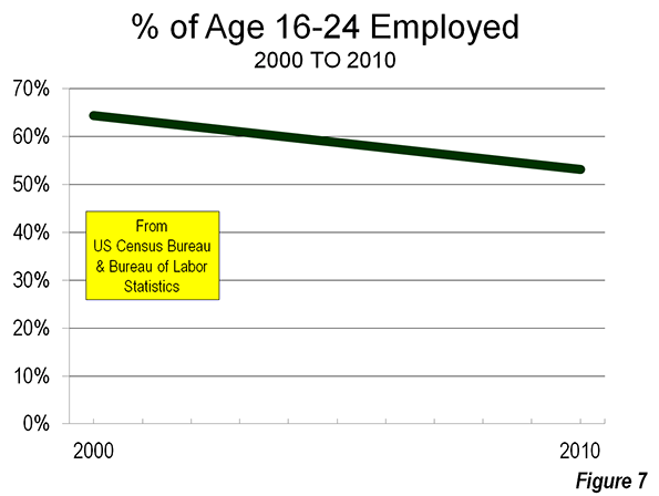
    Youthful exclusion from the labor market constitutes a major challenge to European economies. Unemployment for European youth is in many countries more than twice the level of adult workers. The youth unemployment in advanced economies is, according to the International Labour Organization, estimated at an average level of 18 percent. Some countries, such as Switzerland, Austria and Germany, fare relatively well with a rate below ten percent. In others, such as the UK, France and Sweden, around one in five of the youth is unemployed. In Spain and Greece the share recently peaked at a rate of one in two.

    It is hardly news that youth who face unemployment have a tendency to become angry, and to translate this anger to violence. What has become increasingly evident is how much this situation pertains particularly to men. 

    To begin with we can see that a number of societal trends in particular favor women’s career opportunities. Girls tend to perform better in school, regardless of class, place of residence or ethnicity. Young women also, not only in developed countries but even globally, now constitute the majority of students in higher education. Another important change which in particular benefits women’s career opportunities is urbanization. Large cities attract talented young people like magnets. The attraction tends to be greatest for young women, who find employment and opportunities for entrepreneurship in the sprawling service sectors. Men who remain behind in less densely populated areas sometimes struggle to find both work and a spouse.

    As a whole, we have little reason to feel sorry for men in the labor market. Since women still take the primary responsibility for children and family, men can on average invest much more time on their careers and thus more often reach the top. But while some men succeed, others fall behind. Men end up dominating not only the top of society but also the bottom. After having failed in school, many men face rejection in both the labor market and the marriage market. They are left with little in terms of social capital, in terms of valuable know-how and established social networks.

    One reason for why frustration grows is that for men the link between success in work and success in finding a partner is very strong. Men without higher education for example face a higher chance of never becoming a parent, whilst men with higher degrees face the lowest chance (the relation is the opposite for women, where the individuals with higher education face the highest risk of remaining childless).  Extreme opinions, racism and violence are not uncommon among young men who feel they have little chance of making their way in society.

    We should of course stress individual responsibility. But awareness of the alienation felt by some young men has the danger of morphing into a considerable long-term problem, even in wealthy European nations. In previous generations, a considerable amount of “simple jobs" existed in manufacturing, forestry, agriculture and the like which were suited for young individuals with limited education. Today, such jobs are far less available.

    Part of the explanation is that technological changes and increasing global competition are pushing the labor market towards higher degree of specialization. Another reason is that policies in many modern countries, due in part to bureaucratic regulation, work to slow industrial development. Although industrial job growth is clearly possible and very promising in developed nations, many politicians wrongly believe that new industry has no future in rich Europe.

    The lacking interest to open up for growth in manufacturing is combined with the fact that education systems in countries such as the UK and Sweden are not good at encouraging students with low academic interest to ready themselves for manufacturing and other technical jobs – the situation is much different in for example Germany and Switzerland, with promising apprentice systems. In addition a strong social stigma has begun to become associated with not having a higher degree. This prompts individuals to choose even university courses that aid them little if any on the labor market, rather than take available simple jobs and climb the career ladder by developing practical knowledge.   

    Frustrated young men should never be excused in their acts of violence. But we must take their lack of hope seriously. Both policies and the education system should be reformed, so that the simple entry-level jobs that are suited for young men who lack academic skills or interest are opened up. Such policies would as an added bonus boost growth, employment and in particular benefit smaller cities and rural regions. We surely need ample policies to boost women’s’ career opportunities and entrepreneurship, but we should also recognize the challenges tied to the increasing marginalization for the men who feel little hope of progressing in society by following the rules.

    Dr. Nima Sanandaji is a Swedish author of Kurdish-Iranian origin. He has written two books about womens carreer opportunities in Sweden, and is upcoming with the report “The Equality Dilemma” for Finnish think-tank Libera.

    Husby riot photo by Wiki Commons user Telefonkiosk.

  • The Associate’s Degree Payoff: Community College Grads Can Get High-Paying Jobs, and Here Are Some Examples

    For some students, the decision to enroll at a community college is simple. A two-year school offers the credential they need at a much lower cost than a university, and the earnings post-degree are on par with — or better than — what they would make after going to a four-year school.

    Less debt, similar salary — the math adds up.

    But outside fields that require specific certificates or degrees, it’s not always clear to students which higher education path they should take. And as Jeffrey Selingo wrote in a recent Wall Street Journal weekend essay, a number of websites are cropping up that allow students and parents to compare the return on investment from college to college.

    Based on first-year salaries of graduates (one of the metrics included at CollegeMeasures.org via state unemployment insurance programs), Selingo points out that some community college degrees have been shown to have a stronger early return than bachelor’s degrees.

    Think a community-college degree is worth less than a credential from a four-year college? In Tennessee, the average first-year salaries of graduates with a two-year degree are $1,000 higher than those with a bachelor’s degree. Technical degree holders from the state’s community collegesss often earn more their first year out than those who studied the same field at a four-year university.

    Take graduates in health professions from Dyersburg State Community College. They not only finish two years earlier than their counterparts at the University of Tennessee at Knoxville, but they also earn $5,300 more, on average, in their first year after graduation.

    This isn’t new information by any means. In 2011, the Georgetown Center on Education and the Workforce, an EMSI client, released its well-publicized “College Payoff” report. Anthony Carnevale and his colleagues looked at median lifetime earnings — a key distinction from the sources that Selingo cites — for all educations levels by occupation to show that 28.2% of associate’s degree graduates out-earn bachelor’s degree holders. This is just one example of what Georgetown referred to as “earnings overlap” (see the following chart).

    Georgetown’s report provides clear evidence that degree level matters when it comes to lifetime earnings. But another critical element is the actual job that a person chooses.

    There are many fields — in healthcare, engineering, technology, manufacturing, etc. — in which associate’s degree graduates can make just as much or more than bachelor’s degree holders. But what specific careers are we talking about? Let’s take a look using the Georgetown study and EMSI data.

    Well-Paying Jobs That (Often) Take an Associate’s Degree to Get

    To get a sense of the top-earning jobs in which the majority of workers have an associate’s degree, we looked the educational attainment breakdown by detailed occupation from U.S. Census Bureau’s American Community Survey, via EMSI’s Analyst. This data is only available at the national level; the most recent numbers are from 2009 (see here).

    The following occupations are ones in which associate’s degree holders (or associate’s degree plus some college) comprise the largest percentage of workers. Note that the educational attainment varies for most occupations (e.g., most CEOs have a bachelor’s, some have a master’s, a few have less than a high school diploma). Also, the educational requirements for some occupations change over time. For registered nurses, the typical education needed for entry, as assigned by the BLS, is an associate’s degree — even though 43% of all nurses hold a four-year degree. For this reason, we excluded RNs from our analysis. (We also excluded air traffic controllers because only 14% have an associate’s degree).

    1. Radiation Therapists ($37.36 median hourly earnings)

    Associate’s degree holders make up 42% of this healthcare occupation, slightly higher than bachelor’s degree grads (38%). For both degree levels, workers in this field earn $2.1 million in their lifetimes, per Georgetown. And the job outlook is strong, too. Radiation therapist jobs have increased 14% nationally since 2001, and the female-dominated occupation is projected to grow another 6% from 2012-2015.

    2. Dental Hygienists ($34.77)

    The bulk of hygienists (57%) have associate’s degrees, followed next by bachelor’s degrees (30%). Georgetown lumped these workers in with other healthcare practitioners and technical occupations, but still the lifetime earnings are similar — $2.1 million for two-year degree holders; $2.2 million for four-year grads.

    This lucrative, female-dominated occupation is projected to grow 8% from 2012-2015.


    3. Nuclear Medicine Technologists ($33.96)

    Far and away the largest chunk of workers in this field have associate’s degrees (45%). Although nuclear medicine technologists are not included in the Georgetown report, associate’s degree holders among a larger subset of workers, diagnostic related technologists and technicians, earn $2.2 million in their lifetimes, compared to $2.4 million among bachelor’s degree grads.

    4. Nuclear Technicians ($32.85)

    The first non-healthcare field on our list, these workers are not to be confused with nuclear medicine technologists. Nearly 45% of these workers have an associate’s degree or some college, compared to 24% who have bachelor’s degrees and 23% who have a high school diploma or equivalent. (Note: Georgetown does not report lifetime earnings at the two-year level for nuclear technicians).

    More than a third of fewer than 9,000 nuclear technicians in the U.S. work in two specific industries — electric power distribution and fossil fuel electric power generation.

    5. Diagnostic Medical Sonographers ($31.83)

    Similar to No. 3 on our list, nuclear medicine technologists, 45% of workers in this field have an associate’s degree.

    This field has seen a 63% increase in jobs since 2001, from 34,752 to an estimated 56,514. And it’s projected to grow another 12% from 2012-2015.

    6. Aerospace Engineering and Operations Technicians ($29.48)

    Only 23% of these workers have associate’s degree, but another 33% have some college/no degree, which is why the typical education needed to enter this occupation (as assigned by the BLS) is an associate’s degree.

    Unlike the previous occupations on this list, the job market for aerospace techs isn’t so rosy. Employment in this field declined 16% from 2001-2012 (with the bulk of the jobs losses from 2001-2003 and 2008-2010). It’s projected to decline by 2% from 2012-2015.

    7. Engineering Technicians, Except Drafters, All Other ($28.54)

    Like aerospace technicians, more than half of these workers (56%) have either an associate’s degree or some college/no degree. But unlike the above occupation, this field is growing: employment increased 5% from 2001-2012 and is projected to go up 4% from 2012-2015.

    8. Respiratory Therapists ($27.04)

    A whopping 56% of respiratory therapists hold an associate’s degree, followed by 24% with a bachelor’s degree. The lifetimes earnings, as reported by Georgetown, are the same as for radiation therapists: $2.1 million for both degree levels.

    This is one of the strongest-performing associate’s degree occupations. The U.S. had 28% more respiratory therapists in 2012 than in 2001, and the field is projected to grow 8% through 2015.

    Note: This list doesn’t include the many high-paying jobs available through vocational technical education. Plumbers, electricians, welders — and an array of other skilled trades — often offer better wages than bachelor’s degree-required fields. See our piece on the aging skilled trades workforce here.

    Joshua Wright is an editor at EMSI, an Idaho-based economics firm that provides data and analysis to workforce boards, economic development agencies, higher education institutions, and the private sector. He manages the EMSI blog and is a freelance journalist. Contact him here.

  • The Transit-Density Disconnect

    Around the world planners are seeking to increase urban densities, at least in part because of the belief that this will materially reduce automobile use and encourage people to give up their cars and switch to transit, or walk or cycle (Note 1). Yet research indicates only a marginal connection between higher densities and reduced car use. Never mind that the imperative for trying to force people out of their cars has rendered largely unnecessary by fuel economy improvements projected to radically reduce greenhouse gas emissions from cars (see Obama Fuel Economy Rules Trump Smart Growth).

    Transit Use and Density: A Tenuous Connection at Best

    In a widely cited study, Reid Ewing of the University of Utah, and UC Berkeley’s Robert Cervero reported only a minimal relationship between higher density and less driving per capita. In a meta-analysis of nine studies that examined the relationship between higher density and per household or per capita car travel, they found that for each 1 percent higher density, there is only 0.04 percent less vehicle travel per household (or per capita). This would mean that a 10 percent higher density should be associated with a reduction of 0.4 percent in per capita or household driving.

    More people in the same area driving a little less means overall driving is greater, as Peter Gordon reminds us. This is illustrated by the Ewing-Cervero finding — a 10 percent increase in population density is associated with  9.6 percent increase in overall driving, as is indicated in Figure 1 (the calculation is shown in the table). Ewing and Cervero placed this appropriate caution in their research: "we find population and job densities to be only weakly associated with travel behavior once these other variables are controlled."

    There is another limitation to the density-transit research. The comparison of travel behaviors between areas of differing density   provides no evidence that conversion of an area from lower to higher density would replicate the travel behavior of already existing (historic) areas of higher density.

    Transit is about Downtown, Not Density

    Ewing and Cervero also found that proximity to the central business district (downtown) is far more likely to reduce vehicle travel than higher densities. This mirrors the findings of others. The Ewing-Cervero conclusion is that, all things being equal, there is a 0.22 percent reduction in travel per capita for each one percent reduction in the distance to downtown.

    Table
    Density and Driving Example
      Base Density 1% Higher Density 10% Higher Density
    Households 100 101 110
       Change from Base Density 1.0% 10.0%
    Daily Driving per Household (Miles) 10 9.996 9.960
       Change from Base Density -0.04% -0.40%
    Total Daily Driving (Miles)        1,000       1,009.6           1,095.6
       Change from Base Density 0.96% 9.56%
    Based on Ewing & Cervero (2010)


    Transit commuting is strongly concentrated toward the largest downtown areas, which is the only place automobile-competitive mobility can be provided from large parts of the modern metropolitan area (whether in North America, Western Europe or Australasia).

    This is, at least in part, why transit service provides such minimal employment access throughout major US metropolitan areas. Data from the Brookings Institution indicates that among the 51 metropolitan areas with more than 1,000,000 population, the average worker can reach only six percent of jobs in 45 minutes (see: Transit: The 4 Percent Solution). Nearly two-thirds of the jobs cannot be reached in 45 minutes, despite transit’s being nearby, while slightly less than one third of workers are not nearby transit at all (Figure 2). By comparison, the average driver reaches work in approximately 25 minutes.

    Of course, not everyone can (or would want to) live near downtown. Hong Kong comes closest to this urban containment ideal, with the highest population density of any major urban area in the high income world (67,600 per square mile or 26,100 per square kilometer).Yet despite these extraordinary densities,   one-way work trip travel times average 46 minutes, 20 minutes longer than in lower density, similar sized Dallas-Fort Worth.  

    High Density Commuting in the United States

    The centrality of downtown to transit ridership was a principal point of my “transit legacy city” research, which found that 55 percent of all transit commuting in the United States was to just six municipalities (not metropolitan areas). These include the municipalities of New York, Chicago, Philadelphia, San Francisco, Boston and Washington. Among the 55 percent of transit commuters in the nation who work in these six municipalities, 60 percent work in the downtown areas, which are the largest and most concentrated in the nation. This, combined with nearby high density neighborhoods, makes for transit Nirvana.

    The highest population densities are concentrated in just a few metropolitan areas (Note 2). Approximately 43 percent of the nation’s population living at or above 10,000 per square mile density (approximately 4000 per square kilometer) lives in the New York metropolitan area. Despite its low density reputation, Los Angeles has the second largest concentration of densities above 10,000 per square mile, at 22 percent. Chicago’s high density zip codes contain a much smaller 10 percent of the national high density population (Note 3), while nearly all of the balance is in Boston, San Francisco, Philadelphia, and Washington (Figure 3).

    The greatest concentration of the highest densities is in New York, which has 88 percent of the national population living at more than 25,000 per square mile (approximately 10,000 per square kilometer). Los Angeles ranked second at 3.5 percent and San Francisco ranks third at 3.2 percent (Figure 4). At this very high population density, nearly 60 percent of New York resident workers use transit to get to work. No one, however, rationally believes that densities approximating anything 25,000 per square mile or above will occur, no matter how radical urban plans become.

    An examination of transit work trip market shares in the density range of 10,000 per square mile to 25,000 per square mile illustrates the importance of proximity to downtown. There are nine metropolitan areas in the United States that have more than 200,000 residents living in zip codes with this density. These include the metropolitan areas with the six transit legacy cities, as well as Los Angeles, Miami and San Jose. These latter three experienced from two-thirds to 90 percent of their urban growth since World War II.

    San Jose’s large high density population is surprising, because it has a post-War suburban core city and, as a result, a comparatively weak downtown area. Moreover, San Jose has nearly 20 times as many people living at high densities as larger Portland, despite its more than three decades of densification policy (Note 4).

    Transit market shares are by far the highest in the high density zip codes of the metropolitan areas with the six transit legacy cities, at 30 percent. This ranges from 27 percent in Chicago to 33 percent in New York and Washington. At first glance, this would be evidence of a fairly consistent transit market share for high densities among the six metropolitan areas (Note 5).

    However, metropolitan areas containing the transit legacy cities are unique. Their high density areas are located near their large downtown areas (which are the largest and most concentrated employment centers in the nation), as is to be expected from urban forms that date from the 19th and early 20th centuries. The more recent urban forms of the metropolitan areas rounding out the top ten in high density residents, Los Angeles, Miami, San Jose and San Diego, are very different. Not only do they have smaller downtowns but their high density areas are not concentrated to the same degree around downtown. As a result, their high density transit work trip market shares are much lower (Figure 5).

    This is best illustrated by Los Angeles, the metropolitan area with the largest number of people living at 10,000 to 25,000 residents per square mile in the nation. The transit work trip market share of these high density zip code residents is 9.6 percent, one-third that of similarly high densities in the metropolitan areas with transit legacy cities.

    In Miami, the transit work trip market share of high density residents is only 7.0 percent. In San Jose, the transit work trip market share for high density residents is only 4.6 percent, less than one-sixth that of the metropolitan areas with legacy cities. San Jose’s high density transit work trip market share is even below the national average for all densities (5.0 percent).  San Diego’s high density transit work trip market share is 7.7 percent.

    “A Negligible Impact”

    The transit-density disconnect may have been best summarized by Paul Shimik in 2007 research published in the Transportation Research Record: "The effect of density is so small that even a relatively large-scale shift to urban densities would have a negligible impact on total vehicle travel."

    Wendell Cox is a Visiting Professor, Conservatoire National des Arts et Metiers, Paris and the author of “War on the Dream: How Anti-Sprawl Policy Threatens the Quality of Life.

    —–

    Note 1: This article is limited to the potential for transferring automobile demand from cars to transit. Walking and cycling have only marginal potential for reducing vehicle travel, because these modes cannot provide access throughout today’s large metropolitan (labor) markets.

    Note 2: This analysis uses zip code level data from the 2010 Census and the American Community Survey for 2007-2011.

    Note 3: Los Angeles also has the second highest share of its population living at densities of 10,000 per square mile and above, at 38 percent. New York has 49 percent at this density, while in Chicago and San Francisco, 24 percent of residents live at these high densities.

    Note 4: Portland ranked 25th in high density (at or above 10,000 per square mile) out of the 51 metropolitan areas with more than 1,000,000 population in 2010. Portland’s high density share of its metropolitan population, at 0.7 percent, is well below that of the nation’s most market oriented development metropolitan area, Houston, at 2.0 percent and slightly below that of Dallas-Fort Worth.

    Note 5: Despite their much higher transit work trip market shares in high density areas, the jobs in suburban areas in the metropolitan areas with legacy cities can be as inaccessible by transit as in the metropolitan areas with post-War core municipalities. See Figure 6.

    Photo: San Diego (by author)

  • America’s Fastest-Growing Cities Since The Recession

    It was widely reported that the Great Recession and subsequent economic malaise changed the geography of America. Suburbs, particularly in the Sun Belt, were becoming the “new slums” as people flocked back to dense core cities.

    Yet an analysis of post-2007 population trends by demographer Wendell Cox in the 111 U.S. metro areas with more than 200,000 residents reveals something both very different from the conventional wisdom and at the same time very familiar. Virtually all of the 20 that have added the most residents from 2007 to 2012 are in the Old Confederacy, the Intermountain West and suburbs of larger cities, notably in California. The lone exception to this pattern is No. 15 Portland. The bottom line: growth is still fastest in the Sun Belt, in suburban cities and lower-density, spread out municipalities.

    The No. 1 city on our list, New Orleans, fits this picture to a degree as a quintessentially Southern city, but it’s a bit of an anomaly. Its fast growth is partially a rebound effect from its massive population loss after Katrina, but is also a function of a striking economic revival that I have seen firsthand as a consultant in the area.

    Since 2007 New Orleans’ population has grown 28% to 370,000. Many are newcomers who came, at least initially, to rebuild the city.  But the city is still way below the 2002 population of 472,000, much less its high of 628,000 in 1960.

    New Orleans is one of six cities where the population of the core has grown more in total numbers than the surrounding suburbs. (The other five are New York; San Jose, Calif.; Providence, R.I.; Columbus, Ohio; and San Antonio.) This is also a product of the fact that, when the Greater New Orleans region began to recover, the return to the suburban regions, for the most part, came before that to the city.

    Nothing in the data, however suggests a revival of the older, dense “legacy” cities that were typical of the late 19th century and pre-war era. Most of the fastest-growing big cities since 2007 are of the sprawling post-1945 Sun Belt variety, including Charlotte, N.C. (No. 4); Ft. Worth, Texas (No.  6); Austin, Texas, (10th); El Paso, Texas (11th); Raleigh, N.C. (12th); and Oklahoma City (18th). Some of the fastest-growers are also outside the major metropolitan areas,  such as No. 5 Bakersfield in California’s Central Valley, the North Carolina cities of Greensboro and Durham, (9th and 14th, respectively), and  Corpus Christi, Texas (16th).

    Among the big Northeast cities, the best performer is Washington (27th with 7.8% population growth) followed by Boston (71st, 2.2%). New York has managed only 0.3% population growth since 2007 (88th). Among other leading U.S. cities San Francisco’s population is up 3.3%, Los Angeles has grown 2.1%, and Chicago’s population has dropped 3.4%.

    The other somewhat surprising result is the strong performance of more purely suburban cities, that is, ones that have grown up since car ownership became nearly universal. They are not the historic cores of their regions but have developed into major employment centers with housing primarily made up of single-family residences. These include the city that has grown the second most in the U.S. since 2007: Chula Vista, a San Diego suburb close to the Mexican border, whose population expanded 17.7%. It’s followed in third place by the Los Angeles suburb of Irvine (16.3%); No. 7 Irving, Texas; and the California cities of Fremont (13th) , located just east of San Jose-Silicon Valley, and Oxnard (17th), north of Los Angeles.

    What do these results tell us? First, that Americans continue to move decisively to both lower-density, job-creating cities and to those less dense areas of major metropolitan areas particularly where single-family houses, good schools and jobs are plentiful.

    Irvine, a planned postwar city of some 230,000 which ranks as the country’s seventh-wealthiest municipality, has three jobs for every resident; roughly two in five residents work in the city. Irvine’s 16.3% growth rate since 2007 has been bolstered by a strong inflow of Asians. Once overwhelmingly white, Irvine’s population is now roughly 40% Asian and 9% Hispanic.

    Similarly, Irving, Texas, also thrived through the recession. Like Irvine this Dallas-area suburb is a major job center. Headquarters for Nokia , NEC Corporation of America, Blackberry, and Exxon Mobil, Irving’s population has soared over 13% over the past five years to 225,000.

    This contrasts with some similarly sized suburbs that boomed in the first part of the decade. North Las Vegas added 80,000 people between 2002 and 2007 but its growth slowed down considerably as the Nevada economy cratered. This extension of Las Vegas has added a relatively paltry 12,000 people since 2007. With Phoenix losing 3.2% of its population since ’07, the nearby former boomtowns of Mesa and Scottsdale have also seen net outflows of residents.

    Migration numbers for 2010 to 2012 alone hammer home that suburban areas are continuing to attract people, and that the more dense core areas do not generally perform as well. Although their growth has slowed compared to the last decade, suburban locales, with roughly three-quarters of all residents of metropolitan areas, have added many more people than their core counterparts.

    Where do we go from here? The urban future will continue to evolve in directions that contradict the prevailing conventional wisdom of a shift toward more crowded living. The continued dispersion of America’s population is evidenced by the persistent, and surprising, strength of suburban towns, as well as the low-density cities of Texas and the Plains. The key to growth in the next decade may depend largely on whether these rising municipalities can continue to create the jobs, favorable educational environment and amenities necessary to attract more newcomers in the future.

    MUNICIPALITIES OVER 200,000 IN 2012
    25 Fastest Growing 2007-2012
    POPULATION CHANGE
    RANK MUNICIPALITY 2002 2007 2012 2007-2012
    1 New Orleans, Louisiana     472,744     288,113     369,250 28.2%
    2 Chula Vista, California     194,167     214,506     252,422 17.7%
    3 Irvine, California     162,205     197,714     229,985 16.3%
    4 Charlotte, North Carolina     590,857     669,690     775,202 15.8%
    5 Bakersfield, California     259,146     312,454     358,597 14.8%
    6 Fort Worth, Texas     570,808     680,433     777,992 14.3%
    7 Irving, Texas     195,764     198,119     225,427 13.8%
    8 Laredo, Texas     189,954     215,789     244,731 13.4%
    9 Greensboro, North Carolina     231,415     245,767     277,080 12.7%
    10 Austin, Texas     684,634     749,120     842,592 12.5%
    11 El Paso, Texas     570,336     600,402     672,538 12.0%
    12 Raleigh, North Carolina     313,829     379,106     423,179 11.6%
    13 Fremont, California     205,034     199,187     221,986 11.4%
    14 Durham, North Carolina     196,432     216,943     239,358 10.3%
    15 Portland, Oregon     538,803     546,747     603,106 10.3%
    16 Corpus Christi, Texas     276,877     283,445     312,195 10.1%
    17 Oxnard, California     176,594     183,235     201,555 10.0%
    18 Oklahoma, Oklahoma     519,100     545,910     599,199 9.8%
    19 Aurora, Colorado     282,707     309,007     339,030 9.7%
    20 Denver, Colorado     561,072     578,789     634,265 9.6%
    21 Fontana, California     158,916     184,814     201,812 9.2%
    22 Fresno, California     442,987     465,669     505,882 8.6%
    23 Orlando, Florida     199,358     230,239     249,562 8.4%
    24 Colorado Springs, Colorado     376,341     399,751     431,834 8.0%
    25 Riverside, California     272,814     290,601     313,673 7.9%


    Joel Kotkin is executive editor of NewGeography.com and a distinguished presidential fellow in urban futures at Chapman University, and a member of the editorial board of the Orange County Register. He is author of The City: A Global History and The Next Hundred Million: America in 2050. His most recent study, The Rise of Postfamilialism, has been widely discussed and distributed internationally. He lives in Los Angeles, CA.

    This piece originally appeared at Forbes.com.

    New Orleans photo by Bigstock.

  • As the North Rests on Its Laurels, the South Is Rising Fast

    One hundred and fifty years after twin defeats at Gettysburg and Vicksburg destroyed the South’s quest for independence, the region is again on the rise. People and jobs are flowing there, and Northerners are perplexed by the resurgence of America’s home of the ignorant, the obese, the prejudiced and exploited, the religious and the undereducated. Responding to new census data showing the Lone Star State is now home to eight of America’s 15 fastest-growing cities, Gawker asked: “What is it that makes Texas so attractive? Is it the prisons? The racism? The deadly weather? The deadly animals? The deadly crime? The deadly political leadership? The costumed sex fetish conventions? The cannibal necromancers?” 

    The North and South have come to resemble a couple who, although married, dream very different dreams. The South, along with the Plains, is focused on growing its economy, getting rich, and catching up with the North’s cultural and financial hegemons. The Yankee nation, by contrast, is largely concerned with preserving its privileged economic and cultural position—with its elites pulling up the ladder behind themselves.

    This schism between the old Confederacy and the Northeastern elites is far more relevant and historically grounded than the glib idea of “red” and “blue” Americas. The base of today’s Republican Party—once the party of the North—now lies in the former secessionist states, along with adjacent and culturally allied areas, such as Appalachia, the southern Great Plains, and parts of the Southwest, notably Arizona, largely settled by former Southerners.

    “In almost every species of conceivable statistics having to do with wealth,” John Gunther wrote in 1946, “the South is at the bottom.” But even as Gunther was writing, the region had begun a gradual ascendancy, now in its seventh decade. That began with a belated post-WWII push to promote industrialization, much of it in relatively low-wage industries such as textiles. “Southerners don’t have any rich relatives. God was a Northerner,” the head of the pro-development Southern Regional Council told author Joel Garreau in 1980. “Without a heritage of anything except denial, Southerners, given a chance to improve their standard of living, are doing so.”

    While the Northeast and Midwest have become increasingly expensive places for businesses to locate, and cool to most new businesses outside of high-tech, entertainment, and high-end financial services, the South tends to want it all—and is willing to sacrifice tax revenue and regulations to get it. A review of state business climates by CEO Magazine found that eight of the top 10 most business-friendly states, led by Texas, were from the former Confederacy; Unionist strongholds California, New York, Illinois, and Massachusetts sat at the bottom.

    The South’s advantages come in no small part from decisions that many Northern liberals detest—lack of unions, lower wages, and less stringent environment laws. But for many Southerners, particularly in rural areas, a job at the Toyota plant with a $15-an-hour starting salary, and full medical benefits, is a vast improvement over a minimum-wage job at Wal-Mart, much less your father’s fate chopping cotton on a tenant farm.

    And the business-friendly policies that keep costs down appeal to investors. Ten of the top 12 states for locating new plants are in the former confederacy, according to a recent study by Site Selection magazine. In 2011 the two largest capital investments in North America (PDF)—both tied to natural-gas production—were in Louisiana.

    More recently, the region—led by Texas—has moved up the value-added chain, seizing a fast-growing share of the jobs in higher-wage fields such as auto and aircraft manufacturing, aerospace, technology, and energy. Southern economic growth has now outpaced the rest of the country for a generation and it now constitutes by far the largest economic region in the country. A recent analysis by Trulia projects the edge will widen over the rest of this decade, owing to factors including the region’s lower costs and warmer weather.

    These developments are slowly reversing the increasingly outdated image of the South as hopelessly backward in high-value-added industries. Alabama and Kentucky are now among the top-five auto-producing states, while the Third Coast corridor between Louisiana and Florida ranks as the world’s fourth-largest aerospace hub, behind Toulouse, France; Seattle; and California.

    Southern growth can also be seen in financial and other business services. The new owners of the New York Stock Exchange are based in Atlanta.

    While the recession was tough on many Southern states, the area’s recovery generally has been stronger than that of Yankeedom: the unemployment rate in the region is now lower than in the West or the Northeast. The Confederacy no longer dominates the list of states with the highest share of people living in poverty; new census measurements (PDF), adjusted for regional cost of living, place the District of Columbia and California first and second. New York now has a higher real poverty rate than Mississippi.

    Over the past five decades, the South has also gained in terms of population as Northern states, and more recently California, have lost momentum. Once a major exporter of people to the Union states, today the migration tide flows the other way. The hegira to the sunbelt continues, as last year the region accounted for six of the top eight states attracting domestic migrants—Texas, Florida, North Carolina, Tennessee, South Carolina, and Georgia. Texas and Florida each gained 250,000 net migrants. The top four losers were New York, Illinois, New Jersey, and California.

    These trends suggest that the South will expand its dominance as the nation’s most populous region. In the 1950s, the Confederacy, the Northeast, and the Midwest all had about the same populations. Today the South is nearly as populous as the Northeast and the Midwest combined, and the Census projects the region will grow far more rapidly (PDF) in the years to come than its costlier Northern counterparts.

    Yankees tend to shrug off such numbers as largely the chaff drifting down. “The Feet are moving south and west,” The Atlantic’s Derek Thompson wrote in 2010, “while the Brains are moving toward coastal cities.”

    To be sure, some Yankee bastions, such as Massachusetts and Connecticut, enjoy much higher percentages of educated people than the South. Every state in the Southeast falls below the national average of percentage of residents 25 and over with at least a bachelor’s degree—but virtually every major Southern metropolitan region has been gaining educated workers faster than their Northeastern counterparts. Over the past decade, greater Atlanta added over 300,000 residents with B.A.s, more than the larger Philadelphia region and almost 70,000 more than Boston.

    The region—as recently as the 1970s defined by its often ugly biracial politics—has become increasingly diverse, as newly arrived Hispanics and Asians have shifted the racial dynamics. While the vast majority of 19th-century immigrants to America settled in the Northeast and Midwest, today the fastest-growing immigration destinations—including Nashville, Atlanta, and Charlotte—are in the old Confederacy. Houston ranked second in gaining new foreign-born residents in the past decade, just behind New York City, with nearly three times its size. And Houston and Dallas both now attract a higher rate of immigration than Boston, Chicago, Seattle, or Philadelphia.

    These immigrants are drawn to the South for the same reasons as other Americans—more jobs, a more affordable cost of living and better entrepreneurial opportunities. A 2011 Forbes ranking of best cities for immigrant entrepreneurs—measuring rates of migration, business ownership, and income—found several Southeastern cities at the top of the list, with Atlanta in the top slot, and Nashville coming in third.

    Then there’s the most critical determinant of future power: family formation. The South easily outstrips the Yankee states in growth in its 10-and-under population. Texas and North Carolina expanded their kiddie population by over 15 percent; and every Southern state gained kids except for Katrina-ravaged Louisiana. In contrast New York, Rhode Island, and Michigan lost children by a double-digit margin while every state in the Northeast as well as California suffered net losses.

    The differences are most striking when looking at child-population growth among the nation’s 51 largest metropolitan areas. Eight of the top ten cities for growth in children under 15 were located in the old Confederacy—Raleigh-Cary, Austin, Charlotte, Dallas, Houston, Orlando, Atlanta, and Nashville. New York, Los Angeles, and Boston, along with several predictable rust-belt locals, ranked in the bottom 10.

    Historically, regions with demographic and economic momentum tend to overwhelm those who lack it. Numbers mean more congressional seats and more electoral votes, and governors who command a large state budget and the national stage. Unless there is a major political change, the South’s demographic elevation will do little to help Democrats there, who, like Northern Republicans, appear to be an endangered species.

    Pundits including the National Journal’s perceptive Ron Brownstein suggest that the GOP’s Southern dominance has “masked” the party’s decline in much of the rest of the country. Other, more partisan voices, like the New Yorker’s George Packer simply dismiss Southern conservatives as overmatched by the Obama coalition of minorities, the young, and the highly educated. The even more partisan Robert Shrum correctly points out that the Southern-dominated GOP is increasingly out of step with the rest of the country on a host of social and economic issues, from income inequality to support for gay marriage.

    “A lot of sociologists have projected that the South will cease to exist because of things like the Internet and technology,” Jonathan Wells told Charlotte Magazine. An associate professor of history at UNCC and author of Entering the Fray: Gender, Culture, and Politics in the New South, Wells predicts the region “will lose its distinctive identity that it had in the past.”

    It’s unlikely, though, that the South will emulate the North’s social model of an ever-expanding welfare state and ever more stringent “green” restrictions on business—which hardly constitutes a strong recipe for success for a developing economy. It’s difficult to argue, for example, that President Obama’s Chicago, broke and with 10 percent unemployment, represents the beacon of the economic future compared to faster-growing Houston, Dallas, Raleigh, or even Atlanta. People or businesses moving from Los Angeles, New York, or Chicago to these cities will no doubt carry their views on social issues with them, but it’s doubtful they will look north for economic role models.

    Instead, you might see some political leaders, even Democrats, in states such as Pennsylvania, Ohio (a Civil War hotspot for pro-Southern Copperheads), and Michigan come to realize that pro-development policies, such as fracking, offer broader benefits than the head-in-the-sand “green” energy policy that slow growth in places like New York and California. The surviving Southern Democrats (by definition, a tough breed) like Houston Mayor Anise Parker have shown that you can blend social liberalism with “good old boy” pro-business policies.

    Politicians like Parker, along with Republicans such as former Florida governor Jeb Bush, represent the real future of the states that once made up the Confederacy. As they look to compete with the Northeast and California for the culture, and high-test and financial-service firms that are forced to endure the high cost of the coasts, Southerners are likely to at least begin shrugging off their regressive—and costly—social views on issues like gay marriage.

    Bluntly put, if the South can finally shake off the worst parts of its cultural baggage, the region’s eventual ascendancy over the North seems more than likely. High-tech entrepreneurs, movie-makers, and bankers appreciate lower taxes and more sensible regulation, just like manufacturers and energy companies. And people generally prefer affordable homes and family-friendly cities. Throwing in a little Southern hospitality, friendliness, and courtesy can’t hurt either.

    Joel Kotkin is executive editor of NewGeography.com and a distinguished presidential fellow in urban futures at Chapman University, and a member of the editorial board of the Orange County Register . He is author of The City: A Global History and The Next Hundred Million: America in 2050. His most recent study, The Rise of Postfamilialism, has been widely discussed and distributed internationally. He lives in Los Angeles, CA.

    This piece originally appeared at The Daily Beast.

    Photo by Belle of Louisville.

  • The Evolving Urban Form: The Rhine-Ruhr (Essen-Düsseldorf)

    Rhine-Ruhr, or Essen-Düsseldorf, is among the world’s least recognized larger urban areas (Figure 1).  Germany does not designate urban areas according to the international standard, and for that reason the Rhine-Ruhr does not appear on the United Nations list of largest urban areas. Yet, in reality this contiguous urban area is Germany’s largest urban area, a position as it has held since at least the end of World War II. The Rhine-Ruhr is the third largest urban area in Western Europe, trailing only Paris and London. The area was one of the strongest early urban industrial areas in the 18th century and continued as a major manufacturing and coal mining center through the first half of the 20th century.

    An Early Polycentric Urban Area

    The Rhine Ruhr is unusual in not having evolved around a single core municipality. The Rhine Ruhr has multiple core municipalities, which have grown together to form a conurbation, the second largest in the world following Osaka –Kobe – Kyoto. But the Rhine Ruhr is probably the most polycentric urban region in the world, with a minimum of eight older, large municipalities now linked by urbanization. These include Essen and Düsseldorf, which were until recently the two largest municipalities. In addition there are Dortmund, Duisburg, Bochum, Wuppertal, Gelsenkirchen and Oberhausen. Each of these eight municipalities reached a population of 250,000 or more by 1961.

    Like nearly all prewar municipalities in the high income world that had not expanded their boundaries, each of these has lost population since 1961. By 2011, the combined population of these eight municipalities was under 3.4 million, a reduction of 700,000 (Table) from their 1961 total (a 17% loss).

    Table
    Larger Rhine-Ruhr Municipalities: Population 1961-2011
      1961 2011 Change %
    Bochum      441,000      362,000     (79,000) -17.9%
    Dortmund      645,000      571,000     (74,000) -11.5%
    Duisburg      504,000      488,000     (16,000) -3.2%
    Dusseldorf      705,000      586,000   (119,000) -16.9%
    Essen      730,000      566,000   (164,000) -22.5%
    Gelsenkirchen      384,000      259,000   (125,000) -32.6%
    Oberhausen      258,000      210,000     (48,000) -18.6%
    Wuppertal      422,000      343,000     (79,000) -18.7%
    Total   4,089,000   3,385,000   (704,000) -17.2%


    Data for the balance of the urban area and the broader Rhine-Ruhr region (Note 1) is not readily available for 1961. As a result, this analysis considers the Rhine-Ruhr region to consist of the Dusseldorf, Arnsberg and Münster subregions of the state (lander) of North Rhine-Westphalia, which had a combined population of 11.22 million in 2011, up only modestly from 11.06 million in 1987. The urban area has a population of approximately 6.5 million residents, covering a land area of approximate 950 square miles (2,450 square kilometers). The urban density is approximately 6,800 per square mile (2,650 per square kilometers), less than that of Los Angeles (7,000 per square mile or 2,700 per square kilometer) or Toronto (7,600 per square mile or 2,900 per square kilometer).

    Since 1987, the Rhine-Ruhr has added 161,000 residents, having gained 617,000 residents between 1987 and 2001, and losing 456,000 from 2001 to 2011. The eight older cities lost 170,000 residents from 1987 to 2011, while the balance of the urban area lost 42,000. The exurbs, outside the urban area have added 373,000 residents, and account for more than all of the modest growth since 1987. All three sectors lost population after 2001 (Figure 2).

    Slow Growth, Even for Germany

    The Rhine-Ruhr is located in the lander of North Rhine-Westphalia, which has the largest population in Germany. Its growth, however, has been glacial. Since 1961, the average annual growth rate of the lander was 0.2%. This is one third the growth rate of the other lander that constituted the former Federal Republic of Germany (West Germany).

    North Rhine-Westphalia’s performance is stellar compared to the lander of the former Democratic Republic of Germany (East Germany), which have fallen back to their 1961 population, having lost 10% of their residents since 1990. Germany itself lost more than 2 million people in the last decade, reflecting its well-below replacement fertility rate. Based upon this rate, Germany could lose more than the 5 million more residents projected by United Nations projectionsto 2050 (to 75 million).

    But even within the slow growth environment of North Rhine Westphalia, the  Rhine Ruhr region is falling behind as nearly all the growth has shifted elsewhere to the regions of the lander that surround other urban areas, Cologne (Köln), which includes the former West German capital of Bonn, and Aachen (which stretches into the Netherlands). Local authorities in the Ruhr Valley are forecasting a population loss of approximately 8 percent by 2030.

    The Setting

    The Rhine-Ruhr conurbation is organized around confluences of two rivers with the Rhine. The northern part of the urban area stretches from the west bank of the Rhine eastward along the Ruhr River Valley with the large municipality of Duisburg anchoring the West and Dortmund the East. The southern part of the urban area stretches along the Wupper River Valley starting at Düsseldorf and continuing eastward to south of Dortmund. The elevation at the two river junctions is less than 100 feet (40 meters). A transverse, low mountain range (Rhenish Massif) separates the northern and southern parts of the urban area (maximum elevation 800 feet or 300 meters), though much of the hilly area is urban.

    Transport

    Without a dominant, large center, the Rhine-Ruhr has a lower transit work trip market share – 18 percent – than would be expected for a European urban area of its size. This is well below the 30 percent share of Berlin and the approximately 35 percent shares of Madrid, Lisbon, and Stockholm, which are all smaller than the Rhine-Ruhr. Wuppertal is home to one of the icons of mass transit, the Wuppertal Monorail, which opened in 1901. The Monorail is suspended for much of its route above the Wupper River, with supports straddling the river (such a configuration would probably not be permitted to be constructed today in any high-income world metropolitan area because of environmental regulations).

    The Rhine-Ruhr’s polycentricity requires substantial reliance on its road system. The region is well served by an extensive freeway (autobahn) system consisting of at least four east-west routes and five north-south routes. Traffic congestion is worse than in most US urban areas, but the Rhine-Ruhr’s traffic flows better than in any metropolitan area of similar size in Europe, according to 2012 data from the INRIX Traffic Scorecard. The average peak hour delay is 14.8 percent compared to “free flow.” This is less than one-half the average delay in smaller Milan (30.2 percent) and well below Paris (27.8 percent) and London (26.1 percent). In 2005, the Rhine-Ruhr had the fifth highest rated freeway access among 30 surveyed international urban areas.

    Shrinking City

    Shrinking cities (where cities are defined as metropolitan areas or urban areas) have been unusual in the high income world (Pittsburgh and Liverpool are exceptions). Even as core municipalities have lost population, such as in Atlanta and Copenhagen, metropolitan areas have continued to grow. This is likely to change because of the severe national population declines forecast in a number of countries. The Rhine-Ruhr, and other similarly situated cities, will face serious challenges in retaining dynamic economies and delivering public services in the years to come for an aging population supported by a smaller work force.

    Wendell Cox is a Visiting Professor, Conservatoire National des Arts et Metiers, Paris and the author of “War on the Dream: How Anti-Sprawl Policy Threatens the Quality of Life.

    ———–

    Note 1: The entire Rhine-Ruhr and Cologne areas are considered by Germany to be the Rhine-Ruhr metropolitan area (ballungsräume). This article is limited to an area roughly conforming to the northern part of the ballungsräume. Eurostat defines a much smaller Düsseldorf-Ruhrgebiet metropolitan area that includes the Rhine-Ruhr urban area and most of the exurban area in this analysis. There is no international standard for the designation of metropolitan areas (labor markets).

    Note 2: INRIX classifies the Rhine-Ruhr as two areas (north and south). This is the population weighted congestion delay.

    Photo: Wuppertal Monorail

  • Toward a Self Employed Nation?

    The United States labor market has been undergoing a substantial shift toward small-scale entrepreneurship. The number of proprietors – owners of businesses who are not wage and salary employees, has skyrocketed, especially in the last decade. Proprietors are self employed business owners who use Internal Revenue Service Schedule C to file their federal income tax. Wage and salary workers are all employees of any establishment (private or government), from executives to non-supervisory workers.

    From 2000 to 2011, the number of non-farm proprietors grew by 10.7 million. Total wage and salary employment grew by only 105,000 between 2000 and 2011. Government employment, including federal, state and local, grew 1.36 million, while private employment declined by 1.26 million (Figure 1).

    As a result, 99 percent of the total increase in employment from 2000 to 2011 was in the self-employed, according to Bureau of Economic Analysis of the United States Department of Commerce data. By comparison, during the 1990s, self employment accounted for only 22 percent of the increase in jobs nationally (Figure 2). The economic impact of the increase in self employment may be less, however, than its gross numbers, because many of the self employed are also engaged in wage and salary employment (Note).

    Self Employment Gains in the Great Recession

    Perhaps most striking is the fact that the number of entrepreneurs continued to grow in the Great Recession and what might be called the continuing Great Malaise. From 2007 to 2011, there was an increase of 1.8 million proprietors. This annual growth of nearly 450,000 was more modest than between 2000 and 2007, when the average number of proprietors grew 1.28 million, nearly three times as fast. The continuing growth in proprietors starkly contrasts with the loss of 5.9 million in private sector jobs. Government employment grew 44,000.

    A Longer Term Trend

    The data from 2000 to 2011 indicates an acceleration of an already developing trend of greater self employment, which can be traced back to at least 1970 (the earliest data readily available). In 1970, proprietors were 11.0 percent of employment, a figure that rose to 15.6 percent by 2000. The greatest increase occurred after 2000, when the number of proprietors increased 42 percent. In 2011, proprietors represented 21 percent of employment, nearly double their proportion in 1970 (Figure 3).

    This increase in proprietors (and their generally smaller commercial establishments) tracks with the continuing decline in average establishment size (Figure 4). United States Bureau of Labor Statistics data shows that between 2002 and 2012, there was a loss of 2.3 million private jobs in establishments with 100 or more employees. Establishments with 500 or more employees experienced a reduction of 1.8 million jobs, 80 percent of the large establishment (100 and over) losses. These losses were nearly made up by gains in establishments with under 100 employees (2.1 million).

    State Self Employment Trends

    Self employment added the largest number of jobs in 40 states between 2000 and 2011 (Table). Its percentage increase exceeded both those of private and government employment in all but two states (North Dakota and Alaska)

    Texas added the largest number of proprietors between 2000 and 2011. The Lone Star state added 1.26 million proprietors. Florida ranked second, added 970,000 proprietors, followed by California with 940,000. New York with its long laggard economic growth , added 820,000 proprietors. Georgia ranked 5th, adding 540,000. The next five included fast growing North Carolina (8th), as well as slower growing New Jersey, Illinois, Pennsylvania and Michigan (yes, Michigan).

    The story, however, was much different among these states in wage and salary employment. Texas, with the nation’s most vibrant and business friendly big state economy (according to chiefexecutive.net), added 1.22 million wage and salary jobs, 960,000 of which were in the private sector. Florida did somewhat worse, adding only 201,000 jobs, 113,000 in the private sector. California lost 480,000 private sector jobs, while adding 62,000 government jobs. Public and government employment changed little in New York. Georgia lost 131,000 private jobs, while adding 87,000 to government payrolls, while New Jersey and Illinois suffered private sector losses of 155,000 and 355,000 respectively (Figure 5 and Table).

    EMPLOYMENT CHANGE BY TYPE OF JOB: 2000-2011
    Wage & Salary Employment Total Employment
      Private Government Total Proprietors
    Alabama            (69,050)          22,297        (46,753)          154,522           107,769
    Alaska             39,839          12,355         52,194             9,621             61,815
    Arizona            126,805          51,509       178,314          245,934           424,248
    Arkansas              (8,806)          27,902         19,096           47,141             66,237
    California           (479,691)          62,143      (417,548)          941,071           523,523
    Colorado              (8,740)          70,077         61,337          209,084           270,421
    Connecticut            (64,857)            3,022        (61,835)          168,636           106,801
    Delaware            (11,550)            6,597         (4,953)           35,349             30,396
    District of Columbia             46,402          27,180         73,582           29,288           102,870
    Florida            113,353          88,063       201,416          968,006        1,169,422
    Georgia           (131,337)          87,525        (43,812)          537,451           493,639
    Hawaii             33,157          17,126         50,283           35,638             85,921
    Idaho             37,459            8,327         45,786           54,325           100,111
    Illinois           (354,730)           (5,481)      (360,211)          374,270             14,059
    Indiana           (180,865)          18,415      (162,450)          105,068            (57,382)
    Iowa             10,472          11,440         21,912           49,320             71,232
    Kansas            (17,794)          21,022          3,228           74,747             77,975
    Kentucky            (48,771)          39,826         (8,945)           86,259             77,314
    Louisiana               8,380         (16,543)         (8,163)          219,700           211,537
    Maine            (11,858)            1,060        (10,798)           23,994             13,196
    Maryland             28,580          54,102         82,682          249,229           331,911
    Massachusetts            (96,684)           (4,699)      (101,383)          211,607           110,224
    Michigan           (666,239)         (66,184)      (732,423)          294,215          (438,208)
    Minnesota              (3,680)            6,886          3,206          155,151           158,357
    Mississippi            (64,479)            5,696        (58,783)           87,067             28,284
    Missouri           (107,603)          12,903        (94,700)          138,189             43,489
    Montana             38,149            7,163         45,312           31,068             76,380
    Nebraska             15,922          12,470         28,392           42,849             71,241
    Nevada             75,814          35,526       111,340          136,382           247,722
    New Hampshire              (7,892)            9,275          1,383           41,525             42,908
    New Jersey           (155,108)          21,622      (133,486)          405,353           271,867
    New Mexico             48,017          11,506         59,523           37,120             96,643
    New York               2,427           (5,997)         (3,570)          818,861           815,291
    North Carolina            (58,042)        121,486         63,444          329,109           392,553
    North Dakota             65,306            7,595         72,901           15,776             88,677
    Ohio           (514,436)           (5,380)      (519,816)          277,931          (241,885)
    Oklahoma             28,310          41,462         69,772          106,262           176,034
    Oregon             19,047          16,878         35,925           95,406           131,331
    Pennsylvania            (11,087)          17,678          6,591          310,306           316,897
    Rhode Island            (15,349)           (4,281)        (19,630)           29,356              9,726
    South Carolina            (42,912)            9,998        (32,914)          242,447           209,533
    South Dakota             28,301            7,155         35,456           20,290             55,746
    Tennessee            (84,441)          33,905        (50,536)          196,021           145,485
    Texas            956,988        264,871    1,221,859       1,255,773        2,477,632
    Utah            109,728          33,864       143,592          137,781           281,373
    Vermont              (4,419)            4,179            (240)           21,467             21,227
    Virginia             90,766          64,639       155,405          282,009           437,414
    Washington             77,224          62,267       139,491          170,512           310,003
    West Virginia               8,796            9,736         18,532           20,765             39,297
    Wisconsin            (81,794)          13,783        (68,011)          148,572             80,561
    Wyoming             33,972          10,034         44,006           21,077             65,083
    United States        (1,259,000)     1,364,000       105,000     10,698,900      10,803,900

    The Future?

    Robert Fairlie, one of the nation’s leading experts on self-employment and a professor at the University of California, Santa Cruz, associates much of the increase in proprietors during the Great Recession to higher unemployment rates, measured at the local level. This is consistent with the rise in self employment during the Great Recession and the huge wage and salary job losses. At the same time, the larger increases in the decade before the Great Recession may indicate a strong underlying trend toward self employment. Certainly, this is supported by the rise of the Internet, which provides cheaper access to information and more comprehensive marketing opportunities.

    The future could see stronger self employment gains. As the baby boom generation reaches retirement age, it is likely that many former employees will turn to self employment to increase their incomes.

    Finally, the increasing global competitiveness could continue to reduce establishment sizes and encourage greater self employment. Stronger business regulation, including the mandates of the new medical care system ("Obamacare") could result in stunted employment growth, or even losses, forcing more people into self-employment even if they continue to work with current employers as contractors.

    America may not become a "nation of shopkeepers," like 19th century Britain, but is   increasingly becoming a self-employed nation. It will be challenging for governments, both at the national and local level to develop regulatory and tax structures that encourages this entrepreneurial expression, and perhaps more problematic, figure out to aid their conversion into larger businesses.

    Wendell Cox is a Visiting Professor, Conservatoire National des Arts et Metiers, Paris and the author of “War on the Dream: How Anti-Sprawl Policy Threatens the Quality of Life.

    —-

    Note: This article uses Bureau of Economic Analysis employment counts — the number of jobs, rather than employees (an employee may have more than one job). The database in this analysis includes full and part time employment. Last year’s Forbes article used a different database, limited to people who make their livings principally from self employment.

    Self employment photo by BigStockPhoto.com.

  • Retrofitting the Dream: Housing in the 21st Century, A New Report

    This is the introduction to "Retrofitting the Dream: Housing in the 21st Century," a new report by Joel Kotkin. To read the entire report, download the .pdf attachment below.

    In recent years a powerful current of academic, business, and political opinion has suggested the demise of the classic American dream of home ownership. The basis for this conclusion rests upon a series of demographic, economic and environmental assumptions that, it is widely suggested, make the single-family house and homeownership increasingly irrelevant for most Americans.

    These opinions — which we refer to as ‘retro-urbanist’ — gained public credence with the collapse of the housing bubble in 2007. The widespread media reports of foreclosed housing in suburban tracts, particularly in the exurban reaches of major metropolitan areas, led to widespread reports of the “death of suburbia” and the imminent rise of a new, urban-centric “generation rent.”

    Yet despite this growing “consensus” about the future of housing and home ownership, our analysis of longer-term demographic trends and consumer preferences suggests that the “dream,” although often deferred, remains relevant. We see this in the strength of suburbs, as well as in the growth of the post-war “suburbanized cities” that generally have been the fastest growing regions of the country. These trends are notable in the three key demographic groups that will largely define the American future: aging boomers, immigrants, and the emerging millennial generation.

    This does not mean that suburbia, or home construction patterns, will not change in the coming decades. Higher energy prices, for example, could necessitate shorter commutes, even with automobile fuel efficiency improvements. The emerging concentration of employment centers could help bring this about by improving job housing balance. There is a need to fully make use of the high speed digital communication that can promote both dispersed and home-based work.

    For these and other reasons McKinsey & Company, among others, has noted that meeting environmental challenges does not require the kind of radical alteration of lifestyles and aspirations so widely promoted in the media, academia, and among some real estate interests. Equally important, there has been little consideration of the profound economic and social benefits of both home ownership and low to medium density living. These include, on the economic side, the huge impact on employment from home construction and the ancillary industries associated with household upkeep and improvement.

    More important still may be the social benefits. Most serious studies have shown that lower-density, homeowner-oriented communities are more socially cohesive in terms of volunteerism, neighborly relations, and church attendance, than denser, renter-oriented communities. Suburban and lower density urban neighborhoods are particularly critical for the growth of families and the raising of children, an increasingly important factor in a ‘post-familial’ era of plunging birthrates.

    To be sure, housing has been changing rapidly from the model developed in the 50s, and this process will continue over the next generation. Houses today are more energy efficient, and look to accommodate home-based work, as well as extended, multigenerational families. Similarly, the suburbs and low/mid density urban communities are already far more diverse, in terms of ethnicity and age profile, than the homogeneous communities often portrayed in media and academic accounts. This trend is also likely to accelerate.

    Ultimately, we believe that the dream is not at all dead, but is simply evolving. America’s tradition of property ownership, privacy, and the primacy of the family has constituted a critical aspect of our society since before the nation’s founding. It will need to remain so in the decades ahead if the country is to prove true to the aspirations of its people and the sustainability of its demographics.

    Joel Kotkin is executive editor of NewGeography.com and a distinguished presidential fellow in urban futures at Chapman University, and a member of the editorial board of the Orange County Register. He is author of The City: A Global History and The Next Hundred Million: America in 2050. His most recent study, The Rise of Postfamilialism, has been widely discussed and distributed internationally. He lives in Los Angeles, CA.

  • Driving Trends in Context

    There are grains of reality, misreporting and exaggeration in the press treatment of a report on driving trends by USPIRG. The report generated the usual press reports suggesting that the millennial generation (ages 16 to 35) is driving less, moving to urban cores, and that with a decline in driving per capita, people are switching to transit. These included the usual, but not representative anecdotes about people whose lifestyles and mobility needs are sufficiently served by the severe geographical and travel time limitations of transit.

    Further, in an important contribution, the USPIRG report provides driving trend forecasts that are lower than other projections. If accurate, these would result in materially greater greenhouse gas emissions reductions to 2040 than projected by the Department of Energy, further undermining the justification for anti-mobility policies as well as urban containment.

    Millennials and More Urban and Walkable Living

    It is again reported that millennials "like to live in the city center." Last year, a report by USPIRG cited a poll indicating that 77 percent of millennials plan to live in urban cores. Their actual choices have been radically different.

    In fact, 2010 census data indicates that people between 20 and 29 years old were less inclined to live in more urban and walkable neighborhoods than their predecessors. In 2000, 19 percent of people aged 20 to 29 lived in the core municipalities of major metropolitan areas, where transit service and walkable neighborhoods are concentrated. Only 13 percent of the increase in 20 to 29-year-old population between 2000 and 2010 was in the core municipalities. By contrast, the share of the age 20 to 29 living  in the suburbs of major metropolitan areas was 45 percent, higher than the 36 percent living there in 2000 (Figure 1).

    The Decline in Driving

    Driving per capita in urban areas peaked in 2005. Between 2005 and 2011, driving declined seven percent. In the context of rising gasoline prices, and economic trends, the real news is not how much driving has fallen, but rather how little. A seven percent reduction is slight compared to the one and one-half times increase in gas prices over the past decade (Figure 2). Per capita travel by car and light truck has fallen back only to 2002 levels, which remained above the driving rates of previous years.

    Drivers: Not Switching to Transit

    The USPIRG report gives the impression that instead of driving, Americans are switching to other modes of transport, principally transit. In discussing the report, Nick Turner, of the Rockefeller Foundation said: "Americans are making very different transportation choices than they did in years past."

    Actually not. The data shows that as people drove less, they did not switch to transit. The driving reduction was approximately 900 miles per capita from 2005 to 2011. At the same time, transit ridership per capita was up approximately 15 miles – a small change compared to the reduction in driving (Figure 3). People just traveled a less (perhaps fewer trips to the store or to the beach, not to mention the fewer work trips in a depressed economy).

    Work trip travel trends are little changed over the past decade. Driving alone and transit were up marginally between 2000 and 2011. Working at home increased the most, while car pooling declined the most (Figure 4).

    This raises the issue of context. While driving was declining about seven percent per capita from 2005 to 2011, transit use was increasing about seven percent. The percentages were similar, but the amount of travel was radically different, because of transit’s much smaller base. Transit usage would need to increase nearly 400 percent to equal the mileage of a seven percent loss in travel by car. For all of the impressive transit ridership increase claims, transit’s share of urban travel has changed little (Figure 5).

    Transit’s failure to capture much of the decline in driving simply reflects the limitation of its effectiveness in taking people where they need to go. Transit is very effective in providing mobility to the nation’s largest downtown areas, where it provides half to three quarters of the trips. Approximately 55 percent of all US transit commuting is to six transit legacy cities (municipalities), including New York, Chicago, Philadelphia, Boston, San Francisco, and Washington. Most of this commuting is to the compact and dense downtown areas.

    Outside the transit legacy cities, transit’s impact is slight, because of the "last mile" problem.  Transit service is not close enough (or fast enough) to be practical for most trips in metropolitan areas. For example, Brookings Institution data indicates that the average worker can reach fewer than 10 percent of of jobs in major metropolitan areas within 45 minutes. By contrast, the average solo driver reaches work in approximately 25 minutes. There is no solving this problem, because the infrastructure that would be required is far from affordable, as Professor Jean-Claude Ziv and I showed in a WCTRS paper (See: Megacities and Affluence).

    Millennial Driving in Context

    Survey data does indicate a decline in driving among millennials, but those with jobs are not flocking to transit. Single occupant commuting in this age group increased between 2000 and 2011, from 66.9 percent to 69.7 percent. Transit use and working at home also increased (5.4 percent to 5.8 percent and 1.4 percent to 2.6 percent respectively. There was, however, a substantial decline in car pool use among millennials, from 17.4 percent to 12.6 percent (Figure 6).

    Younger workers have suffered disproportionately from the economic decline. There has been a substantial reduction in the percentage of people aged 16 to 24 who have jobs (Figure 7). These lost work trips have contributed more than any perceived preference for urban living to the decline in driving. Transportation expert Alan Pisarski has attributed much of the decline in demand in this age group to such economic factors.

    At the same time, and as USPIRG indicates, the increase in social media use may well have contributed to the declining demand for discretionary travel.

    Driving Less in the Future and the GHG Emissions Implications

    The decline in per capita driving is not surprising. Back in 1999, Pisarski predicted that per capita driving would soon peak ("Cars, Women and Minorities: The Democratization of Mobility in America"), because automobile availability had now spread to most all segments of society.

    USPIRG forecasts driving volumes below US Department of Energy predictions. According to USPIRG:  "Coupled with improvements in fuel efficiency, reduced driving means Americans will use about half as much gasoline and other fuels in 2040 than they use today." This means an even greater reduction in GHG emissions than currently forecast. Department of Energy forecasts a 21 percent decline in total (not per mile) GHG emissions from light vehicles between 2010 and 2040, despite a 40 percent increase in driving. The more modest driving levels in USPIRG scenarios would result in GHG emissions reductions of between 31 percent and 55 percent between 2010 and 2040 (Figure 8). These projections provide further evidence that of the "greening" of the automobile and the needlessness of urban containment policies.

    Reality

    Regardless, however, of the future trend, it is important to minimize the time that people spend traveling in metropolitan areas, because of the strong association between effective mobility, job access, and economic growth. Modern metropolitan areas require the quickest possible access between all origins and destinations to facilitate greater household affluence (measured in discretionary income) and lower levels of poverty. The objective should be the greatest reduction in travel delay per dollar spent on transportation.

    Dug Begley accurately characterized the situation in the Houston Chronicle:

    "We spend a lot of transportation money in the Houston region on roads, and for good reason: That’s how most people travel. Houston is a growing place, and there aren’t two or three job centers, there are about eight. Getting people between them … is going to take roads."

    Outside the municipal boundaries of the six legacy cities and especially their downtown enclaves, Houston (despite its reputation) is little different than the rest of metropolitan America. From the suburbs of New York, to the entire Portland and Phoenix metropolitan areas, the automobile carries the overwhelming share of travel (see Table 1, here). It cannot be any other way, since no planning agency in the New World or Western Europe has a plan, much less the resources, to construct a transit system that would duplicate the mobility of the automobile throughout its metropolitan area.

    Wendell Cox is a Visiting Professor, Conservatoire National des Arts et Metiers, Paris and the author of “War on the Dream: How Anti-Sprawl Policy Threatens the Quality of Life.

    —–

    Methodology: This article is based on data from the Federal Highway Administration, the Federal Transit Administration, Census Bureau, Department of Energy and USPIRG.

    Photo: Roadways, Fort Lauderdale (Miami metropolitan area)

  • Texas Suburbs Lead Population Growth

    The US Census Bureau has reported that eight of the fifteen 2011-2012 fastest-growing municipalities with at least 50,000 population were in Texas. Three of them were in the Austin metropolitan area. San Marcos, south of Austin, grew the fastest in the nation at 4.9 percent. Cedar Park, located in Austin’s northern suburbs, ranked fourth in growth at 4.7 percent while Georgetown, also north of Austin grew 4.2 percent and ranked seventh. Houston suburb Conroe placed 10th adding 4.0 percent to its population. Dallas-Fort Worth suburbs McKinney and Frisco placed 11th and 12th. The other two Texas municipalities ranking high were outside the major metropolitan areas, Midland (third) and Odessa (13th).

    Growth Outside Texas

    South Jordan, located in the southern suburbs of the Salt Lake City metropolitan area was the second fastest-growing municipality, at 4.9 percent. Atlanta suburb Alpharetta grew 4.4 percent and ranked sixth. The largest municipality among the fastest-growing was Irvine, an Orange County suburb in the Los Angeles metropolitan area, which grew 4.2 percent to a population of 230,000. Buckeye, a suburb on the western periphery of the Phoenix metropolitan area placed ninth, growing 4.1 percent.

    Among the above 11 fastest-growing suburbs in major metropolitan areas, all are either near the periphery of the urban area or beyond the principal urban area. This illustrates the historic tendency of the fastest-growing city sectors to be located on (or beyond) their fringes. This was also strongly evident in the 2000 to 2010 census data, which showed 94 percent of major metropolitan area growth to be 10 miles or more from the urban cores.

    Other fast growers were not in major metropolitan areas, including Midland, Texas, Odessa, Texas, Auburn, Alabama and Manhattan, Kansas. Clarksville, Tennessee grew fifth-fastest. Clarksville is the core city of the second fastest-growing metropolitan area in the nation, just north of Nashville.

    First Census Bureau Municipal Estimates Since 2010

    These were the first reliable municipality (sub-county) population estimates produced by the Census Bureau since the 2010 census. The 2011 municipality estimates were virtually meaningless, since they were simply percentage allocation of county growth to municipalities based upon their share of the 2010 population.

    Growth in the Major Metropolitan Core Cities

    Nonetheless, over the past two years the greatest historical core municipality growth has been in those with the most suburban (Figure 1) land use characteristics. (See Suburbanized Core Cities for discussion of how “Historical Core Cities” are defined).

    Pre-War & Non Suburban Core Cities: The least suburban core cities, those with little postwar suburban development, grew 0.7 percent between 2010 and 2012. The strongest growth in this category was in Washington, which added 2.2 percent annually. In reaching a population of 634,000, Washington passed nearby Baltimore for the first time in its history. New York added the largest number of people in the category at 162,000.

    Pre-War and Suburban Core Cities: The Pre-War Core cities with large tracts of post-war suburban development grew at a 1.2 percent annual rate (Note 1). In this category, New Orleans grew the fastest, at an annual rate of 3.2 percent, as it continues to recover from Hurricane Katrina. Denver also grew strongly, at an annual rate of 2.5 percent.

    Post-War & Suburban Core Cities: These core cities, none of which had strong urban cores before World War II and which are virtually all suburban, grew at an annual rate of 1.5 percent. Austin, which is at the core of the fastest-growing major metropolitan area in the United States, grew the fastest in this category, at 2.9 percent.

    Metropolitan, Core City and Suburban Trends

    The estimates also indicate that the suburban population boom that accompanied the housing bubble has run its course. During the 2000s, the share of major metropolitan area (over 1 million population) growth in historical core municipalities fell to approximately one-half the rate of the 1990s. That picked up in the late 2000s as housing construction came to a near standstill and the slower suburban growth rates that have continued through to 2012.

    In a few metropolitan areas, historical core municipalities attracted the majority of the population growth. The leader in this regard was Providence, with 75 percent of its metropolitan growth, which was miniscule. New Orleans captured nearly 2/3 of the growth in its metropolitan area, while New York accounted for 61 percent of its metropolitan area growth. San Antonio, San Jose, and Columbus also attracted more than one half of their metropolitan area growth, though the high share of core-city growth in San Jose and San Antonio was reflective of their high population shares (Table 1).

    Between 2000 and 2012, historical core municipalities accounted for 27.2 percent of the growth in major metropolitan areas (Figure 2). This is slightly more than their 26.4 percent of the population in 2010. It would be a mistake to interpret this as presaging the long predicted "return to the city." It would take a continuation of these growth rates for nearly 500 years for historical core municipality populations to struggle to 30 percent of the major metropolitan area population. At the same time, there have been recent indications of even more dispersion, as major metropolitan areas lost nearly two million domestic migrants to smaller areas between 2000 and 2011, according to Census Bureau data.

    Further, the trends in domestic migration indicate that people continue to move to the suburbs from elsewhere, while moving away from the core counties (migration data is not available below the county level). Overall, the core counties of major metropolitan areas lost 167,000 domestic migrants, while the suburban counties added 286,000 (Note 2).

    The domestic migration losses in some core counties were substantial. In the five counties that constitute New York, there was a loss of 139,000 domestic migrants (there was also a loss of 114,000 domestic migrants in the suburbs). Los Angeles County lost 111,000 domestic migrants, while Chicago’s Cook County lost 74,000. The largest gainers were in Austin (Travis County: 36,000), Atlanta (Fulton County: 32,000) and San Antonio (30,000). Core counties continued to attract most international migration, adding 757,000, compared to 589,000 in the suburban counties (Table 2).

    The Future?

    It seems apparent that the nation’s growth continues to be in a transitional period. Should a more normal and vibrant economy replace the current malaise, it seems likely that suburban growth will be renewed. That would not, however, preclude a continuation of the recent smaller inner-core population growth in the increasingly safer and more attractive downtown areas.

    Table 1
    Metropolitan and Historical Core CityPopulation: 2010-2012
    Metroplitan Area Metropolitan Area Change Historical Core City(s) Change Share of Growth
    Atlanta, GA        5,457,831         171,099         443,775        23,496 13.7%
    Austin, TX        1,834,303         118,017         842,592        51,955 44.0%
    Baltimore, MD        2,753,149           42,660         621,342            381 0.9%
    Birmingham, AL        1,136,650             8,600         212,038           (250) -2.9%
    Boston, MA-NH        4,640,802           88,400         636,479        18,885 21.4%
    Buffalo, NY        1,134,210            (1,301)         259,384         (1,926)
    Charlotte, NC-SC        2,296,569           79,534         809,798        21,221 26.7%
    Chicago, IL-IN-WI        9,522,434           61,329       2,714,856        19,258 31.4%
    Cincinnati, OH-KY-IN        2,128,603           14,023         296,550           (400) -2.9%
    Cleveland, OH        2,063,535          (13,705)         390,928         (5,886)
    Columbus, OH        1,944,002           42,037         809,798        21,221 50.5%
    Dallas-Fort Worth, TX        6,700,991         274,781       1,241,162        43,329 15.8%
    Denver, CO        2,645,209         101,731         634,265        34,241 33.7%
    Detroit,  MI        4,292,060            (4,187)         701,475       (12,302)
    Grand Rapids, MI        1,005,648           16,710         190,411          2,371 14.2%
    Hartford, CT        1,214,400             2,016         124,893            118 5.9%
    Houston, TX        6,177,035         256,579       2,160,821        63,604 24.8%
    Indianapolis. IN        1,928,982           41,105         834,852        14,410 35.1%
    Jacksonville, FL        1,377,850           32,254         836,507        14,723 45.6%
    Kansas City, MO-KS        2,038,724           29,386         464,310          4,523 15.4%
    Las Vegas, NV        2,000,759           49,490         596,424        12,637 25.5%
    Los Angeles, CA       13,052,921         224,079       3,857,799        65,172 29.1%
    Louisville, KY-IN        1,251,351           15,643         605,110          7,774 49.7%
    Memphis, TN-MS-AR        1,341,690           16,861         655,155          8,266 49.0%
    Miami, FL        5,762,717         198,060         413,892        14,384 7.3%
    Milwaukee,WI        1,566,981           11,073         598,916          4,176 37.7%
    Minneapolis-St. Paul, MN-WI        3,422,264           73,405         683,650        16,004 21.8%
    Nashville, TN        1,726,693           55,803         624,496        20,969 37.6%
    New Orleans. LA        1,227,096           37,233         369,250        25,421 68.3%
    New York, NY-NJ-PA       19,831,858         264,451       8,336,697      161,561 61.1%
    Oklahoma City, OK        1,296,565           43,573         599,199        19,196 44.1%
    Orlando, FL        2,223,674           89,263         249,562        11,258 12.6%
    Philadelphia, PA-NJ-DE-MD        6,018,800           53,459       1,547,607        21,601 40.4%
    Phoenix, AZ        4,329,534         136,647       1,488,750        41,198 30.1%
    Pittsburgh, PA        2,360,733             4,448         306,211            509 11.4%
    Portland, OR-WA        2,289,800           63,791         603,106        19,328 30.3%
    Providence, RI-MA        1,601,374               522         178,432            396 75.9%
    Raleigh, NC        1,188,564           58,074         423,179        19,232 33.1%
    Richmond, VA        1,231,980           23,879         210,309          6,072 25.4%
    Riverside-San Bernardino, CA        4,350,096         125,245         213,295          3,343 2.7%
    Rochester, NY        1,082,284             2,613         210,532              20 0.8%
    Sacramento, CA        2,196,482           47,355         475,516          9,028 19.1%
    St. Louis,, MO-IL        2,795,794             8,099         318,172         (1,122) -13.9%
    Salt Lake City, UT        1,123,712           35,839         189,314          2,871 8.0%
    San Antonio, TX        2,234,003           91,495       1,382,951        55,346 60.5%
    San Diego, CA        3,177,063           81,755       1,338,348        36,727 44.9%
    San Francisco-Oakland, CA        4,455,560         120,169       1,226,603        30,649 25.5%
    San Jose, CA        1,894,388           57,477         982,765        30,203 52.5%
    Seattle, WA        3,552,157         112,348         634,535        25,875 23.0%
    Tampa-St. Petersburg, FL        2,842,878           59,635         347,645        11,936 20.0%
    Virginia Beach-Norfolk, VA-NC        1,699,925           23,105         245,782          2,979 12.9%
    Washington, DC-VA-MD-WV        5,860,342         224,110         632,323        30,600 13.7%
    Total     173,283,025       3,770,067     45,771,761    1,026,581 27.2%
    Calculated from US Census Bureau data
    Table 2
    Migration: Major Metropolitan Areas
    Net Domestic Migration Net International Migration
    Metroplitan Area Core County(s) Suburban Counties Core County(s) Suburban Counties
    Atlanta, GA             32,368             4,672                8,122             31,891
    Austin, TX             36,045           30,339                9,536              2,161
    Baltimore, MD             (9,476)             9,895                4,282             14,336
    Birmingham, AL             (6,365)             2,141                1,709              1,119
    Boston, MA-NH             (2,596)             3,109              14,543             36,407
    Buffalo, NY             (4,920)            (1,473)                4,930                 440
    Charlotte, NC-SC             20,354           16,936                9,535              2,732
    Chicago, IL-IN-WI            (74,050)          (48,018)              36,540             15,580
    Cincinnati, OH-KY-IN            (10,814)            (3,155)                3,420              3,622
    Cleveland, OH            (24,548)            (2,628)                6,409              1,382
    Columbus, OH              3,116             2,366                9,220              1,088
    Dallas-Fort Worth, TX              9,745           88,765              20,652             22,153
    Denver, CO             17,317           29,839                3,447              6,393
    Detroit,  MI            (49,741)              (706)                7,716             13,973
    Grand Rapids, MI                 171                 59                1,794                 776
    Hartford, CT            (10,189)            (3,202)                9,480              1,428
    Houston, TX             20,101           50,554              42,096             12,295
    Indianapolis. IN             (6,523)           11,509                5,561              2,670
    Jacksonville, FL             (2,000)           12,461                5,991              1,546
    Kansas City, MO-KS             (6,842)             2,624                1,957              4,711
    Los Angeles, CA          (110,934)             8,439              88,868             23,635
    Louisville, KY-IN                (906)             1,837                3,871                 647
    Memphis, TN-MS-AR             (4,670)              (656)                3,727                 261
    Miami, FL                   26           44,255              66,308             44,873
    Milwaukee,WI            (11,271)               662                3,740                 911
    Minneapolis-St. Paul, MN-WI              2,706            (4,786)              11,583             11,424
    Nashville, TN              6,117           19,203                5,357              2,714
    New Orleans. LA             19,061              (585)                1,439              4,262
    New York, NY-NJ-PA          (139,190)        (114,335)            151,431           117,636
    Oklahoma City, OK              7,494           12,791                3,335              1,432
    Orlando, FL             16,507           15,163              21,115             10,779
    Philadelphia, PA-NJ-DE-MD            (14,535)          (18,095)              16,276             22,104
    Phoenix, AZ             42,243             4,716              18,971                 413
    Pittsburgh, PA              3,114             4,050                5,006                 783
    Portland, OR-WA              9,266           14,323                5,055              7,153
    Providence, RI-MA             (9,263)            (5,050)                6,428              2,988
    Raleigh, NC             25,546             3,409                7,207                 568
    Richmond, VA              1,965             3,781                1,656              4,908
    Riverside-San Bernardino, CA             (4,221)           33,207                6,649              6,184
    Rochester, NY             (5,738)            (2,222)                4,392                 583
    Sacramento, CA             (2,086)             6,472              11,150              3,172
    St. Louis,, MO-IL             (7,666)          (14,640)                2,322              6,677
    Salt Lake City, UT              1,486                 47                5,486                   28
    San Antonio, TX             30,130           16,031                7,417                 604
    San Francisco-Oakland, CA              1,736           17,103              12,294             36,783
    San Jose, CA             (7,029)               476              30,315                 104
    Seattle, WA             21,616             5,003              26,670              9,748
    Tampa-St. Petersburg, FL             20,153           15,875              12,823              7,086
    Virginia Beach-Norfolk, VA-NC             (4,405)            (7,859)                3,269             10,065
    Washington, DC-VA-MD-WV             14,170           21,026                6,199             73,365
    Total          (163,363)         285,728            798,480           588,593
    Calculated from US Census Bureau data


    Wendell Cox is a Visiting Professor, Conservatoire National des Arts et Metiers, Paris and the author of “War on the Dream: How Anti-Sprawl Policy Threatens the Quality of Life.

    —–

    Note 1: See 2010 historical core municipality list. This list does not include Grand Rapids, which now exceeds 1,0000,000 population as a result of the new metropolitan definitions, and is classified as Pre-War Core and Suburban.

    Note 2: Excludes the Las Vegas and San Diego metropolitan areas, which have only one county.

    Photo: Google Earth image of Cedar Park, Texas