Category: Demographics

  • Characteristics of the Self-Employed

    With EMSI’s new data categories, we can now more closely parse data on the major classes of workers in the labor market. This is a significant shift in how we present employment data, and one of the valuable applications is being able to track and analyze self-employed workers — those whose primary job, their chief source of income, is working on their own.

    In this piece, we’ll use EMSI’s self-employment data to dig into a segment of the workforce that has previously been hard (or impossible) to get at for local researchers and planners. But first, it’s important to distinguish between EMSI’s two proprietors datasets and why we’re only focusing here on the self-employed, the third of our four class of workers.

    We also track what we call extended proprietors. This is distinct, miscellaneous set of workers/income earners, and the fourth category included for subscribers to our web-based labor market research tool. Extended proprietors do side gigs or earn income through a sole proprietorship or partnership, most often (but not always) in addition to their primary job. If surveyed, they would not list this extra work as their main source of income. On the other hand, our self-employed dataset uses the American Community Survey and other publicly available sources to track proprietors who work for their own unincorporated business, practice, or farm. (People with incorporated businesses are considered wage and salary workers for their own companies, and are thus not considered proprietors).

    In short, EMSI’s self-employment data gives an estimate of the true self-employed in the workforce (i.e., those who are primarily self-employed and consider themselves as such). And it does so at the county, ZIP code, MSA, and state level.

    A Note on Monitoring Entrepreneurial Activity

    EMSI’s two new proprietor datasets offer a window into entrepreneurial activity for any level of geography, but we caution against labeling all workers in the self-employed or extended proprietor classes as entrepreneurs. More accurately, inside the extended proprietors dataset are those who pursue extra work opportunities while maintaining their day job, while the self-employed dataset includes those who have taken the additional step and are primarily on their own. Once start-up owners incorporate their business, they fall under the traditional wage and salary worker datasets.

    Another thing to keep in mind: As you compare EMSI’s self-employment numbers at the national level with other sources, you might find higher estimates of the self-employed workforce than EMSI’s. The Current Population Survey, for example, tracks workers’ primary and secondary self-employment, while the ACS — which again is what EMSI uses — keeps tabs on only primary self-employment. A teacher who mows lawns in the summer could fall in the secondary self-employed category in the CPS, but for the purposes of EMSI data, that teacher’s lawn mowing would be found in extended proprietors because if you asked him what he does for a living, he would say teacher.

    Overview

    • There are an estimated 10.6 million self-employed jobs in the US, a 14.4% increase from 2001. From 2006-2008, this group of workers declined nearly 5% before employment mostly leveled off.
    • Self-employed workers make on average $26,921 — more than half the annual average of the total workforce ($56,053).
    • The self-employed population includes a large segment of older workers. Over 30% (3.25 million workers) are 55 or older; this includes more than a million workers who are at least 65. Another 28.2% of self-employed workers are 45-54.
    • Nearly 20% of all self-employed jobs are in the construction industry. Another 15% are classified under “other services (except public administration),” which includes repair & maintenance, personal & laundry services, religious and civic organizations, and private households. The next-largest industry is professional, scientific, and technical services (11% of self-employed jobs).
    • The largest self-employed occupations in the US are child care workers (an estimated 556,523 jobs in 2012), carpenters (459,116 jobs), maids & housekeeping cleaners (441,551), farmers & ranchers (437,999), and construction laborers (380,226).

    Note: The data in this post is from EMSI’s 2012.2 Class of Worker dataset.

    Proportion of All Workers

    Self-employed workers account for 7.1% of all U.S. workers, up from 6.4% in 2001. This percentage is lower that what the Current Population Survey reports, but again, we are looking at those who are primarily self-employed. Note that this proportion does not include peripheral proprietor activity through our extended proprietor dataset.

    Among major sectors, the share of self-employed jobs is greatest in administrative and support services (particularly landscaping and janitorial services); agriculture, forestry, fishing and hunting; construction; and transportation and warehousing. In each of these sectors, 20% or more of the workforce is classified as self-employed.

    As shown in the chart below, agriculture, forestry, fishing and hunting has made the biggest jump in the proportion of self-employed workers since 2001 (from 19.3% to 26%), followed by transportation and warehousing (16.2% to 20.2%).

    While just over 10% of all jobs in the real estate industry are categorized as self-employed, nearly 70% of jobs (more than 5.5 million) in this sector are in the extended proprietors dataset. In this case, extended proprietors include part-time agents or people drawing income in a real estate partnership. The 11% in the self-employed category encompasses those who would list their real estate work as their main source of income.

    Top and Bottom States for Self-Employed

    Driven by a larger-than-average proportion of self-employed jobs in the arts and entertainment sector (as well as in forestry and logging), Vermont has the highest share of self-employment (11.6% of all workers) among all states and the District of Columbia. Maine (10.3%) and Montana (10.1%) are grouped closely together in the second and third spots, followed by California (9.7%), South Dakota (9%), and Idaho (9%).

    By far the smallest share of self-employment is found in Washington, D.C. (2.1%), which is no surprise given that governments workers — regardless of the industry or agency — are considered wage and salary workers. After D.C., Delaware (4.4%), Virginia (5.4%), and New Jersey (5.4%) have the next-smallest shares.

    The following table also shows 2001-2012 self-employment job growth and decline, and no state has expanded its self-employed workforce more than Arizona (36%). The growth of entrepreneurs has also been impressive in Texas (31%), Nevada (31%) and Florida (25%), while Nebraska has lost the largest percentage of self-employed workers (-11%, a loss of almost 9,000 jobs).

    Since the heat of the recession in 2008, Vermont (8%) and Arizona (7%) have led the way in growth among the self-employed.

    State Name 2012 Self-Employed Jobs 2001-2012 % Change 2012 Avg. Annual Wage Proportion of Self-Employed (2012) Rank
    Source: Self-Employed – EMSI 2012.2 Class of Worker BETA
    Vermont 41,529 15% $28,064 11.60% 1
    Maine 69,533 6% $24,717 10.30% 2
    Montana 49,910 -4% $25,834 10.10% 3
    California 1,660,324 21% $28,851 9.70% 4
    South Dakota 42,105 5% $27,093 9.00% 5 (tie)
    Idaho 64,217 13% $24,718 9.00% 5 (tie)
    Oregon 166,412 5% $25,820 8.90% 7
    New Hampshire 59,565 9% $31,172 8.60% 8
    Tennessee 245,723 15% $27,071 8.20% 9
    New Mexico 73,347 9% $23,181 8.10% 10 (tie)
    Colorado 209,822 16% $25,616 8.10% 10 (tie)
    Alaska 30,459 1% $29,248 7.90% 12 (tie)
    Arizona 215,044 36% $24,549 7.90% 12 (tie)
    Texas 934,704 31% $27,079 7.70% 14
    Wyoming 24,575 9% $28,311 7.60% 15 (tie)
    Oklahoma 134,732 0% $24,850 7.60% 15 (tie)
    Washington 251,891 18% $26,057 7.60% 15 (tie)
    Hawaii 55,097 16% $28,896 7.60% 15 (tie)
    Arkansas 97,671 8% $22,687 7.50% 19 (tie)
    Iowa 124,166 5% $24,728 7.50% 19 (tie)
    Florida 589,416 25% $23,508 7.20% 21
    North Dakota 33,105 -4% $27,753 7.10% 22 (tie)
    Kansas 106,887 9% $26,231 7.10% 22 (tie)
    Connecticut 126,400 4% $32,882 7.00% 24
    Nebraska 71,650 -11% $26,269 6.90% 25 (tie)
    Rhode Island 34,567 18% $31,344 6.90% 25 (tie)
    North Carolina 305,895 18% $24,667 6.80% 27 (tie)
    Mississippi 84,600 5% $25,426 6.80% 27 (tie)
    New York 644,061 13% $28,829 6.80% 27 (tie)
    Minnesota 198,691 4% $25,460 6.70% 30 (tie)
    Massachusetts 241,911 13% $31,106 6.70% 30 (tie)
    Louisiana 143,407 17% $26,258 6.70% 30 (tie)
    Missouri 196,695 8% $24,634 6.70% 30 (tie)
    Georgia 288,876 13% $25,189 6.60% 34 (tie)
    Alabama 137,245 14% $26,014 6.60% 34 (tie)
    Michigan 284,673 12% $23,305 6.60% 34 (tie)
    South Carolina 133,602 17% $24,769 6.50% 37
    Kentucky 128,914 -1% $23,896 6.30% 38
    Pennsylvania 378,801 8% $28,930 6.10% 39
    West Virginia 47,775 3% $29,347 6.00% 40 (tie)
    Wisconsin 176,142 -1% $24,811 6.00% 40 (tie)
    Ohio 331,482 5% $25,331 6.00% 40 (tie)
    Maryland 168,572 13% $29,691 5.90% 43
    Indiana 178,485 7% $26,669 5.70% 44 (tie)
    Nevada 70,034 31% $28,109 5.70% 44 (tie)
    Illinois 353,135 12% $26,511 5.70% 44 (tie)
    Utah 75,480 18% $25,027 5.60% 47
    New Jersey 226,039 10% $32,994 5.40% 48 (tie)
    Virginia 223,509 12% $26,574 5.40% 48 (tie)
    Delaware 19,935 4% $28,018 4.40% 50
    District of Columbia 16,680 13% $44,523 2.10% 51
    Total 10,567,489 14% $26,921

    A Look at MSAs

    For the largest metropolitan statistical areas, Riverside, California has the highest percentage of self-employed workers (12.4%), followed by Los Angeles (10.5%). None of the other 30 largest MSAs has a double-digit presence of self-employed workers. Just missing that mark is Miami (9.7%), while San Francisco (9.3%) is also close.

    New York City is right at the national average — 7.1% of its workforce is self-employed. Chicago is at 5.7%.

    For all MSAs regardless of size, Guymon, OK (35.4%) and Rio Grande CIty-Roma, Texas (21.4%) have the largest percentage of self-employed workers. The lowest are Williston, North Dakota (2.6%) and Hinesville-Fort Stewart, Georgia (2.9%).

    Takeaways

    1. Recession’s Toll

    There are almost 400,000 fewer self-employed jobs in the U.S. than in 2006, and the proportion of self-employed workers to the entire workforce is below pre-recession levels.

    2. Highest-Paying Industries are Declining in Self-Employment

    Of the 20 highest-paying industries with at least 100 self-employed jobs at the start of the recession, 17 have fewer self-employed workers in 2012 than in 2008. This includes offices of physicians and offices of dentists, both of which have declined 3%. Almost as pronounced is the drop in self-employment in legal services. In 2008, more than 214,000 self-employed jobs were classified under offices of lawyers; in 2012, it’s estimated to be 209,494, a 2% decline.

    Meanwhile, the largest self-employed occupations tend to be lower-skilled, lower-paying jobs — construction laborers, child care workers, etc.

    3. Older Americans are Working for Themselves

    In 2009, Dane Stangler of the Kauffman Foundation wrote, “Contrary to popularly held assumptions, it turns out that over the past decade or so, the highest rate of entrepreneurial activity belongs to the 55-64 age group.” While our self-employed dataset does not solely contain entrepreneurs (see note above), EMSI data backs up Kauffman’s research. As we showed earlier, over 30% of all self-employed workers are over 55, and another 28% are 45-54.

    4. Majority of Self-Employed are Men

    Of the estimated 10.6 million self-employed jobs in the US, more than 6.6 million (63%) are held by men. This is in contrast to a much more even male/female breakdown (51% male/49% female) when we consider all wage and salary and self-employed jobs.

    Joshua Wright is an editor at EMSI, an Idaho-based economics firm that provides data and analysis to workforce boards, economic development agencies, higher education institutions, and the private sector. He manages the EMSI blog and is a freelance journalist. Contact him here.

  • America’s Future Is Taking Shape In The Suburbs

    For nearly a generation, pundits, academics and journalists have written off suburbia. They predict that the future lies in the cities, with more Americans living in smaller spaces such as the micro-apartments of 300 square feet or less that New York and San Francisco are considering changing their building laws to allow. Even traditionally spread out cities, such as Los Angeles, are laying out plans to create greater population density, threatening the continued existence of some neighborhoods of single-family homes.

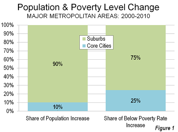
    Yet wishing something dead does not make it so. Indeed, the suburbanization of America is likely to continue over the next decade. The 2010 Census — by far the most accurate recent accounting — showed that over 90% of all metropolitan growth over the past decade took place in the suburbs.

    Some central cities, notably New York, enjoyed decent population growth, but their increases were still below the national average. The Joint Center for Housing at Harvard notes that, only five metro areas —Boston, San Diego, San Jose, Calif., and the Florida cities of Cape Coral and Palm Bay — saw an increase in the share of households living in core cities relative to their suburbs and exurbs.

    To be sure, the Great Recession slowed the growth of suburbs, as many Americans lost the ability to achieve their dream of owning a single-family house. “Back to the city” advocates have seized on Census estimates for the past year that suggested that urban core growth has actually been a tad faster than that of suburbs.

    However, the Census Bureau numbers may be less accurate, and certainly less predictive, than many suggest. University of Pittsburgh urban analyst Chris Briem points out that in the last decade, some Census Bureau city estimates turned out to be vastly exaggerated compared to the actual 2010 Census. This was particularly true in Chicago and New York, where constant lobbying by city officials — after all, federal aid is distributed based on population estimates — meant that optimistic urban estimates turned out to be hundreds of thousands of people off.

    More amazing still, the Census Bureau essentially assumed that growth was even in all municipalities in a county. This bizarre practice projects that growth, say, in the city of Los Angeles, is equal to that of newer communities like Santa Clarita, or that suburbs of Alleghany County grew at the same rate as the city of Pittsburgh. This surely can’t be the case.

    Reporters concentrated in Manhattan and the District of Columbia didn’t look seriously at these numbers. They repeated the assumption that this was the result of mass migration, particularly among the young, out of suburbs and into cities.

    Yet in reality, there was no evidence of that trend. In fact, the Census Bureau’s core county estimates (which are demonstrably more accurate than the municipal estimates) showed a slight core county loss in domestic migration over the past year. The real story of the estimates has to do with the recession, which has led to record-low levels of mobility. Inter-county migration has fallen almost half from its 2006 level. Essentially, a historically weak economy has boosted the city share of population growth.

    So what can we expect in the future? Some cities will grow, but the vast majority of metropolitan growth will continue to take place in what are still car-dominated suburbs like areas areas. This can occur only the economy again get on a full-fledged growth cycle. Here some basic reasons not to write off suburbia.

    Inter-Regional Growth Patterns

    All 15 of the fastest-growing metropolitan areas of the past decade — led by places like Las Vegas, Raleigh, Phoenix, Houston and Dallas-Fort Worth — are sprawling and have low-density cores. Metropolitan areas with far denser cores, such as New York, Boston, Chicago, and San Francisco, tended to display below-average growth.

    These fast-growing cities tend to be suburban in form, dominated by single-family homes, automobile commuters and with dispersed economic centers. The growing central cities of Phoenix or Houston look more like places such as Long Island or Santa Clara than Manhattan or Chicago.

    Economic Shifts

    Many urban boosters cite a Santa Fe Institute study claiming that density creates productivity and economic growth. However, the study clearly dissociated itself from this argument, claiming that it did not matter if a region was shaped like Los Angeles, Atlanta or Houston, or New York or Boston. The source of productivity lay simply in a growing metropolitan population, the authors claimed.

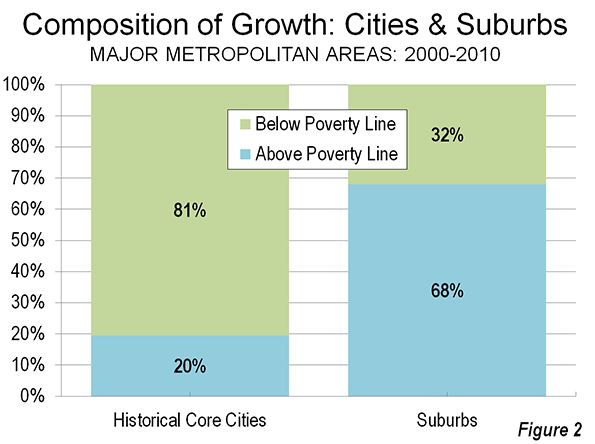
    Overall, it’s questionable whether city economies perform better over time than the suburbs. Indeed, over the last decade, 81 percent of the population growth of core cities was among the poor, compared to 32 percent in suburbs. Poverty anywhere is a bad thing, but the claim, made repeatedly by some pundits that it is worsening more in suburbs turns out to be, well, just another urban legend. Overall poverty accounts for nearly one in four urban residents, twice the rate for suburbs.

    Energy Costs

    Ever since the energy crisis of the 1970s, pundits have predicted suburbanites would be forced to give up their cars. But higher energy prices have not slowed the suburban trend. With the current growth in new energy finds both here and abroad, the much heralded dawn of “peak oil” appears to be about as imminent as a balanced federal budget.

    Some terrified urbanists, like Bruce Fisher, director of the Center for Economic and Policy Studies at Buffalo State College, fear the new oil rush means “suburban real estate development will once again enjoy a comparative advantage over center city development.” In what some see as a catastrophe for both planet and urbanity, the car will remain dominant for the foreseeable future, despite three decades of massive spending on new transit systems across the country.

    Demographic Trends

    The advocates of a dense urban future usually point to demographics. Yet the formerly fashionable theory that retiring boomers would head en masse to cities turned out to be largely false. The last census showed the vast majority of aging boomers remained in the suburbs or moved further out into the periphery. “Back to the country” actually far outweighed “back to the city” in terms of boomer migration.

    Then there’s the other large generation of Americans, millennials, who are said to prefer an urban lifestyle. Yet surveys of millennials show a strong, often even more marked, preference for homeownership and suburban living than their parents.

    This will prove critical as many now urban millennials begin to enter their 30s and 40s over the next decade. Once they marry and start to have families, they will emerge, as the Harvard housing study notes as “the primary driver of new household formations over the next two decades.” Along with the other powerful force, immigrants, most seem likely to end up in suburban locales, if they can.

    Preferences Matter

    This does not counteract the fact that many young people will chose to settle in dense urban areas for their 20s and early 30s. Some urban cores, notably New York, Boston and San Francisco, will likely grow and get denser. But most others will see only modest, often fitful growth; despite massive public investment, for example, downtown Los Angeles, according to Zillow.com, has foreclosure rates worse than virtually anywhere else in the region.

    Preferences are the key here, particularly paying attention to what people want as they age. The 2011 Community Preference Survey, commissioned jointly by the National Association of Realtors and Smart Growth America, found that only a small minority — less than 10 percent — favored a dense urban location. Some 80 percent expressed preference for a single-family home.

    Over time, in a market-based economy, consumer preferences matter far more than those of pundits, professors or, for that matter, rent-seeking real estate developers. The only things that can kill off future suburban development would be forced densification by government edict or a continued miserable economy that entraps millions of the unwilling in dense urban areas.

    Joel Kotkin is executive editor of NewGeography.com and is a distinguished presidential fellow in urban futures at Chapman University, and contributing editor to the City Journal in New York. He is author of The City: A Global History. His newest book is The Next Hundred Million: America in 2050, released in February, 2010.

    This piece originally appeared in Forbes.

    Suburbs photo courtesy of BigStockPhoto.com.

  • Density is Not the Issue: The Urban Scaling Research

    The "urban scaling" research of Geoffrey West, Luis Bettencourt, Jose Lobo, Deborah Strumsky, Dirk Helbing and Christian Kuhnert on cities has attracted considerable attention (references below). They have provided strong quantitative evidence, based upon voluminous econometric analysis that cities tend to become more efficient as they grow in population.

    Specifically, West, a theoretical physicist, and his team show that measures such as gross domestic product per capita and income per capita rise, on average, 15 percent with each doubling of city population. They draw parallels with the animal kingdom, noting that larger animals tend to be more efficient than smaller ones, and comparing elephants, efficient because of their size, to cities.

    This is all very attractive, especially the elephant analogy, which appropriately suggests that cities are organisms.

    The Urban Organism

    Yet the research has been widely reported to suggest that density as opposed to size is the key to urban productivity. West et al look at cities as "integrated economic and social units," at the "level of metropolitan statistical areas (MSAs); in the European Union, larger urban zones (LUZs); and in China, urban administrative units." This is the economic, or functional manifestation of the urban organism (the urban area, the area of continuous urbanization, is the physical manifestation). In so doing, West, et al demonstrate a familiarity with urban geography that is all too rare, even among analysts who have studied cities for far longer.

    The key issue here is what constitutes a “city”.  New York is a good, example, as headquarters to the national media, a world class city and as urban as it gets in the United States. But the New York metropolitan area, the "integrated economic and social unit" is not Manhattan or even five boroughs. It stretches from a bit west of Blooming Grove Township, in Pike County 25 miles west of Port Jervis, a city 90 miles from Manhattan located in western Orange County, NY, to Montauk Point in Suffolk County and from north of West Point, in Putnam County to Egg Harbor Township, in Ocean County, New Jersey (that’s nearly 30 miles south of Toms River). Suffice it to say most of this vast region is not dense at all.

    Divining Density

    Yet, some analysts have characterized the West, et al research as being about higher densities, Richard Florida wrote in The Wall Street Journal:

    Researchers at the Santa Fe Institute have been able to demonstrate that bigger, denser cities literally speed up the metabolism of daily life.

    That’s only half right. The research was about city size, not density, as the authors indicate (below).

    All too typical of the way that suburbanized America is disparaged by the media, Jonah Lehrer, of The New York Times sputtered that:

    In recent decades, though, many of the fastest-growing cities in America, like Phoenix and Riverside, Calif., have given us a very different urban model. These places have traded away public spaces for affordable single-family homes, attracting working-class families who want their own white picket fences.

    In reality, the kind of suburbs found in Phoenix and Riverside-San Bernardino will be found surrounding every one of the nation’s core cities, including New York, an urban area that covers  more land area than any urban area in the world at 3,450 square miles (8,935 square kilometers), according to the Census Bureau. That’s twice the expanse of the Los Angeles urban area. Granted, New York’s Hudson Valley suburbs are greener and more affluent than most in Phoenix, but their population density is nearly the same. Moreover, neither Phoenix nor New York (think Staten Island or much of Long Island) should be ashamed of attracting "working class families who want their own white picket fences." Why demean aspiration?

    Urban blogger James Withow refers to their "remarkable findings" that "raise interesting policy issues on density." Another analyst wrote "West offers data that shows cities create economies of scale that suburbs and small towns cannot match." This is patently absurd since, as noted above, West did not study any part of the urban organism below the metropolitan area. There was no attempt to make a distinction between the productivity of say, Manhattan or Brooklyn, to White Plains or even Blooming Spring Township. No core city or suburb is an "integrated economic and social unit."

    West et al on Density

    Indeed, West et al make it very clear that their findings have nothing to do with urban population density. They tested for correlations population growth and income, patents and violent crimes, and found "no significant trend exists between residuals for income, patents and violent crime and population growth or density." They further note their equations showed an "R2 consistent with zero" (in every day English, that means they found no relationship between density and the other variables).

    This conclusion was correct, though comparing metropolitan area densities is less than ideal. Just to check, we reran the equations with urban density data and found that this approach too produced an "R2 consistent with zero," not only for income, patents and violent crimes, but also gross metropolitan product.

    West et al pointed out that:

    The shape of the city in space, including for example its residential density, matter much less than (and are mostly accounted for by) population size in predicting indicators of urban performance. Said more explicitly, whether a city looks more like New York or Boston or instead like Los Angeles or Atlanta has a vanishing effect in predicting its socio-economic performance. (emphasis by author)

    In other words, the same improvement in urban performance would be predicted from doubling the population of Atlanta, with an urban density of 1,700 per square mile (700 per square kilometer) as in New York, with more than three times Atlanta’s density or Los Angeles’ with more than four (Los Angeles is highest density large urban area in the United States).

     It turns out – counter the misunderstandings of some urbanists – that higher or lower density simply does not matter according to the West, et al research.

    It’s About Density Thresholds and Efficient Labor Markets

    Cities (integrated economic and social units) are created by reaching urban density thresholds. They tend to become more productive as they grow, so long as they are not too large to function as a labor market. Density doesn’t matter particularly. Indeed, the general tendency is for cities to become more dispersed (less dense) as they grow, as indicated by longer term data in the US, Canada and around the world.

    For example, the Seattle and Houston urban areas have population densities much lower than those of Paris, London, Hong Kong and even Los Angeles – yet they still rank higher among the most productive metropolitan areas in the world, according to the Brookings Institution Global Metropolitan Monitor 2011. Brookings rates Hartford as the most productive metropolitan area in the world, yet its urban population density is nearly as low as Atlanta’s.

    Finally, the Brookings list excludes the world’s most dense major city, Dhaka. That’s because the economic output of its 15 million people is insufficient to make a list that includes cities one-tenth its size. Dhaka combines the highest population density in the world with perhaps the lowest per capita economic output of any megacity in the world.

    Allowing Organisms to Grow

    As West et al suggests, cities, like elephants, are organisms. Both expand (dare we say "sprawl") as they grow. This should be cause for concern, given planning dictates that would restrain urban organism, such as urban growth boundaries. These restraints are akin to depriving a large mammal of sufficient space to roam and feed. That’s no way to treat a productive organism, or a great city.

    ——-

    Reference Materials:
    Growth, innovation, scaling, and the pace of life in cities
    Urban Scaling and Its Deviations: Revealing the Structure of Wealth, Innovation and Crime across Cities
    2010 US Urban Area Data

    ——-

    African Bush Elephant photo by flickr user nickandmel2006.

    Wendell Cox is a Visiting Professor, Conservatoire National des Arts et Metiers, Paris and the author of “War on the Dream: How Anti-Sprawl Policy Threatens the Quality of Life.”

  • The Rise of The 1099 Economy: More Americans Are Becoming Their Own Bosses

    While the economy has been miserable for small business, and many larger ones as well, the ranks of the self-employed have been growing. According to research by Economic Modeling Specialists International, the number of people who primarily work on their own has swelled by 1.3 million since 2001 to 10.6 million, a 14% increase.

    This rise is partially reflective of hard times, and many of the self-employed earn only modest livings in fields such as childcare and construction. However the shift to self-employment is likely to accelerate in the future, and into higher-paying professions, for reasons including the ubiquity of the Internet, which makes it easier for some types of business to use independent contractors, as well as the reluctance of large firms to hire full-time employees with benefits.

    Urban analyst Bill Fulton, who has looked into this issue, concludes we may be seeing a fundamental change in how the economy operates. “Even though there may not be jobs in the conventional sense, there is still work,” Fulton notes. “That’s the whole idea of the 1099 economy. It’s just a different way of organizing the economy.”

    If the 1099 economy is the wave of the future, which regions and industries are currently at the forefront? We turned to EMSI for the data. We looked at the change in self-employment numbers for the nation’s 30 largest metropolitan statistical areas from 2001 to the present, and also from 2008, when the economy first nosedived and people started to scramble.

    The results of EMSI’s research are fascinating, and somewhat surprising, perhaps giving us a glimpse of where the future of economic growth may be taking shape. The biggest changes have taken place in four metro areas where the number of self-employed workers expanded over 10% growth between 2008 and 2012. Two of them, Houston and Seattle, have done very well in our previous rankings of economic performance, and the other two, Phoenix and Riverside– San Bernardino, Calif., suffered grievously from the housing bubble.

    In the case of Houston, its 12% rise in the number of self-employed workers reflects not only widening economic opportunity, but also structural changes in the energy industry, the metro area’s prime economic driver. Since 2005, self-employment in the energy industry has grown 35% (and a remarkable 75% for support activities for oil and gas operations). At least part of this influx, EMSI suggests, could be attributed to land owners cashing in on royalties after leasing their property for drilling, but also to the demand for the increasingly specialized, and often high-tech, services required by that industry.

    The entrepreneurial drive in Houston is clearly not a response to economic disaster – the city has a culture that encourages striking out on your own, and low costs and lighter regulation make it easier. Indeed over the past decade, the Texas powerhouse also led the nation in the growth of its 1099 economy, which expanded by a remarkable 51%.

    Like the energy industry, the burgeoning high-tech sector also has become more dependent on the 1099 economy. Encompassing people writing apps, doing technical consulting,  and working in the information sector, the numbers have surged over the past five years. This may help explain the double-digit increase in self-employment over the past five years in Seattle (up 10%) and San Jose (up 11%). In some cases this may be young people working on their own; in others it could be older techies who may have lost full-time jobs but are now consulting.

    Perhaps the most intriguing shift to the 1099 economy can be found not in hotspots like Silicon Valley, but in areas pummeled in the “housing bust” that are only now showing signs of recovery. This includes two areas, Phoenix and San Bernardino-Riverside, Calif., usually disdained by “creative class” pundits as backwaters, that have seen their number of self-employed grow 12% since 2008.

    One contributing factor may be the migration of people to these areas from Southern California, says Rob Lang, a leading expert on economic trends who teaches at the University of Nevada-Las Vegas. For much of the second half of the 20th century, Southern California was, as historian Fred Siegel of the Manhattan Institute aptly put it, the nation’s “capitalist dynamo.” Unlike Houston with energy, or Seattle and San Jose with technology, the Southern California economy was broad based, spanning everything from aerospace and garments to homebuilding  and fast-food restaurants.

    Over the past generation, many heirs to this entrepreneurial tradition have decamped to the Sonoran Desert region, which stretches from California into Arizona, Lang says.

    Of course, Lang notes, Phoenix has long been disdained by urban aesthetes as environmentally “unsustainable”and doomed to economic decline. Its fate, according to accounts during the worst of the housing crash, was to be surrounded by “zombie sub-divisions” that would remain empty for years, perhaps permanently as the desert encroached.

    Yet as the strong self-employment numbers demonstrate, Phoenix may well be on its way to recovery. Brookings recently estimated its rebound since the Great Recession to be the fifth best of the nation’s 100 largest metro areas. Its unemployment rate has dropped from 12% in 2010 to around 7.5% in May 2012. Bankruptcies have fallen dramatically and the housing market is clearly on the mend.

    One clear sign of improvement is foreclosures have dropped 53% over the past year and are now below the national average.   Meanwhile net migration into Phoenix as well as the rest of Arizona is once again on the rise.

    This recovery, notes local economist Elliot Pollack, follows the typical cycle for Phoenix, led by entrepreneurial activity.  “Greater Phoenix is a small business town,” notes Pollack. ”Historically, during periods of growth, there is substantial new business and self employment formation.”

    Phoenix’s self-employment boom suggests that the Valley of the Sun is primed for a comeback. But not all of the top 30 metro areas are seeing anything like this level of new entrepreneurial activity. The 1099 economy has grown at less than half Phoenix’s rate in such “creative”  hotbeds as New York, Los Angeles, San Francisco and Boston. Self-employment is flat in many cities, including St. Louis, Cincinnati and Cleveland, and as actually declined in Kansas City, Chicago and Atlanta.

    It may be too early to declare which economies will finally rebound fully from the ravages of the Great Recession. But for my money, I’d look to those places where people are taking the leap to go out on their own as the ones most likely to reinvent themselves when the economy begins expanding robustly again.

    Rank Region Growth in Self-employed, 2008-2011
    1 Houston-Sugar Land-Baytown, TX 12.2%
    2 Riverside-San Bernardino-Ontario, CA 11.8%
    3 Phoenix-Mesa-Glendale, AZ 11.5%
    4 Seattle-Tacoma-Bellevue, WA 10.0%
    5 Baltimore-Towson, MD 8.6%
    6 San Antonio-New Braunfels, TX 8.1%
    7 Tampa-St. Petersburg-Clearwater, FL 6.5%
    8 Dallas-Fort Worth-Arlington, TX 6.3%
    9 Boston-Cambridge-Quincy, MA-NH 5.6%
    10 Miami-Fort Lauderdale-Pompano Beach, FL 4.9%
    11 Detroit-Warren-Livonia, MI 4.7%
    12 New York-Northern New Jersey-Long Island, NY-NJ-PA 4.6%
    13 Orlando-Kissimmee-Sanford, FL 4.4%
    14 San Francisco-Oakland-Fremont, CA 4.2%
    15 Sacramento–Arden-Arcade–Roseville, CA 4.2%
    16 Los Angeles-Long Beach-Santa Ana, CA 4.1%
    17 San Diego-Carlsbad-San Marcos, CA 4.1%
    18 Portland-Vancouver-Hillsboro, OR-WA 4.1%
    19 Pittsburgh, PA 2.9%
    20 Denver-Aurora-Broomfield, CO 2.9%
    21 Philadelphia-Camden-Wilmington, PA-NJ-DE-MD 2.8%
    22 Washington-Arlington-Alexandria, DC-VA-MD-WV 1.3%
    23 Cleveland-Elyria-Mentor, OH 0.6%
    24 Cincinnati-Middletown, OH-KY-IN 0.5%
    25 St. Louis, MO-IL 0.3%
    26 Las Vegas-Paradise, NV 0.3%
    27 Minneapolis-St. Paul-Bloomington, MN-WI 0.2%
    28 Kansas City, MO-KS -0.7%
    29 Chicago-Joliet-Naperville, IL-IN-WI -2.4%
    30 Atlanta-Sandy Springs-Marietta, GA -6.5%


    Joel Kotkin is executive editor of NewGeography.com and is a distinguished presidential fellow in urban futures at Chapman University, and contributing editor to the City Journal in New York. He is author of The City: A Global History. His newest book is The Next Hundred Million: America in 2050, released in February, 2010.

    This piece originally appeared in Forbes.

    Self employment photo by BigStockPhoto.com.

  • The Tribal Election: Barack Obama Turns to the Karl Rove Playbook

    Move over, Iraq. Tribal politics have arrived at home.

    It’s not like our tribes will arm themselves, but American politics is developing a disturbing resemblance to Mesopotamia’s ever-feuding Sunnis, Shiites, and Kurds as the 2012 election rapidly devolves into a power struggle between irreconcilable factions rather than a healthy debate among citizens.

    The blame here falls in large part on President Barack Obama, who after four years of economic lethargy needs to recast the election as anything other than what it naturally is: a referendum on the incumbent and the state of the nation.

    To turn the page, he has revived the kind of divisive 50 percent–plus–one politics Bush political guru Karl Rove successfully championed in 2004. As former George W. Bush strategist Mark McKinnon has observed, Obama is now following the same playbook used in 2004 against another Massachusetts faux blueblood, Sen. John Kerry. Like Obama, Bush was a polarizing president of meager accomplishments and modest popularity. And like Bush, Obama is hoping to rally his base and demonize his opponent to achieve a fairly comfortable reelection.

    To do that, Obama is offering an array of appeals based on tribal totems—gay marriage, contraception, cheap loans for kids, charges of racism by his opponents. Every “grand” statement is aimed at specific groups, either to offer them something or to show how Romney would threaten their interests.

    It’s a self-perpetuating dynamic: as he’s aimed his appeal at targeted groups to cobble together a winning coalition, he’s consistently lost ground with middle- and lower-income white Americans. That in turn compels him to double down on his appeals to single women, gays, youth, and minority voters—which in turn further alienates working and retired white voters.

    Obama’s gambit creates an election in which turnout and mobilization—a fittingly military concept—of the faithful may be more important than the art of persuasion. It also guarantees a very ugly campaign, filled with even more than its usual share of innuendos, smears, and outright lies aimed at enthusing his base or—particularly for the GOP—discouraging members of unfriendly tribes from showing up to vote.

    Obama starts off with natural advantages in the tribal sweepstakes. He’s black, he’s got a “creative class” university pedigree, and he’s hip and cool, not to mention the first post-boomer president. It’s a powerful base for an electoral win.

    While Romney‘s core tribe, the Mormons, constitute less than 2 percent of the nation’s population. That’s a lot less than the Alawites who have constituted the core of strongman Bashar al-Assad’s support in Syria. (Of course, part of why Obama needs to cobble together a more complicated coalition is that Romney can also count on winning most white voters, who last favored a Democratic candidate in 1964.)

    But Obama and his party have been playing the race card with the aplomb of a Jim Crow Democrat. Assaults on the president or his attorney general, Eric Holder, are immediately blamed on “racism” by groups like the Congressional Black Caucus and “leaders” like the Rev. Al Sharpton—who compared the investigation into the Fast and Furious gun-running case to the stop-and-frisk policies in urban police departments.

    This appeal to race makes sense with African-American unemployment at its worst level in more than three decades and enthusiasm for the first black president understandably diminished since 2008. Tribal politics help cover up economic failings, as the old Dixiecrats did by using racism as a screen for the then-backward condition of their region.

    More recently, Obama has also directed his tribal charm at Latinos. Hispanic families, according to the census, have done the worst of all groups in the recession, losing 66 percent of their household wealth. Unemployment in the group hovers near 11 percent, and more than 6 million Hispanic children live in poverty—exceeding for the first time the number of black children living in poverty.

    Despite those sobering numbers, Obama is favored among Latinos by better than 2 to 1. This is in part because of Mitt Romney’s pivot to a hardline immigration stance during the Republican primary, as well as Obama’s election-year decree effectively giving mass amnesty to a large number of undocumented youth. Obama’s policy conversion is a seminal triumph for Latino politics, marking the group’s ascension into the first rung of American tribes. For many Hispanics, this was seen as an issue of family as well as identity.

    Obama has also worked hard to cultivate culture and gender-oriented tribes. The most obvious example of special-interest pandering was his well-timed “evolution” favoring gay marriage. Perhaps more important in terms of votes, the president’s conflict with the Catholic Church over contraception could appeal to single women, who now constitute a critical part of his base. Recent polling shows single women opting for the president by as much as 2 to 1.

    Then finally there are the millennials. In 2008, Obama could count on both their votes and their enthusiasm. Now amid hard times—particularly for the “screwed generation”—he has to appeal by offering lower interest rates for student loans and expanded aid to education.

    Against these powerful alliance of tribes, what can ultra-white-bread Romney do in response? No doubt he can win the majority of white evangelicals—the largest tribe in the GOP base—but it’s hard to see how they will be much energized for a man whose religion is widely considered a cult among some prominent evangelical preachers. As late as this month, Romney still has to pour time and resources into what has been in recent years a solidly GOP bulwark. At the same time, his other natural “base,” high-income earners in the private sector, is simply not numerous enough to push him even near the electoral requisite.

    To counter Obama’s tribal strategy, Romney has to move the discussion away from issues of race, gender, or immigration to the economy and unemployment, which, according to Gallup, remains far and away the dominant issue—with three times more voters calling it their primary concern than those for all social issues combined.

    Perhaps the most inviting tribal group for Romney to contest is the “youth vote,” whose members of course shift dramatically every four years as voters age in and out of the cohort. The poor performance of the current economy has already blunted the once widespread youthful enthusiasm for Obama; in 2008 turnout reached 64 percent among young people, the highest in 16 years. This year the portion of 18- to 24-year-olds who say they’ll definitely vote has fallen to 47 percent, according to polls conducted by Harvard University’s Institute of Politics.

    Overall, Democrats’ support among millennial voters has dropped from 66 percent in 2008 to close to 54 percent in 2010. Part of this may be because a vast majority of millennials, like other Americans, rank the economy as by far their greatest concern. Obama is already trailing the GOP candidate among white millennials by more than 20 points.

    Due in large part to the heavy minority cohort among millennials, Obama still should win this group in November, but the margin may be somewhat lower and the vote totals much reduced due to rising apathy, something that was notable in the 2010 election. Perhaps more troubling for Democrats, in the critical Scott Walker recall race in Wisconsin, more than 45 percent of voters between 18 and 29 voted for the GOP governor, who had garnered barely 40 percent of their support in his first race against Democrat Tom Barrett two years earlier.

    Other tribes could also be targeted, particularly American-born Latinos, who constitute about half the Hispanic adult population. They have been hard-hit by the recession and, according to a recent University of Arkansas study, tend to be somewhat more hardline on border control than their foreign-born counterparts.

    And even after his amnesty move, Obama’s support among Hispanics is only 57 percent compared with 67 percent four years ago.

    Of course, there are dangers to an ugly tribal win. While Bush significantly moderated his policies in his second term, he received little credit for that shift from the half of the country he’d alienated in 2004 and during his first four years in office.

    Another politician who’s recognized the dangers of tribalism? Barack Obama, circa 2007:

    "You’ve got to break out of what I call the 50-plus-1 pattern of presidential politics, which means you have nasty primaries where everyone’s disheartened, then you divide the country 45 percent on one side, 45 percent on the other, 10 percent in middle, all of whom live in Florida and Ohio," Obama told the Concord Monitor.

    "Then maybe you eke out a victory of 50 plus one. [But] you can’t govern."

    Joel Kotkin is executive editor of NewGeography.com and is a distinguished presidential fellow in urban futures at Chapman University, and contributing editor to the City Journal in New York. He is author of The City: A Global History. His newest book is The Next Hundred Million: America in 2050, released in February, 2010.

    This piece originally appeared in The Daily Beast.

    Barack Obama photo by BigStockPhoto.com.

  • The Evolving Urban Form: London

    The 2011 census results show that London (the Greater London Authority, which is Inner and Outer London) experienced its greatest percentage population growth in more than 100 years (1891 to 1901). London added nearly 1,000,000 new residents since 2001. That growth, however, is not an indication that "people are moving back to the city." On the contrary, National Statistics data indicates that London lost 740,000 domestic migrants between 2001 and 2011. The continuing core net domestic migration losses have been replicated in other major European metropolitan core areas, such as Milan, Vienna, Stockholm and Helsinki.

    Instead as typical in major European core municipalities, the vast majority of the growth in London has come from net international migration. London added 690,000 residents between 2001 and 2010. This pattern has become more prevalent since European Union enlargement, when Eastern Europeans began moving in much larger numbers to the United Kingdom and other richer areas of the old EU-15.
    London first became the world’s largest urban area in the first quarter of the 19th century, displacing Beijing. At that time, London was approaching 1.4 million residents, living in an urban area of approximately 15 square miles. Today, Inner London, the Outer London suburbs and two rings of exurbs spread 10,500 square miles (27,000 square miles), with a population of 20.3 million. Beijing, meanwhile, has grown so fast that it may once again surpass London in the next decade. However, other metropolitan regions are much larger, such as Tokyo and Jakarta.

    Meanwhile, the urban area (the continuous built up area), circumscribed for more than one-half century by the Greenbelt, appears to have a population of 9.5 million, which would place it 27th in population in the world.

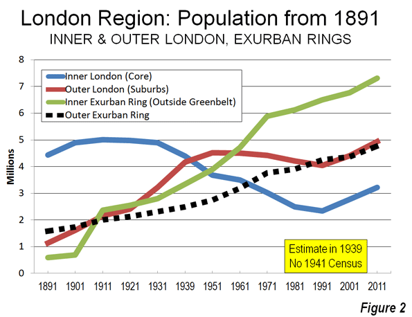
    Over the past century, London has experienced substantial ups and downs in its population and still remains below its 1939 population, even with the large gain over the past decade. Over the same period, Inner London lost millions of its residents and only recently has begun to gain some back, largely due to net international migration gains. Outer London gained in the first half of the 20th century, plateaued and then also gained strongly in the last decade. The exurban areas virtually monopolized growth for most of the post-World War II period (Table) until recently.

    London Region: Population 1891-2011
    Year London Region London (Greater London Authority) Inner London (Historical Core) Outer London (Suburbs) Exurbs (Outside Greenbelt) 1st Exurban Ring (Historical Counties Adjacent to Green Belt) 2nd Exurban Ring
    1891 7,752,000 5,574,000 4,432,000 1,142,000 2,178,000 595,000 1,583,000
    1901 8,931,000 6,507,000 4,898,000 1,609,000 2,424,000 691,000 1,733,000
    1911 11,526,000 7,162,000 5,002,000 2,160,000 4,366,000 2,365,000 2,001,000
    1921 12,071,000 7,386,000 4,978,000 2,408,000 4,684,000 2,553,000 2,131,000
    1931 13,229,000 8,111,000 4,898,000 3,213,000 5,119,000 2,805,000 2,314,000
    1939 8,617,000 4,441,000 4,176,000
    1951 14,832,000 8,193,000 3,680,000 4,513,000 6,635,000 3,891,000 2,744,000
    1961 15,911,000 7,997,094 3,492,881 4,504,213 7,918,000 4,720,000 3,198,000
    1971 17,028,000 7,453,000 3,031,000 4,422,000 9,659,000 5,894,000 3,765,000
    1981 16,644,000 6,713,000 2,498,000 4,215,000 10,035,000 6,127,000 3,908,000
    1991 17,139,000 6,393,000 2,343,000 4,050,000 10,746,000 6,497,000 4,249,000
    2001 18,313,000 7,172,000 2,766,000 4,406,000 11,141,000 6,773,000 4,368,000
    2011 20,256,700 8,164,000 3,222,000 4,942,000 12,092,700 7,318,700 4,774,000
    Sources
    Census except 1939
    Greater London Authority, 1939


    The London Region

    The London region is composed of the Greater London Authority (GLA), which includes Inner London, the historical core municipality, covering approximately the same geographical area as the old London County Council from the 1890s to the 1960s and Outer London, the great suburban expanse consisting of detached and semi-detached housing.

    GLA is surrounded by the Greenbelt, established to contain the expansion of the urban area after World War II, and, at least at first, to decentralize London’s unhealthy and overcrowded conditions. Beyond the Greenbelt are the East of England and the Southeast, which are composed of a first exurban ring of historical county areas, adjacent to the Greenbelt, and a second ring of historical county areas in the East and Southeast, beyond the first ring. Virtually all new urban expansion in the London region was forced into the exurbs by the Greenbelt. As a result, all of the London region’s growth (6 million) since World War II has been outside the Greenbelt (Figure 1).

    Inner London

    Inner London has been a population growth miracle over the past two decades. The 2011 population was 3.2 million, up more than 450,000 from 2001 and nearly 900,000 since 1991. However, the 1991 figure of 2.3 million was more than one-half below the 5,000,000 peak reached in 1911. Even though historical core city losses are typical (where geography is held constant), Inner London’s loss was huge, at more double those sustained in Chicago (since 1950) and Paris (since 1921). The core of Inner London was developed as a walking city and expanded substantially with the coming of transit.  At approximately 26,000 residents per square mile (10,000 per square kilometer), Inner London is less than one-half the density of the ville de Paris and far less dense not only than Manhattan but even less dense than the New York City boroughs of Brooklyn and the Bronx.

    Yet despite the recent increases, inner London’s 2011 population is lower than counted in the 1861 census (yes, 1861) Even  with the population increase Inner London lost 390,000 domestic migrants (Figure 2) to other parts of Great Britain between 2001 and 2010 (the detailed 2011 data is not yet available at this level).

    Tower Hamlets, one of London’s 32 boroughs, is an example of this population roller-coaster. Tower Hamlets is located just to the east of the Tower Bridge in Inner London on the north bank of the Thames. It is home to substantial new development spurred by the rapid growth of the financial services industry both in the "square mile" ("city of London) and Canary Wharf. Tower Hamlets grew to 254,000 in 2011, a nearly 80 percent increase from the 142,000 registered in 1981, less than its 1801 population (Note: London Boroughs). But like Inner London, Tower Hamlets used to be much more populous, reaching a record for a London borough at 597,000 residents in 1901. It then lost more than 75 percent of its population over the next 80 years.  

    Outer London

    Outer London, which was combined into the Greater London Council in 1965 (and the Greater London Authority in 2000) also grew strongly, from 4.4 million to 4.9 million and is now at its peak population. Outer London’s population density is 10,000 per square mile (4,000 per square kilometer), approximately the same as the District of Columbia. Like Inner London, Outer London also lost domestic migrants, with a net 310,000 residents leaving for other parts of the United Kingdom (Figure 2).

    The Greenbelt

    Since World War II, the London urban area (principally composed of Inner and Outer London) has been surrounded by the Greenbelt on which development is not permitted. The Greenbelt ranges from 10 to 20 miles wide (25 to 50 kilometers) and covers more than three times the size of the Greater London Authority. The Greenbelt has been cited, along with related policies, with substantially raising house prices and contributing to London’s longer commutes than Paris, where there is no greenbelt.

    Exurban London

    Despite their more modest growth in the last decade, the exurbs have been effective in attracting net domestic migration. From 2001 to 2011, three was a net inflow of domestic migrants of 320,000 (Figure 2). Much of this appears to be people leaving London. During the last year, more than 50,000 residents of London moved to the exurbs. Net international migration to the exurbs had been fairly small earlier in the decade, but increased substantially in the later years. By 2009-2010, two thirds of the London region’s net international migration was to the exurbs, and only one-third to London.

    First Exurban Ring

    The first exurban ring includes the historical counties that border on the outside of the Greenbelt. These areas added approximately 550,000 residents between 2001 and 2011 and reached a new population peak, at 7.3 million.

    Second Exurban Ring

    The second exurban ring includes the counties of the East of England and the Southeast that are outside the first ring. These areas added more than 400,000 new residents, and reached a new peak population of 4.8 million.

    London and England

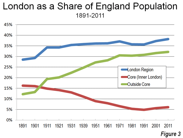
    In contrast to the 1991-2001 decade, the 2001-2011 decade indicated a significant slowdown in the share of England’s population growth in the London region. In the previous decade, all of England’s growth occurred in the greater London region. In the last decade, 50 percent of England’s growth took place around the capital. Overall, the core of London (Inner London) population has steadily fallen relative to the rest of England England’s while the suburbs and exurbs have grown to include one-third of England’s residents (Figure 3). So as Japan is moving to Tokyo, England is still moving to London, but not nearly so fast.

    Wendell Cox is a Visiting Professor, Conservatoire National des Arts et Metiers, Paris and the author of “War on the Dream: How Anti-Sprawl Policy Threatens the Quality of Life.”

    —-

    Note: London Boroughs: The 32 boroughs of London were defined after the creation of the Greater London Council in 1965 (which was abolished in 1986). The Greater London Authority provides data to show the historical population figures for the boroughs, going back to the initial census (1801). The new Greater London Authority was established in 2000, with less power than the previous Greater London Council. The 32 boroughs continue to operate, providing local public services.

    Photograph: London Suburbs (Outer London) by author

  • State of Chicago: The New Century Struggle

    This is the second installment in my “State of Chicago” series. Read part one here.

    Last time I looked at Chicago’s 70s and early 80s horrible struggles followed by rebirth and robust out-performance during the 1990s. Today we turn our attention to the first decade of the 21st century. During the 2000s, Chicago experienced a bit of a two-track performance. Parts of the urban core continued to grow robustly, fueled by the real estate bubble and perhaps the greatest urban condo building boom in America. The culinary, cultural, and other scenes in Chicago only improved. Yet while there was a solid core of health at the center, the overall city and region stumbled badly with aggregate statistics that were, bluntly, awful in most respects. I’ve detailed these elsewhere already so won’t go in depth, but let’s review. These are metro area statistics unless otherwise noted.

    Population

    I already discussed how Chicago got shellacked in the 2010 Census. It was the only one of the 15 largest municipalities in the United States as of 2010 to lose population. The cities of New York, Los Angeles, and San Francisco hit all time record high populations. Philadelphia and DC grew for the first time since 1950, and Boston continued growing. But Chicago has now rolled back its population clock a hundred years and stands at its lowest population since 1910.

    Chicago’s metro population growth of 4% was less than half the national average, and virtually all of that came at the exurban fringe. Chicagoland ranked 40 out of 51 large metros for population growth, though it did beat New York, LA, and Boston on a regional basis, which is positive.

    International Population

    This previous data was all from previous writings. I want to highlight a couple of other areas of demographic weakness though. First is international population. Chicago’s percentage of foreign born residents is 17.6%, which beats the national average, but trails New York and LA by over ten percentage points. It ranked 5 out of the 10 largest US metros. On a growth basis in foreign born population, Chicago did beat New York and LA. Those three were at the bottom in the percentage growth category, most likely because they all started from relatively high bases of total foreign born population. On a total change basis Chicago ranked 7th, with New York #1, but sick man LA brought up the bottom, a stunning change of fortunes for them.

    The city of Chicago itself seems to have lost its allure to immigrants. The foreign born population of the city actually declined during the 2000s. Even during a decade of huge Hispanic population growth nationally, Chicago barely grew its Hispanic population. The city of Indianapolis, about a third of Chicago’s size, added nearly twice as many total Hispanic residents. To the extent that immigrants now see Chicago as an opportunity zone, it appears to be suburban Chicago.

    Education

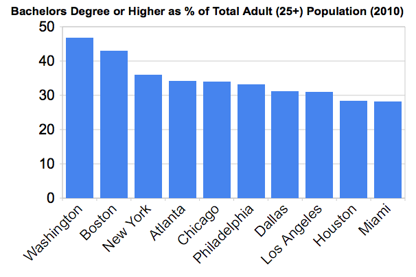
    Chicago’s college degree attainment is in the middle of the pack for the top 10, ranking #5. Considering it came from an industrial heritage, I think this is pretty good.


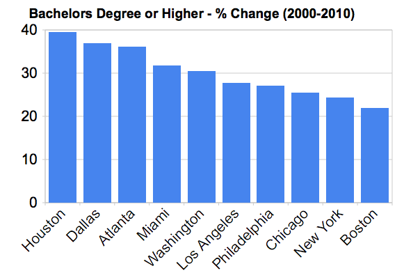
    However, Chicago only ranked 8th out of the top 10 in the growth in population with bachelor’s degrees.


    This hardly suggests that metro Chicago is a talent magnet. If you look at the numbers vs. other large Midwest metros, Chicago is healthy, but not looking like it is pulling away from the pack. I don’t see anything to suggest that Chicago is hoovering up all the college grads in the Midwest.

    Economy

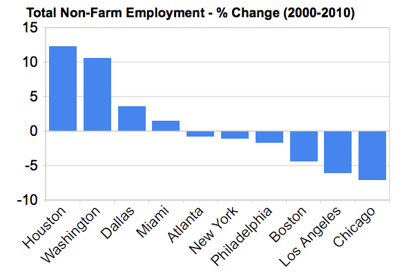
    Chicago lost 323,000 jobs during the 2000s, or 7.1%. The was the worst performance on a percentage basis of any of the 10 largest US metros:


    One of the stats that took some flak from my City Journal piece was that private sector employment in the Loop had dropped by 18.6% during the 2000s. This seems at odds with the massive skyscraper boom and other improvements. This wasn’t my stat. It came from a Chicago Loop Alliance report, and they commissioned a credible analytics firm to do the work, and the data was also reported by the Chicago Sun-Times, so I believe it is solid. A few things to consider:

    – This figure is for the Loop, not the Central Area (a bigger construct). The Loop does have the majority of the Central Area jobs, however.
    – Much of the construction was residential, not commercial. Also, things like the booming Loop U probably brought in more students than jobs.
    – Keep in mind that 2000 was the peak of the dotcom bubble. For reasons I’ll explore later, I believe this hurt Chicago badly. So there’s a tough comp (also why the Bay Area and to a lesser extent Boston look bad on comps vs 2000).
    – Consider major Chicago companies that totally went out of business: Arthur Andersen and Whitman-Hart come to mind.
    – Also consider that pledges of added jobs generally are trumpeted to the sky, while jobs are often cut silently as much as possible.

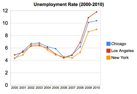
    Looking at unemployment rate in our Chicago vs. NYC/LA chart from before, we now see that Chicago is no longer winning, though is beating LA:


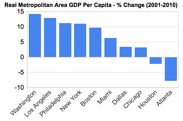
    Chicago is a large economy, but not a particularly high value added one. Out of the ten largest metros, Chicago ranks 8th in per capita GDP. (Chicago is 3rd among large Midwest metros on this figure)


    Chicago also ranked eighth in real per capita GDP growth over the decade.


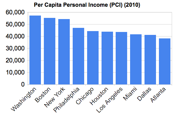
    Chicago ranked 5th out of 10 in per capita personal income, beating LA:


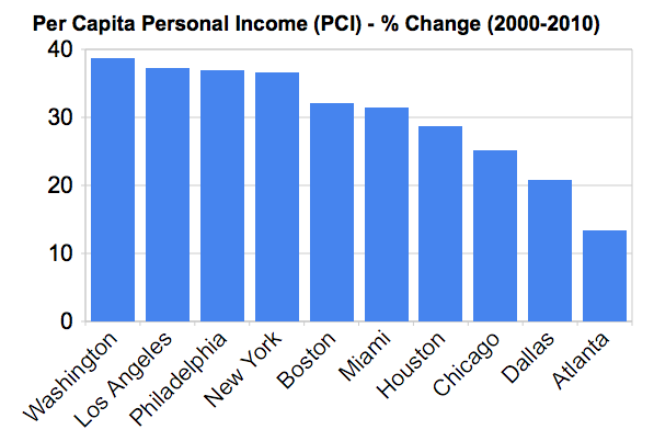
    But Chicago ranked only 8th out of 10 in PCPI growth:


    On the whole, this is a rather uninspiring collection of economic statistics for the Windy City, particularly after it did so well in the 1990s.

    Fiscal Crisis

    No discussion of Chicago’s problems in the 2000s would be complete without a review of its fiscal problems. However, as I already gave the numbers in my City Journal article, I won’t repeat them here. If anything, the problem has only gotten worse since that went to press. While Chicago may not be the worst municipality in terms of fiscal issues, Illinois is the worst state, and that will continue to be a drag until it’s addressed.

    Crime

    Among the biggest complaints about my article was that I didn’t address the crime problem in Chicago. Without a doubt, crime is a problem. Murders are up 38% or so just in 2012. The city of Chicago has a much higher murder rate than the cities of New York or Los Angeles. There has also been a national headline grabbing series of high profile attacks in affluent areas like the Gold Coast and Streeterville. The strength of the Chicago Police Department is somewhere between 500-1000 officers short of where it should be.

    I’m not the best equipped person to talk about crime, but I actually think the crime problem is overstated. Yes, it’s serious. The murder rate especially is troubling. But analyses I’ve read suggest that overall crime isn’t spiraling out of control in Chicago. Also, flash mob type attacks are happening across the country, in places ranging from Philadelphia to Portland. This isn’t a unique to Chicago situation. So I don’t want to claim that Chicago’s crime problems are uniquely bad, though they shouldn’t be minimized.

    Without a doubt the incredible collapse in crime in New York perhaps more than any other single factor fueled that city’s comeback, and it wouldn’t surprise me if it were a big factor in that city’s out performance in the 2000s. Mark Bergen cited some interesting research that suggested that for every murder in your city, 70 people move out. If Chicago had matched New York’s crime performance, it would have held steady or even gained population based on this relationship. If true, wow.

    Regardless, public safety is job #1 for any mayor, so Rahm Emanuel is rightly feeling the heat on this even if he can’t necessarily be blamed for what’s going on.

    Schools

    Others have cited Chicago’s poor public school system. Again, I’m not sure Chicago’s schools are any worse than any other big city system, and there are a number of magnet and neighborhood schools that are now attracting the children of the well-off. I’d have to see something that suggested Chicago took a turn for the worse on schools in the 2000s on a comparative basis.

    Conclusion

    There are more statistics that could be given, and if you want them, I suggest reading the very data rich OECD Territorial Review of Chicago.

    On the whole I think it’s pretty clear that there was trouble in Chicago during the 2000s – and more trouble than most large cities experienced during what was a tough decade nationally.

    Some rightly noted that I discuss the divergent performance of Chicago in the 1990s vs the 2000s, but that my structural factors that weaken Chicago were probably the same in both decades. So why the difference? I want people to know I plan to address that in a future post shortly, but next up we’ll have a look at Chicago’s present day strengths before moving on.

    Read part 1 in this series.

    Aaron M. Renn is an independent writer on urban affairs and the founder of Telestrian, a data analysis and mapping tool. He writes at The Urbanophile, where this piece originally appeared.

    Photo by smik67.

  • Housing Affordability Protests Occurring in “Livable” Hong Kong, Not “Sprawling” Atlanta

    The Economist has published another in its city rating series, under the headline "The Best city in the World." This one was the result of a contest examining ways to elaborate on its rating system. The winner, Filippo Lovato, added a spatial dimension to the ratings, which included a 5 point rating of "sprawl," a pejorative term for the natural expansion of cities (which in this article means urban areas, areas of continuous urban development). Much of the urban planning literature is pre-occupied with combating urban sprawl, though urban expansion continues virtually everywhere around the world, as cities add population and become more affluent.

    Livability for Whom?

    As Jon Copestake, the Editor of the Economist Intelligence Unit’s Cost of Living and Livability surveys and I discussed in front of a Property Institute of Western Australia meeting, The Economist livability ratings are not aimed at average resident households, but rather at an international audience, such as corporate executives and corporate relocation services. This distinction can be important.

    Hong Kong was top ranked for livability in the new Economist list. Doubtless this is accurate for well paid executives posted temporarily, who are granted substantial housing allowances by their employers and who can live in luxury condominiums within a short walk or taxi ride to their jobs in Central (the core of the Hong Kong central business district).

    For local residents, livability is measured differently than for jet-setters or corporate executives.

    Hong Kong: Smart Growth Model

    With the developed world’s highest urban area density and lowest automobile market share, Hong Kong beguiles anti-sprawl "smart growth" crusaders, for whom these two characteristics are the "two great commandments."

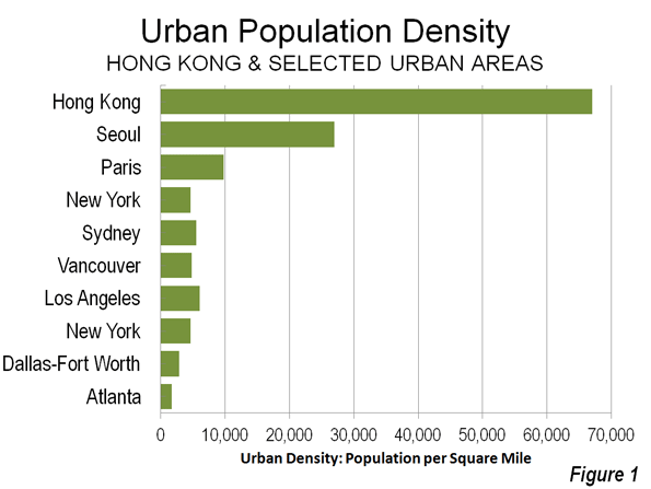
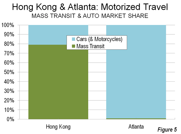
    The entire  Hong Kong urban form (urban area) is as dense as Manhattan at 67,000 per square mile (25,900 per square kilometer), but is more than twelve times the density of the New York urban area: the city and its “sprawling” surrounding suburbs (5,300 per square or 2,100 per square kilometer). Similarly, Hong Kong is somewhat more dense than the ville de Paris, but seven times the density of the Paris urban area (9,800 per square mile or 3,800 per square kilometer). This hyper-density combined with one of the world’s strongest central business districts give Hong Kong a nearly 80% mass transit share of motorized travel, nearly 10 times that of the New York urban area and more than three times that of the Paris urban area (Figure 1).

    "Livable" Hong Kong?

    To its permanent and unsubsidized residents, though, Hong Kong’s spatial Nirvana does not provide much in terms of livability.

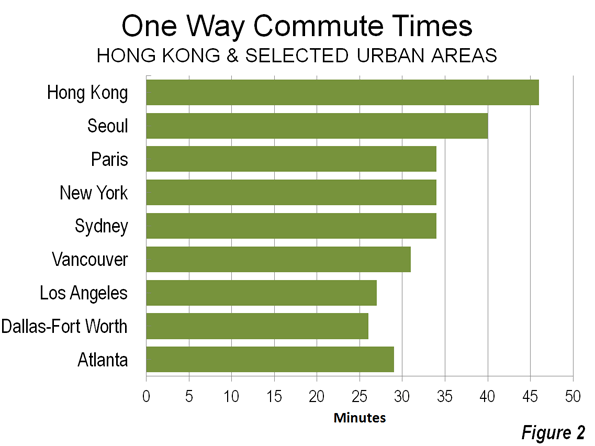
    Excessively Long Commutes Hong Kong’s high density indicates that jobs and houses are relatively close to one another, which should indicate that commute times would be short. Not so. Commutes are among the longest in the developed world – only Tokyo residents take more time to get to work. (Figure 2)

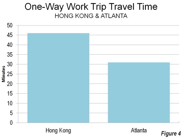
    The average one way commute is 46 minutes in Hong Kong, well above the developed world average of 33 minutes for urban areas over 5,000,000 population. By comparison, commuters in similarly sized Dallas-Fort Worth (26 minutes) and "gridlocked" Los Angeles (27 minutes) get to work much faster. Commuting also takes longer in Hong Kong than in Paris (34 minutes) and London (37 minutes).  Lengthy commutes impose an economic price and make Hong Kong less livable.

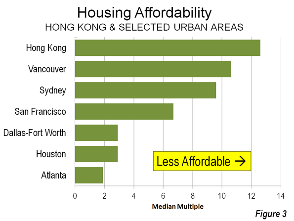
    Exorbitant House Prices: Hong Kong’s housing, the largest household budget item, is profoundly unaffordable. The 8th Annual Demographia International Housing Affordability Survey rates Hong Kong as the most costly out of 325 metropolitan areas. The median house price in Hong Kong’s is 12.6 times the median annual gross household income (the "median multiple"), which leaves little more than a pittance in discretionary income for many households. Perhaps this is why Hong Kong’s fertility rate has fallen to rock bottom levels near the lowest on the planet – people cannot afford kids.

    Even during the housing bubble, coastal California never became so unaffordable. Hong Kong housing is nearly twice as costly as San Francisco (6.7 median multiple) and more than four times as costly as Dallas-Fort Worth (2.9), Houston (2.9) or Atlanta (Figure 3).

    Concern about housing affordability has become so intense that it is an issue in public protests, which The Economist reports to have drawn up to 400,000 people earlier this month (link to photo). Exorbitant house prices make Hong Kong less livable.

    "Sprawling" Atlanta

    Things are much different in "sprawling" Atlanta, which The Economist’s spatial list ranks as the worst among the US entries. Atlanta is at the opposite end of the density spectrum from Hong Kong, with the lowest urban population density of any major developed world urban area.

    Short Commutes: Atlanta’s low density would suggest that jobs and houses must be so far apart that commute times are very long. Again, not so. Atlanta commuters have among the shortest travel times (29 minutes) in the world among urban areas of similar size (see Note: Jobs-Housing Balance). Shorter travel times make Atlanta more livable (Figure 4).

    Other similarly sized US urban areas do even better, such as Dallas-Fort Worth (26 minutes) and Atlanta’s leaders know that traffic congestion need to be eased to improve Atlanta’s competitiveness. But the political process politics has offered a dysfunctional plan that would spend more than half of a new tax on mass transit, which is used by only the one percent. Less than one half of the money would be spent on the roads that the 99 percent use (Figure 5). Any strong growth will overwhelm the stingy highway improvements, and if the voters approve the July 31 referendum, Atlanta’s travel time advantage over Hong Kong could narrow.

    Affordable House Prices: Despite being the bane of planning orthodoxy, Atlanta’s has far better housing affordability than Hong Kong. The median multiple is 1.9, compared to Hong Kong’s 12.6. Hong Kongers pay six times as much of their income for their houses (which are also two-thirds smaller than in Atlanta). So far, there have been no protests against Atlanta’s low house prices. Better housing affordability makes Atlanta area more livable.  

    The Hong Kong Model

    Hong Kong’s high density (more than double that of any other large developed world urban area) is an accident of history, the result of geo-politics, not urban planning. Further, China’s impressive new cities are being built at a small fraction of Hong Kong densities. Yet, Hong Kong has given much to the world. Not least is the fact that its market oriented economy served as the model for economic reform which has radically improved livability for hundreds of millions of people in China.

    Further, Hong Kong is attractive as one of the world’s premier tourist destinations. For aficionados of cities, like me, Hong Kong is intensely interesting. It is the ultimate in urbanization. It is a wonderful place to visit and to live – if someone else is paying the bills.

    However, the interplay between Hong Kong’s hyper-dense urban form and its transportation system burdens Hong Kong residents dearly, both in time and money. For them, Hong Kong is hardly a model of livability.

    ——————-

    Note: Commuting in Dallas-Fort Worth: Larger Dallas-Fort Worth has faster average work trip travel times than Atlanta, at 26 minutes, which are principally are aided by its much superior freeway (motorway) systems and arterial street (non-freeway boulevard) systems. Transit carries about one-half the share (0.6%) of travel in Dallas-Fort Worth as in Atlanta.

    Note: Jobs-Housing Balance: One of urban planning’s principal goals is to achieve a jobs-housing balance, wherein jobs and housing are so close that people can walk to work or use transit, minimizing travel times and distances. Hong Kong is best in this, with its small urban footprint. Yet, despite having achieved the ultimate, it takes Hong Kongers much longer to get to work than Atlantans. The comparison of Hong Kong and Atlanta shows this theoretical measure to be of little importance. A better indicator of the jobs-housing balance is practical – how long it takes to get to work.

    Note: Travel Times by Car and Transit: Mass transit has substantially longer average work trip travel times than cars in nearly all of the world metropolitan areas for which data is available. In Atlanta, the average work trip by car (single-occupancy) was 29 minutes in 2007, compared to 54 minutes for mass transit.

    ———-

    Wendell Cox is a Visiting Professor, Conservatoire National des Arts et Metiers, Paris and the author of “War on the Dream: How Anti-Sprawl Policy Threatens the Quality of Life.”

    Photograph: Kowloon, Hong Kong (by author)

  • Are Millennials the Screwed Generation?

    Today’s youth, both here and abroad, have been screwed by their parents’ fiscal profligacy and economic mismanagement. Neil Howe, a leading generational theorist, cites the “greed, shortsightedness, and blind partisanship” of the boomers, of whom he is one, for having “brought the global economy to its knees.”

    How has this generation been screwed? Let’s count the ways, starting with the economy. No generation has suffered more from the Great Recession than the young. Median net worth of people under 35, according to the U.S. Census, fell 37 percent between 2005 and 2010; those over 65 took only a 13 percent hit.

    The wealth gap today between younger and older Americans now stands as the widest on record. The median net worth of households headed by someone 65 or older is $170,494, 42 percent higher than in 1984, while the median net worth for younger-age households is $3,662, down 68 percent from a quarter century ago, according to an analysis by the Pew Research Center.

    The older generation, notes Pew, were “the beneficiaries of good timing” in everything from a strong economy to a long rise in housing prices. In contrast, quick prospects for improvement are dismal for the younger generation.

    One key reason: their indebted parents are not leaving their jobs, forcing younger people to put careers on hold. Since 2008 the percentage of the workforce under 25 has dropped 13.2 percent, according to the Bureau of Labor Statistics, while that of people over 55 has risen by 7.6 percent.

    “Employers are often replacing entry-level positions meant for graduates with people who have more experience because the pool of applicants is so much larger. Basically when unemployment goes up, it disenfranchises the younger generation because they are the least qualified,” observes Kyle Storms, a recent graduate from Chapman University in California.

    Overall the young suffer stubbornly high unemployment rates—and an even higher incidence of underemployment. The unemployment rate for people between 18 and 29 is 12 percent in the U.S., nearly 50 percent above the national average. That’s a far cry from the fearsome 50 percent rate seen in Spain or Greece, or the 35 percent in Italy and 22 percent in France and the U.K., but well above the 8 percent rate in Germany.

    The screwed generation also enters adulthood loaded down by a mountain of boomer- and senior-incurred debt—debt that spirals ever more out of control. The public debt constitutes a toxic legacy handed over to offspring who will have to pay it off in at least three ways: through higher taxes, less infrastructure and social spending, and, fatefully, the prospect of painfully slow growth for the foreseeable future.

    In the United States, the boomers’ bill has risen to about $50,000 a person. In Japan, the red ink for the next generation comes in at more than $95,000 a person. One nasty solution to pay for this growing debt is to tax workers and consumers. Both Germany and Japan, which appears about to double its VAT rate, have been exploring new taxes to pay for the pensions of the boomers.

    The huge public-employee pensions now driving many states and cities—most recently Stockton, Calif.—toward the netherworld of bankruptcy represent an extreme case of intergenerational transfer from young to old. It’s a thoroughly rigged boomer game, providing guaranteed generous benefits to older public workers while handing the financial upper echelon a “Wall Street boondoggle” (to quote analyst Walter Russell Mead).

    Then there is the debt that the millennials have incurred themselves. The average student, according to Forbes, already carries $12,700 in credit-card and other kinds of debt. Student loans have grown consistently over the last few decades to an average of $27,000 each. Nationwide in the U.S., tuition debt is close to $1 trillion.

    This debt often results from the advice of teachers, largely boomers, that only more education—for which costs have risen at twice the rate of inflation since 2000—could solve the long-term issues of the young. “Our generation decided to go to school and continue into even higher forms of education like master’s and Ph.D. programs, thinking this will give us an edge,” notes Lizzie Guerra, a recent graduate from San Francisco State. “However, we found ourselves incredibly educated but drowning in piles of student loans with a job market that still isn’t hiring.”

    More maddening still, the payback for this expensive education appears to be a chimera. Over 43 percent of recent graduates now working, according to a recent report by the Heldrich Center for Workforce Development, are at jobs that don’t require a college education. Some 16 percent of bartenders and almost the same percentage of parking attendants, notes Ohio State economics professor Richard Vedder, earned a bachelor’s degree or higher.

    “I work at the Gap and Pacific Pak Ice, two jobs that I don’t see myself working long term nor jobs that are specific to my major,” notes recent University of Washington graduate Marshel L. Renz. “I’ve been applying to five jobs a week and have gotten nothing but rejections.”

    Particularly hard hit are those from less prestigious schools or with majors in the humanities, notes a recent Pew study. Among 2011 law-school graduates, half could not find a job in the legal field nine months after finishing school. But it’s not just the lawyers and artists who are suffering. Overall the incomes earned by graduates have dropped over the last decade by 11 percent for men and 7.6 percent for women. No big surprise, then, that last year’s class suffered the highest level of stress on record, according to an annual survey of college freshmen taken over the past quarter century.

    The proliferation of graduate degrees also impacts those many Americans who don’t go (or haven’t yet gone) to college. High-school graduates now find themselves competing with college graduates for basic jobs in service businesses. Unemployment among 16- to 19-year-olds this summer is nearly 25 percent, while for high-school graduates between 2009 and 2011, only 16 percent have found full-time work, and 22 percent work part time.

    Once known for their optimism, many millennials are turning sour about the future. According to a Rutgers study, 56 percent of recent high-school graduates feel they would not be financially more successful than their parents; only 14 percent thought they’d do better. College education doesn’t seem to make a difference: 58 percent of recent graduates feel they won’t do as well as the previous generation. Only 16 percent thought they’d do better.

    This perception builds on the growing notion among economists that the new generation must lower its expectations. Since the financial panic of 2008, “the new normal” has become conventional wisdom. Coined by Mohamed El-Erian at Pimco, it’s been used to describe our world as one “of muted Western growth, high unemployment and relatively orderly delevering.”

    The libertarian Tyler Cowen, in his landmark work The Great Stagnation, makes many of the same points, claiming that the U.S. “frontier” has closed both technologically and in terms of human capital and resources. He maintains that we’ve already harvested “the low-hanging fruit” and that we now rest on a “technological plateau,” making any future economic progress difficult to achieve. Stagnation is not such a bad thing for people already established in college-campus jobs, think tanks, or powerful financial institutions. But it wipes out the hope for the new generation that they can achieve anything resembling the American Dream of their parents or even grandparents.

    Inevitably, young people are delaying their leap into adulthood. Nearly a third of people between 18 and 34 have put off marriage or having a baby due to the recession, and a quarter have moved back to their parents’ homes, according to a Pew study. These decisions have helped cut the birthrate by 11 percent by 2011, while the marriage rate slumped 6.8 percent. The baby-boom echo generation could propel historically fecund America toward the kind of demographic disaster already evident in parts of Europe and Japan.

    The worst effects of the “new normal” can be seen among noncollege graduates. Conservative analysts such as Charles Murray point out the deterioration of family life—as measured by illegitimacy and low marriage rates—among working-class whites; among white American women with only a high-school education, 44 percent of births are out of wedlock, up from 6 percent in 1970. With incomes dropping and higher unemployment, Murray predicts the emergence of a growing “white underclass” in the coming decade.

    The prospect of downward mobility is most evident in recent discussions about the future of the housing market. Since World War II the expectation of each generation was to own property, preferably a single-family house. The large majority of boomers became homeowners during the Reagan-Clinton era. Yet it is increasingly fashionable to insist this “dream” must be expunged. If millennials ever move out of their parents’ house, they will live in apartments they don’t own. There’s a lot of talk about a “generation rent” replacing a primarily suburban ownership society with a new caste of city-dwelling renters. “I’m hoping that the millennial generation doesn’t set its sights on homeownership as a benchmark of economic stability,” sociologist Katherine Newman suggests, “because it’s going to be out of reach for so many of them.”

    No doubt the prospects for homeownership will be tough in the years ahead. But it’s delusional to believe millennials don’t desire the same things as previous generations, note generational chroniclers Morley Winograd and Mike Hais. Survey research finds that 84 percent of 18- to 34-year-olds who are currently renting say that they intend to buy a home even if they can’t currently afford to do so; 64 percent said it was “very important” to have an opportunity to own their own home.

    And where do millennials see their dream house? According to research at Frank Magid Associates, 43 percent describe suburbs as their “ideal place to live,” compared with just 31 percent of older generations. Even though big cities are often preferred among college graduates in their 20s, only 17 percent of millennials say they want to settle permanently in one. This was the same percentage of members of this generation who expressed a preference for living in rural or small-town America.

    So far, the Great Recession has driven young people around the high-income world to the left. Generations growing up in recessions appear more amenable to arguments for government-mandated income redistribution. And since so few young people pay much in the way of taxes, they are less affronted by the prospect of forking over than older voters, who do. This left-leaning tendency has been on display in recent European elections. In France, 57 percent voters 18 to 24 supported the Socialist François Hollande, one of the reasons why the conservative Nicolas Sarkozy lost. Similarly, 37 percent of those in that age category voted for Syrizia, the far-left party in Greece.

    But Winograd and Hais—and Democratic strategist Ruy Teixeira—say it’s not just economics working for the Democrats. Social issues such as gay marriage, women’s rights, and immigration—a large proportion of millennials are children of newcomers—tend to drive younger voters toward the Democrats. Half of millennials, for example, favor gay marriage, compared with a third of boomers, and some predict the Republican embrace of draconian social conservatism will serve to harden the Democratic tilt of millennials for the foreseeable future.

    Yet Republicans may take heart from some of the more conservative values embraced by the young. As a group, millennials appear to be very family-oriented—being good parents is often their highest priority—and roughly two thirds claim to believe in God. And since their long-term aspirations are not so different from those of earlier generations—they still want to own a home in a nice, secure neighborhood—Republicans could make a case that their economic model will work better with their personal goals.

    Right now, politics is just another place where American millennials are getting screwed. Republicans want to deport young Latinos while cutting investments, such as roads and skills education, that would benefit younger voters. Democrats, meanwhile, seem determined to mortgage the future with high spending on pensions, predominantly for aging boomers; cascading indebtedness; and economic policies unfriendly to the rapid growth necessary to assure upward mobility for the new generation.

    This suggests millennials need to force the parties to cater to them and play hard to get. Being taken for granted, as African-Americans have been, does not always produce the best results for any demographic grouping. Politicians target “soccer moms,” “independents,” and suburban voters precisely because they are not predictable. Millennials should not want to be in anyone’s hip pocket.

    Wanting the next generation to succeed is in everyone’s long-term interest. Eventually they will constitute the majority of parents, potential homeowners, and workers. This year they will comprise 24 percent of voting-age adults, up from 18 percent in 2008; by 2020 they will amount to a third of all eligible voters. And if, by then, they are still a screwed generation, they won’t be the only ones suffering. America will be screwed, too.

    Research assistance by Gary Girod. Portrait interviews by Eliza Shapiro.

    Joel Kotkin is executive editor of NewGeography.com and is a distinguished presidential fellow in urban futures at Chapman University, and contributing editor to the City Journal in New York. He is author of The City: A Global History. His newest book is The Next Hundred Million: America in 2050, released in February, 2010.

    This piece originally appeared in Newsweek Magazine.

    Unemployed photo by BigStockPhoto.com.

  • Core City Growth Mainly Below Poverty Line

    Over the toughest economic decade since Great Depression, the nation’s core cities continued to gain more than their share the below poverty line population in the 51 metropolitan areas with more than 1,000,000 population. Between 2000 and 2010, core cities (Note 1) attracted approximately 10 percent of the increase in population (Note 2) while adding 25 percent of the increase in people under the poverty line (Figure 1).

    Most New Core City Residents in Poverty: The core city poverty trend was overwhelming. In the core cities of the 51 metropolitan areas with more than 1,000,000 population (2010), 81 percent of the aggregate population increase was under the poverty line. This compares to the 32 percent of the suburban population increase that was below the poverty line. This may be a much lower figure than the concentration in the core cities, but even that also is far too high (Figure 2).

    The trend in core city poverty concentration was also pervasive. In 39 of the 51 metropolitan areas, core cities accounted for a greater share of poverty level population growth than overall population growth. One of the exceptions was Louisville, where the core city expanded to nearly six times its 2000 land area and more than doubled its population (Note 3). The result was to convert Louisville into a largely suburban city, which masks the high poverty rate in genuine urban core of the former city.

    Poverty in the Suburbs: At the same time, as core city population growth has stalled, much of the numeric increase in the below poverty line population has been in the suburbs. In 2010, the Brookings Institution reported that a majority of the metropolitan population below poverty was in the suburbs (Note 3). This is to be expected, since suburban areas account for nearly 75 percent of major metropolitan area population.

    Partially in response to the Brookings Institution finding, there has been some misinterpretation as to the relative economic fortunes of the core cities and the suburbs. This is consistent with the continuing "drumbeat" of the "return to the cities," which results of the last definitive ten year census only briefly quieted. The "great inversion" cited by Aaron Ehrenhalt and others, wherein the affluent "flock" (the recurring term) to the cities, as the suburbs are ghettoized, remains far from an actual reality.  

    Overall the average major metropolitan area poverty rate rose from 10.9 percent in 2000 to 14.1 percent in 2010. Rather than gentrify, the core city rate rose from 19.2 percent to 23.3 percent, while the suburban rate rose from 8.2 percent to 11.3 percent (Figure 3).

    Core City Poverty Rates Double the Suburbs: In 2010, core city poverty rates were higher in every major metropolitan area than in the suburbs. Overall, average core city poverty rates were more than double that of the suburbs in most metropolitan areas (27 of 51). Among the 10 largest metropolitan areas, the core cities of New York, Chicago, Houston, Philadelphia, Miami, Washington and Boston (Figure 4) suffered poverty rates more than double  those of their suburbs. The cities of Milwaukee and Hartford had the highest poverty rates relative to their suburbs, at four or more times.

    Shares of Poverty Level Population in the Core Cities: On average, 41 percent of metropolitan area populations living below the poverty rate resided in the core cities. The city of San Antonio had the highest share of its metropolitan below poverty population, at 73 percent, followed closely by the city of Milwaukee, at 72 percent. New York City accounted for 63 percent of its metropolitan below poverty line population and the city of San Jose 61 percent. Even after incorporating suburbs, the city of Louisville contained 57 percent of its metropolitan below poverty level population (Figure 5).

    Highlights of the 2010 Data: The 2010 poverty rates for metropolitan areas, core cities and suburbs are shown in the table below. Highlights of the data are described below:

    Metropolitan Areas: The highest metropolitan area poverty rates were in Memphis (19.1 percent), New Orleans (17.4 percent) and Riverside-San Bernardino (17.1 percent). The lowest metropolitan area poverty rates were in Washington (8.4 percent), Hartford (10.1 percent) and Boston (10.3 percent).

    Core Cities: The city of Detroit had the highest poverty rate, at 37.6 percent, The city of San Bernardino, whose city council voted to file for bankrupcty on July 10, had the second highest poverty rate at 34.6 percent, and Cleveland ranked third highest, at 34.0 percent.  The lowest core city poverty rates were in high-tech centers, the city of San Jose (12.6 percent), the city of Seattle (14.7 percent and in the two core cities of San Francisco-Oakland (15.7 percent). Despite the strong metropolitan area showing (#1) and high suburban ranking (#3), the city of Washington had only the 15th lowest poverty rate among core cities.

    Suburbs: The highest suburban poverty rates were in Riverside-San Bernardino (16.2 percent), Miami (15.9 percent) and Oklahoma City (15.2 percent). The lowest suburban poverty rates were in Baltimore (6.7 percent), Milwaukee (6.9 percent) and Washington (7.1 percent), with Baltimore and Washington profiting from strong federal government employment and contracting.

    The data reflects the continuation of longer term trends as wealth losses continue to afflict many core cities and as domestic migrants continue to move away (As was previously reported core counties, the lowest level at which there is migration data, have predominantly lost domestic migrants, both between 2000 and 2009 and in the latest estimates, between 2010 and 2011.) The problem, however is much larger. Both the core cities and the suburbs are are challenged by heightened poverty rates. The entire urban form, from the exurbs and the suburbs to the core cities   need  a substantial reduction in poverty, although  present economic trends are working against this   result.

    2010 Poverty Rates: Major Metropolitan Areas, Core Cities & Suburbs
    Poverty Rates
    Metropolitan Area (MSA) Historical Core City (HCM) MSA City Suburbs City/  Suburbs
    Atlanta, GA Atlanta 14.8% 26.1% 13.9% 1.88
    Austin, TX Austin 15.9% 20.8% 11.7% 1.78
    Baltimore, MD Baltimore 11.0% 25.6% 6.7% 3.80
    Birmingham, AL Birmingham 17.0% 29.5% 14.2% 2.08
    Boston, MA-NH Boston 10.3% 23.3% 8.3% 2.80
    Buffalo, NY Buffalo 14.4% 30.2% 9.7% 3.13
    Charlotte, NC-SC Charlotte 14.5% 17.2% 12.6% 1.36
    Chicago, IL-IN-WI Chicago 13.6% 22.5% 10.0% 2.24
    Cincinnati, OH-KY-IN Cincinnati 14.0% 30.6% 11.4% 2.69
    Cleveland, OH Cleveland 15.1% 34.0% 10.7% 3.19
    Columbus, OH Columbus 15.7% 22.6% 10.5% 2.16
    Dallas-Fort Worth, TX Dallas 14.6% 23.6% 12.5% 1.88
    Denver, CO Denver 12.5% 21.6% 9.7% 2.21
    Detroit,  MI Detroit 16.6% 37.6% 12.4% 3.02
    Hartford, CT Hartford 10.1% 31.2% 7.8% 3.99
    Houston, TX Houston 16.5% 22.8% 13.1% 1.74
    Indianapolis. IN Indianapolis 14.8% 21.1% 9.1% 2.31
    Jacksonville, FL Jacksonville 15.3% 16.7% 13.1% 1.28
    Kansas City, MO-KS Kansas City 12.4% 20.4% 10.0% 2.05
    Las Vegas, NV Las Vegas 15.1% 16.0% 14.7% 1.09
    Los Angeles, CA Los Angeles 16.3% 21.6% 14.0% 1.54
    Louisville, KY-IN Louisville 15.3% 18.9% 12.2% 1.55
    Memphis, TN-MS-AR Memphis 19.1% 26.5% 12.0% 2.20
    Miami, FL Miami 17.1% 32.4% 15.9% 2.04
    Milwaukee,WI Milwaukee 15.5% 29.5% 6.9% 4.30
    Minneapolis-St. Paul, MN-WI Minneapolis & St. Paul 10.9% 23.7% 7.6% 3.10
    Nashville, TN Nashville 15.4% 20.8% 12.2% 1.71
    New Orleans. LA New Orleans 17.4% 27.2% 13.4% 2.02
    New York, NY-NJ-PA New York 13.8% 20.1% 9.0% 2.24
    Oklahoma City, OK Oklahoma City 15.9% 16.8% 15.2% 1.11
    Orlando, FL Orlando 14.7% 18.5% 14.2% 1.30
    Philadelphia, PA-NJ-DE-MD Philadelphia 12.7% 26.7% 7.9% 3.36
    Phoenix, AZ Phoenix 16.3% 22.5% 13.0% 1.73
    Pittsburgh, PA Pittsburgh 12.2% 22.3% 10.7% 2.08
    Portland, OR-WA Portland 13.4% 18.5% 11.7% 1.59
    Providence, RI-MA Providence 13.7% 30.5% 11.7% 2.60
    Raleigh, NC Raleigh 12.9% 18.4% 10.0% 1.84
    Richmond, VA Richmond 11.6% 25.8% 8.9% 2.91
    Riverside-San Bernardino, CA San Bernardino 17.1% 34.6% 16.2% 2.13
    Rochester, NY Rochester 14.2% 33.8% 9.3% 3.62
    Sacramento, CA Sacramento 15.1% 21.5% 13.3% 1.62
    St. Louis,, MO-IL St. Louis 13.3% 27.8% 11.5% 2.42
    Salt Lake City, UT Salt Lake City 13.1% 22.3% 11.3% 1.98
    San Antonio, TX San Antonio 16.3% 19.1% 11.7% 1.64
    San Diego, CA San Diego 14.8% 17.4% 13.0% 1.34
    San Francisco-Oakland, CA San Francisco & Oakland 10.9% 15.7% 9.0% 1.74
    San Jose, CA San Jose 10.6% 12.6% 8.4% 1.49
    Seattle, WA Seattle 11.7% 14.7% 11.1% 1.33
    Tampa-St. Petersburg, FL Tampa 15.4% 21.3% 14.6% 1.46
    Virginia Beach-Norfolk, VA-NC Norfolk 10.6% 16.4% 9.7% 1.69
    Washington, DC-VA-MD-WV Washington 8.4% 19.2% 7.1% 2.69
    Average (Unweighted) 14.1% 23.3% 11.3% 2.18
    Data from American Community Survey, 2010


    Wendell Cox is a Visiting Professor, Conservatoire National des Arts et Metiers, Paris and the author of “War on the Dream: How Anti-Sprawl Policy Threatens the Quality of Life.”

    Photograph: Downtown Detroit (by author)

    ———————-

    Note 1: "Historical core municipalities," which are defined here. One such city is designated in each metropolitan area, except in Minneapolis-St. Paul and San Francisco-Oakland. In each of the metropolitan areas, these are the core cities of the metropolitan area at the beginning of the great automobile-oriented suburban expansion. These cities represent at least the urban core. However, in most cases, these cities  include considerable post-war suburban development is not genuinely urban core, largely due to post-1950 annexations.

    Note 2: The data in this analysis is extracted from the American Community Survey for 2010 and the United States Census of 2000. The metropolitan areas for both years are as geographically defined in 2010. The total population figures are the population for which poverty status has was determined by the Bureau of the Census (in each year this was approximately 98 percent of the total population).

    Note 3: The city of Louisville reached its population peak of 390,000 in 1960. Its highest density was nearly 9,300 per square mile (3,600 per square kilometer) in 1950, when it had a population of 370,000 in 40 square miles (100 square kilometers). The suburban incorporating consolidation of 2000 left the city with under 600,000 population in 340 square miles and a population density of 1,700 per square mile (700 per square kilometer), one of the lowest core city population densities in the nation.

    Note 4: The Brookings Institution report compared its "primary cities" to suburbs for 95 metropolitan areas. The primary cities included some that were little more than small towns at the beginning of the great automobile oriented suburban expansion, such as Aurora (Denver), Mesa (Phoenix), Santa Ana (Los Angeles), Fremont (San Francisco-Oakland) and Arlington (Dallas-Fort Worth), which is not served by mass transit. Each of these municipalities is classified as suburban in this analysis.