Category: Demographics

  • Toward More Competitive Canadian Metropolitan Areas

    The Federation of Canadian Municipalities (FCN) and the Canadian Urban Transit Association (CUTA) have expressed serious concern about generally longer commute trip times making Canadian metropolitan areas less competitive. Each has called for additional funding for transit at the federal level to help reduce commute times and improve metropolitan competitiveness.

    The Right Concern

    The concern over commute times is well placed. Economic research generally concludes that greater economic and employment growth is likely where people can quickly reach their jobs in the metropolitan area. Five of the nation’s six major metropolitan areas (Toronto, Montréal, Vancouver, Ottawa-Gatineau and Calgary) have average one-way work trip travel times that are among the highest in their size classes among 109 metropolitan areas in the more developed world for which data is available. Only Edmonton has an average commute time that is among the shortest (Table 1).

    Table 1
    Average One-way Commute Times: Major Metropolitan Areas
    Compared with International Major Metropolitan Areas
    Major Metropolitan Area One-way Commute Time (Minutes) Overall One-way Commute: Rank out of 109 One-way Commute: Rank in Population Class
    Population Size Class
    Toronto 33 97th  Over 5,000,000 11th out of 19
    Montréal 31 90th  2,500,000 – 5,000,000 19th out of 23
    Vancouver 30 86th  1,000,000 – 2,500,000 60th out of 67
    Ottawa-Gatineau 27 60th  1,000,000 – 2,500,000 55th out of 67
    Calgary 26 58th  1,000,000 – 2,500,000 50th out of 67
    Edmonton 23 15th  1,000,000 – 2,500,000 15th out of 67


    The Wrong Answer

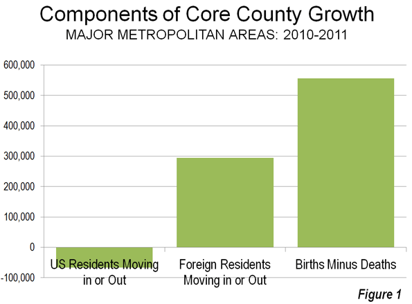
    Yet the solution – more transit and funding for transit – misses the mark. Transit does many things well, but it does not reduce commute times (Figure 1). According to Statistics Canada, average commute times by transit in the Toronto, Montréal and Vancouver metropolitan areas are from 30 per cent longer to nearly double those of average automobile commuters (Note 2). Some 58 percent of car users (drivers and passengers) reach their work locations in under 30 minutes, something accomplished by merely y 25 percent of transit commuters. Overall Toronto commute times are longer than either Los Angeles – famed for its traffic – as well as much less dense, and far less transit dependent, Dallas-Fort Worth. In Toronto, 21 percent of commuters take transit, compared to two percent in Dallas-Fort Worth. Among Montréal commuters, 20 percent use transit and spend more time commuting than their counterparts in more decentralized Phoenix, where less than two percent take transit. Commute times in transit-focused Vancouver are worse than much larger Los Angeles and indeed longer than nearly American metropolitan area, including Dallas-Fort Worth, Houston, and Philadelphia (Table 2).

    Given this pattern, transferring car travel to transit likely would increase commute times and make metropolitan areas even less competitive.

    Table 2
    30- and 40-minute Commute Shares:
    Representative Metropolitan Areas
    Population Classification Work Trip Under 30 Minutes Work Trip 30 to 44 Minutes Work Trip Under 45 Minutes
    5,000,000 and Over      
    Dallas-Fort Worth 59% 24% 83%
    Los Angeles 55% 24% 79%
    Toronto 48% 25% 73%
    Paris 45% 22% 67%
    2,500,000 – 5,000,000      
    Phoenix 57% 26% 83%
    Montréal 47% 27% 74%
    1,000,000 – 2,500,000       
    Edmonton 68% 20% 88%
    Indianapolis 66% 22% 88%
    Ottawa-Gatineau 65% 21% 86%
    Tampa-St. Petersburg 62% 22% 84%
    Calgary 54% 29% 83%
    Vancouver 55% 21% 76%
    Source: Statistics Canada, U.S. American Community Survey, National Institute of Statistics and Economic Studies (France)


    The Geography of Transit

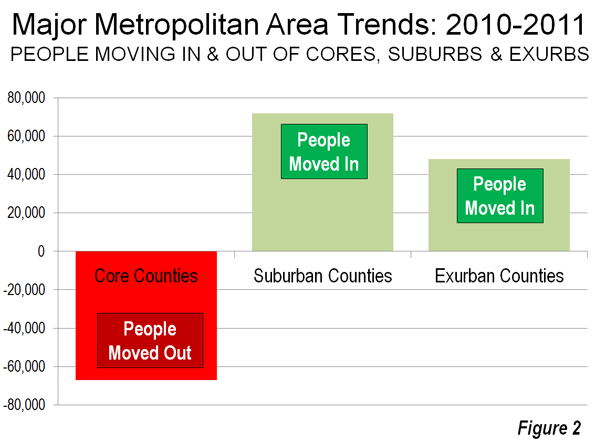
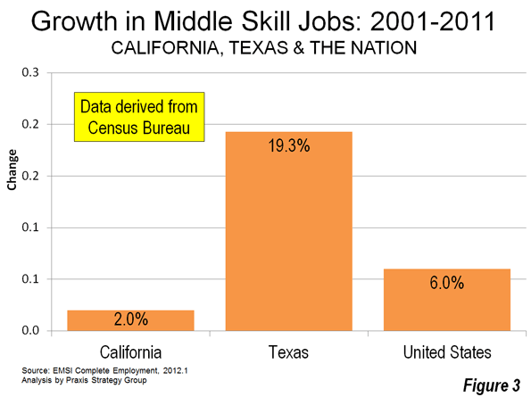
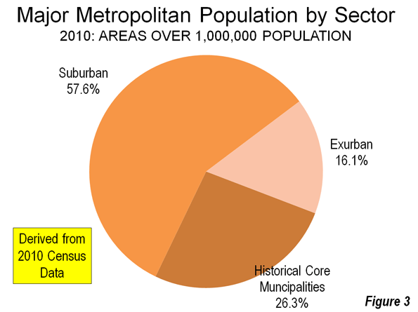
    Rational Transit and Downtown:Transit’s greatest strength is in providing access to the largest downtown areas. These areas have the greatest job densities (jobs per square kilometre) in their metropolitan areas and are typically well served by frequent, rapid and convenient transit service from throughout the metropolitan area. This combination of high employment density and superior transit service attracts one-half or more of all downtown commuters in Canada’s major metropolitan areas to transit (Figure 2). Transit is meets the needs of people who commute to downtown and is the rational choice for many, if not most. However, downtowns contain only a relatively small share (14 per cent) of metropolitan area jobs (Figure 3).

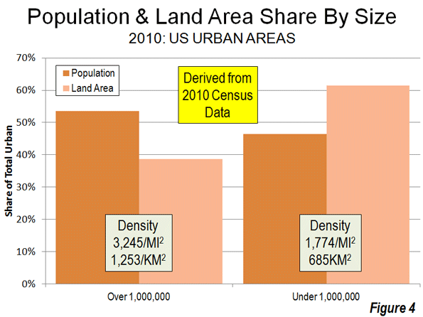
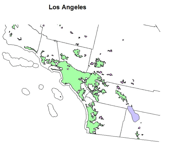
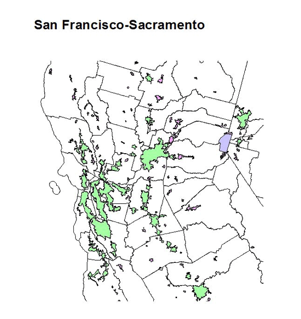
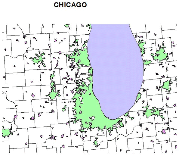
    Rational Personal Mobility Elsewhere: Areas outside downtown lack any such intense concentration of jobs. The area outside downtown, accounting for 6 out of every 7 jobs (Figure 4), maintain much lower employment densities and generally lacks transit service. This is illustrated by the nation’s largest employment center, which surrounds Pearson International Airport in Toronto. Its more than 350,000 employees are spread around an area the size of city of Vancouver (or the city of San Francisco) at a density so low that quick and efficient transit is simply impossible.

    For the overwhelming share of work trips to outside the downtown area, the car does the job and transit accounts for less than 10 percent of commuters. Thus, the automobile is the rational choice for most people who commute to locations outside downtown. And things are not getting better for transit. According to Statistics Canada, employment has been growing much faster outside of downtown than in the high density core areas suited for transit. The 2011 census indicated a continuing dispersion of population as well.


    Transit’s Robust Funding Growth and Declining Productivity

    Strongly Rising Transit Subsidies: Transit subsidies have been growing strongly. According to Transport Canada data, from 1999 to 2008 subsidies grew 83 percent (adjusted for inflation), which is more than three times the 26 percent ridership growth rate and 3.5 times the rate of general inflation. Transit’s declining productivity could indicate a substantial potential for improved cost effectiveness and service expansion within the generous present funding levels.

    Declining Transit Productivity: At the same time, there are concerns about transit productivity. The Conference Board of Canada has documented a 1.2 percent annual decline in productivity for two decades. The same analysis found productivity in other transport sectors to be generally improving. Transit costs have risen well in excess of inflation, service levels and ridership. Rising costs seriously limit transit’s ability to increase its share of travel in metropolitan areas and limits the important role that it is called upon to play in providing door-to-door mobility for the transportation-impaired, such as disabled citizens, the elderly, and students.

    Land Use Strategies that Retard Metropolitan Competitiveness

    Policies that Could Make Metropolitan Areas Less Competitive: While the prospects for improving transit commute times are discouraging, some current land use strategies further increase traffic congestion and lengthen commute times and make metropolitan areas and make metropolitan areas less competitive . Compact cities (also called smart growth) policies have been adopted across Canada in an effort to reduce automobile use and increase urban densities. The planning expectation is that housing should be placed near rail stations. Yet job locations throughout metropolitan areas remain highly dispersed, and with the rise of working at home, are becoming more so. The potential for transit systems (or walking or cycling) to materially impact commuting is very limited in the least.

    International data indicate that higher densities are associated with greater traffic congestion. Further, higher traffic densities are strongly associated with higher levels of air pollution. Improvements in vehicle technology will make reductions in automobile use to reduce greenhouse gas emissions unnecessary, according to U.S. research by McKinsey & Company. Finally, smart growth type policies have been found to retard metropolitan economic growth in the Netherlands, the United Kingdom and the United States (Note 2).

    Improving Metropolitan Competitiveness

    Strategies that reduce commute times can improve metropolitan competitiveness. Expanded telecommuting reduces average commute times by its very nature (though the reported commute times routinely exclude the working at home sector, both in Canada and the US). There are also lessons to be learned from Edmonton and the international metropolitan areas that have been more successful in maintaining shorter commutes: more dispersed employment, lower population densities and a larger share of travel by car (Table 3).

    Table 3
    Comparison of Canadian and U.S. Major Metropolitan Areas
    Average One-way Commute Times and Urban Area Densities
     
    CANADA Canada Metropolitan Areas United States: Metropolitan Area Size Classes
    Commute Time Principal Population Centre Density (per KM2) Average Commute Time Average Principal Population Centre Density (per KM2)
    5,000,000 and Over        
    Toronto 33 2,900 28 1,400
    2,500,000 – 5,000,000        
    Montréal 31 2,200 26 1,200
    1,000,000 – 2,500,00        
    Vancouver 30 1,900 23 1,100
    Ottawa-Gatineau 27 1,900
    Calgary 26 1,600
    Edmonton 23 1,100
    Principal Population Centre: Largest population centre (Statistics Canada term for urban area) in the metropolitan area.


    Focusing on Objectives: To become more competitive, Canada’s metropolitan areas need to improve their average commute times. This requires focusing on strategies that have the highest potential to reduce traffic congestion.

    Residents and businesses in metropolitan areas would be best served by goal-oriented and objective policies squarely directed toward getting people to work faster. The focus should be on what makes commutes shorter, regardless of transport mode, rather than on idealistic notions of how a city should look or how people should travel.

    Wendell Cox is a Visiting Professor, Conservatoire National des Arts et Metiers, Paris and the author of “War on the Dream: How Anti-Sprawl Policy Threatens the Quality of Life”.

    –––

    Note: This article is based upon the recently released Frontier Centre for Public Policy report Improving the Competitiveness of Metropolitan Areas by Wendell Cox, who also serves as a senior fellow at the Centre.

    Note 1: Data not provided for other metropolitan areas.

    Note 2: On a related note, the Bank of Canada (the central bank) and others have indicated a concern about rising house costs relative to incomes. This is to be expected in metropolitan areas adopting green belts, urban growth boundaries and other land rationing policies. Huge housing price increases have occurred in Vancouver, Toronto, Montréal and Calgary (for example), in response to such policies (This is evident from the annual editions of the Demographia International Housing Affordability Survey, sponsored in Canada by the Frontier Centre for Public Policy). The Bank of Canada may be virtually powerless to slow this loss of housing affordability, since its cause (constraining metropolitan land supply) is beyond the reach of the Bank’s monetary policies.

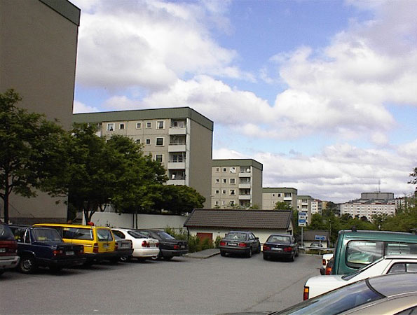
    Photo: Suburban Montreal (by author)

  • Observations on Exurban Trends

    Getting the Migration Story Straight: Analysts continue to misunderstand the recent metropolitan area census estimates. Much of the misunderstanding arises from a misinterpretation of a chart produced by the Brookings Institution, which indicates that the rate of population growth has fallen in exurban counties and was, last year, less than the rate of growth in what Brookings calls emerging suburbs and "city/high density suburbs." However, the Brookings chart characterizes  only total population growth, which is the combination of the natural growth rate, net international migration and net domestic migration. In other words, the Brookings Institution chart includes both people who move between areas of the United States and the net of those who move from outside the United States, are born or died.

    Perhaps the most befuddled was the Arch Daily, which says that "people are leaving the suburbs and once again flocking to the cities…"  In fact exurban and suburban areas continue to grow, though their growth rates have fallen. The highly touted decline in exurban growth rates is for one year only (2010-2011) and represents only the first year in the last 20 that the exurban has trailed that of the "city/high density suburbs." It is also the first year out of the last 20 that the "city/high density suburbs" did not trail both the suburbs and exurbs.

    However, aggregate growth rates say nothing about moving to or from cities. Only one of the components of population change, domestic migration, can possibility indicate movement from the suburbs and exurbs to the cities. People who migrate from outside the nation, for example, are not moving from suburbs to the city (the suburbs of Paris don’t count). People who are born or die are not migrating from the suburbs to the cities (where they might come from or are going has been the source of endless debate through history). The only people who can possibly be moving from suburbs and exurbs to the city are domestic migrants —people who move within the United states.

    Figure 1 indicates the components of population change in the core counties of the nation’s 51 metropolitan areas with more than 1,000,000 population (there are no city level migration data).

    • There was a net gain in natural growth of 556,000 (births minus deaths)
    • There was a net gain in international migration of 295,000 (people who moved from outside the nation to the core counties.
    • There was a net loss in domestic migrants of 67,000. These US residents moved  away from the core counties.

    As we indicated in Still Moving to the Suburbs and Exurbs: The 2011 Census Estimates, there was net domestic migration to the suburbs and exurbs between 2010 and 2011. There was net domestic migration out of the central counties (there is no "city" migration data). This is illustrated in Figure 2, which has been annotated to make the actual moving of people clear.

    If it should ever occur, it will be very clear when people are moving to the cores from the suburbs and exurbs. There will be PLUS domestic migration numbers to the core counties and MINUS domestic migration numbers from the suburbs and exurbs. Until that time any flocking (though that is too strong a word for current trends) will be away from the cores and to the suburbs and exurbs.

    Of course, in the greatest economic downturn in more than 75 years, domestic migration has slowed considerably. It is not surprising, therefore that population growth rates in the exurbs and suburbs have fallen, since far fewer people are moving.

    All Domestic Migration was to the Suburbs: Finally, all of the net domestic migration in the nation was to the suburbs and exurbs of the nation’s major metropolitan areas (Also see Figure 2).

    On the Health of Exurban Housing Markets

    On a related subject, University of South Florida Professor Steven Polzin offered an interesting comment on the Planetizen site:

    While I have not explicitly researched the distribution of home foreclosures as a function of the transportation costs of residents, I would caution analysts to more fully explore the nature of the housing foreclosure trend before jumping to the assumption that transportation costs were a significant contributor to geographically differential rates of foreclosure. Foreclosures were more prominent in homes purchased more recently relative to the housing crash. These new home purchasers were more often highly leveraged, had little equity in their home, and in many cases younger workers with less job seniority and more susceptible to layoffs. In addition, in fringe areas that had been growing there was a high concentration of homes all purchased recently. Thus, new growth areas were more susceptible to both foreclosures and the cascading effect of home depreciation spreading based on nearby foreclosed properties.

    In a new suburb a young financially extended family may lose their job, have no equity in the house and quickly lose their house. Its depreciated value is soon reflected in adjacent appraisals cascading the stress throughout relatively fragile neighborhoods. On the other hand in established neighborhoods only a relatively small share of the homes changed hands near the peak of the building bubble. Thus, many of those homeowners had far more equity in their home and perhaps more job seniority and security enabling them to whether a housing downturn. In addition, the diversity of home ages and types and the less frequent occurrence of foreclosed properties will control the pace at which home value depreciation will cascade through the neighborhood.

    If commuting cost was as big a contributor to suburban fringe foreclosure rates then one would have expected downtown condominiums to weather the housing bubble. In many locations like Florida large clusters of new downtown residential properties suffered the same rapid depreciation as did suburban fringe areas. The concentration of new units seemed to be more critical than the location.

    Similar sentiments have been posted on these pages from time to time, such as here and here.

  • Right in the Middle: The Midwest’s Growth Lessons for America

    The Midwest’s troubles are well-known. The decline of manufacturing has resulted in job losses and dying industrial towns. The best and brightest have fled the flatlands for more exciting, sunnier, mountainous, or coastal places where the real action is. Even Peyton Manning has left the heartland for the Rockies.

    This narrative is so deeply embedded both in and outside of the Midwest that many people overlook the ways in which parts of the region are bouncing back. The Midwest’s story is important because it serves in significant ways as a regional microcosm of how growth and opportunity should look in America today.

    In a recent study we look at trends that upend the conventional wisdom about the Midwest. We find that it is neither doomed to a slow and dirty demise like an old house on an eroding slope, nor forced to reinvent itself Dubai-style in order to compete with Silicon Valley or Manhattan. The Midwest’s future is rooted very much in its past—but with some important updates.

    What do we mean? For starters, this means capitalizing on Americans’ desire to reside where the cost of living and doing business is favorable. As the last Census showed, Americans move in droves to regions where the cost of living is low, businesses face fewer obstacles, and workers have choices. As Wendell Cox and Joel Kotkin have shown, this goes for 25- to 35-year-olds as well as 55- to 65-year-olds. People want options and a good quality of life at a price they can afford.

    In the Midwest, these trends have favored placed like Columbus, Ohio, and Indianapolis, Indiana. When people hear “Midwest,” they are more likely to think of this kind of picture:

    The blue areas show destinations to which people from Detroit have moved between 2000 and 2010. The brown shades are the areas from which Detroit has drawn people. Given Detroit’s well-publicized decline, all the blue should be no surprise.

    But a respectable portion of the Midwest looks like this:

    And this:

    Like most parts of America, Columbus and Indianapolis have seen a net outmigration southward to Florida and Texas. No surprise there. But note how both cities are stealing population from Chicago, Detroit, New York, and even southern California and Miami in Indianapolis’s case. The maps also show how intense interstate competition within the Midwest is right now.

    One important measure of the cost of living is housing affordability, which is typically set at 3.0 as a measure of median housing price divided by median income. Compared to San Francisco at 7.2, New York at 6.1, Los Angeles at 5.9, and Miami at 4.7, Columbus stands at 2.8 and Indianapolis at 2.4. Charlotte, which has been an exemplary Sun Belt growth magnet for a while, stands at 3.9, a slight click above the Chicago area’s 3.8.

    Affordability and overall quality of life as measured by schools and greater disposable income matter a lot—even to technology entrepreneurs. Some Midwestern areas are outpacing coastal areas on this front. In a recent Forbes ranking of tech growth in the nation’s largest 51 metro areas, the Midwest had three cities within the top 15, with Columbus in third position, followed by Indianapolis and St. Louis.

    But it would be wrong for tech boosters to think the Midwest’s future rests in harnessing the power of this sector alone. Rather, it’s a combination of brains and brawn that signify the Midwest’s core strength. When we look at Midwestern areas that have experienced above-average growth in bachelor’s degrees, there are important overlaps with areas experiencing above-average growth in manufacturing, too.

    In the corridor from Madison to Milwaukee, or the outlying areas around Chicago, or the Indianapolis metro area, or even in the Quad Cities on the Iowa-Illinois border, we see higher educational attainment and manufacturing growth occurring together. Cedar Rapids, Iowa, had the highest GDP growth from 2000 to 2010 of any metro area in the Midwest. A new corridor has grown up between Cedar Rapids and Iowa City, home to the University of Iowa; it takes advantage of the region’s historical manufacturing capacity and blends it with new technology. Peoria, Illinois, is second to Cedar Rapids in GDP growth. Peoria is home to 200 manufacturing firms, and it is also a Midwestern leader in college degree attainment.

    Manufacturing continues to be part of the regional DNA in the Midwest. Trying to move away from it would be a fool’s errand, as this picture shows:

    The concentration of manufacturing in middle America is a real asset, especially when combined with higher levels of educational attainment, as we have seen. The Midwest is still home to much of the nation’s skilled labor force. And contrary to the declinist narrative mentioned at the outset, the region has added 50,000 “heavy metal” manufacturing jobs since 2009.

    The challenge for the region, actually, will perhaps be filling manufacturing jobs rather than creating them. A recent Deloitte survey found that 83 percent of manufacturers nationwide suffered a moderate or severe shortage of skilled production workers. The Midwest is poised to establish what we call a “new industrial paradigm,” characterized by a blend of heavy manufacturing, new technology, a more highly educated industrial labor base, and lighter labor restrictions (Indiana just became a right-to-work state, and the much-publicized debates in Wisconsin and Ohio over labor laws have only served to draw more attention to the need for reform, whatever the near-term effects). When you add to all of this the new energy sources discovered in some parts of the Midwest—such as new finds in Utica shale in Ohio—a new industrial paradigm in the region could end up being a large source of new wealth creation in the coming generation.

    So why might the Midwest be something of a microcosm for how growth and opportunity look in America as a whole, given its idiosyncratic reliance on manufacturing not shared by other regions? The main reason is that middle America is a clear picture of how much the basics matter: Cost of living, job quality, schools, and opportunities to develop the right skills for the best jobs. The areas within the Midwest that have gotten the basics right are poaching people and companies from the areas that haven’t. Any economic development strategy that ignores the basics in favor of a more stylized theory of growth will usually run off the rails before too long. Americans, at the end of the day, want the places they live to get the basics right so they themselves can build their lives, start their businesses, and raise their children as they wish.

    This piece originally appeared at The American.

    This peice was adapted from a recent report: "Clues from the Past: The Midwest as an Aspirational Region." Download the full pdf version of the report, including charts and maps about the Great Lakes Region.

    Joel Kotkin is executive editor of NewGeography.com and is a distinguished presidential fellow in urban futures at Chapman University, and contributing editor to the City Journal in New York. He is author of The City: A Global History. His newest book is The Next Hundred Million: America in 2050, released in February, 2010.

    Mark Schill is Vice President of Research at Praxis Strategy Group, an economic development and research firm working with communities and states to improve their economies.

    Ryan Streeter is Distinguished Fellow for Economic and Fiscal Policy at the Sagamore Institute. You can follow his work at RyanStreeter.com and Sagamoreinstitute.org.

    Great Lakes Freighter photo by BigStockPhoto.com.

  • The Export Business in California (People and Jobs)

    California Senate President Pro-Tem Darrell Steinberg countered my Wall Street Journal commentary California Declares War on Suburbia in a letter to the editor (A Bold Plan for Sustainable California Communities) that could be interpreted as suggesting that all is well in the Golden State. The letter suggests that business are not being driven away to other states and that the state is "good at producing high-wage jobs," while pointing to the state’s 10 percent growth over the last decade. Senate President Steinberg further notes that the urban planning law he authored (Senate Bill 375) is leading greater housing choices and greater access to transit.

    This may be a description of the California past, but not present.

    Exporting People

    Yes, California continues to grow. California is growing only because there are more births than deaths and the state had a net large influx of international immigration over the past decade. At the same time, the state has been hemorrhaging residents (Figure 1).

    Californians are leaving. Between 2000 and 2009 (Note), a net 1.5 million Californians left for other states. Only New York lost more of its residents (1.6 million). California’s loss was greater than the population of its second largest municipality, San Diego. More Californians moved away than lived in 12 states at the beginning of the decade. Among the net 6.3 million interstate domestic migrants in the nation, nearly one-quarter fled California for somewhere else.

    The bulk of the exodus was from the premier coastal metropolitan areas. Since World War II, Los Angeles, San Francisco, San Diego and San Jose have been among the fastest growing metropolitan areas in the United States and the high-income world. Over the last decade, this growth has slowed substantially, as residents have moved to places that, all things being considered, have become their preferences.

    More than a net 1.35 million residents left the Los Angeles metropolitan area, or approximately 11 percent of the 2000 population. The San Jose metropolitan area lost 240,000 residents, nearly 14 percent of its 2000 population. These two metropolitan areas ranked among the bottom two of the 51largest metropolitan areas (over 1,000,000 population) in the percentage of lost domestic migrants during the period. The San Francisco metropolitan area lost 340,000 residents, more than 8 percent of its 2000 population and ranked 47th worst in domestic migration (New York placed worse than San Francisco but better than Los Angeles). Each of these three metropolitan areas lost domestic migrants at a rate faster than that of Rust Belt basket cases Detroit, Cleveland and Buffalo.

    San Diego lost the fewest of the large coastal metropolitan areas (125,000). Even this was double the rate of Rust Belt Pittsburgh.

    Exporting Jobs

    California is no longer an incubator of high-wage jobs. The state lost 370,000 jobs paying 25 percent or more of the average wage between 2000 and 2008. This compares to a 770,000 increase in the previous 8 years. California is trailing Texas badly and the nation overall in creating criticial STEM jobs and middle skills jobs (Figures 2 & 3) Only two states have higher unemployment rates than California (Nevada and Rhode Island) . California has the second highest underemployment rate (20.8 percent), which includes the number of unemployed, plus those who have given up looking for work ("discouraged" workers) and those who are working only part time because they cannot find full time work. Only Nevada, with its economy that is overly-dependent on California, has a higher underemployment rate.


    Business relocation coach Joseph Vranich conducts an annual census of companies moving jobs out of California and found a quickening pace in 2012. Often these are the very kinds of companies capable of creating the high-wage jobs that used to be California’s forte. Vranich says that the actual number may be five times as high, which is not surprising, not least because there is no reliable compilation of off-shoring of jobs to places like Bangalore, Manila or Cordoba (Argentina).

    To make matters worse, California is becoming less educated. California’s share of younger people with college degrees is now about in the middle of the states, while older, now retiring Californians are among the most educated in the nation (Figure 4).

    Denying Housing Choice

    It is fantasy to believe, as Steinberg claims, that there are enough single family (detached) houses in the state to meet the demand for years to come. More than 80 percent of the new households in the state chose detached housing over the last decade. People’s actual choices define the market, not the theories or preferences of planners often contemptuous of the dominant suburban lifestyle.

    In contrast, however, the regional plans adopted or under consideration in the Bay Area, Los Angeles and San Diego would require nearly all new housing be multi-family, at five to 10 times normal California densities (20 or more units to the acre are being called for). New detached housing on the urban fringe would be virtually outlawed by these plans. And, when Sacramento does not find the regional plans dense enough, state officials (such as the last two state Attorneys General) are quick to sue. If the "enough detached housing" fantasy held any water, state officials and planners would not be seeking its legal prohibition. To call outlawing the revealed choice of the 80 percent (detached housing) would justify the equivalent of a Nobel Prize in Doublespeak.

    At the same time by limiting the amount of land on which the state preferred high density housing must be built, land and house prices can be expected to rise even further from their already elevated levels (already largely the result of California’s pre-SB 375 regulatory restrictions).

    Transit Rhetoric and Reality

    Transit is important in some markets. About one-half of commuters to downtown San Francisco use transit. The assumptions of SB 375 might make sense if all of California looked like downtown San Francisco. It doesn’t, nor does even most of the San Francisco metropolitan area. Only about 15 percent of employment is downtown, while the 85 percent (and nearly all jobs in the rest of the state) simply cannot be reached by transit in a time that competes with the car. Even in the wealthy San Jose area (Silicon Valley), with its light rail lines and commuter rail line, having a transit stop nearby provides 45 minute transit access to less than 10 percent of jobs in the metropolitan area.

    A recent Brookings Institution report showed that the average commuter in the four large coastal metropolitan areas can reach only 6.5 percent of the jobs in a 45 minute transit commute. This is despite the fact that more than 90 percent of residents can walk to transit stops. Even when transit is close, you can’t get there from here in most cases in any practical sense (Figure 5).

    SB 375 did little to change this. For example, San Diego plans to spend more than 50 percent of its transportation money on transit over the next 40 years. This is 25 times transit’s share of travel (which is less than 2 percent). Yet, planners forecast that all of this spending will still leave 7 out of 8 work and higher education trips inaccessible by transit in 30 minutes in 2050. Already 60 to 80 percent of work trips in California are completed by car in 45 minutes and the average travel time is about 25 minutes.

    For years, planners have embraced the ideal of balancing jobs and housing, so that people would live near where they work, while minimizing travel distances. This philosophy strongly drives the new SB 375 regional plans. What these plans miss is that people choose where to work from the great array of opportunities available throughout the metropolitan area. These varied employment opportunities that are the very reason that large metropolitan areas exist, according to former World Bank principal planner Alain Bertaud.

    People change jobs far more frequently than before and multiple earners in households are likely to work far apart. Similar intentions led to the development up to four decades ago of centers like Tensta in Stockholm, which ended up as concentrated low income areas (Photo). It California, such a concentration would do little to improve transit ridership, even low-income citizens are four to 10 times as likely use cars to get to work than to use transit.


    Tensta Transit Oriented Development: Stockholm

    All of this means more traffic congestion and more intense local air pollution, because higher population densities are associated with greater traffic congestion. Residents of the new denser housing would face negative health effects because there is more intense air pollution, especially along congested traffic corridors.

    Self-Inflicted Wounds

    Worst of all, California’s radical housing and transportation strategies are unnecessary. The unbalanced and one-dimensional pursuit of an idealized sustainability damages both quality of life and the economy. This is exacerbated by other issues, especially the state’s dysfunctional economic and tax policies. It is no wonder California is exporting so many people and jobs. California’s urban planning regime under SB 375 is poised to make it worse.

    Wendell Cox is a Visiting Professor, Conservatoire National des Arts et Metiers, Paris and the author of “War on the Dream: How Anti-Sprawl Policy Threatens the Quality of Life”.

    Net Domestic Migration: 2000-2009
    Rank Metropolitan Area Net Domestic Migration Compared to 2000 Population
    1 Raleigh, NC         194,361 24.2%
    2 Las Vegas, NV         311,463 22.4%
    3 Charlotte, NC-SC         248,379 18.5%
    4 Austin, TX         234,239 18.5%
    5 Phoenix, AZ         543,409 16.6%
    6 Riverside-San Bernardino, CA         469,093 14.3%
    7 Orlando, FL         225,259 13.6%
    8 Jacksonville, FL         126,766 11.3%
    9 Tampa-St. Petersburg, FL         260,333 10.8%
    10 San Antonio, TX         177,447 10.3%
    11 Atlanta, GA         428,620 10.0%
    12 Nashville, TN         123,199 9.4%
    13 Sacramento, CA         141,117 7.8%
    14 Richmond, VA           75,886 6.9%
    15 Portland, OR-WA         121,957 6.3%
    16 Dallas-Fort Worth, TX         317,062 6.1%
    17 Houston, TX         243,567 5.1%
    18 Indianapolis. IN           72,517 4.7%
    19 Oklahoma City, OK           41,082 3.7%
    20 Denver, CO           66,269 3.0%
    21 Louisville, KY-IN           34,381 3.0%
    22 Birmingham, AL           26,934 2.6%
    23 Columbus, OH           34,204 2.1%
    24 Kansas City, MO-KS           31,747 1.7%
    25 Seattle, WA           40,741 1.3%
    26 Minneapolis-St. Paul, MN-WI          (19,731) -0.7%
    27 Memphis, TN-MS-AR            (8,583) -0.7%
    28 Hartford, CT            (9,349) -0.8%
    29 Cincinnati, OH-KY-IN          (17,648) -0.9%
    30 Virginia Beach-Norfolk, VA-NC          (20,005) -1.3%
    31 Baltimore, MD          (36,407) -1.4%
    32 St. Louis, MO-IL          (43,750) -1.6%
    33 Philadelphia, PA-NJ-DE-MD        (115,890) -2.0%
    34 Pittsburgh, PA          (52,028) -2.1%
    35 Washington, DC-VA-MD-WV        (107,305) -2.2%
    36 Providence, RI-MA          (49,168) -3.1%
    37 Salt Lake City, UT          (34,428) -3.5%
    38 Rochester, NY          (40,219) -3.9%
    39 San Diego, CA        (126,860) -4.5%
    40 Buffalo, NY          (55,162) -4.7%
    41 Milwaukee,WI          (74,453) -5.0%
    42 Boston, MA-NH        (235,915) -5.4%
    43 Miami, FL        (287,135) -5.7%
    44 Chicago, IL-IN-WI        (561,670) -6.2%
    45 Cleveland, OH        (136,943) -6.4%
    46 Detroit,  MI        (366,790) -8.2%
    47 San Francisco-Oakland, CA        (347,375) -8.4%
    48 New York, NY-NJ-PA     (1,962,055) -10.7%
    49 Los Angeles, CA     (1,365,120) -11.0%
    50 San Jose, CA        (240,012) -13.8%
    51 New Orleans, LA        (301,731) -22.9%
    Data from US Census Bureau


    —–

    Note:  2000 to 2010 data not available

    Lead photo: Largely illegal to build housing under California Senate Bill 375 planning

  • Is Negative Population Growth Upon Us? Deaths Exceed Births in One Third of U.S. Counties

    Population change has short run and long run effects. Short run effects include changes in fertility rates that can result from economic fluctuations. For example, during a recession, couples may delay having children until economic conditions improve.  Once job growth has begun and expectations rise, birthrates can increase The correlation is not perfect and other demographic factors could come into play.   

    Yet it seems increasingly true that for a rapidly increasing portion of the American landscape, deaths will routinely exceed births. Indeed, total births in the USA peaked at 4,316,000 in 2007, before dropping in the last four years. Recently released provisional birth data by the CDC (Center for Disease Control) show that births in 2011 are preliminarily estimated to be 3,961,000, the lowest figure since 1999. Reviewing the data month by month, we seem to be experiencing continued downward momentum this year. With deaths hitting an all time high of 2,507,000 in 2011, the natural rate of increase for 2011 looks to have dropped to .0047 percent (slightly less than half a percent per year).

    With the expectation that the world’s population will stabilize mid-century, eventually every country’s population – with few exceptions in Africa and elsewhere – will stop increasing. Deaths will exceed births in most countries, and future growth may become more a function of shifting migration patterns. 

    This reality can already be seen in parts of the United States. In one third of the 3,141 counties deaths now exceed births. In the next nine years, the number of counties in this category will expand, which could result in a markedly lower population count in the 2020 census. In contrast, a number of counties continue to experience significant natural rate of increase, and a handful of places experience the triad of dynamic change: births exceeding deaths, immigration, and positive net migration from other parts of the USA.

    The Census recently released population estimates for America’s 3,141 counties.  We can compare the estimates of July 1, 2011 with those of July 1, 2010, by visualizing a series of maps.

    Map Figure One: Estimated Population by County as of July 1, 2011

    The first map shows the distribution of population by county: revealing concentrations in the coastal areas, and lower population in the central regions. Los Angeles County, California had the most persons:9,889,056 persons; Kalawao County, Hawaii had the fewest: 90 persons.

    Map Figure Two: Estimated Absolute Change in Population from July 1, 2010 to July 1, 2011

    The second map shows the pattern of population change during one year.  A total of 1,494 counties lost population, or about 47% of America’s 3,143 counties. This number is an increase from the change from 2000-2010, where 1,103 counties lost population. As one third of counties are experiencing greater deaths than births, another twelve percent are experiencing losses due to net migration. The county that gained the most people from 2010 to 2011 was Harris County, Texas (Houston), which added 71,532 persons.  The county that lost the most people was Wayne County, Michigan (Detroit), with a decline of 13,150 persons.

    Map Figure Three: Estimated Relative Change in Population from July 1, 2010 to July 1, 2011

    The third map shows relative population change in the United States. This reveals  quite a varied landscape. Western North Dakota, experiencing rapid growth of its energy sector, is experiencing fast population growth, along with metropolitan counties in Texas, Colorado, North Carolina and Florida. The county with the fastest population growth is Loving County, Texas, in the rural and isolated West Texas panhandle,  with a 13.25% growth rate resulting from the population increasing from 83 to 94 persons.  The county with the fastest shrinking population is Roberts County, Texas, in the equally rural and isolated North Texas panhandle with a decline of -11.69%.  Counties with very small populations can be subject to rapid change due to the effects of migration.

    Map Figure Four: Estimated Relative Births minus Deaths (Natural Rate of Absolute Population Change) from July 1, 2010 to July 1, 2011

    The fourth map shows the landscape of births minus deaths, or natural change, without the effects of migration. In 2011, one third of counties, or 1,041 out of 3,143 have deaths exceeding births. At the same time, counties with positive natural change, or births exceeding deaths, are concentrated, with half of all net natural change occurring in only 61 counties. The county with the highest level of natural change is Los Angeles County, with a 74,813 natural increase. The county with the highest negative level is Pinellas, Florida (Tampa- St. Petersburg area), with a decrease of 3,037 persons.

    Map Figure Five: Estimated Relative Births minus Deaths (Natural Rate of Relative Population Growth) from July 1, 2010 to July 1, 2011

    The fifth map show relative natural rate of population change, and the extensive area of slow and negative natural population decrease.  Most of the Appalachian counties have deaths exceeding births, along with extensive areas in the Great Plains states and at least parts of all 48 lower states. Only Alaska and Hawaii have positive natural increase across all of their respective counties. The fastest growing natural population is in Northwest Arctic Borough, Alaska, growing at a rapid 2.53% per year.

    Despite this expansive landscape of 1,041 counties that now have deaths exceeding births, and hundreds of counties approaching this status, there are 162 counties that exceed 1% growth per year, or are growing at about the global average rate. On the other hand, only 11 counties are declining faster than 1% a year, indicating that most of the impact is gradual.

    Map Figure Six: Estimated Domestic Migration from July 1, 2010 to July 1, 2011

    The sixth map shows domestic migration, or net moves from one county to another. The top 159 counties received a net of 1,000 domestic migrants or more, and these areas include Florida, the Front Range Counties of Colorado, and the major metropolitan counties of Texas.  Overall, 1,229 counties had positive domestic migration, while 1,914 counties had negative domestic migration. Hillsborough, Florida (Tampa area), had the highest positive migration with 22,963 net movers, while Los Angeles County, California had the greatest number of net leavers with a total of 55,146 net departing residents.

    Map Figure Seven: Estimated International Migration from July 1, 2010 to July 1, 2011

    The seventh map shows the coastal pattern of international migration.  International migration is most visible in California, Arizona and Nevada, and in a number of metropolitan areas including the Northeast and the Chicago area.  One-hundred and thirty- two counties experienced more than 1,000 immigrant arrivals, and these counties received 74 percent of immigrants, indicating that immigration is concentrated. On the other hand, immigration is also widespread, as all but 520 counties received one or more immigrants during the year.

    The top county for international immigration was Los Angeles, California, with a total of 42,413 immigrants.  The next four counties were Miami-Dade, Florida, with 19,996; Harris, Texas (Houston), with 19,558, Cook, Illinois (Chicago) with 17,208 and Queens, New York with 15,949 immigrants.

    Map Figure Eight: Estimated Net Migration (Combined International and Domestic) from July 1, 2010 to July 1, 2011

    The eighth and final map shows the combined effect of domestic and international migration.  Net migration is positive in areas of the Southwest, Texas metropolitan areas and most of Florida. A total of 1,403 counties had positive net migration, while 1,740 counties experienced negative net migration. The top county in America for positive net migration was Miami-Dade county in Florida, with a net migration of 38,382 persons. The county with the highest negative net migration was Wayne County, Michigan, with a net migration rate of -19,580 persons.

    Today one third of United States Counties appear to have entered the stage of zero population and perhaps even negative population growth, but only 31.4 million people or ten percent of the American population lives in these mostly rural counties. Given our concentration in metropolitan areas, the expansion to an ever larger group of counties might continue all the way up to about eightly percent of our land area, before the momentum of this effect manifests into the major population clusters. Fertility rates by race and Hispanic origin of the mother may play a role, but it should be noted that the Hispanic fertility rate has dropped from 2.53 in 2009 to 2.35 in 2010, and may have further declined in 2011. The impact of reduced immigration might also play a role in depressing population growth.

    The first estimate of county population change, the period from July 1, 2010 to July 1, 2011, shows a mixed picture of dynamic activity; there are a set of counties still experiencing robust population growth, but a third and perhaps increasing number of counties undergoing negative natural population growth.  These changes can be compared with 2012 county estimates in a year from now, and we can look for the diffusion process associated with population slowdown to continue. We will update our maps as further information becomes available.

    Ron McChesney is a Geographer with Three Scale Strategy and Research in Columbus, Ohio. Ron received a PhD in Geography at The Ohio State University in 2008.

    Greg Overberg is a City and Regional Planner with Three Scale Strategy and Research in Columbus Ohio.  Greg received a MA in City and Regional Planning at The Ohio State University in 2011.

    Sources:

    Centers for Disease Control (CDC), 2012: Provisional monthly and 12-month ending number of live
    births, deaths, and infant deaths and rates: United States, January 2010 – December 2011. Provisional
    data from the National Vital Statistics System, National Center for Health Statistics.

    Statistical Abstact of the United States, 2011. Table 78. Live Births, Deaths, Marriages and Divorces.

     US Census Bureau, 2011 County Total Population Estimates:
    Web Site:  http://www.census.gov/popest/
    Accessed April 30, 2012

    US Census Bureau, 2000 and 2010 Census by County:
    Web  Site: http://www.census.gov/popest/data/intercensal/county/county2010.html
    Accessed April 30, 2012

  • World Urban Areas Population and Density: A 2012 Update

    The latest edition of Demographia World Urban Areas has just been released. The publication includes population estimates, urban land area estimates and urban densities for all nearly 850 identified urban areas in the world with a population of 500,000 or more. These urban areas account for approximately 48% of the world’s urban population. Overall, data is provided for approximately 1500 urban areas, comprising approximately 1.9 billion people, or 52% of the world’s urban population.

    Urban areas (or urban agglomerations) are areas of continuous urban development within a metropolitan area (labor market area), and are the physical form of that constitutes the essence a city. Generally, urban areas can be identified by the lights one would see from an airplane at night or in a satellite photograph. Urban areas are not metropolitan areas, which represent the economic or functional form of a city. Urban areas are a component of metropolitan areas, the other component of which is non-urban or rural territory. A metropolitan area is the combination of the urban area(s) and rural areas, which together comprise the economic region or labor market (commute shed).

    Over the last year, new census reports have become available in such nations as India, Indonesia, China, Canada, Bangladesh, the United States and South Korea. The new data has resulted in a number of ranking changes from before.

    The Megacities: In 2012, 26 urban areas qualify as megacities (Rental Car Tours for 24 of the megacities are available), with populations of greater than 10 million people (Table). As has been the case for nearly six decades, Tokyo remains the largest urban area in the world, with approximately 37 million. New York, which Tokyo displaced in 1955, has fallen to seventh largest and has the lowest population density of any megacity, at 4600 per square mile or 1800 per square kilometer (Note 2). London, which New York displaced in the 1920s never became a megacity due to the imposition of its greenbelt. Instead urbanization leapfrogged into the exurbs of southeast England, where all of the London area’s net population growth has occurred since World War II (London ranked third as late as 1960).  

    Table 1          
    LARGEST URBAN AREAS IN THE WORLD (MEGACITIES): Estimated 2012
    (Over 10,000,000 Population)          
             
    Rank Geography Urban Area Population Estimate Land Area: Square Miles Density Land Area: Km2 Density
    1 Japan Tokyo-Yokohama 37,126,000 3,300 11,300 8,547 4,300
    2 Indonesia Jakarta 26,063,000 1,075 24,200 2,784 9,400
    3 South Korea Seoul-Incheon 22,547,000 835 27,000 2,163 10,400
    4 India Delhi, DL-HR-UP 22,242,000 750 29,700 1,943 11,500
    5 Philippines Manila 21,951,000 550 39,900 1,425 15,400
    6 China Shanghai, SHG 20,860,000 1,350 15,500 3,497 6,000
    7 United States New York, NY-NJ-CT 20,464,000 4,495 4,600 11,642 1,800
    8 Brazil Sao Paulo 20,186,000 1,225 16,500 3,173 6,400
    9 Mexico Mexico City 19,463,000 790 24,600 2,046 9,500
    10 Egypt Cairo 17,816,000 660 27,000 1,709 10,400
    11 China Beijing, BJ 17,311,000 1,350 12,800 3,497 5,000
    12 Japan Osaka-Kobe-Kyoto 17,011,000 1,240 13,700 3,212 5,300
    13 India Mumbai, MAH 16,910,000 211 80,100 546 30,900
    14 China Guangzhou-Foshan, GD 16,827,000 1,225 13,700 3,173 5,300
    15 Russia Moscow 15,512,000 1,700 9,100 4,403 3,500
    16 Bangladesh Dhaka 15,414,000 134 115,000 347 44,400
    17 United States Los Angeles, CA 14,900,000 2,432 6,100 6,299 2,400
    18 India Kolkota, WB 14,374,000 465 30,900 1,204 11,900
    19 Pakistan Karachi 14,198,000 300 47,300 777 18,300
    20 Argentina Buenos Aires 13,639,000 1,020 13,400 2,642 5,200
    21 Turkey Istanbul 13,576,000 540 25,100 1,399 9,700
    22 Brazil Rio de Janeiro 12,043,000 780 15,400 2,020 6,000
    23 China Shenzhen, GD 11,885,000 675 17,600 1,748 6,800
    24 Nigeria Lagos 11,547,000 350 33,000 907 12,700
    25 France Paris 10,755,000 1,098 9,800 2,844 3,800
    26 Japan Nagoya 10,027,000 1,475 6,800 3,820 2,600


    Jakarta (Jabotabek) has emerged as the world’s second largest urban area, with a population of 26 million. This is a larger population than reported by the United Nations, since its estimates include little more than DKI Jakarta, the national capital district and beyond which urbanization stretches for a considerable distance. Continuing suburban growth in Seoul-Incheon secured that urban area a ranking of third, with approximately 22.5 million people. As was reported last year, new estimates indicate that Delhi has emerged as India’s largest urban area, with a population of 22.2 million and a growth rate that should result in its passing Seoul-Inchon in a matter of a few years. Mumbai, which like Mexico City in the 1980s has often been promoted as being destined to become the largest urban area in the world, was passed by Delhi over the past decade and has become the second largest urban area in India.

    Manila is ranked as the fifth largest urban area in the world, with 22.0 million people. In Manila, as in Jakarta, the population reported to the United Nations is far below that of the genuine urban area. The reported population is for the National Capital Region (popularly and misleadingly called "Metro Manila), which represents approximately one-half of the population of the urban area, which stretches into four additional provinces (Cavite, Laguna, Rizal and Batangas). If the population of the Washington urban area were reported in the same manner, it would be 600,000 – the population of the District of Columbia – rather than the 4.6 million indicated in the 2010 census for the entire urban area.

    Los Angeles, until recent years one of the fastest growing urban areas in the world, has dropped to 17th largest in the world and seems destined to drop out of the top 20 in the next decade or two. Fast growing Karachi, Istanbul, Lagos and others could become larger than Los Angeles. Los Angeles reached its peak ranking of 6th largest in the world from 1965 through 1980 and entered the top ten by 1950.

    Over the past decade, Paris became a megacity, reaching a population of 10.7 million. Paris has been Western Europe’s fastest growing large urban area since World War II. All of its growth since 1921 has been in the suburbs, which stretch over more than 1,000 miles (2,600 square kilometers).  This is more land area than Houston’s suburbs, but more densely populated. Since 1921, the historical core municipality (the ville de Paris) has dropped in population from 2.9 million to 2.2 million.

    By world standards, the Paris urban area has grown slowly, having fallen from being the world’s third largest in 1965 to its current ranking of 23rd. However, over the past census period, Paris added 600,000 residents, compared to less than 200,000 in the previous period, indicating a decline in out-migration and a higher natural population rate increase.

    Urban Area Densities: Dhaka, the capital of Bangladesh grew strongly between 2001 and 2011 and is by far the most densely populated urban area in the world. Dhaka’s density is estimated at 115,000 per square mile or 44,000 per square kilometer, with slum (informal dwelling) densities reported report up 4,210 per acre, or 2.7 million per square mile (1 million per square kilometer). At this density, all of the world’s 3.7 billion urban residents could be accommodated in an area approximately equal to that of the Washington (DC-MD-VA) urban area. All of Dhaka’s urban population of 15.4 million fits into a land area equal to that of the city (municipality) of Portland (population less than 600,000). Nonetheless, analysts have referred to this example of the ultimate of urban density to be "sprawling."

    Among the urban areas with more than 2.5 million population, the second-most dense is Mumbai, at 80,100 per square mile or 30,900 per square kilometer. The most dense high income world urban area is Hong Kong, at 67,000 persons per square mile or 25,900 per square kilometer. Of course, Hong Kong’s density is the result of an accident of history, which resulted in huge migration to the former British colony following World War II. Hong Kong is more than twice as dense as the second most dense high income world urban area, Busan, Korea. The smaller nearby, yet historically similar enclave of Macau (560,000) has an even higher density than Hong Kong, at 70,000 per square mile (27,000 per square kilometer).

    Seven of the densest urban areas with more than 2.5 million population are on the Asian subcontinent. These include Dhaka and Chittagong in Bangladesh, Mumbai, Ahmedabad, Surat and Jaipur in India and Karachi, in Pakistan. Colombia has two of the densest, Bogota and Medellin. Hong Kong is the only high income nation urban area among the 10 densest (Figures 1 & 2).


    The least dense urban areas with more than 2.5 million population are all in the United States. The least dense is Atlanta, with 1800 people per square mile or 700 per square kilometer. The second least dense is, perhaps surprisingly, Boston, despite its reputation for high density. Boston’s population density is 2200 per square mile or 800 per square kilometer. Also, perhaps surprisingly, Philadelphia is the least dense urban area in the world with more than 5 million population, while Chicago is the least dense urban area of more than 7.5 million. The lower density of US urban areas is illustrated by the fact that Portland, with its reputation for higher density and densification planning, would have ranked 11th least dense, if it had reached the 2.5 million threshold used in this ranking.

    Most Extensive Urban Areas: New York covers the most land area of any urban area at nearly 4500 square miles or 11,000 square kilometers. Tokyo covers 3300 square miles or 8500 kilometers. Chicago is the third most expansive urban area, at 2,600 square miles (6,900 square kilometers). Los Angeles, which has long been perceived as the most sprawling of world urban areas, ranks fifth, covering 2400 square miles or 6,300 square kilometers. Atlanta and Boston, the world’s least dense major urban areas, rank 4th and 6th, covering 2,600 and 2,100 square miles respectively (6,900 square kilometers and 5,400 square kilometers).

    The Continuing Exodus from Rural Areas: Around the world, people continue to seek the promise of better economic outcomes in urban areas. United Nations forecasts indicate that another 2.5 billion people will be added to urban areas by 2050, while rural areas (which contain all population not urban) will be reduced in population by 300 million. The world’s urban population is expected to rise from today’s nearly 53 percent to 67 percent. More than 90 percent of the urban growth is expected to be in less developed nations.

    Wendell Cox is a Visiting Professor, Conservatoire National des Arts et Metiers, Paris and the author of “War on the Dream: How Anti-Sprawl Policy Threatens the Quality of Life”.

    ——

    Note 1: Demographia World Urban Areas uses national census authority urban area population and land area data in the few nations designating urban areas on a basis generally consistent with that of the United States Census Bureau. Elsewhere, land area estimates are determined using satellite photography (Google Earth). Population estimates are also obtained from a variety of sources, such as United Nations data, where it is reflective of the urban area population (some data reported to the United Nations is for jurisdictions that are only a part of the urban area and in other cases, metropolitan area data is reported), estimates relying on a "build-up" of local authority data from national census authorities and other sources. Demographia combines some adjacent urban areas when they are contained within the same metropolitan area or consolidated area, such as in New York and Los Angeles (for a complete list see Demographia World Urban Areas). Also see: Urban Terms Defined.

    Note 2: Exceptions: In some cases, continuous urbanization does not constitute a single urban area because they are not within a single labor market (metropolitan area). This can be the case within a nation, such as in the Pearl River Delta of China, where Shenzhen, Dongguan, Zhongshan, Jiangmen, Huizhou, Zhuhai, Guangzhou-Foshan and Hong Kong, which are separate labor markets. International borders (and the Hong Kong-Shenzhen border) also define separate urban areas if free movement of labor is not permitted. Thus Detroit and Windsor or San Diego and Tijuana are separate urban areas because free movement of labor is not permitted. On the other hand, treaties permit virtual free movement of labor between the French and Belgian sides of the Lille urban area and between the Swiss and French components of the Geneva urban area.

    —-

    Photo: Recent migrants to Dhaka slum in NGO school (photo by author)

  • Staying the Same: Urbanization in America

    The recent release of the 2010 US census data on urban areas (Note 1) shows that Americans continue to prefer their lower density lifestyles, with both suburbs and exurbs (Note 2) growing more rapidly than the historic core municipalities.  This may appear to be at odds with the recent Census Bureau 2011 metropolitan area population estimates, which were widely mischaracterized as indicating exurban (and suburban) losses and historical core municipality gains. In fact, core counties lost domestic migrants, while suburban and exurban counties gained domestic migrants. The better performance of the core counties was caused by higher rates of international migration, more births in relation to deaths and an economic malaise that has people staying in (counties are the lowest level at which migration data is reported). Nonetheless, the improving environment of core cities in recent decades has been heartening.

    The urban area data permits analysis of metropolitan area population growth by sector at nearly the smallest census geography (census blocks, which are smaller than census tracts). Overall, the new data indicates that an average urban population density stands at 2,343 per square mile (904 per square kilometer). This is little different from urban density in 1980 and nearly 10 percent above the lowest urban density of 2,141 per square mile (827) recorded in the 1990 census. Thus, in recent decades, formerly falling US urban densities have stabilized .

    Urban density in 2010, however, remains approximately 27 percent below that of 1950, as many core municipalities lost population while suburban and suburban populations expanded. This resulted in the substantial expansion of urban land area reflecting the preference for low-density lifestyles among Americans and most people in other high-income areas of the world.   Between the 1960s and 2000, nearly all of the growth in the major metropolitan regions of Western Europe and Canada has taken place in suburban areas, as these nations’ urban areas have dispersed in a manner similar to that of the United States. The trend continued through 2011 in Canada and domestic migration data in Western Europe shows a continuing movement of people from the historical cores to the suburbs and exurbs.

    This dispersion, pejoratively called "urban sprawl" has been routinely linked with everything from obesity and global warming to "bowling alone." In fact, while population densities have fallen, households densities have remained steady, barely droppping at all. Average household size has fallen dramatically, as fewer children have been born and divorce rates have soared. New households have been formed at more than 1.5 times the rate of population growth. The result is that a 27 percent decline in urban density since 1950 translated into a much more modest 4 percent decline in household density. A more genuine target for anti-suburban crusaders would be household sprawl rather than urban sprawl (Figure 1).

    Smaller Urban Areas Growing Faster

    Even as urban densities have reached a floor, Americans still continue to move to areas of lower density and smaller populations. For example, the urban areas of more than 1 million population in 1990 attracted 48 percent of the nation’s urban growth between 1990 and 2000. Between 2000 and 2010, these areas attracted a smaller 38 percent of urban growth (Figure 2).

    The Exurbs: A Two-Way Exodus

    For much of the last decade (and even before), the media has been heralding an epochal “return” to core cities. This idea is fundamentally misleading since most suburbanites actually came not from core cities but smaller towns and rural areas. The census results have made it clear that the urban focus of population growth was largely anecdotal, although  small inner city areas of some core cities (such as small sections of  St. Louis, Chicago, Dallas, Seattle, San Diego and Portland)  have experienced uncharacteristic growth. But overall, most growth continued to be in the suburbs and exurbs.  Measured at the census block level, exurbs are constantly at risk of being converted into suburbs as they become a part of the continuously developed area. Even so, as of 2010, exurban areas accounted for 16.1 percent of the population in the 51 major metropolitan areas. The historical core municipalities accounted for 26.3 percent of the population, while suburban areas housed 57.6 percent of the population (Figure 3).

    It should be considered, however, that in many urban areas — such as Houston, Los Angeles, Phoenix, Portland, Seattle and Orlando — many historic city neighborhoods were developed as and remain suburban in their form, being dominated detached homes and automobiles. It is unlikely that exurban areas (measured at the census block level) will exceed the historical core cities in population, since they are at constant risk of being merged with suburbs (as the urban area expands).

    Smaller Urban Areas: Where the Sprawl Is

    The principal urban areas of the major metropolitan areas are nearly twice as dense as the rest of America’s urban areas. These urban areas have 53 percent of the urban population, but occupy only 39 percent of the urban land area. By contrast, the smaller urban areas have 47 percent of the urban population, while occupying 61 percent of the urban land area (Figure 4). It seems odd  that the fury of urban planners is directed at the larger, more dense urban areas rather than the smaller, much less dense urban areas, that sprawl to a far greater degree (Figure 5).

    Most and Least Dense Major Urban Areas

    Among the major metropolitan areas, the most dense urban area is Los Angeles, at a density of 6,999 per square mile (2,702 per square kilometer). This is a 32 percent denser than fourth ranked New York whose  hyper-dense core is offset by its low density suburbs. In fact, San Jose, which is virtually all suburban in its urban form and was a small urban area in 1950 (link to 1950-2010 data), ranks third and also is more dense than the New York urban area. Second ranked San Francisco is also more dense than New York (Figure 6). New Orleans ranked 10th most dense, however experienced a reduction in density of more approximately 30 percent due to the devastation of Hurricanes Katrina

    It may be surprising that Portland, with by far the most radical densification policies in the nation, does not even rank among the 10 most dense urban areas. Portland ranked 13th, behind urban areas like Las Vegas, Salt Lake City, San Diego, Sacramento, Denver and exclusively suburban Riverside-San Bernardino (and even the much smaller urban areas of Fresno, Bakersfield, Turlock and Los Banos in California’s San Joaquin Valley). However Portland did densify, reaching one-half the density of Los Angeles.  Portland will catch Los Angeles in density by 2120 at the current rate.   

    The least dense urban area is Birmingham, with a population density of 1,414 per square mile (546 per square kilometer). Atlanta, the least dense urban area of more than 3 million population in the world right is the third least dense at 1,707 per square mile (659 per square kilometer). The second least dense urban area, Charlotte, had a density of 1,685 per square mile (651 per square kilometer), while increasing its land area over the decade at twice the rate of Atlanta (Figure 7).

    Staying the Same

    Urbanization in the United States over the last decade can be characterized by the old French proverb that "the more things change the more they stay the same."

    As in Europe and elsewhere (see the Evolving Urban Form series), when they move, Americans go to less dense areas such as to suburban and exurban areas within the larger metropolitan areas as well as smaller, lower density urban regions. The extent to which they move, however, will depend more upon economic improvement than the lure of core areas that, in reality, continue to lose younger people in their thirties while continuing not attracting their boomer parents as they get older.

    Wendell Cox is a Visiting Professor, Conservatoire National des Arts et Metiers, Paris and the author of “War on the Dream: How Anti-Sprawl Policy Threatens the Quality of Life

    —-

    Note 1: Urban Areas and Metropolitan Areas: An urban area is the area of continuous development and as Sir Peter Hall put it, is thus the "physical" urban form. The urban area is a similar, but fundamentally different concept than a metropolitan area and analysts routinely confuse the terms. The United States Census Bureau calls urban areas over 50,000 population "urbanized areas." The metropolitan area is larger, and includes one or more urban areas as well as economically connected rural areas. . The metropolitan area is the "functional" urban form. There is no rural territory within urban areas, but there can be substantial rural territory in a metropolitan area (For example, the US defines metropolitan areas by counties. This can lead to artificially large metropolitan areas. For example, the Riverside San Bernardino metropolitan area, in the West where counties tend to be larger, covers 27,300 square miles (a land area larger than Ireland). The Cleveland metropolitan area, with a principal urban area similar in population to Riverside-San Bernardino, covers only 2,000 square miles, because it is located in Ohio, where counties are smaller. At the same, the far lower population density of the Riverside-San Bernardino metropolitan area is despite the fact that the urban area is approximately 50 percent more dense than the Cleveland urban area

    Note 2: Historical Core Municipalities, Suburbs and Exurbs: For the purposes of this article, an area outside a historical core municipality is considered a suburb if it is in the urban area and an exurb if it is in the corresponding metropolitan area, but outside the principal urban area. Urban areas are delineated at a small census geographical area (the census block), which makes more precise analysis possible than is available at the county level, the lowest level at which domestic migration data is available.

    Note 3: Principal Urban Areas: The principal urban area is the urban area within a metropolitan area that has the largest population. For example, in the Riverside-San Bernardino metropolitan area, the Riverside-San Bernardino urban area is the principal urban area. Other urban areas, such as Murrietta, Hemet and Indio (Palm Springs) would be secondary urban areas.

    —-

    Photograph: Exurban St. Louis (photo by author)

  • Megalopolis and its Rivals

    Jean Gottman in 1961 coined the term megalopolis (Megalopolis, the Urbanized Northeastern Seaboard of the Unites States) to describe the massive concentration of population extending from the core of New York north beyond Boston and south encompassing Washington DC. It has been widely studied and mapped, including by me. (Morrill, 2006, Classic Map Revisited, Professional Geographer).  The concept has also been extended to describe and compare many other large conurbations around the world.

    Maybe it’s time to see how the original has fared?   And what has happened to other metropolitan complexes in the US, most notably Los Angeles, San Francisco, Chicago and should we say Florida?


    Table 1 summarizes the population of Megalopolis from 1950 to 2010 and Table 2 compares Megalopolis with other US mega-urban complexes.  Megalopolis grew fastest in the 1950s and 1960s, with growth rates of 20 and 18.5 percent. The  northeast has since been outpaced by the growth in other regions, but growth was still substantial in the last decade. Megalopolis added almost 3 million people, by 6.8 %, to reach an amazing 45.2 million.

    Table 1: Growth of Megalopolis 1950-2010
    Year Population Change % Change
    2010 45,357 2,983 7
    2000 42,374 5,794 15.8
    1990 36,580 2,215 6.4
    1980 34,365 360 1.2
    1970 34,005 5,436 18.5
    1960 29,441 4,910 20
    1950 24,534

    From Table 2 I note four major subregions of Megalopolis: Boston, New York, Philadelphia and Washington, DC. New York is still the biggest player, but the locus of growth over time has shifted South. This reflects the increasing world importance of Washington, DC. New York’s almost 20 million may not surprise, but the fact that greater Boston has grown to almost 9.5 million may be more surprising.  The Washington-Baltimore area grew by far the fastest at almost 15 percent (not much sign of shrinkage of government!). In contrast New York, Boston and Philadelphia’s growth was relatively paltry.

    Table 2: Megalopolis and Its Rivals
    Place
    2010 Pop
    2000 Pop
    Change
    % change
    Megalopolis
      New York 19,923 19,209 717 3.7
      Boston   9,445 8,967 478 5.3
      Philadelphia 8,415 76,781 773 9.5
      Baltimore-Washingt 7,403 7,681 960 14.9
    All 45,181 42,302 2,888 6.8
    Chicago 10,817 10,305 512 5
    Los Angeles 12,151 11,789 362 3.1
      Central 903 857 46 5.4
      North 928 634 294 46
      East 2,884 2,105 475 37
      South 3,543 3,210 337 10.4
    All Los Angeles 20,404 18,599 1,810 9.8
    San Francisco-Sacramento
      San Francisco 7,330 6,946 384 5.5
      Sacramento 3,171 2,604 572 22
    All San Francisco-Sacramento 10,501 9,550 951 10
    Florida
      Miami 6,027 5,311 716 13.5
      Tampa 4,818 3,894 974 25.3
      Orlando 2,915 2,193 722 33
      Jacksonville 1,483 1,191 2,242 24.5
    All Florida 15,243 12,544 2,699 21.5

    Greater Los Angeles is the second largest conurbation, with some 20.4 million, growing by 1.8 million, and 10 percent from 2000. In the table I distinguish between the core Los Angeles urbanized area and the satellite urbanized areas west, north, south and east. The core LA area grew by only 3 percent, while the spillover areas to the north and east had astonishing growth, at 46 and 37 percent over the decade.  These include several places with a fairly long history, such as Riverside and San Bernardino, San Diego and Santa Barbara, but many are rapidly growing large suburbs and exurbs, a spillover of growth from the Los Angeles core. Much of the fastest growth has been in  Mission Viejo, Murietta-Temecula, Indio, Lancaster, Santa Clarita and Thousand Oaks.

    For greater San Francisco, I distinguish two subregions, the Bay area of San Francisco-San Jose (west) and Sacramento (central valley).  Some might consider these totally distinct, but they have become one in a conurbation sense, as evidenced by commuting patterns. Many people live in the less costly Central Valley area but commute to the expensive Bay Area cities. Together, the conurbation is now 10.5 million, up 10 percent from 2000. The central valley (Sacramento) portion grew far more rapidly than San Francisco-San Jose (22 percent compared to 5.5 percent).  

    Compared to its rivals the Chicago conurbation has grown less rapidly but is still large, with a population of 10.8 million in 2010 , growing 512,000 (5 percent) since 2000.  Chicago and Milwaukee are the well-known core cities, but there are also less well known components with far faster growth such as Round Lake-McHenry and West Bend, WI.   

    Florida

    The more interesting and difficult conurbation to try to define is what might be called the Florida archipelago. Greater Miami has long been recognized as a conurbation, but I contend that virtually all the urbanized areas of the state are in effect a complex web of urban settlement, with little clear demarcation. This is in part a reflection of   rapid and expansive  growth.  Nevertheless it makes sense to recognize four sub-regions, centered on Miami, Tampa-St. Petersburg, Orlando and Jacksonville. 

    Together these areas have reached an astonishing 15.2 million, up 2.7 million or 21.5 percent in one decade.  Because settlement is spread across the state in such a web-like fashion with no single dominant center, they constitute a newish form of urban concentration. Besides the well-known centers such as   Miami, Tampa-St. Petersburg ), Orlando and Jacksonville,  there are many satellite cities, often quite large. These include North Port, Cape Coral  encompassing older Ft. Meyers, Bonita Springs, Kissimmee, Palm Bay-Melbourne, Palm Coast-Daytona, and Port St. Lucie.  An interesting but hard to answer question is how much of Florida’s phenomenal growth is a result of transfer of people and accumulated wealth from the North (and especially from the original Megalopolis).

    The United States is a large and diverse country, with many other giant cities and a vast countryside. But it is important to realize the importance of these megalopolitan areas, with an aggregate population of 102.6 million, one third of the nation’s population.

    What’s next? Look for the rise of now just somewhat smaller conurbations such as Houston, Dallas, Atlanta, Minneapolis, Seattle, Phoenix, and Denver. In terms of numbers and rates of growth Texas is a front runner, but its stars do not coalesce into a megalopolis, at least not yet. The belt of urban growth from Atlanta, through Greenville, SC, Charlotte to Raleigh-Durham is also a likely future conurbation candidate.

    Richard Morrill is Professor Emeritus of Geography and Environmental Studies, University of Washington. His research interests include: political geography (voting behavior, redistricting, local governance), population/demography/settlement/migration, urban geography and planning, urban transportation (i.e., old fashioned generalist).

  • Census Estimates: Slowing Metropolitan Growth and the Future of the Exurbs

    Recently the Census Bureau released 2011 county and metro area population estimates that showed overall slowing population growth and particularly showing slow to halting growth in exurban counties.

    Someone once said to me about Chicago’s Mayor Daley that if he did something you liked, he was a visionary genius leader, but if he did something you hated, he was a corrupt machine dictator.

    That seems to be how too many urbanists view the Census Bureau.

    I’ll come back to the exurbs in a minute, but first a look at a map of metro area growth last year:


    Metro area percent change in population, July 1, 2010 to July 1, 2011. Source: Census Estimates via Telestrian

    Here’s the county map:


    County percent change in population, July 1, 2010 to July 1, 2011. Source: Census Estimates via Telestrian

    Someone once said to me about Chicago’s Mayor Daley that if he did something you liked, he was a visionary genius leader, but if he did something you hated, he was a corrupt machine dictator.

    That seems to be how too many urbanists view the Census Bureau.

    Back in the 90s when the Census estimates showed cities growing more slowly than boosters believed, they pressured the Census Bureau into adjusting the estimates to provide higher values. As it turned out, in most cases even the original estimates for cities proved inflated. In fact, the 90s were actually better for a lot of major cities than the 2000s were (e.g, New York, Los Angeles, and Chicago). This led to a new narrative that the Census had undercounted cities somehow.

    Now this new data shows slowing exurban growth. All of a sudden, the Census Bureau has become once more a source of Gospel Truth, and I’ve seen many articles suggesting that the exurbs are dead, killed by rising gas prices and new Millennial preferences.

    Let’s not get ahead of ourselves here.

    Yes, exurban growth slowed recently. While cities on the whole fared more poorly than expected in the last census, we did see strong growth in downtowns and adjacent areas. I myself wrote about improving migration trends for core cities. That’s good news worth celebrating for cities. But don’t overstate the case.

    I have a different though admittedly speculative take on the exurbs. I think a chunk of the fringe migration was from very low end home builders skipping out beyond established jurisdictions into unincorporated territory with few buildings restrictions. They threw up dirt cheap homes there and often sold them to people with marginal credit and income who had no business buying homes, using a variety of gimmicks to do so. (I know someone who sold homes for one of these builders, so I heard about some of these). Loose credit policies and government guarantees fueled this. The housing crash killed this market. Now that subsidies for this type of growth aren’t available, so that market is probably never coming back.

    But when the economy improves and the market normalizes, I’d expect some level of suburbanization to resume. Part of the logic is simple math. If you add up the population of the municipalities of New York City, Los Angeles, Chicago, Philadelphia, San Francisco, Boston, Seattle, Washington, Portland, and Miami you only get 20 million people. That’s only about 20% of what the Census Bureau is projecting for just population growth by 2050. With the difficulties of building in urban areas, there’s no way to accommodate just the new growth even if everybody wanted into the city. In other words, there’s just no way there is going to be some massive back to the city movement. I hate to break it to you, but that’s reality.

    Here’s the full list of large metros, sorted by population growth percentage:

    Row Metro Area 2010 2011 Total Change Pct Change
    1 Austin-Round Rock-San Marcos, TX
    1,728,247
    1,783,519
    55,272
    3.20%
    2 Raleigh-Cary, NC
    1,137,297
    1,163,515
    26,218
    2.31%
    3 Dallas-Fort Worth-Arlington, TX
    6,400,511
    6,526,548
    126,037
    1.97%
    4 San Antonio-New Braunfels, TX
    2,153,891
    2,194,927
    41,036
    1.91%
    5 Houston-Sugar Land-Baytown, TX
    5,976,470
    6,086,538
    110,068
    1.84%
    6 Charlotte-Gastonia-Rock Hill, NC-SC
    1,763,969
    1,795,472
    31,503
    1.79%
    7 Denver-Aurora-Broomfield, CO
    2,554,569
    2,599,504
    44,935
    1.76%
    8 Washington-Arlington-Alexandria, DC-VA-MD-WV
    5,609,150
    5,703,948
    94,798
    1.69%
    9 Miami-Fort Lauderdale-Pompano Beach, FL
    5,578,080
    5,670,125
    92,045
    1.65%
    10 Oklahoma City, OK
    1,258,111
    1,278,053
    19,942
    1.59%
    11 Salt Lake City, UT
    1,128,269
    1,145,905
    17,636
    1.56%
    12 Seattle-Tacoma-Bellevue, WA
    3,447,886
    3,500,026
    52,140
    1.51%
    13 New Orleans-Metairie-Kenner, LA
    1,173,572
    1,191,089
    17,517
    1.49%
    14 Orlando-Kissimmee-Sanford, FL
    2,139,615
    2,171,360
    31,745
    1.48%
    15 Riverside-San Bernardino-Ontario, CA
    4,245,005
    4,304,997
    59,992
    1.41%
    16 Nashville-Davidson–Murfreesboro–Franklin, TN
    1,594,885
    1,617,142
    22,257
    1.40%
    17 Atlanta-Sandy Springs-Marietta, GA
    5,286,296
    5,359,205
    72,909
    1.38%
    18 Portland-Vancouver-Hillsboro, OR-WA
    2,232,896
    2,262,605
    29,709
    1.33%
    19 Tampa-St. Petersburg-Clearwater, FL
    2,788,151
    2,824,724
    36,573
    1.31%
    20 Phoenix-Mesa-Glendale, AZ
    4,209,070
    4,263,236
    54,166
    1.29%
    21 San Jose-Sunnyvale-Santa Clara, CA
    1,841,787
    1,865,450
    23,663
    1.28%
    22 San Diego-Carlsbad-San Marcos, CA
    3,105,115
    3,140,069
    34,954
    1.13%
    23 San Francisco-Oakland-Fremont, CA
    4,343,381
    4,391,037
    47,656
    1.10%
    24 Indianapolis-Carmel, IN
    1,760,826
    1,778,568
    17,742
    1.01%
    25 Sacramento–Arden-Arcade–Roseville, CA
    2,154,583
    2,176,235
    21,652
    1.00%
    26 Minneapolis-St. Paul-Bloomington, MN-WI
    3,285,913
    3,318,486
    32,573
    0.99%
    27 Columbus, OH
    1,840,584
    1,858,464
    17,880
    0.97%
    28 Jacksonville, FL
    1,348,702
    1,360,251
    11,549
    0.86%
    29 Las Vegas-Paradise, NV
    1,953,927
    1,969,975
    16,048
    0.82%
    30 Los Angeles-Long Beach-Santa Ana, CA
    12,844,371
    12,944,801
    100,430
    0.78%
    31 Richmond, VA
    1,260,396
    1,269,380
    8,984
    0.71%
    32 Louisville/Jefferson County, KY-IN
    1,285,891
    1,294,849
    8,958
    0.70%
    33 Boston-Cambridge-Quincy, MA-NH
    4,559,372
    4,591,112
    31,740
    0.70%
    34 Kansas City, MO-KS
    2,039,766
    2,052,676
    12,910
    0.63%
    35 Memphis, TN-MS-AR
    1,318,089
    1,325,605
    7,516
    0.57%
    36 Baltimore-Towson, MD
    2,714,546
    2,729,110
    14,564
    0.54%
    37 New York-Northern New Jersey-Long Island, NY-NJ-PA
    18,919,649
    19,015,900
    96,251
    0.51%
    38 Philadelphia-Camden-Wilmington, PA-NJ-DE-MD
    5,971,589
    5,992,414
    20,825
    0.35%
    39 Chicago-Joliet-Naperville, IL-IN-WI
    9,472,584
    9,504,753
    32,169
    0.34%
    40 Milwaukee-Waukesha-West Allis, WI
    1,556,953
    1,562,216
    5,263
    0.34%
    41 Virginia Beach-Norfolk-Newport News, VA-NC
    1,674,502
    1,679,894
    5,392
    0.32%
    42 Birmingham-Hoover, AL
    1,129,068
    1,132,264
    3,196
    0.28%
    43 Cincinnati-Middletown, OH-KY-IN
    2,132,415
    2,138,038
    5,623
    0.26%
    44 St. Louis, MO-IL
    2,814,722
    2,817,355
    2,633
    0.09%
    45 Pittsburgh, PA
    2,357,951
    2,359,746
    1,795
    0.08%
    46 Hartford-West Hartford-East Hartford, CT
    1,212,491
    1,213,255
    764
    0.06%
    47 Rochester, NY
    1,054,723
    1,055,278
    555
    0.05%
    48 Providence-New Bedford-Fall River, RI-MA
    1,601,065
    1,600,224
    -841
    -0.05%
    49 Buffalo-Niagara Falls, NY
    1,135,293
    1,134,039
    -1,254
    -0.11%
    50 Detroit-Warren-Livonia, MI
    4,290,722
    4,285,832
    -4,890
    -0.11%
    51 Cleveland-Elyria-Mentor, OH
    2,075,540
    2,068,283
    -7,257
    -0.35%

    Aaron M. Renn is an independent writer on urban affairs based in the Midwest. His writings appear at The Urbanophile, where this piece originally appeared. Renn is the founder of Telestrian, a data analysis and mapping tool used to create the maps seen here.

  • California Declares War on Suburbia II: The Cost of Radical Densification

    My April 9 Cross Country column commentary in The Wall Street Journal (California Declares War on Suburbia) outlined California’s determination to virtually outlaw new detached housing. The goal is clear:    force most new residents into multi-family buildings at 20 and 30 or more to the acre. California’s overly harsh land use regulations had already driven housing affordability from fairly typical levels to twice and even three times higher than that of much of the nation. California’s more recent tightening of the land use restrictions (under Assembly Bill 32 and Senate Bill 375) has been justified as necessary for reducing greenhouse gas (GHG) emissions.

    It is All Unnecessary: The reality, however, is that all of this is unnecessary and that sufficient GHG emission reductions can be achieved without interfering with how people live their lives. As a report by the McKinsey Company and The Conference Board put it, there would need to be "no downsizing of vehicles, homes or commercial space," while "traveling the same mileage." Nor, as McKinsey and the Conference Board found, would there be a need for a "shift to denser urban housing." All of this has been lost on California’s crusade against the lifestyle most Californians households prefer.

    Pro and Con: As is to be expected, there are opinions on both sides of the issue. PJTV used California Declares War on Suburbia as the basis for a satirical video, Another Pleasant Valley Sunday, Without Cars or Houses? Is California Banning Suburbia?

    California’s Increasing Demand for Detached Housing? A letter to the editor in The Wall Street Journal suggested that there are more than enough single-family homes to accommodate future detached housing demand in California for the next 25 years. That’s irrelevant, because California has no intention of allowing any such demand to be met.

    The data indicates continuing robust demand. In California’s major metropolitan areas, detached houses accounted for 80 percent of the additions to the occupied housing stock between 2000 and 2010, which slightly exceeds the national trend favoring detached housing (Figure 1). If anything, the shift in demand was the opposite predicted by planners, since only 54 percent of growth in occupied housing in the same metropolitan areas was detached in 2000 (Figure 2).


    Watch What they Do, Not What they Say: It does no good to point to stated preference surveys indicating people preferring higher density living. Recently, Ed Braddy noted in newgeography.com (Smart Growth and the New Newspeak) that a widely cited National Association of Realtors had been "spun" to show that people preferred higher density living, from a question on an "unrealistic scenario," and ignoring an overwhelming preference for detached housing – roughly eighty percent – in other questions in the same survey. People’s preferences are not determined by what they say they will do, but rather by what they do.

    Off-Point Criticism: There was also "off-point" criticism, which can be more abundant than criticisms that are "on-point." Perhaps the most curious was by Brookings Institution Metropolitan Policy Program Senior Researcher Jonathan Rothwell (writing in The New Republic) in a piece entitled "Low-Density Suburbs are Are Not Free-Market Capitalism." I was rather taken aback by this, since none of these three words ("free," "market" or "capitalism") appeared in California Declares War on Suburbia. I was even more surprised at the claim that I defend "anti-density zoning and other forms of large lot protectionism." Not so.

    Indeed, I agree with Rothwell on the problems with large lot zoning. However, it is a stretch to suggest, as he does, that the prevalence of detached housing results from large lot zoning. This is particularly true in places like Southern California where lots have historically been small and whose overall density is far higher than that of greater New York, Boston, Seattle and double that of the planning mecca of Portland.

    Rothwell’s own Brookings Institution has compiled perhaps the best inventory of metropolitan land use restrictions, which indicates that the major metropolitan areas of the West have little in large lot zoning. Yet detached housing is about as prevalent in the West as in the rest of the nation (60.4 percent in the West compared to 61.9 percent in the rest of the nation, according to the 2010 American Community Survey). Further, there has been little or no large lot zoning in Canada and Australia, where detached housing is detached, nor in Western Europe and Japan (yes, Japan, see the Note below).  

    On-Point: Urban Growth Boundaries Do Increase House Prices: However, to his credit, Rothwell points out the connection between urban growth boundaries and higher house prices. This is a view not shared by most in the urban planning community, who remain in denial of the economic evidence (or more accurately, the economic principle) that constraining supply leads to higher prices. This can lead to disastrous consequences, as California’s devastating role in triggering the Great Recession indicates.

    The Purpose of Urban Areas: From 1900 to 2010, the urban population increased from 40 percent to 80 percent of the US population. Approximately 95 percent of the population growth over 100 years was in urban areas. People did not move to urban areas the cities for "togetherness" or to become better citizens. Nor did people move out of an insatiable desire for better urban design or planning. The driving force was economic: the desire for higher incomes and better lives. A former World Bank principal urban planner, Alain Bertaud stated the economic justification directly: "large labor markets are the only raison d’être of large cities."

    And for the vast majority of Americans in metropolitan areas, including those in California, those better lives mean living in suburbs and detached houses. All the myth-making in the world won’t change that reality, even if it pushes people out of the Golden State to other, more accommodating pastures.

    The performance of urban areas is appropriately evaluated by results, such as economic outcomes, without regard to inputs, such as the extent to which an area conforms to the latest conventional wisdom in urban planning.

    • Land use policies should not lead to higher housing costs relative to incomes, as they already have in California, Australia, Vancouver, Toronto and elsewhere. If they do, residents are less well served.
    • Transport policies should not be allowed to intensify traffic congestion by disproportionately funding alternatives (such as transit and bicycles) that have little or no potential to improve mobility as seems the likely outcome of radical densification. If they do, residents will be less well served.

    This gets to the very heart of the debate. The “smart growth on steroids” policies now being implemented in California are likely to lead to urban areas with less efficient personal and job mobility, where economic and employment growth is likely to be less than would otherwise be expected. The issue is not urban sprawl. The issue is rather sustaining the middle-income quality of life, which is now endangered by public policy in California, and for no good reason.

    Wendell Cox is a Visiting Professor, Conservatoire National des Arts et Metiers, Paris and the author of “War on the Dream: How Anti-Sprawl Policy Threatens the Quality of Life

    —-

    Note: Despite its reputation for high density living, Japan’s suburbs have many millions of detached houses. In 2010, 47 percent of the occupied housing in Japan’s major metropolitan areas was detached (Tokyo, Osaka-Kobe-Kyoto, Nagoya, Sapporo, Sendai, Hiroshima, Kitakyushu-Fukuoka, Shizuoka and Hamamatsu).

    Photo: An endangered species: Detached houses in Ventura County (Photo by author)