Category: Demographics

  • Population Change 2010-2011: Interesting Differences

    The recently released estimates of population change and the natural increase and migration components of that change for 2010-2011 contain a few surprises, as well as much what has come to be expected.  What we population freaks have been awaiting are estimates of the components of change for the whole 2000-2010 decade, but these are still being adjusted, in part because of the tremendous complexity of migration and immigration and, yes, estimating  just who is in the country!

    I provide four simple maps, one of population change, 2010-2011,  one for the portion f that change due to natural increase (births less deaths), one for immigration and one for domestic or internal migration between the states.  Overall the big news is a slowdown of growth, to only .92 %, the lowest since the 1940s. This was due to a fewer  births, and thus of natural increase, because of folks not marrying or marrying later, and or postponing births because of the recession. It also has to do with  a reduction in immigration, again because of the recession, and possibly because of anti-immigrant sentiment and policies.

    The second big news is the somewhat surprising shift of some rapid growth to areas beyond the sunbelt and towards the northern tier.  Still impressive absolutely, the pace of growth has slowed in states such as Florida and Georgia, more so in Arizona and even more in Nevada, from the housing collapse and lower immigration. The South Atlantic region remained strong, but the new locus of faster growth is the “northern tier” from Minnesota through the Dakotas to Oregon and Washington. The Dakotas’ growth, also affecting Montana and Wyoming, is energy related, while that of Washington, now the 6th fastest growing state, is a reflection of a young population, continuing immigration, both high tech and agricultural growth, and a relatively robust economy.

    Natural increase. Natural increase is low in the states with the highest shares of the elderly, most obviously Florida, Pennsylvania, West Virginia and northern New England, in general regions and states from which young people have moved, e.g., MI, OH, KY, MO, AR, LA, MS, AL and IA, across the eastern heartland. But natural increase may have picked up a little in economically stronger states like NY, NJ, IL, IN and WI. Natural increase rates are higher, as might be expected, across the southwest and in Mormon states like Utah and Idaho. The bigger surprise once again is in the the upper Plains, including MN, ND, SD, and NE. Again Washington surprises, behaving like a sunbelt state, due more to an influx of a young population, than high fertility. 

    Immigration. Immigration overall has slowed, but was a relatively significant part of growth for much of the northeast, especially NY, NJ, MA, CT, RI, MD and DE, and remained important in FL, CA, NV, AZ, and WA (and yes Texas, but at a lower rate). The pace of immigration fell most in Nevada and Arizona.

    Domestic migration. This map is the one that most closely reflects the perceived and/or actual attractiveness of the states in the recent past. The states with the highest rates of net out-migration are mainly in the old urban-industrial core, including IL, MI, OH, NY, NJ and even CT, KS in the Plains and now Nevada. Even Alaska, Hawaii and especially California lost through domestic migration. The biggest change is the shift from net out-migration to net gains for the District of Columbia, Louisiana (after years of loss), and especially North Dakota, which made strong gains for the first time in decades. Missouri, New Hampshire, Utah and especially Nevada shifted from net gain to net loss.

    The gains of Texas and Florida, and at a lower rate, North and South Carolina and Tennessee, continue a pattern seen throughout the 2000-2010 decade. But Arizona, Georgia and Virginia have slowed down, and Nevada went from big gains to a loss. The biggest winners are South and especially North Dakota and Montana, in a dramatic turnaround, Colorado, now with the 4th highest rate, and Washington, with the 5th highest. Colorado appears especially popular with retiree migrants, particularly from California. DC and ND, losers for 2000-2009 had the two highest rates of gain for 2010-2011!

    Warning: These trends are fascinating, but we should remember that economic conditions – and even perceived attractiveness of states for cultural or environmental reasons – are volatile and can change again and again.

    Richard Morrill is Professor Emeritus of Geography and Environmental Studies, University of Washington. His research interests include: political geography (voting behavior, redistricting, local governance), population/demography/settlement/migration, urban geography and planning, urban transportation (i.e., old fashioned generalist).

  • The Shifting Landscape of Diversity in Metro America

    Census 2010 gave the detail behind what we’ve known for some time: America is becoming an increasingly diverse place.  Not only has the number of minorities simply grown nationally, but the distribution of them among America’s cities has changed. Not all of the growth was evenly spread or did it occur only in traditional ethnic hubs or large, historically diverse cities.

    To illustrate this, I created maps of U.S. metro areas showing their change in location quotient. Location quotient (LQ) measures the concentration of something in a local area relative to its concentration nationally. This is commonly used for identifying economic clusters, such as by comparing the percentage of employment in a particular industry locally vs. its overall national percentage. In a location quotient, a value of 1.0 indicates a concentration exactly equal to the US average, a value greater than 1.0 indicates a concentration greater than the US average, and a value less than 1.0 indicates a concentration less than the US average.

    While commonly used for economic analysis, the math works for many other things. It can be useful to measure how the concentration of particular values changes over time relative to the national average.  In this case, we will examine the change in LQ for various ethnic groups between the 2000 and 2010 censuses for metro areas. Those metro areas with a positive change in LQ grew more concentrated in that ethnic group compared to the US average over the last decade. Those with a negative change in LQ grew less concentrated compared to the nation as a whole, even if they grew total population in that ethnic group.

    To increase concentration level requires growing at a faster percentage than the US as a whole. This is obviously easier for places that start from a low base than those with a high base. In this light, places that have traditionally been ethnic hubs – such as west coast metros for Asians – can grow less concentrated relative to the nation as a whole even if they continue to add a particular ethnic group. Asian population, for example, can grow strongly in California, but at a slower rate than the rest of the country. This is indeed the case as groups like Hispanics and Asians have been de-concentrating from the west coast, and now are showing up in material numbers even in the Heartland.

    Black Population


    Black Only Population, Change in Location Quotient 2000-2010

    The change in Black concentration is particularly revealing. Much has been written about the so-called reversing of the Great Migration. But contrary to media reports, there is no clear monolithic move from North to South. Instead, we see that the outflow has been disproportionately from America’s large tier one metros like New York, Chicago, and Los Angeles. In contrast, Northern cities like Indianapolis, Columbus, and even Minneapolis-St. Paul (home to a large African immigrant community) grew Black population strongly, and actually increased their Black concentrations. Similarly, there were clearly preferred metro destinations in South for Blacks, like Atlanta and Charlotte. Many other Southern metros , particularly those along the Atlantic coast of Georgia and the Carolinas continued to lose their appeal to Blacks, relatively speaking.

    Hispanic Population


    Hispanic Population (of any race), Change in Location Quotient 2000-2010

    Here we see de-concentration clearly in action. The Mexican border regions retained high Hispanic population counts, but they are no longer as dominant as in the past. Places like Nashville, Oklahoma City, and Charlotte particularly stand out for increasing Hispanic population percentage. Again, large traditionally diverse tier one cities like New York and Chicago show declines on this measure as smaller cities are now more in on the diversity game.

    Asian Population


    Asian Only Population, Change in Location Quotient 2000-2010

    Again, we see here that America’s Asian population spread well beyond traditional west coast bastions. There were big increases in Asian population counts, with resulting LQ changes, in places like Atlanta, Indianapolis, Philadelphia, and Boston. Even New York (which now has over one million Asian residents within the city limits alone) and Chicago showed gains among Asians.

    Children (Population Under Age 18)

    As a bonus, here is a look at LQ change for metro areas for people under the age of 18.


    Children (Population Under Age 18), Change in Location Quotient 2000-2010

    Here we see that metros along America’s northern tier now have relatively fewer children than a decade ago, while metros like Denver, Dallas, and Nashville had more. Clearly, some places are increasingly seen as better – and perhaps also more affordable – locations for child rearing than others.  Perhaps unsurprisingly many of the out of favor locales are either expensive, have poor economic prospects, and/or are excessively cold. Not surprisingly, for example, Atlanta, Houston and Florida’s west coast have gained in this demographic while much of the Northeast, particularly upstate New York, have lost out.

    The overall key is while there are certain broad themes that emerge from the recent Census, such as America’s increasing diversity or signs of a reversing of the Great Migration, we need to take a more fine grained view to see which places are in fact benefitting and being hurt by these trends.  What we see here is that traditional large urban bastions of black population and ethnic diversity are no longer the only game in town. Smaller places in the interior and the South are now emerging as diversity magnets in their own right, as well as magnets for families with children. This is the collection of places to watch to look for the next set of great American cities to emerge.

    Aaron M. Renn is an independent writer on urban affairs based in the Midwest. His writings appear at The Urbanophile. Telestrian was used to analyze data and to create maps for this piece.

    Note: The original version of this piece included incorrect charts for the Asian, Hispanic, and child measures.

  • New Geography’s Most Popular Stories of 2011

    As our third full calendar year at New Geography comes to a close, here’s a look at the ten most popular stories in 2011. It’s been another year of steady growth in readership and reach for the site.  Thanks for reading and happy new year.

    10.  The Other China: Life on the Streets, A Photo Essay Argentinean architect and photographer Nicolas Marino offers a set of stunning photographs from the streets of Chengdu and Shanghai.

    9.  Six Adults and One Child in China Emma Chen and Wendell Cox outline the rising numbers of elderly and increasing age dependency ratios in China and across the globe.  Chen and Cox outline a number of solutions, including “extending work and careers into the 70s; means tested benefits; greater incentives for having children; and measures to keep housing more affordable and family friendly,” but conclude “the ultimate issue will be maintaining economic growth.”

    8.  The Texas Story is Real Aaron Renn takes a look at a number of broad-based economic measures of Texas over the past decade. He finds that “While every statistic isn’t a winner for Texas, most of them are, notably on the jobs front. And if nothing else, it does not appear that Texas purchased job growth at the expense of job quality, at least not at the aggregate level.”

    7.  Let’s Face it High Speed Rail is Dead and Obama’s High Speed Rail Obsession Aaron Renn and Joel Kotkin look at high speed rail in America from two angles, Renn from the practical and Kotkin from the political.  According to Renn: “In short, it’s time to stop pretending we are going to get a massive nationwide HSR rail network any time soon.  Advocates should instead focus on building a serious system in a demonstration corridor that can built credibility for American high speed rail, then built incrementally from there.” Kotkin’s piece also appeared at Forbes.com.

    6.  America’s Biggest Brain Magnets Joel Kotkin and Wendell Cox use American Community Survey data to estimate the biggest gainers of bachelor’s degree holders in U.S. regions.  The big winners:  New Orleans, Raleigh, Austin, Nashville, and Kansas City. This piece also appeared at Forbes.com.

    5.  The Next Boom Towns in the U.S. Joel Kotkin examines the U.S. regions most primed for future growth, based on my analysis of six forward-looking metrics.  “People create economies and they tend to vote with their feet when they choose to locate their families as well as their businesses.  This will prove   more decisive in shaping future growth than the hip imagery and big city-oriented PR flackery that dominate media coverage of America’s changing regions.” The piece also appeared at Forbes.com.

    4.  The Decline and Fall of the French Language Gary Girod wonders if the French language is declining in worldwide significance.

    3.  Census 2010 Offers a Portrait of America in Transition Aaron Renn’s summary of this spring’s new Census 2010 results includes eight county and metropolitan area level maps showing population change and shifts in racial group concentrations.

    2.  The Golden State is Crumbling In this piece, also appearing at The Daily Beast, Joel Kotkin blames California’s stagnancy on self-imposed policy decisions.  While the state has many assets and is rich in promise “the state will never return until the success of the current crop of puerile billionaires can be extended to enrich the wider citizenry. Until the current regime is toppled, California’s decline—in moral as well as economic terms—will continue, to the consternation of those of us who embraced it as our home for so many years.”

    1.  Best Cities for Jobs 2011 Our best cities rankings measure one thing: job growth.  This purposefully simple approach leaves out other less tangible measures of such as quality of life or other amenity indicators, leaving you with a tool to use creating policy for your region.

  • The Driving Decline: Not a “Sea Change”

    The latest figures from the United States Department of Transportation indicate that driving volumes remain depressed. In the 12 months ended in September 2011, driving was 1.1 percent below the same  period five years ago. Since 2006, the year that employment peaked, driving has remained fairly steady, rising in two years (the peak was 2007) and falling in three years. At the same time, the population has grown by approximately four percent. As a result, the driving per household has fallen by approximately five percent.

    There are likely a number of reasons for the driving decline, some of which are described below.

    Democratization of Mobility: The leveling off of driving is something analysts have expected for some time. More than ten years ago, Alan Pisarski noted that drivers licenses and automobility had saturated the market among the While-non-Hispanic population. For decades, driving had been increasing at a substantially faster rate than the population, as driving rates for women and minorities converged  upon the rate of White-non-Hispanic males.

    Clearly, the continued, extraordinary increase in driving of recent decades could not be expected to continue, since nearly all were already driving. Pisarski called this the "democratization of mobility" in a 1999 paper. At that time only African-Americans and Hispanics were still behind the curve. The recent economic difficulties have slowed the progress toward equal automobility for minorities. In 2009, American Community Survey data indicates that the share of Hispanic households without access to a car remained 40 percent above White-non-Hispanic Whites. The rate of African-American no-car households was 20 percent above that of White-non-Hispanics. The driving decline reflects in large part the failure of the economy to produce equal mobility opportunities for minority households.

    Higher Gasoline Prices and the Middle Class Squeeze: One of the most important factors has to be the unprecedented increase in gasoline prices. Over the past decade, gasoline prices have doubled (adjusted for inflation) and have remained persistently high. It has worsened in the last five years, with prices having risen more rapidly than in any period relative to the previous decade in the 80 years for which there are records. This has taken a huge toll on households. At average driving rates, budgets have increased by nearly $1,800 annually to pay for the higher gasoline prices. In a time (2000-2010) that median household incomes declined $3,700 (inflation adjusted), it is not surprising that people are driving less.

    Unemployment: Not Driving to Work: Today’s higher unemployment means that fewer people are driving to work. Employment peaked in 2006. Assuming average work trip travel distances, the smaller number of people working now would reduce travel per household by more than one percent (one-fifth of the household reduction).

    Shopping Less Frequently due to Higher Gasoline Prices: According to the Nationwide Household and Transportation Survey (2009), the average household makes 468 shopping trips annually. If shopping trips were reduced by one quarter in response to higher gasoline prices, the reduction in travel per household would be enough, along with the work trip reductions, to account for all of the decline over the past five years.

    Information Technology: Not Driving and Telecommuting Instead: Again, advances in information technology appear to have also added to the decline. Even while employment was falling, working at home (mainly telecommuting) increased almost 10 percent between 2006 and 2010 (latest data available) and telecommuting added six times as many commuters as transit. Working at home eliminates the work trip and is thus the most sustainable mode of access to employment. In just four years, in working at home removed as much automobile travel to work as occurs every day in the Salt Lake City metropolitan area.

    More Information Technology: Not Driving and Texting Instead? Adie Tomer at the Brookings Institution notes a decline in the share of people 19 years and under who have drivers licenses as potentially contributing to the trend. She cites University of Michigan research by Michael Sivak and Brandon Schoettle, who documented the decline. Sivak told The Michigan Daily that "a major reason for the trend is the shift toward electronic communication among America’s youth, reducing the need for ‘actual contact among young people.’"

    Still More Information Technology: Not Driving and Shopping On-Line Instead? And, as with electronic communication and telecommuting, there is also an information technology angle to shopping. The substantial increase in on-line shopping could be reducing shopping trips.

    Not Making Intercity Trips? All of the loss in driving has been in rural areas, rather than urban areas. Since the employment peak in 2006, urban driving has increased 0.4 percent (though driving per household has decreased). By comparison, rural driving has declined 6.0 percent (Note). This much larger rural driving decline could be an indication that people have reduced discretionary travel, such as longer trips that extend beyond the fringes of urban areas (Figure). As with transit, however, it would be a mistake to characterize Amtrak as having attracted much of the reduced rural travel (or for that matter from airlines, see If Wishes were Iron Horses: Amtrak Gaining Airline Riders?). Over the period, Amtrak’s gain (passenger mile) has been approximately one percent of the rural loss.

    Not Driving and not Transferring to Transit: Transit ridership trends have been generally positive over the past decade. Since 2006, transit ridership has risen 3.4 percent. This compares to the 1.1 percent decline in automobile use. However, it would be incorrect to assume attraction to transit as contributing materially to the decline in driving. Because transit has such a small market, even this healthy increase has budged its urban market share (now approximately 1.7 percent) up by barely 0.5 percentage points.

    Besides scale, there is another reason transit has not been the beneficiary of the driving reduction. Automobile competitive transit service is simply not accessible for most trips. For example, it is estimated that less than four percent of metropolitan jobs can be reached in 30 minutes by transit for the average metropolitan area resident. This compares to the more than 65 percent of automobile commuters who do reach their jobs in 30 minutes or less. In short, transit is not an alternative to the car for the vast majority of urban trips.

    It does no good to suggest this can be materially improved by increasing transit service. The most lucrative transit markets are already served, and new ones would be more expensive. This is illustrated by the exorbitant cost of adding ridership. Over the most recent decade, transit ridership increased 21 percent, which required an expenditure increase of 59 percent, nearly three times as much.

    Decentralization of Jobs and Residences: The 2010 census indicated that the American households continue to decentralize, increasingly choosing to live in single-family detached houses in the suburbs. The same trend has been occurring in employment locations, as Brookings Institution research indicates. Between 1998 and 2006, less than one percent of new employment was located within three miles of urban cores. Nearly 70 percent of the new jobs decentralized to outer suburban rings.

    The continuing dispersion of jobs and residences could dampen the increase rate of driving in the years to come, as households have greater opportunities to live in the suburban surroundings they prefer, while also commuting to the more proximate jobs that have moved to the suburbs.

    The Decline in Context: Among the potential causes, certainly the most important is the economic situation,with steeply declining household incomes and the worst economic situation since the 1930s. The longer term driving trends will be more apparent when (and if) prosperity restores healthy growth in employment. Moreover, with only a small part of travel being attracted to transit, a more significant shift could involve substitution of access by information technology (on-line). Even with the decline, however, there has been nothing like a "sea change" in how the nation travels.

    Note: The data on driving is estimated from Federal Highway Administration (FHWA) reports. FHWA produces monthly preliminary estimates, which are subsequently adjusted in annual reports.

    Wendell Cox is a Visiting Professor, Conservatoire National des Arts et Metiers, Paris and the author of “War on the Dream: How Anti-Sprawl Policy Threatens the Quality of Life

    Photograph: Harbor Freeway, Los Angeles

  • Looking at the New Demography

    In the last 200 years the population of our planet has grown exponentially, at a rate of 1.9% per year. If it continued at this rate, with the population doubling every 40 years, by 2600 we would all be standing literally shoulder to shoulder. 
    — Professor Stephen Hawking

    Eighty-two years after the original development of the four stage Demographic Transition Model (DTM) by the late demographer Warren Thompson (1887-1973), the cracks are starting to show on the model that for many years revolutionised how we think about the geography of our global population.

    Thompson’s achievement was an important one. He suggested that we were in the midst of a transition, from an ‘old’ world dominated by high mortality, autocracy and subsistence to a ‘new’ world characterised by low mortality, democracy and an ever globalising economy. Our global society, slowly but surely, was moving to what he described as a ‘stage 4’ of the DTM: an earthly paradise in which mortality, fertility and population growth are low. However, is this really paradise? Is it too early to pop the champagne and congratulate ourselves for thousands of years of social and economic development? Is this the end of the demographic transition?

    What is stage 5?

    The mainstay of the geography classroom in secondary and tertiary education is the 4 part DTM.  Its theoretical representation shows a graph whereby high and fluctuating birth and death rates dramatically decline in stages 2 and 3 and come to equilibrium in stage 4 whereby birth and death rates are low. Simultaneously intertwined in the graph is a line representing population growth rates which starts low, increases exponentially and levels off in stage 4.

    Today we may be entering the next and largely unanticipated stage of development. Countries of the developed world have long said farewell to times where woman used to be chained to an animal cycle of reproduction and death used to be an almost daily occurrence. We may need to ask: is stage 4 really sustainable in the long term? Are we still in transition? The developed world is now one that experiences a low death rate and therefore an aging population, a birth rate far below the replacement level and a flat lining of population growth.

    I would by no means be the first to suggest we may be entering something what would be best defined as stage 5. The three main indicators of stage 5 of the DTM are: a very low birth rate, a low death rate and a slow decrease of the total population. How is this different from stage 4? The birth rate is the lowest the human race has ever experienced and for the first time since the Stone Age (excepting medieval plagues), the total population of some developed countries are in decline.

    Does Stage 5 exist anywhere?

    Firstly, a distinction needs to be made between the old world, the new world and the whole world. The ‘old’ world simply refers to the relatively undeveloped world characterised by high birth rates and a predominantly agrarian economy. Examples include Zambia and Uganda, places sitting at around stage 2 of the DTM. The ‘new’ world refers to the developed world of places which include East Asia, Europe, North America and increasingly parts of the developed world, notably China. Much of the developed and developing world has already reached stage 4 and many countries are headed decisively into stage 5.

    The most startling example of the exhaustion of stage 4 is Russia’s recent demographic performance. Since the breakup of the Soviet Union, Russia has lost 5.7 million people through higher death rates and lower birth rates. This is equivalent to the emptying of Scotland and the city of Newcastle-upon-Tyne.

    The rest of Europe is seeing below replacement level fertility rates. The only phenomena sustaining the level of population in these countries are the diasporas of overpopulated Africa and Asia. Not only has Europe entered stage 5 of the demographic transition, it’s now facing the challenge of its related social issues*.

    What might a stage 5 world look like?

    Some current trends lead to some fascinating projections of the future demographic make-up of the most technologically advanced factions of our global society. The low birth rate, especially in Europe, has allowed for an empowerment of women unseen before in history. Many are essentially swapping children for careers. This financially advantages both the parents and the 1 or 2 children who can enjoy a healthy share of the family income.

    Another dimension to a ‘stage 5 family’ is the inter-generational relationships between 3 and sometimes 4 generations of a single blood line. That is to say, it creates a situation where a grand child can have a relationship with a parent, a grand-parent and sometimes even a great grand-parent thanks to longer life expectancy and low death rates. This of course is rare in the ‘old’ world where a child may never know a grandparent beyond childhood. The reader may care to notice that this particular geography of the family, a 1 or 2 child household with living grand-parents, is not all that unusual.

    The decline of fertility in Europe has reached a point where it is below the replacement level needed to sustain the population. The reason that the European population is still growing, albeit slightly, is because of the influx of immigrants. The resulting greater multiculturalism can strain the patience of the most liberal and tolerant of people. It is a well known script from social scientists that immigrants tend to form insular communities in their arrival destination. The conflict between the British far-right pressure group, the English Defence League and British Muslims provides a textbook example of problems that arise from the ever evolving demographic transition. Problems that are of such importance, they are often reflected in the make up of parliament.

    Beyond stage 5

    Clearly, Thompson’s 4 stage DTM is increasingly outdated in most developed parts of the world. One possible solution to the dilemma of lost identity, rapid aging and depopulation may be a policy aimed at reversing the negative correlation between economic development and fertility. Mikko Myrskylä, Hans-Peter Kohler and Francesco C. Billari published an article in Nature 36 months ago outlining an irregularity in one of the most established relationships in the social sciences. Although it is normal for fertility decline in medium to high-HDI countries, there is evidence for fertility increase in areas of very advanced human development.  Perhaps it is this that could serve as a new model of what might be called ‘stage 6’ of humanities ever changing demographic transition.

    Edward Morgan is a 3rd Year Human Geography student at the University of St Andrews, Scotland.

    *It has been suggested that the ‘top-up’ of population with immigrants has led to the return of the anti-immigration far-right in Europe and it has been used to explain the electoral successes of parties such as the British National Party, Front National (France) and the ultra-right wing Danish Peoples Party.

    ~~~~~~~~~~~~~~~~~~

    Keith Montgomery does a good introduction to the demographic transition model

    Paper by Mikko Myrskylä, Hans-Peter Kohler and Francesco C. Billari.


    http://hs-geography.ism-online.org/2010/09/07/the-demographic-transition-model/
    Thompson’s Demographic Transition Model with stage 5.

    Photo courtesy of BigStockPhoto.com

    .

  • California in 2011: Suburbs Up, Exurbs Down?

    I had the fortune recently to stumble on the California Department of Finance’s estimates of population change in California during the period July 1, 2010 – July 1- 2011. This is distinct from the Federal census, which tried to establish the number of people in all localities as of April 1, 2010. These California statistics are for a short period of only one year; they are not as reliable, of course, as a real census.  

    Percentagewise, the county that grew fastest was a Sacramento suburban county called Placer, which grew by 1.45 per cent (or, I suppose, what financial people would call 145 basis points) during that one year. It was also only one of two California counties where more people moved to from within the United States than from outside the United States (the other being Riverside County). It was also  one of three where the number of people moving in over that moving out was greater than the excess of births over deaths, the other two being Napa County, which is suburban in its southern reaches before the grapes begin, and San Francisco County, which is known for, well, for not being big on baby-making. (Nevertheless San Francisco County did have a natural increase of 3,138 persons, whereas, as we shall see later, some rural counties had more deaths than births.)

    But what came as a surprise  was that Placer’s sister county, El Dorado, also a Sacramento suburban county running up into the mountains, gained a mere 26 basis points; and the other foothill counties of the Gold Country actually lost population during the year! This came as a surprise to me, for I have a house in Calaveras County and in the past I had spent time there; the Gold Country seemed to be a haven for the semi-retired and the part-time worker and even the long distance commuter; and Grass Valley had the beginnings of a high tech industry spilling over from Silicon Valley.

    I don’t know what the terms “suburb” and “exurb” mean to New Geography readers, but I have my own definition which seems handy enough to me. A “suburb” has subdivisions and planned communities; developers buy land, subdivide, and build homes or sell lots often with covenants of various kinds.  People still prefer suburbs – even ones quite distant from the urban cores – over the city, in part due to factors like cheaper housing, better schools, and newer amenities.

    Exurbs are different. In an exurb, people split parcels into smaller lots, sell the lots, and then people build custom houses on them with no covenants (except maybe a few easements) and any architectural style the government will allow and perhaps a few they don’t. A good place to see the contrast is in the area just north of Cajon Pass. Victorville, Adelanto, and parts of Hesperia and Apple Valley abound with subdivisions, like the Orange County of my youth. But if you go a little bit to the southwest, around Pinnon Hills and Phelan, there is not a “subdivision” to be seen, and yet houses and, on the road, commercial establishments get thicker and thicker every year. (I have, on occasion for the past 25 years, taken the road to the monastery at Valyermo from Orange County, and I have seen these changes.)

    Overall, it looks like the “suburbs” are growing – far more than the cities –  while the “exurbs” are not. Placer County is an explosion of subdivided suburbs and “planned communities” as far as Newcastle and Lincoln.

    In contrast, El Dorado has some of these in its west end, but they are not expanding much. And the other Gold Country Counties, Nevada, Amador, Calaveras, Tuolumne, and Mariposa, all of which shrank slightly in population, fit my definition of “exurban” – they have exurbs, and they are not very agricultural unless you count backyard wine and marijuana patches.  These areas had been much sought out since the inflationary “survivalist” days of the 1970s. Now, it seems, the economy and gasoline prices are not affecting the prosperity and desirability of organized suburbia, but they are making the areas beyond organized suburbia less desirable than they used to be. I wonder if this is a nationwide trend.

    Another discovery may point to the age of residents in various counties. Of the counties that actually lost population over the year the three on the Redwood Coast  – Del Norte, Humboldt, and Mendocino – did so in spite of having an excess of births over deaths. So did the two in the far northeast, Modoc and Lassen. To read that a county in California lost population is in the “this I have lived to see” category.

    Oddly, did one county in the Central Valley also declined. Kings, which is metropolitan Hanford, declined despite the fact that next door Tulare County was a big gainer; and Inyo County – home of Bishop, Lone Pine, and Death Valley – had an identical number of births and deaths. On the other hand, the Gold Country counties I mentioned – plus Sierra, Plumas, Siskiyou, Trinity, and Lake, outside the Sacramento Valley – had an excess of deaths over births. Perhaps these particular counties, more than the others, had been settled by retirees or empty nesters, who were no longer having children.

    For its part, the rain-drenched Redwood Coast and the far northeast were less attractive, apparently, to retirees. In the counties not attractive to retirees, natural increase exceeded even immigration from outside the United States, which was positive in every county except Alpine, where it was exactly zero. Also, only in the aforementioned Placer and Napa Counties, and the City of San Francisco, did inward migration of any kind – from the U.S. or outside – exceed the “natural increase.”

    The “native Californian,” once a slightly exotic phenomenon, seems to be becoming the norm. The days of what Carey McWilliams called, in his book title of 70 years ago, California: The Great Exception, seem to be at an end. We have entered a world we never knew before. California may become, at long less, less exceptional, still sprawling but in a more organized fashion.

    Howard Ahmanson of Fieldstead and Company, a private management firm, has been interested in these issues for many years.

    Photo courtesy of Bigstockphoto.com

  • The Sun Belt’s Migration Comeback

    Along with the oft-pronounced, desperately wished for death of the suburbs, no demographic narrative thrills the mainstream news media more than the decline of the Sun Belt, the country’s southern rim extending from the Carolinas to California. Since the housing bubble collapse in 2007, commentators have heralded “the end of the Sun Belt boom.”

    Yet this assertion is largely exaggerated, particularly since the big brass buckle in the middle of the Sun Belt, Texas, has thrived throughout the recession. California, of course, has done far worse, but its slow population growth and harsh regulatory environment align it more with the Northeast than with its sunny neighbors.

    Moreover, the Sun Belt is poised for a recovery, according to the most recent economic and demographic data. Even such hard-hit states as Arizona and most impressively Florida appear to be making an unexpected, and largely unheralded, recovery.

    Take Florida. The Sunshine State may have experienced rapid population loss during 2008 and 2009, but the just-released 2011 Census estimates show a remarkable turnaround, with the state adding 119,000 domestic migrants last year. This may be less than half the gains in 2004 and 2005, when the in-migration reached nearly 250,000, but it is close to levels enjoyed a decade ago.

    The big winners in terms of growth were in the South, with Texas, Florida and North Carolina as the leading in-migration states. Virginia, South Carolina, Georgia, Tennessee and Virginia also ranked in the top 10. Overall, the Southern states reaped 95% of the inter-regional net domestic migration (people moving from one state to another). Arizona, another state widely written off, enjoyed an 11th place finish, with a net gain over 13,000.

    As for the much-cherished notion that people will start flocking to highly urbanized, high-cost littoral states? Well, as they say in my native New York, fuggedaboutit. As has been the case for most of the past few decades, the Empire State has once again been the biggest loser, not of pounds, losing 113,000 people. Following close behind are California and Illinois, all of which are once again losing people in large numbers to other places.

    In contrast, one of the few Sun Belt states to lose migrants is former high-flier Nevada, which lost 11,000 people to other states. The Silver State’s continued decline seems traced to what Phoenix economist Elliot Pollack describes as its “one-trick pony economy.” In Nevada, that economy is tied to gambling, which has been hit by the recession and by increasing competition both domestically and in East Asia. It also suffers from its unhealthy “evil twin” dependency on still-weak California.

    The reasons behind these shifts are complex. For one, there is a slowly improving economic climate in many Sun Belt cities. In terms of year-to-year job growth, Dallas ranks first and Houston third, while  Orlando, Miami and Phoenix all are among the top 10 of the country’s 32 largest metropolitan areas. Among the states Texas ranks fifth and Arizona ranks seventh, while Florida clocks in at 16th. This may not be the gangbuster growth of previous decades, but is far from moribund.

    Looking forward, some of the “bubble states” appear to be taking a lesson from Texas and are reconsidering their former growth formula, which relied far too much on tourism, retirees and housing construction. “We know the business model has to change from just tourism and retirees,” notes Chris McCarty, director of the Bureau of Economic and Business Research at the University of Florida. “We need to make a modification in our approach and now there’s a desire to do something about it.”

    Increasingly, places like Phoenix, Orlando and Tampa are focusing on more broad-based growth in such fields as biomedicine, software and trade, which may produce steadier, if not quite as rapid, growth. Aggressively pro-business governments in almost all Sun Belt states — with the exception of California — will enjoy better economic prospects as companies seek out lower-tax, less regulated environments.

    But ultimately demographic trends may prove more determinative. People moving into a state provides many things — such as new workers, skills and, perhaps most important, capital. An examination of IRS data of income brought in as a result of migration by the Tax Foundation shows that Florida ranked third in terms of overall gains, behind only Montana and South Carolina. Arizona ranked fifth. The biggest losers are all in the frost belt: Michigan, New York, Rhode Island and Illinois.

    If we are, as is likely, returning to something approximating earlier patterns, we should expect these trends to accelerate gradually over the coming years. One critical factor will be our rapidly aging population.  Over the past decade, Phoenix as well as the Florida burgs of Tampa-Saint Petersburg, Orlando and Jacksonville all ranked among the top 10 destinations for aging boomers. This pattern may be reasserting itself.

    Housing prices are a critical factor here. Once-soaring prices in communities such as Orlando and Phoenix have adjusted to the more historic median multiple (median housing price relative to income) of roughly three; in contrast, despite some declines, prices in metropolitan areas like New York, Los Angeles, San Francisco, San Diego and San Jose all remain around six or higher.

    This suggests that many retirees and down-shifting boomers — people still working but able to relocate their jobs — may find cashing out of their more expensive houses in the Northeast, Chicago or coastal California an effective way of supplementing often depleted IRAs. “There’s a lot of older people with equity who can find bargains that weren’t around in 2006,” observed the University of Florida’s McCarty.

    More important still is the movement of younger people from the large millennial generation. Despite the assumption that this group inevitably prefers dense, expensive cities, the 2010  Census showed people 25 to 34 moving primarily to Sun Belt cities such as Orlando, Tampa, Houston and Austin, as well as Raleigh, North Carolina.

    “There are a lot of people who will be getting into their 30s [who] still haven’t created a household or bought a home,” says Phoenix-based economist Elliot Pollack. “They mostly won’t be able to do that in California or the Northeast, but they can do it in places like Arizona.”

    Pollack maintains that the real estate meltdown has actually created opportunities for the emerging generation. Burdened by college debt and what could still be a sluggish economy, they may find, like so many of their parents, that their best options for homeownership lie in these Sun Belt growth markets. In this sense, the millennials, like the generations before them, may not be the ones to kill the Sun Belt  but the demographic which will  propel it into a new period of more steady, and sustainable, growth.

    Net Domestic Migration By State, 2010-2011
    State 2011
    Texas    145,315
    Florida    118,756
    North Carolina      41,033
    Washington      35,166
    Colorado      31,195
    South Carolina      22,013
    Tennessee      20,328
    Georgia      17,726
    Virginia      15,538
    Oregon      13,636
    Arizona      13,150
    Oklahoma        8,933
    District of Columbia        8,334
    Louisiana        7,085
    North Dakota        6,368
    Kentucky        5,761
    Arkansas        5,724
    Montana        3,888
    West Virginia        2,814
    South Dakota        2,610
    Delaware        2,347
    New Mexico        2,202
    Alabama        1,974
    Alaska           740
    Wyoming         (149)
    Idaho         (256)
    Utah         (826)
    Vermont         (841)
    Nebraska         (977)
    Maine      (1,000)
    Pennsylvania      (1,121)
    Iowa      (1,361)
    Hawaii      (2,320)
    Maryland      (2,994)
    New Hampshire      (3,645)
    Rhode Island      (6,273)
    Mississippi      (6,672)
    Kansas      (7,928)
    Minnesota      (8,073)
    Massachusetts    (10,886)
    Wisconsin    (10,990)
    Nevada    (11,113)
    Indiana    (11,412)
    Missouri    (11,831)
    Connecticut    (16,848)
    Ohio    (44,868)
    New Jersey    (54,098)
    Michigan    (57,234)
    California    (65,705)
    Illinois    (79,458)
    New York  (113,757)
    Data from US Bureau of the Census


    This piece first appeared at Forbes.com.

    Joel Kotkin is executive editor of NewGeography.com and is a distinguished presidential fellow in urban futures at Chapman University, and contributing editor to the City Journal in New York. He is author of The City: A Global History. His newest book is The Next Hundred Million: America in 2050, released in February, 2010.

  • New Census Data Reaffirms Dominance of the South

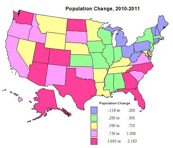
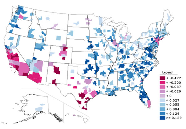
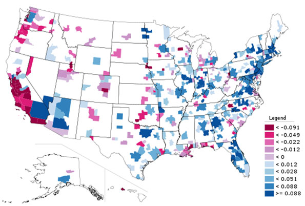
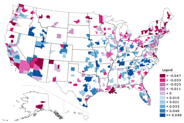
    The 2011 state population estimates released earlier today by the Census Bureau show that the South has retained its dominant position in both population and growth over the last year. Southern states accounted for more than one half of the nation’s population growth between 2011 and 2000, despite having little more than one third of the population. Moreover, the South was the recipient of 95% of the inter-regional net domestic migration (people moving from one state to another), with the West accounting for the other 5%, with the losses split between the Northeast and the Midwest.

    Overall, a net 533,000 people moved from one state to another, somewhat above the low of 503,000 in 2008 and below the 573,000 at the beginning of the previous decade (2001). The figure, however, remained less than one-half that of the mid 2000s peak.

    The state data confirmed the "return to normalcy," that had been indicated by the 2010 American Community Survey data.

    The South Rises Again

    In 2011 (July 2010 to June 2011), seven of the top domestic migration gaining states were in the South. This is a restoration of the same dominance the South achieved in 2001 to 2006. Some of the states have changed, but the overall impact is little different.

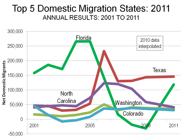
    Texas:Texas again led the nation in net domestic migration, adding 145,000 people from other states to its population. This was a slight increase from the 143,000 net domestic migrants in 2009 (Note 1) and was the highest for Texas since the artificially intense exodus from Louisiana in the year (2006) following hurricanes Katrina and Rita. Texas has led the nation in net domestic migration for six years and ranked second in the nation over the 2001 to 2009.

    Florida: Most spectacularly, however, has been the performance of Florida. Florida had been a net domestic migration leader for years, and had been number one from 2001 through 2005. However, when its highly inflated house prices collapsed (New York Federal Reserve Bank research refers to Florida as one of the "four bubble" states, along with California, Arizona and Nevada), Florida lost domestic migrants for the first time in at least six decades, in both 2008 and 2009. That has been radically turned around. In 2011, Florida added 119,000 net domestic migrants, housing prices dropped to normal levels (Note 2). While this is less than one half the gains in 2004 and 2005, it exceeds the annual Texas increase in the previous decade by 20%.

    North Carolina and South Carolina: North Carolina ranked third, adding 41,000 net domestic migrants. This is an improvement from a fourth-place ranking in the previous decade. Neighboring South Carolina added 22,000 net domestic migrants and ranked sixth. This is an improvement from the previous decade’s ranking of seventh. The domestic migrants to North Carolina and South Carolina have been called "halfbacks," as some have suggested that many who had moved to Florida from the Northeast have subsequently moved to North Carolina and South Carolina, essentially one half of the way back to where they moved from originally.

    Tennessee, Georgia and Virginia: Tennessee (7th), Georgia (8th) and Virginia (9th) rounded out the South’s seven of the top 10 states. Tennessee improved from having been 8th in 2001 to 2009, while Georgia dropped from 5th and Virginia was a new entrant, having previously ranked 12th.

    Western Runners-Up

    While the West continued to show net domestic migration gains, this formerly fastest-growing area of the nation has fallen well behind.

    Washington: Washington ranked fourth in 2011, an improvement from ninth between 2001 and 2009. Washington added 35,000 net domestic migrants.

    Colorado: Colorado also improved its position, adding a net 31,000 domestic migrants and ranking fifth in 2011, which is up from its 10th ranking in 2001 through 2009.

    Oregon:Oregon ranked 10th, adding 14,000 net domestic migrants and was a new entrant to the top 10, having placed 11th between 2001 and 2009.

    Things Never Change: The Bottom 10

    A similar restoration of normalcy is evident in the bottom 10 states. From 2001 to 2009, all of the bottom 10 net domestic migration states were in the Northeast or the Midwest, joined by California. This changed somewhat in 2011, with formerly fast-growing Nevada, edging out one of the former bottom 10. There was some movement at the very bottom of the list.

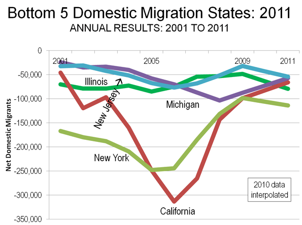
    New York: New York recovered its last place position (51st), which it held overall between 2001 and 2009, but had yielded to California later in the decade. New York lost 114,000 net domestic migrants in 2011, which compares to the 1,650,000 loss between 2000 and 2009.

    Illinois:Illinois had the second-highest net domestic migration loss, sending 79,000 of its residents to other states. Illinois had ranked 49th in net domestic migration in the previous decade, with a 615,000 loss. Unlike the other biggest losers, New York and California, the Illinois rate in the single year of 2011 exceeded its annual rate of net domestic migration loss between 2000 and 2009.

    California:The bad news is that California continues to be among the most hemorrhaging states in net domestic migration. The 2000 to 2009 net domestic migration loss of 1,500,000 was more than the population of the cities (municipalities) of San Francisco and Sacramento combined. Perhaps it is good news that the net domestic migration loss dropped to 66,000 in 2011, less than half the annual rate in the previous decade. California ranked 49th in net domestic migration in 2011, an improvement from its 50th place position in 2001 through 2009.

    Michigan: Michigan continued its heavy losses, losing a net 57,000 domestic migrants in 2011 and ranking 48th. In the previous decade, Michigan had also ranked 48th and had a net loss of more than 535,000 domestic migrants.

    New Jersey, Ohio and Connecticut: New Jersey, Ohio and Connecticut occupied the next three higher positions in the bottom ten. The New Jersey and Ohio ranks of 47th and 46th were the same as in the previous decade. Connecticut ranked 45th in 2011 and had ranked 42nd, at the top of the bottom 10, in the previous decade. Each of these states experienced an acceleration of net domestic outmigration relative to their annual loss in the previous decade. In the previous decade, the New Jersey and Connecticut losses had been driven by the New York metropolitan area, which suffered the preponderance of the net domestic migration losses in the Northeast.

    Missouri and Indiana: The Midwestern states of Missouri and Indiana were new entrants to the bottom 10. Missouri ranked 44th in net domestic migration in 2011, losing 12,000, a substantial deterioration from its 20th ranking in the previous decade when the state added 41,000 residents from other states. Indiana ranked 43rd compared to its 32nd place ranking in the previous decade.

    Nevada: Nevada, which had ranked sixth in net domestic migration in the previous decade, occupied the top position in the bottom 10, at 42nd. Nevada lost 11,000 domestic migrants, compared to a gain of more than 360,000 in the previous decade. Like Florida, house prices had escalated sharply during the housing bubble and prices have since fallen back to normal levels. However, much of Nevada’s economy is tied to that of California, which could be a hindrance to the restoration of its previous growth.

    Other Notes

    The other "bubble state," Arizona ranked 11th in net domestic migration, adding 13,000 new residents from other states. As in Florida, house prices had escalated sharply but have since fallen back to normal levels. However, despite its healthy domestic migration, Arizona’s gain is far less than its annual rate in the previous decade.

    There are nothing but surprises in the balance of the top 15. Oklahoma, which has long exported people, especially to the West, ranked 12th in net domestic migration, an improvement from 19 in the previous decade. The District of Columbia ranked 13th, which is a strong improvement from its previous ranking of 37th. Louisiana continued its recovery, ranking 14th, which is an improvement from 45th in the previous decade. North Dakota, whose 2000 population was less than that of 1920, ranked 15th, which is an improvement from 31th in the previous decade.

    No Matter How Much Things Change They Stay the Same

    Both over the last decade and in 2011, the South accounted for 53% of the nation’s growth, the West 32%, with the Midwest rising from 8% to 9% and the Northeast falling from 7% to 6%. And, as indicated above, net domestic migration results were similar. The conclusion from the new census estimates is consistent with the old adage that "no matter how much things change, they stay the same."

    Net Domestic Migration by State:
    2001-2009 and 2011
    By 2011 Rank
    State 2011 2011 Rank 2001-2009 2001-2009 Rank
    Texas       145,315                   1        838,126                   2
    Florida       118,756                   2     1,154,213                   1
    North Carolina         41,033                   3        663,892                   4
    Washington         35,166                   4        239,037                   9
    Colorado         31,195                   5        202,735                 10
    South Carolina         22,013                   6        306,045                   7
    Tennessee         20,328                   7        259,711                   8
    Georgia         17,726                   8        550,369                   5
    Virginia         15,538                   9        164,930                 12
    Oregon         13,636                 10        177,375                 11
    Arizona         13,150                 11        696,793                   3
    Oklahoma           8,933                 12           42,284                 19
    District of Columbia           8,334                 13         (39,814)                 37
    Louisiana           7,085                 14       (311,368)                 45
    North Dakota           6,368                 15         (18,071)                 31
    Kentucky           5,761                 16           81,711                 15
    Arkansas           5,724                 17           75,163                 16
    Montana           3,888                 18           39,853                 21
    West Virginia           2,814                 19           17,727                 26
    South Dakota           2,610                 20             7,182                 27
    Delaware           2,347                 21           45,424                 18
    New Mexico           2,202                 22           26,383                 24
    Alabama           1,974                 23           87,199                 14
    Alaska               740                 24           (7,360)                 29
    Wyoming             (149)                 25           22,883                 25
    Idaho             (256)                 26        110,279                 13
    Utah             (826)                 27           53,390                 17
    Vermont             (841)                 28           (1,505)                 28
    Nebraska             (977)                 29         (39,275)                 36
    Maine          (1,000)                 30           29,260                 23
    Pennsylvania          (1,121)                 31         (33,119)                 34
    Iowa          (1,361)                 32         (49,589)                 40
    Hawaii          (2,320)                 33         (29,022)                 33
    Maryland          (2,994)                 34         (95,775)                 43
    New Hampshire          (3,645)                 35           32,588                 22
    Rhode Island          (6,273)                 36         (45,159)                 38
    Mississippi          (6,672)                 37         (36,061)                 35
    Kansas          (7,928)                 38         (67,762)                 41
    Minnesota          (8,073)                 39         (46,635)                 39
    Massachusetts       (10,886)                 40       (274,722)                 44
    Wisconsin       (10,990)                 41         (11,981)                 30
    Nevada       (11,113)                 42        361,512                   6
    Indiana       (11,412)                 43         (21,467)                 32
    Missouri       (11,831)                 44           41,278                 20
    Connecticut       (16,848)                 45         (94,376)                 42
    Ohio       (44,868)                 46       (361,038)                 46
    New Jersey       (54,098)                 47       (451,407)                 47
    Michigan       (57,234)                 48       (537,471)                 48
    California       (65,705)                 49   (1,490,105)                 50
    Illinois       (79,458)                 50       (614,616)                 49
    New York     (113,757)                 51   (1,649,644)                 51
    Data from US Bureau of the Census


    —–

    Note 1: The Census Bureau did not produce domestic migration data for 2010 (2009-2010). Any reference to 2010 in this article is based upon an interpolation of the 2010 estimate from 2009 and 2011 Census Bureau estimates.

    Note 2: By 2010, housing affordability in all of Florida’s four major metropolitan areas with the exception of Miami had been returned to a Median Multiple (median house price divided by median household income) of approximately 3.0 or less, which is the historical norm (See: 7th Annual Demographia International Housing Affordability Survey). During the housing bubble of the early to middle 2000s, the Median Multiple had risen to above 5.0 in all of the major metropolitan areas except Jacksonville.

    Wendell Cox is a Visiting Professor, Conservatoire National des Arts et Metiers, Paris and the author of “War on the Dream: How Anti-Sprawl Policy Threatens the Quality of Life

  • Rethinking College Towns

    As a practitioner in both consulting and local government, I have observed that in local communities nothing seems to prompt productive action better than a local crisis or strongly felt threat like a factory closure. 

    Unfortunately, we are often inclined to take action to close the barn door only after the horse has escaped.

    That may be why “college town economic development” could be considered the ultimate oxymoron.  Higher education has been a growth industry for half a century. As a result, college towns and university neighborhoods have prospered in good times and bad and typically see little reason to pursue economic growth. 

    New realities in the economy and technology, however, mean their admirable invulnerability is no longer assured.  The paradigm of guaranteed growth in college town USA is coming to an end.

    More Debt, Fewer Jobs

    As this is written, the Occupy movement on campuses is protesting high tuition costs and the $25,000 average debt that comes with the diploma, with even the Secretary of Education in a Democratic administration calling upon colleges in a Las Vegas conference November 29 to cut their prices.

    Increasingly, what doesn’t always come with that diploma these days is a job or even a place to live away from mom and dad. Corporate cost-cutting, offshoring, and white collar automation promise fewer jobs for our graduates even beyond the current slowdown.  And the growth of for-profit universities, fast-track degree programs, and lower-cost distance learning offer strong competition to the traditional economic base of college towns that relies on large numbers of students spending four years in their town.

    In addition, there is likely to be a reduction in the number of future college students, as the millennial or “echo boom” begins to pass through their teens and early twenties.    To survive, college towns have to reinvent themselves in order to “find a new way to prosper and thrive” in future years.

    Additional Roles for College Towns

    These various threats to colleges place the economy of the town or neighborhood outside the campus in even greater jeopardy. Thanks to technology, professors can now deliver their services to customers who have never set foot in town. College town barbers and pizza places cannot.

    But happily, the college town has the potential for even greater growth than the university, not being narrowly tied like the latter to instruction and research nor to serving a single age group.

    The key to that growth lies in marketing. But that’s an activity college towns have seldom done well when they’ve done it at all. Colleges themselves have often mystifyingly underperformed in this pursuit.

    Despite the college town’s current prestige and trendiness, there simply won’t be enough high tech to fill the space in every college town with aspirations for a research park. And tech is unlikely to create jobs in places with only small non-research colleges.

    But colleges’ assets can lend themselves to college town success not only as “A Place to Learn” and “A Place to Research” but also as “A Place to Visit” and “A Place to Live.”

    A Place to Visit or Live

    As detailed in The Third Lifetime Place, college towns have significant opportunities to further develop and market themselves to potential visitors as “A Place for Sports and Entertainment,” “A Place to Heal,” “A Place to Meet,” and even “A Place to Vacation.”  The biggest payoff, however, may be from marketing the college town as “A Place to Come Home To” during working years or “A Place to Retire” thereafter.

    College towns are already taking off as retirement destinations. With the now-beginning retirement of the huge Baby Boom generation, a college town with advantages for retirement that doesn’t develop and market them is simply leaving money on the table.

    But the technology that enables telecommuting and the money it saves both corporations and independent entrepreneurs can also make the college town a great place to live for workers who are not faculty or college staff. The advantages of good schools and small town living that so many families pay top dollar for in metropolitan suburbs can be readily found in many college towns and with a smaller price tag.

    A Unique Competitive Advantage

    As places to market for living or retirement, college towns are blessed with a unique competitive advantage: their status as the Third Lifetime Place (TLP) in the lives of thousands of alumni. 

    Most of us have a special place that joins in lifetime significance the place where we grew up — which will always be “home” — and the place where we’re spending most of our adult lives. This third place is or was a pleasurable temporary refuge from both work and home responsibilities.

    The traditional TLP has been the year-after-year vacation spot. Later becoming the location of the second home, the final validation of its TLP significance was its choice for retirement. The most conspicuous success among traditional TLPs has been Florida, which moved from vacationland status to Retirement Central and also a favored place to locate a business, take a job, or hold a convention.

    But as suggested in The Third Lifetime Place, for the  highly college-educated generations that started with the Boomers, the four or more years spent in the college town may make it a more potent TLP than the place at the lake where they spend two weeks every July. 

    The most enjoyable and often most life-changing years of one’s youth were often those spent in the college town. Lifetime devotion to the football team, return trips to campus for reunions, and gifts to the alma mater testify to the strong feelings graduates have about these years.  And emotional appeals are probably the most potent force in marketing anything.

    Obstacles to Overcome

    But despite the powerful TLP marketing advantage, business as usual on campus, in city hall, or in the chamber of commerce office will not be enough to make the economic payoff happen.

    The most daunting impediment may be an “if-it-ain’t-broke-don’t-fix-it” complacency, the consequence of a seemingly bulletproof prosperity. Another is a left-of-center activist political climate that is characteristically anti-business and anti-growth which commonly results in high local taxes or high levels of regulation.   

    Unfortunately, a long history of dominating the provision of a universally popular product like higher education no longer assures places perpetual prosperity. The poster child for that reality is Detroit.  The Motor City once figured it would keep riding high so long as Americans continued to buy cars. But that’s not what happened.

    Per the Chinese character that designates both “danger” and “opportunity,” the effects of changes in higher education on college towns will depend on how our towns respond to them.  And that will depend to a large degree on the quality of their business, civic, and political leadership.

    John L. Gann, Jr., President of Gann Associates, Glen Ellyn, Illinois–(800) 762-GANN—consults, trains, and writes on marketing places to grow sales, jobs, property values, and tax revenues.  Formerly with Extension at Cornell University, he is the author of How to Evaluate (and Improve) Your Community’s Marketing published by the International City/County Management Association.

    E-mailed information on The Third Lifetime Place: A New Economic Opportunity for College Towns is available from the author at citykid@uwalumni.com.

    New Paltz, NY photo by Flickr user joseph a

    .

  • The Trend Away from Illinois

    Illinois has become famous for producing Barack Obama, but now another sort of fame is in the news. The Illinois Policy Institute has come out with a devastating report on “the state of Illinois”:

    Illinois residents are fleeing the state. When people leave, they take their purchasing power, entrepreneurial activity and taxable income with them. For more than 15 years, residents have left Illinois at a rate of one person every 10 minutes.

    Recent data from the Internal Revenue Service shows that, in 2009, Illinois netted a loss of people to 43 states, including each of its neighbors – Wisconsin, Indiana, Missouri, Kentucky and Iowa. Over the course of the entire year, the state saw a net of 40,000 people leave Illinois for another state.

    The data reflects a continuation of a trend of out-migration from Illinois that has lasted more than a decade. Between 1995 and 2009, the state lost on a net basis more than 806,000 people to out-migration. 

    When people leave, they take their income and their talent with them. In 2009 alone, Illinois lost residents who took with them a net of $1.5 billion in taxable income. From 1995 to 2009, Illinois lost out on a net of $26 billion in taxable income to out-migration.

    Illinois lost one person every 10 minutes between 1995 and 2009. Will the people who stay in Illinois demand reform before more wealth and jobs leave the state?