Category: Demographics

  • The Evolving Urban Form: Delhi

    It has been a time of ups and downs for Delhi, which has emerged as the largest urban area (area of continuous urban development) in India. By a quirk in the Census of India definitions, an urban area (urban agglomeration) may not cross a state or territorial boundary. As a result, Delhi continues to be the second largest urban area in India according to the Census of India.

    However, as a Population Reference Bureau reported, the population of the urban expanse of Delhi had exceeded that of Mumbai by 2007 to become the largest urban area. In 2007, the Population Reference Bureau noted that the continuous urbanization of Delhi extended into the adjacent states of Haryana and Uttar Pradesh (which has largest population of any sub-national jurisdiction in the world).

    In 2010, the United Nations placed the Delhi urban area population above that of all other urban areas in the world with the exception of Tokyo. This second ranking position was only temporary, since new census data showed stronger growth in Jakarta (Jabotabek) and Seoul. These developments, along with a smaller than anticipated population in the interstate Delhi urban area dropped Delhi to fourth position after the 2011 census. Even so, with its stronger growth, and given the plummeting birth rates in Korea, it can be expected that Delhi will exceed the population of Seoul within one or two years.

    Delhi has experienced some of the quickest and most substantial urban growth in the history of the world. Since the 1951 census, Delhi has grown from under 1.5 million people to a population of 22.6 million in 2011 (Figure 1). Delhi has been one of the fastest growing urban areas in history and (along with Jakarta, Seoul and Manila) has added approximately 20 million people over the past 60 years. Only Tokyo has added more new residents than these four urban areas, (25 million population).

    The national capital of India is the city of New Delhi (Note 1), which is a district of the National Capital Territory of Delhi. New Delhi is a fully planned national capital that is among the most impressive in the world, with broad expanses of green space not unlike that of Washington, DC. New Delhi became the capital in 1911, replacing Kolkata and much of the planned capital area was completed by the 1930s.

    An Interstate Urban Area

    This interstate urban area includes all of the urbanization of the National Capital Territory, which includes the urban core, as well as the adjacent Gahziabad and the Noida urban areas in the state of Uttar Pradesh and the Faridibad and Gurgaon urban areas in the state of Haryana.

    Between 2001 and 2011 (Figure 2):

    • The population of the inner area, which includes New Delhi and the Central, North, Northeast and East districts of the National Capital Territory grew 15 percent. This area accounted for 10 percent of the urban area growth.  Consistent with the experience of other inner areas (such as Mumbai, Shanghai, Chicago and Kolkata), inner core of this area (New Delhi and the Central District) lost population between 2001 and 2001 (14 percent).
    • The balance of the urban area inside the National Capital Territory grew by 2.8 million people, an increase of 33%. This area captured 47% of the interstate urban area population growth.
    • The urban areas outside the National Capital Territory grew slightly less, at 2.7 million and accounted for 44% of the interstate urban area population growth. These outer areas grew by far the fastest, from 2.6 million to 5.3 million, an increase of .


    Map of Dehli districts courtesy of wikipedia user Deeptrivia

    Between 2000 and 2011, the strongest growth was in the urbanization in Uttar Pradesh and to the southwest in Haryana.

    Gurgaon (photograph below), in Haryana, abuts Indira Gandhi International Airport on the south side, has emerged as an important corporate and information technology center. Gurgaon grew from 250,000 people in 2001 to 900,000 in 2011.

    Ghaziabad (photograph below), in Uttar Pradesh, is located adjacent to Delhi’s Northeast district and is the largest of the urban expanses beyond the National Capital Territory, having grown from approximately 975,000 people 2001 to more than 2,350,000 people in 2011.

    Noida (photograph below), in Uttar Pradesh, is another business center, is a special econonomic zone and includes a software technology park). Noida is located in Delhi and grew from approximately 300,000 in 2001 to nearly 650,000 in 2011.

    Faridabad (photograph below), in Haryana, is located directly to the south of the National Capital Territory and had the slowest percentage growth among the urban expanses beyond the National Capital Territory, growing from 1,050,000 people in 2001 two 1,400,000 people in 2011.

    The preponderance of growth in the suburban areas mirrors the trend in the previous census. Between 1991 and 200l, 26% of the growth was in the inner area and 74% of the growth in the outer areas of the National Capital Territory.

    Common Threads

    Even with its somewhat less than expected growth over the past decade, the Delhi continues to be among the fastest growing metropolitan regions in the world. Including adjacent rural areas, the Delhi metropolitan region (Note 2) added approximately 6.0 million people between 2001 and 2010 (growing from 20.4 million to 26.4 million). This compares to the 10 year gain of 7.4 million in Jakarta, 6.6 million in Manila and Shanghai and 6.1 million in Beijing.

    The Delhi urban area illustrates the same pervasive urban growth trend evident around the world. As urban areas become larger, they tend to grow most rapidly on their periphery as opposed in the core. As a result, contrary to popular misconception, they are overall becoming become less dense. In Delhi, as well as in all of the other urban areas or metropolitan regions examined in the Evolving Urban Form series, growth is concentrated in the suburbs and further out on the periphery.

    —-

    Note 1: The city of New Delhi is officially the capital of India. It is, however, only a small part of the National Capital Territory of Delhi. The city of New Delhi had a population of 134,000 in 2011, down one-quarter from 169,000 in 2001. While the term "New Delhi" has often been used to denote the urban agglomeration, both the government of India and the United Nations refer to the urban agglomeration as Delhi.

    Note 2: This metropolitan region definition includes the National Capital Territory and the Ghaziabad and Gatam Buddha Nagar (Noida) districts of Uttar Pradesh and the Gurgaon and Faridabad districts of Haryana (districts are analagous to counties in the United States).

    Top Photograph: India Gate in New Delhi. All photos by author

    Wendell Cox is a Visiting Professor, Conservatoire National des Arts et Metiers, Paris and the author of “War on the Dream: How Anti-Sprawl Policy Threatens the Quality of Life

  • Good Morning, Vietnam

    While many experts are pronouncing the demise of the American era and the rise of China, other East Asian nations complicate the picture. As America continues to participate and extend its influence in the dynamic Asian market, there may be no more suitable ally than its old antagonist, Vietnam.

    In some senses, Vietnam has emerged as the un-China, a large, fast-growing country that provides an alternative for American companies seeking to tap the dynamism of East Asia but without enhancing the power of a potentially devastating global competitor. With 86 million people, Vietnam may not offer as large a market, but it has strong historical, cultural, and strategic reasons to lean towards America.

    Why an un-China?

    Vietnam has deep historical reasons for wanting to link closely with the United States and its other allies, such as Singapore, Thailand, South Korea, and Japan. Some of this has to do with the country’s unique history. While France, Japan, and the United States were at times deeply and bloodily entangled with the country, by far the biggest threat to Vietnam has always been its looming neighbor to the north.

    France, Japan, and the United States intervened in Vietnam for comparatively short periods of time. In contrast, China has had an unrelenting interest in Vietnam and its 2,140-mile coastline ever since its nearly thousand-year rule over the country from 111 BC to 938 AD. The two countries have been embroiled in numerous territorial disputes over the years, with the most recent one involving the South China Sea, which has important shipping routes and is believed to contain rich oil and gas deposits.

    Many Vietnamese see some of their former colonialist or “imperialist” powers as necessary allies in protecting themselves from escalating territorial threats from China. Opening Cam Ranh Bay naval base to foreign warships, notably to those from the United States, is an illustrative example of Vietnam’s defensive strategy during the unfolding geopolitical competition.

    Amid the maritime tension between China and Vietnam regarding the oil-rich Spratly and Paracel islands in the South China Sea, the United States in 2010 successfully negotiated with Vietnam to reopen Cam Ranh Bay to foreign warships besides Russia. The bay will take approximately three years to rebuild and the primary foreign visitor is expected to be the United States.  “The regular presence of U.S. warships at Cam Ranh Bay might make China think twice about using coercive military diplomacy against Vietnam,” noted Ian Storey, a fellow at the Institute of Southeast Asian Studies in Singapore.

    The rise of the diaspora

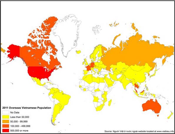
    Perhaps the greatest thing tying America to Vietnam is people. When the Communist government overran the former South Vietnam in 1975, several million Vietnamese fled the country. The Vietnamese eventually settled in 101 different countries and territories throughout the world, with the majority of them heading to the United States, France, Canada, and Australia. There are currently about 4 million Vietnamese living outside of Vietnam. Some settled in the former colonial ruler, France, and others in Australia, Canada, and Singapore. But the bulk—roughly 40 percent—moved to the United States, which is now by far the largest settlement of overseas Vietnamese. About 2 million Vietnamese are estimated to live in the United States (see map of “Overseas Vietnamese”).

    Overseas Vietnamese Population

    Hostile to the Communist regime, the overseas Vietnamese population turned away from their homeland , focusing instead on building new lives in their host countries. They flourished particularly in the United States, clustering in places such as Orange County and San Jose, California, as well as Houston and New Orleans. In 2009, they were enjoying levels of prosperity comparable to the national average, with a median family income of $59,129 and 64.6 percent owning homes. Vietnamese are also three times more likely to be in such fields as information technology, science, and engineering than other immigrants, and have one of the highest rates of naturalization—72.8 percent.

    Contact between this dynamic diaspora and the homeland was constrained by the two governments for decades. After the Vietnam War, the United States had placed a strict embargo against Vietnam and prohibited any political or economic relations between the two countries. The Vietnamese refugees who sought to reconnect with their relatives in Vietnam had to rely on neutral third-party countries to act as an intermediary in sending various goods and money back to needy family members.

    For their part, the Communist regime conducted stringent inspections of packages and letters sent to Vietnam. The Vietnamese government also imposed heavy taxation on financial remittances, which discouraged money transfers through official channels.

    Desperate to help close relatives left behind in their impoverished homeland, many Vietnamese Americans were forced to invent creative alternatives to formal remittances. According to Yen Do, the creator of Nguoi Viet, the most prominent Vietnamese newspaper in the United States, overseas Vietnamese would hide American dollars inside pill bottles sent through either French or Canadian shipping companies.

    With tens of millions of Vietnamese starving in Vietnam despite the clandestine remittances, the Vietnamese government eventually realized that they had to either change their economic strategy or suffer the debilitating consequences of a continually declining economy.

    Remittances have played a critical role in reviving the economy. Last year alone the diaspora sent an estimated $7.2 billion into the country, according to the World Bank. This comprised about 7 percent of Vietnam’s overall GDP in 2010. A 2010 study conducted by Wade Donald Pfau and Giang Thanh Long revealed that 57.7 percent of all international remittances being sent to Vietnam in 1997-1998 came from the United States.

    The growing symbiosis of Vietnam with its diaspora, particularly in the United States, will shape the rapid development of the country. Nowhere will this impact be felt more than in major cities such as Hanoi, Danang, and especially Ho Chi Minh City (the former Saigon). “We are seeing more of the expatriates here, and they are bringing management skill and capital through their family networks,” notes economist Le Dang. “They are a key part of the changes here.”

    The rise of a new dragon

    Aware of the enormous progress being made in China with its liberalization, in 1986 the Vietnamese government made the crucial decision to begin the Renovation Process—also known as Doi Moi—and reform the closed communist economy. It was the first official step that Vietnam had made towards opening its economic doors to the rest of the world.

    With the collapse of the Berlin Wall in 1989 and the subsequent fall of other communist powers in the world, the United States eventually responded to the improved political relations with Vietnam by lifting the 20-year-old embargo against its former foe in 1995. This put Vietnam on the fast track toward economic liberalization and ultimately helped it transition from a developing country to a middle-income country with a GDP per capita of more than $1,000. The International Monetary Fund estimated Vietnam’s GDP per capita as $1,155 for the 2010 fiscal year.

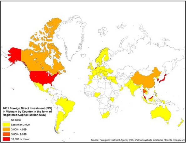
    Yet, in sharp contrast to China—where the largest sources of capital came from Chinese diaspora havens such Hong Kong, Taiwan, and Singapore—most of the money that revived the economy came from outside Southeast Asia. In particular, the biggest investor turned out to be the old arch-enemy, the United States, followed by another former “imperialist” power, Japan. China, now the world’s fourth-largest foreign investor, lagged behind much smaller regional economies, including South Korea, Thailand, and Malaysia, as well as the Netherlands (see map of “FDI by Registered Capital”).

    FDI in Vietnam by Country

    This is all the more remarkable given China’s huge expansion of investment with other developing countries. Over the past decade, China has expanded its capital flows both into other parts of Southeast Asia, including Laos and other Mekong Delta nations, as well as resource rich regions of the Middle East, Latin America, and Australia. Yet Vietnam, with its rich agriculture, fisheries, and developing energy industry, has stayed largely outside the emerging Sinosphere.

    Trade winds

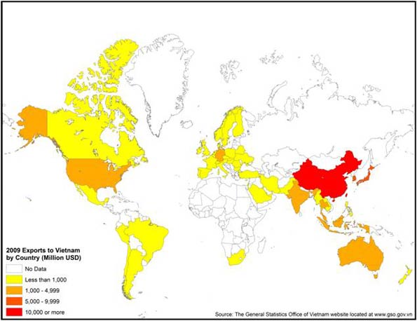
    The tilt in investment is also borne out by trade patterns. Vietnam has seen, like most countries, a flood of Chinese goods, but it has also developed a strong appetite for exports from other countries, notably Japan, South Korea, and the United States (see map of “Exports to Vietnam”).

    Exports to Vietnam by Country

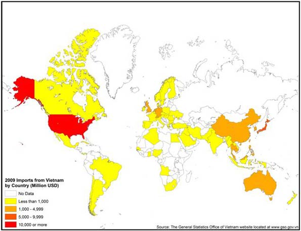
    But perhaps the best measure of Vietnam’s emergence as an un-China can be seen in its own burgeoning exports, which increased from about $5 billion to over $70 billion over the past three decades. The United States has emerged as by far Vietnam’s largest market, with more than $10 billion in annual trade. Japan ranked a strong second, with China lagging behind.

    This is all the more remarkable given that Vietnam possesses many things China needs and the two countries share both a border and obedience, at least nominally, to the same ideology. Vietnam seems to be making a choice to diversify itself away from China and avoid the semi-colonial status that many of China’s neighbors—notably Cambodia, Laos, and Myanmar—seem to have tacitly accepted (see map of “Vietnamese Exports”).

    Imports from Vietnam by Country

    This rising engagement with the global economy has brought great benefits. According to the CIA World Factbook, the country’s poverty rate has dropped from 75 percent in the 1980s to 10.6 percent in 2010. In terms of economic output, a brief on Vietnam by the World Bank reported that between 1995 and 2005 real GDP increased by 7.3 percent annually and per capita income by 6.2 percent annually.

    Why Vietnam matters to America

    Hanoi today—and even more so Ho Chi Minh City, the former Saigon—recalls China in the 1980s. But there are crucial differences. State-owned companies in Vietnam lack the depth and critical mass of their Chinese counterparts and are thus less likely to pose an immediate competitive threat to the United States and other foreign countries.

    Still, this is clearly a country on the way up. Many rural residents—still roughly 70 percent of the population—continue to pour into Hanoi and other cities, but without the same desperation that characterizes, for example, people moving from Bihar to New Delhi or Mumbai. There is nothing of the kind of criminal elements that fester in the favelas of Brazil or Mexico City’s colonias.

    More important still are the “animal spirits” of the place. Adam Smith—or Jane Jacobs for that matter—would enjoy the  very un-socialistic frenzy as motorcyclists barrel down the streets like possessed demons, with little regard to walking lanes or lights. Everyone not on the government payroll seems to be hustling something, or looking to. It reminds one of the Vietnamese outposts in Orange County, California, or in Los Angeles’ Chinatown, which is now largely dominated by Chinese from Vietnam.

    Le Dang Doanh, one of the architects of Doi Moi, estimates that the private sector now accounts for 40 percent of the country’s GDP, up from virtually zero. But Le Dang also estimated that as much as 20 percent more occurs in the “underground” economy where cash—particularly U.S. dollars—is king.

    “You see firms with as many as 300 workers that are not registered,” the sprightly, bespectacled 69-year-old economist explains. “The motive force is underground. You walk along the street. I followed an electrical cable once and it led me to a factory with 27 workers making Honda parts and it was totally off the system.”

    This energy is in part a product of demographics. Most of the people you see in these unofficial workshops are in their 20s and 30s. And unlike what you see in China, these workers also have children. Vietnam may be modernizing and getting richer, but it also enjoys a growing population.

    These trends have enormous long-term consequences. According to the CIA World Factbook, 69 percent of the approximately 86 million people in Vietnam are currently between the working ages of 15 and 64. In the next four decades the Vietnamese workforce is expected to expand rapidly; at the same time, it will contract dramatically in Japan, Taiwan, Singapore, South Korea, and China. As these countries amble into what demographer Nick Eberstadt has called a “fertility implosion” that will lead to a rapid aging of the workforce, Vietnam will remain relatively young.

    Already this enormous source of cheap labor has compelled investors around the world to look toward Vietnam as a way to simultaneously cut costs and increase profits. But more important still is the rapid growth of education. The country enjoys nearly 95 percent literacy.

    This combination of a growing and skilled workforce represents the same combination of factors that previously led to rapid growth in other Asian countries, from Japan in the 1960s to South Korea and Taiwan in the 1980s, and China more recently. One local investment house, Indochina Capital, estimates that by 2050 Vietnam’s economy will be the world’s 14th-largest—ahead of Canada, Italy, South Korea, and Spain.

    Combined with the strong human ties and its aversion to domineering neighbors, these factors suggest that Vietnam may well prove itself as valuable an ally and trade partner to the United States as it was once an irrepressible enemy.

    This piece originally appeared at The American.

    Joel Kotkin is executive editor of NewGeography.com and is a distinguished presidential fellow in urban futures at Chapman University, and an adjunct fellow of the Legatum Institute in London. He is author of The City: A Global History. His newest book is The Next Hundred Million: America in 2050, released in February, 2010.

    Jane Le Skaife is a doctoral candidate at the University of California, Davis. She is currently conducting her dissertation research involving a cross-national comparison of Vietnamese refugees in France and the United States.

    Accompanying maps were prepared for Legatum Institute by Ali Modarres, chairman of the Geography Department, California State University at Los Angeles.

    Photo courtesy of BigStockPhoto.com

    .

  • Population Growth in Australia Has Normalized

    Yesterday’s Daily Telegraph contained an interesting article on the increasing number of Australians departing Australia permanently:

    OVERALL migration from Australia has soared to a record high – with 88,000 leaving in the past year, almost half from NSW.

    The stampede abroad is a 90 per cent increase 10 years ago, figures from the Department of Immigration show.

    Half the emigrants are Australian-born who have chosen to start new lives in Britain (15,119), New Zealand, (14,596), the US (8046 and Singapore (6952)…

    At the same time, the number of people emigrating to Australia has dropped, by 9 per cent to 127,458 in the past year, making the ratio of departures to arrivals a record high…

    Upon reading this article, I decided to crunch the numbers to determine how Australia’s migration numbers are tracking. The below chart shows the permanent arrivals vs permanent departures numbers alluded to in the above article. The ratio of arrivals to departures is also shown:


    As you can see, the number of net permanent arrivals into Australia – around 45,000 for the 12 months to September 2011 – is well below the long-run average (around 65,000). The ratio of arrivals to departures is also in long-term decline and currently sits at a 35-year low of 1.5 times.

    However, the broader net overseas migration (NOM) statistics published by the Australian Bureau of Statistics, which measures in/out migration of anyone residing/leaving Australia for a period of 12 months or more (rather than permanently), paints a different picture.

    According to these statistics, NOM is still above long-term trends, but has declined sharply from the peak level seen in the year to September 2008, from around 315,000 to 170,000:


    With the decline in NOM, Australia’s population growth has also fallen significantly, from a peak of just under 470,000 in the year to September 2008 to just under 320,000. The share of population growth coming from immigration has also fallen over the same period from a peak of 67% to 54%.


    Finally, in percentage terms, it appears that Australia’s population growth and immigration are returning to average levels after surging in the 3 years to 2008:


    With the ABS scheduled to release the June quarter NOM data in mid-December, it will be interesting to see whether Australia’s NOM mirrors the permanent arrivals/departures figures and registers another fall.

    This piece originally appeared at Macrobusiness.

    Leith van Onselen writes daily as the Unconventional Economist at MacroBusiness Australia. He has held positions at the Australian Treasury, Victorian Treasury and currently works at a leading financial services company. Follow him @leithVO.

  • Urbanizing India: The 2011 Census Shows Slowing Growth

    Provisional results from the 2011 census of India show a diminishing population, the lowest since independence in 1947. From 2001 to 2007, India’s population grew 17.6%, compared to a 20% to 25% growth rate in previous periods since the 1951 census. Even so, India is expected to virtually catch up with China in population by 2020, with United Nations forecasts showing a less than 1 million advantage for China. By 2025, the UN forecasts that India will lead China by more than 50 million people. Nonetheless, like many other developing nations, falling birth rates are substantially reducing population growth in India.

    Moving to the Cities

    India’s still strong growth reflects the fact that it remains a principally rural nation. According to the 2011 census, only 31% of the population of India lives in urban areas. Urban migration, of course, is continuing but at a considerably slower rate than in China. According to the United Nations, the urban population of India will be less than 35% in 2020 and approximately 40% in 2030.  Yet despite this, the number of new urban residents will be substantial. By 2030, another 225 million people will be added to the Indian urban areas, more than the population of Japan and Germany combined.

    The Largest Urban Areas

    During the last decade, the number of urban areas (areas of continuous urban development) in India rose by one half, from 34 to 51 (Table). However, growth was somewhat less than forecast in the largest urban areas, a phenomena that appears elsewhere, such as in now slower growing Mexico City, Sao Paulo, New York and Los Angeles. This pattern seems to be found all around the world, according to a report by the McKinsey Global Institute.

    India: Urban Areas Over 1,000,000 Population: 2011
    Rank
    Urban Area
    2001
    2011
    % Change
    1 Delhi, NCT-UP-HAR   15,358,000   21,622,000 41%
    2 Mumbai, MAH   16,554,000   18,790,000 14%
    3 Kolkata, WB   13,217,000   14,113,000 7%
    4 Chennai, TN     6,425,000     8,696,000 35%
    5 Bangalore, KAR     5,687,000     8,499,000 49%
    6 Hyderabad, AP       5,534,000     7,749,000 40%
    7 Ahmadabad, GUJ     4,519,000     6,352,000 41%
    8 Pune, MAH     3,756,000     5,050,000 34%
    9 Surat, GUJ      2,811,000     4,585,000 63%
    10 Jaipur, RAJ      2,324,000     3,073,000 32%
    11 Kanpur, UP     2,690,000     2,920,000 9%
    12 Lucknow, UP      2,267,000     2,901,000 28%
    13 Nagpur, MAH     2,123,000     2,498,000 18%
    14 Indore, MP      1,639,000     2,167,000 32%
    15 Coimbatore, TN      1,446,000     2,151,000 49%
    16 Kochi, KER     1,355,000     2,118,000 56%
    17 Patna, BH     1,707,000     2,047,000 20%
    18 Kozhikode, KER        880,000     2,031,000 131%
    19 Bhopal, MP     1,455,000     1,883,000 29%
    20 Thrissur, KER        330,000     1,855,000 462%
    21 Vadodara, GUJ     1,492,000     1,817,000 22%
    22 Agra, UP      1,321,000     1,746,000 32%
    23 Visakhapatnam, AP     1,329,000     1,730,000 30%
    24 Malappuram, KER        170,000     1,699,000 899%
    25 Thiruvananthapuram, KER        889,000     1,687,000 90%
    26 Kannur, KER        498,000     1,643,000 230%
    27 Ludhiana, PJ     1,395,000     1,614,000 16%
    28 Nashik, MAH      1,152,000     1,563,000 36%
    29 Vijayawada , AP     1,011,000     1,491,000 47%
    30 Madurai, TN     1,195,000     1,462,000 22%
    31 Varanasi, UP     1,212,000     1,435,000 18%
    32 Meerut, UP      1,167,000     1,425,000 22%
    33 Rajkot, GUJ     1,002,000     1,391,000 39%
    34 Jamshedpur, JH     1,102,000     1,337,000 21%
    35 Srinagar, JK        971,000     1,273,000 31%
    36 Jabalpur, MP      1,117,000     1,268,000 14%
    37 Asansol, WB     1,090,000     1,243,000 14%
    38 Vasai Virar, MAH        293,000     1,221,000 317%
    39 Allahabad, UP     1,050,000     1,217,000 16%
    40 Dhanbad. JH      1,064,000     1,195,000 12%
    41 Aurangabad, MAH        892,000     1,189,000 33%
    42 Amritsar, PJ     1,011,000     1,184,000 17%
    43 Jodhpur, RAJ        856,000     1,138,000 33%
    44 Ranchi, JH        863,000     1,127,000 31%
    45 Raipur , CHH        699,000     1,123,000 61%
    46 Kollam, KER        380,000     1,110,000 192%
    47 Gwalior, MP        866,000     1,102,000 27%
    48 Durg-Bhilainagar, CHH        924,000     1,064,000 15%
    49 Chandigarh, CH        809,000     1,026,000 27%
    50 Tiruchirappalli, TN        847,000     1,022,000 21%
    51 Kota, RAJ        705,000     1,001,000 42%
    Data derived from Census of India


    Delhi: Delhi (National Capital Territory, Uttar Pradesh and Haryana) was reported by the United Nations to have become the second largest urban area in the world, following Tokyo in 2010. However, the Delhi urban area was nearly 1,000,000 people short of the population than projected by the United Nations. However, over the decade, Delhi managed to become the nation’s largest urban area with a population of 21.6 million people, an increase of 41% over its 15.5 million people in 2001 (Note 1). This is an impressive accomplishment, since some demographers have long maintained that Mumbai could be destined to become the largest urban area in the world in future decades.

    Mumbai: Mumbai (formerly Bombay), in Maharashtra, placed second with a population of 18.8 million. This compares to a population of 16.6 million in 2001. The Mumbai urban area grow only 14% between 2001 and 2011, a much slower rate than before, driven by declines in the urban core of central Mumbai – another general global phenomena –  and only modest growth in the suburban Mumbai portion of the central city, with explosive growth in the suburban areas outside the central city (Note 2). Mumbai‘s 2011 population is approximately 1.5 million below the level that would have been indicated by the 2010 United Nations projection.

    Kolkata: India’s third largest urban area, Kolkata (formerly Calcutta), in West Bengal, registered a population of 14.1 million, an increase of only 7% from its 13.4 million population in 2001. Like the two larger urban areas, the current population of Kolkata is less than project by the UN. As in the case of Mumbai the shortfall is by approximately 1.5 million.

    Chennai: Chennai (formerly Madras), in Tamil Nadu, ranked fourth among India’s urban areas with a population of 8.7 million, up from 6.5 million in 2001. This 35% growth rate propelled Chennai to a population more than 1 million above expectation.

    Bangalore: Information technology center Bangalore (Karnataka) was the fastest growing of the urban areas over 5 million people, with a population of 8.5 million, an increase of 49% over its 2001 population of 5.7 million. Should Bangalore’s population growth rate continue, it is likely to pass Chennai over the next decade to become the fourth largest urban area. Like Chennai, Bangalore registered a population at least 1 million higher than anticipated.

    Hyderabad: Hyderabad (Andra Pradesh), another of the nation’s leading information technology areas, rose to a population of 7.7 million people, from 5.5 million in 2001. With a 40% growth rate, Hyderabad exceeded its population estimate by at least1 million people.

    Ahmadabad: Ahmadabad, in Gujarat, is the last of the seven urban areas with more than 5 million population had 6.4 million people, which is an increase from 4.5 million in 2001. Ahmadabad grew 41% and achieve the population at least one half million higher than was expected.

    Surat: The fastest growing urban area of the 16 Indian urban areas with more than 2 million people was Surat, in Gujarat. Surat grew from 2.8 million people to 4.6 million, for an increase rate of 63%.

    The Largest State or Province

    The state of Uttar Pradesh registered a population of just under 200 million people in the 2011 census. This makes Uttar Pradesh the largest sovereign national jurisdiction (state or province) in the world. Nonetheless, the largest urban area in Uttar Pradesh has a population of under 3 million: Kanpur. However the Delhi suburbs in Uttar Pradesh, Ghaziabad and Noida are slightly larger than Kanpur.

    Soon the Largest Nation

    As India edges toward becoming the most populous nation, it is clear that its growing urban areas will occupy more of the top positions among the world’s largest urban areas in the years to come. But the pattern here indicates, as elsewhere in the world, that most growth, and the most rapid growth, is occurring not in the largest megacities but in smaller, and perhaps more manageable, ones.

    ——-

    Note 1: This urban area definition includes adjacent urban areas in the state of Uttar Pradesh (Ghaziabad and Noida) and Haryana (Faridabad and Gurgaon, which borders Indira Gandhi International Airport opposite Delhi), which are not considered to be in the Delhi urban area by the census of India but are included in the United Nations definition.

    Note 2: This urban area definition includes the adjacent Panvel and the Navi Mumbai-Panvel urban areas. The latter is between Panvel and Navi Mumbai (proper) which is included in the Mumbai urban area by the census of India.

    Photographs by Author (Delhi, Mumbai, Kolkata)

    Wendell Cox is a Visiting Professor, Conservatoire National des Arts et Metiers, Paris and the author of “War on the Dream: How Anti-Sprawl Policy Threatens the Quality of Life

  • The New World Order: A Report on the World’s Emerging Spheres of Influence

    This is the introduction to a new report, "The New World Order" authored by Joel Kotkin in partnership with the Legatum Institute. Read the full report and view the maps at the project website.

    The fall of the Soviet Union nearly a quarter of a century ago forced geographers and policy makes to rip up their maps. No longer divided into “west” and “east”, the world order lost many of its longtime certainties.

    In our attempt to look at the emerging world order, we have followed the great Arab historian Ibn Khaldun’s notion that ethnic and cultural ties are more important than geographic patterns or levels of economic development. In history, shared values have been critical to the rise of spheres of influence across the world. Those that have projected power broadly – the Greek, Roman, Arab, Chinese, Mongol and British empires – shared intense ties of kinship and common cultural origins. As Ibn Khaldun observed: “Only tribes held together by a group feeling can survive in a desert.”

    Of course, much has been written about the rising class of largely cosmopolitan “neo nomads”, who traipse from one global capital to another. But, for the most part, these people largely serve more powerful interests based on what we may call tribal groupings: the Indian sphere of influence, the Sinosphere and the Anglosphere.

    Our approach departs from the conventional wisdom developed after the Cold War. At that time it was widely assumed that, as military power gave way to economic influence and regional alliances, the world would evolve into broad geographic groups. A classic example was presented in Jacques Attali’s Millennium: Winners and Losers in the Coming World Order. Attali, a longtime advisor to French President Francois Mitterrand, envisioned the world divided into three main blocs: a European one centered around France and Germany, a Japan-dominated Asian zone, and a weaker United States-dominated North America.

    Time has not been kind to this vision, which was adopted by groups like the Trilateral Commission. The European Union proved less united and much weaker economically and politically than Attali and his ilk might have hoped. The notion of Japan, now rapidly aging and in a twodecades long slump, at the head of Asia, seems frankly risible. Although also suffering from the recession, North America over the past quarter century has done better in terms of growth and technology development, and has more vibrant demographics than either the EU or Japan.

    More recently, attention has turned to the rise of the so-called BRIC countries – Brazil, Russia, India and China. Yet it turns out that these countries have even less in common than the squabbling members of the European Union. For one thing, they represent opposing political systems. Brazil and India are chaotic but entrenched democracies, for example; Russia and especially China remain authoritarian, one-party dictatorships.

    These economies also are not particularly intertwined. Brazil is a major food exporter; Russia’s economy revolves around energy and minerals; China dominates in manufacturing; and India is vaulting ahead based largely on services. Brazil’s leading export markets, for example, are the United States and Argentina; Russia and China constituted together take barely 8 percent of the country’s exports. China’s largest trading partners by far are the United States, Hong Kong, Taiwan, South Korea and Japan. India ranks only ninth and Brazil tenth.

    More important still, no common “tribal” link, as expressed by a shared history, language, or culture unites these countries and peoples. This link is fundamental to any powerful and long-lasting power grouping.

    In contrast, the Indian and Chinese spheres, for example, are united by deep-seated commonalities: food, language, historical legacy and national culture. A Taiwanese technologist who works in Chengdu while tapping his network across east Asia, America, and Europe does so largely as a Chinese; an Indian trader in Hong Kong does business with others of his “tribe” in Africa, Great Britain and the former Soviet Republics in east Asia. Beyond national borders, these spheres extend from their home countries to a host of global cities, such as Hong Kong, Singapore, London, New York, Dubai, San Francisco, and Los Angeles, where they have established significant colonies.

    The prospects for the last great global grouping, the Anglosphere, are far stronger than many expect. Born out of the British Empire, and then the late 20th Century, the Anglosphere may be losing its claim to global hegemony, but it remains the first among the world’s ethnic networks in terms of everything from language and global culture to technology. More than the Indian Sphere and Sinosphere, the Anglosphere has shown a remarkable ability to incorporate other cultures and people.

    In the future, we will see the rise of other networks, as well. An example would be the Vietnamese sphere of influence, which reflects both the rise of that particular Asian country, and the influence of its scattered diaspora across the world. Culture is key to understanding the Vietnamese sphere: the country’s history includes long periods of Chinese domination that made it resistant to being absorbed into the Sinosphere. Instead, as we argue, Vietnam is likely to be more closely allied, first and foremost, with the United States and its allies.

    Finally, our maps deal with basic demographic issues that will dominate the future. We trace the global rise of women to prominence in business, education and politics. Although Western nations still lead in female empowerment, we argue that the most significant changes are taking place in developing countries, notably in Latin America. It will be these women – in Sao Paolo, Mumbai, and Maseru – who increasingly will shape the future female influence on the world.

    Yet this positive development also contains the seed of dangers. Female empowerment, along with urbanization, has had a depressing effect on fertility rates, seen first in the highly developed countries, and now increasingly in developing ones. Looking out to 2030, many countries, including the United States and China, will be facing massive problems posed by too many seniors and not enough working age people.

    As has always been the case, the emerging world order will face its own crises in the future, with, no doubt, unexpected, unpredictable results. But our bet is solidly on the three spheres of influence which constitute the bulk of this report.

    For the full report, visit The New World Order website at the Legatum Institute.

    Report authors:

    Joel Kotkin is executive editor of NewGeography.com and is a distinguished presidential fellow in urban futures at Chapman University, and an adjunct fellow of the Legatum Institute in London. He is author of The City: A Global History. His newest book is The Next Hundred Million: America in 2050, released in February, 2010.

    Sim Hee Juat is currently a research associate with the Centre for Governance and Leadership at the Civil Service College of Singapore.

    Shashi Parulekar is an engineer by training. He holds a master’s in finance and an M.B.A. He has worked as a high-tech marketer in Asia for several decades.

    Jane Le Skaife is a doctoral candidate in the Department of Sociology at the University of California, Davis. She is currently conducting her dissertation research involving a cross-national comparison of Vietnamese refugees in France and the United States.

    Wendell Cox is a consultant specialising in demographics and urban issues, principal of Demographia and a visiting professor at the Conservatoire National des Arts et Metiers in Paris.

    Emma Chen is a senior strategist at the Centre for Strategic Futures, Singapore. The views expressed within this article are solely her own. Publication does not constitute an endorsement by the Centre for Strategic Futures, Singapore.

    Zina Klapper is Deputy Editor of www.newgeography.com. A Los Angeles-based writer/editor/consultant with a background in journalism, she works in multiple aspects of report presentation. The maps were prepared by Ali Modarres, Professor of Urban Geography at California State University, Los Angeles.

    We also owe a debt to our largely volunteer research staff, headed by Zina Klapper, Editor and Director of Research. This includes Gary Girod and Kirsten Moore from Chapman University, to whom we owe a special debt for directed study focused on the maps. We also wish to thank Sheela Bonghir from California State University at Northridge; Malcolm Yiong and Jasmin Lau at the Centre for Strategic Futures, Singapore, and Chor Pharn Lee at the Ministry of Trade and Industry and researcher Erika Ozuna, based in Dallas, Texas. Special thanks to Nathan Gamester at Legatum Institute in London for helping put this project together and seeing it to fruition.

  • California’s Jobs Engine Broke Down Well Before the Financial Crisis

    Everybody knows that California’s economy has struggled mightily since the 2008 financial crisis and subsequent recession. The state’s current unemployment rate, 12.1 percent, is a full 3 percentage points above the national rate. Liberal pundits and politicians tend to blame this dismal performance entirely on the Great Recession; as Jerry Brown put it while campaigning (successfully) for governor last year, “I’ve seen recessions. They come, they go. California always comes back.”

    But a study commissioned by City Journal using the National Establishment Time Series database, which has tracked job creation and migration from 1992 through 2008 (so far) in a way that government statistics can’t, reveals the disturbing truth. California’s economy during the second half of that period—2000 through 2008—was far less vibrant and diverse than it had been during the first. Well before the crisis struck, then, the Golden State was setting itself up for a big fall.

    One of the starkest signs of California’s malaise during the first decade of the twenty-first century was its changing job dynamics. Even before the downturn, California had stopped attracting new business investment, whether from within the state or from without.

    Economists usually see business start-ups as the most important long-term source of job growth, and California has long had a reputation for nurturing new companies—most famously, in Silicon Valley. As Chart 1 shows, however, this dynamism utterly vanished in the 2000s. From 1992 to 2000, California saw a net gain of 776,500 jobs from start-ups and closures; that is, the state added that many more jobs from start-ups than it lost to closures. But during the first eight years of the new millennium, California had a net loss of 262,200 jobs from start-ups and closures. The difference between the two periods is an astounding 1 million net jobs.

    Between 2000 and 2008, California also suffered net job losses of 79,600 to the migration of businesses among states—worse than the net 73,800 jobs that it lost from 1992 through 2000. The leading destination was Texas, with Oregon and North Carolina running second and third (see Chart 2). California managed to add jobs only through the expansion of existing businesses, and even that was at a considerably lower rate than before.

    Graph by Alberto Mena

    Graph by Alberto Mena

    Another dark sign, largely unnoticed at the time: California’s major cities became invalids in the 2000s. Los Angeles and the San Francisco Bay Area had been the engines of California’s economic growth for at least a century. Since World War II, the L.A. metropolitan area, which includes Orange County, has added more people than all but two states (apart from California): Florida and Texas. The Bay Area, which includes the San Francisco and the San Jose metro areas, has been the core of American job growth in information technology and financial services, with San Jose’s Silicon Valley serving as the world’s incubator of information-age technology. During the 1992–2000 period, the L.A. and San Francisco Bay areas added more than 1.1 million new jobs—about half the entire state total. But between 2000 and 2008, as Chart 3 indicates, California’s two big metro areas produced fewer than 70,000 new jobs—a nearly 95 percent drop and a mere 6 percent of job creation in the state. This was a collapse of historic proportions.

    Graph by Alberto Mena

    Not only did California in the 2000s suffer anemic job growth; the new jobs paid substantially less than before. Chart 4 reveals the sad reversal. From 2000 to 2008, California had a net job loss of more than 270,000 in industries with an average wage higher than the private-sector state average. That marked a turnaround of nearly 1.2 million net jobs from the 1992–2000 period, when 908,900 net jobs were created in above-average-wage industries. Further, during the earlier period, more than 707,000 net jobs were created in the very highest-wage industries—those paying over 150 percent of the private-sector average.

    Chart 5, which indicates job growth or decline in selected industries, again suggests that a lopsided amount of California’s economic growth in the 2000s was in below-average-wage fields. It included nearly 590,000 net jobs in “administration and support”—clerical and janitorial jobs, for example, as well as positions in temporary-help services, travel agencies, telemarketing and telephone call centers, and so on. The largest losses in the state during the 2000s were in manufacturing, which traditionally provided above-average wages. After adding a net 64,900 manufacturing jobs from 1992 to 2000, California hemorrhaged a net 403,800 from 2000 to 2008. But information jobs also went into negative territory, while professional, scientific, and technical-services employment experienced far lower growth than in the previous decade.

    The chart also shows that California’s growth in the 2000s, such as it was, took place disproportionately in sectors that rode the housing bubble. In fact, 35 percent of the net new jobs in the state were created in construction and real estate. All those jobs have vaporized since 2008, according to Bureau of Labor Statistics data. They are unlikely to come back any time soon.

    These are troubling numbers. Fewer jobs and lower wages do not a robust economy make. A continuation of this trend, even if California’s recession-battered condition improves, would result in a far more unequal economy, shrunken tax revenues, and a likely increase in state public assistance—all at a time when officials are struggling with massive deficits.

    Graph by Alberto Mena

    Graph by Alberto Mena

    A final indicator of California’s growing economic weakness during the 2000–2008 period is that the average size of firms headquartered in the state shrank dramatically. As Chart 6 shows, California had a huge increase over the 1992–2000 period in the number of jobs added by companies employing just a single person or between two and nine people, even as larger firms cut hundreds of thousands of jobs. Many of the single-employee companies may simply be struggling consultancies: if they were doing better, they’d likely have to start hiring at least a few people. While start-ups are indeed crucial to economic growth, small companies are especially vulnerable to economic downturns and often feel the brunt of taxes and regulations more acutely than larger firms do. The awful job numbers for the bigger companies—including a net loss of nearly 450,000 positions for firms with 500 or more employees—suggest the toxicity of California’s business climate. After all, bigger firms have the resources to settle and expand in other locales; in the 2000s, they clearly wanted nothing to do with the Golden State.

    Graph by Alberto Mena

    What is behind California’s shocking decline—its snuffed-out start-ups, unproductive big cities, poorer jobs, and tinier, weaker, or fleeing companies—during the 2000–2008 period? Steven Malanga’s “Cali to Business: Get Out!” identifies the major villains: suffocating regulations, inflated business taxes and fees, a lawsuit-friendly legal environment, and a political class uninterested in business concerns, if not downright hostile to them. One could add to this list the state’s extraordinarily high cost of living, with housing prices particularly onerous, having skyrocketed in the major metropolitan areas before the downturn—thanks, the research suggests, to overzealous land-use regulation.

    One thing is for sure: California will never regain its previous prosperity if it leaves these problems unaddressed. Its profound economic woes aren’t just the result of the Great Recession.

    This piece originally appeared in City Journal. City Journal thanks the Hertog/Simon Fund for Policy Analysis for its generous support of this issue’s California jobs package.

    Wendell Cox is a Visiting Professor, Conservatoire National des Arts et Metiers, Paris and the author of “War on the Dream: How Anti-Sprawl Policy Threatens the Quality of Life

    Photo by Altus via Flickr

  • Women Ascendent: Where Females Are Rising The Fastest

    You can find the future of the world’s women not in Scandinavia or the U.S., but among the entrepreneurs who line the streets of Mumbai, Manila and Sao Paulo. Selling everything from mangoes to home-made blouses, these women, usually considered the very bottom of their home country’s employment barrel, represent the cutting-edge of progress for women in the 21st century.

    This marks a departure from past decades, when the advancement of women was visible almost solely in the wealthiest of countries. Surveys of female achievements have consistently singled out just a sliver of the globe, but increasingly, women are making the greatest strides elsewhere — in the rapidly growing developing world.

    Women in these countries are newly empowered by remarkable gains in political representation, legal rights and, especially, education. But more important, they are rising in the 21st century’s key economic strata: as business owners.

    For our analysis of the countries where women are rising the fastest, we looked at three factors: education, politics and entrepreneurship. We studied the United Nations’ demographics on post-secondary education (current and historical) and on political participation. To assess the business environment, we examined statistics from Global Entrepreneurship Monitor on nascent entrepreneurship and the World Bank and World Economic Forum on gaps between male and female business ownership. We searched the global press, pored through research publications by financial institutions and NGOs, and visited some locations. Finally, we crunched the numbers, information and observations and came up with our own impressions.

    Our top picks for places where women were rising the fastest — as opposed to merely surfing an already advantageous position — were found largely in the developing world — particularly in Brazil, India, Vietnam and the Philippines.

    A vital benchmark of this progress is the large role that women play in business ownership in these places. In many developing countries the rate of female entrepreneurship surpasses that in the G-7 nations. Many become entrepreneurs by necessity: Often locked out of the of the best opportunities in the job market by cultural and sometimes legal barriers, women are starting businesses at rapid rates in Latin America, India, East Asia and even Africa and Central Europe.

    In contrast, female entrepreneurship rates aren’t rising in many of the most advanced countries. Despite talk of the feminization of advanced societies, the percentages of women-owned businesses are inching downward in the U.S., and they are stagnant in the E.U. To some extent, this slowdown reflects greatly expanded opportunities for a new generation of women, considerably more educated than their mothers, in both the mid-level job market and the highest corporate tiers. These changes have been accelerated by shifts in the nature of employment that favor “brains” and collaboration over traditional male advantages in “brawn” and single-minded ambition.

    The Rise of the Female Entrepreneur

    Latin America is a premiere example of the rise of female business ownership. Both Brazil and Costa Rica rank in the World Bank’s top 10 countries for female ownership participation. The region also stands out for its small gender gap in new businesses: Women are now starting businesses as often men, and sometimes succeeding. Among the top countries with the greatest equality between women and men in establishing new ventures, Global Entrepreneurship Monitor notes that many Latin American countries, especially Brazil and Peru, now have a gap that is smaller than in the U.S. or anywhere in Europe.

    The same trend is emerging in Asia. In the more tropical countries, where women are impeded by unpaid family work combined with a notoriously grim labor picture, many own marginal businesses. South Asia’s bright spot for female entrepreneurs is India, with its highly developed support structure of national-level and local organizations for women’s SMEs and early participation in micro-finance. And female entrepreneurs are thriving in Vietnam, the Philippines and Thailand as well. For example, 24% of Vietnam’s 100,000-plus incorporated enterprises are owned by women; 27% of its 3 million household businesses are also female-owned. The rate of female private business owners in China, at 11 out of 100, is also higher than the world average of 7%. Surprisingly, famously chauvinist Japan is the only country in the world where the percentage of women who own their own businesses, 13%, edges out the percentage of males who do.

    Eurasia and Central Eastern Europe have also experienced a surge in female entrepreneurial activity. As in Latin America, self-employment has often come about as a result of national tragedy and political dislocation — in this case, the economic disruption and male migration abroad that followed the fall of the Soviet Union.

    Data on women in African economies are sparse, with the positive news focused on Lesotho, ranked No. 1 and No. 2 by the World Economic forum for economic opportunity in the last two years, and, unsurprisingly, South Africa, the continent’s most developed nation, considered Africa’s best economic climate for women’s by The Economist Intelligence Unit. Ghana has also drawn attention, with a World Food Program-initiated salt start-up. Micro-financiers, development NGOs and the United Nations have assisted small-scale women entrepreneurs in African nations like Kenya in establishing micro industries such as processing soap, fruit and maize.

    Educated Women on the Front Lines

    Across the globe female gains in education have skyrocketed. In tertiary education — which includes post-high school vocational schools as well as colleges and universities — females now outnumber males in one-third of developing countries, including Brazil, Bangladesh, Honduras, Lesotho, Malaysia, Mongolia and South Africa. Worldwide, between 1970 and 2008, the number of female tertiary students expanded by 70 million, compared with 60 million for males.

    The Legal Right to Wages and Assets

    Along with economic and education gains, women in developing countries are making substantial political gains. Part of a broader movement throughout the developing world toward political empowerment, women are gaining increased access to capital and property ownership, and greater national attentiveness to issues specific to women, such as domestic violence and female health.

    One indication: The percentage of parliamentary seats held by women globally has risen considerably during the first decade of this century, and is now about 18%. As in entrepreneurship and education, the most dramatic gains now are not in the high-income countries but in the developing world, where sizable inroads to the very top tiers of government have also been made.

    Latin America has become the most visible emblem of rising female political power sweeping across a region. When Brazil elected Dilma Rousseff as president in 2010, it joined its neighbors Argentina, Costa Rica and, until recently, Chile in having a female head of state. Latin America, too, is a world leader for female political representation, with 30%-plus parliamentary representation in Costa Rica, Argentina, Ecuador and Bolivia.

    Yet some of the most astonishing changes in representation have taken place in Africa, where Rwanda now has the world’s highest percentage of women in parliament and cabinet seats. Each of Rwanda’s parliamentary houses comprises 50% or more women. South Africa, Angola, Mozambique, Uganda and Tanzania also boast above-average rates.

    The destiny of the global economy has shifted toward countries that once trailed behind but are now rapidly rising. In the same way, the trajectory of women’s progress — and the future of the ascendancy of women — has shifted from the developed to the developing world.

    This piece originally appeared at Forbes.com.

    Joel Kotkin is executive editor of NewGeography.com and is a distinguished presidential fellow in urban futures at Chapman University, and an adjunct fellow of the Legatum Institute in London. He is author of The City: A Global History. His newest book is The Next Hundred Million: America in 2050, released in February, 2010.

    Zina Klapper is a Los Angeles-based journalist, and Deputy Editor of newgeography.com.

    Photo by flickr user Dawn Danby

  • Domestic Migration: Returning to Normalcy?

    Even as the troubled economy has continued to hobble along, there may be hints that the domestic migration patterns from before the Great Financial Crisis could be returning at least in some states. This is evident in the recent national interstate migration data from the American Community Survey. This analysis reviews annual interstate migration data from the beginning of the Great Financial Crisis to 2010, with broad comparisons to earlier (2001-2006) data from the Census Bureau population estimates program (Note 1). The big stories are that Florida and Arizona show signs of recovery, the trend has reverted to more negative in California and the steady states are North Carolina (a big gainer of domestic migrants) and Illinois (a big loser of domestic migrants).

    Moreover, none of the states that have been perennial domestic migration losers moved into the top ten between 2007 and 2010, even as fast growing states such as Florida and Arizona were hard hit by the real estate bubble and saw migration rates decline. Notably, however, Pennsylvania, which had sustained modest domestic migration losses, rose to the number 8 position in 2010 (Table 1).

    Table
    Top Domestic Migration States: 2001-2010
      Year and Source
      2001-6 2007-9 2010
    Rank Census Estimates ACS ACS
    1 Florida Texas Texas
    2 Arizona North Carolina North Carolina
    3 Texas Arizona Florida
    4 North Carolina South Carolina Arizona
    5 Georgia Georgia Colorado
    6 Nevada Oklahoma South Carolina
    7 South Carolina Washington Virginia
    8 Tennessee Colorado Pennsylvania
    9 Virginia Virginia Washington
    10 Washington Utah Kentucky


    The Largest Gaining States:Some of the states with the largest gains seem to be returning toward their previous domestic migration volumes.

    Florida: For the last few years, the big news in interstate domestic migration has been in Florida. This state, which has grown by more than 5.5 times since 1950, had been the domestic migration leader for some years. However, as one of the four "ground zero" states (along with California, Arizona and Nevada) for its huge house price losses, Florida bottomed out at a loss of 38,000 domestic migrants, falling to 44th in 2007. The state lost another 16,000 interstate migrants in 2008. These were the first domestic migration loss since the 1940s for Florida.

    However, in 2009, Florida returned to growth, adding 21,000 domestic migrants. An even stronger recovery occurred in 2010, with a net 55,000 domestic migrants. This remains well below the peak of 265,000 recorded in Census estimate figures in 2004 and 2005. Nonetheless, Florida ranked third in domestic migration in 2010, trailing North Carolina by only 1000 as well as number one Texas. Part of Florida’s success is likely related to its housing affordability, which has been restored in all of the state’s major metropolitan areas with the exception of Miami. The recent repeal of Florida’s land rationing "smart growth" law should position the state for even more affordable housing and net domestic migration gains.

    Arizona: Arizona is another state that was hit hard by the housing bubble. Much has been written on Arizona’s recent hard times. Yet, unlike Florida, Arizona did not experience domestic migration losses in any year of the past decade. The state has routinely been among the top five in domestic migration, even during the darkest years of the Great Financial Crisis. Like the nation in general, Arizona reached its lowest net domestic migration figure in 2009 at 29,000, but recovered to 46,000 in 2010. Interstate domestic migration remains somewhat below the early 2000s figures, but is trending upwards.

    Texas: Texas took the interstate domestic migration crown away from Florida in 2006 at has been the nation’s leader since that time. According to Census estimates, Texas peaked in 2006 at 233,000 net domestic migrants. This was an artificially high peak, location by the outflow of people from Louisiana who were driven out by Hurricanes Katrina and Rita and the failure of responsible governments to properly maintain flood control infrastructure. From 2007 to 2009, Texas was also aided by its liberal land use policies that helped it avoid the real estate bubble, retaining lower house prices that made it more attractive to domestic migrants. Texas added more than 125,000 domestic migrants annually. However in 2010, net domestic migration dropped to 75,000. Nonetheless, even Texas indicates a return toward normalcy. In the first five years of the decade, Census data placed net domestic migration in Texas at only 40,000, well short of the 2010 figure.

    North Carolina: Through good times and bad, North Carolina was has been a consistent performer among the larger gainers. North Carolina ranked fourth in net domestic migration from 2001 through 2006, according to Census data. Then the state moved up to number two in every year from 2007 to 2010.   In 2010 domestic migration was 56,000, slightly below the 2001 to 2006 Census reported average of approximately 63,000. Like Texas, North Carolina largely escaped the real estate bubble, with house prices rising far less severely than on the West Coast, the Northeast, Florida, Nevada and Arizona, which could be a principal reason for its consistent domestic migration gains.

    The Largest Losing States:There were also indications that people continue to be among the most significant exports of California and New York, which wrestled for the bottom position for the entire decade. While The New York Times characterized the 2008 to 2010 domestic outmigration from California and New York as having slowed to a "relative trickle," the ACS data indicates that the spigot is still on.

    New York:New York experienced a net loss of 94,000 domestic migrants in 2010, a figure nearly equal to the population of its state capital, Albany. Despite this large loss, New York is doing better than earlier in the decade, when domestic outmigration averaged more than 200,000 from 2001 to 2006.

    California: California, however, may have taken a turn to the south. After having experienced the largest losses in the nation in 2007 (175,000), net domestic outmigration fell to 87,000 in 2009 and California relinquished the bottom position to New York. However, in 2010, California’s net domestic outmigration rose to 129,000 and the state recovered its former bottom ranking.

    Illinois: Illinois has been the most consistent performer among the largest losing states. According to Census data, domestic migration losses averaged 77,000 from 2001 to 2006. ACS data indicates similar losses, averaging 73,000 from 2007 to 2010.

    Normalcy Again? It is premature to suggest any long-term judgments on these early data. However, it would not be surprising to see the states with the highest costs of living (driven by high housing costs) and the least friendly business climates to lose domestic migrants to states with lower costs of living and more friendly business environments. For example, the fact that median house prices today in Phoenix are more affordable compared to the large metropolitan areas of coastal California than they were at the peak of the housing bubble may be part of what drove Arizona’s improved net domestic migration in 2010.

    —-

    Note 1: The Census Bureau provides annual estimates of domestic migration, however does not do so in census years, such as 2010, which is why this analysis uses American Community Survey data. For the purposes of data compatibility, 2007, 2008, 2009 and 2010 data from the American Community Survey (also conducted by the Census Bureau) is the principal source for recent trends. This analysis is different from the one by Kenneth M. Johnson of the University of New Hampshire Carey Institute, which detailed domestic migration results from the three year American Community Survey (2008-2010), and which was covered by The New York Times.

    Note 2: Leith van Onselen has recently described developments in the Phoenix housing market (in How Phoenix Boomed and Busted) during the last decade.

    Wendell Cox is a Visiting Professor, Conservatoire National des Arts et Metiers, Paris and the author of “War on the Dream: How Anti-Sprawl Policy Threatens the Quality of Life

    Photograph: Cape Coral, Florida (by author)

  • Back to the City?

    The 2010 Census results were mostly bleak for cities, especially for those who believed the inflated hype about the resurgence of the city at the expense of the suburbs.  Despite claims of an urban renaissance, the 2000s actually turned out to be worse than the 1990s for central cities.  The one bright spot was downtowns, which showed strong gains, albeit from a low base.  The resurgence of the city story seemed largely fueled by intra-census estimates by the government that proved to be wildly inflated when the actual 2010 count was performed.

    But beyond the headline numbers, there is intriguing evidence of a shift in intra-regional population dynamics in the migration numbers. The Internal Revenue Service uses tax return data to track movements of people around the country on a county-to-county and state-to-state basis. These can be used to look at movements of people within a metro area.

    Because this data is at the county level, it does not map directly to what we might think of as the “urban core” as most counties that are home to central cities contain large suburban areas as well. There are also areas inside many central cities themselves that are suburban in their built form.

    However, there are a limited number of cities that have combined city-county definitions that approximate the urban core. Looking at a few of these – New York, Philadelphia, San Francisco, and Washington, DC – we see that over the 2000s out-migration from the core to the suburban counties was relatively flat or even declined late in the decade as general mobility declined in the Great Recession. In contrast, migration from the suburban counties to the core stayed flat or actually increased, even late in the decade when again overall migration declined nationally.

    It should be stressed that the overall trend is still that of net out-migration from the core to the suburbs. But in searching for any potential inflection point, changes in the dynamics are clearly of interest.

    New York City

    First let us look at New York City. The city proper consists of five boroughs, each of which is a separate county. Treating the city as a whole as the core reveals these migration trends during the 2000s:


    Note: Core defined as the five boroughs of New York City

    This chart renders migration as an index, to show changes in in- and out-migration on the same scale. This should not be confused with the total number of people moving, which still shows overall net out-migration, though the trend lines show the same dynamic as above:


    Note: Core defined as the five boroughs of New York City

    Philadelphia

    Perhaps the most dramatic shift in these four cities was in Philadelphia, where the central city actually gained population for the first time since 1950.

    Here are the raw migration numbers, which again show net out-migration, but a distinct shift over the decade.

    San Francisco

    The Bay Area has been divided into two metro areas by the government, San Francisco and San Jose. Therefore, an intra-regional migration analysis looking at San Francisco alone will miss certain migration within the broader Bay Area. With that caveat in mind, we see again the same trend, albeit somewhat less pronounced:

    And here are the total migrants:

    Washington, DC

    Due to its very nature as a government town, Washington’s migration patterns differ from the many other cities. However, it has still experienced the same suburbanization phenomenon as the rest of America, and the same changes in intra-regional migration dynamics as the other cities highlighted here, though we see the shift beginning only in mid-decade:

    And the raw values:

    Conclusion

    Given the overblown triumphalist rhetoric about the urban core that ultimately hasn’t been backed up by the data, we should be cautious about reading too much into this. Again, net migration remains outward towards the suburbs and away from denser cities to smaller, generally less dense ones (from Chicago to Indianapolis or New York to Raleigh). Overall city population figures were disappointing. And the housing crash and the Great Recession have clearly wreaked havoc with migration patterns on a national level.

    Still, these are clearly figures that should inspire some at least small-scale optimism in urban advocates.  There has clearly been a shift affecting the net migration in these cities. And the same pattern is visible, though less easily attributable to just the urban core, in a large number of other metros around the country.  In particular, the fact the in-migration from the suburbs to the core held steady or even increased is a sign of some urban health.

    Back to the city as a mass movement?  Not yet.  But it’s certainly an improvement. These intra-regional migration statistics are key figures to keep an eye on as we look for any sign of a true inflection point in the overall population trends for America’s urban centers. The whole pattern could also shift again — in one direction or the other — as the economy, albeit slowly, comes back to life and people once again get back into the housing market.

    Aaron M. Renn is an independent writer on urban affairs based in the Midwest. His writings appear at The Urbanophile, where this piece originally appeared. Telestrian was used to analyze data and to create charts for this piece.

    Chicago photo by Storm Crypt / Flickr

  • Brand Loyalty Dominates Trip to Work

    Many public sector mavens watch like the Dow Jones average the shares of workers using various modes of transportation on work trips to see how their favorite mode is doing.  One shouldn’t be surprised when a certain hyperbole creeps into the interpretation of the trends.   But in reality not a whole lot is changing, despite many assertions of ballooning growth from some sectors. 

     We should start in 1960 with the first census to cover the Journey to Work.  Back then about two-thirds of workers used a car or truck. More interestingly 13% were on transit, 10% walked and 7% worked at home (think farmers).   As Figure 1 indicates, effectively all of the growth in the last 50 years has occurred in the private vehicle mode.  The melding here of walking and working at home misleads a bit because walking has continually declined while, due to the internet, working at home – once the farm decline reached bottom – has been the “mode” with the greatest and most consistent share of growth in the period.


    Source: 1960-2000 decennial Census; 2010 ACS

    Meanwhile the transit and walk modes have declined in share since the last half century but seem more recently to have bottomed out and reached some base level. 1

    Table 1 shows the relatively stable pattern for the last 20 years in broad terms. 

    1990 decennial

    2000 decennial

    2010

    ACS

    WORKERS

    100%

    100%

    100%

    DRIVE ALONE

    73%

    76%

    77%

    CARPOOL

    13%

    11%

    10%

    TRANSIT

    5%

    5%

    5%

    TAXI 

    0%

    0%

    0%

    BICYCLE

    0%

    0%

    0%

    WALKED

    4%

    3%

    3%

    OTHER

    1%

    1%

    1%

    WORKED AT HOME

    3%

    3%

    4%


    For Figure 1 and Table 1, the 2000 and earlier data are from the decennial censuses. The 2010 data are from a new source, the American Community Survey, which seeks to replicate the census structure.   These data are therefore not strictly comparable.  It has been observed that the ACS has tended to understate carpooling and overstate transit despite best efforts to assure comparability.

    Given the breadth of coverage of the census, it has immense value but a better handle on the mode share question can be found in the National Household Travel Survey (NHTS) of the Federal Highway Administration.  It replicates the census question asking about the usual mode of commuting, but it asks it as part of a collection of a complete diary of a day’s travel for each member of the household. It gets the what did you do yesterday response as well for the same person.   That means we can compare the person’s responses to the two separate queries and learn a great deal about the relationships between the responses. 

    This comparison between census and NHTS products helps state and metro planners know how their surveys might map to the census and helps test the utility of the census products. Just as importantly, it provides a comparison between what people say they do and what they actually do and it tells more about what alternatives travelers shift to when they don’t do “the usual”.   

    When the NHTS asks the question in the “actually-did-yesterday” format things change, in some cases appreciably.

    ‘Usual’

    On  Travel  Day Commuted   by:

    Commute

     Mode:

    Drove Alone

    Carpool

    Transit

    Walk

    Bike

    Other

    Drove Alone

    93.5

    5.6

    0.1

    0.5

    0.1

    0.4

    Carpool

    42.9

    54.8

    0.5

    1

    0

    0.8

    Transit

    13.2

    9.2

    68.3

    6.6

    0.8

    1.9

    Walk

    6.1

    9.3

    3.4

    80.2

    0.2

    0.7

    Bike

    13.8

    3.3

    6

    2.6

    73

    1.4

    Other

    64.1

    19

    4.2

    4.3

    0.3

    8

    Source: NHTS 2009

    Quick Findings

    If we study the yellow boxes we see the “loyalty” relationship between what people say they do and what they actually do.   There are some interesting stories here.

    Drove alone:  According to the NHTS, 93.5% of the people who said they usually drive alone to work actually did.  When they didn’t they almost exclusively shifted to carpooling, with only about 1% shifting out of the auto mode.  This is basically identical to the responses in the 2001 NHTS.2

    Transit:  Only about 68.3% of usual transit users actually used it on a specific day.  The big shift is to the auto-based modes, solo driving or pooling, accounting for more than three quarters of the shift, with the remainder largely shifting to walking.  This is almost the identical loyalty share observed in 2001, but with greater shifts to the auto instead of walking.

    Walking:  Surprisingly about 80% of those who say they usually walk actually do.  Again, when these commuters don’t walk, about three/quarters of the shift is to the private vehicle, with the remainder largely shifting to transit. Also very similar in loyalty to 2001 measures, but showing some increase in transit shifts.  

    Bicycle:   biking exhibits a little less “loyalty” than walking and a little more than transit.   Biking showed a decrease in loyalty from the 77% observed in 2001, perhaps reflecting that the increases in biking we have seen among less inveterate bikers.  The shift to the auto-based modes is less pronounced than the other cases with about a 63% share of the shift.  Transit and walking each obtain appreciable shares of the remainder.   Use of the auto modes as an alternative increased substantially from 2001. 

    Carpooling:  Carpooling is the great surprise.  While transit exhibited the lowest level of loyalty of all modes in 2001 it was surpassed by carpooling in 2009.  Carpooling showed a dramatic decrease in loyalty from 75% in 2001 to 55%, in 2009.  The dominant shift is to driving alone with only about 2% shifting to non-auto modes.  So the auto-based share remains about the same as in 2001. 

    What to Make of All This

    In today’s world we have seen substantial increases in variability in trips to work  – variability  in time of departure, arrival, choice of route to work, even a choice as to whether or not one travels to work at all  with telecommuting becoming more significant every day.  We should not be surprised that there is variability in choice of mode of travel.  Some part of this may simply be that some workers see transit, biking, or walking as the socially preferred modes and will state so when asked – kind of the “good citizen” response – they know what they are supposed to want – “but yesterday was different!”    

    Clearly, auto users tend to remain auto users, with a 98-99% loyalty whether in a carpool or driving solo.  Shifting either way often means things like: the car is in the shop, my wife needs the car, or carpool buddy is on leave, lost a job, or busy doing something else.  This does tell us that carpooling is becoming less formal and more of an occasional and more flexible activity, abetted by cell phones and apps.  One could speculate that these workers often do not have a serious option to the auto.   

    Transit users’ swing is substantial, with significant implications.  Actual users come in at 3.7% of travel rather than the 5% shown for the “usually use” response.  About 3.5% are the usual transit riders who are actually using transit. In terms of survey response reliability we are dancing on the thin edge of trustworthy responses in terms of observation density.    But even with that caveat it would seem appropriate for transit providers to recognize that a significant portion of their riders are “in for the day” because their usual circumstance changed.  Also worth noting is that given that auto users are about 20 times the number of transit riders, an insignificant shift from auto to transit – unnoticeable on the roads – could swamp transit use.   If all the car users had their car in the repair shop once a month it could double transit use in most regions.

    Walkers and bikers, who are those most likely to be affected by weather, both do better than transit in terms of brand loyalty.  This may all be a product of trip length. It has been observed in the past that walkers have an average trip length that is typically so short (circa 15 minutes or about a mile)  that transit (given typical wait times of close to 15 minutes) is not a realistic option so on bad weather days the car may be the substitute. Bike trip lengths to work may be significantly longer than walking so that transit can become a viable option, depending on wait times and routing.    

    Alan E. Pisarski is the author of the long running Commuting in America series. A consultant in travel behavior issues and public policy, he frequently testifies before the Houses of the Congress and advises States on their investment and policy requirements.

    Photo by Nathan Harper, Bottleleaf

    —————–

    Wendell Cox covered this topic in greater detail in a recent New Geography posting Oct 17 2011

    Commuting in America III pg 63