Category: Demographics

  • More Americans Move to Detached Houses

    In defiance of the conventional wisdom in the national media and among most planning professionals, Americans continue not only to prefer, but to move into single family detached houses. Data from the 2010 American Community Survey indicates that such housing attracted 79.2% of the new households in the 51 major metropolitan areas (over 1,000,000 population) over the past decade.

    In contrast households in multi-unit buildings (apartments and condominiums) represented 11.8% of the new housing, while two-unit attached housing represented 11.3% of the increase. There was a 2.3% decline in the "other" category of new housing, which includes mobile homes and boats. A total of 4 million net new occupied detached houses were added in the largest metropolitan areas, while there were 590,000 additional apartments and condominiums and 570,000 attached houses (Figure 1).

    Detached Vacancy Rate Rises Less than Multi-Unit: Another conventional assumption is that single family homes have been disproportionately abandoned by their occupants, particularly since the collapse of the housing bubble. This is also not true. In 2010 detached housing enjoyed a 92.4% occupancy rate in 2010 which is higher than the 89.4% occupancy rate in attached housing and 84.2% occupancy rate in multi-unit buildings. Because a more of the multi-unit housing is rental, it is to be expected that the vacancies would be the highest in this category. However, at the national level, overall vacancy rates rose the most in multi-unit housing, with an increase of 61%, from 10.7% in 2000 to 17.1% in 2010. The vacancy rate in detached housing rose at a slower rate, from 7.3% in 2000 to 10.7% in 2010, an increase of 48%. Attached housing – such as townshouses – have the slowest rise in vacancy rate, from 8.4% in 2000 to 11.0% in 2010, an increase of 32% (Figure 2).

    Detached and Attached Up in Most Markets, Apartments and Condominiums Down in Most: The move to detached housing was pervasive at the major metropolitan area level. Among the 51 largest metropolitan areas, the share of detached housing rose in 44 and declined in seven. The share of attached housing rose in 32 of the metropolitan areas, while declining in 19. Multi-unit housing experienced an increase in its market share in only three markets, while declining in 48.

    Largest Metropolitan Areas: Detached housing also increased more than attached housing and multi-unit housing in each of the nation’s five largest metropolitan areas.

    • In the largest metropolitan area, New York, 51.9% of the new housing was detached. This is considerably more than the 36.9% detached market share in 2000. Multi-unit housing accounted for 24.1% of the increase in the market. This is a far smaller share than the 55.7% that multi-unit housing represented in 2000. Attached housing was 19.9% of the increase, nearly 3 times its 2000 share of 6.7%. This movement of New Yorkers to less dense housing forms is particularly significant, in view of the fact that New York has historically had the lowest share of lower density housing (detached and attached) and the highest share of multi-unit houses.
    • In the second largest metropolitan area, Los Angeles, 96.0% of the new housing was detached. This is nearly double the 49.7% that detached housing represented of the market in 2000. The balance of the new housing was split between a share of 18.6% for multi-unit housing and a loss of 11.8% in the attached housing. The share of new units represented by multi-unit houses was less one-half than its percentage of the market in 2000 (39.0%).
    • In the third largest metropolitan area, Chicago, 95.9% of the new housing was detached, well above the 52.5% share in 2000. There was a huge loss in apartment and condominium share, at 31% of the market, while attached housing captured 40.4% of the market.
    • In the fourth largest metropolitan area, Dallas Fort Worth, 84.3% of the new housing was detached, well above the 62.0% share in 2000. Multi-unit housing accounted for 13.5% of the increase, approximately one-half the 2000 market share. Attached housing represented 3.2% of the increase.
    • In the fifth largest metropolitan area, Philadelphia, 77.6% of new housing was detached, well above the 45.3% market share for detached housing in 2000. Apartments and condominiums accounted for 27.7% of the increase between 2000 and 2010, slightly more than the 2000 market share 23.7%. Attached housing represented a minus 4.3% of the new housing.

    Despite being only the fourth largest metropolitan area, Dallas-Fort Worth accounted for 46% of the new housing in the five largest metropolitan areas (Figure 3).

    The three largest metropolitan markets where there was an increase in multi-unit housing share were San Jose, New Orleans and Denver. In San Jose, 55.5% of new housing was multi-unit, while only 10.3 percent was detached. New Orleans had a similar 10.5% detached new housing share, while 65.8% of the new housing was multi unit. In Denver, 31.3% of the new housing was multi-unit, while 60.2% was detached.

    The share of detached housing also declined between 2000 and 2010 in Boston, Kansas City, Minneapolis-St. Paul and Portland. In each of these metropolitan areas, the share of attached housing increased, while the share of multi-unit housing decreased. Nonetheless, detached housing continued to attract a majority of new housing in Kansas City (70.8 percent) and Portland (56.6 percent). Despite Portland’s strong planning emphasis on high density housing, its share of multi-unit housing, and 26.8% between 2000 and 2010 was less than its 2000 market share of 27.5%, with a strong 20.6 percent share in attached housing. Attached housing also accounted for a comparatively large share of new housing in Boston (45.7 percent), Minneapolis-St. Paul (39.7 percent) and Kansas City (25.8 percent). The stronger densification policies that existed in Minneapolis-St. Paul until the middle of the decade may have artificially raised the share of attached new housing.

    Share by housing type data is provided for the major metropolitan areas in Tables 1 and 2.

    Table 1
    Occupied Housing by Major Metropolitan Area: 2000
    Metropolitan Area Detached Attached Multi-Unit Other
    Atlanta, GA 66.6% 3.5% 25.5% 4.4%
    Austin, TX 57.7% 3.7% 32.1% 6.6%
    Baltimore, MD 46.0% 28.5% 24.2% 1.3%
    Birmingham, AL 68.3% 2.6% 17.9% 11.2%
    Boston, MA-NH 48.9% 4.4% 45.4% 1.3%
    Buffalo, NY 60.0% 2.8% 35.1% 2.1%
    Charlotte, NC-SC 67.5% 3.4% 21.8% 7.3%
    Chicago, IL-IN-WI 52.5% 6.3% 40.1% 1.1%
    Cincinnati, OH-KY-IN 64.7% 3.6% 27.8% 3.9%
    Cleveland, OH 65.7% 5.5% 27.7% 1.2%
    Columbus, OH 62.8% 5.5% 29.1% 2.6%
    Dallas-Fort Worth, TX 62.0% 3.1% 30.3% 4.6%
    Denver, CO 60.9% 7.8% 29.0% 2.3%
    Detroit,  MI 70.5% 5.5% 20.7% 3.3%
    Hartford, CT 60.0% 5.2% 34.1% 0.8%
    Houston, TX 61.4% 3.6% 29.1% 6.0%
    Indianapolis. IN 68.4% 5.2% 23.2% 3.3%
    Jacksonville, FL 63.5% 3.9% 22.3% 10.3%
    Kansas City, MO-KS 71.3% 4.6% 21.4% 2.6%
    Las Vegas, NV 53.4% 6.0% 34.7% 5.9%
    Los Angeles, CA 49.7% 8.6% 39.6% 2.0%
    Louisville, KY-IN 70.7% 2.1% 22.2% 5.0%
    Memphis, TN-MS-AR 69.1% 3.8% 22.8% 4.2%
    Miami, FL 45.4% 9.9% 42.1% 2.6%
    Milwaukee,WI 55.7% 5.3% 38.3% 0.7%
    Minneapolis-St. Paul, MN-WI 62.8% 7.7% 27.4% 2.0%
    Nashville, TN 64.9% 4.4% 24.4% 6.2%
    New Orleans. LA 59.9% 7.7% 28.5% 3.9%
    New York, NY-NJ-PA 36.9% 6.5% 56.3% 0.4%
    Oklahoma City, OK 71.6% 3.1% 19.2% 6.0%
    Orlando, FL 61.5% 4.5% 25.1% 8.9%
    Philadelphia, PA-NJ-DE-MD 45.3% 29.8% 23.5% 1.4%
    Phoenix, AZ 61.6% 6.1% 24.9% 7.4%
    Pittsburgh, PA 68.8% 6.5% 20.4% 4.4%
    Portland, OR-WA 63.8% 3.3% 27.5% 5.5%
    Providence, RI-MA 54.3% 2.9% 41.6% 1.2%
    Raleigh, NC 63.6% 5.2% 21.5% 9.8%
    Richmond, VA 71.3% 4.9% 20.4% 3.4%
    Riverside-San Bernardino, CA 67.0% 5.1% 18.6% 9.3%
    Rochester, NY 65.7% 4.3% 26.5% 3.5%
    Sacramento, CA 66.1% 6.0% 24.0% 3.9%
    Salt Lake City, UT 67.0% 4.8% 25.4% 2.8%
    San Antonio, TX 67.4% 2.9% 22.2% 7.5%
    San Diego, CA 51.7% 9.4% 34.5% 4.4%
    San Francisco-Oakland, CA 50.3% 9.3% 39.1% 1.3%
    San Jose, CA 57.0% 9.1% 30.5% 3.4%
    Seattle, WA 60.2% 3.5% 31.6% 4.8%
    St. Louis,, MO-IL 70.2% 3.1% 21.9% 4.8%
    Tampa-St. Petersburg, FL 58.4% 4.6% 25.7% 11.4%
    Virginia Beach-Norfolk, VA-NC 61.4% 10.4% 25.2% 3.0%
    Washington, DC-VA-MD-WV 47.6% 19.4% 32.1% 0.8%
    Average (Weighted) 55.9% 7.5% 33.3% 3.3%
    Data from 2000 Census
    Metropolitan areas over 1,000,000 population as defined in 2010


    Table 2
    Occupied Housing by Major Metropolitan Area: 2010
    Metropolitan Area Detached Attached Multi-Unit Other
    Atlanta, GA 69.2% 5.3% 22.7% 2.7%
    Austin, TX 60.4% 2.6% 31.8% 5.1%
    Baltimore, MD 47.4% 27.3% 24.2% 1.1%
    Birmingham, AL 70.8% 2.4% 16.8% 10.0%
    Boston, MA-NH 48.7% 5.9% 44.2% 1.2%
    Buffalo, NY 62.3% 2.9% 33.0% 1.8%
    Charlotte, NC-SC 68.9% 5.1% 20.4% 5.6%
    Chicago, IL-IN-WI 54.2% 7.6% 37.1% 1.1%
    Cincinnati, OH-KY-IN 68.9% 4.8% 23.2% 3.1%
    Cleveland, OH 68.7% 5.1% 25.1% 1.1%
    Columbus, OH 64.1% 7.3% 26.6% 2.1%
    Dallas-Fort Worth, TX 65.9% 3.1% 27.4% 3.6%
    Denver, CO 60.8% 7.9% 29.4% 1.9%
    Detroit,  MI 71.6% 6.3% 19.1% 2.9%
    Hartford, CT 60.9% 5.3% 33.1% 0.7%
    Houston, TX 65.1% 3.5% 26.0% 5.3%
    Indianapolis. IN 71.3% 5.0% 21.1% 2.6%
    Jacksonville, FL 66.3% 4.8% 21.3% 7.6%
    Kansas City, MO-KS 71.3% 6.4% 20.1% 2.2%
    Las Vegas, NV 60.9% 5.4% 29.9% 3.8%
    Los Angeles, CA 51.0% 8.0% 39.0% 1.9%
    Louisville, KY-IN 71.6% 3.6% 20.9% 4.0%
    Memphis, TN-MS-AR 72.5% 3.3% 20.4% 3.7%
    Miami, FL 47.0% 10.8% 40.0% 2.1%
    Milwaukee,WI 56.2% 6.5% 36.5% 0.8%
    Minneapolis-St. Paul, MN-WI 61.5% 11.0% 25.9% 1.6%
    Nashville, TN 67.2% 5.6% 22.3% 4.9%
    New Orleans. LA 65.1% 6.1% 24.6% 4.2%
    New York, NY-NJ-PA 37.2% 6.7% 55.7% 0.4%
    Oklahoma City, OK 74.3% 3.0% 17.1% 5.6%
    Orlando, FL 64.1% 5.5% 23.4% 6.9%
    Philadelphia, PA-NJ-DE-MD 46.6% 28.5% 23.7% 1.3%
    Phoenix, AZ 67.2% 4.8% 22.2% 5.8%
    Pittsburgh, PA 69.4% 7.5% 19.1% 4.0%
    Portland, OR-WA 62.8% 5.5% 27.4% 4.3%
    Providence, RI-MA 55.7% 3.7% 39.6% 1.0%
    Raleigh, NC 65.4% 8.0% 20.5% 6.2%
    Richmond, VA 73.2% 4.9% 19.0% 3.0%
    Riverside-San Bernardino, CA 70.7% 4.3% 17.1% 7.9%
    Rochester, NY 66.9% 4.8% 25.3% 2.9%
    Sacramento, CA 68.8% 5.6% 22.6% 3.0%
    Salt Lake City, UT 67.8% 6.1% 23.9% 2.2%
    San Antonio, TX 70.8% 2.2% 21.1% 5.9%
    San Diego, CA 53.0% 9.0% 34.5% 3.5%
    San Francisco-Oakland, CA 50.7% 9.4% 38.8% 1.1%
    San Jose, CA 54.3% 10.7% 32.0% 3.0%
    Seattle, WA 60.5% 4.2% 31.5% 3.8%
    St. Louis,, MO-IL 70.8% 4.2% 21.1% 3.9%
    Tampa-St. Petersburg, FL 59.6% 5.6% 24.7% 10.1%
    Virginia Beach-Norfolk, VA-NC 62.5% 11.1% 24.0% 2.5%
    Washington, DC-VA-MD-WV 48.1% 19.6% 31.7% 0.7%
    Average (Weighted) 57.8% 7.9% 31.5% 2.8%
    Data from 2010 American Community Survey
    Metropolitan areas over 1,000,000 population as defined in 2010


    In Housing, Preference Trumps Policy: The trend of the last decade is evidence of a continued preference of American households for detached housing. The results are remarkable for at least two reasons:

    • The first is that there have been unprecedented policy initiatives to discourage, if not to prohibit the building of new detached houses. It seems likely that the miniscule new detached housing share in San Jose, for example, is a direct result of that metropolitan area’s virtual prohibition of new detached housing, rather than any evidence that households have begun to prefer higher density housing. A small detached housing share in the face of a strong public policy bias toward higher density housing says nothing about preferences.
    • Second; the media and wishful advocates of denser settlement patterns have continuously referred to detached housing as having been severely overbuilt during the housing bubble, while suggesting an imperative for households to move into multiunit, often rented housing. The new data, with the larger increase in multi-unit vacancy rates, indicates that there was at least as much overbuilding in more dense housing types as there was in detached housing.

    Despite the expressed preferences of planners, academics and even many builders, American households continue to make their own decisions about housing.

    Wendell Cox is a Visiting Professor, Conservatoire National des Arts et Metiers, Paris and the author of “War on the Dream: How Anti-Sprawl Policy Threatens the Quality of Life

    Lead photo: Houses in Los Angeles. Photograph by author.

  • Arab Spring – American Winter

    2011 brought us the Arab Spring, a year of protests, turmoil, and revolution. 2012 will usher in the American Winter, a new era of withdrawal and separation for America and the Middle East. Contrary to conventional wisdom, America is poised to step back from the dominant role it has played in the Middle East since 1948.

    The author has traveled to the Middle East for more than two decades during which time there was little change among the dictators, strongmen and mullahs that ruled the desert lands. The author has watched Dubai convert itself from a dusty port to a world-class city with the world’s tallest building and biggest airport. Like most people, he has observed the price of oil rise from $17 per barrel to $145 per barrel at its peak. At $80 per barrel, the developed nations of the world ship a trillion dollars each year to the Persian Gulf, representing the largest transfer of wealth in the history of the world.

    It was said that the Arab people were not ready to embrace democracies like western civilizations. It was a clash of cultures like the Crusades a millennium ago. Suddenly, a political tsunami, known as the Arab Spring, swept away rulers in Tunisia, Algeria, Libya, Egypt and Yemen. It threatens next to topple Assad in Syria and may yet undermine the Islamic regime in Iran.

    The aftermath of the tsunami has been as unexpected as the Arab Spring itself. Ten months after its revolution, The Islamic Party of Tunisia, winners of that country’s free elections, will impose Sharia Law on its people. Sharia law is based on the Koran and the cornerstone of Islamic rule. The United States cannot complain. The elections were free, fair and represent the choice of the people. The Libyan National Transition Council announced they too would seek governance under Sharia law. Free elections are to be held in Egypt. The Muslim Brotherhood is expected to become the dominant party in Egypt. Islamic law will be imposed on all Egyptian citizens in what was a secular country.

    The Iraq Parliament refused to vote to keep American troops in that country, a decision that paves the way for closer relations with the Islamic government of Iran. In Afghanistan, President Karzai stated that in the event of a war he would side with Pakistan over the U.S. The Arab Spring, once believed to be a pro-democracy movement, friendly to the U.S., has not tilted that part of the world in our direction.

    After two decades of military involvement, a trillion dollars spent and the loss of 5,000 soldiers, America ends up withdrawing  from the Middle East with very little to show for its efforts. The fledgling democracies are not likely to be following the writings of Thomas Jefferson but the words of Mohammed and the strict laws of the Koran. The dreams of liberty and multiple democracies in the Middle East, unleashed by President Bush in 2003, have been replaced by popular votes for traditional rule under Islamic law. This could not have been foreseen by those – including many around President Bush – who believed that the people of the Middle East yearned for freedom as we did more than two hundred years ago.

    Welcome to the American Winter. 2012 brings new political realities to bear. America can no longer afford to spend a trillion dollars on foreign adventures and nation building. Its domestic needs are too pressing. One way or another, under a President Obama or a President Romney, America’s military adventure in Iraq and Afghanistan will wind down. In particular, Americans have Muslim fatigue, and rightly so. The cost and duration of the war in Afghanistan, the nation’s longest, the war on terror, the nation’s most invasive, and the two Iraqi wars have exhausted its collective patience, squandered our treasure and divided the country. The never-ending Israeli-Arab conflict that drains $6 billion each year from our Treasury has little to show for the effort. Americans do not believe Muslims appreciate the sacrifice of blood and treasure made to save the Bosnian Muslims from the Serbs, rescue Kuwait from Saddam, free Iraq, remove the Taliban in Afghanistan and now evict Gaddafi from Libya.

    Americans have had enough and, significantly, this now includes many conservatives who in the past supported interventions. Americans will never understand the Tunisians or the Libyans voluntarily voting to impose Sharia law on themselves. They especially are dumfounded by women who vote to legalize polygamy and agree to wear the burka. The American people are through with intimate ties to the Muslim Middle East.  They are ready for the American Winter.

    Overall, Americans will welcome a reprieve from the focus and expenditure of time and treasure on that part of the world. It will be good to take a break for a decade or two. It will be healthy for Americans to allow the Middle East to straighten out its own house. Our military has done a wonderful job decimating the terrorist infrastructure. Predator drones will keep Al Queda volunteers to a minimum. The CIA and FBI have infiltrated enough networks that they no longer have to play catch up. The Arab Spring will force Arabs to look inward to solve their own crisis and not to focus on American involvement in their affairs.

    And for us, there’s the opportunity to turn away from dependence on this region. We now have the energy to power our own economy, yet another reason to take a walk from Arabia.  There are more pressing security concerns – like our economy and mass unemployment at home – and the more potent challenge posed by China.

    An American Winter is coming.   The season couldn’t have turned at a more opportune time.

    Robert J Cristiano PhD is a Contributing Editor at New Geography, the Real Estate Professional in Residence at Chapman University in Orange, CA, Senior Fellow at The Pacific Research Institute and President of the international investment firm, L88 Investments LLC. He has been a successful real estate developer in Newport Beach California for thirty years.

    Arab protest photo by Bigstockphoto.com.

  • Overpopulation Isn’t The Problem: It’s Too Few Babies

    The world’s population recently passed the 7 billion mark, and, of course, the news was greeted with hysteria and consternation in the media. “It’s not hard to be alarmed,” intoned National Geographic. “We should all be afraid, very afraid,” warned the Guardian.

    To be sure, continued population increases, particularly in very poor countries, do threaten the world economy and environment — not to mention these countries’ own people. But overall the biggest demographic problem stems not from too many people but from too few babies.

    This is no longer just a phenomenon in advanced countries. The global “birth dearth” has spread to developing nations as well. Nearly one-third of the 59 countries with “sub-replacement” fertility rates — those under 2.1 per woman — come from the ranks of developing countries. Several large and important emerging countries, including Iran, Brazil and China, have birthrates lower than the U.S.

    In the short run this is good news. It gives these countries an opportunity to leverage their large, youthful workforce and declining percentage of children to drive economic growth. But over the next two or three decades — by 2030 in China’s case  – these economies will be forced to care for growing numbers of elderly and shrinking workforces. For the next generation of Chinese leaders, Deng Xiaoping’s rightful concern about overpopulation at the end of the Mao era will shift into a future of eldercare costs, shrinking domestic markets and labor shortages.

    This scenario is already a reality in Japan and much of the European continent, including Greece, Spain, Portugal, much of Eastern Europe, Scandinavia and Germany. Adults over the age of 65 make up more than 20% of these countries’ populations — compared with 15% in the U.S. —  and their numbers could double by 2030, according to researchers Emma Chen and Wendell Cox.

    In many of these countries, rising debt burdens and shrinking labor markets have already slowed economic growth and suppressed any hope for a major long-term turnaround. The same will happen to even the best-run European economies, just as  it has in Japan, whose decades-long growth spurt ended as its workforce began to shrink.

    By 2030 the weight of an aging population will strangle what’s left of these economies. Germany, Japan, Italy and Portugal, for example, will all have only two workers for every retiree. The U.S. will fare somewhat better, with closer to three workers per retiree. By 2030 the median age  will also be higher in China and Korea than in the U.S. This  age difference will grow substantially by 2050, according to the Stanford Center on Longevity.

    The biggest impact of aging, however, will not occur in northern Europe and Japan, where there may be enough chestnuts hidden away to keep the aged fed, but in Asia. In the next few decades, South Korea, Taiwan, Singapore, Thailand, and even Indonesia will start following Japan into the wheelchair stage of their demographic histories. These are not quite rich places like China and Brazil, which still lack the wealth and a developed welfare state to take care of the elderly Although not headed directly to European or Japanese rates of aging, these countries will experience a doubling of their Old Age Dependency Ratios; both will rise slightly above current U.S. levels by 2030.

    In China, the one-child policy could be used to explain this phenomenon, but this hardly accounts for declining birthrates and rapid aging in countries such as Iran, Mexico or Brazil. Other factors — urbanization, a secular society and upwardly mobile women — also appear to be playing an important role.

    Of course, the populations in most developing countries will still grow, but more due to longer lifetimes than a surfeit of new births.  But projections are often wrong, and their demographic trajectory may slow down more than now predicted.

    The one region expected to continue growing is Africa. Some countries, like Nigeria and Tanzania, are expected to more than double or even triple their current populations by 2050. But as Africa urbanizes and develops, it may eventually experience the same unexpected decline in fertility  we already see in Islamic Iran, multi-cultural Brazil  or throughout east Asia.

    Largely left out of the analysis may well be the next big demographic phenomenon: the rise of childlessness. We have already seen how the move in developing countries from six kids or more per household has reduced population growth. In a similarly dramatic way  the shift towards zero children, particularly in wealthier countries could have unforeseen lasting consquences. After all, with two children, or even with one kid, there’s the possibility of two or more grandchildren. With no children, it’s game over — forever.

    Of course, there have always been unmarried people and childless people; some by necessity or health reasons, others by choice. But now a growing proportion of young child-bearing age women in countries as diverse as Italy, Japan and Taiwan are claiming  no intention of having even one child. One-third of Japanese women in their 30s are unmarried, and similar trends are developing in other Asian countries.

    Life without marriage, and children, has also become the rage among a large proportion of the cognoscenti even in historically procreation-friendly America. Whether it’s because men are seen as weak, or children too problematical, traditional families could erode further in the decades ahead.

    The chidlessness phenomenon stems largely from such things as urbanization, high housing prices, intense competition over jobs and the rising prospects for women. The secularization of society — essentially embracing a self-oriented prospective — may also be a factor.

    If this trend gains momentum, we may yet witness one of the greatest demographic revolutions in human history. As larger portions of the population eschew marriage and children, today’s projections of old age dependency ratios may end up being wildly understated.  More important, the very things that have driven human society from primitive time — such as family and primary concern for children — will be shoved ever more to the sidelines. Our planet may be less crowded and frenetic, but, as in many of our child-free environments, a little bit sad and lot less vibrant.

    Our future may well prove very different from the Malthusian dystopia widely promoted in the 1960s and still widely accepted throughout the media. With fewer children and workers, and more old folks, the “population bomb” end up being more of an implosion   than an explosion.

    This piece originally appeared at Forbes.com.

    Joel Kotkin is executive editor of NewGeography.com and is a distinguished presidential fellow in urban futures at Chapman University, and an adjunct fellow of the Legatum Institute in London. He is author of The City: A Global History. His newest book is The Next Hundred Million: America in 2050, released in February, 2010.

    Photo "Nursery Cart" by flickr user Pieterjan Vandaele

  • Major Metropolitan Commuting Trends: 2000-2010

    As we indicated in the last article, solo automobile commuting reached an all time record in the United States in 2010, increasing by 7.8 million commuters. At the same time, huge losses were sustained by carpooling, while the largest gain was in working at home, which includes telecommuting. Transit and bicycling also added commuters.  This continues many of the basic trends toward more personalized employment access that we have seen since 1960.

    Solo Automobile Commuting: Among the nation’s 51 metropolitan areas with more than 1 million population, 38 experienced increases in solo automobile commuting between 2000 and 2010. More than 80% of commuting is by solo automobile in 25 of the 51 largest metropolitan areas, with the highest rates being in Birmingham, Detroit, Cincinnati, Indianapolis and Kansas City. Another 28 metropolitan areas have single automobile commute shares of between 70% and 80%, with Boston, Washington and San Francisco between 60% and 70%. As would be expected, the lowest solo automobile commute share was in New York at 51%.

    Car Pools: The national data also showed a nearly 2.4 million loss in carpool use. The losses were pervasive, occurring in all 51 metropolitan areas. Riverside-San Bernardino had the highest carpool market share at just under 15%, while all other major metropolitan areas were below 12%. Car pools have been losing market share for decades.

    Work at Home (Includes Telecommuting): In what we have previously labeled as The Decade of the Telecommute, the nation experienced a 1.7 million increase in working at home over the past decade. The market share gains in working at home were as pervasive as the losses in carpooling, with all 51 metropolitan areas registering increases. Austin had the strongest work-at-home market share, at 7.3%, followed by Portland at 6.5%, San Francisco and Denver at 6.2%, Phoenix at 6.0%, with San Diego, Raleigh and Atlanta above 5.5%. Overall, working at home exceeded transit commuting in 37 major metropolitan areas out of 51 in 2010, up from 27 in 2000. Three metropolitan areas had work at home market shares of less than 3%, including Memphis, New Orleans and last place Buffalo.

    Transit: As noted before, transit enjoyed its first 10 year gain since journey to work data was first collected by the Census Bureau 50 years ago. Overall, transit added 900,000 daily commuters, roughly half that for telecommuters. Transit’s market share increased in 25 of the top 51 metropolitan areas. It is also notable that in a number of the metropolitan areas with the largest expenditures for new rail systems, there were either losses or commuting gains were concentrated in the more flexible bus services.

    New York: As so often has been the case, transit was largely a "New York story." More than one half of the new transit commuters were in the New York metropolitan area, more than 450,000 of the 900,000 increase. New York boasts by far the most extensive transit system in the nation, which serves the second largest central business district in the world and by far the nation’s most important. In 2000, New York had a transit work trip market share of 27.4%. By 2010, New York’s transit work trip market share had risen to 30.7%, more than double that of any other metropolitan area. More than 70% of the new transit commuters in the New York area were on its subway (Metro), suburban rail and light rail systems.

    San Francisco: San Francisco retained its position as the second strongest transit metropolitan area, with a 14.6% work trip market share in 2010. This is up from 13.8% in 2000.

    Washington: Washington was the third strongest transit commuting market, with a 14.0% work trip market share in 2010. This modest increase from 13.4% nonetheless produced the second largest ridership increase in the nation, at more than 130,000. This reflects the strength of Washington’s job market over the decade. Rail ridership accounted for 53% of this increase, while buses accounted for the other 47%.

    Boston and Chicago: Boston passed Chicago to become the fourth strongest transit market, at 11.8% in 2010. This is an increase from 11.2% in 2000. Chicago ranked fifth at 11.2%, a small reduction from the 11.3% in 2000.

    Los Angeles: Los Angeles had the third largest increase in transit commuting, adding 60,000 daily transit commuters. Approximately 75% of these new commuters were attracted by the region’s extensive bus system as opposed to its very expensive but limited rail system. This increase placed Los Angeles in a virtual tie with Portland, with a work trip market share of 6.2%.

    Portland: Portland continued to experience its now 30 year transit market share erosion, despite having added three new light rail lines between 2000 and 2010. Portland’s transit work trip market share fell to 6.2% from 6.3% and now trails the work at home and telecommute market share of 6.5%.

    Seattle:Seattle added 29,000 new transit commuters for the fourth strongest growth in the nation. Approximately 75% of the new commuters were on the metropolitan area’s bus system.

    Atlanta: Atlanta, which is home to the third largest postwar Metro system in the nation (MARTA) gained nearly 9000 new transit commuters, all of them on the bus, while losing more than 3000 rail commuters.

    Miami:Miami added 16,000 new transit commuters, though more than 90% were attracted to the bus system, rather than the rail services.

    Rail and Bus in Texas: Other metropolitan areas with new and expanded rail systems did not fare as well. In Dallas-Fort Worth, the light rail system was more than doubled in length, yet there was a reduction of more than 3000 daily transit commuters. The transit work trip market share in Dallas-Fort Worth dropped from 1.8% to 1.4%, approximately one quarter lower than that of any other major metropolitan area with a new light rail or Metro system. Houston, which built its first light rail line during the period, lost nearly 3000 daily transit commuters, with its transit work trip market share dropping by nearly one-third, from 3.2% to 2.3%. By contrast, the third largest metropolitan area in Texas, San Antonio, lost no commuters from its bus only transit system.

    Other New Rail Metropolitan Areas: Other metropolitan areas with new rail systems experienced modest ridership increases, with 60 to 70 percent of the increase on the bus systems in Charlotte, Minneapolis-St. Paul and Phoenix. Salt Lake City experienced a small decline in transit commuting.

    Below 1 Percent: Four metropolitan areas had transit work trip market shares of less than 1%, including Indianapolis, Raleigh, Birmingham and last place Oklahoma City, with a market share of 0.4%.

    Bicycles: It was also a good decade for bicycle commuting, with the national increase of nearly 250,000. The bicycle commuting market share rose in 45 of the 51 largest metropolitan areas. Portland had the highest bicycle market share at 2.2%, with three other metropolitan areas at 1.5% or above, Sacramento, San Francisco and San Jose. The lowest bicycle commuting market shares were in San Antonio, Cincinnati, Birmingham and Memphis, all at 0.1 percent.

    Walking: There was little change in walking among the nations major metropolitan areas. The largest shares were in New York (5.9%) and Boston (5.4%), with the smallest shares in Raleigh (1.1%), Orlando (1.1%) and Birmingham (1.0%).

    Drifting Away from Shared Commuting: In some ways, the 2000s were different than previous decades, especially with the reversals in bicycle commuting and transit. However, overall, shared ride commuting (transit and car pools) lost share due to the precipitous decline in car pooling. Longer term share increase trends also continued in single-occupant automobile commuting and working at home. The bottom line: personal employment access (personal mobility plus working at home) continues to carve away at the smallish share still held by shared commuting.

    ————-

    Data: The 2000 and 2010 commuting market shares by mode are shown in Tables 1 and 2 (2010 metropolitan area boundaries).

    ————

    Table 1
    Work Trip Market Share: 2000
    Metropolitan Areas Over 1,000,000 Population in 2010
    Metropolitan Area Car, Truck or Van: Alone Car/Van Pool Transit Bicycle Walk Other Work at Home (Includes Telecommute)
    Atlanta 77.0% 13.7% 3.4% 0.1% 1.3% 1.1% 3.5%
    Austin 76.5% 13.7% 2.5% 0.6% 2.1% 1.1% 3.6%
    Baltimore 75.5% 11.5% 5.9% 0.2% 2.9% 0.9% 3.2%
    Birmingham 83.3% 12.0% 0.7% 0.1% 1.2% 0.7% 2.1%
    Boston 71.1% 8.6% 11.2% 0.5% 4.6% 0.8% 3.3%
    Buffalo 81.7% 9.4% 3.3% 0.2% 2.7% 0.5% 2.1%
    Charlotte 80.7% 12.8% 1.4% 0.1% 1.2% 0.8% 2.9%
    Chicago 70.4% 11.0% 11.3% 0.3% 3.1% 1.0% 2.9%
    Cincinnati 81.3% 10.1% 2.8% 0.1% 2.3% 0.6% 2.7%
    Cleveland 81.3% 8.8% 4.1% 0.2% 2.2% 0.6% 2.7%
    Columbus 82.1% 9.7% 2.1% 0.2% 2.3% 0.6% 3.0%
    Dallas-Fort Worth 78.7% 13.9% 1.8% 0.1% 1.5% 1.0% 3.0%
    Denver 76.0% 11.7% 4.4% 0.4% 2.1% 0.8% 4.6%
    Detroit 84.7% 9.2% 1.7% 0.1% 1.4% 0.6% 2.2%
    Hartford 82.6% 8.7% 2.8% 0.2% 2.5% 0.6% 2.6%
    Houston 77.0% 14.3% 3.2% 0.3% 1.6% 1.1% 2.5%
    Indianapolis 82.8% 10.4% 1.3% 0.2% 1.7% 0.7% 3.0%
    Jacksonville 80.3% 12.6% 1.3% 0.5% 1.7% 1.4% 2.3%
    Kansas City 82.6% 10.6% 1.2% 0.1% 1.4% 0.7% 3.5%
    Las Vegas 74.6% 14.7% 4.4% 0.5% 2.3% 1.3% 2.3%
    Los Angeles 71.9% 14.6% 5.6% 0.7% 2.7% 1.0% 3.5%
    Louisville 81.8% 11.2% 2.0% 0.2% 1.7% 0.7% 2.5%
    Memphis 80.7% 13.3% 1.6% 0.1% 1.3% 0.9% 2.2%
    Miami-West Palm Beach 77.3% 13.1% 3.2% 0.5% 1.7% 1.2% 3.1%
    Milwaukee 79.7% 9.9% 4.2% 0.2% 2.9% 0.6% 2.6%
    Minneapolis-St. Paul 78.3% 10.0% 4.4% 0.4% 2.4% 0.6% 3.8%
    Nashville 80.5% 13.1% 0.8% 0.1% 1.5% 0.8% 3.2%
    New Orleans 72.9% 14.6% 5.4% 0.6% 2.7% 1.3% 2.4%
    New York 52.7% 9.3% 27.4% 0.3% 6.0% 1.5% 2.9%
    Oklahoma City 81.6% 12.1% 0.5% 0.2% 1.7% 1.0% 2.9%
    Orlando 80.6% 12.1% 1.6% 0.4% 1.3% 1.1% 2.9%
    Philadelphia 73.1% 10.2% 8.9% 0.3% 3.9% 0.7% 2.9%
    Phoenix 74.6% 15.3% 1.9% 0.9% 2.1% 1.4% 3.7%
    Pittsburgh 77.5% 9.8% 5.9% 0.1% 3.6% 0.6% 2.5%
    Portland 73.1% 11.5% 6.3% 0.8% 2.9% 0.8% 4.6%
    Providence 80.7% 10.5% 2.4% 0.2% 3.3% 0.8% 2.2%
    Raleigh 80.8% 12.1% 0.9% 0.2% 1.6% 1.0% 3.5%
    Richmond 81.7% 10.9% 1.9% 0.2% 1.8% 0.8% 2.7%
    Riverside-San Bernardino 73.5% 17.6% 1.6% 0.5% 2.2% 1.2% 3.5%
    Rochester 81.7% 9.1% 2.0% 0.2% 3.5% 0.6% 2.9%
    Sacramento 75.3% 13.5% 2.7% 1.4% 2.2% 0.9% 4.0%
    Salt Lake City 76.0% 13.4% 3.3% 0.5% 2.1% 0.7% 4.0%
    San Antonio 76.2% 14.9% 2.7% 0.1% 2.4% 1.2% 2.6%
    San Diego 73.9% 13.0% 3.3% 0.6% 3.4% 1.4% 4.4%
    San Francisco-Oakland 62.8% 12.7% 13.8% 1.1% 3.9% 1.3% 4.3%
    San Jose 77.2% 12.4% 3.4% 1.2% 1.8% 0.9% 3.1%
    Seattle 71.6% 12.7% 7.0% 0.6% 3.1% 0.8% 4.2%
    St. Louis 82.5% 10.0% 2.2% 0.1% 1.7% 0.6% 2.9%
    Tampa-St. Petersburg 79.7% 12.4% 1.3% 0.6% 1.7% 1.2% 3.1%
    Virginia Beach-Norfolk 78.8% 12.1% 1.7% 0.3% 2.7% 1.6% 2.7%
    Washington 67.5% 13.4% 11.2% 0.3% 3.0% 0.9% 3.7%
    Top 51 Metropolitan Areas 73.2% 11.8% 7.5% 0.4% 2.9% 1.0% 3.2%
    Calculated from Census Bureau data
    Metropolitan areas as defined in 2010
    Table 2
    Work Trip Market Share: 2010
    Metropolitan Areas Over 1,000,000 Population in 2010
    Car, Truck or Van: Alone Car/Van Pool Transit Bicycle Walk Other Work at Home (Includes Telecommute)
    Atlanta 77.6% 10.3% 3.4% 0.2% 1.3% 1.5% 5.8%
    Austin 75.6% 10.5% 2.3% 0.6% 1.9% 1.8% 7.3%
    Baltimore 76.5% 9.6% 6.0% 0.2% 2.6% 1.0% 4.1%
    Birmingham 84.8% 10.0% 0.6% 0.1% 1.0% 0.5% 3.1%
    Boston 69.5% 7.5% 11.8% 0.7% 5.4% 0.8% 4.4%
    Buffalo 82.0% 7.5% 3.8% 0.3% 3.0% 1.1% 2.3%
    Charlotte 80.6% 10.0% 2.0% 0.2% 1.5% 0.6% 5.1%
    Chicago 71.0% 8.5% 11.2% 0.6% 3.1% 1.0% 4.5%
    Cincinnati 84.1% 7.9% 2.1% 0.1% 2.0% 0.4% 3.4%
    Cleveland 82.3% 7.2% 3.6% 0.3% 2.2% 0.7% 3.7%
    Columbus 82.4% 8.0% 1.7% 0.5% 2.3% 0.6% 4.6%
    Dallas-Fort Worth 81.3% 10.1% 1.4% 0.2% 1.2% 1.4% 4.6%
    Denver 76.3% 9.6% 4.1% 0.8% 1.9% 1.1% 6.2%
    Detroit 84.6% 8.5% 1.5% 0.2% 1.4% 0.8% 3.0%
    Hartford 81.5% 7.9% 3.1% 0.3% 3.0% 1.0% 3.2%
    Houston 79.4% 11.5% 2.3% 0.3% 1.4% 1.7% 3.4%
    Indianapolis 83.9% 8.2% 0.9% 0.3% 1.5% 0.8% 4.3%
    Jacksonville 82.5% 8.9% 1.0% 0.5% 1.4% 1.2% 4.5%
    Kansas City 83.7% 8.5% 1.2% 0.2% 1.4% 0.9% 4.1%
    Las Vegas 78.9% 10.5% 3.8% 0.6% 1.6% 1.3% 3.3%
    Los Angeles 73.5% 10.7% 6.2% 0.9% 2.6% 1.2% 5.0%
    Louisville 83.5% 9.2% 1.9% 0.2% 1.3% 0.9% 3.1%
    Memphis 83.6% 10.3% 1.0% 0.1% 1.5% 0.9% 2.7%
    Miami-West Palm Beach 78.8% 9.4% 3.5% 0.6% 2.0% 1.4% 4.4%
    Milwaukee 80.1% 9.3% 3.4% 0.5% 2.6% 0.7% 3.4%
    Minneapolis-St. Paul 78.3% 7.9% 4.8% 0.7% 2.4% 0.9% 4.9%
    Nashville 81.3% 10.7% 1.0% 0.2% 1.2% 1.0% 4.6%
    New Orleans 78.1% 11.0% 3.2% 0.7% 2.6% 1.9% 2.5%
    New York 50.5% 6.8% 30.7% 0.5% 5.9% 1.6% 3.9%
    Oklahoma City 82.7% 10.6% 0.5% 0.3% 1.6% 1.0% 3.4%
    Orlando 82.1% 9.2% 1.6% 0.3% 1.1% 1.4% 4.4%
    Philadelphia 73.9% 8.0% 9.6% 0.5% 3.5% 0.8% 3.8%
    Phoenix 76.7% 11.8% 2.0% 0.6% 1.5% 1.5% 6.0%
    Pittsburgh 77.0% 8.9% 5.6% 0.3% 3.7% 0.9% 3.5%
    Portland 72.1% 8.8% 6.2% 2.2% 3.3% 0.9% 6.5%
    Providence 81.3% 8.3% 2.6% 0.5% 3.2% 0.9% 3.2%
    Raleigh 82.0% 8.7% 0.9% 0.3% 1.1% 1.1% 5.9%
    Richmond 81.2% 10.1% 1.8% 0.4% 1.2% 0.7% 4.6%
    Riverside-San Bernardino 76.1% 14.8% 1.7% 0.4% 1.8% 1.4% 3.8%
    Rochester 82.6% 7.1% 1.8% 0.4% 3.9% 0.7% 3.6%
    Sacramento 75.6% 11.2% 2.9% 1.7% 1.9% 1.1% 5.5%
    Salt Lake City 77.7% 11.3% 2.9% 0.8% 2.3% 1.0% 4.0%
    San Antonio 79.5% 11.5% 2.1% 0.1% 2.0% 1.4% 3.3%
    San Diego 76.2% 10.1% 3.3% 0.8% 2.8% 1.0% 5.9%
    San Francisco-Oakland 61.5% 10.6% 14.6% 1.7% 4.2% 1.2% 6.2%
    San Jose 77.5% 10.3% 2.9% 1.6% 1.8% 0.9% 5.1%
    Seattle 70.5% 10.2% 8.2% 1.1% 3.5% 1.0% 5.5%
    St. Louis 83.0% 7.7% 2.6% 0.2% 1.9% 0.8% 3.7%
    Tampa-St. Petersburg 80.3% 9.5% 1.6% 0.8% 1.4% 1.4% 5.0%
    Virginia Beach-Norfolk 80.9% 9.4% 1.8% 0.5% 3.3% 0.9% 3.1%
    Washington 65.6% 10.6% 14.0% 0.5% 3.5% 1.0% 4.9%
    Top 51 Metropolitan Areas 73.7% 9.4% 7.9% 0.6% 2.8% 1.2% 4.4%
    Calculated from Census Bureau data
    Metropolitan areas as defined in 2010

    Wendell Cox is a Visiting Professor, Conservatoire National des Arts et Metiers, Paris and the author of “War on the Dream: How Anti-Sprawl Policy Threatens the Quality of Life

    Photo: Manhattan (New York), with the Woolworth Building in the distance (by author)

  • America’s Demographic Opportunity

    Among the world’s major advanced countries, the United States remains a demographic outlier, with a comparatively youthful and growing population. This provides an unusual opportunity for America’s resurgence over the next several decades, as population growth elsewhere slows dramatically, and even declines dramatically, in a host of important countries.

    This demographic vitality, however, can only work if there is substantive increase in the economic growth rate and particularly in employment. A growing population brings new entrants into the labor force at a rapid rate. Historically, a relatively positive relationship between workforce entrants and dependents, both old and young, has generated waves of growth across the past several decades. This is widely known as “the demographic dividend.”

    In the 1950s and 1960s, a relatively youthful population helped drive rapid economic growth first in Europe and then in Japan. By the 1970s, this “youth bulge” shifted to developing nations of east Asia, notably Singapore, South Korea, Malaysia and Indonesia. China experienced this surge in workers in the 1980s and 1990s. More recently, the big winners in youth demographics could be found in countries such as Vietnam, Turkey and Brazil.

    Yet remarkably throughout this period, the United States has retained its relative youthfulness. The last census showed the nation experienced 10 percent population growth over the first decade of the 21st Century, with a final count approaching 310 million people. This is in large part a product both of immigration and higher birthrates.

    Today, the U.S. fertility rate of over two children per woman remains as much as twice as high as many countries, including Russia, Germany, Japan, Italy, Singapore and Korea. As a result, according to U.S. census projections, the United States will continue to grow to upwards of 420 million by 2050.

    In contrast, the populations of longterm competitors among advanced countries—including the European Union, Japan and Russia—are all expected to stagnate and then decline. Japan is a particularly hard case. Its fertility rate has dropped by a third since 1975. By 2015, a full quarter of the Japanese population will be over 65. Generally inhospitable to immigrants, Japan could see its population drop from a current 127 million to 95 million by 2050, with as much as 40 percent of the population over 65 years of age. By then, no matter how innovative the workforce, Dai Nippon will simply be too old to compete.

    To a large extent, Europe shares this dilemma. By 2050, Europe’s population, now numbering 730 million people, will shrink by 75 to 100 million. Italy’s population alone is slated to drop by 22 percent, while Poland’s will be reduced to 15 percent.

    Due to the one child policy and rapid urbanization, China’s population growth is also expected to slow significantly in coming years while the proportion of seniors soars. In the longer run, population growth will be stymied by a large surplus of boys over girls. As a result, notes demographer Nicholas Eberstadt, more than 25 percent of men in their late 30s by 2030 are likely never to marry.

    Perhaps even more challenged will be Russia, whose low birth and high mortality rates suggest that its population will drop 30 percent by 2050 to less than one-third of that of the U.S. Even Prime Minister Vladimir Putin has spoken of "the serious threat of turning into a decaying nation."

    Russia’s de facto tsar has cause for concern. Throughout history, low fertility and socioeconomic decline have been inextricably linked, creating a vicious cycle that affected once-vibrant civilizations such as ancient Rome and 17thcentury Venice.

    Within the next four decades, most of the developed countries in East Asia, as well as Europe, will become veritable old-age homes: A third or more of their populations will be over 65. The U.S. will also have to cope with an aging population and lower population growth. Comparatively speaking though, the U.S. will maintain a relatively youthful, dynamic demographic. In comparison, the percentage of the population over 65 will be only one in five in the United States.

    The reasons for this divergence with other advanced countries likely includes such things as continuing immigration, greater space, larger houses, a strong aspirational culture and a higher degree of religious affiliation. Whatever the cause, a younger demography could lead to a relatively brighter future for America than is now commonly assumed.

    In the near future, the U.S. could reap a potential critical advantage from a particularly large baby ‘boomlet’ among the Millennial generation, the children of the boomers. This next surge in population may be delayed if tough economic times continue, but over time it will translate into a growing workforce, sustained consumer spending and produce a youthful population likely to push innovation.

    The most critical shift will be in the growth of the American workforce which is expected to grow by over 40 percent between 2000 and 2050. In contrast, during the same period the number of entrants to the labor pool will decline by 25 percent in the European Union and Korea and plummet over 40 percent in Japan.

    Due to the rapid aging of China’s population, largely due to the impacts of urbanization, that emerging superpower’s workforce is expected to decline by 10 percent. These demographics suggest a far more difficult future for all these countries, as fewer workers support ever-growing numbers of retirees. China’s lack of an established social welfare system makes this transition even more problematic.

    Persistently low birthrates and sagging population growth inevitably undermine the growth capacity of an economy. In large part due to demographic forces, by 2050 Europe’s economy could be half that of the United States’ economy.

    Even frugal Germany, by far Europe’s strongest economy, can expect its growth to be constrained by ever higher spending on seniors and a diminished workforce. By 2030, notes demographer Nicholas Eberstadt, Germany’s public debt will exceed 200 percent of GDP, with annual debt service accounting for 10 percent of GDP. To put this in perspective, that’s nearly twice Greece’s current burden of debt service.

    Other negative consequences of an aging and stagnant (or declining) population are less tangible, but no less real. Similarly, it is generally younger workers who drive innovation. Children provide a large consumer market and push their parents to work harder. By having children, people also make a commitment to the future for themselves, their communities and their country.

    In contrast, a largely childless society generally produces other attitudes. It tends to place greater emphasis on leisure activities over work. It also promotes a shift away from a focus on future growth and toward paying pensions for the aging. An aging society is likely to resist risky innovation or infrastructure investments meant to serve future generations.

    Yet in the immediate future, population and labor force growth present us with enormous challenges. Perhaps the greatest challenge in this era of economic stagnation lies in providing employmen—and adequate education—to a growing workforce. One cause of the U.S.’s persistently high unemployment and underemployment lies in the rapid expansion of the workforce from the large baby boom “echo” or Millennial generation.

    This growing workforce means the country needs to create 250,000 new jobs a month—twice what we produce in a “good” month today—just to stay even. Younger Americans may be unemployed at rates similar to their European counterparts, but in Europe the labor force will be shrinking. For the US to take advantage of its demographic dividend, we need to create the kind of rapid economic growth that sparks widespread job creation.

    One possible, if unpalatable, alternative to meeting the growth challenge would be for the US to follow the path of demographic decline well under way in Europe and Japan. American birthrates, which were rising during the first part of the 2000s, have fallen with the recession and could conceivably become permanently depressed—as occurred in the 1930s—if prospects for economic growth fade.

    A weaker economy could also slow immigration, which has been one of the main causes for the country’s relatively favorable demographics. Roughly one-quarter of all the country’s elementary school students are either immigrants or the children of immigrants. Overall, Mexican immigrants, the largest group coming to the country, average 2.5 children per family compared to 1.8 to their Caucasian counterparts.

    Immigrants, particularly from Mexico, have been hard-hit by the recessions, in large part due to declines in construction and manufacturing where their losses have been higher than native-born Americans. This, not surprisingly, has created diminishing immigration levels across the country.

    Overall, migrants leaving Mexico, both legally and illegally, have dropped by more than two-thirds since 2005, according to that country’s census. Illegal immigration, according to the Pew Center, has fallen even more precipitously, from over 500,000 in 2000- 2004 to barely 100,000 in 2010. This pattern may continue in part due to lower birthrates in Mexico itself—where the average family size has decline from 6.8 children to barely 2.0—and by improving economic conditions.

    A drop-off in immigration from Mexico and elsewhere could be particularly problematic for cities such as New York or Los Angeles, long reliant on newcomers to make up for high levels of domestic outmigration. Already, migration to these cities is roughly 50 percent below the levels in 2000. In 2001, for example, New York welcomed almost 160,000 newcomers; in 2009, that number had dropped to barely 100,000.

    If tough times continue, these levels could drop even further, with profound consequences. Immigrants, for example, fuel much of the urban workforce.

    In Los Angeles, where immigration dropped by 40,000 annually over the past decade, immigrants constitute roughly half the total of those employed.

    Perhaps even more importantly, these immigrants have become critical to creating the kind of grassroots capitalism necessary to create jobs. In the last decade, largely immigrant populations such as Hispanics and Asians expanded their number of businesses at 50 percent higher rates than the overall average. According to the Kaufmann Foundation, the immigrant share of all new startups doubled from 14 percent in 1996 to 29 percent in 2010.

    The future of these new businesses could now be clouded both by diminishing immigration as well as stirring antiimmigrant sentiment. It is perhaps too early to know if strict controls on illegal immigration—enacted in states such as Georgia and Arizona—will slow down migration to other metropolitan regions but this has to be considered as a possibility. Ironically, many of these same areas have been those that were becoming increasingly attractive to newcomers escaping high housing costs in traditional coastal urban magnets.

    Another potential threat to America’s demographic vitality lies in the potential imposition of strong controls on suburban housing development. This is a policy widely supported among Administration officials and their green allies. In places like coastal California where such policies are already in place, housing prices remain artificially elevated, driving large numbers of young families into the interior and further out to other states.

    Generally speaking, people are far more likely to have children in singlefamily homes than in apartment complexes. These potential families also may be impacted by rising tax rates and fiscal burdens, particularly at the state and local levels. Without strong economic growth, it’s difficult to see how even the current level of public education—which is paltry, at best—can be maintained.

    Already poor schools in cities constitute a major reason why so many “young and restless” move from cities to suburbs; but if suburban education also declines, they may be left to send their children to private schools as well. It is logical to assume that, once forced to pay for schools, many parents will become hesitant to have multiple offspring.

    Yet ultimately the question of demographics—and its close link to the need for economic growth—represents a kind of existential question for civilizations. This is understood by some in Europe and Japan, where there have been attempts to increase benefits for families as concerns over demographic declines have grown.

    But can policy really change a society that is falling into demographic decline? So far state measures to encourage child-bearing have failed in a host of countries in both Europe and Asia. One possible solution for Europe, immigration, is now being curbed largely due to fears connected to people of Islamic heritage.

    Similarly, it is difficult to imagine how historically homogeneous China, Korea or Japan would be willing to accommodate large numbers of newcomers. Among the advanced Asian countries, only Singapore, with one of the world’s lowest birth rates, has contemplated using immigrants to stabilize workforce growth and prevent a process of hyper-aging.

    Some in the U.S., particularly on the far right, also oppose greater immigration, in part due to fears of the resultant ethnic shift away from a white majority. In addition, many environmental groups around the world oppose steps to revive birthrates. Some even consider procreation of new carbon-belching citizens as something close to anathema. In Great Britain, Jonathan Porritt, chair of the U.K.’s Sustainable Development Commission has advocated cutting the island’s population in half as a way to reduce global greenhouse gases.

    For their part, some America greens have expressed concern over our country’s relative fecundity. Groups like the Center for Biological Diversity and Greenpeace seek to see a cut in our slightly above replacement level birthrate.

    These pressures, as well as persistently low economic growth, could lead America into a Japanese or European style demographic decline. A growing population may create great environmental and economic challenges, but it seems clear that a scenario of persistent decline and rapid aging presents a far worse prospect.

    This piece originally appeared in Business Horizon Quarterly, published by the National Chamber Foundation.

    Joel Kotkin is executive editor of NewGeography.com and is a distinguished presidential fellow in urban futures at Chapman University, and an adjunct fellow of the Legatum Institute in London. He is author of The City: A Global History. His newest book is The Next Hundred Million: America in 2050, released in February, 2010.

  • A Century of Change in the US Black Population, 1910 to 2010

    2010 was the 100th anniversary of the start of the “Great Migration” of the “Negro” population to northern cities from the mainly rural South. The midway point occurred in 1960 when black urban population was beginning to peak.   

    Since then redistribution had taken several forms. First, we see some return migration to the South, but to metropolitan, but not to the rural small town “Black Belt” of the past but to the sprawling metropolitan regions. Second, there is a decline of black population in metropolitan core cities and counties because of suburbanization. Third, we see a more dispersed growth of the Black population to a wider set of large metropolitan areas across the country.

    In this essay I map and discuss first state level change in the Black population for 1910, 1960 and 2010, then concentrate on US counties which were majority Black in 1910, 1960 or 2010 or housed over 100,000 Black population in 2010, whatever the share. Special note is made of counties which were majority in combinations of the three times, 1910, 1960 and 2010.

    For states I map and discuss change for two critical 50 year periods, 1910 through 1960 and 1960 through 2010. The first encloses both the Great Migration from World War One and the equally large migration from south to north and west in World War II still firmly within the unreconstructed Jim Crow segregation era.  The past 50 years coincides with the rise of the South economically and demographically. Changes wrought by the Civil Rights Revolution brought the at least formal achievement of greater equality—culminated symbolically by the election of a Black President.

    In 1910 the South had 8.75 million of nation’s 9.83 million “Negroes”, an 89 percent share. By 1960 the southern share had fallen to under 60%  with 11.31 of 18.97 million Black population. By 2010 the South had 22 of 39 million Blacks, for 56 percent, still a sizeable majority.

    For 1910 to 1960 absolute and relative changes are depicted in Figure 1. In absolute numbers New York gained the most, 1.3 million, but California and especially Michigan  had the highest rates of growth, with 40 times their 1910 population in 1960. The largest   absolute gains, after New York, were in Illinois (Chicago), California, Michigan, Ohio and Pennsylvania.  Note that the highest growth was in industrial belt states.  In the South, Texas, Louisiana, North Carolina and Virginia – growing and industrializing – experience growth but at modest rates as Black people moved to the growing cities. The Deep South states, with the highest Black shares in 1910, Arkansas, Mississippi, South Carolina, Georgia and even Kentucky experienced absolute losses of Black people over the 50 years.

    For 1960 to 2010, changes are depicted in Figure 2, The highest rates of growth were in states historically very low in Black shares, as Minnesota, Utah, Arizona, New Hampshire and Vermont, with fairly large numbers for Minnesota, Arizona, the Dakotas and Nevada. Remarkably high rates and amounts of growth ocurred in Florida and Maryland (suburbanization from Washington, DC) and substantial growth occurred in the metropolitan dynamos of the South, Georgia (Atlanta) and Texas (especially Houston).

    Growth slowed in mostof the northern industrial belt. Only West Virginia experienced a decline in the Black population (Washington DC lost via gentrification and Black suburbanization). The percent Black fell in AL, AR, DC, MS, NC, SC, VA and WV, most of the South, and even in FL and TX, despite large absolute gains. The highest increase in the Black population (number of times higher) were in mainly white NV, MN, VT and ND.

    Over the full century, among the 27 states with the largest total Black population, the highest rates of change were for Wisconsin, California, Michigan, Connecticut and New York, and the highest absolute growth were in New York, Florida, Texas and California. The lowest   rate was for Arkansas, barely above the 1910 level, followed by Kentucky and Mississippi.

    I do offer two maps at the county level for Black population change 1960 to 2010, but only for a select set of 359 counties, those with a majority Black in 1910, 1960 or 2010, or with at least 100,000 Black persons in 2010.

    As can be seen from the map, all counties (288) with a majority Black at one or more of the three times (1910, 1960 or 2010) are located in the South, including 18 which also had over 100,000 Black persons in 2010  Of the 71 counties that were never a majority Black but had over 100,000 Black population in 2010, 30 more are in the South. Those outside the South (42) are basically the rest of the country’s largest metropolitan counties.

    The majority Black counties define the traditional “Black Belt” of slavery and plantation agriculture across the US South from east Texas to Maryland. The micro-geography of Black majority counties is amazingly unchanged. The dominant areas: the Mississippi Delta and the states Alabama, Georgia, South Carolina, North Carolina and Virginia show cores of 177 counties that have had a Black majority in all three censuses, surrounded by a set of 66 with a Black majority in two of the three census counts, and at the fringe the 128 counties which had a Black majority only in 1910.

    The only area with over 100,000 Black persons and with a Black majority in 1960 and 2010 was Washington, DC, the only one in 1910 and 2010 was Hinds county (Jackson, Mississippi), and the only in all three censuses was Montgomery, Alabama, all government-centered  cities in the South,

    But although the South is still dominant, most of the largest absolute totals are outside the South. New York City alone has over 2 million Black persons, Cook county (Chicago) 1.3 million, Los Angeles, 857,000. Southern metropolises are increasingly important. Harris County Texas (Houston), for example, has more African-Americans (775,000) than Detroit or Philadelphia. Suburban Prince George, MD, 557,000, Dallas, 528,000 and Miami-Dade, 473,000 and Fulton (Atlanta, 466,000, plus 376,000 in De Kalb) all contain large black populations. Only in the South are there high Black populations in rural, small town to small city counties typically in the traditional areas. In the North, Black persons are highly concentrated in the largest core metropolitan counties. Metropolitan Black populations have grown greatly in the South as well, including more suburbanization than in the North.

    Conclusion
    The overall story of the American Black population is one of great change and of continuity—a dramatic spread from the rural South to the large metropolitan North, followed more recently by a partial return to the South’s expanding metropolitan areas. It also reflects growing suburbanization in both the North and the South, and a moderate spread to metropolitan areas in less traditionally Black parts of the country.

    Richard Morrill is Professor Emeritus of Geography and Environmental Studies, University of Washington. His research interests include: political geography (voting behavior, redistricting, local governance), population/demography/settlement/migration, urban geography and planning, urban transportation (i.e., old fashioned generalist).

  • Surprise: Higher Gas Prices, Data Shows More Solo Auto Commuting

    Despite higher prices and huge media hype over shifts to public transit, the big surprise out of the 2010 American Community Survey has been the continued growth over the last decade in driving alone to work. Between 2000 and 2010, driving alone to work increased by 7.8 million out of a total of 8.7 million increase in total jobs. As a result, this use of this mode reached 76.5% of the nation’s workers, up from 75.6% in 2000. This is the largest decadal share of commuting ever achieved for this mode of transport.

    In view of the much higher gasoline prices that prevailed in 2010, it might have been expected that driving alone would lose market share from 2000 (Figure 1). But this did not — despite many media and academic claims that would or was already taking place — occur.

    The Census Bureau began compiling data on commuting in the 1960 census. In each census through 2000, commuting data was obtained through the census "long form" questionnaire. During the last decade, however, the Census Bureau has begun an annual survey, the American Community Survey, which includes commuting data and a considerable amount of additional data, and the decennial census survey was discontinued.

    Cars Dominate: There have been substantial changes in how the nation travels since the first survey in 1960. In 1960, 64% of the nation’s workers traveled by car. Separate data was not obtained for driving alone and carpools until 1980. The 2010 data indicates that 86.2% of employees used cars for the work trip in 2010. This was a slight reduction from 87.9% in 2000. But the anti-automobile crowd should not celebrate; all of the loss was due to a substantial decline in carpooling. In 2000, 12.2% of workers traveled by car pool. This figure dropped to 9.7% in 2010. With the higher gas prices, it might have been expected that carpooling would have become more popular, because of the lower costs from sharing experiences with other workers. This simply did not occur.

    Working at Home: The big winner among the nation’s commuting modes was working at home, a large share of which is telecommuting. Working at home increased from 3.3% of the workforce in 2000 to 4.3% of the workforce in 2010, for a market share increase of 33%, Overall 1.7 million more people work at home in 2010 than in 2000. It seems likely that the high gas prices encouraged a more working at home as did the move by companies to offload work to freelancers to reduce their costs or boost efficiency. Over the decade, gas prices increased 46%, adjusted for inflation, while the work at home market share increased 33% (Figure 2).

    Further, working at home, as indicated in a previous article, is poised to become the third most popular method of accessing work before 2020, passing transit and trailing only driving alone and carpooling (see Decade of the Telecommute). Working at home might have been much more popular in 1960, when it accounted for 7.2% of employment. But as many home-based industries lost share to chains and malls,   this figure fell by more than one-half by 1970 and then fell to 2.2% in 1980. The doubling of the work at home market share since that time, on the other hand, is attributable to the advances in information technology.

    Transit: Transit experienced by far its best decade since the Census Bureau began tracking commuting. Transit’s long market share slide came to an end, rising from 4.6% in 2000 to 4.9% in 2010. Even so, it might have been expected that a more substantial increase in transit commuting would have occurred as a result of the high gasoline prices. However, only an 8% increase in the transit market share occurred at the same time as gasoline prices increased a real 46%, less in percentage terms than the shift to working at home (Figure 2).

    Part of the problem was revealed in a Brookings Institution report. The percentage of metropolitan area jobs that can be reached by transit for the average worker is very low, which seriously limits transit’s potential for commuting use. Brookings data indicates that less than 10% of the jobs in major metropolitan areas can be reached within 45 minutes by transit by the average worker in major metropolitan areas (see Transit: The 4 Percent Solution). This is not only because transit service is infrequent in many parts of metropolitan areas, but also because it operates so much more slowly, on average, than cars. By comparison, the median work trip travel time by people driving alone is 21 minutes.

    Transit carried 12.1% of the nation’s commuters in 1960 and had fallen to 5.3% by 1990. The results of the last three decades indicate that transit commuting may have stopped declining but has reached a plateau, with only small increase.

    Recent decades have seen establishment and substantial expansion of urban rail systems. A principal rationale for these systems has been reducing traffic congestion, especially during peak hours. The majority of commuting takes place during peak hour and is principally responsible for peak hour traffic congestion. Between 2000 and 2010, Metros (subways and elevated) accounted for 48% of the increase in transit commuting, while buses and a trolley buses accounted for 43%. Light rail (trolleys and streetcars) accounted for less than 2% of the additional transit commuting, despite the fact that light rail has been the dominant form of rail transit expansion (Figure 3).

    Bicycling: It was also a good decade for bicycle commuting. Bicycling added nearly 250,000 new commuters and rose from 0.4% of the market in 200 to 0.5% in 2010. The increase in bicycle commuting was 15 times that of light rail. Bicycling was first surveyed by the Census Bureau in the 1980s census, when its market share was also 0.5%.

    Walking: There was little change in walking as a form of commuting. In 2000, 2.9% of commuters walked to work, a figure that dropped to 2.8% in 2010. However, walking has suffered even greater losses than transit over the last 50 years. In 1960, 9.9% of commuters walked to work.

    The Future? One thing is clear from the data of the last decade. There has been no sea-change in commuting, even with the huge gasoline price increases. Few analysts would have predicted that single-occupant commuting would have increased at a time of both high gasoline prices and high joblessness. Further, as the shift to personal mobility continues, the largest percentage increases will like take place in telecommuting, arguably the most energy-efficient form of transport.

    Data from 1960: The table below summarizes work trip access market shares over the 50 years of data collection by the US Census Bureau.

    US Work Access by Mode: 1960-2010
    COMMUTERS 1960 1970 1980 1990 2000 2010
    Car, Truck or Van 41,368,062 59,722,550 81,258,496 99,592,932 112,736,101 118,123,873
    Drove Alone     62,193,449 84,215,298 97,102,050 104,857,517
    Car Pool     19,065,047 15,377,634 15,634,051 13,266,356
    Transit 7,806,932 6,514,012 6,007,728 5,890,155 5,867,559 6,768,661
    Bicycle     468,348 466,856 488,497 731,286
    Walk only 6,416,343 5,689,819 5,413,248 4,488,886 3,758,982 3,797,048
    Other or Unspecified 4401718 2240864 1289613 1225420 1243866 1,595,942
    Work at Home 4,662,750 2,685,144 2,179,863 3,406,025 4,184,223 5,924,200
    Total 64,655,805 76,852,389 96,617,296 115,070,274 128,279,228 136,941,010
               
    MARKET SHARE 1960 1970 1980 1990 2000 2010
    Car, Truck or Van 64.0% 77.7% 84.1% 86.5% 87.9% 86.3%
    Drove Alone     64.4% 73.2% 75.7% 76.6%
    Car Pool     19.7% 13.4% 12.2% 9.7%
    Transit 12.1% 8.5% 6.2% 5.1% 4.6% 4.9%
    Bicycle     0.5% 0.4% 0.4% 0.5%
    Walk only 9.9% 7.4% 5.6% 3.9% 2.9% 2.8%
    Other or Unspecified 6.8% 2.9% 1.3% 1.1% 1.0% 1.2%
    Work at Home 7.2% 3.5% 2.3% 3.0% 3.3% 4.3%
               
    Notes          
    Other includes taxicabs, motorcycles and other
    Blank cells indicate no data
    Taxicab included in transit in 1960
    Workers 14 and over, 1960 & 1970. Workers 16 & over, subsequent censuses
    US Census Bureau data


    Wendell Cox is a Visiting Professor, Conservatoire National des Arts et Metiers, Paris and the author of “War on the Dream: How Anti-Sprawl Policy Threatens the Quality of Life

    Photo: Junction of Interstates 110 (Harbor Freeway) and 105 (Glenn Anderson Freeway) in Los Angeles, which carry four varieties of passenger transport, cars, busway, high-occupancy vehicles and light rail (by author). 

  • How Cities Grow: Dispersion, not Densification

    Analysts occasionally note that urban areas ("cities") are becoming larger and denser. This is only half right. It is true that most of the world’s urban areas are becoming larger, with megacities like Delhi, Jakarta, Shanghai, Beijing and Manila adding more than five million people in the last decade and most other urban areas are growing, but not as fast.

    Understanding Urban Areas: However almost without exception, urban areas are getting less dense. Because there is so much confusion about city "definitions," a clarification is required. The only geography for which overall urban density can be measured is the urban area, which is the area of continuous development. The urban area is not constrained by municipal or other jurisdictional boundaries and does not include rural (undeveloped) territory, even if it is in a "central city" (such as Rome, Ho Chi Minh or Marseille, with their expansive boundaries). An urban area is also different from a metropolitan area, because metropolitan areas (as labor markets) always include rural territory, which is by definition not urban.

    1960-1990 Data: Historical urban population density is not readily available. Kenworthy and Laube were pioneers in this area, publishing estimates from 1960 to 1990 for a number of urban areas. That data indicates density losses in the more than urban areas for which they were able to develop comparable data. The world average decline was 20 percent, ranging from 15 percent in the United States to 29 percent in Europe and 33 percent in Australia. While Tokyo was doubling in population, its population density was dropping 17 percent between 1960 and 1990. While Zurich was adding 21 percent to its population, it was becoming 13 percent less dense.

    Recent Data: The dispersion continues, which is indicated by these high-income world cases:

    Today, the ville de Paris has 700,000 fewer people than at its peak, and inner London (generally the former London County Council area) has lost more than 1,500,000 people since its peak. All growth has been in lower density suburban areas in both the London and Paris urban areas.

    In the United States, urban areas with more than 1,000,000 population more than doubled in population from 1950 to 2000 (2010 data not yet available), while the population density dropped by nearly one-third. Detailed analysis indicates that this trend has continued over the past decade in New York, Los Angeles, Chicago, Dallas-Fort Worth, Seattle, St. Louis and other major US urban areas.

    The dense core city of Seoul has been losing population and all growth has been in the suburbs, which are lower density.

    The dense urban core of Milan has experience substantial population losses, while the less dense suburbs have captured all the growth.

    Dispersion is not limited to high income urban areas, with declining densities in evidence across lower and middle income nations as well. For example:

    Nearly all of the growth in Jakarta has been in the suburbs for the last 20 years, while the core has gained little in population. The net effect is a less dense, but much larger urban area, because the suburbs are not as dense.

    Nearly all of the growth for 30 years in Manila has been in the suburbs, while the core city. Again, the urban area has become much larger, but much less dense because the suburbs are much less dense.

    The dense core of Shanghai has lost population and all growth has been in the suburbs, which are lower density.

    The population in the dense core of Beijing has nearly stopped growing, with nearly all population in the suburbs, which are lower density.

    The core of Mumbai has lost population in two of the last three census periods, while all growth has been in the suburbs, which are lower density.

    The urban core of Mexico City has been declining in population since 1960 and all of the growth has been in the suburbs, which are less dense.

    The dense core city of Buenos Aires has fewer people today than in 1947, while at least 8 million people have been added to nearly 1,000 square miles of lower density suburbs.

    Urban growth continues to be overwhelmingly in less dense suburban areas, rather than in the more dense urban cores, and as a result even as urban areas grow, they become less dense. This is how cities grow.

  • Six Adults and One Child in China

    On a Saturday afternoon at The Bund, Xiao Ming (or “Little Ming”) clings tightly onto the hands of his paternal grandparents. His maternal grandparents walk slightly ahead, clearing a path for him in the midst of all the buzz and traffic. Retracing the imprints of their imaginary footsteps, Xiao Ming takes his first tentative steps as a three year old in town for the first time. Slightly behind him, the watchful eyes and ready hands of his own parents spur him on. 1

    Xiao Ming’s personal parade epitomises the popular quip in Shanghai and across China, that “it takes six adults to raise one child”. These six individuals form the unspoken support structure of China’s youth: While the OECD points out that 80% of students in Shanghai attend after-school tutoring, it fails to capture the “soft factors” behind Shanghai’s top rankings in the Program for International Student Assessment (PISA). Popular Chinese dramas such as <<房奴>> (House Slave) depict this in meticulous detail: Grandparents spend hours brewing “brain tonics” for their grandchildren, and parents pack austere work lunchboxes to save up for their child’s tuition fees.

    LOW FERTILITY AND THE DEMOGRAPHIC DIVIDEND

    Fifty-five years ago, China’s fertility rate was 6.1. This had fallen to 1.8 in 2010. This means that in 1955, the typical female in China would have had, on average, six children during her productive life cycle; in 2010 she would have had less than two. If Xiao Ming were born in the 1950s, he would probably have had to vie for attention and resources with at least five other siblings. Today, he has the devoted attention and care of two generations before him. Overall, the number of Chinese under 14 has declined by 6.3 percent over the last decade. (Pierson and David, 2011).

    And to be sure there are short and medium term advantages to this situation. These anecdotal observations point to demographic trends that ultimately contribute to the optimal development of a nation’s trajectory. Children may be a blessing, but in many cases too many of them overburden the working population. Indeed some describe this combination of low-fertility with a large workforce as the “demographic dividend” (RAND, 2002).

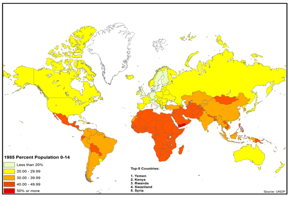
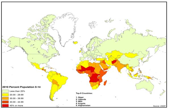
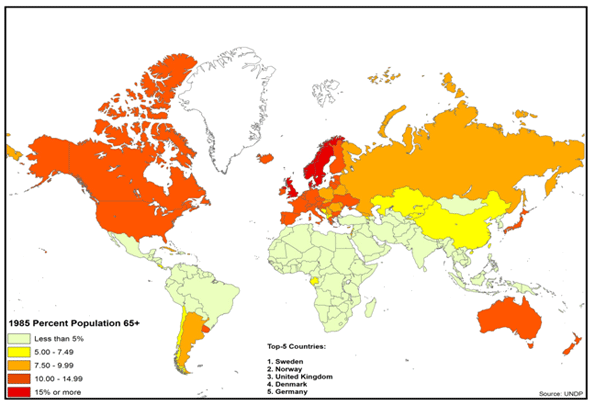
    It is of little surprise that countries with a high Youth Dependency Ratios (children under 15 per 100 persons of working age, or 15 to 64) are less stable, and turn up as hotspots on the world map (Figures 1 & 2). Liberia for instance has a 5.1 percent annual natural population increase rate, 81 children per 100 of working age, and a fertility rate of 4.7. In contrast, prosperous Denmark has a 0.3 percent annual natural population increase rate, 28 children per 100 of working age and a fertility rate of 1.9 (UNDP, 2010).

    Figure 1: Global Youth Dependency Ratio (1985)


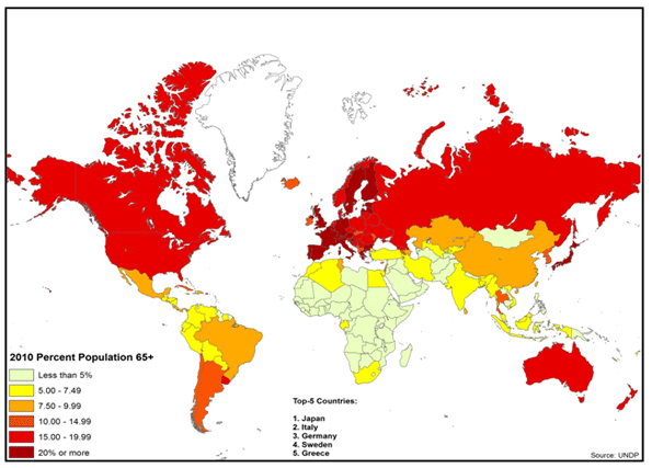
    Figure 2: Global Youth Dependency Ratio (2010)

    As population increases outpace economic opportunities and growth, nations at risk fail to accommodate new entrants into the workforce. In addition, caring for children requires a high proportion of resources, thus depressing the rate of economic growth. (Bloom et.al., 2001).

    A low median age is thus a harbinger of impending stresses, where in extreme cases at least 50% of the population is below 20 years of age (UNDP, 2010). In comparison, the median age of the developed world averages 30 – 40 years. This forms the foundational basis of several youth bulge studies of late, explaining demographic factors behind the Arab Spring (Anderson, 2011), that was in part driven by massive increase in youth (Hvistendahl, 2011; Fuller, 2003) and the youth workforce (Kuhn and Korbel, 2011; Schwartz, 2011), much of whom are unemployed and underemployed (Bajora, 2011).

    THE FERTILITY IMPLOSION

    Yet there is a distinct disadvantage as well to ever lower birthrates. Globally population growth rates are likely to continue dropping – to less than 0.8 percent worldwide by 2025 – largely due to an unanticipated drop in birthrates in developing countries such as Mexico and Iran. These declines are in part the result of increased urbanization, the education of women, and higher property prices. Already the global fertility rate, including the developing countries, has dropped in half to an estimated 2.5 today (Longman, 2010a). Close to half the world’s population lives, notes demographer Nicholas Eberstadt, in countries with below replacement rate birth-rates. The world, he suggests, is experiencing a “fertility implosion” (Eberstadt, 2010).

    Like a population explosion, a demographic implosion has consequences. Countries that have previously engineered reductions in the fertility rates – Singapore (Yap, 2003), Hong Kong (FPAHK, 2011), Vietnam (Bennett-Jones, 2000), India (WHO, 2011) and Indonesia (Hull, 2007) – have done so to achieve more manageable economic conditions. Similar initiatives are being debated, even in the in the Philippines (Pernia et. al., 2011), where religious interpretations are being contested. China’s “one child policy” represented just a more authoritarian expression of a widespread global process. Yet this process often includes many unintended and potentially damaging consequences. However, elsewhere, virtually the same results were replicated without government policy direction, such as in Brazil (Gomey, 2011).

    Chinese “fertility implosion” is already having profound impact on marriage in China. Today researchers characterize declining fertility in China into “waves of singletons” (单身潮). While the first three, distinct “waves” or phases since 1950 are well established (王霞, 2006),it has recently been noted that the fourth (第四次单身潮) is currently in progress(陈亚亚, 2011). In the fourth and current wave, women increasingly view child-bearing and marriage as a form of entrapment and a burden that can interfere with aspirations of affluence (杨燕明  2011; 黄蓉芳 and 杨励潮, 2011).

    Not surprisingly this is most evident in the advanced urbanized parts of China, such as Shanghai, where there are already three million people over 60, or 2l percent of the population, roughly equal to the share in many advanced countries (McCartney, 2009).

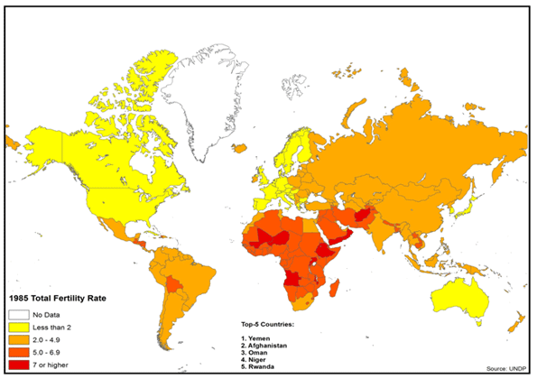
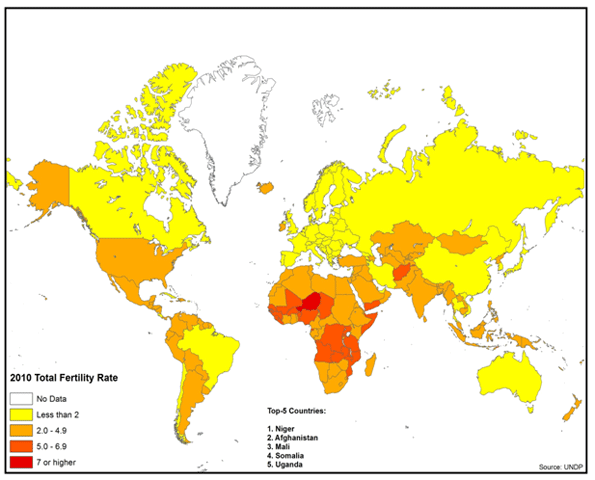
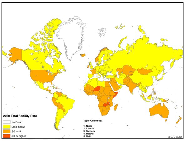
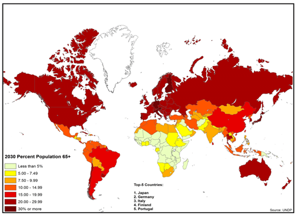
    China now has a fertility rate of 1.6, below that of Western Europe. Nor is China alone. Other middle income nations and even low income nations are experiencing significant declines in fertility rates. Brazil and Iran already have fertility rates less than that of the United States. In Bangladesh and Indonesia, fertility rates are projected to drop below replacement rates (2.1) by 2030. Around the world, increasing affluence has been associated with fewer children, as is indicated in Figures 1 – 3. The longer run implications of these less than replacement fertility rates (2.1) is smaller and much older populations (Figures 3, 4 &5).

    Figure 3: Global Total Fertility Rate (1985)

    Figure 4: Global Total Fertility Rate (2010)

    Figure 5: Global Total Fertility Rate (2030)


    GRAYING OF THE WORLD

    Here’s the big issue down the historical road: Thirty years from now, how will Xiao Ming handle six elderly parents and grandparents, all by himself? Xiao Ming’s impending dilemma is not unique to China.

    Overall what author Phil Longman calls a “gray tsunami” will be sweeping the planet, with more than half of all of population growth coming from people over 60 while only six percent will be from people under 30. The battle of the future – including in the developing world – will be, in large part, how to maintain large enough workforces required for the economic growth needed to, among other things, take care of and feed the elderly (Longman, 2011b). The National Bureau of Research (NBER) further notes that similar to child dependents, a large elderly population similarly requires a large proportion of resources, which likewise can inhibit economic growth (Bloom et. al., 2001).

    Right now the situation seems dire. Fertility rates are projected to continue their decline. Increasing life expectancy is contributing to a substantial increase in the elderly population. In many nations, the size of the elderly population will exceed that of the under 15 population for the first time.

    This could not have happened at a worse time, because the elderly have become ever more dependent on the state in many nations. Supporting a larger elderly population requires a larger work force, however it will be smaller.

    All of this leads to a demographic future that promises to challenge the nations of the world as never before. This is illustrated by rising Old Age Dependency Ratios in Figures 6, 7 & 8.

    Figure 6: Global Old Age Dependency Ratios (1985)

    Figure 7: Global Old Age Dependency Ratios (2010)


    Figure 8: Global Old Age Dependency Ratios (2030)

    High income countries are projected to experience elderly population increases on the order of 60 percent in relation to the working age population (15 – 64) by 2030. In the United States, there are now 20 people 65 or over for every 100 of working age; little changed since 1985, when it was 18. However, by 2030 there will be 33 seniors per 100 working people. More extreme will be the fates of the world’s third and fourth largest economies. Germany’s ratio of elderly to working age individuals is already 33, compared to 21 in 1985. In 2030 this ratio will rise to an almost unimaginable 48, meaning that there will be only two working people per retiree. Japan’s situation is even worse. As recently as 1985, Japan had a relatively healthy 15 retirees for every working age person. Today this ratio is one the world’s most extreme: with 35 seniors per 100 working age people. In 2030, this ratio is expected to rise to 53.

    Things will be a bit better, at least in the next two decades, in middle income countries such as China and Brazil. But the rate of aging will be even greater than in the high income nations. Both China and Brazil will experience a doubling of their Old Age Dependency Ratios; both will rise slightly above current US levels by 2030. China is projected to rise from 11 to 23, while Brazil’s will increase from 10 to 20. Despite its theological regime, which might be seen as working against smaller families, middle-income Iran is also aging rapidly. It should see a doubling of its Old Age Dependency Ratio, but from a low 7 to a manageable 14. 

    There will be a mix of results in the lower income countries, as illustrated by the Philippines and Nigeria. In the Philippines, the fertility rate is expected to remain high by current global standards, at 2.6 in 2030, only a modest drop from the present 2.9. However, the elderly will increase 60 percent relative to the working age population (from an Old Age Dependency Ratio of 6 to 10 in 2030). Similarly, in Nigeria the fertility rate is expected to decline only slightly, from 4.8 to 4.5. Alone among the group of nations reviewed, Nigeria is expected to experience only a negligible increase in the Old Age Dependency Ratio, remaining at 6. In 1985, these nations had Old Age Dependency Ratios of between 5 to 7 (UNDP, 2010).

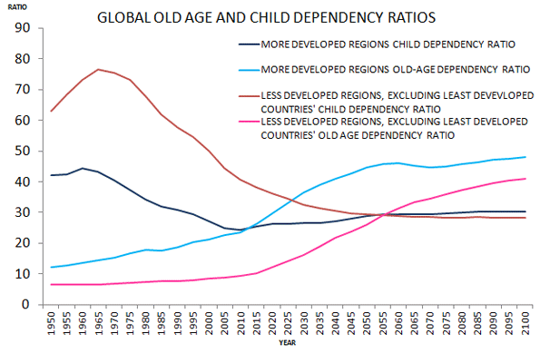
    Even if we were to discount population projections going forward (Shahani, 2011), the world is on the verge of a global demographic precipice (Figure 9) – one in which the the increase in proportion of elderly far outweighs that of the increase in proportion of children. A world which Andrew Blechman terms, “a world without children” (Blechman, 2009), and that Ted Fishman describes as one which “pits young against old, child against parent, worker against boss, company against rival, and nation against nation” (Fishman, 2009).

    Figure 9: UNDP global old age and child dependency ratios. In the developed world, child dependency will equal old-age dependency within the next 5 years. In the developing world this will happen in the next 40 years.

    FINANCING THE UNFINANCABLE?

    Where there is Virtually Universal State Support.The options available for addressing increasing old age dependency are not very attractive. Older people require considerably more in terms of overall support, particularly for health care, than younger generations (Feinberg et. al., 2011). This is a crisis particularly in demographically declining countries with well-developed social welfare nets. A recent Bank of International Settlements study found that, due to these pressures, Germany’s ratio of public debt to gross domestic product could exceed 200 percent in 2030, with annual debt service approach 10% of GDP. This would be a fiscal burden twice that of Greece today (Eberstadt and Hans, 2010).

    Where there is Less State Support: In many nations, state retirement systems often fail to cover a large share of the elderly population. While arrangements vary widely, many elderly must find their own ways to survive, such as by working longer or by relying on families. As emerging nations consider establishing or expanding social safety nets for the elderly, they need to consider the experience of the high-income world welfare states.

    Family Support: Given the stresses on public systems, it might be hoped that the elderly could be supported by their children. But this solution has been losing hold throughout the developed world. The mathematics cannot work in any of the challenged nations, at whatever income level: As the elderly population increases relative to the working population, an adult Xiao Ming is unlikely to be able, or willing, to support six parents or grandparents or even two or three.

    Reduce Benefits? The accounting answer may be simple – limit elderly benefits to what society can afford. But the politics do not work. Concentrated, organized interests, such as the elderly who receive state benefits, are likely to block any such reforms. The difficulty of dealing with today’s challenges, which are modest compared to the future, is illustrated by recent developments in Western Europe and the United States, where recipients of state aid have fought, often successfully, to retain their benefits even in the face of significant funding challenges.

    Increase the Birth Rate? A substantial increase in the birth rate in low fertility nations could help, but it would need to happen immediately. This would require broad acceptance of earlier and more frequent child-bearing women, many of whom are increasingly finding a life of affluence to be preferable to one of child-raising. Some projections show increases in the fertility rate in future years, however it could be too little-too late (UNDP HDI, 2010).

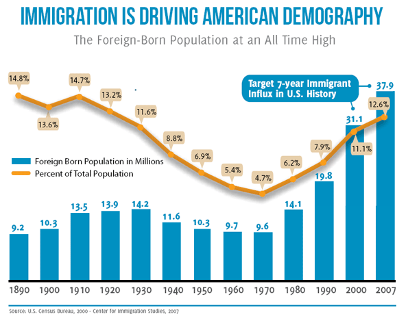
    More Migration? Increased migration from poorer countries could help richer countries finance the needs of their elderly. However, migration rates are dropping even in the United States, which is by far the world’s largest country for immigration. Although the US foreign born population grew by 10 million over the past decade, both illegal and legal immigration have been dropping. In 2008 there were over one million naturalizations; last year there were barely 600,000, a remarkable 40% drop (Ohlemacher, 2006).

    Working Longer: As life expectancy has increased in recent decades, retirement ages have changed little. For example, in the United States, since the establishment of the state retirement system, life expectancy at birth has increased 16 years, while the retirement age has increased only two years.   Generally, every additional year in life expectancy is an additional year of state support. One possible solution would be to extend retirement ages beyond the 65 years common in the high income world. Yet while life expectancy has increased, perhaps in 2030, the standard Old Age Development Ratio should be calculated using the population that is more than 75 years old instead of 65.

    More Women in the Work Force: Another factor that could assist in meeting the daunting financial challenge of supporting the elderly would be for an increase in female participation in the workplace. The extent to which such an expansion is theoretically possible varies significantly by nation, but this could be part of the solution. There is an important caveat, however. Increasing the supply of workers does not automatically create wealth. Western Europe has had intractable unemployment rates for decades and has been joined in recent years by the United States. More workers, of either sex, will require strong enough economic growth to generate sufficiently high paid employment.

    Affordable Housing:One reason for lower birthrates may be the cost of housing. Many of the countries, and regions, with the most expensive housing also tend to experience the lowest fertility – Taiwan, Singapore, Hong Kong, and much of Western Europe. Across China, for example, it is generally agreed that apartment sales prices are exceedingly high relative to incomes (Pierson, 2011). In a number of places with considerable land for new development, like the United Kingdom, Australia and some metropolitan areas of the United States and Canada, researchers have connected substantially increasing prices and housing shortages with overly-restrictive land use regulation. Any strategy that would encourage greater fertility might need to address this issue. Further, the artificially higher house prices consume discretionary income that could be better put to encouraging economic growth by increasing the demand for other goods and services.

    Economic Growth: Economic growth represents the best hope. Chinese-level GDP increases would better position to countries for demographic challenges than the Japanese or European rates of the last two decades. Clearly, economic expansion would ameliorate the pre-occupation with splitting the economic pie. It will also be important to pursue policies that minimize costs for households. If, for example, the cost of housing or food is less, more money will be available for necessary social programs (and there will be less resistance to funding them). In a sense, the difference between laggard and strong economic growth can make a huge difference. For example, economist Bret Swanson has shown that the United States could conquer its well-publicized debt burden with economic growth rates of 4 percent (Swanson, 2011).

    This Issue Must be Addressed: No one can accurately predict the future, but it is necessary to focus on the issue of aging and declining fertility. In advanced countries, if the elderly retain their state benefits and economic growth continues to be modest or even stagnant, the pressure on economies will be severe. There will be, to put it simply, less money to go around. Those who primarily fund the state – the working population – will have to pay more and could see material reductions to their standards of living. Central Bankers could yield to the temptation to print enough money to seemingly hyper-inflate away the problem, but that could lead to a lower standard of living for all.

    Overall our research suggests several possible solutions, including extending work and careers into the 70s; means tested benefits; greater incentives for having children; and measures to keep housing more affordable and family friendly wherever possible. But the ultimate issue will be maintaining economic growth.   

    The future of Xiao Ming and billions more will depend upon the result.

    Emma Chen is a Senior Strategist at the Centre for Strategic Futures, Singapore. The views expressed within this article are solely her own. Publication does not constitute an endorsement by the Centre for Strategic Futures, Singapore.

    Wendell Cox is a consultant specializing in demographics and urban issues, principal of Demographia and a visiting professor at the Conservatoire National des Arts et Metiers in Paris.

    This project was supported by the Legatum Institute. Maps designed by Ali Modarres, chairman, Geography Department, California State University, Los Angeles.


    REFERENCES

    王霞. 2006. “第三次单身潮解析 (Analysis of Youth Single Phenomenon in the Third Bachelor Trend).”中国青年研究(China Youth Study) 2006(12).

    杨燕明. 2011. “大家谈中国:第四次单身潮反映家庭婚姻危机 (Everybody Discusses China: Fourth Wave of Singles Reflects Family and Marriage Crises).” BBC News. Accessed September 19, 2011.
    http://www.bbc.co.uk/zhongwen/simp/comments_on_china/2011/07/110720_coc_marriage_byyangminyan.shtml.

    陈亚亚. 2011. “都市单身女性的生存状态考察 (Observations on the living status of urban single females).” 华人社会和谐家庭论坛暨第九届全国家庭问题学术研讨会(The Ninth National Conference on Family Issues, The Forum for Chinese Societal Harmony and Family), hosted in Guang Dong, 2011.

    黄蓉芳 and 杨励潮. 2011. “中国将迎第四次单身潮 近4%的女性因性取向单身 (China Will Meet its Fourth Wave of Singles – Nearly Four Percent of Females are Single Due to Sexual Orientation).” Xinhua, July 19.

    Anderson, Lisa. 2011. “Demystifying the Arab Spring.” Foreign Affairs May/June 2011 2-7.

    Bajoria, Jayshree. 2011. “Demographics of Arab Protests.” Council on Foreign Relations. Accessed September 19, 2011. http://www.cfr.org/egypt/demographics-arab-protests/p24096.

    Bennett-Jones, Owen. 2000. “Vietnam’s Two-Child Policy.” BBC News. Accessed September 19, 2011. http://news.bbc.co.uk/2/hi/asia-pacific/1011799.stm.

    Blechman, Andrew D. 2009. Leisureville: Adventures in a World Without Children. New York: Grove Press.

    Bloom, David E., David Canning, and Jaypee Sevilla. 2001. “Economic Growth and the Demographic Transition.” NBER Working Paper Series. Accessed September 19, 2011. http://www.nber.org/papers/w8685.pdf.

    Eberstadt, Nicholas, and Hans Groth. 2010, “Time for Demographic Stress Test.” Wall Street Journal, November 27.

    Eberstadt, Nicholas. 2010. “The Demographic Future.” Foreign Affairs 89:54-64.

    Feinberg, Lynn, Susan C. Reinhard, Ari Houser, and Rita Choula. 2011. “Valuing the Invaluable: 2011 Update – The Growing Contributions and Costs of Family Caregiving.” AARP Public Policy Institute. Accessed September 9, 2011. http://assets.aarp.org/rgcenter/ppi/ltc/i51-caregiving.pdf.

    Fishman, Ted. 2010. Shock of Gray. New York: Scribner

    Friedman, Benjamin. 2005. The Moral Consequences of Economic Growth. New York: Alfred A. Knopf.

    Fuller, Graham E. 2003. “The Youth Factor: The New Demographics of the Middle East and the Implications for U.S. Policy”. Brookings Institute. Accessed September 19, 2011.
    http://www.brookings.edu/~/media/Files/rc/papers/2003/06middleeast_fuller/fuller20030601.pdf.

    Gorney, Cynthia. 2011. “Brazil’s Girl Power.” National Geographic, September.

    Hvistendahl, M. 2011. “Young and Restless can be a Volatile Mix.” Science 333:552-4.

    Hull, Terence H, “Formative Years of Family Planning in Indonesia,” in The Global Family Planning Revolution: Three Decades of Population Policies, edited by Warren C. Robinson and John C. Warren (Washington: The World Bank, 2007), 246.

    Kuhn, Randall, and Josef Korbel. 2011. “On the Role of Human Capability in the Arab Spring.” Working paper, University of Colorado Boulder. Accessed September 19, 2011. http://www.colorado.edu/ibs/pubs/pop/pop2011-0011.pdf.

    Longman, Phillip. 2010. “Think Again: Global Aging.” Foreign Policy. Accessed September 19, 2011. http://www.foreignpolicy.com/articles/2010/10/11/think_again_global_aging.
    Longman, Phillip. 2011. “The World Will be More Crowded – With Old People.” Foreign Policy. Accessed September 19, 2011. http://www.foreignpolicy.com/articles/2011/08/15/the_world_will_be_more_crowded_with_old_people.

    McCartney, Jean. 2009. “China Steps Back from One Child Policy.” Times, July 24.

    Ohlemacher, Stephen. 2006. “3M a Year Leave Developing Countries.” Associated Press, August 17.

    Pernia, Ernesto M., Stella Alabastro-Quimbo, Maria Joy V. Abrenica, Ruperto P. Alonzo, Agustin L. Arcenas, Arsenio M. Balisacan, Dante B. Canlas, Joseph J. Capuno, Ramon L. Clarete, Rolando A. Danao, Emmanuel S. de
    Dios, Aleli dela Paz-Kraft, Benjamin E. Diokno, Emmanuel F. Esguerra, Raul V. Fabella, Maria Socorro Gochoco-Bautista, Teresa J. Ho, Dennis Claire S. Mapa, Felipe M. Medalla, Maria Nimfa F. Mendoza, Solita C. Monsod, Toby Melissa C. Monsod, Fidelina Natividad-Carlos, Cayetano W. Paderanga, Gerardo P. Sicat, Orville C. Solon, and Edita A. Tan. 2011. Discussion paper, University of the Philippines. Accessed September 19, 2011. http://www.econ.upd.edu.ph/dp/index.php/dp/article/viewFile/670/132.

    Pierson, David. 2011. “In China, Having Children is no Longer a Given.” Los Angeles Times, September 2.

    RAND Corporation. 2002. “Banking the ‘Demographic Dividend’.” Accessed September 19, 2011. http://www.rand.org/pubs/research_briefs/RB5065/index1.html.

    Shahani, Lila Ramos. 2011. “Whither the RH Bill”. BusinessWorld Online. Accessed 19 September, 2011. http://www.bworldonline.com/content.php?section=Opinion&title=Whither-the-RH-bill?&id=38459

    Schwartz, Stephanie. 2011. “Youth and the ‘Arab Spring’.” United States Institute of Peace. Accessed September 19, 2011. http://www.usip.org/publications/youth-and-the-arab-spring.

    Swanson, Bret. 2011. “The Growth Imperative.” Presentation to the National Chamber Foundation, Washington D.C., May 24. Accessed September 19, 2011. http://entropyeconomics.com/wp-content/uploads/2011/05/EE-NCF-Growth-Imperative-05.24.11-v1.9.pdf.

    The Family Planning Association of Hong Kong. 2011. “Family Planning Milestone.” Accessed September 19, 2011. http://www.famplan.org.hk/fpahk/en/template1.asp?style=template1.asp&content=about/history.asp.

    United Nations Development Programme. 2010. “International Human Development Indicators.” New York: UN Human Development Report Office. Accessed September 19, 2011. http://hdr.undp.org/en/statistics.

    U.S. Department of Homeland Security. 2010. “Table 20 – Petitions for Naturalization Filed, Persons Naturalized, and Petitions for Naturalization Denied: Fiscal Years 1907 to 2010.” Washington D.C.:  U.S. Department of Homeland Security. Accessed September 19, 2011. http://www.dhs.gov/files/statistics/publications/YrBk10Na.shtm.

    United Nations Development Programme. 2010. “International Human Development Indicators.” New York: UN Human Development Report Office. Accessed September 19, 2011. http://hdr.undp.org/en/statistics.

    United Nations Development Programme. 2010. “International Human Development Indicators.” New York: UN Human Development Report Office. Accessed September 19, 2011. http://hdr.undp.org/en/statistics.

    United Nations Development Programme. 2010. “International Human Development Indicators.” New York: UN Human Development Report Office. Accessed September 19, 2011. http://hdr.undp.org/en/statistics.

    World Health Organization Regional Office for South-East Asia. “India and Family Planning: An Overview.” Accessed September 19, 2011. http://www.searo.who.int/LinkFiles/Family_Planning_Fact_Sheets_india.pdf

    Yap, Mui Teng. 2003. “Fertility and Population Policy: The Singapore Experience.” Journal of Population and Social Security (Population) 1:643-58.

    1: Based on personal history of a co-author

  • Housing Bottom? Not Yet.

    Weakness in housing activity and in housing prices continues to be a major drag on the overall economy. My colleagues at California Lutheran University’s Center for Economic Research and Forecasting have long maintained that the home ownership rate (HOR) needs to fall back to its historical norm of 64% before housing can recover. Their view has been that the attempt to increase the HOR by loosening credit standards contributed to creating financial instability. In a classic case of unintended consequences, the attempt to improve the home ownership rate contributed to rising home prices which ended up lowering affordability for first-time buyers.

    A rising home ownership rate has been a major goal of public policy for several decades under both Republican and Democratic administrations. The rationale was multi-part. First, it was believed that communities are stronger where home ownership is greater. Second, building equity in a home was viewed as the primary path to improving a family’s financial condition. Finally, lower home ownership among minorities was felt to be an indicator of bias.

    Policies directed towards increasing the rate of home ownership included subsidizing first time home buyers, reducing required down payments, and streamlining the application process. Weaker underwriting standards increased the effective demand for housing and helped propel a boom in housing activity and home price appreciation between 1995 and 2006. The overall HOR rose from 65% in 1990 to 69% in 2006 which was applauded on both sides of the political aisle.

    However, rising home prices eventually reduced affordability and, along with excess supplies of housing due to overbuilding, led to a peak and then a decline in housing prices. The price decline eventually set in motion forces that generated severe losses to mortgage investors and homeowners alike. The underwriting pendulum shifted from easy to tight, and effective demand for houses plummeted. Millions of people have lost their homes, and many more have zero or negative equity in their homes. The homeownership rate has now declined from 69% to 66%, and appears to be headed lower.

    Another fundamental indicator of housing weakness is the large number of delinquent mortgages and the implied backlog of future foreclosures. Of course, as the foreclosure backlog is worked through, the result will be a decline in the home ownership rate, as newly foreclosed-upon home owners become renters. Thus, this issue is not separate from the HOR issue.

    The large number of vacant homes is also a measure of housing market health. During the period of 2002 through 2005 the housing industry massively overbuilt. The degree of overbuilding can seen by comparing the rate of household formation (about 1.1 million new households per year during this period) with total housing starts, which is the number of new units (including rentals) completed each year.

    This number exceeded two million units per year during the boom. Since the end of the housing boom, total starts have fallen dramatically to around 600,000 per year. If the rate of household formation had remained at 1.1 million per year, then the surplus developed during the boom would have been eliminated by now. However, an important yet obscure statistic maintained by the Census Department, the Vacant Homes For Sale (VHFS), remains at more than one million above its long-term average. What is going on?

    I suspect that the rate of household formation dramatically declined following the crisis and subsequent recession because more young adults returned to their family homes, and because multiple families are occupying the same housing unit.

    The problem of too much housing stock and too few households will not be resolved purely by a lower home ownership rate. It will be resolved by rising household formation , even if the new households are renters instead of owners. What we need is more people. One strategy to accelerate the process is to streamline legal immigration and to lift or eliminate quotas on the number of people who can legally come to this country.

    Jeff Speakes is Executive in Residence at California Lutheran University, and Lecturer in economics at the University of Southern California.