Category: Demographics

  • Brain Drain or Birth Dearth?

    Observers and advocates on Long Island — New York’s Nassau and Suffolk counties — have repeatedly used age group population estimates to bolster land use policies based on their preferred narrative. The assumption? Young adults are moving away from the region in large numbers due to the high cost of living, particularly housing prices. So, the story goes, the suburban pattern must be broken, and small, high density housing units must replace detached, single-family homes as the dominant urban form if young adults are to be retained.

    When the Long Island Housing Partnership dedicated a dozen affordable housing units in Southampton town in 2007, a spokesperson explained. “We’re losing our young from the ages of 20 to 34 at five times the national average. People can’t stay because of the high cost of living.” The region’s premiere daily, Newsday, editorialized a few years later, “Unless Long Island stops this brain drain, it won’t prosper.”

    In reality, explanations for the changes in the size of age cohorts from decade to decade amount to little more than speculation. Census estimates of the population by age group tell us next to nothing about if, when, where, or why people are moving or “disappearing.” The data is a static picture of population age groups as they exist in a given geography on a given day.

    Demographers have long believed that the primary driver of changes in age cohorts are changing patterns of birth and death rates. For example, in 1980, there were 141,917 fewer children below the age of 10 than in 1970 in Nassau-Suffolk (484,145 vs. 342,228). This correlates roughly with the decline of 150,262 in the number of 10-19 year-olds between 1980 and 1990, the decline of 110,663 in the number of people between 20 and 29 years of age in the 1990s, and the decline of 107,657 in the number of people between the ages of 30 and 39 in the 2000s (441,008 vs. 333,351).

    This makes perfect sense. Individuals born in the 1970s would be in their teens in the 1980s, in their 20s in the 1990s, and in their 30s in the 2000s. If there were 150 thousand fewer children aged 0-9 in the 1970s, one would expect there to be over 100 thousand fewer people in their 30s in the 2000s.

    It is, in other words, the case that the sharp decline of twenty-somethings in the 1990s and of thirty-somethings in the 2000s is largely the result of the “birth dearth,” a sharp decline in the birth rate that Nassau-Suffolk experienced in the 1970s, the decade after the “baby boom” from 1947 to 1964. The 1970s birth cohort is wending its way through the life cycle.

    Indeed, even as critics decry the “brain drain,” it looks like this pattern has started to partially reverse in Nassau-Suffolk. Because birth rates rose in the late 1980s and early 1990s, there has been a substantial increase in the number of people between 15 and 24 years of age in the past decade. The population aged 15-19 increased by 17.4 percent, between 2000 and 2010, while the 20-24 year-old group increased by 18 percent, for a total increase of 15-24 year-olds of 54,726 over the last ten years. If the correlation between housing costs and people in their early 20s was strong, it is unlikely that during a period when the median price of a single-family home increased by 66 percent (from $220,000 in 2000 to $366,000 in 2010), that the population in their early twenties would increase as well.

    All of this is not to discount the importance of migration patterns, or the attractiveness of a particular region to those in a particular age group. But the misinterpretation of data can lead to misplaced policy priorities. In this case, it’s generally believed that when young adults move away from a region it’s unhealthy for the area, and that policies that encourage a reversal of the trend — “hip” downtowns, sports stadiums, entertainment venues, small attached housing units — should be put in place.

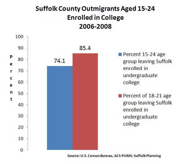
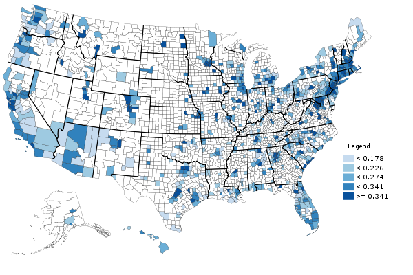
    But numbers from the U.S. Census Bureau’s American Community Survey, recently crunched for the Suffolk County Comprehensive Plan, show that 74.1 percent of 15-24 year-olds who move out of Suffolk are enrolled in college. When looking at only 18-21 year-olds, the primary college-aged group, the percentage of those leaving Suffolk because they’re enrolled in college rises to 85.4 percent (see Figure 1).

    Suffolk County had a college-going rate among high school graduates of 86.5 percent in 2010. Is this high rate something that needs to be reversed? Many of these college goers return to Long Island, sometimes after stints in New York or other cities as young careerists, and help to raise the median household income of migrants coming into Suffolk county to $81,471 (2008 dollars), compared to only $67,241 for those leaving Suffolk.

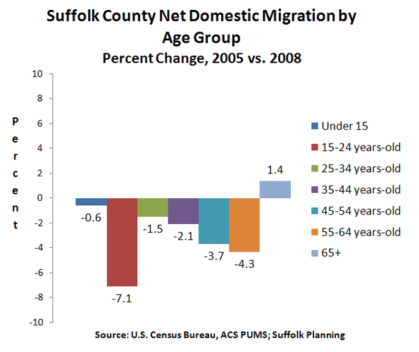
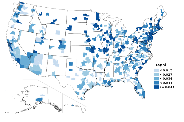
    One more finding from the Suffolk Comprehensive Plan on domestic migration —movement within the United States — seems to mitigate against received wisdom. While the college-goers age group had the largest net domestic migration out of Suffolk, the second largest group was the 55-64 year-olds. (see Figure 2)

    In other words, the age groups widely believed to be the most in danger of shrinking or “disappearing” due to outmigration are, according to the best available data, the least in danger of doing so. In general, the 25-34 and 35-44 year-old age groups are the smallest net domestic migration “losers,” because it is a relatively stable time in life. If people marry, and/or care for young children, move up the ranks of a career, or invest in a home, it is typically in these years that they do so.

    As far back as 1978, Newsday screamed that “An Exodus of the Young Threatens Life-Style.” In fact, the 1970s saw a sharp increase in the number of young adults in Nassau-Suffolk; as the population aged 15-39 grew by 178,179, or 21 percent, from 846,070 in 1970 to 1,019,249 in 1980.

    Demographic data can be a useful tool for policy makers attempting to clarify complicated public issues. But when data is not properly understood, or it is misinterpreted, then public policy debate is stymied.

    Seth Forman, Ph.D, AICP, is author of American Obsession: Race and Conflict in the Age of Obama and Blacks in the Jewish Mind: A Crisis of Liberalism, among other books. His work has appeared in publications that include National Review, Frontpagemag.com, The Weekly Standard, and The American. He is currently Research Associate Professor at Stony Brook University, and the Chief Planner for the Long Island Regional Planning Council. His opinions are not associated with any of these institutions. He blogs at www.mrformansplanet.com.

    Photo by SaraPritchard, Warped Tour’10, Long Island, New York

  • Are We Headed For China’s Fat Years?

    Chan Koonchung’s chilling science fiction novel The Fat Years — already an underground sensation in China — will be published in the U.S. January 2012. The book, first published in Hong Kong in 2009, is partly so chilling because it reveals a scenario that is all too plausible. Set in 2013, it takes place after a second financial crisis  (euros, anyone?) that all but destroys the Anglo-American economies and ushers in “China’s golden age of ascendancy.”

    The nation that leads the world in The Fat Years is less bleakly dystopian than the Stalinist state portrayed in George Orwell’s 1984 or the biologically controlled society of Aldous Huxley’s Brave New World. Yet it is supremely authoritarian — harassing and even executing the rare dissident and putting drugs in the water supply to inflate a sense of well-being among the masses.

    This all-powerful Chinese state looks very familiar. It pursues a commercial strategy of plundering resource-rich regions around the world, often working with the most despicable of regimes such as Zimbabwe. And it harnesses and promotes information technology while maniacally censoring the Internet, rendering cyberspace just another outlet for propaganda.

    It is also increasingly self-confident. As one character — a highly placed party cadre in the story — suggests, this new Chinese model represents “the best option in the world as it really exists.”

    Many in the West already accept this notion. According to a recent Pew survey, nearly half of all Americans believe China will surpass America as the world’s leading power. The same poll found that roughly two-thirds of Britons — and many Europeans — believe similarly.

    The higher circles in Washington and New York generally view the Anglo-Saxon democracy as unable to compete with the more ordered, authoritarian Chinese model. Thrilled by what he sees as “China’s green leap forward,” New York Times columnist Thomas  Friedman proclaims the greater advantages of “one-party autocracy.” After all, Chinese autocrats can adopt “policies needed to move a society forward in the 21st century” without needing to check in with the voters. Even conservative pundit Francis Fukuyama, once a believer in the inevitable triumph of market liberalism, feels that “Anglo Saxon capitalism” has squandered its historic moment. “Democracy in America,” he notes, “has less than ever to teach China.”

    Former Obama Management and Budget chief Peter Orszag is the latest to endorse the down-with-democracy movement. Concerned with our inability to deal with our fiscal problems, climate change and rebuilding the economy, Orszag proposes shifting power from Congress to more “independent institutions” made up of unelected policymakers.  He argues that democracy can be “too much of a good thing.”  Comfortably ensconced at bailed-out Citigroup, Orszag has benefited from a financial system that increasingly resembles China’s, with its intimate ties between the state and banks. Crony capitalism, on both sides of the Pacific, it appears, has its rewards.

    Yet perhaps it is too early for the English-speaking democracies to throw in the towel.  Many who now espouse Chinese supremacy previously argued that Japan, and even Europe, was destined to dominate the world.  Yet Pax Niponica never got past the early 1990s; one former inevitable global hegemon has been downgraded to the sick man of Asia.

    Like Japan, China faces many great, if often overlooked, challenges. There’s a devastated environment, growing social unrest and rising competition from other countries, notably the Indian subcontinent. Labor force growth is slowing rapidly, and the country now has up to 30 million more marriage-age boys than girls, an all but certain spur to political unrest. Misallocation of resources by both central and local authorities threatens to create a major property bubble.

    Throughout modern history authoritarian and more centrally controlled countries have proved very good at playing “catch up” and impressing journalists. China’s Communist regime can order investment into everything from high-speed trains to green technology and massive dam construction. The results — like those previously seen in Nazi Germany and Soviet Russia — are often as physically and technologically impressive, although often cruel to both the environment and people stuck in the way.

    But once a country reaches a certain plateau of development, as Japan did in the 1990s, the nature of the competition changes; it becomes harder to target industries that are themselves in constant flux. Workers who have already achieved considerable affluence tend to be harder to bully or motivate.

    Take the battle for cyberspace. Japan’s ballyhooed bureaucracy sought to conquer this frontier through traditional channels. This allowed the internet to become a competition largely among relative young U.S. companies such as Apple, Amazon, Google and Facebook. The much-feared Japanese takeover of the computer and cultural industries back in the 1980s now has petered out into a historical footnote.

    And despite the recent, often spectacular gains of China , the primary English-speaking countries — the  U.S., U.K., Canada, Australia and New Zealand — still control a quarter of the world’s GDP, compared with 15% for the Sinosophere. Their combined per capita income is six times higher.

    Critically the U.S. and its closest cultural allies — New  Zealand, Australia and Canada —  also have enormous physical advantages. These four countries all stand among the eight largest food exporters in the world.  Recent discoveries on the energy front have made North America, particularly the Great Plains, a potentially dominant force in the global oil and gas industries. China lacks the water, and likely to resources, to match up.

    But the real edge lies with culture, particularly the English language, which has decimated all its traditional competitors — French, German and Russian — over the past two decades.  Difficult to learn, Chinese is not likely to replace English any time soon as the dominant language of culture, air travel, science and technology.

    This cultural dominion can be seen in the media as well. The U.S. and its English-speaking allies account for roughly half of all the world’s audio-visual exports. To an extent never seen before, Anglophones dominated how people think, dress and recreate.

    Arguably our biggest advantage lies in the very thing our upper echelons increasingly disdain — our messy multicultural democracy and our addiction to the rule of law. “The secret of U.S. success is neither Wall Street or Silicon Valley but its long-surviving rule of law and the system behind it,” Liu Yazhou, a Chinese two-star general, recently said. “The American system…is designed by genius and for the operation of the stupid.”

    The stunning lack of such constitutional guarantees is just one reason why many of China’s entrepreneurial elite seek to immigrate to the U.S., Canada or Australia.   Indeed, among the 20,000 Chinese with incomes over 100 million Yuan ($15 million), 27% have already emigrated and another 47% have said they were considering it, according to an April report by China Merchants Bank and U.S. consultants Bain & Co.

    To be sure, the U.S. and its allies need to change in order to compete.  Greater incentives for savings, investments and productive industries must supplant those that promote asset speculation and financial manipulation. But we can do this without importing Asia’s   hierarchical structures. Rather than trying to outdo the Politburo in developing crony capitalism we should seek to reinvigorate our diverse, grassroots economy.

    In any competitive race you do not win by emulating your rivals but by building on your intrinsic strengths.  The best way to avoid the scenario laid out in The Fat Years lies not in abandoning the very strengths that drove our historic ascendancy, but by tweaking and enhancing them so that they propel us in the coming decades.

    This piece originally appeared at Forbes.com.

    Joel Kotkin is executive editor of NewGeography.com and is a distinguished presidential fellow in urban futures at Chapman University, and an adjunct fellow of the Legatum Institute in London. He is author of The City: A Global History. His newest book is The Next Hundred Million: America in 2050, released in February, 2010.

    Shanghai photo by flickr user Sprengben

    .

  • A Decade in College Degree Attainment

    This week the Census Bureau released its 2010 data from the American Community Survey. The ACS is what contains many of the core demographic characteristics that are frequently opined upon, such as college degree attainment, commute times, etc.

    It used to be that the Census Bureau collected this information during the decennial census using the so-called “long form” that went to one out of every ten households. But that was discontinued as of this census and has been replaced with with the ACS. The ACS reports data more frequently (annually for geographies larger than a certain size), but has a smaller sample size and so there’s lot of statistical noise that I don’t think we are used to dealing with yet. For example, in 2008 the Indianapolis metro area ranked #3 in the US for growth in college degree attainment over the course of the decade to date among metros greater than one million people. But in the 2010 data Indy ranked #28 on the same measure. There are fluctuations year to year and the margin of error needs to be accounted for in serious statistical analysis. Nevertheless, this is what we have to work with.


    Metro area college degree attainment, 2010

    I’m going to roll out a series of posts covering the highlights of some of this data. I’ll start with educational attainment, since that is something that is so key to upward social mobility and urban economic success.

    But first I’ll put in a brief plug for my Telestrian tool. The Census Bureau site for distributing this data is a disaster. As one Brookings senior fellow put it, “Lots of Census data yesterday, today. Lots of angles, stories, conclusions. One shared sentiment: new American Factfinder is AWFUL” and “New Factfinder making mainframe punchcards look appealing.” Telestrian is designed for very rapid basic analysis and comparative benchmarking moreso than simple fact lookups (though it can do that do). In fact, I generated every table, graph and map in this post in ten total minutes with it. Even if you aren’t in the market for a commercial product, there’s a no credit card required free trial period, so if you are interested in perusing the ACS data and don’t want to beat your head against the wall with the Census Factfinder, I encourage you to check it out. Telestrian doesn’t have every data element, but it has a lot of interesting stuff.

    College Degree Attainment

    College degree attainment (the percentage of adults with a bachelors degree or higher), is one of the most critical factors in urban success. If you’d like to know more, just check out all the great research on it under the heading of “talent dividend” over at CEOs for Cities.

    The map at the top of the post is 2010 college degree attainment for metro areas. Here are the top ten, among those with a population greater than one million, showing total number of people with degrees and the attainment percentage:


    Row Metro Area 2010
    1 Washington-Arlington-Alexandria, DC-VA-MD-WV 1,758,297 (46.8%)
    2 San Jose-Sunnyvale-Santa Clara, CA 558,519 (45.3%)
    3 San Francisco-Oakland-Fremont, CA 1,317,354 (43.4%)
    4 Boston-Cambridge-Quincy, MA-NH 1,335,276 (43.0%)
    5 Raleigh-Cary, NC 301,012 (41.0%)
    6 Austin-Round Rock-San Marcos, TX 429,163 (39.4%)
    7 Denver-Aurora-Broomfield, CO 651,661 (38.2%)
    8 Minneapolis-St. Paul-Bloomington, MN-WI 822,321 (37.9%)
    9 Seattle-Tacoma-Bellevue, WA 867,193 (37.0%)
    10 New York-Northern New Jersey-Long Island, NY-NJ-PA 4,613,445 (36.0%)

    And here’s the bottom ten:


    Row Metro Area 2010
    1 Riverside-San Bernardino-Ontario, CA 499,663 (19.5%)
    2 Las Vegas-Paradise, NV 278,387 (21.6%)
    3 Memphis, TN-MS-AR 209,987 (25.1%)
    4 San Antonio-New Braunfels, TX 344,247 (25.4%)
    5 Louisville/Jefferson County, KY-IN 224,392 (25.8%)
    6 Tampa-St. Petersburg-Clearwater, FL 513,182 (26.2%)
    7 Birmingham-Hoover, AL 198,856 (26.3%)
    8 New Orleans-Metairie-Kenner, LA 209,916 (26.8%)
    9 Jacksonville, FL 241,801 (26.9%)
    10 Phoenix-Mesa-Glendale, AZ 731,643 (27.2%)

    While we are on the topic, here is a map of college degree attainment by state:


    State college degree attainment, 2010

    And here is county level college degree attainment for those counties covered by the 1-year ACS:


    County college degree attainment, 2010

    Changes in College Degree Attainment

    Beyond just the raw 2010 numbers, it’s interesting to look at which places are growing their college degree attainment the most. That is, which places are growing their talent base. So here’s a look at metros by their change in college degree attainment over the last decade:


    Change in percentage of adults with college degrees, 2000-2010.

    Some places already have very high college degree attainment, which can make it tougher to grow even higher. Speaking of which, the US as a whole raised its college degree attainment as well. To some extent, this is purely a function of demographics. Older generations have lower educational levels than younger ones. (None of my grandparents had a college degree, and my father’s parents never even finished high school. I don’t think that was atypical for their day).

    What might be more interesting to look at is whether places are increasing their college degree attainment faster or slower than the US overall. There’s a measure that does capture that. It’s called location quotient, and is used in economic analysis to measure the concentration of industries in certain locations.

    An economist told me once that he likes to look at this for all sorts of things, not just industry clusters. The formula works for other stuff. I really haven’t seen this used before, so caveat emptor, but here’s a look at shifts in location quotient for metro areas over the course of the decade:


    Metro area change in location quotient for college degree attainment, 2000-2010. Increase in LQ in blue, decrease in red.

    The blue metro areas had a higher concentration of college degrees relative to the nation as a whole in 2010 than they did in 2000. The red ones a lower concentration. This is certainly an interesting area for further exploration.

    While I’m on the topic, here’s the same chart, only limited to graduate and professional degrees. There’s some interesting variability here.


    Metro area change in location quotient for graduate and professional degree attainment, 2000-2010. Increase in LQ in blue, decrease in red.

    A Closer Look at Indianapolis

    Just as one more granular example, I wanted to take a look at the Indianapolis vertical. Here’s 2010 college degree attainment for the city, metro, state, and America as a whole:


    College degree attainment, 2010

    As we know, urban regions tend to be more highly educated. Here we see that while Indiana is one of the lowest states in terms of college degree attainment, the Indy metro area actually beats the US average. However, the city of Indianapolis falls short of the US average. Because Indy is a consolidated city-county government that includes a lot of inner ring suburban areas, it’s hard to draw conclusions about the true urban core, but it does seem clear that the center is less educated than the periphery of the metro.

    Now lets look at the change in attainment for the decade:


    Change in the percentage of adults with a college degree, 2000-2010.

    Here we see that the rich get richer, as Indy metro not only started out on a higher base, but had the best showing in attainment growth as well. OTOH, going back to our LQ measure, Indiana actually boosted its LQ while the Indy region was stagnant. That’s because this is a percentage point change, not a percentage change, and growing from a low base makes it easier to boost LQ. It’s one of the quirks of that formula.

    The poor showing of the city of Indianapolis is something that should definitely be worrying. It would be interesting to do a similar analysis for other metros, but alas that’s all for today.

    Aaron M. Renn is an independent writer on urban affairs based in the Midwest. His writings appear at The Urbanophile, where this piece originally appeared. Telestrian was used to analyze data and to create charts for this piece.

  • Smart Growth (Livability), Air Pollution and Public Health

    In response to the outcry by job creators about proposed new Nitrogen Oxides emission regulations, the Obama Administration has suspended a planned expansion of these rules.

    The Public Health Risks of Densification

    The purpose of local air pollution regulation is to improve public health. For years, regional transportation plans, public officials, and urban planners have been seeking to densify urban areas, using strategies referred to as “smart growth” or “livability.” They have claimed that densifying urban areas would lead to lower levels of air pollution, principally because it is believed to reduce travel by car. In fact, however, EPA data show that higher population densities are strongly associated with higher levels of automobile travel and more intense air pollution emissions from cars and other highway vehicles. In short, higher emissions cause people to breathe more in air pollution, which can be unhealthful. To use a graphic example, a person is likely to encounter a greater chance of health risk by breathing intense smoke from a fire than if they are far enough from the fire to dilute the intensity of the smoke.

    Overall, more intense air pollution detracts from public health. To put in the economic terms that appear so often in planning literature on "urban sprawl," more intense traffic congestion and the consequent higher air pollution emissions are negative externalities of smart growth and densification.

    This is illustrated by county-level data for nitrogen oxides (NOx) emissions, which is an important contributor to ozone formation. This analysis includes the more than 420 counties in the nation’s major metropolitan areas (those with more than 1 million in population).

    Seven of the 10 counties with the highest NOx emissions concentration (annual tons per square mile) in major metropolitan areas are also among the top 10 in population density (2008). The densest, New York County (Manhattan), has by far the most intense NOx emissions. Manhattan also has the highest concentration of emissions for the other criteria air pollutants, such as carbon monoxide, particulates, and volatile organic compounds (2002 data). New York City’s other three most urban counties (Bronx, Kings, and Queens) are more dense than any county in the nation outside Manhattan, and all land among the top 10 in NOx emission density (Table 1).

    Table 1
    Intensity of Nox Emissions (per Square Mile)
    NOx Emissions
    Rank County Compared to Average
    1 New York Co, NY           23.8
    2 San Francisco Co, CA           14.7
    3 Bronx Co, NY           13.7
    4 Washington city, DC           13.1
    5 St. Louis city, MO           12.4
    6 Arlington Co, VA           11.3
    7 Cook Co, IL           10.0
    8 Suffolk Co, MA             9.5
    9 Kings Co, NY             8.7
    10 Queens Co, NY             8.7
    Calculated from 2008 EPA Data


    NOx emission density data by county is provided in the document below, Annual Density of Highway Vehicle NOx Emissions by County: 2008. Overall, this data indicates that the average core county had a NOx density 3.9 times that of the average suburban county (Figure 1). By contrast, the average core county density is 4.5 times that of the average suburban county (Figure 2), indicating a strong relationship that is also shown in Figure 3.

    For example, in the New York metropolitan area, core New York County has NOx emissions that are nearly 15 times as intense in a given volume of air as suburban Morris County. In the Cleveland metropolitan area, core Cuyahoga County has a NOx emissions intensity 12 times that of suburban Geauga County. Charlotte’s core Mecklenberg County has a NOx emissions intensity more than five times that of suburban Union County.

    Traffic and Air Pollution

    More concentrated traffic also leads to greater traffic congestion and more intense air pollution, according to data available from EPA. The data for traffic concentration is similar to population density. Manhattan – despite its huge transit complex – has by far the greatest miles of road travel per square mile of any county, while seven of the densest counties are among the top ten in traffic intensity. As in the case of NOx emissions, the four highly urbanized New York City counties are also among the top 10 in the density of motor vehicle travel (Table 1).

    Table 2
    Intensity of Traffic (per Square Mile)
    Motor Vehicle Travel
    Rank County Compared to Average
    1 New York Co, NY 37.8
    2 Bronx Co, NY 22.3
    3 Fredericksburg city, VA 19.9
    4 Alexandria city, VA 15.8
    5 San Francisco Co, CA 15.6
    6 Arlington Co, VA 15.1
    7 Suffolk Co, MA 14.4
    8 Queens Co, NY 14.3
    9 Kings Co, NY 13.8
    10 Washington city, DC 13.1
    Calculated from 2005 EPA Data


    Traffic density data by county is provided in the second document below, Daily Density of Road Vehicle Miles by County: 2005. Overall, this data indicates that the average core county had a traffic density 3.7 times that of the average suburban county (Figure 4), again a difference similar to the difference in density (Figure 5).

    The overall relationship between higher population densities and both NOx concentration and motor vehicle traffic intensity is illustrated in Figure 6 and Figure 7. There is a significant increase in the concentration of both NOx emissions and motor vehicle travel in each higher category of population density. For example, the counties with more than 20,000 people per square mile have NOx emission concentrations 14 times those of the average county in these metropolitan areas, and motor vehicle travel is 22 times the average. A smaller sample of the most urbanized counties (those with 90 percent or more of the land urbanized) showed a stronger association. This findings are consistent with research by the Sierra Club and a model derived from that research by ICLEI–Local Governments for Sustainability, both strong supporters of the livability and smart growth strategies of densification.

    A Caution: The air pollution data contained in this report is for emissions, not for air quality. Air quality is related to emissions and if there were no other intervening variables, it could be expected that emissions alone would predict air quality. However there are a number of intervening variables, from climate, wind, topography and other factors. Again, Los Angeles County makes the point. As the highest density large urban area in the nation   Los Angeles under any circumstances would have among the highest density of air pollution emissions. However, the situation in Los Angeles is exacerbated by the fact that the urban area is surrounded by mountains which tend to trap the air pollution that is blown eastward by the prevailing westerly winds.

    The EPA data for 2002 can be used to create maps indicating criteria pollutant densities within metropolitan areas. An example is shown of  the Portland (OR-WA) metropolitan area (Figure 8), with the latter indicating the data illustration feature using Multnomah County (the central county of the metropolitan area), which is the most dense county and has the greatest intensity of NOx emissions and traffic congestion.

    The Goal: Improving Public Health

    These data strongly indicate that the densification strategies associated with smart growth and livability are likely to worsen the intensity of both NOx emissions and congestion of motor vehicle travel.

    But there is a more important impact. A principal reason for regulating air pollution from highway vehicles is to minimize public health risks. Any public policy that tends to increase air pollution intensities will work against the very purpose of air pollution regulation: public health. The American Heart Association found that air pollution levels vary significantly in urban areas and that people who live close to highly congested roadways are exposed to greater health risks. The EPA also notes that NOx emissions are higher near busy roadways. The bottom line is that all – things being equal – higher population density, more intense traffic congestion, and higher concentrations of air pollution go together.

    All of this could have serious consequences as the EPA seeks to expand its misguided regulations. For example, officials in the Tampa-St. Petersburg area have expressed concern that the metropolitan area will not meet the new standards, and they have proposed densification as a solution, consistent with the misleading conventional wisdom. The reality is that this is likely to make things worse, not better.  

    Less Livable

    There are myriad difficulties with smart growth and livability policies, not least their association with higher housing prices, a higher cost of living, muted economic growth, and decreased mobility and access to jobs in metropolitan areas. As the EPA data show, the densification policies of smart growth and livability also make air pollution worse for people at risk.

    Virtually all urban areas of Western Europe, North America and Oceania principally rely on cars for their mobility and there is no indicate that this will change. The air is less healthful for residents where traffic intensity is greater. As the air pollution intensity data shows, cars need space.

    Wendell Cox is a Visiting Professor, Conservatoire National des Arts et Metiers, Paris and the author of “War on the Dream: How Anti-Sprawl Policy Threatens the Quality of Life

    —–

    Note 1: The city (county level jurisdiction) of Fredericksburg, Virginia surprisingly ranks third in its concentration of motor vehicle travel yet ranks eighth much lower in population density. This reflects the high volumes of traffic through the  small municipality (and county-equivalent jurisdiction) carried on two of the East’s busiest roadways, Interstate 95 and US-1.

    Note 2: Additional analysis and information is available at Air Pollution, NOx Emissions, Traffic Congestion and Higher Population Density: The Association in Major Metropolitan Areas of the United States.

    Adapted from an article published by the Heritage Foundation.

    Photo of Manhattan traffic by carthesian.

  • First Step for California: Admit There’s a Problem

    The October 29, 2009 issue of Time Magazine had an article titled “Why California is America’s Future.”  I sure hope not.  California is fast becoming a post-industrial hell for almost everyone except the gentry class, their best servants, and the public sector.

    We only need a few numbers to demonstrate that California is clearly on the wrong track:

    • California’s unemployment rate is over 12 percent, about a third higher than the United States.
    • Only eight of California’s 58 counties have unemployment rates in single digits.
    • California has lost jobs in four of the past six months for which we have data, while the United States has gained or had no change in jobs in each month over that period.
    • California’s poverty rate is 16.1 percent compared to the United States 15.1 percent.  The rate goes way up when adjusted for the cost of living.  For example, the respected Public Policy Institute of California estimated that Los Angeles County’s 2007 poverty rate increased 11 percentage points from 15 to 26 percent, when adjusted for cost of living. 
    • Two California cities, Fresno and San Bernardino, are among the ten poorest American cities with populations over 200,000.  In fact, San Bernardino’s 34.6 poverty rate is the second highest of these cities, exceeded only by Detroit.
    • Unemployment among college educated is 34 percent higher in California than in the United States, while Los Angeles’s college educated unemployment rate is almost a whopping 80 percent above the United States’ rate.
    • According the California Department of Education, California’s public colleges and universities graduate over 150,000 students a year, while California’s Economic Development Department is forecasting less than 50,000 openings a year for jobs that require a college degree.

    Of course, that’s not the future that Time was selling.  Time’s future was a “dream state,” a magical place where enlightened pioneers, guided by their superior vision and funded by venture capital, would lead the world in innovation and environmental bliss.  California firms, like Solyndra, would lead the competition to a competitive new green economy.  No kidding, they named Solyndra:

    "It’s (California) building massive power plants for utilities, as well as roof panels for big-box stores, complete subdivisions and individual homes. Prices are plummeting, and competition is fierce, most of it from California firms like BrightSource, Solar City, eSolar, Nanosolar and Solyndra." 

    Along the way to this brave new world, there would be a new, “green” gold rush “beckoning dreamers who want to cook Korean tacos or convert fuel tanks into hot tubs.”

    That vision turned out to be about as real as Disneyland – but not as profitable. 

    Time wasn’t alone.  Brett Arends had a similar piece, The Truth about California, in November 2010, and the ever-optimistic duo of Bill Lockyer and Stephen Levy had a December 2010 piece, California isn’t Broken.

    Visitors can be forgiven for seeing California as a bit of paradise on earth.  It is.  I  am a native myself who could not wait to return from my job at the Federal Reserve in Washington, DC.  I remember going to Santa Barbara in October for my UCSB job interview.  Santa Barbara was magical to me, after enduring weeks of dreary and increasingly cold East Coast weather.  Santa Barbara was warm and sunny, and people were wearing the minimum legal requirements, and State Street was alive and vibrant with a happy energy I hadn’t seen since I’d left California for my East Coast job over a year before. 

    I wanted that job.

    You can still have that experience in certain spots in California.  There’s no doubt, California has abundant charms.  It can seduce almost anyone. 

    But there is a lot of California that visitors don’t see.  They don’t see the many communities in California’s central valley where unemployment rates of over 15 percent are typical, where people live in substandard housing and face the prospect of a lifetime in an ignored underclass.

    Well, they are not exactly ignored.  They receive food stamps and other subsidies, but they are denied opportunity, social mobility, or the confidence and pride that come with self-sufficiency.

    You don’t have to leave Santa Monica or Santa Barbara to see poverty without opportunity though.  Just blocks from Santa Barbara’s State Street or Santa Monica’s Third Street Promenade, over-crowded units , packed sometimes by several families, are the norm, because Coastal California’s housing prices are not related to the local economy. Statewide, 28 percent of California’s children live in crowded housing.  This is the highest rate in the nation, tied only with Hawaii. 

    When you live here, you can’t avoid the signs of California’s decline.  Beaches I walked with High School dates are no longer safe at night.  Water lines in Los Angeles burst with alarming frequency.  Our roads are approaching gridlock and are littered with potholes.  Electrical cutbacks are common in hot weather.  Water is increasingly scarce, except in very rainy years.  Our primary schools are clearly in decline.  Even California’s higher education system, once the envy of the world, has passed its prime. Places like the University of Texas or University of North Carolina are now real competitors.

    It wasn’t always this way, and it doesn’t have to be in the future.  When I started my career, California was a place of opportunity.  One could have a career, own a home, and raise a family. 

    Not any more – not unless you have a trust fund or a secure pensioned public employee job. 

    That’s why California’s middle class is leaving, looking for opportunity and affordable housing.  The evidence is in the migration data.  Domestic migration has been negative for over a decade.  Perhaps even more telling, only 23 percent of U.S. illegal immigrants are coming to California today, down from about 42 percent in 1990.  Even the lowest skilled newcomers know there’s shrinking opportunity here.

    California has a problem, and it’s high time the political class accepted the fact.

    Two steps need to be taken before any problem can be solved.  You need to recognize you have a problem.  Then you need to identify the problem.  Unfortunately, it appears that among Sacramento’s leadership, only Gavin Newsom even recognizes that California has a problem.  Governor Brown gives lip service to jobs, but like Schwarzenegger before him, identifies the failed command and control policies of the green movement as the source of the new jobs.  Solyndra has become the poster child for this fantastical policy failure.

    California’s economic future is pretty grim, until Sacramento takes off the blinders and admits it has a problem. Until then, things are likely to get much worse before they get better.

    Bill Watkins is a professor at California Lutheran University and runs the Center for Economic Research and Forecasting, which can be found at clucerf.org

    Photo illustration by krazydad/jbum.

  • The Demise Of The Luxury City

    The Republican victory in New York City’s ninth congressional district Sept. 13 — in a special election to replace disgraced Rep. Anthony Weiner — shocked the nation.  But more important, it also could have signaled the end of the idea, propagated by Mayor Michael Bloomberg, of New York’s future as a “luxury product.”

    For a decade, the Bloomberg paradigm has held the city together: Wall Street riches fund an expanding bureaucracy that promotes social liberalism and nanny-state green politics. Indeed, Wall Street’s fortune — guaranteed by federal bailouts and monetary policy under both Presidents George W. Bush and Barack Obama — has been the key to the mayor’s largely self-funded political success. Under Bloomberg, Wall Street’s profits allowed city expenditures to grow 40% faster than the rate of inflation. Bloomberg was also able to buy political peace by bestowing raises two to three times the rate of inflation on the city’s unionized workers.

    Now this calculus is falling apart. Layoffs are mounting on Wall Street, while bonuses — the red meat that fuels everything from high-end condos to expensive boutiques and restaurants — are expected to drop 30% from last year.

    The newly Republican ninth district — stretching from south Brooklyn through the upper-middle-class strongholds around Forest Hills, Queens — reflects growing unease in the non-luxury parts of the city. The area is decidedly middle class, but with a median income of $55,000 it is the city’s least wealthy white district. For the most part, its residents have not benefited from Bloomberg’s management nor from Obama’s economic policies.

    Rather, the district reflects the kind of anxiety that is sweeping middle class areas across the country. “These people are worried about their kids and their future,” says Seth Bornstein, executive director the Queens Economic Development Corp. “The fire may not be in the backyard, but it’s around the corner.”

    Like many native New Yorkers, Bornstein sees Manhattan — the epicenter of the “luxury city” — as something of a “fantasy land,” inhabited by those who, despite living in Gotham’s historic core, are “not really New Yorkers.” Most Manhattanites, he notes, did not grow up in New York, and a majority live in single households. They largely either go to school, work in media or Wall Street, or make their livings servicing the rich.

    The ninth district is different socially as well. It is family-oriented. Barely one-third live in single households, compared with a near majority in Manhattan. Unlike the tony Upper East Side or trendy Soho, there are few celebrities or multi-millionaires. Although some of the ninth district’s inhabitants do work in the financial sector, many are tied to industries such as garments, work as professionals, such as doctors or accountants, or own their own small businesses.

    Some Democrats like California Rep. Henry Waxman have another explanation for the vote: greed. “They want to protect their wealth,” he explained, “which is why a lot of well-off voters vote for Republicans.” You almost have to admire the chutzpah of such views from a man who represents Beverly Hills.

    Waxman, of course, is wrong. This election was driven not by desertions of the rich but by the shift to the GOP among largely middle or working class voters. In many ways this election followed the pattern established by Sen. Scott Brown’s stunning 2009 Massachusetts victory, which came largely from middle-income voters. The ninth district’s new representative, Bob Turner, won big in modest Middle Village and South Brooklyn, while losing decisively in the wealthiest precincts such as Forest Hills and some minority, immigrant-oriented enclaves.

    The big story here, as Bornstein suggests, lies in the growing unease about the national and New York economies among large sections of the city’s beleaguered middle class. Despite the enormous wealth generated on Wall Street, New York’s middle class has been fleeing the city at breakneck speed for decades.

    According to the Brookings Institution, New York has suffered the fastest declines of middle class neighborhoods in the U.S.: Its share of middle income neighborhoods is roughly half that of Seattle or the much maligned Long Island suburbs. Twenty-five percent of New York City was middle-class in 1970, but by 2008 that figure had dropped to 16%.

    Even the young, who so dominate parts of lower Manhattan and Brooklyn, do not appear to be hanging around once they get into their 30s, particularly after their children reach school age. One reason: Bloomberg’s much touted school reforms have been, for the most part, ineffective in turning the bulk of the city’s public schools around.

    Ultimately, the basic truth is this: Bloomberg’s luxury city has failed most of its citizens. Despite its self-celebrated “progressive” image, New York has the most unequal distribution of income in the nation. The bulk of the job growth has not been on Wall Street, where employment has declined over the decade, but in hospitality and restaurants, which pay salaries 60% below the city average. In fact, restaurants are now the largest single private employers in Manhattan, with more people serving tables than trading equities.  As the New York Post quipped: “If you can make it here, you can make it anywhere — as a waiter.”

    It gets worse for the poor. One in five New Yorkers lives in poverty. Black male joblessness hovers at around 50%. Overall, New York’s household income, based on purchasing power, ranks 21st in the nation, behind not only such rich areas as San Francisco or Washington, but also places like Houston, Dallas, Indianapolis, Kansas City and even Pittsburgh.

    Ultimately, suggests Jonathan Bowles, president of the Center for an Urban Future, the future of New York’s middle class depends on reducing dependence on Wall Street.  The city needs to focus on industries and niches outside finance, including education, health, design, high-tech services, media and smaller businesses, many of them owned by immigrants.

    Bowles suggests diversification needs to speed up particularly now that Wall Street, the very engine of the “luxury” economy, is sputtering. Such a change will require a new political climate.  Voter engagement and political choice in New York have atrophied under the Medici-like Bloomberg, who has managed to pay off many interest groups with a combination of his own and the city’s money. Combined with a union-financed get-out-the-vote, the choices offered by the city’s once contentious politics have become increasingly constricted.

    But something is stirring in the boroughs.  The district’s voters not only embarrassed their civic betters by voting Republican, but they also demonstrated that New York’s middle class, politically quiescent under Bloomberg, may need to be taken seriously again.

    This gives hope for what Bornstein calls “the real New York” — a place that is neither particularly glamorous nor severely bifurcated between the rich and those who service their needs. With a more diversified economy and family orientation, this unexpected rebellion could represent the first step toward restoring New York’s roots as a city not of luxury but of aspiration.

    This piece originally appeared at Forbes.com.

    Joel Kotkin is executive editor of NewGeography.com and is a distinguished presidential fellow in urban futures at Chapman University, and an adjunct fellow of the Legatum Institute in London. He is author of The City: A Global History. His newest book is The Next Hundred Million: America in 2050, released in February, 2010.

    Photo by flickr user zoonabar

  • What Boomers Are Choosing

    In 1989, a man came to my office and introduced himself as the vice president of development for the Del Webb Corporation.  He retained my firm to prepare a master plan for their first active-adult community outside of their typical desert southwest market. 

    This led me to an exploration of what made a successful active adult community.  I learned they required unique and distinct considerations quite different from those used in more conventional master planned communities.  During the information gathering process, I toured each of the Sun City projects, interviewing staff and visiting residents to understand the qualities and features which attracted buyers and provided the lifestyle sought by retirees. 

    Since that initial project, I and my partners have had the opportunity to plan and design over 60 active adult communities, many of which were realized and built out over the past 10 years.  We have also worked with existing active adult communities to expand or enhance their amenities and programming to remain relevant to the changing needs of the boomer resident and buyer.

    Over the past several years, our firm began working with small towns and rural communities utilizing our insight and knowledge of the retiree market and desired community amenities to create or enhance their position as a retirement destination.  Additionally, we have assisted them in establishing programs to recruit retirees as an economic development strategy that taps into economic, social, educational and professional attributes of the boomers. 

    Through my work with both the active adult and rural/small town communities I have observed changing trends in the retiree market as the Eisenhower generation gave way to the boomers.  The following are some of the patterns and behaviors which are vital to the boomer home buyer as they make decisions on their retirement living.

    Trend 1 – When making a decision regarding retirement housing, boomers are savvy consumers, typically having purchased between 3 – 9 homes in their lifetime.  These are buyers who know what they want and are reluctant to compromise their selection criteria.

    Trend 2 – Recreation preferences have shifted significantly over the 35 years I have worked in this market.  In the late 80s, virtually all active adult communities relied on golf as the primary community amenity.  Now golf ranks 8th as the preferred amenity of retirees and continues to decline in popularity.  Walking facilities are by far the most requested amenity in retiree focus groups followed by fishing, bocce, tennis and pickleball.

    Trend 3 – The preferred design of single family homes sought by retirees remains one-story living with no steps between parking and front door.  The size of individual dwellings is smaller but still well constructed and featuring no reduction in amenities.  However, specialty rooms are being replaced by multi-use space.  My favorite analogy is the comparison of a Cadillac to a BMW.  There is also increased demand for design and construction techniques which enhance the conservation of water, electricity and natural gas.

    Trend 4 – Community size is smaller, ranging from 10,000 to 2,500 units.  The trend now reflects a growing demand in the market for smaller, more intimate communities.  Finance and entitlement issues further support this trend.

    Trend 5 – 65% of boomers desire to continue their education through formal and informal means during retirement.  This preference drives the decision to purchase a home in towns with a college or an established academic program.  Communities which do not have higher learning institutions have brought in private education, on-line and community educational entities.  Senior University in Georgetown, Texas was established to meet this demand by the residents of Sun City Texas.

    Trend 6 – Historic residential sales patterns show that the “resort-style active adult community” appeals to only 7% of the age and income qualified boomer market.  Small towns and rural locations, however, are finding themselves the preferred destination for boomers in retirement.

    Trend 7 – We know there are many factors which are essential to attracting retirees including affordability, health care, transportation, established social fabric, significant retention of visual history and moderate climate.  However, there is a much greater emphasis on proximity to family, especially grandchildren.  This is driving the relocation decision for many boomers.  Additionally, safety and security have been identified by a greater portion of focus group participants. This preference has become more difficult to realize due to a growing reluctance by municipalities to allow private roads and secure entry gates as a facet of the community’s security program.  The requirement for connectivity is also complicating this trend.

    Trend 8 – Boomers are not flocking en masse to multi-family dwellings in urban cores.  Robert Charles Lesser and Company recently reported that only 4% of affluent empty nesters indicated they would move to a condo downtown in their current metro area while 3% would chose a condo in a suburb of their current metro area.  Essentially, there is little migration of retirees from rural communities and the suburbs to the urban core, contrary to widely held beliefs.

    Overall, the boomer market is diverse and no one solution will appeal to the entire market.  A knowledgeable developer or small town councilman must formulate their plans on local preferences and values.  And remember that many of the myths perpetuated by the media – notably the return en masse of boomers into the city – are just that, a myth.

    Joe Verdoorn, a Principal at SEC Planning, LLC, has over 40 years land planning and development experience working with clients such as Pulte/Del Webb, Motorola, Apple and Hunt Investments.  He is a pioneer in the field of active adult community design who continues to research the retiree market to understand their evolving wants and needs. 

  • Being Dense About Dwellings: Check the Numbers!

    Recently I suggested that in New Zealand we are heading into the perfect housing storm. Now we have news that house prices and rentals are on the climb again, although stocks remain tight, as an annual inflation rate of 5.3% hits a 21 year high.  The economists are suggesting this is good news, although it means interest rates may have to be pushed up sooner than expected.

    Well the bad news is that the housing crisis might just have worsened. 

    Sure, its not an across-the-board crisis, but it is very real to large and important sections of our population.  Lack of housing affordability remains a threat to social sustainability and economic recovery.  So how are we responding to the threat — or perhaps now the reality — of a perfect housing storm?  What provisions are we making in our urban plans?

    Smaller boxes – bigger footprint
    Urban planners are still more preoccupied with fitting more dwellings into smaller areas than they are with responding to people’s needs for housing.  It might help shift this fixation to point out that the preferred compact city solution is not only socially destructive, because it doesn’t reflect need and does nothing for affordability, but it is also environmentally short-sighted.

    Think about the metrics.

    Take 100 people and house them at 1.5 residents per dwelling.  That’s arbitrary, but it reflects a widespread expectation that most new dwellings will house smaller households in central locations. 

    In the interests of sustainability, let’s assume the resulting 67 dwellings are small, so that we can fit more of them onto less land.  Say, 120 sq meters per dwelling.  That totals 8,000 sq metres or thereabouts (more if we count the common areas in apartment buildings), 80 sq metres per person.  It’s also 67 kitchens, 67 lounges, maybe 67 media centres, at least 67 bathrooms, maybe some additional lighting for common areas and even some lifts.

    Now take 100 people and fit them in at 3 people per dwelling, terraces, duplexes or fully detached houses.  Let’s make the dwellings bigger, say 200 sq metres.  We now need only 33 dwellings, 6,600 sq metres of dwelling, or 66 sq metres per person.  Less space per person, sure, but that’s okay because now we need just half the kitchens, bathrooms, lounges and media centres.  However we look at it, we’ve used a lot less resources and have a spare 1,400 sq metres for open space, extra gardens, courtyards, whatever.  And with the capacity for extra bedrooms, we have much more flexible housing stock.

    So which is the more sustainable?  Surely bigger dwellings with higher occupancies.  Surprised?

    Can we plan for higher occupancies?
    Now, we can’t engineer household size, can we?  Well, actually we already do.  With a housing shortfall we now require young adults to stay longer with their parents, force singles to move in with others,  require couples to take on boarders, or even promote multi-family living, all boosting occupancies.

    So let’s at least understand that building more, smaller dwellings, especially medium- or high-rise apartments, does not necessarily deliver sustainable urban settlement, nor does it provide the flexibility to make the higher occupancy "solutions" we force on people easy to live with.

    Larger dwellings do allow for diverse living arrangements, but its more multi-generational living, more non-family households, more sharing.  Like them or not, such arrangements are likely to increase, if only in response to the affordability issues we seem intent on entrenching.

    So what’s happening to demand?
    So why are planners trying to put more people into smaller dwellings anyway?  How relevant is the expectation that average household size will be smaller in the future than it has been in the past?

    Most forecasts of housing “demand” simply extrapolate diminishing occupancy across demographic projections.  Its all about the coefficients, and the assumption that household structures won’t change much in the medium to long-term. 
    Well, it’s not that simple.

    Things like an unexpected boom in the dissolution of relationships over the past three or four decades, the rapid growth in migration, and the recent stabilisation and even reversal in occupancy rates undermine the conceit that we can accurately forecast the structure, preferences, and behaviour of households 20 or 30 years hence.  If that’s the case, why are our prescriptions for housing increasingly rigid?

    Projecting household types
    To understand this let’s stay with the current ”best”  projections of what households might look like in the future, and think about the implications for housing.

    Statistics New Zealand (SNZ) medium projections to 2031 indicate that families with children will account for a minority of household growth in our main cities (see chart).  The figures may even shrink in Wellington and Christchurch.  According to this projection, they will make up 28% of new households in Auckland, though, so we could still need over 71,000 new dwellings for families there.  It’s reasonable to expect that detached housing will still work best for them.

    Household Category Projections, Statistics New Zealand

    Couples will account for more growth, though, maybe 36% of new households in Auckland according to SNZ, and singles for 32%.  So let’s think about the preferences of the small household segment. 

    So what will the small household segment look  like?
    To get a feel for this, I divided the SNZ age projections into four (setting aside the main family age cohorts) : young adults (aged 20-29), empty nesters (the kids have left home, aged 50-64); early retirees (65-79), and later retirees (80+).  These are the groups most small households will come from.  But they have quite different housing preferences, so the nature of future demand for smaller dwellings depends on which ones grow the most.

    Age-Based Housing Demand Segments (based on SNZ Projections)

    So who will dominate growth?
    Empty nesters and retirees will dominate the demand for new houses.  And these are not usually people who want to move into small, centralised apartments, at least not as a primary residence. 

    Many of them have significant financial equity in their existing homes and emotional equity in their neighbourhoods.  If they move into smaller dwellings, they won’t be that small!  They will expect them to be well appointed and well located, probably close to where they already live. 

    They won’t want high or even medium rise.  And they are  likely to seek three or four bedrooms.  They will need the space to maintain active  lives into their seventies and eighties, more so than past generations.  They will be accommodating visiting family and friends; they will need offices, hobby areas, workshops, and storage. 

    Here’s a model to take seriously if we are serious about sustainability
    And as the baby boomers eventually become less independent, we might expect them to head into retirement villages, already a booming – and highly sustainable – form of housing.

    In fact, we should look seriously at retirement villages if we want to understand the sorts of arrangements that could dominate new housing demand over the next 30 years.  Here, the market seems to have got it right. 

    They offer varied living arrangements – detached and semi detached housing, terraces, apartments, and even on-site nursing facilities.  They offer medium density living with plenty of green space and gardens; common areas and shared facilities for recreation and leisure; plenty of on-site activity to cut down transport needs but also on-site parking to reflect the realities of modern living.  They achieve density and sustainability with style.  And – there must be a lesson here – they do it overwhelmingly in suburban if not city edge localities. 

    So let’s not assume that rising house prices mean a return to business as usual.  Far from it – freeing up the housing market must remain a top priority if the economy is in recovery mode.  And let’s start looking to the suburbs and beyond for the housing solutions that might just help it stay that way.

    Phil McDermott is a Director of CityScope Consultants in Auckland, New Zealand, and Adjunct Professor of Regional and Urban Development at Auckland University of Technology.  He works in urban, economic and transport development throughout New Zealand and in Australia, Asia, and the Pacific.  He was formerly Head of the School of Resource and Environmental Planning at Massey University and General Manager of the Centre for Asia Pacific Aviation in Sydney. This piece originally appeared at is blog: Cities Matter.

    Photo by flickr user: Adam Foster.

  • Declining Birthrates, Expanded Bureaucracy: Is U.S. Going European?

    To President Barack Obama and many other Democrats, Europe continues to exercise something of a fatal attraction.  The “European dream” embraced by these politicians — as well as by many pundits, academics and policy analysts — usually consists of an America governed by an expanded bureaucracy, connected by high-speed trains and following a tough green energy policy.

    One hopes that the current crisis gripping the E.U. will give even the most devoted Europhiles pause about the wisdom of such mimicry. Yet the deadliest European disease the U.S. must avoid is that of persistent demographic decline.

    The gravity of Europe’s demographic situation became clear at a conference I attended in Singapore last year. Dieter Salomon, the green mayor of the environmentally correct Freiburg, Germany, was speaking about the future of cities. When asked what Germany’s future would be like in 30 years, he answered, with a little smile,  ”There won’t be a future.”

    Herr Mayor was not exaggerating. For decades, Europe has experienced some of the world’s slowest population growth rates. Fertility rates have dropped well below replacement rates, and are roughly 50% lower than those in the U.S. Over time these demographic trends will have catastrophic economic consequences. By 2050, Europe, now home to 730 million people, will shrink by 75 million to 100 million and its workforce will be 25% smaller than in 2000.

    The fiscal costs of this process are already evident. Countries like Spain, Italy and Greece, which rank among the most rapidly aging populations in the world, are teetering on the verge of bankruptcy. One reason has to do with the lack enough productive workers to pay for generous pensions and other welfare-state provisions.

    Germany, the über-economy of the continent, has little hope of avoiding the demographic winter either.  By 2030 Germany will have about 53 retirees for every 100 people in its workforce; by comparison the U.S. ratio will be closer to 30. As a result, Germany will face a giant debt crisis, as social costs for the aging eat away its currently frugal and productive economy. According to the American Enterprise Institute’s Nick Eberstadt, by 2020 Germany debt service compared to GDP will rise to twice that currently suffered by Greece.

    Europe, of course, is not alone in the hyper-aging phenomena. Japan, South Korea, Taiwan and Singapore face a similar scenario of rapid aging, a declining workforce and gradual depopulation.

    In the past, it seemed likely America would be spared the worst of this mass aging. But there are worrisome signs that our demographic exceptionalism could be threatened. One cause for concern is rapid   decline in immigration, both legal and illegal.  Although few nativist firebrands have noticed, the number of unauthorized immigrants living in the U.S. has decreased by 1 million from 2007.   Legal immigration is also down.  Meanwhile, the number of Mexicans annually leaving Mexico for the U.S. declined from more than 1 million in 2006 to 404,000 in 2010 — a 60% reduction.

    More troubling still, fewer immigrants are becoming naturalized residents.   In 2008, there were over 1 million naturalizations; last year there were barely 600,000, a remarkable 40% drop.

    The drop-off includes most key sending countries, including Mexico, which accounts for 30% of all immigrants. Since 2008 naturalizations have dropped by 65% from North America, 24% from Asia and 28% for Europe.  In fact the only place from which naturalizations are on the rise appears to be Africa, with an 18% increase.

    This drop off, if continued, will have severe consequences. Since 1990 immigrants have accounted for some 45% of all our labor force growth and have increased their share from 9.3% to 15.7% of all workers. These immigrants, and their children, have been one key reason why the U.S. has avoided the deadly demography of Europe and much of east Asia.

    This decline can be traced, in part, by rapid decreases in birthrates among such traditional sources of immigrants such as China, India, Mexico and the rest of Latin America. Mexico’s birthrate, for example, has declined from 6.8 children per woman in 1970 to roughly 2 children per woman in 2011. This drop-off has reduced the number of Mexicans entering the workforce from 1 million annually in the 1990s to about 800,000 today. By 2030, that number will drop to 300,000.

    A second major cause lies with the improved economy in many developing countries like Mexico. According to economist Robert Newell, per-capita  Mexico’s GDP and family income have both climbed by more than 45% over the last 10 years  . Not only are there less children to emigrate, but there’s more opportunity for those who chose to remain.

    Asia not only has lower birthrates, and, for the most part, better performing economies. As a result, immigrants — many of them well educated and entrepreneurially oriented — who in earlier years might have felt the need to come to the U.S. now can find ample opportunities at home. Many educated immigrants and graduate  students, notably from Asia, are not staying after graduation. America’s loss is Asia’s gain.

    Finally the weak U.S. economy is also depressing birthrates to levels well below those of the last decade — birthrates that could soon reach its lowest levels in a century. Generally, people have children when they feel more confident about the future. Confidence in the American future is about as low now as any time since the 1930s.

    Other factors could further depress birthrate. High housing costs and a lack of opportunities to purchase dwellings appropriate for raising children have contributed to the growth of childless households in countries as diverse as Italy and Taiwan. Until now, American home prices — including those for single-family units — were relatively affordable outside of a few large metropolitan areas.

    But now many local and state governments — often with strong support from the Obama Administration — are implementing European-style “smart growth” ideas that would severely restrict the number of single-family houses and drive people into small apartments. For decades, areas with affordable low-density development (such as Houston, Dallas, Nashville, Raleigh and Austin) have attracted the most families. If we become a nation of apartment-dwelling renters, birthrates are likely to slide even further.

    What does this suggest for the American future? History has much to tell us about the relationship between demographics and national destiny. The declines of states — from Ancient Rome to Renaissance Italy and early modern Holland — coincided with drops in birthrates and population.

    To many in Europe our entrance to the ranks of hyper-aging countries would be a welcome development. It would also cheer many academics and greens, and likely some members of the Obama Administration, who might see fewer children as an ideal way to reduce our carbon footprint. Perhaps happiest of all: the authoritarian Mandarins in Beijing who can send their most talented sons and daughters to American graduate schools, increasingly confident they will return home to rule the world.

    This piece originally appeared at Forbes.com.

    Joel Kotkin is executive editor of NewGeography.com and is a distinguished presidential fellow in urban futures at Chapman University, and an adjunct fellow of the Legatum Institute in London. He is author of The City: A Global History. His newest book is The Next Hundred Million: America in 2050, released in February, 2010.

    Photo by flickr user Sigs24141

  • The Evolving Urban Form: Milan

    Italy’s population growth has been stagnating in recent decades, but has turned around during the last decade, with the annual growth rate increasing 16 times (from 0.04 percent to 0.69 percent). According to United Nations data, Italy added more international migrants in the 2000s (3.8.5 million) than it added people in any ten year period since 1960. Some of the strongest growth has been in the Milan metropolitan region, which has begun to grow again after years of stagnation. This is not due to any increase in Italian birth rates but principally because of surging international migration.

    Much of this has to do with the enlargement of the European Union (EU) from 15 to 27 member states, and the consequent removal of all legal barriers to internal migration. The Milan metropolitan region, occupies much of Lombardy, Italy’s most populated region. Milan added 634,000 foreign residents in just six years (2000 to 2008, the latest year for which data is available).  The largest share, 103,000, was from the EU’s Romania, with 50,000 from Albania, 47,000 from Morocco, 30,000 each from Ecuador and Egypt and 27,000 from Ukraine. Over the period, more than 80 percent of Lombardy’s growth has come as a result of international immigration.  The key to this lies with the region’s economy, which is the strongest in Italy and all of southern Europe.

    International migration has also fueled large population increases elsewhere, especially in both northern and central Italy, such as Rome and Turin. Further south, however, growth (such as in the Naples area) has continued to be comparatively slow (Figure 1).

    The Urban Area: The Milan urban area is the largest in Italy. The Milan urban area stretches from the core of Milan northward to the Alps and includes development in the provinces of Varese (photo), Como, and Lecco (Photo: Lecco) as well as Monza and Brianza. The province of Como is home to the picturesque Lake Como, while Varese sits at the foot of the Simplon Tunnel (of "Venice Simplon-Orient Express" fame) and the highway over Simplon Pass to Brig in Switzerland’s Rhone Valley and the Matterhorn.


    Varese


    Lecco: Northernmost suburbs


    There is also considerable development both to the east and the west in the province of Milan and more limited development to the south. Overall, the urban area has a population of approximately 5,400,000 (Note 1), covering approximately 800 square miles (2,100 square kilometers) for a population density of approximately 6,700 per square mile (2,500 per square kilometer).  This is similar to that of Los Angeles or Toronto.

    Growth in the Metropolitan Region: Until the recent increase in international migration, the Milan metropolitan region was growing slowly and more recently even losing population. Between 1991 and 2001, the metropolitan region lost one percent of its population. However, since 2001 the metropolitan region has gained 9.0 percent, an improvement from the minus 1.1 percent between 1991 and 2001. The last decade’s growth was at an average annual increase rate of 0.96 percent which is slightly more than the United States (0.94 percent) and slightly less than Canada (1.04 percent). 

    The Inner City: The commune of Milan is the central municipality of Milan metropolitan region. The population of Milan peaked in 1971 at just under 1,700,000 people. By 2001 the population had fallen to approximately 1,250,000 people, a loss of approximately 25 percent and its lowest population since before the 1951 census. The central municipality of Milan continued to lose population to 2001. From 1991 to 2001, Milan lost more than 100,000 people and nine percent of its population. Milan is not unusual in this decline. Declines have been characteristic for virtually all Western European central municipalities, except where there was substantial greenfield space to accommodate new suburban development (such as in Rome).

    However, the commune of Milan has begun to grow again. Milan’s population has increased by nearly 70,000 people or 5.4 percent. Milan now has a population density of 18,600 per square mile (7,200 per square kilometer), slightly higher than that the city of San Francisco (Photo: Milan). Even with the recent increase, however, all of the growth in the Milan metropolitan region since 1991 has been in the suburbs and exurbs (Figure 2) and 87 percent in the last decade (Figure 3).


    Milan

    Much of the commune’s population increase has been the result of international migration, since many Italians continue to migrate to the surrounding suburban and exurban areas, as is the case in a number of European metropolitan regions.  Domestic out-migration continued from the commune of Milan, while the suburbs and exurbs attracted domestic migrants (Note 2).

    Inner Suburbs: The inner suburbs of Milan include portions of the province of Milan outside the commune of Milan and the (single) province of Monza and Brianzia, which was separated from the province of Milan earlier in the decade. The inner suburbs also lost population between 1991 and 2001. This was reversed between 2000 and 2010, when the inner suburbs added approximately 230,000 people, and grew at an overall rate of 9.4 percent. The inner suburbs have a population density of approximately 5,000 per square mile (1,900 per square kilometer), somewhat less than the Sydney urban area and 1.5 times that of Portland.

    Outer Suburbs and Exurbs: The outer suburbs and exurbs stretch north to the foot of the Alps, as well as to the south of the province of Milan. The largest population is to the north, with a far smaller population to the south, in the exurban provinces of Pavia and Lodi. Unlike the commune of Milan and the inner suburbs, the outer suburbs and exurbs have grown in each of the last decades.  Between 1991 and 2001, the outer suburbs and exurbs accounted for all the growth, though at a modest rate of 2.5 percent. The growth has substantially increased since 2001 with the addition of more than 245,000 new residents and a growth rate of 10.4 percent. International migration accounted for 93 percent between 2002 and 2008, 93 percent were foreign (202,000).

    Where the Immigrants are Moving: As might be expected with strong international migration, most of the new entrants have moved to the inner city and inner suburbs. Between 2002 and 2006, 97 percent of the population growth was from international migration, with an addition of 202,000. The overall foreign population increased 119 percent from 2002 to 2008. Yet, the percentage growth was much stronger in the outer suburbs and the exurbs, where the foreign population grew 171 percent (125,000). However, this represented a smaller share of the overall growth (67 percent), which is likely to be an indication of strong outbound domestic migration from the inner city and the inner suburbs to the outer suburbs and exurbs. There was also strong foreign population growth in the balance of Lombardy, with an increase of 147 percent, which constituted a somewhat higher share of overall growth, at 84 percent (Figure 4).

    Decentralizing, Diversifying Milan: Like the other international urban areas (Note 3), Milan continues to suburbanize, though growth has also resumed in the historic core municipality. At the same time, international migration is changing Milan and Italy. United Nations (UN) data indicates that the number of international migrants to Italy was 10 times higher in the 2000s than in the 1990s. The UN projects that the inflow will drop by 50 percent between 2010 and 2015 and then to approximately one-third the 2000s influx to beyond 2050. Whatever the result, because of its strong economy, the Milan area will doubtless continue to attract a disproportionate share of the new arrivals.

    Wendell Cox is a Visiting Professor, Conservatoire National des Arts et Metiers, Paris and the author of “War on the Dream: How Anti-Sprawl Policy Threatens the Quality of Life

    —–

    Note 1: Milan is one of a small number of large urban areas that is often dismissed as being much smaller than it really is. This is because data for metropolitan regions is not routinely produced in Italy and Milan. As a result, analysts often referred to the population of the historical core municipality which has only 20 percent of the metropolitan population. Similar problems of national reporting occur in Germany’s Rhine – Ruhr (Essen-Dusseldorf) metropolitan region and Jakarta, Manila and Kuala Lumpur. The Rhine-Ruhr does not appear on the United Nations urban agglomeration list of all over 750,000, despite the fact that it has 7 million people in close proximity, at near average Western European large urban area densities (7,100 per square mile or 2,800 per square kilometer, compared to the Western European average of 8,000 per square mile or 3,100 per square kilometer)

    Note 2: More detailed data is not available on the internet from the Istituto Nazionale di Statistica Italia, Italy’s statistical bureau.

    Note 3: See additional reviews in the "Evolving Urban Form" series, at : Beijing, Chicago, Dallas-Fort Worth, Jakarta, Los Angeles, Manila, Mexico City, Mumbai, New York, SeattleSeoul and Shanghai .

    Photo: Duomo (Cathedral), Milan. Photographs by author.