Category: Demographics

  • The Evolving Urban Form: Shanghai

    According to the results of the 2010 census, Shanghai’s population was nearly 1,000,000 people more than had been projected by local authorities. The provincial level of jurisdiction grew from a population of 16.4 million in 2000 to 23.0 million in 2010. Shanghai is one of the world’s fastest growing megacities (urban regions of more than 10 million population). Shanghai’s 6.6 million population growth equals the strong growth of the Manila urban region over the same period but trails the 7.4 million growth in the Jakarta urban region. Shanghai modestly extended its lead over Beijing as China’s largest urban region, where the growth over the same period was 5.8 million.

    As is typical of urban regions around the world, Shanghai’s population gain was concentrated outside the core, in suburban and exurban areas (see table at bottom). A map of Shanghai’s districts can be seen here.

    Suburban Growth: The nine suburban districts grew 69% between 2000 and 2010. The suburban areas grew from 9.5 million in 2000 to 16.0 million in 2010, adding the equivalent of the population of greater Toronto, Dallas-Fort Worth or the Rhine-Ruhr (Essen-Dusseldorf). The suburbs dominated growth, with 99.2% of the population gain

    Sonjiang, to the west of Honquiao airport grew the most, adding nearly 150% to its population. Pudong, a huge district that extends from the new edge city development across the Huangpu River from downtown all the way to Pudong Airport on the Yangtze River added 1.9 million people and now has a population exceeding 5 million (Note).


    Pudong Business District

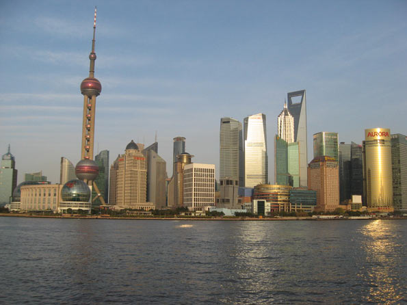
    The Inner Core: The inner core is the all of the famous Bund, with its Western-style commercial architecture along the Huangpu River and Shanghai’s best known shopping street, Nanjing road. The three districts of the inner core all lost population. Overall, the inner core population dropped from 1.209 million to 926,000, a decline of 23%. This may seem surprising, in view of the large number of high-rise condominium buildings that have been constructed in this area. However, these buildings typically replaced higher density low rise development that was generally not up to modern standards. The inner core has a population density of 119,400 people per square mile (46,100 per square kilometer), down from 155,700 per square mile (60,100 per square kilometer) in 2000. Even so, the inner core retains a population density more than 50% above that of either Manhattan or the ville de Paris. 
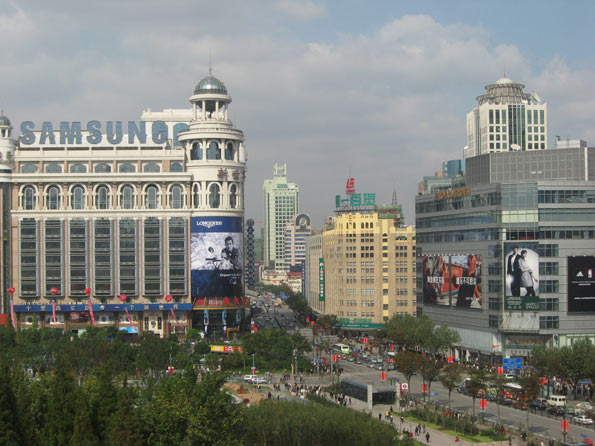

    Toward Nanjing Road

    The Outer Core: The six districts of the outer core gained 6%, increasing from 5.723 million to 6.060 million people. Two districts sustained minor losses and another three made modest gains. The district of Putuo was the exception, gaining 23%. The outer core districts had a population density of approximately 60,100 per square mile, or 23,200 per square kilometer in 2010.

    Overall, the entire core grew 0.8% and accounted for 0.8% of the growth in the jurisdiction. The population density was approximately 64,000 per square mile or 25,000 per square kilometer.

    Urban and Rural Shanghai: Overall, Shanghai covers approximately 2,445 square miles (6,333 square kilometers), a land area somewhat more than that of the Statistics Canada defined Toronto metropolitan area (2,279 square miles or 5,901square kilometers). However, Shanghai’s population is nearly four times that of the Toronto area. Even so, Shanghai’s rural population remains at approximately 3,000,000 people.

    Based upon the new census count, it is estimated that the population of the urban area is approximately 20,000,000. The suburban areas, inside the urban area but outside the core are estimated to have a population density of 10,600 per square mile or 4,100 per square kilometer, well below the density of the core. Even so, this suburban density is well above that of all but a few of the urban areas of Western Europe. The suburban areas include a number of undeveloped areas that are completely surrounded by urbanization.

    Decentralized Employment: Shanghai has also developed a decentralized employment base, despite having one of the world’s largest central business districts, with 1.25 million jobs. By comparison, Manhattan has approximately 1,750,000 jobs south of 59th Street, while Tokyo has approximately 4,000,000 jobs inside the Yamanote Loop. The central business district has approximately 15% of Shanghai’s employment.

    Shanghai’s Urban Expansion: Shanghai continues to expand in virtually every direction. It is likely that Shanghai’s urbanization will mean that of Kunshan, an urban area of nearly 1.5 million people located in the Suzhou Prefecture of Jiangsu. In addition, the urbanization is also likely to soon meet that of Taicang, another urban area in Suzhou that has a population of approximately 500,000.  At least one of Shanghai’s Metro lines is planned to be extended to Taicang.

    Shanghai’s urbanization is also poised to spill across the border into the province of Zhejiang. Development is also spreading to the east and southeast in Pudong, including Lingang, which will eventually have 1 million residents. The ocean will prevent further expansion in this direction. Lingang is the point from which a 17 mile (28 kilometer) long bridge crosses one-half of Hangzhou Bay Bridge to Shanghai’s new island port, the largest in the world.

    Shanghai exhibits the same trends that are evident in other world megacities. Like Seoul and Mexico City, the inner core population density is falling. And like Jakarta, Mumbai, Manila and most other large urban areas in the world, the overall population density is declining even as population growth continues.

    Shanghai: Population by District & County (Qu & Xian)
    2010 Census
    POPULATION            
    Sector Area: Square Kilometers  Population: 2000  Population: 2010 Population: Change 2000-2010 % Change % of Growth
    INNER CORE 20.1     1,209,000       926,000      (283,000) -23.4% -4.3%
    Huangpu Qu 4.5        575,000        430,000       (145,000) -25.2% -2.2%
    Jing’an Qu 7.6        305,000        247,000         (58,000) -19.0% -0.9%
    Luwan Qu 8.0        329,000        249,000         (80,000) -24.3% -1.2%
    OUTER CORE 261.4     5,723,000     6,060,000       337,000 5.9% 5.1%
    Changning Qu 38.3        702,000        691,000         (11,000) -1.6% -0.2%
    Hongkou Qu 23.5        861,000        852,000           (9,000) -1.0% -0.1%
    Putuo Qu 54.8     1,052,000     1,289,000        237,000 22.5% 3.6%
    Xuhui Qu 54.8     1,065,000     1,085,000          20,000 1.9% 0.3%
    Yangpu Qu 60.7     1,244,000     1,313,000          69,000 5.5% 1.0%
    Zhabei Qu 29.3        799,000        830,000          31,000 3.9% 0.5%
       
    CORE DISTRICTS 281.5 6,932,000 6,986,000 54,000 0.8% 0.8%
       
    SUBURBAN 6,051.1     9,476,000   16,031,000     6,555,000 69.2% 99.2%
    Baoshan Qu 415.3     1,228,000     1,905,000        677,000 55.1% 10.2%
    Chongming Xian 1,041.2        650,000        704,000          54,000 8.3% 0.8%
    Fengxian Qu 687.4        624,000     1,083,000        459,000 73.6% 6.9%
    Jiading Qu 458.8        753,000     1,471,000        718,000 95.4% 10.9%
    Jinshan Qu 586.1        580,000        732,000        152,000 26.2% 2.3%
    Minhang Qu 371.7     1,217,000     2,429,000     1,212,000 99.6% 18.3%
    Pudong Xin   Qu 1,210.4     3,187,000     5,044,000     1,857,000 58.3% 28.1%
    Qingpu Qu 675.5        596,000     1,081,000        485,000 81.4% 7.3%
    Songjiang Qu 604.7        641,000     1,582,000        941,000 146.8% 14.2%
       
    TOTAL 6,332.6   16,408,000   23,019,000     6,611,000 40.3% 100.0%
       
       
    POPULATION DENSITY          
       
    Sector Area: Square Kilometers  Area: Square Miles  Population/ KM2: 2000 Population/ KM2: 2010 Population/ Mile2: 2000 Population/ Mile2: 2010
    INNER CORE 20.1              7.8         60,100         46,100       155,700       119,400
    Huangpu Qu 4.5               1.7        127,800          95,600        331,000        247,600
    Jing’an Qu 7.6               2.9          40,100          32,500        103,900          84,200
    Luwan Qu 8.0               3.1          41,100          31,100        106,400          80,500
    OUTER CORE 261.4           100.9         21,900         23,200         56,700         60,100
    Changning Qu 38.3             14.8          18,300          18,000          47,400          46,600
    Hongkou Qu 23.5               9.1          36,600          36,300          94,800          94,000
    Putuo Qu 54.8             21.2          19,200          23,500          49,700          60,900
    Xuhui Qu 54.8             21.2          19,400          19,800          50,200          51,300
    Yangpu Qu 60.7             23.4          20,500          21,600          53,100          55,900
    Zhabei Qu 29.3             11.3          27,300          28,300          70,700          73,300
    CORE DISTRICTS 281.5           108.7         24,600         24,800         63,700         64,200
    SUBURBAN 6,051.1        2,336.3           1,600           2,600           4,100           6,700
    Baoshan Qu 415.3            160.3            3,000            4,600            7,800          11,900
    Chongming Xian 1,041.2            402.0              600              700            1,600            1,800
    Fengxian Qu 687.4            265.4              900            1,600            2,300            4,100
    Jiading Qu 458.8            177.1            1,600            3,200            4,100            8,300
    Jinshan Qu 586.1            226.3            1,000            1,200            2,600            3,100
    Minhang Qu 371.7            143.5            3,300            6,500            8,500          16,800
    Pudong Xin   Qu 1,210.4            467.3            2,600            4,200            6,700          10,900
    Qingpu Qu 675.5            260.8              900            1,600            2,300            4,100
    Songjiang Qu 604.7            233.5            1,100            2,600            2,800            6,700
    TOTAL 6,332.6        2,445.0           2,600           3,600           6,700           9,300


    —-

    Lead Photograph: The Bund (all photos by author)

    Note: Pudong includes the large Pudong business district, which is directly across the Huangpu River from the Bund in the central business district. However, Pudong is a relatively new development and was not a part of the urban core. Moreover, Pudong extends far to the east and southeast.

    Wendell Cox is a Visiting Professor, Conservatoire National des Arts et Metiers, Paris and the author of “War on the Dream: How Anti-Sprawl Policy Threatens the Quality of Life

  • Will the Last Family Leaving Seattle Please Turn out the Lights?

    New Census data for the Seattle area’s population changes, 2000-2010, permit a preliminary look at age and at types of households in the region. Let’s look at patterns of geographic variation in selected age groups and household types for places in greater Seattle. It provides more evidence for how rapidly Seattle in particular is changing in fundamental ways.

    The data show show a fairly similar geographic pattern — a dramatic gradient from Seattle (and to a degree also the older core cities of Tacoma and Everett) through the older suburbs and out to the urban and exurban fringe. These gradients trace the shares of singles (high in Seattle, low in the far suburbs), those under 18 (low in Seattle, high farther out), husband and wife families with children (low in Seattle, high in the far suburbs), and home ownership (lower in Seattle).

    This pattern is not new. But because of growth management and the concentration of higher-density redevelopment in the core cities, the gradient is perhaps more marked than earlier. Seattle really is exceptional — amazingly high in singles, but low in husband-wife couples with children, proportions under 18, and in home ownership. Conversely, some of the far suburbs are exceptionally low in singles, and high in traditional families, persons under 18, and home ownership.

    Two related variables are young adults, those 20-35, and the share of unmarried partners, but there are some differences from each other and from the preceding variables. The share of persons 20-35 is again exceptionally high in Seattle and Everett but also on military bases, and along the 520 corridor (Kirkland and Redmond). It is unusually low in retirement communities and on islands (e.g., Vashon, Bainbridge). The share of unmarried partner households is also very high in Seattle, but also in less affluent areas, places with high minority shares, and in a few rural communities.

    The shares of population over 65 and of single-parent households also have distinct patterns. The highest shares of the elderly are naturally in retirement communities, followed by island places (Vashon and Bainbridge and Mercer Island) and some older suburbs. Low shares of older folks characterize military bases, areas with many ethnic minorities, and some younger suburbs such as Sammamish and Mill Creek, and (in contrast to many large cities) in Seattle, Tacoma, and Everett.

    High shares of single-parent families occur on Indian reservations, on military bases, and in minority ethnic areas, most notably in south King Ccounty and parts of Pierce County. Low shares of single-parent households occur, as expected, in affluent suburbs, but are surprisingly low in Seattle. These variables, in particular, attest to the continuing gentrification of Seattle, and its changing patterns of ethnicity related to gentrification and high housing costs.

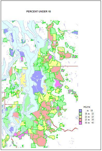
    Higher shares of persons under 5 reveal areas of young families. The highest shares are in military bases and Latino towns in eastern Washington, but are quite high, over 12 percent, in the farthest suburban and exurban places around Seattle such as Duvall and Snoqualmie. They are lowest in retirement towns, on islands such as Vashon and Bainbridge, and in some college towns such as Pullman.

    Shares of persons under 18 show a similar but not identical pattern. Again they are highest in military and Latino places, and in suburban and exurban places in the metropolitan area, and lowest in university towns and in Seattle itself. This implies that while still low Seattle is not as deficient in the very youngest as it is in older children.

    The story is very different for young adults. Not surprisingly, shares 20-25 are very high in university towns, on military bases, and Seattle, and quite low in suburban, mainly residential communities, especially more affluent areas, and on islands. Middle-aged adults, aged 45-64 (the baby boomers and thus the largest age group) are high in some older residential suburbs where younger adults are less common, and low in college towns, Latino areas, and in some areas of very recent growth, as in Snoqualmie and Monroe.

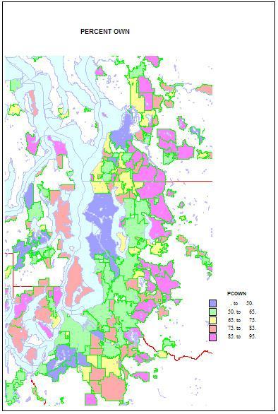
    Home ownership is related to both age and household types. Rates of home ownership are extremely high, in the 90s in newer and more affluent suburbs, with mainly single family homes; the rates are lowest on military bases, college towns, and in a few less affluent suburbs, such as Tukwila. As for the city of Seattle — which has indeed changed its character in a fundamental way — home ownership has dropped to a low of 48 percent. This shift helps us understand the cleavages in Seattle’s body politic, as a formerly very middle class city adjusts to an influx of singles, renters, and young people.

    Finally, as to types of households. Married couple families with children are the historic norm. They remain traditionally high on military bases, and in the farther newer suburbs, such as Snoqualmie, Sammamish, and Maple Valley; they are low as expected in college towns, in retirement communities, and (no surprise) in Seattle—13 percent, which is really low.

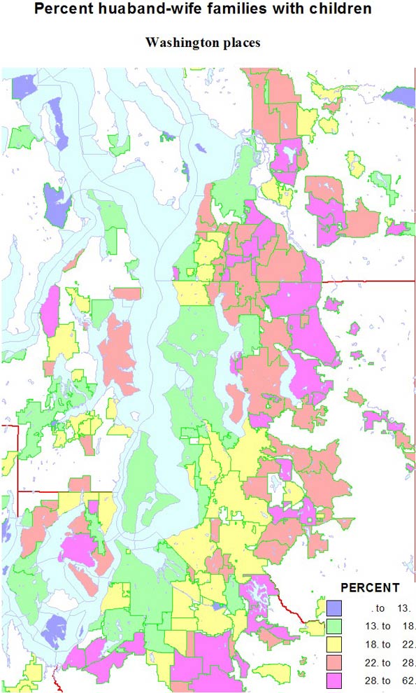
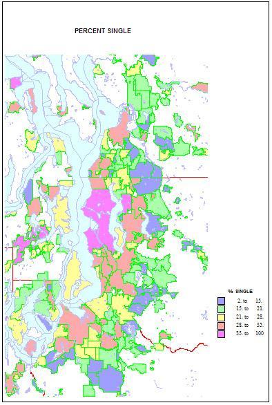
    Conversely, singles are highest in two island towns, Friday Harbor and Langley, but Seattle is an extremely high 41 percent. Shares are lowest in the same new suburbs rich in families, as in Sammamish, at 11 percent. Shares of unmarried partners are a high 10 percent of households in Seattle, but are higher on Indian reservations and the cities of Hoquiam and Aberdeen. The share of single-parent households is also high on Indian reservations, in less affluent and more ethnic suburbs like Parkland and Bryn Mawr and Tukwila. It is lowest in the newer, family-filled far suburbs.

    This piece originally ran at Crosscut.com and was edited by David Brewster.

    Richard Morrill is Professor Emeritus of Geography and Environmental Studies, University of Washington. His research interests include: political geography (voting behavior, redistricting, local governance), population/demography/settlement/migration, urban geography and planning, urban transportation (i.e., old fashioned generalist).

  • UN Celebrates Seven Billion People a Year Too Early

    The UN has decided to announce that on October 31, 2011 the Earth’s human population will pass the seven billion mark, up from the six billion that was designated on December 5, 1998. The United Nations Population Division Agency is the main organization that estimates global population. Every two years, their report attempts to piece together surprisingly fragmentary national census data and demographic surveys to arrive at a global estimate. As a geographer, I have long been interested in these reports, and in all aspects of population change and distribution on the earth.

    The UN report is subject to a variety of interpretations, but the main news story has been that a revised methodology projects a global population of 10.1 billion in the year 2100, driven most notably by continued rapid population growth in Africa. This will be a call to arms for population planning programs to increase funding targeted in Africa, along with a new round of debate over the long term sustainability of seven billion people.

    The numbers reveal mostly positive news for those concerned about population growth and hoping for a leveling off of population (achievement of zero population growth). First, the aggregate global estimates from 1950 to 2010 show that the rate of global population growth peaked in 1969 at 2.12% per year, and has now declined to 1.15% per year. This means that population growth has been slowing down for the past 42 years.

    In addition, the absolute annual increase in population peaked in 1988 at 89.63 million and has declined to 78.152 million in 2010. The overall dynamic is a deceleration toward a leveled-off population this century, with some uncertainty as to whether the peak will be eight, nine or ten billion persons.

    We are going from a preindustrial world of a half billion people to a post industrial, urbanized one of seven to ten billion with a global economy hundreds of times larger than the one in the year 1800. Seven to ten— is it too casual to give or take three billion? The difference is not as large as it sounds, since most human activity is concentrated on ten percent of the surface.

    That’s because three quarters of the Earth’s surface area is covered in ocean and ice, and of the dry land, sixty percent of that consists of tundra, deserts, boreal forests and other lands that have very low population densities. As a result, the difference between a world of 7 billion and one of 10 billion is 350 persons per square mile compared to 500 per square mile of settled land. To put the difference in perspective, look at the densities of France, at 296 per square mile, compared to that of Italy, at 521 per square mile. Passing the seven billion mark, or hitting 10 billion, doesn’t call for some fundamental reckoning, or indicate that we’ve reached a carrying capacity ceiling.

    Still, given that UN numbers are estimates, how accurate are the projections for Africa? Table #1 shows the 2010 estimates for the five regions of Africa, and the 2050 and 2010 projections. While East and West Africa combined represent 9 percent of global population and land area, this last frontier of population growth is interesting. The estimates indicate dramatic growth from 1950 to 2010. Population in North, South and Middle Africa as a group have peaked, while East and West Africa are still accelerating. (The other 91 percent of the globe is 80 percent of the way to the UN’s population peak in 2058 and is basically done with population growth.)

    The dynamics of global population change are becoming focused on East Africa and West Africa, the two regions which together comprise about forty percent of the land area of Africa. With the rest of the world experiencing a mix of modest population growth and decline, East and West Africa are projected to experience 94 percent of future global population growth. Even with a more likely scenario of a leveling off at 1.523 billion rather than going on to a very large 2.14 billion, East and West Africa will still represent the largest demographic change story of the 21st century.

    Do East and West Africa have some demographic similarities with China and Latin America back in 1960? If so, as has been seen around the world, fertility declines from 6 to 2 children per mother will happen much more quickly than the UN 2011 projections suggest. Given that African real economic growth of 57% has been robust in the last ten years, including a 29% gain in real per capita income, there is evidence that the continent is slowly emerging out of a poverty trap. Africa is also rapidly urbanizing, and demographic surveys conclusively show a big difference in the fertility rates of women living in urban areas as opposed to rural ones. East and West Africa represent a very interesting final chapter in modern population growth, with the challenge to use land and fresh water efficiently and protect significant wildlife resources, while potentially becoming an economic powerhouse later into the century.

    The story will be interesting and important to follow. In the next forty years, East and West Africa, along with South Asia, will be the big population growth centers, while the rest of the world will increase very slowly. Even with dramatic economic growth, urbanization, and a doubling of population in East and West Africa in the next few decades, the global population could very well level off at 8.8 billion rather than 10.1 billion.

    Back to the estimates themselves: The UN pieces together a global story from a set of data and estimates from countries with infrequent censuses. Table Two shows official national census estimates for 31 countries, which represent about 60% of the global population. Most of the census results are coming in below UN projections.

    Assuming that the rest of the world’s nations that have not conducted recent censuses have similar overall projection problems, one could infer that the actual population is at least one percent lower than the UN 2011 estimates. If we just assume the UN population growth rates for 2010-11 are accurate, and project these 31 country census results forward to July 1, 2011, we get a population of 6.9 billion people. We would then estimate that the world population would hit 7 billion in October, 2012.

    So why is the UN declaring October 31, 2011 as the day of 7 billion? While nobody knows what the true world population is, perhaps the UN should err on the side of accuracy… and put off this announcement until 2012. A delay would increase the probability that we actually have crossed that symbolic threshold, something for all people on earth to reflect upon.

    Ron McChesney is a Geographer who founded a research firm called Three Scale Strategy and a related non-profit called Three Scale Research. The company studies and reports on the economy of the state of Ohio and how Ohio interacts with the rest of the world. His research interests include the study of patterns and changes in population, land use, economics, energy production and transportation.

    Data Sources: UN Population Division, International Monetary Fund, Geohive.com

    Photo by etrenard, “Niger Portrait”

  • Federal Survey: Fewer Transit Commuters

    Results from the US Department of Transportation’s 2009 National Household Travel Survey indicate that transit’s work trip market share in the United States was only 3.7 percent in 2009. This is a full one quarter less than the 5.0 percent reported by the Bureau of the Census American Community Survey for 2009. Further, the NHTS data does not include people who work at home. If the work at home share of employment from the American Community Survey is assumed, the transit work trip  market share would be 3.5 percent.

    Much of the difference is due the differing questions asked in the two surveys. The American Community Survey asks how people "usually" got to work last week, while the National Household Travel Survey (NTHS) data is based upon actual diaries of travel kept by respondents. The NHTS reports that among people who respond that transit is their "usual mode" of travel to work, transit is used only 68 percent of the time. In contrast, the daily trip diaries report that commuters who drive alone are a larger share of the market than those who indicate driving alone as their usual mode of travel. People who report their usual mode as "car pool" actually use a car pool to get to work only 55 percent of the time, an even lower rate relative to "usual" mode than transit.

    The daily trip diaries from the NHTS also a large difference in travel times between automobile commuters (including car pools) and transit. The average automobile commute time was 22.9 minutes, while the average transit commute time was more than double, at 53.0 minutes.

  • Listing the Best Places Lists: Perception Versus Reality

    Often best places lists reflect as much on what’s being measured, and who is being measured as on the inherent advantages of any locale.  Some cities that have grown rapidly in jobs, for example, often do not do as well if the indicator has more to do with perceived “quality” of employment.

    Take places like Denver and Seattle. Both do well on what may be considered high-tech measurements – bandwidth, educated migration, entrepreneurial start ups – but have trailed other places in terms of creating jobs. Others, such as Oklahoma City and Raleigh, do better in terms of overall job creation and cost competitiveness.

    There are effectively few truly objective criteria, and the Area Development list does tend to weigh a bit heavy on the factors that help more expensive – although not necessarily the most costly – cities. If cost of doing business, or regulatory environments were given more weight, some of the high fliers would not do as well.

    We prefer to focus less on atmospherics and more on how people, and businesses, are voting for their feet. San Francisco and New York have generally had slower job growth and greater outmigration, but do well on lists that focus on perceived qualitative factors.

    But then there is Austin. Here is one region that has it all, the low costs and favorable regulatory climate of Texas along with the amenities associated with a high-tech region. The area creates a large number of jobs of varying types and is still inexpensive enough to attract young, upwardly mobile families. This gives it a critical advantage over places like Silicon Valley, Los Angeles or New York.  Unlike those three centers, Austin performs extraordinarily well in quantitative measurements.

    The region that most closely matches Austin in these respects is not Seattle and Denver, but Raleigh Durham. Recently a group of leaders from Raleigh made a visit to Denver to learn what makes that city successful. Speaking to the group, we pointed out that by objective measurement – job growth, educated migration, population growth – Raleigh beat Denver by a long shot, yet it was to Denver the group was looking for inspiration. In fact, over the past three years, Americans have moved to Raleigh at a rate more than three times that of Denver.  Perception can be a funny thing which makes a winner feel inferior to a clear runner-up.

    Another strange result is that New York and Houston had the same number of mentions. Yet looking at numbers — from educated migration, job growth, population increase — Houston slaughters New York. People, from the college educated on down are flocking to Houston while fleeing, in rather large numbers, from New York. One has to wonder where the rankers live and where they are coming from. Houston triumphs on performance, while New York, to a large extent, wins on perception. 

    Looking simply at job growth over the past ten years for the Leading Locations mentioned on at least five surveys, the 14 regions separate themselves into three groups.  The top tier of places – Austin, Raleigh, San Antonio, and Houston – all have seen job growth of more than 12% and seem to be recovering from the recession faster than the others.  

    Salt Lake City and Charlotte were tracking with the top tier of places until 2007 but have since fallen to the second tier of cities.  The remainder of the second tier includes steady growers Dallas and Lincoln, along with Oklahoma City, a region that has seen a boom in jobs since bottoming out in 2003.

    The final job growth tier of places includes five regions that have fewer jobs than ten years ago.  Seattle drops just below the zero line after being hit particularly hard by the 2001 and 2008 recessions, while New York and Denver finish near the national rate.  Pittsburgh and Boston spent most of the decade below their 2000 employment levels, but each seem to be recovering from the recession faster than many of the other Leading Locations cities. 

    But perhaps the biggest problem with lists has to do with the size of regions. Much of the fastest growth in America, particularly in terms of jobs, has been in small metros, many with fewer than 1 million or 500,000 residents. Smaller dynamic areas such as Anchorage, Alaska; Bismarck, North Dakota; Dubuque, Iowa; or Elizabethtown, Kentucky – all in the top 25 of NewGeography’s Best Cities for Job Growth 2011 Rankings – are too small to show up on some lists yet may be a location of choice for expansion. This reflects not so much their relative desirability but the fact that, unlike larger regions, they simply are not included on many rankings.

    Ultimately, a list of lists does tell us much, but perhaps only so much for a specific individual or business. For someone interested in the movie business, for example, Los Angeles – and increasingly places like New Orleans or Albuquerque – are great draws, but perhaps not so much for financial services.  The lists of lists are useful to identify hotspots, but for most location decisions, it may be more imperative to drill down to more detailed industry sectors and workforce attributes. And most of all, take the perception factor into account and look instead at the real numbers to tell you where to go.

    This piece first appeared at AreaDevelopment.com, as part of its Leading Locations series discussing best cities rankings.

    Joel Kotkin is a Distinguished Presidential Fellow in Urban Futures at Chapman University in California, an adjunct fellow with the London-based Legatum Institute, and the author of The Next Hundred Million: America in 2050. Mark Schill is Vice President of Research at Praxis Strategy Group, an economic research and community strategy firm.  Both are editors at NewGeography.com, a provider of two surveys for Area Development’s Leading Locations list.

    Photo by mclcbooks

  • The Katrina Effect: Renaissance On The Mississippi

    In this most insipid of recoveries, perhaps the most hopeful story comes from New Orleans. Today, its comeback story could serve as a model of regional recovery for other parts of the country — and even the world.

    You could call it the Katrina effect. A lovely city, rich in history, all too comfortable with its fading elegance and marred by huge pockets of third-world style poverty, suffers a catastrophic natural disaster; in the end the disaster turns into an opportunity for the area’s salvation.

    Had Katrina never occurred New Orleans would likely have continued its inexorable albeit genteel decline; the area’s population dropped from 627,000 in 1960 to 437,000 in 2005, the year the hurricane occured. Instead the disaster brought new energy and a sense of purpose to the Big Easy.

    I first realized that New Orleans was going through some kind of renaissance when looking at some numbers.  In our list of the country’s biggest brain magnets — based on analysis of where college-educated adults were moving to by demographer Wendell Cox —  New Orleans ranked No. 1, ahead of such hot spots as Raleigh-Durham, N.C., and Austin, Texas.

    Then came our analysis of the best large cities for jobs: New Orleans ranked No. 2 in our survey, up a remarkable 46 places. New Orleans’ performance was particularly impressive in the information field, which includes software and entertainment, and in which the Big Easy grew the most — over 30% last year alone – among our major metros.

    Yet numbers do not tell the whole story. Sometimes statistics simply look great against the background of catastrophic decline. New Orleans was so far down and received so much recovery money that recent improvements could be explained as a short-term bounce back from a disaster.

    But the resurgence of New Orleans, whose population is now back to almost 350,000, represents something far more significant and long-term. For one thing, the storm undermined the corrupt, inept political regimes that had burdened the area for decades. “Katrina shattered the networks and broke down the old hierarchies,” notes Tim Williamson, a New Orleans native and founder of Idea Village, a nonprofit focused on aiding local entrepreneurs.  ”People felt we were dying. Now we feel like we are refounding a great American city.”

    For example, inept leaders like former Mayor Ray Nagin and the equally lost Kathleen Blanc have been replaced by more effective figures like Mayor Mitch Landrieu and Gov. Bobby Jindal. Equally important, according to a recent Brookings report, New Orleanians have become noticeably more engaged with their community. Particularly impressive have been improvements in the local schools, once among the nation’s worse. Last year, the majority (61%) of public school students in Orleans Parish (counties in NOLA are called parishes) attended charter schools, which are now attracting some middle class families.

    Most impressive, this once stagnant region has transformed into an entrepreneurial hot bed. “Five years ago people thought we were crazy to be here,” says Matt Wisdom, founder of Turbosquid, a firm with 45 employees that provides three-dimensional images to corporate clients. “Now instead of people being amazed we are here, they want to get here to ride the wave.”

    Walking along Magazine Street from the edge of the Garden District to the Central Business District, you still pass some rough areas. But the way is peppered with scores of independently owned shops and small businesses, many of them opened since the hurricane. Their owners for the most part appear to be younger than 40.

    “We used to have this huge brain drain to the Northeast, the West Coast and Texas, but this has changed,” Williamson says. “After Katrina everyone was forced to become an entrepreneur. The dominant concept for the rebuilding has become one of resiliency and self-employment — it’s been bottom up. It’s become as much of our identity as Mardi Gras or the Jazzfest.”

    Since its founding back in 2000 Idea Village has assisted 1,000 local companies with business plans, financing and focus. Most are small, but some of what Williamson calls post-Katrina generation companies, like Naked Pizza, founded in 2006, have expanded rapidly. Specializing in a healthy, organic version of the traditional high-fat fast food, Naked Pizza has won financial backing from Dallas Maverick owner Mark Cuban. The company, which employs 40 employees at its New Orleans headquarters, expects to have over 70 franchises by the end of the year  .

    Many rapidly rising businesses specialize in digital media, attracting talent from other places like the West Coast and New York. 37-year-old Kenneth Purcell, founder of Iseatz, moved his entertainment and travel business from New York to NOLA in 2009 and has since grown his company from seven people to 25.

    One big advantage of starting a business in New Orleans is its affordable housing. Based on median price against median household income, the region’s prices are roughly 50% less than those in New York or San Francisco. This is particularly attractive both to middle-aged couples with children who can afford a spacious suburban home that are far less expensive than their equivalents in Los Angeles, Westchester or Silicon Valley.

    It also is attractive to the smaller subset of employees, many of them young, who are drawn to traditional cities. Some New Orleans neighborhoods remind me of pre-1980 Greenwich Village, offering a charming urban environment without either the extortionate price tag or oppressive density.

    Immigration, much of it from Mexico, also is contributing to the regional remake. Over the past decade, as both white and black populations dropped, the Asian population grew by 3000 and Hispanics by 33,500, most of them settling in suburban Jefferson Parish.  Once predominately African-American, New Orleans is returning to its more multi-racial past while re-establishing its strong cultural and social ties to Latin America.

    Yet despite all positive signs, it may be too early to proclaim, as some boosters do, a “New Orleans miracle.” After all, the city’s population remains over 100,000 below its depressed pre-Katrina levels. There are still over 47,000 vacant housing units in the city, many of the uninhabitable, notes Allison Plyer, who runs the Greater New Orleans Community Data Center. Overall, the recovery remains stronger in the suburbs, many of which suffered less damage from the storm. The share of regional population living in Orleans Parish, where the city of New Orleans is located, has slipped to 29% compared with 37% in 2000. Jefferson Parrish now has more jobs than the city across all income categories.

    Plyer believes the priority for the entire region lies in restoring the higher-paid blue-collar and middle-class jobs that for decades have disappeared from the city.  Young tech and media firms can help gentrify parts of a city, but they are not sufficient to provide opportunities to the vast majority of its residents. To do this, Plyer suggests, the region will have to focus more on “export” oriented jobs in industries such as  energy, manufacturing and trade.

    Critically these fields can provide decent salaries for a broad swath of workers.  Right now, Plyer adds, 45% of the workforce earns less than $35,000 a year, one byproduct of the domination of the generally low-paying tourism industry. Jobs connected to shipping pay twice as much on average as tourism; energy three times as much. A new steel plant announced recently by Nucor in suburban St. James Parish could create more than 1200 jobs with average pay of $75,000 annually.

    “We’ve allowed Houston and Biloxi to move ahead in a lot of these other industries,” she explains.  ”We have to move ahead in engineering and services and energy to compete with Texas. We can’t be just a tourism economy.”

    Ultimately, New Orleans’ long-term recovery may depend on exploiting historic raison d’etre: location. The region  stands astride the primary corridor for the Midwest grain trade and sits in the middle of the Gulf trade routes. It also boasts some of the nation’s richest energy deposits.

    Coupled with its enormous cultural appeal, resurgence in the  more traditional economy could spark the most remarkable urban comeback story of the new century. Once the poster child for urban despair, New Orleans may develop a blueprint for turning a devastated region into a role model not only for other American cities but for struggling urban regions around the world.

    This piece originally appeared at Forbes.com.

    Joel Kotkin is executive editor of NewGeography.com and is a distinguished presidential fellow in urban futures at Chapman University, and an adjunct fellow of the Legatum Institute in London. He is author of The City: A Global History. His newest book is The Next Hundred Million: America in 2050, released in February, 2010.

    Photo by Adam Reeder

  • Planning Decisions Must be Based on Facts

    While the misreporting of city population density comparisons commented on by  Wendell Cox was probably inadvertent, it is indicative of a general problem relating to contemporary planning – misrepresentation of facts.

    We are repeatedly told of the wonderful results of infill high density policies in locations such as Portland, USA or Vancouver, Canada which on investigation are found to be non-existent or applicable only to a small locality instead of to the city as a whole.

    Quantitative data is frequently misrepresented. To give one example, a 2008 Canadian study is often quoted as proving high-density reduces greenhouse gas emissions. Inspection and interpretation of the data provided reveals this to be negligible.  Without any evidence to the contrary, it seems reasonable to assume that the Canadian fraction of total household emissions that relate to transport is similar to that shown on the Australian Conservation Foundation’s website, being 10.5%. Applying this value to the data in Chart 2 of this Canadian study one finds that for those living within 5 km of the city centre there would be a transport difference attributable to increased density of only 1% in total annual emissions per person. For people living 20 km or more from the city centre the difference would be much less at 0.2%.

    We are told that high-density imposed on areas originally designed for low density is good for the environment; that it provides greater housing choice, that it reduces housing cost, that it encourages people on to public transport; that it leads to a reduction in motor vehicle use and that it saves on infrastructure costs for government. Not only do none of these claims stand up to scrutiny in any significant way, the contrary mostly prevails.

    Movements advocating high-density show characteristics of an ideology, their members’ enthusiasm resulting in a less than objective approach. The desire by these individuals to be socially and environmentally responsible and to identify with a group marketing these imagined benefits is understandable. Some may even benefit professionally. However the result is policies for which no objective favorable justification can be provided and which are not wanted by the greater community who have to live with the consequences.

  • The Evolving Urban Form: Jakarta (Jabotabek)

    There is probably no large urban area in the world that better illustrates the continuing dispersion of urban population and declining urban population density than Jakarta. Recently released 2010 census data indicates over the past decade that 84 percent of the metropolitan area (Jabotabek) population growth occurred in the suburbs (Note 1). This continues a trend which saw more than 75 percent of growth in the suburbs between 1971 and 2000 (Figure 1).

    Savannah State University (Georgia) Professor Deden Rukmana notes that this trend includes “many moderate and high-income families” who left the central city for better amenities while many poor people moved out to the fringe areas to escape what might be seen in the West as gentrification . 

    The Megacity: Jabotabek: Jakarta is one of only a few world megacities (over 10 million) that have changed their names in recognition of their regional rather than core city focus (this sentence corrected from original). The most recent megacity with a new name is Mexico City, now referred to as the Valley of Mexico (Zona Metropolitana del Valle de México). Other examples are Tokyo-Yokohama (Kanto) and Osaka-Kobe-Kyoto (Keihansh1n).   Jakarta’s changed name, Jabotabek, represents an acronym made up of the beginning letters of the municipality of Jakarta and the three adjacent regencies (subdivisions of provinces), Bogor, Tangerang and Bekasi (Note 3). Jabotabek is one of the fastest growing megacities in the world and is experiencing accelerated growth. This is in contrast to the situation identified by the McKinsey Global Institute, which noted the declining growth rates of most megacities. In 2000, Jabotabek had a population of approximately 20.6 million, which by 2010 had risen to 28.0 million or 36 percent, nearly doubling its rate of population from the 1990s.    Jabotabek’s additional 7.4 million people is nearly equal to that of London (Greater London Authority), nearly as large as the city of New York and more people than live in the entire Greater Toronto area. In 2000, Jabotabek had a population of approximately 20.6 million, which by 2010 had risen to 28.0 million (Figure 2).

    Jabotabek’s unexpectedly high growth was greater than the 6.6 million added in both the Shanghai and Manila regions over the same period and above the 5.8 million increase in the Beijing region. The percentage growth in Shanghai and Beijing was slightly higher than in Jabotabek and slightly lower in Manila. The megacities of the United States, Western Europe and Japan have all fallen back to growth rates of less than five percent per decade (Tokyo-Yokohama, New York, Osaka-Kobe-Kyoto, Los Angeles and Paris).

    Population Trends by Sector: Population growth and rates are indicated in the table for the sectors of Jabotabek and the constituent jurisdictions.

    Jakarta Region (Jabotabek)
    Population by Sector: 2000-2010
    2000
    2010
    Change
    % Change
    Core: Jakarta 8.36 9.59 1.23 15%
    Inner Suburbs (Municipalities) 4.94 7.23 2.30 47%
    Tangerang 1.33 1.80 0.47 36%
    Tangerang Selatan 0.80 1.30 0.50 63%
    Depok 1.14 1.75 0.61 53%
    Bekasi 1.66 2.38 0.71 43%
    Outer Suburbs & Exurbs 7.30 11.20 3.90 53%
    Bogor (Municipality) 0.75 0.95 0.20 27%
    Bogor (Regency) 2.92 4.78 1.86 64%
    Tangerang (Regency) 2.02 2.84 0.82 41%
    Bekasi (Regency) 1.62 2.63 1.01 63%
    Jabotabek: Total 20.60 28.02 7.42 36%
    Population in millions


    City of Jakarta: The core city of Jakarta is the "Special Capital Region" of  Indonesia, similar to the District of Columbia in the United States, the Distrito Federal in Mexico or the Capital Federal in Argentina. This core of Jakarta grew 15 percent and added more than 1.2 million population, rising from 8.36 million in 2000 to 9.59 million in 2010, a turnaround from a loss of nearly 500,000 people between 1995 and 2000. The city of Jakarta captured 16 percent of metropolitan area growth and now accounts for 34 percent of the population of Jabotabek (Figures 3, 4 & 5).

    Inner Suburbs: The inner suburbs, which are made up for the purposes of this article by the municipalities of Bekasi, Tangerang, Depok and Tangerang Selatan (South Tangerang) grew 47 percent during the 2000, from 4.94 million to 7.23 million. These inner suburban municipalities captured 31 percent of the metropolitan area growth and now have 26 percent of the population of Jabotabek (Figures 3, 4 & 5).

    Outer Suburbs and Exurbs: The outer suburbs and exurbs (Note 2) experienced the greatest growth, at 53 percent, rising from 7.30 million to 11.20 million. For the first time, the outer suburbs surpassed the core with the largest population. The outer suburbs and exurbs accounted for 53 percent of the metropolitan area growth and now have 40 percent of the population of Jabotabek (Figures 3, 4 & 5).

    Urban Area:  The substantial growth of Jabotabek occurred principally in the urban area (the area of continuous development or the agglomeration). It appears likely that the urban area population will exceed 24 million (Note 4). It thus seems likely that the Jakarta urban area will again be ranked as the second largest in the world, following Tokyo-Yokohama. Jakarta had been displaced by Delhi (and Seoul-Incheon), for which United Nations 2010 estimates had indicated higher than anticipated population growth as Delhi passed Mumbai to become the largest in India.

    Overall, the Jakarta urban area has a population density of approximately 22,000 per square mile or approximately 8500 per square kilometer. Yet the overall density of the Jakarta urban area has declined as population has moved to the outer suburbs which have a population density only one third that of the city of Jakarta. The inner suburbs have a population density that is only two thirds that of the city of Jakarta (Figures 6 and 7).


    Despite this, the Jakarta urban area is much denser than most large urban areas in the high income world. Overall, the Jakarta urban area is approximately 2.5 times as dense as the Paris urban area, more than three times as dense as the Los Angeles urban area, and approximately seven times as dense as the Portland urban area. Other urban areas in the developing world are even denser:  Delhi is more than 1.5 times as dense as Jakarta, Mumbai more than three times as dense and Dhaka is more than four times.


    Informal housing, city of Jakarta (photo by author)


    A Larger Metropolitan Area?  This continuing population growth could cause Jabotabek to expand even further. Indonesia’s President Susilo Bambang Yudhoyono (SBY) has proposed expanding the metropolitan area to include the regencies of Karawang, Serang, Purwakarta and Sukabumi as well as the municipalities of Serang, Sukabumi and Cilegon. Already, Jakarta’s continuous urbanization nearly reaches the Karawang urban area to the east (population over 600,000) and is nearing Serang regency to the west. SBY’s "Greater Jakarta" has a population approaching 36 million according to the 2010 census. Further pressure on suburban growth could be generated by plans in Jakarta to limit the core city’s population to 12 million.

    Yet even so it may take some decades, before Jakarta, or perhaps Delhi, could pass Tokyo-Yokohama’s nearly 37 million people to become the world’s largest urban area, assuming that they do not experience the reduced population growth so widespread in other megacities.   

    ———

    Notes:

    1. Caution should be used in making comparisons of metropolitan areas, especially between nations. There is virtually no consistency in the delineation of metropolitan areas between nations. In some cases, such as Japan, the United States, France and Canada, Metropolitan areas are based upon commuting patterns, but even between these nations there is no consistency.

    2. For the purposes of this article, suburbs are inside the urban area, but outside the central city (Jakarta). Exurbs are the portions of the metropolitan area (Jabotabek) outside the urban area.

    3. The provinces of Indonesia and the state of Virginia are subdivided similarly. In Virginia, all of the land area is divided into municipalities or counties. In the provinces of Indonesia, all of the land area is divided into municipalities (kota) and regencies (kapupaten). The regencies are further divided into sub-districts (kecamatan). Jabotabek is located in three provincial level jurisdictions, the Special Capital District of Jakarta, and the provinces of West Java (Java Barat) and Bantan. West Java has a population of 43 million, approximately 6,000,000 more than the largest state in the United States, California. Banten is bordered on the west by the Sunda Strait, location of Krakatoa, the volcano.

    Further, the name Jabotabek may not survive. As municipalities (Note 3) were carved out of the regencies in the 1990s and 2000s, the megacity was called Jabodetabek by some and proposed additions to the metropolitan area could bring even more variations. Inconsistent and alternative names probably make likely that sources will continue to call the megacity "Jakarta."

    4. This urban area population is much larger than reported by the United Nations, which for Indonesian urban areas limits its estimates to the jurisdiction of the core city, and thus excludes suburbs. As is generally the case throughout the world, the continuous urbanization of Indonesian urban generally areas extends far beyond core cities.

    —–

    Photograph: Luxury housing in Cileungsi sub-district, Bogor regency (outer suburbs), by author

    Wendell Cox is a Visiting Professor, Conservatoire National des Arts et Metiers, Paris and the author of “War on the Dream: How Anti-Sprawl Policy Threatens the Quality of Life

  • Goodbye, New York State Residents are Rushing for the Exits

    For more than 15 years, New York State has led the country in domestic outmigration: for every American who comes to New York, roughly two depart for other states. This outmigration slowed briefly following the onset of the Great Recession. But a new Marist poll released last week suggests that the rate is likely to increase: 36 percent of New Yorkers under 30 are planning to leave over the next five years. Why are all these people fleeing?

    For one thing, according to a recent survey in Chief Executive, New York State has the second-worst business climate in the country. (Only California ranks lower.) People go where the jobs are, so when a state repels businesses, it repels residents, too. It’s also telling that in the Marist poll, 62 percent of New Yorkers planning to leave cited economic factors—including cost of living (30 percent), taxes (19 percent), and the job environment (10 percent)—as the primary reason.

    In upstate New York, a big part of the problem is extraordinarily high property taxes. New York has the 15 highest-taxed counties in the country, including Nassau and Westchester, which rank first and second nationwide. Most of the property tax goes toward paying the state’s Medicaid bill—which is unlikely to diminish, since the state’s most powerful lobby, the political cartel created by the alliance of the hospital workers’ union and hospital management, has gone unchallenged by new governor Andrew Cuomo.

    New York City doesn’t suffer from outmigration to the extent that the state does; in fact, the city grew slightly over the past decade, thanks to immigration. And there’s more work in Gotham than in the state as a whole. The problem is that the kind of work available shows that the city accommodates new immigrants much better than it supports middle-class aspirations. A recent report from the Drum Major Institute helps make sense of the Marist numbers: “The two fastest-growing industries in New York are also the lowest paid. More than half of the city’s employment growth over the past year has been in retail, hospitality, and food services, all of which pay their workers less than half of the city’s average wage.” Worse yet, more than 80 percent of the new jobs are in the city’s five lowest-paying sectors. Parts of the country are seeing a revival of manufacturing—traditionally a source of upward mobility for immigrants—but not New York City, whose manufacturing continues to decline. The culprits here include the city’s zoning policies, business taxes, and declining physical infrastructure.

    Then there’s the cost of living in New York City. A 2009 report by the Center for an Urban Future found that “a New Yorker would have to make $123,322 a year to have the same standard of living as someone making $50,000 in Houston. In Manhattan, a $60,000 salary is equivalent to someone making $26,092 in Atlanta.” Even Queens, the report found, was the fifth most expensive urban area in the country.

    The implications of Gotham’s hourglass economy—with all the action on the top and bottom, and not much in the middle—are daunting. The Drum Major report, which noted that 31 percent of the adults employed in New York work at low-wage labor, came with a political agenda. The institute wants the city to subsidize new categories of work by expanding the scope of “living-wage” laws, which require higher pay than minimum-wage laws do, to all businesses that receive city funds or contracts. But that would mean higher taxes for the middle class and a further narrowing of the hourglass’s midsection.

    Governor Cuomo is calling for a property-tax cap, but without “mandate relief” for localities—for example, relaxing state laws that require localities to pay out exorbitant pension benefits. Mayor Michael Bloomberg has pledged not to increase local taxes, but even at their current level, city taxes and regulations will keep serving as an exit sign for aspiring twentysomething workers. In short, we can expect New York to lead the country in outmigration for the near future.

    This piece first appeared in the City Journal.

    Fred Siegel is a contributing editor of City Journal, a senior fellow at the Manhattan Institute, and a scholar in residence at St. Francis College in Brooklyn.

    Photo by Christopher Schoenbohm

  • Transit: The 4 Percent Solution

    A new Brookings Institution report provides an unprecedented glimpse into the lack of potential for transit to make a more meaningful contribution to mobility in the nation’s metropolitan areas. The report, entitled Missed Opportunity: Transit and Jobs in Metropolitan America, provides estimates of the percentage of jobs that can be accessed by transit in 45, 60 or 90 minutes, one-way, by residents of the 100 largest US metropolitan areas. The report is unusual in not evaluating the performance of metropolitan transit systems, but rather, as co-author Alan Berube put it, "what they are capable of." Moreover, the Brookings access indicators go well beyond analyses that presume having a bus or rail stop nearby is enough, missing the point the availability of transit does not mean that it can take you where you need to go in a reasonable period of time.

    Transit: Generally Not Accessible: It may come as a surprise that, according to Brookings, only seven percent of jobs in the nation’s largest metropolitan areas can be reached by residents in 45 minutes during the morning peak period (when transit service is the most intense). Among the 29 metropolitan areas with more than 2,000,000 population, the 45 minute job access average was 5.6 percent, ranging from 12.6 percent in Boston to 1.3 percent in Riverside-San Bernardino. The New York’s metropolitan area’s 45 minute job access figure was 9.8 percent (Figure 1).

    Brookings did not examine a 30 minute transit work trip time. However, a bit of triangulation (Note 1) suggests that the 30 minute access figure would be in the range of 3 to 4 percent, at most about 4,000,000 jobs out of the more than 100 million in these metropolitan areas.   At least 96 percent of jobs in the largest metropolitan areas would be inaccessible by transit in 30 minutes for the average resident (Figure 2).

    The Brookings report also indicates that indicates that 13 percent of employment is accessible within 60 minutes by transit and 30 percent within 90 minutes (Note 2). Brookings focuses principally on the 90 minutes job accessibility data. However, the reality is that few people desire a 45 minute commute, much less one of 90 minutes.

    In 2009, in fact, the median one way work trip travel time in the United States was 21 minutes (Note 3). Approximately 68 percent of non-transit commuters (principally driving alone, but also car pools, working at home, walking, bicycles, taxicabs and other modes) were able to reach work in less than 30 minutes. The overwhelming majority, 87 percent, were able to reach work in 45 minutes or less, many times transit’s seven percent. Transit’s overall median work trip travel time was more than double that of driving alone (Figure 3).

    A mode of transport incapable of accessing 96 percent of jobs within a normal commute period simply does not meet the needs of most people. This makes somewhat dubious claims that transit can materially reduce congestion or congestion costs throughout metropolitan areas. The Brookings estimates simply confirm the reality that has been evident in US Census Bureau and US Department of Transportation surveys for decades: that transit is generally not time-competitive with the automobile. It is no wonder that the vast majority of commuters in the United States (and even in Europe) travel to work by car.

    Much of the reason for transit’s diminished effectiveness lies in the fact that downtowns — the usual destination for transit — represent a small share of overall employment. Downtown areas have only 10 percent of urban area employment, yet account for nearly 50 percent of transit commuting in the nation’s largest urban areas (Figure 4).

    Meanwhile, core areas, including downtown areas, represent a decreasing share of the employment market as employment dispersion has continued. Since 2001, metropolitan areas as different as Philadelphia, Portland, Dallas-Fort Worth, Salt Lake City, Denver and St. Louis, saw suburban areas gain employment share. Even in the city of New York, outer borough residents are commuting more to places other than the Manhattan central business district (link to chart).

    Transit: The Long Road Home: Transit problem stems largely from its relative inconvenience.    In 2009, 35 percent of transit commuters had work trips of more than 60 minutes. Only six percent of drivers had one way commutes of more than 60 minutes. For all of the media obsession about long commutes, more than twice as many drivers got to work in less than 10 minutes than the number who took more than an hour. In the case of transit, more than 25 times as many commuters took more than 60 minutes to get to work as those who took less than 10 minutes.

    Economists Peter Gordon and Harry W. Richardson have shown that the continuing dispersion of jobs (along with residences) has kept traffic congestion under control in the United States. Available data indicates that work trips in the United States generally take less time than in similar sized urban areas in Europe, Japan, Canada and Australia.

    Transit Access is Better for Low Income Citizens: The Brookings report also indicated that job accessibility was better for low income citizens than for the populace in general. Approximately 36 percent of jobs were accessible to low-income residents in 90 minutes, compared to the overall average of 30 minutes. This, of course, is because low income citizens are more concentrated in the central areas of metropolitan areas where transit service is better. But even this may be changing. For example, Portland’s aggressive gentrification and transit-oriented development programs are leading to lower income citizens, especially African-Americans, being forced out of better served areas in the core to more dispersed areas where there is less transit. Nikole Hannah Jones of The Oregonian noted:

    "And those who left didn’t move to nicer areas. Pushed out by gentrification, most settled on the city’s eastern edges, according to the census data, where the sidewalks, grocery stores and parks grow sparse, and access to public transit is limited." 

    Realistic Expectations: More money cannot significantly increase transit access to jobs. Since 1980, transit spending (inflation adjusted) has risen five times as fast as transit ridership. A modest goal of doubling 30 minute job access to between 6 and 8 percent would require much more than double the $50 billion being spent on transit today.

    Moreover, there is no point to pretending that traffic will get so bad that people will abandon their cars for transit (they haven’t anywhere) or that high gas prices will force people to switch to transit. No one switches to transit for trips to places transit doesn’t go or where it takes too long.

    Nonetheless, transit performs an important niche role for commuters to some of the nation’s largest downtown areas, such in New York, Chicago, Boston, San Francisco, and Philadelphia. Approximately half or more of commuters to these downtowns travel there by transit and they account for nearly 40 percent of all transit commuters in the 50 largest urban areas.   

    Yet for 90 percent of employment outside downtown areas, transit is generally not the answer, and it cannot be made to be for any conceivable amount of money. If it were otherwise, comprehensive visions would already have been advanced to make transit competitive with cars across most of, not just a small part of metropolitan areas.  

    All of this is particularly important in light of the connection between economic growth and minimizing the time required to travel  to jobs throughout the metropolitan area.

    The new transit job access is important information for a Congress, elected officials, and a political system seeking ways out of an unprecedented fiscal crisis.

    A four percent solution may solve 4 percent of the problem, but is incapable of solving the much larger 96 percent.

    Notes:

    1. For example at difference between transit commuters reaching work in less than 30 minutes and 45 minutes, Brookings employment access estimate of 7 percent at 45 minutes would become 3 percent at 30 minutes.

    2. The Brookings travel time assumptions appear to be generally consistent with data from the Census Bureau’s American Community Survey (ACS) and the US Department of Transportation’s National Household Transportation Survey (NHTS). Brookings, ACS includes the time spent walking to transit in work trip travel times (For example, the ACS questionnaire asks respondents how long it takes to get from home to work and thus includes the time necessary to walk to transit).

    3. Median travel times are estimated from American Community Survey data for 2009 and includes working at home. The "median" is the point at which one half of commuters take more time and one-half of commuters take less time to reach work and is different from the more frequently cited "average" travel time, which was 25.5 minutes in 2008.

    4. Is Transit Better in Smaller Metropolitan Areas? It is generally assumed that transit service is better in larger metropolitan areas than in smaller metropolitan areas. Yet, the Brookings data seems to indicate the opposite. Larger metropolitan areas tended to have less job access by transit than smaller metropolitan areas. In the largest 20 percent (quintile) of metropolitan areas, only 5.5 percent of employment was accessible within 45 minutes. This was the smallest quintile accessibility score, and well below the middle quintile at 9.2 percent and the bottom quintile at 8.3 percent. The top quintile included metropolitan areas with 2.6 million or more people, the middle quintile included metropolitan areas with 825,000 to 1,275,000 population and the bottom quintile included metropolitan areas between 500,000 and 640,000 (Figure 1). This stronger showing by smaller metropolitan areas probably occurs because it is far less expensive for transit to serve a smaller area. Further, smaller metropolitan areas can have more concentration in core employment.  Even so, smaller metropolitan areas tend to have considerably smaller transit market shares than larger metropolitan areas.

    Wendell Cox is a Visiting Professor, Conservatoire National des Arts et Metiers, Paris and the author of “War on the Dream: How Anti-Sprawl Policy Threatens the Quality of Life

    Photo: Suburban employment: St. Louis (by author)