Category: Demographics

  • The Recipe for Unlivable Cities in New Zealand

    The Auckland Council’s great vision is to make Auckland one of the world’s most livable cities. Yet the outcome of its currently proposed plans will be a city which is second best for most Aucklanders.

    Some 60% to 80% of residents of New World cities state a clear preference for a single family home with its own backyard. In Victoria state, where Melbourne is located, 70% of the population, for example, preferred a single family home according to one government study. There have been similar findings from US based groups like the National Association of Realtors.

    Yet even when this is acknowledged, many in the media, taking their clue from planners and urban theorists, seek to change this reality.  The May 9 issue of the NZ Herald carried a story titled “The Dying Backyard Dream” tells us “Many Auckland suburbs will become home to high-rise apartment blocks with the quarter acre dream (1,000 sq m) reserved for the privileged few.”

    This fairly represents the intended outcomes of Council’s Spatial Plan as outlined in the discussion paper “Auckland Unleashed”.  But if this new vision is realized how can Auckland be a “liveable city” for all those residents who are unable to realize their preference for a low-density suburban home? Instead, they must “learn to accept” life in “terrace houses, duplexes, courtyard houses, maisonettes, and 4 -5 storey apartment buildings”.

    When working-class and middle-class households find they are priced out of the market for the housing of their choice, they will simply move to some other location, here or overseas. This has long been the case with British migrants to places like New Zealand and now people from China and the diaspora countries, currently the largest source of new immigrants.

    Yet these households provide the core labour force for the productive sectors, and for the manufacturing sector in particular. For some reason engineers and scientists tend to place more emphasis on home life and work life balance than financiers, and other members of the “creative classes”. (i.e. those who are creative with other people’s money). Hence, in the Bay Area, engineers and scientists gravitated to suburban Silicon Valley while the “creative classes” gravitated to downtown San Francisco.

    The New Geography team have documented the recent changes in the diverse states of the U.S. using the data from the 2010 U.S. Census. Their findings deserve careful study if we want to provide livable cities for the mass of New Zealanders, rather than for a wealthy elite.  In the U.S., according to the most recent Census, middle class people and companies have moved to Texas and the Southeast, because these areas are business-friendly, have low housing costs, reasonable taxation, and regulatory environments that encourage industrial expansion.

    This suggests it may be time to propose urban visions that are more humane for the vast majority by rejecting intensification and concentration in favor of the more adaptable and resilient environment of more dispersed cities and suburbs.  A key advantage of smaller dispersed cities such as Raleigh, Austin, San Antonio and Indianapolis, is their more affordable housing means up to four out of five households can afford their preference for a suburban house with a backyard.

    The densifiers insist that dispersal increases commuting times and yet the average commute in low-density urban areas like Salt Lake City and Kansas City is slightly above twenty minutes. (Aucklanders should be so lucky).  If the aim is economic growth and job creation, the transport system must provide genuine mobility throughout the entire labour market of the metropolitan area, not just to the central business district.

    Auckland’s Spatial Planners should take note of this recent research, and Christchurch leaders should seize the opportunity to be the Number One City in New Zealand if they don’t.
    A major source of evidence in support of Unleashing Auckland is the ARC’s “Future Housing Demand Study” which assumes that Auckland’s density must increase to develop a healthy and growing urban economy. Unfortunately these assumptions are not supported by any evidence from the rest of the New World. In fact, forced densification is as often as not a   recipe for failure.

    The Auckland urban area is already the second densest in the New World and the street network was never designed to cope with such high densities. Rather than reducing congestion, doubling the density on a given street increases the vehicle trips on that street by at least 70 – 90%. How can such densification reduce congestion?

    These surveys of housing preference also tell us that the growing number of smaller households will not NEED three bedrooms, and hence will not prefer them. Such inferences ignore the growth in the spatial demands of home occupations, home arts and crafts, telecommuting, and the need for spare rooms to accommodate visiting friends and relatives – not to mention a lifetime’s accumulation of stuff. Even single people will buy a three bedroom house to guarantee long term salability and value. The rooms soon fill it up.

    Aging couples are presumed to want to be rid of their backyard “burden”. Yet we are a nation of gardeners, and retirees are some of the keenest gardeners of all. It’s a healthy hobby.

    The Wellington Regional Strategy Report also assumes the need for intensification, and also presumes “need” determines “preference” as in:

    The eventual decrease in two-parent families will have implications in terms of reducing demand for larger dwellings on larger sections, resulting in a surplus of this stock.

    So larger dwellings must be getting cheaper. Sorry, they are not.

    The report also presumes that ordinary folk just don’t know what they are doing when they make their choices. Researchers find that people actually make their trade-offs very well – especially the trade-off between travel times and distances, and price and amenity.

    Evidently, the early development of Silicon Valley was a dreadful error because“ … having centrally located and compact form of residential development provide greater benefits to the city than lower density forms.” But what would those scientists and engineers know? They built the world’s premier technology region in the suburbs, just as had been done a half century earlier in Los Angeles or in scores of other tech belts scattered from Austin, TX to the outer rings of London, Paris and Tokyo.

    The report also claims a “large proportion of retirees are currently moving to Kapiti Coast, which indicates there is an insufficient housing supply in other locations to meet their needs.” Maybe these retirees have actually chosen to live on the Kapiti Coast, an area of smaller, low density development sixty kilometers from Wellington, because they prefer it. Many people would share their choice. Similarly, who speaks for the children who lose the freedom to enjoy spontaneous outdoor play, and to benefit from a free-ranging life?

    There is nothing wrong with medium and high-density living for those who make a free choice within a functioning and affordable market. Councils should be maximizing our freedom to choose by focusing on general affordability. They must start by reducing the cost of land by freeing up supply.

    Owen McShane is Director of the Centre for Resource Management Studies, New Zealand.

    Photo by Pat Scullion

  • Chicago: Out of the Loop

    The “global city” is one of the dominant themes related to  urban success today.  In this model, cities serve both as huge agglomerations of top specialized talent and also as “control nodes” of the global economy serving as key sites for the production of financial and producer services demanded by the new globalized economy. In her seminal book on the subject, Saskia Sassen noted New York, London, and Tokyo as the paradigmatic examples of the global city.

    The status of global cities, however, is protean, and not all “global cities” are created equal or occupy a similar status. Tokyo, for example, is clearly fading in the face of the shift of economic power from Japan to the Chinese sphere of influence – Shanghai, Beijing, Hong Kong and Singapore.

    Chicago has long prided itself as one of those cities, and consistently rated in the top ten global cities in various surveys. It’s a huge business services hub, financial hub, transport hub, cultural center, and massive draw for talent. The greater Loop area is clearly a classic global city area, densely packed with knowledge workers, with gleaming towers all around – over a hundred of which went up in the last decade. The transformation of the Loop and the surrounding neighborhoods in the last 20 years has been nothing short of stunning and remains a testament to the record of both Mayor Daleys.

    Even at its best, the global city model has its weaknesses, such as extreme income inequality, but at least it seems to provide a model that works in an era when so many urban formulas have failed.  Chicago, for example, has used its global city status to avoid the rot that has hit so many Midwestern cities.

    But for Chicago, though its global city side is running strong, there’s a serious problem. Although impressive both economically and awe-inspiring in its physical form, the greater Loop economy is just too small – especially relative to the size of the region. This suggests that the Chicago region cannot rely primarily on the global city to carry its economy.

    This might seem difficult to believe given that the greater Loop is the second largest business district in the United States and home to over half the region’s office space. But it can be easily illustrated by comparing Chicago employment to that in Manhattan.  Here’s a comparison of total jobs in Manhattan vs. all of Cook County, Illinois.


    Source: Quarterly Census of Employment and Wages

    As you can see, Manhattan has almost as many jobs as all of Cook County, and the two are converging. Given trends in both cities, it doesn’t seem unreasonable to think that in the near future Manhattan may actually have more jobs than Cook County.  Not only are there more jobs in Manhattan, but they pay significantly higher wages.  Here is a comparison of the average weekly wage between the two:


    Source: Quarterly Census of Employment and Wages

    Manhattan wages dropped as a result of the financial crash, but still remain 70% higher than Cook County – and until the crash had been pulling away.  They may be surging again as Wall Street has been a notable beneficiary of the bailouts. But the difference in scale is significant under any circumstances. Manhattan, with a mere tenth of the regional population, has about as many jobs as Cook County, which has over half the regional population. The wealth and income engine of Manhattan is simply of a different order and power than any other US city. As a result, the global city side of New York for which Manhattan is a proxy really can pay the freight for not just the outer boroughs, but also the greater region and the budgets of not only New York but to some extent New Jersey and Connecticut as well.

    By contrast, Chicago’s global city side, strong as it is, simply cannot perform the same role in powering its region and state. Though estimates are that it encompasses something like 600,000 people participate in it, and though the Loop along with select suburban business districts are legitimately thriving, this economy is just too small to support the entire region. In fact it can’t pay the bills even for the rest of Chicago itself, much less the region or state, especially considering that the non-global city parts are basically Rust Belt in character.  That’s one reason local government finance is in such rough shape.  The city is facing a deficit of about $650 million and the state’s unfunded future liabilities are upwards of $160 billion.

    Clearly, Chicago needs to continue focusing on expanding the size of its Loop economy and ensuring that it remains a top global city destination in the future. But unlike some other places that can hang their hat on that if they want, Chicago has to go beyond just being a global city and also be something more. After all, Chicago does not enjoy a “lock” on any industry, like New York with finance and media, or even Houston in energy, the Bay Area in technology or Los Angeles in entertainment. In almost every major business category it is not the lead player, which allows for greater economies of agglomeration and, perhaps even more importantly, a powerful and enduring global signature.

    But bluntly, the world city economy is too diffused and small to offer much to the 90% of its people who aren’t a part of that.  In short, Chicago needs more “outside the Loop” thinking.

    A critical aspect of the challenge here lies with improving  the state and local business climate, recently rated as one of the worst in the country by Chief Executive magazine. If you’re a hedge fund partner, architect, or celebrity chef, things are great. But for bread and butter type businesses and workers, which constitute the vast majority of the economy, things are quite different. That’s why everyone from the CEO of Caterpillar,based three hours from the city, on down is publicly complaining and threatening to move.

    Fixing this means finally rooting out the corruption that undermines confidence in local government, restructuring state and local finances to provide more certainty to investors, continuing to focus on education, addressing the infrastructure investment deficit, and radically reducing the red tape that plagues small and medium sized businesses.

    None of these are sexy or easy. In fact, the CEO of the Chicagoland Chamber of Commerce recently said he’s not putting any faith in claims by Rahm Emanuel, the new mayor  that red tape relief is on the way, reflecting the level of skepticism in the local business community right now. Today businesses in the city literally need a city ordinance passed in order to do seemingly simple things like add an awning or get a sidewalk café permit – something that is totally at the discretion of the alderman.  The Chicago Reader recently reported that this sort of “ward housekeeping” accounts for over 95% of city council legislation. Clearly this approach is toxic to business.  That’s why these items are absolutely mission critical items to creating a regional economy that can actually generate employment and pay the bills going forward. Glamor jobs and prestige employers downtown just aren’t going to cut it by themselves anymore.

    Aaron M. Renn is an independent writer on urban affairs based in the Midwest. His writings appear at The Urbanophile.

    Photo by Doug Siefken

  • Where Do the Children Play?

    Are compact cities healthy cities? One argument for compact cities is that they are good for our health.  The New Zealand Public Health Advisory Committee in 2008, for example, cited four principles for healthy urban planning based on the density of development: urban regeneration, compact growth, focused decentralisation, and linear concentration.  The aim is less time in cars and more use of active transport.

    One objective of Auckland’s Regional Growth Strategy, with its emphasis on CBD and centre-focused residential growth is “safe and healthy communities”.  But how far can that be achieved through residential intensification?  Does regulating for a compact city work for everyone?  Everywhere? 

    Kids and consolidation

    Research by Penelope Carroll and Karen Witten of Massey University, summarised here and in a recent article in The Aucklander, highlights the disadvantages for children in the inner city. 

    Witten and Carroll suggest that traffic volumes, strangers on the street, and lack of outdoor play space mean that children in central city environments are likely to be confined indoors.  And that raises the disadvantages of high density dwellings: insufficient space, internal noise, lack of natural light, lack of privacy, inadequate parking, inadequate indoor play space, and the potentially hazardous nature of balconies.  Poor health outcomes is a major concern.

    A key issue for children in compact parts of the compact city is lack of opportunity for outdoor activity.  Heavily trafficked streets are not good for bike riding, or even walking alone.  Auckland’s centre is devoid of segregated cycleways or play areas.  Getting to school or the park is a major mission, and may well need a car trip. 

    Even the Auckland Domain, a splendid sprawling park on the CBD fringe, is surrounded by high intensity streets, remote from most central apartments, and is hardly child-friendly.  The much smaller Victoria Park is similarly difficult to access, isolated by major arterial roads.  Albert Park is about the only central green space of note, but this is a throughway between university and town, not an ideal area for children to play. 

    Auckland CBD Green Space

    Perhaps the well-being of children is not a major issue here, because only around 600 (aged under 15) lived in the CBD in 2006.  But it was up 130% over a decade.  And they do count.

    Anyway, the limits of central city living for children – and families – flag more general issues:

    • The need to think seriously about how we cater for families in higher density living generally, in the CBD, in other centres, and in suburbs targeted for intensification;
    • How we provide safe, public green space, areas for play, and ease of movement in high density, mixed use environments; and
    • Just how healthy is the inner city residential for living generally?

    CBD living – not so healthy?

    The factors potentially stressing children in the CBD impact on adults too.  Research for Auckland City in 2003 (CBD Metadata Analysis by No Doubt Research) suggested dissatisfaction with inner city apartment living came from a diminished sense of security and safety, noise nuisance, small units, absence of outdoor living spaces, and lack of a sense of community. 

    In the absence of outdoor recreation space adult residents may get some exercise in the burgeoning gymnasium sector (for between $1,000 and $2,500 a year).  But for many recreational and social activities a car is a necessity.  Simply to take advantage of the key benefits cited for living in Auckland – access to outdoor recreation opportunities, organised sports, beaches, bush and countryside – residential Intensification around centres means more time- and fuel-consuming car trips.

    On top of a lack of open useable space the latest State of the Region Report documents the heaviest concentration of air pollutants in and around central Auckland, hardly a healthy living environment.

    Central Auckland Haze
    Source: Auckland Regional Council,
    State of the Region, 2010

    Community in the central city

    Research by Larry Murphy of the University of Auckland (“Third-wave gentrification in New Zealand: the case of Auckland” Urban Studies 2008, Volume 45) described different communities in the CBD: the well-to-do with their spacious harbour edge apartments (and quite possibly a second home – a beach cottage or lifestyle block – outside the city); the student-dominated quarter to the east; and the low income population to the west.  Families may end up in the latter area, in cramped apartments in featureless apartment blocks, simply for reasons of affordability.

    These are transient populations, some 52% of residents in the Central East and Central West Census Area Units had been in their current dwellings for less than a year in 2006.  This compares with 23% in Auckland as a whole.  These particularly high residential mobility figures contradict any suggestion that high density living might create a strong sense of community cohesion.

    Okay for some, for some of the time

    The CBD works for some people.  The proliferation of downtown bars and entertainment caters particularly for the young and well-to-do.  Gentrification of the harbour-edge works for the professional couple, the wealthy, and out-of-towners.  But the central city is not right for middle or low income households, or families. 

    Two key ingredients of a compact city strategy are increasing residential densities and boosting inner city living.  But these raise health and equity issues.  At the least, they call for investment in the quantity and quality of public space in areas targeted for intensification, making potentially big demands on the public purse given the value of land in the CBD and other commercial centres. 

    We may just have to acknowledge the benefits of suburban living for some time to come and seek opportunities for sustainable development that don’t oblige less well-off families to dwell in small apartments and featureless blocks around busy commercial areas for lack of affordable alternatives.

    Phil McDermott is a Director of CityScope Consultants in Auckland, New Zealand, and Adjunct Professor of Regional and Urban Development at Auckland University of Technology.  He works in urban, economic and transport development throughout New Zealand and in Australia, Asia, and the Pacific.  He was formerly Head of the School of Resource and Environmental Planning at Massey University and General Manager of the Centre for Asia Pacific Aviation in Sydney. This piece originally appeared at is blog: Cities Matter.

    Photo by Pat Scullion

  • World Urbanization Update: Delhi 2nd in a World of Smaller Urbanization

    Perhaps the most surprising development in urban areas over the past year was the ascendancy of Delhi to rank second in the world in population, following only Tokyo – Yokohama. Based upon the new United Nations population estimate, the 7th annual edition of Demographia World Urban Areas places Delhi’s population at 22.6 million. Tokyo – Yokohama, however, is in no immediate jeopardy of losing its number one status, with a population estimated at 36.7 million, approximately 70 percent greater than that of Delhi (Note 1). Demographia World Urban Areas includes population estimates  for all identified urban areas in the world with 500,000 or more residents. Among these 796 urban areas, 169 are in higher income nations and 627 are in lower income nations.

    The Largest Urban Areas: For years, demographers have been watching Mumbai on the assumption that it might eventually emerge as the largest urban area outside Tokyo – Yokohama. However, Mumbai, at 21.3 million, has fallen behind faster growing Delhi and now ranks as the sixth largest urban area in the world. Seoul-Incheon, in Korea, has emerged as the number three urban area, based upon higher than anticipated  suburban growth registered in the 2010 census and now shows a population of 22.5 million. Jakarta, Indonesia’s capital, now stands as number four, with a population of 22.2 million, followed by number five Manila at 21.3 million (Note 2). The next three largest world urban areas are in the Americas with New York at 20.7 million, Sao Paulo at 20.4 million and Mexico City at 19.6 million. The world’s 10th largest urban area is Shanghai (18.7 million), which experienced larger than anticipated growth toward the end of the decade (Table).

    10 Largest Urban Areas in the World: 2011
    Rank
    Geography Urban Area
    Current Year Population Estimate
    Land Area: Square Miles
    Density
    Land Area: Km2
    Density
    Density Year
    1 Japan Tokyo-Yokohama
    36,690,000
    3,500
    10,500
    9,065
    4,000
    2011
    2 India Delhi, DL-HAR-UP
    22,630,000
    605
    37,000
    1,567
    14,300
    2011
    3 South Korea Seoul-Incheon
    22,525,000
    835
    27,000
    2,163
    10,400
    2011
    4 Indonesia Jakarta
    22,245,000
    1,075
    20,400
    2,784
    7,900
    2011
    5 Philippines Manila
    21,295,000
    550
    37,000
    1,425
    14,300
    2009
    6 India Mumbai, MAH
    21,290,000
    300
    70,300
    777
    27,100
    2011
    7 United States New York, NY-NJ-CT
    20,710,000
    4,349
    4,500
    11,264
    1,800
    2000
    8 Brazil Sao Paulo
    20,395,000
    1,125
    18,100
    2,914
    7,000
    2011
    9 Mexico Mexico City
    19,565,000
    780
    25,000
    2,020
    9,700
    2011
    10 China Shanghai
    18,665,000
    1,125
    16,500
    2,914
    6,400
    2011


    Among the top ten urban areas, New York is by far the least dense, followed by Tokyo-Yokohama. They are also the most affluent, with seven of the remaining 10 far more dense and located in lower income countries, while Seoul-Incheon is more dense, but in a nation that is among the latest entrants to higher income status (Figures 1 & 2).


    Highest Population Densities: Dhaka, the capital of Bangladesh is the most dense with 90,600 persons per square mile or 35,000 per square kilometer. Dhaka ranks 24th in population in the world and crowds its approximately 11.5 million residents into 125 square miles or 325 square kilometers (less than the land area of the municipality of Portland, Oregon). Mumbai ranks second in population density, with 70,300 per square mile or 27,100 percent per square kilometer. Among high income urban areas, Macau is the most dense, at 70,000 per square mile or 27,000 per square kilometer, slightly ahead of its neighbor across the Pearl River, Hong Kong, which is estimated to have 66,100 residents per square mile or 25,500 per square kilometer. Of course, both Hong Kong and Macau have artificially high densities, driven by their enclave status. Comparatively few urban areas in the high income world exceed 15,000 per square mile (6,000 per square kilometer).

    Largest Urban Land Area: Although we commonly identify Gotham with the density of high-rise Manhattan, New York sprawls more than any of the top urban areas. Its urban area contains far the largest  land area, stretching to cover 4,350 square miles or 11,300 square kilometers. Los Angeles, more noted for its physical expanse, has approximately one-half the land area of New York and it extends less than both Tokyo – Yokohama and Chicago. Perhaps astonishingly, the Boston urban area covers approximately 95 percent of the land area of Los Angeles, though with only one-third the population.

    Larger Urban Areas, Higher Density: As urban areas become larger, their population densities also increase. Moreover, as in the top 10 urban areas, lower income nations tend to have far higher densities than the urban areas located in the higher income nations(Figures 3 & 4).


    • Overall urban densities are approximately 9,000 per square mile (3,500 per square kilometer) in urban areas with between 500,000 and 1 million population and rise to 15,500 per square mile (6,000 per square kilometer) among urban areas with more than 10 million population.
    • Urban areas in higher income nations range from a population density of 3,800 per square mile (1,500 per square kilometer) among urban areas with from 500,000 to 1,000,000 population. Larger urban areas with more than 10 million population average o 8,900 per square mile (3,400 per square kilometer).
    • The urban areas located in lower income nations have far higher densities densities, ranging from 15,100 per square mile (6,000 per square kilometer) in the 500,000 to 1,000,000 population category and up to 22,100 residents per square mile (8,500 per square kilometer) in the over 10 million population category.           


    Population Density by  Region: There is also considerable variation in urban population densities between the regions of the world (Figures 5 & 6).


    The lowest densities are in affluent areas. The United States and Canada, at 3,600 per square mile (1,400 per square kilometer), Oceania at 4,100 per square mile (1,600 per square kilometer) and Europe at 8,400 per square mile (3,200 per square kilometer). Latin American urban densities are 15,900 per square mile (6,200 per square kilometer), followed by Africa at 18,600 per square mile (7,200 per square kilometer) and Asia, at 18,800 per square mile (7,300 per square kilometer).

    The overall population density of urban areas with more than 500,000 residents in India is estimated at 37,000 per square mile (14,400 per square kilometer), which is more than double that of China, at 17,000 per square mile (6,700 per square kilometer).

    A Smaller Urban World? A review of the size of the world urban areas shows the planet to be made up principally of rural areas and towns and cities with less than 500,000 population. In 2011, approximately 51 percent of the world is urban and 49 percent is rural. Urban areas ranging from just a few thousand residents to under 500,000 residents account for 27 percent of the world’s population, which constitutes a majority of its urban population. Among the larger urban areas, megacities (10,000,000 and larger) and the urban areas with between 1 million people and 2.5 million people each for approximately 6 percent of the world population. The other larger categories of urban areas each account for approximately 4 percent of the world’s population (Figure 5).

    The McKinsey Global Institute recently reported that the world’s megacities were growing less quickly than the other large urban areas. This development, along with the distribution of world urban population may indicate that world’s largest urban areas, especially the megacities, may not be the wave of the future; instead it may be smaller urbanized regions between 500,000 and 10 million.  These regions, with three times the population of the megacities, will likely shape urbanity over the next few decades.

    —————-

    Note 1: An urban area is an urban agglomeration or an urban footprint (area of continuous development). An urban area is the organism of the “city” in its spatial dimension. Census authorities in a number of nations have adopted similar definitions for urban areas (Examples are United States, Canada, United Kingdom, France, Norway, Sweden and Australia). Demographia World Urban Areas uses national census bureau data for both population and land area estimates where it is available and estimates urban land area from satellite imagery for all others.

    Note 2: for the purposes of this analysis, higher income urban areas are generally in nations with a gross domestic product of $20,000 per capita, purchasing power parity.

    Note 3: The urban area population estimates of Seoul-Incheon, Jakarta and Manila are considerably of love those reported by the United Nations. The United Nations data for these urban areas is based upon a far smaller definition of urbanization than is used in other urban areas. As additional explanatory notes are found in Demographia World Urban Areas.

    Photo: India Gate, Delhi (by author)

    Wendell Cox is a Visiting Professor, Conservatoire National des Arts et Metiers, Paris and the author of “War on the Dream: How Anti-Sprawl Policy Threatens the Quality of Life

  • Can the Winnipeg Model Save Detroit?

    Detroit, not only in the US but across the globe, has become the poster child for urban decay.  The city lost 25% of its population between 2000-2010, and over half its population since 1950.  Over 90,000 houses stand empty, and many neighborhoods have been completely abandoned. 

    The burden of maintaining infrastructure and law enforcement in a city with an eroding tax base and sparse population has lead to attempts to “shrink” the city.  This means bulldozing several areas of the city, and relocating existing residents.  Current Mayor Dave Bing realizes this, and has pledged to knock down a staggering 10,000 structures during his first term.  In the past such slum clearances lead to vigorous opposition from urbanists like Jane Jacobs, who argued that top down approaches to urban redevelopment would cause a great deal of pain, for little to no benefit.  Yet despite the fact that Jacobs is widely admired by planners, the plan to shrink the city has met with little opposition in Detroit.  Frankly, unless Detroit sees a major population surge, shrinking the city may sadly be necessary.  

    Last week, New York Mayor Michael Bloomberg appeared on NBC’s Meet the Press, and at one point mused about using immigration policy to repopulate the city.   Bloomberg didn’t offer a substantive policy proposal, but the premise makes perfect sense.  Most of Detroit’s problems stem from the fact that fewer and fewer people are working and paying taxes in the city.  There is more infrastructure than people need or the city can afford. 

    Ultimately the issue then is getting people to live in Detroit. But the biggest problem, even with a mild resurgence in the auto sector, is that Americans, and even most Michiganders, don’t want to live in Detroit, even with jobs.

    But for many immigrants, Detroit would seem like a major upgrade over their current living situation. This is not as far-fetched a notion as some may believe. Here’s a proposal for Detroit based on an unlikely Canadian immigration success story: Winnipeg.

    Learning from Winnipeg

    When Americans think of Winnipeg, they think of white guys wearing earmuffs in July, speaking with the kind of Canadian accents typically ridiculed on American sitcoms.  When Canadians from outside of Manitoba think of Winnipeg, they think of a former industrial city that is hardly a draw to the much sought after “creative class” even though  the city has the nation’s lowest housing cost.  What no one from outside the city associates with Winnipeg is immigration.

    Winnipeg’s immigration success is not well known outside of the province, but it is hard to dispute the facts.  Smart immigration policies have helped Winnipeg stabilize its population and reverse the city’s decline.

    Between 1971-1996, the city of Winnipeg grew by just under 16%, or roughly 0.6% per year.  Like many North American cities, all of the growth was taking place in the suburbs.  In fact, the population of Downtown Winnipeg shrunk by 23.25% during that period.  Though the rate of decline is nowhere near that of Detroit, the causes and effects are similar.  Manufacturing declined; people moved to the suburbs, aided by highway expansions and low cost automobiles; residents moved to more entrepreneurial cities, such as Calgary; ensuing job and population decline lead to a decline in safety.  The most notable difference is that racial tensions in Detroit exacerbated suburban flight.  But the similarities are sufficient to use Winnipeg as a model.

    Using immigration to reverse population decline in Manitoba

    In 1998, the Province of Manitoba introduced the Provincial Nominee Program, which gave the province the ability to recruit immigrants over and above federal immigration quotas.  Since Manitoba was not seen as the most attractive place for new immigrants to settle, only 1.8% of immigrants to Canada settled in the province between 1996-2000 (Note 1).  Since the introduction of the nominee program, immigration to the province has increased by 250%.  The increase in the City of Winnipeg has been staggering.  In the years 1996-2000, the city saw 15,809 new immigrants.  In just one year, 2007-2008, the city attracted 16,585 immigrants.  Equally as important, 78% of Manitoba immigrants stay in the province, which is a significant improvement over the 1980s, when they had a retention rate of less than 50%.  Increased immigration ended Manitoba’s population stagnation, and the province now enjoys consistently positive net migration.

    Economic outcomes of Manitoba immigrants

    A survey of immigrants who migrated to Manitoba through the provincial nominee program shows promising results.  Three quarters of participants surveyed have never experienced involuntary unemployment.  Of those surveyed, 85% were employed, and 7% were in school.  While the average annual household income of $49,066 for participants is lower than the provincial average of $60,242, they are generally making enough money to live reasonably well, contributing to the provincial and municipal tax bases. 

    Reasons for the program’s success

    Of course, mass immigration often creates challenges for recipient regions.  Aside from the need for immigrants to find jobs, they also often require language training, and educational upgrading to meet certification levels for their professions. However, the success of the program shows that participants were by and large able to overcome these difficulties.  Some of this can likely be attributed to the fact that immigrants of similar backgrounds tended to cluster together, some integrating into communities with existing settlers of similar backgrounds.  The primary examples of these two patterns are the concentration of Filipino immigrants in Winnipeg, and the large number of Mennonites from Germany, Mexico, and South America who integrated into existing Mennonite communities.  This can be important, since it allows for them to develop, or take advantage of informal support networks.  Living in a community with speakers of the same language makes it easier for immigrants whose first language is not English to integrate into the community, and can help with finding employment. 

    Benefits of targeted immigration to Detroit

    Immigration is often a source of innovation and entrepreneurship.  Recent studies have shown that immigrant entrepreneurs in America have created more jobs for existing Americans than  for other    immigrants.  More people moving to Detroit would also mean more customers for the service industry in the city.  And by paying property taxes, they would help to keep the city government afloat.  Perhaps the most important benefit would be that more people generally would make the city safer.  Criminals, after all, hate witnesses. 

    Hopeful signs from recent immigration to Detroit

    Recently, Detroit has experienced an influx of Latino and Muslim immigration.  Despite the stigma attached to these groups by many Americans, anecdotal evidence suggests that these newcomers have been a boon to the city.  According to the Immigration Policy Center, Arab American employment now contributes $7.7 billion to the Detroit metro economy, and provides $544 million in tax revenue to the state.  They now support over 140,000 jobs in the city.  Latino immigrants are being credited with helping to revitalize Southwest Detroit, which saw $200 million of investments between 1993-2008, and the area’s population grew by nearly 7% between 1990-2000 even as most of the city declined.  The City is now home to nearly 50,000 Latinos, up from under 20,000 in 1990.    

    And for those who claim immigrants take American jobs, the evidence suggests the opposite.  Despite the fact that immigrants have lower average wages than non-immigrants, they manage to have a disproportionate economic impact in many cities, Detroit being one of the best examples.  According to the Fiscal Policy Institute, immigrants contribute 1.3 times as much to the economy per capita as non-immigrants in Detroit.  This means, among other things, they disproportionately create jobs and contribute to the tax base.    

    Policy recommendations

    Creating a targeted immigration program would require co-operation between municipal, state and federal governments.  The policies recommended here are one set of options among many.

    • The federal government should create an ”urban revitalization” visa category to allow for municipalities with severe demographic declines to accept immigrants without counting them towards immigration quotas.
    • The state of Michigan, or other similarly challenged states, should create a specific program modeled on Manitoba’s provincial nominee program.
    • Immigrants should be required to prove that they have the financial means to support themselves for a specified amount of time in the absence of income.  This would ensure that they didn’t burden the existing welfare system.
    • Participants in the program could be required to undertake language training at their own expense, or to prove a basic competence in English. 
    • The City of Detroit should move more aggressively towards allocating abandoned buildings to provide housing or places for businesses of immigrants, or anyone else who wants to occupy them for that matter.  Filling buildings means more property taxes.
    • The City should concentrate on settling new immigrants of similar ethno-linguistic backgrounds into specific underpopulated areas.  Rather than simply allowing a certain number of immigrants into the city, they could create zones with high vacancy levels, and allow immigrants who apply to the program to move into these zones initially.  The aim should be to populate one neighborhood every two years to fill current vacancies.
    • Instead of punitive measures to force immigrants to stay in Detroit, the city should provide incentives to stay.  This could include requiring immigrants under this program to sign long term leases with large deposits, or to purchase property.  This is preferable to attempting to monitor the movement of immigrants. 
    • The city and state should attempt to partner with businesses, who may be interested in opening operations in the city due to the influx of immigrant labor.  This could help to give further incentives for new immigrants to stay, and create jobs for existing unemployed residents.

    Many of these recommendations require more micromanagement than I’d personally prefer, but address political and economic realities.  Simply allowing anyone and everyone to immigrate to Detroit or anywhere else in America is a political non-starter.  Also, the dire budgetary situation facing the City of Detroit and the state of Michigan means that neither can afford to allow new immigrants to become economic liabilities.  After all, the justification for this program is to replace the tax base and reduce crime, not to create a new underclass.  Though there would certainly be some hiccups, evidence in Winnipeg and Manitoba could help to revitalize both Detroit and much of the state of Michigan.  Failure to undertake an aggressive revitalization strategy will make an aggressive shrinking strategy inevitable.  Given the two choices, revitalization seems vastly preferable.

    Note 1: Unless otherwise noted, data on the Manitoba Provincial Nominees Program is based on http://www2.immigratemanitoba.com/asset_library/en/resources/pdf/pnp-manitoba-provincial-nominee-program-tom-carter-report-2009.pdf


    Steve Lafleur is a public policy analyst and political consultant based out of Calgary, Alberta. For more detail, see his blog.

    Photo by Arlo Bates

  • Fifty Years of Population Change in the US: 1960-2010

    A new census leads us to ask how population has changed, but usually discussion is focused on changes since the last census. But even more interesting is to appreciate the vaster changes over a greater sweep of time, for example: the fifty years since 1960, when the United States had 179 million people, toward the end of the post-war Baby Boom.

    Over this fifty year period, the country experienced a tremendous economic expansion and metropolitan growth. The attatched maps and charts display these changes, both in the greatest absolute and relative (percentage) losses and gains. We can then assess areas and regions that changed the most – or the least – and how this pattern differs from the most recent decade.

    Looking at both the maps and the tables, high absolute losses are in large northeastern metropolitan counties, plus, because of Katrina, Orleans (New Orleans).  Next most prominent in terms of losses are mining and small industrial counties in Appalachia as well as the largely rural Black majority counties in the Mississippi delta (Arkansas and Mississippi). Far more widespread in terms of space are small absolutely but often high percentage losses across the Great Plains, the rural small town heartland of the country. Losses do extend to the west, in a few mining and farming counties, as in MT, ID, OR and WA, as well as a few Native American reservation areas. 

    From Table 1 (below), 12 counties lost more than 100,000 people since 1960, most in the northeastern historic urban industrial core, including two New York City boroughs. The bigger loser by far, however, was Wayne (Detroit) . Next were Philadelphia, which lost 477,000 and St. Louis, falling 57 percent from 750,000 to 319,000.   Among non-metropolitan counties, the largest absolute losses were in West Virginia, Kentucky and Pennsylvania (mining), and Arkansas and Mississippi (high Black population).

    High relative losses (table 2) of over 50 percent beset 69 counties, all non-metropolitan   except one: St Louis. States with the greatest number of declining counties included North Dakota, 19; Texas, 16; South Dakota, 6, Kansas, Montana and Nebraska, 4; Arkansas, 3; and Missouri, 2. Most were in the Plains states. It is also clear that a high proportion of counties – both metropolitan and non metropolitan – with high Black populations have experienced losses, a sad commentary on disinvestment in areas with high African-American shares.

    In contrast, the pattern of gains is more complex.  Overwhelmingly, the highest absolute amounts (table 3) – and often percentage gains (table 4) – are in mostly larger metropolitan complexes. For the largest areas, the core counties often had lesser rates of growth, even if the absolute amounts were very large (e.g., Los Angeles, Cook, Dallas-Fort Worth, Houston). In contrast the highest rates of growth, often over 400 percent, took place in their satellite or suburban counties. Most obvious are greater Los Angeles and San Francisco, Denver, the large Texas metropolitan areas, Minneapolis, Chicago-Milwaukee, Atlanta, Indianapolis, Seattle, Portland and Washington, DC.  More recent, less suburban (at least in terms of jurisdiction) dominated areas, often in the Sunbelt, include especially Maricopa (Phoenix), Las Vegas, Salt Lake, Nashville, Charlotte, Raleigh, and Richmond.

    This leaves perhaps the two most spectacular (along with California, obviously: the northeastern Megalopolis and Florida. Florida clearly has the highest overall rate of change over this period. The northeastern Megalopolis is highly varied, but overall now spreading from Richmond, Virginia to Portland, Maine. It has developed into an astounding agglomeration of growth, with the locus of fastest absolute as well as percentage growth in its suburban and exurban portions.

    Growth was also often substantial in non-metropolitan or now small metropolitan areas in many parts of the country. An especially remarkable belt of growth – including small towns – extends from Memphis across Tennessee and North Carolina. Another span of significant growth – despite decline or slower growth in the recent past – lies in the Midwest (Indiana, Ohio, Michigan, Wisconsin and Minnesota). Belts of growth follow the I-5 corridor from California to Canada, the corridor from Tulsa through Fayetteville and Springfield to St Louis, and the I95 coastal south Atlantic strip.

    Sixteen counties gained a million or more: Los Angeles, Orange, San Diego, Riverside and San Bernardino, a southwestern megalopolis; Santa Clara (San Jose); Harris (Houston); Dallas and Fort Worth (Tarrant) and Bexar (San Antonio) in Texas; Miami, Ft. Lauderdale (Broward) and Palm Beach, Florida; Clark (Las Vegas); King (Seattle); and Maricopa (Phoenix).

    Finally the counties which grew at the fastest rate over the 50 years include some 118 that grew by 400 percent or more, and 27 that expanded more than ten-fold. States with the most such counties (400 to 1000 % ) include Florida, 15; Georgia, 11; Colorado, 8; Texas, 6; Virginia 6; California, 4; AZ,MN, MO, NC, and NV, 3 each; MD, NM, OR, TN, WY, 2 each; with 1 each in AL, AR, AK, IL, IN, KY, LA, MS, NE, OK, PA,  SC, UT and WA. Among the over 1000 percent growth, AK and AZ, 1; CO, 3; FL, 8; GA, 4; NV, 2; TX, 6; UT, 1; and VA, 1. 

    Types of counties with over 400 percent growth include 3 core metropolitan, 69 suburban, 44 environmental, and 2 others, often resource development. The fastest growth county was Douglas in suburban Denver, followed by environmentally attractive Mohave, AZ, and Flagler and Collier, FL, followed by Dallas suburb, Collin, and Atlanta suburb Gwinnett.

    Conclusion
    People continue to come to the US in large numbers, and people move from place to place in remarkable numbers.  Don’t count on the current pattern of population to remain very stable, just as the last fifty years have not been.  For example, while the northeastern “Rustbelt” seems in trouble, it is a region of vast plant capacity, superior universities, and a high quality labor force. A reaction to the high cost of excessive outsourcing, and even  some shifts from the “new South” could bring about a surprising restoration.

    Table 1: Largest Absolute Losses, 1960-2010
    Name
    1900
    1960
    2000
    2010
    Change 1960-2010
    Percent Change, 1960-2010
    MI Wayne County 348,793 2,666,297 2,061,162 1,820,584 -845,713 -31.7%
    PA Philadelphia County 1,293,697 2,002,512 1,517,550 1,526,006 -476,506 -23.8%
    MO St. Louis city 575,238 750,026 348,189 319,294 -430,732 -57.4%
    PA Allegheny County 775,058 1,628,587 1,281,666 1,223,348 -405,239 -24.9%
    OH Cuyahoga County 439,120 1,647,895 1,393,978 1,280,122 -367,773 -22.3%
    MD Baltimore city 508,957 939,024 651,154 620,961 -318,063 -33.9%
    LA Orleans Parish 287,104 627,525 484,674 343,829 -283,696 -45.2%
    DC District of Columbia 278,718 763,956 572,059 601,723 -162,233 -21.2%
    NY Erie County 433,686 1,064,688 950,265 919,040 -145,648 -13.7%
    NJ Essex County 359,053 923,545 793,633 783,969 -139,576 -15.1%
    NY Kings County 1,166,582 2,627,319 2,465,326 2,504,700 -122,619 -4.7%
    NY New York County 2,050,600 1,698,281 1,537,195 1,585,873 -112,408 -6.6%
    WI Milwaukee County 330,017 1,036,041 940,164 947,735 -88,306 -8.5%
    MA Suffolk County 611,417 791,329 689,807 722,023 -69,306 -8.8%
    VA Norfolk city 46,624 305,872 234,403 242,803 -63,069 -20.6%
    OH Hamilton County 409,479 864,121 845,303 802,374 -61,747 -7.1%
    OH Mahoning County 70,134 300,480 257,555 238,823 -61,657 -20.5%
    WV Kanawha County 54,696 252,925 200,073 193,063 -59,862 -23.7%
    PA Cambria County 104,837 203,283 152,598 143,679 -59,604 -29.3%
    Table 2: Greatest Relative Losses 1960-2010
    Name
    1900
    1960
    2000
    2010
    Change 1960-2010
    Percent Change, 1960-2010
    ND Sheridan County 4,350 1,710 1,321 -3,029 -69.6%
    WV McDowell County 18,747 71,359 27,329 22,113 -49,246 -69.0%
    HI Kalawao County 1,177 279 147 90 -189 -67.7%
    ND Burke County 5,886 2,242 1,968 -3,918 -66.6%
    TX Cottle County 1,002 4,207 1,904 1,505 -2,702 -64.2%
    TX Loving County 33 226 67 82 -144 -63.7%
    ND Logan County 1,625 5,369 2,308 1,990 -3,379 -62.9%
    NM Harding County 1,874 810 695 -1,179 -62.9%
    ND Divide County 5,566 2,283 2,071 -3,495 -62.8%
    TX Terrell County 2,600 1,081 984 -1,616 -62.2%
    CO La Plata County 7,016 19,225 43,941 7,310 -11,915 -62.0%
    ND Grant County 6,248 2,841 2,394 -3,854 -61.7%
    ND Slope County 1,893 767 727 -1,166 -61.6%
    MS Quitman County 5,435 21,019 10,117 8,223 -12,796 -60.9%
    ND Hettinger County 6,317 2,715 2,477 -3,840 -60.8%
    MS Issaquena County 10,400 3,576 2,274 1,406 -2,170 -60.7%
    ND Cavalier County 12,580 10,064 4,831 3,993 -6,071 -60.3%
    ND Towner County 6,491 5,624 2,876 2,246 -3,378 -60.1%
    SD Campbell County 4,527 3,531 1,782 1,466 -2,065 -58.5%
    ND Steele County 5,888 4,719 2,258 1,975 -2,744 -58.1%
    ND McIntosh County 4,818 6,702 3,390 2,809 -3,893 -58.1%
    ND Emmons County 4,349 8,462 4,331 3,550 -4,912 -58.0%
    TX Motley County 1,257 2,870 1,426 1,210 -1,660 -57.8%
    SD McPherson County 6,327 5,821 2,904 2,459 -3,362 -57.8%
    MO St. Louis city 575,238 750,026 348,189 319,294 -430,732 -57.4%
    Table 3: Largest Absolute Gains, 1960-2010
    Name
    1900
    1960
    2000
    2010
    Change 1960-2010
    Percent Change, 1960-2010
    CA Los Angeles County 170,298 6,038,771 9,519,338 9,818,605 3,779,834 63%
    AZ Maricopa County 20,457 663,510 3,072,149 3,817,117 3,153,607 475%
    TX Harris County 63,786 1,243,158 3,400,578 4,092,459 2,849,301 229%
    CA Orange County 19,696 703,925 2,846,289 3,010,232 2,306,307 328%
    CA San Diego County 35,090 1,033,011 2,813,833 3,095,313 2,062,302 200%
    CA Riverside County 17,897 306,191 1,545,387 2,189,641 1,883,450 615%
    NV Clark County 127,016 1,375,765 1,951,269 1,824,253 1436%
    FL Dade County 4,955 935,047 2,253,362 2,496,435 1,561,388 167%
    CA San Bernardino County 27,929 503,591 1,709,434 2,035,210 1,531,619 304%
    TX Dallas County 82,726 951,527 2,218,899 2,368,139 1,416,612 149%
    FL Broward County 333,946 1,623,018 1,748,066 1,414,120 423%
    TX Tarrant County 52,376 538,495 1,446,219 1,809,034 1,270,539 236%
    CA Santa Clara County 60,216 642,315 1,682,585 1,781,642 1,139,327 177%
    FL Palm Beach County 228,106 1,131,184 1,320,134 1,092,028 479%
    TX Bexar County 69,422 687,151 1,392,931 1,714,773 1,027,622 150%
    WA King County 110,053 935,014 1,737,034 1,931,249 996,235 107%
    CA Sacramento County 45,915 502,778 1,223,499 1,418,788 916,010 182%
    FL Orange County 11,374 263,540 896,344 1,145,956 882,416 335%
    FL Hillsborough County 36,013 397,788 998,948 1,229,226 831,438 209%
    NY Suffolk County 77,582 666,784 1,419,369 1,493,350 826,566 124%
    TX Travis County 47,386 212,136 812,280 1,024,266 812,130 383%
    VA Fairfax County 18,580 275,002 969,749 1,081,726 806,724 293%
    GA Gwinnett County 25,585 43,541 588,448 805,321 761,780 1750%
    TX Collin County 50,087 41,247 491,675 782,341 741,094 1797%
    NC Wake County 54,626 169,082 627,846 900,993 731,911 433%
    AZ Pima County 14,689 265,660 843,746 980,263 714,603 269%
    NC Mecklenburg County 55,268 272,111 695,454 919,628 647,517 238%
    UT Salt Lake County 77,725 383,035 898,387 1,029,655 646,620 169%
    Table 4: Largest Relative Gains, 1960-2010
    Name
    1900
    1960
    2000
    2010
    Change 1960-2010
    Percent Change, 1960-2010
    CO Douglas County 3,120 4,816 175,766 285,465 280,649 5827%
    AZ Mohave County 3,426 7,736 155,032 200,186 192,450 2488%
    FL Flagler County 4,566 49,832 95,696 91,130 1996%
    FL Collier County 15,753 251,377 321,520 305,767 1941%
    TX Collin County 50,087 41,247 491,675 782,341 741,094 1797%
    GA Gwinnett County 25,585 43,541 588,448 805,321 761,780 1750%
    AK Matanuska-Susitna Borough 5,188 59,322 88,995 83,807 1615%
    TX Montgomery County 17,067 26,839 293,768 455,746 428,907 1598%
    FL Hernando County 3,638 11,205 130,802 172,778 161,573 1442%
    NV Clark County 127,016 1,375,765 1,951,269 1,824,253 1436%
    FL Citrus County 5,391 9,268 118,085 141,236 131,968 1424%
    TX Fort Bend County 16,538 40,527 354,452 585,375 544,848 1344%
    GA Forsyth County 11,550 12,170 98,407 175,511 163,341 1342%
    FL Osceola County 3,444 19,029 172,493 268,685 249,656 1312%
    TX Denton County 28,318 47,432 432,976 662,614 615,182 1297%
    CO Summit County 2,744 2,073 23,548 27,994 25,921 1250%
    NV Douglas County 1,534 3,481 41,259 46,997 43,516 1250%
    UT Washington County 4,612 10,271 90,354 138,115 127,844 1245%
    TX Rockwall County 8,531 5,878 43,080 78,337 72,459 1233%
    GA Fayette County 10,114 8,199 91,263 106,567 98,368 1200%
    VA Loudoun County 21,948 24,549 169,599 312,311 287,762 1172%
    FL Charlotte County 12,594 141,627 159,978 147,384 1170%
    FL Pasco County 6,054 36,785 344,765 464,697 427,912 1163%
    TX Williamson County 38,072 35,044 249,967 422,679 387,635 1106%
    GA Henry County 18,602 17,619 119,341 203,922 186,303 1057%
    FL Lee County 3,071 54,539 440,888 618,754 564,215 1035%

    Richard Morrill is Professor Emeritus of Geography and Environmental Studies, University of Washington. His research interests include: political geography (voting behavior, redistricting, local governance), population/demography/settlement/migration, urban geography and planning, urban transportation (i.e., old fashioned generalist).

  • Japan’s 2010 Census: Moving to Tokyo

    For years, demographers have been predicting that the population of Japan would begin to decline. The  census of Japan, conducted every five years, however, still continues to show slight population growth, with 288,000 people having been added between 2005 and 2010. This growth was so small that the nation of Japan added fewer people than seven US metropolitan areas (Dallas-Fort Worth, Houston, Washington, Atlanta, Riverside-San Bernardino, Phoenix and Raleigh) and less than the Toronto metropolitan area over the same period of time.

    A Less Populous Future: However, the 2010 census figure was higher than the estimates predicted. Still, longer-term projections indicate a substantial population decline. According to the 2010 census, Japan had approximately 128 million people. United Nations projections indicate that by 2050, Japan’s population will fall to 102 million. Although  the extent of urbanization is expected to increase from 68 percent to 80 percent, the overall urban population is expected to decline. This is an astonishing development, in light of the fact that the world urban population is expected to increase by nearly 3 billion over the same period.

    The Falling Growth Rate: The decline in Japan’s population growth rate has been precipitous. Between 1970 and 1975, Japan experienced an annual population growth rate of 1.53 percent. This was the fastest growth rate experienced by the nation since 1900, with the exception of the strong growth   immediately after World War II, from 1945 to 1950. After 1975, however growth declined significantly, dropping to 0.89 percent annually between 1975 and 1980 and finally dropping to 0.05 percent annually between 2005 and 2010 (Figure 1).

    Tohoku: Population Loss, Earthquake and Tsunami: The largest population losses were in the Tohoku region of northeast Honshu, which is the largest and most highly populated island (more than 80 percent of the population). The population declined there by more than three percent..   However, one of Tohoku’s prefectures, Miyagi, has grown strongly, adding 29 percent to its population since 1970, more than any prefecture outside the Tokyo-Yokohama, Nagoya and Osaka-Kobe-Kyoto areas. All of this, of course, was before the great earthquake and tsunami of March 11, 2011 which severely damaged many communities in Tohoku and took an especially severe toll in Miyagi and its capital, Sendai.

    All but two of Japan’s other regions experienced losses between 2000 and 2005, with growth only in Kanto (the broader Tokyo region, consisting of seven prefectures) and the island region (and prefecture) of Okinawa.

    Only the prefecture of Aichi  and four prefectures in the Tokyo – Yokohama area added more than 100,000 people. Nagoya is the capital of Aichi prefecture and forms the core of Japan’s third largest urban area. Small gains were also experienced in Osaka Prefecture (capital Osaka), at the core of the Osaka – Kobe – Kyoto urban area, the world’s 12th largest, with a population of 17 million. Shiga prefecture, halfway between Nagoya and Osaka grew slightly, as did Fukuoka prefecture, home of the Fukuoka and Kitakyushu urban areas.

    Population losses were sustained in 38 of Japan’s 47 prefectures between 2005 and 2010 (Table). In contrast, during the much faster growing period of 1975 to 1980, 46 of Japan’s 47 prefectures gained   (Figure 2). Indeed, the only prefecture losing population during that period was Tokyo (includes the 23 wards of the former city of Tokyo and the "tama" suburbs), which was the nation’s fastest-growing prefecture during the last census period.

    Japan Population Trends by Region and Prefecture, 1970-2010
     
    1970 2000 2005 2010 Change Change from 2005 Share of Growth from 1970 Change from 1970
    JAPAN 104,663 126,926 127,768 128,056 288 0.2% 100.0% 22.4%
    REGION:Prefecture
    HOKKAIDO 5,184 5,683 5,628 5,507 -120 -2.1% 1.4% 6.2%
    Hokkaido 5,184 5,683 5,628 5,507 -120 -2.1% 1.4% 6.2%
    TOHOKU 9,031 9,818 9,635 9,335 -300 -3.1% 1.3% 3.4%
    Aomori 1,428 1,476 1,437 1,373 -63 -4.4% -0.2% -3.8%
    Iwate 1,371 1,416 1,385 1,331 -55 -3.9% -0.2% -3.0%
    Miyagi 1,819 2,365 2,360 2,348 -12 -0.5% 2.3% 29.1%
    Akita 1,241 1,189 1,146 1,086 -60 -5.2% -0.7% -12.5%
    Yamagata 1,226 1,244 1,216 1,169 -47 -3.9% -0.2% -4.7%
    Fukushima 1,946 2,127 2,091 2,029 -63 -3.0% 0.4% 4.3%
    KANTO 29,496 40,434 41,495 42,607 1,113 2.7% 56.0% 44.5%
    Ibaraki 2,144 2,986 2,975 2,969 -6 -0.2% 3.5% 38.5%
    Tochigi 1,580 2,005 2,017 2,007 -10 -0.5% 1.8% 27.0%
    Gumma 1,659 2,025 2,024 2,008 -16 -0.8% 1.5% 21.0%
    Saitama 3,866 6,938 7,054 7,195 141 2.0% 14.2% 86.1%
    Chiba 3,367 5,926 6,056 6,217 161 2.7% 12.2% 84.6%
    Tokyo 11,408 12,064 12,577 13,162 585 4.7% 7.5% 15.4%
    Kanagawa 5,472 8,490 8,792 9,050 258 2.9% 15.3% 65.4%
    CHUBU 18,091 21,628 21,774 21,715 -59 -0.3% 15.5% 20.0%
    Niigata 2,361 2,476 2,431 2,375 -57 -2.3% 0.1% 0.6%
    Toyama 1,030 1,121 1,112 1,093 -18 -1.7% 0.3% 6.2%
    Ishikawa 1,002 1,181 1,174 1,170 -4 -0.3% 0.7% 16.8%
    Fukui 744 829 822 806 -15 -1.8% 0.3% 8.4%
    Yamanashi 762 888 885 863 -22 -2.5% 0.4% 13.2%
    Nagano 1,957 2,215 2,196 2,153 -43 -2.0% 0.8% 10.0%
    Gifu 1,759 2,108 2,107 2,081 -26 -1.2% 1.4% 18.3%
    Shizuoka 3,090 3,767 3,792 3,765 -27 -0.7% 2.9% 21.8%
    Aichi 5,386 7,043 7,255 7,408 154 2.1% 8.6% 37.6%
    KANSAI 18,944 22,713 22,760 22,755 -5 0.0% 16.3% 20.1%
    Mie 1,543 1,857 1,867 1,855 -12 -0.7% 1.3% 20.2%
    Shiga 890 1,343 1,380 1,410 30 2.2% 2.2% 58.5%
    Kyoto 2,250 2,644 2,648 2,637 -11 -0.4% 1.7% 17.2%
    Osaka 7,620 8,805 8,817 8,863 46 0.5% 5.3% 16.3%
    Hyogo 4,668 5,551 5,591 5,589 -1 0.0% 3.9% 19.7%
    Nara 930 1,443 1,421 1,400 -21 -1.5% 2.0% 50.5%
    Wakayama 1,043 1,070 1,036 1,001 -35 -3.4% -0.2% -4.0%
    CHUGOKU 6,997 7,732 7,676 7,562 -114 -1.5% 2.4% 8.1%
    Tottori 569 613 607 588 -19 -3.1% 0.1% 3.4%
    Shimane 774 762 742 716 -26 -3.5% -0.2% -7.4%
    Okayama 1,707 1,951 1,957 1,945 -12 -0.6% 1.0% 13.9%
    Hiroshima 2,436 2,879 2,877 2,861 -16 -0.6% 1.8% 17.4%
    Yamaguchi 1,511 1,528 1,493 1,451 -41 -2.8% -0.3% -3.9%
    SHIKOKU 3,904 4,154 4,086 3,977 -109 -2.7% 0.3% 1.9%
    Tokushima 791 824 810 786 -24 -3.0% 0.0% -0.6%
    Kagawa 908 1,023 1,012 996 -17 -1.6% 0.4% 9.7%
    Ehime 1,418 1,493 1,468 1,431 -37 -2.5% 0.1% 0.9%
    Kochi 787 814 796 765 -32 -4.0% -0.1% -2.8%
    KYUSHU 12,071 13,446 13,353 13,204 -148 -1.1% 4.8% 9.4%
    Fukuoka 4,027 5,016 5,050 5,073 23 0.5% 4.5% 26.0%
    Saga 838 877 866 850 -17 -1.9% 0.1% 1.4%
    Nagasaki 1,570 1,517 1,479 1,427 -52 -3.5% -0.6% -9.1%
    Kumamoto 1,700 1,859 1,842 1,817 -25 -1.3% 0.5% 6.9%
    Oita 1,156 1,221 1,210 1,196 -13 -1.1% 0.2% 3.5%
    Miyazaki 1,051 1,170 1,153 1,135 -18 -1.6% 0.4% 8.0%
    Kagoshima 1,729 1,786 1,753 1,706 -47 -2.7% -0.1% -1.3%
    OKINAWA 945 1,318 1,362 1,393 31 2.3% 1.9% 47.4%
    Okinawa 945 1,318 1,362 1,393 31 2.3% 1.9% 47.4%
    In thousands
    Data from Japan Statistics Bureau


    Moving to Tokyo: Since 1970, 56 percent of Japan’s growth has been in the Kanto region, which includes Tokyo. During the last five years, all of Japan’s growth took place in the core of the Tokyo – Yokohama region. This includes the suburban prefectures of Chiba, Kanagawa and Saitama, along with the prefecture of Tokyo.  These four prefectures added 1.14 million people, nearly 4 times the population gain of the entire country. Tokyo is the national capital and forms the world’s largest urban area, with 37 million people.  

    Different Urban Areas: Different Fates: The fortunes of the prefectures in Japan’s two largest urban areas could hardly be more different. The four prefectures of the Tokyo – Yokohama area had added approximately 3,000,000 people in each five-year period until 1975. Since that time, growth has been slower, but the area has added 1 million or more people each five years from 1975 to 2010. On the other hand, the Osaka – Kobe – Kyoto area (Osaka, Hyogo, Kyoto and Nara prefectures), which also experienced strong growth after World War II, adding between one and two million people in each five year period until 1975, has seen its growth come to a virtual standstill. Over the past five years, Osaka – Kobe – Kyoto added only 12,000 people (Figure 3). As a result, Osaka – Kobe – Kyoto is easily the slowest growing mega-city in the world, by far.   Osaka – Kobe – Kyoto seems destined to fall substantially in world urban area rankings in the years to come. Tokyo – Yokohama, however, remains at least 14 million larger than any other urban area in the world, a margin that seems likely to be secure for decades to come.

    The Impetus for Decentralization: These numbers suggest there is ample reason to worry about the concentration of population and power in the Tokyo – Yokohama area, which now contains nearly 30 percent of the nation’s population. None of the world’s largest nations, outside of Korea (which ranks 25th in population), are so concentrated in one urban area. Among other nations with more than 100 million the greatest concentration is in Mexico, where Mexico City accounts for less than 20 percent of the population. The largest urban areas in Brazil (Sao Paulo) and Russia (Moscow) have little more than 10 percent of the population. The largest urban area in the United States, New York, accounts for less than seven percent of the population, while in China (Shanghai) and India (Delhi), the largest urban areas house less than two percent of the population (Figure 4). Paris, the beneficiary of centuries of centralization, has less than 20 percent of the population.  

    Moving Away from Tokyo? There had long been proposals to move the national capital, but were not implemented, at least in partly because of Japan’s two decade-long economic difficulties. However, after the great earthquake and tsunami, these calls have been revived. One proposal would establish a series of auxiliary capitals around the nation, rather than simply moving the capital from Tokyo. Proponents have indicated concern that a major earthquake and tsunami in the Tokyo – Yokohama area could be far more damaging than the recent disaster in Tohoku. A recent proposal by former Japanese Chief Cabinet Secretary Yasuhisa Shiozaki (formerly the second ranking official in the national government) called on Japan to move parliament (the Diet) to the Fukushima area, near the damaged nuclear power plant as a part of a decentralization strategy.

    Despite these concerns, decentralization will be no easy matter. Moving the government would require a huge political shift, and that would just be the beginning. Shifting the commercial base and the population could well prove impossible.

    Nonetheless, the results of the 2010 census provide strong support for decentralization, a message that has been telegraphed by the earthquake and tsunami of March 11.

    Photo: Kyoto (by Jean Love)

    Wendell Cox is a Visiting Professor, Conservatoire National des Arts et Metiers, Paris and the author of “War on the Dream: How Anti-Sprawl Policy Threatens the Quality of Life

  • The New Geography of Population Loss and Gain

    Dramatic shifts in population growth across the United States in the last decade should surprise no one. Some patterns are continuing trends of earlier decades, but other patterns show substantial change.  I show these changes in three ways, first a conventional choropleth map coloring counties by broad classes from high losses to moderate and high percent gain, second a map in which absolute gains and losses are depicted by proportional symbols, with colors showing the rate of change, and third, a look a counties that experienced either extreme loss and gain. 

    There are four major regions that experienced population loss. The largest covers the rural high plains from Texas to Canada, and most marked in Kansas, Nebraska, Iowa, North and South Dakota, and eastern Montana in a continuation of at least 60 years, and no surprise, as farms get larger and more mechanized, small towns decline. Yet these losses are less pervasive than earlier, especially due to energy development in Wyoming, North and South Dakota and Montana, and energy and agricultural change in Oklahoma and Texas. 


    The second area of decline, also continuing a long historic trend, can be seen in the heavily African-American dominated areas in the Mississippi Delta, in Arkansas, Louisiana and Mississippi, and across the Black belt, Alabama, Georgia, and South Carolina, where significant development investment simply did not occur—race matters.

    Third, we see continued population reductions  across Appalachia from eastern Kentucky, through West Virginia, but this loss has now taken gotten more severe in western Pennsylvania and New York, largely due reductions in  mining and manufacturing as well as a dearth  of new investment.

    Fourth is decline across many urban as well as rural counties in the upper Midwest, in Illinois, Indiana, Ohio and Michigan, due to a complex mix of deindustrialization and related forces.

    Looking at losses from the map emphasizing absolute number of population change reduces the significance of the losses in the Plains, as most were small, reveals somewhat larger absolute losses in the Mississippi delta, and the specific Katrina-led losses in greater New Orleans. It highlights the concentration of larger losses in core metropolitan counties, not only in northern Appalachia and the upper Midwest, particularly in Ohio, Pennsylvania and Michigan, but also in other large cities, as St. Louis and Chicago.


    At least eight regions of significant growth can be described. Territorially, the most obvious can be seen in the Mountain stares, from Arizona, through Utah and much of Colorado, Wyoming into parts of Idaho and Montana. The reasons vary, from energy in Wyoming, to more amenity based growth in western Colorado and Montana, to broader, across the board expansions in Arizona, Utah and Idaho. The high fertility in the Mormon realm also played a role. Nevada is, well, Nevada.

    A second area of continuing growth is across the Pacific coast, but especially the entire I-5 corridor, the spillover counties surrounding Los Angeles, California’s Central valley, largely due to high Latino growth (which was a major factor way to the north in Washington state).

    Third is the continuing and large scale boom in and around the largest Texas cities, Dallas, Houston, Austin and San Antonio. All have enjoyed a combination of population and economic growth.

    Fourth is a pickup in growth from Oklahoma across the Ozarks, through northwestern Arkansas and across southern Missouri, from a mixture of industrial development and amenity migration.

    Fifth is a less expected belt of growth from the Chicago suburbs, across western Wisconsin, and Minnesota (especially northern), to Fargo, ND.

    Sixth is the never ending growth of Florida. Seventh is the continuing significant urban and industrial based growth in the middle South, from Tennessee and Kentucky, northern Georgia, through South and North Carolina, into Virginia. Then, eighth, is the high level of growth over what we might call the outer, exurban edges of Megalopolis, from Richmond, Virginia, to southern Maine.

    Looking at absolute gains from the second map shows a quite widespread geography of growth, many micropolitan and small metropolitan counties across the west registered  the highest rates of gain. Similarly across the Plains, while the greatest growth is in suburban counties around the Texas giants, growth was robust in many smaller metropolitan areas and cities, from the Mexican border up to Canada.  Likewise, in the upper Midwest, despite problem in the declining big city cores, growth was stronger in exurban and small metropolitan areas. Across the southeast, despite the stupendous growth around Atlanta, Nashville, Raleigh and Washington DC, the significant pattern is how widespread growth was across much of the region. Florida, too, perhaps grew less fast in its long time biggest cities, but is now filling up the remaining space!

    Finally Megalapolis is far from dormant. The old cores of Baltimore, Philadelphia, New York and Boston may be slow growing or even declining a little,but  the satellite and exurban belt show remarkable gains, especially in Maryland, Delaware and eastern Pennsylvania, in a kind of spillover of investment and residence to its outer limits.

    The Biggest Losers and Gainers

    Absolute losses: The largest loss numbers are in core counties of de-industrializing metropolitan areas in the north. Among just the 21 counties losing more than 10,000, Michigan has 3 for a loss of 260,000, Ohio, 6, for a loss of 228,000, and Pennsylvania 3, for a loss of 81,000. Others include Cook county (Chicago), St Louis city and county, Erie (Buffalo), and Baltimore. Greater New Orleans includes three counties, with a loss of 195,000. The one non-metropolitan county is highly African-American Washington County, MS (Greenville). Indeed, high Black concentration is a common denominator among all these areas.  Race continues to rule demography in much of the south.

    Relative losses:  Most of the counties with the highest loss rate (48 counties with over a 17 percent loss) are rural or small town. The only exceptions are Orleans and St. Bernard (New Orleans). States with high rate loss counties include Texas (7), Mississippi and North Dakota (6), Louisiana (5) Arkansas and Kansas (4), South Dakota, Nebraska, Montana and Alaska (2), and one each in Colorado, Minnesota, Nevada, New Mexico, Oklahoma and West Virginia.  The AR, LA and MS counties are heavily African American.

    Absolute Gains

    51 counties gained more than 100,000 residents. The top 11 are
    Wake, NC :: 273,000
    San Diego :: 281,000
    Collin, TX (Dallas suburb) :: 291,000
    Los Angeles :: 299,000
    Bexar (San Antonio :: 322,000
    San Bernardino :: 326,000
    Tarrant (Ft. Worth) :: 363,000
    Clark, NV (Las Vegas) :: 576,000
    Riverside :: 644,000
    Harris (Houston) :: 692,000
    Maricopa (Phoenix) :: 745,000

    Of the 51 big gainers, ALL are metropolitan, as the 12 in Texas gained 3,171,000, the 12 in California 2,640,000, 7 in Florida 1,335,000, two in North Carolina 497,000, three in Virginia 384,000, and two in Georgia 332000. Many of these counties are Sunbelt core counties, or satellite or spillover counties. Many are suburbs of large metropolitan centers. Of the 51, only 8 are in the “north” of the country (Illinois, Utah, Washington and northern California).

    Relative Gains

    The eight counties gaining more than 75% are
    Sumter, FL :: 75%
    Forsyth GA  ::  78
    Rockwall, TX :: 82
    Loudon, VA :: 84
    Lincoln, WY  :: 86
    Flagler, FL :: 92
    Pinal, AZ :: 109
    Kendall, IL :: 110

    Of the top 35 counties, gaining over 50 percent, Texas had seven, Georgia, six, Florida four, Utah 2, with one each in AK, AZ, CO,ID, IL, IN, IA, MS, NV,NC, OH, PA, SD, VA, WA and WY. Twenty-eight are metropolitan suburbs, three are new small metropolitan areas (FL UT), two are energy development areas (SD, WY) and two more environmental (PA, ID). Finally of the 35, 11 are in the North, 24 in the South.  Eight counties are in both the highest absolute and highest relative lists—Pinal, AZ, Douglas, CO, Loudon, VA, and five in Texas, Collin, Denton, Montgomery, Ft. Bend, and Williamson. Overall, in terms of growth, Texas wins.

    Conclusion

    I know a lot about population in the US, but still I’m glad I didn’t venture predictions ten years ago, as population change is more than a little unpredictable. Yes, Sunbelt growth was expected, but the details were sometimes as expected but there were unusual gains and losses. The data reviewed here are just the totals for redistricting, so no attempt was made to relate population change to economic change. Still, while some of the redistribution to the Sunbelt, or to the Mountain states was amenity or retirement driven, much more seems to be a consequence of massive shifts of industry and services from the higher cost north to the lower cost south. But there is a vast amount of talent and physical plant in these areas so I would not dare to predict that 2020 would be a simple continuation of the last decade.

    Richard Morrill is Professor Emeritus of Geography and Environmental Studies, University of Washington. His research interests include: political geography (voting behavior, redistricting, local governance), population/demography/settlement/migration, urban geography and planning, urban transportation (i.e., old fashioned generalist).

  • The Dispersionist Manifesto

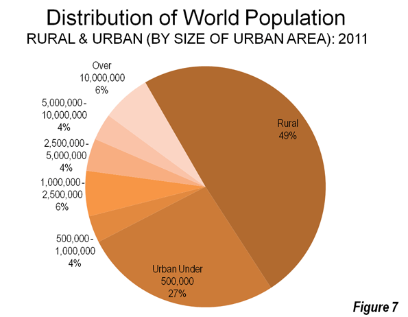
    We live in an era of the heady drumbeat of urban triumphalism. In a world that is now, by some measures, predominately urban, observers like historian Peter Hall envision a “coming golden age” of great cities. It is time to look at such claims more closely, replacing celebratory urban legends with careful analysis. Although the percentage of people living in cities is certain to grow, much of this growth will be in smaller cities, suburbs and towns. And it is unclear whether extreme centralization and densification are either inevitable or desirable, for as cities get larger—both in the developed and developing world—they display a tendency to become increasingly congested, bifurcated by class and economically inflexible.

    It may be time to propose a less gargantuan vision that is more humane for the vast majority of people. This alternative view embraces not cramming and concentration— the favored strategies of most planners, pundits, architectural stars and their urban land-owner enablers—but the protean development of more dispersed and less concentrated cities and suburbs. This is what is happening in most cities in the world today, and has been the pattern of urban areas throughout history.

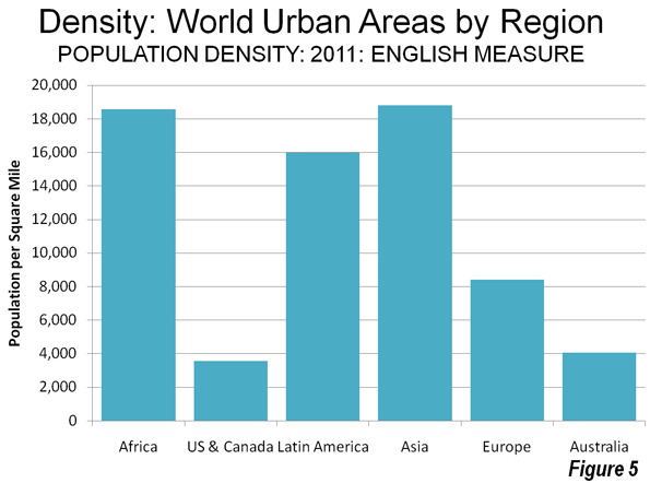
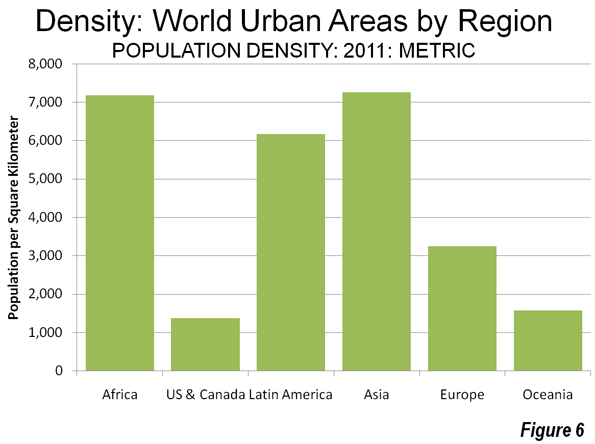
    There are numerous signs that this reality is taking root, both in the developing world and in high-income countries. Shlomo Angel, a lecturer at the Woodrow Wilson School at Princeton, has shown that as the world’s urban population has grown, the percentage living in the 100 largest cities has declined. Between 1960 and 2000, the share of the largest cities declined from nearly 30 percent to closer to 25 percent. Since the nineteenth century, notes Angel, urban population densities have declined, as people have sought out less dense, more appealing, and usually less costly locations on the periphery. This is true, he points out, in London and even to some extent Mumbai, as well as in the United States. As the World Bank has noted: “Cities became more packed and more sprawling at the same time.”

    What may be best is to forge not an agenda for centralization, but policies that promote both smaller cities and villages. This, notes Ashok R. Datar, chairman of the Mumbai Environmental Social Network and a long-time advisor to the Ambani corporate group, may represent the most practicable strategy for relieving the unbearable congestion that threatens so many mega-city environments.

    Down from the Commanding Heights

    The dispersionist viewpoint challenges the assumption that the bigger, more densely packed a city is, the better. This approach appeals to prominent urbanists, such as the University of Chicago’s Saskia Sassen, who see such places as the inevitable occupiers of the (Leninist) “commanding heights” of the global economy. To spread out economic growth, a World Bank report asserts, is to discourage it.

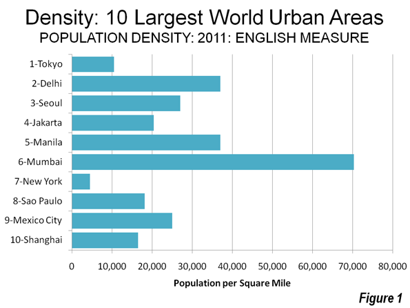
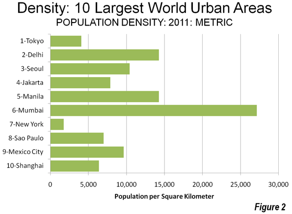
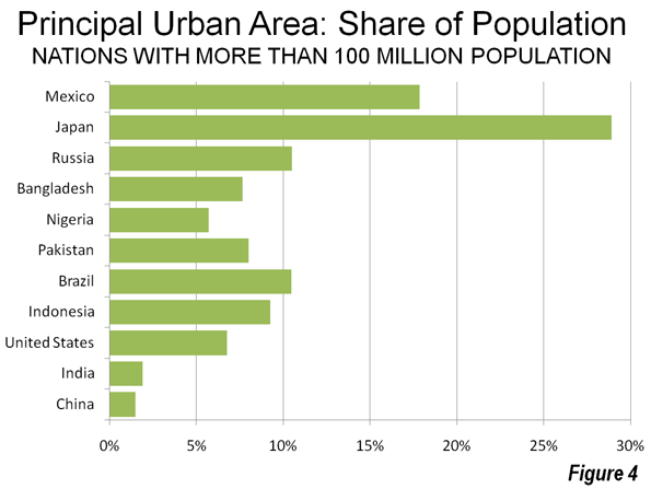
    The dispersionist view begs to differ. In many important ways, the largest urban agglomerations can also be seen as gradually losing their edge to more smaller cities. One of the ironies of this Age of Cities lies in the fact that relative size is no longer the overwhelming critical advantage as was the case in the less urbanized past. Before the late twentieth century, big cities were efficient and economically viable. The greatest urban centers of history—Babylon, Rome, Constantinople, Paris, London, Kaifeng, Baghdad, New York, Tokyo—grew in part because concentration provided the best, and sometimes only, way to support the basic infrastructure for commerce, cultural development, state religion or the exercise of power. But increasingly size not only matters less, but actually can be seen as a detriment to efficient, sustainable urbanism. This is particularly evident in the developing world where urbanization is spreading most rapidly. With the exception of Tokyo, the world’s most populous urban agglomerations—Delhi, Mumbai, São Paulo, Mexico City—have evolved into almost unspeakably congested leviathans, plagued by both deepening class divides and environmental problems.

    By 2025, cities in developing countries are projected to account for eight of the ten world’s largest cities. Four will be located in the Indian subcontinent alone, and each will accommodate twenty million or more residents. They may be seen as “colorful” by what one writer calls “slumdog tourists,” and “exciting” for those working within the confines of their “glamour zones,” but for most of their citizens life will be very difficult, and better only compared to what are even more dismal conditions in the countryside.

    Over the past forty years, the percentage of Mumbai’s population living in slums has grown from one in six to a majority. One indicator of the conditions there: the average Mumbaiker’s lifespan is now seven years less than the national average. This is all the more remarkable since most Indians still live in villages with very limited sanitation and even less access to quality health care. Concentrating more people in Mumbai or other developing mega-cities represents a form of lunacy. Much the same can be said for Kolkata, Manila, Cairo, Mexico City, and Lagos.

    On the other hand, the dispersionist notion emphasizes second and third tier city development. Already many Indian businesses and skilled workers are moving to smaller, less congested, often better-run cities such as Bangalore, whose density is roughly one-fourth of Mumbai’s, or Ahmadabad in the state of Gujarat. Much of this new growth takes place in campuslike settings on the edge of the city that take advantage of newer infrastructure and offer workers a less harried way of life. Many of India’s key industries—auto manufacturing, software and entertainment— are establishing themselves in such smaller cities, which are far less dense and less populated than Mumbai or Kolkata.

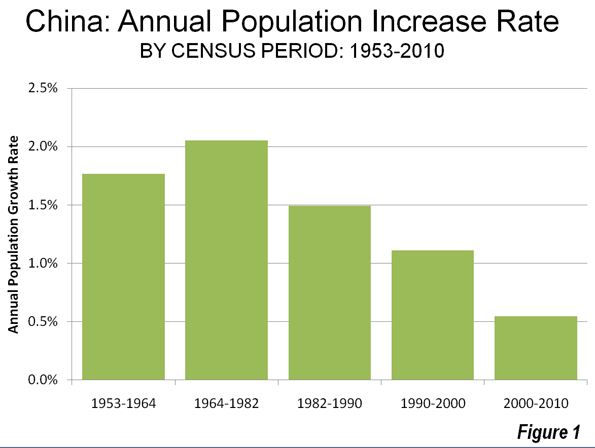
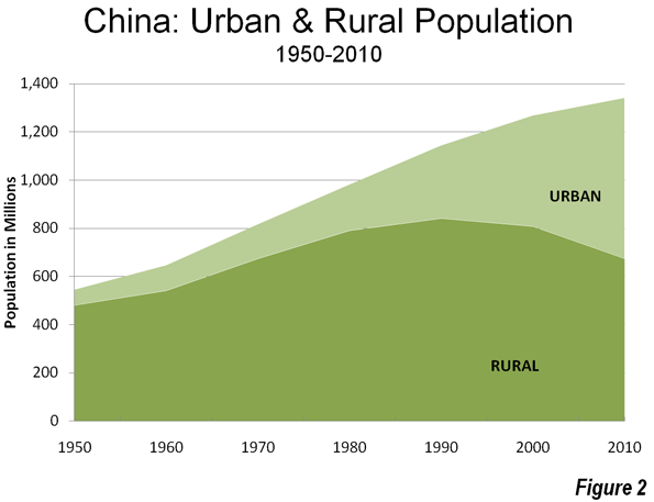
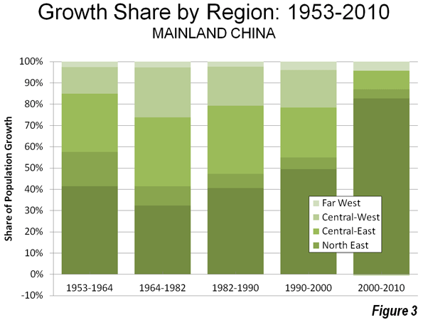
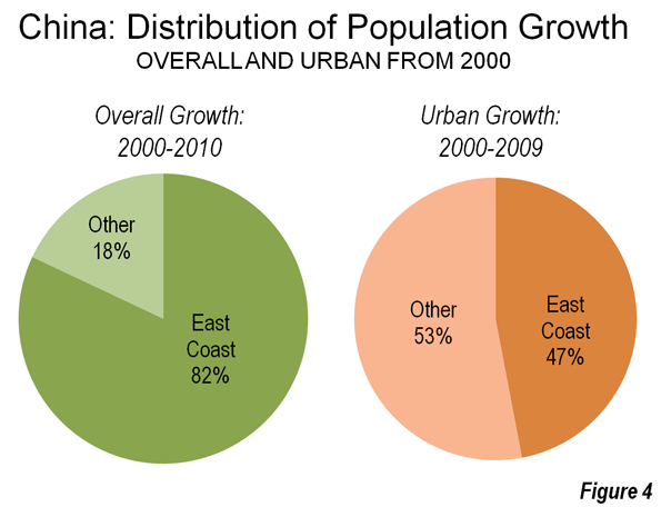
    In a more planned fashion, China is embracing decentralization, encouraging growth in smaller interior cities such as Chengdu, Wuhan and Xi’an. Such cities, notes Chengdu-based architect Adam Mayer, offer a healthy alternative to the coastal megacities of Shanghai, Hong Kong, Shenzhen, and Guangzhou. China’s bold urban diversification strategy hinges both on forging new transportation links and on nurturing businesses in these interior cities.

    Such commitment, and the resources to fund it, are lacking in much of the developing world. Africa, for example, now boasts many huge, and rapidly growing, cities, but it is hard to describe Lagos in Nigeria, Luanda in Angola, and Kinshasa in the Democratic Republic of the Congo as places with particularly bright prospects. One exception may be Capetown, the beautiful South African coastal city that shone so well during the recent World Cup. Latin America, too, has a plethora of huge and growing cities, but it is hard to imagine Mexico City and São Paulo as likely hot-spots for future economic growth. Instead the best prospects lie in smaller cities like Santiago, the capital of resource-rich Chile, or Campinas, a growing smaller Brazilian city with three million residents that lies outside the congested São Paolo region.

    This shift to smaller cities, as Michigan State’s Zachary Neal points out, has been conditioned by rapid improvements in telecommunications and transportation infrastructure. But perhaps the most conclusive evidence that smaller can be better and more efficient can be found in other parts of the developing world. Cairo, Baghdad, and Tehran are the biggest cities in the Middle East, but they are hardly economic successes. In contrast, Tel Aviv, whose total metropolitan population is only three million, has emerged as a major center for technology as well as one of the world’s premier diamond centers. The other leading candidates in the region hail from the United Arab Emirates, notably oil-rich Abu Dhabi and perhaps also its now financially weakened neighbor, Dubai.

    No place illustrates the principle that smaller can be better as well as Singapore. With roughly four million residents, Singapore ranks only sixtieth in terms of population among the world’s cities. But its economy clocks in at twenty-seventh, ahead of much larger Mumbai. In per capita terms, by purchasing power parity, it boasts an income of $62,200, one of the highest in the world, and behind only Liechtenstein, Luxembourg, Bermuda, and Qatar (and roughly the same as the United States). This is a remarkable achievement for a city-state whose per capita income at the time of its independence in 1965 was equal to those of other developing countries. Today Singapore boasts one of the world’s largest ports, a highly efficient subway system, and among the world’s most impressive skylines. It is easily the cleanest, most efficient big city in all of Asia. It is noteworthy that Singapore has employed its collective intelligence to develop a socially, economically and increasingly environmentally viable city in a space of only 268 square miles.

    The High-Income World

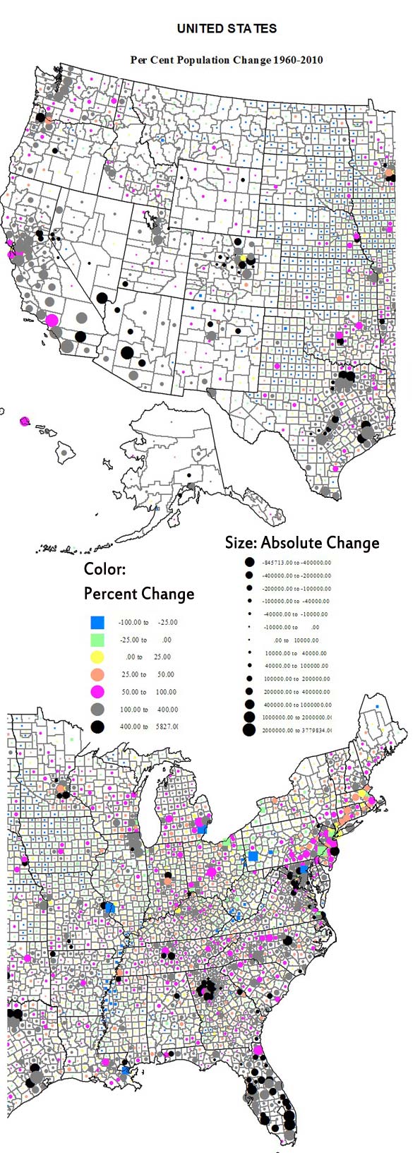
    The dispersionist reality is also evident in the high-income world. Even though some city cores have improved markedly, the largest and densest urban regions have performed somewhat worse than newer, smaller and often less compact urban areas. This decentralizing trend can also be seen in the western United States. In 1965, New York presided over the American economy like a colossus, accounting for more than 150 of the nation’s 500 largest companies; today that number is fewer than fifty. Not far behind New York are Los Angeles and Chicago, which also claim the coveted status of “world city.” In the meantime, a host of smaller and far more dispersed Texas cities have come to the fore. Houston, Dallas, San Antonio, and Austin enjoy the most rapid job and population growth of the nation’s largest metropolitan regions. Houston, which replaced New York as the center of the global energy industry, now has more Fortune 500 companies than Chicago. Together, the four Texas cities boast more large company headquarters than greater New York.

    But this movement from large dense cities to less dense ones represents only part of the dispersionist trend. A more critical one involves the movement from larger cities to smaller ones. In fact, between 2000 and 2008, notes demographer Wendell Cox, regions of more than ten million suffered a 10 percent rate of net outmigration. The big gainers were cities between 100,000 and 2.5 million residents. The winners included not only cities in Texas, but also southern urban regions such as Raleigh-Durham, now the fastest growing metro area over one million in the nation, and Nashville, and rising Heartland cities such as Columbus, Indianapolis, Des Moines, Omaha, Sioux Falls, and Fargo. Among urban areas of over one million, Columbus, Raleigh, Indianapolis, Denver and Kansas City all rank considerably ahead (in terms of growth of educated migrants between 2007 and 2009) of megacities such as New York, Los Angeles and San Francisco, according to the most recent American Community survey. One key advantage for these smaller cities is the price of housing. Even after the real estate bust, according to the National Association of Home Builders, barely one in three Los Angeles median-income households can afford a median-priced house; in New York, that ratio falls to one in four. In contrast, in regions such as Raleigh, Austin, San Antonio and Indianapolis, between two in three or four in five can afford the American dream. Advocates of dense cities mega-regions often point out that many poorer places, including old Rustbelt cities, enjoy high levels of affordability while regions such as New York do not. But that does not mean that affordability itself is a problem; areas with the lowest affordability, including New York, also have suffered among the high rates of domestic outmigration. The formula for a dynamic region mixes affordability with a growing economy.

    The smaller cities also are often easier for workers and entrepreneurs in which to do business. Despite the presence of the nation’s best developed mass transit system, the New York area has the longest commuting travel times; the worst are in Queens and Staten Island. As a general rule, average commuting time also tends to be longest in some of the biggest denser cities, notably New York, Chicago, and Washington, D.C. In contrast, the average commutes in places like Salt Lake City and Kansas City are slightly above twenty minutes. Over a year, moving to these smaller cities can save roughly 70 hours a week in commuting time.

    Finally there is the critical social issue. The largest cities such as New York and Los Angeles also tend to suffer the most extreme polarization of incomes. New York, for example, now has a distribution of wealth roughly twice as concentrated at the top than the national average. In 1980 Manhattan ranked seventeenth among the nation’s counties for social inequality; by 2007 it ranked first, with the top fifth of wage earners earning fifty-two times that of the lowest fifth, a disparity roughly comparable to that of Namibia. This is not only an American phenomenon. A study of the core city of Toronto, for example, found that between 1970 and 2001 the portion of middle-income neighborhoods in the city had dropped from two thirds to one third, while poor districts had more than doubled to 40 percent. By 2020, according to the University of Toronto researchers, middle-class neighborhoods could fall to barely less than 10 percent, with the balance made up of affluent and poor residents.

    Increasingly, one sees income gaps in high-income country megacities that one normally associates with developing countries. This is particularly true in expensive megacities whose finance-driven economies create high costs but lesser opportunities for middle and working class families. Once cost of living is factored in, more than half the children in inner London live in poverty, the highest level in Great Britain. More than one million Londoners were on public support in 2002.

    The Triumph of Suburbia

    We can see the impact of dispersion not only in the movement between cities but also in population shifts within them. Even the great metropolitan areas are, for the most part, de-concentrating. They increasingly boast not one center but a series of smaller ones, some far from the urban core. This can also be seen in both developing and high-income cities. The new business center of Mexico City, for example, is located in suburban Santa Fe and not the historic core. Much of the Mumbai entertainment complex known as Bollywood long ago migrated to the northern suburbs, with their malls and less dense neighborhoods.

    This pattern can be seen even more in the high-income countries. In virtually every major city in Europe, the urban core now represents a smaller percentage of the metropolitan population than two decades ago. Cities such as London, Paris, Frankfurt and Madrid, despite the presence of excellent mass transit, are far more suburbanized and decentralized than they were two decades ago. Since 1965, virtually all European major metropolitan area growth has been in the suburbs. Indeed, the share of the metropolitan area population gains in the suburbs has been greater in Western Europe than in the United States. As in the United States, this reflects in part the shift of technology industries into suburban areas. The reasons for this may have much to do with the family-oriented nature of many engineers and scientists, and their preference for campus-like settings. This is true both in the Grande Couronne around Paris, where many French tech firms cluster, and in Great Britain. The dynamic growth in fields such as technology and high-value-added and design-led manufacturing are concentrated not in the core, or even the surrounding suburbs, but in the outer reaches of the Thames Valley and around Cambridge. New home-work opportunities and attractive housing concentrates workers in such places, as well as in cities such as Bath and Taunton. “Cities,” concluded one recent report by the British Urban Regeneration Association, “are no longer the main source of new enterprises.”

    This statement will be familiar to people who study North America. For all the talk about new media and other tech related fields clustering in “hip and cool” urban cores, the greatest concentrations of technology industries are in predominately suburban areas, such as those on the periphery of Ottawa, Montreal, and Toronto, or Route 128 around Boston, Orange County, California and the hill country around Austin, Texas. One reason is that the brain power is there. According to the United States Census, eighteen of the nation’s twenty counties with the highest percentage of college-educated people over twenty-five are in either suburban or small cities.

    Silicon Valley, the world’s predominant high-tech concentration, remains to a large extent a vast suburb. The headquarters of such firms such as Intel, Apple, and Google are not in urbanized, transit-oriented San Francisco, but in sprawling, car-dominated places like Santa Clara, Cupertino and Mountain View. Although there are some pockets of density, the Valley essentially functions along suburban lines with no significant real urban core. Transit ridership in the Valley now stands at 3 percent, closer to a Phoenix or Houston than a New York or San Francisco.

    These economic trends are also reflected in demographics. Nationwide, over the past decade, suburbs have accounted for 85 percent of all metropolitan growth. Over the past decade, out of the forty-eight metropolitan areas, suburban counties gained more migrants than core counties in forty two cases; virtually all the fastest-growing communities in the country over the past decade have been located on the suburban fringe. Another indicator: Despite all the talk of people moving “back to the city” to experience the joys of density, between 2000 and 2008, the share of households living in detached housing rose from 61.4 percent to 63.5 percent.

    The Urban Future

    Whether in the high income or developing world, the evidence suggests our urban future will be more diverse—and dispersed—than commonly assumed. Like the housing around some suburban areas, there has also been a crash in many inner city markets.

    As a result of overestimating the demand for high density, there are sad stretches of abandoned or drastically devalued highrise and mixed-use areas in Miami, Kansas City, Chicago, Los Angeles and even the core of Portland, where condo prices have tumbled by at least 30 percent since 2007.

    Rather than force a density agenda on a largely unwilling population, it is better to consider how to make the more dispersed urban future more workable and sustainable. In the developing world, this might include the development of regional employment centers to reduce the often unbearable congestion of the urban core. At the same time, more thought should be given to allowing for houses on small lots, which could serve as gardens or placing for small household industry. In the high-income countries, there will be new opportunities in what may have once been considered second-tier markets to develop new urban amenities. There will be similar openings in the suburbs and even exurbs. Although these areas will not become densely packed, they will become more urban in many ways.

    Much also can be done to make our dispersing geography more environmentally friendly. Recent studies by environmental scientists in Australia suggest that the carbon footprint of high-rise urban residents, contrary to the conventional wisdom, is higher than that of medium and low-density suburban homes, due to the cost of heating common areas such as parking garages, and the highly consumptive lifestyles of more affluent urbanites, a considerable number of whom own second residences in the countryside. Even if these claims are exaggerated, there is no question suburbs and lower-density cities can be made more environmentally sustainable by such relative low-cost, relatively unobtrusive steps, these including insulation and tree-planting as well as the adoption of more fuel-efficient automobiles and a greater embrace of telecommuting, which is by far the fastest form of commute to work.

    Instead of clinging to the idea that density and concentration are best, planners, architects and developers would do better to focus what appeals to the vast majority of the population, particularly the middle and working classes. Nurturing smaller, more efficient cities, as well as expansive suburbs and revived small towns, may prove far more practical and beneficial to society than imposing the manic agenda among planners, pundits and urban land speculators for relentless centralization.

    This piece originally appeared in Wharton Real Estate Review.

    Joel Kotkin is executive editor of NewGeography.com and is a distinguished presidential fellow in urban futures at Chapman University, and an adjunct fellow of the Legatum Institute in London. He is author of The City: A Global History. His newest book is The Next Hundred Million: America in 2050, released in February, 2010.

    Photo by Paul Sapiano

  • China: Urbanizing and Moving East: 2010 Census

    The National Bureau of Statistics of China has just released the first results of the 2010 census. The new figures portray a radically reduced population growth rate, rapid urbanization and an unprecedented domination of population growth by the East Coast.

    Slowing Population Growth: China, the world’s most populous nation, grew rapidly until the early 1980s. The strongest growth since 1950 was in the 1964 to 1982 census period, during which the annual growth rate exceeded two percent. By the 1990 to 2000 period, the annual rate had fallen to 1.1 percent and then dropped in half to approximately 0.6 percent between 2000 and 2010 (Figure 1). The nation’s total population growth between 2000 and 2010 was approximately 75 million. In contrast, the 1964 to 1982 rate would have produced a population increase of 300 million people. Two key factors have   influenced this drop in population growth rate. The first is rapidly improving affluence, a factor routinely associated with lower birth rates around the world. The second factor is China’s one child policy, which is contributing to an aging of the population and has been associated with an increasing male to female birth ratio.

    Accelerating Urbanization: Between 2000 and 2010, China continued to urbanize at a pace and scale never seen before in world history (Figure 2).  China added approximately 205 million urban residents over 10 years, more urban residents than live in any country except for India and the United States. China’s urban population expansion was 2.5 times the estimated increase in rapidly urbanizing India. In 2010, nearly 50 percent of the population lived in urban areas, compared to 37 percent in 2000. This increase is well above expectations. The United Nations had projected an urbanization share of 47 percent, which would have converted to approximately 50 million fewer urban residents.

    A large share of the increase in urban population was from the nation’s large migrant population, which lacks registration (hukou status) at its current, generally urban place of residence. A floating population, this group rose from 120 million in 2000 to 220 million in 2010. This movement of 100 million people dwarfs the national population increase of 75 million. Previous data indicated that virtually all of Shanghai’s population growth was due to migration of (principally poorer) people from elsewhere, as has occurred elsewhere in the nation.

    Moving East: For the first time since 1950, one region of the nation was dominant (Figure 3), with 83 percent of growth on the already heavily urbanized East Coast. In contrast, the center (East Central and West Central regions) combined for only eight percent of the growth, which is down from 41 percent between 1990 and 2000 and 56 percent between 1964 and 1982 (Note 1) Regional and provincial level population trends are indicated in the table below (link to provincial level map).

    China Population Trends by Region & Province
    1990-2010
    1990 2000 2010 1990-2000 Change 2000-2010 Change Share of Growth: 1990-2000 Share of Growth: 2000-2010
    CHINA    1,130.49    1,262.28       1,332.77 11.7% 5.6% 100.0% 100.0%
    EAST COAST 428.61 493.84 552.20 15.2% 11.8% 49.5% 82.8%
    NORTH 165.08 182.06 200.20 10.3% 10.0% 12.9% 25.7%
      Beijing        10.82 13.82 19.61 27.7% 41.9% 2.3% 8.2%
      Hebei          61.08 67.44 71.85 10.4% 6.5% 4.8% 6.3%
      Shandong       84.39 90.79 95.79 7.6% 5.5% 4.9% 7.1%
      Tianjin        8.79 10.01 12.94 13.9% 29.3% 0.9% 4.2%
    CENTRAL 151.89 172.60 193.00 13.6% 11.8% 15.7% 28.9%
      Fujian         30.05 34.71 36.89 15.5% 6.3% 3.5% 3.1%
      Jiangsu        67.06 74.38 78.66 10.9% 5.8% 5.6% 6.1%
      Shanghai       13.34 16.74 23.02 25.5% 37.5% 2.6% 8.9%
      Zhejiang       41.45 46.77 54.43 12.8% 16.4% 4.0% 10.9%
    SOUTH 111.63 139.18 159.00 24.7% 14.2% 20.9% 28.1%
      Guangdong      62.83 86.42 104.30 37.5% 20.7% 17.9% 25.4%
      Guangxi        42.25 44.89 46.03 6.3% 2.5% 2.0% 1.6%
      Hainan         6.56 7.87 8.67 20.0% 10.2% 1.0% 1.1%
    NORTH EAST 99.33 106.55 109.52 7.3% 2.8% 5.5% 4.2%
      Heilongjiang   35.21 36.89 38.31 4.8% 3.9% 1.3% 2.0%
      Jilin          24.66 27.28 27.46 10.6% 0.7% 2.0% 0.3%
      Liaoning       39.46 42.38 43.75 7.4% 3.2% 2.2% 1.9%
    EAST CENTRAL 344.25 375.23 381.43 9.0% 1.7% 23.5% 8.8%
    NORTH 106.40 116.59 119.92 9.6% 2.9% 7.7% 4.7%
      Anhui          56.18 59.86 59.50 6.5% -0.6% 2.8% -0.5%
      Inner Mongolia 21.46 23.76 24.71 10.7% 4.0% 1.7% 1.3%
      Shanxi         28.76 32.97 35.71 14.6% 8.3% 3.2% 3.9%
    SOUTH 237.85 258.64 261.51 8.7% 1.1% 15.8% 4.1%
      Henan          85.51 92.56 94.02 8.2% 1.6% 5.3% 2.1%
      Hubei          53.97 60.28 57.24 11.7% -5.0% 4.8% -4.3%
      Hunan          60.66 64.40 65.68 6.2% 2.0% 2.8% 1.8%
      Jiangxi        37.71 41.40 44.57 9.8% 7.7% 2.8% 4.5%
    WEST CENTRAL 236.49 259.61 259.18 9.8% -0.2% 17.5% -0.6%
    NORTH 59.91 67.29 69.20 12.3% 2.8% 5.6% 2.7%
      Gansu          22.37 25.62 25.58 14.5% -0.2% 2.5% -0.1%
      Ningxia        4.66 5.62 6.30 20.7% 12.1% 0.7% 1.0%
      Shaanxi        32.88 36.05 37.33 9.6% 3.5% 2.4% 1.8%
    SOUTH 176.58 192.32 189.98 8.9% -1.2% 11.9% -3.3%
      Chongqing      28.86 30.90 28.85 7.1% -6.6% 1.5% -2.9%
      Guizhou        32.39 35.25 34.75 8.8% -1.4% 2.2% -0.7%
      Sichuan        78.36 83.29 80.42 6.3% -3.4% 3.7% -4.1%
      Yunnan         36.97 42.88 45.97 16.0% 7.2% 4.5% 4.4%
    FAR WEST 21.81 27.05 30.44 24.0% 12.5% 4.0% 4.8%
      Qinghai        4.46 5.18 5.63 16.2% 8.6% 0.5% 0.6%
      Tibet          2.20 2.62 3.00 19.3% 14.6% 0.3% 0.5%
      Xinjiang       15.16 19.25 21.81 27.0% 13.3% 3.1% 3.6%

    East Coast: The East Coast growth share of 83 percent is far higher than in previous census periods, which reached a high at 49 percent between 1990 and 2000. The share of growth was consistent within the sub-regions of the East Coast. The North, surrounding Beijing and the Yellow River (Huang He) Delta, accounted for 26 percent of the growth. The Central East Coast, with Shanghai and the Yangtze River (Changjiang) Delta at its core, captured 29 percent of the growth. The South, centering on the Pearl River Delta, and the megacities of Guangzhou, Shenzhen and Dongguan, accounted for 28 percent of the growth (Note 2).

    All of the 11 provincial level jurisdictions (Note 3) on the East Coast all except for Guangxi grew at least as fast as the nation. The fastest growth in the nation was in the three provincial level municipalities: Beijing, where the population increased 42 percent, Shanghai at 38 percent and Tianjin at 29 percent. Even so, Beijing’s population was a full two million less than some estimates, while Shanghai’s was nearly one million more than current city estimates.

    Outside the provincial level municipalities, Guangdong was the fastest growing in the nation, adding 21 percent. Guangdong became the nation’s largest provincial level jurisdiction, reaching 104 million and adding 18 million new residents. The Guangdong count was particularly surprising, roughly 7 million higher than would have been expected based upon 2009 population estimates. Zhejiang, adjacent to Shanghai grew 16 percent. Hainan, an island province carved from Guangdong in the 1980s, grew 10 percent.

    North East: The North East ("Manchuria" or "Dong Bei") accounted for only four percent of the nation’s growth, down significantly from previous census periods.  All three provinces grew at lower rates than the nation. These are traditional manufacturing areas that have not seen the sort of investment seen further south.

    East Central: The East Central provinces accounted for eight percent of the nation’s growth, down from 23 percent between 1990 and 2000. Among the seven provinces, only Shanxi and Jiangxi grew faster than the national rate. Hubei, home of Wuhan, one of the nation’s largest urban areas, experienced a loss of more five percent, the second largest population decline in the nation after Chongqing. The northern East Central jurisdictions grew at approximately one half the national rate, while the south grew at approximately one fifth the national rate.

    West Central: The seven West Central provincial level jurisdictions lost population in an amount equal to -0.6 percent of the national growth. This compares to an18 percent share of national growth between 1990 and 2000. The provincial level municipality of Chongqing experienced the largest rate of population loss in the nation at seven percent. Sichuan, from which Chongqing was carved in the 1990s, lost three percent of its population. Nonetheless, two provincial level jurisdictions in the West Central grew faster than the national rate, Ningxia and Yunnan. As in the East Central, the North grew at approximately one half the national rate. The South experienced heavy rural population losses, even as large urban areas, such as Chongqing and Chengdu experienced strong population gains.

    Far West: The jurisdictions of the Far West captured five percent of the national growth. The Far West grew the fastest among the regions, at 12.5 percent compared to 11.8 percent on the East Coast.  Each of the jurisdictions, Xinjiang, Tibet and Qinghai grew more quickly than the national rate. Nonetheless, with such a small population (30 million), the population growth in the Far West was barely one-half that of Beijing or Shanghai and little more than Tianjin.

    Provincial Losses, Urban Gains: Despite the uneven concentration of growth on the East Coast, the larger increase in (100 million) in migration from rural to urban areas led to a less uneven distribution of urban growth. The slow growth and even the population losses occurring in the interior mask huge growth in major urban areas of the same provincial level jurisdictions.

    Based upon 2009 estimates (provincial level urban data has not yet been released for 2010), the provincial level municipality of Chongqing gained 4.5 million urban residents (more than the population of Berlin), while the overall provincial level population loss was 2 million from 2000 to 2010. This illustrates one of the principal dynamic of population trends in China, as the countryside loses population to urban areas not only on the East Coast but also in the same general areas. The rural areas of Chongqing, which accounted for two-thirds of the population, lost more than 6 million residents, principally to the nearby Chongqing urban area as well as to other urban areas of the nation.

    In Sichuan, with its large and fast growing capital Chengdu, the urban population grew nearly 10 million, while  the provincial population was declining 3 million, indicating a rural loss of 13 million. Thus, while the East Coast accounted for 83 percent of the overall population growth, government estimates through 2009 indicate that only 47 percent of the urban population growth was on the East Coast (Figure 4). 

    Challenges: China faces no shortage of demographic challenges. An aging population will impose significant financial burdens on the generations to come, as is already happening in more affluent nations. The ratio of female to male births needs to be improved or social stability could be difficult to maintain in the decades ahead. The role of China’s one-child policy in these issues is now being debated and reviewed.

    The strong trend toward urbanization will continue for decades. The United Nations estimates that China will be nearly 75 percent urbanized in 2050 compared to the current 50 percent. The nation is expected to add 70 million residents, with an increase of 400 million in urban areas and a loss of 330 million in rural areas. Should these projections be reached, China’s rate of urbanization will be near the current levels in the affluent West. Even with more than one-half of urban growth now occurring outside the East Coast, there is a need to decentralize more of the growth to the emerging urban areas of the interior. This is something now widely recognized within Chinese planning and government circles.

    —–

    Photo: Wuhan (capital of Hubei) By author

    Note 1: There are various methods to categorize the regions of China. This classification is used to illustrate the differences in regional growth rates in the census periods since 1950. The provincial level municipality of Beijing is classified as East Coast because it is surrounded by provincial level jurisdictions (Hebei and Tianjin) which are coastal. Inner Mongolia, which stretches across the entire center of the nation is classified in the East Central because its population is more concentrated in that area. The regional population change between 1953 and 1964 includes an estimated allocation of population to provincial level jurisdictions into which abolished provinces (Rehe, or Jehol and Xikang) were merged during the period.

    Note 2: The Hong Kong and Macao Special Administrative Regions are also in the south, but are not included in the 2010 census data.

    Note 3: There are three types of provincial level jurisdictions in China, provinces, provincial level municipalities and autonomous regions.

    Wendell Cox is a Visiting Professor, Conservatoire National des Arts et Metiers, Paris and the author of “War on the Dream: How Anti-Sprawl Policy Threatens the Quality of Life