Category: Demographics

  • Census 2010 Offers Portrait of America in Transition

    The Census Bureau just finished releasing all of the state redistricting file information from the 2010 Census, giving us a now complete portrait of population change for the entire country.  Population growth continued to be heavily concentrated in suburban metropolitan counties while many rural areas, particularly in the Great Plains, continue to shrink.
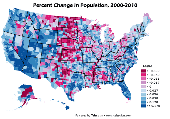

    Percentage change in population, 2000-2010. Counties that grew in population in blue, decliners in red. Note: Legend values not multiplied by 100.

    Dividing counties by those growing faster or slower than the US average paints the picture even more starkly:
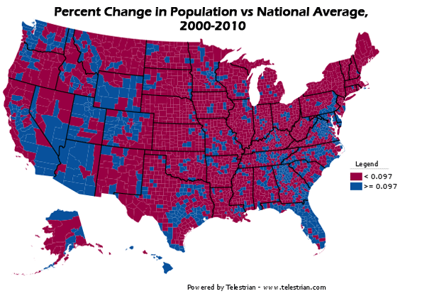

    Percentage change in population, 2000-2010.  Counties growing faster than the US average in blue, slower than the US average in red.  Note: Legend values not multiplied by 100.

    The release of all county data means it is also possible to take an unofficial, preliminary look at metropolitan area growth.  The biggest gainers were Sunbelt cities in the South, Texas, and the Midwest, while the Midwest and Northeast continued to lag, particularly the old heavy manufacturing axis stretching from Detroit to Pittsburgh. But this picture was not monolithic. Many Southern cities with Rust Belt profiles like Birmingham failed to grow much compared to neighbors, nor did coastal California with its development restrictions.
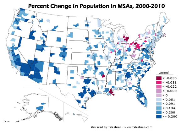

    Percentage change in population, 2000-2010. MSAs that grew in population in blue, decliners in red. Note: Legend values not multiplied by 100.
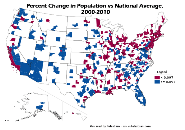

    Percentage change in population, 2000-2010.  Counties growing faster than the US average in blue, slower than the US average in red.  Note: Legend values not multiplied by 100.

    A full table of population change for large metro areas (greater than one million people) is available at the bottom of this post.

    Basic race information is also available in this data release, since it is used to ensure redistricting complies with the requirements of the Voting Rights Act.  Here’s a map showing the concentration of Hispanic population the US:
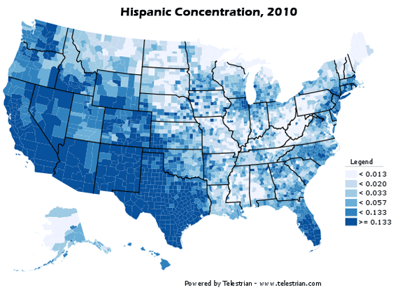

    Population of Hispanic Origin, as a percentage of total population. Note: Legend values not multipled by 100.

    Hispanic population remains heavily concentrated in the Southwest, but the interior, and especially parts of the South one would not expect, such as Alabama, posted significant gains in Hispanic population share.
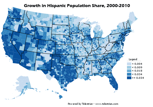

    Hispanic population as change in percentage of total population, 2000-2010.  Note: Legend values not multiplied by 100.

    As the highest concentrations of Hispanics remain in the Southwest, similarly the Black population is at its heaviest concentrations in the South:
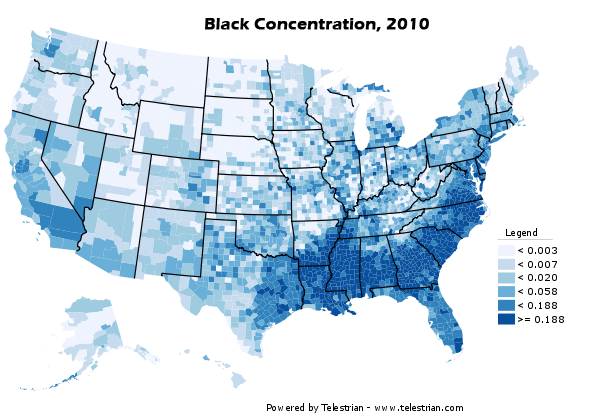
    Black Alone population as a percentage of total population, 2010.  Note: Legend percentages not multiplied by 100.

    A lot has been written about the so-called reverse Great Migration of blacks from the North to the South.  These results show something of that effect, but less of a general than a specific migration. Some cities both North and South are becoming magnets for Blacks, while other traditional Black hubs like Chicago are no longer favored. Note that some northern cities that showed a larger increase in concentration started off on a low base, like Minneapolis-St. Paul:
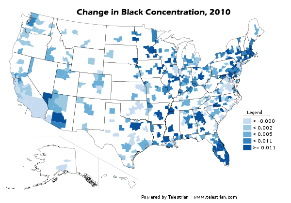

    Black Alone population as change in percentage of total population, 2000-2010.  Note: Legend values not multiplied by 100.

    As noted above, here are all US metro areas with a population greater than one million people in 2010, ranked by percentage change in population:

    2000-2010 Population Growth, MSAs of 1 Million or More
    Rank Metropolitan Area 2000 2010 Total Change Pct Change
    1 Las Vegas-Paradise, NV 1,375,765 1,951,269 575,504 41.8%
    2 Raleigh-Cary, NC 797,071 1,130,490 333,419 41.8%
    3 Austin-Round Rock-San Marcos, TX 1,249,763 1,716,289 466,526 37.3%
    4 Charlotte-Gastonia-Rock Hill, NC-SC 1,330,448 1,758,038 427,590 32.1%
    5 Riverside-San Bernardino-Ontario, CA 3,254,821 4,224,851 970,030 29.8%
    6 Orlando-Kissimmee-Sanford, FL 1,644,561 2,134,411 489,850 29.8%
    7 Phoenix-Mesa-Glendale, AZ 3,251,876 4,192,887 941,011 28.9%
    8 Houston-Sugar Land-Baytown, TX 4,715,407 5,946,800 1,231,393 26.1%
    9 San Antonio-New Braunfels, TX 1,711,703 2,142,508 430,805 25.2%
    10 Atlanta-Sandy Springs-Marietta, GA 4,247,981 5,268,860 1,020,879 24.0%
    11 Dallas-Fort Worth-Arlington, TX 5,161,544 6,371,773 1,210,229 23.4%
    12 Nashville-Davidson–Murfreesboro–Franklin, TN 1,311,789 1,589,934 278,145 21.2%
    13 Jacksonville, FL 1,122,750 1,345,596 222,846 19.8%
    14 Sacramento–Arden-Arcade–Roseville, CA 1,796,857 2,149,127 352,270 19.6%
    15 Denver-Aurora-Broomfield, CO 2,179,240 2,543,482 364,242 16.7%
    16 Washington-Arlington-Alexandria, DC-VA-MD-WV 4,796,183 5,582,170 785,987 16.4%
    17 Tampa-St. Petersburg-Clearwater, FL 2,395,997 2,783,243 387,246 16.2%
    18 Salt Lake City, UT 968,858 1,124,197 155,339 16.0%
    19 Portland-Vancouver-Hillsboro, OR-WA 1,927,881 2,226,009 298,128 15.5%
    20 Indianapolis-Carmel, IN 1,525,104 1,756,241 231,137 15.2%
    21 Richmond, VA 1,096,957 1,258,251 161,294 14.7%
    22 Oklahoma City, OK 1,095,421 1,252,987 157,566 14.4%
    23 Columbus, OH 1,612,694 1,836,536 223,842 13.9%
    24 Seattle-Tacoma-Bellevue, WA 3,043,878 3,439,809 395,931 13.0%
    25 Miami-Fort Lauderdale-Pompano Beach, FL 5,007,564 5,564,635 557,071 11.1%
    26 Kansas City, MO-KS 1,836,038 2,035,334 199,296 10.9%
    27 Minneapolis-St. Paul-Bloomington, MN-WI 2,968,806 3,279,833 311,027 10.5%
    28 Louisville/Jefferson County, KY-IN 1,161,975 1,283,566 121,591 10.5%
    29 San Diego-Carlsbad-San Marcos, CA 2,813,833 3,095,313 281,480 10.0%
    30 Memphis, TN-MS-AR 1,205,204 1,316,100 110,896 9.2%
    31 Birmingham-Hoover, AL 1,052,238 1,128,047 75,809 7.2%
    32 Baltimore-Towson, MD 2,552,994 2,710,489 157,495 6.2%
    33 Virginia Beach-Norfolk-Newport News, VA-NC 1,576,370 1,671,683 95,313 6.0%
    34 Cincinnati-Middletown, OH-KY-IN 2,009,632 2,130,151 120,519 6.0%
    35 San Jose-Sunnyvale-Santa Clara, CA 1,735,819 1,836,911 101,092 5.8%
    36 Hartford-West Hartford-East Hartford, CT 1,148,618 1,212,381 63,763 5.6%
    37 San Francisco-Oakland-Fremont, CA 4,123,740 4,335,391 211,651 5.1%
    38 Philadelphia-Camden-Wilmington, PA-NJ-DE-MD 5,687,147 5,965,343 278,196 4.9%
    39 St. Louis, MO-IL 2,698,687 2,812,896 114,209 4.2%
    40 Chicago-Joliet-Naperville, IL-IN-WI 9,098,316 9,461,105 362,789 4.0%
    41 Los Angeles-Long Beach-Santa Ana, CA 12,365,627 12,828,837 463,210 3.7%
    42 Milwaukee-Waukesha-West Allis, WI 1,500,741 1,555,908 55,167 3.7%
    43 Boston-Cambridge-Quincy, MA-NH 4,391,344 4,552,402 161,058 3.7%
    44 New York-Northern New Jersey-Long Island, NY-NJ-PA 18,323,002 18,897,109 574,107 3.1%
    45 Rochester, NY 1,037,831 1,054,323 16,492 1.6%
    46 Providence-New Bedford-Fall River, RI-MA 1,582,997 1,600,852 17,855 1.1%
    47 Buffalo-Niagara Falls, NY 1,170,111 1,135,509 -34,602 -3.0%
    48 Pittsburgh, PA 2,431,087 2,356,285 -74,802 -3.1%
    49 Cleveland-Elyria-Mentor, OH 2,148,143 2,077,240 -70,903 -3.3%
    50 Detroit-Warren-Livonia, MI 4,452,557 4,296,250 -156,307 -3.5%
    51 New Orleans-Metairie-Kenner, LA 1,316,510 1,167,764 -148,746 -11.3%

    Aaron M. Renn is an independent writer on urban affairs based in the Midwest. His writings appear at The Urbanophile. Maps and analysis done using Telestrian.

  • New York City Population Growth Comes Up Short

    Just released census counts for 2010 show the New York metropolitan area historical core municipality, the city of New York, to have gained in population from 8,009,000 in 2000 to 8,175,000 in 2010, an increase of 2.1 percent. This is the highest census count ever achieved by the city of New York.

    Nonetheless, the figure was 245,000 below the expected level of 8,420,000 (based upon 2010 Census Bureau estimates). The higher population estimate had been the result of challenges by the city to Census Bureau intercensal estimates. The city of New York attracted 29 percent of the metropolitan area growth. Approximately 43 percent of the metropolitan area’s population lives in the city.

    Overall, the New York metropolitan area grew from 18,323,000 to 18,890,000, an increase of 3.1 percent. The suburbs grew approximately twice as rapidly as the city of New York, at 4.0 percent, and attracted 71 percent of the metropolitan area growth.

  • Charlotte Continues Strong Growth

    According to US Census Bureau data, the Charlotte (NC-SC) metropolitan area grew 32 percent, from 1,330,000 to 1,758,000 between 2000 and 2010. The historical core municipality, the city of Charlotte grew from a 2000 base of 568,000 to 731,000 in 2010 (an increase of 29 percent). The city of Charlotte is largely of a post-World War II suburban form. The city of Charlotte attracted 38 percent of the metropolitan area growth.

    The suburbs grew at a 35 percent rate, higher than that of the city of Charlotte. The suburbs captured 62 percent of the metropolitan area growth.

  • Slow Growth in Providence: City Grows

    The Providence (RI) metropolitan area was one of the slowest growing in the 2000 to 2010 period, according to counts just released by the Census Bureau. Providence grew 1.1 percent, from 1,583,000 to 1,601,000. The historical core municipality, the city of Providence gained 2.5 percent, from 174,000 to 178,000 and grew faster than the suburbs, like neighboring Boston. The city of Providence reached its population peak in 1940, at 254,000.

    Even so, the suburbs attracted 75 percent of the metropolitan area growth.

  • Declining Detroit

    The historical core municipality of the Detroit metropolitan area, the city of Detroit, continued its steep population decline between 2000 and 2010. The new census count indicates that the city dropped to 733,000 residents, from 951,000 in 2000. This drop of 25 percent was the largest in any census period since 1950, when the city peaked at a population of 1,850,000. Even so, the percentage decline from 1950 of 61.4 percent remains less than that of city of St. Louis, which has experienced the steepest population decline of any municipality that has reached 500,000 population in modern times (62.7 percent).

    The decline did not extend to the suburbs, which gained a modest 2.3 percent between 2000 and 2010. Suburban growth has also been substantial since 1950, with 2.2 million new residents added.

    However, the suburban growth was not enough to erase the impact of the city of Detroit decline. The Detroit metropolitan area fell from 4,452,000 in 2000 to 4,296,000 in 2010, a loss of 3.6 percent. The loss was the greatest among major metropolitan areas reporting up to this time. Nonetheless, even with the huge city of Detroit loss, the Detroit metropolitan area has grown more than 30 percent and more than 1,000,000 people.

  • Boston: The Outlier

    The new 2010 census results for the Boston metropolitan area show the historical core municipality, the city of Boston, increasing its population at a greater rate than that of its suburbs. Thus far, Boston is the only historical core municipality with essentially the same boundaries as in 1950 that has experienced a growth rate greater than the suburbs in the 2000 to 2010 period. Boston grew from 589,000 to 617,000, an increase of 4.8 percent. Even so, the city remained more than 20 percent below its historic peak of 801,000 in 1950. Further, even with its faster growth, the city of Boston captured only 18 percent of the metropolitan area growth between 2000 and 2010. The city of Boston contains 14 percent of the metropolitan area population.

    By comparison, the suburbs grew 3.5 percent and accounted for 82 percent of the metropolitan area growth.

    Overall, the Boston metropolitan area, which stretches from Massachusetts into New Hampshire grew from 4,391,000 to 4,552,000, for a growth rate of 3.7 percent, approximately one-third of the national growth rate between 2000 and 2010. This growth rate is the same as in Los Angeles and Milwaukee, which were the slowest growing major metropolitan areas (population over 1,000,000) reporting so far, with the exception of Cleveland, Detroit and Pittsburgh, which lost population.

    Boston retains its position as the nation’s 10th largest metropolitan area, having passed losing Detroit and been passed by Atlanta.

  • Appalatin: A Perfect Rhythm Falling Into Place

    Nesting in Louisville since 2006, slowly taking its time to form and blossom, Appalatin is six working professionals who haven’t quit their day jobs — two native Kentuckians and four immigrant Kentuckians from Latin America, who do lot of professional-quality music in their spare time.

    If one were to introduce Appalatin to the world in one longish sentence, it might be something like this: “Appalatin is sunny, high-spirited, fun music, technically a cross-pollination of Appalachian-Kentucky Hillbilly and various Latin American Sounds (primarily Andes & Coastal Central American) — specifically Rumba, Andean, Central American Folk, American Folk, Cuban, Cha Cha, trova movement from the Sixtes and Seventies, Cumbia, and Bluegrass — with some of their influences being Silvio Rodriquez of Cuba, Mercedes Sosa of Argentina, Victor Jara of Chile, Nineties Spanish pop band Jarabe de Palo and jam bands like the Allman Brothers.”

    Meet this time from foreign shores not Paul, John, George, and Ringo, but rather Obanodo “Marlon” Solano, Steve Sizemore, Yani Vozos, (who has emerged as the group’s unofficial/official spokesperson), Fernando Moya, Luis de Leon and the amicable Mario Cardenas, who speaks mostly in Spanish.

    The first time I see them was at the Americana Festival this past summer — and they caught my ear. Right away there was something extra-special and highly individual about Appalatin — not just the fact that the music they performed is unusual (i.e., “Shady Grove” with Andean Pan Pipes and Central American Spanish guitar rhythms) — but also the fact that they made it cohesive, natural and relaxed.

    As people, they are very, very much like the music they perform. They have a notably warm, genial, and relaxed air about them, similar to the Carolina Chocolate Drops, that gives them the potential to be a real crowd-pleaser and a favorite.

    Yani Vozos recaps their genesis this way: “In August 2006, Steve and Marlon jammed once, then I came in and we did a show at [the] Jazz Factory. A year later Fernando joined the band, a year later Mario started playing off and on, and a year after that Luis joined the band, and here we are.”

    Steve and Yani both hail from small towns in Kentucky — Hazard County, and Richmond plus Estill County, respectively. Marlon grew up on a farm in a tiny community, only in San Lorenzo, Nicaragua. Fernando, surprisingly the most urban of the bunch given his tribal heritage, hails from just outside of Quito. Mario hails from Loja — the “Nashville or New Orleans of Ecuador” (his words), and Luis is from the State of Chiapas and lived in Guatemala for twelve years before coming here.

    The music that emerges from this divergent mix is remarkable in the degree to which it both melds seamlessly together and preserves the essence of each of its ingredients.

    Appalatin began with a long-running set of gigs at various of the locations of Heine Brothers Coffee that lasted from 2006 until Spring/Summer of this year, an affiliation which gave them excellent exposure to some of the most literarily and artistically acute people in the city and one which they might therefore resume sometime in the near future. They have also appeared earlier this year at the Tequila Factory and have an annual gig at the Kentucky Museum of Art & Craft – appropriately enough for the Day of the Dead celebration – in addition to other sporadic gigs around town over the past four years. On the out-of-town front so far, they have put in appearances in Lexington, Frankfort, and London, Kentucky (an event that got rained out, but they played for the organizers, anyway) and Corydon, Indiana. Basically they have taken their time since 2006 in bringing the particular and challenging synthesis of their eclectic sound together, forming it based on the common-denominator influences shared by each of the members.

    Yani summarizes their seminal period, throughout which they were mentored by Louisville music-development legend John Gage, this way: “We started out playing cover tunes of mostly Latin folk music, and as musicians, we were comfortable playing together from the beginning. But Heine Bros. gave us the opportunity to develop the sound and get more comfortable playing with each other. For a long time, we rehearsed very little and only played together at Heine Bros., it was our rehearsal spot.. . . Everyone has unique but vaguely similar backgrounds, and the format that we use is very open, i.e., play a song and everyone adds their flavor and we see what happens. This was definitely cultivated at the Heine Bros., because we would just play and have fun and experiment with cover songs. So, when Marlon and myself began to introduce original songs it was easy to cultivate the original sound because of the open format and everyone being comfortable with each other.”

    Getting There

    This past summer, they felt they had enough original material together to record an album and put the finishing touches on it in the middle of December — it should be released just a few weeks after this article hits the stands. As a comparison, Justin Bieber had been discovered, released an album, and garnered world-wide recognition in half the time Appalatin has spent in R&D — but Beiber isn’t as original and wouldn’t appear to have that long shelf life that I project can be expected from Appalatin.

    The great thing about Appalatin is that their sound hits you like early blues or Sainkho Namtchylak’s surreal throat singing — when you first hear it, what you (or at least it was true for me) get is this irrational but exciting feeling of “This is such a great sound, but is so new to me — so clearly it is still so unknown — I must be the only person who’s heard it; otherwise everyone would be listening to it, and I would have heard it long ago.”

    This experience of feeling like you’re discovering something totally new to everyone is still possible for new listeners to Appalatin — but, if I am right about their trajectory in the future, that should change.

    Appalatin’s own feeling of recent discovery has to do with acquiring that necessity to create something permanent that all artists feel when they realize that at last they are “there”; as Steve puts it, “When we recorded the album this summer, that was the first time we felt like, OK, we have to do this. You know, the rest of the time we’re just like, all right, let’s play, let’s have fun.”

    The good-feeling, upbeat music that has emerged as their signature has been the result of a cross-cultural experience for all the members; they didn’t just play together, they visited each other’s areas as a precursor to composing together, and immersed themselves independently in each other’s folk music. Both Kentuckians, independently, spent time in Central and South America — Yani in Nueva Morolica, Honduras from mid-2000 to late 2002, during a stint in the Peace Corps. Steve lived in Santiago, Chile for a year and a half, and in Buenos Aries, Argentina for almost a year, where he taught English as a second language. This is where they both really got into their mutual love of Latin American and Spanish music.

    The situation was the reverse for the Hispanic members, who were immersed in their own local traditions as well as in Latin American commercial pop, and who got into Bluegrass and Appalachian Hillbilly music, again independently, upon coming into the U.S. The key difference is that the Latin Americans already had a little bit of a leg-up, since they didn’t have to leave their respective countries to discover the commercial American stuff.

    But here they are now, all together, with primarily much the same influences – Steve, a planner at U of L, who is drummer/percussionist-of-all-trades (congas, bongos, cajons, etc.); Marlon, who is self-employed with his homemade jewelry business Naturaleza al Descubierto (plus being an archaeologist), on guitar & vocals; Fernando, on Bamboo Flutes and Chagrango, makes Andean flutes and sells them along with native crafts at art fairs and festivals around the region; Luis, a journalist and photographer for Al Dia En America, the local Spanish-language paper, also submits to papers in Mexico and Guatemala, and is the one on harmonica and Maracas (who, according to Fernando, brings the “blues-y flavor”); Mario, a retired industrial engineer, dubbed by the other members ‘the Godfather,’ a.k.a. the group’s oldest member, providing bass and background vocals; and spokesperson Yani, a U of L Graduate Student Advisor, on vocal, guitar and mandolin, who, according to Fernando, accounts, with Steve, for the group’s “gringo flavor.’”

    Appalatin: The Music You Can’t Ignore


    There is an old cough medication somewhere out there with the slogan, “Tastes Awful But It Works.” On the surface, one might think that combining Applachian with a variety of Latin American styles might be more like a case of “sounds awful but it doesn’t work,” or even possibly ending up like a Hasil Adkins song – “sounds awful but it somehow manages to work.” But the ears don’t lie — and, if you think about it, of course, the folk traditions in both the Americas, rooted in European, African, and Native American customs and styles, would have to blend together smoothly and harmoniously — a perfect fit.

    There could be some influences from their past that have affected their music that the members themselves are unaware of – I asked them this and they responded with a joke at their own expense, that possibly music they didn’t necessarily like, but that happened to be in the background of their individual childhoods, would account for what I was hearing.

    However, that isn’t what I meant at all. Personally, the unreported influences I think I might be hearing are not unlikable in any way — some Caribbean rhythms, which might have sneaked in undetected via the Nicaraguan and Honduran streams. Possibly for Marlon, it might be Nicaraguan ranchera and Latin American music; for Steve it might be top 40; for Yani it could be the Greek roots music of his heritage; or for Fernando it might be the heavy metal to which he says he used to pick up girls as a teenager.

    Appalatin still has to make the mark they deserve in Louisville, let alone in the rest of the world, but from this point on they should “get known” very quickly, especially with their new CD coming out. They make music one really cannot ignore, and their own peculiarly inviting and stage-warming presence should clinch it, especially among those who tend toward the traditional in music. So, while they have enjoyed the success of having played for the U.S. Ambassador to Sweden, I would have to say I cannot imagine any panties ever being thrown onstage at an Appalatin concert. On the other hand, they do report having once played for dogs. Yes, dogs: “We played a dog party, yes its true, a party in a gymnasium where dogs were running around with their owners, they all seemed to enjoy it.” And as for panty paucity and party-pooper factor, I wouldn’t want to go so far as to give the wrong impression: “Last Cinco de Mayo at the Tequila Factory [we had] people dancing on table at the end of the night.” So, OK, not panties — but close enough.

    In what they refer to as “a narrow brush with fame,” Appalatin was invited to play (though in the end Yani was the only one who could attend) an EPA rally on the expansion of a coal- fired energy plant in Southwest Jefferson County, in company with Jim James and Daniel Martin Moore.

    Appalatin’s playlist so far consists of originals, traditional American Folk — both North and South American, that is — and covers of some Latin American commercial music. They’ve also done renditions of Andean music, such as covers (“Alturas” among them) of Inti-Illimani songs. Here’s their take on some of their own favorites so far: “I [Yani] think that all of the songs are special and have the power to speak to and move people both here and abroad. For me though, I am a fan of "Canta mi Gente," "Spread the Love Around," "Luna Llena," "Pine Mountain Top," and "Shady Grove.. . . Oh, and "Carro Loco," too, is a foot stompin’, knee slappin’ jam that will get even the most timid in the mood to move. Definitely has potential to catch on.”

    Regarding the future the group members envision for themselves, Yani has this to say: “I think that we will continue to grow as musicians and as a band, always paying tribute to past folk traditions from Latin America and here in Kentucky. I also see us experimenting with different styles and perhaps other instruments as well. Flamenco is something that we are all very fond of as well as Brazilian music as well as more rock and blues. We have talked about incorporating the violin/fiddle, saxophone (Luis plays this) and electric lead guitar (Yani plays this) and perhaps a drum kit.”

    For the future, a quote from Steve Sizemore on Appalatin’s Facebook page — “2011 should be a big year for Appalatin!”

    I think that is a safe prophecy to make.

    This piece originally appeared at Louisville Music News.

    Photo by Paul Moffett, Louisville Music News.

    Appalachia-based Alexander Clark Campbell has done critical pieces on film, C&W music, local and regional travel, and food. He currently covers the worldbeat music scene for Louisville Music News.

  • Cincinnati: Suburban Counties Gain, Core Losses

    The historical core municipality of the Cincinnati metropolitan area, the city of  Cincinnati, continued its population loss string stretching back to the 1970 census and dropped below 300,000 population for the first time since the 1890 census.  The city peaked at 504,000 in 1950.

    In 2010, the census counted 297,000 residents, down 10 percent from the 2000 figure of 331,000. The city of Cincinnati has essentially the same borders (city limits) as in 1950. Hamilton County, which is the core county and includes the city of Cincinnati lost 43,000 people, with a net loss of 9,000 in the portions outside the city.  

    All growth was in the suburbs, which grew at a rate of 9 percent. The fastest growing counties were Boone in Kentucky at 38 percent and Warren in Ohio at 34 percent. Combined, these two counties captured more than two-thirds of the metropolitan area growth.

    The Cincinnati metropolitan area, which stretches from Ohio into Kentucky and Indiana grew 6 percent, from 2,010,000 to 2,130,000.

  • Actually, Cities are Part of the Economy

    “The prosperity of our economy and communities is dependent on the political structures and mechanisms used to manage and coordinate our economic systems.”

    No politician expecting to be taken seriously would say that today. State intervention was discredited long before it collapsed in the 1980s. Even our prime minister in Australia pays lip-service to “flexible markets with the right incentives and price signals to maximise the value of our people and capital resources.” But how does that square with her government’s quiet push for a more intrusive urban policy agenda?

    Over the last twelve months, Infrastructure Minister Anthony Albanese has been laying the ground work for a grand National Urban Policy, to be announced later in the year. To this end, he released three dense documents. Last March we got State of Australian Cities 2010 (“Cities 2010”), a compilation of statistics confirming, amongst other things, that cities account for 80 per cent of our Gross Domestic Product. Then in December came a discussion paper and a background paper, both called Our Cities.

    Their general drift can be gauged from a line in the latter’s final chapter. It’s the sentence quoted at the top of this article, with the words “cities” and “urban” replacing “economy” and “economic.”

    Embarrassed to champion intervention at the macro level, progressives resort to carving chunks out of the national economy and relabeling them “the environment”, “social capital” or “urban planning” before turning reality upside down. As he moves urban policy to the environment ledger, Mr. Albanese promises to transform the “productivity, sustainability and liveability” of our cities. Intervention is bad for the national economy, it seems, but good for the 80 per cent of GDP generated by cities.

    Urban Myths

    The authors of Mr. Albanese’s documents are anonymous, but aficionados will recognize the handiwork of Curtin University’s Sustainable Policy Institute, Griffith University’s Urban Research Program, the Faculty of the Built Environment at NSW University, and other focal-points of green orthodoxy. The reference lists are full of their output. Their technique of persuasion, recycled by Mr. Albanese’s Department, is to evoke plausible images while perpetuating three myths: suburban growth worsens carbon emissions and traffic congestion, people are being forced to live far from jobs concentrated in CBDs, and denser development will make housing cheaper.

    The discussion paper says: “Australian cities generate very high carbon emissions and air pollution from our heavy reliance on carbon fuels for energy and transport. Carbon emissions from transport are principally due to the lengths of trips necessitated by our dispersed cities and our extensive use of private motor vehicles.” Variations of this passage recur throughout the documents. It sounds plausible enough. So many vehicles cris-crossing our wide open cities must be spewing out heaps of carbon dioxide. But the documents ignore evidence painting a different picture.

    There is the Australian Conservation Foundation’s Consumption Atlas, which found that dense, affluent, inner-suburbs account for more carbon than the dispersed fringe, suggesting that, as a factor in emissions, general consumption trumps settlement patterns; there is a 2007 study by Randolph and Troy confirming earlier findings that energy consumption per capita in high-density developments, like high-rise apartments, is notably higher than in detached housing; there is a recent report by Allen Consulting for the Victorian Building Commission, noting the absence of conclusive evidence that vertical living is more ‘sustainable’ than conventional homes; and there is more.

    None of these rate a mention in the documents. Chapter 5 of the background paper does reference a couple of studies by Alford and Whteman (2009) and Trubka, Newman and Bisborough (2010), but these focus on “transport energy consumption” and “transport greenhouse gases.” They don’t investigate the impact of urban form on general consumption, the real determinant of emission levels. And a study by Perkins et al (2009), cited in Cities 2010, actually contradicts the approved message: “overall, it cannot be assumed that centralised, higher density living will deliver per capita emission reductions for residents … ”

    There is no reliable evidence that suburban growth is worse for emissions. Even Griffith’s Brendan Gleeson, a very green urbanist, had to concede that “the faith … in residential density as a simple lever that can be used to manipulate urban sustainability appears to be misplaced. New Australian scientific analysis points to the consumptive lifestyle, not the nature of one’s dwelling, as the root of environmental woes.”

    In any event, transport accounts for 14 per cent of Australia’s 1.4 per cent share of global emissions, or a minuscule 0.197 per cent of the world’s carbon. We should retain a sense of perspective, even if the documents obsess about our high per capita emissions. If the climate is being affected (a big if), it’s absolute volumes that matter.

    Allied to the myth of carbon-spewing suburbs is the myth of centrally-located jobs. We read in Cities 2010 that “the impacts of outward expansion and low density residential development have been a greater separation between residential areas and locations of employment …” The discussion paper asserts, more directly, that “the trend to inner-city living reflects changing preferences for dwellings and location – living closer to employment that is concentrated in central areas.” Again, similar statements crop up throughout the documents. People shouldn’t have to drive or commute long distances to a “centre” where the jobs are.

    Evidence to the contrary is easy to find. According to the NSW Department of Transport, only 12 per cent of Sydney’s jobs are in the CBD, and second tier centres like North Sydney, Chatswood, Parramatta, Hustville and Penrith have no more than 1.8 per cent each. The rest are distributed throughout the metropolitan region. In the case of Melbourne, McCloskey, Birrell and Yip (2009) say it’s absurd to concentrate housing near transit lines since only 19 per cent of jobs within the Melbourne Statistical Division (MSD – Greater Melbourne) were located in the Melbourne Local Government Area (the CBD), while 81 per cent “are scattered throughout the rest of the MSD”.

    In fact, the background paper points out that a majority of the employed in Sydney, Melbourne and Perth live within 10 kilometres of their workplace, while around 15 per cent live more than 20 kilometres away. This is hardly a disaster in the making. Consistently, Cities 2010 refers to “evidence that commuting distances have been stable or even declining since the 1990s in a number of capital cities.”

    For green urbanists, these myths are indispensible. Their agenda hasn’t a hope unless the public accepts that suburban growth will spoil the climate, and hike congestion and transport costs. As for housing affordability, the documents take a leave-pass (social housing is another story). They promote the term “living affordability”, adding petrol prices and mortgage rates to the equation.

    Evidence linking costly housing to supply restrictions on the fringe, like the annual Demographia survey, is too inconvenient. When the background paper does get around to the subject, it says “multiple factors [impede] the delivery of an efficient supply of suitable and affordable housing.”
    These include “land zoning and building code regulations and other standards related to building quality.” A few pages later, however, canvassing some solutions to the problem, the paper proposes “reforming planning systems to … position a variety of residential development in close proximity to centres and transport infrastructure”. Doesn’t this mean a lot more inefficient “land zoning”?

    This is just one instance of disjointed logic and economic illiteracy; many others are scattered throughout the documents.

    The Invisible Hand and Land

    Actually, cities are part of the economy, and are subject to the same principles. The operations of demand, supply and prices are equally applicable to land and structures. They can’t be erased by regulation, even if it’s called planning and zoning. The inflationary effect of coercive zoning on land values is the elephant in the room. Nowhere is it acknowledged in the documents.

    Consider two recent press items. Retail tenants in Pitt Street Mall, the heart of Sydney’s CBD, are paying rents as high as $13,000 a square meter, while industrial tenants on the north-west outskirts pay around $237. These rent differentials are, of course, a function of distance, and influence the viability, not just the location, of various types of activities.

    Restricting expansion and other forms of coercive zoning place an escalating floor under peripheral rents and values. Mr. Albanese’s authors fail to appreciate the implications of this, not least for “urban productivity.” There is little call to dwell on economic mechanisms if you believe, as the discussion paper puts it, “the private sector, through a myriad of individual decisions and investments, guided and constrained by government investments, regulations or charges, is a powerful shaper of cities [emphasis added]”.

    In the documents, lifting productivity boils down to cutting the costs of traffic congestion, estimated to reach $20 billion a year by 2020, principally by reducing “car dependency” (another loaded term, echoing drug dependency).

    Ignoring the reality of high job dispersal, the background paper says “a key challenge is to reduce dependence on motor vehicles while maintaining access between and within locations … the Australian Government recognises that it has a role … in investing in major mass transit systems, identifying and protecting new transport corridors and supporting means to shift from private vehicles to public transport”. But as McCloskey, Birrell and Yip explain, “the high level of job dispersal around Melbourne [and other cities] cannot be easily unwound.” In those conditions, Mr. Albanese’s strategy is doomed to failure.

    Alternatively, when diseconomies from congestion start to outweigh economies from centrality, firms and commuters will move to other, less congested sites, easing congestion all-round. This is the only effective, long-term solution to congestion. However by mandating concentration rather than enabling dispersion, evidenced by a dim view of road-building, green planning stymies this process. The documents want to end it altogether.

    According to the background paper, “connectivity within cities can also be achieved by placing people closer to the jobs, facilities, goods and services they desire – or putting these closer to where people live. This highlights the important role of integrated land-use and infrastructure planning in managing the need for physical travel”. But this notion, that firms and residences can be “placed” by a central authority, is logically flawed. It suffers from something akin to a “coordination problem” (a concept from game theory).

    Suppose household A has, in existing circumstances, chosen its optimal location relative to (1) affordable housing, (2) employment and (3) services. How can the government arrange things so that A ends up in a more optimal location? Moving A closer to work may push it further from affordable housing and services. Moved closer to services, A may end up further from other factors, and so on. It’s unlikely that the government can ever place A in a better location relative to all three factors.

    Then suppose household B has chosen its own optimal location relative to the three factors, some distance away from the point chosen by A. How does the government improve the outcome for both households? Action benefiting A may hurt B and vice versa.

    The same problem can be framed for businesses locating relative to (1) competitive rents, (2) transport routes, (3) suppliers, (4) suitable labour and (5) customers (market). Our cities host hundreds of thousands of households and businesses. There is no way that a planning hierarchy can engineer a more efficient outcome than the people themselves, interacting freely in the marketplace. Official meddling is more likely to induce problems than solve them.

    Instances of disjointed logic abound. One paper talks about “micro-reforms to reduce costs to businesses and consumers”, but another urges “access to a range of [more expensive and less efficient] high-quality renewable energy sources”; a paper commends “the principle of subsidiarity, ensuring that the most local level of government is used …”, but then calls for “improving alignment and integration of planning and investment across all three levels of government to support the nationally agreed … objective”; a paper demands action to “reduce red tape”, but all three documents offer heaps more instruments and regulations.

    Ultimately, Mr. Albanese’s documents are the pretext for a new wave of intrusion into economic life. As such, they represent a glaring case of bureaucratic overreach. However much he may spruik flats, smaller houses, public transport and higher utility bills as an enhancement of urban “liveability”, most Australians will disdain them as anything but liveable.

    John Muscat is a co-editor of The New City, where this piece originally appeared. 

    Photo by Joseph Younis.

  • Mixed Performance in Suburbanized Core Cities of Tennessee and Kentucky

    New 2010 census data for the highly suburbanized historic core municipalities of the major metropolitan areas of Tennessee and Kentucky indicates mixed results. The historic core municipality of Louisville (Louisville/Jefferson County) captured just under one half of the metropolitan area’s growth, yet grew more slowly than the historic core municipality of Nashville/Davidson County, which captured 20 percent of the metropolitan area’s growth. The historic core municipality of Memphis, which annexed substantial suburban areas, experienced a loss.

    The majority of population growth was in the suburbs in all three metropolitan areas.

    Nashville: The Nashville (Tennessee) metropolitan area grew 21 percent, from 1,312,000 in 2000 to 1,590,000 in 2010, according to the recent census count. The historical core municipality (city of Nashville) grew from 570,000 to 627,000, for a growth rate of 10 percent. The city of Nashville is combined with Davidson County and is of a largely suburban form, and includes rural areas. Between 1960 and 1970, the consolidation increased Nashville’s land area nearly 20 fold, from 29 square miles to 508 square miles, while the population less than tripled. Nashville/Davidson County covers 1.6 times the land area of the city of New York, which has more than 10 times the population. Nashville/Davidson County captured 20 percent of the metropolitan area growth, above the average thus far of less than 10 percent.

    Growing at a rate of nearly 30 percent, the suburbs captured 80 percent of the metropolitan area growth. The suburbs account for nearly 40 percent of the metropolitan population. Williamson and Rutherford counties were the fastest growing, at approximately 45 percent. Combined, the two counties represented one-half of the metropolitan area growth.

    Louisville: The Louisville (Kentucky-Indiana) metropolitan area grew 9 percent, from 1,162,000 in 2000 to 1,267,000 in 2010, according to the recent census count. The historical core municipality (the combined city of Louisville and Jefferson County) grew from 693,000 to 741,000, for a growth rate of 7 percent. The city of Louisville is combined with Jefferson County and is of a largely suburban form, and includes rural areas. Between 2000 and 2010, the consolidation increased Louisville’s land area five times, from 62 square miles to 385 square miles, while the population nearly tripled. Louisville/Jefferson County covers nearly three times the land area of the city of Philadelphia, which has a population twice as large. Louisville/Jefferson County captured 45 percent of the metropolitan area growth, well above the average thus far of less than 10 percent.

    The suburbs grew at rate of 12 percent and captured 55 percent of the metropolitan area. Suburban Desoto County, Mississippi grew by 50 percent and accounted for one-half of the metropolitan area’s growth.

    Memphis: Memphis (Tennessee-Mississippi-Arkansas) was alone among the major metropolitan areas with historic core municipalities in Kentucky and Tennessee that lost population between 2000 and 2010.  The 2000 population for the present land area of the historical core municipality, the city of Memphis declined six percent, from 691,000 to 647,000. The city of Memphis has a principally post-World War II urban form, having expanded its land area more than 150 percent, and covers more than five times the land area of the larger city of San Francisco.

    Overall, the Memphis metropolitan area grew from 1,205,000 in 2000 to 1,316,000 in 2010, a growth rate of 9 percent, slightly below the national average. The suburbs grew 21 percent and captured all of the growth.