Category: Economics

  • Globalization: Too Many Americans Are Dropping Under the Radar

    By the time I arrived in Silicon Valley in 1986 California’s middle class economy was already being remade by globalization. Globalization’s dramatic impact on northern California hit me square in the face the moment I arrived at my first career expo later that year at the Westin Hotel in Santa Clara. There I found myself surrounded by a multitude of H‑1B workers from all over the world, excitedly speaking in a myriad of languages. I was staggered. Born in the U.S.A., I felt like a foreigner in the land of my birth.  

    In this new Pacific Rim "promised land," an American-born engineer residing in Palo Alto would need four or five times his annual salary to purchase the same home his father had gotten with only two. Valley infrastructure was not keeping up with the expanding population and the inevitable supply-demand dynamic was rapidly dividing the middle class into winners and losers. The winners would enjoy at least a 4-bed/3-bath/2-car home and early retirement; the losers would compete for tiny 1-bed condos. This trend has not only continued but is escalating across a variety of benchmarks—both in the Valley and all over America.

    Now, let’s get close to the ground and see if we can find who’s been dropping under the radar.

    Some Are Hot, But Most Americans (Particularly White Males) Are Not

    Half of Silicon Valley’s technology workforce is now Asian, and many come from abroad. This was already the case among software development engineers back in 1990 when I was working for Consilium. Hispanics, Latinos, and African-Americans are all losing ground, though not as quickly as whites.

    US taxpayers have unknowingly funded a training program called JEEP to train foreign Asian students for jobs in some booming career fields such as offshore call centers that serve US businesses. As a result, according to Congressman Tim Bishop (D-New York), American workers have lost some five hundred thousand jobs in just five years.

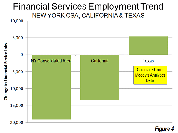
    Last November figures obtained from inside IBM seemed to indicate that for the first time more of the tech giant’s workforce would be employed in India than in the US. Of IBM’s total global workforce of 430,000 less than one quarter now work in the US. IBM benefits from the hefty difference in employee salaries, which can amount to as much as $100,000 per year.

    All this cost-cutting from H-1B work visas, outsourcing, and offshoring is having a leveling impact on US wages, including among technology specialists such as software development engineers and project managers—even though new technology developments continue at a breathtaking pace.

    Age-Related Losers, Old and Young

    When I arrived, you could see how youth-obsessed 80s Silicon Valley was. It still is, only more so. In her article Silicon Valley’s Dirty Secret: Age Bias, Sarah McBride details a number of cases of age-related bias that show how much tougher it is for the over-40 techie to find her next job than for the 20s person, even from another country. I know Age-bias first-hand. One day in 2002, while a technical writer for startup E2open, I was confronted by two young  engineers: "What’s an over-40 dude doing here—aren’t you retired yet?"

    It’s not just Silicon Valley anymore. A 2012 United States GAO report noted that   "…long-term unemployment has particularly serious implications for older workers (age 55 and over). Job loss for older workers threatens not only their immediate financial security, but also their ability to support themselves during retirement."

    Think you’re too young to worry about age? Think again. Even pretty young women might not be quite good enough in the brave new world. In 2011, clothing giant H&M reported that they are now using "perfect" virtual models—not real humans—for their online shopping site.

    Globalization’s Broadband Impact on America

    In The Slow Disappearance of the American Working Man, Bloomberg Businessweek Magazine (Aug. 2011) highlights the particularly devastating impact on the American male worker.

    • "The portion of men who work and their median wages have been eroding since the early 1970s."
    • "The portion of men holding a job—any job, full or part-time—fell to 63.5 percent in July 2012."
    • "These are the lowest numbers in statistics going back to 1948."
    • "Among the critical category of prime working-age men between 25 and 54, only 81.2 percent held jobs."
    • "To put those numbers in perspective, consider that in 1969, 95 percent of men in their prime working years had a job."
    • "After accounting for inflation, median wages for men between 30 and 50 dropped 27 percent"…putting them "back at their earnings capacity of the 1950s."

    In Race Against the Machine (2011) MIT’s Erik Brynjolfsson and Andrew McAfee show how jobs formerly enjoyed by the median US worker are now being lost to cutting-edge technologies. Artificial Intelligence (AI) is to today’s white collar STEM worker what robotics was to many blue collar workers.   We were already advancing this trend at Oracle in 1990 with the development of our SQL*Forms application generator, obviating the need for thousands of application developers.

    A number of disturbing statistics indicate that US workers are now both producing and earning less.
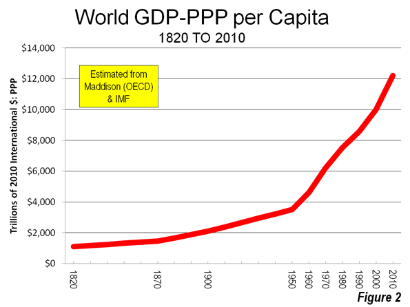
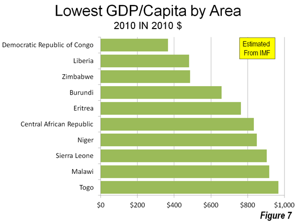
    The Central Intelligence Agency World Factbook ranks the United States 11th in the world in GDP per capita. We used to be number 1. This figure indicates that while rich Americans keep getting ever richer, the middle class is producing less and less per capita. The US-born middle class worker keeps on sinking.

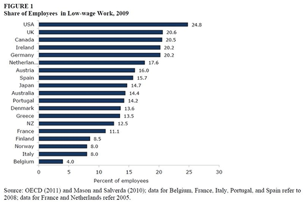
    A recent National Employment Law Project report indicates that the current "recovery" continues to be slanted toward low-paying jobs, reinforcing the mounting inequality s. The fastest growing low-wage jobs include retail salespeople, food prep workers, waiters and waitresses, laborers and freight workers, office clerks and customer representatives, and personal and home care aides—mostly paying median hourly wages between $7.69 and $13.83 per hour. Is this America’s new path to "prosperity?"

    The Organization for Economic Co-operation and Development (OECD) reports, amazingly, that the United States actually has a higher percentage of workers doing low-wage work than any other major industrialized nation:

    The Future: Dimmest for the Brightest, Brightest for the Dimmest?

    Last year a NY Times article covered the appalling plight of recent college grads. Half of today’s graduates are jobless or underemployed. They are more likely to be employed in jobs not requiring a college diploma—such as receptionists, cashiers and food-service helpers—than as engineers, physicists, or computer professionals.

    And while Americans are busy paying for US corporations to move work to Asia, US federal employment accounts for the entire net increase in jobs since at least 2008. Washington’s cure to de-industrialization of the US has been to expand government payrolls. But is the creation of more and more "security" jobs and unnecessary bureaucracy the proper cure for persistent unemployment and swelling welfare rolls?

    Where Do We Go From Here?

    All of the benchmarks point to the unavoidable conclusion that ever more Americans are simply dropping under the economic radar screen. This includes some very broad downtrends for American workers of all races; "older" workers; young workers who perform work that robotics and AI are learning to do more cost-effectively; the American male workforce and  middle income workers in general; and even recent college graduates. With neither the free market or   government helping very much the message seems quite clear: globalization’s losers must get organized and work together for improved economic opportunity.

    Rob Argento is a senior technical writer and project leader with a background in aerospace engineering and some 18 years in Silicon Valley with Oracle, Xerox, Microsoft, and Sony. His broad industry experience includes NASA, e-commerce, US Navy, Biotech, and PC Games. He has degrees in physics and theological studies.

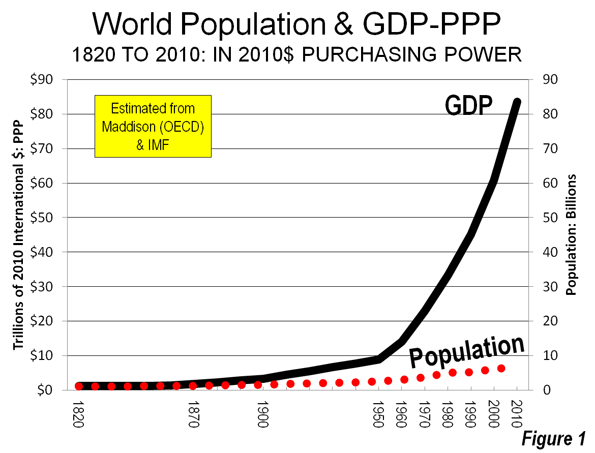
    Global population photo by Bigstock.

  • The Dispersion of Financial Sector Jobs

    When you think of financial services, one usually looks at iconic downtowns such as New York’s Wall Street, Montgomery Street San Francisco’s or Chicago’s LaSalle Street. But since the great financial crisis of 2007-8 the banking business is on the move elsewhere. Over the last five years (2007 to 2012), even as the total number of financial jobs has declined modestly, they have been growing elsewhere.

    This is the conclusion of an analysis of data supplied by Moody’s Analytics for an article in The Wall Street Journal ("Meet Them in St. Louis: Bankers Move). This analysis adjusts the data provided by Moody’s Analytics, combining portions of metropolitan areas (called "metropolitan divisions")into their complete metropolitan areas (See Note 1).

    The financial sector tends to be comparatively concentrated. In 2007, approximately one-third of the financial sector jobs reported by Moody’s were located in the New York metropolitan area. New York is the home of one of world’s largest financial sector hubs, Manhattan.

    New York: Financial Sector Employment Losses and Dispersion

    However, the New York metropolitan area and the other four largest concentrations of financial sector jobs – New York, Chicago, Boston, Los Angeles and San Francisco – accounted all of the net job losses over the period. Between 2007 and 2012, the five largest financial sector markets, lost 39,000 jobs. Outside these five metropolitan areas, the number of financial sector jobs increased by 12,000 (Figure 1).

    The extent of this dispersal away from the five most concentrated markets is illustrated by the decline in their financial sector jobs compared to the other metropolitan areas. In 2007, the five most concentrated markets had 32,000 more financial sector jobs than the other metropolitan areas. By 2012, the other metropolitan areas achieved a total number of 19,000 more financial sector jobs than the five most concentrated markets (Figure 2).

    The dispersion of financial sector jobs is evident even within the New York area itself. The central metropolitan division of the New York metropolitan area (New York-White Plains-Wayne), which includes Manhattan, lost 19,000. However, the balance of the New York metropolitan area experienced a 2500 increase in financial sector jobs, resulting in a overall loss of 16,500 jobs in the metropolitan area

    Not all of the New York metropolitan area jobs were lost to places like Dallas-Fort Worth and Des Moines. The balance of the New York combined statistical area (formerly called consolidated metropolitan statistical areas) added 2000 jobs, principally in the Bridgeport (Fairfield County, Connecticut) metropolitan area (Figure 3). Thus, while the core of the New York metropolitan area was losing 9 percent of its financial sector jobs, the more suburban balance of the combined area gained 11 percent, even as the total region lost employment.

    California: Substantial Financial Sector Employment Losses

    However, New York’s percentage losses paled by comparison to those in the Los Angeles (Los Angeles and Riverside-San Bernardino) and San Francisco combined (San Francisco and San Jose) statistical areas. The losses in the Los Angeles area were 21 percent, while in the San Francisco area the losses reached 17 percent. The losses in Los Angeles and San Francisco regions exceeded that of the New York combined statistical area, which had three times as many financial sector jobs in 2007. San Diego also experienced a 5percent job loss, while Sacramento’s loss was miniscule. Overall, California lost 17 percent of its financial sector jobs between 2007 and 2012.

    Texas: Gaining Financial Sector Employment

    The large metropolitan areas of Texas and did better. Dallas-Fort Worth, Houston, San Antonio and Austin added 5400 financial sector jobs, an increase of 14 percent (Figure 4).

    Metropolitan Area Performance

    St. Louis added 5,600 financial sector jobs, the most of any single metropolitan area (Figure 5). The Washington area added 4,400, followed by Phoenix (3,900), Dallas-Fort Worth (2,600) and Bridgeport (2,000). New York, as mentioned above, lost 16,500 financial sector jobs, the most of any individual metropolitan area (Figure 6). Boston had the second largest loss (8,300), followed by Los Angeles (6,800), Miami (4,800) and San Francisco (4,400).

    The metropolitan areas with the largest percentage gains include net job leader St. Louis which grew 85 percent (Figure 7). Phoenix gained 36 percent, Washington 28 percent, Tampa-St. Petersburg 18 percent and Dallas-Fort Worth 14 percent. Des Moines, which had only 1,400 financial sector jobs in 2007 had the largest percentage gain, at 96 percent.

    Miami had the largest loss, at 27 percent (Figure 8). Charlotte, having risen to prominence with its large banks may have been in the wrong place at the wrong time, losing 24 percent of its financial sector jobs, followed by Boston and Los Angeles (19 percent) and San Francisco (17 percent).

    Dispersing to Lower Density Areas

    The data is not sufficiently precise to distinguish between central business district, urban core and suburban trends. However, the metropolitan areas with high density historical core municipalities (above 10,000 persons per square mile or 4,000 per square kilometer in 2010), suffered a loss of 35,000 financial sector jobs between 2007 and 2012, more than the total national metropolitan loss of 27,000. The six high density historical core municipalities (Note 2) include New York, Chicago, Philadelphia Boston, San Francisco and Miami all suffered significant losses while the metropolitan areas with less dense cores gained 9,000 financial sector jobs (Figure 9).

    Further, the losses were concentrated in the metropolitan areas with the four most dense major urban areas, Los Angeles, San Francisco, San Jose and New York and the losses in these areas exceeded the overall industry loss. This movement away from density reinforces the often misconstrued conclusions of the Santa Fe Institute Urban Scaling research to the effect that metropolitan area size was a principal determinant of productivity, however not urban density (see: Density is Not the Issue: The Urban Scaling Research). Larger, less dense regions did far better — for example Houston, Dallas and St. Louis — than their more dense rivals.

    Dispersion to Housing Affordability

    There is also a strong trend of financial sector job gains where housing is more affordable and job losses where housing is less affordable. This is indicated by the median multiple (median house price divided by gross median household income) data from the 8th Annual Demographia International Housing Affordability Survey (Table below).


    Demographia International Housing Affordability Survey

    Housing Affordability Rating Categories

    Rating

    Median Multiple

    Severely Unaffordable

    5.1 & Over

    Seriously Unaffordable

    4.1 to 5.0

    Moderately Unaffordable

    3.1 to 4.0

    Affordable

    3.0 & Under


    Metropolitan areas rated as affordable (median multiple 3.0 or lower) gained 9,300 financial sector jobs between 2007 and 2012. Metropolitan areas rated moderately unaffordable (median multiple 3.1 to 4.0) gained 2,600 jobs. The metropolitan areas with the most unaffordable housing suffered a net loss in financial sector jobs. Seriously unaffordable (median multiple 4.1 to 5.0) metropolitan areas lost 3,700 jobs. Metropolitan areas rated seriously unaffordable (median multiple 5.1 or higher) lost 35,000 jobs. This is more than the overall loss reported in the data of 27,000 (Figure 10).

    Financial Sector Jobs: Reflecting Urban Dispersion

    The dispersion of financial sector jobs away from concentrated areas may come as a surprise, given the close association that the industry has with the largest central business districts. Yet, the trend mirrors the more general, but overwhelming trends of dispersion indicated over the last decade in both population and domestic migration.

    Wendell Cox is a Visiting Professor, Conservatoire National des Arts et Metiers, Paris and the author of “War on the Dream: How Anti-Sprawl Policy Threatens the Quality of Life.”

    ——

    Note 1: The data used in this analysis is limited to that provided in The Wall Street Journal article. Data was provided for only is only for a part of the Boston metropolitan area (the Boston-Quincy metropolitan division).

    Note 2: In 1940, at least 15 of the historical core municipalities had population densities exceeding 10,000 per square mile (4,000 per square kilometer)

    Photo by Flickr user IABoomerFlickr

  • California’s Poor Long-term Prognosis

    California’s current economic recovery may be uneven at best, but things certainly look better now than the pits-of-hell period in 2008. A cautiously optimistic New York Times piece proclaimed "signs of resurgence," and there was even heady talk in Sacramento of eventually sighting that rarest of birds, a state budget surplus.

    Yet such outbreaks of optimism should not blind us to the bigger issue: the long-term secular decline of the state’s economy. Whether you believe that the new higher taxes may now slow our growth, as my colleagues at Chapman University now believe, or right the fiscal ship, as is widely hoped in the blue California press, it’s more important to look more at the long-term trends, and assess where we stand compared with our domestic competitors.

    California, despite its enormous natural and human resources, is losing ground in most basic areas. Its unemployment rate, a still-horrendous 10 percent, stands as the nation’s third-highest. This is not a new development or the product of a run of bad luck. The state’s unemployment rate has been consistently above the national average for almost all of the past 20 years. Most interior counties, including the Inland Empire and the Central Valley, now suffer unemployment rates well into the double digits, with some approaching 15 percent.

    Overall, the state is still down a half-million jobs during the recession. California’s losses since its employment peak have been considerably above the national average, some 3 percent, far worse than the 2.3 percent erosion seen nationwide. Despite the modest recent uptick, the California Budget Project projects the state would need to add twice as many jobs per month to fully recover from the recession by the summer of 2015.

    Other long-term trends confirm the state’s secular decline in competitiveness. Take per capita income – a decent indicator of relative progress. In 1945, journalist John Gunther, writing his famous "Inside USA," gushingly described California "the most spectacular and most diversified American state … so ripe, golden." At the time, the state boasted the third-highest per capita income in the nation. As late as 1980, the state still ranked fourth. Today, despite Silicon Valley’s money machine, California has fallen to 12th and appears headed for further decline.

    Despite hopes in Sacramento and in the media, high-tech alone can not bail out the state. The much hoped-for windfall around the time of the Facebook IPO has failed to produce the expected fiscal bonanza for the state treasury. Silicon Valley famously gets nearly half the country’s venture capital, but its impact on the rest of the state has diminished. In the 1980s and 1990s, tech booms stretched prosperity throughout its surrounding regions and as far as Sacramento. Now it barely covers half the Bay Area; unemployment in Oakland remains at around 13 percent and one child in three lives in poverty.

    Part of this reflects the shift from an industrial high-tech focus to one fixated on software and social media. Given the extraordinary ease with which support and even research operations can be moved, once companies start to grow, they easily head to India, China or over to lower-cost locales like Utah or Texas. "Sure, we are getting half of all the venture capital investment but in the end we have relatively small research and development firms only," observes Jack Stewart, president of the California Technology and Manufacturing Association. "Once they have a product or go to scale, the firms move elsewhere. The other states end up getting most of the middle-class jobs."

    This can be seen in the long-term trends in STEM (science, technology, engineering, mathematics-related) jobs. Over the past decade, even with the current bubble, Silicon Valley’s STEM employment, according to estimates by Economic Modeling Specialists Inc., has increased by a mere 4 percent over the past decade. In contrast, science-based employment jumped 25 percent in Seattle, 20 percent in Houston and 16.8 percent in Austin, Texas.

    The tech scene in the Los Angeles Basin is doing even worse. STEM employment in the Los Angeles-Santa Ana area is still stuck below 2002 levels, partially a residue of the continued decline of the region’s once-globally dominant aerospace industry. The region, once arguably the world’s largest agglomeration of scientists and engineers, has now dipped below the national average in proportion of STEM jobs.

    Far greater problems can be seen further down the economic food chain, where many working-class and middle-class Californians traditionally have been employed. The state’s heavy industry – traditionally the source of higher-paid blue-collar employment – has missed out on the nation’s broad manufacturing resurgence. Over the past 10 years, according to an analysis by the Praxis Strategy Group, California has ranked 45th among the states in terms of heavy metal job creation, losing 126,000 jobs – more than 27 percent; San Francisco-Oakland ranked last among 51 large metropolitan areas. Both Los Angeles-Orange and San Bernardino ranked in the bottom 10.

    Despite hype about "green jobs," the immediate prospect for a big manufacturing turnaround is not bright. Because of its high energy costs and other regulatory costs, industrial investment has dried up in California. According to the California Technology and Manufacturing Association, California in 2011 did not even make the top 10 states in terms of new industrial investment, accounting for a paltry 2 percent. This was about one-third or less the share garnered by rivals such as Texas, North Carolina and rebounding "rust belt" states, like Pennsylvania.

    Construction, another pillar of higher-paid blue-collar employment, has recovered a bit but remains in worse shape than elsewhere. Overall, the state has lost almost 300,000 construction jobs from the 2007 peak, an almost 40 percent loss compared with 29 percent for the country as a whole.

    Even the trade sector, stalwart performer in producing high-wage jobs, may soon be declining. Recent labor disputes by highly paid, politically powerful California port workers – shutting down operations for eight days in Los Angeles and Long Beach – has reinforced the notion that the state’s an increasingly unreliable place to do business. After peaking around 2002, our ports are watching growth shift to the Gulf ports, such as Houston, and to the ports of the south Atlantic. The challenge will become far greater once the Panama Canal is widened in 2014 to accommodate larger ships from Asia.

    California is also squandering its chance to participate in a potential fourth source of basic employment, the massive expansion in domestic oil-and-gas production. The Golden State sits on potentially the largest gusher in the nation – the Monterey Formation is now estimated to be four times as rich in oil as North Dakota’s Bakken Formation. But our green consciousness dictates we don’t exploit our resources too much. In the past decade, Texas created some 200,000 generally high-paying energy jobs, while greener-than-thou California has generated barely one-tenth as many.

    As a result, wealthier, older, whiter, generally better-educated coastal areas can recover, but the prospects are dismal the further you head into the increasingly Latino, younger and less-educated inland areas. You have flush times for venture capitalists and celebrities, but growing poverty elsewhere. For at least two decades California’s poverty rate has remained higher than the national average. Now, notes a new Census estimate, the Golden State has a poverty rate of more than 23 percent, the highest in the country, something unthinkable a generation ago.

    Clearly, progressive policies are having socially regressive effects. Over the past few years the state, as a recent Public Policy Institute of California study demonstrates, has become ever substantially more unequal than the rest of the nation. Typical California middle-income workers have seen their median wage, adjusted for inflation, decline 4.5 percent since 2006, and now is at the lowest level since 2008. Only the highest-paid workers have avoided a decline in earnings.

    Fortunately, the elements to regain our former broad-based prosperity are still in place. The critical human assets are there: entrepreneurs, hardworking immigrants, top universities. We boast advantages from legacy industries – entertainment and fashion to technology and agriculture. And, perhaps most importantly, California retains its remarkable natural blessings of massive energy resources, fertile soil and a benign climate.

    The imperative now is to take fuller advantage of all these blessings in the coming years. Otherwise California will become poorer, more socially bifurcated and relegated by other places to the proverbial "dustbin of history."

    This piece first appeared in the Orange County Register.

    Joel Kotkin is executive editor of NewGeography.com and is a distinguished presidential fellow in urban futures at Chapman University, and contributing editor to the City Journal in New York. He is author of The City: A Global History. His newest book is The Next Hundred Million: America in 2050, released in February, 2010.

  • Is America’s Future Progressive?

    Progressives may be a lot less religious  than conservatives, but these days they have reason to think that Providence– or Gaia — has taken on a bluish hue.

    From the solid re-election of President Obama, to a host of demographic and social trends, the progressives seem poised to achieve what Ruy Texeira predicted a decade ago:  an “emerging Democratic majority”.

    Virtually all the groups that backed Obama — singles, millennials, Hispanics, Asians — are all growing bigger while many of the core Republican groups, such as evangelicals  and intact families, appear in secular decline.

    And then, the Republicans, ham handed themselves, are virtually voiceless (outside of the Murdoch empire) in the mainstream national media.

    Whatever the issue that comes up — from Hurricane Sandy to the Newtown shootings or the “fiscal cliffs” — the Republicans, congenitally inept to start with, end up being portrayed as even more oafish.

    Not surprising then that progressive boosters feel the wind of inexorability to their backs. Red states, and cities, suggests Richard Florida are simply immature versions of blue state ones; progress means density, urbanity, apartment living and the decline of suburbs. Republicans, he argues, are “at odds with the very logic of urbanism and economic development.”

    Yet I am not sure all trends are irredeemingly progressive. For one thing, there’s this little matter of economics. What Florida and the urban boosters often predict means something less progressive than feudalist. The Holy Places of urbanism such as NewYork, San Francisco, Washington DC also suffer some of the worst income inequality, and poverty, of any places in the country.

    The now triumphant urban gentry have their townhouses and high-rise lofts, but the service workers who do their dirty work have to log their way by bus or car from the vast American banlieues, either in peripheral parts of the city (think of Brooklyn’s impoverished fringes) or the poorer close-in suburbs. This progressive economy works from the well-placed academics, the trustfunders and hedge funders, but produces little opportunity for a better life for the vast majority of the middle and working class.

    The gentry progressives don’t see much hope for the recovery of blue collar manufacturing or construction jobs, and they are adamant in making sure that the potential gusher of energy jobs in the resurgent fossil fuel never materializes, at least in such places as New York and California. The best they can offer the hoi polloi is the prospect of becoming haircutters and dog walkers in cognitively favored places like Silicon Valley. Presumably, given the cost of living there, they will have to get there from the Central Valley or sleep on the streets.

    Not surprisingly, this prospect is not exciting many Americans. So instead of heading for the blue paradises, but to lower-cost, those who move now tend towards low-cost, lower-density regions like Dallas-Fort Worth, Houston, Atlanta, Austin, Charlotte and Raleigh. Even while voting blue, they seem to be migrating to red places. Once there, one has to doubt whether they are simply biding their time for Oklahoma City to morph into San Francisco.

    In this respect, the class issue so cleverly exploited by the President in the election could prove the potential Achilles heel of today’s gentry progressivism. The Obama-Bernanke-Geithner economy has done little to reverse the relative decline of the middle and working class, whose their share of national income have fallen to record lows. If you don’t work for venture-backed tech firms, coddled, money-for-nearly-free Wall Street or for the government, your income and standard of living has probably declined since the middle of the last decade.

    If the main focus of progressives was to promote upward mobility, they would deserve their predicted political hegemony. But current-day leftism is more about style, culture and green consciousness than jobs and opportunity. It’s more Vogue’s Anne Wintour than Harry Truman. Often times the gentry agenda — for example favoring higher housing and energy prices — directly conflicts with the interests of middle and working class families.

    The progressive coalition also has little to offer to the private sector small business community, which should be producing jobs as they have in the wake of previous recessions but have failed to do so this time. A recent McKinsey study  finds that small business confidence is at a 20 year low, entrepreneurial start-ups have slowed, and with it, the innovation that drives an economy from the ground up.

    These economic shortcomings are unlikely to reverse themselves under the Obama progressives. An old Democrat of the Truman and Pat Brown, perhaps even Bill Clinton, genre would be pushing our natural gas revolution, a key to blue-collar rejuvenation, instead of seeking to slow it down. They would be looking to raise revenues from Wall Street plutocrats rather than raise taxes on modestly successful Main Street businesses. A HUD interested in upward mobility and families would be pressing for more detached housing and dispersal of work, not forcing the masses to live in ever smaller, cramped and expensive lodgings.

    Over time, the cultural identity and lifestyle politics practiced so brilliantly by the President and his team could begin to wear thin even with their core constituencies.  Hispanics, for example, have suffered grievously in the recession — some 28%  now live in poverty, the highest of any ethnic group.

    It’s possible that the unnatural cohesion between gentry progressives and Latinos will tear asunder. For one thing Hispanics seek out life in suburbs with homes and backyards, and often drive more energy-consuming cars that fit the needs of family and work, notably construction and labor blue collar industries — all targets of the gentry and green agenda.

    Arguably the biggest challenge for the blue supremacists may prove the millennials, a group I have called the screwed generation. They have been vulnerable in a torpid recovery following a deep recession since they depend on new jobs or having their elders move to better ones; more than half of those under 25 with college degrees are either looking for work or doing something that doesn’t require tertiary education.

    For now, millennials — socially liberal, ethnically diverse and concerned with economic inequality — naturally tilt strongly to the President. Their voting power continue to swell as they enter the electorate. As Morley Winograd and Mike Hais have demonstrated, if they remain, as they predict, solidly Democratic, the future will certainly be colored blue.

    But this result is not entirely assured. Now that the first wave of millennials are hitting their thirties, they may not want to remain urban Peter Pans, riding their bikes to their barista jobs, as they age. A growing number will start getting married, looking to buy homes to raise children. The urban developers and gentry progressives may not favor this, preferring instead they remain part of “generation rent”  who remain chained to leasing apartments in dense districts.

    And then there’s the economy. What happens if in two or four years, millennials find opportunity still lagging?  Cliff Zukin, at Rutger’s John J. Heidrich Center for Workforce Development, predicts the young generation will “be permanently depressed and will be on a lower path of income for probably all their life”. One has to wonder if, at some point, they might rebel against that dismal fate. Remember the boomers too once tilted to the left, but moved to the center-right starting with Reagan and have remained that way.

    Of course, the blues have one inestimable advantage: a perennially stupid Republican party and a largely clueless, ideologically hidebound conservative movement. Constant missteps on issues like immigration and gay rights could keep even disappointed minority or younger votes in the President’s pocket. You can’t win new adherents by being the party of no and know-nothing. You also have to acknowledge that inequality is real and develop a program to promote upward mobility.

    Unless that is done, the new generation and new Americans likely will continue to bow to the blue idols, irrespective to the failures that gentry progressivism all but guarantees.

    Joel Kotkin is executive editor of NewGeography.com and is a distinguished presidential fellow in urban futures at Chapman University, and contributing editor to the City Journal in New York. He is author of The City: A Global History. His newest book is The Next Hundred Million: America in 2050, released in February, 2010.

    This piece originally appeared at Forbes.com.

    Barack Obama photo by Bigstock.

  • The Rise of Management Consultants

    The always-entertaining Freakonomics podcast recently devoted a full episode to the emergence of management consulting firms in the U.S. The podcast got our attention right away when Stephen Dubner rattled off labor market statistics — something that always piques our interest — for management consultants.

    DUBNER: Raise your hand if you know somebody who works as a consultant. Yeah, I thought so – pretty much everybody. There are more than 500,000 management consultants in the U.S. – more than 700,000 if you count the self-employed. And there are even more on the way. The Bureau of Labor Statistics estimates the consulting field will grow another 22 percent over the next decade, which means there will be more new jobs for consultants than there will be for computer programmers or lawyers. Now, how does consulting pay? Quite well, thank you. A median salary of about $78,000. That’s more than architects, postsecondary teachers, and a lot of scientists and engineers.

    What Dubner referred to as management consultants are actually known, according to the Bureau of Labor Statistics, as management analysts (SOC 13-1111). In this post we’ll explore the growth of this field, especially among those who work as self-employed or contract consultants, and where it’s grown the most (hint: Washington, D.C. and state capitals with government-heavy workforces).

    Overview of Management Analysts

    Management consulting firms specialize in solving companies’ problems and providing outside advice. And judging by the uptick in employment, they’re providing more of this expertise. The number of management analysts — the wage-and-salary variety who work as employees for big or little firms — has grown 13% since 2001 (from just over 500,000 jobs to an estimated 566,282 in 2012). Approximately 62% of these workers are men, and as Dubner points out, they tend to be young (55% are 25-44 years old). Their median salary is indeed about $79,000 per year ($37.74 per hour), and their wage curve steepens quickly for the top percentile of workers ($68.16 per hour, or nearly $142,000).

    But would you guess that there are more self-employed and extended proprietors than salaried employees in this field? Check out EMSI’s class-of-worker breakdown for management analysts:

    • Salaried employees: 566,282 jobs, 13% growth since 2001
    • Self-employed: 155,801 jobs, 52% growth since 2001
    • Extended proprietors: 462,005, 77% growth since 2001

    Taken together, there are nearly 1.2 million management analyst jobs in the workforce, and 617,807 of those are in the self-employed or extended proprietor category. And as you can see from our breakdown, those last two segments of workers have seen immense growth since 2001, almost all of which occurred before the recession.

    Why So Many Self-Employed and Extended Proprietors?

    What’s driving the huge number of self-employed and extended proprietors in management consulting? One possible explanation is that as business executives near retirement, they start working on their own — or on a contract basis with firms — as management analysts. Consider that 62% of the self-employed and extended proprietors in the field are at least 55 years or old (and 25% are 65 and above). That’s a drastic difference from the age breakdown of salaried workers, as illustrated in the following chart.

    Note: What we refer to as “extended proprietors” are workers who are counted as proprietors, but classify the income as peripheral to their primary employment. Many industries (primarily oil & gas extraction, finance & insurance, and real estate) include people who are considered sole proprietors or part of a partnership, yet have little or no involvement or income in the venture. Read more here.


    The Geography of Management Analysts

    Two of the largest management consulting firms, Boston Consulting Group and Bain, are headquartered in Boston. But the epicenter for management analysts is the Washington, D.C. metro. For salaried employees, the nation’s capital is 4.4 times more concentrated with management analysts than the national average. Overall, D.C. has an estimated 87,486 of these jobs — about the same number as the Boston and Los Angeles metro areas put together.

    D.C. is also the most saturated with self-employed and extended proprietors, with more than twice the national average. But as the table below shows, San Francisco, San Jose, Boston, and Bridgeport, among others, have much larger percentages of independent management analysts as compared to the total workers in the field in each metro. And when it comes to proprietor growth, Atlanta — the second-most concentrated metro overall — has added a whopping 140% since 2001, compared a more tepid 7% among salaried employees.

    Smaller metros also have significant shares of management analysts. Looking at just salaried employees, Madison, Wis., Richmond and Virginia Beach, Va., and Harrisburg, Pa. are among the 10 most concentrated metros.

    The bottom line: Metros with a considerable presence of government workers — state capitals and D.C. — have higher saturations of these workers than metros of comparable size.

    The following map is for all U.S. metros and shows the percentage job growth since 2001 (ranging from 306% growth to 73% decline). Notice the overwhelmingly widespread growth, with a few pockets of job loss.

    MANAGEMENT ANALYSTS – LARGEST 100 METROS
    Salaried Employees Self-Employed and Ext. Proprietors
    MSA Name 2001 Jobs 2012 Jobs Job Change % Job Growth 2012 Conc. Median Hourly Earnings 2001 Jobs 2012 Jobs Job Change % Job Growth Median Hourly Earnings 2012 Conc. Proportion of Total Workforce
    Washington-Arlington-Alexandria, DC-VA-MD-WV 40,607 56,751 16,144 40% 4.44 $45.37 14,538 27,124 12,586 87% $33.49 2.25 32%
    Atlanta-Sandy Springs-Marietta, GA 21,430 23,013 1,583 7% 2.43 $41.06 6,206 14,913 8,707 140% $29.67 1.16 39%
    Madison, WI 2,367 2,938 571 24% 2.07 $32.72 1,000 1,753 753 75% $21.05 1.4 37%
    Richmond, VA 4,468 5,151 683 15% 2 $38.93 1,229 2,478 1,249 102% $24.01 1.1 32%
    Virginia Beach-Norfolk-Newport News, VA-NC 4,963 5,986 1,023 21% 1.76 $36.96 1,390 2,674 1,284 92% $25.60 1.08 31%
    Boston-Cambridge-Quincy, MA-NH 16,997 17,469 472 3% 1.7 $45.44 11,925 17,955 6,030 51% $32.90 1.86 51%
    Harrisburg-Carlisle, PA 2,106 2,210 104 5% 1.68 $30.40 601 937 336 56% $28.38 1.05 30%
    Baltimore-Towson, MD 7,504 8,876 1,372 18% 1.63 $42.86 4,041 7,403 3,362 83% $26.70 1.4 45%
    San Francisco-Oakland-Fremont, CA 12,255 13,547 1,292 11% 1.6 $45.77 12,990 20,311 7,321 56% $34.46 1.87 60%
    Des Moines-West Des Moines, IA 1,954 2,185 231 12% 1.6 $30.50 643 1,139 496 77% $31.60 0.99 34%
    Columbus, OH 5,459 5,904 445 8% 1.52 $35.68 2,179 4,047 1,868 86% $26.43 1.11 41%
    Columbia, SC 1,764 2,251 487 28% 1.52 $29.89 565 1,223 658 116% $25.74 0.79 35%
    Bridgeport-Stamford-Norwalk, CT 2,792 2,523 -269 -10% 1.47 $43.97 2,541 4,188 1,647 65% $37.38 1.5 62%
    San Jose-Sunnyvale-Santa Clara, CA 5,957 5,619 -338 -6% 1.45 $49.58 5,313 8,241 2,928 55% $36.07 2.18 59%
    Chicago-Joliet-Naperville, IL-IN-WI 24,843 25,364 521 2% 1.43 $40.02 11,001 18,566 7,565 69% $30.13 1.04 42%
    Hartford-West Hartford-East Hartford, CT 3,883 3,554 -329 -8% 1.42 $35.62 1,675 2,754 1,079 64% $23.68 1.13 44%
    Sacramento–Arden-Arcade–Roseville, CA 4,219 5,096 877 21% 1.4 $34.80 3,090 4,806 1,716 56% $24.93 1.16 49%
    Palm Bay-Melbourne-Titusville, FL 932 1,054 122 13% 1.3 $38.08 571 1,024 453 79% $21.81 1.08 49%
    Tampa-St. Petersburg-Clearwater, FL 5,340 6,075 735 14% 1.29 $31.06 2,496 4,946 2,450 98% $23.22 0.96 45%
    Seattle-Tacoma-Bellevue, WA 8,023 9,266 1,243 15% 1.25 $41.54 5,669 10,546 4,877 86% $31.69 1.6 53%
    Minneapolis-St. Paul-Bloomington, MN-WI 8,461 9,228 767 9% 1.25 $38.97 4,905 8,771 3,866 79% $27.07 1.33 49%
    San Diego-Carlsbad-San Marcos, CA 5,932 7,085 1,153 19% 1.21 $35.99 6,157 9,098 2,941 48% $28.58 1.4 56%
    North Port-Bradenton-Sarasota, FL 979 1,201 222 23% 1.18 $28.50 1,018 2,152 1,134 111% $29.83 1.11 64%
    Indianapolis-Carmel, IN 3,680 4,292 612 17% 1.17 $31.81 1,927 3,726 1,799 93% $31.06 1.16 46%
    Philadelphia-Camden-Wilmington, PA-NJ-DE-MD 12,418 12,873 455 4% 1.16 $42.35 7,766 14,334 6,568 85% $33.44 1.4 53%
    New York-Northern New Jersey-Long Island, NY-NJ-PA 38,299 40,317 2,018 5% 1.16 $44.99 23,811 42,734 18,923 79% $30.64 1.06 51%
    Jacksonville, FL 2,329 2,889 560 24% 1.16 $33.43 1,310 2,624 1,314 100% $23.78 0.92 48%
    Albany-Schenectady-Troy, NY 1,905 2,040 135 7% 1.15 $33.13 1,309 2,049 740 57% $24.65 1.32 50%
    Kansas City, MO-KS 4,248 4,656 408 10% 1.14 $34.10 2,350 3,949 1,599 68% $30.75 1.01 46%
    Dayton, OH 1,814 1,771 -43 -2% 1.14 $35.69 961 1,286 325 34% $25.49 0.99 42%
    Phoenix-Mesa-Glendale, AZ 7,608 8,340 732 10% 1.13 $32.40 4,639 9,169 4,530 98% $33.22 1.14 52%
    Albuquerque, NM 1,616 1,689 73 5% 1.11 $32.90 1,194 1,863 669 56% $22.58 1.22 52%
    Nashville-Davidson–Murfreesboro–Franklin, TN 2,798 3,465 667 24% 1.09 $35.65 1,974 3,693 1,719 87% $30.35 0.98 52%
    Charleston-North Charleston-Summerville, SC 835 1,372 537 64% 1.09 $33.58 553 1,384 831 150% $35.79 0.84 50%
    Miami-Fort Lauderdale-Pompano Beach, FL 8,493 9,935 1,442 17% 1.08 $32.23 5,861 11,662 5,801 99% $25.00 0.78 54%
    Worcester, MA 1,460 1,449 -11 -1% 1.07 $38.83 1,226 1,823 597 49% $25.44 1.32 56%
    Ogden-Clearfield, UT 693 889 196 28% 1.06 $35.29 516 1,053 537 104% $21.40 0.92 54%
    Denver-Aurora-Broomfield, CO 5,020 5,475 455 9% 1.05 $35.87 4,363 8,222 3,859 88% $31.82 1.28 60%
    Salt Lake City, UT 2,228 2,820 592 27% 1.04 $29.72 1,487 2,495 1,008 68% $28.77 0.98 47%
    Oxnard-Thousand Oaks-Ventura, CA 1,174 1,311 137 12% 1.02 $35.60 1,381 1,783 402 29% $28.25 1.1 58%
    Orlando-Kissimmee-Sanford, FL 3,268 4,289 1,021 31% 1.02 $32.16 1,652 3,374 1,722 104% $21.70 0.84 44%
    Los Angeles-Long Beach-Santa Ana, CA 21,063 22,906 1,843 9% 1.01 $40.18 20,890 27,397 6,507 31% $28.44 0.95 54%
    Milwaukee-Waukesha-West Allis, WI 3,035 3,228 193 6% 0.97 $34.75 1,363 2,343 980 72% $24.85 1.05 42%
    Colorado Springs, CO 1,116 1,144 28 3% 0.95 $39.33 895 1,456 561 63% $24.09 1.11 56%
    Providence-New Bedford-Fall River, RI-MA 2,463 2,628 165 7% 0.95 $36.02 1,986 2,511 525 26% $23.94 0.97 49%
    Cincinnati-Middletown, OH-KY-IN 3,590 3,925 335 9% 0.94 $37.23 2,287 4,179 1,892 83% $29.33 1.13 52%
    Dallas-Fort Worth-Arlington, TX 9,432 11,664 2,232 24% 0.93 $39.31 7,543 16,252 8,709 115% $32.06 1.03 58%
    Cleveland-Elyria-Mentor, OH 3,823 3,779 -44 -1% 0.92 $34.77 2,527 4,022 1,495 59% $27.45 1.07 52%
    Omaha-Council Bluffs, NE-IA 1,548 1,782 234 15% 0.91 $35.49 809 1,336 527 65% $21.03 0.87 43%
    Austin-Round Rock-San Marcos, TX 2,318 3,106 788 34% 0.9 $38.24 2,768 6,827 4,059 147% $30.82 1.52 69%
    Charlotte-Gastonia-Rock Hill, NC-SC 2,525 3,126 601 24% 0.89 $37.00 1,535 3,500 1,965 128% $26.99 1 53%
    Boise City-Nampa, ID 860 973 113 13% 0.88 $25.77 701 1,371 670 96% $26.39 0.97 58%
    Springfield, MA 1,100 1,068 -32 -3% 0.87 $38.83 905 1,341 436 48% $21.14 1.14 56%
    Syracuse, NY 1,033 1,094 61 6% 0.86 $33.49 750 1,084 334 45% $23.92 1.07 50%
    Greensboro-High Point, NC 1,074 1,239 165 15% 0.86 $33.31 583 1,120 537 92% $21.04 0.93 47%
    Oklahoma City, OK 1,832 2,113 281 15% 0.85 $32.65 1,261 2,116 855 68% $21.18 0.76 50%
    New Haven-Milford, CT 1,388 1,259 -129 -9% 0.84 $35.65 1,203 2,018 815 68% $24.78 1.19 62%
    Augusta-Richmond County, GA-SC 642 738 96 15% 0.81 $31.58 326 793 467 143% $25.98 0.7 52%
    Greenville-Mauldin-Easley, SC 941 955 14 1% 0.79 $30.95 475 964 489 103% $29.36 0.79 50%
    Rochester, NY 1,536 1,612 76 5% 0.78 $42.31 1,509 2,093 584 39% $24.08 1.18 56%
    Honolulu, HI 1,414 1,638 224 16% 0.78 $38.00 1,119 1,713 594 53% $23.04 1.03 51%
    Cape Coral-Fort Myers, FL 418 650 232 56% 0.78 $29.02 623 1,192 569 91% $34.26 0.9 65%
    Chattanooga, TN-GA 746 758 12 2% 0.78 $30.21 452 769 317 70% $32.13 0.8 50%
    San Antonio-New Braunfels, TX 2,182 2,798 616 28% 0.74 $36.56 1,898 3,762 1,864 98% $25.26 0.84 57%
    Raleigh-Cary, NC 1,327 1,563 236 18% 0.72 $35.67 1,181 3,057 1,876 159% $28.88 1.4 66%
    Pittsburgh, PA 3,462 3,407 -55 -2% 0.72 $39.85 3,022 4,724 1,702 56% $29.95 1.22 58%
    Houston-Sugar Land-Baytown, TX 6,450 8,067 1,617 25% 0.72 $45.88 7,166 14,480 7,314 102% $34.85 1.06 64%
    Portland-Vancouver-Hillsboro, OR-WA 2,571 3,029 458 18% 0.71 $35.49 3,198 5,632 2,434 76% $29.72 1.22 65%
    Riverside-San Bernardino-Ontario, CA 2,264 3,586 1,322 58% 0.71 $33.82 3,241 4,991 1,750 54% $21.48 0.73 58%
    Knoxville, TN 914 964 50 5% 0.7 $36.29 986 1,579 593 60% $30.40 1.06 62%
    Little Rock-North Little Rock-Conway, AR 869 980 111 13% 0.69 $25.44 614 1,056 442 72% $25.47 0.9 52%
    Louisville/Jefferson County, KY-IN 1,472 1,758 286 19% 0.69 $32.21 1,090 1,905 815 75% $29.22 0.87 52%
    Provo-Orem, UT 403 543 140 35% 0.67 $27.33 569 1,394 825 145% $25.34 1.14 72%
    Detroit-Warren-Livonia, MI 6,388 4,878 -1,510 -24% 0.67 $38.72 3,847 7,756 3,909 102% $25.81 0.99 61%
    Tucson, AZ 901 997 96 11% 0.66 $26.22 1,322 2,098 776 59% $23.63 1.22 68%
    Akron, OH 752 872 120 16% 0.65 $32.30 790 1,243 453 57% $28.09 1.07 59%
    St. Louis, MO-IL 3,908 3,529 -379 -10% 0.65 $36.83 2,717 4,619 1,902 70% $29.33 0.95 57%
    Tulsa, OK 1,141 1,096 -45 -4% 0.63 $32.87 1,045 1,634 589 56% $21.73 0.78 60%
    Bakersfield-Delano, CA 592 760 168 28% 0.63 $41.27 539 809 270 50% $26.87 0.68 52%
    Memphis, TN-MS-AR 1,499 1,505 6 0% 0.61 $36.09 1,115 1,860 745 67% $28.32 0.68 55%
    Allentown-Bethlehem-Easton, PA-NJ 759 828 69 9% 0.59 $37.07 795 1,219 424 53% $27.54 0.98 60%
    Buffalo-Niagara Falls, NY 1,175 1,266 91 8% 0.57 $35.82 1,106 1,634 528 48% $21.49 1.04 56%
    Las Vegas-Paradise, NV 1,580 1,954 374 24% 0.57 $34.80 1,832 3,555 1,723 94% $30.50 0.96 65%
    Wichita, KS 769 688 -81 -11% 0.57 $36.40 583 785 202 35% $25.83 0.67 53%
    Birmingham-Hoover, AL 1,123 1,083 -40 -4% 0.54 $39.70 904 1,893 989 109% $29.65 0.81 64%
    New Orleans-Metairie-Kenner, LA 1,347 1,176 -171 -13% 0.53 $34.93 1,322 2,094 772 58% $34.33 0.74 64%
    Poughkeepsie-Newburgh-Middletown, NY 559 522 -37 -7% 0.5 $34.21 669 1,182 513 77% $26.26 1.04 69%
    Jackson, MS 468 499 31 7% 0.49 $25.35 507 1,011 504 99% $25.58 0.82 67%
    Baton Rouge, LA 686 760 74 11% 0.49 $31.81 705 1,518 813 115% $25.83 0.81 67%
    Stockton, CA 432 437 5 1% 0.49 $33.90 419 606 187 45% $23.69 0.65 58%
    Modesto, CA 330 336 6 2% 0.49 $35.82 279 394 115 41% $21.03 0.58 54%
    Grand Rapids-Wyoming, MI 745 740 -5 -1% 0.48 $31.45 620 1,239 619 100% $21.66 0.88 63%
    Toledo, OH 649 580 -69 -11% 0.47 $38.54 622 935 313 50% $25.12 0.9 62%
    Lakeland-Winter Haven, FL 347 367 20 6% 0.45 $30.15 303 534 231 76% $21.03 0.61 59%
    Fresno, CA 515 590 75 15% 0.41 $33.26 610 851 241 40% $23.13 0.61 59%
    Scranton–Wilkes-Barre, PA 424 419 -5 -1% 0.4 $34.74 362 588 226 62% $23.07 0.73 58%
    Lancaster, PA 330 355 25 8% 0.37 $39.37 484 765 281 58% $27.27 0.76 68%
    El Paso, TX 355 411 56 16% 0.32 $31.72 374 775 401 107% $21.03 0.6 65%
    Youngstown-Warren-Boardman, OH-PA 246 186 -60 -24% 0.2 $28.78 382 571 189 49% $24.92 0.67 75%
    McAllen-Edinburg-Mission, TX 158 195 37 23% 0.2 $35.50 222 555 333 150% $21.03 0.43 74%

    Data and analysis for this infographic came from Analyst, EMSI’s web-based labor market tool. Follow us on Twitter @desktopecon. Email Josh Wright if you have any questions or comments, or would like to see further data.

    Young woman in a field photo by BigStock.

  • Entrepreneurial Software Developers and the App Economy

    The New York Times continued its excellent iEconomy series with an article on the job prospects for app developers. The lengthy piece gives a few snippets of labor market data for software developers and touches on the work of economist Michael Mandel in measuring the “App Economy.”

    The gist of the NYT piece, and something that Mandel doesn’t go along with, is that the majority of entrepreneurs in the app writing realm have a difficult time making a living — despite all the buzz that surrounds the growing field.

    Mandel’s recent paper (PDF) on the subject “makes it clear that large companies are hiring droves of app developers in-house to create and maintain apps,” he writes on his blog. (Note: Mandel’s paper was written for a software development industry association, and his previous App Economy paper was written for advocacy group TechNet.)

    Using all this as a jumping-off point, we explored EMSI’s data on software developers — both those in traditional employment settings and those who are self-employed or write code on the side. Our analysis shows that while wages for independent app developers significantly lag those of salaried employees in the field, proprietors have grown at a faster pace than their salaried counterparts in app development over the last decade.

    Mandel relied on job posting data for his research. For this post, we used standard labor market data from EMSI — understanding its limitations in measuring relatively new occupations such as this one — and specifically focused on application software developers (SOC 15-1132). Not all these workers create mobile apps for the iPhone or Android mobile operating system, but this is the closest we can get to approximating the labor market characteristics of app developers with historic, detail-rich data.

    Background & Wage Comparison

    Mandel estimates there are 519,000 jobs in the App Economy, with only a portion of those being app developers. Meanwhile, as the Times writes, there are roughly one million software developer jobs in the U.S., and the growth has been robust outside hiccups during the 2001 and 2007-2009 recessions (see the image to the left). When we narrow our focus to application software developers, removing systems software developers from the picture, the national job total shrinks to fewer than 570,000. Self-employed app developers and those who work on the side on top of their primary job (what EMSI refers to as “extended proprietors”) account for another 40,000-plus estimated jobs, or 7% of the total app developer workforce as of 2012.

    We should note here that EMSI’s proprietor datasets offer a window into entrepreneurial activity for app developers and any other occupation, but we caution against labeling all workers in the self-employed or extended proprietor classes as entrepreneurs. More accurately, inside the extended proprietors dataset are those who pursue extra work opportunities while maintaining their day job, while the self-employed dataset includes those who have taken the additional step and are primarily on their own. Once start-up owners incorporate their business, they fall under the traditional wage-and-salary worker datasets.

    SOC Description Salaried Jobs (2012) Proprietor Jobs (2012) Proportion of Proprietors
    Source: QCEW Employees, Non-QCEW Employees, Self-Employed & Extended Proprietors – EMSI 2012.3 Class of Worker
    15-1132 Software Developers, Applications 568,953 42,819 7%
    15-1133 Software Developers, Systems Software 410,202 27,983 6%
    15-1131 Computer Programmers 330,067 82,802 20%
    15-1179 Information Security Analysts, Web Developers, and Computer Network Architects 285,478 115,136 29%
    Total 1,594,700 268,741 14%

    The U.S. has nearly twice as many proprietors classified as generic computer programmers (SOC 15-1131) as app developers — and nearly three times as many proprietors in SOC 15-1179: information security analysts, web developers, and computer network architects. Still, with proprietors and salaried employees taken together, there are more app developers than any programming-related occupation, and it’s the second-highest paying programming-related occupation behind systems software developers.

    What’s really eye-opening, however, is the difference in hourly earnings for salaried app developers and independent app developers. As shown in the chart below, the wages for proprietors are substantially lower than their traditional counterparts. The earnings disparity for app developers at the bottom 10% in wages — what can be considered entry level — isn’t huge, but it quickly escalates. At the median wage level, salaried app developers make 1.5 times more than proprietors ($43.18 vs. $28.22 per hour); that jumps to almost twice as much among the top 10% of earners ($63.45 vs. $32.13).

    This wage gap isn’t confined to app developers; across the board, self-employed workers and extended proprietors make far less (see “Characteristics of the Self-Employed” for more). But what stands out for application developers is how dramatically the gap widens for salaried workers from the bottom to top 10th percentile of workers, and how comparatively small that gap is for proprietors. The top earners among proprietors make just $8 more per hour more than the bottom 10th percentile; for salaried workers, the difference is $36 per hour (or an additional $75,000 per year).

    Job Growth and Proprietor Breakdown by State

    We’ve already mentioned that 7% of application software developers nationwide are either self-employed or write code as a side gig. That’s up from 6.8% in 2001. Not a huge bump. But this segment of the app developer workforce has grown 13% since 2001, compared to 9% growth for standard salaried workers. Since 2007, when the App Economy took off, each group of workers has grown 6%.

    The following table provides the salaried employee/proprietor breakdown by state. It also gives the median hourly earnings and top 10% earnings for both classes of workers.

    A few items of note:

    • Wyoming (22.7%) and Nevada (21%) have the largest share of proprietors in app development. Both have small app developer workforces, a common thread among the other top states in this category (Montana, Louisiana, Mississippi, Hawaii, New Mexico, and Idaho). With fewer established software companies in these states, developers could be more likely to go at it on their own (though we should mention: many software developers can work from anywhere).
    • Washington (3.8%) and Virginia (3.9%) have the smallest proportion of proprietors. These two states have also seen the largest percentage increase in salaried app developers since 2001, at 35% and 38% respectively.
    • In addition to having the second-highest percentage of proprietors in app development, Nevada has seen the fastest proprietor growth since 2001 (52%). Among states with more than 1,000 self-employed and extended proprietors in this field, Georgia has increased the fastest (39%), followed by Florida (36%), Texas (32%), and Michigan (31%).
    • While Michigan’s proprietor growth has been strong, salaried app developers there have declined 11% since ’01. At least some of those laid-off developers could be fueling the proprietor growth by starting their own businesses.
    • For salaried app developers in the top percentile for wages, California ($71.00) and Maryland ($70.27) lead the U.S. with the most lucrative wages. It’s not a surprise to see either of these state at the top: California has the most developers in the nation, many of which are clustered around San Jose, the nation’s highest-paying metro area; part of Maryland feeds into the high-paying Washington, D.C., metro area.
    • For proprietors in the top percentile for wages, New Jersey ($41.02) is the highest-paying state. According to Mandel’s latest study, the App Economy has a more than $1 billion annual impact in New Jersey, based on wages generated in the sector. That’s the sixth-highest impact in the nation. New Jersey is also fifth among all states in its concentration of app developers, at 68% more per capita than the national average.
    APPLICATION SOFTWARE DEVELOPERS
    Source: QCEW Employees, Non-QCEW Employees, Self-Employed & Extended Proprietors – EMSI 2012.3 Class of Worker
    SALARIED EMPLOYEES PROPRIETORS
    State Name 2012 Jobs % Job Change (2001-12) Median Hourly Earnings Top 10% Hourly Earnings 2012 Jobs % Job Change (2001-12) Median Hourly Earnings Top 10% Hourly Earnings Proportion of Proprietors (vs. Total Workforce)
    Wyoming 214 -10% $29.52 $41.29 63 15% $25.89 $29.47 22.7%
    Nevada 1,520 8% $38.40 $55.09 404 52% $30.96 $35.26 21.0%
    Montana 555 3% $28.29 $50.62 145 37% $22.52 $25.64 20.7%
    Louisiana 1,373 -12% $34.58 $55.34 355 18% $29.00 $33.02 20.5%
    Mississippi 905 -8% $33.37 $52.31 177 30% $24.81 $28.25 16.4%
    Hawaii 749 6% $37.43 $60.07 145 -3% $27.79 $31.64 16.2%
    New Mexico 1,328 2% $37.31 $56.69 225 22% $22.82 $25.98 14.5%
    Idaho 1,390 -12% $30.83 $50.86 232 41% $27.57 $31.39 14.3%
    Tennessee 4,978 0% $36.77 $51.50 717 34% $25.68 $29.24 12.6%
    Rhode Island 979 4% $45.67 $63.27 136 12% $28.53 $32.49 12.2%
    Maine 1,355 -9% $35.04 $55.23 187 21% $22.32 $25.41 12.1%
    Oklahoma 2,531 -10% $31.26 $48.06 337 6% $23.18 $26.39 11.8%
    West Virginia 835 10% $38.51 $56.25 112 11% $20.80 $23.68 11.8%
    Arkansas 1,773 3% $34.81 $47.36 234 42% $24.04 $27.37 11.7%
    Alaska 697 24% $35.27 $53.22 86 18% $26.40 $30.06 11.0%
    Utah 4,801 18% $38.49 $55.51 587 40% $22.95 $26.13 10.9%
    Vermont 939 14% $34.87 $65.49 104 11% $23.88 $27.19 10.0%
    Kansas 2,901 -11% $39.30 $61.35 317 8% $27.35 $31.14 9.9%
    Florida 22,102 14% $36.68 $56.37 2,411 36% $25.29 $28.20 9.8%
    Georgia 12,450 2% $40.86 $56.96 1,347 39% $27.86 $31.72 9.8%
    Connecticut 6,441 -1% $43.78 $59.87 691 14% $33.66 $38.33 9.7%
    Oregon 7,632 4% $41.57 $61.26 786 28% $21.86 $24.89 9.3%
    South Dakota 809 -14% $33.84 $52.85 83 20% $21.83 $24.85 9.3%
    Arizona 8,822 13% $42.05 $62.32 885 25% $26.79 $30.50 9.1%
    South Carolina 3,853 15% $35.42 $52.29 384 42% $24.66 $28.08 9.1%
    Michigan 12,865 -11% $36.02 $54.46 1,228 31% $27.02 $30.77 8.7%
    Indiana 6,189 12% $34.08 $51.57 585 9% $25.33 $28.84 8.6%
    Pennsylvania 16,123 6% $40.93 $58.46 1,460 8% $27.36 $31.15 8.3%
    Texas 40,230 15% $43.17 $64.35 3,590 32% $30.82 $35.09 8.2%
    Alabama 4,295 8% $40.13 $58.05 381 30% $23.81 $27.12 8.1%
    Maryland 13,183 25% $43.61 $70.27 1,086 16% $29.93 $34.08 7.6%
    Illinois 19,390 -1% $42.78 $67.65 1,581 2% $27.55 $31.37 7.5%
    Kentucky 4,100 16% $33.66 $49.69 328 21% $25.85 $29.43 7.4%
    California 91,783 5% $49.69 $71.00 6,813 -5% $30.66 $34.91 6.9%
    New York 33,554 2% $44.44 $70.12 2,325 -11% $29.27 $33.33 6.5%
    Wisconsin 9,682 16% $36.75 $52.95 658 36% $22.10 $25.16 6.4%
    North Dakota 970 20% $30.38 $41.90 64 28% $20.22 $23.03 6.2%
    North Carolina 16,122 13% $41.49 $58.84 1,044 24% $24.85 $28.30 6.1%
    Delaware 2,072 0% $43.28 $64.27 130 43% $33.01 $37.59 5.9%
    Iowa 4,574 15% $34.54 $49.23 280 8% $25.58 $29.12 5.8%
    New Hampshire 4,412 -3% $44.45 $65.62 274 -8% $28.08 $31.97 5.8%
    New Jersey 27,617 5% $44.89 $68.60 1,631 15% $34.38 $39.14 5.6%
    Colorado 19,887 -3% $42.75 $62.44 1,156 16% $28.58 $32.54 5.5%
    Ohio 23,378 19% $38.56 $54.45 1,305 8% $27.77 $31.62 5.3%
    Massachusetts 25,567 0% $46.04 $67.52 1,385 1% $27.23 $31.01 5.1%
    Minnesota 14,893 4% $42.59 $58.43 776 13% $26.56 $30.24 5.0%
    District of Columbia 2,720 33% $45.28 $67.89 138 10% $36.03 $41.02 4.8%
    Missouri 12,671 11% $39.57 $56.53 603 11% $25.18 $28.67 4.5%
    Nebraska 4,128 10% $34.43 $51.57 193 21% $27.55 $31.37 4.5%
    Virginia 33,599 38% $47.87 $69.49 1,350 20% $31.72 $36.12 3.9%
    Washington 33,016 35% $46.34 $65.56 1,305 23% $27.26 $31.04 3.8%
    Total 568,953 9% $43.18 $63.45 42,819 13% $28.22 $32.13 7.0%

    Further Reading

    Measuring the Impact of Apple and the App Economy

    An IT Worker Shortage? It Depends on the State

    INDUSTRY REPORT: Internet Publishing, Broadcasting, and Search Engines

    The Emerging Professional, Scientific, and Technical Sector

    Data and analysis for this infographic came from Analyst, EMSI’s web-based labor market tool. Follow us on Twitter @desktopecon. Email Josh Wright if you have any questions or comments, or would like to see further data.

    Illustration by Gabe Stevenson

  • Obama’s Energy Dilemma: Back Energy-Fueled Growth or Please Green Lobby

    Talk all you want about the fiscal cliff, but more important still will be how the Obama administration deals with a potential growth-inducing energy boom. With America about to join the ranks of major natural gas exporters and with the nation’s rising oil production reducing imports, the energy boom seems poised to both  boost our global competitiveness and drive economic growth well above today’s paltry levels.

    This puts President Obama in a dilemma. To please his core green constituency, he can strangle the incipient energy-led boom in its cradle through dictates of federal regulators. On the other hand, he can choose to take credit for an economic expansion that could not only improve the lives of millions of middle- and working-class Americans, but also could assure Democratic political dominance for a decade or more.

    Stronger economic growth remains the only way to solve our nation’s fundamental fiscal problems other than either huge tax hikes or crippling austerity. As economist Bret Swanson has pointed out, the best way to raise revenues and reduce expenditures, particularly for such things as welfare and unemployment, would be to increase overall growth from the current pathetic 2 percent rate to something closer to 3 or 4 percent.

    Swanson suggests in a few simple charts (PDF) that a 4 percent growth rate would drive output to levels that would cover even our current projected spending levels. Even at 3 percent, the additional revenue would be enough, for example, to fill in Medicare’s looming $24.6 billion liability that is projected to 2050. The effects of higher growth are likely far greater than either any anticipated bonanza by raising taxes on the “rich” or enacting the most extreme austerity.

    The energy revolution presents Obama with the clearest path to drive this critical boost to greater economic growth. New technologies for finding and tapping resources, such as fracking and other new technologies to tap older oil fields, could make America potentially the largest oil and gas producer by 2020, according to the International Energy Agency.

    Equally important, an increasingly energy self-sufficient America would enjoy significantly greater independence from pressure from the often hoary influence of such unattractive regimes as Saudi Arabia, Venezuela, and Russia. Approval of the controversial Keystone pipeline from Canada to Texas would cement what would effectively be a North American energy community utterly independent of these trouble spots.

    Those that have embraced the energy revolution have already created a gusher in energy jobs, which pay wages on average higher (roughly $100,000 annually )  than those paid by information, professional services, or manufacturing . The six fastest-growing jobs for 2010-11, according to Economic Modeling Specialists International, are related to oil and gas extraction. In total, nine of the top 11 fast-growing jobs in the nation over the past two years are tied in one way or another to oil and gas extraction.

    Over the decade, the energy sector has created nearly 200,000 jobs in Texas, as well as 40,000 in Oklahoma, and more than 20,000 in Colorado. Growth on a percentage basis is even higher in North Dakota, which saw a 400 percent increase in these jobs, as well as Pennsylvania, where jobs increased by 20,000.

    In contrast California, whose Monterey Formation alone is estimated to be four times larger than North Dakota’s Bakken reserve, has chosen, in its irrepressible quest for ever greater greenness, to sharply limit its fossil-fuel industry As a result, it has generated barely one-tenth the new fossil fuel jobs generated in archrival Texas. Not surprisingly, California and other green-oriented states have lagged behind in GDP and income growth while the energy states have for the most part enjoyed the strongest gains.

    In addition, domestic energy growth directly spurs the construction of new, as well as the rehabilitation of old, industrial facilities. This already is occurring across a vast swath of America, from revived steel mills in Ohio and Pennsylvania to massive new petrochemical plants being planned along the Gulf Coast. Further development of energy resources, according to a study by Price Waterhouse Coopers, could create upwards of a million industrial jobs over the next few years.

    For Obama, getting behind energy boom presents both enormous opportunities as well a serious political dilemma. In terms of cutting emissions, the rising use of natural gas has been a huge boon, allowing the U.S. to make greater cuts than any other major country over the past four years. Yet, the green lobby, once sympathetic to this relatively clean fuel, has turned decisively against any new gas development.

    As a major component of Obama’s wide-ranging  coalition of grievance holders, environmentalists expect  to exercise greater influence in the second Obama term. Hollywood, now virtually an adjunct to the “progressive” coalition, will soon weigh in with Promised Land, a predictably anti-fracking movie, starring Matt Damon. Living up to Hollywood’s tradition of serving as what Lenin called “useful idiots”, the movie is financed in large part  by investors from the United Arab Emirates, whose profits would be threatened by the growth of American energy production.

    The ideological stakes for the green movement are tremendous . Greatly expanded American fossil-fuel production violates the “peak oil” mantra that has underpinned environmental thinking for decades, and undermines some of the core rationale for subsidizing expensive renewables such as solar and wind.

    Geography also may play a major role here. Outside of Colorado, the industrial Midwest and western Pennsylvania, where the shale boom is widely seen as boosting local economies, the vast majority of energy-producing states tilt strongly to the GOP. In contrast, Obama’s strongest support comes from green-oriented coastal residents whose familiarity with energy production starts and ends with turning on a light or switching on an Ipad.

    Obama’s financial base—in contrast to that enjoyed by the Republicans—relies little on the energy industry. The president’s corporate support comes largely from the entertainment, media, and software industries. Many of Obama’s strongest business backers, particularly in Silicon Valley, have become entangled financially with “renewable energy” schemes, many of which can only survive with massive subsidies in the form of tax credits, loans, and surcharges on energy consumers.

    Yet the president has good political reasons not to undermine the energy boom tht can deliver on his promise to deliver high-wage jobs and prosperity to the beleaguered middle class and working classes. In the campaign, the president wisely and openly sublimated his inner green, even taking credit for the expansion of fossil-fuel production. As the campaign came to a close, as Walter Russell Mead observed, “the less we hear about green and the more we hear about brown, about oil and gas drilling.”

    As in so many areas, Obama’s political judgments were on target. His “brown” shift helped deprive the GOP of a key issue in critical swing states such as Colorado, Ohio, and Pennsylvania. Seeming moderation on energy also helped keep Democratic Senate seats in such key producing states as West Virginia, North Dakota, and Montana. A sharp turn back to a hard green position, particularly a ban on fracking, would leave these and other energy-state Democratic miracle babies isolated and vulnerable .

    Right now, the administration’s energy policy seems a bit muddled, as the Obama team emerges from the fog of the campaign wars. On the one hand, there are signs that the Bureau of Land Management may take upwards of 1.5 million acres of western lands off the table for energy production. Yet at the same time, the bureau has announced plans to open 20 million acres off the Gulf Coast for exploration.

    One can understand Obama’s ambivalence on the issue. Embracing the energy boom, and the ensuing economic expansion, could create an economic bonanza while continuing to reduce carbon emissions. This can be further enhanced by backing efforts by natural-gas producers to expand more into the bus, heavy equipment and truck market. On the other hand, this tack will risk the ire of rent-seeking renewable-energy firms and greens,  as well as their media and Hollywood claques.

    Rather than divide the country into green and brown camps, the Breakthrough Institute’s Ted Nordhaus and Michael Shellenberger suggest, the administration should seek “a rapprochement” between the natural gas industry and the environmental movement. Dirtier energy sources, notably coal, could be jettisoned while the country shifts, at least for the medium and short run, toward a greater reliance on cleaner gas energy.

    Ultimately, the decision whether to embrace an energy-led growth strategy may well determine whether President Obama can improve middle-class prospects. In the coming months, he will need to choose between pleasing the green purists around him and generating a long boom that would elevate him to Mount Rushmore levels, and assure his party’s political dominion for a generation.

    Joel Kotkin is executive editor of NewGeography.com and is a distinguished presidential fellow in urban futures at Chapman University, and contributing editor to the City Journal in New York. He is author of The City: A Global History. His newest book is The Next Hundred Million: America in 2050, released in February, 2010.

    This piece originally appeared at The Daily Beast.

    Midwest drilling rig photo by Bigstock.

  • What Is a Global City?

    We hear a lot of talk these days about so-called “global cities.” But what is a global city?

    Saskia Sassen literally wrote the book on global cities back in 2001 (though her global cities work dates back well over a decade prior to that book). She gave a definition that has long struck with me. In short form, in the age of globalization, the activities of production are scattered on a global basis. These complex, globalized production networks require new forms of financial and producer services to manage them. These services are often complex and require highly specialized skills. Thus they are subject to agglomeration economics, and tend to cluster in a limited number of cities. Because specialized talent and firms related to different specialties can cluster in different cities, this means that there are actually a quite a few of these specialized production nodes, because they don’t necessarily directly compete with each other, having different groupings of specialties.

    In this world then, a global city is a significant production point of specialized financial and producer services that make the globalized economy run. Sassen covered specifically New York, London, and Tokyo in her book, but there are many more global cities than this.

    The question then becomes how to identify these cities, and perhaps to determine to what extent they function as global cities specifically, beyond all of the other things that they do simply as cities. Naturally this lends itself to our modern desire to develop league tables.

    A number of studies were undertaken to produce various rankings. However, when you look at them, you see that the definition of global city used is far broader than Sassen’s core version. Wikipedia lists some of the general characteristics people tend to refer to when talking about global cities. It cites a very lengthy list, but some of them are:

    • Home to major stock exchanges and indexes
    • Influential in international political affairs
    • Home to world-renowned cultural institutions
    • Service a major media hub
    • Large mass transit networks
    • Home to a large international airport
    • Having a prominent skyline

    As you can see, this is quite a hodge-podge of items, many of which are only tangentially related to globalization per se. In effect, many of them seek to define cities only in term of global prominence rather than functionally as related to the global economy. That’s certainly a valid way to look at it, but it raises the point that we should probably clarify what we are talking about when we talk about global cities.

    To clarify our thinking, let’s look at how various ranking studies have defined global city for their purposes.

    One oft-cited such ranking was a 1999 research paper called A Roster of World Cities. The authors, Jon Beaverstock, Richard G. Smith and Peter J. Taylor, explicitly reference Sassen’s work, seeking to define global cities in terms of advanced producer services.

    Taking our cue from Sassen (1991, 126), we treat world cities as particular ‘postindustrial production sites’ where innovations in corporate services and finance have been integral to the recent restructuring of the world-economy now widely known as globalization. Services, both directly for consumers and for firms producing other goods for consumers, are common to all cities of course, what we are dealing with here are generally referred to as advanced producer services or corporate services. The key point is that many of these services are by no means so ubiquitous; for Sassen they provide a limited number of leading cities with ‘a specific role in the current phase of the world economy’ (p. 126).

    They took lists of firms in four specific service industries – accounting, advertising, banking, and law – and determined where those firms maintained branches and such around the world in order to determine the importance of various cities as production nodes of these services. This has some weaknesses in that it doesn’t necessarily distinguish whether say a particular accounting firm is doing routine type work of the sort accountants have always been doing, or performing advanced work of a type specific to globalization, but it at least tries to derive lists related to the production of services.

    As the global city concept grew in popularity, various other organizations entered the fray. Most of these newer lists take a very different a much broader approach closer to the Wikipedia type lists of characteristics rather than a Sassen-like definition.

    One example is AT Kearney’s list, developed in conjunction with the Chicago Council on Global Affairs. Their most recent version is the 2012 Global Cities Index. This study uses criteria across five dimensions:

    • Business Activity (headquarters, services firms, capital markets value, number of international conferences, value of goods through ports and airports)
    • Human Capital (size of foreign born population, quality of universities, number of international schools, international student population, number of residents with college degrees)
    • Information Exchange (accessibility of major TV news channels, Internet presence (basically number of search hits), number of international news bureaus, censorship, and broadband subscriber rate)
    • Cultural Experience (number of sporting event, museums, performing arts venues, culinary establishments, international visitors, and sister city relationships).
    • Political Engagement (number of embassies and consulates, think tanks, international organizations, political conferences)

    The Institute for Urban Strategies at The Mori Memorial Foundation in Tokyo published another study called “The Global Power City Index 2011.” This report examined cities in terms of functions demanded by several “actor” types: Manager, Researcher, Artist, Visitor, and Resident. The functional areas were:

    • Economy (Market Attractiveness, Economic Vitality, Business Environment, Regulations and Risk)
    • Research and Development (Research Background, Readiness for Accepting and Supporting Researchers, Research Achievement)
    • Cultural Interaction (Trendsetting Potential, Accommodation Environment, Resources of Attracting Visitors, Dining and Shopping, Volume of Interaction)
    • Livability (Working Environment, Cost of Living, Security and Safety, Life Support Functions)
    • Environment (Ecology, Pollution, Natural Environment)
    • Accessibility (International Transportation Infrastructure, Inner City Transportation Infrastructure)

    Another popular ranking is the Economist Intelligence Unit’s Global City Competitiveness Index. They rank cities on a number of domains:

    • Economic Strength (Nominal GDP, per capita GDP, % of households with economic consumption > $14,000/yr, real GDP growth rate, regional market integration)
    • Human Capital (population growth, working age population, entrepreneurship and risk taking mindset, quality of education, quality of healthcare, hiring of foreign nationals)
    • Institutional Effectiveness (electoral process and pluralism, local government fiscal autonomy, taxation, rule of law, government effectiveness)
    • Financial Maturity (breadth and depth of financial cluster)
    • Global Appeal (Fortune 500 companies, frequency of international flights, international conferences and conventions, leadership in higher education, renowned think tanks)
    • Physical Capital (physical nfrastructure quality, public transport quality, telecom quality)
    • Environment and Natural Hazards (risk of natural disaster, environmental governance)
    • Social and Cultural Character (freedom of expression and human rights, openness and diversity, crime, cultural vibrancy)

    Note that these were not all equal weighted. Economic strength is paramount.

    Yet another ranking comes from the Knight Frank/Citibank Wealth Report. This ranking is purely subjective and was based on surveying wealth advisors as to which cities they felt would be most important to their clients today and in the future based on four areas: economic activity, political power, knowledge and influence, and quality of life.

    It’s worth noting that Sassen contributed to various of these surveys.

    Looking at the newer surveys versus the Roster of World Cities, it’s clear that the game has changed. Rather than attempting to look at specific global economic functions, the global city game has become effectively a balanced scorecard attempt to determine, as I like to put it, the world’s “biggest and baddest” cities.

    There are quite a few differences in methodologies, which is inevitable. But a few things jump out at me. First the focus on aggregate measures in these surveys. For example: total GDP, total foreign population, number of headquarters. There is a remarkable lack of attention to dynamism variables such as growth in various metrics, though the Economist survey includes a couple.

    The focus on static totals versus dynamism tends to reward large, developed world cities versus rapidly growing or emerging market cities. (The AT Kearney survey has a separate emerging cities list). In a sense, these rankings are biased in favor of important legacy cities.

    It’s also interesting to see what was included vs. not included in quality of life type ratings. For example, items like censorship, media access, the rule of law, and the environment are listed. But measures of upward social-economic mobility or income inequality or not.

    Lastly, a number of the rankings suggest a self-consciously elite mindset, such as shopping and dining options. As with many quality of life surveys, these seem to orient them towards expatriate executive types rather than normal folks.

    Looking at these, I can’t help but think that the criteria were the product of an iterative process where the results were refined over time. Thus in a sense the outcomes were likely somewhat pre-determined. That’s not to say that the game was rigged necessarily. But I suspect if anyone were doing a global city survey and London and New York did not rank at the top, the developers would question whether they got the criteria right. In a sense, a global city is like obscenity: we know one when we see it, but we don’t necessarily have a widely agreed upon objective set of criteria to measure it by.

    I sense that these rankings attempt to look at global cities in four basic ways:

    1. Advanced producer services production node. This is basically Sassen’s original definition. I think this one remains particularly important. Because the skills are specialized and subject to clustering economics, the cities that concentrate in these functions have a Buffett-like “wide moat” sustainable competitive advantage in particular very high value activities. For cities with large concentrations of these, those cities can generate significantly above average economic output and incomes per worker.
    2. Economic giants. Namely, this is a fairly simple but important view of that simply measures how big cities are on some metrics like GDP.
    3. International Gateway. Measures of the importance of a city in the international flows of people and goods. Examples would be the airport and cargo gateway figures.
    4. Political and Cultural Hub. An important distinction should perhaps be made here between hubs that may be large but of primarily national or regional importance, and those of truly international significance. For example, there are many media hubs around the world, but few of them are home to outlets like the BBC that drive the global conversation.

    There may potentially be other ways to slice it as well. The fact that these various ways of viewing cities can often overlap can confuse things I think. For example, New York and London score highly on all of these. And there are surely underlying reasons why they do. Yet trying to sum it all up into one overall ranking or score, while making it easy to get press, can end up obscuring important nuance.

    So when thinking about global cities, I think we need to do a couple of things:

    1. Clarify what it is we are talking about at the time.
    2. Relative to the definition we are using, seek to identify the specific parts of the city in question that generate real above average value at the global level.

    Aaron M. Renn is an independent writer on urban affairs and the founder of Telestrian, a data analysis and mapping tool. He writes at The Urbanophile, where this piece first appeared.

    Chicago photo by Bigstock.

  • The Blue-State Suicide Pact

    With their enthusiastic backing of President Obama and the Democratic Party on Election Day, the bluest parts of America may have embraced a program utterly at odds with their economic self-interest. The almost uniform support of blue states’ congressional representatives for the administration’s campaign for tax “fairness” represents a kind of  bizarre economic suicide pact.

    Any move to raise taxes on the rich — defined as households making over $250,000 annually — strikes directly at the economies of these states, which depend heavily on the earnings of high-income professionals, entrepreneurs and technical workers. In fact, when you examine which states, and metropolitan areas, have the highest concentrations of such people, it turns out they are overwhelmingly located in the bluest states and regions.

    Ironically the new taxes will have relatively little effect on the detested Romney uber-class, who derive most of their income from capital gains,   taxed at a much lower rate. They also have access to all manner of offshore dodges. Nor will it have much impact on Silicon Valley millionaires and billionaires, or the Hollywood moguls and urban land speculators who constitute the Democratic Party’s “good rich,” and enjoy many of the same privileges as their wealthy conservative counterparts.

    The people whose wallets will be drained in the new war on “the rich” are high-earning, but hardly plutocratic professionals like engineers, doctors, lawyers, small business owners and the like. Once seen as the bastion of the middle class, and exemplars of upward mobility, these people are emerging as the modern day “kulaks,” the affluent peasants ruthlessly targeted by Stalin in the early 1930s.

    The ironic geography of the Democratic drive can be seen most clearly by examining the  distribution of the classes now targeted by the coming purge. The top 10 states with the largest percentage of “rich” households under the Obama formula include true blue bastions Washington, D.C., which has the highest concentration of big earners, Connecticut, New Jersey, Maryland, Massachusetts, New York, California and Hawaii. The only historic “swing state” in the top six is Virginia, due largely to the presence of the affluent suburbs of the capital. These same states, according to the Tax Foundation, would benefit the most from an extension of the much-lambasted Bush tax cuts.

    The pattern of distribution of “the rich” is even more marked when we focus on metropolitan areas. Big metro areas supported Obama, particularly their core cities, by margins as high as four to one. Besides New York, the metro areas with the highest percentage of high-earning households include such lockstep blue cities as San Francisco, Washington, San Jose, Atlanta and Los Angeles.

    The income tax hit may not be the only pain inflicted on these areas in the President’s drive for greater “fairness.” Moves to curb mortgage interest deductions for affluent households also would fall predominately on these same areas. The states with the highest listing prices — and the biggest mortgages on average – are the president’s home state of Hawaii, followed by the District of Columbia, New York, California and Connecticut. According to the Census Bureau and the Federal Housing Agency, median home values in California are 200% higher than the national median, and in New York they’re 150% higher; in contrast, red Texas’ prices are below the median.

    The contrast in prices is even greater between metropolitan areas. The highest prices — and thus largest mortgages — are in the deep blue havens of San Francisco, New York and Los Angeles. If the mortgage interest deduction is capped for loans, say, over $300,000, homeowners in these cities will suffer far more than in key red state cities like Dallas or Houston, where homes are at least half the price.

    The curbing of the mortgage interest deduction constitutes only one part of a broader effort to cut back on all itemized deductions. This would hit states with the highest rates of people taking such deductions: California, New York, the District of Columbia, Connecticut and New Jersey, according to the Wall Street Journal. In contrast, the states least vulnerable to this kind of leveling reform would be either red states such as Indiana, Alaska or Kentucky, or classic “swing” states such as Iowa and Ohio.

    Of course, one can argue that these changes follow the precepts of social justice: Rich people and rich regions should pay more. Yet being “rich” means different things in different places, due to vast differences in costs of living. The cost of living   in New York and Los Angeles, for example, is so high that the adjusted value of salaries rank in the bottom fifth in the nation. In other words, a couple with two children with a $150,000 income in Austin or Raleigh may be, in terms of housing and personal consumption, far “richer” than one making twice that in New York or Los Angeles.

    What would a big tax increase on the “rich” mean to the poor and working classes in these areas? To be sure, they may gain via taxpayer-funded transfer payments, but it’s doubtful that higher taxes will make their prospects for escaping poverty much brighter. For the most part, the economies of the key blue regions are very dependent on the earnings of the mass affluent class, and their spending is critical to overall growth. Singling out the affluent may also reduce the discretionary spending that drives employment in the personal services sector, retail and in such key fields as construction.

    This prospect is troubling since many of these areas are already among the most unequal in America. In the expensive blue areas, the lower-income middle class population that would benefit from the Administration’s plan of  keeping the Bush rates for them is proportionally smaller, although  the numbers of the poor, who already pay little or nothing in income taxes, generally greater. Indeed, according to a recent Census analysis, the two places with the highest proportions of poor people are Washington, D.C., and California. By far the highest level of inequality among the country’s 25 most populous counties is in Manhattan.

    Finally we have to consider the impact of the new tax rates on the fiscal health of these states. Four of the five states in the poorest shape fiscally, according to a recent survey by 24/7 Wall Street, all have congressional delegations dominated by Democrats — California, New Jersey, Rhode Island and Illinois (the one red state is Arizona). Slower economic growth brought about by higher taxes — compounded by high state taxes — is unlikely to make their situation any better.

    So what can we expect to happen if the fiscal cliff appears, or if the President and his party get their taxes on the rich? One can expect a proportionally greater impact on citizens and the budgets of the already expensive, high-tax states, where the new kulak class is concentrated. It may also spark a greater migration of people and companies to less expensive, lower-tax areas.

    Perhaps the greatest  irony in all this is that the Republicans, largely detested in the deep blue bastions, are the ones most likely to fall on their swords to maintain lower rates for the the  mass affluent class in the bluest states and metros. If they were something other than the stupid party, or perhaps a bit more cynical, they would respond to the President’s tax proposals by taking a line from their doddering cultural icon, Clint Eastwood: make my day.

    Joel Kotkin is executive editor of NewGeography.com and is a distinguished presidential fellow in urban futures at Chapman University, and contributing editor to the City Journal in New York. He is author of The City: A Global History. His newest book is The Next Hundred Million: America in 2050, released in February, 2010.

    This piece originally appeared at Forbes.

    Income tax photo by Bigstock.

  • The Expanding Economic Pie & Grinding Poverty

    A review of data from the past 200 years indicates not only a huge increase in the world’s population, but an even more significant increase in real incomes. This is illustrated using the data series developed by the late Angus Maddison of the Organization for Economic Cooperation and Development that included historic estimates of economic performance by geographical area (nations and other reported geographies) from 1500 to 2000. The Maddison data is expressed in international dollars adjusted for purchasing power, so that the impact of inflation and differing prices is factored out, to the extent feasible. Caution is required, however, because there are difficulties with longer term purchasing power and inflation time-series, not least because technological advances make it nearly impossible to accurately account for the changed standard of living. For example, there were no telephones of any sort in 1820, yet today, low-income Nigeria has 143 million mobile phones, nearly 90 for every 100 persons.

    I extended the Maddison data for another 10 years, to 2010, using the database of the International Monetary Fund (IMF) and converted all data to 2010 inflation adjusted international dollars.

    Fast Population Growth and Faster Economic Growth

    Between 1820 and 2010, the world population grew from 1.0 billion to 6.8 billion as indicated in the databases. This 550% increase, however, pales by comparison to the increase in the world real gross domestic product (GDP), which grew nearly 13 times as fast as the population (Figure 1). The relationship between rising urbanization and increasing wealth is evident in comparing Figure 1 to Figure 2 from the recent feature What is A Half-Urban World.   Between 1820 and 1900, the real economic growth rate was 1.5 times of that of population growth. This improved to 2.2 times between 1900 and 1950. In each of these succeeding decades, the economic growth rate relative to population growth was even greater, except in the decade of the 1980s when economic growth was 1.9 times population growth. Despite the economic difficulties, particularly in Japan and the West, 2000 to 2010 showed the largest rate of economic growth compared to population growth, at 3.0.

    GDP Per Capita (Purchasing Power)

    The real GDP per capita data strongly indicates the expanding economic pie. In 1820, the world GDP per capita was approximately $1100, expressed in 2010$, adjusted for purchasing power. By 1900, this had nearly doubled to $2100. The largest gains came after 1950 when the GDP per capita reached $3500. Since that time the GDP per capita has risen to $12,200 (Figure 2).

    A History of Poverty

    Even so, the history of economics is a history of poverty. University of Rochester (NY) Economist stated the case this way:

    Modern humans first emerged about 100,000 years ago. For the next 99,800 years or so, nothing happened. Well, not quite nothing. There were wars, political intrigue, the invention of agriculture – but none of that stuff had much effect on the quality of people’s lives. Almost everyone lived on the modern equivalent of $400 to $600 a year, just above the subsistence level.

    The $1100 GDP per capita from 1820 would rank among the poorest areas in the world today. The world’s richest area at that time was the Netherlands, which had a GDP per capita of $3100. This is more than Nigeria today, with its 143 million mobile phones and nearly as high as the GDP per capita of India.

    Distribution of Income

    Today, the large majority of the world’s population lives in lower income areas.

    • 16% of the population lives in areas with a GDP per capita of less than $2500. The largest of these are Bangladesh and Tanzania.
    • 29% of the world’s population is in areas with a GDP per capita of $2500 to $5000. The largest are India, Indonesia, Pakistan, Bangladesh, Nigeria and the Philippines.
    • 26% live in low middle income areas with a GDP per capita of between $5000 and $10,000, such as China and Ukraine.
    • 14% live higher middle income areas (a per capita GDP of $10,000 to $20,000). The largest such areas are Brazil, Mexico and Russia.
    • 10% of the population lives in relatively well off areas (a GDP per capita of $20,000 to $40,000) including France, the United Kingdom, Korea and Japan.
    • Only 5% of the world’s population enjoys a GDP per capita exceeding $40,000, the largest of which are the United States, Germany, Canada and Australia. (Figure 3).

    The Richest Areas

    The very richest countries in the world on a per capita basis are generally small. Oil rich Qatar has the highest GDP per capita at nearly $100,000 annually. Europe’s Luxemburg is the second most affluent, followed by the city-state of Singapore. Resource rich Brunei-Darassalam is the world’s fifth richest area. The United States ranks sixth and is by far the largest of the richest areas. More than 55% of the world’s population in areas with more than $40,000 GDP per capita lives in the United States. The balance of the richest 10 is completed by the United Arab Emirates, another oil rich Gulf state, the world’s other large city-state, Hong Kong,  as well as the Netherlands and Switzerland in Europe (Figure 4).

    Generally, IMF data indicates that the largest high-income world economies have experienced real GDP per capita growth of from 40% to 80% since 1980. The UK has grown the most among the examples, while Italy has grown the least (Figure 5). Germany’s lower growth rate is, at least in part, due to the complexity of combining virtually bankrupt East Germany with far healthier West Germany in the early 1990s. The US has been hobbled by its housing bubble-induced economic bust, which hurt other economies as well. Canada’s recent stronger growth could presage an improved ranking in the years to come. Other areas, such Italy, Spain, Japan and France could experience slower growth in the future, due to the seemingly intractable fiscal difficulties and, in some cases, demographic stagnation or even decline.

    Who’s Growing Rich Fastest?

    A number of countries have experienced spectacular growth in their GDP per capita over the past three decades, according to the IMF data (Figure 6). Oil rich Equatorial Guinea experienced the greatest growth, reaching a GDP per capita more than 16 times the 1980s figure. Equatorial Guinea is small, with a population of only 700,000 people (similar to the size of metropolitan areas such as Colorado Springs, Colorado, Hamilton, Ontario or Florence, Italy).

    The broadest and most significant progress has been made by China. According to the IMF data, in 1980 China had the second lowest GDP per capita of any reporting area, ranking above only Mozambique. This was approximately the same time that the economic reforms began, under the leadership of Deng Xiaoping.  By 2010, China’s GDP per capita had reached more than 12 times the 1980 figure. China’s gross GDP-PPP grew more than that of any other area. Once on the low end of the poverty league table    China now has entered the middle rank in terms of wealth.

    Other areas have also done well, especially in Asia. The largest of these include Korea, Vietnam, Taiwan, Thailand and Singapore. One African area is included among the fastest growing per capita economies, Botswana (Figure 6). Each of these areas grew from four to five times in GDP per capita from 1980.

    The Poorest Areas

    All 10 of the world’s poorest areas are located in Africa. The poorest is the Democratic Republic of the Congo, with a GDP per capita of less than $400.   Torn by civil war  its GDP per capita would rank it among the poorest areas even in the 1820 listing. The four next poorest areas have also faced severe domestic disruptions, Liberia, Zimbabwe, Burundi and Eritrea (Figure 7).

    Some Areas Getting Poorer

    The severity of the world’s poverty is indicated by the fact that 26 of the 138 areas for which there is data experienced declines in their GDPs per capita from 1980. The population of these declining areas was about 300 million, or approximately four percent of the world’s total. The Democratic Republic of the Congo, the world’s poorest area, experienced a 60% decline in real GDP per capita, which was the largest decline.

    Conclusion

    While the economic pie has expanded much faster than its population, there is still plenty of poverty in the world. It is no surprise that the developing world focused the attention of the recent 2012 Rio +20 conference on poverty, with a declaration that eradicating poverty is the greatest global challenge facing the world today.

    Wendell Cox is a Visiting Professor, Conservatoire National des Arts et Metiers, Paris and the author of “War on the Dream: How Anti-Sprawl Policy Threatens the Quality of Life.”

    Photo: Regency Park, Shanghai (by author)