Category: housing

  • Domestic Migration: Returning to Normalcy?

    Even as the troubled economy has continued to hobble along, there may be hints that the domestic migration patterns from before the Great Financial Crisis could be returning at least in some states. This is evident in the recent national interstate migration data from the American Community Survey. This analysis reviews annual interstate migration data from the beginning of the Great Financial Crisis to 2010, with broad comparisons to earlier (2001-2006) data from the Census Bureau population estimates program (Note 1). The big stories are that Florida and Arizona show signs of recovery, the trend has reverted to more negative in California and the steady states are North Carolina (a big gainer of domestic migrants) and Illinois (a big loser of domestic migrants).

    Moreover, none of the states that have been perennial domestic migration losers moved into the top ten between 2007 and 2010, even as fast growing states such as Florida and Arizona were hard hit by the real estate bubble and saw migration rates decline. Notably, however, Pennsylvania, which had sustained modest domestic migration losses, rose to the number 8 position in 2010 (Table 1).

    Table
    Top Domestic Migration States: 2001-2010
      Year and Source
      2001-6 2007-9 2010
    Rank Census Estimates ACS ACS
    1 Florida Texas Texas
    2 Arizona North Carolina North Carolina
    3 Texas Arizona Florida
    4 North Carolina South Carolina Arizona
    5 Georgia Georgia Colorado
    6 Nevada Oklahoma South Carolina
    7 South Carolina Washington Virginia
    8 Tennessee Colorado Pennsylvania
    9 Virginia Virginia Washington
    10 Washington Utah Kentucky


    The Largest Gaining States:Some of the states with the largest gains seem to be returning toward their previous domestic migration volumes.

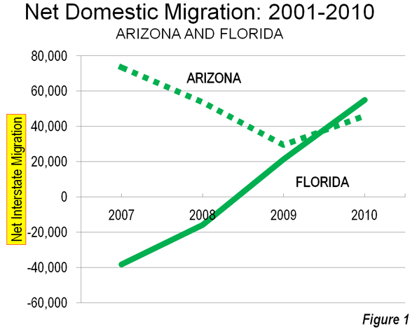
    Florida: For the last few years, the big news in interstate domestic migration has been in Florida. This state, which has grown by more than 5.5 times since 1950, had been the domestic migration leader for some years. However, as one of the four "ground zero" states (along with California, Arizona and Nevada) for its huge house price losses, Florida bottomed out at a loss of 38,000 domestic migrants, falling to 44th in 2007. The state lost another 16,000 interstate migrants in 2008. These were the first domestic migration loss since the 1940s for Florida.

    However, in 2009, Florida returned to growth, adding 21,000 domestic migrants. An even stronger recovery occurred in 2010, with a net 55,000 domestic migrants. This remains well below the peak of 265,000 recorded in Census estimate figures in 2004 and 2005. Nonetheless, Florida ranked third in domestic migration in 2010, trailing North Carolina by only 1000 as well as number one Texas. Part of Florida’s success is likely related to its housing affordability, which has been restored in all of the state’s major metropolitan areas with the exception of Miami. The recent repeal of Florida’s land rationing "smart growth" law should position the state for even more affordable housing and net domestic migration gains.

    Arizona: Arizona is another state that was hit hard by the housing bubble. Much has been written on Arizona’s recent hard times. Yet, unlike Florida, Arizona did not experience domestic migration losses in any year of the past decade. The state has routinely been among the top five in domestic migration, even during the darkest years of the Great Financial Crisis. Like the nation in general, Arizona reached its lowest net domestic migration figure in 2009 at 29,000, but recovered to 46,000 in 2010. Interstate domestic migration remains somewhat below the early 2000s figures, but is trending upwards.

    Texas: Texas took the interstate domestic migration crown away from Florida in 2006 at has been the nation’s leader since that time. According to Census estimates, Texas peaked in 2006 at 233,000 net domestic migrants. This was an artificially high peak, location by the outflow of people from Louisiana who were driven out by Hurricanes Katrina and Rita and the failure of responsible governments to properly maintain flood control infrastructure. From 2007 to 2009, Texas was also aided by its liberal land use policies that helped it avoid the real estate bubble, retaining lower house prices that made it more attractive to domestic migrants. Texas added more than 125,000 domestic migrants annually. However in 2010, net domestic migration dropped to 75,000. Nonetheless, even Texas indicates a return toward normalcy. In the first five years of the decade, Census data placed net domestic migration in Texas at only 40,000, well short of the 2010 figure.

    North Carolina: Through good times and bad, North Carolina was has been a consistent performer among the larger gainers. North Carolina ranked fourth in net domestic migration from 2001 through 2006, according to Census data. Then the state moved up to number two in every year from 2007 to 2010.   In 2010 domestic migration was 56,000, slightly below the 2001 to 2006 Census reported average of approximately 63,000. Like Texas, North Carolina largely escaped the real estate bubble, with house prices rising far less severely than on the West Coast, the Northeast, Florida, Nevada and Arizona, which could be a principal reason for its consistent domestic migration gains.

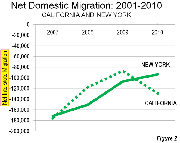
    The Largest Losing States:There were also indications that people continue to be among the most significant exports of California and New York, which wrestled for the bottom position for the entire decade. While The New York Times characterized the 2008 to 2010 domestic outmigration from California and New York as having slowed to a "relative trickle," the ACS data indicates that the spigot is still on.

    New York:New York experienced a net loss of 94,000 domestic migrants in 2010, a figure nearly equal to the population of its state capital, Albany. Despite this large loss, New York is doing better than earlier in the decade, when domestic outmigration averaged more than 200,000 from 2001 to 2006.

    California: California, however, may have taken a turn to the south. After having experienced the largest losses in the nation in 2007 (175,000), net domestic outmigration fell to 87,000 in 2009 and California relinquished the bottom position to New York. However, in 2010, California’s net domestic outmigration rose to 129,000 and the state recovered its former bottom ranking.

    Illinois: Illinois has been the most consistent performer among the largest losing states. According to Census data, domestic migration losses averaged 77,000 from 2001 to 2006. ACS data indicates similar losses, averaging 73,000 from 2007 to 2010.

    Normalcy Again? It is premature to suggest any long-term judgments on these early data. However, it would not be surprising to see the states with the highest costs of living (driven by high housing costs) and the least friendly business climates to lose domestic migrants to states with lower costs of living and more friendly business environments. For example, the fact that median house prices today in Phoenix are more affordable compared to the large metropolitan areas of coastal California than they were at the peak of the housing bubble may be part of what drove Arizona’s improved net domestic migration in 2010.

    —-

    Note 1: The Census Bureau provides annual estimates of domestic migration, however does not do so in census years, such as 2010, which is why this analysis uses American Community Survey data. For the purposes of data compatibility, 2007, 2008, 2009 and 2010 data from the American Community Survey (also conducted by the Census Bureau) is the principal source for recent trends. This analysis is different from the one by Kenneth M. Johnson of the University of New Hampshire Carey Institute, which detailed domestic migration results from the three year American Community Survey (2008-2010), and which was covered by The New York Times.

    Note 2: Leith van Onselen has recently described developments in the Phoenix housing market (in How Phoenix Boomed and Busted) during the last decade.

    Wendell Cox is a Visiting Professor, Conservatoire National des Arts et Metiers, Paris and the author of “War on the Dream: How Anti-Sprawl Policy Threatens the Quality of Life

    Photograph: Cape Coral, Florida (by author)

  • How Phoenix Housing Boomed and Busted

    When analysing the US housing bubble, four states stand-out for the way in which home values rose into the stratosphere before crashing and burning: California, Nevada, Florida and Arizona (see below chart).


    Since I covered three markets were covered in previous posts at Macrobusiness (see above links), I now want to analyse the Arizona housing market – with particular emphasis on its largest city, Phoenix – to determine why prices bubbled and then burst in such a violent manner.

    In the lead-up to the crash, Phoenix’s economy was booming. New jobs were being added at a fast pace and per capita incomes were growing strongly:


    With confidence riding high on the back of seemingly solid fundamentals and rising asset prices, along with easy access to credit, Arizona households borrowed heavily. Per capita debt accumulation surged in the mid-2000s to levels far in excess of the national average:


    But Phoenix was living on borrowed time. With the national economy turning south in the wake of the sub-prime crisis and the collapse of Lehman Brothers, Phoenix home prices, which had already been falling gradually, began to slide fast. After home prices peaked in May 2006, it took another 18 months before Phoenix’s unemployment rate began rising:


    The rest is history. Home prices continued falling, unemployment kept rising, and nominal per capita incomes fell for the first time in at least 40 years.

    And the pain is widespread, with around one in seven mortgages 90 days in arrears – well in excess of the national average:


    So what went wrong? Could anything have been done differently to prevent the housing bubble/bust?

    Certainly, if credit was less readily available, households would have been constrained in their ability to bid-up prices. But easy credit was only part of the problem. Another key driver of the rampant price escalation and then collapse was the way in which land was supplied for housing.

    Throughout the 2000s, Arizona was one of the fastest growing metropolitan area in the United States with more than 1,000,000 population (see below chart).


    However, despite there being ample developable land on the urban fringe to accomodate this population growth, the actual quantity of land available for development was heavily restricted on two counts:

    1. The State of Arizona passed statewide planning laws in 1998 and 2000, which included the implementation of high impact fees on new development and urban containment devices. In a 2006 study of land-use policies in the 50 largest metropolitan areas of the US, the Brookings Institution ranked Phoenix as ‘growth management’, which is the same ranking as Florida and California.
    2. The overwhelming majority of potential developable land in Arizona is either owned by the state and federal governments, preserved for conservation, or otherwise off-limits to development.

    On the second point – the lack of available land for development – the below graphics highlight the land supply situation in Phoenix.

    First, a pie diagram, extracted from the Arizona State Land Department Annual Report, showing how only 17.5% of land in Arizona is privately owned:


    Second, a map showing the lack of developable land around Phoenix:


    There is evidence that the Arizona State Land Department, whose mission is to “optimize economic return for the Trust beneficiaries”, heavily restricted sales of land to the market in an effort to maximise revenues, causing builders and developers to bid-up land price in period auctions to ensure their supply of land for construction (called ‘land banking’).

    Whereas the price of land for housing sold for around $40,000 per acre immediately prior to the bubble, at the peak average land prices fetched nearly $200,000 (see below chart).


    And with the state rationing the supply of fringe land, average residential land prices rose throughout Arizona:


    Obviously, this land price inflation was a principal cause of the house price escalation as well as the delayed supply response to the rapidly growing population and rising house prices (see below chart).


    Had land around Phoenix been freely available for development, developers would likely not have paid such high prices for the land sold by the state government and Phoenix home prices would never have risen to such heights or crashed as violently.

    Phoenix is yet another example of where excessive government interference in the supply of land has combined with easy credit to create a speculative bubble followed by a painful bust.

    This piece originally appeared at Macrobusiness.

    Leith van Onselen writes daily as the Unconventional Economist at MacroBusiness Australia. He has held positions at the Australian Treasury, Victorian Treasury and currently works at a leading financial services company. Follow him @leithVO.

  • Occupy Wall Street: About D@%& Time!

    "Privileged people don’t march and protest; their world is safe and clean and governed by laws designed to keep them happy. I had never taken to the streets before; why bother? And for the first block or two I felt odd, walking in a mass of people, holding a stick with a placard…" Michael Brock in John Grisham’s The Street Lawyer (Doubleday, 1998).

    I’ve been waiting for three years for Americans to get out in the street and protest the actions that created the Financial Crisis that sparked the Great Contraction. As ng.com frequent commenter Richard Reep put it back at the beginning: “What happened to people’s outrage? Where are the torch-bearing citizens marching on Washington?” If some third-world leader had pillaged the national treasury on their way out of town the way Hank Paulson did – with the full and enthusiastic support of New York Fed chief and now Treasury Secretary Timothy Geithner – when he convinced Congress to spend $750 billion to bailout the Wall Street banks, there would be angry mobs, riots and possibly UN Peacekeepers.

    Three years later, all we can muster is a sort of hippy sit-in – but I’ll take it! It’s better than letting it run over us, drip-by-drip, until there is no middle in our increasingly bifurcated economy.

    Let me summarize what 99% of Americans should protest. It started in the early 2000s with good intentioned policies directed toward leveling the playing field by re-designing consumer credit ratings to allow more Americans to own homes. The move was embraced by Mike Milken and his followers as a way to further the cause of The Democratization of Capital – oddly enough, an idea born out of the outrage of the Watts Riots of August 1965.

    Republicans and Democrats alike joined in the movement and a great boom in home prices was born. Expanding homeownership opportunities, especially for minorities, was a fundamental aim of the Bush Administration’s housing policy, one strongly supported by Democrats in Congress. Then everyone got greedy, including wanna-be real estate moguls who started flipping houses instead of working for their living.

    Banks that were writing mortgages soon turned to securitization – bundling mortgages into bonds called mortgage-backed securities – so they could use the proceeds to lend more money to subprime borrowers. The banks were collecting fees at every step. They charged fees for making the mortgage loan and for putting together the bond deal; then they charged commissions for trading the bonds. The interest paid on the bonds was high because the interest charged on the mortgages was high – after all, these were less-than-credit worthy borrowers by traditional standards.  The banks wanted to be compensated for taking the risk – even though they were selling the risk to someone else. It was all about making money on money and eventually demand overtook supply. But that didn’t stop Brother Banker!

    According to a story on PBS (originally aired November 21, 2008), managers at Standard & Poor’s credit rating agency were pressured to give mortgage bonds triple-A ratings in the pursuit of ever higher fees. In essence, the banks paid credit rating agencies to get triple-A ratings for their mortgage bonds so that insurance company and pension fund money could be added to the scheme. Insurance companies and pension funds are highly regulated in order to protect investors who rely on them for compensation in disasters and retirement.

    If the bank couldn’t get the top credit rating for some mortgage bonds, they turned to selling an unregulated kind of insurance called Credit Default Swaps. The swaps became so popular that people who didn’t even own the bonds were buying the swaps. Eventually, there were more credit default swaps than there were bonds – and the banks were making fees on top of fees with no incentive to stop. In the end, there was more money to be made in mortgage defaults than mortgage payoffs and some banks even stopped taking mortgage payments to force the defaults. It was a little like the failing businessman who burns down his own shop because he can make more on the insurance than he can trying to sell it.

    When the swaps came due, companies like AIG collapsed under the pressure of the payments – and American taxpayers were left holding the bag. Using your insurance and pension benefits to create their bonfire, Wall Street staged a weenie-roast! Two years ago you could have purchased all the common stock of Lennar Homebuilders for $1.2 billion – but if they went bankrupt you could collect $40 billion on the swaps. (The European Union fixed this problem in their markets – the US did not.) Like any Ponzi scheme, this one also required that “new money” continue to flow in so that the early investors could receive payouts – hence the need to get your benefit money invested in these things. When Uncle Sam took 80% ownership of AIG in Hank Paulson’s bailout scheme, again approved by our current administration’s financial geniuses, the US Treasury in combination with the Federal Reserve provided an unlimited source of new money. THAT is what you should be protesting today because it can – and probably will – happen again.

    Critics of the protesters like to equate Wall Street with all the companies that create jobs. This ignores how the stock market works. The only time that a company gets money from its stock is in the initial public offering. Those shares are mostly sold to syndicates, underwriters, and primary dealers, not the general public. What happens day in and day out on Wall Street is simply stirring the pot. When the company’s stock goes up, it is the next seller and his broker that make money, not the company. The stock market should have everything to do with jobs. When households have excess earnings – more money than they need for their expenses – they make savings deposits or investments in the stock market through banks. Banks channel savings from households to entrepreneurs and businesses. Entrepreneurs use the money to create new businesses which employ more people, thus increasing the earnings that households have available for savings and investment, which would bring the process fully around the virtuous circle. But Wall Street doesn’t exactly do that anymore. It just makes jobs for Wall Street.

    The other argument is that the problem isn’t Wall Street, it’s the government. Anyone who thinks that only one or the other is to blame doesn’t understand how politics is financed. According to the MAPLight.org’s analysis, Senator Barack Obama’s presidential campaign received more money in 2007-2008 from Wall Street than anyone else, but it was only $2 million more than the $22,108,926 that went to Senator John McCain.

    Blame the government and blame the Wall Street banks that sponsor their political campaigns – they are blaming each other anyway. The occupy protestors – with the possible exception of the violent black band anarchists – are not the perpetrators we need to put in handcuffs.

    The sad fact is that nothing in Washington, D.C. or Wall Street, NYC has changed since that day in September 2008 when Hank Paulson told Congress that the world would end if they didn’t give him $750 billion to spread around Wall Street. For many people, like a Michael Brock, it takes a life-changing event to make you look at the truth all around you. Fixing our broken financial markets requires systemic reform of a great scale.  

    I think a lot of people who joined the 2008 tea parties – myself included – thought we were mounting a petition against bank bailouts and the misuse of public funds. The U.S. Government Accountability Office audit of the Federal Reserve, released in July 2011, proves that petition failed. Call your Representative, write to your Senator, and show up for the #Occupy or Tea Party events in your city. Like Michael Brock, you may find yourself savoring the exercise in civil protest.

    A version of this article appeared in the Omaha World Herald on November 4, 2011.

    Susanne Trimbath, Ph.D. is CEO and Chief Economist of STP Advisory Services. She participated in an Infrastructure Index Project Workshop Series throughout 2010. Her training in finance and economics began with editing briefing documents for the Economic Research Department of the Federal Reserve Bank of San Francisco. She worked in operations at depository trust and clearing corporations in San Francisco and New York, including Depository Trust Company, a subsidiary of DTCC; formerly, she was a Senior Research Economist studying capital markets at the Milken Institute. Her PhD in economics is from New York University. In addition to teaching economics and finance at New York University and University of Southern California (Marshall School of Business), Trimbath is co-author of Beyond Junk Bonds: Expanding High Yield Markets

    Occupy Wall Street Photo by Paul Stien.

  • More Americans Move to Detached Houses

    In defiance of the conventional wisdom in the national media and among most planning professionals, Americans continue not only to prefer, but to move into single family detached houses. Data from the 2010 American Community Survey indicates that such housing attracted 79.2% of the new households in the 51 major metropolitan areas (over 1,000,000 population) over the past decade.

    In contrast households in multi-unit buildings (apartments and condominiums) represented 11.8% of the new housing, while two-unit attached housing represented 11.3% of the increase. There was a 2.3% decline in the "other" category of new housing, which includes mobile homes and boats. A total of 4 million net new occupied detached houses were added in the largest metropolitan areas, while there were 590,000 additional apartments and condominiums and 570,000 attached houses (Figure 1).

    Detached Vacancy Rate Rises Less than Multi-Unit: Another conventional assumption is that single family homes have been disproportionately abandoned by their occupants, particularly since the collapse of the housing bubble. This is also not true. In 2010 detached housing enjoyed a 92.4% occupancy rate in 2010 which is higher than the 89.4% occupancy rate in attached housing and 84.2% occupancy rate in multi-unit buildings. Because a more of the multi-unit housing is rental, it is to be expected that the vacancies would be the highest in this category. However, at the national level, overall vacancy rates rose the most in multi-unit housing, with an increase of 61%, from 10.7% in 2000 to 17.1% in 2010. The vacancy rate in detached housing rose at a slower rate, from 7.3% in 2000 to 10.7% in 2010, an increase of 48%. Attached housing – such as townshouses – have the slowest rise in vacancy rate, from 8.4% in 2000 to 11.0% in 2010, an increase of 32% (Figure 2).

    Detached and Attached Up in Most Markets, Apartments and Condominiums Down in Most: The move to detached housing was pervasive at the major metropolitan area level. Among the 51 largest metropolitan areas, the share of detached housing rose in 44 and declined in seven. The share of attached housing rose in 32 of the metropolitan areas, while declining in 19. Multi-unit housing experienced an increase in its market share in only three markets, while declining in 48.

    Largest Metropolitan Areas: Detached housing also increased more than attached housing and multi-unit housing in each of the nation’s five largest metropolitan areas.

    • In the largest metropolitan area, New York, 51.9% of the new housing was detached. This is considerably more than the 36.9% detached market share in 2000. Multi-unit housing accounted for 24.1% of the increase in the market. This is a far smaller share than the 55.7% that multi-unit housing represented in 2000. Attached housing was 19.9% of the increase, nearly 3 times its 2000 share of 6.7%. This movement of New Yorkers to less dense housing forms is particularly significant, in view of the fact that New York has historically had the lowest share of lower density housing (detached and attached) and the highest share of multi-unit houses.
    • In the second largest metropolitan area, Los Angeles, 96.0% of the new housing was detached. This is nearly double the 49.7% that detached housing represented of the market in 2000. The balance of the new housing was split between a share of 18.6% for multi-unit housing and a loss of 11.8% in the attached housing. The share of new units represented by multi-unit houses was less one-half than its percentage of the market in 2000 (39.0%).
    • In the third largest metropolitan area, Chicago, 95.9% of the new housing was detached, well above the 52.5% share in 2000. There was a huge loss in apartment and condominium share, at 31% of the market, while attached housing captured 40.4% of the market.
    • In the fourth largest metropolitan area, Dallas Fort Worth, 84.3% of the new housing was detached, well above the 62.0% share in 2000. Multi-unit housing accounted for 13.5% of the increase, approximately one-half the 2000 market share. Attached housing represented 3.2% of the increase.
    • In the fifth largest metropolitan area, Philadelphia, 77.6% of new housing was detached, well above the 45.3% market share for detached housing in 2000. Apartments and condominiums accounted for 27.7% of the increase between 2000 and 2010, slightly more than the 2000 market share 23.7%. Attached housing represented a minus 4.3% of the new housing.

    Despite being only the fourth largest metropolitan area, Dallas-Fort Worth accounted for 46% of the new housing in the five largest metropolitan areas (Figure 3).

    The three largest metropolitan markets where there was an increase in multi-unit housing share were San Jose, New Orleans and Denver. In San Jose, 55.5% of new housing was multi-unit, while only 10.3 percent was detached. New Orleans had a similar 10.5% detached new housing share, while 65.8% of the new housing was multi unit. In Denver, 31.3% of the new housing was multi-unit, while 60.2% was detached.

    The share of detached housing also declined between 2000 and 2010 in Boston, Kansas City, Minneapolis-St. Paul and Portland. In each of these metropolitan areas, the share of attached housing increased, while the share of multi-unit housing decreased. Nonetheless, detached housing continued to attract a majority of new housing in Kansas City (70.8 percent) and Portland (56.6 percent). Despite Portland’s strong planning emphasis on high density housing, its share of multi-unit housing, and 26.8% between 2000 and 2010 was less than its 2000 market share of 27.5%, with a strong 20.6 percent share in attached housing. Attached housing also accounted for a comparatively large share of new housing in Boston (45.7 percent), Minneapolis-St. Paul (39.7 percent) and Kansas City (25.8 percent). The stronger densification policies that existed in Minneapolis-St. Paul until the middle of the decade may have artificially raised the share of attached new housing.

    Share by housing type data is provided for the major metropolitan areas in Tables 1 and 2.

    Table 1
    Occupied Housing by Major Metropolitan Area: 2000
    Metropolitan Area Detached Attached Multi-Unit Other
    Atlanta, GA 66.6% 3.5% 25.5% 4.4%
    Austin, TX 57.7% 3.7% 32.1% 6.6%
    Baltimore, MD 46.0% 28.5% 24.2% 1.3%
    Birmingham, AL 68.3% 2.6% 17.9% 11.2%
    Boston, MA-NH 48.9% 4.4% 45.4% 1.3%
    Buffalo, NY 60.0% 2.8% 35.1% 2.1%
    Charlotte, NC-SC 67.5% 3.4% 21.8% 7.3%
    Chicago, IL-IN-WI 52.5% 6.3% 40.1% 1.1%
    Cincinnati, OH-KY-IN 64.7% 3.6% 27.8% 3.9%
    Cleveland, OH 65.7% 5.5% 27.7% 1.2%
    Columbus, OH 62.8% 5.5% 29.1% 2.6%
    Dallas-Fort Worth, TX 62.0% 3.1% 30.3% 4.6%
    Denver, CO 60.9% 7.8% 29.0% 2.3%
    Detroit,  MI 70.5% 5.5% 20.7% 3.3%
    Hartford, CT 60.0% 5.2% 34.1% 0.8%
    Houston, TX 61.4% 3.6% 29.1% 6.0%
    Indianapolis. IN 68.4% 5.2% 23.2% 3.3%
    Jacksonville, FL 63.5% 3.9% 22.3% 10.3%
    Kansas City, MO-KS 71.3% 4.6% 21.4% 2.6%
    Las Vegas, NV 53.4% 6.0% 34.7% 5.9%
    Los Angeles, CA 49.7% 8.6% 39.6% 2.0%
    Louisville, KY-IN 70.7% 2.1% 22.2% 5.0%
    Memphis, TN-MS-AR 69.1% 3.8% 22.8% 4.2%
    Miami, FL 45.4% 9.9% 42.1% 2.6%
    Milwaukee,WI 55.7% 5.3% 38.3% 0.7%
    Minneapolis-St. Paul, MN-WI 62.8% 7.7% 27.4% 2.0%
    Nashville, TN 64.9% 4.4% 24.4% 6.2%
    New Orleans. LA 59.9% 7.7% 28.5% 3.9%
    New York, NY-NJ-PA 36.9% 6.5% 56.3% 0.4%
    Oklahoma City, OK 71.6% 3.1% 19.2% 6.0%
    Orlando, FL 61.5% 4.5% 25.1% 8.9%
    Philadelphia, PA-NJ-DE-MD 45.3% 29.8% 23.5% 1.4%
    Phoenix, AZ 61.6% 6.1% 24.9% 7.4%
    Pittsburgh, PA 68.8% 6.5% 20.4% 4.4%
    Portland, OR-WA 63.8% 3.3% 27.5% 5.5%
    Providence, RI-MA 54.3% 2.9% 41.6% 1.2%
    Raleigh, NC 63.6% 5.2% 21.5% 9.8%
    Richmond, VA 71.3% 4.9% 20.4% 3.4%
    Riverside-San Bernardino, CA 67.0% 5.1% 18.6% 9.3%
    Rochester, NY 65.7% 4.3% 26.5% 3.5%
    Sacramento, CA 66.1% 6.0% 24.0% 3.9%
    Salt Lake City, UT 67.0% 4.8% 25.4% 2.8%
    San Antonio, TX 67.4% 2.9% 22.2% 7.5%
    San Diego, CA 51.7% 9.4% 34.5% 4.4%
    San Francisco-Oakland, CA 50.3% 9.3% 39.1% 1.3%
    San Jose, CA 57.0% 9.1% 30.5% 3.4%
    Seattle, WA 60.2% 3.5% 31.6% 4.8%
    St. Louis,, MO-IL 70.2% 3.1% 21.9% 4.8%
    Tampa-St. Petersburg, FL 58.4% 4.6% 25.7% 11.4%
    Virginia Beach-Norfolk, VA-NC 61.4% 10.4% 25.2% 3.0%
    Washington, DC-VA-MD-WV 47.6% 19.4% 32.1% 0.8%
    Average (Weighted) 55.9% 7.5% 33.3% 3.3%
    Data from 2000 Census
    Metropolitan areas over 1,000,000 population as defined in 2010


    Table 2
    Occupied Housing by Major Metropolitan Area: 2010
    Metropolitan Area Detached Attached Multi-Unit Other
    Atlanta, GA 69.2% 5.3% 22.7% 2.7%
    Austin, TX 60.4% 2.6% 31.8% 5.1%
    Baltimore, MD 47.4% 27.3% 24.2% 1.1%
    Birmingham, AL 70.8% 2.4% 16.8% 10.0%
    Boston, MA-NH 48.7% 5.9% 44.2% 1.2%
    Buffalo, NY 62.3% 2.9% 33.0% 1.8%
    Charlotte, NC-SC 68.9% 5.1% 20.4% 5.6%
    Chicago, IL-IN-WI 54.2% 7.6% 37.1% 1.1%
    Cincinnati, OH-KY-IN 68.9% 4.8% 23.2% 3.1%
    Cleveland, OH 68.7% 5.1% 25.1% 1.1%
    Columbus, OH 64.1% 7.3% 26.6% 2.1%
    Dallas-Fort Worth, TX 65.9% 3.1% 27.4% 3.6%
    Denver, CO 60.8% 7.9% 29.4% 1.9%
    Detroit,  MI 71.6% 6.3% 19.1% 2.9%
    Hartford, CT 60.9% 5.3% 33.1% 0.7%
    Houston, TX 65.1% 3.5% 26.0% 5.3%
    Indianapolis. IN 71.3% 5.0% 21.1% 2.6%
    Jacksonville, FL 66.3% 4.8% 21.3% 7.6%
    Kansas City, MO-KS 71.3% 6.4% 20.1% 2.2%
    Las Vegas, NV 60.9% 5.4% 29.9% 3.8%
    Los Angeles, CA 51.0% 8.0% 39.0% 1.9%
    Louisville, KY-IN 71.6% 3.6% 20.9% 4.0%
    Memphis, TN-MS-AR 72.5% 3.3% 20.4% 3.7%
    Miami, FL 47.0% 10.8% 40.0% 2.1%
    Milwaukee,WI 56.2% 6.5% 36.5% 0.8%
    Minneapolis-St. Paul, MN-WI 61.5% 11.0% 25.9% 1.6%
    Nashville, TN 67.2% 5.6% 22.3% 4.9%
    New Orleans. LA 65.1% 6.1% 24.6% 4.2%
    New York, NY-NJ-PA 37.2% 6.7% 55.7% 0.4%
    Oklahoma City, OK 74.3% 3.0% 17.1% 5.6%
    Orlando, FL 64.1% 5.5% 23.4% 6.9%
    Philadelphia, PA-NJ-DE-MD 46.6% 28.5% 23.7% 1.3%
    Phoenix, AZ 67.2% 4.8% 22.2% 5.8%
    Pittsburgh, PA 69.4% 7.5% 19.1% 4.0%
    Portland, OR-WA 62.8% 5.5% 27.4% 4.3%
    Providence, RI-MA 55.7% 3.7% 39.6% 1.0%
    Raleigh, NC 65.4% 8.0% 20.5% 6.2%
    Richmond, VA 73.2% 4.9% 19.0% 3.0%
    Riverside-San Bernardino, CA 70.7% 4.3% 17.1% 7.9%
    Rochester, NY 66.9% 4.8% 25.3% 2.9%
    Sacramento, CA 68.8% 5.6% 22.6% 3.0%
    Salt Lake City, UT 67.8% 6.1% 23.9% 2.2%
    San Antonio, TX 70.8% 2.2% 21.1% 5.9%
    San Diego, CA 53.0% 9.0% 34.5% 3.5%
    San Francisco-Oakland, CA 50.7% 9.4% 38.8% 1.1%
    San Jose, CA 54.3% 10.7% 32.0% 3.0%
    Seattle, WA 60.5% 4.2% 31.5% 3.8%
    St. Louis,, MO-IL 70.8% 4.2% 21.1% 3.9%
    Tampa-St. Petersburg, FL 59.6% 5.6% 24.7% 10.1%
    Virginia Beach-Norfolk, VA-NC 62.5% 11.1% 24.0% 2.5%
    Washington, DC-VA-MD-WV 48.1% 19.6% 31.7% 0.7%
    Average (Weighted) 57.8% 7.9% 31.5% 2.8%
    Data from 2010 American Community Survey
    Metropolitan areas over 1,000,000 population as defined in 2010


    In Housing, Preference Trumps Policy: The trend of the last decade is evidence of a continued preference of American households for detached housing. The results are remarkable for at least two reasons:

    • The first is that there have been unprecedented policy initiatives to discourage, if not to prohibit the building of new detached houses. It seems likely that the miniscule new detached housing share in San Jose, for example, is a direct result of that metropolitan area’s virtual prohibition of new detached housing, rather than any evidence that households have begun to prefer higher density housing. A small detached housing share in the face of a strong public policy bias toward higher density housing says nothing about preferences.
    • Second; the media and wishful advocates of denser settlement patterns have continuously referred to detached housing as having been severely overbuilt during the housing bubble, while suggesting an imperative for households to move into multiunit, often rented housing. The new data, with the larger increase in multi-unit vacancy rates, indicates that there was at least as much overbuilding in more dense housing types as there was in detached housing.

    Despite the expressed preferences of planners, academics and even many builders, American households continue to make their own decisions about housing.

    Wendell Cox is a Visiting Professor, Conservatoire National des Arts et Metiers, Paris and the author of “War on the Dream: How Anti-Sprawl Policy Threatens the Quality of Life

    Lead photo: Houses in Los Angeles. Photograph by author.

  • HELP WANTED: The North Dakota Boom

    The nation’s unemployment rate has been hovering at nearly nine percent since 2009. But not every state is suffering an employment crisis. In the remote, windswept state of North Dakota, job fairs often bustle with more recruiters than potential workers. The North Dakota unemployment rate hasn’t risen above five percent since 1987.  In the state’s oil country, unemployment hovers at around two percent, and pretty much everyone who wants a job—as long as they are old enough and not incarcerated—is employed.  North Dakota has either tied for or had the lowest unemployment in the country since 2008.   

    The job base of the state (population 672,500) has grown five percent in the past two years. Even more astonishing, there are over 16,000 unfilled jobs, and projections indicate that 45,000 more workers will be needed in the next two years.  Of those jobs, one out of three will be in oil and gas.

    The Booming West

    If you are willing to endure the blazing hot summers and bitterly cold winters, come to western North Dakota, young (or not) man (or woman) and you can get a job. Michael Ziesch has worked with Job Service of North Dakota for the past 15 years and is currently a manager in the Labor Market Information Center. “The average wage in oil and gas is $80,000 plus overtime, and there will likely be plenty of that,” said Ziesch.  Development of the massive Bakken oil field in the western part of the state has tapped out the local workforce.

     If you are not interested in an energy job, consider retail. Employers are paying $15 an hour for convenience store employees and fast food workers. Drive through any community in the area and you will be hard pressed to find a store front devoid of a sign shouting “Help Wanted, Now!” It seems that everything in the state these days ends with an exclamation mark, and for a state filled with unassuming, hardworking, family-centered kind of folks, it’s a little disconcerting.

    New North Dakotans

    Job seekers from outside the state are flocking to Williston, the unofficial capital of the oil boom, located in the remote northwestern corner of North Dakota. The population here has grown from 12,500 to an estimated 22,000 in the past five years.

    Williston is home to 350 oil service companies. Willistonlife.com, an employment and informational website built with the objective of attracting workers to the area, boasts that at any given time, over 1,200 job openings are available in the Williston area alone. On its home page, the website beckons to the nation’s unemployed in large white letters brightly juxtaposed against a black background, “Make Your Move!”

    The wildcat oil culture that the newly arrived encounter, though, is distinctly different than the risk-averse culture of the state. One “New North Dakotan” noted that although long-time residents of the state are pleasant (we smile a lot), helpful (there’s no better place to have a flat tire), kind (we’ll bring you a hot dish if you are sick), and polite (we almost always hold the door open for the person behind us), we are not quite “friendly.” We are a little guarded with folks we didn’t grow up with. Ethnic to us means Norwegian or German. We’re not used to accents other than our own. (And, no, we don’t talk like the actors in the movie Fargo.) One more thing — and this is important — we talk about the weather a lot.

    What should you know before you throw your last $100 in your gas tank and head up to Williston to make cold calls for jobs? Don’t come without a housing plan, or you may find yourself among the hundreds of parking lot denizens, living out of your car.

    New North Dakotans need places to live, creating an enormous construction boom. Williston formerly saw about five new homes a year. So far this year, 2,000 new homes have sprouted up. In 2012, the expectation is for 4,000 more along with apartments, hotels and, outside of town, dormitory-style housing facilities known as ‘man camps’. According to the Williston Herald, since the boom began, the market price of rental housing in Williston has jumped from $300 to $2,000 per month for a modest apartment. Hotels are full and booked for months, charging $170 to $200 a night.  

    Service is hard to come by. Waits of 45 minutes or more are not uncommon at fast-food restaurants. The Dairy Queen closes at 5:00 pm because they can’t retain enough staff to stay open any later, and many small businesses have simply closed their doors for lack of employees. The town’s Wal-Mart doesn’t have enough employees to stock the shelves, so boxes are simply laid open in the middle of the aisles for customers to grab what they need. Locals have discovered a “secret route” into the store to avoid the worst of the incoming traffic, and even the local Luddites have managed to learn how to use the self-checkout lanes as a matter of self-preservation. A professor at Williston State College complained recently that she had to text her husband with a request to pick up clothes hangers while he was out of town visiting relatives because local stores were completely sold out. It’s not only hangers; long lines and low inventory have made running everyday errands a vexing challenge. “It sounds crazy,” this same professor says, “but I order laundry detergent online and have it delivered by UPS to my front door.”

    At Williston State College, faculty often take out their own garbage to help out the strapped maintenance staff.  The school is seeing lower enrollments as students are drawn away from post-secondary education by the lure of instant cash.

    The law of supply and demand has kicked in across all sectors of the community. A severe shortage of contractors, plumbers and electricians means that homeowners wait weeks or even months for simple home projects. The local community college is putting out a second bid for a parking lot because, the first time, they didn’t get any bids at all.

    Even more disturbing in Williston are rumors of impending electricity shortages. Worried about brownouts and blackouts during the long North Dakota winter, many townspeople have picked up generators in Fargo, where they sell for $700, compared to the “sale” price of $1300 in Williston.

    Officials are quick to point out that the state’s larger cities, Bismarck and Fargo, are also thriving. In the Governor’s most recent State of the State address, he posited his explanation of ‘The North Dakota Miracle’: “It is about an educated workforce, low taxation, a friendly regulatory climate.” And if your state happens to be sitting atop 400 billion barrels of oil … hey, it can’t hurt.

    Energy Economics: Boom and Bust

    Oilmen have known for fifty years that beneath North Dakota’s surface lay billions of barrels of oil, perhaps as much as 4 million barrels per square mile.

    In 1952, The Wall Street Journal reported that Williston was receiving a “cornucopia of riches.” Banks were setting new deposit records weekly, and the population had jumped from 7,500 to 10,000.  In the early 1980s, oil prices skyrocketed and the region again became an exploration target as its vast deposits became economically feasible to drill. When prices began to slip, hitting a low of $9 a barrel by 1986, the boom faltered and, even more quickly than it began, it was over. The state spent the later part of the 1990s trying to recover from a brutal bust.

    Today, a perfect storm of two 21st century technologies, hydraulic fracturing and horizontal drilling, along with high prices and unprecedented demand, have come together to make drilling profitable, triggering a new boom that some experts say will be the biggest and longest lasting in the cycle of boom and bust. Conventional wisdom is that this time around the oil boom will be steadier and longer, because oil prices are no longer being defined by the cartels that once controlled the world’s oil prices and, therefore, the economics of energy. In the meantime, the oil pump jacks that dot the skyline are nodding their heads in greeting. Welcome to North Dakota.

    Debora Dragseth, Ph.D. is professor of business at Dickinson State University in Dickinson, North Dakota.

    Photo of Williston, ND traffic jam courtesy of Williston Department of Economic Development.

  • Florida Repeals Smart Growth Law

    The state of Florida has repealed its 30-year old growth management law (also called "smart growth," "compact development" and "livability"). Under the law, local jurisdictions were required to adopt comprehensive land use plans stipulating where development could and could not occur. These plans were subject to approval by the state Department of Community Affairs, an agency now abolished by the legislation. The state approval process had been similar to that of Oregon. Governor Rick Scott had urged repeal as a part of his program to create 700,000 new jobs in seven years in Florida. Economic research in the Netherlands, the United Kingdom and the United States has associated slower economic growth with growth management programs.

    Local governments will still be permitted to implement growth management programs, but largely without state mandates. Some local jurisdictions will continue their growth management programs, while others will welcome development.

    The Need for A Competitive Land Supply: Growth management has been cited extensively in economic research because of its association with higher housing costs. The basic problem is that, by delineating and limiting the land that can the used for development, planners create guides to investment, which shows developers where they must buy and tells the now more scarce sellers that the buyers have little choice but to negotiate with them. This can violate the "principle of competitive land supply," cited by Brookings Institution economist Anthony Downs. Downs said:

    If a locality limits to certain sites the land that can be developed within a given period, it confers a preferred market position on those sites. … If the limitation is stringent enough, it may also confirm a monopolistic powers on the owners of those sites, permitting them to raising land prices substantially.

    This necessity of retaining a competitive land supply is conceded by proponents of growth management. The Brookings Institution published research by leading advocates of growth management, Arthur C Nelson, Rolf Pendall, Casey J. Dawkins and Gerrit J. Knapp that makes the connection, despite often incorrect citations by advocates to the contrary.   In particular they cite higher house prices in California as having resulted from growth management restrictions that were too strong.

    even well-intentioned growth management programs … can accommodate too little growth and result in higher housing prices. This is arguably what happened in parts of California where growth boundaries were drawn so tightly without accommodating other housing needs

    Nelson, et al. also concluded that “… the housing price effects of growth management policies depend heavily on how they are designed and implemented. If the policies tend to restrict land supplies, then housing price increases are expected” (emphasis in original). 

    In other words, if growth management policies do not maintain a competitive land supply, house prices are likely to rise in response. This is basic economics. Restricting the supply of any good or service in demand is likely to lead to higher prices, all things being equal.

    The loss of a competitive land supply was seen during the real estate bubble in the unprecedented escalation of house prices in California (which was already high), Oregon, Washington, Phoenix, Las Vegas, parts of the Northeast and Florida. In these markets, the demand from more liberal lending standards was much greater than the land available for development under growth management plans and government land auctions.  By contrast, house prices generally stayed within historic norms in metropolitan areas where land supplies were not constrained by growth management programs, such as Dallas-Fort Worth, Houston, Atlanta, Austin, Indianapolis, Kansas City and elsewhere.

    Housing Price Escalation in Florida: In 2000, the four Florida metropolitan areas with more than 1,000,000 population had Median Multiples (median house price divided by median household income) near or below the historic norm of 3.0. By late in the next decade, all four metropolitan areas reached unprecedented levels of unaffordability. In Miami, the Median Multiple reached 7.2. In Orlando, the Median Multiple peaked at 5.2, 70 percent above the historic norm. In Tampa-St. Petersburg, the Median Multiple peaked at 4.8, 60 percent above the historic norm. The peak in Jacksonville was a more modest 3.6, though this was still an 80 percent increase.

    By 2010, the Median Multiple has declined to hear the historic norm in Orlando and Tampa-St. Petersburg and slightly below in Jacksonville. The Median Multiple remained well above the historic norm in Miami, at 4.7.

    When Supply Lags Behind Demand: Florida’s housing cost escalation may have been surprising, since Florida has a reputation for liberal land-use regulation. However, the growth management act had long since turned the state toward a shortage of land supply relative to demand as described by Wachovia Bank in a 2005 analysis.

    "While all the stars seem to be perfectly aligned on the demand side, the supply of housing in Florida has been much more problematic. Even though residential construction has soared to new highs recently, the supply of housing has lagged woefully behind demand in recent years. This has been particularly true for single-family homes, where population growth, a rising homeownership rate, and strong demand for second homes and vacation properties created a demand for 560,000 new single-family homes between mid 2000 and mid 2004. During this period builders only delivered 540,000 units. When you add in the growing demand for townhouses and condominiums, buyers were looking to purchase 675,000 new homes during this period, while builders were supplied just 570,000 units. No wonder prices have been surging!

    The chief impediment to new construction has been a shortage of developable land. The shortage primarily results from a growing resistance to new development. The state is not running out of space. Nearly every community in Florida and the state itself are looking at some type of limitations on new residential development. While well intentioned, these initiatives are making it more time consuming and expensive to build homes in Florida. Others are taking land off the market, designating areas for green space, or preserving space for industrial development. The net result has been dramatically higher land prices across much of the state."

    The point of the Wachovia analysis is that unless there is a sufficient supply of land, the price of housing is likely to rise. Having a lot of land is not enough. There must be enough land to accommodate demand at affordable land and housing prices (Note).

    The Florida action is the most successful reversal of house price increasing growth management regulations to date.

    Other Advances: There have, however, then more modest advances.

    After taking office in 2003, Minnesota Governor Tim Pawlenty replaced the board of directors of the Metropolitan Council in Minneapolis-Saint Paul. The previous board had been spent on the following Portland style growth management policies, including the enforcement of a variant of the urban growth boundary. The new board exhibited more liberal attitudes toward residential development, and the housing bubble did not produce the extent of housing affordability in the Twin Cities that occurred in growth management areas such as Portland, California and Florida.

    The Conservative- Liberal coalition government of the United Kingdom has proposed modest relaxation of some of the world’s most restrictive land use regulations, which could lead to an improvement of housing affordability in the nation. Kate Barker, who was then a member of the Monetary Policy Committee of the Bank of England was commissioned to examine land-use regulation and housing affordability in England and found a strong association between the loss of housing affordability and restrictive land use policies. This association between Britain’s strong land use regulation and higher house prices was noted in the early 1970s research led by Sir Peter Hall of the University College, London.

    For the Future: The relaxation of overly restrictive growth management policies could not have come at a better time. With the squeeze on the middle-class getting tighter, fewer households can afford higher   housing costs associated with growth management areas. Moreover, responsive to the political consensus for job creation, more home construction will bring return more good-paying construction jobs in Florida.

    Wendell Cox is a Visiting Professor, Conservatoire National des Arts et Metiers, Paris and the author of “War on the Dream: How Anti-Sprawl Policy Threatens the Quality of Life

    —–

    Note: There has been a similar misunderstanding of the housing markets in Las Vegas and Phoenix, where developable land appears to stretch virtually to the horizon. However, what is usually missed is that both metropolitan areas are hemmed in by government land, some of which is periodically auctioned. During the housing bubble, the price per acre of residential land at auction in both metropolitan areas rose as much as the price for land rose over a similar period in Beijing, with its huge land price increases.

    Photo: Orlando (by author)

  • Housing Bottom? Not Yet.

    Weakness in housing activity and in housing prices continues to be a major drag on the overall economy. My colleagues at California Lutheran University’s Center for Economic Research and Forecasting have long maintained that the home ownership rate (HOR) needs to fall back to its historical norm of 64% before housing can recover. Their view has been that the attempt to increase the HOR by loosening credit standards contributed to creating financial instability. In a classic case of unintended consequences, the attempt to improve the home ownership rate contributed to rising home prices which ended up lowering affordability for first-time buyers.

    A rising home ownership rate has been a major goal of public policy for several decades under both Republican and Democratic administrations. The rationale was multi-part. First, it was believed that communities are stronger where home ownership is greater. Second, building equity in a home was viewed as the primary path to improving a family’s financial condition. Finally, lower home ownership among minorities was felt to be an indicator of bias.

    Policies directed towards increasing the rate of home ownership included subsidizing first time home buyers, reducing required down payments, and streamlining the application process. Weaker underwriting standards increased the effective demand for housing and helped propel a boom in housing activity and home price appreciation between 1995 and 2006. The overall HOR rose from 65% in 1990 to 69% in 2006 which was applauded on both sides of the political aisle.

    However, rising home prices eventually reduced affordability and, along with excess supplies of housing due to overbuilding, led to a peak and then a decline in housing prices. The price decline eventually set in motion forces that generated severe losses to mortgage investors and homeowners alike. The underwriting pendulum shifted from easy to tight, and effective demand for houses plummeted. Millions of people have lost their homes, and many more have zero or negative equity in their homes. The homeownership rate has now declined from 69% to 66%, and appears to be headed lower.

    Another fundamental indicator of housing weakness is the large number of delinquent mortgages and the implied backlog of future foreclosures. Of course, as the foreclosure backlog is worked through, the result will be a decline in the home ownership rate, as newly foreclosed-upon home owners become renters. Thus, this issue is not separate from the HOR issue.

    The large number of vacant homes is also a measure of housing market health. During the period of 2002 through 2005 the housing industry massively overbuilt. The degree of overbuilding can seen by comparing the rate of household formation (about 1.1 million new households per year during this period) with total housing starts, which is the number of new units (including rentals) completed each year.

    This number exceeded two million units per year during the boom. Since the end of the housing boom, total starts have fallen dramatically to around 600,000 per year. If the rate of household formation had remained at 1.1 million per year, then the surplus developed during the boom would have been eliminated by now. However, an important yet obscure statistic maintained by the Census Department, the Vacant Homes For Sale (VHFS), remains at more than one million above its long-term average. What is going on?

    I suspect that the rate of household formation dramatically declined following the crisis and subsequent recession because more young adults returned to their family homes, and because multiple families are occupying the same housing unit.

    The problem of too much housing stock and too few households will not be resolved purely by a lower home ownership rate. It will be resolved by rising household formation , even if the new households are renters instead of owners. What we need is more people. One strategy to accelerate the process is to streamline legal immigration and to lift or eliminate quotas on the number of people who can legally come to this country.

    Jeff Speakes is Executive in Residence at California Lutheran University, and Lecturer in economics at the University of Southern California.

  • UK Moves to Reform Planning Disaster

    This piece originally appeared at Macrobusiness.

    The United Kingdom (UK) housing system is arguably the worst in the world because of a myriad of policies that work to severely restrict supply, pump demand, and make renting a highly undesirable substitute for home ownership. These policies have led to the UK housing market experiencing:

    1) a higher level of house price inflation than most other European nations:


    2) Relatively expensive housing on a price-to-earnings basis:


    3) Extreme house price volatility:


    4) Which has also increased the volatility of the economic cycle due to the positive effects on consumer spending of equity withdrawals from rising home values and heightened austerity in the bust phase:


    At the core of the UK’s housing problems is the straightjacket that was placed on housing supply following the passage of the Town and Country Planning Act in 1947, which nationalised development rights. Essentially, the pre-existing right of landowners to build-on or re-develop their land was removed and handed to the state, thereby requiring land owners to seek planning permission before anything other than minor renovation work was undertaken.

    UK housing supply effectively became a centrally planned system whereby government bureacrats would attempt to predict some years ahead the required numbers of dwellings that ought to be built in an area to meet demand. However, as explained brilliantly in a detailed paper by the Policy Exchange, the key outcome from the UK planning system has been a housing market that has delivered some of the oldest, smallest and most expensive homes in Europe of a type that are least preferred by households. Put simply, UK households are paying more for housing than their European counterparts and receiving less in return:

    Central planning attempts to ensure that what is thought best for the people by the central planners is what is produced. So, as we showed earlier, the system currently attempts to produce exactly the number of dwellings which are estimated to be required from calculations of need, calculations involving assessments of demographic change, household formation, household splits, migration, deaths, births, etc. Built into the system is a pressure at all levels to provide the minimum. Using green field sites is politically problematic. The cry goes up that the countryside is being buried under tarmac. And anyway, as we have shown, the system adjusts. If too little housing is provided, house prices rise and housing becomes expensive. When it is more expensive, people can afford less and so buy smaller homes. With smaller homes, more dwellings can be provided on less land because homes can be built at higher densities, namely flats or houses with tiny gardens.

    But is this really what people want? In March 2005, a widely reported survey carried out by MORI on behalf of the Commission for Architecture and the Built Environment found that over 50 per cent of those questioned wanted a detached house and 22 per cent preferred a bungalow. Only 2 per cent per cent expressed a preference for a low rise flat and less than 1 per cent a flat in a high rise block. But since detached houses and bungalows use more land than other kinds of house, fewer and fewer are built each year. And many are also demolished to make way for terraced houses or blocks of flats. So while as recently as 1990 only about an eighth of newly built dwellings were apartments, by 2004 the proportion had increased to just under a half…

    So whilst people may not want to live in them or want them built where they live,more and more blocks of flats of just this type are being built because the central planners think that they should have them, and because the production norms are filled more easily in this way than by building houses or bungalows…

    The British planning system means that the most important thing the developer has to do is to obtain planning permission. Once this has been obtained, given the demand for housing, whatever is built can be sold. So the way to make the greatest profit, having obtained permission, is to produce the permitted dwellings at the lowest possible cost. Adding good design is an unnecessary expense because whatever is built will sell. So the constraints imposed by the planning system work against the achievement of a better architectural environment, something which might be achieved with less pressure to build at the lowest possible cost. Competition between developers on design becomes largely unnecessary because they know that they will be able to sell whatever they produce.

    So the current position is that what people want, when asked, is lower density housing. What they get, what the planning system now insists upon, is high density development, much of it in the least desired form – blocks of flats…

    British housing tends to be older than elsewhere in Western Europe. Because they are older their efficiency, in terms of heating for example, tends to be less. The houses [also] tend to be smaller… New houses tend to be even smaller on average than existing houses. In addition, house prices rise faster in the UK so that, year on year, housing in Britain has been getting more expensive relative to that in the rest Europe…

    If fifty years of planning has achieved one thing… Britain [now] has the oldest, pokiest, housing in Europe.

    Compounding the above regulatory constraints on land/housing supply are the greenbelts that have been errected around all of the UK’s major housing markets, which have excluded large swathes of agricultural land from urban development and helped to push-up land prices. A map of the UK’s greenbelts is provided below:


    In addition, the overriding planning objective in the UK has increasingly become one of ‘urban containment and ‘densification’. In the 1990s, the Central Government explicitly required that 60% of all new land for housing must be brownfield land – i.e. land which has already been developed for some other purpose.

    This 60% in-fill requirement necessarily meant the restriction of land supply and higher land prices. It has also produced some perverse outcomes owing to the fact that many brownfield sites that come onto the market for redevelopment are not necessarily located where there is demand for housing. Key amongst these perverse outcomes are the construction of high density developments in poorly located areas as well as ‘leapfrog’ developments far away from the existing urban fringe:

    In southern England, where demand is great, the brown fields norm is complied with by constructing high-density developments whenever and wherever the land has become available, whether centrally, in the inner suburbs, in the outer suburbs, or in the middle of the country miles away from public transport. So the site of a house or hotel in the middle of the London Green Belt may be redeveloped to provide more houses or a larger hotel. The development is on a brown field site so that fulfils the production norm, to be sure. But the development neither preserves the countryside, nor does it reduce the use of private transport. Indeed, it actually increases it above what might have been achieved on a green field site bordering the town.

    A final related roadblock to housing supply in the UK is its centralised fiscal system, whereby local authorities – which are the primary decision makers on development and have statutory obligations to provide services for new houses – receive very little revenue from increased population and housing. As such, these local authorities tend to be biased against development.

    Combined, these regulatory constraints on new housing construction have meant that housing supply in the UK has been incapable of responding quickly and efficiently to changes in demand, thus placing upward pressure on prices and creating expectations of future capital growth.

    According to the Joseph Rowntree Foundation’s (JRF) Housing Market Taskforce report on reducing volatility in the UK housing market, only an average of around 180,000 homes per annum were completed in the UK over the past two decades – only slightly above construction volumes in Australia, despite the UK having nearly triple the population (around 62 million).

    And as shown below, despite the massive run-up in prices between 2000 and 2007, there was only a minimal supply response towards the end of the latest housing bubble, confirming that UK housing supply is highly unresponsive (‘inelastic’) to changes in demand.


    More worryingly still, new home construction has reportedly fallen to its lowest level since the 1920s, with just 105,000 new homes completed in 2010.

    The supply constraints present in the UK housing market ensured that the extra demand arising from the UK’s deregulated mortgage market – where lenders were offering 100% plus LVR (i.e. no deposit) mortgages to first-time buyers at the height of the most recent housing bubble – manifested into escalating prices rather than new home construction. By contrast, in the wake of the global financial crisis, UK lenders rationed credit and demanded higher deposits (reduced LVRs), which contributed to the falling prices.

    In a similar vein, the UK’s deregulated rental market and lack of security of tenure (whereby six month leases are the norm) has ensured that renting is a second rate option, thereby encouraging residents to strive (and borrow big) for owner occupancy. With this extra demand for owner-occupied housing not met by increased supply, the inevitable result has been ’panic buying’ from first-time buyers when house prices are rising and the opposite when prices are expected to stagnate or fall.

    Change in the air?

    The concerns about the UK housing situation appear to have come to a head, with the Central Government moving to reform the planning system by:

    1. streamlining the development process by reducing more than 1,000 pages of regulations and red tape to just 52 pages; and
    2. implementing a “presumption in favour of sustainable development”, which has the potential to open up the greenbelts to new housing development.

    The UK Prime Minister, David Cameron, has described the planning system as “slow and bureaucratic” and argues that reform is essential. He also laments the fact that the average first-time buyer without parental help in the UK is 37 years of age.

    However, conservationists and NIMBY groups have rallied against the changes arguing that the reforms risk concreting over the UK’s precious country side and robbing the nation of productive farmland – a ridiculous claim when you consider that:

    1. only around 8% of UK land is urbanised, which is lower than the Netherlands (15%), Belgium (15%), Germany (13%), and Denmark (9%); and
    2. the proportion of UK land used for agriculture is among the highest in the old European Economic Community: 78% compared with an average of 64%.

    According to Dr Oliver Marc Hartwich, an economist and planning expert at Sydney’s Centre for Independent Studies, concerns that the UK will concrete over the country side if the proposed planning reforms are implemented are misguided:

    Dr Oliver Hartwich, an economist with the Centre for Independent Studies, who has studied the British system, believes that without the postwar planning system, the UK would only “look slightly different, but not much”.

    Instead, he suggests the real impact of the green belt has been to fuel house price inflation and push development further into the “real” countryside beyond the green belt, leading to more commuting, fuel use and stress.

    “No-one wants to concrete over the countryside,” he adds. But British cities are overcrowded.

    “What this sort of planning does is encourage a system where bubbles are likely. The idea that you need to get into the property market in your early 20s is very harmful but it’s something that this planning system promotes.”

    Dr Hartwich is particularly well placed to comment on the UK planning system given that he was born and educated in Germany – a country regarded as having one of the best planning systems in the world – before residing in England in the 2000s. He has also written detailed studies of planning systems from around the world (for example, see Why Some Countries Plan Better than others).

    Whether the UK Central Government will ultimately succeed in reforming the UK planning system remains to be seen. Nevertheless, it is heartening to see it taking on vested interests and fighting the good fight.

    Photograph: New, smaller exurban housing in the London area (by Wendell Cox).

    Leith van Onselen writes daily as the Unconventional Economist at MacroBusiness Australia. He has held positions at the Australian Treasury, Victorian Treasury and currently works at a leading financial services company. Follow him @leithVO.

  • Are 20th Century Models Relevant to 21st Century Urbanization?

    Analysis of the state of the world’s cities 2010/2011 by UN-Habitat focused on the narrowing urban divide, with 227 million people moving out of slum conditions over the preceding decade.  While acknowledging uncertainty over cause and effect, the report notes that:

    urbanization … is associated in some places with numerous, positive outcomes such as technological innovation, forms of creativity, economic progress, higher standards of living, enhanced democratic accountability and women’s empowerment. … the report calls for policy-makers and planners to understand that urbanization can be a positive force for economic development, leading to desirable social and political outcomes.

    The North Atlantic solution

    The report acknowledges the diversity of urbanisation[1], making its authors’ somewhat singular approach to managing it (more density) incongruous.  Their prescription is based on resisting urban sprawl, reflecting the experience of North America.  They also suggest that sprawl is a sign of “divided cities”, translating into

    an increase in the cost of transport, public infrastructure and of residential and commercial development. Moreover, sprawling metropolitan areas require more energy, metal, concrete and asphalt than do compact cities because homes, offices and utilities are set farther apart.

    The report denounces sprawl in suburban zones of high and middle income groups and in extensive slums on the city edge.  On the latter, they invoke issues of governance, saying it occurs because

    authorities pay little attention to slums, land, services and transport. Authorities lack the ability to predict urban growth and, as a result, fail to provide land for the urbanizing poor.

    Can one size fit all?

    It is difficult to accept prescription predisposed to a particular view. Urbanisation is not a single condition. Differences in the stage of urbanisation, vastly different physical, cultural and economic settings of “urban” settlement, and different institutional arrangements belie the idea of a universal response or that any particular form is best for all cities. 

    Apart from anything else, “western” cities [2] don’t really feature in 21st century urbanism.  Consider the figures.  In 1950 western cities accounted for 43% of the world’s urban population.  This was down to 23% in 1990 and 18% in 2010. UN projections have the figure down to 15% in 2030, accounting for between just 3% and 4% of all urban growth between now and then.

    What Size City?

    This post looks at some more numbers that help illustrate the diversity of urbanisation – the size of urban settlements. 

    According to UN figures,  8% of the world’s population lives in 53 cities housing over 5 million people; 12% in 388 cities of between 1 and 5 million; and 31% in cities of under 1 million. Any prescriptions for urban governance and urban form need to reflect quite extreme divergence between the few megacities and the many smaller settlements where the majority of urbanites live.

    The Urban Growth Trajectory

    Urbanisation experiences vary, also.  The different national experiences of the past 60 years can be illustrated using ten quite different countries (Chart 1).  By 2010, Brazil, US, UK, Mexico, and Iran were all heavily urbanised.  But the level of urbanisation changed little for the US and the UK over thelate 20th century, while it grew rapidly in the others.

    In yet another trajectory, erstwhile rapid urbanisation in Russia stalled after the mid 1980s. 


    Chart 1: Urbanisation Trends, Selected Nations, 1950-2010

    Urbanisation is accelerating in China, but has flattened off in Indonesia.  It has been increasing steadily in Nigeria and slowly but still steadily in India.

    Most people moving into smaller cities

    Chart 2 shows shares of growth by city size groups over the last twenty years. (Russia is omitted because urbanisation actually declined by 5.5%.) 

    Cities of under 1 million residents dominate gains, strongly favouring developing countries.  They accounted for 90% of urban growth in Indonesia, 71% in Nigeria and 66% in Iran. 

    US experienced growth more or less across all size categories, although Chicago went from the 7m-8m to the 8m plus category, reducing down the former.

    Chart 2: Where Populations Grew – Cities by Size Category, 1990-2010

    Brazil, China, and Indonesia saw significant growth across the most size groups.  There appears to be a contrast within these countries between the centralising influence of few large cities and dispersed urbanisation in many much smaller settlements.

    (The picture for the UK reflects a gain of around 1 million people in London — to 8.6m — shifting it between categories.  Smaller cities actually accounted for 82% of the net UK gain in urban population, suggesting a duality between the growth of the capital and decentralisation through growth in smaller settlement). 

    So where are the big cities?

    The US has five urban agglomerations with a population of more than 5m, centred on New York, Los Angeles, Chicago, Philadelphia and Detroit (Chart 3).  Compare this with China, with twelve cities of over 5m, and five cities of more than 8 million people (Shanghai, Beijing, Chongqing, Shenzhen, and Guangzhou); or India, with eight over 5m and three over 8m (Mumbai, Kolkata, and Chennai).

    At the same time, China has 90 cities of between 750,000 and 2m, India 44 and the US 66.  Mexico has 15, Russia 14 and Brazil 13. 

    Chart 3: Number of Cities by Size Category, Ten Nations 2010

    Primacy – a mixed picture

    Single centres that dominate national populations are termed “primate”.  Their rise and fall may be symptomatic of national economic fortunes.  Excessive primacy may increase economic volatility because the contrast between a rich centre and poor periphery is politically destabilising. One centre dominating financial, human, and intellectual resources may also increase national vulnerability to structural decline.

    The picture is mixed across our sample (Chart 4).  Mexico City and London stand out.  High levels of primacy are also evident in Iran and Indonesia, but have been easing, contrasting with Nigeria where it is increasing.  It is least pronounced in the countries with the largest urban populations – China and India — suggesting a strong population pull from a number of state or provincial capitals, as well as a host of much smaller cities.

    Chart 4: Population Share of Largest City, Ten Nations, 1990 and 2010

    So what does all this mean?

    The data confirms huge diversity in the sizes of cities people live in across and within nations.  It generates more questions than answers, though, the main one being whether it is relevant simply to transfer urban governance, management, or planning models from one place to another.  Apart from contrasts within and between nations, it is clear that the west is no longer the focus of urbanisation and is unlikely to hold many of the answers to today’s urban growth challenges.

    The evidence also indicates a tendency for urbanisation to take place in small, dispersed settlements rather than mega-cities.  More modest scale makes different demands on infrastructure and institutions.  It may also help manage urbanisation and ensure that benefits can be better accessed by larger numbers of people.  Small cities, sub-centres in large cities, and districts of modest scale may be better suited to adaptable and innovative planning and management than large scale, extensive cities with their more centralised, remote, and inevitably bureaucratic political and administrative systems. 

    Very large agglomerations do exist, even if they are not as dominant in the wider urban picture as their size and profiles might suggest.  The question they raise is whether they should continue to dominate national and international agenda for urban growth and management.  Dispersed urbanisation may better reflect the resources and capacities needed to support an exploding urban population in the 21st century.

    Phil McDermott is a Director of CityScope Consultants in Auckland, New Zealand, and Adjunct Professor of Regional and Urban Development at Auckland University of Technology.  He works in urban, economic and transport development throughout New Zealand and in Australia, Asia, and the Pacific.  He was formerly Head of the School of Resource and Environmental Planning at Massey University and General Manager of the Centre for Asia Pacific Aviation in Sydney. This piece originally appeared at is blog: Cities Matter.


    [1]  The lowest level of urbanisation incorporated by the UN depends on the conventions of individual nations but may refer to settlements with as few as 2,000 people.

    [2] Treated here as North America, Northern Western and Southern Europe, and Australasia

    Photo by NASA’s Marshall Space Flight Center.

  • Being Dense About Dwellings: Check the Numbers!

    Recently I suggested that in New Zealand we are heading into the perfect housing storm. Now we have news that house prices and rentals are on the climb again, although stocks remain tight, as an annual inflation rate of 5.3% hits a 21 year high.  The economists are suggesting this is good news, although it means interest rates may have to be pushed up sooner than expected.

    Well the bad news is that the housing crisis might just have worsened. 

    Sure, its not an across-the-board crisis, but it is very real to large and important sections of our population.  Lack of housing affordability remains a threat to social sustainability and economic recovery.  So how are we responding to the threat — or perhaps now the reality — of a perfect housing storm?  What provisions are we making in our urban plans?

    Smaller boxes – bigger footprint
    Urban planners are still more preoccupied with fitting more dwellings into smaller areas than they are with responding to people’s needs for housing.  It might help shift this fixation to point out that the preferred compact city solution is not only socially destructive, because it doesn’t reflect need and does nothing for affordability, but it is also environmentally short-sighted.

    Think about the metrics.

    Take 100 people and house them at 1.5 residents per dwelling.  That’s arbitrary, but it reflects a widespread expectation that most new dwellings will house smaller households in central locations. 

    In the interests of sustainability, let’s assume the resulting 67 dwellings are small, so that we can fit more of them onto less land.  Say, 120 sq meters per dwelling.  That totals 8,000 sq metres or thereabouts (more if we count the common areas in apartment buildings), 80 sq metres per person.  It’s also 67 kitchens, 67 lounges, maybe 67 media centres, at least 67 bathrooms, maybe some additional lighting for common areas and even some lifts.

    Now take 100 people and fit them in at 3 people per dwelling, terraces, duplexes or fully detached houses.  Let’s make the dwellings bigger, say 200 sq metres.  We now need only 33 dwellings, 6,600 sq metres of dwelling, or 66 sq metres per person.  Less space per person, sure, but that’s okay because now we need just half the kitchens, bathrooms, lounges and media centres.  However we look at it, we’ve used a lot less resources and have a spare 1,400 sq metres for open space, extra gardens, courtyards, whatever.  And with the capacity for extra bedrooms, we have much more flexible housing stock.

    So which is the more sustainable?  Surely bigger dwellings with higher occupancies.  Surprised?

    Can we plan for higher occupancies?
    Now, we can’t engineer household size, can we?  Well, actually we already do.  With a housing shortfall we now require young adults to stay longer with their parents, force singles to move in with others,  require couples to take on boarders, or even promote multi-family living, all boosting occupancies.

    So let’s at least understand that building more, smaller dwellings, especially medium- or high-rise apartments, does not necessarily deliver sustainable urban settlement, nor does it provide the flexibility to make the higher occupancy "solutions" we force on people easy to live with.

    Larger dwellings do allow for diverse living arrangements, but its more multi-generational living, more non-family households, more sharing.  Like them or not, such arrangements are likely to increase, if only in response to the affordability issues we seem intent on entrenching.

    So what’s happening to demand?
    So why are planners trying to put more people into smaller dwellings anyway?  How relevant is the expectation that average household size will be smaller in the future than it has been in the past?

    Most forecasts of housing “demand” simply extrapolate diminishing occupancy across demographic projections.  Its all about the coefficients, and the assumption that household structures won’t change much in the medium to long-term. 
    Well, it’s not that simple.

    Things like an unexpected boom in the dissolution of relationships over the past three or four decades, the rapid growth in migration, and the recent stabilisation and even reversal in occupancy rates undermine the conceit that we can accurately forecast the structure, preferences, and behaviour of households 20 or 30 years hence.  If that’s the case, why are our prescriptions for housing increasingly rigid?

    Projecting household types
    To understand this let’s stay with the current ”best”  projections of what households might look like in the future, and think about the implications for housing.

    Statistics New Zealand (SNZ) medium projections to 2031 indicate that families with children will account for a minority of household growth in our main cities (see chart).  The figures may even shrink in Wellington and Christchurch.  According to this projection, they will make up 28% of new households in Auckland, though, so we could still need over 71,000 new dwellings for families there.  It’s reasonable to expect that detached housing will still work best for them.

    Household Category Projections, Statistics New Zealand

    Couples will account for more growth, though, maybe 36% of new households in Auckland according to SNZ, and singles for 32%.  So let’s think about the preferences of the small household segment. 

    So what will the small household segment look  like?
    To get a feel for this, I divided the SNZ age projections into four (setting aside the main family age cohorts) : young adults (aged 20-29), empty nesters (the kids have left home, aged 50-64); early retirees (65-79), and later retirees (80+).  These are the groups most small households will come from.  But they have quite different housing preferences, so the nature of future demand for smaller dwellings depends on which ones grow the most.

    Age-Based Housing Demand Segments (based on SNZ Projections)

    So who will dominate growth?
    Empty nesters and retirees will dominate the demand for new houses.  And these are not usually people who want to move into small, centralised apartments, at least not as a primary residence. 

    Many of them have significant financial equity in their existing homes and emotional equity in their neighbourhoods.  If they move into smaller dwellings, they won’t be that small!  They will expect them to be well appointed and well located, probably close to where they already live. 

    They won’t want high or even medium rise.  And they are  likely to seek three or four bedrooms.  They will need the space to maintain active  lives into their seventies and eighties, more so than past generations.  They will be accommodating visiting family and friends; they will need offices, hobby areas, workshops, and storage. 

    Here’s a model to take seriously if we are serious about sustainability
    And as the baby boomers eventually become less independent, we might expect them to head into retirement villages, already a booming – and highly sustainable – form of housing.

    In fact, we should look seriously at retirement villages if we want to understand the sorts of arrangements that could dominate new housing demand over the next 30 years.  Here, the market seems to have got it right. 

    They offer varied living arrangements – detached and semi detached housing, terraces, apartments, and even on-site nursing facilities.  They offer medium density living with plenty of green space and gardens; common areas and shared facilities for recreation and leisure; plenty of on-site activity to cut down transport needs but also on-site parking to reflect the realities of modern living.  They achieve density and sustainability with style.  And – there must be a lesson here – they do it overwhelmingly in suburban if not city edge localities. 

    So let’s not assume that rising house prices mean a return to business as usual.  Far from it – freeing up the housing market must remain a top priority if the economy is in recovery mode.  And let’s start looking to the suburbs and beyond for the housing solutions that might just help it stay that way.

    Phil McDermott is a Director of CityScope Consultants in Auckland, New Zealand, and Adjunct Professor of Regional and Urban Development at Auckland University of Technology.  He works in urban, economic and transport development throughout New Zealand and in Australia, Asia, and the Pacific.  He was formerly Head of the School of Resource and Environmental Planning at Massey University and General Manager of the Centre for Asia Pacific Aviation in Sydney. This piece originally appeared at is blog: Cities Matter.

    Photo by flickr user: Adam Foster.