Category: housing

  • Evangelicals: Preventing and Causing the Housing Bubble

    The International Monetary Fund has published some of the most peculiar econometric research in recent history in Irrational Exuberance in the US Housing Market: Were Evangelicals Left Behind? In it, Christopher Crowe associates the financial behavior of Evangelical Protestant Christians with more stable US markets during the housing bubble. It is well known that the housing bubble was concentrated in some metropolitan areas and largely missed others, such as Dallas-Fort Worth, Atlanta, Houston, Indianapolis and many others, most of them with stronger underlying demand than in the metropolitan areas with huge house price increases. Crowe’s research raises the possibility that Evangelicals kept house prices down by not speculating, due to their religious beliefs.

    Evangelicals generally believe in missionary and conversion activities and tend to hold to beliefs that were largely liberalized in large portions, but not universally in the “mainstream” Protestant churches (such as Episcopal, United Church of Christ, Lutheran, Presbyterian, Methodist, Baptist and Disciples of Christ churches) during the first half of the 20th century. In recent decades, Evangelical churches have grown strongly, Evangelical membership is now 50% greater than that of “mainstream” Protestantism (even with its Evangelical remnants), which has been relegated to “mainstream” in name only.

    The Crowe thesis is generally that Evangelicals, allegedly with an “intense” belief in “end times” theology (such as the “imminent” return or the “second coming” of Jesus Christ) were less inclined to speculate in housing, which kept house prices from rising strongly in metropolitan areas with larger concentrations of Evangelicals.

    There are some rather substantial difficulties with the thesis.

    The first problem is relates to speculation. Rising prices are needed for there to be any incentive to speculate. If, for example, the numerous Evangelicals in Dallas-Fort Worth had undertaken a furious speculative frenzy, prices would not have gone up, instead more houses would have been built. This is because the liberal land use regime in Dallas-Fort Worth permits housing to be built in response to demand and nullifies any potential for speculative gain. Evangelicals, of course, like Catholics, Mainstream Protestants, Jews and Atheists are not stupid and were no more inclined to speculate on housing in the plentiful Dallas-Fort Worth market than they would have been climb over one another to offer higher prices for sand on the beach.

    Another difficulty is that Crowe’s characterization of Evangelical beliefs is a caricature. In fact, the nation’s 40 million Evangelicals, including 15 million Southern Baptists more than 2 million Missouri Synod Lutherans, more than 1 million members of the African Methodist Episcopal Zion Church, non-denominational megachurch members and others behave similarly to other Americans in the economic sphere. Crowe hypothesizes that “that a belief in the end times reduces incentives to save simply because agents put a lower expectation on the future being realized.” It would have been equally reliable to conjecture on the subsurface geology of an undiscovered planet.

    Evangelicals like nice houses. They like nice cars. They like their children to be well clothed and to go to good schools. They do not refuse raises offered by their bosses because they expect shortly to be caught up into heaven like the prophet Elijah. True, some “end times” Christians have sold their property and trekked to mountaintops or otherwise awaited dates wrongly prophesied by their leaders. It happened in 1844 and in 1914, but these were not Evangelicals.

    While Crowe’s research suggests an Evangelical stabilizing effect on housing markets, an opposite, but no less improbable thesis was advanced in an Atlantic Monthly article entitled “Did Christianity Cause the Housing Crash?” This article suggests that the “prosperity” gospel preached in some Evangelical churches led parishioners to take on obligations they could not afford, leading to the bursting of the bubble, though it is mercifully devoid of spurious regressions. Author Hanna Rosin names names, such as Joel Osteen of Houston’s Lakewood Church and Rick Warren, whose Saddleback Church in Southern California hosted President Obama as a candidate. It would not be surprising if a future article in The Atlantic pontificated about abandoned suburban megachurches.

    One can only wonder what the other nearly 90 percent of Americans were doing while Evangelicals were simultaneously causing and preventing the housing bubble.

    Wendell Cox a contributing editor of newgeography.com is the son of an Evangelical clergyman (Pentecostal), became Presbyterian and later an Episcopalian.

    Photo: Hollywood Presbyterian Church: An Evangelical Church in a Mainstream Protestant Denomination (by the author).

  • Ownership Subsidies: Dream Homes or Disasters?

    Home ownership has been considered an integral part of the American Dream for as long as anyone can remember. Now it has come under scrutiny, notably in a June Wall Street Journal piece by Richard Florida, which claims that that home ownership reduces employment opportunities for young adults, since it limits their mobility. To support ownership, others — particularly Wendell Cox — have argued that home ownership levels do not correlate with the economic productivity of cities, and cite the rapid suburban development in the Sunbelt as evidence that home ownership is as valuable as ever.

    My inclination is that the truth lies somewhere in between the two sides of the debate. For the sake of simplicity, I’ll refer to them as New Urbanist supporters versus Smart Growth opponents (I realize these are broad generalizations). While they disagree on the merits of home ownership, there’s an interesting point of agreement: both sides oppose subsidies to homeowners. I’d argue that both sides should focus on getting the issue of discontinuing subsidies onto the national agenda.

    Like many 20-something young professionals, I have no aspirations towards home ownership. I ditched my car when I moved out of the suburbs, and I refuse to sign a lease that lasts more than three months. This affords me the flexibility that my life as a freelancer requires. If I were in a profession that didn’t call for a great deal of mobility, perhaps home ownership would be appealing. When North America was a manufacturing powerhouse, most people were in that situation. But an increasingly dynamic labor market requires an increasingly mobile workforce… to an extent.

    For those of us in the 18-30 demographic who work in fairly mobile industries, home ownership isn’t necessarily as big a hindrance as Florida suggests. There are people like me who work in volatile industries and simply can’t be tied down to one city, but we’re in the minority. For the majority, it really depends on the location. If your home is within commuting range of a major city, it should be possible to find work in your field without uprooting.

    But jobs come before home ownership in order of priority. In a scenario where state and local governments create a fiscal climate inhospitable to economic growth, rather than chase cheap housing, people migrate to the strongest economic region (for example, the Sunbelt).

    While home ownership isn’t going to be obsolete any time soon, in decaying cities like Detroit and Buffalo, and in towns far from urban centers, it can be a major hindrance to finding a job. Home owners invest a large amount of their net worth in their homes, and it becomes difficult to simply abandon unsellable homes and pay rent in a new city, though this does happen. There are roughly 90,000 abandoned homes in Detroit alone. Old manufacturing and resource town centers are especially vulnerable, since their economies typically lack the diversity to attract new employment opportunities. This isn’t a fault of government policy, but an unavoidable economic reality.

    Incentives such as the omnibus of initiatives created by the Bush administration’s Ownership Society led to an increase in home ownership levels. But no good can come of home owner subsidies; they lead to inflated prices and distorted patterns of urban development. A survey of first time homeowners in 2009 by Keller Williams Research found that 10% of first time home buyers were primarily motivated to purchase a home because of the $8000 tax credit. A further 4% were primarily motivated by low interest rates. This may seem trivial, but it should be pointed out that the average age of first time US home buyers has decreased to 26. That is a full 8 years younger than in the UK, where the average age is on the upswing. While higher home costs in the UK (partially due to more stringent land use regulations) are probably a major factor, one cannot help but think that the First Time HomeBuyers Tax Credit and subsidized mortgages contributed.

    Subsidies for home ownership are incongruent with the ideological underpinnings of both New Urbanists and Smart Growth opponents (who are mainly conservatives and libertarians). Some Smart Growth opponents are likely to be in favor of these subsidies, since they buy the rationale behind the Ownership Society model. Namely, they believe that ‘pride of ownership’ leads to flourishing communities. On this point, they are probably correct. But the ‘pride of ownership’ argument is based on the ‘broken window theory’ that blight leads to an increase in crime. Ownership Society partisans argue that since owners have more of an incentive to maintain their homes, high home ownership rates should lead to less crime. There is quite a bit of evidence to support this theory. Then again, apartment renters do not control yards or frontage, so the ‘pride of ownership’ argument seems far less relevant with respect to high density development.

    Both sides should take a time out to get the issue of ending housing subsidies on the national agenda. In the wake of a major recession caused partly by misguided housing and mortgage policies, this is an issue that could gain traction with the electorate. The two sides will have plenty of time — and issues — to fight over later.

    “Mid-Century Suburban Home,” Paradise Palms Home, Las Vegas, Nevada by Roadsidepictures

    Steve Lafleur is a public policy analyst and political consultant based out of Calgary, Alberta. For more detail, see his blog.

  • Health Care Development in Central Florida

    By Richard Reep

    In this still cooling economy, Florida seems to be continually buffeted by a perfect storm of unemployment, record foreclosures, and stagnant population growth. As the state continues to suffer, the health care industry has unfolded two planning efforts aimed at building some economic momentum.

    Florida Hospital’s Health Village, an urban revitalization of one of Orlando’s older core neighborhoods, is one planning effort to watch. The other, Lake Nona, is a classic suburban mixed-use campus planned around R&D facilities gilded with stellar names like Scripps and Nemours, occurring in the southeast periphery of Orlando. The vastly different values of their developers underscore the striking contrasts between the development strategies of Health Village and Lake Nona.

    Lake Nona, a small lake just east of Orlando’s airport, is a new development centered around six major research facilities, four of which are under construction. Financing came from a 2006 program, the Florida Capital Formation Act, that has contributed millions to start up biomedical research in the state. Florida’s state venture capital fund lured Scripps, Nemours, Burnham, and M. D. Anderson. Two state universities are also participating, as well as the Veterans Administration with a new facility. This taxpayer investment was supplemented by Tavistock, the master developer of Isleworth fame, and smaller contributions by city, county, and other private investors all creating the impetus to develop this campus.

    Lake Nona’s Robert Adams described his “model” as San Diego’s biomedical cluster, which combines commercial, clinical, research, and educational facilities forming. Employment, in the form of the research facilities, was preceded by a country club and an indistinct mix of Florida residential building types – estate homes, smaller single family homes, and multifamily clusters that are sprinkled amongst golf courses, pretty lakes, and remnant pockets of old Florida wilderness. It’s obvious upon visiting the campus that this is first and foremost a real estate development scheme. Like most developers, Tavistock programmed the uses and zones as if all the land, being flat, were relatively equal in nature except for the slightly more lucrative edges of lakes and the even more lucrative engineered waterways. Currently, the Town Center is an open, flat D-shaped parcel conveniently accessed from Orlando’s beltway, the 417. A comfortable, safe land development scheme with all the usual regulatory battles is underway, and eventually Orlando will find a new, attractive community themed around medical research competing with other new developments for market share.

    In contrast, Florida Hospital selected, among its multiple sites in the state, about 96 acres squeezed between two close, parallel roads (Orange Avenue and Interstate 4) in a dense part of the city where the Adventist Health System quietly bought up dozens of individual parcels of 1930s era Orlando. Like most neighborhoods still suffering in the shadow of Eisenhower’s grand interstate system, this one has languished, and Florida Hospital intends to convert this neighborhood into a Health Village campus anchored by its adjacent hospital campus in a slow, organically grown and financed process.

    Orange Avenue bisects this Health Village, with towering hospital facilities on one side and an aged, mostly 2-story commercial neighborhood on the other. Much of the older residential stock is past its useful life, and owners, grateful for a buyer to release them from the ragged edge of Interstate 4, quickly sold out and left. Inserting the Burnham Institute’s Clinical Research Institute for Diabetes will be the latest revitalization project, and the interior land is intended for residential development catering to hospital professionals and staff within walking distance.

    With 17 hospital locations in Florida alone (the Adventist Health System operates medical facilities throughout the South and Midwest), the choice to locate a health village in a congested urban site is an interesting one. The city deal-making involved in such a move is reminiscent of the negotiations for New York’s Lincoln Center near Columbus Circle in the 1960s, and is rare in Florida where land is cheap. At first glance, it seems like Florida Hospital willingly hamstrung itself with this strategy, as compared to the huge blank slate being developed by Tavistock in Lake Nona.

    Tavistock also has eyes firmly watching the global health care market, and hopes to compete with San Diego, Research Triangle, Dubai’s Medical City, Singapore’s Biopolis, and other stellar research clusters. Lake Nona’s growth potential is relatively large, assuming a smooth flow of funding and continuation of markets. The science-themed real estate development brochures for Lake Nona exude a breezy, hip confidence, putting biomedical research in the background and projecting an alluring lifestyle in the foreground.

    Instead of amping up its marketing campaign to overcome its vastly smaller size, Florida Hospital’s Health Village eschews marketing altogether, as if it is too busy developing it to talk about it. The Adventist Health System is not visibly interested in the temporal nature of global markets, and its stated position as a Christian health care institution quietly suggests that reviving a struggling neighborhood – an exercise most developers would shy away from – is worth the effort. Florida Hospital’s ultimate end appears to be planned on a much longer timescale.

    Both projects are refreshing pathways for Florida, as they represent an attempt to develop future jobs away from the dependence on tourism and second home development. Of the two, right now Lake
    Nona seems much more poised for growth. With a vision for 16,000 jobs at maturity, Lake Nona hopes to capture a substantial portion of the real estate growth attached to those jobs, which is the tried-and-true Old Florida model. Shopping areas, recreational activities, and lifestyle creation will add one more new neighborhood cluster to a multipolar, decentralized region at the expense of 7,000 acres of Florida’s natural environment.

    In contrast, Florida Hospital’s urban build out will benefit existing neighborhoods, certainly a new concept for Floridians. In this respect, Florida Hospital’s tiny contribution to growth (some 800 new residential units are proposed to replace the 150 existing homes) is more than offset by its larger contribution to Orlando’s development as a city. And it delivers this at no expense to Florida’s natural environment.

    Each model offers something to a revived Florida. Florida Hospital’s campus in congested Orlando is instructive as a model for economic activity in the urban future. Religious institutions may become a more important force in the community, given the lack of wealth creation by the standard players in Wall Street and real estate speculation.

    Tavistock could contribute as well, particularly as a move towards a new modality of wealth creation that transcends the traditional Florida focus on consumption activities: shopping malls, hotels, and theme parks. Placing the region on the world stage as a contender in health research can move Florida away from its failed model and towards a future shaped by important diversifications of its employment base.

    Richard Reep is an Architect and artist living in Winter Park, Florida. His practice has centered around hospitality-driven mixed use, and has contributed in various capacities to urban mixed-use projects, both nationally and internationally, for the last 25 years.

    Photo pf Lake Nona development by saikofish

  • Going Underground in Australia

    Just over a decade ago, governments in Australia were immune to calls for accelerated infrastructure investment in our major urban centres. Plans for strategic reinvestment were rare. Much has changed in that time, maybe too much. It seems that enthusiasm for major urban infrastructure now runs ahead of impartial assessment of the cost, versus the claimed benefits. A proposed $8.2 billion underground rail loop for Brisbane, along with a new underground station for its busy downtown, provides one example of an over exuberant propensity to spend.

    The idea of new underground heavy rail lines to connect with the commuter rail system of southeast Queensland isn’t new. I can recall some 15 years ago proposing just that in a policy paper for the Property Council. The paper identified new stations in the CBD as a critical element in making use of rail transit more user friendly. The existing downtown stations, we argued, were barely downtown anymore, because the modern downtown (of close to 2 million square metres of office space, major retail, and entertainment hubs) had shifted toward the river and away from the stations.

    This large concentration of office workers should prove prime candidates for public transit, since they typically work regular hours (which helps with service schedules) and are concentrated at the centre of a hub and spoke system. But the walk from their workplace to the nearest stations, in summer heat or rain, represents (among other things) a disincentive to rail transit. So logically a new underground station (or even two) which brings the convenience of commuter rail closer to the workplace should encourage more people to make use public transport. Clearly, if you owned office buildings anywhere along the river edge of the ‘Golden Triangle’, you’d welcome this initiative with open arms and beg the Government to fast track the proposal.

    So it could indeed be a great idea. But first there are few unanswered questions about the economics of heavy rail commuter transport. The latest State Government figures show that every trip, by each and every commuter on the City Train network, is now subsidized to the tune of $10. That’s per trip, so for every daily return trip, the taxpayer is forking over $20 per commuter. And that’s after commuters have paid their fare – remember it’s only the subsidy. Even worse, the numbers of patrons are falling, from 60.7 million to 57 million in a year. (Worth reading the article “Taxpayers’ share of rail fares increases, while CityTrain passengers continue to decline” in The Courier Mail, June 15, 2010).

    The concern here is that under this failed pricing model, more commuters may also mean more subsidies and a greater tax burden on the taxpayer. In short, there doesn’t seem to be an economy of scale: if more people caught the train under the present system, it could cost more in subsidies, not less.

    Ironically, an online poll taken in connection with the above story revealed that 79% of respondents (out of 824) claimed that train fares are already too high. This is especially ironic for two reasons: commuters with jobs in the CBD market are, on average, paid more than their suburban counterparts and commuters who use the rail service are increasingly drawn from more affluent inner city and middle ring suburbs. The proportion of public transport users who begin their journey in lower income, outer suburbs, is relatively small.

    The evidence for this is found in papers by people such as Dr Paul Rees, School of Global Studies, Social Science & Planning at RMIT, and others. Various studies increasingly point to a rising correlation between rail (and tram in the case of Melbourne) use and proximity to central city workplaces. Put crudely, big chunks of that $10 each way subsidy are being paid for by low and middle income taxpayers in the outer suburbs (far from convenient train stations) so higher paid central city workers can have access to a convenient form of transport from their inner city or middle ring home, to work.
    As for the mooted new underground rail network, according to the Queensland Premier Anna Bligh, the network will service “Toowong, West End, the city, Newstead, Bowen Hills, Bulimba and Hamilton North Shore.” In Brisbane’s case, these are inner city areas which enjoy some of the highest real estate prices in the region. In short, this is where the rich people live and will also be subsidized.

    A further question needs to be raised about the potential growth in commuter rail traffic, notwithstanding the convenience of a new CBD station. With the exception of the new line to Springfield, there are no new lines being laid and no new stations proposed. The catchment populations around the various train stations that form the City Train network are variously touted as ‘TOD’ (transit oriented development) zones but … there’s been precious little development activity to show for a decade of discussion.

    In the end, simply building more housing around train stations won’t mean more commuters to the CBD because most of the jobs are in the suburbs in the first place, and getting more so. I am unaware of any State Planning Policy which aims to concentrate more office and retail workers in the CBD (indeed the pressure is on to decentralize). And without more workers in the CBD, there are simply not going to be more commuters wanting to go there. So you can have more housing around train stations but this won’t mean more people working in the city – unless there’s also going to be more jobs in the city (or the mode share rises).

    An additional brake on increasing patronage of the heavy rail network is the inability to get to a suburban train station in order to easily catch the train. If you live more than a kilometre from a train station (the overwhelmingly majority of all residents), you would need to drive your car to a station to ride. But stations have precious little in the way of parking for these commuters, and nearby residents justifiably object to having their streets turned into kerbside carparks for daily rail commuters. This is one of many practical realities holding back increases in mode share of rail as a percentage of all commuter trips. That proportion has remained stubbornly fixed at under 10% of all trips for Brisbane (rail and bus and ferry combined) while for the CBD the mode share sits at some 45% of all commuter trips (bus, rail and ferry combined).

    So while the notion of a new underground rail line with a new CBD station sounds like a terrific idea, you’d hope that those who are responsible for spending our money will be running some hard numbers on the feasibility. This cross river rail project is mooted to cost something like $8.2 billion dollars in today’s terms. By the time they get around to building it, it will no doubt cost more.

    Even if the cross river rail and new station managed to achieve the result of 100,000 new rail commuters, that still works out to $82,000 per extra commuter. And if those commuters are to continue to be further subsidised to the tune of $10 per trip, each way, every day, this could be the sort of infrastructure initiative which ends up costing the community a great deal.

    You’d hope the numbers are being compiled rationally, dispassionately and independently, and the proper questions asked. Quality, strategic infrastructure investment in our urban areas is an economic necessity. But irrationally conceived projects of dubious economic merit are not the way forward.

    Ross Elliott is a 20 year veteran of property and real estate in Australia, and has held leading roles with national advocacy organizations. He was written and spoken extensively on housing and urban growth issues in Australia and maintains a blog devoted to public policy discussion: The Pulse.

    Photo by monkeyc.net

  • We Trust Family First

    Americans, with good reason, increasingly distrust the big, impersonal forces that loom over their lives: Wall Street, federal bureaucracy, Congress and big corporations. But the one thing they still trust is that most basic expression of our mammalian essence: the family.

    Family ties dominate our economic life far more than commonly believed. Despite the power of public companies, family businesses control roughly 50% of the country’s gross domestic product, according to the research firm Gaebler.com. Some 35% of the Fortune 500 are family businesses, but so too are the vast majority of smaller firms. Family companies represent 60% of the nation’s employment and almost 80% of all new jobs.

    And despite the glowering about impersonal corporate agriculture and the overall decline in the number of farms since the 1950s, almost 96% of the 2.2 million remaining farms are family-owned. Even among the largest 2% of farms, 84% are family-owned. The recent surge in smaller, specialized farming may actually increase this percentage in the future.

    Family life also often determines the economic success of individuals–something widely understood since the controversial 1965 Moynihan Report linked poverty among African-Americans to the decline of intact family units. Today more than half of black children live in households with a single mother, a number that has doubled since the 1960s, and they are much more likely to live in poverty than non-blacks. When you consider intact African-American families the so-called “racial gap” diminishes markedly.

    The confluence between upward mobility and strong family networks remains extraordinary not only among African-Americans but among all groups. Only 6% of married-couple families live in poverty, and most of them, like previous generations of newcomers, are likely to climb out of that state. “Families,” suggests Nobel Prize-winning economist James Heckman, “are the major source of inequality in American social and economic life.”

    The critical importance of family runs against the mindset of pundits, corporate marketers and planners. Starting with Vance Packard’s 1972 bestseller A Nation of Strangers, Americans have been sold the notion of a more atomized, highly individualized future. Similar alarms have been issued both on the left, from the late Jane Jacobs, and by conservative observers, like Francis Fukuyama and William Bennett.

    Yet despite these predictions, our mammalian instinct to trust family first has remained very strong. Some 90% of Americans, notes social historian Stephanie Coontz, consider their parental relations close.

    This back-to-family trend has been building for at least a decade. For example, over the past 30 years the percentage of households with more than one generation of adults has grown and now stands at the highest levels since the mid-1950s. Meanwhile the once irrepressible growth of single-family households has begun to slow down, and has even dropped among those over 65. Meanwhile the numbers of adults aged 25 to 39 living with their parents jumped 32% between 2000 and 2008, before the full impact of the recession; the increase in single-centric Manhattan, notes The New York Times’ Sam Roberts, was nearly 40%.

    Unlike the typically “nuclear” families of the mid-20th century, the current crop, much like earlier generations of American families, tend to be more “blended.” In its contemporary form this includes same-sex partners, uncles, aunts, grandparents and stepparents.

    Today childrearing extends beyond the biological parents and is often shared by divorced parents, their new spouses and other family members. Grandparents and other relatives help provide care for roughly half of all preschoolers, something that has not changed significantly over time and is unlikely to do so in the future. This is even true in the Obama White House, where Marian Robinson, the First Lady’s mother, has moved in to help raise the couple’s two children.

    Of course, some still celebrate the purported demise of the family unit to support various feminist, green or dense urbanist agendas. They point out with enthusiasm that barely one in five households consists of a married couple with children living at home, even though these households account for more than one-third of the total population ,according to the Census. Yet they miss one critical point: Parents usually continue to care for and be deeply involved with their offspring even after they leave the nest.

    When people move somewhere, for instance, they tend not to do so because it is closer to their favorite jazz club or a Starbucks or even because they would get a better job–instead, their main motivation for moving is to be closer to kin. Family, as one Pew researcher notes, “trumps money when people make decisions about where to live.”

    These nesting patterns are being further buttressed by hard times. People who might have struck out on their own are staying close to home–if not at home.

    Last year Pew reported that some 10% of people under 35 moved back in with their parents. Pressed by the bad economy, the number of adults 18 to 29 who lived alone dropped from nearly 8% in 2007 to 7.3%. People are less likely to form new households in tough times.

    Similarly if people are looking to start a business, they are more likely to do so within the family. In a time of constricted credit from banks, Pew also reports a growing dependence on family members for loan. In bad times, who else can you trust besides your kin?

    Of course, the very affluent can afford to have it all–easy credit, a country house and ease of travel between their “places.” But for the middle and working classes, family ties often trump all other considerations. Real estate agent Judy Markowitz, once explained to me that being close to parents remained the primary motivation for young people staying in neighborhoods like Bayside or Middle Village in Queens, N.Y. “In Manhattan they have nannies,” she explained. “In Queens we have grandparents.”

    These basic trends are not likely to be reversed once the economy recovers. For one thing, our increasingly non-white populations remain very committed to inter-generational living; over 20% of African-Americans, Asians and Latino households–compared with 13% of whites–live in such households. Many minorities, particularly immigrants, also often tend to own small family businesses, which rely on credit and labor from extended family networks.

    And then we have to consider the new generation. The millennials, note researchers Morley Winograd and Michael Hais, are very family-oriented. Indeed three-quarters of 13-to-24-year-olds, according to one 2007 survey, consider time spent with family the greatest source of their own happiness, rating it even higher than time spent with friends or a significant other. More than 80% think getting married will make them happy, and some 77% say they definitely or probably will want children.

    Anyone looking into the future of the country’s economy cannot do so without considering the continued importance of the family. Americans’ most important decisions–where to move, what to buy, whether to have children–will continue to revolve largely around the one institution most can still trust: the family.

    This article originally appeared in Forbes.com.

    Joel Kotkin is executive editor of NewGeography.com and is a distinguished presidential fellow in urban futures at Chapman University. He is author of The City: A Global History. His newest book is The Next Hundred Million: America in 2050, released in February, 2010.

    Photo: driki

  • How Texas Avoided the Great Recession

    Lately, Texas has been noted frequently for its superior economic performance. The most recent example is the CNBC ratings, which designated the Lone Star state as the top state for business in the nation. Moreover, Texas performed far better than its principal competitor states during the Great Recession as is indicated in our How Texas Averted the Great Recession report, authored for Houstonians for Responsible Growth.

    Introduction: How Texas averted the Great Recession:

    One reason that Texas did so well is that it fully escaped the “housing bubble” that did so much damage in California, Florida, Arizona, Nevada and other states. One key factor was the state’s liberal, market oriented land use policies. This served to help keep the price of land low while profligate lending increased demand. More importantly, still sufficient new housing was built, and affordably. By contrast, places with highly restrictive land use policies (California, Florida and other places, saw prices rise to unprecedented heights), making it impossible for builders to supply sufficient new housing at affordable prices (overall, median house prices have been 3.0 times or less median household incomes where there are liberal land use policies).

    The Great Recession: The world-wide Great Recession was the deepest economic decline since the Great Depression: This downturn hit average households very hard. According to Federal Reserve Board “flow of funds” data, gross housing values declined 9 quarters in a row through the first quarter of 2009. The previous modern record is a single quarter. From the peak to the trough, household net worth was reduced a quarter, which is more than 1.5 times the previous record decline.

    Texas Largely Avoided the Great Recession. Texas has largely escaped the economic distress experienced around the nation, and especially that of its principal competitors, California and Florida. By virtually all measures, Texas has performed better in growth of gross domestic product, employment, unemployment, personal income, state tax collections, and consumer spending This is in part due to much less mortgage distress in Texas. At the bottom of the economic trough, the Brookings Institution Metropolitan Monitor ranked the performance of the 6 largest Texas metropolitan areas among the top 10 in the nation. The latest Metropolitan Monitor ranked each of the 6 metropolitan areas in the highest performance category.

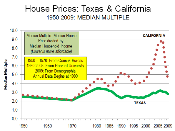
    Throughout the past decade, Texas has experienced far smaller house price increases than in California, Florida and many other states. During the bubble, California house prices increased at a rate 16 times those of Texas, while Florida house prices increased 7 times those of Texas. As a result, after the bubble burst, subsequent house price declines were far less severe or even non-existent in Texas. Texas had experienced its own housing bubble in the 1980s, however even then overall prices did not exceed the Median Multiple of 3.0 (The Median Multiple is the median house price divided by the median household income).

    Unlike Texas, all of the markets with steep house price escalation had more restrictive land use regulations. This association between more restrictive use regulation and higher house prices has been noted by a wide range economists, from left-leaning Nobel Laureate Paul Krugman to the conservative Hoover Institution’s Thomas Sowell. It is even conceded in The Costs of Sprawl —2000, the leading academic advocacy piece on more restrictive land use controls, which indicates the potential for higher house or land prices in 7 of its 10 recommended strategies.

    Comparing Texas and California: Unlike California, housing remained affordable in Texas. California’s housing affordability – in relation to income – largely tracked that of Texas (and the nation) until the early 1970s (Figure). After more restrictive land use regulations were adopted prices started to escalate. This relationship has been well demonstrated by William Fischel of Dartmouth University. Other factors have had little impact. Construction cost increases have been near the national average in California. Other factors, like underlying demand as measured by domestic migration, have been lower in California than in Texas..

    Comparing Texas and Florida: The contrast with Florida is similar. Housing affordability in Florida was comparable to that of Texas as late as the 1990s. However, with strict planning control of land for development in Florida, land prices rose substantially when profligate lending increased demand.

    Comparing Texas and Portland: Further, the Texas housing market avoided the huge price increases that have occurred in Portland (Oregon), which relies on extensive restrictive land use regulation. In 1990, Portland house prices relative to incomes were similar to those of the large Texas metropolitan areas. At the recent peak, the median Portland house price soared to approximately 80% above Texas prices. Portland did not experience the price collapses of California, but due to the greater price volatility associated with smart growth price declines in relation to incomes that were five times those of Texas.

    How the Speculators Missed Texas: Speculation is often blamed as having contributed to the higher house prices that developed in California and Florida. This is correct. Moreover, with some of the strongest demand in the United States, Texas would seem to have been a candidate for rampant speculation. After all, it happened back in the 1970s when a huge oversupply of housing, industrial, retail and office space collapsed in the face of falling energy prices.

    But it did not happen this time, despite solid population growth. During the housing bubble, Dallas-Fort Worth and Houston ranked second and third to Atlanta in population increases among metropolitan areas with more than 5 million population. Austin is the nation’s second fastest growing metropolitan area with more than 1 million population. Each of these metropolitan areas had strong underlying demand, as indicated by domestic migration data.

    Yet the speculators were not drawn to the metropolitan areas of Texas. This is because speculators or “flippers” are not drawn by plenty, but by perceived scarcity. In housing, a sure road to scarcity is to limit the supply of buildable land by outlawing development on much that might otherwise be available.

    However, the speculators did not miss California and Florida. Nor did they miss Las Vegas or Phoenix, where the price of land for new housing rose between five and 10 times as the housing bubble developed. Despite their near limitless expanse of land, much of it was off limits to building, and the exorbitant price increases were thus to be expected.

    The Threat: Yet, despite the success of the less restrictive land use policies in Texas, there are strong efforts there to impose more smart growth policies. The impact could be devastating, especially from strategies that ration land that would raise land and house prices, as has occurred in California and Florida. In 2009, Governor Perry vetoed a bill that would have required the state to promote smart growth. Federal initiatives, under proposed climate change and transportation acts could do much to destroy not only the affordability of Texas metropolitan markets, but could also make Texas less competitive in the decades ahead.

    Photograph: Suburban San Antonio (by the author)

    Wendell Cox is a Visiting Professor, Conservatoire National des Arts et Metiers, Paris. He was born in Los Angeles and was appointed to three terms on the Los Angeles County Transportation Commission by Mayor Tom Bradley. He is the author of “War on the Dream: How Anti-Sprawl Policy Threatens the Quality of Life.

  • Locals Flee from New South Wales

    A newspaper headline “Fleeing locals ease population pressure on New South Wales” highlights a trend over the last few years. Since 2002 the Australian state of New South Wales, the country’s most populous with over seven million residents, has been losing its residents to other states at some 20,000 per year.

    During the year ended December 2009, 0.2 per cent of the New South Wales population moved to other Australian states. By contrast the State of Queensland, gained 0.3 per cent. Total population growth (consisting of net immigration, natural increase and net interstate movement) in the states of Victoria, Queensland and Western Australia was 2.13, 2.44 and 2.65 per cent respectively. By contrast New South Wales grew a desultory 1.64 per cent.

    The main reason ascribed to the exodus from New South Wales is the cost of housing in Sydney. The 6th Annual Demographia Housing Affordability Survey shows that its capital city Sydney has the second highest housing costs of the cities in the six countries surveyed, behind only Vancouver, Canada. For many people, 9.1 years of median family income required to purchase a median family home Sydney is becoming too expensive to live in.

    The Demographia Survey indicates that a price/income ratio of 3.0 can be considered affordable and 9.1 severely unaffordable. As a result many people, especially the young, will never be able to aspire to the Great Australian Dream of owning their own home. For those who can afford a home, the average wait time to save for the required deposit is 6.2 years. The newly appointed Federal Sustainable Population Minister recently is quoted as saying “people have said all I can see for my kids is they’re never going to be able to afford to live in this suburb because of what’s happening with housing prices”.

    The high cost of housing has significant social impacts. The Demographia Survey estimates that in Sydney 57% of median gross family income would be required to make mortgage repayments for a current median priced house. This may be compared with the 20 per cent figure applicable in Atlanta or Dallas-Fort Worth. There are already some 11,000 homeless persons in New South Wales and some 4,000 sleeping rough.

    Why is the cost of housing in Sydney so high? The Demographia Survey portrays a widespread relationship among the cities studied between high housing cost and overly restrictive planning regimes. New South Wales is among the most restrictive. In order to implement a high-density policy it has restricted the release of greenfield housing sites from an historic average of 10,000 lots per year to an average over the last five years of only 2,250. This is in the face of a annual state population increase of some 115,000. It is staggering to consider this constraint in a continent-sized country of which only some 0.3 per cent is urbanised.

    The scarcity resulting from the miserable allocation of greenfield lots has been most notable in land price, whose share of housing costs has increased from 30 per cent to 70 per cent of the total cost. The result has been an increase of overall prices some three times what it was ten years ago.
    Only seven per cent of people, wish to live in apartments. However, in order to implement its high-density policy the State Government intends to force this lifestyle on reluctant consumers. It plans 460,000 extra dwellings within the existing footprint of Sydney by 2031. In practice the production rate of these high density units has fallen well short of that planned.

    These high-density planning policies result in a dwelling scarcity which enables developers to make large profits on apartments. Developers now comprise by far the largest group (29.5 percent) among Australia’s 200 richest people. They have the resources to make sizable donations to both major political parties. Donations help fund election campaigns and in the past have helped keep the politicians who promote these policies in power. Numerous cases have been documented that show a large donation being made to a governing party shortly before permission was granted for a particular development.

    The shortage of land also impacts commerce and industry. Higher housing costs result in higher rentals or mortgage costs. Workers have to make ends meet and so businesses have to pay higher wages. Additionally employers must shell out for higher commercial rentals. The cost of industrial land in Sydney is roughly 70 per cent greater than in the other Australian large cities. Recently there have been a number of well publicised instances of industries closing their factories in Sydney and moving to Victoria, the state located to the south.

    Communities in Sydney are now paying the price for misguided state planning policies. Concrete, bitumen and tiles dominate vast areas where streetscapes of flowers and foliage once reigned supreme. There is a rising consciousness of disasters resulting from the government’s high-density planning policies. as Along with the topic of unaffordable housing, traffic gridlock, disintegrating public transport, frequent power blackouts and a city running out of water hit the headlines with increasing frequency. Dissatisfaction is escalating.

    The latest Newspoll puts the primary vote for New South Wale’s ruling Labor Party at 25 per cent, the lowest ever recorded. It faces a devastating defeat in the forthcoming March 2011 election. There can be little doubt that ill-advised planning policies are a major factor underlying this pending electoral calamity. But will politicians ever learn?

    (Dr) Tony Recsei has a background in chemistry and is an environmental consultant. Since retiring he has taken an interest in community affairs and is president of the Save Our Suburbs community group which opposes over-development forced onto communities by the New South Wales State Government.

    Photo by Nelson Minar

  • More Clouds Over Sky-High Metro Housing

    Can housing costs get so high that they repel new migrants, and stunt a metropolitan area’s economic growth?

    For potential migrants looking for a job, metropolitan areas—and in particular large metropolitan areas—are the places to be. People move in because that’s where the jobs are. More than 93% of non-farm jobs in the U.S. are in the 100 largest metropolitan areas. The biggest 15 metro areas account for 34% of the nation’s jobs. Big places also have the benefits of cultural amenities, educational institutions, and impressive retail and restaurant environments.

    The combination of population growth, a constrained supply of land, and local land use policies, however, work together to put upward pressure on housing costs. Wages in big cities are typically higher than in other places. In theory, this compensates for higher housing costs. But is this notion a thing of the past?

    One measure of housing affordability in metropolitan areas is the Housing Opportunity Index (HOI), produced quarterly by the National Association of Home Builders, and defined as the share of homes sold in a metropolitan area affordable to a household earning the local area median income, using standard mortgage underwriting criteria. The nation’s largest metropolitan areas—the so-called Mega metropolitan areas—are the least affordable places to live as measured by the HOI. They also experienced the biggest drop in affordability over the 2000-2007 period: The average HOI for the Mega metropolitan areas dipped from 54.3 to 34.5 between 2000 and 2007 (Table 1). In other words, 54.3% of homes in the nation’s largest metropolitan areas were affordable to the median income household in 2000, but only 34.5% were in 2007.

    Metropolitan Area Hierarchy
    Population
    Mega metro greater than 2.5 million
    Major metro 1 to 2.5 million
    AAA metro 500,000 to 999,999
    AA metro 250,000 to 499,999
    A metro less than 250,000
    Source: D. A. Plane, C. J. Henrie, and M. J. Perry.  2005. Migration up and down the urban hierarchy and across the life course. PNAS 102(43).

    Given the run-up in home prices, household migration to the Mega metropolitan areas should have slowed between 2000 and 2007, while migration to smaller, more affordable places should have been relatively higher.

    Table 1. Housing Opportunity Index by  Metropolitan Area Type: 2000 and 2007
    Percent of Homes Affordable to Median Income Household
    Metropolitan Area Type 2000 2007 Pct. Change
    Mega metropolitan 54.3 34.5 -19.8
    Major metropolitan 68.3 57.5 -10.9
    AAA metropolitan 70.7 53.2 -17.5
    AA metropolitan 66.4 56.2 -10.3
    A metropolitan 70.3 62.5 -7.8
    All metropolitan areas 68.7 58.3 -10.4
    Source: National Association of Home Builders and author’s calculations

    In-migration rates (Table 2) fell between 2000 and 2007 for all sizes of metropolitan areas, with somewhat larger drops in the Mega metros.

    Table 2. Household In-Migration Rates (per 10,000 housing units) by Metropolitan Area Type: 2000 and 2007
    Metropolitan Area 2000 2007 Pct. Change
    Mega metropolitan 401 367 -8.8
    Major metropolitan 449 423 -5.8
    AAA metropolitan 467 440 -5.8
    AA metropolitan 544 501 -7.9
    A metropolitan 560 526 -6.1
    All metropolitan areas 527 492 -6.6
    Source: IRS County-to-county migration files and author’s calculations

    Is there a statistical relationship between a metropolitan area’s housing affordability and household in-migration rates in a given year? The short answer is no. A simple correlation between metropolitan area HOI and in-migration rate for both 2000 and 2007 show a weak negative relationship between housing affordability and household in-migration rates.

    What does seem to matter is the change in housing affordability over time. There is a positive and large correlation between the change in HOI between 2000 and 2007 and in-migration rates in 2007. That is, places where affordability dropped between 2000 and 2007 generally had lower rates of household in-migration in 2007. Places that became more affordable between 2000 and 2007 had higher in-migration rates in 2007.

    Why would the change in housing affordability be related to in-migration when a metro area’s current affordability is not? It may be that changes in housing affordability are actually signals for a multitude of economic changes. Generally, we think of home prices as being influenced by changes in the local economy. When a region loses jobs, as some metro areas in the mid-West have, home prices fall and the region becomes more affordable.

    But it is also possible that the relationship can work differently. Can home prices influence job growth, particularly when prices rise quickly and wages cannot keep up? Perhaps the phenomenon is a result of employers not being able to expand their businesses and add jobs because they could not find workers that could afford to re-locate. Perhaps new firms did not locate in places with rapidly escalating housing costs because the wage premium got too high. Perhaps the disadvantages of large metropolitan areas started to outweigh the advantages, at least on the margins.

    Job data from the Bureau of Labor Statistics provides some preliminary indications on the economic effects of housing unaffordability in large metro areas. In metropolitan Miami, for example, the HOI dropped 49 points, from 58.8 in 2000 to 10.0 in 2007. The job growth rate in Miami slowed considerably in 2007. The number of jobs in the Miami metro area grew by about 3% annually in 2004, 2005 and 2006; however, in 2007, jobs grew by only 0.6%. In the Washington DC metro area, where the HOI dropped 39 points between 2000 and 2007, job growth proceeded at a stable 2.0 to 2.5% annual growth rate in 2004, 2005 and 2006. In 2007, however, job growth was at 0.8%.

    In many places where housing affordability improved—or at least did not decline too much—job growth held steady or increased in 2007. Many of these were Major metro areas (with populations between one and 2.5 million). For example, the HOI for Denver increased six points, from 58.5 in 2000 to 64.5 in 2007. The job growth rate in Denver in 2007 was 2.2%, up from 2.1% in 2006, 2.0% in 2005 and 0.8% in 2004. In Pittsburgh, the HOI was up 8.6 points and annual job growth rates were steady between 2004 and 2007. In Rochester, NY, the HOI was up five points and job growth in 2007 was stronger than in 2006.

    So—big drops in housing affordability may be a problem for a metropolitan area’s economic health. High housing costs make it more difficult to attract labor. The wage premium needed to offset the high housing costs becomes untenable at some point. As a result, new firms stop locating in high cost areas and existing firms are unable to add jobs.

    Eventually, of course, job losses would put downward pressure on housing costs and the metropolitan area’s economy would stabilize. Large metropolitan areas will end up with a smaller share of the nation’s jobs after this stabilization process. If large places are good for economic activity because of the agglomeration benefits they provide, the dispersion of economic activity may not be a good thing for them.

    How can the biggest cities best prosper? Large, high cost metropolitan areas can stem economic slowdowns through policy changes that increase the supply of housing, thereby reducing housing costs. These policy initiatives would include changes to local land use and building regulations to encourage the construction of more housing. A regional approach to increasing the housing supply would focus on promoting housing near transit and employment centers.

    In the last two years, home prices have declined across many high cost metropolitan areas; however, job growth has already slowed disproportionately in many of these regions. This trend will likely continue in the near future. If the nation’s largest places are to be the dominate location for job growth in the future, regional and local policymakers need to develop comprehensive housing strategies that treat housing as an integral part of a regional economic development policy.

    Photo by limonada (Emilie Eagan), Late Afternoon and Almost Stormy

    Lisa Sturtevant is an Assistant Research Professor at George Mason University School of Public Policy, Center for Regional Analysis.

  • SPECIAL REPORT: Move to Suburbs (and Beyond) Continues

    Anyone who challenges the notion that the long predicted exodus of people from the suburbs to the city has been wildly overstated is sure to generate some backlash from urban boosters. Alan Berube of the Brookings Institution contends in a New Republic column that “head counts” better reveal city trends than property trends or the massive condo bust. He points to a Brookings Institution analysis by Bill Frey, entitled “Texas Gains, Suburbs Lose in 2010 Census Review,” which compares trends in major cities and suburbs, but offers not a sentence demonstrating any actual population “loss” in suburbs (his point is that their growth rates have declined).

    However, Berube has a point. Head counts are the issue. The annual Bureau of the Census “head count” of domestic migration reveals that the suburban to urban core exodus is as elusive as it has ever been. Gross population totals reveal nothing with respect to movements between the suburbs and the core. There is no doubt that core city population trends have improved, and this is a good thing. However, there is not a shred of evidence that suburbanites are picking up and moving to the cores.

    Domestic Migration: This is indicated by a “head count” of migration trends during the decade and during the last year. Each year, the Bureau of the Census estimates the number of people who move between counties (domestic migration) and the number of people who move into metropolitan areas from outside the nation (international migration). The data is estimated at the county (equivalent) level, which means that, except where cities are counties (such as Baltimore, San Francisco and others), individual core city data is not available. Thus, the analysis has to rely on core versus suburban counties in metropolitan areas (Note 1).

    In short, the nation’s urban cores continue to lose domestic migrants with a vengeance, however are doing quite well at attracting international migration. Thus, core growth is not resulting from migration from suburbs or any other part of the nation, but is driven by international migration.

    The following analysis covers all but four (48) metropolitan areas with more than 1,000,000 population as of 2009. San Diego, Las Vegas and Tucson are excluded because they include only one county, so there is only a core county and no suburban county. New Orleans is excluded due to the special circumstances of the huge population losses from Hurricane Katrina.

    Generally, domestic migrants are leaving the nation’s largest metropolitan areas. Between 2000 and 2009, a net 1,900,000 domestic migrants moved to areas of the nation outside the largest metropolitan areas (Table 1). Domestic migration losses occurred 24 of the 48 metropolitan areas. In the last year (2008-2009), the net domestic out-migration for all 48 regions in total was 22,000, 90% below the 2000-2008 annual rate. A somewhat smaller number of metropolitan areas, 22, experienced domestic migration losses in the last year. Most observers, including Berube, trace this diminishing loss to the recession, which has made movement in any direction more difficult over the past two years.

    Table 1
    Domestic Migration: Major Metropolitan Areas
    2000-2009
    2008-2009
    Core County Classification
    Metropolitan Area
    Metropolitan Area
    Core
    Suburban
    Metropolitan Area
    Core
    Suburban
    1
    New York   (1,920,745)   (1,222,290)     (698,455)       (110,278)     (77,381)    (32,897)
    3
    Los Angeles   (1,337,522)   (1,102,202)     (235,320)         (79,900)     (76,674)      (3,226)
    2
    Chicago       (547,430)      (705,403)      157,973         (40,389)     (31,114)      (9,275)
    4
    Dallas-Fort Worth        307,907      (262,982)      570,889           45,241       (7,494)      52,735
    1
    Philadelphia       (112,071)      (154,338)         42,267           (7,577)       (5,496)      (2,081)
    4
    Houston        242,573        (69,736)      312,309           49,662       19,002      30,660
    4
    Miami-West Palm Beach       (284,860)      (297,637)         12,777         (29,321)     (25,142)      (4,179)
    1
    Washington       (110,775)        (39,814)       (70,961)           18,189         4,454      13,735
    3
    Atlanta        412,832            3,243      409,589           17,479         7,579        9,900
    1
    Boston       (232,984)      (100,485)     (132,499)             6,813             (32)        6,845
    2
    Detroit       (361,632)      (306,467)       (55,165)         (45,488)     (34,794)    (10,694)
    4
    Phoenix        530,579        404,840      125,739           12,441         4,651        7,790
    2
    San Francisco-Oakland       (343,834)      (245,796)       (98,038)             7,977           (207)        8,184
    4
    Riverside-San Bernardino        457,430        375,055         82,375               (616)       13,174    (13,790)
    3
    Seattle           42,424        (27,407)         69,831           17,035       11,053        5,982
    2
    Minneapolis-St. Paul         (22,865)      (138,395)      115,530           (2,503)       (1,989)          (514)
    1
    St. Louis         (42,151)        (62,990)         20,839           (4,532)       (3,197)      (1,335)
    4
    Tampa-St. Petersburg        254,650          89,385      165,265             4,663         2,630        2,033
    1
    Baltimore         (35,938)        (74,328)         38,390           (3,687)       (4,883)        1,196
    2
    Denver           61,108        (44,839)      105,947           19,831         6,369      13,462
    2
    Pittsburgh         (49,438)        (57,532)           8,094             1,144            401           743
    2
    Portland        120,437            3,811      116,626           16,320         7,053        9,267
    2
    Cincinnati         (18,313)        (87,976)         69,663               (384)       (2,833)        2,449
    4
    Sacramento        135,038          32,369      102,669             4,733       (1,185)        5,918
    2
    Cleveland       (133,679)      (151,448)         17,769         (10,191)     (10,875)           684
    4
    Orlando        218,108          46,341      171,767           (4,279)       (6,275)        1,996
    4
    San Antonio        175,552          96,856         78,696           18,984       10,797        8,187
    3
    Kansas City           30,181        (33,910)         64,091             3,929           (417)        4,346
    4
    San Jose       (233,133)      (226,545)         (6,588)           (5,361)       (4,829)          (532)
    3
    Columbus           32,087        (36,024)         68,111             5,018         1,907        3,111
    4
    Charlotte        243,399        104,402      138,997           19,211         8,299      10,912
    3
    Indianapolis           70,271        (53,039)      123,310             7,034       (1,209)        8,243
    4
    Austin        224,227          52,842      171,385           25,654       10,484      15,170
    2
    Norfolk-Virginia Beach         (19,172)        (19,391)              219           (8,052)       (3,559)      (4,493)
    2
    Providence         (50,151)        (38,129)       (12,022)           (6,736)       (4,939)      (1,797)
    3
    Nashville        120,684        (20,101)      140,785           10,826            128      10,698
    2
    Milwaukee         (72,668)        (89,476)         16,808           (2,336)       (3,585)        1,249
    4
    Jacksonville        125,881          17,866      108,015             1,758       (3,415)        5,173
    4
    Memphis           (8,834)        (61,325)         52,491           (5,276)       (7,867)        2,591
    3
    Louisville           33,700           (7,692)         41,392             2,122            262        1,860
    2
    Richmond           74,650           (4,839)         79,489             2,751                 3        2,748
    3
    Oklahoma City           41,523           (8,164)         49,687             8,798         3,236        5,562
    3
    Hartford           (9,385)        (22,089)         12,704           (1,847)       (1,949)           102
    3
    Birmingham           26,420        (26,550)         52,970             2,418       (1,424)        3,842
    3
    Salt Lake City         (32,760)        (43,779)         11,019               (164)           (911)           747
    4
    Raleigh        190,438        150,583         39,855           20,095       16,070        4,025
    2
    Buffalo         (53,191)        (47,780)         (5,411)           (1,711)       (1,806)              95
    2
    Rochester         (42,163)        (35,354)         (6,809)           (1,937)       (1,224)          (713)
    Total   (1,903,595)   (4,548,659)   2,645,064         (22,439)   (199,153)   176,714
    Major metropolitan areas: Population over 1,000,000 in 2009
    Core county classifications: See Table 2

    The core counties lost domestic migrants, often at very high rates. Between 2000 and 2009, more than 4,500,000 people moved out of the core counties. This is more people than live in the cities of Los Angeles and Washington, DC combined. The suburban counties did substantially better gaining more than 2,600,000 domestic migrants (nearly as many people as live in the city of Chicago), but not enough to negate the core losses. Over the past year, the core counties lost 200,000 domestic migrants, an annual rate approximately two-thirds less than the rate from 2000 to 2008. Suburban counties gained 175,000, a more than 40% reduction from the 2000-2008 annual rate. All of these rate changes are consistent with expectations in a recession, as fewer people move.

    If anything, the trends of the past decade indicate a further dispersal of America’s metropolitan population, with an additional 200,000 domestic migrants moving to the exurban counties adjacent to and beyond the major metropolitan areas (Note 2). Reflecting the effects of the recession, exurban areas lost 4,000 domestic migrants in the last year. This one year loss rate is less than 1/10th of the core county domestic migration loss rate over the same period. Another nearly 1.7 million domestic migrants left the major metropolitan areas and their exurbs altogether, moving to smaller metropolitan areas, smaller urban areas and rural areas.

    Between 2000 and 2008, 36 cores experienced domestic migration losses, compared to 10 suburban areas. The cores did better in the last year, with 29 losing domestic migrants, while 13 suburban areas lost domestic migrants. Further, more people moved into (or fewer moved out of) the suburbs from other parts of the country than to the cores in 42 of the 48 metropolitan areas between 2000 and 2009 and in 2008-2009.

    Moreover, not all urban cores are the same. Some, including most of the fast growing areas, are far more suburban than others. This is illustrated by a classification of core counties (Table 2) based upon the share of owner occupant housing built after 1949 (For for statistical purposes the beginning of automobile oriented suburbanization was with the census of 1950).

    Table 2
    Core County Classifications (Extent of Suburbanization)
    Core County Classification
    Share of Owner-Occupied Houses Built After 1949
      Dominant Urban Cores
    Less than 50%
      Moderately Suburban
    50% = <75%
      Substantially Suburban
    70% = <85%
      Predominantly Suburban
    85% & Over
    Data from 2000 US Census

    For example, in the core counties of the St. Louis and Boston metropolitan areas, there is little suburbanization, with more than 70% of houses having been built before 1950. Their growth truly reflects the attractiveness of traditional, relatively dense urban living. On the other hand, in the core county of the Austin metropolitan area, less than 10% of the houses were built before 1950, while in Phoenix, the figure is 3%. In these and other core counties that encompass large suburban areas, the vast majority of “urban” growth follows a highly suburbanized, auto-oriented model.

    The domestic migration results by core county classification are as follows:

    • Dominant Urban Core Central Counties (less than 50% of the housing stock built after 1949) lost 1.650 million domestic migrants, or 14.0% of their 2000 population. In the last year, the loss was 87,000.
    • Moderately Suburban Core Central Counties (50% to 69% of the housing stock built after 1949) lost 1.970 million domestic migrants, or 10.0% of their 2000 population. In the last year, the loss was 83,000.
    • Substantially Suburban Core Central Counties (70% to 84% of the housing stock built after 1949) lost 1.380 million domestic migrants, or 7.2% of their 2000 population. In the last year, the loss was 58,000.
    • Predominantly Suburban Core Central Counties (85% and more of the housing stock built after 1949) gained 450 thousand domestic migrants, or 2.0% of their 2000 population. In the last year, the gain was 29,000.

    By no stretch of the imagination, then, can it be validly claimed that the overall trend is people moving from the suburbs to the core. The evidence suggests that the more urban the core county, the greater are the domestic migration losses.
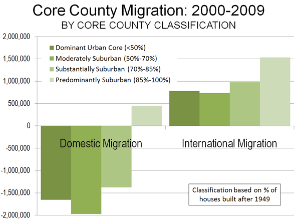
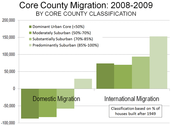
    International Migration: The real story with respect to core growth is international migration. The 48 metropolitan areas gained 6.4 million international migrants from 2000 to 2009 and 620,000 in 2008-2009. International migration, also impacted by recession, dropped by nearly a 15% drop from the 2000-2008 annual rate (Table 3).

    Table 3
    International Migration: Major Metropolitan Areas
    2000-2009
    2008-2009
    Core County Classification
    Metropolitan Area
    Metropolitan Area
    Core
    Suburban
    Metropolitan Area
    Core
    Suburban
    1
    New York     1,075,016      622,538      452,478        100,669     57,674      42,995
    3
    Los Angeles        803,614      628,303      175,311           75,062     58,557      16,505
    2
    Chicago        363,134      265,156         97,978           33,363     24,236        9,127
    4
    Dallas-Fort Worth        323,941      203,732      120,209           31,571     19,785      11,786
    1
    Philadelphia        122,733         50,761         71,972           12,944        5,560        7,384
    4
    Houston        289,648      252,098         37,550           27,996     24,371        3,625
    4
    Miami-West Palm Beach        506,423      318,888      187,535           51,548     32,380      19,168
    1
    Washington        310,222         23,112      287,110           31,904        2,096      29,808
    3
    Atlanta        207,238         42,082      165,156           20,288        4,093      16,195
    1
    Boston        191,014         64,359      126,655           19,250        6,522      12,728
    2
    Detroit           93,625         44,177         49,448             8,723        4,132        4,591
    4
    Phoenix        214,067      209,326           4,741           21,833     21,364           469
    2
    San Francisco-Oakland        257,318      161,324         95,994           24,376     15,373        9,003
    4
    Riverside-San Bernardino           90,652         46,829         43,823             8,464        4,313        4,151
    3
    Seattle        126,973         98,983         27,990           12,919        9,971        2,948
    2
    Minneapolis-St. Paul           84,440         69,262         15,178             8,234        6,756        1,478
    1
    St. Louis           29,782         11,794         17,988             2,928        1,112        1,816
    4
    Tampa-St. Petersburg           74,173         42,568         31,605             8,045        4,762        3,283
    1
    Baltimore           43,949         10,852         33,097             4,604        1,125        3,479
    2
    Denver           93,916         45,338         48,578             8,738        4,251        4,487
    2
    Pittsburgh           19,225         16,326           2,899             1,901        1,596           305
    2
    Portland           70,901         28,755         42,146             6,680        2,677        4,003
    2
    Cincinnati           22,364         12,754           9,610             2,245        1,260           985
    4
    Sacramento           64,275         47,169         17,106             6,056        4,420        1,636
    2
    Cleveland           28,002         20,168           7,834             2,826        1,987           839
    4
    Orlando           95,500         61,171         34,329           11,720        7,381        4,339
    4
    San Antonio           31,595         28,157           3,438             3,303        2,940           363
    3
    Kansas City           34,339         12,613         21,726             3,404        1,262        2,142
    4
    San Jose        170,452      168,009           2,443           16,347     16,116           231
    3
    Columbus           39,755         38,261           1,494             4,063        3,915           148
    4
    Charlotte           48,176         34,522         13,654             4,678        3,332        1,346
    3
    Indianapolis           27,676         22,058           5,618             2,809        2,239           570
    4
    Austin           65,958         56,828           9,130             6,406        5,516           890
    2
    Norfolk-Virginia Beach                421         (1,546)           1,967                867             81           786
    2
    Providence           34,926         25,547           9,379             3,753        2,741        1,012
    3
    Nashville           36,570         26,208         10,362             3,850        2,760        1,090
    2
    Milwaukee           26,814         22,612           4,202             2,706        2,292           414
    4
    Jacksonville           15,066         12,046           3,020             1,760        1,397           363
    4
    Memphis           19,845         17,801           2,044             2,093        1,874           219
    3
    Louisville           16,437         12,778           3,659             1,685        1,291           394
    2
    Richmond           17,061           4,161         12,900             1,805           440        1,365
    3
    Oklahoma City           23,717         18,698           5,019             2,394        1,878           516
    3
    Hartford           30,266         25,871           4,395             3,230        2,784           446
    3
    Birmingham           14,485         10,644           3,841             1,557        1,151           406
    3
    Salt Lake City           41,216         39,416           1,800             3,855        3,684           171
    4
    Raleigh           36,923         32,141           4,782             3,560        3,103           457
    2
    Buffalo             9,671           8,387           1,284                940           814           126
    2
    Rochester           12,796         11,657           1,139             1,243        1,123           120
    Total     6,356,310   4,024,694   2,331,616        621,195   390,487   230,708
    Major metropolitan areas: Population over 1,000,000 in 2009
    Core county classifications: See Table 2

    The core counties gained 4.0 million net international migrants between 2000 and 2009. The international migration gains in the dominant urban and moderately suburban core counties were not sufficient to compensate for the domestic migration losses (Figure 3). Surprisingly, the strongest gain in international migration from 2000 to 2009 was not in the more urban core counties, but rather was in the predominantly suburban core counties, at a 6.8% rate compared to 2000 populations.
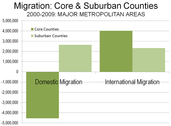
    In 2008-2009, the core county gain was 390,000, approximately 15% below the 2000-2008 annual rate (Figure 4). The suburban counties gained international migrants, though fewer than the cores, adding a net 2.3 million between 2000 and 2009. Between 2008 and 2009, the suburbs added a net 230,000 international migrants, a 12% decline from the 2000-2008 annual rate.
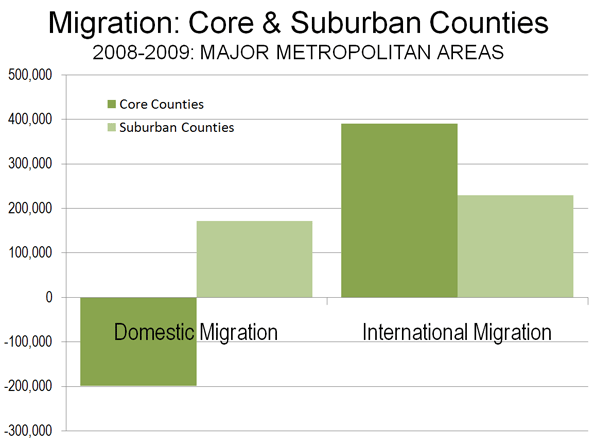
    This of course measures only initial international migration. Over time many immigrants likely will head for the suburbs, which now are home to a majority. Core cities may be playing more of a “revolving door” role where they take in immigrants (and young people) for several years, then lose them, but replace the loss with newcomers.

    The Exodus: Elusive as Ever: The much ballyhooed suburban hegira has not begun, despite it having been announced repeatedly (Table 4). There is no doubt that the cores are doing better than in recent decades, particularly since the deep recession began. But the relative better urban performance may have more to do with stagnation than anything endlessly alluring about inner city life.

    Table 4
    Domestic, International & Total Migration: Major Metropolitan Areas
    PERSONS
    Net Domestic Migration: 2000-2009
    Net Domestic Migration: 2008-2009
    Net International Migration: 2000-2009
    Net International Migration: 2008-2009
    Net Total Migration: 2000-2009
    Net Total Migration: 2008-2009
    Core Counties (Share of Post-1949 Housing)   (4,548,659)     (199,153)      4,024,694         390,487        (523,965)     191,334
      Dominant Urban Core (Less than 50%)  (1,654,245)      (86,535)        783,416          74,089       (870,829)     (12,446)
      Moderately Suburban (50%-69%  (1,969,014)      (83,099)        734,078          69,759    (1,234,936)     (13,340)
      Substantially Suburban (70%-84%)  (1,377,714)      (58,419)        975,915          93,585       (401,799)       35,166
      Predominantly Suburban (85% & Over)       452,314        28,900     1,531,285        153,054     1,983,599    181,954
    Suburban Counties     2,645,064       176,714      2,331,616         230,708      4,976,680     407,422
    48 Major Metropolitan Areas   (1,903,595)       (22,439)      6,356,310         621,195      4,452,715     598,756
    Exurban Counties        198,294          (4,053)         364,498           36,740          562,792        32,687
    48 Metropolitan Areas & All Exurban Counties   (1,705,301)       (26,492)      6,720,808         657,935      5,015,507     631,443
    4 Excluded Metropolitan Areas          19,958         14,553         225,767           23,400          245,725        37,953
    All (52) Major Metropolitan Areas & Exurban Counties   (1,685,343)       (11,939)      6,946,575         681,335      5,261,232     669,396
    Smaller Metropolitan & Rural     1,685,343         11,939      1,678,369         173,570      3,363,712     185,509
    United States 0 0      8,624,944         854,905      8,624,944     854,905
    Major metropolitan areas: Population over 1,000,000 in 2009
    Excluded metropolitan areas: San Diego, Las Vegas & Tucson (no suburban county) and New Orleans (due to Hurricane Katrina)
    Exurban counties of excluded metropolitan areas are included (Las Vegas and New Orleans)

    As in Europe, people are moving to the urban cores. But also, as in Europe, they are moving there from across national borders, rather than from the suburbs (Figures 3 & 4). This will surprise urbanites who cannot imagine meaningful lives in the suburbs, but will not shock the many millions more suburban residents content enough not to move. The exodus from the suburbs to the core will not have begun until more moving vans head away from the suburbs than to them. To this point, this is simply not occurring. And when the economy recovers, history suggests that the gap between suburban and core growth rates may begin expanding again.


    Note: There is one core county in each metropolitan area, which is the county containing the first named city, except for in New York, where all five counties (boroughs) are included, in San Francisco-Oakland, where Alameda County (Oakland) is also included and in Minneapolis-St. Paul, where Ramsey County (St. Paul) is also included.

    Note: The exurban counties are those included in combined statistical areas (as designated by the Bureau of the Census), which have major metropolitan areas as their core.

    Photo: Suburban Minneapolis-St. Paul

    Wendell Cox is a Visiting Professor, Conservatoire National des Arts et Metiers, Paris. He was born in Los Angeles and was appointed to three terms on the Los Angeles County Transportation Commission by Mayor Tom Bradley. He is the author of “War on the Dream: How Anti-Sprawl Policy Threatens the Quality of Life.

  • The Economic Significance of Village Markets

    Flea markets and garage sales have been around for years. But for most New Zealanders, produce markets have been associated with old European villages, or the ethnic markets of Hong Kong and other exotic locations. Village markets focus on locally made crafts, while Flea Markets are essentially centralized garage sales.

    At the true Farmers’ Market vendors may sell only what they grow, farm, pickle, preserve, bake, smoke, or catch themselves from a defined area. There are now over 50 “official” Farmers’ Markets in New Zealand. But when all the flea markets, village markets, and less formal markets are tallied up there must be hundreds throughout New Zealand.

    When I grew up they simply didn’t exist – unless we count the school “Bring and Buy” and Church fétes. We simply shopped in shops. Why is this? Why did my parents feel no need for such markets? I suspect my parents would have regarded such markets as somewhat old-fashioned and even primitive. This was the sort of thing our forebears left behind in Ireland in the 1830s.

    However, they are now a part of our lives. For the last few years I have routinely – effectively every Saturday Morning – shopped at our local market at Mangawhai, a nearby coastal village in Northland. It’s where people sell their own produce, but also sell books, bric-a-brac, power-tools, and other bits and pieces. The market works for me because it is just across the road from my excellent butcher, and next door to the local lending library.

    So what’s the new appeal? The conventional theory is that the rise of these markets reflects a desire for fresh healthy food, and fruit and vegetables grown locally, and in-season rather than imported from far away. It’s also considered green to buy local and support local cultivars, and growers of eco-sourced native plants and so on.

    These markets are also a good place to meet for a chat, and they also provide a convenient means of selling off numerous “priceless objects” now growing mould in the garage.

    Indeed, last weekend, my wife and I decided to win back some space and earn some ready cash. Setting up a stall at the Mangawhai market was easy. We simply phoned the market organizer (from the local Cheese Shop) and booked a trestle table.

    We thought our real cash-cow would be the plants and seedlings but the biggest and most regular seller was our collection of vinyl records dating from US pressings of jazz giants from the sixties. Our first major sale was a high-quality Akai turntable. It was fun to see grandmotherly types shuffle up to the table and enthuse over early discs by Oscar Peterson, Miles Davis, and Billie Holliday. As a bonus we gave the turntable buyer a 1950s 10 inch LP of Bill Hayley and his Comets – Don’t Knock the Rock.

    The last time I thought about these markets was two weeks ago when I wrote the sad story of the urban Onehunga Market that had to close because Auckland City demanded a resource consent that would have cost maybe $30,000 dollars.

    I presume our Mangawhai market operates without such costs because it is housed in the Village Hall, on public ground, shared with the Library and the Museum. Consequently our stall space and trestle cost us only $10 for the morning. But if the Council had demanded say $30,000 for a land use consent, then a twenty-trestle market at $10 a trestle would take 150 weeks to recover just the consenting cost. Obviously, there would have to be many more spaces, or the rental would have to be much higher.

    On our first morning we netted only about $80. (Being newcomers, we were outside and it rained) But even this represented about $20 dollars an hour – not huge but better than the minimum wage. On the other hand it was an $80 dollar return on our $10 dollar capital investment (using simple “homespun” economics). Remember the stuff we were selling had negative value, and I drive back and forth from the village every Saturday anyhow.
    And it was fun. But could such markets become an endangered species? As in so many areas, the culprit is heavy-handed regulation. The high costs of land and development, and the burden of consenting and development contributions already make it nearly impossible for small corner stores to make any return on capital.

    Yet, the stall renter’s capital-productivity is massive. But many regulators cannot stand to see such an opportunity slip from their grasp. So the Onehunga market had to close.

    These village markets remind us of the “power of markets”. As the heavy-handed regulators drive down capital productivity, entrepreneurs have responded by rediscovering the outdoor markets of much earlier times when capital was scarce and labour was plentiful. Market economies are like water-beds – push down on one corner and they bounce up in another.

    We are beginning to see similarly ad hoc responses in the residential and commercial property markets. The regulators have so severely constrained the supply of coastal land in New Zealand that people like my parents, who bought a batch at on the coast at Tairua out of their working class income, no longer have a hope of enjoying the sprint from the Kiwi bach straight into the sea.

    Those who have generated this scarcity then complain that only foreigners can afford to buy our coastal land. But many of us really do want to occupy a beach side property for the best weeks of summer, and then return home to our rural dwellings in the regional towns and villages. Enter the motor home.

    As farmers become more and more regulated by central planners who know nothing about agricultural economics but instead are determined to ‘save the planet’, enterprising farmers will look for new ways to supplement their incomes.

    Well, here’s one way we can solve our mutual problem. First, buy a quality self-contained motor home. Then use Google Maps to find what looks like an ideal bay, with a farm track connecting the main road to the beach.

    Then approach the farmer and negotiate a “right to occupy” this little patch of heaven. It could be no more than the right to park on the spot for perhaps eight weeks a year, but could include an obligation to fence off the area to contain any children or pets. No resource consent, no title, no lease – just a right to drive on to the farm, park on the spot, and drive away if it rains.

    Farmers supplement their income and Kiwis reclaim the low cost beach. The Environmental Puritans will gnash their teeth at the prospect of so many people having fun – but this time we might be ready for them. Markets and human ingenuity can still win in the long run.

    Owen McShane is Director of the Centre for Resource Management Studies, New Zealand.

    Photo of Mangawhai Village Saturday Market by Sids1