Category: planning

  • How To Justify Spending $8M On Something Nobody Wants

    The Minneapolis-St. Paul Metropolitan Council is gambling $8.7 million on a project to alleviate pedestrian congestion that might exist in 5 to 10 years if we’re somehow able to build two additional light rail lines and they are operating at full capacity for 10 days a year.

    That’s like buying flood insurance on the house you have yet to buy.

    The below $8.7 million piece of public infrastructure is intended to create a more safe passageway for travelers at the Downtown East station during Vikings home games. It’ll serve west and northbound train passengers and other pedestrians looking to enter a new football stadium. It is deemed this will be an important pedestrian overpass once all four major light rail lines completed.

    Download the Downtown East Plan Met Council PowerPoint here [PDF].

    Those reading this should have at least two questions:

    1. How did this come to be a thing?
    2. Why is it all of a sudden getting $8.7 million?

    I pay particularly close attention to local projects. I read blogs, forums and newspapers daily. I know and follow local decision-makers on social media, track development proposals, and pay attention to those boring committees few care about. I also work in the industry and talk to other people who work and follow the industry across related professions. It’s fair to say that I have a very good idea of what’s going on in the Twin Cities and the transportation and development needs of the community.

    Never once have I heard of this project until a few days ago. And now, out of the blue, we’re dropping $8.7 million on a bridge that’ll be needed 10 days a year starting in 2019.

    I wrote a blog post last year titled The Politics of Dumb Infrastructure. It was well received, and is even being used as required reading in an undergrad planning course in California. In the article I theorize as to why we make bad decisions when it comes to receiving other people’s money on transit projects;

    It’s the orderly, but dumb system that makes planners and politicians play to a bureaucratic equation that is supposed to guide officials towards the best alternative. Only it never actually works out that way and it usually forces smart people into making highly compromised and less-than-ideal decisions.

    The pedestrian bridge is different. It may deal with Federal grants, but is also come from local and regional coffers. Regardless, this project is being pushed forward. According to the Star Tribune,

    “The transit agency will likely devote $6 millon from its coffers for the project (this figure could be offset by federal grants), with the Minnesota Sports Facilities Authority (which oversees stadium construction) ponying up $2 million, and the rest coming from bonds issues by the Met Council.”

    Before we go any further, I think we need to ask a complex question.

    How Did We Get Here?

    The new $1 billion Green Line is done and the $1.1 billion Vikings Stadium is underway. They combine to represent over $2 billion of investment. Our local leaders are concerned, as they should be, that these pieces of infrastructure be as perfect as possible.

    To quote a former Governor (one who wasn’t a professional wrestler),

    “All too often, the human tendency is to compound one big mistake with a series of additional mistakes in the hope that somehow the results will improve. This appears to be the case with the Vikings stadium.”

    Politicians are attracted to big, transformitive projects, so it seems only natural that our leaders, who have expelled a great amount of political capital, want to see every inch of it succeed. Even if that means throwing good money after bad.

    How We Justify It All

    An engineer at the Met Council, likely under much political pressure, noticed something: based on 2019 projections, during peak hours on Minnesota Vikings game days, there will be only a 120 second headway between trains. This will likely not be enough time to manage safe pedestrian crossings. The proposed solution is the bridge.

    TopView

    Please note the skyway attached to the State-mandated parking structure.

    The pedestrian bridge makes some sense. Based on the projections, there will be long lines and delays during this period; and building a bridge for pedestrians certainly isn’t an unreasonable response. The Met Council’s Transportation Committee appears to be interested in the idea.

    Let’s look at these assumptions: they assume that there will be two additional light rail lines in full operation, both of which have not yet even been either fully allocated money or constructed. Basically, the Met Council is gambling $8.7 million that there might be a problem in 5 years if we’re somehow able to build two additional light rail lines and they are operating at full capacity for 10 days a year.

    To reiterate: Four (4) LRT lines being in operation (Blue, Green, SW & Bottentieu) and that Vikings game attendees hitting a 40% transit mode share. All of things don’t currently exist. It also assumes, more importantly, that if there is congestion people will not find an alternative route or change their travel behavior. This isn’t to say we can’t plan ahead. We should. But, we should be more realistic in our projections and our priorities.

    Where Are Our Priorities?

    Why did this project get fast-tracked while other smaller, more “everyday” projects never see the light of day? And, when smaller projects get the public’s attention, why do they struggle to find funding? These are merely a question of priorities.

    As Nick Magrino (at streets.mn) has asked so often, “why are we embarrassed by the bus?” He writes,

    “… I can’t shake the feeling that many of the expensive transit improvements we get in the Twin Cities are thought up by people who don’t actually use transit. Which is why we end up with Northstar, the Red Line, and so on.”

    A bridge like this seems like such a low priority, especially when we have legitimate transportation needs. For example, THIS is a bus stop on a heavily used transit line near the center of Minneapolis.

    It’s not that a pedestrian bridge is a terrible idea. Under the projections, at some point in the future, it seems maybe reasonable. But, why is the Met Council prioritizing and fast-tracking this, whereas things like bike lanes, bus shelters, and potholes get ignored? I say this because you could build 40 miles of protected bike lanes for the same price tag.

    Projects can take on a life of their own. There is no traditional process to getting things done. In this pedestrian overpass, you have the right person with the right slideshow presenting it to the right people at the right time. From here, you have the Met Council employees and political-appointed representatives who have monies at their disposal. The proposal, while not perfect, seems reasonable enough. And, we’ve just spent $2 billion on infrastructure, so we need to make it right. The presentation looks good, so why not go for it?

    What Would Your City Do With $8.7 Million?

    Imagine if the City of Minneapolis was given $8.7 million that could only be used on downtown pedestrian and/or transit projects. What would they do? The answer is: not a pedestrian bridge to be used during 10 sports games a year.

    So, why are we doing it?

    The answer is that we can get money from elsewhere to do the things we don’t need to do. But, when it comes to doing the simple things that we need to do, well, that money isn’t available from elsewhere. The pedestrian bridge is a bad idea (right now) that’s made worse when you think of the countless thousands of more useful public investments we could be making.

    The truth is that the people and the City of Minneapolis don’t even care about it. It’s not on their radar. It’s the people who control infrastructure and transportation dollars who care about this. If given the opportunity to allocate these dollars elsewhere, it’s fair to say thatliterally everyone locally would divert them elsewhere.

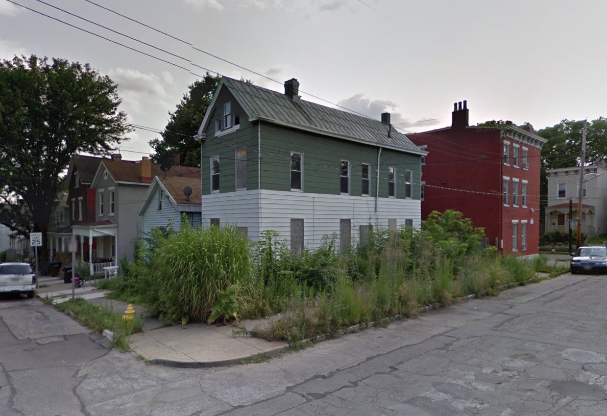
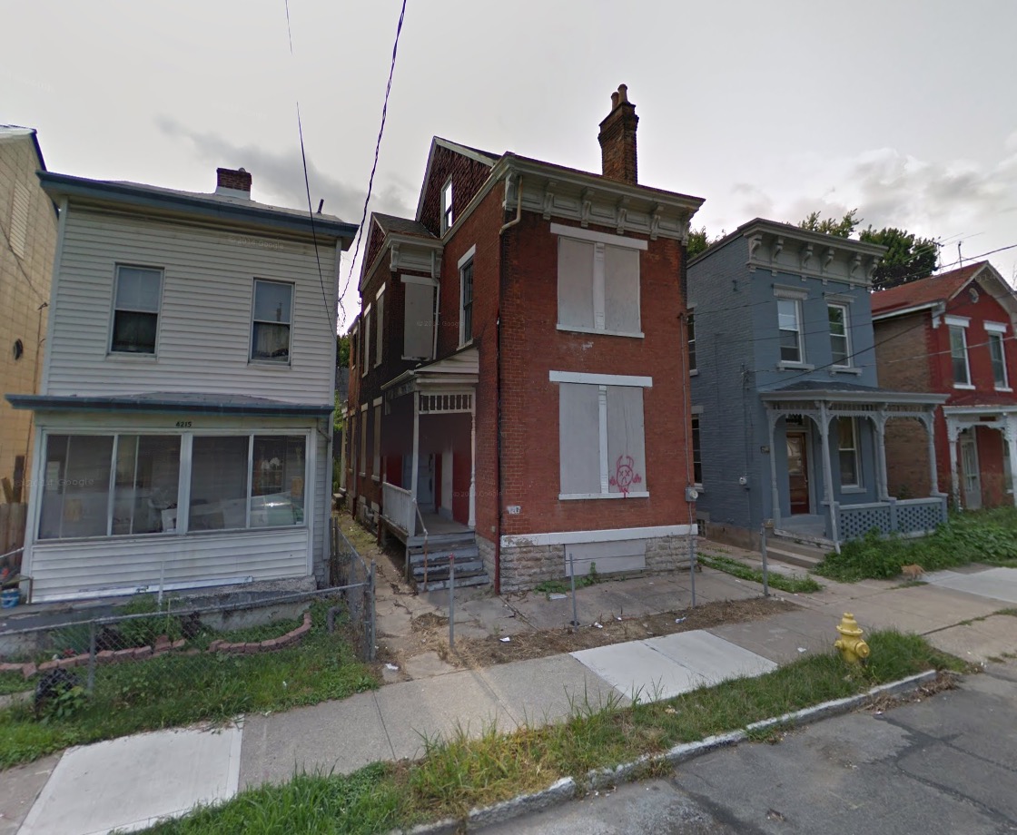
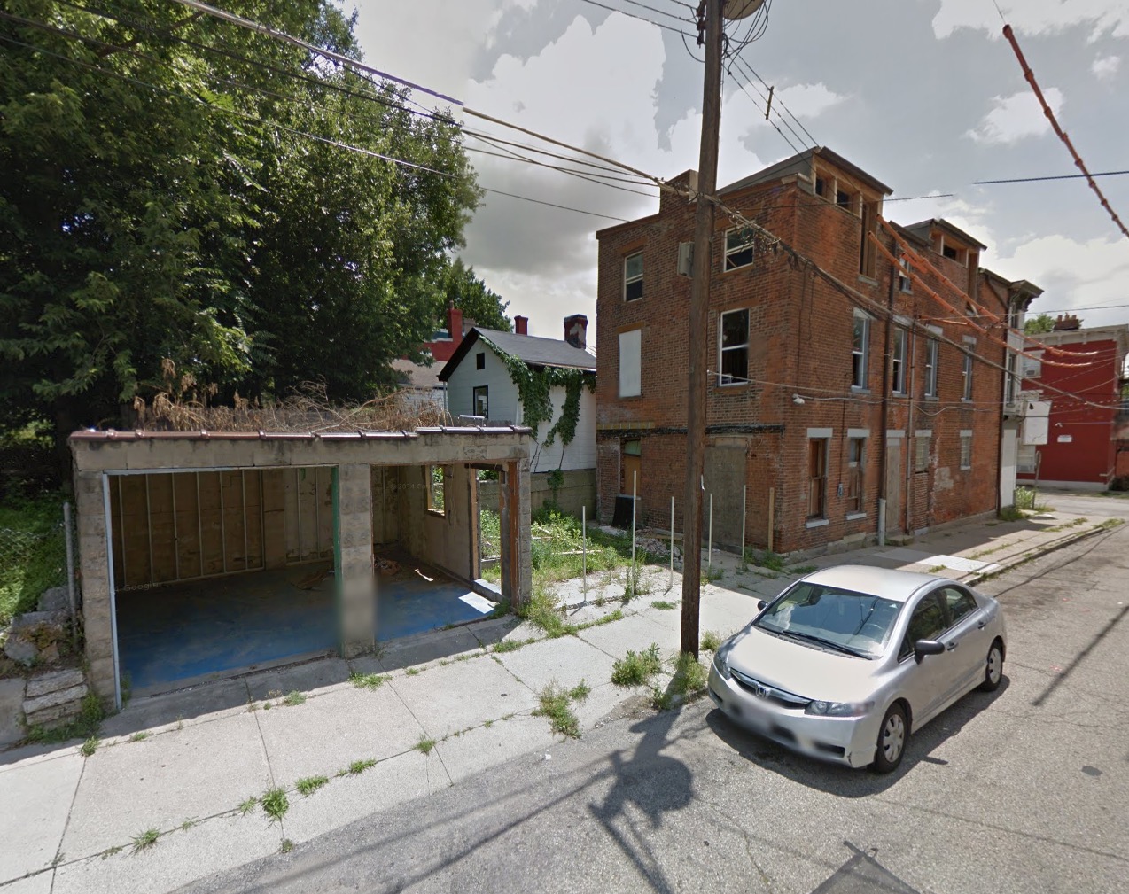
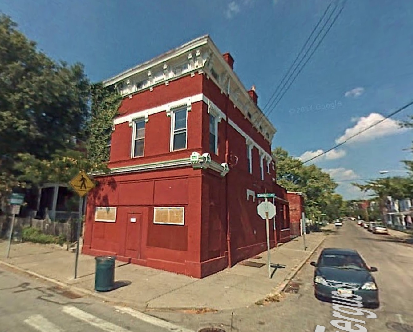
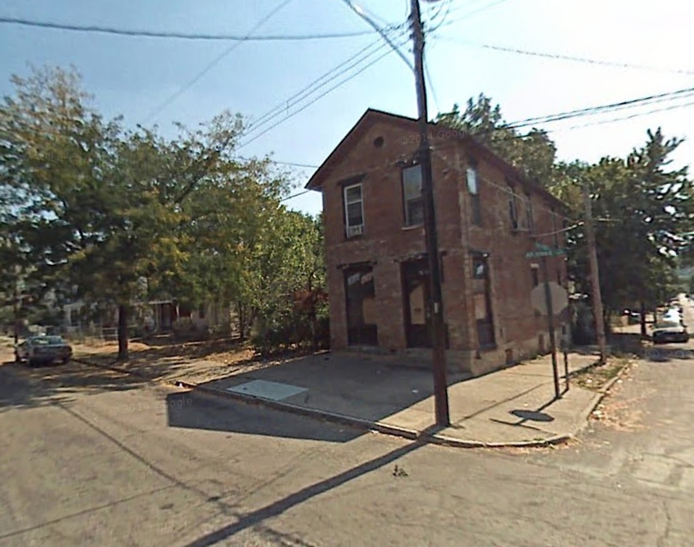
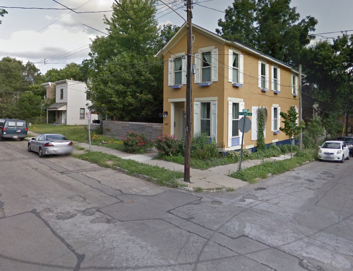
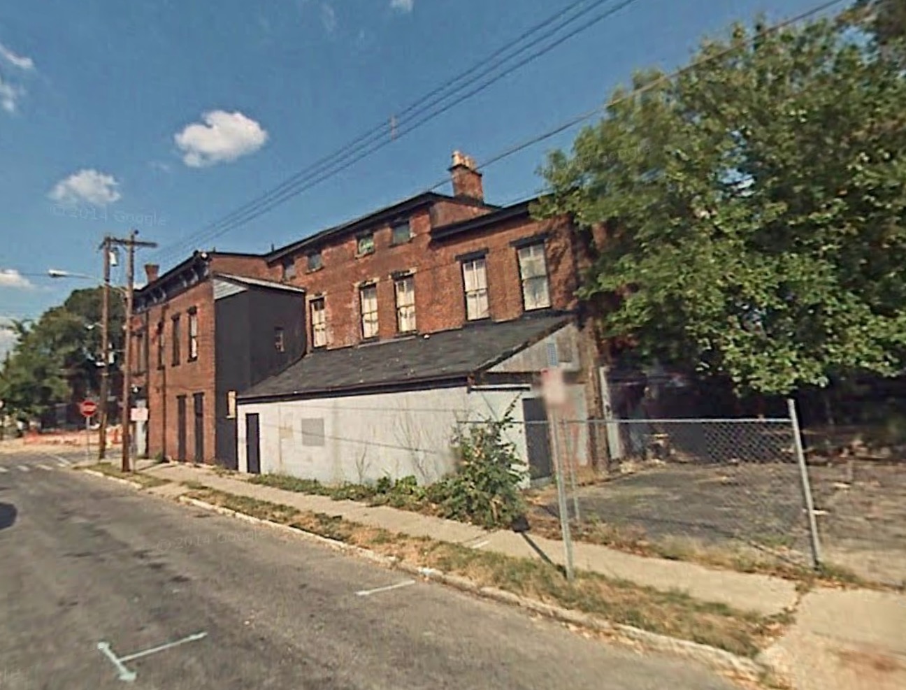
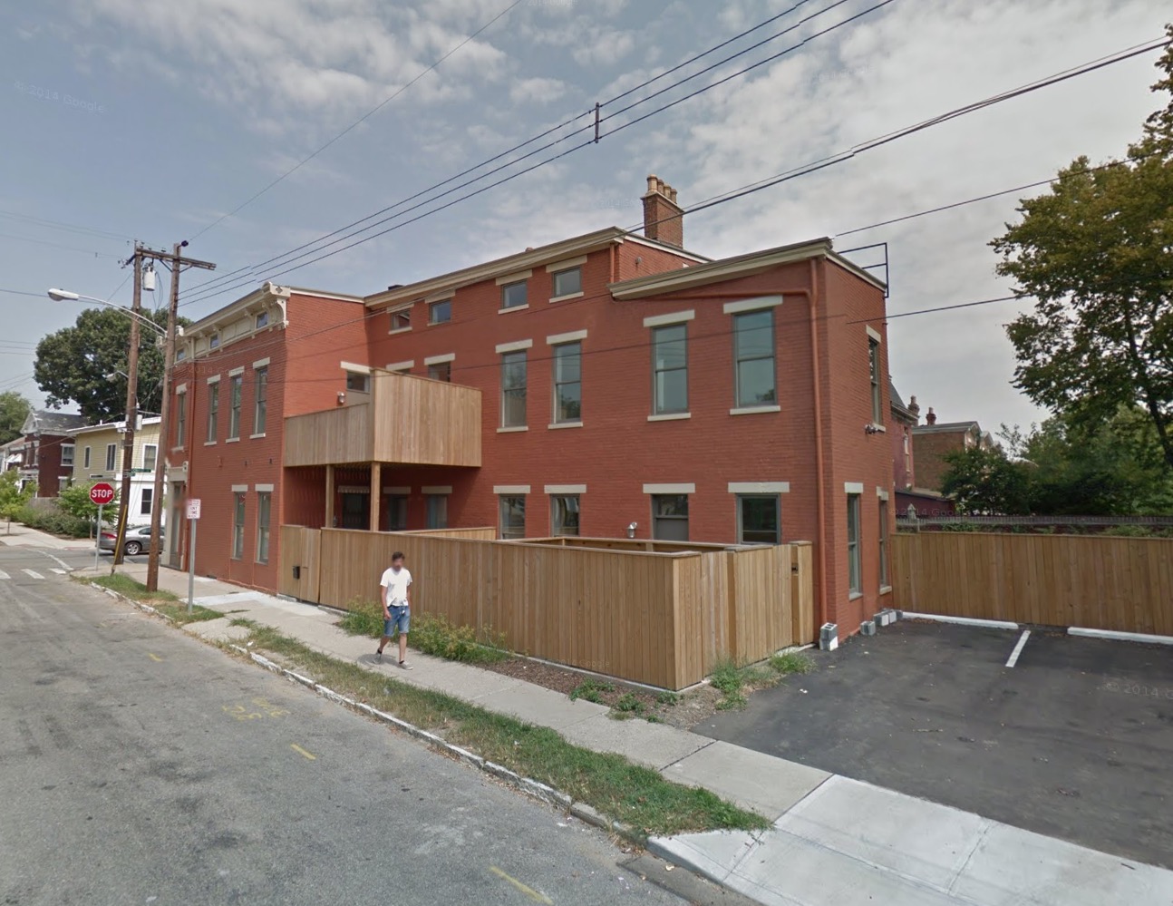
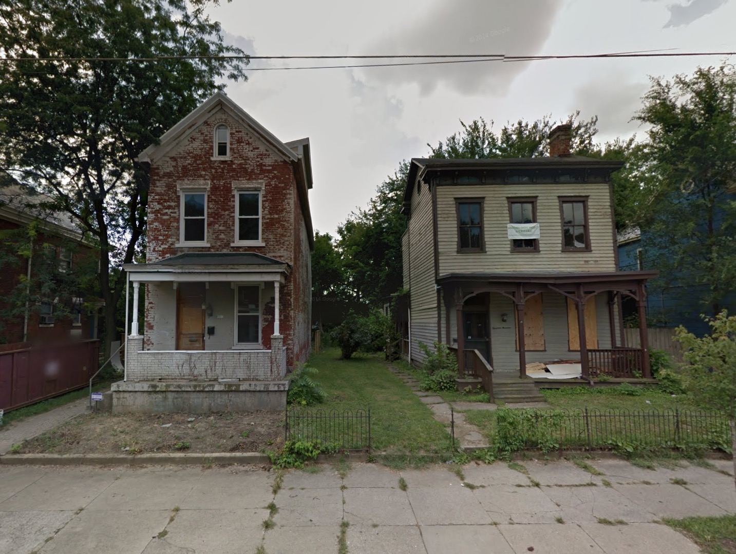
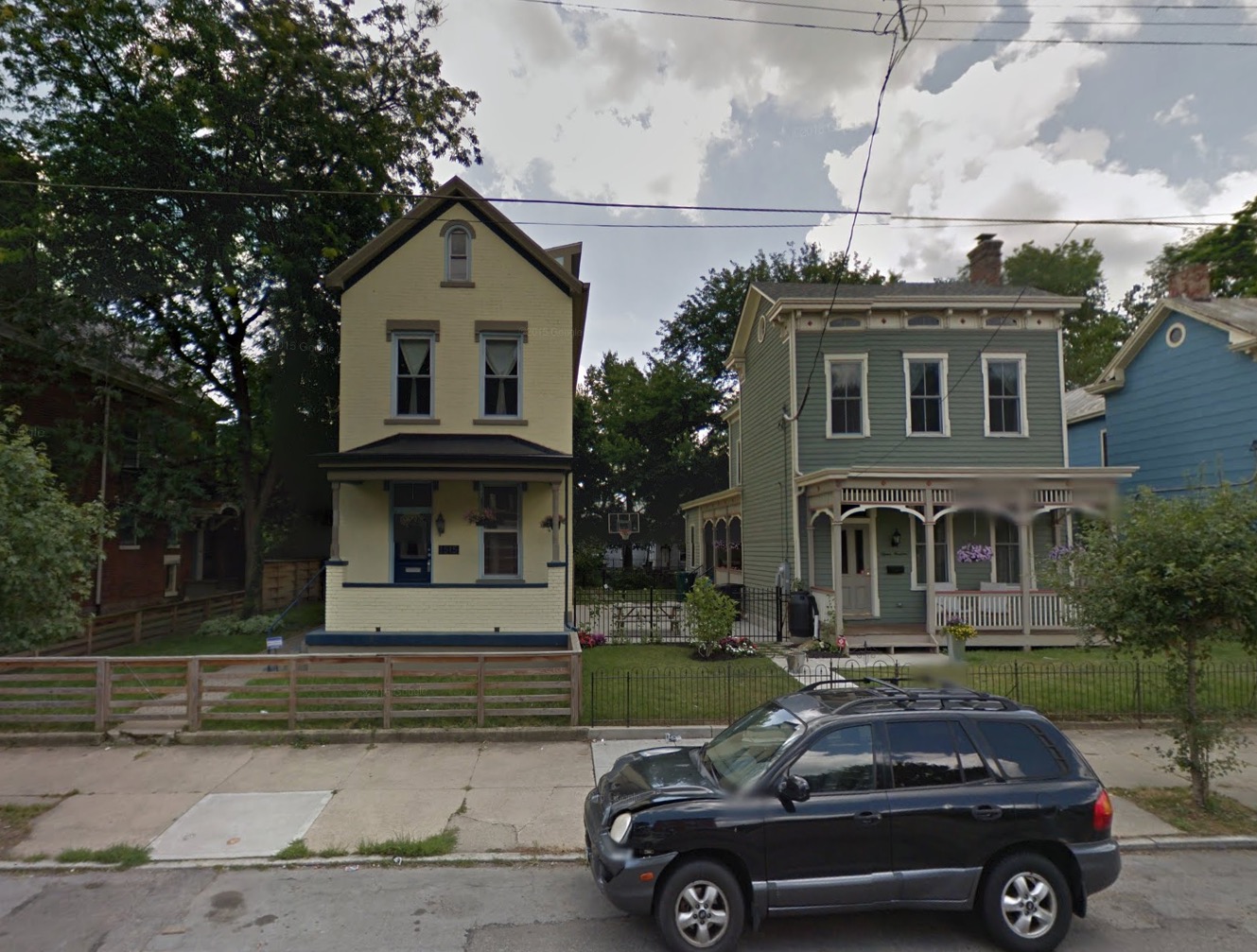
    Our priorities get skewed and we misallocate resources most when our funding comes from elsewhere. In fact, it is precisely why Minneapolis has the below. All of which the City of Minneapolis will be tearing down in 30 years …

    vikingsblahugh

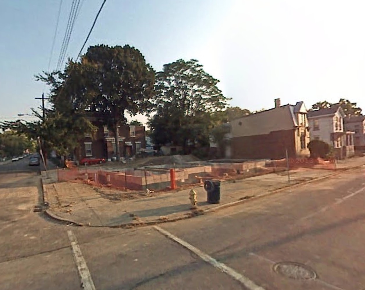
    Note: This is also next to a proposed park called “The Yard” that neither the City of Minneapolis nor it’s Park Board want to maintain. Yet, somehow it’s still a thing.

    This post originally appeared in Strong Towns on September 9, 2014. Content licensed under a Creative Commons Attribution-Share Alike 3.0 Unported License.

    Find more from Nathaniel M. Hood at his blog: nathanielhood.com

  • Some Kindly Advice From an Old White Guy

    Last month I bought an old fixer-upper for $15,000 in Cincinnati. It was originally offered at $17,000, but I got the sellers down a bit. The place is a complete disaster. All the copper pipes and wires have been stripped out of the building. It hasn’t seen paint for decades. Every window and door needs to be replaced. The roof is shot. There’s no insulation of any kind. The yard is a mess. And there are plenty of similar houses in the neighborhood. So why exactly did I buy it? I’ll get to that in a minute.


    Screen Shot 2015-06-20 at 2.39.06 PMGoogle

    Screen Shot 2015-06-20 at 3.43.32 PMGoogle

    Screen Shot 2015-06-20 at 2.51.09 PMGoogle

    But first I want to relate a conversation I had with a contractor this morning. He’s an older man who lives in the distant suburbs and has very definite opinions about the city. He spoke to me in a kindly grandfather voice. “Do you understand where this house is? Do you know what kind of people live there?” He used some colorful language which I won’t repeat. Let’s just say he’s a white guy of a particular generation from the South… He advised me to take the money I’m about to spend renovating the house and use it to buy a nice big new home on a good sized piece of land across the river in Kentucky instead.

    If this were 1980, or 1990, or 2000 this man’s recommendation would have been entirely valid from an economic perspective. Inner city neighborhoods all over the country were hemorrhaging population, jobs, and revenue for decades. It would have been a disastrous investment. But times have changed. Not everyone has noticed.

    Screen Shot 2015-06-20 at 1.15.34 PMGoogle

    Screen Shot 2015-06-20 at 1.16.17 PMGoogle

    Screen Shot 2015-06-20 at 1.11.49 PMGoogle

    Screen Shot 2015-06-20 at 1.12.31 PMGoogle

    Screen Shot 2015-06-20 at 2.12.12 PMGoogle

    Screen Shot 2015-06-20 at 2.12.43 PMGoogle

    Screen Shot 2015-06-20 at 2.19.56 PMGoogle

    Screen Shot 2015-06-20 at 2.20.21 PMGoogle

    Here are some before and after photos of buildings in the immediate neighborhood curtesy of Google Street View. Since the Google van has driven by a few times in the last decade it’s possible to see the same buildings from the perspective of different years. People have consistently been buying up cheap run down properties, fixing them up, and incrementally improving the neighborhood. This is no longer a place of permanent decline and disinvestment. The area hit bottom a few years back and it’s already on the way back up. It’s not entirely there yet, but it’s well on its way.

    Screen Shot 2015-06-20 at 1.17.02 PMGoogle

    Screen Shot 2015-06-20 at 1.17.35 PMGoogle

    In addition to recently renovated older buildings, vacant lots are sprouting quality new construction. These two homes are LEED certified for energy efficiency.

    Screen Shot 2015-06-20 at 2.30.02 PMGoogle

    GantryUAV21gantrylife.com / bayerbecker.com

    CornerView copy1_0csoinc.net / bayerbecker.com

    A few blocks away a larger vacant parcel is currently being redeveloped into a market rate multi-million dollar mixed use building by an out-of-state firm. I’ve noticed that local companies don’t always appreciate their own assets, but plenty of well funded ventures from other metro areas are taking advantage of the opportunities on offer in Cincinnati.

    Screen Shot 2015-06-20 at 4.57.52 PMGoogle

    Screen Shot 2015-06-20 at 4.56.41 PMGoogle

    unnamed-3

    unnamed-1

    Right next door is the American Can Lofts building which was completely transformed in 2011 after siting empty since 1978. I arrived in Cincinnati for the first time a few years ago just as this building was having its grand reopened. That takes me to how a guy from San Francisco ended up looking at property in Cincinnati in the first place. Which takes me to why I think Cincinnati is such a great investment.

    Screen Shot 2014-12-05 at 1.11.18 AM

    Screen Shot 2014-12-05 at 1.05.23 AM

    Screen Shot 2014-12-05 at 1.11.59 AM

    I have long time friends-of-the-family in Los Angeles. Their daughter graduated from university, got married, and promptly left California. She and her husband explored the country looking for a place to live that they both liked and could afford. (That ruled out nearly every inch of California.) They lived in Baltimore, Maryland for a while and then Portland, Oregon for a year before moving to Cincinnati. They could afford Baltimore and appreciated its gritty charm. But they really loved Portland – give or take the ridiculously high rent and real estate values. What they wanted was Portland at a Baltimore price.

    And then they moved to Cincinnati. Ahhhhhh. They bought a charming century old four bedroom house in perfectly good condition for $50,000. It was the best thing any young couple could have done, both financially and in terms of their quality of life. If they had stayed in Los Angeles or Portland they would still be renting (with room mates) and just scraping by. In Cincinnati they became comfortably middle class home owners at the tender age of twenty five. Their mortgage is $400 a month. And they’ve had no trouble finding good work or like minded friends. They aren’t the only young people making this kind of move. Which is probably why out-of-state developers are investing in the city.

    The odd thing about Cincinnati is that while the existing housing stock is very reasonably priced, good quality space is commanding fairly high rents. Apartments in the America Can building go for $610 for a one bedroom up to $1,480 for a three bedroom – and there’s a waiting lists. My inner capitalist sees a generous spread between affordable property and the potential for solid rent from solvent tenants. If I can provide a high quality building I believe I can find good people to occupy the space at a rent that’s reasonable for them and profitable for me. And I can do it without taking on debt and without being a slumlord. Try that in San Francisco and see how far you get…

    I just hired a young local architect to help with the reconstruction. This is going to be a fun little adventure. And I’m really happy that old guy who was trying to give me advice lives in the distant suburbs. He’d be a terrible neighbor.

    John Sanphillippo lives in San Francisco and blogs about urbanism, adaptation, and resilience at granolashotgun.com. He’s a member of the Congress for New Urbanism, films videos for faircompanies.com, and is a regular contributor to Strongtowns.org. He earns his living by buying, renovating, and renting undervalued properties in places that have good long term prospects. He is a graduate of Rutgers University.

  • Australia’s Recipe for Urban Decay

    Across federal, state, and local levels, Australian urban planning authorities have emphasized the need for policies that seek to limit urban fringe development and create densely-populated urban centers. This process is called ‘urban consolidation’ and has been a goal of Australian authorities for more than three decades. More specifically, urban consolidation is defined by efforts to concentrate housing, jobs, and amenities around “activity centers” such as a traditional downtown, satellite urban centers, and elongated strategic corridors. These high-density areas are to be separated by green belts of undeveloped land and connected by public transport links such as trains and light rail systems.

    Australian planners’ efforts to establish a high-density urban form have been effective, at least from their point of view. From 1981 to 2011, housing stock in Sydney, Melbourne, and Brisbane saw a large shift towards high-density units. A net total of 640,000 new multi-unit dwellings were built during this time, representing an increase of over 115%. This surge forced the proportion of multi-unit housing to increase to nearly one-third of the total housing supply in cities that have historically been dominated by single-family dwellings.1

    As Australia moves toward higher-density cities, what will be the result? Urban planners assert that their policy decisions are thoroughly researched and provide the “best” outcomes, but evidence from Australia’s largest cities tends to refute that claim. Among the numerous issues that arise due to consolidation ideology, perhaps the most disturbing are the severe impacts on housing affordability, poverty, and housing quality.

    Urban consolidation policies, by definition, are aimed at choking the supply of new single-family detached housing by limiting urban fringe growth as a means of minimizing the urban footprint. This is intended to drive more and more of the urban population into compact living situations. Thus, by limiting the supply of single-family detached housing and pushing more households into the market for multi-family housing, urban consolidation causes home prices to rise in both markets. As Figures 1 through 5 show, this is exactly what has happened in cities that adopt consolidation ideology. The Australian Bureau of Statistics reports that “the price of established houses in the capital cities rose by almost half (46%) between 2002-03 and 2008-09, with prices increasing at an average of 6.5% per year.”2 From 2001 to 2011, the number of dwellings in Sydney costing less than AUD $275 in rent per week decreased by 52% while the number of dwellings costing more than $275 in weekly rent surged by 269%; in Melbourne, the number of dwellings that cost at least $650 per week in rent more than tripled. Homeowners in Sydney and Melbourne have also seen tremendous increases in mortgage payments. In the same ten-year period, there was a seven-fold increase in the number of households in Sydney and Melbourne paying more than $4,000 per month in mortgage payments, while the number of households paying less than $1,000 per month was cut in half.3  At a time when wages and income have been stagnant, this means a severe decrease in housing affordability, meaning fewer Australians are able to afford the highly sought-after stability of homeownership.

    Given the profile of buyers and sellers, the market for dense multi-family housing is predominantly driven by investors, landlords, and institutional property owners.4 Thus the large majority of occupants are renters, not owner-occupiers, and there is no reason to infer that this ownership pattern will change.  As Australian cities continue to densify, ownership demand – that is, the market for the purchase and sale of housing units – will be driven less by owner-occupiers and more by investors and landlords, who have historically been the dominant players in multi-unit dwelling markets. This latter group of owners responds to market conditions in a different way than the owner-occupier group, and the shift is likely to have a profound impact on economic and socio-political outcomes in the long-term.

    In housing markets, there are two groups of consumers: investors, who intend to lease the units after buying, and owner-occupiers, who intend to live in the residences themselves. Owner-occupiers purchase homes for personal consumption; their decision about which home to buy is driven by the quality of the housing, access to transportation and employment, amenities in the surrounding area, and the sense of financial stability provided by owning one’s own home. Investors, on the other hand, are quite different. By definition, investors are driven by profit. They are seeking rental income from tenants as well as appreciation in the value of both the property and the underlying land. They evaluate properties based on the potential cash flows from renting and the price they can receive when they sell the property sometime in the future.

    But investors’ motives may become distorted in Australia due to a policy known as ‘negative gearing.’ Negative gearing, in terms of real estate investment, allows any negative cash flow from a single property to be deducted from the investor’s total taxable income.5 This gives investors   an incentive to purchase properties where the mortgage payments exceed rental income, especially if value of the property is appreciating. This pushes up the after-tax returns to investors which inflates housing prices even further. It also provides investors with greater incentive to make speculative purchases, which increases home price volatility and instability.

    What happens when you throw urban consolidation policies into the mix? As urban planners continue to choke the supply of new land, the price of existing land continues to accelerate upward. When investor profits are increasingly driven by speculating on the land value rather than income from the tenants, investors are more inclined to purchase lower-value properties which require less maintenance and fewer capital expenditures yet enjoy the same increases in underlying land value. By this logic, we could expect that low-income housing would increase in value at a faster pace than higher-quality housing as investors bid up the prices, which is exactly what happened in Sydney’s last real estate boom.6 Low-value properties are also more likely to provide investors with the support of negative gearing since they typically provide the lowest rental revenues. But investors, looking primarily at tax advantages, are less likely to improve the properties or even maintain existing structures. Thus, we can see how more and more investors not only have the incentive to compete for low-value housing units, where there is already insufficient supply, but also neglect those units in the long-term. Such market pressures are already noticeable in Sydney and Melbourne, where urban consolidation has been occurring for a longer time, and will certainly arise in Brisbane, in the state of Queensland, as planners establish growth boundaries for its booming population.7

    But it doesn’t stop there. This problem is exacerbated by the nature of Strata title plans, which have come to dominate the market for higher density housing in Australia. Essentially, strata titling comes from legislation passed in the 1960s whereby each apartment unit or flat on a parcel of land can be owned individually, and thus a mortgage could be taken out in order to purchase individual high-density housing units. This is similar to a condominium ownership structure in the United States, but with a few key shortcomings. Although strata titling allows a few individuals living in high-density areas to enjoy homeownership, it primarily benefits investors who now only have to purchase single units instead of entire multi-family buildings. Even worse, strata titling’s lack of consideration for common areas poses a serious issue in the long run for the maintenance of high-rise buildings and their surrounding neighborhoods, especially in areas of lower income. According to Bill Randolph, Director of the City Futures Research Center at the University of New South Wales, “the strata system may come badly unstuck in lower value areas where investor landlords have little incentive to reinvest in their property and home owners do not have the wherewithal to afford major repair costs.”8

    Putting it all together, what can we expect to be the future for Australia? Urban consolidation policies continue to push more Australians out of suburban homes and into cramped apartments, where housing markets are dominated by investor-landlords instead of owner-occupiers. The consolidation policies will squeeze the supply of land and force dwelling prices to rise regardless of rental revenue, promoting speculative behavior among investors. Negative gearing and strata titling programs incentivize these investors to neglect their properties, causing high-density areas (especially low-income neighborhoods) to deteriorate. The end result is slum-like conditions, social tension, and perpetual poverty for the neighborhood’s inhabitants. Even in higher-value neighborhoods, a lack of necessary upkeep will erode housing quality, even as prices continue to inflate. This is the reality of urban consolidation; it takes ownership out of the hands of Australians and puts it in the hands of speculative and neglectful investor-landlords. It is nothing short of a recipe for urban decay.

    Clinton Stiles-Schmidt graduated magna cum laude from Chapman University where he earned a Bachelor of Science in Business Administration (emphasis in Real Estate and Finance) and a Bachelor of Arts in Economics. His experience includes several internships in real estate investment and development as well as studying abroad in both Spain and Australia. Clinton recently joined Cushman & Wakefield as an Analyst in their Corporate Finance & Investment Banking Group.


    Figure 1: Ratio of Housing Debt to Disposable Income in Australia9

    Figure 2: Weekly Rent Payments in Sydney10

    Figure 3: Monthly Mortgage Payments in Sydney11

    Figure 4: Weekly Rent Payments in Melbourne12

    Figure 5: Monthly Mortgage Payments in Melbourne13


    1 "Community Profiles." ABS Census 1986-2011. Australian Bureau of Statistics, 1 Oct. 2014. http://www.abs.gov.au/websitedbs/censushome.nsf/home/communityprofiles.

    2 "Measures of Australia’s Progress, 2010." Australian Bureau of Statistics, 15 Sept. 2010. http://www.abs.gov.au/ausstats/abs@.nsf/Lookup/by%20Subject/1370.0~2010~Chapter~House%20prices%20(5.4.4.1)

    3 "Community Profiles." ABS Census 1986-2011. Australian Bureau of Statistics, 1 Oct. 2014. http://www.abs.gov.au/websitedbs/censushome.nsf/home/communityprofiles.

    4 Randolph, Bill. "Delivering the Compact City in Australia: Current Trends and Future Implications." City Future Research Centre, University of New South Wales, 1 June 2006.

    5 Koulizos, Peter. "How Negative Gearing Works." The Realestate.com.au Blog. Realestate.com.au, 21 Oct. 2013. http://www.realestate.com.au/blog/how-negative-gearing-works/.; "Real Estate." Australian Tax Office. Australian Government, 22 Jan. 2013. https://www.ato.gov.au/General/Capital-gains-tax/In-detail/Real-estate/

    6 Hill, Robert J., Daniel Melser, and Iqbal Syed. "Measuring a Boom and Bust: The Sydney Housing Market 2001–2006." Journal of Housing Economics 18.3 (2009): 193-205. ScienceDirect. Web. http://www.sciencedirect.com/science/article/pii/S1051137709000321

    7 Yu, Xiaojiang. "‘The Great Australian Dream’ Busted on a Brick Wall: Housing Issues in Sydney." Cities 22.6 (2005): 436-45. ScienceDirect. Web. http://www.sciencedirect.com/science/article/pii/S0264275105000879 ; Stimson, Robert J., and Shane P. Taylor. "City Profile: Brisbane." Cities 16.4 (1999): 285-95.ScienceDirect. Web. http://www.sciencedirect.com/science/article/pii/S0264275199000104

    8 Randolph, Bill. "Delivering the Compact City in Australia: Current Trends and Future Implications." Urban Policy and Research 24.4 (2006): 473-90. City Futures, June 2006. Web. https://www.be.unsw.edu.au/sites/default/files/upload/researchpaper6.pdf

    9 "RBA: Statistical Tables." Reserve Bank of Australia, 26 Sept. 2014. http://www.rba.gov.au/statistics/tables/.

    10 "Community Profiles." ABS Census 1986-2011. Australian Bureau of Statistics, 1 Oct. 2014. http://www.abs.gov.au/websitedbs/censushome.nsf/home/communityprofiles.

    11 Ibid.

    12 Ibid.

    13 Ibid.

    Sydney suburb photo by BigStockPhoto.com.

  • America’s Largest Commuter Sheds (CBSAs)

    Core Based Statistical Area (CBSA) is the Office of Management and Budget’s (OMB) way of defining metropolitan regions.  The OMB (not the Census Bureau) defines criteria for delineating its three metropolitan concepts, combined statistical areas, metropolitan statistical areas, and micropolitan statistical areas. The CBSA has obtained little use since this adoption for the 2000 census. According to OMB:

    "A CBSA is a geographic entity associated with at least one core of 10,000 or more population, plus adjacent territory that has a high degree of social and economic integration with the core as measured by commuting ties."

    In this context, core means urban area. If an urban area has 50,000 or more population, OMB defines a metropolitan area around it. If an urban area has 10,000 or more population but fewer than 50,000 residents, OMB defines a micropolitan area around it.

    It is also important to understand that CBSAs, whether CSAs, metropolitan areas, or micropolitan areas are not urban areas. In fact, 94% of the area in CBSAs is rural — only 6% is urban (built-up urban cores and suburbs).

    Combined statistical areas (CSAs) are made up of adjacent CBSAs that have a significant amount of commuting between them, but less than required for a metropolitan area or a micropolitan area. In some cases the CSAs seem so obvious as to make the smaller metropolitan area definitions seem ludicrous. One keen observer, Michael Barone of the Washington Examiner, put San Francisco and San Jose, as well as Los Angeles and Riverside-San Bernardino together in his recent analysis of population growth, because, as he rightly pointed out, they seem to "flow together."

    Some CSAs are very large. For example the New York CSA is composed of 8 metropolitan areas (New York (NY-NJ-PA), Bridgeport (CT), New Haven (CT), Trenton (NJ), Allentown (PA-NJ), Kingston (NY). Torrington (CT) and East Stroudsburg (PA). On the other hand, many major metropolitan areas are not a part of a CSA, such as Phoenix and San Diego.

    Since the term CBSA seems unlikely to achieve popular usage, this article uses the term "commuter shed" to denote the highest local level of metropolitan definition.  The highest level for the largest regions are is the combined statistical area (CSA). In others they are defined as a metropolitan area or micropolitan area. The result is a consistent standard of economic geography defined by commuting. Yet such lists are rare or non-existent. A table of all 569 commuter sheds (over 1,000,000 population) is posted to demographia.com.

    10 Largest Commuter Sheds

    As a 2014, there were 60 commuter sheds in the United States with more than 1 million population (Table).

    Not surprisingly, the nation’s largest commuter shed is New York. New York stretches from New Haven and Bridgeport, and Connecticut which are separate metropolitan areas out to Allentown which is principally in Pennsylvania and Trenton in New Jersey. The New York commuter shed has a population of 23.6 million. In fact, given the extensive suburban rail transit service between Southwestern Connecticut and New York City, it may be surprising that New Haven and Bridgeport are separate metropolitan areas, both with nearly 1,000,000 population. Moreover, there is virtually no break in the continuously built-up area between New York and southwestern Connecticut (Fairfield and New Haven counties) — they "flow together" to use Barone’s term. Since 2010, the Allentown metropolitan area, with nearly 1,000,000 population, was added to the New York CSA.

    The second largest commuter shed is Los Angeles-Inland Empire, with 18.6 million residents. This includes the Los Angeles metropolitan area (Los Angeles and Orange Counties, Ventura County and the Riverside San Bernardino metropolitan area (Inland Empire, including Riverside and San Bernardino County), which is one of the largest in the nation, with more than 4 million population. Here, as in New York, there is virtually no break in the built-up urbanization between the two urban areas, Los Angeles and Riverside-San Bernardino.

    Chicago is the third largest commuter shed, though its adjacent metropolitan areas are far smaller than in New York and Los Angeles. Chicago is also growing very slowly, with its population increase over the last year so small that it will take nearly to 2020 to reach 10 million, even though it only has 72,000 to go.

    Just below Chicago, Washington and Baltimore combine to form nation’s fourth largest commuter shed. Already with more than 9.5 million residents and strong growth this decade, Washington-Baltimore could pass 10 million population and Chicago by 2020. Washington-Baltimore is unique in combining two of the nation’s historically largest and most intensely developed core municipalities along with the much more extensive suburbs (which contain 85% of the population). Washington-Baltimore now extends to Franklin County, Pennsylvania.

    The fifth largest metropolitan complex is the San Francisco Bay Area with a population of 8.6 million. This includes the San Francisco, San Jose, Vallejo, Santa Rosa, Santa Cruz metropolitan areas and the recently added Stockton metropolitan area.. There is no break in the urbanization between San Francisco and San Jose.  

    The Boston CBSA was enlarged during the last decade to include Providence, a major metropolitan area in its own right. Boston also includes the Worcester metropolitan area, which is nearing 1,000,000 population. Boston-Providence has a population of 8.1 million.

    The top 10 is rounded out by Dallas-Fort Worth (7.4 million), Philadelphia (7.2 million), Houston (6.7 million), and Miami (6.6 million).

    The largest metropolitan complex in the nation that is not a part of a CSA is Phoenix, which is ranked 14th. Only one other commuter sheds in the top 20 is not a CSA (San Diego) and only six of the 60 commuter sheds with more than 1,000,000 population is not a CSA.

    Fastest Growing Commuter Sheds

    The fastest commuter shed growth rates are in the South, which accounts for eight of the ten fastest growing commuter shed’s. Austin ranks number one in annual percentage growth between 2010 and 2014, a position it also holds among major metropolitan areas. Cape Coral (Florida) ranks second. Cape Coral also ranks as the fastest growing among the midsized metropolitan areas (from 500,000 to 1,000,000 population). Houston ranks third in growth rate. Houston and Dallas-Fort Worth are the only commuter sheds with more than 5 million population that are among the top 10 in growth. The two non-Southern top 10 entries are from the West: Denver and Phoenix (Figure 2).

    Slowest Growing Commuter Sheds

    All of the 10 slowest growing major commuter sheds are in the old industrial heartland of the Northeast and Midwest. Cleveland-Akron is the slowest growing, having lost approximately 0.1 percent of its population annually. Pittsburgh, Dayton, Buffalo and Detroit have also lost population.

    Continuing Dispersion

    The dispersion of US metropolitan areas continues, with perhaps the ultimate example of Portland (Oregon), which was recently combined with four other metropolitan areas (see: Driving Farther to Quality in Portland). The "flowing together" suggest that the combined statistical area may be an increasingly important in assessing regional trends.

    Core Based Statistical Areas (Commuter Sheds): United States
    Over 1,000,000 Population in 2014
    2014 Population Rank Metropolitan Area 2010 2014 Annual % Change: 2010-2014 Growth Rank
    1 New York-New Haven, NY-NJ-CT-PA CSA 23.077 23.633 0.56% 41
    2 Los Angeles-Inland Empire, CA CSA 17.877 18.550 0.87% 30
    3 Chicago, IL-IN-WI CSA 9.841 9.928 0.21% 50
    4 Washington-Baltimore, DC-MD-VA-WV-PA CSA 9.052 9.547 1.26% 18
    5 San Fransicsco-San Jose, CA CSA 8.154 8.607 1.28% 17
    6 Boston-Providence, MA-RI-NH-CT CSA 7.894 8.100 0.61% 38
    7 Dallas-Fort Worth, TX-OK CSA 6.818 7.353 1.79% 8
    8 Philadelphia, PA-NJ-DE-MD CSA 7.068 7.165 0.32% 47
    9 Houston, TX CSA 6.115 6.686 2.13% 3
    10 Miami-West Palm Beach, FL CSA 6.168 6.558 1.46% 14
    11 Atlanta, GA CSA 5.910 6.259 1.36% 16
    12 Detroit, MI CSA 5.319 5.315 -0.02% 56
    13 Seattle, WA CSA 4.275 4.527 1.36% 15
    14 Phoenix, AZ MSA 4.193 4.489 1.62% 9
    15 Minneapolis-St. Paul, MN-WI CSA 3.685 3.835 0.94% 26
    16 Cleveland-Akron, OH CSA 3.516 3.498 -0.12% 60
    17 Denver, CO CSA 3.091 3.345 1.88% 6
    18 San Diego, CA MSA 3.095 3.263 1.25% 20
    19 Portland-Salem, OR-WA CSA 2.921 3.060 1.10% 23
    20 Orlando-Daytona Beach, FL CSA 2.818 3.046 1.84% 7
    21 Tampa-St. Petersburg, FL MSA 2.784 2.916 1.10% 22
    22 St. Louis, MO-IL CSA 2.893 2.911 0.15% 52
    23 Pittsburgh, PA-OH-WV CSA 2.661 2.654 -0.06% 59
    24 Charlotte, NC-SC CSA 2.376 2.538 1.57% 11
    25 Sacramento, CA CSA 2.415 2.513 0.94% 27
    26 Salt Lake City-Ogden, UT CSA 2.272 2.424 1.54% 12
    27 Kansas City, MO-KS CSA 2.343 2.412 0.68% 36
    28 Columbus, OH CSA 2.309 2.398 0.90% 28
    29 Indianapolis, IN CSA 2.267 2.354 0.89% 29
    30 San Antonio, TX MSA 2.143 2.329 1.98% 4
    31 Las Vegas, NV-AZ CSA 2.195 2.315 1.26% 19
    32 Cincinnati, OH-KY-IN CSA 2.174 2.208 0.37% 46
    33 Raleigh-Durham, NC CSA 1.913 2.075 1.94% 5
    34 Milwaukee, WI CSA 2.026 2.044 0.21% 51
    35 Austin, TX MSA 1.716 1.943 2.97% 1
    36 Nashville, TN CSA 1.788 1.913 1.59% 10
    37 Norfolk-Virginia Beach, VA-NC CSA 1.779 1.819 0.53% 43
    38 Greensboro-Winston-Salem, NC CSA 1.589 1.630 0.60% 39
    39 Jacksonville, FL-GA CSA 1.470 1.543 1.14% 21
    40 Louisville, KY-IN CSA 1.460 1.499 0.62% 37
    41 Hartford, CT CSA 1.486 1.488 0.02% 55
    42 New Orleans, LA-MS CSA 1.414 1.480 1.09% 24
    43 Grand Rapids, MI CSA 1.379 1.421 0.71% 34
    44 Greenville, SC CSA 1.362 1.410 0.81% 33
    45 Oklahoma City, OK CSA 1.322 1.409 1.50% 13
    46 Memphis, TN-MS-AR CSA 1.353 1.370 0.29% 48
    47 Birmingham, AL CSA 1.303 1.317 0.27% 49
    48 Richmond, VA MSA 1.208 1.260 1.00% 25
    49 Harrisburg, PA CSA 1.219 1.240 0.39% 45
    50 Buffalo, NY CSA 1.216 1.215 -0.02% 57
    51 Rochester, NY CSA 1.175 1.177 0.05% 54
    52 Albany, NY CSA 1.169 1.174 0.10% 53
    53 Albuquerque, NM CSA 1.146 1.166 0.40% 44
    54 Tulsa, OK CSA 1.106 1.139 0.69% 35
    55 Fresno, CA CSA 1.081 1.121 0.84% 32
    56 Knoxville, TN CSA 1.077 1.104 0.58% 40
    57 Dayton, OH CSA 1.080 1.078 -0.05% 58
    58 Tucson, AZ CSA 1.028 1.051 0.53% 42
    59 El Paso, TX-NM CSA 1.013 1.050 0.85% 31
    60 Cape Coral, FL CSA 0.940 1.028 2.13% 2
    In millions
    Data from US Census Bureau
    Metropolitan Statistical Areas shown only if not in a Combined Statistical Area.


    Wendell Cox is Chair, Housing Affordability and Municipal Policy for the Frontier Centre for Public Policy (Canada), is a Senior Fellow of the Center for Opportunity Urbanism (US), a member of the Board of Advisors of the Center for Demographics and Policy at Chapman University (California) and principal of Demographia, an international public policy and demographics firm.

    He is co-author of the "Demographia International Housing Affordability Survey" and author of "Demographia World Urban Areas" and "War on the Dream: How Anti-Sprawl Policy Threatens the Quality of Life." He was appointed to three terms on the Los Angeles County Transportation Commission, where he served with the leading city and county leadership as the only non-elected member. He served as a visiting professor at the Conservatoire National des Arts et Metiers, a national university in Paris. 

    Photo: Albany (NY) City Hall (by author)

  • Stack and Pack vs. Smear All Over

    I drove out to a distant suburb recently to attend to some business and I passed by a cluster of billboards on the side of the freeway that got me thinking. The general gist of the slogans asserted a conservative anti-government anti-urban rebellion. These are clearly people who don’t want density and public transit imposed on them by pointy headed liberal idiots. I have to admit I have some sympathy for this perspective, although probably not for the same reasons as the billboard people. Their knee jerk reaction makes clear what they don’t want, but offers no alternative response to the underlying difficulties faced by the inevitable urbanization of rural areas.

    Screen Shot 2015-06-06 at 1.45.36 AM

    Screen Shot 2015-06-06 at 1.44.07 AM

    Screen Shot 2015-06-06 at 1.44.23 AM

    Screen Shot 2015-06-06 at 1.43.24 AM

    Screen Shot 2015-06-06 at 1.43.47 AM

    Screen Shot 2015-06-06 at 3.07.22 AM

    Screen Shot 2015-06-06 at 3.05.57 AM

    Screen Shot 2015-06-06 at 3.05.27 AM

    Screen Shot 2015-06-06 at 3.06.59 AM

    Screen Shot 2015-06-06 at 3.06.43 AM

    Here’s the fantasy of how this particular area should remain: bucolic landscapes, family farms, charming old homes, and delicate churches with little graveyards out back. But these are all part of a heritage park. School children are brought here to learn what the place was like in the 1850’s.

    Screen Shot 2015-06-06 at 3.08.52 AM

    Screen Shot 2015-06-06 at 3.11.23 AM

    Screen Shot 2015-06-06 at 3.10.27 AM

    Screen Shot 2015-06-06 at 3.08.27 AM

    Screen Shot 2015-06-06 at 3.08.08 AM

    Screen Shot 2015-06-06 at 3.13.18 AM

    Turn the camera just slightly to the left or the right and the landscape is filled with gas stations, parking lots, drive-thru banks, and freeway traffic. And everywhere there’s new construction. Money (lots and lots of San Francisco Bay Area money) and a whole lot of people are inevitably going to be occupying what is now open space in these distant counties. No political force can stop it. There are two competing models for what that new growth is going to look like and neither is pretty as far as I’m concerned.

    Screen Shot 2014-11-17 at 5.42.47 PM

    Screen Shot 2014-11-17 at 5.43.17 PM

    Screen Shot 2014-11-17 at 5.41.57 PM

    Screen Shot 2014-11-17 at 5.42.34 PM

    First, there’s the compact, dense, transit oriented development favored by regional planners. (This is precisely the kind of thing the billboard people are so pissy about.) Now… I live in a compact, dense, transit oriented neighborhood in San Francisco that I think is amazing. But when I look at what’s being built in the far flung suburbs I find nothing to love about any of it. The scale is overwhelming. Each of these complexes occupies a massive super block. And it’s not just the size per se that I don’t like. It’s the fact that these buildings have all the drawbacks of density without any of the compensating urbanism. Where are the shops on the ground floor? Where’s the corner grocery? Where are the cafes and nightclubs? Where are the intimate little restaurants and pocket parks? Where are the vibrant walkable places? There just aren’t any. These places are as lifeless as any cul-de-sac, minus the space and privacy provided by a tract house with a yard. It’s not a good combination.

    Screen Shot 2015-06-05 at 5.43.30 PM

    Screen Shot 2015-06-05 at 5.41.17 PM

    Screen Shot 2015-06-05 at 5.38.59 PM

    Screen Shot 2015-06-05 at 5.42.04 PM

    Screen Shot 2015-06-06 at 2.54.54 AM

    Screen Shot 2015-06-05 at 5.42.41 PM

    Screen Shot 2015-06-06 at 2.55.35 AM

    Screen Shot 2015-06-06 at 3.13.37 AM

    Here’s the second option. Traditional American values brought to life in shiny new single family homes with three car garages as far as the eye can see. This is the alternative to big bad government and communist apartment blocks. Luxury homes chew up the countryside and load the freeway with an unmanageable amount of traffic. And by the way, these homes each cost $1.4M.

    I compare this political situation with the dilemma the country faced in the early 1980’s when Reagan came to power. Conservatives hated the idea that the government operated halfway houses and insane asylums. They wanted no part of drug treatment programs either. At the same time liberals insisted that it was inhumane to lock people up against their will in underfunded and uncaring institutions where they were likely to be mistreated. So the two opposing elements of society conspired to shut down such institutions. The problem, of course, is that the mentally ill, drug addicted, and penniless segment of American society didn’t just disappear. They now live on our streets and fill our prisons. Both sides got what they wanted, but the problems persist in slightly different forms. So it is with the battles over land use regulation. Happenstance brings us a funky world and we all just muddle through some how.

    John Sanphillippo lives in San Francisco and blogs about urbanism, adaptation, and resilience at granolashotgun.com. He’s a member of the Congress for New Urbanism, films videos for faircompanies.com, and is a regular contributor to Strongtowns.org. He earns his living by buying, renovating, and renting undervalued properties in places that have good long term prospects. He is a graduate of Rutgers University.

  • Small Regions Rising

    In the last 25 years there has been a huge change in the level of competitiveness of smaller urban areas – by which I mean the small end of the major urban scale, or metro areas of about one to three million people – that has put them in the game for people in residents in way they never were before.

    I recently gave the morning keynote at the Mayor’s Development Roundtable in Oklahoma City and talked a bit about this phenomenon, as well as how these generally younger and sprawling areas ought to be thinking about their future.

    If the video doesn’t display for you, click over to watch on You Tube (my segment starts at 4:36).


    Aaron M. Renn is a senior fellow at the Manhattan Institute and a Contributing Editor at City Journal. He writes at The Urbanophile, where this piece first appeared.

  • The California Dream has Moved Away

    Southern California faces a serious middle income housing affordability crisis. I refer to middle income housing, because this nation has become so successful in democratizing property ownership that the overwhelming majority of middle income households own their own homes in most of the country.

    Recently I had the privilege of participating in a forum on this subject sponsored by the Urban Land Institute, Los Angeles Housing Chapter in Century City. The forum also included a presentation from USC Professor Dowell Myers and was chaired by Ehud Mouchly, who chairs the Housing Chapter. This article is adapted from my presentation.

    I am a native Angeleno, having been born near Temple and Alvarado, less than two miles from City Hall. I was appointed to three terms on the Los Angeles County Transportation Commission (LACTC) by Mayor Tom Bradley, where I played a pivotal role in the establishment of the Los Angeles rail system. LACTC and SCRTD were the two predecessors to the current Los Angeles County Metropolitan Transportation Authority (MTA).

    In addition, for 11 years, Hugh Pavletich of Christchurch, New Zealand and I have published the Demographia International Housing Affordability Survey. The latest edition was released in January and included median multiple data for 86 major metropolitan areas and nearly 300 smaller metropolitan areas in nine nations. Finally, I publish the most comprehensive annual review of world urbanization, providing population, land area and density for world urban areas with over 500,000 population (See World’s 1,000 Largest Cities: World Urban Areas 2015 Edition).

    All of this makes housing in Southern California and urban development particularly interesting to me.

    The Imperative: A Rising Standard of Living and Less Poverty

    The title of the forum was "The Changing Demographics of Southern California and Their Impact on Housing," however I think that the reverse is more significant — the impact housing is likely to have on Southern California.

    My perspective is neither ideological nor tied to any political party. It is a fundamentally pragmatic view that domestic policy should principally seek to better people’s lives, by facilitating a rising standard of living and reducing poverty. These objectives were also referenced in the G20 nations communiqué in Brisbane and adopted a announcing a dedication to improving standards of living and eradicating poverty.

    The issue is particularly ripe in California, where public policies relating to housing are having virtually the opposite effect. Housing costs have already increased poverty and reduced the discretionary income of middle-income households.

    This is not an issue of suburbs versus the urban core. I could not be more pleased by the long overdue resurgence of downtown areas as residential locations, something made possible by the huge crime reductions that began with Mayor Rudy Giuliani’s policies in New York City and similar efforts in cities like Los Angeles. It is important to recognize that a vibrant core no more needs dying suburbs then vibrant suburbs need a dying core. Both urban cores and suburbs can prosper, creating a stronger urban area.

    The Housing Crisis

    Southern California’s biggest crisis relates to housing. Housing is important to the standard of living and alleviating poverty. It is the largest element of household budgets. When housing more expensive, it leaves households with less discretionary income to purchase other goods and services. This will, other things being equal, reduce economic output from levels that would be otherwise attained.

    This has been developing for more than four decades as house price to income ratios (such as the median multiple, the median house price divided by the median household income) have doubled and tripled above historical levels and well above those of other metropolitan areas. Attention is often focused on lower income affordable housing, a problem virtually everywhere, but most parts of the country do not suffer so severe a middle-income housing affordability problem. Low-income housing affordability is important and one of the best ways to minimize it is to ensure that there is middle-income housing affordability.

    A bit of historical perspective is appropriate. For centuries nations had little or no property-owning middle class. Huge progress has been made in the last century and particularly since World War II. Following the war, housing development innovation, combined with transportation advances, led to the development of owned middle income housing in the suburbs. It started with Levittown on Long Island and spread across the nation. The most fabled Southern California example is Lakewood (see D. J. Waldie’s Holy Land: A Suburban Memoir on this). The result was a massive increase in home ownership, rising from percentages from the low 40s to 65% in the final decades of the 20th century.

    Similar progress was made in other countries, especially in Canada, Australia and New Zealand, where middle-income households purchased homes with sufficient space. In each of these nations, the median multiples were around or below 3.0 as late as 1995.

    All of this represented progress toward what the late and renown British urbanist Peter Hall called the "ideal of a property owning democracy" (See: The Costs of Smart Growth Revisited: A 40 Year Perspective).

    Sadly, affordability has diminished greatly in many metropolitan areas around the world.  House prices relative to incomes have doubled or tripled in virtually all of the metropolitan areas of Australia and New Zealand, some metropolitan areas in Canada as well as in some key metropolitan areas in the United States, with the worst in California. In each of these places, this house price escalation occurred after implementation of urban containment policies (also called smart growth or growth management), which seriously reduce the amount of land that can be used for new housing.

    The Roots of Urban Containment Policy

    Urban containment has its roots in the British 1947 Town and Country Planning Act. This act created green belts around British cities and is a proximate cause of the present housing shortage and crisis. The general philosophy of the 1947 Act is evident throughout urban planning in the United States and has been implemented in Oregon, part of Washington and California. Urban containment policy was also enacted in Florida. There, house prices had escalated at rates — if not the price levels — to near that of California during the housing bubble. However, legislators took the opportunity to repeal Florida’s urban containment policies when housing prices dropped to historical median multiple levels.

    A recent California Legislative Analyst’s report indicated that much of the problem is California’s strict land-use laws and regulations (See:  How the California Dream Became a Nightmare). A dense mesh of "urban containment" and "smart growth"  regulations have severely limited the land available for new housing, especially on the periphery, where cities grow organically. This destroys the competitive market for land, driving up its cost. This makes house prices escalate in relation to incomes.

    California: 50% More Poverty Than Mississippi

    Today, California house prices are far higher than in the rest of the nation. This is taking a toll on the standard of living and increasing poverty. The Census Bureau’s supplemental poverty measure, which adjusts for housing costs shows California’s poverty rate to be the highest in the nation. It should be of concern that California’s poverty rate is 50% above that of perennial poverty leader Mississippi (Figure).

    Because so much poverty is concentrated among minority ethnic populations, California’s urban containment policy is particularly disadvantaging Hispanics and African-Americans. The Thomas Rivera Institute at USC published a detailed examination of California’s land-use regulations and found that "Far from helping, they are making it particularly difficult for Latino and African American households to own a home."

    The Need for Reform

    The bad news is that things are likely to get much worse. Under the Sustainable Communities Strategies required under Senate Bill 375 (2008), it is likely to become nearly impossible to build traditional suburban single-family housing in California’s metropolitan areas (See: California Declares War on Suburbia). Already, median multiples in San Francisco, San Jose, Los Angeles and San Diego are approaching the highs reached at the peak of the housing bubble. House prices are likely to continue rising relative to incomes, other things being equal.

    Allowing Supply to Meet Demand

    It is often asserted that diminishing land supply in California reflects not so much regulation, but physical limits. The state is sometimes seen as ‘built out’. Yet, in fact, there is plenty of land available for development. Despite its reputation for urban sprawl, the Los Angeles urban area is the most densely populated in the United States. It covers a bit more than one half the land area of the New York urban area. Like any urban area, the greenfield land that is available for development is on the periphery, which  includes areas like the northern Antelope Valley, the Victor Valley, and Southwestern California (Temecula to Hemet) and in some closer areas. Each of these areas is closer to the urban core than some parts of the New York commuter shed.

    These areas could easily accommodate the additional population expected in the area by 2060, including the single family housing generally preferred among middle-income households. Households are not likely to raise children on high rise balconies.

    Even so, the urban footprint would continue to be much smaller than that of New York. If sufficient land were opened to development, the city would expand geographically, but people would also have better access to middle class standards of living, and there would likely be a lot less poverty. The obvious choice would be to let the city expand, while improving real incomes and reducing poverty.

    The California Dream is Now in Denver?

    During the discussion period after my talk, perhaps the most prescient comment was made by an unidentified audience member said that the California dream is now in Denver. California’s unjustifiably and artificially high housing prices are the cause. Between 1993 and 2010, there was net out-migration from California to 42 of the 50 states and the District of Columbia. Immigration to Los Angeles and Orange from abroad has also declined, as immigrants too look for more affordable alternatives. People seeking sun, glamour or a good time will continue to flourish in southern California, but it seems likely that more families, and middle class households, will continue to ebb out, seeking somewhere else the dream that was once so closely identified with Southern California.

    Wendell Cox is principal of Demographia, an international public policy and demographics firm. He is co-author of the "Demographia International Housing Affordability Survey" and author of "Demographia World Urban Areas" and "War on the Dream: How Anti-Sprawl Policy Threatens the Quality of Life." He was appointed to three terms on the Los Angeles County Transportation Commission, where he served with the leading city and county leadership as the only non-elected member. He served as a visiting professor at the Conservatoire National des Arts et Metiers, a national university in Paris. Wendell Cox is Chair, Housing Affordability and Municipal Policy for the Frontier Centre for Public Policy (Canada), is a Senior Fellow of the Center for Opportunity Urbanism and is a member of the Board of Advisors of the Center for Demographics and Policy at Chapman University.

    Photo: Central Los Angeles and the San Fernando Valley (by author)

  • Growth Concentrated in Most Suburbanized Core Cities

    An analysis of the just-released municipal population trends shows that core city growth is centered in the municipalities that have the largest percentage of their population living in suburban (or exurban) neighborhoods.

    Improved Urban Core Analysis

    There is considerable interest in urban core population trends, both because of recent increases in the interest of urban planning orthodoxy to restore living patterns more akin to the pre-World War II era. At that time, urban areas were considerably more densely populated, commuting travel was much more focused on downtowns (central business districts or CBDs) and automobile use accounted for far less of urban travel than today.

    Most previous analysis has equated historical core municipality (core city) data with the urban core. The core cities are generally the original settlements, as they have evolved by expanding their city limits. Around these core cities, suburbs and exurbs have developed, which combined with the core cities make up the metropolitan area. Metropolitan areas are the "economic" dimension of contemporary cities.

    However, even the most cursory analysis demonstrates that equating core cities with the urban core is far from ideal. Historical core municipalities vary greatly in their percent of their population living in traditional high density neighborhoods. For example, in core cities like New York, Boston and San Francisco, nearly all people live in neighborhoods that can be classified as urban core. In others of the largest core cities, virtually all of the population lives in neighborhoods that are suburban or exurban, in view of their low densities and overwhelming automobile orientation. These include examples like San Antonio, Phoenix and San Jose. Even core cities perceived to have a strong urban core, such as Portland and Miami, have considerably less than 50% of their population in urban core neighborhoods.

    Overall, historical core municipalities have little more than 40% of their population living in urban core neighborhoods. When non-core principal cities or primary cities are equated with core cities, there is even less association with the urban core. Overall, non-core principal cities have less than 10% of their population living in urban core neighborhoods.

    This has changed in recent years, with the introduction of the annual American Community Survey and its small area data, such as for ZIP Code analysis zones (ZCTAs). Even so, the comprehensive publication of small area data tends to lag approximately three years behind population estimates. Thus, the small area data that would make it possible to compare population trends to 2014 by functional urban sector within core cities will not be released until 2017.

    This article classifies 2010 to 2014 core city population growth by the percentage of urban core population according to the 2010 census. The classification was developed using my City Sector Model, which classifies every zip code in metropolitan areas as pre-War urban core (CBD and inner ring) or post-War suburban or exurban (Figure 1). Simplified, the City Sector Model classifies as urban core any small area with an employment density of 20,000 per square mile or more or a population density of 7,500 per square mile or more, with a transit, cycling and walking work trip market share of 20% or more (Note).

    Growth by Extent of Urban Core Population

    More than 50% of the growth between 2010 and 2014 has been in core municipalities that are more than 90% post World War II suburban or exurban (0 to 10% urban core). This growth share is nearly one-half higher than their population share of 35%.

    These findings are based on the City Sector Model (Figure 1 and Note), which classifies small areas (zip code tabulation areas) principally using population density and commuting market share data that attempts to replicate urban areas as they functioned before World War II.

    These most suburban of core cities grew the fastest, up 6.8% from 2010 to 2014. These municipalities had less than 10% of their population in urban core neighborhods, and include core cities that annexed substantial suburban or rural territory, such as Phoenix, San Jose, Charlotte, Tampa, Orlando and San Antonio. Those that were most heavily urban core in form grew 4,0 percent, which was slightly behind the national average of 4.7 percent. The core cities had less than 10% of their population living in urban core neighborhoods, and include New York, Buffalo, Providence, San Francisco and Boston (Figure 2)  

    The functionally suburban and exurban areas accounted for approximately 58% of the population in the core cities. This leaves approximately 42% of the population living in areas that are similar to the urban areas as they functioned in 1940.

    Approximately 70% of the growth was in the 33 historical core municipalities that are more than 60% suburban or exurban.

    At the same time, the five core cities with the largest urban core percentages accounted for nearly 20% of the growth, compared to their 22 percent of the population. Approximately 80% of this growth was in New York, which is estimated to have added the largest population (316,000) among the core cities.

    Ten Fastest Growing Core Municipalities

    Six of the ten fastest growing core cities had urban core shares of less than 10%, including Austin, Orlando, Charlotte, Raleigh, Atlanta and San Antonio. A seventh, Denver was less than 15% urban by function. Two more had more than 50% in urban core population, Washington and Seattle (Table). Eight of the 10 fastest growing core cities were in the South, including Washington.

    Table
    Population Growth: 2010-2014
    Core Municipalities in Major Metropolitan Areas
    Population Population in Pre-War Functional Urban Core
    Rank Historical Core Municipality Metropolitan Area 2010 2014 % Change Historical Core Municipality Metropolitan Area
    1 Austin Austin, TX     790,637      912,791 15.5% 4.8% 2.2%
    2 New Orleans New Orleans. LA     343,829      384,320 11.8% 37.9% 10.9%
    3 Denver Denver, CO     600,024      663,862 10.6% 13.1% 3.1%
    4 Orlando Orlando, FL     238,304      262,372 10.1% 0.0% 0.0%
    5 Charlotte Charlotte, NC-SC     735,780      809,958 10.1% 0.0% 0.0%
    6 Seattle Seattle, WA     608,660      668,342 9.8% 52.6% 10.5%
    7 Washington Washington, DC-VA-MD-WV     601,723      658,893 9.5% 83.7% 16.5%
    8 Raleigh Raleigh, NC     403,947      439,896 8.9% 0.0% 0.0%
    9 Atlanta Atlanta, GA     420,279      456,002 8.5% 9.2% 0.7%
    10 San Antonio San Antonio, TX  1,327,605   1,436,697 8.2% 0.1% 0.1%
    11 Miami Miami, FL     399,508      430,332 7.7% 23.0% 3.0%
    12 Oklahoma City Oklahoma City, OK     580,003      620,602 7.0% 6.1% 2.8%
    13 Dallas Dallas-Fort Worth, TX  1,197,833   1,281,047 6.9% 1.1% 0.5%
    14 Tampa Tampa-St. Petersburg, FL     335,709      358,699 6.8% 0.0% 0.0%
    15 Houston Houston, TX  2,097,217   2,239,558 6.8% 1.4% 0.5%
    16 Nashville Nashville, TN     603,527      644,014 6.7% 0.7% 0.2%
    17 Richmond Richmond, VA     204,237      217,853 6.7% 26.0% 4.5%
    18 San Jose San Jose, CA     952,562   1,015,785 6.6% 0.1% 0.2%
    19 Minneapolis Minneapolis-St. Paul, MN-WI     382,578      407,207 6.4% 86.0% 0.0%
    20 Boston Boston, MA-NH     617,594      655,884 6.2% 90.4% 35.5%
    21 Phoenix Phoenix, AZ  1,447,552   1,537,058 6.2% 0.0% 0.0%
    22 San Diego San Diego, CA  1,301,621   1,381,069 6.1% 2.8% 1.2%
    23 Portland Portland, OR-WA     583,778      619,360 6.1% 37.9% 10.0%
    24 Columbus Columbus, OH     788,577      835,957 6.0% 12.0% 5.0%
    25 Oakland San Francisco-Oakland, CA     390,719      413,775 5.9% 54.7% 0.0%
    26 San Francisco San Francisco-Oakland, CA     805,235      852,469 5.9% 94.4% 0.0%
    27 Las Vegas Las Vegas, NV     583,787      613,599 5.1% 7.8% 2.8%
    28 Stl Paul Minneapolis-St. Paul, MN-WI     285,068      297,640 4.4% 38.7% 0.0%
    29 Sacramento Sacramento, CA     466,488      485,199 4.0% 7.6% 1.6%
    30 New York New York, NY-NJ-PA  8,175,136   8,491,079 3.9% 97.3% 52.8%
    31 Jacksonville Jacksonville, FL     821,784      853,382 3.8% 0.0% 0.0%
    32 Los Angeles Los Angeles, CA  3,792,627   3,928,864 3.6% 30.1% 10.6%
    33 Indianapolis Indianapolis. IN     820,442      848,788 3.5% 11.0% 4.8%
    34 Grand Rapids Grand Rapids, MI     188,040      193,792 3.1% 19.1% 3.8%
    35 Louisville Louisville, KY-IN     597,336      612,780 2.6% 17.8% 8.7%
    36 San Bernardino Riverside-San Bernardino, CA     209,952      215,213 2.5% 0.0% 0.0%
    37 Kansas City Kansas City, MO-KS     459,787      470,800 2.4% 19.8% 5.4%
    38 Salt Lake City Salt Lake City, UT     186,443      190,884 2.4% 21.4% 3.7%
    39 Philadelphia Philadelphia, PA-NJ-DE-MD  1,526,006   1,560,297 2.2% 86.1% 25.8%
    40 Memphis Memphis, TN-MS-AR     646,889      656,861 1.5% 3.7% 1.8%
    41 Norfolk Virginia Beach-Norfolk, VA-NC     242,803      245,428 1.1% 2.8% 0.4%
    42 Chicago Chicago, IL-IN-WI  2,695,598   2,722,389 1.0% 76.6% 25.8%
    43 Milwaukee Milwaukee,WI     594,740      599,642 0.8% 55.4% 23.6%
    44 Providence Providence, RI-MA     178,036      179,154 0.6% 92.6% 26.2%
    45 Cincinnati Cincinnati, OH-KY-IN     296,950      298,165 0.4% 54.2% 10.1%
    46 Baltimore Baltimore, MD     620,961      622,793 0.3% 67.7% 16.2%
    47 Birmingham Birmingham, AL     212,288      212,247 0.0% 0.0% 0.0%
    48 Hartford Hartford, CT     124,775      124,705 -0.1% 88.5% 11.3%
    49 Pittsburgh Pittsburgh, PA     305,702      305,412 -0.1% 78.0% 15.9%
    50 Rochester Rochester, NY     210,512      209,983 -0.3% 51.7% 11.4%
    51 St. Louis St. Louis,, MO-IL     319,294      317,419 -0.6% 84.1% 11.7%
    52 Buffalo Buffalo, NY     261,310      258,703 -1.0% 96.0% 29.2%
    53 Cleveland Cleveland, OH     396,814      389,521 -1.8% 80.1% 22.2%
    54 Detroit Detroit,  MI     713,777      680,250 -4.7% 32.1% 6.5%
    Data from:
    US Census Bureau
    City Sector Model (2015)


    Austin has been the fastest growing historical core municipality over the four years. In 2010, Austin had 790,000 residents, and has increased 15.5% to 913,000.

    New Orleans was the second fastest growing, adding 11.8%, continuing its recovery from the huge population loss after Hurricanes Katrina and the related flood control failures, which the Independent Levee Investigation Team concluded was the "single most costly catastrophic failure of an engineered system in history." New Orleans has now recovered more than 70% of its population loss between 2005 and 2006. In 2005, the population was 455,000, which fell to 209,000 in 2006, before recovering to the 2014 figure of 384,000.

    The balance of the top five, Denver, Orlando and Charlotte also grew more than 10% between 2010 and 2014. The second five in population growth were Seattle, Washington (DC), Raleigh, Atlanta and San Antonio.

    Slowest Growing Core Municipalities

    Eight of the 10 slowest growing municipalities were in the Northeast and Midwest, including Detroit, Cleveland, Buffalo, St. Louis, Rochester, Pittsburgh, Hartford and Cincinnati. Two were in the South, Birmingham and Baltimore.

    Eight core municipalities lost population. The largest loss was in Detroit, which fell 4.7% to 680,000. This is a continuation of the catastrophic losses from 1950, when Detroit had 1,850,000 residents. It may be surprising, however, that Detroit has become the core municipality with the greatest loss only this year. Until 2013, St. Louis had lost the largest share of its population from 1950 (when its population was 857,000). By 2014, Detroit had lost 63.2% of its 1950 population, compared to the 63.0% loss in St. Louis). St. Louis also continued its losses, dropping 0.6% between 2010 and 2014.

    Cleveland and Buffalo had greater losses than St. Louis. Cleveland slipped 1.8% to 390,000, while Buffalo dropped 1.0% to 259,000. Losses of less than 0.5% were posted in Pittsburgh, Hartford and Birmingham.

    More-than-a-Million Municipalities

    The United States added its 10th municipality with more than 1,000,000 in the 2014 estimates. San Jose joins Los Angeles and San Diego as California’s third more-than-a-million city. As a result, California now equals Texas, which had led the nation, with three cities with more than 1,000,000 residents in previous years (Houston, San Antonio and Dallas).

    Texas, however, should soon reclaim the exclusive title. The city of Austin forecasts that its population will reach 1,000,000 population early in the 2020s, which would give Texas four more-than-a-million municipalities. This forecast, however, could be too conservative. If the Texas city continues to grow at its current rate, a population of more than 1,000,000 could be reached before the 2020 census.

    Yet, the core municipalities with more than 1,000,000 – particularly the new entrants – are not particularly dense, but are virtually suburban in form, that is, auto-oriented and generally low density.  Three have less than one percent of their population in urban core neighborhoods, including Phoenix, San Antonio and San Jose, Dallas and Houston have less than two percent of their population in urban core neighborhoods, while San Diego has less than three percent. Even in Los Angeles only 30% of residents live in urban core neighborhoods. Only three of the largest municipalities have most of their population in urban core neighborhoods, New York, (97%), Philadelphia (86%) and Chicago (77%).  

    Lower Density Growth Could be Dominant in Core Cities

    The new population estimates provide little indication how much core city growth since 2010 is urban intensification versus low density suburban development. However, the concentration of growth where urban cores are smaller implies that growth has been stronger at lower in the suburban portions of core municipalities. To know for sure will require waiting for later small area data.

    Related article: U.S. Population Estimate Accuracy: 2010

    Note: The analysis is based on the City Sector Model (Figure 1), which classifies small areas (ZIP codes, more formally, ZIP Code Tabulation Areas, or ZCTAs) in major metropolitan areas based upon their behavioral functions as urban cores, suburbs or exurbs. The criteria used are generally employment and population densities and modes of work trip travel. The purpose of the urban core sectors is to replicate, to the best extent possible, the urban form as it existed before World War II, when urban densities were much higher and when a far larger percentage of urban travel was on transit or by walking. The suburban and exurban sectors replicate automobile oriented suburbanization that began in the 1920s and escalated strongly following World War II.

    Wendell Cox is principal of Demographia, an international public policy and demographics firm. He is co-author of the "Demographia International Housing Affordability Survey" and author of "Demographia World Urban Areas" and "War on the Dream: How Anti-Sprawl Policy Threatens the Quality of Life." He was appointed to three terms on the Los Angeles County Transportation Commission, where he served with the leading city and county leadership as the only non-elected member. He served as a visiting professor at the Conservatoire National des Arts et Metiers, a national university in Paris. Wendell Cox is Chair, Housing Affordability and Municipal Policy for the Frontier Centre for Public Policy (Canada), is a Senior Fellow of the Center for Opportunity Urbanism and is a member of the Board of Advisors of the Center for Demographics and Policy at Chapman University.

    Photo: Newest more-than-a-million US core city, virtually all-suburban San Jose by Robert Campbell [GFDL or CC BY-SA 3.0], via Wikimedia Commons

  • Celebrating Strips Malls: Strength in Standardization

    Our current urbanized form has become remarkably homogenous. Anywhere in Florida, and in much of the United States, one now experiences a new sense of sameness in the texture and the pace of places. America has entered a period of uniform buildings, roads, and infrastructure, differing only in the details. We live in a very standardized America today.

    To witness the new homogeneity, look no farther than the commercial strips that have come to dominate the 21st century experience. These strips are our marketplace, our town square writ large, and are a study in careful, intentional uniformity. In commercial America, from New York to California, these strips are smoothly uniform in both their scale and their details to a startling degree, differentiated only by local geography.

    This is the quiet strength of our country. Our commercial environment, although criticized for its aesthetic monotony, unifies our national experience. The endless asphalt strip expresses the contemporary American lifestyle, a way of ordering our space that represents our participation in the high-energy global economy. It’s ugly, but it works; so goes consumerism.

    Businesses that compete for the customer dollar ensure familiarity and efficiency, and the uniformity extends to the design of the store, both inside and out. From the front door to the street, a precise series of moves are choreographed around the invisible practices of safety, security, and barrier-free flow from the car door to the cash register. All of these dictate uniformity of design, a certain monolithic character, which moves the customer effortlessly from merchandise to the point of sale to the driveway.

    The driveway leads to the street. While we yearn for alternatives to the car, we still cling to its super mobility. Its influence results in a rigid, standardized design for all pavement. Lights, signs, intersections, and the pulse and rhythm of the road all become one. Gone, for the most part, are local eccentricities such as stoplights turned sideways; in their place are broad, well-lit roadways with the same signals everywhere, built with the future in mind. This, again, is a strength. Americans have always tended towards mobility, and standardization enables freedom of movement and a state of supermobility that is imagined, if not quite achieved.

    Because America’s building industry climbed a series of regulatory steps in the last several generations, today’s built environment is more uniform and less specific to its particular locale, with a vague, broad national character that is barrier-free and safe. Starting with the 1992 Americans with Disabilities Act (ADA), and continuing today with the International Building Code, standardization has become a quiet but powerful force.

    The ADA sought to remove the localized, obstacle-ridden geography that restricted a large population with sensory or mobility difficulties from having access to buildings and places. Since its passage, a substantial portion of our constructed world has been built under these rules, and older buildings have been adjusted to remove barriers. The result of this act has been to cause much of America to look the same, from the way our sidewalks rise up from the street to the size of our public bathrooms.

    Building codes became standardized, too. In the 1990s, three regional codes converged into one International Building Code. With the real estate development economy normalized at a national scale, it has become more efficient to deliver the same product everywhere, rather than customize an office or a store to local eccentricities. Building codes, which go back to Hammurabi’s time, have evolved into exquisitely complicated texts, annotated like the Talmud and as complex as the tax code. This sameness, again, allows super-mobility and comparisons of sales and productivity metrics from one place to another. It smooths the evolution of a new, migratory America. This again is a strength, if efficiency is any measure.

    Local codes still customize structures to particular locales; California requires resistance to seismic activity, and Florida protects against hurricanes. A lot of idiosyncratic localisms — nuances that did little to protect anybody — have been done away with, however. A wood building in the Midwest, for example, was called a Type Five building, while in the South it was Type Six, with accompanying detailed descriptions differing in little details. These were all melded into one, wood-frame building type by the new code, simplifying national-scale construction and design, and eliminating wastefulness. This convergence of codes promotes a common system of definitions and measures of firmness and safety.

    Intertwined with this rather massive regulatory convergence is, of course, the globalization of the economy. Standardization of materials is critical for manufacturers importing key products from overseas, and for assuring national real estate developers of similar costs from coast to coast. Sameness is a virtue, from an accounting perspective.

    Should this sameness be doubted, interview any offshore visitor about their American experience. While American behavior may generate complaints, the American built environment inspires awe and respect. “Why can’t we have this in our country,” more than one international guest has bitterly questioned me, usually pointing to a clean, well-ordered aspect of place that we take for granted. “America,” stated one South American to me recently, “is still the safest place to buy real estate, because of your standardization.” Monotony and safety features make for a dull sense of place, but great property values.

    How this came about is a study in our faith in the future. America has always had faith that things will get better, even in the darkest of times. This belief in the future seems lost today if one focuses merely on the surface, and the general deterioration of our national conversation. Our actions, however, are different than our words, and our actions – widening roads, consolidating codes, standardizing infrastructure – are those of a people in the process of perfecting our built environment. Only a people that cares about the future would be doing this.

    American roads and buildings are not precious; we are not a sentimental people, by and large, when it comes to our physical environment. The American style of place is a product of our society’s character. It is barrier-free, safe, and guarded well against disaster. Our character transcends the superficial notion of “style” and is expressed in a uniform, shared sense of place. Monotonous, yes; as all standardization tends to become, but with a great value placed upon planning and design.

    A positive byproduct of this style of place is equity. Roads (except toll roads) can be travelled by all, and buildings are built safely for all. Another is efficiency, speeding up the process of rolling out new infrastructure. A final byproduct is the future; we are giving our children’s generation a simplified infrastructure with one operating manual.

    What our progeny does with our standardized environment is up, of course, to them. Uniformity is a tacit scaffold upon which a unique, more localized future can be built, celebrating the specific geography and society of each individual place. Suffocating monotony can perhaps give way to flexibility, creativity, and a character that expresses our diversity as we move ahead.

    Richard Reep is an architect with VOA Associates, Inc. who has designed award-winning urban mixed-use and hospitality projects. His work has been featured domestically and internationally for the last thirty years. An Adjunct Professor for the Environmental and Growth Studies Department at Rollins College, he teaches urban design and sustainable development; he is also president of the Orlando Foundation for Architecture. Reep resides in Winter Park, Florida with his family.

    Flickr photo by Payton Chung, Meanwhile in Ethnoburbia: the new Chinatown in California’s San Gabriel Valley.

  • Who Benefits From Other People’s Transit Use?

    In the May 11 issue of Finance and Commerce, Matt Kramer, a local Chamber of Commerce representative lobbying for additional public transit and transportation spending (currently being debated at the Minnesota Legislature) is quoted as saying “Every person who is riding transit is one less person in the car in front of us.”

    This is a fascinating quote. First is the use of “us.” So the Chamber of Commerce (probably correctly) identifies riding transit as something someone else does (since “we” are still in the car) and goes on to imply that it benefits us because there will be fewer cars. (Actually he says fewer people per car, but I think he meant fewer cars, not that it would reduce carpooling.) And I suppose he could mean he rides the bus, and the car in front has fewer people (or there were fewer cars in front), but I don’t think that’s what he meant, since the arguments in the legislature are mostly about building and operating new facilities — such as LRT lines or freeway BRT, rather than supporting existing buses driving in traffic.

    This evokes the famous Onion article: Report: 98 Percent Of U.S. Commuters Favor Public Transportation For Others.

    But it also suggests transit reduces auto travel. The converse is almost equally true, building roads reduces transit crowding. But that is not an argument road-builders make. (It is an argument urbanists make against roads.)

    Of course, some transit users would have otherwise driven, but many would have been passengers in cars, walked, ridden bikes, or telecommuted. No one really knows what the alternative untaken mode would be. We have models, but the form of those models dictates the answer. Logit models, which are widely used by travel demand forecasters to predict mode choice (and whose development resulted in a Nobel Prize in Economics for University of Minnesota graduate Daniel McFadden), have the property called “IIA”, which is short for Independence of Irrelevant Alternatives. In short, if you take away a mode, IIA means people choose the other modes in proportion to their current use. So let’s say there are 3 modes: walk 25%, transit 25%, drive 50%, and there is a transit shutdown (like in 2004). IIA implies the 25% of former transit users would split 1/3 (25%/75%) for walk and 2/3 (50%/75%) for driving. We all know that is not true (and there are various techniques to try to fix the models and use more complicated functional forms), but the question of what istrue is not at all clear.

    While there are surveys that have answered those questions, they are all context specific. For instance, Googling turns up a Managed Lanes Case Study report:

    95 Express bus riders were asked how long they have been traveling by bus and what was their previous mode of travel before using the bus service. 92 percent of respondents (307 out of 334) mentioned they have been traveling the 95 Express bus before the Express Lanes started. Only, 8 percent of respondents (27 out of 334) began using the bus after the Express Lanes opened. Among them, 50 percent (13 out of 27) had their previous mode as drive alone and none of them carpooled previously. Therefore, 95 Express bus ridership consisted primarily of those who have been using the service prior to Express Lanes implementation and the small mode shift from highway to transit was mostly from SOVs. Note that the number of respondents is too small to make any conclusions (Cain, 2009).

    Undoubtedly other services would have different numbers, but transit lines are not generally a direct substitute for driving.

    The line of reasoning in the opening quote suggests the primary purpose of transit is reducing auto travel, rather than serving people who want to or must use transit. In other words, building transit is good because it reduces traffic congestion (and almost no one argues building roads is good because it reduces transit crowding).

    That is at best a secondary benefit, a benefit which could be achieved must more simply and less expensively through the use of prices as we do with almost all other scarce goods in society, even necessities like water.

    Transit today is, in almost all US markets, slower than driving. People who depend on transit can reach fewer jobs than those who have automobiles available. Some people use transit by choice, for instance to save money (if they need to pay for parking), and the rest without choice. In my opinion, it is more important to spend scarce public dollars to improve options for those without choices than to improve the choices for those who already have alternatives. Perhaps ideally we could do both, in practice, one comes at the expense of other.

    The idea that transit is for the other person is true for the 95.5% of people who don’t use transit regularly. But it warps thinking that the aim of public transit funding is to benefit those non-transit users.

    This post was written by David Levinson and originally published on streets.mn. Follow streets.mn on Twitter: @streetsmn.

    David Levinson is a Professor in the Department of Civil Engineering at the University of Minnesota and Director of the Networks, Economics, and Urban Systems (NEXUS) research group. He also blogs at The Transportationist and can be found [@trnsprttnst]. Levinson has authored or edited several books, including Planning for Place and Plexus: Metropolitan Land Use and Transport and numerous peer reviewed articles. He is the editor of the Journal of Transport and Land Use.

    Photo Metro Transit Stop at Coffman Memorial Union by Runner1928 (Own work) [CC BY-SA 3.0], via Wikimedia Commons