Category: planning

  • The Long Term: Metro America Goes From 82% to 86% Suburban Since 1990

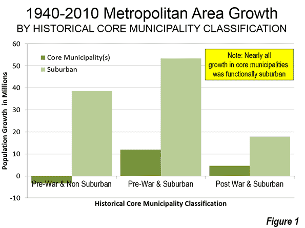
    The major metropolitan areas of the United States experienced virtually all of their overall growth in suburban and exurban areas between 2000 and 2010. This is the conclusion of an analysis of the functional Pre-Auto Urban Cores and functional suburban and exurban areas using the Demographia City Sector Model.

    The City Sector Model
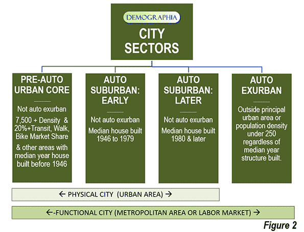
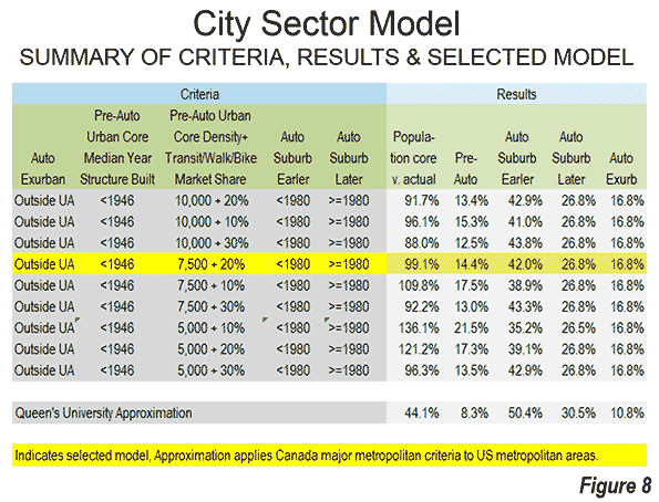
    The City Sector Model classifies zip code areas in the major metropolitan areas based on urban form (Note 1). These include four classifications, one of which replicates the urban form and travel behavior typical of the pre-World War II urban cores. These areas were typically higher density and dependent on transit and walking. The City Sector Model has three other classifications, Pre-Auto Urban Core, Auto-Suburban: Earlier, Auto-Suburban: Later and Auto-Exurban.

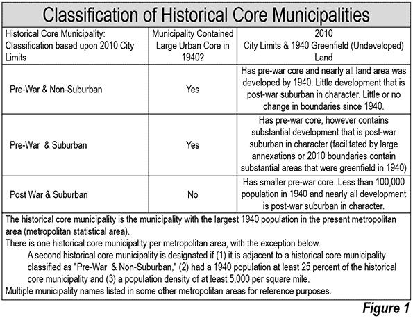
    For simplicity the City Sector categories are referred to as urban core, earlier suburban, later suburban and exurban. The City Sector Model is described in a previous article, and illustrated in Figure 1, which is also posted to the internet.

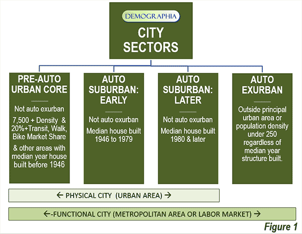
    The model makes it possible to analyze metropolitan areas based on smaller area functional classifications, rather than on jurisdictional (historical core municipality) borders, which among other things, mask as core large areas of suburbanization.

    Suburbanized Core Municipality Examples: San Jose and Charlotte

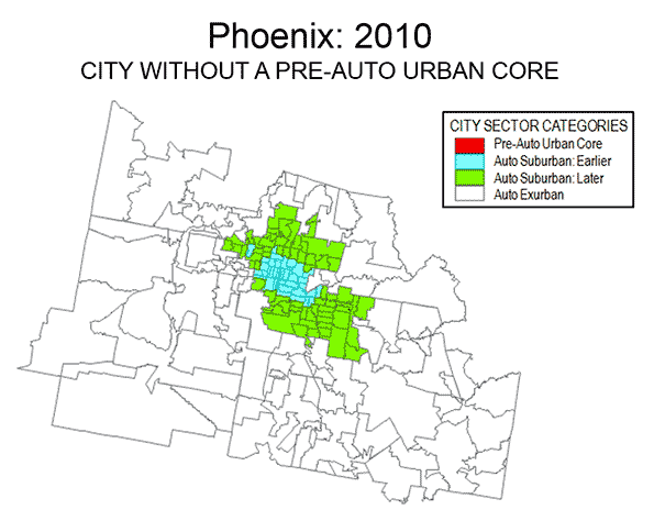
    This suburbanization in the historical core municipalities is illustrated by examples like San Jose and Charlotte. The City Sector Model indicates that neither of these metropolitan areas has a pre-auto urban core. This is because neither metropolitan area has a large enough concentration of houses with a median construction date of 1945 or before or sufficient area of 7,500 population density per square mile (2,900 per square kilometer) with a transit, walking and cycling work trip market share of at least 20 percent. As a result, virtually all of both metropolitan areas is automobile oriented suburban, including virtually all of the core municipalities.

    This is true in Charlotte despite its development of one of the most impressive new central business districts in the nation, with high employment densities. Yet at the same time the  core city of Charlotte itself is very low density (2010), at 2,500 per square mile (950 per square kilometer), less than the suburban area average for large US urban areas (2,600 per square mile or 1,000 per square kilometer). Charlotte, however, could develop the equivalent of a pre-auto urban core if its central population density rises enough and enough commuters use transit, walking and cycling.

    The core city of San Jose is far more dense than Charlotte, at 5,800 per square mile (2,200 per square kilometer). However, it is less dense than the suburbs of Los Angeles (6,400 per square mile or 2,500 per square mile). Like Charlotte, the core city of San Jose is virtually all automobile oriented suburban and has a transit work trip market share a full third below the major metropolitan area average.

    Overall Population Trend: 2000-2010

    These phenomena reflect national trends, All major metropolitan area growth between 2000 and 2010 (100.9 percent) was in the functional suburbs and exurbs.

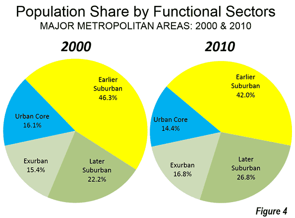
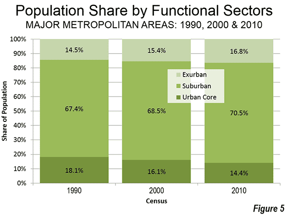
    Between 2000 and 2010, the percentage of major metropolitan area population in the urban cores declined from 16.1 percent to 14.4 percent. The urban cores lost approximately 140,000 residents (a loss of 0.6 percent), despite strong gains very close to the centers of the historical core municipalities. Consistent with these findings, Census Bureau analysis showed that the focused gains in the cores of the urban cores were more than negated by losses in surrounding urban core areas (described in: Flocking Elsewhere: The Downtown Growth Story).

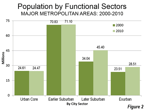
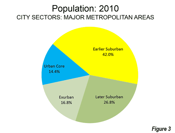
    The earlier suburban areas gained only modestly, adding 280,000 new residents, for a 0.4 percent increase. These areas have median house construction dates between 1946 and 1979. The largest increase was in the later suburban areas, which added the most new residents, 11.4 million, for a gain of 33.4 percent. The later suburban areas have median house constructions of 1980 or later. Exurban areas added 5.0 million residents, for a gain of 21.3 percent. Exurban areas are located outside the principal urban areas (Figure 2).

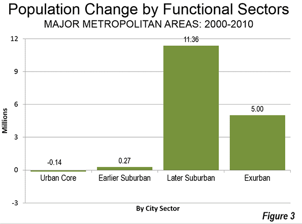
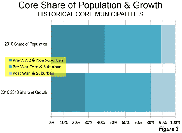
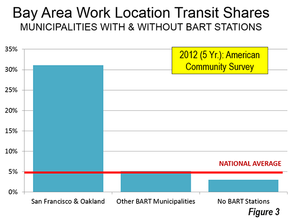
    Overall, the later suburban and exurban areas gained 16.4 million residents, compared to the combined gain of 130,000 in the urban cores and earlier suburban areas. Thus, more than 99 percent of the population growth in the major metropolitan areas was in the later suburban and exurban areas (Figure 3).

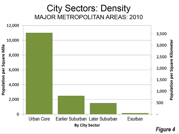
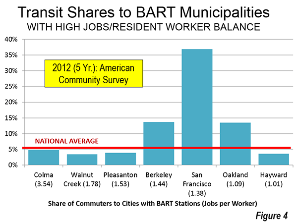
    During the decade, the exurban areas overtook the urban cores in population, rising from 15.4 percent of the major metropolitan area population to 16.8 percent (Figure 4).

    Contrast with 1990-2000 Population Trend

    Despite all of the talk of an urban core renaissance, the 2000 to 2010 decade was less favorable for urban cores than the 1990 to 2000 decade. In the earlier decade, the urban cores (as defined in 2010) added 960,000 residents, for a growth rate of 4.0 percent. This compares to the 140,000 urban core loss between 2000 and 2010 (Note 2).

    Virtually all of the difference was attributable to urban core population trend reversals in New York, Boston and Chicago, which combined experienced a drop in growth of 1.1 million. Between 1990 and 2000, the urban core of New York added 779,000 residents, far more than the 190,000 added between 2000 and 2010. Boston’s 1990-2000 urban core growth was 296,000, but fell to 27,000 in the last decade. Chicago’s urban core dropped from a gain of 139,000 to a loss of 175,000.

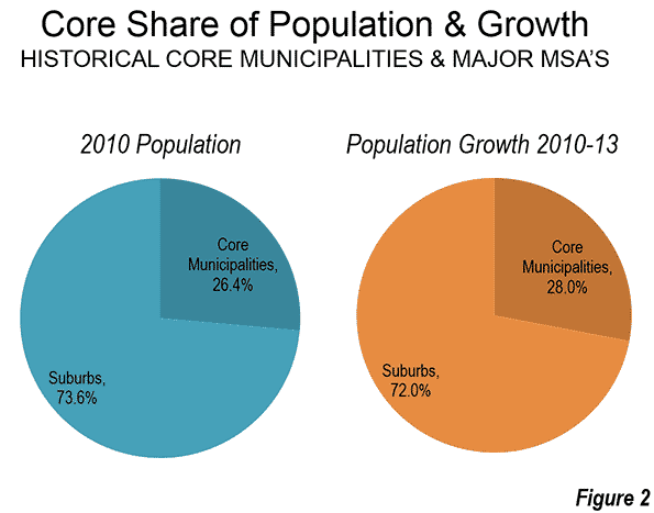
    Over the past twenty years, the population of urban cores has diminished relative to that of major metropolitan areas. In 1990, the urban cores represented 18.1 percent of the population, but fell to 14.1 percent in 2010. Auto-oriented areas (suburban and exurban) have increased their combined share from 81.9 percent of the major metropolitan area population in 1990 to 85.6 percent in 2010 (Figure $$$).

    Summary of Individual Metropolitan areas

    In 30 of the 52 major metropolitan areas, all or more of the population growth was in suburban and exurban areas between 2000 and 2010. This includes the metropolitan areas that do not have Pre-Auto Urban Cores.

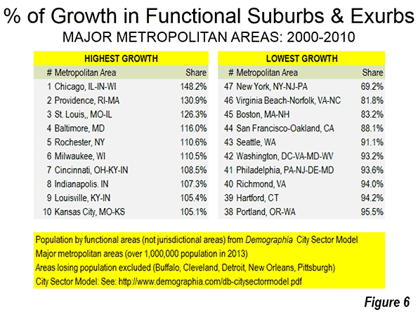
    Chicago had the largest share of suburban and exurban population growth, at 148 percent. This occurred because of the substantial urban core population losses. The suburbs and exurbs of Providence captured 131 percent of its growth, slightly more than the 126 percent suburban and exurban share in St. Louis. Baltimore, Rochester and Milwaukee had more than 110 percent of their growth in the suburbs and exurbs. Cincinnati, Indianapolis, Louisville, and Kansas City rounded out the largest suburban and exurban growth shares, all over 105 percent.

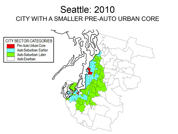
    Despite the substantial decline in its urban core growth in the last decade, New York had the lowest share of population growth in the suburbs and exurbs (meaning that it had the highest share of population growth in the urban core). The suburbs and exurbs of New York captured only 69 percent of the metropolitan area growth, well below second place, Virginia Beach – Norfolk (81 percent). Boston was next at 83 percent, followed by San Francisco – Oakland, at 88 percent. The bottom 10 in suburban and exurban growth share also included Seattle, Washington, Philadelphia, Richmond, Hartford and Portland. Even so, each of these six metropolitan areas had more than 90 percent of their growth in suburban and exurban areas (Figure 6).

    Jurisdictional Analyses: Suburbs Masquerading in Cities

    The functional analysis based on urban form and behavior reveals substantially different trends compared to the conventional jurisdictional analysis that compares historical core municipalities, principal cities or primary cities to the balance of metropolitan areas. For example a jurisdictional analysis shows that core municipalities added 1,290,000 residents between 2000 and 2010. In contrast, the urban cores, as indicated in the functional analysis, lost 140,000 residents. This indicates the extent of to which municipal boundaries can mislead in the analysis of urban form within metropolitan areas. The expansive city limits of most core cities masks the substantial automobile oriented suburbanization within their own borders.

    —-

    Note 1: The City Sector Model is generally similar to the groundbreaking research published by David L. A. Gordon and Mark Janzen at Queen’s University in Kingston Ontario (Suburban Nation: Estimating the Size of Canada’s Suburban Population) with regard to the metropolitan areas of Canada. Gordon and Janzen concluded that the metropolitan areas of Canada are largely suburban. Among the major metropolitan areas of Canada, the Auto Suburbs and Exurbs combined contain 76 percent of the population, somewhat less than the 86 percent found in the United States.

    Note 2: Changes in zip code definitions and boundaries could result in minor differences in comparability between the three censuses.

    —-

    Wendell Cox is principal of Demographia, an international public policy and demographics firm. He is co-author of the "Demographia International Housing Affordability Survey" and author of "Demographia World Urban Areas" and "War on the Dream: How Anti-Sprawl Policy Threatens the Quality of Life." He was appointed to three terms on the Los Angeles County Transportation Commission, where he served with the leading city and county leadership as the only non-elected member. He was appointed to the Amtrak Reform Council to fill the unexpired term of Governor Christine Todd Whitman and has served as a visiting professor at the Conservatoire National des Arts et Metiers, a national university in Paris.

    Photo:  Later Suburbs in New York Urban Area (Morris County, New Jersey), by author

  • From Jurisdictional to Functional Analysis of Urban Cores & Suburbs

    The 52 major metropolitan areas of the United States are, in aggregate, approximately 86 percent suburban or exurban in function. This is the conclusion from our new City Sector Model, which divides all major metropolitan zip codes into four functional categories, based on urban form, population density and urban travel behavior. The categories are (1) Pre-Auto Urban Core, (2) Auto Suburban: Earlier, (3) Auto Suburban: Later and (4) Auto Exurban. It is recognized that automobile-oriented suburbanization was underway before World War II, but it was interrupted by the Great Depression during the 1930s and was small compared to the democratization of personal mobility and home ownership that has occurred since that time.

    For decades there has been considerable analysis of urban core versus suburban trends. However, for the most part, analysts have been jurisdictional, comparing historical core municipalities to the expanse that constitutes the rest of the metropolitan area. Most core municipalities are themselves substantially suburban, which can mask (and exaggerate) the size of urban cores.

    The Queen’s University Research

    The City Sector Model is generally similar to the groundbreaking research published by David L. A. Gordon and Mark Janzen at Queen’s University in Kingston Ontario (Suburban Nation: Estimating the Size of Canada’s Suburban Population) with regard to the metropolitan areas of Canada. Researchers used travel behavior (journey to work data from the 2006 census) and density for classifying metropolitan areas into four sectors, (1) Active Core, (2) Transit Suburbs, (3) Auto Suburbs, and (4) Exurbs. The active core was that portion of metropolitan areas with a high share of work trip travel by walking and cycling. I covered the research in a newgeography.com article last autumn.

    Gordon and Janzen concluded that the metropolitan areas of Canada are largely suburban. Among the major metropolitan areas of Canada, the Auto Suburbs and Exurbs combined contain 76 percent of the population, somewhat less than the 86 percent we found in the United States.

    The City Sector Model follows the same general approach as the Queens University research, although there are important differences. For example, the City Sector Model is principally aimed at identifying the Pre-Auto Urban Core component of the modern metropolitan area and does not identify an active core.

    All US Major Metropolitan Area Growth Has Been Suburban and Exurban

    Virtually all population growth in US metropolitan areas (as currently defined) has been suburban or exurban since before World War II (the 1940 census). The historical core municipalities that have not annexed materially and were largely developed by 1940 have lost population. As a result, approximately 110 percent of their metropolitan area growth has occurred in suburbs and exurbs. Further, among the other core municipalities, virtually all of the population growth that has occurred in annexed areas or greenfield areas that were undeveloped in 1940 (Figure 1).

    Identifying the Pre-Auto Urban Core

    The City Sector Model is not dependent upon municipal boundaries (the term "city" is generic, and refers to cities in their functional sense, metropolitan areas, or in their physical sense, urban areas). Not being constrained by municipal boundaries is important because core municipalities vary substantially. For example, the core municipality represents less than 10 percent of the population of Atlanta, while the core municipality represents more than 60 percent of the population of San Antonio. The City Sector Model applies data available from the US Census Bureau to estimate the population and distribution of Pre-Auto Urban Cores in a consistent manner.

    At the same time, the approach is materially different from the Office of Management and Budget (OMB) classification of "principal cities." It also differs from the Brookings Institution "primary cities," which is based on the OMB approach. The OMB-based classifications classify municipalities using employment data, without regard to urban form, density or other variables that are associated with the urban core. These classifications are useful and acknowledge that the monocentric nature of US metropolitan areas has evolved to polycentricity. However, non-urban-core principal cities and primary cities are themselves, with few exceptions, functionally suburban.

    The City Sector Model Criteria

    Due to media and academic interest in the Pre-Auto Urban Core, a number of data combinations were used to best fit the modeled population to that of the core municipalities that have virtually the same boundaries as in 1940 and that were virtually fully developed by that time (the Pre-War & Non-Suburban classification in historical core municipalities). A number of potential criteria were examined, and the following were accepted (Figure 2).

    The Auto Exurban category includes any area outside a principal urban area.

    The Pre-Auto Urban Core category includes any non-exurban with a median house construction date of 1945 or before and also included areas with a population density of 7,500 per square mile (2,900 per square kilometer) or more and with a transit, walk and cycling journey to work market share of 20 percent or more.

    The Auto Suburban Earlier category included the balance of areas with a median house construction date of 1979 or before.

    The Auto Suburban Later category later included the balance of areas with a median house construction date of 1980 or later.

    Additional details on the criteria are in Note 1

    Results: 2010 Census

    The combined Pre-Auto Urban Core areas represented 14.4 percent of the population of the major metropolitan areas in 2010 (2013 geographical definition). This compares to the 26.4 percent that the core municipalities themselves represented of the metropolitan areas, indicating nearly half of their population was essentially suburban.

    The Auto Suburban: Earlier areas accounted for 42.0 percent of the population, while the Auto Suburban: Later areas had 26.8 percent of the population. The Auto Exurban areas had 16.8 percent of the population (Figure 3).

    The substantial difference between US and Canadian urbanization is illustrated by applying an approximation of the Gordon-Janzen criteria, which yielded an 8.4 percent Pre-Auto Urban Core population. The corresponding figure for the six major metropolitan areas of Canada was 24.0 percent. This difference is not surprising, since major Canadian urban areas have generally higher densities and much more robust transit, walking and cycling market shares. Yet, the Gordon-Janzen research shows Canada still to be overwhelmingly suburban (Note 2).

    Population Density: As would be expected, the Pre-Auto Urban Core areas had the highest densities (Figure 4), at 11,000 per square mile (4,250 per square kilometer). The Auto Suburban: Earlier areas had a density of 2,500 per square mile (1,000 per square kilometer), while the Auto Suburban: Later had a population density of 1,300 per square mile (500 per square kilometer), while the Auto Exurban areas had a population density of 150 per square mile (60 per square kilometer)).

    Individual Metropolitan Areas (Cities)

    The metropolitan areas with the highest proportion of Pre-Auto Urban Core population are New York (more than 50 percent), and Boston (nearly 35 percent), followed by Buffalo, Chicago, San Francisco-Oakland, and Providence, all with more than 25 percent (Table).

    Table
    City Sectors: 2010
    Major Metropolitan Areas
    City (Metropolitan Area) Pre-Auto Urban Core Auto Suburban: Earlier Auto Suburban: Later Auto Exurban
    Atlanta, GA 0.5% 14.9% 70.7% 13.8%
    Austin, TX 1.8% 15.7% 62.5% 20.0%
    Baltimore, MD 16.2% 41.8% 19.9% 22.0%
    Birmingham, AL 0.0% 42.1% 24.6% 33.3%
    Boston, MA-NH 34.2% 49.7% 3.2% 12.9%
    Buffalo, NY 28.8% 51.6% 3.1% 16.5%
    Charlotte, NC-SC 0.0% 10.0% 38.4% 51.6%
    Chicago, IL-IN-WI 25.8% 45.0% 18.3% 10.9%
    Cincinnati, OH-KY-IN 10.1% 38.8% 24.3% 26.8%
    Cleveland, OH 22.2% 46.8% 10.5% 20.6%
    Columbus, OH 5.0% 28.7% 37.5% 28.9%
    Dallas-Fort Worth, TX 0.3% 34.4% 43.0% 22.4%
    Denver, CO 3.1% 42.9% 42.4% 11.6%
    Detroit,  MI 6.3% 60.6% 16.1% 16.9%
    Grand Rapids 3.8% 32.9% 15.3% 48.1%
    Hartford, CT 11.1% 58.6% 1.1% 29.2%
    Houston, TX 0.3% 34.2% 48.9% 16.6%
    Indianapolis. IN 4.6% 28.0% 41.8% 25.6%
    Jacksonville, FL 0.0% 26.4% 48.2% 25.4%
    Kansas City, MO-KS 5.4% 37.6% 26.3% 30.6%
    Las Vegas, NV 2.4% 17.5% 76.7% 3.5%
    Los Angeles, CA 10.4% 76.4% 5.2% 8.0%
    Louisville, KY-IN 8.1% 45.4% 25.6% 20.8%
    Memphis, TN-MS-AR 1.8% 40.6% 34.3% 23.3%
    Miami, FL 1.4% 51.4% 44.8% 2.4%
    Milwaukee,WI 22.1% 52.0% 10.4% 15.5%
    Minneapolis-St. Paul, MN-WI 12.7% 31.6% 33.8% 22.0%
    Nashville, TN 0.0% 25.0% 36.1% 38.9%
    New Orleans. LA 10.6% 49.9% 7.0% 32.4%
    New York, NY-NJ-PA 52.4% 35.3% 5.6% 6.7%
    Oklahoma City, OK 2.5% 35.1% 31.6% 30.8%
    Orlando, FL 0.0% 16.1% 50.5% 33.4%
    Philadelphia, PA-NJ-DE-MD 24.6% 51.1% 15.1% 9.2%
    Phoenix, AZ 0.0% 29.4% 51.7% 18.8%
    Pittsburgh, PA 15.7% 56.1% 4.8% 23.4%
    Portland, OR-WA 9.3% 36.7% 39.5% 14.6%
    Providence, RI-MA 25.5% 47.7% 2.8% 24.0%
    Raleigh, NC 0.0% 7.5% 54.4% 38.1%
    Richmond, VA 4.5% 38.8% 38.0% 18.8%
    Riverside-San Bernardino, CA 0.0% 29.1% 29.4% 41.4%
    Rochester, NY 11.1% 46.9% 7.7% 34.3%
    Sacramento, CA 1.6% 38.0% 40.2% 20.1%
    St. Louis,, MO-IL 11.7% 39.9% 25.7% 22.8%
    Salt Lake City, UT 4.6% 47.9% 38.4% 9.1%
    San Antonio, TX 0.1% 39.7% 42.6% 17.6%
    San Diego, CA 1.2% 61.6% 30.3% 6.9%
    San Francisco-Oakland, CA 25.7% 55.5% 7.6% 11.2%
    San Jose, CA 0.1% 77.7% 9.1% 13.1%
    Seattle, WA 7.8% 38.9% 40.2% 13.0%
    Tampa-St. Petersburg, FL 0.0% 44.8% 39.7% 15.5%
    Virginia Beach-Norfolk, VA-NC 1.5% 44.4% 37.7% 16.4%
    Washington, DC-VA-MD-WV 15.9% 29.2% 36.2% 18.7%
    Overall 14.4% 42.0% 26.8% 16.8%


    It may be surprising that many of the major metropolitan areas are shown with little or no Pre-Auto Urban Core population. For example, five metropolitan areas have virtually no Pre-Auto Urban Core population, including Phoenix, Riverside-San Bernardino, Tampa-St. Petersburg, Orlando, Jacksonville, and Birmingham. By the Census Bureau criteria of 1940, two of these areas were not yet metropolitan and only Birmingham (400,000) had more than 250,000 residents.  Many of the newer and fastest growing metropolitan areas were too small, too sparsely settled or insufficiently dense to have strong urban cores before the great automobile suburbanization that followed World War II. Further, many of the Pre-Auto Urban Cores have experienced significant population loss and some of their neighborhoods have become more suburban (automobile oriented). Virtually no urban cores have been developed since World War II meeting the criteria.

    Thus, no part of Phoenix, San Jose, Charlotte and a host of other newer metropolitan areas functionally resembles the Pre-Auto Urban Core areas of metropolitan areas like Chicago, Cincinnati, or Milwaukee. However, new or expanded urban cores are possible, if built at high enough population density and with high enough transit, walking, and cycling use. 

    Examples of three differing metropolitan areas are provided. Philadelphia (Figure 5) is a metropolitan area with a strong Pre-Auto Urban Core, which is indicative of an older metropolitan area that has been among the largest in the nation since its inception, Seattle (Figure 6) is a much newer metropolitan area, yet exhibits a larger Pre-Auto Urban Core than most. Phoenix (Figure 7) may be the best example of a post-War metropolitan area, with virtually no Pre-Auto Urban Core. In 1940, the Phoenix metropolitan area had only 120,000 residents and could be 40 times that large by 2020. Virtually all of Phoenix is automobile-oriented. Even three years after opening its light rail line, 88 percent of Phoenix commuters go to work by car and only two percent by transit, virtually the same as in 2000.

    Despite the comparatively small share of the modern metropolitan area represented by the Pre-Auto Urban Core in the City Core Model, the definition is broad and, if anything over-estimates the size of urban core city sectors. The population density of Pre-Auto Urban Core areas is below that of the historical core municipalities before the great auto oriented urbanization (11,000 compared to 12,100 in 1940) and well above their 2010 density (8,400), even when New York is excluded. The minimum density requirement of 7,500 per square mile (not applied to analysis zones with a median house construction data of 1945 or earlier) is slightly less than the density of Paris suburbs (7,800 per square mile or 3,000 per square kilometer) and only 20 percent more dense than the jurisdictional suburbs (suburbs outside the historical core municipality) of Los Angeles (6,400 per square mile or 2,500 per square kilometer). Some urban containment plans require higher minimum densities, not only in urban cores but also in the suburbs.

    In describing the Canadian results, Professor Gordon noted that there is a tendency to “overestimate the importance of the highly visible downtown cores and underestimate the vast growth happening in the suburban edges.” That is true to an even greater degree in the United States. 

    —–

    Note 1:

    The City Sector Model is applied to the 52 major metropolitan areas in the United States (over 1 million population). The metropolitan areas are broken into principal urban areas, with all other areas considered to be exurban. The principal urban areas also include the Concord urban area and the Mission Viejo urban area, which are adjacent to and included in the San Francisco and Los Angeles urban areas respectively. As a result, some smaller urban areas, such as Palm Springs (Riverside-San Bernardino metropolitan area), Lancaster (Los Angeles metropolitan area) and Poughkeepsie (New York metropolitan area) are considered exurban. Areas with less than 250 residents per square mile (100 per square kilometer) are also considered exurban, principally for classification of large areas on the urban fringe that have a substantial rural element.

    The Pre-Auto Urban Core includes all non-– exurban areas in which is the median house (single-family or multi-family) was built is 1945 or before. Three density levels were considered, 10,000, 7,500 and 5,000 per square mile (4,000, 2,900 and 2,000 per square kilometer). The lower 5,000 per square mile was examined to test the extent to which such a low density would increase the urban core population. This density, less than the entire urban area (urban core and suburban) of the Los Angeles, San Francisco, San Jose and New York urban areas would have, at the most raised the urban core population to 21.5 percent of the metropolitan population, even with a modest 10 percent transit, walking and cycling market share (Figure 8)

    The pre-auto urban core specification results in a 2010 population for the metropolitan areas with Pre-war and non-suburban historical core municipalities within one percentage point of the actual total, excluding the far higher density case of New York.

    The analysis showed that a lower transit, walking and cycling market share at a 7,500 per square mile floor (2,900 per square kilometer) would substantially increase the Pre-Auto Urban Core category population, while diluting its urban core nature. More than one-half of the increase would be in Los Angeles which has added literally millions of residents in high density suburban areas that are as automobile oriented as suburbs elsewhere.

    The analysis zones (zip codes) have an average population of 19,000, with from as many as 1,000 zones in New York to 50 in Raleigh.

    Note 2:

    An approximation based on the Gordon and Janzen approach would indicate an urban core population of only 8 percent in the major metropolitan areas of the United States. This approximation results in a modeled population for the metropolitan areas with pre-war and non-suburban historical core municipalities of less than one-half the actual 2010 population.

    This Queen’s University research comparison in Figure 8 is referred to as an approximation, since it applies an overall transit, walking, and cycling market share for the six major metropolitan areas, instead of a factor corresponding to each metropolitan area (the Gordon and Janzen approach).

    The differences in transit market share relative to the US are substantial. This may be best shown by considering Calgary, which with a population of 1.2 million in 2011 would have ranked as the 47th largest metropolitan area if it were in the United States. Yet, Calgary would rank second only to the New York metropolitan area in transit market share if it were in the United States. Even so, Calgary is found to be the most suburban of Canada’s major metropolitan areas in the Queen’s University research and Statistics Canada data from 2011 indicates strong domination of urban travel by the automobile.

    Wendell Cox is principal of Demographia, an international public policy and demographics firm. He is co-author of the “Demographia International Housing Affordability Survey” and author of “Demographia World Urban Areas” and “War on the Dream: How Anti-Sprawl Policy Threatens the Quality of Life.” He was appointed to three terms on the Los Angeles County Transportation Commission, where he served with the leading city and county leadership as the only non-elected member. He was appointed to the Amtrak Reform Council to fill the unexpired term of Governor Christine Todd Whitman and has served as a visiting professor at the Conservatoire National des Arts et Metiers, a national university in Paris.

    Photo: Los Angeles

  • From Anecdotes to Data: Core & Suburban Growth Trends 2010-2013

    According to the Wall Street Journal, there are "Signs of a Suburban Comeback." This is a turnaround from the typical media coverage of US population estimates in recent years, which have more often than not heralded a "return to the cities" generally more rooted in anecdote than data.

    There were always at least two problems with the "return to the city" thesis. First of all, most people who live in the suburbs came from areas outside metropolitan areas and they couldn’t return to where they had never lived (see Cities and Suburbs: The Unexpected Truth). More importantly, in every year for which there is data, the net inward migration to suburbs has been far greater than to the core counties, which have nearly always had net outward migration (see Special Report: 2013 Metropolitan Area Population Estimates. Under these conditions, there could not have been net migration from the suburbs to the core municipalities.

    Historical Core Municipalities: The Differences

    I have classified historical core municipalities based on their extent of automobile oriented suburbanization (Figure 1). The break point is World War II, after which the great automobile suburbanization occurred in the United States. There had been automobile oriented suburbanization before 1940. During the 1920s, annual rates of suburban growth exceeded five percent in the 14 metropolitan areas with more than 500,000 population. The decade of the Great Depression (1930 to 1940) saw annual growth rates drop three quarters (Note). By the end of World War II, transit had seen its motorized urban travel market share restored to 35 percent, equal to early 1920s levels, a figure that has since fallen to under two percent. 

    Historical Core Municipalities: Improving Trends

    Even so, in recent years, the core municipalities have done better than in the past. The nightmare that occurred between 1970 and 1990 seems to be over in many places. This has made it feasible for an increase in core living by many Millennials and singles. However, even this has been exaggerated by anecdotal research that dominates the media. More than 80 percent of Millennials live outside the core municipalities, where they are less visible to the anecdote-driven media.

    On a percentage basis, the historical core municipalities of the 52 major metropolitan areas (more than 1,000,000 population) managed to grow 3.4 percent between 2010 and 2013, more than the suburban rate of 3.1 percent. This is probably the first time this has occurred in any three year period since the end of World War II.

    But the core municipalities now contain such a small share of major metropolitan area population that the suburbs have continued to add population at about three times the numbers of the core municipalities (Figure 2). Indeed, if the respective 2010-2013 annual growth rates were to prevail for the next century,  the core municipalities would house only 28.0 percent of the major metropolitan area population in 2113 (up from 26.4 percent in 2013).

    Despite the publicity to the contrary, only six core municipalities added more population than suburbs in the same metropolitan areas between 2010 and 2013. These were New York, San Antonio, Columbus, San Jose, Austin, and New Orleans, all except New York with substantial suburbanization within their city limits. The core municipalities did better in percentage gains, with 19 gaining faster than the suburbs, compared to 33 suburban areas growing faster than the core municipalities.

    Core Municipality Growth

    Most of the 2010 to 2013 core growth occurred in municipalities with a larger suburban component. The core municipalities that have little suburban development ("Pre-War & Non-Suburban") had 43 percent of the core population in 2010. Yet they attracted only 27 percent of the growth (Figure 3). The two other categories, which include large areas of functional suburbanization (low density and strong automobile orientation) attracted 73 percent of the core population (Figure 3). These include suburbanized pre-War core municipalities, such as Los Angeles, Seattle, and Atlanta. They also include cores that are nearly all suburban, with nearly all of their population growth having occurred during the great automobile suburbanization (such as Austin, Sacramento, Phoenix, and San Jose).

    Core Municipalities: Top Gainers

    New York led the core municipalities by adding 230,000 new residents between 2010 and 2013. This was 56 percent of the population growth among the "Pre-War & Non-Suburban” core municipalities. The core municipality accounted for 60 percent of the population growth in the metropolitan area. However, domestic migrants continued to move away from New York City. Core municipality losses were 215,000 from 2010 to 2013, while the suburbs, with more than 55 percent of the population, lost less than a third as many (70,000).

    Houston gained 96,000 new residents between 2010 and 2013, followed by Austin (95,000), Los Angeles (92,000), and San Antonio (82,000).  Houston, Los Angeles, and San Antonio each have large suburban areas within their city limits, while the core municipality of Austin is virtually all automobile-oriented. The sixth through 10th positions were taken by Phoenix, Dallas, San Jose, Denver, and San Diego, all with substantial suburbanization.

    The largest core municipality population gains were in Austin (12.0 percent), still recovering New Orleans (10.1 percent), Denver (8.3 percent), Washington (7.4 percent), and Orlando (6.1 percent). Seattle, Raleigh, Atlanta, San Antonio and San Jose rounded out the top ten. Among the 10 fastest growing core municipalities, all but Washington have large automobile-oriented suburban components.

    There was also bad news. Detroit continued its population slide, now down to 689,000 from its 1950 peak of 1,850,000. This 62.76 percent loss, however, is not the worst among major US core municipalities. St. Louis still holds that title, having fallen from 857,000 in 1950 to 318,000 in 2013, a loss of 62.84 percent. However, one more year of losses at the 2010-2013 rates will transfer this dubious title to Detroit.

    Suburban Areas: Top Gainers

    The largest suburban gains were in Dallas-Fort Worth (325,000), Houston (296,000), Washington (269,000), Miami (245,000) and Los Angeles (211,000). Atlanta, which had virtually set the world standard for suburbanization before the Great Financial Crisis, managed to re-emerge with the sixth fastest largest suburban increase (208,000).

    Measured on a percentage basis, Texas dominated the suburban gains. The suburbs of Houston added 7.8 percent to their population between 2010 and 2013. Austin added 7.7 percent, San Antonio added 6.6 percent, and Dallas-Fort Worth 6.2 percent. The only non-Texas entry in the top five was Raleigh, which, like Austin, posted a 7.7 percent increase.

    The metropolitan area and historical core municipality data is summarized in the Table.

    Table: Metropolitan Area & Historical Core Municipality Population: 2010-2013
    Metropolitan Area Historical Core Municipality
    Rank Metropolitan Area 2010 2013 % Change 2010 2013 % Change
    1 New York, NY-NJ-PA 19.566 19.950 2.0% 8.175 8.406 2.8%
    2 Los Angeles, CA 12.829 13.131 2.4% 3.793 3.884 2.4%
    3 Chicago, IL-IN-WI 9.461 9.537 0.8% 2.696 2.719 0.9%
    4 Dallas-Fort Worth, TX 6.426 6.811 6.0% 1.198 1.258 5.0%
    5 Houston, TX 5.920 6.313 6.6% 2.099 2.196 4.6%
    6 Philadelphia, PA-NJ-DE-MD 5.965 6.035 1.2% 1.526 1.553 1.8%
    7 Washington, DC-VA-MD-WV 5.636 5.950 5.6% 0.602 0.646 7.4%
    8 Miami, FL 5.565 5.828 4.7% 0.399 0.418 4.6%
    9 Atlanta, GA 5.287 5.523 4.5% 0.420 0.448 6.6%
    10 Boston, MA-NH 4.552 4.684 2.9% 0.618 0.646 4.6%
    11 San Francisco-Oakland, CA 4.335 4.516 4.2% 1.196 1.244 4.0%
    12 Phoenix, AZ 4.193 4.399 4.9% 1.446 1.513 4.7%
    13 Riverside-San Bernardino, CA 4.225 4.381 3.7% 0.210 0.214 1.8%
    14 Detroit,  MI 4.296 4.295 0.0% 0.714 0.689 -3.5%
    15 Seattle, WA 3.440 3.610 5.0% 0.609 0.652 7.2%
    16 Minneapolis-St. Paul, MN-WI 3.349 3.459 3.3% 0.668 0.695 4.1%
    17 San Diego, CA 3.095 3.211 3.7% 1.307 1.356 3.7%
    18 Tampa-St. Petersburg, FL 2.783 2.871 3.1% 0.336 0.353 5.1%
    19 St. Louis,, MO-IL 2.788 2.801 0.5% 0.319 0.318 -0.3%
    20 Baltimore, MD 2.711 2.771 2.2% 0.621 0.622 0.2%
    21 Denver, CO 2.543 2.697 6.1% 0.600 0.649 8.2%
    22 Pittsburgh, PA 2.356 2.361 0.2% 0.306 0.306 0.0%
    23 Charlotte, NC-SC 2.217 2.335 5.3% 0.787 0.823 4.5%
    24 Portland, OR-WA 2.226 2.315 4.0% 0.584 0.609 4.4%
    25 San Antonio, TX 2.143 2.278 6.3% 1.327 1.409 6.1%
    26 Orlando, FL 2.134 2.268 6.3% 0.238 0.255 7.2%
    27 Sacramento, CA 2.149 2.216 3.1% 0.466 0.480 2.8%
    28 Cincinnati, OH-KY-IN 2.115 2.137 1.1% 0.297 0.298 0.2%
    29 Cleveland, OH 2.077 2.065 -0.6% 0.397 0.390 -1.7%
    30 Kansas City, MO-KS 2.009 2.054 2.2% 0.460 0.467 1.6%
    31 Las Vegas, NV 1.951 2.028 3.9% 0.584 0.603 3.4%
    32 Columbus, OH 1.902 1.967 3.4% 0.787 0.823 4.5%
    33 Indianapolis. IN 1.888 1.954 3.5% 0.820 0.843 2.8%
    34 San Jose, CA 1.837 1.920 4.5% 0.946 0.999 5.6%
    35 Austin, TX 1.716 1.883 9.7% 0.790 0.885 12.0%
    36 Nashville, TN 1.671 1.758 5.2% 0.601 0.634 5.5%
    37 Virginia Beach-Norfolk, VA-NC 1.677 1.707 1.8% 0.243 0.246 1.4%
    38 Providence, RI-MA 1.601 1.604 0.2% 0.178 0.178 0.0%
    39 Milwaukee,WI 1.556 1.570 0.9% 0.595 0.599 0.7%
    40 Jacksonville, FL 1.346 1.395 3.6% 0.822 0.843 2.5%
    41 Memphis, TN-MS-AR 1.325 1.342 1.3% 0.647 0.653 1.0%
    42 Oklahoma City, OK 1.253 1.320 5.3% 0.580 0.611 5.3%
    43 Louisville, KY-IN 1.236 1.262 2.1% 0.597 0.610 2.1%
    44 Richmond, VA 1.208 1.246 3.1% 0.204 0.214 4.8%
    45 New Orleans. LA 1.190 1.241 4.3% 0.344 0.379 10.1%
    46 Hartford, CT 1.212 1.215 0.2% 0.125 0.125 0.2%
    47 Raleigh, NC 1.130 1.215 7.4% 0.404 0.432 6.9%
    48 Salt Lake City, UT 1.088 1.140 4.8% 0.186 0.191 2.5%
    49 Birmingham, AL 1.128 1.140 1.1% 0.212 0.212 -0.1%
    50 Buffalo, NY 1.136 1.134 -0.1% 0.261 0.259 -0.9%
    51 Rochester, NY 1.080 1.083 0.3% 0.211 0.210 -0.1%
    52 Grand Rapids, MI 0.989 1.017 2.8% 0.188 0.192 2.3%
    Total 169.512 174.942 3.2% 44.739 46.258 3.4%
    In Millions: Data from US Census Bureau


    Normalcy Knocks?

    Ken Johnson, the frequently quoted University of New Hampshire demographer told the Wall Street Journal, "The slowing growth in these urban cores and the increasing gains in the suburbs may be the first indication of a return to more traditional patterns of city-suburban growth." These patterns are of long standing. Nearly all urban population growth since World War II has been suburban, whether within or outside the core municipalities. It should not be surprising that suburban growth dropped during the second greatest economic decline in a century and has been slow to recover during the Great Recession and the Great Malaise that has followed. The one-quarter suburban growth rate drop was more modest than during the Great Depression, but still substantial. Should genuine prosperity return, it will likely be accompanied by a renewal of more robust suburban growth.

    Note: Core municipality growth also dropped in the 1930s, as the high rate of migration from rural to urban areas in the 1920s was interrupted due to the economic reversal.

    Wendell Cox is principal of Demographia, an international public policy and demographics firm. He is co-author of the “Demographia International Housing Affordability Survey” and author of “Demographia World Urban Areas” and “War on the Dream: How Anti-Sprawl Policy Threatens the Quality of Life.” He was appointed to three terms on the Los Angeles County Transportation Commission, where he served with the leading city and county leadership as the only non-elected member. He was appointed to the Amtrak Reform Council to fill the unexpired term of Governor Christine Todd Whitman and has served as a visiting professor at the Conservatoire National des Arts et Metiers, a national university in Paris.

  • Thrive 2040: Toward a Less Competitive Minneapolis-St. Paul

    In a Wall Street Journal commentary entitled Turning the Twin Cities Into Sim City, Katherine Kersten of the Center of the American Experiment describes how "a handful of unelected bureaucrats are gearing up to impose their vision of the ideal society on the nearly three million residents of the Minneapolis-St. Paul metro region." She notes that the Metropolitan Council (the "handful of unelected bureaucrats") intend for "all future housing and economic development within "easy walking distance" (one-half mile) of major transit stops—primarily in the urban core and inner-ring suburbs.” This would lead to "tax dollars (mostly from people who live elsewhere) will be lavished on high-density housing, bike and pedestrian amenities and subsidized retail shops." She equates the plan with playing the computer game "Sim City with residents’ lives."

    Kersten also notes the all-too predictable distortion of future transportation funding to support transit, rather than highway congestion relief.  The ("Thrive 2040") "plan also will pour public funds into mass transit while virtually ignoring congestion relief on highways. The Twin Cities region is projected to have just $52 million available annually from 2014 to 2022 for highway congestion relief, according to the Minnesota Department of Transportation. Yet the Met Council intends to spend at least $1.7 billion on a single light-rail project, with more rail transit to follow."

    This imbalance of funding is despite the fact that less than two percent of travel in the Twin Cities is by transit. In the longer run, Minneapolis-St. Paul, which has been by far the most successful metropolitan area in the Midwest since World War II, will become less competitive if it fails to take steps to improve traffic congestion (and it is nothing short of folly to expect that transit can substitute for driving in the modern metropolitan area, see The Transit-Density Disconnect).

    Kersten also characterizes as the "most radical element," of the Metropolitan Council plan as its greenhouse gas emission reduction component, and for good reason. The urban containment policies of densification and transit are far more expensive than other strategies for reducing greenhouse gas emissions (see questioning the Messianic Conception of Smart Growth and Enough "Cowboy" Greenhouse Gas Emissions Reduction Policies). At the same time, there are a myriad of strategies that are more cost effective, such as improved fuel economy (see Obama Fuel Economy Rules Trump Smart Growth). Cost-effectiveness is important, because if more than necessary is spent to reach greenhouse gas emission goals, there will be an economic cost in fewer jobs created, a lower standard of living and greater poverty (see Toward More Prosperous Cities).

  • May the (Insidious) Force Be With You

    Google Earth pic to the left of the boundary between Detroit and suburban Grosse Pointe Park, MI. Alter Road (cutting from upper left to lower right) is the boundary between the two. Take note of the differences in vacant land between Detroit (on the left) and Grosse Pointe Park (on the right).

    Too many people think today’s “de facto” segregation in metro areas is the result of personal preferences expressed by individuals, when the fact is that public policy has created the conditions we live with today.  In fact, I see the demise of Jim Crow through the Civil Rights Act and the Voting Rights Act corresponding with the immediate rise of an insidious, “non-racist” racism that shapes our metros today.  Our metro areas have never dealt with this.

    In the aftermath of the Donald Sterling controversy (which, if you aren’t aware of, you truly are under a rock), the Atlantic’s Ta-Nehisi Coates posted an on-spot critique of how racism is viewed and how racism is really working in today’s society.  It is a truly beautiful piece on the perception of racism versus its realities — the perception being that racism is the purview of dunces like Sterling (and Cliven Bundy before him) who get caught making inelegant statements that shed light on their true feelings, and a reality that is far more insidious and receives far less attention.  Coates describes how “elegant racism”, that insidious force, shapes where we live, what jobs are available to us, how we’re educated, and who is incarcerated and who isn’t:

    “Elegant racism is invisible, supple, and enduring. It disguises itself in the national vocabulary, avoids epithets and didacticism. Grace is the singular marker of elegant racism. One should never underestimate the touch needed to, say, injure the voting rights of black people without ever saying their names. Elegant racism lives at the border of white shame. Elegant racism was the poll tax. Elegant racism is voter-ID laws.”

    And to better describe how “elegant racism” works, he cites Chicago as its key implementer:

    “Throughout the 20th century—and perhaps even in the 21st—there was no more practiced advocate of housing segregation than the city of Chicago. Its mayors and aldermen razed neighborhoods and segregated public housing. Its businessmen lobbied for racial zoning. Its realtors block-busted whole neighborhoods, flipping them from black to white and then pocketing the profit. Its white citizens embraced racial covenants—in the ’50s, no city had more covenants in place than Chicago.

    If you sought to advantage one group of Americans and disadvantage another, you could scarcely choose a more graceful method than housing discrimination. Housing determines access to transportation, green spaces, decent schools, decent food, decent jobs, and decent services. Housing affects your chances of being robbed and shot as well as your chances of being stopped and frisked. And housing discrimination is as quiet as it is deadly. It can be pursued through violence and terrorism, but it doesn’t need it. Housing discrimination is hard to detect, hard to prove, and hard to prosecute. Even today most people believe that Chicago is the work of organic sorting, as opposed segregationist social engineering. Housing segregation is the weapon that mortally injures, but does not bruise.”

    (Let’s parenthetically stop here for a second; the symbolism in that last sentence is incredible.  The implication is that victims of elegant racism “die” from internal injuries, which are often believed to be sustained from a lifetime of poor personal choices.  But elegant racism made those choices for them.  Absolutely incredible).

    I don’t know if Chicago was the innovator of this type of racism, but I do believe it was something created in Northern industrial cities — i.e., the Rust Belt.  I suspect it has its seeds in the antebellum North, whose cities had small African-American populations prior to the Civil War and immediately afterwards.  I imagine at that time, when blacks comprised maybe less than five percent of, say, Buffalo’s population, it was relatively easy to isolate blacks without necessarily singling them out, as in the Jim Crow South.

    But the Great Migration changed everything.  The need for industrial labor in the North, and rapidly declining conditions in the Jim Crow South, pushed African-Americans into Northern cities.  Once there they encountered competition for jobs and housing from both longtime “nativists” and more recent European immigrants.  The ten years from 1910-1920 were fraught with racial conflicts in Northern cities, culminating with the Red Summer of 1919.

    But Northern cities did something that Southern ones did not.  They sought to limit and stigmatize the places where blacks lived, instead of limiting or stigmatizing the people themselves.  Out of this a whole set of policies emerged.  Racial covenants.  Redlining emerges during the New Deal.  Blockbusting came about as a tool to clear room for a growing black population, accelerate suburban expansion, and enrich real estate speculators.  Public housing was concentrated where blacks lived, and infrastructure investments ground to a halt.  Investments in education fell behind that of suburban schools, or couldn’t keep up with growing social challenges.  “Tough-on-crime” measures like mandatory sentencing and the “War on Drugs” were effective in removing potential workers from the workforce, reducing competition.  Taken together, these “non-racist” racist policies, often grounded in sound, rational economic thinking, created deeply ingrained patterns within metros that shape them today.

    This position is further buffeted by research done by Nancy DiTomaso, a business professor at Rutgers University in New Jersey.  In her book, The American Non-Dilemma: Racial Inequality Without Racism, she says this:

    “Because whites disproportionately hold jobs with more authority, higher pay, more opportunities for skill development and training, and more links to other jobs, they can benefit from racial inequality without being racists and without discriminating against blacks and other nonwhites. In fact, I argue that the ultimate white privilege is the privilege not to be racist and still benefit from racial inequality.”

    There are other strong claims made by DiTomaso in that interview; it (and the book, which I loved) is worth your attention.

    In my opinion the practice was perfected in the Rust Belt but has spread everywhere.  Milwaukee Journal-Sentinel is doing a series on political segregation in southeastern Wisconsin, and found that its roots are in the state’s residential segregation legacy.  Lee Atwater’s famous quote about the abstraction of racial policies, uttered in 1981, possibly signaled to Southern metros that there was a way to accomplish the separation that Jim Crow had earlier provided.  I see a correlation between the number of blacks within a metro area, and the impact of insidious policies on residential and job patterns.  In some metros, the impact, while there, is not as strong (New York, Boston), because of lower relative numbers of blacks.  In some Sun Belt metros, Jim Crow likely enforced similar patterns but subsequent post-War growth and the new policies altered things a little (Atlanta, Charlotte, Nashville).  In other Sun Belt metros with more recent growth the numbers of blacks has hardly been enough for full-on “elegant racism” implementation (Phoenix, Las Vegas).  But insidious racism is a critical feature of today’s Rust Belt cities.

    This is in part why I’m skeptical of new calls from urbanists to increase affordable housing in cities, when I see vast neighborhoods that have suffered from policies that simply removed them from the consciousness of the majority of the housing market.  I’d prefer to address yesterday’s mistakes before creating new ones.

    Plus, I keep thinking about that saying that the only thing necessary for evil to prosper is for good people to do nothing…

    This post originally appeared in Corner Side Yard on May 9, 2014.

    Pete Saunders is a Detroit native who has worked as a public and private sector urban planner in the Chicago area for more than twenty years.  He is also the author of “The Corner Side Yard,” an urban planning blog that focuses on the redevelopment and revitalization of Rust Belt cities.

  • Thinking About Housing in the Northwest

    With one of the most successful economies in the nation, the real estate news in the Pacific Northwest is positive and gives hope for a housing sector recovery, albeit at different rates in different markets. CNNMoney reports that from the third quarter in 2012 to the third quarter in 2013, the median home price in the Seattle-Bellevue and Everett area increased by 13.7%. The forecast for changes from the third quarter in 2013 to the third quarter in 2014 is another 5.2%. Tacoma’s (Pierce County) housing prices did not grow as quickly, with an increase of 9.3% from 2012 to 2013, but it is expected to witness a sharper increase in 2014, with a healthy 8.6% change from the third quarter of 2013 to 2014. 

    As rosy as the real estate picture is, we should also remember that in the second quarter of 2013, as housing values began to climb in both markets, median family incomes were already too low compared to median home prices. In Seattle, the ratio of median home prices to median family income was 4.7, and in Tacoma it was 3.6. That made Tacoma a relatively affordable city. However, an expected increase of 8.6% in home values, without a corresponding increase in median family incomes will not do much for its affordability.

    Without a major change in its employment structure that might lead to higher incomes for current and future residents of Tacoma, the differential in home prices could make Tacoma a residential destination for Seattle employees finding this city comparatively more affordable. Living half an hour from work, but paying significantly less for housing, is a great incentive, especially for young, single or double income, and childless families. For them, a two-bedroom condo with a view of Commencement Bay may do the job. For Tacoma residents whose median family income is about $20,000 less than their Seattle counterparts, rising home values may prove to be a challenge that cannot be easily overcome without a higher number of well-paying jobs that keep pace with rising home values.

    Regional patterns of housing affordability

    It is no longer news to anyone that most unaffordable cities rely on their less costly neighbors to house their working populations. The city of Los Angeles relies on the vast sprawl of its own suburbs and the Inland Empire. San Francisco does the same by having people commute from the larger urban region, all the way from the San Joaquin Valley.

    The relationship between Seattle and other cities in King and Pierce Counties already follows the same script. Morning commutes into Seattle and afternoon rush hour traffic heading out of Seattle do not require statistics. The numbers are felt by anyone driving during those hours. However, two maps will help paint a vivid picture of the regional urban dynamics created by the unholy triangle of housing market price differentials, economic development patterns, and the resulting spatial mismatch between home and work places. 

    Maps for median housing values and commuting patterns in King and Pierce Counties clearly show that a good number of people who work in unaffordable regions of King County (including Seattle) rely on more affordable housing elsewhere. As the map of commuting patterns illustrates, for Pierce County, this starts right at the county border, where housing prices are lower (compared to median household incomes). This has already turned certain portions of Pierce County into bedroom communities, feeding economic growth elsewhere. In other words, job-rich areas are resolving their housing problems by pushing their employed populations to other areas, where home prices are more affordable. However, will the growth of housing demand in areas outside employment centers translate to increased housing values in previously affordable regions and push long-time residents out of the housing market?

    To answer this question, we need to engage in a more detailed level of analysis.


    Micro-geographies of affordability

    In order to get a better sense of housing affordability patterns, we can rely on a simple indicator called median multiples (the ratio of median housing value to median household income). While this measure has its critics, it is easily understandable. The basic premise is that when median housing value exceeds median household income more than three fold, an area becomes unaffordable.

    A few years ago, Wendell Cox used this method to identify the least affordable cities in the nation. He used the following table to classify various cities in the U.S.:

    Demographia
    Housing Affordability Ratings

    Rating

    Median Multiple

    Severely Unaffordable

    5.1 & Over

    Seriously Unaffordable

    4.1 to 5.0

    Moderately Unaffordable

    3.1 to 4.0

    Affordable

    3.0 or Less

    Median Multiple: Median House Price divided by Median Household Income


    The map of median multiples for King and Pierce Counties reveals a pattern of housing affordability that indicates a looming problem as the housing market recovers. As of Census 2012, almost all Seattle and Bellevue areas were unaffordable, with median multiples exceeding 5. Comparatively speaking, Tacoma has had more affordable housing areas (with more census tracts with median multiples ranging from 3 to 4).  Between Tacoma and Seattle, areas such as Federal Way have more affordable housing for the income levels found there. Tacoma’s North East community, adjacent to Federal Way, has higher housing values matching residents’ income levels. Given the commuting patterns, this region is clearly home to many who work elsewhere, earn better incomes, and spend a smaller portion of it on their homes.


    In some areas, where median multiples exceed 5, current residents may have purchased their houses when prices were lower. In other words, at one point in time, the median multiple had a lower value. Under such conditions, residents have accumulated substantial equities, allowing them to sell in a more expensive market. However, the next group of occupants will need substantially higher incomes to afford these houses. With the potential arrival of a sellers’ market, any transition in the composition of homeowners will also coincide with a shift to higher socioeconomic status.  

    Given the overall housing affordability patterns, it is clear that with the looming hike in home prices, the last of the semi-affordable housing pockets in the region extending from Seattle to Tacoma could vanish quickly. Clearly, the well-paid employees in King County could choose to live in Pierce County, enjoy the views, but struggle with traffic up and down I-5. They could even benefit from a publicly funded transportation system. But this won’t resolve the growing traffic and the emerging spatial mismatch between housing and employment. At this point the entire urban region from Seattle to Tacoma should focus on job-housing balance, where the quantity and cost of housing are comparable to employment volume and average salaries paid. To be truly ‘green,’ decision makers need to think regionally. Passing housing or employment problems to neighboring cities is not the best approach to sustainability.

    As for Tacoma, like any other urban region on the fringes of a major metropolitan area, the city has a few options moving forward. First, it could act as a satellite city and build more houses for people who work in the larger urban region. Second, it could imagine itself as a major urban center with little interest in being a “second city.” In that case, it needs to focus on economic development, bringing more well-paying jobs that are suitable for its current and future residents, and build houses that are affordable for the types of incomes generated in the area. This strategy requires coordination between housing and economic development that reduces the spatial mismatch between housing and employment and improves the job-housing balance. This will help both housing and transportation conditions. That will also keep Tacoma affordable and make it unpretentiously ‘green.’

    The National Association of Home Builders ranks Tacoma 103rd for housing affordability on a list of 224 cities. Spokane ranks 62 and Seattle 202 on the same list. Tacoma should aspire to appear on the list of the top 50 most affordable cities by 2020, and be recognized for the quality of life and employment opportunities it offers to current and future residents.

    Ali Modarres is the Director of Urban Studies at University of Washington Tacoma.  He is a geographer and landscape architect, specializing in urban planning and policy. He has written extensively about social geography, transportation planning, and urban development issues in American cities.

  • Thomas Sowell Explains the Economics of Urban Containment (Smart Growth)

    Economist Thomas Sowell, who has taught at Cornell University and UCLA and has worked at the Urban Institute and the Hoover Institution at Stanford University summarizes the economics of the housing market in a recent article:

    "Anyone who has taken Economics 1 knows that preventing the supply from rising to meet the demand means that prices are going to rise. Housing is no exception."

    Sowell’s cites the high prices houses for sale in the San Francisco Bay area suburb of Palo Alto. Three catch his eye:

    About the first house, he says: “The house is for sale at $1,498,000. It is a 1,010 square foot (94 square meters, added by author) bungalow with two bedrooms, one bath and a garage. Although the announcement does not mention it, this bungalow is located near a commuter railroad line, with trains passing regularly throughout the day."

    The second house has 1,200 square feet (111 square meters) and was listed for $1.3 million. Intense competition for the house drove the sale price to $1.7 million.

    The third, with 1,292 square feet (120 square meters) and built in 1895 is on the market for $2.3 million.

    Sowell continues: "There are people who claim that astronomical housing prices in places like Palo Alto and San Francisco are due to a scarcity of land. But there is enough vacant land ("open space") on the other side of the 280 Freeway that goes past Palo Alto to build another Palo Alto or two — except for laws and policies that make that impossible. As in San Francisco and other parts of the country where housing prices skyrocketed after building homes was prohibited or severely restricted, this began in Palo Alto in the 1970s."

    As in Palo Alto, outrageous price increases began in the San Francisco Bay Area in the 1970s, and were the predictable outcome of urban containment policies (smart growth policies) that rationed land for development.

    House prices are three times as high relative to incomes in the Bay Area than they were before urban containment regulation began in the early 1970s. Among New World (US, Canada, Australia and New Zealand) major metropolitan areas, only Vancouver has higher house prices relative to incomes.

  • The New Downtown Los Angeles

    There was a time when downtown Los Angeles was the commercial center of Southern California. According to Robert Fogelson, writing in his classic Downtown: Its Rise and Fall (1880-1950)"nearly half" of Los Angeles residents went downtown every day in the middle 1920s. A time traveler from 1925 might think that to still be the case, with the concentration of tall buildings, and the frequent press reports about downtown’s resurgence.  

    Downtown LA got a late start with high-rises. Until the middle 1960s, there were few buildings exceeding the 13 story height limit repealed in 1958 by city of Los Angeles. The most important exception is City Hall, opened in 1928, which is 454 feet tall (137 meters). By 1989, the city’s tallest building, Library Tower (First Interstate Tower), had been opened, topping out at 1,018 feet (310 meters). The under-construction Wilshire-Grand Tower will soon rise 80 feet (25 meters) above Library Tower. From the flight path to Los Angeles International Airport (above) and many ground vistas, the vertical profile of downtown Los Angeles will continue to stand tall over the city.

    Yet, far less understood is that downtown has declined in metropolitan importance for decades. Now, downtown has only 2.4 percent of employment the metropolitan area (Los Angeles and Orange Counties).  Between the 2000 Census and the 2006-2010 American Community Survey, employment in the central business district dropped approximately five percent. At least four other employment areas, all freeway oriented with lower employment density, equal or exceed downtown’s employment (these include the Airport-El Segundo area and nameless employment areas straddling the Santa Ana Freeway in Los Angeles County, the Harbor and San Diego Freeways in the South Bay and the Costa Mesa Freeway in Orange County). More important still, approximately two-thirds the metropolitan area’s employment is not in a large employment area at all. This dispersion of employment is one reason why Los Angeles –despite its reputation for horrendous traffic – has the shortest one-way commute time of any world megacity for which there is data.

    Shifting Downtown

    Following World War II, the heart of downtown Los Angeles shifted west from Broadway, Hill and Spring Streets, leaving a large stock of quality commercial buildings vacant. This was well before the end of their useful lives, yet decades of disuse followed. Most of these buildings rose to the 13 floors height limit, though one, the 18 story United California Bank headquarters at 6th and Spring, was completed not long before its competitors hired moving vans to move west. Soon after, the United California Bank built the UCB Tower (now Aon Tower) on Hope Street, with 62 floors (1973), which at the time was the tallest building in the world outside New York and Chicago.

    Adaptive Reuse

    The UCB Building and many more on the now more residential east side of downtown been converted to apartments and condominiums under the city’s creative "adaptive reuse" ordinance, which facilitates conversions from office to residential use. According to the city of Los Angeles, the ordinance has facilitated conversion of downtown commercial space into more than 3,000 residential units. Another 7,000 are either under construction or being considered.  

    The conversion of office buildings to residential has spread to post war structures, such as the Mobil Oil Building (now the Pegasus Apartments). This building, on Flower Street, was one of the earliest examples of the more modern styles that were to proliferate throughout the downtown areas of the nation. The Signal Oil Building, also one of the first to exceed the 13 story limit has also become residential (1010 Wilshire). This building had been the subject of an unusual 1980s remodeling that enlarged the footprint and the floors, while materially changing the outside angles and the decor. Another nearby office building (1100 Wilshire) sat empty for two decades after construction, before being converted to residential use.

    The shift to residential makes sense given that most downtown office buildings are having difficulty filling their space. Downtown’s glutted office market is indicated by a 19.2 percent vacancy rate in the fourth quarter of 2013. This is better than such market laggards as downtown Detroit or downtown Dallas, both over 20 percent, but higher than the Los Angeles suburban office vacancy rate, at 15.9 percent. Downtown’s vacancy rate is also approximately double or more those of dynamic downtowns such as San Francisco, Boston, New York, and Houston, which are all under 10 percent (Figure 1).

    It appears likely that the Crocker Citizens Plaza, opened as the city’s tallest building in 1969 (42 floors), is slated for conversion to residential. After Crocker Bank moved to its new Crocker Center (now Wells Fargo Center) on Bunker Hill, Crocker Citizens Plaza became the AT&T Building. AT&T vacated the building and moved to the earlier 1960s Transamerica Building, which urban legend indicates was built well south of downtown because consultants convinced the developers that this would be the center of an even larger downtown. The Transamerica, now AT&T, is even more divorced from the commercial core than when it was built. By the time Crocker Citizens Plaza (now "611 Place") is converted to residential, it could be the third tallest mixed use building in downtown.

    The second tallest mixed use tower could well be the prestigious Library Tower, which stands half-empty. There are rumors that the new owners may convert a large part of the structure to condominiums and a hotel. No major office skyscraper has opened in downtown Los Angeles in the last 20 years. Nor will that change when the Wilshire Grand Tower is completed. Wilshire-Grand will only be partially an office tower and will include a hotel. Only 30 of the 73 floors will be offices. This is a climb-down from the original design, which included two buildings – a 60 story office tower and a 40 floor hotel and condominium project. The new building is little of an endorsement of downtown’s office demand.

    Transitioning from Adaptive Reuse?

    This conversions may be the tail end of trend. DT News reports that it has become more economical for many developers to construct new residential buildings, rather than to convert empty commercial buildings. As demand has increased, so have prices of existing buildings, which makes adaptive reuse   less attractive. Further, many of the structures on Broadway, which casual observation might indicate have potential for conversion, but the density of development may make offering enough natural light difficult for residences.

    Ups and Downs of Downtowns

    As employment has dispersed throughout the Los Angeles area, there has been less of a need for a central business district. Among the nation’s larger downtowns, only downtown Los Angeles has undertaken wholesale abandonment of its commercial core and built a new one. Perhaps this is, in part, because the 13-story height limit rendered the older buildings uneconomic for the second half of the 20th century.

    New York (Manhattan), south of 59th Street also has seen its ups and downs. But New York did not abandon large swaths of development, only to move elsewhere. Downtown Chicago expanded northward along Michigan Avenue, but little if any of the Loop was ever abandoned and it has undergone continuous renewal. The West Coast’s premium downtown areas, San Francisco and Seattle, have interspersed new development along with the old, and remain more important to their metropolitan areas than downtown Los Angeles, accounting for from four to six times its employment share (though still less than 15 percent). Even Houston, which most resembles Los Angeles in its post war downtown rebuild, managed its transformation without abandoning the historic core. And, at the same time, all are enjoying increasing residential demand, like downtown Los Angeles.

    Rising Demand

    Downtown interests are rightly proud of the rising residential population. This has occurred in many downtowns across the nation. Between 2000 and 2010, areas within 2 miles of City Hall gained 206,000 residents in the major metropolitan areas (over 1 million population). However, within in the next ring, from 2 to 5 miles from City Hall the decline in population more than compensated for the core gains (minus 272,000).

    The situation was the same in Los Angeles, where the Census Bureau reports that population within 2 miles of City Hall rose 12,000, while it declined 23,000 between 2 and 5 miles. The growth of downtown Los Angeles is impressive in part because it was stagnant for so many decades. In context, however, it is no "game-changer." Overall in the last decade all growth in the Los Angeles metropolitan area was outside the 5 mile ring, and 75 percent of that was more than 20 miles from City Hall (Figure 2).

    A New Species is Born

    It would be a mistake to characterize the emerging downtown Los Angeles as reasserting any economic primacy. Its former function is beyond revival. This was indicated by UCLA Anderson Forecast economist David Shulman, who indicated that he was "not bullish on Downtown Los Angeles." The report by public radio station KPCC continued:

    "That view runs counter to the impression that downtown L.A. is staging an urban comeback. But the resurgence is more about sports and entertainment venues, restaurants and bars, loft conversions, and hotels than it is about companies that need a lot of floors in tall buildings. Nightlife and streetscapes trump florescent light and cubicles."

    This refers to the new entertainment venues, such as the Staples Center, the Walt Disney Concert Hall and "LA Live," which may be joined by a new football stadium for a proposed National Football League franchise.

    The transformation of downtown Los Angeles is not so much a renaissance of a business core, but a shift into a new, and different, function. The new downtown serves a function similar to that of Wilshire Boulevard’s more heavily residential high-rise district. But it’s not likely to ever resemble the Upper East Side or Upper West Side in New York, not only because its residential base will remain  small, but because downtown is hardly an ascendant business center. Downtown’s recovery as a residential district – with a population roughly equivalent to the suburb of Diamond Bar – is indeed impressive, but its role as a vital urban economic center remains relatively small. 

    ——-

    Photo: Downtown Los Angeles toward the Hollywood Hills and the San Fernando Valley (by author)

    Wendell Cox is principal of Demographia, an international public policy and demographics firm. He is co-author of the "Demographia International Housing Affordability Survey" and author of "Demographia World Urban Areas" and "War on the Dream: How Anti-Sprawl Policy Threatens the Quality of Life." He was appointed to three terms on the Los Angeles County Transportation Commission, where he served with the leading city and county leadership as the only non-elected member. He was appointed to the Amtrak Reform Council to fill the unexpired term of Governor Christine Todd Whitman and has served as a visiting professor at the Conservatoire National des Arts et Metiers, a national university in Paris.

  • Focusing on People, Not Sprawl

    For seven decades urban planners have been seeking to force higher urban population densities through urban containment policies. The object is to combat "urban sprawl," which is the theological (or ideological) term applied to the organic phenomenon of urban expansion. This has come at considerable cost, as house prices have materially increased relative to incomes, which is to be expected from urban containment strategies that ration land (and thus raise its price, all things being equal).

    Smart Growth America is out with its second report that rates urban sprawl, with the highest scores indicating the least sprawl and the lowest scores indicating the most (Measuring Sprawl 2014).

    Metropolitan Areas and Metropolitan Divisions

    For the second time in a decade Smart Growth America has assigned a "sprawl" rating to what it calls metropolitan areas. I say "what it calls," because, as a decade ago, the new report classifies "metropolitan divisions" as metropolitan areas (Note 1). Metropolitan divisions are parts of metropolitan areas. This is not to suggest that a metropolitan division cannot have a sprawl index, but metropolitan divisions have no place in a ranking of metropolitan areas. Worse, metropolitan areas with metropolitan divisions were not rated (New York, Los Angeles, Chicago, Dallas-Fort Worth, Philadelphia, Washington, Miami, San Francisco, Detroit, and Seattle).

    This year’s highest rating among 50 major metropolitan areas (over 1,000,000 population) goes to part of the New York metropolitan area (the New York-White Plains-Wayne metropolitan division) at 203.36. The lowest rating (most sprawling) is in Atlanta, at 40.99. This contrasts with 2000, when the highest rating was in part of the New York metropolitan area (the New York PMSA), at 177.8, compared to the lowest, in the Riverside-San Bernardino PMSA portion of the since redefined Los Angeles metropolitan area, at 14.2. Boston is excluded due to insufficient data (Note 2)

    Rating Sprawl

    The sprawl ratings are interesting, though obviously I would have done them differently.

    Overall urban population density would seem to be a more reliable indicator (called urbanized areas in the United States, built-up urban areas in the United Kingdom, population centres in Canada, and urban areas just about everywhere else). For example, the Los Angeles metropolitan area (combining its two component metropolitan divisions), has an index indicating greater sprawl than Springfield, Illinois. Yet, the Los Angeles urban area population density is about four times that of Springfield (6,999 residents per square mile, compared to 1747 per square mile, approximately the same as bottom ranking Atlanta). The implication is that if Los Angeles were to replicate the individual ratings that make up its index, and covered (sprawled) over four times as much territory, it would be less sprawling than today.

    This case simply illustrates the fact that sprawl has never been well defined. Indeed, the world’s most dense major urban area, Dhaka (Bangladesh), with more than 15 times the urban density of Los Angeles and 65 times the urban density of Springfield, has been referred to in the planning literature as sprawling.

    Housing Affordability

    The principal problem with the report lies with its assertions regarding housing affordability. Measuring Sprawl 2014 notes that less sprawling areas have higher housing costs than more sprawling areas (Note 3). However, it concludes that the lower costs of transportation offset much more all of the difference. This conclusion arises from reliance the US Department of Housing and Urban Development (HUD) and US Department of Transportation (DOT) Location Affordability Index, which bases housing affordability for home owners on median current expenditures, not the current cost of buying the median priced home. Nearly two thirds of the nation’s households are home owners, and most aspire to be.

    HUD-DOT describes its purpose as follows:

    "The goal of the Location Affordability Portal is to provide the public with reliable, user-friendly data and resources on combined housing and transportation costs to help consumers, policymakers, and developers make more informed decisions about where to live, work, and invest." 

    Yet, a consumer relying on the Location Affordability Index could be seriously misled. The HUD-DOT index (Note 4) does not begin to tell the story to people seeking to purchase homes. The costs are simply out of pocket housing costs, regardless of whether the mortgage has been paid off and regardless of when the house was bought (urban containment markets have seen especially strong house price increases).An index including people who have no mortgage and people who have lower mortgage payments as a result of having purchased years ago cannot give reliable information to consumers in the market today.

    A household relying on this source of information would be greatly misled. For example, comparing Houston with San Jose, according to HUD-DOT, owned housing and transportation consume virtually the same share of the median household income in each of the two metropolitan areas. In Houston, 52.5 percent of income is required for housing and transportation, while the number is marginally higher than San Jose (52.9 percent).

    But the HUD-DOT numbers reflect nothing like the actual costs of housing in San Jose relative to Houston. The median price house in Houston was approximately $155,000, 2.8 times the median household income of $55,200 (this measure is called the median multiple) during the 2006-10 period used in calculating the HUD-DOT index. In San Jose, the median house price was approximately $675,000, 7.8 times the median household income of $86,300 (Figure 1).

    If the Location Affordability Index reflected the real cost for a prospective home owner (HUD-DOT costs including a market rate mortgage for the house), a considerable difference would emerge between San Jose and Houston. The combined San Jose Location Affordability Index for home owners would rise to 85 percent of median household income, a full 60 percent above the Houston figure, rather than the minimal difference of less than one percent indicated by HUD-DOE (Figure 2).

    Under-Estimating the Cost of Urban Containment

    There is a substantial difference between the HUD–DOT housing and transportation cost and the actual that would be paid by prospective buyers. Five selected urban containment markets indicate a substantially higher actual housing cost than reflected in the HUD–DOT figures. On the other hand, in the selected liberally regulated markets (or traditionally regulated markets), the HUD–DOE figure is much closer to the current cost of home ownership (Figure 3). This is a reflection of the greater stability (less volatility) of house prices in liberally regulated markets. Overall, based on data in the 50 major metropolitan areas, owned housing costs relative to incomes rise approximately 6 percent for each 10 percent increase in the sprawl index – that is, less sprawl is associated with higher house prices relative to incomes (Note 6).

    The increasing impacts of urban containment’s housing cost increases have been limited principally to households who have made recent purchases. The effect will become even more substantial in the years to come as the turnover of the more expensive housing stock continues.

    Granted, the 2006 to 2010 housing data includes part of the housing bubble and its higher house prices. However, house prices relative to incomes have returned to levels at or above that recorded during the period covered by Measuring Sprawl 2014 in "urban containment" markets, such as San Francisco, San Jose, Los Angeles, San Diego, Seattle, Portland, and Washington.

    Economic Mobility and Human Behavior

    Another assertion requires attention: economic mobility is greater in less sprawling metropolitan areas. The basis is research by Raj Chetty and Nathaniel Hendren of Harvard University and Patrick Kline and Emmanuel Saez of the University of California, Berkeley. However, the realities of domestic migration suggest caution with respect to the upward mobility conclusions, as is indicated in Distortions and Reality About Income Mobilityand in commentary by Columbia University urban planner David King.

    Virtually all urban history shows city growth to have occurred as people have moved to areas offering greater opportunity. Jobs, not fountains, theatres and art districts, drive nearly all the growth of cities. This means that there should be a strong relationship between the cities net domestic migration and the economic mobility conclusions of the research. The strongest examples show the opposite relationship.

    Domestic migration is strongly away from some metropolitan areas identified in the research as having the greatest upward income mobility also had substantial net domestic migration losses. For example, despite claims of high economic mobility New York, Los Angeles and the San Francisco Bay area, each lost approximately 10 percent of their population to net domestic migration in the 2000s. On the other hand, some metropolitan areas scoring the lowest in upward economic mobility drew substantial net domestic migration gains. For example, low economic mobility Charlotte and Atlanta gained 17 percent and 10 percent due to net domestic migration in the 2000s. Thus, the results of the economic research appear to be inconsistent with expected human behavior (Note 7).

    Sprawl: An Inappropriate Priority

    The new sprawl report is just another indication that urban planning policy has been elevated to a more prominent place than appropriate among domestic policy priorities. The usual justification for urban containment is a claimed sustainability imperative for its densification and anti-mobility policies. Yet, these policies are hugely expensive and thus ineffective at reducing greenhouse gas emissions, and thus have the potential to unduly retard economic growth (read "the standard of living and job creation"). Far more cost-effective alternatives are available, which principally rely on technology.

    There is a need to reverse this distortion of priorities. Little, if anything is more fundamental than improving the standard of living and reducing poverty (see Toward More Prosperous Cities). Housing is the largest element of household budgets and policies of that raise its relative costs necessarily reduce discretionary incomes (income left over after paying taxes and paying for basic necessities). There is no legitimate place in the public policy panoply for strategies that reduce discretionary incomes.

    London School of Economics Professor Paul Cheshire may have said it best, when he noted that urban containment policy is irreconcilable with housing affordability.

    ———

    Note 1: The previous Smart Growth America report used primarily metropolitan statistical areas (PMSAs), which have been replaced by metropolitan divisions. The primary metropolitan statistical areas were also subsets of metropolitan areas (labor market areas). This is problem is best illustrated by the fact that the Jersey City PMSA, composed only of Hudson County, NJ, is approximately one mile across the Hudson River from Manhattan in New York. Manhattan is the world’s second largest central business district and frequent transit service connects the two. Obviously, Jersey City is a part of the New York metropolitan area (labor market area), not a separate labor market.

    Note 2: Because of incomplete data, Boston is not given a sprawl rating in Measuring Sprawl 2014. A different rating system in the previous edition resulted in a Boston rating among the least sprawling. Yet, the Boston metropolitan area is characterized by low density development. Outside a 10 mile radius from downtown, the population density within the urban area is slightly lower than that of Atlanta (same square miles of land area used).

    Note 3: Higher house prices relative to household incomes are more associated with policies to control urban sprawl (such as urban growth boundaries and other land rationing devices), than with the extent of sprawl. More compact (less sprawling) urban areas do not necessarily have materially higher house prices. For example, in 1970, the Los Angeles urban area was one of the most dense in the United States, yet it was within the historical affordability range (a median multiple of less than 3.0). The emergence of Los Angeles as the nation’s most dense urban area in the succeeding decades (and 30 percent increase in density) is largely the result of a change in urban area criteria. Through 1990, the building blocks of urban areas were municipalities, which meant that many square miles of San Gabriel Mountains wilderness were included, because it was in the city of Los Angeles. Starting in 2000, the building blocks or urban areas became census blocks, which are far smaller and thus exclude the large swaths of rural territory that were included before in some urban areas.

    Note 4: The transport costs from the Location Affordability Index are accepted for the purposes of this article.

    Note 5: The current purchase housing cost is based on the average price to income multiple over the period of 2006 to 2010, relative to the median household income (calculated from quarterly data from the Joint Center for Housing Studies of Harvard University, State of the Nation’s Housing 2011). It is assumed that the buyer would finance 90 percent of the house cost at the average 30 year fixed mortgage rate with points over the period. The 10 percent down payment is allocated annually in equal amounts over the 360 months (30 years). The final annual cost estimate is calculated by adding the monthly mortgage payment and down payment allocation to the median monthly housing cost in each metropolitan area for households without a mortgage.

    HUD-DOT uses the "selected monthly owner cost" from the American Community Survey (ACS) for its cost of home ownership. According to ACS, “Selected monthly owner costs are calculated from the sum of payment for mortgages, real estate taxes, various insurances, utilities, fuels, mobile home costs, and condominium fees."

    Note 6: This is based on a two-variable regression estimation (log-log) with the sprawl index as the independent variable and the substituted housing share of income as the dependent variable for the 50 largest metropolitan areas (excluding Boston), It is posited that most of the variation in housing costs is accounted for by variation in land costs. Other significant factors, such as construction costs and financing costs in this sample vary considerably less. A sprawl index for each metropolitan areas represented by metropolitan divisions (not provided in the sprawl report) is estimated by population weighting.

    Note 7: Another difficulty with that research is that it measured geographic economic mobility at age 30, well before people reach their peak earning level. This is likely to produce less than reliable results, since those who achieve the highest incomes as well as the most educated such as medical doctors and people with advanced degrees) are likely to have larger income increases after age 30 than other workers.

    Wendell Cox is principal of Demographia, an international public policy and demographics firm. He is co-author of the “Demographia International Housing Affordability Survey” and author of “Demographia World Urban Areas” and “War on the Dream: How Anti-Sprawl Policy Threatens the Quality of Life.” He was appointed to three terms on the Los Angeles County Transportation Commission, where he served with the leading city and county leadership as the only non-elected member. He was appointed to the Amtrak Reform Council to fill the unexpired term of Governor Christine Todd Whitman and has served as a visiting professor at the Conservatoire National des Arts et Metiers, a national university in Paris.

    Suburban neighborhood photo by Bigstock.

  • Work Access in the Non-centered San Francisco Bay Area

    The San Francisco Bay Area (San Jose-San Francisco combined statistical area or CSA) has a superior access to work systems, including its important work at home element. The freeway system provides primary access between all points, importantly supplemented by arterial streets, and accounts for nearly 70 percent of all work trips. There are more types of transit than in other metropolitan regions (metro, street car, commuter rail, light rail, ferry, and cable car) and generally with a higher level of service. The Silicon Valley virtually defines information technology and is behind the huge increase in working at home, much of it telecommuting.

    The recently released American Community Survey five-year file provides the opportunity to examine state of employment access in all Bay Area municipalities

    Employment Access by Car

    Like every major metropolitan area in the United States, more people use cars or light trucks (for simplicity called "cars" in this article) to get to work than any other mode of transport. In the Bay Area, 68 percent of commuting is by car. Cars provide the overwhelming majority of work access to jobs in 11 of the Bay Area’s 12 counties. This ranges from 80 percent in Alameda County (secondary core municipality Oakland is the county seat) to 91 percent in San Joaquin County, which was recently added to the San Jose-San Francisco CSA (Figure 1). In the 12th county, San Francisco, cars provide work access for nearly equal to that of transit, walking and cycling combined (both approximately 46 percent).

    Employment Access from Home

    Working at home continues to grow and, to an even greater extent than car travel, is relatively evenly distributed throughout the 12 Bay Area counties. The highest percentage is in Marin County, at 9.6 percent. The combination of a technology friendly regional environment and horrific traffic on the primary commuting routes to most of the Bay Area (US-101 and the Golden Gate Bridge) probably drive this figure higher. Contra Costa County and Santa Cruz County also have a high work at home shares, at 7.3 percent and 7.1 percent respectively. This is than 50 percent above the national rate.

    Most surprisingly, however, the lowest work at home share in the Bay Area is in Santa Clara County, the very heart of Silicon Valley. This is slightly less than the national average. Another surprise is counties on the periphery of the Bay Area also have small work at home shares. Sonoma, Napa and San Joaquin counties have work at home shares of under 5.0 percent.

    Outside the core cities of San Francisco and Oakland, more than 1.5 times as many employees work at home (including telecommuting) than access work by transit (Figure 2).

    Employment Access by Transit

    The Bay Area remains monocentric only in aerial photographs and transit market share. San Francisco is served by one of the nation’s busiest metro (subway or underground) systems in the nation, Bay Area Rapid Transit (BART), which carries over 400,000 one-way rides daily. BART was the first of the major post-World War II rapid transit systems in the United States and was followed by other fully grade separated Metro systems in Washington and Atlanta and individual lines in Los Angeles.

    As we indicated in Transit Legacy Cities, most of the transit commuting (55 percent) in the United States is to just six core municipalities, New York, Chicago, Philadelphia, Boston, Washington, and San Francisco. Approximately 60 percent of commuting to those cities is to the downtown areas, which are also the largest in the United States. Yet these legacy cities, with a majority of the nation’s transit commuting, account for only six percent of the nation’s employment.

    Nearly two-thirds of Bay Area transit commuters work in the city of San Francisco and that figure rises to more than 70 percent, including the city of Oakland, with its strong downtown. Yet, these two core cities have only 21 percent of employment in the Bay Area. The downtowns of both core cities are well served by transit, including BART and radial surface transit systems. Buses serve downtown Oakland, while buses, trolley buses (electric buses), street cars and cable cars are focused on downtown San Francisco.

    The Non-Centered Metropolis

    Even with a regional Metro system, the Bay Area has developed in a strongly dispersed and polycentric form. Polycentricity is represented by edge cities (suburban office centers) such as Walnut Creek (with a BART station), the San Francisco Airport office area (not generally walkable from any rapid transit) and in the Silicon Valley (San Mateo and Santa Clara counties). Even more, however, employment is dispersed well beyond even these nodes.  Authors Robert Lang and Jennifer LeFurg have called this phenomenon "edgeless cities," though their other term, the "non-centered metropolis," says it better.

    Outside the San Francisco-Oakland core, the commuting pattern in the Bay Area is little different than in the rest of the nation (as is also the case in New York, outside the urban core). Nearly 80 percent of the Bay Area’s jobs are outside the cities of San Francisco and Oakland, however only 4.0 percent of commuters use transit to jobs located outside these cores. Among municipalities other than San Francisco and Oakland with BART stations, work access by transit is 5.1 percent, only slightly higher than the national average (which includes all urban and rural areas). Commuting by transit is even lower (3.0 percent) to jobs in outside municipalities with BART stations (Figure 3).

    Among the municipalities with BART stations and favorable "jobs-housing balances," only San Francisco, Oakland and Berkeley (home of the University of California) attract more transit commuters than the national average. Walnut Creek illustrates the problem of regional transit commuting to suburban locations. Walnut Creek has a strong suburban office center and a stronger jobs-housing balance than all BART municipalities but much smaller Colma. Yet, only 3.5 percent of commuters who work in Walnut Creek used transit to get to work (Figure 4).

    Overall, outside the core cities of San Francisco and Oakland, approximately 20 times as many people commute to jobs by car as by transit.

    The Illusion of Monocentricity

    With transit’s failure to carry large numbers of workers to jobs throughout the Bay Area (not just to the two older core municipalities), planners have switched strategies. Now the focus is on urban villages (transit oriented development), by which people and jobs will be located close together, reducing the need for long automobile commutes. The adopted regional plan, "Plan Bay Area" imagines people living in transit oriented developments and walking, cycling or using transit to get to employment. However, former principal planner of the World Bank Alain Bertaud says that this "urban village model exists only in the mind of urban planners" and worse, that "it contradicts the economic justification of large cities:  the efficiency of large labor markets." (see: Urban Planning 101) That means a lower standard of living and more poverty.

    The reality for the Bay Area and for metropolitan areas around the world is that transit is structurally incapable of replacing the automobile for the bulk of the workforce. The fundamental problem is that no transit system can attract drivers to jobs by offering travel times competitive with the automobile (Note). Transit can compete to some downtowns, but downtowns have only a small minority of employment. Outside of those, trip patterns are simply too dispersed for transit to serve as well as cars. Monocentric cities, to duplicate Bertaud’s logic, exist "only in the mind of urban planners."

    Wendell Cox is principal of Demographia, an international public policy and demographics firm. He is co-author of the "Demographia International Housing Affordability Survey" and author of "Demographia World Urban Areas" and "War on the Dream: How Anti-Sprawl Policy Threatens the Quality of Life." He was appointed to three terms on the Los Angeles County Transportation Commission, where he served with the leading city and county leadership as the only non-elected member. He was appointed to the Amtrak Reform Council to fill the unexpired term of Governor Christine Todd Whitman and has served as a visiting professor at the Conservatoire National des Arts et Metiers, a national university in Paris.

    ————–

    Note: In 2003, I issued a challenge to identify an existing or proposed transit system design that would achieve automobile competitiveness throughout a metropolitan area of more than 1,000,000 in Western Europe or the United States (see: Smart Growth Challenge: Transportation Choice for All, Not Just a Few [Automobile Competitiveness]). No complete responses were received. This is not surprising. In 2007, Professor Jean-Claude Ziv and I authored a paper for the 11th World Conference on Transport Research (2007 WCTRS) that estimated such a system could cost as much as the total gross domestic product of any such metropolitan area each year).

    Photo: Bart A car Oakland Coliseum Station