Category: planning

  • Does a Big Country Need to do Big Things? Yes. Do We Need a Big Government to do them? No.

    TV network MSNBC’s left-leaning commentator Rachel Maddow has opened herself up to ridicule by the conservative blogsophere over her advert featuring the Hoover Dam. The thrust of the spot is that “we don’t do big things anymore” but that we should. But critics say the dam couldn’t be built today due to environmental opposition to exactly these kinds of projects. Indeed many in the Administration and their green allies are more likely to crusade for the destruction of current dams than for the building of new ones.

    Both sides have their points.

    Building the Hoover Dam was not uncontroversial, to say the least. But it has proven to be beneficial to millions of Americans (flood control, hydroelectric power, recreation, and water for homes, farms and factories). Truly, it has allowed the desert to bloom.

    Public goods like dams are not excludable (their use is not limited to paying customers), so only government can provide them, right? Well, as economist Jodi Beggs points out, there is certainly a case to be made for private ownership of seemingly public goods. The questions to be asked are:

    • Do the benefits to society of these projects outweigh the costs?
    • Could private enterprise provide this good or service if the government did not undertake the project itself?
    • Is there a compelling reason to ensure that everyone have access to this good or service?
    • If so, is there a way to ensure access without wholly providing the good or service?

    In support of the case for private ownership Beggs cites Dingmans Bridge, which provides a crossing of the Delaware River between Pennsylvania and New Jersey, one of the last private toll bridges in America. Ironic she should mention it, because for the past 40 years Dingmans Bridge was supposed to be deep under the water behind the Tocks Island Dam.

    The Big Dam that Never Got Built

    Although Tocks Island Dam was never built, 72,000 acres of land were acquired by the U.S. government, often by condemnation, including farms, homes, and businesses. Whole towns disappeared when people had to move away, including many historic roads and structures that featured prominently in the Revolutionary War. This land now constitutes the Delaware Water Gap Recreation Area, which I visited last August on my summer vacation. It was eerie, haunting, beautiful and amazingly empty on a warm summer’s day within a 90-minute drive from Manhattan (okay, maybe two hours).

    Many of the condemned homes, farms and buildings still exist, abandoned. As I drove through the area I could not help but think something has gone terribly wrong here, but what? Is it a story of government incompetence or good intentions gone bad? Or perhaps a story of NIMBYism run amok to throttle progress, development and future opportunity for future generations?

    The Tocks Island Dam Project had been under consideration even before the 1955 flood, which caused several deaths and immeasurable damage to the Delaware River basin. In 1965 a proposal was made to Congress for the construction of the dam. The Tocks Island National Recreation Area was to be established around the lake, which would offer recreation activities such as hunting, hiking, fishing, and boating. In addition to flood control and recreation, the dam would be used to generate hydroelectric power and to supply water to the cities of New York and Philadelphia.

    There was much local opposition to the project. My sister and brother-in-law have been locals for over 40 years and I can tell you, it’s still a touchy subject. The dam was disapproved by a majority vote of the Delaware River Basin Commission in 1975. With the United States still funding the Vietnam War, financial considerations came to the fore. Also, the geology was questionable for what would have been the largest dam project east of the Mississippi River.

    In 1992, the project was reviewed again and rejected with the provision that it would be revisited ten years later. In 2002, after extensive research, the Tocks Island Dam Project was officially de-authorized. But the heartache of dislocation remains.

    What are the lessons of the Tocks Island Dam?

    Well, if we apply Beggs’ qualifications, we find that the project’s benefits did not outweigh its social, political and economic costs. It would have been nice to know this before all that land was acquired, causing those homes, farms and businesses to be condemned and abandoned by force. Would the dam have prevented the recent damaging floods in New Jersey and Pennsylvania? No, the recent floods were off the Passaic River, not the Delaware. Have New York and Philadelphia experienced major water and/or electricity shortages in the past 40 years that the dam would have ameliorated? Not apparently.

    So we are left with this: even with highest purposes, best intentions and smartest people, government tends to get things wrong. It is not just the law of unintended consequences, but the law of government efforts having the opposite effect of those intended.

    What ever happened to Reinventing Government?

    In 1992 the concerns over government debt, deficits and unfunded liabilities were national issues (sad, ironic and maddening, isn’t it?). So strong were these concerns that they drove a Presidential candidate, Ross Perot, to the largest vote ever received (nominally and percentage-wise) by a national third-party candidate since the Bull Moose Party of Teddy Roosevelt. After Bill Clinton won that election – largely because of the votes Perot took away from George Bush – the newly-elected President would famously say, “The era of big government is over.” Oh, would that it were so.

    That same year saw the publication of a book by David Osborne and Ted Gabler, Reinventing Government: How the Entrepreneurial Spirit is Transforming the Public Sector. Oh, would that it were so. The most compelling concepts in that book (to me) were the privatization and contracting-out of government services – the transformation of government from the entity that provides services to the entity that makes sure needed services are provided.

    What happened? The concept of reinventing government is still alive, at least on the local and state levels; David Osborne is still fighting the good fight with the Public Strategies Group, but as he writes, “Reinventing public institutions is Herculean work.” And at the federal level we have had orgies of spending, debt and deficits.

    Of course, we still need to do big things: Keystone pipeline, anyone? How ironic the opposition to building big things comes from the political left, the greens. In contrast, big Labor generally supports infrastructure projects, but not universally and often with prohibitively expensive terms. One big advantage that FDR enjoyed – something rarely cited by progressives – was the lack of public employee unions.

    Meanwhile, a whole generation of underemployed blue collar youth is coming up, with few prospects and little of the can-do ethic that once propelled us to do big things. The President recently bemoaned this too – citing the Hoover Dam and Golden Gate Bridge. What he does not realize is that, more times than not, big government is now more of a hindrance to, than an agent of, needed and desired change.

    Dr. Roger Selbert is a trend analyst, researcher, writer and speaker. Growth Strategies is his newsletter on economic, social and demographic trends. Roger is economic analyst, North American representative and Principal for the US Consumer Demand Index, a monthly survey of American households’ buying intentions.

    Dingmans Bridge photo by Charlie Anzman via Flickr.
  • Brand Loyalty Dominates Trip to Work

    Many public sector mavens watch like the Dow Jones average the shares of workers using various modes of transportation on work trips to see how their favorite mode is doing.  One shouldn’t be surprised when a certain hyperbole creeps into the interpretation of the trends.   But in reality not a whole lot is changing, despite many assertions of ballooning growth from some sectors. 

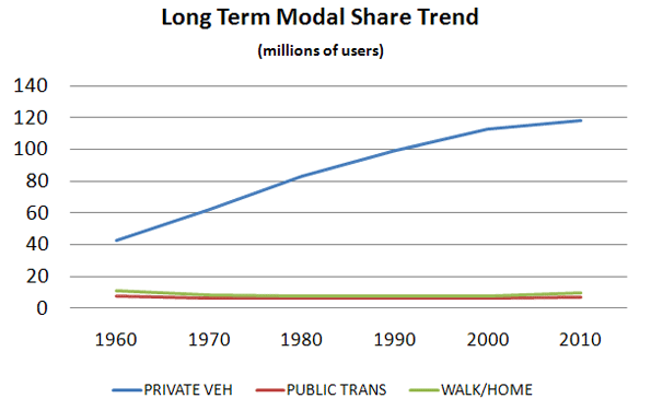
     We should start in 1960 with the first census to cover the Journey to Work.  Back then about two-thirds of workers used a car or truck. More interestingly 13% were on transit, 10% walked and 7% worked at home (think farmers).   As Figure 1 indicates, effectively all of the growth in the last 50 years has occurred in the private vehicle mode.  The melding here of walking and working at home misleads a bit because walking has continually declined while, due to the internet, working at home – once the farm decline reached bottom – has been the “mode” with the greatest and most consistent share of growth in the period.


    Source: 1960-2000 decennial Census; 2010 ACS

    Meanwhile the transit and walk modes have declined in share since the last half century but seem more recently to have bottomed out and reached some base level. 1

    Table 1 shows the relatively stable pattern for the last 20 years in broad terms. 

    1990 decennial

    2000 decennial

    2010

    ACS

    WORKERS

    100%

    100%

    100%

    DRIVE ALONE

    73%

    76%

    77%

    CARPOOL

    13%

    11%

    10%

    TRANSIT

    5%

    5%

    5%

    TAXI 

    0%

    0%

    0%

    BICYCLE

    0%

    0%

    0%

    WALKED

    4%

    3%

    3%

    OTHER

    1%

    1%

    1%

    WORKED AT HOME

    3%

    3%

    4%


    For Figure 1 and Table 1, the 2000 and earlier data are from the decennial censuses. The 2010 data are from a new source, the American Community Survey, which seeks to replicate the census structure.   These data are therefore not strictly comparable.  It has been observed that the ACS has tended to understate carpooling and overstate transit despite best efforts to assure comparability.

    Given the breadth of coverage of the census, it has immense value but a better handle on the mode share question can be found in the National Household Travel Survey (NHTS) of the Federal Highway Administration.  It replicates the census question asking about the usual mode of commuting, but it asks it as part of a collection of a complete diary of a day’s travel for each member of the household. It gets the what did you do yesterday response as well for the same person.   That means we can compare the person’s responses to the two separate queries and learn a great deal about the relationships between the responses. 

    This comparison between census and NHTS products helps state and metro planners know how their surveys might map to the census and helps test the utility of the census products. Just as importantly, it provides a comparison between what people say they do and what they actually do and it tells more about what alternatives travelers shift to when they don’t do “the usual”.   

    When the NHTS asks the question in the “actually-did-yesterday” format things change, in some cases appreciably.

    ‘Usual’

    On  Travel  Day Commuted   by:

    Commute

     Mode:

    Drove Alone

    Carpool

    Transit

    Walk

    Bike

    Other

    Drove Alone

    93.5

    5.6

    0.1

    0.5

    0.1

    0.4

    Carpool

    42.9

    54.8

    0.5

    1

    0

    0.8

    Transit

    13.2

    9.2

    68.3

    6.6

    0.8

    1.9

    Walk

    6.1

    9.3

    3.4

    80.2

    0.2

    0.7

    Bike

    13.8

    3.3

    6

    2.6

    73

    1.4

    Other

    64.1

    19

    4.2

    4.3

    0.3

    8

    Source: NHTS 2009

    Quick Findings

    If we study the yellow boxes we see the “loyalty” relationship between what people say they do and what they actually do.   There are some interesting stories here.

    Drove alone:  According to the NHTS, 93.5% of the people who said they usually drive alone to work actually did.  When they didn’t they almost exclusively shifted to carpooling, with only about 1% shifting out of the auto mode.  This is basically identical to the responses in the 2001 NHTS.2

    Transit:  Only about 68.3% of usual transit users actually used it on a specific day.  The big shift is to the auto-based modes, solo driving or pooling, accounting for more than three quarters of the shift, with the remainder largely shifting to walking.  This is almost the identical loyalty share observed in 2001, but with greater shifts to the auto instead of walking.

    Walking:  Surprisingly about 80% of those who say they usually walk actually do.  Again, when these commuters don’t walk, about three/quarters of the shift is to the private vehicle, with the remainder largely shifting to transit. Also very similar in loyalty to 2001 measures, but showing some increase in transit shifts.  

    Bicycle:   biking exhibits a little less “loyalty” than walking and a little more than transit.   Biking showed a decrease in loyalty from the 77% observed in 2001, perhaps reflecting that the increases in biking we have seen among less inveterate bikers.  The shift to the auto-based modes is less pronounced than the other cases with about a 63% share of the shift.  Transit and walking each obtain appreciable shares of the remainder.   Use of the auto modes as an alternative increased substantially from 2001. 

    Carpooling:  Carpooling is the great surprise.  While transit exhibited the lowest level of loyalty of all modes in 2001 it was surpassed by carpooling in 2009.  Carpooling showed a dramatic decrease in loyalty from 75% in 2001 to 55%, in 2009.  The dominant shift is to driving alone with only about 2% shifting to non-auto modes.  So the auto-based share remains about the same as in 2001. 

    What to Make of All This

    In today’s world we have seen substantial increases in variability in trips to work  – variability  in time of departure, arrival, choice of route to work, even a choice as to whether or not one travels to work at all  with telecommuting becoming more significant every day.  We should not be surprised that there is variability in choice of mode of travel.  Some part of this may simply be that some workers see transit, biking, or walking as the socially preferred modes and will state so when asked – kind of the “good citizen” response – they know what they are supposed to want – “but yesterday was different!”    

    Clearly, auto users tend to remain auto users, with a 98-99% loyalty whether in a carpool or driving solo.  Shifting either way often means things like: the car is in the shop, my wife needs the car, or carpool buddy is on leave, lost a job, or busy doing something else.  This does tell us that carpooling is becoming less formal and more of an occasional and more flexible activity, abetted by cell phones and apps.  One could speculate that these workers often do not have a serious option to the auto.   

    Transit users’ swing is substantial, with significant implications.  Actual users come in at 3.7% of travel rather than the 5% shown for the “usually use” response.  About 3.5% are the usual transit riders who are actually using transit. In terms of survey response reliability we are dancing on the thin edge of trustworthy responses in terms of observation density.    But even with that caveat it would seem appropriate for transit providers to recognize that a significant portion of their riders are “in for the day” because their usual circumstance changed.  Also worth noting is that given that auto users are about 20 times the number of transit riders, an insignificant shift from auto to transit – unnoticeable on the roads – could swamp transit use.   If all the car users had their car in the repair shop once a month it could double transit use in most regions.

    Walkers and bikers, who are those most likely to be affected by weather, both do better than transit in terms of brand loyalty.  This may all be a product of trip length. It has been observed in the past that walkers have an average trip length that is typically so short (circa 15 minutes or about a mile)  that transit (given typical wait times of close to 15 minutes) is not a realistic option so on bad weather days the car may be the substitute. Bike trip lengths to work may be significantly longer than walking so that transit can become a viable option, depending on wait times and routing.    

    Alan E. Pisarski is the author of the long running Commuting in America series. A consultant in travel behavior issues and public policy, he frequently testifies before the Houses of the Congress and advises States on their investment and policy requirements.

    Photo by Nathan Harper, Bottleleaf

    —————–

    Wendell Cox covered this topic in greater detail in a recent New Geography posting Oct 17 2011

    Commuting in America III pg 63

  • More Americans Move to Detached Houses

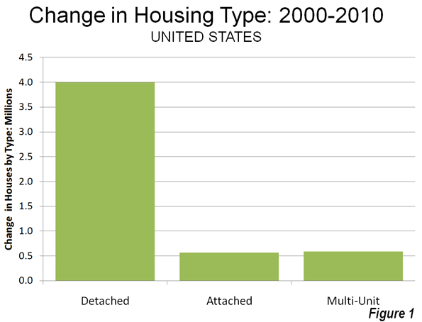
    In defiance of the conventional wisdom in the national media and among most planning professionals, Americans continue not only to prefer, but to move into single family detached houses. Data from the 2010 American Community Survey indicates that such housing attracted 79.2% of the new households in the 51 major metropolitan areas (over 1,000,000 population) over the past decade.

    In contrast households in multi-unit buildings (apartments and condominiums) represented 11.8% of the new housing, while two-unit attached housing represented 11.3% of the increase. There was a 2.3% decline in the "other" category of new housing, which includes mobile homes and boats. A total of 4 million net new occupied detached houses were added in the largest metropolitan areas, while there were 590,000 additional apartments and condominiums and 570,000 attached houses (Figure 1).

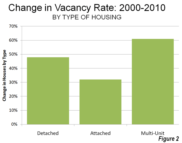
    Detached Vacancy Rate Rises Less than Multi-Unit: Another conventional assumption is that single family homes have been disproportionately abandoned by their occupants, particularly since the collapse of the housing bubble. This is also not true. In 2010 detached housing enjoyed a 92.4% occupancy rate in 2010 which is higher than the 89.4% occupancy rate in attached housing and 84.2% occupancy rate in multi-unit buildings. Because a more of the multi-unit housing is rental, it is to be expected that the vacancies would be the highest in this category. However, at the national level, overall vacancy rates rose the most in multi-unit housing, with an increase of 61%, from 10.7% in 2000 to 17.1% in 2010. The vacancy rate in detached housing rose at a slower rate, from 7.3% in 2000 to 10.7% in 2010, an increase of 48%. Attached housing – such as townshouses – have the slowest rise in vacancy rate, from 8.4% in 2000 to 11.0% in 2010, an increase of 32% (Figure 2).

    Detached and Attached Up in Most Markets, Apartments and Condominiums Down in Most: The move to detached housing was pervasive at the major metropolitan area level. Among the 51 largest metropolitan areas, the share of detached housing rose in 44 and declined in seven. The share of attached housing rose in 32 of the metropolitan areas, while declining in 19. Multi-unit housing experienced an increase in its market share in only three markets, while declining in 48.

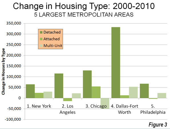
    Largest Metropolitan Areas: Detached housing also increased more than attached housing and multi-unit housing in each of the nation’s five largest metropolitan areas.

    • In the largest metropolitan area, New York, 51.9% of the new housing was detached. This is considerably more than the 36.9% detached market share in 2000. Multi-unit housing accounted for 24.1% of the increase in the market. This is a far smaller share than the 55.7% that multi-unit housing represented in 2000. Attached housing was 19.9% of the increase, nearly 3 times its 2000 share of 6.7%. This movement of New Yorkers to less dense housing forms is particularly significant, in view of the fact that New York has historically had the lowest share of lower density housing (detached and attached) and the highest share of multi-unit houses.
    • In the second largest metropolitan area, Los Angeles, 96.0% of the new housing was detached. This is nearly double the 49.7% that detached housing represented of the market in 2000. The balance of the new housing was split between a share of 18.6% for multi-unit housing and a loss of 11.8% in the attached housing. The share of new units represented by multi-unit houses was less one-half than its percentage of the market in 2000 (39.0%).
    • In the third largest metropolitan area, Chicago, 95.9% of the new housing was detached, well above the 52.5% share in 2000. There was a huge loss in apartment and condominium share, at 31% of the market, while attached housing captured 40.4% of the market.
    • In the fourth largest metropolitan area, Dallas Fort Worth, 84.3% of the new housing was detached, well above the 62.0% share in 2000. Multi-unit housing accounted for 13.5% of the increase, approximately one-half the 2000 market share. Attached housing represented 3.2% of the increase.
    • In the fifth largest metropolitan area, Philadelphia, 77.6% of new housing was detached, well above the 45.3% market share for detached housing in 2000. Apartments and condominiums accounted for 27.7% of the increase between 2000 and 2010, slightly more than the 2000 market share 23.7%. Attached housing represented a minus 4.3% of the new housing.

    Despite being only the fourth largest metropolitan area, Dallas-Fort Worth accounted for 46% of the new housing in the five largest metropolitan areas (Figure 3).

    The three largest metropolitan markets where there was an increase in multi-unit housing share were San Jose, New Orleans and Denver. In San Jose, 55.5% of new housing was multi-unit, while only 10.3 percent was detached. New Orleans had a similar 10.5% detached new housing share, while 65.8% of the new housing was multi unit. In Denver, 31.3% of the new housing was multi-unit, while 60.2% was detached.

    The share of detached housing also declined between 2000 and 2010 in Boston, Kansas City, Minneapolis-St. Paul and Portland. In each of these metropolitan areas, the share of attached housing increased, while the share of multi-unit housing decreased. Nonetheless, detached housing continued to attract a majority of new housing in Kansas City (70.8 percent) and Portland (56.6 percent). Despite Portland’s strong planning emphasis on high density housing, its share of multi-unit housing, and 26.8% between 2000 and 2010 was less than its 2000 market share of 27.5%, with a strong 20.6 percent share in attached housing. Attached housing also accounted for a comparatively large share of new housing in Boston (45.7 percent), Minneapolis-St. Paul (39.7 percent) and Kansas City (25.8 percent). The stronger densification policies that existed in Minneapolis-St. Paul until the middle of the decade may have artificially raised the share of attached new housing.

    Share by housing type data is provided for the major metropolitan areas in Tables 1 and 2.

    Table 1
    Occupied Housing by Major Metropolitan Area: 2000
    Metropolitan Area Detached Attached Multi-Unit Other
    Atlanta, GA 66.6% 3.5% 25.5% 4.4%
    Austin, TX 57.7% 3.7% 32.1% 6.6%
    Baltimore, MD 46.0% 28.5% 24.2% 1.3%
    Birmingham, AL 68.3% 2.6% 17.9% 11.2%
    Boston, MA-NH 48.9% 4.4% 45.4% 1.3%
    Buffalo, NY 60.0% 2.8% 35.1% 2.1%
    Charlotte, NC-SC 67.5% 3.4% 21.8% 7.3%
    Chicago, IL-IN-WI 52.5% 6.3% 40.1% 1.1%
    Cincinnati, OH-KY-IN 64.7% 3.6% 27.8% 3.9%
    Cleveland, OH 65.7% 5.5% 27.7% 1.2%
    Columbus, OH 62.8% 5.5% 29.1% 2.6%
    Dallas-Fort Worth, TX 62.0% 3.1% 30.3% 4.6%
    Denver, CO 60.9% 7.8% 29.0% 2.3%
    Detroit,  MI 70.5% 5.5% 20.7% 3.3%
    Hartford, CT 60.0% 5.2% 34.1% 0.8%
    Houston, TX 61.4% 3.6% 29.1% 6.0%
    Indianapolis. IN 68.4% 5.2% 23.2% 3.3%
    Jacksonville, FL 63.5% 3.9% 22.3% 10.3%
    Kansas City, MO-KS 71.3% 4.6% 21.4% 2.6%
    Las Vegas, NV 53.4% 6.0% 34.7% 5.9%
    Los Angeles, CA 49.7% 8.6% 39.6% 2.0%
    Louisville, KY-IN 70.7% 2.1% 22.2% 5.0%
    Memphis, TN-MS-AR 69.1% 3.8% 22.8% 4.2%
    Miami, FL 45.4% 9.9% 42.1% 2.6%
    Milwaukee,WI 55.7% 5.3% 38.3% 0.7%
    Minneapolis-St. Paul, MN-WI 62.8% 7.7% 27.4% 2.0%
    Nashville, TN 64.9% 4.4% 24.4% 6.2%
    New Orleans. LA 59.9% 7.7% 28.5% 3.9%
    New York, NY-NJ-PA 36.9% 6.5% 56.3% 0.4%
    Oklahoma City, OK 71.6% 3.1% 19.2% 6.0%
    Orlando, FL 61.5% 4.5% 25.1% 8.9%
    Philadelphia, PA-NJ-DE-MD 45.3% 29.8% 23.5% 1.4%
    Phoenix, AZ 61.6% 6.1% 24.9% 7.4%
    Pittsburgh, PA 68.8% 6.5% 20.4% 4.4%
    Portland, OR-WA 63.8% 3.3% 27.5% 5.5%
    Providence, RI-MA 54.3% 2.9% 41.6% 1.2%
    Raleigh, NC 63.6% 5.2% 21.5% 9.8%
    Richmond, VA 71.3% 4.9% 20.4% 3.4%
    Riverside-San Bernardino, CA 67.0% 5.1% 18.6% 9.3%
    Rochester, NY 65.7% 4.3% 26.5% 3.5%
    Sacramento, CA 66.1% 6.0% 24.0% 3.9%
    Salt Lake City, UT 67.0% 4.8% 25.4% 2.8%
    San Antonio, TX 67.4% 2.9% 22.2% 7.5%
    San Diego, CA 51.7% 9.4% 34.5% 4.4%
    San Francisco-Oakland, CA 50.3% 9.3% 39.1% 1.3%
    San Jose, CA 57.0% 9.1% 30.5% 3.4%
    Seattle, WA 60.2% 3.5% 31.6% 4.8%
    St. Louis,, MO-IL 70.2% 3.1% 21.9% 4.8%
    Tampa-St. Petersburg, FL 58.4% 4.6% 25.7% 11.4%
    Virginia Beach-Norfolk, VA-NC 61.4% 10.4% 25.2% 3.0%
    Washington, DC-VA-MD-WV 47.6% 19.4% 32.1% 0.8%
    Average (Weighted) 55.9% 7.5% 33.3% 3.3%
    Data from 2000 Census
    Metropolitan areas over 1,000,000 population as defined in 2010


    Table 2
    Occupied Housing by Major Metropolitan Area: 2010
    Metropolitan Area Detached Attached Multi-Unit Other
    Atlanta, GA 69.2% 5.3% 22.7% 2.7%
    Austin, TX 60.4% 2.6% 31.8% 5.1%
    Baltimore, MD 47.4% 27.3% 24.2% 1.1%
    Birmingham, AL 70.8% 2.4% 16.8% 10.0%
    Boston, MA-NH 48.7% 5.9% 44.2% 1.2%
    Buffalo, NY 62.3% 2.9% 33.0% 1.8%
    Charlotte, NC-SC 68.9% 5.1% 20.4% 5.6%
    Chicago, IL-IN-WI 54.2% 7.6% 37.1% 1.1%
    Cincinnati, OH-KY-IN 68.9% 4.8% 23.2% 3.1%
    Cleveland, OH 68.7% 5.1% 25.1% 1.1%
    Columbus, OH 64.1% 7.3% 26.6% 2.1%
    Dallas-Fort Worth, TX 65.9% 3.1% 27.4% 3.6%
    Denver, CO 60.8% 7.9% 29.4% 1.9%
    Detroit,  MI 71.6% 6.3% 19.1% 2.9%
    Hartford, CT 60.9% 5.3% 33.1% 0.7%
    Houston, TX 65.1% 3.5% 26.0% 5.3%
    Indianapolis. IN 71.3% 5.0% 21.1% 2.6%
    Jacksonville, FL 66.3% 4.8% 21.3% 7.6%
    Kansas City, MO-KS 71.3% 6.4% 20.1% 2.2%
    Las Vegas, NV 60.9% 5.4% 29.9% 3.8%
    Los Angeles, CA 51.0% 8.0% 39.0% 1.9%
    Louisville, KY-IN 71.6% 3.6% 20.9% 4.0%
    Memphis, TN-MS-AR 72.5% 3.3% 20.4% 3.7%
    Miami, FL 47.0% 10.8% 40.0% 2.1%
    Milwaukee,WI 56.2% 6.5% 36.5% 0.8%
    Minneapolis-St. Paul, MN-WI 61.5% 11.0% 25.9% 1.6%
    Nashville, TN 67.2% 5.6% 22.3% 4.9%
    New Orleans. LA 65.1% 6.1% 24.6% 4.2%
    New York, NY-NJ-PA 37.2% 6.7% 55.7% 0.4%
    Oklahoma City, OK 74.3% 3.0% 17.1% 5.6%
    Orlando, FL 64.1% 5.5% 23.4% 6.9%
    Philadelphia, PA-NJ-DE-MD 46.6% 28.5% 23.7% 1.3%
    Phoenix, AZ 67.2% 4.8% 22.2% 5.8%
    Pittsburgh, PA 69.4% 7.5% 19.1% 4.0%
    Portland, OR-WA 62.8% 5.5% 27.4% 4.3%
    Providence, RI-MA 55.7% 3.7% 39.6% 1.0%
    Raleigh, NC 65.4% 8.0% 20.5% 6.2%
    Richmond, VA 73.2% 4.9% 19.0% 3.0%
    Riverside-San Bernardino, CA 70.7% 4.3% 17.1% 7.9%
    Rochester, NY 66.9% 4.8% 25.3% 2.9%
    Sacramento, CA 68.8% 5.6% 22.6% 3.0%
    Salt Lake City, UT 67.8% 6.1% 23.9% 2.2%
    San Antonio, TX 70.8% 2.2% 21.1% 5.9%
    San Diego, CA 53.0% 9.0% 34.5% 3.5%
    San Francisco-Oakland, CA 50.7% 9.4% 38.8% 1.1%
    San Jose, CA 54.3% 10.7% 32.0% 3.0%
    Seattle, WA 60.5% 4.2% 31.5% 3.8%
    St. Louis,, MO-IL 70.8% 4.2% 21.1% 3.9%
    Tampa-St. Petersburg, FL 59.6% 5.6% 24.7% 10.1%
    Virginia Beach-Norfolk, VA-NC 62.5% 11.1% 24.0% 2.5%
    Washington, DC-VA-MD-WV 48.1% 19.6% 31.7% 0.7%
    Average (Weighted) 57.8% 7.9% 31.5% 2.8%
    Data from 2010 American Community Survey
    Metropolitan areas over 1,000,000 population as defined in 2010


    In Housing, Preference Trumps Policy: The trend of the last decade is evidence of a continued preference of American households for detached housing. The results are remarkable for at least two reasons:

    • The first is that there have been unprecedented policy initiatives to discourage, if not to prohibit the building of new detached houses. It seems likely that the miniscule new detached housing share in San Jose, for example, is a direct result of that metropolitan area’s virtual prohibition of new detached housing, rather than any evidence that households have begun to prefer higher density housing. A small detached housing share in the face of a strong public policy bias toward higher density housing says nothing about preferences.
    • Second; the media and wishful advocates of denser settlement patterns have continuously referred to detached housing as having been severely overbuilt during the housing bubble, while suggesting an imperative for households to move into multiunit, often rented housing. The new data, with the larger increase in multi-unit vacancy rates, indicates that there was at least as much overbuilding in more dense housing types as there was in detached housing.

    Despite the expressed preferences of planners, academics and even many builders, American households continue to make their own decisions about housing.

    Wendell Cox is a Visiting Professor, Conservatoire National des Arts et Metiers, Paris and the author of “War on the Dream: How Anti-Sprawl Policy Threatens the Quality of Life

    Lead photo: Houses in Los Angeles. Photograph by author.

  • Florida Gets Dragged Into the 21st Century

    Righteous cries of outrage and anger dominate Florida these days, as unreasonable assaults upon common sense seem to roll with regularity out of the governor’s office. Recently, Governor Scott   published a list of Florida’s higher education faculty, matching salaries to names.  This act was disingenuously styled as an effort towards transparency, but it was really a good old-fashioned right-wing poke at the eggheads. 

    Sadly, this does the Governor no favors, and reinforces the public’s perception of Scott as a reactionary Neanderthal with no heart or soul, perpetually on the wrong side of every issue.   Perception is important because Scott has done some very useful things:  cutting government, eliminating a bloated bureaucracy, stimulating private development, and questioning the economic benefits of all forms of higher education.  Unfortunately, he seems to cloak these actions in such vindictive, uncivil arrogance that the actions themselves remain mostly unexamined.

    The CEO-turned-Governor drove far-reaching budget cuts and deregulation, putting the state legislature into reactive mode, causing many to long for the days of milquetoast former Governor Charlie Crist.   The end result, however, was a budget that went down, not up, for the first time ever, an accomplishment that eluded Crist and his Republican predecessor, Jeb Bush.

    Along the way Scott also eliminated an entire state agency, the Department of Community Affairs (DCA). Some Floridians reacted badly, seeing their state stripped naked of its only protection against the large, out-of-state developers responsible for much of the economic growth in past decades.  While the governor claimed this move would allow towns and cities to determine their own destiny, no more protection from big brother could also mean that small towns, starved for tax revenue, will quickly cave to development pressure regardless of the broader consequences for property values.

    Taking out the DCA was a bold swipe at a bureaucracy that had seen its day come and go.  Established in 1985 to “manage” growth, the DCA failed to manage its own growth, encountered few real estate deals that it didn’t like, and guaranteed that only the largest, most deep-pocketed developers would prevail.  In this moribund economy, developers have yet to gear up for the next boom.  Instead, smaller, more agile players that meet more specific, localized needs are becoming more active.  Now that this large, lawyer-intensive burden is removed, small businesses may have a chance to compete.  Public outcry at large developments may, in fact, be more effective than an easily co-opted bureaucrat when it comes to land values and protection of sensitive wetlands.

    Scott also made national news by rejecting high speed rail between Orlando and Tampa.  Floridians, who were promised this by Barack Obama, were shocked and surprised.  The loss of this vision, along with the potential jobs that it created, was widely bemoaned.  Scott’s move set off a domino effect that has now come to doom the whole program.

    Federal rail programs, given a bad name by the quaint but inefficient Amtrack, make little practical sense today between Tampa and Orlando.  The distance is so short that the train would not be really high-speed in the true sense of the word; just as it reached its cruising speed, it would have to slow down again for Lakeland and other stops.  Missing some key stops such as Disney and lacking connectivity with other rail systems diminishes ridership, there was a real possibility that it would become a white elephant.

    Typecast as a hatchetman, Scott went against type this summer to fund central Florida commuter rail, and it looks like this 19th century spine running north-south through the region will soon be home to Sunrail.  At the recent panel discussion put on by the Orlando Chapter of the American Institute of Architects , “Sunrail” presented plans for 62 miles of track, complete with dreams of low- to mid-rise density clusters at various stops.   Perhaps figuring that the real costs won’t be known until after he is out of office (Sunrail will be 50% federally funded until 2019), Scott threw the region a bone that will create jobs to build and operate the trains. 

    Symposiums on the best way to develop around train stops are already being held.  Job growth and employment-related cluster development plans at least are being discussed. This is some rare good news for Florida’s development community, whether or not the rail system is capable of supporting itself financially .

    True to his form, however, Scott drew hisses for publicly disparaging anthropology, rhetorically asking the Northwest Business Association if it wanted to spend tax money to “educate more people who can’t get jobs in this field ,” preferring instead to focus tax subsidies on science, engineering, and technology.  The remark reinforces the public’s perception of Scott as a man with no heart or soul who seems bent on alienating – often unnecessarily – many whom he needs for support.

    His words mirror the country’s irrational political rhetoric and serve little purpose other than to inflame emotions.  Intent on making enemies with the media, his abuse of the fourth estate prevents constructive dialogue from taking place.  Fatigue at this rancorous rivalry is so high that Scott has become a big turnoff , and whatever he is associated with could quickly be undone the moment he leaves office.  

    It is important to recognize that Florida, under Scott and previous governors, has made strides in diversifying its economy by adding biomedical research through some shrewd venture capital investment.  The state is badly in need of evolving its education system to support these science, technology, engineering, and manufacturing jobs, in order to keep these employers close to home. Bringing Scripps, Nemours, and other research laboratories to the Sunshine State will mean little unless they are reinforced by curriculums producing graduates that will remain in these fields. 

    Scott can and should promote these ideas with a positive spin, mostly because we don’t want to repeat our 1990s experience with the entertainment industry.   A similar state-sponsored effort to bring the film studios was not coordinated much with education, so when state subsidies vanished, moviemakers quickly relocated elsewhere, leaving little trace of their presence behind.

    Scott’s actions have set changes into motion that will all have long-lasting effects in the state of Florida, if they are allowed to remain in place.  It is important for Floridians to realize these achievements and not be too put off by nasty words, nastily delivered. The important long-term effect may be that Scott, while dividing Floridians often unnecessarily, has begun to position the state for recovery.    When the wounds heal, the Sunshine State will emerge more nimble and less bound to institutions that did not serve it well, and will be better positioned to take advantage of the growth potential of America’s fourth most populous state.

    Richard Reep is an Architect and artist living in Winter Park, Florida. His practice has centered around hospitality-driven mixed use, and has contributed in various capacities to urban mixed-use projects, both nationally and internationally, for the last 25 years.

    Photo: Matthew Ingram

  • HELP WANTED: The North Dakota Boom

    The nation’s unemployment rate has been hovering at nearly nine percent since 2009. But not every state is suffering an employment crisis. In the remote, windswept state of North Dakota, job fairs often bustle with more recruiters than potential workers. The North Dakota unemployment rate hasn’t risen above five percent since 1987.  In the state’s oil country, unemployment hovers at around two percent, and pretty much everyone who wants a job—as long as they are old enough and not incarcerated—is employed.  North Dakota has either tied for or had the lowest unemployment in the country since 2008.   

    The job base of the state (population 672,500) has grown five percent in the past two years. Even more astonishing, there are over 16,000 unfilled jobs, and projections indicate that 45,000 more workers will be needed in the next two years.  Of those jobs, one out of three will be in oil and gas.

    The Booming West

    If you are willing to endure the blazing hot summers and bitterly cold winters, come to western North Dakota, young (or not) man (or woman) and you can get a job. Michael Ziesch has worked with Job Service of North Dakota for the past 15 years and is currently a manager in the Labor Market Information Center. “The average wage in oil and gas is $80,000 plus overtime, and there will likely be plenty of that,” said Ziesch.  Development of the massive Bakken oil field in the western part of the state has tapped out the local workforce.

     If you are not interested in an energy job, consider retail. Employers are paying $15 an hour for convenience store employees and fast food workers. Drive through any community in the area and you will be hard pressed to find a store front devoid of a sign shouting “Help Wanted, Now!” It seems that everything in the state these days ends with an exclamation mark, and for a state filled with unassuming, hardworking, family-centered kind of folks, it’s a little disconcerting.

    New North Dakotans

    Job seekers from outside the state are flocking to Williston, the unofficial capital of the oil boom, located in the remote northwestern corner of North Dakota. The population here has grown from 12,500 to an estimated 22,000 in the past five years.

    Williston is home to 350 oil service companies. Willistonlife.com, an employment and informational website built with the objective of attracting workers to the area, boasts that at any given time, over 1,200 job openings are available in the Williston area alone. On its home page, the website beckons to the nation’s unemployed in large white letters brightly juxtaposed against a black background, “Make Your Move!”

    The wildcat oil culture that the newly arrived encounter, though, is distinctly different than the risk-averse culture of the state. One “New North Dakotan” noted that although long-time residents of the state are pleasant (we smile a lot), helpful (there’s no better place to have a flat tire), kind (we’ll bring you a hot dish if you are sick), and polite (we almost always hold the door open for the person behind us), we are not quite “friendly.” We are a little guarded with folks we didn’t grow up with. Ethnic to us means Norwegian or German. We’re not used to accents other than our own. (And, no, we don’t talk like the actors in the movie Fargo.) One more thing — and this is important — we talk about the weather a lot.

    What should you know before you throw your last $100 in your gas tank and head up to Williston to make cold calls for jobs? Don’t come without a housing plan, or you may find yourself among the hundreds of parking lot denizens, living out of your car.

    New North Dakotans need places to live, creating an enormous construction boom. Williston formerly saw about five new homes a year. So far this year, 2,000 new homes have sprouted up. In 2012, the expectation is for 4,000 more along with apartments, hotels and, outside of town, dormitory-style housing facilities known as ‘man camps’. According to the Williston Herald, since the boom began, the market price of rental housing in Williston has jumped from $300 to $2,000 per month for a modest apartment. Hotels are full and booked for months, charging $170 to $200 a night.  

    Service is hard to come by. Waits of 45 minutes or more are not uncommon at fast-food restaurants. The Dairy Queen closes at 5:00 pm because they can’t retain enough staff to stay open any later, and many small businesses have simply closed their doors for lack of employees. The town’s Wal-Mart doesn’t have enough employees to stock the shelves, so boxes are simply laid open in the middle of the aisles for customers to grab what they need. Locals have discovered a “secret route” into the store to avoid the worst of the incoming traffic, and even the local Luddites have managed to learn how to use the self-checkout lanes as a matter of self-preservation. A professor at Williston State College complained recently that she had to text her husband with a request to pick up clothes hangers while he was out of town visiting relatives because local stores were completely sold out. It’s not only hangers; long lines and low inventory have made running everyday errands a vexing challenge. “It sounds crazy,” this same professor says, “but I order laundry detergent online and have it delivered by UPS to my front door.”

    At Williston State College, faculty often take out their own garbage to help out the strapped maintenance staff.  The school is seeing lower enrollments as students are drawn away from post-secondary education by the lure of instant cash.

    The law of supply and demand has kicked in across all sectors of the community. A severe shortage of contractors, plumbers and electricians means that homeowners wait weeks or even months for simple home projects. The local community college is putting out a second bid for a parking lot because, the first time, they didn’t get any bids at all.

    Even more disturbing in Williston are rumors of impending electricity shortages. Worried about brownouts and blackouts during the long North Dakota winter, many townspeople have picked up generators in Fargo, where they sell for $700, compared to the “sale” price of $1300 in Williston.

    Officials are quick to point out that the state’s larger cities, Bismarck and Fargo, are also thriving. In the Governor’s most recent State of the State address, he posited his explanation of ‘The North Dakota Miracle’: “It is about an educated workforce, low taxation, a friendly regulatory climate.” And if your state happens to be sitting atop 400 billion barrels of oil … hey, it can’t hurt.

    Energy Economics: Boom and Bust

    Oilmen have known for fifty years that beneath North Dakota’s surface lay billions of barrels of oil, perhaps as much as 4 million barrels per square mile.

    In 1952, The Wall Street Journal reported that Williston was receiving a “cornucopia of riches.” Banks were setting new deposit records weekly, and the population had jumped from 7,500 to 10,000.  In the early 1980s, oil prices skyrocketed and the region again became an exploration target as its vast deposits became economically feasible to drill. When prices began to slip, hitting a low of $9 a barrel by 1986, the boom faltered and, even more quickly than it began, it was over. The state spent the later part of the 1990s trying to recover from a brutal bust.

    Today, a perfect storm of two 21st century technologies, hydraulic fracturing and horizontal drilling, along with high prices and unprecedented demand, have come together to make drilling profitable, triggering a new boom that some experts say will be the biggest and longest lasting in the cycle of boom and bust. Conventional wisdom is that this time around the oil boom will be steadier and longer, because oil prices are no longer being defined by the cartels that once controlled the world’s oil prices and, therefore, the economics of energy. In the meantime, the oil pump jacks that dot the skyline are nodding their heads in greeting. Welcome to North Dakota.

    Debora Dragseth, Ph.D. is professor of business at Dickinson State University in Dickinson, North Dakota.

    Photo of Williston, ND traffic jam courtesy of Williston Department of Economic Development.

  • Dense Urban Thinking Down Under

    Ku-ring-gai is a piece of suburban paradise in the inner rings of Sydney. A district of modest homes and quaint small-scale shopping districts, it sits near one of the last remaining stretches of blue-gum forest inside Australia’s largest city. You can still catch the occasional cockatoo luxuriating on a branch.

    First built around 1900, the neighborhood of 106,000 boasts all the charms of the classic “garden city,” balancing nature with modestly scaled development. Yet today the Ku-ring-gai community — including the remaining flora and fauna — is threatened with extinction by planners and developers seeking to pack the district with non-descript apartment tracks and ten-story commercial structures.

    “They’re doing everything they can to destroy this area,” says long-time community activist Kathy Cowley, a founding member of both Save Our Suburbs and Friends of Ku-ring-gai over lunch of meat pies and salad at her cottage. “They approach it as if it was a greenfield [or previously undeveloped] site for high-density housing. They are trying to destroy everything with bad planning.”

    Cowley speaks bitterly about how the state government of New South Wales, which controls development, cares little about disturbing a sensitive human as well as natural urban environment. Most of the new apartment dwellers, she notes, tend to be recently arrived residents. Many appear to be Chinese students, who ride on the surprisingly rickety trains largely to schools closer to Sydney’s center city.

    This assault on Cowley’s neighborhood reflects a peculiar density ideology that, although present in the United States, is far more powerful in New Zealand, Great Britain and Australia. Density advocates swear that everything from the necessities of economic competition to limited resources require “cramming” future populations in ever smaller spaces. It doesn’t matter that the population might object.

    In contrast, suburbs are constantly painted as on the verge of extinction. They are destined to become the dull victims of everything from demographics, “cool” migration, green ideology and the rise of “rentership” over home ownership to the ever-present, never-quite-happening “peak oil” that is destined to drive people out of their cars and into the inner cities.

    Economically, the density industry emphasizes the central city’s producer of high-end jobs tied particularly to financial services and its role as home to most universities, government institutions and media. But in the future, even elite industries seem more likely to disperse than concentrate. Look at high tech, where the vast majority of employment tends to be in suburban areas such as Silicon Valley, the counties surrounding Washington, D.C., and sprawling Durham, N.C.

    The same can be said in terms of demographics. Rather than becoming more dense, the vast majority of American cities have become more spread-out. The same has happened in many major metropolitan areas in advanced countries worldwide.

    The density obsession seems particularly ill-suited to Australia, a sparsely populated country where less than 0.2% of the land is urbanized, compared with less than 3% in the U.S. and around 6% for Great Britain.  But such thinking has taken root in this vast continent — to the detriment of many of its people.  ”The writing is on the wall for the Australian dream,” says Joe Flood, professor at the Flinders University Institute for Housing, Urban and Regional Research.

    Perhaps the biggest impact of pro-density policies has been rising land prices. State governments, which control most planning in Australia, along with their developer allies have discouraged development of new houses on greenfield sites, preferring to see the next generation of Australians living cheek to jowl close to the urban core.

    Because of this Australia, once a bastion of middle class aspiration, has suffered some of the world’s highest housing prices.  Sydney itself ranks second, behind Vancouver, in the English-speaking world’s unaffordability sweepstakes. In 1990 a Sydney household median income required five years wages; today it requires almost ten.

    Prices have been shaky recently, but current planning strictures will likely keep them artificially high. In America you can escape California or New York prices by heading south or inland. Even Australia’s second-tier, slow-growing  burgs like isolated Adelaide are more expensive than larger economically vibrant cities like Seattle and more than double as costly relative to incomes as Indianapolis, Dallas-Fort Worth or Houston.

    As a result, many younger Australians — and their parents — have reason to wonder if the next generation will ever be able to own a home. What they call the “Great Australian Dream” — with a backyard and shady streets — is being supplanted by the planner’s utopia of dense urban dwellers. Nothing wrong with having a dense option, but this is not about choice; it’s about coercion. The feisty New City Journal, edited by onetime Labour Party activists, described the process as “ruining our cities in order to save them.”

    Sadly much of the densification policy is based on faulty logic, increasingly justified by climate change. It’s ironic hearing pious greenhouse gas obsessions in a country dependent on exports of raw materials, most prominently coal, to China, the world’s biggest emitter. And a domestic reordering would have little to no impact on climate change since Australia generates barely 1% of the world’s greenhouse gases.

    But even if you agree Australia must do its part against climate change, many policy recommendations are based on a total misreading of modern urban form. Planners and media pundits assume, for example, that people can save energy by taking the train downtown; but even in Sydney, Australia’s largest and oldest big city, barely 12% of the labor force works in the central district, well below the levels decades ago.

    There’s also a presupposition that people living in downtown apartments are inherently less energy consumptive than their suburban counterpart. Yet a recent study done by researchers at the University of South Australia showed that overall urban dwellers — who travel, eat out more and consume more goods per capita — also consume more energy, once things like elevators and common areas are factored in, than the suburbanites living in townhouses or single-family homes.

    A similar finding was also made by the Australian Conservation Foundation. But in this particular battle, facts rarely intrude. Who needs to think after you have spent years in college being conditioned to believe that all density is good, the denser the better?   And for the big urban landowner, what could be better than stating a moral cause for limiting the suburban competition, thus spiking property  prices?

    What is happening to lovely Ku-ring-gai and the Great Australian Dream should stand as a warning of what happens if planners, and their big developer allies, gain total sway.  Let’s just hope America’s traditional decentralization of authority will prevent our middle class dream from following the sad trajectory of our hitherto lucky friends down under.

    This piece originally appeared at Forbes.com.

    Joel Kotkin is executive editor of NewGeography.com and is a distinguished presidential fellow in urban futures at Chapman University, and an adjunct fellow of the Legatum Institute in London. He is author of The City: A Global History. His newest book is The Next Hundred Million: America in 2050, released in February, 2010.

    Photo "Cockatoo in Sheldon Forest" by flickr user AussieGold

  • Surprise: Higher Gas Prices, Data Shows More Solo Auto Commuting

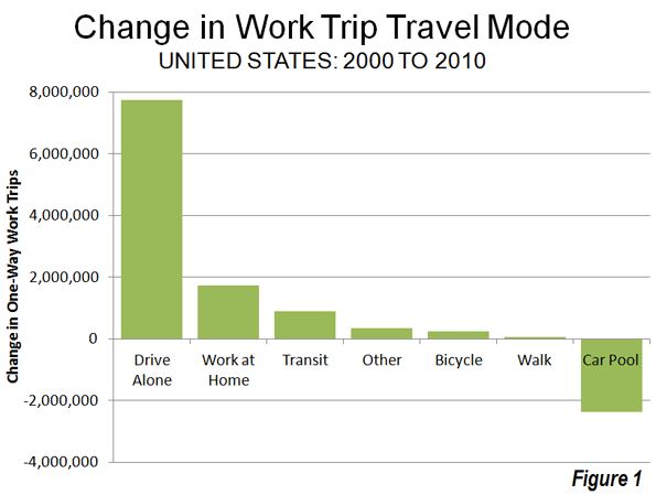
    Despite higher prices and huge media hype over shifts to public transit, the big surprise out of the 2010 American Community Survey has been the continued growth over the last decade in driving alone to work. Between 2000 and 2010, driving alone to work increased by 7.8 million out of a total of 8.7 million increase in total jobs. As a result, this use of this mode reached 76.5% of the nation’s workers, up from 75.6% in 2000. This is the largest decadal share of commuting ever achieved for this mode of transport.

    In view of the much higher gasoline prices that prevailed in 2010, it might have been expected that driving alone would lose market share from 2000 (Figure 1). But this did not — despite many media and academic claims that would or was already taking place — occur.

    The Census Bureau began compiling data on commuting in the 1960 census. In each census through 2000, commuting data was obtained through the census "long form" questionnaire. During the last decade, however, the Census Bureau has begun an annual survey, the American Community Survey, which includes commuting data and a considerable amount of additional data, and the decennial census survey was discontinued.

    Cars Dominate: There have been substantial changes in how the nation travels since the first survey in 1960. In 1960, 64% of the nation’s workers traveled by car. Separate data was not obtained for driving alone and carpools until 1980. The 2010 data indicates that 86.2% of employees used cars for the work trip in 2010. This was a slight reduction from 87.9% in 2000. But the anti-automobile crowd should not celebrate; all of the loss was due to a substantial decline in carpooling. In 2000, 12.2% of workers traveled by car pool. This figure dropped to 9.7% in 2010. With the higher gas prices, it might have been expected that carpooling would have become more popular, because of the lower costs from sharing experiences with other workers. This simply did not occur.

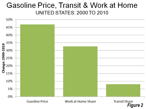
    Working at Home: The big winner among the nation’s commuting modes was working at home, a large share of which is telecommuting. Working at home increased from 3.3% of the workforce in 2000 to 4.3% of the workforce in 2010, for a market share increase of 33%, Overall 1.7 million more people work at home in 2010 than in 2000. It seems likely that the high gas prices encouraged a more working at home as did the move by companies to offload work to freelancers to reduce their costs or boost efficiency. Over the decade, gas prices increased 46%, adjusted for inflation, while the work at home market share increased 33% (Figure 2).

    Further, working at home, as indicated in a previous article, is poised to become the third most popular method of accessing work before 2020, passing transit and trailing only driving alone and carpooling (see Decade of the Telecommute). Working at home might have been much more popular in 1960, when it accounted for 7.2% of employment. But as many home-based industries lost share to chains and malls,   this figure fell by more than one-half by 1970 and then fell to 2.2% in 1980. The doubling of the work at home market share since that time, on the other hand, is attributable to the advances in information technology.

    Transit: Transit experienced by far its best decade since the Census Bureau began tracking commuting. Transit’s long market share slide came to an end, rising from 4.6% in 2000 to 4.9% in 2010. Even so, it might have been expected that a more substantial increase in transit commuting would have occurred as a result of the high gasoline prices. However, only an 8% increase in the transit market share occurred at the same time as gasoline prices increased a real 46%, less in percentage terms than the shift to working at home (Figure 2).

    Part of the problem was revealed in a Brookings Institution report. The percentage of metropolitan area jobs that can be reached by transit for the average worker is very low, which seriously limits transit’s potential for commuting use. Brookings data indicates that less than 10% of the jobs in major metropolitan areas can be reached within 45 minutes by transit by the average worker in major metropolitan areas (see Transit: The 4 Percent Solution). This is not only because transit service is infrequent in many parts of metropolitan areas, but also because it operates so much more slowly, on average, than cars. By comparison, the median work trip travel time by people driving alone is 21 minutes.

    Transit carried 12.1% of the nation’s commuters in 1960 and had fallen to 5.3% by 1990. The results of the last three decades indicate that transit commuting may have stopped declining but has reached a plateau, with only small increase.

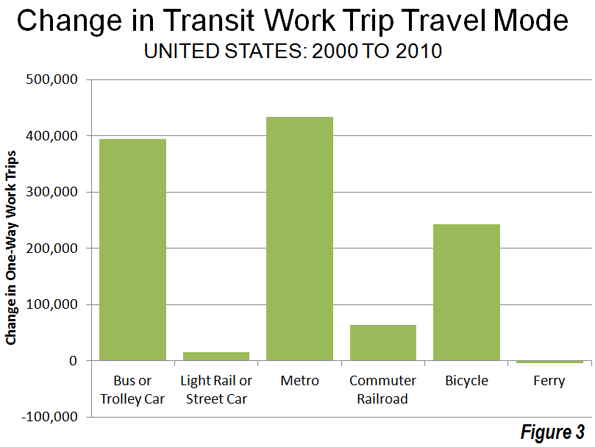
    Recent decades have seen establishment and substantial expansion of urban rail systems. A principal rationale for these systems has been reducing traffic congestion, especially during peak hours. The majority of commuting takes place during peak hour and is principally responsible for peak hour traffic congestion. Between 2000 and 2010, Metros (subways and elevated) accounted for 48% of the increase in transit commuting, while buses and a trolley buses accounted for 43%. Light rail (trolleys and streetcars) accounted for less than 2% of the additional transit commuting, despite the fact that light rail has been the dominant form of rail transit expansion (Figure 3).

    Bicycling: It was also a good decade for bicycle commuting. Bicycling added nearly 250,000 new commuters and rose from 0.4% of the market in 200 to 0.5% in 2010. The increase in bicycle commuting was 15 times that of light rail. Bicycling was first surveyed by the Census Bureau in the 1980s census, when its market share was also 0.5%.

    Walking: There was little change in walking as a form of commuting. In 2000, 2.9% of commuters walked to work, a figure that dropped to 2.8% in 2010. However, walking has suffered even greater losses than transit over the last 50 years. In 1960, 9.9% of commuters walked to work.

    The Future? One thing is clear from the data of the last decade. There has been no sea-change in commuting, even with the huge gasoline price increases. Few analysts would have predicted that single-occupant commuting would have increased at a time of both high gasoline prices and high joblessness. Further, as the shift to personal mobility continues, the largest percentage increases will like take place in telecommuting, arguably the most energy-efficient form of transport.

    Data from 1960: The table below summarizes work trip access market shares over the 50 years of data collection by the US Census Bureau.

    US Work Access by Mode: 1960-2010
    COMMUTERS 1960 1970 1980 1990 2000 2010
    Car, Truck or Van 41,368,062 59,722,550 81,258,496 99,592,932 112,736,101 118,123,873
    Drove Alone     62,193,449 84,215,298 97,102,050 104,857,517
    Car Pool     19,065,047 15,377,634 15,634,051 13,266,356
    Transit 7,806,932 6,514,012 6,007,728 5,890,155 5,867,559 6,768,661
    Bicycle     468,348 466,856 488,497 731,286
    Walk only 6,416,343 5,689,819 5,413,248 4,488,886 3,758,982 3,797,048
    Other or Unspecified 4401718 2240864 1289613 1225420 1243866 1,595,942
    Work at Home 4,662,750 2,685,144 2,179,863 3,406,025 4,184,223 5,924,200
    Total 64,655,805 76,852,389 96,617,296 115,070,274 128,279,228 136,941,010
               
    MARKET SHARE 1960 1970 1980 1990 2000 2010
    Car, Truck or Van 64.0% 77.7% 84.1% 86.5% 87.9% 86.3%
    Drove Alone     64.4% 73.2% 75.7% 76.6%
    Car Pool     19.7% 13.4% 12.2% 9.7%
    Transit 12.1% 8.5% 6.2% 5.1% 4.6% 4.9%
    Bicycle     0.5% 0.4% 0.4% 0.5%
    Walk only 9.9% 7.4% 5.6% 3.9% 2.9% 2.8%
    Other or Unspecified 6.8% 2.9% 1.3% 1.1% 1.0% 1.2%
    Work at Home 7.2% 3.5% 2.3% 3.0% 3.3% 4.3%
               
    Notes          
    Other includes taxicabs, motorcycles and other
    Blank cells indicate no data
    Taxicab included in transit in 1960
    Workers 14 and over, 1960 & 1970. Workers 16 & over, subsequent censuses
    US Census Bureau data


    Wendell Cox is a Visiting Professor, Conservatoire National des Arts et Metiers, Paris and the author of “War on the Dream: How Anti-Sprawl Policy Threatens the Quality of Life

    Photo: Junction of Interstates 110 (Harbor Freeway) and 105 (Glenn Anderson Freeway) in Los Angeles, which carry four varieties of passenger transport, cars, busway, high-occupancy vehicles and light rail (by author). 

  • Florida Repeals Smart Growth Law

    The state of Florida has repealed its 30-year old growth management law (also called "smart growth," "compact development" and "livability"). Under the law, local jurisdictions were required to adopt comprehensive land use plans stipulating where development could and could not occur. These plans were subject to approval by the state Department of Community Affairs, an agency now abolished by the legislation. The state approval process had been similar to that of Oregon. Governor Rick Scott had urged repeal as a part of his program to create 700,000 new jobs in seven years in Florida. Economic research in the Netherlands, the United Kingdom and the United States has associated slower economic growth with growth management programs.

    Local governments will still be permitted to implement growth management programs, but largely without state mandates. Some local jurisdictions will continue their growth management programs, while others will welcome development.

    The Need for A Competitive Land Supply: Growth management has been cited extensively in economic research because of its association with higher housing costs. The basic problem is that, by delineating and limiting the land that can the used for development, planners create guides to investment, which shows developers where they must buy and tells the now more scarce sellers that the buyers have little choice but to negotiate with them. This can violate the "principle of competitive land supply," cited by Brookings Institution economist Anthony Downs. Downs said:

    If a locality limits to certain sites the land that can be developed within a given period, it confers a preferred market position on those sites. … If the limitation is stringent enough, it may also confirm a monopolistic powers on the owners of those sites, permitting them to raising land prices substantially.

    This necessity of retaining a competitive land supply is conceded by proponents of growth management. The Brookings Institution published research by leading advocates of growth management, Arthur C Nelson, Rolf Pendall, Casey J. Dawkins and Gerrit J. Knapp that makes the connection, despite often incorrect citations by advocates to the contrary.   In particular they cite higher house prices in California as having resulted from growth management restrictions that were too strong.

    even well-intentioned growth management programs … can accommodate too little growth and result in higher housing prices. This is arguably what happened in parts of California where growth boundaries were drawn so tightly without accommodating other housing needs

    Nelson, et al. also concluded that “… the housing price effects of growth management policies depend heavily on how they are designed and implemented. If the policies tend to restrict land supplies, then housing price increases are expected” (emphasis in original). 

    In other words, if growth management policies do not maintain a competitive land supply, house prices are likely to rise in response. This is basic economics. Restricting the supply of any good or service in demand is likely to lead to higher prices, all things being equal.

    The loss of a competitive land supply was seen during the real estate bubble in the unprecedented escalation of house prices in California (which was already high), Oregon, Washington, Phoenix, Las Vegas, parts of the Northeast and Florida. In these markets, the demand from more liberal lending standards was much greater than the land available for development under growth management plans and government land auctions.  By contrast, house prices generally stayed within historic norms in metropolitan areas where land supplies were not constrained by growth management programs, such as Dallas-Fort Worth, Houston, Atlanta, Austin, Indianapolis, Kansas City and elsewhere.

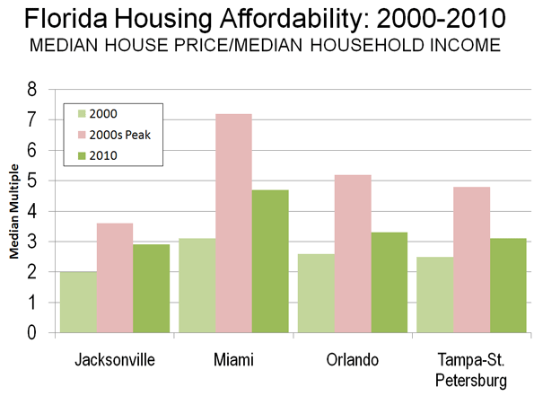
    Housing Price Escalation in Florida: In 2000, the four Florida metropolitan areas with more than 1,000,000 population had Median Multiples (median house price divided by median household income) near or below the historic norm of 3.0. By late in the next decade, all four metropolitan areas reached unprecedented levels of unaffordability. In Miami, the Median Multiple reached 7.2. In Orlando, the Median Multiple peaked at 5.2, 70 percent above the historic norm. In Tampa-St. Petersburg, the Median Multiple peaked at 4.8, 60 percent above the historic norm. The peak in Jacksonville was a more modest 3.6, though this was still an 80 percent increase.

    By 2010, the Median Multiple has declined to hear the historic norm in Orlando and Tampa-St. Petersburg and slightly below in Jacksonville. The Median Multiple remained well above the historic norm in Miami, at 4.7.

    When Supply Lags Behind Demand: Florida’s housing cost escalation may have been surprising, since Florida has a reputation for liberal land-use regulation. However, the growth management act had long since turned the state toward a shortage of land supply relative to demand as described by Wachovia Bank in a 2005 analysis.

    "While all the stars seem to be perfectly aligned on the demand side, the supply of housing in Florida has been much more problematic. Even though residential construction has soared to new highs recently, the supply of housing has lagged woefully behind demand in recent years. This has been particularly true for single-family homes, where population growth, a rising homeownership rate, and strong demand for second homes and vacation properties created a demand for 560,000 new single-family homes between mid 2000 and mid 2004. During this period builders only delivered 540,000 units. When you add in the growing demand for townhouses and condominiums, buyers were looking to purchase 675,000 new homes during this period, while builders were supplied just 570,000 units. No wonder prices have been surging!

    The chief impediment to new construction has been a shortage of developable land. The shortage primarily results from a growing resistance to new development. The state is not running out of space. Nearly every community in Florida and the state itself are looking at some type of limitations on new residential development. While well intentioned, these initiatives are making it more time consuming and expensive to build homes in Florida. Others are taking land off the market, designating areas for green space, or preserving space for industrial development. The net result has been dramatically higher land prices across much of the state."

    The point of the Wachovia analysis is that unless there is a sufficient supply of land, the price of housing is likely to rise. Having a lot of land is not enough. There must be enough land to accommodate demand at affordable land and housing prices (Note).

    The Florida action is the most successful reversal of house price increasing growth management regulations to date.

    Other Advances: There have, however, then more modest advances.

    After taking office in 2003, Minnesota Governor Tim Pawlenty replaced the board of directors of the Metropolitan Council in Minneapolis-Saint Paul. The previous board had been spent on the following Portland style growth management policies, including the enforcement of a variant of the urban growth boundary. The new board exhibited more liberal attitudes toward residential development, and the housing bubble did not produce the extent of housing affordability in the Twin Cities that occurred in growth management areas such as Portland, California and Florida.

    The Conservative- Liberal coalition government of the United Kingdom has proposed modest relaxation of some of the world’s most restrictive land use regulations, which could lead to an improvement of housing affordability in the nation. Kate Barker, who was then a member of the Monetary Policy Committee of the Bank of England was commissioned to examine land-use regulation and housing affordability in England and found a strong association between the loss of housing affordability and restrictive land use policies. This association between Britain’s strong land use regulation and higher house prices was noted in the early 1970s research led by Sir Peter Hall of the University College, London.

    For the Future: The relaxation of overly restrictive growth management policies could not have come at a better time. With the squeeze on the middle-class getting tighter, fewer households can afford higher   housing costs associated with growth management areas. Moreover, responsive to the political consensus for job creation, more home construction will bring return more good-paying construction jobs in Florida.

    Wendell Cox is a Visiting Professor, Conservatoire National des Arts et Metiers, Paris and the author of “War on the Dream: How Anti-Sprawl Policy Threatens the Quality of Life

    —–

    Note: There has been a similar misunderstanding of the housing markets in Las Vegas and Phoenix, where developable land appears to stretch virtually to the horizon. However, what is usually missed is that both metropolitan areas are hemmed in by government land, some of which is periodically auctioned. During the housing bubble, the price per acre of residential land at auction in both metropolitan areas rose as much as the price for land rose over a similar period in Beijing, with its huge land price increases.

    Photo: Orlando (by author)

  • Brain Drain or Birth Dearth?

    Observers and advocates on Long Island — New York’s Nassau and Suffolk counties — have repeatedly used age group population estimates to bolster land use policies based on their preferred narrative. The assumption? Young adults are moving away from the region in large numbers due to the high cost of living, particularly housing prices. So, the story goes, the suburban pattern must be broken, and small, high density housing units must replace detached, single-family homes as the dominant urban form if young adults are to be retained.

    When the Long Island Housing Partnership dedicated a dozen affordable housing units in Southampton town in 2007, a spokesperson explained. “We’re losing our young from the ages of 20 to 34 at five times the national average. People can’t stay because of the high cost of living.” The region’s premiere daily, Newsday, editorialized a few years later, “Unless Long Island stops this brain drain, it won’t prosper.”

    In reality, explanations for the changes in the size of age cohorts from decade to decade amount to little more than speculation. Census estimates of the population by age group tell us next to nothing about if, when, where, or why people are moving or “disappearing.” The data is a static picture of population age groups as they exist in a given geography on a given day.

    Demographers have long believed that the primary driver of changes in age cohorts are changing patterns of birth and death rates. For example, in 1980, there were 141,917 fewer children below the age of 10 than in 1970 in Nassau-Suffolk (484,145 vs. 342,228). This correlates roughly with the decline of 150,262 in the number of 10-19 year-olds between 1980 and 1990, the decline of 110,663 in the number of people between 20 and 29 years of age in the 1990s, and the decline of 107,657 in the number of people between the ages of 30 and 39 in the 2000s (441,008 vs. 333,351).

    This makes perfect sense. Individuals born in the 1970s would be in their teens in the 1980s, in their 20s in the 1990s, and in their 30s in the 2000s. If there were 150 thousand fewer children aged 0-9 in the 1970s, one would expect there to be over 100 thousand fewer people in their 30s in the 2000s.

    It is, in other words, the case that the sharp decline of twenty-somethings in the 1990s and of thirty-somethings in the 2000s is largely the result of the “birth dearth,” a sharp decline in the birth rate that Nassau-Suffolk experienced in the 1970s, the decade after the “baby boom” from 1947 to 1964. The 1970s birth cohort is wending its way through the life cycle.

    Indeed, even as critics decry the “brain drain,” it looks like this pattern has started to partially reverse in Nassau-Suffolk. Because birth rates rose in the late 1980s and early 1990s, there has been a substantial increase in the number of people between 15 and 24 years of age in the past decade. The population aged 15-19 increased by 17.4 percent, between 2000 and 2010, while the 20-24 year-old group increased by 18 percent, for a total increase of 15-24 year-olds of 54,726 over the last ten years. If the correlation between housing costs and people in their early 20s was strong, it is unlikely that during a period when the median price of a single-family home increased by 66 percent (from $220,000 in 2000 to $366,000 in 2010), that the population in their early twenties would increase as well.

    All of this is not to discount the importance of migration patterns, or the attractiveness of a particular region to those in a particular age group. But the misinterpretation of data can lead to misplaced policy priorities. In this case, it’s generally believed that when young adults move away from a region it’s unhealthy for the area, and that policies that encourage a reversal of the trend — “hip” downtowns, sports stadiums, entertainment venues, small attached housing units — should be put in place.

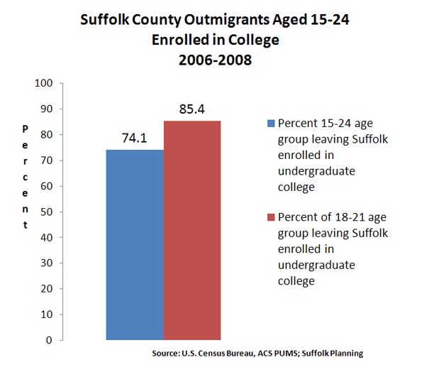
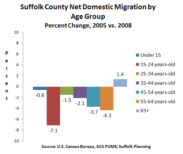
    But numbers from the U.S. Census Bureau’s American Community Survey, recently crunched for the Suffolk County Comprehensive Plan, show that 74.1 percent of 15-24 year-olds who move out of Suffolk are enrolled in college. When looking at only 18-21 year-olds, the primary college-aged group, the percentage of those leaving Suffolk because they’re enrolled in college rises to 85.4 percent (see Figure 1).

    Suffolk County had a college-going rate among high school graduates of 86.5 percent in 2010. Is this high rate something that needs to be reversed? Many of these college goers return to Long Island, sometimes after stints in New York or other cities as young careerists, and help to raise the median household income of migrants coming into Suffolk county to $81,471 (2008 dollars), compared to only $67,241 for those leaving Suffolk.

    One more finding from the Suffolk Comprehensive Plan on domestic migration —movement within the United States — seems to mitigate against received wisdom. While the college-goers age group had the largest net domestic migration out of Suffolk, the second largest group was the 55-64 year-olds. (see Figure 2)

    In other words, the age groups widely believed to be the most in danger of shrinking or “disappearing” due to outmigration are, according to the best available data, the least in danger of doing so. In general, the 25-34 and 35-44 year-old age groups are the smallest net domestic migration “losers,” because it is a relatively stable time in life. If people marry, and/or care for young children, move up the ranks of a career, or invest in a home, it is typically in these years that they do so.

    As far back as 1978, Newsday screamed that “An Exodus of the Young Threatens Life-Style.” In fact, the 1970s saw a sharp increase in the number of young adults in Nassau-Suffolk; as the population aged 15-39 grew by 178,179, or 21 percent, from 846,070 in 1970 to 1,019,249 in 1980.

    Demographic data can be a useful tool for policy makers attempting to clarify complicated public issues. But when data is not properly understood, or it is misinterpreted, then public policy debate is stymied.

    Seth Forman, Ph.D, AICP, is author of American Obsession: Race and Conflict in the Age of Obama and Blacks in the Jewish Mind: A Crisis of Liberalism, among other books. His work has appeared in publications that include National Review, Frontpagemag.com, The Weekly Standard, and The American. He is currently Research Associate Professor at Stony Brook University, and the Chief Planner for the Long Island Regional Planning Council. His opinions are not associated with any of these institutions. He blogs at www.mrformansplanet.com.

    Photo by SaraPritchard, Warped Tour’10, Long Island, New York

  • Smart Growth (Livability), Air Pollution and Public Health

    In response to the outcry by job creators about proposed new Nitrogen Oxides emission regulations, the Obama Administration has suspended a planned expansion of these rules.

    The Public Health Risks of Densification

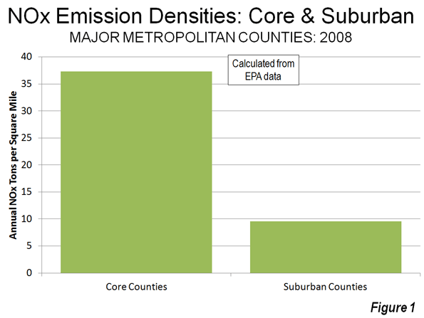
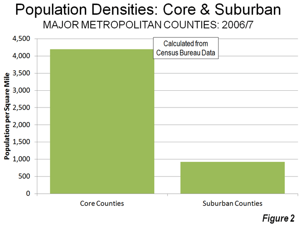
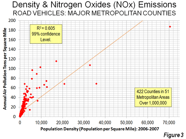
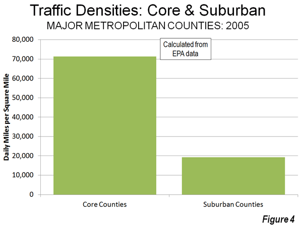
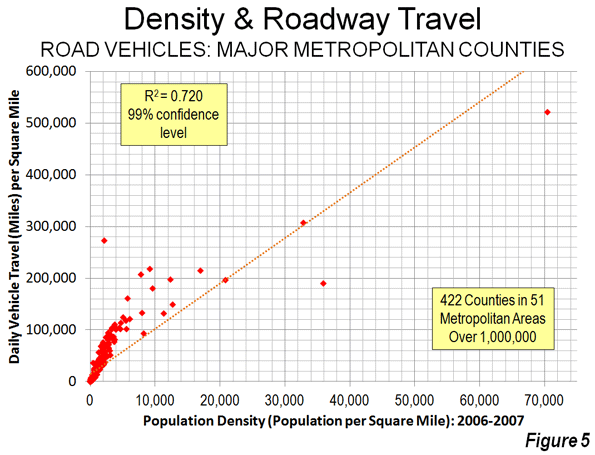
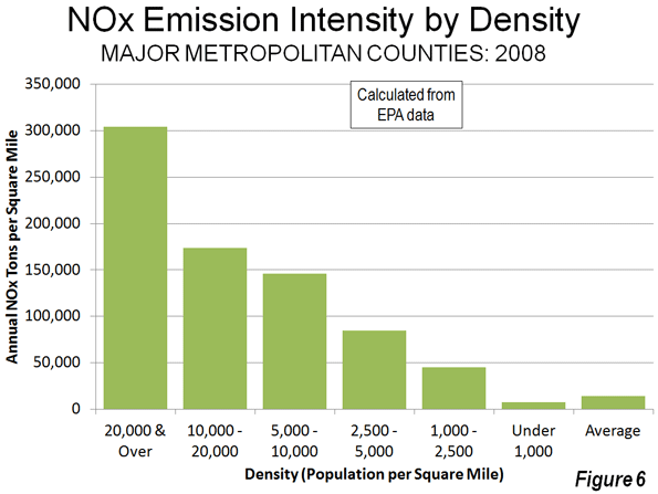
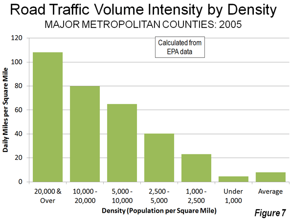
    The purpose of local air pollution regulation is to improve public health. For years, regional transportation plans, public officials, and urban planners have been seeking to densify urban areas, using strategies referred to as “smart growth” or “livability.” They have claimed that densifying urban areas would lead to lower levels of air pollution, principally because it is believed to reduce travel by car. In fact, however, EPA data show that higher population densities are strongly associated with higher levels of automobile travel and more intense air pollution emissions from cars and other highway vehicles. In short, higher emissions cause people to breathe more in air pollution, which can be unhealthful. To use a graphic example, a person is likely to encounter a greater chance of health risk by breathing intense smoke from a fire than if they are far enough from the fire to dilute the intensity of the smoke.

    Overall, more intense air pollution detracts from public health. To put in the economic terms that appear so often in planning literature on "urban sprawl," more intense traffic congestion and the consequent higher air pollution emissions are negative externalities of smart growth and densification.

    This is illustrated by county-level data for nitrogen oxides (NOx) emissions, which is an important contributor to ozone formation. This analysis includes the more than 420 counties in the nation’s major metropolitan areas (those with more than 1 million in population).

    Seven of the 10 counties with the highest NOx emissions concentration (annual tons per square mile) in major metropolitan areas are also among the top 10 in population density (2008). The densest, New York County (Manhattan), has by far the most intense NOx emissions. Manhattan also has the highest concentration of emissions for the other criteria air pollutants, such as carbon monoxide, particulates, and volatile organic compounds (2002 data). New York City’s other three most urban counties (Bronx, Kings, and Queens) are more dense than any county in the nation outside Manhattan, and all land among the top 10 in NOx emission density (Table 1).

    Table 1
    Intensity of Nox Emissions (per Square Mile)
    NOx Emissions
    Rank County Compared to Average
    1 New York Co, NY           23.8
    2 San Francisco Co, CA           14.7
    3 Bronx Co, NY           13.7
    4 Washington city, DC           13.1
    5 St. Louis city, MO           12.4
    6 Arlington Co, VA           11.3
    7 Cook Co, IL           10.0
    8 Suffolk Co, MA             9.5
    9 Kings Co, NY             8.7
    10 Queens Co, NY             8.7
    Calculated from 2008 EPA Data


    NOx emission density data by county is provided in the document below, Annual Density of Highway Vehicle NOx Emissions by County: 2008. Overall, this data indicates that the average core county had a NOx density 3.9 times that of the average suburban county (Figure 1). By contrast, the average core county density is 4.5 times that of the average suburban county (Figure 2), indicating a strong relationship that is also shown in Figure 3.

    For example, in the New York metropolitan area, core New York County has NOx emissions that are nearly 15 times as intense in a given volume of air as suburban Morris County. In the Cleveland metropolitan area, core Cuyahoga County has a NOx emissions intensity 12 times that of suburban Geauga County. Charlotte’s core Mecklenberg County has a NOx emissions intensity more than five times that of suburban Union County.

    Traffic and Air Pollution

    More concentrated traffic also leads to greater traffic congestion and more intense air pollution, according to data available from EPA. The data for traffic concentration is similar to population density. Manhattan – despite its huge transit complex – has by far the greatest miles of road travel per square mile of any county, while seven of the densest counties are among the top ten in traffic intensity. As in the case of NOx emissions, the four highly urbanized New York City counties are also among the top 10 in the density of motor vehicle travel (Table 1).

    Table 2
    Intensity of Traffic (per Square Mile)
    Motor Vehicle Travel
    Rank County Compared to Average
    1 New York Co, NY 37.8
    2 Bronx Co, NY 22.3
    3 Fredericksburg city, VA 19.9
    4 Alexandria city, VA 15.8
    5 San Francisco Co, CA 15.6
    6 Arlington Co, VA 15.1
    7 Suffolk Co, MA 14.4
    8 Queens Co, NY 14.3
    9 Kings Co, NY 13.8
    10 Washington city, DC 13.1
    Calculated from 2005 EPA Data


    Traffic density data by county is provided in the second document below, Daily Density of Road Vehicle Miles by County: 2005. Overall, this data indicates that the average core county had a traffic density 3.7 times that of the average suburban county (Figure 4), again a difference similar to the difference in density (Figure 5).

    The overall relationship between higher population densities and both NOx concentration and motor vehicle traffic intensity is illustrated in Figure 6 and Figure 7. There is a significant increase in the concentration of both NOx emissions and motor vehicle travel in each higher category of population density. For example, the counties with more than 20,000 people per square mile have NOx emission concentrations 14 times those of the average county in these metropolitan areas, and motor vehicle travel is 22 times the average. A smaller sample of the most urbanized counties (those with 90 percent or more of the land urbanized) showed a stronger association. This findings are consistent with research by the Sierra Club and a model derived from that research by ICLEI–Local Governments for Sustainability, both strong supporters of the livability and smart growth strategies of densification.

    A Caution: The air pollution data contained in this report is for emissions, not for air quality. Air quality is related to emissions and if there were no other intervening variables, it could be expected that emissions alone would predict air quality. However there are a number of intervening variables, from climate, wind, topography and other factors. Again, Los Angeles County makes the point. As the highest density large urban area in the nation   Los Angeles under any circumstances would have among the highest density of air pollution emissions. However, the situation in Los Angeles is exacerbated by the fact that the urban area is surrounded by mountains which tend to trap the air pollution that is blown eastward by the prevailing westerly winds.

    The EPA data for 2002 can be used to create maps indicating criteria pollutant densities within metropolitan areas. An example is shown of  the Portland (OR-WA) metropolitan area (Figure 8), with the latter indicating the data illustration feature using Multnomah County (the central county of the metropolitan area), which is the most dense county and has the greatest intensity of NOx emissions and traffic congestion.

    The Goal: Improving Public Health

    These data strongly indicate that the densification strategies associated with smart growth and livability are likely to worsen the intensity of both NOx emissions and congestion of motor vehicle travel.

    But there is a more important impact. A principal reason for regulating air pollution from highway vehicles is to minimize public health risks. Any public policy that tends to increase air pollution intensities will work against the very purpose of air pollution regulation: public health. The American Heart Association found that air pollution levels vary significantly in urban areas and that people who live close to highly congested roadways are exposed to greater health risks. The EPA also notes that NOx emissions are higher near busy roadways. The bottom line is that all – things being equal – higher population density, more intense traffic congestion, and higher concentrations of air pollution go together.

    All of this could have serious consequences as the EPA seeks to expand its misguided regulations. For example, officials in the Tampa-St. Petersburg area have expressed concern that the metropolitan area will not meet the new standards, and they have proposed densification as a solution, consistent with the misleading conventional wisdom. The reality is that this is likely to make things worse, not better.  

    Less Livable

    There are myriad difficulties with smart growth and livability policies, not least their association with higher housing prices, a higher cost of living, muted economic growth, and decreased mobility and access to jobs in metropolitan areas. As the EPA data show, the densification policies of smart growth and livability also make air pollution worse for people at risk.

    Virtually all urban areas of Western Europe, North America and Oceania principally rely on cars for their mobility and there is no indicate that this will change. The air is less healthful for residents where traffic intensity is greater. As the air pollution intensity data shows, cars need space.

    Wendell Cox is a Visiting Professor, Conservatoire National des Arts et Metiers, Paris and the author of “War on the Dream: How Anti-Sprawl Policy Threatens the Quality of Life

    —–

    Note 1: The city (county level jurisdiction) of Fredericksburg, Virginia surprisingly ranks third in its concentration of motor vehicle travel yet ranks eighth much lower in population density. This reflects the high volumes of traffic through the  small municipality (and county-equivalent jurisdiction) carried on two of the East’s busiest roadways, Interstate 95 and US-1.

    Note 2: Additional analysis and information is available at Air Pollution, NOx Emissions, Traffic Congestion and Higher Population Density: The Association in Major Metropolitan Areas of the United States.

    Adapted from an article published by the Heritage Foundation.

    Photo of Manhattan traffic by carthesian.