Category: planning

  • GIS and Online Mapping: Stretching the Truth Scale

    When I began my land planning career in 1968, one of the first things I learned about was the use of the Rubber Scale. What is it? Rubber Scale was a term used by civil engineers and land surveyors to describe an inaccurate plan that ignored the physical limitations of the existing terrain. To say that the planner or architect had used a Rubber Scale to create a beautifully rendered plan with pastel colors and soft shadows cast from tree stamps was a negative comment, since these plans were pretty much worthless to the engineer and surveyor that had to make the plans conform to regulations. Because the lines were hand drawn back then (and in many cases still are today), accuracy was, and remains, an issue.

    I was guilty of “stretching the scale” to maximize density, thus the term. The rubber scale was beloved by designers who wanted to look good to their developer clients. The developer expected a plan that maximized yield, and a plan that was of a higher density than they expected would surely be pleasing. Of course, these plans had no basis in reality. Ultimately, the land surveyors and civil engineers would lose the units we falsely claimed, and they would also get blamed for the density loss!

    Fast forward two decades to 1988, when GIS (Geographic Information Systems) began gaining market share. Government agencies (typically cities and counties) embarked on spending sprees with the promise of a new era in planning technology brought on by the advent and proliferation of the GIS technology, which blended graphic mapping information with a data base. You wanted to know property information, demographics, soil types? Just query the map. The sales teams of GIS mapping systems convinced those in charge of purchasing that “parcels” shown on the map could be traced quickly from a variety of sources, then later “rubber sheeted” into accurate surveyed section corners. As if by magic, inaccurate parcels would be made precise.

    So— early, existing hand drawn maps were traced into a computer, and the imprecise data was made even more imprecise. Even when the data came from aerial maps, created by flights several thousand feet above the surface, the accuracy was at best within three to five feet of actual location. What happens to curved boundary lines if the map is stretched to meet tens of thousands (or more) of lot corners, with all four section corners set accurately? The answer is, of course, a map that would be impractical to correct at a later date. Very few GIS maps exist today that were done using accurate land survey from the beginning.

    Fast forward another two decades and more to today, when Google Earth and its rivals, MapQuest and BingMaps, have unfortunately become the basis for site information. Call the data of these suppliers “on-line graphics”. There are a variety of software systems that boast that site layout can easily be done using on-line-graphics, or simply using the available on-line GIS mapping data.

    Here lies today’s problem: None of this information is likely to be accurate enough to be useful to an engineer or surveyor who ultimately must put their license on the drawing, guaranteeing its accuracy.

    GIS salesman make their sales commissions by convincing the world’s governments that data can be “adjusted” later to a more accurate data structure. This is true, but not economically feasible or practical. Since curved property lines are represented in a GIS system by a series of miniscule lines, it could be possible for the data to be corrected. This is like saying that it could be possible to temporarily build an approximate building and later on move walls to the locations shown on the plan. It would be possible, yes, but hardy cost (and time) effective.

    A lack of correct information is a huge problem when using GIS or on-line-graphics information. For example, it’s not possible to see contour lines that are accurate enough to determine flood plain, wetlands, or other information critical to the initial site design. Even when this information is shown on the city or county on-line map, what is the source of that data? Most of these maps are sourced to the lowest bidder. Was that wetland shown on the site just something that looked wet on an aerial map traced by a low-bidding draftsman, or was the wetland defined by an environmental expert who accurately surveyed it and somehow placed it precisely on the GIS map? This is the modern day version of using a rubber scale to measure the very data used to make decisions. Entire cities are stretched beyond practical use by surveyors and engineers.

    Many think that the on-line-graphics are taken from a satellite in space with some military camera that spy agencies use. Wrong! The images are derived from aerial mapping firms. These photographs might be several years old, which is why you might look at a newly developed suburban area, while the map still shows a farm field. You could be looking at a site to build residential units, not realizing a sewage treatment plant was recently built next door.

    Building Information Modeling (BIM) is a way for architects, engineers, contractors and owners to communicate and collaborate while designing a structure they are all involved in creating. The various parties can be instantly communicating worldwide on a single project located anywhere. Recently, I was participating in an on-line conference from one of the suppliers of BIM technology, who wanted to sell me on the idea of using BIM as an additional tool to use with our precision site design software. I require a developer to furnish us with an accurately surveyed boundary, topography, and any wetlands delineated precisely on the site before I begin my work. The BIM supplier took an office building from Florida (created accurately), and placed it on a site in South Dakota shown by Google Maps as if somehow that’s all there is to planning. Nowhere in the conversation did the salesman mention local regulations, site restrictions, where any easements might be (most often easements are not easily seen in photographs), etc. As soon as I was shown how a building from Florida could be placed on a site in a northern state using an on-line-graphics data base as the planning solution, the demonstration was over. Could BIM be used for site design? Absolutely, but only by using precision data from qualified engineers and surveyors, not on-line-graphics.

    The tax payers have financed billions of dollars worth of GIS systems with map data of questionable accuracy, with the understanding that the rough mapping data could be rectified accurately later. While true, the cost of converting existing maps would be prohibitive. The general public might think that these public data structures replace the need for land surveys and accurate civil engineering. But these vague images actually make it even more important to consult with a licensed professional to provide precision data before any design or development decisions are made.

    Over four decades ago I was guilty of using the rubber scale. New technology has promoted us into a new problem, and moved us from a rubber scale to a rubber sheeted world.

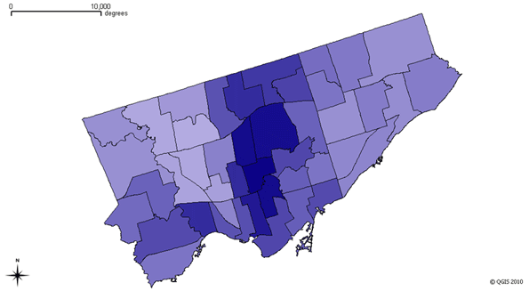
    Photo by edibleoffice: GIS of Hayes Valley, San Francisco.

    Rick Harrison is President of Rick Harrison Site Design Studio and Neighborhood Innovations, LLC. He is author of Prefurbia: Reinventing The Suburbs From Disdainable To Sustainable and creator of Performance Planning System. His websites are rhsdplanning.com and performanceplanningsystem.com.

  • Coalition of the Unwilling

    This week the UK government announced an ”end to anti-car policies” reversing the guidance to local authorities to dissuade citizens from using their cars in favour of public transport. Charges for parking will be reined in, they promise.

    It should be good news. The comically-named ”traffic calming” schemes put in place by the outgoing government were deeply unpopular. Still, we are getting used to taking our announcements from the new coalition government with a pinch of salt.

    Before the election Housing Minister Grant Shapps backed demands from the Housebuilders’ Federation for a ‘right to build’. That might seem unnecessary, but in Britain the planning laws are so prohibitive that owning land extends no right to build upon it. Instead planning authorities extend permission to build where it meets the terms of the local plan.

    The impact of Britain’s planning laws has always been a problem, but for the last thirteen years the ‘local plan’ has been hi-jacked by anti-growth campaigners from the Campaign to Protect Rural England, the Urban Taskforce and the massed ‘NIMBY’ campaigners of the Tory Shires.

    The new local government minister Eric Pickles explained that the net effect of the planning system’s strangle hold on house building was that ”we’re at rock bottom”: ”1924 was the last time we built this little number of houses”. His Labour predecessor Nick Raynsford had ”done more damage than the Luftwaffe”, said Pickles, exaggerating a little, but making his point (Sunday Times, 12 September 2010).

    So what about the changes? Grant Shapps’s published policy does include the words ”right to build” – but they are heavily hedged about:

    ”provided that [the new homes and buildings] conform to national environmental, architectural, economic and social standards, conform with the local plan, and pay a tariff that compensates the community for loss of amenity and costs of additional infrastructure’ (Open Source Planning, Page 3).

    All of which sounds pretty much as bad as it was before. What right to build, you might ask? Indeed the words ‘right to build’ feature just once in the document, as quoted above, in the executive summary. There is a question mark, too, over who it is that has the right to build. ”Communities”, according to Shapps, and the government have the right, but just how these ”communities” are defined is not clear. More likely they will be the same planning authorities as before. In that case the only developers that get a look in will be the powerful and well-connected like Tesco or Barratt Homes – those who are in a position to meet the municipal fathers’ demands for baksheesh… or ”planning gain” as it is known in the UK.

    Coalitions are new to Britain (apart from one shaky Liberal-Labour government in the seventies). But with neither David Cameron’s Conservative Party, nor the deeply demoralised Labour Party of Gordon Brown winning enough votes to command a majority in the House of Commons, Cameron had to turn to Nick Clegg’s minority Liberal Democrats.

    This arrangement seems to suit Cameron. Cameron became leader on a pledge to lose the ”nasty party” image the Conservatives had after years of office in the 1980s. His method is a mirror image of Tony Blair’s repositioning of the Labour Party as a centre party by distancing it from its socialist roots. First we had a Labour government that was against socialism. Now we have a Conservative-led government that is shy about capitalism.

    Sidelining the old-school Thatcherite, free market Tories in favour of his friends in the public relations, media and volunteer sector, Cameron seems obsessed with changing the party brand.Although this did not work in the election, the advantage of an alliance with the Liberal Democrats means that he can ditch whatever fundamentalist free market doctrines whenever convenient on the grounds that ”coalition government is compromise”.

    The net effect is a government that keeps sounding as if it is going to do something decisive, but then doesn’t.

    The greatest challenge has been the state of the public finances. Britain’s government debts are astonishing: one trillion pounds sterling, or 68.2 per cent of GDP. Since most of the debt was contracted under Labour’s watch, the coalition government has the moral high ground. The Labour coalition says that the cuts announced in the public sector put the recovery in danger because they are too far, too fast. They stand by ”counter-cyclical” spending, but Labour has little mainstream credibility in terms of the country’s finances.

    For the left, though, balancing the capitalists’ books is hardly the issue. They are looking forward to a re-run of the campaign against the Thatcher public spending cuts of the 1980s. The protests and banners all seem to reinforce the idea that the government is indeed planning to rein in public spending, but it is not. As former Tory Minister John Redwood has pointed out, the planned cuts are not even cuts at all, but a limit on spending growth.

    Cameron’s government had to sound tough on public spending, because the bond traders were in fear of Britain’s debt rating being marked down, and the wider impact of a loss of confidence. With both Greece and Ireland’s finances in trouble, the British government needed to promise stability.

    But the same city traders are just as determined that the spending party should carry on, even if the volume is turned down to avoid scaring the neighbours. For years Britain’s ”private sector” has been dependent on extraordinary boosts of government cash. Under the outgoing government’s Private Finance Initiative, public institutions like hospitals and schools were allowed to raise funds by issuing their own bonds, debt that was not reckoned in the official accounts. Then Gordon Brown’s banking bailout found government buying up failing banks like Royal Bank of Scotland.

    Despite their fawning support for austerity Britain’s City traders still expect to be looked after. The Bank of England’s emergency policy to meet the shortage of credit in the economy is called ”quantitative easing”. In practice it means that the government trades government bonds for the banks’ own toxic debts, while bond traders make money on the commission.

    Even the one controversial cut in public spending turns out to be something more like a gift to the banks. The government says that they will let universities charge fees approaching the market rate, and that students will no longer be subsidised. Since those who made the decision all got to go to university for free, the backlash was understandable – the kind of rioting Saturnalia that Britons indulge in from time to time (“off with their heads!“ shouted student rioters when they chanced upon the Prince of Wales’s limousine and mobbed it, while running from the police).

    To moderate the impact of the fees, though, the government has promised to expand the student loans scheme, where the State lends the money, and then recovers it later, through the tax system. For the banks, what could be more perfect? Here is a tranche of debt created overnight, guaranteed by a government that undertakes to recover it on their behalf: More of a subsidy to the City of London than a cut in government spending.

    Though the Conservatives are thought of as ”Thatcher’s Children”, they behave much more like their ”New Labour” predecessors. The tough talk is for show.

    Nowhere is this proto-New Labour approach clearer than on energy policy. Although Energy Minister Chris Huhne has acknowledged that Britain faces severe electricity shortages – he fails to ascribe the problem to its proximate cause, the failure to build enough coal-powered power stations.

    Huhne’s solution, though, will make things worse. Not more coal-powered stations, but a government imposed increase on tariffs for fossil-fuel generated power, and a special allowance for renewable energy. Of course, renewable energy on any normal pricing system would be uneconomic. Britain’s latest windmills even had to be heated up to stop them freezing solid this winter. The net effect of Huhne’s proposal: no fix for the energy shortage, and more expensive electricity.

    These policies have had disastrous, even lethal, results. According to the latest figures, excess winter deaths in the UK are in the region of 25 000, most of them the elderly, often hastened along by fuel poverty. With Huhne’s proposals, those numbers are set to increase, as electricity becomes something of a luxury to the poor.

    At least in this area, the Tories are “conservative”. The tradition of the poor freezing to death in wintertime is being restored, and so too may be the old class system that allows the City to enrich itself as the expense of everyone else, including the taxpayers.

    James Heartfield is the author of Let’s Build: Why we need five million new homes, a director of Audacity.org, and a member of the 250 New Towns Club.

    Photo by Chris Devers

  • Yes, We Do Need to Build More Roads

    Road are clearly out of fashion in urban planning circles. Conventional wisdom now decries roads in favor of public transit, walking or biking in developments designed to mimic traditional 19th century urbanism. Common refrains are “we can’t build our way out of congestion” or “widening roads to cure congestion is like loosening your belt to cure obesity.” Also frequently noted is the vehicle miles traveled has – at least until recently – outpaced population growth.

    But this piece of conventional wisdom is also deeply flawed. It obscures the bigger point that in a growing country we need to expand infrastructure to keep pace. The recent 2010 Census results put this in stark relief. The rate of growth from 2000 to 2010 slowed considerably from the previous decade, but still at a robust 9.7%, or 27.3 million new Americans. It would have been physically impossible to house all those people in traditional urban communities well-served by transit. The 27.3 million number is more than the combined 2009 population of the cities of New York, Los Angeles, Chicago, Philadelphia, Washington, Boston, San Francisco, Portland, and Seattle.

    In fact, this national growth is greater than the combined population of the 12 largest municipalities in the country.

    That’s just one decade’s worth of growth. America’s traditional urban areas couldn’t contain this, even if they were emptied of all their current residents. And the United States is projected to add an additional 90 million people by 2050. Where are all those people going to go? And how would they get to work even if they could live in these cities, given that much of America’s job growth has been suburban?

    Keep in mind also that much of this urban and transit infrastructure must be seen as more legacy than a reflection of modern choices. It was largely compete 50 or more years ago. Only Portland and Washington, DC have really managed to build new transit friendly urban core cities in the modern era. And despite their growing populations, these two places can only absorb a relatively small amount of new population every year. In Washington, it’s less population growth than gentrification – the replacement of largely poor African Americans with more affluent whites – that is the most outstanding demographic trend.

    That’s not to say America can’t invest more in transit or build more transit friendly cities. It can and it should. In particular, large, already dense urban areas like New York, Chicago, and Washington with large core area employment require major investment to upgrade their systems.

    Even smaller cities need better transit options and more urban neighborhoods. They are simply not well positioned to compete head on with newer suburban areas built from the ground up to support an auto-oriented lifestyle. But this will be difficult since they will have to build transit largely from scratch, and given anticipated cutbacks in new federal transit funding. this suggests they would be well-advised to avoid costly boondoggle mega-projects in favor of unglamorous but basic activities like running a quality urban bus system.

    But even if we achieve our potential in transit, America still needs to build more roads. We’ve got an interstate system originally designed for a 1960 population of 180 million and we are now well over 300 million and going up. By 2050 we’ll have more than double the 1960 population. This will require a major expansion of infrastructure, and that includes highway infrastructure.

    Just as one example, consider a moderate growth area like the Indianapolis-Carmel MSA. Its interstate system was mostly designed and completed circa 1970. The region had a population of a bit over 1.1 million then. Today it is over 1.7 million, an increase of 52%, or 596,000 people. A county the size of that increase would be the second largest county in the state of Indiana, well exceeding that of today’s #2, Lake County, a heavily urbanized county in Northwest Indiana.

    Yet until recently there had been almost no expansion of the Indianapolis freeway system. Fortunately, it was over-designed when built, but that is no longer the case. Thanks to a fortuitous lease of the Indiana Toll Road however, over 50 miles of freeway in the region are now being widened. Without this, the region would have faced decades of commuting misery.

    Unfortunately, that’s the bind where most cities now find themselves: managing growth with funding for roadway expansion and even maintenance running dry nationally.

    Keep in mind that tomorrow’s roads need not resemble yesterday’s monstrosities. The days of simplistically adding lanes while neglecting basics like enclosed drainage, sidewalks and paths, bus shelters, and aesthetics are likely over in many parts of the country. We need to provide room for the traffic we need to accommodate without excessive over-designs for a 15 minute peak of the peak, or dehumanizing roadway design approaches. Reform of our civil engineering educational system is eminently doable as plenty of great examples of suburban roadway design already exist. Federal standards need a revamp as well. We need to build not just more, but also better roads.

    With a botched stimulus, huge deficits at the federal and state level, and a public that has decisively turned against those deficits, a major construction program seems unlikely at this time. But in a couple years the economy should be back and a plan for fiscal recovery put in place and under execution. If not, we’ll have much bigger problems than roads.

    But assuming we get past this moment, we need to be laying the groundwork for a major continuation of the long history of American investment in infrastructure, from the Erie Canal to the interstate highway system. This includes not only a significant boost in urban transit spending where appropriate, but also a major program of both roadway repair and quality expansion, particularly in our growing metro regions. And as the Indiana example of a Toll Road lease shows, this doesn’t all have to come from tax dollars. Without this investment, our critical transport networks will ultimately seize up and America cannot hope to be competitive globally over the long haul.

    Aaron M. Renn is an independent writer on urban affairs based in the Midwest. His writings appear at The Urbanophile.

    Photo of a suburban road in Carmel, IN by author.

  • Faith-Based City Planning: Exorcising the Suburban Dream

    We’re coming to the end of the season when we focus a great deal of attention on faith. What is faith? The Biblical definition calls it the substance of things hoped for; the evidence of things not seen (Hebrews 11:1, KJV). Humans have the capacity to firmly believe in something that cannot be explained by reason and is not visibly evident. Faith is the basis of the world’s major religions, and often is a cause for war, and today, terrorism. But though the season of faith may be winding down, there is still a place where faith remains strong year round: It is often the basis of the way we plan our communities.

    Over the past two decades, our city planning has become faith based. A new preacher has evolved in the form of the Architect or Planner who evangelizes to the congregation that they can all live in serenity if they have faith in the teachings. Their sermons of architectural commandments introduce dimensional ratios that can deliver a utopian existence, promising a wonderland for families.

    To enforce faith, you of course need an evil entity to oppose. The evil entity in the faith of land planning is The Suburbs. Those that believe in the suburbs are inherently evil and must be converted or they may spend eternity dammed to a cul-de-sac. The automobile is sacrificed on this altar, with the chant “Space – Space – Space”.

    Converts to this faith include many if not most, politicians (not just liberals), architects, planners, environmentalists, movie stars, and many in the press. Those that have not converted yet include land developers, builders, city council and planning commission members, and the majority of the home buying market.

    Some of the principles this faith are as follows:

    • Thou shalt build upon thy dwelling a porch of such magnitude that it can serve as a gathering place.
    • Thou shalt construct a path of 2 cubits (approximately 4 feet) wide near thy porch for followers to meet and pray that a cul-de-sac shall not influence thy offspring.
    • A place for chariots shall be placed upon the buttocks of thy dwelling. Thy chariot must not be nearer to the dwelling than 4 cubits or thee will be smitten.
    • Thou shall plant a tree half a cubit from thy curb and in front of thy porch.
    • Create a place for gathering no farther than 600 cubits from thy dwelling.
    • Thy dwelling shall have Craftsman trim.
    • The path to heaven is taken by bicycle, light rail, or walking, not by powered chariot.
    • A congregant must dwell in extreme closeness to thy neighbor.

    Myself? I’m a disbeliever; a heretic who thinks there is no place in the design of our cities and neighborhoods for this belief system to be regulated or enforced. If development companies are believers, then by all means let them develop their land in such a manner, as they will have the faith that homes will sell to those that also believe.

    The danger arises when Federal funding is tied to the faith, on the basis that developments of extreme density will surely result in less vehicular miles traveled and a more healthy environment for human creatures. Do not follow this faith, and good luck getting funded. Is this the American way?

    I do not believe the automobile is evil, and I’m thankful that I live in an era where I can think nothing of traveling 20, 30, 40 miles or even 400 miles. A hundred years ago my ancestors had no such luxury.

    I am thankful that I live in a place that offers a sense of space, yet is not too distant from neighbors and services. I am especially thankful for choice. Yes, there is a coffee shop about a 10 minute walk away, but a three minute drive will get me to a coffee shop that offers more tasty drinks at lower costs.

    Looking outside, I see two feet of new snow. I’m especially thankful that I do not have to use our icy walks in the sub-zero temperatures, and wait for the bus that connects downtown to the bus that would take me to within a ¼ mile of my office. Yes I’m thrilled to have a 5 minute drive to work instead of an hour bus ride (buses connect downtown, not in the burbs). Of course, those with faith believe that exposure to sub-zero weather and walking along icy surfaces is somehow healthier.

    I lack the faith that extreme density without car ownership is a better way. As a disbeliever, I cannot find the faith to believe children being brought up in high-density, high-rise projects have the same quality of life as those brought up in homes with a secure and safe yard to play in. I cannot find the faith that living in high rise rentals is an American Dream.

    I do believe the consumer will not flock to this new life of high density living. Yes, New York today is a somewhat exciting place to visit, but just a few decades ago it was a truly awful place. What will it be like two decades from now? Will it be a great place to live for those on the lower side of “middle income”?

    I believe there is no magic architectural solution to create a better society – none. There is no special setback, density, or building-to- street ratio that can somehow provide a better life. There is no software button one can press to analyze land use and, bingo, spit out a solution. To believe that any of formula of that sort could be workable takes faith, a faith that is apparently held by many.

    I also believe that it’s simply untrue that the suburbs are not walkable. In the southern states, most cities demand walks to be constructed on both sides of the street. Because of snow, as one ventures north, walkways become less mandated. I have visited (and not on a press tour) the developments of the faith of land planning: I’On, Kentlands, Celebration, SeaSide, WaterColor, etc. What I’ve observed is that there seem to be no more or less people walking than what I have seen in conventional suburbs. On these visits I have never seen a single person sitting on his or her front porch – not one.

    Yet I do believe that a full front porch is important for two reasons. The first is that it connects the living spaces to the street, and it can be used to congregate. But secondly, there is a warmth to a neighborhood of homes that have full porches. It adds character, compared to the coldness of a development lacking porches. So— how the porch is used is not the only measure of its success.

    The sooner we can get faith out of the design of our cities, the sooner we can implement sustainable solutions that have a positive effect on our living standards and help get our housing market (and our economy) back on track. And yes, I hope I’m dammed to a cul-de-sac for eternity!

    Photo by Will Hart of College Hill, Rhode Island – Looking North-East with The First Baptist Church in America (1775), 75 North Main Street in the foreground.

    Rick Harrison is President of Rick Harrison Site Design Studio and Neighborhood Innovations, LLC. He is author of Prefurbia: Reinventing The Suburbs From Disdainable To Sustainable and creator of Performance Planning System. His websites are rhsdplanning.com and performanceplanningsystem.com.

  • Overselling Transit

    A recent op-ed in the Los Angeles Times eloquently illustrated the limits of mass transit in modern societies. This is not to imply that that transit does not have its place, nor that it does not provide a most useful service where it can. The problem has been the overselling of a mode that has very serious limitations. This has led to misallocations of financial resources that could be more efficiently used for the roadway expansions that would relieve traffic congestion and reduce both air pollution and greenhouse gas emissions while encouraging greater job creation and economic growth.

    The op-ed in question was by Karen Leonard, a professor at the University of California, Irvine and Sarah Hays, a Los Angeles architect. The article noted the neighborhood opposition to the “Expo” Line (Exposition Boulevard line) and efforts by the authors to gain support for the line. The neighborhood in question is Cheviot Hills, a tony neighborhood with a median house price of $850,000 in the city of Los Angeles and located between Beverly Hills and Culver City.

    What is significant about the op-ed, however, is not so much the neighborhood as the concluding line and the author credits.

    “So we continue to walk our neighborhoods talking with our neighbors, hoping that this time the quiet majority will finally prevail and we will all gain the choice of leaving our cars at home.

    Karen Leonard is an anthropology professor at UC Irvine. Sarah Hays is a Los Angeles architect. They are co-chairs of Light Rail for Cheviot Hills (lightrailforcheviot.org).

    UC Irvine? It is doubtful that the Expo line will make it possible for anyone in the foreseeable future who lives in Cheviot Hills to “leave their car at home.” The University of California, Irvine is located in the middle of Orange County, approximately 50 miles from Cheviot Hills.

    It is useful to consider what leaving the car at home in Cheviot Hills would mean for a mythical professor at the University of California, Irvine once the Expo line is fully operational.

    On Monday*, the professor needs to be in class at 8:00 am, which requires arrival on campus by 7:45 a.m. On the assumption that the mythical professor lives in the middle of Cheviot Hills, the trip would involve leaving the house at 3:45 a.m. and walking 20 minutes to the transit stop. The favored Expo light rail line would likely not be available that early, so the first leg of the trip would be on a bus. (If the Expo line is operating early enough for the trip, the professor could leave home approximately 25 minutes later).

    Three transfers later, the mythical professor arrives at the campus, at 7:20 a.m., in plenty of time to have coffee and get to the classroom before 8:00. While the professor requires four hours from leaving his or her car at home to the necessary arrival time at campus, a neighbor could have driven nearly all the way to Las Vegas for breakfast.

    If it is assumed that the mythical professor is able to get out of a staff meeting at 3:00 pm, the return trip would take more than 3 hours, part of it on the Expo line.

    Tuesday would be little better, assuming a 10:00 a.m. class start and that the professor gets away by 5:15 p.m. The trip to Irvine would have the advantage of starting on the Expo line, but would still take more than 3 hours, door to door. The return trip, including bus rides, a Green Line ride, a Harbor Freeway Busway ride and an Expo light rail ride would be about 4 hours and 30 minutes, with little wait in Irvine for service.

    These transit commutes would hardly be comfortable or productive, though they would include all conventional forms of transit available in Los Angeles (there are no trolley buses, inclined planes or ferries in Los Angeles). The total door-to-door time would be up to 7.5 hours for a work day of 7 hours. Needless to say, it is unlikely that with this schedule, any professor would ever leave his or her car at home.

    Finally, there is a myth people cannot leave their cars at home and walk or take transit to work. In fact, there are probably no work locations in urban America where people cannot choose to live close enough to work to walk or take transit. But choosing to leave the car at home is not as important as other choices, even for advocates for transit improvements. Otherwise they would live close enough to leave their cars at home. Of course, most people value other things more than leaving the car at home, such as a nice neighborhood, a nice car, a low crime rate and a host of other considerations. Otherwise no professor would live in Cheviot Hills and work at UC Irvine. Indeed, they would probably live in the faculty housing made available by UC Irvine.

    All of this illustrates what transit cannot do; provide automobile competitive service for most of the trips that are taken in the modern American (and even European) urban area.

    It is also worth recognizing that transit has been substantially improved in Los Angeles over the past 20 years (whether it has grown cost effectively is dealt with in another article). Spending aside, these improvements have made it possible to make any one-way trip in the Los Angeles urban area in less than four hours, at least during the middle of the day. This is to the credit of the Metrolink commuter rail system, the subway, rapid busways and the more rapid of the light rail lines. But this is hardly tempting to Angelenos whose median commute time by car is 24 minutes. As elsewhere in the nation (and as in Western Europe, Canada and Australia), transit can sometimes compete with the automobile to core (principally downtown) locations. The suburban to suburban trips, however, largely are simply beyond transit’s capability.

    Of course, some drivers commute much longer, as in the case of the mythical professor at UC Irvine, whose trip would be between one and one and one-half hours each way. In Los Angeles, 8 percent of people in cars have commutes that are more than one hour. And virtually all of them find this commute, however maddening, is far shorter and more comfortable than a similar trip taken by transit.

    —-

    *Correction: The Monday trip from Cheviot Hills to UC-Irvine has been corrected to reflect a subsequently identified better itinerary. The article has been revised to assume this trip.

    —-

    Photograph: Interstate 5 (on the way to Irvine) in Orange County

    Wendell Cox trained on the Exposition corridor between the University of Southern California (USC) and Culver City (near Cheviot Hills) as a member of the USC cross country team. He was appointed to three terms on the Los Angeles County Transportation Commission (one of two agencies merged later to form the MTA) and participated in decisions to authorize the Green Line light rail line, the Harbor Freeway Busway, the Red Line Subway and Interstate 105, all used by the mythical professor commuting to UC Irvine.

  • Toronto: Three Cities in More than One Way

    The issue of income disparity in Toronto has once again been brought into the public eye by a December 15th report by University of Toronto Professor David Hulchanski. The report, “The Three Cities Within Toronto,” points to a growing disparity in incomes between Downtown Toronto, the inner suburbs, and the outer suburbs of the city. The report demonstrates that between 1970 and 2005 the residents of the once prosperous outer suburbs have been losing ground compared to the now wealthy downtown core. The results for the inner suburbs have been mixed.

    In 1970, 66% of city neighbourhoods were considered middle income. Only 15% were considered high or very high, and 19% were low or very low. In 2005, only 29% of neighbourhoods were considered middle income. The number of high or very high income neighbourhoods rose to 19%, while low and very low income neighbourhoods made up a staggering 54% of neighbourhoods.


    The news isn’t all bad. After all, the downtown core is now one of the most desirable places to live in North America, and many of the formerly low income neighbourhoods have gentrified, or are in the process of doing so. However, many of the city’s traditional suburbs have been decimated. The former cities of Etobicoke and Scarborough used to be middle class. Not so much anymore.

    In real dollar terms, even the majority of the very low income areas have become wealthier. The trouble with poverty statistics is that they focus on relative poverty, rather than absolute poverty. This means that if Etobicoke’s average income doubled tomorrow, the downtown core would all of a sudden be considered poor. This is a major limitation. Toronto isn’t exactly turning into a Canadian Detroit.

    The report rightly points to the need for greater mobility in the outer suburbs. Given that the most lucrative jobs are typically downtown, many young professionals and recent graduates living outside of the core need to be able to get downtown cheaply and quickly in order to build their careers. Where the report goes wrong is that it recommends stricter land use regulations, stronger rent controls, and the revival of the flawed Transit City plan that Mayor Ford vigorously campaigned against in the recent election.

    It is easy for academics to blame a lack of social welfare spending, or suburbanization for the problem. The real problem is the loss of local policy making power resulting from amalgamation. For the most part, the areas losing ground the fastest are the formerly middle class suburbs amalgamated into the city. In contrast the “exurbs” just outside of city boundaries have thrived. This is no coincidence. The real takeaway from this study is that the suburbs have different needs than the central core. By attempting to accommodate the needs of both, the megacity has benefitted neither. Short of de-amalgamation, the only hope for the city is to substantially decentralize policy making. No amount of spending can make up for the loss of local autonomy.

    Policies have different effects in different types of cities. Take the treatment of automobiles. It might make sense to discourage automobile usage in downtown Toronto, but the benefits of doing so in Vaughan or Pickering would be questionable at best. Similarly, mandating that every commercial establishment have a public washroom probably makes sense as a public health measure in downtown, where public urination is an issue, but not so much in suburban Markham, or Richmond Hill.

    Making sensible regulations for a small, relatively homogenous area isn’t all that difficult. Applying these regulations to a large, demographically diverse area can help some areas and hurt others. It’s not that regulations need to be a zero sum game. People in Etobicoke wouldn’t be affected if, say, maximum parking allotments were tightened in the downtown core. They would be affected if they were tightened throughout the entire megacity. Similarly, increasing maximum parking allotments might hurt the core and help the suburbs. The current one size fits all approach sometimes benefits the core and sometimes benefits the suburbs, but ever both.

    Perhaps more important than city wide regulations is the centralization of taxing power. Since the merger, the city now sets tax rates across the entire megacity. This also allows the city to control the ratio of residential to non-residential taxes. The city of Toronto has the highest ratio of non-residential to residential taxes in Ontario. This means that businesses carry a higher share of the tax load in the city than anywhere else in the province. The combination of tax and regulatory policies in the city have lead the Canadian Federation of Independent Businesses to rank Toronto as the second least business friendly city in Canada. On a scale of 1-100, Toronto came in at 33, slightly ahead of Vancouver’s 31. Meanwhile, the rest of the (Greater Toronto Area) GTA is near the top, at 61. Neighbouring Oshawa took the top spot in Ontario with 69.

    GTA Area Cities by CFIB Entrepreneurial Cities Policy Score

    Rank (Ontario)

    City

    Score

    Driving Distance to Yonge and Bloor

    1

    Oshawa

    69

    0:45

    6

    GTA (Excluding Toronto)

    61


        Mississauga

    61

    0:27


        Brampton

    61

    0:41


        Richmond Hill

    61

    0:32


        Markham

    61

    0:32


        Vaughan

    61

    0:32

    16

    Hamilton

    55

    0:58

    19

    Guelph

    54

    1:15

    24

    Barrie

    52

    1:16

    27

    Brantford

    51

    1:20

    30

    Kitchener

    48

    1:23

    33

    Toronto

    33


        Etobicoke

    33

    0:20


        Scarborough

    33

    0:21

    Now the share of non-residential to residential taxes in Toronto may actually make sense downtown. The core is home to the third biggest financial sector in North America. These jobs are heavily concentrated in the downtown core.

    Downtown Toronto isn’t competing with low tax Vaughan or Barrie for these jobs. They are competing with high tax cities like New York and Chicago. This means that employment in the core is not as easily chased off by taxes and regulations than in the suburbs. But in industries like wholesale and manufacturing, which are far more important outside of the core, employment can easily relocate to Barrie, Mississauga, Oshawa, and so forth. Indeed, jobs have been leaving the city since before the recession hit.

    Since 2004 Downtown and North York have prospered but the rest of the city has lost jobs. This should make the results of the Professor Hulchanski’s report unsurprising. The financial sector isn’t enough to keep the entire city employed or lift wages in the city-controlled suburban rings. As a a result despite the thriving financial sector, Toronto was dead last in the GTA in terms of median incomes.

    To turn this around, the city must decentralize decision making power so the suburban communities can come up with their own economic development strategies. No matter how much the city improves transit to the outer suburbs, they will not be able to significantly increase median incomes without creating more jobs. The financial sector will continue to grow, but many of jobs created in this sector require specialized training, and thus go to people from outside of the city. This doesn’t do much for former manufacturing workers in Scarborough and Etobicoke. Growth of the financial sector combined with the dispearance of blue collar jobs together guarantee continuing income disparities in the city.

    Below is previously published data from Professor Hulchanski that highlights how badly blue collar sections of the city have been hit.


    Fundamentally, a strong focus on financial and other so-called “creative class” jobs will do little for these areas. The above map was created by Richard Florida’s Martin Prosperity Institute. It shows that most creative class jobs are clustered around the subway, but this doesn’t mean that expanding rail transit will expand creative class employment. Building a light rail line through a neighbourhood doesn’t suddenly transform the residents into artists and physicians. It may attract more artists and physicians, but this could actually hurt local residents by driving up rent and property values without creating jobs for them. Below is a map of educational attainment by ward. The darker the colour, the higher the number of residents with a bachelor’s degree or higher.

    The real problem is that a focus on elite jobs creates exactly the kind of bifurcation that progressive complain about. Given that city wide business policies are tailored towards creative class type occupations, it is unlikely that price sensitive manufacturers will find any reason to locate within city boundaries, rather than setting up shop in Mississauga or Barrie.

    Indeed, for all the temptation by urbanists to point to Toronto’s suburban ring as an example of the decline of suburbia, the peripheral suburban areas outside of city limits have been booming. Here is a map of growth in the GTA between 2001-2006. While Toronto grew modestly, suburban cities Milton, Brampton, Vaughan, Richmond Hill, Markham, Ajax, and Whitby all grew by at least 20%. Even Oshawa, which was hit hard by the decline of the auto sector, has managed to survive, and indeed maintained a higher median income than Toronto during this period. Regional rival Mississauga eclipsed Toronto’s growth rate, and emerging regional player Barrie grew by over 20%.

    In short, despite its strong financial core, Toronto is losing its standing as the go-to destination in the GTA. And it could get worse. Mississauga is working hard to lure financial services and advanced manufacturing jobs from Toronto. Several other cities, such as Guelph and Waterloo are actually competing for the very creative types that Toronto’s policies are tailored to attract. Other cities, such as Barrie are working hard to cannibalize what is left of Toronto’s manufacturing and distribution sectors. Were it not for amalgamation, Etobicoke or Scarborough could just as easily have undertaken a similar strategy to attract blue collar jobs.

    The Three Cities report identifies serious regional disparities in Toronto. Unfortunately, it doesn’t provide much insight into how to fix the problem. Expanding transit options will only go so far towards this. Building more light rail may raise median incomes by attracting wealthier people to these neighbourhoods. Ironically, this will only widen the income gap. The real challenge is finding out how to create opportunities for blue collar jobs in suburban Toronto. Unfortunately, amalgamation has imposed one size fits all policies that may work downtown, but utterly fail in the suburbs and continue to drive people to the periphery outside the city limits. Ironically, the very policies that seek to halt “sprawl” may well end up exacerbating it.

    Toronto Skyline photo by Smaku

    Steve Lafleur is a public policy analyst and political consultant based out of Calgary, Alberta. For more detail, see his blog.

  • Washington Opens The Virtual Office Door

    On December 9, President Obama signed into law the Telework Enhancement Act, a bill designed to increase telework among federal employees. Sponsored by Representatives John Sarbanes (D-MD), Frank Wolf (R-VA) and Gerry Connolly (D-VA), the legislation gives federal agencies six months to establish a telework policy, determine which employees are eligible to telework, and notify employees of their eligibility. Agency managers and employees are required to enter written telework agreements detailing their work arrangements and to receive telework training. Under the Act, teleworkers and non-teleworkers must be treated equally when it comes to performance appraisals, work requirements, promotions and other management issues. Each agency must designate a Telework Managing Officer, and must incorporate telework into its continuity of operations plan.

    Supporters of the measure, including the National Treasury Employees Union and the Telecommunications Industry Association, rightly tout its potential to improve the productivity of federal employees, reduce the government’s overhead expenses, decrease energy consumption and cut carbon emissions. Indeed, the Telework Research Network estimates that if the eligible federal workers who wanted to telecommute did so once a week, agencies would increase productivity “by over $4.6 billion each year” and save “$850 million in annual real estate, electricity, and related costs.” The country would save nearly six million barrels of foreign oil and reduce greenhouse gas emissions by one million tons per year. The bill would enable agencies to continue functioning during emergencies (federal telecommuters saved the government an estimated $30 million per day when D.C.-area snow storms shut down offices last winter), and it would decrease traffic congestion.

    Increasing the number of federal telecommuters is a good first step towards empowering the nation to tap telework’s many benefits. However, a diverse group of advocates would like to see telework become widely available for all workers. The Obama Administration endorses this goal. Proponents of broad access to telework include champions for small businesses and for energy independence, transportation alternatives, work/life balance, homeowners, environmental protection, disabled Americans, and rural economic development. To maximize telework’s promise — including its potential to open employment opportunities for 17.5 million people — Congress must enact comprehensive legislation offering employers, workers and other stakeholders in both the public and private sectors a wide array of cogent reasons to expand the practice.

    Comprehensive legislation would need to offer either carrots or sticks to constituencies that may resist telework’s growth: organizations with telework-shy managers; commercial landlords worried about telework-induced vacancies; and cities and states afraid that reducing the number of commuters will decrease their revenue. A few key elements:

    Remove Regulatory Barriers
    Perhaps the single greatest regulatory barrier to telework is the threat interstate, part-time telecommuters face of being taxed twice at the state level on the wages they earn at home: once by their home state and then again by their employer’s state. New York has been especially aggressive in taxing nonresidents on the wages they earn at home even though their home states can tax those wages, too. The double tax risk makes telework unaffordable for many Americans.

    Proposed federal legislation called the Telecommuter Tax Fairness Act would eliminate this roadblock to telework, prohibiting states from taxing the income nonresidents earn in their home states. This bill, introduced in the 111th Congress by Representatives Jim Himes (D-CT) and Frank Wolf, enjoys bi-partisan support from lawmakers representing states across the country. It must be included in any package intended to accelerate telework’s adoption.

    Simplify the Home Office Deduction
    The complexity of the current home office deduction discourages home-based workers from taking advantage of it. Potent telework legislation would give both home-based business owners and telecommuting employees the option to take a standard home office deduction.

    Offer Incentives To Employers
    Employers should be allowed to treat as nontaxable income the dollar savings they realize as a result of telework. Alternatively, they should receive a tax credit based either on the cost they incur for equipping employees to telecommute or on the percentage of workers who telecommute. They should receive a payroll tax break when they hire new teleworkers

    Because managerial resistance is a significant obstacle to telework’s growth, and because managers who telecommute themselves may have a more positive view of telework than their office-based colleagues, businesses should receive added incentives to allow managers to telecommute.

    Offer Incentives To Workers
    Workers should be allowed a tax credit based on the amount of time they spend telecommuting or on the cost they incur to purchase equipment and services necessary for telecommuting. They should have the option to treat the value of all equipment and services the employer provides to facilitate telework as a fringe benefit excludable from their taxable income, even when personal use of the tools is also permitted.

    Officer Incentives To Insurers
    Insurers covering losses that telework can minimize should be recruited to promote telework with tax advantages. Because experienced teleworkers enable their companies to continue operating even when emergencies render the main office unusable, business continuity insurers can limit their exposure by increasing the number of their policyholders that maintain strong, well-designed telework programs. They should receive incentives to do so.

    Automobile insurers should also be enlisted. The less frequently people drive, the fewer accidents occur and the less liability car insurers face. To motivate these insurers, Congress should offer them tax advantages based on 1) the proportion of their corporate policyholders that have both significant telework programs and aggressive policies to replace work-related driving with Web-based or telephone conferencing; and 2) the proportion of their individual policyholders who telecommute regularly.

    Offer Incentives To Commercial Property Owners
    Because businesses with dispersed workers need less office space, commercial landlords may wince at decentralization. However, the landlords able to fill their buildings with a greater number of tenants requiring less space – rather than fewer tenants requiring more – can thrive. In addition to operating greener and more cost-efficient sites, these landlords can reduce their risk of loss: Because each tenant represents a smaller proportion of a landlord’s total revenues, a single tenant’s default or decision to relocate is less likely to deal the landlord an insurmountable blow.

    To entice commercial property owners to encourage their tenants to adopt telework, Congress should offer the owners tax incentives based on the proportion of their tenants that have either vigorous telework programs or well-enforced policies requiring employees to replace business travel with remote conferencing.

    Make State and Local Efforts To Promote Telework A Condition Of Federal Transportation Funding
    By reducing the demand for roads and mass transit, telecommuting minimizes the cost of repair, maintenance and expansion of such infrastructure. Before the federal government subsidizes state and local transportation investments, the funding recipients should be compelled to mitigate costs by promoting telework.

    One step that states receiving federal aid should be required to take is to eliminate tax barriers to interstate telework. For example, they should be prohibited from subjecting a nonresident company to business activity taxes when the company’s sole connection to the state is its employment of a few in-state telecommuters. States could also allow car insurers to offer pay-as-you-drive policies.

    States and municipalities could require their agencies to develop telework programs for their own workers and to engage only those contractors that make the maximum possible use of telework. They could require agencies seeking funds to increase their car fleets or facilities to submit an assessment of whether telework could eliminate or reduce the need. They could compel their employees who seek approval for business travel to demonstrate that remote conferencing would not be an adequate substitute. They could authorize agencies to retain the funds the agencies save as a result of telework.

    States could create offices that promote telework and provide technical/legal support for both public and private employers developing telework programs; designate high traffic and pollution days as telework days and publicize them; and conduct public awareness campaigns to encourage telework, including campaigns specifically targeting businesses. Municipalities could eliminate telework-hostile zoning rules.

    All of these proposals would go a long way towards minimizing needless travel. Some would cost the federal government nothing or save it money. Others require a federal investment, but the investment would be made via business and individual tax breaks — welcome incentives for many members of the incoming Congress. Together, these suggestions would create jobs and strengthen the nation’s energy security. They would reduce traffic, carbon emissions and transportation costs; enable workers to meet conflicting job and family responsibilities; help businesses lower expenses, and drive profits. These are fundamentally important goals with bi-partisan support. Congress should act quickly and forcefully to unleash telework’s potential to meet them.

    Photo by By Rae Allen, “My portable home office on the back deck”

    Nicole Belson Goluboff is a lawyer in New York who writes extensively on the legal consequences of telework. She is the author of The Law of Telecommuting (ALI-ABA 2001 with 2004 Supplement), Telecommuting for Lawyers (ABA 1998) and numerous articles on telework. She is also an Advisory Board member of the Telework Coalition.

  • Holiday Greetings from New Geography

    Here’s to the end of our 31st month publishing NewGeography.com. It’s been another good year of steady growth. Thanks for reading, for the good natured arguments, and your submissions. We hope your holiday season is relaxing and safe (for me it’s a 350 mile drive across the frozen tundra.)

    Here’s a look at of some of our most popular pieces over the past year.

    January
    The War Against Suburbia
    Reducing Travel Congestion and Improving Travel Options in Los Angeles
    Housing Affordability as Public Policy: The New Demographia International Housing Affordability Survey
    Beyond Neo-Victorianism: A Call for Design Diversity

    February
    America on the Rise
    A Race of Races

    March
    What American Demographics Will Look Like in 2050
    Midwest Success Stories
    New Traffic Scorecard Reinforces Density-Traffic Congestion Nexus
    Let’s Not Fool Ourselves On Urban Growth

    April
    Best Cities Rankings
    Finding Good in this Bad Time

    May
    Is it Game Over for Atlanta?
    Bungled Parliament: The Price of Pursuing Safe Society Over Growth and Opportunity
    Shanghai: The Rise of the Global City

    June
    The Future of America’s Working Class
    Time to Dismantle the American Dream?
    The Suburban Exodous, Are We There Yet?

    July
    How Texas Avoided the Great Recession
    ”James Drain” Hits Cleveland
    Civic Choices: The Quality Vs. Quantity Dilemma

    August
    The Golden State’s War on Itself
    The Beginning of the Great Deconstruction
    Urban Legends, Why Suburbs Not Dense Cities are the Future
    City Thinking is Stuck in the 90s
    Can the Suburban Fringe be Downtown-Adjacent?

    September
    The New World Order
    City Size Does Not Matter Much Anymore

    October
    The Smackdown of the Creative Class
    Greetings from Recoveryland, Ten Places to Watch Coming out of the Great Recession
    The World’s Fastest Growing Cities
    The Privitization-Industrial Complex

    November
    I Opt Out of California
    The Rise of the Efficient City
    The Other Chambers of Commerce

    December
    Hasta La Vista, Failure
    If California is so Great, Why are So Many Leaving?
    Cities that Prosper, Cool or Not

    Photo by Fusionpanda

  • Smart Growth and the Quality of Life

    The idea of “smart growth” should be like mom and apple pie. But take a closer look and you find, for the most part, that smart growth policies often have unintended consequences that are anything but smart.

    If housing is unaffordable, the cost of living is high and people are leaving, it probably means that a state rates higher in smart growth policies. That’s the story from an analysis of the new Smart Growth America state ratings on transportation policies the organization believes would reduce greenhouse gas emissions. The new ratings are based upon strategies recommended in Moving Cooler, a smart growth oriented report authored by Cambridge Systematics in 2009 (Note 1).

    The new Smart Growth America ratings and the Moving Cooler strategies relied, in large measure, on strategies that would force higher population densities, virtually stop development on and beyond the urban fringe, and seek to, in the immortal words of Transportation Secretary Ray Lahood, “coerce” people out of cars.

    Yet when the new ratings are arrayed alongside measures of the quality of life, such as housing affordability and the cost of living, smart growth shows its less attractive side. You can see this, for example, in patterns of domestic migration states with the highest Smart Growth America scores also suffer the highest net domestic out-migration. .

    Quality of Life Indicators: The following analysis compares the Smart Growth America ratings of the states with quality of life indicators, which include lower house prices, a lower cost of living and a greater net domestic migration (Note 2).

    • Housing Affordability: Housing affordability is measured using a median value multiple (Note 3), which is the median house value by the median household income (from the 2009 American Community Survey). Economic research generally indicates that smart growth land use policies lead to higher house prices and lower levels of housing affordability. A lower housing affordability score means that housing is more affordable, and is an indication of a better quality of life. Generally, the median value multiple was 3.0 or below until the housing bubble and remains at that level in some states.
    • Cost of Living: The overall cost of living was examined using regional price parities developed by the Bureau of Economic Analysis (US Department of Commerce) in the form of “regional price parities.” Regional price parities are the domestic equivalent of “purchasing power parities,” which are used to adjust personal income and gross domestic product data between nations. A lower score means that the cost of living is lower and is an indication of a better quality of life.
    • Net Domestic Migration: Net domestic migration rates are for the period of 2000 to 2009 and based upon Bureau of the Census data and is calculated as a percentage of the 2000 population. A higher score means that more people are moving in than moving out. A state with a higher score is more attractive to movers than states with lower scores, which is also an indication of a better quality of life.

    The Top (Mostly Bottom) Ten

    Generally, the states with the highest Smart Growth America ratings perform the worst by these quality of life indicators.

    California is first in Smart Growth America score, at 82 (out of a possible 100). Yet, California ranks 49th in housing affordability, 48th in cost of living and 45th in net domestic migration, having lost 4.4 percent of its population (1.5 million) to other states since 2009. California’s average rank among the quality of life indicators is 47, essentially a mirror image of its Smart Growth America rating. Only New York has a worse average ranking (49th).

    Maryland is second in Smart Growth America score, at 77. However, Maryland ranks 42nd in housing affordability, 41st in the cost of living and 36th in net domestic migration, having lost 1.8 percent of its residents (nearly 100,000) to other states since 2000. Maryland’s average rank is 40th on the quality of life indicators.

    New Jersey ranks third, with a Smart Growth America score of 75. New Jersey ranks 45th in housing affordability, 47th in the cost of living and 47th in domestic migration, having lost 4.5 percent of its population (450,000) to other states during the decade. Among the top ten, only California has a worse average ranking than New Jersey’s, at 46th on the quality of life indicators.

    Connecticut ranks fourth, with a Smart Growth America score of 70. Connecticut ranks 40th in housing affordability, 46th in cost of living and 40th in domestic migration, having lost 2.8 percent (nearly 100,000) of its population. Connecticut’s average rank is 42th in the quality of life indicators.

    Washington is fifth in Smart Growth America score, at 68. Washington ranks 44th in housing affordability and 40th in cost of living. Washington ranked much higher, however, in domestic migration at 14th, with a gain of 4.0 percent (240,000). Washington, like other western states, has been the recipient of strong migration from even more expensive coastal California. Washington’s average rank is 33rd in the quality of life indicators.

    Oregon ranks sixth, with a Smart Growth America score of 65. The state ranks 47th in housing affordability (trailing Hawaii, California and New York), but has a higher average cost of living ranking (31st) and in domestic migration, principally because it, like Washington is a favored destination by people fleeing California.

    Seventh ranked Massachusetts (64) scores much more consistently in the quality of life indicators, at 46th in housing affordability, 45th in the cost of living, 44th in net domestic migration and 45th overall.

    Neighboring Rhode Island (61) ranks eighth and is also a consistent performer, ranking 43rd in housing affordability and net domestic migration, 44th in the cost of living and 43rd overall.

    Delaware and Minnesota share 9th place with a Smart Growth America score of 59. Delaware’s average ranking is 28th, and Minnesota’s average ranking is 29th. Delaware’s ranking, near the top of the bottom 25 is driven by a high net domestic migration rate. Minnesota scores similarly in all quality of life indicators.

    Two states scoring the worst in the quality of life indicators were notably absent in the Top (Mostly Bottom) Ten. New York’s average rank was 49, compared to its Smart Growth America rank of 21. Hawaii’s average quality of life indicator rank was 46 and its Smart Growth America rank was 15. Some of the worst housing affordability and highest costs of living drove their low quality of life scores.

    States with Higher Quality of life Indicators

    The five states with the lowest Smart Growth America scores are Nebraska, North Dakota, West Virginia, Mississippi and Arkansas. These states surely qualify as “flyover” country, being well removed from the more elite coasts. Yet, each of these states scores considerably better than Smart Growth America’s top ten states, with some of the nation’s best housing affordability and lowest costs of living. Slightly more people moved out of these states than moved in. However, bottom ranked Arkansas (Smart Growth America score of 2) attracted 75,000 net domestic residents, almost 1.6 million more than Smart Growth America’s top ranked California and 170,000 more than second ranked Maryland.

    Texas (15th), North Carolina (16th) and Georgia (17th) were among the higher scoring large states in the quality of life indicators. The high Texas ranking resulted from higher rankings in housing affordability and net domestic migration. Georgia and North Carolina had among the highest rankings in net domestic migration.

    Statistical Analyses

    For fun, I did a quick statistical analysis, which indicated that inferior housing affordability and a higher cost of living are associated with a higher Smart Growth America score, at a 99 percent level of confidence (Note 4).

    This relationship is evident in Table 1, which is a summary by Smart Growth America scores. Housing affordability and the cost of living all improve as the Smart Growth America score declines. At this level, a similar relationship is evident in the net domestic migration rate, with the exception of states with a Smart Growth America score of under 20. The states with the highest Smart Growth America ratings (60 and over) lost 2.5 million domestic migrants, while the states with scores from 40 to 60 lost 500,000. States with Smart Growth America ratings under 40 gained 2.5 million domestic migrants, more people than live in all of the nation’s municipalities except for New York, Los Angeles and Chicago. Table 2 provides detailed data for all states.

    Table 1
    Quality of Life Indicator Summary by Smart Growth Score
    Smart Growth America Score
    Housing Affordability
    Cost of Living
    Net Domestic Migration Rate
    Net Domestic Migration
    60 & Over             

    5.1
          

    114.5
    -1.7%
         

    (2,035,132)
    40 to 60             

    4.3
          

    102.2
    1.8%
            

    (501,121)
    20 to 40             

    3.3
            

    87.7
    2.2%
          

    2,576,584
    Under 20             

    2.6
            

    79.2
    -0.5%
                  

    (517)
    Table 2
    Smart Growth America Transportation Ratings & Quality of Life Indicator Summary by State
    Smart Growth America Rating
    Quality of Life Indicators
    State
    Housing Affordability
    Cost of Living
    Net Domestic Migration Rate
    Average Rank
    Value
    Rank
    Value
    Rank
    Value
    Rank
    Value
    Rank
    California
    82
    1
         

    6.5
    49
    129.1
    48
    -4.4%
    45
    47
    Maryland
    77
    2
         

    4.6
    42
    106.5
    41
    -1.8%
    36
    40
    New Jersey
    75
    3
         

    5.1
    45
    125.6
    47
    -5.4%
    47
    46
    Connecticut
    70
    4
         

    4.3
    40
    121.6
    46
    -2.8%
    40
    42
    Washington
    68
    5
         

    5.1
    44
    102.9
    40
    4.0%
    14
    33
    Oregon
    65
    6
         

    5.3
    47
    95.4
    31
    5.2%
    9
    29
    Massachusetts
    64
    7
         

    5.3
    46
    120.8
    45
    -4.3%
    44
    45
    Rhode Island
    61
    8
         

    4.9
    43
    113.7
    44
    -4.3%
    43
    43
    Delaware
    59
    9
         

    4.4
    41
    97.7
    34
    5.8%
    8
    28
    Minnesota
    59
    9
         

    3.6
    26
    92.6
    28
    -0.9%
    32
    29
    Vermont
    57
    11
         

    4.2
    37
    99.5
    36
    -0.2%
    29
    34
    Illinois
    53
    12
         

    3.7
    28
    99.2
    35
    -4.9%
    46
    36
    Virginia
    51
    13
         

    4.3
    38
    102.1
    39
    2.3%
    19
    32
    Wisconsin
    51
    13
         

    3.4
    21
    91.5
    24
    -0.2%
    28
    24
    Hawaii
    50
    15
         

    8.1
    50
    133.4
    50
    -2.4%
    38
    46
    Pennsylvania
    50
    15
         

    3.3
    20
    94.2
    29
    -0.3%
    30
    26
    Arizona
    45
    17
         

    3.9
    30
    94.4
    30
    13.5%
    2
    21
    Florida
    45
    17
         

    4.1
    34
    99.9
    37
    7.2%
    6
    26
    Michigan
    45
    17
         

    2.9
    12
    92.5
    27
    -5.4%
    48
    29
    Nevada
    42
    20
         

    3.9
    32
    100.4
    38
    17.9%
    1
    24
    New York
    41
    21
         

    5.6
    48
    131.8
    49
    -8.7%
    50
    49
    New Mexico
    37
    22
         

    3.7
    27
    83.5
    14
    1.4%
    23
    21
    Colorado
    36
    23
         

    4.3
    39
    97.1
    32
    4.7%
    10
    27
    Utah
    36
    23
         

    4.1
    33
    86.5
    19
    2.4%
    18
    23
    Kentucky
    35
    25
         

    2.9
    13
    80.8
    4
    2.0%
    21
    13
    Tennessee
    35
    25
         

    3.3
    19
    84.7
    18
    4.6%
    12
    16
    Alaska
    34
    27
         

    3.5
    23
    106.7
    42
    -1.2%
    33
    33
    Maine
    33
    28
         

    3.9
    31
    92.2
    26
    2.3%
    20
    26
    South Carolina
    33
    28
         

    3.2
    18
    83.2
    13
    7.6%
    5
    12
    New Hampshire
    32
    30
         

    4.1
    35
    113
    43
    2.6%
    17
    32
    Georgia
    31
    31
         

    3.4
    22
    87.9
    23
    6.7%
    7
    17
    Kansas
    31
    31
         

    2.6
    7
    83.6
    16
    -2.5%
    39
    21
    Idaho
    30
    33
         

    3.8
    29
    82.7
    10
    8.5%
    3
    14
    Iowa
    28
    34
         

    2.5
    3
    82.9
    11
    -1.7%
    35
    16
    Ohio
    28
    34
         

    3.0
    15
    87.2
    21
    -3.2%
    42
    26
    Texas
    27
    36
         

    2.6
    6
    91.7
    25
    4.0%
    15
    15
    North Carolina
    26
    37
         

    3.6
    25
    86.9
    20
    8.2%
    4
    16
    Missouri
    25
    38
         

    3.1
    16
    81.3
    7
    0.7%
    27
    17
    Oklahoma
    24
    39
         

    2.6
    4
    81.6
    8
    1.2%
    24
    12
    Alabama
    23
    40
         

    3.0
    14
    80.8
    4
    2.0%
    22
    13
    Louisiana
    23
    40
         

    3.2
    17
    83.6
    16
    -7.0%
    49
    27
    Montana
    23
    40
         

    4.2
    36
    83.1
    12
    4.4%
    13
    20
    South Dakota
    23
    40
         

    2.8
    11
    82.3
    9
    1.0%
    26
    15
    Wyoming
    21
    44
         

    3.5
    24
    97.4
    33
    4.6%
    11
    23
    Indiana
    20
    45
         

    2.7
    9
    83.5
    14
    -0.4%
    31
    18
    Nebraska
    18
    46
         

    2.6
    5
    87.3
    22
    -2.3%
    37
    21
    North Dakota
    18
    46
         

    2.4
    1
    79.5
    3
    -2.8%
    41
    15
    West Virginia
    13
    48
         

    2.5
    2
    70.3
    1
    1.0%
    25
    9
    Mississippi
    12
    49
         

    2.7
    8
    80.8
    4
    -1.3%
    34
    15
    Arkansas
    2
    50
         

    2.7
    10
    78.2
    2
    2.8%
    16
    9
    Housing Affordability: Median House Value/Median Household Income, 2009
    Cost of Living: Regional Price Parities, 2006
    Net Domestic Migration: 2000-2009 Migration/2000 Population

    ——————-
    Note 1: Moving Cooler has been criticized by Alan Pisarksi (ULI Moving Cooler Report: Exaggerations and Misconceptions) and this author (Reducing Vehicle Miles Traveled Produces Meager Greenhouse Gas Emissions Returns) in previous newgeography.com articles.

    Note 2: There are additional quality of life indicators, such as shorter work trip travel times, less intense traffic congestion, less intense air pollution, more living space, etc.

    Note 3: This measure is based upon median house value, which is the only data available at the state level. The median value multiple is different from the Median Multiple (median house price divided by median household income), which is widely used in metropolitan area analysis (such as in the Demographia International Housing Affordability Survey).

    Note 4: Details of the regression analysis: The dependent variable was the Smart Growth America score. The independent variables were the cost of living indicator and the domestic migration rate. The coefficient of determination (R2) was 0.55. (The positive relationship to the cost of living was strong, with a probability of only 1 in 10,000 that the result could have occurred by chance. The indicated association with the net migration rate was weak; the chance association cannot be ruled out).

    Wendell Cox is a Visiting Professor, Conservatoire National des Arts et Metiers, Paris and the author of “War on the Dream: How Anti-Sprawl Policy Threatens the Quality of Life

  • Don’t Touch My Junk – At the Airport OR at the Zoning Office

    Until recently, “Don’t touch my junk” was only a rallying cry for people who liked to accumulate broken down cars in their yards, in defiance of local nuisance ordinances. The internet meme radiating from San Diego International Airport puts an entirely new spin on the phrase.

    Americans have a strong tradition of equality, enshrined in the Equal Protection clause of the 14th Amendment to the United States Constitution: “no state shall … deny to any person within its jurisdiction the equal protection of the laws”. Next to the implied right to privacy—the right to be left alone—we value the fact that the law holds each of us as equals, whether we’re old or young, rich or poor, white, black, brown or purple. We’re Americans, darn it, and we should all be treated the same.

    However, we balance the blind scales of justice with countervailing impulses of forgiveness and righteousness, charity and perseverance. The vaunted Puritan work ethic makes sense—you work hard, you should enjoy the fruits of your labor. On the other hand, our better nature implores us to give a helping hand up, to right wrongs and to make the world a better place. Sometimes we don’t treat people the same because they worked harder or because they need a little extra help. We balance our values, and that’s OK.

    In the wake of 9/11, we have balanced many rights against the greater good of protecting our national security. This week’s dust-up with the TSA’s enhanced security systems is illustrative of that balancing act. Americans will put up with a lot when there is a genuine consensus that the end result benefits the greater good, but eventually government will overreach. Even on—or especially on—issues of grave national concern, we risk going a bridge too far.

    Each day I work with communities and the people who live in them to build better places to live. Like an entrepreneur puts together a business plan evaluating assets and liabilities, revenues and expenses, communities put together comprehensive land use plans to chart their shared course forward. Those plans are implemented through local ordinances and policies, such as zoning regulations or economic development programs.

    The 2005 US Supreme Court case of Kelo v. City of New London (545 US 469) was a case of a bridge too far for local government policy. As you may recall, the city put together a redevelopment plan that promised over 3,000 new jobs and over $1 million a year in new tax revenue. The price to be paid was the Fort Trumbull neighborhood, which was slated to be acquired by eminent domain, demolished and rebuilt by private developers. In this case the Court upheld the existing balance between property rights and community development, ruling that the city’s acquisition of private property for economic development is a permissible “public use” under the takings clause of the Fifth Amendment, applied by the Due Process Clause of the 14th Amendment.

    This was a pyrrhic victory at best, as across the nation people rebelled at the notion, not just of takings—the property owners were due just compensation—but of imposing so great a cost on an individual for the dubious betterment of so many. If they could do this to Susette Kelo in New London, Connecticut, they could take any of our homes if a big enough carrot comes to town. As Ilya Shapiro at Cato Institute noted this summer, in the five years since the Supreme Court decision nine state high courts have limited eminent domain, and almost all state legislatures across the country have passed some type of property rights reform. The consensus comes undone when we reach too far.

    Now I am a planner, by training and craft. I don’t believe, as some say, that “central planning is superior to free-market competition.” Comprehensive planning is a statement of a community’s shared goals and visions for the future. As the Cheshire Cat told Alice, “If you don’t know where you are going, any road will get you there.” The federal government sinks billions of dollars into roads, rail and air networks, so it makes sense to do some transportation planning. Local governments sink untold millions into water, sewer, and road infrastructure, so it makes some sense to spend those scare funds prudently. That said, there is no sense in robbing Peter to pay Paul. Peter needs to pay for Peter’s problems and Paul needs to pay for Paul’s.

    The same questions arise countless times in local government. We write a rule to fix a problem and then the rule creates another problem. For example, local zoning regulations often require special conditional use permits for places of worship. Traditionally churches, synagogues and mosques have been sited in residential neighborhoods, limiting the traffic increase to once-a-week worship services. As a practical matter it wasn’t much of a problem. More recently, many of these buildings have added day care and other week-day services more typical of commercial land uses. So should they be treated the same as commercial uses that attract traffic and impact residential livability? Or following the First Amendment should freedom of religion exempt places of worship from local land use requirements?

    Congress stepped in to this zoning question with the Religious Land Use and Institutionalized Persons Act (RLUIPA) in 2000, prohibiting any “substantial burden” on religious exercise unless a “compelling government interest” can be demonstrated. Religious expression is a constitutionally protected freedom,yet there may be compelling public interest in balancing that expression. In the case of airport security, we all recognize the public interest in security, yet part of the current public outcry stems from the perception that the government may not be consistent in how they treat people based on their religious practices.

    We are still struggling to interpret RLUIPA in cities and counties across the country as well as in our courts. Boulder County, Colorado, recently appealed to the US Supreme Court a decision holding that the county had not treated a proposed church campus expansion similarly to a non-religious use on equal terms. The County’s long-standing commitment to “curbing urban sprawl, maintaining open space to preserve the county’s rural character, and sustaining agriculture”, as expressed in the Comprehensive Plan and implemented in the Land Use Code, was insufficient to balance the protected religious expression. However that case turns out one thing is clear: we have to treat everyone the same, be they a Christian cathedral, a Buddhist temple or a non-denominational retreat center.

    Whether it’s the political correctness of security pat-downs or land use regulations, we inevitably get in trouble when we forget the great American traditions of equality, charity and justice. All men are created equal, at the airport or at the zoning office.

    John C. Shepard, AICP, works in regional development in Southwest Minnesota and is a member of the American Institute of Certified Planners. John has experience in local economic and community development across the Great Plains and Rocky Mountain states. He blogs on life, liberty and the pursuit of Americana at jcshepard.com.

    Photo by phidauex, Sam Ley