Category: Small Cities

  • Form Follows Zoning

    When Louis Sullivan, purveyor of modern American high-rise architecture, said more than 100 years ago that ‘Form Follows Function’, he perhaps didn’t realize the extent to which building form would not be determined only by building type and the laws of physics, but by zoning laws, building safety codes, real estate developer balance sheets and even vocal neighborhood groups.

    For every new building project, an architect’s role is to balance these opposing forces, while also delivering a scheme that is aesthetically pleasing and appropriate for its surroundings. This can be a challenge, but also an opportunity for designers to find creative solutions working within constraints.

    Following are just a few of the many parameters an architect must work with when designing this type of project:

    Form Follows Zoning

    Zoning is a term with broad implications, used to describe the set of regulations put forth by local governments that dictate what type of building can be built where. For each land plot, zoning laws also indicate floor area ratio (FAR, or how much area of building can be constructed), allowable building height, bulk limits, site density, setbacks, and parking requirements, among other constraints.

    The FAR number is of paramount importance: it is the magic number used as a multiplier of a site’s area, resulting in the allowable gross floor area. The higher the FAR number, the more area is allowed to be built on a given plot. In most U.S. cities FAR numbers are difficult to amend except through cumbersome political and legal processes. On the other hand, in developing countries such as China, FAR numbers change on an almost daily basis as zoning regulations remain malleable in order to meet of the moment economic growth needs.

    For high-density commercial and multi-family residential buildings, real estate developers typically seek to maximize FAR to get the highest return on investment. For tall buildings, that means building to the height limit, and then asking for a variance to exceed the height limit if it does not max out the FAR.

    Bulk limits deal with the ascending bulk of skyscrapers, mandating setbacks in the building form as the tower rises up to mitigate shadow impact. That is how you end up with ‘wedding cake’ buildings like the Chrysler Building and the GE Building at Rockefeller Center, both of which were a result of setback mandates in New York City’s 1916 Zoning Resolution. These Art Deco masterpieces are prime examples of how architects cleverly worked within zoning laws to design handsome buildings.

    Form Follows Parking Requirements

    While parking requirements are indicated in zoning laws, this constraint warrants its own category. It is remarkable how much influence the personal automobile has in shaping the modern city, not only in terms of road infrastructure but also in the space required for parking when cars are stopped. Parking requirements are responsible for urban design situations like the ubiquitous linear strip mall setback a great distant from the street, separated by a sea of parking spaces.

    Even in dense urban environments, parking is usually a requirement for new buildings. This means that when designing a multi-story building, the parking layout is what sets the structural column grid that stacks vertically throughout the entire height of the building. A typical 30 ft. column bay (measured from center to center) will accommodate 3 parking spaces, which then results in the building’s entire structure being based on the 30’ column grid.

    Parking garages are either below grade or above grade (above lobby level), and usually do not count towards FAR. There are various reasons (including geological/topographical) for placing a parking garage either below or above grade, but in either case, structure is ultimately designed to accommodate the needs of automobiles.

    Form Follows Rentable/Saleable Area

    In addition to zoning requirements, architects must also meet the needs of their developer clients. This entails realizing in form what real estate bean counters calculate to be the appropriate mix of area for what is to be built.

    If it is commercial office space, developers follow the Building Owners and Managers Association (BOMA) standards of measurement to calculate how much ‘rentable area’ can be squeezed out of a building’s floor given a building’s envelope. Of utmost importance in this calculation is the ‘load factor’ or ratio of rentable area to usable area, determining how much building owners can charge their tenants.

    Also important is the ‘lease span’, with a 45 ft. clear span from service core to exterior wall being the ideal. This allows flexibility in office layout and also ensures enough natural light penetrates deep enough into the office space.

    In residential buildings, saleable are is what developers are after and that determines the mix of unit types (studios, 1 bedrooms, 2 bedrooms, etc…) in a given market. This can frequently change during the design process based on changing market conditions

    For towers with a mix of uses, designing a functional building places tremendous onus on the architect to balance competing forces of different building types consolidated into one vertical structure. With financial rewards ultimately more important than aesthetic outcome, architects have to struggle to create a beautiful building within these constraints.

    Form Follows NIMBY Demands

    In the U.S., and other democratic countries with strong property rights, new building projects are subject to the scrutiny of local neighborhood and vocal environmental groups. Often derided as NIMBYs (Not-In-My-Back-Yard) by those on the pro-development side of a new project, these groups usually have predictable objections, the most common being    increases in traffic. Yet if these NIMBYs, especially in urban settings, have objections to traffic, rather than protest individual projects, they should write their local city councilman suggesting a change in zoning to modify parking requirements.

    Even after the approval of extensive traffic and environmental studies, NIMBYs may criticize a building’s appearance in a last ditch effort to prevent construction. Objections include obscure criticisms such as a design does not fit in with ‘neighborhood character’. This criticism reflects a fundamental misunderstanding that even in historic neighborhoods, a well designed counterpoint or contrast can be a suitable proposal. After all, cities are not static museums frozen in time but dynamic and evolving organisms.

    Unfortunately, the NIMBY victory can often be a final blow to what would’ve otherwise been a successful, beautiful design.

    Conclusion

    For architects, designing a building is more like solving a puzzle rather than an exercise in unrestrained creativity. Surprisingly, there is little discussion of the real world constraints in architecture schools. This is perhaps due in part to the fact that regulations vary greatly from place to place, but the fundamental importance of planning and zoning should be emphasized more often.

    For all stakeholders involved in new building projects (developers, local officials and planning departments, the design team, concerned neighbors) what is written in the local zoning code provides the basis for every decision made. For those interested in making better, more informed planning decisions, individuals and governments should focus less on singular building projects and more on easing the process of making changes to local zoning codes.

    Adam Nathaniel Mayer is an architectural design professional from California. In addition to his job designing buildings he writes the China Urban Development Blog.

    Follow him on Twitter: AdamNMayer

    Chicago skyline photo by Bigstockphoto.com.
  • Public School Parent Trigger Laws: Something’s Gotta Give

    In the mid-1950s, the McGuire Sisters’ version of Johnny Mercer’s song about what happens when an irresistible force meets an immovable object made it to number five on the record charts. Their prediction, that “Something’s Gotta Give,” provides an apt description of the outcome of today’s battle between the parents of Millennials who want more say in their children’s education and the teacher unions and school district administrators who refuse to give up a smidgeon of control over the public schools they run.

    One of the hottest battle fronts in the war between these two forces has been debates over whether to adopt “Parent Trigger” laws, similar to those passed in California in 2010. Such legislation empowers the majority of parents in any school district deemed to be “failing,” according to the federal No Child Left Behind standards, to essentially reconstitute the school according to parents’ desires either by turning it into a charter school or removing and replacing all current teachers and administrators.

    Since 2010, Texas, Mississippi, and Louisiana have passed similar legislation and it is up for debate in major industrial states such as Michigan, Pennsylvania and New York. In Florida, the idea came within one vote of passage in the State Senate thanks to the enthusiastic support of former Florida Republican Governor, Jeb Bush. At the same time, such Democratic stalwarts as Barack Obama’s Secretary of Education, Arne Duncan, and liberal Congressman George Miller (D-CA) have expressed their strong support for the concept. Most recently, the bi-partisan U.S. Conference of Mayors unanimously passed a resolution in support of Parent Trigger laws.  Los Angeles Mayor, Antonio Villaraigosa, chairman of both the Mayor’s Conference and the upcoming Democratic National Convention, led the charge for the resolution’s passage, aided by strong support from Democratic Mayors such as Michael Nutter of Philadelphia and Kevin Johnson of Sacramento.

    None of this has softened the resistance from teacher unions, historically a bulkwark of Democratic support. Often led by unreconstructed Boomer liberals from the 1960s, they see the law’s emphasis on parental prerogatives as the ultimate threat to their control of the classroom and educational budgets. In the most recent battle, unions were able to pressure Change.org, a for profit, grass roots website “staffed by some of the most talented progressive organizers in the country,”  to bar StudentsFirst, an advocacy group run by Democrat Michelle Rhee, the former Washington D.C. School Superintendent, that supports giving parents more control over the schools their children attend, from using its website.

    And when the chief press person for Parent Revolution, the non-profit that is the primary driver behind the adoption of Parent Trigger laws, was announced as the new education media spokesperson by Obama’s re-election campaign, teachers’ unions threatened to withhold their support of the president.

    In the long run, the implacable objections of the unions to parents having more say over the type of education their own children will fail. They will prove no match for the irresistible force of generational change that is already sweeping away existing institutional power structures in schools across the country.

    One of the distinguishing characteristics of Millennials, born 1982-2003, is the intense interest their parents take in every aspect of their children’s lives. This desire to constantly hover over their offspring earned parents of older Millennials (those now in their twenties) the sobriquet, “helicopter parents.” The younger half of the Millennial Generation, which  accounts for most elementary and all secondary school students today is primarily parented by members of the more entrepreneurial Generation X (born 1965-1981). These parents replaced their Boomer predecessors’ tendency to hover and talk with a desire to take action and change bottom-line results.

    Millennials are the largest, most diverse generation in American history, and many of them are now starting to have children of their own. When those children begin arriving in the nation’s schools, Millennial Generation parents will bring the same dedication that their own parents exhibited to making sure each school serves their child’s interests first.  As a result, it won’t be long before the same rights California, Mississippi, Texas, and Louisiana parents now have are given to every parent in the country. As Ben Austin, the founder of the Parent Revolution points out, “the old coalitions don’t apply here; it’s a cause that unites parents from upper-middle-class and working-class backgrounds—white, black, and Latino alike.”            

    The type of generational change America will experience over the next few decades   will drive the transformation of America’s educational institutions and overwhelm those who attempt to keep parents from deciding what kind of school their kids go to. When push comes to shove, something’s gotta give. And, in the end, that means that those who stand for the status quo in our nation’s schools will have to give up their traditional prerogatives and let parents choose the educational experience they think is best for their own children.  

    Morley Winograd and Michael D. Hais are co-authors of the newly published Millennial Momentum: How a New Generation is Remaking America and Millennial Makeover: MySpace, YouTube, and the Future of American Politics and fellows of NDN and the New Policy Institute.

    School bus photo by BigStockPhoto.com.

  • The New Geography Of Success In The U.S. And The Trap Of The ‘New Normal’

    This year’s presidential election is fast becoming an ode to diminished expectations. Neither candidate is advancing a reasonable refutation of the conventional wisdom that America is in the grips of a “new normal” — an era of low growth, persistently high unemployment and less upward mobility, particularly for the working class.

    Certainly recent economic news of slowing growth and job creation bolster the pessimists’ case. But Americans may face far better prospects than portrayed by our dueling presidential mediocrities. Let’s look at those states that have found their own way out of the “new normal,” in some cases reversing all the losses of the Great Recession and then some.

    The states that have added the most jobs since 2007 — Texas, North Dakota, Louisiana, Oklahoma and Alaska – are located in a vast energy and commodities corridor extending from the western Gulf to the northern tip of the Continent. New York and Washington, D.C., prime beneficiaries of monetary easing and a growing federal government, have also clawed back.

    But the big winners are in the central energy corridor. Since 2007, Texas has created almost five times as many jobs as New York; California is still down almost 900,000 jobs and Illinois is off close to 300,000.

    This should represent what Walter Russell Mead calls “a new geography of power,” the anointing of new places Americans and business go to find opportunity. One example: five of the six best cities for starting over in 2012, according to TheStreet.com, were in the Dakotas, Utah, Iowa and Nebraska.

    Why the energy and agriculture states? Since the onset of the new century, much of the sustained growth in the world has taken place not in the financial or information capitals, but in regions that produce basic commodities like energy and food. In the high-income world, the consistently best-performing countries since 2008 have also tended to be resource-rich ones such as Norway, Australia and Canada.Blue social policies work best when financed by petro-dollars and minerals sales.

    Domestic and European demand may fall in the next few years, but increasingly global commodity and energy markets are driven by the expanding needs of the major developing countries. This has helped keep energy prices high, particularly for oil. Being good at exploration and drilling has been more profitable than social media. Texas alone has added nearly 200,000 jobs in its oil and gas sector over the past decade and Oklahoma some 45,000. The Lone Star energy sector created twice as many jobs as exist in the software sector in San Jose and San Francisco combined. These jobs have been an outstanding driver of high-wage employment, with an average salary of upwards of $75,000, and located usually in less expensive areas.

    Choice plays an important part in the growth. The energy boom has supercharged the economies of the states that have welcomed this growth, including Texas, Oklahoma, Louisiana, North Dakota, Wyoming and Alaska. It has not been much help to New York and California, which are reluctant to crack rocks to extract even relatively cleaner carbon-based fuels like natural gas. In contrast, long-suffering Ohio and Pennsylvania, where there have been significant new finds of shale oil and gas, appear to have decided that Texas, not California, is the model for spurring growth.

    The energy-producing states can look forward to a bright future in the long run. U.S. oil and Canadian reserves now stand at over 2 trillion barrels and constitute more than three times the total estimated reserves of the Middle East and North Africa. Observers such as the New America Foundation’s Michael Lind believe that new discoveries, particularly of natural gas, mean that we might actually be living in an era of “peak renewables,” and at the onset of a “very long age of fossil fuels.”

    Growth of these sectors — along with construction and manufacturing — could prove critical to our beleaguered working class. There’s not much respect among the university-dominated pundit class for people who work with  their hands or have specific tangible  skills. Instead they need to lower their expectations and seek, as Slate recently suggested, to find work “in the service sector supporting America’s innovative class.”

    In this neo-Victorian society, the “new normal” means a society dominated by  “innovative” or “creative” masters and their chosen, lucky servants. Leave your job and family in the Midwest or Nevada to become a toenail painter in Silicon Valley, San Francisco or Boston. Besides losing any sense of one’s independence, it’s hard to see how a barber or gardener can live decently, particularly with a family, in such expensive places.

    This bleak reality may not inevitable, though. In many places construction employment is on the rise from its nadir in 2010. This recovery has been a nationwide phenomena but is, not surprisingly, most evident in growth states like Montana, Colorado, Indiana, Iowa, Nebraska, Tennessee and Utah.

    At the same time over the last two years the nation has added more than 400,000 manufacturing jobs, led by the industrial states hit hardest by the recession. Though these gains are small compared to the losses earlier in the decade, the growth is encouraging; automakers and other industries already are complaining about severe shortages of skilled labor. Maybe, after all, life as a dog-walker and hostel denizen in Palo Alto is not the best one can hope for if you can make enough to afford a nice suburban house outside Columbus or Detroit.

    The pundit class may be ready to write off the American dream but many Midwest states are working to restore it. Over the past two years Michigan and Ohio have experienced the biggest drop in unemployment of any states in the union; Michigan leads the way with a drop of almost five percentage points, while Ohio comes in second with a nearly three-point decline. Other key Great Lakes battlegrounds—Wisconsin, Indiana and arguably Missouri—have also seen two-point drops in their unemployment numbers.

    Why is this happening? A lot of it has to do with business-friendly state regimes. Unlike Illinois, increasingly the sad sack  of the Midwest, these states have cut taxes, worked to increase the availability of skill training and streamlined regulations. This has allowed them to take advantage of new opportunities.

    Improving the business climate represents the third critical element for overcoming the new normal. Most rundowns of the states with consistently favorable business and tax climates – as judged by executives — start with Texas, Utah and South Dakota. Many states that are recovering best from the recession, like Louisiana, Wisconsin, Florida, Ohio, Michigan and Arizona, all have been improving their rankings in business surveys over recent years.

    But this should not be seen as an exclusively red state phenomenon. Some blue states as well, notably Washington, have worked hard to keep taxes tolerable and have promoted a rapid expansion of their  industrial sector. Democratic-leaning Colorado, under the leadership of pragmatic Gov. John Hickenlooper, has also strived to main a good business climate and promote growth.

    What works, it appears, is not the mindless embrace of GOP or Democratic ideology, but a model that drives economic growth. It’s not rocket science: sensible regulation, moderate taxes and investments to spur job creation and productivity. “There is no Democratic or Republican way to sweep streets,” legendary New York City Mayor Fiorello LaGuardia once remarked and the same is true of economic growth.

    The stories of the successful states tell us the key to success lies  in promoting basic industries like energy, agriculture and manufacturing — which then create business service and high-skilled jobs — combined with a broad agenda favorable to entrepreneurs of all kinds. If only one of our presidential candidates would get the message.

    For more about how states are defying the "new normal," read the 2012 Enterprising States: Policies that Produce report, authored by Joel Kotkin and Praxis Strategy Group.

    Joel Kotkin is executive editor of NewGeography.com and is a distinguished presidential fellow in urban futures at Chapman University, and contributing editor to the City Journal in New York. He is author of The City: A Global History. His newest book is The Next Hundred Million: America in 2050, released in February, 2010.

    This piece originally appeared in Forbes.

    Auto manufacturing photo by BigStockPhoto.com.

  • CNU20: New Urbanism’s Young Adult Angst

    Possibly the most earnest folks in the real estate development industry assembled for the 20th anniversary of the founding of the Congress of the New Urbanism in West Palm Beach, Florida this month. Among the excellent accomplishments of CNU20 attendees: a credible car/pedestrian strategy, some fine looking new communities, and perhaps best of all, a body of hard-won knowledge about town-making for citizen education.

    Officially, CNU20 was optimistic and confident, but an undercurrent of negativism marred the event. More than one New Urbanist questioned the validity of what by now should have been a transformative movement. But the imposition of form-based codes and regulations on city growth has become a stress point in the movement’s evolution.

    Three hundred communities now boast New Urbanist town planning, over a dozen communities have adopted form-based zoning, and urban design schools are teaching the New Urban principles all over the country, facts triumphed during the opening plenary session. Form-based zoning uses a hierarchy of increasingly dense districts with defined boundaries, rather than land-use (or Euclidian) zoning to regulate growth. These principles are exquisitely defined in a model code nicknamed the Smart Code, which defines street width and sidewalk width, and provides fine-grained guidance on the form of a building on a given lot. Participants in early work sessions were taught how to work the code, and walked the hot, humid streets of West Palm Beach to interpret its many nuances and subtleties.

    In 2003, Downtown West Palm Beach was redeveloped, and it should be a proud example of the earliest New Urban efforts. Instead, conference participants spoke of the result with open distaste. The main outdoor plaza features a noisy fountain, which a group of attorneys, architects, and land planners belittled as “a mini Bellagio”; a pale imitation of the huge Las Vegas hotel’s water feature. Andrés Duany, one of the founders of the CNU, stated during the conference that “much of the architecture of the downtown zone was junk.” The movement’s most flamboyant spokesman, James Howard Kunstler, cited the “cartoonish, low quality finish of the buildings” as a failure. The distance New Urbanists have put between themselves and one of their finest achievements is dismaying.

    When not complaining about West Palm Beach, many practitioners wandered the somewhat sparse exhibit hall of booths sponsored by municipalities, attorneys, and consultants. Conversations often hit notes of personal suffering. Few new communities of any scale are being funded, so just as the supply of highly trained New Urbanists has hit the market, demand has dwindled to a trickle of infill projects here and there. Morale at the ground level was quite low, given the effort New Urbanists have put forth.

    Pedestrian-based urban form is a science that New Urbanists can offer to every community, and it has been a win for them where it has been implemented. Our monocultural vehicular transport model of car-dominated cities has made people work hard to carve out social space. The New Urbanist critique of the aesthetics of transportation is right on target. Armed with plenty of real data about how pedestrian environments work, New Urbanists have succeeded at softening the city and allowing pedestrians to compete.

    New Urbanists can also point to successes in the real estate market. In one study session, three single-family residential New Urbanist communities were analyzed, and the developer’s financial models were revealed. Each of the three communities fared better than their competitive set through the 2008-2012 cycle, in terms of net present value, appraisals, and foreclosure rate. New Urbanists claimed credit for this, although the affluent demographics and in-town locations tilted the plate in their favor. Still, New Urbanists have created a strong model that works for a segment of the population.

    Perhaps New Urbanism’s most potent contributions are to the art and science of traditional town planning. A solid body of knowledge that is based upon beautiful real places— Charleston, South Carolina and Savannah, Georgia, to name just two — now informs much of the theory behind place-making. We Americans are notably unsentimental about our cities, tearing down landmarks and whole districts in the quest for efficiency and betterment. New Urbanists have made it fashionable once again to care about history and good design, and our cities are the better for it.

    The CNU’s 20th anniversary marks a curious point in the life of this laudable and lasting movement. Because there isn’t any new development occurring, government effortshave turned towards adding form-based code overlays to existing cities. Already, Miami and Philadelphia have passed these codes to regulate growth. Many other cities like Orlando operate a standard zoning code by ordinance, while enforcing a form-based code as well. Property owners, developers, and design teams must now satisfy the intricacies of two local codes, rather than one, to get a building permit.

    While de-regulation is a term on everyone’s lips, this quiet up-tick in regulation has occurred largely under the radar screen. Those pushing for form-based code are largely consultants, who argue that the code will make for a better city by protecting us from ourselves. Municipal officials are amenable to, it, too.Both groups see the job security it promises them. Developers see profit if their communities can boast adherence to a strict code that promises a better lifestyle.

    Developers would normally scream loudly at any new regulation, no matter how trivial, but they are passively allowing form-based code because of the effect it can have on their bottom lines.
    If these codes tend to increase cost, well, the financial investors don’t complain, because the more money that’s borrowed to complete these structures, the more interest income they earn. So — form-based codes benefit all the interest groups that advocate their implementation.

    At CNU20 we witnessed the coming of age of a new regulatory regime. Place-making, once an activity trusted to individual citizens, has become codified; a vision enforced by authorities and interpreted by high priests who have special training to understand how to make a proper city. Maybe we have so abused our power as individuals that we deserve to have this power taken away. Perhaps our city form is so ugly, and so dysfunctional, that we cannot rescue it without serious intervention.

    Or, perhaps not. The American Dream is not about freedom from sprawl, as suggested in the movement’s seminal manifesto, “Suburban Nation”. Rather, it’s about freedom to choose. New Urbanists might be able to provide this freedom within the confines of a new institution, the Smart Code, as long as the Smart Code produced good results. But if the critique at CNU20 of their own Downtown West Palm Beach is any indication, the Smart Code ain’t so smart after all.

    American town planning needs less regulation, not more. Let’s use CNU’s body of knowledge to educate citizens and provide a path forward, not with the manacles of a new code, but with the freedom to create a new urban form that suits the lifestyles of the 21st century.

    Flickr photo by Eric Alix Rogers, New Urban, in Six Corners, Chicago. New houses, all facing a common sidewalk, with garages on alleys behind. Off of Kilbourn, just south of Irving Park.

    Richard Reep is an architect and artist who lives in Winter Park, Florida. His practice has centered around hospitality-driven mixed use, and he has contributed in various capacities to urban mixed-use projects, both nationally and internationally, for the last 25 years.

  • Homebuilding Recovery: A Zoning & Planning Overhaul

    Part III of the Recovery Blueprint for homebuilding. Defining good zoning and good planning, and a look at how social engineering plays in.

    What exactly is ‘planning’?

    It can be government creation of an Interstate Highway, or a city council vote on a new park. For the purposes of this blueprint, planning refers to the design of a new land development or a design for redevelopment. In both cases, the land plan is the developer’s business plan. The design will either be positive or negative for the sustainability — long-term health — of the city.

    Typically, the ‘planner’ will be an engineer or surveyor if the development is suburban, or an architect or ‘urban planner’ designing an urban redevelopment. In any case, the planner will follow regulations that set ‘minimums,’ such as a minimum on lot size, side yards, front and rear setbacks, and so forth. There are a few major problems with this ‘minimums’ based system.

    In order to maximize profits for the client (the builder or developer), the planner is encouraged to squeeze as many units as possible within the available land. The design of the development becomes a mathematical exercise, more than an attempt to create an attractive and functional neighborhood design.

    The result becomes a monotonous, cookie-cutter solution. It maximizes not just density, but also construction costs, with a high volume of streets, utility mains, and sidewalks.

    Technology made the situation worse, with software not only limiting creativity, but also influencing the planning to correspond with the predetermined, robotic functions of the widely used software.

    A minimums-based design is quite rigid. In the long run, if a design is driven only by density, the development can be far less profitable for the developer, despite the original intention to economize. Builders who buy lots from the developer also end up paying more than they would have with a different approach. When topography and the overall property configuration are more complex, and as restrictions on wetlands and tree ordinances increase, it gets worse. Rigid designing is like trying to fit a square peg in an odd shaped hole, increasing waste.

    Development after development becomes a clone, because of the way regulations are written and interpreted. This monotony can then only be broken up with a much greater attention to architecture and landscaping. The ‘geometry’ of each development remains similar.

    This is where the confusion between good planning and good architecture comes in. An example is New Urbanism, with architecture as its key component. A coherent architectural theme, full front porch, and street trees are typical of these developments. Compare that to the vinyl sided, bland subdivision where the three-car garage is the dominant feature. New Urbanism typically wins the curb appeal beauty contest. (Of course, in upscale suburban communities where every home showcases great architecture and landscaping, that is not necessarily the case.)

    Underlying New Urbanism is the implication that certain design elements will change behavior and solve social problems. Neighbors will want to interact regardless of income, race, religion, and so on. Many think this ‘Stepford Wife’ approach places design as a tool to implement mind control. Is it?

    Those who reside in New Urban communities desire the more attractive setting. The architectural and landscaping control creates a welcoming and cohesive community appearance, compared to the garage snout vinyl cladded subdivision. These developments are typically more expensive per home square foot, thus your neighbor is likely to be somewhat successful, just like you. This is no more social engineering than is providing any market for successful people who value appearance and like to live among others with similar values.

    Within a city, other planning solutions can result in social change. Replacing a blighted, high crime neighborhood with a gentrified urban mecca for wealthy residents that enjoy the nightlife is one sure formula to do so. But is it a change in the right direction for a city?

    What happens to those low-income families that are displaced? How are their lives improved? Theoretically, they could move to a safer, less blighted area, like many who were displaced by Katrina. Instead of displacing poor families, there are viable solutions based on rebuilding blighted areas and maintaining affordability. Not the typical ‘smart growth’ solutions, though; those often add significantly to redevelopment costs. Compressing these families into dense, high-rise structures does nothing to foster pride, thus, high-density low-income housing could be considered unsocial engineering.

    Zoning gets attacked, but the truth is that it tends to preserve property values better than intermixed usage does. New Urbanism offers the promise that the rich and poor can all live on the same block. That would be marketing suicide for the developer and builder. Suburban zoning can also be a terrible model. It places the strip mall or multi-family homes along arterial roads, then transitions to the large single family lots and homes as one drives deeper into the subdivision or the ‘master planned’ community (i.e., ‘larger’ subdivision). Showcasing the cheapest housing, and placing the most families in the worst places is land use madness. To highlight inexpensive homes and strip malls cheapens the development and the city as a whole.

    A blueprint for recovery without class barriers, one that benefits all income levels, can easily be accomplished today. To start, the suburban zoning pattern is in serious need for an overhaul. Reversing the pattern would increase property values and profitability, and values would be more stable over time.

    A less rigid geometric pattern would reduce monotony, while allowing the development design to adhere to the natural terrain. An adherence to the natural terrain allows surface flow, which reduces the expense and negative impact of traditional storm sewer systems.

    How can all of the above be expedited? Cities can be proactive by writing regulations that reward better solutions. That particularly includes a modification of their existing minimums-based regulations.

    Flickr photo by infomatique (William Murphy): “Discussion: ‘Can Zoning Be Bad For You?’ All land in Dublin City is zoned for one particular use or another, some more restrictive than others…”

    Rick Harrison is President of Rick Harrison Site Design Studio and Neighborhood Innovations, LLC. He is author of Prefurbia: Reinventing The Suburbs From Disdainable To Sustainable and creator of Performance Planning System. His websites are rhsdplanning.com and pps-vr.com.

  • Small Cities Are Becoming a New Engine Of Economic Growth

    The conventional wisdom is that the world’s largest cities are going to be the primary drivers of economic growth and innovation. Even slums, according to a fawning article in National Geographic, represent “examples of urban vitality, not blight.” In America, it is commonly maintained by pundits that “megaregions” anchored by dense urban cores will dominate the future.

    Such conceits are, not surprisingly, popular among big city developers and the media in places like New York, which command the national debate by blaring the biggest horn. However, a less fevered analysis of recent trends suggests a very different reality: When it comes to growth, economic and demographic, opportunity increasingly is to be found in smaller, and often remote, places.

    Read about how we selected the 2012 Best Cities for Job Growth

    This year’s edition of Forbes’ Best Cities For Jobs survey, compiled with Pepperdine University’s Michael Shires, found that small and midsized metropolitan areas, with populations of 1 million or less, accounted for 27 of the 30 urban regions in the country that are adding jobs at the fastest rate. The three largest metropolitan statistical areas that made the top 30 — Austin, Houston and Salt Lake City — are themselves highly dispersed with sprawling employment sheds.

    Rather than the products of “smart growth” and intense densification, almost all of the fastest-growing metropolitan areas — including larger ones like Silicon Valley and Raleigh — tend to be dominated by suburban-style, single-family homes and utterly dependent on the greatest scourge of the urbanist creed: the private car. But many of the smaller areas also punch above their weight in myriad ways, spanning a host of industries.

    Among the 398 MSAs we ranked for the list, energy towns dominate the top of the table:  Odessa, Texas (100,000), took first place; followed by Midland, Texas (population: 111,000), in second place; Lafayette, La. (fourth, 114,000); Corpus Christi, Texas (sixth, 287,000); San Angelo, Texas (seventh, 92,000); Casper, Wyo. (10th, 54,000); and Bismarck, N.D. (21st, 61,000). These cities’ economies have expanded steadily over the last few years, beneficiaries of a great boom in fossil fuels that, unless derailed by regulators, will continue for the foreseeable future.

    But some of the other best cities for jobs make their livings in different ways, such as No. 12 Glens Falls, N.Y., riding growth in business services and tourism; and No. 15 Columbia, Mo., which is primarily a college and government town. Several smaller communities have bounced back strongly with the recovery of manufacturing, including No. 3 Columbus Ind., No. 11 Williamsport, Pa., and No. 19 Holland-Grand Haven, Mich.

    This shift in opportunity also parallels some compelling demographic trends. In the 1990s, the rate of population growth of areas over 1 million and those below was essentially similar. In contrast, in the subsequent decade, urban areas with fewer than a million people expanded by 15%, compared to barely 9% for larger urban areas, notes demographer Wendell Cox. In those 10 years, areas with fewer than a million people accounted for more than 60% of urban growth. Essentially more Americans are now moving to smaller regions than to larger ones.

    We  see is a very different reality than that often promoted by big city boosters. Large, dense urban regions clearly possess some great advantages: hub airports, big labor markets, concentrations of hospitals, schools, cultural amenities and specific industrial expertise. Yet despite these advantages, they still lag in the job creation race to unheralded, smaller communities.

    Why are the stronger smaller cities growing faster than most larger ones? The keys may lie in many mundane factors that are often too prosaic for urban theorists. They include things such as strong community institutions like churches and shorter commutes than can be had in New York, L.A., Boston or the Bay Area (except for those willing to pay sky-high prices to live in a box near downtown). Young families might be attracted to better schools in some areas — notably the Great Plains — and the access to natural amenities common in many of these smaller communities.

    Perhaps another underappreciated factor is Americans’ overwhelming preference for a single-family home, particularly young families. A recent survey from the National Association of Realtors found that 80 percent preferred a detached, single-family home; only a small sliver, roughly 7 percent, wanted to live in a dense urban area “close to it all.” Some 87 percent expressed a strong desire for greater privacy, something that generally comes with lower-density housing.

    This trend towards smaller communities — unthinkable among big city planners and urban land speculators — is likely to continue for several reasons. For one thing, new telecommunications technology serves to even the playing field for companies in smaller cities. You can now operate a sophisticated global business from Fargo, N.D., or Shreveport, La., in ways inconceivable a decade or two ago.

    Another key element is the predilections of two key expanding demographic groups: boomers and their offspring, the millennials. Aging boomers are not, in large part, hankering for dense city life, as is often asserted. If anything, if they choose to move, they tend toward less dense and even rural areas. Young families and many better-educated workers also seem to be moving generally to less dense and affordable places.

    Perhaps even more surprising, this tendency toward decentralization can be seen around the world: much of the new growth is in smaller cities, with India as a prime example. A recent McKinsey study found that “middle-weight” cities, many of them well under a million, have already started taking a larger percentage of the world’s urban growth.

    McKinsey suggests that the notion that megacities will dominate the urban future constitutes “a common misconception.” Instead surging smaller cities will constitute well over half of the world’s urban growth, gaining ever more share from the megacities over time. This is particularly true in the U.S. which constitutes the epicenter for the new smaller city economy. Of the world’s 600 “middleweight” cities, the U.S. is home to 257. Together they generate 70% of U.S. GDP.

    What does this mean for investors, companies and individuals in the coming decades? For one thing, Wall Street, which tends to obsess over a handful of high-cost, dense, urban markets, may seek out new opportunities in faster-growing smaller cities. Prices tend to be lower and competition for prime space less intense, and the demographic wind is at their backs. Companies looking to expand may find not only a welcome mat from the locals, but also an expanding workforce in these generally more affordable places.

    Finally, particularly for the next generation, the shift to smaller cities provides a whole realm of new options for sinking roots, starting business or a family and owning a home. Smaller city life certainly does not appeal to everyone, or every business, but their growing dynamism provides a welcome option for people who want to get a leg up in the next decade.

    Read about how we selected the 2012 Best Cities for Job Growth

    This piece originally appeared in Forbes.

    Joel Kotkin is executive editor of NewGeography.com and is a distinguished presidential fellow in urban futures at Chapman University, and contributing editor to the City Journal in New York. He is author of The City: A Global History. His newest book is The Next Hundred Million: America in 2050, released in February, 2010.

    Photo: Glens Falls, NY

  • Is Negative Population Growth Upon Us? Deaths Exceed Births in One Third of U.S. Counties

    Population change has short run and long run effects. Short run effects include changes in fertility rates that can result from economic fluctuations. For example, during a recession, couples may delay having children until economic conditions improve.  Once job growth has begun and expectations rise, birthrates can increase The correlation is not perfect and other demographic factors could come into play.   

    Yet it seems increasingly true that for a rapidly increasing portion of the American landscape, deaths will routinely exceed births. Indeed, total births in the USA peaked at 4,316,000 in 2007, before dropping in the last four years. Recently released provisional birth data by the CDC (Center for Disease Control) show that births in 2011 are preliminarily estimated to be 3,961,000, the lowest figure since 1999. Reviewing the data month by month, we seem to be experiencing continued downward momentum this year. With deaths hitting an all time high of 2,507,000 in 2011, the natural rate of increase for 2011 looks to have dropped to .0047 percent (slightly less than half a percent per year).

    With the expectation that the world’s population will stabilize mid-century, eventually every country’s population – with few exceptions in Africa and elsewhere – will stop increasing. Deaths will exceed births in most countries, and future growth may become more a function of shifting migration patterns. 

    This reality can already be seen in parts of the United States. In one third of the 3,141 counties deaths now exceed births. In the next nine years, the number of counties in this category will expand, which could result in a markedly lower population count in the 2020 census. In contrast, a number of counties continue to experience significant natural rate of increase, and a handful of places experience the triad of dynamic change: births exceeding deaths, immigration, and positive net migration from other parts of the USA.

    The Census recently released population estimates for America’s 3,141 counties.  We can compare the estimates of July 1, 2011 with those of July 1, 2010, by visualizing a series of maps.

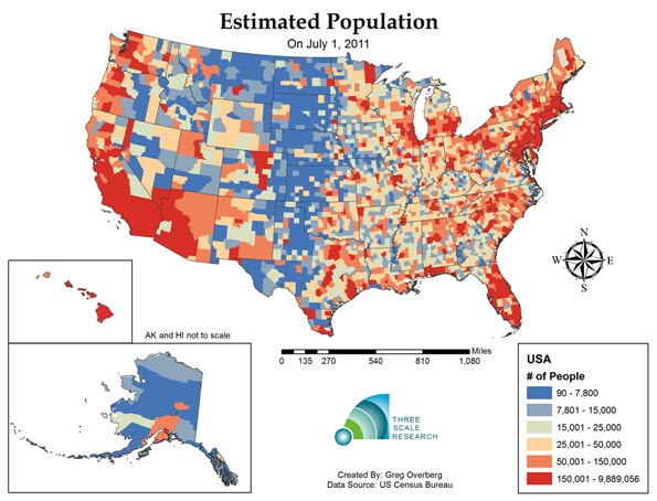
    Map Figure One: Estimated Population by County as of July 1, 2011

    The first map shows the distribution of population by county: revealing concentrations in the coastal areas, and lower population in the central regions. Los Angeles County, California had the most persons:9,889,056 persons; Kalawao County, Hawaii had the fewest: 90 persons.

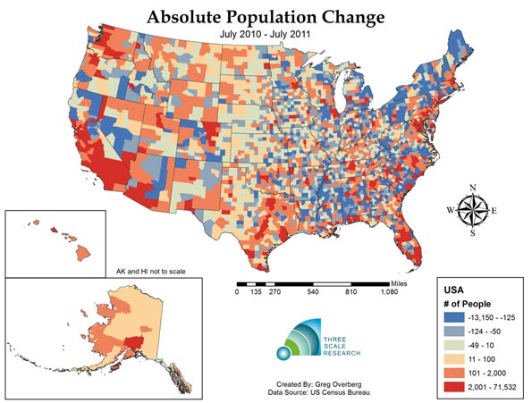
    Map Figure Two: Estimated Absolute Change in Population from July 1, 2010 to July 1, 2011

    The second map shows the pattern of population change during one year.  A total of 1,494 counties lost population, or about 47% of America’s 3,143 counties. This number is an increase from the change from 2000-2010, where 1,103 counties lost population. As one third of counties are experiencing greater deaths than births, another twelve percent are experiencing losses due to net migration. The county that gained the most people from 2010 to 2011 was Harris County, Texas (Houston), which added 71,532 persons.  The county that lost the most people was Wayne County, Michigan (Detroit), with a decline of 13,150 persons.

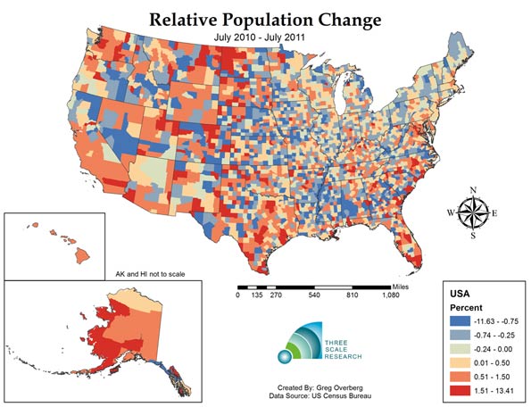
    Map Figure Three: Estimated Relative Change in Population from July 1, 2010 to July 1, 2011

    The third map shows relative population change in the United States. This reveals  quite a varied landscape. Western North Dakota, experiencing rapid growth of its energy sector, is experiencing fast population growth, along with metropolitan counties in Texas, Colorado, North Carolina and Florida. The county with the fastest population growth is Loving County, Texas, in the rural and isolated West Texas panhandle,  with a 13.25% growth rate resulting from the population increasing from 83 to 94 persons.  The county with the fastest shrinking population is Roberts County, Texas, in the equally rural and isolated North Texas panhandle with a decline of -11.69%.  Counties with very small populations can be subject to rapid change due to the effects of migration.

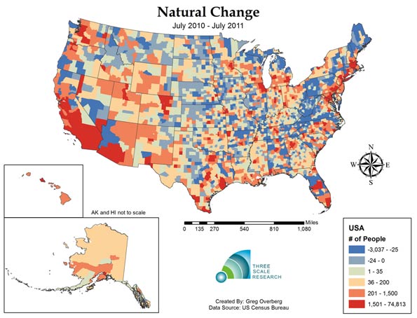
    Map Figure Four: Estimated Relative Births minus Deaths (Natural Rate of Absolute Population Change) from July 1, 2010 to July 1, 2011

    The fourth map shows the landscape of births minus deaths, or natural change, without the effects of migration. In 2011, one third of counties, or 1,041 out of 3,143 have deaths exceeding births. At the same time, counties with positive natural change, or births exceeding deaths, are concentrated, with half of all net natural change occurring in only 61 counties. The county with the highest level of natural change is Los Angeles County, with a 74,813 natural increase. The county with the highest negative level is Pinellas, Florida (Tampa- St. Petersburg area), with a decrease of 3,037 persons.

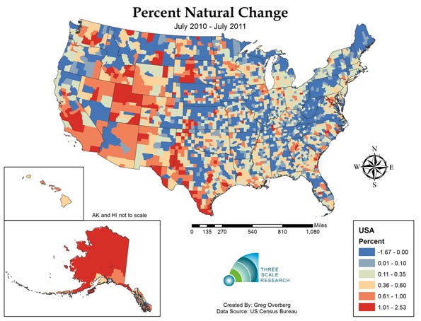
    Map Figure Five: Estimated Relative Births minus Deaths (Natural Rate of Relative Population Growth) from July 1, 2010 to July 1, 2011

    The fifth map show relative natural rate of population change, and the extensive area of slow and negative natural population decrease.  Most of the Appalachian counties have deaths exceeding births, along with extensive areas in the Great Plains states and at least parts of all 48 lower states. Only Alaska and Hawaii have positive natural increase across all of their respective counties. The fastest growing natural population is in Northwest Arctic Borough, Alaska, growing at a rapid 2.53% per year.

    Despite this expansive landscape of 1,041 counties that now have deaths exceeding births, and hundreds of counties approaching this status, there are 162 counties that exceed 1% growth per year, or are growing at about the global average rate. On the other hand, only 11 counties are declining faster than 1% a year, indicating that most of the impact is gradual.

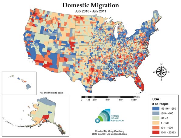
    Map Figure Six: Estimated Domestic Migration from July 1, 2010 to July 1, 2011

    The sixth map shows domestic migration, or net moves from one county to another. The top 159 counties received a net of 1,000 domestic migrants or more, and these areas include Florida, the Front Range Counties of Colorado, and the major metropolitan counties of Texas.  Overall, 1,229 counties had positive domestic migration, while 1,914 counties had negative domestic migration. Hillsborough, Florida (Tampa area), had the highest positive migration with 22,963 net movers, while Los Angeles County, California had the greatest number of net leavers with a total of 55,146 net departing residents.

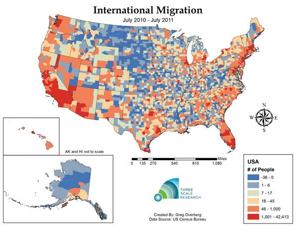
    Map Figure Seven: Estimated International Migration from July 1, 2010 to July 1, 2011

    The seventh map shows the coastal pattern of international migration.  International migration is most visible in California, Arizona and Nevada, and in a number of metropolitan areas including the Northeast and the Chicago area.  One-hundred and thirty- two counties experienced more than 1,000 immigrant arrivals, and these counties received 74 percent of immigrants, indicating that immigration is concentrated. On the other hand, immigration is also widespread, as all but 520 counties received one or more immigrants during the year.

    The top county for international immigration was Los Angeles, California, with a total of 42,413 immigrants.  The next four counties were Miami-Dade, Florida, with 19,996; Harris, Texas (Houston), with 19,558, Cook, Illinois (Chicago) with 17,208 and Queens, New York with 15,949 immigrants.

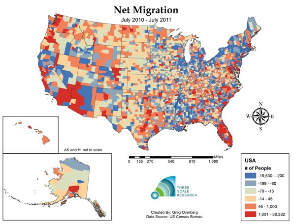
    Map Figure Eight: Estimated Net Migration (Combined International and Domestic) from July 1, 2010 to July 1, 2011

    The eighth and final map shows the combined effect of domestic and international migration.  Net migration is positive in areas of the Southwest, Texas metropolitan areas and most of Florida. A total of 1,403 counties had positive net migration, while 1,740 counties experienced negative net migration. The top county in America for positive net migration was Miami-Dade county in Florida, with a net migration of 38,382 persons. The county with the highest negative net migration was Wayne County, Michigan, with a net migration rate of -19,580 persons.

    Today one third of United States Counties appear to have entered the stage of zero population and perhaps even negative population growth, but only 31.4 million people or ten percent of the American population lives in these mostly rural counties. Given our concentration in metropolitan areas, the expansion to an ever larger group of counties might continue all the way up to about eightly percent of our land area, before the momentum of this effect manifests into the major population clusters. Fertility rates by race and Hispanic origin of the mother may play a role, but it should be noted that the Hispanic fertility rate has dropped from 2.53 in 2009 to 2.35 in 2010, and may have further declined in 2011. The impact of reduced immigration might also play a role in depressing population growth.

    The first estimate of county population change, the period from July 1, 2010 to July 1, 2011, shows a mixed picture of dynamic activity; there are a set of counties still experiencing robust population growth, but a third and perhaps increasing number of counties undergoing negative natural population growth.  These changes can be compared with 2012 county estimates in a year from now, and we can look for the diffusion process associated with population slowdown to continue. We will update our maps as further information becomes available.

    Ron McChesney is a Geographer with Three Scale Strategy and Research in Columbus, Ohio. Ron received a PhD in Geography at The Ohio State University in 2008.

    Greg Overberg is a City and Regional Planner with Three Scale Strategy and Research in Columbus Ohio.  Greg received a MA in City and Regional Planning at The Ohio State University in 2011.

    Sources:

    Centers for Disease Control (CDC), 2012: Provisional monthly and 12-month ending number of live
    births, deaths, and infant deaths and rates: United States, January 2010 – December 2011. Provisional
    data from the National Vital Statistics System, National Center for Health Statistics.

    Statistical Abstact of the United States, 2011. Table 78. Live Births, Deaths, Marriages and Divorces.

     US Census Bureau, 2011 County Total Population Estimates:
    Web Site:  http://www.census.gov/popest/
    Accessed April 30, 2012

    US Census Bureau, 2000 and 2010 Census by County:
    Web  Site: http://www.census.gov/popest/data/intercensal/county/county2010.html
    Accessed April 30, 2012

  • The Best Cities for Jobs 2012

    Throughout the brutal recession, one metropolitan area floated serenely above the carnage: Washington, D.C.  Buoyed by government spending, the local economy expanded 17% from 2007 to 2012. But for the first time in four years, the capital region has fallen out of the top 15 big cities in our annual survey of the best places for jobs, dropping to 16th place from fifth last year.

    It’s a symptom of a significant and welcome shift in the weak U.S. economic recovery:  employment growth has moved away from the public sector to private businesses. In 2011, for the first time since before the recession, growth in private-sector employment outstripped the public sector. More than half (231) of the 398 metro areas we surveyed for our annual study of employment trends registered declines in government jobs, with public-sector employment dropping 0.9 percent overall. Meanwhile, private-sector employment expanded 1.4 percent.

    Read about how we selected the 2012 Best Cities for Job Growth

    Instead of government, the big drivers of growth now appear to be three basic sectors: energy, technology and, most welcome all, manufacturing. Energy-rich Texas cities dominate our list — the state has added some 200,000 generally high-paying oil and gas jobs over the past decade — but Texas is also leading in industrial job growth, technology and services. In first place in our ranking of the 65 largest metropolitan areas is Austin, which has logged strong growth in manufacturing,  technology-related employment and business services. Houston places second, Ft. Worth fourth, and Dallas-Plano-Irving sixth. Another energy capital, Oklahoma City, ranks 10th, while resurgent New Orleans-Metairie places 13th among the largest metro areas.

    To determine the best cities for jobs, we ranked all 398 current metropolitan statistical areas based on employment data from the Bureau of Labor Statistics covering November 2000 through January 2012. Rankings are based on recent growth trends, mid-term growth, long-term growth and the region’s momentum. (Here is a detailed description of our methodology.) We also broke down rankings by size — small, medium and large — since regional economies differ markedly due to their scale.

    The strong growth of the energy sector, and Texas, is even more evident in our overall ranking, which includes many small and medium-sized metropolitan areas. The top 10 fastest growers overall include such energy-centric places as No. 1 Odessa, Texas; second-place Midland, Texas;  Lafayette, La. (fourth place); Corpus Christi, Texas (sixth), San Angelo, Texas (seventh); and Casper, Wyo. (10th).

    The shift from public to private can be seen in the falling rankings of many of the most government-dependent economies. Outside of Washington, D.C. (where federal employment actually has continued to grow), Bethesda-Rockville-Frederick, Md., took an even more dramatic tumble in our big city table,  dropping 34 places to No. 46.There were sizable relative declines in the rankings of many state capitals such as Springfield, Ill. and Madison, Wisc. College towns, which had previously done well in the face of the recession, have also moved sharply lower in our rankings, due to a combination of state budget cuts and better performance elsewhere. College Station, Texas, plummeted from fourth last year on our overall list to 167th; Fairbanks, Alaska, slid from 15th place to 165th, Corvallis, Ore., tumbled from 40th place to 203rd place; and Cedar Rapids, Iowa, dropped from 81st to 246th.

    Budget constraints have also hurt military towns, which previously had been largely immune to the recession. Last year’s overall No. 1, Killeen-Ft. Hood, Texas, slid to 43rd place; Jacksonville, N.C., home to Camp Lejeune, fell to 102nd from 19th last year; and Lawton, Okla., home to Fort Sill, slipped to 274th from  No. 20 last year.

    In addition to energy, the technology sector has been on a tear. After a decade of tepid growth and some years of job losses, Silicon Valley has blown itself another huge tech bubble, this time driven by the social media craze and a surge in private-equity investment. In the San Jose-Sunnyvale-Santa Clara metro area, the number of information sector jobs is up 36 percent over the past five years; this year the epicenter of Silicon Valley jumped 22 places to No. 5 among the 65 biggest metro areas. The social media boom has also been very good for the San Francisco-San Mateo-Redwood City area, which rocketed 16 places to a solid 17th this year.

    But much of the tech growth in the country has continued to flow to more affordable regions less dependent on venture investment. At the head of the pack is Austin, where Apple recently announced a large expansion,  and Salt Lake City, No. 2 on our big cities list, which is a major destination for expansion for Silicon Valley firms such as Adobe, Twitter and  Electronic Arts. Other big players benefiting from the tech boom include seventh-place Raleigh-Cary, N.C., which has been a consistent top 15 performer for the past seven years; Seattle, which rose 18 places to 14th, and Denver at No. 15.

    Perhaps most encouraging of all has been the expansion of the manufacturing sector. In 2011 manufacturing expanded at three time the rate of overall GDP, according to Mark Perry of the University of Michigan-Flint, and the sector added 425,000 jobs, also outpacing the national average.

    As a result, the fortunes of some of America’s hardest-hit manufacturing regions are improving. Columbus, Ind., rose from 235th overall last year to No. 3 on our list this year.  Michigan is beginning to see some signs of new life: perennial cellar dweller Holland-Grand Haven rose a remarkable 202 places to 19th on the overall list. A slew of other Michigan cities rose more than 100 places, including Grand Rapids (64th place), Bay City (136th), Warren-Troy-Farmington Hills (199th), Muskegon-Norton Shores (219th), and Jackson (233th).  It is a glimmer of hope in a region that has lurked near the bottom of our Best Places rankings for as long as we have published it.

    Another group of big cities that may be seeing light at the end of the tunnel are some of the metro areas hit hardest by the bursting of the housing bubble. Miami, Fla., which ranks 21st among the 65 largest metros, Tampa-St.Petersburg-Clearwater, Fla.  (33rd), Phoenix (45th), Riverside-San Bernardino, Calif. (50th), and even Las Vegas (56th) began to show some signs of new life this past year.

    So amidst all the good news, which big cities are still doing badly, or even relatively worse? Sadly, many of the places still declining are located in our home state of California, including Los Angeles (59th place among the biggest metro areas), Sacramento (60th), and, and just across the Bay from Silicon Valley, Oakland (63rd). Only the old, and to date still not recovering,  industrial towns of Providence, R.I. (64th), and Birmingham-Hoover, Ala. (dead last at No. 65), did worse.  And the glad tidings in manufacturing have not touched all the Rust Belt cities: Camden, N.J. (57th), Newark, N.J. (58th), Cleveland, Ohio (61st), and Detroit (62nd) still feature prominently near the bottom.

    Read about how we selected the 2012 Best Cities for Job Growth

    This piece originally appeared in Forbes.

    Joel Kotkin is executive editor of NewGeography.com and is a distinguished presidential fellow in urban futures at Chapman University, and contributing editor to the City Journal in New York. He is author of The City: A Global History. His newest book is The Next Hundred Million: America in 2050, released in February, 2010.

    Michael Shires, Ph.D. is a professor at Pepperdine University School of Public Policy.

    Austin photo by Bigstockphoto.com.
  • Homebuilding: Recovery & Red Tape

    The Recovery Blueprint is a multipart series of articles that offers suggestions on how to recover from the homebuilding recession.

    Since the recession began, there haven’t been any significant changes in how regulations could be improved to energize the housing market and foster innovation. Three areas where big regulation changes are needed? Environmental subsidies, density requirements, and zoning laws.

    Environmental Incentives: Repeating the mistakes of the Carter era, federal and state governments have thrown vast sums of tax money at ‘green’ solutions likely to fail. A massive amount of our nation’s total energy use seeps out of inefficient housing, draining families of income at a time when they can least afford it. The subsidization of inefficient construction that incorporates energy saving alternatives is as flawed today as it was 25 years ago. Federal and state credits allow funding for improvements such as insulation, solar panels, wind generation, geothermal systems, and the like. These tax credits have to be balanced against taxes paid by families who are barely surviving this recession, if they are still in their homes making mortgage payments.

    Who benefits? Not the mortgage companies that repossess energy inefficient homes. Not the families in traditional homes burdened with high energy costs. Only those wealthy enough to need tax breaks can benefit. But a household at the income level where it makes financial sense to upgrade an existing home can easily afford the upgrade without burdening the already overtaxed public.

    In a low income, possibly downtrodden neighborhood, upgrading a home for energy efficiency results in an expense (even after tax breaks) not likely to be recovered at the sale of the home. It would make more sense to use the same amount of funds to replace older, inefficient homes with new construction. New construction essentially replaces homes with the least efficient HVAC (heating/ventilation/ air conditioning) and insulation with new ones that operate the most efficient systems. But new construction gets almost no tax benefits; only geothermal or solar systems on new construction are subsidized. Does that make sense?

    Density Targets: Making funds available to cities on the condition that certain higher densities are met is not a solution, either. What I hear most often is that we need to provide high-density housing and public transportation so that poor people can get to their jobs, assuming, of course, that all people of low income work downtown.

    Are multi-billion dollar light rail projects and heavily subsidized low-income high-rise towers justified by such rhetoric? A low-income family on the 6th floor of a high-density building will not have the same quality of living or the pride-of-place that a home with a yard would provide. Travel dependent on a train or bus schedule does not offer the independence of owning a vehicle and travelling on one’s own schedule. Travel by foot or bike makes perfect sense for some of those who live in San Diego, but in the rest of the world those alternatives are viable only for the few nice weather days.

    When the recession began, urban architects and planners celebrated the death of the suburbs and the coming advent of an urban rebirth. While the suburbs were certainly hard hit, urban areas did not receive the expected mass migration.

    There is a myth that sprawl was the result of large lots and low density in the suburbs. Over the past 20 years, the firm I founded has planned over 730 developments in 46 States and 15 countries. I would estimate the average density of our suburban developments at between four and five units per useable acre. Today’s suburban development must preserve wetlands, steep slopes, wooded areas, and most often contain a minimum percentage of the site in open space. None of those requirements were in place when our core cities were built. One simply gridded streets through swamps (the previous term for wetlands) and bulldozed slopes and woodlands. Had our existing core cities been built under today’s regulations, they would likely sprawl 30% or more beyond the areas they currently occupy.

    Density targets that must be hit in order to receive government financial assistance not only doesn’t increase the quality of lower income life, it doesn’t result in more sustainable and affordable cities. Instead, most funding has resulted in displacing low-income neighborhoods with gentrified, wealthy development. Many of these projects were initial financial failures. The next developer — the one who picked up the project at bargain prices — realized the profit. Successful, affordable urban redevelopment remains elusive.

    Ordinances & Codes: The designer of any development, suburban or urban, will squeeze every inch out of the site to stay within the most minimal dimensions allowed by local ordinances. This effort to maximize the client’s profits can only result in monotonous, cookie-cutter development.

    Many city planning boards have been manipulated into believing the illusion that a ‘forms based’ or ‘smart-code’ approach is a solution. These new regulations simply increase the number of minimum standards, and restrict innovative solutions. What a ‘forms based’ or ‘smart’ code does accomplish is to significantly increase the consulting income of the firm that promotes this alternative.

    Many engineers and architects base their fees on a percentage of the final construction costs. A consultant who charges on a percentage of infrastructure costs has an incentive to introduce excessive sewer pipes, retaining walls, or other non-needed construction. A fee structure based upon increased profit derived on the least efficient design is a huge roadblock to developing sustainable cities.

    Innovations in land development and in methods of design now allow a reduction of both environmental and economic impact from 15% to over 50%, compared to conventional or New Urban planning methods. While these new methods take more time and effort to design, the reward is more attractive, affordable, and functional neighborhoods.

    What’s the blueprint for better planning? For starters, two ideas: government aid should be based on a ‘plan’ showing how the resulting development will enhance the living standards, and not be tied only to density levels. And agencies should reward contracts to the consultant with the best solution. This means creating a financial mechanism to increase – not decrease — profitability for sustainable planning and engineering solutions that require the least amount of construction costs.

    Photo by Stripey Anne: “I am an NHS Bureaucrat…These, dear friends, are the tools of my trade: red tape, pen, ink…”

    Rick Harrison is President of Rick Harrison Site Design Studio and Neighborhood Innovations, LLC. He is author of Prefurbia: Reinventing The Suburbs From Disdainable To Sustainable and creator of Performance Planning System. His websites are rhsdplanning.com and pps-vr.com.

  • The Urban US: Growth and Decline

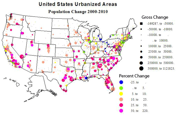
    The urban population of the United States is now 249 million, according to the 2010 Census, 81 percent of the total. This is impressive, and not all surprising for a large developed economy. Yet the urban population — meaning cities, suburbs and exurbs — is not everything. And in many ways for everything from food, resources and recreation, the urban areas still depend on the nearly sixty million who live in rural America

    It is fascinating to review how American demography has changed over the last decade. So I will briefly look at some obvious points, such as the largest, most important, places, those that grew the most absolutely and relatively, and those that, on the contrary, declined.

    Our Giant Metropolises 

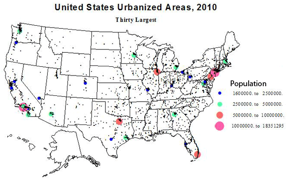
    The Census is very generous, probably way too generous, in their defining the outer limits of our urbanized areas (agglomerations with over 50,000 people). They tend to respect the independence of historically separate places, which from a satellite view would appear to be part of a united larger agglomeration. For example, New York, as defined, is huge enough but dense settlement goes far beyond its census limits. (I’ll take a look at conurbations, like Megalopolis, in a separate discussion). The 30 giants are shown in Table 1. The top three, New York, Los Angeles and Chicago have kept their positions for decades, but  story of more recent times has been the upsurge of Southern giants of Houston, Dallas, Miami, Atlanta, and of course, Washington, DC. Detroit is still in the top 15, but its position has fallen to 11th, while other historic places like Cleveland, St. Louis and Pittsburgh have dropped into the second set of 15.

    Table 1: Largest US Urbanized Areas
    Urbanized Area Name  2010 Population 2000 Population Change % Change
    1 New York–Newark, NY–NJ–CT 18,351,295 17,799,861 551,434 3.10
    2 Los Angeles–Long Beach–Anaheim, CA 12,150,996 11,789,487 361,509 3.07
    3 Chicago, IL–IN 8,608,208 8,307,904 300,304 3.61
    4 Miami, FL 5,502,379 4,919,036 583,343 11.86
    5 Philadelphia, PA–NJ–DE–MD 5,441,567 5,149,079 292,488 5.68
    6 Dallas–Fort Worth–Arlington, TX 5,121,892 4,145,659 976,233 23.55
    7 Houston, TX 4,944,332 3,822,509 1,121,823 29.35
    8 Washington, DC–VA–MD 4,586,770 3,933,920 652,850 16.60
    9 Atlanta, GA 4,515,419 3,499,840 1,015,579 29.02
    10 Boston, MA–NH–RI 4,181,019 4,032,484 148,535 3.68
    11 Detroit, MI 3,734,090 3,903,377 -169,287 -4.34
    12 Phoenix–Mesa, AZ 3,629,114 2,907,049 722,065 24.84
    13 San Francisco–Oakland, CA 3,281,212 3,228,605 52,607 1.63
    14 Seattle, WA 3,059,393 2,712,205 347,188 12.80
    15 San Diego, CA 2,956,746 2,674,436 282,310 10.56
    90,064,432 82,825,451
    16 Minneapolis–St. Paul, MN–WI 2,650,890 2,388,593 262,297 10.98
    17 Tampa–St. Petersburg, FL 2,441,770 2,062,339 379,431 18.40
    18 Denver–Aurora, CO 2,374,203 1,984,889 389,314 19.61
    19 Baltimore, MD 2,203,663 2,076,354 127,309 6.13
    20 St. Louis, MO–IL 2,150,706 2,077,662 73,044 3.52
    21 San Juan, PR 2,148,346 2,216,616 -68,270 -3.08
    22 Riverside–San Bernardino, CA 1,932,666 1,506,816 425,850 28.26
    23 Las Vegas–Henderson, NV 1,886,011 1,314,357 571,654 43.49
    24 Portland, OR–WA 1,849,898 1,583,138 266,760 16.85
    25 Cleveland, OH 1,780,673 1,786,647 -5,974 -0.33
    26 San Antonio, TX 1,758,210 1,327,554 430,656 32.44
    27 Pittsburgh, PA 1,733,853 1,753,136 -19,283 -1.10
    28 Sacramento, CA 1,723,634 1,393,498 330,136 23.69
    29 San Jose, CA 1,664,496 1,538,312 126,184 8.20
    30 Cincinnati, OH–KY–IN 1,624,827 1,503,262 121,565 8.09
    29,923,846 26,513,173

    Cities with the Largest Gains  

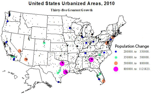
    Urbanized areas which gained the most population over the last decade are listed in Table 2. These numbers are truly large; these are clear leaders in “population power”. I’ll first draw our attention to the five cities which are in the top 35 in both absolute growth and in percent growth. These include Temecula-Murrieta, CA (most folks will never have even heard of it: think inland sunshine of Riverside county); Charlotte and Raleigh, NC; Cape Coral, FL (again, huh?); and Austin, TX (you were thinking Dallas or Houston? See below).

    Temecula-Murietta : 25th absolute growth, 6th % growth               
    Charlotte : 9th and 19th
    Raleigh : 18th and 21st               
    Cape Coral : 30th and 27th  
    Austin : 10th and 34th

    North Carolina wins the race for the fastest growing areas.  But in sheer growth in people, the winners are (Table 2) Houston, Atlanta, Dallas, Phoenix, Washington, Miami, Las Vegas (despite the recession), New York, Charlotte and Austin. Giant New York is the only non-sunbelt place in the elite, and it had a quite slow rate of growth (3%). The next places outside the southern tier are Denver (13th) and Seattle (18th).  The total absolute growth in these top 15 cities was a phenomenal 7.24 million, a rate of growth of 8.7 %. For the top 30 urbanized areas, the growth was 10.3 million, with a percent growth of 9.7 – the same as the rate of growth of the nation. This includes slow growing but still very big places like Los Angeles (growth displaced to its satellites), Philadelphia, Chicago, Indianapolis, Portland and Minneapolis.

    Table 2: Largest Absolute Change in US Urbanized Areas
    Urbanized Area Name  2010 Population 2000 Population Change % Change
    1 Houston, TX 4,944,332 3,822,509 1,121,823 29.35
    2 Atlanta, GA 4,515,419 3,499,840 1,015,579 29.02
    3 Dallas–Fort Worth–Arlington, TX 5,121,892 4,145,659 976,233 23.55
    4 Phoenix–Mesa, AZ 3,629,114 2,907,049 722,065 24.84
    5 Washington, DC–VA–MD 4,586,770 3,933,920 652,850 16.60
    6 Miami, FL 5,502,379 4,919,036 583,343 11.86
    7 Las Vegas–Henderson, NV 1,886,011 1,314,357 571,654 43.49
    8 New York–Newark, NY–NJ–CT 18,351,295 17,799,861 551,434 3.10
    9 Charlotte, NC–SC 1,249,442 758,927 490,515 64.63
    10 Austin, TX 1,362,416 901,920 460,496 51.06
    11 San Antonio, TX 1,758,210 1,327,554 430,656 32.44
    12 Riverside–San Bernardino, CA 1,932,666 1,506,816 425,850 28.26
    13 Denver–Aurora, CO 2,374,203 1,984,889 389,314 19.61
    14 Tampa–St. Petersburg, FL 2,441,770 2,062,339 379,431 18.40
    15 Los Angeles–Long Beach–Anaheim, CA 12,150,996 11,789,487 361,509 3.07
    16 Orlando, FL 1,510,516 1,157,431 353,085 30.51
    17 Seattle, WA 3,059,393 2,712,205 347,188 12.80
    18 Raleigh, NC 884,891 541,527 343,364 63.41
    19 Sacramento, CA 1,723,634 1,393,498 330,136 23.69
    20 Chicago, IL–IN 8,608,208 8,307,904 300,304 3.61
    21 Philadelphia, PA–NJ–DE–MD 5,441,567 5,149,079 292,488 5.68
    22 San Diego, CA 2,956,746 2,674,436 282,310 10.56
    23 Indianapolis, IN 1,487,483 1,218,919 268,564 22.03
    24 Portland, OR–WA 1,849,898 1,583,138 266,760 16.85
    25 Minneapolis–St. Paul, MN–WI 2,650,890 2,388,593 262,297 10.98
    26 Columbus, OH 1,368,035 1,133,193 234,842 20.72
    27 Nashville-Davidson, TN 969,587 749,935 219,652 29.29
    28 Murrieta–Temecula–Menifee, CA 441,546 229,810 211,736 92.14
    29 McAllen, TX 728,825 523,144 205,681 39.32
    30 Cape Coral, FL 530,290 329,757 200,533 60.81

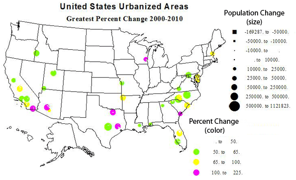
    Rate of Population Growth

    Thirty six cities had a growth rate of more than 50 percent between 2000 and 2010, a decade not that fabulous in economic growth!  Only three of these are independent metropolises of over a half-million: Charlotte and Raleigh, NC, and Austin, TX. With growth numbers and rates of 491000 (65%), 343000 (63%), and 460000 (51%)—clearly places on the move up. The others fall more or less into these categories: (please see table 3 for a list of all 35).

    Satellite places to larger urban areas: 21 places
    Smaller regional capitals or centers: 10 place

    The superstars in rate of growth were McKinney, TX (Dallas satellite), 212% growth; Avondale, AZ (Phoenix suburb), 190%; The Woodlands, TX (Houston satellite), 168%; Lady Lake, FL (Orlando satellite), 123%; West Bend, WI (Milwaukee satellite, 106%); El Centro , CA (Imperial Valley center), 103%; and  Hilton Head, SC (retirement, etc.), 101%.

    Table 3: Greatest Percent Gains
    Urbanized Area Name  2010 Population 2000 Population Change % Change
    1 McKinney, TX 170,030 54,525 115,505 211.84
    2 Avondale, AZ 197,041 67,875 129,166 190.30
    3 The Woodlands, TX 239,938 89,445 150,493 168.25
    4 Lady Lake, FL 112,991 50,721 62,270 122.77
    5 West Bend, WI 68,444 33,288 35,156 105.61
    6 El Centro, CA 107,672 52,954 54,718 103.33
    7 Hilton Head Island, SC 68,998 34,400 34,598 100.58
    8 Temecula–Murrieta, CA 441,546 229,810 211,736 92.14
    9 Concord, NC 214,881 115,057 99,824 86.76
    10 Visalia, CA 219,454 120,044 99,410 82.81
    11 Los Lunas, NM 63,758 36,101 27,657 76.61
    12 Myrtle Beach, SC 215,304 122,984 92,320 75.07
    13 Portsmouth, NH–ME 88,200 50,912 37,288 73.24
    14 Casa Grande, AZ 51,331 29,815 21,516 72.17
    15 Fayetteville–Springdale, AR 295,083 172,585 122,498 70.98
    16 Dover, DE 110,769 65,044 45,725 70.30
    17 Kissimmee, FL 314,071 186,667 127,404 68.25
    18 Salisbury, MD–DE 98,081 59,426 38,655 65.05
    19 Charlotte, NC–SC 1,249,442 758,927 490,515 64.63
    20 Victorville–Hesperia–Apple Valley, CA 328,454 200,436 128,018 63.87
    21 Raleigh, NC 884,891 541,527 343,364 63.41
    22 Manteca, CA 83,578 51,176 32,402 63.31
    23 Cape Coral, FL 530,290 329,757 200,533 60.81
    24 Provo–Orem, UT 482,819 303,680 179,139 58.99
    25 Nampa, ID 151,499 95,909 55,590 57.96
    26 St. George, UT 98,370 62,630 35,740 57.07
    27 Cartersville, GA 52,477 33,685 18,792 55.79
    28 Hammond, LA 67,629 43,458 24,171 55.62
    29 Mauldin–Simpsonville, SC 120,577 77,831 42,746 54.92
    30 Blacksburg, VA 88,542 57,236 31,306 54.70
    31 Lee’s Summit, MO 85,081 55,285 29,796 53.90
    32 Hagerstown, MD–WV–PA 182,696 120,326 62,370 51.83
    33 Santa Clarita, CA 258,653 170,481 88,172 51.72
    34 Austin, TX 1,362,416 901,920 460,496 51.06
    35 Daphne–Fairhope, AL 57,383 38,110 19,273 50.57

    Losers

    Urban growth is the expected norm, but not all areas of the country prospered 2000-2010. What kinds of place lost population and why? See Table 4 for a list of larger absolute and percent losses. Despite the comeback of the automobile industry, Detroit experienced the greatest loss, arguably because much of the industry has moved to the non-union and lower wage South. New Orleans had the second biggest loss, with almost an 11 percent loss, recovering only gradually from hurricane Katrina. Partly race or perhaps more a legacy of poverty and inept governance?  Other large numerical losses were in rust belt industrial and mining cities, such as Buffalo, Youngstown and Pittsburgh and Charleston, WV.  At least one was quite different: Seaside-Monterey CA, with losses due to reduced military operations as well as a generally weak California economy.

    High rates of losses were mostly in the same places, but included several smaller industrial towns in Ohio, Indiana and Pennsylvania.

    Table 4: Greatest Percent Losses  and Greatest Absolute Losses
    Relative posses
    Urbanized Area Name  2010 Population 2000 Population Change % Change
    1 Mansfield, OH 75,250 79,698 -4,448 -5.58
    2 Lorain–Elyria, OH 180,956 193,586 -12,630 -6.52
    3 Pascagoula, MS 50,428 54,190 -3,762 -6.94
    4 Youngstown, OH–PA 387,550 417,437 -29,887 -7.16
    5 Wheeling, WV–OH 81,249 87,613 -6,364 -7.26
    6 Lompoc, CA 51,509 55,667 -4,158 -7.47
    7 Mayagüez, PR 109,572 119,350 -9,778 -8.19
    8 Hightstown, NJ 64,037 69,977 -5,940 -8.49
    9 Pine Bluff, AR 53,495 58,584 -5,089 -8.69
    10 Seaside–Monterey–Marina, CA 114,237 125,503 -11,266 -8.98
    11 Anderson, IN 88,133 97,038 -8,905 -9.18
    12 Johnstown, PA 69,014 76,113 -7,099 -9.33
    13 Saginaw, MI 126,265 140,985 -14,720 -10.44
    14 New Orleans, LA 899,703 1,009,283 -109,580 -10.86
    15 Uniontown–Connellsville, PA 51,370 58,442 -7,072 -12.10
    16 Yauco, PR 90,899 108,024 -17,125 -15.85
    17 Charleston, WV 153,199 182,991 -29,792 -16.28
    18 Lodi, CA 68,738 83,735 -14,997 -17.91
    19 Parkersburg, WV–OH 67,229 85,605 -18,376 -21.47
    20 Ponce, PR 149,539 195,037 -45,498 -23.33
    Absolute Losses
    Urbanized Area Name  2010 Population 2000 Population Change % Change
    1 Seaside–Monterey–Marina, CA 114,237 125,503 -11,266 -8.98
    2 Lorain–Elyria, OH 180,956 193,586 -12,630 -6.52
    3 Saginaw, MI 126,265 140,985 -14,720 -10.44
    4 Lodi, CA 68,738 83,735 -14,997 -17.91
    5 Yauco, PR 90,899 108,024 -17,125 -15.85
    6 Parkersburg, WV–OH 67,229 85,605 -18,376 -21.47
    7 Pittsburgh, PA 1,733,853 1,753,136 -19,283 -1.10
    8 Charleston, WV 153,199 182,991 -29,792 -16.28
    9 Youngstown, OH–PA 387,550 417,437 -29,887 -7.16
    10 Buffalo, NY 935,906 976,703 -40,797 -4.18
    11 Ponce, PR 149,539 195,037 -45,498 -23.33
    12 San Juan, PR 2,148,346 2,216,616 -68,270 -3.08
    13 New Orleans, LA 899,703 1,009,283 -109,580 -10.86
    14 Detroit, MI 3,734,090 3,903,377 -169,287 -4.34

    These statistics are also summarized in 5 maps – one showing the size and rate of growth of all urbanized areas, followed by maps of the largest 30 places, the 35 places with the highest absolute and highest relative growth, then a map of the largest absolute and percent losses.

    Density, Size and Location

    People are often surprised by the fact that the highest urban densities are not in the historic eastern cities but in newer western cities. Los Angeles, often called the epitome of sprawl, is in fact the densest urbanized area in the US, for the third straight census! Table 5 lists the densest urbanized areas and the densities of the largest areas.

    Table 5: Highest and lowest urban densisties
    Highest urbanzed area densities
    Place State Population (Thousands) Density
    Los Angeles CA 12,151 6,999
    San Francisco CA 3,281 6,266
    San Jose CA 1,664 5,820
    Delano CA 54 5,483
    New York NY 18,351 5,319
    Davis CA 73 5,157
    Lompoc CA 52 4,816
    Honolulu HI 802 4,716
    Woodland CA 56 4,551
    L:as Vegas NV 1,886 4,525
    Densities of largest places (not on above list)
    Chicago IL 8,608 3,524
    Miami FL 5,502 4,442
    Philladelphia PA 5,442 2,746
    Dallas TX 5,122 2,879
    Houston TX 4,944 2,979
    Washington DC DC 4,586 3,470
    Atlanta GA 4,515 1,707
    Boston MA 4,182 2,232
    Detroit MI 3,734 2,793
    Phoenix AZ 3,629 3,165
    Seattle WA 3,059 3,028
    Lowest density places
    Hickory NC 212 811
    Hammond LA 68 883
    Barnstable MA 247 890
    Gadsden AL 64 892
    Homosassa Spgs FL 81 895
    Anniston AL 80 920
    Los Lunas NM 64 921
    Spartanburg SC 181 952
    Hilton Head SC 69 1,020
    Anderson SC 76 1,022

    The remarkable story is that of the 10 densest areas, 9 are in the west, and 7 in the Golden State. Four of these are fairly small, another surprise. The only eastern city in the top 10 is New York, which is fairly sharply limited by the census. Los Angeles, San Francisco and San Jose are the three most densely settled areas. The main underlying reason is not just planning regulations, although these probably play a role, but the issue of providing water to developable land. Both are restricted. This is one reason why growth in the southwest tends to be relatively dense. These drier areas lack the local water supplies that enable the kind of low density sprawl typical of the historic eastern cities like, yes, Boston with a density of only 2231, less than one-third that of Los Angeles!!  Other large urban areas with lower densities include Chicago, Philadelphia, Detroit, Houston, Dallas and Atlanta, a mere 1707!

    The winners for low density are an interesting mix of satellite places, such as Hammond, Barnstable, Los Lunas, and independent places like Hickory, Gadsden and Anniston, AL, and Spartanburg and Anderson, SC, many in hilly Appalachian environments, with settlement limited to valley floors. This is why the density could be below 1000 per square mile, the usual demarcation point of urban densities. Several are rather resort-like, e.g., Barnstable, Hilton Head and Homosassa Springs.

    Even if our urban definition is a little generous, 80 percent of the population or 250 million persons is an impressive total. Most of us cannot escape the city, where most jobs and opportunities are. We need to live in cities and perhaps most of us love the city. So the settlement issue in our lives becomes what city to live in and where to live within that place.

    Richard Morrill is Professor Emeritus of Geography and Environmental Studies, University of Washington. His research interests include: political geography (voting behavior, redistricting, local governance), population/demography/settlement/migration, urban geography and planning, urban transportation (i.e., old fashioned generalist).

    Next: Megalopolis and its rivals.

    Los Angeles skyline photo by Bigstockphoto.com.