Category: Small Cities

  • The New Bohemia: Not Where You Expect

    There’s an established image in the collective imagination of the kinds of places artsy types tend to live: the painter in a Paris garret, the actor in a Brooklyn brownstone, the musician in a San Francisco Victorian, or the playwright in a fisherman’s shack on Cape Cod. It’s all very romantic. We currently associate these places with vacation destinations and cutting edge high culture so of course that’s where the avant garde would naturally congregate. But people forget that in their day these were the cheapest least desirable locations available. These spots were economically depressed, populated by the lower working class, immigrants, “working girls”, and the substance abusers of their day. In short, they were places that respectable people avoided and where the authorities generally turned a blind eye. How else could artists survive without family money or the income that comes with full time employment in the mainstream economy? And where else could fringe elements of various subcultures thrive without inhibition from the dominant culture? It’s only after decades of anonymous incubation that these neighborhoods eventually became safe and vibrant enough to attract middle class residents in search of good food, nightlife, and tourist photo opportunities.

    The current reality is that the so-called “Creative Class” is being priced out of the places they helped make so desirable in the first place. Many lament their expulsion brought on by gentrification. Fair enough. In many respects it’s sad that these dynamic places are becoming more homogenized and sometimes even sterilized since well paid tech workers, financiers, and corporate lawyers are great at consuming culture, but pretty spotty when it comes to generating it. Then again… let’s not forget that without wealthy patrons or state support there would be no one to underwrite the art in question. Well-intentioned government attempts to preserve low rents through legislation or the construction of subsidized housing units are helpful to the handful of people that are lucky enough to participate. But economic reality generally tends toward gentrification and displacement. So where are the new artist colonies likely to spring up? In other words, where are the new cheap undesirable places where fringe types can thrive without attracting the attention of the authorities? I see three options.

     IMG_7165 (800x533) IMG_7169 (800x533) IMG_7137 (800x533) IMG_7146 (800x533) IMG_7157 (800x533)

    First, for the “traditional” rebel artist who can no longer afford New York, Boston, D.C. or Chicago there’s Buffalo, Cleveland, St. Louis, Pittsburgh, and Cincinnati. These Rust Belt cities have a fine stock of premium buildings and neighborhoods chock full of 19th century architectural gems and grand public parks and plazas at deeply discounted prices. If you want the authentic look and feel of a previous generation’s artist enclave they exist in second, third, and fourth tier cities in America’s forgotten interior. That multi-million dollar industrial live/work loft space in Manhattan is available elsewhere for a tiny fraction of a percent of the cost. A clever member of the Creative Class might initially establish her credentials and connections in Los Angeles or Toronto and then set up shop elsewhere to keep overhead low while sending her creations on to paying customers in more expensive markets.

    unnamed-7 unnamed-8 unnamed-5 unnamed-6 unnamed unnamed-3 unnamed-4 IMG_6476 (800x533) IMG_6477 (800x533)

    Second, there are thousands of depopulated rural villages that exist everywhere in America once you escape the economic forcefields of pricey metroplexes. Key West, Sedona, Provincetown, Carmel, New Hope, and Rehobeth have all been bought up and Disneyfied by now. But there are an unlimited number of small towns and villages that have similar qualities at an infinitely lower price point. Most of these remote country outposts will never become anything different from what they are now – quiet backwaters populated by contented older folks and restless young people eager to flee. But some of them will be colonized by just enough funky individuals that a self-reinforcing community will be able to take root.

    Third, and in my opinion the most viable and likely scenario, involves the reinvigoration of failed suburban districts. When I look around at the desolate commercial strip corridors (pick a crappy suburb… any crappy suburb anywhere from the outskirts of Charlotte to the damp underbelly of Seattle) I can imagine the new “arts districts” of the future. Dead suburban retail buildings and their associated parking lots are the current equivalent of abandoned industrial warehouses or cheap seventh floor walk up apartments. These properties and locations are most ripe for transformation over time. My guess is that most of the action early on will not be out front facing the highway, but in back behind the semi-abandoned muffler shops, defunct carpet emporiums, and burned out supermarkets. The rear loading docks and back alleys typically face quiet subdivisions of modest homes along more humanely scaled streets. It’s possible for individuals to create pleasant convivial places that engage with a selective element of the community while not attracting the attention of code enforcement agencies.

    Screen Shot 2014-10-21 at 6.03.37 PM ouhpoui unnamed-3  unnamed-8 unnamed-7 unnamed-5 unnamed-6 unnamed-16 unnamed-14 unnamed-15 unnamed-13

    Chuck Marohn of Strong Towns here calls this “Good Enough Urbanism”. It may not look like renaissance Florence or Greenwich Village, but it gets the job done in a hurry on a tight budget without the need for committees or regulatory approval. The key to success hangs on likeminded members of an interconnected community working together in an informal and organic way. Some places will develop around a cohesive social core and thrive. Most others will lack focus and the required critical mass and continue to devolve into slums. Happenstance will sort it all out over time. The trajectory is predictable at this point. As architect and urbanist Andres Duany likes to say, “First there are the risk oblivious pioneers, then gradually the neighborhood improves sufficiently to attract the risk aware, then with enough respectable small scale improvements by numerous mom and pops the big developers arrive and prepare the way for the Dentist from New Jersey.”

    John Sanphillippo lives in San Francisco and blogs about urbanism, adaptation, and resilience at granolashotgun.com. He’s a member of the Congress for New Urbanism, films videos for faircompanies.com, and is a regular contributor to Strongtowns.org. He earns his living by buying, renovating, and renting undervalued properties in places that have good long term prospects. He is a graduate of Rutgers University.

  • America’s Fastest-Growing Small Cities

    Coverage of America’s changing urban scene tends to focus heavily on large metropolitan areas and the “megaregions” now often said to dominate the economic future. Often missed has been a slow, but inexorable, shift of migration and economic growth to smaller cities, a geography usually ignored or dismissed, with the exception of college towns, as doomed to lag behind by urban boosters.

    Part of the problem is that analysts often assume that the decline of small towns, which have been losing population, also means small cities are in trouble. Yet this is simply not true. Since 2000 small cities with between 100,000 and 250,000 residents have enjoyed a 13.6% population growth rate, more than twice that of New York, Los Angeles and Chicago, and roughly 10% faster than the national growth rate. The main driving force, notes demographer Wendell Cox, appears to be domestic migration, which is negative in the largest cities as well as in small towns. However the 167 metropolitan statistical areas with between 100,000 to 250,000 in population have added a net 675,000 people due to domestic migration since 2000.

    This performance is also seen in the economic sphere. All five of the nation’s fastest growing economies in 2013 were small cities, which, despite their smaller size, possess the basic infrastructure — hospitals, schools, airports, broadband — that are essential to economic growth.

    Of course, not all small cities are doing well. Many, particularly in the industrial heartland, continue to suffer; virtually all the bottom 10 small cities on our list are in old industrial areas in the Great Lakes, the Southeast and Massachusetts,  the birthplace of America’s first manufacturing boom.

    In order to determine which small metro areas are booming, and help us understand why, we asked Mark Schill at the Praxis Strategy Group to rank them based on four factors: population growth (2000-13), job growth (2001-14), real per capita personal income growth (2000-12), and growth of regional GDP per job (2001-12) — if GDP per job is increasing, it’s an indicator that the metro area is adding high-value, productive industries to its economy, as opposed to lower-wage jobs.

    Boomer Boomtowns

    Over the next decade, one major driver for growth in small cities may be demographic factors, notably the aging of the baby boom generation. Contrary to popular press accounts that suggest boomers are gravitating to big cities, demographic evidence suggests the opposite is the case. Demographer Cox says boomers appear to be, on net, leaving both big cities and older suburbs in favor either of exurbs or smaller cities.

    Some small cities already appear to benefiting from this trend, including the top-ranked city on our list: The Villages, Fla. This relatively new community, which focuses on “active” seniors has doubled in population since 2000, and last year was the nation’sfastest-growing metropolitan area. The area also has expanded its job base by 186% since 2001. Yet as much of the employment is in services, growth in economic productivity has been lackluster. Critically, this does not mean the area has been getting poorer. Personal income growth, largely from assets owned by seniors, has soared by some 60% since 2000, 10 times the national average growth rate of 6%.

    Thriving senior-oriented economies can be found throughout Florida, but they are also emerging elsewhere. St. George, Utah, which ranks 12th on our list, has long attracted downshifting boomers from the West Coast as well as the rest of the Intermountain West. This has helped to power its construction sector, a key element of the local economy. Another hot spot for boomers is No. 17 Bellingham, Wash., which is home to Western Washington University. In the coming decade, we can expect a growing competition among smaller towns for boomer residents, and their sometimes significant assets.

    Energy Towns

    The oil and gas industry doesn’t need bright lights, but sometimes its presence can create some. Of our top 10 fastest-growing small cities, five are energy-driven boom towns. This includes No. 2 Midland, Texas, which has logged 60% job growth since 2001 and 30% population growth since 2000. The west Texas  city, located in the heart of the booming Permian Basin is also getting richer, with personal income growth of over 96.7% since 2000, a rate well above the national average of 6% and the median for small cities of 10.2%. Last year, Midland led the nation in GDP growth at 14%.

    Other high-ranked energy cities include No. 3 Odessa, Texas,  and No. 8 Houma-Thibadaoux, La., which this February boasted the lowest unemployment rate in the nation at 2.8%.

    College Towns

    One would expect this list to be chock full of university towns, but to our surprise, only one made the top 10: Fargo, North Dakota-Minnesota. The metro area has caught our eye before. Fargo is far more than home to North Dakota State, with almost 15,000 students, but the school’s  expertise in engineering and energy dovetails perfectly with the state’s boom not only in energy but it’s rapidly growing tech and manufacturing sectors. Since 2010, manufacturing employment is up 18% in Fargo, to go along with 21% growth at corporate managing offices, 20% in wholesale trade, 17% in finance, and 14% in professional services.

    Perhaps a better example of a small city benefiting from university connections is  No. 12 Morgantown, W.V. The metro area of 135,000 is home to the nearly 30,000 people working or studying at the University of West Virginia. Other college towns that made it to the upper tier include No. 11 Hammond, home to Southeast Louisiana University , with 15,000 students; No. 13 Logan, Utah, which hosts Utah State’s 28,000 students; and No. 25 Auburn, Alabama, home to the 25,000-student university of the same name.

    Government Centers

    Throughout the Bush years and in the first years of the recession, government centers — such as greater Washington, D.C., Madison, Wisc., as well as towns with military bases — out-performed the overall economy. Today many of the small cities that are thriving remain largely dependent on government spending, including  No. 5 Jacksonville, N.C., home to the Marine Corps’ Camp Lejeune.

    Given the long-term fiscal crisis facing many communities, this dependence on government spending could prove problematic, leaving a metro area’s fate in the hands of others. Planned cuts in military spending could undermine growth in many of these communities and is already raising the hackles of some public sector unions.

    The Road Ahead

    These trends suggest that the future of small city America may be far brighter than suggested by many urban pundits. The movement of boomers and the growth of resource-based industries seem likely to accelerate this trend, although declines in government, and particularly military, spending may impact some communities negatively. Like big cities, their small brethren seem to be divided between those that are thriving and those that are not.

    Perhaps the biggest challenge facing small cities will be retaining or attracting enough young families. Already roughly two out of every five millennials lives in one of the country’s smaller communities, and proportionately this population grew faster in these small metro areas than in either core cities or suburbs. In the future the key question is how to get more of them, particularly the better educated, to stay.

    Economically, these areas also need to diversify, taking advantage of new technologies that allow many businesses to operate remotely. Too great dependence on government spending, or on boomer migration, tends to distort local economies by fostering too much dependence on Washington or  creates a labor market overly tilted towards low-paying service workers. These smaller places still have their work cut out from them, but their prospects may overall be brighter than many suspect.

    Fastest Growing Small Cities
    Rank Region (MSA) Score Growth GDP/Job, 2001-2012 Job Growth, 2001-2014 PCPI Growth, 2000-2012 Population Growth, 2000-2013
    1 The Villages, FL 76.4 2.0% 186.0% 59.2% 99.2%
    2 Midland, TX 60.4 15.8% 59.7% 96.7% 30.3%
    3 Odessa, TX 54.4 32.9% 45.0% 49.4% 23.8%
    4 Fargo, ND-MN 43.4 24.8% 28.4% 23.5% 27.7%
    5 Jacksonville, NC 41.8 15.3% 27.2% 42.2% 22.9%
    6 Longview, TX 41.1 29.7% 18.0% 25.0% 11.5%
    7 Bismarck, ND 41.0 15.2% 35.5% 34.9% 22.5%
    8 Houma-Thibodaux, LA 40.7 18.0% 22.0% 49.7% 7.9%
    9 Watertown-Fort Drum, NY 39.9 22.1% 19.8% 39.5% 6.9%
    10 Madera, CA 39.4 20.1% 25.6% 22.0% 23.3%
    11 Hammond, LA 39.1 18.6% 20.5% 25.2% 24.5%
    12 Morgantown, WV 39.1 19.8% 22.7% 23.9% 22.3%
    13 Logan, UT-ID 39.0 23.1% 23.8% 12.4% 25.7%
    14 Las Cruces, NM 38.7 20.0% 21.0% 23.2% 21.9%
    15 Elizabethtown-Fort Knox, KY 37.9 27.8% 9.9% 18.6% 12.6%
    16 St. George, UT 36.9 -2.0% 48.7% 6.4% 62.1%
    17 Bellingham, WA 35.2 15.8% 20.1% 15.7% 23.1%
    18 Rochester, MN 35.1 24.7% 7.0% 12.7% 14.2%
    19 Sioux Falls, SD 34.9 13.6% 19.7% 13.0% 29.3%
    20 California-Lexington Park, MD 34.7 12.6% 20.0% 17.0% 26.7%
    21 Hanford-Corcoran, CA 34.7 10.2% 12.0% 36.6% 16.3%
    22 Sherman-Denison, TX 34.4 27.7% 3.1% 9.4% 10.3%
    23 College Station-Bryan, TX 33.8 9.0% 26.1% 16.5% 27.5%
    24 Elkhart-Goshen, IN 33.4 31.9% 3.8% -3.1% 9.4%
    25 Auburn-Opelika, AL 33.3 8.7% 33.9% 7.3% 30.8%
    26 St. Joseph, MO-KS 33.1 24.8% 8.7% 14.4% 3.0%
    27 Tuscaloosa, AL 32.7 19.4% 11.0% 10.2% 15.2%
    28 Billings, MT 32.6 13.2% 16.1% 17.3% 18.0%
    29 Grand Forks, ND-MN 32.3 13.5% 8.6% 34.2% 3.4%
    30 Hattiesburg, MS 32.3 13.3% 13.7% 15.9% 19.0%
    31 Idaho Falls, ID 32.3 10.8% 12.0% 10.6% 30.5%
    32 Charlottesville, VA 31.6 12.8% 12.7% 16.0% 17.5%
    33 Lawton, OK 31.5 15.4% 7.1% 23.2% 7.7%
    34 Burlington-South Burlington, VT 31.4 20.0% 4.9% 14.2% 7.6%
    35 Coeur d’Alene, ID 31.3 6.9% 23.9% 7.1% 31.8%
    36 Alexandria, LA 31.2 16.6% 4.8% 21.8% 6.6%
    37 Daphne-Fairhope-Foley, AL 31.2 3.2% 27.3% 5.9% 38.3%
    38 Johnson City, TN 31.2 19.5% 1.6% 13.2% 10.5%
    39 Bend-Redmond, OR 30.6 2.4% 23.9% 2.6% 42.4%
    40 Yuma, AZ 30.4 8.7% 13.1% 11.4% 25.3%
    41 Waterloo-Cedar Falls, IA 30.0 15.2% 6.8% 21.6% 3.5%
    42 El Centro, CA 30.0 -0.2% 28.2% 21.9% 24.0%
    43 Binghamton, NY 30.0 27.1% -10.5% 11.1% -1.7%
    44 Grand Junction, CO 30.0 12.2% 13.7% 2.0% 25.4%
    45 Jonesboro, AR 29.9 9.8% 11.9% 17.0% 16.2%
    46 Eau Claire, WI 29.7 15.8% 9.3% 10.1% 10.7%
    47 Sierra Vista-Douglas, AZ 29.7 7.1% 8.2% 30.0% 9.6%
    48 State College, PA 29.6 10.6% 3.5% 20.2% 14.3%
    49 Iowa City, IA 29.6 6.3% 21.1% 12.4% 21.9%
    50 Winchester, VA-WV 29.6 9.7% 12.2% 4.3% 27.4%
    51 Greenville, NC 29.4 6.8% 13.6% 6.3% 29.8%
    52 Lafayette-West Lafayette, IN 29.0 17.6% 5.8% -0.9% 16.8%
    53 Tyler, TX 28.8 5.8% 16.4% 11.3% 23.0%
    54 Bowling Green, KY 28.4 9.2% 16.8% 4.5% 20.8%
    55 Bloomington, IN 28.2 15.0% 8.5% 2.5% 14.3%
    56 Champaign-Urbana, IL 28.2 17.5% -5.0% 6.9% 11.7%
    57 Yakima, WA 27.9 9.0% 12.9% 14.5% 11.0%
    58 Homosassa Springs, FL 27.9 8.7% 11.2% 9.5% 17.4%
    59 Carbondale-Marion, IL 27.8 13.7% 0.8% 16.9% 4.8%
    60 Rapid City, SD 27.8 4.9% 7.7% 19.0% 17.4%
    61 Panama City, FL 27.6 4.5% 15.7% 15.1% 17.1%
    62 Anniston-Oxford-Jacksonville, AL 27.5 17.7% -5.2% 10.0% 5.1%
    63 Columbia, MO 27.3 2.5% 20.8% 6.7% 25.6%
    64 La Crosse-Onalaska, WI-MN 27.3 11.9% 6.1% 13.8% 6.7%
    65 Chico, CA 27.2 10.5% 6.5% 13.6% 9.0%
    66 Abilene, TX 27.1 7.7% 10.2% 21.8% 4.5%
    67 Yuba City, CA 27.1 6.8% 4.4% 10.2% 20.9%
    68 Terre Haute, IN 27.0 18.8% -2.7% 8.7% 0.8%
    69 Kahului-Wailuku-Lahaina, HI 27.0 1.4% 13.0% 13.0% 24.2%
    70 St. Cloud, MN 26.9 8.0% 10.7% 10.8% 13.8%
    71 Chambersburg-Waynesboro, PA 26.9 7.5% 17.1% 4.7% 17.2%
    72 Oshkosh-Neenah, WI 26.8 15.4% 1.4% 5.3% 7.9%
    73 Dover, DE 26.6 -2.8% 23.0% 6.0% 33.2%
    74 Texarkana, TX-AR 26.6 12.4% -0.3% 15.1% 4.5%
    75 Dothan, AL 26.4 9.6% -2.5% 13.4% 12.7%
    76 Lake Havasu City-Kingman, AZ 26.3 2.8% 8.5% 3.9% 30.0%
    77 Lawrence, KS 26.3 10.2% 2.0% 7.9% 14.0%
    78 Fairbanks, AK 26.3 1.3% 8.5% 15.8% 21.0%
    79 Missoula, MT 26.3 5.4% 13.7% 9.4% 16.3%
    80 Joplin, MO 26.2 12.0% 2.0% 6.6% 11.1%
    81 Owensboro, KY 26.2 11.4% 5.2% 11.5% 5.8%
    82 Lake Charles, LA 26.2 6.8% 5.4% 22.4% 4.4%
    83 Williamsport, PA 26.2 12.5% 0.4% 20.0% -2.6%
    84 San Angelo, TX 26.1 5.0% 5.4% 20.1% 10.1%
    85 Flagstaff, AZ 26.0 6.2% 9.3% 8.3% 16.9%
    86 Glens Falls, NY 25.9 8.6% 3.7% 19.5% 3.4%
    87 Cumberland, MD-WV 25.8 9.6% 0.3% 22.4% -0.6%
    88 New Bern, NC 25.8 9.8% -1.1% 11.2% 10.9%
    89 Beckley, WV 25.7 6.2% 3.3% 28.7% -1.7%
    90 Bloomington, IL 25.5 9.5% -2.6% 8.4% 14.0%
    91 Longview, WA 25.4 12.2% -5.4% 8.2% 9.5%
    92 Kingston, NY 25.3 9.5% -4.7% 20.9% 1.8%
    93 Wheeling, WV-OH 25.3 14.2% 0.7% 14.7% -4.7%
    94 Florence-Muscle Shoals, AL 25.1 12.0% -0.7% 11.4% 3.0%
    95 Dalton, GA 25.1 19.3% -15.8% -10.6% 17.6%
    96 Sioux City, IA-NE-SD 25.1 10.5% 0.7% 16.2% 0.6%
    97 Sebastian-Vero Beach, FL 25.0 1.9% 12.8% 2.4% 25.3%
    98 Wenatchee, WA 24.8 1.3% 17.1% 11.5% 14.2%
    99 Blacksburg-Christiansburg-Radford, VA 24.8 6.9% 3.4% 12.4% 9.0%
    100 Harrisonburg, VA 24.7 3.8% 7.7% 6.2% 19.1%
    101 Albany, OR 24.5 9.8% 2.6% -0.8% 15.3%
    102 Battle Creek, MI 24.2 17.5% -9.7% 6.1% -2.2%
    103 Ithaca, NY 24.2 3.1% 5.9% 18.3% 7.3%
    104 Warner Robins, GA 24.1 -3.9% 13.5% 7.2% 28.6%
    105 Lebanon, PA 24.0 0.9% 13.0% 13.0% 12.6%
    106 Goldsboro, NC 23.9 7.8% -2.2% 9.2% 9.6%
    107 Monroe, LA 23.8 6.7% -2.5% 15.6% 5.0%
    108 Lewiston-Auburn, ME 23.7 9.1% 0.3% 9.9% 3.6%
    109 Sumter, SC 23.6 9.1% -9.1% 15.1% 3.2%
    110 Prescott, AZ 23.4 -3.7% 11.5% 5.4% 27.6%
    111 Vineland-Bridgeton, NJ 22.9 3.5% -0.4% 14.9% 7.6%
    112 Wichita Falls, TX 22.8 6.5% -9.7% 21.3% -0.4%
    113 Jackson, TN 22.8 6.5% 3.8% 6.6% 7.0%
    114 Decatur, AL 22.8 12.2% -7.7% 2.4% 5.0%
    115 Cleveland, TN 22.7 2.7% 7.5% 5.6% 13.6%
    116 Janesville-Beloit, WI 22.5 11.0% -3.7% 1.4% 5.4%
    117 Napa, CA 22.3 0.1% 15.0% 6.2% 12.7%
    118 Decatur, IL 22.3 11.6% -9.6% 12.2% -4.6%
    119 Sheboygan, WI 22.2 6.1% -3.1% 13.7% 1.9%
    120 Athens-Clarke County, GA 22.2 -3.3% 17.9% 5.3% 18.7%
    121 Kankakee, IL 21.9 7.1% -1.8% 3.2% 8.0%
    122 Morristown, TN 21.8 6.9% -4.8% 0.9% 12.1%
    123 Brunswick, GA 21.7 3.9% -4.9% -3.1% 21.9%
    124 Medford, OR 21.6 0.3% 7.9% 4.4% 14.7%
    125 Topeka, KS 21.4 6.4% -4.2% 7.7% 4.2%
    126 Wausau, WI 21.3 4.9% -1.6% 5.9% 7.5%
    127 Hilton Head Island-Bluffton-Beaufort, SC 21.3 -8.7% 8.4% -2.7% 38.8%
    128 Mount Vernon-Anacortes, WA 21.3 -1.3% 8.2% 6.0% 14.9%
    129 East Stroudsburg, PA 21.1 -0.3% 7.3% -1.1% 19.6%
    130 Bangor, ME 21.1 3.4% -0.9% 9.4% 5.8%
    131 Valdosta, GA 21.0 -6.2% 6.7% 11.6% 19.4%
    132 Gadsden, AL 20.9 5.1% -2.2% 11.0% 0.6%
    133 Jefferson City, MO 20.9 3.6% -1.4% 6.7% 7.3%
    134 Altoona, PA 20.8 6.7% -1.2% 9.2% -2.1%
    135 Appleton, WI 20.8 -0.6% 5.5% 5.2% 13.5%
    136 Gettysburg, PA 20.7 2.2% 6.3% 1.0% 11.0%
    137 Staunton-Waynesboro, VA 20.5 0.9% -3.2% 9.3% 9.5%
    138 Michigan City-La Porte, IN 20.3 11.8% -12.6% -0.8% 1.1%
    139 Lima, OH 19.9 12.6% -11.3% -0.6% -3.0%
    140 Springfield, IL 19.7 8.1% -12.6% 0.0% 5.0%
    141 Fond du Lac, WI 19.6 3.8% -1.5% 3.7% 4.5%
    142 Charleston, WV 19.5 3.4% -9.0% 16.9% -4.6%
    143 Redding, CA 19.0 -2.1% -1.6% 8.5% 9.4%
    144 Pueblo, CO 18.9 -4.2% 6.5% 3.6% 13.9%
    145 Farmington, NM 18.8 -15.5% 9.6% 28.5% 10.8%
    146 Gainesville, GA 18.8 -12.1% 13.9% -3.4% 33.2%
    147 Jackson, MI 18.3 7.8% -7.0% -4.0% 1.1%
    148 Monroe, MI 18.1 5.9% -5.8% -3.1% 2.7%
    149 Bay City, MI 18.1 9.4% -10.9% -2.1% -3.0%
    150 Florence, SC 18.0 -2.3% -3.4% 8.0% 6.7%
    151 Santa Fe, NM 17.9 -5.4% 4.5% 3.2% 13.7%
    152 Niles-Benton Harbor, MI 17.4 4.7% -9.0% 5.3% -4.4%
    153 Burlington, NC 17.3 -0.6% -6.2% -7.8% 17.5%
    154 Racine, WI 17.2 0.4% -5.4% 3.6% 3.2%
    155 Johnstown, PA 17.0 0.1% -6.0% 14.5% -7.6%
    156 Muncie, IN 16.7 7.2% -13.8% -4.1% -1.1%
    157 Punta Gorda, FL 16.3 -11.2% 12.9% 2.0% 15.8%
    158 Mansfield, OH 15.6 5.2% -16.6% 1.3% -5.5%
    159 Rocky Mount, NC 15.6 -0.1% -13.7% -0.1% 5.3%
    160 Pittsfield, MA 15.3 -5.7% -1.4% 13.2% -3.8%
    161 Barnstable Town, MA 15.3 -10.8% 3.2% 21.1% -3.6%
    162 Weirton-Steubenville, WV-OH 13.8 -1.6% -15.8% 9.0% -7.4%
    163 Albany, GA 13.7 -9.5% -5.7% 13.8% -1.2%
    164 Springfield, OH 13.1 -2.7% -10.4% 4.0% -5.8%
    165 Saginaw, MI 11.8 -1.3% -10.6% -4.0% -6.4%
    166 Muskegon, MI 10.8 -9.7% -4.1% -0.7% 0.4%
    167 Macon, GA 9.1 -18.3% -3.1% 5.6% 4.0%

    Analysis by Mark Schill, mark@praxissg.com. Measures are normalized and equally weighted. Sources: U.S. BEA (GDP/Job, PCPI growth), EMSI (employment growth), U.S. Census Population Estimates Program (population growth).

    This piece originally appeared at Forbes..

    Joel Kotkin is executive editor of NewGeography.com and Distinguished Presidential Fellow in Urban Futures at Chapman University, and a member of the editorial board of the Orange County Register. His newest book, The New Class Conflict is now available at Amazon and Telos Press. He is author of The City: A Global History and The Next Hundred Million: America in 2050. His most recent study, The Rise of Postfamilialism, has been widely discussed and distributed internationally. He lives in Los Angeles, CA.

    Fargo photo by David Kohlmeyer.

  • Boomers: Moving Further Out and Away

    There have been frequent press reports that baby boomers, those born between 1945 and 1964, are abandoning the suburbs and moving "back" to the urban cores (actually most suburban residents did not move from urban cores). Virtually without exception such stories are based on anecdotes, often gathered by reporters stationed in Manhattan, downtown San Francisco or Washington or elsewhere in urban cores around the nation. Clearly, the anecdotes about boomers who move to suburbs, exurbs, or to outside major metropolitan areas are not readily accessible (and perhaps not as interesting) to the downtown media.

    Yet there is a wide gulf between the perceived reality of the media stories and what is actually occurring on the ground, as is indicated by comprehensive sources. The latest available small area data shows that baby boomers continue to leave the urban cores in large numbers. They have also left the earlier suburbs in such large numbers that their population gains in the later suburbs and exurbs have been insufficient to stem boomer movement out of the major metropolitan areas to smaller cities and rural areas.

    These conclusions are drawn from an analysis of population at the zip code tabulation area (ZCTA) among those 35 to 54 years of age in 2000 and the same cohort in 2010 (then 45 to 64 years of age). This small area analysis avoids the exaggeration of urban core data that necessarily occurs from reliance on the municipal boundaries of core cities (which are themselves nearly 60 percent suburban or exurban, ranging from as little as three percent to virtually 100 percent). This is described in further detail in the "City Sector Model" note below.

    Overall Trend

    The national population of the baby boomer generation declined 1.82 million between 2000 and 2010, a 2.2 percent loss (the result of an inevitably increasing death rate from the aging of cohorts). A small increase of 350,000 (1.0 percent) outside the largest cities was more than offset by a 2.17 million loss in the major metropolitan areas (over 1 million population), where the decline was of 4.7 percent.

    Boomers and the Urban Core

    The largest percentage loss occurred in the functional urban cores, which experienced a decline of 1.15 million baby boomers, a reduction of 16.7 percent. The functional urban cores are defined by the higher population densities that predominated before 1940 and a much higher dependence on transit, walking and cycling for work trips (further details are provided in the "City Sector Model" note below). In 2000, baby boomers accounted for 14.9 percent of the major metropolitan area population, a figure that declined to 13.0 percent by 2010 (Figure 1).

    The losses were pervasive. Among the 24 major metropolitan areas with functional urban core populations above 100,000, all experienced reductions in their baby boomer population shares. The average share reduction was approximately 12 percent.

    Not surprisingly, the leading urban core magnets of New York and San Francisco did the best, losing 4.3 percent and 5.8 percent of their boomer population share between 2000 and 2010. Providence, Los Angeles,and Boston rounded out the best five.

    Among the 24 metropolitan areas with the largest functional urban cores, Detroit experienced the largest proportional boomer loss, at 21.2 percent. Kansas City, Washington, and Minneapolis-St. Paul lost from 17 percent to 19 percent, proportionally, of their boomer urban core populations. Despite its reputation for core renewal, Portland experienced an approximate 15 percent proportional loss of its urban core boomers, along with Milwaukee and Cleveland (Figure 2).

    Boomers and the Earlier Suburbs

    The reduction in baby boomer population was even greater in the earlier suburban areas (those with median house construction dates of 1979 or before). The 2.33 million earlier suburban population loss was double that of the functional urban core loss, but because of this population is much larger than the functional cores, the overall drop was a smaller 11.1 percent. Nonetheless, the earlier suburbs continue to house the largest share of major metropolitan boomers. This fell, however, from 45.3 percent in 2000 to 42.2 percent in 2010.

    Combined, the urban cores and earlier suburbs lost 3.48 million boomers between 2000 and 2010.

    Boomers and the Later Suburbs and Exurbs

    In contrast, the later suburban areas (median house construction date 1980 or later) added approximately 750,000 baby boomers, for an increase of 6.8 percent. The later suburbs also experienced an increase in their share of major metropolitan boomers, rising from 24.0 percent in 2000 to 26.9 percent in 2010.

    The exurban gain was greater than the later suburbs in percentage terms (7.7 percent) but less in population gain (560,000). This was enough to increase the exurban share of boomers from 15.8 percent in 2000 to 17.9 percent in 2010. Indeed, the exurban areas of the 24 major metropolitan areas with urban cores over 100,000 population all did better in attracting or retaining boomer populations than both the urban cores and the earlier suburbs.

    Overall there was a 5.0 percentage point transfer of boomer share from the functional urban cores and earlier suburbs to the later suburbs and exurbs, reflecting their more than 1.3 million gain between 2000 and 2010.

    Boomers and the Nation

    Moreover, the data indicates that boomers are leaving the major metropolitan areas to move to smaller cities or even to rural areas. In contrast with the 2.17 million major metropolitan area loss, areas outside the major metropolitan areas added 350,000 boomers between 2000 and 2010. In 2000, smaller cities and rural areas housed 44.4 percent of the boomer population. By 2010, the smaller city and rural share had risen to 45.8 percent (Figure 3). By contrast, over the same period, the major metropolitan areas increased their proportion of the US population, from 54.5 percent in 2000 to 54.9 percent in 2010.

    America’s downtowns (generally a smaller area than the larger urban cores), have done much better in recent years, as they have become safer and as a "100 year flood" of economic retrenchment has reduced many to renting rather than buying. Yet, overall, urban cores have done less well, with Census Bureau data showing that the population gains within two miles of largest municipality city halls being more than offset by losses in the two to five mile radius between 2000 and 2010. These loses are not limited to the overall population, but extend to share losses among Millennials and population losses among the boomers.

    Wendell Cox is principal of Demographia, an international public policy and demographics firm. He is co-author of the "Demographia International Housing Affordability Survey" and author of "Demographia World Urban Areas" and "War on the Dream: How Anti-Sprawl Policy Threatens the Quality of Life." He was appointed to three terms on the Los Angeles County Transportation Commission, where he served with the leading city and county leadership as the only non-elected member. He was appointed to the Amtrak Reform Council to fill the unexpired term of Governor Christine Todd Whitman and has served as a visiting professor at the Conservatoire National des Arts et Metiers, a national university in Paris.

    ———–

    City Sector Model Note: The City Sector Model allows a more representative functional analysis of urban core, suburban and exurban areas, by the use of smaller areas, rather than municipal boundaries. The more than 30,000 zip code tabulation areas (ZCTA) of major metropolitan areas and the rest of the nation are categorized by functional characteristics, including urban form, density and travel behavior. There are four functional classifications, the urban core, earlier suburban areas, later suburban areas and exurban areas. The urban cores have higher densities, older housing and substantially greater reliance on transit, similar to the urban cores that preceded the great automobile oriented suburbanization that followed World War II. Exurban areas are beyond the built up urban areas. The suburban areas constitute the balance of the major metropolitan areas. Earlier suburbs include areas with a median house construction date before 1980. Later suburban areas have later median house construction dates.

    Urban cores are defined as areas (ZCTAs) that have high population densities (7,500 or more per square mile or 2,900 per square kilometer or more) and high transit, walking and cycling work trip market shares (20 percent or more). Urban cores also include non-exurban sectors with median house construction dates of 1945 or before. All of these areas are defined at the zip code tabulation area (ZCTA) level.

  • What College Gowns Bring to Towns

    The college town, one of America’s most appealing and unique features, grew out of the Age of Reason, and the concept of a regional, liberal-arts college nurtured by a small town has been intertwined with American history. Today, with enrollment dropping, the small, private college seems to be going the same way as the typewriter, the newspaper and the independent bookstore. While some colleges struggle to survive, the institution of the college town lives in suspended animation, ready to support whatever form its major employer may take. One thing’s for sure: the reinvention of the post-college town is coming.

    Here in Central Florida, the tradition of a liberal-arts college entwined with a small or medium-sized municipality is alive and well, for the moment. But trouble is brewing. While private institutions in Central Florida may not advertise their funding problems, the truth is plain to see. Rapid expansion of athletic programs, sure-fire profit centers for most schools, is underway at Rollins College, Stetson, and University of Tampa, and all are exploring other ways to reach more students, as well.

    Florida’s public universities are not immune to budget problems, either. And their response to the financial crisis says much about the future of college towns everywhere.

    Reinvention of the liberal arts college itself has been a cottage industry for the last several years. Student body diversification into “lifelong learning” (read: the lucrative retiree demographic), extensions, outreach campuses, and summer programs for primary and secondary schools has surged, as colleges try to open new markets. Bloated administrative costs have given rise to urgent fundraising and athletic programs, while an army of poorly paid adjunct professors shoulder an increasing burden of responsibility for the actual work of teaching. But, as Moody’s analyst Susan Fitzgerald has said about small, tuition-dependent colleges, they are in “a death spiral – this continuing downward momentum for some institutions [means] we’ll see more closures than in the past.”

    The Economist magazine has compared colleges to newspapers. If their analogy were to hold true, of the 4,700 colleges and universities in the world, “more than 700 institutions would shut their doors.” Citing the rise of massive, open, online courses or MOOCS, the magazine suggested that the idea of a professor interacting face-to-face with students will become a luxury. Colleges seem destined to end up in the same tiresome boat as the rest of the digital world, where everything, ultimately, becomes a product on Amazon.

    Uncertainty about the future has hastened the liberal arts school’s demise. In the darkest days of the recession we were told there was a STEM crisis: science, technology, engineering and mathematics were the fields that would get you a job. People ditched their liberal arts pursuits for more practical, employable ones, swearing off the indulgent frivolity of a philosophy course for a computer programming class. Panicking parents and students stampeded out of the gothic halls of the English department as fast as they could.

    Here in Florida, to pay for a new state campus in Lakeland, the Governor gutted the operational budget of Florida’s 11 other institutions of higher education. The new campus, located on rural land adjacent to Interstate 4, is far from any sort of population center. It’s a soulless commuter school; any form of a college town to accompany it lies far, far in the future.

    USF Polytechnic is being billed as a “destination campus”. Its showy new structure nearly complete, it lies naked to the Florida scrub and Interstate 4, with a few lonely stucco buildings and portable classrooms marking a kind of desperate, treeless sense of place in the hot Florida sun. No flip-flop-shod students strumming guitars, debating the meaning of Proust or the relevance of Marx will ever be found under its oak trees or in front of its bohemian coffee shops, because there aren’t any. Instead, there’s a harsh, asphalt parking lot and a long, hot trudge to the endpoint, another signal that one’s college years are just like a shopping trip to Wal-mart.

    If the one-in-seven death rate holds true, then one of the seven college towns in Central Florida will not have a future either. Gainesville, DeLand, Winter Park, St. Augustine, Tampa, Lakeland, and St. Petersburg are seven places with streets, residences, and businesses that each have grown up around colleges, public and private, and that enjoy a thriving sidewalk life.

    Ironically, at least two of these colleges were born in another desperate time, the Great Depression. The University of Tampa, across the Hillsborough River from downtown Tampa, started in a failed hotel when the city took it over from owner Henry Plant’s railroad empire. Likewise, Flagler College in St. Augustine began in a resort hotel built by New York railroad magnate Henry Flagler. The small, private, liberal-arts college was a perfect solution. A grand old structure was re-inhabited, and a struggling city was bolstered.

    Towns that grew up around these places have different, more informal qualities than other towns. In Gainesville, for example, churches, temples, student centers, and other non-profit institutions occupy prominent positions within the urban core. There’s a diversity of old houses with garage apartments, lean-tos, and enclosed porches. Wood apartment buildings have side stairs, outdoor beer kegs, and bicycle racks. They sit under huge, mature trees, clad in subtropical philodendron vines, and are connected by narrow dirt pathways carved independent of sidewalks. A sense of grown-over-time pervades within and around campus, its boundaries softened by sneaker and bicycle traffic, concert posters and poetry reading notices.

    Gainesville, with nearly fifty thousand students, will probably survive, but other, smaller towns may struggle. As conversion to digital learning reduces costs, the college town may disappear. Anonymous reviews, posted online, replace conversations in bookstores. University Avenue may be deleted, just like yesterday’s term paper.

    Our bookshelves are crowded with titles about the urban future, but in all of this furious scribbling it seems no one has noticed that sidewalks have all but emptied out in many of our cities. Chicago, New York, San Francisco, and a few more still march to the pedestrian beat. But a fairly thorough survey of peninsular Florida yields few sidewalks with any kind of street life — and the few that still operate as shared, social space all belong to our college towns.

    Students, with one foot in childhood and one in adulthood, still walk on sidewalks. They shop online, too, but they still patronize businesses for the sake of the social interaction, and still have use for the physicality of the street… for a street life that seems to be endangered.

    College towns, living on today in a shadow of their former bohemian selves, will be reinvented, just as education systems will. But for now, deprived of street life, we breed a different sort of citizen and thinker than an old college town once did. This new digital citizen will construct social space in ways yet to be foreseen.

    Richard Reep is an architect with VOA Associates, Inc. who has designed award-winning urban mixed-use and hospitality projects. His work has been featured domestically and internationally for the last thirty years. An Adjunct Professor for the Environmental and Growth Studies Department at Rollins College, he teaches urban design and sustainable development; he is also president of the Orlando Foundation for Architecture. Reep resides in Winter Park, Florida with his family.

    Photo of downtown Gainesville by the author. This scene is typical of the streets surrounding the campus of the University of Florida.

  • Agrarianism Without Agriculture?

    The ever-surprising Ralph Nader has recently been reading some paleo-conservative sources, and has written a book entitled Unstoppable; the Emerging Left-Right Alliance to Dismantle the Corporate State. In the Acknowledgements at the end, he specifically thanks Intercollegiate Studies Institute, a conservative think tank, for keeping in print a tome from the 1930s called Who Owns America? A New Declaration of Independence. Nader devotes the seventh chapter of his book to a discussion of this volume. He quotes Edward Shapiro’s 1999 foreword at some length:

    In his 1999 foreword to the reissued edition, historian Edward S. Shapiro called Who Owns America? “one of the most significant conservative books published in the United States during the 1930s” for its “message of demographic, political, and economic decentralization and the widespread ownership of property” in opposition “to the growth of corporate farming, the decay of the small town, and the expansion of centralized political and economic authority.” ……

    In this mix, there was espoused a political economy for grass-roots America that neither Wall Street nor the socialists nor the New Dealers would find acceptable. It came largely out of the agrarian South, casting a baleful eye on both Wall Street and Washington, D. C. To these decentralists, the concentrated power of bigness would produce its plutocratic injustices whether regulated through the centralization of political authority in Washington or left to its own monopolistic and cyclical failures. They were quite aware of both the corporate state fast maturing in both Italy and Nazi Germany and the Marxists in the Soviet Union ……

    Nor did they believe that a federal government with sufficient political authority to modestly tame the plutocracy and what they called “monopoly capitalism” could work, because its struggle would end either in surrender or with the replacing of one set of autocrats with another. As Shapiro wrote in the foreward, “while the plutocrats wanted to shift control over property to themselves, the Marxists wanted to shift this control to government bureaucrats. Liberty would be sacrificed in either case. Only the restoration of the widespread ownership of property, Tate said, could ‘create a decent society in terms of American history.’”

    Although the decentralists were dismissed by their critics as impractical ….. their views have a remarkable contemporary resonance given today’s globalized gigantism, absentee control, and intricate corporate statism, which are undermining both economies and workers. They started with the effects of concentrated corporate power and its decades-long dispossession of farmers and small business. They rejected abstract theories by focusing instead on such intensifying trends as the separation of ownership from control; the real economy of production in contrast to the manipulative paper economy of finance; and the growth of “wage slavery,” farm tenancy, and corporate farming. One can only imagine what they would say today! (Nader, pp. 139-141.)

    I apologize for the long quote. These people advocated doing away with the “joint stock corporation” for the most part, to be replaced by cooperatives. I’m not sure about the liability of members of these cooperatives, but that’s a major issue. Without limited liability, I would hesitate to co-invest in any project unless all the partners were as liquid and wealthy as myself, otherwise guess who ends up holding the bag! And it is to be noted that many insurance companies, and some savings and loans, including, until the 1980s, all federally chartered ones, were in fact “mutual” and owned by their depositors or policy holders.

    They did not succeed as far as agricultural land was concerned. The concentration of agricultural land under fewer and fewer owners, and even more the oligopolies of processing food through such entities as Cargill, Tyson, and Archer Daniels Midland, proceeded apace. But “widely distributed property ownership” resurfaced on another front; the urban-suburban one. The New Deal first chartered the Federal Housing Administration to underwrite and guarantee loans for homes, and in Truman’s time the Veterans Administration and other reforms brought this regime into full flower. So instead of their forty acres and a mule, people got their ¼ acre and an automobile, the only practical way to travel from their ¼ acre to wherever they wanted to go.

    Eventually people came to see their ¼ acre with a house on it as an “investment,” and further, a “source of wealth.” But this was not a truly agrarian source of wealth. Farms depend for their value on the quality of their soil and their productivity as farms. They are truly commercial real estate. But residences depend for their value only to a minor degree on what is on the property itself, but rather on what is around it; and suburbanites demanded that covenants, or the Government in the form of City Hall or County Hall, control their neighbors and what is around them. Part of the reason for living in the suburbs, after all, is the presence of trees and green space. (The suburbanites have therefore been friendly to the environmental cause, as long as it did not touch their automobiles.) There was also the factor that just as printing money dilutes its value, “printing” a large number of houses in an area dilutes their value as well. And, the more development, the more traffic comes to resemble that of the centralized portion of the city and one’s automobile gets stuck in it. Fact: the borough of Irvine, where my office is, imposes a “cap and trade” system on those who would desire to build or repair commercial structures, and what one buys in this marketplace is not carbon or pollution, but potential car trips that one’s project might be potentially using. The suburban model, in the end, demanded that to preserve suburban values, that the building of suburbs be stopped! That’s the irony of the whole thing.

    Howard Ahmanson of Fieldstead and Company, a private management firm, has been interested in these issues for many years.

  • Dispersing Millennials

    The very centers of urban cores in many major metropolitan areas are experiencing a resurgence of residential development, including new construction in volumes not seen for decades. There is a general impression, put forward by retro–urbanists (Note 1) and various press outlets that the urban core resurgence reflects a change in the living preferences of younger people – today’s Millennials – who they claim are rejecting the suburban and exurban residential choices of their parents and grandparents.

    There is no question that the millennial population has risen in urban cores in recent years. Yet the growth in the younger population in urban cores masks far larger increases in the same population group in other parts of major metropolitan areas and in the nation in general.

    Functional Analysis of Metropolitan Areas

    This article continues a series examining the 52 major metropolitan areas (those with more than 1,000,000 residents) using the City Sector Model, which allows a more representative functional analysis of urban core, suburban, and exurban areas, by using smaller areas, rather than using municipal boundaries. The City Sector Model thus eliminates the over-statement of urban core data that occurs in conventional analyses, which rely on historical core municipalities, most of which encompass considerable suburbanization.

    The City Sector Model classifies 9,000 major metropolitan area zip code tabulation areas using urban form, density, and travel behavior characteristics. There are four functional classifications: the urban core, earlier suburban areas, later suburban areas, and exurban areas. The urban cores have higher densities, older housing and substantially greater reliance on transit, similar to the urban cores that preceded the great automobile oriented post-World War Two suburbanization. Exurban areas are beyond the built up urban areas. The suburban areas constitute the balance of the major metropolitan areas. Earlier suburbs include areas with a median house construction date before 1980. Later suburban areas have later median house construction dates (Note 2).

    20-29s and the Urban Core

    The age band best approximating millennials for the period of 2000 to 2010 is people of from 20 to 29 years of age.

    Between 2000 and 2010, the total population of 20-29’s living in the functional urban cores increased by 300,000, from 4.3 million to 4.6 million from 2000 to 2010. Yet, the share of 20-29s living in the urban cores actually declined over the decade.

    In 2000, 20.2 percent of the major metropolitan area 20- to 29-year-old population was in the urban core. By 2010, it had dropped to 19.3 percent, a 4.4 percent share reduction. This happened because the 300,000 increase in 20-29s in the urban core was dwarfed by the overall 2.6 million increase in the same age group throughout the major metropolitan areas. As a result, only 12 percent of the 20-29 population growth was in the urban core, 40 percent below its 2000 share.

    While 80 percent of the 20-29s lived outside the urban cores in 2000, 88 percent of the 20-29 population growth was outside the urban core between 2000 and 2010 (Figure 1). Overall, the suburban and exurban millennial population grew nearly 8 times than in the urban core.

    The 20-29s and the Balance of Major Metropolitan Areas

    The trend among the 20-29s also tended away from the areas adjacent to the urban cores. These tend to be   earlier suburban areas (generally with median house construction dates before 1980). Between 2000 and 2010, the share of 20-29s living in the earlier suburbs fell from 46.1 percent to 42.0 percent. This was double the urban core loss noted above (4.4 percent), at 8.9 percent.

    At the same time, millennials, long said to hate suburbs, have embraced dispersion. The more recently built suburban areas saw their share of 20-29s rise from 20.6 percent to 24.4, an 18 percent gain. A smaller gain was registered in exurban areas, where the share of 20-29s rose from 13.2 percent to 14.3 percent; an 8 percent share gains (Figure 2).

    The net effect from 2000 and 2010: a full five percent more of all 20-29s in major metropolitan areas lived in the later suburban and exurban areas, while 5 percent fewer lived in the urban cores and earlier suburbs. The later suburbs and exurbs added 1,500,000 more 20-29s than the urban core and earlier suburbs.

    Millennials and the Nation

    The numbers of 20-29s continued to increase in the rest of the nation’s small towns and cities, as well as rural areas. In 2000, approximately 44.6 percent of the 20-29 population lived outside the major metropolitan areas. In the next decade, these areas added 20-29s at a lower rate (40.9 percent of the increase), yet this was enough to keep the share of 20-29s at 44.2 percent. In 2010, more than four times as many 20-29s lived outside the major metropolitan areas as lived in the urban cores. Between 2000 and 2010, the growth in 20-29’s living outside the major metropolitan areas was almost six times the growth in the urban cores (Figure 3).

    Overall, only 7 percent of the growth in the 20-29 age group was in the functional urban cores between 2000 and 2010. That left 93 percent of the growth to be outside the urban core (Figure 4).

    Consistency with Other Research

    The trend among the 20-29s in the urban core may seem surprising. However, it is consistent with an analysis of 2000-2010 data by the US Census Bureau, which indicated that the population gains within two miles of the city halls of the largest cities were more than offset by losses in the ring between two and five miles from City Hall. While the gains in the course of the urban cores are impressive, they are much smaller when considered in the context of the entire urban core and even smaller in the context of the entire metropolitan area.

    More recent data suggests the dispersion of Millennials is continuing. According to Jed Kolko, Chief Economist at Trulia.com Millennials located in larger numbers in suburban areas  than in the urban cores between 2012 and 2013 (more recent data for the city sector analysis is not yet available) 

    Dispersing, But Not Quite as Quickly

    Essentially what we see here is myopic prejudices of contemporary journalism. More than 300,000 new 20-29 residents in the urban cores was more than enough to be noticed by analysts and reporters, since that’s where many of them spend much of their time. Moreover, the share of 20-29s living in urban cores dropped less than one-half the rate for all ages in the urban core.

    Simply put, despite the conventional wisdom, 20-29s are not abandoning the suburbs and exurbs for the urban core. The data indicates that the 20-29s have been more inclined to choose the urban core than other age groups, but not enough to prevent their overwhelming numbers living in suburban and exurban communities. Nor has this inclination been sufficient to counter the continuing relative decline in the urban core among the 20-29s.

    ————-

    Wendell Cox is principal of Demographia, an international public policy and demographics firm. He is co-author of the "Demographia International Housing Affordability Survey" and author of "Demographia World Urban Areas" and "War on the Dream: How Anti-Sprawl Policy Threatens the Quality of Life." He was appointed to three terms on the Los Angeles County Transportation Commission, where he served with the leading city and county leadership as the only non-elected member. He was appointed to the Amtrak Reform Council to fill the unexpired term of Governor Christine Todd Whitman and has served as a visiting professor at the Conservatoire National des Arts et Metiers, a national university in Paris.

    Note 1: The term retro-urbanist is applied to the currently popular strain of urban planning that favors urban cores over the rest of the urban area and metropolitan area (the suburbs and exurbs).

    Note 2:. The previous articles in this series are:
    From Jurisdictional to Functional Analyses of Urban Cores & Suburbs
    The Long Term: Metro American Goes from 82 percent to 86 percent Suburban Since 1990
    New York, Legacy Cities Dominate Transit Urban Core Gains
    Functional v. Jurisdictional Analysis of Metropolitan Areas
    City Sector Model Small Area Criteria

  • The Best Small And Midsize Cities For Jobs 2014

    In the classic television show “The Honeymooners,” many jokes were wrung out of bus driver Ralph Cramden’s membership in the International Brotherhood of Loyal Raccoons, headquartered in Bismarck, North Dakota. When Ralph mentioned in one episode to his wife, Alice, that among the privileges is that they could be buried at the “Raccoon National Cemetery” in Bismarck, Alice’s reply was that it made her not know “if I want to live or die.”

    That’s worth a chuckle, but perhaps it’s time to reconsider Bismarck, which ranked first out of the 398 metro areas we considered for our annual roundup of The Best Cities For Jobs. A metro area of 120,000 located in the country’s fastest-growing state and near the vast Bakken oil fields, the number of jobs in Bismarck is up 3% over the last year and a sizzling 32.4% since 2002. You might not want to be buried there, but at least you can get a job before that.

    Bismarck’s growth, although remarkable, is mirrored in many smaller places. When we look at economic growth in America, we tend to focus on large metropolitan areas (we draw the bar at 5 million people and up). However over 40% of Americans live outside these big cities and their much more populous suburbs, notes demographer Wendell Cox. They reside in smaller cities and towns, the destination of choice for many of the domestic migrants fleeing the largest metropolitan areas for the better part of the last decade.

    View the Best Cities for Jobs 2014 List

    These places are often seen by pundits as economic backwaters, but in fact small and mid-sized metro areas take up 16 of the top 20 spots of our overall list of The Best Cities For Jobs. For the most part, it is the smaller markets with under 150,000 jobs that are growing the fastest, but several mid-sized cities (between 150,000 and 450,000 nonfarm jobs) also are outperforming, including Boulder, Colo., which ranks first on our medium-sized cities list, and Provo-Orem, Utah, which ranks second. These areas are as varied as America. Some fit the resource-dominated archetype often associated with smaller cities and towns but others are driven by industry and even tech growth.

    The Energy Hubs

    As we saw with our large cities list, metro areas that are connected to the energy economy have been peak performers. Beyond Bismarck, our list of the Best Small Cities For Jobs includes Greeley (fifth) and Ft. Collins (17th), both located near the oilfields of northern Colorado; and near the west Texas oilfields, the cities of Midland (sixth), San Angelo (11th), Odessa (15th) and Lubbock (16th).

    Energy jobs pay an average of about $80,000 a year according to BLS data. But this wealth is not only for geologists or those with oil stains on the hands. The money brought into these communities has also sparked strong growth in such fields as manufacturing, construction and business services in virtually all these towns. In Midland, for example, natural resources and construction employment has surged 50% since 2008, but wholesale trade, manufacturing, business and financial services have also expanded strongly.

    Manufacturing Comeback Cities

    Plenty of old industrial cities are at the bottom of the 240 MSAs we ranked for our small cities list, including 238th place Danville, Ill., which has lost 6% of its jobs since 2008, and second from last, Michigan City-La Porte, Ind., where employment has dropped 6.8% over the same span. But some of the highest fliers are also industrial towns. This includes second-ranked Elkhart-Goshen, Ind., which rose a remarkable 63 places from last year on our list, and from 233rd back in 2010. The recreational vehicle manufacturing hub suffered steep job losses during the Recession, but industrial employment has risen 24% since 2010.

    Like energy, industrial jobs tend to pay more than most, and have a strong effect on other sectors. Since 2010 in the Elkhart-Goshen area, employment in wholesale trade and business services has expanded at double-digit percentage paces, while retail employment has shot up a healthy 7.4%. In Grand Rapids-Wyoming, Mich., which ranks third on our list of the Best Midsize Cities For Jobs, manufacturing employment is up almost 14.7% since 2010 while job growth has also been strong in medical services, education, and business services. Grand Rapids has 4.9% more jobs now than in 2002, a far sight better than larger industrial metro areas like Detroit, where employment has declined 16.2% over the same period.

    But most of the comeback industrial towns are not in the Midwest but the Southeast, which has gotten the bulk of new investment from foreign automakers and steelmakers. This includes Auburn-Opelika, Ala., No. 7 on our small cities list, where there has been a surge in employment by auto parts suppliers. The home of 25,000-studentAuburn University, it has also seen strong growth in business services and hospitality. Two South Carolina metro areas, Anderson (12th) and Spartanburg (13th), have also benefited from the industrial resurgence in the region.

    College Towns

    We may be approaching the end of a “higher education bubble,” as Glenn Reynolds and others have suggested, but at least for now many college towns in the Midwest, the southeast and the Intermountain West continue to show strong job growth.

    In Columbia, Mo., home to the 35,000-student University of Missouri, employment has expanded 9.7% since 2008 and 4% in 2013, placing it third on our small cities list. In ninth-place College Station, Texas, the presence of Texas A&M (56,000 students) has sparked growth in the information and business services sectors, in which employment has expanded 18.2% and 14.2%, respectively, since 2008, while leisure and hospitality employment is up 29.5% over the same period. Higher education has continued to be a strong and growing industry for these small towns, although its long-term sustainability may be hampered by a lethargic economy and burgeoning student debt.

    Places For The Rich And Famous

    In this most unequal of recoveries, some of the biggest winners are cities that cater to the rich and aging baby boomers. People over 55 control upward of three-quarters of the country’s wealth and more than half all discretionary dollars. And unlike the millennials and Xers who follow them, this generation has generally profited more from the recent jump in equity and property prices.

    Fourth on our small cities list is St. George in scenic southwestern Utah, a fast-growing community for retirees, where employment shot up 5.38% in 2013. Naples-Marco Island, Fla. (eighth), long a major lure to northern snowbirds, is home to a fast-growing economy built around hospitality and construction. Napa, Calif. (18th), has emerged as a major beneficiary of spending by wealthy retirees from the booming San Francisco Bay Area.

    The Future For Smaller Cities

    Big city mayors are wont to proclaim that they’re on the cutting edge of economic life. Big cities are where “the action is,” Atlanta’s Karim Reed said at a recent confab in Chicago. But as our roundup of the cities with the strongest employment growth shows, many of the hottest economies in the country are in places that most urbanistas would write off as the boondocks. Some of them, may only do well as long the energy and agriculture booms continue, but many other will benefit as boomers continue to seek out comfortable, less congested, and often less expensive, places to retire. These smaller places may also benefit as millennials start seeking to buy homes and raise families. And with the expansion of communication technology, they may find it increasingly easy to perform sophisticated work from smaller places. America’s economy may still remain dominated by its giant metro areas, but it would be inaccurate to discount the role of smaller places in the evolving American economy.

    View the Best Cities for Jobs 2014 List

    This story originally appeared at Forbes.

    Joel Kotkin is executive editor of NewGeography.com and Distinguished Presidential Fellow in Urban Futures at Chapman University, and a member of the editorial board of the Orange County Register. He is author of The City: A Global History and The Next Hundred Million: America in 2050. His most recent study, The Rise of Postfamilialism, has been widely discussed and distributed internationally. He lives in Los Angeles, CA.

    Michael Shires, Ph.D. is a professor at Pepperdine University School of Public Policy.

    Boulder, CO photo by Phil Armitage.

  • The Rise of the Executive Headquarters

    Headquarters were once a defining characteristic of urban economic power, and indeed today cities that can still brag of the number of entries they boast on the Fortune 500 list of largest American firms. Yet as urban centers increasingly lost headquarters, boosters started to downplay them as a metric, particularly with the rise of the so-called “global city” concept. Today the HQ is back into the urban mix, but increasingly as what I would call the “executive headquarters” which brings bragging rights to a city but not much in terms of middle class jobs.

    The corporate headquarters in a downtown skyscraper took a beating during the 70s, 80s, and 90s as America’s inner cities went into decline. Why locate in a decaying, lawless, dysfunctional urban setting that seemed destined for the scrap heap when the shiny suburbs beckoned?  Indeed, companies increasingly vacated downtowns for massive suburban office campuses, frequently in idyllic, pastoral settings where employees would exist in a cocooned bubble without any but approved distractions such as on site gyms, dry cleaning, cafeterias, and daycare.

    Tom Wolfe, writing of the early 90s recession in New York, presciently pointed out the one thing that continued to hold urban allure for many CEOs, namely the lavish lunch:

    Eight years before 9/11, financial services and commercial real estate were superseded as driving forces in the New York economy by the restaurants appearing in boldface in Zagat’s. The exodus of corporations from New York during the near-depression of 1992-95 was stanched by a single thing: lunch. The C.E.O.’s would do anything rather than give up the daily celebrations of their eminence at eateries in the town where the wining and dining were as good azagats. (I know, I know; just read it out loud.) The case could be made that any post-9/11 federal appropriations to prop up business in New York should go first to the places where you can get Chilean sea bass with a Georgia plum marmalade glaze on a bed of mashed Hayman potatoes laced with leeks, broccoli rabe and emulsion of braised Vidalia onions infused with Marsala vinegar.

    Many CEOs might prefer to be close to home, but others enjoyed hobnobbing with their peers and getting treated like royalty at the Four Seasons.

    Yet even as many corporate headquarters were leaving and as Time magazine published its “Rotting of the Big Apple” cover in 1990, it was clear major change was already afoot. The cleanup had begun in the mid-1980s and by the 90s Americas biggest cities were on the way back.

    How could the urban center be coming back while headquarters bled away? The answer was the rise of the global economy and the services based “global city”. Saskia Sassen and other writers pioneered the analysis of this new entity.  In this world the complexities of the global economy generated demand for new forms of financial and producer services needed to manage and control the far flung networks of the global corporation. These highly specialized services providers were subject to clustering economics and concentrated in large urban centers like New York, London, and Chicago where they provided a new type of urban economic vitality.

    Sassen specifically says, “The key sector specifying the distinctive production advantages of global cities is the highly specialized and networked intermediate economy rather than corporate headquarters. In developing this argument, I am responding to a very common notion that the number of headquarters is what specifies a global city.”

    This not only provided an explanation for why urban centers could economically rebound while simultaneously losing headquarters, but from a civic marketing perspective it provided a justification for pooh-poohing the loss of HQs as much ado about nothing.  Headquarters were yesterday’s news anyway.

    Except that they weren’t. In recent years we’ve seen increasing evidence of the return of the corporate headquarters to the global city, a phenomenon I identified in 2008.  Today the “back to the city” theme for corporations is much written about, and the headquarters is once again conveniently seen as a signifier of urban strength.

    But in most cases this is not the old monolithic headquarters of yore, with their thousands of employees. Rather this takes the form of an “executive headquarters.” That is, a headquarters consisting largely of the C-suite and a small number of other very senior leaders and support staff.

    These have been around for a while, but traditionally existing to serve the desire of the CEO to live in a particular city. Men’s Wearhouse established headquarters in Fremont, CA for example, but most of the corporate employees are located in Houston. Lincoln National moved its executive headquarters to Philadelphia from Ft. Wayne, IN but the distribution of employment was barely affected. Both were CEO living preference driven.

    The people in “executive headquarters” are precisely those who most need proximity to the global city service providers that increasingly form a key part of company operations. Also, recruiting executive talent and proximity to airports play a role. And when companies want to think in a totally global manner, they can want to have their main office physically separate from any particular operating location.

    There are numerous examples. In Chicago alone, MillerCoors moved its top staff from Milwaukee. Mead Johnson Nutrionals established an executive headquarters in the suburbs away from its main Evansville, IN base. Boeing’s move to Chicago from Seattle can be seen in the same light. And just recently agribusiness giant ADM announced it was moving its HQ from Decatur, IL to Chicago.

    The Mead Johnson case is instructional. According to press reports at the time:

    Working in a large city will make it easier to conduct business throughout the world. Mead Johnson makes Enfamil and similar products and about half of its sales come from overseas. Having offices near Chicago, for instance, will place executives in close proximity to global-business consultants, leaders in the field of nutrition and an international airport.

    Between 40 and 60 people will work in the corporate offices, most of them in new positions. Evansville will retain the company’s operations in research and development, U.S. sales and marketing and information management, as well as a bulk of the finance and human-resources departments, Paradossi said. Mead Johnson’s liquid products will continue to be made in Evansville, he said.

    Note the stated reasons for the move, as well as the small number of people involved.  The ADM move is similar, with only about 100 jobs initially. This suggests that while headquarters are in some cases coming back to the global city, they aren’t brining many jobs.  Also, many second tier business centers like Indianapolis continue to see their downtown job base hollowed out apart from hot sectors like technology.

    The executive headquarters is one more example of the increasing bifurcation of America’s elite cities. A handful of top executives gather in America’s capitals of capitalism while the good paying core of the old headquarters – including many upper middle class positions – remain in more workaday cities. This but one example of the “growth without growth” model in which cities dispense with “old fashioned” notions like population and job growth in favor of higher per capita GDP and income in which parts of cities thrive by becoming downtown versions of the exclusive gated subdivision.

    A few cases have gone beyond this, with even more wholesale moves back to the core. United Airlines moved 3,000 to the Chicago Loop from Elk Grove Village. And Google is moving 2,500 people from Libertyville as a result of the Motorola Mobility purchase. (This unit is already being sold to Lenovo, however). These more substantial moves could bring more bread and butter jobs.

    But as a recent column in the Economist noted, investors are putting huge pressures on companies to slim down bloated overheads. This does not bode well for bringing middle-skilled jobs to expensive headquarters locations. Additionally, the rise of telecommuting the and 1099 economy, just in time offices, co-working spaces, etc. are transforming the way people work and putting further pressure on the traditional HQ.  Office floor plates are expensive, and increasing numbers of people no longer want to spend their days toiling away in the salt mines of cubicle farms anyway.

    Where does this lead?  If there’s one thing the last few decades have shown it’s that the only constant is constant change.  With unpredictable market dynamics and various iterations of the cycle of reincarnation (centralizing vs. decentralizing, etc), even the shift to selected downtowns may bring fewer benefits to the urban economy than imagined, and could ultimately accelerate the bifurcation between a small elite population and largely poor communities around them.

    Aaron M. Renn is an independent writer on urban affairs and the founder of Telestrian, a data analysis and mapping tool. He writes at The Urbanophile.

    Boeing Chicago photo by J. Crocker.

  • Where Inequality Is Worst In The United States

    Perhaps no issue looms over American politics more than worsening  inequality and the stunting of the road to upward mobility. However, inequality varies widely across America.

    Scholars of the geography of American inequality have different theses but on certain issues there seems to be broad agreement. An extensive examination by University of Washington geographer Richard Morrill found that the worst economic inequality is largely in the country’s biggest cities, as well as in isolated rural stretches in places like Appalachia, the Rio Grande Valley and parts of the desert Southwest.

    Morrill’s findings puncture the mythology espoused by some urban boosters that packing people together makes for a more productive and “creative” economy, as well as a better environment for upward mobility. A much-discussed report on social mobility in 2013 by Harvard researchers was cited by the New York Times, among others, as evidence of the superiority of the densest metropolitan areas, but it actually found the highest rates of upward mobility in more sprawling, transit-oriented metropolitan areas like Salt Lake City, small cities of the Great Plains such as Bismarck, N.D.; Yankton, S.D.; Pecos, Texas; and even Bakersfield, Calif., a place Columbia University urban planning professor David King  wryly labeled “a poster child for sprawl.”

    Demographer Wendell Cox pointed out that the Harvard research found that commuting zones (similar to metropolitan areas) with less than 100,000 population average have the highest average upward income mobility.

    The Luxury City

    Most studies agree that large urban centers, which were once meccas of upward mobility, consistently have the highest level of inequality. The modern “back to the city” movement is increasingly less about creating opportunity rather than what former New York Mayor Michael Bloomberg called “a luxury product” focused on tapping the trickle down from the very wealthy. Increasingly our most “successful cities” have become as journalist Simon Kuper puts it, “the vast gated communities where the one percent reproduces itself.”

    The most profound level of inequality and bifurcated class structure can be found in the densest and most influential urban environment in North America — Manhattan. In 1980 Manhattan ranked 17th among the nation’s counties in income inequality; it now ranks the worst among the country’s largest counties, something that some urbanists such as Ed Glaeser suggests Gothamites should actually celebrate.

    Maybe not. The most commonly used measure of inequality is the Gini index, which ranges between 0, which would be complete equality (everyone in a community has the same income), and 1, which is complete inequality (one person has all the income, all others none).  Manhattan’s Gini index stood at 0.596 in 2012, higher than that of South Africa before the Apartheid-ending 1994 election. (The U.S. average is 0.471.) If Manhattan were a country, it would rank sixth highest in income inequality in the world out of more than 130 for which the World Bank reports data. In 2009 New York’s wealthiest one percent earned a third of the entire municipality’s personal income — almost twice the proportion for the rest of the country.

    The same patterns can be seen, albeit to a lesser extent, in other major cities. A 2006 analysis by the Brookings Institution showed the percentage of middle income families declined precipitously in the 100 largest metro areas from 1970 to 2000.

    The role of costs is critical here. A 2014 Brookings study showed that the big cities with the most pronounced levels of inequality also have the highest costs: San Francisco, Miami, Boston, Washington, D.C., New York, Oakland, Chicago and Los Angeles. The one notable exception to this correlation is Atlanta. The lowest degree of inequality was found generally in smaller, less expensive cities like Ft. Worth, Texas; Oklahoma City; Raleigh, N.C.; and Mesa, Ariz. Income inequality has risen most rapidly in the bastion of luxury progressivism, San Francisco, where the wages of the 20th percentile of all households declined by $4,300 a year to $21,300 from 2007-12. Indeed when average urban incomes are adjusted for the higher rent and costs, the middle classes in metropolitan areas such as New York, Los Angeles, Portland, Miami and San Francisco have among the lowest real earnings of any metropolitan area.

    Rural Poverty

    But cities are not the only places suffering extreme inequality. Some of the nation’s worst poverty and inequality, notes Morrill, exist in rural areas. This is particularly true in places like Texas’ Rio Grande Valley, Appalachia and large parts of the Southwest.

    Perhaps no place is inequality more evident than in the rural reaches of California, the nation’s richest agricultural state. The Golden State is now home to 111 billionaires, by far the most of any state; California billionaires personally hold assets worth $485 billion, more than the entire GDP of all but 24 countries in the world. Yet the state also suffers the highest poverty rate in the country (adjusted for housing costs), above 23%, and a leviathan welfare state. As of 2012, with roughly 12% of the population, California accounted for roughly one-third of the nation’s welfare recipients.

    With the farm economy increasingly mechanized and industrial growth stifled largely by regulation, many rural Californians particularly Latinos, are downwardly mobile, and doing worse than their parents; native-born Latinos actually have shorter lifespans than their parents, according to a2011 report. Although unemployment remains high in many of the state’s largest urban counties, the highest unemployment is concentrated in the rural counties of the interior. Fresno was found in one study to have the least well-off Congressional district.

    The vast expanse of economic decline in the midst of unprecedented, but very narrow urban luxury has been characterized as “liberal apartheid. ” The well-heeled, largely white and Asian coastal denizens live in an economically inaccessible bubble insulated from the largely poor, working-class, heavily Latino communities in the eastern interior of the state.

    Another example of this dichotomy — perhaps best described as the dilemma of being a “red state” economy in a blue state — can be seen in upstate New York, where by virtually all the measurements of upward mobility — job growth, median income, income growth — the region ranked below long-impoverished southern Appalachia as of the mid-2000s. The prospect of developing the area’s considerable natural gas resources was welcomed by many impoverished small landowners, but it has been stymied by a coalition of environmentalists in local university towns and plutocrats and celebrities who have retired to the area or have second homes there, including many New York City-based “progressives.”

    Where Inequality Is Least Pronounced

    According to the progressive urbanist gospel, suburbs are doomed to be populated by poor families crowding into dilapidated, bargain-priced former McMansions in the new “suburban wastelands.” Suburbs, not inner cities, suggests such urban boosters as Brookings Chris Leinberger, will be the new epicenter of inequality, even though the percentage of poor people, as shown above, remained far higher in the urban core.

    Yet , according to geographer Morrill, in comparison with urban cores, suburban areas remain heavily middle class, with a high proportion of homeowners, something rare inside the ranks of core cities.The average poverty rate in the historical core municipalities in the 52 largest U.S. metro areas was 24.1% in 2012, more than double the 11.7% rate in suburban areas. Between 2000 and 2010, more than 80% of the new population.

    in America’s urban core communities lived below the poverty line compared with a third of the new population in suburban areas, although the majority of poor people lived there, in large part because they are also the home to the vast majority of metropolitan area residents.

    An analysis by demographer Wendell Cox of American Community Survey Data for 2012 indicates that suburban areas suffer considerably less household income inequality than the core cities. Among the 51 metropolitan areas with populations over 1 million, suburban areas were less unequal (measured by the Gini coefficient) than the core cities in 46 cases.

    The Racial Dynamic

    There is also a very clear correlation between high numbers of certain groups — notably African Americans but also Hispanics — and extreme inequality. Morrill’s analysis shows a huge confluence between states with the largest income gaps, largely in the South and Southwest, with the highest concentrations of these historically disadvantaged ethnic groups.

    In contrast, Morrill suggests, areas that are heavily homogeneous, notably the “Nordic belt” that cuts across the northern Great Lakes all the way to the Seattle area, have the least degree of poverty and inequality. Morrill suggests that those areas dominated by certain ethnic backgrounds — German, Scandinavian, Asian — may enjoy far more upward mobility and less poverty than others.

    Some, such as UC Davis’ Gregory Clark even suggest that parentage determines success more than anyone suspects — what the Economist has labeled “genetic determinism.” None of this is particularly pleasant but we need to understand the geography of inequality if we want to understand the root causes of why so many Americans remain stuck at the lower ends of the economic order.

    This story originally appeared at Forbes.com.

    Joel Kotkin is executive editor of NewGeography.com and Distinguished Presidential Fellow in Urban Futures at Chapman University, and a member of the editorial board of the Orange County Register. He is author of The City: A Global History and The Next Hundred Million: America in 2050. His most recent study, The Rise of Postfamilialism, has been widely discussed and distributed internationally. He lives in Los Angeles, CA.

  • The Evolution of Red and Blue America 1988-2012

    David Jarman of Daily Kos Elections provides an excellent analysis of the absolute change in the Democratic and Republican vote for president from the 1988 through the 2012 elections, together with valuable tables and maps. The maps, tables, and narrative clearly demonstrate that, while the map looks mostly red as if Republicans were the big winners, the reality is that the Democrats were the beneficiaries of vastly more added votes, because of Democrats’ stupendous domination of the denser, bigger, metropolitan territory. For example, Los Angeles County by itself provided a Democratic gain of 1.2 MILLION, while the largest Republican gain was Utah county, Utah (Provo) with a paltry 90,000 gain. Republicans dominate the vast non-metropolitan expanses, Democrats the urban cores.

    But the title of the piece, “Democrats are from cities, Republicans from exurbs”, is not quite right. Density is only one factor in elections; Democrats did quite well in much of exurbia as well as much of suburbia, relegating Republicans to rural, small city, non-metropolitan America. But the story is as much one of social change as of city versus country. Not only the big central cities, but their suburbs and even exurbs have evolved to house the more socially liberal population, with issues of race, women’s rights, and sexuality converting many middle and upper class to the Democratic side, even while rural small town America and much of the South remain socially conservative and supportive of Republicans.

    This analysis extends Jarman’s findings by disaggregating the net change in the D and R vote by first looking at the degree of change in the Democratic share of the presidential vote from 1988 to 2012 and second by classifying by the change by such categories as:

    • increased R vote shares, 1,
    • declining R votes, 2,
    • shift to Democratic to Republican,3,
    • increased D vote shares, 4,
    • decreased D vote shares, 5,  and
    • 6, a shift from Republican to a Democratic majority

    This permits a more subtle geographic evaluation of the evolution of Red and Blue America. I want to thank the Daily Kos Elections which generously provided the necessary data files. This analysis considers only the vote for president, as the story of votes for congress is complicated by gerrymandering and other issues.

    Change in the Democratic vote by type of change (see Table 1)

    Table 1: Net Change by Type of Change
    Number of Counties 2012 %D 1988 %D Change in D% 88-12 net change County Type (Code)
    1411 30.8 39.8 -9 -4,605,125 1 Total
    448 40.3 55.1 -14.5 -1,517,300 3 Total
    108 55.8 57.2 -1.4 -62,214 5 Total
    -6,184,639 R gain
    274 71.1 58 12.8 8,835,866 4 Total
    313 59.7 42.9 16.4 8,917,699 6 Total
    572 42.4 35.3 7.1 463,743 2 Total
    18,217,308 D gain
    12,032,669 Net D Gain

    Almost half of all counties, 1411, experienced Democratic declines and net Republican gains, totaling  a  net change of 4,605,000, with the Democratic share dropping nine points from 39.8% to 30.8%.  Next in importance for Republicans was the gain of 1,517,000 votes in 448 counties taken from the Democratic column in 1988, with a decline in the Democratic share from 55.1% to 40.3%, a big drop of 14.8 points.  Finally a smaller number of counties, 108, remained Democratic but with a declining share (type 5), giving Republicans a small net gain of 62,000. These Republican gains totaled 6,184,000 and look impressive on a US map.

    But what the Democrats lose in vast America, they make up in the crowded parts. Although their increased shares took place in only 274 counties, the gains were populous enough to provide the Democrats with a massive gain of 8,836,000 total votes. The D share rose an impressive 12.5 points from 58.8% to 71.1%. (This exceeds even the R share in the R gaining counties). But even this big number was exceeded by the gain of 8,918,000 in the again fairly small number of counties which switched from Republican to Democratic, with a change in share up 16.4 points from 46.1% D to 59.3%. Finally the Democrats gained a net 464,000 votes in 572 counties carried by Republicans but by a lesser margin than in 1988, with the D share rising from 35.3% to 42.4%.  Overall the net Republican gains of 6,184,000 were surpassed by Democratic gains of 18,717,000 for a net D growth of 12,032,000, a rise in the D share of 5.9 points from 46.1% in 1988 to 52.6% in 2012.

    Change By State

    A short look at the state level is interesting (Table 2).  Sixteen states became even more Republican, with a net gain of 2,681,000.  Most important in total numbers is the southwestern set of  TX, OK, LA, and AR (1,143,000), then the northern mountain states of UT,ID, WY, and MT (477,000), followed by the Great Plains states of ND,SD, NE, KS, and MO (376,000), and the Appalachian set of TN  and KY (488,000). To the latter should be added West Virginia, 210,000, the only state which switched from Democratic to Republican and an apt example of the non-big-metropolitan and ideological shift in the US electorate.  Only one state, Iowa, experienced a small Democratic decline.

    Nine states became even more Democratic, but sixteen switched from Republican to Democratic, and thus spurring the major numeric and geographic manifestation of the 1988-2012 realignment, a total of 15,342,000.  Combining the Democratic states into subregions reveals the overwhelming importance of greater northeastern Megalopolis, yielding a net vote gain of 5,660,000 and of the “Left Coast” with 4,115,000, both dwarfing the total Republican gains. And the gains in the Great Lakes of 2,740,000, northern New England of 443,000, and the southern Mountain states of 431,000 were significant. Finally the major change in the South Atlantic region is notable, with a gain of 1,383,000 in SC, NC, GA, and FL, even though all but Florida remained Republican. At the individual state level California is dominant, 3,367,000, followed by NY-NJ. For Republicans Texas dominated with 578,000 followed by much smaller Utah with 268,000.

    County level

    The first two maps are the traditional red and blue (sort  of) choropleth maps, showing in Map 1 change in the share voting Democratic and in Map 2, the type of change. Map 3 depicts via graduated circles the absolute net change by counties, like the similar map in the Jarman article.

    Percent change in the Democratic and Republican shares, 1988-2012, Map 1

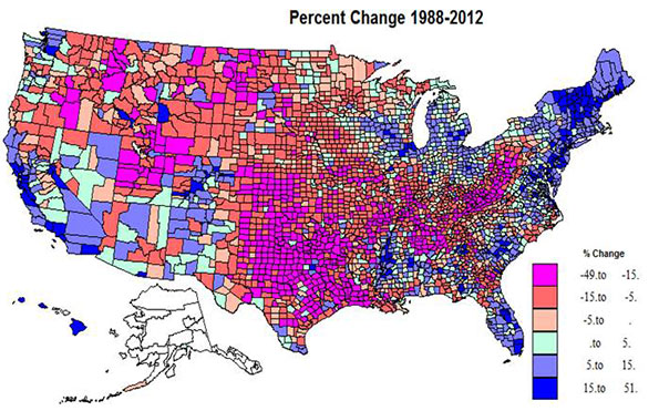
    Somewhat over half the territory of the US experienced Republican gains, in red shadings, but on average, the populations of the counties are smaller than for the Democratic counties in the blue shades. The dominant swath of red in the center third of the country from TX and LA north through the Dakotas and MN is impressive, but also prominent is the extension across the border south from MO and southern IL to KY, WV and into western PA, and then the northwestern extension to the mountain west, as far as the Cascade range. The most extreme Republican gains were in the two cores of southern Appalachia and eastern TX and OK into LA, plus UT. Most are non-metropolitan. A few most extreme R gains were in Knott, KY, 50%, Cameron, LA, 45, Mingo and Logan, WV, 44 and 43, and Kent, TX, 43%.

    Democratic gains were far more concentrated: in the northeast, in the urban Great Lakes, in much of FL, in the Black Belt of the south, in the metropolitan Left Coast, and in the southern mountain states. The highest gains were in central and suburban-exurban counties in the northeast, the west coast, and Great Lakes, and also in non-metropolitan northern New England. Lower Democratic gains were common beyond the big metropolitan cores or on the edges of the Black Belt in the south.  A few of the more extreme Democratic increases were in Clayton, GA, 51%, Rockdale, GA, 33, both suburban Atlanta, Osceola, FL, 31, Prince George, MD, 30, and Hinds, MS (Jackson), 28%. 

    Kind of change, 1988-2012, Map 2

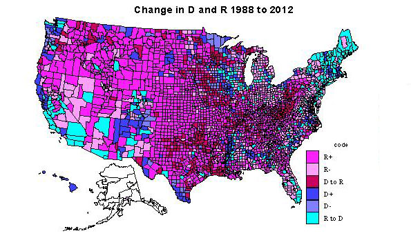
    The 1411 counties becoming even more Republican (type 1) certainly dominate the interior Plains from Canada to the Gulf and the interior, mainly non-metropolitan far northwest. There are a few counties (typically university counties) in this heartland with counties still red, but less so in 2012. The dominant areas for Republican decline (type 2) are found in the Great Lakes states, in the non-metropolitan, often exurban edges of Megalopolis (NY, PA, NJ, MD, VA). Other areas of Republican decline include rural areas in the interior west, especially areas with environmental attractions and/or increasing Latino populations, and even in parts of the traditional south, such as MS, FL, SC,NC, and VA.

    Most notable are such long term Republican strongholds as Orange, CA, Duval (Jacksonville), FL, and Maricopa, (Phoenix).  Counties which switched from Democratic to Republican (type 3) are first and most impressively in Appalachia from western PA, then including most of WV, and into western VA, central TN into northern AL, second in the TX-OK-AR-LA zone, almost totally non-metropolitan.

    Areas of Democratic gains, type 4, darkest blue, require a close look at the map, as they are mainly the metropolitan cores, most notably Los Angeles, Cook, King (Seattle), much of the New York SMSA, San Francisco-Oakland, Detroit, and Philadelphia. However there are also many majority-minority counties: in the Black Belt across the south, in a few Hispanic areas along the Rio Grande, and Native American areas across the west. Highest Democratic share gains were in metropolitan CA,  FL, in exurban New York, Philadelphia, Washington, DC, and Chicago, northern New England and select amenity areas, popular with metropolitan migrants, even in WY and ID!

    Democratic voter share declined (type 5) in  some urban cores, like Allegheny (Pittsburgh), but the most prominent areas are in farming and forestry  areas in the upper Midwest (IA, WI, MN, often adjacent to counties which switched from D to R), and traditionally D forest industry counties in OR and WA. Especially interesting are the counties switching from Republican to Democratic, type 6, most critical to understanding the connection to social liberalism. The most prominent area is northern New England and NY, and extending through Megalopolis snatching a large number of very populous suburban and EXURBAN counties (MA, CT, NY, NJ, MD, VA, PA).

    A second large swath in territory and population is in CA, switching major metropolitan-suburban counties, and also increasingly Hispanic counties to the D column. This switching of suburban and exurban counties was also prevalent in CO, OR, WA, IL, and MI, as well as in parts of the south, e.g., FL and NC. Less visible is the shift of many university counties in most parts of the country. Last and increasingly important is the shift of rural environmentally attractive areas, mostly across the west, but also in the south Atlantic, upper New England and the upper Great Lakes, in part due to retirement of urban professionals. Some of the most important switches were Riverside, San Bernardino, San Diego, Sacramento in CA; Miami and Orlando, FL; Oakland, MI; Suffolk, Bergen and Westchester (all exurban New York); Mecklenburg (Charlotte); and Marion, IN (Indianapolis).

    Absolute change in the D and R vote, 1988-2012, Map 3

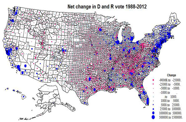
    Map 3 plots the absolute size variation in the Democratic versus Republican change, via a simple blue versus red, to assist the reader in properly interpreting Maps 1 and 2. The map highlights the tremendous concentration of Democratic gains in the northeastern Megalopolis, metropolitan California, the big cities of the Great Lakes, and Florida, versus the much more widespread pattern  of Republican gains, extensive in area but small in voter magnitude across the Plains, Mountain states, and most notably, Appalachia .

    Overall, what emerges is a picture far more subtle than simply cities versus exurbs. The bad news for Republicans is that most of their gains occur in rural areas with little population while the Democrats have consolidated their increases in more populous urban, suburban, and in some places exurban areas. Whether these trends spell the death knell for the GOP in the post-Obama period may turn on how they learn to appeal to the next generation of suburban and exurban voters – many of them Hispanic or Asian – as they enter their 30s, buy houses and start businesses. Economic issues could help here, but an emphasis on social issues, or simple anti-tax dogmatism could spell the GOP’s descent into permanent minority status.

    Table 2: Greatest Changes by State
    State 2012% 1988% % Change Code Net change (000)
    TX 42 43.7 -1.7 1 -578
    UT 25.4 32.6 -7.2 1 -268
    KY 36 44.7 -8.7 1 -254
    OK 33.3 41.6 -8.3 1 -253
    TN 39.5 41.8 -2.3 1 -234
    WV 36.3 52.4 -16.1 3 -210
    WY 28.6 39.5 -10.9 1 -62
    DE 59.6 43.5 16.1 4 114
    VT 68.2 48.3 19.9 6 115
    NV 53.3 39.2 14.1 6 141
    NH 52.9 37.7 15.2 6 157
    ME 57.8 44.3 13.5 6 171
    WA 58.2 50.8 7.4 4 435
    MA 61.7 54 7.7 4 516
    VA 51.9 39.7 12.2 6 598
    OH 51.5 43.9 7.6 6 643
    MI 54.8 46 8.8 6 739
    MD 62.6 48.5 14.1 6 756
    IL 58.6 49 9.6 6 979
    FL 50.4 38.8 11.6 6 1,036
    NJ 59 43.1 15.9 6 1,068
    NY 66.2 52.1 14.1 4 1,720
    CA 61.9 45.2 16.7 4 3,367

    Richard Morrill is Professor Emeritus of Geography and Environmental Studies, University of Washington. His research interests include: political geography (voting behavior, redistricting, local governance), population/demography/settlement/migration, urban geography and planning, urban transportation (i.e., old fashioned generalist).