Category: Suburbs

  • Dispersion and Concentration in Metropolitan Employment

    The just released County Business Patterns indicates a general trend of continued employment dispersion to the newer suburbs (principally the outer suburbs) and exurbs but also greater concentration in the central business districts of the 52 major metropolitan areas in the United States (over 1 million population in 2013). County Business Patterns is a Census Bureau program that provides largely private-sector employment data by geography throughout the nation.

    This article examines the most recent data, for 2013, with comparisons to 2007, which was the peak employment year and preceded the Great Recession, the most substantial economic decline in the United States since the Great Depression. There are also comparisons to 2010, the year in which national employment reached its lowest level (trough) before beginning what is, so far, a long and fairly arduous recovery. The analysis uses the City Sector Model (Note)

    2007-2013 Trend

    Job losses were registered in each of the five urban sectors between the employment peak of 2007 and the trough of 2010. Three of the urban sectors have recovered to above their 2007 employment levels. However, overall major metropolitan area employment remains lower by approximately 800,000. Since the 2010 trough, the largest numeric gains have been in the newer suburbs. The Central Business Districts (CBDs) of the Urban Core have recovered more than double their 2007 to 2010 numeric loss. In contrast, the balance of the Urban Core, the Inner Ring experienced a modest increase over its 2007 employment peak. The exurbs have not yet fully recovered. By far the largest losses between 2007 and 2010 were in the earlier suburbs (principally inner suburbs), where employment dropped 2.8 million and has recovered less than one half of that loss (Figure 1).

    Dispersion and Concentration

    The dispersion and concentration is most evident in the shares of employment by urban sector (Figure 3). Three of the urban sectors increased their share of metropolitan employment between 2007 and 2013. The largest increase was in the newer suburban areas, which rose from 24.7 percent to 25.6 percent of metropolitan employment. The central business districts also increased their share of employment, from 8.4 percent in 2007 to 9.0 percent in 2013. This trend is similar to the City Observatory (Joe Courtright) findings that urban cores outperformed suburbs in job growth between 2007 and 2011. The Courtright findings were for areas within three miles of the largest city center, while the findings here relate to the generally smaller CBDs (Figure 2).The gains in other sectors were at the expense of the earlier suburbs, which experienced a loss from 45.9 percent to 44.4 percent of metropolitan employment between 2007 and 2013.


    From the 2010 Trough to 2013

    Since the trough of 2010, there were numeric gains in all of the urban sectors. The gains were concentrated in the suburbs and exurbs, which accounted for 80.9 percent of the employment growth from 2010 to 2013. This nearly equals the 81.9 percent share of employment in these areas in 2007. The urban core, including the CBD and inner ring, captured 19.1 percent of the 2010 to 2013 employment growth, better than their combined 18.1 percent share in 2007 (Figure 3).

    There was also geographic concentration in the CBD gains between the 2010 trough and 2013. Approximately two-thirds of the CBD employment gain between 2007 and 2013 was in four metropolitan areas: New York, Chicago, Boston and San Francisco. Along with Seattle and Houston, these metropolitan areas account for 75 percent of the CBD growth. All of the 46 other major metropolitan areas contributed 25 percent of the gain (Figure 4).

    Between 2010 and 2013, the largest annual percentage employment gain was in the later suburbs, at 3.2 percent. The CBDs, experienced the second strongest growth at 2.9 percent. However, numeric gain in the later suburbs was more than three times that of the CBDs, due to their already much larger employment base (Figure 5).

    Returning to Normalcy?

    For decades, most employment growth has been outside the urban cores of the major metropolitan areas, as had been the case with residential population gains. The Great Recession interfered with these patterns, but normalcy may be returning. Brookings Institution Demographer William Frey recently commented on later population trends (through 2014), suggesting "renewed growth in suburban and exurban counties." The new data indicates renewed employment growth in suburban and exurban areas. At the same time, it would not be surprising for the revival in the CBDs to continue, even if the numbers are relatively small in the metropolitan area context, where the dominance of suburban and exurban job growth seems likely to continue.

    Note: The analysis is based on the City Sector Model (Figure 6), which classifies small areas (ZIP codes, more formally, ZIP Code Tabulation Areas, or ZCTAs) in metropolitan area in the nation based upon their behavioral functions as urban cores, suburbs or exurbs. The criteria used are generally employment and population densities and modes of work trip travel. The purpose of the urban core sectors is to replicate, to the best extent possible, the urban form as it existed before World War II, when urban densities were much higher and when a far larger percentage of urban travel was on transit or by walking. The suburban and exurban sectors replicate automobile oriented suburbanization that began in the 1920s and escalated strongly following World War II.

    Photo: New York: Columbus Circle (by author)

    Wendell Cox is principal of Demographia, an international public policy and demographics firm. He is co-author of the "Demographia International Housing Affordability Survey" and author of "Demographia World Urban Areas" and "War on the Dream: How Anti-Sprawl Policy Threatens the Quality of Life." He was appointed to three terms on the Los Angeles County Transportation Commission, where he served with the leading city and county leadership as the only non-elected member. He served as a visiting professor at the Conservatoire National des Arts et Metiers, a national university in Paris. Wendell Cox is Chair, Housing Affordability and Municipal Policy for the Frontier Centre for Public Policy (Canada), is a Senior Fellow of the Center for Opportunity Urbanism and is a member of the Board of Advisors of the Center for Demographics and Policy at Chapman University.

  • Land Use Regulations and “Social Engineering”

    All forms of land use regulation are explicitly “social engineering”. Full stop. Let’s acknowledge that reality as we move forward. The question is never whether we’ll be engaging in manipulating society through land use regulations, but how and why.

     Screen Shot 2015-03-30 at 1.59.06 AM


    The typical pejorative reference to “social engineering” includes things like government built subsidized low income housing or rent control imposed on private property. There are large numbers of people who find this sort of thing distasteful. I understand the objections, particularly since so much public housing has been so bad and rent control distorts the rental market. Then again, lots of for-profit housing is really bad and all sorts of other things distort rental markets.

    Screen Shot 2015-04-26 at 3.22.22 AM
    Screen Shot 2015-04-26 at 3.20.47 AM

    How about a municipality that dictates all new construction must be single family detached homes with a minimum 2,800 square feet on a lot that’s at least a quarter acre? What exactly is the logic behind that kind of land use control? Well… a particular town might want to “socially engineer” a middle class demographic in and a lower class demographic out. If only large expensive homes are available then the “wrong” kinds of people can’t live there. And their “undesirable” children can’t attend the local schools, etc.

    It’s also possible to “socially engineer” a private community so that it only includes people of a certain age… say, 55 and over. Municipal governments love retirement communities because they pay property tax, but don’t burden the town’s budget with school aged children. And most of the social services for retirement age folks are paid for by federal and state programs rather than local government. This sort of thing certainly distorts the local property market as well. So let’s be honest and say that some people like certain kinds of “social engineering” but not others.

    Screen Shot 2015-04-26 at 2.23.01 AM screen-shot-2014-10-08-at-11-12-33-am

    Screen Shot 2015-04-26 at 3.39.35 PM

    Voters in some areas value the rural agricultural quality of the landscape and don’t want to see the place paved over with new subdivisions, gas stations, and strip malls. Land use regulations are put in place with restrictions like zoning that requires new homes to be built on no less than forty acres. In addition, there are procedures that restrict new construction based on water availability, flood hazards, soil percolation, and so on. These policies work together to keep most of the land unavailable for development. These policies do in fact preserve the beauty of the open landscape, but they also restrict the supply of buildings and drive up the cost of property in the area. “Social engineering.”

    Screen Shot 2015-03-28 at 4.28.34 PM

    Screen Shot 2015-03-28 at 6.14.03 PM

    Screen Shot 2015-03-28 at 8.22.21 PM

    Screen Shot 2015-03-28 at 4.26.34 PM

    Screen Shot 2015-03-28 at 4.25.28 PM

    Other areas have pro growth policies that encourage development. Each new shopping mall, housing tract, and car dealership represents tax revenue and progress. There are a host of professional organizations that relentlessly lobby for new growth in order to promote full employment, affordable middle class homes, and a continuation of the suburban lifestyle. As property taxes rise the cost of having land sit idle becomes prohibitive just as potential profits rise. Owners are pressured into selling or developing whether they necessarily want to or not. Individual buildings sell well and bring many immediate benefits, but the long term consequences often destroy the landscape and reduce the quality of life. “Social engineering.”

    Screen Shot 2015-04-28 at 2.52.11 AM

    Screen Shot 2015-04-28 at 2.54.35 AM

    Screen Shot 2015-04-14 at 6.50.45 PM

    Screen Shot 2015-04-15 at 12.12.45 AM

    These photos show a form of development that is illegal almost everywhere in North America. The buildings all touch. That’s illegal. Some buildings have both commercial and residential uses. That’s illegal. All of these buildings have little or no parking. That’s illegal. Even at just three or four stories there’s still far too much density. That’s illegal. There’s a long list of handicap accessibility inadequacies in these buildings. That’s illegal. The streets between these buildings are much too narrow. That’s illegal. And yet these are highly desirable places to live and command premium prices on the open market in large part because they are so rare. So much so, in fact, that voters introduced rent control and other measures to help keep at least some working class people in the neighborhood. “Social engineering.”

    “Social engineering.” Use the term if you wish. But apply it evenly across the physical and political landscape.

    John Sanphillippo lives in San Francisco and blogs about urbanism, adaptation, and resilience at granolashotgun.com. He’s a member of the Congress for New Urbanism, films videos for faircompanies.com, and is a regular contributor to Strongtowns.org. He earns his living by buying, renovating, and renting undervalued properties in places that have good long term prospects. He is a graduate of Rutgers University

  • Driving Farther to Qualify in Portland

    Portland has been among the world leaders in urban containment policy. And, as would be predicted by basic economics, Portland has also suffered from serious housing cost escalation, as its median multiple (median house price divided by median household income) has risen from a normal 3.0 in 1995 to 4.8 in 2014.

    One of the all too predictable effects of urban containment policy is at least some households will drive even farther to "qualify" for mortgages than before. Single-family detached houses have been the national preference in housing in the United States (and a number of other nations) for decades. Significant "leakage" can occur as people skip over the urban growth boundaries, inside of which housing has become unaffordable. For example, after the 2010 census, San Joaquin County, with its seat of Stockton, was added to the San Francisco Bay combined statistical area (CSA). Combined statistical areas are combinations of metropolitan areas have a somewhat weaker economic connection, as defined by commuting patterns than within metropolitan areas (Note 1).

    As in the San Francisco Bay Area, more Portlanders are now commuting from outside the metropolitan area in large enough numbers that four additional, metropolitan areas are now included in the Portland CSA.

    Driving to Qualify from Corvallis and Albany

    Perhaps most notable addition is Corvallis, seat of Benton County and home of Oregon State University. Corvallis is rather exurban to Portland, even though it is now officially in Portland’s commuting belt. At least 15 percent of resident workers in Benton County travel to one of the central counties of the Portland metropolitan area (Clackamas, Multnomah and Washington in Oregon and Clark in Washington) or vice versa. This is no 30 minute commute. Corvallis is 85 miles from downtown Portland. It is 65 miles from the nearest potential Portland MSA employment in southern Clackamas County. Further, the Corvallis metropolitan area is not adjacent to the Portland metropolitan area. To get to the Portland metropolitan area by the most direct route, a Benton County commuter passes through two other metropolitan areas Albany and Salem.

    This would be a very long commute, even by comparison to the nation’s largest metropolitan regions. Take New York, for example. The New York CSA extends from outside of New Haven, Connecticut, to beyond Allentown, Pennsylvania, to beyond Toms River, New Jersey and includes all of Long Island. Yet some of the farthest reaches of New York are no closer to Manhattan than Corvallis to Portland. These include Bethlehem, Pennsylvania, New Haven, Connecticut, and Port Jervis, New York. Philadelphia, beyond the New York CSA, is only slightly farther away (90 miles).

    Or, consider Los Angeles, which its undeserved reputation for sprawl. The Los Angeles CSA is the second largest in the nation. Yet, Banning, which sits on the mountain pass leading to Palm Springs is 85 miles from Los Angeles. San Clemente, the southernmost point in the CSA is only 60 miles from downtown. The expansive Portland commuter shed suggests that, in some ways, Portland, already far less dense, is also more sprawling.

    Expansions for Linn, Marion, Polk and Cowlitz Counties

    The Portland CSA added two more metropolitan areas in the Willamette Valley. Albany (Linn County), only about 15 miles closer than Corvallis is one. Salem, the state capital, was also added. Salem includes Marion and Polk counties and is 45 miles from Portland. To the north, Longview, Washington (Cowlitz County) was also added. By comparison with Corvallis, Longview seems close, at less than 50 miles from Portland.

    The Portland CSA now stretches 175 miles from the southern Linn County border to the northern Cowlitz County border. There it has collided with the southerly expanding Seattle CSA, which now includes Lewis County (Centralia-Chehalis), 85 miles from downtown Seattle.

    However, this does not imply 175 miles of continuous urbanization. Like all metropolitan areas, combined statistical areas, including Portland, have far more rural land than urban land.

    Dispersing in the Metropolitan Area

    Perhaps the greatest irony is that an “urban containment” policy designed to prevent sprawl could well be accelerating it. Higher prices, in part due to this policy, have forced more people to look ever further for housing that is affordable.

    Approximately 98 percent of Portland’s population growth between 2000 and 2011 occurred in the suburbs (Note). There was a small, but significant percentage growth around the central business district, but its addition of fewer than 7,000 residents paled by comparison to the more than 325,000 added to the suburbs and exurbs. The balance of the urban core, (the inner ring) grew by little more than 100, which is glacial for an urban sector with more than 200,000 residents (less than 0.1 percent).

    None of this should be surprising. The attractive inner city developments, especially the Pearl District, do not provide for the economic needs or wants of most people, as the population trend data indicates. Few households are drawn to buy less than one-half the space they want at nearly three times the price per square foot they would pay in outer suburbs like Forest Grove, Wilsonville or Hazel Dell.

    Job Dispersion

    Fortunately for both the suburbanites and an exurbanites, Portland’s job market also dispersed between 2000 and 2011, meaning that a smaller percentage of commuting was to downtown or the balance of the urban core (Figure 3). That makes it easier to drive to qualify. It turns out that while planners plan, people usually make choices that suit their basic needs rather than those of a particular urban ideology.

    Note 1: Metropolitan areas are defined by commuting patterns. Oversimplifying, metropolitan areas are organized around central counties that contain all or part of large urban areas ("built-up" urban areas). All such counties are included in the metropolitan area as well as any counties that have a strong commuting interchange with the central counties. For example, in the case of Portland, the central counties are Multnomah, Washington and Clackamas in Oregon and Clark in Washington. Columbia and Yamhill in Oregon are outlying counties as well as Skamania in Washington. Combined statistical areas are created from combinations of metropolitan areas that meet a weaker commuting interchange threshold. A complete description of the commuting thresholds that apply to metropolitan areas and combined statistical areas is found here.

    Note 2: Based on the City Sector Model (Figure 4), which classifies small areas (ZIP codes, more formally, ZIP Code Tabulation Areas, or ZCTAs) in metropolitan area in the nation based upon their behavioral functions as urban cores, suburbs or exurbs. The criteria used are generally employment and population densities and the extent of transit, versus car use. The purpose of the urban core sectors is to replicate, to the best extent possible, the urban form as it existed before World War II, when urban densities were much higher and when a far larger percentage of urban travel was on transit. The suburban and exurban sectors replicate automobile oriented suburbanization that began in the 1920s and escalated strongly following World War II. The data from 2000 is from the 2000 census. The 2011 data is from the 2009-2013 American Community Survey (mid-year 2011).

    Photo: Benton County Courthouse, Corvallis (in the Portland commuter shed) by Gregkeene (Own work) [CC BY 3.0 us or CC BY-SA 3.0], via Wikimedia Commons

    Wendell Cox is principal of Demographia, an international public policy and demographics firm. He is co-author of the "Demographia International Housing Affordability Survey" and author of "Demographia World Urban Areas" and "War on the Dream: How Anti-Sprawl Policy Threatens the Quality of Life." He was appointed to three terms on the Los Angeles County Transportation Commission, where he served with the leading city and county leadership as the only non-elected member. He served as a visiting professor at the Conservatoire National des Arts et Metiers, a national university in Paris. Wendell Cox is Chair, Housing Affordability and Municipal Policy for the Frontier Centre for Public Policy (Canada), is a Senior Fellow of the Center for Opportunity Urbanism and is a member of the Board of Advisors of the Center for Demographics and Policy at Chapman University.

  • Silicon Valley: Jelly in the Jam

    My last post was about how Silicon Valley is evolving into an urban form that’s not quite leafy and open enough to be a suburb anymore, but not really vibrant and compact enough to be a proper city either. “Too thin to be jelly. Too thick to be jam.” The story got an unusually large number of visits. I received some well informed comments that touched on the reality that Silicon Valley is a big place and I shouldn’t generalize. Palo Alto is very different from Fremont and so on. It’s not all isolated corporate enclaves. Fair enough. So here’s a quick follow up that explores the jelly in the jam.

    Screen Shot 2015-04-16 at 2.29.01 PM
    Google


    Screen Shot 2015-04-15 at 10.26.37 PM Screen Shot 2015-04-15 at 10.25.31 PM Screen Shot 2015-04-15 at 10.30.58 PM Screen Shot 2015-04-15 at 10.27.11 PM Screen Shot 2015-04-15 at 10.25.01 PM

    This is the town of San Carlos twenty five miles south of San Francisco and an equal distance north of San Jose. We all have our biases. I’m partial to the kind of walkable Main Street small town that was common everywhere a century ago. I like a place with mom and pop shops and a mix of modest cottages and grand stately homes a few blocks in each direction. For me that’s the perfect balance of city and suburb. A Main Street provides a broad range of activities while accommodating pedestrians, cyclists, and cars without prejudice. These places can also be well served by public transit – not so much to get around town, but to efficiently connect people to other towns that are also walkable. If these small towns are then surrounded by working farms and a bit of nature all the better. Toss in a nearby city for access to culture and jobs and I’m in heaven. But such places are hard to come by in America these days. Fortunately, Silicon Valley has a string of such places along the historic rail line like little gems imbedded in the post WWII sprawl.

    Screen Shot 2015-04-17 at 4.55.51 AM
    Google Screen Shot 2015-04-17 at 4.57.12 AM
    Google   Screen Shot 2015-04-15 at 10.14.31 PM Screen Shot 2015-04-15 at 10.16.33 PM Screen Shot 2015-04-15 at 10.16.08 PM Screen Shot 2015-04-15 at 10.17.11 PM

    San Carlos sits between two major freeways and right on El Camino Real and the CalTrain line that serves the entire peninsula. It’s possible to navigate most parts of San Carlos as a pedestrian, hop on a train or a bus, or drive to just about everything in the Bay Area. You have a lot of transportation choices that are equally good. What’s more important to me personally is that being a pedestrian or cyclist is actually pleasant in San Carlos. Transit within most of the town itself is entirely unnecessary. There are areas up in the hills with a lot of twisting cul-de-sacs that are more manageable in a car, but there’s at least a continuum of housing options including small apartment buildings next to shops downtown. People can select their own personal sweet spot.

    Screen Shot 2015-04-15 at 10.12.50 PM Screen Shot 2015-04-15 at 10.13.14 PM Screen Shot 2015-04-15 at 10.13.31 PM Screen Shot 2015-04-15 at 10.13.43 PM Screen Shot 2015-04-15 at 10.14.00 PM Screen Shot 2015-04-15 at 10.14.16 PM

    There are relatively “affordable” $950,000 bungalows (this is the Bay Area) while the big fancy homes up on the hill with water views sell for $7,000,000. I understand these numbers seem ridiculous to people in other parts of the country, but San Carlos has immediate access to very well paid jobs so these prices are justified based on local incomes. If you have the money it’s a great place to raise a family with excellent public schools and a safe clean environment. It’s also a pretty fabulous retirement spot if you decide to age in place. And it isn’t terrible to be a young single person in San Carlos either. That little downtown and the train station make all the difference. You’ll find the same basic arrangements in similar older towns along the train line: Burlingame, San Mateo, Menlo Park, Mountain View, and so on.

    Screen Shot 2015-04-18 at 4.09.16 PM Screen Shot 2015-04-18 at 4.08.41 PM Screen Shot 2015-04-18 at 4.08.13 PM Screen Shot 2015-04-18 at 4.09.02 PM

    Here’s another point that’s often overlooked by city planners obsessed with making everything pretty or attracting the right demographic to their town. Every town needs some ugly utilitarian stuff. Even in a place where schmaltzy tract homes sell for a million bucks people still need plumbers, electricians, and low grade warehouses. If a town zones or redevelops these areas out of existence they induce more people to get into their cars and trucks to commute to distant industrial parks in a region where freeway traffic already comes to a complete halt during most business hours. And these suburban warehouse districts are also excellent buffers from the ugliness and noise of freeways and rail lines. No one wants to live pressed up against a diesel train or freeway interchange full of tractor trailers. It’s often a mistake to see these light industrial areas as redevelopment opportunities for dense infill housing.

    Screen Shot 2015-04-17 at 7.03.28 AM
    Google

    Some of the comments I received from my last post mentioned recent projects that brought transit and density to some Silicon Valley suburbs. This is San Bruno, home to tech companies like YouTube. It has all the same advantages of San Carlos: immediate access to good jobs and nearby culture, the same freeways, El Camino Real, a BART rail station, similar single family housing stock, and so on. But the two towns are very different. I would love to live in San Carlos, but I could never live in San Bruno. Here’s why.

    Screen Shot 2015-04-17 at 7.16.22 AM Screen Shot 2015-04-17 at 7.22.27 AM Screen Shot 2015-04-17 at 7.17.37 AM Screen Shot 2015-04-17 at 7.11.50 AM 

    San Bruno was built after cars had come to dominate the landscape. There never was much of a town and everything built over the last sixty or seventy years has been organized around the freeways. A rail station in a shopping mall parking lot that’s cut off by massive twelve lane roads is just miserable for pedestrians and of little use to people in cars. There are plenty of people on foot in San Bruno, but they’re very poorly served in this environment.

    Screen Shot 2015-04-17 at 5.16.41 AM
    GoogleScreen Shot 2015-04-17 at 7.11.21 AM Screen Shot 2015-04-17 at 7.14.03 AM Screen Shot 2015-04-17 at 7.15.51 AM Screen Shot 2015-04-17 at 7.11.09 AM Screen Shot 2015-04-17 at 7.13.45 AM

    Density and transit all by themselves do nothing for a town if the public realm is completely car oriented. These new infill apartment buildings are perfectly respectable and I’m sure they’re very comfortable on the inside. But once you step outdoors you find yourself in the left over space between parking lots and highways. You can physically walk to the supermarket and the dentist and the train station so it checks off a lot of boxes on the “Smart Growth” list, but you feel like a social outcast as you schlep around the edge of speeding vehicles. The scale is out of whack with human needs because the needs of cars always come first. Adding apartments and giant parking garages to a suburban environment also adds that many more cars to the already congested roads. This kind of development bothers people who want a traditional suburb and it falls short for people who want a genuine urban experience. As I walked around this cluster of apartments I thought about how it could have been done better. What if the ground floors had shops in them? What if the sidewalks were wider? What if the roads were more narrow? What if the buildings were organized around outdoor public space instead of having the greenery sprinkled around the edges in useless landscaped berms and highway medians?

    Screen Shot 2015-04-17 at 5.19.18 AM
    Google Screen Shot 2015-04-18 at 12.36.51 PMScreen Shot 2015-04-18 at 12.26.02 PMScreen Shot 2015-04-18 at 12.25.06 PM Screen Shot 2015-04-18 at 12.42.29 PM

    As I made my way from one suburban train station to the next I discovered another infill project that actually made an effort to do many of the things on my list. Wide sidewalks? Check. Meaningful public space? Check. Shops on the ground floor? Check. At least a few narrow side streets? Check. Train station around the corner? Check. This place was significantly better. But… context is important.

    Screen Shot 2015-04-17 at 9.24.59 PM
    Google

    Here’s a Google Earth view of the area in which I colored the roads, surface parking lots, and multi-story parking garages blue. What would you call that building to pavement ratio? It looks like 60/40 to me in favor of pavement. The largest garage is owned by BART and is designed to collect suburban drivers and funnel them into the city by train for the last little stretch of the commute. This kind of train station is a highway patch to relieve traffic congestion in the city. It has nothing at all to do with “transit” or any kind of urbanism. It’s a clumsy and expensive prosthetic limb for cars and highways.

    Screen Shot 2015-04-18 at 12.36.19 PM Screen Shot 2015-04-18 at 12.35.53 PM Screen Shot 2015-04-18 at 12.34.29 PM Screen Shot 2015-04-18 at 12.20.32 PM

    Here’s what it looks like on the ground. This well intentioned mixed use infill project is an island in the middle of the usual suburban sprawl. I’m quite certain that the people who live in the single family homes across the street drive to the Trader Joe’s market even though it’s only a block away. If I had to choose a spot to live this place is marginally better than San Bruno, but still an order of magnitude worse than San Carlos. And I should point out that San Carlos has a downtown of mostly one story buildings surrounded by much smaller apartment buildings than these and a majority of detached single family homes. “Density” has nothing to do with the success or failure of good urbanism.

    Screen Shot 2015-04-18 at 12.37.48 PM Screen Shot 2015-04-18 at 12.41.36 PM Screen Shot 2015-04-18 at 12.33.46 PM Screen Shot 2015-04-18 at 1.50.29 PM Screen Shot 2015-04-18 at 1.51.16 PM

    Here’s the sad part. Even after what must have been an heroic effort on the part of everyone involved in getting this project built it still fails to cultivate enough foot or vehicular traffic to support small shops. The Trader Joe’s and the Starbucks are doing well enough, no doubt feeding off the morning and evening commuter flows from the BART station. And there is a small dry cleaner that’s managing to get by so far. But the rest of the storefronts are empty and have been so from the get go. Too thick to be jam. Too thin to be jelly. I keep wanting suburban retrofits to work, but they rarely do. The typical suburban chassis makes incremental urbanism a hit or miss affair. Mostly miss. The question is… what are the alternatives? Do we just let the cost of the existing single family homes rise until people and businesses pick up and move to Scottsdale or Orlando in search of economic relief? Do we let taxes rise on all the strip malls and gas stations until the necessary funds appear to repave all the twelve lane roads out in front of them? Or is mediocre the best we can expect from half assed infill projects that do the best they can under the circumstances?

    John Sanphillippo lives in San Francisco and blogs about urbanism, adaptation, and resilience at granolashotgun.com. He’s a member of the Congress for New Urbanism, films videos for faircompanies.com, and is a regular contributor to Strongtowns.org. He earns his living by buying, renovating, and renting undervalued properties in places that have good long term prospects. He is a graduate of Rutgers University.

  • Growth and the Suburban Chassis

    I tend to explore what happens to suburbs as they age and begin to decline. But this time I’m going to explore what happens to suburbs that thrive and continue to grow and work their way up the value chain. It isn’t exactly what many people expect. “Be careful what you wish for.”

    A friend moved from San Francisco to San Jose this winter. Now that I’ve been visiting her on a regular basis I have an excuse to poke around. It’s actually pretty fascinating.

     Screen Shot 2015-04-08 at 1.35.48 AM Screen Shot 2015-04-08 at 1.36.12 AM

    A friend moved from San Francisco to San Jose this winter. Now that I’ve been visiting her on a regular basis I have an excuse to poke around. It’s actually pretty fascinating. Her tract home was built in 1947 on land that had previously been orchards. By the 1960’s the area had become home to military and aerospace firms that then spun off civilian electronics companies in little low rise office parks. By the 1980’s the area had officially emerged as Silicon Valley. Oracle, Apple, Facebook, Hewlett-Packard, Microsoft, Google, eBay, Juniper Network, PayPal… these companies stretch out for miles in every direction. It’s an economic development dream for local governments. While there are a dozen separate municipalities (Redwood City, Cupertino, Mountain View, Palo Alto, Santa Clara, Fremont, Los Gatos, and so on) the entire southern end of San Francisco Bay is essentially one giant suburban corporate office park blur.

    Screen Shot 2015-04-11 at 3.49.19 PM Google Screen Shot 2015-04-08 at 1.09.30 AM Screen Shot 2015-04-08 at 1.06.01 AM Screen Shot 2015-04-08 at 1.10.00 AM

    Here are three examples of the kinds of commercial buildings that served earlier waves of businesses in Silicon Valley. They were probably built between the 1970’s and 1990’s. This office park happens to be in the town of Sunnyvale, but nearly identical arrangements can be found all over the Bay Area. In fact, I bet there are buildings just like these in whatever town you live in too whether it’s in Florida, Michigan, or Utah.

    Screen Shot 2015-04-11 at 4.25.53 PM GoogleScreen Shot 2015-04-08 at 1.52.00 AM   Screen Shot 2015-04-08 at 1.09.00 AM

    Here’s what’s happening to these office parks as the economy heats up. The land has become very valuable and it makes good economic sense to build new eight or ten story office blocks on vacant land and surface parking lots. It’s good for the tech companies who want to expand their existing operations. It’s good for the land owners who can cash in on the sale. It’s good for the city since it brings increased tax revenue to the municipal coffers. And it’s good for people looking for high paying jobs, both in the initial construction phase and later office workers and support staff. There are, of course, also problems associated with this kind of redevelopment, which I’ll get to in a minute.

    Screen Shot 2015-04-11 at 6.33.25 PM Google Screen Shot 2015-04-11 at 6.32.52 PM  Screen Shot 2015-04-08 at 1.52.32 AM

    Here’s another construction site directly across the street. The old one story buildings were scraped and are being replaced by parking decks and office blocks. These are all part of the same company that is experiencing rapid expansion and doubling their corporate campus that already has over a million square feet of space. These few buildings alone will ultimately house another eight hundred well paid workers. Part of the long term plan for this site is to include a two hundred room hotel for business travelers associated with the company. Perhaps that new hotel will replace the existing one story motel.

    Screen Shot 2015-04-11 at 5.26.01 PM Google   Screen Shot 2015-04-11 at 8.04.09 PM Screen Shot 2015-04-11 at 8.04.26 PM Screen Shot 2015-04-11 at 7.27.03 PM Screen Shot 2015-04-11 at 7.26.05 PM

    Here’s the bigger picture. Zooming out on Google Earth you can see how multiple older office parks are being absorbed and folded in to much larger more unified corporate complexes. The scale of the construction is too large to capture even with a macro lens on the ground. These tech workers were walking between buildings at lunchtime and it was quite a trek. This kind of land use intensification is actually very similar to how old orchards were converted to residential subdivisions. Land values increased and property was pressed into service for tract homes which were much more lucrative than apricots or prunes. The same process is now unfolding at the next higher economic level with office parks. If I hadn’t taken these photos myself I would swear some of them were computer generated. The buildings have such a generic AutoCAD look about them. And there are dozens of them at this one site alone.

    Screen Shot 2015-04-11 at 7.44.08 PM Google   Screen Shot 2015-04-11 at 8.14.31 PM  Screen Shot 2015-04-08 at 3.40.10 AM Screen Shot 2015-04-13 at 5.58.20 PM 

    Here’s another corporate campus. This one is in Redwood City. Everywhere you look the old one and two story buildings are being razed and replaced with significantly larger buildings. The schmaltzy motels, strip malls, and office parks of previous decades have been upscaled both physically and economically. This was once open water and marshland that was filled, dredged and contoured in the 1960’s, but has since been redeveloped to a higher value use.

    Screen Shot 2015-04-13 at 5.42.01 PM Google Screen Shot 2015-04-13 at 5.43.28 PM Google

    Companies are fond of the “theme park” suburban campus where the environment is akin to an all inclusive resort destination for workers. These are islands – sometime literal islands – in the suburban landscape. From the air these corporate campuses look a lot like Epcot Center at Disney World or a regional shopping mall off the side of a highway.

    Screen Shot 2015-04-14 at 9.24.20 AM Google Screen Shot 2015-04-14 at 9.12.06 AM Google

    Screen Shot 2015-04-14 at 9.22.14 AM Google  Screen Shot 2015-04-14 at 9.13.02 AM Google

    This inward looking mega block form of development is common in suburbia. The images above show a college, an amusement park, and a corporate office park. When you’re inside one of these bubbles it’s actually very pleasant. But getting to and from these locations is pretty much impossible without a car. Even if you live directly across the street walking wouldn’t work all that well. Add in the fact that many of the nearby residential subdivisions are gated communities and that each of these bubbles are separated by highways, walls, and drainage canals… a car becomes essential. That loads the road network with an insane amount of traffic. If the one story buildings incrementally ramp up to eight story buildings you have a very big transportation problem on your hands.

    Screen Shot 2015-04-11 at 9.05.27 PM Google Screen Shot 2015-04-08 at 2.00.16 AM Screen Shot 2015-04-11 at 9.15.54 PM Screen Shot 2015-04-08 at 1.56.54 AM

    Here’s an intersection halfway between my friend’s house and the corporate campus where she works. It’s a typical suburban commercial corridor lined with standard one story buildings of the office park and light industrial variety that were built anytime from the 1960’s to the 1990’s.

    Screen Shot 2015-04-11 at 9.16.34 PM Screen Shot 2015-04-08 at 1.59.10 AM Screen Shot 2015-04-11 at 9.17.10 PM Screen Shot 2015-04-13 at 8.24.15 PM Screen Shot 2015-04-08 at 1.58.53 AM Screen Shot 2015-04-08 at 2.00.03 AM

    Here’s what’s happening all around Silicon Valley. The small old buildings are being replaced with much larger ones. These aren’t exactly skyscrapers, but they’re significantly more substantial than what was there before.

    Screen Shot 2015-04-13 at 7.26.36 PM Google Screen Shot 2015-04-12 at 11.56.58 AM Screen Shot 2015-04-12 at 11.31.13 AM

    The same thing is happening with residential property. The old suburban roads lined with gas stations and Kwickie Marts are giving way to multi-story apartment buildings with underground parking decks. These two photos show two sides of the same street. This spot is immediately adjacent to a 1950’s residential subdivision of single family homes. The apartment building fills a need for workforce housing at a high, but tolerable price. One bedroom apartments in this neighborhood rent for about $2,000 a month. Two bedroom units rent for closer to $3,000. If you want to buy an actual house the bargain basement fixer uppers start at $600,000. There are a lot of people in the area who can afford to carry a mortgage of that size, but the problem is often the down payment. Twenty per cent of $600,000 is $120,000. That’s a hurdle many people struggle with. I’ve seen some very nice double wide trailers for sale in the $320,000 range, but that doesn’t include the land under the trailer which you would still need to rent. So rental apartments and condo complexes are in fact necessary in this area if many workers are to live anywhere near where the jobs are.

    Screen Shot 2015-04-13 at 5.16.11 PM Google

    That brings us to some of the serious problems with an economically successful suburb. Silicon Valley, as the name suggests, is hemmed in by mountains and water. All the flat, easily developed land has already been built on in the standard suburban fashion. Over the decades highways have been built through mountain passes to access new land on the other side of these mountains and many people and businesses have expanded outward to the far edges where possible. But the resulting transportation bottlenecks and commute times are severe. Driving to and from Silicon Valley to the outer outer outer suburbs is like pouring molasses through a funnel. People are willing to pay a lot extra to not have to endure that schlep every day. In theory public transportation could ease the commute for many people, but the dispersed development pattern guaranties that transit will never be efficient or cost effective since most people need to drive from their house to a transit center and then take a shuttle bus to the office at the other end of the train line. Living closer to work is a better option for many people. If you have a million dollars on hand you can buy a nice big home with a front lawn and swimming pool in the back yard. Many people in the area do. The median income in Silicon Valley for people with a bachelor’s degree is $95,000 a year. That’s the median, so half the working population earns more than that. A million dollar house is within reason, particularly if there are two incomes per household to carry the mortgage. If not, living in a condo or apartment complex is the next best option.

    Screen Shot 2015-04-08 at 3.41.17 AM Screen Shot 2015-04-08 at 3.41.49 AM Screen Shot 2015-04-13 at 8.29.38 PMScreen Shot 2015-04-13 at 8.28.45 PMScreen Shot 2015-04-13 at 8.29.00 PM 

    From my perspective these intensifying suburbs are in an adolescent phase of development. They are rapidly losing the qualities that people like about the suburbs: open space, privacy, convenience, quiet, lower cost, ample free parking, and so on. But they aren’t yet delivering the things people like about cities: culture, vibrant street life, walkability, convenient public transportation, night life, and such. I stopped and took photos of large numbers of tech workers walking along the side of the eight lane highways at lunchtime. There isn’t anyplace for these folks to walk to. There’s nothing but parking lots, highway fly-overs, gas stations, landscaped berms, and convenience stores as far as the eye can see. When I ask the workers where they’re going they say they’re just stretching their legs and getting some air. They eat lunch (and very often breakfast and dinner) inside their office compounds in subsidized cafeterias. Perhaps in another thirty years the transformation from suburb to something more vital may be complete. Given the suburban chassis these places inherited I don’t see how the underlaying infrastructure will ever support anything other than a bad compromise.

    Joel Garreau calls places like this Edge City: a place that has a suburban form but at an urban density. Driving private cars is no longer convenient here anymore, but transit will never function well either. Jobs are plentiful, but housing is too expensive. It lacks the privacy and peace of a good suburb, but is deficient in the vibrancy and culture available in a real city. It’s too thick to be jam, but too thin to be jelly. 

    John Sanphillippo lives in San Francisco and blogs about urbanism, adaptation, and resilience at granolashotgun.com. He’s a member of the Congress for New Urbanism, films videos for faircompanies.com, and is a regular contributor to Strongtowns.org. He earns his living by buying, renovating, and renting undervalued properties in places that have good long term prospects. He is a graduate of Rutgers University.

  • Southern California Housing Figures to Get Tighter, Pricier

    What kind of urban future is in the offing for Southern California? Well, if you look at both what planners want and current market trends, here’s the best forecast: congested, with higher prices and an ever more degraded quality of life. As the acerbic author of the “Dr. Housing Bubble” blog puts it, we are looking at becoming “los sardines” with a future marked by both relentless cramming and out-of-sight prices.

    This can be seen in the recent surge of housing prices, particularly in the areas of the region dominated by single-family homes. You can get a house in San Francisco – a shack, really – for what it costs to buy a mansion outside Houston, or even a nice home in Irvine or Villa Park. Choice single-family locations like Irvine, Manhattan Beach and Santa Monica have also experienced soaring prices.

    Market forces – overseas investment, a strong buyer preference for single-family homes and a limited number of well-performing school districts – are part of, but hardly all, the story. More important may be the increasingly heavy hand of California’s planning regime, which favors ever-denser development at the expense of single-family housing in the state’s interior.

    Read the entire piece at The Orange County Register.

    Joel Kotkin is executive editor of NewGeography.com and Roger Hobbs Distinguished Fellow in Urban Studies at Chapman University, and a member of the editorial board of the Orange County Register. He is also executive director of the Houston-based Center for Opportunity Urbanism. His newest book, The New Class Conflict is now available at Amazon and Telos Press. He is also author of The City: A Global History and The Next Hundred Million: America in 2050.  He lives in Los Angeles, CA.

    Photo by Downtowngal (Own work) [CC BY-SA 3.0 or GFDL], via Wikimedia Commons

  • Dispersion in Europe’s Cities

    For any who had been following demographic trends closely in Western Europe, it is long been obvious that suburbanization was following generally the same track as in Canada (more than 75 percent suburban), Australia and the United States (85 percent suburban). Nearly all growth in the major cities has been in the suburbs for the last four decades.

    The massive postwar automobile oriented suburbanization of Europe started a bit later than in the Western offshoots of the British Empire as the fabled economic historian Angus Maddison called them. It took a while for Western Europe to recover from World War II, but by 1970 much had been restored.

    This article reviews citywide population trends, divided into their core and suburban (or exurban) components from 1971 to 2011. This is a far more complicated exercise than reviewing the urban trends of Canada, Australia, and the United States. Ten years ago I published an examination of European trends relying principally on using data from the Ranally Metropolitan Areas, which had been established by my friend Richard Forstall, then at Rand McNally. Metropolitan areas are particularly difficult to compare across international lines because the few nations that designate them use different criteria and most nations do not designate them at all.

    Regretfully, the internet and perhaps other commercial considerations made the Ranally Metropolitan Areas a thing of the past.

    Data Difficulty in Western Europe

    The only source that approaches consistency is the United Nations Urban Agglomerations (urban areas) list. In its latest iteration the list includes data from 1950 through projections to 2030 in five year increments for approximately 1700 cities around the world. But, the United Nations must rely on member states to provide the information, which is often not urban agglomeration data at all.

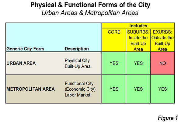
    Some nations report urban area data. Others report metropolitan area data. Urban areas and metropolitan areas are not the same thing. Urban areas are built up areas defined by the extent of the urban form, rather than by jurisdictional boundaries (see Demographia World Urban Areas). Metropolitan areas encompass both the urban area and the economically connected areas to the outside (exurbs). The difference is that urban areas do not include exurbs and metropolitan areas do (Figure 1).

    Some nations report only core municipality data, which is incomplete. Characterizing cities as only the core is rather like declaring a leg or a lung to be the same thing as a human body. These nations include Germany and Austria. Data for Valencia, Spain is also for the core municipality only.

    Perhaps the best source for citywide trends over the last 40 years in Western Europe is the United Nations data. The results are reported for urban areas and metropolitan areas, ignoring the irrelevant reported core data. Cities are included that had a population of 750,000 or more in any year from 1970 to 2010 on the UN World Agglomerations list. As of 2011, there are 24 urban areas and 16 metropolitan areas with comparable United Nations data (Table).

    How the Cities have Dispersed

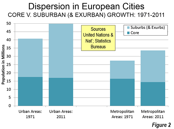
    Among the urban areas, the suburbs monopolized population growth over the period (1971 to 2011). Overall, the 24 urban areas increased their population by 9.1 million residents. This was the combination of a 9.7 million increase in the suburbs and a 600,000 loss in the cores. With the core losses, the suburbs accounted for 107% of the urban area growth.

    The monopolization of suburban and exurban growth was even greater in the 16 metropolitan areas. The overall citywide population increase was 6.2 million. This included 8.2 million in the suburbs and exurbs and the loss of 2.1 million in the cores.

    Combining these two different urban conceptions for statistical purposes shows how dominant suburban and exurban growth has been. In 1971, the cores and suburbs had about the same population. By 2011, the suburbs had grown to have 60% more residents than the cores (Figure 2).

    Some of the disparities were large. In Madrid, the suburbs grew 450 percent between 1971 and 2011, compared to only 5 percent in the core. In Toulouse, the suburbs grew 327 percent, while the core edged up only 20 percent, while in Zurich, the suburbs grew 186 percent compared to the core decline of 12 percent.

    Overall, core population performance exceeded that of the suburbs in only three of the 40 cases. The most significant is slow-growing Birmingham, which is closing in on its 1951 peak. Then there is Liverpool, which is managed to drop from the population peak of more than 850,000 in 1931 to under 475,000 in 2011. Liverpool’s loss over the 40 years was even less percentage wise than that of the suburbs. The core of Southampton also grew faster than the suburbs.

    Core Resurgence

    At the same time, it notable cores have reversed their previous loss patterns in recent years. Some resurgent cores remain well below their much earlier peaks. The ville de Paris has regained little more than 100,000 of its 800,000 loss since 1921. Inner London (Note) has regained much more (800,000), but still needs another 1.3 million to restore its 1901 peak (Outer London is so suburban that it provided much of the ammunition for the British anti-suburban movement). Others cores, like Stockholm and Madrid have risen above previous peaks.

    As in the United States, this urban resurgence should not lead to a perception that suburbanites are "flocking" to the urban cores. Domestic migration data continues to show net population movements from the cores to the suburbs and exurbs. Much of the resurgence has been propelled by international migration since enlargement of the European Union (such as from the growing London core), which has virtually eliminated westward barriers to immigration from the less affluent former Soviet satellites. Even the core of Stockholm, now at its population peak, has lost domestic migration to the suburbs in Stockholm County in each of the last five years according to Statistics Sweden data.

    Earlier Core Troughs

    The forty-year perspective masks some huge core population losses that occurred earlier. Perhaps the most spectacular is Copenhagen, which dropped from 768,000 in 1950 to 464,000 in 1992, for a percentage loss near that of Detroit from 1950 to 1990. Copenhagen’s population loss was 40 percent, compared to Detroit’s 44 percent (See: Shrinking Cities, Chapter 2). Since 1992, the core of Copenhagen has made up only a quarter of its loss since 1950.

    The core of Glasgow also suffered earlier losses. In 1931, the core municipality had a population nearing 1.1 million. By 1971, Glasgow became the first core municipality in the world to fall below 1,000,000 population after having achieved that status. Glasgow has since been followed by Naples, Turin and Detroit. Glasgow increased its population modestly after 2001, to just under 600,000.

    The Missing Cities

    What can be said about Germany and Austria, which do not provide data for either urban areas or metropolitan areas? If such data were available, it would likely show the same general trends. By the early 2000s, cores such as Berlin, Dresden, Frankfurt, Hamburg, Leipzig, Munich and Stuttgart had lost population from their peaks. Between 1987 and 2001, all growth in the Rhine-Ruhr, Western Europe’s third largest city, was in the suburbs and exurbs. This area, which defines the very term conurbation, may have been the first truly polycentric metropolitan area in the world, with its historic municipalities like Essen, Dusseldorf, Bochum, Gelsenkirchen, Oberhausen, Dortmund, Duisburg, Dusseldorf and Wuppertal.  Vienna reached its population peak in 1910,when  capital of the Austro-Hungarian under Emperor Franz Josef.

    Better Data Ahead

    Meanwhile, the state of urban statistics is improving significantly in Europe. It is to be expected that historical data would be non-comparable and cumbersome with Europe’s multiple nations. However, Eurostat now publishes its own, consistent metropolitan area data. Generally data is available back to the early or mid 2000s, which will make the lives of interested statisticians better in the future.

    The suburbanization of Europe may be surprising to New World tourists, who rarely venture beyond the historical cores. I called this the Louvre Syndrome, which describes New World tourists who jealousy wonder why their cites cannot look like attractive European cores, but never experience, predictably,  their extensive and   less historically appealing  suburbs. And why should they? Americans and Canadians go to Europe to see what’s different, not what’s similar.

    What is similar is that the cities of Europe, like those in Japan and the New World have dispersed as they have become more affluent, a dynamic pointed out by Robert Bruegmann in Sprawl: A Short History. There is also considerable dispersion going on in developing world cities. There is also an imperative to disperse the inhuman densities and living conditions in many parts of African, Asia and South America. These include shantytowns like Dharavi in Mumbai, Kibera in Nairobi, Rio’s notorious favelas and in Manila, with its all too frequent fires that destroy thousands of homes at once.

    Core & Suburban Growth in Cities
    Western Europe: 1971-2011
    Urban Areas (Urban Agglomerations) and Metropolitan Areas
    Population in 000s 1971 Population 2011 Population
      UA/MA Core Suburbs UA/MA Core Suburbs
    URBAN AREAS (URBAN AGGLOMERATIONS)      
    Amsterdam 938 820 118 1,064 780 284
    Athens 2,535 862 1,673 3,089 664 2,425
    Birmingham 2,369 1,013 1,356 2,446 1,086 1,360
    Bordeaux 590 254 336 853 239 614
    Dublin 783 569 214 1,114 528 586
    Glasgow 1,732 897 835 1,210 593 617
    Helsinki 522 529 -7 1,134 588 546
    Lille 912 233 679 1,020 228 792
    Liverpool 1,253 607 646 865 466 399
    London 7,787 2,959 4,828 10,297 3,232 7,065
    Lyon 1,128 507 621 1,563 491 1,072
    Manchester 2,391 542 1,849 2,559 503 2,056
    Marseille 1,197 894 303 1,569 851 718
    Newcastle 876 222 654 776 149 627
    Nice 649 328 321 947 344 603
    Oslo 643 488 155 916 599 317
    Paris 8,278 2,504 5,774 10,537 2,250 8,287
    Rotterdam 959 687 272 995 606 389
    Stockholm 1,031 747 284 1,385 847 538
    Southampton 740 213 527 857 254 603
    Thessaloniki 557 340 217 754 325 429
    Toulouse 476 372 104 891 447 444
    West Yorkshire 1,705 506 1,199 1,787 475 1,312
    Zurich 711 423 288 1,198 373 825
    Urban Areas 40,763 17,516 23,247 49,824 16,918 32,906
    METROPOLITAN AREAS (LABOR MARKETS)      
    Antwerp 858 227 631 976 185 791
    Barcelona 3,521 1,828 1,693 4,999 1,621 3,378
    Bergamo 561 126 435 799 115 684
    Bologna 746 488 258 766 371 395
    Brussels 1,576 143 1,433 1,975 170 1,805
    Copenhagen 1,338 626 712 1,207 540 667
    Florence 725 460 265 694 358 336
    Genoa 918 832 86 701 586 115
    Lisbon 1,874 782 1,092 2,826 553 2,273
    Madrid 3,595 3,121 474 5,870 3,265 2,605
    Milan 3,040 1,732 1,308 3,065 1,242 1,823
    Naples 2,019 1,267 752 2,213 962 1,251
    Palermo 757 653 104 855 658 197
    Porto 941 326 615 1,288 238 1,050
    Rome 3,168 2,656 512 3,617 2,617 1,000
    Turin 1,775 1,142 633 1,742 872 870
    Metropolitan Areas 27,413 16,409 11,004 33,594 14,353 19,241
    All 68,177 33,925 34,252 83,418 31,271 52,148
    Populaton Change 1971 Population 2011 Population
      UA/MA Core Suburbs UA/MA Core Suburbs
    URBAN AREAS (URBAN AGGLOMERATIONS)      
    Amsterdam 126 -40 166 13% -5% 141%
    Athens 553 -198 751 22% -23% 45%
    Birmingham 77 73 4 3% 7% 0%
    Bordeaux 263 -15 278 45% -6% 83%
    Dublin 331 -41 372 42% -7% 173%
    Glasgow -522 -304 -218 -30% -34% -26%
    Helsinki 611 59 552 117% 11%
    Lille 108 -5 113 12% -2% 17%
    Liverpool -389 -141 -248 -31% -23% -38%
    London 2,510 273 2,237 32% 9% 46%
    Lyon 435 -16 450 39% -3% 72%
    Manchester 169 -39 208 7% -7% 11%
    Marseille 372 -43 415 31% -5% 137%
    Newcastle -101 -73 -28 -11% -33% -4%
    Nice 298 16 282 46% 5% 88%
    Oslo 272 111 161 42% 23% 104%
    Paris 2,259 -254 2,513 27% -10% 44%
    Rotterdam 36 -81 117 4% -12% 43%
    Stockholm 354 100 254 34% 13% 90%
    Southampton 118 41 77 16% 19% 15%
    Thessaloniki 197 -15 212 35% -4% 97%
    Toulouse 415 75 340 87% 20% 327%
    West Yorkshire 82 -31 113 5% -6% 9%
    Zurich 487 -50 537 69% -12% 186%
    Urban Areas 9,061 -598 9,659 22% -3% 42%
    METROPOLITAN AREAS (LABOR MARKETS)      
    Antwerp 118 -42 160 14% -19% 25%
    Barcelona 1,477 -207 1,684 42% -11% 99%
    Bergamo 238 -11 249 43% -9% 57%
    Bologna 21 -117 138 3% -24% 54%
    Brussels 399 27 372 25% 19% 26%
    Copenhagen -131 -86 -45 -10% -14% -6%
    Florence -31 -102 71 -4% -22% 27%
    Genoa -217 -246 29 -24% -30% 34%
    Lisbon 952 -229 1,181 51% -29% 108%
    Madrid 2,275 144 2,131 63% 5% 450%
    Milan 24 -490 514 1% -28% 39%
    Naples 194 -305 499 10% -24% 66%
    Palermo 97 5 92 13% 1% 88%
    Porto 347 -88 435 37% -27% 71%
    Rome 449 -39 488 14% -1% 95%
    Turin -33 -270 237 -2% -24% 37%
    Metropolitan Areas 6,181 -2,056 8,237 23% -13% 75%
    All 15,242 -2,654 17,896 22% -8% 52%
    Population in 000s
    Sources:
       Urban Area/Metropolitan Area data estimated from UN
       Core data from national statistics bureaus
    Core: Core municipality or previous core municipality where data available
    Urban Areas/Metropolitan Areas over 750,000 in 1971 or 2001
    No data for Germany, Austria or Valencia (Spain)
       Do not report data in urban area or metropolitan area format
    Some cores may have added land area during the period


    Wendell Cox is principal of Demographia, an international public policy and demographics firm. He is co-author of the "Demographia International Housing Affordability Survey" and author of "Demographia World Urban Areas" and "War on the Dream: How Anti-Sprawl Policy Threatens the Quality of Life." He was appointed to three terms on the Los Angeles County Transportation Commission, where he served with the leading city and county leadership as the only non-elected member. He served as a visiting professor at the Conservatoire National des Arts et Metiers, a national university in Paris and is a Senior Fellow at the Center for Opportunity Urbanism.

    Photograph: Paris: Eifel Tower & La Defense from Tour Montparnasse (by author)

  • Is Suburbia Crashing? Suburban Traffic Myths Refuted

    Traffic crashes are a cause of ill health, impaired living or curtailed lifespan. Does city growth, in its sprawl-type outward expansion, increase the incidence of fatal and injurious crashes? This factor is the latest addition to numerous attempts to pin a correlation or causality linking traffic accidents with any number of causes.

    The twentieth century is not the only time in city evolution at which traffic accidents became a concern. Around the end of nineteenth century, when all in-city transportation was hoof and foot-dependent, accidents in cities were common.

    In New York, for example, 200 persons died in accidents in the year 1900, which, when transposed, means a 75 percent higher per capita rate than today. In Chicago the rate per horse-drawn vehicle in 1916 would be almost seven times the per auto rate in 1997.

    These are surprising, counter-intuitive statistics: the two cities, as all others at the time, were not just walkable, they were predominantly foot-based cities; exemplars of urbanism. No person had to cross six-lane arterials or dodge high-speed vehicles. Distances were short, city blocks small, densities high, and personal daily routine took place mostly on foot. It seems paradoxical that a walkable, dense, mixed-use city would generate high fatality rates; and more so because the speed of traffic ranged between 3 and 9 m/hr : half or less the 20 m/hr threshold beyond which fatalities increase. Without sidetracking for explanations, we can draw at least one simple idea from this past: a dense, foot-based city can generate high rates of fatalities.

    Soon after motorized transport entered city streets, fatal crashes rose. In the face of appalling and rising death figures, many adjustments occurred over a 30-year period. None of these changes involved urban form; they were inevitably operational and regulatory (e.g. lane markers, stop signs, driving rules, etc).

    In the U.S. during the first decades of the automobile’s presence on city streets, car accident rates fell rapidly even though car travel tripled between 1920 and 1955.

    During the same period the urban form characteristics remained fairly stable. The modest suburban expansion of cities at that time was light-rail dependent; “motopia” had yet to emerge . Most urban form of the ’30s and ’40s was generally similar to the early twentieth century prototypes: medium to high density compact development around a rail line or station with a core of amenities and services. It is nearly impossible to determine whether or not this form played a role in the drop in fatalities, due to the absence of concurrent alternative forms. When new “motopia” forms emerged, trends in fatalities did not bear out their influence.

    When automobile dominance was firmly established and new highways opened vast tracts of land for city growth, urban form at the city periphery changed decisively from compact, mixed use, walkable and transit-centered to typical “motopia” or “sprawl.”

    Despite a Smart Growth America recent claim of a correlation between sprawl and an increase in fatal accidents and a small decrease in injuries, the traffic fatality rate actually decreased as U.S. cities sprawled and total VMTs increased.

    The current level of traffic fatalities stands at about one third of the 1955 level and less than 1/20 of the 1925 rate. Intriguingly, sprawl at the national scale did not produce an increase in fatal or total crashes as analysts predicted. If the sprawl paradigm did play its negative role, then other countervailing factors must have had a greater influence that overshadowed its effect.

    The national trends in Canada mirror those of the U.S. Notably, fatal crashes fell at a faster rate than injuries, increasing the uncertainty about the correlation that links a substantial rise in fatalities with a rise in “sprawl-ness”. Provincial statistics show similar trends. The chart below shows the trends in Ontario, the most populous Canadian province:

    During a quarter century of more suburban expansion, fatalities and injuries followed a similar decline for a respective drop of around 70 percent in fatalities and about 60 percent in injuries; a substantial change. Like the national level statistics, provincial ones reinforce the uncertainty about a correlation between urban form and traffic fatality rates; instead of upward climb, we see an unmistakable decline.

    But what do statistics show at the finer, city scale?

    We turn to two – Toronto and Calgary – of six Canadian cities whose sprawl has been documented in detail. In spite of their anti-sprawl policies, in most the movement was retrograde, toward more sprawl.

    The graph above shows Toronto’s trend in fatal crashes and injuries for the period of 1997 to 2011. Toronto during these 15 years can be characterized as a suburbanized region (with a few exurban appendices) that continues to expand using the conventional development model.

    In addition, Calgary, Alberta, the “car capital of Canada”, according to a Smart Growth report, has Canada’s lowest overall density; it remains a sprawled city. As with the national and provincial trends, the two cities’ traffic safety trends show a persistent overall drop in fatal and injurious accidents. Once more, the city-level fatalities and injuries trends contradict the correlation that links sprawl-type urban form with an increase in fatal accidents and a decrease in injuries. Whatever the countervailing factors are, they mask and overwhelm an expected rise in fatalities. As for the decrease in injuries, the actual drop is far greater than what the postulated correlation would predict and cannot be explained by it alone.

    If at the national, provincial and city levels the trends are positive in spite of the negative direction of urban form, the health concerns that would justify planning interventions appear to have been alleviated on this front, at least for the first century of automobility and for the half century of uninterrupted sprawl.

    One might speculate that had growth been in a compact, walkable, diverse use, transit-centered form, fatalities could have declined even faster. This could well be true but cannot be deduced from the above statistics. Regardless, the current trends could not be seen as a cause for concern and urgent action on the urban form front. On strictly health grounds, cities and provinces are progressing in the right direction. There is no apparent imminent or growing threat.

    So far we have seen the difficulty of explaining the persistent drop in traffic fatalities via a correlation with “sprawl-ness” and we hypothesized that other factors may be at work. Indeed they are. We find several in overlapping lists of international, national, provincial and city documents: some linked to the causes of fatal crashes, others as government directives. Here is a collection in no particular order of importance:

    Speed limit range/control
    Drinking and driving laws
    Young driver restrictions
    Intersection geometry
    Car crash-worthiness rating
    Car fitness regulations
    Road condition care
    Driving fitness/age
    Speeding penalties
    Vulnerable user protection
    Motorcycle helmets
    Seat belt use/air-bags
    Child restraints usage
    Pre-hospital, on-spot care
    Distraction prohibitions

    As one example of the potential effect of safety measures, NHTSA in 2005 estimated that 5,839 lives would have been saved in 2004 (or 14 percent of total car-related fatalities) if all passengers wore seat belts.

    Planning interventions can have multiple beneficial effects. On at least one front there is no cause for alarm or a rationale for a call to arms; the battle against traffic fatalities is being won, without urban form change. This does not suggest that a correlation between sprawl and the reduction in fatal and injurious crashes exists, or imply that sprawl is a desirable urban form. It simply means that the effect of urban form on crashes cannot be established unequivocally and therefore cannot be a lead driver for action.

    Fanis Grammenos heads Urban Pattern Associates (UPA), a planning consultancy. UPA researches and promotes sustainable planning practices including the implementation of the Fused Grid, a new urban network model. He is a regular columnist for the Canadian Home Builder magazine, and author of Remaking the City Street Grid: A model for urban and suburban development. Reach him at fanis.grammenos@gmail.com.

    After twenty-four years at Canada Mortgage and Housing Corporation, Tom Kerwin now leads an active volunteer life, including being the Science and Environment Coordinator for the Calgary Association of Lifelong Learners. He holds a Master’s degree in Environmental Studies from York University.

    A different version of this article appeared at SustainableCitiesCollective.

    Flickr photo by 7mary3: a car accident due to an unsafe lane change.

  • Big Box Urbanism

    I’m ambivalent about big box stores. I occasionally shop at places like Walmart, Costco, and Target just like most people. I buy various packaged goods in bulk from these mega retailers to take advantage of a volume discount. I don’t moralize over these things. But when it comes to meat, dairy, and fresh produce I walk around the corner or down the street to my local mom and pop stores, farmers market, or Community Supported Agriculture plan. I’m fine with buying a pallet of inexpensive toilet paper that was manufactured on an industrial scale. Chicken? Not so much.

     Screen Shot 2015-03-08 at 3.23.46 AM

    But I’m really interested in the giant retail buildings themselves. A large proportion of the North American landscape is dominated by big box stores and the associated land use pattern that we’ve all come to recognize. They’re so ubiquitous that we tend not to question how they came into being. This blog post will explore the retail development in the Antelope Valley in California, but I use this example because it’s typical rather than unique. Whether you live in Florida, Texas, or Nebraska the same dynamics are at work.

    Screen Shot 2015-03-08 at 4.55.37 PM Google

    Screen Shot 2015-03-10 at 1.38.12 AM Google Screen Shot 2015-03-10 at 1.37.40 AM Google

    The story begins with a rivalry between the two contiguous municipalities of Lancaster and Palmdale. If you were to drive through the Antelope Valley you would have no way of knowing when you had passed through one town and into the other. Not only are they composed of identical building types, but their borders are incredibly intertwined and gerrymandered after decades of annexation in an arms race to see who could grow the fastest. The big prize is always sales tax revenue from high volume retailers: car dealerships, big box stores, department stores, chain restaurants… Anything with a cash register will do. Like most towns the property tax revenue from residential development isn’t nearly enough to cover the costs of city services such as schools, road maintenance, and police and fire protection. Sales tax receipts are desperately needed to fill the gap. The construction and service jobs associated with new retail are also welcomed by city authorities. New growth is paramount at the economic development agencies.

    Screen Shot 2015-03-09 at 1.19.09 AM Google

    With this in mind the City of Lancaster prepared a site for a regional shopping mall in the late 1980’s. The land next to the freeway was set aside, it was properly zoned, expensive infrastructure was installed, a “business friendly” package of heavy subsidies and sweeteners was put in place, and an extensive lobbying campaign was launched. Basically, Lancaster hiked up its skirt, put on a Wonder Bra and a lot of rouge and hoped a big strong regional shopping mall would come calling.

    Screen Shot 2015-03-09 at 1.22.39 AM Google

    Unfortunately for Lancaster it was Palmdale that successfully wooed the mall developer with a $20,000,000 incentive package back in 1990. The customer traffic heading to and from the new mall spawned a dozen adjacent retail sites that sprouted big box stores and a penumbra of chain restaurants and strip malls. It was a city planner’s dream for almost eighteen years.

    But then Palmdale was hammered by the economic crash of 2008. The mall lost its Gottschalk’s and Mervyn’s anchor stores. Palmdale’s economic development team felt it had no choice but to entice Macy’s and others to fill the void with multi million dollar tax deferments and business “incentives”. Remember, a big mall with no anchor stores rapidly fails as foot traffic declines. In fact, no developer can even secure bank financing to build or improve a retail complex unless they already have signed contracts with a couple of big stores. That’s why the largest stores in any mall pay the lowest proportional rent. The real cost of the mall is carried by the smaller shops and very often the tax payers. A Cinnabon pays a great deal more per square foot in rent than a big anchor like Macy’s. The Cinnabon is also far more productive and pays more tax and employs more people pound for pound. The anchors effectively take up a lot of space, negotiate with veiled threats, pay as little rent as possible, and virtually no tax. That’s standard business practice across the country.

    The idea that a town can repeatedly offer tax abatements to the same property in the short term in order to create tax revenue and prosperity over the long haul is a bad economic model. In fact, having neighboring towns race to see who can repeatedly impoverish themselves the most in an attempt to grow rich on new business is also a bad plan. Both towns know private corporations actively game the system, yet they can’t seem to help themselves. They still wet their pants at the thought that the next town over might get the new Applebee’s or Jiffy Lube instead of them. It’s a form of institutional insanity.

    Screen Shot 2015-03-09 at 1.37.09 AM Google

    Since Lancaster couldn’t have the regional mall it needed to find a new use for the land it had set aside. There aren’t that many things that can fill that kind of space. Like the mall in Palmdale it needed to be something that would serve as a catalyst for growth all around it. And it had to be something that Palmdale didn’t already have. So Lancaster built what was intended to be a regional entertainment center with a baseball stadium, hotel, multiplex movie theater, and a premium outlet mall. “Build it and they will come.”

    Screen Shot 2015-03-10 at 5.34.22 PM Screen Shot 2015-03-10 at 5.33.38 PM

    In 1995 the city of Lancaster spent $14,500,000 to build the baseball stadium in the hope that economic growth and development would spring up all around it. So a decade on what does the area look like?

    Screen Shot 2015-03-10 at 1.54.34 AM Screen Shot 2015-03-10 at 1.53.31 AM Screen Shot 2015-03-10 at 1.53.06 AM Screen Shot 2015-03-10 at 2.34.17 AM

    Near the ball park is the Lancaster Marketplace – an outlet mall. I checked the official management website and the leasing agent lists half the stores as “available”. The spaces that are occupied include a dialysis clinic, a dentist, various nail solons, a recycling center, an evangelical church, and a few outlet stores that sell sneakers and jeans. This clearly isn’t the economic engine or tax base that the city had originally envisioned. It wasn’t simply the economic crash of 2008 that brought this place down. It was the institutional over supply of retail space across the entire region. No town needs the insane number of shops that were induced into being by overly optimistic developers and tax starved municipal authorities.

    Screen Shot 2015-03-10 at 5.36.08 PM Screen Shot 2015-03-10 at 5.36.52 PM

    Here’s the movie theater with all the modern bells and whistles: 22 screens, IMAX, 3D, stadium seating, all digital, a sound system that can pull the gold fillings out of your teeth… you name it. It’s a massive stand alone building with an even bigger parking lot. In fact, the collection of reserved handicapped parking spots close to the front door is as large as many ordinary parking lots at lesser movie theaters. But here’s the problem.

    Screen Shot 2015-03-10 at 1.49.18 AM Screen Shot 2015-03-10 at 1.48.52 AM

    This is the old 12 screen movie theater half a mile away. It’s now a “second run” theater catering to the discount matinee crowd because it can’t possibly compete on anything other than price with the new super deluxe theater down the road.

    Screen Shot 2015-03-09 at 2.28.27 AM Screen Shot 2015-03-09 at 2.28.54 AM

    And here’s the old, old movie theater that used to play second run shows when the 12 screen opened up. It was eventually driven out of business. The building sat empty for a long while until someone attempted to operate a hairdressing school at the location. That business failed and now the place sits empty again. The new growth isn’t adding to the town’s economy. New bigger buildings simply replace old buildings that never get repurposed.

    Screen Shot 2015-03-08 at 3.06.38 AM Screen Shot 2015-03-10 at 1.49.40 AM 

    Across the street from the struggling outlet mall and old 12 screen movie theater is a Walmart. In fact, there are two Walmarts right next to each other. The older “small” Walmart was built in 1990. In 2006 Walmart decided it was time for a new larger super store and there was still plenty of land available in the same retail complex. Even as I stood on the far edge of the enormous parking lot with a special wide angle camera lens I still couldn’t get the two side-by-side buildings into view in a single frame. These buildings are massive.

    Screen Shot 2015-03-10 at 3.58.09 AM deccabuilders.com

    Screen Shot 2015-03-10 at 3.57.58 AM deccabuilders.comScreen Shot 2015-03-10 at 3.58.44 AM deccabuilders.com

    I found photos of the old Walmart on the building contractor’s website. They were proud of the fact that this was the very first Walmart built in the state of California and they delivered the project on time and on budget.

    Screen Shot 2015-03-09 at 4.57.04 PM Screen Shot 2015-03-09 at 4.57.31 PM Screen Shot 2015-03-09 at 4.57.54 PM Screen Shot 2015-03-10 at 1.27.47 PM

    Here’s what that same Walmart looks like today – just twenty five years later. In theory a new big box retailer would have opened up in the old Walmart building, but instead it has remained empty since 2006. There’s simply no market demand for these hulking ruins.

    Screen Shot 2015-03-09 at 2.22.47 AM

    Across the street from the two Walmarts is another strip of big and medium sized retail buildings. When the regional shopping mall fell through the idea was that the new Super Walmart would draw enough traffic to the area to support additional shops. “With thousands of folks driving to Walmart everyday the new Circuit City will thrive!” The building pictured above was once a Circuit City. Past tense. Not only was there too much retail space built in the Antelope Valley, but many of these chain stores have gone out of business entirely due to competition from on-line retailers who deliver goods directly to customers via UPS and FedEx.

    Screen Shot 2015-03-11 at 10.58.00 PM Screen Shot 2015-03-11 at 10.59.39 PM Screen Shot 2015-03-11 at 11.00.17 PM

    One of the popular urban planning strategies in vogue these days is to reuse dead retail buildings by converting them to “meds and eds”. Junior colleges and medical centers are of a suitable size that they can fill old big box stores and help reactivate the surrounding space. The above photos are of the newest medical center in Lancaster. It’s solar powered and hyper energy efficient. The native draught tolerant landscaping is irrigated with recycled gray water. High quality regionally appropriate public art is in abundance. And it’s almost exactly the same size as the old Walmart that’s been sitting empty for the last decade. But where is it?

    Screen Shot 2015-03-11 at 11.03.44 PM Screen Shot 2015-03-11 at 11.15.31 PM

    If you were to search out the least developed patch of this already sprawling hopscotch part of Lancaster… that’s where. Why? I’m sure there were all sorts of reasons having to do with the medical people, the developers, the city planners, the banks… Maybe the medical center is expected to be the engine of economic development in this patch of the desert and they want loads of extra room so they can spread out in the future. Or maybe that’s where the really cheap land was near a freeway cloverleaf. Or perhaps the medical center was too prestigious to be located in a low rent shopping plaza. Who knows?

    Screen Shot 2015-03-10 at 5.31.42 PM Screen Shot 2015-03-10 at 5.32.24 PM Screen Shot 2015-03-12 at 12.03.48 AM Google

    There was still a big chunk of the old mall site that couldn’t be filled with much of anything. Reluctantly the city rezoned it for single family residential subdivisions. Housing wouldn’t bring in tax revenue the way retail development would, but it was better than nothing. Growth was growth and Lancaster needed it badly. From Google Earth view you can see the cul-de-sacs carved into the desert. So far… no takers.

    Screen Shot 2015-03-10 at 5.32.57 PM Screen Shot 2015-03-10 at 5.34.47 PM Screen Shot 2015-03-10 at 5.36.37 PMScreen Shot 2015-03-10 at 5.35.05 PM Screen Shot 2015-03-10 at 5.34.05 PM

    Here are a few views of that old regional shopping mall site: the back of the 22 screen movie theater, the back of the outlet mall, the back of the baseball stadium, and the back of the hotel. Notice the roads that were built to accommodate all the anticipated growth.

    But they built it and they didn’t come.

    Again, this isn’t unique to the Antelope Valley. These same patterns of development play out all over the country. Some of you may dismiss this particular part of the world and assume your town is much better at managing its affairs. You may have more employers pumping money into your local economy. Or perhaps you live in a more sensible state with a pro business legislature, unlike the folks who run California. The truth is that California just did everything earlier and faster and on a grander scale than other places. Your turn is coming.

    John Sanphillippo lives in San Francisco and blogs about urbanism, adaptation, and resilience at granolashotgun.com. He’s a member of the Congress for New Urbanism, films videos for faircompanies.com, and is a regular contributor to Strongtowns.org. He earns his living by buying, renovating, and renting undervalued properties in places that have good long term prospects. He is a graduate of Rutgers University.

  • Still Moving to Texas: The 2014 Metropolitan Population Estimates

    Texas continues to dominate major metropolitan area growth. Among the 53 major metropolitan areas (with more than 1 million population), Texas cities occupied three of five top positions in population growth, and four of the top 10 (Figure 1).

    Other parts of the nation are adding population in large numbers as well. The six top 10 cities not in Texas were split evenly between the South and the Mountain West. In the South, Raleigh ranked third, Orlando ranked fourth and Nashville was eighth. Out West, sixth-ranked Denver is maintaining its quick  growth rate as the middle of the decade approaches. Two cities that were especially hard hit by the housing bust now seem to be making progress. Las Vegas, has recovered to become the seventh fastest growing city, largely on the strength of substantially improved domestic migration numbers. In 2013-2014, the rate of net domestic migration quadrupled in Las Vegas. Phoenix (9th) is also recovering, and is now established as the nation’s 12th largest metropolitan area, having passed Riverside-San Bernardino.

    Texas

    But the biggest gains were in Texas.

    Houston gained the most population between 2013 and 2014, adding 166,000 new residents. This is nearly as much as the gain in the entire Midwest states (177,000) which is home to 10 times as many people. Since 2000, Houston has risen from the nation’s eighth largest metropolitan area to its fifth, passing Washington, Miami, and earlier in this decade, Philadelphia.

    For the first time in US history, two of the five largest cities in the nation are in Texas. Just ahead of Houston is fourth-ranked Dallas-Fort Worth, which had the second largest population gain at 127,000. This is a larger increase than occurred in the Northeast, which stretches from Pennsylvania, New Jersey, and New York through New England and has more than eight times as many people as Dallas-Fort Worth. While Dallas-Fort Worth’s population increase has been slower than Houston’s in recent years (10th in 2013-2014), it has risen from a position of ninth in 1992 fourth today (present metropolitan boundaries).

    Other Texas cities are also performing well. Austin, as has often been the case since the moderation of growth in Las Vegas during the last decade, has by far the largest population growth rate, at 3.0%, compared to the Houston’s 2.5%.

    San Antonio, so often overlooked in a state with Houston, Dallas-Fort Worth, and Austin ranked fifth in population growth rate between 2013 and 2014.

    Net Domestic Migration

    The top cities in net domestic migration almost duplicate the top 10 in population growth. Charlotte and Tampa-St. Petersburg replace Phoenix and Dallas-Fort Worth among the top 10 in net domestic migration (Figure 2).

    A number of cities suffered substantial net domestic migration losses (Figure 3). The largest loss was in New York, which lost nearly one percent of its residents to other parts of the country. New York’s net domestic migration loss increased more than a third from that of 2011 through 2013, rising to 163,000 in 2014. Almost a net 100,000 left New York City, up from 69,000 in 2012-2013. The suburbs experienced a smaller loss, 64,000, up from 44,000.

    The other two largest cities, Los Angeles and Chicago also had larger domestic migration losses (61,000 66,000 respectively) than the other cities.  Washington had by far the largest reversal, experiencing a domestic migration loss of 25,000, down from a plus 43,000 between 2012 and 2013.

    Additional Developments

    There’s also a new member of the million person metropolitan club, Tucson, the 53rd major metropolitan area.

    Chicago’s growth has virtually stalled. Over the last year, the metropolitan area added only 0.1% to its population. This is less than one quarter the longer-term rate that had previously been projected. At that rate, Chicago would have reached 10 million residents within a decade. At the most recent growth rate, it would take nearly a half century. In light of the expected slower growth rates in the future, Chicago may never reach megacity status, unless its commuting shed expands enough to add new counties along its metropolitan fringe.

    However, even without Chicago, the United States could add two new megacities within the next two decades. Both Houston and Dallas-Fort Worth would exceed 10 million by 2040 population if their current growth rates were to be maintained.

    Despite being passed by Houston and Dallas-Fort Worth in the last two decades, Washington appears sure to emerge larger than Philadelphia by next year’s population estimates. This year, Washington exceeded 6 million population for the first time.

    Domestic Migration: Core and Suburban Counties

    This is indicated by domestic migration trends, which are reported by the Census Bureau only at the county level. Suburban counties continue to increase their net domestic migration and over the last year attracted nearly 420,000 more new residents from other parts of the nation than the core counties. The suburban counties gained 230,000 net domestic migrants, while the core counties lost 190,000. The low point of suburban net domestic migration occurred in 2012 when the gap relative to core counties was approximately 155,000. In each of the years of this decade, core counties have lost domestic migration, while suburban counties have gained more new residents from elsewhere (Figure 4).

    As the nation continues its tepid recovery from the Great Recession, the largest number of people are moving to the suburbs and away from the core counties. This suggests that, normalcy may be gradually returning, with strong growth both in the suburbs and throughout the Sunbelt.

    Major Metropolitan Area Population Estimates
    Population 2013-2014
    Rank Metropolitan Area 2010 2013 2014 % Change Net Domestic Migration Rank: Domestic Migration
    1 New York, NY-NJ-PA  19,567  20,002  20,093 0.45% -0.81%          53
    2 Los Angeles, CA  12,829  13,176  13,262 0.66% -0.47%          47
    3 Chicago, IL-IN-WI    9,461    9,545    9,555 0.10% -0.69%          51
    4 Dallas-Fort Worth, TX    6,426    6,823    6,954 1.92% 0.72%          13
    5 Houston, TX    5,920    6,334    6,490 2.47% 1.04%            6
    6 Philadelphia, PA-NJ-DE-MD    5,965    6,036    6,051 0.25% -0.34%          42
    7 Washington, DC-VA-MD-WV    5,636    5,967    6,034 1.12% -0.41%          45
    8 Miami, FL    5,565    5,863    5,930 1.13% -0.21%          35
    9 Atlanta, GA    5,287    5,525    5,614 1.61% 0.58%          15
    10 Boston, MA-NH    4,552    4,698    4,732 0.73% -0.22%          37
    11 San Francisco-Oakland, CA    4,335    4,530    4,594 1.42% 0.32%          21
    12 Phoenix, AZ    4,193    4,404    4,489 1.93% 0.93%          11
    13 Riverside-San Bernardino, CA    4,225    4,390    4,442 1.18% 0.24%          23
    14 Detroit,  MI    4,296    4,295    4,297 0.03% -0.47%          48
    15 Seattle, WA    3,440    3,614    3,671 1.60% 0.48%          16
    16 Minneapolis-St. Paul, MN-WI    3,349    3,461    3,495 0.97% -0.02%          31
    17 San Diego, CA    3,095    3,223    3,263 1.27% 0.08%          28
    18 Tampa-St. Petersburg, FL    2,783    2,874    2,916 1.44% 0.99%          10
    19 St. Louis,, MO-IL    2,788    2,802    2,806 0.16% -0.28%          39
    20 Baltimore, MD    2,710    2,774    2,786 0.43% -0.23%          38
    21 Denver, CO    2,543    2,700    2,754 2.02% 1.09%            4
    22 Charlotte, NC-SC    2,217    2,337    2,380 1.84% 1.03%            7
    23 Pittsburgh, PA    2,356    2,361    2,356 -0.19% -0.12%          33
    24 Portland, OR-WA    2,226    2,315    2,348 1.45% 0.71%          14
    25 San Antonio, TX    2,143    2,282    2,329 2.04% 1.09%            5
    26 Orlando, FL    2,134    2,271    2,321 2.22% 1.01%            8
    27 Sacramento, CA    2,149    2,218    2,244 1.21% 0.37%          19
    28 Cincinnati, OH-KY-IN    2,115    2,139    2,149 0.51% -0.04%          32
    29 Kansas City, MO-KS    2,009    2,055    2,071 0.77% 0.05%          29
    30 Las Vegas, NV    1,951    2,029    2,070 1.99% 1.00%            9
    31 Cleveland, OH    2,077    2,065    2,064 -0.08% -0.38%          44
    32 Columbus, OH    1,902    1,969    1,995 1.30% 0.44%          17
    33 Indianapolis. IN    1,888    1,953    1,971 0.93% 0.11%          26
    34 San Jose, CA    1,837    1,929    1,953 1.25% -0.37%          43
    35 Austin, TX    1,716    1,886    1,943 3.05% 1.75%            1
    36 Nashville, TN    1,671    1,759    1,793 1.94% 1.13%            3
    37 Virginia Beach-Norfolk, VA-NC    1,677    1,707    1,717 0.54% -0.30%          40
    38 Providence, RI-MA    1,601    1,606    1,609 0.24% -0.16%          34
    39 Milwaukee,WI    1,556    1,570    1,572 0.13% -0.45%          46
    40 Jacksonville, FL    1,346    1,396    1,419 1.65% 0.92%          12
    41 Memphis, TN-MS-AR    1,325    1,342    1,343 0.11% -0.55%          50
    42 Oklahoma City, OK    1,253    1,321    1,337 1.23% 0.43%          18
    43 Louisville, KY-IN    1,236    1,262    1,270 0.59% 0.12%          25
    44 Richmond, VA    1,208    1,247    1,260 1.06% 0.36%          20
    45 New Orleans. LA    1,190    1,242    1,252 0.80% 0.16%          24
    46 Raleigh, NC    1,130    1,215    1,243 2.28% 1.18%            2
    47 Hartford, CT    1,212    1,216    1,214 -0.14% -0.71%          52
    48 Salt Lake City, UT    1,088    1,142    1,153 1.03% -0.32%          41
    49 Birmingham, AL    1,128    1,140    1,144 0.37% 0.02%          30
    50 Buffalo, NY    1,136    1,136    1,136 0.02% -0.22%          36
    51 Rochester, NY    1,080    1,084    1,083 -0.06% -0.52%          49
    52 Grand Rapids, MI       989    1,017    1,028 1.03% 0.25%          22
    53 Tucson, AZ       980       998    1,005 0.65% 0.09%          27
    In 000s
    Data from Census Bureau


    ——–

    Note: Core counties are the counties with the largest historical core municipalities as well as the five counties that make up the core city of New York.

    Photograph: Houston Suburbs by author


    Wendell Cox is principal of Demographia, an international public policy firm located in the St. Louis metropolitan area. He has served as a visiting professor at the Conservatoire National des Arts et Metiers in Paris since 2002. His principal interests are economics, poverty alleviation, demographics, urban policy and transport. He is co-author of the annual Demographia International Housing Affordability Survey and Demographia World Urban Areas.