Category: Suburbs

  • New York, Legacy Cities Dominate Transit Urban Core Gains

    Much attention has been given the increase in transit use in America. In context, the gains have been small, and very concentrated (see: No Fundamental Shift to Transit, Not Even a Shift). Much of the gain has been in the urban cores, which house only 14 percent of metropolitan area population. Virtually all of the urban core gain (99 percent) has been in the six metropolitan areas with transit legacy cities (New York, Chicago, Philadelphia, San Francisco, Boston, and Washington).

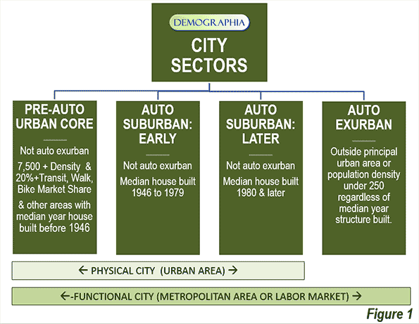
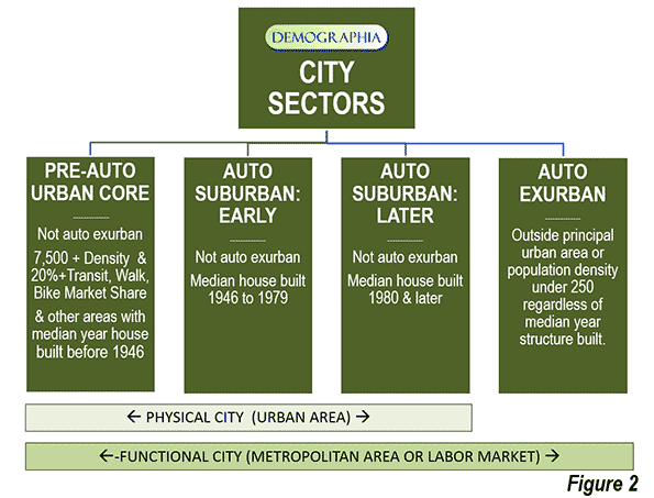
    In recent articles, I have detailed a finer grained, more representative picture of urban cores, suburbs and exurbs than is possible with conventional jurisdictional (core city versus suburban) analysis. The articles published so far are indicated in the "City Sector Articles Note," below.

    Transit Commuting in the Urban Core

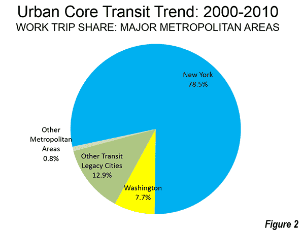
    As is so often the case with transit statistics, recent urban cores trends are largely a New York story. New York accounted for nearly 80 percent of the increase in urban core transit commuting. New York and the other five metropolitan areas with "transit legacy cities" represented more than 99 percent of the increase in urban core transit commuting (Figure 1). This is not surprising, because the urban cores of these metropolitan areas developed during the heyday of transit dominance, and before broad automobile availability. Indeed, urban core transit commuting became even more concentrated over the past decade. The 99 percent of new commuting (600,000 one-way trips) by transit in the legacy city metropolitan areas was as well above their 88 percent of urban core transit commuting in 2000.

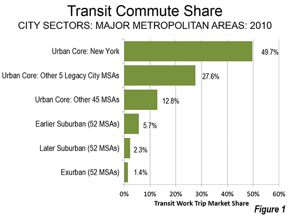
    New York’s transit commute share was 49.7 percent in 2010, well above the 27.6 percent posted by the other five metropolitan areas with transit legacy cities. The urban cores of the remaining 45 major metropolitan areas (those over 1,000,000 population) had a much lower combined transit work trip market share, at 12.8 percent.

    The suburban and exurban areas, with 86 percent of the major metropolitan area population, had much lower transit commute shares. The Earlier Suburban areas (generally median house construction dates of 1946 to 1979, with significant automobile orientation) had a transit market share of 5.7 percent, the Later Suburban areas 2.3 percent and the Exurban areas 1.4 percent (Figure 2).

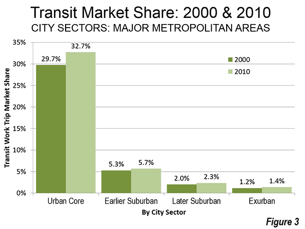
    The 2000s were indeed a relatively good decade for transit, after nearly 50 years that saw its ridership (passenger miles) drop by nearly three-quarters to its 1992 nadir. Since that time, transit has recovered 20 percent of its loss. Transit commuting has always been the strongest in urban cores, because the intense concentration of destinations in the larger downtown areas (central business districts) that can be effectively served by transit, unlike the dispersed patterns that exist in the much larger parts of metropolitan areas that are suburban or exurban. Transit’s share of work trips by urban core residents rose a full 10 percent, from 29.7 percent to 32.7 percent (Figure 3).

    There were also transit commuting gains in the suburbs and exurbs. However, similar gains over the next quarter century would leave transit’s share at below 5 percent in the suburbs and exurbs, because of its small base or ridership in these areas.

    Walking and Cycling

    The share of commuters walking and cycling (referred to as "active transportation" in the Queen’s University research on Canada’s metropolitan areas) rose 12 percent in the urban core (from 9.2 percent to 10.3 percent), even more than transit. This is considerably higher than in suburban and exurban areas, where walking and cycling remained at a 1.9 percent market share from 2000 to 2010.

    Working at Home

    Working at home (including telecommuting) continues to grow faster than any work access mode, though like transit, from a small base. Working at home experienced strong increases in each of the four metropolitan sectors, rising a full percentage point or more in each. At the beginning of the decade, working at home accounted for less work commutes than walking and cycling, and by 2010 was nearly 30 percent larger.

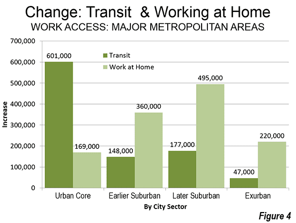
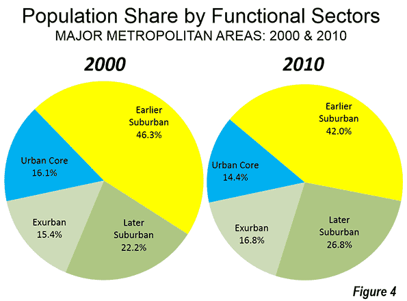
    The working at home largest gain was in the Earlier Suburban Areas, with a nearly 500,000 person increase. Unlike transit, working at home does not require concentrated destinations, effectively accessing employment throughout the metropolitan area, the nation and the world. As a result, working at home’s growth is fairly constant across the urban core, suburbs and exurbs (Figure 4). Working at home has a number of advantages. For example, working at home (1) eliminates the work trip, freeing additional leisure or work time for the employee, (2) eliminates greenhouse gas emissions from the work trip, (3) expands the geographical area and the efficiency of the labor market (important because larger labor markets tend to have greater economic growth and job creation, and it does all this without (4) requiring government expenditure.

    Driving Alone

    Despite empty premises about transit’s potential, driving remains the only mode of transport capable of comprehensively serving the modern metropolitan area. Driving alone has continued its domination, rising from 73.4 percent to 73.5 percent of major metropolitan area commuting and accounting for three quarters of new work trips. In the past decade, driving alone added 6.1 million commuters, nearly equal to the total of 6.3 million major metropolitan area transit commuters and more than the working at home figure of 3.5 million. To be sure, driving alone added commuters in the urban core, but lost share to transit, dropping from 45.2 percent to 43.4 percent. In suburban and exurban areas, driving alone continued to increase, from 78.2 percent to 78.5 percent of all commuting.).

    Density of Cars

    The urban cores have by far the highest car densities, despite their strong transit market shares. With a 4,200 household vehicles available per square mile (1,600 per square kilometer), the concentration of cars in urban cores was nearly three times that of the Earlier Suburban areas (1,550 per square mile or  600 per square kilometer) and five times that of the Later Suburban areas (950 per square kilometer). Exurban areas, with their largely rural densities had a car density of 100 per square mile (40 per square kilometer).

    Work Trip Travel Times

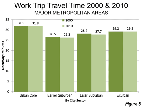
    Despite largely anecdotal stories about the super-long commutes of those living in suburbs and exurbs, the longest work trip travel times were in the urban cores, at 31.8 minutes one-way. The shortest travel times were in the Earlier Suburbs (26.3 minutes) and slightly longer in the Later Suburbs (27.7 minutes). Exurban travel times were 29.2 minutes. Work trip travel times declined slightly between 2000 and 2010, except in exurban areas, where they stayed the same. The shorter travel times are to be expected with the continuing evolution from monocentric to polycentric and even "non-centric" employment patterns and a stagnant job market (Figure 5).

    Contrasting Transportation in the City Sectors

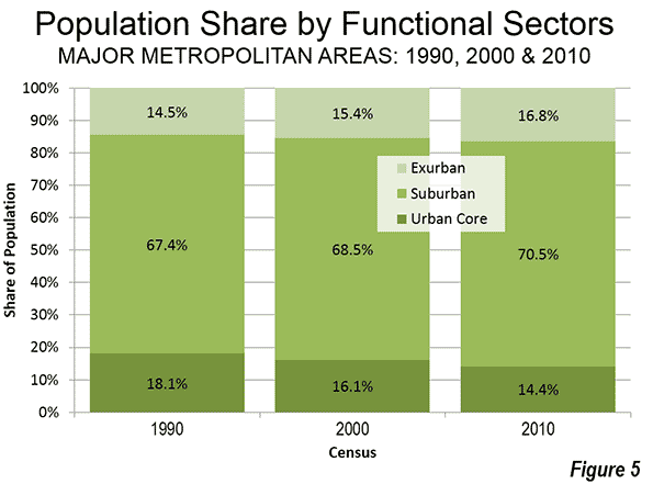
    The examination of metropolitan transportation data by city sector highlights the huge differences that exist between urban cores and the much more extensive suburbs and exurbs. Overall the transit market share in the urban core approaches nine times the share in the suburbs and exurbs. The walking and cycling commute share in the urban core is more than five times that of the suburbs and exurbs. Moreover, the trends of the past 10 years indicate virtually no retrenchment in automobile orientation, as major metropolitan areas rose from 84 percent suburban and exurban in 2000 to 86 percent in 2010. This is despite unprecedented increases is gasoline prices and the disruption of the housing market during worst economic downturn since the Great Depression.

    —————————-

    Wendell Cox is principal of Demographia, an international public policy and demographics firm. He is co-author of the "Demographia International Housing Affordability Survey" and author of "Demographia World Urban Areas" and "War on the Dream: How Anti-Sprawl Policy Threatens the Quality of Life." He was appointed to three terms on the Los Angeles County Transportation Commission, where he served with the leading city and county leadership as the only non-elected member. He was appointed to the Amtrak Reform Council to fill the unexpired term of Governor Christine Todd Whitman and has served as a visiting professor at the Conservatoire National des Arts et Metiers, a national university in Paris.

    Photograph: DART light rail train in downtown Dallas (by author)

    —————————-

    City Sector Note: Previous articles in this series are listed below:
    From Jurisdictional to Functional Analyses of Urban Cores & Suburbs
    The Long Term: Metro American Goes from 82 percent to 86 percent Suburban Since 1990
    Functional v. Jurisdictional Analysis of Metropolitan Areas
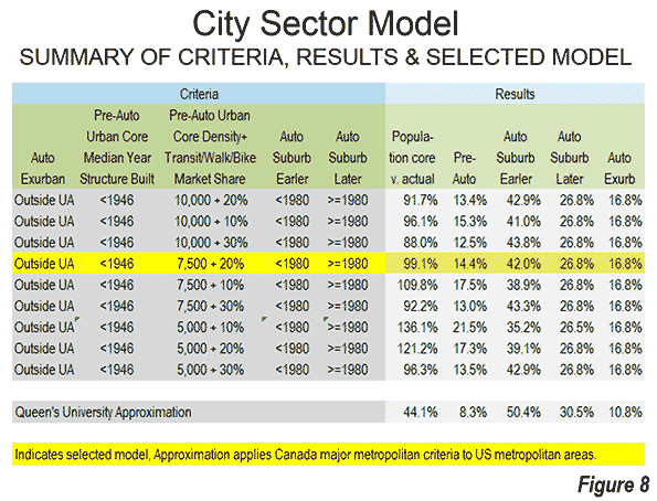
    City Sector Model Small Area Criteria

  • The Long Term: Metro America Goes From 82% to 86% Suburban Since 1990

    The major metropolitan areas of the United States experienced virtually all of their overall growth in suburban and exurban areas between 2000 and 2010. This is the conclusion of an analysis of the functional Pre-Auto Urban Cores and functional suburban and exurban areas using the Demographia City Sector Model.

    The City Sector Model
    The City Sector Model classifies zip code areas in the major metropolitan areas based on urban form (Note 1). These include four classifications, one of which replicates the urban form and travel behavior typical of the pre-World War II urban cores. These areas were typically higher density and dependent on transit and walking. The City Sector Model has three other classifications, Pre-Auto Urban Core, Auto-Suburban: Earlier, Auto-Suburban: Later and Auto-Exurban.

    For simplicity the City Sector categories are referred to as urban core, earlier suburban, later suburban and exurban. The City Sector Model is described in a previous article, and illustrated in Figure 1, which is also posted to the internet.

    The model makes it possible to analyze metropolitan areas based on smaller area functional classifications, rather than on jurisdictional (historical core municipality) borders, which among other things, mask as core large areas of suburbanization.

    Suburbanized Core Municipality Examples: San Jose and Charlotte

    This suburbanization in the historical core municipalities is illustrated by examples like San Jose and Charlotte. The City Sector Model indicates that neither of these metropolitan areas has a pre-auto urban core. This is because neither metropolitan area has a large enough concentration of houses with a median construction date of 1945 or before or sufficient area of 7,500 population density per square mile (2,900 per square kilometer) with a transit, walking and cycling work trip market share of at least 20 percent. As a result, virtually all of both metropolitan areas is automobile oriented suburban, including virtually all of the core municipalities.

    This is true in Charlotte despite its development of one of the most impressive new central business districts in the nation, with high employment densities. Yet at the same time the  core city of Charlotte itself is very low density (2010), at 2,500 per square mile (950 per square kilometer), less than the suburban area average for large US urban areas (2,600 per square mile or 1,000 per square kilometer). Charlotte, however, could develop the equivalent of a pre-auto urban core if its central population density rises enough and enough commuters use transit, walking and cycling.

    The core city of San Jose is far more dense than Charlotte, at 5,800 per square mile (2,200 per square kilometer). However, it is less dense than the suburbs of Los Angeles (6,400 per square mile or 2,500 per square mile). Like Charlotte, the core city of San Jose is virtually all automobile oriented suburban and has a transit work trip market share a full third below the major metropolitan area average.

    Overall Population Trend: 2000-2010

    These phenomena reflect national trends, All major metropolitan area growth between 2000 and 2010 (100.9 percent) was in the functional suburbs and exurbs.

    Between 2000 and 2010, the percentage of major metropolitan area population in the urban cores declined from 16.1 percent to 14.4 percent. The urban cores lost approximately 140,000 residents (a loss of 0.6 percent), despite strong gains very close to the centers of the historical core municipalities. Consistent with these findings, Census Bureau analysis showed that the focused gains in the cores of the urban cores were more than negated by losses in surrounding urban core areas (described in: Flocking Elsewhere: The Downtown Growth Story).

    The earlier suburban areas gained only modestly, adding 280,000 new residents, for a 0.4 percent increase. These areas have median house construction dates between 1946 and 1979. The largest increase was in the later suburban areas, which added the most new residents, 11.4 million, for a gain of 33.4 percent. The later suburban areas have median house constructions of 1980 or later. Exurban areas added 5.0 million residents, for a gain of 21.3 percent. Exurban areas are located outside the principal urban areas (Figure 2).

    Overall, the later suburban and exurban areas gained 16.4 million residents, compared to the combined gain of 130,000 in the urban cores and earlier suburban areas. Thus, more than 99 percent of the population growth in the major metropolitan areas was in the later suburban and exurban areas (Figure 3).

    During the decade, the exurban areas overtook the urban cores in population, rising from 15.4 percent of the major metropolitan area population to 16.8 percent (Figure 4).

    Contrast with 1990-2000 Population Trend

    Despite all of the talk of an urban core renaissance, the 2000 to 2010 decade was less favorable for urban cores than the 1990 to 2000 decade. In the earlier decade, the urban cores (as defined in 2010) added 960,000 residents, for a growth rate of 4.0 percent. This compares to the 140,000 urban core loss between 2000 and 2010 (Note 2).

    Virtually all of the difference was attributable to urban core population trend reversals in New York, Boston and Chicago, which combined experienced a drop in growth of 1.1 million. Between 1990 and 2000, the urban core of New York added 779,000 residents, far more than the 190,000 added between 2000 and 2010. Boston’s 1990-2000 urban core growth was 296,000, but fell to 27,000 in the last decade. Chicago’s urban core dropped from a gain of 139,000 to a loss of 175,000.

    Over the past twenty years, the population of urban cores has diminished relative to that of major metropolitan areas. In 1990, the urban cores represented 18.1 percent of the population, but fell to 14.1 percent in 2010. Auto-oriented areas (suburban and exurban) have increased their combined share from 81.9 percent of the major metropolitan area population in 1990 to 85.6 percent in 2010 (Figure $$$).

    Summary of Individual Metropolitan areas

    In 30 of the 52 major metropolitan areas, all or more of the population growth was in suburban and exurban areas between 2000 and 2010. This includes the metropolitan areas that do not have Pre-Auto Urban Cores.

    Chicago had the largest share of suburban and exurban population growth, at 148 percent. This occurred because of the substantial urban core population losses. The suburbs and exurbs of Providence captured 131 percent of its growth, slightly more than the 126 percent suburban and exurban share in St. Louis. Baltimore, Rochester and Milwaukee had more than 110 percent of their growth in the suburbs and exurbs. Cincinnati, Indianapolis, Louisville, and Kansas City rounded out the largest suburban and exurban growth shares, all over 105 percent.

    Despite the substantial decline in its urban core growth in the last decade, New York had the lowest share of population growth in the suburbs and exurbs (meaning that it had the highest share of population growth in the urban core). The suburbs and exurbs of New York captured only 69 percent of the metropolitan area growth, well below second place, Virginia Beach – Norfolk (81 percent). Boston was next at 83 percent, followed by San Francisco – Oakland, at 88 percent. The bottom 10 in suburban and exurban growth share also included Seattle, Washington, Philadelphia, Richmond, Hartford and Portland. Even so, each of these six metropolitan areas had more than 90 percent of their growth in suburban and exurban areas (Figure 6).

    Jurisdictional Analyses: Suburbs Masquerading in Cities

    The functional analysis based on urban form and behavior reveals substantially different trends compared to the conventional jurisdictional analysis that compares historical core municipalities, principal cities or primary cities to the balance of metropolitan areas. For example a jurisdictional analysis shows that core municipalities added 1,290,000 residents between 2000 and 2010. In contrast, the urban cores, as indicated in the functional analysis, lost 140,000 residents. This indicates the extent of to which municipal boundaries can mislead in the analysis of urban form within metropolitan areas. The expansive city limits of most core cities masks the substantial automobile oriented suburbanization within their own borders.

    —-

    Note 1: The City Sector Model is generally similar to the groundbreaking research published by David L. A. Gordon and Mark Janzen at Queen’s University in Kingston Ontario (Suburban Nation: Estimating the Size of Canada’s Suburban Population) with regard to the metropolitan areas of Canada. Gordon and Janzen concluded that the metropolitan areas of Canada are largely suburban. Among the major metropolitan areas of Canada, the Auto Suburbs and Exurbs combined contain 76 percent of the population, somewhat less than the 86 percent found in the United States.

    Note 2: Changes in zip code definitions and boundaries could result in minor differences in comparability between the three censuses.

    —-

    Wendell Cox is principal of Demographia, an international public policy and demographics firm. He is co-author of the "Demographia International Housing Affordability Survey" and author of "Demographia World Urban Areas" and "War on the Dream: How Anti-Sprawl Policy Threatens the Quality of Life." He was appointed to three terms on the Los Angeles County Transportation Commission, where he served with the leading city and county leadership as the only non-elected member. He was appointed to the Amtrak Reform Council to fill the unexpired term of Governor Christine Todd Whitman and has served as a visiting professor at the Conservatoire National des Arts et Metiers, a national university in Paris.

    Photo:  Later Suburbs in New York Urban Area (Morris County, New Jersey), by author

  • From Jurisdictional to Functional Analysis of Urban Cores & Suburbs

    The 52 major metropolitan areas of the United States are, in aggregate, approximately 86 percent suburban or exurban in function. This is the conclusion from our new City Sector Model, which divides all major metropolitan zip codes into four functional categories, based on urban form, population density and urban travel behavior. The categories are (1) Pre-Auto Urban Core, (2) Auto Suburban: Earlier, (3) Auto Suburban: Later and (4) Auto Exurban. It is recognized that automobile-oriented suburbanization was underway before World War II, but it was interrupted by the Great Depression during the 1930s and was small compared to the democratization of personal mobility and home ownership that has occurred since that time.

    For decades there has been considerable analysis of urban core versus suburban trends. However, for the most part, analysts have been jurisdictional, comparing historical core municipalities to the expanse that constitutes the rest of the metropolitan area. Most core municipalities are themselves substantially suburban, which can mask (and exaggerate) the size of urban cores.

    The Queen’s University Research

    The City Sector Model is generally similar to the groundbreaking research published by David L. A. Gordon and Mark Janzen at Queen’s University in Kingston Ontario (Suburban Nation: Estimating the Size of Canada’s Suburban Population) with regard to the metropolitan areas of Canada. Researchers used travel behavior (journey to work data from the 2006 census) and density for classifying metropolitan areas into four sectors, (1) Active Core, (2) Transit Suburbs, (3) Auto Suburbs, and (4) Exurbs. The active core was that portion of metropolitan areas with a high share of work trip travel by walking and cycling. I covered the research in a newgeography.com article last autumn.

    Gordon and Janzen concluded that the metropolitan areas of Canada are largely suburban. Among the major metropolitan areas of Canada, the Auto Suburbs and Exurbs combined contain 76 percent of the population, somewhat less than the 86 percent we found in the United States.

    The City Sector Model follows the same general approach as the Queens University research, although there are important differences. For example, the City Sector Model is principally aimed at identifying the Pre-Auto Urban Core component of the modern metropolitan area and does not identify an active core.

    All US Major Metropolitan Area Growth Has Been Suburban and Exurban

    Virtually all population growth in US metropolitan areas (as currently defined) has been suburban or exurban since before World War II (the 1940 census). The historical core municipalities that have not annexed materially and were largely developed by 1940 have lost population. As a result, approximately 110 percent of their metropolitan area growth has occurred in suburbs and exurbs. Further, among the other core municipalities, virtually all of the population growth that has occurred in annexed areas or greenfield areas that were undeveloped in 1940 (Figure 1).

    Identifying the Pre-Auto Urban Core

    The City Sector Model is not dependent upon municipal boundaries (the term "city" is generic, and refers to cities in their functional sense, metropolitan areas, or in their physical sense, urban areas). Not being constrained by municipal boundaries is important because core municipalities vary substantially. For example, the core municipality represents less than 10 percent of the population of Atlanta, while the core municipality represents more than 60 percent of the population of San Antonio. The City Sector Model applies data available from the US Census Bureau to estimate the population and distribution of Pre-Auto Urban Cores in a consistent manner.

    At the same time, the approach is materially different from the Office of Management and Budget (OMB) classification of "principal cities." It also differs from the Brookings Institution "primary cities," which is based on the OMB approach. The OMB-based classifications classify municipalities using employment data, without regard to urban form, density or other variables that are associated with the urban core. These classifications are useful and acknowledge that the monocentric nature of US metropolitan areas has evolved to polycentricity. However, non-urban-core principal cities and primary cities are themselves, with few exceptions, functionally suburban.

    The City Sector Model Criteria

    Due to media and academic interest in the Pre-Auto Urban Core, a number of data combinations were used to best fit the modeled population to that of the core municipalities that have virtually the same boundaries as in 1940 and that were virtually fully developed by that time (the Pre-War & Non-Suburban classification in historical core municipalities). A number of potential criteria were examined, and the following were accepted (Figure 2).

    The Auto Exurban category includes any area outside a principal urban area.

    The Pre-Auto Urban Core category includes any non-exurban with a median house construction date of 1945 or before and also included areas with a population density of 7,500 per square mile (2,900 per square kilometer) or more and with a transit, walk and cycling journey to work market share of 20 percent or more.

    The Auto Suburban Earlier category included the balance of areas with a median house construction date of 1979 or before.

    The Auto Suburban Later category later included the balance of areas with a median house construction date of 1980 or later.

    Additional details on the criteria are in Note 1

    Results: 2010 Census

    The combined Pre-Auto Urban Core areas represented 14.4 percent of the population of the major metropolitan areas in 2010 (2013 geographical definition). This compares to the 26.4 percent that the core municipalities themselves represented of the metropolitan areas, indicating nearly half of their population was essentially suburban.

    The Auto Suburban: Earlier areas accounted for 42.0 percent of the population, while the Auto Suburban: Later areas had 26.8 percent of the population. The Auto Exurban areas had 16.8 percent of the population (Figure 3).

    The substantial difference between US and Canadian urbanization is illustrated by applying an approximation of the Gordon-Janzen criteria, which yielded an 8.4 percent Pre-Auto Urban Core population. The corresponding figure for the six major metropolitan areas of Canada was 24.0 percent. This difference is not surprising, since major Canadian urban areas have generally higher densities and much more robust transit, walking and cycling market shares. Yet, the Gordon-Janzen research shows Canada still to be overwhelmingly suburban (Note 2).

    Population Density: As would be expected, the Pre-Auto Urban Core areas had the highest densities (Figure 4), at 11,000 per square mile (4,250 per square kilometer). The Auto Suburban: Earlier areas had a density of 2,500 per square mile (1,000 per square kilometer), while the Auto Suburban: Later had a population density of 1,300 per square mile (500 per square kilometer), while the Auto Exurban areas had a population density of 150 per square mile (60 per square kilometer)).

    Individual Metropolitan Areas (Cities)

    The metropolitan areas with the highest proportion of Pre-Auto Urban Core population are New York (more than 50 percent), and Boston (nearly 35 percent), followed by Buffalo, Chicago, San Francisco-Oakland, and Providence, all with more than 25 percent (Table).

    Table
    City Sectors: 2010
    Major Metropolitan Areas
    City (Metropolitan Area) Pre-Auto Urban Core Auto Suburban: Earlier Auto Suburban: Later Auto Exurban
    Atlanta, GA 0.5% 14.9% 70.7% 13.8%
    Austin, TX 1.8% 15.7% 62.5% 20.0%
    Baltimore, MD 16.2% 41.8% 19.9% 22.0%
    Birmingham, AL 0.0% 42.1% 24.6% 33.3%
    Boston, MA-NH 34.2% 49.7% 3.2% 12.9%
    Buffalo, NY 28.8% 51.6% 3.1% 16.5%
    Charlotte, NC-SC 0.0% 10.0% 38.4% 51.6%
    Chicago, IL-IN-WI 25.8% 45.0% 18.3% 10.9%
    Cincinnati, OH-KY-IN 10.1% 38.8% 24.3% 26.8%
    Cleveland, OH 22.2% 46.8% 10.5% 20.6%
    Columbus, OH 5.0% 28.7% 37.5% 28.9%
    Dallas-Fort Worth, TX 0.3% 34.4% 43.0% 22.4%
    Denver, CO 3.1% 42.9% 42.4% 11.6%
    Detroit,  MI 6.3% 60.6% 16.1% 16.9%
    Grand Rapids 3.8% 32.9% 15.3% 48.1%
    Hartford, CT 11.1% 58.6% 1.1% 29.2%
    Houston, TX 0.3% 34.2% 48.9% 16.6%
    Indianapolis. IN 4.6% 28.0% 41.8% 25.6%
    Jacksonville, FL 0.0% 26.4% 48.2% 25.4%
    Kansas City, MO-KS 5.4% 37.6% 26.3% 30.6%
    Las Vegas, NV 2.4% 17.5% 76.7% 3.5%
    Los Angeles, CA 10.4% 76.4% 5.2% 8.0%
    Louisville, KY-IN 8.1% 45.4% 25.6% 20.8%
    Memphis, TN-MS-AR 1.8% 40.6% 34.3% 23.3%
    Miami, FL 1.4% 51.4% 44.8% 2.4%
    Milwaukee,WI 22.1% 52.0% 10.4% 15.5%
    Minneapolis-St. Paul, MN-WI 12.7% 31.6% 33.8% 22.0%
    Nashville, TN 0.0% 25.0% 36.1% 38.9%
    New Orleans. LA 10.6% 49.9% 7.0% 32.4%
    New York, NY-NJ-PA 52.4% 35.3% 5.6% 6.7%
    Oklahoma City, OK 2.5% 35.1% 31.6% 30.8%
    Orlando, FL 0.0% 16.1% 50.5% 33.4%
    Philadelphia, PA-NJ-DE-MD 24.6% 51.1% 15.1% 9.2%
    Phoenix, AZ 0.0% 29.4% 51.7% 18.8%
    Pittsburgh, PA 15.7% 56.1% 4.8% 23.4%
    Portland, OR-WA 9.3% 36.7% 39.5% 14.6%
    Providence, RI-MA 25.5% 47.7% 2.8% 24.0%
    Raleigh, NC 0.0% 7.5% 54.4% 38.1%
    Richmond, VA 4.5% 38.8% 38.0% 18.8%
    Riverside-San Bernardino, CA 0.0% 29.1% 29.4% 41.4%
    Rochester, NY 11.1% 46.9% 7.7% 34.3%
    Sacramento, CA 1.6% 38.0% 40.2% 20.1%
    St. Louis,, MO-IL 11.7% 39.9% 25.7% 22.8%
    Salt Lake City, UT 4.6% 47.9% 38.4% 9.1%
    San Antonio, TX 0.1% 39.7% 42.6% 17.6%
    San Diego, CA 1.2% 61.6% 30.3% 6.9%
    San Francisco-Oakland, CA 25.7% 55.5% 7.6% 11.2%
    San Jose, CA 0.1% 77.7% 9.1% 13.1%
    Seattle, WA 7.8% 38.9% 40.2% 13.0%
    Tampa-St. Petersburg, FL 0.0% 44.8% 39.7% 15.5%
    Virginia Beach-Norfolk, VA-NC 1.5% 44.4% 37.7% 16.4%
    Washington, DC-VA-MD-WV 15.9% 29.2% 36.2% 18.7%
    Overall 14.4% 42.0% 26.8% 16.8%


    It may be surprising that many of the major metropolitan areas are shown with little or no Pre-Auto Urban Core population. For example, five metropolitan areas have virtually no Pre-Auto Urban Core population, including Phoenix, Riverside-San Bernardino, Tampa-St. Petersburg, Orlando, Jacksonville, and Birmingham. By the Census Bureau criteria of 1940, two of these areas were not yet metropolitan and only Birmingham (400,000) had more than 250,000 residents.  Many of the newer and fastest growing metropolitan areas were too small, too sparsely settled or insufficiently dense to have strong urban cores before the great automobile suburbanization that followed World War II. Further, many of the Pre-Auto Urban Cores have experienced significant population loss and some of their neighborhoods have become more suburban (automobile oriented). Virtually no urban cores have been developed since World War II meeting the criteria.

    Thus, no part of Phoenix, San Jose, Charlotte and a host of other newer metropolitan areas functionally resembles the Pre-Auto Urban Core areas of metropolitan areas like Chicago, Cincinnati, or Milwaukee. However, new or expanded urban cores are possible, if built at high enough population density and with high enough transit, walking, and cycling use. 

    Examples of three differing metropolitan areas are provided. Philadelphia (Figure 5) is a metropolitan area with a strong Pre-Auto Urban Core, which is indicative of an older metropolitan area that has been among the largest in the nation since its inception, Seattle (Figure 6) is a much newer metropolitan area, yet exhibits a larger Pre-Auto Urban Core than most. Phoenix (Figure 7) may be the best example of a post-War metropolitan area, with virtually no Pre-Auto Urban Core. In 1940, the Phoenix metropolitan area had only 120,000 residents and could be 40 times that large by 2020. Virtually all of Phoenix is automobile-oriented. Even three years after opening its light rail line, 88 percent of Phoenix commuters go to work by car and only two percent by transit, virtually the same as in 2000.

    Despite the comparatively small share of the modern metropolitan area represented by the Pre-Auto Urban Core in the City Core Model, the definition is broad and, if anything over-estimates the size of urban core city sectors. The population density of Pre-Auto Urban Core areas is below that of the historical core municipalities before the great auto oriented urbanization (11,000 compared to 12,100 in 1940) and well above their 2010 density (8,400), even when New York is excluded. The minimum density requirement of 7,500 per square mile (not applied to analysis zones with a median house construction data of 1945 or earlier) is slightly less than the density of Paris suburbs (7,800 per square mile or 3,000 per square kilometer) and only 20 percent more dense than the jurisdictional suburbs (suburbs outside the historical core municipality) of Los Angeles (6,400 per square mile or 2,500 per square kilometer). Some urban containment plans require higher minimum densities, not only in urban cores but also in the suburbs.

    In describing the Canadian results, Professor Gordon noted that there is a tendency to “overestimate the importance of the highly visible downtown cores and underestimate the vast growth happening in the suburban edges.” That is true to an even greater degree in the United States. 

    —–

    Note 1:

    The City Sector Model is applied to the 52 major metropolitan areas in the United States (over 1 million population). The metropolitan areas are broken into principal urban areas, with all other areas considered to be exurban. The principal urban areas also include the Concord urban area and the Mission Viejo urban area, which are adjacent to and included in the San Francisco and Los Angeles urban areas respectively. As a result, some smaller urban areas, such as Palm Springs (Riverside-San Bernardino metropolitan area), Lancaster (Los Angeles metropolitan area) and Poughkeepsie (New York metropolitan area) are considered exurban. Areas with less than 250 residents per square mile (100 per square kilometer) are also considered exurban, principally for classification of large areas on the urban fringe that have a substantial rural element.

    The Pre-Auto Urban Core includes all non-– exurban areas in which is the median house (single-family or multi-family) was built is 1945 or before. Three density levels were considered, 10,000, 7,500 and 5,000 per square mile (4,000, 2,900 and 2,000 per square kilometer). The lower 5,000 per square mile was examined to test the extent to which such a low density would increase the urban core population. This density, less than the entire urban area (urban core and suburban) of the Los Angeles, San Francisco, San Jose and New York urban areas would have, at the most raised the urban core population to 21.5 percent of the metropolitan population, even with a modest 10 percent transit, walking and cycling market share (Figure 8)

    The pre-auto urban core specification results in a 2010 population for the metropolitan areas with Pre-war and non-suburban historical core municipalities within one percentage point of the actual total, excluding the far higher density case of New York.

    The analysis showed that a lower transit, walking and cycling market share at a 7,500 per square mile floor (2,900 per square kilometer) would substantially increase the Pre-Auto Urban Core category population, while diluting its urban core nature. More than one-half of the increase would be in Los Angeles which has added literally millions of residents in high density suburban areas that are as automobile oriented as suburbs elsewhere.

    The analysis zones (zip codes) have an average population of 19,000, with from as many as 1,000 zones in New York to 50 in Raleigh.

    Note 2:

    An approximation based on the Gordon and Janzen approach would indicate an urban core population of only 8 percent in the major metropolitan areas of the United States. This approximation results in a modeled population for the metropolitan areas with pre-war and non-suburban historical core municipalities of less than one-half the actual 2010 population.

    This Queen’s University research comparison in Figure 8 is referred to as an approximation, since it applies an overall transit, walking, and cycling market share for the six major metropolitan areas, instead of a factor corresponding to each metropolitan area (the Gordon and Janzen approach).

    The differences in transit market share relative to the US are substantial. This may be best shown by considering Calgary, which with a population of 1.2 million in 2011 would have ranked as the 47th largest metropolitan area if it were in the United States. Yet, Calgary would rank second only to the New York metropolitan area in transit market share if it were in the United States. Even so, Calgary is found to be the most suburban of Canada’s major metropolitan areas in the Queen’s University research and Statistics Canada data from 2011 indicates strong domination of urban travel by the automobile.

    Wendell Cox is principal of Demographia, an international public policy and demographics firm. He is co-author of the “Demographia International Housing Affordability Survey” and author of “Demographia World Urban Areas” and “War on the Dream: How Anti-Sprawl Policy Threatens the Quality of Life.” He was appointed to three terms on the Los Angeles County Transportation Commission, where he served with the leading city and county leadership as the only non-elected member. He was appointed to the Amtrak Reform Council to fill the unexpired term of Governor Christine Todd Whitman and has served as a visiting professor at the Conservatoire National des Arts et Metiers, a national university in Paris.

    Photo: Los Angeles

  • From Anecdotes to Data: Core & Suburban Growth Trends 2010-2013

    According to the Wall Street Journal, there are "Signs of a Suburban Comeback." This is a turnaround from the typical media coverage of US population estimates in recent years, which have more often than not heralded a "return to the cities" generally more rooted in anecdote than data.

    There were always at least two problems with the "return to the city" thesis. First of all, most people who live in the suburbs came from areas outside metropolitan areas and they couldn’t return to where they had never lived (see Cities and Suburbs: The Unexpected Truth). More importantly, in every year for which there is data, the net inward migration to suburbs has been far greater than to the core counties, which have nearly always had net outward migration (see Special Report: 2013 Metropolitan Area Population Estimates. Under these conditions, there could not have been net migration from the suburbs to the core municipalities.

    Historical Core Municipalities: The Differences

    I have classified historical core municipalities based on their extent of automobile oriented suburbanization (Figure 1). The break point is World War II, after which the great automobile suburbanization occurred in the United States. There had been automobile oriented suburbanization before 1940. During the 1920s, annual rates of suburban growth exceeded five percent in the 14 metropolitan areas with more than 500,000 population. The decade of the Great Depression (1930 to 1940) saw annual growth rates drop three quarters (Note). By the end of World War II, transit had seen its motorized urban travel market share restored to 35 percent, equal to early 1920s levels, a figure that has since fallen to under two percent. 

    Historical Core Municipalities: Improving Trends

    Even so, in recent years, the core municipalities have done better than in the past. The nightmare that occurred between 1970 and 1990 seems to be over in many places. This has made it feasible for an increase in core living by many Millennials and singles. However, even this has been exaggerated by anecdotal research that dominates the media. More than 80 percent of Millennials live outside the core municipalities, where they are less visible to the anecdote-driven media.

    On a percentage basis, the historical core municipalities of the 52 major metropolitan areas (more than 1,000,000 population) managed to grow 3.4 percent between 2010 and 2013, more than the suburban rate of 3.1 percent. This is probably the first time this has occurred in any three year period since the end of World War II.

    But the core municipalities now contain such a small share of major metropolitan area population that the suburbs have continued to add population at about three times the numbers of the core municipalities (Figure 2). Indeed, if the respective 2010-2013 annual growth rates were to prevail for the next century,  the core municipalities would house only 28.0 percent of the major metropolitan area population in 2113 (up from 26.4 percent in 2013).

    Despite the publicity to the contrary, only six core municipalities added more population than suburbs in the same metropolitan areas between 2010 and 2013. These were New York, San Antonio, Columbus, San Jose, Austin, and New Orleans, all except New York with substantial suburbanization within their city limits. The core municipalities did better in percentage gains, with 19 gaining faster than the suburbs, compared to 33 suburban areas growing faster than the core municipalities.

    Core Municipality Growth

    Most of the 2010 to 2013 core growth occurred in municipalities with a larger suburban component. The core municipalities that have little suburban development ("Pre-War & Non-Suburban") had 43 percent of the core population in 2010. Yet they attracted only 27 percent of the growth (Figure 3). The two other categories, which include large areas of functional suburbanization (low density and strong automobile orientation) attracted 73 percent of the core population (Figure 3). These include suburbanized pre-War core municipalities, such as Los Angeles, Seattle, and Atlanta. They also include cores that are nearly all suburban, with nearly all of their population growth having occurred during the great automobile suburbanization (such as Austin, Sacramento, Phoenix, and San Jose).

    Core Municipalities: Top Gainers

    New York led the core municipalities by adding 230,000 new residents between 2010 and 2013. This was 56 percent of the population growth among the "Pre-War & Non-Suburban” core municipalities. The core municipality accounted for 60 percent of the population growth in the metropolitan area. However, domestic migrants continued to move away from New York City. Core municipality losses were 215,000 from 2010 to 2013, while the suburbs, with more than 55 percent of the population, lost less than a third as many (70,000).

    Houston gained 96,000 new residents between 2010 and 2013, followed by Austin (95,000), Los Angeles (92,000), and San Antonio (82,000).  Houston, Los Angeles, and San Antonio each have large suburban areas within their city limits, while the core municipality of Austin is virtually all automobile-oriented. The sixth through 10th positions were taken by Phoenix, Dallas, San Jose, Denver, and San Diego, all with substantial suburbanization.

    The largest core municipality population gains were in Austin (12.0 percent), still recovering New Orleans (10.1 percent), Denver (8.3 percent), Washington (7.4 percent), and Orlando (6.1 percent). Seattle, Raleigh, Atlanta, San Antonio and San Jose rounded out the top ten. Among the 10 fastest growing core municipalities, all but Washington have large automobile-oriented suburban components.

    There was also bad news. Detroit continued its population slide, now down to 689,000 from its 1950 peak of 1,850,000. This 62.76 percent loss, however, is not the worst among major US core municipalities. St. Louis still holds that title, having fallen from 857,000 in 1950 to 318,000 in 2013, a loss of 62.84 percent. However, one more year of losses at the 2010-2013 rates will transfer this dubious title to Detroit.

    Suburban Areas: Top Gainers

    The largest suburban gains were in Dallas-Fort Worth (325,000), Houston (296,000), Washington (269,000), Miami (245,000) and Los Angeles (211,000). Atlanta, which had virtually set the world standard for suburbanization before the Great Financial Crisis, managed to re-emerge with the sixth fastest largest suburban increase (208,000).

    Measured on a percentage basis, Texas dominated the suburban gains. The suburbs of Houston added 7.8 percent to their population between 2010 and 2013. Austin added 7.7 percent, San Antonio added 6.6 percent, and Dallas-Fort Worth 6.2 percent. The only non-Texas entry in the top five was Raleigh, which, like Austin, posted a 7.7 percent increase.

    The metropolitan area and historical core municipality data is summarized in the Table.

    Table: Metropolitan Area & Historical Core Municipality Population: 2010-2013
    Metropolitan Area Historical Core Municipality
    Rank Metropolitan Area 2010 2013 % Change 2010 2013 % Change
    1 New York, NY-NJ-PA 19.566 19.950 2.0% 8.175 8.406 2.8%
    2 Los Angeles, CA 12.829 13.131 2.4% 3.793 3.884 2.4%
    3 Chicago, IL-IN-WI 9.461 9.537 0.8% 2.696 2.719 0.9%
    4 Dallas-Fort Worth, TX 6.426 6.811 6.0% 1.198 1.258 5.0%
    5 Houston, TX 5.920 6.313 6.6% 2.099 2.196 4.6%
    6 Philadelphia, PA-NJ-DE-MD 5.965 6.035 1.2% 1.526 1.553 1.8%
    7 Washington, DC-VA-MD-WV 5.636 5.950 5.6% 0.602 0.646 7.4%
    8 Miami, FL 5.565 5.828 4.7% 0.399 0.418 4.6%
    9 Atlanta, GA 5.287 5.523 4.5% 0.420 0.448 6.6%
    10 Boston, MA-NH 4.552 4.684 2.9% 0.618 0.646 4.6%
    11 San Francisco-Oakland, CA 4.335 4.516 4.2% 1.196 1.244 4.0%
    12 Phoenix, AZ 4.193 4.399 4.9% 1.446 1.513 4.7%
    13 Riverside-San Bernardino, CA 4.225 4.381 3.7% 0.210 0.214 1.8%
    14 Detroit,  MI 4.296 4.295 0.0% 0.714 0.689 -3.5%
    15 Seattle, WA 3.440 3.610 5.0% 0.609 0.652 7.2%
    16 Minneapolis-St. Paul, MN-WI 3.349 3.459 3.3% 0.668 0.695 4.1%
    17 San Diego, CA 3.095 3.211 3.7% 1.307 1.356 3.7%
    18 Tampa-St. Petersburg, FL 2.783 2.871 3.1% 0.336 0.353 5.1%
    19 St. Louis,, MO-IL 2.788 2.801 0.5% 0.319 0.318 -0.3%
    20 Baltimore, MD 2.711 2.771 2.2% 0.621 0.622 0.2%
    21 Denver, CO 2.543 2.697 6.1% 0.600 0.649 8.2%
    22 Pittsburgh, PA 2.356 2.361 0.2% 0.306 0.306 0.0%
    23 Charlotte, NC-SC 2.217 2.335 5.3% 0.787 0.823 4.5%
    24 Portland, OR-WA 2.226 2.315 4.0% 0.584 0.609 4.4%
    25 San Antonio, TX 2.143 2.278 6.3% 1.327 1.409 6.1%
    26 Orlando, FL 2.134 2.268 6.3% 0.238 0.255 7.2%
    27 Sacramento, CA 2.149 2.216 3.1% 0.466 0.480 2.8%
    28 Cincinnati, OH-KY-IN 2.115 2.137 1.1% 0.297 0.298 0.2%
    29 Cleveland, OH 2.077 2.065 -0.6% 0.397 0.390 -1.7%
    30 Kansas City, MO-KS 2.009 2.054 2.2% 0.460 0.467 1.6%
    31 Las Vegas, NV 1.951 2.028 3.9% 0.584 0.603 3.4%
    32 Columbus, OH 1.902 1.967 3.4% 0.787 0.823 4.5%
    33 Indianapolis. IN 1.888 1.954 3.5% 0.820 0.843 2.8%
    34 San Jose, CA 1.837 1.920 4.5% 0.946 0.999 5.6%
    35 Austin, TX 1.716 1.883 9.7% 0.790 0.885 12.0%
    36 Nashville, TN 1.671 1.758 5.2% 0.601 0.634 5.5%
    37 Virginia Beach-Norfolk, VA-NC 1.677 1.707 1.8% 0.243 0.246 1.4%
    38 Providence, RI-MA 1.601 1.604 0.2% 0.178 0.178 0.0%
    39 Milwaukee,WI 1.556 1.570 0.9% 0.595 0.599 0.7%
    40 Jacksonville, FL 1.346 1.395 3.6% 0.822 0.843 2.5%
    41 Memphis, TN-MS-AR 1.325 1.342 1.3% 0.647 0.653 1.0%
    42 Oklahoma City, OK 1.253 1.320 5.3% 0.580 0.611 5.3%
    43 Louisville, KY-IN 1.236 1.262 2.1% 0.597 0.610 2.1%
    44 Richmond, VA 1.208 1.246 3.1% 0.204 0.214 4.8%
    45 New Orleans. LA 1.190 1.241 4.3% 0.344 0.379 10.1%
    46 Hartford, CT 1.212 1.215 0.2% 0.125 0.125 0.2%
    47 Raleigh, NC 1.130 1.215 7.4% 0.404 0.432 6.9%
    48 Salt Lake City, UT 1.088 1.140 4.8% 0.186 0.191 2.5%
    49 Birmingham, AL 1.128 1.140 1.1% 0.212 0.212 -0.1%
    50 Buffalo, NY 1.136 1.134 -0.1% 0.261 0.259 -0.9%
    51 Rochester, NY 1.080 1.083 0.3% 0.211 0.210 -0.1%
    52 Grand Rapids, MI 0.989 1.017 2.8% 0.188 0.192 2.3%
    Total 169.512 174.942 3.2% 44.739 46.258 3.4%
    In Millions: Data from US Census Bureau


    Normalcy Knocks?

    Ken Johnson, the frequently quoted University of New Hampshire demographer told the Wall Street Journal, "The slowing growth in these urban cores and the increasing gains in the suburbs may be the first indication of a return to more traditional patterns of city-suburban growth." These patterns are of long standing. Nearly all urban population growth since World War II has been suburban, whether within or outside the core municipalities. It should not be surprising that suburban growth dropped during the second greatest economic decline in a century and has been slow to recover during the Great Recession and the Great Malaise that has followed. The one-quarter suburban growth rate drop was more modest than during the Great Depression, but still substantial. Should genuine prosperity return, it will likely be accompanied by a renewal of more robust suburban growth.

    Note: Core municipality growth also dropped in the 1930s, as the high rate of migration from rural to urban areas in the 1920s was interrupted due to the economic reversal.

    Wendell Cox is principal of Demographia, an international public policy and demographics firm. He is co-author of the “Demographia International Housing Affordability Survey” and author of “Demographia World Urban Areas” and “War on the Dream: How Anti-Sprawl Policy Threatens the Quality of Life.” He was appointed to three terms on the Los Angeles County Transportation Commission, where he served with the leading city and county leadership as the only non-elected member. He was appointed to the Amtrak Reform Council to fill the unexpired term of Governor Christine Todd Whitman and has served as a visiting professor at the Conservatoire National des Arts et Metiers, a national university in Paris.

  • Is Something Wrong With Chicago’s Suburbs?

    I previously talked about Connecticut becoming a suburban corporate wasteland as well as the rise of the executive headquarters in major global city downtowns. What we see is that high end functions have shown anecdotal signs of re-centralizing, while the more bread and butter – though still often well-paying – jobs are heading to less expensive suburban locales in places like Austin, Charlotte, and Salt Lake City. These leaves expensive and business hostile suburbs around global cities, like most of those in Connecticut, in a tough spot.

    Suburban Chicago isn’t as expensive or business hostile as say Connecticut or New Jersey, but there are so many stories about businesses leaving it that I can’t help but wonder if something is seriously wrong there.

    First, downtown Chicago has attracted a number of marquee executive headquarters locations like Boeing, MillerCoors, and now ADM. The suburbs have only picked up a handful of smaller operations, like Mead Johnson Nutritionals.

    Second, a number of suburban companies have relocated (or announced relocations of) headquarters to downtown. This includes a Sara Lee spinoff, the old Motorola cell phone division, United Airlines, and Gogo Internet. What distinguishes this from the executive headquarters relocations is that some of these involved big numbers of jobs. I believe there were about 3,000 United Airlines employees and about 2,500 Motorola ones.

    Third, even companies that haven’t moved their headquarters have opened downtown offices or relocated operations there. Walgreens moved its e-Commerce operations to the Loop and BP relocated some employees, for example.

    Fourth, some suburban based companies have simply abandoned the Chicagoland area outright. Office Max comes to mind, which is moving 1,600 jobs to Boca Raton. Sears is having a slow-motion going out of business sale.

    Two recent news articles this week reinforce to me the lack of competitiveness of Chicago’s suburbs. First, when Toyota announced it was relocating its headquarters from Los Angeles and Cincinnati to suburban Dallas, Greg Hinz at Crain’s Chicago Business asked why Chicago wasn’t even on the list of candidate cities for this operation.

    I believe Toyota wanted to be in the South. But if you look at where they located, namely the suburb of Plano, you’ll see that this is why Chicago is off the list. Chicago’s suburbs have been losing these types of corporations, not gaining them. If you’re going to choose a suburban location, why would you pick Schaumburg over Plano? You probably wouldn’t unless you had a major reason to be in Chicagoland, such as having a primarily Midwest presence or if your company was founded in the area.

    What this shows is that while Chicago’s stellar Loop environment is great for executive headquarters type operations, the suburbs lack appeal to people looking to build a greenfield operation from out of town. This hurts the region’s ability to attract large scale employers like Toyota.

    Then yesterday Crain’s reported that Walgreens is looking at relocating its entire headquarters downtown in the old Main Post Office building. This isn’t a done deal by any means, but the fact that a company I’d always considered dyed-in-the-wool suburban would consider this is incredible. (Investors have been pressuring Walgreens to move its HQ overseas, but like Aon’s re-domicle to London, even if it happened it might not involve many jobs, especially since the pharmacy business in the United States is so radically different from that in the rest of the world).

    So unlike in even other global cities, Chicago’s suburbs can’t even seem to hang on to large scale employers within the region. I don’t want to overstate a trend here, but this would be at least the third company moving thousands of jobs downtown. That’s huge and I don’t see it happening anywhere else at this scale.

    Which raises the question of what might be wrong with Chicago’s suburbs. They can’t seem to be competitive for greenfield operations like Toyota, and they are losing some marquee established employers. I took a quick peek at suburban vacancy rates, and it looks like at first glance every major sub-market is over 20% and there was net negative absorption last year (do some further research before quoting me on that). Is there a big problem going on out there?

    I’ve long observed that while Chicago has some great residential suburbs, its business suburbs are weak. Places like Schaumburg and Oak Brook are just generic, unattractive edge cities of a typology that, like the enclosed mall, appears falling out of favor. Chicago seems to lack the kind of suburb that combines residential appeal with a strong business presence and a significant regional amenity draw. Only Naperville would seem to fit the bill here.

    So while Chicago’s suburbs are not super-high cost by global city standards, and Illinois isn’t the worst when it comes to taxes and a poor business climate by any means, those suburbs appear to have a serious competitiveness issue. It’s a major concern that regional suburban business centers should look to address. As other edge city environments around the country like Stamford (one part of Connecticut I would say has significant strengths) and Tyson’s Corner upgrade themselves, Chicago’s suburbs are only going to fall further behind.

    Aaron M. Renn is an independent writer on urban affairs and the founder of Telestrian, a data analysis and mapping tool. He writes at The Urbanophile, where this piece originally appeared.

    Photograph: Outer suburbs of Chicago (by Wendell Cox)

  • Thinking About Housing in the Northwest

    With one of the most successful economies in the nation, the real estate news in the Pacific Northwest is positive and gives hope for a housing sector recovery, albeit at different rates in different markets. CNNMoney reports that from the third quarter in 2012 to the third quarter in 2013, the median home price in the Seattle-Bellevue and Everett area increased by 13.7%. The forecast for changes from the third quarter in 2013 to the third quarter in 2014 is another 5.2%. Tacoma’s (Pierce County) housing prices did not grow as quickly, with an increase of 9.3% from 2012 to 2013, but it is expected to witness a sharper increase in 2014, with a healthy 8.6% change from the third quarter of 2013 to 2014. 

    As rosy as the real estate picture is, we should also remember that in the second quarter of 2013, as housing values began to climb in both markets, median family incomes were already too low compared to median home prices. In Seattle, the ratio of median home prices to median family income was 4.7, and in Tacoma it was 3.6. That made Tacoma a relatively affordable city. However, an expected increase of 8.6% in home values, without a corresponding increase in median family incomes will not do much for its affordability.

    Without a major change in its employment structure that might lead to higher incomes for current and future residents of Tacoma, the differential in home prices could make Tacoma a residential destination for Seattle employees finding this city comparatively more affordable. Living half an hour from work, but paying significantly less for housing, is a great incentive, especially for young, single or double income, and childless families. For them, a two-bedroom condo with a view of Commencement Bay may do the job. For Tacoma residents whose median family income is about $20,000 less than their Seattle counterparts, rising home values may prove to be a challenge that cannot be easily overcome without a higher number of well-paying jobs that keep pace with rising home values.

    Regional patterns of housing affordability

    It is no longer news to anyone that most unaffordable cities rely on their less costly neighbors to house their working populations. The city of Los Angeles relies on the vast sprawl of its own suburbs and the Inland Empire. San Francisco does the same by having people commute from the larger urban region, all the way from the San Joaquin Valley.

    The relationship between Seattle and other cities in King and Pierce Counties already follows the same script. Morning commutes into Seattle and afternoon rush hour traffic heading out of Seattle do not require statistics. The numbers are felt by anyone driving during those hours. However, two maps will help paint a vivid picture of the regional urban dynamics created by the unholy triangle of housing market price differentials, economic development patterns, and the resulting spatial mismatch between home and work places. 

    Maps for median housing values and commuting patterns in King and Pierce Counties clearly show that a good number of people who work in unaffordable regions of King County (including Seattle) rely on more affordable housing elsewhere. As the map of commuting patterns illustrates, for Pierce County, this starts right at the county border, where housing prices are lower (compared to median household incomes). This has already turned certain portions of Pierce County into bedroom communities, feeding economic growth elsewhere. In other words, job-rich areas are resolving their housing problems by pushing their employed populations to other areas, where home prices are more affordable. However, will the growth of housing demand in areas outside employment centers translate to increased housing values in previously affordable regions and push long-time residents out of the housing market?

    To answer this question, we need to engage in a more detailed level of analysis.


    Micro-geographies of affordability

    In order to get a better sense of housing affordability patterns, we can rely on a simple indicator called median multiples (the ratio of median housing value to median household income). While this measure has its critics, it is easily understandable. The basic premise is that when median housing value exceeds median household income more than three fold, an area becomes unaffordable.

    A few years ago, Wendell Cox used this method to identify the least affordable cities in the nation. He used the following table to classify various cities in the U.S.:

    Demographia
    Housing Affordability Ratings

    Rating

    Median Multiple

    Severely Unaffordable

    5.1 & Over

    Seriously Unaffordable

    4.1 to 5.0

    Moderately Unaffordable

    3.1 to 4.0

    Affordable

    3.0 or Less

    Median Multiple: Median House Price divided by Median Household Income


    The map of median multiples for King and Pierce Counties reveals a pattern of housing affordability that indicates a looming problem as the housing market recovers. As of Census 2012, almost all Seattle and Bellevue areas were unaffordable, with median multiples exceeding 5. Comparatively speaking, Tacoma has had more affordable housing areas (with more census tracts with median multiples ranging from 3 to 4).  Between Tacoma and Seattle, areas such as Federal Way have more affordable housing for the income levels found there. Tacoma’s North East community, adjacent to Federal Way, has higher housing values matching residents’ income levels. Given the commuting patterns, this region is clearly home to many who work elsewhere, earn better incomes, and spend a smaller portion of it on their homes.


    In some areas, where median multiples exceed 5, current residents may have purchased their houses when prices were lower. In other words, at one point in time, the median multiple had a lower value. Under such conditions, residents have accumulated substantial equities, allowing them to sell in a more expensive market. However, the next group of occupants will need substantially higher incomes to afford these houses. With the potential arrival of a sellers’ market, any transition in the composition of homeowners will also coincide with a shift to higher socioeconomic status.  

    Given the overall housing affordability patterns, it is clear that with the looming hike in home prices, the last of the semi-affordable housing pockets in the region extending from Seattle to Tacoma could vanish quickly. Clearly, the well-paid employees in King County could choose to live in Pierce County, enjoy the views, but struggle with traffic up and down I-5. They could even benefit from a publicly funded transportation system. But this won’t resolve the growing traffic and the emerging spatial mismatch between housing and employment. At this point the entire urban region from Seattle to Tacoma should focus on job-housing balance, where the quantity and cost of housing are comparable to employment volume and average salaries paid. To be truly ‘green,’ decision makers need to think regionally. Passing housing or employment problems to neighboring cities is not the best approach to sustainability.

    As for Tacoma, like any other urban region on the fringes of a major metropolitan area, the city has a few options moving forward. First, it could act as a satellite city and build more houses for people who work in the larger urban region. Second, it could imagine itself as a major urban center with little interest in being a “second city.” In that case, it needs to focus on economic development, bringing more well-paying jobs that are suitable for its current and future residents, and build houses that are affordable for the types of incomes generated in the area. This strategy requires coordination between housing and economic development that reduces the spatial mismatch between housing and employment and improves the job-housing balance. This will help both housing and transportation conditions. That will also keep Tacoma affordable and make it unpretentiously ‘green.’

    The National Association of Home Builders ranks Tacoma 103rd for housing affordability on a list of 224 cities. Spokane ranks 62 and Seattle 202 on the same list. Tacoma should aspire to appear on the list of the top 50 most affordable cities by 2020, and be recognized for the quality of life and employment opportunities it offers to current and future residents.

    Ali Modarres is the Director of Urban Studies at University of Washington Tacoma.  He is a geographer and landscape architect, specializing in urban planning and policy. He has written extensively about social geography, transportation planning, and urban development issues in American cities.

  • Should Middle Class Abandon the American Dream?

    Over the past few years, particularly since the bursting of the housing bubble, there have been increasing calls for middle-class Americans to “scale down” from their beloved private homes and seek a more constrained existence. Among these voices recently was Michael Milken, for whom I have worked and have enormous respect. He suggested Americans would be better off not buying homes and living smaller, for the sake of their own economic situations, families and the environment.

    To some extent, the Great Recession has done much to make downsizing a reality, just as Milken and others propose. Homeownership in America, which peaked in 2002 at nearly 70 percent, dropped, according to the U.S. Census Bureau, to 65 percent in 2013, the lowest level in 15 years. Some of this may be seen as correcting the excesses of the housing bubble, but the trajectory suggests – and many analysts agree – that ownership may continue to fall in years ahead.

    The question now is, do we want Americans to abandon homeownership, leave the less-crowded periphery for congested areas, adopting the chock-a-block lifestyle much as many of their grandparents did? This poses an easier proposition for the ultrarich, who already live far larger than the average American and whose biggest real estate worry more likely involves which pied a terre or country house they want to purchase next.

    This is very different than the reality of the average middle-class family, whose concerns are more prosaic, such as finding room for home offices, deciding how few bathrooms a family can accommodate without armed conflict and if it is even feasible to afford the close-in communities their betters want them to inhabit.

    Unable to play the stock game on the scale of gain like those who invest in private equity, hedge funds or venture capital, for the middle classes the home remains the one place where they can gain equity and, perhaps more importantly, some sense of autonomy. For many, it is the only large investment they can afford, since at least it provides a place to live and offsets the rent that they would have to pay otherwise.

    The recovery has been sweet for the rich, in large part because they have the extra money to invest in stocks. They have 24 percent of their wealth in homes, compared with 40 percent for middle-income families.

    And, since the rich can afford to send their kids to elite schools, where degrees increasingly are the last ones to produce much value at the high end of the job market, to such people, the investment in education urged by Milken may seem like a good bet. Investing more in conventional education, however, is no panacea for many middle-class and working-class families, whose kids are often saddled with debt and attend the second-tier schools whose returns on income are far less attractive, say, than those who can send their kids to Harvard.

    This is not to say that many larger homes seem foolhardy investments. But there are many legitimate reasons why people may need larger spaces. Among the most prominent is the growing tendency for people to work at home – most metro areas have far more telecommuters than transit commuters – as well as the increasing numbers of multigenerational households, which, after falling for decades, have risen from 12 percent of total households to 16 percent since 1980.

    The phenomena of some among the rich calling for the middle class to scale back represents one of the least-attractive aspects of the current gentry liberal ascendency. In one remarkable piece, Dave Zahniser, writing for the LA Weekly, went to the homes of L.A.’s “smart growth” advocates, most of whom want ever more density and multifamily apartments as opposed to houses. And where did they live? Almost all in large houses, often in gated communities, far from any bus line. Zahnhiser’s headline captured the hypocrisy: “Do what we say, not what we do.”

    Cloaked in sensible rhetoric, the current drive to discourage middle-class homeownership really represents a kind of class warfare, albeit unacknowledged, waged by wealthy people upon the middle class, who, the wealthy suggest, should live smaller even as they indulge ever-expanding luxury. Talk about adding insult to injury: Middle-income groups have fared far worse during the recovery than the rich or, in relative terms, the poor.

    Some advocacy for middle-class downsizing is brazenly self-interested. The Wall Streetadvocates of a “rentership” society see a great opportunity for profit as Americans are deprived of their aspirations by the weak economy. As the dream of some autonomy fades, more families are forced to become renters in apartments or houses that such hedge funds as Blackstone have collected from distressed former owners.

    In the process, a huge portion of the population is being transformed from property owners to renting serfs; money that might have gone to building a family nest egg ends up paying the mortgages for the investor class. In this neofeudalist landscape, landlords replace owner-occupants, perhaps for as long as the next generation.

    “There is the possibility that Wall Street and the banks and the affluent 1 percent stand to gain the most from this,” said Jack McCabe, a real estate consultant based in Deerfield Beach, Fla. “Meanwhile, lower-income Americans will lose their opportunity for the American Dream of building wealth through owning a home.”

    Other wealthy folks – notably some in Hollywood and Silicon Valley – also support a California planning regime that makes difficult the purchasing and construction of family-size homes, largely as a means to reducing the dreaded human “carbon footprint.” Yet they, too, are often unconsciously hypocritical, as many of them live in palatial houses, and often fly on private jets, one of the quickest ways to boost one’s carbon emissions. Google’s top executives, among the most reliable allies of the middle-class-destroying green and urban-planner lobby, famously have a fleet of planes based at San Jose Airport.

    Others, like the environment magazine Grist, embrace a more idealistic vision of a new generation that rarely owns and doesn’t embrace conventional ambitions. They see the current millennial generation, facing limited economic prospects and high housing prices, as “a hero generation,” rejecting the material trap of suburban living and work that engulfed their parents.

    This story originally appeared at The Orange County Register.

    Joel Kotkin is executive editor of NewGeography.com and Distinguished Presidential Fellow in Urban Futures at Chapman University, and a member of the editorial board of the Orange County Register. He is author of The City: A Global History and The Next Hundred Million: America in 2050. His most recent study, The Rise of Postfamilialism, has been widely discussed and distributed internationally. He lives in Los Angeles, CA.

  • Time Magazine Gets it Wrong on the Suburbs

    Time Magazine’s Sam Frizell imagines that the American Dream has changed, in an article entitled "The New American Dream is Living in a City, Not Owning a House in the Suburbs." Frizell further imagines that "Americans are abandoning their white-picket fences, two-car garages, and neighborhood cookouts in favor of a penthouse view downtown and shorter walk to work." The available population data shows no such trend.

    Frizell’s evidence is the weak showing in single family house building permits last month and a stronger showing in multi-family construction.

    This is just the latest in the "flocking to the city" mantra that is routinely mouthed without any actual evidence (see: Flocking Elsewhere: The Downtown Growth Story). The latest Census Bureau estimates show that net domestic migration continues to be negative in the core counties (which include the core cities) of the major metropolitan areas (those with more than 1,000,000 residents). The county level is the lowest geographical level for which data is available.

    At the same time, there is net domestic inward migration to the suburban counties. Moreover, much of the net domestic migration to metropolitan areas has been to the South and Mountain West, where core cities typically include considerable development that is suburban in nature (such as in Austin, Houston and Phoenix). As the tepid "recovery" has proceeded, net domestic migration to suburban counties has been strengthened (see: Special Report: 2013 Metropolitan Area Population Estimates), as is indicated in the Figure.

    There is no question but that core cities are doing better than before. It helps that core city crime is down and that the South Bronx doesn’t look like Berlin in 1945 anymore. For decades, many inclined toward a more urban core lifestyle were deterred by environments that were unsafe, to say the least. A principal driving force of this has been millennials in urban core areas. Yet, even this phenomenon is subject to over-hype. Two-thirds of people between the ages of 20 and 30 live in the suburbs, not the core cities, according to American Community Survey data.

    To his credit, Frizell notes that the spurt in multi-family construction is "not aspirational," citing the role of the Great Recession in making it more difficult for people to buy houses. As I pointed out in No Fundamental Shift to Transit: Not Even a Shift, 2013 is the sixth year in a row that total employment, as reported by the Bureau of Labor Statistics was below the peak year of 2007. This is an ignominious development seen only once before in the last 100 years (during the Great Depression).

    In short, urban cores are in recovery. But that does not mean (or require) that suburbs are in decline.

  • Insights into Planning for the Future From Long Island

    Recently, Long Island-based Foggiest Idea launched an all-new feature called The Foggiest Five, which asks influential Long Islanders five questions regarding the future of the region. The first participant was Andrew Freleng, who serves as Suffolk County’s Chief Planner. Freleng’s experience and dedication to the field made for the perfect first featured guest.

    The Foggiest Idea was started in 2010 as a dedicated effort to make land use and development issues approachable and understandable to the general public. Since its creation, the site has been used by journalists, policymakers and residents in order to research and understand the issues that shape their community. The Foggiest Five serves to present different viewpoints and perspectives on development issues, while at the same time adhering to strict urban planning principles often forgotten in the name of simplifying the issues for quick consumption.

    The feedback to the feature has been positive, with the first round of answers by Suffolk County’s Chief Planner Andrew Freleng generating much discussion on the Nassau and Suffolk’s future. Freleng’s segment can be read here.

    What makes Freleng’s commentary so compelling is that despite his entrenchment in the milieu of Long Island’s development scene, his instinct for and adherence to following sound planning principles is not only intact, but heightened. The questions presented were simple:
    1. What is your favorite part of living on Long Island?
    2. What is our greatest regional challenge?
    3. What is an easy first step to solving this challenge?
    4. What has been the biggest change that you’ve seen on Long Island during the course of your career?
    5. What do you think Long Island will be like in 20 years?

    The answers reflected greater undertones that showed an underlying frustration with the way land use planning is conducted on Long Island, and a sense of optimism that we can always improve.

    What was most compelling about Freleng’s answers was that he touched upon many aspects of regional development now often ignored. Those engaged with the issues forget that development issues are complex, and cannot solely be captured by buzzwords or agendas.

    In recent years, the conversation regarding the future of America’s definitive suburb has been dominated by involved stakeholders, "advocates" and politicians. All of these groups have something to gain when it comes to the successful promotion of hard, aggressive solutions that push for infrastructure improvements and increasing density yield. To have developers dictating the terms and conditions of the regional debate on housing is akin to having Oil Barons from Texas singularly dictating energy policy – it just doesn’t make sense. On Long Island, it truly is a case of the foxes watching the hen house when it comes to urban development.

    Long Island, like so many other regions nationwide, is a victim of its own success. The rapid expansion of both Nassau and Suffolk overwhelmed the municipalities preference for home-rule community building, allowing development to run rampant on any vacant lot from Elmont to Riverhead with very limited regulation until it was proven necessary by groundwater studies. These federally funded studies, conducted in the late 1970s through mid-1980s, provided the scientific justification for the county to pursue its nationally trailblazing open space preservation efforts and employ stricter land use controls.  

    In recent years, the solution to high cost of living, lack of affordable housing and limited economic opportunity has been clustered development in various downtown centers across Long Island, a concept backed by valid planning principles. However, the excellence is in execution, with developers taking the once-valid planning terms "walkable", "sustainable" and "mixed-use", and using them to justify large increases of density without the appropriate infrastructure upgrades to support it – all in the name of Smart Growth that lately has been anything but.

    The lessons learned from Nassau and Suffolk Counties can be applied broadly across the United States. First and foremost, planning is a mixture of public education, participation, and implementation. The minute any one of these aspects are forgotten by the municipality or developer looking to increase their yield, the legitimacy of their endeavor is compromised. Nationwide, the smart growth movement has been used to justify anything from storefront apartments to roundabouts. What is needed is a focus that doesn’t dumb down the concepts, but rather, presents them in an approachable manner.

    Overall, Freleng’s responses capture two distinct needs that get lost in the zeal to build “smart growth mixed-use walkable communities” to “plug the brain drain”: the need for further utilization of Transfer of Development Rights (TDR) in conjunction with increased efforts to preserve open space. These important land use tools, paired with the proper use of home-rule authority that maintains the distinct “sense of place” that Freleng mentions in his favorite part of living on the Island, can help Long Island not only be fiscally and environmentally sustainable, but help the region grow in future decades.

    As Chief Planner for the County, Freleng has worked on a multitude of projects both large and small, allowing him a unique perspective to the issues that many don’t share. When asked what Long Island’s greatest regional challenge is, Freleng succinctly responded:

    “…to recognize that there is a carrying capacity/saturation population to our island.  In that respect, finding a model for sustained economic growth is a huge challenge.”

    It’s very telling for a planner to state that the greatest challenge we face as a region is admitting that we have limits. He did not say that we need more development, nor did he claim that more growth is needed to capture millennials, as countless others have said when asked the same question. Those answers would serve as the easy way out. Unfortunately, many opt for that path. Development and growth is needed, but in the right places, and offset by equal (if not more) preservation.

    Freleng chose to point out the fact that despite what stakeholders and others claim, our land use decisions are determined by environmental factors first and economic interests second. For Long Island to remain competitive in the coming decades, we must start planning for the needs of our environment, not doing so as an afterthought. To be blunt, we as an Island cannot build our way to a solution to many of our regional challenges.

    Often, I write that the key to planning is maintaining the balance between Long Island’s environment, economy and social equity. In recent years, the tone and pace of the conversation regarding our approach to critical regional issues has been determined by involved stakeholders (housing groups, environmentalists and builders), and invested policymakers more concerned about the election cycle and maintaining their fiefdoms.

    Despite the stacked odds, Long Island must always have prevailing sense of optimism. Freleng’s final response noted that the Long Island of the future will have room for all generations, which is an encouraging sign we may finally be able to diversify our housing stock. Suffolk County Government seems to be optimistic that the Island’s carrying capacity can be increased thanks to advanced wastewater treatment techniques and traffic congestion management, two key factors that limit the Island’s growth. Advances in both would help ease the burdens of growth, but sound planning now is necessary for both to be successful.

    Now, more than ever, we must properly lay the foundation for a stronger, sustainable Long Island. If we just throw density at the issue, we’ll have a whole host of other problems that are far more extensive and expensive to deal with.

    Richard Murdocco writes regularly on land use, planning and development issues for various publications. He has his BA in both Political Science and Urban Studies from Fordham University, and his MA in Public Policy from Stony Brook University, and studied planning under Dr. Lee Koppelman, Long Island’s veteran planner. You can follow Murdocco on Twitter @TheFoggiestIdea, Like The Foggiest Idea on Facebook, and read his collection of work on urban planning at TheFoggiestIdea.org.

  • The Rise of the Executive Headquarters

    Headquarters were once a defining characteristic of urban economic power, and indeed today cities that can still brag of the number of entries they boast on the Fortune 500 list of largest American firms. Yet as urban centers increasingly lost headquarters, boosters started to downplay them as a metric, particularly with the rise of the so-called “global city” concept. Today the HQ is back into the urban mix, but increasingly as what I would call the “executive headquarters” which brings bragging rights to a city but not much in terms of middle class jobs.

    The corporate headquarters in a downtown skyscraper took a beating during the 70s, 80s, and 90s as America’s inner cities went into decline. Why locate in a decaying, lawless, dysfunctional urban setting that seemed destined for the scrap heap when the shiny suburbs beckoned?  Indeed, companies increasingly vacated downtowns for massive suburban office campuses, frequently in idyllic, pastoral settings where employees would exist in a cocooned bubble without any but approved distractions such as on site gyms, dry cleaning, cafeterias, and daycare.

    Tom Wolfe, writing of the early 90s recession in New York, presciently pointed out the one thing that continued to hold urban allure for many CEOs, namely the lavish lunch:

    Eight years before 9/11, financial services and commercial real estate were superseded as driving forces in the New York economy by the restaurants appearing in boldface in Zagat’s. The exodus of corporations from New York during the near-depression of 1992-95 was stanched by a single thing: lunch. The C.E.O.’s would do anything rather than give up the daily celebrations of their eminence at eateries in the town where the wining and dining were as good azagats. (I know, I know; just read it out loud.) The case could be made that any post-9/11 federal appropriations to prop up business in New York should go first to the places where you can get Chilean sea bass with a Georgia plum marmalade glaze on a bed of mashed Hayman potatoes laced with leeks, broccoli rabe and emulsion of braised Vidalia onions infused with Marsala vinegar.

    Many CEOs might prefer to be close to home, but others enjoyed hobnobbing with their peers and getting treated like royalty at the Four Seasons.

    Yet even as many corporate headquarters were leaving and as Time magazine published its “Rotting of the Big Apple” cover in 1990, it was clear major change was already afoot. The cleanup had begun in the mid-1980s and by the 90s Americas biggest cities were on the way back.

    How could the urban center be coming back while headquarters bled away? The answer was the rise of the global economy and the services based “global city”. Saskia Sassen and other writers pioneered the analysis of this new entity.  In this world the complexities of the global economy generated demand for new forms of financial and producer services needed to manage and control the far flung networks of the global corporation. These highly specialized services providers were subject to clustering economics and concentrated in large urban centers like New York, London, and Chicago where they provided a new type of urban economic vitality.

    Sassen specifically says, “The key sector specifying the distinctive production advantages of global cities is the highly specialized and networked intermediate economy rather than corporate headquarters. In developing this argument, I am responding to a very common notion that the number of headquarters is what specifies a global city.”

    This not only provided an explanation for why urban centers could economically rebound while simultaneously losing headquarters, but from a civic marketing perspective it provided a justification for pooh-poohing the loss of HQs as much ado about nothing.  Headquarters were yesterday’s news anyway.

    Except that they weren’t. In recent years we’ve seen increasing evidence of the return of the corporate headquarters to the global city, a phenomenon I identified in 2008.  Today the “back to the city” theme for corporations is much written about, and the headquarters is once again conveniently seen as a signifier of urban strength.

    But in most cases this is not the old monolithic headquarters of yore, with their thousands of employees. Rather this takes the form of an “executive headquarters.” That is, a headquarters consisting largely of the C-suite and a small number of other very senior leaders and support staff.

    These have been around for a while, but traditionally existing to serve the desire of the CEO to live in a particular city. Men’s Wearhouse established headquarters in Fremont, CA for example, but most of the corporate employees are located in Houston. Lincoln National moved its executive headquarters to Philadelphia from Ft. Wayne, IN but the distribution of employment was barely affected. Both were CEO living preference driven.

    The people in “executive headquarters” are precisely those who most need proximity to the global city service providers that increasingly form a key part of company operations. Also, recruiting executive talent and proximity to airports play a role. And when companies want to think in a totally global manner, they can want to have their main office physically separate from any particular operating location.

    There are numerous examples. In Chicago alone, MillerCoors moved its top staff from Milwaukee. Mead Johnson Nutrionals established an executive headquarters in the suburbs away from its main Evansville, IN base. Boeing’s move to Chicago from Seattle can be seen in the same light. And just recently agribusiness giant ADM announced it was moving its HQ from Decatur, IL to Chicago.

    The Mead Johnson case is instructional. According to press reports at the time:

    Working in a large city will make it easier to conduct business throughout the world. Mead Johnson makes Enfamil and similar products and about half of its sales come from overseas. Having offices near Chicago, for instance, will place executives in close proximity to global-business consultants, leaders in the field of nutrition and an international airport.

    Between 40 and 60 people will work in the corporate offices, most of them in new positions. Evansville will retain the company’s operations in research and development, U.S. sales and marketing and information management, as well as a bulk of the finance and human-resources departments, Paradossi said. Mead Johnson’s liquid products will continue to be made in Evansville, he said.

    Note the stated reasons for the move, as well as the small number of people involved.  The ADM move is similar, with only about 100 jobs initially. This suggests that while headquarters are in some cases coming back to the global city, they aren’t brining many jobs.  Also, many second tier business centers like Indianapolis continue to see their downtown job base hollowed out apart from hot sectors like technology.

    The executive headquarters is one more example of the increasing bifurcation of America’s elite cities. A handful of top executives gather in America’s capitals of capitalism while the good paying core of the old headquarters – including many upper middle class positions – remain in more workaday cities. This but one example of the “growth without growth” model in which cities dispense with “old fashioned” notions like population and job growth in favor of higher per capita GDP and income in which parts of cities thrive by becoming downtown versions of the exclusive gated subdivision.

    A few cases have gone beyond this, with even more wholesale moves back to the core. United Airlines moved 3,000 to the Chicago Loop from Elk Grove Village. And Google is moving 2,500 people from Libertyville as a result of the Motorola Mobility purchase. (This unit is already being sold to Lenovo, however). These more substantial moves could bring more bread and butter jobs.

    But as a recent column in the Economist noted, investors are putting huge pressures on companies to slim down bloated overheads. This does not bode well for bringing middle-skilled jobs to expensive headquarters locations. Additionally, the rise of telecommuting the and 1099 economy, just in time offices, co-working spaces, etc. are transforming the way people work and putting further pressure on the traditional HQ.  Office floor plates are expensive, and increasing numbers of people no longer want to spend their days toiling away in the salt mines of cubicle farms anyway.

    Where does this lead?  If there’s one thing the last few decades have shown it’s that the only constant is constant change.  With unpredictable market dynamics and various iterations of the cycle of reincarnation (centralizing vs. decentralizing, etc), even the shift to selected downtowns may bring fewer benefits to the urban economy than imagined, and could ultimately accelerate the bifurcation between a small elite population and largely poor communities around them.

    Aaron M. Renn is an independent writer on urban affairs and the founder of Telestrian, a data analysis and mapping tool. He writes at The Urbanophile.

    Boeing Chicago photo by J. Crocker.