Category: Suburbs

  • Focusing on People, Not Sprawl

    For seven decades urban planners have been seeking to force higher urban population densities through urban containment policies. The object is to combat "urban sprawl," which is the theological (or ideological) term applied to the organic phenomenon of urban expansion. This has come at considerable cost, as house prices have materially increased relative to incomes, which is to be expected from urban containment strategies that ration land (and thus raise its price, all things being equal).

    Smart Growth America is out with its second report that rates urban sprawl, with the highest scores indicating the least sprawl and the lowest scores indicating the most (Measuring Sprawl 2014).

    Metropolitan Areas and Metropolitan Divisions

    For the second time in a decade Smart Growth America has assigned a "sprawl" rating to what it calls metropolitan areas. I say "what it calls," because, as a decade ago, the new report classifies "metropolitan divisions" as metropolitan areas (Note 1). Metropolitan divisions are parts of metropolitan areas. This is not to suggest that a metropolitan division cannot have a sprawl index, but metropolitan divisions have no place in a ranking of metropolitan areas. Worse, metropolitan areas with metropolitan divisions were not rated (New York, Los Angeles, Chicago, Dallas-Fort Worth, Philadelphia, Washington, Miami, San Francisco, Detroit, and Seattle).

    This year’s highest rating among 50 major metropolitan areas (over 1,000,000 population) goes to part of the New York metropolitan area (the New York-White Plains-Wayne metropolitan division) at 203.36. The lowest rating (most sprawling) is in Atlanta, at 40.99. This contrasts with 2000, when the highest rating was in part of the New York metropolitan area (the New York PMSA), at 177.8, compared to the lowest, in the Riverside-San Bernardino PMSA portion of the since redefined Los Angeles metropolitan area, at 14.2. Boston is excluded due to insufficient data (Note 2)

    Rating Sprawl

    The sprawl ratings are interesting, though obviously I would have done them differently.

    Overall urban population density would seem to be a more reliable indicator (called urbanized areas in the United States, built-up urban areas in the United Kingdom, population centres in Canada, and urban areas just about everywhere else). For example, the Los Angeles metropolitan area (combining its two component metropolitan divisions), has an index indicating greater sprawl than Springfield, Illinois. Yet, the Los Angeles urban area population density is about four times that of Springfield (6,999 residents per square mile, compared to 1747 per square mile, approximately the same as bottom ranking Atlanta). The implication is that if Los Angeles were to replicate the individual ratings that make up its index, and covered (sprawled) over four times as much territory, it would be less sprawling than today.

    This case simply illustrates the fact that sprawl has never been well defined. Indeed, the world’s most dense major urban area, Dhaka (Bangladesh), with more than 15 times the urban density of Los Angeles and 65 times the urban density of Springfield, has been referred to in the planning literature as sprawling.

    Housing Affordability

    The principal problem with the report lies with its assertions regarding housing affordability. Measuring Sprawl 2014 notes that less sprawling areas have higher housing costs than more sprawling areas (Note 3). However, it concludes that the lower costs of transportation offset much more all of the difference. This conclusion arises from reliance the US Department of Housing and Urban Development (HUD) and US Department of Transportation (DOT) Location Affordability Index, which bases housing affordability for home owners on median current expenditures, not the current cost of buying the median priced home. Nearly two thirds of the nation’s households are home owners, and most aspire to be.

    HUD-DOT describes its purpose as follows:

    "The goal of the Location Affordability Portal is to provide the public with reliable, user-friendly data and resources on combined housing and transportation costs to help consumers, policymakers, and developers make more informed decisions about where to live, work, and invest." 

    Yet, a consumer relying on the Location Affordability Index could be seriously misled. The HUD-DOT index (Note 4) does not begin to tell the story to people seeking to purchase homes. The costs are simply out of pocket housing costs, regardless of whether the mortgage has been paid off and regardless of when the house was bought (urban containment markets have seen especially strong house price increases).An index including people who have no mortgage and people who have lower mortgage payments as a result of having purchased years ago cannot give reliable information to consumers in the market today.

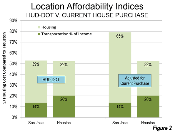
    A household relying on this source of information would be greatly misled. For example, comparing Houston with San Jose, according to HUD-DOT, owned housing and transportation consume virtually the same share of the median household income in each of the two metropolitan areas. In Houston, 52.5 percent of income is required for housing and transportation, while the number is marginally higher than San Jose (52.9 percent).

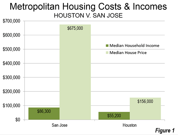
    But the HUD-DOT numbers reflect nothing like the actual costs of housing in San Jose relative to Houston. The median price house in Houston was approximately $155,000, 2.8 times the median household income of $55,200 (this measure is called the median multiple) during the 2006-10 period used in calculating the HUD-DOT index. In San Jose, the median house price was approximately $675,000, 7.8 times the median household income of $86,300 (Figure 1).

    If the Location Affordability Index reflected the real cost for a prospective home owner (HUD-DOT costs including a market rate mortgage for the house), a considerable difference would emerge between San Jose and Houston. The combined San Jose Location Affordability Index for home owners would rise to 85 percent of median household income, a full 60 percent above the Houston figure, rather than the minimal difference of less than one percent indicated by HUD-DOE (Figure 2).

    Under-Estimating the Cost of Urban Containment

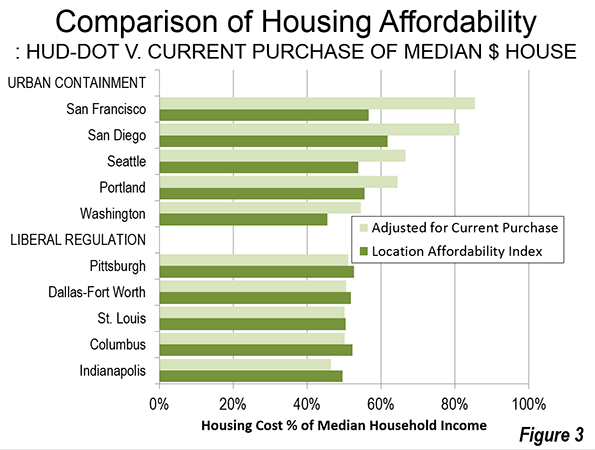
    There is a substantial difference between the HUD–DOT housing and transportation cost and the actual that would be paid by prospective buyers. Five selected urban containment markets indicate a substantially higher actual housing cost than reflected in the HUD–DOT figures. On the other hand, in the selected liberally regulated markets (or traditionally regulated markets), the HUD–DOE figure is much closer to the current cost of home ownership (Figure 3). This is a reflection of the greater stability (less volatility) of house prices in liberally regulated markets. Overall, based on data in the 50 major metropolitan areas, owned housing costs relative to incomes rise approximately 6 percent for each 10 percent increase in the sprawl index – that is, less sprawl is associated with higher house prices relative to incomes (Note 6).

    The increasing impacts of urban containment’s housing cost increases have been limited principally to households who have made recent purchases. The effect will become even more substantial in the years to come as the turnover of the more expensive housing stock continues.

    Granted, the 2006 to 2010 housing data includes part of the housing bubble and its higher house prices. However, house prices relative to incomes have returned to levels at or above that recorded during the period covered by Measuring Sprawl 2014 in "urban containment" markets, such as San Francisco, San Jose, Los Angeles, San Diego, Seattle, Portland, and Washington.

    Economic Mobility and Human Behavior

    Another assertion requires attention: economic mobility is greater in less sprawling metropolitan areas. The basis is research by Raj Chetty and Nathaniel Hendren of Harvard University and Patrick Kline and Emmanuel Saez of the University of California, Berkeley. However, the realities of domestic migration suggest caution with respect to the upward mobility conclusions, as is indicated in Distortions and Reality About Income Mobilityand in commentary by Columbia University urban planner David King.

    Virtually all urban history shows city growth to have occurred as people have moved to areas offering greater opportunity. Jobs, not fountains, theatres and art districts, drive nearly all the growth of cities. This means that there should be a strong relationship between the cities net domestic migration and the economic mobility conclusions of the research. The strongest examples show the opposite relationship.

    Domestic migration is strongly away from some metropolitan areas identified in the research as having the greatest upward income mobility also had substantial net domestic migration losses. For example, despite claims of high economic mobility New York, Los Angeles and the San Francisco Bay area, each lost approximately 10 percent of their population to net domestic migration in the 2000s. On the other hand, some metropolitan areas scoring the lowest in upward economic mobility drew substantial net domestic migration gains. For example, low economic mobility Charlotte and Atlanta gained 17 percent and 10 percent due to net domestic migration in the 2000s. Thus, the results of the economic research appear to be inconsistent with expected human behavior (Note 7).

    Sprawl: An Inappropriate Priority

    The new sprawl report is just another indication that urban planning policy has been elevated to a more prominent place than appropriate among domestic policy priorities. The usual justification for urban containment is a claimed sustainability imperative for its densification and anti-mobility policies. Yet, these policies are hugely expensive and thus ineffective at reducing greenhouse gas emissions, and thus have the potential to unduly retard economic growth (read "the standard of living and job creation"). Far more cost-effective alternatives are available, which principally rely on technology.

    There is a need to reverse this distortion of priorities. Little, if anything is more fundamental than improving the standard of living and reducing poverty (see Toward More Prosperous Cities). Housing is the largest element of household budgets and policies of that raise its relative costs necessarily reduce discretionary incomes (income left over after paying taxes and paying for basic necessities). There is no legitimate place in the public policy panoply for strategies that reduce discretionary incomes.

    London School of Economics Professor Paul Cheshire may have said it best, when he noted that urban containment policy is irreconcilable with housing affordability.

    ———

    Note 1: The previous Smart Growth America report used primarily metropolitan statistical areas (PMSAs), which have been replaced by metropolitan divisions. The primary metropolitan statistical areas were also subsets of metropolitan areas (labor market areas). This is problem is best illustrated by the fact that the Jersey City PMSA, composed only of Hudson County, NJ, is approximately one mile across the Hudson River from Manhattan in New York. Manhattan is the world’s second largest central business district and frequent transit service connects the two. Obviously, Jersey City is a part of the New York metropolitan area (labor market area), not a separate labor market.

    Note 2: Because of incomplete data, Boston is not given a sprawl rating in Measuring Sprawl 2014. A different rating system in the previous edition resulted in a Boston rating among the least sprawling. Yet, the Boston metropolitan area is characterized by low density development. Outside a 10 mile radius from downtown, the population density within the urban area is slightly lower than that of Atlanta (same square miles of land area used).

    Note 3: Higher house prices relative to household incomes are more associated with policies to control urban sprawl (such as urban growth boundaries and other land rationing devices), than with the extent of sprawl. More compact (less sprawling) urban areas do not necessarily have materially higher house prices. For example, in 1970, the Los Angeles urban area was one of the most dense in the United States, yet it was within the historical affordability range (a median multiple of less than 3.0). The emergence of Los Angeles as the nation’s most dense urban area in the succeeding decades (and 30 percent increase in density) is largely the result of a change in urban area criteria. Through 1990, the building blocks of urban areas were municipalities, which meant that many square miles of San Gabriel Mountains wilderness were included, because it was in the city of Los Angeles. Starting in 2000, the building blocks or urban areas became census blocks, which are far smaller and thus exclude the large swaths of rural territory that were included before in some urban areas.

    Note 4: The transport costs from the Location Affordability Index are accepted for the purposes of this article.

    Note 5: The current purchase housing cost is based on the average price to income multiple over the period of 2006 to 2010, relative to the median household income (calculated from quarterly data from the Joint Center for Housing Studies of Harvard University, State of the Nation’s Housing 2011). It is assumed that the buyer would finance 90 percent of the house cost at the average 30 year fixed mortgage rate with points over the period. The 10 percent down payment is allocated annually in equal amounts over the 360 months (30 years). The final annual cost estimate is calculated by adding the monthly mortgage payment and down payment allocation to the median monthly housing cost in each metropolitan area for households without a mortgage.

    HUD-DOT uses the "selected monthly owner cost" from the American Community Survey (ACS) for its cost of home ownership. According to ACS, “Selected monthly owner costs are calculated from the sum of payment for mortgages, real estate taxes, various insurances, utilities, fuels, mobile home costs, and condominium fees."

    Note 6: This is based on a two-variable regression estimation (log-log) with the sprawl index as the independent variable and the substituted housing share of income as the dependent variable for the 50 largest metropolitan areas (excluding Boston), It is posited that most of the variation in housing costs is accounted for by variation in land costs. Other significant factors, such as construction costs and financing costs in this sample vary considerably less. A sprawl index for each metropolitan areas represented by metropolitan divisions (not provided in the sprawl report) is estimated by population weighting.

    Note 7: Another difficulty with that research is that it measured geographic economic mobility at age 30, well before people reach their peak earning level. This is likely to produce less than reliable results, since those who achieve the highest incomes as well as the most educated such as medical doctors and people with advanced degrees) are likely to have larger income increases after age 30 than other workers.

    Wendell Cox is principal of Demographia, an international public policy and demographics firm. He is co-author of the “Demographia International Housing Affordability Survey” and author of “Demographia World Urban Areas” and “War on the Dream: How Anti-Sprawl Policy Threatens the Quality of Life.” He was appointed to three terms on the Los Angeles County Transportation Commission, where he served with the leading city and county leadership as the only non-elected member. He was appointed to the Amtrak Reform Council to fill the unexpired term of Governor Christine Todd Whitman and has served as a visiting professor at the Conservatoire National des Arts et Metiers, a national university in Paris.

    Suburban neighborhood photo by Bigstock.

  • Where Inequality Is Worst In The United States

    Perhaps no issue looms over American politics more than worsening  inequality and the stunting of the road to upward mobility. However, inequality varies widely across America.

    Scholars of the geography of American inequality have different theses but on certain issues there seems to be broad agreement. An extensive examination by University of Washington geographer Richard Morrill found that the worst economic inequality is largely in the country’s biggest cities, as well as in isolated rural stretches in places like Appalachia, the Rio Grande Valley and parts of the desert Southwest.

    Morrill’s findings puncture the mythology espoused by some urban boosters that packing people together makes for a more productive and “creative” economy, as well as a better environment for upward mobility. A much-discussed report on social mobility in 2013 by Harvard researchers was cited by the New York Times, among others, as evidence of the superiority of the densest metropolitan areas, but it actually found the highest rates of upward mobility in more sprawling, transit-oriented metropolitan areas like Salt Lake City, small cities of the Great Plains such as Bismarck, N.D.; Yankton, S.D.; Pecos, Texas; and even Bakersfield, Calif., a place Columbia University urban planning professor David King  wryly labeled “a poster child for sprawl.”

    Demographer Wendell Cox pointed out that the Harvard research found that commuting zones (similar to metropolitan areas) with less than 100,000 population average have the highest average upward income mobility.

    The Luxury City

    Most studies agree that large urban centers, which were once meccas of upward mobility, consistently have the highest level of inequality. The modern “back to the city” movement is increasingly less about creating opportunity rather than what former New York Mayor Michael Bloomberg called “a luxury product” focused on tapping the trickle down from the very wealthy. Increasingly our most “successful cities” have become as journalist Simon Kuper puts it, “the vast gated communities where the one percent reproduces itself.”

    The most profound level of inequality and bifurcated class structure can be found in the densest and most influential urban environment in North America — Manhattan. In 1980 Manhattan ranked 17th among the nation’s counties in income inequality; it now ranks the worst among the country’s largest counties, something that some urbanists such as Ed Glaeser suggests Gothamites should actually celebrate.

    Maybe not. The most commonly used measure of inequality is the Gini index, which ranges between 0, which would be complete equality (everyone in a community has the same income), and 1, which is complete inequality (one person has all the income, all others none).  Manhattan’s Gini index stood at 0.596 in 2012, higher than that of South Africa before the Apartheid-ending 1994 election. (The U.S. average is 0.471.) If Manhattan were a country, it would rank sixth highest in income inequality in the world out of more than 130 for which the World Bank reports data. In 2009 New York’s wealthiest one percent earned a third of the entire municipality’s personal income — almost twice the proportion for the rest of the country.

    The same patterns can be seen, albeit to a lesser extent, in other major cities. A 2006 analysis by the Brookings Institution showed the percentage of middle income families declined precipitously in the 100 largest metro areas from 1970 to 2000.

    The role of costs is critical here. A 2014 Brookings study showed that the big cities with the most pronounced levels of inequality also have the highest costs: San Francisco, Miami, Boston, Washington, D.C., New York, Oakland, Chicago and Los Angeles. The one notable exception to this correlation is Atlanta. The lowest degree of inequality was found generally in smaller, less expensive cities like Ft. Worth, Texas; Oklahoma City; Raleigh, N.C.; and Mesa, Ariz. Income inequality has risen most rapidly in the bastion of luxury progressivism, San Francisco, where the wages of the 20th percentile of all households declined by $4,300 a year to $21,300 from 2007-12. Indeed when average urban incomes are adjusted for the higher rent and costs, the middle classes in metropolitan areas such as New York, Los Angeles, Portland, Miami and San Francisco have among the lowest real earnings of any metropolitan area.

    Rural Poverty

    But cities are not the only places suffering extreme inequality. Some of the nation’s worst poverty and inequality, notes Morrill, exist in rural areas. This is particularly true in places like Texas’ Rio Grande Valley, Appalachia and large parts of the Southwest.

    Perhaps no place is inequality more evident than in the rural reaches of California, the nation’s richest agricultural state. The Golden State is now home to 111 billionaires, by far the most of any state; California billionaires personally hold assets worth $485 billion, more than the entire GDP of all but 24 countries in the world. Yet the state also suffers the highest poverty rate in the country (adjusted for housing costs), above 23%, and a leviathan welfare state. As of 2012, with roughly 12% of the population, California accounted for roughly one-third of the nation’s welfare recipients.

    With the farm economy increasingly mechanized and industrial growth stifled largely by regulation, many rural Californians particularly Latinos, are downwardly mobile, and doing worse than their parents; native-born Latinos actually have shorter lifespans than their parents, according to a2011 report. Although unemployment remains high in many of the state’s largest urban counties, the highest unemployment is concentrated in the rural counties of the interior. Fresno was found in one study to have the least well-off Congressional district.

    The vast expanse of economic decline in the midst of unprecedented, but very narrow urban luxury has been characterized as “liberal apartheid. ” The well-heeled, largely white and Asian coastal denizens live in an economically inaccessible bubble insulated from the largely poor, working-class, heavily Latino communities in the eastern interior of the state.

    Another example of this dichotomy — perhaps best described as the dilemma of being a “red state” economy in a blue state — can be seen in upstate New York, where by virtually all the measurements of upward mobility — job growth, median income, income growth — the region ranked below long-impoverished southern Appalachia as of the mid-2000s. The prospect of developing the area’s considerable natural gas resources was welcomed by many impoverished small landowners, but it has been stymied by a coalition of environmentalists in local university towns and plutocrats and celebrities who have retired to the area or have second homes there, including many New York City-based “progressives.”

    Where Inequality Is Least Pronounced

    According to the progressive urbanist gospel, suburbs are doomed to be populated by poor families crowding into dilapidated, bargain-priced former McMansions in the new “suburban wastelands.” Suburbs, not inner cities, suggests such urban boosters as Brookings Chris Leinberger, will be the new epicenter of inequality, even though the percentage of poor people, as shown above, remained far higher in the urban core.

    Yet , according to geographer Morrill, in comparison with urban cores, suburban areas remain heavily middle class, with a high proportion of homeowners, something rare inside the ranks of core cities.The average poverty rate in the historical core municipalities in the 52 largest U.S. metro areas was 24.1% in 2012, more than double the 11.7% rate in suburban areas. Between 2000 and 2010, more than 80% of the new population.

    in America’s urban core communities lived below the poverty line compared with a third of the new population in suburban areas, although the majority of poor people lived there, in large part because they are also the home to the vast majority of metropolitan area residents.

    An analysis by demographer Wendell Cox of American Community Survey Data for 2012 indicates that suburban areas suffer considerably less household income inequality than the core cities. Among the 51 metropolitan areas with populations over 1 million, suburban areas were less unequal (measured by the Gini coefficient) than the core cities in 46 cases.

    The Racial Dynamic

    There is also a very clear correlation between high numbers of certain groups — notably African Americans but also Hispanics — and extreme inequality. Morrill’s analysis shows a huge confluence between states with the largest income gaps, largely in the South and Southwest, with the highest concentrations of these historically disadvantaged ethnic groups.

    In contrast, Morrill suggests, areas that are heavily homogeneous, notably the “Nordic belt” that cuts across the northern Great Lakes all the way to the Seattle area, have the least degree of poverty and inequality. Morrill suggests that those areas dominated by certain ethnic backgrounds — German, Scandinavian, Asian — may enjoy far more upward mobility and less poverty than others.

    Some, such as UC Davis’ Gregory Clark even suggest that parentage determines success more than anyone suspects — what the Economist has labeled “genetic determinism.” None of this is particularly pleasant but we need to understand the geography of inequality if we want to understand the root causes of why so many Americans remain stuck at the lower ends of the economic order.

    This story originally appeared at Forbes.com.

    Joel Kotkin is executive editor of NewGeography.com and Distinguished Presidential Fellow in Urban Futures at Chapman University, and a member of the editorial board of the Orange County Register. He is author of The City: A Global History and The Next Hundred Million: America in 2050. His most recent study, The Rise of Postfamilialism, has been widely discussed and distributed internationally. He lives in Los Angeles, CA.

  • Work Access in the Non-centered San Francisco Bay Area

    The San Francisco Bay Area (San Jose-San Francisco combined statistical area or CSA) has a superior access to work systems, including its important work at home element. The freeway system provides primary access between all points, importantly supplemented by arterial streets, and accounts for nearly 70 percent of all work trips. There are more types of transit than in other metropolitan regions (metro, street car, commuter rail, light rail, ferry, and cable car) and generally with a higher level of service. The Silicon Valley virtually defines information technology and is behind the huge increase in working at home, much of it telecommuting.

    The recently released American Community Survey five-year file provides the opportunity to examine state of employment access in all Bay Area municipalities

    Employment Access by Car

    Like every major metropolitan area in the United States, more people use cars or light trucks (for simplicity called "cars" in this article) to get to work than any other mode of transport. In the Bay Area, 68 percent of commuting is by car. Cars provide the overwhelming majority of work access to jobs in 11 of the Bay Area’s 12 counties. This ranges from 80 percent in Alameda County (secondary core municipality Oakland is the county seat) to 91 percent in San Joaquin County, which was recently added to the San Jose-San Francisco CSA (Figure 1). In the 12th county, San Francisco, cars provide work access for nearly equal to that of transit, walking and cycling combined (both approximately 46 percent).

    Employment Access from Home

    Working at home continues to grow and, to an even greater extent than car travel, is relatively evenly distributed throughout the 12 Bay Area counties. The highest percentage is in Marin County, at 9.6 percent. The combination of a technology friendly regional environment and horrific traffic on the primary commuting routes to most of the Bay Area (US-101 and the Golden Gate Bridge) probably drive this figure higher. Contra Costa County and Santa Cruz County also have a high work at home shares, at 7.3 percent and 7.1 percent respectively. This is than 50 percent above the national rate.

    Most surprisingly, however, the lowest work at home share in the Bay Area is in Santa Clara County, the very heart of Silicon Valley. This is slightly less than the national average. Another surprise is counties on the periphery of the Bay Area also have small work at home shares. Sonoma, Napa and San Joaquin counties have work at home shares of under 5.0 percent.

    Outside the core cities of San Francisco and Oakland, more than 1.5 times as many employees work at home (including telecommuting) than access work by transit (Figure 2).

    Employment Access by Transit

    The Bay Area remains monocentric only in aerial photographs and transit market share. San Francisco is served by one of the nation’s busiest metro (subway or underground) systems in the nation, Bay Area Rapid Transit (BART), which carries over 400,000 one-way rides daily. BART was the first of the major post-World War II rapid transit systems in the United States and was followed by other fully grade separated Metro systems in Washington and Atlanta and individual lines in Los Angeles.

    As we indicated in Transit Legacy Cities, most of the transit commuting (55 percent) in the United States is to just six core municipalities, New York, Chicago, Philadelphia, Boston, Washington, and San Francisco. Approximately 60 percent of commuting to those cities is to the downtown areas, which are also the largest in the United States. Yet these legacy cities, with a majority of the nation’s transit commuting, account for only six percent of the nation’s employment.

    Nearly two-thirds of Bay Area transit commuters work in the city of San Francisco and that figure rises to more than 70 percent, including the city of Oakland, with its strong downtown. Yet, these two core cities have only 21 percent of employment in the Bay Area. The downtowns of both core cities are well served by transit, including BART and radial surface transit systems. Buses serve downtown Oakland, while buses, trolley buses (electric buses), street cars and cable cars are focused on downtown San Francisco.

    The Non-Centered Metropolis

    Even with a regional Metro system, the Bay Area has developed in a strongly dispersed and polycentric form. Polycentricity is represented by edge cities (suburban office centers) such as Walnut Creek (with a BART station), the San Francisco Airport office area (not generally walkable from any rapid transit) and in the Silicon Valley (San Mateo and Santa Clara counties). Even more, however, employment is dispersed well beyond even these nodes.  Authors Robert Lang and Jennifer LeFurg have called this phenomenon "edgeless cities," though their other term, the "non-centered metropolis," says it better.

    Outside the San Francisco-Oakland core, the commuting pattern in the Bay Area is little different than in the rest of the nation (as is also the case in New York, outside the urban core). Nearly 80 percent of the Bay Area’s jobs are outside the cities of San Francisco and Oakland, however only 4.0 percent of commuters use transit to jobs located outside these cores. Among municipalities other than San Francisco and Oakland with BART stations, work access by transit is 5.1 percent, only slightly higher than the national average (which includes all urban and rural areas). Commuting by transit is even lower (3.0 percent) to jobs in outside municipalities with BART stations (Figure 3).

    Among the municipalities with BART stations and favorable "jobs-housing balances," only San Francisco, Oakland and Berkeley (home of the University of California) attract more transit commuters than the national average. Walnut Creek illustrates the problem of regional transit commuting to suburban locations. Walnut Creek has a strong suburban office center and a stronger jobs-housing balance than all BART municipalities but much smaller Colma. Yet, only 3.5 percent of commuters who work in Walnut Creek used transit to get to work (Figure 4).

    Overall, outside the core cities of San Francisco and Oakland, approximately 20 times as many people commute to jobs by car as by transit.

    The Illusion of Monocentricity

    With transit’s failure to carry large numbers of workers to jobs throughout the Bay Area (not just to the two older core municipalities), planners have switched strategies. Now the focus is on urban villages (transit oriented development), by which people and jobs will be located close together, reducing the need for long automobile commutes. The adopted regional plan, "Plan Bay Area" imagines people living in transit oriented developments and walking, cycling or using transit to get to employment. However, former principal planner of the World Bank Alain Bertaud says that this "urban village model exists only in the mind of urban planners" and worse, that "it contradicts the economic justification of large cities:  the efficiency of large labor markets." (see: Urban Planning 101) That means a lower standard of living and more poverty.

    The reality for the Bay Area and for metropolitan areas around the world is that transit is structurally incapable of replacing the automobile for the bulk of the workforce. The fundamental problem is that no transit system can attract drivers to jobs by offering travel times competitive with the automobile (Note). Transit can compete to some downtowns, but downtowns have only a small minority of employment. Outside of those, trip patterns are simply too dispersed for transit to serve as well as cars. Monocentric cities, to duplicate Bertaud’s logic, exist "only in the mind of urban planners."

    Wendell Cox is principal of Demographia, an international public policy and demographics firm. He is co-author of the "Demographia International Housing Affordability Survey" and author of "Demographia World Urban Areas" and "War on the Dream: How Anti-Sprawl Policy Threatens the Quality of Life." He was appointed to three terms on the Los Angeles County Transportation Commission, where he served with the leading city and county leadership as the only non-elected member. He was appointed to the Amtrak Reform Council to fill the unexpired term of Governor Christine Todd Whitman and has served as a visiting professor at the Conservatoire National des Arts et Metiers, a national university in Paris.

    ————–

    Note: In 2003, I issued a challenge to identify an existing or proposed transit system design that would achieve automobile competitiveness throughout a metropolitan area of more than 1,000,000 in Western Europe or the United States (see: Smart Growth Challenge: Transportation Choice for All, Not Just a Few [Automobile Competitiveness]). No complete responses were received. This is not surprising. In 2007, Professor Jean-Claude Ziv and I authored a paper for the 11th World Conference on Transport Research (2007 WCTRS) that estimated such a system could cost as much as the total gross domestic product of any such metropolitan area each year).

    Photo: Bart A car Oakland Coliseum Station

  • Urban Planning 101

    Former World Bank principal planner Alain Bertaud has performed an important service that should provide a much needed midcourse correction to urban planning around the world. Bertaud returns to the fundamentals in his "Cities as Labor Markets."

    Bertaud begins by reminding us that without well functioning labor markets, cities will not be successful. This requires mobility, which he defines as "the ability to move quickly and easily between locations within a metropolitan area" and "the ability to locate one’s house or one’s firm in any location within a metropolitan area." This mobility, he maintains, is indispensable in facilitating growth of the city.

    There is just one exception, according to Bertaud. These are retiree cities, which do not principally rely on mobility for their growth. Yet, Bertaud notes that these are themselves products of the much more numerous conventional cities, where mobility has facilitated growth and in which future retirees accumulate the resources that permit migration to the retirement cities.

    There are also the planned cities for government, such as Brasilia and Washington. Bertaud contends that they have become successful because "more diversified labor market "was grafted " onto the government activities."Before that, however: "The ‘cost is no object’ concept presided over their construction and insured their initial survival as they were financed by taxes paid by the rest of the country." This should give pause to nations, especially in the developing world proposing to build and thereby divert resources from improving the lives of people (see;  Unmanageable Jakarta Soon to Lose National Capital?).

    Imaginary "Urban Villages"

    Bertaud insists on the importance of cities as unified labor markets. Metropolitan areas will be hampered in their development and innovation to the extent that they are fragmented.

    He is particularly critical of planning attempts to create "urban villages" within the unified labor markets (metropolitan areas). He contends that: "The urban village model” implies a systematic fragmentation of labor markets within a large metropolis and does not make economic sense in the real world."

    Bertaud does not accept the notion that:

    "… everybody could walk or bicycle to work, even in a very large metropolis. To allow a city to grow, it would only be necessary to add more clusters. The assumption behind this model is either that urban planners would be able to perfectly match work places and residences, or that workers and employers would spontaneously organize themselves into the appropriate clusters."

    He is concerned at the "prevalence of this conceit in many urban master plans," which he characterizes as "utopian trip patterns."

    According to Bertaud, the urban village "model does not exist in the real world because it contradicts the economic justification of large cities: the efficiency of large labor markets." The cold water of reality is that "… the urban village model exists only in the mind of urban planners."

    Uncontained Self-Contained Satellite Towns

    He supports his claim. Seoul’s satellite communities were intended to be self contained towns (urban villages), in which most residents both lived and worked. Yet, most of the workers employed in the satellite towns live in other parts of the metropolitan area. At the same time, most of the residents of the satellite  work in other parts of the Seoul metropolitan area. He cites Stockholm regulations requiring neighborhood jobs – housing balances as having no impact on shortening commute distances even when such a balance is achieved.

    My own research using 2001 census data indicated that the London area new towns, also intended to be populated principally by people who work in them, had average work trip travel distances more than their diameter (See: Jobs-Housing Balance and Urban Villages in Southeast England). This means that large numbers of people were traveling to work outside the towns. In London as in Seoul, the planners can conceptualize the self-contained satellite towns, but it is beyond them to force the behaviors to make them work.

    Similarly misguided efforts elsewhere, from the San Francisco Bay Area and other California metropolitan areas to Montréal and beyond are destined for similar failures.

    Commuting and the City

    Bertaud cites research by Remy Prud’homme and ChoonWong Lee at the University of Paris showing that the efficiency of cities tends to increase up so long as a large share of the commutes are less than 60 minutes, though optimal efficiency occurs at shorter commute distances. Lest there be any misunderstanding, American cities have average commute times of approximately 25 minutes, according the Census Bureau’s American Community Survey, not the hour or two hour journeys of urban legends.

    Defining the City

    This large commuting radius makes it clear that Bertaud does not accept the distorted urban definition that would, for example, define the urban form to not extend beyond the borders of New York City, or worse beyond the Hudson, East and Harlem Rivers – the boundaries of the island of Manhattan. If the city is limited to dense cores, then the "half urban" world recently announced won’t be here for many decades. The city is the metropolitan area – the labor market, which extends to the far reaches of the commuting shed.

    The Bottom Line

    According to Bertaud, 

    "Increasing mobility and affordability are the two main objectives of urban planning. These two objectives are directly related to the overall goal of maximizing the size of a city’s labor market, and therefore, its economic prosperity." 

    That brings us back to first principles. Cities are about people. Planning is justified to the extent that it facilitates the aspirations of people. The city requires prosperity, which Bertaud shows in a much needed first installment of Urban Planning 101.

    Wendell Cox is a Visiting Professor, Conservatoire National des Arts et Metiers, Paris and the author of “War on the Dream: How Anti-Sprawl Policy Threatens the Quality of Life.

    —–

    Note: Alain Bertaud’s "Cities as Labor Markets," was published by the Marron Institute on Cities and the Urban Environment at New York University and is intended to be a chapter in his forthcoming book, tentatively titled Order without Design.

  • The Evolution of Red and Blue America 1988-2012

    David Jarman of Daily Kos Elections provides an excellent analysis of the absolute change in the Democratic and Republican vote for president from the 1988 through the 2012 elections, together with valuable tables and maps. The maps, tables, and narrative clearly demonstrate that, while the map looks mostly red as if Republicans were the big winners, the reality is that the Democrats were the beneficiaries of vastly more added votes, because of Democrats’ stupendous domination of the denser, bigger, metropolitan territory. For example, Los Angeles County by itself provided a Democratic gain of 1.2 MILLION, while the largest Republican gain was Utah county, Utah (Provo) with a paltry 90,000 gain. Republicans dominate the vast non-metropolitan expanses, Democrats the urban cores.

    But the title of the piece, “Democrats are from cities, Republicans from exurbs”, is not quite right. Density is only one factor in elections; Democrats did quite well in much of exurbia as well as much of suburbia, relegating Republicans to rural, small city, non-metropolitan America. But the story is as much one of social change as of city versus country. Not only the big central cities, but their suburbs and even exurbs have evolved to house the more socially liberal population, with issues of race, women’s rights, and sexuality converting many middle and upper class to the Democratic side, even while rural small town America and much of the South remain socially conservative and supportive of Republicans.

    This analysis extends Jarman’s findings by disaggregating the net change in the D and R vote by first looking at the degree of change in the Democratic share of the presidential vote from 1988 to 2012 and second by classifying by the change by such categories as:

    • increased R vote shares, 1,
    • declining R votes, 2,
    • shift to Democratic to Republican,3,
    • increased D vote shares, 4,
    • decreased D vote shares, 5,  and
    • 6, a shift from Republican to a Democratic majority

    This permits a more subtle geographic evaluation of the evolution of Red and Blue America. I want to thank the Daily Kos Elections which generously provided the necessary data files. This analysis considers only the vote for president, as the story of votes for congress is complicated by gerrymandering and other issues.

    Change in the Democratic vote by type of change (see Table 1)

    Table 1: Net Change by Type of Change
    Number of Counties 2012 %D 1988 %D Change in D% 88-12 net change County Type (Code)
    1411 30.8 39.8 -9 -4,605,125 1 Total
    448 40.3 55.1 -14.5 -1,517,300 3 Total
    108 55.8 57.2 -1.4 -62,214 5 Total
    -6,184,639 R gain
    274 71.1 58 12.8 8,835,866 4 Total
    313 59.7 42.9 16.4 8,917,699 6 Total
    572 42.4 35.3 7.1 463,743 2 Total
    18,217,308 D gain
    12,032,669 Net D Gain

    Almost half of all counties, 1411, experienced Democratic declines and net Republican gains, totaling  a  net change of 4,605,000, with the Democratic share dropping nine points from 39.8% to 30.8%.  Next in importance for Republicans was the gain of 1,517,000 votes in 448 counties taken from the Democratic column in 1988, with a decline in the Democratic share from 55.1% to 40.3%, a big drop of 14.8 points.  Finally a smaller number of counties, 108, remained Democratic but with a declining share (type 5), giving Republicans a small net gain of 62,000. These Republican gains totaled 6,184,000 and look impressive on a US map.

    But what the Democrats lose in vast America, they make up in the crowded parts. Although their increased shares took place in only 274 counties, the gains were populous enough to provide the Democrats with a massive gain of 8,836,000 total votes. The D share rose an impressive 12.5 points from 58.8% to 71.1%. (This exceeds even the R share in the R gaining counties). But even this big number was exceeded by the gain of 8,918,000 in the again fairly small number of counties which switched from Republican to Democratic, with a change in share up 16.4 points from 46.1% D to 59.3%. Finally the Democrats gained a net 464,000 votes in 572 counties carried by Republicans but by a lesser margin than in 1988, with the D share rising from 35.3% to 42.4%.  Overall the net Republican gains of 6,184,000 were surpassed by Democratic gains of 18,717,000 for a net D growth of 12,032,000, a rise in the D share of 5.9 points from 46.1% in 1988 to 52.6% in 2012.

    Change By State

    A short look at the state level is interesting (Table 2).  Sixteen states became even more Republican, with a net gain of 2,681,000.  Most important in total numbers is the southwestern set of  TX, OK, LA, and AR (1,143,000), then the northern mountain states of UT,ID, WY, and MT (477,000), followed by the Great Plains states of ND,SD, NE, KS, and MO (376,000), and the Appalachian set of TN  and KY (488,000). To the latter should be added West Virginia, 210,000, the only state which switched from Democratic to Republican and an apt example of the non-big-metropolitan and ideological shift in the US electorate.  Only one state, Iowa, experienced a small Democratic decline.

    Nine states became even more Democratic, but sixteen switched from Republican to Democratic, and thus spurring the major numeric and geographic manifestation of the 1988-2012 realignment, a total of 15,342,000.  Combining the Democratic states into subregions reveals the overwhelming importance of greater northeastern Megalopolis, yielding a net vote gain of 5,660,000 and of the “Left Coast” with 4,115,000, both dwarfing the total Republican gains. And the gains in the Great Lakes of 2,740,000, northern New England of 443,000, and the southern Mountain states of 431,000 were significant. Finally the major change in the South Atlantic region is notable, with a gain of 1,383,000 in SC, NC, GA, and FL, even though all but Florida remained Republican. At the individual state level California is dominant, 3,367,000, followed by NY-NJ. For Republicans Texas dominated with 578,000 followed by much smaller Utah with 268,000.

    County level

    The first two maps are the traditional red and blue (sort  of) choropleth maps, showing in Map 1 change in the share voting Democratic and in Map 2, the type of change. Map 3 depicts via graduated circles the absolute net change by counties, like the similar map in the Jarman article.

    Percent change in the Democratic and Republican shares, 1988-2012, Map 1

    Somewhat over half the territory of the US experienced Republican gains, in red shadings, but on average, the populations of the counties are smaller than for the Democratic counties in the blue shades. The dominant swath of red in the center third of the country from TX and LA north through the Dakotas and MN is impressive, but also prominent is the extension across the border south from MO and southern IL to KY, WV and into western PA, and then the northwestern extension to the mountain west, as far as the Cascade range. The most extreme Republican gains were in the two cores of southern Appalachia and eastern TX and OK into LA, plus UT. Most are non-metropolitan. A few most extreme R gains were in Knott, KY, 50%, Cameron, LA, 45, Mingo and Logan, WV, 44 and 43, and Kent, TX, 43%.

    Democratic gains were far more concentrated: in the northeast, in the urban Great Lakes, in much of FL, in the Black Belt of the south, in the metropolitan Left Coast, and in the southern mountain states. The highest gains were in central and suburban-exurban counties in the northeast, the west coast, and Great Lakes, and also in non-metropolitan northern New England. Lower Democratic gains were common beyond the big metropolitan cores or on the edges of the Black Belt in the south.  A few of the more extreme Democratic increases were in Clayton, GA, 51%, Rockdale, GA, 33, both suburban Atlanta, Osceola, FL, 31, Prince George, MD, 30, and Hinds, MS (Jackson), 28%. 

    Kind of change, 1988-2012, Map 2

    The 1411 counties becoming even more Republican (type 1) certainly dominate the interior Plains from Canada to the Gulf and the interior, mainly non-metropolitan far northwest. There are a few counties (typically university counties) in this heartland with counties still red, but less so in 2012. The dominant areas for Republican decline (type 2) are found in the Great Lakes states, in the non-metropolitan, often exurban edges of Megalopolis (NY, PA, NJ, MD, VA). Other areas of Republican decline include rural areas in the interior west, especially areas with environmental attractions and/or increasing Latino populations, and even in parts of the traditional south, such as MS, FL, SC,NC, and VA.

    Most notable are such long term Republican strongholds as Orange, CA, Duval (Jacksonville), FL, and Maricopa, (Phoenix).  Counties which switched from Democratic to Republican (type 3) are first and most impressively in Appalachia from western PA, then including most of WV, and into western VA, central TN into northern AL, second in the TX-OK-AR-LA zone, almost totally non-metropolitan.

    Areas of Democratic gains, type 4, darkest blue, require a close look at the map, as they are mainly the metropolitan cores, most notably Los Angeles, Cook, King (Seattle), much of the New York SMSA, San Francisco-Oakland, Detroit, and Philadelphia. However there are also many majority-minority counties: in the Black Belt across the south, in a few Hispanic areas along the Rio Grande, and Native American areas across the west. Highest Democratic share gains were in metropolitan CA,  FL, in exurban New York, Philadelphia, Washington, DC, and Chicago, northern New England and select amenity areas, popular with metropolitan migrants, even in WY and ID!

    Democratic voter share declined (type 5) in  some urban cores, like Allegheny (Pittsburgh), but the most prominent areas are in farming and forestry  areas in the upper Midwest (IA, WI, MN, often adjacent to counties which switched from D to R), and traditionally D forest industry counties in OR and WA. Especially interesting are the counties switching from Republican to Democratic, type 6, most critical to understanding the connection to social liberalism. The most prominent area is northern New England and NY, and extending through Megalopolis snatching a large number of very populous suburban and EXURBAN counties (MA, CT, NY, NJ, MD, VA, PA).

    A second large swath in territory and population is in CA, switching major metropolitan-suburban counties, and also increasingly Hispanic counties to the D column. This switching of suburban and exurban counties was also prevalent in CO, OR, WA, IL, and MI, as well as in parts of the south, e.g., FL and NC. Less visible is the shift of many university counties in most parts of the country. Last and increasingly important is the shift of rural environmentally attractive areas, mostly across the west, but also in the south Atlantic, upper New England and the upper Great Lakes, in part due to retirement of urban professionals. Some of the most important switches were Riverside, San Bernardino, San Diego, Sacramento in CA; Miami and Orlando, FL; Oakland, MI; Suffolk, Bergen and Westchester (all exurban New York); Mecklenburg (Charlotte); and Marion, IN (Indianapolis).

    Absolute change in the D and R vote, 1988-2012, Map 3

    Map 3 plots the absolute size variation in the Democratic versus Republican change, via a simple blue versus red, to assist the reader in properly interpreting Maps 1 and 2. The map highlights the tremendous concentration of Democratic gains in the northeastern Megalopolis, metropolitan California, the big cities of the Great Lakes, and Florida, versus the much more widespread pattern  of Republican gains, extensive in area but small in voter magnitude across the Plains, Mountain states, and most notably, Appalachia .

    Overall, what emerges is a picture far more subtle than simply cities versus exurbs. The bad news for Republicans is that most of their gains occur in rural areas with little population while the Democrats have consolidated their increases in more populous urban, suburban, and in some places exurban areas. Whether these trends spell the death knell for the GOP in the post-Obama period may turn on how they learn to appeal to the next generation of suburban and exurban voters – many of them Hispanic or Asian – as they enter their 30s, buy houses and start businesses. Economic issues could help here, but an emphasis on social issues, or simple anti-tax dogmatism could spell the GOP’s descent into permanent minority status.

    Table 2: Greatest Changes by State
    State 2012% 1988% % Change Code Net change (000)
    TX 42 43.7 -1.7 1 -578
    UT 25.4 32.6 -7.2 1 -268
    KY 36 44.7 -8.7 1 -254
    OK 33.3 41.6 -8.3 1 -253
    TN 39.5 41.8 -2.3 1 -234
    WV 36.3 52.4 -16.1 3 -210
    WY 28.6 39.5 -10.9 1 -62
    DE 59.6 43.5 16.1 4 114
    VT 68.2 48.3 19.9 6 115
    NV 53.3 39.2 14.1 6 141
    NH 52.9 37.7 15.2 6 157
    ME 57.8 44.3 13.5 6 171
    WA 58.2 50.8 7.4 4 435
    MA 61.7 54 7.7 4 516
    VA 51.9 39.7 12.2 6 598
    OH 51.5 43.9 7.6 6 643
    MI 54.8 46 8.8 6 739
    MD 62.6 48.5 14.1 6 756
    IL 58.6 49 9.6 6 979
    FL 50.4 38.8 11.6 6 1,036
    NJ 59 43.1 15.9 6 1,068
    NY 66.2 52.1 14.1 4 1,720
    CA 61.9 45.2 16.7 4 3,367

    Richard Morrill is Professor Emeritus of Geography and Environmental Studies, University of Washington. His research interests include: political geography (voting behavior, redistricting, local governance), population/demography/settlement/migration, urban geography and planning, urban transportation (i.e., old fashioned generalist).

  • We Had To Destroy the City In Order to Save It

    As housing prices and rents soar out of control in tightly regulated cities like San Francisco and New York, many people have called for a significant loosening of zoning rules to permit greater densification. Many policies contribute to unaffordable housing, including rent control, historic districts, eminent domain abuse, and building codes, but zoning puts an absolute cap on dwelling units per acre thus is generally part of any solution to the supply problem. What’s more, as recent commentators have started to notice, even many of America’s most dense cities are predominantly zoned for single family homes, calling into question the need to dedicate so much space to a single housing typology.

    For example, a web site called Better Institutions posted this map of Seattle, in which all of the yellow districts are zoned exclusively for single family homes:

    The poster lets his feelings be known by using scare quotes to denote single family “character” and blaming the zoning for Seattle’s high rents.

    And Daniel Hertz posted a similar map of Chicago in which the red is single family homes only and yellow is industrial space unavailable for any residential use:

    Some go beyond affordability, saying that we also need to significantly increase densities in central cities in order to reduce greenhouse gas emissions.  Harvard professor Ed Glaeser wrote an article advocating this subtitled, “To save the planet, build more skyscrapers—especially in California.”  He says, “A better path would be to ease restrictions in the urban cores of San Francisco, San Jose, Los Angeles, and San Diego. More building there would reduce average commute lengths and improve per-capita emissions” and “Similarly, limiting the height or growth of New York City skyscrapers incurs environmental costs. Building more apartments in Gotham will not only make the city more affordable; it will also reduce global warming.” He claims that, “The best thing that we can do for the planet is build more skyscrapers.”

    These complaints and the proposed solution of more dense multi-family development may be true in a technical sense, but what would carrying that out mean for people who actually live in our cities?

    Some critics may disdain the character of single family districts but few of these pundits ask the question of what eliminating lower-density housing actually means to the survival of the urban middle class.  Districts, like the Portage Park example Daniel Hertz gave in Chicago, are some of the last bastions of middle class family life in the city.  It’s clear that some densification can be implemented without radically changing the appearance or functioning of the built environment. Allowing 2-flats and coach houses, or even the corner apartment building or townhouse development, wouldn’t ruin Portage Park. There’s no reason such things should not be allowed. But nor would they make a major dent in affordability in places where a tidal wave of global demand is washing over the city such as in San Francisco.

    To materially boost the number of units in an era in a manner that moderates prices in a highly desirable place like San Francisco would require massive changes in the built environment of its neighborhoods.  This would radically transform the character and nature of the city in question.  If San Francisco were really covered in skyscrapers, it would cease to be San Francisco— a city of low-rise buildings framed by hills that would be obscured by high rises. There may well be the same geography on the map labeled as such, but it would be a completely different place. We would have to destroy the city in order to save it.

    One person who gets that is Alex Steffan. He’s angry about prices, saying that the “criminal lack of housing is a global scandal.”  He’s also honest enough to forthrightly acknowledge that a sufficient scale of new homes to bend the cost curve would fundamentally change many of our cities:

    We can build some housing incrementally, without changing the skyline or cityscape, but not anything like enough. To produce enough homes to matter, fast enough, we’re going to have to fundamentally alter parts of our cities. That, of course, demands a local government willing and able to plan and permit such widespread change. It also takes an array of homebuilders doing the actual work, often in more innovative and low-cost ways, like more collaborative housing, manufactured buildings and flexible living spaces. Most of all, it takes broader public insight into how large-scale development can improve our cities.

    In other words, it’s a major change in communities that requires selling the public on the idea. He believes that young people will be the agents of change here. This shows perhaps one of the signature affects such changes would have. They would displace families by eliminating their preferred housing typologies in favor of forms more amenable to predominantly younger singles or the childless for  whom living in an apartment with no backyard is more likely a relief than an imposition. But it’s hard to imagine cities as places for solving the problem of climate change if they are, like San Francisco, increasingly places devoid of families with children.

    Steffan also says affordable housing is a social justice issue. Yet is it really social justice to require everyone to have equal access to San Francisco, population 825,000?  I think not. Especially not when America is replete with urban centers whose biggest problems are depopulation and worthless houses that you can’t give away. There are plenty of options of places for people to live; we should look at making our now failing cities more attractive to people who may like the housing and neighborhood, if not for issues such as crime and poor schools. There’s no guarantee in America that you can afford to live in the place you might most want to choose. That’s long been true of suburbanites and city dwellers alike.

    Also, the willingness to fundamentally reshape cities is odd in light of the fact that such previous attempts are uniformly viewed in the urbanist community as disasters. The idea of Manhattanizing San Francisco brings to mind nothing so much as Le Corbusier’s Plan Voisin for Paris, in which the historical cityscape is replaced with towers in the park.

    Of course no one is actually saying to take it this far, although Glaeser’s vision gets close it. But once we enshrine the rule that a certain threshold of unaffordability means more density and building regardless of neighborhood character, it’s hard to see what the limiting principle would be. Also, high rises or even buildings above 4-5 stories in height usually require expensive construction techniques, and thus are inherently costly.

    It’s true, however, that cities are not static entities. Every downtown skyscraper in America is built on a site that was once used for something else. Yet we see this densification overall as a good thing. Had Manhattan been preserved as of its pre-skyscraper era, it’s not clear the city would have benefitted.

    Clearly the zoning and building regulations in our cities are often too strict. Yet the disasters of previous generations’ radical change suggests that incrementalism is a better course.  By all means allow two-unit houses, corner stores with upper story apartments, etc. into currently all-single family zones. Add areas where high rises are allowed the peripheries of districts currently zoned for such; warehouse districts as well as office buildings that are not well occupied.  But don’t bring out the bulldozer wholesale.  Additionally, a healthy city should make sure to embrace the entire palette of housing types – including single family homes. There’s more to making cities attractive to middle class families than just cost, and things like the prospect of a backyard for the kids to play in are among them.

    And given the relatively few intact and attractive urban cores in America, prices are going to continue to go up. That’s true even with radical new building. As mentioned, San Francisco only has a bit over 800,000 people. Boston and DC have only about 600,000 each. How many people can you plausibly put into these places? Realistically, not all of us who would like to live in San Francisco or lower Manhattan are going to be able to do so.  That’s true no matter how many skyscrapers we build.

    Aaron M. Renn is an independent writer on urban affairs and the founder of Telestrian, a data analysis and mapping tool. He writes at The Urbanophile.

    Lead Photo: More density in Los Angeles

  • Where New Yorkers are Moving

    The American Community Survey has released domestic migration data that was collected over a five year period (2007 to 2011).  There is newer domestic migration data available, such as is annually provided by the Census Bureau’s population estimates program, but not in the detail that the latest data provides.

    The new release is significant because domestic migration data is provided between each of the nation’s more than 3,100 counties. Because the survey was taken over a five-year period, the data represents, in effect, a one-fifth snapshot of domestic migration for each of the years from 2007 to 2011. Each year respondents are asked where they lived a year ago. It is thus a rolling annual figure, rather than a picture of a single year.

    The Uniqueness of New York City

    The city of New York provides an interesting case for many reasons. The city is by far the largest municipality in the United States and the only municipality composed of at least two complete counties. New York is coterminous with five counties. New York also has by far the greatest extent of high density in the United States, comprising more than 85 percent population of zip codes with greater than 25,000 per square mile density (10,000 per square kilometer).

    Finally, New York is at the center of the largest metropolitan area in the United States, which in its expanded, combined form (combined statistical area) has a population of 23.1 million, most of which (20.7 million) is in a built-up urban area that covers the largest land area in the world (has the largest urban footprint). This is more than a third larger than Tokyo, the world’s largest urban area by population, with an 80 percent higher population. It is surprising to many that New York’s urban area covers nearly twice the land area of Los Angeles and is nearly one-quarter less dense.

    Domestic Migration and New York City

    New York’s broad suburban expanse generally resembles the suburbs of Dallas-Fort Worth, Seattle or Toronto and much of its Staten Island borough (county of Richmond) looks more like suburban New Jersey than New York, most of its urban core – the city of New York – is unique.

    And the city continues to export large numbers of people – 90,000 more than arrived in the rolling year represented by the latest ACS data. This is a big number, representing 1.1 percent of the city’s 2010 population. This is a larger loss than Philadelphia (0.5 percent), but smaller than Washington (1.4 percent).

    This has been evident in the large numbers net domestic migrants reported each year in the Census Bureau estimates. The data shows that people are leaving not only the city of New York not only for the suburbs, but moving in even greater numbers to beyond the metropolitan area. Approximately 27,000 more New Yorkers moved to the suburbs than to the city of New York over the period. However, an even larger 63,000 net domestic migrants left the city of New York for areas outside the metropolitan area.

    Approximately 30,000 of these inter-regional migrants moved to other major metropolitan areas (those with more than 1 million population). By far the largest share – 74 percent – of the city’s net domestic migrants to other major metropolitan areas moved to the South. Four of the five largest major metropolitan gainers at the city’s expense were Miami (net 5,600) and Atlanta (net 4,300), followed by Tampa-St. Petersburg, and Dallas-Fort Worth.

    Another 13 percent of the city’s net domestic migrants moved to other major metropolitan areas in the Northeast. Rochester was the largest gainer with nearly 1000 net domestic migrants from the city of New York, followed by Philadelphia. The city gained more than 250 residents from Boston.

    Approximately 9 percent of the city’s net domestic migrants moved to major metropolitan areas in the West. Los Angeles led in the West, gaining 1,800 net migrants from the city. The outlier was the Midwest, which sent more than 300 net migrants to the city (Figure 1).

    City residents tended to move to the suburbs of the major metropolitan areas, which attracted 60 percent, while the core cities received 40 percent of the net migrants.

    Dispersing Beyond the Larger Metropolitan Areas

    However, the most striking trend is that most of the net domestic migrants who left the city of New York to move outside the New York metropolitan area moved to areas outside the major metropolitan areas. In this regard, New Yorkers who move seem to be more inclined toward the greater dispersion of the nation’s smaller metropolitan areas and micropolitan areas.

    Over the period, approximately 32,500 net domestic migrants left the city for areas outside major metropolitan areas. This is more than moved to the other major metropolitan areas or to the New York metropolitan area suburbs (Figure 2).

    The most surprising finding is that the majority (65 percent) of net domestic migrants from the city who moved to outside the major metropolitan areas settled in the Northeast. Most of these 23,000 residents moved to smaller areas in Upstate New York and Pennsylvania. Virtually all of the other migrants not moving to major metropolitan areas moved to states in the South (41 percent). In contrast, there was a small amount of migration to New York from the West and Midwest totaling less than 2,000 (Figure 3).

    Outside New York and New Jersey, which contain nearly all of the New York metropolitan area, Florida received the largest number of net migrants from the city (11,000), followed by Pennsylvania (8,000). Only 100 of the Pennsylvania migrants were to Pike County, which is in the New York metropolitan area. Georgia, Texas and North Carolina all received approximately 5,000 net migrants from the city. The top ten destinations were rounded out by Virginia, Connecticut and South Carolina. A total of 37 states received net domestic migrants from the city. Only Alaska and the District of Columbia sent more than 1,000 net domestic migrants to New York City.

    Conclusion

    The New York City migration data indicates continuing dispersion of the population. People are moving from the core to the periphery in New York, and many going beyond to less urban areas in the Northeast. More are moving to other major metropolitan and other smaller areas, located for the most part in the South. This year’s brutal winter could make the South look even better to New Yorkers.

    Wendell Cox is a Visiting Professor, Conservatoire National des Arts et Metiers, Paris and the author of “War on the Dream: How Anti-Sprawl Policy Threatens the Quality of Life.

    Photo: Leaving New York City via the Holland Tunnel (by author)

  • Sustaining Prosperity: A Long Term Vision for the New Orleans Region

    This is the executive summary from a new report Sustaining Prosperity: A Long Term Vision for the New Orleans Region, authored by Joel Kotkin for Greater New Orleans, Inc. Download the full report from GNO, Inc. here: gnoinc.org/sustainingprosperity

    The recovery of greater New Orleans represents one of the great urban achievements of our era. After decades of slow economic, political and social decline, hurricane Katrina seemed a kind of coup de grâce, smothering the last embers of the region’s vitality. In the fall of 2005 it was entirely logical to see New Orleans as just a potential exemplar of failed urbanization, much as we might see in Detroit1, Cleveland, and a host of other once great cities – for example Naples, Lisbon, Antwerp and Osaka – that have tumbled from their once great importance.2

    Yet in New Orleans’ case, disaster engendered not continued decline, but the revival of the en­tire region, its economy, and social and political institutions. Like Chicago after the great fire of 1871, San Francisco in the wake of the 1906 earthquake and fire, or New York following 9-ll, New Orleans has rebounded in ways that have defied expectations.

    Critical to making New Orleans a resilient city has been the transformation of the civic culture. This has much to do with the commitment of New Orleanians to their city – like Chicagoans, New Yorkers and San Franciscans in the past. “A city,” notes urban historian Kevin Lynch,” is hard to kill if it possesses unique cultural appeal, geographic assets and people who are determined to save the city they love.”3

    New Orleans resiliency since Katrina constitutes much more than improved levees or better evacuation procedures; more than new brick and mortar applied to what had been an aging, deterio­rating region. New Orleans has made enormous progress in cleaning up its famously corrupt political system, and also made huge strides in improving its educational infrastructure. Once considered one of the worst places to do business, the region, and the state of Louisiana, has undergone a marked improvement to its reputation. It has emerged as a good place for commerce – something of a “Cin­derella” in economic development terms.4 Allison Plyer of the Greater New Orleans Community Data Center put it, “Greater New Orleans is in some ways rebuilding better than before”.5

    Our analysis shows this progress in a host of indicators. Once a below-average job producer, the region has expanded its employment since the 2007 recession far faster than the national average. It recovered all the jobs lost in the recession by 2012 – and then some – while the nation remained three percent below its pre-recession level. Entrepreneurial activity also has grown faster than the national average by a wide margin.6

    More important still, the region finally began to reverse a demographic decline that, for a gen­eration or more, saw young, educated people and families depart for other locales to seek out a better life. The concentration of 25 to 35 year olds has increased far more quickly in the region than it has in the nation as a whole. Indeed since 2007, New Orleans region has experienced the fastest growth in educated population in the nation.7

    Many economic trends favor the region’s continued ascendency. These include the still nascent US energy boom, which represents arguably the greatest shift in global economic power since the end of the Cold War and the rise of China; the massive flow of investment, domestic and foreign, into lower-cost locales and most particularly into the Third Coast, the burgeoning region around the Gulf of Mexico; and finally the expansion of US trade with Latin America and the Caribbean basin.

    To these powerful forces we can also add demographic and social factors that work to the region’s advantage. One key is a relatively low cost of living, which, in effect, gives area residents and businesses a leg up on their East and West coast rivals. This is critical in attracting net migration from those regions, with their storehouse of educated residents and skilled workers.8 Another force is the breadth of skills that can be easily found in the region, including higher paid skilled professionals ex­perienced in transportation and material moving, installation, maintenance and repair, construction, manufacturing and energy.

    A future scenario can be constructed where greater New Orleans emerges as one of the bright­est spots in the North American economy. Not only does the region have natural advantages in terms of energy resources and transportation, it can claim primary sources of higher-wage employment. It also possesses a cultural cachet that attracts educated workers, but in a cost and regulatory environ­ment that appeals to business investors.

    This is most notable in the growth of the region’s rapidly evolving information industry, in­cluding software, videogames and an expanding film/television industry. Over the past five years, New Orleans has come to enjoy a locational concentration equal to that of New York, and has emerged as a major player in this sector.

    Challenges Ahead: Economic, Social and Environmental

    As the region moves further from the immediate post-Katrina crisis, the great momentum of the last five years is clearly slowing down. Job creation remains positive, but has gradually fallen towards national norms. Indeed, since 2010, after years of running ahead, the region’s job growth rate actually trailed the national average. This could be simply a sign that, after recovering more slowly, the rest of the country is now catching up. But the slowdown relative to other cities should be taken seriously, as it could represent a loss of critical momentum.

    “Concert Of Economic Forces” That Can Make Recovery Permanent

    To overcome its legacy of poverty and inequality, the New Orleans region needs to focus not on just one sector but on five critical ones. In a highly competitive national and global economy, re­gions need to work on their unique strengths, establishing advantages that can lead to more, and bet­ter, job creation. Most particularly, the region needs to develop a broad, but still highly selective, base of industries that can create the higher-wage jobs necessary for the uplift not of a few New Orleani­ans, but for the many.

    1. The first, and most evident, is the region’s cultural legacy, which serves as a major source of jobs for local people as well as a lure for talented people from elsewhere. This, of course, includes the still very important tourism industry, but also encompasses generally higher-wage professions in film, television, video game software and even medical research.

    The growth in information sector employment, something relatively new to the region, rep­resents a clear breakthrough. It allows the region to take advantage of its essential cultural assets, by attracting companies and highly skilled workers. Although it is unlikely that the New Orleans region will ever become as tech-dependent as, say, Silicon Valley — which may prove a good thing, given that industry’s volatility — New Orleans can look forward to a sustained increase in high-paying, and high-visibility, employment. Perhaps most critically, it has an excellent opportunity to make itself the cultural capital of the Third Coast, the burgeoning region around the Gulf, something the region desperately needs and a role that New Orleans is uniquely positioned to fulfill.

    Yet although these industries are important, they alone cannot sustain a long-term, broad recovery. Wages in the tourism industry and the arts tend to be low – one reason for the city’s per­sistently poor income distribution in the past – and higher-wage jobs, except in engineering services and entertainment, remain below national norms in total jobs and will take many years to reach true critical mass. Perhaps most critically, these industries alone cannot produce enough high-wage skilled jobs for the region’s working class population.9

    2. The river system. Its location at the shipping terminus of the Mississippi River, across the regions the region’s ports – New Orleans, South Louisiana, St. Bernard, Manchac, Plaquemines and Grand Isle Port – is the historic reason for the region’s existence and one of the key factors in its future success. The region needs to work to compete successfully with its Third Coast rivals, notably Houston, as well as Mobile and Tampa. Growing trade with the Caribbean and the completion of the Panama Canal expansion project increase the opportunities for expanded logistics and cargo han­dling. In addition, the river provides an ideal spur to new industrial production, such as the Nucor Steel plant in St. James Parish, which some see as the precursor of a new zone, akin to Germany’s Ruhr Valley, that could emerge between New Orleans and Baton Rouge.

    Given the devastation of the region’s unique ecological environment, the river presents unique challenges to be addressed. At the same time, the river offers the region new opportunities to develop yet another nascent sector: environmental remediation. The RESTORE Act funds will bring billions to the Gulf help alleviate the region’s own environmental issues, but could also support the unique expertise and skills related to the profound challenges of maintaining coastal regions. This can be seen already in the over $210 million that has flowed to expert Louisiana companies as a result of Hurricane Sandy.10

    3. The energy revolution. Perhaps no sector has more potential to generate higher wage jobs across the region, particularly for working class residents, than the current energy revolution. This is rapidly shifting economic power to North America, and it’s a shift for which the region has a front row seat. Louisiana and the greater New Orleans area boast enormous oil and gas reserves, but the region has not kept up with Houston or even smaller cities in terms of energy-related jobs. Yet there has been continued growth in many upstream services, such as petro-industrial development and exploration, even if headquarters employment has dropped. With the resolution of the BP disaster, it is hoped that the region will recover more employment in this high-wage sector.

    4. Environmental remediation. This is both a major challenge and an opportunity for economic development. Simply put, there is no long-term future for the region if the environment that sup­ports it collapses. Katrina, after all, was not the first ecological disaster to hit the region, and it won’t be the last. Finding ways to restore coastal wetlands and manage the river and other water resources in a sustainable manner not only preserves the environment that New Orleanians cherish, but could also create significant business opportunities down the road; More than 4% of Dutch GDP is related to water management, and more than 50% of that is related to international projects and the export of water expertise and services.11

    The region has already received $1.3 billion from various BP criminal settlements that will be applied to river diversion and barrier island restoration projects. Over $600 million is already budget­ed for projects being let in 2014 alone, signifying great potential to expand the region’s expertise and capacity in this sector.12

    5. The construction of infrastructure. New industries require new or improved roads, better freight and harbor access, reliable, inexpensive electricity, and improved air service. The region is moving ahead on many of these fronts, from the expansion of the airport to major port improvements and the development of a new biomedical district along the Canal Street corridor. A region that has historically lagged in forward-looking improvements is showing clear signs of determination to catch up with competitors in the country and around the world.13

    Yet all these efforts must be done in conjunction with a long-term commitment to preserve the very environment that New Orleanians treasure. This is the ultimate challenge to sustaining and expanding regional prosperity in the era ahead.

    This concert of economic forces is critical to driving down poverty rates and raising incomes across class and racial lines. This can only be realized if there is a conscious effort to promote broad-based, sustainable growth in a diversity of industries. This requires placing a greater emphasis, among other things, on higher education, particularly on engineering and the biosciences, and, per­haps even more, on community colleges, technical schools and certificate training. The area may now be attracting more college-educated workers, but it still lags behind the national average, reflecting a legacy of out-migration of skilled workers over the past few decades.14

    This is the executive summary from a new report Sustaining Prosperity: A Long Term Vision for the New Orleans Region, authored by Joel Kotkin for Greater New Orleans, Inc. Download the full report from GNO, Inc. here: gnoinc.org/sustainingprosperity

    Joel Kotkin is executive editor of NewGeography.com and Distinguished Presidential Fellow in Urban Futures at Chapman University, and a member of the editorial board of the Orange County Register. He is author of The City: A Global History and The Next Hundred Million: America in 2050. His most recent study, The Rise of Postfamilialism, has been widely discussed and distributed internationally. He lives in Los Angeles, CA.

    Endnotes
    1 http://www.newgeography.com/content/003897-root-causes-detroit-s-decline-should-not-go-ignored
    2 http://www.theatlantic.com/business/archive/2012/01/the-10-fastest-growing-and-fastest-declining-cities-in-the-world/251602/#slide16
    3 Lawrence J. Vale and Thomas J. Campanella, “Conclusion: Axioms of Resilience”, in The Resilient City, editors, Lawrence J. Vale and Thomas J. Campanella, Oxford University Press, (New York: 2005), pp.335-353
    4 http://chiefexecutive.net/best-worst-states-for-business-2012
    5 The New Orleans Index, by Allison Player, 2013
    6 Allison Plyer, Elaine Ortiz, Ben Horwitz and George Hobor, The New Orleans Index at Eight: Measuring Greater New Orleans Progress Towards Prosperity, Greater New Orleans Community Data Center August 13, 2013, p.6-7
    7 newgeography.com/content/002044-americas-biggest-brain-magnets
    8 http://www.newgeography.com/content/002950-the-cities-where-a-paycheck-stretches-the-furthest
    9 Author’s analysis of data from EMSI, Inc.
    10 http://www.bp.com/en/global/corporate/sustainability/environment/managing-our-impact-on-the-environ­ment/complying-with-regulations/clean-water-act-provision.html; http://www.restorethegulf.gov/council/about-gulf-coast-ecosystem-restoration-council
    11 Dale Morris, Senior Economist, Royal Netherlands Embassy
    12 http://www.nfwf.org/gulf/Pages/home.aspx;
    13 http://biodistrictneworleans.org/
    14 Plyer, etal, op. cit., p.12

  • Business Insider: “Americans are Still Moving to the Suburbs”

    Andy Kiersz’s article in the Business Insider  (see Americans are Still Moving to the Suburbs) summarizes data from the US Census Bureau’s American Community Survey (ACS) to conclude that "Americans still love the suburbs, and are still moving there from big cities."

    This has long been and continues to be indicated in the data, even as major media rely on anecdotes are to suggest that large numbers of people are leaving the suburbs to "return" to the core cities (from which, by the way, most never moved). There is no doubt that the core cities are doing much better than before, and that is a good thing. Much of this is because the cities are safer than in the 1970s and 1980s. The historic urban core has been restored as an integral part of the modern urban area. However, promoting the health of core cities does not require demeaning or dismissing the suburbs, which are just as integral to modern urbanism as core cities.

    Kiersz refers to a list of the 25 largest met migration movements between counties as reported by the ACS for 2007 to 2011. In every case, the 25 largest net domestic migration movements are from more highly urban core environments to more suburban environments (domestic migration is measured only at the county level).

    The list shows that even within the nation’s largest core city, New York, people are moving to more dispersed areas. This includes net migration from Manhattan to the Bronx and Brooklyn to Queens. Then there is the suburban movement, with a stream of migrants from Queens, in the city to adjacent, suburban Nassau County. Migration from Nassau County even further out, to Suffolk County also made the top 25.

    The outward movement is not limited to New York. A net 50,000 people left the Los Angeles metropolitan area than arrived, just among the 25 largest county migration pairs. Most went to the Riverside-San Bernardino area (which depending on the definition can be called "exurban") and a large number to the Bakersfield metropolitan area. Within the metropolitan area, 10,000 moved from Los Angeles County to Orange County.

    The city (also a county) of San Francisco, which has had the strongest growth of any fully developed major US municipality that has not annexed since 1950, lost 5,000 people to nearby suburban San Mateo County.

    The top 25 also includes nearly 20,000 people moving from Chicago’s core Cook County to three suburban counties.

    It will probably be quite a long time, if ever, before the top 25 migration list has meaningful representation showing movement from suburban counties to core counties. Yet, today’s more healthy cities will do better if they genuinely tackle their remaining challenges. Most important are their education systems that send a disproportionate share of young families to the suburbs. However, from the United States to Europe, Japan, and China, the natural order is that cities (metropolitan areas with their core cities, suburbs, and exurbs) tend to disperse as they add population. That reality is again confirmed by the new data.

  • The Evolving Urban Form: Suburbanizing Mexico

    There is an increasing recognition – at least outside the academy, planning organization and urban core developer groups – that the spatial expansion of cities or suburbanization represents the evolving urban form of not only the United States and virtually all of the high income world but also across the developing world, whether middle income or third world.

    In recent years, Mexico has made substantial economic progress. Per capita income (purchasing power parity) in Mexico exceeds that of all the "BRIC" nations (Brazil, Russia, India, and China) except resource-rich Russia.

    In Mexico, as almost everywhere, cities continue to expand to provide more living space for an emerging suburban middle-class. This is obvious in the new townhouse (attached house) and detached house developments that ring the urban areas (photograph above). Some of the best evidence of this can be observed on and beyond the southern edge of the nation’s second-largest urban area, Guadalajara (for example on Google Earth).

    The Valley of Mexico

    Nearly 3 years ago, one of the first Evolving Urban Form articles highlighted the Valley of Mexico metropolitan area, which is Mexico City in its functional (economic) manifestation. That article noted that the core municipality of Mexico City in 1950 had 2.23 million residents out of the urban area’s fewer than 3 million and comprised only 54 square miles (139 square kilometers). By 1970, the city’s population had risen to 2.85 million. However, as has happened in Paris, Copenhagen, Milan, Osaka, Glasgow, Detroit, and many others, the urban core population plummeted. By 2000, the former city had a population of only 1.69 million, a 40 percent loss from 1970. There was a modest population increase between the 2000 and 2010 censuses, but its population seems unlikely to ever be restored to near their previous peak, which mirrors the experience of Paris and Copenhagen.

    Instead all population growth in the Valley of Mexico metropolitan area has been outside the 1950 area of Mexico City and in the post-World War II suburbs. While comparable metropolitan area data is not available, the Mexico City urban area added more than 10 million residents between 1970 and 2010. The same period, the suburban areas added more than 11 million residents (Figure 1). The Valley of Mexico metropolitan area is located not only in the Distrito Federal, but also in the states of Mexico and Hidalgo.

    The Other Major Metropolitan Areas

    While the scale of urbanization in the Valley of Mexico dwarfs that of the rest of the nation, similar dispersion is evident in the nation’s other 11 metropolitan areas with more than 1,000,000 population (Figures 2 and 3).

    Guadalajara

    Guadalajara, capital of state of Jalisco, is Mexico’s second largest metropolitan area. Between 2000 and 2010, the metropolitan area grew nearly 20 per cent, from 3.7 million residents to 4.4 million. The core city (locality) of Guadalajara lost 150,000 residents, registering a population of just under 1.5 million in 2010. Suburbs accounted for approximately all the metropolitan area’s population growth.

    Monterey

    Monterey, capital of the state of Nuevo Leon, is currently the third largest metropolitan area in Mexico and is growing slightly more rapidly than Guadalajara. Between 2000 and 2010, Monterey added 22 per cent to its population, which increased from 3.4 million residents to 4.1 million. The central locality grew modestly, but 97 per cent of the metropolitan area growth was in the suburbs.

    Central Mexico

    The Valley of Mexico metropolitan area is encircled by smaller, but major metropolitan areas that are among the fastest-growing in the nation.

    Queretaro, the capital of the state of Queretaro, is located 130 miles (220 kilometers) north of Mexico City by freeway. Queretaro is the fastest-growing major metropolitan area in Mexico, having added 34 per cent to its population over the last census period, to reach 1.1 million. More than two thirds of the growth was in the suburbs.

    Toluca, capital of the state of Mexico (Note), is located across a mountain range only 40 miles (65 kilometers) west of Mexico City. Toluca grew 33 percent to 1.9 million residents in 2010. Nearly 90 per cent of Toluca’s population growth was in the suburbs between 2000 and 2010.

    Pueblo, capital of the state of Puebla, is located across mountain range 130 miles (80 kilometers) to the east of Mexico City. Puebla is located in a valley surrounded by some of the most spectacular volcanoes in the world, including Popocateptl and Iztaccihuatl (both more than 17,000 feet, or 5,100 meters), toward Mexico City, La Malinche (14,600 feet or 4,500 meters), only 17 miles from the city center and Orizaba (18,500 feet or 5,600 meters). The three tallest of these reach elevations higher than any in North America outside of the Yukon and Alaska. Puebla was the slowest growing of the Central Mexico metropolitan areas, adding 23 percent to its population, and reaching 2.9 million residents in 2010. Three quarters of Puebla’s growth was in the suburbs. The Puebla metropolitan area extends into the state of Tlaxcala.

    Border Metropolitan Areas

    In comparison,   the large metropolitan areas on the United States border expanded outwards but not as rapidly. Tijuana, which is adjacent to the San Diego metropolitan area now has 1.75 million residents. More than 60 percent of its growth over the preceding 10 years was suburban. Juarez (located in the state of Chihuahua), is across the border from the El Paso metropolitan area and reached a population of 1.5 million, with slightly more than one half of its growth being in the suburbs. Neither San Diego-Tijuana area nor Juarez -El Paso qualify as metropolitan areas because they are not labor markets – there are significant limitations on the movement of labor (employees).

    Other Interior Metropolitan Areas

    Three other major metropolitan areas are located in the interior. In Torreon (states of Coahuila and Durango), more than 60 percent of the population growth was in the suburbs. A smaller 51 percent of the growth in San Luis Potosi (state of San Luis Potosi) was in the suburbs. The significant exception was Leon (state of Guanajuato), where only 36 percent of the growth was outside the core urban core.

    Continuing Dispersion

    Overall, 5.1 million of the 6.0 residents added to Mexico’s major metropolitan areas between 2000 and 2010 were outside the urban cores (Figure 4). Most of the growth was in the three largest metropolitan areas (Mexico City, Guadalajara and Monterrey), which added 3.2 million residents. The urban cores of these three metropolitan areas together declined approximately 100,000, while the suburbs attracted more than all of the metropolitan area growth. Mexico seems well positioned for continued economic growth and a populace that seeks better standards of living, more often than not in dispersed settings.

    Wendell Cox is a Visiting Professor, Conservatoire National des Arts et Metiers, Paris and the author of “War on the Dream: How Anti-Sprawl Policy Threatens the Quality of Life.

    —————-

    Note: The state of Mexico has the largest population in the nation, at 15.2 million (2010). This is 70 percent more than the second largest federal division, the Distrito Federal. This state of Mexico borders the Distrito Federal (Mexico City) on three sides and it outer suburban areas constitute more than one-half of the Valley of Mexico metropolitan area population (11 million of 21 million). Another 2 million are located in the even more distant state of Hidalgo. This state of Mexico also includes Toluca, another major metropolitan area (see above).

    ————

    Photograph: Southern suburbs of Guadalajara (by author)

    Correction: This version removes reference to Tijuana as the capital of Baja California. Mexicali is the state capital.