Category: Suburbs

  • How China’s Megacities Have Avoided Problems of Other Developing Cities

    Urbanist media can’t seem to get enough of the megacity these days. Much of the commentary surrounding this topic is disconcertingly celebratory about these leviathans despite such phenomena as overcrowding, high levels of congestion and sprawling slums.

    Yet absent from most of the commentary is any mention of cities in China. This is perhaps due in large part to the lack of serious social problems in comparison to its developing city counterparts in other countries. If a megacity is defined as a city with a population of more than 10 million, then China is home to 5 megacities: Shanghai, Beijing, Shenzhen, Guangzhou and Dongguan. As the country continues to urbanize, more Chinese cities are bound to join the ranks of these megacities.

    How has China been able to avoid the pitfalls facing other developing megacities? No one is denying that Chinese cities don’t have problems including unequal income distribution, pollution and growing traffic congestion. Yet China’s megacities seem to have largely avoided social dangers such as violent crime, disease and slum proliferation that plague urban areas of other developing countries.

    How have China’s cities avoided these issues?

    1. Construction of New Housing Units

    Western media continues to bawl over the amount of new residential construction in China, calling it the ”biggest bubble ever.” I have pointed out before how this might be an overestimation of the problem and that the housing market is actually more stable than many think. One thing is clear: the ample construction of new housing units in cities across China remains the essential component leading the way in the country’s development. The ability to provide modern accommodations for millions of aspiring urban dwellers has also directly prevented the proliferation of slums and large-scale shantytowns.

    2. Development of Public Transportation

    The ability to move efficiently through an urban area is paramount to opportunity and quality of life. When one thinks of megacities such as Jakarta or Mexico City, automobile gridlock often comes to mind. Beijing might have its traffic problems as well, but China’s development of public transportation, including extensive underground subway networks, ensures citizens will have other options to move around besides motor vehicles. The more connected by different forms of a transportation a city is, the more opportunity people have to live where they want and have access to a wider geographic range of job options.

    3. Land-Use and Zoning Flexibility

    The often-overlooked reality of zoning and land-use regulations plays a much greater role in the shaping the character of megacities then it is given credit for. Mumbai’s draconian 1.33 floor-to-area ratio (FAR) throughout most of the city means that it is limited to construction of low-rise buildings,leading to the growth of overcrowded sprawling slums. Chinese cities, in contrast, allow for high FAR, promoting construction of high-rise buildings that leave room for ample green space.

    Furthermore, Chinese cities are not limited by ”urban growth boundaries” and allow development to occur on newly annexed land outside of traditional urban cores. Even traditionally ”dense” cities like Shanghai and Hong Kong allow for new development outside of their traditional centers: the Pudong New Area in Shanghai and the New Territories in Hong Kong are huge areas that are still largely underdeveloped when compared to their respective downtown areas.

    Critically, these nominally suburban or even “exurban” expansions are not mere bedroom community; they are frequently attached to areas of intense commercial, industrial and technical development. In many cities, including Chengdu, where I reside, most of the new economic growth takes place in such communities.

    4. Providing Economic Incentives with Special Trade Zones

    As China enters its third decade of rapid development, competition is heating up between its cities for domestic and foreign investment. The winners will ultimately be cities that are most business friendly and offer incentives like tax breaks to companies looking to set up operations. Many of China’s cities have gone about this by establishing special ‘economic and trade zones’, usually outside of traditional urban cores. As a matter of fact, one of new China’s most economically successful cities, Shenzhen, largely started as a ‘Special Economic Zone’ (SEZ). Special economic and trade zones that are not actual cities, but part of a larger city, thrive because they usually built on more affordable land on urban peripheries, opening up more investment for construction of state-of-the-art manufacturing and R&D facilities.

    5. Willingness to Learn from Outside Experts

    When it comes to political issues at the Central Government level, it is clear that China does not want to be told how to run its country by outside diplomats and foreign policy experts. Yet at the municipal level, Chinese government and business leaders are earnestly open to listening to experts in planning and development from outside its borders. One only needs to take a look at the countless architecture and urban planning practices from the West, Singapore and even Taiwan who currently work in China. This open exchange of ideas taking place is what allows best practices to come to fruition.

    Adam Nathaniel Mayer is an American architectural design professional currently living in China. In addition to his job designing buildings he writes the China Urban Development Blog, where a version of this piece originally appeared.

    Photo by xiquinhosilva

  • Washington State’s Evolving Demography

    Population change in the state of Washington has relevance to the nation and to other states because it tells us something about market preferences of households versus the orientation of planners (e.g., “smart growth”). It tells us much about gentrification and America’s changing racial and ethnic diversity.

    The summary will be in two parts. This piece will look at population growth and redistribution. A second article will review the growth of the minority population and its (surprising to some) redistribution and its relation to the gentrification of the city of Seattle, plus a look at the implications of ethnic change to Washington’s new 10th congressional district.

    Washington state and the greater Seattle region grew fairly vigorously 14% (838,000 new residents) in the decade, as they have most decades for over a century. This growth is unusually high for a “non Sunbelt” state. This growth is due not just the engine of Seattle, as eastern and western Washington also experienced substantial growth.

    Most smaller metropolitan areas across the state grew faster than the Seattle metropolitan core. Fast-growing counties are found in the east (Franklin 50%, the easy winner, Benton 23; Kittitas, 22; and Grant 20); all associated with Latino in-migration, as well as in the west (Clark, 23 %; suburban Portland, Mason, 23 percent; suburban Olympia, Thurston (Olympia) 22; Whatcom (Bellingham), 20; and Snohomish, finally, suburban Seattle, 18.

    There are two Washingtons: greater Seattle and the rest of the state, marked by a love and hate relationship. But the balance of power – and demography – is clearly changing in both. There were a few areas of slow growth or decline, as in the heart of the wheat country, but significant growth took place in other metropolitan areas, most notably the Tri-Cities, Vancouver (suburban Portland), Bellingham, Olympia (the state capitol) as well as Spokane, Yakima, and Wenatchee.

    There has been considerable population growth associated with the Columbia Basin project, fueled by heavy Latino in-migration and high birth rates. At the same time there has been population expansion in selected environmental amenity areas – often with retiree in-migration – in many counties across the state. Amenity fueled growth was dramatic in all directions beyond the metropolitan central Puget Sound core, but was also impressive in several areas in eastern Washington, as in Okanogan, Pend Oreille, and Stevens, the far north and northeast, and in Kittitas. Some of this growth comes from migration east from Seattle. Fourth, despite a growth management plan, metropolitan exurbs continue to expand, especially around Vancouver, Spokane, Bellingham and the Tri-Cities (black on the map, over 100% growth).

    Turning to central Puget Sound, the most dramatic growth (often over 100 percent), occurred at the far edge of the urban growth areas, and just beyond as exurban growth. This is true in absolute numbers as well as rates. Growth management and upzoning have been unable to stem this tide, for two main reasons rarely acknowledged by planners: the preference of families with children for single family houses and greater housing affordability, at least in some areas (for example, King county south and east of Seattle, and south into Pierce county). Growth was also impressive in most rural and exurban areas, especially in Pierce, Snohomish and Kitsap counties, but far less in King county, which has by far the strictest growth controls

    At the same time, there was concentrated growth in already urban areas, city and suburban, as higher density apartment sprang up across much of Seattle, Tacoma, south King county, in some Eastside cities, and in the SR 99 corridor of Snohomish county north from Seattle.

    In Pierce, Snohomish and south King, some single family and small apartment growth occurred in less affluent areas, attracting many people, including young families who cannot afford to live closer to Seattle. Areas of slower growth tended to be military areas, some urban non-residential tracts, and some more affluent, older settled single family home areas, with an aging population. Growth in downtown Seattle and Bellevue, even Tacoma, was substantial, if not quite as great as planners envisioned. The current shift from home ownership to renting is leading some to project a projected apartment boom in or near downtown Seattle.

    It’s also interesting to look at density as a measure of “urban-ness”. The third map for density is at a finer block group level. Moderate urban densities from 1000 to 5000 per square mile are dominated by single family homes, areas between 5000 and 7000, by a mix of single family homes and apartments, and over 7000 by apartments, essentially the density goal of urbanist smart growth planning. Seattle really has achieved a substantial degree of such urbanness, dominating central Seattle, but spreading to all corners of the city. Other areas of higher density include the SR99 corridor in Snohomish county, especially south Everett, high tech suburbs to the east, and in south King county the SR 99 corridor again, in some less affluent suburbs, and in Pierce county, downtown Tacoma, and some of South Tacoma toward Ft. Lewis.

    But still more than half the urban footprint resists the officially preferred urban densities. Even with densification, redevelopment and the opening of the first light rail line, these higher density areas housed only 34 percent of the population of King county (up from 32 % in 2000), and only 10 % of the population of the people of the three suburban counties. The city of Seattle is exceptional, containing 52 percent of the high density tracts on the metropolitan area, although it has only one-sixth of the population.

    As the late great UW economist Charlie Tiebout told a seminar 50 years ago, “People vote with their feet” This is certainly true about residential choices. While perhaps twenty percent at most of Americans may prefer higher density living, for reasons of age, family status or ideology, the large majority does not and likely will not.

    To a leftist like me, the tragedy is how smart growth transfers wealth and the vaunted “quality of life” to the rich and the professionals, at the expense of the poor and of minorities. Sadly the Democratic party seems totally blind to the fact that the fixation on new urbanism contributes to the rightward backlash. Folks do not want to be told how to live, especially, dare I assert, when those hectoring them have already cornered the nicest parts of the region for themselves. Middle and working class families are not likely to embrace policies – beloved by affluent professionals – that would deny them a chance to own their preferred kind of residence at a reasonable price.

    Richard Morrill is Professor Emeritus of Geography and Environmental Studies, University of Washington. His research interests include: political geography (voting behavior, redistricting, local governance), population/demography/settlement/migration, urban geography and planning, urban transportation (i.e., old fashioned generalist).

  • The Evolving Urban Form: Manila

    The Urban Area: The Manila urban area ranks as the world’s fifth largest urban area (area of continuous urban development) with a population of approximately 21,000,000 (Note 1) covering a land area of 550 square miles (1,425 square kilometers). The urban population density sits at approximately 38,000 people per square mile (14,500 per square kilometer).

    Like nearly all major urban areas of the world, Manila has experienced substantial suburbanization over recent decades and substantially falling urban population densities. In 1950, the core municipality of Manila had a population of under 1 million people, and it represented approximately 60 percent of the urban area population. Over the intervening years, the core of Manila grew by approximately 700,000 people, while the balance of the urban area added nearly 20,000,000 people (Figure 1).

    A Forbes article indicates that Manila is the highest density major municipality in the world with a population density of nearly 115,000 per square mile (45,000 per square kilometer). This is more than double the population density of ville de Paris. The core has a population of approximately 1.7 million in a land area of 15 square miles (39 square kilometers).

    The densest district reaches nearly 180,000 people per square mile (70,000 per square kilometer). Even so, this is far less dense than some parts of Hong Kong (more than 1.1 million per square mile and more than 400,000 per square kilometer). Even higher densities existed in the early 20th century Lower East Side in New York (according Jacob Riis, author of A Ten Years’ War: An Account of the Battle with the Slum in New York). Even higher densities were reached during the late 1980s in Hong Kong’s now demolished Kowloon Walled City, variously estimated at up to 5 million per square mile (2 million per square kilometer).

    The inner suburbs, the balance of the National Capital Region now have approximately 10,600,000 residents. The population density drops substantially from the core to the inner suburbs to approximately 45,000 per square mile (18,000 per square kilometer).  The outer suburbs, which are composed of the portions of the urban area outside the National Capital Region, have a population of more nearly 8.5 million and a considerably lower density at 28,000 per square mile or 11,000 per square kilometer (Figure 2).

    As early as the 1950s, the suburbs have captured most of the urban areas growth. Between 1950 and 1980, the core municipality attracted between 10 percent and 20 percent of the urban area growth. The core municipality of Manila reached a population peak of nearly 1.6 million in 1980, which it has only been recently exceeded. From 1980 to 2000, virtually none of the urban growth took place in the core of Manila, though it captured roughly 2 percent of the growth from 2000 to 2010 (Figure 3).

    As of 2010, it is estimated that eight percent of the population lives in the core municipality of Manila, 51 percent in the inner suburbs and 40 percent in the outer suburbs (Figure 4).

    The Metropolitan Area: Unlike urban areas, there are no international standards for the delineation of metropolitan areas (labor markets including extensions beyond urban areas). Serious attempts to compare international metropolitan area data have been rare (Note 2). Nonetheless, the evolution of Manila as a metropolitan area can be independently reviewed based upon a provincial level analysis.

    The Manila urban area occupies all or part of six provincial level jurisdictions. The largest population is in the National Capital Region, which is somewhat misleadingly referred to as "Metro Manila", despite being only a part of the metropolitan area. This is similar to Tokyo, where the prefecture of Tokyo is referred to as the "Tokyo Metropolis," yet represents only one third of the metropolitan area population. The metropolitan area also extends into the provinces of Rizal (from which the National Capital Region was carved in 1976), Cavite, Laguna, Bulucan and Batangas. The total population was estimated at 26.5 million in 2010 (Note 3).

    The metropolitan area’s population growth is strongly moving toward the outer suburbs (the five provinces outside the National Capital Region). Between 1970 and 1990, the inner suburbs captured 61 percent of the metropolitan area growth, compared to 36 percent in the outer suburbs. Between 1990 and 2010, the outer suburbs accommodated 64 percent of the metropolitan areas population growth, compared to 34 percent for the inner suburbs.

    Commercial Development: The suburbanization of Manila has not been limited to residences. New, world class commercial cores have been developed that have displaced many of the traditional functions of the older commercial core of Manila. Makati, a municipality to the east of Manila and within the National Capital Region now has the largest business district (photo), while a nearly as large commercial core has developed in Ortigas, just to the north (photo). There are other developing office centers such as the somewhat more distant commercial center near the southern border of the National Capital Region in Muntinlupa. This is similar to the kinds of newer commercial developments that have supplanted traditional business districts in urban areas such Mexico City (Reforma and Santa Fe) Sao Paulo (Paulista and Luis Carlos Berrini) and Istanbul (Levant).These developing country cities have experienced an economic decentralization of business that surpasses that of American edge cities.


    Makati


    Ortigas


    Manila’s Ominous Future? Manila faces an especially difficult future. The Philippines is projected to have one of the strongest urban growth rates in the world over the period to 2050. Since 1950, the Manila urban area has captured nearly 50 percent of the urban population growth of the nation. If this rate were to continue, the Manila urban area would reach a population of between 45 and 50 million by 2050. This is approximately 10,000,000 more than live in Tokyo, the world’s largest urban area today.

    But Manila faces even greater problems, related to the intense poverty of much of the population migrating to the urban area from the countryside. The Philippine Institute for Development Studies (PIDS) estimated that 4 million of the 11.5 million residents in the National Capital Region lived in slums (shantytowns or informal settlements) in 2010 (Photo).  PIDS indicates that this population is increasing at a rate of eight percent annually and is expected to reach 9 million by 2050. This would be nearly 60 percent of the projected population at that time, and does not include slum populations in the extensive suburbs beyond the limits of the National Capital Region.

    As if the poverty were not enough, Manila has been plagued by disastrous slum fires, the most recent within the past week. According to the Manila Times up to 10,000 people were left homeless by this most recent fire, which was in Makati, home of the metropolitan area’s largest and most prestigious business district.

    Manila also experiences some of the world’s worst traffic congestion, as people increasingly travel by car on its largely substandard road system. Perhaps even more surprisingly, a substantial number of detached housing communities have been developed, especially on the urban fringe.

    Manila’s challenge will be to accommodate the millions more who will seek a better life in the urban area and to do so while materially improving the standard of living as urgently as possible.

    ———

    Note 1: This urban area population is considerably above the figure reported by United Nations (11.6 million). United Nations figure is for the National Capital Region, which is also referred to as Metro Manila. In fact, the urban area stretches well beyond Metro Manila. This population estimate is based upon a build-up of smaller area population totals within the continuously develop urban area.

    Note 2: By far the most comprehensive attempt to apply consistent criteria to international metropolitan areas, was by urban expert Richard L. Forstall (who ran the Rand McNally "Ranally" international metropolitan area program), Richard P. Green and James B. Pick. The complexity of the research is indicated by the fact that their list is limited to the top 15 in the world. 

    Note 3: The metropolitan population is estimated by applying the 2000 to 2007 annual growth rate to from 2007.

    Wendell Cox is a Visiting Professor, Conservatoire National des Arts et Metiers, Paris and the author of “War on the Dream: How Anti-Sprawl Policy Threatens the Quality of Life

    Lead Photograph: Urban fringe development: Laguna province (outer suburbs). All photographs by author.

  • The Evolving Urban Form: Dallas-Fort Worth

    The Dallas-Fort Worth metropolitan area (Note 1), which corresponds to the Dallas-Fort Worth urban area, provides a casebook example of expanding urbanization. Dallas-Fort Worth has been one of the fastest growing major metropolitan areas in the nation for decades. Dallas-Fort Worth was among only three US metropolitan areas adding more than 1,000,000 residents between 2000 and 2010. Only Houston’s addition of 1,230,000 exceeded that of Dallas-Fort Worth, which grew by 1,210,000, a 23.4 percent growth rate. Atlanta was the third metropolitan area to add more than one million residents, at 1,021,000. During the 2000s, Dallas-Fort Worth passed Philadelphia to become the nation’s fourth largest urban area, with a population of 6,372,000. Only New York, Los Angeles and Chicago are larger.

    On an international scale, the United Nations estimates indicate that only Singapore, Houston and Atlanta had greater percentage growth between 2000 and 2010 among high-income world urban areas that exceed 4,000,000 in population.

    The Core: The core of the metropolitan area experienced the earliest growth and has since seen its share of growth and its growth rate decline significantly. Dallas County, which includes the historical core municipality of Dallas (Note 2), had a growth rate of 6.7 percent between 2000 and 2010, approximately one third less than the national growth rate of 9.7 percent. Nearly all of the growth in Dallas County was outside the city of Dallas, which added only 0.8 percent to its population, less than one-tenth of the national rate. The city of Dallas added 9,000 residents, while the suburbs within Dallas County added 140,000 residents.

    Overall, Dallas County accounted for 12 percent of the metropolitan area’s growth between 2000 and 2010. This is down from 41 percent between 1950 and 2000. Between 1900 and 1950, Dallas County accounted for an even larger share (66 percent) of growth (Figure 1). Dallas County’s annual growth rate fell from 4.1 percent between 1900 and 1950 to 2.6 percent between 1950 and 2000 to 0.7 percent in the last decade (Figure 2).


    Inner Suburban Counties: During the 2000s, the greatest growth was experienced in the inner suburban counties (those abutting the core county, Dallas). These six counties (Collin, Denton, Ellis, Kaufman, Rockwall and Tarrant, where Fort Worth is located) experienced a population gain of 38.9 percent. Inner suburban counties now contain 56 percent of the metropolitan area population. Between 2000 and 2010, the inner suburban counties captured 82 percent of the metropolitan area, up from 53 percent between 1950 and 2000 and 38 percent between 1900 and 1950. The inner suburban counties grew 1.7 percent annually from 1900 to 1950, increasing to 3.2 percent between 1950 and 2000 and 3.3 percent in the 2000s.

    Outer Suburban Counties: The outer suburban counties represent a comparatively small portion of the metropolitan area’s population. These five counties (Delta, Hunt, Jasper, Parker and Wise) accounted for only 7 percent of the metropolitan area population. The 2000 to 2010 growth rate was 20.9 percent, somewhat below the metropolitan area rate of 23.4 percent, and more than double the national population growth rate of 9.7 percent national growth rate.

    Between 2000 and 2010, the outer suburban counties captured 6 percent of the metropolitan area growth, the same share as between 1950 and 2000. However, perhaps surprisingly, their combined 1950 population was 19 percent below that of 1900. This illustrates the declining fortunes in the early part of the 20th century of counties that were dominated by agriculture, as the farm population and population of many small farm dependent communities declined. Of course, the 1900 to 1950 losses have since been compensated many times over by the post 1950 suburbanization. Nonetheless, one outer suburban county, Delta is unique in continuing to lose population through the 2010 census. Delta County’s 2010 population of 5,200 is approximately one third of its 1900 population of 15,200.

    The outer suburban counties lost 0.4 percent of their population annually from 1900 to 1950, but turned around to gain 2.1 percent from 1950 to 2000. Between 2000 and 2010, the growth rate fell back to 1.9 percent.

    The City of Dallas: The historical core municipality of Dallas illustrates of the dynamics of aggressive annexation policies. In 1910, Dallas covered only 16 square miles (41 square kilometers) and had a population of 92,000. Even at this early date, the city of Dallas was not very dense, with 5,700 residents per square mile (2,200 per square kilometer). The city reached its peak density of 7,300 (2,800 per square kilometer) in 1940, after having expanded to 41 square miles (106 square kilometers) and a population of 295,000.. Even at this peak density, the city of Dallas remained well below the densities of other core cities, especially in the East and Midwest, most of which had densities exceeding 10,000 per square mile (3,900 per square kilometer).

    By 1950, the city had expanded to 112 square miles (289 square kilometers) and with a population of 334,000, the population density had fallen to 3,900 (1,500 per square kilometer). Larger annexations were to follow, with the city reaching 343 square miles (885 square kilometers) by 2010. With a population of 1,198,000, the population density was 3,500 per square mile (1,350 per square kilometer), less than one-half the 1940 peak. Virtually all new owned housing was built consistent with the post-World War II suburban form, as occurred in metropolitan areas around the nation. The city’s addition of 9,000 residents between 2000 and 2010 was far less than the 182,000 gain between 1990 and 2000. By 2000, there was little greenfield land left to develop in the city and the population could be peaking. Indeed, the population could decline in future censuses, as has happened in geographically constrained urban cores around the world. Any such decline could, however, be counteracted by immigration, as has occurred in some urban cores.

    Ethic Trends in the Metropolitan Area: As would be expected in a state bordering Mexico, the Latino population of Dallas-Fort Worth grew substantially between 2000 and 2010, at a 43 percent rate. Overall, Latinos accounted for 42 percent of the metropolitan area’s growth. The Latino population increase was nearly 520,000, more people than live in the core city of Atlanta.

    However, unlike a number of other metropolitan areas, there was strong growth in the African-American population, which added 33 percent to its count. African-Americans accounted for 19 percent of the metropolitan area’s growth.

    This growth was strongest in the core county of Dallas, where Latino and African-American growth made up for a decline in the rest of the population.  In the inner suburban counties, 53 percent of the growth was Latino or African-America, while the lowest share of Latino and African American growth was in the outer suburban counties, at 30 percent.

    Overall, 75 percent of Latino growth and 69 percent of African-American growth took place in the suburban counties, which is a substantial change from the past (Figure 3).

    The Urban Area: Urban area data has not been released from the 2010 census. However, it is clear that Dallas-Fort Worth has become less dense since 1950. Between 1950 and 2000, the population density of the urban area declined approximately 10 percent.   Even so, it is surprising to some that the Dallas-Fort Worth urban area, with its low-density reputation, was only 12 percent less dense that Portland urban area in 2000, despite the aggressive densification strategies employed by Portland.

    The Expanding Metropolitan Area: The story in Dallas-Fort Worth is little different (Table) from what has emerged in metropolitan areas around the world, in places like Seoul, Mexico City and Mumbai. Dallas-Fort Worth also illustrates a trend only now becoming more obvious, that middle-sized and smaller metropolitan areas are generally growing faster than the megacities within their own countries (see the report by the McKinsey Global Institute). The United States has two megacities, the New York metropolitan area, which grew 3.1 percent from 2000 to 2010 and Los Angeles, which grew 3.7 percent. Dallas-Fort Worth’s far higher growth rate of 23.4 percent translated into an actual population increase of 175,000 more than the combined increase of the two megacities, despite their having five times the population.

    Dallas-Fort Worth: Population Trend by Sector and County 
    1900-2010
    1900 1950 2000 2010
    CORE COUNTY
    Dallas County       82,756    614,799  2,218,899  2,368,139
    INNER SUBURBAN COUNTIES    222,747    527,281  2,596,623  3,585,286
    Collin County       50,087      41,692    491,675    782,341
    Denton County       28,318      41,365    432,976    662,614
    Ellis County       50,059      45,645    111,360    149,610
    Kaufman County       33,376      31,170      71,313    103,350
    Rockwall County         8,531        6,156      43,080      78,337
    Tarrant County       52,376    361,253  1,446,219  1,809,034
    OUTER SUBURBAN COUNTIES    149,302    120,754    346,022    418,348
    Delta County       15,249        8,964        5,327        5,231
    Hunt County       47,295      42,731      76,596      86,129
    Johnson County       33,819      31,390    126,811    150,934
    Parker County       25,823      21,528      88,495    116,927
    Wise County       27,116      16,141      48,793      59,127
    METROPOLITAN STATISTICAL AREA    454,805  1,262,834  5,161,544  6,371,773

    The Future? It is an open question whether the rapid growth of Dallas-Fort Worth will continue. As it continues to grow, the stagnation that now afflicts the nation’s two megacities and its near-megacity, Chicago could spread to Dallas-Fort Worth. On the other hand, Dallas-Fort Worth has advantages that could permit its growth to continue for multiple decades into the future. Texas has a favorable business climate, low taxes and less heavy handed regulation than New York, California and Illinois. Dallas-Fort Worth has plenty of developable land as well as a political culture not cowed by development. The economic advance of its growing population, particularly the burgeoning Latino population, depends upon public policies that favor housing affordability and urban expansion. If it continues on its current course, Dallas-Fort Worth could pass the Chicago metropolitan area in population by 2050 and could even challenge Los Angeles later in the century.

    —-

    Note 1: As currently defined by the Census Bureau. Officially titled the Dallas-Fort Worth-Arlington metropolitan statistical area. Metropolitan areas are essentially labor markets and include a principal urban area and rural (non-urban) areas and may include smaller urban areas.

    Note 2: Fort Worth is not considered a historical core municipality, based upon the discussion in Perspectives on Urban Cores and Suburbs, though the Census Bureau considers Fort Worth and Arlington to be principal cities (which are a different thing). The "Dallas-Fort Worth" terminology is used because of its wide acceptance and to make the geographical expanse of the metropolitan area more clear.

    Wendell Cox is a Visiting Professor, Conservatoire National des Arts et Metiers, Paris and the author of “War on the Dream: How Anti-Sprawl Policy Threatens the Quality of Life

    Photo by Trey Ratcliff

  • Cities and the Census: Cities Neither Booming Nor Withering

    For many mayors across the country, including New York City’s Michael Bloomberg, the recently announced results of the 2010 census were a downer. In a host of cities, the population turned out to be substantially lower than the U.S. Census Bureau had estimated for 2010—in New York’s case, by some 250,000 people. Bloomberg immediately called the decade’s meager 2.1 percent growth, less than one-quarter the national average, an “undercount.” Senator Charles Schumer blamed extraterrestrials, accusing the Census Bureau of “living on another planet.” The truth, though, is that the census is very much of this world. It just isn’t the world that mayors, the media, and most urban planners want to see.

    Start with the fact that America continues to suburbanize. The country’s metropolitan areas have two major components: core cities (New York City, for example) and suburbs (such as Westchester County, Long Island, northern New Jersey, and even Pike County in Pennsylvania). During the 2000s, the census shows, just 8.6 percent of the population growth in metropolitan areas with more than a million people took place in the core cities; the rest took place in the suburbs. That 8.6 percent represents a decline from the 1990s, when the figure was 15.4 percent. The New York metropolitan area was no outlier: though it did better than the national average, with 29 percent of its growth taking place within New York City, that’s still a lot lower than the 46 percent that the center region saw in the 1990s.

    This may be shocking to some. For years, academics, the media, and big-city developers have been suggesting that suburbs were dying and that people were flocking back to the cities that they had fled in the 1970s. The Obama administration has taken this as gospel. “We’ve reached the limits of suburban development,” Housing and Urban Development secretary Shaun Donovan opined in 2010. “People are beginning to vote with their feet and come back to the central cities.” Yet of the 51 metropolitan areas that have more than 1 million residents, only three—Boston, Providence, and Oklahoma City—saw their core cities grow faster than their suburbs. (And both Boston and Providence grew slowly; their suburbs just grew more slowly. Oklahoma City, meanwhile, built suburban-style residences on the plentiful undeveloped land within city limits.)

    All this suburbanization means that the best unit for comparison may not be the core city but the metropolitan area, and the census shows clearly which metropolitan areas are growing and which are not. The top ten population gainers—growing by 20 percent, twice the national average or more—are the metropolitan areas surrounding Las Vegas, Raleigh, Austin, Charlotte, Riverside–San Bernardino, Orlando, Phoenix, Houston, San Antonio, and Atlanta. These areas are largely suburban in form. None developed the large, dense core cities that dominated America before the post–World War II suburban boom began. By contrast, many of the metropolitan areas that grew at rates half the national average or less—San Francisco, Los Angeles, Philadelphia, Boston, New York—have core areas that are the old, dense variety. Planners and pundits may like density, but people, for the most part, continue to prefer more space.

    If you do look at cities themselves, rather than at larger metropolitan areas, you’ll see that the census reveals three different categories. The most robust cities, with population growth over 15 percent for the decade—Raleigh, Austin, Charlotte, Las Vegas, Jacksonville, and Orlando—were located within the kind of metropolitan area that urbanists tend to dislike: highly suburbanized, dominated by single-family homes, and with few people using public transit. That’s partly because these cities developed along largely suburban lines by annexing undeveloped land and low-density areas. This has been the case in virtually all the fastest-growing cities. Raleigh has expanded its boundaries to become 12 times larger than it was in 1950; Charlotte and Orlando are nine times larger, and Jacksonville an astounding 25 times larger.

    At the opposite end of the spectrum are core cities, mostly in the Midwest and Northeast and often land-constrained, that have continued to shrink. These include longtime disaster zones like Detroit and Cleveland as well as newer ones like Birmingham in the South. They include Pittsburgh, a city much praised for its livability but one that is aging rapidly and whose city government, based disproportionately on revenue from universities and nonprofits, is among the nation’s most fiscally strapped. They even include Chicago, which lost some 200,000 people during the 2000s, its population falling to the lowest level since the 1910 census. The reasons aren’t hard to identify: despite all the hype about Chicago’s recovery and the legacy of Mayor Richard M. Daley, the Windy City is among the most fiscally weak urban areas in the country, its schools are in terrible shape, and its economy is struggling.

    Finally, there are cities that have grown, but not quickly. New York City’s population, for example, inched to a record high in the 2000s, but that growth was less than the national average. The population of Los Angeles grew a mere 97,000—the smallest increase since the 1890s. Many of the slow-growing cities (New York, San Francisco, and Boston, for example) suffer from high housing costs, which inhibit population growth. But they also host high-end industries—finance, technology, and business services—and enough well-paid workers in these industries to afford pricey housing and sustain a small rate of growth. The cities also attract already wealthy people from elsewhere.

    The census provides information on a smaller level, too, telling us not just which cities have grown, but where the growth has taken place within cities. Often, it has been in and around the historic downtowns. This is a trend in many cities that otherwise differ starkly (New York, St. Louis, Chicago, Los Angeles), and it reflects a subtle shift in the role of the downtown. Rather than reasserting themselves as dominant job centers, downtowns are becoming residential and cultural—a change that H. G. Wells predicted when he wrote that by 2000, the center of London would be “essentially a bazaar, a great gallery of shops and places of concourse and rendezvous.” What may have been an office, industrial, or retail zone morphs into a gentrified locale attractive to the migratory global rich, to affluent young people, and to childless households.

    This downtown recovery (which many cities subsidized heavily) was partly why so many urbanists and developers identified a broader back-to-the-city movement; but in reality, the phenomenon was usually limited to a relatively small population and a relatively small area. Since 1950, for example, St. Louis has lost a greater share of its population than any American city ever boasting 500,000 or more residents. The area from downtown to Central West End experienced strong growth during the 2000s, however, adding more people than Portland’s Pearl District, a favorite of urban planners. Yet this gain of 7,000 people was far from enough to offset the loss of 36,000 in the rest of St. Louis.

    It’s also worth noting that in economic terms, downtowns are losing their hold. For example, though the residential population of Chicago’s Loop tripled to 20,000 in the past decade, that famed business district lost almost 65,000 jobs; its share of the metropolitan area’s employment also fell. Los Angeles’s downtown, whose population has likewise grown, lost roughly 200,000 jobs from 1995 to 2005. Manhattan is losing employment share to the other four boroughs, as it has been for decades; but as a recent report from the Center for an Urban Future reveals, the process accelerated over the last ten years. From 2000 to 2009, Manhattan lost a net 41,833 jobs, while other boroughs saw net increases. This employment dispersion is even more evident in the suburbs. Of commuters who live in the inner-ring suburbs (such as Yonkers and East Orange), 60 percent work in their home counties and only 14 percent in Manhattan. Of commuters from such outer-ring suburbs as Haverstraw and Morristown, 73 percent work in their home counties and 6 percent in Manhattan.

    What, in the end, does the census tell us about America’s cities today? Certainly not that they’re dying, as they threatened to do in the 1950s, but equally certainly that they aren’t roaring back. Cities remain a successful niche product for a relatively small percentage of the population. Most people, though, even in the New York metropolitan area, continue to move toward the periphery rather than the core. That said, New York’s continuing growth over the past decade suggests that its recovery will likely prove durable. As for Senator Schumer’s “another planet” allegations, the census is simply confirming the fact that terrestrial Americans continue to disperse, both within and among metropolitan areas. So far, there’s little that planners, policy makers, and urban boosters can do about that.

    This piece originally appeared in City Journal.

    Joel Kotkin is executive editor of NewGeography.com and is a distinguished presidential fellow in urban futures at Chapman University, and an adjunct fellow of the Legatum Institute in London. He is author of The City: A Global History. His newest book is The Next Hundred Million: America in 2050, released in February, 2010.

    Wendell Cox is a Visiting Professor, Conservatoire National des Arts et Metiers, Paris and the author of “War on the Dream: How Anti-Sprawl Policy Threatens the Quality of Life

    Photo by caruba

  • The Evolving Urban Form: Mumbai

    The continuing dispersion of international metropolitan areas is illustrated by recently released 2011 Census of India preliminary data for the Mumbai "larger" metropolitan area. The historical core, the "island" district of Mumbai (Inner Mumbai) lost population between 2001 and 2011, while all growth was in suburban areas outside the historic core. Indeed, since 1981, Inner Mumbai lost 140,000 residents, while suburban areas gained 13.2 million.

    The larger metropolitan area is defined by district boundaries, the census division level below that of the state. The Mumbai Metropolitan Region Development Authority has a more "tight" definition, composed of smaller administrative units (municipalities), however that data is not yet available on the internet (Note). The larger metropolitan area includes four districts, two of which compose the city of Mumbai, Inner Mumbai (the historic core), and Outer Mumbai. The larger metropolitan area also includes the district of Thane, which is to the east and north of Mumbai and the district of Raigarh, which is to the south of Mumbai. The overwhelming majority of growth outside the city of Mumbai has been in Thane, which is accessible by land and bridge to Mumbai. Raigarh is less accessible from Mumbai and requires travel through Thane to reach.

    The historic population trends of these four districts are described below. The evolution of the Mumbai urban form is illustrated by the following:

    (1) The population growth rate peaked first in the core, Inner Mumbai, Outer Mumbai later and then fell substantially. Recent growth has been concentrated in the outlying districts of Thane and Raigarh. Figure 1 shows the population growth rate by district for each decade since the 1901 census.

    (2) Much of the population growth was in Inner Mumbai until 1961. From 1961 through 1981, the bulk of the population growth moved to Outer Mumbai. By the 1981 to 1991 period, Thane emerged to virtually equal Outer Mumbai in its share of growth and has been dominant since 1991. Figure 2 indicates the share of the larger metropolitan area growth by district since 1901.

    (3) The population of Inner Mumbai has risen comparatively little since 1961, with nearly all growth occurring first in Outer Mumbai and later in Thane. These two suburban areas now account for 90 percent of the larger metropolitan area population, double the 44 percent of 1961. Figure 3 illustrates the actual population, by district, of the larger metropolitan area from 1901 to 2011.

    Inner Mumbai: The historic core (Inner Mumbai) registered 3.146 million residents, down from 3.327 million in 2001. The historic core now contains only 12 percent of the larger metropolitan area population, down from 40 percent in 1961, adding approximately 375,000 residents during that forty year stretch. Overall, since 1960, the island district has captured only 2 percent of the larger metropolitan area growth. This contrast with the period before 1951; Inner Mumbai had captured approximately 60 percent of the larger metropolitan region population growth between 1931 and 1941, and 49 percent between 1941 and 1951. However, Inner Mumbai’s share dropped to a 26 percent share in 1951 to 1961 and an 11 percent share in 1961-1971. This is consistent with the overall trend in urban core population growth in metropolitan areas around the world, with population stalling or even declining once there is little greenfield land remaining for development. Inner Mumbai had lost population in the 1981-1991 census period, however recovered to reach its population peak in 2001. The 2011 population for Inner Mumbai was the lowest since the 1971 census. These population losses have occurred despite an unprecedented building boom of high-rise residential towers.

    Outer Mumbai: The Mumbai Suburban district (Outer Mumbai) became a part of the city of Mumbai through a 1950 consolidation. As Inner Mumbai became fully developed, population growth shifted sharply to Outer Mumbai. By 2011, Outer Mumbai grew to 9.33 million residents, an increase of 7.95 million from its 1961 total of 1.38 million. Outer Mumbai captured 41 percent of the larger metropolitan area growth from 1961 to 2011. However, as the supply of greenfield land has been reduced, Outer Mumbai’s growth has also slowed considerably. In each of the three decades from 1941 to 1971, Outer Mumbai grew by more than 100 percent. Outer Mumbai attracted only 19 percent of the larger metropolitan area growth, down from a 58 percent peak in the 1971-1981 period. The 2001-2011 increase of 744,000 (8.7 percent) was the lowest since the 1951-1961 census period, and was substantially below the 27.2 percent from rate from 1991 to 2001.

    Thane: During the last 10 years, Thane has become the largest district in the Mumbai larger metropolitan area, with a population of 11.1 million, passing Outer Mumbai. Thane is now the largest district in India. In 2001 Thane had 8.1 million residents in 2001 and grew 35 percent to 2011. This, however, is down from a 55 percent growth rate between 1991 and 2001, reflecting a decline in the overall growth rate of the larger metropolitan area (see below). Thane has steadily increased its share of growth in the larger metropolitan area, from 24 percent between 1961 and 1971 to 55 percent between 1991 and 2001. Thane reached a peak in the 2001-2011 census period, capturing 74 percent of the larger metropolitan area growth. Since 1961, Thane has captured 49 percent of the growth in the larger metropolitan area and added 9.4 million residents. In each of the last two census periods, Thane has added 2.9 million residents, equal nearly to the population of the urban core, Inner Mumbai.

    Raigarh: More remote from the core, Raigarh has experienced considerably slower growth than Thane, and until recently slower than Outer Mumbai. Raigarh grew 19 percent, from 2.21 million in 2001 to 2.64 million in 2011, an increase of 19 percent. This was the only census period since 1901 in which Raigarh grew more quickly than Outer Mumbai. Raigarh accounted for 11 percent of the larger metropolitan area growth between 2001 and 2011 and 8 percent since 1960. Raigarh added approximately 1.575 million residents from 1961 to 2001, more than four times that of larger Inner Mumbai (the urban core).

    Overall Population Growth: Consistent with the general population growth rate declines witnessed in less affluent nations, the Mumbai larger metropolitan area is growing less quickly than in previous decades. Between 2001 and 2011, the area grew 17.3 percent, which is down from 30.9 percent between 1991 and 2001.  The greatest growth had been between 1941 and 1951 (49 percent), with rates from 30 percent to 39 percent in each of the decades from 1951 to 1991 (Figure 4).

    Mumbai: Penultimate Density, Yet Representative: The core urban area (area of continuous urban development) of Mumbai represents approximately 80 percent of the larger metropolitan area population. Mumbai is the third most dense major urban area in the world at nearly 65,000 residents per square mile (25,000 per square kilometer), trailing Dhaka (Bangladesh) and Hong Kong. Yet even at this near penultimate density, Mumbai exhibits the general trends of dispersion and declining density that are occurring in urban areas around the world, from the most affluent to the least. In the two Mumbai city districts, as in other megacities, housing has become so expensive that population growth is being severely limited. Overall, the Mumbai larger metropolitan area may also be experiencing slower growth as smaller metropolitan areas outperform larger ones, a trend identified in a recent report by the McKinsey Global Institute. Finally, the over-crowded, slum conditions that prevail for more than one-half of the city’s residents could be instrumental in driving growth to more the distant suburbs of Thane and Raigarh.

    —-

    Note: This "larger metropolitan area" definition is consistent with the cruder US Bureau of the Census delineation for metropolitan areas, which is based upon counties (in 44 states), rather than tighter definitions, such as municipalities or census tracts.

    Photo: Chhatrapati Shivaji Terminus, formerly Victoria Terminus, Mumbai (by author)

    Wendell Cox is a Visiting Professor, Conservatoire National des Arts et Metiers, Paris and the author of “War on the Dream: How Anti-Sprawl Policy Threatens the Quality of Life

  • The Accelerating Suburbanization of New York

    Some of the best evidence that the tide has not turned against dispersion and suburbanization comes from an unlikely source:  New York’s 2010 census results. If dense urbanism works anywhere in America, it does within this greatest of US traditional urban areas.

    Before the actual count, the Census Bureau estimated, in large part as a result of a successful historical core municipality (city of New York) challenges, that as of Census Day (April 1, 2010), the city would have added 413,000 residents since 2000 and would have accounted for more than one-half of the metropolitan area growth. But the numbers turned out startlingly different. In fact, the city’s census count came in nearly 250,000 below projections and accounted for the lowest share of New York metropolitan area growth since the 1970s.

    Overall the 2010 census figures paint a picture of continuing dispersion in the nation’s largest metropolitan area, New York. The metropolitan area stretches from Manhattan, with the world’s second largest business district (after Tokyo) to the four outer boroughs of the city of New York, more than 100 miles to the eastern end of Long Island, north to Putnam and Rockland counties, completely across northern New Jersey, jumping the Delaware River to include Pike County, Pennsylvania and south to Ocean County (New Jersey), nearly all the way to Atlantic City. In all, this 23 county metropolitan area has the nation’s largest population and actually extended its margin over second place Los Angeles, which has been converted from a growth leader to a laggard giant growing slower than most Midwestern metropolitan areas. New York added 574,000 residents, while Los Angeles added 473,000. If New York continues to add more people than Los Angeles in future censuses, its position as the nation’s largest metropolitan area be secure.

    Major metropolitan areas in general did poorly in terms of growth in the new cesusus. This was particularly true in New York. Between 2000 and 2010, the New York metropolitan area population rose from 18,323,000 to 18,897,000, a modest growth rate of 3.1 percent, one of the slowest among major metropolitan areas in the country. The national growth rate was three times as high

    Suburbanization Accelerating Again: If you had read the New York Times and other Manhattan-based media over the last decade you would have assumed the suburbs were in decline and cities ascendant, particularly in the New York area. Yet in reality over the past decade, the suburban counties captured their largest share of New York metropolitan area growth in three decades. During the 2000s, the suburbs accounted for 71 percent of growth, up from 54 percent during the 1990s and 48 percent in the 1980s. The outer suburbs grew the fastest, while the inner suburbs – some of which are denser than historical core municipalities in other metropolitan areas – grew faster than the historical core municipality, the city of New York (Figure 1 and Table)


    NEW YORK METROPOLITAN AREA
    POPULATION TREND BY COUNTY: 2000 TO 2010
    2000 2010 Change %
    HISTORIC CORE MUNICIPALITY (New York)
    Bronx County, NY       1,332,650       1,385,108        52,458 3.9%
    Kings County, NY       2,465,326       2,504,700        39,374 1.6%
    New York County, NY       1,537,195       1,585,873        48,678 3.2%
    Queens County, NY       2,229,379       2,230,722          1,343 0.1%
    Richmond County, NY         443,728         468,730        25,002 5.6%
    Subtotal       8,008,278       8,175,133       166,855 2.1%
    INNER SUBURBAN
    Bergen County, NJ         884,118         905,116        20,998 2.4%
    Essex County, NJ         793,633         783,969         (9,664) -1.2%
    Hudson County, NJ         608,975         634,266        25,291 4.2%
    Middlesex County, NJ         750,162         809,858        59,696 8.0%
    Nassau County, NY       1,334,544       1,339,532          4,988 0.4%
    Passaic County, NJ         489,049         501,226        12,177 2.5%
    Union County, NJ         522,541         536,499        13,958 2.7%
    Westchester County, NY         923,459         949,113        25,654 2.8%
    Subtotal       6,306,481       6,459,579       153,098 2.4%
    OUTER SUBURBAN
    Hunterdon County, NJ         121,989         128,349          6,360 5.2%
    Monmouth County, NJ         615,301         630,380        15,079 2.5%
    Morris County, NJ         470,212         492,276        22,064 4.7%
    Ocean County, NJ         510,916         576,567        65,651 12.8%
    Pike County, PA           46,302           57,369        11,067 23.9%
    Putnam County, NY           95,745           99,710          3,965 4.1%
    Rockland County, NY         286,753         311,687        24,934 8.7%
    Somerset County, NJ         297,490         323,444        25,954 8.7%
    Suffolk County, NY       1,419,369       1,493,350        73,981 5.2%
    Sussex County, NJ         144,166         149,265          5,099 3.5%
    Subtotal       4,008,243       4,262,397       254,154 6.3%
    SUBTOTAL: SUBURBAN     10,314,724     10,721,976       407,252 3.9%
    TOTAL     18,323,002     18,897,109       574,107 3.1%


    Critically, the city of New York did worse than at any time since the 800,000 population loss that was sustained in the 1970s, representing all of the loss since 1950. Between 1950 and 1980 the suburbs added 3.9 million residents. The city’s fortunes had improved measurably in the 1980s and 1990s, with approximately one-half of the metropolitan area’s growth. The last decade’s share of metropolitan area growth – only 29 percent – in the historical core municipality indicates a startling acceleration of dispersion, although fortunately not a return to the population decline of the 1970s (Figure 2).

    City of New York: The city of New York grew from 8,008,000 to 8,175,000 between 2000 and 2010, a rate of 2.1 percent.

    Staten Island (Richmond County), which is largely suburban in form, was the fastest growing of New York’s boroughs, with a growth rate of 5.6 percent. The Bronx grew the second fastest, at a rate of 3.9 percent. Only Staten Island and Queens (below) reached their population peaks in the 2010 census (Figure 3).

    The Bronx has experienced perhaps the nation’s most successful urban turn-arounds, after a disastrous period in the 1970s and 1980s, when large swaths of the South Bronx were literally leveled. The population fell from 1,472,000 in 1970 to 1,204,000 in 1990. By 2010, the population had recovered nearly two-thirds of the loss, to 1,385,000.

    Manhattan (New York County) added 3.2 percent to its population (49,000) and reached 1,586,000. This is approximately one-third below its population peak of 2,232,000 in 1910.   Manhattan’s population, however, remained approximately 45,000 below the Census Bureau estimates.

    Brooklyn (Kings County) continues to be the largest borough in New York, with 2,505,000 residents, an increase of 39,000 (1.6 percent) between 2000 and 2010. Brooklyn reached its population peak of 2,738,000 in 1950. Brooklyn’s population proved approximately 75,000 below the Census Bureau’s estimates.

    The slowest growing borough was Queens, which added only 2,000 residents (a 0.1 percent population increase), yet reached its population peak of 2,231,000. Queens had added more residents than any other borough since 1950 and added approximately 275,000 residents in the 1990 to 2000 census period.

    Inner Ring Suburbs: The inner ring counties (Nassau, Westchester, Bergen, Passaic, Essex, Hudson, Union and Middlesex) grew 2.4 percent from 6,306,000 to 6,460,000. Growth rates varied significantly, from a loss of 1.2 percent in Essex County (where Newark is located) to 8.0 percent in Middlesex County. Middlesex County includes newer suburban areas further away from the core than in any other inner ring county. Much of the Middlesex County growth occurred in these areas. The inner ring suburbs captured 26.7 percent of the metropolitan area growth.

    Outer Ring Suburbs: By far the e fastest growth was in the outer ring counties, with a population increase of 6.3 percent, from 4,008,000 to 4,262,000. Monmouth County was the slowest growing outer ring county, adding 2.5 percent to its population. Pike County, Pennsylvania, which is the farthest to the west of any county in the metropolitan area, had by far the highest growth rate, at 23.8 percent. Ocean County, New Jersey, had the second fastest growth rate, at 12.8 percent. Ocean County lies at the extreme southern end of the metropolitan area. The outer ring counties captured 44.3 percent of the metropolitan area growth.

    Suburban Growth and Projections: Overall suburban growth was from 10,314,000 to 10,712,000, for a gain of 407,000 (4.0 percent). This was above the Census Bureau estimate of 392,000. The suburbs now contain 57 percent of the metropolitan area population.

    New York’s Continuing Dispersion: The dispersion of the 2000s is an extension of the overall metropolitan area trend since 1950 (Note). The historical core municipality, New York, has added less than 300,000 residents, or 3.6 percent. The suburbs have added 5.3 million residents, nearly doubling their population. Approximately 95 percent of the metropolitan area’s growth was in the suburbs between 1950 and 2010 (Figure 4).

    The dispersion is apparent even in the city of New York. Since 1950, Queens, the outermost of the inner four boroughs, added nearly 700,000 residents, while the more inner boroughs of Manhattan, Brooklyn and the Bronx, lost nearly as many residents. Overall these four inner boroughs gained only 6,000 residents since 1950. Staten Island, which is largely post-war suburban, grew 277,000, while the city overall was growing by 283,000, leaving only a net gain of 6,000 for the four inner boroughs of New York.

    A recent newgeography.com article documents similar patterns in employment dispersion and commuting during the 1990 to 2008 period.

    Consistency with the National Trend: The accelerating suburbanization of New York is consistent with the national trends in major metropolitan areas in the new census data. Between 1990 and 2000, historical core municipalities accounted for 15 percent of metropolitan area growth. Between 2000 and 2010, the share of historical core municipality growth had fallen to 9 percent.

    Note: This analysis is based upon the metropolitan area boundaries as currently defined.

    Wendell Cox is a Visiting Professor, Conservatoire National des Arts et Metiers, Paris and the author of “War on the Dream: How Anti-Sprawl Policy Threatens the Quality of Life

    Photo by Mike Lee

  • Census 2010 Offers Portrait of America in Transition

    The Census Bureau just finished releasing all of the state redistricting file information from the 2010 Census, giving us a now complete portrait of population change for the entire country.  Population growth continued to be heavily concentrated in suburban metropolitan counties while many rural areas, particularly in the Great Plains, continue to shrink.


    Percentage change in population, 2000-2010. Counties that grew in population in blue, decliners in red. Note: Legend values not multiplied by 100.

    Dividing counties by those growing faster or slower than the US average paints the picture even more starkly:


    Percentage change in population, 2000-2010.  Counties growing faster than the US average in blue, slower than the US average in red.  Note: Legend values not multiplied by 100.

    The release of all county data means it is also possible to take an unofficial, preliminary look at metropolitan area growth.  The biggest gainers were Sunbelt cities in the South, Texas, and the Midwest, while the Midwest and Northeast continued to lag, particularly the old heavy manufacturing axis stretching from Detroit to Pittsburgh. But this picture was not monolithic. Many Southern cities with Rust Belt profiles like Birmingham failed to grow much compared to neighbors, nor did coastal California with its development restrictions.


    Percentage change in population, 2000-2010. MSAs that grew in population in blue, decliners in red. Note: Legend values not multiplied by 100.


    Percentage change in population, 2000-2010.  Counties growing faster than the US average in blue, slower than the US average in red.  Note: Legend values not multiplied by 100.

    A full table of population change for large metro areas (greater than one million people) is available at the bottom of this post.

    Basic race information is also available in this data release, since it is used to ensure redistricting complies with the requirements of the Voting Rights Act.  Here’s a map showing the concentration of Hispanic population the US:


    Population of Hispanic Origin, as a percentage of total population. Note: Legend values not multipled by 100.

    Hispanic population remains heavily concentrated in the Southwest, but the interior, and especially parts of the South one would not expect, such as Alabama, posted significant gains in Hispanic population share.


    Hispanic population as change in percentage of total population, 2000-2010.  Note: Legend values not multiplied by 100.

    As the highest concentrations of Hispanics remain in the Southwest, similarly the Black population is at its heaviest concentrations in the South:

    Black Alone population as a percentage of total population, 2010.  Note: Legend percentages not multiplied by 100.

    A lot has been written about the so-called reverse Great Migration of blacks from the North to the South.  These results show something of that effect, but less of a general than a specific migration. Some cities both North and South are becoming magnets for Blacks, while other traditional Black hubs like Chicago are no longer favored. Note that some northern cities that showed a larger increase in concentration started off on a low base, like Minneapolis-St. Paul:


    Black Alone population as change in percentage of total population, 2000-2010.  Note: Legend values not multiplied by 100.

    As noted above, here are all US metro areas with a population greater than one million people in 2010, ranked by percentage change in population:

    2000-2010 Population Growth, MSAs of 1 Million or More
    Rank Metropolitan Area 2000 2010 Total Change Pct Change
    1 Las Vegas-Paradise, NV 1,375,765 1,951,269 575,504 41.8%
    2 Raleigh-Cary, NC 797,071 1,130,490 333,419 41.8%
    3 Austin-Round Rock-San Marcos, TX 1,249,763 1,716,289 466,526 37.3%
    4 Charlotte-Gastonia-Rock Hill, NC-SC 1,330,448 1,758,038 427,590 32.1%
    5 Riverside-San Bernardino-Ontario, CA 3,254,821 4,224,851 970,030 29.8%
    6 Orlando-Kissimmee-Sanford, FL 1,644,561 2,134,411 489,850 29.8%
    7 Phoenix-Mesa-Glendale, AZ 3,251,876 4,192,887 941,011 28.9%
    8 Houston-Sugar Land-Baytown, TX 4,715,407 5,946,800 1,231,393 26.1%
    9 San Antonio-New Braunfels, TX 1,711,703 2,142,508 430,805 25.2%
    10 Atlanta-Sandy Springs-Marietta, GA 4,247,981 5,268,860 1,020,879 24.0%
    11 Dallas-Fort Worth-Arlington, TX 5,161,544 6,371,773 1,210,229 23.4%
    12 Nashville-Davidson–Murfreesboro–Franklin, TN 1,311,789 1,589,934 278,145 21.2%
    13 Jacksonville, FL 1,122,750 1,345,596 222,846 19.8%
    14 Sacramento–Arden-Arcade–Roseville, CA 1,796,857 2,149,127 352,270 19.6%
    15 Denver-Aurora-Broomfield, CO 2,179,240 2,543,482 364,242 16.7%
    16 Washington-Arlington-Alexandria, DC-VA-MD-WV 4,796,183 5,582,170 785,987 16.4%
    17 Tampa-St. Petersburg-Clearwater, FL 2,395,997 2,783,243 387,246 16.2%
    18 Salt Lake City, UT 968,858 1,124,197 155,339 16.0%
    19 Portland-Vancouver-Hillsboro, OR-WA 1,927,881 2,226,009 298,128 15.5%
    20 Indianapolis-Carmel, IN 1,525,104 1,756,241 231,137 15.2%
    21 Richmond, VA 1,096,957 1,258,251 161,294 14.7%
    22 Oklahoma City, OK 1,095,421 1,252,987 157,566 14.4%
    23 Columbus, OH 1,612,694 1,836,536 223,842 13.9%
    24 Seattle-Tacoma-Bellevue, WA 3,043,878 3,439,809 395,931 13.0%
    25 Miami-Fort Lauderdale-Pompano Beach, FL 5,007,564 5,564,635 557,071 11.1%
    26 Kansas City, MO-KS 1,836,038 2,035,334 199,296 10.9%
    27 Minneapolis-St. Paul-Bloomington, MN-WI 2,968,806 3,279,833 311,027 10.5%
    28 Louisville/Jefferson County, KY-IN 1,161,975 1,283,566 121,591 10.5%
    29 San Diego-Carlsbad-San Marcos, CA 2,813,833 3,095,313 281,480 10.0%
    30 Memphis, TN-MS-AR 1,205,204 1,316,100 110,896 9.2%
    31 Birmingham-Hoover, AL 1,052,238 1,128,047 75,809 7.2%
    32 Baltimore-Towson, MD 2,552,994 2,710,489 157,495 6.2%
    33 Virginia Beach-Norfolk-Newport News, VA-NC 1,576,370 1,671,683 95,313 6.0%
    34 Cincinnati-Middletown, OH-KY-IN 2,009,632 2,130,151 120,519 6.0%
    35 San Jose-Sunnyvale-Santa Clara, CA 1,735,819 1,836,911 101,092 5.8%
    36 Hartford-West Hartford-East Hartford, CT 1,148,618 1,212,381 63,763 5.6%
    37 San Francisco-Oakland-Fremont, CA 4,123,740 4,335,391 211,651 5.1%
    38 Philadelphia-Camden-Wilmington, PA-NJ-DE-MD 5,687,147 5,965,343 278,196 4.9%
    39 St. Louis, MO-IL 2,698,687 2,812,896 114,209 4.2%
    40 Chicago-Joliet-Naperville, IL-IN-WI 9,098,316 9,461,105 362,789 4.0%
    41 Los Angeles-Long Beach-Santa Ana, CA 12,365,627 12,828,837 463,210 3.7%
    42 Milwaukee-Waukesha-West Allis, WI 1,500,741 1,555,908 55,167 3.7%
    43 Boston-Cambridge-Quincy, MA-NH 4,391,344 4,552,402 161,058 3.7%
    44 New York-Northern New Jersey-Long Island, NY-NJ-PA 18,323,002 18,897,109 574,107 3.1%
    45 Rochester, NY 1,037,831 1,054,323 16,492 1.6%
    46 Providence-New Bedford-Fall River, RI-MA 1,582,997 1,600,852 17,855 1.1%
    47 Buffalo-Niagara Falls, NY 1,170,111 1,135,509 -34,602 -3.0%
    48 Pittsburgh, PA 2,431,087 2,356,285 -74,802 -3.1%
    49 Cleveland-Elyria-Mentor, OH 2,148,143 2,077,240 -70,903 -3.3%
    50 Detroit-Warren-Livonia, MI 4,452,557 4,296,250 -156,307 -3.5%
    51 New Orleans-Metairie-Kenner, LA 1,316,510 1,167,764 -148,746 -11.3%

    Aaron M. Renn is an independent writer on urban affairs based in the Midwest. His writings appear at The Urbanophile. Maps and analysis done using Telestrian.

  • Final Census Results: Core Cities Do Worse in 2000s than 1990s

    Based upon complete census counts for 2010, historical core municipalities of the nation’s major metropolitan areas (over 1,000,000 population) captured a smaller share of growth in the 2000s than in the 1990s.

    The results for the 50 metropolitan areas (New Orleans excluded due to Hurricane Katrina and Tucson unexpectedly failed to reach 1,000,000 population) indicate that historical core municipalities accounted for 9 percent of metropolitan area growth between 2000 and 2010, compared to 15 percent in the 1990-2000 period. Overall, suburban areas captured 91 percent of metropolitan area population growth between 2000 and 2010, compared to 85 percent between 1990 and 2000.

    Total population growth in the historical core municipalities was 1.4 million, nearly all of it in municipalities with a largely suburban form (such as Phoenix, San Antonio and Charlotte). This compares to an increase of 2.9 million during the 1990s.

    Suburban areas (areas in metropolitan areas outside the historical core municipalities) grew 15.0 million, down from 16.1million.

    Overall, the major metropolitan areas added 14 percent to their populations in the 2000s, down from 19 percent growth in the 1990s. The historical core municipalities grew 4 percent, compared to the 1990s rate of 7 percent. Suburban areas grew 18 percent, compared to the 1990s rate of 26 percent (all data unweighted).


  • Actually, Cities are Part of the Economy

    “The prosperity of our economy and communities is dependent on the political structures and mechanisms used to manage and coordinate our economic systems.”

    No politician expecting to be taken seriously would say that today. State intervention was discredited long before it collapsed in the 1980s. Even our prime minister in Australia pays lip-service to “flexible markets with the right incentives and price signals to maximise the value of our people and capital resources.” But how does that square with her government’s quiet push for a more intrusive urban policy agenda?

    Over the last twelve months, Infrastructure Minister Anthony Albanese has been laying the ground work for a grand National Urban Policy, to be announced later in the year. To this end, he released three dense documents. Last March we got State of Australian Cities 2010 (“Cities 2010”), a compilation of statistics confirming, amongst other things, that cities account for 80 per cent of our Gross Domestic Product. Then in December came a discussion paper and a background paper, both called Our Cities.

    Their general drift can be gauged from a line in the latter’s final chapter. It’s the sentence quoted at the top of this article, with the words “cities” and “urban” replacing “economy” and “economic.”

    Embarrassed to champion intervention at the macro level, progressives resort to carving chunks out of the national economy and relabeling them “the environment”, “social capital” or “urban planning” before turning reality upside down. As he moves urban policy to the environment ledger, Mr. Albanese promises to transform the “productivity, sustainability and liveability” of our cities. Intervention is bad for the national economy, it seems, but good for the 80 per cent of GDP generated by cities.

    Urban Myths

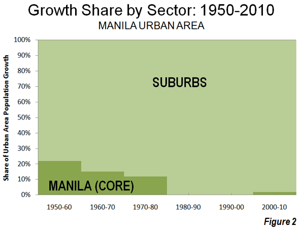
    The authors of Mr. Albanese’s documents are anonymous, but aficionados will recognize the handiwork of Curtin University’s Sustainable Policy Institute, Griffith University’s Urban Research Program, the Faculty of the Built Environment at NSW University, and other focal-points of green orthodoxy. The reference lists are full of their output. Their technique of persuasion, recycled by Mr. Albanese’s Department, is to evoke plausible images while perpetuating three myths: suburban growth worsens carbon emissions and traffic congestion, people are being forced to live far from jobs concentrated in CBDs, and denser development will make housing cheaper.

    The discussion paper says: “Australian cities generate very high carbon emissions and air pollution from our heavy reliance on carbon fuels for energy and transport. Carbon emissions from transport are principally due to the lengths of trips necessitated by our dispersed cities and our extensive use of private motor vehicles.” Variations of this passage recur throughout the documents. It sounds plausible enough. So many vehicles cris-crossing our wide open cities must be spewing out heaps of carbon dioxide. But the documents ignore evidence painting a different picture.

    There is the Australian Conservation Foundation’s Consumption Atlas, which found that dense, affluent, inner-suburbs account for more carbon than the dispersed fringe, suggesting that, as a factor in emissions, general consumption trumps settlement patterns; there is a 2007 study by Randolph and Troy confirming earlier findings that energy consumption per capita in high-density developments, like high-rise apartments, is notably higher than in detached housing; there is a recent report by Allen Consulting for the Victorian Building Commission, noting the absence of conclusive evidence that vertical living is more ‘sustainable’ than conventional homes; and there is more.

    None of these rate a mention in the documents. Chapter 5 of the background paper does reference a couple of studies by Alford and Whteman (2009) and Trubka, Newman and Bisborough (2010), but these focus on “transport energy consumption” and “transport greenhouse gases.” They don’t investigate the impact of urban form on general consumption, the real determinant of emission levels. And a study by Perkins et al (2009), cited in Cities 2010, actually contradicts the approved message: “overall, it cannot be assumed that centralised, higher density living will deliver per capita emission reductions for residents … ”

    There is no reliable evidence that suburban growth is worse for emissions. Even Griffith’s Brendan Gleeson, a very green urbanist, had to concede that “the faith … in residential density as a simple lever that can be used to manipulate urban sustainability appears to be misplaced. New Australian scientific analysis points to the consumptive lifestyle, not the nature of one’s dwelling, as the root of environmental woes.”

    In any event, transport accounts for 14 per cent of Australia’s 1.4 per cent share of global emissions, or a minuscule 0.197 per cent of the world’s carbon. We should retain a sense of perspective, even if the documents obsess about our high per capita emissions. If the climate is being affected (a big if), it’s absolute volumes that matter.

    Allied to the myth of carbon-spewing suburbs is the myth of centrally-located jobs. We read in Cities 2010 that “the impacts of outward expansion and low density residential development have been a greater separation between residential areas and locations of employment …” The discussion paper asserts, more directly, that “the trend to inner-city living reflects changing preferences for dwellings and location – living closer to employment that is concentrated in central areas.” Again, similar statements crop up throughout the documents. People shouldn’t have to drive or commute long distances to a “centre” where the jobs are.

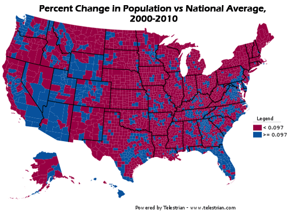
    Evidence to the contrary is easy to find. According to the NSW Department of Transport, only 12 per cent of Sydney’s jobs are in the CBD, and second tier centres like North Sydney, Chatswood, Parramatta, Hustville and Penrith have no more than 1.8 per cent each. The rest are distributed throughout the metropolitan region. In the case of Melbourne, McCloskey, Birrell and Yip (2009) say it’s absurd to concentrate housing near transit lines since only 19 per cent of jobs within the Melbourne Statistical Division (MSD – Greater Melbourne) were located in the Melbourne Local Government Area (the CBD), while 81 per cent “are scattered throughout the rest of the MSD”.

    In fact, the background paper points out that a majority of the employed in Sydney, Melbourne and Perth live within 10 kilometres of their workplace, while around 15 per cent live more than 20 kilometres away. This is hardly a disaster in the making. Consistently, Cities 2010 refers to “evidence that commuting distances have been stable or even declining since the 1990s in a number of capital cities.”

    For green urbanists, these myths are indispensible. Their agenda hasn’t a hope unless the public accepts that suburban growth will spoil the climate, and hike congestion and transport costs. As for housing affordability, the documents take a leave-pass (social housing is another story). They promote the term “living affordability”, adding petrol prices and mortgage rates to the equation.

    Evidence linking costly housing to supply restrictions on the fringe, like the annual Demographia survey, is too inconvenient. When the background paper does get around to the subject, it says “multiple factors [impede] the delivery of an efficient supply of suitable and affordable housing.”
    These include “land zoning and building code regulations and other standards related to building quality.” A few pages later, however, canvassing some solutions to the problem, the paper proposes “reforming planning systems to … position a variety of residential development in close proximity to centres and transport infrastructure”. Doesn’t this mean a lot more inefficient “land zoning”?

    This is just one instance of disjointed logic and economic illiteracy; many others are scattered throughout the documents.

    The Invisible Hand and Land

    Actually, cities are part of the economy, and are subject to the same principles. The operations of demand, supply and prices are equally applicable to land and structures. They can’t be erased by regulation, even if it’s called planning and zoning. The inflationary effect of coercive zoning on land values is the elephant in the room. Nowhere is it acknowledged in the documents.

    Consider two recent press items. Retail tenants in Pitt Street Mall, the heart of Sydney’s CBD, are paying rents as high as $13,000 a square meter, while industrial tenants on the north-west outskirts pay around $237. These rent differentials are, of course, a function of distance, and influence the viability, not just the location, of various types of activities.

    Restricting expansion and other forms of coercive zoning place an escalating floor under peripheral rents and values. Mr. Albanese’s authors fail to appreciate the implications of this, not least for “urban productivity.” There is little call to dwell on economic mechanisms if you believe, as the discussion paper puts it, “the private sector, through a myriad of individual decisions and investments, guided and constrained by government investments, regulations or charges, is a powerful shaper of cities [emphasis added]”.

    In the documents, lifting productivity boils down to cutting the costs of traffic congestion, estimated to reach $20 billion a year by 2020, principally by reducing “car dependency” (another loaded term, echoing drug dependency).

    Ignoring the reality of high job dispersal, the background paper says “a key challenge is to reduce dependence on motor vehicles while maintaining access between and within locations … the Australian Government recognises that it has a role … in investing in major mass transit systems, identifying and protecting new transport corridors and supporting means to shift from private vehicles to public transport”. But as McCloskey, Birrell and Yip explain, “the high level of job dispersal around Melbourne [and other cities] cannot be easily unwound.” In those conditions, Mr. Albanese’s strategy is doomed to failure.

    Alternatively, when diseconomies from congestion start to outweigh economies from centrality, firms and commuters will move to other, less congested sites, easing congestion all-round. This is the only effective, long-term solution to congestion. However by mandating concentration rather than enabling dispersion, evidenced by a dim view of road-building, green planning stymies this process. The documents want to end it altogether.

    According to the background paper, “connectivity within cities can also be achieved by placing people closer to the jobs, facilities, goods and services they desire – or putting these closer to where people live. This highlights the important role of integrated land-use and infrastructure planning in managing the need for physical travel”. But this notion, that firms and residences can be “placed” by a central authority, is logically flawed. It suffers from something akin to a “coordination problem” (a concept from game theory).

    Suppose household A has, in existing circumstances, chosen its optimal location relative to (1) affordable housing, (2) employment and (3) services. How can the government arrange things so that A ends up in a more optimal location? Moving A closer to work may push it further from affordable housing and services. Moved closer to services, A may end up further from other factors, and so on. It’s unlikely that the government can ever place A in a better location relative to all three factors.

    Then suppose household B has chosen its own optimal location relative to the three factors, some distance away from the point chosen by A. How does the government improve the outcome for both households? Action benefiting A may hurt B and vice versa.

    The same problem can be framed for businesses locating relative to (1) competitive rents, (2) transport routes, (3) suppliers, (4) suitable labour and (5) customers (market). Our cities host hundreds of thousands of households and businesses. There is no way that a planning hierarchy can engineer a more efficient outcome than the people themselves, interacting freely in the marketplace. Official meddling is more likely to induce problems than solve them.

    Instances of disjointed logic abound. One paper talks about “micro-reforms to reduce costs to businesses and consumers”, but another urges “access to a range of [more expensive and less efficient] high-quality renewable energy sources”; a paper commends “the principle of subsidiarity, ensuring that the most local level of government is used …”, but then calls for “improving alignment and integration of planning and investment across all three levels of government to support the nationally agreed … objective”; a paper demands action to “reduce red tape”, but all three documents offer heaps more instruments and regulations.

    Ultimately, Mr. Albanese’s documents are the pretext for a new wave of intrusion into economic life. As such, they represent a glaring case of bureaucratic overreach. However much he may spruik flats, smaller houses, public transport and higher utility bills as an enhancement of urban “liveability”, most Australians will disdain them as anything but liveable.

    John Muscat is a co-editor of The New City, where this piece originally appeared. 

    Photo by Joseph Younis.