Category: Suburbs

  • Enough “Cowboy” Greenhouse Gas Reduction Policies

    The world has embarked upon a campaign to reduce greenhouse gas (GHG) emissions. This is a serious challenge that will require focused policies rooted in reality. Regrettably, the political process sometimes falls far short of that objective. This is particularly so in the states of California and Washington, where ideology has crowded out rational analysis and the adoption of what can only be seen as reckless “cowboy” policies.

    Last year, California enacted Senate Bill 375, which seeks to reduce future GHG emissions by encouraging higher urban population densities and forcing more development to be near transit stations. Yet there is no objective analysis to suggest that such an approach will work. Of course, there are the usual slogans about people giving up their cars for transit and walking to work, but this occurs only in the minds of the ideologues. The forecasting models have been unable to predict any substantial reduction in automobile use, and, more importantly, such policies have never produced such a result.

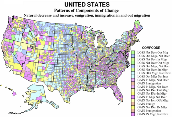
    In fact, higher densities are likely to worsen the quality of life in California, while doing little, if anything to reduce GHG emissions. California already has the densest urban areas (which includes core cities and surrounding suburbs) in the United States. The Los Angeles urban area is 30 percent more dense than the New York urban area. The San Francisco and San Jose urban areas are also denser than the New York urban area. Sacramento stands as the 10th most dense among the 38 urban areas over 1,000,000 population, while Riverside-San Bernardino ranks 12th and San Diego ranks 13th.

    This high density creates the worst traffic congestion in the nation. The slower stop and go operation of cars in traffic congestion materially intensifies local air pollution and increases health hazards. It also consumes more gasoline, which increases GHG emissions. Finally, California’s prescriptive land use regulations have destroyed housing affordability. By the early 1990s, land use regulation had driven prices up well beyond national levels relative to incomes, according to Dartmouth’s William Fischell. Over the next decade the rationing effect of California’s excessive land use restrictions tripled house prices relative to incomes, setting up the mortgage meltdown and all that has followed in its wake.

    The implementation of Senate Bill 375’s provisions seems likely to make things worse. California’s urban areas already have plenty of dense “luxury” housing, much of which is now empty or is now converted from condos to rentals. Wherever they are clustered, particularly outside traditional urban centers like San Francisco, such areas experience intense traffic congestion, with all the resultant negative impact on both people and the environment.

    Yet despite the problems seen in California, the ideological plague has spread to Washington state. Last year the Washington legislature enacted a measure (House Bill 2815) that requires reductions in driving per capita, for the purpose of GHG emission reduction. By 2050, driving per capita is supposed to be halved. This year there was a legislative proposal, House Bill 1490, that would have mandated planning for 50 housing units to the acre within one-half mile of light rail stations. This would have amounted to a density of nearly 50,000 per square mile, 3 times the city of San Francisco, 7 times the density of the city of Seattle and more than that of any of more than 700 census tracts (small districts) in the three-county Seattle area. Areas around stations would be two-thirds as dense as Hong Kong, the world’s most dense urban area.
    The density requirement has since been amended out of the bill, but the fact that it made it so far in the legislature indicates how far the density mania has gone. The bill appears unlikely to pass this year.

    Extending the density planning regime is not likely to help the people on the ground, much less reduce GHGs. Seattle already has a housing affordability problem, which is not surprising given its prescriptive planning policies (called growth management or smart growth). Theo Eicher of the University of Washington has documented the close connection between Seattle’s regulatory structures and its house price increases.

    As in California, Seattle house prices rose dramatically during the housing bubble, nearly doubling relative to incomes. At the same time, much of the debate on House Bill 1490 has been over affordable housing. Yet there has been virtually no recognition of connection between Seattle’s low level of housing affordability and its destructive land use regulations. House Bill 1490 would have only made things worse, and still could. Proponents have indicated that they have not given up.

    The theory behind House Bill 1490 parallels that of California’s SB 375. It assumes high densities would significantly reduce driving and attract people to transit. As in California, however, this is based upon wishful thinking, and has no basis in reality. No urban area in the developed world has produced a material decline in automobile use through such policies.

    Regrettably, the special interest groups behind the California and Washington initiatives appear more interested in forcing people to change their lifestyles than in reducing GHG emissions. This is demonstrated by the Washington driving reduction requirement.

    A good faith attempt to reduce GHG emissions from cars would have targeted GHG emissions from cars, not the use of cars. The issue is GHG emission reduction, not behavior modification, and the more the special interests target people’s behavior, the clearer it becomes how facetious they are about reducing GHG emissions.

    Technology offers the most promise. Already the technology is available to substantially reduce GHG emissions by cars, without requiring people to change their lifestyles. Hybrids currently being sold obtain nearly three times the miles per gallon of the average personal vehicle (cars, personal trucks and sport utility vehicles) fleet. And that is before the promising developments in decades to come in alternative fuels and improved vehicle technology. In addition, the rapid increase in people working at home – a number on track to pass that of transit users by 2015 – would also represent a clear way to reduce GHG emissions.

    Finally it is not certain that suburban housing produces higher GHG emissions per capita than high rise urban development. The only comprehensive research on the subject was conducted in Australia and found that, generally, when all GHG emissions are considered, suburban areas emitted less per capita than higher density areas. This is partially because dense urbanites tend to live a high consumption lifestyle, by eating out at restaurants serving exotic foods, having summer homes and extensive travel. It is also because high density living requires energy consumption that does not occur in lower density suburbs, such as electricity for elevators, common area lighting, and highly consumptive central air conditioning, heating, water heating and ventilation, as Energy Australia research indicates.

    Further, tomorrow’s housing will be more carbon friendly than today’s. Japan has already developed a prototype 2,150 square foot, single story suburban carbon neutral house.

    Much of the anti-suburban and anti-car sloganeering ignores these developments and generally assumes a static world. If the world were static, we would still be living in caves.

    The California and Washington initiatives were not based upon any comprehensive research. There were no reports estimating the tons of GHG emissions that were to be reduced. There was no cost analysis of how much each ton removed would cost. United Nations Intergovernmental Panel on Climate Change (IPCC) has said that the maximum amount necessary to accomplish deep reversal of GHG concentrations is between $20 and $50 per ton. Responsible policy making would have evaluated these issues. (It seems highly improbable that Seattle’s currently under-construction University light rail extension remotely matches this standard, with is capital and operating costs per annual patron of more than $10,000.)

    The price that society can afford to pay for GHG emission reduction is considerably less today than it was just six months ago. The history of the now departed communist world demonstrates that poorer societies simply do not place a high priority on environmental protection. That is not surprising, since people address their basic human needs before broader objectives, such as a better environment. That may not comport with the doctrines of political correctness, but it is reality.

    In such times, communities should be careful not to undertake policies based on assumptions or the preferences of those planners, architects and ideologues who seem to hold suburbs and personal mobility in such contempt that they would not be satisfied even if they emitted no GHGs. These radical motives are inappropriate. “Cowboy” policies enacted ad hoc at the bequest of ideologues openly disdainful of our basic lifestyles threaten not only the future prosperity of a society but our most reasonable path to long-term environmental improvement including reducing GHG emissions.

    Wendell Cox is a Visiting Professor, Conservatoire National des Arts et Metiers, Paris. He was born in Los Angeles and was appointed to three terms on the Los Angeles County Transportation Commission by Mayor Tom Bradley. He is the author of “War on the Dream: How Anti-Sprawl Policy Threatens the Quality of Life.

  • PARIS: Urban Museum Amidst a Suburban Sea

    I arrived in Paris on March 1 for my annual visiting professor assignment at the Conservatoire National des Arts et Metiers. Again, I have taken a flat (apartment) in the 1st arrondissement (district) in the heart of the ville de Paris, one of the world’s great pedestrian expanses. It is also one of the great virtual experiences – a place oddly disembodied from its setting.

    The flat is just a couple of doors to the right on the first perpendicular street in the picture below, which was taken at the entrance of the Chatalet-Les Halles Metro-RER station, less than 200 yards away.

    It is 300 yards to the Pompideau Museum, a structure whose hideousness is compensated for only by the fact that because of its dense surroundings it cannot be seen from anywhere more than a block away. The Louvre and the Hotel de Ville (city hall) are each one-half mile away and Notre Dame is less than three-quarters of a mile away. This is probably the ultimate in urbanization outside of Hong Kong.

    Sundays are very relaxing in Paris. There are people on the streets. The atmosphere is informal. Crowds are out examining the art works, books, maps and posters of the vendors that line both banks of the River Seine. I always like to attend Vepres (Vespers) at Notre Dame at 5:45 on Sunday evening. This is bit ecumenical for an Anglican, although not much of an ecumenical stretch to Roman Catholicism. I understand nothing, but the singing and the organ are inspirational nonetheless.

    There are many advantages to living in central Paris. Nearly the entire ville de Paris is an outdoor museum of architecture. There is the dense, irregular urbanization of the ancient Marais, a relic of the pre-Hausmann city, as well as walks along the well planned Champs d’Elysee toward Etoile and the Arc de Triomphe on the newer 19th Century boulevards created by the master-planner.

    Everything is so close that there is no need for either car or transit. The classroom is a 15 minute walk. This small section of Paris is a model for walkability. Yet this does not, however, necessarily translate into the social connections advocates of walkability suggest. I took a survey in Montorgueil, another busy pedestrian quarter, for a few days. Out of more than 5,000 people who had stopped to talk to someone or were on cell phones, 80 percent were on the phone. This illustrates how technology has made it possible for us to interact more with those we have common interest, wherever they are, instead of being limited to those who just happen to be in geographical proximity.

    We also have to understand the ephemeral nature of the Parisian core. It is now more museum and place of “experience” than a thriving residential neighborhood. The center of the area – the 1st arrondissement (there are 20) – is a shadow of its former self in population. Today, the 1st arrondissement has 18,000 people, 80 percent below its 1861 figure of 90,000, and probably lower than the 1836 Paris core peak. The overall city has lost population as well, dropping from 2.95 million in 1921 to less than 2.2 million today, a decline on the order of some US central cities (such as Chicago).

    One reason: living in central Paris has its disadvantages. One of them is shopping. Perhaps no city has more grocery markets per capita than Paris. But they are so small that probably no city has less grocery square footage than Paris. It is quite an adventure. Not all stores carry the same products, which makes it necessary to go to more than one grocery store to fill the larder. Not surprisingly, such small stores prices have much higher prices than the supercenters – Carrefour, Auchan and other Wal-Mart lookalikes (though often larger) – that have located just outside the Boulevard Peripherique, the six to eight lane freeway that surrounds the city.

    Some of the Metro lines extend beyond the Boulevard Peripherique, allowing urban Parisians to take advantage of lower suburban supercenter prices. Suburbanites can also shop at supercenters on the second ring freeway (the A-86) and the third ring freeway (the “Franciliene”). It may not be as famous as Le Metro, but Paris possesses the best freeway system in Europe outside of the Dusseldorf-Essen (Rhine-Ruhr) area. But the stores are not permitted, by law, to be open on Sunday, which makes parking lots and adjacent streets so crowded on Saturdays that both employees and police are used to direct the traffic.

    The biggest surprise to many Americans would be the extent of the Paris suburbs. Many, especially in the urban planning community, have long deluded themselves and others into believing that Europe, unlike America, has no suburbs. The core of Paris is very small, with most of the monuments and museums that are of interest being within a less than five square mile area. The ville de Paris itself covers approximately 40 square miles. The suburbs extend outward for more than another 1,000 square miles, 25 times the area of the ville de Paris.

    So, yes Paris has suburbs, as does every big city in Europe. In fact, virtually all European urban growth in the last 40 years has occurred in the suburbs, while virtually all of the cores have either experience slow growth or lost population, much like the United States. The European suburbs continue to attract residents from the cities, and whatever gains are achieved by some core cities are the result of international migration, not domestic migration from suburbs to the cities.

    Overall more than 80 percent of Parisians live in the suburbs and exurbs. The ville de Paris has less than 2.2 million people, while the rest of the urban area has nearly 8 million people, according to the French national statistical agency (INSEE). Another 2 million people are included in the rural and exurban portions of the metropolitan area (the “aire urbaine”) which are the French equivalent of exurbs.

    There is also a perception – oft reported in the New York Times and other urban-centric media – that the suburbs of Paris are made up of poor people. Certainly, like many American cities, Paris has poor suburbs, particularly in the department of Seine-St. Denis, to the north of the city. This area has high rise public housing blocks that look every bit as decrepit as the mercifully demolished Robert Taylor Homes on the south side of Chicago. But most Paris suburbs are predominately middle class housing, just like in America. There are also some very wealthy areas, as we find in the periphery of our own metropolitan regions.

    For two months, the ville de Paris is an absolutely delightful place to live. But once my Parisian sojourn is over, I, for one, will be very happy to return home to the suburbs of St. Louis which may be duller, less colorful and historic than Paris, but far more comfortable and affordable for the experience of everyday living.

    For additional information, see the Paris Rental Car Tour at http://www.rentalcartours.net/rac-paris.pdf.

    Wendell Cox is a Visiting Professor, Conservatoire National des Arts et Metiers, Paris. He was born in Los Angeles and was appointed to three terms on the Los Angeles County Transportation Commission by Mayor Tom Bradley. He is the author of “War on the Dream: How Anti-Sprawl Policy Threatens the Quality of Life.

  • Is Obama’s Urban Focus Bad News for the Rest of the Countryside?

    To much of the media, Barack Obama is the ultimate dream president, a sophisticated urbanite whose roots lie in top-tier academia and big-city politics. This asset could also become a glaring weakness, blinding him to the fundamental aspirations for smaller places and self-government that have long animated the American experience.

    It has been a half-century since have we seen a presidential inner circle so identified with our densest urban centers. The three most recent Democratic presidents — Lyndon Johnson, Jimmy Carter and Bill Clinton — all had substantial roots in small-town America that also helped them understand the aspirations of middle-class suburban and exurban voters.

    In contrast, this is an administration steeped in the mystique of big cities. Chief of staff Rahm Emanuel is a tough-guy player from the variously effective and consistently corrupt Chicago city machine. The members of the Cabinet and top-tier apparatus are longtime residents of such large cities as New York, Los Angeles, San Francisco and Boston and, of course, Chicago.

    As the continuing Roland Burris saga reveals, the Chicago connection, in particular, seems likely to wreak continued damage. Chicago’s corruption could run like a sore through this administration, much like Arkansas with the Clintons. But rather than deal with almost laughable hillbillies, we may witness the exposure of some of the toughest, and brazen, baddies in American politics.

    Yet for the most part, the big media have been too captivated by the president’s urbane mystique to delve too deeply into the Chicago morass. Largely denizens of big cities, the top media generally embrace the notion that dense urban places are inherently better, more efficient, culturally and environmentally sound than less glamorous, more spread-out places.

    You can see this worldview almost daily in The New York Times or, more substantially, in the pages of The Atlantic Monthly and The New Republic, where writers often like to envision an American future bright for top-tier cities and pretty bleak for everyone else.

    Given the composition of the president’s inner circle, one can imagine such views are widely accepted at the highest levels. Over the coming years, this could precipitate a policy agenda that, though perhaps well intentioned, could work to the disadvantage in the suburbs, exurbs and small towns where most Americans live. Their policies — particularly the new taxes on the so-called $250K-a-year rich — may not even work so much to the advantage of middle-class urbanites; but this may take time to unfold.

    More important, Obama’s urban policy also marks a critical shift from the traditional American preference for decentralization of power — including at the city level — to one that embraces ever greater concentration. It could also mark a public embrace of hierarchy every bit as serious — and perhaps less reversible — than has occurred in the relatively unregulated marketplace environment of the past quarter century.

    The most recent Pew study confirms that some 77 percent of Americans prefer to live in suburbs, small towns or the countryside. But this prevailing preference for deconcentration disturbs many urban planners and policymakers, including some close to the Obama team. A key transition adviser of urban policy, the Brookings Institution’s Bruce Katz, has been pushing the notion of “regionalism” under which there would be a major shift of power away from individual towns, counties and even urban neighborhoods to mega-regional agencies.

    Katz, like many regionalists, seeks to diminish such local interests — which they fear as too parochial and insufficiently enlightened. His views about small-town politics are scathing as evidenced in an anti-Sarah Palin screed, published in The New Republic last October, revealingly titled “Village Idiocy.”

    To be sure, regional agencies sometimes are useful, for example, in the management of air and water basins. But almost automatically regionalism favors more powerful entrenched interests over smaller communities and businesses. For example, in Southern California, the vast majority of the population lives in suburban cities, but power at the mega-regional agencies — such as the Southern California Association of Governments — usually reliably reflects the interests of large developers, public employee unions, big architects and planners.

    Speaking in Florida recently, the president denounced “sprawl,” saying its days were now “over.” Although hardly a declaration of war on suburbia per se, his comments thrilled those offended by low-density suburbs and who want government to promote ever denser urban development — even if often opposed by grass-roots urbanites.

    The emerging centralizing impulse can be seen in the stimulus, with unprecedented funds for light-rail projects and high-speed rail. Although such projects may seem logical in a few concentrated cities like Washington or New York, they seem poorly suited for most American cities and the vast majority of suburbs. In such places, a more practical, market-friendly way to curb greenhouse gases would be to promote decentralization of work, the creation of flexible low-cost transit and providing incentives for home-based business.

    Over time, such tendencies could present potential dangers for the president. Despite the preferences of most people around the president, and perhaps he himself, nearly 80 percent of Americans consistently report they favor living in less dense places and overwhelmingly prefer single-family homes. They may also be reluctant to surrender ever more control over their daily lives to either distant regional authorities or the federal apparatus. Ultimately, the administration may be forced to choose between acting on its urban mystique and maintaining its political majority.

    This article originally appeared at Politico.

    Joel Kotkin is executive editor of NewGeography.com and is a presidential fellow in urban futures at Chapman University. He is author of The City: A Global History and is finishing a book on the American future.

  • NEW GEOGRAPHY SPECIAL REPORT: America’s Ever Changing Demography

    America’s demography tells not one story, but many. People concerned with looking at long-term trends need to familiarize themselves with these realities – and also consider whether these will continue in the coming decades.

    Losers and Winners

    It’s common to read about rapidly growing places, but what about those that are losing? Perhaps it’s fitting in this time of economic decline first to tell the story of areas of loss of population, of out-migration and of natural decrease, more deaths than births. Such areas are not of course necessarily “losers.” They may be prosperous, with a high quality of life; they are just not “growing.”

    The map below shows the 40 percent of counties which lost population, 2000-2007. 216 lost more than 10 percent, and 1139 lost up to 10 percent. These contrast the 33 counties which grew more than 40 percent in these seven years. So overall, well over half the territory of the country lost population. The largest population losses, by far, were in and around New Orleans (Katrina), followed by the metropolitan cores of the Rust Belt axis from Pittsburgh, through Cleveland to Detroit, and extending west into Indiana, and east through Pennsylvania and western New York.

    The largest contiguous area of counties with losses remains the same as it was in the 1970s, 1980s and 1990s: the “high plains” from Mexico to Canada (actually continuing in Canada). Probably 90 percent of counties lost population, especially in Kansas, Nebraska and North Dakota, and extending into the Midwest agricultural heartland of Iowa, northern Missouri, southern Minnesota and western Illinois.

    Other traditional areas of losses which continue from the 1970s through 1990s include the coal counties of Appalachia (Kentucky, West Virginia), and the “Black Belt” from Arkansas and Louisiana through the Mississippi Delta and on through parts of Alabama, Georgia, South and North Carolina into Virginia.

    Again repeating past patterns are losses in some of the large core counties of Megalopolis, as Philadelphia and Baltimore, and elsewhere (St. Louis, Chicago, Minneapolis and even San Francisco). The highest rates of loss were again in and around New Orleans, small counties in Mississippi and Nevada, and Montana, North and South Dakota.

    The 33 rapidly growing counties are ALL suburban except for the new metropolitan area of St. George, Utah. Suburban Atlanta dominates, followed by northeastern Florida, and selected suburbs of Columbus, OH, Indianapolis, Charlotte, Chicago, Minneapolis, Washington, DC, Des Moines, Denver, Reno, Houston, Dallas, and Austin. The largest absolute gains (many areas are now hurting economically) were Maricopa (Phoenix), Harris (Houston), Riverside and San Bernardino, Clark (Las Vegas), Los Angeles, and suburbs of Dallas and San Antonio.

    Migration

    Immigration dominates the news, but there is also emigration, and the difference between these is ‘net’ international migration. Data on immigration and emigration are not very certain or reliable, as people leaving don’t have to tell anyone, and many entering are equally reticent. Yet there is a clear pattern from the map of the 416 counties. Overall the areas of net loss tend to be the same as for losses in overall population.

    Counties where immigrants greatly exceed emigrants are both the core counties of the largest metropolitan areas and their largest suburban counties, but especially in the west, Texas, Florida, and the Atlantic coast metropolitan cores from Atlanta to Boston, California, Texas, Florida, and metropolitan New York city. Mexican immigration is the largest, but there is significant immigration from the rest of Latin America, from Asia and from Eastern Europe. Most of the immigrant destinations are metropolitan, but include some rural small town areas, typically with food processing, an industry dependent on low wage immigrants (TX, AR, OK, KS, NE, IA).

    Largest absolute gains are to Los Angeles, Cook, New York City, Miami, Houston, Dallas, Orange County, Phoenix and Santa Clara, with a bias to the southwest, Florida and New York City. The highest immigration rates are in part the same, Miami, Queens, Hudson NJ, Santa Clara, but high rates also characterize Washington DC suburbs, two Kansas counties (food processing), and a Colorado county (workers for ski resorts).

    Significant numbers of non-immigrants also move, and as many as a third probably crossed county lines since 2000. In much of America the balance between in and out migration is close, but for many regions, “net” migration is the most important component of change.

    Overall two thirds of American counties reported a net loss from internal migration, 29 at a level more than 20 percent of the base population. Only 118 have high rates of net in-migration (over 20 percent). Large absolute losses characterize most large metropolitan core counties, including coastal California, Dallas, Miami, New Orleans, megalopolis core counties (from Maryland to Massachusetts), and the Great Lakes and Midwest. Smaller absolute net out-migration prevails over most rural small-town America, especially the Great Plains, and agricultural Midwest and Great Lakes, the Black Belt across the south, and includes much of the southwest.

    Internal domestic migration represents a distinctive geography. In the west many were inland smaller metropolises, as well as many rural small town environmentally attractive counties that received many of the out-migrants from the large coastal metropolises. In the Midwest and northeast gains were strongly suburban (often local flows from the core counties). In the south rapid gains continued to dominate much of Florida, and metropolitan suburbs, especially around Washington DC, Atlanta, Dallas, and Austin-San Antonio, fueled both by continuing in-region rural to urban flows and by migration from the north to the south.

    The losses include the usual suspects, the core counties of the largest metro areas, including Dallas, Miami, and Orange counties, with the native-born displaced to the suburbs and beyond. The largest absolute gains include some central counties, like Maricopa and Clark (but which are also themselves suburban), major suburban counties of Los Angeles, Dallas, Houston, Phoenix, Chicago, and a newcomer, Wake county NC (Raleigh). The highest rates of net in-migration are mostly suburban, Atlanta, Dallas, Washington DC, Denver, Chicago, but also a few smaller counties, as in Pennsylvania and South Dakota.

    The Role of Natural Increase

    One of the indicators of diversity in America is the remarkable variation in the role of natural increase (or decrease) – that is the difference between births and deaths in an area – in the story of population change.

    Almost 30 percent of US counties experience natural decrease, and only a little over 10 percent (337) have high rates of natural increase (6% or more growth in 7 years). Natural decrease is mainly a function of age structure, where the young of child-raising age have left, OR where unusual numbers of the elderly have moved in, dominating the population.

    There are four distinct regions of natural decrease. The largest, absolutely and relatively, is Appalachia, from extreme northern Georgia, through smaller parts of Tennessee and North Carolina, western Virginia, most of West Virginia, and both the greater Pittsburgh and the Scranton-Wilkes Barre region of northeastern Pennsylvania. Much is a historic region of coal (and steel) production, and often poor transport links to the rest of country. The region has suffered loss of the young, often for 40 years or more.

    The second large region of natural decrease is entirely different in character, namely mid-Florida, centered on Tampa-St, Petersburg and Sarasota, as a result of the aging in place of massive numbers of retirees from the north moving to Florida over the last 50 years.

    The third region is much more extensive, covering most of the Great Plains and rural Midwest, from Texas and Arkansas to the Dakotas, Minnesota and Montana, regions again suffering long-term loss of the young population to greater opportunities in the city.

    The last smaller region is the Michigan-Wisconsin upper peninsula, where losses can be traced to the result of declining mining and forestry. Counties in New Mexico, Arizona, and northern California are somewhat like Florida with large numbers of retirees, while those in coastal Oregon and Washington are in part like upper Michigan, but with many retirees as well.

    The 112 counties where births greatly exceed deaths, not surprisingly, reflect a very different geography. They do represent, as is often pointed out, a shift to metropolitan areas but importantly not to the core cities but the suburban hinterlands. Most prominent areas of high natural increase are primarily suburban areas around metropolitan Houston, Dallas, San Antonio, Atlanta, Washington DC, Chicago, Minneapolis and Raleigh, NC. Many of these areas are also affected by in-migration of Hispanic families.

    The other reason for high natural increase is higher fertility – families with above replacement numbers of children, often for reasons of religion or ethnicity, and also reinforced by in-migration of young adults. On the map, Native American Indian reservations stand out, as in North and South Dakota, Wisconsin, Montana, and Alaska, although these numbers are still slow. Mormon Utah and Idaho demonstrate high fertility, family size and shares of births, in rural as well as urban counties. But the dominant area of high natural increase is clearly the extensive southwestern region of Mexican heritage and in-migration over recent decades, in Texas, California, Colorado, New Mexico, Arizona, and eastern Washington, plus selected counties in the high plains, e.g., Kansas and Oklahoma. The final bastions for young families and higher natural increase are military dominated counties, as in Georgia, North Carolina and Kansas.

    In absolute losses, parts of Florida and Pennsylvania and the northern Great Plains stand out. Relative gains are highest in Hispanic, Native American Indian and Mormon counties. These are impressive numbers – the surplus of births over deaths as a share of the total population.

    Why the Differences?

    What makes counties lose or gain people? The US has a diverse and restless population. Counties vary greatly in attractiveness to immigrants from abroad or migrants from other states, broadly because of real or perceived “opportunities,” characteristics of jobs or amenities which may lure migrants from less competitive or attractive areas.

    The map divides the counties into nine sets, based on the relative importance of natural increase or decrease, emigration and immigration and in-migration and out-migration. The 1439 counties which lost population include 165 for which the main reason for loss is from natural decrease; of these one subgroup lost overall despite net immigration, the other’s loss was aggravated by net out-migration as well. The larger set of counties with population losses, 1184, are those for which the loss is mainly attributable to net out-migration, with two subgroups, one with loss despite natural increase, the other with loss magnified by natural decrease.

    On the map the “darker” green counties (89) had a large natural decrease and a smaller net out-migration; the “lighter” green (76) had natural decrease, exceeding a smaller net in-migration. These counties for which natural decrease dominates are scattered across the Great Plains from Texas to Canada, together with clusters from Appalachia (VA, WV, PA, and NY), northern MI-WI, and a few declining natural resource areas in the west.

    The “darker” blue counties (486) are dominated by net out-migration, but also had natural decrease. The “lighter” blue counties (698) had natural increases but these were much exceeded by net out-migration. These counties are often interspersed with the “green” counties, dominated by natural decrease. These 1184 counties – over one-third of counties and of US territory – constitute a large swath of the Plains and Midwest, large parts of New York and Pennsylvania, the coal counties of Kentucky and West Virginia, and the “Black Belt” across the south from Louisiana and Arkansas to southern Virginia. Finally they include sparsely populated resource counties in Alaska and parts of the west. Overall, the counties losing population tend to be non-metropolitan and interior, except for the declining industrial metropolitan counties of the “Rust Belt”.

    Gainers

    The gaining counties consist of three broad groups — 755 for which natural increase is the main contributor to growth, with subsets of 420 growing despite net out-migration, and 335 with net in-migration as well. The second consists of 104 counties for which immigration is the predominant basis for growth. Finally there are 933 counties for which net in-migration is the main contributor to growth, with subsets with natural decrease with natural increase.

    The “yellow” counties (755) gained population mainly because of natural increase; the light yellow counties (420) grew despite often substantial net out-migration; the darker yellow counties (335) also had a smaller net in-migration, and are thus among the more ”successful” more rapidly growing US counties. The former are especially prevalent in cities of the west – e.g. Los Angeles, San Diego, Houston, Dallas – with sizable immigrant populations (see the table) and higher fertility and displacement of the native-born, but yellow counties are also common in non-metropolitan and small metropolitan and suburban areas of the Great Lakes states, the outer Megalopolis, and urban industrializing parts of the south. The “dark” yellow areas are in the same regions, and are very often the areas gaining migrants from the “light” yellow areas, as can be seen in California, Arizona, Utah, Washington and Colorado.

    The “orange” counties, only 104, are those where immigration is the main source of growth. These are somewhat scattered, but especially common in New England and Middle Atlantic states, selected counties of the Plains (often with food processing plant growth) and northern Pacific Coast metropolitan regions, as the San Francisco bay region, Portland and Seattle.

    The “magenta” counties (933) are those for which net in-migration dominates growth. The lighter magenta for those with natural decrease (213), the darker magenta for those with natural increase as well. All these tend to be the most rapidly growing counties in the country, and tend to occur together. The main difference with counties with natural decrease are those with an older age structure, but which are nevertheless attractive to in-migrants. From the map these occur in two main settings: traditional areas of amenity migration, most obviously covering much of Florida, but also widespread in northern New England, northern Michigan, Wisconsin and Minnesota, the Ozarks, parts of the Tennessee valley, and across much of the west, with particular swaths in western Montana, coastal Oregon and Washington and northern California. The second setting is the exurban environs of major metropolitan areas, where new growth is invading formerly rural areas.

    The final, largest set of counties with natural increase as well as high in-migration (720 counties), are the stereotypical winners in the contemporary “growth races” – based on a combination of employment growth and metropolitan or environmental amenities. These tend especially to be southern and western metropolitan areas, small as well as large. The most dominant regions are greater Washington DC, greater Atlanta, Dallas and Houston, Portland, Denver, Phoenix, most of Florida, and – perhaps surprisingly – substantial parts of the north-south borderlands, including Tennessee, Kentucky, Arkansas, Oklahoma, and Missouri.

    What about the recession? It’s hard to judge the relative effects of the current severe recession on likely near- or longer-term growth. Clearly, the collapse of housing markets are slowing the growth of such rapidly growing places as Phoenix and Las Vegas, but this does not mean they won’t regain their general attractiveness and economic viability. The particularly severe job losses in the already hurting western Rust Belt will likely aggravate the recent pattern of decline which predated the recession and could get much worse.

    Richard Morrill is Professor Emeritus of Geography and Environmental Studies, University of Washington. His research interests include: political geography (voting behavior, redistricting, local governance), population/demography/settlement/migration, urban geography and planning, urban transportation (i.e., old fashioned generalist)

  • Sunbelt Indianapolis

    For decades, the overwhelming majority of population and economic growth has occurred in the Sun Belt – the nation’s South and West as defined by the United States Bureau of the Census. This broadly-defined area stretches south from the Washington-Baltimore area to the entire West, including anything but sunny Seattle and Portland. Any list of population growth or employment growth among the major metropolitan areas will tend to show the Sun Belt metropolitan areas bunched at the top and the Frost Belt areas (the Northeast and Midwest regions) bunched at the bottom. Since World War II, no state has experienced the growth that has occurred in California.

    However, the trends in the last decade indicate a shift, certainly away from California, which has experienced a net domestic migration (people moving to other parts of the nation). The overall loss reaches over 1.2 million people; the state’s overall population growth rate is now only little more than average. Some metropolitan areas in the Frost Belt have begun to perform better in population and domestic migration, but most continue to experience growth that is well below that of the Sun Belt.

    The exception to this is Indianapolis, which has developed growth rates that would put it right in the middle of Sun Belt metropolitan areas, if it were not in the Frost Belt.

    Indianapolis is a metropolitan area of 1.7 million population. Indianapolis added nearly 11 percent to its population between 2000 and 2007 (latest data available) and ranks 19th in population growth among the 50 metropolitan areas with more than 1,000,000 population (New Orleans has been excluded from this analysis because of the hurricane related population losses). Indianapolis is growing faster than Washington, DC or Seattle and nearly as fast as Portland or Denver. Its population growth rate has been double that of San Diego, triple that of Los Angeles or San Jose and more than six times that of San Francisco, which has seen its growth slow to a rate no better than that of Italy. Overall Indianapolis would rank 18th out of the 32 largest US Sun Belt metropolitan areas in total population growth. It is the fastest growing of the 18 largest Frost Belt metropolitan areas.

    Between 2000 and 2007, the Indianapolis metropolitan area added 55,000 domestic migrants, equal to 3.6 percent of its 2000 population. No other Frost Belt metropolitan area comes close. Columbus and Kansas City had domestic migration gains, at 1.2 percent of their population. All other Frost Belt metropolitan areas lost domestic migrants. Indianapolis, however, would have ranked 17th out of the 32 largest Sun Belt metropolitan areas trailing Portland, but leading Seattle and Denver.

    The distribution of domestic migration within the Indianapolis metropolitan area is also significant. For one-half century various analysts have predicted the decline of the suburbs. Indianapolis, like most metropolitan areas around the country, shows exactly the opposite: the suburbs continue to attract central city residents and have yet to fall into this seemingly inevitable decline.

    While the Indianapolis metropolitan area gained 55,000 domestic migrants from 2000 to 2007, Marion County, the central county which is nearly co-existent with the central city of Indianapolis, lost 46,500 domestic migrants. All of the domestic migration growth was in the suburbs, which attracted 101,800 new residents from Indianapolis/Marion County and the rest of the nation.

    What is it that has allowed Indianapolis to experience Sun Belt growth despite being in the Frost Belt? This is not the place for a full attempt to identify all of the causes, but some observations can be made.

    Perhaps it is most important to understand what is not the cause of the superior growth in Indianapolis. It is not the city’s “unigov” governance structure. In the early 1970s, to the great fanfare of urban planners, Indianapolis merged with most of Marion County, increasing the city’s population by approximately 50 percent. Proponents of local government consolidations often (and speciously) suggest that these consolidations will make metropolitan areas more attractive (this issue is discussed in detail in our Pennsylvania report on local government consolidation). Yet, Indianapolis, one of the nation’s largest consolidated local governments, is losing residents to the suburbs. It is also worthy of note that state taxpayers provided a $1 billion pension bailout to the city last year.

    One factor that clearly makes Indianapolis attractive is its housing affordability, which is the best among metropolitan areas with more than 1,000,000 residents in six nations. According to our 5th Annual Demographia International Housing Affordability Survey, Indianapolis had a Median Multiple (median house price divided by median household income) of 2.2 in the third quarter of 2008, well below the historic norm of 3.0. Indianapolis has been ranked near the top in each of the preceding four editions as well. In recent years, new suburban starter houses of 1,500 square feet have been advertised at less than $110,000, less than the price of land for a house in many metropolitan areas.

    Superior housing affordability constitutes a critical important attractor. At the height of the housing bubble, a household living in the median priced house in Indianapolis would have saved more than $1,000,000 in down payment and mortgage payments over 30 years, compared to San Diego.

    Indianapolis also has the advantage of a comfortable lifestyle. Commuters spend 2 minutes less per day than the national average getting to work, according to the 2007 United States Bureau of the Census American Community Survey. The Texas Transportation Institute indicates that traffic congestion is less severe in Indianapolis than average and that it has become better in the last 10 years. Indicating its usual irrelevance to traffic congestion, Indianapolis has the smallest transit market share of any urban area over 1,000,000 in the nation, at approximately 0.2 percent. This compares to 11 percent in New York, 5 percent in San Francisco and 2 percent in Los Angeles and Portland.

    Where does Indianapolis go from here? So far, Indianapolis has shown resiliency in the current economic crisis. The December 2009 unemployment rate was 6.7 percent, which is below the 7.2 percent national rate. Other parts of Indiana are not doing nearly as well, especially in smaller metropolitan areas that rely to a greater extent on manufacturing. For example, unemployment has reached 15 percent in Elkhart.

    To some extent, the metropolitan area’s huge advantage in housing affordability has been eroded by the collapse of prices in the most expensive Sun Belt metropolitan areas, such as in California and Florida. Yet, Indianapolis remains far more affordable, even after these losses.

    Indianapolis also has an advantages for business. In the State Business Tax Climate Index, Indiana is ranked highly, at 14th in the nation. With the prospect of higher taxes, both at the federal level and in many states, this should help Indianapolis retain an impressive advantage and continue to perform as if it were a Sun Belt metropolitan area, but without the problems associated with the housing bubble, massive congestions and growing social inequality.

    Wendell Cox is a Visiting Professor, Conservatoire National des Arts et Metiers, Paris. He was born in Los Angeles and was appointed to three terms on the Los Angeles County Transportation Commission by Mayor Tom Bradley. He is the author of “War on the Dream: How Anti-Sprawl Policy Threatens the Quality of Life.

  • Democrats Could Face an Internal Civil War as Gentry and Populist Factions Square Off

    This is the Democratic Party’s moment, its power now greater than any time since the mid-1960s. But do not expect smooth sailing. The party is a fractious group divided by competing interests, factions and constituencies that could explode into a civil war, especially when it comes to energy and the environment.

    Broadly speaking, there is a long-standing conflict inside the Democratic Party between gentry liberals and populists. This division is not the same as in the 1960s, when the major conflicts revolved around culture and race as well as on foreign policy. Today the emerging fault-lines follow mostly regional, geographical and, most importantly, class differences.

    Gentry liberals cluster largely in cities, wealthy suburbs and college towns. They include disproportionately those with graduate educations and people living on the coasts. Populists tend to be located more in middle- and working-class suburbs, the Great Plains and industrial Midwest. They include a wider spectrum of Americans, including many whose political views are somewhat changeable and less subject to ideological rigor.

    In the post-World War II era, the gentry’s model candidate was a man such as Adlai Stevenson, the Democratic presidential nominee who lost twice to Dwight D. Eisenhower. Stevenson was a svelte intellectual who, like Barack Obama, was backed by the brute power of the Chicago machine. After Stevenson, the gentry supported candidates such as John Kennedy – who did appeal to Catholic working class voters – but also men with limited appeal outside the gentry class, including Eugene McCarthy, George McGovern, Gary Hart, Bill Bradley, Paul Tsongas and John Kerry.

    Hubert Humphrey, a populist heir to the lunch-pail liberalism of Harry Truman (and who was despised by gentry intellectuals) missed the presidency by a hair in 1968. But populists in the party later backed lackluster candidates such as Walter Mondale and Dick Gephardt.

    Bill Clinton revived the lunch-pail Democratic tradition; and the final stages of last year’s presidential primaries represented yet another classic gentry versus populist conflict. Hillary Clinton could not match Barack Obama’s appeal to the gentry. Driven to desperation, she ended up running a spirited populist campaign.

    Although peace now reigns between the Clintons and the new president, the broader gentry-populist split seems certain to fester at both the congressional and local levels – and President Obama will be hard-pressed to negotiate this divide. Gentry liberals are very “progressive” when it comes to issues such as affirmative action, gay rights, the environment and energy policy, but are not generally well disposed to protectionism or auto-industry bailouts, which appeal to populists. Populists, meanwhile, hated the initial bailout of Wall Street – despite its endorsement by Mr. Obama and the congressional leadership.

    Geography is clearly a determining factor here. Standout antifinancial bailout senators included Sens. Byron Dorgan of North Dakota, Tim Johnson of South Dakota, and Jon Tester of Montana. On the House side, the antibailout faction came largely from places like the Great Plains and Appalachia, as well as from the suburbs and exurbs, including places like Arizona and interior California.

    Gentry liberals, despite occasional tut-tutting, fell lockstep for the bailout. Not one Northeastern or California Democratic senator opposed it. In the House, “progressives” such as Nancy Pelosi and Barney Frank who supported the financial bailout represent districts with a large concentration of affluent liberals, venture capitalists and other financial interests for whom the bailout was very much a matter of preserving accumulated (and often inherited) wealth.

    Energy and the environment are potentially even more explosive issues. Gentry politicians tend to favor developing only alternative fuels and oppose expanding coal, oil or nuclear energy. Populists represent areas, such as the Great Lakes region, where manufacturing still plays a critical role and remains heavily dependent on coal-based electricity. They also tend to have ties to economies, such as in the Great Plains, Appalachia and the Intermountain West, where smacking down all new fossil-fuel production threatens lots of jobs – and where a single-minded focus on alternative fuels may drive up total energy costs on the farm, make life miserable again for truckers, and put American industrial firms at even greater disadvantage against foreign competitors.

    In the coming years, Mr. Obama’s “green agenda” may be a key fault line. Unlike his notably mainstream appointments in foreign policy and economics, he’s tilted fairly far afield on the environment with individuals such as John Holdren, a longtime acolyte of the discredited neo-Malthusian Paul Ehrlich, and Carol Browner, who was Bill Clinton’s hard-line EPA administrator.

    These appointments could presage an environmental jihad throughout the regulatory apparat. Early examples could mean such things as strict restrictions on greenhouse gases, including bans on new drilling and higher prices through carbon taxes or a cap-and-trade regime.

    Another critical front, not well understood by the public, could develop on land use – with the adoption of policies that favor dense cities over suburbs and small towns. This trend can be observed most obviously in California, but also in states such as Oregon where suburban growth has long been frowned upon. Emboldened greens in government could use their new power to drive infrastructure spending away from badly needed projects such as new roads, bridges and port facilities, and toward projects such as light rail lines. These lines are sometimes useful, but largely impractical outside a few heavily traveled urban corridors. Essentially it means a transfer of subsidies from those who must drive cars to the relative handful for whom mass transit remains a viable alternative.

    Priorities such as these may win plaudits in urban enclaves in New York, Boston and San Francisco – bastions of the gentry class and of under-35, childless professionals – but they might not be so widely appreciated in the car- and truck-driving Great Plains and the vast suburban archipelago, where half the nation’s population lives.

    If he wishes to enhance his power and keep the Democrats together, Mr. Obama will have to figure out how to placate both his gentry base and those Democrats who still see their party’s mission in terms that Harry Truman would have understood.

    This article originally appeared at Wall Street Journal.

    Joel Kotkin is executive editor of NewGeography.com and is a presidential fellow in urban futures at Chapman University. He is author of The City: A Global History and is finishing a book on the American future.

  • The Decline of Los Angeles

    Next week, Antonio Villaraigosa will be overwhelmingly re-elected mayor of Los Angeles. Do not, however, take the size of his margin – he faces no significant opposition – as evidence that all is well in the city of angels.

    Whatever His Honor says to the media, the sad reality remains that Los Angeles has fallen into a serious secular decline. This constitutes one of the most rapid – and largely unnecessary – municipal reversals in fortune in American urban history.

    A century ago, when L.A. had barely 100,000 souls, railway magnate Henry Huntington predicted that the place was “destined to become the most important city in this country, if not the world.” Long run by ambitious, often ruthless boosters, the city lured waves of newcomers with its pro-business climate, perfect weather and spectacular topography.

    These newcomers – first largely from the Midwest and East Coast, and then from around the world – energized L.A. into an unmatched hub of innovation and economic diversity.

    As a result, L.A. surged toward civic greatness. By the end of the 20th century, it stood not only as the epicenter for the world’s entertainment industry, but also North America’s largest port, garment manufacturer and industrial center. The region also spawned two important presidents – Richard Nixon and Ronald Reagan – and nurtured a host of political and social movements spanning the ideological spectrum.

    Now L.A. seems to be fading rapidly toward irrelevancy. Its economy has tanked faster than that of the nation, with unemployment now close to 10%. The port appears in decline, the roads in awful shape and the once potent industrial base continues to shrink.

    Job growth in the area, notes a forecast by the University of California at Santa Barbara, dropped 0.6% last year and is expected to plunge far more rapidly this year. Roughly one-fifth of the population depends on public assistance or benefits to survive.

    Once a primary destination for Americans, L.A. – along with places like Detroit, New York and Chicago – now suffers among the highest rates of out-migration in the country. Particularly hard hit has been its base of middle-class families, which continues to shrink. This is painfully evident in places like the San Fernando Valley, where I live, long a middle-class outpost for L.A., much like Queens and Staten Island are for New York.

    In such a context, Villaraigosa’s upcoming coronation seems hard to comprehend. By most accounts, he has been at best a mediocre mayor, with few real accomplishments besides keeping police chief Bill Bratton, a man appointed by his predecessor. So far, Bratton has managed to keep the lid on crime, a testament both to his skills and to the demographic aging of much of the city.

    Besides this, virtually every major initiative from Villaraigosa has been a dismal failure; from a poorly executed program to plant more trees to a subsidized drive to refashion downtown Los Angeles into a mini-Manhattan. Instead of reforming a generally miserable business climate, Villaraigosa has fixated on fostering “elegant density” through massive new residential construction. This gambit has failed miserably, with downtown property values plunging at least 35% since their peak. Many “luxury” condominiums there, as well as elsewhere in the city, remain largely unoccupied or have turned into rentals.

    More recently the mayor has presided over a widely ridiculed scheme to hand over the solar business in Los Angeles to a city agency, the Department of Water and Power (DWP), whose workers are among the best paid and most coddled of any municipal agency anywhere. Most solar plans by utilities focus more on competitive bidding by outside contractors. Villaraigosa’s plan, which recent estimates suggests will cost L.A. ratepayers upward of $3.6 billion, would grant a powerful, well-heeled union control of the city’s solar program.

    This has occurred despite years of overruns on previous DWP “clean energy” projects. Not surprisingly, the plan was widely blasted – by the city’s largest newspaper, the rapidly shrinking Los Angeles Times, the feistier LA Weekly and the last independent voice at City Hall, outgoing City Controller Laura Chick, who proclaimed that the whole scheme “stinks.” Yet despite the criticism, a ballot measure endorsing the plan – opponents have little money to stop it – seems likely to be approved next week.

    With his firm grip on political power, Villaraigosa likes to think of himself as a West Coast version of New York’s Michael Bloomberg or Chicago’s Richard Daley. Yet at least they have demonstrated a modicum of seriousness about the job.

    In contrast, Villaraigosa, according to a devastating recent report in the LA Weekly, spends remarkably little time – about 11% – actually doing his job. The bulk of his 16-hour or so days are spent politicking, preening for the cameras and in other forms of relentless self-promotion.

    So how is this person about to be re-elected with only token opposition? Rick Caruso, the developer of luxury shopping center The Grove and one of L.A.’s last private sector power brokers, ascribes this to a growing sense of powerlessness, even among the city’s most important business leaders.

    “People feel it’s kind of hopeless. It’s a dysfunctional city,” Caruso, who once considered a run against Villaraigosa, told me the other day. “They don’t think there’s anything to do.”

    Certainly, odds against changing the current political system seem long to an extreme. The once-powerful business community has devolved into a weak plaintive lobby who rarely challenge our homegrown Putin or his allies in our municipal Duma.

    Of course, entrepreneurial Angelenos still find opportunities, but largely by working at home or in one of the city’s surrounding communities. They tend to flock to locales like Ontario, Burbank, Glendale or Culver City, all of which, according to the recent Kosmont-Rose Institute Cost of Doing Business Survey, are less expensive and easier to do business in than L.A.

    “It’s extremely difficult to do business in Los Angeles,” observes Eastside retail developer Jose de Jesus Legaspi. “The regulations are difficult to manage. … Everyone has to kiss the rings of the [City Hall politicians].”

    Legaspi, like many here, still regards Southern California as an appealing place to work, but takes pains to avoid anything within the purview of City Hall. As the economy recovers, I would bet the smaller cities around L.A. and even the hard-hit periphery rebounds first.

    The only immediate chance of relief for us Angelenos is if Villaraigosa (who will soon face term limits) takes off to run for governor. As the sole southern Californian and Latino candidate, he could prevail in a crowded Democratic primary. But the idea of this empty suit running the once great state of California – not exactly a paragon of good governance – may be enough to push even more people to the exits or, at very least, think about taking a very strong sedative.

    This article originally appeared at Forbes.

    Joel Kotkin is executive editor of NewGeography.com and is a presidential fellow in urban futures at Chapman University. He is author of The City: A Global History and is finishing a book on the American future.

  • Housing Downturn Moves Into Phase II

    The great housing turndown, which started as early as 2007, has entered a second and more difficult phase. We can trace this to Monday, September 15, 2008 just as October 29, 1929 – “Black Tuesday” – marked the start of the Great Depression. September 15 does not yet have a name and the name “Black Monday” has already been taken by the 1987 stock market crash. The 1987 crash looks in historical perspective like a slight downturn compared to what the world faces today.

    On September 15 – let’s call it “Meltdown Monday” – the housing downturn ended its Phase I and burst into financial markets leading to the most serious global recession since the Great Depression. Indeed, International Monetary Fund head Dominique Strauss-Kahn now classifies it a depression.

    Phase I claimed its own share of victims; Phase II seems likely to hit many more.

    Phase I of the Housing Downturn

    Whether in depression or recession, parts of the United States housing market were already in a deep downturn well before September 15. Phase I of the housing downturn started when house prices reached an unprecedented peak in some markets and began fell into decline. By September of 2008, house prices in the “ground zero” markets of California, Florida Las Vegas, Phoenix and Washington, DC had dropped from 25 percent to 45 percent from their peaks. These markets represented 75 percent of the overall lost value among the major metropolitan areas (those with more than 1,000,000 population).

    The Varieties of House Price Escalation Experience: In Phase I, the house price escalation and subsequent losses were far less severe in other major metropolitan areas. This depended in large part to the degree of land use controls – such as land rationing (urban growth boundaries and urban service limits), building moratoria, large lot zoning and other restrictions on building routinely – that helped drive prices up to unsustainable levels. This effect, cited by a number of the world’s most respected economists, was exacerbated by the easy money policies adopted by mortgage lenders.

    On the other hand, in the “responsive” land use regulation areas, the market (people’s preferences) was allowed to determine where and what kind of housing could be built. In these areas housing prices rose far less during the housing bubble and fell far less during Phase I of the housing downturn.

    Leading to the International Financial Crisis: These radically differing house price trends set up world financial markets for ”Meltdown Monday.” The easy money led to a strong increase in foreclosure rates, an inevitable consequence of households having sought or been enticed into mortgage loans that they simply could not afford. Yet it was not foreclosure rates that doomed the market. It was rather the unprecedented intensity of those losses in particular markets.

    Foreclosures were not the problem: Foreclosures happened all over. Foreclosure rates rose drastically in California and the prescriptive markets, but had relatively less impact in the responsive markets of the South and Midwest, where house prices changed little relative to incomes.

    Intensity of the losses was the problem. The problem lay largely in the scale of house value losses in some markets, particularly the most prescriptive ones. Lenders faced foreclosure and short sales losses on houses that had lost an average of $170,000 in value in the ground zero markets. In the responsive markets, on the other hand, average house value losses were less than one-tenth that, at $12,000 per house (http://www.demographia.com/db-hloss.pdf).

    By the end of Phase I of the housing downturn, house value losses in the prescriptive markets had reached nearly $2.3 trillion, accounting for 94 percent of the total losses in major metropolitan markets (those with more than 1,000,000 population). If the market had been allowed to operate in these markets, the losses in the prescriptive markets could easily have been one-fifth this amount. Most likely the mortgage industry and the international economy might have been able to handle such losses, sparing the world the current deep financial crisis.

    True, the housing bust would not have happened without the easy money. Neither easy money nor prescriptive land use regulation were sufficient in themselves to send the world economy into a tailspin. But together they conspired to create the conditions for “Meltdown Monday”.

    Phase II of the Housing Downturn

    The Panic of 2008: By September 15, the “die had been cast.” The holders of mortgage debt could no longer sustain the losses that were occurring in the ground zero markets. This led to the Lehman Brothers bankruptcy and then to a financial sector that seems to be accelerating faster than the taxpayers can pick up the pieces. The ensuing “panic” – a 19th century synonym for a severe economic downturn – has led to millions of layoffs, decreases in demand across the economy and taxpayer financed bailouts around the world. Many have seen their retirement funds wiped out. Others have lost their jobs. American icons, such as General Motors and Bank of America have been relegated to begging on Washington’s K Street.

    Housing Downturn Broadens and Deepens: The panic has now brought about a new phase in the housing downturn – what I label Phase II. In Phase II, a deteriorating economy starts to kick the bottom out of the rest of the housing market. With evaporating confidence in the economy and the drying up of demand, house prices have begun a free-fall in virtually all markets, regardless of the extent to which their prices had bloated.

    Our analysis of National Association of Realtors data shows this. In almost all markets house price declines accelerated during the fourth quarter of 2008 (the first quarter following Meltdown Monday). In just three months, median house prices fell an average of more than 12 percent in the major metropolitan markets. In the ground zero markets, house prices dropped 14 percent, with the average loss from the peak exceeding 40 percent. In the responsive markets, prices fell 11 percent, approximately double the previous reduction from the peak (See Table).

    Thus, the difference is that in Phase I, house price declines were in proportion to the previous price escalation. In Phase II, the percentage declines are generally similar without regard to the house price increases.

    House Price Deflation from Peak
    By Phase of the Housing Downturn
    PRESCRIPTIVE LAND USE MARKETS
    RESPONSIVE LAND USE MARKETS
    Factor
    Ground Zero
    Other
    All
    ALL MARKETS
       
    Prices: To Phase I
    -31.70%
    -11.10%
    -20.80%
    -5.90%
    -17.90%
    Prices: To Phase II
    -41.40%
    -21.40%
    -30.80%
    -16.60%
    -28.00%
     
    Prices in Phase II
    -14.20%
    -11.60%
    -12.60%
    -12.40%
    -14.20%
     
    Loss per House: To Phase I
    ($193,800)
    ($42,400)
    ($96,300)
    ($12,200)
    ($66,900)
    Loss per House: To Phase II
    ($253,000)
    ($81,800)
    ($142,700)
    ($34,200)
    ($104,800)
     
    Loss per House in Phase II
    ($59,200)
    ($39,400)
    ($46,400)
    ($37,900)
    ($59,200)
     
    Gross Losses (Trillions): To Phase I
    ($1.82)
    ($0.46)
    ($2.29)
    ($0.16)
    ($2.44)
    Gross Losses (Trillions): To Phase II
    ($2.40)
    ($0.99)
    ($3.39)
    ($0.44)
    ($3.82)
     
    Gross Losses (Trillions): in Phase II
    ($0.58)
    ($0.52)
    ($1.10)
    ($0.28)
    ($1.38)
       
    Phase I: To September 2008          
    Phase II: To December 2008          
    Major Metropolitan Markets (over 1,000,000 population)      
    For markets by classification see: http://www.demographia.com/db-hloss.pdf    

    Recession or Depression?

    It’s critical to note that the decline is by no means as deep as in the 1930s. On the other hand, there is no indication that conditions are going to improve markedly in the short run. Millions of households who saw their retirement accounts devastated are likely to curb consumption for years to come. The key question is whether we are in the equivalent of 1933, in the pit of the downturn, or in the equivalent of the late 1930s, soon to begin a long, slow climb out.

    For housing though, this is a depression. Never before over the last half-century have house prices fallen as they have in the prescriptive markets during Phase I of the housing downturn. And since the bust, during Phase II, overall price declines are on a par with the worst years of the Great Depression. “Meltdown Monday” has incited a downward spiral whose course will be the topic of future commentaries on this site.

    The classifications of the major metropolitan markets and price declines for each market are shown in http://www.demographia.com/db-hloss.pdf.

    Also see: Mortgage Meltdown Graphic: http://www.demographia.com/db-meltdowngraphic.pdf

    Wendell Cox is a Visiting Professor, Conservatoire National des Arts et Metiers, Paris. He was born in Los Angeles and was appointed to three terms on the Los Angeles County Transportation Commission by Mayor Tom Bradley. He is the author of “War on the Dream: How Anti-Sprawl Policy Threatens the Quality of Life.

  • Musings on Urban Form: Is Brooklyn the Ultimate City?

    It’s clear we need a new lexicon for emerging urban forms that are neither urban nor suburban in character. Yet when you raise that issue, you elicit some strongly held views — most of them negative — about whether anything other than a “real city” with its bad sections, panhandlers, and industrial areas can qualify as urban.

    I feel it is increasingly difficult to make such distinctions. This is particularly true as we observe the rapidly changing character of inner-ring suburbs in particular, as well as the innumerable “new towns” that have sprouted up in what would otherwise clearly be suburban or even exurban locales.

    One commenter suggested, thusly, that places like my home town, the City of Falls Church, Virginia, lacks the “authenticity” to be a real city:

    Planned and tightly controlled cities are not “real”.

    Real cities have panhandlers.
    Real cities have plenty of Class-D space.
    Real cities have ethnically diverse populations.

    Call me in 30 years and by then the City of Falls Church may be a real city

    Ironically, based on the foregoing litmus test, Falls Church is two-thirds of the way toward being a “real” city. It has both panhandlers and at least some “Class-D” space; however, it admittedly lacks an ethnically diverse population. As to the assertion that “real” cities are neither “planned” nor “tightly controlled,” with the exception of perhaps Houston, Texas, I cannot identify a single city in America that was not planned, and the extent to which growth is “tightly controlled” in these real cities is certainly subject to debate.

    So what makes a real city? On a recent visit to Brooklyn, once largely considered a suburban appendage to New York, I found what is perhaps the standard-bearer of what it means to be a “real” city. And, if anything, Manhattan is arguably becoming an “appendage” to Brooklyn.

    I suspect that the average person knows that the City of New York – comprised of five boroughs including Manhattan and Brooklyn – is the most populous city in the United States (although there are some who mistakenly believe it is the City and County of Los Angeles, confusing Los Angeles County’s population with that of the city by the same name). In fact, if Brooklyn were an independent jurisdiction – which it was until 1898 when it was consolidated with New York City – it would be the country’s fourth largest after New York, L.A. and Chicago, with a residential population exceeding 2.5 million. Interestingly, that number represents an increase of over 275,000 people since 1980 (277,884 to be exact, which is more than the entire population of St. Paul, MN), although it represents an overall decrease in population since Brooklyn reached it residential apex in 1950 at over 2.7 million.

    Moreover, based on population density, with over 35,600 residents per square mile (2,528,050 residents as of 2006, in a 71 square mile area), Brooklyn would be the densest city in America.

    By contrast, the population density of the rest of New York City (which includes somewhat less dense Queens and positively suburban Staten Island), San Francisco (at over 16,000 residents/sq. mi.), Chicago, Boston, Philadelphia, and Washington, D.C. – in that order – are all denser than L.A., which has a population density of less than 8,000 residents/sq. mi. or approximately 22% of the density of Brooklyn. Consider Brooklyn’s Brown-Wood Cemetery: If its “residents” were alive today, it would be the 24th largest city in the U.S., just ahead of Seattle but slightly behind Milwaukee.

    But neither total population nor population density makes the case for my suggestion that Brooklyn is America’s quintessential city, ahead of even Manhattan. First, Brooklyn reflects a much more holistic melding of complimentary land uses, with residential, commercial, institutional, recreational, and retail and entertainment in close proximity of each other in many of its neighborhoods.

    Manhattan, on the other hand, is much more Balkanized, with its various land uses much more clustered together, to the point of edging out other, potentially complimentary uses. That is not to say that there are no residential neighborhoods in Manhattan per se: However, Manhattan, like many of San Francisco’s nicer neighborhoods, is a great place to live only if money is not an obstacle. Finally, Manhattan has a much-more transitory culture, whereas Brooklyn has become a preferred place for “New Yorkers” of modest to moderate means to settle down and raise a family.

    Like a model city, Brooklyn manages to accommodate its density extremely well. First of all, like San Francisco, Brooklyn is a city of neighborhoods. Bedford Stuyvesant, Bensonhurst, Coney Island, Flatbush, Park Slope and Williamsburg are some of the more notable among Brooklyn’s 32 neighborhoods. It is remarkable, given Brooklyn’s density, that much of its housing stock is comprised of three and four-story brownstones, along with mid-rise apartment and coop buildings. For example, Park Slope and Carroll Gardens, with a combined neighborhood population of almost 105,000 (slightly more residents than South Bend, Indiana and just under the population of Clearwater, Florida), have a wonderful scale both to their residential streets and their main commercial thoroughfare, 5th Avenue. They achieve a very walkable and synergistic mix of homes and businesses, as well as public and institutional uses.

    However, it is arguably the incredible diversity of Brooklyn’s residents that define it as a “real” city. Less than 35% of the population of Brooklyn is white/non-Hispanic, over 36% is Black or African-American, and almost 20% is Latino or Hispanic. Almost 38% of Brooklyn’s population was born somewhere other than the U.S., almost 47% speak a language other than English at home, and a total of 110 ethnic origins are represented among its population.

    The median income in Brooklyn is just under $30,000 per year. However, the median price of a home (all types) is $490,000. The median price for co ops is $267,500, representing approximately 25% of the housing market. The median-priced condo is $514,216, representing approximately 28% of the market. Just under half of the Brooklyn for-sale market is comprised of one- to three-family dwellings, with a median sales price of $584,250. Not surprisingly, however, most of Brooklyn’s housing stock is rental housing.

    Without a doubt, Brooklyn is the melting pot of the world, with a tremendous amount of social, ethnic, and economic diversity, all coexisting in a 71 square mile area. So while there may be disagreement about how to best characterize the City of Falls Church in the suburban-to-urban spectrum, Brooklyn establishes the benchmark for a “real city,” even if it is not, in fact, a city in the legal sense of the word.

    Peter Smirniotopoulos, Vice President – Development of UniDev, LLC, is based in the company’s headquarters in Bethesda, Maryland, and works throughout the U.S. He is on the faculty of the Masters in Science in Real Estate program at Johns Hopkins University. The views expressed herein are solely his own.

  • Housing Prices Will Continue to Fall, Especially in California

    The latest house price data indicates no respite in the continuing price declines, especially where the declines have been the most severe. But no place has seen the devastation that has occurred in California. As median house prices climbed to an unheard-of level – 10 or more times median household incomes – a sense of euphoria developed among many purchasers, analysts and business reporters who deluded themselves into believing that metaphysics or some such cause would propel prices into a more remote orbit.

    Yet gravity still held. A long-term supply of owned housing for a large population cannot be sustained at prices people cannot afford. Since World War II, median house prices in the United States have tended to be 3.0 times or less median household incomes. This fact should have been kept in mind before – and now as well.

    By abandoning this standard, California’s coastal markets skidded towards disaster. Just over the past year, house prices in the Los Angeles, San Francisco, San Diego and San Jose metropolitan areas have declined at more than three times the greatest national annual loss rate during the Great Depression as reported by economist Robert Schiller.

    But the re-entry into earthly prices is just beginning. In the four coastal markets, the Median Multiple has plummeted since our third quarter 2008 data just reported in our 5th Annual Demographia International Housing Affordability Survey. The most recent data from the California Association of Realtors would suggest that the Median Multiple has fallen from 8.0 to 6.7 in San Francisco, in just three months. In San Jose, the drop has been from 7.4 to 6.3. Los Angeles has fallen from 7.2 to 6.2 and San Diego has slipped from 5.9 to 5.2.

    Yet history suggests that there is a good distance yet to go. California’s prices will have to fall much further, particularly along the coast. Due largely to restrictive land use policies, California house prices had risen to well above the national Median Multiple by the early 1990s, an association identified by Dartmouth’s William Fischel. During the last trough, after the early 1990s bubble and before the 2000s bubble, the Median Multiple in the four coastal California markets fell to between 4.0 and 4.5. It would not be surprising for those levels to be seen again before there is price stability.

    Using this standard, I expect median house prices could fall another $150,000 to $200,000 in the San Francisco and San Jose metropolitan areas. The Los Angeles area could see another $100,000 to $125,000 drop, while the San Diego area could be in store for a further decline of $50,000 to $75,000.

    Is there anything that can stop this? Yes there is – the government. This is the same force that caused much of the problem at the onset. Now with the passage of Senate Bill 375 and an over-zealous state Attorney General more intent on engaging in a misconceived anti-greenhouse gas jihad, it may become all but impossible to build the single-family homes that, according to a Public Policy Institute of California survey, are preferred by more than 80% of California. Instead we may see ever more dense housing adjacent to new transit stops – exactly the kind of housing that has flooded the market in recent years. Many of these units, once meant for sale, have been turned into rentals. Many others lay empty.

    In the short run, however, even Jerry Brown’s lunacy will have limited impact. The continuing recession will continue to reduce prices even though the supply remains steady. The surplus of dense condominium units will expand the swelling inventory of rentals, as prices continue to drop towards a 4.0 to 4.5 Median Multiple or below.

    The one place which may benefit from this will be some of the less glamorous inland markets, that are suddenly becoming far more affordable. Sacramento earns the honor of being the first major metropolitan area to reach a Median Multiple of 3.0, as a result of continuing declines. Riverside-San Bernardino is close behind, and should be in this territory within the next year.

    But many other overpriced markets have yet to experience this kind of pain. Prime candidates for big reductions include New York, Miami, Portland (Oregon), Boston and Seattle. These areas may not have suffered the extreme disequilibrium seen in California, but their prices have soared. As the economies of these regions – New York and Portland in particular – begin to unravel, prices will certainly fall, perhaps precipitously.

    This may not make Manhattan or Portland’s Pearl District affordable for the middle class but could drive prices to reasonable levels in the outer boroughs, Long Island or the Portland suburbs. This may be a disaster for the speculators, architects, developers and some local governments, but for many middle class families it may seem like the dawning of a new age of reason.

    HOUSING AFFORDABILITY RATINGS UNITED STATES METROPOLITAN MARKETS OVER 1,000,000
    Rank Metropolitan Area Median Multiple
    AFFORDABLE  
    1 Indianapolis 2.2
    2 Cleveland 2.3
    2 Detroit 2.3
    4 Rochester 2.4
    5 Buffalo 2.5
    5 Cincinnati 2.5
    7 Atlanta 2.6
    7 Pittsburgh 2.6
    7 St. Louis 2.6
    10 Columbus 2.7
    10 Dallas-Fort Worth 2.7
    10 Kansas City 2.7
    10 Mem[hios 2.7
    14 Oklahoma City 2.8
    15 Houston 2.9
    15 Louisville 2.9
    15 Nashville 2.9
    MODERATELY UNAFFORDABLE  
    18 Minneapolis-St. Paul 3.1
    18 New Orleans 3.1
    20 Birmingham 3.2
    20 San Antonio 3.2
    22 Austin 3.3
    22 Jacksonville 3.3
    24 Phoenix 3.4
    25 Sacramento 3.5
    26 Tampa-St. Petersburg 3.6
    27 Denver 3.7
    27 Hartford 3.7
    27 Las Vegas 3.7
    27 Raleigh 3.7
    27 Richmond 3.7
    32 Salt Lake City 3.8
    33 Charlotte 3.9
    33 Riverside-San Bernardino 3.9
    33 Washington (DC) 3.9
    36 Milwaukee 4.0
    36 Philadelphia 4.0
    SERIOUSLY UNAFFORDABLE  
    38 Chicago 4.1
    38 Orlando 4.1
    40 Baltimore 4.2
    41 Virginia Beach-Norfolk 4.3
    42 Providence 4.4
    43 Portland (OR) 4.9
    SEVERELY UNAFFORDABLE  
    44 Seattle 5.2
    45 Boston 5.3
    46 Miami-West Palm Beach 5.6
    47 San Diego 5.9
    48 New York 7.0
    49 Los Angeles 7.2
    50 San Jose 7.4
    51 San Francisco 8.0
    2008: 3rd Quarter  
    Median Multiple: Median House Price divided by Median Household Income
    Source: http://www.demographia.com/dhi.pdf

    Note: The Demographia International Housing Affordability Survey is a joint effort of Wendell Cox of Demographia (United States) and Hugh Pavletich of Performance Urban Planning (New Zealand).

    Wendell Cox is a Visiting Professor, Conservatoire National des Arts et Metiers, Paris. He was born in Los Angeles and was appointed to three terms on the Los Angeles County Transportation Commission by Mayor Tom Bradley. He is the author of “War on the Dream: How Anti-Sprawl Policy Threatens the Quality of Life.