Category: Urban Issues

  • Citibank, Citizen Wriston, And The Age of Greed

    Robert Sarnoff , the CEO of RCA before it was absorbed by GE, once said, “Finance is the passing of money from hand to hand until it disappears.” That process is very clearly defined in The Age of Greed by Jeffrey Madrick. It recounts, in concise terms, how a few dozen individuals—some in the private sector, some in government–brought us to our current economic pass, in which finance seems to have been completely detached from life. Names from the past come back, and their crimes are explained. Ivan Boesky, Michael Milken, and Dennis Levine look guiltier in the retelling than they did in the newspapers at the time. And in this telling, the philosopher king of the new finance was Walter Wriston, CEO of Citicorp.

    I wrote for Wriston and other senior managers of Citibank from 1980 through his retirement in 1984, and for his successors through 1991. My colleagues and I were charged with helping Wriston make the case that the financial regulatory regime that was put in place during the Depression was obsolete. Let me make it clear: I was a footnote, although I occasionally run into old acquaintances who still shake their fingers at me.

    Madrick’s Wriston is by far the book’s most compelling character. As with all the other subjects, there’s a smattering of armchair Freud, although most of the political figures who make appearances here escape their two minutes on the shrink’s couch. Wriston’s psyche was more interesting than the insecurities of Ivan Boesky and Sandy Weill, to name just two; his university-president father Henry Wriston despised the New Deal as it was happening, and imparted that attitude to the son. Henry then remarried too quickly after Walter’s mother died for the son’s taste, and they became estranged.

    But there’s more to Wriston than you read in Madrick. He was a restless intellect, impatient with field of diplomacy he had studied for before World War II, and after taking a job in banking, which he once wrote seemed like, “the embodiment of everything dull,” found a vehicle for exerting his imagination, and then for fulfilling his ambitions. The First National City Bank, later to become Citibank and Citicorp, and then Citibank again, had inspired imperial dreams before. Through a series of mergers it became the biggest bank in the biggest city in the country. When trade followed the flag around the world, Citibank’s precursors were right there with it. During the Roaring Twenties, Charles Mitchell dreamed of a “bank for all”, the forerunner of Wriston’s vision of one-stop banking, although Mitchell’s stewardship ended with a trial (and an acquittal) after the stock market crash and the Pecora hearings in the early ‘30s. While the bank had social register threads running through its history—when Wriston started the president was James Stillman Rockefeller, descended both from the Stillmans and the Rockefellers, married to a Carnegie—the patrician elements always had hungry outsiders around to push the envelop of banking practice. When Rockefeller was chairman, he had a president named George Moore, and Wriston was his protégé. However, Moore was too frisky for Rockefeller, and when a successor was chosen, it was Wriston.

    Wriston hung a portrait of Friederich Hayek on the wall of his office. He was a reader. When Adam Smith became the Holy Ghost of the Church of Deregulation, Wriston’s top writer (and later my boss) was the man who actually edited The Wealth of Nations for the Great Books. When I was new there, I asked one of the bigshot corporate bankers which great thinkers he liked to quote in his speeches. He answered, “The only person who can get away with that is Walt Wriston, and I’m not sure he can.” Wriston’s ambition may have been shaped by philosophy, but he achieved it with tactics and strategy that sprang from a contrary nature as much as by the force of his ideas, and Madrick recounts that. He wanted his bank to be valued like a growth stock, and promised analysts 15% a year return on equity—not a recipe for safety and soundness.

    Whether it was inventing financial instruments to get around interest rate restrictions, making outsize bets on railroad bonds and New York City bonds, creating the Eurodollar market, blitzing the country with credit cards, or wholesale lending to developing countries to recycle petrodollars, Wriston had a knack for making money when the economy was right and then challenging the government to deregulate in time to accommodate his losses. Personally, I think that before the bank was too big to fail, it was too big to succeed.

    Looked at now, there’s something quaint about these investments. At least they had to do with real things, like trains, oil, municipal governance, and the ostensible aspirations of people in emerging markets, although they were mostly oligarchs and autocrats. In Madrick’s account, Wriston was dismissive of the government’s capacity to efficiently recycle petro-dollars, among many other things, and contended that his loan officers knew more about their corporate customers than anyone else did, which would enable them to safely make riskier loans than capital standards would permit. We all know how that turned out.

    Wriston was a real visionary. To underscore his then-revolutionary idea that information about money was as important as money itself, he bought a transponder on a satellite to carry the bank’s data stream, and then put a satellite on the cover of the annual report. Theoretically, all that proprietary information made it hard to hide bad news about a company’s finances or a country’s; executives and prime ministers beware of poor management! He was undoubtedly the first bank CEO to anticipate what Moore’s Law—quantifying the exponential growth of computing power—would mean to business and society. Unfortunately, that power is exactly what enables the hollow finance we have today.

    Reading Madrick’s book was like watching my life pass before my eyes, including the parts I slept through, and it certainly brought me up to date on events that happened long after my eyes glazed over.

    It reminded me that when Wriston ran it, Citibank was fun to work for, as jobs in tall buildings went. My closest colleagues were well-educated and witty refugees from college faculties. The bank’s historian worked closely with us, and we learned the secrets that never made it into the deadly official history, such as the fact that one of Wriston’s predecessors kept a house in Paris, where he was known among the haute couturiers as le bonbon, or that when the Titanic went down, some hard-money banker had written to customers that there was good news—the loss of all the paper currency aboard would strengthen the dollar. Wriston set the tone: History counted, an attitude that wouldn’t survive the cost-cutting that came later. Wriston was renown for his sharp needle, but when I found myself in his office with the portrait of Hayek staring down, he seemed to enjoy the relief from the routine pressures of his job. I always had some kind of bleeding heart question based on current events, and he always had a sharp, witty retort.

    He was also a citizen. When the City of New York had its own financial collapse in 1975 (“Ford to City: Drop Dead”), Wriston represented the commercial banks on the committee charged with rescuing the city’s finances. One of the bank’s economists assigned to work with him saw the beating Wriston took every day at the hands of the municipal unions and asked why he carried on. He answered, “Because I live here.” I wish some of the new financiers who have benefited from the work Wriston did would exhibit some evidence that they felt that way about the city. About the country. About the world.

    Photo: Bigstockphotos.com; the old Citibank and newer Citicorp buildings.

    Henry Ehrlich no longer writes for bankers, although he still likes money. He is editor of
    www.asthmaallergieschildren.com, and co-author of Asthma Allergies Children: a parent’s guide.
  • California’s Deficit: The Jerry Brown and ‘Think Long’ Debate

    California has three major problems: persistent high unemployment, persistent deficits, and persistently volatile state revenues. Unfortunately, the only one of these that gets any attention is the persistent deficit. It is even more unfortunate that many of the proposals to reduce the deficits are likely to make all three of the problems worse over the long run.

    Two major proposals to deal with the deficit will shape the coming debate. One is from the newly formed Think Long for California Committee; the other from the governor.

    Governor Jerry Brown’s plan would increase sales taxes, and would increase the tax rate on the portion of anyone’s income that is over $250,000 (the marginal rate). It is a general rule of tax analysis that if you want there to be less of something, tax it. Indeed, this proposal would result in some wealthier people leaving California, and it would accelerate the trend of substituting internet retail purchases for local retail purchases.

    It would also increase California’s tax receipt volatility. California’s tax base is dependent on the income of a relatively small group of wealthy people. It turns out that this income is more volatile than the economy. Increasing top marginal tax rates would only increase the volatility of the state’s revenue.

    So, why would the governor make such a silly proposal? I’ve heard a few reasons.

    • The government is starving and it needs the income now.

    This is nonsense. Combined national, state, and local government spending is now over 35 percent of gross product. This is highest it has ever been, including the peak spending years of World War II.

    We can disagree on the optimal size of government, but to argue that this is a time of scarce government spending is absurd.

    • The wealthy have too much money. We must increase the progressivity of California’s tax code.

    The governor’s proposal will do that. If implemented, the plan will give California the highest marginal tax rates in the United States. The problem is that people with high incomes often have more choices than most of us. They can move. They can reallocate earnings to other states or into less-taxed activities. They can just forego earnings if the return is too low.

    Most analysts agree that California’s tax structure should be broader based. The only way to do that is to make the system less progressive, not more progressive. Increasing taxes on the wealthy may feel good when the law is implemented, but it will eventually lead to lower tax revenues, increased revenue volatility, and slower economic growth.

    • There is nothing else we can do. The political situation does not allow a better fix.

    It never will be easy to implement comprehensive tax reform in California. There are too many groups with too much at stake. However, it is senseless to argue that we should therefore increase the distortions in an already distorted tax code. California has been doing this for years, and it just keeps making things worse. California’s governance is a mess precisely because it is the result of hundreds of ad-hoc decisions.

    California desperately needs comprehensive tax reform, “if not now, when?”

    Which brings us to the proposal by the Think Long for California Committee . The Think Long committee is a subset of California’s political elite. You will recognize many of the names; for a start: Nicolas Berggruen, Eli Broad, Willie Brown, Gray Davis, Condoleeza Rice, Bob Hertzberg, Eric Schmidt, Terry Semel, Laura Tyson, and George Schultz. The proposal has three components:

    Empowering Local Governments and Regions: Here’s what it says about decentralizing decision-making: “While the committee embraces the principles of de-centralization, devolution and realignment of revenues and responsibilities, we have not endeavored to propose precisely how that should be accomplished.”

    That’s a bit like endorsing Mom and apple pie, isn’t it? The committee has not earned itself any honor or credibility by failing to have a proposal for one of the three major components of its plan, the first that it enunciates.

    Improving Accountability: “The Citizens Council For Government Accountability – an independent, impartial and non-partisan body – would be established to develop a vision encompassing long-term goals for California’s future.”

    Only, it is not a citizens group at all. It would be funded by the state, and it would have access to state agencies for support. Nine of the committee’s thirteen members would be appointed by the governor, two of whom could not be registered in either party. The Senate Rules Committee and the Speaker of the Assembly would each appoint two members, one from each major party. The committee would have four non-voting ex-officio members: the director of finance, the state treasurer, the state controller, and the attorney general.

    That sounds to me a lot like just another government agency. Not exactly; this would be a super-committee with broad powers. It would soon be involved in almost every aspect of California’s government. The committee would have subpoena power, and the ability to publish on the election ballot its comments and positions on proposed ballot initiatives and referendums, as well as to place initiatives directly on the ballot.

    Giving the committee the ability to place initiatives directly on the ballot is a nice touch in a document that elsewhere tries to make it more difficult for others to place initiatives on the ballot.

    Restructuring the Tax Code: California’s tax code needs restructuring, no doubt about that. This proposal doesn’t get us to where we need to be, though. It reduces sales tax rates, top marginal income and business tax rates, and deductions from personal income taxes, except for education and health care, and for taxing services.

    In general, these are steps in the right direction. However, exempting education and healthcare is a serious, perhaps fatal, flaw. It amounts to a huge subsidy for those industries, and places an extraordinary burden on the remaining service providers. The exempted industries are big, and exempting them means higher taxes on other service providers.

    Who would actually bear the tax burden? That depends on the elasticities of supply and demand. In general, when demand is less elastic than supply (when the consumer is relatively indifferent to price changes), the consumer bears the tax burden, which is what is desired. However, for many services, it would appear that demand is not that inelastic.

    Consumers can easily reduce the frequency of services such as haircuts, lawn maintenance, and the like. This would shift the burden of the tax from the consumer to the provider, that is, the hairdresser or landscape worker. In many cases, these are very low-income workers, making the tax extraordinarily regressive. California’s tax code needs to be less progressive, but this could be a huge regressive swing, one that would create extreme hardships for some of our least advantaged citizens.

    Economic theory is clear that there are fewer distortions in consumption taxes than in income and capital taxes. However, these models assume that the tax burden is squarely placed on the consumer. It appears that for many services this may be impossible. Perhaps that is why we don’t observe many service taxes.

    It is also the case that, in many services, taxes are avoided by the use of cash transactions. Estimates of the size of the “underground economy” vary, but most economists believe it is significant. A tax on services would likely increase its size dramatically.

    The Think Long proposal is not the solution to California’s challenges. It does, however, represent far more thought than went into the governor’s proposal. It provides a service, in that it provides a starting point for a conversation that California desperately needs.

    Photo by Randy Bayne; California Governor Jerry Brown

    Bill Watkins is a professor at California Lutheran University and runs the Center for Economic Research and Forecasting, which can be found at clucerf.org

  • The U.S. Economy: Regions To Watch In 2012

    In an election year, politics dominates the news, but economics continue to shape people’s lives. Looking ahead to 2012 and beyond, it is clear that the United States is essentially made up of many economies, each with distinctly different short- and long-term prospects. We have highlighted the five regions that are most poised to flourish and help boost the national economy.

    Our list assumes that we will be living in a post-stimulus environment. Even if President Obama is re-elected, it will largely be the result of the unattractive nature of his opposition as opposed to his economic policies. And given it is unlikely the Democrats will regain the House — and they could still lose the Senate — we are unlikely to see anything like the massive spending associated with Obama’s first two years in office.

    Clearly the stimulus helped prop up certain regions, such as New York City, Washington and various university towns, which benefited from the financial bailout, lax fiscal discipline and grants to research institutions. But in the foreseeable future, fundamental economic competitiveness will be more important. Global market forces will prove more decisive than grand academic visions.

    With that in mind, here are our five regions to watch in 2012.

    1. The Energy Belt. Even if Europe falls into recession, demand from China and other developing countries, as well as threats from Iran to cut off the Persian Gulf, will keep energy prices high. While this is bad news for millions of consumers, it could be a great boon to a host of energy-rich regions, particularly in Texas, Oklahoma, the Dakotas, Montana, Louisiana and Wyoming. New technologies that allow for greater production require higher prices than more conventional methods — roughly $70 a barrel — and most experts expect prices to stay above $100 for the next year.

    Goldman Sachs recently predicted that the U.S. will become the world’s largest oil producer by 2017. The bounty is so great that the key energy-producing states have consistently out-performed the national average in terms of job and income growth. Houston, the nation’s energy capital, has enjoyed the fastest growth in per-capita income in the past decade. No reason to expect this to slow down much this year.

    Energy growth, notes Bill Gilmer, senior economist at the Federal Reserve Bank of Dallas, also sparks “upstream” expansion in a host of other industries, such as chemicals and plastics. Massive new expansions to serve the industry are being planned not only in Texas and Louisiana but in former rust belt states, including now gas-rich Ohio. The big exception is oil-rich California, which seems determined to keep its fossil fuels — and the growth they could drive — out of mind and underground.

    2. The Agricultural Heartland. You don’t have to have oil or gas to enjoy a strong economy. Omaha, Neb., is not in the energy belt, but its strong agriculture-based economy keeps its unemployment rate well under 5%. Demand from developing countries — especially China, which is expected to supplant Canada as our No. 1 agricultural market — should boost the nation’s farm income to a record $341 billion.

    Most of the increased product demand lies in commodities like soybeans, corn, barley, rice and cotton. Contrary to the assumptions of East Coast magazines such as The Atlantic, which paint a picture of a devastated and dumb rural America, places like Iowa are doing very well indeed and are likely to continue doing so. Urban economies like Des Moines are also benefiting and expanding into finance and other non-farm related activities. The once massive out-migration from the region has slowed to something like a balance, with increasingly strong in-migration from places like Illinois and California.

    3. The New Foundry. The revival of Great Lakes manufacturing is one of the heartening stories of the past year, but the biggest beneficiaries of American manufacturing’s revival will likely be in the Southeast and along the Texas corridor connected to Mexico. Future big growth will not come from bailed-out General Motors or Chrysler, with their legacy costs and still-struggling quality issues, but from foreign makers — Japanese, German and increasingly Korean — that build highly rated, energy-efficient vehicles. These countries are not just investing in cars; they also have placed steel mills and aerospace facilities in the rising south-facing foundry.

    Foreign companies have good reasons to look to an expanded U.S. base: aging domestic markets, diminishing workforces and a growing concern over China’s tendency to steal technology and favor state-owned firms. This shift from domestic production has been building for years, in large part due to familiar reasons of less unionization and lower business costs. Of the ten foreign auto assembly plants opened or announced between 1997 and 2008, eight were in Southern right-to-work states. As the recovery has taken hold, new expansions are being announced. In 2011 Toyota opened a new plant in the tiny hamlet of Blue Springs, Miss., just 17 miles from Elvis’ hometown of Tupelo, while Mercedes-Benz announced  $350 million to add capacity to its plant just outside of Tuscaloosa.

    4. The Technosphere. Silicon Valley, as well as the Boston area, has thrived under the stimulus, and worldwide demand for technology products will continue to spark some growth in those areas. Over the past year, San Jose-Silicon Valley, Boston and Seattle all stood in the top five in job creation among the country’s 32 largest metro areas. The coming IPO for Facebook and other Valley companies may heighten the tech sector’s already smug sense of well-being.

    Unfortunately for the rest of California, and even more blue-collar Bay Area communities like San Jose and Oakland, high costs and an unfavorable regulatory environment will keep this bubble geographically constrained. Historic patterns, particularly over the past decade, suggest that as the core tech companies expand, they are likely to head  to business-friendly places such as  Salt Lake City, Raleigh and Columbus, Ohio, which have picked up both tech companies and educated migrants from California.

    5. The Pacific Northwest. This is one blue region in the country with excellent prospects. For one thing, both Washington and Oregon enjoy considerable in-migration, in sharp contrast to New York, California and Illinois. They also have a more varied economy than Silicon Valley, with strong companies connected to retail (Amazon, Costco and Starbucks), aerospace (Boeing) and software (Microsoft).

    The Seattle region, home to all these companies,  is the real standout. It ranked first on our recent list of technology regions and third in industrial manufacturing, a trend likely to continue as Boeing expands production of its new 787 Dreamliner. The business climate and the housing costs are somewhat challenging, but more favorable than in California. The Bay Area and Los Angeles continue to send large numbers of migrants to the Puget Sound region. Over the long term, the area also benefits from possessing ample cheap renewable energy (mostly hydro) and water, which are both  in short supply elsewhere.

    These scenarios, of course, could be changed by either world events — such as an unexpected crash in the Chinese economy — or a stunning Democratic sweep in 2012 that would occasion another round of Obamaian stimulus and ever more heavy-handed regulation. Yet barring such developments, expect the back to basics economy to continue enriching these regions best positioned to take advantage of it.

    This piece also appeared at Forbes.com.

    Joel Kotkin is executive editor of NewGeography.com and is a distinguished presidential fellow in urban futures at Chapman University, and contributing editor to the City Journal in New York. He is author of The City: A Global History. His newest book is The Next Hundred Million: America in 2050, released in February, 2010.

    Photo by BigStockPhoto.com.

  • The Shifting Landscape of Diversity in Metro America

    Census 2010 gave the detail behind what we’ve known for some time: America is becoming an increasingly diverse place.  Not only has the number of minorities simply grown nationally, but the distribution of them among America’s cities has changed. Not all of the growth was evenly spread or did it occur only in traditional ethnic hubs or large, historically diverse cities.

    To illustrate this, I created maps of U.S. metro areas showing their change in location quotient. Location quotient (LQ) measures the concentration of something in a local area relative to its concentration nationally. This is commonly used for identifying economic clusters, such as by comparing the percentage of employment in a particular industry locally vs. its overall national percentage. In a location quotient, a value of 1.0 indicates a concentration exactly equal to the US average, a value greater than 1.0 indicates a concentration greater than the US average, and a value less than 1.0 indicates a concentration less than the US average.

    While commonly used for economic analysis, the math works for many other things. It can be useful to measure how the concentration of particular values changes over time relative to the national average.  In this case, we will examine the change in LQ for various ethnic groups between the 2000 and 2010 censuses for metro areas. Those metro areas with a positive change in LQ grew more concentrated in that ethnic group compared to the US average over the last decade. Those with a negative change in LQ grew less concentrated compared to the nation as a whole, even if they grew total population in that ethnic group.

    To increase concentration level requires growing at a faster percentage than the US as a whole. This is obviously easier for places that start from a low base than those with a high base. In this light, places that have traditionally been ethnic hubs – such as west coast metros for Asians – can grow less concentrated relative to the nation as a whole even if they continue to add a particular ethnic group. Asian population, for example, can grow strongly in California, but at a slower rate than the rest of the country. This is indeed the case as groups like Hispanics and Asians have been de-concentrating from the west coast, and now are showing up in material numbers even in the Heartland.

    Black Population


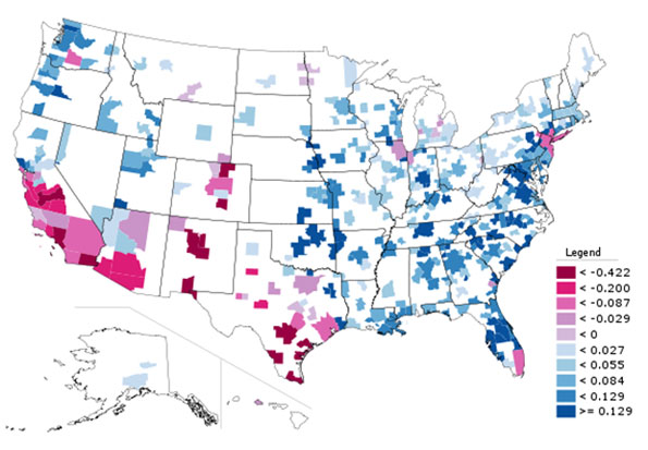
    Black Only Population, Change in Location Quotient 2000-2010

    The change in Black concentration is particularly revealing. Much has been written about the so-called reversing of the Great Migration. But contrary to media reports, there is no clear monolithic move from North to South. Instead, we see that the outflow has been disproportionately from America’s large tier one metros like New York, Chicago, and Los Angeles. In contrast, Northern cities like Indianapolis, Columbus, and even Minneapolis-St. Paul (home to a large African immigrant community) grew Black population strongly, and actually increased their Black concentrations. Similarly, there were clearly preferred metro destinations in South for Blacks, like Atlanta and Charlotte. Many other Southern metros , particularly those along the Atlantic coast of Georgia and the Carolinas continued to lose their appeal to Blacks, relatively speaking.

    Hispanic Population


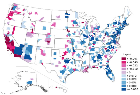
    Hispanic Population (of any race), Change in Location Quotient 2000-2010

    Here we see de-concentration clearly in action. The Mexican border regions retained high Hispanic population counts, but they are no longer as dominant as in the past. Places like Nashville, Oklahoma City, and Charlotte particularly stand out for increasing Hispanic population percentage. Again, large traditionally diverse tier one cities like New York and Chicago show declines on this measure as smaller cities are now more in on the diversity game.

    Asian Population


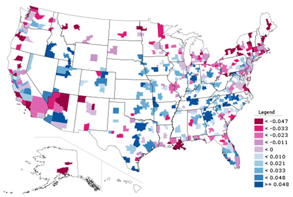
    Asian Only Population, Change in Location Quotient 2000-2010

    Again, we see here that America’s Asian population spread well beyond traditional west coast bastions. There were big increases in Asian population counts, with resulting LQ changes, in places like Atlanta, Indianapolis, Philadelphia, and Boston. Even New York (which now has over one million Asian residents within the city limits alone) and Chicago showed gains among Asians.

    Children (Population Under Age 18)

    As a bonus, here is a look at LQ change for metro areas for people under the age of 18.


    Children (Population Under Age 18), Change in Location Quotient 2000-2010

    Here we see that metros along America’s northern tier now have relatively fewer children than a decade ago, while metros like Denver, Dallas, and Nashville had more. Clearly, some places are increasingly seen as better – and perhaps also more affordable – locations for child rearing than others.  Perhaps unsurprisingly many of the out of favor locales are either expensive, have poor economic prospects, and/or are excessively cold. Not surprisingly, for example, Atlanta, Houston and Florida’s west coast have gained in this demographic while much of the Northeast, particularly upstate New York, have lost out.

    The overall key is while there are certain broad themes that emerge from the recent Census, such as America’s increasing diversity or signs of a reversing of the Great Migration, we need to take a more fine grained view to see which places are in fact benefitting and being hurt by these trends.  What we see here is that traditional large urban bastions of black population and ethnic diversity are no longer the only game in town. Smaller places in the interior and the South are now emerging as diversity magnets in their own right, as well as magnets for families with children. This is the collection of places to watch to look for the next set of great American cities to emerge.

    Aaron M. Renn is an independent writer on urban affairs based in the Midwest. His writings appear at The Urbanophile. Telestrian was used to analyze data and to create maps for this piece.

    Note: The original version of this piece included incorrect charts for the Asian, Hispanic, and child measures.

  • New Geography’s Most Popular Stories of 2011

    As our third full calendar year at New Geography comes to a close, here’s a look at the ten most popular stories in 2011. It’s been another year of steady growth in readership and reach for the site.  Thanks for reading and happy new year.

    10.  The Other China: Life on the Streets, A Photo Essay Argentinean architect and photographer Nicolas Marino offers a set of stunning photographs from the streets of Chengdu and Shanghai.

    9.  Six Adults and One Child in China Emma Chen and Wendell Cox outline the rising numbers of elderly and increasing age dependency ratios in China and across the globe.  Chen and Cox outline a number of solutions, including “extending work and careers into the 70s; means tested benefits; greater incentives for having children; and measures to keep housing more affordable and family friendly,” but conclude “the ultimate issue will be maintaining economic growth.”

    8.  The Texas Story is Real Aaron Renn takes a look at a number of broad-based economic measures of Texas over the past decade. He finds that “While every statistic isn’t a winner for Texas, most of them are, notably on the jobs front. And if nothing else, it does not appear that Texas purchased job growth at the expense of job quality, at least not at the aggregate level.”

    7.  Let’s Face it High Speed Rail is Dead and Obama’s High Speed Rail Obsession Aaron Renn and Joel Kotkin look at high speed rail in America from two angles, Renn from the practical and Kotkin from the political.  According to Renn: “In short, it’s time to stop pretending we are going to get a massive nationwide HSR rail network any time soon.  Advocates should instead focus on building a serious system in a demonstration corridor that can built credibility for American high speed rail, then built incrementally from there.” Kotkin’s piece also appeared at Forbes.com.

    6.  America’s Biggest Brain Magnets Joel Kotkin and Wendell Cox use American Community Survey data to estimate the biggest gainers of bachelor’s degree holders in U.S. regions.  The big winners:  New Orleans, Raleigh, Austin, Nashville, and Kansas City. This piece also appeared at Forbes.com.

    5.  The Next Boom Towns in the U.S. Joel Kotkin examines the U.S. regions most primed for future growth, based on my analysis of six forward-looking metrics.  “People create economies and they tend to vote with their feet when they choose to locate their families as well as their businesses.  This will prove   more decisive in shaping future growth than the hip imagery and big city-oriented PR flackery that dominate media coverage of America’s changing regions.” The piece also appeared at Forbes.com.

    4.  The Decline and Fall of the French Language Gary Girod wonders if the French language is declining in worldwide significance.

    3.  Census 2010 Offers a Portrait of America in Transition Aaron Renn’s summary of this spring’s new Census 2010 results includes eight county and metropolitan area level maps showing population change and shifts in racial group concentrations.

    2.  The Golden State is Crumbling In this piece, also appearing at The Daily Beast, Joel Kotkin blames California’s stagnancy on self-imposed policy decisions.  While the state has many assets and is rich in promise “the state will never return until the success of the current crop of puerile billionaires can be extended to enrich the wider citizenry. Until the current regime is toppled, California’s decline—in moral as well as economic terms—will continue, to the consternation of those of us who embraced it as our home for so many years.”

    1.  Best Cities for Jobs 2011 Our best cities rankings measure one thing: job growth.  This purposefully simple approach leaves out other less tangible measures of such as quality of life or other amenity indicators, leaving you with a tool to use creating policy for your region.

  • The Driving Decline: Not a “Sea Change”

    The latest figures from the United States Department of Transportation indicate that driving volumes remain depressed. In the 12 months ended in September 2011, driving was 1.1 percent below the same  period five years ago. Since 2006, the year that employment peaked, driving has remained fairly steady, rising in two years (the peak was 2007) and falling in three years. At the same time, the population has grown by approximately four percent. As a result, the driving per household has fallen by approximately five percent.

    There are likely a number of reasons for the driving decline, some of which are described below.

    Democratization of Mobility: The leveling off of driving is something analysts have expected for some time. More than ten years ago, Alan Pisarski noted that drivers licenses and automobility had saturated the market among the While-non-Hispanic population. For decades, driving had been increasing at a substantially faster rate than the population, as driving rates for women and minorities converged  upon the rate of White-non-Hispanic males.

    Clearly, the continued, extraordinary increase in driving of recent decades could not be expected to continue, since nearly all were already driving. Pisarski called this the "democratization of mobility" in a 1999 paper. At that time only African-Americans and Hispanics were still behind the curve. The recent economic difficulties have slowed the progress toward equal automobility for minorities. In 2009, American Community Survey data indicates that the share of Hispanic households without access to a car remained 40 percent above White-non-Hispanic Whites. The rate of African-American no-car households was 20 percent above that of White-non-Hispanics. The driving decline reflects in large part the failure of the economy to produce equal mobility opportunities for minority households.

    Higher Gasoline Prices and the Middle Class Squeeze: One of the most important factors has to be the unprecedented increase in gasoline prices. Over the past decade, gasoline prices have doubled (adjusted for inflation) and have remained persistently high. It has worsened in the last five years, with prices having risen more rapidly than in any period relative to the previous decade in the 80 years for which there are records. This has taken a huge toll on households. At average driving rates, budgets have increased by nearly $1,800 annually to pay for the higher gasoline prices. In a time (2000-2010) that median household incomes declined $3,700 (inflation adjusted), it is not surprising that people are driving less.

    Unemployment: Not Driving to Work: Today’s higher unemployment means that fewer people are driving to work. Employment peaked in 2006. Assuming average work trip travel distances, the smaller number of people working now would reduce travel per household by more than one percent (one-fifth of the household reduction).

    Shopping Less Frequently due to Higher Gasoline Prices: According to the Nationwide Household and Transportation Survey (2009), the average household makes 468 shopping trips annually. If shopping trips were reduced by one quarter in response to higher gasoline prices, the reduction in travel per household would be enough, along with the work trip reductions, to account for all of the decline over the past five years.

    Information Technology: Not Driving and Telecommuting Instead: Again, advances in information technology appear to have also added to the decline. Even while employment was falling, working at home (mainly telecommuting) increased almost 10 percent between 2006 and 2010 (latest data available) and telecommuting added six times as many commuters as transit. Working at home eliminates the work trip and is thus the most sustainable mode of access to employment. In just four years, in working at home removed as much automobile travel to work as occurs every day in the Salt Lake City metropolitan area.

    More Information Technology: Not Driving and Texting Instead? Adie Tomer at the Brookings Institution notes a decline in the share of people 19 years and under who have drivers licenses as potentially contributing to the trend. She cites University of Michigan research by Michael Sivak and Brandon Schoettle, who documented the decline. Sivak told The Michigan Daily that "a major reason for the trend is the shift toward electronic communication among America’s youth, reducing the need for ‘actual contact among young people.’"

    Still More Information Technology: Not Driving and Shopping On-Line Instead? And, as with electronic communication and telecommuting, there is also an information technology angle to shopping. The substantial increase in on-line shopping could be reducing shopping trips.

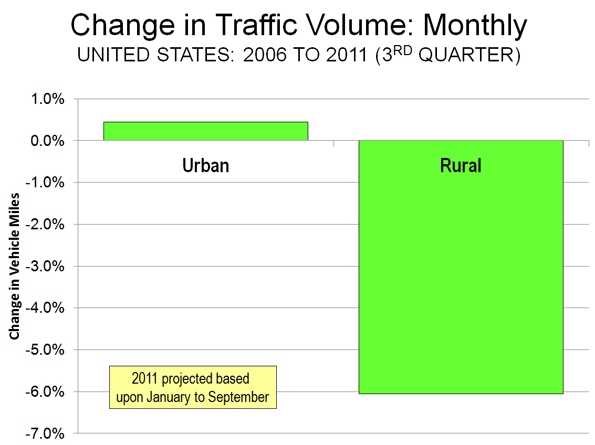
    Not Making Intercity Trips? All of the loss in driving has been in rural areas, rather than urban areas. Since the employment peak in 2006, urban driving has increased 0.4 percent (though driving per household has decreased). By comparison, rural driving has declined 6.0 percent (Note). This much larger rural driving decline could be an indication that people have reduced discretionary travel, such as longer trips that extend beyond the fringes of urban areas (Figure). As with transit, however, it would be a mistake to characterize Amtrak as having attracted much of the reduced rural travel (or for that matter from airlines, see If Wishes were Iron Horses: Amtrak Gaining Airline Riders?). Over the period, Amtrak’s gain (passenger mile) has been approximately one percent of the rural loss.

    Not Driving and not Transferring to Transit: Transit ridership trends have been generally positive over the past decade. Since 2006, transit ridership has risen 3.4 percent. This compares to the 1.1 percent decline in automobile use. However, it would be incorrect to assume attraction to transit as contributing materially to the decline in driving. Because transit has such a small market, even this healthy increase has budged its urban market share (now approximately 1.7 percent) up by barely 0.5 percentage points.

    Besides scale, there is another reason transit has not been the beneficiary of the driving reduction. Automobile competitive transit service is simply not accessible for most trips. For example, it is estimated that less than four percent of metropolitan jobs can be reached in 30 minutes by transit for the average metropolitan area resident. This compares to the more than 65 percent of automobile commuters who do reach their jobs in 30 minutes or less. In short, transit is not an alternative to the car for the vast majority of urban trips.

    It does no good to suggest this can be materially improved by increasing transit service. The most lucrative transit markets are already served, and new ones would be more expensive. This is illustrated by the exorbitant cost of adding ridership. Over the most recent decade, transit ridership increased 21 percent, which required an expenditure increase of 59 percent, nearly three times as much.

    Decentralization of Jobs and Residences: The 2010 census indicated that the American households continue to decentralize, increasingly choosing to live in single-family detached houses in the suburbs. The same trend has been occurring in employment locations, as Brookings Institution research indicates. Between 1998 and 2006, less than one percent of new employment was located within three miles of urban cores. Nearly 70 percent of the new jobs decentralized to outer suburban rings.

    The continuing dispersion of jobs and residences could dampen the increase rate of driving in the years to come, as households have greater opportunities to live in the suburban surroundings they prefer, while also commuting to the more proximate jobs that have moved to the suburbs.

    The Decline in Context: Among the potential causes, certainly the most important is the economic situation,with steeply declining household incomes and the worst economic situation since the 1930s. The longer term driving trends will be more apparent when (and if) prosperity restores healthy growth in employment. Moreover, with only a small part of travel being attracted to transit, a more significant shift could involve substitution of access by information technology (on-line). Even with the decline, however, there has been nothing like a "sea change" in how the nation travels.

    Note: The data on driving is estimated from Federal Highway Administration (FHWA) reports. FHWA produces monthly preliminary estimates, which are subsequently adjusted in annual reports.

    Wendell Cox is a Visiting Professor, Conservatoire National des Arts et Metiers, Paris and the author of “War on the Dream: How Anti-Sprawl Policy Threatens the Quality of Life

    Photograph: Harbor Freeway, Los Angeles

  • Public Pensions: Reform, Repair, Reboot

    Ill-informed chatter continues to dominate the airwaves when it comes to California public pensions. It’s a big, complex and critical issue for government at all levels in the Golden State. What makes debate so distorted is that public pensions actually differ from agency to agency — and advocates on the issue often talk past each other. Pension critics often point to outrageous abuses as if they were typical. On the other hand, pension defenders often cite current averages that understate long-term costs. All this fuels the typical partisan gridlock that Californians lament yet seem powerless to change in our state.

    Credit Governor Jerry Brown for trying to overcome the polarization. That’s what most California voters want him to do, according to a new Field Poll, one of the leading opinion research firms in California. His 12-point pension package (unveiled in October) is successfully framing the debate — and enjoys encouraging support from voters. I agree with them. While Brown’s plan is far from perfect (as he acknowledged in presenting it as a way to build consensus) it sensibly tackles some of the most challenging areas where reform is needed. Among the key reforms he’s proposed:

    • Increasing the retirement age from 55 to 67 (with a lower age to be spelled out for public safety workers).
    • Replacing the current “defined benefit” pensions with a hybrid program that includes a defined benefit component, but also a 401(k)-like defined contribution component
    • Prohibiting retroactive pension increases.
    • Requiring all employees to contribute at least 50 percent of the cost of their pensions

    These generally follow the surprisingly strong stand taken by the League of California Cities, which was based on recommendations from a committee of City Managers that I served on. Our work was grounded in four core principles:

    1. Public retirement systems are useful in attracting and retaining high-performing public employees to design and deliver vital public services to local communities;
    2. Sustainable and dependable employer-provided defined benefits plans for career employees, supplemented with other retirement options including personal savings, have proven successful over many decades in California;
    3. Public pension costs should be shared by employees and employers (taxpayers) alike; and
    4. Such programs should be portable across all public agencies to sustain a competent cadre of California public servants.

    Our goal was to ensure the public pension system is reformed, instead of destroyed. Our reform package mirrors Brown’s calls for a hybrid system, raising retirement ages and increasing the portion of pension costs borne by employees. We also backed his bid to base retirements on the top three highest years of pay, curbing the abuses that often artificially raise final year salaries to “spike” pension pay-outs.

    Typical of California’s other challenges, the issue faces long odds in the Legislature and uncertain fate at the ballot box. Partisan Democrats are leery of crossing unions by embracing Brown’s package. Partisan Republicans are demanding more far-reaching changes. Brown hopes to bridge the differences to win majority support by drawing on moderates in both parties. “He hasn’t riled up one side or the other,” noted Field Poll director Mark DiCamillo. “He’s managed to strike the middle ground on a very polarizing issue.” Unfortunately, moderates are hard to find in Sacramento.

    That leaves the roll of the dice that comes with ballot initiatives. Since it takes millions to bankroll a successful ballot measure, few sensible measures get far without support from well-heeled interests.

    In the eternal game of chicken that goes on in Sacramento, the Legislature keeps one eye on those special interests. About the only hope for reform is if a majority is worried that failure to act might spur an expensive ballot box war and an even worse outcome.

    This issue might be the exception, however. Public outrage is real. So is the need for reform. In Ventura, we took an early lead on this issue, first with our Compensation Policies Task Force, then union contracts that established a lower benefit and later retirement age for new hires and increased contributions from all employees of at least 4.5% of their pay. But real reform to level the playing field can only come at the State level.

    Before this issue devolves into another ballot box catastrophe that radically oversimplifies the issues to a “yes” or “no” choice on an initiative bankrolled by special interests, legislators in both parties need to come together on sensible reform. The Governor has put such a program on their desks. Reasonable people can differ on the details. But only unreasonable people want all-or-nothing victories. This is an issue that both sides should be willing to compromise on. The only way that will happen is if voters push both parties toward sensible compromise in the year ahead!

    Photo by Randy Bayne

    Rick Cole is city manager of Ventura, California, and recipient of the Municipal Management Association of Southern California’s Excellence in Government Award. He can be reached at RCole@ci.ventura.ca.us

  • California: Codes, Corruption And Consensus

    We Californians like collaboration. Before we do things here, we consult all of the “stakeholders.” We have hearings, studies, reviews, conferences, charrettes, neighborhood meetings, town halls, and who knows what else. Development in some California cities has become such a maze that some people make a fine living guiding developers through the process, helping them through the minefields and identifying the rings that need kissing.

    Here’s an example. This is a (partial?) list of the groups who will have a say on any proposed project in my city, Ventura:

    • City agencies (Planning, Engineering, Flood Control, Traffic, Building & Safety, Utilities, Police, Fire)
    • Historic Preservation Committee
    • Parks and Recreation Committee
    • Design Review Committee
    • Planning Commission
    • City Council
    • School District
    • Neighborhood and Community Councils
    • No-Growth Citizen Groups
    • Chamber of Commerce
    • Ventura Citizens for Hillside Preservation
    • California Department of Fish and Game
    • United States Department of Fish and Wildlife
    • Ventura County Local Agency Formation Committee (discretionary authority regarding annexations)
    • Los Angeles Regional Water Quality Control Board (new MS4 Stormwater Permit issues)
    • Ventura County Environmental Health
    • California Coastal Commission (for some projects within the Coastal Zone)
    • California Native American Heritage Commission and Designated Most Likely Descendant of local tribe
    • United States Army Corps of Engineers
    • Natural Resources Defense Council, Surfrider Foundation, Heal the Bay, other environmental groups
    • And all parties who have requested to be on notice, as well as the general public and other agencies, will be informed of any California Environmental Quality Act (CEQA) document.

    I didn’t pick Ventura because it is the most difficult. It’s not. I think Ventura is pretty typical for a coastal California city, actually.

    The result of having all these stakeholders is that, in many California communities, particularly those in coastal and upscale locations, everyone has a veto on everything. At the beginning of a project the developer faces a huge amount of uncertainty about what the project will look like once it gets past the gauntlet and about the cost of the development process. Add to that uncertainty about who will demand what, how long the approval process will take, market conditions and the regulatory environment when the project is completed, if it is completed.

    This is where the corruption connection comes in.

    In economics, we teach that there are two types of corruption, centralized and decentralized. Decentralized corruption is the more pernicious of the two.

    Think of a city where organized crime has a successful protection racket. This would be centralized corruption. The mob is going to collect from everyone, but it has an incentive not to collect too much. It doesn’t want to draw too much attention to itself or chase the business out of town.

    By contrast, decentralized corruption consists of a bunch of independent gangs, each trying to collect all they can before the next group of thugs comes along. Each gang of thugs will demand and collect too much, and chase the business out of town.

    Of course, if you want to develop a property in California no one will hold a gun to your head and demand money, and everyone is way too polite to call it extortion. Certainly, no group thinks of itself as a mob of corrupt gangsters. Instead, the members think of themselves as stakeholders, and they hold delays, lawsuits, or project denial to your head. The results are the same.

    First, you have to meet everyone, and everyone wants something in return for support, or for refraining from opposition. Groups will demand “mitigation fees,” delays, studies and more studies, and changes in the project. You will meet their demands, or you will be sued, or the project will be denied.

    Time spent on meetings, studies, and negotiations is expensive. The cost of the local “guide,” necessary to get through the local maze, is expensive. The “mitigation fees” are expensive. Delays are expensive. Studies are expensive. Changes in the project are expensive. Lawsuits are expensive. And risk is expensive.

    Eventually, the project is no longer profitable. No wonder California’s unemployment rate is 30 percent above the United States unemployment rate.

    The current climate provides California’s local governments with their best economic development opportunity: Eliminate the legal extortion by guaranteeing a project’s prompt approval if it meets existing general plans, specific plans, zoning, building codes, and adopted design criteria. Any community that did this would see immediate increased economic activity. To steal a phrase from a famous economist, it is the closest thing to a free lunch.

    A city does outreach before it develops its zoning and community design plans. It only adds to the cost of development to require builders to go through the entire process again, fighting the same battles, every time a project is proposed.

    The best thing about this idea is that it has been tried, and it works. The City of San Diego has seen an amazing-for-California energy since its redevelopment agency implemented such a plan several years ago. In the worst economy in 50 years, San Diego has been building and providing commercial and housing projects for all economic levels in its downtown area. It is time for the rest of California to get on with it.

    Bill Watkins is a professor at California Lutheran University and runs the Center for Economic Research and Forecasting, which can be found at clucerf.org

    Photo: Two Tree Hill, Ventura California by Joseph Liao (Chowee).

  • Heavy Metal Is Back: The Best Cities For Industrial Manufacturing

    For a generation American manufacturing has been widely seen as a “declining sport.” Yet its demise has been largely overplayed.  Despite the many jobs this sector has lost in the past generation, manufacturing remains remarkably resilient, with a global market share similar to that of the 1970s.

    More recently, the U.S. industrial base has been on a powerful upswing, with employment climbing steadily since 2009. Boosted by productivity gains and higher costs in competitors, including China, U.S. manufacturing exports have grown at their fastest rate since the late 1980s. In 2011 American manufacturing continued to expand, while Germany, Japan and Brazil all weakened in this vital sector.

    To determine the best cities for manufacturing my colleague Mark Schill at Praxis Strategy Group measured the 51 largest regions in the country in terms of how they expanded their “heavy metal” sector — think automobiles, farm and energy equipment, aircraft, metal work and machine shops. We averaged absolute growth rate and momentum in 148 heavy metal manufacturing industries over ten-, five-, two-, and one-year time frames.

    Our top ranked area, Houston, is one of only four regions that enjoyed net job growth in manufacturing in the past 10 years. This year its heavy manufacturing sector expanded by almost 5%. Houston’s industrial growth is no fluke; over the past year its overall job growth has been about the best among  all the nation’s major metros.

    Houston’s industrial success owes much to the city’s massive port and booming energy sector, says Bill Gilmer, senior economist at the Federal Reserve office of Dallas. “Houston is about energy — it’s about fabricated metals and machinery,” he says. “It’s oil service supply and petrochemicals. It’s all paced by a high price of oil and new technology that makes it more accessible.”

    This shift towards domestic energy augurs well for a huge and economically beneficial  shift in America’s  longer term economic prospects, he points out. Cheap natural gas, for example, makes petrochemical production in America more competitive than anyone could have imagined a decade ago. Linkages with Mexico in terms of energy as well as autos has made Texas — which is also home to No. 4 ranked San Antonio and No. 15 ranked Dallas — the nation’s primary export super-power, with current shipment 15% to 20% above pre-crisis levels.

    The energy and industry connection also can be seen in No. 10 Oklahoma City, where heavy industry has been booming through much of the recession due to its strong fossil fuel industry. This synergy between energy and manufacturing could also spread to other regions, including many not associated with large fossil fuel deposits  New finds in the Utica shale in Ohio, for example, could be worth as much as  $500 billion; one energy executive called it “the biggest thing to hit Ohio since the plow.”

    These gas finds may help ignite the heavy metal revival. As coal-fired plants become more expensive to operate due to concerns over greenhouse gas emissions, the region will have a new, cleaner and potentially less expensive power source.

    Already the  boom in natural gas has sparked a considerable industrial rebound in parts of eastern Ohio including the building of a new $650 million steel plant for gas pipes in the Youngstown area.  Karen Wright, whose Ariel Corporation sells compressors used in gas plants, has added more than 300 positions in the past two years. “There’s a huge amount of drilling throughout the Midwest,” Wright says. “This is a game changer.”

    But the industrial rebound is not only about energy. Another critical factor is rising  wages in East Asia, including China. Increasingly, American-based manufacturing is in a favored position as a lower-cost producer. Concerns over “knock offs” and lack of patent protection in China may also spark a growing “Made in the USA” trend.

    The shift back to U.S. production may be a great sign for many regions. Our No. 3 ranked area, Seattle-Tacoma-Bellevue, is picking up heavy metal jobs associated with the aerospace industry. A growing focus on domestic production for Boeing’s new aircraft could bring even more prosperity to the high-flying region, which also ranked No. 1 on our recent technology industry growth ranking.

    If new industrial growth is just another piece of good news in the Pacific Northwest, it’s manna from heaven to the long suffering industrial heartland heavily concentrated in the Great Lakes region, which includes much of Ohio, Michigan, Indiana, Illinois , Wisconsin and Minnesota.  Long reviled as the “rust belt” this area now leads in the industrial rebound with over 100,000 new manufacturing jobs in just the past year.

    Particularly well positioned is No. 2 ranked Milwaukee, which is home to a wide array of specialized manufacturing firms ranging from machine tools to energy. Over the past year alone the region added almost 3900 heavy metal jobs and has consistently led other Great Lakes communities in job creation.

    But Milwaukee is not the only rust belt rebound town. The greater Detroit area, No. 6 on our list, actually added the most heavy metal jobs — more than 12,000 — than any region of the country. The area’s ranking, however, was dragged down by its legacy; greater Detroit still has lost almost 130,000 positions in the past decade.

    The heavy metal revival has a long way to go. And we cannot expect it to produce the same kinds of jobs produced in the last century. For example, the new jobs will be more highly skilled; even as the share of the workforce employed in manufacturing has dropped from 20% to roughly half that, high skilled jobs in industry have soared 37%, according to a New York fed study.

    Regions seeking strong industrial growth will have to focus more and more on training more skilled workers. Even after years of declining employment and surplus numbers of graduates in the arts and law, manufacturers in heavy industry are running short on skilled workers. Industry expert David Cole predicts there could be demand for 100,000 new workers by 2013. According to Deloitte Touche, 83% of all manufacturers suffer a moderate or severe shortage of skilled production workers.

    The resurgence of heavy metal should lead regions, and the federal government, to consider shifting their emphasis toward productive, skilled based training and away from a single-minded focus on the BA or graduate degree. Few regions suffer a shortage of art history or English graduates.   This more practical emphasis is particularly critical for the Midwest, which is home to four of the ten highest-ranked industrial engineering schools in the nation.

    Even more important: training workers for the assembly lines of tomorrow. These jobs, notes Ariel’s Karen Wright, will require not BA degrees but high degrees of math and mechanical skills that can be apply to expanding companies like hers.

    As we enter a new economic era, regions should look beyond the current obsession with “creative” and “information” industries. Instead, they should focus on a resurgent industrial economy — which then can provide a customer base for advertising, graphics and software companies — as a primary driver of economic growth.  Turn down those soulful   Adele tracks: Heavy metal is back.

    The Top Regions for Heavy Metal
    Manufacturing Job Growth


    Score consists of 10, 5, 2, and 1 year job growth rate and job momentum and 2011 industry concentration. 

    Rank MSA Name Score
    1 Houston-Sugar Land-Baytown, TX 68.5
    2 Milwaukee-Waukesha-West Allis, WI 65.6
    3 Seattle-Tacoma-Bellevue, WA 64.7
    4 San Antonio-New Braunfels, TX 60.7
    5 Virginia Beach-Norfolk-Newport News, VA-NC 60.4
    6 Detroit-Warren-Livonia, MI 58.2
    7 Kansas City, MO-KS 56.3
    8 Hartford-West Hartford-East Hartford, CT 56.1
    9 Sacramento–Arden-Arcade–Roseville, CA 54.4
    10 Oklahoma City, OK 53.3
    11 Pittsburgh, PA 53.2
    12 Salt Lake City, UT 52.6
    13 Richmond, VA 52.0
    14 Portland-Vancouver-Hillsboro, OR-WA 51.8
    15 Dallas-Fort Worth-Arlington, TX 51.5
    16 Cincinnati-Middletown, OH-KY-IN 51.3
    17 Cleveland-Elyria-Mentor, OH 51.3
    18 San Diego-Carlsbad-San Marcos, CA 50.5
    19 Raleigh-Cary, NC 50.1
    20 San Jose-Sunnyvale-Santa Clara, CA 48.7
    21 Birmingham-Hoover, AL 48.0
    22 Minneapolis-St. Paul-Bloomington, MN-WI 47.9
    23 Atlanta-Sandy Springs-Marietta, GA 47.6
    24 Louisville/Jefferson County, KY-IN 47.3
    25 Austin-Round Rock-San Marcos, TX 47.2
    26 St. Louis, MO-IL 46.8
    27 Orlando-Kissimmee-Sanford, FL 46.7
    28 Charlotte-Gastonia-Rock Hill, NC-SC 46.2
    29 Denver-Aurora-Broomfield, CO 45.7
    30 Boston-Cambridge-Quincy, MA-NH 44.9
    31 Chicago-Joliet-Naperville, IL-IN-WI 44.6
    32 Washington-Arlington-Alexandria, DC-VA-MD-WV 44.0
    33 Memphis, TN-MS-AR 43.9
    34 Tampa-St. Petersburg-Clearwater, FL 42.9
    35 Indianapolis-Carmel, IN 42.9
    36 Providence-New Bedford-Fall River, RI-MA 42.9
    37 Rochester, NY 42.3
    38 Columbus, OH 42.2
    39 Phoenix-Mesa-Glendale, AZ 41.9
    40 Jacksonville, FL 41.1
    41 Los Angeles-Long Beach-Santa Ana, CA 40.2
    42 Miami-Fort Lauderdale-Pompano Beach, FL 40.1
    43 Nashville-Davidson–Murfreesboro–Franklin, TN 39.8
    44 Philadelphia-Camden-Wilmington, PA-NJ-DE-MD 39.1
    45 Buffalo-Niagara Falls, NY 38.7
    46 Riverside-San Bernardino-Ontario, CA 37.9
    47 New Orleans-Metairie-Kenner, LA 35.7
    48 Baltimore-Towson, MD 34.3
    49 Las Vegas-Paradise, NV 31.0
    50 New York-Northern New Jersey-Long Island, NY-NJ-PA 30.1
    51 San Francisco-Oakland-Fremont, CA 24.5
    Analysis includes job data from 148 six-digit NAICS industry sectors covering Primary Metal Manufacturing (NAICS 331), Fabricated Metal Manufacturing (332), Machinery Manufacturing (333) and Transportation Equipment Manufacturing (336).
    Data Source: EMSI Complete Employment, 2011.4 


    This piece first appeared at Forbes.com.

    Joel Kotkin is executive editor of NewGeography.com and is a distinguished presidential fellow in urban futures at Chapman University, and contributing editor to the City Journal in New York. He is author of The City: A Global History. His newest book is The Next Hundred Million: America in 2050, released in February, 2010.

    Mark Schill of Praxis Strategy Group perfomed the economic analysis for this piece.

    Photo courtesy of BigStockPhoto.com.


  • Los Angeles Gets Old

    During the last decade, Los Angeles County grew by about 300,000, an insignificant figure for a region of 9.8 million people. As in the previous decade, the slight increase in population was made possible by an increase in the number of Latinos (10.5%) and non-Hispanic Asians (18%). But overall growth was slowed by a sharp    decline in non-Hispanic white (7.4%) and non-Hispanic African American (8.5%) populations (see Table 1).

    Less recognized, immigration, the demographic fuel that previously fed LA’s economic engine also has slowed down. With little in-migration from other states, we are beginning a new phase in our trajectory: aging together, native and foreign born.

    This is a crucial moment in our history. We could be at the end of the period where Los Angeles thrived as a destination of choice for the working-age population and may simply begin to age, much like our counterparts in the Northeast. Is LA finally out of its “sunbelt” phase and entering its graying era?

    Demographic Changes – An Overview

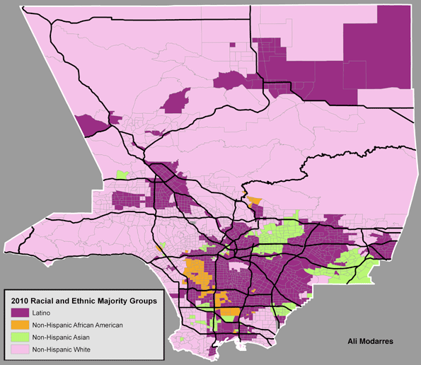
    As Figure 1 illustrates, the geography of race and ethnicity has changed little over the course of the last few decades. Latinos have retained or expanded their majority status in a significant number of neighborhoods. Asian and Asian-American neighborhoods are highly concentrated in an area known as the San Gabriel Valley, while the non-Hispanic white population continues to dominate in areas outside the central city, with the exception of a few tracts in and around the Figueroa corridor (in downtown LA) connected with recent downtown development. Non-Hispanic African Americans have lost their majority status in some South LA neighborhoods where Latinos have come to outnumber them.


    Immigration

    California’s declining immigration can be attributed to a tarnished economic image of the state and its anti-immigrant sociopolitical environment.  This might seem puzzling to many residents of Los Angeles, who live a very immigrant-rich environment.

    First, are immigrants still coming to Los Angeles at the same rate as before)?  

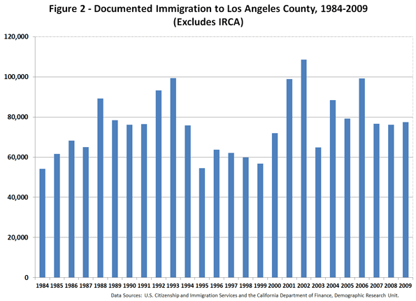
    Figure 2 helps provide the answer to this question, by illustrating the annual immigration patterns to the county. The 2007–2009 period has seen less annual immigration, but the nearly 80,000 immigrants per year is as many or more than those from 1994 to 2000. Comparing the period of 1990–1999 with 2000–2009 illustrates that, during the last ten years, a larger number of immigrants have arrived in the county (718,166 versus 841,325).

    But what seems clear is that if they are arriving in LA, fewer are staying for the long term. This secondary migration can be made visible by comparing the number of immigrants arriving in Los Angeles County with a tabulation of LA’s foreign-born population by year of U.S. entry.

    The 2009 American Community Survey shows that, among the nearly 3.5 million foreign-born residents of the county, 909,692 arrived between 1990 and 1999 and 811,808 between 2000 and 2009 (see Table 2). Comparing these figures with the number of immigrants who arrived in Los Angeles during the same periods from their countries of origin (718,166 in the 1990s and 841,325 in the 2000s) indicates that we attracted more immigrants from the 1990–1999 cohort (a net gain of close to 192,000) and lost members of the 2000–2009 cohort (about 30,000).

    Clearly the county lost its foreign-born population to other regions of the state and the nation. This is somewhat troubling since it reveals that the allure of the region may be waning among the working-age immigrant population. In fact, as Table 2 portrays, Los Angeles has gradually become home to an old-stock immigrant population, where the foreign-born population hails from earlier eras (i.e., the 1980s and the 1990s).

    Does this mean that the foreign-born population is also getting older? The answer to this question is complicated. Based on 2009 American Community Survey (ACS) data, the average age of the foreign-born population in the country is slightly over 44, with 70% of the population falling between the ages of 27 and 62. This suggests that the immigrant population is a bit older than commonly expected.   Also, with fewer than 6% of the foreign-born population being younger than age 18, it is clear that the number of children arriving is significantly less than often assumed.   

    Therefore, it may be crucial to ask a pointed question. Does Los Angeles have the appropriate economic infrastructure to attract new immigrant while keeping more of our working age immigrants?  Considering the economic circumstance of the recent immigrants, the cost of living in Los Angeles, and the current economic and job environment, it should not come as a shock that many are leaving Los Angeles. After all, this is exactly what the native-born population has done throughout the history of the United States: leaving harsh economic conditions for better opportunities in other cities and states.

    Native born

    What about the native born population? 

    Surprisingly, with an average age of slightly over 30 years, the native-born population is younger than its foreign-born counterpart. This becomes clear as we compare the age structure of both groups. Among the working-age population, the foreign-born outnumber the native-born. However, among young and old residents, the native-born population is a larger group. Before jumping to any particular conclusion, we should be reminded that the native-born population includes a large number of individuals whose parents are immigrants. This means that the younger population is multi-racial and multi-ethnic in character. To illustrate this, I provide a detailed analysis of the native-born population in the following paragraphs.

    As Table 3 illustrates, among those 0–19 years old (the first two columns), Latinos outnumber other racial and ethnic groups. This is more pronounced among those 0–9 years old. However, in every age category older than 19, the non-Hispanic white population outnumbers others. Interestingly, it is only among the age 60+ residents that non-Hispanic African Americans outnumber Latinos (124,587 versus 119,676). This information, combined with what appears on Figure 3, suggests our foreign-born population is aging and new immigrants are not arriving fast enough to keep their average age low. But at the same time their children (particularly among Latinos) are clearly a significant portion of the younger and the working-age population. This illustrates that our economy and social structure operate largely based on the dividends from past decades of high immigration. Without a renewed immigration pattern that expands the working-age population, our economic prospects are somewhat dubious.  

    LA’s Demographic Future

    Table 4 provides a brief glimpse to our demographic future. Here we have the average age for the native-born population by race and ethnicity. With an average age of 20.6, native-born Latinos are younger than the non-Hispanic native- born population (at an average of 37.4). In fact, a significant majority of native-born Latinos are under age 40. This is in stark contrast to foreign-born Latinos who are, on an average, in their early 40s. Compared with an average age of 20.6 among native-born Latinos, the age gap between the two groups becomes clear, further highlighting the decline of younger Latino immigrants in Los Angeles.  

    Clearly the demographic path of Los Angeles County has been altered. We are becoming older and more native born. Blaming immigrants, the easy game of the last two decades, can no longer explain our social and economic ills. We need to embrace who we are and what our economy, politics, and collective decision making have brought to our doorsteps. It may be difficult to accept that we are getting older, but our region is losing young people as well. Table 5 contains the last bit of information we need to understand about how we became a region with a graying population.

    Between 2000 and 2010, we lost residents in five age categories: 0–4, 5–9, 10–14, 25–34, and 35–44. This suggests that – as we have seen in other high-cost urban regions – young families are leaving! Among the working-age population, we were able to hang on to those 15–24 and age 45 and older. These individuals are from older families whose young adults (15–24) may or may not choose to stay in the region. With declining immigration and departing younger families, the Los Angeles region is on its way to becoming a much grayer place.

    A Brief Note on Policy Options

    To be sure, there is nothing wrong with aging. It happens to the best of us. However, one needs to plan for it. Los Angeles County can develop policies that benefit a working-age population and its pending retirement needs (or rethink why it has lost its luster to immigrants and the native-born population.

    Unless conditions change, the ambitious children of immigrants will surely behave like other native-born citizens and look to regions where economic prosperity is most likely. High cost of housing, a less than satisfactory educational system, inadequate health services, and an inefficient transportation system might drive the second generation young families to other region.   

    The solution to the growing loss of our productive population does not lie in building more condos and subsidizing iconic places, such as downtown LA.   We need more jobs a burgeoning economy to keep productive people here. This needs to be tied to the integration of immigrants and their children.  Immigrants are not different from those who were born here. They also want the best quality of life they can get: for themselves and their children. If Los Angeles cannot provide that, perhaps other cities and regions can.

    Table 1 – Racial and Ethnic Structure of Los Angeles County, 2000-2010
    Population by Race and Ethnicity 2000 2010 Change 2000-2010 % Changes 2000-2010
      Population Percent Population Percent
    Total 9,519,338 100.0 9,818,605 100.0 299,267 3.1
    Not Hispanic or Latino 5,275,851 55.4 5,130,716 52.3 -145,135 -2.8
    Not Hispanic or Latino; White alone 2,946,145 30.9 2,728,321 27.8 -217,824 -7.4
    Not Hispanic or Latino; Black or African American alone 891,194 9.4 815,086 8.3 -76,108 -8.5
    Not Hispanic or Latino; American Indian and Alaska Native alone 26,141 0.3 18,886 0.2 -7,255 -27.8
    Not Hispanic or Latino; Asian alone 1,123,964 11.8 1,325,671 13.5 201,707 17.9
    Not Hispanic or Latino; Native Hawaiian and Other Pacific Islander alone 24,376 0.3 22,464 0.2 -1,912 -7.8
    Not Hispanic or Latino; Some other race alone 18,859 0.2 25,367 0.3 6,508 34.5
    Not Hispanic or Latino; Two or more races 245,172 2.6 194,921 2.0 -50,251 -20.5
    Hispanic or Latino 4,243,487 44.6 4,687,889 47.7 444,402 10.5
    Hispanic or Latino; White alone 1,676,614 17.6 2,208,178 22.5 531,564 31.7
    Hispanic or Latino; Black or African American alone 25,713 0.3 41,788 0.4 16,075 62.5
    Hispanic or Latino; American Indian and Alaska Native alone 42,330 0.4 53,942 0.5 11,612 27.4
    Hispanic or Latino; Asian alone 10,299 0.1 21,194 0.2 10,895 105.8
    Hispanic or Latino; Native Hawaiian and Other Pacific Islander alone 2,845 0.0 3,630 0.0 785 27.6
    Hispanic or Latino; Some other race alone 2,244,066 23.6 2,115,265 21.5 -128,801 -5.7
    Hispanic or Latino; Two or more races 241,620 2.5 243,792 2.5 2,172 0.9
    Source: U.S. Census Bureau, 2000 and 2010


    Table 2 – Foreign Born Population in Los Angeles County by Decade of Entry in the U.S.
    Decade of entry Population Percent
    Before 1950 24,568 0.7
    1950-1959 67,127 1.9
    1960-1969 182,618 5.2
    1970-1979 569,689 16.3
    1980-1989 934,034 26.7
    1990-1999 909,692 26.0
    2000-2009 811,808 23.2
    Total 3,499,536 100
    Source: U.S. Census Bureau, American Community Survey, 2009 
    Note: Selected Data is from PUMAs 4500 to 6126


    Table 3 – Race and Ethnicity among Native Born Population, by Age – Los Angeles County
    Race and Ethnicity 0 – 9 10-19 20-29
    Non-Hispanic Latino Non-Hispanic Latino Non-Hispanic Latino
    White alone 235,638 433,253 245,522 374,450 299,123 233,629
    African Americans 97,213 4,494 115,954 3,908 116,017 4,569
    Native Americans 2,010 5,093 1,930 5,102 4,179 3,720
    Asian 106,150 2,007 98,866 2,413 76,293 2,094
    Pacific Islander 2,806 150 4,262 479 3,141 155
    Other 3,989 360,581 4,908 317,786 2,830 203,948
    Two ore more  races 44,079 33,447 31,733 30,319 28,443 19,189
    Total 491,885 839,025 503,175 734,457 530,026 467,304
    Race and Ethnicity 30-39 40-49 50-59
    Non-Hispanic Latino Non-Hispanic Latino Non-Hispanic Latino
    White alone 293,983 138,832 348,042 90,154 346,481 57,596
    African Americans 97,312 2,297 116,845 1,065 99,881 816
    Native Americans 2,180 2,557 2,371 1,872 4,205 2,249
    Asian 39,582 1,992 22,476 772 20,151 515
    Pacific Islander 3,740 354 2,149 157 1,556 57
    Other 2,182 103,856 958 53,540 742 36,311
    Two ore more  races 20,435 11,770 13,319 7,022 10,131 4,695
    Total 459,414 261,658 506,160 154,582 483,147 102,239
    Race and Ethnicity 60+ Total Total
    Non-Hispanic Latino Non-Hispanic Latino  
    White alone 522,510 80,945 2,291,299 1,408,859 1,821,615
    African Americans 124,587 1,011 767,809 18,160 342,155
    Native Americans 1,883 1,483 18,758 22,076 22,034
    Asian 32,665 845 396,183 10,638 287,823
    Pacific Islander 2,395 147 20,049 1,499 10,993
    Other 1,029 30,085 16,638 1,106,107 894,042
    Two ore more  races 10,254 5,160 158,394 111,602 187,210
    Total 695,323 119,676 3,669,130 2,678,941 3,565,872
    Source: U.S. Census Bureau, ACS 2009


    Table 4 – Average Age by Race and Ethnicity, Los Angeles County
    Race Latino Non-Hispanic All
    Average Age Population Std. Deviation Average Age Population Std. Deviation Average Age Population Std. Deviation
    White 21.7 1,408,859 18.9 41.2 2,291,299 23.0 33.7 3,700,158 23.5
    African American 23.2 18,160 18.0 36.2 767,809 22.1 35.9 785,969 22.1
    Native American 26.6 22,076 20.0 36.3 18,758 20.1 31.1 40,834 20.6
    Asian 26.9 10,638 19.0 24.2 396,183 20.8 24.2 406,821 20.8
    Pacific Islander 28.5 1,499 18.7 31.2 20,049 19.8 31.0 21,548 19.7
    Other 19.0 1,106,107 16.0 23.5 16,638 18.3 19.1 1,122,745 16.1
    Two or more races 21.2 111,602 17.7 24.7 158,394 19.7 23.2 269,996 19.0
    All 20.6 2,678,941 17.8 37.4 3,669,130 23.2 30.3 6,348,071 22.6
    Source: U.S. Census Bureau, ACS 2009


    Table 5 – Age Composition and Changes from 2000 to 2010, Los Angeles County
    Age 2000 2010 Change % Change
    Under 5 years 737,631 645,793 -91,838 -12.5
    5 to 9 years 802,047 633,690 -168,357 -21.0
    10 to 14 years 723,652 678,845 -44,807 -6.2
    15 to 19 years 683,466 753,630 70,164 10.3
    20 to 24 years 701,837 752,788 50,951 7.3
    25 to 34 years 1,581,722 1,475,731 -105,991 -6.7
    35 to 44 years 1,517,478 1,430,326 -87,152 -5.7
    45 to 54 years 1,148,612 1,368,947 220,335 19.2
    55 to 59 years 389,457 560,920 171,463 44.0
    60 to 64 years 306,763 452,236 145,473 47.4
    65 to 74 years 492,833 568,470 75,637 15.3
    75 to 84 years 324,693 345,603 20,910 6.4
    85 years and over 109,147 151,626 42,479 38.9
    Total 9,519,338 9,818,605 299,267 3.1
    Source: U.S. Census Bureau, 2000 and 2010


    Ali Modarres is an urban geographer at California State University, Los Angeles. This report is based on a longer article appearing in the 2011 edition of the journal of California Politics and Policy.

    Photo by Bigstockphoto.com