Category: Urban Issues

  • Dense Urban Thinking Down Under

    Ku-ring-gai is a piece of suburban paradise in the inner rings of Sydney. A district of modest homes and quaint small-scale shopping districts, it sits near one of the last remaining stretches of blue-gum forest inside Australia’s largest city. You can still catch the occasional cockatoo luxuriating on a branch.

    First built around 1900, the neighborhood of 106,000 boasts all the charms of the classic “garden city,” balancing nature with modestly scaled development. Yet today the Ku-ring-gai community — including the remaining flora and fauna — is threatened with extinction by planners and developers seeking to pack the district with non-descript apartment tracks and ten-story commercial structures.

    “They’re doing everything they can to destroy this area,” says long-time community activist Kathy Cowley, a founding member of both Save Our Suburbs and Friends of Ku-ring-gai over lunch of meat pies and salad at her cottage. “They approach it as if it was a greenfield [or previously undeveloped] site for high-density housing. They are trying to destroy everything with bad planning.”

    Cowley speaks bitterly about how the state government of New South Wales, which controls development, cares little about disturbing a sensitive human as well as natural urban environment. Most of the new apartment dwellers, she notes, tend to be recently arrived residents. Many appear to be Chinese students, who ride on the surprisingly rickety trains largely to schools closer to Sydney’s center city.

    This assault on Cowley’s neighborhood reflects a peculiar density ideology that, although present in the United States, is far more powerful in New Zealand, Great Britain and Australia. Density advocates swear that everything from the necessities of economic competition to limited resources require “cramming” future populations in ever smaller spaces. It doesn’t matter that the population might object.

    In contrast, suburbs are constantly painted as on the verge of extinction. They are destined to become the dull victims of everything from demographics, “cool” migration, green ideology and the rise of “rentership” over home ownership to the ever-present, never-quite-happening “peak oil” that is destined to drive people out of their cars and into the inner cities.

    Economically, the density industry emphasizes the central city’s producer of high-end jobs tied particularly to financial services and its role as home to most universities, government institutions and media. But in the future, even elite industries seem more likely to disperse than concentrate. Look at high tech, where the vast majority of employment tends to be in suburban areas such as Silicon Valley, the counties surrounding Washington, D.C., and sprawling Durham, N.C.

    The same can be said in terms of demographics. Rather than becoming more dense, the vast majority of American cities have become more spread-out. The same has happened in many major metropolitan areas in advanced countries worldwide.

    The density obsession seems particularly ill-suited to Australia, a sparsely populated country where less than 0.2% of the land is urbanized, compared with less than 3% in the U.S. and around 6% for Great Britain.  But such thinking has taken root in this vast continent — to the detriment of many of its people.  ”The writing is on the wall for the Australian dream,” says Joe Flood, professor at the Flinders University Institute for Housing, Urban and Regional Research.

    Perhaps the biggest impact of pro-density policies has been rising land prices. State governments, which control most planning in Australia, along with their developer allies have discouraged development of new houses on greenfield sites, preferring to see the next generation of Australians living cheek to jowl close to the urban core.

    Because of this Australia, once a bastion of middle class aspiration, has suffered some of the world’s highest housing prices.  Sydney itself ranks second, behind Vancouver, in the English-speaking world’s unaffordability sweepstakes. In 1990 a Sydney household median income required five years wages; today it requires almost ten.

    Prices have been shaky recently, but current planning strictures will likely keep them artificially high. In America you can escape California or New York prices by heading south or inland. Even Australia’s second-tier, slow-growing  burgs like isolated Adelaide are more expensive than larger economically vibrant cities like Seattle and more than double as costly relative to incomes as Indianapolis, Dallas-Fort Worth or Houston.

    As a result, many younger Australians — and their parents — have reason to wonder if the next generation will ever be able to own a home. What they call the “Great Australian Dream” — with a backyard and shady streets — is being supplanted by the planner’s utopia of dense urban dwellers. Nothing wrong with having a dense option, but this is not about choice; it’s about coercion. The feisty New City Journal, edited by onetime Labour Party activists, described the process as “ruining our cities in order to save them.”

    Sadly much of the densification policy is based on faulty logic, increasingly justified by climate change. It’s ironic hearing pious greenhouse gas obsessions in a country dependent on exports of raw materials, most prominently coal, to China, the world’s biggest emitter. And a domestic reordering would have little to no impact on climate change since Australia generates barely 1% of the world’s greenhouse gases.

    But even if you agree Australia must do its part against climate change, many policy recommendations are based on a total misreading of modern urban form. Planners and media pundits assume, for example, that people can save energy by taking the train downtown; but even in Sydney, Australia’s largest and oldest big city, barely 12% of the labor force works in the central district, well below the levels decades ago.

    There’s also a presupposition that people living in downtown apartments are inherently less energy consumptive than their suburban counterpart. Yet a recent study done by researchers at the University of South Australia showed that overall urban dwellers — who travel, eat out more and consume more goods per capita — also consume more energy, once things like elevators and common areas are factored in, than the suburbanites living in townhouses or single-family homes.

    A similar finding was also made by the Australian Conservation Foundation. But in this particular battle, facts rarely intrude. Who needs to think after you have spent years in college being conditioned to believe that all density is good, the denser the better?   And for the big urban landowner, what could be better than stating a moral cause for limiting the suburban competition, thus spiking property  prices?

    What is happening to lovely Ku-ring-gai and the Great Australian Dream should stand as a warning of what happens if planners, and their big developer allies, gain total sway.  Let’s just hope America’s traditional decentralization of authority will prevent our middle class dream from following the sad trajectory of our hitherto lucky friends down under.

    This piece originally appeared at Forbes.com.

    Joel Kotkin is executive editor of NewGeography.com and is a distinguished presidential fellow in urban futures at Chapman University, and an adjunct fellow of the Legatum Institute in London. He is author of The City: A Global History. His newest book is The Next Hundred Million: America in 2050, released in February, 2010.

    Photo "Cockatoo in Sheldon Forest" by flickr user AussieGold
  • Surprise: Higher Gas Prices, Data Shows More Solo Auto Commuting

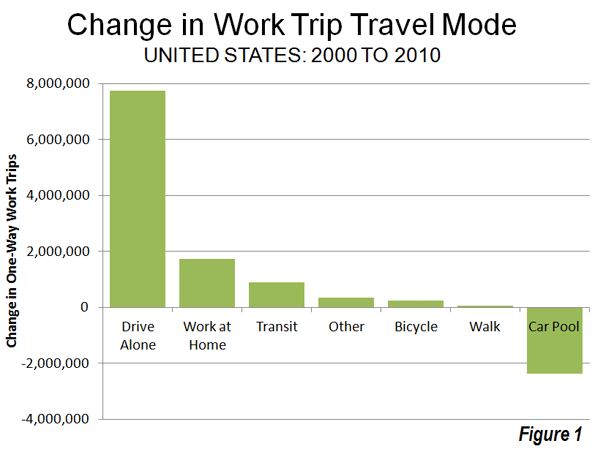
    Despite higher prices and huge media hype over shifts to public transit, the big surprise out of the 2010 American Community Survey has been the continued growth over the last decade in driving alone to work. Between 2000 and 2010, driving alone to work increased by 7.8 million out of a total of 8.7 million increase in total jobs. As a result, this use of this mode reached 76.5% of the nation’s workers, up from 75.6% in 2000. This is the largest decadal share of commuting ever achieved for this mode of transport.

    In view of the much higher gasoline prices that prevailed in 2010, it might have been expected that driving alone would lose market share from 2000 (Figure 1). But this did not — despite many media and academic claims that would or was already taking place — occur.

    The Census Bureau began compiling data on commuting in the 1960 census. In each census through 2000, commuting data was obtained through the census "long form" questionnaire. During the last decade, however, the Census Bureau has begun an annual survey, the American Community Survey, which includes commuting data and a considerable amount of additional data, and the decennial census survey was discontinued.

    Cars Dominate: There have been substantial changes in how the nation travels since the first survey in 1960. In 1960, 64% of the nation’s workers traveled by car. Separate data was not obtained for driving alone and carpools until 1980. The 2010 data indicates that 86.2% of employees used cars for the work trip in 2010. This was a slight reduction from 87.9% in 2000. But the anti-automobile crowd should not celebrate; all of the loss was due to a substantial decline in carpooling. In 2000, 12.2% of workers traveled by car pool. This figure dropped to 9.7% in 2010. With the higher gas prices, it might have been expected that carpooling would have become more popular, because of the lower costs from sharing experiences with other workers. This simply did not occur.

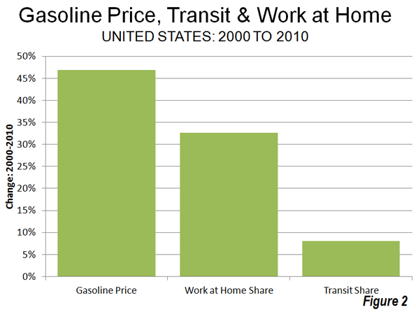
    Working at Home: The big winner among the nation’s commuting modes was working at home, a large share of which is telecommuting. Working at home increased from 3.3% of the workforce in 2000 to 4.3% of the workforce in 2010, for a market share increase of 33%, Overall 1.7 million more people work at home in 2010 than in 2000. It seems likely that the high gas prices encouraged a more working at home as did the move by companies to offload work to freelancers to reduce their costs or boost efficiency. Over the decade, gas prices increased 46%, adjusted for inflation, while the work at home market share increased 33% (Figure 2).

    Further, working at home, as indicated in a previous article, is poised to become the third most popular method of accessing work before 2020, passing transit and trailing only driving alone and carpooling (see Decade of the Telecommute). Working at home might have been much more popular in 1960, when it accounted for 7.2% of employment. But as many home-based industries lost share to chains and malls,   this figure fell by more than one-half by 1970 and then fell to 2.2% in 1980. The doubling of the work at home market share since that time, on the other hand, is attributable to the advances in information technology.

    Transit: Transit experienced by far its best decade since the Census Bureau began tracking commuting. Transit’s long market share slide came to an end, rising from 4.6% in 2000 to 4.9% in 2010. Even so, it might have been expected that a more substantial increase in transit commuting would have occurred as a result of the high gasoline prices. However, only an 8% increase in the transit market share occurred at the same time as gasoline prices increased a real 46%, less in percentage terms than the shift to working at home (Figure 2).

    Part of the problem was revealed in a Brookings Institution report. The percentage of metropolitan area jobs that can be reached by transit for the average worker is very low, which seriously limits transit’s potential for commuting use. Brookings data indicates that less than 10% of the jobs in major metropolitan areas can be reached within 45 minutes by transit by the average worker in major metropolitan areas (see Transit: The 4 Percent Solution). This is not only because transit service is infrequent in many parts of metropolitan areas, but also because it operates so much more slowly, on average, than cars. By comparison, the median work trip travel time by people driving alone is 21 minutes.

    Transit carried 12.1% of the nation’s commuters in 1960 and had fallen to 5.3% by 1990. The results of the last three decades indicate that transit commuting may have stopped declining but has reached a plateau, with only small increase.

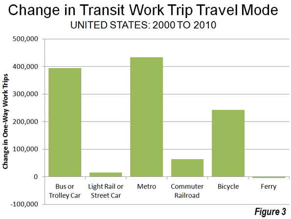
    Recent decades have seen establishment and substantial expansion of urban rail systems. A principal rationale for these systems has been reducing traffic congestion, especially during peak hours. The majority of commuting takes place during peak hour and is principally responsible for peak hour traffic congestion. Between 2000 and 2010, Metros (subways and elevated) accounted for 48% of the increase in transit commuting, while buses and a trolley buses accounted for 43%. Light rail (trolleys and streetcars) accounted for less than 2% of the additional transit commuting, despite the fact that light rail has been the dominant form of rail transit expansion (Figure 3).

    Bicycling: It was also a good decade for bicycle commuting. Bicycling added nearly 250,000 new commuters and rose from 0.4% of the market in 200 to 0.5% in 2010. The increase in bicycle commuting was 15 times that of light rail. Bicycling was first surveyed by the Census Bureau in the 1980s census, when its market share was also 0.5%.

    Walking: There was little change in walking as a form of commuting. In 2000, 2.9% of commuters walked to work, a figure that dropped to 2.8% in 2010. However, walking has suffered even greater losses than transit over the last 50 years. In 1960, 9.9% of commuters walked to work.

    The Future? One thing is clear from the data of the last decade. There has been no sea-change in commuting, even with the huge gasoline price increases. Few analysts would have predicted that single-occupant commuting would have increased at a time of both high gasoline prices and high joblessness. Further, as the shift to personal mobility continues, the largest percentage increases will like take place in telecommuting, arguably the most energy-efficient form of transport.

    Data from 1960: The table below summarizes work trip access market shares over the 50 years of data collection by the US Census Bureau.

    US Work Access by Mode: 1960-2010
    COMMUTERS 1960 1970 1980 1990 2000 2010
    Car, Truck or Van 41,368,062 59,722,550 81,258,496 99,592,932 112,736,101 118,123,873
    Drove Alone     62,193,449 84,215,298 97,102,050 104,857,517
    Car Pool     19,065,047 15,377,634 15,634,051 13,266,356
    Transit 7,806,932 6,514,012 6,007,728 5,890,155 5,867,559 6,768,661
    Bicycle     468,348 466,856 488,497 731,286
    Walk only 6,416,343 5,689,819 5,413,248 4,488,886 3,758,982 3,797,048
    Other or Unspecified 4401718 2240864 1289613 1225420 1243866 1,595,942
    Work at Home 4,662,750 2,685,144 2,179,863 3,406,025 4,184,223 5,924,200
    Total 64,655,805 76,852,389 96,617,296 115,070,274 128,279,228 136,941,010
               
    MARKET SHARE 1960 1970 1980 1990 2000 2010
    Car, Truck or Van 64.0% 77.7% 84.1% 86.5% 87.9% 86.3%
    Drove Alone     64.4% 73.2% 75.7% 76.6%
    Car Pool     19.7% 13.4% 12.2% 9.7%
    Transit 12.1% 8.5% 6.2% 5.1% 4.6% 4.9%
    Bicycle     0.5% 0.4% 0.4% 0.5%
    Walk only 9.9% 7.4% 5.6% 3.9% 2.9% 2.8%
    Other or Unspecified 6.8% 2.9% 1.3% 1.1% 1.0% 1.2%
    Work at Home 7.2% 3.5% 2.3% 3.0% 3.3% 4.3%
               
    Notes          
    Other includes taxicabs, motorcycles and other
    Blank cells indicate no data
    Taxicab included in transit in 1960
    Workers 14 and over, 1960 & 1970. Workers 16 & over, subsequent censuses
    US Census Bureau data


    Wendell Cox is a Visiting Professor, Conservatoire National des Arts et Metiers, Paris and the author of “War on the Dream: How Anti-Sprawl Policy Threatens the Quality of Life

    Photo: Junction of Interstates 110 (Harbor Freeway) and 105 (Glenn Anderson Freeway) in Los Angeles, which carry four varieties of passenger transport, cars, busway, high-occupancy vehicles and light rail (by author). 

  • Primatene And The War on (Asthma) Drugs

    On December 31, 2011, Primatene Mist, the only over-the-counter asthma inhaler still available, will be taken off the market. The ban is being pointed to as an example of regulatory overreach by the Obama administration. As a physician and asthma specialist, I have been observing the Primatene controversy for — without exaggeration — decades, and have concluded that there’s blame enough to share between both the pro and con government regulation camps, as well as the pharmaceutical and financial industries.

    The official reason for the ban is the danger Primatene poses to the environment. I have always thought that extending the ban on chlorofluorocarbon propellants (CFCs) to medication was an example of regulatory overkill, because medication is such a small part of the problem. However, it does help to look at the context. Back in 1987, when Ronald Reagan was President and the Montreal Protocol was written, there was international consensus that we needed to do something about depletion of the ozone layer high in the atmosphere, which was causing problems for us here on earth. For many of the products releasing these gasses into the atmosphere — car air-conditioners, hairspray, and deodorant, for example — alternatives could plausibly be found. I wish we could find a way to relieve asthma attacks with a roll-on, but we can’t.

    Medical aerosols were given more time than other products, and, frankly, I don’t think we’ve done a very good job of replacing them. The new inhalers don’t deliver medication as efficiently as Primatene delivers its active ingredient. Still, anyone who looks at the timeline for the upcoming restriction can see that the key decisions were made in 2006 and in 2008. The current administration is following the timetable set by its predecessors.

    The charges of over-regulation have been accompanied by newly expressed sympathies for the plight of poor people with asthma. I think the greater disservice was done recently when stronger air-quality regulations were postponed. The best way to treat asthma is to reduce its incidence, and air quality is one of the biggest factors. It’s unfair to generalize, but I have a feeling that some of the people looking to demonize Big Government for regulating Primatene were also calling tighter air-quality regulations “job-killers” a few weeks ago.

    The best argument against Primatene falls outside of the environmental realm, and that is the medical case. The active agent is epinephrine, which is pharmaceutical adrenaline. This has the ability to relieve the airway tightness produced by an asthma attack, also known as bronchoconstriction. In this, it resembles the action of the preferred asthma-relief medicine known generically as albuterol. However, epinephrine also stimulates the heart. This makes it unsuitable for large numbers of asthmatics who also have heart problems. Most of the people who rely on Primatene are poor, and often overweight and hypertensive. These regular jolts to the heart are not doing them any good.

    In addition, it does nothing to control asthmatic inflammation, which is best accomplished with systematic, daily doses of inhaled corticosteroids, a very different kind of drug. Asthmatic lungs are what British doctors called “twitchy,” i.e., they are chronically inflamed and primed for any asthma trigger, such as diesel fumes, airborne allergens, or viruses, to touch off an attack. Primatene treats symptoms, not causes, and I have no doubt that users miss a lot of work or school and are sub-par performers when they do go. Uncontrolled inflammation is remodeling their airways, costing them lung capacity for the long haul.

    Many who decry the passing of Primatene believe the ban was contrived to squeeze more money out of those who can least afford it. They probably have a point. I would love to see the FDA memos and transcripts from 2006 when the Primatene decision was made, or from 2008 when the fuse was lit, not to mention those of the current owners when they decided to acquire the drug. Even without access to these secrets, we know that drug makers like to tweak existing medicines and bring them back on the market at higher prices than they command over the counter, and that investors sometimes buy up the rights to older drugs with exactly this in mind.

    It doesn’t always work. The next generation drugs are sometimes no improvement over the previous ones. Last year I wrote a post commemorating a landmark: Never before in over 30 years of practice had an entire month passed in which I hadn’t written a prescription for an oral antihistamine. The OTC versions were good, and the new drugs weren’t so much better that they justified prescribing.

    When it comes to asthma, I believe in active intervention. The economics of good asthma care have proven themselves again and again. Want to do something for poor people with uncontrolled asthma? Pay for systematic care. Want to lower the nation’s emergency room bills? Help people control inflammation in their airways through daily use of medication and reducing exposure to triggers. Treating asthma symptoms, whether with Primatene or albuterol, is not asthma treatment, any more than a ride in an ambulance is health care.

    Dr. Paul Ehrlich is co-author with Dr. Larry Chiaramonte and Henry Ehrlich of Asthma Allergies Children: A Parent’s Guide (Third Avenue Books), available only from Amazon.com and from Barnes & Noble. He is co-founder of the website www.asthmaallergieschildren.com, and president of the New York Allergy and Asthma Society. He has been featured as one of the top pediatric allergy and immunology specialists in New York Magazine for the last 10 years.

    Photo by eo was taken: Asthma Map

  • Silicon Valley Can No Longer Save California — Or The U.S.

    Even before Steve Jobs crashed the scene in late 1970s, California’s technology industry had already outpaced the entire world, creating the greatest collection of information companies anywhere. It was in this fertile suburban soil that Apple — and so many other innovative companies — took root.

    Now this soil is showing signs of exhaustion, with Jobs’ death symbolizing the end of the state’s high-tech heroic age.

    “Steve’s passing really makes you think how much the Valley has changed,” says Leslie Parks, former head of economic development for the city of San Jose, Silicon Valley’s largest city. “The Apple II was produced here and depended on what was unique here. In those days, we were the technology food chain from conception to product. Now we only dominate the top of the chain.”

    Silicon Valley’s job creation numbers are dismal. In 1999 the San Jose-Sunnyvale-Santa Clara area had over 1 million jobs; by 2010 that number shrank by nearly 150,000. Although since 2007 and early 2010 the number of information jobs has increased substantially — up roughly 5000 to a total of 46,000 — the industrial sector, which still employs almost four times as many people as IT, lost around 12,000. Overall the region’s unemployment stands at 10%, well above the national average of 9.1%.

    This is partly because Apple, Intel and Hewlett-Packard have shifted their production — which offered jobs to many lower- and medium-skilled Californians — to other states or overseas. With its focus just at the highest end, the Valley no longer represents the economically diverse region of the 1970s and 1980s. Indeed, it increasingly resembles Wall Street — with a few highly skilled employees and well-placed investors making out swimmingly.

    “Silicon Valley has become hyper-efficient; the region doesn’t create jobs anymore,” says Tamara Carleton, a locally based fellow at the Foundation for Enterprise Development. “In terms of revenue per employee, Facebook’s ratio is unprecedented. Even Apple hasn’t grown significantly this last decade, despite the successful launch of many products and services. While commendable, greater efficiency doesn’t put more jobs in the California economy.”

    This “hyper-efficiency” can be seen in the real state of the valley’s industrial/flex space market. The overall industrial vacancy rate remains 14%, two points higher than in 2009. Areas close to Stanford, such as Palo Alto and Mountain View, have done well, but others on the periphery, such as Gilroy, Milpitas and Fremont, and even parts of San Jose have vacancies reaching over 20%.

    California’s other high-tech centers, with the possible exception of San Diego, are doing worse. The state has been losing high-tech employment over the past decade, while such employment has surged not only in China and Korea, but also in competitor states such as Texas, Virginia, Washington and Utah. According to the annual Cyberstates study, California lost more high-tech jobs — about 18,000 — last year than any other state.

    California’s political leaders, particularly Democrats, still genuflect toward the Valley for economic salvation and job growth. But social media has not proved a jobs-creating dynamo, and it’s clear that the highly subsidized, venture backed “green economy” has floundered miserably and faces a less than rosy future.

    You can feel pride, as an American and Californian, in the legacy of the likes of Steve Jobs but also believe our future cannot be salvaged by high-tech alone. Many of the country’s greatest assets, for example, are physical; in California these include the best climate for any advanced region in the world, fertile soil, a prime location on the Pacific Rim and potentially huge fossil fuel energy reserves, which give it enormous competitive advantages.

    The green theocracy now in control of Sacramento, however, has little interest in these aspects of California. It may prove difficult, if not impossible, to modernize the ports of Los Angeles and Long Beach, prolific sources of good-paying white and blue collar jobs. These ports will soon face increased competition for Asian trade from Gulf and south Atlantic locales eagerly waiting for the 2014 widening of the Panama Canal.

    Administration officials such as Energy Secretary Steven Chu also slate the state’s agriculture for demise by climate change. But just in case he’s wrong, we should note that California’s agriculture — despite green attempts to cut off its water supply — accounts for 40% of state exports. It generates $12.7 billion annually in overseas sales and employs over 400,000 people directly and many thousands more in marketing, processing and warehousing.

    Similarly, California boasts some of the nation’s richest deposits of oil and gas, not only on its sensitive and politically nettlesome coast but along the coastal plains and in the Central Valley. The most recent estimates of the state’s reserves, according to the Energy Information Agency, include nearly 3 billion cubic feet of natural gas and more than three billion barrels of oil, roughly the same as Alaska and more than booming North Dakotas.

    Geologists and wildcatters, usually ahead of the game, believe we have touched only a small part of the state’s energy potential. Some discuss new oil shale discoveries, particularly in the Monterey region, that could dwarf even the massive Bakken find in North Dakota. “If you were in Texas,” quipped economist Bill Watkins to an audience in the hard-hit central California town of Santa Maria, a predominately Latino town north of Santa Barbara, “you’d be rich.”

    A judicious and carefully planned expansion of these resources, particularly in the less populated interior areas, could provide tens of thousands of high-paying jobs. It would also funnel desperately needed revenue to the state. At the same time, such development could forestall much higher energy costs, one of the things driving manufacturers in the state to move elsewhere.

    California is unlikely to take advantage of its physical bounty; its leadership seems to lack enthusiasm for any industrial expansion outside of the “green” economy. Industrial parks across the state are emptying, more houses go into foreclosure and local governments wither on the vine. Unless California begins to take its own economy seriously, it will continue to devolve from the aspirational place that produced not only Steve Jobs but scores of entrepreneurs in everything from movies and oil to agriculture and aerospace.

    The Valley itself will likely do fine. Steve Jobs helped cement the position of Santa Clara Valley as the epicenter of the high-tech world. But this accomplishment does relatively little for the rest of California. What we will miss will not only be Steve Jobs’ creative contributions, but how clearly his opportunistic, entrepreneurial spirit has ebbed away from the Golden State.

    This piece originally appeared at Forbes.com.

    Joel Kotkin is executive editor of NewGeography.com and is a distinguished presidential fellow in urban futures at Chapman University, and an adjunct fellow of the Legatum Institute in London. He is author of The City: A Global History. His newest book is The Next Hundred Million: America in 2050, released in February, 2010.

    Shanghai photo by flickr user acaben

  • Florida Repeals Smart Growth Law

    The state of Florida has repealed its 30-year old growth management law (also called "smart growth," "compact development" and "livability"). Under the law, local jurisdictions were required to adopt comprehensive land use plans stipulating where development could and could not occur. These plans were subject to approval by the state Department of Community Affairs, an agency now abolished by the legislation. The state approval process had been similar to that of Oregon. Governor Rick Scott had urged repeal as a part of his program to create 700,000 new jobs in seven years in Florida. Economic research in the Netherlands, the United Kingdom and the United States has associated slower economic growth with growth management programs.

    Local governments will still be permitted to implement growth management programs, but largely without state mandates. Some local jurisdictions will continue their growth management programs, while others will welcome development.

    The Need for A Competitive Land Supply: Growth management has been cited extensively in economic research because of its association with higher housing costs. The basic problem is that, by delineating and limiting the land that can the used for development, planners create guides to investment, which shows developers where they must buy and tells the now more scarce sellers that the buyers have little choice but to negotiate with them. This can violate the "principle of competitive land supply," cited by Brookings Institution economist Anthony Downs. Downs said:

    If a locality limits to certain sites the land that can be developed within a given period, it confers a preferred market position on those sites. … If the limitation is stringent enough, it may also confirm a monopolistic powers on the owners of those sites, permitting them to raising land prices substantially.

    This necessity of retaining a competitive land supply is conceded by proponents of growth management. The Brookings Institution published research by leading advocates of growth management, Arthur C Nelson, Rolf Pendall, Casey J. Dawkins and Gerrit J. Knapp that makes the connection, despite often incorrect citations by advocates to the contrary.   In particular they cite higher house prices in California as having resulted from growth management restrictions that were too strong.

    even well-intentioned growth management programs … can accommodate too little growth and result in higher housing prices. This is arguably what happened in parts of California where growth boundaries were drawn so tightly without accommodating other housing needs

    Nelson, et al. also concluded that “… the housing price effects of growth management policies depend heavily on how they are designed and implemented. If the policies tend to restrict land supplies, then housing price increases are expected” (emphasis in original). 

    In other words, if growth management policies do not maintain a competitive land supply, house prices are likely to rise in response. This is basic economics. Restricting the supply of any good or service in demand is likely to lead to higher prices, all things being equal.

    The loss of a competitive land supply was seen during the real estate bubble in the unprecedented escalation of house prices in California (which was already high), Oregon, Washington, Phoenix, Las Vegas, parts of the Northeast and Florida. In these markets, the demand from more liberal lending standards was much greater than the land available for development under growth management plans and government land auctions.  By contrast, house prices generally stayed within historic norms in metropolitan areas where land supplies were not constrained by growth management programs, such as Dallas-Fort Worth, Houston, Atlanta, Austin, Indianapolis, Kansas City and elsewhere.

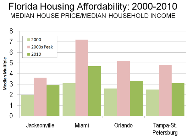
    Housing Price Escalation in Florida: In 2000, the four Florida metropolitan areas with more than 1,000,000 population had Median Multiples (median house price divided by median household income) near or below the historic norm of 3.0. By late in the next decade, all four metropolitan areas reached unprecedented levels of unaffordability. In Miami, the Median Multiple reached 7.2. In Orlando, the Median Multiple peaked at 5.2, 70 percent above the historic norm. In Tampa-St. Petersburg, the Median Multiple peaked at 4.8, 60 percent above the historic norm. The peak in Jacksonville was a more modest 3.6, though this was still an 80 percent increase.

    By 2010, the Median Multiple has declined to hear the historic norm in Orlando and Tampa-St. Petersburg and slightly below in Jacksonville. The Median Multiple remained well above the historic norm in Miami, at 4.7.

    When Supply Lags Behind Demand: Florida’s housing cost escalation may have been surprising, since Florida has a reputation for liberal land-use regulation. However, the growth management act had long since turned the state toward a shortage of land supply relative to demand as described by Wachovia Bank in a 2005 analysis.

    "While all the stars seem to be perfectly aligned on the demand side, the supply of housing in Florida has been much more problematic. Even though residential construction has soared to new highs recently, the supply of housing has lagged woefully behind demand in recent years. This has been particularly true for single-family homes, where population growth, a rising homeownership rate, and strong demand for second homes and vacation properties created a demand for 560,000 new single-family homes between mid 2000 and mid 2004. During this period builders only delivered 540,000 units. When you add in the growing demand for townhouses and condominiums, buyers were looking to purchase 675,000 new homes during this period, while builders were supplied just 570,000 units. No wonder prices have been surging!

    The chief impediment to new construction has been a shortage of developable land. The shortage primarily results from a growing resistance to new development. The state is not running out of space. Nearly every community in Florida and the state itself are looking at some type of limitations on new residential development. While well intentioned, these initiatives are making it more time consuming and expensive to build homes in Florida. Others are taking land off the market, designating areas for green space, or preserving space for industrial development. The net result has been dramatically higher land prices across much of the state."

    The point of the Wachovia analysis is that unless there is a sufficient supply of land, the price of housing is likely to rise. Having a lot of land is not enough. There must be enough land to accommodate demand at affordable land and housing prices (Note).

    The Florida action is the most successful reversal of house price increasing growth management regulations to date.

    Other Advances: There have, however, then more modest advances.

    After taking office in 2003, Minnesota Governor Tim Pawlenty replaced the board of directors of the Metropolitan Council in Minneapolis-Saint Paul. The previous board had been spent on the following Portland style growth management policies, including the enforcement of a variant of the urban growth boundary. The new board exhibited more liberal attitudes toward residential development, and the housing bubble did not produce the extent of housing affordability in the Twin Cities that occurred in growth management areas such as Portland, California and Florida.

    The Conservative- Liberal coalition government of the United Kingdom has proposed modest relaxation of some of the world’s most restrictive land use regulations, which could lead to an improvement of housing affordability in the nation. Kate Barker, who was then a member of the Monetary Policy Committee of the Bank of England was commissioned to examine land-use regulation and housing affordability in England and found a strong association between the loss of housing affordability and restrictive land use policies. This association between Britain’s strong land use regulation and higher house prices was noted in the early 1970s research led by Sir Peter Hall of the University College, London.

    For the Future: The relaxation of overly restrictive growth management policies could not have come at a better time. With the squeeze on the middle-class getting tighter, fewer households can afford higher   housing costs associated with growth management areas. Moreover, responsive to the political consensus for job creation, more home construction will bring return more good-paying construction jobs in Florida.

    Wendell Cox is a Visiting Professor, Conservatoire National des Arts et Metiers, Paris and the author of “War on the Dream: How Anti-Sprawl Policy Threatens the Quality of Life

    —–

    Note: There has been a similar misunderstanding of the housing markets in Las Vegas and Phoenix, where developable land appears to stretch virtually to the horizon. However, what is usually missed is that both metropolitan areas are hemmed in by government land, some of which is periodically auctioned. During the housing bubble, the price per acre of residential land at auction in both metropolitan areas rose as much as the price for land rose over a similar period in Beijing, with its huge land price increases.

    Photo: Orlando (by author)

  • For High-Speed Rail It Looks Like the End of the Line

    With its vote on September 21, the Senate Appropriations Committee ended the rail boosters’ hopes of getting a meaningful appropriation for high-speed rail in the new (FY 2012) fiscal year. It probably also dealt a decisive death blow to President Obama’s loopy goal of "giving 80 percent of Americans access to high-speed rail."

    By including only a token $100 million for high-speed rail as a "placeholder" in their FY 2012 budget recommendations (a sum that is likely to be further cut in the House-Senate negotiations on the FY 2012 appropriations), Senate appropriators have done more than merely declare a temporary slowdown in the high-speed rail program. They have effectively given a vote of "no confidence" to President Obama’s signature infrastructure initiative. Along with their House counterparts who had denied the program any new money, the Senate lawmakers have sent a bipartisan signal that Congress has no appetite for pouring more money into a venture that many lawmakers have come to view as a poster child for wasteful government spending.

    Their posture is understandable. After committing $8 billion in stimulus money and an additional $2.5 billion in regular appropriations, the Administration has little to show for in terms of concrete results or accomplishments. Aside from an ongoing project to upgrade track between Chicago and St. Louis (a $1.1 billion venture that promises to offer a mere 48 minute reduction in travel time between those two cities), no significant construction has begun on any of the authorized rail projects.

    In the meantime, the Department of Transportation has rushed to distribute the balance of the authorized HSR dollars, lest Congress decides to rescind any funds that remain unobligated. Continuing its practice of scattering money far and wide rather than focusing it on one or two worthwhile projects, the Federal Railroad Administration approved in September over $480 million worth of planning, engineering and construction grants "to improve high-speed and intercity passenger rail service" in 11 states. The beneficiaries are New York, Texas, New England (Maine, Vermont, Rhode Island, Connecticut), North Carolina, Virginia, Washington State, Oregon and Pennsylvania. The awards range from $149 million to New York State to as little as $13 million to the state of Oregon, and they average under $40 million per individual grant. It remains to be seen how quickly the recipient states will put these funds to work—and what kind of service improvements these grants will bring about.

    From an examination of the grant announcements it becomes clear that none of the grants will help to bring true "high-speed" rail service to America. At best, they will permit modest incremental improvements in speed and frequency of existing Amtrak services by helping to upgrade railway tracks of Class One railroads on which Amtrak runs its trains. The U.S. Department of Transportation (DOT) has implicitly acknowledged to have revised its program objective.  It has dropped its earlier rhetoric that high-speed rail "is just around the corner" (Secretary LaHood’s words) or that "80 percent of Americans will have access to high-speed rail" (repeated assertions by LaHood and DOT press releases).  

    Instead, the DOT (through its Federal Railroad Administration) is trying to lower the expectations by stating that "the true potential of high-speed rail will not be achieved or realized overnight." (FRA’s "vision statement") It’s a welcome sign that the Department has abandoned its quixotic goal of revolutionizing rail travel overnight. It may also signal the Administration’s realization that it cannot unilaterally force its vision upon a fiscally conservative Congress, a largely indifferent public and a skeptical, risk-averse investment community. If high-speed rail is eventually to find its place in America, it will be because market conditions will create a favorable climate for its development and acceptance – not because Washington in its wisdom has decided that the country needs it – and needs it now!    

    California’s Bullet Train beset by mounting political and financial problems

    Meanwhile, the one true U.S. high-speed rail project – California’s LA-to-San Francisco bullet train – is beset by mounting political and financial problems.  Nearly three years after the passage of the enabling Proposition 1A and less than a year before construction is scheduled to start on the first line segment in the Central Valley, construction costs have doubled the 2008 estimate. There is no evident source of where the additional funds to complete Phase One (LA-SF) system will come from since the prospect of both further federal money and private risk capital is remote. As one recent report put it, the project is being pursued "in the confident hope of a miracle."

    The systems’ first stage – a $10-14 billion 160-mile line segment in the Central Valley from Bakersfield to Merced – has run into determined opposition from local residents and farming interests during the ongoing environmental impact review. The possibility of lengthy court challenges could delay construction, thus increasing costs, eroding political support and putting federal money at risk.

    At the policy level, the project has been subject recently to several analyses. First came a critical report by California legislature’s fiscal watchdog, the non-partisan Legislative Analyst’s Office (LAO). It questioned the Rail Authority’s cost estimates and its decision to build the first segment in a sparsely populated region where travel demand is not expected to be sufficient to cover operating expenses. The LAO concluded that if the total cost of building the Phase One system were to grow as much as the revised Authority estimate for the Central Valley segment (an increase of 57%), the whole system would cost not $43 billion as originally estimated, but $67 billion. Concern about escalating costs and overly optimistic ridership forecasts were echoed by an independent Peer Review Group and numerous newspaper editorials. Even some of the state former legislative supporters, such as state Senators Joe Simitian, Alan Lowenthal and Mark DeSaulnier, have begun to express reservations and urge the Authority to rethink its direction. (See, "California’s Bullet Train – On the Road to Bankruptcy," InnoBriefs, May 31, 2011).

    A more recent challenge to the project’s financial credibility came from a team of respected independent experts, Alain Enthoven, William Grindley and William Warren, who cooperate with a citizen watchdog group, the Community Coalition on High Speed Rail. The team has concluded that without further federal aid (which almost certainly can no longer be counted upon) the project stands no chance of meeting its legislative requirements and the conditions of the enabling bond initiative (Proposition 1A). Nor is reliance on private financial participation a credible option.  In the authors’ judgment, private risk capital hasn’t to date and will not come in the future without revenue guarantees (aka public subsidy).

    The authors conclude: "With highly questionable prospects for federal grants or private ‘at risk’ construction funds, but the certainty that costs will continue to increase, the logic for continuing the largest project in California’s history is highly questionable."  (Alain Enthoven, William Grindley and William Warren, The Financial Risks of California’s Proposed High-Speed Rail Project, September 14, 2011, www.cc-hsr.org ). (Note: The report’s financial analyses and conclusions have been reviewed in detail and verified by high ranking California State officials, according to reliable sources.)

    But politically the most damaging blow to the project has come from a just released opinion survey. According to this poll, nearly two-thirds of California’s likely voters (62.4%) would stop the bullet train project from proceeding further. Virtually the same number said they are unlikely to ever travel on the train between Los Angeles and San Francisco, thus casting doubt on the Authority’s optimistic ridership forecasts. What is more, the project came in dead last (at 11%) in a list of voters’ spending priorities, according to the Irvine-based Probolsky Research polling outfit (as reported in The Sacramento Bee, September 29, 2011). With declining public support as evidenced by this poll, and with the State coming to a point where it will have to prioritize future public spending, enthusiasm for the project among politicians in Sacramento could evaporate.

    Given the possibility of the California bullet train’s demise, the attention and hopes of high-speed train advocates probably will (and should) turn to the Northeast Corridor – the nation’s most likely travel corridor where high-speed rail can eventually succeed and prosper.

    Ken Orski has worked professionally in the field of transportation for over 30 years.

    ~~~~~~~~~~~~~~~~~~~~
    Note: the NewsBriefs can also be accessed at www.infrastructureUSA.org
    A listing of all recent NewsBriefs can be found at www.innobriefs.com

  • Los Angeles Downtown Stadium Cloaked in ‘Green’ Snake Oil

    AEG’s downtown stadium in Los Angeles isn’t just a playground for really big guys or just another site for really rich guys to consume conspicuously in luxury boxes. If you believe the chorus of hype, Farmers Field also grows good jobs, solves the city’s debt crisis, transforms downtown Los Angeles into a nicer version of Manhattan, and builds strong bodies eight ways. It may even cure cancer.

    But the downtown stadium – if it’s built – isn’t going to be particularly “green” in ways that matter.

    According to a report by David Futch in the L.A. Weekly:

    AEG has promised to build a “carbon-neutral” Farmers Field football stadium that will add no extra emissions to the current load in polluted downtown Los Angeles. But there’s no way to accomplish that, according to environmental lawyers, climate researchers and traffic engineers who’ve seen it all before.

    Claiming “carbon neutrality” for a massive construction project that will have a usable life measured in decades is beyond the ability of good science (and common sense), but it sounds good in press briefings. “Most labels are nonsense, dreamed up by marketing departments,” Konstantin Vinnikov, a University of Maryland climatologist and atmospheric scientist, told Futch.

    In defense of green nonsense, the state Legislature has put on Governor Brown’s desk SB 292, a special bill that would permit the city of Los Angeles and AEG to declare Farmers Field a model of environmental sensitivity while shutting out critics of the project, whose ability to force a real review of the stadium’s environmental impact would be severely limited.

    Under SB 292, legal challenges would have to go directly to the state Court of Appeals, where bringing suit is much more expensive.

    In exchange for giving AEG a fast track to judicial review in a favorable setting, the downtown stadium would have to show zero net emissions of new greenhouse gases from automobile trips and achieve a ratio of automobile trips to attendance that is at least ten percent lower than other NFL stadiums.

    Since nearly all NFL stadiums are not in downtowns but at the suburban fringe, where tailgaters gather in massive parking lots, this last criterion is essentially meaningless.

    But AEG has another out. If cutting more automobile trips isn’t “feasible” (a very slippery term), AEG can buy carbon credits to reduce emissions somewhere else – even in another state – rather than cut the stadium’s emissions downtown.

    Certifying that AEG’s trip reduction measures have met the goal of greenhouse gas emissions (to the extent “feasible”) is the responsibility of the city – not the state agencies that currently oversee air quality. In fact, all of the mitigation measures promised by AEG are equally squishy, hedged with qualifiers that permit AEG and the city to quietly waive costly mitigations and allow others to be achieved without measurable improvements. That’s just standard operating procedure at city hall, which explains why state regulators are cut out of the process.

    Santa Monica environmental attorney Doug Carstens reminded Futch, “When developers (like AEG) start shedding mitigation like crazy, then instead of revoking approval, public agencies tend to forgive and forget.”

    SB 292 is almost certain to be signed into law. And it’s so perfect a model of environmental duplicity that other developers demanded and a got a companion bill – SB 900 – that gives every big project in California generally the same benefits. SB 900 is sure to be signed into law, too.

    Farmers Field won’t be environmentally neutral in the context of downtown’s crowded streets and neighborhoods and, say many experts, can’t possibly be “carbon neutral” overall. As one traffic engineer asked, “Do they include the carbon dioxide emitted by all of the additional motor vehicles, buses and trains serving fans going to and from the games? Do they count the carbon dioxide emitted by the power plants supplying the electricity for the billboards?”

    Actually, AEG doesn’t have to count anything, except the profits it intends to make. And the only green that will wrap Farmers Field will shine from its gigantic LED billboards.

    This piece originally appeared at KCET.org.

    D. J. Waldie is a contributing editor at the Los Angeles Times and a contributing writer for Los Angeles magazine. He is the author most recently of California Romantica with Diane Keaton. He blogs for KCET TV at http://www.kcet.org/user/profile/djwaldie.

    Photo by Pete Prodoehl

  • A Decade in College Degree Attainment

    This week the Census Bureau released its 2010 data from the American Community Survey. The ACS is what contains many of the core demographic characteristics that are frequently opined upon, such as college degree attainment, commute times, etc.

    It used to be that the Census Bureau collected this information during the decennial census using the so-called “long form” that went to one out of every ten households. But that was discontinued as of this census and has been replaced with with the ACS. The ACS reports data more frequently (annually for geographies larger than a certain size), but has a smaller sample size and so there’s lot of statistical noise that I don’t think we are used to dealing with yet. For example, in 2008 the Indianapolis metro area ranked #3 in the US for growth in college degree attainment over the course of the decade to date among metros greater than one million people. But in the 2010 data Indy ranked #28 on the same measure. There are fluctuations year to year and the margin of error needs to be accounted for in serious statistical analysis. Nevertheless, this is what we have to work with.


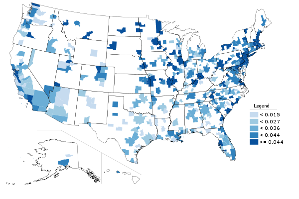
    Metro area college degree attainment, 2010

    I’m going to roll out a series of posts covering the highlights of some of this data. I’ll start with educational attainment, since that is something that is so key to upward social mobility and urban economic success.

    But first I’ll put in a brief plug for my Telestrian tool. The Census Bureau site for distributing this data is a disaster. As one Brookings senior fellow put it, “Lots of Census data yesterday, today. Lots of angles, stories, conclusions. One shared sentiment: new American Factfinder is AWFUL” and “New Factfinder making mainframe punchcards look appealing.” Telestrian is designed for very rapid basic analysis and comparative benchmarking moreso than simple fact lookups (though it can do that do). In fact, I generated every table, graph and map in this post in ten total minutes with it. Even if you aren’t in the market for a commercial product, there’s a no credit card required free trial period, so if you are interested in perusing the ACS data and don’t want to beat your head against the wall with the Census Factfinder, I encourage you to check it out. Telestrian doesn’t have every data element, but it has a lot of interesting stuff.

    College Degree Attainment

    College degree attainment (the percentage of adults with a bachelors degree or higher), is one of the most critical factors in urban success. If you’d like to know more, just check out all the great research on it under the heading of “talent dividend” over at CEOs for Cities.

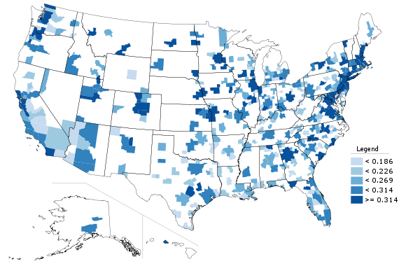
    The map at the top of the post is 2010 college degree attainment for metro areas. Here are the top ten, among those with a population greater than one million, showing total number of people with degrees and the attainment percentage:


    Row Metro Area 2010
    1 Washington-Arlington-Alexandria, DC-VA-MD-WV 1,758,297 (46.8%)
    2 San Jose-Sunnyvale-Santa Clara, CA 558,519 (45.3%)
    3 San Francisco-Oakland-Fremont, CA 1,317,354 (43.4%)
    4 Boston-Cambridge-Quincy, MA-NH 1,335,276 (43.0%)
    5 Raleigh-Cary, NC 301,012 (41.0%)
    6 Austin-Round Rock-San Marcos, TX 429,163 (39.4%)
    7 Denver-Aurora-Broomfield, CO 651,661 (38.2%)
    8 Minneapolis-St. Paul-Bloomington, MN-WI 822,321 (37.9%)
    9 Seattle-Tacoma-Bellevue, WA 867,193 (37.0%)
    10 New York-Northern New Jersey-Long Island, NY-NJ-PA 4,613,445 (36.0%)

    And here’s the bottom ten:


    Row Metro Area 2010
    1 Riverside-San Bernardino-Ontario, CA 499,663 (19.5%)
    2 Las Vegas-Paradise, NV 278,387 (21.6%)
    3 Memphis, TN-MS-AR 209,987 (25.1%)
    4 San Antonio-New Braunfels, TX 344,247 (25.4%)
    5 Louisville/Jefferson County, KY-IN 224,392 (25.8%)
    6 Tampa-St. Petersburg-Clearwater, FL 513,182 (26.2%)
    7 Birmingham-Hoover, AL 198,856 (26.3%)
    8 New Orleans-Metairie-Kenner, LA 209,916 (26.8%)
    9 Jacksonville, FL 241,801 (26.9%)
    10 Phoenix-Mesa-Glendale, AZ 731,643 (27.2%)

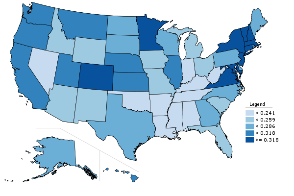
    While we are on the topic, here is a map of college degree attainment by state:


    State college degree attainment, 2010

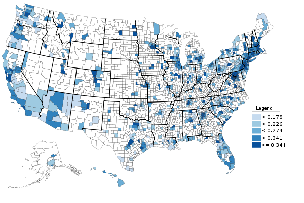
    And here is county level college degree attainment for those counties covered by the 1-year ACS:


    County college degree attainment, 2010

    Changes in College Degree Attainment

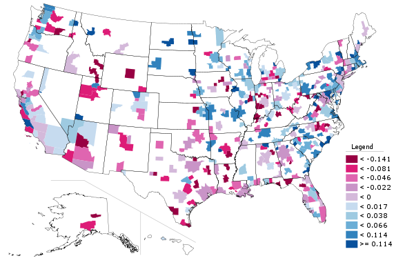
    Beyond just the raw 2010 numbers, it’s interesting to look at which places are growing their college degree attainment the most. That is, which places are growing their talent base. So here’s a look at metros by their change in college degree attainment over the last decade:


    Change in percentage of adults with college degrees, 2000-2010.

    Some places already have very high college degree attainment, which can make it tougher to grow even higher. Speaking of which, the US as a whole raised its college degree attainment as well. To some extent, this is purely a function of demographics. Older generations have lower educational levels than younger ones. (None of my grandparents had a college degree, and my father’s parents never even finished high school. I don’t think that was atypical for their day).

    What might be more interesting to look at is whether places are increasing their college degree attainment faster or slower than the US overall. There’s a measure that does capture that. It’s called location quotient, and is used in economic analysis to measure the concentration of industries in certain locations.

    An economist told me once that he likes to look at this for all sorts of things, not just industry clusters. The formula works for other stuff. I really haven’t seen this used before, so caveat emptor, but here’s a look at shifts in location quotient for metro areas over the course of the decade:


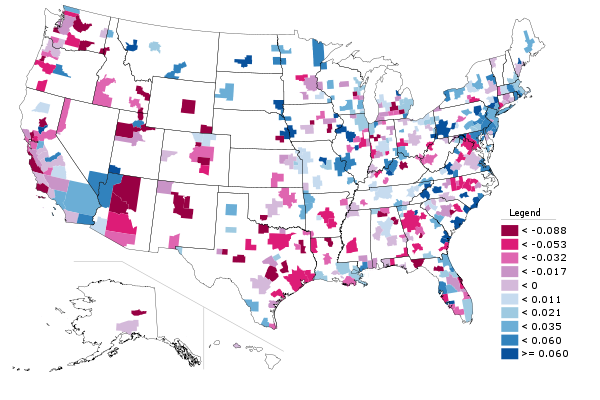
    Metro area change in location quotient for college degree attainment, 2000-2010. Increase in LQ in blue, decrease in red.

    The blue metro areas had a higher concentration of college degrees relative to the nation as a whole in 2010 than they did in 2000. The red ones a lower concentration. This is certainly an interesting area for further exploration.

    While I’m on the topic, here’s the same chart, only limited to graduate and professional degrees. There’s some interesting variability here.


    Metro area change in location quotient for graduate and professional degree attainment, 2000-2010. Increase in LQ in blue, decrease in red.

    A Closer Look at Indianapolis

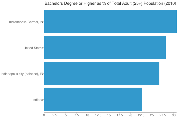
    Just as one more granular example, I wanted to take a look at the Indianapolis vertical. Here’s 2010 college degree attainment for the city, metro, state, and America as a whole:


    College degree attainment, 2010

    As we know, urban regions tend to be more highly educated. Here we see that while Indiana is one of the lowest states in terms of college degree attainment, the Indy metro area actually beats the US average. However, the city of Indianapolis falls short of the US average. Because Indy is a consolidated city-county government that includes a lot of inner ring suburban areas, it’s hard to draw conclusions about the true urban core, but it does seem clear that the center is less educated than the periphery of the metro.

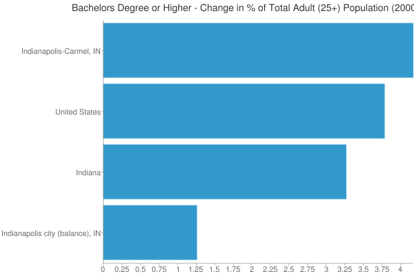
    Now lets look at the change in attainment for the decade:


    Change in the percentage of adults with a college degree, 2000-2010.

    Here we see that the rich get richer, as Indy metro not only started out on a higher base, but had the best showing in attainment growth as well. OTOH, going back to our LQ measure, Indiana actually boosted its LQ while the Indy region was stagnant. That’s because this is a percentage point change, not a percentage change, and growing from a low base makes it easier to boost LQ. It’s one of the quirks of that formula.

    The poor showing of the city of Indianapolis is something that should definitely be worrying. It would be interesting to do a similar analysis for other metros, but alas that’s all for today.

    Aaron M. Renn is an independent writer on urban affairs based in the Midwest. His writings appear at The Urbanophile, where this piece originally appeared. Telestrian was used to analyze data and to create charts for this piece.

  • Smart Growth (Livability), Air Pollution and Public Health

    In response to the outcry by job creators about proposed new Nitrogen Oxides emission regulations, the Obama Administration has suspended a planned expansion of these rules.

    The Public Health Risks of Densification

    The purpose of local air pollution regulation is to improve public health. For years, regional transportation plans, public officials, and urban planners have been seeking to densify urban areas, using strategies referred to as “smart growth” or “livability.” They have claimed that densifying urban areas would lead to lower levels of air pollution, principally because it is believed to reduce travel by car. In fact, however, EPA data show that higher population densities are strongly associated with higher levels of automobile travel and more intense air pollution emissions from cars and other highway vehicles. In short, higher emissions cause people to breathe more in air pollution, which can be unhealthful. To use a graphic example, a person is likely to encounter a greater chance of health risk by breathing intense smoke from a fire than if they are far enough from the fire to dilute the intensity of the smoke.

    Overall, more intense air pollution detracts from public health. To put in the economic terms that appear so often in planning literature on "urban sprawl," more intense traffic congestion and the consequent higher air pollution emissions are negative externalities of smart growth and densification.

    This is illustrated by county-level data for nitrogen oxides (NOx) emissions, which is an important contributor to ozone formation. This analysis includes the more than 420 counties in the nation’s major metropolitan areas (those with more than 1 million in population).

    Seven of the 10 counties with the highest NOx emissions concentration (annual tons per square mile) in major metropolitan areas are also among the top 10 in population density (2008). The densest, New York County (Manhattan), has by far the most intense NOx emissions. Manhattan also has the highest concentration of emissions for the other criteria air pollutants, such as carbon monoxide, particulates, and volatile organic compounds (2002 data). New York City’s other three most urban counties (Bronx, Kings, and Queens) are more dense than any county in the nation outside Manhattan, and all land among the top 10 in NOx emission density (Table 1).

    Table 1
    Intensity of Nox Emissions (per Square Mile)
    NOx Emissions
    Rank County Compared to Average
    1 New York Co, NY           23.8
    2 San Francisco Co, CA           14.7
    3 Bronx Co, NY           13.7
    4 Washington city, DC           13.1
    5 St. Louis city, MO           12.4
    6 Arlington Co, VA           11.3
    7 Cook Co, IL           10.0
    8 Suffolk Co, MA             9.5
    9 Kings Co, NY             8.7
    10 Queens Co, NY             8.7
    Calculated from 2008 EPA Data


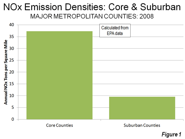
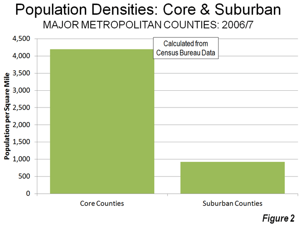
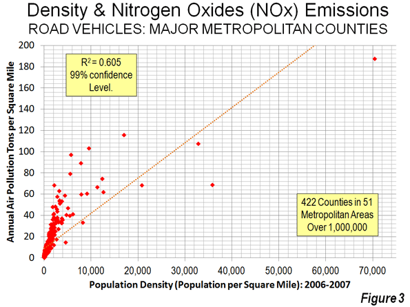
    NOx emission density data by county is provided in the document below, Annual Density of Highway Vehicle NOx Emissions by County: 2008. Overall, this data indicates that the average core county had a NOx density 3.9 times that of the average suburban county (Figure 1). By contrast, the average core county density is 4.5 times that of the average suburban county (Figure 2), indicating a strong relationship that is also shown in Figure 3.

    For example, in the New York metropolitan area, core New York County has NOx emissions that are nearly 15 times as intense in a given volume of air as suburban Morris County. In the Cleveland metropolitan area, core Cuyahoga County has a NOx emissions intensity 12 times that of suburban Geauga County. Charlotte’s core Mecklenberg County has a NOx emissions intensity more than five times that of suburban Union County.

    Traffic and Air Pollution

    More concentrated traffic also leads to greater traffic congestion and more intense air pollution, according to data available from EPA. The data for traffic concentration is similar to population density. Manhattan – despite its huge transit complex – has by far the greatest miles of road travel per square mile of any county, while seven of the densest counties are among the top ten in traffic intensity. As in the case of NOx emissions, the four highly urbanized New York City counties are also among the top 10 in the density of motor vehicle travel (Table 1).

    Table 2
    Intensity of Traffic (per Square Mile)
    Motor Vehicle Travel
    Rank County Compared to Average
    1 New York Co, NY 37.8
    2 Bronx Co, NY 22.3
    3 Fredericksburg city, VA 19.9
    4 Alexandria city, VA 15.8
    5 San Francisco Co, CA 15.6
    6 Arlington Co, VA 15.1
    7 Suffolk Co, MA 14.4
    8 Queens Co, NY 14.3
    9 Kings Co, NY 13.8
    10 Washington city, DC 13.1
    Calculated from 2005 EPA Data


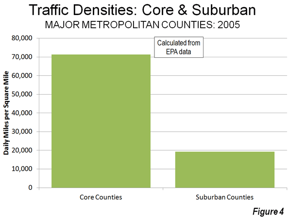
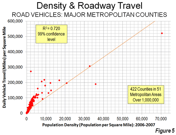
    Traffic density data by county is provided in the second document below, Daily Density of Road Vehicle Miles by County: 2005. Overall, this data indicates that the average core county had a traffic density 3.7 times that of the average suburban county (Figure 4), again a difference similar to the difference in density (Figure 5).

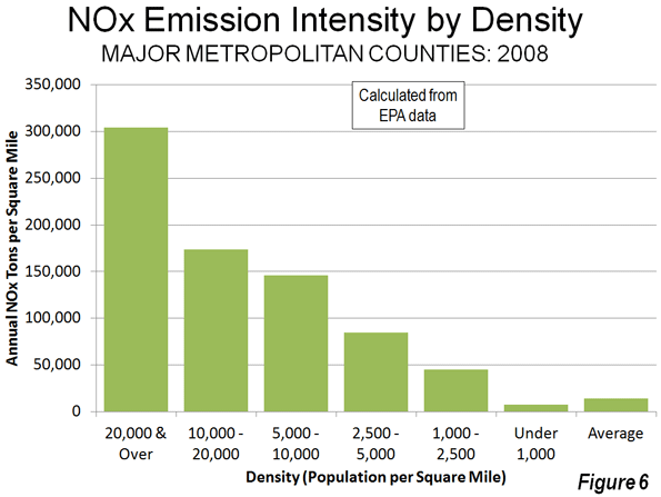
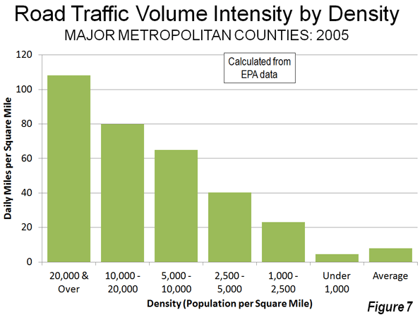
    The overall relationship between higher population densities and both NOx concentration and motor vehicle traffic intensity is illustrated in Figure 6 and Figure 7. There is a significant increase in the concentration of both NOx emissions and motor vehicle travel in each higher category of population density. For example, the counties with more than 20,000 people per square mile have NOx emission concentrations 14 times those of the average county in these metropolitan areas, and motor vehicle travel is 22 times the average. A smaller sample of the most urbanized counties (those with 90 percent or more of the land urbanized) showed a stronger association. This findings are consistent with research by the Sierra Club and a model derived from that research by ICLEI–Local Governments for Sustainability, both strong supporters of the livability and smart growth strategies of densification.

    A Caution: The air pollution data contained in this report is for emissions, not for air quality. Air quality is related to emissions and if there were no other intervening variables, it could be expected that emissions alone would predict air quality. However there are a number of intervening variables, from climate, wind, topography and other factors. Again, Los Angeles County makes the point. As the highest density large urban area in the nation   Los Angeles under any circumstances would have among the highest density of air pollution emissions. However, the situation in Los Angeles is exacerbated by the fact that the urban area is surrounded by mountains which tend to trap the air pollution that is blown eastward by the prevailing westerly winds.

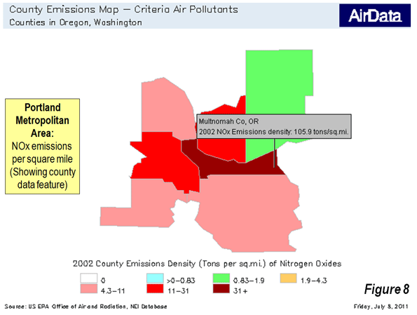
    The EPA data for 2002 can be used to create maps indicating criteria pollutant densities within metropolitan areas. An example is shown of  the Portland (OR-WA) metropolitan area (Figure 8), with the latter indicating the data illustration feature using Multnomah County (the central county of the metropolitan area), which is the most dense county and has the greatest intensity of NOx emissions and traffic congestion.

    The Goal: Improving Public Health

    These data strongly indicate that the densification strategies associated with smart growth and livability are likely to worsen the intensity of both NOx emissions and congestion of motor vehicle travel.

    But there is a more important impact. A principal reason for regulating air pollution from highway vehicles is to minimize public health risks. Any public policy that tends to increase air pollution intensities will work against the very purpose of air pollution regulation: public health. The American Heart Association found that air pollution levels vary significantly in urban areas and that people who live close to highly congested roadways are exposed to greater health risks. The EPA also notes that NOx emissions are higher near busy roadways. The bottom line is that all – things being equal – higher population density, more intense traffic congestion, and higher concentrations of air pollution go together.

    All of this could have serious consequences as the EPA seeks to expand its misguided regulations. For example, officials in the Tampa-St. Petersburg area have expressed concern that the metropolitan area will not meet the new standards, and they have proposed densification as a solution, consistent with the misleading conventional wisdom. The reality is that this is likely to make things worse, not better.  

    Less Livable

    There are myriad difficulties with smart growth and livability policies, not least their association with higher housing prices, a higher cost of living, muted economic growth, and decreased mobility and access to jobs in metropolitan areas. As the EPA data show, the densification policies of smart growth and livability also make air pollution worse for people at risk.

    Virtually all urban areas of Western Europe, North America and Oceania principally rely on cars for their mobility and there is no indicate that this will change. The air is less healthful for residents where traffic intensity is greater. As the air pollution intensity data shows, cars need space.

    Wendell Cox is a Visiting Professor, Conservatoire National des Arts et Metiers, Paris and the author of “War on the Dream: How Anti-Sprawl Policy Threatens the Quality of Life

    —–

    Note 1: The city (county level jurisdiction) of Fredericksburg, Virginia surprisingly ranks third in its concentration of motor vehicle travel yet ranks eighth much lower in population density. This reflects the high volumes of traffic through the  small municipality (and county-equivalent jurisdiction) carried on two of the East’s busiest roadways, Interstate 95 and US-1.

    Note 2: Additional analysis and information is available at Air Pollution, NOx Emissions, Traffic Congestion and Higher Population Density: The Association in Major Metropolitan Areas of the United States.

    Adapted from an article published by the Heritage Foundation.

    Photo of Manhattan traffic by carthesian.

  • Comparing Perry’s Texas to Romney’s Massachusetts

    Republican primary front-runners Rick Perry and Mitt Romney are each basing a large part of their campaigns on their economic track records. So who is better when it comes to jobs and the economy — Romney or Perry?

    Let’s put each of their states under the microscope to see what the data says. In this exercise we will use Analyst, EMSI’s web-based labor market analysis tool, to help us see the ins and outs of the Massachusetts and Texas economies.

    Notes:
    1. All data, graphs, and tables are from Analyst’s 2011.3 dataset, which is based on BLS, Census, BEA, and nearly 80 other sources.

    2. As an economics firm we want to stress this point — businesses and economic activity create jobs, not politicians.

    3. Gov. Perry (2000-current) and Romney (Massachusetts Governor from 2003-2007) do not have perfectly overlapping times in office, so we are going to consider the 10-year time frame and then look at how the states have performed during the recession, which would tend to reflect the legacy of each politician (e.g., politicians always inherit the blessings or curses of the previous administration).

    4. Performance during the recession is the key point of data we want to look at. Which state is strong when tough times arise?

    TEN-YEAR TRENDS
    Right off the bat we see that the Texas economy is the clear leader. The state grew by 18%, or about 2.2 million jobs, in the last 10 years. Over that same time period Massachusetts grew by 2%, or less than 100,000 jobs.

    (click images to enlarge)


    Almost every industry sector in Texas grew from 2001 to 2011. Agriculture, information, and manufacturing were the only ones to actually decline. The big leaders were health care (43% growth, 421,000 jobs), government (17% growth, 282,000 jobs), oil and gas (111% growth, 257,000 jobs), finance and insurance (38% growth, 216,000 jobs), and professional and technical services (29% growth, 210,000 jobs).

    NAICS Code Description 2001 Jobs 2011 Jobs Change % Change 2011 Earnings
    62 Health Care and Social Assistance 985,667 1,407,160 421,493 43% $49,118
    90 Government 1,679,431 1,961,341 281,910 17% $59,455
    21 Mining, Quarrying, and Oil and Gas Extraction 231,809 488,494 256,685 111% $136,302
    52 Finance and Insurance 575,109 791,054 215,945 38% $69,091
    54 Professional, Scientific, and Technical Services 713,722 923,621 209,899 29% $74,784
    72 Accommodation and Food Services 789,913 987,746 197,833 25% $19,814
    56 Administrative and Support and Waste Management and Remediation Services 744,446 932,960 188,514 25% $33,979
    53 Real Estate and Rental and Leasing 410,363 559,112 148,749 36% $31,946
    81 Other Services (except Public Administration) 592,116 708,981 116,865 20% $28,597
    23 Construction 849,097 950,903 101,806 12% $54,438
    61 Educational Services 148,927 214,526 65,599 44% $36,378
    55 Management of Companies and Enterprises 41,840 105,073 63,233 151% $102,137
    71 Arts, Entertainment, and Recreation 171,298 230,177 58,879 34% $24,422
    44-45 Retail Trade 1,350,407 1,400,681 50,274 4% $30,803
    48-49 Transportation and Warehousing 506,512 553,486 46,974 9% $60,395
    42 Wholesale Trade 508,024 552,876 44,852 9% $80,704
    22 Utilities 52,813 55,870 3,057 6% $118,804
    11 Agriculture, Forestry, Fishing and Hunting 345,303 319,410 (25,893) (7%) $20,912
    51 Information 299,481 227,513 (71,968) (24%) $73,610
    31-33 Manufacturing 1,066,622 871,533 (195,089) (18%) $79,460
    Total 12,062,901 14,242,517 2,179,616 18% $53,493
    Source: EMSI Complete Employment – 2011.3

    Massachusetts’ growth sprung primarily from health care (24% growth, 111,000 jobs), professional and technical services (10% growth, 37,000 jobs), educational services  (19% growth, 35,000 jobs), and real estate (27% growth, 34,000 jobs). A big thing to note is that nine industry sectors — utilities, government, transportation, retail trade, management of companies, wholesale trade, information, construction, and manufacturing — lost jobs from 2001-2011.

    NAICS Code Description 2001 Jobs 2011 Jobs Change % Change 2011 Earnings
    62 Health Care and Social Assistance 468,668 579,523 110,855 24% $60,616
    54 Professional, Scientific, and Technical Services 363,592 400,919 37,327 10% $96,534
    61 Educational Services 184,644 220,002 35,358 19% $56,621
    53 Real Estate and Rental and Leasing 125,313 159,096 33,783 27% $32,018
    72 Accommodation and Food Services 249,024 277,782 28,758 12% $22,995
    81 Other Services (except Public Administration) 179,165 203,904 24,739 14% $33,199
    71 Arts, Entertainment, and Recreation 84,064 105,900 21,836 26% $28,814
    52 Finance and Insurance 232,356 253,578 21,222 9% $115,262
    56 Administrative and Support and Waste Management and Remediation Services 212,872 213,893 1,021 0% $39,572
    21 Mining, Quarrying, and Oil and Gas Extraction 2,604 3,398 794 30% $148,741
    11 Agriculture, Forestry, Fishing and Hunting 20,552 20,373 (179) (1%) $33,359
    22 Utilities 12,332 11,383 (949) (8%) $135,669
    90 Government 432,156 426,859 (5,297) (1%) $66,827
    48-49 Transportation and Warehousing 124,887 111,495 (13,392) (11%) $52,693
    44-45 Retail Trade 406,859 393,365 (13,494) (3%) $32,842
    55 Management of Companies and Enterprises 72,884 58,796 (14,088) (19%) $125,760
    42 Wholesale Trade 150,660 134,602 (16,058) (11%) $91,749
    51 Information 122,543 100,471 (22,072) (18%) $100,676
    23 Construction 219,882 195,324 (24,558) (11%) $66,726
    31-33 Manufacturing 398,839 264,887 (133,952) (34%) $94,358
    Total 4,063,896 4,135,549 71,653 2% $63,647
    Source: EMSI Complete Employment – 2011.3

    Since much of the discussion in the Republican primary has to do with the nation’s more recent economic turmoil, let’s refocus our analysis to 2007 – 2011.

    MASSACHUSETTS FACTS
    The current population of Massachusetts is 6.6 million with 4.1 million jobs. The unemployment rate is 7.6%, and average earnings in the state are more than $63,000 per year. The gross regional product (GRP), which is the value of all goods and services produced in a region by all industries, is $378 billion per year.

    In Massachusetts, nearly 80% of the population is White, Non-Hispanic. The age demographics tell us the state is pretty balanced, and educational attainment is high.


    Massachusetts ’07-11

    From 2007-2011, jobs declined by 1% (overall loss of 34,000). All things considered — not bad. The biggest losses were felt in construction and manufacturing (total losses of 82,000 jobs). The biggest gains were in health care (45,000 jobs), educational services (11,000 jobs), professional and technical (11,000 jobs), and accommodation and food services (10,000 jobs).

    NAICS Code Description 2007 Jobs 2011 Jobs Change % Change 2011 Earnings
    62 Health Care and Social Assistance 534,634 579,523 44,889 8% $60,616
    61 Educational Services 209,184 220,002 10,818 5% $56,621
    54 Professional, Scientific, and Technical Services 390,170 400,919 10,749 3% $96,534
    72 Accommodation and Food Services 267,731 277,782 10,051 4% $22,995
    52 Finance and Insurance 245,717 253,578 7,861 3% $115,262
    81 Other Services (except Public Administration) 196,358 203,904 7,546 4% $33,199
    71 Arts, Entertainment, and Recreation 98,450 105,900 7,450 8% $28,814
    22 Utilities 10,653 11,383 730 7% $135,669
    21 Mining, Quarrying, and Oil and Gas Extraction 2,854 3,398 544 19% $148,741
    11 Agriculture, Forestry, Fishing and Hunting 19,934 20,373 439 2% $33,359
    51 Information 100,643 100,471 (172) 0% $100,676
    90 Government 427,688 426,859 (829) 0% $66,827
    53 Real Estate and Rental and Leasing 162,635 159,096 (3,539) (2%) $32,018
    55 Management of Companies and Enterprises 62,367 58,796 (3,571) (6%) $125,760
    48-49 Transportation and Warehousing 116,671 111,495 (5,176) (4%) $52,693
    44-45 Retail Trade 404,423 393,365 (11,058) (3%) $32,842
    42 Wholesale Trade 148,614 134,602 (14,012) (9%) $91,749
    56 Administrative and Support and Waste Management and Remediation Services 227,964 213,893 (14,071) (6%) $39,572
    23 Construction 236,308 195,324 (40,984) (17%) $66,726
    31-33 Manufacturing 306,523 264,887 (41,636) (14%) $94,358
    Total 4,169,521 4,135,549 (33,972) (1%) $63,647
    Source: EMSI Complete Employment – 2011.3

    Also, here is a view of 6-digit (NAICS) industries that grew and declined from 2007-11. In the table above we looked only at 2-digit NAICS. When we use the 6-digit sectors we can see much more specific industry detail. Portfolio management was the highest growing industry from 2007-11 in Massachusetts.


    Here is a list of occupations that grew and declined from ’07-11. These are 5-digit occupations (SOC codes). Consistent with the industry data, the fastest-growing occupation is personal financial advisors.


    TEXAS FACTS

    Texas has a total population of 25.6 million with 14.2 million jobs. The average earnings is $53.5K per year, and the unemployment is 972,000. The unemployment rate is 8.4%, which is a tad higher than Massachusetts’. The state’s GRP is $1.2 trillion per year.


    In terms of demographics, Texas is 46% White, Non-Hispanic, 36% Hispanic, and 11% Black or African American. Educational attainment is lower than Massachusetts. Texas also appears to have a slightly younger population when compared to Massachusetts.


    Texas ’07-11

    From 2007-2011, the Texas economy grew by 3% (391,000 jobs gained overall). The state had huge job gains in oil and gas extraction (56% growth and 175,000 jobs), health care (14% growth and 171,000 jobs), and government (7% growth and 125,000 jobs). Other sectors like finance and insurance, accommodation and food, professional and technical, and educational services all had decent gains. Losses occurred in construction and manufacturing (about 192,000 jobs), retail trade (41,000 jobs or -3%), information (35,000 jobs or -13%), transportation (24,000 jobs or – 4%) and wholesale trade (13,000 jobs or -2%).

    NAICS Code Description 2007 Jobs 2011 Jobs Change % Change 2011 Earnings
    21 Mining, Quarrying, and Oil and Gas Extraction 313,502 488,494 174,992 56% $136,302
    62 Health Care and Social Assistance 1,235,840 1,407,160 171,320 14% $49,118
    90 Government 1,836,081 1,961,341 125,260 7% $59,455
    52 Finance and Insurance 717,799 791,054 73,255 10% $69,091
    72 Accommodation and Food Services 943,336 987,746 44,410 5% $19,814
    54 Professional, Scientific, and Technical Services 892,977 923,621 30,644 3% $74,784
    61 Educational Services 192,643 214,526 21,883 11% $36,378
    55 Management of Companies and Enterprises 83,783 105,073 21,290 25% $102,137
    81 Other Services (except Public Administration) 689,944 708,981 19,037 3% $28,597
    71 Arts, Entertainment, and Recreation 215,084 230,177 15,093 7% $24,422
    22 Utilities 50,935 55,870 4,935 10% $118,804
    11 Agriculture, Forestry, Fishing and Hunting 317,762 319,410 1,648 1% $20,912
    56 Administrative and Support and Waste Management and Remediation Services 934,474 932,960 (1,514) 0% $33,979
    53 Real Estate and Rental and Leasing 564,471 559,112 (5,359) (1%) $31,946
    42 Wholesale Trade 565,616 552,876 (12,740) (2%) $80,704
    48-49 Transportation and Warehousing 577,467 553,486 (23,981) (4%) $60,395
    51 Information 262,342 227,513 (34,829) (13%) $73,610
    44-45 Retail Trade 1,441,632 1,400,681 (40,951) (3%) $30,803
    23 Construction 1,025,977 950,903 (75,074) (7%) $54,438
    31-33 Manufacturing 989,430 871,533 (117,897) (12%) $79,460
    Total 13,851,095 14,242,517 391,422 3% $53,493
    Source: EMSI Complete Employment – 2011.3

    Here is a look at 6-digit industries and 5-digit occupations that grew and declined at the largest clip in Texas from ’07-11. As you can see, oil and natural gas extraction is a very big driver for the state. Under Perry, the state also picked up quite a few local government jobs during the recession.


    CONCLUSION

    Based on job numbers, both candidates do have legitimate claims that their states have done well through the recession. In this comparison — Texas really benefits from the huge grow within oil and natural gas. See this recent interactive display to better visualize this trend.

    When looking at data like this, it is important to keep in mind that the economies of states (and these two states in particular) are quite different in terms of total population, demographics, and industry composition. Both states have some strong qualities, but based on raw numbers, Texas is the obvious choice.

    Rob Sentz is the marketing director at EMSI, an Idaho-based economics firm that provides data and analysis to workforce boards, economic development agencies, higher education institutions and the private sector. He is the author of a series of green jobs white papers. Email Rob with questions at rob@economicmodeling.com.

    Lead illustration by Mark Beauchamp