Category: Urban Issues

  • The Best Cities For Minority Entrepreneurs

    As the American economy struggles to recover, its greatest advantage lies with its diverse population. The U.S.’ major European competitors — Germany, Scandinavia, France, Italy, the Netherlands and Italy — have admittedly failed at integrating racial outsiders. Its primary Asian rivals, with the exception of Singapore, are almost genetically resistant to permanent migration from those outside the dominant ethnic strain.

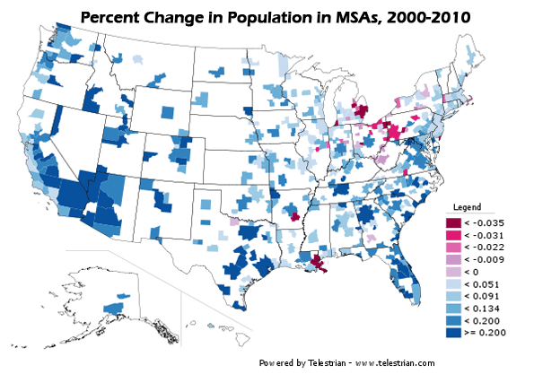
    In contrast, America’s destiny is tied to minorities, who already constitute a third of the nation’s population and who will account for roughly half of the population by 2050. Younger and more heavily represented in the labor force, minorities are poised to become the primary source of entrepreneurial growth.

    The clear advantage with minorities, particularly immigrant minorities, lies in their own self-selection. Risk-takers by the very act of emigration, they are more likely to start small firms than other Americans. In fact, a recent Kauffman Foundation study found that immigrants  were unique in boosting their  entrepreneurial activities since the onset of the recession.  Overall the share of immigrants among new entrepreneurs has expanded from 13.4% in 1996 to nearly 30% this year.

    Forbes asked demographer Wendell Cox (www.demographia.com), researcher Erika Ozuna and me to examine the immigrant entrepreneurial phenomena among the nation’s 52 largest metropolitan areas. The results (below) turned out to be in many ways surprising, and almost counter-intuitive.

    Usually we think of immigrant entrepreneurs as clustering in crowded city communities or high-tech  places like Silicon Valley. But based on rates of self-employment, housing affordability, income growth and migration, immigrant entrepreneurs tend to prefer sprawling, heavily suburbanized regions, many of them clustered in the South and Southwest.

    The best U.S. city for minority entrepreneurs on our list, Atlanta, has long been a haven for black entrepreneurs. But, recently, its Latino and Asian populations have exploded, with exceptionally high rates of self-employment.  In the past decade, the Atlanta region’s Asian population surged 74%, while its Latino population grew by 101%. The overall foreign-born population rose by roughly 300,000.

    Similar surges took place in almost all the top cities on list. They include Baltimore (No. 2), Nashville (No. 3), Houston, Miami, Oklahoma City, Riverside San Bernardino, Calif., the Washington D.C. metro area,  Orlando, Fla.. and Phoenix, Ariz.

    Latino shopping center developer Jose Legaspi traces much of the entrepreneurial success in these areas to this rise in population. This is particularly true in places like Miami, which has the nation’s highest rate of foreign immigration, and has long boasted of its role as “the capital of the Americas.” Less renowned are cities like Houston, which now enjoys a higher per capita rate of immigration than Boston, Seattle or Chicago. All these cities have engendered dense pockets of diverse and often dispersed ethnic populations; in some locales, ethnic groups share neighborhoods and economic space. It’s increasingly common to see stores owned by ethnic groups serving both their own tribe as well as others.

    “The entrepreneurial class will follow the immigrant population,” notes the Montebello, Calif.-based entrepreneur, who has developed retail centers in such diverse locations as Los Angeles, Las Vegas, Atlanta, Phoenix and Fort Worth, Texas. “You get small retailers following their needs as well as a growing professional class.”

    Legaspi notes that an increasingly critical factor for the growth of many of these fastest-growing minority areas is cost of living. With the exception of Baltimore and Washington — whose growth is tied to the expansion of the federal government — the cities on our list enjoy relatively low housing costs. Minorities “American dream” generally does not revolve around an  apartment in dense, expensive urban areas, Legaspi n says, but want an affordable single-family house.

    This also applies to middle- and working-class African-Americans, whose shift away from cities to suburbs has been among the most remarked upon phenomena identified by the Census. In Atlanta, for example, the ratio of median income to median house value is 4.6 for African-Americans, 3.1 for Asians and 5.2 for Hispanics. In 35th-ranked San Francisco it’s 14.3 for African Americans, 7.1 for Asians and 10.6 for Hispanics. No surprise that per-capita minority growth is far more rapid in Atlanta than in the avowedly “multi-cultural” Bay Area.

    Land use and other regulations also play a role here, not only for housing prices but for entrepreneur opportunities. Again, with exception of the Washington and Baltimore areas,  the fast-growing minority regions, and rapidly growing self-employed populations, are regions with diffuse, multi-polar and heavily suburbanized land patterns.

    The strip mall, much detested among urban aesthetes and planners often serves as “the immigrants’ friend,” says Houston architect Tim Cisneros. In places like Houston, Cisneros points out, Columbians, Nigerians, Mexicans , Indian and Vietnamese businesses usually cluster not in downtown centers or fancy high-end malls, but in makeshift auto-oriented strip  centers, where prices are low, parking ample and the location within easy driving distance of various ethnic populations. You want a good Indian meal in Houston, you don’t need to head downtown, but to the outer suburbs of Fort Bend County.

    In contrast, many of the more expensive, denser regions — many with storied high-tech sectors — did poorly in our survey. Besides San Francisco, Minneapolis ranked  No. 49, San Diego No. 48, San Jose No. 46 and Boston No. 45. Chicago clocked in at a dismal No. 50.New York, the legendary home of minority entrepreneurship, ranked a meager No. 39.

    Jonathan Bowles, president of the New York-based Center for an Urban Future, traced this poor performance to a myriad of factors, including sky-high business rents, which stymie would-be entrepreneurs in minority communities. “[Entrepreneurs] face incredible burdens here when they start and try to grow a business,” Bowles suggested. “Many go out of business quickly due to the cost of real estate and things like high electricity costs. It’s an expensive city to do business without a lot of cash.”

    Yet not every region at the bottom of our list came from the array of high-end “luxury” cities. The bottom of the list also included a host of rustbelt cities, including Detroit (No. 47), Cleveland (No. 51) and Milwaukee (last place at No. 52). Clearly cheap rents and affordable space are not enough when weighed against slow job growth, weak immigration and general economic stagnation.

    And often, notes Richard Herman, an immigrant attorney in Cleveland, a cultural pre-disposition against immigrants plays a destructive role in many of these cities. “The rust belt cities don’t tend to welcome newcomers,” Herman says. “The infrastructure, the sentiment is not there. But you can’t get around it. We have to change our culture if want to change our situation.”

    Here is the full ranking of the top 52 metros for minority entrepreneurs, compiled by researchers Wendell Cox and Erika Ozuna:

    1. Atlanta-Sandy Springs-Marietta, GA
    2. Baltimore-Towson, MD
    3. Nashville-Davidson-Murfreesboro-Franklin, TN
    4. Houston-Sugar Land-Baytown, TX
    5. Miami-Fort Lauderdale-Pompano Beach, FL
    6. Oklahoma City, OK
    7. Riverside-San Bernardino-Ontario, CA
    8. Washington-Arlington-Alexandria, DC-VA-MD-WV
    9. Orlando-Kissimmee, FL
    10. Phoenix-Mesa-Scottsdale, AZ
    11. Memphis, TN-MS-AR
    12. Dallas-Fort Worth-Arlington, TX
    13. San Antonio, TX
    14. Tampa-St. Petersburg-Clearwater, FL
    15. Austin-Round Rock, TX
    16. Charlotte-Gastonia-Concord, NC-SC
    17. Indianapolis-Carmel, IN
    18. Los Angeles-Long Beach-Santa Ana, CA
    19. Richmond, VA
    20. New Orleans-Metairie-Kenner, LA
    21. Jacksonville, FL
    22. Tucson, AZ
    23. Portland-Vancouver-Beaverton, OR-WA
    24. Raleigh-Cary, NC
    25. Louisville-Jefferson County, KY-IN
    26. Birmingham-Hoover, AL
    27. Seattle-Tacoma-Bellevue, WA
    28. Cincinnati-Middletown, OH-KY-IN
    29. Sacramento-Arden-Arcade-Roseville, CA
    30. Pittsburgh, PA
    31. Kansas City, MO-KS
    32. Columbus, OH
    33. Las Vegas-Paradise, NV
    34. Virginia Beach-Norfolk-Newport News, VA-NC
    35. San Francisco-Oakland-Fremont, CA
    36. Denver-Aurora-Broomfield, CO
    37. St. Louis, MO-IL
    38. Buffalo-Niagara Falls, NY
    39. New York-Northern New Jersey-Long Island, NY-NJ-PA
    40. Rochester, NY
    41. Hartford-West Hartford-East Hartford, CT
    42. Salt Lake City, UT
    43. Providence-New Bedford-Fall River, RI-MA
    44. Philadelphia-Camden-Wilmington, PA-NJ-DE-MD
    45. Boston-Cambridge-Quincy, MA-NH
    46. San Jose-Sunnyvale-Santa Clara, CA
    47. Detroit-Warren-Livonia, MI
    48. San Diego-Carlsbad-San Marcos, CA
    49. Minneapolis-St. Paul-Bloomington, MS-WI
    50. Chicago-Naperville, Joliet-IL-IN-WI
    51. Cleveland-Elyria-Mentor, OH
    52. Milwaukee-Waukesha-West Allis, WI

    This piece originally appeared in Forbes.com

    Joel Kotkin is executive editor of NewGeography.com and is a distinguished presidential fellow in urban futures at Chapman University, and an adjunct fellow of the Legatum Institute in London. He is author of The City: A Global History. His newest book is The Next Hundred Million: America in 2050, released in February, 2010.

    Photo by LHOON

  • Hanoi’s Underground Capitalism

    Along the pitted elegance of Pho Ngo Quyen, a bustling street in Hanoi, Vietnam, you will, predictably, find uniformed men in Soviet-style uniforms, banners with Communist Party slogans, and grandfatherly pictures of Ho Chi Minh. Yet, capitalism thrives everywhere else in this community — in the tiny food stalls, countless mobile phone stores and clothing shops  offering everything from faux European fashion to reduced-price children’s wear,  sandals and sneakers.

    Outside a ministry office, someone is cutting hair on the street. Nearby a woman is drying squid to sell to customers. Internet cafes proliferate, filled with young people.  Virtually every nook and cranny has a small shop or workplace for making consumer goods.

    In some ways, Hanoi seems very much a third-world city in terms of its infrastructure and cracking sidewalks, and it shares some characteristics with the slums featured in this Megacities project, such as underground economies and a growing population migrating from rural areas. But its poverty pales compared to places like Mumbai or Rio. The poor sections are rundown and crowded, but you don’t see people sleeping on the streets. This is a city clearly on the way up — in a country with nearly 95% literacy and a countryside that not only feeds itself but remains the largest source of export earnings.

    Of course, many rural residents — still roughly 70% of the population — continue to pour into Hanoi and other cities, but without the same desperation that characterizes, for example, people moving from Bihar to New Dehli or Mumbai. There is nothing of the kind of criminal elements that fester in the favelas of Brazil or Mexico City colonias.

    In Hanou, even for the poor, it’s not just about survival. There’s a sense of Wild West in the East. With very un-socialistic frenzy, motorcyclists barrel down the streets like possessed demons, with little regard to walking lanes or lights. Everyone not on the government payroll seems to have hustle, or is looking for one.

    Modern-day Hanoi reminds me most of China in the 1980s, when I first started going there. But there are crucial differences. State-owned companies in Vietnam lack the depth and critical mass of their Chinese counterparts, for example.  Still, as in China, foreign firms are moving in: Panasonic plants dot the outskirts, and Nokia is planning to build a $200 million factory on the city’s edge.

    Hanoi is not Singapore either, where an enlightened state has allowed flashes of street capitalism, particularly in the hawker’s stalls that make the city a foodie’s delight. In Singapore business remains highly deliberate and world-class, enabled by a much envied and skilled Mandarinate. As you walk around Hanoi, peak inside a cavernous building and you’ll see not a sleek Singapore-style mall, but a cluttered collection of small boutiques. It reminds one of nothing more than the Vietnamese outposts in Orange County, Calif., or in Los Angeles’ Chinatown, which is now largely dominated by Chinese from Vietnam.

    Le Dang Doanh, one of the architects of Vietnam’s economic reforms, which were  known as (Doi Moi) and launched in 1986, estimates the private sector now accounts for 40% of the country’s GDP, up from virtually zero. But Le Dang estimated as much as 20% more occurs in the “underground” economy where cash — particularly U.S.  dollars — reigns as king.

    “You see firms with as many as 300 workers that are not registered,” the sprightly, bespectacled 69-year-old economist explains. “The motive force is underground. You walk along the street. I followed an electrical cable once and it led me to a factory with 27 workers making Honda parts and it was totally off the system.”

    After years as a Communist apparatchik, Le Dang now has more faith in markets than is commonly found in the American media or U.S. college campuses. Trained in the Soviet Union and the former East Germany, Le Dang saw up close the “future” of a state-guided economy and concluded it doesn’t work. He noted that in agriculture farmers produce 50% of the cash income on the 5% of land that they can call their own. He also mentions proudly that his son, born in 1979, works for a private Hanoi-based software firm.

    Other Vietnamese also have developed a taste for self-interest — and display considerable ingenuity finding their way. One clear inspiration, and source of capital, for the rapid acceleration toward capitalism comes from the over 3.7 million overseas Vietnamese. Ironically many of these are former stalwart opponents to the nominally capitalist rulers who fled the Communist takeover in 1975.

    Today you see these ties at Vietnamese banks and trading companies nestled in various U.S. communities, including the largest in Orange County.  Overall, the U.S. community — also strong in Houston, Northern Virginia and San Jose –  accounts for roughly 40% of the total diaspora.

    These communities have prospered, after a shaky start following the end of the Vietnam War. They are particularly prominent in fields such as information technology, science and engineering, with percentage representation in the workforce in those fields higher than most other immigrant groups.

    For years the Communist homeland had little contact and shared no common purpose with this  largely successful, intensely capitalist diaspora. Strengthening ties between these upwardly mobile communities and the mother country are changing both. As UC Davis researcher Jane Le Skaife has found,Vietnam now ranks sixteenth in the world in remittances from abroad, with over $8 billion in 2010, nearly three-fifths come from the U.S.  This amounts to roughly 8% of the country’s GDP and is a larger amount than investment from international aid donors.  Skaife and others believe this number may be much too small given the Vietnamese penchant for  running beneath the official radar — a skill honed over the centuries.

    Although hardly fans of the official Marxist-Lenninist regime, many Vietnamese , notes Le Skaife, now take great pride — and see great opportunity — in Vietnam’s rapid growth and growing affluence.  According to the  CIA World Factbook, the country’s poverty rate has dropped from 75% in the 1980s to  10.6% of the population in 2010 . In terms of economic output, a brief on Vietnam by the World Bank reported that between the years 1995 and 2005 real GDP increased by 7.3% per year and per capita income by 6.2% per year.

    The growing symbiosis of   Vietnam with its diaspora, particularly in the U.S., will shape the rapid development of the country, notes Le Dang. This parallels the roles played earlier by the Indian and Chinese diaspora in the development of their home countries over the past two decades.

    Nowhere will this impact be felt more than in major cities such as Hanoi, Danang and especially Ho Chi Minh City (the former Saigon). “We are seeing more of the expatriates here, and they are bringing management skill and capital through their family networks,” Le Dang says. “They are a key part of the changes here.”

    For Americans, these changes should be welcomed both for economic and geopolitical reasons. Although much of our intelligentsia welcomes the onset of a “post-American” world, the perspective in Hanoi could not be more different. To Vietnam’s leaders, the United States, for all memories of the devastating war there, remains a critical counterweight to the country that has been their historic rival, China. Americans are more welcomed in Hanoi these days than in Berlin or Paris, or maybe even Toronto.

    Even in the ramshackle working class wards along the Red River, you see signs in English and the dollar is welcome. It’s not that these fiercely independent people want to become Americans, but that they are acting like Americans — or at least those who still favor grassroots capitalism as the best way to secure the urban future.

    This piece originally appeared in Forbes.

    Joel Kotkin is executive editor of NewGeography.com and is a distinguished presidential fellow in urban futures at Chapman University, and an adjunct fellow of the Legatum Institute in London. He is author of The City: A Global History. His newest book is The Next Hundred Million: America in 2050, released in February, 2010.

    Photo by Gerry Popplestone

  • The Accelerating Suburbanization of New York

    Some of the best evidence that the tide has not turned against dispersion and suburbanization comes from an unlikely source:  New York’s 2010 census results. If dense urbanism works anywhere in America, it does within this greatest of US traditional urban areas.

    Before the actual count, the Census Bureau estimated, in large part as a result of a successful historical core municipality (city of New York) challenges, that as of Census Day (April 1, 2010), the city would have added 413,000 residents since 2000 and would have accounted for more than one-half of the metropolitan area growth. But the numbers turned out startlingly different. In fact, the city’s census count came in nearly 250,000 below projections and accounted for the lowest share of New York metropolitan area growth since the 1970s.

    Overall the 2010 census figures paint a picture of continuing dispersion in the nation’s largest metropolitan area, New York. The metropolitan area stretches from Manhattan, with the world’s second largest business district (after Tokyo) to the four outer boroughs of the city of New York, more than 100 miles to the eastern end of Long Island, north to Putnam and Rockland counties, completely across northern New Jersey, jumping the Delaware River to include Pike County, Pennsylvania and south to Ocean County (New Jersey), nearly all the way to Atlantic City. In all, this 23 county metropolitan area has the nation’s largest population and actually extended its margin over second place Los Angeles, which has been converted from a growth leader to a laggard giant growing slower than most Midwestern metropolitan areas. New York added 574,000 residents, while Los Angeles added 473,000. If New York continues to add more people than Los Angeles in future censuses, its position as the nation’s largest metropolitan area be secure.

    Major metropolitan areas in general did poorly in terms of growth in the new cesusus. This was particularly true in New York. Between 2000 and 2010, the New York metropolitan area population rose from 18,323,000 to 18,897,000, a modest growth rate of 3.1 percent, one of the slowest among major metropolitan areas in the country. The national growth rate was three times as high

    Suburbanization Accelerating Again: If you had read the New York Times and other Manhattan-based media over the last decade you would have assumed the suburbs were in decline and cities ascendant, particularly in the New York area. Yet in reality over the past decade, the suburban counties captured their largest share of New York metropolitan area growth in three decades. During the 2000s, the suburbs accounted for 71 percent of growth, up from 54 percent during the 1990s and 48 percent in the 1980s. The outer suburbs grew the fastest, while the inner suburbs – some of which are denser than historical core municipalities in other metropolitan areas – grew faster than the historical core municipality, the city of New York (Figure 1 and Table)


    NEW YORK METROPOLITAN AREA
    POPULATION TREND BY COUNTY: 2000 TO 2010
    2000 2010 Change %
    HISTORIC CORE MUNICIPALITY (New York)
    Bronx County, NY       1,332,650       1,385,108        52,458 3.9%
    Kings County, NY       2,465,326       2,504,700        39,374 1.6%
    New York County, NY       1,537,195       1,585,873        48,678 3.2%
    Queens County, NY       2,229,379       2,230,722          1,343 0.1%
    Richmond County, NY         443,728         468,730        25,002 5.6%
    Subtotal       8,008,278       8,175,133       166,855 2.1%
    INNER SUBURBAN
    Bergen County, NJ         884,118         905,116        20,998 2.4%
    Essex County, NJ         793,633         783,969         (9,664) -1.2%
    Hudson County, NJ         608,975         634,266        25,291 4.2%
    Middlesex County, NJ         750,162         809,858        59,696 8.0%
    Nassau County, NY       1,334,544       1,339,532          4,988 0.4%
    Passaic County, NJ         489,049         501,226        12,177 2.5%
    Union County, NJ         522,541         536,499        13,958 2.7%
    Westchester County, NY         923,459         949,113        25,654 2.8%
    Subtotal       6,306,481       6,459,579       153,098 2.4%
    OUTER SUBURBAN
    Hunterdon County, NJ         121,989         128,349          6,360 5.2%
    Monmouth County, NJ         615,301         630,380        15,079 2.5%
    Morris County, NJ         470,212         492,276        22,064 4.7%
    Ocean County, NJ         510,916         576,567        65,651 12.8%
    Pike County, PA           46,302           57,369        11,067 23.9%
    Putnam County, NY           95,745           99,710          3,965 4.1%
    Rockland County, NY         286,753         311,687        24,934 8.7%
    Somerset County, NJ         297,490         323,444        25,954 8.7%
    Suffolk County, NY       1,419,369       1,493,350        73,981 5.2%
    Sussex County, NJ         144,166         149,265          5,099 3.5%
    Subtotal       4,008,243       4,262,397       254,154 6.3%
    SUBTOTAL: SUBURBAN     10,314,724     10,721,976       407,252 3.9%
    TOTAL     18,323,002     18,897,109       574,107 3.1%


    Critically, the city of New York did worse than at any time since the 800,000 population loss that was sustained in the 1970s, representing all of the loss since 1950. Between 1950 and 1980 the suburbs added 3.9 million residents. The city’s fortunes had improved measurably in the 1980s and 1990s, with approximately one-half of the metropolitan area’s growth. The last decade’s share of metropolitan area growth – only 29 percent – in the historical core municipality indicates a startling acceleration of dispersion, although fortunately not a return to the population decline of the 1970s (Figure 2).

    City of New York: The city of New York grew from 8,008,000 to 8,175,000 between 2000 and 2010, a rate of 2.1 percent.

    Staten Island (Richmond County), which is largely suburban in form, was the fastest growing of New York’s boroughs, with a growth rate of 5.6 percent. The Bronx grew the second fastest, at a rate of 3.9 percent. Only Staten Island and Queens (below) reached their population peaks in the 2010 census (Figure 3).

    The Bronx has experienced perhaps the nation’s most successful urban turn-arounds, after a disastrous period in the 1970s and 1980s, when large swaths of the South Bronx were literally leveled. The population fell from 1,472,000 in 1970 to 1,204,000 in 1990. By 2010, the population had recovered nearly two-thirds of the loss, to 1,385,000.

    Manhattan (New York County) added 3.2 percent to its population (49,000) and reached 1,586,000. This is approximately one-third below its population peak of 2,232,000 in 1910.   Manhattan’s population, however, remained approximately 45,000 below the Census Bureau estimates.

    Brooklyn (Kings County) continues to be the largest borough in New York, with 2,505,000 residents, an increase of 39,000 (1.6 percent) between 2000 and 2010. Brooklyn reached its population peak of 2,738,000 in 1950. Brooklyn’s population proved approximately 75,000 below the Census Bureau’s estimates.

    The slowest growing borough was Queens, which added only 2,000 residents (a 0.1 percent population increase), yet reached its population peak of 2,231,000. Queens had added more residents than any other borough since 1950 and added approximately 275,000 residents in the 1990 to 2000 census period.

    Inner Ring Suburbs: The inner ring counties (Nassau, Westchester, Bergen, Passaic, Essex, Hudson, Union and Middlesex) grew 2.4 percent from 6,306,000 to 6,460,000. Growth rates varied significantly, from a loss of 1.2 percent in Essex County (where Newark is located) to 8.0 percent in Middlesex County. Middlesex County includes newer suburban areas further away from the core than in any other inner ring county. Much of the Middlesex County growth occurred in these areas. The inner ring suburbs captured 26.7 percent of the metropolitan area growth.

    Outer Ring Suburbs: By far the e fastest growth was in the outer ring counties, with a population increase of 6.3 percent, from 4,008,000 to 4,262,000. Monmouth County was the slowest growing outer ring county, adding 2.5 percent to its population. Pike County, Pennsylvania, which is the farthest to the west of any county in the metropolitan area, had by far the highest growth rate, at 23.8 percent. Ocean County, New Jersey, had the second fastest growth rate, at 12.8 percent. Ocean County lies at the extreme southern end of the metropolitan area. The outer ring counties captured 44.3 percent of the metropolitan area growth.

    Suburban Growth and Projections: Overall suburban growth was from 10,314,000 to 10,712,000, for a gain of 407,000 (4.0 percent). This was above the Census Bureau estimate of 392,000. The suburbs now contain 57 percent of the metropolitan area population.

    New York’s Continuing Dispersion: The dispersion of the 2000s is an extension of the overall metropolitan area trend since 1950 (Note). The historical core municipality, New York, has added less than 300,000 residents, or 3.6 percent. The suburbs have added 5.3 million residents, nearly doubling their population. Approximately 95 percent of the metropolitan area’s growth was in the suburbs between 1950 and 2010 (Figure 4).

    The dispersion is apparent even in the city of New York. Since 1950, Queens, the outermost of the inner four boroughs, added nearly 700,000 residents, while the more inner boroughs of Manhattan, Brooklyn and the Bronx, lost nearly as many residents. Overall these four inner boroughs gained only 6,000 residents since 1950. Staten Island, which is largely post-war suburban, grew 277,000, while the city overall was growing by 283,000, leaving only a net gain of 6,000 for the four inner boroughs of New York.

    A recent newgeography.com article documents similar patterns in employment dispersion and commuting during the 1990 to 2008 period.

    Consistency with the National Trend: The accelerating suburbanization of New York is consistent with the national trends in major metropolitan areas in the new census data. Between 1990 and 2000, historical core municipalities accounted for 15 percent of metropolitan area growth. Between 2000 and 2010, the share of historical core municipality growth had fallen to 9 percent.

    Note: This analysis is based upon the metropolitan area boundaries as currently defined.

    Wendell Cox is a Visiting Professor, Conservatoire National des Arts et Metiers, Paris and the author of “War on the Dream: How Anti-Sprawl Policy Threatens the Quality of Life

    Photo by Mike Lee

  • Vietnam, No Longer an Underdeveloped Country

    The most recent estimates for 2010 indicate that Vietnam is no longer among the underdeveloped countries of the world and has moved onto the ranks of middle-income countries.  Financial remittances – better known as money being sent back to the home country – have lent a critical hand in accomplishing this major triumph in the country’s formerly depressed economy.

    The influx of money by overseas Vietnamese, many of whom fled as political refugees, has dramatically changed the economic landscape of the country in terms of poverty levels and development.

    Development Since the War

    The aftermath of the war had left Vietnam among the five poorest countries in the world with 75 percent of the population living in poverty in 1984. Since then, the poverty level had dramatically decreased to 37 percent in 1998 and later to 29 percent in 2002, according to the World Bank.

    The CIA World Factbook more recently estimated Vietnam as having only 10.6 percent of the population living below the poverty line in 2010, a far cry from the 75 percent just 26 years earlier. In terms of economic output, a brief on Vietnam by the World Bank reported that the real GDP increased by 7.3 percent per year during 1995-2005 and per capita income by 6.2 percent per year.

    Vietnam was expected to enter the ranks of other middle-income countries by reaching the $1,000 GDP per capita marker by 2010, which it did according to the International Monetary Fund (IMF). The IMF estimated Vietnam’s GDP per capita as $1,155 for the 2010 fiscal year. Since then, the country’s Ministry of Planning and Investment (MPI) has set a new target that nearly doubles Vietnam’s current GDP per capita over the next four years. An expected GDP per capita of $2,100 by 2015 will allow Vietnam to surpass India’s GDP per capita in the global economy and be among the ranks of the Philippines.

    The target GDP per capita, however, is still well below its communist competitor, China, which now boasts an average GDP per capita of $4,520. Even though China presently holds the title as the “Red Dragon of the East,” Vietnam, with its enormous potential for economic growth, has recently been referred to as the “Rising Dragon” and the “New Asian Dragon” by various scholars.

    The World Bank avowed, “Vietnam is one of the best performing economies in the world over the last decade.” It further stated, “Vietnam’s poverty reduction and economic growth achievement in the last 15 years are one of the most spectacular success stories in economic development.”

    Remittances Over the Years

    Financial remittances have had a notable influence on the improved economic conditions in Vietnam over the years. This has been especially evident since the U.S. rescinded the embargo against Vietnam in 1995, which allowed for greater opportunities to remit money through formalized channels.

    In the years immediately following the Vietnam War, it was close to impossible for Vietnamese-Americans to send money directly to their home country. The majority of remittances that were successfully sent back to the home country were primarily conducted through informal money transfers.

    The gradual increase in official remittances over the past few decades, however, has been attributed to a combination of key events, which include but are not limited to: the Vietnamese government launch of a renovation process (Doi Moi) in 1986, the U.S. lifting of the embargo against Vietnam in 1995, and Vietnam’s membership into the World Trade Organization in 2007.

    In 2008, Vietnam emerged as the tenth leading recipient of migrant remittances among developing countries with $7.2 billion received during that year alone. The U.S. neighbor to the south, Mexico, with $26.3 billion, was third behind India and China.

    Later in 2009, Vietnam’s financial remittances fell slightly to $6.8 billion despite predictions of a greater drop among all developing countries. The slight decline during the considerable global economic downturn illustrated the resilience of money being sent to Vietnam from abroad, particularly from troubled economies such as the United States, France and in Eastern Europe.

    In addition, remittances appear again on an upswing.  By the end of the 2010 fiscal year, Vietnam set a new total inward remittance record of more than $8 billion through official channels. This $8 billion represented about 8 percent of the overall GDP for the country that year.

    The Role of remittances on development

    Although there have been no notable studies that directly connect migrant remittances and development specifically in Vietnam,  the effects of financial remittances on the Vietnamese economy are likely to be profound.

    Existing studies on other countries in the world have already illustrated the significant relationship between migrant remittances and development in the home country in terms of balance of payments, saving and investment, structural changes in the economy, and other channels influencing development and growth. In recent decades, these links between mother country and expatriates have played a critical role in the rise of both China and India.

    Such ties are particularly critical for developing countries which see remittances as a reliable long-term source of foreign capital. In 2000, the United Nations reported that financial remittances had increased the GDPs of El Salvador, Jamaica, Jordan, and Nicaragua by 10 percent. The World Bank in 2004 further revealed that financial remittances accounted for 31 percent, 25 percent, and 12 percent of the GDP in Tonga, Haiti, and Nicaragua, respectively.

    More recent data from the Migration Policy Institute (MPI) in 2009 astonishingly showed that remittances constituted 49.6 percent, 37.7 percent, and 31.4 percent of the overall GDP for Tajikistan, Tonga, and Moldova, respectively. Although Vietnam’s inward formal remittances comprise less than 10 percent of the country’s overall GDP, it was still ranked 16th among the top 30 remittance receiving countries by the World Bank in 2010.

    The existing potential of remittances on development has been notable in Vietnam and continues to grow exponentially – even despite the slowing of the economy in the rest of the world.

    Whether or not these effects are positive or negative may be a matter of ideology and politics. The Vietnamese government clearly wants to maximize the benefits of remittances. But there is concern about such issues as “dollarization” of the economy and the role such transfer may play in worsening the growing inequality between the rich and poor widely decried in Vietnam. Yet overall remittances should be seen as a net positive, helping to spark entrepreneurial ventures critical to the country’s movement from a third world to a solidly second world status.

    Jane Le Skaife is a doctoral candidate in the Department of Sociology at the University of California, Davis. She is currently conducting her dissertation research involving a cross-national comparison of Vietnamese refugees in France and the United States.

    Photo by Yen H Nguyen

  • Census 2010 Offers Portrait of America in Transition

    The Census Bureau just finished releasing all of the state redistricting file information from the 2010 Census, giving us a now complete portrait of population change for the entire country.  Population growth continued to be heavily concentrated in suburban metropolitan counties while many rural areas, particularly in the Great Plains, continue to shrink.


    Percentage change in population, 2000-2010. Counties that grew in population in blue, decliners in red. Note: Legend values not multiplied by 100.

    Dividing counties by those growing faster or slower than the US average paints the picture even more starkly:


    Percentage change in population, 2000-2010.  Counties growing faster than the US average in blue, slower than the US average in red.  Note: Legend values not multiplied by 100.

    The release of all county data means it is also possible to take an unofficial, preliminary look at metropolitan area growth.  The biggest gainers were Sunbelt cities in the South, Texas, and the Midwest, while the Midwest and Northeast continued to lag, particularly the old heavy manufacturing axis stretching from Detroit to Pittsburgh. But this picture was not monolithic. Many Southern cities with Rust Belt profiles like Birmingham failed to grow much compared to neighbors, nor did coastal California with its development restrictions.


    Percentage change in population, 2000-2010. MSAs that grew in population in blue, decliners in red. Note: Legend values not multiplied by 100.


    Percentage change in population, 2000-2010.  Counties growing faster than the US average in blue, slower than the US average in red.  Note: Legend values not multiplied by 100.

    A full table of population change for large metro areas (greater than one million people) is available at the bottom of this post.

    Basic race information is also available in this data release, since it is used to ensure redistricting complies with the requirements of the Voting Rights Act.  Here’s a map showing the concentration of Hispanic population the US:


    Population of Hispanic Origin, as a percentage of total population. Note: Legend values not multipled by 100.

    Hispanic population remains heavily concentrated in the Southwest, but the interior, and especially parts of the South one would not expect, such as Alabama, posted significant gains in Hispanic population share.


    Hispanic population as change in percentage of total population, 2000-2010.  Note: Legend values not multiplied by 100.

    As the highest concentrations of Hispanics remain in the Southwest, similarly the Black population is at its heaviest concentrations in the South:

    Black Alone population as a percentage of total population, 2010.  Note: Legend percentages not multiplied by 100.

    A lot has been written about the so-called reverse Great Migration of blacks from the North to the South.  These results show something of that effect, but less of a general than a specific migration. Some cities both North and South are becoming magnets for Blacks, while other traditional Black hubs like Chicago are no longer favored. Note that some northern cities that showed a larger increase in concentration started off on a low base, like Minneapolis-St. Paul:


    Black Alone population as change in percentage of total population, 2000-2010.  Note: Legend values not multiplied by 100.

    As noted above, here are all US metro areas with a population greater than one million people in 2010, ranked by percentage change in population:

    2000-2010 Population Growth, MSAs of 1 Million or More
    Rank Metropolitan Area 2000 2010 Total Change Pct Change
    1 Las Vegas-Paradise, NV 1,375,765 1,951,269 575,504 41.8%
    2 Raleigh-Cary, NC 797,071 1,130,490 333,419 41.8%
    3 Austin-Round Rock-San Marcos, TX 1,249,763 1,716,289 466,526 37.3%
    4 Charlotte-Gastonia-Rock Hill, NC-SC 1,330,448 1,758,038 427,590 32.1%
    5 Riverside-San Bernardino-Ontario, CA 3,254,821 4,224,851 970,030 29.8%
    6 Orlando-Kissimmee-Sanford, FL 1,644,561 2,134,411 489,850 29.8%
    7 Phoenix-Mesa-Glendale, AZ 3,251,876 4,192,887 941,011 28.9%
    8 Houston-Sugar Land-Baytown, TX 4,715,407 5,946,800 1,231,393 26.1%
    9 San Antonio-New Braunfels, TX 1,711,703 2,142,508 430,805 25.2%
    10 Atlanta-Sandy Springs-Marietta, GA 4,247,981 5,268,860 1,020,879 24.0%
    11 Dallas-Fort Worth-Arlington, TX 5,161,544 6,371,773 1,210,229 23.4%
    12 Nashville-Davidson–Murfreesboro–Franklin, TN 1,311,789 1,589,934 278,145 21.2%
    13 Jacksonville, FL 1,122,750 1,345,596 222,846 19.8%
    14 Sacramento–Arden-Arcade–Roseville, CA 1,796,857 2,149,127 352,270 19.6%
    15 Denver-Aurora-Broomfield, CO 2,179,240 2,543,482 364,242 16.7%
    16 Washington-Arlington-Alexandria, DC-VA-MD-WV 4,796,183 5,582,170 785,987 16.4%
    17 Tampa-St. Petersburg-Clearwater, FL 2,395,997 2,783,243 387,246 16.2%
    18 Salt Lake City, UT 968,858 1,124,197 155,339 16.0%
    19 Portland-Vancouver-Hillsboro, OR-WA 1,927,881 2,226,009 298,128 15.5%
    20 Indianapolis-Carmel, IN 1,525,104 1,756,241 231,137 15.2%
    21 Richmond, VA 1,096,957 1,258,251 161,294 14.7%
    22 Oklahoma City, OK 1,095,421 1,252,987 157,566 14.4%
    23 Columbus, OH 1,612,694 1,836,536 223,842 13.9%
    24 Seattle-Tacoma-Bellevue, WA 3,043,878 3,439,809 395,931 13.0%
    25 Miami-Fort Lauderdale-Pompano Beach, FL 5,007,564 5,564,635 557,071 11.1%
    26 Kansas City, MO-KS 1,836,038 2,035,334 199,296 10.9%
    27 Minneapolis-St. Paul-Bloomington, MN-WI 2,968,806 3,279,833 311,027 10.5%
    28 Louisville/Jefferson County, KY-IN 1,161,975 1,283,566 121,591 10.5%
    29 San Diego-Carlsbad-San Marcos, CA 2,813,833 3,095,313 281,480 10.0%
    30 Memphis, TN-MS-AR 1,205,204 1,316,100 110,896 9.2%
    31 Birmingham-Hoover, AL 1,052,238 1,128,047 75,809 7.2%
    32 Baltimore-Towson, MD 2,552,994 2,710,489 157,495 6.2%
    33 Virginia Beach-Norfolk-Newport News, VA-NC 1,576,370 1,671,683 95,313 6.0%
    34 Cincinnati-Middletown, OH-KY-IN 2,009,632 2,130,151 120,519 6.0%
    35 San Jose-Sunnyvale-Santa Clara, CA 1,735,819 1,836,911 101,092 5.8%
    36 Hartford-West Hartford-East Hartford, CT 1,148,618 1,212,381 63,763 5.6%
    37 San Francisco-Oakland-Fremont, CA 4,123,740 4,335,391 211,651 5.1%
    38 Philadelphia-Camden-Wilmington, PA-NJ-DE-MD 5,687,147 5,965,343 278,196 4.9%
    39 St. Louis, MO-IL 2,698,687 2,812,896 114,209 4.2%
    40 Chicago-Joliet-Naperville, IL-IN-WI 9,098,316 9,461,105 362,789 4.0%
    41 Los Angeles-Long Beach-Santa Ana, CA 12,365,627 12,828,837 463,210 3.7%
    42 Milwaukee-Waukesha-West Allis, WI 1,500,741 1,555,908 55,167 3.7%
    43 Boston-Cambridge-Quincy, MA-NH 4,391,344 4,552,402 161,058 3.7%
    44 New York-Northern New Jersey-Long Island, NY-NJ-PA 18,323,002 18,897,109 574,107 3.1%
    45 Rochester, NY 1,037,831 1,054,323 16,492 1.6%
    46 Providence-New Bedford-Fall River, RI-MA 1,582,997 1,600,852 17,855 1.1%
    47 Buffalo-Niagara Falls, NY 1,170,111 1,135,509 -34,602 -3.0%
    48 Pittsburgh, PA 2,431,087 2,356,285 -74,802 -3.1%
    49 Cleveland-Elyria-Mentor, OH 2,148,143 2,077,240 -70,903 -3.3%
    50 Detroit-Warren-Livonia, MI 4,452,557 4,296,250 -156,307 -3.5%
    51 New Orleans-Metairie-Kenner, LA 1,316,510 1,167,764 -148,746 -11.3%

    Aaron M. Renn is an independent writer on urban affairs based in the Midwest. His writings appear at The Urbanophile. Maps and analysis done using Telestrian.

  • NY Borough to Borough Commute? Fuhgeddaboudit

    As the country’s largest and densest metropolis, New York City has been able to offer a level of public transit service that most other cities can only dream about. Commuting to Downtown or Midtown Manhattan has been—and still is to a large degree—a remarkably easy affair for hundreds of thousands of residents, whose travel options include commuter train, subway, ferry and bus. However, like a lot of older American cities, New York has changed dramatically since most of those services were put into place, and more and more residents, particularly among lower-income workers, no longer travel to Manhattan for work.

    Census data show that between 1990 and 2008 the number of residents who traveled to work in their own borough or a neighboring borough or county increased much faster than the number who made the more traditional commute to Manhattan. For instance, the number of Bronx residents who traveled to Queens or Westchester County for work increased by 38 percent, and the number who traveled inside the borough jumped by 25 percent, while the number commuting to Manhattan increased by only 13 percent in the same period.

    The discrepancies on Staten Island are even starker: During the same period, the number of Staten Island residents traveling to work inside their own borough increased by 32 percent, and those going to Brooklyn or New Jersey increased by 22 percent, while the number heading into Manhattan barely changed at all—a four percent increase in those 18 years. Although not as dramatic, Brooklyn and Queens both saw significant gains in non-traditional commutes as well. In fact, the number of Brooklyn residents traveling to Queens grew by 32 percent, compared to a 13 percent increase in the number going to Manhattan. In 2008 despite being a notoriously difficult trip for public transit riders, nearly 160,000 people crossed the Brooklyn/Queens border for work everyday.

    One big reason for this shift in commuter patterns is New York’s changing economic landscape. For decades Manhattan has been steadily losing its share of jobs to the other four boroughs, but over the last ten years that process has sped up considerably. From 2000 to 2009, New York City lost a net 41,833 jobs, but that was because of the huge concentration of losses in Manhattan during 2008 (over 100,000 in that single year). Every other borough saw a net increase in jobs during that period. Queens saw 2.4 percent growth, Staten Island 4.6 percent growth and the Bronx and Brooklyn 7.7 and 7.9 percent growth, respectively.

    It won’t come as surprise to those who have been paying close attention to the economy that robust job gains in the health care and education sectors are what lie behind sustained growth in the outer boroughs. Between 2000 and 2009, New York City gained nearly 120,000 jobs in those two sectors alone. And although Midtown Manhattan has several prominent hospitals and universities, collectively, the hundreds of hospitals, nursing homes, community health clinics, colleges and professional schools in the other four boroughs—from Montefiore Hospital in the Bronx and SUNY Downstate Medical Center in Brooklyn to Queensborough Community College in Bayside—accounted for the lion’s share of jobs in those sectors.

    New York City’s transit system wasn’t designed for commuter trips to jobs within and between boroughs outside of Manhattan, and as a result the city’s median commute times have been rising steadily for decades. According to American Community Survey data released last December, New York’s four outer boroughs all have median commute times that are north of 40 minutes, which puts them among the longest in the country. And among public transit riders they are significantly longer, ranging from 52 minutes each way in Brooklyn to a barely comprehensible 69 minutes each way in Staten Island.

    In our study, we interviewed a number of outer borough employers who felt that a lack of dependable rapid transit service has exacted a toll on their businesses. A lack of transit effectively shrinks their labor pool, they said, and causes more turnover as disgruntled employees decide to leave rather than suffer through two hour commutes every day. The chief operating officer at SUNY Downstate Medical Center in East Flatbush Brooklyn even said that it could cause the hospital to rethink its plans for expansion. “I’ve been here 24 years,” he said, “and I still haven’t seen any improvements in mass transit.”

    New York’s biggest investments in transit are still almost entirely focused on Manhattan commuters. Tens of billions of dollars are being invested in what amounts to an extension of the Q train along Second Avenue, a new Long Island Railroad tunnel to Grand Central, a one stop extension of the number 7 train on the west side, and a Santiago Calatrava-designed Fulton Street Station in lower Manhattan. A new Moynihan Station on 34th Street is apparently next on the agenda. These projects may spawn billions more in lucrative real estate deals, but they don’t reflect the city’s true economic geography.

    A lack of transit investments in the outer boroughs might be understandable if these new outer borough jobs were spread out evenly over a large territory, but a huge percentage are located in relatively dense clusters. Over 20,000 commuters descend on the SUNY Downstate and Kings County Medical Campuses — right across the street from each other —every morning, for example. But very little has been done to facilitate commutes to that area, and many employees and patients depend on a dizzying array of livery cabs and dollar vans to get them where they’re going. Similarly, JFK airport in Queens is home to over 55,000 jobs; Hunts Point in the Bronx 20,000; the Sunset Park waterfront in Brooklyn 32,000, and so on.

    Making much needed investments in service and upgrades to the bus system may not be as sexy as a new train terminal in Midtown. But if New York is going to sustain job growth and retain a truly world-class transit system, then it will have to start looking beyond Manhattan and invest in solutions that make commutes to job centers in the outer boroughs easier for residents.

    David Giles is a research associate at the Center for an Urban Future, a Manhattan-based think tank. He is the author of Behind the Curb, a Center for an Urban Future report about the gaps in transit service in the four boroughs of New York City outside of Manhattan, from which this article was adapted. For the whole report, please visit BehindtheCurb or www.nycfuture.org.

    Photo: The Brooklyn Bridge by S J Pinkey

  • The High Speed Rail Battle of Britain

    A high speed rail battle is brewing in Great Britain, not unlike the controversies that have lit up the political switchboard in the United States over the past six months.

    The Department for Transport has announced a plan to build a "Y" shaped high speed rail route that would connect Leeds and Manchester, to Birmingham, with a shared line on to London and London’s Heathrow Airport.

    The government places the construction cost at £32 billion and makes familiar claims that the economic benefits would be 2.6 times the cost.

    These apparently impressive benefits relative to costs are not convincing to George Monbiot, the well-known environmental columnist for The Guardian. He points out that much of the purported benefit is a mere conversion of time savings into currency, which hardly produces "investment grade" projections.

    Monbiot further observes that these monetized time savings benefits largely will not be returned to the taxpayers who pay for the system. This raises a fundamental question. If the time savings benefits are so great to the users, why shouldn’t they pay for the whole system instead of the projected (and perhaps unreliable) 60 percent? Why should taxpayers be required to pay 40 percent (or probably more)?

    As in the United States, the critics get little respect. The Financial Times refers to the Taxpayers Alliance, which opposes the high speed rail program as an "anti-public spending group." In fact, like taxpayers organizations around the world, the Taxpayers Alliance does not oppose public spending but rather opposes wasteful public spending. The Transport Secretary himself, Philip Hammond employs a form of populist character assassination, calling opponents of the high speed rail line "truck importers and climate change deniers," echoing similar sentiments from this side of the Atlantic where promoters would have you believe that anyone who questions high speed rail is best described as an enemy of the people. Demonization should not be used as a substitute for debate.

    In the above referenced article, the Financial Times notes that 69 business people signed a letter favoring the project. FT refers specifically to executives of three companies, including Seimens, without mentioning that the firm is among the world’s biggest builders and promoters of high speed trains.

    Meanwhile, as in the United States, the government and much of the British media have accepted cost, ridership and revenue projections as produced by the consultants as if they were holy writ. Given the experience of Britain on this very corridor, this makes "child-like faith" look like ultimate truth.

    Much of the proposed high speed rail line would be built parallel to the West Coast Main Line (which runs from London, through Birmingham and Manchester to Glasgow). Nothing short of a dog’s breakfast has been made of West Coast Main Line projects. In the 1980s, the tilting Advanced Passenger Train was developed to increase speeds to 155 miles per hour along the West Coast Main Line. The project was scrapped and all of the expenditure lost. Then there was the West Coast Main Line upgrade in the late 1990s and 2000s, to increase speeds to 140 miles per hour, which was to have cost £2 billion. The trains never exceeded 125 miles per hour, but the costs exceeded projections approached £10 billion instead, a world record cost blowout of Big Dig proportions (Figure).

    This should not be a surprise. The international record of high-speed rail projections is nothing short of horrific.Not only have costs proven far higher, but ridership and revenue have been less than projected. All of this means that taxpayers end up paying more.

    Again, Britain is a prime example. The Eurostar London to Brussels and Paris continues to attract at least 50 percent less ridership originally projected. High speed rail systems in Taiwan and Korea have had similar ridership shortfalls.

    As in Britain, costs have been higher as well. In Korea, the high speed rail line costs rose three times projections. Costs in California have increased 50 percent in two years and doubled over a decade even before the first shovel has been turned (inflation adjusted).  The cost escalation has already equaled the high end of the range predicted by Joe Vranich and me in our Reason Foundation Due Diligence Report on the California system in 2008.  

    If the proposed high speed rail project were simply to miss its cost and revenue targets by the international average (which is far better than the British experience), the benefits to users would fall below £1.00 for each £1.00 of cost. Both the strategic case and the business case for high speed rail would be blown apart. The spectre of cost overruns was a major factor in Governor Scott’s cancellation of the Florida high speed rail project.

    Not surprisingly, there is rising concern about high speed rail in Britain.A group of 21 officials, including former Chancellor of the Exchequer (minister of the treasury, finance and economics) Nigel Lawson, signed a letter to the Daily Telegraph calling the project "an extremely expensive white elephant isn’t what the economy needs. If the government wants to encourage growth there are better ways to get Britain growing and make us more competitive than getting each family to pay over £1,000 for a vanity project we cannot afford." The signatories also included Mark J. Littlewood, Director-General of the Institute of Economic Affairs, one of Great Britain’s leading free-market think tanks.

    Further, as in the United States there is also strong opposition from neighborhood groups concerned about the impact of trains operating at more than 200 miles per hour or faster through their neighborhoods. Eventually, up to 18 trains per hour are projected in each direction. This means that a 1,300 foot long train will pass houses and other adjacent development every one minute and forty seconds.

    There are the usual claims that the high speed rail line will reduce greenhouse gas emissions. However, as in California, the reality dissipates quickly, like steam into the air. Areport prepared for the Department for Transport by Booz Allen Hamilton concluded that the busiest section of the line, from London to Manchester would result in a net increase in greenhouse gas emissions when construction emissions are included (over a 60 year time analysis). Perhaps the intention is to begin reducing greenhouse gas emissions sometime after 2075?

    Monbiot further dismantles the environmental case, looking into the government reports to find that 92% of the passengers would switch to high-speed rail from alternatives that produce lower levels of greenhouse gas emissions (including conventional train, new travel and air).

    In Britain, as opposed to the United States, the proposed high speed rail system would relieve congestion on a passenger rail line. In contrast, US high speed rail lines would be built in corridors where there are few, if any rail passengers, much less passenger rail congestion.

    Even so, there are disagreements in Britain over whether high speed rail is the least costly way to address the problem, or indeed, whether there is a "problem" of sufficient magnitude to justify the public expenditure.

    The huge ridership increases projected may well be "over the top" given Britain’s less than population replacement fertility rate. As in the United States, some question the wisdom of high speed rail subsidies at a time that the government is (or in the case of the United States, should be) committed to an unprecedented austerity program that is falling heavily on middle income people who will not be the principal beneficiaries of high speed rail.

    In the final analysis, the questions will come down to who rides, how far and how fast. Will riders, in this third iteration, ride as fast as promised?  More likely it’s Britain’s beleaguered taxpayers who will be taken for a ride, with costs low-balled and ridership exaggerated as before.

    Revised on 3/22/2011. The original version had inappropritately refered to George Monbiot in the sentence about Transport Secretary Hammond. This was due to an editing error.

    Wendell Cox is a Visiting Professor, Conservatoire National des Arts et Metiers, Paris and the author of “War on the Dream: How Anti-Sprawl Policy Threatens the Quality of Life

    Photo by Jon Curnow

  • Actually, Cities are Part of the Economy

    “The prosperity of our economy and communities is dependent on the political structures and mechanisms used to manage and coordinate our economic systems.”

    No politician expecting to be taken seriously would say that today. State intervention was discredited long before it collapsed in the 1980s. Even our prime minister in Australia pays lip-service to “flexible markets with the right incentives and price signals to maximise the value of our people and capital resources.” But how does that square with her government’s quiet push for a more intrusive urban policy agenda?

    Over the last twelve months, Infrastructure Minister Anthony Albanese has been laying the ground work for a grand National Urban Policy, to be announced later in the year. To this end, he released three dense documents. Last March we got State of Australian Cities 2010 (“Cities 2010”), a compilation of statistics confirming, amongst other things, that cities account for 80 per cent of our Gross Domestic Product. Then in December came a discussion paper and a background paper, both called Our Cities.

    Their general drift can be gauged from a line in the latter’s final chapter. It’s the sentence quoted at the top of this article, with the words “cities” and “urban” replacing “economy” and “economic.”

    Embarrassed to champion intervention at the macro level, progressives resort to carving chunks out of the national economy and relabeling them “the environment”, “social capital” or “urban planning” before turning reality upside down. As he moves urban policy to the environment ledger, Mr. Albanese promises to transform the “productivity, sustainability and liveability” of our cities. Intervention is bad for the national economy, it seems, but good for the 80 per cent of GDP generated by cities.

    Urban Myths

    The authors of Mr. Albanese’s documents are anonymous, but aficionados will recognize the handiwork of Curtin University’s Sustainable Policy Institute, Griffith University’s Urban Research Program, the Faculty of the Built Environment at NSW University, and other focal-points of green orthodoxy. The reference lists are full of their output. Their technique of persuasion, recycled by Mr. Albanese’s Department, is to evoke plausible images while perpetuating three myths: suburban growth worsens carbon emissions and traffic congestion, people are being forced to live far from jobs concentrated in CBDs, and denser development will make housing cheaper.

    The discussion paper says: “Australian cities generate very high carbon emissions and air pollution from our heavy reliance on carbon fuels for energy and transport. Carbon emissions from transport are principally due to the lengths of trips necessitated by our dispersed cities and our extensive use of private motor vehicles.” Variations of this passage recur throughout the documents. It sounds plausible enough. So many vehicles cris-crossing our wide open cities must be spewing out heaps of carbon dioxide. But the documents ignore evidence painting a different picture.

    There is the Australian Conservation Foundation’s Consumption Atlas, which found that dense, affluent, inner-suburbs account for more carbon than the dispersed fringe, suggesting that, as a factor in emissions, general consumption trumps settlement patterns; there is a 2007 study by Randolph and Troy confirming earlier findings that energy consumption per capita in high-density developments, like high-rise apartments, is notably higher than in detached housing; there is a recent report by Allen Consulting for the Victorian Building Commission, noting the absence of conclusive evidence that vertical living is more ‘sustainable’ than conventional homes; and there is more.

    None of these rate a mention in the documents. Chapter 5 of the background paper does reference a couple of studies by Alford and Whteman (2009) and Trubka, Newman and Bisborough (2010), but these focus on “transport energy consumption” and “transport greenhouse gases.” They don’t investigate the impact of urban form on general consumption, the real determinant of emission levels. And a study by Perkins et al (2009), cited in Cities 2010, actually contradicts the approved message: “overall, it cannot be assumed that centralised, higher density living will deliver per capita emission reductions for residents … ”

    There is no reliable evidence that suburban growth is worse for emissions. Even Griffith’s Brendan Gleeson, a very green urbanist, had to concede that “the faith … in residential density as a simple lever that can be used to manipulate urban sustainability appears to be misplaced. New Australian scientific analysis points to the consumptive lifestyle, not the nature of one’s dwelling, as the root of environmental woes.”

    In any event, transport accounts for 14 per cent of Australia’s 1.4 per cent share of global emissions, or a minuscule 0.197 per cent of the world’s carbon. We should retain a sense of perspective, even if the documents obsess about our high per capita emissions. If the climate is being affected (a big if), it’s absolute volumes that matter.

    Allied to the myth of carbon-spewing suburbs is the myth of centrally-located jobs. We read in Cities 2010 that “the impacts of outward expansion and low density residential development have been a greater separation between residential areas and locations of employment …” The discussion paper asserts, more directly, that “the trend to inner-city living reflects changing preferences for dwellings and location – living closer to employment that is concentrated in central areas.” Again, similar statements crop up throughout the documents. People shouldn’t have to drive or commute long distances to a “centre” where the jobs are.

    Evidence to the contrary is easy to find. According to the NSW Department of Transport, only 12 per cent of Sydney’s jobs are in the CBD, and second tier centres like North Sydney, Chatswood, Parramatta, Hustville and Penrith have no more than 1.8 per cent each. The rest are distributed throughout the metropolitan region. In the case of Melbourne, McCloskey, Birrell and Yip (2009) say it’s absurd to concentrate housing near transit lines since only 19 per cent of jobs within the Melbourne Statistical Division (MSD – Greater Melbourne) were located in the Melbourne Local Government Area (the CBD), while 81 per cent “are scattered throughout the rest of the MSD”.

    In fact, the background paper points out that a majority of the employed in Sydney, Melbourne and Perth live within 10 kilometres of their workplace, while around 15 per cent live more than 20 kilometres away. This is hardly a disaster in the making. Consistently, Cities 2010 refers to “evidence that commuting distances have been stable or even declining since the 1990s in a number of capital cities.”

    For green urbanists, these myths are indispensible. Their agenda hasn’t a hope unless the public accepts that suburban growth will spoil the climate, and hike congestion and transport costs. As for housing affordability, the documents take a leave-pass (social housing is another story). They promote the term “living affordability”, adding petrol prices and mortgage rates to the equation.

    Evidence linking costly housing to supply restrictions on the fringe, like the annual Demographia survey, is too inconvenient. When the background paper does get around to the subject, it says “multiple factors [impede] the delivery of an efficient supply of suitable and affordable housing.”
    These include “land zoning and building code regulations and other standards related to building quality.” A few pages later, however, canvassing some solutions to the problem, the paper proposes “reforming planning systems to … position a variety of residential development in close proximity to centres and transport infrastructure”. Doesn’t this mean a lot more inefficient “land zoning”?

    This is just one instance of disjointed logic and economic illiteracy; many others are scattered throughout the documents.

    The Invisible Hand and Land

    Actually, cities are part of the economy, and are subject to the same principles. The operations of demand, supply and prices are equally applicable to land and structures. They can’t be erased by regulation, even if it’s called planning and zoning. The inflationary effect of coercive zoning on land values is the elephant in the room. Nowhere is it acknowledged in the documents.

    Consider two recent press items. Retail tenants in Pitt Street Mall, the heart of Sydney’s CBD, are paying rents as high as $13,000 a square meter, while industrial tenants on the north-west outskirts pay around $237. These rent differentials are, of course, a function of distance, and influence the viability, not just the location, of various types of activities.

    Restricting expansion and other forms of coercive zoning place an escalating floor under peripheral rents and values. Mr. Albanese’s authors fail to appreciate the implications of this, not least for “urban productivity.” There is little call to dwell on economic mechanisms if you believe, as the discussion paper puts it, “the private sector, through a myriad of individual decisions and investments, guided and constrained by government investments, regulations or charges, is a powerful shaper of cities [emphasis added]”.

    In the documents, lifting productivity boils down to cutting the costs of traffic congestion, estimated to reach $20 billion a year by 2020, principally by reducing “car dependency” (another loaded term, echoing drug dependency).

    Ignoring the reality of high job dispersal, the background paper says “a key challenge is to reduce dependence on motor vehicles while maintaining access between and within locations … the Australian Government recognises that it has a role … in investing in major mass transit systems, identifying and protecting new transport corridors and supporting means to shift from private vehicles to public transport”. But as McCloskey, Birrell and Yip explain, “the high level of job dispersal around Melbourne [and other cities] cannot be easily unwound.” In those conditions, Mr. Albanese’s strategy is doomed to failure.

    Alternatively, when diseconomies from congestion start to outweigh economies from centrality, firms and commuters will move to other, less congested sites, easing congestion all-round. This is the only effective, long-term solution to congestion. However by mandating concentration rather than enabling dispersion, evidenced by a dim view of road-building, green planning stymies this process. The documents want to end it altogether.

    According to the background paper, “connectivity within cities can also be achieved by placing people closer to the jobs, facilities, goods and services they desire – or putting these closer to where people live. This highlights the important role of integrated land-use and infrastructure planning in managing the need for physical travel”. But this notion, that firms and residences can be “placed” by a central authority, is logically flawed. It suffers from something akin to a “coordination problem” (a concept from game theory).

    Suppose household A has, in existing circumstances, chosen its optimal location relative to (1) affordable housing, (2) employment and (3) services. How can the government arrange things so that A ends up in a more optimal location? Moving A closer to work may push it further from affordable housing and services. Moved closer to services, A may end up further from other factors, and so on. It’s unlikely that the government can ever place A in a better location relative to all three factors.

    Then suppose household B has chosen its own optimal location relative to the three factors, some distance away from the point chosen by A. How does the government improve the outcome for both households? Action benefiting A may hurt B and vice versa.

    The same problem can be framed for businesses locating relative to (1) competitive rents, (2) transport routes, (3) suppliers, (4) suitable labour and (5) customers (market). Our cities host hundreds of thousands of households and businesses. There is no way that a planning hierarchy can engineer a more efficient outcome than the people themselves, interacting freely in the marketplace. Official meddling is more likely to induce problems than solve them.

    Instances of disjointed logic abound. One paper talks about “micro-reforms to reduce costs to businesses and consumers”, but another urges “access to a range of [more expensive and less efficient] high-quality renewable energy sources”; a paper commends “the principle of subsidiarity, ensuring that the most local level of government is used …”, but then calls for “improving alignment and integration of planning and investment across all three levels of government to support the nationally agreed … objective”; a paper demands action to “reduce red tape”, but all three documents offer heaps more instruments and regulations.

    Ultimately, Mr. Albanese’s documents are the pretext for a new wave of intrusion into economic life. As such, they represent a glaring case of bureaucratic overreach. However much he may spruik flats, smaller houses, public transport and higher utility bills as an enhancement of urban “liveability”, most Australians will disdain them as anything but liveable.

    John Muscat is a co-editor of The New City, where this piece originally appeared. 

    Photo by Joseph Younis.

  • Asthma: The Geography of Wheezing

    Are you familiar with the Hygiene Hypothesis? The HH — or, as some of us call it, the “pound of dirt theory” — is grabbing attention again. A minor medical press feeding frenzy followed the publication in the New England Journal of Medicine of a study based on data from Europe. The summary?

    “Children living on farms were exposed to a wider range of microbes than were children in the reference group, and this exposure explains a substantial fraction of the inverse relation between asthma and growing up on a farm.”

    This is the Hygiene Hypothesis incarnate. The HH posits that part of our immune system produces an antigen called IgE, which evolved to fight parasites in unhygienic conditions that have prevailed for most of human history, and since we are now cleaner, these antigens attack otherwise harmless proteins in some of us, making us sick, in the form of allergies. Instead of attacking, say, hookworms, the antigen goes after that just-chomped peanut butter sandwich.

    Proponents of the HH compare the prevalence of allergies in East and West Germany before and after unification. East Germany had more children growing up on farms and in larger families than West Germany, and much lower rates of allergies and asthma. Now, with its more westernized culture, East German rates of allergies and asthma have nearly caught up with West Germany.

    It makes a great story. The whole farm-city thing resonates deep in the American mind. It evokes the mythic hold that farm life has over our national psyche. Farms good; cities bad. Wholesome Jeffersonian America is good for our children not only morally, but physically. The implication is that if we all grew up on farms, asthma wouldn’t be at the epidemic levels we now have. The trouble is that in medical science there are too many variables to draw sweeping conclusions from one set of data, and anyone who would do so is not a serious scientist, or is driven by an agenda (or both).

    A case in point is a Forbes blogger who took a pot shot at mold-inspired litigation against landlords, interpreting the study to mean that mold is good for us. The Forbes blogger mentioned the case of Bianca Jagger, who sued her landlord about mold growing in her Park Avenue apartment. Erin Brockovich, Michael Jordan, and Ed McMahon are other celebrities who have coped with mold contamination, along with countless sufferers whose names are not familiar to us.

    Some mold is, undoubtedly, good. Without it, we wouldn’t have penicillin or blue cheese. But some mold can kill, particularly stachybotrys chartarum – a toxic black mold – which is often found in buildings with water damage. Other molds, while not immediately life threatening, are still potent allergens, including the ones you find in the woods behind the back 40, in Central Park, and in virtually any basement anywhere. In fairness, it’s not as easy for landlords to decide which molds to allow in their properties as it is, say, to choose between Stilton or Roquefort. As for that wet laundry you left in the washing machine for two days, it may not make you sneeze, let alone kill you, but it does stink.

    As objectionable as I find enlisting a specious inference in service of an ideological argument against the American tort bar, there are medical considerations to look at before we let the kids run barefoot through the barnyard as immunotherapy against asthma.

    First, these were European farms under study. The European farm population may or may not be a fairly homogeneous group compared to city dwellers, and genetics make a large difference in who develops asthma. It stands to reason that generations of working the family farm may have bred a hearty cohort of kids who can breathe the local air without wheezing.

    Second, there may be something about European farming practices that makes their farm/city dynamic different from ours. European farms are regulated very differently from our own, in part because of the health fears of the European commissioners. For example, genetically modified food is much more tightly restricted in Europe, if it is legal at all. This means that Europeans use different fertilizers and pesticides than the ones we use here, which undoubtedly affects the rural health picture.

    And European farm asthma may just be lagging behind ours. Typical farms are rampant with chemicals. Add to that the effects of weather on the pollen count and the aromatic plumes from manure lagoons, and no wonder rural America is suffering from an asthma epidemic that rivals the one we’re seeing in urban America.

    CDC researcher Dr. Teresa Morrison, medical epidemiologist in the Air Pollution and Respiratory Health Branch, was lead author of an article in the Journal of Asthma which concluded that “Asthma prevalence is as high in rural as in urban areas.” The goal of their research is “… to document patterns of asthma symptoms among rural residents in Midwestern states, and learn more about possible environmental exposures that potentially lead to asthma attacks.”

    David Van Sickle, who has worked with Morrison, holds a doctorate from the University of Wisconsin, and is founder of a Madison-based company called Reciprocal Sciences. In a guest editorial for www.asthmaallergieschildren.com in November, he wrote that studies of farm workers in California showed that exposures to agricultural dusts were associated with the development of persistent wheeze, exposure to pesticides was associated with the development of asthma in women, and that community exposures to airborne waste from large scale animal agriculture might also be associated with exacerbations of asthma. As he also pointed out, this may have remained hidden because it’s hard to study, but that is changing, in no small part because Van Sickle has developed an iPhone app called Asthmopolis, which can transmit information to doctors every time the patient—say a farmer—toots on his inhaler.

    No one who has studied immunology, as I have, can ignore the contribution farms have made to the treatment of the human immune system. As every biology student should know, vaccination began because Edward Jenner noticed that milk maids exposed to cow pox gained immunity from small pox. I have my doubts that a similar benefit can be derived with asthma.

    The country — where the air is full of all kinds of pollen and chemicals — is probably not the ideal choice for a Fresh Air Fund-style migration of wheezing children. But who knows? Maybe some of those farm microbes do have a salutary effect on kids’ immune systems. I wouldn’t recommend sending the kids to the city, either (check out some of the reasons a Bronx neighborhood has the nation’s highest asthma rates). If I sound equivocal, it’s because I am. Maybe sneezing, wheezing, and itching are the price we — that’s an urban and rural “us” — pay for “progress.”

    Dr. Paul Ehrlich is co-author with Dr. Larry Chiaramonte and Henry Ehrlich of Asthma Allergies Children: A Parent’s Guide (Third Avenue Books), available only from Amazon.com and from Barnes & Noble. He is co-founder of asthmaallergieschildren. He is a fellow of the American Academy of Pediatrics, the American Academy of Allergy, Asthma & Immunology, and the American College of Allergy, Asthma & Immunology, as well as a clinical assistant professor of pediatrics at New York University School of Medicine, and an attending physician at Beth Israel Medical Center and at the New York Eye & Ear Infirmary. He has been featured as one of the top pediatric allergy and immunology specialists in New York Magazine for the last 10 years and counting.

    Photo by Nathan T. Baker: “I might have to get a cooler style for this asthma inhaler.”

  • Perspectives on Urban Cores and Suburbs

    Our virtually instant analysis of 2000 census trends in metropolitan areas has the generated wide interest. The principal purpose is to chronicle the change in metropolitan area population and the extent to which that change occurred in the urban core as opposed to suburban areas.

    From a policy perspective, this is especially timely because of the recurring report that suburbanites have been moving to the urban core over the last decade. We have dealt with this issue extensively, noting the lack of data for any such interpretation. As of this writing, with data for more than half of the major metropolitan areas (over 1,000,000 population) in, there remains virtually no evidence that people are "moving back to the city" (actually, most suburban growth came from outside metropolitan areas, not from the "cities").

    The Policy Context: Urban Cores and Suburbs

    This discussion is not new, and generally pits anti-automobile interests – including much of the urban planning community – who favor the urban development patterns of prewar America (generally the urban planning community) against those who would prefer allowing people to make their own choices about where they live or work..

    Over the past 60 or more years, the data indicates that consumers have nearly exclusively chosen less dense and more suburban areas. This is not to suggest, however that many of us, including this author, automatically favor suburbs over urban cores. Indeed, I have enjoyed years of alternating between living in suburban America and the urban core of the (inner) ville de Paris (arrondissements I, II, V, VII and XI). But if you have a taste for urban living, that does not mean high-density cities are inherently superior to suburban living. People, after all, have different preferences.

    Urban areas include both urban cores and suburbs. The delineation of urban cores and suburbs is subjective. There was for example a time – say around 1820 – when development to the north of New York’s Houston Street would have been considered suburban. More than two thirds of the present ville de Paris was suburban before the city limits were expanded in the 1860s. Now, no one would consider, for example, Washington Square or Herald Square to be suburban and the suburbs of Paris now extended to more than 80 times the land area of the 1860s ville de Paris.

    One overlooked way to approach the current debate would be to look not at municipal boundaries but forms of development. Around 1950 we began the breakneck expansion of automobile oriented suburbanization which had proceeded more modestly for two or more decades before.

    The Urban Core:

    This analysis defines the urban core consistent with the criteria of the US Bureau of the Census in 1950. Metropolitan areas are organized around urban areas (urbanized areas). We use the "central cities" of the core urban areas in 1950 as the urban core in the analysis. Those portions outside the 1950 urban core are thus considered suburban. Where an urban area did not exist in 1950 (such as in Las Vegas and Tucson), the urban core is the central city of the urban area when it was first established.

    No existing specification of the urban core is ideal, though the present one is appropriate for the policy purpose stated above. Clearly, the urban core would be far better defined at the census tract or even census block level based upon the characteristics of an urban core. This would include factors such as high residential population density, high transit usage, walkability and a high percentage of multiple unit residential buildings.

    Such an ideal definition of the urban core cannot be measured with municipal boundaries. Yet, municipal boundaries have routinely been used by researchers to delineate the urban core, not least because the data is readily available. However there three notable difficulties with the use of municipal boundaries to define the urban core.

    First; some areas with urban core characteristics are outside the core municipalities. As The Infrastructurist notes, municipalities like Jersey City or Hoboken have the characteristics of urban cores. However, since they are not a part of the core municipality (city of New York), they are classified as suburbs in our analysis. It is well to remember that both Hoboken and Jersey City represented suburban development, during their period of greatest growth, before 1930.

    Second, other areas with postwar suburban characteristics are inside the core municipalities. For example, Richmond County (Staten Island), a part of the city of New York is principally suburban. Much of it was developed well after 1950 and consists largely of single family homes. The median construction date of owner occupied housing in Staten Island is 1970, which compares to 1965 in adjacent Middlesex County, New Jersey. It is newer than in Morris County New Jersey (1965), much of which is outside the urban area (all median house construction years from the 2000 census). Major portions of core municipalities such as Los Angeles, Houston, Dallas, Portland, Seattle, Denver and others are also postwar suburban.

    Third, in a number of core municipalities, there is little, if any urban core, at least from a residential perspective. For example, one would be hard-pressed to identify an urban core in municipalities such as Phoenix or San Jose (despite the fact that the San Jose urban area is more dense than New York urban area). In metropolitan areas such as these, it might be preferable to define virtually all growth as suburban, though our analysis still defines these municipalities as the urban core.

    Based upon the early results from the census it seems that if the more ideal census tract-based urban core definition were used, the urban cores would be shown to be capturing an even smaller share of growth, while suburban areas would be capturing more. But this analysis will have to wait until all the numbers are in.

    Historical Core Municipality

    The term "historical core municipality" is used to denote the urban cores using municipal boundaries.  The term "city" is avoided because of its multiple definitions. Cities can be municipalities (such as in the city of New York), urban areas (such as the New York urban area), metropolitan areas (such as the New York metropolitan area) or multi-county regions or prefectures of countries like China (such as Wuhan or Shenyang).

    This lack of clarity can be routinely seen in media reports that indiscriminately (and without comprehension) make comparisons between cities, using differing definitions. This can even extend even to more technical literature (see pages 12-14 of Urban Transportation Policy Requires Factual Foundations).

    Principal Cities: Starting in 2003, the Census Bureau substituted the term "principal city" for the previous "central city" term. The use of principal city designations and the largest municipality as the principal name of a metropolitan area are appropriate for the purposes intended by the Census Bureau.

    In its State of Metropolitan America, the Brookings Institution uses up to the three largest principal cities (which it calls "primary cities") and consider other parts of metropolitan areas as suburbs.

    Neither approach, however, is appropriate in analyzing postwar suburbanization. Any municipality in a metropolitan area with more than 250,000 population is considered a principal city, regardless of its urban form. Any municipality with more than 50,000 population but which also has more jobs than resident workers is also a principal city, regardless of its actual on the ground reality.

    This leads to a situation in which, for example, Los Angeles has 26 principal cities. Any postwar urban form definition would classify nearly all as suburban (and much of the historical core municipality of Los Angeles, notably the San Fernando Valley, itself is suburban). For example, the suburban city of Cerritos is a principal city, yet was largely filled by dairy farms well into the 1950s and was called Dairy Valley.

    Other principal cities hardly existed in 1950. Virginia Beach has become the largest municipality in its metropolitan area, having displaced Norfolk. Yet, in 1950 Virginia Beach had a population of only 5,400, well below the 50,000 threshold that was required of central cities (smaller than Ponchatoula, Louisiana, doubtless an unfamiliar municipality to most readers). Arlington, Texas, the third municipality in the Dallas-Fort Worth-Arlington metropolitan area, had a population of 7,700 in 1950, again well below the central city threshold. Arlington is not an urban core, it is a suburban jurisdiction.

    Virginia Beach is a good example of a suburban area that has become the largest municipality in a metropolitan area. Its greater size, however, does not make Virginia Beach the urban core. Otherwise, Contra Costa County in California could, by consolidating with its constituent municipalities (God forbid), replace San Francisco as the metropolitan area’s urban core.

    Perhaps the ultimate example of the problem of principal cities being confused with urban cores is Hemet, California, a principal city of the Riverside-San Bernardino metropolitan area that is, in fact an exurb and not in the primary urban area.

    Toward the Future

    An eventual more precise analysis of urban cores and suburban trends will be welcome. Yet, as our analysis of trends in New Jersey indicated, even the growth in more urban core oriented municipalities was minuscule compared to the state’s suburban growth. Further, much of the urban core growth in the nation came from areas that, although formally located within “city limits” actually were on the suburban fringe. This was true, for example, in Kansas City, Oklahoma City and even Portland.  This suggests that the small share of growth reported in urban cores would be even less if it were based on census tract data; and suburbanization, as a way of life, may indeed be even more prevalent than this year’s numbers suggest. 

    Wendell Cox is a Visiting Professor, Conservatoire National des Arts et Metiers, Paris and the author of “War on the Dream: How Anti-Sprawl Policy Threatens the Quality of Life

    Photo by urbanfeel