Category: Urban Issues

  • Black Homes Matter: The Fate of Affordable Housing in Pittsburgh

    “I live here.  I’m from here.  My whole family is here.   We try to stay close together.  This is America.  I’m a Marine, I went to war three times.  I served my country.  It feels crazy not to be able to live in my own area where I grew up,” writes an East Liberty resident in Black Homes Matter, a booklet describing alternative approaches to neighborhood revitalization in the city of Pittsburgh. Since the Reagan-era shut-down of funding for public housing projects, the lack of decent affordable housing for low-income people has become a crisis in many cities.  San Francisco and Seattle are notorious for pushing out poor and working-class residents, but mid-sized cities like Pittsburgh will be following suit unless city governments have the courage to implement equitable development.

    Pittsburgh has been designated the “most livable city” in the US several times in the past decade.  It gets points for its parks and rivers, excellent universities and hospitals, low crime rate, strong family-centered neighborhoods, expanding high-tech economy, and fine dining.  Of course, The Economist and Forbes magazine do not consider how the city’s livability is distributed unequally across lines of race and class.  The facts that we have among the steepest bus fares in the nation, the lowest minimum wages, and high infant mortality among African Americans do not figure in rankings designed to attract tourists and new businesses to the city.

    Housing is one of the sharpest of these class-race fault lines, as gentrification accelerates in desirable neighborhoods.  In a city already segregated by race, affordable housing is rapidly being replaced by high-end units for young professionals attracted by the city’s hi-tech reinvention of itself after the decline of steel and other industries.  The former Nabisco factory in East Liberty now houses a Google hub in the Bakery Square mall and “village,” with an LA Fitness gym, Anthropologie store, and high-priced coffee shops.   Its developer received major public funding because the project borders a “blighted” neighborhood, whose mostly black residents have hardly benefitted from the action.  Few local residents are employed by the new businesses in their neighborhood.

    East Liberty is also the site of a nearly completed Transit-Oriented Development project along the Port Authority’s east bus-way.  Residents of the 360 new apartments, built by private developers with infrastructure provided by the city, will be able to get downtown in twelve minutes.  Rents in the transit center buildings start at $1,100 a month for a studio apartment.   No units have been reserved for tenants whose income is below the city’s median income, which in Pittsburgh is $37,161 overall, and $21,790 for black residents.  Calculating housing expenses at 30% of income, maximum rents would be $929 and $545 respectively.  In the absence of inclusionary zoning, or other enforcement for equity, there is no room in the attractive new development for even the average city resident, let alone those getting by on much lower incomes.  Ironically, these are traditionally the primary users of public transit.  Pittsburgh is on a course to follow Washington DC, where a recent Washington Post study found that neighborhoods with Metro stops are now majority white, and “the Metrorail system is becoming more inaccessible to minority workers.”

    Throughout what was a predominantly black neighborhood, residents are being forced out either through direct eviction from public housing that is being demolished for re-development or because rents have risen beyond their means. In the Pittsburgh Post-GazetteDiana Nelson Jones writes, “Many who are leaving East Liberty can’t find rental housing under $800. Many are having to accept living without adequate services, including transit, outside city neighborhoods where they have earned a sense of belonging. The vast majority are our elders, lifelong laborers and the working poor. Nobody should get sick with stress in the struggle to pay their expenses, then get sent off to the fringes.”  But that is the current reality.  One resident quoted in Black Homes Matter says, “We wasted six months looking for something affordable around here so we finally moved out to Millvale.  I had to buy a car to commute back here to my job and then I had to take another job to pay for the car. I get very little sleep.  And I miss my neighborhood.”

    As a white middle-class resident of a neighborhood bordering East Liberty, I have benefited from the area’s revitalization.  I shop at Trader Joes and Home Depot and eat at Chipotle and Whole Foods.  I have a choice of three nearby yoga studios.  The house I bought twenty years ago for $50K, with help from the Urban Redevelopment Authority because it was in a “transitional” neighborhood, is now worth upwards of $300K.  My street, which was mixed-race back then, now appears to be entirely white, despite being majority rental.   There’s a deep injustice in the fact that many residents who lived through the period of “blight” in the neighborhood are not here to share in its renewal or in the wealth being generated.  Some residents who stay no longer feel at home: “There are people looking at me like ‘what are you doing here?’  I had my first kiss on that street.”

    Along with its “most livable” designation, Pittsburgh is also credited these days for its progressive city administration.  Mayor Bill Peduto, in office since 2014, is listed alongside New York’s Bill De Blasio as a leader willing to tackle structural inequality in his city.  Bakery Square and the East Liberty TOD were initiated before Peduto’s term, and he has recently set up an Affordable Housing Task Force.  A test case will come with the development of the “28 acres,” a vast parking lot between downtown and the largely black Hill District.  This was the site in the 1960s of one of Pittsburgh’s most brutal acts of “urban renewal” – or “negro removal” as activists call it.  8,000 people were displaced and their homes and businesses razed to make way for an arena and parking for the Pittsburgh Penguins hockey team.  The arena has been demolished and the Penguins have relocated, but they still own the land and they refuse to include more than 12% of affordable housing on the site.  With “affordable” defined as 80% of the market rate, even those few homes will be out of reach for descendants of the families that used to live in what was a thriving community.

    It doesn’t have to be this way.  On Pittsburgh’s North Side we have a counter-example: a strong tenant council prevented the eviction of more than 300 low-income families from Section 8 housing slated for redevelopment.  Working with the URA and other agencies, Northside Coalition for Fair Housing acquired properties and used a “rehab for resale” strategy to keep people in their homes.  “The result has been higher-quality housing, safer and more attractive neighborhoods, and increased tenant incomes,” according to the Pittsburgh Fair Development Action Group, which produced Black Homes Matter.  The group advocates a range of strategies to resist displacement and support resident control in neighborhoods threatened by gentrification: inclusionary zoning, community land trusts, rent stabilization, tenant ownership schemes.

    There is no shortage of successful models from around the country.  In Pittsburgh and other cities, we need the political will to hold private property developers accountable to equitable standards and to include residents in determining plans for improvement of their communities.  Affordable housing and accessible transit are essential to neighborhoods that are “livable” for all.

    This essay was first published by the Working-Class Perspectives blog, which offers weekly commentaries on current issues related to working-class people and communities.

    Nicholas Coles holds BA and MA degrees from Oxford University and MA and PhD degrees from SUNY, Buffalo, and has been a member of Pitt’s English Department at the University of Pittsburgh since 1980. Coles is a past-president of the Working-Class Studies Association, and is a founding member of the Pittsburgh Collaborative for Working-Class Studies, a new multi-campus interdisciplinary organization.

    Image of Eastside III development courtesy of mosites.net.

  • Just How Much has Los Angeles Transit Ridership Fallen?

    Los Angeles transit ridership has fallen even more than a recent Los Angeles Times front page story indicated, according to Thomas A. Rubin, who served as Chief Financial Officer (auditor/controller) of the Southern California Rapid Transit District (SCRTD) from 1989 until 1993, SCRTD merged with the Los Angeles County Transportation Commission (LACTC) after the first new rail line was opened in the early 1990s (I served as a city of Los Angeles appointee to the board of LACTC).

    It is not that the Times misreported the story, but rather that the official data it used does not fully account for important underlying ridership data.

    Rubin’s analysis, (available here), responds to a commentary by Ethan Elkind who criticized the Los Angeles Times article for providing a misleadingly pessimistic ridership picture. Rubin shows that, in fact, a closer look at the data suggests things are even worse that suggested by the Times.

    Rubin provides compelling evidence refuting the Elkind commentary (discussed below), as well as more detailed ridership issues that require deeper analysis. Tom Rubin is among the nation’s most knowledgeable transit advocates) and his commentary provides far more information than is summarized in this article. Rubin’s commentary is necessary reading for anyone seriously interested in the history of transit in the new rail era (since 1980).

    Passenger Journeys v. Linked Trips

    Transit ridership statistics in the United States nearly exclusively rely on the concept of unlinked trips. An unlinked trip occurs every time a passenger enters a transit vehicle. Thus, if a rider takes one bus and then transfers to another bus to complete a trip, this single passenger journey counts as two unlink trips. Or, if a passenger starts the journey on the bus, transfers to a rail line, then transfers to another rail line and finally to a bus, this single passenger journey will count as four unlinked trips. So, when comparing transit ridership in the United States, it is important to keep in mind that unlinked trips, rather than passenger journeys are being counted.

    It is worth noting, that in some other countries, officials have found it relatively easy to count passenger journeys. For example, most large European transit systems count passenger journeys and thus do not report the inflated ridership figures that occur as a result of countingtransfers on a single trip.

    As Rubin points out, transfer ratios vary significantly between systems. Further, transfer ratios tend to increase as transit agencies open rail systems. As new rail lines are opened, bus routes are often truncated as agencies attempt to force more ridership on to the rail system. This means that the number of transfers increases. Data that Rubin provides indicates that the linked trip to passenger journey ratio on the former SCRTD/MTA transit system has risen from 1.66 linked trips per passenger journey in the early 1990s to 2.25 in the most recent surveys . Rubin also notes that some surveys have shown even higher transfer ratios in recent years. He uses the 2.25 transfer ratio to obtain the most conservative possible estimate of 2015 passenger journeys.

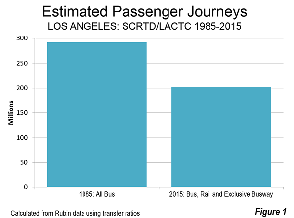
    According to the unlinked trips data reported by the Los Angeles Times, transit ridership on the SCRTD/MTA transit system declined nearly 10 percent from 1985 to 2015, despite the addition of billions of dollars worth of new rail lines. Taking Rubin’s estimate of passenger journeys based on the change in transfer rate (from 1.66 to 2.25 unlinked trips per passenger journey), the drop would be even greater, at a loss of more than 30 percent. Passenger journeys, using these ratios, would have been approximately 290 million in 1985 and 200 million in 2015 (Figure 1).

    Billions for What?
    Rubin has provided important research in his analysis of rail construction costs. Over the past 30 years. Rubin estimates that approximately $16.4 billion dollars (2016$) has been spent to build the routes that are already in service (including the Orange Line busway, but not the Silver Line busway, which he does not include) Elkind implies that this is not enough to see a “true return” on investment.

    With all the huzzahs about the rail system having made transit “the next great mass-transit city,” and the near universal praise for the rail system among the “powers that be” in Los Angeles, the Times is to be commended for courageously revealing the billions that have been spent while millions have abandoned transit, as SCRTD/MTA have placed a priority on expanding the rail services. Rubin also shows that another $9.0 billion is expected to be spent on new lines that will be opened by 2023.

    How Much is a Rail Rider Worth?

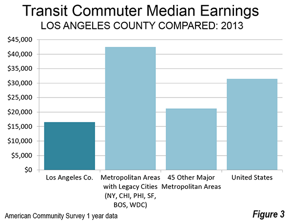
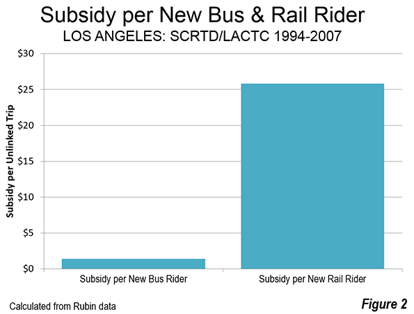
    Rubin was a principal actor in a civil rights lawsuit that forced MTA to reduce its rail spending and increase in spending on buses and lower fares after ridership had fallen about 120 million from its 1985 peak. During the period that the court oversaw MTA, was forced to add more bus service and lower bus pass prices. Rubin shows that during the period of rising ridership, from 1994 to 2007, unlinked trips nearly recovered to the 1985 peak. The ridership increase required a subsidy of $1.40 to add each new bus rider and $25.82 for each new rail rider (Figure 2). This suggests that a new rail rider is valued at nearly 20 times that of a new bus rider. This illustrates that it is far less expensive to increase ridership in Los Angeles with lower bus fares than with rail lines. It is also far more helpful to, Los Angeles transit riders, whose median income is well below that of transit riders nationally, and who need better access to jobs for the higher standard of living they seek (Figure 3).

    What About the Base Year

    Elkind suggests that the Los Angeles Times was unfair in comparing 2015 ridership to the peak year of 1985. Rubin does not accept this argument and for good reason. The principal purpose of the rail system was to increase ridership and any other outcome was, frankly, beyond the pale. The opening of 10 new rail and busway corridors is more than sufficient to have a significant increased ridership, which, as both Rubin and the Times shows, they have not (Note).

    As author of the rail funding amendment to Proposition A in 1980 that provided virtually all of the local funding for the rail system for a decade, these results fall far short of expectations. If I had doubted the ability of a large rail system to significantly increase transit ridership, I would not have offered the amendment (the only other similar amendment offered that day had already been rejected).

    Further, never in my succeeding five years on LACTC including the two years I served on the Rail Transit Committee did I ever hear another member of the Commission or a member of staff imply that there was any possibility that lower ridership could be the result. Had such a view become dominant, the “plug would probably have been pulled,” and the bus system maintained and improved. If so,  transit would be carrying many more people today, while delivering value for taxpayers.

    Photograph: John Ferraro Building, which hosted LACTC board meetings during my tenure. Los Angeles City Council President John Ferraro was the first chair of LACTC.

    Note: Each downtown oriented corridor counts as one (so that, for example, the Gold Line, which enters downtown from two directions is counted as two). Lines that do not reach downtown are counted as one.

    Wendell Cox was appointed to three terms on the Los Angeles County Transportation Commission by Los Angeles Mayor Tom Bradley. The LACTC board consisted of the Mayors of Los Angeles and Long Beach, two smaller city majors, the five county supervisors (county commissioners) and two other appointees of the Mayor of Los Angeles. Mayor Bradley routinely appointed the City Council President to fill one of these two seats as well as a private citizen (Wendell Cox). Wendell Cox chaired the Service Coordination Committee and also served on the Rail Transit and Finance Review Committees.

  • Best Baseball Towns

    Indulge me please as I tried to write my first sports column. No, I have no intention of applying for the job of newgeography.com’s sports editor and others have been far more prolific on this issue. I have been falling out of love with sports for decades now.  

    That does not mean, however, that I ignore the sporting world. I may be withdrawing from spectator sports    but I am interested in statistics they produce. Attendance figures have always intrigued me. It is impressive that more than 100,000 fans routinely fill stadiums in Ann Arbor, Columbus, Tuscaloosa, Baton Rouge, College Station, State College, Austin, and Knoxville.  Even so the largest crowds no longer occur, such as Notre Dame, Navy and USC, which drew the largest college football crows in history, at Chicago’s Soldier Field when its capacity was 165,000 (capacity source: 1929 World Almanac). Baseball’s record was more than 115,000 at a Los Angeles Coliseum exhibition game in 2008, celebrating 50 years since the Dodgers moved from Brooklyn.

    Recently, major league baseball announced its annual attendance figures. Living in St. Louis, a middle-sized market that has usually drawn large market crowds, it struck me that it might be interesting to compare attendance figures to the population in the commuting sheds of the major league markets. By commuting sheds, I mean the combined statistical areas or where they do not exist, the metropolitan statistical areas.

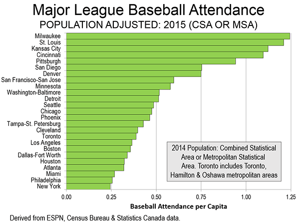
    So I did a simple calculation of the major league attendance in each market compared to the population. The attendance data is readily available on the ESPN website for any wanting a more in-depth look.  Obviously, the market with the highest annual fans per capita would be the best baseball town. I frankly expected that it would be St. Louis. It was not .  The figure below shows the results.

    The Top 5

    The five best baseball towns are all on inland waters, on the Great Lakes and the other four on the Mississippi River and its tributaries. .

    #1: Milwaukee

    Milwaukee, the Great Lakes (Lake Michigan) entry, is number one. In 2015, the Brewers attracted the equivalent of 1.24 trips to the stadium per capita. This may be surprising, because the Brewers are nowhere near the top in terms of their capacity used during games (approximately 75%) or in their average attendance of 31,000, one-third short of the major league baseball leading Los Angeles Dodgers (46,000).

    #2: St. Louis

    The expected leader, river-city St. Louis came in second, attracting 1.21 visits per capita. However St. Louis drew many more people than Milwaukee, with an average crowd of more than 44,000. Even if I had wanted to go to a game (I have been to at least one in three decades), it could have been hard to find a seat. The Cardinals filled 98.8% of their seats in 2015. However, they had to settle for second place on this indicator as well, as the San Francisco Giants were number one with 99.4% of their seats filled each game (The timing of this article is purely coincidental with the announced move of the National Football League Rams from St. Louis to Los Angeles: See Note 1)..

    #3: Kansas City

    The state of Missouri’s other team — also on a river — ranked third. Kansas City drew 1.12 fans per capita in 2015. The Royals had an average crowd of 33,000 and filled a creditable 89% of the stadium on average.

    #4: Cincinnati

    The Cincinnati Reds placed fourth, with an average of 1.09 fans per capita. The Reds, however, had an average crowd of 30,000 and filled only 70% of their seats each game on the banks of the Ohio River.

    #5: Pittsburgh

    Pittsburgh, also a river city, was in fifth place, with 0.94 fans annual per capita. Pittsburgh’s average attendance was 31,000 and did a bit better in filling its capacity, at 80%.

    The Bottom Five

    The average fans per capita falls off dramatically among 2015’s bottom five baseball towns.

    Last: New York

    New York, of course, has two teams, the Yankees in the Mets. The New York fans per capita figure is calculated by adding the attendance figure for its two teams, as is also the case in Los Angeles and Chicago with their two teams. But with a commuting shed of 24 million residents, even filling every seat would not have been enough to grant New York an exit pass from the bottom 5. The Yankees attracted 80% capacity crowds, while the Mets averaged 75%. Overall, New York averaged 0.24 fans per capita, approximately one-fifth that of baseball’s best town in 2015, Milwaukee.

    2nd to Last: Philadelphia

    Philadelphia ranked second to last, with approximately 0.26 fans per capita. Philadelphia average 23,000 per game, which is only 53% of capacity.

    Third to Last: Miami

    Miami was third to last, averaging 0.27 fans per capita, with an average crowd of 22,000, which took up 57% of capacity.

    Fourth to Last: Atlanta

    Atlanta ranked fourth to last, averaging 0.32 trips to the ballpark per capita. The average crowd was 25,000, which represented only 50% of capacity.

    Fifth to Last: Houston

    Houston ranked fifth to last, slightly above Atlanta at 0.32 fans per capita. The Astros drew 27,000 per game and filled 65% of capacity.

    Honorable Mentions and others

    As the figure indicates, attendance per capita falls off significantly after fifth ranking Pittsburgh. San Diego and Denver attract approximately 0.75 fans per capita. The Denver is particularly significant, since the Rockies averaged 55,000 per game in 1993, before moving to their specially built stadium. Last year, the best the Rockies could muster was an average crowd of 31,000, filling only 62% of their capacity. The Rockies holds the record of 4.5 million annual attendees in a season, though the New York Yankees have drawn more than 4 million fans in four years. Their best attendance was 4.3 million.

    The Toronto Blue Jays (Note 2) are another team that drew more than 4 million fans twice in its heyday and averaged 50,000 fans in 1992. Toronto had been the first team to draw more than 4 million fans, in 1991. The New York Mets also drew more than 4 million fans in 2008, the same year the Yankees drew their largest figure.

    As is indicated above, the Los Angeles Dodgers led major league baseball in attendance in 2015. However, just down the road, the Los Angeles Angels— who play in Anaheim (Orange County) —  ranked fifth in total attendance, giving Los Angeles a combined total of 84,000 between the two teams. The New York Yankees and Mets had a total combined attendance of 70,000. The Chicago Cubs and White Sox drew a combined attendance of 58,000.

    Tampa-St. Petersburg put the “if you build it they will come” slogan to the test, in building a domed baseball stadium that opened in 1990. It took major league baseball eight years to come (that is not a record, San Antonio’s Alamo Dome has been waiting for nearly a quarter century for an NFL team). And, at least in 2015, not that many fans came. The Tampa Bay Devil Rays drew the smallest average crowd in the major leagues (15,000) and filled only 45 percent of its seats. Tampa-St. Petersburg did much better in fans per capita, at 0.43, for a ranking of 15th.

    My Career as a Baseball Spectator

    As may be obvious, I have not been to many baseball games. My first game was on a cross-country Trailways bus trip after high school when I spent my only night in New York at Yankee Stadium. But my most memorable game was in 1978, on the night the Dodgers set the then all-time attendance record (at least then) of 3,000,000 fans in a season. I don’t remember who they played or if the Dodgers won.

    Note 1: The off and on again musical chairs game of franchise moves continues with the Cleveland/Los Angeles/St. Louis Rams, which have now become the Cleveland/Los Angeles/St. Louis/Los Angeles Rams. Soon perhaps the Los Angeles/San Diego Chargers will become the Los Angeles/San Diego/Los Angeles Chargers or perhaps the Oakland/Los Angeles/Oakland Raiders will become the Oakland/Los Angeles/Oakland/Los Angeles Raiders?

    Note 2: The Toronto commuting shed includes the Toronto, Hamilton and Oshawa metropolitan areas, which Statistics Canada has indicated would be the combined statistical area if they were to designate one.

    Wendell Cox is Chair, Housing Affordability and Municipal Policy for the Frontier Centre for Public Policy (Canada), is a Senior Fellow of the Center for Opportunity Urbanism (US), a member of the Board of Advisors of the Center for Demographics and Policy at Chapman University (California) and principal of Demographia, an international public policy and demographics firm. He is co-author of the “Demographia International Housing Affordability Survey” and author of “Demographia World Urban Areas” and “War on the Dream: How Anti-Sprawl Policy Threatens the Quality of Life.” He was appointed to three terms on the Los Angeles County Transportation Commission, where he served with the leading city and county leadership as the only non-elected member. He served as a visiting professor at the Conservatoire National des Arts et Metiers, a national university in Paris.

    Photo:  Best Baseball Town: Milwaukee (2015)

    by Greg Hume (Own work) [CC BY-SA 3.0], via Wikimedia Commons

  • This Is Why You Can’t Afford a House

    The rising cost of housing is one of the greatest burdens on the American middle class. So why hasn’t it become a key issue in the presidential primaries?

    There’s little argument that inequality, and the depressed prospects for the middle class, will be a dominant issue this year’s election. Yet the most powerful force shaping this reality—the rising cost of housing—has barely emerged as political issue.

    As demonstrated in a recent report (PDF) from Chapman University’s Center for Demographics and Policy, housing now takes the largest share of family costs, while expenditures on food, apparel, and transportation have dropped or stayed about the same. In 2015, the rise in housing costs essentially swallowed savings gains made elsewhere, notably, savings on the cost of energy. The real estate consultancy Zillow predicts housing inflation will only worsen this year.

    Driven in part by potential buyers being forced into the apartment market, rents have risen to a point that they now compose the largest share of income in modern U.S. history. Since 1990, renters’ income has been stagnant, while inflation-adjusted rents have soared 14.7 percent. Given the large shortfall in housing production—down not only since the 2007 recession but also by almost a quarter between 2011 and 2015—the trend toward ever higher prices and greater levels of unaffordability seems all but inevitable.

    The connection between growing inequality and rising property prices is fairly direct. Thomas Piketty, the French economist, recently described the extent to which inequality in 20 nations has ramped up in recent decades, erasing the hard-earned progress of previous years in the earlier part of the 20th century. After examining Piketty’s groundbreaking research, Matthew Rognlie of MIT concluded (PDF) that much of the observed inequality is from redistribution of housing wealth away from the middle class.

    Rognlie concluded that much of this was due to land regulation, and suggested the need to expand the housing supply and reexamine the land-use regulation that he associates with the loss of middle-class wealth. Yet in much of the country, housing has become so expensive as to cap upward mobility, forcing many people to give up on buying a house and driving many—particularly young families—to leave high-priced coastal regions for less expensive, usually less regulated markets in the country’s interior.

    The Rise of the Exclusionary Region

    The regions with the deepest declines in housing affordability, notes William Fischel, an economist at Dartmouth College, tend to employ stringent land-use regulations, a notion recently seconded by Jason Furman, chairman of President Obama’s Council of Economic Advisors. In 1970, for example, housing costs adjusted for income were similar in coastal California and the rest of the country. Today house prices in places like San Francisco and Los Angeles are three or more times higher, when adjusted for income, than most other metropolitan areas. For most new buyers, such areas are becoming what Fischel calls “exclusionary regions” for all but the most well-heeled new buyers.

    The biggest impact from regulation has been to diminish the supply of housing, particularly single-family homes. In a recent examination of permits across the nation from 2011 to 2014 for Forbes, we found that California regions lag well behind the national average in terms of new housing production, both multi-family and single family. Houston and Dallas-Fort Worth, areas with less draconian regulations, have issued three times as many permits per capita last year. Overall California’s rate of new permits is 2.2 per 1000 while across the Lone Star state the rate was nearly three times higher.

    In the “exclusionary regions” along both coasts, high land prices have made it all but impossible to build much of anything except luxury units. In Manhattan this has taken the form of high-rise towers that have been gobbled by the rich, including many foreigners, but this new construction has done little to make New York affordable for most residents. Between 2010 and 2015, Gotham rents increased 50 percent, while incomes for renters between ages 25 and 44 grew by just 8 percent.

    Making of Two Americas

    Real estate inflation is redefining American politics and could eventually transform the nature of our society. In the dense, increasingly “kiddie-free zones” around our Central Business Districts (CBDs), according to 2011 Census figures, children between ages 5 and 14 constituted about 7 percent of the population, less than half the level seen in newer suburbs and exurbs. The common habitués of these high-cost, high-density urban areas—singles and childless couples—have emerged, according to Democratic pollster Stan Greenberg, as key elements of the progressive coalition.

    The bluer the city, generally, the fewer the children. For example, the highest percentage of U.S. women over age 40 without children—a remarkable 70 percent—can be found in Washington, D.C. In Manhattan, singles make up half of all households. In some central neighborhoods of major metropolitan areas such as New York, San Francisco, and Seattle, less than 10 percent of the population is made up of children under 18.Perhaps the ultimate primary example of the new child-free city is San Francisco, home now to 80,000 more dogs than children, and where the percentage of children has dropped 40 percent since 1970.

    In contrast, familial America clusters largely in newer suburbs and exurbs, and increasingly in the lower-cost cities in the South, the Intermountain West, and especially in Texas. Overall—and contrary to the bold predictions of many urbanists—suburban areas are once again, after a brief slowdown, growing faster than the urban cores.

    America remains a suburban nation. Overall, 44 million Americans live in the core cities of America’s 51 major metropolitan areas, while nearly 122 million Americans live in the suburbs. And this does not include the more than half of the core city population that live in districts, particularly in the Sunbelt, that are functionally suburban or exurban, with low density and high automobile use.

    The Geography of Inequality

    Inequality may be a big issue among urban pundits, but, ironically, inequality is consistently more pronounced in larger, denser cities, including New York, Los Angeles, and San Francisco. Manhattan, the densest and most influential urban environment in North America, exhibits the most profound level of inequality and the most bifurcated class structure in the U.S. If it were a country, New York City overall would have the 15th-highest inequality level of 134 countries, according to James Parrott of the Fiscal Policy Institute, landing between Chile and Honduras.

    In our core cities in particular, we are seeing something reminiscent of the Victorian era, when a huge proportion of workers labored in the servile class. Social historian Pamela Cox has explained that in 1901 one in four people, mostly women, were domestic servants. But is this—the world portrayed in shows such as Downton Abbey and Upstairs Downstairs—the social norm we wish most to promote?

    In contrast, research by the University of Washington’s Richard Morrill shows that suburban areas tend to have “generally less inequality” than the denser areas. For example, in California, Riverside-San Bernardino is far less unequal than Los Angeles, and Sacramento less so than San Francisco. Within the 51 metropolitan areas with more than 1 million in population, notes demographer Wendell Cox, suburban areas were less unequal (measured by the Gini coefficient) than the core cities in 46 cases. And overall the poverty rate for cities is close to 20 percent, almost twice that of suburban areas.

    The differential of housing cost accounts for much of this disparity. High housing prices tend to stunt upward mobility, particularly for minorities. One reason: The house remains the last great asset of the middle class. Homes represent only 9.4 percent of the wealth of the top 1 percent, but 30 percent for those in the upper 20 percent and, for the 60 percent of the population in the middle, roughly 60 percent. The decline in property ownership threatens to turn much of the middle class into a class of rental serfs, effectively wiping out the social gains of the past half-century.

    The Geographic Shift

    High housing prices are also rapidly remaking America’s regional geography. Even areas with strong economies but ultra-high prices are not attracting new domestic migrants. One reason is soaring rents: According to Zillow, for workers between 22 and 34, rent costs claim upwards of 45 percent of income in Los Angeles, San Francisco, New York, and Miami compared to less than 30 percent of income in cities like Dallas and Houston. The costs of purchasing a house are even more lopsided: In Los Angeles and the Bay Area, a monthly mortgage takes, on average, close to 40 percent of income, compared to 15 percent nationally.

    This is leading to a renewed shift even among educated millennials to such lower-cost regions as Atlanta, Orlando, New Orleans, Houston, Dallas-Fort Worth, Pittsburgh, Columbus, and even Cleveland. As millennials enter their 30s and seek to buy houses, these changes are likely to accelerate.

    Millennials may be staying in the city longer than previous generations, but their long-term aspirations remain fixed on buying a single-family house. This trend will accelerate in the next few years, suggests economist Jed Kolko, as the peak of the millennial population turns 30. Faced with a huge student debt load, a weaker job market, and often high housing prices, millennials face tougher challenges than some previous generations, but retain remarkably similar aspirations.

    Bringing Back Levittown

    Clearly America needs a new approach to housing. Democrats may enjoy their strongest base in the cities, but many of their young constituents likely will end up in the suburbs, or will continue to move to smaller, less reflexively progressive cities. Finding ways to make suburbs more sustainable, both environmentally and for families, will have more long-term appeal than trying to eliminate their preferred way of life.

    Some attempts to force developers to build low-income units have, if anything, worsened the situation by discouraging new production while actually boosting prices for the vast majority. In some cases, as in New York City, the forced construction of low-income units in otherwise market-rate buildings has resulted in such absurdities as the so-called “poor door,” through which low-income residents, who are denied most of the amenities offered to wealthier residents, must enter.

    Republicans too may need to change their tune. As suburbs become more multi-cultural, and dominated by millennials, the GOP will have to embrace some of the environmental and social priorities of the new residents. They also have to realize that middle-class homeowners do not always share the same interests as Wall Street investors. Under the current regulatory regime, slavish adherence to the ambitions of big investors could undermine the dispersed ownership culture, replacing it with one primarily rental-based, even in single-family homes. Essentially this could transform large areas, including suburbs, into far less socially stable areas, particularly for families.

    One potential solution would be to draw on the successful policies enacted after World War II. At that time, the nation suffered a severe housing crisis as servicemen returned from the war. The solution combined governmental activism—through such things as the GI Bill and mortgage interest deductions—with less regulatory control over development. The result was a massive expansion of the country’s housing stock, and a dramatic increase in the level of homeownership.

    Bringing back the Levittown approach would require jettisoning ideological baggage that now accompanies the contemporary discussion about housing. Libertarians tend to favor loosened regulations—something welcome indeed—but seem to have less than passionate interest in addressing the housing interests of working- and middle-class Americans. As we saw in the late ’40s, at least some government support for affordable housing is critical to expanding ownership.

    But increasingly the worst influence on housing stems from the proclivities of contemporary progressivism. Whereas earlier Democratic presidents, from Roosevelt and Truman to Johnson and Clinton, strongly supported suburban single-family growth, contemporary progressives display an almost cultish bias toward the very dense, urban environment. The fact that perhaps at most 10 to 20 percent of Americans prefer this option almost guarantees that this approach would be unacceptable to the vast majority.

    How we deal with the housing crisis will shape our future, and will largely determine what kind of nation we will become. Although some developers outside the coastal areas are trying to revive smaller “starter homes,” at least in more reasonably priced markets, this may prove all but impossible to accomplish in “exclusionary regions” unless there is serious change.

    Following our current path, we can expect our society—particularly in deep blue states—to move ever more toward a kind of feudalism where only a few own property while everyone else devolves into rent serfs. The middle class will have little chance to acquire any assets for their retirement and increasingly few will choose to have children. Imagine, then, a high-tech Middle Ages with vast chasms between the upper classes and the poor, with growing dependence—even among what once would have been middle-class households—on handouts to pay rent. Imagine too, over time, Japanese-style depopulation and an ever more rapidly aging society.

    Yet none of this is necessary. This is not a small country with limited land and meager prospects. A bold new approach to housing, including the reform of out of control regulations, could restore the fading American dream for tens of millions of families. It would provide the basis for a greater spread of assets and perhaps a less divided—and less angry—country. Rather than waste their time on symbolic issues or serving their financial overlords, candidates in both parties need to address policies that are now undermining the very basis of middle-class democracy.

    This piece originally appeared at The Daily Beast.

    Joel Kotkin is executive editor of NewGeography.com. He is the Roger Hobbs Distinguished Fellow in Urban Studies at Chapman University and executive director of the Houston-based Center for Opportunity Urbanism. His newest book, The Human City: Urbanism for the rest of us, will be published in April by Agate. He is also author of The New Class Conflict, The City: A Global History,
    and The Next Hundred Million: America in 2050. He lives in Orange County, CA.

    Photo by cinderellasg.

  • Chicago Is Winning the Battle for the Executive Headquarters

    The corporate headquarters used to be the primary measure of a city’s economic clout. Saskia Sassen, while not ignoring headquarters, documented how in the age of globalization, the resurgence of the global city was driven by demand for financial and producer services, not more and bigger HQs. As she pointed out in her seminal book The Global City, “Major cities such as London, New York, and Chicago have been losing top ranked headquarters for at least three decades.” Yet despite this they were coming back strong.

    Back in 2008, I started observing a shift in the marketplace in which corporate HQs were relocating back to the city. But this wasn’t a traditional monolithic HQ, but rather a reconstituted, smaller version consisting of only the most senior people that I call the “executive headquarters.”

    Crain’s Chicago Business has a major feature this week investigating the executive headquarters trend as it is playing out there. They point out that these HQs make for great headlines, but they don’t necessarily result in that many jobs.

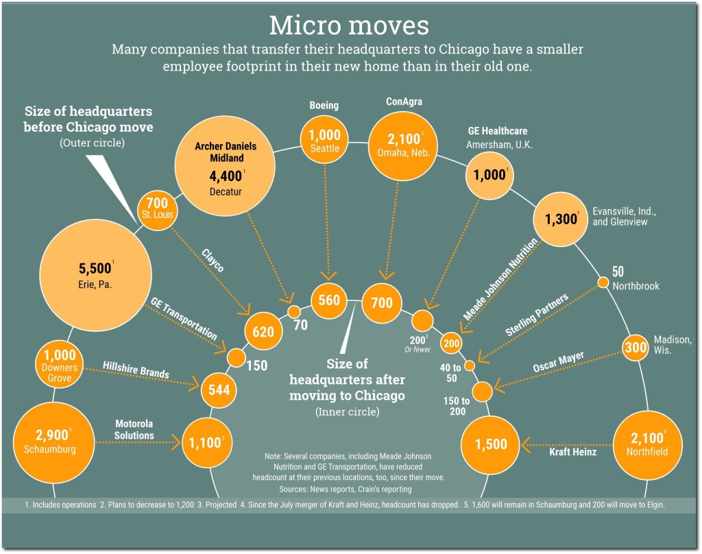
    ADM is Exhibit A in the rise of a new type of corporate headquarters, one that arrives from afar but packs light. These headquarters represent the pinnacle of the corporate pyramid, snapped off and relocated, free of jobs tied to operations and often midlevel HQ functions such as payroll, human resources or purchasing. To be sure, migrating headquarters offer benefits to the city: They boost demand for business services, their executives join the philanthropic scene and, of course, they confer bragging rights. But in terms of jobs, the farther a company travels to set up shop in Chicago, the fewer people come with it.

    “The notion of the corporate headquarters in the ‘Mad Men’ world when there were hundreds or thousands of people in a building with the company logo . . . those days are gone,” says David Collis, a professor at Harvard Business School who studies corporate headquarters.

    Click through to read the whole thing, which features me and my work on the topic. This is an important trend to grapple with.

    The bad news, which the Crain’s piece highlights, is that the headquarters ain’t what it used to be. On the other hand, Chicago is winning the battle for them.  These smaller executive headquarters, particularly for major global businesses, benefit from being in a global city. Chicago has lured a number of these from out of town. In line with Sassen’s findings that the “deep economic history of a place” matters, note that we see a lot of agro-industrial firms choosing Chicago: ADM, Con Agra, Mead Johnson Nutrionals, Oscar Mayer.  This industry space is where Chicago has a major advantage over New York and other coastal cities.

    A trend I see playing out, and which I am currently researching in more detail, is the bifurcation of HQ attraction. For executive headquarters of global firms, and for companies that are looking for an urban location, Chicago is reasserting its dominance as the interior business capital. But for those who prefer a suburban environment, or which maintain a mass employment HQ, the Sunbelt remains strong, especially Dallas, where Toyota is a building its North American campus. Dallas replicates many of Chicago’s non-urban advantages at lower cost and with a more suburban feel: central location and time zone, a major airport, a diverse economy, and scale. Increasingly it looks like Chicago is the urban interior capital, Dallas the suburban interior one. Stay tuned for more on this in the future.

    Aaron M. Renn is a senior fellow at the Manhattan Institute and a Contributing Editor at City Journal. He writes at The Urbanophile, where this piece originally appeared.

    Chicago photo by Bigstock.

  • Live from Honolulu: HART Rail, a Megaproject Failure in the Making

    Typically very few people pay attention to the goings on in the small state of Hawaii. How bad can possibly things get there? Well, a lot of people recall Boston’s Big Dig, the nation’s largest infrastructure fiasco with a final price tag of about $15 billion. What if I tell you that tiny Honolulu is building a rail system that’s expected to cost at least one-half the cost of the Big Dig? On a per-capita basis it would be the nation’s largest infrastructure fiasco by far.

    Honolulu rail, managed by Honolulu Area Rapid Transit (HART), is a 1970s style 20 mile, all-elevated heavy-rail guideway with third rail power delivery and light rail-sized cars limited to about 650 passengers per two-car combination; it has an ability to run only up to four cars for peak period service. It is the worst design possible because it combines an intrusive and expensive infrastructure including 21 elevated stations, and a low passenger carrying capacity with over 60% of it as standing passengers.

    Despite the preponderance of evidence that Honolulu’s rail will do little to mitigate the severe congestion on the island of Oahu, the project did garner marginal (50.6%) public support on a 2008 referendum. Despite a couple major lawsuits, it completed the Federal Full Funding Grant Agreement process in 2012.  Local political preference (e.g., why build a $1 Billion taxpayer project when you can get away with a $5 Billion project? … also known as “the gravy train”) stands among the major causes of this megaproject failure in progress.

    What’s a megaproject failure? An infrastructure project that exhibits at least two out of three bad outcomes: 1) Large cost overruns, 2) Long project delivery delays, and 3) Much lower usage than forecast.  Well known megaproject failures include the Chunnel Tunnel/Eurotunnel that suffered all three failures, and Boston’s Big Dig that suffered failures 1 and 2 in a big way. Tren Urbano in San Juan, Puerto Rico is a peer project that HART rail will likely match in failure-to-meet-targets. Tren Urbano’s actual construction cost was 80% over the planned estimate, and its ridership has been only one quarter of what was projected! HART rail and Tren Urbano were planned by the same consultant (PB) and had the same oversight (FTA.)

    At the end of 2015, five miles of the HART guideway, and the rail yard appear to be substantially complete. HART, the voter approved “independent authority” that runs the project with many of its budget strings controlled by the city council, claimed a 25% project completion in December 2015, although 15% is a more realistic estimate based on what has been physically constructed so far. Several segments and columns have suffered large cracks, concrete delamination and segment misalignment [1], and safety lapses were alleged at the Ansaldo rail yard [2]. In less than two years, the guideway construction company (Kiewit) submitted 40 work change orders and recently demanded a $20 million price adjustment. But this is nothing compared to the total escalation of cost figures.

    First, let’s review some highlights of the project’s development between 2004 and 2015.

    • 2004: Newly elected mayor Hannemann asserts that 34 miles of rail will cost $2.7 Billion.
    • Mid-2006: Hannemann switches to the Minimum Operating Segment: 20 miles will cost about $3 B.
    • Late-2006: Alternatives Analysis sets the cost at $4.6 B (this figure and all figures below include FTA-mandated contingency funds).
    • Spring 2008: Hawaii legislature approves a 0.5% tack-on to Hawaii’s GET tax that applies to every transaction. Against expectations, Republican Governor Linda Lingle opted to save her political career and let the tax stand without a veto. The rail tax is expected to generate about $2 B. The gravy train has thus been established.
    • Summer 2008: Mayor Hannemann up for reelection gives a helicopter ride to Senator Oberstar who then says that the Feds will give Honolulu $900 M. Hannemann declares that “the train has left the station.”
    • 2009: President pro tempore Senator Inouye of Hawaii joins the rail party. FTA is strong-armed to pay $1.55 B.
    • 2010: The cost is up to $5.4 Billion not counting the error of locating an insufficient distance from an airport runway. A $150 M realignment is necessary to reroute the guideway one block over.
    • 2010: Outgoing Governor Linda Lingle releases an independent financial analysis of the project by IMG and Thomas Rubin which concluded that construction cost will likely be more than the $5.4 B projection, ridership projections were both very high and would require passenger loads significantly higher than that of any U.S. transit operator, future rail renewal and replacement costs were ignored, operating subsidies were significantly understated, and many projected revenues were significantly overstated.  Mayor Carlisle dismissed the report as “a product of rail opponents.”
    • 2011: Mayor Carlisle performs a “ceremonial groundbreaking” but only utility relocation occurs afterwards. The project still aims for a 2019 completion.
    • 2012: Both a National Environmental Policy Act (NEPA) and a Hawaiian burial ground desecration lawsuit are filed, the former in federal court the latter in state court. Only the second lawsuit causes minor construction restrictions in areas where archeological surveys had not been done.
    • 2012: Construction accelerates at the casting yard and the first piers appear in the middle of prime agricultural land. The first four miles of the project are on agricultural land. Carlisle loses in the primary. Two Democrats, Kirk Caldwell (pro rail) wins the mayor race over past governor Ben Cayetano (anti rail.) Although some frame it as another victory for the rail project, Cayetano’s battles with unions during his eight years in the governor’s office were a major cause of his loss.
    • Mid-2014: 9th Circuit court appeal ends unsuccessfully for the plaintiffs of a NEPA-based suit.
    • December 2014: HART reveals a $910 projected deficit and asks for more tax monies.
    • December 2015: HART proposes to open 10 miles of service in 2018.

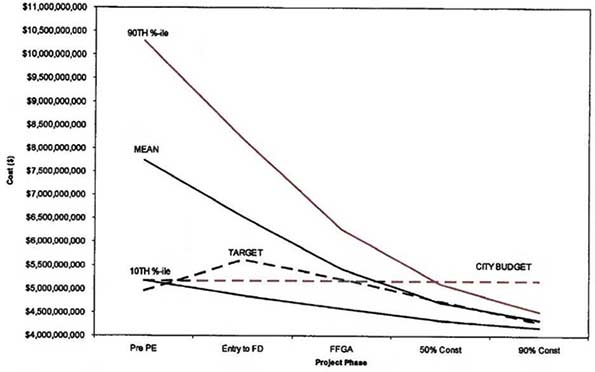
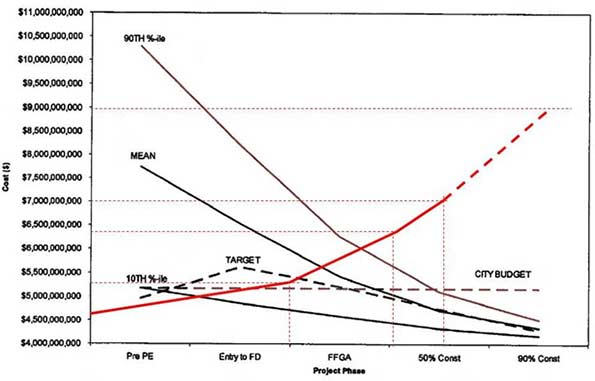
    One of the flaws in megaproject development is strategic misrepresentation, or cleverly worded lying to the public and decision makers such as the HART board members and the Honolulu city council members, none of whom have any expertise in large infrastructure projects and rail in particular. Project advocates such as the FTA turned a blind eye to facts and in 2009 they presented to the people of Hawaii Figure 1, a gem of strategic misrepresentation [4] which simply fit the political line that the proposed 20-mile rail will cost $4.6 billion as applicable during the 2008 rail referendum.  Notice that the FTA cost development in Figure 1, line labeled MEAN, goes against decades of real world evidence of a project’s cost escalation as it moves from planning to construction (e.g., Dr. Bent Flybjerg’s summaries of infrastructure megaprojects [3]). This FTA-sponsored report contains one point of truth: There is a 10% chance that HART rail will cost about $10 B.


    Figure 1. HART expected cost over time.

    One would think that only three years into construction, with only about 15% of the project completed and only about half of the project gone to bid, HART would be sitting comfortably on a pile of money generated by a general excise tax surcharge being collected since 2007 (about $140 M per year) plus $1.55 B from the full funding grant agreement. Nothing could be further from the truth. In late 2014 HART announced a $910 M expected shortfall and successfully lobbied the Hawaii legislature to extend the 0.5% surcharge from end of 2022 to end of 2027.

    In another move of strategic misrepresentation, rail planners pretended that the rail is like an electric car, e.g., one buys an EV, then goes homes and plugs it in. Likewise, HART builds rail, which plugs into the city grid for free.  However, rail’s 30 MW to 50 MW power draw is a major requirement. The utility’s reaction was unpleasant for HART [5] which is now negotiating another expensive arrangement. The combined cost of substations, power generation and the (still in limbo) airport utility relocation tasks are likely to cost about $500 M bringing the known total to approximately $7 B with none of the 21 stations constructed nor the second half of the project gone to bid.

    HART rail’s cost development is plotted in Figure 2. The second half of the project includes the challenging construction through urban Honolulu which is one of the densest US cities. There are now peripheral discussions to terminate the project at a large transit bus and handicapped van terminal at Middle Street, which is approximately at the 16th mile of the rail route. This is a welcome possibility because Honolulu will be spared of the heavy construction and debilitating lane and road closures at its downtown and near Waikiki which will be deleterious to general economic activity and tourism.


    Figure 2. Actual and expected cost plot.

    As the project cost creeps above $7 B (for a city of just one million people), with an expected payoff of about 1% in congestion reduction [6], and the dramatic re-arrangement of TheBus as a feeder to the rail [7], one can begin to outline some of the major consequences such as:

    • Minimal ridership like Tren Urbano in San Juan, PR. Furthermore, San Juan’s average income and auto ownership are much lower to those of Honolulu (i.e., Honolulu has far fewer transit dependent commuters than San Juan.)
    • Destruction of prime agricultural land on Oahu. After years in legal battles, the state Supreme Court approved B.R. Horton’s proposed 12,000 suburban Ho’opili development which includes two rail stations. Although HART makes a big deal out of Transit Oriented Development, Horton’s own EIS reveals that each station will generate the equivalent of only two busloads of passengers for the rail in the peak hour. This approval is proof that development that does not pass traffic congestion standards simply gets … a rail pass.
    • The huge opportunity cost. With $7 B and counting, Honolulu could have actually reduced traffic congestion by more than 25% and reduced its dependency on oil by over 40%. Honolulu burns oil to produce electric power and as a result its electricity cost is 300% above US average. Instead of switching power generation and fleet fueling to natural gas, island policies emphasize oil-generated electric cars and electric trains!

    Finally, looking at the bigger picture for Honolulu which includes a $5 B consent decree with the EPA for secondary sewer treatment, increasing dependency on imports, including 90% of food, with prices escalated by the Jones Act requirements, and the nation’s fifth worst unfunded pension liability according to The Economist [8], the future is worrisome: At best Honolulu will experience large increases in taxes and congestion, at worst those plus bankruptcy.  One thing is certain.  This textbook megaproject failure orchestrated by business interests and unions, supported by misguided environmentalism and enabled by enterprising politicians got Honolulu railroaded [9].

    Panos D. Prevedouros is Professor and Chair, Department of Civil and Environmental Engineering, University of Hawaii at Manoa.

    Photo by super-structure (Jason Coleman), “Honolulu Murals”.

    REFERENCES AND CLARIFICATIONS
    [1] HawaiiNewsNow, Large Cracks Develop along Rail Line, http://www.hawaiinewsnow.com/story/28827333/large-cracks-develop-along-rail-line, 2015.
    [2] HawaiiNewsNow, Rail Whistleblower Suit Filed, http://www.hawaiinewsnow.com/story/30203942/exclusive-rail-whistleblower-suit-filed, 2015.
    [3] Bent Flyvbjerg, et al. Delusion and Deception in Large Infrastructure Projects: Two Models for Explaining and Preventing Executive Disaster, California Management Review Vol. 51, No. 2 Winter 2009.
    [4] FTA, Project Management Oversight Program, Honolulu High-Capacity Transit Corridor Project, July 2009 (Final)
    [5] KHON2, Tension Escalates over Rail’s Power Supply and Who Will Pay for It, http://khon2.com/2015/11/11/tension-escalates-over-rails-power-supply-and-who-will-pay-for-it-2/, 2015.
    [6] Past mayors and HART have been eager to misuse the EIS statistic that rail is projected to remove 40,000 cars from the streets.  The actual statistic says that rail may reduce car trips by 40,000. Total car trips on Oahu when rail is completed are projected to be four million.  HART rail may provide a 1% reduction.
    [7] TheBus is one of America’s best bus transit systems and has a 6% commuting trip share in Honolulu. Many of its routes will be eliminated or terminated at HART stations. According to the EIS, the subject routes are: B, C, E, 3, 9, 11, 20, 43, 53, 73, 81, 90, 91, 92, 93, 94, 96, 97, 98A, 101, 102, 103, 201 and 202 many of them are popular peak hour express routes.
    [8] The Economist, Pensioners Are Pushing Many Cities and States towards Financial Crisis, http://www.economist.com/news/united-states/21582282-pensioners-are-pushing-many-cities-and-states-towards-financial-crisis-who-pays-bill, 2013.
    [9] Randy T. Simmons, et al., Bootleggers, Baptists, and Political Entrepreneurs: Key Players in the Rational Game and Morality Play of Regulatory Politics, The Independent Review, v. 15, n. 3, Winter 2011.

  • Cleveland Renaissance Fair

    So much talk of the Cleveland comeback with our downtown building boom and Republican National Convention-fueled makeover makes it difficult not to think about our mid-1990s civic renaissance. In 1995, The New York Times headline proclaimed ” ‘Mistake by the Lake’ Wakes Up, Roaring” as downtown’s stadiums and lakefront development created a “new face and new style of a city that for a long time had little panache.”

    But it wasn’t just the media who became enchanted with our freshly minted charms — even the scholars were feeling it. The academics, however, had a Lake Erie-sized caveat. There was a divide in the region’s comeback, noted the authors of the 1997 study “The Rise and Fall and Rise of Cleveland,” with areas separated by characteristics of “capital investment and disinvestment, industrialization and deindustrialization, suburbanization and ghettoization, white flight and a black underclass, the growth of services, and a [high-skill and low-skill] dual economy.”

    Prophetic then, those words serve as a warning now. The paradox of Cleveland’s comeback, if not an urban American comeback, is that the more a city returns, the greater the number who get left behind.

    Rob English splits his time between Baltimore and Cleveland. He has been doing so for nearly three years.

    A former Army infantryman, he serves as supervising organizer for the Greater Cleveland Congregations, a network of local faith and community-based organizations working for social justice. His experience in Baltimore since 1997 gives him a different perspective on his work in Cleveland today. “You have to meet people where they’re at, listen to them, and find ways to act in their mutual interest,” he says.

    English marched with the Cleveland group in late May after the Michael Brelo trial verdict to demand comprehensive criminal justice reform. As the demonstrators from about 40 religious congregations walked arm-in-arm along downtown streets to City Hall and the Justice Center, it was peaceful — unlike what happened in Baltimore a month earlier. There, the death of 25-year-old Freddie Gray in police custody prompted violent social unrest.

    “Baltimore is about seven to 10 years ahead of Cleveland,” says English.

    Odd as it sounds, what English means is that Baltimore’s economic resurgence has been longer in the making — and that may be a good thing for Cleveland.

    Baltimore’s signature project, the cleanup and rehabilitation of Baltimore’s Inner Harbor with its world-class aquarium and science center, began in the 1980s. Oriole Park at Camden Yards, an architectural model for Progressive Field, opened in 1992.

    With the beautification came a change in the city’s demographics. Today, nearly 27 percent of Baltimore residents have college degrees, compared to 16 percent in Cleveland. Baltimore’s median income ($41,385) is $15,000 higher than here. Cleveland’s poverty rate sits at 35 percent, 12 percentage points more than Baltimore.

    But the benefits in Charm City are not evenly distributed. White city residents earn nearly double that of black city residents. Baltimore also had the ninth worst wage disparity between high- and low-income workers in the nation, according to the Martin Prosperity Institute. So, while the physical redevelopment is apparent in the eyes of all Baltimoreans, the effect is uneven in their temperaments.

    English, 46, recalls a talk he had with an African-American woman from East Baltimore several years back. She could see the Inner Harbor off in the distance from her neighborhood.

    “Let me tell you about my anger,” she told him. “Every morning when I wake up and take the kids to the bus stop, every morning I look down and see the harbor, and every morning I get angrier.”

    Her experience is more than an isolated one, says English. In Baltimore, people saw aspects of the city improve year after year. Yet so many weren’t a part of it. Eventually tensions built, and the Freddie Gray incident ignited it.

    “Now, Cleveland is beginning a renaissance,” English says. “But there is room to come together so you’re not two cities.”

    ——–

    Thomas P.M. Barnett’s book The Pentagon’s New Map is more than a decade old. But its message is no less relevant.

    “Disconnectedness defines danger,” he argues.

    For the expert geostrategist, the world is split between two types of geographies: the Core, where “globalization is thick with network connectivity, financial transactions, liberal media flows, and collective security,” and the Gap, or areas disconnected from globalization and defined by poverty, low education rates and “the chronic conflicts that incubate the next generation” of instability.

    “We ignore the Gap’s existence at our own peril,” concludes Barnett.

    It is a useful model in understanding what’s occurring in Northeast Ohio.

    Consider that, according to a Brookings Institution study, Cleveland and Seattle led the nation with the biggest percentage increases in high-income households from 2012 to 2013. Yet, research from Rutgers University revealed Cleveland also has one of the largest increases in neighborhoods with concentrated poverty since 2000.

    This division is further evident when mapping the concentration of Northeast Ohio residents with college degrees. Higher educated areas are centered in downtown, Ohio City, Tremont, Detroit Shoreway and AsiaTown, which have each seen double-digit percentage increases in residents with college degrees since 2000, as well as along the lakeshore, near University Circle and in various suburban and exurban clusters. Meanwhile less educated areas are grouped in the city of Cleveland outside the urban core and in the rural exurbs.

    Simply, areas of Cleveland that are revitalizing are part of the globalizing Core. The isolate neighborhoods, or those experiencing higher levels of violence and poverty, comprise the Gap.

    In fact, for a number of quality of life indicators, outcomes in various East Side neighborhoods are below that of developing nations. A recent PolitiFact article showed that infant mortality rates were worse in select East Cleveland neighborhoods than in North Korea, Uzbekistan, Zimbabwe and the Gaza Strip.

    According to data by Case Western Reserve University, homicide rates for sections of the city are similarly comparable. In 2010, homicide rates in Ward 1, comprising parts of the southeast side, and Ward 9, which entails Glenville, are similar to Guatemala and El Salvador.

    What’s happening here is not unlike cities such as Chicago, Baltimore, Miami and Brooklyn, New York, where the spatial patterns of having and not having mean poverty gets pushed together, not alleviated. When cities evolve as separate and unequal, they create a deepening sense of alienation and marginalization.

    “The economic and social frustration could be expressed in more recourse to violence,” says Mark Joseph, director of the National Initiative on Mixed-Income Communities at Case Western Reserve University.

    Revitalizing neighborhoods have more “eyes on the street,” says Joseph, who examined the effect in the Second City while at the University of Chicago. And more vigilant policing can “push gangs into more constrained areas of the city and into more conflict with each other.”

    In the first nine months of 2015, for example, there was a 40 percent increase in gun homicides compared to 2014.

    “As we are seeing in our city, innocent bystanders suffer the consequences as well as those directly targeted,” Joseph says.

    In a span of a month, a 5-year-old, a 3-year-old and a 5-month-old were all victims of drive by shootings from gang violence that has boiled over in various East Side neighborhoods.

    After the youngest, Aavielle Wakefield, was killed, Cleveland police chief Calvin Williams stood at the crime scene on East 143rd Street in Cleveland’s Mount Pleasant neighborhood. It was night. The street was lit by the television crews. With Mayor Frank Jackson by his side, the chief demurred about the senseless tit for tat, the need to catch the perpetrators.

    Suddenly, his face went from firm to fragile. “To the family … it’s tough … it’s tough,” he said in tears. “This should not be happening to our city. And we got to do something about it.”

    ——–

    “I have looked into the eyes of children soldiers overseas,” says English, who served a platoon leader stationed in Somalia. “I see the same look in Cleveland and Baltimore. That is what decades of disinvestment has created in our urban areas. It’s got to stop.”

    Click to Enlarge

    English was in Baltimore in April when the riots erupted about 20 miles away from the harbor. The city was on needles. English and a few co-workers received alerts about young people near Mondawmin Mall turning violent.

    The message was to go where the rioting was occurring, with the intent to stem the unrest.

    When English arrived, a CVS was being looted and burned. As a community organizer, English attempted to do what organizers do: connect to the disconnected. But he wasn’t succeeding.

    “I looked at the young people in the eyes,” he recalls. “I lost my soul. I couldn’t connect with them.”

    Anthony Body, a 29-year-old Glenville resident and member of the Cleveland Community Police Commission, sees similarities here.

    “There is a sense of hopelessness,” he says.

    Isolation fuels the cycle of disenfranchisement. Without exposure to positive outcomes, there can only be so much progress. Body says due to the lack of role models in his neighborhood people were influenced by the lifestyle of rappers, drug dealers and the garbage man.

    “There is nothing wrong with being a garbage man,” he says. “But in order to choose Option B, you had to be exposed to Option B.”

    The realities of his neighborhood have taken a personal toll. Body has lost at least one family member or friend to violence every year since 2006.

    “All the trauma. The trauma of no job, the trauma of violence — the lack of family or social support — the schools,” he says, “it all drags on you when you try to better your life, so that when difficulty hits, you just go back to what you know.”

    No doubt, the persistence of violence is not just a Cleveland problem, but a national one. Homicides are up sharply in Washington, D.C., Milwaukee, St. Louis and Baltimore.

    On a mid-October trip to Ohio, FBI director James B. Comey wondered aloud: After years of declining violent crime in cities, why the uptick? “I’m not here announcing any big initiative or program,” Comey said, “but we have a lot of smart people who we brought on board after 9/11 who may be able to help look at the issue differently.”

    Cheap heroin from Mexico and the turf battles to supply what has become a nationwide heroin epidemic was one likely scenario, he offered.

    “What we’re in the midst of is a drug war,” says Hough resident and writer Mansfield Frazier, who likens today’s violence to the St. Valentine’s Day Massacre that left seven men dead in Prohibition-era Chicago.

    For Khrystalynn Shefton, a housing development manager at the Famicos Foundation — a community development corporation in Glenville and Hough — this drug war is not just an urban problem, but an everyone problem. It’s limiting the potential for struggling neighborhoods to appreciate.

    Shefton tells the story of a friend who lives off Rockefeller Park in a beautifully renovated home in Glenville. On a recent Sunday, she was enjoying tea in her sunroom. “A guy pulls up, straps up and does heroin in front of her house,” Shefton says. When he was done, the man left down Martin Luther King Jr. Boulevard to head toward Interstate 90 and back to the suburbs.

    “The pain for me in this renaissance is that as a city we have not figured out that ‘I am my brother’s keeper,’ ” she says. “It’s all connected — the ills in the suburbs and the city.”

    The roots of urban violence run deeper than the existence of a drug war. In September, the Cincinnati Enquirer investigated the Queen City’s rise in gun violence. What Cincinnati was witnessing ran counter to conventional wisdom that crime goes up in bad economic times and down in good times, offered Mayor John Cranley.

    “This is the best economy we’ve had since the Great Recession and yet crime is up,” Cranley explained. “So it’s more likely to be linked to social and cultural than economic reasons.”

    Of course, one could argue that the violence is linked to social and cultural issues stemming from economic reasons. Simply, the economy has changed rapidly since so many worked in the plants. Good economic times have been divorced from so many people, if not a generation of so many people.

    The Georgetown Public Policy Institute found that four out of the five jobs lost since the Great Recession required a high school degree or less. “The shift in the workforce from less-educated to more-educated has been a slow and steady process,” notes the authors.

    In the early 20th century, Cleveland was a magnet for European immigrants, Puerto Ricans and African-Americans because industry needed labor to produce economic growth. Manufacturing built our middle class. It enabled people to move up.

    In 1990, for example, more than 50 percent of Cuyahoga County’s African-American residents lived in heavily segregated East Side city neighborhoods, while today that number is down to 30 percent.

    That said, large-scale launchpad industries for formerly blue-collar communities are now nonexistent. Cleveland lost its old magnetism. But the children and grandchildren of the city’s factory-floored forefathers remain.

    And they are idle. Thirty-eight percent of Cleveland’s males are not in the labor force. In black majority neighborhoods such as Union Miles, Central and Glenville, those numbers approach 50 percent.

    When English first began canvassing Rust Belt cities, the Texas native was amazed at the number of black men standing on the corners. In Baltimore, he got to know many of them.

    “We have always been on the corners,” English recalls one of them telling him. “The difference then is that we had lunch pails, and we were waiting for a ride to the steel mills.”

    While English has been making that point for years, corporate and civic leadership in Baltimore are just now coming around to it, he says. “The unrest in Baltimore and the day-to-day violence in Cleveland — it’s a jobs issue.”

    Body, a good neighbor ambassador supervisor with the Northeast Ohio Sewer District, echoes the sentiment. “People where I live just want opportunity,” he says. “They want to work. Every generation up to recently had [opportunities to work] handed down, somewhere in between it stopped being handed down.”

    Body, who earned a business degree from Malone University while on a football scholarship, considers himself blessed. His parents and higher education taught him critical-thinking skills. He became better prepared for today’s economy. He found his place — and Glenville is a part of it.

    “I’m still playing the dozens and breaking bread with my community,” he says. “I’m trying to express to folks there is another way.”

    But too many of them can’t see it, he says. “The feeling in most folks is disappointment for not being able to join with it.”

    ——–

    There is an understanding in geopolitics that everything local is global. What you see happening on the corner is tied together, whether that’s a vacant house and a skeletal factory or a condo development and state-of-the-art medical research facility.

    It is correlated to Cleveland’s relationship with and relevance in the world. One set of aesthetics are birthed by severing from our economic past, and the other birthed from ties to our economic future.

    In between these aesthetics are people.

    Yes, a younger, more educated generation has found aspiration in Cleveland’s core. Yet to think Cleveland can come back by deepening the pattern of isolation versus prosperity is to ignore a basic tenant of modernization: With evolution comes progress — not just economically, but humanly.

    Cleveland’s rebirth is in its infancy. The city is still alive in the shadows of all it has lost, making it possible for a consciousness to be reborn right.

    Part of this entails learning from the lessons of Baltimore. There, like in Cleveland, the city’s economic transformation is largely spearheaded by the education and medical sectors centered around Johns Hopkins University and Johns Hopkins Hospital in East Baltimore.

    Recently, in the face of Baltimore’s social unrest, the two institutions joined in an initiative called HopkinsLocal. The point is simple: Tackle social and health issues in Baltimore by engaging the city’s poorest residents and preparing the unprepared. By 2018, they plan to fill 40 percent of targeted positions by hiring from within the city’s most distressed communities. In all, it is one of the more robust buy local anchor institution policies in the nation.

    Locally, programs to do something similar with anchor institutions have been developed, particularly the Evergreen Cooperatives. The worker-owned co-ops based in Cleveland’s East Side are contracted out to sell local goods and services to global institutions such as the Cleveland Clinic. While innovative, the efforts need scaling. Discussions are happening in Cleveland to do just that.

    For English, the urgency couldn’t have come too soon.

    “It’s a generational moment,” he says. “In the future, people will look back to now and ask, ‘How did we respond?’ “

    This piece first appeared in Cleveland Magazine.

    Richey Piiparinen is a Senior Research Associate who leads the Center for Population Dynamics at the Levin College of Urban Affairs at Cleveland State University. His work focuses on regional economic development and urban revitalization.
  • Best and Worst: 2015 International Housing Affordability

    Housing affordability and its impact on   middle income households around the world is emerging as a major concern throughout the developed world. The largest element in household budgets is housing, and house prices have skyrocketed relative to incomes in many metropolitan areas, especially those that have adopted strict land use regulation (particularly urban containment, as described below).

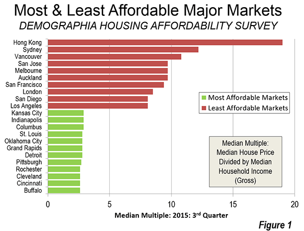
    The 12th Annual Demographia International Housing Affordability Survey reports that, as of the third quarter of 2015, Hong Kong has the least affordable housing among major markets in 9 nations, followed by Sydney, Vancouver, with Auckland, Melbourne, San Jose, San Francisco, London, Los Angeles and San Diego. In each of these markets, housing costs are now triple or more their  levels before restrictive land use regulation (house prices have tripled compared to incomes).

    Ranking Similarities: Demographia and the UBS Real Estate Bubble Index

    The Demographia list of least affordable metropolitan areas is largely echoed by UBS, the international financial services company headquartered in Switzerland. The UBS Global Real Estate Bubble Index ranks London, Hong Kong, Sydney and Vancouver as most vulnerable to risk from a real estate bubble. Demographia rates Hong Kong, Sydney and Vancouver as having the least affordable housing. London is ranked 8th in the Demographia Survey. Overall, the five cities rated by UBS as the most vulnerable are included among the eight least affordable in the Demographia Survey. The three other cities ranked in the least affordable eight by Demographia are not considered in the UBS report.

    Background on Middle-Income Housing Affordability

    In his introduction to the Survey, Senator Bob Day (Australian federal Senate) recalls that: “For more than 100 years the average Australian family was able to buy its first home on one wage. The median house price was around three times the median income allowing young home buyers easy entry into the housing market.”

    Senator Day’s description of the experience in Australia tracks with that of other nations. Following World War II and until the early 1970s, virtually all metropolitan areas in Australia, Canada, Ireland, New Zealand, the United Kingdom and the United States had median multiples around 3.0 or below.

    Since then far more restrictive land use policies have spread beyond the metropolitan areas to many others in other nations. This has often included urban containment policies (called “urban consolidation in Australia”), which severely limit or even prohibit new housing construction on or beyond the urban fringe. The result, as basic economics predicts, is higher land prices and skyrocketing housing costs, (despite expectations to the contrary by planners).

    Rating Housing Affordability

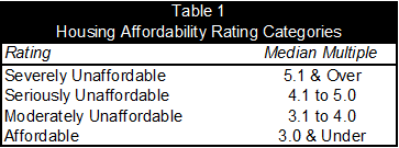
    The Demographia International Housing Affordability Survey uses the "median multiple" price-to-income ratio. The median multiple is calculated by dividing the median house price by the median household income.  Housing affordability ratings are indicated in Table 1.

    Virtually all of the severely unaffordable major markets in this year’s Survey exercise urban containment policy. Meanwhile, no market without strong land use regulation has ever been rated as severely unaffordable in the 12 years of the Survey.

    The Bottom 10: Least Affordable Major Metropolitan Markets

    The kinds of restrictions on development that Senator Day outlines are evident in the most unaffordable metropolitan areas.

    For the fifth straight year, Hong Kong had the least affordable housing.  Its median multiple was 19.0. Sydney became the second least affordable, at 12.2, leaping by 3.2 points, the largest annual increase ever recorded among major markets in the Survey. Sydney displaced Vancouver, which had the third least affordable housing among the major markets, with a median multiple of 10.8. This is up from 10.6 last year. Each of these is the highest median multiple recorded in these markets in the history of the Survey.

    Three metropolitan markets tied in fourth position with a median multiple of 9.7, San Jose, Melbourne and Auckland. San Francisco was the 7th least affordable market, with a median multiple of 9.4, followed by London (8.5). San Diego and Los Angeles, which both had a median multiple of 8.1 (Figure 1).

    Urban containment markets clearly and nearly perennially suffer declines in housing affordability. In 2013, the same ten metropolitan markets were the least affordable and had an average median multiple of 9.1. By 2015, their average median multiple had risen to 10.5. Housing affordability deteriorated in all 10 markets (house prices rose faster than incomes). This loss in housing affordability was at least 14 times the loss in the 10 most affordable markets (below).

    The Top 10: Most Affordable Major Metropolitan Markets

    Again, the United States, with its multiple regulatory variations accounted for all of the top 10 in housing affordability (actually the top 12, because of a four way tie for ninth position). Buffalo, Cincinnati, Cleveland and Rochester had the most affordable housing, with a median multiple of 2.6. Pittsburgh ranked 5th, at 2.7. Detroit, Grand Rapids and St. Louis tied for 6th, at 2.8. The tenth place tie was between Columbus, Indianapolis, Oklahoma City and Kansas City, with a median multiple of 2.9.

    By contrast, the top ten markets experienced relatively little deterioration in housing affordability over the past two years. In 2013, their median multiple averaged 2.6, and rose to 2.7 in 2015 (Figure 1). The housing affordability deterioration in the bottom 10 markets (all urban containment markets) was 14 times as high, as noted above.

    Among the five megacities (over 10 million population) in the Survey, Osaka-Kobe-Kyoto had the best housing affordability, with a moderately unaffordable median multiple of 3.4.

    All Markets

    Overall, the Survey included 368 markets. The most favorable housing affordability was in Ireland, with a median multiple among the markets of 2.8. This was the third year in a row that Ireland had the best housing affordability. In the nine prior years of the Survey, the most affordable housing had always been in either Canada or the United States (Figure 2).

    The United States was the second most affordable in 2015, with a median multiple of 3.5. Canada and Japan tied for third, with median multiples of 3.9. Four geographies with virtually universal urban containment policy were the least affordable, the United Kingdom (5.1), New Zealand (5.2), Australia (5.6) and Hong Kong (19.0).

    Singapore, though seriously unaffordable at 5.0, is far more affordable than its long-time rival,  Hong Kong (19.0). Each has virtually no suburban or rural hinterland and high population density. Yet there is a serious difference in housing policy. In contrast to Hong Kong, Singapore’s e Housing and Development Board, which accounts for approximately 90 percent of housing (which after sale is privately owned) has increased production and reduced new house prices which has led to a lowering of resale house prices as well.

    A Wholly Contrived Crisis

    Senator Day characterizes the housing affordability crisis “wholly contrived,” and “a matter of political choice… the product of restrictions imposed through planning regulation and zoning.” Senator Day calls the economic consequences of present land use policies “devastating.” He argues that governments and central banks have been too hasty to blame unprecedented housing affordability losses on demand factors, while missing the “real culprit,” which is the “refusal of … governments … to provide an adequate and affordable supply of land for new housing stock to meet demand (typically urban containment policy).

    Without reform, prospects for middle income households are grim in the metropolitan areas with urban containment policy. Housing affordability can be expected to deteriorate more, with dire economic and social consequences. According to London School of Economics and Political Science economists Paul C. Cheshire, Max Nathan and Henry G. Overman (see: People Rather than Places, Ends Rather than Means: LSE Economists on Urban Containment).

    "The problem is it is utterly unviable in the long term. With every passing decade the problems would get worse, the wider economic costs would become more penalising, the economy and monetary policy more unmanageable and the outcomes – the divide between the property haves and the property have-nots – more unacceptable."

    Wendell Cox is Chair, Housing Affordability and Municipal Policy for the Frontier Centre for Public Policy (Canada), is a Senior Fellow of the Center for Opportunity Urbanism (US), a member of the Board of Advisors of the Center for Demographics and Policy at Chapman University (California) and principal of Demographia, an international public policy and demographics firm. He is co-author of the “Demographia International Housing Affordability Survey” and author of “Demographia World Urban Areas” and “War on the Dream: How Anti-Sprawl Policy Threatens the Quality of Life.” He was appointed to three terms on the Los Angeles County Transportation Commission, where he served with the leading city and county leadership as the only non-elected member. He served as a visiting professor at the Conservatoire National des Arts et Metiers, a national university in Paris.

    Photo: Sign advertising new house and land packages starting in the $170,000s. Suburban St. Louis, third quarter 2015 (photo by author).

  • In Southern California, It Takes an Assortment of Villages

    Among urban historians, Southern California has often had a poor reputation, perennially seen as “anti-cities” or “19 suburbs in search of a metropolis.” The great urban thinker Jane Jacobs wrote off our region as “a vast blind-eyed reservation.”

    The Pavlovian response from many local planners, developers and politicians is to respond to this criticism by trying to repeal our own geography. Los Angeles’ leaders, for example, see themselves as creating the new sunbelt role model, built around huge investments Downtown and in an expensive, albeit underused, subway and light-rail network.

    Yet the notion of turning Southern California into a dense, New York hybrid makes very little sense. Nor has it done much for the regional economy, certainly in Los Angeles. The City of Angels thrived during its period of development into a multipolar region; in the 21st century, as Downtown has gained a few thousand hipsters, the rest of the city has lagged economically while population and job growth – including in tech – has been more robust in the surrounding counties of Orange, Riverside and San Bernardino.

    Building off Strength

    Southern California, even before the advent of the freeways, developed along the lines of an “archipelago of villages.” Even Downtown Los Angeles, the one legitimate urban core in the region, lost its central relevance by the 1930s and, despite all its self-promotion, employs close to the smallest share – well short of 3 percent – of the regional workforce of any large region in the country.

    In contrast, the two fastest-growing areas in Southern California – the Inland Empire and Orange County – are arguably the largest regions in the country without a real downtown. Rather than a negation of urbanity, as some suggest, these areas are nurturing an expansive archipelago of smaller hubs, each serving distinct geographies, populations, tastes and purposes, and constitute the building blocks for Southern California’s urban future.

    Read the entire piece at The Orange County Register.

    Joel Kotkin is executive editor of NewGeography.com and Roger Hobbs Distinguished Fellow in Urban Studies at Chapman University, and a member of the editorial board of the Orange County Register. He is also executive director of the Houston-based Center for Opportunity Urbanism. His newest book, The New Class Conflict is now available at Amazon and Telos Press. He is also author of The City: A Global History and The Next Hundred Million: America in 2050. He lives in Orange County, CA.

  • Why High Taxes Aren’t the Only Reason GE Left Connecticut

    General Electric, unhappy with a recent corporate tax increase in Connecticut, has now announced that it is relocating to Boston’s south waterfront. Indeed Connecticut’s tax climate is bad, ranking 44th according to the Tax Foundation, but GE’s move points to much bigger problems in the state.  I examine this in my new piece over at City Journal. Here’s an excerpt:

    For decades, nearby New York City’s pain was Connecticut’s gain. New York was a grim, dangerous, failing city that almost went bankrupt in the 1970s. More than 100 Fortune 500 companies fled during that era, many heading to suburban New Jersey and Connecticut—including GE, which moved in 1974 from 570 Lexington Avenue to Fairfield, Connecticut. The same story played out in cities across America, with corporations fleeing dying downtowns for the safety of the suburban office campus.

    Today, cities are back. The policing revolution—helped by the waning of the crack epidemic—made cities safe again. Core public services were slowly restored, parks were rebuilt, and transit systems were cleaned up and refurbished. Investment started returning. The structure of the economy changed, too. Starting in the 1990s, technology radically transformed the business world and is now a major industry in its own right. The financial industry was deregulated. Globalization drove demand for new types of business services, reinforcing the need to stay on top of a constantly shifting landscape. People with advanced, specialized knowledge are the ones who help companies innovate now. These employees work in highly interactive ways that benefit from clustering together—disproportionately in urban areas like New York, Chicago, and Boston.

    Click through to read the whole thing.

    Aaron M. Renn is a senior fellow at the Manhattan Institute and a Contributing Editor at City Journal. He writes at The Urbanophile, where this piece originally appeared.

    Photo: The former General Electric/Remington facility in Bridgeport, CT. The buildings have been demolished in recent years.