Category: Urban Issues

  • Volcano Urbanism

    Before I get to the urbanism portion of this post I need to do a quick geography and geology lesson for those readers who are unfamiliar with Hawaii. The state is made up of a chain of islands: Oahu, Maui, Kauai, Molokai, Lanai, the Big Island (that’s the largest island called “Hawaii”) and numerous lesser islands. All the islands formed from the same volcanic hot spot on the sea floor over a period of 70 million years.

    Screen Shot 2015-05-25 at 1.13.56 AM
    Google

    Screen Shot 2015-05-23 at 7.12.16 PM

    DSC_6314 Picture 082 DSC_7911 Lava (2)

    lava_6687

    The hot spot continually pushes up molten lava from the center of the Earth forming new islands. Over time the plates of the Earth’s crust drift carrying the old islands away while a new island forms at the hot spot. The old islands gradually erode, shrink, and disappear under the sea, while a new underwater mountain gradually pushes its way up to the surface. At the moment the youngest island is the Big Island and it’s still growing in size. These Hawaiian volcanoes aren’t the kind that lay dormant for centuries and then suddenly erupt like Mount Saint Helens, Vesuvius, or Pinatubo. Instead they are shield volcanoes that continually release slow steady flows of lava. You can actually walk away from the lava as it inches forward.

    Screen Shot 2015-05-24 at 12.34.25 AM Screen Shot 2015-05-22 at 8.33.00 PM Screen Shot 2015-05-24 at 12.37.36 AM

    Screen Shot 2015-05-24 at 12.37.57 AM

    I just took these photos of the newest lava field that formed from June through February this year.

    Screen Shot 2015-05-22 at 8.31.12 PM

    Screen Shot 2015-05-22 at 8.29.18 PM

    Screen Shot 2015-05-22 at 8.32.18 PM


    Screen Shot 2015-05-23 at 10.47.32 AM

    Screen Shot 2015-05-23 at 10.47.18 AM

    Screen Shot 2015-05-23 at 10.22.52 AM

    Screen Shot 2015-05-25 at 2.26.54 AM

    Screen Shot 2015-05-25 at 2.06.39 AM

    Screen Shot 2015-05-25 at 2.19.09 AM

    In the first hundred years after a new lava flow pioneer species slowly colonize the rocks. First there’s moss and ferns. Then the rugged ohia trees sprout. Then coconut palms wash up on the newly formed black sand beach and take root. After two hundred years a dense forest is established.

    Screen Shot 2015-05-25 at 3.42.25 AM

    Screen Shot 2015-05-25 at 4.56.42 AM

    Screen Shot 2015-05-25 at 4.01.41 AM

    Screen Shot 2015-05-25 at 4.52.54 AM

    Screen Shot 2015-05-25 at 4.52.20 AM

    Screen Shot 2015-05-25 at 4.55.26 AM

    Screen Shot 2015-05-25 at 4.26.57 AM

    Screen Shot 2015-05-25 at 12.45.32 PM

    Soon after the lava cools a new kind of pioneer species arrives to colonize the rocks. Before the lava flow the land had already been carved up into farms and subdivisions which were covered over. Once the lava cooled the old lots were resurveyed and sold off at bargain prices. Lots began at $1,000. When I asked one resident about the precarious nature of the location he explained, “You pay your dollar and you take your chances.” Then he asked me where I live. San Francisco. “Hmmm. Nothing dangerous about living on top of a massive earthquake fault is there?” We continued to talk. Seattle and Portland have volcanoes in their back yards too. Manhattan has seen terrorist attacks and super storms in recent years. Florida and Louisiana are directly in harm’s way when it comes to hurricanes. Entire towns in Kansas get swept away in tornadoes. There are 180 aging nuclear power plants all over the mainland. What could possibly go wrong there? Or you could live in New Jersey which has… New Jersey. His point was that people were more directly engaged with the danger on the lava flow. They live with the risk everyday and can’t let themselves forget what they’re dealing with. The lava could return tomorrow or it might be another 50 years. No one knows. Everyone enjoys life, but has a Plan B.

    Screen Shot 2015-05-25 at 4.50.51 AM

    Screen Shot 2015-05-25 at 4.11.37 AM

    Screen Shot 2015-05-25 at 4.49.24 AM

    Screen Shot 2015-05-25 at 4.25.39 AM

    Screen Shot 2015-05-25 at 4.07.43 AM

    Screen Shot 2015-05-25 at 3.43.38 AM

    As I took these photos of the lava dwellers I was fascinated. It wasn’t so much the dramatic location or funky architecture, although they’re certainly worth exploring on those terms. Instead, I looked at these lava homes as a window into the past. Historically this is exactly how all towns and cities began including Rome, New York, London, and Toronto. There’s no city water supply. No complex sewer system was installed ahead of development. There are no paved roads. No banks have financed any of these buildings. No insurance company provided coverage. There are no building codes, zoning regulations, or government inspections. (Or more accurately, all those strictures exist, but they’re simply unenforced.)

    Screen Shot 2015-05-25 at 1.45.25 PMGoogle

    Screen Shot 2015-05-25 at 12.40.12 PM

    Screen Shot 2015-05-25 at 4.06.18 AM

    Screen Shot 2015-05-25 at 4.24.19 AM

    Screen Shot 2015-05-25 at 4.02.46 AM

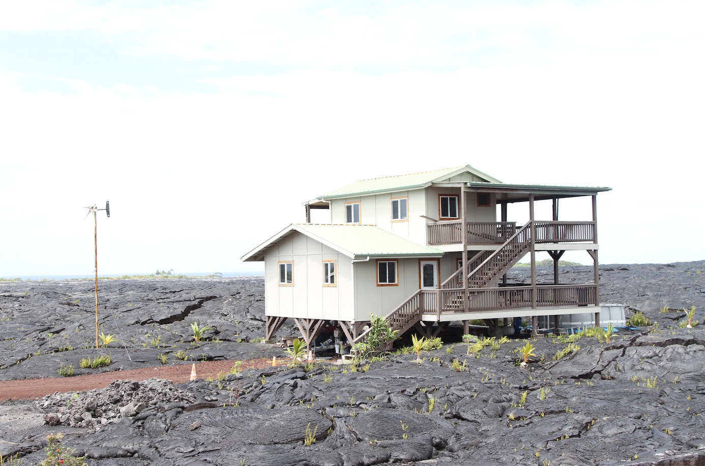
    The average North American town gets 37 inches of rain per year. This part of Hawaii gets 148. That’s over 12 feet of water falling from the sky. The simplest way to supply an off-grid home with water in this location is to collect it from the roof and hold it in a tank. The water is generally clean enough to be used directly for things like washing, but the drinking water needs to be filtered or boiled. The climate is mild year round so there’s never a need for heating or cooling, particularly if a home is built with traditional techniques that provide shade and cross ventilation. A barbecue size tank of propane will keep a stove going for a very long time. A few solar panels and/or a small marine style wind turbine will keep the lights on, especially if they’re compact florescent or LED. Ten years ago people would have used gasoline generators, but these days solar is more cost effective, silent, safer, and more convenient. Toilets come in the same form that was used by Moses, Napoleon, and Abraham Lincoln. Dry composting toilets use no water and the waste quickly turns to soil so long as sawdust or other carbon rich material is added to neutralize the nitrogen.

    Screen Shot 2015-05-25 at 12.41.01 PM

    Screen Shot 2015-05-25 at 12.43.00 PM

    Screen Shot 2015-05-25 at 4.04.40 AM

    Screen Shot 2015-05-25 at 4.27.56 AM

    A D9 bulldozer and driver can be rented for the day to do the work of a thousand men in a single afternoon. The rough lava is scraped flat enough to be passable by car. A few loads of cinder help smooth the way. The roads are only improved where and as needed in an incremental fashion. The value of individual vacant lots rises as ease of access improves so homes tend to be built in clusters along the cinder roads. This level of infrastructure is in keeping with the needs and budget of the community without involving higher levels of government.

    Screen Shot 2015-05-25 at 4.01.11 AM

    I’m not advocating building in this kind of environment and I’m not romanticizing counter culture off-grid communities. What I am saying is that in a country that prides itself on freedom and private property rights you shouldn’t have to move to the side of a volcano to escape the regulations and social constraints that make self built mortgage free homes illegal everywhere else. I know the arguments against this sort of thing. Shanty towns are dangerous and unhealthy. They will be populated by meth labs and crack whores. These people aren’t paying their fair share of taxes to society. This isn’t a wholesome environment for children, the elderly, or the disabled. This sort of thing will destroy nearby property values. The list goes on. My response is pretty straightforward. So… we don’t have unhealthy pockets of poverty, meth labs, and crack whores in places that were built entirely to code and heavily regulated?

    I will say that in this kind of community there’s no need for “affordable housing”. Even the most cash strapped residents can provide shelter for themselves. It may not be the sort of home most middle class people aspire to, but living here is entirely voluntary within a community of like-minded self-selecting people. As time passes each of these makeshift structures is being improving and upgraded. The shanties are gradually evolving into more substantial and respectable homes in the same way the moss and ferns yield to ohia and palm trees. This is an extreme example, but the same principles can be applied selectively in other locations in a more intentional fashion. These lava homes provide a glimpse into what town building used to look like and could look like again if the banks, regulators, and Upright Citizens Brigade cut people a bit more slack. I’m not counting on that, but it’s good to see obscure demonstrations of the historical pattern playing out in forgotten corners to remind us of how things were done before the days of the production home builder, the master planned community, and the seventeen volume building code.

    John Sanphillippo lives in San Francisco and blogs about urbanism, adaptation, and resilience at granolashotgun.com. He’s a member of the Congress for New Urbanism, films videos for faircompanies.com, and is a regular contributor to Strongtowns.org. He earns his living by buying, renovating, and renting undervalued properties in places that have good long term prospects. He is a graduate of Rutgers University.

  • The Best Cities For Jobs 2015

    Since the U.S. economy imploded in 2008, there’s been a steady shift in leadership in job growth among our major metropolitan areas. In the earliest years, the cities that did the best were those on the East Coast that hosted the two prime beneficiaries of Washington’s resuscitation efforts, the financial industry and the federal bureaucracy. Then the baton was passed to metro areas riding the boom in the energy sector, which, if not totally dead in its tracks, is clearly weaker.

    Right now, job creation momentum is the strongest in tech-oriented metropolises and Sun Belt cities with lower costs, particularly the still robust economies of Texas.

    Topping our annual ranking of the best big cities for jobs are the main metro areas of Silicon Valley: the San Francisco-Redwood City-South San Francisco Metropolitan Division, followed by San Jose-Sunnyvale-Santa Clara, swapping their positions from last year.

    Our rankings are based on short-, medium- and long-term job creation, going back to 2003, and factor in momentum — whether growth is slowing or accelerating. We have compiled separate rankings for America’s 70 largest metropolitan statistical areas (those with nonfarm employment over 450,000), which are our focus this week, as well as medium-size metro areas (between 150,000 and 450,000 nonfarm jobs) and small ones (less than 150,000 nonfarm jobs) in order to make the comparisons more relevant to each category. (For a detailed description of our methodology, click here.)

    An Economy Fit For Geeks

    Venture capital and private-equity firms keep pouring money into U.S. technology companies, lured by the promise of huge IPO returns. Last year was the best for new stock offerings since the peak of the dot-com bubble, with 71 biotech IPOs and 55 tech IPOs. It’s continuing to fuel strong job creation in Silicon Valley. Employment expanded 4.8% in the San Francisco Metropolitan Division in 2014, which includes the job-rich suburban expanses of San Mateo to the south, and employment is up 21.2% since 2009. This has been paced by growth in professional business services jobs in the area, up 9% last year, and in information jobs, which includes many social media functions – information employment expanded 8.3% last year and is up 28.7% since 2011.

    San Jose which, like San Francisco, was devastated in the tech crash a decade ago, has also rebounded smartly. The San Jose MSA clocked 4.9% job growth last year and 20.0% since 2009. Employment in manufacturing, once the heart of the local economy, has grown 8% since 2011, after a decade of sharp reversals, but the number of information jobs there has exploded, up 16% last year and 35.7% since 2011.

    Meanwhile, there’s been a striking reversal of fortune in the greater Washington, D.C., area, while the greater New York area has also fallen off the pace. In the years after the crash, soaring federal spending pushed Washington-Arlington-Alexandria to as high as fifth on our annual list of the best cities for jobs; this year it’s a meager 47th, with job growth of 1.5% in 2014, following meager 0.2% growth in 2013, while Northern Virginia (50th) and Silver Spring-Frederick-Rockville (64th) also lost ground, dropping, respectively, five and 15 places.

    Job growth has also slowed in the greater New York region, which also was an early star performer in the immediate aftermath of the recession, in part due to the bank bailout that consolidated financial institutions in their strongest home region. Virtually all the areas that make up greater New York have lost ground in our ranking: the New York City MSA has fallen to 17th place from seventh last year, as employment growth tailed off to 2.6% in 2014 from 3.2% in 2013. Meanwhile Nassau-Suffolk ranks 49th, Rockland-Westchester 60th and Newark is second from the bottom among the biggest metro areas in 69th place.

    The Shift To ‘Opportunity Cities’ Continues

    Not every tech hot spot has the Bay Area’s advantages, which include venture capital, the presence of the world’s top technology companies and a host of people with the know-how to start and grow companies.

    But other metro areas have something Silicon Valley lacks: affordable housing. Most of the rest of our top 15 metro areas have far lower home prices than the Bay Area, or for that matter Boston, Los Angeles or New York. And they also have experienced strong job growth, often across a wider array of industries, which provides opportunities for a broader portion of the population.

    The combination of lower prices and strong job opportunities are what earns them our label of “opportunity cities.” The Bay Area may attract many of the best and brightest, but it is too expensive for most. Despite the current boom, the area’s population growth has been quite modest — San Jose has had an average population growth rate of 1.5% over the past four years. In contrast, seven of our top 10 metro areas, including third place Dallas-Plano-Irving, Texas, and No. 4 Austin, Texas, are also in the top 10 in terms of population growth since 2000. If prices and costs are reasonable, people will go to places where work is most abundant.

    In the Dallas metro area, the job count grew 4.2% last year, paced by an 18.6% expansion in professional business services, while overall employment is up 15.7% since 2009. Job growth last year in Austin, Texas, was a healthy 3.9%, while the information sector expanded by 4.7% and since 2011 by 17.8%.

    Many Texas cities, of course, have benefited from the energy boom — the recent downturn in oil prices make it likely that growth, particularly in No. 6 Houston, will decelerate in coming years.

    But what is most remarkable about the top-performing cities is the diversity of their economies. Most have tech clusters, but several, such as Houston, Nashville, Tenn., Dallas and Charlotte, N.C., have growing manufacturing, trade, transportation and business services sectors. The immediate prognosis, however, may be brightest in places like Denver and Orlando, where growth is less tied to energy than business services, trade and tourism. Nashville, which places fifth on our list, has particularly bright prospects, due not only to its growing tech and manufacturing economy, but also its strong health care sector which, according to one recent study, contributes an overall economic benefit of nearly $30 billion annually and more than 210,000 jobs to the local economy.

    The Also-Rans

    Some economies lower in our rankings have made strong improvements, notably Atlanta-Sandy Spring-Roswell, which rose to 12th this year, a jump of 12 places. Long a star performer, the Georgia metro area stumbled through the housing bust, but it appears to have regained its footing, with strong job growth across a host of fields from manufacturing and information to health, and particularly business services, a category in which employment has increased 24% since 2009.

    In California, one big turnaround story has been the Riverside-San Bernardino area, which gained six places to rank 11th this year as it has again begun to benefit from migration caused by coastal Southern California’s impossibly high home prices.

    Several mid-American metro areas also are showing strong improvement. Louisville-Jefferson County, Ky., jumped fifteen places to 21st, propelled by strong growth in manufacturing, business services and finance. Kansas City, Kan. (23rd), and Kansas City, Mo. (46th), both made double-digit jumps in our rankings. In Michigan, Detroit-Dearborn-Livonia, bolstered by the recovery of the auto industry, gained six places to 59th, while manufacturing hub Warren-Troy-Farmington Hills picked up two to 39th. These may not be high growth areas, but these metro area no longer consistently sit at the bottom of the list.

    Losing Ground

    One of the biggest resurgent stars in past rankings, New Orleans-Metairie, dropped 17 places to 43rd, while Oklahoma City fell 17 places to 33rd. These cities lack the economic diversity to withstand a long-term loss of energy jobs if the sector goes into a prolonged downturn.

    Yet perhaps the most troubling among the also-rans are the metro areas that have remained steadily at the bottom. These are largely Rust Belt cities such as last place Camden, N.J., which has been at or near that position for years.

    Future Prospects

    Now the best prospects appear to be in tech-heavy regions, but it’s important to recognize that a key contributor to the tech sector’s frenzy of venture capital and IPOs had been the Federal Reserve’s unprecedented monetary interventions, which are now phasing out. As it is, headwinds to expansion in the Bay Area are strong. High housing prices, according to recent study, may make it very difficult for these companies to expand their local workforces. The median price of houses in tech suburbs like Los Gatos now stand at nearly $2 million — rich for all but a few — while downtown Palo Alto office rents have risen an impossible 43% in the last five years.

    Companies like Google, which has run into opposition over its proposed new headquarters expansion, may choose to shift more employment to other tech centers, such as Austin, Denver, Seattle, Raleigh and Salt Lake City, where the cost of doing business tends to be less. Similarly the stronger dollar could erode the modest progress made by some industrial cities, such as Detroit and Warren, as it gives a strong advantage to foreign competitors.

    Normally we would expect these processes to play out slowly. But in these turbulent times, it’s best to keep an eye out for disruptive changes — a new economic cataclysm, should one occur, could quickly shift the playing field once again.

    Joel Kotkin is executive editor of NewGeography.com and Roger Hobbs Distinguished Fellow in Urban Studies at Chapman University, and a member of the editorial board of the Orange County Register. He is also executive director of the Houston-based Center for Opportunity Urbanism. His newest book, The New Class Conflict is now available at Amazon and Telos Press. He is also author of The City: A Global History and The Next Hundred Million: America in 2050.  He lives in Los Angeles, CA.

    Michael Shires, Ph.D. is a professor at Pepperdine University School of Public Policy.

  • Better Suburbs = Better Cities: Employment and the Importance of the Suburban Economy

    Australia’s inner city areas and CBDs are a focus of media and public policy attention, with good reason. But it’s also true that the real engines of employment are outside the inner city areas and that the dominant role of our suburban economy as an economic engine is grossly understated, even ignored. This is not good public policy. It’s not even common sense. 

    I have a view that the focus on urban renewal and inner urban economic development has become a policy obsession of late. It’s the trendy thing to quote Richard Florida’s ‘creative class’ theories which become the excuse to increasingly spoil inner city workers with transport, cultural and other forms of taxpayer funded infrastructure. There was a time when inner city areas, if not recapitalised, risked pockets of blight. But those days have passed. Today, it is the suburban landscape – much derided in fashionable inner city policy circles – that risks pockets of blight if not brought back to the attention of policy makers and strategically recapitalised.

    The imperative is simple: the suburban economy is so much larger than inner city areas. As a rule of thumb, between 8 and 9 out of ten jobs in our major metro regions of Brisbane, Sydney and Melbourne are suburban. Only one in ten or at most two in ten, are found in the inner city areas. Achieving a 10% improvement in the suburban economic engine is hypothetically equivalent to achieving an 80% improvement in the economic performance of the inner cities. 

    So why this preoccupation with the inner cities to the detriment of the suburbs?

    First, a quick review of the evidence as provided in the Census. 

    In Brisbane, the CBD itself accounts for 12.5% of the Brisbane region’s employment numbers – one in eight. The combined CBD and inner city areas – including the CBD – account for around 170,000 jobs.  That’s not a very big number.  As a proportion of state-wide jobs, it’s less than 9%. As a proportion of the 925,000 jobs across the metro region of Brisbane, it’s less than one in five – and that’s with including the near city areas like South Brisbane, Fortitude Valley and Spring Hill. 

    In Sydney in 2011, the CBD accounted for only 8.3% of all jobs in New South Wales, and for only 13.4% of all jobs in wider metropolitan Sydney. Including the surrounding areas of Pyrmont, Ultimo, Potts Point, and Woolloomooloo raises this share to just 9.7% of all jobs in the state and 15.6% of jobs in metropolitan Sydney. So one in ten state-wide jobs and one in every six or seven metro wide jobs. 

    In Melbourne, the CBD is home to just 7.6% of the state’s total employment, and to just 10.6% of all jobs in greater Melbourne. Including the ‘fringe’ locations of Docklands and Southbank sees this share rise to only 10.3% of the state and 14.3% of greater Melbourne, which is one in ten of all jobs in the state and one in seven metro wide jobs.

    In none of these centres is the concentration of inner city jobs close to one in four metro wide jobs. Yet if you asked a room full of people – industry and planning experts included –a significant proportion will think the figures are much higher. I’ve done this several times at workshops and presentations and there are a worrying proportion of people who seem to think the figure is more than 50%. A wider survey of the general public might even put the figure higher – it would be an interesting exercise to find out.

    Suburban employment centres are by nature much more widely dispersed. Teachers, doctors, dentists, tradies, factory workers, shop workers and so on do not rely on close proximity to each other to perform their work, as do CBD employment markets. In the suburban business districts of our metro regions, workforce concentrations typically fall into a band somewhere between 3,000 and 5,000 jobs per square kilometre. Places with super-regional shopping centres will tend to be at the upper end of that scale while industrial areas at the lower end. CBDs, by contrast, can easily have pockets where the employment density sails past 10,000 or 20,000 jobs per square kilometre.

    But however dispersed these suburban jobs may be, it doesn’t make them any less important to the economy – particularly given their dominant role as employment and economic engines.

    So why then the preoccupation with the inner cities and why the dearth of policy interest in the suburbs? 

    Perhaps the inner cities are seen as more glamorous? There are more higher paying jobs and more CEOs to the square mile than anywhere else. It’s where cultural facilities and seats of government are found. It’s where the most expensive real estate is. Basically, any concentration of money plus power is always going to grab attention. It’s an age when celebrity tweets capture more media and public attention than important issues of economic policy. The CBDs and inner city areas are widely seen as ‘where it’s at’ and where the cool people are. ‘Nuff said?

    Sadly, even policy makers seem to have fallen for the inner city bling over suburban substance. The importance of transport workers, freight workers, teachers, doctors, tradies or suburban white collar employment to the economy receives next to no policy comment. The performance of suburban transport systems, the need to promote higher employment density in key centres, the pathways by which property owners could be encouraged to partner with public sector agencies for suburban centre improvement – none of these seem to appear as workshop or forum topics promoted by any of the leading industry groups. 

    I suspect there’s also a strong element of cultural cringe as it applies to our suburban heritage. Frequently mocked as a cultural wasteland or ‘home of the bogan’, there’s an almost desperate desire to prove we’re an advanced society by focussing on the lifestyles and achievements of our inner city areas and the people who live and work there, to the exclusion of all else. ‘Urbanists’ grab headlines and appear as keynotes at any number of planning conferences. Sub urbanists (and there are plenty of them) are evidently persona non grata.

    It’s as if a prosperous, successful and highly efficient suburban economy simply doesn’t cut it in the global race for attention and status amongst cities, which seems almost exclusively focussed on the how much like downtown New York or downtown Paris every other city can pretend to be. 

    The reality is that the inner city economy is reliant on – not divorced from – the performance of the suburban economy. In the same way that there can be no public sector without a profitable private sector, I suggest that a strong and prosperous inner city economy relies heavily on a strong and prosperous suburban economy. And in the same way that strategic infrastructure and policy decisions are needed for the inner city to operate at optimum efficiency, the exact same applies to suburban economies.  

    The question is whether this balance is being achieved.

    Ross Elliott has more than 20 years experience in property and public policy. His past roles have included stints in urban economics, national and state roles with the Property Council, and in destination marketing. He has written extensively on a range of public policy issues centering around urban issues, and continues to maintain his recreational interest in public policy through ongoing contributions such as this or via his monthly blog The Pulse.

  • Flexible Economic Opportunism: Beyond Diversification in Urban Revival

    Discouraging employment data have recently dampened optimism about America’s economic recovery. These challenges are nothing new for developed regions long beset by manufacturing decline amidst globalization. Exemplars of this trend, America’s rust belt cities have battled unemployment, decaying infrastructure, and social challenges since economic decline emerged in the 1960s. In response, some now cultivate service, knowledge, and tourism industries. Explaining these new growth models, analysts often espouse the virtues of diversification. However, legacy industrial systems and native constraints (e.g. geography and culture) can hinder this strategy. Chasing diversification for its own sake diverts policy attention from a more valid determinant of growth. Post-industrial urban policy should target structural flexibility, enabling diversification or specialization – neither deserving preeminent status – to occur naturally.

    In exploring rival economic development strategies, two management theories are particularly relevant: Michael Porter’s competitive advantage and Harry Markowitz’s portfolio theory. Competitive advantage describes the strategic orientation of business operations and brand image to command an inimitable market position. Portfolio theory is the logic behind investment diversification to maximize returns for given risk preferences. In management, these are not rival theories. However, when applied to urban economic development they present a direct contrast. The former can be likened to specialization, and the latter to diversification.

    In attempting to revive their economies, cities often reduce strategic options to the simple dichotomy of specialization versus diversification. Some compromise by favoring a primary industry and enabling the emergence of secondary industries. Economic orthodoxy generally argues that diversification is the wiser choice in volatile economies. This portfolio-style approach assumes that stability in one industry offsets decline in another. This argument is convincing: many “single-engine” economies have underperformed amidst globalization. Besides the usual cases, overlooked examples are Oakland, California (shipbuilding and automobiles), Birmingham, Alabama (steel), and upstate South Carolina (textiles). A similar fate befell the British Midlands and German Ruhr Valley, where recovery strategies have generated mixed results. Instability in single-industry dependence is not limited to manufacturing. Las Vegas, where the pro-cyclical tourism mirrors national economic trends, remains fairly irrelevant outside its casinos and related industries.

    By contrast, many successful cities boast diversified economies. New York has a path-dependent advantage in finance, with recent volatility offset by tourism, business services, and the arts. The 1986 collapse in oil prices tested the resilience of Sunbelt boomtown Houston, whose shipping industry offset energy sector declines while banking, finance, and healthcare kept the city competitive. Large cities are naturally more diversified, but smaller cities can also exhibit diversification: examples are Austin, Texas (research, education, and technology), Nashville, Tennessee (entertainment, insurance, and health care), and Tampa, Florida (military, tourism, trade, and retirement services). Austin added jobs even during the 2008 recession, and has routinely been labelled the nation’s best-performing economy in recent years. These examples show that economic resilience is dependent more on diversified industrial portfolios than on size.

    Nevertheless, a larger story underlies America’s revitalization champions. While the flag of diversification flies high, at the base of the pole stands structural flexibility, arguably a more durable, achievable, and powerful mechanism for growth. Cities prepared to re-orient towards emerging opportunities maintain development potential across economic cycles. Furthermore, flexibility gives cities of any size hope for transformative growth. Not every city has the native advantages to meaningfully diversify, but flexibility can be their wild-card strategy.

    Two former manufacturing cities have exhibited post-industrial flexibility: Pittsburgh and Bilbao. Once the pride of America’s post-WWII steel industry, Pittsburgh suffered a precipitous decline in the 1980s as manufacturing moved overseas. 200,000 jobs and nearly half the population were lost. However, Pittsburgh’s situational advantages provided a flexible platform for revival. Well-endowed cultural institutions and flourishing medical, education, and research sectors supported a lifestyle economy based on knowledge, services, and creative entrepreneurship. Pittsburgh’s economic performance was seventh best in the nation during the 2008 recession, an example of how flexible planning, private sector creativity, and situational advantages converged to make progress halting seemingly irreversible decline. Similarly, Bilbao, Spain, sharply declined after the withdrawal of manufacturing. Without its economic engine and facing crisis-level unemployment, it creatively turned to tourism and culture. The government’s stated commitment to collaborative policy making and quality-of-life now complements efforts to sustain post-industrial competitiveness. Like Pittsburgh, Bilbao has used flexible, opportunistic planning to pursue economic growth.

    Despite their highly publicized transformations, however, these post-industrial success stories are not without challenges. The Pittsburgh metropolitan area has failed to gain population for years, and lost nearly 5,000 residents between mid-2013 and mid-2014. The city’s stagnant job growth has led some claim that Pittsburgh’s amenities, rather than employment opportunities, are a relocation magnet. Others claim that flat overall job growth conceals local economic restructuring, as manufacturing industries give way to the creative sector. Despite recent signs of a recovery, Spain’s persistent unemployment (23.8% in the first quarter of 2015) indicates that the nation, and particularly secondary cities such as Bilbao, continues to struggle in the stubborn wake of the 2010 euro crisis. Further, Bilbao’s top-down approach of museum-based revitalization has failed to generate vitality in the grassroots cultural scene, where artists have collectively mobilized but still struggle to obtain financial support.

    Manchester has recently enjoyed consistent growth, and is now considered the UK’s healthiest economy outside of London. Like Pittsburgh and Bilbao, the city experienced rapid mid-century decline with the closure of its shipping port and loss of heavy manufacturing. The city’s economic revival has pivoted towards knowledge, services, and entertainment, a strategy attracting recognition for liveability and cultural vibrancy. Financial services now outsize manufacturing and engineering, with no single industry representing more than 16% of the economy. Poised to benefit further from devolutionary reforms and “northern powerhouse” status, Manchester has garnered recognition for its economic diversity and entrepreneurial spirit. The city exemplifies a flexible approach to post-industrial development, particularly for a hinterland region overshadowed by a dominant neighbour (London).

    Other efforts at revitalization, however, have produced lesser results. Like Pittsburgh and Bilbao, Cleveland’s steel industry flourished in the mid-20th century before industrial decline gutted the city of jobs and population. In 1969 the emblematic Cuyahoga River fire brought national attention to Cleveland’s economic crisis. Since 1990 the city has caught fire once again – in a revival driven by services, tourism, and entertainment. Global connections in knowledge industries and education complement Cleveland’s flexible economic vision. However, the city still struggles with disinvested neighbourhoods, ageing infrastructure, and regional competition from Pittsburgh, where flexible strategies also target culture and technology.

    Taken superficially, these revival cases support the concept of diversification. Cities focusing on a singular competitive advantage – geography, image, or path-dependent conditions – tend to specialize but often struggle to re-configure inflexible industrial infrastructure for new opportunities. Regardless, specialization versus diversification is a false choice. Beyond this continuum, the true survival instinct is structural flexibility. Diversification often correlates with overall growth but is more a lagging indicator of opportunistic preparedness. Flexible policy broadens structural capabilities and builds resilience into urban systems, in either a specialized or diversified economy. The outputs include infrastructure both hard (transport, technology and housing) and soft (education, culture, and institutions). In providing platforms for investment that adapt to global trends, this strategy transforms industrial determinism into flexible economic opportunism.

    Kris Hartleyis a visiting researcher at Seoul National University and PhD Candidate at the National University of Singapore, Lee Kuan Yew School of Public Policy. For more details about his argument, see his book Can Government Think? Flexible Economic Opportunism and the Pursuit of Global Competitiveness.

  • Working at Home: In Most Places, the Big Alternative to Cars

    Working at home, much of it telecommuting, has replaced transit as the principal commuting alternative to the automobile in the United States outside New York. In the balance of the nation, there are more than 1.25 commuters who work at home for each commuter using transit to travel to work, according to data in the American Community Survey for 2013 (one year). When the other six largest transit metropolitan areas are included (Los Angeles, Chicago, Philadelphia, Washington, Boston and San Francisco), twice as many people commute by working at home than by transit.

    Overall, working at home leads transit in 37 of the 52 major metropolitan areas (over 1 million population in 2013).

    The Top Ten

    Not surprisingly, most of the strongest work at home markets are technology hubs. However, the strength of working at home, and particularly its growth in these metropolitan areas may seem at odds with the huge expenditures on urban rail. Nine of the top 10 working at home metropolitan areas have built or expanded rail systems, yet working at home has grown far faster than transit. The exception is Seattle, where transit has grown faster, but nearly all the increase has been on buses and ferries. Only two of the top ten metropolitan areas have larger transit shares than work at home shares.

    Here are the top 10 working at home major metropolitan areas (Figure). Market shares are shown to the second digit to eliminate ties.

    • Denver has the highest working at home commute share, at 7.14%. Like nine of the other top 10 major metropolitan areas, Denver has an urban rail system. Even so, Denver’s transit work trip market share is a full third lower, at 4.41%. In 2000, working at home had only a lead over transit (4.58% v. 4.45%).
    • Technology hub Austin places a close second, at 6.87%. Austin’s working at home commute share is nearly 3 times its 2.37% transit share. Working at home increased from 3.60% in 2000, while transit dropped from 2.51%, despite the addition of a rail line.
    • Portland, also a technology hub, and a decorated model among urban planners, ranks third in working at home commute share, at 6.40%. Transit share slightly smaller, at 6.37%. In 1980, however, transit’s market share was nearly a third again its present level (8.4%), before the first of its six rail lines opened. In contrast, working at home has nearly tripled its share from 2.2% in 1980. In 2000, working at home attracted 4.60% of commuters in Portland, well below the 6.27% transit share.
    • San Diego ranks fourth in working at home, with a 6.38% market share. The California city built the first of the modern light rail lines in the early 1980s. San Diego’s transit market share is approximately one half its working at home share (3.17 percent). In 2000, working at home had a commute share of 4.40%, while transit’s share was 3.31%.
    • Raleigh, another technology hub, ranks fifth in working at home with a 6.16% market share. Raleigh is the only metropolitan area among the top 10 that does not have an urban rail system. Raleigh’s transit work trip market share is 1.03%. In 2000, working at home had a commute share of 3.46%, while transit’s share was 0.86%, modestly below the 2013 figure.
    • Atlanta ranks sixth in working at home, with a 5.96% market share. Atlanta has built more miles of high quality Metro (grade separated subway and elevated rail) than anywhere outside Washington and San Francisco in the last half century. Even so, Atlanta has experienced a more than 50% decline in its transit market share and now that share is barely half that of working alone (3.08%). In 2000, working at home had a commute share of 3.47%, while transit’s share was 3.46%.
    • San Francisco, another technology hub, ranks seventh in working at home, with a 5.94% market share. San Francisco is unique in having a substantially higher transit than work at home market share (16.13%). San Francisco is the second strongest transit market in the United States, trailing only New York (30.86%). In 2000, working at home had a commute share of 4.27%, while transit’s share was 13.77%.
    • Phoenix nearly equals San Francisco, with a 5.85% working at home market share. This is more than double the 2.61% transit market share. In 2000, working at home had a commute share of 3.66%, while transit’s share was 1.93%.
    • Sacramento ranks 9th in working at home market share, at 5.56%, more than double its 2.65% transit work trip share. In 2000, working at home had a commute share of 4.03%, while transit’s share was 2.67%.
    • Seattle, also a technology hub, has a working at home market share of 5.38%, for a ranking of 10th. Like San Francisco has a higher transit work trip market share (9.31%). In 2000, working at home had a commute share of 4.17%, while transit’s share was 6.97%.

    The work at home and transit market shares are indicted for each major metropolitan area in the table.

    Where Working at Home is the Weakest

    In most of the strongest transit metropolitan areas, as opposed to cities that have systems that simply are not so widely used, working at home doesn’t usually achieve second place to cars.  As noted above, San Francisco has a considerably stronger transit share than virtually any major metropolitan area outside New York.

    New York, by far the largest transit market in the United States, is also the largest work at home market in raw numbers (386,000). Yet, New York’s transit market share (30.86%) is seven times its work at home share (4.17%).

    Chicago, Washington and Boston have transit market shares approximately three times that of working at home, while Philadelphia’s transit share is 2.5 times as high.

    This is not to say that working at home is in decline. Strong working at home gains — nearly 50% to over 100% from 2000 to 2013 — were made in each of these six metropolitan areas. Yet, with its smaller base, working at home is not likely to exceed transit in the near future.

    Los Angeles is a possible exception. Since 2013, working at home has closed approximately 60% of the gap with transit. Continuation of present trends would have working at home becoming the most popular alternative to cars in Los Angeles before 2020.

    The Future?

    Working at home has grown despite having received little attention in urban planning, compared to that of expensive rail projects. Its success has eliminated millions of daily work trips, reduced greenhouse gases and responded to the desire for better lifestyles by many. With continuing improvements in technology, and higher acceptance among companies and government agencies, working at home seems likely to continue its growth in the coming decades.

    Work at Home to Transit Commuting Ratio
    Major Metropolitan Areas: 2013
    Metropolitan Area Work at Home Work Trip Share Transit Work Trip Share Work at Home Commuters per Transit Commuter
    Atlanta, GA 5.96% 3.08% 1.93
    Austin, TX 6.87% 2.37% 2.89
    Baltimore, MD 4.10% 6.79% 0.60
    Birmingham, AL 2.79% 0.78% 3.57
    Boston, MA-NH 4.46% 12.76% 0.35
    Buffalo, NY 2.62% 2.92% 0.90
    Charlotte, NC-SC 5.19% 1.74% 2.98
    Chicago, IL-IN-WI 4.32% 11.75% 0.37
    Cincinnati, OH-KY-IN 3.85% 2.17% 1.78
    Cleveland, OH 3.80% 3.25% 1.17
    Columbus, OH 4.14% 1.69% 2.44
    Dallas-Fort Worth, TX 4.98% 1.39% 3.58
    Denver, CO 7.14% 4.41% 1.62
    Detroit,  MI 3.52% 1.68% 2.09
    Grand Rapids, MI 4.22% 1.62% 2.61
    Hartford, CT 3.50% 3.07% 1.14
    Houston, TX 3.69% 2.37% 1.56
    Indianapolis. IN 3.93% 1.12% 3.51
    Jacksonville, FL 4.99% 1.07% 4.66
    Kansas City, MO-KS 4.08% 1.22% 3.35
    Las Vegas, NV 3.18% 3.47% 0.92
    Los Angeles, CA 5.13% 5.84% 0.88
    Louisville, KY-IN 2.77% 1.71% 1.63
    Memphis, TN-MS-AR 2.37% 1.15% 2.07
    Miami, FL 4.76% 4.07% 1.17
    Milwaukee,WI 3.52% 3.65% 0.96
    Minneapolis-St. Paul, MN-WI 4.88% 4.64% 1.05
    Nashville, TN 4.50% 1.02% 4.43
    New Orleans. LA 2.67% 2.70% 0.99
    New York, NY-NJ-PA 4.17% 30.86% 0.13
    Oklahoma City, OK 3.07% 0.54% 5.74
    Orlando, FL 5.05% 1.73% 2.92
    Philadelphia, PA-NJ-DE-MD 3.99% 10.00% 0.40
    Phoenix, AZ 5.85% 2.61% 2.25
    Pittsburgh, PA 3.71% 4.89% 0.76
    Portland, OR-WA 6.40% 6.37% 1.01
    Providence, RI-MA 3.23% 2.68% 1.21
    Raleigh, NC 6.16% 1.03% 5.96
    Richmond, VA 4.25% 1.34% 3.18
    Riverside-San Bernardino, CA 5.00% 1.46% 3.42
    Rochester, NY 3.39% 2.53% 1.34
    Sacramento, CA 5.56% 2.65% 2.10
    Salt Lake City, UT 5.13% 3.25% 1.58
    San Antonio, TX 4.33% 2.51% 1.72
    San Diego, CA 6.38% 3.17% 2.01
    San Francisco-Oakland, CA 5.94% 16.13% 0.37
    San Jose, CA 4.05% 4.24% 0.96
    Seattle, WA 5.38% 9.31% 0.58
    St. Louis,, MO-IL 4.09% 2.91% 1.40
    Tampa-St. Petersburg, FL 5.11% 1.38% 3.70
    Virginia Beach-Norfolk, VA-NC 3.38% 1.71% 1.98
    Washington, DC-VA-MD-WV 5.02% 14.16% 0.35
    From: American Community Survey, 2013 (One Year)


    Wendell Cox is principal of Demographia, an international public policy and demographics firm. He is co-author of the "Demographia International Housing Affordability Survey" and author of "Demographia World Urban Areas" and "War on the Dream: How Anti-Sprawl Policy Threatens the Quality of Life." He was appointed to three terms on the Los Angeles County Transportation Commission, where he served with the leading city and county leadership as the only non-elected member. He served as a visiting professor at the Conservatoire National des Arts et Metiers, a national university in Paris. Wendell Cox is Chair, Housing Affordability and Municipal Policy for the Frontier Centre for Public Policy (Canada), is a Senior Fellow of the Center for Opportunity Urbanism and is a member of the Board of Advisors of the Center for Demographics and Policy at Chapman University.

    Photo by By Rae Allen, “My portable home office on the back deck”

  • The Changing Geography of Racial Opportunity

    In the aftermath of the Baltimore riots, there is increased concern with issues of race and opportunity. Yet most of the discussion focuses on such things as police brutality, perceptions of racism and other issues that are dear to the hearts of today’s progressive chattering classes. Together they are creating what talk show host Tavis Smiley, writing in Time, has labeled “an American catastrophe.”

    Yet what has not been looked at nearly as much are the underlying conditions that either restrict or enhance upward mobility among racial minorities, including African-Americans, Latinos and Asians. In order to determine this, my colleague at Houston-based Center for Opportunity Urbanism Wendell Cox and I developed a ranking system that included four critical factors: migration patterns, home ownership, self-employment and income.

    We found, for all three major minority groups,   that the best places were neither the most liberal in their attitudes nor had the most generous welfare programs. Instead they were located primarily in regions that have experienced broad-based economic growth, have low housing costs, and limited regulation. In other words, no matter how much people like Bill de Blasio talk about the commitment to racial and class justice, the realities on the ground turn out to be quite different than he might imagine.

    Southern Comfort

    Perhaps the greatest irony in our findings is the location of many of the best cities for minorities: the South. This is particularly true for African-Americans who once flocked to the North for both legal rights and opportunity. Today almost all the best cities for blacks are in the South, a region that has enjoyed steady growth and enjoys generally low costs. Indeed, of the top 15 cities for African-Americans, 13 are in the old Confederacy starting with top-ranked Atlanta, No. 2 Raleigh, No. 4 Charlotte, No. 6 Virginia Beach-Norfolk, No. 7 Orlando, No. 8 Richmond (a distinction it shares with Miami and San Antonio), as well as   four of Texas’ large metro areas: No. 12 Houston, No. 13 Dallas-Ft. Worth and No. 8 San Antonio. The only two other metros are “inside the Beltway”: the metropolitan expanses of Washington and, surprisingly, Baltimore.

    What accounts for this? Well, in Washington and Baltimore, the obvious answer is the federal government.  Roughly one in five black adults works for the government, and are far more likely to have a public sector job than non-Hispanic whites, and twice as likely as Hispanics. These are not the people who rioted in the inner city; most of them live in prosperous suburbs surrounding these cities. But outside the Beltway region, the explanations tend towards more basic economics, like job creation, low housing prices and better opportunities for starting businesses.

    Ironically, blacks – 6 million of whom moved to the North during the great migration — are once again voting with their feet, but back to the same region in which, for so long, they were so harshly oppressed.   Between 2000 and 2013, the African-American population of Atlanta, Charlotte, Orlando, Houston, Dallas-Fort Worth, Raleigh, Tampa-St. Petersburg and San Antonio all experienced growth of close to 40 percent or higher, well above the average of 27 percent for the nation’s 52 metropolitan areas with more than 1 million residents.  

    In contrast, the African-American population actually dropped in five critically important large metros that once were beacons for black progress: San Francisco-Oakland, San Jose, Los Angeles, Chicago and Detroit.  In many cases, most notably in San Francisco, blacks have become the unintended victims of soaring housing prices and rampant gentrification, with little option to move to the also high-priced suburbs.   Today, suggests economist Thomas Sowell, the black population of the city itself is half that of 1970; the situation has changed so much that former Mayor Gavin Newsom even initiated a task force to address black out-migration.

    Yet if many African-Americans can be seen “going home” to their native region, the South is also doing well among ethnic groups that have historically had little attachment to Dixie. For Latinos, now the nation’s largest ethnic minority, seven of the top 13 places are held by cities wholly or partially in the old Confederacy, led by No. 1 Jacksonville, Fla., as well as No. 4 Houston, No. 6 Virginia Beach, No. 7 Dallas-Ft. Worth, No. 9 Austin, No. 12 Tampa and #13 Orlando.The majority of newcomers to the South, notes a recent Pew study, are classic first-wave immigrants: young, 57 percent foreign-born and not well educated — but they see the South as their land of opportunity.

    In Florida, no stranger to Latino populations, Tampa-St. Petersburg, Orlando and Jacksonville all experienced Hispanic growth rates since 2000 between 100 and 150 percent, well above the average of 96 percent among the 52 metropolitan regions.  Lower housing costs and better prospects for advancement drive this change.  Despite their historically large populations in Texas, Latino populations still grew at a rapid rate in Houston, at 68 percent, Dallas-Ft. Worth at 70 percent and Austin, 83 percent.  “You go where the opportunities are,” explains Mark Hugo Lopez, associate director of the Pew Hispanic Center in Washington, D.C.

    Asian-Americans, although their economic and educational performance tends to be better than other minorities, follow a surprisingly similar pattern. Seven of the top 10 regions for them also were in the South, as well as two others, Washington and Baltimore, that abut the old Confederacy. Most of the best metros for Asians were in the Sunbelt, starting with No.1 Riverside-San Bernardino, Calif., No. 2 Richmond, No. 4 Raleigh, No. 5 Houston,   No. 7 Dallas-Ft. Worth, No. 8 Austin, No. 9 Las Vegas, No. 12 Phoenix, No. 13 Atlanta and No. 15 Jacksonville.

    Like African-Americans and Latinos, Asians are voting for these places with their feet. Although Asian migration still is largely to California, that’s not where Asians are increasingly moving. Since 2000, Asian population growth in their traditional hubs like Los Angeles, San Francisco and San Jose was roughly one-third what was seen in the top Asian cities.

    The New Geography of Racial Opportunity

    Perhaps the biggest determinant of immigrant and minority opportunity has to do with home ownership. In the aftermath of the housing crash, minorities, notably blacks and Hispanics, suffered tremendous losses. This exacerbated the largest cause of the wealth gap  between minorities and whites: the extent of homeownership, which represents the key asset class for most Americans.

    Whereas older whites may have been able to benefit from wildly inflated home values, the results for minorities, who are generally younger and newer to the market, are less satisfactory. One useful comparison can be drawn between two adjacent metropolitan regions, Los Angeles and Riverside-San Bernardino. House prices in Los Angeles are roughly twice as high, based on income; not surprisingly, minority home ownership is much lower there. Black homeownership in Riverside-San Bernardino (an area known as the Inland Empire) is over 40 percent, 10 points higher than in L.A.; for Asians it is 14 percent higher, and for Latinos the percentage difference with L.A.  is more than 20 points.

    Some of the worst results — in terms not only homeownership but income — are ironically in those part of the country that purport to be most sympathetic to minority interests. In New York, Los Angeles and San Francisco, between 25 and 30 percent of African-Americans own their own home. In Atlanta it’s nearly 50 percent and well over 40 percent in most of the other Dixie metro areas.  

    This is not likely to change soon. Black incomes in these Southern cities, where there is a much lower cost of living, are roughly the same as they are in super-blue New York, Los Angeles, Boston or San Francisco.  Much the same pattern can be seen for both Latinos and Asians, with the exception of San Jose, where Silicon Valley employment keeps their household income well north of $100,000 annually.

    Policy Implications

    What this study shows us is, if nothing else, the relative worthlessness of good intentions. As we have seen over the past 50 years, the expansion of transfer payments, while critical to alleviating the worst impacts of poverty, have not generally been best at promoting upward mobility for African-Americans and, increasingly, Latinos. If higher welfare costs and political pronunciamentos were currency, New York, Los Angeles, Boston and San Francisco would not be, for the most part, stuck in the second half of our rankings.

    Ultimately what really matters are the economics of opportunity. Many of the cities that scored best for all three groups — the Washington, D.C. area, Houston, Dallas-Fort Worth, San Antonio and Austin — have enjoyed stronger than normal economic growth over the past decade.  In the areas around the nation’s capital, government employment has been a critical factor; in the other areas more generalized business growth has taken the lead.  In contrast, notes University of Washington demographer Richard Morrill , many regions that have seen rapid de-industrialization and slow housing growth have developed “barbell” economies based on a combination of ultra-high-wage industries, like technology and finance, and low-end service jobs.  

    There are other policy implications. Blue state progressives are often the most vocal about expanding opportunities for minority homeownership but generally support land use and regulatory policies, notably in California, that tend to raise prices far above the ability of newcomers — immigrants, minorities, young people — to pay. Similarly blue state support for such things as strict climate change regulation tends to discourage the growth of industries such as manufacturing, logistics and home construction that have long been gateways for minority success.

    Given the persistence of racial tensions, this data begins to give us a clearer understanding of what actually works for America’s emerging non-white majority. Denunciations of racism, police brutality and xenophobia may be all well and good for one’s sense of justice. But  if you want actually to improve the lives of minorities, we might consider focusing instead on policies that promote economic opportunity, keep living costs down, and allow for all Americans to enjoy fully the bounty of this country.

    This piece first appeared at Real Clear Politics.

    Joel Kotkin is executive editor of NewGeography.com and Roger Hobbs Distinguished Fellow in Urban Studies at Chapman University, and a member of the editorial board of the Orange County Register. He is also executive director of the Houston-based Center for Opportunity Urbanism. His newest book, The New Class Conflict is now available at Amazon and Telos Press. He is also author of The City: A Global History and The Next Hundred Million: America in 2050.  He lives in Los Angeles, CA.

    Photo “asian american” by flicker user centinel.

  • Best Cities for Minorities: Gauging the Economics of Opportunity

    This is the overview from a new report, Best Cities for Minorities: Gauging the Economics of Opportunity by Joel Kotkin and Wendell Cox for the Center for Opportunity Urbanism. Read the full report here (pdf viewer).

    This study provides an initial analysis of African-American, Latino and Asian economic and social conditions in 52 metropolitan regions currently and over the period that extends from 2000  to 2013. Our analysis includes housing affordability, median household incomes, self-employment rates, and population growth. Overall, the analysis shows that ethnic minorities in metropolitan regions with significant economic growth and affordable housing tend to do better than in other locations irrespective of the dominant political culture.

    Understanding the dynamics of minority economic mobility is critical to the future of all Americans. If ethnic minorities may once have been viewed as a cultural afterthought in a primarily anglo society, they are now unquestionably America’s future. According to the U.S. Census Bureau, minority children will outnumber white children by as early as 2020, and by 2050, non-white ethnic groups will equal the total number of White-non Hispanics in the population. These estimates likely understate the rate of ethnic transformation in the U.S. because of the country’s growing number of mixed race households.

    For years America has been an anglo-dominated nation and ethnic groups largely peripheral societies all too frequently marginalized by discrimination, segregation and racial strife. If W.E.B. Dubois famously noted that “the problem of the twentieth century is the problem of the color line” at the beginning of the 20th century,” the great historian John Hope Franklin asserted that racial issues will continue to shape our society in the 21st.

    Demographic trends suggest this is inevitable. Today, America’s ethnic population has surged to an unprecedented extent Latinos, together with African Americans and Asians, now constitute 43 percent of the population in the country’s 52 largest metropolitan areas with a population of at least one million residents, which also comprise 55 percent of the total U.S. population. This is up from 35 percent in 2000.

    African Americans, including new immigrants from the Caribbean and Africa, constitute 15 percent of the population, Hispanics are now 21 percent and Asians 7 percent. These areas. Today Latinos are the nation’s largest ethnic minority and Asians the fastest growing in percentage terms.

    Despite the massive new and growing influence of ethnic minorities, there are surprisingly few studies comparing the economic performance of American’s burgeoning communities in different metropolitan areas. Fewer still have attempted to identify specific factors that correlate with the most and least favorable results in different regions. As the ethnic composition of America decisively shifts, it is vitally important to understand what regional factors work best to create and sustain economic and social opportunities for the nation’s emerging majority groups.

    Overall we found that metropolitan areas with less burdensome regulations, especially those affecting land use and housing costs, tended to do better, in the survey, but not in every instance. Some areas with more restrictive regulations were also highly ranked if other factors, such as a proximity to a relatively robust government employment base (Washington D.C. and Baltimore regions), or rapid private sector growth (Asians in the San Jose area) were sufficiently strong to overcome adverse regulatory and tax burdens.

    The data also show a strong contrast between America’s luxury cities, such as New York, San Francisco or Boston, where high costs have significantly reduced opportunities for middle and working class households, and “opportunity cities,” often located in less costly portions of the country like Texas or the South but that have also sustained more rapid and broadly based economic growth.

    Although most, if not all, luxury cities sustain strongly progressive politics African-Americans, Asians and Latino households have done relatively worse in these locations; cities in the states with the more generous welfare provisions aimed to help the minority poor – notably California, New York and Illinois –  tended to perform worse than those that were less forthcoming, notably in the sunbelt. Ironically, in many of these places, such as metropolitan New York, Chicago, San Francisco and Los Angeles, the media and public officials may be the most adamant in attacking racial and class inequality, but their outcomes have been generally less than optimal.

    Instead, America’s ethnic population growth, has shifted away from these slower growth, higher cost regions, irrespective of the level of public assistance or political ideology, towards opportunity cities where economic, housing and other policies provide greater chances of social advancement for middle and working class Americans of all races.

    The implication of these findings is that America’s emerging majorities, like the Anglo communities before them, primarily desire and will populate regions where they can afford decent homes, earn higher incomes relative to the cost of living, and have greater independence and opportunity, as reflected in self-employment rates. These broad strategies do much more to enhance the lives of African-Americans, Asians and Latino households than the redistributive war on poverty-era programs employed in regions with high housing and living costs. These programs are usually not sufficient to improve the prospects of minorities if the business environment is burdened by high costs and regulatory burdens.

    Minorities Head to Opportunity Cities

    The data overwhelmingly show that minority populations are growing much faster in opportunity cities than in the more expensive, highly regulated luxury cities in the Northeastern corridor or on the west coast.iv In some cases, this has to do with the changing post-industrial nature of these economies. The increasing dependence on industries, such as software and social media, that employ few Latinos or African Americans. In Silicon Valley, African Americans and Hispanics make up roughly one-third of the valley population but barely five percent of employees in the top Silicon Valley firms.

    Over the past forty years States such as Texas, Arizona, the Carolinas and Florida have seen their employment base grow far more rapidly and broadly in terms of manufacturing and other blue collar sectors than either California or the Northeast corridor.vi Generally, the leading metropolitan areas in the sunbelt also have overall enjoyed higher growth in population, income and self- employment and considerably higher rates for minority homeownership. “Luxury cities” such as described by former New York Mayor Michael Bloomberg are generally not so good for minorities.

    Read the full report (pdf viewer).

    Joel Kotkin is executive editor of NewGeography.com and Roger Hobbs Distinguished Fellow in Urban Studies at Chapman University, and a member of the editorial board of the Orange County Register. He is also executive director of the Houston-based Center for Opportunity Urbanism. His newest book, The New Class Conflict is now available at Amazon and Telos Press. He is also author of The City: A Global History and The Next Hundred Million: America in 2050.  He lives in Los Angeles, CA.

    Wendell Cox is principal of Demographia, an international public policy and demographics firm. He is co-author of the “Demographia International Housing Affordability Survey” and author of “Demographia World Urban Areas” and “War on the Dream: How Anti-Sprawl Policy Threatens the Quality of Life.” He was appointed to three terms on the Los Angeles County Transportation Commission, where he served with the leading city and county leadership as the only non-elected member. He was appointed to the Amtrak Reform Council to fill the unexpired term of Governor Christine Todd Whitman and has served as a visiting professor at the Conservatoire National des Arts et Metiers, a national university in Paris.

  • Who Benefits From Other People’s Transit Use?

    In the May 11 issue of Finance and Commerce, Matt Kramer, a local Chamber of Commerce representative lobbying for additional public transit and transportation spending (currently being debated at the Minnesota Legislature) is quoted as saying “Every person who is riding transit is one less person in the car in front of us.”

    This is a fascinating quote. First is the use of “us.” So the Chamber of Commerce (probably correctly) identifies riding transit as something someone else does (since “we” are still in the car) and goes on to imply that it benefits us because there will be fewer cars. (Actually he says fewer people per car, but I think he meant fewer cars, not that it would reduce carpooling.) And I suppose he could mean he rides the bus, and the car in front has fewer people (or there were fewer cars in front), but I don’t think that’s what he meant, since the arguments in the legislature are mostly about building and operating new facilities — such as LRT lines or freeway BRT, rather than supporting existing buses driving in traffic.

    This evokes the famous Onion article: Report: 98 Percent Of U.S. Commuters Favor Public Transportation For Others.

    But it also suggests transit reduces auto travel. The converse is almost equally true, building roads reduces transit crowding. But that is not an argument road-builders make. (It is an argument urbanists make against roads.)

    Of course, some transit users would have otherwise driven, but many would have been passengers in cars, walked, ridden bikes, or telecommuted. No one really knows what the alternative untaken mode would be. We have models, but the form of those models dictates the answer. Logit models, which are widely used by travel demand forecasters to predict mode choice (and whose development resulted in a Nobel Prize in Economics for University of Minnesota graduate Daniel McFadden), have the property called “IIA”, which is short for Independence of Irrelevant Alternatives. In short, if you take away a mode, IIA means people choose the other modes in proportion to their current use. So let’s say there are 3 modes: walk 25%, transit 25%, drive 50%, and there is a transit shutdown (like in 2004). IIA implies the 25% of former transit users would split 1/3 (25%/75%) for walk and 2/3 (50%/75%) for driving. We all know that is not true (and there are various techniques to try to fix the models and use more complicated functional forms), but the question of what istrue is not at all clear.

    While there are surveys that have answered those questions, they are all context specific. For instance, Googling turns up a Managed Lanes Case Study report:

    95 Express bus riders were asked how long they have been traveling by bus and what was their previous mode of travel before using the bus service. 92 percent of respondents (307 out of 334) mentioned they have been traveling the 95 Express bus before the Express Lanes started. Only, 8 percent of respondents (27 out of 334) began using the bus after the Express Lanes opened. Among them, 50 percent (13 out of 27) had their previous mode as drive alone and none of them carpooled previously. Therefore, 95 Express bus ridership consisted primarily of those who have been using the service prior to Express Lanes implementation and the small mode shift from highway to transit was mostly from SOVs. Note that the number of respondents is too small to make any conclusions (Cain, 2009).

    Undoubtedly other services would have different numbers, but transit lines are not generally a direct substitute for driving.

    The line of reasoning in the opening quote suggests the primary purpose of transit is reducing auto travel, rather than serving people who want to or must use transit. In other words, building transit is good because it reduces traffic congestion (and almost no one argues building roads is good because it reduces transit crowding).

    That is at best a secondary benefit, a benefit which could be achieved must more simply and less expensively through the use of prices as we do with almost all other scarce goods in society, even necessities like water.

    Transit today is, in almost all US markets, slower than driving. People who depend on transit can reach fewer jobs than those who have automobiles available. Some people use transit by choice, for instance to save money (if they need to pay for parking), and the rest without choice. In my opinion, it is more important to spend scarce public dollars to improve options for those without choices than to improve the choices for those who already have alternatives. Perhaps ideally we could do both, in practice, one comes at the expense of other.

    The idea that transit is for the other person is true for the 95.5% of people who don’t use transit regularly. But it warps thinking that the aim of public transit funding is to benefit those non-transit users.

    This post was written by David Levinson and originally published on streets.mn. Follow streets.mn on Twitter: @streetsmn.

    David Levinson is a Professor in the Department of Civil Engineering at the University of Minnesota and Director of the Networks, Economics, and Urban Systems (NEXUS) research group. He also blogs at The Transportationist and can be found [@trnsprttnst]. Levinson has authored or edited several books, including Planning for Place and Plexus: Metropolitan Land Use and Transport and numerous peer reviewed articles. He is the editor of the Journal of Transport and Land Use.

    Photo Metro Transit Stop at Coffman Memorial Union by Runner1928 (Own work) [CC BY-SA 3.0], via Wikimedia Commons

  • California in 2060?

    The California Department of Finance (DOF) has issued population projections for the state’s counties to 2060.  Forecasts are provided for every decade, from a 2010 base. The DOF projects that the the state will grow from 37.3 million residents in 2010 to 51.7 million in 2060. This is a 0.7 percent annual growth rate over the next 50 years. By contrast, California’s growth rate was 1.7 percent annually over the last 50 years (1960-2010), and a much higher 3.0 percent in the growth heyday of 1940 to 1990. However, even with this slower rate, California is expected to grow slightly more quickly than the nation (0.6 percent annually).

    The current projections are considerably more conservative than those made by DOF less than a decade ago. In 2007, DOF forecast that California would have 60 million residents in 2050. The current population project for 2050 is substantially smaller, at 49.8 million.

    Metropolitan Complexes

    To understand where this growth is projected to take place — and not — we look at CSA’s (consolidated statistical areas).  CSA’s are economically connected, adjacent metropolitan areas. CSA’s require a 15 percent employment interchange between the metropolitan areas. Metropolitan areas themselves are defined by a 25 percent commuting interchange between outlying counties and central counties, each of which must have at least one-half of its population in the core urban area.

    As Michael Barone pointed out in his analysis of the 2014 population estimates, sometimes it is not obvious when one metropolitan area changes into another, as in the cases of San Francisco/San Jose and Los Angeles/Riverside-San Bernardino, which are CSA’s. Another example is New York and the southwestern Connecticut suburbs in Fairfield and New Haven counties. This is because there is no break in the continuous urbanization.

    Metropolitan Complexes in 2060

    If the DOF has it right, in a half century, California will be home to eight major metropolitan complexes. which I am defining as combined statistical areas (CSA’s) or  "stand alone" metropolitan areas with more than 1,000,000 population (Figure 1).

    The Los Angeles metropolitan complex (Los Angeles-Riverside, including Los Angeles, Orange, Riverside, San Bernardino and Ventura counties) would remain by far the largest, growing from 17.9 million to 22.8 million. One-third of the growth would be in Los Angeles County, and two-thirds outside. Riverside and San Bernardino counties would receive most of the growth (53 percent). Riverside County would grow the fastest, adding 68 percent to its population (Figure 2). Overall, the Los Angeles metropolitan complex would grow 27.3 percent, well below the projected state rate of 38.4 percent. This is quite a turnaround for a metropolitan complex that was once among the fastest growing in human history.

    The San Francisco Bay metropolitan complex, including the San Francisco, San Jose, Santa Cruz, Vallejo, Santa Rosa and Stockton metropolitan areas would grow a much faster 45.6 percent, from 8.1 million in 2010 to 11.9 million in 2060. The core city of San Francisco would add nearly 300,000, growing 36.3 percent to 1.1 million, (nearly the state rate). However, only 8 percent of the Bay Area growth would be in San Francisco, and 92 percent outside (Figure 3).  Four counties would add more than 500,000 residents, including Santa Clara (800,000), Alameda (680,000), Contra Costa (519,000), and newly added San Joaquin county, which is defined as the Stockton metropolitan area (620,000). San Joaquin County would also grow the fastest, at 90 percent, reaching 1.3 million. This growth is to be expected, since San Joaquin is one of the more peripheral counties, and where the metropolitan fringe (which includes the commuting shed) has been expanding the most.

    The San Diego metropolitan complex, a "stand alone" metropolitan area, would grow nearly as slowly as Los Angeles. San Diego’s population of 3.1 million in 2010 would rise to 4.1 million in 2060, an increase of 30.8 percent.

    Sacramento’s metropolitan complex includes the Sacramento, Truckee-Grass Valley and Yuba City metropolitan areas. Sacramento is projected to grow 52.8 percent, from 2.4 million in 2010 to 3.7 million in 2060.

    Four additional metropolitan complexes with more than 1 million population are projected, all in the San Joaquin Valley.

    Fresno, which includes Fresno County and Madera County, would grow from 1.1 million to 1.9 million, for a nearly 75 percent growth rate.

    Bakersfield (Kern County) would be the fastest growing among major metropolitan complexes. Bakersfield would grow from 840,000 in 2010 to 1.8 million in 2060, for a growth rate of 111 percent.

    Modesto (Stanislaus and Merced counties) would be the seventh largest metropolitan complex. From a 2010 population of 770,000, Modesto would grow 74 percent to 1,340,000. However, it is possible that by 2060 the commuting shed will reach the San Francisco Bay metropolitan complex, causing it to consume Modesto, as it already has Stockton.

    In 2060, California would get its eighth major metropolitan area, with Visalia-Hanford reaching 1,040,000, up 74 percent from 2010 (Tulare and Kings Counties).

    Outside of these areas, the largest metropolitan complex would be Salinas, which is projected to have 530,000 residents by 2060. However, Salinas is close enough to the San Francisco Bay Area that it could be added to that area’s commuting shed by 2040. The next largest metropolitan area would be El Centro (Imperial County), with a population projected to reach 340,000 by 2060. El Centro, however, could be included in the San Diego commuter shed by that time, making it a part of the San Diego metropolitan complex. The next largest metropolitan complexes would be in the northern Sacramento Valley, Redding and Chico, both approximately 300,000.

    Only 2.4 million Californians lived outside the 8 major metropolitan complexes, or 7 percent of the population. Growth in these areas is expected to be slow, with only a 27 percent increase to 2060.

    The Difficulty of Projections

    Of course, it is virtually impossible to accurately predict demographic trends 50 years into the future. California’s slower than expected growth in recent decades reflected general economic weakness since 1990, and the impact of ultra-high housing prices, particularly on the coast. However, the 2060 California projections provide an interesting view of the future from today’s perspective.

    Photo: Bakersfield: Fastest Growth Projected 2010 to 2060. “Bakersfield CA – sign” by nickchapman – originally posted to Flickr as P1000493. Licensed under CC BY 2.0 via Wikimedia Commons.

    Wendell Cox is principal of Demographia, an international public policy and demographics firm. He is co-author of the "Demographia International Housing Affordability Survey" and author of "Demographia World Urban Areas" and "War on the Dream: How Anti-Sprawl Policy Threatens the Quality of Life." He was appointed to three terms on the Los Angeles County Transportation Commission, where he served with the leading city and county leadership as the only non-elected member. He served as a visiting professor at the Conservatoire National des Arts et Metiers, a national university in Paris. Wendell Cox is Chair, Housing Affordability and Municipal Policy for the Frontier Centre for Public Policy (Canada), is a Senior Fellow of the Center for Opportunity Urbanism and is a member of the Board of Advisors of the Center for Demographics and Policy at Chapman University.

  • The Uncelebrated Places Where America’s Farm Economy Is Thriving

    We consume their products every day but economists give them little attention, and perhaps not enough respect. Yet America’s agriculture sector is not only the country’s oldest economic pillar but still a vital one, accounting for some 3.75 million jobs — not only in the fields, but in factories, laboratories and distribution. That compares to about 4.3 million jobs in the tech sector (which we analyzed last month here). Net farm income totaled $108 billion in 2014, according to preliminary figures from the USDA, up 24% from 2004.

    This growth may not be impressive by Silicon Valley standards, but most farms and agribusinesses are likely to be with us longer than the latest social media darlings. Online crazes like FarmVille may come and go, but people always have to eat, and in the rest of world, many of them are eating more, and, as the old saying goes, “higher on the hog.” As the world’s leading exporter of agricultural products, the U.S. farm sector is capitalizing on that. The dollar value of U.S. agricultural exports rose to a record $152.5 billion in 2014, making up about 9% of total U.S. goods exports for the year. It’s one of a short list of sectors in which the United States has continued to consistently post a trade surplus — $42 billion last year.

    For 2013, the USDA estimated that agricultural exports supported about 1.1 million full-time private-sector jobs, which included 793,900 off the farm (in the food processing industry, the trade and transportation sector and in other supporting industries).

    There are many communities in America where agriculture is still a primary industry — even the dominant one. Working with Mark Schill, head of research at the Grand Forks, N.D.-based Praxis Strategy Group, we analyzed the performance of the nation’s largest 124 agriculture economies and put together a list of the strongest ones. We ranked the 124 metropolitan statistical areas based on short- and long-term job growth (2004-14 and 2012-14) in 68 agriculture-related industries (including food processing and manufacturing, wholesaling and farm equipment), average earnings in these communities, earnings growth, and the share of agribusiness in the local workforce.

    Short On Water, But Still In The Lead

    California may be struggling with a terrible drought, but its agricultural economy still thrives in the domestic and international markets. Six of our top 10 U.S. agricultural economies are in California, including No. 1 Madera, No. 3 Merced and No. 6 Bakersfield. These California regions have a similar profile: an outsized concentration in agribusiness, roughly 10 times the national average, reasonable growth, and low but rising wages.

    All these areas did poorly during the recession, and some, notably Merced, have served as exemplars of what The New York Times described as the “ruins of the American dream.” Many California farm communities, particularly those closer to the ultra-pricey Bay Area, hoped that lower land prices would bring skilled workers, and maybe jobs, to their towns from places like Silicon Valley.

    But if this aspiration to become a high-tech exurb has floundered in many places, the traditional agricultural economy has continued to roll along. Since 2004, agribusiness employment in our top-ranked agricultural economy, Madera, has surged 36.6%, which is impressive given that nationwide over the same time span, agribusiness employment has remained pretty much unchanged. Although pay for local agriculture-related jobs remains relatively low, wages have risen 15.7% over the past decade to $26,557 for the 14,700 people in this sector. (Note that farm owners on the whole are doing quite well. In 2013, the average farm household income was $118,373, according to the Congressional Research Service, 63% higher than the average U.S. household income of $72,641.)

    The key to California farming is dominance in specialized, high-value sectors. California accounts for a remarkable 80% of the world’s almonds, and that lucrative cash crop has been key to Madera’s prosperity — the county produced $623 million worth of almonds in 2013. The area is a big producer of milk and grapes as well, and has a thriving organic farm sector.

    Most of the other California leaders share a similar profile, but with sometimes different specializations. Grapes dominate No. 3 Bakersfield’s agricultural production, while Salinas (eighth), where we have both worked as consultants, describes itself as “the salad bowl of the world,” growing 70% of the nation’s lettuce. The area’s specialization in “fresh” has also made it a center of agricultural research and marketing, which provide higher-income opportunities than more traditional farm-based activities. The Salinas area  has also developed a thriving winery scene along the nearby Santa Lucia Mountains as well as a burgeoning number of organic farms production sector in recent years.

    Heartland Hotspots

    The other hot spot for the agriculture economy is the nation’s breadbasket. Our second-ranked agriculture hub, Decatur, Ill., grows the cash crops that built Middle America — corn and soybeans cover 80% of the area’s land. Due largely to the more mechanized nature of the area’s wet corn milling industry, and the large related industries, notably Archer Daniels Midland, the average local agribusiness worker makes $85,900 a year, almost three times the wages in Madera and other California farm areas.

    In fourth place is St. Joseph, a metropolitan statistical area that straddles the Missouri and Kansas border. The area has become a major center for food processing companies – particularly meat — as well as animal pharmaceuticals. It’s a major hub along the Kansas City Animal Health Corridor, where nearly a third of the $19 billion global animal health industry is concentrated.

    Other heartland growth areas include No. 11 Grand Island, Neb., No. 12 Evansville, Ind., and No. 14 Waterloo-Cedar Falls, Iowa. All these areas specialize in the agribusinesses that have long defined agriculture in the Midwest: cattle, grains and corn.

    Just two areas in our top 10 are outside California and the heartland. Yakima, Wash., markets itself as the “fruit bowl of the nation,” and accounts for roughly 60% of the nation’s apple production, as well as a major share of cherries and pears. About 30% of the local workforce is employed in agriculture or related businesses. Perhaps the most surprising entrant on our list is the only large metro area in the top 10: ninth place Atlanta-Sandy Springs-Roswell. While agribusiness is not dominant in Atlanta, it makes the list due to high rankings in agribusiness wages ($74,932, 2nd) and wage growth (up 24.5% since 2004). This is driven by high-value sectors such as flavoring syrups and concentrates for the beverage industry (Coca-Cola is based in the city), farm machinery manufacturing, coffee and tea, and breweries. Its high ranking also reflects the vast sprawl of the area, which still also includes many large poultry producers, as well growers of rye, peanuts and pecans.

    The Agricultural Future

    Even as population growth slows in the United States and other developed nations, higher birth rates in emerging markets mean the world will require a 70% increase in food production by 2050. The shift of China alone from self-sufficiency in grains such as wheat, corn and soybeans to import dependence all but guarantees growth opportunities for American producers.

    To be sure, agricultural producers and the areas they are concentrated in face many challenges. Climate change is expected to impact the growing of certain crops. Severe water shortages, like the one California is experiencing, could threaten many agricultural areas throughout the traditionally arid West.

    These challenges will force food producers and processors to adapt. But what kind of farms will meet the challenge? It seems likely that most of the demand will be filled by large, often family-controlled concerns, as has been the trend for decades. As of 2012, some 66% of U.S. farm production by dollar value was accounted for by just 4% of the country’s farms. The century-long process of mechanization that has steadily reduced the numbers of farm workers has moderated in recent decades. The farms of the future are increasingly high-tech and run by highly skilled professionals and technicians.

    Simply put, large producers tend to be better suited to adapt to change, and particularly at marketing abroad. But at the same time, we can expect growth in more specialized fields, such as organic fruits, vegetables and meat as well as wine and specialty products, like olive oil. In fact two California areas known for artisanal production have logged considerable growth in recent years and placed highly on our list: Napa (13th) and Santa Maria-Santa Barbara (16th). In future years, we can expect that many other areas, even in the heartland, may look to these niches for profits.

    The notion of a stable peasantry, so important in a country like France, and the romantic attachment to farming among many urbanities, does not apply to most of rural America.

    As de Tocqueville noted in the first half of the 19th century, agriculture in America is a business. “Almost all farmers of the United States,” he observed,” combine industry with agriculture; most of them make agriculture a trade.”

    The idea of living on the land may impress old hippies, urban exiles and hipsters, but for most U.S. agricultural communities, the attachment comes from producing jobs, incomes and opportunities for local residents. This may not be as utopian an approach as some might like, but it has brought more food to more tables than any farming economy in the world.

    Rank Region (MSA) Score 2004 – 2014 %  Job Change 2012 – 2014 % Job Change 2014 Wages, Salaries, & Proprietor Earnings 2004-2014 Earnings Change 2014 Location Quotient 2014 Sector Jobs
    1 Madera, CA 63.3 36.6% 9.2%  $ 26,557 15.7% 11.5   14,730
    2 Decatur, IL 59.7 7.7% 1.8%  $ 85,907 13.8% 4.4     5,768
    3 Merced, CA 58.8 14.9% 10.2%  $ 33,383 3.9% 11.2   22,770
    4 St. Joseph, MO-KS 58.4 159.9% -0.1%  $ 44,800 11.9% 3.5     5,333
    5 Yakima, WA 56.9 27.9% 2.3%  $ 27,075 14.2% 12.0   34,537
    6 Bakersfield, CA 55.2 44.6% 10.7%  $ 26,594 3.2% 8.3   70,559
    7 Visalia-Porterville, CA 54.7 14.2% 2.9%  $ 30,536 12.0% 11.1   44,799
    8 Salinas, CA 53.8 17.2% 5.8%  $ 32,509 -0.9% 11.7   57,221
    9 Atlanta-Sandy Springs-Roswell, GA 53.0 2.8% 1.0%  $ 74,932 24.5% 0.5   30,758
    10 Hanford-Corcoran, CA 52.3 0.7% 1.3%  $ 38,676 14.1% 9.3   11,559
    11 Grand Island, NE 51.4 32.3% -0.2%  $ 41,632 14.5% 7.0     8,158
    12 Evansville, IN-KY 50.6 21.2% 10.3%  $ 46,548 12.5% 1.3     5,041
    13 Napa, CA 50.0 15.5% 4.2%  $ 51,483 -4.8% 7.7   15,008
    14 Waterloo-Cedar Falls, IA 47.0 6.9% -0.9%  $ 62,298 5.1% 4.7   11,155
    15 Modesto, CA 46.6 -2.9% 1.7%  $ 42,215 10.3% 6.2   28,978
    16 Santa Maria-Santa Barbara, CA 46.1 23.2% 8.0%  $ 29,722 5.3% 4.5   24,148
    17 Chico, CA 46.0 19.6% 8.0%  $ 37,430 7.6% 2.6     5,485
    18 Yuma, AZ 45.6 -18.7% -1.6%  $ 27,921 22.7% 7.9   14,062
    19 Santa Rosa, CA 45.3 7.9% 7.6%  $ 41,952 3.5% 3.3   17,864
    20 Kennewick-Richland, WA 44.9 29.8% 1.2%  $ 29,603 8.2% 6.3   19,308
    21 Wenatchee, WA 44.4 10.2% 0.0%  $ 21,851 4.8% 10.1   14,404
    22 Gettysburg, PA 44.4 16.9% 2.2%  $ 37,146 2.9% 6.1     6,032
    23 Davenport-Moline-Rock Island, IA-IL 44.4 10.4% 0.8%  $ 61,311 3.5% 2.6   12,469
    24 Walla Walla, WA 43.9 2.5% -1.4%  $ 32,919 6.3% 8.6     6,907
    25 Boston-Cambridge-Newton, MA-NH 43.6 27.1% 8.2%  $ 46,168 2.2% 0.4   27,025
    26 Grand Rapids-Wyoming, MI 43.3 16.8% 6.7%  $ 37,050 9.5% 1.6   20,959
    27 Sioux Falls, SD 43.2 0.4% 4.2%  $ 43,743 11.9% 1.9     7,326
    28 Louisville/Jefferson County, KY-IN 43.0 -15.2% -1.1%  $ 53,691 24.1% 0.7   11,775
    29 New Orleans-Metairie, LA 42.8 -8.0% 1.4%  $ 59,275 13.3% 0.5     6,968
    30 Omaha-Council Bluffs, NE-IA 42.0 5.4% 3.9%  $ 46,590 7.3% 1.6   20,208
    31 Santa Cruz-Watsonville, CA 41.9 2.0% 2.9%  $ 33,401 10.8% 3.9   11,167
    32 Canton-Massillon, OH 41.7 25.1% 8.6%  $ 40,484 -2.6% 1.4     6,009
    33 Fresno, CA 41.5 4.0% -0.3%  $ 29,168 7.6% 6.8   66,982
    34 Amarillo, TX 41.5 14.7% 4.2%  $ 38,692 6.1% 2.4     7,411
    35 Des Moines-West Des Moines, IA 41.4 5.4% 0.1%  $ 59,584 4.8% 1.5   13,798
    36 Cincinnati, OH-KY-IN 41.3 3.6% 7.8%  $ 49,291 -0.2% 0.6   16,821
    37 Kalamazoo-Portage, MI 41.1 6.4% 5.0%  $ 32,065 12.5% 1.9     7,031
    38 Minneapolis-St. Paul-Bloomington, MN-WI 40.9 -1.5% 3.3%  $ 49,930 8.6% 0.8   39,300
    39 Houston-The Woodlands-Sugar Land, TX 40.8 -7.3% 6.5%  $ 51,866 3.5% 0.3   21,060
    40 Birmingham-Hoover, AL 40.5 1.3% 10.9%  $ 38,714 0.3% 0.5     6,401
    41 San Diego-Carlsbad, CA 39.9 4.6% 10.1%  $ 33,886 3.3% 0.5   19,359
    42 Bellingham, WA 39.7 19.8% 4.5%  $ 30,171 6.5% 2.3     5,441
    43 Oxnard-Thousand Oaks-Ventura, CA 39.4 26.2% 0.2%  $ 31,156 7.8% 3.5   30,982
    44 Appleton, WI 39.3 7.6% 0.5%  $ 43,222 5.0% 2.9     9,032
    45 Cedar Rapids, IA 39.1 7.1% 1.2%  $ 60,098 -4.5% 1.6     5,922
    46 Gainesville, GA 39.1 19.7% 4.2%  $ 34,848 -9.1% 5.1   10,420
    47 Columbus, OH 39.1 -15.7% 0.0%  $ 60,747 7.4% 0.6   14,524
    48 Peoria, IL 39.0 -5.6% -4.0%  $ 48,075 20.9% 1.1     5,132
    49 San Jose-Sunnyvale-Santa Clara, CA 39.0 -5.0% 9.2%  $ 38,179 2.5% 0.4   11,750
    50 Grand Forks, ND-MN 38.9 -10.8% -4.2%  $ 39,268 19.3% 3.5     5,303
    51 Phoenix-Mesa-Scottsdale, AZ 38.8 -2.2% 6.5%  $ 37,495 7.5% 0.4   22,154
    52 San Luis Obispo-Paso Robles-Arroyo Grande, CA 38.6 26.0% -0.7%  $ 32,695 11.1% 2.5     7,682
    53 Portland-Vancouver-Hillsboro, OR-WA 38.6 2.6% 7.1%  $ 34,455 4.8% 1.0   29,146
    54 Sioux City, IA-NE-SD 38.5 -4.7% -1.0%  $ 42,084 -1.9% 5.8   13,565
    55 Greeley, CO 37.6 11.8% 2.1%  $ 32,324 -3.4% 4.8   12,935
    56 Reading, PA 37.5 5.0% 5.8%  $ 38,675 -2.7% 1.9     8,553
    57 Fargo, ND-MN 37.5 3.9% -3.3%  $ 53,253 6.0% 1.9     6,805
    58 Joplin, MO 37.4 -21.2% -1.4%  $ 40,138 15.9% 2.4     5,003
    59 Yuba City, CA 37.2 -14.0% -3.1%  $ 32,690 13.9% 4.6     6,050
    60 Green Bay, WI 37.1 20.6% 3.3%  $ 36,437 -4.0% 2.8   12,150
    61 Stockton-Lodi, CA 37.1 -2.4% -2.4%  $ 35,861 8.1% 4.3   25,296
    62 Salem, OR 36.7 3.2% 3.2%  $ 26,949 1.6% 4.0   17,217
    63 Chicago-Naperville-Elgin, IL-IN-WI 36.7 -7.5% 2.2%  $ 51,126 2.0% 0.6   67,224
    64 Seattle-Tacoma-Bellevue, WA 36.7 0.6% 5.6%  $ 39,415 2.7% 0.3   16,642
    65 Wichita, KS 36.5 7.1% 3.1%  $ 51,114 -5.5% 0.9     7,260
    66 St. Cloud, MN 36.3 13.1% 3.6%  $ 34,545 -0.8% 2.2     5,877
    67 Richmond, VA 36.2 -5.2% 8.2%  $ 38,672 -2.3% 0.4     5,900
    68 Hartford-West Hartford-East Hartford, CT 35.7 12.0% 4.8%  $ 37,100 0.6% 0.4     6,376
    69 Rochester, NY 35.3 5.7% 5.6%  $ 36,398 -3.1% 1.1   14,768
    70 Charlotte-Concord-Gastonia, NC-SC 35.2 -0.2% 3.3%  $ 40,743 2.3% 0.5   15,328
    71 Baltimore-Columbia-Towson, MD 35.1 13.4% 2.8%  $ 46,016 -3.7% 0.4   13,801
    72 Vineland-Bridgeton, NJ 34.8 34.2% -2.9%  $ 36,070 -4.2% 3.9     6,008
    73 El Centro, CA 34.6 -5.7% -9.0%  $ 27,952 10.9% 7.3   12,420
    74 Ogden-Clearfield, UT 34.5 33.6% 2.7%  $ 33,771 -2.4% 0.8     5,185
    75 Jackson, MS 34.4 -14.0% -1.2%  $ 36,223 16.1% 0.8     5,237
    76 Kansas City, MO-KS 33.8 -9.3% -0.9%  $ 50,538 2.8% 0.5   14,001
    77 Harrisonburg, VA 33.6 -10.4% 0.0%  $ 34,844 -4.3% 4.6     7,585
    78 Indianapolis-Carmel-Anderson, IN 33.5 12.4% -0.9%  $ 51,997 -4.9% 0.6   16,132
    79 Memphis, TN-MS-AR 33.5 -17.5% -2.3%  $ 55,272 3.0% 0.6     9,734
    80 Boise City, ID 33.3 -5.1% -1.8%  $ 36,627 8.3% 1.7   12,560
    81 San Francisco-Oakland-Hayward, CA 32.9 -2.1% 2.8%  $ 44,038 -3.7% 0.4   21,369
    82 Fort Smith, AR-OK 32.6 -22.2% -2.3%  $ 34,447 8.0% 3.0     8,706
    83 Rochester, MN 32.5 9.2% -0.4%  $ 36,864 -1.1% 1.8     5,470
    84 San Antonio-New Braunfels, TX 32.5 10.4% -4.9%  $ 39,201 12.2% 0.5   11,860
    85 Las Cruces, NM 32.4 -12.9% -1.1%  $ 23,719 12.3% 2.7     5,506
    86 Salt Lake City, UT 32.3 -1.1% -0.1%  $ 39,698 4.4% 0.3     6,090
    87 Harrisburg-Carlisle, PA 32.2 -19.9% -2.2%  $ 47,083 5.2% 0.9     7,431
    88 Denver-Aurora-Lakewood, CO 31.8 -2.2% 2.6%  $ 48,162 -9.4% 0.4   14,651
    89 Sacramento–Roseville–Arden-Arcade, CA 31.6 9.9% 1.0%  $ 38,510 -3.0% 0.7   16,298
    90 Lancaster, PA 31.2 -18.0% -2.3%  $ 45,489 -2.5% 2.4   15,195
    91 Goldsboro, NC 30.9 -6.0% -0.2%  $ 31,551 -6.1% 3.9     5,053
    92 Knoxville, TN 30.8 1.2% -0.9%  $ 36,956 2.9% 0.6     5,745
    93 Fayetteville-Springdale-Rogers, AR-MO 30.7 -14.2% -2.8%  $ 33,593 3.0% 3.0   17,130
    94 Milwaukee-Waukesha-West Allis, WI 30.7 -13.6% 3.3%  $ 43,829 -8.4% 0.6   14,113
    95 Detroit-Warren-Dearborn, MI 30.0 -7.5% 4.3%  $ 33,166 -3.8% 0.2   10,978
    96 Providence-Warwick, RI-MA 30.0 -5.5% 0.7%  $ 33,580 2.7% 0.3     6,187
    97 Columbia, SC 29.5 0.0% 0.8%  $ 32,795 -1.6% 0.9     8,184
    98 Urban Honolulu, HI 29.5 -6.3% 2.8%  $ 29,767 -1.1% 0.6     7,576
    99 York-Hanover, PA 29.5 -1.9% -2.3%  $ 43,359 -4.7% 1.4     6,338
    100 St. Louis, MO-IL 29.3 -19.6% -7.4%  $ 55,033 4.5% 0.6   20,054
    101 New York-Newark-Jersey City, NY-NJ-PA 29.3 0.9% 2.0%  $ 42,074 -9.8% 0.3   63,059
    102 Miami-Fort Lauderdale-West Palm Beach, FL 29.1 -0.7% 1.0%  $ 32,275 -1.1% 0.5   31,740
    103 Virginia Beach-Norfolk-Newport News, VA-NC 29.0 -26.5% -4.2%  $ 45,284 6.8% 0.4     8,457
    104 Cleveland-Elyria, OH 28.7 -7.1% 2.1%  $ 35,946 -5.8% 0.5   13,914
    105 Nashville-Davidson–Murfreesboro–Franklin, TN 27.4 3.0% -3.8%  $ 39,609 -1.3% 0.5   10,847
    106 Lexington-Fayette, KY 27.3 -15.2% -6.2%  $ 32,557 9.7% 1.4     9,763
    107 Riverside-San Bernardino-Ontario, CA 27.3 -15.0% -0.8%  $ 32,745 0.5% 0.7   26,357
    108 Philadelphia-Camden-Wilmington, PA-NJ-DE-MD 26.9 -6.9% 0.2%  $ 40,376 -9.6% 0.5   38,965
    109 Pittsburgh, PA 26.7 -20.2% 0.1%  $ 34,121 -0.5% 0.3     7,765
    110 Raleigh, NC 26.4 -17.6% 1.0%  $ 40,219 -9.4% 0.4     6,022
    111 Oklahoma City, OK 26.3 -12.3% -5.2%  $ 37,948 4.6% 0.4     6,099
    112 Lakeland-Winter Haven, FL 25.6 -14.9% -8.7%  $ 43,105 -0.4% 2.2   11,733
    113 Orlando-Kissimmee-Sanford, FL 25.2 -4.8% -0.2%  $ 33,141 -7.5% 0.4   12,851
    114 Buffalo-Cheektowaga-Niagara Falls, NY 25.1 -21.6% -1.4%  $ 41,848 -8.4% 0.6     7,851
    115 Naples-Immokalee-Marco Island, FL 24.9 -22.9% -8.2%  $ 25,014 13.7% 1.9     6,572
    116 Dallas-Fort Worth-Arlington, TX 24.7 -9.1% 0.0%  $ 47,118 -18.2% 0.3   28,697
    117 Los Angeles-Long Beach-Anaheim, CA 24.6 -19.1% -3.7%  $ 43,853 -5.8% 0.4   59,217
    118 Tampa-St. Petersburg-Clearwater, FL 23.6 -14.5% 1.3%  $ 26,027 -7.7% 0.6   20,043
    119 Chattanooga, TN-GA 22.8 -18.2% -8.1%  $ 42,812 -2.2% 0.9     5,466
    120 Salisbury, MD-DE 22.3 -13.6% -9.3%  $ 32,913 -2.2% 2.7   10,914
    121 McAllen-Edinburg-Mission, TX 22.0 -38.2% -11.7%  $ 26,476 20.1% 1.1     7,330
    122 North Port-Sarasota-Bradenton, FL 20.7 -5.3% -4.6%  $ 32,039 -11.5% 1.3     9,269
    123 Washington-Arlington-Alexandria, DC-VA-MD-WV 18.9 -19.7% -3.8%  $ 31,162 -8.9% 0.1   10,945
    124 Allentown-Bethlehem-Easton, PA-NJ 13.2 -16.4% -10.8%  $ 49,598 -24.4% 0.6     5,176


    To determine the top regions for agribusiness, Mark Schill of Praxis Strategy Group, mark@praxissg.com, examined employment data in 68 ag- and food production-related industries, including crop and animal production. Only metropolitan areas with at least 5,000 total jobs in the 68 industries are included in the analysis. The five measures are equally-weighted. Location quotient is the local share of jobs in agribusiness divided by the national share in the same industry group. Data is from Economic Modeling Specialists, Intl (EMSI).

    Joel Kotkin is executive editor of NewGeography.com and Roger Hobbs Distinguished Fellow in Urban Studies at Chapman University, and a member of the editorial board of the Orange County Register. He is also executive director of the Houston-based Center for Opportunity Urbanism. His newest book, The New Class Conflict is now available at Amazon and Telos Press. He is also author of The City: A Global History and The Next Hundred Million: America in 2050.  He lives in Los Angeles, CA.

    Mark Schill is a community process consultant, economic strategist, and public policy researcher with Praxis Strategy Group.