Category: Urban Issues

  • The Other Side of the Tracks

    I tend to fixate on certain places – sometimes because I love them, other times because I can’t help but stare at twisted wreckage. Lancaster, California has always been 30/70 leaning toward wreckage, although it does show signs of ongoing reinvention so I keep going back. Lancaster is highly representative of most places in suburban America. If Lancaster can successfully adapt to changing circumstances then there’s hope for the rest of the country. I’ve already written several blog posts about the place hereherehere, and here.

    Screen Shot 2014-11-04 at 6.47.50 PM unnamed

    OLYMPUS DIGITAL CAMERA Screen Shot 2014-11-05 at 12.38.35 PMScreen Shot 2014-11-05 at 12.35.09 PM

    Recently Mayor Rex Parris has been in the news suggesting that the MetroLink commuter rail station should either be shut down or moved to the far edge of the city limits. Why? Well… Lancaster is a typical suburb. In fact it’s a far flung exurb with a self-selecting population who left the city in order to escape certain things and particular kinds of people. You know where I’m going with this right? The proverbial “wrong element” whispered by terrified white people who are nervous about their property values and crime. I have no idea what Mr. Parris himself believes one way or another, but he’s genuinely good at representing the concerns of his constituency. In this instance the electorate felt that the wrong kinds of folks were taking the train from downtown Los Angeles and showing up in Lancaster where they proceed to loiter in a disagreeable manner. These weren’t “our kind of people”. After a period of review between the mayor and various agencies it was announced that the MetroLink station would remain, although there were hints at new procedures and assurances of an unspecified nature.

    Screen Shot 2014-11-03 at 11.54.57 AM Photo Credit: Google Earth

    This got me thinking about the neighborhoods immediately around the train station. To the west of the tracks is an eight block commercial strip referred to as The BLVD. It was once a floundering half dead Main Street that was completely revamped by the local planning department in 2010 and has enjoyed remarkable success on multiple levels. The adjacent streets of single family homes have gotten a boost in popularity and higher property value while the rest of the Antelope Valley is still struggling unsuccessfully to recover from the 2008 crash.

    Screen Shot 2014-11-03 at 12.15.35 PM Screen Shot 2014-11-03 at 12.32.29 PM Screen Shot 2014-11-03 at 12.15.50 PM Screen Shot 2014-11-03 at 12.30.11 PMScreen Shot 2014-11-03 at 12.28.30 PM Screen Shot 2014-11-03 at 12.26.14 PM   Screen Shot 2014-11-03 at 12.27.32 PM

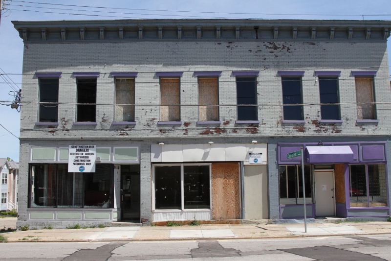
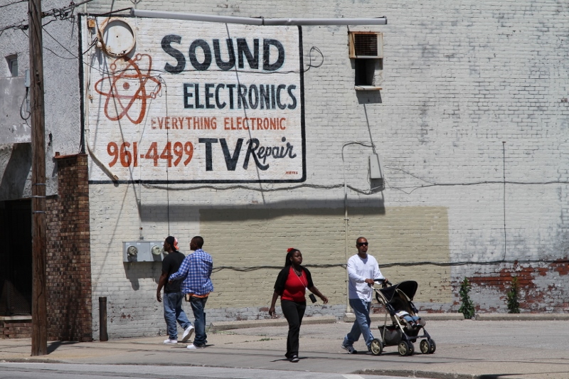
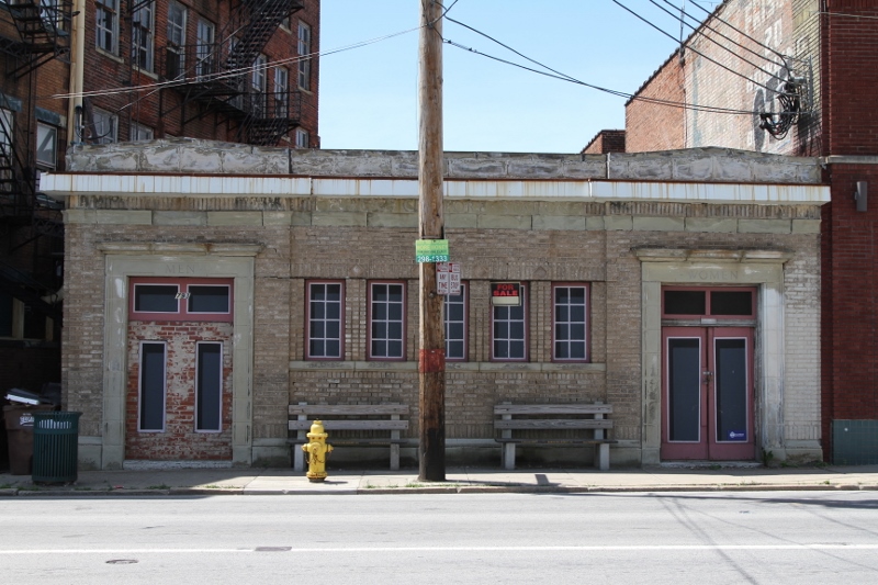
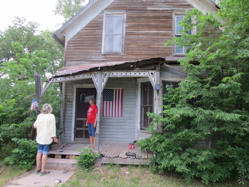
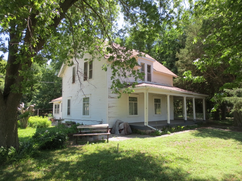
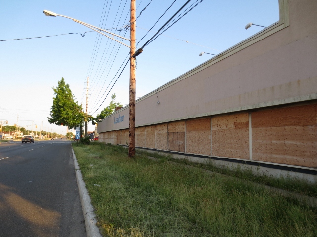
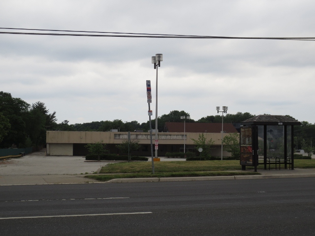
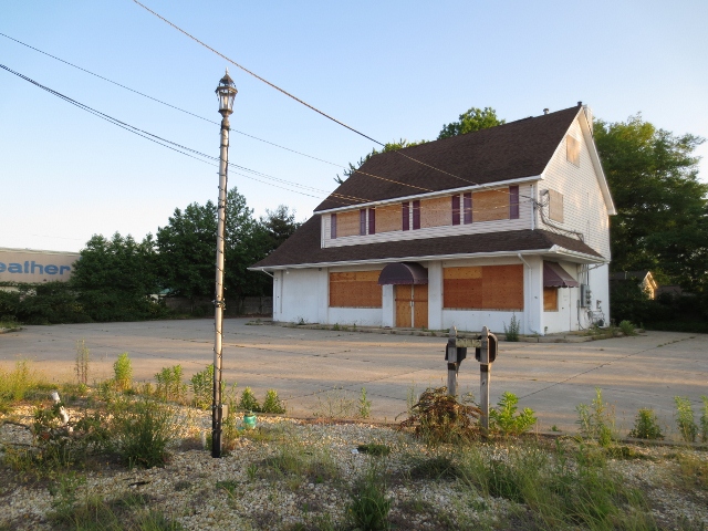
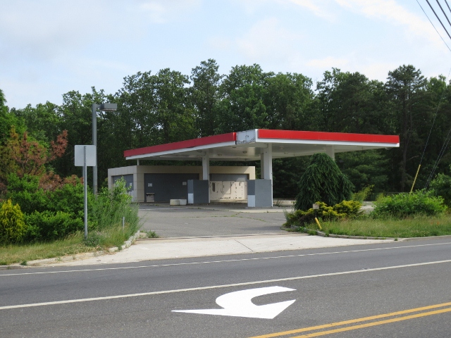
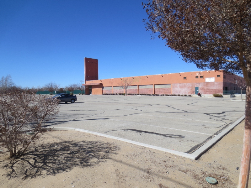
    But then there’s the east side of the tracks… These photos look like an Edward Hopper retrospective: bleak, empty, soulless, and unloved. No one has spent ten cents on this part of town in decades and it shows, yet it’s only a block from the beginning of The BLVD. and it’s pressed up against the back side of the train station. In another kind of town this might constitute prime real estate, or at least a place that had a little something going on. After all, the commuter train gives you direct convenient access to everything greater Los Angeles has to offer from jobs to culture. But in Lancaster it’s mostly vacant land, underutilized parking lots, semi-occupied warehouses, and marginal low value businesses. That’s not to say that people don’t live, work, attend church, and go to school in the nearby blocks. They’re just doing so without the benefit of any viable civic infrastructure.

    There may be good reasons why extending The BLVD east to the other side of the tracks won’t work. Aside from any physical or political limitations Lancaster may not be able to absorb much more in the way of upscale dining and discretionary shopping. I’ve had conversations with locals who say they can’t afford a $25 Italian dinner or a $6 beer at a trendy brew pub. Maybe eight blocks of good quality brick and mortar establishments is all Lancaster can handle at the moment. I’ve also heard that developers think the local real estate market might be able to absorb another fifty urban style condo/apartments near The BLVD. But five hundred? They just don’t know since this is terra incognita for them and their traditional business model. But the east side of the tracks might be the perfect place to establish an entirely different kind of environment at a lower price point that actually works for the people who already live nearby. Yucca Ave. runs parallel to the railroad tracks rather than perpendicular like The BLVD. More importantly, it’s an area the theater and chardonnay crowd never sees and doesn’t care about so it’s a great place to do some low cost, low risk, potentially high return experimenting to see what works and what doesn’t.

    Screen Shot 2014-11-03 at 12.32.12 PM Screen Shot 2014-11-05 at 12.36.41 PM 

    The city of Lancaster spent $10.5 million on the redevelopment of The BLVD, plus some state and federal funds. Personally, I can’t see the city mustering the political will to scrape together that kind of money to transform Yucca Ave. in a similar fashion. Instead, I see the back alleys and vacant parking lots as incubators for local micro-entrepreneurs who will interact with the people who live next door and down the street. It’s less about making everything “pretty” and more about making the place vibrant and productive at a scale that works on a tight budget. Yucca is just too big and wide and needs too much major help to be saved at the moment. But the backs and sides of these commercial buildings actually have a human scale and can be connected to the smaller more domestic streets and buildings they face across the alley.

    Screen Shot 2014-11-04 at 11.20.38 PM Screen Shot 2014-11-04 at 11.21.53 PMScreen Shot 2014-11-04 at 11.22.41 PMScreen Shot 2014-11-04 at 11.20.48 PMScreen Shot 2014-11-04 at 11.21.37 PM 

    Here’s one possible model that Lancaster might try along Yucca. This is a crappy triangular parking lot in San Francisco sandwiched between a double decker freeway and a Costco. I can’t imagine a worse location for anything. But a clever entrepreneur decided to rent the parking lot, install a few port-a-potties and hand washing stations, set up some inexpensive outdoor furniture, and then charge a modest rent for parking spaces to a rotating cast of local food trucks. It’s been fantastically successful and unlike The BLVD it costs almost nothing to install. This kind of operation does best in a marginal location with no NIMBYs or brick and mortar competition. Food trucks are infinitely less expensive to buy and operate than a traditional restaurant so the bar to entry is much lower for small business people. If the bank says no to a modest loan it’s possible to get start up capital from an aunt or cousin. In fact, these are most likely to be collaborative family businesses. The food these trucks serve is radically more affordable and can represent the specific tastes of the community in a way that McDonald’s or Domino’s may not – and the profits stay local rather than being sucked out to corporate headquarters. All the city of Lancaster would need to do is keep out of the way and let small business people do their thing without an endless amount of code enforcement to gum up the works.

    Screen Shot 2014-11-05 at 10.09.50 AM Screen Shot 2014-11-05 at 10.10.46 AM Screen Shot 2014-11-05 at 10.11.14 AM

    Here’s a different approach that might work even better since I’ve never actually seen a food truck anywhere in the Antelope Valley. My guess is that they’re illegal and/or can’t find a hospitable spot to park given the relentless and pervasive “mall security” guarding the Taco Bells and Applebees. This is the Underground Food Market in Oakland. This is a pop up market that appears quickly and then melts away in a single day. Both the vendors and the customers are told the date of the next event, but only alerted to the exact location at the last moment in order to keep code enforcement people unaware long enough to actually conduct business for an afternoon. None of these people use anything more elaborate than folding tables and barbecue equipment and it all fits in the trunk of a car or a pick up truck. Does this sort of thing violate a dozen health, safety, and zoning regulations? Yep. Has anyone ever gotten sick or died? Nope. If Lancaster could find a way to legitimize this sort of activity they might discover a ready supply of people in the neighborhood who would bring their talents to bear.

    Screen Shot 2014-11-03 at 12.30.23 PM  Screen Shot 2014-11-05 at 10.19.51 AM Screen Shot 2014-11-05 at 10.22.38 AM  Screen Shot 2014-11-05 at 10.20.45 AM pontocho_night  2662771

    I want to get back to the idea of human scale and how the best parts of Yucca are the little spaces between and around the buildings instead of the big parking lots and super wide street frontage. Everywhere I go in the world I find some of the best streets are barely wide enough for a car to pass through – and that’s part of the magic. I could see stretching some sun shades over the top of these alleys in Lancaster and lining the blank walls with shallow market stalls. This is an economic incubator that costs pennies and could lead to bigger and more permanent local businesses. The trick is to get the entry cost for experimentation down low enough to engage people without much capital or credit. Will this sort of thing terrify suburban homeowners out in the gated communities? Yep. Will they care if it happens in the “bad” part of town that they never visit? Maybe not…

    Screen Shot 2014-11-05 at 12.36.33 PM Screen Shot 2014-11-05 at 3.33.00 PM Screen Shot 2014-11-03 at 10.53.21 AM Screen Shot 2014-11-03 at 10.53.35 AM Screen Shot 2014-11-03 at 11.51.43 AM Screen Shot 2014-11-03 at 11.52.16 AM

    Here’s another example of a reuse of an existing space with very little actual construction. Property values are so high and vacancies are so low in places like San Francisco that every crappy building in every marginal location is being pressed into service for things that no one would have envisioned twenty years ago. Lancaster could do exactly the same thing at a much lower price point. I don’t imagine the wine and cheese crowd being interested in Yucca anytime soon, but there are all sorts of other subcultures that would love this much space to tinker with for their legitimate enterprises so long as the local authorities cut them some slack. What most of these empty warehouses in Lancaster need is fresh paint and the right people to colonize them. The trouble with lone mom and pop operations in this sort of desolate location is that without community and other active participants they tend to wither. Lancaster desperately needs a well organized group to adopt this place. Koreans, Mormons, Armenians, Hasidic Jews, Guatemalans… it needs a La Raza, a Chinatown, or a respectable gay population – any cohesive subculture that can reimagine the place and add vitality in a focussed and concentrated manner. Would it kill city officials to hang out the welcome mat instead of freaking out when “They” appear at the train station?

    Screen Shot 2014-11-05 at 12.34.20 PM Screen Shot 2014-11-05 at 12.33.29 PM unnamed unnamed-1 unnamed-2 unnamed-3 Screen Shot 2014-11-03 at 11.23.59 AM Screen Shot 2014-11-03 at 11.26.16 AM Screen Shot 2014-11-03 at 11.27.26 AM unnamed-4 unnamed-5 unnamed-6 unnamed-7

    Here’s one last example of a seriously bad location that is starting to be transformed in a way that cost the city almost nothing. Flora Grubb was a successful business woman who rented a vacant lot in San Francisco’s Mission District back when The Mission was cheap and considered a bad neighborhood. Renting a vacant lot was one of the few affordable options back when she was younger and just starting out. She didn’t need a building or much infrastructure since she sold plants, garden supplies, and outdoor furniture. As The Mission gradually became fashionable (largely due to lots of cool people like Flora doing their thing) property values rose so high that she was asked to leave so her landlord could put up luxury condos on the site. But the landlord was a clever guy. He had another vacant lot in a different miserable part of town half a block from the sewage treatment plant. He arranged for Flora to set up shop there. She had enough of a loyal following by then that people were willing to follow her to the new location. Her current shop is an open air industrial shed and a former parking lot. The landlord owns other nearby properties and is leveraging Flora’s activities to boost those values. Flora is the catalyst for the transformation of an entire block.

    Don’t get me wrong. I’m not saying Lancaster needs to become a mini San Francisco. That isn’t going to happen. But there are cost-effective techniques for jumpstarting a revival that Lancaster might consider in one of its least loved neighborhoods.

    John Sanphillippo lives in San Francisco and blogs about urbanism, adaptation, and resilience at granolashotgun.com. He’s a member of the Congress for New Urbanism, films videos for faircompanies.com, and is a regular contributor to Strongtowns.org. He earns his living by buying, renovating, and renting undervalued properties in places that have good long term prospects. He is a graduate of Rutgers University.

  • The Evolving Urban Form: Tianjin

    Tianjin is located on Bohai Gulf, approximately 75 miles (120 kilometers) from Beijing. It was the imperial port of China, by virtue of that proximity. Tianjin also served as one of the most important "treaty ports" occupied and/or controlled by western nations and Japan for various years before 1950.

    Tianjin is pivotally located along the East coast corridor between "Dongbei" – the northeast (the provinces of Heilongjiang, Jilin and Liaoning, which are also referred to as Manchuria) and Jinan, Nanjing, Shanghai and points south. Both the most direct expressway route (interstate standard) and high speed rail line from Shanghai to Dongbei cross through Tianjin rather than larger Beijing.

    Tianjin is one of four centrally administered provincial level municipalities, along with Shanghai, Beijing, and Chongqing. While Tianjin has grown strongly in recent years, it has been one of China’s largest cities for decades. According to the United Nations, the 1950 Tianjin urban area was the second largest in China, with 2.5 million residents, trailing only Shanghai which had 4.3 million. Beijing trailed Tianjin by a third, at 1.7 million.

    Population and Growth

    Since 1982, the total population of Tianjin has expanded by nearly 90 percent, from 7.9 million to 14.7 million in 2013 (Exhibit 1).  Population growth has accelerated over that time. Between 2000 and 2010, the population rose 2.7 percent annually, more than double 1.2 percent rate of the 1990s. The rate of increase was even higher between 2010 and 2013, at 4.5 percent.

    Between the 2000 and 2010 censuses, the inner core district (Heping qu), experienced a population loss of 12 percent. But the rest of the municipality increased, accounting for 101 percent of the growth. The balance of the core captured 18 percent of the growth, while the suburban ring attracted 27 percent. By far the greatest growth was in the outer districts, which accounted for a solid majority of the growth (Exhibit 2). This peripheral domination of growth mirrors the experience of other large Chinese cities, such as Shanghai, Beijing, and Chongqing, which have seen their core areas decline in population, with most growth occurring in the outer sectors.

    A New Megacity

    Tianjin is one of the world’s newest megacities (urban area over 10 million population). This has occurred because of the strong post-2010 population growth. In the next Demographia World Urban Areas (early 2015), Tianjin will have an estimated built up urban area population of 10.9 million. With an urban expanse covering 775 square miles (2,007 square kilometers), Tianjin has an urban population density of 14,100 per square mile (5,400 per square kilometer).

    With the urban area expanding geographically, Tianjin fits the international trend of cities, in growing strongly, yet experiencing declining overall urban densities. Chinese urban planners have told me that it has been an intended objective of policy to reduce population densities, to give people more living space. This is despite the preachments of US and European urban planners for whom higher densities often are embraced as an "Article of Faith."

    Tianjin’s Urban Form

    Despite their comparatively high density, Chinese cities are anything but compact. Most are polycentric in urban form, with central districts have widely spaced commercial buildings (the most notable exceptions may be Shanghai, Chongqing, and Dalian, but even these are somewhat polycentric). Tianjin, along with "in situ" urbanization Quanzhou, may be the least compact of the major cities.

    Tianjin has a broad central business district (CBD), populated with tall, commercial buildings and residential structures (Exhibits 3 & 4). As is the case in many Asian cities (such as Bangkok, Guanzhou-Foshan, Xi’an and Beijing, the tall commercial buildings tend to be highly dispersed, rather than close together as is the custom in Canadian and American cities. In between the dispersed tall buildings are lower rise buildings, both commercial and residential.

    Currently the tallest building in the CBD is the Tianjin World Financial Center (Exhibit 5), at 76 stories (1,105 feet or 337 meters). This is somewhat taller than New York’s Chrysler Building, which was the second tallest in Gotham for years. However, another taller building is near completion, the Tianjin R&F Guangdong Tower (Exhibit 6), which is well on the way to its 91 floors (1,535 feet or 468 meters). However,even this building is not as tall as three others under construction in other Tianjin centers.

    A second central business district is developing in the Binhai new area, near the port and 30 miles (50 kilometers) south of the Tianjin CBD. The Rose Rock International Financial Center will reach 100 floors (1,929 feet or 538 meters). This, however, is only the second tallest under construction. The CTF Tower is also under construction and will reach 96 floors (1,740 feet or 530 meters), nearly as tall as the new World Trade Center in New York (1,776 feet or 541 meters).

    Finally, the tallest building in Tianjin, Goldin Finance 117 is under construction approximately 9 miles (15 kilometers) west of the Tianjin CBD in a virtually new business center. This building will exceed the heights of all but three of the completed skyscrapers in the world (Lead Photo).

    Altogether, Tianjin will soon have five buildings of more than 90 floors, a record few if any cities will soon equal.

    Architecture

    Tianjin has more than its share of modern Chinese high rise commercial structures and residential buildings. But, perhaps to a greater extent than any other Chinese city, Tianjin exhibits the architecture of the foreign powers to a greater degree than some other treaty ports (such as Fuzhou, Dalian, and Wuhan). The city of Tianjin has meticulously preserved many of these structures, not only commercial and residential buildings, but also churches.

    The Tianjin CBD has a number of low rise streets with European architecture. Some of the most impressive are across the Hai River from the Tianjin Railway Station. There is also a long pedestrian street beyond with considerable western architecture. Virtually throughout the urban core there are examples of classic western architecture, some as ornate as in central Buenos Aires (Exhibit 7).

    Perhaps the most unique feature is a large area of western residences just to the south of the Tianjin CBD (Exhibits 8 & 9).

    In the Beijing Orbit: An Advantage

    Tianjin is clearly in the orbit of larger Beijing, which has recently announced plans for a 7th ring road and other infrastructure to tie not only the city but adjacent provincial level jurisdictions together (Tianjin and Hebei). With a strong policy interest in limiting Beijing’s population growth, and with plenty of rural land available, Tianjin could receive a substantial share of growth that otherwise would go to Beijing.

    Top photo: Goldin 117 Financial Building under construction at November 6, 2014 (by author).

    Wendell Cox is principal of Demographia, an international public policy and demographics firm. He is co-author of the "Demographia International Housing Affordability Survey" and author of "Demographia World Urban Areas" and "War on the Dream: How Anti-Sprawl Policy Threatens the Quality of Life." He was appointed to three terms on the Los Angeles County Transportation Commission, where he served with the leading city and county leadership as the only non-elected member. He was appointed to the Amtrak Reform Council to fill the unexpired term of Governor Christine Todd Whitman and has served as a visiting professor at the Conservatoire National des Arts et Metiers, a national university in Paris.

  • America’s Smartest Cities

    In this difficult recovery, many of the strongest local economies have been those with a high share of educated people in their workforce, particularly areas where technology companies and other knowledge-based industries are growing most rapidly.

    To determine the metro areas that are gaining brainpower in the 21stCentury, we scored the nation’s 380 metropolitan statistical areas based on three criteria. We started with the growth rate in the number of residents with at least a bachelor’s degree from 2000 through 2013 (25% weighting in final score). But since the places that post the highest growth rates tend to be those starting with low levels of educational attainment, we gave greater weight to the percentage point increase in the share of the population that is college-educated over that span (50%), and we factored in the share of educated people in the population in 2013 (25%). We also separated out results for the 51 MSAs with over a million residents.

    For the most part, the top 10 on our list of the 51 largest metro areas is dominated by places with large concentrations of colleges, and those that long ago made the transition from industrial to information-based economies.

    In the Boston-Cambridge-Newton metro area, 44.8% of the population has bachelor’s degrees or above, the fourth-highest concentration of brainpower in the nation, up 7.8 percentage points since 2000 on the strength of a 32.2% jump in its college-educated population. That places Boston No. 1 on our large cities list.

    It’s followed in second place by Pittsburgh, which logged the largest percentage point increase since 2000 in the proportion of its population that is college-educated, 8.8 points, to 32.2%, on the strength of 37.3% growth in raw numbers.

    Perhaps the biggest driver in increasing the concentration of educated people in a population lies in the composition of local industry. Silicon Valley has done very well, making heavy additions to an already high concentration of educated residents. The San Jose-Sunnyvale-Santa Clara metro area places third on our list with a population in which 46.7% hold a bachelor’s degree or above, the second highest share in the nation, a 6.8 percentage point jump over 2000. Its urban annex, San Francisco-Oakland-Hayward, places eighth, with a population that is 45.2% college-educated, an increase of 6.4 percentage points. To some extent, this reflects the area’s deindustrialization and high price structure; you do not want to come to the Bay Area today without a high-paying job requiring a good college degree if you expect to live a middle-class lifestyle.

    Another big employer of educated people is government, and with Washington in expansion mode over the past decade, it’s no surprise that our nation’s capital features in the top 10 — twice. The proportion of the population of Washington-Alexandria-Arlington that is college-educated has risen 6.2 points to 48.7%, the highest concentration in the nation, on the back of a 45% increase in the raw numbers. It ranks fifth on our list, followed in sixth place by neighboring Baltimore-Columbia-Towson, Md.

    The Small Smart Set

    Looking at the full set of the nation’s 380 metropolitan areas, the 51 biggest added far more people to their college-educated populations than the other 329 — a net 12 million since 2000, compared to 4.8 million for the smaller metro areas. But the growth rates were actually fairly similar, 43% vs. 41%, which highlights that the largest cities are no longer the only places attracting educated workers.

    Some of the most dramatic growth is taking place in two kinds of small-scale geographies: college towns and what might be best described as amenity regions. At the turn of the millennium, college towns already had a decent base of educated people; now they seem able to attract and nurture tech companies as well. This is the case for the second-ranked metro area on our overall list of all 380: Bloomington, Indiana. Home to Indiana University, the metro area has logged a dramatic 11.7 percentage point increase in the proportion of its population that is college educated since 2000. The share of its population with BAs is now 40.6%, putting it in range of places like Boston and the Bay Area.

    Much the same pattern can be seen in several college towns, including No. 4 Auburn-Opelika, Ala.; Hattiesburg, Miss. (sixth); Lawrence, Kan. (seventh), and Burlington, Vt. (10th). The other big growth areas are attractive small towns that have lured many down-shifting, but often well educated, boomers. Placing first on our overall list is St. George, Utah — its college-educated population increased by 167% from 2000 through 2013, making for a hefty 11.1 percentage point jump in the proportion of its population that’s college educated to 32.0%. Other areas with similar patterns of growth include Ocean City, N.J. (third), Wilmington, N.C. (fifth), Asheville, N.C. (eighth), and Redmond-Bend, Ore. (ninth).

    Looking Forward

    The rapid growth in the concentration of residents with bachelor’s degrees in these smaller cities suggests that the geography of brainpower is likely to change in the years ahead. For decades the Southeast and Midwest have lagged behind the Northeast and the West Coast in education, but this gap is closing somewhat, at least in the smaller cities. Save Burlington, Vt., not one small metro area in the Northeast or California ranked within the top 65 of our overall list.

    A plethora of places in the Southeast dot the top part of our overall list: in addition to the previously mentioned Wilmington and Asheville, Durham-Chapel Hill (15th); Charleston-North Charleston, S.C. (17th); and Savannah, Ga. (20th). The Intermountain West is well represented as well in addition to St. George, with Boulder, Colo., in 13th place, and Provo-Orem, Utah, in 22nd. These areas are all likely to emerge as top tech and professional centers as their ranks of educated workers swell.

    An equally compelling view of the future would be to concentrate on the locations of relatively recent college graduates. A recent study by Richey Piiparinen and Jim Russell for Cleveland State University looked at college-educated people between the ages of 25 and 34 in 2011-13. It found that many of the metro areas with the most rapid growth of this population were in the South, led by Nashville, Tenn., Orlando-Kissimmee-Sanford, Fla.; and Austin, Texas, all of which experienced growth in this cohort of between 15% and 25%.

    More surprising, however, was the strong growth in some Rust Belt cities, including Cleveland-Elyria (+20%), and Pittsburgh (12%). Piiparinen and Russell suggest this is, in part, due to the lower costs in these regions, which allow young people to live far better than they would in a pricier city on either coast. Clearly high costs could shift the nature of future educated migration. It already has caused millennial populations to stagnate in some traditional magnet cities for the educated, such as New York and San Francisco, and actually drop in the core areas of Chicago and Portland. Another factor could be the availability of high-paying jobs; Portland, for example, has an inordinate proportion of college-educated young residents working at lower wages than the national average. In contrast Houston, where high-paying jobs are being created at a healthy clip, the young educated cohort grew five times as fast.

    Of course many factors could shift this geography of education in the years ahead. An extended slide in oil prices, for example, could slow growth in places like Houston and Dallas, while a shift in the terrain of social media could have a devastating effect on the Bay Area. Yet looking ahead, it’s clear that the map of America’s brainpower is likely to continue changing. The leaders, particularly talent-producers such as Boston, should remain at the top for years to come, but other regions — notably the South, the Intermountain West and perhaps also the Rust Belt — could be making bigger gains in the years ahead.

    Educated Metropolitan Area Rankings
    Rank Rank in Size Group Region (MSA) Size Score 2013 share 2000-2013 Growth 2000-2013 point change
    1 1 St. George, UT S 72.0 32.0% 167.3% 11.1%
    2 2 Bloomington, IN S 69.7 40.6% 27.6% 11.7%
    3 3 Ocean City, NJ S 67.6 33.7% 48.7% 11.7%
    4 4 Auburn-Opelika, AL S 65.6 37.9% 90.0% 10.0%
    5 1 Wilmington, NC M 62.5 34.6% 37.6% 10.4%
    6 5 Hattiesburg, MS S 62.1 32.6% 77.7% 10.0%
    7 6 Lawrence, KS S 60.6 50.4% 50.4% 7.7%
    8 2 Asheville, NC M 60.2 32.7% 71.8% 9.6%
    9 7 Bend-Redmond, OR S 60.1 33.8% 104.6% 8.9%
    10 8 Burlington-South Burlington, VT S 59.2 43.3% 39.8% 8.4%
    11 9 Bloomington, IL S 58.1 41.8% 48.0% 8.2%
    12 1 Boston-Cambridge-Newton, MA-NH L 57.1 44.8% 32.2% 7.8%
    13 3 Boulder, CO M 56.8 58.5% 20.1% 6.1%
    14 10 Iowa City, IA S 55.2 48.6% 45.2% 6.6%
    15 4 Durham-Chapel Hill, NC M 54.7 45.5% 53.1% 6.8%
    16 2 Pittsburgh, PA L 54.7 32.2% 37.3% 8.8%
    17 5 Charleston-North Charleston, SC M 54.7 33.0% 81.5% 8.0%
    18 3 San Jose-Sunnyvale-Santa Clara, CA L 54.2 46.7% 32.9% 6.8%
    19 4 Grand Rapids-Wyoming, MI L 54.0 30.6% 92.7% 7.9%
    20 6 Savannah, GA M 53.9 31.3% 73.2% 8.1%
    21 5 Washington-Arlington-Alexandria, DC-VA-MD-WV L 53.3 48.7% 44.9% 6.2%
    22 7 Provo-Orem, UT M 52.9 37.7% 94.5% 6.7%
    23 11 Hilton Head Island-Bluffton-Beaufort, SC S 52.6 36.7% 83.4% 6.9%
    24 6 Baltimore-Columbia-Towson, MD L 52.6 36.8% 40.8% 7.6%
    25 7 Raleigh, NC L 52.6 43.7% 78.7% 6.1%
    26 12 Missoula, MT S 52.5 39.8% 48.8% 7.0%
    27 8 Des Moines-West Des Moines, IA M 52.4 35.4% 59.8% 7.4%
    28 9 Ann Arbor, MI M 51.4 53.5% 23.7% 5.4%
    29 8 San Francisco-Oakland-Hayward, CA L 51.3 45.2% 30.8% 6.4%
    30 9 Seattle-Tacoma-Bellevue, WA L 50.9 39.4% 47.9% 6.7%
    31 10 New York-Newark-Jersey City, NY-NJ-PA L 50.9 37.4% 37.9% 7.1%
    32 11 St. Louis, MO-IL L 50.8 32.5% 41.9% 7.7%
    33 13 Sioux Falls, SD S 50.6 32.3% 73.0% 7.2%
    34 10 Fayetteville-Springdale-Rogers, AR-MO M 50.4 28.2% 92.3% 7.4%
    35 14 Manhattan, KS S 50.3 37.8% 13.0% 7.4%
    36 15 Great Falls, MT S 50.2 29.4% 45.5% 7.9%
    37 12 Denver-Aurora-Lakewood, CO L 49.4 40.3% 52.2% 6.1%
    38 11 Trenton, NJ M 49.0 40.4% 27.7% 6.4%
    39 16 Logan, UT-ID S 48.8 35.9% 66.6% 6.3%
    40 17 Corvallis, OR S 48.7 52.2% 26.1% 4.8%
    41 18 Hinesville, GA S 48.4 20.9% 101.1% 7.7%
    42 13 Nashville-Davidson–Murfreesboro–Franklin, TN L 48.4 32.3% 71.9% 6.6%
    43 14 Philadelphia-Camden-Wilmington, PA-NJ-DE-MD L 48.2 34.6% 36.3% 6.9%
    44 19 California-Lexington Park, MD S 48.1 29.5% 69.3% 7.0%
    45 15 Minneapolis-St. Paul-Bloomington, MN-WI L 48.1 39.3% 43.7% 6.1%
    46 12 Bridgeport-Stamford-Norwalk, CT M 48.0 45.5% 21.5% 5.6%
    47 13 Portland-South Portland, ME M 47.9 35.8% 37.2% 6.6%
    48 20 Columbia, MO S 47.7 45.3% 35.0% 5.3%
    49 14 Madison, WI M 47.6 42.4% 48.5% 5.5%
    50 16 Portland-Vancouver-Hillsboro, OR-WA L 47.4 35.1% 53.9% 6.3%
    51 15 Salisbury, MD-DE M 46.9 22.5% 344.7% 3.0%
    52 21 Morgantown, WV S 46.7 32.5% 55.5% 6.4%
    53 17 Austin-Round Rock, TX L 46.3 41.5% 79.8% 4.8%
    54 16 Omaha-Council Bluffs, NE-IA M 46.3 33.4% 48.0% 6.4%
    55 22 Fargo, ND-MN S 46.3 35.3% 56.7% 5.9%
    56 23 Sumter, SC S 46.2 23.3% 58.9% 7.5%
    57 24 State College, PA S 46.1 41.7% 36.0% 5.4%
    58 25 Elizabethtown-Fort Knox, KY S 46.1 21.6% 113.7% 6.8%
    59 17 Green Bay, WI M 45.9 27.0% 54.7% 7.0%
    60 18 Lexington-Fayette, KY M 45.6 35.7% 45.7% 5.9%
    61 19 Huntsville, AL M 45.6 36.5% 54.5% 5.6%
    62 18 Buffalo-Cheektowaga-Niagara Falls, NY L 45.4 30.1% 29.4% 6.9%
    63 19 Chicago-Naperville-Elgin, IL-IN-WI L 45.4 35.1% 32.5% 6.2%
    64 20 Hartford-West Hartford-East Hartford, CT L 45.2 36.5% 28.5% 6.0%
    65 20 Worcester, MA-CT M 44.9 32.9% 55.0% 6.0%
    66 21 Milwaukee-Waukesha-West Allis, WI L 44.8 33.2% 33.4% 6.3%
    67 21 Clarksville, TN-KY M 44.8 23.2% 70.1% 7.0%
    68 26 Pittsfield, MA S 44.5 32.4% 24.4% 6.4%
    69 22 Cincinnati, OH-KY-IN L 44.4 31.2% 37.7% 6.4%
    70 27 Gettysburg, PA S 44.3 23.6% 63.8% 6.9%
    71 22 Greeley, CO M 44.3 27.4% 101.2% 5.8%
    72 23 Peoria, IL M 44.0 27.4% 41.3% 6.7%
    73 28 Daphne-Fairhope-Foley, AL S 44.0 29.0% 76.5% 5.9%
    74 24 North Port-Sarasota-Bradenton, FL M 43.9 30.6% 53.3% 6.0%
    75 29 Springfield, IL S 43.9 34.0% 30.0% 6.0%
    76 30 Santa Fe, NM S 43.7 41.7% 37.1% 4.8%
    77 25 New Haven-Milford, CT M 43.4 33.5% 30.1% 5.9%
    78 26 Davenport-Moline-Rock Island, IA-IL M 43.3 26.5% 41.2% 6.6%
    79 27 Evansville, IN-KY M 43.3 24.5% 32.3% 7.0%
    80 31 Napa, CA S 43.1 32.2% 39.8% 5.8%
    81 32 Fairbanks, AK S 43.1 32.6% 52.5% 5.6%
    82 23 Kansas City, MO-KS L 43.1 33.7% 37.7% 5.7%
    83 28 Hagerstown-Martinsburg, MD-WV M 43.0 21.3% 71.5% 6.7%
    84 24 Columbus, OH L 42.7 33.7% 50.0% 5.4%
    85 33 Champaign-Urbana, IL S 42.4 39.4% 30.3% 4.9%
    86 29 Urban Honolulu, HI M 42.2 33.4% 37.5% 5.5%
    87 30 Norwich-New London, CT M 42.2 32.0% 32.7% 5.8%
    88 34 Ithaca, NY S 42.2 50.9% 21.3% 3.4%
    89 35 Johnson City, TN S 42.0 24.8% 50.2% 6.4%
    90 25 Tampa-St. Petersburg-Clearwater, FL L 42.0 27.6% 53.1% 5.9%
    91 31 Boise City, ID M 41.9 30.7% 74.5% 5.2%
    92 26 Jacksonville, FL L 41.9 28.3% 62.5% 5.7%
    93 36 Ames, IA S 41.8 48.2% 22.0% 3.7%
    94 27 Virginia Beach-Norfolk-Newport News, VA-NC L 41.8 29.6% 41.2% 5.8%
    95 28 Providence-Warwick, RI-MA L 41.7 29.6% 30.9% 6.0%
    96 37 Rochester, MN S 41.7 35.3% 56.9% 4.8%
    97 38 Grand Junction, CO S 41.6 27.6% 63.7% 5.7%
    98 32 Bremerton-Silverdale, WA M 41.6 30.9% 42.2% 5.6%
    99 33 Roanoke, VA M 41.6 27.1% 40.7% 6.1%
    100 29 Birmingham-Hoover, AL L 41.5 28.6% 39.9% 5.9%
    101 39 Charlottesville, VA S 41.4 42.2% 48.2% 3.9%
    102 34 Allentown-Bethlehem-Easton, PA-NJ M 41.4 27.6% 44.3% 5.9%
    103 40 Las Cruces, NM S 41.3 27.9% 59.3% 5.6%
    104 30 Los Angeles-Long Beach-Anaheim, CA L 41.3 31.7% 36.6% 5.5%
    105 41 Winchester, VA-WV S 41.2 24.2% 71.3% 5.9%
    106 31 San Diego-Carlsbad, CA L 41.2 34.6% 39.9% 5.0%
    107 35 Fort Collins, CO M 41.2 43.3% 43.6% 3.8%
    108 32 Cleveland-Elyria, OH L 41.0 29.8% 23.8% 5.9%
    109 36 Albany-Schenectady-Troy, NY M 40.8 34.3% 28.0% 5.2%
    110 37 Santa Cruz-Watsonville, CA M 40.6 38.9% 18.6% 4.7%
    111 42 Bellingham, WA S 40.4 32.2% 51.9% 5.0%
    112 33 Louisville/Jefferson County, KY-IN L 40.4 27.0% 42.5% 5.8%
    113 43 Bismarck, ND S 40.3 30.5% 65.3% 4.9%
    114 34 Detroit-Warren-Dearborn, MI L 40.0 29.0% 24.6% 5.7%
    115 38 Lynchburg, VA M 39.8 24.6% 46.9% 5.9%
    116 35 Miami-Fort Lauderdale-West Palm Beach, FL L 39.8 29.3% 45.2% 5.3%
    117 39 Cape Coral-Fort Myers, FL M 39.7 26.2% 84.1% 5.1%
    118 44 Appleton, WI S 39.7 27.6% 48.8% 5.4%
    119 36 Charlotte-Concord-Gastonia, NC-SC L 39.7 32.0% 102.3% 4.0%
    120 40 Lancaster, PA M 39.6 26.1% 47.7% 5.6%
    121 41 Akron, OH M 39.4 29.7% 27.7% 5.4%
    122 42 Lincoln, NE M 39.4 36.3% 37.0% 4.4%
    123 43 Scranton–Wilkes-Barre–Hazleton, PA M 39.3 23.6% 35.7% 6.1%
    124 45 Jonesboro, AR S 39.2 23.1% 58.5% 5.8%
    125 37 Richmond, VA L 39.2 32.5% 37.0% 4.9%
    126 44 Erie, PA M 39.2 26.6% 32.9% 5.7%
    127 46 Sierra Vista-Douglas, AZ S 39.1 24.5% 52.4% 5.7%
    128 38 Orlando-Kissimmee-Sanford, FL L 39.0 29.5% 66.5% 4.7%
    129 47 Dover, DE S 39.0 23.9% 79.0% 5.3%
    130 45 Myrtle Beach-Conway-North Myrtle Beach, SC-NC M 39.0 22.7% 163.1% 4.0%
    131 46 Naples-Immokalee-Marco Island, FL M 39.0 32.4% 58.2% 4.5%
    132 39 Rochester, NY L 38.8 32.6% 27.6% 4.9%
    133 40 Houston-The Woodlands-Sugar Land, TX L 38.7 30.9% 61.7% 4.5%
    134 48 Kahului-Wailuku-Lahaina, HI S 38.7 27.4% 60.0% 5.0%
    135 49 Walla Walla, WA S 38.5 28.1% 37.8% 5.2%
    136 50 Flagstaff, AZ S 38.4 34.3% 40.1% 4.4%
    137 47 Ogden-Clearfield, UT M 38.4 29.0% 79.0% 4.4%
    138 48 San Luis Obispo-Paso Robles-Arroyo Grande, CA M 38.3 31.5% 35.4% 4.8%
    139 51 Bloomsburg-Berwick, PA S 38.2 23.0% 40.8% 5.8%
    140 52 Fond du Lac, WI S 38.2 22.6% 48.7% 5.7%
    141 49 Harrisburg-Carlisle, PA M 38.2 29.4% 34.8% 5.0%
    142 53 Dubuque, IA S 38.0 26.6% 38.2% 5.3%
    143 54 Homosassa Springs, FL S 38.0 18.9% 70.8% 5.8%
    144 50 Manchester-Nashua, NH M 37.9 34.5% 27.0% 4.4%
    145 51 Reno, NV M 37.8 28.4% 58.5% 4.7%
    146 55 La Crosse-Onalaska, WI-MN S 37.5 29.5% 34.1% 4.9%
    147 41 Dallas-Fort Worth-Arlington, TX L 37.4 32.6% 54.6% 4.1%
    148 42 San Antonio-New Braunfels, TX L 37.4 26.7% 66.2% 4.7%
    149 56 Cheyenne, WY S 37.2 28.2% 45.2% 4.8%
    150 43 Atlanta-Sandy Springs-Roswell, GA L 37.1 35.2% 47.7% 3.8%
    151 52 Wichita, KS M 37.0 29.0% 36.9% 4.8%
    152 57 Kingston, NY S 37.0 29.8% 25.9% 4.8%
    153 53 Ocala, FL M 36.9 19.0% 84.4% 5.3%
    154 44 Las Vegas-Henderson-Paradise, NV L 36.9 22.1% 91.4% 4.7%
    155 45 Indianapolis-Carmel-Anderson, IN L 36.8 30.8% 51.4% 4.3%
    156 54 Shreveport-Bossier City, LA M 36.8 24.2% 56.8% 5.0%
    157 58 Columbus, IN S 36.6 27.0% 36.8% 4.9%
    158 46 Sacramento–Roseville–Arden-Arcade, CA L 36.6 30.8% 48.4% 4.2%
    159 59 Altoona, PA S 36.5 19.7% 41.8% 5.8%
    160 47 Phoenix-Mesa-Scottsdale, AZ L 36.4 29.2% 62.5% 4.2%
    161 55 Syracuse, NY M 36.4 29.9% 25.6% 4.7%
    162 56 Oxnard-Thousand Oaks-Ventura, CA M 36.1 31.2% 34.8% 4.3%
    163 60 Niles-Benton Harbor, MI S 36.1 24.9% 26.5% 5.3%
    164 61 Elmira, NY S 36.1 23.9% 29.0% 5.3%
    165 57 Colorado Springs, CO M 36.0 35.3% 43.7% 3.6%
    166 62 Chico, CA S 35.9 26.6% 36.7% 4.8%
    167 58 Columbia, SC M 35.9 30.7% 44.3% 4.1%
    168 59 Baton Rouge, LA M 35.8 27.3% 46.7% 4.5%
    169 63 Cape Girardeau, MO-IL S 35.3 24.9% 31.3% 5.0%
    170 60 Springfield, MO M 35.2 25.8% 51.2% 4.5%
    171 64 Greenville, NC S 35.1 28.4% 33.3% 4.4%
    172 61 Lansing-East Lansing, MI M 34.9 32.4% 23.8% 4.0%
    173 65 Staunton-Waynesboro, VA S 34.9 22.4% 41.7% 5.0%
    174 66 Pocatello, ID S 34.9 28.4% 28.0% 4.5%
    175 48 New Orleans-Metairie, LA L 34.9 27.4% 21.8% 4.7%
    176 62 Greenville-Anderson-Mauldin, SC M 34.8 26.8% 81.5% 3.8%
    177 67 Midland, MI S 34.7 33.2% 21.8% 3.9%
    178 63 Kalamazoo-Portage, MI M 34.6 31.0% 25.3% 4.1%
    179 68 Barnstable Town, MA S 34.5 37.1% 10.2% 3.5%
    180 64 Atlantic City-Hammonton, NJ M 34.5 23.5% 40.0% 4.8%
    181 65 Duluth, MN-WI M 34.3 25.2% 28.9% 4.7%
    182 69 Wheeling, WV-OH S 34.3 20.0% 34.1% 5.3%
    183 49 Memphis, TN-MS-AR L 34.1 26.4% 38.1% 4.4%
    184 70 Glens Falls, NY S 34.1 23.6% 37.2% 4.7%
    185 50 Salt Lake City, UT L 34.1 31.2% 43.8% 3.6%
    186 71 Monroe, MI S 34.0 19.4% 47.7% 5.1%
    187 72 Harrisonburg, VA S 33.7 25.6% 47.1% 4.2%
    188 73 Albany, OR S 33.7 18.3% 62.1% 4.9%
    189 66 Spartanburg, SC M 33.6 22.6% 56.1% 4.4%
    190 67 Greensboro-High Point, NC M 33.5 27.5% 36.6% 4.1%
    191 74 Binghamton, NY S 33.1 26.4% 19.9% 4.4%
    192 75 Lafayette-West Lafayette, IN S 32.9 32.5% 32.6% 3.3%
    193 76 Lebanon, PA S 32.9 20.1% 47.8% 4.7%
    194 77 Bay City, MI S 32.8 19.2% 35.4% 5.0%
    195 68 Eugene, OR M 32.6 29.2% 30.9% 3.7%
    196 78 Coeur d’Alene, ID S 32.6 23.0% 68.6% 3.9%
    197 79 Blacksburg-Christiansburg-Radford, VA S 32.6 29.3% 38.0% 3.6%
    198 80 Battle Creek, MI S 32.6 20.8% 31.1% 4.8%
    199 51 Oklahoma City, OK L 32.5 27.9% 41.8% 3.7%
    200 69 Chattanooga, TN-GA M 32.4 23.7% 42.1% 4.2%
    201 81 College Station-Bryan, TX S 32.3 34.2% 49.9% 2.7%
    202 70 Augusta-Richmond County, GA-SC M 32.2 24.5% 45.2% 4.0%
    203 71 Springfield, MA M 32.2 29.2% 7.8% 4.0%
    204 82 Carbondale-Marion, IL S 32.0 27.5% 27.3% 3.9%
    205 83 Johnstown, PA S 32.0 18.7% 28.4% 5.0%
    206 84 Saginaw, MI S 31.9 20.7% 26.3% 4.8%
    207 72 El Paso, TX M 31.8 20.8% 57.7% 4.2%
    208 73 Tucson, AZ M 31.8 30.1% 35.0% 3.3%
    209 74 Pensacola-Ferry Pass-Brent, FL M 31.7 25.4% 37.7% 3.9%
    210 85 Bowling Green, KY S 31.5 25.3% 86.0% 3.1%
    211 86 Charleston, WV S 31.5 22.8% -4.8% 4.9%
    212 87 Medford, OR S 31.4 26.0% 40.9% 3.7%
    213 75 Santa Rosa, CA M 31.4 31.7% 25.4% 3.2%
    214 88 Chambersburg-Waynesboro, PA S 31.3 19.1% 54.2% 4.3%
    215 76 Tallahassee, FL M 31.2 36.6% 26.8% 2.5%
    216 89 Jackson, TN S 31.2 23.8% 50.4% 3.8%
    217 90 Brunswick, GA S 31.0 23.4% 50.2% 3.8%
    218 77 Fayetteville, NC M 31.0 22.3% 43.0% 4.0%
    219 52 Riverside-San Bernardino-Ontario, CA L 31.0 20.1% 73.9% 3.8%
    220 78 Anchorage, AK M 30.9 30.0% 41.4% 3.0%
    221 91 Oshkosh-Neenah, WI S 30.8 26.4% 30.1% 3.6%
    222 79 Dayton, OH M 30.7 26.6% 14.1% 3.9%
    223 92 Decatur, IL S 30.5 21.3% 24.9% 4.3%
    224 80 Deltona-Daytona Beach-Ormond Beach, FL M 30.5 21.3% 66.9% 3.6%
    225 81 Killeen-Temple, TX M 30.5 21.6% 61.5% 3.7%
    226 82 Tulsa, OK M 30.5 26.0% 33.0% 3.6%
    227 83 Reading, PA M 30.4 22.5% 35.3% 4.0%
    228 84 Jackson, MS M 30.4 29.3% 35.6% 3.1%
    229 85 Little Rock-North Little Rock-Conway, AR M 30.3 27.4% 37.6% 3.3%
    230 86 Huntington-Ashland, WV-KY-OH M 30.1 18.8% 63.5% 3.9%
    231 93 Wausau, WI S 30.0 22.2% 37.5% 3.9%
    232 87 Port St. Lucie, FL M 30.0 23.1% 60.6% 3.4%
    233 94 Grants Pass, OR S 30.0 18.3% 48.6% 4.2%
    234 88 Utica-Rome, NY M 30.0 21.9% 24.6% 4.1%
    235 95 Casper, WY S 29.9 23.5% 47.8% 3.5%
    236 89 Canton-Massillon, OH M 29.7 21.4% 26.3% 4.1%
    237 90 Albuquerque, NM M 29.6 30.7% 40.7% 2.6%
    238 96 Sebastian-Vero Beach, FL S 29.4 26.2% 42.3% 3.1%
    239 91 Santa Maria-Santa Barbara, CA M 29.4 32.2% 18.4% 2.7%
    240 97 Prescott, AZ S 29.3 24.3% 55.2% 3.2%
    241 98 Muncie, IN S 29.0 24.1% 16.1% 3.7%
    242 99 Lake Charles, LA S 28.9 20.3% 35.5% 3.9%
    243 92 Lubbock, TX M 28.9 26.9% 37.6% 3.0%
    244 93 York-Hanover, PA M 28.6 21.9% 39.1% 3.5%
    245 94 Mobile, AL M 28.5 22.3% 30.4% 3.6%
    246 100 Grand Forks, ND-MN S 28.5 27.4% 17.3% 3.2%
    247 95 Brownsville-Harlingen, TX M 28.4 17.1% 63.6% 3.7%
    248 101 Yuba City, CA S 28.4 17.0% 61.7% 3.8%
    249 96 Olympia-Tumwater, WA M 28.4 32.0% 41.8% 2.1%
    250 97 Youngstown-Warren-Boardman, OH-PA M 28.4 20.3% 19.3% 4.0%
    251 102 Lewiston, ID-WA S 28.3 22.1% 32.5% 3.5%
    252 98 Palm Bay-Melbourne-Titusville, FL M 28.2 26.5% 33.4% 2.9%
    253 99 Toledo, OH M 28.2 24.8% 10.5% 3.5%
    254 100 Knoxville, TN M 28.1 27.1% 55.2% 2.5%
    255 101 Lakeland-Winter Haven, FL M 28.0 18.4% 60.9% 3.5%
    256 103 Lewiston-Auburn, ME S 28.0 18.3% 35.8% 3.9%
    257 104 Bangor, ME S 27.9 23.6% 30.0% 3.3%
    258 105 Midland, TX S 27.9 27.3% 49.9% 2.5%
    259 102 Vallejo-Fairfield, CA M 27.9 24.5% 31.8% 3.1%
    260 106 Florence, SC S 27.9 20.5% 33.9% 3.6%
    261 107 Springfield, OH S 27.8 18.9% 23.5% 4.0%
    262 103 Hickory-Lenoir-Morganton, NC M 27.8 17.5% 40.5% 3.9%
    263 108 Punta Gorda, FL S 27.8 21.0% 40.3% 3.4%
    264 104 McAllen-Edinburg-Mission, TX M 27.8 16.2% 84.9% 3.3%
    265 109 Gainesville, GA S 27.7 21.7% 59.6% 3.0%
    266 110 Joplin, MO S 27.6 19.9% 38.3% 3.6%
    267 111 St. Cloud, MN S 27.6 24.0% 37.9% 3.0%
    268 112 Williamsport, PA S 27.6 19.0% 26.1% 3.9%
    269 105 Cedar Rapids, IA M 27.5 27.6% 26.3% 2.7%
    270 113 Tuscaloosa, AL S 27.4 24.7% 37.1% 2.9%
    271 114 Eau Claire, WI S 27.3 25.0% 31.8% 2.9%
    272 115 Mount Vernon-Anacortes, WA S 27.1 23.7% 39.5% 2.9%
    273 116 Tyler, TX S 27.1 25.3% 40.7% 2.7%
    274 106 Fort Wayne, IN M 27.0 24.3% 27.2% 3.0%
    275 117 Racine, WI S 26.9 23.4% 25.4% 3.2%
    276 118 Beckley, WV S 26.9 15.9% 33.9% 4.0%
    277 119 Hammond, LA S 26.4 19.3% 58.0% 3.0%
    278 107 Salem, OR M 26.3 23.6% 34.3% 2.8%
    279 120 Topeka, KS S 26.2 26.3% 18.4% 2.7%
    280 121 Hot Springs, AR S 26.1 21.1% 31.4% 3.1%
    281 122 Pueblo, CO S 26.0 21.3% 37.2% 3.0%
    282 123 Lima, OH S 25.8 17.1% 27.2% 3.7%
    283 124 Sheboygan, WI S 25.8 21.1% 26.0% 3.2%
    284 125 Jefferson City, MO S 25.7 24.0% 23.0% 2.8%
    285 126 Burlington, NC S 25.6 22.0% 36.8% 2.8%
    286 127 Waterloo-Cedar Falls, IA S 25.5 25.0% 18.1% 2.7%
    287 128 Michigan City-La Porte, IN S 25.3 17.4% 31.5% 3.4%
    288 108 Laredo, TX M 25.3 16.8% 70.4% 2.9%
    289 129 Jacksonville, NC S 25.3 17.8% 56.3% 3.0%
    290 130 Muskegon, MI S 25.3 17.3% 31.5% 3.4%
    291 109 South Bend-Mishawaka, IN-MI M 25.3 24.4% 17.3% 2.7%
    292 110 Fort Smith, AR-OK M 25.2 16.7% 33.0% 3.5%
    293 111 Gainesville, FL M 25.0 37.5% 24.2% 0.8%
    294 112 Winston-Salem, NC M 25.0 25.7% 66.2% 1.7%
    295 113 Amarillo, TX M 24.9 23.4% 31.9% 2.5%
    296 114 Columbus, GA-AL M 24.9 21.1% 32.3% 2.8%
    297 131 San Angelo, TX S 24.9 22.2% 30.8% 2.7%
    298 132 Decatur, AL S 24.8 18.9% 30.2% 3.1%
    299 133 Cleveland, TN S 24.8 17.6% 44.1% 3.1%
    300 134 Janesville-Beloit, WI S 24.8 19.7% 29.8% 3.0%
    301 135 Weirton-Steubenville, WV-OH S 24.3 15.7% 20.6% 3.6%
    302 115 Kingsport-Bristol-Bristol, TN-VA M 24.1 18.6% 26.2% 3.1%
    303 136 Valdosta, GA S 24.0 20.1% 35.4% 2.7%
    304 116 Flint, MI M 23.9 19.3% 18.8% 3.0%
    305 117 Stockton-Lodi, CA M 23.5 17.2% 53.0% 2.6%
    306 118 Crestview-Fort Walton Beach-Destin, FL M 23.4 25.6% 63.8% 1.3%
    307 137 Jackson, MI S 23.4 19.1% 22.4% 2.9%
    308 138 Abilene, TX S 23.4 22.1% 21.1% 2.5%
    309 139 Watertown-Fort Drum, NY S 23.4 18.9% 26.2% 2.8%
    310 119 Kennewick-Richland, WA M 23.1 24.8% 54.4% 1.5%
    311 140 East Stroudsburg, PA S 23.1 22.6% 36.9% 2.1%
    312 141 Cumberland, MD-WV S 23.0 16.5% 24.2% 3.1%
    313 142 Sioux City, IA-NE-SD S 22.9 20.8% 34.5% 2.3%
    314 120 Fresno, CA M 22.6 19.8% 41.1% 2.3%
    315 121 Beaumont-Port Arthur, TX M 22.4 17.4% 28.9% 2.7%
    316 122 Rockford, IL M 22.1 21.0% 23.0% 2.3%
    317 143 Mankato-North Mankato, MN S 22.0 28.8% 27.1% 1.2%
    318 123 Montgomery, AL M 21.9 25.9% 19.1% 1.7%
    319 144 Dothan, AL S 21.8 18.3% 33.2% 2.4%
    320 145 Gadsden, AL S 21.7 16.2% 24.2% 2.8%
    321 124 Gulfport-Biloxi-Pascagoula, MS M 21.2 19.3% 73.8% 1.4%
    322 125 Merced, CA M 21.2 13.5% 59.1% 2.4%
    323 146 Rome, GA S 20.9 18.2% 22.4% 2.4%
    324 147 Elkhart-Goshen, IN S 20.9 17.8% 29.2% 2.3%
    325 148 Goldsboro, NC S 20.8 17.4% 28.4% 2.4%
    326 149 Rapid City, SD S 20.8 24.5% 42.0% 1.2%
    327 150 Mansfield, OH S 20.7 15.3% 19.3% 2.7%
    328 151 Rocky Mount, NC S 20.5 16.3% 28.6% 2.4%
    329 152 Hanford-Corcoran, CA S 20.5 12.9% 48.8% 2.5%
    330 153 Grand Island, NE S 20.5 18.2% 25.6% 2.2%
    331 154 Longview, WA S 20.1 15.6% 36.7% 2.3%
    332 126 Spokane-Spokane Valley, WA M 20.1 25.9% 39.5% 0.9%
    333 155 El Centro, CA S 20.1 12.7% 55.8% 2.3%
    334 156 Kokomo, IN S 20.1 19.5% -2.9% 2.4%
    335 157 Terre Haute, IN S 19.8 19.4% 14.6% 2.1%
    336 158 Alexandria, LA S 19.6 17.7% 25.6% 2.0%
    337 127 Modesto, CA M 19.5 16.0% 40.5% 2.0%
    338 159 Yuma, AZ S 19.3 13.9% 48.8% 2.1%
    339 160 Billings, MT S 19.2 26.8% 28.2% 0.7%
    340 161 St. Joseph, MO-KS S 19.0 18.3% 21.9% 1.9%
    341 162 Macon, GA S 19.0 20.4% 15.9% 1.7%
    342 163 Lawton, OK S 18.8 20.5% 28.1% 1.4%
    343 164 Texarkana, TX-AR S 18.6 16.8% 33.8% 1.8%
    344 165 Owensboro, KY S 18.3 17.4% 23.0% 1.8%
    345 166 Panama City, FL S 17.8 18.8% 43.4% 1.1%
    346 167 Morristown, TN S 17.7 14.4% 13.3% 2.2%
    347 128 Visalia-Porterville, CA M 17.7 13.3% 47.1% 1.8%
    348 168 Odessa, TX S 17.7 13.8% 42.1% 1.8%
    349 169 Idaho Falls, ID S 17.4 24.5% 41.4% 0.3%
    350 170 Sherman-Denison, TX S 17.3 18.6% 23.3% 1.4%
    351 171 Vineland-Bridgeton, NJ S 17.3 13.7% 27.0% 2.0%
    352 172 Warner Robins, GA S 17.2 20.1% 74.6% 0.3%
    353 129 Lafayette, LA M 17.1 21.6% 107.4% -0.5%
    354 173 Wichita Falls, TX S 17.0 20.5% 10.5% 1.3%
    355 174 Kankakee, IL S 17.0 16.6% 23.1% 1.6%
    356 175 New Bern, NC S 16.6 18.9% 23.6% 1.2%
    357 176 Sebring, FL S 15.9 15.1% 23.8% 1.5%
    358 177 Parkersburg-Vienna, WV S 15.6 16.9% -33.6% 2.1%
    359 178 Lake Havasu City-Kingman, AZ S 15.5 11.3% 56.0% 1.4%
    360 130 Waco, TX M 15.3 19.7% 27.9% 0.6%
    361 179 Athens-Clarke County, GA S 15.2 31.6% 20.3% -0.8%
    362 180 Monroe, LA S 15.1 21.7% 13.8% 0.6%
    363 181 Danville, IL S 14.3 13.9% 8.7% 1.5%
    364 131 Bakersfield, CA M 14.2 14.4% 41.6% 0.9%
    365 182 Redding, CA S 13.9 17.3% 20.3% 0.7%
    366 183 Madera, CA S 13.6 13.0% 36.4% 1.0%
    367 184 Dalton, GA S 13.4 12.2% 30.4% 1.1%
    368 185 Wenatchee, WA S 13.0 20.2% 21.0% 0.1%
    369 186 Houma-Thibodaux, LA S 12.6 13.2% 23.6% 0.9%
    370 187 Carson City, NV S 12.5 18.8% 8.5% 0.4%
    371 188 Albany, GA S 12.4 16.4% 7.9% 0.7%
    372 132 Salinas, CA M 11.6 22.2% 8.6% -0.3%
    373 189 Florence-Muscle Shoals, AL S 10.9 17.0% 5.9% 0.3%
    374 190 Yakima, WA S 10.6 15.5% 14.9% 0.2%
    375 191 Victoria, TX S 10.1 15.7% -6.8% 0.5%
    376 133 Corpus Christi, TX M 10.0 17.5% 14.5% -0.2%
    377 192 Longview, TX S 9.3 16.1% 12.3% -0.1%
    378 193 Anniston-Oxford-Jacksonville, AL S 8.0 15.0% 4.6% -0.2%
    379 194 Pine Bluff, AR S 6.0 13.8% -6.3% -0.3%
    380 195 Farmington, NM S 5.8 12.9% 15.7% -0.6%


    Analysis by Mark Schill, mark@praxissg.com. Measures are normalized and weighted 50% to point change in educational attainment rate, 25% growth in educated population, and 25% in 2013 educational attainment rate. Point change is the difference between the 2000 and the 2013 educational attainment rate. The Villages, FL, an extreme outlier, was excluded from the analysis. Data source: U.S. Census and American Community Survey.

    This piece originally appeared at Forbes..

    Joel Kotkin is executive editor of NewGeography.com and Distinguished Presidential Fellow in Urban Futures at Chapman University, and a member of the editorial board of the Orange County Register. His newest book, The New Class Conflict is now available at Amazon and Telos Press. He is author of The City: A Global History and The Next Hundred Million: America in 2050. His most recent study, The Rise of Postfamilialism, has been widely discussed and distributed internationally. He lives in Los Angeles, CA.

    Mark Schill is a community process consultant, economic strategist, and public policy researcher with Praxis Strategy Group.

    Boston photo by 2nified (Own work) [CC-BY-SA-3.0], via Wikimedia Commons

  • The Progressives’ War on Suburbia

    You are a political party, and you want to secure the electoral majority. But what happens, as is occurring to the Democrats, when the damned electorate that just won’t live the way—in dense cities and apartments—that  you have deemed is best for them?   

    This gap between party ideology and demographic reality has led to a disconnect that not only devastated the Democrats this year, but could hurt them in the decades to come. University of Washington demographer Richard Morrill notes that the vast majority of the 153 million Americans who live in  metropolitan areas with populations of more than 500,000  live in the lower-density suburban places Democrats think they should not. Only 60 million live in core cities.      

    Despite these realities, the Democratic Party under Barack Obama has increasingly allied itself with its relatively small core urban base. Simply put, the party cannot win—certainly not in off-year elections—if it doesn’t score well with suburbanites. Indeed, Democrats, as they retreat to their coastal redoubts, have become ever more aggressively anti-suburban, particularly in deep blue states such as California.  “To minimize sprawl” has become a bedrock catchphrase of the core political ideology.   

    As will become even more obvious in the lame duck years, the political obsessions of the Obama Democrats largely mirror those of the cities: climate change, gay marriage, feminism, amnesty for the undocumented, and racial redress. These may sometimes be worthy causes, but they don’t address basic issues that effect suburbanites, such as stagnant middle class wages, poor roads, high housing prices, or underperforming schools. None of these concerns elicit much passion among the party’s true believers.

    The miscalculation is deep-rooted, and has already cost the Democrats numerous House and Senate seats and at least two governorships. Nationwide, in areas as disparate as east Texas and Maine or Colorado and Maryland, suburban voters deserted the Democrats in droves. The Democrats held on mostly to those peripheral areas that are very wealthy—such as Marin County, California or some D.C. suburban counties—or have large minority populations, particularly African-American.

    This is not surprising since the policies and predilections of President Obama and his team are based on a largely exaggerated urban mythology. Former HUD Secretary Shaun Donovan, for example, has declared the move to the suburbs is “over.” People are, he has claimed, “moving back into central cities and inner ring suburbs.” To help foster this trend, administration policies at HUD and other agencies have been designed to fulfill Donahue’s vision of getting Americans out of their suburban homes and cars and into apartments and trains. These policy initiatives include large “smart city” grants for dense development, restrictions on new building, the promotion of high-speed rail links that would supposedly reconcentrate economic activity in the urban core. The administration’s strong support for regional governments, and its attempts to force suburbs to diversify their populations (even though they are already where minorities increasingly move) are thinly disguised efforts to promote densification and put the squeeze on suburban growth.

    Yet, as census data and electoral returns demonstrate, the demographic realities are nothing like what Donahue and the administration insist. The last decennial census showed, if anything, that suburban growth accounted for something close to 90 percent of all metropolitan population increases, a number considerably higher than in the ’90s. Although core cities (urban areas within two miles of downtown) did gain more than 250,000 net residents during the first decade of the new century, surrounding inner ring suburbs actually lost 272,000 residents across the country. In contrast, areas 10 to 20 miles away from city hall gained roughly 15 million net residents.

    Since 2010, suburban growth has slowed as young people, hampered by a weak economy and tougher mortgage standards, have not been able to buy houses. But while population growth in the same time period has been roughly even between the suburbs and core cities,  the suburban population, which is so much larger to start with, has continued to expand at a faster rate . According to demographer Morrill, since 2010 the suburbs have added 4.4 million people compared to fewer than 2 million in core cities.

    The big problem here is this: the progressives’ war on suburbia is essentially an assault on the preferences of the middle class. Despite the hopes at HUD, the vast majority of Americans—even in most cities and particularly away from the coasts—actually live in single-family homes in low- to mid-density neighborhoods, and overwhelmingly commute by car. If we measure people by how they actually live, notes demographer Wendell Cox, more than 80 percent of those in metropolitan areas have what most would consider a suburban life style.

    Contrary to the conventional wisdom, there is nothing intrinsically “progressive” about hating suburbs. It was, after all, President Franklin Roosevelt who believed that dispersion and homeownership would make the country much stronger. “A nation of homeowners, of people who own a real share in their land, is unconquerable,” he maintained. This notion of favoring policies that allowed for middle-class and eventually working-class people to own their own homes and a patch of grass was shared by Harry Truman, John Kennedy, and Bill Clinton, all of whom were fairly successful in winning over suburban voters.

    Suburbanites are not intrinsically Republican. Clinton, noted political analyst Bill Schneider, shared suburban voters’ skeptical view of government’s ability to address problems, and won 47 percent of the suburban vote in 1996. Barack Obama, running as a conciliatory pragmatist in 2008, did even better with some 50 percent. This performance was aided by the growing proportion of racial minorities, including African Americans, who had moved to the suburbs.

    But as Obama’s administration took shape, suburban support began to ebb. In 2012, Obama lost the suburbs to Romney  by a two-point margin. In this year’scongressional elections the GOP edge grew to 12 points in the suburbs, which accounted for a majority of the electorate. The  Democrats won by 14 percent in the more urban areas, but these accounted for barely one-third of the total vote. The result was a thorough shellacking of the Democratic party from top to bottom.

    Yet even these numbers do not express how critical suburban voters were this year. Much of urban America, particularly in places like Phoenix, Houston, and Las Vegas, is primarily suburban. They have multiple employment centers and the vast majority of commuters take to the roads. Democrats did not do so well in these cities this year, although the party continues to dominate more traditional inner cities dominated by apartment dwellers and mass transit riders. Some hopeful conservative commentators have noted a slight increase in GOP votes in some inner cities, but the percentages are still laughably pathetic.

    This can be seen in GOP wins in the governor’s races. Michigan’s Republican Governor Rick Snyder got 6.8 percent of the vote in Detroit. Successful Illinois challenger Bruce Rauner won only 20 percent of Chicago’s take, even in the face of gross mismanagement by his Democratic opponent. And Maryland’s Larry Hogan won about 22 percent in Baltimore. In all these elections, it was the suburbs—not paltry gains in the cities—that made the difference. Rauner’s election, for example, was based largely on a 60 percent margin in Chicago’s swing “collar counties.” Boston’s suburbs, particularly in the more working class south, helped assure the gubernatorial election of GOP candidate Charles Baker in this bluest of blue states. Suburban voters also played a huge role in the Republicans’ biggest win—the Texas governorship—giving GOP candidate Greg  Abbott almost two-thirds of their votes.

     Much the same suburban swing can be seen in the critical senatorial races races where the Democrats lost seats. Iowa Republican Joni Ernst lost the city vote but won 58 percent of suburban electorate, almost equaling her show in the rural areas. In Colorado, Corey Gardner also secured a large majority among suburban voters, who accounted for roughly half the total electorate. Finally, in the upset of Senator Kay Hagan in North Carolina, successful GOP candidate Thom Tillis ran even better in the suburbs—with some 57 percent of the vote—than he did in the supposedly hardcore conservative countryside.

    But the best way to see the suburban impact is to look at the House races. Among the 12 seats that Republicans took from the Democrats, half were located in solidly suburban areas. These included districts surrounding such cities as Raleigh, N.C.; Salt Lake City, which elected black Republican Mia Love; Miami, in a predominately Latino area; Las Vegas, in a suburban district that went for Obama in 2012; and eastern Long Island. The powerful shift in suburban voting also appears to have cost the Democrats two seats in the president’s home state—one in the northern suburbs of Chicago and the other in southern Illinois communities adjacent to St. Louis, a district that has been in Democratic hands for three decades.

    So what does this mean for 2016 and beyond? To be sure, the key Democratic urban-centric constituencies—millennials, single women, minorities—likely will turn out in bigger numbers in the next election. But ultimately their numbers will be somewhat balanced by rural and small town voters, who will continue to support conservatives overwhelmingly. Ultimately there is only one truly contested piece of political turf in this country—the suburbs—and who wins there takes the whole enchilada.

    There are those, even slightly deluded Republicans, who believe the country is becoming “more urban” and that therefore the suburban edge will mean less in the years ahead. Yet since 2011 the most rapid growth in country, as noted by Trulia’s Jed Kolko, continues to be in the suburbs and exurbs. Some urban cores have recovered nicely, but most often the surrounding city areas have continued to see slow or negative growth.

    Nor is this trend likely to reverse in the near future. As Millennials head into their thirties, survey data suggests that most are looking for single family houses and most favor suburban locations where increasingly they will be joined by   immigrants and minorities. And virtually all the fastest growth urban regions—Houston, Dallas-Ft. Worth, Phoenix, Charlotte—remain largely suburban in form and character, while growth is much slower in the more traditional legacy cities such as San Francisco, New York, or Boston.

    None of this suggests that that Republicans can take suburban votes for granted. The suburbs are changing in ways that could help progressives, notably by becoming more heavily minority and Millennial. The preferences of these new arrivals will differ from those of previous suburban generations—particularly their views on immigration, the need for open space and cultural liberalism. That said, how likely is it that these new suburbanites will embrace progressive ideologues who continually diss the very places they have chosen to live?

    The  progressive “clerisy” and their developer allies may wish to destroy the suburban dream, but they will not be able to stay in office for long with such attitudes. America remains, and likely will remain, a predominately suburban nation for decades to come. This demographic reality means that whoever wins the suburban vote in 2016 and beyond will inherit the political future.

    This piece originally appeared at The Daily Beast.

    Joel Kotkin is executive editor of NewGeography.com and Roger Hobbs Distinguished Fellow in Urban Studies at Chapman University, and a member of the editorial board of the Orange County Register. His newest book, The New Class Conflict is now available at Amazon and Telos Press. He is author of The City: A Global History and The Next Hundred Million: America in 2050. His most recent study, The Rise of Postfamilialism, has been widely discussed and distributed internationally. He lives in Los Angeles, CA.

    Suburbs photo by Bigstock.

  • The Reluctant Suburbanite, Or Why San Francisco Doesn’t Always Work

    This week I’m helping a friend move house after watching her grapple with some unappealing options for the last couple of years. In the end she’s leaving San Francisco and moving to the suburbs forty-seven miles to the south. She absolutely hates the suburbs, but given all the possibilities it really is the right thing to do under the circumstances. Here’s a little background. She attended Berkeley University in the 1990′s as a foreign exchange student and fell in love with the Bay Area. She went back home, worked very hard, jumped through a million bureaucratic hoops, and eventually became a naturalized citizen. She’s lived here in San Francisco for the last fifteen years. Eight years ago she bought an apartment next door and we became good friends.

     Screen Shot 2014-11-05 at 9.30.52 PM

    Screen Shot 2014-11-05 at 10.52.01 PM Screen Shot 2014-11-05 at 10.52.46 PM Screen Shot 2014-11-05 at 11.56.50 PM   Screen Shot 2014-11-06 at 12.01.32 AM Screen Shot 2014-11-05 at 10.56.12 PM Screen Shot 2014-11-05 at 11.57.26 PM Screen Shot 2014-11-05 at 10.48.27 PM

    Over the years she went from being a starving student to having a good paying job in the tech sector. Her work was initially downtown which was an effortless ten minute commute by BART (the local rail system). But a few years back she landed a job with one of the big companies in Silicon Valley. She had absolutely no desire to schlep that far to work so one of the terms of her employment was she would work from home most of the time and appear in person at the office once in a blue moon when absolutely necessary. That arrangement worked really well in the beginning. But then the nature of her position changed, she was promoted, she got a raise, and she found herself at the office more and more often. She bought a car and endured the long miserable commute with bumper to bumper traffic that took two hours each way and left her in a foul mood. She took the so-called “Google” bus (all the tech companies have private shuttle buses but they’re all generically referred to as the “Google” bus) but there were problems with that too. The company bus takes just as long as driving. While she was able to be more productive as a WiFi enabled passenger she was still spending an extra four hours a day schlepping back and forth. This was in addition to some very long hours at the office that sometimes involved spending the night solving complex urgent problems or synchronizing with coworkers in India or Singapore. Her life essentially became her job and her commute with little room for anything else. She wasn’t happy and she wasn’t even able to enjoy the things that she loved about living in San Francisco.

    Screen Shot 2014-11-06 at 3.32.25 AM

    There’s another aspect of the situation here in San Francisco that motivated her to leave. On three separate occasions in the last year she was approached by strangers as she got on or off the company bus. One guy spit on her, another called her a (well, I won’t use the actual word here, but it’s a crude reference to a female body part) and another guy lectured her about how all the newly arrived tech people were destroying the city. She began to feel distinctly unwelcome in her own neighborhood – and by people who may not even have lived here as long as she has. The irony of the situation is that because she plans to eventually return to San Francisco she needs to keep her apartment. She can’t sell it because she may never be able to afford to buy a new place here. But she can’t rent it either because local regulations make it extraordinarily difficult to remove tenants once they get settled in. In effect she wouldn’t be able to move back into her own home without a significant amount of sturm and drang and a big financial and legal battle. She’d love to rent the place for a few years so the rental income would cover her mortgage, but instead she’s leaving her apartment empty and paying both the city and suburban mortgages. It’s the only logical thing to do under the circumstances. The ordinances that are designed to protect renters are working to take units off the market since no sane person wants to be a landlord in the city.

    You might ask why she doesn’t just quit her job. She did consider it. But she does a very specific kind of thing and doesn’t want to give up her position and the challenges that only a particular kind of company can provide. If she wants to continue in her career she’s most likely going to have to work for one of the other big companies in the southern suburbs. The job wasn’t the problem. The commute was. Now I can picture some of you out there rolling your eyes about this woman and her “problems”. Poor baby. But her dilemma is very similar to a lot of people who need to stay in a job for all sorts of reasons. For example, I know teachers and cops who are so over their jobs, but they’ve been plugging away for an eternity and they just need to hang in there for a few more years in order to collect a full pension. I know other people who lost their jobs and are now forced to do work elsewhere in order to make ends meet. People have their reasons and it’s hard to argue when you start poking at the particulars.

    Screen Shot 2014-11-06 at 2.22.17 AM  Screen Shot 2014-11-06 at 2.21.37 AM Screen Shot 2014-11-06 at 2.48.31 AM Screen Shot 2014-11-06 at 2.46.56 AM Screen Shot 2014-11-06 at 2.47.07 AM Screen Shot 2014-11-05 at 9.32.48 PM Screen Shot 2014-11-05 at 9.48.08 PM

    So here’s what her new place is like. The house is a 1947 tract home with a patch of front lawn and a wee little back yard. She’s got two bedrooms and two baths. It’s cute and she and I agree that it’s very comfortable and has everything most people would want or need in a home. And at $645,000 it’s significantly bigger and less expensive than her one bedroom apartment in the city which is estimated at around $850,000. (She didn’t pay anything like that eight years ago, but prices have skyrocketed lately.) The really important thing about this house is its location a mile from her office. She could ride a bicycle to work if she wanted to, although she will almost certainly drive or take the light rail. It’s physically possible to ride a bike, but it isn’t necessarily safe or pleasant given the wide roads and high speed of the cars and trucks whizzing by. In fact, once you step off the front lawn there really isn’t anything in her neighborhood that’s even remotely worth walking to or as pleasant as what she’s leaving behind in San Francisco. The only place to buy milk and eggs was the corner gas station. But here’s where it gets interesting…

    Screen Shot 2014-11-06 at 2.50.13 AM Screen Shot 2014-11-06 at 2.50.59 AM Screen Shot 2014-11-06 at 2.55.41 AM Screen Shot 2014-11-06 at 2.54.48 AM Screen Shot 2014-11-06 at 2.55.15 AM

    I asked her where she’d eat since the only places in evidence were drive-thru fast food joints and low end chain restaurants in strip malls. She explained that her company (like all the companies in Silicon Valley) provides a variety of high quality heavily subsidized restaurants within the corporate campus. In fact she invited me to explore the place and we had lunch together a couple of times. Once I registered, went through security, and entered the complex there was an entire self-contained world to explore. These places employ tens of thousands of people from all over the world. At lunch there was excellent dim sum, samosas, saag paneer, dolmas, kibbeh, long salad bars, boreks, beef steaks and potatoes – all locally sourced, organic, seasonal, and beautifully prepared by professional chefs. Kosher? Sure. Halal? No problem. Vegetarian? Of course. Special menu for Diwali? You bet. It was all very good and ridiculously inexpensive. Breakfast, lunch, dinner, late night healthy snacks… they have it covered. We dined indoors, but most people drifted out to one of the many al fresco areas. As we walked from building to building I noticed well populated lounges for relaxation and socializing, Starbucks, volleyball courts, pool tables. There’s a farmers market in the parking lot. There’s a dry cleaners. A masseuse or manicurist can be summoned if need be. These companies have essentially taken over the functions of a town and provided them internally for their employees. Partly they do these things to keep their workers happy. Partly it keeps people at work longer than they might otherwise be willing to stay. But on a fundamental level these companies must know that their location in soul crushing sprawl is so lifeless and unsatisfying that they need to compensate by recreating all the aspects of a real town inside the landscaped berms of low rise office parks. And what about the people who live in the area but don’t work for one of these companies and don’t have security clearance to enjoy the buffet and foreign cinema night?

    I understand why she’s moving, but I wouldn’t want to live there myself.

    John Sanphillippo lives in San Francisco and blogs about urbanism, adaptation, and resilience at granolashotgun.com. He’s a member of the Congress for New Urbanism, films videos for faircompanies.com, and is a regular contributor to Strongtowns.org. He earns his living by buying, renovating, and renting undervalued properties in places that have good long term prospects. He is a graduate of Rutgers University.

  • Back to Vlasic

    Earlier this year a trend called “normcore” got a lot of press. Normcore is a fashion idea based on wearing boring, undistinguished clothing such as that from the Gap. Jerry Seinfeld is a normcore fashion icon.

    While normcore was at least in part a joke, I think it illustrates why trend chasing by uncool cities will never make them cool. So you live in some place which isn’t on everyone’s list of the coolest cities. You read all about what’s happening in places like Brooklyn with micro-roasters, micro-breweries, cupcake shops, and artisanal pickles, and you’re like wow, my city has all that now, too. We’ve arrived.

    No you haven’t. Do you think for a minute that the cool kids are going to let you just catch up and join the club? It doesn’t work that way. By the time you get to where they were, they’ve moved on to something else. You’ll never catch up doing it that way.

    The idea of normcore, though probably just ephemera, shows how quickly the script could be flipped on you. Just as you finally master pretentious esoterica, the cool kids suddenly revert back to ordinary.

    I wouldn’t be totally surprised to see something like that happen, actually. While I shouldn’t underestimate the ability of creative people to continue playing leapfrog to new levels of local, bespoke, exclusive, etc., at some point that trend will be played out. Then were do you go? Back to the comfort of ordinary.

    Just when your Rust Belt burg finally has seven different artisanal pickle purveyors, don’t be surprised when the New York Times does an article talking about how the latest trend in Brooklyn is Vlasic kosher dill spears. (In an era in which Millennials are under huge financial pressure, this, like the sharing economy, would also be conveniently a matter of self-interest). Heck, maybe they already have and I just missed it.

    Again, it’s like the way that these industrial towns abandoned their local culture to pursue cool city culture, only to have those cool cities re-appropriate working class culture – Pabst, workwear brands, etc – for themselves. Now these Rust Belt cities are re-importing their own culture back as supplicants. Remember, back in the 90s, the cool cities list used to frequently include the number of Starbucks locations as an indicator. Things change fast.

    I like being able to get a good cup of coffee in these industrial towns now. I think it’s great for cities to have nicer stuff. But don’t ever make the mistake of thinking that by itself will change your relative standing in the marketplace.

    Aaron M. Renn is an independent writer on urban affairs and the founder of Telestrian, a data analysis and mapping tool. He writes at The Urbanophile, where this piece originally appeared

  • Measuring Current Metropolitan Area Growth from 1900

    Growth in the current land areas of the 52 major metropolitan areas (over 1 million) provides an effective overview of changes in how the population has been redistributed United States since 1900. These metropolitan areas are composed of nearly 440 counties, as defined by the Office of Management and Budget for 2013. There have been such substantial changes in metropolitan area concepts and definitions that reliable comparisons extending beyond a decade from Census Bureau are impossible. (See Caution: Note 1).

    In 1900, the land areas which hold today’s major metropolitan areas had a population of 27.6 million. This was only 36 percent of the national population, which stood at 76.2 million. By 2010, these 52 areas had reached 169.5 million population, approximately 55 percent of the nation’s 308.7 million population (Figure 1). Over the period of 1900 to 2010, the 52 areas captured 61 percent of the nation’s growth, while the balance of the nation accounted for the other 39 percent.

    From 1900

    The growth was anything but equal among the nation’s four Census Bureau regions (metropolitan areas were allocated using the Census Bureau region of the historical core municipality). In 1900, the East was dominant, with 45 percent of the population of the 52 areas. The Midwest was a strong second with 28 percent, while the South had 21 percent of the population. The West accounted for only six percent of the population of the 52 areas.

    By comparison, growth since 1900 has been in the parts of the country least populated in 1900. The South alone obtained 35 percent of the population increase, followed by the West with 30 percent of the increase. The East gained only 18 percent of the increase, while the Midwest gained only 17 percent.

    From 1950

    Things had already begun to change significantly by 1950, when the East’s share had fallen to 37 percent. The Midwest experienced a slight and dropped to 26 percent, while the South remained at 21 percent. The biggest change was in the West, which nearly tripled its percentage of the population, to 16 percent.

    The changes were much more significant to 2010. The formerly dominant East has now been displaced by the South, with 33 percent of the population. The West also passed the East, with 26 percent of the population. The East’s share had fallen to 22 percent, while the Midwest had fallen substantially, to 19 percent (Figure 2).

    Between 1950 and 1970 the highest growth was in the South, which added 11 million residents and the lowest growth was in the East, which added 7 million residents. However, after 1970 there was a sea– change in regional population growth. Since that time, the East and Midwest have fallen strongly behind. From 1970 to 2010, the East added only 3.2 million residents, less than one half the 7.3 million residents added between 1950 and 1970. The Midwest did modestly better, adding 5.6 million residents between 1970 and 2010, but well below the 7.7 million residents added between 1950 and 1970.

    The big gains were made in the South and West. Between 1950 and 1970, the West added nearly as many new residents (10.4 million) as the South (11.0 million), despite starting from a smaller base. However, since 1970, the momentum has shifted to the South which added nearly 30 million new residents from 1970 to 2010. The West also grew strongly, but fell behind the South in growth, with an increase of 22 million. The South accounted for 49 percent of the growth over the period. The substantial deceleration of population growth in California’s coastal metropolitan areas (Los Angeles, San Francisco, San Diego and San Jose) was a major factor in slowing the West’s growth rate (Figure 3).

    Metropolitan Highlights

    A review of the individual metropolitan areas indicates the pervasiveness of growth in the South and West and the more lackluster growth of the East and Midwest. The five fastest growing current metropolitan areas from 1900, 1950, and 1980 to 2010 were all in the South and West. The five slowest growing were all in the East and Midwest (Table).

    2010 Metropolitan Area Population Compared to 1900
    2013 Geographical Definitions
    TOP 10    
    FROM 1900 TO 2010 Times 1900
    1 Miami 1113
    2 Phoenix 150
    3 Orlando 97
    4 Riverside-San Bernardino 92
    5 San Diego 88
    FROM 1950 TO 2010 Times 1950
    1 Las Vegas 40.7
    2 Orlando 11.2
    3 Phoenix 11.2
    4 Riverside-San Bernardino 9.4
    5 Miami 8.0
    FROM 1980 TO 2010 Times 1980
    1 Las Vegas 4.21
    2 Austin 2.93
    3 Raleigh 2.81
    4 Riverside-San Bernardino 2.71
    5 Orlando 2.71
    TOP 10    
    FROM 1900 TO 2010 Times 1900
    1 Pittsburgh 1
    2 Buffalo 1
    3 Providence 1
    4 Boston 1
    5 Rochester 1
    FROM 1950 TO 2010 Times 1950
    1 Pittsburgh 0.91
    2 Buffalo 1.04
    3 Cleveland 1.24
    4 Detroit 1.36
    5 Providence 1.36
    FROM 1980 TO 2010 Times 1980
    1 Pittsburgh 0.89
    2 New Orleans 0.91
    3 Buffalo 0.91
    4 Cleveland 0.96
    5 Detroit 0.99


    No city can compare to the growth registered by Miami since 1900. At that time, the three counties of the 2013 metropolitan area had only 5,000 residents. By 2010, Miami had reached 5.6 million and was more than 1,100 times its size in 1900. Next was fast growing Phoenix, which at 150 times its 1900 size (28,000), grew at only a fraction of Miami’s growth. Orlando is 97 times its 1900 size, Riverside-San Bernardino is 92 times, and San Diego is 88 times its 1900 population.

    The slowest growing were all in the East, although each grew over the past century. Pittsburgh grew the slowest and was 1.81 times its 1900 size in 2010. Buffalo, Providence, Boston and Rochester rounded out the slowest growing five from 1900.

    From 1950, Las Vegas was the fastest growing, with a 2010 population 40.7 times that of 60 years before (complete data is not available for Las Vegas in 1900). Orlando, Phoenix, Riverside-San Bernardino, and Miami were also in the top five.

    The bottom five from 1950 was led by Pittsburgh, which lost population to 2010. The other four, Buffalo, Cleveland, Detroit, and Providence all gained, but only modestly.

    Las Vegas was also the fastest growing since 1980, with a 2010 population was 4.21 times its 1980 level. The other top five cities were Austin, Raleigh, Riverside-San Bernardino, and Orlando.

    The bottom five between 1980 and 2010 followed the pattern since 1950, with the exception of New Orleans, which ranked second slowest growing. This reflects largely the impact of Hurricane Katrina. Other than New Orleans, the four slowest growing were Pittsburgh, Buffalo, Cleveland, and Detroit. All five of these cities lost population from 1980.

    The data for all 52 metropolitan areas for each census year (and 2013) is on this webpage.

    The United States: Moving South and Increasingly

    The population shifts in the United States have been substantial over the past 110 years. In 1900, nearly three quarters of the population of these cities was located in the East and Midwest. By 2010, the balance had shifted substantially, with 59 percent of the population in the major metropolitan areas of the South and West. However, in the West, coastal California growth rates are beginning to look more like those of the East and Midwest. Current projections suggest that this shift will continue, though nothing about the future is a certainty.

    Wendell Cox is principal of Demographia, an international public policy and demographics firm. He is co-author of the "Demographia International Housing Affordability Survey" and author of "Demographia World Urban Areas" and "War on the Dream: How Anti-Sprawl Policy Threatens the Quality of Life." He was appointed to three terms on the Los Angeles County Transportation Commission, where he served with the leading city and county leadership as the only non-elected member. He was appointed to the Amtrak Reform Council to fill the unexpired term of Governor Christine Todd Whitman and has served as a visiting professor at the Conservatoire National des Arts et Metiers, a national university in Paris.

    —-

    Note 1: Caution: This article compares 2013 geographical boundaries of metropolitan areas to census years between 1900 and 2010. In years before 2010, metropolitan area geographical definitions were different from 2010 and before 2000 metropolitan area conceptual definitions were different. As a result, this article does not compare 2013 metropolitan areas with metropolitan areas as defined in any year before 2013.

    Note 2: The population data referred to is for the current county composition of metropolitan areas. These data are not adjusted for county boundary changes that may have occurred. For example, no data is available for Las Vegas in 1900, because its one metropolitan county, Clark, did not exist until the 1910 census.

    Top photo: Miami’s Elser’s Pier in the 1920s.

  • California’s Southern Discomfort

    We know this was a harsh recession, followed by, at best, a tepid recovery for the vast majority of Americans. But some people and some regions have surged somewhat ahead, while others have stagnated or worse.

    Greater Los Angeles fails to make the grade. In per capita growth of gross domestic product since 2010, according to analyst Aaron Renn, our region ranks a very mediocre 38th out of 52 metro areas, with a measly 1.5 percent, well below the national average of 3.8 percent. It places behind up-and-comers among the Texas cities, Oklahoma City and some tech-oriented clusters – Silicon Valley ranked second, after Houston. These places have growth rates roughly twice those of the Southland.

    When we wanted to drill down to the more local level, and analyze what is happening by county, we needed to go to the Census Bureau, as opposed to the Bureau of Economic Analysis, where we could glean what is happening in our communities. Our analysis is based on those figures, and neither of us hopes the Southern California region continues to stagnate or decline.

    Poverty

    One of the saddest results of the Great Recession and the weak recovery has been the expansion of poverty across the country. The poverty rate among the country’s 52 largest metropolitan areas, according to the most recent census numbers, grew from 14.9 percent in 1999 to 15.8 percent in 2013, a 7 percent rise. At least one-quarter of that rise has taken place since the recovery began.

    Southland politicians, like those in much of California, often decry income inequality and poverty, but they have not been very effective in combatting it. The region has had higher-than-average poverty for well over a decade, and things have not gotten better recently. Since 2009, the Los Angeles region, which includes Orange County, has seen its poverty rate grow by 1.8 percent, 80 percent higher than the national norm. The area ranked 47th out of 52 in terms of increased poverty. Riverside-San Bernardino saw a similar jump, 1.7 percent, in poverty.

    The scale of the poverty problem in the Southland is much greater than many imagine. When we broke down the figures, Los Angeles County remained the area with the highest concentration of poverty. L.A. saw a slight reduction in poverty from 1999-2010, but has moved in the other direction more recently. From 2010-13, poverty in L.A. County rose from 17.5 percent to 18.9 percent, an 8 percent increase. Poverty now afflicts a considerably larger portion of the population of Los Angeles than it did in 1999.

    But if Los Angeles County endures the largest pocket of poverty, there’s not much for the surrounding counties to shout about. San Bernardino and Riverside counties have each seen rapid 20 percent increases in their poverty rates since 1999; in fact, San Bernardino’s 19.1 percent poverty rate is slightly higher than that of Los Angeles County.

    Orange County fares better, but the curse of poverty is spreading even here. Although its 13.5 percent poverty rate lies below the national average, the ranks of the O.C. poor have jumped 30 percent relative to the entire population since 1999. The expansion of poverty as a share of the population has grown by more than 10 percent since 2010.

    Low Income Growth and High Housing Prices: A Bad Combination

    As befits a region with relatively low GDP growth, incomes in Southern California have stagnated. Median household incomes have dropped in every county in the region, including Ventura and Orange, whose residents boast median household incomes above $70,000, well above the $50,000 range found in Los Angeles, San Bernardino and Riverside. Since 2010, the biggest income drops have happened in the Inland Empire, where real incomes have fallen by nearly 7 percent. Los Angeles also has experienced a drop, with real incomes down 3 percent since 2010.

    For the most part, the more-affluent suburban counties have done better, consistent with the two-speed U.S. economy. Orange and Ventura enjoy median household incomes a full $20,000 above those of Los Angeles County and the Inland Empire. This is after the smaller 2.1 percent reduction (2010-13) in Orange County real incomes. Real incomes have recovered, albeit slightly, only in Ventura. The biggest hit has been concentrated in those parts of Southern California – Los Angeles County and the Inland Empire – historically most dependent on blue-collar professions in manufacturing, logistics and construction. These are, for the most part, also the most heavily Latino and African American areas of the region.

    So, why can’t the Southland replicate the economic boom in the San Francisco Bay Area? Simply put, the Los Angeles region is not the Bay Area, or Seattle. The share of Los Angeles’ jobs that are tied to manufacturing and logistics is twice that of the San Francisco area. Our population is far less well-educated, particularly in the Inland Empire and much of Los Angeles County, and is also far more heavily African American and Latinogroups that have fared particularly poorly. Nationwide, Latino poverty rates, notes a recent Pew study, stand at 28 percent, the highest for any ethnic group.

    Alongside the stagnant economy, growing Latino poverty – which is really the key challenge for Southern California – also reflects a high cost of living. This is most profound in terms of housing costs. Overall, the Southland counties – most notably Los Angeles and Orange – suffer among the highest housing cost burdens, relative to income, than virtually anywhere in the country.

    This can be seen by looking at what parts of the country have the highest percentages of people paying more than 50 percent of pretax income for housing. According to the Center for Housing Policy and National Housing Conference, 39 percent of working households in the Los Angeles metropolitan area spend more than half their incomes on housing, a somewhat higher rate than in the pricier San Francisco and New York areas and much higher than the national rate of 24 percent of households spending more than half of income on housing, itself far from tolerable.

    New Policy Imperatives

    Our current mix of state and local policies are neither reviving the regional economy nor reducing poverty. One key reason is that the current political environment – fostered and perpetuated by greens, urban land interests and organized public workers – places little priority on promoting the growth of the tangible economy that tends to employ blue-collar workers. High energy costs, largely due to the state’s Draconian commitment to renewable fuels, are a direct threat to any kind of industrial growth, while highly restrictive housing policies slow any hope of meeting the needs of renters and prospective homeowners.

    Of course, one could point out that the Bay Area, the one large region in California experiencing above-average income growth, labors under the same progressive policy regime. But the Bay Area, particularly San Francisco, is already largely deindustrialized and its population far more attractive to digitally based companies. It boasts a far larger pool of venture capital, and a unique network to support tech.

    A Google or an Apple can easily move its energy-hungry arrays of computer servers to less-expensive states, along with its device manufacturing. The more grass-roots based, small-business-oriented Southland economy is far less able to adapt to regulatory strictures from Sacramento.

    Southern California leaders clearly need to understand that the region is not winning under the current policy environment in the state. Steps to re-energize our basic industries and restart new housing, particularly single-family housing desired by most young families, need to be taken. Other steps, from reforming the schools and rebuilding basic infrastructure to modernizing higher education, also are imperative. At risk is not just a comfortable way of life, but also the legacy of opportunity that has been so critical to this region from its earliest days, a legacy now at extreme risk.

    This piece first appeared at the Orange County Register.

    Joel Kotkin is executive editor of NewGeography.com and Roger Hobbs Distinguished Fellow in Urban Studies at Chapman University, and a member of the editorial board of the Orange County Register. His newest book, The New Class Conflict is now available at Amazon and Telos Press. He is author of The City: A Global History and The Next Hundred Million: America in 2050. His most recent study, The Rise of Postfamilialism, has been widely discussed and distributed internationally. He lives in Los Angeles, CA.

    Wendell Cox is principal of Demographia, an international public policy and demographics firm. He is co-author of the “Demographia International Housing Affordability Survey” and author of “Demographia World Urban Areas” and “War on the Dream: How Anti-Sprawl Policy Threatens the Quality of Life.” He was appointed to three terms on the Los Angeles County Transportation Commission, where he served with the leading city and county leadership as the only non-elected member. He was appointed to the Amtrak Reform Council to fill the unexpired term of Governor Christine Todd Whitman and has served as a visiting professor at the Conservatoire National des Arts et Metiers, a national university in Paris.

  • The New Bohemia: Not Where You Expect

    There’s an established image in the collective imagination of the kinds of places artsy types tend to live: the painter in a Paris garret, the actor in a Brooklyn brownstone, the musician in a San Francisco Victorian, or the playwright in a fisherman’s shack on Cape Cod. It’s all very romantic. We currently associate these places with vacation destinations and cutting edge high culture so of course that’s where the avant garde would naturally congregate. But people forget that in their day these were the cheapest least desirable locations available. These spots were economically depressed, populated by the lower working class, immigrants, “working girls”, and the substance abusers of their day. In short, they were places that respectable people avoided and where the authorities generally turned a blind eye. How else could artists survive without family money or the income that comes with full time employment in the mainstream economy? And where else could fringe elements of various subcultures thrive without inhibition from the dominant culture? It’s only after decades of anonymous incubation that these neighborhoods eventually became safe and vibrant enough to attract middle class residents in search of good food, nightlife, and tourist photo opportunities.

    The current reality is that the so-called “Creative Class” is being priced out of the places they helped make so desirable in the first place. Many lament their expulsion brought on by gentrification. Fair enough. In many respects it’s sad that these dynamic places are becoming more homogenized and sometimes even sterilized since well paid tech workers, financiers, and corporate lawyers are great at consuming culture, but pretty spotty when it comes to generating it. Then again… let’s not forget that without wealthy patrons or state support there would be no one to underwrite the art in question. Well-intentioned government attempts to preserve low rents through legislation or the construction of subsidized housing units are helpful to the handful of people that are lucky enough to participate. But economic reality generally tends toward gentrification and displacement. So where are the new artist colonies likely to spring up? In other words, where are the new cheap undesirable places where fringe types can thrive without attracting the attention of the authorities? I see three options.

     IMG_7165 (800x533) IMG_7169 (800x533) IMG_7137 (800x533) IMG_7146 (800x533) IMG_7157 (800x533)

    First, for the “traditional” rebel artist who can no longer afford New York, Boston, D.C. or Chicago there’s Buffalo, Cleveland, St. Louis, Pittsburgh, and Cincinnati. These Rust Belt cities have a fine stock of premium buildings and neighborhoods chock full of 19th century architectural gems and grand public parks and plazas at deeply discounted prices. If you want the authentic look and feel of a previous generation’s artist enclave they exist in second, third, and fourth tier cities in America’s forgotten interior. That multi-million dollar industrial live/work loft space in Manhattan is available elsewhere for a tiny fraction of a percent of the cost. A clever member of the Creative Class might initially establish her credentials and connections in Los Angeles or Toronto and then set up shop elsewhere to keep overhead low while sending her creations on to paying customers in more expensive markets.

    unnamed-7 unnamed-8 unnamed-5 unnamed-6 unnamed unnamed-3 unnamed-4 IMG_6476 (800x533) IMG_6477 (800x533)

    Second, there are thousands of depopulated rural villages that exist everywhere in America once you escape the economic forcefields of pricey metroplexes. Key West, Sedona, Provincetown, Carmel, New Hope, and Rehobeth have all been bought up and Disneyfied by now. But there are an unlimited number of small towns and villages that have similar qualities at an infinitely lower price point. Most of these remote country outposts will never become anything different from what they are now – quiet backwaters populated by contented older folks and restless young people eager to flee. But some of them will be colonized by just enough funky individuals that a self-reinforcing community will be able to take root.

    Third, and in my opinion the most viable and likely scenario, involves the reinvigoration of failed suburban districts. When I look around at the desolate commercial strip corridors (pick a crappy suburb… any crappy suburb anywhere from the outskirts of Charlotte to the damp underbelly of Seattle) I can imagine the new “arts districts” of the future. Dead suburban retail buildings and their associated parking lots are the current equivalent of abandoned industrial warehouses or cheap seventh floor walk up apartments. These properties and locations are most ripe for transformation over time. My guess is that most of the action early on will not be out front facing the highway, but in back behind the semi-abandoned muffler shops, defunct carpet emporiums, and burned out supermarkets. The rear loading docks and back alleys typically face quiet subdivisions of modest homes along more humanely scaled streets. It’s possible for individuals to create pleasant convivial places that engage with a selective element of the community while not attracting the attention of code enforcement agencies.

    Screen Shot 2014-10-21 at 6.03.37 PM ouhpoui unnamed-3  unnamed-8 unnamed-7 unnamed-5 unnamed-6 unnamed-16 unnamed-14 unnamed-15 unnamed-13

    Chuck Marohn of Strong Towns here calls this “Good Enough Urbanism”. It may not look like renaissance Florence or Greenwich Village, but it gets the job done in a hurry on a tight budget without the need for committees or regulatory approval. The key to success hangs on likeminded members of an interconnected community working together in an informal and organic way. Some places will develop around a cohesive social core and thrive. Most others will lack focus and the required critical mass and continue to devolve into slums. Happenstance will sort it all out over time. The trajectory is predictable at this point. As architect and urbanist Andres Duany likes to say, “First there are the risk oblivious pioneers, then gradually the neighborhood improves sufficiently to attract the risk aware, then with enough respectable small scale improvements by numerous mom and pops the big developers arrive and prepare the way for the Dentist from New Jersey.”

    John Sanphillippo lives in San Francisco and blogs about urbanism, adaptation, and resilience at granolashotgun.com. He’s a member of the Congress for New Urbanism, films videos for faircompanies.com, and is a regular contributor to Strongtowns.org. He earns his living by buying, renovating, and renting undervalued properties in places that have good long term prospects. He is a graduate of Rutgers University.

  • City and Suburb 2010-2013

    Three years is a short time, but perhaps enough to give a sense of what is happening to US metropolitan areas. For both reasons of less uncertainty (and less work for me), I look at just the 107 US metro areas with 500,000 or more people in 2013. These regions house 213 million, two-thirds of the population. I look at the populations of core cities and their suburbs, comparing amounts and rates of change, with further comparison by population size and by region. One definitional problem is what I mean by “core” central city: not the multi-names given by OMB, but rather the historic cities by which we know the places. These can sometimes be a pair, for example, Minneapolis-St. Paul, Dallas-Ft. Worth, San Francisco-Oakland and San Bernardino-Riverside. Another problem I do not try to deal with is whether there were annexations to the core cities in these 3 years.

    City and Suburb: the Nation

    The 107 core cities grew to almost 60 million, but still only 28 percent of the metropolitan population, the suburbs to 153 million. The central cities grew by almost 2 million, a 3.4% gain, while suburbs added 4.4 million, for a slower rate of 3.0%, giving value to the claim of urban revitalization in recent years. We can first deconstruct this change by size of metro areas, large (those over 2.25 million), medium (those from 1 to 2.5 million), and “small” (those under 1 million).

    The interesting story here is that is that the smaller metros, often thought of as the faster growing, e.g., in the 1990s, were the slowest for 2010-2013 at only 2.5%, for both cities and suburbs. Next were the giant metropolises over 2.5 million, growing at an intermediate rate of 3.2%, again with no difference between cities and suburbs. So the particular successful cities now are the medium-sized metros, here from 1 to 2.5 million, whose cities grew by an impressive 4.3% in 3 years, but with a lower 2.3% growth in their suburbs. These intermediate metro areas also had a much smaller suburban share overall of 58% compared to 74% for the largest areas and 69% for the smaller.

    Differences Across Broad Regions, the North, the South and the West

    Confirming expectations, and continuing trends of several decades, the North’s metro areas had the highest total population, but the smallest change for both cities and suburbs, but the region also shows the biggest gap between very low suburban (1.3 %) and a not quite so low city rate of 1.8%. The south, continuing a pattern of larger absolute and relative growth, with city growth moderately faster (5.3%) than in their suburbs (4.6%).  In the west, too, cities grew just slightly more than the suburbs.

    City and Suburb: Population Change 2010-2013 (Thousands)
    Size Large Metros (>2.5 mil) Medium Metros (1-2.5 Mil) Small Metros (Under 1 Mil) Total
    City 2010             31,004                15,557              11,143               57,704
    City 2013             32,016                16,261              11,426               59,703
    Suburb 2010             87,958                34,959              25,738             148,655
    Suburb2013             90,753                35,907              26,368             153,028
    % in suburb 74 69 70 72
    Large Metros (>2.5 mil) Medium Metros (1-2.5 Mil) Small Metros (Under 1 Mil) Total
    Total Change % change Total Change % change Total Change % change Total Change % change
    Metro Change            3,807.0 3.2                 1,624 2.7 914 2.5                 6,345 3.1
    City Change            1,008.0 3.2                    675 4.3 283 2.5                 1,966 3.4
    Suburb Change            2,799.0 3.2                    949 2.3 631 2.5                 4,379 3
    % change in suburbs 74 58 69 69
    Region North South West Total
    City 2010             23,448                17,882              16,358               57,688
    City 2013             23,920                18,866              16,958               59,744
    Suburb 2010             62,910                48,179              37,565             148,654
    Suburb2013             63,732                50,380              38,921             153,033
    % in suburb 73 73 70
    North  South West Total
    Total Change % change Total Change % change Total Change % change Total Change
    Metro Change                1,241 1.4                 3,144 4.7                  1,956 3.6                 6,341
    City Change                   422 1.8                    944 5.3                     600 3.7                 1,966
    Suburb Change                   892 1.3                 2,201 4.6                  1,356 3.6                 4,449
    % change in suburbs 72 70 69


    Example City and Suburb Change

    Here we examine the full list of places, to find which contribute to the growth of cities and of suburbs. I will note metro areas where the highest absolute and relative growth was in cities (1), or in suburbs (2), and those metro areas, where both city and suburban growth were high. But I will also note metro areas with very low growth and then those which are right in the middle, the average place!  Please see the following table.  The reader can also see the geographic patterns of these differences in absolute and relative growth via two maps, the first showing city growth and the second on suburban growth.

    Fast, Slow, and Medium Growth of Cities and Suburbs
    Fast City Growth Fast Suburb Growth Fast City and Suburb Growth
    Rate Rate City Rate Suburb Rate
    Washington 7.4 Houston 7.8 Dallas 6 6
    Atlanta 6.6 Boise 6.1 San Antonio 6.2 6.5
    Seattle 7.2 Des Moines 7.1 Austin 12 7.7
    Charlotte 8.4 Provo 7.1 Orlando 7.2 6.1
    New Orleans 13 Raleigh 6.9 7.7
    Omaha 6.2 Charleston 6.7 7.3
    Durham 7.6 Ft Myers-CapeCoral 7.5 6.6
    Denver 8.2
    Medium City Growth Medium Suburbs
    All 3.3 to 3.5% All 2.8 to 3.2
    Riverside-SanBernardino Minneapolis
    Las Vegas Tampa-St Petersburg
    Provo Baltimore
    Chattanooga Sacramento
    Honolulu Richmond
    Columbia SC Tucson
    Tulsa
    Fresno
    BatonRouge
    Stockton
    Madison
    Slow Growth City Slow Growth Suburb Slow Growth City & Suburb
    Rate Rate City Rate Suburb Rate
    Cincinnati 0.2 Albany 0.7 Chicago 0.9 0.8
    Baltimore 0.2 Dayton 0.2 Detroit -3.5 0.7
    Milwaukee 0.7 Wichita 0.9 St Louis -0.3 0.6
    Birmingham -0.1 New Orleans 0.8 Pittsburgh -0.1 0.2
    Worcester 0.8 Cleveland -1.7 -0.3
    Baton Rouge 0 Providence -0.1 0.2
    Youngstown -1.4 Hartford 0.2 0.2
    Lancaster -1.5 Buffalo -1 0.1
    Portland, ME 0.8 Rochester -0.1 0.4
    New Haven 0.7 -0.1
    Allentown 0.5 0.8
    Akron -0.5 0.7
    Syracuse -0.3 0
    Toledo -1.7 0.9
    Harrisburg -1.4 1.8
    Largest Absolute Growth
    Cities Rate  Absolute Growth Suburbs Rate  Absolute Growth
    New York 2.8                        231,000 New York 13                     153,000
    Dallas 6                        116,000 Los Angeles 2.3                     211,000
    LosAngeles 2.4                          92,000 Dallas 6                     208,000
    Houston 4.1                          95,000 Houston 7.8                     257,000
    San Antonio 6.2                          82,000 Washington 5.3                     266,000
    Austin 12                          95,000 Miami 4.5                     238,000
    Raleigh 6.9                          84,000 Atlanta 4.3                     205,000
    Boston 2.1                     104,000
    SanFrancisco 4                     133,000
    Phoenix 5                     138,000
    Riverside 3.7                     138,000
    Seatttle 4.8                     127,000
    Denver 5.9                     105,000
    Orlando 6.1                     116,000


    City Growth

    Although New York and Los Angeles had high absolute growth, the rates of growth were modest. In contrast, several southern and western cities showed both high numbers and rates of change—notably Austin, Dallas, San Antonio, three just in Texas, and Raleigh, NC. And there were high rates in more southern and western metro areas: Washington, Atlanta, Charlotte, Durham, but especially New Orleans (recovery), and Seattle and Denver, and the northern outlier, Omaha.

    Most slow-growing or losing cities are in the north – 21 cities – with only Birmingham and Baton Rouge in the south, pretty much a continuation of historic deindustrialization trends. Fourteen have slow growing suburbs as well.

    Suburb Growth

    Suburban growth is absolutely much larger than city growth, so is more prominent on the map.  Fourteen suburban areas added at least 100,000 in three years, led by Washington (266,000), Houston (257,000), and Miami (238,000). But the highest rates of change were for Houston, Des Moines, Boise and Provo, metros where suburban growth was rather faster than central city. Other growing regions include Dallas, San Antonio, Austin, Orlando, Charleston, Raleigh and Ft. Myers-Cape Coral – note all are in the south – for which both city and suburban rates of growth were high.

    Slow growing suburbs but not the core cities characterized Atlanta, Dayton, Wichita, and New Orleans, but in 15 other metro areas, all in the north, both suburban and core city growth was slow. Moderately fast (5 to 6%) city growth occurred for San Jose, Nashville, Oklahoma City, McAllen, TX, and El Paso. Moderately fast growing suburban regions include Miami, Phoenix, Denver, Nashville, Jacksonville, Oklahoma City, Salt Lake, and McAllen.     

    City and Suburb: Richer and Poorer

    The economic context for cities and suburbs has changed. In the 1970s and 1980s core cities suffered as suburban employment expanded mightily, spurred by the new interstate highways, and also fueled by social change, especially school desegregation, leading to massive white flight. Thus cities became poorer as the more affluent joined the suburban lifestyle. Some cities partly recovered by the late 1980s into the 1990s due to growth of the finance sectors, but suburbanization was still dominant even from 2000 to 2010. But around 1990 some cities – mostly high level regional capitals – began to gentrify, as younger, more affluent, professional and educated, and often unmarried singles or partners, reclaimed desirable older city housing. Some are even reverse commuting to suburban jobs, such as to Microsoft from Seattle.

    Such gentrification led to substantial displacement of the poor and of especially of minorities from the cities to adjacent suburbs, again typified by Seattle experience. The process has gone so far that some central cities are no higher in income and lower in poverty than their suburbs, as in Seattle, San Francisco, and Portland. The most gentrified cities, as measured by the share of neighborhoods upgraded, are Boston, Seattle, New York, San Francisco, Atlanta, Chicago, Portland, Tampa, Los Angeles and Denver—many of the biggest metro areas, and also cities with substantial growth 2010-2013.

    The relative vibrancy and high income of these cities is obviously related as well to the growing inequality of income and wealth of the last 20 years. This has particularly hurt the middle classes, but enabled the educated and professional non-family population to reinvigorate the core cities, even if they have to endure very high housing costs. If the economy improves in terms of jobs and middle class income, I would predict more successful growth in the suburbs than the media and even real estate market folks think, as people find more and more affordable housing available.

    Conclusion

    The period of review is short, but does show continuing growth of both core cities and their suburbs, but with the growth edge going to cities, unlike the dominant pattern of earlier decade. The “new urbanist” interpretation might be that people have come to support denser urban living, but an equally plausible interpretation is that the recession is not yet over, and that the market and financing for suburban single family home living is still suppressed. And a further realistic view is that the huge increase in inequality, reducing the number and buying power of the middle classes, is the more likely explanation of the relative success of cities, as adult children return to family homes, elderly move in with children, or people just double up in homes or are forced to accept living in apartments, even if they might prefer homes.

    Richard Morrill is Professor Emeritus of Geography and Environmental Studies, University of Washington. His research interests include: political geography (voting behavior, redistricting, local governance), population/demography/settlement/migration, urban geography and planning, urban transportation (i.e., old fashioned generalist).