Category: Urban Issues

  • Los Angeles: Rail for Others

    A few years ago, the satirical publication, The Onion ran an article under the headline "98 Percent of US Commuters Favor Public Transit for Others." The spoof cited a mythical press release by the American Public Transit Association (APTA), in which Lance Holland of Anaheim, California said "Expanding mass transit isn’t just a good idea, it’s a necessity," Holland said. "My drive to work is unbelievable. I spend more than two hours stuck in 12 lanes of traffic. It’s about time somebody did something to get some of these other cars off the road." The Onion spoof said that APTA would be kicking off a new promotional campaign using the slogan "Take the Bus… I’ll be Glad You Did." The Onion spoof singled out Los Angeles County Metropolitan Transportation Authority (MTA) officials as saying that public support for mass transit will lead to its expansion and improvement."

    "Transit for Others" characterizes three decades of transit in Los Angeles County. Despite its massive $10 billion plus rail program, MTA bus and rail services carried fewer riders in 2012 (latest Federal Transit Administration data) than were carried by the buses in 1985 (MTA was formed in the early 1990s from a merger between the Los Angeles County Transportation Commission and the Southern California Rapid Transit District).

    The Birth of Modern Rail

    The history of the modern Los Angeles rail revival began with a special meeting of the Los Angeles County Transportation Commission on August 20, 1980. I was to play a principal role.

    I had the honor of being appointed to LACTC by Mayor Tom Bradley to three terms and was the only principal commissioner who was not an elected official. The other members, under state law, were the Mayor of Los Angeles, a Los Angeles City Council Member, the Mayor of Long Beach, two city council members from other cities, the five county supervisors and an additional member appointed by the Mayor of Los Angeles (which was me).

    The special meeting had been requested by legendary county Supervisor Kenneth Hahn, who proposed a 5-year reduction of the bus fare to $0.50 to be financed by a sales tax increase, which would be submitted to the voters at the November election. Any money not needed for the bus fare reduction would be used for unspecified transit  purposes.

    The original motion by Supervisor Hahn was amended by Gardena Mayor Edmund Russ, who proposed a "local return program," which would dedicate 25 percent of the funding to municipalities (and Los Angeles County for unincorporated areas) on a population basis, to be used for transit services. At that time, local operators provided less than 20% of the bus service, with the overwhelming majority of services provided by the Southern California Rapid Transit District (SCRTD). 

    I was concerned that the proposal by Supervisor Hahn failed to provide funding for a rail system. I believed at the time that a rail system would reduce the intractable traffic congestion in Los Angeles. I was also concerned at the rapidly rising unit costs of bus operations and was convinced that unless there was a "firewall," no money would be available for rail.

    As a result, on the spur of the moment, I introduced an amendment to direct 35 percent of the proceeds to rail. This motion was seconded by Supervisor Baxter Ward and was incorporated into the final package Supervisor Hahn accepted a shortening of the reduced fare period to three years. The measure, Proposition A was placed on the ballot and was passed by the voters in November.

    Transit Since Proposition A

    The impacts of the three programs approved in 1980 had varying results on transit in Los Angeles.

    Three Year Fare Reduction (1982-1985): Between 1982 and 1985, there was a flat $0.50 fare for transit services in the county. SCRTD experienced an increase from 354 million to 497 million annual passengers. At 40%, this may be the largest three year relative increase in any large transit agency’s ridership in decades. Ridership fell after subsequent fare increases.

    Further, the fare reduction was cost effective. The cost per new rider was less than $1.00 (2012$), a small fraction of typical projected costs per new riders on proposed rail transit systems around the country. By comparison, the cost per new rider on the east extension of the Gold light rail line was projected at more than $30 (2012$, $24.19 in 2003). This is more than 30 times the cost per new rider of the low fare program.

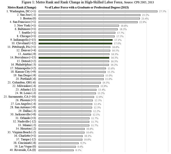
    The strong ridership increase in response to the low fare program is consistent with the relatively low incomes of Los Angeles transit commuters. In 2013, the median income of Los Angeles County transit commuters was approximately one-half that of the national, 60 percent below that of the six metropolitan areas with transit legacy cities (New York, Chicago, Philadelphia, San Francisco, Boston and Washington) and even lower than the other 45 metropolitan areas over 1,000,000 population (Figure 1)

    Local Return Program: Since 1985, when the bus fare reduction program ended, by far the greatest impact on ridership was from the Local Return program. In 1985, the existing local bus operators carried approximately 55 million annual passengers, a figure that rose to more than 130 million in 2012 (a nearly 140 percent increase). This ridership increase is more passengers that were carried on all the bus and rail systems of Dallas (DART), Salt Lake City and St. Louis in 2012, according to Federal Transit Administration data.

    Urban Rail Program: Many miles of urban rail have been built in Los Angeles County, including two subways and five light rail lines (determined by route termini from downtown). But the hope that others would leave their cars for transit, as expressed in The Onion has not occurred. By 2012, Federal Transit Administration data indicates that MTA (formed by a merger of LACTC and the Southern California Rapid Transit District, which operated the system before) bus and rail system was carrying 475 million annual riders, down from the 497 million carried on buses alone in 1985.

    This is despite constructing billions  in subway lines, light rail lines, and rapid busways and the addition of approximately 2 million residents to Los Angeles County.

    The "Return" on Local Return: The big surprise was the "return" on the local return program. A number of new systems were established, such as Foothill Transit and the Antelope Valley Transportation Authority. Many cities established new bus and paratransit systems. The city of Los Angeles now operates a number of commuter express bus services and local circulation bus services throughout the city. Many of the new systems used competitive tendering, under which services are awarded to competing private companies, with fares, routes, and schedules dictated by the public agencies. One important advantage of competitive tendering is lower costs, which makes it possible to provide more service. This service approach has been used extensively in Denver and San Diego. Further, virtually all of London’s largest public bus system in the high income world is competitively tendered as are  all of the bus, subway, commuter rail and light rail services in Stockholm.

    Overall, the Los Angeles County transit system, including MTA and the local operators experienced a ridership increase of 55 million between 1985 and 2012 (This excludes Metrolink, the five county commuter rail system established in the 1990s). Virtually all of the ridership increase is attributable to the local bus services operated by cities and by new sub-regional agencies (Figure 2).

    Overall Transit Work Trip Share

    Census Bureau data indicates that the employment access share of transit in Los Angeles County has declined modestly, from 7.0 percent in 1980 to 6.9 percent in 2013 (including Metrolink). Driving alone increased from 68.7 percent to 72.7 percent, while car pool commuting dropped from 16.8 percent to 10.0 percent. Outside of driving alone, the largest increase occurred in working at home rising from 1.5 percent to 5.2 percent (Figure 3). Unlike transit, working at home requires virtually no expenditures of public funds. Transit one-way work trips increased 77,000 daily, while driving along increased 947,000 and working at home increased 182,000. Car pools suffered a large loss (Figure 4).     

    Thus, despite rave reviews about its rail system, Los Angeles relies on cars to an even greater extent than before. Los Angeles qualifies as the next great transit city only if the standard is spending and construction, rather than ridership.

    Wendell Cox is principal of Demographia, an international public policy and demographics firm. He is co-author of the "Demographia International Housing Affordability Survey" and author of "Demographia World Urban Areas" and "War on the Dream: How Anti-Sprawl Policy Threatens the Quality of Life." He was appointed to three terms on the Los Angeles County Transportation Commission, where he served with the leading city and county leadership as the only non-elected member. He was appointed to the Amtrak Reform Council to fill the unexpired term of Governor Christine Todd Whitman and has served as a visiting professor at the Conservatoire National des Arts et Metiers, a national university in Paris.

    —-

    Note: Part of the MTA/SCRTD ridership loss was due to the transfer of services to Foothill Transit and the city of Los Angeles in the late 1980s.

    Photo: Los Angeles County Transportation Commission logo from 1980s

  • Aging America: The U.S. Cities Going Gray The Fastest

    For years we have been warned about the looming, profound impacts that the aging of the U.S. population will have on the country. Well, the gray wave has arrived. Since 2000, the senior population has increased 29% compared to overall population growth of 12%. The percentage of Americans in the senior set has risen from 12.4% to 14.1%, and their share of the population is projected to climb to 19.3% by 2030. There are two principal causes for this: the baby boom generation is reaching 65 years old, while the U.S. fertility rate has fallen markedly in recent decades, despite immigration, and now hovers around the replacement rate.

    To find the cities that are going gray the fastest, we looked at the change from 2000 through 2013 in the share of seniors in the populations of the nation’s largest metropolitan areas, the 52 metropolitan statistical areas that have more than a million residents. Some 13.2% of the residents of these 52 MSAs are seniors, a lower proportion than nationwide.

    Before we look at where the biggest changes have occurred, let’s take a look at where the highest overall concentrations of seniors are: no big surprise, in Florida, and in the slow-growing Northeast and Midwest. Among the 52 biggest metropolitan areas, Tampa-St. Petersburg has the highest share of seniors in its population at 18.2%. The retirement mecca of Miami, where 16.7% of its population is over 65, ranks third in the nation, and Jacksonville is 18th, at 13.7%.

    Outside of Florida almost all the retirement capitals are in the Northeast and Midwest. The second most senior region, for example, is Pittsburgh, where 18.0% of the population is over 65. The old Steel City is followed by a host of Rust Belt metro areas: Cleveland, Rochester, Providence, Hartford, St. Louis and Detroit, all of which have a senior set that makes up 14% or more of the overall population.

    Austin, Texas, has the smallest proportion of seniors, at 9.2%, but its senior share is rising — more on Austin later on. Salt Lake City, Houston and Dallas-Fort Worth are also below 10%, while Raleigh has the fifth-lowest proportion of seniors, at 10.2%. Not surprisingly, all of these relatively young cities are experiencing strong domestic in-migration.

    Cities That Are Aging The Most

    The metropolitan areas that have seen the biggest jumps in the senior proportion of their populations, have, for the most part, been the same ones that have drawn strong net domestic in-migration of millennials, families and working adults. The rise in the share of seniors in these cities isn’t because seniors are moving to them in overwhelming numbers — Census data shows they make major moves less than all other age groups. (In 2011-12, seniors moved to another state five times less frequently than those between the ages of 25-34, according to Current Population Survey figures.) Rather, many of those who have reached 65 since 2000 in the cities that top our list moved to them when they were younger, generally in search of economic opportunities or better lives, and have aged there.

    However, when seniors do decide to move, they can have a disproportionate impact on metropolitan economies because of their relative affluence. Over-65 households have a net worth 2.5 times the national average, according to Census Bureau data. Seniors (over 62) were far less damaged in the housing bust than younger households, and their incomes increased more with the tepid economic recovery, according to St. Louis Federal Reserve studies.

    In first place on our list is Atlanta, where the share of seniors in the population rose from 7.7% in 2000 to 10.4% in 2013, the biggest increase in the nation. In raw numbers, the over-65 population of the metro area rose to 572,534, an increase of  73.5% since 2000.

    The percentage of the population in fast-growing Raleigh, N.C., that is over 65 grew from 8.0% to 10.2% in 2013, putting it in second place.

    Austin may have a reputation as a youthful place, but it’s also getting older rapidly. The senior population has surged 91.7% since 2000 to 172,476, amid a general population boom – the share of seniors in the metro area has expanded from 7.2% to 9.2%, placing it third on our list. The metro area may be unprepared for a mounting “silver tsunami” of impoverished elderly, according to the Austin American-Statesman.

    Two of the cities that posted the biggest increases in the share of seniors in their populations also were among the largest overall domestic migration losers, San Jose, Calif., and Los Angeles. Since 2000, 1.7 million more U.S. residents moved away from the two metro areas than to them. Only Hurricane Katrina-ravaged New Orleans lost a larger share of its total population to domestic out-migration than San Jose, which ranks 4th in the increase of its senior population, going from 9.4% to 11.9%. Los Angeles, which trailed only New Orleans, San Jose and New York in the percentage of its population that it lost to domestic migration, went from 9.8% over-65 to 12.1%, the ninth biggest increase among the 52 largest metro areas. The combination of older households moving less and younger households leaving to take advantage of better job opportunities elsewhere may explain this.

    The balance of the top 10 all experienced net domestic migration gains since 2000.

    Meanwhile, the Rust Belt and Florida cities that already were among the oldest didn’t get much older. Tampa-St. Petersburg actually got younger, at least in part due to strong overall in-migration by younger people.

    Are Seniors Headed To Big Cities?

    One favorite meme of urban boosters is the assertion that seniors are heading to the inner city. The preponderance of evidence shows the opposite. Within the 52 largest metropolitan areas, the urban cores, measured at the small area level (zip codes) have lost seniors to the periphery. Between 2000 and 2010, the urban core senior population declined by  1.5 million, dropping from nearly 15% of the total population to 13%.The losses were pervasive, extending to all the 52 biggest MSAs except for San Diego (and there the urban core gain was miniscule, with 97% of the senior growth occurring in the suburbs and exurbs).

    In contrast, suburbs and exurbs together gained over 2.82 million seniors. But the largest increases were farthest from core, in the newer, outer suburbs and exurbs. Together these areas gained 2.4 million seniors. Rather than headed into the core, the prevailing trend has been quite the opposite.

    A similar pattern has been identified in Canada. A recent study of that country’s six largest cities found similar patterns, with older Canadians, if they move, tending to end up the suburban rings.

    Just The Beginning

    Over the next 15 years, cities are likely to age even faster. Those cities that attract the most among relatively few senior domestic migrants and which have seen their over-50 cohorts swelled by previous domestic migration should see the largest increases. At the same time, other cities with modest senior population gains could also age more quickly if more of the rest of the population moves away.

    Seniors in America’s Largest Metropolitan Areas, 2000-2013
    Ranked by change in share of seniors, 2000-2013
    Rank MMSA Seniors Share 2000 Seniors Share 2013 Seniors Share Change 2000-13% Number of Seniors 2013 Change in Total Seniors 2000-13%
    1 Atlanta, GA 7.7% 10.4% 34.0% 572,534 73.5%
    2 Raleigh, NC 8.0% 10.2% 28.6% 124,285 96.0%
    3 Austin, TX 7.2% 9.2% 27.2% 172,476 91.7%
    4 San Jose, CA 9.4% 11.9% 26.7% 229,062 40.1%
    5 Denver, CO 9.0% 11.3% 25.7% 304,698 57.1%
    6 Dallas-Fort Worth, TX 7.9% 9.9% 25.6% 676,537 64.4%
    7 Jacksonville, FL 11.0% 13.7% 24.2% 191,000 54.2%
    8 Houston, TX 7.7% 9.5% 24.0% 601,800 66.9%
    9 Los Angeles, CA 9.8% 12.1% 23.7% 1,584,236 31.4%
    10 Portland, OR-WA 10.4% 12.8% 23.5% 296,365 48.3%
    11 Minneapolis-St. Paul, MN-WI 9.7% 11.9% 23.1% 412,713 40.4%
    12 Washington, DC-VA-MD-WV 9.0% 11.0% 23.0% 656,678 51.3%
    13 Virginia Beach-Norfolk, VA-NC 10.3% 12.7% 22.7% 215,992 32.6%
    14 Grand Rapids, MI 10.5% 12.7% 20.5% 128,805 31.6%
    15 Las Vegas, NV 10.7% 12.8% 20.4% 260,156 77.5%
    16 Rochester, NY 12.9% 15.5% 20.0% 167,497 22.3%
    17 Detroit, MI 12.0% 14.3% 19.7% 616,033 15.5%
    18 Sacramento, CA 11.3% 13.5% 19.1% 298,327 46.8%
    19 Seattle, WA 10.1% 11.9% 17.9% 431,378 39.8%
    20 Richmond, VA 11.4% 13.3% 17.1% 166,173 38.2%
    21 San Francisco-Oakland, CA 11.7% 13.7% 16.8% 617,996 27.9%
    22 New Orleans. LA 11.4% 13.2% 16.4% 164,372 8.0%
    23 Memphis, TN-MS-AR 10.0% 11.7% 16.3% 156,792 28.7%
    24 Salt Lake City, UT 8.0% 9.3% 15.6% 105,993 40.3%
    25 Columbus, OH 10.1% 11.7% 15.5% 230,044 35.6%
    26 Charlotte, NC-SC 10.5% 12.0% 15.2% 281,202 56.7%
    27 Phoenix, AZ 11.9% 13.7% 15.1% 604,442 55.8%
    28 Nashville, TN 10.3% 11.8% 14.9% 208,133 46.3%
    29 Chicago, IL-IN-WI 10.9% 12.4% 14.3% 1,184,871 19.8%
    30 Baltimore, MD 12.0% 13.7% 14.1% 379,722 23.8%
    31 Cincinnati, OH-KY-IN 11.7% 13.3% 13.4% 283,518 21.5%
    32 Kansas City, MO-KS 11.5% 13.0% 12.8% 266,749 27.9%
    33 Louisville, KY-IN 12.4% 14.0% 12.4% 176,229 26.6%
    34 Cleveland, OH 14.5% 16.2% 11.8% 335,054 7.5%
    35 Boston, MA-NH 12.6% 14.1% 11.6% 658,710 19.0%
    36 St. Louis,, MO-IL 13.0% 14.4% 11.1% 404,297 16.3%
    37 San Diego, CA 11.1% 12.3% 10.8% 396,543 26.4%
    38 Hartford, CT 13.9% 15.4% 10.5% 187,183 16.9%
    39 New York, NY-NJ-PA 12.6% 13.9% 10.4% 2,768,694 16.3%
    40 Birmingham, AL 12.8% 14.1% 10.1% 160,686 19.3%
    41 San Antonio, TX 10.8% 11.9% 10.1% 270,480 46.5%
    42 Riverside-San Bernardino, CA 10.5% 11.5% 9.8% 502,846 47.8%
    43 Oklahoma City, OK 11.4% 12.5% 9.7% 164,481 32.2%
    44 Indianapolis. IN 11.0% 12.0% 9.5% 234,973 29.0%
    45 Orlando, FL 12.4% 13.4% 8.5% 304,660 49.7%
    46 Milwaukee,WI 12.6% 13.5% 7.4% 211,527 12.3%
    47 Providence, RI-MA 14.4% 15.4% 7.0% 247,689 8.4%
    48 Philadelphia, PA-NJ-DE-MD 13.4% 14.2% 6.5% 858,313 13.0%
    49 Buffalo, NY 15.9% 16.5% 3.7% 186,693 0.5%
    50 Miami, FL 16.4% 16.7% 1.8% 975,529 18.5%
    51 Pittsburgh, PA 17.7% 18.0% 1.6% 425,102 -1.3%
    52 Tampa-St. Petersburg, FL 19.2% 18.4% -4.3% 527,861 14.6%
    52 Major Metropolitan Areas 11.4% 12.9% 13.2% 22,588,129 29.2%
    Outside MMSAs 13.6% 15.7% 14.8% 22,115,945 26.4%
    United States 12.4% 14.1% 13.8% 44,704,074 27.8%

    This piece first appeared at the Orange County Register.

    Joel Kotkin is executive editor of NewGeography.com and Roger Hobbs Distinguished Fellow in Urban Studies at Chapman University, and a member of the editorial board of the Orange County Register. His newest book, The New Class Conflict is now available at Amazon and Telos Press. He is author of The City: A Global History and The Next Hundred Million: America in 2050. His most recent study, The Rise of Postfamilialism, has been widely discussed and distributed internationally. He lives in Los Angeles, CA.

    Wendell Cox is principal of Demographia, an international public policy and demographics firm. He is co-author of the “Demographia International Housing Affordability Survey” and author of “Demographia World Urban Areas” and “War on the Dream: How Anti-Sprawl Policy Threatens the Quality of Life.” He was appointed to three terms on the Los Angeles County Transportation Commission, where he served with the leading city and county leadership as the only non-elected member. He was appointed to the Amtrak Reform Council to fill the unexpired term of Governor Christine Todd Whitman and has served as a visiting professor at the Conservatoire National des Arts et Metiers, a national university in Paris.

    “Senior Citizens Crossing” photo by Flickr user auntjojo.

  • Brain Drain Hysteria Breeds Bad Policy

    Desperate times call for desperate measures. The Rust Belt, a region familiar to the air of anxiety, knows this all too well, particularly the “desperate measures” part.

    A case in point: During the 1990’s, Pittsburgh, like many of its Rust Belt peers, was in the midst of a fit of brain drain hysteria. Strategic policy was needed. So the powers that be thought of a marketing campaign meant to saturate the minds of the educated “young and the restless” who were thinking about exiting the Steel City. Pittsburgh demographer and economist Chris Briem, in a 2000 op-ed in the Post-Gazette, picks it up from here:

    “The focus on retaining vs. attracting workers is pervasive in local policies. One marketing character thought of by the Pittsburgh Regional Alliance, whose mission is to promote Pittsburgh, was the genial "Border Guard Bob." The image was of an older, uniformed sentinel on Pittsburgh’s borders keeping our citizens, in particular the younger workers, from leaving the region. This is the same logic that inspired the East Germans to build a wall around Berlin and is likely to have as much success in the long-run.”

    Luckily for Pittsburgh, Border Guard Bob never materialized. Policy-wise, building walls is terrible form in the age of information. Still, the aura of desperation remained in the region, despite its illogicality. For instance, in his 2002 piece called “Young people are not leaving Pittsburgh”, Briem crunched the numbers to find the region’s brain drain wasn’t. Yet he found it hard “to convince Pittsburghers that the outmigration of youth is not the problem it once was,” blaming “a persistence of memory” stemming from the regional exodus in the 1980’s.  

    As a demographer and economic thinker in Cleveland, I can sympathize with Briem. Cleveland, too, is prone to bouts of brain drain hysteria. A recent report highlighted in the New York Times called “The Young and Restless and the Nation’s Cities” was enough set off a flare-up. The report found that between 2000 and 2012, Greater Cleveland added less than 800 25- to 34-year-olds with a college degree—an increase of 1%. The metro ranked second last out of 51 metros, behind only Detroit.

    Obviously, those numbers are not good. That said, from a methodological standpoint, the study has its limitations. Specifically, the analysis cuts through four economic eras: 2000, the end of a prolonged expansionary period; 2005 to 2007, the middle of a jobless economic recovery; 2008 to 2010, the throes of a deep global recession; and 2011 to 2012, a period of economic recovery.

    Why does this matter? Migration patterns are affected by quite different economic circumstances nationally. This is especially true for the 25- to 34-year-old cohort, who are the most mobile, if not fickle, group.

    For example, Greater Cleveland’s lack of a young adult brain gain from 2000 to 2012 resulted from a substantial decrease of nearly 16,000 25- to 34-year-olds with a 4-year college degree from 2000 to 2006. The 2001 recession and subsequent jobless recovery hit Cleveland hard. However, my research at the Center for Population Dynamics at Cleveland State University showed that Greater Cleveland recouped the losses from earlier in the decade, gaining approximately 17,000 25- to 34-year-olds with a 4-year degree from 2006 to 2012—an increase of 23%.

    Moreover, the Census recently released data for 2013, which allows a comparison of the nation’s top big-city metros for 2011 to 2013: the current era of economic recovery. Put simply, what large metros have the momentum? Has there been a shift in where the “young and the restless” are attempting to settle down?

    The results are surprising. Cleveland ranks 3rd in the nation, with a 19.85% increase in the number of young adults with a college degree, behind the Sun Belt metros Nashville and Orlando. And no, this percentage “pop” for the region is not simply due to the fact that Cleveland had a really small base of young college graduates. In fact, the region’s 3-year gain of 15,557 ranks Cleveland 15th in total gains, despite being the 29th largest metro in the nation. To put this in perspective, Greater Cleveland had a larger total growth than Chicago, and nearly seven times the gain of Portland: the nation’s poster child for where the “young and restless” go to “live, work, play”.

    Table 1: 25-to-34-year-olds with at least a Bachelor’s degree, Change, 2011 to 2013
    Metro Area 2011 2013 % Change 2011 to 2013 Total Change 2011 to 2013
    Nashville-Davidson–Murfreesboro–Franklin, TN 82,588 103,239 25.01% 20,652
    Orlando-Kissimmee-Sanford, FL 83,706 101,066 20.74% 17,361
    Cleveland-Elyria, OH 78,392 93,949 19.85% 15,557
    Riverside-San Bernardino-Ontario, CA 97,804 116,767 19.39% 18,963
    Jacksonville, FL 47,792 56,256 17.71% 8,464
    Austin-Round Rock, TX 119,482 138,240 15.70% 18,758
    Seattle-Tacoma-Bellevue, WA 208,647 240,267 15.15% 31,620
    Sacramento–Roseville–Arden-Arcade, CA 77,075 87,435 13.44% 10,360
    Salt Lake City, UT 55,036 62,124 12.88% 7,088
    Pittsburgh, PA 117,402 131,770 12.24% 14,368
    Philadelphia-Camden-Wilmington, PA-NJ-DE-MD 306,271 341,220 11.41% 34,948
    Columbus, OH 106,144 118,224 11.38% 12,080
    Houston-The Woodlands-Sugar Land, TX 266,289 295,230 10.87% 28,941
    Buffalo-Cheektowaga-Niagara Falls, NY 52,231 57,727 10.52% 5,496
    Dallas-Fort Worth-Arlington, TX 296,927 327,330 10.24% 30,403
    New Orleans-Metairie, LA 54,104 59,616 10.19% 5,512
    San Jose-Sunnyvale-Santa Clara, CA 135,306 148,978 10.10% 13,672
    Detroit-Warren-Dearborn, MI 154,542 170,122 10.08% 15,580
    San Francisco-Oakland-Hayward, CA 320,585 350,490 9.33% 29,904
    Baltimore-Columbia-Towson, MD 150,003 163,941 9.29% 13,938
    New York-Newark-Jersey City, NY-NJ-PA 1,216,127 1,327,778 9.18% 111,651
    Los Angeles-Long Beach-Anaheim, CA 631,960 688,057 8.88% 56,098
    St. Louis, MO-IL 134,267 145,978 8.72% 11,710
    Oklahoma City, OK 58,027 63,084 8.71% 5,057
    San Antonio-New Braunfels, TX 85,240 92,524 8.55% 7,284
    Hartford-West Hartford-East Hartford, CT 59,780 64,784 8.37% 5,004
    Denver-Aurora-Lakewood, CO 163,026 176,237 8.10% 13,211
    Milwaukee-Waukesha-West Allis, WI 79,404 85,793 8.05% 6,390
    Louisville/Jefferson County, KY-IN 50,790 54,849 7.99% 4,060
    Virginia Beach-Norfolk-Newport News, VA-NC 67,664 72,888 7.72% 5,224
    Tampa-St. Petersburg-Clearwater, FL 99,316 106,504 7.24% 7,187
    San Diego-Carlsbad, CA 167,735 179,850 7.22% 12,114
    Birmingham-Hoover, AL 47,340 50,675 7.04% 3,335
    Kansas City, MO-KS 102,284 109,455 7.01% 7,171
    Rochester, NY 48,844 52,212 6.90% 3,368
    Boston-Cambridge-Newton, MA-NH 348,490 371,303 6.55% 22,813
    Phoenix-Mesa-Scottsdale, AZ 163,995 174,694 6.52% 10,699
    Providence-Warwick, RI-MA 64,205 68,349 6.45% 4,144
    Raleigh, NC 76,164 80,447 5.62% 4,283
    Indianapolis-Carmel-Anderson, IN 91,083 95,827 5.21% 4,744
    Las Vegas-Henderson-Paradise, NV 59,998 63,058 5.10% 3,060
    Cincinnati, OH-KY-IN 95,084 99,225 4.36% 4,142
    Minneapolis-St. Paul-Bloomington, MN-WI 214,755 223,640 4.14% 8,885
    Washington-Arlington-Alexandria, DC-VA-MD-WV 460,693 477,706 3.69% 17,013
    Chicago-Naperville-Elgin, IL-IN-WI 558,464 572,324 2.48% 13,860
    Atlanta-Sandy Springs-Roswell, GA 272,907 279,232 2.32% 6,325
    Portland-Vancouver-Hillsboro, OR-WA 119,490 121,794 1.93% 2,304
    Miami-Fort Lauderdale-West Palm Beach, FL 221,294 224,388 1.40% 3,094
    Richmond, VA 59,907 59,289 -1.03% -618
    Memphis, TN-MS-AR 52,911 49,412 -6.61% -3,499
    Source: ACS 1-Year, 2011, 2013 Note: Charlotte was removed from the analysis due to substantial geographic changes in the MSA designation from 2011 to 2013. Created by the Center for Population Dynamics at Cleveland State Univeristy, October, 2014. 


    What gives?

    Part of the answer may be economic. For example, my colleagues Joel Kotkin and Aaron Renn recently analyzed the growth in per capita GDP from 2010 to 2013 for Forbes in a piece entitled “The cities that are benefiting the most from the economic recovery”. Cleveland ranked 15th in the nation, with a 6% increase. In terms of income, the metro is 5th in the nation in the total per capita income increase from 2010 to 2012, behind Houston, San Jose, Oklahoma, and San Francisco.

    In understanding Cleveland’s nascent young adult brain gain, the broader economic performance is important. Healthier economies make metros “stickier” for those here and more of a magnet for those who aren’t. And while there also is the element of “Rust Belt Chic”, or the lure of so-called “authentic” places that counter the “Brooklynization” of American cities, Cleveland as a destination, or a “consumer city”, will always take a back seat to Cleveland as a “producer city”, which is a metro of good jobs, good schools, and affordable housing. The producer city focuses on the creation of value, not simply the consumption of things. This is not to say amenities, such as a good culinary and microbrew scene, are not important, it only says that if the talent you attract has nothing to produce or nowhere to live, well, all play and no work makes Jack a dull boy.

    Talent attraction, then, is only part of the formula in Cleveland’s ongoing and difficult economic restructuring. Talent production is also needed, for both natives and newcomers, regardless of the age group. But emphasizing the latter entails knowing the score on the former. Brain drain hysteria breeds desperation.

    And desperate times call for desperate measures—and bad policy.

    This piece first appeared at Crains Cleveland.

    Richey Piiparinen is a Clevelander, writer, and Senior Research Associate heading the Center for Population Dynamics at Cleveland State University.

  • New Zealand Seeks to Avoid “Generation Rent”

    The political leadership and others in New Zealand are talking about the consequences of its land use policies. Under the "urban containment" land use policy (also called by terms like "smart growth," "growth management," and "livability") in effect in every urban area, house prices have doubled relative to incomes over the last 25 years. The principal causes have been the restrictions inherent in urban containment policy, such as making most suburban land off limits for housing development, (which raises its price, like rationing oil raises the price of gasoline), and requirements for upfront payment of large development impact fees (which can also be higher than they need to be). The association between urban containment policy and unaffordable housing is consistent with both with both economic theory and also considerable economic research. The title of a report by Paul Cheshire, Professor of Economic Geography at the London School of Economics best indicates the reality: "Urban Containment, Housing Affordability, Price Stability – Irreconcilable Goals." 

    New Zealand Housing Unaffordability and Consequences

    According to the 10th Annual Demographia Housing Affordability Survey, Auckland, the nation’s largest city is now the 7th least affordable out of 85 major metropolitan markets rated. Auckland’s median multiple (median house price divided by median household income) is 8.0, approaching triple the level that prevailed before the adoption of urban containment policy. The other largest cities, Christchurch and Wellington have seen house prices relative to incomes double since they have adopted urban containment policy (which were 3.0 or less). Obviously, when houses cost more than necessary, households have less discretionary income. This leads directly to two consequences with respect to affluence and poverty.

    The first consequence of these policies is that households have less discretionary income (income after paying taxes and for necessities) to spend on other goods and services. Obviously this means a lower standard of living. This generally leads to a weaker economy, other things being equal, because households with less money are not able to purchase as much in goods and services as they would be able to afford if house prices had not been distorted.

    The second consequence is greater poverty. When the price of housing rises, discretionary incomes can fall enough to force lower income households into poverty.

    Land Use Policies Blamed for Poverty and Greater Inequality

    Recently, Deputy Prime Minister and Finance Minister Bill English said in an October 7 press conference that New Zealand’s land use policies have led to higher levels of poverty and increased inequality: "Inequality in New Zealand would have been improving had it not been for growing housing costs. So our planning processes have probably done more to increase income inequality and poverty in New Zealand than most other policies." Finally, the Deputy Prime Minister noted that house price increases have impacted the lowest income households most.

    Minister English had previously expressed concern about the extent to which land use policy had driven up house prices, in his preface to the 9th Annual Demographia Housing Affordability Survey: "It costs too much and takes too long to build a house in New Zealand. Land has been made artificially scarce by regulation that locks up land for development. This regulation has made land supply unresponsive to demand (see: "Unblocking Constipated Planning" in New Zealand").

    There was "pushback" on the Deputy Prime Ministers comments from the city of Auckland and the Green Party. Others saw it differently the well-read national blog, Whale Oil, however, opined that the Deputy Prime Minister "is onto something." Whale Oil continued "The squealing in unison means English is putting the pressure in the right places."  

    Housing Minister Nick Smith has decried the situation in Auckland:  "We’ve got a rigid Metropolitan Urban Limit (urban growth boundary) prohibiting any new housing developments beyond the artificial line drawn 15 years ago." At the same time, he said that resulting land cost increases had been more responsible for higher house prices than any other factor. Auckland accounts for approximately one-third of the nation’s population and has been growing rapidly, accounting for more than one-half of the nation’s population growth between the 2006 and 2013 censuses.

    On the government’s website, the Housing Minister expressed the government’s interest in reforming the Resource Management Act, which governs land-use planning. “It is the price of land and sections that has gone up so rapidly in unaffordable housing markets like Auckland, and it is the Resource Management Act and how it is implemented that is largely responsible for this cost escalation. The new law allowing Special Housing Areas is a short-term fix but we must address the fundamental problem with the Resource Management Act if we are serious about long-term housing affordability."

    Business Concerns

    Business interests are also raising concerns.

    The Property Council (similar in its advocacy function to the Urban Land Institute in the United States) has indicated support for the reforms.

    Other business support comes from ANZ Bank New Zealand Chief Executive Officer David Hisco. In expressing concern noting that" "The elevator of economic progress in New Zealand has always been home ownership for everyone – right across the socioeconomic spectrum. But at the current pace of house price rises we risk creating a generation of disenfranchised, second class citizens – ‘Generation Rent.’" He continues: "The housing affordability issue is a housing supply issue, pure and simple. In 1974 there were 34,400 new homes built. Last year there were 15,000 – less than half. It’s no wonder houses doubled in price in under a decade in Auckland. The solution is simple – urgently build more houses. To do that in places like Auckland we need to build more suburbs and allow intensification in existing areas."

    In noting that the poor are the "biggest victims" of Auckland’s land use policies, Eric Crampton (on Kiwiblog) says that Auckland should be allowed "to build both upwards and outwards: which would be a great step in reducing child poverty." Moreover, the Prime Minister, John Key, has expressed a particular interest in reducing child poverty.

    Building upwards and outwards is not an option  under the urban containment dictum favoring intensification and prohibiting greenfield suburban development.

    A similar connection between housing costs and high rates of poverty is indicated by California, which has the highest poverty rate, adjusted for housing costs, of all states as well as  the District of Columbia. California’s major metropolitan markets have severely unaffordable housing costs, with a median multiple of 7.1. This is lower than Auckland (8.0), New Zealand’s one major metropolitan market, but higher than Australia’s (6.3). Dartmouth economist William Fischel and others have associated California’s high housing costs with its land use policies. Fischel further noted that before these policies were implemented, house prices were about the same in California as in the rest of the nation, which have since more than doubled relative to incomes.

    New Zealand: Land Use Policy Leader

    There is virtual consensus among the world’s governments that the standard of living should be improved and poverty eradicated. Yet, many governments have adopted land use policies that raise the price of housing, which has the inevitable effect of lowering standard of living and more poverty. New Zealand’s government is seeking to restore an appropriate policy balance.

    Wendell Cox is principal of Demographia, an international public policy and demographics firm. He is co-author of the "Demographia International Housing Affordability Survey" and author of "Demographia World Urban Areas" and "War on the Dream: How Anti-Sprawl Policy Threatens the Quality of Life." He was appointed to three terms on the Los Angeles County Transportation Commission, where he served with the leading city and county leadership as the only non-elected member. He was appointed to the Amtrak Reform Council to fill the unexpired term of Governor Christine Todd Whitman and has served as a visiting professor at the Conservatoire National des Arts et Metiers, a national university in Paris.

    Photograph: Downtown Auckland (by author)

  • RIP, NYC’s Middle Class: Why Families are Being Pushed Away From the City

    Mayor de Blasio has his work cut out for him if he really wants to end New York’s “tale of two cities.” Gotham has become the American capital of a national and even international trend toward greater income inequality and declining social mobility.

    There are things the new mayor can do to help, but the early signs aren’t promising that he will be able to reverse 30 years of the hollowing out of the city’s once vibrant middle class.

    As the cost of living has skyrocketed while pay has stagnated except for those at the very top, New York has shifted from a place people go to make it to a place for those who already have it made, or whose families have.

    And once here, the rich are indeed getting richer even as the rest of the city is barely holding on.

    Manhattan is now the most unequal county in America (it was 17th in 1980), with a Gini coefficient — which measures the disparity between the richest and poorest residents — higher than that of Apartheid-era South Africa.

    Between 1990 and 2010, the city’s 1% saw their median income shoot up from $452,415 to $716,625 in 2010 dollars, even as the bottom 60% hardly saw their incomes budge at all, according to a recent City University study. The trend precedes Michael Bloomberg, the billionaire mayor who envisioned New York as a “luxury city,” and it won’t be easy for de Blasio to reverse — especially as he rolls out pricey new public-employee contracts and programs like universal pre-K that further expand the city’s dependence on its wealthiest citizens.

    In 2009, the 0.5% of New Yorkers who made $1 million or more accounted for 27% of the city’s income (nearly three times their share nationally), and an even higher share of its tax take. But while the smart set that attends President Obama’s frequent Manhattan fundraisers has prospered, in no small part thanks to low-interest Federal Reserve policies that have helped big banks more than working people, just across the Harlem River roughly one in three Bronx households lives in poverty — making it the nation’s poorest urban county.Over the Bloomberg years, New York was the national leader in both luxury housing and in homelessness — with a 73% jump in the number of homeless families here. Last January, an unprecedented 21,000 children were in the city’s shelter system each night. This year, that number is rising.

    And as the city becomes more economically unequal, it’s also become more racially segregated. Demographer Daniel Herz’ census analysis shows New York is now America’s second most racially divided city, behind only Milwaukee.African-American incomes in New York are barely half those of whites, as compared to nearly 70% in Phoenix and Houston.

    And New York City now has the nation’s single most segregated public school system, according to a devastating report from the Civil Rights Project at UCLA.

    As the 2014 report put it: “In 2009, black and Latino students in the state had the highest concentration in intensely-segregated public schools (less than 10% white enrollment), the lowest exposure to white students, and the most uneven distribution with white students across schools.”

    Nowhere are these divergences more obvious than in nouveau hipster and increasingly expensive Brooklyn. In my parents’ native borough, the average income has actually dropped between 1999 and 2011, despite huge increases of wealth in areas closer to Manhattan.

    Roughly one in four Brooklynites — most of them black or Hispanic — lives in poverty.

    Bloomberg’s notion that if “we can find a bunch of billionaires around the world to move here, that would be a godsend,” with prosperity trickling down, hasn’t panned out, at least for most New Yorkers. The billionaires came, bought and flourished, but the same can not be said for Gotham’s middle and working classes.

    Using Bureau of Economic Analysis data, analyst Aaron Renn estimates that the city’s per capita GDP has grown a bare 2.3% since 2010, below the mediocre 3.8% national rate and behind such traditional hard-luck cases as Buffalo, Cleveland and Baltimore.

    The percentage of New Yorkers living in poverty has actually gone up by 1.1% since 2010, while household income has been flat.

    Rather than forge a more upwardly mobile society, New York epitomizes what Citigroup researchers have labeled a “plutonomy,” an economy and society driven largely by the investment behavior and spending of the uber-rich. This creates great demand for low-end service workers — dog-walkers, baristas and waiters — but not much for New York’s middle or aspiring middle class.

    Adjusting for the cost of living here, the average paycheck in New York is one of the lowest of any major metropolitan area. Put otherwise, working New Yorkers pay a huge premium to live in the five boroughs, one that repels middle-class individuals and families who aren’t compelled to be here.

    The exodus of the middle class has been ongoing for 30 years, with New York by one measure now having the second lowest share of middle-income neighborhoods of America’s 100 largest cities.As the middle class has waned, even exemplars of the celebrated creative class — musicians, artists, writers — find the going increasingly rough, and unrewarding. Laments rock icon Patti Smith: “New York has closed itself off to the young and the struggling. New York City has been taken away from you.”

    This is the dynamic New Yorkers elected de Blasio to fix. And he’s right the reality of rising inequality and, more important, diminishing opportunity, must be confronted.

    Critically — and here de Blasio has better instincts than his predecessor — more emphasis needs to be placed on the outer boroughs. Even if Manhattan remains the prototypical luxury city, the rest of New York can be reinvented as a generator of middle-class jobs and opportunities.

    One approach that’s paid dividends for workers in cities such as Houston, Dallas-Ft. Worth, Nashville and Pittsburgh is to concentrate on diversified economic growth.

    Certainly some middle class jobs could be created by boosting such things as the port and logistics, resuscitating industries such as food processing and specialized household goods, and rolling out policies that encourage, rather than overregulate, smaller firms in the business-service industry.

    But de Blasio’s press to bring in more tax revenue to pay for ambitious new programs, more generous social services and new contracts for city workers have the perverse effect of doubling down on Bloomberg’s bet on the wealthy.

    His ambitious ramping up of green-energy policy could be the straw that breaks the back of what remains of the logistics and manufacturing industries in New York, something that has already occurred in California.

    And his kowtowing to the teachers union and attempted assaults on charter schools threaten to further undermine the effectiveness of public education, something vital to middle and working class residents.

    In fact, the effect of de Blasio’s policies may turn out to be more neo-Victorian than progressive. Rather than new homeowners, the city may see a greater concentration of people dependent on government largesse.

    The poor-door phenomena, with a few lucky members of the lower class winning subsidized units in buildings for the rich, but with separate entrances and no access to luxury amenities, recreates not social democracy but the Victorian upstairs-downstairs society.

    The critical point is this: New York is losing its role as a place of opportunity, and the de Blasio toolbox is unlikely to put back the ladder that’s been pulled up.

    A great city does not only serve the rich, transforming others into their servants or recipients of noblesse oblige. New York need to be, as Rene Descartes described Gotham’s founding city, 17th century Amsterdam, “an inventory of the possible.”

    That must hold true for most New Yorkers, not just for the very rich.

    This piece first appeared at the New York Daily News.

    Joel Kotkin is executive editor of NewGeography.com and Roger Hobbs Distinguished Fellow in Urban Studies at Chapman University, and a member of the editorial board of the Orange County Register. His newest book, The New Class Conflict is now available at Amazon and Telos Press. He is author of The City: A Global History and The Next Hundred Million: America in 2050. His most recent study, The Rise of Postfamilialism, has been widely discussed and distributed internationally. He lives in Los Angeles, CA.

    Photo by Kevin Case from Bronx, NY, USA (Bill de Blasio) [CC-BY-2.0], via Wikimedia Commons

  • Affordable Cities are the New Sweet Spots

    I’ve lived in San Francisco long enough (I’m getting old) that I’ve seen several waves of bright young people arrive, burn out, then move away. For some they were looking for adventure, found it, and then carried on with normal life elsewhere. But for most it was simply a matter of the numbers not adding up. Working a dead end low wage job while sharing a two bedroom apartment with seven room mates is only romantic for so long. I’m fairly inquisitive so I’ve kept up with many of these folks to see how they manage after they leave. I travel a lot and pop in to visit on occasion. The big surprise is that they aren’t moving to the suburbs the way previous generations did when they were done with their youthful excursions in the city.

    Cincy 23  Cincy 3  Cincy 7

    Cincy 2  Cincy 24
    Cincy 25
    Cincy 1

    Instead, they’re seeking out smaller less expensive cities with the same basic characteristics as the pricey places that squeezed them out. I’m very fond of one young couple in particular who spent time in Los Angeles, Baltimore, and Portland before finally settling down and buying a house in Cincinnati. Why Cincinnati? It’s a great town at a fantastic price. They bought a charming four bedroom century old home in an historic neighborhood a couple of miles from downtown for $50,000. Their mortgage is $300 a month. Okay, with tax and insurance it’s more like $500. And it wasn’t a fixer-upper in a slum. It’s a genuinely lovely place with amazing neighbors.

    Cincy 6
    Cincy 5
    Cincy 51 -1
    Cincy 8

    Who needs New Urbanism or Smart Growth when so many amazing old neighborhoods are just sitting out there in under-appreciated and radically undervalued cities all across North America? The Rust Belt has long since hit bottom and has already adjusted to every indignity that the Twentieth Century could throw at it: deindustrialization, race riots, white flight to the suburbs, population shifts to the Sun Belt… Now that the unpleasantness has run its course what’s left are magnificent towns ripe for reinvention. Personally I believe many of the boom towns of the last fifty or sixty years have peaked and are about to enter the kinds of steep decline we currently associate with Detroit – except the dried up stucco and Sheetrock ruins of Phoenix and Las Vegas won’t age as well as the handsome brick buildings of the Midwest.

    Cincy 33
    3 Cincy 34
    4

    Don’t get me wrong. Cincinnati isn’t San Francisco. It isn’t Brooklyn either, although they do have an elegant bridge by the same engineer. If you want to be a Master of the Universe in international finance, or the next super genius computer whiz, or a millionaire movie star you probably need to be in a bigger place. But most of us just want ordinary comfortable rewarding lives surrounded by good people. The big question is pretty simple. Do you want that life to involve a $500,000 mortgage on a bungalow in a coastal city, or a $50,000 place in the Midwest. Will you earn less money in Ohio? Probably. But since your overhead is one tenth the California or New York price you really don’t need the big salary or the stress that comes with it. It’s like moving to the suburbs except you get to live in a great vibrant city instead of a crappy tract house on a cul-de-sac an hour from civilization.

    Cincy 46

    John Sanphillippo lives in San Francisco and blogs about urbanism, adaptation, and resilience at granolashotgun.com. He’s a member of the Congress for New Urbanism, films videos for faircompanies.com, and is a regular contributor to Strongtowns.org. He earns his living by buying, renovating, and renting undervalued properties in places that have good long term prospects. He is a graduate of Rutgers University.

  • Southern Indiana is More Than Just a Great View of Louisville

    As part of a small project I’m doing in Southern Indiana, I spent two days touring around Clark and Floyd Counties to see what was up. As a guy who grew up in the area, it was great to get to see a lot of the positive things that have been occurring there. While perhaps places like New Albany and Jeffersonville might be considered small cities, the Southern Indiana portion of the Louisville metro area has about 280,000 people and is integrated into the larger regional economy. So it is participating in the economic and urban growth that’s also happening on the Kentucky side of the river.

    The commercial development, particularly restaurants, in New Albany was impressive. Several Louisville establishments have set up shop there, joining locally-based businesses that offer a wide range of high quality goods. I’m talking about places like New Albanian, Quills Coffee, Toast, The Exchange, Bread and Breakfast, and more. There have also been a lot of infrastructure upgrades since I last lived there. For example, a recent streetscape project on New Albany’s Main Street was underway while I was visiting.

    Toast in New Albany. (Aaron Renn)Toast in New Albany is one of the city’s many retail offerings. (Aaron Renn)

    Talking with some of the employees of the various businesses, some of whom moved from out of town to the area, it was clear that many of them made a deliberate choice to pick downtown New Albany, seeing it as a place with huge upside potential—they didn’t just land there by accident.

    There are some similar developments in downtown Jeffersonville, where the impact of the full opening of the Big Four Bridge as a pedestrian and bike crossing has been huge. I’ve walked across it several times now and am always amazed by the crowds. With extremely limited commercial development on the Louisville side of the river, Jeffersonville is raking in a ton of businesses, with an ice cream stand, several quality bar and grill places, and even a cigar bar tapping in. I expect this is only the start of a significant uptick in activity there.

    The Big Four Bridge has been good for business in Jeffersonville. (Aaron Renn)The Big Four Bridge has been good for business in Jeffersonville. (Aaron Renn)

    Clarksville remains the commercial center of the region and appears to be staying strong. It’s also got a huge redevelopment opportunity on its hands with the Colgate property and other prime real estate directly across the river from downtown Louisville. Not only is this the best skyline view of the city available, it already has pedestrian access across the Second Street Bridge to Louisville, albeit on a very narrow sidewalk.

    Most people never see it since you don’t pass it on any major highways—yet—but the Port of Indiana industrial park near Utica is humming with activity. Likewise, I saw a ton of building in the River Ridge industrial park that spans Jeffersonville and Charlestown. That huge amount of space on a major highway is primed to explode when the East End Bridge opens, though tolls remain a huge question mark.

    Overall, I was happy to see the kind of redevelopment that had long been talked about when I was a kid finally happening—though I must confess I miss the “LRS 102” lights on the Big Four. I’m expecting things to only continue to get better as these developments mature and grow.

    This piece was first published by Broken Sidewalk.

    Aaron M. Renn is an independent writer on urban affairs and the founder of Telestrian, a data analysis and mapping tool. He writes at about urban affairs at The Urbanophile.

  • A Newer Geography of Jobs: Where Workers with Advanced Degrees Are Concentrating the Fastest

    This is a new report brief from the Center for Population Dynamics at Cleveland State University, download the pdf version here. The report was authored by Richey Piiparinen, Jim Russell, and Charlie Post.

    In 1963, nearly 75% of America’s top 50 companies owned and extracted natural resources1. By 2013, only 20% of top firms were natural resource-based. Today, knowledge-focused industries such as IBM comprise over 50% of America’s top 50 firms. Translation: talent is the new oil.

    But not every region has reservoirs of human capital. Historically, knowledge economies have gathered in select top-tier metros, termed “Islands of Innovation”2. Think Boston and San Francisco. There are numerous reasons for this, including access to select research institutions, as well as the productivity effects that arise when a cluster economy is formed3.

    For scholars such as economist Enrico Moretti, this “Great Divergence”4 between “the best” and “the rest” will continue. “More than traditional industries,” writes Moretti in his book The New Geography of Jobs, “the knowledge economy has an inherent tendency toward geographical agglomeration.”

    But is this trend inevitable? Will the divergence remain? One line of thought is that the cost of living in top-tier metros will inevitably lead to “capital equalization”5—loosely defined as the “convergence” between regions in job and income growth. Capital equalization was a key factor in the decline of the Rust Belt. Here, manufacturing jobs became automated or moved down South or overseas to cut labor costs. One could argue that capital equalization will re-map the geographies of the knowledge economy in a similar manner.

    “The prediction of this view is the convergence of American communities,” writes Moretti. “Low-cost areas will attract more and more of the new, high-paying jobs. Cities that have been lagging behind-the Clevelands, the Topekas, and the Mobiles-will grow much faster. Bogged down by their high costs, San Francisco, New York, Seattle, and similar cities will decline.” That said, Moretti does not believe convergence is taking shape. “[T]he data don’t support this view,” Moretti continues. “In fact, the opposite has been happening.”

    But there is data that do support this view, and it begins to sketch a newer geography of jobs that is enabling an increasing concentration of highly-skilled workers in America’s second-tier cities. AOL Co- Founder Steve Case has dubbed this convergence back into Middle America “the Rise of the Rest”6.

    Where are America’s Highest-Skilled Jobs Clustering?

    The most common measure of human capital is educational attainment, or the percent of a population  with a college degree. Not all human capital is equal. Generally speaking, the higher the degree conferred, the more productive the worker, and this is reflected in pay. For example, the national median income by education level is as follows: $27,350 for a high school graduate, $50,050 for a person with a 4-year degree, and $65,565 for a person with an advanced degree7. The fact that those with a graduate or professional degree are paid highest is indicative of their productive capacity in the knowledge economy.

    Specifically, a region’s highest-educated workers are likely to be job creators, not just job consumers. This primarily comes about two ways: (1) through direct job creation, such as a research doctor starting a biotech spin-off firm; and (2) through indirect job creation, particularly relating to the “downstream” effect a high- paying job has on the local service economy. Put simply, more income, more spending, equals more jobs.

    What metros are experiencing the fastest growth in its concentrationof workers with advanced or professional degrees? To answer this, the analysis used data from the Current Population Survey (CPS) to compare the educational attainment rates of the nation’s largest laborforcesfrom 2005 to 2013. Of particular concern was the percentage of people in a regional labor force with an advanced or professional degree, and whether or not top-tier metros gained higher- skilled workers at a faster rate than second-tier metros. Here, the rate was calculated as the percent point change between a region’s 2013 educational attainment rate and its 2005 educational attainment rate for workers with an advanced degree.

    Table 1 shows the results. In line with the Great Divergence, Washington, D.C. and San Francisco are experiencing the 1st and 4th fastest rates of change in the employment of high- skilled workers, respectively. However, three of the top five fastest-growth metros are second tier: Providence, Indianapolis, and Cleveland— each with over a 5% percent point change. While these metros cannot match the top-tier metros in the number of advanced degree jobs gained— e.g., Cleveland gained nearly 44,000 grad-level jobs compared to 157,000 for San Francisco— the data nonetheless speak to a number of second-tier metros converging, or “moving up”, into the knowledge economy hierarchy.

    Table 1 Percentage of Workers with Advanced Degree, 2005 Percentage of Workers with Advanced Degree, 2013 Percent Point Change
    Source: CPS 2005, 2013
     
    Washington, DC 21.58% 27.48% 5.90%
    Providence 10.71% 16.30% 5.59%
    Indianapolis 11.63% 17.08% 5.45%
    San Francisco 17.49% 22.88% 5.39%
    Cleveland 11.68% 17.00% 5.32%
    Kansas City 10.88% 15.49% 4.61%
    Jacksonville 7.54% 12.07% 4.52%
    San Antonio 8.52% 12.32% 3.80%
    Denver 12.75% 16.54% 3.78%
    Sacramento, CA 9.07% 12.78% 3.72%
    Detroit 12.66% 16.26% 3.60%
    Minneapolis 12.30% 15.55% 3.25%
    Riverside, CA 5.08% 8.09% 3.01%
    Pittsburgh, PA 13.66% 16.57% 2.91%
    Chicago 14.70% 17.55% 2.84%
    Philadelphia 13.52% 16.22% 2.70%
    Charlotte 7.62% 10.14% 2.52%
    Orlando 9.28% 11.73% 2.45%
    Boston 21.03% 23.41% 2.37%
    Seattle 15.34% 17.71% 2.36%
    Phoenix 10.19% 12.50% 2.31%
    Milwaukee 12.32% 13.87% 1.55%
    Las Vegas 7.08% 8.56% 1.48%
    Portland 13.52% 14.98% 1.46%
    New York 17.14% 18.56% 1.42%
    Columbus, OH 12.95% 14.35% 1.40%
    St. Louis 11.91% 13.20% 1.29%
    Dallas 10.89% 12.16% 1.28%
    Baltimore 17.12% 18.28% 1.17%
    Virginia Beach 9.62% 10.57% 0.96%
    Houston 9.65% 10.60% 0.95%
    Miami 10.83% 11.68% 0.85%
    San Diego 14.27% 15.03% 0.75%
    Los Angeles 11.65% 12.38% 0.73%
    San Jose 23.33% 23.52% 0.20%
    Nashville 12.02% 11.70% -0.32%
    Atlanta 14.08% 13.36% -0.72%
    Cincinnati 10.23% 9.22% -1.01%
    Tampa 11.30% 10.05% -1.25%
    Austin 17.92% 16.35% -1.57%


    To further illustrate this point, rankings were calculated to show the metros with the highest concentration of advanced-degreed workers in the labor force for 2005 and 2013. Change rankings were then calculated to determine just how far converging metros like Cleveland and Indianapolis were rising in the knowledge economy hierarchy. Figure 1 displays the results. Notice the top of the rankings are comprised of traditional top-tier metros. Also, the change in these metro rankings from 2005 showed no variance (ranging from -1 to +1), indicating little “wiggle room” in the top echelon from 2005 to 2013. The exception, here, was Austin, which dropped 9 spots to 13th. Moreover, two metros—Indianapolis and Cleveland—moved up from the middle of the pack to rank 9th and 10th, respectively. Providence also made a large leap: from 29th in 2005 to 14th in 2013. These figures indicate there is a notable economic restructuring occurring in Indianapolis, Cleveland, and Providence that is perhaps forming a next generation of innovation nodes.

    Now, in the case of Cleveland, do the results mean the gritty Rust Belt metro is experiencing robust job growth? Not exactly. From 2005 to 2013, 78% of the nearly 54,782 jobs added for college graduates in Greater Cleveland were for those with advanced degrees—meaning job growth for people with only a bachelor’s degree was sluggish at best. What’s more, job losses for Greater Clevelanders without college degrees was substantial: a decline over 83,000 jobs from 2005 to 2013. In other words, while the region’s highest-skilled workforce is converging into the ranks of the national elite, the effect has yet to be found “downstream” in direct or indirect job creation.

    This is not unexpected. Specifically, economic restructuring, particularly for manufacturing-based regions, is a process, and a working theory for the Center for Population Dynamics is that a concentration of advanced-degree workers is an important leading indicator to more widespread growth8. As this line of inquiry evolves, an eventual step is to set up a policy framework so that the region’s growing concentration of high-skilled workers can be strategically catalyzed to lead to broader economic opportunities, rather than missed opportunities. The Center for Population Dynamics is currently constructing a working policy paper that will help drive this effort.

    This is a new report brief from the Center for Population Dynamics at Cleveland State University, download the pdf version here. The report was authored by Richey Piiparinen, Jim Russell, and Charlie Post.

    2 Hilpert, Ulrich. Archipelago Europe: islands of innovation: synthesis report. FAST, Commission of the European Communities, 1992.

    3 Porter, Michael E. "Location, competition, and economic development: Local clusters in a global economy." Economic development quarterly 14.1 (2000): 15-34.

    4 Moretti, Enrico. The new geography of jobs. Houghton Mifflin Harcourt, 2012.

    7 Source: American Community Survey 1-Year Estimates, 2013

    8 See: http://engagedscholarship.csuohio.edu/urban_facpub/1177/

  • Should the Gas Tax Go Local?

    After approving yet another general budget stopgap for highway construction in July, legislators across the country are acknowledging the obvious: The Federal Highway Trust Fund, the primary pot of federal roadway dollars, is nearly out of gas.

    The fund has been fed for decades by the federal taxes on gasoline and diesel fuel. But the gas tax hasn’t been raised in 21 years. At the same time, people are driving less, and using more fuel-efficient cars. As a result, federal fuel tax revenues have fallen to just 60 to 70 percent of gross federal highway expenditures.

    The resulting fiscal dilemma has kickstarted a debate among policymakers on how to get the fund solvent again. Simultaneously, it’s also attracted attention from many planners looking for an opportunity to stress what they perceive as the unsustainability of America’s suburban low-density development.

    The core of the argument by these critics is that current infrastructure funding policies do not hold drivers accountable for the costs of the roads. Nationally, gas taxes and vehicle fees cover just half of total local, state, and federal road spending. They contend that if roads had to be paid for directly by those who used them, we’d likely have denser development and fewer cars, and that planning policy should embrace an ambitious course to implement that future through centralized land use regulation and urban design.

    But this approach is neither desirable nor necessary. Instead, there are ways to restructure infrastructure funding to make roads accountably solvent without turning society upside down.

    A first step would be to reduce the enormous control the federal government has over road construction. When first created, the federal highway trust fund was designed to ensure only the maintenance of the national interstate highway network.

    But today, the fund, which accounts for a quarter of all American roadway spending, is used for numerous other projects that can’t be justified as national priorities. As of 2011 20 percent of federal highway spending went to federal priority DOT projects. The remaining 80 percent was divvied out to states and communities via grants, many of them for capital outlays for new roads at the suburban edges of expanding regions. Communities should be expected to pay for these kinds of roads themselves, especially as the number of local projects continues to grow.

    This federal spending has encouraged a lack of accountability at the local level. While it has given the federal government the freedom to address concerns about existing infrastructure projects — since 1990 Washington has reduced the share of bridges deemed “structurally deficient” from 25 percent to 11 percent – it has done little to ensure that local projects will be prioritized responsibly in the future. Instead, cities and states have accrued federal dollars primarily on the basis of marketing, regardless of whether the costs and benefits actually add up.

    Balancing those costs and benefits is a crucial issue because, in the eyes of many planners, auto-dependent suburbanites are getting a free ride while urbanites who drive less are being unfairly taxed. Meanwhile, there is no clear answer to the question of how much people would be willing to pay for infrastructure in order to live at low densities if they were shouldering the costs directly.

    Polling data does little to resolve the uncertainty. When asked, a majority say that they like their commutes, that they would rather drive than travel by other modes, and that they greatly value the positive attributes of living at low densities in detached homes with yards and privacy from their neighbors. This suggests they would be hard-pressed to relinquish the status quo. Simultaneously, however, they also overwhelmingly oppose raising the federal gas tax.

    So where do the public’s priorities really fall? This question could be better answered if more infrastructure were funded locally. Not only would it allow more accountability between those providing the funding and those accruing the costs and benefits, it would more democratically help solve the density issue by letting people vote with their feet. People would be free to choose between the wide-ranging densities and tax rates that compose the many competitive municipalities of most regions.

    There are other benefits to concentrating road spending locally. Foremost among them is that communities and states are better equipped than the federal government to tackle congestion, one of the costliest contributors to road degradation

    Since 1982, the primary federal approach to combat congestion costs through the gas tax has been to redirect an increasing portion of revenues to a Mass Transit Account under the principle of encouraging alternative modes of transportation. It hasn’t worked. Between 1978 and 1995 transit funding increased eightfold, while ridership increased just two percent. And by 2005 Americans indicated they still overwhelmingly rejected transit, even when both driving and transit were available.

    Much of the gas tax has been wasted. The American Public Transit Association reports that about 15 percent of the gas tax is used for mass transit. Roads carry just 51 percent of their own costs. Ports, airports, and parking facilities, by contrast, paid for 80 to 100 percent of their own costs when measured the same way.

    Cutting off the transit syphon would free up significant capital to patch gaps in the Highway Fund. Meanwhile, more effective approaches to reducing congestion could be tackled at the state and local level. These include regulations to stagger travel times and routes, clearing breakdowns more quickly, improving traffic light engineering, providing better traffic alerts, and limiting truck traffic (one of the worst congestion offenders) at certain times of day.

    Most of the public debate has been on ways the gas tax itself could be restructured to keep the highway fund afloat. In addition to simply raising the gas tax, universal tolling and taxing people per mile driven are popular ideas for directly funding roads.

    While popular, such “miles-based” approaches may not improve a roadway system that is a crucial tool for facilitating economic growth. Housing prices in the United States are lower than nearly anywhere else in the world in part because of roads that facilitate cost-efficient transportation between locations more efficiently than places where most residents are dependent on transit. This creates choice in where to live and work, and facilitates ladders out of poverty.

    There are practical concerns as well. When polled, people have overwhelmingly indicated that their primary personal method for alleviating congestion is to take a less direct route to work. Discouraging indirect travel by taxing drivers per mile could actually end up exacerbating congestion, rather than relieving it.

    The way the tax is designed now is a solid middle-ground approach, simultaneously charging users while incentivizing fuel-efficiency. If only the revenues were spent more efficiently, recent dips in Highway Fund revenues due to a drop in driving and an uptick in miles per gallon might be celebrated, not maligned.

    It’s clear that roadway funding needs a second look. And while a more accountable approach would be a breath of fresh air, accountability may not resemble the high-density, high-tax, transit-rich future that some planners assume.

    Roger Weber is a city planner specializing in global urban and industrial strategy, urban design, zoning, and real estate. He holds a Master’s degree from the Harvard Graduate School of Design. Research interests include fiscal policy, demographics, architecture, housing, and land use.

    Flickr photo by Neff Conner: Highway traffic jam and construction in Bedford, Texas.

  • How Segregated Is New York City?

    The online reaction to the reports on racial segregation in New York state’s public schools reminded me, yet again, that most people think of New York as an integrated city, and are surprised or incredulous when that impression is contradicted.

    This is somewhat jarring, since virtually every attempt to actually measure racial segregation suggests that New York is one of the most segregated cities in the country. This University of Michigan analysis of 2010 Census data, for example, suggests that New York is the second-most-segregated metropolitan area in the U.S., exceeded only by Milwaukee, and that about 78% of white and black people would have to move in order to achieve perfect integration. (Chicago’s corresponding number is just over 76%, good enough for third place.)

    Why is this so surprising? One obvious reason, I think, is that most people’s conception of New York is limited to about 1/2 of Manhattan and maybe 1/6 of Brooklyn, areas that are among the largest job and tourist centers in the world. As a result, they attract people of all different ethnic backgrounds, especially during the day, even if the people who actually live in those areas tend to be monochromatic. Imagine, in other words, trying to judge racial segregation in Chicago by walking around the Loop and adjacent areas: you would probably conclude that you were in a pretty integrated city.

    But it goes beyond that, I think. Segregation in New York doesn’t look like segregation in Chicago, or a lot of smaller Rust Belt cities. For one, there just aren’t very many monolithically black neighborhoods left in New York. Here, for example, I’ve highlighted every neighborhood that’s at least 90% African American (see note on method at the bottom of this piece):


    NYB90

    Were we to do this in Chicago, half the South and West Sides would be lit up. But in New York, black neighborhoods have become significantly mixed, in particular with people of Hispanic descent. This is a phenomenon Chicagoans are used to in formerly all-white communities – places like Jefferson Park or Bridgeport, which as recently as 1980 were overwhelmingly white, now have very large Latino and Asian populations – but in New York, it’s happened in both white and black neighborhoods.

    That said, white folks in New York have still on the whole declined to move to black areas, except for some nibbling along the edges in Harlem and central Brooklyn. That means that instead of measuring segregation the way we might in Chicago – by looking for very high concentrations of a single ethnic group – it makes more sense to look for the absence of either white or black people.

    Here, then, I’ve highlighted all the places where white people make up less than 10% of the population:


    NYW10

    It’s a lot. And, correspondingly, here are all the places where black people make up less than 10% of the population:


    NYB10

    It’s also a lot. And if we put the two maps together, we see that these two categories cover the overwhelming majority of NYC:


    NY10

    The same pattern holds pretty well if we lower the threshold to no more than 5% white or black:


    NY5

    And there are even a significant number of areas that are truly hypersegregated, with fewer than 2% of residents being either white or black:


    NY2

    Because I now love GIFs, here’s a summary GIF.


    NYSeg

    What does all this tell us? For one, it confirms graphically what the Census numbers suggested, which is that the median black New Yorker lives in a neighborhood with very few white people, and vice versa.

    But it also suggests a racial landscape that looks different from that of Chicago, and lots of other American cities, in important ways. In particular, where Chicago has a relatively simple racial geography – white neighborhoods at various levels of integration with Hispanics and Asians to the north and northwest, black and Hispanic neighborhoods to the south and west, with only a few small islands like Hyde Park and Bridgeport that break the pattern – New York’s segregated neighborhoods form a more complex patchwork across the city. That means that while a North Sider in Chicago might go years without having to even pass through a black neighborhood, lots of white New Yorkers have to get through the non-white parts of Brooklyn or the Bronx to reach job and entertainment districts in Manhattan or northern Brooklyn.

    I imagine that structural-geographic fact, combined with New York’s relatively high level of black-Hispanic integration, goes a long way to explaining my anecdotal experience that white New Yorkers tend to be less ignorant and scared of their city’s non-white neighborhoods than white Chicagoans are of Chicago’s. (There’s some interesting research that suggests white people tend to be more sympathetic to brown people, and their neighborhoods, than black people and theirs.) There’s also, of course, the fact that Chicago’s segregated non-white neighborhoods tend to have much higher violent crime rates, and much more modest business districts, than New York’s, although that’s likely both an effect and cause of their relative isolation.

    All of this is another reason that I’m kind of excited about the growing entertainment and shopping district on 53rd St. in Hyde Park, since the more that the South Side has “neighborhood downtown” strips that draw people from across the city, the more likely North Siders and suburbanites are to travel through the black and Latino neighborhoods that surround them, observe that many of them are actually quite nice, become less committed to shunning them, and thus contribute less to the social and economic dynamics that have created the institution of the ghetto, and the poor job prospects, failing schools, and high crime rates that accompany it.

    In conclusion: New York is super segregated, but the numbers aren’t everything.

    Also, let me have another Talk To Me Like I’m Stupid moment: suggestions for books about the racial history of New York? What’s the equivalent of Making the Second Ghetto or Family Properties? I’ve already read Caro’s Moses book.

    Note:  This piece focuses on white-black segregation because that, for various social and historical reasons, has been by far the most significant geographic separation in American cities, certainly in the Midwest and Northeast. But by far the second most significant separation – white-Latino segregation – is also very extreme in New York. The same Census analysis that found NYC was the second-most-segregated metro area in terms of white and black people found that it was the third-most-segregated metro area in terms of white and Latino people. That’s obviously not the end of the story either, though. If you know about or are curious about some other aspect of segregation, leave a comment.

    Daniel Hertz is a masters student at the Harris School of Public Policy at the University of Chicago. This post originally appeared in City Notes on April 14, 2014.

    Photo by Mike Lee