Category: Urban Issues

  • The Evolving Urban Form: Suburbanizing Mexico

    There is an increasing recognition – at least outside the academy, planning organization and urban core developer groups – that the spatial expansion of cities or suburbanization represents the evolving urban form of not only the United States and virtually all of the high income world but also across the developing world, whether middle income or third world.

    In recent years, Mexico has made substantial economic progress. Per capita income (purchasing power parity) in Mexico exceeds that of all the "BRIC" nations (Brazil, Russia, India, and China) except resource-rich Russia.

    In Mexico, as almost everywhere, cities continue to expand to provide more living space for an emerging suburban middle-class. This is obvious in the new townhouse (attached house) and detached house developments that ring the urban areas (photograph above). Some of the best evidence of this can be observed on and beyond the southern edge of the nation’s second-largest urban area, Guadalajara (for example on Google Earth).

    The Valley of Mexico

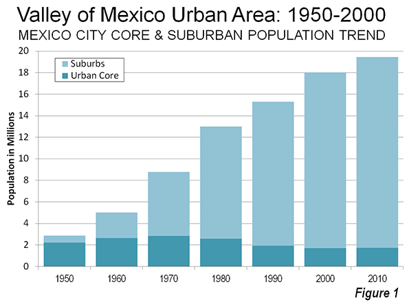
    Nearly 3 years ago, one of the first Evolving Urban Form articles highlighted the Valley of Mexico metropolitan area, which is Mexico City in its functional (economic) manifestation. That article noted that the core municipality of Mexico City in 1950 had 2.23 million residents out of the urban area’s fewer than 3 million and comprised only 54 square miles (139 square kilometers). By 1970, the city’s population had risen to 2.85 million. However, as has happened in Paris, Copenhagen, Milan, Osaka, Glasgow, Detroit, and many others, the urban core population plummeted. By 2000, the former city had a population of only 1.69 million, a 40 percent loss from 1970. There was a modest population increase between the 2000 and 2010 censuses, but its population seems unlikely to ever be restored to near their previous peak, which mirrors the experience of Paris and Copenhagen.

    Instead all population growth in the Valley of Mexico metropolitan area has been outside the 1950 area of Mexico City and in the post-World War II suburbs. While comparable metropolitan area data is not available, the Mexico City urban area added more than 10 million residents between 1970 and 2010. The same period, the suburban areas added more than 11 million residents (Figure 1). The Valley of Mexico metropolitan area is located not only in the Distrito Federal, but also in the states of Mexico and Hidalgo.

    The Other Major Metropolitan Areas

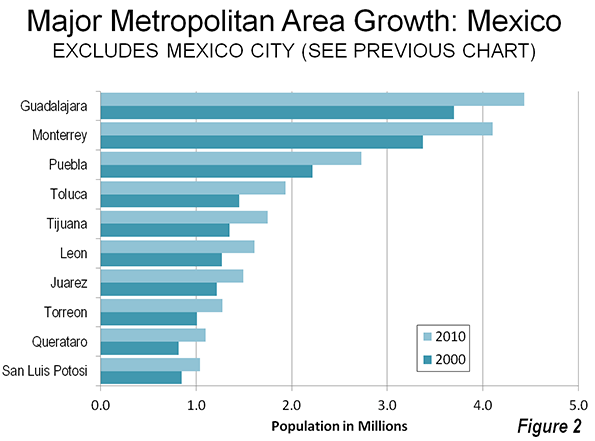
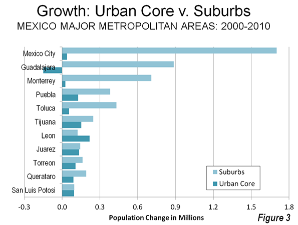
    While the scale of urbanization in the Valley of Mexico dwarfs that of the rest of the nation, similar dispersion is evident in the nation’s other 11 metropolitan areas with more than 1,000,000 population (Figures 2 and 3).

    Guadalajara

    Guadalajara, capital of state of Jalisco, is Mexico’s second largest metropolitan area. Between 2000 and 2010, the metropolitan area grew nearly 20 per cent, from 3.7 million residents to 4.4 million. The core city (locality) of Guadalajara lost 150,000 residents, registering a population of just under 1.5 million in 2010. Suburbs accounted for approximately all the metropolitan area’s population growth.

    Monterey

    Monterey, capital of the state of Nuevo Leon, is currently the third largest metropolitan area in Mexico and is growing slightly more rapidly than Guadalajara. Between 2000 and 2010, Monterey added 22 per cent to its population, which increased from 3.4 million residents to 4.1 million. The central locality grew modestly, but 97 per cent of the metropolitan area growth was in the suburbs.

    Central Mexico

    The Valley of Mexico metropolitan area is encircled by smaller, but major metropolitan areas that are among the fastest-growing in the nation.

    Queretaro, the capital of the state of Queretaro, is located 130 miles (220 kilometers) north of Mexico City by freeway. Queretaro is the fastest-growing major metropolitan area in Mexico, having added 34 per cent to its population over the last census period, to reach 1.1 million. More than two thirds of the growth was in the suburbs.

    Toluca, capital of the state of Mexico (Note), is located across a mountain range only 40 miles (65 kilometers) west of Mexico City. Toluca grew 33 percent to 1.9 million residents in 2010. Nearly 90 per cent of Toluca’s population growth was in the suburbs between 2000 and 2010.

    Pueblo, capital of the state of Puebla, is located across mountain range 130 miles (80 kilometers) to the east of Mexico City. Puebla is located in a valley surrounded by some of the most spectacular volcanoes in the world, including Popocateptl and Iztaccihuatl (both more than 17,000 feet, or 5,100 meters), toward Mexico City, La Malinche (14,600 feet or 4,500 meters), only 17 miles from the city center and Orizaba (18,500 feet or 5,600 meters). The three tallest of these reach elevations higher than any in North America outside of the Yukon and Alaska. Puebla was the slowest growing of the Central Mexico metropolitan areas, adding 23 percent to its population, and reaching 2.9 million residents in 2010. Three quarters of Puebla’s growth was in the suburbs. The Puebla metropolitan area extends into the state of Tlaxcala.

    Border Metropolitan Areas

    In comparison,   the large metropolitan areas on the United States border expanded outwards but not as rapidly. Tijuana, which is adjacent to the San Diego metropolitan area now has 1.75 million residents. More than 60 percent of its growth over the preceding 10 years was suburban. Juarez (located in the state of Chihuahua), is across the border from the El Paso metropolitan area and reached a population of 1.5 million, with slightly more than one half of its growth being in the suburbs. Neither San Diego-Tijuana area nor Juarez -El Paso qualify as metropolitan areas because they are not labor markets – there are significant limitations on the movement of labor (employees).

    Other Interior Metropolitan Areas

    Three other major metropolitan areas are located in the interior. In Torreon (states of Coahuila and Durango), more than 60 percent of the population growth was in the suburbs. A smaller 51 percent of the growth in San Luis Potosi (state of San Luis Potosi) was in the suburbs. The significant exception was Leon (state of Guanajuato), where only 36 percent of the growth was outside the core urban core.

    Continuing Dispersion

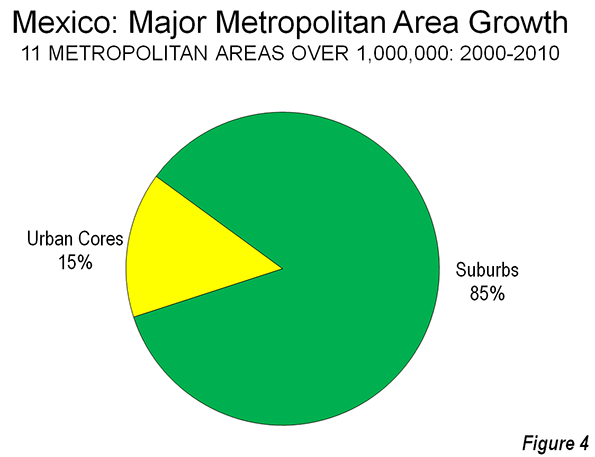
    Overall, 5.1 million of the 6.0 residents added to Mexico’s major metropolitan areas between 2000 and 2010 were outside the urban cores (Figure 4). Most of the growth was in the three largest metropolitan areas (Mexico City, Guadalajara and Monterrey), which added 3.2 million residents. The urban cores of these three metropolitan areas together declined approximately 100,000, while the suburbs attracted more than all of the metropolitan area growth. Mexico seems well positioned for continued economic growth and a populace that seeks better standards of living, more often than not in dispersed settings.

    Wendell Cox is a Visiting Professor, Conservatoire National des Arts et Metiers, Paris and the author of “War on the Dream: How Anti-Sprawl Policy Threatens the Quality of Life.

    —————-

    Note: The state of Mexico has the largest population in the nation, at 15.2 million (2010). This is 70 percent more than the second largest federal division, the Distrito Federal. This state of Mexico borders the Distrito Federal (Mexico City) on three sides and it outer suburban areas constitute more than one-half of the Valley of Mexico metropolitan area population (11 million of 21 million). Another 2 million are located in the even more distant state of Hidalgo. This state of Mexico also includes Toluca, another major metropolitan area (see above).

    ————

    Photograph: Southern suburbs of Guadalajara (by author)

    Correction: This version removes reference to Tijuana as the capital of Baja California. Mexicali is the state capital.

  • Life as a Second City

    Imagine someone writes a newspaper story about you and prints the picture of your older, well-known sibling next to the column. It is clear to you why this was done: your sibling is more famous and recognizable. But how does that make you feel?

    Following the January 28th State of the Union address, PBS interviewed a number of civic leaders. One of those interviewed was the mayor of Tacoma, a city with many of the challenges and attributes of a second child.

    The older sibling (that is, Seattle) has a nationally recognizable architectural landmark and a larger economy, and there is a higher likelihood that people around the country have heard its name rather than Tacoma’s.  Should we be surprised, therefore, that when Mayor Marilyn Strickland was being interviewed, “(D) Tacoma Washington,” was written at the bottom of the screen, but behind her was an image of Seattle’s skyline? The Tacoma Dome, Downtown Tacoma, the Museum of Glass, and other Tacoma landmarks were notably absent on the screen. Instead of using the Seattle image and perhaps to suggest where the program was being taped, PBS had an opportunity to educate the public (and to be factually correct) by showing a picture of Ms. Strickland’s town, Tacoma. Instead, PBS reinforced Tacoma’s “second city” image by visually identifying it with a picture of its more famous sibling. You cannot imagine how bothersome this is to people who live in Tacoma. A local columnist lamented that with Seattle’s picture as the backdrop, it was hard to focus on what the mayor was saying.

    The “second city” phenomenon is not exclusively a Tacoma issue. Glasgow, Melbourne, Milan, Montreal, St. Paul, Long Beach, California and many other cities around the globe face a similar challenge. Either their identity has not been well-articulated, or it has not been understood by external observers. This is not a logo problem. It is not about a catchy phrase, and it is not about another cultural event. Unique architectural landmarks can create memorable identities, but these phallic symbols already dot cities the world over. Whether in Dubai, Barcelona, or Beijing, starchitects would be happy to add the next jaw-dropper to any city willing to deposit a large sum of public funds at their altars.

    But for smaller cities, this level of economic competition is not affordable. This is where the notion of “urban branding” comes in. Cities need an internally generated and well-articulated narrative of identity before they can be recognized externally. At the beginning of the twenty first century, many cities, including Tacoma, are finding themselves struggling with this notion at local, regional, and international scales. How does a city get out of the shadow of another city? How do you broadcast who you are? Creating hipster colonies or 24 hour entertainment districts does not always work. Cities like Tacoma already house museums, artist colonies, hip hangouts, and, yes, waterfront condos with killer views. Nevertheless, the glitzy brother 20 miles north casts a long shadow that may stunt growth and contribute to a feeling of self-doubt.

    To get out of this position, cities like Tacoma need more than cultural fairs and gimmicky tourist attractions. They need an inclusively created branding strategy. It is important that they know what works and what doesn’t, but strategies need to be based on a vision that gives the city the self-confidence it needs to move forward. Tacoma cannot be and should not be Seattle, in the same way that Long Beach is not and should not be Los Angeles. The identity of a city does not arise out of a formula calculated by the latest intellectual fashion, but from an inclusively-created vision that seeks input from the public, and asks help from experts, not the other way around. Perhaps one the worst ideas of the last twenty years has been an excessive reliance on “best practices” and “experts.” We need to learn about each other, but we need to do it our way and articulate a clear vision of who we are. The second child can also succeed.

    Table: Tacoma is about a third of Seattle in population. With a lower density, less expensive housing and a more affordable cost of living, its households are on average slightly larger than those living in Seattle. Its small city charm, stunning views and history rival any urban area in the nation.

    Tacoma & Seattle Quick Facts Seattle Tacoma Washington
    Population, 2012 estimate     634,535 202,010 6,895,318
    Population, 2010 (April 1) estimates base     608,660 198,397 6,724,543
    Population, percent change, April 1, 2010 to July 1, 2012     4.30% 1.80% 2.50%
    Persons under 5 years, percent, 2010     5.30% 7.00% 6.50%
    Persons under 18 years, percent, 2010     15.40% 23.00% 23.50%
    Persons 65 years and over, percent,  2010     10.80% 11.30% 12.30%
           
    White alone, percent, 2010  69.50% 64.90% 77.30%
    Black or African American alone, percent, 2010  7.90% 11.20% 3.60%
    American Indian and Alaska Native alone, percent, 2010      0.80% 1.80% 1.50%
    Asian alone, percent, 2010      13.80% 8.20% 7.20%
    Native Hawaiian and Other Pacific Islander alone, percent, 2010      0.40% 1.20% 0.60%
    Two or More Races, percent, 2010     5.10% 8.10% 4.70%
    Hispanic or Latino, percent, 2010      6.60% 11.30% 11.20%
    White alone, not Hispanic or Latino, percent, 2010     66.30% 60.50% 72.50%
           
    Foreign born persons, percent, 2008-2012     17.50% 13.50% 13.00%
    High school graduate or higher, percent of persons age 25+, 2008-2012     92.90% 88.00% 90.00%
    Bachelor’s degree or higher, percent of persons age 25+, 2008-2012     56.50% 24.70% 31.60%
           
    Housing units, 2010     308,516 85,786 2,885,677
    Homeownership rate, 2008-2012     47.30% 52.80% 63.80%
    Housing units in multi-unit structures, percent, 2008-2012     50.50% 35.00% 25.70%
    Median value of owner-occupied housing units, 2008-2012     $441,000 $230,100 $272,900
           
    Households, 2008-2012     285,476 78,447 2,619,995
    Persons per household, 2008-2012     2.06 2.46 2.52
    Per capita money income in past 12 months (2012 dollars), 2008-2012     $42,369 $25,990 $30,661
    Median household income, 2008-2012     $63,470 $50,439 $59,374
    Persons below poverty level, percent, 2008-2012     13.20% 17.60% 12.90%
           
    Land area in square miles, 2010     83.94 49.72 66,455.52
    Persons per square mile, 2010     7,250.90 3,990.20 101.2
    Source: US Census Bureau State & County QuickFacts
    Downloaded: February 8, 2014

    None of this, however, diminishes the responsibility of media outlets. Tacoma is not Seattle. A major news outlet should educate itself and the public by using accurate images. The next time a TV station invites the mayor of Tacoma to participate in a program, here’s hoping they don’t show the Space Needle in the background. 

    For now, people will be sleepless in Tacoma until they figure out their way out of being the second city.

    Ali Modarres is the Director of Urban Studies at University of Washington Tacoma.  He is a geographer and landscape architect, specializing in urban planning and policy. He has written extensively about social geography, transportation planning, and urban development issues in American cities.

    Tacoma photo by Flickr user Michael D. Martin.

  • Possible Sign of Trouble for Los Angeles

    A quarter century ago, the Los Angeles-Orange County area seemed on the verge of joining the first tier of global cities. As late as 2009, the veteran journalist James Flanigan could pen a quasiserious book, “Smile Southern California: You’re the Center of the Universe,” which maintained that L.A.’s port, diversity and creativity made it the natural center of the 21st century.

    A very different impression comes from a newer report, The Los Angeles 2020 Commission, which points out that, in reality, the region “is barely treading water while the rest of the world is moving forward.” The report, which focuses on the city of Los Angeles, points to many of the problems – growing poverty, a shrinking middle class, an unbalanced city budget, an underachieving economic and educational system – that have been building for decades.

    Sadly, “the 2020” report more accurately reflects L.A.’s current situation than Flanigan’s more optimistic view. All the more remarkable – and, perhaps, ironic – is that the signatures on the report come from many of the same political figures, union leaders and political advocates who have done so much to create this very sad situation. Disappointingly, the L.A. City Council already has started making its excuses, while the report’s authors, as the Daily News’ Rick Orlov notes, have already started “softening” their sometimes-harsh assessment.

    It is difficult, for example, to take seriously a report that, on the one hand, worries over pension costs but is signed, and supported, by the likes of County Labor Federation boss Maria Elena Durazo and L.A. Department of Water and Power union head Brian D’Arcy. For the most part, the commission was made up of lawyers and others who feed off the very pattern of insider deals and misdirected investment strategies that have so humbled a great city, and region. No surprise, then, that their biggest concrete recommendations were to speed up the pouring of concrete for their various pet projects, some of which make sense, while other don’t.

    Nevertheless, the report suggests that, perhaps, at last, even the most comfortably entrenched leaders are finally waking up to the predicament they and their colleagues have helped create. What they need now is a strategy that restores to Los Angeles the global status that is a prerequisite for progress.

    Why does being a global city matter so much? In large part, it is the best way to compete in a globalizing economy where the successful cities are defined not by size or population, but by the unique services they offer the world. In an ongoing study I am directing for the Chapman University Center for Demographics and Policy, with the assistance of the Singapore Civil Service College, we identified the leading world cities. We focused on such things as financial services, industrial specialization, media and culture.

    Size doesn’t always matter

    In the business of global cities, many of the biggest urban areas – in fact, all the largest ones, excluding Tokyo – failed to make the top 30. Instead, New York and London did best, along with such Asian cities as Tokyo, Hong Kong and Singapore. Perhaps our most surprising finding was that California’s two great metropolitan areas, the San Francisco Bay Area and Los Angeles, ranked sixth and seventh, respectively.

    Why, despite all its problems, is Southern California ranked so high? This is largely a reflection of several factors – notably, a still-sizeable tech sector, a huge port and strong cultural diversity – but, most importantly, because of Hollywood. Great global cities, by our calculations, are often what can be seen as “necessary cities.” They dominate economic niches to an extent that someone from outside the region is compelled to do business there.

    Hooray for Hollywood

    This is true, for example, for finance and media in New York and London, while the Bay Area dominates tech. Similarly, Hollywood is nearly synonymous with the American entertainment industry, which is by far the largest in terms of revenue and influence in the world. Last year, the industry enjoyed a trade surplus of roughly $12 billion; film and television industry exports totaled nearly $15 billion. Every major global movie studio in the world is located in Los Angeles, which is also a key hub of the music industry.

    So dominant is Los Angeles’ entertainment industry that many countries, trying to preserve their own cultural industries, have placed strict quotas on the number of English-language films that can be shown and songs that can be played on the radio. Los Angeles-Orange County once also enjoyed a dominant position in aerospace, but this industry has dramatically faltered, as the sector shrank by some 240,000 jobs as companies moved elsewhere, taking with them much of the region’s technical talent.

    The port of Los Angeles, another economic linchpin, remains somewhat dominant but the trade sector faces growing competition and suffers from the kind of institutional malaise that affects so much of business here. The region retains a foothold in the auto sector as the U.S. base for some Asian makers. Even here, however, there are clouds, as Nissan relocated to Nashville, Tenn., and Honda moved top executives to Ohio in order to be nearer to its manufacturing. More promising, the new Hyundai U.S. headquarters in Fountain Valley signals that global carmakers still see L.A.-Orange County as a “necessary” place.

    The region has held on to a leading, if somewhat smaller, share of entertainment, but L.A.’s other traditional industrial strengths, such as aerospace and defense, have badly eroded. One bright spot is technology. Somewhat surprisingly, the Startup Genome project ranked Los Angeles as having the second-strongest startup ecosystem in the United States. Yet, overall, L.A. has been losing ground in terms of employment, technology employment and net migration to other ascendant regions.

    Tech titans

    Perhaps the most critical factor affecting L.A.’s global status revolves around technology. It was shocking to me, at least, with L.A.’s focus on global ties, that the Bay Area has now slightly nosed out Southern California in our study’s rankings, largely due to that region’s technological preeminence. The region hosts the largest concentration of cutting-edge tech firms in the world. This fact alone allows the Bay Area to play a profound role in how globalization works, notes analyst Aaron Renn (www.urbanophile.com), particularly since innovations coming from that region arguably are a more primal enabler than advanced producer services. Indeed, according to one study, three Bay Area counties – San Francisco, San Mateo and Santa Clara – rank as the top three for concentration of tech jobs, and are among the leaders in growth.

    More serious still, Silicon Valley’s technological push is threatening to upend the structure of Hollywood and media. Over the past decade, Internet and software publishing, which are heavily centered in the Bay Area, have added close to 100,000 new jobs, while traditional media – based largely in New York and Los Angeles – have lost almost three times as many jobs.

    Google and Yahoo already are ranked among the largest media companies in the world. (Yahoo refers to itself as a digital media, rather than a technology, company.) Apple now has a great deal of control over consumer distribution of entertainment products like music and video. The entrance of Netflix, and other tech firms, into the television production business could further undermine L.A.’s entertainment dominance. To the new-tech oligarchs, older industries are prisoners to what one venture capitalist derisively called “the paper economy,” soon to be swept aside by the rising digital aristocracy.

    These issues, and challenges, are what the 2020 Commission people should be addressing in their search for solutions to the L.A. region’s relative decline. As our research indicates, Los Angeles-Orange County remains a major world city, but its upward trajectory is threatened by changes in technology and the rise of other regions in the U.S. and abroad. Now that members of the L.A. establishment have acknowledged “the truth,” perhaps it’s time for them to come up with ideas that can make the truth more pleasant.

    This story originally appeared at The Orange County Register.

    Joel Kotkin is executive editor of NewGeography.com and Distinguished Presidential Fellow in Urban Futures at Chapman University, and a member of the editorial board of the Orange County Register. He is author of The City: A Global History and The Next Hundred Million: America in 2050. His most recent study, The Rise of Postfamilialism, has been widely discussed and distributed internationally. He lives in Los Angeles, CA.

    Photograph: Downtown Los Angeles from Echo Park (by Wendell Cox)

  • San Francisco Photo Essay: I Used to Live Here

    This is my old apartment in SF’s Mission District from way back when Mrs. UpintheValley and I were just dating.  My waystation before cohabitation and matrimony. I notice the curtains haven’t changed.  Flea market bedspreads and pillowcases were the order of the day then, and apparently still are.  Which means P. has kept the lease on the place and presumably lived in uninterrupted squalor with a revolving cast of characters from Roommate Finders all these years.  At the prices we were paying then, why would you ever leave?  The rest of the neighborhood has…evolved, beginning with the ground floor. Man, has it ever.

    DSCN2226

    For example, the launderia, where I once had a load of jeans stolen, is now a yoga studio…

    DSCN2227

    …and is buttressed by a vegan restaurant.  The corner liquor store beneath my old bedroom is now a supper club with gilt lettering in the window.  The dive bar at the other corner, where day laborers used to drink their wages beneath the deathly pallor of fluorescent tube lighting and stagger out to the alley to relieve themselves against the wall, is now a pretentious cocktail lounge with velvet curtains.

    DSCN2228

    The New Mission:  High end condos where the old $1 dollar movie palace used to be, but the marquee remains to satisfy the historic preservationists.

    DSCN2261

    Dogs and bikes are ubiquitous in the new SF.

    DSCN2267

    Unlike LA, the bike is king in the new social arrangement.  Bike lanes are everywhere.  Bicyclists are entitled to use the full lane if they choose, and they do so. You may not squeeze them to the side as you pass.   There are reasons for this. One of them is: people who write programming code like to ride bikes, and the people who write code are making it rain in San Francisco.

    DSCN2331

    Construction is everywhere….

    DSCN2346

    They’ve just built the two tallest apartment buildings on the West Coast.

    DSCN2315

    Way out in the Avenues, 3BR starter homes sell for $1 million+ sight unseen, all cash, to Chinese investors, the other group making it rain. No one in the neighborhood seems to know who the buyers are, but everything goes in multiple offers.  You see a guy like this at a cake shop on Taraval, yakking away in Mandarin, and you find yourself inordinately interested in someone else’s mundane conversation.   I’ll say this for the Asians: not a spec of trash or tagging to be found West of Twin Peaks and I only saw one house in disrepair in three days of strenuous walking.

    DSCN2317

    Trails, trails, trails, everywhere…with plenty of parking.   For a city drowning in New Money, San Francisco, unlike LA, has managed to retain at least one bedrock principle of the social contract.

    DSCN2253

    But back to the Mission.  One still encounters the old army of derelicts and panhandlers, but you just don’t find as many Latinos there anymore. Its identity as a landing place for working class immigrants to get a toehold in the economy is rapidly being eclipsed by the brute facts of New Money.  If people of the Twitterverse are willing to spend a million dollars to share a block with schizophrenic crack addicts then there is a diminished geography remaining for line cooks and seamstresses to occupy.   Or drywall installers. Or yoga instructors.   Or maintenance men.  The Latino working class is abundant in Van Nuys.  In San Francisco, it is memorialized in murals.

    DSCN2255


    DSCN2338

    Last image on the way out of town….a concise acknowledgement of the obvious:  the laptop has replaced the pickaxe in the digital Gold Rush.  Unlike their 19th century counterparts, the gold miners are actually making the money.  The dry goods dealers and shopkeepers work for them.  How long can this last? What happens when Apple stops selling 400, 000 iPhones a day?  Social media and gaming and on-line retail are built on code.  Code can be written anywhere. Angry Birds was designed in Finland.  Tell me how this movie ends.

    Andreas Samson lives and works in Van Nuys and blogs about the San Fernando Valley at upinthevalley.org.

  • America’s Future Cities: Where The Youth Population Is Booming

    To identify economic hot spots in the making, we often look for where immigrants, young people or entrepreneurs are clustering. But perhaps nothing is a better indicator than those who truly make up generation next — America’s children.

    Several major factors determine where the most children are being born, and more importantly, raised, says demographer Wendell Cox. Three key ones are economic growth, affordability and lower population densities.

    Using the Census Bureau’s 2012 American Community Survey, Cox looked at the under 14 populations of the nation’s 51 metropolitan statistical areas with over a million residents, and also traced the changing numbers in this age group since the onset of the Great Recession in 2007. Finally he broke down each of these metro areas between their core cities and suburbs to determine where within the region children are the most predominant.

    Thesuburbs have sometimes been described as the nurseries of the nation, but surprisingly the outer rings generally did not outperform core cities in terms of births over the period we examined. In the core cities of our 51 largest MSAs, newborns to 4-year-olds made up 6.9% of the population in 2012, compared to 6.3% in the suburbs. But even here, it’s not the “hip and cool” cities leading the way – San Francisco, Seattle and Boston were all well below the average. Generally the highest proportions of young children were in lower-density cores of such cities as Oklahoma City, Dallas, Charlotte, N.C., and Houston. (Two metro areas with denser urban cores, Milwaukee and Hartford, also made the top  10.)

    But something dramatic happens as children age: They and their parents start moving to the suburbs in massive numbers. In both the 5-to-9 and 10-to-14 cohorts, suburbs easily surpass core cities in virtually every major metropolitan area. So while the popular perception that many downtowns are now overrun by baby strollers is not necessarily an urban myth, it ignores what happens to families as children get older and ambulatory, requiring more space, needing to go to school and more susceptible to getting into trouble.

    In addition, Cox notes, not only are there higher concentrations of children in suburbs in the vast majority of metro areas, the overall greater population on the periphery makes the suburbs home to the preponderance of families. This is one reason that most of the fastest-growing counties in the U.S. are either suburbs or exurbs. Roughly 23.9 million children below the age of 14 live in the suburbs of our 51 largest metro areas compared to 8.6 million in the core cities.

    Families and Opportunity

    Perhaps nothing attracts families on the move more than economic opportunity. The old adage “the rich get richer and the poor have babies” may no longer fit in the United States. In fact, in most high-income societies, the birth rate is shaped increasingly by economic conditions. The Great Recession, for example, reduced fertility in most major countries, including the United States, which traditionally has enjoyed somewhat higher birth rates than its high-income competitors in East Asia and Europe.

    But with the gradual economic recovery in the United States, the decline in birthrates has endedand could return to the levels of the more prosperous 1990s and early 2000s.  This dynamic plays out as well on the local level. Birthrates tend to have remained stable in metro areas with stronger economies during the recession. In booming North Dakota, births actually increased.

    Not surprisingly, metropolitan areas with the consistently strongest economies in terms of job creation and income growth dominate our list of the cities with the highest share of children under 14 in their populations. In our top-ranked metro area, Salt Lake City, children make up 24.7% of the population, and in second place Houston, they account for 23.0%.

    Affordability

    The second major factor driving child demography is the cost of housing, which is the principal driver of the cost of living. Virtually all the areas with high proportions of children have median home price to annual income ratios of three to four. In some cases, low home prices seem to trump economic malaise. This may help explain the relatively high under 14 population in No. 4 Riverside-San Bernardino, Calif.

    Conversely high housing prices can also limit the ability of even prospering areas to grow families. This is most obvious in the relatively low ranking of the New York metro area (41st), with a median home price to income multiple of 6.2.  San Francisco-Oakland, home to the highest housing prices in the nation with a median multiple rapidly approaching 9, ranks 45th place. Pricey Boston ranks 46th. Policies designed to prevent the construction of single-family homes, particularly in the Bay Area, all but guarantee that housing prices will remain high, and toxic for all but wealthy households.

    Density

    Despite the hopes of some urbanists, most families prefer lower-density living, particularly single-family houses. Between 2000 and 2011, detached house accounted for 83% of the net additions to the occupied housing stock in the United States. A survey sponsored by the National Association of Realtors suggests that roughly 80% of Americans prefer a single-family house to either an apartment or townhouse.

    Correspondingly, expansion in the number of families and children has been occurring overwhelmingly in less dense areas. The fastest growth in the under 14 population since 2007 has been almost entirely in what can be described as heavily suburbanized low-density areas, led by greater New Orleans, Raleigh, San Antonio, Charlotte, Nashville, and Houston. In contrast, the biggest drop off in the number of children has been in metropolitan areas with higher urban densities, with the most dense, Los Angeles, also suffering the largest decline. The 10 metropolitan areas with the largest declines in their youth populations had urban densities averaging 45 percent more than the 10 with the greatest gains.

    The Urban Future and Fertility

    What does this tell us about the future of our urban regions? Since families are a critical component of growth in any metropolitan areas, those with higher percentages of children are likely to grow far faster than those that are made up increasingly of childless households. This trend should accelerate as the millennials, now entering their 30s, begin to form families. Children boost the demand for certain goods, notably houses and certain kinds of retail, and also increase demand for many services, notably schools.

    Given the current economy, most of our top metropolitan areas can be expected to continue growing, particularly those, like Houston and Dallas, that have become increasingly hospitable to immigrants; the foreign-born account for one out of every four women giving birth in the country. Minorities overall are the ones driving population growth; last year  there weremore white deaths than births.

    But some traditionally fertile metropolitan areas might see a real slowdown, notably Riverside-San Bernardino, where income and job growth is lagging well behind housing costs.  At the same time, we can expect continued slow growth in the populations in those areas towards the bottom of the list. To be sure, migration of older people from cold climates will keep Miami (47th on our list) and Tampa-St. Petersburg (second from last) growing, particularly as the boomers age. Such a movement can not anticipated in many other low-ranked cities ranging from relatively prosperous Pittsburgh (last place) to less affluent Buffalo, Providence and Cleveland.

    We can also anticipate the evolution of some metropolitan areas with low percentages of children — such as Boston, San Francisco, New York and Los Angeles — will slow not just demographically, but also economically as younger workers look to establish families elsewhere.  This may be somewhat counterbalanced by foreign immigration, but these newcomers, particularly those without huge financial resources, are also increasingly migrating to lower-density cities.

    Having children in your region certainly does not guarantee success, but without them, metro areas will face a more rapid aging of their populations and workforces, something that historically does not produce robust economies but gradual decline.

    YOUNG POPULATION: MAJOR METROPOLITAN AREAS: 2012
    Ages 0-14
    MMSA MMSA% Core City % Suburban %
    Atlanta, GA 21.6% 15.9% 22.1%
    Austin, TX 21.2% 18.9% 23.1%
    Baltimore, MD 18.6% 18.3% 18.8%
    Birmingham, AL 19.7% 19.0% 19.9%
    Boston, MA-NH 17.3% 14.4% 17.7%
    Buffalo, NY 17.1% 19.5% 16.4%
    Charlotte, NC-SC 21.4% 19.6% 22.8%
    Chicago, IL-IN-WI 20.2% 19.0% 20.6%
    Cincinnati, OH-KY-IN 20.3% 19.5% 20.5%
    Cleveland, OH 18.3% 19.4% 18.0%
    Columbus, OH 20.4% 19.6% 21.1%
    Dallas-Fort Worth, TX 22.9% 22.0% 23.1%
    Denver, CO 20.5% 19.0% 21.0%
    Detroit,  MI 19.1% 20.7% 18.8%
    Hartford, CT 17.4% 21.1% 17.0%
    Houston, TX 23.0% 21.8% 23.6%
    Indianapolis. IN 21.6% 21.2% 22.0%
    Jacksonville, FL 19.3% 19.7% 18.6%
    Kansas City, MO-KS 21.1% 20.8% 21.2%
    Las Vegas, NV 20.4% 20.1% 20.6%
    Los Angeles, CA 19.4% 18.7% 19.7%
    Louisville, KY-IN 19.5% 19.3% 19.7%
    Memphis, TN-MS-AR 21.6% 20.9% 22.2%
    Miami, FL 17.3% 16.2% 17.4%
    Milwaukee,WI 20.1% 22.9% 18.4%
    Minneapolis-St. Paul, MN-WI 20.4% 19.5% 20.7%
    Nashville, TN 20.1% 18.7% 20.9%
    New Orleans. LA 19.2% 18.3% 19.6%
    New York, NY-NJ-PA 18.4% 17.9% 18.9%
    Oklahoma City, OK 21.0% 22.1% 20.1%
    Orlando, FL 18.8% 20.2% 18.6%
    Philadelphia, PA-NJ-DE-MD 18.8% 18.9% 18.7%
    Phoenix, AZ 21.4% 22.9% 20.7%
    Pittsburgh, PA 16.0% 12.9% 16.5%
    Portland, OR-WA 19.2% 16.5% 20.2%
    Providence, RI-MA 17.2% 18.3% 17.0%
    Raleigh, NC 21.6% 19.8% 22.7%
    Richmond, VA 18.8% 17.0% 19.2%
    Riverside-San Bernardino, CA 22.8% 23.9% 22.7%
    Rochester, NY 17.6% 19.2% 17.3%
    Sacramento, CA 19.9% 19.9% 19.8%
    Salt Lake City, UT 24.7% 18.5% 25.9%
    San Antonio, TX 21.7% 21.8% 21.6%
    San Diego, CA 19.0% 17.1% 20.3%
    San Francisco-Oakland, CA 17.4% 13.6% 18.8%
    San Jose, CA 20.0% 20.5% 19.4%
    Seattle, WA 18.7% 13.4% 19.8%
    St. Louis,, MO-IL 19.2% 17.9% 19.3%
    Tampa-St. Petersburg, FL 17.1% 18.7% 16.8%
    Virginia Beach-Norfolk, VA-NC 19.1% 18.0% 19.3%
    Washington, DC-VA-MD-WV 19.5% 14.8% 20.1%
    Calculated from American Community Survey Data

    This story originally appeared at Forbes.com.

    Joel Kotkin is executive editor of NewGeography.com and Distinguished Presidential Fellow in Urban Futures at Chapman University, and a member of the editorial board of the Orange County Register. He is author of The City: A Global History and The Next Hundred Million: America in 2050. His most recent study, The Rise of Postfamilialism, has been widely discussed and distributed internationally. He lives in Los Angeles, CA.

    Crossing the street photo by Bigstock.

  • The Illusions of Charles Montgomery’s Happy City (Part 2)

    This is the second of a two-part series discussing Charles Mongomery’s Happy City. Read part one here.

    ‘The system that built sprawl’

    Montgomery faces the hurdle of explaining why, if low-density suburbs cause unhappiness, so many millions of people, over so many decades, across several countries, flocked to that way of life. As he writes, ‘since 1940, almost all urban growth has actually been suburban.’ He must account for this fact, even though it means little to him personally. For the green-tinged intelligentsia, working and middle-class people are pawns who rarely think for themselves.      

    Still, in Montgomery’s case the hurdle is high, since his objections to dispersion go much further than conventional gripes about fragile economic foundations. Happy City does peddle the myth, in passing, that the financial crisis brought suburbanisation to a crashing halt. There’s an assertion that ‘census data in 2010/2011 showed that major American cities showed more growth than their suburbs’, and a hope this points to forces ‘systemic and powerful enough to permanently alter the course of urban history’. Montgomery even compares buying a detached home on the urban edge to ‘gambling on oil futures and global geopolitics’. As it turns out, he misconstrues the available data. Suburbanisation barely missed a beat in the United States and continues in earnest. 

    Montgomery’s essential point, though, is that suburban life is contrary to deep-seated human yearnings. This endows him with an even more patronising attitude to working people than his forerunners Richard Florida – who endorses the book – and Edward Glaeser. One line of argument in Happy City, which also features in Glaeser’s Triumph of the City, claims dispersion was forced on people by greedy land owners and property developers in cahoots with weak-kneed or compromised politicians and officials.

    He puts it his way: ‘sprawl, as an urban form, was laid-out, massively subsidized and legally mandated long before anyone actually decided to buy a house there … it is as much the result of zoning, legislation and lobbying as a crowded city block.’ In another chapter, Montgomery warns of the challenge for pro-density New Urbanism: ‘the system that built sprawl – huge state subsidies, financial incentives and powerful laws – is still in place.’ Popular preferences don’t even rate a mention. Similar comments appear throughout the book, adding up to an audacious feat of historical revisionism.

    The standard interpretation of urban evolution, from the walking city to the monocentric and then polycentric metropolis, places breakthroughs in transport technologies first, most notably railways, streetcars (trams) and affordable motor vehicles, followed by mass shifts in transportation modes and population movements second, with land owners and politicians ready to exploit the new conditions. Of course, transportation technologies have such a powerful impact because of pent up demand for space and lower densities.

    Essentially, Montgomery reverses the causative sequence, claiming government and business interests dragged people to the fringes and this induced a transformation of transportation modes, which may or may not have been viable under prevailing technologies. This anomalous theory puts him at odds with some of the most recognised urban thinkers:  

    • Lewis Mumford in The City in History: ‘what has happened to the suburb is now a matter of historic record … as soon as the motor car became common, the pedestrian scale of the suburb disappeared …’
    • Peter Hall in Cities in Civilization, discussing Los Angeles: ‘the car was doing more than decentralize; it was decentralizing in a new way’.
    • Robert Bruegmann in Sprawl: A Compact History: ‘families wishing to live at lower densities could be seen as the primary cause of the growth in … the railroad, public transportation and finally the automobile industry … each of these means of transportation did, in fact, give families increased mobility.’
    • Joel Kotkin in The City: A Global History: ‘as automobile registrations soared in the 1920s, suburbanization across the rest of [the United States] also picked up speed, with suburbs growing at twice the rate of cities.’
    • Shlomo Angel in Planet of Cities: ‘a third and more radical transformation, from the monocentric to the polycentric city, began in the middle decades of the twentieth century with the rapid increase in the use of cars, buses, and trucks.’

    Such quotes can be piled up all day long.    

    Happy City is open to the same criticism as Glaeser’s book, namely that as a matter of chronology, urban dispersion took off before the interstate highway system, tax deductibility of home mortgage interest, the relative decline of inner-city schools, many development controls, and other factors cited by both as having pushed Americans to the periphery. In Downtown: Its Rise and Fall 1880-1950, Robert Fogelson explains that ‘by the mid and late 1920s, however, some Americans had come to the conclusion that the centrifugal forces were beginning to overpower the centripetal forces – or, in other words, that the dispersal of residences might well lead in time to the decentralization of business.’ And suburbs have been popular in countries other than the US, like Australia, where these sorts of factors are absent.

    Blinded by science

    For his part, Montgomery envisages an alternative past, in which demands for space and mobility hardly figure. ‘Well, the path that led … to today’s sprawl was not straight’, he writes, ‘it meandered back and forth between pragmatism, greed, racism and fear.’ Rewriting history may be audacious, but that’s just the beginning. The book doesn’t stop at denouncing suburbanisation as a form of organised compulsion. Montgomery’s ultimate purpose, drawing on ‘happiness science’, is to expose suburban life as a mass delusion. ‘We need to identify the unseen systems that influence our health and control our behaviour’, he writes.     

    Much of Happy City is devoted to a succession of studies and experiments by a range of neuroscientists, psychologists and behavioural economists on the conditions that stimulate feelings of well-being and contentment. Montgomery focuses on research into different spatial environments: densely or sparsely populated, high-rise or street-level, crowded or uncrowded, mixed-use or homogenous, auto-dependent or walkable, near or far from nature, and so on.

    Many people have no clue that their deeper inclinations are out of synch with their surroundings, he maintains, painting a less than flattering portrait of human nature. ‘The more psychologists and [behavioural] economists examine the relationship between decision-making and happiness,’ he repeats in various ways, ‘the more they realize … we make bad choices all the time … in fact we screw up so systematically …’

    Building a case that most of us are hobbled by delusions, Montgomery delights in claiming ‘we are far less rational in our decisions than we sometimes like to believe …’, and ‘we regularly respond to our environment in ways that seem to bear little relation to conscious thought or logic.’ Personal motives can be reduced to a stew of physiological and chemical stimuli, all summed up in a single paragraph:  

    Neuroscientists have found that environmental cues trigger immediate responses in the human brain even before we are aware of them. As you move into a space, the hippocampus, the brain’s memory librarian, is put to work immediately … it also sends messages to the brain’s fear and reward centres … it’s neighbour, the hypothalamus, pumps out a hormonal response … before most of us have decided if a place is safe or dangerous … places that seem too sterile or too confusing can trigger the release of adrenaline and cortisol, the hormones associated with fear and anxiety … places that seem familiar … are more likely to activate hits of feel-good serotonin, as well as the hormone that … promotes feelings of interpersonal trust: oxytocin.

    Nowhere is it acknowledged that if rational choice is devalued, people might end up being treated less like autonomous citizens and more like laboratory rats. Happiness ‘can’t be summed up by the number of things we produce or buy’, the book insists, ‘but the firing synapses of our brains, the chemistry of our blood …’

    Montgomery proceeds to grab hold of anything that discredits the real-life choices of suburbia’s teeming millions. One of many concepts he takes from neuroscience is ‘information propagation’. By operation of the hippocampus and other parts of the brain, we are told, our ‘concept of the right house, car or neighbourhood might be as much a result of happy moments from our past or images that flood us in popular media as of any rational analysis.’ From psychology he borrows the concept of ‘adaptation’, described as a ‘characteristic that exacerbates such bad decision-making [namely] the uneven process by which we get used to things.’

    He considers these important explanations for the appeal of suburban lifestyles when denser neighbourhoods are better for physical and mental health, at least according to his interpretation of studies and experiments on walking, cycling, social encounters, community activities, public space, streetscapes, grid planning, on-street parking and traffic velocity.  

    But his method of selecting a body of research, cobbling the results together, and equating this to the preconditions for a happy life, suffers from a fallacy of composition ─ the error of inferring that something is true of the whole from the fact that it is true of some part of the whole. Although Montgomery claims ‘most people, in most places, have the same basic needs and most of the same desires’, it doesn’t follow that research findings on parts of life should add up to a real whole life.

    Kirk Schneider, a prominent American psychologist, writes in Psychology Today that ‘prevailing studies of happiness … represent but a circumscribed range of how such phenomena are actually experienced on the ground, so to speak, in people’s everyday worlds.’ Schneider cautions that ‘those things represent only slices of life, not life itself.’

    There’s no reason why urban planning should start from abstract assumptions drawn from a bunch of controlled experiments, rather than from masses of people weighing up their full, lived experience.   

    In this and other ways, the book succumbs to a disturbing strain of authoritarianism. History teaches us to beware a state that deals with people through the prism of theories which second-guess their inner thoughts and feelings, rather than according to their outward conduct. Freedoms are at risk whenever powerful functionaries claim to know what people are thinking, because of ‘false consciousness,’ ethnic stereotypes, biological determinism, or whatever. And Montgomery is no freedom-fighter: ‘we are pushed and pulled according to the systems in which we find ourselves, and certain geometries ensure that none of us are as free as we might think.’  

    ‘Make them feel rich’

    In the end, Happy City fails to prove the assertions trumpeted in its opening pages. It fails to produce any direct evidence connecting flatlining assessments of well-being or rising rates of depressive illness to ‘sprawl’. Nor is there any indirect evidence from which a connection can be inferred. Just as research on parts of life don’t add up to a whole real life, neither can studies and experiments finding discontent in particular conditions translate to generalised disenchantment with a whole way of life.

    Montgomery’s style is to fill the gaps with a series of conveniently chosen anecdotes and vignettes, some designed to trash suburbia and others to wrap a glowing aura around transit-oriented density. Randy Straussner’s super-commuting horror story, which never goes away, is an example of the former. But the star of the book, and prominent case of the latter, is ‘The Mayor of Happy’.

    At the helm of impoverished Bogota between 1998 and 2001, Enrique Penalosa cancelled a highway expansion plan, used the funds for hundreds of miles of cycle paths, hiked fuel taxes by 40 per cent, banned drivers from commuting by car more than three times a week, introduced car-free days, dedicated a new chain of parks and pedestrian plazas, and built the city’s first rapid transit system. This made him a guru to green urbanists like Montgomery, who was inspired to write Happy City.

    ‘We might not be able to fix the economy’, Penalosa is quoted as saying in the book, ‘we might not be able to make everyone as rich as Americans … but we can design the city to give people dignity, to make them feel rich.’ Confronting an unemployment rate of 18 per cent when Penalosa left office, however, many Bogotans would have longed for the real thing. 

    John Muscat is a co-editor of The New City, where this piece first appeared.

  • The Evolving Urban Form: The San Francisco Bay Area

    Despite planning efforts to restrict it, the Bay Area  continues to disperse. For decades, nearly all population and employment growth in the San Jose-San Francisco Combined Statistical Area has been in the suburbs, rather than in the core cities of San Francisco and Oakland. The CSA (Note) is composed of seven adjacent metropolitan areas (San Francisco, San Jose, Santa Cruz, Santa Rosa, Vallejo, Napa, and Stockton). A similar expansion also occurred in the New York CSA.

    The San Francisco Bay Area is home to two of the three most dense built-up urban areas in the United States, the San Francisco urban area, (6,266 residents per square mile or 2,419 per square kilometer) with the core cities of San Francisco and Oakland and the all-suburban San Jose urban area (5,820 residents per square mile or 2,247 per square kilometer), according to US Census 2010 data. Only the Los Angeles urban area is denser (6,999 per square mile or 2.702 per square kilometer). The more spread out New York urban area trails at 5,319 per square mile (2,054 per square kilometer).

    The San Francisco Bay & Central Valley Area

    The continuing dispersion was reflected in commuting patterns that developed between 2000 and 2010, with the addition of the Stockton metropolitan area, which is composed of San Joaquin County, with more than 700,000 residents. San Joaquin County is located in the Central Valley and is so far removed from San Francisco Bay that it may be appropriate in the long run to think of the area as the "San Francisco Bay & Central Valley Area." The distance from Stockton to the closest point shore of San Francisco Bay is 60 miles, and it is nearly another 25 miles to the city of San Francisco.

    Ironically, this continued dispersion of jobs and residences is, at least in part, driven by the San Francisco Bay Area’s urban containment land use policies designed to prevent it. What the planners have ignored is the impact on house prices associated with highly restrictive land use planning. The San Francisco metropolitan area and the San Jose metropolitan area are the third and fourth most unaffordable major housing markets out of 85 rated in the recent 10th Annual Demographia International Housing Affordability Survey, trailing only Hong Kong and Vancouver.

    Historical Core Cities: San Francisco and Oakland

    The historical core municipalities (cities) of the San Francisco Bay Area, San Francisco and Oakland have held their population very well. Each essentially retains it 1950 borders. Among the 40 US cities with more than 250,000 residents in 1950, only San Francisco and Oakland managed population increases by 2000 without substantial annexations and substantial non-urban (rural) territory within their city limits. For example, New York and Los Angeles, both of which have grown, have nearly the same city limits as in 1950 and 2000, yet much of New York’s Staten Island was rural in 1950 as was much of the San Fernando Valley in Los Angeles.

    Yet both San Francisco and Oakland have had difficult times. Between 1950 and 1980, both San Francisco and Oakland suffered 12 percent population losses, which were followed by recoveries. The losses were modest compared to the emptying out of municipalities like St. Louis. Detroit, Chicago, Copenhagen, and Paris, which remain one quarter to nearly two-thirds below their 1950s figures. Further, population gains from annexations masked losses within the 1950 boundaries of many cities, such as Portland, Seattle, and Indianapolis, etc.

    San Jose: Now the Largest City

    San Jose is now the Bay Area’s largest city. San Jose has grown spectacularly, from a population of 95,000 in 1950 to nearly 1,000,000 today. San Jose passed San Francisco by the 1990 census and Oakland by the 1970 census (Figure 1). Virtually all of San Jose’s population growth has occurred during the postwar period of automobile suburbanization. The pre-automobile urban form familiar in San Francisco and central Oakland simply does not exist in San Jose. Even attempts to pretend the pre-war urban form has returned have been famously unsuccessful. Even after building an extensive light rail system, San Jose’s transit work trip market share is barely one quarter that of the adjacent San Francisco metropolitan area.

    Nonetheless, suburban San Jose has become a dominant force in the "Silicon Valley", which stretches through San Mateo County in the San Francisco metropolitan area and into Santa Clara County, which includes San Jose. The Silicon Valley has been the capital of the international information technology business for at least a half century. The highly suburbanized region has done more than its share to elevate the San Francisco Bay Area to its high standard of living (According to Brookings Institution data), a phenomenon that has spread also the urban core of San Francisco. At the same time, San Jose is the second most affluent major metropolitan in the world and San Francisco ranks seventh. The Silicon Valley, which includes much of San Mateo County (adjacent to Santa Clara County in the San Francisco metropolitan area), is clearly the economic engine of the region with twice as many jobs as San Francisco (which is both a city and a county).

    Metropolitan Growth

    Overall, the San Francisco Bay Area has grown approximately 180 percent since 1950, considerably more than the national average from 1950 to 2012 of 107 percent. The Bay Area’s growth was strong, but well behind the 280 percent growth achieved in the Los Angeles CSA (Los Angeles, Riverside-San Bernardino, and Oxnard MSAs).

    However, growth has since moderated substantially. Between 1950 and 2000, the Bay Area grew at an annual rate of 1.9 percent but since 2000, the annual growth rate has dropped to 0.7 percent annually. Even so, in recent years, the Bay Area has nearly equaled the much slowed growth of the Los Angeles CSA, adding 23.6 percent to its population since 1990, compared to 25.5 percent in Los Angeles. Both areas, however, grew at less than the national population increase rate (25.8 percent), and slowing, in the 2000s to the slowest growth rates since California became a state in 1850.

    Suburban Growth

    Despite the decent demographic performance of the cities of San Francisco and Oakland since 1950, nearly all Bay Area growth occurred in the suburbs. Between 1950 and 2012, only one percent of population growth in the CSA occurred in the two historical core municipalities and 99 percent in suburban areas. Things have been somewhat better for the two cities since 2000, with seven percent of the growth in the historical core municipalities and 93 percent of the growth in suburban areas (Figure 2).

    Since 1950, the San Jose metropolitan area has grown by far the fastest in the CSA, with the more than 500 percent increase in population. The outer metropolitan areas (Santa Cruz, Santa Rosa, Vallejo, Napa, and Stockton) have grown nearly 300 percent, while the parts of the San Francisco metropolitan area outside the two core cities grew more than 200 percent. San Francisco and Oakland grew approximately 5 percent (Figure 3).

    Domestic Migration

    As house prices increased before the subprime crisis, the Bay Area lost more than 600,000 domestic migrants, a rate of more than 85,000 per year. Since 2008, however, with substantially lower house prices, and a renewed tech boom, there has been an annual gain of approximately 4,000 to the Bay Area in domestic migration. However, if the substantial house price increases since 2012 continue, the area could again become a net exporter of people.

    Future Urban Evolution

    Like much of California, San Francisco Bay CSA exhibits much slower population growth than before. How much of this is tied to the regional and state policies constricting suburban housing remains an open question, but it seems much growth that might have occurred in the original San Francisco metropolitan area or the later developing San Jose metropolitan area will instead occur in the Vallejo or Stockton metropolitan areas, where housing prices  tend to be much lower, particularly for larger homes that are increasingly unaffordable closer to the urban core. Indeed, it is not impossible that Modesto (Stanislaus County) could be added  to the San Francisco Bay CSA by 2020, which is even farther away from the historical core than the Stockton metropolitan area.

    At the same time, many potential new residents may find either the high prices near the core nor the long commutes associated with Central Valley residence unappealing. Many households may instead seek their aspirations in Utah, Colorado, Texas, and even Oklahoma, not least because the "California Dream" has been made affordable.

    Wendell Cox is a Visiting Professor, Conservatoire National des Arts et Metiers, Paris and the author of “War on the Dream: How Anti-Sprawl Policy Threatens the Quality of Life.

    —–

    Note: Metropolitan areas are labor markets. Their building blocks in the United States are complete counties. Metropolitan statistical areas are organized around built up urban areas with counties reaching a threshold of the urban area population being considered central counties and included in the metropolitan area. In addition, any county with an employment interchange of 25 percent or more with the core counties is also included in the metropolitan area. Adjacent metropolitan areas are added together to form Combined Statistical Areas if there is a 15 percent or more employment interchange. This is a simplified definition. Complete details are available from the US Office of Management and the Budget.

    Photo: Market Street, San Francisco (by author)

  • City-Specific Immigration Visas Would Be a Modern Day Indentured Servitude

    An idea that’s been kicked around by many is to help turn around struggling cities like Detroit by offering geographically limited immigrations visas. That is, to allow foreigners get their green card if they agree to live in a particular city for a certain number of years.

    Michigan Gov. Rick Snyder has now officially endorsed the concept, calling for Detroit to be awarded 50,000 city-specific immigration visas for skilled workers over five years. As the NYT put it:

    Under the plan, which is expected to be formally submitted to federal authorities soon, immigrants would be required to live and work in Detroit, a city that has fallen to 700,000 residents from 1.8 million in the 1950s.

    “Isn’t that how we made our country great, through immigrants?” said Mr. Snyder, a Republican, who last year authorized the state’s largest city to seek bankruptcy protection and recently announced plans to open a state office focused on new Americans.

    Later, he added, “Think about the power and the size of this program, what it could do to bring back Detroit, even faster and better.”

    The appeal of the idea is obvious. I’ve probably said positive things about it myself in the past. But examine it more closely and it’s clear this is an idea that’s fatally flawed. By requiring immigrants to live and work in the city of Detroit for a period of time, this program would effectively bring back indentured servitude, only instead of having to work for the people who paid for their trip to America, these immigrants would have to work for Detroit.

    I’ve got to believe that the courts would look skeptically at such a scheme that so radically restricts geographic mobility and opportunity. What’s more, I think it’s plain wrong to invite people into our country with the idea that they are de facto restricted to one municipality.

    L. Brooks Patterson, county executive of wealthy Oakland County in suburban Detroit, took huge heat again this week when he was quoted in the New Yorker saying “I made a prediction a long time ago, and it’s come to pass. I said, ‘What we’re gonna do is turn Detroit into an Indian reservation, where we herd all the Indians into the city, build a fence around it, and then throw in the blankets and the corn.’” Yet isn’t this idea of city specific visas almost literally treating Detroit like a reservation, only for immigrants instead of Indians?

    Some have likened this to programs to entice doctors to rural areas by paying for medical school. I’m not sure how all of those are structured, but they may have questionable elements as well. But more importantly, my understanding is that they are purely financial, where medical school loans are paid off in return for a certain number of years of service. If a doctor elects to leave the program, they are in no worse shape than someone who didn’t sign up would be. They are still licensed to practice medicine and have to repay their loans just like every other doctor.

    I don’t think Gov. Snyder is motivated by any ill will in this. I think he’s genuinely looking for creative solutions to the formidable problems Detroit faces. He’s taken huge heat for finally facing up to the legacy of problems there, and hasn’t shied way from making tough calls. He’s even willing to call for some bailout money, which many in his own party don’t like. But this idea is a bad one. He should withdraw it, and the federal government should by no means open to the door to these types of arrangements.

    Immigrants remain a great way to pursue a civic turnaround, however. Detroit just needs to lure them on the open market the same way Dayton, Ohio and others are trying to do.

    Aaron M. Renn is an independent writer on urban affairs and the founder of Telestrian, a data analysis and mapping tool. He writes at The Urbanophile, where this piece originally appeared.

    Photo by telwink

  • Blue-Collar Hot Spots: The Cities Creating The Most High-Paying Working-Class Jobs

    It’s a common notion nowadays that American blue-collar workers are doomed to live out their lives on the low-paid margins of the economy. They’ve been described as “bitter,” psychologically scarred and even an “endangered species.”  Americans, noted one economist, suffered a “recession” but those with blue collars endured a “depression.”

    Yet in recent years, according to research by Mark Schill of the Praxis Strategy Group, there’s been a strong revival in higher-paid blue-collar industries in many of our largest metropolitan areas, and the momentum is, if anything, building. Schill analyzed employment changes from 2007 to 2013  among a group of higher-paying blue-collar industries: oil and gas and mining; construction; manufacturing; and wholesale trade, transportation, warehousing and waste handling. Compensation in these sectors average $58,000 a year; in oil and gas, pay tops $100,000. In any case, these fields pay far better than alternative sources of employment for people without college degrees, such as retailing ($27,500), food service ($16,000), hospitality, or the arts ($31,000). Nationally, this cross section of higher-value blue-collar industries employs 31.3 million people, just more than a fifth of the nation’s workforce, up 1.3 million jobs since 2010.

    This blue-collar resurgence seems likely to be  more than a merely cyclical phenomenon. The U.S. edge in energy and manufacturing, increasingly linked, has sparked major new investments by both domestic and foreign producers. The new energy finds have created employment in the construction and operation of such things as pipelines and refineries, and have also led manufacturers to plan new factories here due to electricity and feedstock costs that are now well below those in Europe or East Asia.

    The Boston Consulting Group suggests other factors sparking this revival. This includes  rising wages in China as well as sometimes unpredictable business conditions that are leading some large U.S. companies to move some production to America from China.

    Overall, since 2010 the number of high-value manufacturing jobs is up 167,000 in the 52 largest metropolitan areas while energy extraction added 50,000 positions. (Heavily subsidized renewables enjoyed a much smaller increase.) The wholesale trade and material handling sectors have added almost 300,000 jobs in  that time. And as the economy has recovered somewhat, demand for housing, including in some once distressed exurban areas, has sparked a nascent revival in higher-paying construction employment. This key blue-collar sector, devastated by the recession, has gained roughly 200,000 jobs since 2010.

    This revival is not evenly spread. The big winner is the Houston metro area, in large part due to the energy industry, which has added 23,000 jobs since 2010. It also reflects local growth in the high-wage manufacturing (up 30,000 jobs) and trade and transport sectors (up 26,000), while construction employment has surged nearly 20,000, a number matched only by the much larger New York metro area. Houston tops our list of the cities creating the most good blue-collar jobs. (Our ranking is based 50-50 on growth from 2007-13 and 2010-13.) Not far behind in second place is Oklahoma City, which has clocked a similarly broad increase, led by 28% growth in energy employment, 6% in construction and 15% in manufacturing.

    Many of the other metro areas in our top 10 fit the same mold — traditionally business-friendly Sun Belt locales with strong energy sectors, and expanding manufacturing.

    A Surge In The West

    The Intermountain West also continues to create manufacturing and trade jobs at a rapid rate. This region’s blue-collar star is Salt Lake City, which places seventh on our list, led by a strong expansion in energy sector employment and trade and transport, with decent growth in manufacturing.

    It’s not merely a “red state” phenomena. Progressive-dominated Denver places 11th on our list, with 32% growth in energy jobs as well as a 10% increase in construction employment. Similarly Portland (9th) and Seattle (10th) have produced more opportunities for blue-collar workers. This has been paced largely by strong growth in manufacturing, aided by low energy costs from hydro. Intel INTC +0.2% is building a large new factory near Portland, while Boeing BA -2.5% has continued to add jobs in the Seattle area – its headcount in Washington State is up 17% since 2010. Construction has also been healthy, in part due to migration from more expensive California, as well as trade, which ties into the region’s close ties to the Pacific Rim.

    In contrast the “big enchilada” economies of California have lagged, and overall employment in high-paying blue collar sectors remains well below 2007 levels. But since 2010, there has been a modest uptick in manufacturing and construction in San Jose/Silicon Valley, which ranks 13th on our list, while San Francisco (16th) has seen some recovery in the transportation and trade sectors.

    The Revival Of The Rust Belt

    No part of the country is more associated with high-paid blue-collar work, and its decline, than the Rust Belt. Employment in most Rust Belt cities is well below 2007 levels, but since 2010 there has been a resurgence in high-paying manufacturing industries, led by the third-ranked Detroit area, which added 37,000 jobs.

    This is clearly tied to the recovery of the U.S. auto industry. The East and West Coast media love to yammer about the demise of the car, but the industry’s production has returned to 2007 levels and automakers are investing in the region. GM has committed to spend over $1.3 billion to upgrade five factories in Ohio, Indiana, Detroit and the nearby Michigan cities of Flint and Romulus.

    It’s more than an autos story in the region. Grand Rapids, which has a highly diverse manufacturing sector, including many furniture companies,  has increased industrial employment 16% since 2010, putting it fourth on our list. Other Rust Belt metro areas making a blue-collar comeback  are Louisville, Ky. (12th), Minneapolis (15th), Columbus, Ohio (18th), and Pittsburgh (19th).

    The Laggards

    Some metro areas have continued to lose high-wage blue-collar jobs, led by Las Vegas (down 4.2% since 2010), Orlando (-13.6% since 2007), Providence, Rochester and Philadelphia. Our two largest industrial metro areas, Chicago and Los Angeles, have seen slow growth, ranking 25th and 28th, respectively. Rapidly de-industrializing New York ranks 35th, despite the metro area’s surge in construction employment.

    Yet overall, demand is rising for highly skilled workers at U.S. industrial and energy companies.

    At a time when the wages of college graduates have been falling, it might behoove more young people to realize that, in many cases, a degree in art is not worth as much as a certificate for machining, welding, plant management or plumbing. Some metro areas are bolstering their efforts in this area, notably New Orleans, Columbus, Nashville and even creative class-oriented Portland.

    To be sure, the golden days for working-class employment are over, but the future may prove to be a lot less dismal, particularly in some regions, than generally proclaimed by those who have rarely seen in the inside of factory or a refinery.

    Blue Collar Industry Growth Index
    Rank Region (MSA) Score Growth, 2010-2013 Growth, 2007-2013 2013 Avg Earnings Concentration, 2013
    1 Houston 97.3 12.6% 6.6% $102,726 1.41
    2 Oklahoma City 95.2 12.6% 4.4% $68,526 1.00
    3 Detroit 80.5 13.5% -12.3% $80,964 1.10
    4 Grand Rapids 80.2 11.3% -6.5% $66,157 1.30
    5 Nashville 80.1 12.1% -8.7% $64,217 1.01
    6 Austin 78.6 10.0% -4.7% $84,780 0.88
    7 Salt Lake City 71.7 8.3% -6.5% $67,794 1.09
    8 Dallas 70.3 7.2% -5.2% $79,645 1.15
    9 Portland 68.8 8.4% -9.7% $78,439 1.13
    10 Seattle 66.7 7.6% -9.5% $84,921 1.06
    11 Denver 66.1 6.9% -8.3% $77,652 0.94
    12 Louisville 64.4 6.3% -8.3% $66,783 1.26
    13 San Jose 62.2 5.4% -8.1% $148,369 1.20
    14 Charlotte 61.7 7.2% -13.5% $67,555 1.05
    15 Minneapolis 61.4 6.0% -10.2% $80,834 0.99
    16 San Francisco 60.2 6.3% -12.3% $96,017 0.82
    17 San Antonio 60.1 3.8% -5.7% $57,763 0.80
    18 Columbus 59.7 5.9% -11.7% $67,612 0.91
    19 Pittsburgh 59.0 4.0% -7.4% $70,676 0.96
    20 Phoenix 58.5 8.7% -20.3% $73,253 0.95
    21 Birmingham 57.4 5.6% -13.2% $68,810 1.08
    22 Milwaukee 54.5 4.1% -11.9% $74,417 1.18
    23 Virginia Beach 53.8 3.4% -10.9% $64,353 0.79
    24 Indianapolis 52.2 2.7% -10.5% $72,993 1.13
    25 Chicago 51.8 3.6% -13.3% $81,077 1.06
    26 Kansas City 51.4 2.7% -11.3% $67,777 0.98
    27 Baltimore 51.3 2.6% -11.1% $75,899 0.77
    28 Los Angeles 51.1 3.5% -13.8% $73,019 0.98
    29 New Orleans 50.4 1.0% -7.7% $78,854 1.06
    30 Raleigh 50.1 3.9% -15.8% $71,675 0.83
    31 Memphis 49.9 2.0% -10.8% $74,353 1.24
    32 Boston 49.1 1.9% -11.3% $91,328 0.78
    33 Miami 49.0 4.5% -18.3% $60,559 0.82
    34 San Diego 47.7 2.7% -14.6% $79,572 0.77
    35 New York 47.5 1.5% -11.7% $83,900 0.73
    36 Atlanta 47.4 2.6% -14.9% $73,156 1.01
    37 Cincinnati 47.1 1.8% -13.0% $71,311 1.12
    38 Tampa 46.9 4.5% -20.4% $60,296 0.76
    39 Buffalo 46.3 1.3% -12.4% $68,672 0.90
    40 St. Louis 46.1 2.5% -15.8% $72,353 0.96
    41 Hartford 44.5 0.6% -12.3% $82,968 0.96
    42 Richmond 44.4 2.4% -17.1% $66,079 0.85
    43 Riverside 44.4 4.0% -21.6% $56,220 1.06
    44 Cleveland 43.9 1.7% -15.7% $70,419 1.09
    45 Jacksonville 38.7 2.0% -21.6% $64,006 0.85
    46 Sacramento 37.9 2.3% -23.2% $68,535 0.69
    47 Washington 37.5 -0.4% -16.2% $75,597 0.50
    48 Philadelphia 37.2 -1.1% -14.7% $81,843 0.83
    49 Rochester 35.1 -1.6% -15.3% $70,776 0.96
    50 Providence 32.8 -1.2% -18.6% $68,235 0.91
    51 Orlando 31.7 0.3% -23.7% $60,493 0.70
    52 Las Vegas 1.0 -4.2% -41.1% $66,445 0.60

    Data source: QCEW Employees, Non-QCEW Employees & Self-Employed – EMSI 2013.4 Class of Worker. Analysis by Mark Schill, Praxis Strategy Group, mark@praxissg.com. The analysis covers 37 "blue collar" industry sectors at the 3-digit NAICS classification level, each averaging at least $40,000 in average annual pay (including benefits). Industries include oil and gas extraction, utilities, heavy and specialty construction, most manufacturing, merchant wholesale industries, most transportation sectors, warehousing and storage, and waste management.

    This story originally appeared at Forbes.com.

    Joel Kotkin is executive editor of NewGeography.com and Distinguished Presidential Fellow in Urban Futures at Chapman University, and a member of the editorial board of the Orange County Register. He is author of The City: A Global History and The Next Hundred Million: America in 2050. His most recent study, The Rise of Postfamilialism, has been widely discussed and distributed internationally. He lives in Los Angeles, CA.

    Auto manufacturing photo by BigStockPhoto.com.

  • Rich, Poor, and Unequal Zip Codes

    Income inequality is an increasingly dominant theme in American culture and politics. Data from the IRS covering mean and median income of filing households for 2012 by zipcode allow us to map and interpret the fascinating geography of income differences. Where are the richest areas, the poorest and the most unequal?

    The IRS data do not give us the distributions of incomes, so this report does not tell us where the largest numbers of rich or poor populations will be found; this can be done from the American Community Survey for large enough units of geography. With the IRS data, the median is the income of the household halfway between poorest to richest after all are ranked by income. The mean, or average income, is the aggregate income of all households divided by the number of households filing a return. 

    Most of the over 44,000 US zip codes have a sufficient mix of lower to higher income households that they do not stand out as extremely rich or poor. Even many zips with very low mean or median incomes are not so extreme since most of the poor population actually lives in more mixed income areas. Very unequal areas are defined here as having a far higher mean than median income, indicating an imbalance of incomes, e.g. a few very high income households inflate the average over the more typical, median income.

    The Richest Zip Codes

    Figure 1 maps the 170 zip codes with more than 1000 people and median incomes over $150,000 or mean incomes over $200,000. The most astounding thing about the map (which shows the number of rich zip codes by the county they are part of) is their  concentration  in a few areas, led by the country’s premier global city, greater New York city, with 75 of the 170. New York is followed by Washington DC with 23, another sign of the growing wealth of the national capital.  Boston follows with 10, Los Angeles, 18, San Francisco (14), and Chicago (6) and then a scattering in other leading metropolitan areas. There is no such concentration of the super-rich in any rural or small town area. But many are quasi-rural suburban and exurban.

    Richest Zip Codes
    State County Place Zipcode Mean (thousands)
    NY Westchester Purchase 10577 363
    NY Nassau Westbury 11568 351
    IL Cook Kenilworth 60043 342
    NY Westchester Pound Ridge 10576 338
    CA San Mateo Atherton 94027 337
    PA Montgomery Gladwyne 19035 333
    CA Los Angeles Bel Air 90077 327
    NJ Essex Short Hills 07078 322
    NY Nassau Glen Head 11548 316
    CT Fairfield Weston 06883 286
    CT Fairfield New Canaan 06840 308
    IL Cook Glencoe 60022 297


    But, the reader will protest, there are huge numbers of rich folk in Texas, Florida, Ohio, Pennsylvania, and other states. The reason is that these many rich households are “diluted” in impact because the zip codes are more variable in income. There really is something remarkable about the overwhelming affluence of the key suburban areas of Westchester and Nassau, New York; Fairfield, CT; Fairfax, VA; and Howard and Montgomery, MD. But I believe the map is telling and accurate at highlighting the utter dominance of the economic power of New York and then Washington. Boston retains power beyond its size, while Los Angeles, Chicago, San Francisco, and upstarts in the South scramble for a place.

    The Richest Areas

    The zip code with the highest and the 4th highest incomes are in Westchester County, close to the Connecticut border. The second richest, Westbury, is in Nassau county, New York, which also has the 9th richest. Also in the NYC suburbs are the 8th, in New Jersey just 20 miles west of New York, while 10th and 11th richest are both located  in Fairfield County, CT.

    Chicago’s north Cook county has the 3rd (Kenilworth) and 12th (Glencoe) richest areas.  Los Angeles is home to the 7th richest, Bel Air (northwest of Beverly Hills), Atherton, in San Mateo county, is the 5th richest, and Gladwyne in Montgomery County, PA is the 6th richest.  Greater New York then is home to 7 of the 12 richest, followed by Chicago with 2.  Quite a concentration. 

    The Poorest Zip Codes

    The list and map (Figure 2) of counties with poor zip codes may surprise the reader more. I divide the 94 poorest areas into five types:

    • minority population domination, 35 areas,
    • college or university student majorities, with 25 places,
    • rural (in the sense of small communities in these counties having been left behind or declined) some 25 areas,
    • five inner city areas dominated by single men, 5, and
    • two areas dominated by a large military base.

    The poor college areas are zip codes for student dormitory housing, people who are temporarily poor; some military base areas are similarly poor because of barrack housing of single people.

    The poorest minority dominated areas are mainly Black and in the rural to small city South, except for a few Hispanic dominated areas in the west. The college poor areas are scattered across the country, especially in the East, the military base communities in Texas and Oklahoma. The rural set is surprisingly concentrated mainly in the north, especially in Michigan. The few inner city poor areas are in Los Angeles, Waterbury, CT: Portland, OR; Youngstown and Canton, OH; an odd set. A few of the rural areas also have correctional institutions.

    Poorest Zip Codes
    State County Place Zipcode Median
    NE Douglas Omaha 68178 $2,499
    KY Elliott Burke 41171 $3,494
    GA Clinch Cogdell 31634 $3,886
    FL Gulf Wawahitchka 32465 $4,481
    CT Tolland Storrs 06269 $6,124
    WI Dane Madison 53706 $6,359
    VA Nottoway Blackstone 23824 $6,421
    MI Clare LeRoy 49665 $6,639
    TN Rutherford Murfreesboro 37132 $7,125
    IN Delaware Muncie 47306 $6,750
    NY Cattaraugus Salamanca 14779 $7,395


    If I had relaxed limit by including more smaller population areas, or not quite such low incomes, many more college, military base, minority majority counties would appear on the map. But as noted up front, virtually none of these poorest zip codes are in big cities or their metropolitan areas, where millions of poor households live, simply because these metro zip codes tend to be large and more heterogeneous. This also does not factor in the cost of living, which can be high in some regions, particularly on the east and west coasts.

    The Poorest Areas

    The 12 poorest zip codes are different and quite varied in character. Five of the zip codes are essentially college or university student housing, and thus not indicative of an adult working population. Three areas are in part poor because of the presence of correctional institutions or adult care institutions. Two of these also have a significant minority (Black) population. Two rural areas, in GA and VA have high Black shares. This leaves two northern rural areas in Michigan (high seasonal dependency) and in New York, Salamanca, also a seasonal resort, as well as an Indian reservation.

    Unequal Zip Code

    The unequal zip codes (67) are mainly areas where the mean is at least twice the median, showing the disproportionate effect of a few very wealthy households. One critical area for high inequality are primarily beach or mountain communities with richer retirees serviced by lower-paid workers; these include 13 areas in California, South Carolina, Florida, New York, Nevada, North Carolina, and Colorado. Downtowns (8 areas) include a few actual downtown CBD zip codes with an older poor population and newer rich folk. Rural here identifies mainly small Kentucky zip codes with a very imbalanced income pattern (7 areas). Finally I note a few zip codes in exurban areas where there appears to be a juxtaposition of an older resident population, and newer wealthier households (3 areas). This pattern may become more common in both exurban and rural small-town environmental amenity areas.

    Most Unequal Zip Codes
    State County Place Zipcode Median Mean
    CA Alameda Berkeley 94720 $16,192 $79,238
    SC Pickens Clemson 29634 $12,159 $51,444
    LA E Carroll Transylvania 71286 $28,961 $96,377
    TX Starr 3 zips 78536etc $29,722 $98,048
    KY Elliott Ezel 41425 $29,980 $65,676
    TN Rutherford Murfreesboro 37132 $7,125 $21,863
    MA Suffolk Boston 02111 $31,442 $62,087
    VA Radford Radford 24142 $15,931 $46,860
    ND Cass Fargo 58105 $24,750 $70,633
    DC DC WashingtonDC 20006 $12,103 $32,155
    TX Bexar San Antonio 78205 $25,779 $69,628
    NC New Hanover WrightsvilleBch 28480 $70,375 $184,658
    NV Douglas Glenbrook 89413 $68,512 $172,004


    The Most Unequal Areas

    Of the 13 most unequal areas, 6 are college or university zip codes, areas with poor students and much higher income professionals. Two are downtown zip codes, Boston and San Antonio, two are minority population areas, Louisiana and Texas. Two are resort areas, in Nevada and North Carolina, but several similar areas are not far down on the list. One Kentucky area is classed as just rural, but again other similar counties are on the fuller list.

    Several zip codes are on both the poorest and the unequal zip code lists, most commonly the college and the minority-dominated areas. Rich suburban and exurban areas tend to be fairly consistently rich, resort areas tend to be more unequal.

    Conclusion

    The zip code data provide a partial, highly localized look at the geography of inequality. If American society continues to accept extreme income, the geography of inequality will only become not only more extreme, but more pronounced in a diverse set of locations.

    Richard Morrill is Professor Emeritus of Geography and Environmental Studies, University of Washington. His research interests include: political geography (voting behavior, redistricting, local governance), population/demography/settlement/migration, urban geography and planning, urban transportation (i.e., old fashioned generalist).