Category: Urban Issues

  • Bridges Boondoggle, Portland Edition

    A couple weeks ago I outlined how the Ohio River Bridges Project in Louisville had gone from tragedy to farce. Basically none of the traffic assumptions from the Environmental Impact Statements that got the project approved are true anymore. According to the investment grade toll study recently performed to set toll rates and sell bonds, total cross river traffic will be 78,000 cars (21.5%) less than projected in the original FEIS. What’s more, tolls badly distort the distribution of traffic that will come such that the I-65 downtown bridge, which is being doubled in capacity, will never carry just what the existing bridge carries right now anytime during the study period, and won’t exceed the design capacity even slightly until 2050. Meanwhile, the I-64 bridge that will remain free will grow in traffic by 55% by 2030, when it will be 34% over capacity.

    A nearly identical scenario is playing out in Portland with the $2.75 billion I-5 Columbia River Crossing. Joe Cortright of Impresa consulting unearthed the information through freedom of information requests looking into the investment grade toll study on that is being conducted for that bridge. You can see his report here (there’s also a summary available).

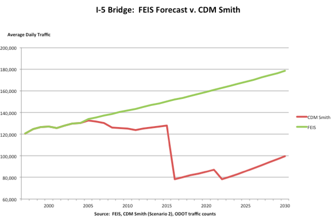
    I’ll highlight some of his truly eye-popping findings. Traffic forecasts are inflated, of course. The toll study is suggesting traffic increases of 1.1% to 1.2% per year when over the last decade traffic has actually declined by 0.2% per year on average even though there are no tolls. But it’s the addition of tolls that badly distort cross-river traffic and make a mockery out of the EIS. Here’s the money chart for the I-5 bridge itself:


    How is it possible that after building a gigantic multi-billion dollar bridge traffic declines? For the same reason as Louisville: tolling will cause huge amounts of traffic to divert to the I-205 free bridge. By 2016 traffic on I-205 would rise from 140,000 per day to 188,000 – and up to 210,000 by 2022 (full capacity).

    This is so eerily similar to the Louisville situation, that someone suggested, only half in jest I suspect, that they must be having “how to” training sessions on this stuff over at AASHTO HQ.

    Unlike Louisville, where a docile press is basically in cahoots with the state DOTs pushing the project, Portland’s media started asking questions. And one local paper even caught a civil engineering professor from Georgia serving on the independent review board for the project labeling the tolling scheme “stupid.” (Louisvillians take note).

    Oregon DOT director Matt Garrett released a letter in response in which he says, “This work is fundamentally different than the traffic analysis completed for the Final Environmental Impact Statement, and with very different goals in mind.” I agree. The FEIS was performed with the goal of getting this bridge the DOT wanted built approved. The toll study was designed to withstand financial scrutiny on Wall Street and be relied on in selling securities. I’ll let you be the judge of which is more likely to be closer to the truth. What’s more, Cortright addresses this very issue by saying in his report, “Neither federal highway regulations nor federal environmental regulations authorize or direct using multiple, conflicting forecasts for a single project, or using one set of traffic numbers for one purpose, and a different set for another.” I might also add that the DOTs in Louisville have not to the best of my knowledge made similar claims to explain away an identical discrepancy there. Nevertheless, the rest of Garrett’s letter acknowledges that I-5 will see a big traffic drop and there will be diversion from tolling. So he appears to just be doing the bureaucratic equivalent of “pay no attention to that man behind the curtain.”

    Again, want to know how it is that we spend so much money on transport infrastructure and get so little value? It’s because far too many of our highway dollars go into boondoggle mega-projects ginned up through political pressure (watch this space as I have another example coming soon) instead of into projects that make transportation sense. It may well be that there are legitimate problems with the existing I-5 river crossing, but these numbers give no confidence that the Oregon DOT has come up with a good or cost-effective plan for dealing with them. Unlike some, I do think we need to build more roads in America. Unfortunately our system is set up to ensure the survival of the unfittest instead of projects that make actual transportation and economic sense.

    Aaron M. Renn is an independent writer on urban affairs and the founder of Telestrian, a data analysis and mapping tool. He writes at The Urbanophile, where this piece originally appeared.

    Photo of current Columbia River crossing by Jonathan Caves.

  • The Cities Creating The Most Middle-Class Jobs

    Perhaps nothing is as critical to America’s future as the trajectory of the middle class and improving the prospects for upward mobility. With middle-class incomes stagnant or falling, we need to find a way to generate jobs for Americans who, though eager to work and willing to be trained, lack the credentials required to enter many of the most lucrative professions.

    Mid-skilled jobs in areas such as manufacturing, construction and office administration — a category that pays between $14 and $21 an hour — can provide a decent standard of living, particularly if one has a spouse who also works, and even more so if a family lives in a relatively low-cost area. But mid-skilled employment is in secular decline, falling from 25% of the workforce in 1985 to barely 15% today. This is one reason why middle- and working-class incomes remain stagnant, well below pre-recession levels.

    Over the past three years, high-wage professions have accounted for 29% of new jobs created, while the lowest-paid jobs (under $13 an hour) have grown to encompass roughly half of all new jobs. Net worth-wise, as a recent Pew study notes, the wealthy — the top 7% — are thriving due to the rebound of the stock and bond markets; the bottom 93%, whose wealth is more tied up in their homes,  is still feeling the hangover from the cratering of housing prices in the recession.

    No surprise then that about a third of all Americans now consider themselves lower class, according to another Pew study, up from a quarter before the recession.

    But middle-income employment has not vanished everywhere.  An analysis of the distribution of new jobs since 2010 by Economic Modeling Specialists, Inc. found a wide disparity among the states. Between 34% and 45% of all new jobs have been mid-wage in Wyoming, Iowa, North Dakota, Michigan and Arizona. The worst performers: Mississippi where only 10% of new jobs have been middle-income, followed by New York, New Hampshire, New Jersey and Virginia, all with 14% or less. (Note: I use the terms “mid-skill” and “middle-income” interchangeably; recent research suggests pay is a reasonable proxy for skill.)

    Generally speaking mid-skilled employment is expanding the most in states with strong overall job growth, and less in high-cost, high-tax states, with the notable exception of Mississippi. The EMSI data also suggest that states with expanding heavy industries such as oil and manufacturing generate more positions for mid-level workers such as machinists, truck drivers, welders and oil roustabouts. At the same time, the states with a bifurcated combination of low-wage industries, like hospitality or retail, and high-paid professions, like software engineers or investment bankers, tend to have fewer opportunities for middle-income workers.

    This pattern becomes clearer if we look at metropolitan areas, the level at which most economic activity takes place. Mark Schill at the Praxis Strategy Group crunched the data for us on employment trends over the five years since the recession in the 51 metropolitan statistical areas with over 1 million people. It’s not a pretty picture. Three years since employment hit bottom, the U.S. still has 2 million fewer mid-income jobs than at the onset of the financial crisis in 2007; half of that deficit is in the largest metro areas.

    But the pain is not evenly distributed. There are eight metro areas that boast more mid-level jobs today than in 2007. The list is dominated by Texas cities, led by Austin-Round Rock-San Marcos, which has added 17,000 mid-skill jobs — an increase of 7.6%  – among the 95,000 new jobs generated in the region. The largest numeric increase is in Houston-Sugarland-Baytown, which has 60,810 more mid-skilled jobs, up 7.4%. The Houston metro area also has easily led the nation in overall job growth since 2007, adding a net 280,000 positions.

    Texas metro areas also come in third and fourth: in San Antonio-New Braunfels, middle-income employment rose 3.4%; in Dallas-Ft. Worth-Arlington , 3.1%. Nearby Oklahoma City comes in fifth with 2.1% growth in middle-income employment, sharing the merits of relatively low costs and a strong energy economy.

    The working class and  the endangered middle class may be favored topics of discussion in the deepest blue regions, but for the most part these metro areas have failed to bolster their middle-skilled labor forces. Los Angeles-Long Beach leads the league with the biggest net loss of mid-skilled jobs since 2007, down by 112,300, or 6.1%. Chicago had the second-largest numerical decline, some 102,100, or 7.6%, followed by New York, which lost 82,350 such jobs, 3.4% of its total in 2007. In contrast, notes economist Tyler Cowen, Texas has not only created the most middle-income jobs, but a remarkableone-third of all net high-wage jobs created over the past decade.

    The loss of manufacturing jobs is clearly part of the problem here; despite the recent resurgence in the industrial sector, the U.S. still has 740,000 fewer middle-skill manufacturing jobs than in 2007. Chicago and Los Angeles remain the nation’s largest industrial regions, but they are also among the most rapidly de-industrializing areas in the country. New York City, once among the world’s leading industrial centers, with roughly a million manufacturing workers in 1950, is down to around 75,000. In contrast, industrial employment has been expanding in the Houston, Seattle and Oklahoma City metro areas, and recently even Detroit.

    In contrast, New York, Chicago and L.A. have seen job gains in such low-wage areas as hospitality and retail, as well as a smaller surge in high-end employment — notably in information and business services. But the welcome growth in these positions is not enough to make up for the big hole in middle-class employment. Since the recession, for example, New York has lost manufacturing and construction jobs at a double-digit rate while hospitality employment grew 18% and retail 10%. Los Angeles and Chicago showed similar patterns, but actually did worse in higher-wage sectors, like professional business services.

    Another major area of lost middle-class jobs has been construction. The U.S. is still down 1.2 million middle-skill construction jobs since 2007 and 125,000 in real estate. These losses have inflicted the most pain in the boom towns that grew fastest in the early 2000s. The biggest loser of mid-skill jobs in percentage terms is Las Vegas-Paradise, Nev., which has suffered a staggering 16.1% loss in such jobs since 2007. It’s followed by Riverside-San Bernardino-Ontario, Calif. (-10.6%); Sacramento-Arden-Arcade-Roseville, Calif., (-10.4%); Tampa- St. Petersburg- Clearwater, Fla. (-9.7%); and Phoenix-Mesa- Scottsdale, Ariz. (-9.3%).

    Whether in the biggest cities, or Sun Belt boom towns, the issue of increasing middle-income employment should be as much of a priority for policymakers as attracting glamorous high-wage jobs or helping the poor. America’s identity has been built around the idea that hard work, particularly with some study for a particular skill, should be rewarded with decent pay. Boosting employment in mid-skill professions, from construction and manufacturing to logistics and energy, is critical to achieving this goal.

    If we fail to stem the erosion of middle-income jobs, we will be faced with a continued descent into a Latin American style society divided largely between an affluent elite and multitudes of the poor, with a thin layer in the middle. This promises miserable consequences for most Americans and the future of our democracy.

    Note: An early version of this table listed incorrect figures in the 2013 total jobs column.

    Middle-skill Employment in U.S. Metropolitan Areas
    Metropolitan Statistical Area Name 2013 Middle Skill Jobs 2007-2013 Change % Change % Change Rank 2013 Location Quotient 2013 LQ Rank
    Austin-Round Rock-San Marcos, TX 248,988 17,485 7.6% 1 0.93 41
    Houston-Sugar Land-Baytown, TX 878,038 60,810 7.4% 2 1.00 17
    San Antonio-New Braunfels, TX 310,920 10,316 3.4% 3 1.07 3
    Dallas-Fort Worth-Arlington, TX 959,326 29,178 3.1% 4 0.98 23
    Oklahoma City, OK 198,944 4,113 2.1% 5 1.05 8
    New Orleans-Metairie-Kenner, LA 177,207 2,676 1.5% 6 1.05 8
    Nashville-Davidson–Murfreesboro–Franklin, TN 263,022 2,309 0.9% 7 1.02 12
    Salt Lake City, UT 221,892 476 0.2% 8 1.07 3
    Denver-Aurora-Broomfield, CO 390,661  (2,824) -0.7% 9 0.96 31
    Indianapolis-Carmel, IN 274,996  (3,143) -1.1% 10 0.98 23
    Boston-Cambridge-Quincy, MA-NH 700,371  (9,683) -1.4% 11 0.90 46
    San Jose-Sunnyvale-Santa Clara, CA 233,796  (5,012) -2.1% 12 0.78 51
    Louisville/Jefferson County, KY-IN 199,292  (4,669) -2.3% 13 1.04 10
    Charlotte-Gastonia-Rock Hill, NC-SC 267,840  (6,888) -2.5% 14 0.98 23
    Pittsburgh, PA 358,823  (9,301) -2.5% 15 1.03 11
    Rochester, NY 147,269  (4,325) -2.9% 16 0.97 28
    Raleigh-Cary, NC 153,838  (4,854) -3.1% 17 0.93 41
    Baltimore-Towson, MD 391,208  (12,532) -3.1% 18 0.95 34
    Washington-Arlington-Alexandria, DC-VA-MD-WV 764,805  (25,078) -3.2% 19 0.80 50
    San Diego-Carlsbad-San Marcos, CA 492,724  (16,382) -3.2% 20 1.09 2
    New York-Northern New Jersey-Long Island, NY-NJ-PA 2,336,777  (82,350) -3.4% 21 0.88 48
    Columbus, OH 272,821  (9,829) -3.5% 22 0.95 34
    Buffalo-Niagara Falls, NY 159,658  (5,770) -3.5% 23 0.99 20
    Richmond, VA 193,104  (7,081) -3.5% 24 1.00 17
    San Francisco-Oakland-Fremont, CA 583,934  (21,618) -3.6% 25 0.87 49
    Seattle-Tacoma-Bellevue, WA 543,988  (21,651) -3.8% 26 0.97 28
    Minneapolis-St. Paul-Bloomington, MN-WI 507,261  (20,643) -3.9% 27 0.91 45
    Portland-Vancouver-Hillsboro, OR-WA 337,705  (19,386) -5.4% 28 1.02 12
    Hartford-West Hartford-East Hartford, CT 179,653  (10,578) -5.6% 29 0.95 34
    Philadelphia-Camden-Wilmington, PA-NJ-DE-MD 789,395  (49,105) -5.9% 30 0.95 34
    Atlanta-Sandy Springs-Marietta, GA 692,336  (44,530) -6.0% 31 0.95 34
    Los Angeles-Long Beach-Santa Ana, CA 1,731,419  (112,332) -6.1% 32 0.96 31
    St. Louis, MO-IL 393,900  (27,502) -6.5% 33 0.98 23
    Kansas City, MO-KS 302,025  (21,222) -6.6% 34 0.98 23
    Memphis, TN-MS-AR 192,693  (14,600) -7.0% 35 1.02 12
    Detroit-Warren-Livonia, MI 517,098  (39,268) -7.1% 36 0.93 41
    Orlando-Kissimmee-Sanford, FL 304,724  (23,533) -7.2% 37 0.95 34
    Cincinnati-Middletown, OH-KY-IN 302,932  (24,111) -7.4% 38 1.00 17
    Chicago-Joliet-Naperville, IL-IN-WI 1,249,263  (102,122) -7.6% 39 0.94 40
    Jacksonville, FL 200,324  (16,482) -7.6% 40 1.06 6
    Virginia Beach-Norfolk-Newport News, VA-NC 298,352  (25,147) -7.8% 41 1.19 1
    Miami-Fort Lauderdale-Pompano Beach, FL 706,788  (60,373) -7.9% 42 0.97 28
    Milwaukee-Waukesha-West Allis, WI 237,871  (20,489) -7.9% 43 0.96 31
    Cleveland-Elyria-Mentor, OH 304,167  (27,158) -8.2% 44 0.99 20
    Birmingham-Hoover, AL 162,440  (15,437) -8.7% 45 1.07 3
    Providence-New Bedford-Fall River, RI-MA 206,473  (20,670) -9.1% 46 0.99 20
    Phoenix-Mesa-Glendale, AZ 578,767  (59,101) -9.3% 47 1.02 12
    Tampa-St. Petersburg-Clearwater, FL 365,043  (39,371) -9.7% 48 1.02 12
    Sacramento–Arden-Arcade–Roseville, CA 259,792  (30,200) -10.4% 49 0.92 44
    Riverside-San Bernardino-Ontario, CA 431,892  (51,373) -10.6% 50 1.06 6
    Las Vegas-Paradise, NV 234,340  (44,849) -16.1% 51 0.89 47
    Total 23,210,895  (1,045,210) -4.3%      
    Source: EMSI Class of Worker – QCEW Employees + Non-QCEW Employees + Self-Employed
    Analysis by Mark Schill, Praxis Strategy Group

    This story originally appeared at Forbes.

    Joel Kotkin is executive editor of NewGeography.com and Distinguished Presidential Fellow in Urban Futures at Chapman University, and a member of the editorial board of the Orange County Register. He is author of The City: A Global History and The Next Hundred Million: America in 2050. His most recent study, The Rise of Postfamilialism, has been widely discussed and distributed internationally. He lives in Los Angeles, CA.

  • Cities and Sustainability: Is Intensification Good Policy?

    This post examines the idea that we can promote sustainability by increasing the densities of large cities around their centres.  This compact city paradigm presumes that we can reshape the consumption of citizens in environmentally benign ways by reshaping the cities they live in.  

    The sustainability challenge is the challenge of consumption: how much and what we consume drives our impact on the planet.  But presuming that by enforcing urban intensification we will transform ingrained patterns of consumption in favour of the environment may be a step too far.  Will obliging more citizens to live at higher densities in smaller dwellings around city centres really pave the way to environmental salvation?

    Some evidence of urban impacts

    The Australian Conservation Foundation is committed to ecological sustainability, tackling the social and economic causes of environmental problems.  Among other things, the Foundation publishes the onlineAustralian Consumption Atlas. This is a useful source for addressing the role of urbanisation and urban form.

    The Atlas is based on methodology which traces the direct and indirect demands on the environment of different goods and services.  Consumption patterns from Household Expenditure Surveys are related to household size and type, members’ age structure, incomes and education, and the statistical areas they live in. Using this information the environmental impacts of individuals living in different areas can be mapped. 

    Three indicators of impact are displayed in the atlas: tonnes of greenhouse gas emitted, litres of water consumed, and ecological footprint.  The latter estimates the area of resources required to support a person’s lifestyle.  You can read more about the methodology here.

    The data underlying the atlas is dated – based on the 2001 Census and 1999 Household Expenditure Survey, among other things.  But I do not expect the relativities it demonstrates, or the conclusions it supports, to have changed much.

    Cities don’t consume; people do

    Here is the authors’ key conclusion. Our urban planners, designers, and politicians should consider carefully:

    despite the lower environmental impacts associated with less car use, inner city households outstrip the rest of Australia in every other category of consumption. Even in the area of housing, the opportunities for relatively efficient, compact living appear to be overwhelmed by the energy and water demands of modern urban living, such as air conditioning, spa baths, down lighting and luxury electronics and appliances, as well as by a higher proportion of individuals living alone or in small households.

    In each state and territory, the centre of the capital city is the area with the highest environmental impacts, followed by the inner suburban areas. Rural and regional areas tend to have noticeably lower levels of consumption.

    (Consuming Australia: Main Findings, 2007, Australian Conservation Foundation, p.10)

    Looking inside Sydney

    I explored the indicators for different parts of Sydney.  Here are some results.

    Indicators of Environmental Impacts: Sydney Centre and Suburbs

    People in Inner Sydney generate 92% more greenhouse gas than the New South Wales Average, and well over twice as much as people in the lower income western suburbs, like Penrith and Blacktown. The levels are a bit higher for people in the more prosperous northern suburbs. Despite proximity to major employment centres, and an efficient commuter rail service, the consumption patterns of Willoughby and Ku-ring-gai residents generate high levels of air pollution. 

    Looking East to Sydney CBD
    (Source: www:freeaussiestock.com)

    A similar pattern is evident for water consumption – residents of the hot, dry, western suburbs account for the least consumption, Inner and North Sydney residents the most.  They also have the biggest ecological footprint.

    So what does this tell us?

    The lesson is not necessarily that location in the CBD is less sustainable; but that the lifestyle associated with it is. 

    I have discussed the potential inefficiency of small, multi-unit dwellings elsewhere.  Over and above that, the high cost of redevelopment in central locations calls for housing construction strategies that add little to sustainability.  

    One strategy is to build to modest standards.  This keeps the price down and rental yield up for investors; or creates opportunities for ownership by low income earners.  Another strategy is to adopt high standards of fit-out and install luxury appliances in favoured locations to make multi-unit dwellings attractive to wealthier households. 

    Neither option is particularly environmentally sympathetic.  

    Smaller is still better

    I also reviewed the indicators for smaller cities and towns in New South Wales.  (In some cases these included surrounding rural settlement).  

    Indicators of Environmental Impacts: New South Wales Towns and Small Cities

    This suggests that smaller towns hold the key to environmentally sustainable lifestyles, even more than city suburbs.  For example,  Coffs Harbour’s 73,000 residents generate greenhouse emissions at 88% of the state average, and just 46% of inner Sydney residents.  They consume water at 81% of the State rate (and 60% of North Sydney), and have an ecological footprint just 60% of their inner Sydney counterparts.  Similar patterns are evident in coastal settlements like Byron Bay (33,000 residents), Ballina (42,000), and Port Macquarie (77,000) and inland towns such as Griffith (26,000), Tamworth (60,000), and Wagga Wagga (64,000).

    What does it all add up to?

    A simple overview can be derived by summing the percentage deviations of each area from the New South Wales average across the three measures. Admittedly this is a course approach: it weights each indicator equally, and ignores differences in how much centres vary across each individually.  Nevertheless, it provides a sufficiently meaningful overview to confirm that towns and small cities are generally more sustainable than a large city, and that the suburbs perform better than the inner city. 

    Summary Index of the Environmental Impact of Urbanisation

    Explaining the sustainability dividend of small towns

    There can be any number of explanations for this, the obvious one being that it is all about income.  Perhaps the advantages of lifestyles outside Sydney simply reflect lower average incomes in smaller cities and towns.  As people become more affluent or seek more income, they migrate into the main cities taking their high consumption expectations with them; or by living in large cities they are more likely to earn – and consume – more. 

    Conversely, living in smaller cities and settlements may reflect lifestyle preferences which are intrinsically less environmentally intrusive.  At the same time. small settlements make less travel demands given the greater proximity to work, shopping, service, and recreation opportunities.  In addition, lower density housing may provide more opportunities for passive energy efficiency, directly reducing resource consumption for comparable activities.  

    Flawed policy

    Until we know more, however, we need to avoid the trap of determinism.  It would be short-sighted simply to invert the current paradigm, for example, and decide that policies to encourage people to live outside large cities and city centres will somehow enhance sustainability. 

    Ultimately, how we live is more important than where we live.  What the evidence here confirms, though, is that under current patterns of consumption promoting large scale urban consolidation is flawed as environmental as well as urban policy. 

    Phil McDermott is a Director of CityScope Consultants in Auckland, New Zealand, and Adjunct Professor of Regional and Urban Development at Auckland University of Technology.  He works in urban, economic and transport development throughout New Zealand and in Australia, Asia, and the Pacific.  He was formerly Head of the School of Resource and Environmental Planning at Massey University and General Manager of the Centre for Asia Pacific Aviation in Sydney. This piece originally appeared at is blog: Cities Matter.

    Aukland harbour photo by Bigstockphoto.com.

  • Suburban & Urban Core Poverty: 2012: Special Report

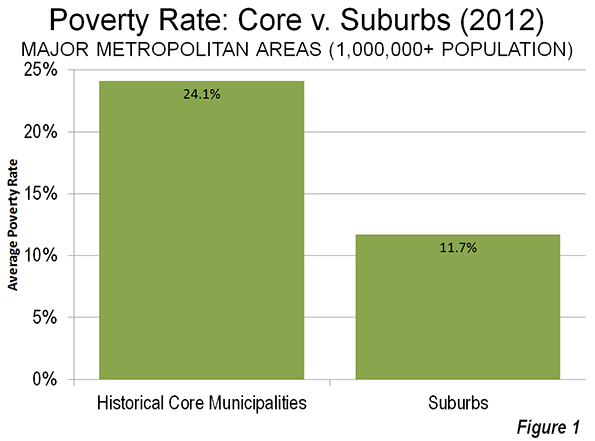
    The US Census Bureau recently released poverty rate data by state, county and metropolitan area for 2012. As has been the case for decades, urban core poverty rates dwarf those of suburban areas in the nation’s 52 major metropolitan areas (those with more than 1 million population).

    Urban Core & Suburban Poverty Rates

    The average poverty rate in the 52 urban cores – the historical core municipalities – was 24.1 percent, more than double the 11.7 percent rate in suburban areas (Figure 1). These high poverty rates have continued despite the best decade in more than one-half century for the urban cores which have experienced net population increases in the neighborhoods within two miles of downtown. The heavy urban core losses of the 1960s through the 1980s are generally no longer occurring. Yet, between 2000 and 2010, more than 80 percent of the population growth in the urban cores was below the poverty line (See City Growth Mainly Below Poverty Line). By contrast, less than one third of the suburban population increase was below the poverty line.

    Table 1
    Major Metropolitan Areas: Summary of Poverty Status: 2012
      Historical Core Municipalities (HCM) Suburbs Metropolitan Area
    Population (Poverty Status Determined)     44,730,920    123,763,495   168,494,415
    Above Poverty Level     34,613,515    108,917,367   143,530,882
    Below Poverty Level     10,117,405      14,846,128     24,963,533
    Major Metropolitan Areas 22.6% 12.0% 14.8%
    Data from American Community Survey, 2012


    Detailed Metropolitan Data

    The lowest historical core municipality poverty rate was in San Jose, at 13.0 percent. Seattle, San Diego, Raleigh and San Francisco rounded out the five urban cores with the lowest poverty rates. The highest urban core poverty rate was in Detroit, at 42.8 percent, followed by Hartford, Cleveland, Cincinnati and Miami.

    The lowest suburban poverty rate was in the Washington metropolitan area at 7.2 percent. Milwaukee, Baltimore, Indianapolis and Minneapolis-St. Paul followed. The highest suburban poverty rate was in the Riverside San Bernardino, 18.4 percent, followed by Orlando, Miami, Las Vegas and Atlanta. Only 15 of the major metropolitan areas had suburban poverty rates that were higher than the best historical core municipality rate of 13.0 percent (San Jose).

    Taking a look over the regions of the country, the five lowest major metropolitan poverty rates were in Washington (8.4 percent), Boston, Minneapolis-St. Paul, San Jose, and Hartford. The highest major metropolitan area poverty rates were in Memphis (19.9 percent), New Orleans, Riverside San Bernardino, Los Angeles, and Miami (Table 2).

    A caveat is in order, however. The official poverty rate does not take into consideration the cost of living differences between states and metropolitan areas. These differences can be large. According to the latest Bureau of Economic Analysis (US Department of Commerce) data, there can be an up to 35 percent difference in the cost of living between major metropolitan areas (the high being San Francisco and the lowest being St. Louis). The new Census Bureau supplemental poverty measure takes housing costs into consideration, but provides only state data. The differences can be substantial. For example, California’s supplemental poverty rate is the highest in the nation, and nearly one-half higher than its unadjusted poverty rate. California’s housing adjusted poverty rate is approximately double that of West Virginia, which is normally considered to be one of the nation’s highest poverty states.

    Table 2
    Major Metropolitan Areas: Poverty Status: 2012
    Metropolitan Area Historical Core Municipalities (HCM) Rank Suburbs Rank Metropolitan Area Rank Core Rate/ Suburban Ratio Rank
    Atlanta, GA 25.8%          35 15.8%        48 16.6%        41 1.63         14
    Austin, TX 20.3%          14 11.5%        28 15.5%        31 1.77         19
    Baltimore, MD 24.8%          34 7.4%          3 11.3%          6 3.34         49
    Birmingham, AL 31.2%          46 13.5%        41 16.8%        42 2.31         34
    Boston, MA-NH 21.6%          21 9.0%          9 10.7%          2 2.40         38
    Buffalo, NY 30.9%          44 9.4%        11 14.2%        19 3.30         47
    Charlotte, NC-SC 21.8%          23 9.9%        14 15.1%        30 2.22         33
    Chicago, IL-IN-WI 23.9%          30 10.8%        22 14.5%        24 2.20         32
    Cincinnati, OH-KY-IN 34.1%          49 11.9%        32 14.9%        26 2.86         41
    Cleveland, OH 36.1%          50 10.8%        21 15.6%        32 3.33         48
    Columbus, OH 21.8%          23 9.9%        15 15.1%        29 2.20         31
    Dallas-Fort Worth, TX 23.9%          31 13.0%        38 15.0%        27 1.85         22
    Denver, CO 19.2%          10 10.7%        19 12.7%        12 1.80         21
    Detroit,  MI 42.3%          52 12.6%        35 17.4%        47 3.36         50
    Grand Rapids 29.4%          42 12.4%        34 16.5%        40 2.37         36
    Hartford, CT 38.0%          51 7.9%          6 10.9%          5 4.83         52
    Houston, TX 23.5%          29 12.6%        36 16.4%        39 1.87         24
    Indianapolis. IN 22.2%          25 7.6%          4 14.4%        22 2.92         43
    Jacksonville, FL 18.5%            9 11.4%        27 15.7%        33 1.61         13
    Kansas City, MO-KS 20.7%          15 10.6%        18 12.9%        14 1.94         28
    Las Vegas, NV 17.6%            6 15.8%        49 16.4%        37 1.11           2
    Los Angeles, CA 23.3%          27 15.3%        45 17.6%        49 1.53           9
    Louisville, KY-IN 19.5%          12 13.1%        40 16.1%        35 1.49           6
    Memphis, TN-MS-AR 28.3%          38 11.8%        31 19.9%        52 2.39         37
    Miami, FL 31.7%          48 16.4%        50 17.5%        48 1.94         27
    Milwaukee,WI 29.9%          43 7.3%          2 15.9%        34 4.08         51
    Minneapolis-St. Paul, MN-WI 22.6%          26 7.7%          5 10.7%          3 2.94         44
    Nashville, TN 19.4%          11 11.2%        25 14.3%        20 1.73         16
    New Orleans. LA 28.7%          40 15.4%        47 19.4%        51 1.87         23
    New York, NY-NJ-PA 21.2%          19 9.8%        12 14.8%        25 2.17         30
    Oklahoma City, OK 19.7%          13 13.1%        39 16.2%        36 1.50           7
    Orlando, FL 21.2%          20 16.4%        51 16.9%        44 1.30           4
    Philadelphia, PA-NJ-DE-MD 26.9%          37 8.7%          8 13.4%        16 3.08         45
    Phoenix, AZ 24.1%          32 13.9%        42 17.4%        46 1.74         17
    Pittsburgh, PA 21.1%          16 10.9%        23 12.1%        10 1.94         26
    Portland, OR-WA 17.7%            7 12.7%        37 14.0%        18 1.39           5
    Providence, RI-MA 28.7%          39 11.7%        29 13.6%        17 2.44         39
    Raleigh, NC 16.4%            4 10.7%        20 12.7%        11 1.53         10
    Richmond, VA 26.3%          36 9.1%        10 11.9%          9 2.88         42
    Riverside-San Bernardino, CA 31.1%          45 18.4%        52 19.0%        50 1.68         15
    Rochester, NY 31.6%          47 10.2%        17 14.4%        23 3.10         46
    Sacramento, CA 23.4%          28 15.1%        44 16.9%        43 1.55         11
    St. Louis,, MO-IL 29.2%          41 12.4%        33 14.3%        21 2.35         35
    Salt Lake City, UT 21.2%          17 11.1%        24 12.7%        13 1.91         25
    San Antonio, TX 21.7%          22 10.0%        16 17.3%        45 2.17         29
    San Diego, CA 15.5%            3 14.7%        43 15.0%        28 1.05           1
    San Francisco-Oakland, CA 17.3%            5 9.8%        13 11.9%          8 1.75         18
    San Jose, CA 13.0%            1 8.5%          7 10.8%          4 1.52           8
    Seattle, WA 13.6%            2 11.3%        26 11.7%          7 1.20           3
    Tampa-St. Petersburg, FL 24.5%          33 15.3%        46 16.4%        38 1.61         12
    Virginia Beach-Norfolk, VA-NC 21.2%          18 11.8%        30 13.1%        15 1.80         20
    Washington, DC-VA-MD-WV 18.2%            8 7.2%          1 8.4%          1 2.52         40
    Average of Metropolitan Areas 24.1% 11.7% 14.7% 2.07


    Suburban Poverty

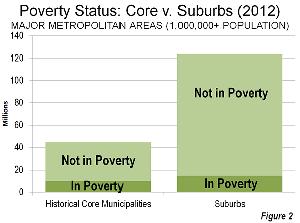
    The majority of the major metropolitan area poverty population now lives in the suburbs, by virtue of their population dominance; overall suburban populations are now 2.7 times as large as those of all core cities. In fact, rather than being a new phenomenon, suburban areas passed the urban cores in poverty population before 2000. The 2000 Census indicated that approximately 53 percent of the poverty population was in suburban areas of the 52 metropolitan areas. The share of poverty rose to 59 percent in the suburbs, largely as a consequence of their having dominated growth between 2000 and 2012. While there were nearly 5 million more people below the poverty line in the suburbs than in the historical core municipalities, the suburbs contained more than three times the above-poverty line population – some 109 million – as the urban cores (Figure 2).

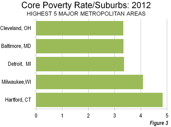
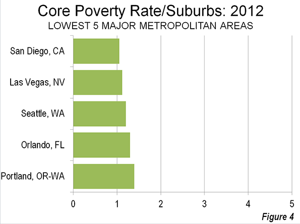
    In 2012, suburban poverty rates were below those of the urban cores in all 52 major metropolitan areas (Table 2). The urban core poverty rates ranged from 5 percent above the suburban rates, in San Diego to nearly 5 times the suburban rate in Hartford. San Diego, Las Vegas, Seattle, Orlando and Portland had the lowest urban poverty rates relative to the suburbs of the same metropolitan areas (Figure 3). The urban cores of Hartford, Milwaukee, Detroit, Baltimore and Cleveland had the highest poverty rates relative to the suburbs of the same metropolitan areas (Figure 4).

    Poverty by Historical Core Municipality Category

    When the new poverty data was announced, Milwaukee Mayor Tom Barrett bemoaned the fact that the city’s poverty rate was the highest in the nation relative to that of the suburbs. The Milwaukee Journal-Sentinel’s “Politifact” pointed out that the mayors’ contention was based on 2010 data rather than the new 2012 data. As is noted above, Hartford had displaced Milwaukee with the highest urban core poverty rate relative to the suburbs by 2012.

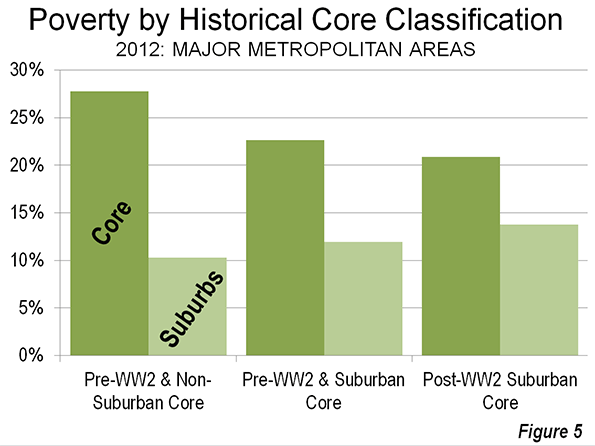
    However, Mayor Barrett’s concern is well founded. The city of Milwaukee’s high poverty rate relative to the suburbs is surprising. Among the five urban cores with the highest poverty rates relative to the corresponding suburbs, only Milwaukee includes substantial areas of suburban land use development. The city of Milwaukee is categorized as a Pre-World War II core with substantial suburbanization, by virtue of having more than doubled its land area by annexing lower density (suburban) areas. Each of the four other urban cores with the highest ratios relative to suburban poverty rates are classified as pre-World War II cores with little suburbanization. None of these municipalities (Hartford, Detroit, Baltimore, and Cleveland) has annexed significant suburban territory since before World War II.

    Since poverty tends to be more concentrated in urban cores in the United States, it is to be expected that pre-World War II historical core municipalities would have higher poverty rates relative to the suburbs.

    The smallest differences between urban core and suburban poverty rates are found in the metropolitan areas with heavily suburban core cities and lack major pre-World War II cores (Figure 5). San Jose, Phoenix, Orlando, and Las Vegas are examples of metropolitan areas in this category.

    From Poverty to Prosperity

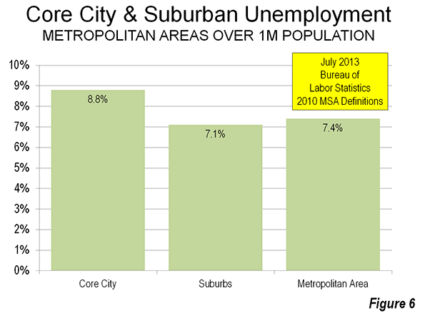
    The continuing high rates of poverty in the urban cores and the higher than previous poverty rates in suburban areas is cause for primary concern. At the heart of the problem is the lingering high unemployment rate, which averages nearly a quarter higher in the urban cores than in the suburbs (Figure 6).

    The principal purpose of cities (from the urban core to the exurban periphery) is to facilitate a better standard of living for all income segments. This has, of course, been made difficult by the Great Recession and could be lengthened should grudging growth nurture a long-term Great Malaise. Obviously, the answer is stronger economic growth, which will require a better investment climate

    Wendell Cox is a Visiting Professor, Conservatoire National des Arts et Metiers, Paris and the author of “War on the Dream: How Anti-Sprawl Policy Threatens the Quality of Life.

    —–

    Note: These data vary from those reported by the Brookings Institution, which classifies “cities” and “suburbs” differently. For example, the Brookings Institution classifies suburbs such as Arlington, Texas in the Dallas-Fort Worth metropolitan area, Aurora, Colorado in Denver (see photo above),  Mesa, Arizona in Phoenix, Bellevue , Washington in Seattle and  Paradise, Nevada in Las Vegas as “cities.” The net effect is generally higher suburban poverty rate in the Brookings Institution analysis than in this “urban core” versus suburban analysis.

    —–

    Photo: Suburban Denver (Aurora), by author

  • Where Are The Boomers Headed? Not Back To The City

    Perhaps no urban legend has played as long and loudly as the notion that “empty nesters” are abandoning their dull lives in the suburbs for the excitement of inner city living. This meme has been most recently celebrated in the Washington Post and the Wall Street Journal.

    Both stories, citing research by the real estate brokerage Redfin, maintained that over the last decade a net 1 million boomers (born born between 1945 and 1964) have moved into the city core from the surrounding area. “Aging boomers,” the Post gushed, now “opt for the city life.” It’s enough to warm the cockles of a downtown realestate speculator’s heart, and perhaps nudge some subsidies from city officials anxious to secure their downtown dreams.

    But there’s a problem here: a look at Census data shows the story is based on flawed analysis, something that the Journal subsequently acknowledged. Indeed, our number-crunching shows that rather than flocking into cities, there were roughly a million fewer boomers in 2010 within a five-mile radius of the centers of the nation’s 51 largest metro areas compared to a decade earlier.

    If boomers change residences, they tend to move further from the core, and particularly to less dense places outside metropolitan areas. Looking at the 51 metropolitan areas with more than a million residents, areas within five miles of the center lost 17% of their boomers over the past decade, while the balance of the metropolitan areas, predominately suburbs, only lost 2%. In contrast places outside the 51 metro areas actually gained boomers.

    Only one city, Miami, recorded a net gain in the boomer population within five miles of the center, roughly 1%. Much ballyhooed back to city markets including Chicago, New York, Washington, D.C., and San Francisco suffered double-digit percentage losses within the five-mile zone.

    Where the boomers move is critical to the real estate industry, as well as other businesses. This is a large and relatively wealthy generation. Boomers account for some 70% of the country’s disposable income, and their spending decisions will shake markets around the country.

    Given the importance of this market, why has the analysis of it proved so wrong? One factor may well be that most boomers generally do not really want to move if they can help it. Three out of four boomers want to “age in place,” according to a recent AARP  study.

    Part of the problem is one found commonly in press reporting on demographic trends; reporters only tend to know what they see, and mostly they work almost exclusively in urban cores. They encounter empty nester who moves to Manhattan or even downtown St. Louis, but not the ones who moves to the desert, lake, the mountains, the woods or into an adult-oriented community on the urban fringe. Out of the core, these people often fade into media oblivion.

    However, as people age, they turn out to be not, as one developer suggests, “more hip hop and happening” than more likely to seek remaining not only close to home, but attached to the workforce and the neighborhood. A recent series in the Dallas Morning News tracked where local empty nesters were moving — largely to low-crime, well-maintained suburbs and exurbs. What were they looking for? The paper found the biggest concern by far to be safety, followed by affordability and quiet.

    So if boomers aren’t flocking to inner cities, which of the 51 biggest metro areas are gaining the largest share of them? The top gainers are all relatively low-cost, low-density Sun Belt metropolises, led by Las Vegas. Its boomer population expanded 20.2% from 2000 to 2010, with a 12.2% decline in the five-mile inner ring and 36.3% growth outside it. In second place, Tampa-St. Petersburg, Fla., up 11.5% (-8.3% in the five-mile zone, +13.5% outside); followed by Phoenix, whose boomer population rose 11.3% (-22.8%, +15.0%). In contrast, more expensive, denser cities like New York, San Francisco, Los Angeles and San Jose, Calif., saw the worst boomer flight, suffering double-digit percentage losses.

    What are the implications of these findings? For cities, time to forget the long-anticipated “back to the city” trend among seniors as something that can save their downtowns. To be sure, there may be some ultra-affluent urban districts that may attract wealthy older investors and buyers, many of them part-time residents, such as Chicago’s Gold Coast and parts of Manhattan. In some elite Manhattan buildings, full-time residents constitute as little as 10% of the total.

    A  little further out from these hot spots, boomers are fleeing. The five-mile zone around the City Hall of New York lost about 20% of its boomer population in the past decade, while in Chicago the corresponding area lost 26%.

    Ultimately, some downtown places might be a “wonderland,” as The New York Times puts it,for a small group of highly affluent residents. But for most they are outrageously expensive. At an age when capital preservation if often paramount, in New York, the senior best positioned is one living a long time in a rent-controlled apartment.

    Cities need to understand that, for the most part, their appeal remains primarily to young, largely single people, students and couples before they have children; cities’ real challenge, and opportunity, lies in trying to keep more of this youthful cohort in the city as they age and expand their households. Boomers and seniors may be able to support luxury apartment developers in parts of Manhattan, but not in most cities.

    The boomer population in the five-mile radius of the 51 largest U.S. metropolitan areas fell by roughly a million from 2000 to 2010, out of a 2000 population of nearly 6 million, or 17%. The boomer population outside the five-mile zone in these metro areas also fell, but at a much lower rate: 2%, or 800,000 people out of a population of 39.5 million in 2000.  Away from the major metros, smaller metropolitan areas and rural areas gained nearly 450,000 boomers. However, there was an overall loss of about 1.3 million boomers, principally due to deaths.

    Given the trends, suburbs will likely persist as a primary arena for aging populations. This suggests these communities will have to ramp up services to accommodate them, such as shuttle buses and hospitals. They should cultivate  downshifting boomers as new consumers for local stores, and particularly on Main Streets, and as sources for capital and expertise.

    Perhaps the biggest impact, however, may be on smaller metropolitan areas and the less expensive Sun Belt communities. As more boomers achieve “empty nester” status they could bring investment capital, and broader connections to smaller cities that could much use them.

    One early sign of this trend may be the recent rise in migration to Florida. After a brief recession-driven hiatus a net 200,000 people have moved to Florida in the last two years. New Census numbers also suggest a  large number of people continue to leave the Northeast, the Midwest and California.  Also likely to benefit will be some emerging boomer magnet communities in Idaho, Arizona, Uta­h, the Carolinas and Colorado.

    For real estate developers and investors, the ones often most entranced by the “back to the city” story, the lessons are very clear. It makes more sense to follow the numbers, and understand the logic of senior migration, than swallow the snake oil so many have been carelessly imbibing. There are great opportunities in the expanding senior market, including in some uniquely attractive urban districts— but the bigger plays are in outlying areas, and, increasingly, smaller towns.

    Baby Boomer Population (35-54 in 2000/45-64 in 2010)
    Comparison: 5 Mile Radius of City Hall v. Balance of Metropolitan Area          
    51 Major Metropolitan Areas (2010 Popultion over 1,000,000)            
    In thousands (000)                
                       
        POPULATION   % OF POPULATION
        2000 2010 Change %   2000 2010  % Change
                       
    5-MILE RADIUS     5,895     4,890   (1,005) -17.1%   7.1% 6.0% -15.7%
    BALANCE     39,352   38,575      (777) -2.0%   47.5% 47.3% -0.4%
    MAJOR METROPOLITAN AREAS (MMAS)   45,247   43,464   (1,783) -3.9%   54.6% 53.3% -2.4%
                       
    OUTSIDE MMAS   37,579   38,025        446 1.2%   45.4% 46.7% 2.8%
                       
    UNITED STATES   82,826   81,489   (1,337) -1.6%   100.0% 100.0% 0.0%
                       
    Calculated from Census Burea data


    This story originally appeared at Forbes.

    Joel Kotkin is executive editor of NewGeography.com and Distinguished Presidential Fellow in Urban Futures at Chapman University, and a member of the editorial board of the Orange County Register. He is author of The City: A Global History and The Next Hundred Million: America in 2050. His most recent study, The Rise of Postfamilialism, has been widely discussed and distributed internationally. He lives in Los Angeles, CA.

  • My Presence Is a Provocation

    The urbanist internet has been a ga ga over an article by artist and musician David Byrne (photo credit: Wikipedia) called “If the 1% stifles New York’s creative talent, I’m out of here.” Now David Byrne himself is at least a cultural 1%er, and at with a reported net worth of $45 million, isn’t exactly hurting for cash. In fairness to him, he forthrightly admits he’s rich. He also is bullish on the positive changes in New York in areas like public safety, transportation, and parks, and does not fall prey to romanticizing the bad old days of the 70s and 80s. However, in his assigning blame for New York’s affordability, he points the finger squarely at Wall Street, neglecting the role he himself played in bringing about the changes he decries, changes in which he was more than a passive participant.

    Back in the early 90s I liked to hang out in a neighborhood called Fountain Square in Indianapolis, a down at the heels commercial district near downtown largely populated by people from Appalachia. I enjoyed browsing the low end, marginal shops and eating at diners where the food was mediocre and the waitresses sassy but not all that attractive (not that I let that stop me from flirting with them). Today, Fountain Square is not exactly gentrified, but is seeing a lot of investment and new residential construction. It’s a long way from unaffordable, but it isn’t impossible to conceive of a day when it features almost entirely higher prices (by Indianapolis standards) in the way some other zones downtown do.

    About that time I also liked to drive around the city and take pictures of various neighborhoods in the inner city. One time I was on the East Side and was walking around taking snaps of streetscapes. I apparently pointed my camera too close in the direction of a white minivan whose owner took umbrage. The driver, who was white, long-haired, with a bit of a redneck air about him, circled the block and pulled up next to me to berate me in a semi-menacing way, alternately demanding to know why I was taking pictures of his van and warning me I should never do it again. (I generally take pains to try to avoid including people in my photographs when possible, and things like this are one reason why).

    I’m not going to claim there was any hidden agenda here other than this guy being directly suspicious of my pointing a camera his way. But I can’t help but wonder if subconsciously he was aware of a more subtle but potentially more dangerous threat that I posed to his neighborhood and way of life.

    I’m not taking credit or blame for neighborhood change in Indianapolis. But I do know that I’m part of the dynamic of the city I’m in. And when I guy like me walks into a neighborhood, my mere presence can be a provocation. Cities are inherently dynamic places, and we are agents of the forces of change whether we want to be or not. (Which is as true for the poor as for the one percent, we just label it “fair housing” when poor people move into rich neighborhoods, but “gentrification” when the reverse occurs).

    While I am a writer and observer on cities, I’m an endogenous not exogenous observer. All of us are players in the development of the places we live and visit, event if only bit players in some cases. And oftimes in the complex world of the city, our actions are part of forces or trends we are not event aware of, ones that may have consequences we would never have desired. That does not absolve us of our role.

    As for David Byrne, the role of artists and musicians in paving the way for gentrification is so well known as to be conventional wisdom. Similarly today the hipster. And what’s one of the original signature markers of the hipster? The fixed-gear bicycle.

    Just as reductions in crime obviously have an effect of dramatically raising property values (and thus rents) in a place as intrinsically attractive as New York, so do other quality of life improvements such as bicycle infrastructure. By making New York an even more desirable place to live, these improvements, wonderful as they may be and which I would heartily endorse, clearly attract more well-off residents and drive up prices.

    Byrne has even taken a direct role in this. He created a series of nine public art type back racks from the city, all but one of which is in Manhattan, and which even includes this delightful example from Wall Street:


    Photo Credit: Flickr/zombiete

    These racks and his activism with regards to bicycles are what give Bryne his standing an urban commentator.

    I for one am glad he made the bike racks as they are fantastic and I’m a fan of New York’s improved cycling infrastructure. But I also recognize that this sort of quality of life improvement contributes towards New York’s attractiveness to the wealthy. It’s just not realistic to think one can clean up the crime, the parks, improve infrastructure, etc. and then expect that prices will remain what they were back in the 70s when Bryne moved to the city. Rather than pointing the finger at the Other, the finance industry in this case, it would be more helpful if those of us who advocate for better urban environments would recognize the inevitable side effects many of our proposed policies would produce, and our own role in bringing them about.

    Aaron M. Renn is an independent writer on urban affairs and the founder of Telestrian, a data analysis and mapping tool. He writes at The Urbanophile, where this piece originally appeared.

  • Shenzhen II?: The New Shanghai Financial Free Trade Zone

    Less than 35 years ago, China established its first special economic zone in Shenzhen, a prefecture (Note) bordering Hong Kong. This model is about to be expanded with the establishment of a new financially oriented free-trade zone in Shanghai, which could prove a major breakthrough in that city’s quest to become East Asia’s financial capital. The “China (Shanghai) Pilot Free Trade Zone (FTZ)” is located in eastern Pudong, the Shanghai’s suburban district (qu) that includes the huge new Pudong business district, across the river from the central business district in Puxi. 

    The potential here for rapid growth can be seen by reviewing the success of the Shenzen special economic zone (SEZ), When founded, the SEZ contained little more than a fishing village, but soon was transformed into a manufacturing and trading center, propelled by a less constrained regulatory environment. Foreign investment soared. The success of the Shenzhen model led to expansion of the zone and other special economic zones were established around the country. Shenzhen’s prosperity extended into neighboring Pearl River Delta prefectures such as Guangzhou, Dongguan, Foshan, Zhuhai and Zhongshan. Investment friendly policies were applied virtually across the nation in the years that followed. Today, for example, Apple makes many of its tablets in Chengdu, the capital of Sichuan, 1200 miles (2000 kilometers) inland via China’s larger equivalent of the US interstate highway system.

    Yet the economic advances of the special economic zones were anything but inevitable. Chinese leader Deng Xiaoping faced strong opposition from some high government officials, who were intent on limiting the scope of the Shenzhen experiment. Some even hoped to shut it down altogether (see Ezra Vogel’s Deng Xiaoping and the Transformation of China). Moreover, the economic advance of China involved, as the late Nobel Laureate Ronald Coase and Ning Wang relate in How China Became Capitalist  much more than conscious economic policy. Coase and Wang characterize the government’s light handed policies as permitting the “marginal revolutions” in individual entrepreneurship, township and village enterprises (locally owned enterprises) and private farming. These, and the special economic zones, were the driving forces in the Chinese economic miracle.

    And, as is predictable, not everyone is happy with the results of China’s transformation. There is persistent criticism of the inequality of income that has developed in China over the period. Yet, sitting on the sidelines, it is easy to second-guess the results of national economic policies, which do not always produce the intended outcomes. Suffice it to say that since 1980, China, one of the poorest nations in the world, has pursued policies, both of commission and omission, that have together lifted more people from poverty than ever before in history (See: Alleviating Poverty: A Progress Report). There is probably not a more important domestic objective for governments.

    Shanghai’s New Financially Oriented Free Trade Zone

    In the past the free trade zones focused principally on manufacturing. The new Shanghai free trade zone is the first to specialize in finance. The zone stretches along the Pacific Coast from north of Pudong International Airport, south through the large new town of Nanhui and across the Donghai Bridge to the new deep water port, which is an important component of the Port of Shanghai, now the largest in the world, and is designed to focus on finance. Initially, it will cover 11 square miles (29 square kilometers), but Hong Kong’s South China Morning Postsuggests that it might eventually be expanded to cover all of the Pudong New Area. This would expand the area to 467 square miles (1,210 square kilometers), an area nearly as large as the San Francisco-Oakland built up urban area.

    According to The Wall Street Journal “China’s government said it would turn a new free-trade zone here into a laboratory for remaking the country’s financial sector…” The Journal continues: “Financial-sector changes are at the heart of the experimentation in the zone: letting the market, rather than regulators, set interest rates and allowing firms to convert money more freely from yuan to foreign currencies and move the money overseas.”

    The Chinese based Global Times characterized the new free trade zone as an important step in China’s economic reform and the internationalization of the yuan. 

    As in the case of Shenzhen, government officials are characterizing the establishment of the new “Pilot Free Trade Zone” as an experiment. The Journal reports that the project is championed by new Premier Premier Li Keqiang, just as Shenzhen was championed by Deng Xiaoping. Should the zone be successful, it would not be surprising to see other such zones established. Perhaps, it will lead to an eventual liberalization of financial regulation across the nation, which is critical for China’s future development.

    Shanghai American Chamber of Commerce president Kenneth Jarrett responded positively to the announcement, telling China Daily: "One thing significant about the zone is its relationship to China’s economic reform agenda. Because there are a lot of talks about the need to rebalance the economy and make it more market-oriented, the FTZ (free trade zone) is a signature piece for the whole process."

    Yet, this will be far from a total free-market paradise. The government has announced a list of restrictions, including industries in which foreign investment will not be permitted and industries in which investment will be limited to joint ventures with Chinese companies.

    Chinese sources emphasize the evolutionary nature of the restrictions. According to Shanghai Daily, “The list is a temporary version for 2013 and the zone regulators will update the list every one or two years to better facilitate liberalization policies testing in the free trade zone.”

    Differing Views

    The new free trade zone move comes as analysts increasingly suggest the need to liberalize its financial sector. The Pilot FTZ could lead China’s financial sector toward greater integration into the globalized economy. This would strengthen China’s integration with the world, and could pose a major challenge to established financial centers, such as New York, London, Hong Kong and Singapore, In an editorial, The South China Morning Post (SCMP) speculates that the reforms begun with the Pilot FTZ could eventually undermine Hong Kong’s position as Asia’s financial center. The SCMP further notes that “The ultimate effect” of the Pilot FTZ “could be to help speed up economic reform nationwide. And that might be the bigger threat to Hong Kong.”

    If the skeptics are right, the restrictions and slowness of reform could limit the effectiveness of the zone and the challenge it poses to Hong Kong and other global financial capitals.  Such a view may be naïve. Other views are that reforms could lead to far more important consequences both in Asia and the World,.

    The most significant impacts could be on the United States, at least if former International Monetary Fund economist Arvind Subramanian is right. In his controversial book, Eclipse: Living in the Shadow of China’s Economic Dominance, Subramanian predicts that China will replace the United States as the world’s dominant economy by 2030 and that the yuan could replace the dollar as the principal reserve currency by that time. This could become more plausible if the financial liberalization apparently at the heart of the Pilot FTZ effort proceeds with dispatch.

    History: Repeating Itself?

    The signs from China are not completely clear. Bob Davis and Lingling Wei have just published an analytical The Wall Street Journal article that notes that President Xi Jinping has “veered left on some political issues.” Yet, indications on the economic front could be the opposite. The article focuses on Lie He, Xi Jinping’s leading economic advisor, Liu He, who Harvard’s 2001 Nobel laureate Michael Spence calls “an example of Chinese pragmatism," Spence adds that  Liu "…thinks markets are important mechanisms for getting things done efficiently," but "they’re not religion to him."

    Deng Xiaoping famously talked of crossing the river by “following the stones.” This cautious approach uses seemingly glacial policy changes that gradually initiate major change.This is how China has evolved over the past 35 years. Again, the Chinese appear to be choosing caution. This is not fast enough for some analysts, but this may also be a development that could augur many changes, not only for China, but for all its primary competitors in Asia and elsewhere.

    —–

    Note: The alternate term “prefecture” is used to denote the local jurisdictions into which all of China’s land area is divided. These go by various terms, with “municipality” or “city” used most frequently. In each case, municipalities are more akin to metropolitan areas (or even larger areas), which include the built-up urban areas and substantial expanses of surrounding rural territory.

    Photo: Pudong, Century Avenue toward the China (Shanghai) Pilot Free Trade Zone (by author)

  • Cashing in on So Cal Culture

    Southern California has always been an invented place. Without a major river, a natural port or even remotely adequate water, the region has always thrived on reinventing itself – from cow town to agricultural hub to oil city, Tinsel Town and the “Arsenal of Democracy.”

    Today, the need for the region to reinvent itself yet again has never been greater. Due in large part to regulatory pressures, as well as competitive forces both global and national, many industries that have driven the Southland economy – notably, aerospace, garments and oil – are under assault. A high cost of living, particularly for housing, stymies potential in-migration and motivates industries to look elsewhere to locate or expand.

    As a result, virtually every key Southern California industry has been either stagnating or losing ground to competitors. More important, the area in the past decade has lost much of its appeal as a destination for both immigrants and young people, drying up a huge source of potential innovation.

    To put it in vaudeville terms, Southern California needs a new shtick. We must look to leverage our natural advantages (beyond just our climate) into a new economic paradigm that can withstand competition from the rest of the world and the rest of the country. This opportunity is best seen as the commercialization of culture. These include, as one recent Los Angeles County Economic Development Corp. report stated, “businesses and individuals involved in producing cultural, artistic and design goods and services.”

    This is not largely a matter of museums or concert venues. When it comes to the “fine” arts, Southern California is an increasingly respectable player, but cannot compete on equal footing with London, Paris, New York or Chicago, locales with far older endowments and, arguably, more people with refined artistic tastes. There is also growing competition from cash-rich wannabe cities, from Houston and Dallas to Shanghai, Beijing or Singapore. Fine art has always been for sale to the highest bidder.

    Where Southern California retains a decisive edge is in the popular arts – from casual fashion and industrial design to movies, television and commercials – which could provide the basis for a broad-based economic revival. This requires political and business leadership to shift from their obsession with downtown Los Angeles and dense building projects to a focus on nurturing long-term, sustainable employment.

    This demands that we do everything to maintain the quality of life, largely a matter of our region’s spread-out neighborhoods, that has always been our primary calling card to creative talent. Los Angeles, in particular, boasts by far the largest concentration of artists in the country. Overall, the “creative industries” account, according to a recent Otis Institute study, for roughly 337,000 direct jobs in the Los Angeles-Orange County region. Adding indirect employment, the study estimated these industries employed more than 642,000 people, more than the total employment of the Sacramento area.

    Each of these economic drivers deserves a closer look:

    Fashion

    Over the past quarter century, Los Angeles, with roughly three times as many establishments, has replaced New York as the nation’s garment capital. Most of these companies are small, but, together, the fashion industry across the five-county Southland region employs more than 100,000 people.

    In recent years, apparel manufacturing has been in decline, losing some 40,000 jobs. But there has been growth in such areas as clothing design and merchandising. The region has become the de facto capital for “fast forward” fashion, paced by firms such as Forever 21 Inc., Wet Seal and Papaya. Orange County, capital of the surfwear industry, is home to firms such as Oakley, Volcom, Hurley, Gotcha International, O’Neill, Raj Manufacturing, Mossimo and Stussy.

    These firms, and the businesses serving them, are expected to experience more growth in the coming years, according to the U.S. Bureau of Labor Statistics. Aided by the “onshoring” trend – returning jobs from overseas – and a demand for quicker product turnaround, the Southern California apparel industry seems poised to solidify its hold over the country’s fashions over the coming years.

    Entertainment

    This fashion industry derives much of its success from a link with Hollywood and the rest of the entertainment world. Accounting for more than 40 percent of all creative industry jobs, the entertainment complex is increasingly critical to the region’s resurgence. Much concern has been raised about the future of this key industry, whose growth has slowed, due in part to massive tax incentives from other states and countries.

    Despite this, the industry has been on something of an upswing recently, adding more than 4,600 jobs last year, a gain of 3.7 percent. At 129,700 jobs, employment in the industry is now at its highest level in four years but still tantalizingly below its levels in 2004 (132,200 jobs) and 1999 (146,300 jobs). Growth derives not so much from studio employment but from the ranks of independent contractors, now more than 85,000, well above the prerecession level. Nearly 80 percent of all new entertainment jobs are from the ranks of independent proprietors.

    Digital Arts

    The stabilization, and hopefully resurgence, of the entertainment sector could boost other industries, like digital media, hoping to play off the region’s extraordinary concentration of artists, specialists and story-tellers. Historically, Southern California, in large part due to a relative shortage of venture capital, has been playing catch-up with the Bay Area, and to a lesser extent, Seattle.

    The key to the future is combining other assets besides Hollywood, such as having the largest number of engineers – 70,000 – of any area in the country. Much hope has been placed on the rise of the much-ballyhooed “Silicon Beach” that follows the coastline, largely in Los Angeles, which some people claim is becoming a real competitor to Silicon Valley.

    Yet this is not the first time we have heard this story. Similar growth took place in past digital media waves, only to see reductions as the inevitable cratering takes place during market shake-outs. But employing the strong ties to the Hollywood creative community, there is the real prospect for the region to achieve a critical mass that will allow digital entrepreneurs to remain comfortably here rather than head up to Silicon Valley.

    Industrial Design

    Even as manufacturing employment has declined over time, improving recently to a level of mere stagnation recently, Southern California has maintain a leading position in industrial design. This field is expected to grow, both nationally and in the Southland.

    The area has maintained its leadership as center of automotive design, with studios such as the BMW Design Works, in Ventura, and Mercedes Advanced Design, in Carlsbad, as well as GM’s Advance Design Studio in North Hollywood. The fact that many international firms – for example, Hyundai (Fountain Valley), Kia (Irvine), Honda and Toyota – maintain their North American headquarters in the Southland provides a critical link to the expanding global auto market.

    Primacy in industrial design also extends into other product lines, such as furniture and household furnishings. If this design edge can be combined with automation and the onshoring of jobs, Southern California could enjoy a broad-based resurgence more sustainable than those of more-narrowly based economies, such as in New York or the Bay Area.

    Design of Life

    As we have seen over the past decade, local industries such as entertainment – not to mention fields like fashion, digital and industrial design – are going to be subject to enormous pressure from both home and abroad. China, for example, is building a massive $8.2 billion film studio in a concerted drive to replace Hollywood as the center of the world entertainment industry.

    If we lose our stranglehold on entertainment and other creative industries, there is very little hope for a regional resurgence. We lack the deep digital bench and funding sources of the Bay Area, or New York’s financial industry and its ability to dominate the news media. We can never be as cheap, or business friendly, as our emerging cultural rivals in the South, such as New Orleans, Nashville, Tenn., Austin, Texas, or Dallas, nor can we offer the kind of bargain-basement deals that desperate places, such as Detroit or Las Vegas, might offer to creative types.

    This means we have to focus on preserving and improving those very things – our cultural legacy and a predominately low-rise and flexible-work lifestyle – that differentiates us from far more congested, structured and often far-less pleasant locales like New York – and, even more so, China. In the past, this region has won the “design wars” by being itself, not by trying to create a faux vision that seeks to mimic Manhattan or Shanghai. Ultimately, Southern California can win only by playing the same aces that for generations have led the creative and the questioning to settle in our sun-drenched metropolis.

    Joel Kotkin is executive editor of NewGeography.com and Distinguished Presidential Fellow in Urban Futures at Chapman University, and a member of the editorial board of the Orange County Register. He is author of The City: A Global History and The Next Hundred Million: America in 2050. His most recent study, The Rise of Postfamilialism, has been widely discussed and distributed internationally. He lives in Los Angeles, CA.

    This piece originally appeared at The Orange County Register.
  • Exporting Metros

    If there’s one thing that people of pretty much every political persuasion agree on, it’s the need to boost exports. This is true not just at the national level, but also the local one. The balance of world population and economic growth is outside the United States. McKinsey estimates that there will be an additional one billion people added to the global “consuming class” by 2025.  An economy focused solely on a domestic American or North American market is missing a huge part of the addressable market, dooming it to slower growth.

    Exports have also long been seen as a key part of economic growth in the city. Jane Jacobs noted how cities develop import substitutes. That is, cities develop replacements for goods and services they formerly imported, and subsequently start exporting these to other places. So exporting, both to domestic and to foreign destinations, is critical for cities.

    The US Department of Commerce recently released foreign export totals by metropolitan area for 2012. The data series goes back as far as 2005. A number of metro regions are exporting power houses.  There are 31 metro areas that export more than $10 billion in goods and services every year.  Here is the top ten:

    Rank

    Metro Area

    2012

    1

    Houston-Sugar Land-Baytown, TX

    110,297,753,116

    2

    New York-Northern New Jersey-Long Island, NY-NJ-PA

    102,298,029,869

    3

    Los Angeles-Long Beach-Santa Ana, CA

    75,007,521,224

    4

    Detroit-Warren-Livonia, MI

    55,387,305,415

    5

    Seattle-Tacoma-Bellevue, WA

    50,301,690,645

    6

    Miami-Fort Lauderdale-Pompano Beach, FL

    47,858,713,857

    7

    Chicago-Joliet-Naperville, IL-IN-WI

    40,567,953,537

    8

    Dallas-Fort Worth-Arlington, TX

    27,820,946,540

    9

    San Jose-Sunnyvale-Santa Clara, CA

    26,687,656,696

    10

    Minneapolis-St. Paul-Bloomington, MN-WI

    25,155,739,576

    Table 1: Dollar Value of Exports, 2012

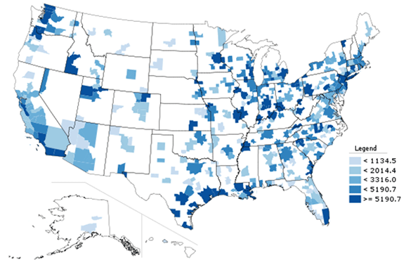
    Unsurprisingly, bigger cities have more exports, but it’s not a perfect correlation. Energy and chemicals intensive Houston ranks #1, and places like #5 Seattle (home to Boeing and Microsoft) and #6 Miami (the hub of Latin American trade) punch above their weight.

    But perhaps a better measure of the export intensity of an economy is exports per capita. Here’s a map of US metro areas for that metric:


    Map 1: Export dollar value per capita, 2012.

    Here are the top ten metros in America among those with a population greater than one million:

    Rank

    Metro Area

    2012

    1

    New Orleans-Metairie-Kenner, LA

    20209.1

    2

    Houston-Sugar Land-Baytown, TX

    17778.0

    3

    Seattle-Tacoma-Bellevue, WA

    14160.9

    4

    San Jose-Sunnyvale-Santa Clara, CA

    14087.7

    5

    Salt Lake City, UT

    13764.1

    6

    Detroit-Warren-Livonia, MI

    12904.6

    7

    Cincinnati-Middletown, OH-KY-IN

    9312.0

    8

    Portland-Vancouver-Hillsboro, OR-WA

    8881.9

    9

    Memphis, TN-MS-AR

    8522.5

    10

    Miami-Fort Lauderdale-Pompano Beach, FL

    8304.9

    Table 2: Top Ten Large Metros, Dollar Value of Exports Per Capita, 2012

    Here we see that some top exporters like Houston, Seattle, and Miami continue to rank well.  But some smaller metros crack the list like #1 New Orleans (another major petroleum center) and #7 Cincinnati (which has a major GE aircraft engine plant).

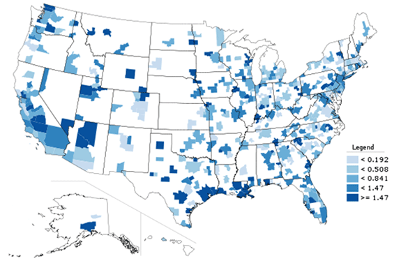
    And lastly, here’s a look at the growth in total exports from metro areas over the time period for which data is available:


    Map 2: Percent change in total exports, 2005-2012.

    There was extremely wide variability in the growth rates of exports among metro areas. Here is the top 10 for large metro areas:

    Rank

    Metro Area

    2005

    2012

    Percent
    Change

    1

    San Antonio-New Braunfels, TX

    2,346,954,123

    14,010,234,128

    496.95%

    2

    New Orleans-Metairie-Kenner, LA

    4,857,754,172

    24,359,505,265

    401.46%

    3

    Salt Lake City, UT

    3,912,555,433

    15,989,999,420

    308.68%

    4

    Houston-Sugar Land-Baytown, TX

    41,747,920,224

    110,297,753,116

    164.20%

    5

    Las Vegas-Paradise, NV

    716,805,170

    1,811,480,065

    152.72%

    6

    Birmingham-Hoover, AL

    796,241,450

    1,939,217,017

    143.55%

    7

    Washington-Arlington-Alexandria, DC-VA-MD-WV

    6,058,364,485

    14,609,712,467

    141.15%

    8

    Raleigh-Cary, NC

    974,832,168

    2,308,052,342

    136.76%

    9

    Miami-Fort Lauderdale-Pompano Beach, FL

    20,382,947,257

    47,858,713,857

    134.80%

    10

    Providence-New Bedford-Fall River, RI-MA

    2,667,670,867

    5,830,785,377

    118.57%

    Table 3: Large metro top ten, Percent change in total exports, 2005-2012.

    San Antonio is the champion, but Houston and New Orleans score well again.  A few unexpected metro areas like Birmingham and Providence, traditionally viewed as economic laggards, appear on the list though these are growing admittedly from small bases. What this does show is that even long struggling metros have a major opportunity to improve themselves through focusing on export growth.

    While there’s a general nod of approval in the direction of boosting exports, few urban strategies seem to focus on it. Rather, sexier items like subsidized real estate development is generally front and center. But given the positive results even struggling cities like Providence have seen with exports, this type of more basic economic blocking and tackling would seem to be a better place to focus.

    Aaron M. Renn is an independent writer on urban affairs and the founder of Telestrian, a data analysis and mapping tool. He writes at The Urbanophile.

    Great Lakes Freighter photo by BigStockPhoto.com.

  • Driving Alone Dominates 2007-2012 Commuting Trend

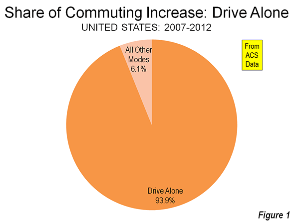
    New data from the American Community Survey makes it possible to review the trend in mode of access to employment in the United States over the past five years. This year, 2012, represents the fifth annual installment of complete American Community Survey data. This is also a significant period, because the 2007 was a year before the Lehman Brothers collapse that triggered the Great Financial crisis, while gasoline prices increased about a third between 2007 and 2012.

    National Trends

    The work trip access data is shown in Tables 1 and 2. Driving alone continued to dominate commuting, as it has since data was first reported in the 1960 census. In 2007, 76.1 percent of employment access was by driving alone, a figure that rose to 76.3 percent in 2012. Between 2007 and 2012, driving alone accounted for 94 percent of the employment access increase, capturing 1.55 million out of the additional 1.60 million daily one-way trips (Figure 1). The other 50,000 new transit commutes were the final result of increases in working at home, transit and bicycles, minus losses in car pooling and other modes.

    Carpools continued to their long decline, losing share in 43 of the 52 major metropolitan areas. Approximately 810,000 fewer people travel to work by carpools in 2012, which reduced its share from 10.7 percent to 9.7 percent.

    Transit did better, rising from 4.9 percent of work access in 2007 to 5.0 percent in 2012. There was an overall increase of approximately 250,000 transit riders. This increase, however, may be less than might have anticipated in view of the much higher gasoline prices and the imperative for commuters to save money in a more difficult economy.

    Bicycling also did well, rising from a 0.5 percent share in 2007 to a 0.6 percent share in 2012. Approximately 200,000 more people commuted by bicycle by 2012.

    Walking retained its 2.8 percent share, with only a modest 15,000 increase over the period. The largest increase in employment access outside single occupant driving was working at home, which rose from 4.1 percent to 4.4 percent. This translated into an increase of approximately 470,000.

    Metropolitan Area Highlights

    Among the 52 metropolitan areas with more than 1 million population (major metropolitan areas), 47 had drive alone market shares of 70 percent or more. Birmingham was the highest, at 85.6 percent. Surprisingly, this grouping included metropolitan areas with reputations for strong transit ridership, such as Chicago, Philadelphia, and Portland. Four metropolitan areas had drive alone shares of between 60 percent and 70 percent: Seattle, Washington, Boston, and San Francisco, which had the second lowest in the nation at 60.8 percent. As would be expected, New York had by far the lowest drive alone market share at 50.0 percent.

    Consistent with its low drive alone market share, New York led by a large margin the other metropolitan areas in its transit work trip market share. Transit carried 31.1 percent of New York commuters, up nearly a full percentage point from the 30.2 percent in 2007. New York alone accounted for nearly one-half of the growth in transit commuting over the period.

    San Francisco continued to hold onto second place, with a 15.1 percent transit market share, up a full percentage point from 2007. Washington rose to 14.0 percent, up from 13.2 percent in 2007. Boston (11.9 percent) and Chicago (11.0 percent) were the only other major metropolitan areas to achieve a transit work trip market share of more than 10 percent, and were little changed from 2007.

    Working at home continued to increase at a larger percentage rate than any other mode of work access. Four metropolitan areas were tied for the top position in 2012, at 6.4 percent. These included Raleigh, Austin, San Diego, and Portland, all metropolitan areas with a strong high-tech orientation. In San Diego and Portland, where large light rail systems have been developed, working at home is now more popular as a mode of access to work than transit.

    According to 2012 US Census Bureau estimates, the major metropolitan areas comprised 55.2 percent of the national population. These metropolitan areas represented a slightly larger share of total employment, at 57.3 percent. The combined major metropolitan areas also had similar shares to their national population share in each of the employment access modes, ranging from a low of 55.3 percent of communters driving alone to 59.9 percent of walkers. The one exception was transit, where the major metropolitan areas constituted nearly all of commuters, at 90.7 percent, well above their 55.2 percent share of US population (Table 1).

    Table 1
    Distribution of Employment Access (Commuting) by Employment Location: 2012
    SHARE OF WORK ACCESS BY MODE (2012)
      All Employment Drive Alone Car Pool Transit Bike Walk Other Work at Home
    MAJOR METROPOLITAN AREAS 57.3% 55.3% 55.4% 90.7% 59.9% 56.0% 55.6% 59.3%
    Metropolitan Areas with Legacy Cities 17.1% 13.8% 14.4% 65.4% 21.5% 27.8% 18.3% 17.1%
      6 Legacy Cities (see below) 6.0% 2.7% 4.1% 55.1% 12.7% 16.3% 7.8% 4.6%
      Suburban 11.1% 11.1% 10.3% 10.3% 8.8% 11.5% 10.5% 12.6%
      New York Metropolitan Area 6.4% 4.2% 4.5% 39.6% 5.8% 13.6% 8.5% 5.9%
        Legacy City: New York 3.1% 1.0% 1.5% 35.4% 4.2% 9.5% 4.2% 2.5%
        Suburban 3.3% 3.2% 3.0% 4.2% 1.7% 4.1% 4.3% 3.5%
      5 Other Metropolitan Areas with Legacy Cities 10.7% 9.6% 9.9% 25.8% 15.7% 14.2% 9.8% 11.2%
        5 Legacy Cities (CHI, PHI, SF, BOS, WDC) 2.9% 1.7% 2.6% 19.7% 8.5% 6.8% 3.6% 2.1%
        Suburban 7.8% 7.9% 7.3% 6.1% 7.1% 7.5% 6.2% 9.1%
    46 Other Major Metropolitan Areas 40.2% 41.5% 41.0% 25.3% 38.4% 28.2% 37.3% 42.2%
    OUTSIDE MAJOR METROPOLITAN AREAS 42.7% 44.7% 44.6% 9.3% 40.1% 44.0% 44.4% 40.7%
    United States 100% 100% 100% 100% 100% 100% 100% 100%
    Calculated from American Community Survey: 2012 (one year)

    Follow this link to a table containing data for the nation’s major metropolitan areas.

    Commuting Becomes More Concentrated in Legacy Cities

    This concentration of transit commuting was most evident to the six large "transit legacy cities," (the core cities of New York, Chicago, Philadelphia, San Francisco, Boston, and Washington), which still exhibit sufficient remnants of their pre-automobile urban cores that support extraordinarily high transit market shares. The transit legacy cities accounted for 55 percent of all transit commuting destinations in the United States, yet have only six percent of the nation’s jobs. Between 2007 and 2012, the concentration increased, with transit legacy cities accounting 68 percent of the additional transit commutes were between 2007 and 2012. Outside the legacy cities, there was relatively little difference in the share of transit commutes within metropolitan areas with legacy cities and in the other major metropolitan areas (Figure 2)

    The key to the intensive use of transit in the legacy cities is the small pockets of development that are particularly amenable to high transit market shares – the six largest downtown areas (central business districts) in the United States. Most of the commuting to transit legacy cities is to these downtown areas, Yet, the geographical areas of these downtowns is very small. Combined, the six downtown areas are only one-half larger than the land area of Chicago’s O’Hare International Airport. This yields employment per square mile densities of from 40 to 150 times densities of employee residences throughout their respective urban areas.  

    Not surprisingly, transit has very strong market shares to work locations in the transit legacy cities, at 45.8 percent. At the same time, transit commuting to locations outside the transit legacy cities is generally well below the national average. The exception is New York, where transit commuting to suburban locations is 6.4 percent, above the overall national average of 5.0 percent. In the five other metropolitan areas with transit legacy cities, transit commuting to suburban locations is 3.9 percent. This drops to 3.1 percent, overall, in the 46 other major metropolitan areas and 1.1 percent in the rest of the nation (Table 2 and Figure).

    Table 2
    Employment Access (Commuting) by Employment Location: 2012
      Drive Alone Car Pool Transit Bike Walk Other Work at Home
    MAJOR METROPOLITAN AREAS 73.6% 9.4% 7.9% 0.6% 2.8% 1.2% 4.5%
    Metropolitan Areas with Legacy Cities 61.7% 8.2% 19.2% 0.8% 4.6% 1.3% 4.4%
      6 Legacy Cities (see below) 33.9% 6.5% 45.8% 1.3% 7.6% 1.6% 3.3%
      Suburban 76.8% 9.1% 4.7% 0.5% 2.9% 1.1% 5.0%
      New York Metropolitan Area 50.0% 6.8% 31.1% 0.6% 6.0% 1.6% 4.1%
        Legacy City: New York 23.7% 4.6% 57.1% 0.8% 8.6% 1.6% 3.5%
        Suburban 74.8% 8.9% 6.4% 0.3% 3.5% 1.6% 4.6%
      5 Other Metropolitan Areas with Legacy Cities 68.6% 9.0% 12.1% 0.9% 3.7% 1.1% 4.6%
        5 Legacy Cities (CHI, PHI, SF, BOS, WDC) 44.8% 8.6% 33.7% 1.8% 6.5% 1.5% 3.1%
        Suburban 77.6% 9.1% 3.9% 0.6% 2.7% 1.0% 5.1%
    46 Other Major Metropolitan Areas 78.7% 9.9% 3.1% 0.6% 2.0% 1.1% 4.6%
    OUTSIDE MAJOR METROPOLITAN AREAS 79.9% 10.1% 1.1% 0.6% 2.9% 1.3% 4.2%
    United States 76.3% 9.7% 5.0% 0.6% 2.8% 1.2% 4.4%
    Transit legacy cities include the municipalities of New York, Chicago, Philadelphia, San Francisco, Boston & Washington

    Staying the Same

    The big news in the last five years of commuting data is that virtually nothing has changed. This is remarkable, given the greatest economic reversal in 75 years and continuing gasoline price increases that might have been expected to discourage driving alone. Yet, driving alone continues to increase, while the most cost effective mode of car pooling continued to suffer huge losses, while working at home continued to increase strongly.

    Wendell Cox is a Visiting Professor, Conservatoire National des Arts et Metiers, Paris and the author of “War on the Dream: How Anti-Sprawl Policy Threatens the Quality of Life.

    Photograph: DART light rail train in downtown Dallas (by author)