Category: Urban Issues

  • California’s New Feudalism Benefits a Few at the Expense of the Multitude

    California has been the source of much innovation, from agribusiness and oil to fashion and the digital world. Historically much richer than the rest of the country, it was also the birthplace, along with Levittown, of the mass-produced suburb, freeways, much of our modern entrepreneurial culture, and of course mass entertainment. For most of a century, for both better and worse, California has defined progress, not only for America but for the world.

    As late as the 80s, California was democratic in a fundamental sense, a place for outsiders and, increasingly, immigrants—roughly 60 percent of the population was considered middle class. Now, instead of a land of opportunity, California has become increasingly feudal. According to recent census estimates,  the state suffers some of the highest levels of inequality in the country. By some estimates, the state’s level of inequality compares with that of such global models as  the Dominican Republic, Gambia, and the Republic of the Congo.

    At the same time, the Golden State now suffers the highest level of poverty in the country—23.5 percent compared to 16 percent nationally—worse than long-term hard luck cases like Mississippi. It is also now home to roughly one-third of the nation’s welfare recipients, almost three times its proportion of the nation’s population.

    Like medieval serfs, increasing numbers of Californians are downwardly mobile, and doing worse than their parents: native born Latinos actually have shorter lifespans than their parents, according to one recent report. Nor are things expected to get better any time soon. According to a recent Hoover Institution survey, most Californians expect their incomes to stagnate in the coming six months, a sense widely shared among the young, whites, Latinos, females, and the less educated.

    Some of these trends can be found nationwide, but they have become pronounced and are metastasizing more quickly in the Golden State. As late as the 80s, the state was about as egalitarian as the rest of the country. Now, for the first time in decades, the middle class is a minority, according to the Public Policy Institute of California.

    The Role of the Tech Oligarchs.

    California produces more new billionaires than any place this side of oligarchic Russia or crony capitalist China. By some estimates the Golden State is home to one out of every nine of the world’s billionaires. In 2011 the state was home to 90 billionaires, 20 more than second place New York and more than twice as many as booming Texas.

    The state’s digital oligarchy, surely without intention, is increasingly driving the state’s lurch towards feudalism. Silicon Valley’s wealth reflects the fortunes of a handful of companies that dominate an information economy that itself is increasingly oligopolistic.  In contrast to the traditionally conservative or libertarian ethos of the entrepreneurial class, the oligarchy is increasingly allied with the nominally populist Democratic Party and its regulatory agenda. Along with the public sector, Hollywood, and their media claque, they present California as “the spiritual inspiration” for modern “progressives” across the country.

    Through their embrace of and financial support for the state’s regulatory regime, the oligarchs have made job creation in non tech-businesses—manufacturing, energy, agriculture—increasingly difficult through “green energy” initiatives that are also sure to boost already high utility costs. One critic, state Democratic Senator Roderick Wright from heavily minority Inglewood, compares the state’s regulatory regime to the “vig” or high interest charged by the Mafia, calling it a major reason for disinvestment in many industries.

    Yet even in Silicon Valley, the expansion of prosperity has been extraordinarily limited. Due to enormous losses suffered in the current tech bubble, tech job creation in Silicon Valley has barely reached its 2000 level. In contrast, previous tech booms, such as the one in the 90s, doubled the ranks of the tech community. Some, like UC Berkeley economist Enrico Moretti, advance the dubious claim that those jobs are more stable than those created in Texas. But even if we concede that point for the moment,  the Valley’s growth primarily benefits its denizens but not most Californians. Since the recession, California remains down something like 500,000 jobs, a 3.5 percent loss, while its Lone Star rival has boosted its employment by a remarkable 931,000, a gain of more than 9 percent.

    Much of this has to do with the changing nature of California’s increasingly elite-driven economy. Back in the 80s and even the 90s, the state’s tech sector produced industrial jobs that sparked prosperity not only in places like Palo Alto, but also in the more hardscrabble areas in San Jose and even inland cities such as Sacramento. The once huge California aerospace industry, centered in Los Angeles, employed hundreds of thousands, not only engineers but skilled technicians, assemblers, and administrators.

    This picture has changed over the past decade. California’s tech manufacturing sector has shrunk, and those employed in Silicon Valley are increasingly well-compensated programmers, engineers and marketers. There has been little growth in good-paying blue collar or even middle management jobs. Since 2001 state production of “middle skill” jobs—those that generally require two years of training after high-school—have grown roughly half as quickly as the national average and one-tenth as fast as similar jobs in arch-rival Texas.

    “The job creation has changed,” says Leslie Parks, a long-time San Jose economic development official. “We used to be the whole food chain and create all sorts of middle class jobs. Now, increasingly, we don’t design the future—we just think about it. That makes some people rich, but not many.”

    In the midst of the current Silicon Valley boom, incomes for local Hispanics and African-Americans, who together account for one third of the population, have actually declined—18 percent for blacks and 5 percent for Latinos between 2009 and 2011, prompting one local booster to admit that “Silicon Valley is two valleys. There is a valley of haves, and a valley of have-nots.”

    The Geography of Inequality

    Geography, caste, and land ownership increasingly distinguish California’s classes from one another. As Silicon Valley, San Francisco, and the wealthier suburbs in the Bay Area have enjoyed steady income growth during the current bubble, much of the state, notes economist Bill Watkins, endures Depression-like conditions, with stretches of poverty more reminiscent of a developing country than the epicenter of advanced capitalism.

    Once you get outside the Bay Area, unemployment in many of the state’s largest counties—Sacramento, Los Angeles, Riverside, San Bernardino, Fresno, and Oakland—soars into the double digits. Indeed, among the 20 American cities with the highest unemployment rates, a remarkable 11 are in California, led by Merced’s mind-boggling 22 percent rate.

    This amounts to what conservative commentator Victor Davis Hanson has labeled “liberal apartheid,” a sharp divide between a well-heeled, mostly white and Asian population located along the California coast, and a largely poor, heavily Latino working class in the interior. But the class divide is also evident within  the large metro areas, despite their huge concentrations of affluent individuals. Los Angeles, for example, has the third highest rate of inequality of the nation’s 51 largest metropolitan areas, and the Bay Area ranks seventh.

    The current surge of California triumphalism, trumpeted mostly by the ruling Democrats and their eastern media allies, seems to ignore the reality faced by residents in many parts of the state. The current surge of wealth among the coastal elites, boosted by rises in property, stock, and other assets, has staved off a much feared state bankruptcy. Yet the the state’s more intractible problems cannot be addressed if growth remains restricted to a handful of favored areas and industries. This will become increasingly clear when, as is inevitable, the current tech and property boom fades, depriving the state of the taxes paid by high income individuals.

    The gap between the oligarchic class and everyone else seems increasingly permanent. A critical component of assuring class mobility, California’s once widely admired public schools were recently ranked near the absolute bottom in the country. Think about this: despite the state’s huge tech sector, California eighth graders scored 47th out of the 51 states in science testing. No wonder Mark Zuckerberg and other oligarchs are so anxious to import “techno coolies” from abroad.

    As in medieval times, land ownership, particularly along the coast, has become increasingly difficult for those not in the upper class. In 2012, four California markets—San Jose, San Francisco, San Diego, and Los Angeles—ranked as the most unaffordable relative to income in the nation. The impact of these prices falls particularly on the poor. According to the Center for Housing Policy and National Housing Conference, 39 percent of working households in the Los Angeles metropolitan area spend more than half their income on housing, as do 35 percent in the San Francisco metro area—both higher than 31 percent in the New York area and well above the national rate of 24 percent. This is likely to get much worse given that California median housing prices rose 31 percent in the year ending May 2013. In the Bay Area the increase was an amazing 43 percent.

    Even skilled workers are affected by these prices. An analysis done for National Core, a major developer of low income housing, found that prices in such areas as Orange County are so high that even a biomedical engineer earning more than $100,000 a year could not afford to buy a home there. This, as well as the unbalanced economy, has weakened California’s hold on aspirational families, something that threatens the very dream that has attracted  millions to the state.

    This is a far cry from the 50s and 60s, when California abounded in new owner-occupied single family homes. Historian Sam Bass Warner suggested that this constituted “the glory of Los Angeles and an expression of its design for living.” Yet today the L.A. home ownership rate, like that of New York, stands at about half the national average of 65 percent. This is particularly true among working class and minority households. Atlanta’s African-American home ownership rate is approximately 40 percent above that of San Jose or Los Angeles, and approximately 50 percent higher than San Francisco.

    This feudalizing trend is likely to worsen due to draconian land regulations that will put the remaining stock of single family houses ever further out of reach, something that seems related to a reduction in child-bearing in the state. As the “Ozzie and Harriet” model erodes, many Californians end up as modern day land serfs, renting and paying someone else’s mortgage. If they seek to start a family, their tendency is to look elsewhere, ironically even in places such as Oklahoma and Texas, places that once sent eager migrants to the Golden State.

    Breaking Down the New Feudalism: The Emerging Class Structure

    The emerging class structure of neo-feudalism, like its European and Asian antecedents, is far more complex than simply a matter of the gilded “them” and the broad “us.” To work as a system, as we can now see in California, we need to understand the broader, more divergent class structure that is emerging.

    The Oligarchs: The swelling number of billionaires in the state, particularly in Silicon Valley, has enhanced power that is emerging into something like the old aristocratic French second estate. Through public advocacy and philanthropy, the oligarchs have tended to embrace California’s “green” agenda, with a very negative impact on traditional industries such as manufacturing, agriculture, energy, and construction. Like the aristocrats who saw all value in land, and dismissed other commerce as unworthy, they believe all value belongs to those who own the increasingly abstracted information revolution that has made them so fabulously rich.

    The  Clerisy: The Oligarchs may have the money, but by themselves they cannot control a huge state like California, much less America. Gentry domination requires allies with a broader social base and their own political power. In the Middle Ages, this role was played largely by the church; in today’s hyper-secular America, the job of shaping the masses has fallen to the government apparat, the professoriat, and the media, which together constitute our new Clerisy. The Clerisy generally defines societal priorities, defends “right-thinking” oligarchs, and chastises those, like traditional energy companies, that deviate from their theology.

    The New Serfs: If current trends continue, the fastest growing class will be the permanently property-less. This group includes welfare recipients and other government dependents but also the far more numerous working poor. In the past, the working poor had reasonable aspirations for a better life, epitomized by property ownership or better prospects for their children. Now, with increasingly little prospect of advancement, California’s serfs depend on the Clerisy to produce benefits making their permanent impoverishment less gruesome. This sad result remains inevitable as long as the state’s economy bifurcates between a small high-wage, tech-oriented sector, and an expanding number of lower wage jobs in hospitality, health services, and personal service jobs. As a result, the working class, stunted in their drive to achieve the California dream, now represents the largest portion of domestic migrants out of the state.

    The Yeomanry: In neo-feudalist California, the biggest losers tend to be the old private sector middle class. This includes largely small business owners, professionals, and skilled workers in traditional industries most targeted by regulatory shifts and higher taxes. Once catered to by both parties, the yeomanry have become increasingly irrelevant as California has evolved into a one-party state where the ruling Democrats have achieved a potentially permanent, sizable majority consisting largely of the clerisy and the serf class, and funded by the oligarchs. Unable to influence government and largely disdained by the clerisy, these middle income Californians are becoming a permanent outsider group, much like the old Third Estate in early medieval times, forced to pay ever higher taxes as well as soaring utility bills and required to follow regulations imposed by people who often have little use for their “middle class” suburban values.

    The Political Implications of Neo-Feudalism

    As Marx, among others, has suggested, class structures contain within them the seeds of their dissolution. In New York, a city that is arguably as feudal as anything in California, the  emergence of mayoral candidate Bill de Blasio reflected growing  antagonism—particularly among the remaining yeoman and serf class— towards the gentry urbanism epitomized by Mayor Michael “Luxury City” Bloomberg.

    Yet except for occasional rumbling from the left, neo-feudalism likely represents the future. Certainly in California, Gov. Jerry Brown, a former Jesuit with the intellectual and political skills needed to oversee a neo-feudal society, remains all but unassailable politically. If Brown, or his policies, are to be contested, the challenge will likely come from left-wing activists who find his policies insufficiently supportive of the spending demanded by the clerisy and the serfs or insufficiently zealous in their pursuit of environmental purity.

    The economy in California and elsewhere likely will determine the viability of neo-feudalism. If a weaker economy forces state and local government budget cutbacks, there could be a bruising conflict as the various classes fight over diminishing spoils. But it’s perhaps more likely that we will see enough slow growth so that Brown will be able to keep both the clerisy and the serfs sufficiently satisfied. If that is the case, the new feudal system could shape the evolution of the American class structure for decades to come.

    Joel Kotkin is executive editor of NewGeography.com and Distinguished Presidential Fellow in Urban Futures at Chapman University, and a member of the editorial board of the Orange County Register. He is author of The City: A Global History and The Next Hundred Million: America in 2050. His most recent study, The Rise of Postfamilialism, has been widely discussed and distributed internationally. He lives in Los Angeles, CA.

    This piece originally appeared at The Daily Beast.


  • The Unrise of the Creative Working Class

    Scarcity leads to creativity out of necessity. That’s the pop culture meme at least. Think “starving artist,” or the survivors in Survivor. The thinking has penetrated the business culture as well. For example, in the shadow of the 2008 recession, Google founder Sergey Brin, in a letter to his shareholders, writes: “I am optimistic about the future, because I believe scarcity breeds clarity: it focuses minds, forcing people to think creatively and rise to the challenge.”

    But a recent book, Scarcity: Why Having Too Little Means So Much, by Ivy League psychologists Sendhil Mullainathan and Eldar Shafir, states otherwise. Through years of investigative research, the authors found that people operating from a bandwidth of scarcity don’t have the luxury of preemptive thought. Rather, being in survivor mode saps a person’s cognitive reserve.

    “Think about being hungry,” says Shafir in a piece in Pacific Standard. “If you’re hungry, that’s what you think about. You don’t have to strain for years—the minute you’re hungry, that’s where your mind goes.” The mental preoccupation extends to unpaid utility bills, debt, or, more generally, anything that’s life-pressing, he adds. The effect drains resources from a person’s “proactive memory”.

    Think of the absence of scarcity, then, as the freedom to think, visualize, and create. The results of Mullainathan and Shafir’s findings have implications for cities. Specifically, it’s widely theorized that cities must innovate to survive, and it is a city’s creative reservoir—which is dependent on the size of its educated workforce—that will nurture innovation. This is how  a city of soot can evolve into a city of software, not unlike what has occurred in Pittsburgh.

    But what about  Rust Belt cities struggling with high rates of poverty? Over 36 percent of Detroit’s 700,000 plus are below the poverty line. In Cleveland, the poverty rate is 33 percent of nearly 400,000. The national poverty rate is 14 percent.  This is a ridiculous amount of brain capacity consumed by unforgiving reality.  No wonder Detroit inches to get a leg up. The feral dogs, abandoned houses, and creditors looking for money have eaten up the capability to envision. Hence, the collective exasperation, and the bankruptcy death spiral.

    What will save the Clevelands and Detroits? The most prescribed cure is to find a way to attract more educated people. This has led cities across the country to compete for the vaunted “creative class” professional demographic. To urban theorist Richard Florida, to get creative types a city must have “[an] indigenous street-level culture – a teeming blend of cafes, sidewalk musicians, and small galleries and bistros, where it is hard to draw the line between participant and observer or between creativity and its creators.”

    According to Florida, a city needs to know it is on stage,and compete for the attention of a select demographic. In theatre parlance, this is called “capturing the audience experience.”  In urban place-making parlance it is called  “principles of persuasion” that emphasize novelty, contrast, surprise, color, etc.

    Robin_Williams_779552

    In other words, cities must become the collective embodiment of Robin Williams.

    Then, once you get your audience, you just watch them go,  says Florida, as creativity is “a social process.”  Creativity is bred by “the presence of other creative people.”  The scarcity of creativity in a poor city hypothetically gets filled up by the big-bang spontaneity of two creative types talking, neurologically egged on, no doubt, by a festival performer on stilts in a clown suit sauntering before them.

    If this strategy sounds like an overly simplified way to change what ails Detroit and Cleveland, it’s because it is. In fact Florida himself acknowledged this, stating in Atlantic Cities that, “On close inspection, talent clustering provides little in the way of trickle-down benefits [to the poor].”  In fact, because housing costs rise, it  makes the lives of lower- and middle-income people worse.

    But cities keep revitalizing this way because it is a feel-good prescription that is politically palatable. Who hates art, carnivals, drinking, and eating?  Displays of abundance provide the incentive to look the other way. Writes Thomas Sewell, “The first lesson of economics is scarcity: There is never enough of anything to satisfy all those who want it. The first lesson of politics is to disregard the first lesson of economics”.

    Where does that leave the millions operating on the wrong side of scarcity? Florida’s answer is for cities to somehow convince corporate America to pay their service workers more. While admirable, I doubt Daniel Schwartz, CEO of Burger King, is listening.

    Another option would be refocusing the lens through which modern urban revitalization is viewed. The default setting is to compete for scarcity of the educated elite. Instead, we should alleviate the scarcity from the struggling.  But flipping this script requires cities to give up on the idea that there is some audience that will save them. It is a city’s people who ultimately ruin or save themselves.

    In the meantime, the urban play continues. Cleveland is directing $4 million dollars of its casino windfall profits into the creation of an outdoor chandelier  that will hang at an intersection outside of Playhouse Square, the city’s theater district. The design, evoked by chandeliers inside the Playhouse itself, is intended to blur the line between drama and reality, and will “add glittery outdoor glamour to a district that tends at times to look gray and lifeless,”  according to architecture critic Steven Litt–all the while making the intersection “feel like a giant theater lobby”.

    But the script on Cleveland’s streets is one of hardship, not glittery glamour. Here’s hoping the outdoor chandelier illuminates that scarcity to those walking beneath it.

    This piece was originally published in Belt Magazine.

    Richey Piiparinen is a writer and policy researcher based in Cleveland. He is co-editor of Rust Belt Chic: The Cleveland Anthology. Read more from him at his blog and at Rust Belt Chic.

    Lead photo by David Shvartsman.

  • The Growing Public Safety Inequality Gap in Chicago

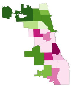
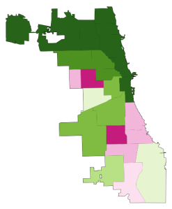
    Take a look at the two maps below. Like the captions say, the one on the left shows homicide rates in Chicago by police district in the early 90s, when crime was at its peak, and the one on the right shows the same thing, but about two decades later.* The areas in dark green are the safest; the ones in dark pink are the most dangerous. The colors are calibrated so that green areas are safer than average for the early 90s, and pink ones are more dangerous than average for the early 90s. The 2008-2011 map keeps the same calibration: green is safe compared to the early 90s, so that you can see change in the levels of violence over time.

    And, indeed, the first thing that jumps out from these maps is that there’s way more green nowadays, and it tends to be darker. The city is way safer! Some areas we might consider a bit dicey today – like, say, the Lawndale/Little Village area – actually register as light green, meaning that by early 90s standards, they would be considered relatively safe.

    HOMICIDE RATE BY POLICE DISTRICT

    Hom90 hom20

    1990-1993 2008-2011

    [For those of you craving numbers, the murder rate averaged 30 per 100k during the first period, and 17 per 100k during the second, a decline of nearly 50%.]

    Of course, the other thing we notice is that there are some very distinct patterns to safety. These maps are breaking exactly no news by indicating that the more dangerous parts of the city are on the West and South Sides, but it is striking, I think, to see that nowadays, basically the entire North Side is the darkest green, which translates to a homicide rate of less than 6 per 100k. In fact, the dark-green part of the city has a murder rate of 3.3 per 100k.

    Three point three. In New York City, which is constantly (and mostly correctly) being held up as proof that urban safety miracles can happen in America, it’s 6.3. Toronto, which as far as North American big cities go occupies a fairy tale land where no one hurts anybody, had a homicide rate of 3.3 per 100k as recently as 2007. The North Side is unbelievably safe, at least as far as murder goes.

    But there are none of the darkest green on the West or South Sides. There’s actually a fair amount of pink, meaning places that are relatively dangerous even by the terrifying standards of the early 90s.

    This raises a question: Has the great Crime Decline benefited the whole city equally? Are the South and West Sides still relatively dangerous because they started from such a bad place, or because they haven’t seen nearly as much of a decline as the North Side has?

    Here is the answer in another map:

    CHANGE IN HOMICIDE RATE, EARLY 90s – LATE 2000s

    Murderchange

    The areas in darkest green saw the greatest decline; red means the murder rate actually increased.

    So: Yes, the great Crime Decline is a fickle thing. The North Side saw huge decreases (in Rogers Park, it was over 80%) pretty much everywhere; the few areas that are lighter green were the safest in the city to begin with. The parts of the South and West Sides closest to downtown – Bronzeville, the West Loop, Pilsen, etc. – got a lot safer. But most of the rest actually got worse, including some neighborhoods that were already among the most dangerous in the city, like Englewood and Garfield Park.

    This is a complicated state of affairs, and probably goes at least part of the way to explaining why, in the face of a 50% decrease in homicides citywide over the last two decades, many people persist in believing that the opposite is true: because in their neighborhoods, it is. It’s a dynamic that defies an easy narrative, and makes me slightly less angry (though only slightly) at all those journalists who have written in the last year or two about murder in Chicago without mentioning that the city is, in fact, safer on the whole than it has been in fifty years.

    Here is one final pair of maps:

    RATIO OF POLICE DISTRICT HOMICIDE RATE TO CITY AVERAGE

    Homicideratios90s homicideratio2

    1990-1993 2008-2011

    This is slightly less intuitive. These maps show the how the homicide rate in any given police district compares to the citywide average, using ratios; for example, if the homicide rate in West Town is 10 per 100k, and citywide it’s 5 per 100k, West Town’s ratio is 2 to 1. If West Town were 2.5 per 100k, its ratio would be 0.5 to 1. (Obviously the numbers in these examples are made up.) Blue areas have ratios below 1, and so are relatively safe; red ones above 1, and are relatively dangerous.

    With the help of these maps, I’m going to ignore what I said about all this defying an easy narrative, and try to supply one: Over the last twenty years, at the same time as overall crime has declined, the inequality of violence in Chicago has skyrocketed. The pattern of what’s blue and what’s red in each map is mostly the same; I count only three out of twenty-five districts that switched from one color to another. But the colors are much darker in the 2000s than they were in the 1990s. There have always been safer and more dangerous areas here, as there are everywhere; but the gap between them is way, way bigger now than it used to be.

    Numbers will help this case. Imagine that for each of these two time periods, we cut the city into equal thirds: one contains the most dangerous neighborhoods; another, the safest; and the last, everything else. In the early 90s, the most dangerous third of the city had about six times as many murders as the safest third. By the late 2000s, the most dangerous part of the city had nearly fifteen times more homicides than the safest third.

    In addition, here are two charts (click to enlarge):

    HomRatio90

    Homratio20

    The divergence is self-evident. The early 90s look very roughly like a normal curve: most neighborhoods are in the middle, and there’s a clear, if slightly bumpy, slope down towards the extremes.

    Today, any semblance of a normal curve has been annihilated. Or, actually, that’s not quite right. Now it looks like there might be two completely separate normal curves, one with a peak at 0.2-0.4, and the other peaking at 3.1-4. Plus a few guys who got lost in the middle.

    I suppose there are many, many things that one might say about what this means, but here’s the bottom line: The disadvantages and tragedies that people in “dangerous” neighborhoods experience are both absolute and relative. The death of an innocent person** is an indescribable loss no matter what. And, on that count, things are somewhat better for Chicago’s most violent areas: the homicide rate for the most dangerous third of the city declined from 51 to 39 per 100k in the time period we’ve looked at here. That is a real accomplishment, and hundreds, if not thousands, of people are still with their families and friends because of it.

    But in other ways, it does matter if other parts of the city are getting safer much, much faster. When people weigh safety in their decisions about where to live, they do so by comparing: How much safety am I gaining by living in one neighborhood versus another? The same is true of entrepreneurs considering where to open their next business. The same is true of tourists looking to explore the city. The same is true of locals looking to travel to another neighborhood to eat out or go shopping.

    On every one of those counts, the disadvantages that are accruing to already-disadvantaged neighborhoods in terms of lost population, investment, and connections to the rest of the city are now much more severe. The hurdles are that much higher.

    That’s bad for those physical neighborhoods. It’s also terrible for the people who have good reasons to live there, like social networks, nearby family, or the affordability of real estate.

    Because I don’t have the data in front of me, but who would doubt that over these same twenty years, there has also been a growing gap between how much it costs to live on the safe North Side compared to the more dangerous parts of the South and West Sides? Who would doubt that, as the North Side reaches Toronto-level peacefulness, the cost of rent has greatly diminished the number of apartments there affordable to the poor and working class?

    In other words, just as the stakes have been tripled as to whether you live in Relatively Safe Chicago or Relatively Dangerous Chicago, it has become much, much harder to establish yourself on the winning side.

    So: Next time you hear someone talking about “record violence” in the city, tell them that actually, murders are down almost 50% from twenty years ago. And then tell them that what’sreally alarming is murder inequality.

    * Why does this data end in 2011? Because I made these maps using data from the Chicago Police Department annual reports, which are available online, and which only broke down crimes by police district in the 1990s. In 2012, the police district boundaries changed, making it not quite an apples-to-apples comparison to prior years. Maybe somewhere data exists by Community Area for the early 90s, and then I could redo all of this.

    ** And I think reporting like that done by This American Life at Harper High in Englewood ought to challenge conventional middle-class ideas about “innocence” in the ghetto. It is very easy for those who don’t live in the neighborhood to talk about “thugs” and “gangsters” getting what they deserve. It is also very cruel, and very naive about what exactly “gangs” are, and what kind of people join one, and how, and why.

    This post originally appeared in City Notes on August 5, 2013. Daniel Hertz is a masters student at the Harris School of Public Policy at the University of Chicago.

    Chicago photo by Bigstock.

  • Canada: Suburban, Automobile Oriented Nation

    Canada is even more a suburban nation than generally thought, according to new research that digs deeper than the usual core city versus suburbs distinctions. Researchers at Queen’s University in Kingston, Ontario have announced groundbreaking research that disaggregates 33 census metropolitan areas into four classifications: (1) urban core, (2) transit oriented suburban, (3) automobile oriented suburban and (4) exurban lifestyles, which are also automobile oriented. The findings were made available to canada.com and will be published during the autumn in an academic journal.

    Suburbs and Urban Cores: The Complexities

    Professor David Gordon, director of the School of Urban and Regional Planning at Queen’s University summarized the research as indicating that “Canada is a suburban nation.” This may be surprising, the core cities of Canada represent a larger share of their metropolitan area population than is common in the United States. However, the core city versus suburban (outside the core city) classification substantially understates the suburban and automobile oriented nature of Canada’s metropolitan areas. This definition has long since become obsolete with the substantial annexations of suburban areas by Calgary and Edmonton and the forced consolidations of Toronto, Montréal (parts of which were reversed) and Ottawa.

    Even the core city of Vancouver, which has had essentially the same boundaries for at least 60 years, contains considerable expanses of suburbanization beyond its urban core. The core city of Toronto contains large areas of suburban development, such as in Scarborough, North York and Etobikote. The same is true of the core cities of Calgary, Edmonton and Ottawa and the ville de Montréal.

    To get around this difficulty, we used federal electoral district data to do an early analysis of urban core versus suburban growth when the 2011 census data was released. Our findings were that the greatest share of growth had been in suburban areas (See: Special Report: Census 2011: Urban Dispersion in Canada). The Queens University researchers went considerably deeper, and showed that 95 percent of metropolitan area growth had been in suburban areas between 2006 and 2011, a somewhat higher figure than the 93 percent suburban growth derived from the federal electoral district data (federal electoral districts are smaller than the large core cities).

    The Queen’s University Approach

    Gordon and the research team divided metropolitan areas into the four classifications at the census tract level. The census tract level is ideal for this type of analysis, because it is the closest approximation to the neighborhood. The Gordon et al analysis is thus finely grained, and may be virtually unprecedented in the world.

    The research uses criteria developed from journey to work mode data (such as transit, walking, cycling and automobile) and residential densities. Gordon et al called their urban core classification "active core," to note the greater dependence of residents on walking and cycling for commuting to work. They divided suburban areas into transit and auto suburban areas, and designated the rural areas of metropolitan areas as exurban (Note).

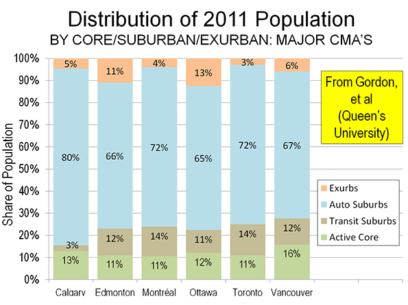
    The findings may be surprising to those retro-urbanists who hold Canada up as a planning model. When urbanization is examined at the neighborhood level, little of the metropolitan population actually follows    the urban core model. Overall, the average urban core constitutes approximately 12% of the metropolitan area. This varies little by population category.

    In describing the results, Gordon noted that there is a tendency to “overestimate the importance of the highly visible downtown cores and underestimate the vast growth happening in the suburban edges.” This is especially evident in the largest metropolitan areas.

    Major Metropolitan Areas

    Among the six major metropolitan areas (those with more than 1 million population), the urban cores also average 12 percent of the population (Figure).


    In relative terms, Vancouver has the largest urban core, at 16% of its population, followed by Calgary with 13% of its population. Toronto, Montréal and Edmonton all have urban cores with approximately 11% of their population, while Ottawa, which is both in Ontario and Quebec, stands at 12%. This means that the major metropolitan areas are, on average, 88% suburban or exurban.

    There is also relative consistency with respect to the populations of the transit oriented suburban areas. The largest are in Toronto and Montréal, at 14%. Vancouver and Edmonton have 12% of their populations in transit oriented suburban areas and Ottawa 11%. However, transit’s reach is much less in Calgary, where the transit suburbs have only 3% of the population.

    Calgary was the most automobile oriented of the major metropolitan areas, with 85 percent of residents living in automobile suburbs and exurbs. But other major metropolitan areas were not far behind, ranging from 73 percent in Vancouver to 78 percent in Ottawa, with Toronto Montréal and Edmonton in between.

    Smaller Metropolitan Areas

    Generally, the level of suburbanization was similar even in the smaller metropolitan areas. Interestingly, Gordon’s method did not require an urban core. This is illustrated by the Abbotsford (BC), where there no urban core is reported. Abbotsford is located in the Fraser River Valley, east of the Vancouver metropolitan area. Abbotsford developed in recent decades and, as a result, is so automobile oriented that the Queen’s University researchers do not even find a transit oriented suburb.

    Further, there were two instances of transit suburban areas being oriented toward urban cores outside their own metropolitan areas. In Oshawa, to the east of Toronto, a transit suburban area is west of Oshawa’s core, along the GO Transit commuter rail line to Toronto’s Union Station. Similarly, in Hamilton, a transit suburban area is located east of Hamilton’s core, on the GO Transit commuter rail line to Toronto.

    Maps

    The media site canada.com has also published A Country of Suburbs  with detailed census tract level maps for each of the metropolitan areas. There are also articles on each of the major metropolitan areas.

    Professor Gordon and his associates have pioneered a new, far more detailed method of analyzing the lifestyle components of the modern metropolitan area. They deserve credit for their objectiveness and attention to detail. Similar analysis is needed in other high income world nations.

    ——

    Note: Metropolitan areas always include rural areas – areas that are not urban. This is because metropolitan areas are employment market areas and people invariably commute from outside the population center (formerly called the urban area by Statistics Canada). The rural areas of metropolitan areas are far larger in geography than population centers or urban areas.

    Photograph: Centre Block, Parliament Hill: Ottawa (by author)

    This has been adapted from an article published at Frontier Centre for Public Policy Notes.

  • The Promise and the Peril of Rust Belt Chic

    What do you do when you’re a post-industrial city fallen on hard times? There’s a sort of default answer in the marketplace that I’ll call for want of a better term the “Standard Model.” The Standard Model more or less tells cities to try to be more like Portland. That is, focus on things like local food, bicycles, public transit, the arts, New Urbanist type real estate development, upscale shopping, microbreweries, coffee shops, etc., etc. The idea seems to be that the Rust Belt city model is a failure and should be chucked in favor of something better. In this model the publicly subsidized real estate project is the preferred economic development strategy. We’ve seen city after city work to create downtown and near-downtown “Green Zones” resembling miniature Chicagos. While these have generated excitement and even attracted some residents (upwards of 4,000 in Cleveland and 3,000 in St. Louis, though these are the high end), they have not fundamentally changed the civic trajectory other than in the largest Tier One type cities. And they likely never will. People who want Standard Model urbanism can find superior versions in many cities that generally boast more robust economies to boot.

    Enter Rust Belt Chic. This approach in theory solves two of the issues plaguing Standard Model urbanism, authenticity and uniqueness. I haven’t seen a crisp definition of what Rust Belt Chic actually is according to its boosters, but Pete Saunders summed up some of the salient points. The three key elements I see, which build upon each other:

    1. Do the Fail. Giving up on the idea of the factories coming back or large scale re-population.

    2. Reject Growth as a Success Marker. This actually aligns it somewhat with the standard model. Traditional signs of civic success such as population and job growth are rejected in favor of items like per capita income, brain gain, etc.

    3. Brashly Embrace the “Rust” in Rust Belt. This extends Do the Fail to actually embrace the civic characteristics failure produced, as well as various quirky legacies of the industrial past such as Pittsburgh potties.

    The best part of Rust Belt Chic is that it understands that you have to be who you are, not who you aren’t. Someone once described a brand as “a promise delivered.” When cities decide that what they are is of no worth or that it can’t succeed in the marketplace, the temptation can then be to try to pretend like they are Portland or some such. Almost invariably in such cases cities end up building towards a false promise they can never deliver. That’s not to say any of the elements of Standard Model urbanism are bad in an of themselves. The problem is that they are basically “best practices” types of things. Just as no company can succeed as nothing but an agglomeration of best practices, no city can either.

    The tendency in Rust Belt cities has been to try to downplay their authentic characteristics in order to try to portray themselves as hip and with it. As I’ve noted before, the one thing most clearly associated with Indianapolis is the Indianapolis 500, yet auto racing plays a fairly small role in how the city tries to sell itself these days.

    Rust Belt Chic is a first attempt at a region deciding no longer to be a passive importer of ideas about what cities should be, but instead trying to chart a path that is rooted in a unique, local history, culture, geography, etc. To the extent that it steers cities away from a purely “me too” strategy towards creating something that has a unique market positioning that’s real to the place and has at least some competitive advantage in the marketplace, Rust Belt Chic is a big win.

    However, as currently constituted, Rust Belt Chic would appear to be limited. In effect, it is really a marketing and to some extent a talent attraction program. Looking at the ironically appropriated trappings of the working man that characterize so much of hipsterdom, Rust Belt Chic says “Hey, we’ve got the real thing.” So rather than drinking PBR ironically, you drink I.C. Light with a more subtle degree of irony (i.e., by pretending that you’re actually drinking it authentically). The term “chic” itself is suggestive of fashion, and thus of artifice.

    What Rust Belt Chic does not do is address any of the core problems of the cities in question, ranging from fiscal crises to corruption to poor business climates to segregation, to say nothing of safe streets, better schools, etc. Maybe that isn’t its aim. But if not, then it would appear to be only one small component of an overall civic strategy, and not an alternative to the Standard Model in its own right. The theory of change it embodies would appear to be that authenticity of place and culture will attract people looking for the real, thus restarting the demographic engine through more population dynamism and ultimately that will percolate into the economy. That’s fine as far as it goes, but it’s insufficient.

    The elevation of authenticity also poses the danger of imprisoning the community in a straitjacket from the past. With “do the fail” and the embrace of decline as part of the culture, Rust Belt Chic deftly side steps some of the worst dangers of the corrosive force of nostalgia. However, the problem with authenticity is that is has to be, well, authentic. And the way that’s normally accomplished is by encasing something in amber, stunting its evolution.

    What Rust Belt Chic needs to be able to do is inform real, substantive change, and to not only unearth the authentic civic character, but updates it for 21st century realities.

    A city I think has done this quite well is Nashville. It would have been tempting for them to see their country music legacy as déclassé, and try to basically pitch themselves as the Portland of the South or some such. Instead, while they have embraced a number of Standard Model approaches – as I said, there’s nothing per se wrong with them – they kept country music as core to their identity. But it isn’t yesterday’s country music or culture. People in Nashville today aren’t sitting around watching Hee Haw reruns. Country music today is as much Hollywood as Hank Williams.

    That’s not to say Nashville disparages its past. Far from it. The old classic country performers are still honored, and their music still respected and listened to. And they see today’s country as linked across time to that of previous generations. So there’s evolution, but with continuity. They very much value their traditions. But they haven’t become imprisoned by them. Also, Nashville happens to have a stellar business climate, far less corruption than your average Rust Belt city, an openness to outsiders, an increasingly diverse population base, and an aggressiveness towards growth missing in most of the Rust Belt. That’s not to say Nashville’s perfect, but they’ve done a pretty good job of updating their authentic culture while backing it up with an actual product that’s functional demographically and economically.

    If Rust Belt Chic wants to reach its potential, it has to be able to do more than unearth and embrace the authentic culture of a place – though that’s important – it needs to be able to inform cultural evolution and also the very real changes in the product (such as Atlanta’s striving to shuck itself of the stigma of racism in the South by becoming the “city too busy to hate” and in the process becoming America’s premier city for blacks) needed to make these cities competitive again.

    Aaron M. Renn is an independent writer on urban affairs and the founder of Telestrian, a data analysis and mapping tool. He writes at The Urbanophile, where this piece originally appeared.

  • America’s Fastest-Growing Counties: The ‘Burbs Are Back

    For nearly a half century, the death of suburbs and exurbs has been prophesied by pundits, urban real-estate interests and their media allies, and they ratcheted up the volume after the housing crash of 2007. The urban periphery was destined to become “the next slums,” Christopher Leinberger wrote in The Atlantic in 2008, while a recent book by Fortune’s Leigh Gallagher, The End of Suburbsclaimed that suburbs and exurbs were on the verge of extinction as people flocked back to dense cities such as New York.

    This has become a matter of faith even among many supposed development professionals. “ There’s a pall being cast on the outer edges,” John McIlwain, a fellow at the Urban Land Institute, told USA Today. “The foreclosures, the vacancies, the uncompleted roads. It’s uncomfortable out there. The glitz is off.”

    Yet an analysis by demographer Wendell Cox of the counties with populations over 100,000 that have gained the most new residents since 2010 tells us something very different: Suburbs and exurbs are making a comeback, something that even the density-obsessed New York Times has been forced to admit. Of the 10 fastest-growing large counties all but two — Orleans Parish, home to the recovering city of New Orleans, and the Texas oil town of Midland— are located in the suburban or exurban fringe of major metropolitan areas.

    Fastest Growiing US Counties: 2010-2012
    Counties over 100,000 Population
    Rank County Equivalent Jurisdiction Growth
    1 Williamson, TX 7.94%
    2 Loudoun, VA 7.87%
    3 Hays, TX 7.56%
    4 Orleans, LA 7.39%
    5 Fort Bend, TX 7.16%
    6 Midland, TX 7.14%
    7 Forsyth, GA 7.07%
    8 Montgomery, TN 7.04%
    9 Prince William, VA 7.04%
    10 Osceola, FL 6.97%


    Not surprisingly several of these fast-growth areas are in burgeoning Texas metro areas. The population of Williamson County, on the outskirts of Austin, has expanded 7.94% since 2010, the strongest growth in the nation over that period. Far from turning into a slum, over the past 25 years the county’s residents have enjoyed the Lone Star state’s fastest rate of income growth and the sixth-highest in the nation. With a strong tech scene – Dell is headquartered in the Williamson town of Round Rock — the county has increased employment by 73% since 2000, the third highest rate in the country.

    Another Austin outer suburb, Hays County, ranks third on our list, with population growth of 7.6% since 2010 and 67% since 2000. Also impressive has been the growth of another Texas exurb, Fort Bend County, to the west of Houston.

    Since 2010 the county’s population has grown 7.2%, and since 2000 employment has increased 78%, in part due to the expansion of energy companies outside Houston. Fort Bend County is now home to 625,000 people, considerably more than the total population of most major core cities, including Atlanta, Cleveland, Baltimore and Portland. Like many of the boom counties, Fort Bend is alsoincreasingly diverse, with a rapidly growing Asian population that is approaching 20% of the total. It is now the unlikely home to one of the nation’s largest Hindu temples.

    In second place is Loudoun County, 25 miles from Washington, D.C., where the population has expanded 7.87% since 2010 and the number of jobs has grown 83% over the past decade. Much of this has come from tech and telecommunications companies, as well as growing numbers of jobs tied to Dulles Airport as well as the nation’s capital.

    They are not on the road to “next slum” status: Loudoun is one of the nation’s wealthiest counties. Another D.C. exurb on our list in ninth place, Prince William County, Va., ranks among America’s 10 wealthiest counties in terms of per capita income.Most of the other fastest-growing counties have a similar profile, attracting large numbers well-educated residents to the fringe of urban regions.

    What these findings demonstrate is that more people aren’t moving “back to the city” but further out. In the last decade in the 51 largest U.S. metropolitan areas, inner cores, within two miles of downtown, gained some 206,000 people,  while locations 20 miles out gained over 8.5 million. Although the recession slowed exurban growth, since 2011, notes Jed Kolko at Trulia, suburbs have continued to grow far faster than inner ring areas as well as downtown. Americans, he concludes, “still love their suburbs.”

    Rather than an inevitable long-range shift, the post-crash slowdown of suburban growth seems to have been largely a response to economic factors. The retro-urbanist dream of eliminating, or at least undermining, suburban alternatives depends very much on maintaining recessionary conditions that discourage relocation, depress housing starts, as well as lowering marriage and birthrates.

    Where incomes are growing along with rapid job growth , suburban and exurban growth tends to be strong.  The metro regions that contain our fastest-growing counties — Austin, Houston, Nashville and Northern Virginia — all epitomize this phenomenon. For example, nearly 80% of all housing growth in greater Houston takes place in the areas west of Beltway 8 (the outer beltway). A similar pattern can be seen in the D.C. area, where the number of units permitted in Loudoun has more than doubled since 2007. In 2012 permit issuances were the highest since 2005, and the vast majority were for either detached or attached single-family houses.

    This doesn’t mean the central areas of  thriving Washington or Houston are in decline; both core areas    enjoy modest population growth not seen in many more hard-pressed cities. But this highly visible and relentlessly promoted growth has not altered the fundamental pattern of faster development on the fringes.  As the economy strengthens, these trends will become evident in other areas.

    It now seems clear that the preference for single-family houses did not change in the recession, but was just stunted by it. With construction starts up again— more than two-thirds single family — this trend is beginning to re-assert itself. Mortgage lending is now at the highest level in five years.

    Indeed suburbia — or sprawl to use the perjorative term — is back even in the anti-suburban stretches of the San Francisco area, where suburban and exurban developers are once again pushing plans to develop new housing for the area’s expanding workforce. In long-suffering areas such as the Inland Empire, east of Los Angeles, there has been a steady housing recovery, leading to talk of new development.

    Other signs suggest that the widely predicted dense city nirvana may need to be put on hold. For example, car sales  — automobiles dominate transportation in most suburbs and exurbs — have been on the upswing, hitting a record in August. And despite predictions that the size of new homes would shrink, the median home size in the country has continued to rise, reaching a record high in 2012.Even shopping malls, long seen as doomed, are experiencing something of a resurgence.

    Demographic forces should accelerate suburban and exurban growth. As the economy has improved, we are starting to see an uptick in the birthrate, and household formation.

    Given the tendency of families to move to suburbs, this should spark further growth there in the future. High-density neighborhoods and the densest U.S. cities may be good for many things, and certain individuals, but not so much for families. During the last decade, suburbs and exurbs accounted for four-fifths of all household growth, a pattern that does not seem likely to change.

    Indeed, what we are seeing now is not the “end of suburbs” but the end of a brief period in which peripheral development was quashed by the severity of the Great Recession. With the return of even modest economic growth, we can expect that most demographic growth will continue to favor suburbs and exurbs, as has been the case for the better part of the last half century.

    This story originally appeared at Forbes.

    Joel Kotkin is executive editor of NewGeography.com and Distinguished Presidential Fellow in Urban Futures at Chapman University, and a member of the editorial board of the Orange County Register. He is author of The City: A Global History and The Next Hundred Million: America in 2050. His most recent study, The Rise of Postfamilialism, has been widely discussed and distributed internationally. He lives in Los Angeles, CA.

    Georgetown, Texas Town Square photo by Jeffrey W. Spencer.

  • “Unblocking Constipated Planning” in New Zealand

    One of the National Party’s principal objectives since coming to power in New Zealand has been to address that nation’s terribly deteriorated housing affordability problem.  Deputy Prime Minister Bill English explained the problem in his Introduction to the 9th Annual Demographia International Housing Affordability Survey:

    “It costs too much and takes too long to build a house in New Zealand. Land has been made artificially scarce by regulation that locks up land for development. This regulation has made land supply unresponsive to demand. When demand shocks occur, as they did in the mid-2000s in New Zealand and around the world, much of that shock translates to higher prices rather than more houses.”

    In the largest markets (Auckland, Christchurch and Wellington), house prices had doubled relative to incomes over the past two decades, as land prices were driven up by urban containment land-use policies (Note), that severely restrict the supply of land available for new housing. Across New Zealand, this rationing of land has led to the destruction of the competitive supply of land the Brookings Institution economist Anthony Downs says is essential to maintaining housing affordability. The relationship between urban containment policy and higher house prices is documented in a large body of international research. Economists Richard Green and Stephen Malpezzi succinctly summarized the issue:

    “When the supply of any commodity is restricted, the commodity’s price rises. To the extent that land – use, building codes, housing finance, or any other type of regulation is binding, it will worsen housing affordability.”

    On September 5, the government took an important step toward improving housing affordability, with the enactment of ground-breaking land use regulation reform. In the Parliamentary debate, Housing Minister Dr. Nick Smith expressed the imperative for passage by describing the regulatory situation in Auckland, the nation’s largest city (metropolitan area):

    Auckland has just 1,300 sections (lots) currently available for housing. That’s a third of what it had 10 years ago.

    We need 13,000 each year just to keep up with population growth.

    We’ve got a rigid Metropolitan Urban Limit (urban growth boundary) prohibiting any new housing developments beyond the artificial line drawn 15 years ago.

    We’ve got a few lucky land owners sitting on the last few parcels of developable residential land holding prospective homebuyers to ransom.

    Section (lot) prices have trebled and gone up by more than any other part of the housing cost equation.

    We’ve got a convoluted RMA (Resource Management Act) planning system where it takes an average of seven years to get a plan changed by the time you get through all the consultation and appeal processes.

    And even when you get a plan change, it takes an average of another three years to get a consent for a greenfields development and a year for a brownfields development.

    We’ve got a constipated planning system blocking new residential construction and this bill is a laxative to get new houses flowing.

    The passage represents an important step in the campaign by Dr. Smith and the National Party government to improve New Zealand’s housing affordability.

    According to Dr. Smith: “The increased land supply will help take the pressure off the over-heated Auckland housing market and help the economic recovery. It will enable tens of thousands of kiwi families to realise the dream of owning their own home.”

    Housing Accords and Special Housing Areas Act

    The new Housing Accords and Special Housing Areas Act permits the government to establish special housing districts that permit bypassing expensive planning regulations. Initially, the Act will be applied in Auckland, where an urban growth boundary (the “Metropolitan Urban Limit”) has been blamed for driving house prices to more than double their historic relationship to household incomes. Smith indicated that the Act would “over-ride Auckland’s Metropolitan Urban Limit” and that  ”…it would enable low-rise greenfield developments to be consented in six months, when they previously took three years, and low-rise brownfield developments to be consented in three months, when they previously took a year.”

    Smith also noted that support for the act was based on advice from the New Zealand Productivity Commission, the Reserve Bank of New Zealand (the central bank), the Organization for Economic Cooperation and Development (OECD) and the International Monetary Fund (IMF), which have indicated that “increasing supply is crucial to addressing housing affordability.”

    The government intends to move quickly, according to Minister Smith:

    “The main initial focus of the new law would be to enact the Auckland Housing Accord through which it is planned to build 39,000 new houses in a three year period in the Auckland region. Housing Minister Nick Smith says he expects the Auckland Council to approve the accord next Tuesday and is talking about having special housing areas approved by Christmas that would be able to cater for 5000 houses.”

    Housing Affordability in New Zealand

    The housing affordability crisis problem is the most severe in Auckland. The most recent Demographia International Housing Affordability Survey reported that median house prices were 6.7 times median household incomes in 2012 (this is the “median multiple”). This price to income ratio has more than doubled since the early 1990s. This is a particular problem because housing cost is by far the largest element of household budgets in New Zealand (as well as in Australia, Canada and the United States).

    The extent of the problem in Auckland is illustrated by the fact that across the urban growth boundary, values are one-tenth per acre for comparable land, according to research by Dr. Arthur Grimes, Chairman of the Board of Reserve Bank of New Zealand. In a competently governed market, there would be little difference.

    The higher land prices of urban containment also encourages builder “up-market,” to achieve competitive returns on the required larger investments. This is illustrated in New Zealand Productivity Commission research by Guanyu Zheng for the New Zealand Productivity Commission found that the higher prices generated by Auckland’s urban growth boundary were more severe for lower cost housing: “…when the supply of land on the urban periphery is restricted, the price of available residential land rises and new builds tend to be larger and more expensive houses.”

    High house prices are not limited to Auckland. Like in the United Kingdom, where exorbitant house prices occur from depressed Glasgow and Liverpool to dynamic London, house prices are high from the top of North Island to Invercargill in the South, irrespective of the economy.

    The provisions of the Act will also be applied in other more expensive markets in New Zealand. The Minister said: “The Government is also having discussions with other councils in high cost housing areas on how the tools in this law can assist in addressing the housing supply and affordability issues in their communities.”

    The Campaign

    The extent of New Zealand’s housing affordability problem has been known for some time and has been cause for serious concern.

    The long-time Governor of the Reserve Bank, Donald Brash wrote in 2008 that “the one clear factor that separates all of the” affordable and unaffordable housing markets “is the severity of the artificial restraints on the availability of land for residential building.” Later, Brash zeroed in on the cause., which he characterized as the extent to which urban containment policy “has pushed the price of residential land well beyond the reach of far too many New Zealanders.”

    For the last decade, Christchurch’s Hugh Pavletich (co-author of the Demographia International Housing Affordability Surveys) has been drawing attention to the problem: “We are currently paying near double per square metre build costs because of this…”

    More recently, Governor Graeme Wheeler of the Reserve Bank of New Zealand raised concerns about house price increases and implemented stronger loan qualification requirements to cool the market. Similar action was taken by the Bank of Canada last year, though monetary policy is severely limited in reigning in bubbles in the face of regional policies that drive up land prices.

    Moreover, urban containment is a poor strategy for reducing greenhouse gas emissions, because of its exorbitant costs per ton and its meager results.

    Getting Priorities Right

    By these reforms, the New Zealand government has given priority to the quality of life of its households over the more peripheral issues of city form and how people travel. In an increasingly globalized and competitive world, this sends an important signal.

    Wendell Cox is a Visiting Professor, Conservatoire National des Arts et Metiers, Paris and the author of “War on the Dream: How Anti-Sprawl Policy Threatens the Quality of Life.

    —–

    Note: Urban containment is also referred to as “smart growth,” growth management,” “compact cities” and other terms.

    —-

    Photograph: Downtown Auckland (by author)

  • Thinking Outside the Rails on Transit

    To many in the transit business – that is, people who seek to profit from the development and growth of buses, trains and streetcars – Southern California is often seen as a paradise lost, a former bastion of streetcar lines that crossed the region and sparked much of its early development. Today, billions are being spent to revive the region’s transit legacy.

    Like many old ideas that attract fashionable support, this idea, on its surface, is appealing. Yet, in reality, the focus on mass transit, however fashionable, represents part of an expensive, largely misguided and likely doomed attempt to re-engineer the region away from its long-established dispersed, multipolar and auto-dependent form.

    Traditional transit works best when a large number of commuters work in a central district easily accessible by trains or buses. New York and Washington, D.C., where up to 20 percent of the regional workforces labor downtown (the central business district), are ideal for transit. Even in those metropolitan areas, however, the auto is king.

    In contrast, less than 3 percent of Southern Californians work in downtown Los Angeles. Overall, despite all the money sunk into new rail lines around the country, Americans’ transit commuting is overwhelmingly concentrated in a few older “legacy” cities. Altogether, 55 percent of transit work trips are to six core cities: New York, Chicago, Philadelphia, San Francisco, Boston and Washington, and 60 percent of those commutes are to downtown.

    In contrast, in the Los Angeles-Orange County region, barely 6 percent of workers take transit, one-fifth the rate in New York. Yet we’re a bunch of committed strap-hangers compared with Phoenix, Atlanta, Charlotte, N.C., and Dallas-Fort Worth, where, despite surfeits of new trains and streetcars, 2 percent or less of commuters use public transit. Even in Portland, Ore., widely proclaimed the exemplar of new urbanism and transit investment, the percentage of commuters taking transit is less today than in 1980. Portland is now contemplating cutbacks that could eventually eliminate up to 70 percent of its transit service.

    Imposing Past on Future

    This miserable record reflects how trains, a largely 19th century technology, have limited utility in a contemporary setting. Indeed, the only way to make it work, planners insist, is if the population is moved from their low-density neighborhoods to high-density “pack and stack” areas near transit stops, while suburban businesses are dragooned to denser downtown locations. This is the essence of the recently approved Bay Area Plan.

    Although these kinds of strategies have never materially reduced automobile use – the Bay Area Plan itself says automobile use will still increase by 18 percent over 30 years – the bureaucratic logic here is almost Stalinesque in the scope of its social-engineering ambitions. As Bay Area journalist and plan advocate John Wildermuth puts it, people know they should take transit but don’t because it’s very inconvenient. But by forcing three quarters of new residents into dense housing, some with no parking, he reasons, it then will be “easier for them to either give up their cars or, at least, use them a lot less.”

    Yet getting people to change their way of life, as many central planners have discovered, is not as easy as it seems. The highly dispersed San Jose-Silicon Valley area, the economic epicenter of the Bay Area and worldwide information technology, has a commute trip market share barely a third of major metropolitan area average… . Building “one of the longest” light rail systems in the United States in 50 years has barely moved the percentage of transit commuters over the past three decades.

    What the Bay Area Plan will probably accomplish is to boost housing prices ever further out of reach, both in urban areas and in the suburbs. With new single-family development effectively all but banned, prices of homes in the Bay Area already are again rising far faster than the national average and now are approaching two and half times higher, based on income, than in competitor regions such as Salt Lake City, Phoenix, Dallas-Fort Worth, Austin, Tex., Houston or Raleigh, N.C.

    Environmental Imperative?

    Greens and their allies in the high-density housing lobby long have suggested that “peak oil” and rising prices will inevitably drive suburbanites out their cars. But, clearly, recent advances in U.S. oil and natural gas production may have already made this moot. Transit activists increasingly have focused on climate change to justify massive spending on expanding transit and forcing recalcitrant suburbanites from their cars.

    This logic is largely based on the notion that suburbanites must travel greater distances to work. Yet, a study by McKinsey & Co. and the Conference Board found that – largely because of the impact of higher energy standards for cars forecast by the Department of Energy – sufficient greenhouse gas emission reductions can be achieved without reducing driving or necessitate “a shift to denser urban housing.”

    The fundamental limitations of transit in dispersed cities further weakens environmentalists’ claim. Ridership on some transit systems is so sparse that cars are more energy efficient. Then, there’s the oft-mistaken assumption that higher-density housing will reduce congestion and travel. But in multipolar areas like Southern California, traffic congestion and resultant pollution generally becomes worse with higher density.

    There may be other, more technologically savvy ways to reduce emissions and energy use. People have cut automobile use the past three years but their reduced travel is not showing up so much in transit usage, but, rather, is driven by other factors such as unemployment and the high price of gasoline.

    But, arguably the biggest reduction can be traced to the rise of telecommuting. Over the past decade, the country added some 1.7 million telecommuters, almost twice the much-ballyhooed increase of 900,000 transit riders. In Southern California, the number of home-based workers grew 35 percent, three times the increase for transit usage. By 2020, according to projections from demographer Wendell Cox, telecommuting should pass transit, both nationally and in this region, in total numbers.

    What About the Poor?

    Perhaps the most compelling argument for transit stems from serving those populations – the poor, students, minorities – who often lack access to a private car. Yet, for workers in newer cities, public transit often is not an effective alternative. Brookings Institution research indicates that less than 5 percent of the jobs in the Los Angeles and Riverside-San Bernardino areas are within reach of the average employee within 45 minutes, using transit. The figure is less than 10 percent in the San Jose metropolitan area, the same percentage as for cities nationwide. Moreover, 36 percent of entry-level jobs are completely inaccessible by public transit.

    Not surprisingly, roughly three in four poorer workers use cars to get to work. Recent work by University of Southern California researcher Jeff Khau finds that car ownership is positively correlated with job opportunities; no such relationship can be proven with access to transit.

    At the same time, we should look at more-flexible systems, notably, expanded bus and bus rapid transit, which work better in dispersed areas and are less costly. Most rail systems tend to cannibalize most of their riders from existing bus lines, which explains the small net increases in total transit ridership.

    Transit too expensive

    Costs matter, and will become more important as cities and counties face the looming threat of fiscal defaults. In this respect, rail systems essentially steal from other transit – notably, the buses used mostly by the poor – and from hard-pressed city and county general-fund budgets. Gov. Jerry Brown’s outrageously expensive high-speed rail, which will principally serve the affluent, takes this unfairness to an extreme.

    Instead, we should push far more cost-effective ways to provide transportation options, including those from the private sector, such as the successful Megabus, which provides efficient, quicker and far-less expensive transport between cities than either existing rail or short-haul airline flights. USC’s Khau suggests the private sector also could enhance solutions for lower-income commuters through car loans and car-sharing services such as ZipCar and and Lyft, a mobile app that links riders with drivers.

    As we attempt to figure out ways to improve both the environment and people’s economic prospects, innovative 21st century solutions – from telecommuting to car-sharing – may prove more effective than relying on the 19th century technology of rail. We should not blindly follow transit ideology but focus on how to improve people’s mobility in ways other than the overpriced, inefficient and often far-less-equitable solutions being bandied about today.

    Joel Kotkin is executive editor of NewGeography.com and Distinguished Presidential Fellow in Urban Futures at Chapman University, and a member of the editorial board of the Orange County Register. He is author of The City: A Global History and The Next Hundred Million: America in 2050. His most recent study, The Rise of Postfamilialism, has been widely discussed and distributed internationally. He lives in Los Angeles, CA.

    This piece originally appeared at The Orange County Register.

    Photo by biofriendly, Metro Bus Campaign, Los Angeles

  • The Next Urban Crisis, And How We Might Be Able To Avoid It

    Urban boosters are rightly proud of the progress American cities have made since their nadir in the 1970s; Harvard economist Ed Glaeser has gone so far as to proclaim “the triumph of the city.” Yet recent events — notably Detroit’s bankruptcy and the victory of left-wing populist Bill de Blasio in the Democratic primary of the New York mayoral election — suggest that the urban future may prove far more problematic than commonly acknowledged.

    Detroit’s bankruptcy revealed the unsustainable fiscal problems facing most major urban centers, including, most importantly, President Obama’s political base of Chicago. This summer, Moody’s downgraded the Windy City’s credit rating three notches, noting the unsustainable nature of its pension obligations. Some 37 cities have filed for bankruptcy since 2010, most of them small, and as many as 20 others may be on the verge, including larger places like the California cities of Oakland and Fresno, and Providence, R.I.

    My hometown of Los Angeles may not be far behind. Perhaps the most union-dominated big city in America, the City of Angels’ pension obligations have gone from 3% of the city budget a decade ago to 18% last year. They are rising at a phenomenal 25% annual rate, according to a recent report by an independent watchdog, California Common Sense.

    Given this background, the political tides in New York suggest a worsening of the crisis. Thanks to the Bernanke-inspired Wall Street boom, the New York economy has not suffered the extreme fiscal distress of other big cities. But its fiscal condition is far worse than Mayor Michael Bloomberg and his well-oiled media machine might suggest. Under Bloomberg city spending grew 55% while pension costs have grown 300%.

    With de Blasio likely to be the next mayor, we can expect the bleeding to get worse. Many business people rightly fear a de Blasio’s administration will raise taxes in order to meet public employee demands. Faced with financial shortfalls, de Blasio’s response, notes historian Fred Siegel, is likely to be similar to that of his hero, former Mayor David Dinkins, who consistently gave in to public unions and raises taxes.

    But it’s not enough to dismiss de Blasio as a throwback. His victory reveals the depth of a profound social crisis beneath the glitz and glitter of Bloomberg’s luxury city. Similar class and geographic divisions can be seen throughout the country but inequality seems most egregious in New York. A recent analysis of inequality by University of Washington demographer Richard Morrill found New York to be the least egalitarian big metro area in America.

    This is borne out by other research: the New York City comptroller’s office found that the top 1% account for roughly a third of Gotham’s income, twice as high a share as in the rest of the country. Incomes have surged on Wall Street but most New Yorkers — two-thirds of whom are racial minorities — have struggled to keep pace. Controlling for cost, in fact, the New Yorker’s average paycheck is among the lowest among the nation’s 51 largest metro areas. Nearly half the city’s residents, notes theNation, are either below the poverty line or just above it.

    Bloomberg’s policy focus on ultra-dense development geared to Wall Street, the global rich, and the needs of the all-powerful, largely Manhattan real estate community has done very little for the vast majority of New Yorkers. This reality has lent credibility to de Blasio’s “tale of two cities ” stump speech and the growing rejection of Bloomberg’s legacy.

    Not that all of this can be laid at Bloomberg’s feet. New York’s economy has been changing for decades. New York of the 1950s was a manufacturing, trade and fashion superpower, employing hundreds of thousands of middle- and working-class residents. Large corporations employed large numbers of white- and pink-collar workers. This made New York, although always with its extremes, still a very middle- and working-class city.

    New York’s blue-collar economy has withered to a degree unmatched in most other U.S. cities. The port, the city’s original raison d’etre , lost its primacy to Los Angeles-Long Beach by 1980 and now ranks third in cargo value behind Houston-Galveston as well. The manufacturing sector, which employed a million in 1950, has shriveled to 73,000 jobs today (note that a small part of the decline is due to the BLS’ reclassification of some jobs to other sectors, and other statistical changes). Manufacturing employment in NYC has shrunk 39% since 2004, the worst performance of any major metropolitan area.

    A similar, albeit less dramatic decline has occurred in white-collar employment, in part due to the movement of large companies out of the city. In 1960 New York City boasted one out of every four Fortune 500 firms; today there are 46. And even among those keeping their headquarters in Gotham, many have shipped most of their back office operations elsewhere. Employment has even dropped in the “booming” financial sector, down 7.4% since 2007. The big employment gains have been almost entirely concentrated in the low-wage hospitality and retail sectors.

    If inequality is now greater in New York, the overall economic situation in other cities is, if anything, worse. New York at least has Wall Street, media and a constant infusion of wealth from the rest of world to keep its economy going and stave off the bond-holders. Yet even New York’s economy is underperforming its periphery. The city’s unemployment rate is 8.7% while the surrounding suburbs stand at 7.5%. This gap exists in almost all major metropolitan areas ; among the 51 largest metros the core unemployment rate is 8.8 percent compared to 7.1% in the suburbs.

    The gap is wider in other major cities. In the Chicago area, unemployment in the city is 2 percentage points higher than in the suburbs; in Los Angeles, the city unemployment rate is near 12%, three points higher than in suburbs. This, of course, all pales to Detroit where the city jobless rate stands at over 18% compared to 10% in the suburbs.

    Rather than “cure poverty” or export it to the suburbs, as is regularly claimed, cities retain a poverty rate twice as high as in the suburbs. And although hipsters and the global rich dominate media coverage, the vast majority of the population growth in urban cores over the past decade — upward of 80% — has come not from hipsters but the poor.

    These woes have been largely ignored by the press, but, as de Blasio’s primary victory shows, cannot be hidden forever. True, big investments aimed at attracting the “hip and cool” urban element have helped real estate speculators in selected districts, but has precious little positive impact on the neighborhoods where most urbanities reside.

    Unless addressed, the inequality in core cities suggests a similar lurch to the left could be seen in other cities. What is needed now is a new strategy that promotes the kind of broad-based economic growth that would make the urban “triumph” more than an empty one.

    This story originally appeared at Forbes.

    Joel Kotkin is executive editor of NewGeography.com and Distinguished Presidential Fellow in Urban Futures at Chapman University, and a member of the editorial board of the Orange County Register. He is author of The City: A Global History and The Next Hundred Million: America in 2050. His most recent study, The Rise of Postfamilialism, has been widely discussed and distributed internationally. He lives in Los Angeles, CA.

    Photo courtesy of Bill de Blasio.

  • Health, Happiness, and Density

    The proponents of currently fashionable planning doctrines favouring density promulgate a variety of baseless assertions to support their beliefs. These doctrines, which they group under the label of “Smart Growth”, claim, among other things, that from a health and sustainability perspective, the need to increase population densities is imperative.

    With regard to health these high-density advocates have seized upon the obesity epidemic as a reason to advocate squeezing the population into high-density. This is based on a supposition that living in higher densities promotes greater physical activity and thus lower levels of obesity.  They quote studies that show associations between suburban living and higher weight with its adverse health implications. But the weight differences found are minor – in the region of 1 to 3 pounds. Nor do the studies show it is suburban living that has caused this.

    The suburbs, after all, have been with us for 70 years and reached its mature development over 40 years ago. Obesity, on the other hand, is a much more recent phenomenon and is primarily due to people eating too much fattening food.

    Less discussed, however, are other facets to human health and it is important to consider the results of research on the association with high-density living of mental illness, children’s health, respiratory disease, heart attacks, cancer and human happiness.

    A significant health issue relates to the scourge of Mental Illness. There is convincing evidence showing adverse mental health consequences from increasing density.

    A monumental Swedish study of over four million Swedes examined whether a high level of urbanisation (which correlates with density) is associated with an increased risk of developing psychosis and depression. Adjustments were made to cater for individual demographic and socio-economic characteristics. It was found that the rates for psychosis (such as the major brain disorder schizophrenia) were 70% greater for the denser areas. There was also a 16% greater risk of developing depression. The paper discusses various reasons for this finding but the conclusion states: "A high level of urbanisation is associated with increased risk of psychosis and depression".

    Another analysis, in the prestigious journal Nature, discusses urban neural social stress. It states that the incidence of schizophrenia is twice as high in cities. Brain area activity differences associated with urbanisation have been found. There is evidence of a dose-response relationship that probably reflects causation.

    There are adverse mental (and other) health consequences resulting from an absence of green space. After allowing for demographic and socio-economic characteristics, a study of three hundred and fifty thousand people in Holland found that the prevalence of depression and anxiety was significantly greater for those living in areas with only 10% green space in their surroundings compared to those with 90% green space.

    High-density advocates seem most oblivious to the needs of children. Living in high-density restricts children’s physical activity, independent mobility and active play. Many studies find that child development, mental health and physical health are affected. They also find a likely association of high-rise living with behavioural problems.

    An Australian study of bringing up young children in apartments emphasizes resulting activities that are sedentary. It notes there is a lack of safe active play space outside the home – many parks and other public open spaces offer poor security. Frustrated young children falling out of apartment windows can be a tragic consequence. Children enter school with poorly developed social and motor skills. Girls living in high-rise buildings are prone to increased levels of overweight and obesity.

    A British study found that 93% of children living in centrally located high-rise flats had behavioural problems and that this percentage was higher than for children living
    in lower density dwellings. Anti-social behaviour often results. An Austrian study showed disturbances in classroom behaviour higher for children living in multiple-dwelling units compared to those living in lower densities. 

    There is also evidence of other potential health impacts on children living in higher density housing. These include short-sightedness due to restricted length of vision, and diminished auditory discrimination and reading ability due to exposure to noise.

    Air pollution increases with density. This results from higher traffic densities together with less volume of air being available for dilution and dispersion. Nitrogen oxides in this pollution have adverse respiratory effects including airway inflammation in healthy people and increased respiratory symptoms in people with asthma. There is consistent evidence that proximity to busy roads, high traffic density and increased exposure to pollution are linked to a range of respiratory conditions. These can range from severe conditions (such as a higher incidence of death) to minor irritations. Moreover, these respiratory health impacts affect all age groups.

    Several studies relate low birth weight to air pollution. A South Korean report, for example, found the pollutants carbon monoxide, nitrogen dioxide, sulfur dioxide, and total suspended particle concentrations in the first trimester of pregnancy pose significant risk factors for low birth weight.

    Air pollution particulates are associated with killing more people than traffic accidents. Pollutants such as those emitted by vehicles are significantly associated with an increase in the risk of heart attacks and early death.

    Cancer is a major health scourge and a relationship between increased colon cancer, breast cancer and total cancer mortality with population density has been found.

    There is an association between overall Human Happiness and density. Professor Cummins’ Australian Unity Wellbeing Index reports that the happiest electorates have a lower population density. A United States study finds the satisfaction of older adults living in higher density social housing reduces as building height increases and as the number of units increases. By contrast, in lower densities there are higher friendship scores, greater housing satisfaction, and more active participation. This does not apply only to single family houses: Residents of garden apartments have a greater sense of community than residents of high-rise dwellings.

    An example of misinformation on this issue can be found in R.D. Putnam’s famous book “Bowling Alone”.  Putnam states that "suburbanisation, commuting and sprawl" have contributed to the decline in social engagement and social capital.  However I have shown that data from charts in his book indicate quite the opposite:

    Adapted from Figure 50, Putnam R D, Bowling Alone, Simon & Schuster, New York, 2000

    This shows that involvement in these social activities are more common in the suburbs than in the denser centres of cities (and that they become more common as the community size and density decreases).

    Community contentment relating to the density of surroundings is revealed by a study in New Zealand that asked people if the type of area they would most prefer to live in is similar to the area they currently live in. The responses are shown in this table.


    So 90% of rural residents would prefer an area similar to their current area but only 64% of central city dwellers would prefer an area similar to their current surroundings.  It can be seen that satisfaction decreases as density increases.

    Thus evidence from a variety of sources points to greater human happiness and better health in lower densities — the exact opposite of the theories of the advocates for “cramming” people into ever small places.

    (Dr) Tony Recsei has a background in chemistry and is an environmental consultant. Since retiring he has taken an interest in community affairs and is president of the Save Our Suburbs community group which opposes over-development forced onto communities by the New South Wales State Government.

    Sydney suburb photo by BigStockPhoto.com.